Badge

Badge — a pill-shaped label for tags, status indicators, and counts.
Public functions
Badge
Detailed description
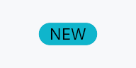
Badge renders a short piece of text inside a rounded-pill container.
Common uses include tag chips on list items, unread-count bubbles in
navigation rails, and severity labels in alert rows. The pill chrome
(corner radius, padding, surface tint) is driven by the active
BadgeStyle; callers may swap it per-instance (.style(...)) or
theme-wide via theme.style_slots.badge.
When to use
- Inline chip that annotates another widget (version tag, "NEW" label).
- Standalone count indicator; pair with
SeverityBadgefor icon-backed status glyphs.
Accessibility
Announces as Role::Label with its resolved text as the AT name.
The inner TextWidget is hidden from AT to avoid double-announcement;
the badge emits that label's text runs from its own node instead, so a
reader can review the text by character, word and line rather than only
hear it.
#![allow(unused)]
fn main() {
use teksilo_widgets::Badge;
use teksilo_i18n::lit;
use teksilo_tokens::Color;
let _badge = Badge::new(lit!("NEW"))
    .background(Color::new(0.2, 0.6, 1.0, 1.0));
}
Touch and pen
Nothing to do, and it is worth saying why: a Badge carries no pointer
handler of any kind — no tap, no hover, no drag — so it is not a target,
takes no press and needs no widened hit area. Its only pointer-adjacent
feature is a tooltip, whose touch route is the long press the tooltip
package owns. A badge that an app makes tappable does so by wrapping it,
and the wrapper is the target.
Density
The picture above is the widget at TargetDensity::Compact, the mouse-and-keyboard ladder. Below is the same subject on the same canvas with only the ladder changed, so what moves is the density and nothing else — where the subject no longer fits, that is what the denser targets cost it at that size. See docs/density-and-targets.md.
Touch
API reference
📖 Full rustdoc API for this module
pub struct Badge
Import: use teksilo::widgets::Badge;
A pill-shaped label for displaying tags, counts, or status.
#![allow(unused)]
fn main() {
pub struct Badge { /* fields */ }
}
Methods
pub fn new(label: impl Into<LocalizedString>) -> Self
Construct a badge with the given label text.
pub fn style(mut self, style: impl teksilo_core::styles::BadgeStyle) -> Self
Per-call style override for the badge pill chrome. Replaces the
theme-wide default BadgeStyle for just this instance.
pub fn background(mut self, color: impl Into<ColorProp>) -> Self
Override the badge background. Accepts Color, a
SurfaceRole / TextRole,
or a Signal<Color>. Default (unset) is SurfaceRole::AccentSubtle.
pub fn text_role(mut self, color: impl Into<ColorProp>) -> Self
Override the badge text color. Accepts Color, a role, or a signal.
Default (unset) is the theme's status_info_fg.
pub fn text_style(mut self, style: impl Into<teksilo_core::color_prop::TextStyleProp>) -> Self
Override the label's text style (font, size, weight). Accepts a
TextStyleRole, a TextStyle, or a Signal of either. Default
(unset) is TextStyleRole::Tiny.
pub fn tooltip(mut self, text: impl Into<LocalizedString>) -> Self
Attach a plain single-line tooltip shown after a hover delay.
Mutually exclusive with rich_tooltip,
rich_tooltip_content, and
composite_tooltip — the last setter called wins.
pub fn rich_tooltip(mut self, key: impl Into<String>) -> Self
Attach a rich tooltip identified by a registry key.
Mutually exclusive with tooltip,
rich_tooltip_content, and
composite_tooltip — the last setter called wins.
pub fn rich_tooltip_content(mut self, content: crate::tooltip::TooltipContent) -> Self
Attach a rich tooltip from inline TooltipContent.
Mutually exclusive with tooltip,
rich_tooltip, and
composite_tooltip — the last setter called wins.
pub fn composite_tooltip(mut self, content: impl Widget + 'static) -> Self
Attach a composite tooltip with an arbitrary widget tree body.
Mutually exclusive with tooltip,
rich_tooltip, and
rich_tooltip_content — the last setter called wins.