Calendar
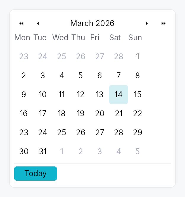
Calendar — month-grid date picker, standalone widget.
Public types
| Kind | Name |
|---|---|
struct | DateRange — Inclusive range of two dates, with start <= end enforced at construction |
enum | CalendarMode — What the calendar body is showing — drives the WPF/Avalonia "header-zoom" UX where clicking the title cycles to a coarser grid, letting the user reach any… |
enum | WeekNumberDisplay — Whether and how week numbers are displayed in the leading column of the day grid |
struct | Calendar — Standalone month-grid date picker |
Public functions
Calendar
| Returns | Function |
|---|---|
| Constructors | |
Self | single(value: Signal<Option<Date>>) |
Self | range(value: Signal<Option<DateRange>>) |
| Builder methods | |
Self | first_day_of_week(w: Weekday) |
Self | week_numbers(mode: WeekNumberDisplay) |
Self | show_today_button(show: bool) |
Self | show_navigation(show: bool) |
Self | min_date(d: Date) |
Self | max_date(d: Date) |
Self | disabled_date_filter(f: impl Fn(Date) -> bool + 'static) |
Self | label(label: impl Into<LocalizedString>) |
Self | enabled(enabled: impl Into<Prop<bool>>) |
Self | on_selection_changed(f: impl Fn(Option<Date>, &mut EventContext) + 'static) |
Self | on_range_changed(f: impl Fn(Option<DateRange>, &mut EventContext) + 'static) |
Self | on_month_changed(f: impl Fn(YearMonth, &mut EventContext) + 'static) |
Self | on_activate(f: impl Fn(Date, &mut EventContext) + 'static) |
| Methods | |
Signal<YearMonth> | visible_month_signal() |
Signal<Date> | focused_date_signal() |
Signal<CalendarMode> | mode_signal() |
DateRange
| Returns | Function |
|---|---|
| Constructors | |
Self | new(a: Date, b: Date) |
| Methods | |
bool | contains(d: Date) |
CalendarMode
| Returns | Function |
|---|---|
| Builder methods | |
Self | demote() |
Detailed description
A self-contained calendar with month/year navigation, a 6×7 day grid,
keyboard navigation matching the WAI-ARIA grid pattern, and full
AccessKit instrumentation (Role::Grid + per-cell Role::GridCell).
Used standalone for event apps and scheduling, and embedded in
DateEdit's popover.
Selection modes
Calendar::single— pick one day. Bound toSignal<Option<Date>>.Calendar::range— pick a start + end day. Bound toSignal<Option<DateRange>>. Click first day → click second day to commit. Escape mid-selection cancels the in-progress anchor.
Behaviour
- Visible month is independent of the selection — navigating past the selected month doesn't lose the selection.
- Today highlight draws a ring around today's cell whenever it's
in the visible month. Color comes from
BorderRole::Focused, painted by the activeCalendarStyle::make_day_cell. - Out-of-month cells (the leading days from the previous month
and trailing days from the next month that fill the 6×7 grid) are
rendered with
TextRole::Disabledand remain selectable (matching macOS / Material). To prevent selection usedisabled_date_filter. - Keyboard (matches the WAI-ARIA
gridpattern):- Arrow keys: move focus by one day.
- Home / End: first / last day of week.
- Ctrl+Home / Ctrl+End: first / last day of month.
- PageUp / PageDown: previous / next month.
- Shift+PageUp / Shift+PageDown: previous / next year.
- Enter / Space: commit focused day to selection.
- Escape: in range mode mid-selection, cancel anchor; otherwise bubble (popover hosts close).
T: jump focus to today.
- Keyboard in the months and years views: the cursor is the month
(or year) shown, highlighted in the grid.
- Arrow keys: move by one month (year) across a row, by a row of three up and down.
- PageUp / PageDown: a year back or on (a decade in the years view).
- Enter / Space: open the month under the cursor on its days (the year on its months). Nothing is selected.
- Escape: back to the days of the month under the cursor. A date field's popup takes Escape first and closes, and opens again on its days.
- Activating the header title zooms out and takes the keyboard into the grid, on the month (year) shown.
Accessibility
Every string below is in the user's language. The words come from the
framework's Fluent bundle, so an application that registers
framework_locales() gets them translated; every date inside them is
written by ICU for the widget tree's locale, in the locale's own order
and grammar and on the Gregorian calendar the grid is laid out in, never
assembled from numbers or from translated names (see
common::datetime::written).
- Container:
Role::Grid, named after the visible month ("Calendar, May 2026", "Calendrier, mai 2026"). It is not a live region: a live grid announced its name and each weekday header as it opened, and then focus said its name again. A change of month made from the keyboard moves the focus to a day of the new month (see the day cells below), whose name says the month. One made from a header arrow or the Today button, where focus stays on the button, is announced once through the tree's announcer: the title as it now reads, or today's date in full. The value is the day under the keyboard cursor in full, then the selection when there is one: "Saturday, May 2, 2026 (selected: Friday, May 1, 2026)". With the cursor on the one selected day, the day is said once: "Friday, May 1, 2026 (selected)". A range is joined by words ("… to …"), not an en-dash, which some screen readers skip. The value is for a client that reads the grid; the cursor is heard through the focus. UIA and macOS raise a value-changed event on the grid, which is not the focus while a day is; AT-SPI carries a string value on no interface. - Header arrow buttons:
Role::Buttonwith localized labels ("Previous month", "Next month") andAction::Clickadvertised. - Header month/year label:
Role::Button, aGhostButtonwhose activation demotesCalendarModeone level, swapping the body for the coarser grid in place, and moves focus to the grid; no popup is opened. Its name is its title: the month and year, the year, or the decade in words ("2020 to 2029"). - Month and year cells of the zoomed views:
Role::GridCell, a month named with its year ("mai 2026"),Action::Clickadvertised, no Tab stop of their own: the grid names the one under the cursor as its active descendant, as it does a day. - Weekday header row:
Role::RowofRole::ColumnHeadercells, each labelled with the long weekday name (e.g. "Monday"). - Weeks:
Role::Row, each holding its seven day cells, so the grid isGrid > Row > GridCellin every platform's tree. - Day cells:
Role::GridCellnamed by the day in full ("Saturday, May 2, 2026", "samedi 2 mai 2026"),set_selected,set_aria_current(Date)on today,set_disabledfor filter rejections, andAction::Clickadvertised. Keyboard focus stays on the Calendar root, which names the cell under the cursor as its active descendant while it holds focus in the day view. AccessKit reports that cell as the focus on AT-SPI, UIA and macOS, so each arrow press, and each change of month, is a focus change to the new day, which is what a screen reader speaks.
Example
use teksilo::widgets::{Calendar, common::datetime::Date};

let date = ctx.signal(Some(Date::constant(2026, 5, 2)));
ctx.add(
    Calendar::single(date.clone())
        .show_today_button(true)
        .on_selection_changed(|d, ctx| ctx.send_intent(MyIntent::DateChanged(d))),
);
Touch and pen
A day cell is a tap target, not a manipulator, and the distinction
decides what it declares. Its activation is on_tap, so it already lands on
the release; its 32 dp box already clears the WCAG 2.2 SC 2.5.8 floor at
Compact and follows the density ladder above it; and it produces no value
from the press position and owns no drag. It therefore does not declare
touch_action(NONE): a finger that comes to rest on a day and then drags is
scrolling the dialog or form the calendar sits in, which is what a user
expects and what declaring NONE would forbid for nothing gained.
Density
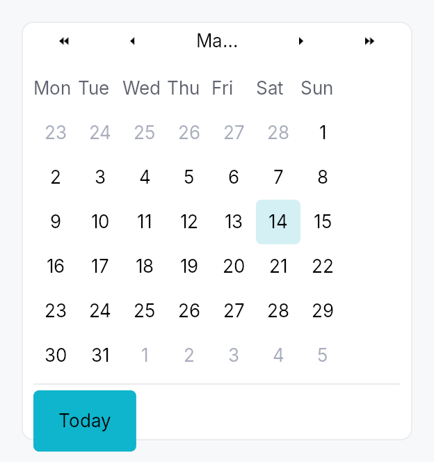
The picture above is the widget at TargetDensity::Compact, the mouse-and-keyboard ladder. Below is the same subject on the same canvas with only the ladder changed, so what moves is the density and nothing else — where the subject no longer fits, that is what the denser targets cost it at that size. See docs/density-and-targets.md.
Touch
API reference
📖 Full rustdoc API for this module
pub struct DateRange
Import: use teksilo::widgets::DateRange;
Inclusive range of two dates, with start <= end enforced at
construction. Used by Calendar::range.
#![allow(unused)]
fn main() {
pub struct DateRange { /* fields */ }
}
Fields
start:Dateend:Date
Methods
pub fn new(a: Date, b: Date) -> Self
Construct a range; swaps start and end if needed so the
invariant start <= end always holds.
pub fn contains(&self, d: Date) -> bool
true iff d is between start and end inclusive.
pub enum CalendarMode
Import: use teksilo::widgets::calendar::CalendarMode;
What the calendar body is showing — drives the WPF/Avalonia
"header-zoom" UX where clicking the title cycles to a coarser
grid, letting the user reach any year in 2-3 clicks instead of
many chevron presses. Default CalendarMode::Days.
#![allow(unused)]
fn main() {
pub enum CalendarMode { /* variants */ }
}
Variants
Days— 6×7 day grid for the visible month. Title shows "May 2026". Header chevrons step by ±1 month and ±1 year.Months— 4×3 grid of months. Title shows "2026". Header chevrons step by ±1 year. Picking a cell zooms back intoSelf::Days.Years— 4×3 grid of years (current decade). Title shows "2020 to 2029". Header chevrons step by ±10 years (one decade). Picking a cell zooms back intoSelf::Months.
Methods
pub fn demote(self) -> Self
Mode after demoting one level (clicking the header title).
Years is the coarsest level — no further demotion.
pub enum WeekNumberDisplay
Import: use teksilo::widgets::WeekNumberDisplay;
Whether and how week numbers are displayed in the leading column of the day grid.
#![allow(unused)]
fn main() {
pub enum WeekNumberDisplay { /* variants */ }
}
Variants
None— No week-number column (default).Iso8601— ISO 8601 week number — week 1 is the week containing the first Thursday of the year. Adds a narrow column to the left of the day grid.
pub struct Calendar
Import: use teksilo::widgets::Calendar;
Standalone month-grid date picker. See the module docs for
the full feature list and a usage example.
#![allow(unused)]
fn main() {
pub struct Calendar { /* fields */ }
}
Methods
pub fn single(value: Signal<Option<Date>>) -> Self
Construct a calendar in single-selection mode bound to a nullable date signal.
pub fn range(value: Signal<Option<DateRange>>) -> Self
Construct a calendar in range-selection mode bound to a nullable date-range signal.
pub fn first_day_of_week(mut self, w: Weekday) -> Self
Override the locale-derived first day of the week.
pub fn week_numbers(mut self, mode: WeekNumberDisplay) -> Self
Show or hide the leading week-number column.
pub fn show_today_button(mut self, show: bool) -> Self
Show a "Today" button in the footer that jumps focus and selection (in single mode) to today.
pub fn show_navigation(mut self, show: bool) -> Self
Show or hide the prev/next month navigation arrows.
pub fn min_date(mut self, d: Date) -> Self
Earliest allowed date; days before this read as disabled.
pub fn max_date(mut self, d: Date) -> Self
Latest allowed date; days after this read as disabled.
pub fn disabled_date_filter(mut self, f: impl Fn(Date) -> bool + 'static) -> Self
Per-cell predicate. true ⇒ cell is disabled (no click, no
keyboard commit, AT marks disabled).
pub fn label(mut self, label: impl Into<LocalizedString>) -> Self
Override the AT label. Default: "Calendar, May 2026" (localized, derived from the visible month).
pub fn enabled(mut self, enabled: impl Into<Prop<bool>>) -> Self
Set the enabled state, statically or reactively. Forwarded to the
arena at build time — a bound Signal<bool> updates live.
pub fn on_selection_changed( mut self, f: impl Fn(Option<Date>, &mut EventContext) + 'static, ) -> Self
Fired when the selection changes. In range mode use
on_range_changed instead — this
callback fires on every committed-day change in range mode too,
passing the just-committed endpoint.
pub fn on_range_changed( mut self, f: impl Fn(Option<DateRange>, &mut EventContext) + 'static, ) -> Self
Fired in range mode whenever a range is committed (second click
of the pair). None fires when the user resets via Escape or
when the bound value is externally cleared.
pub fn on_month_changed(mut self, f: impl Fn(YearMonth, &mut EventContext) + 'static) -> Self
Fired when the visible month changes (navigation arrows, keyboard PageUp/Down, today jump).
pub fn on_activate(mut self, f: impl Fn(Date, &mut EventContext) + 'static) -> Self
Fired in single mode on Enter or click (i.e. when the user "double commits"). Distinct from selection change; popover hosts use this to dismiss themselves only on a real click, not on keyboard navigation.
pub fn visible_month_signal(&self) -> Signal<YearMonth>
Reactive accessor for the currently-visible month.
pub fn focused_date_signal(&self) -> Signal<Date>
Reactive accessor for the focused-cell date.
pub fn mode_signal(&self) -> Signal<CalendarMode>
Reactive accessor for the body mode (Days / Months / Years). Drives the header-zoom UX. Apps can read this to react to mode changes, or write to it to programmatically zoom in/out.