Checkbox
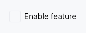
Checkbox — a two-state or tristate checkbox with an optional label.
Public functions
Checkbox
Detailed description
Checkbox renders a square (or rounded-square / circle) toggle box
alongside an optional label and caption. Two modes are supported:
- Two-state (
Checkbox::new): toggles aSignal<bool>betweentrue(checked) andfalse(unchecked) on click or Space. - Tristate (
Checkbox::tristate): cycles aSignal<CheckState>betweenCheckedandUncheckedon user interaction; theIndeterminatestate is set only by external sources such asTreeCheckedModelaggregation — clicking fromIndeterminategoes toChecked, not a further third state.
Chrome (box shape, fill, focus ring) is driven by the active
CheckboxStyle; three visual variants are available via
CheckboxVariant.
Label styling
The label is Body / Primary and the caption Small / Secondary by
default. Checkbox::label_style / Checkbox::label_color and
Checkbox::caption_style / Checkbox::caption_color override them.
A theme role colour still dims when the checkbox is disabled; a literal
Color stays as given.
Touch and pen
The pressed state comes from the framework press
(docs/touch-and-pen.md §7.1) rather than from this widget: sliding off
abandons it, sliding back on restores it, and a pan claimant winning the
press clears it with no release. Before the controls sweep is_pressed
could only ever be set by a keyboard Space, so a mouse-down showed no
pressed chrome at all — themes that paint one (IntUI's checked box, Material
3's state layer) now get it from every pointer.
The 24 dp MinSize around the 19 dp glyph already meets the WCAG 2.2
SC 2.5.8 floor at Compact and follows the density ladder above it, so no
hit-widening mechanism is involved.
Accessibility
Announces as Role::CheckBox. A label is required in debug builds
unless .labelled_externally() is set (for embedding inside a composite
row that owns the AT name). Keyboard: Space toggles; lone-KeyUp guard
prevents spurious toggle when focus is restored after a shortcut.
#![allow(unused)]
fn main() {
use teksilo_widgets::Checkbox;
use teksilo_core::signal::Signal;
use teksilo_i18n::lit;
let checked = Signal::new(false);
let _cb = Checkbox::new(checked)
    .label(lit!("Accept terms and conditions"));
}
Density
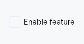
The picture above is the widget at TargetDensity::Compact, the mouse-and-keyboard ladder. Below is the same subject on the same canvas with only the ladder changed, so what moves is the density and nothing else — where the subject no longer fits, that is what the denser targets cost it at that size. See docs/density-and-targets.md.
Touch
API reference
📖 Full rustdoc API for this module
pub struct Checkbox
Import: use teksilo::widgets::Checkbox;
A checkbox that toggles a Signal<bool> or cycles a Signal<CheckState>.
#![allow(unused)]
fn main() {
pub struct Checkbox { /* fields */ }
}
Methods
pub fn new(checked: Signal<bool>) -> Self
Create a two-state checkbox bound to a Signal<bool>.
pub fn tristate(state: Signal<CheckState>) -> Self
Create a tristate checkbox bound to a Signal<CheckState>.
User clicks toggle Checked ↔ Unchecked (clicking from Indeterminate
checks the whole). The Indeterminate state is reserved for external
sources — TreeCheckedModel aggregation when descendants are mixed,
"select all" indicators, etc. Matches the Outlook / Files-app
folder-checkbox semantic. Useful for parent checkboxes in tree views.
pub fn on_change(mut self, f: impl Fn(bool, &mut EventContext) + 'static) -> Self
Run f when the user checks or unchecks this box, with the
checked-ness the activation produced and an EventContext, so it can do
what a bare Signal write cannot (ctx.send_intent(...),
ctx.set_theme(...), opening a window). Fires for the pointer, for
Space, for an assistive-technology Click, and for Space on a data
view's focused row.
Does not fire for programmatic writes to the bound signal — there is
no event in flight to carry. Observe the signal for that. The signal
stays the source of truth either way: it is written first, and f sees
the value it now holds.
A tristate checkbox reports a bool too: activation cycles
Checked ↔ Unchecked only, and Indeterminate is external-source-only.
pub fn labelled_externally(mut self) -> Self
Declare that this checkbox's accessible name comes from an
ancestor, suppressing the visual label/caption AND the
debug-time "missing accessible label" assertion. Use it when
the checkbox is embedded inside a composite that owns the
row's name (e.g. StandardListItem / StandardTreeItem,
where the row's accessibility(builder) calls set_name(...)
with the row label).
A11y contract: the caller MUST guarantee that an
addressable AT ancestor provides the name — either via that
ancestor's own accessibility() impl or a builder-level
.access_label* override. Without it the AT tree exposes a
Role::CheckBox node with no name; screen readers announce
"checkbox, checked" with no context. The Outlook /
Files-app row pattern (where the row label covers the
embedded checkbox) is the supported use case.
Spelled the same way on Toggle.
pub fn label(mut self, label: impl Into<LocalizedString>) -> Self
Set the visible label rendered to the right of the checkbox box,
also used as the AT name. Required unless .labelled_externally() is set.
pub fn caption(mut self, text: impl Into<LocalizedString>) -> Self
Secondary explanatory text rendered below the label, left-aligned
with the label (not the box). Uses the small / text_secondary
style. Has no effect unless label(...) is also set.
pub fn label_style( mut self, style: impl Into<teksilo_core::color_prop::TextStyleProp>, ) -> Self
Override the label's text style (font, size, weight). Accepts a
TextStyleRole, a TextStyle, or a Signal of either. Default is
TextStyleRole::Body.
pub fn label_color(mut self, color: impl Into<teksilo_core::color_prop::ColorProp>) -> Self
Override the label's text color. Accepts Color, a theme role, or a
Signal of either. Default is TextRole::Primary. A role still dims
to the disabled color when the checkbox is disabled; a literal Color
stays as given.
pub fn caption_style( mut self, style: impl Into<teksilo_core::color_prop::TextStyleProp>, ) -> Self
Override the caption's text style. Default is TextStyleRole::Small.
pub fn caption_color(mut self, color: impl Into<teksilo_core::color_prop::ColorProp>) -> Self
Override the caption's text color. Accepts Color, a theme role, or
a Signal of either. Default is TextRole::Secondary. A role still
dims to the disabled color when the checkbox is disabled; a literal
Color stays as given.
pub fn enabled(mut self, enabled: impl Into<Prop<bool>>) -> Self (default: true)
Set the enabled state, statically or reactively. Forwarded to the
arena via ctx.enabled_when(self_id, self.enabled.clone()) at
build time — a bound Signal<bool> updates live.
pub fn variant(mut self, variant: CheckboxVariant) -> Self
Pick the design-language variant. Default Square. The active
CheckboxStyle impl decides what the variant means visually
(the IntUI RecipeCheckboxStyle honours all three variants
directly via corner-shape changes).
pub fn style(mut self, style: impl teksilo_core::styles::CheckboxStyle) -> Self
Per-call style override. Replaces the theme-wide default
CheckboxStyle for just this Checkbox instance — same role as
Button::style(...).
pub fn tooltip(mut self, text: impl Into<LocalizedString>) -> Self
Attach a plain tooltip shown after a hover delay. Clears any previously set rich or composite tooltip (last-call wins).
pub fn rich_tooltip(mut self, key: impl Into<String>) -> Self
Attach a rich tooltip resolved from the app-wide tooltip
registry. See Button::rich_tooltip.
pub fn rich_tooltip_content(mut self, content: crate::tooltip::TooltipContent) -> Self
Attach a rich tooltip driven by inline TooltipContent.
pub fn composite_tooltip( mut self, content: impl teksilo_core::widget::Widget + 'static, ) -> Self
Attach a composite tooltip — third tier, hosting an arbitrary
widget tree. See Button::composite_tooltip.