Dialog
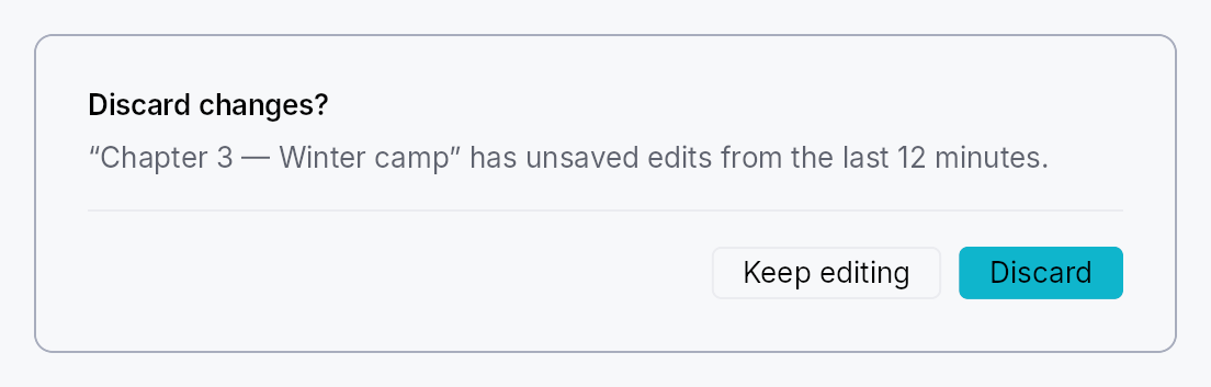
Modal dialogs — a trigger button that presents a centered modal panel.
Public types
| Kind | Name |
|---|---|
struct | ModalContainer — Rounded panel chrome that wraps a modal dialog's content widget |
struct | ModalScrim — Full-viewport dimming scrim painted behind a ModalContainer |
struct | DialogContent — Convenience body layout for a modal dialog: optional title, supporting text, scrollable body slot, and a Divider-separated footer row |
struct | Dialog — A trigger button that presents a modal dialog when activated |
Public functions
Dialog
| Returns | Function |
|---|---|
| Constructors | |
Self | new(label: impl Into<LocalizedString>) |
| Builder methods | |
Self | content<W, F>(factory: F) |
Self | variant(variant: ButtonVariant) |
Self | enabled(enabled: impl Into<Prop<bool>>) |
Self | presentation(presentation: ModalPresentation) |
Self | close_behavior(close_behavior: ModalCloseBehavior) |
Self | trigger(trigger: impl teksilo_core::IntoTeksiChild) |
ModalContainer
| Returns | Function |
|---|---|
| Constructors | |
Self | new(content: impl Widget + 'static) |
| Builder methods | |
Self | padding(padding: f32) |
Self | min_width(min_width: f32) |
Self | style(style: impl teksilo_core::styles::DialogStyle) |
Self | title(title: impl Into<LocalizedString>) |
ModalScrim
| Returns | Function |
|---|---|
| Constructors | |
Self | new() |
| Builder methods | |
Self | style(style: impl teksilo_core::styles::DialogStyle) |
Self | dismiss_target(target: Rc<Cell<Option<OverlayId>>>) |
Self | click_to_dismiss(enabled: bool) |
DialogContent
| Returns | Function |
|---|---|
| Constructors | |
Self | new() |
| Builder methods | |
Self | title(title: impl Into<LocalizedString>) |
Self | supporting_text(text: impl Into<LocalizedString>) |
Self | body(body: impl teksilo_core::IntoTeksiChild) |
Self | footer(footer: impl teksilo_core::IntoTeksiChild) |
Detailed description
Three cooperating types cover the common dialog use-case. Dialog is the
high-level entry point: a Button (or custom trigger) that, on activation,
presents a ModalContainer above a full-viewport dimming ModalScrim.
DialogContent is the convenience body layout — a VStack with an
optional title, supporting text, scrollable body slot, and a footer slot
separated by a Divider.
When to use
Dialog::new(label).content(|| …)for the common "button opens dialog" pattern.Dialog::new(label).trigger(my_icon_button).content(|| …)to use a custom widget as the trigger instead of the defaultButton.ModalContainer::new(content)directly when you need to present a modal from handler code viactx.present_modal(ModalRequest::…)rather than a persistent trigger.
Accessibility
ModalContainer is a Role::Dialog node and announces set_modal().
Its accessible name defaults to the DialogContent title (via
Widget::accessible_title_hint) or falls back to the localized
a11y_dialog_name message; pass .title(tr!(…)) to the container for an
explicit override. When the content's own node is already a dialog (a
MessageBox's Role::AlertDialog, a CommandPalette's Role::Dialog),
the container publishes no node of its own, so a reader meets one dialog
and hears its title once. The trigger button advertises HasPopup::Dialog and
set_expanded tracks whether the modal is currently open.
use teksilo_widgets::dialog::{Dialog, DialogContent};
use teksilo_i18n::lit;

let _d = Dialog::new(lit!("Open settings"))
    .content(|| {
        DialogContent::new()
            .title(lit!("Settings"))
            .supporting_text(lit!("Adjust your preferences below."))
    });
Touch and pen
The trigger is a Button (or, with .trigger(..), the caller's widget wrapped
in the same activation handlers), and both actuate on the release. The footer's
buttons are buttons.
The scrim is the one full-viewport node that has to receive exactly the presses
that land on it, so it says no_hit_slop outright rather than relying on the
slop pass's size formula to exclude it by arithmetic — see
scrim_hit_targeting_tests below. Its dismissal is a tap, so it too waits for
the release.
Density
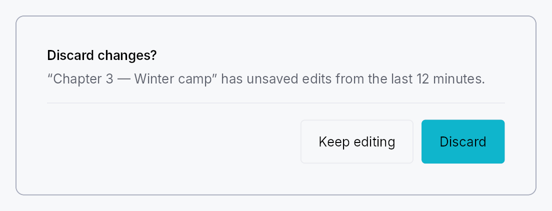
The picture above is the widget at TargetDensity::Compact, the mouse-and-keyboard ladder. Below is the same subject on the same canvas with only the ladder changed, so what moves is the density and nothing else — where the subject no longer fits, that is what the denser targets cost it at that size. See docs/density-and-targets.md.
Touch
API reference
📖 Full rustdoc API for this module
pub struct ModalContainer
Import: use teksilo::widgets::ModalContainer;
Rounded panel chrome that wraps a modal dialog's content widget.
All visual dimensions (padding, corner radius, min-width, shadow) are owned
by the active DialogStyle; per-instance
overrides are available via Self::padding and Self::min_width.
#![allow(unused)]
fn main() {
pub struct ModalContainer { /* fields */ }
}
Methods
pub fn new(content: impl Widget + 'static) -> Self
Wrap content inside a modal panel with default chrome.
pub fn padding(mut self, padding: f32) -> Self
Override the content padding (logical pixels) from the theme default.
pub fn min_width(mut self, min_width: f32) -> Self
Override the minimum panel width (logical pixels) from the theme default.
pub fn style(mut self, style: impl teksilo_core::styles::DialogStyle) -> Self
Per-call style override for the modal panel chrome. Replaces the
theme-wide default DialogStyle for just this container.
pub fn title(mut self, title: impl Into<LocalizedString>) -> Self
Accessible title for the dialog, announced as the dialog's name
when the content paints no title of its own. Content that does —
e.g. DialogContent::title — names the dialog by pointing at that
label and wins over this string, so the two should match. Content
that is itself a dialog names itself, and the container then
publishes no node for this title to name.
pub struct ModalScrim
Import: use teksilo::widgets::ModalScrim;
Full-viewport dimming scrim painted behind a ModalContainer.
Mounted by the modal-presentation pipeline (teksilo-app) as a separate
OverlayPlacement::FullViewport overlay pushed BEFORE the centered
modal overlay so it z-orders below the panel. The chrome itself is
delegated to the active DialogStyle::make_scrim; clicking the
scrim dismisses the linked modal when the modal's
ModalCloseBehavior permits click-outside dismissal.
The dismissal cascade is wired via
OverlayManager::set_parent_overlay AFTER both overlays are
pushed — the scrim's parent_overlay is set to the modal's id, so
any dismiss of the modal cascades through dismiss_immediate and
also dismisses the scrim. The scrim's own dismiss behavior is
Manual — it never dismisses itself directly.
#![allow(unused)]
fn main() {
pub struct ModalScrim { /* fields */ }
}
Methods
pub fn new() -> Self
Build a new scrim; wire it with Self::dismiss_target and
Self::click_to_dismiss after construction.
pub fn style(mut self, style: impl teksilo_core::styles::DialogStyle) -> Self
Per-call style override for the scrim chrome. Replaces the
theme-wide default DialogStyle for just this scrim.
pub fn dismiss_target(mut self, target: Rc<Cell<Option<OverlayId>>>) -> Self
Handle to the modal-overlay id the scrim dismisses on click.
The framework fills this AFTER the modal is pushed (see the
in-tree modal pipeline in teksilo-app).
pub fn click_to_dismiss(mut self, enabled: bool) -> Self (default: false)
Enable click-to-dismiss on the scrim. Should mirror whether the
modal's ModalCloseBehavior permits click-outside dismissal.
pub struct DialogContent
Import: use teksilo::widgets::DialogContent;
Convenience body layout for a modal dialog: optional title, supporting text,
scrollable body slot, and a Divider-separated footer row.
#![allow(unused)]
fn main() {
pub struct DialogContent { /* fields */ }
}
Methods
pub fn new() -> Self
Create an empty dialog body with no sections set.
pub fn title(mut self, title: impl Into<LocalizedString>) -> Self (default: None)
Bold title shown at the top of the content area. Also propagated to
the enclosing ModalContainer via accessible_title_hint.
pub fn supporting_text(mut self, text: impl Into<LocalizedString>) -> Self (default: None)
Secondary description text shown below the title.
pub fn body(mut self, body: impl teksilo_core::IntoTeksiChild) -> Self
Main scrollable content slot (any widget).
pub fn footer(mut self, footer: impl teksilo_core::IntoTeksiChild) -> Self
Footer slot separated from the body by a Divider (typically action
buttons like "OK" / "Cancel").
pub struct Dialog
Import: use teksilo::widgets::Dialog;
A trigger button that presents a modal dialog when activated.
Renders as a Button by default; call .trigger(w) to replace it with any
widget. The content is lazily constructed by a factory closure each time the
dialog opens — no persistent widget subtree is kept while the dialog is closed.
#![allow(unused)]
fn main() {
pub struct Dialog { /* fields */ }
}
Methods
pub fn new(label: impl Into<LocalizedString>) -> Self
Build a dialog trigger with label as the button text and accessible name.
pub fn content<W, F>(mut self, factory: F) -> Self where W: Widget + 'static, F: Fn() -> W + 'static,
Factory closure that builds the dialog's content each time it opens. Required — the dialog panics at build time if no factory is set.
pub fn variant(mut self, variant: ButtonVariant) -> Self
Visual style of the default trigger button. Has no effect when
.trigger(…) replaces the button with a custom widget.
pub fn enabled(mut self, enabled: impl Into<Prop<bool>>) -> Self
Enable or disable the trigger button, statically or reactively
(default true).
pub fn presentation(mut self, presentation: ModalPresentation) -> Self
Override the modal presentation mode (default ModalPresentation::Auto).
pub fn close_behavior(mut self, close_behavior: ModalCloseBehavior) -> Self
Override how the dialog may be closed (default EscapeOrClickOutside).
pub fn trigger(mut self, trigger: impl teksilo_core::IntoTeksiChild) -> Self
Replace the default Button trigger with a custom widget. The widget
receives the same tap / key / AT-action handlers as the button would.