DockingLayout
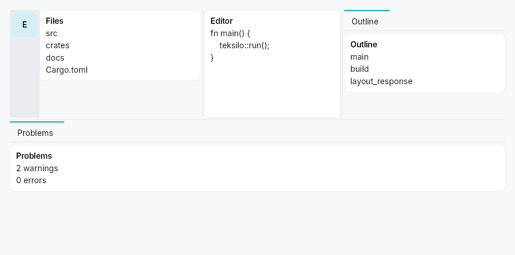
DockingLayout — a VS Code-style dockable layout: a fixed centre slot
(the app's main content) surrounded by four collapsible, splittable,
draggable side regions (leading / trailing / top / bottom), backed by a
cloneable, serializable DockingModel.
Public types
| Kind | Name |
|---|---|
struct | DockingLayout — The docking layout widget |
type | DockRailSlot — Factory for a rail slot widget (rebuilt on each rail rebuild) |
struct | DockActionId — Stable identity for a DockAction |
enum | DockActionPlacement — Where a DockAction sits along the rail's column |
struct | DockAction — A dockless command button in the activity rail: it looks and behaves like an activity item, but opens no panel — activating it just runs a closure |
struct | DockRail — App-facing configuration for a side's activity rail (Rail presentation) |
enum | DockSide — One of the four dockable sides |
enum | DockCorner — One of the four corners of the container |
struct | CornerOwners — Which side owns each corner |
struct | DockWidgetId — Process-unique identity for a registered dock widget (the atomic unit) |
struct | DockTabId — Process-unique identity for a dock tab (a tab of a side's TabWidget) |
enum | TabPresentation — How a side surfaces its tabs: an in-side strip (the TabWidget's own bar) or an always-visible activity rail outboard of the collapsible content |
enum | DockOpenMode — Placement mode for a programmatically-opened dock |
struct | DockOpenLocation — Target for DockingModel::open_dock / DockingModel::move_dock |
enum | DockRailItemSize — Activity-bar item size for a side's rail (context-menu "Activity bar size") |
enum | DockTabDisplay — How a side's dock tabs render (context-menu "Tab size") |
struct | DockPolicy — App-declared policy that locks down end-user layout edits on a DockingLayout |
struct | DockingModel — The shared docking-layout model |
struct | DockWidget — App-facing declaration of a dock widget: identity, chrome metadata, and a lazy content factory |
struct | DockLayoutState — The full serializable snapshot of a DockingModel |
Public functions
DockingLayout
| Returns | Function |
|---|---|
| Constructors | |
Self | new(model: DockingModel) |
| Builder methods | |
Self | rail(rail: DockRail) |
Self | rails(rails: impl IntoIterator<Item = DockRail>) |
Self | center(widget: impl teksilo_core::IntoTeksiChild) |
Self | policy(policy: DockPolicy) |
Self | disable_side(side: DockSide) |
Self | dock(dock: DockWidget) |
Self | docks(docks: impl IntoIterator<Item = DockWidget>) |
DockActionId
| Returns | Function |
|---|---|
| Constructors | |
Self | named(name: &str) |
Self | from_raw(v: u64) |
| Methods | |
u64 | raw() |
DockAction
| Returns | Function |
|---|---|
| Constructors | |
Self | new(id: DockActionId, label: impl Into<LocalizedString>, icon: impl Fn() -> IconWidget + 'static, on_activate: impl Fn(&mut EventContext) + 'static) |
| Builder methods | |
Self | placement(placement: DockActionPlacement) |
Self | tooltip(tooltip: impl Into<LocalizedString>) |
Self | enabled(enabled: impl Into<Prop<bool>>) |
Self | toggled(state: Signal<bool>) |
| Methods | |
DockActionId | id() |
DockRail
DockSide
| Returns | Function |
|---|---|
| Methods | |
bool | is_horizontal_axis() |
| Constants and types | |
[DockSide | ALL |
DockCorner
| Returns | Function |
|---|---|
| Methods | |
(DockSide, DockSide) | adjacent_sides() |
| Constants and types | |
[DockCorner | ALL |
CornerOwners
| Returns | Function |
|---|---|
| Methods | |
DockSide | owner(corner: DockCorner) |
set(corner: DockCorner, owner: DockSide) |
DockWidgetId
| Returns | Function |
|---|---|
| Constructors | |
Self | fresh() |
Self | from_raw(v: u64) |
| Methods | |
u64 | raw() |
DockTabId
| Returns | Function |
|---|---|
| Constructors | |
Self | fresh() |
Self | from_raw(v: u64) |
| Methods | |
u64 | raw() |
DockOpenLocation
| Returns | Function |
|---|---|
| Constructors | |
Self | side(side: DockSide) |
| Builder methods | |
Self | stack() |
Self | new_tab() |
DockRailItemSize
| Returns | Function |
|---|---|
| Methods | |
bool | shows_label() |
DockTabDisplay
| Returns | Function |
|---|---|
| Methods | |
bool | shows_icon() |
bool | shows_text() |
DockPolicy
| Returns | Function |
|---|---|
| Constructors | |
Self | locked() |
DockingModel
DockWidget
Detailed description
The structure is four levels deep:
DockingLayout
└── Centre + 4 Sides
    └── Side = [optional DockActivityBar rail] + collapsible content region
        └── content region holds ONE TabWidget (strip optional / replaced
            by the rail)
            └── Tab → DockArrangement (a Splitter of panes, each a single
                DockWidget or a ToolBox of DockWidgets)
                └── DockWidget — the atomic dockable unit
Density
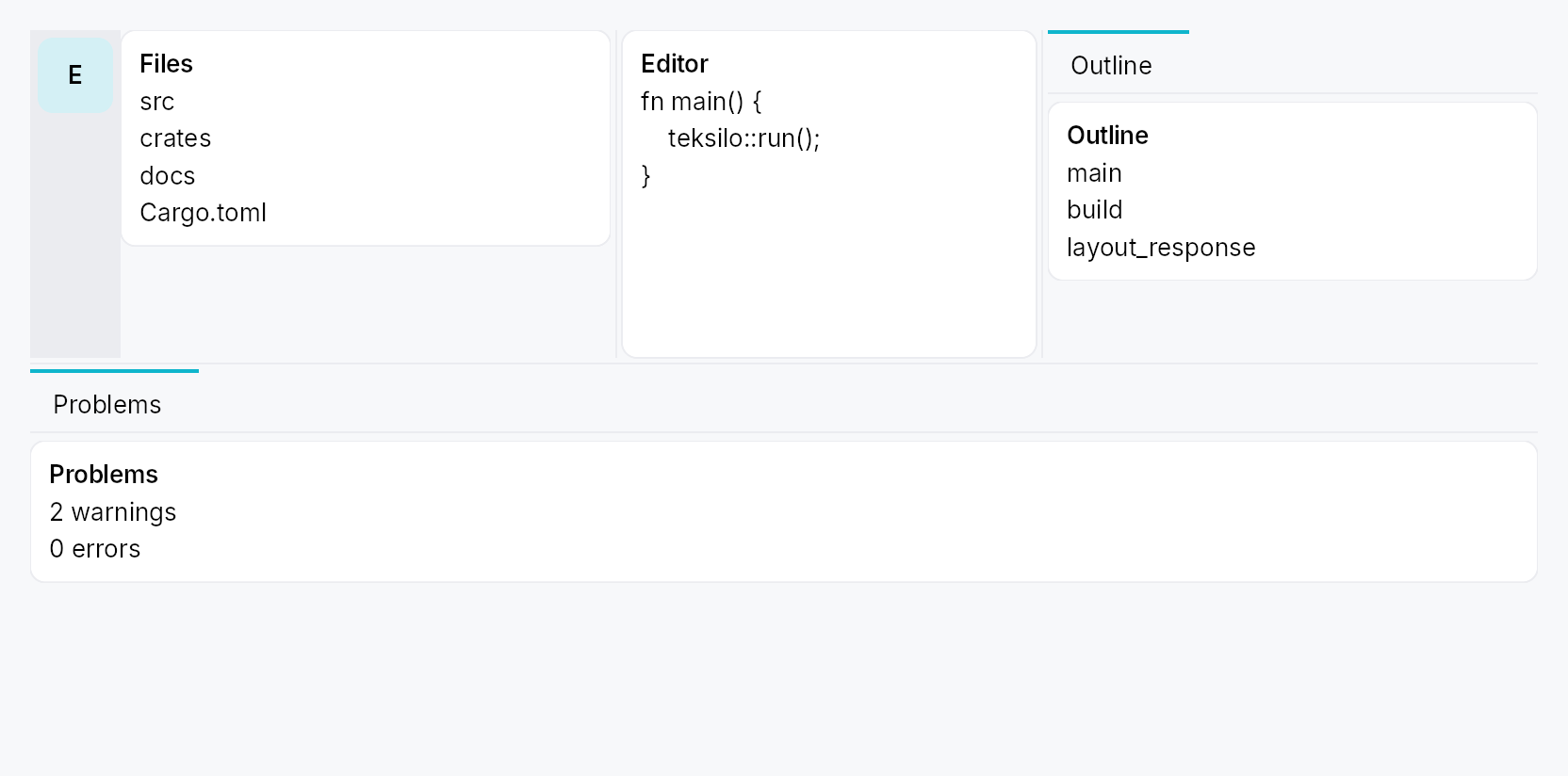
The picture above is the widget at TargetDensity::Compact, the mouse-and-keyboard ladder. Below is the same subject on the same canvas with only the ladder changed, so what moves is the density and nothing else — where the subject no longer fits, that is what the denser targets cost it at that size. See docs/density-and-targets.md.
Touch
API reference
📖 Full rustdoc API for this module
pub struct DockingLayout
Import: use teksilo::widgets::DockingLayout;
The docking layout widget. See the module docs.
let model = DockingModel::new();
// …declare panels + an initial layout on `model`…
DockingLayout::new(model.clone())
    .center(editor)
    .dock(DockWidget::new(EXPLORER, lit!("Explorer"), |_| Explorer::new()))
#![allow(unused)]
fn main() {
pub struct DockingLayout { /* fields */ }
}
Methods
pub fn new(model: DockingModel) -> Self
Create a docking layout over a model.
pub fn rail(mut self, rail: DockRail) -> Self
Configure a side's activity rail (item size, top/bottom slots, overflow
trigger). The side still needs DockingModel::set_side_rail to put it
in Rail presentation; this only styles the rail. See DockRail.
pub fn rails(self, rails: impl IntoIterator<Item = DockRail>) -> Self
Configure several sides' activity rails from an iterator.
The loop form of rail. Each rail carries its own side, so
a later entry for a side already configured replaces it.
pub fn center(mut self, widget: impl teksilo_core::IntoTeksiChild) -> Self
Set the always-present centre content (the app's main area).
pub fn policy(self, policy: DockPolicy) -> Self
Lock down end-user layout edits (sugar for DockingModel::set_policy).
See DockPolicy.
pub fn disable_side(self, side: DockSide) -> Self
Disable a side (sugar for DockingModel::set_side_enabled``(side, false)):
it renders nothing, reserves no space, and rejects docks.
pub fn dock(self, dock: DockWidget) -> Self
Declare a dock widget (its content factory + chrome metadata). The
dock is registered immediately, so the app may set the initial layout
on the model (open_dock / import_state) before mounting.
pub fn docks(self, docks: impl IntoIterator<Item = DockWidget>) -> Self
Declare several dock widgets from an iterator, in order.
The loop form of dock, and the usual one once an app has
more than a couple of panels to register.
pub type DockRailSlot
Import: none — DockRailSlot is public in a private module of teksilo-widgets and nothing re-exports it.
Factory for a rail slot widget (rebuilt on each rail rebuild).
A slot that wants to match the rail's current item size binds
DockingModel::rail_size_mode_signal
— the rail rebuilds its slots whenever the size mode changes, so reading the
signal in the factory is enough to keep the slot in step.
#![allow(unused)]
fn main() {
pub type DockRailSlot = Rc<dyn Fn() -> Box<dyn Widget>>;
}
pub struct DockActionId
Import: none — DockActionId is public in a private module of teksilo-widgets and nothing re-exports it.
Stable identity for a DockAction.
Not used for persistence — a rail action carries no user-mutable state,
so nothing about it is serialized (see DockLayoutState's
"app-config is reconstructed each run" rule). It exists so the accessibility
tree and the automation bridge can address a given action stably across
runs; a fresh-per-run id would make every script that clicks a rail action
flaky.
#![allow(unused)]
fn main() {
pub struct DockActionId(u64);
}
Methods
pub const fn named(name: &str) -> Self
Derive a stable id from a caller-chosen name — identical across runs,
processes and machines. Prefer this over from_raw:
it removes the hand-picked-u64-literal collision hazard entirely.
const so ids can be declared as module-scope const items, the same
way apps already declare their DockWidgetIds.
# use teksilo_widgets::docking::DockActionId;
const SETTINGS: DockActionId = DockActionId::named("app.settings");
assert_eq!(SETTINGS, DockActionId::named("app.settings"));
assert_ne!(SETTINGS, DockActionId::named("app.about"));
pub const fn from_raw(v: u64) -> Self
Wrap a raw value. Prefer named.
pub const fn raw(self) -> u64
pub enum DockActionPlacement
Import: none — DockActionPlacement is public in a private module of teksilo-widgets and nothing re-exports it.
Where a DockAction sits along the rail's column.
#![allow(unused)]
fn main() {
pub enum DockActionPlacement { /* variants */ }
}
Variants
Start— Before the first activity item, in the flowing cluster.End— After the last activity item and after the overflow trigger, still in the flowing cluster — the group grows downward with the tabs.Pinned— Past the flexible spacer, anchored to the rail's far edge regardless of how many activities exist — VS Code's Accounts / Manage-gear cluster. Where a Settings gear belongs.
pub struct DockAction
Import: none — DockAction is public in a private module of teksilo-widgets and nothing re-exports it.
A dockless command button in the activity rail: it looks and behaves like an activity item, but opens no panel — activating it just runs a closure.
Declared on DockRail::action rather than on
DockingModel because nothing about an action is
user-mutable, which is state.rs's own test for what is not persisted —
so (like the rail's slots) it is per-view app config, reconstructed each
run. A rail action is deliberately more
restricted than a real activity: it is never draggable, never hidable, has
no "Move to" menu, and is never overflow-parked — it is reserved space. That
matches every surveyed precedent (VS Code's fixed Accounts / Manage cluster;
IntelliJ's stripe, whose only non-tool-window button is IDE-owned chrome).
DockRail::new(DockSide::Leading).action(
    DockAction::new(
        DockActionId::named("app.settings"),
        lit!("Settings"),
        || IconWidget::gear(),
        |ctx| ctx.send_intent(Intent::new("app.settings")),
    )
    .placement(DockActionPlacement::Pinned),
)
#![allow(unused)]
fn main() {
pub struct DockAction { /* fields */ }
}
Methods
pub fn new( id: DockActionId, label: impl Into<LocalizedString>, icon: impl Fn() -> IconWidget + 'static, on_activate: impl Fn(&mut EventContext) + 'static, ) -> Self
Declare a rail action. Defaults to DockActionPlacement::End,
enabled, untoggled, with the label as its hover tooltip.
pub fn placement(mut self, placement: DockActionPlacement) -> Self (default: DockActionPlacement::End)
Where the action sits along the rail. See DockActionPlacement.
pub fn tooltip(mut self, tooltip: impl Into<LocalizedString>) -> Self
Override the hover tooltip (defaults to the label). Ignored in
Icon + Label rail mode, which paints the label inline instead.
pub fn enabled(mut self, enabled: impl Into<Prop<bool>>) -> Self (default: true)
Enable / disable the action. Accepts a bool or a Signal<bool>.
pub fn toggled(mut self, state: Signal<bool>) -> Self (default: None)
Paint the selected surface while state is true — the same
highlight an open activity gets. Reflect-only: activating the
action does not write state; on_activate must.
pub fn id(&self) -> DockActionId
The action's id.
pub struct DockRail
Import: none — DockRail is public in a private module of teksilo-widgets and nothing re-exports it.
App-facing configuration for a side's activity rail (Rail presentation).
Pass to DockingLayout::rail. All knobs are
optional; an unconfigured rail uses IconButtonSize::Large items, no
slots, and no overflow affordance (items just clip if the side is too
short).
#![allow(unused)]
fn main() {
pub struct DockRail { /* fields */ }
}
Methods
pub fn new(side: DockSide) -> Self
Configure the rail for side.
pub fn size(mut self, size: IconButtonSize) -> Self
Pick one size for every rail item (IconButtonSize::Compact …
Hero). Default IconButtonSize::Large.
pub fn background(mut self, color: impl Into<ColorProp>) -> Self
Override the rail strip's background. Accepts Color, a
SurfaceRole, or a Signal<Color>.
Default (unset) is SurfaceRole::Sunken.
pub fn divider(mut self) -> Self
Draw a 1 dp divider line between the rail and the side's content, on
the rail's content-facing edge (RTL-aware). Uses BorderRole::Divider.
Off by default. See divider_color for a custom
colour.
pub fn divider_color(mut self, color: impl Into<ColorProp>) -> Self (default: None)
Like divider, but with an explicit colour. Accepts
Color, a BorderRole, or a
Signal<Color>.
pub fn top_slot<W: Widget + 'static>(mut self, f: impl Fn() -> W + 'static) -> Self
Widget pinned above the items (e.g. a logo / hamburger). To track the
rail's item size, bind
DockingModel::rail_size_mode_signal
inside the factory.
pub fn bottom_slot<W: Widget + 'static>(mut self, f: impl Fn() -> W + 'static) -> Self
Widget pinned at the bottom of the rail (e.g. settings / account). To
track the rail's item size, bind
DockingModel::rail_size_mode_signal
inside the factory.
pub fn leading_slot<W: Widget + 'static>(mut self, f: impl Fn() -> W + 'static) -> Self
Widget pinned at the start of this side's Strip-presentation tab
bar (via TabWidget::bar_leading_slot).
The Rail-presentation counterpart is top_slot.
Weaker contract than top_slot. top_slot/bottom_slot sit on the
DockActivityBar, which is built whenever the side has a rail — they
survive the side being collapsed. leading_slot/trailing_slot sit
inside the side's TabWidget, which lives within the collapsing
SideClipPane, so they disappear with the content when the side is
hidden. If your content must survive a hidden side, use Rail
presentation, or host it outside the docking system.
pub fn trailing_slot<W: Widget + 'static>(mut self, f: impl Fn() -> W + 'static) -> Self
Widget pinned at the end of this side's Strip-presentation tab
bar. Composed before the side's own "hidden activities" hamburger when
both are present, so neither is dropped. See
leading_slot for the visibility contract.
pub fn action(mut self, action: DockAction) -> Self
Append a dockless command button to this side's rail. Declaration
order is render order within a placement. See DockAction.
Rail presentation only. A side in
TabPresentation::Strip renders no
actions at all — and set_side_rail
can flip presentation at runtime, so a side that flips Rail → Strip drops
its whole action cluster. If that is reachable in your app, mirror the
cluster with trailing_slot, which the same
DockRail can carry alongside its actions.
pub fn actions(self, actions: impl IntoIterator<Item = DockAction>) -> Self
Append several dockless command buttons from an iterator, in order.
The loop form of action, for a rail whose command
cluster comes from data. The same duplicate-id debug_assert! applies to
every action in the iterator.
pub fn overflow_icon(mut self, f: impl Fn() -> IconWidget + 'static) -> Self
Choose the glyph for the overflow trigger — the item shown (in place of the surplus items) when they don't all fit. Tapping it opens a popover list of the overflowed entries.
pub enum DockSide
Import: none — DockSide is public in a private module of teksilo-widgets and nothing re-exports it.
One of the four dockable sides. Leading/Trailing are
writing-direction-relative (mirrored under RTL by the caller); Top/
Bottom never mirror.
#![allow(unused)]
fn main() {
pub enum DockSide { /* variants */ }
}
Variants
Leading— Left in LTR, right in RTL.Trailing— Right in LTR, left in RTL.TopBottom
Methods
pub const ALL: [DockSide;
All four sides, in a stable order.
pub fn is_horizontal_axis(self) -> bool
True for the vertical columns (leading / trailing), whose long axis is vertical — they stack their dock content top-to-bottom.
pub enum DockCorner
Import: none — DockCorner is public in a private module of teksilo-widgets and nothing re-exports it.
One of the four corners of the container. Each corner is owned by exactly
one of its two adjacent sides (Qt setCorner).
#![allow(unused)]
fn main() {
pub enum DockCorner { /* variants */ }
}
Variants
TopLeadingTopTrailingBottomLeadingBottomTrailing
Methods
pub const ALL: [DockCorner;
All four corners.
pub fn adjacent_sides(self) -> (DockSide, DockSide)
The two sides adjacent to this corner: (horizontal side, vertical side) — i.e. (Leading|Trailing, Top|Bottom).
pub struct CornerOwners
Import: none — CornerOwners is public in a private module of teksilo-widgets and nothing re-exports it.
Which side owns each corner. Default = the classic IDE shell where the top and bottom bars span the full width and the leading / trailing columns occupy only the middle band.
#![allow(unused)]
fn main() {
pub struct CornerOwners { /* fields */ }
}
Fields
top_leading:DockSidetop_trailing:DockSidebottom_leading:DockSidebottom_trailing:DockSide
Methods
pub fn owner(&self, corner: DockCorner) -> DockSide
pub fn set(&mut self, corner: DockCorner, owner: DockSide)
pub struct DockWidgetId
Import: none — DockWidgetId is public in a private module of teksilo-widgets and nothing re-exports it.
Process-unique identity for a registered dock widget (the atomic unit).
#![allow(unused)]
fn main() {
pub struct DockWidgetId(pub u64);
}
Methods
pub fn fresh() -> Self
Mint a fresh, process-unique id.
pub fn from_raw(v: u64) -> Self
pub fn raw(self) -> u64
pub struct DockTabId
Import: none — DockTabId is public in a private module of teksilo-widgets and nothing re-exports it.
Process-unique identity for a dock tab (a tab of a side's TabWidget).
#![allow(unused)]
fn main() {
pub struct DockTabId(pub u64);
}
Methods
pub fn fresh() -> Self
pub fn from_raw(v: u64) -> Self
pub fn raw(self) -> u64
pub enum TabPresentation
Import: none — TabPresentation is public in a private module of teksilo-widgets and nothing re-exports it.
How a side surfaces its tabs: an in-side strip (the TabWidget's own bar) or an always-visible activity rail outboard of the collapsible content.
#![allow(unused)]
fn main() {
pub enum TabPresentation { /* variants */ }
}
Variants
Strip— In-side tab strip (always shown, even for a single tab).Rail— External always-visible activity rail; the in-side strip is suppressed.
pub enum DockOpenMode
Import: none — DockOpenMode is public in a private module of teksilo-widgets and nothing re-exports it.
Placement mode for a programmatically-opened dock.
#![allow(unused)]
fn main() {
pub enum DockOpenMode { /* variants */ }
}
Variants
Stack— Stack into the side's currently-selected tab (as an extra Splitter pane).NewTab— Create a brand-new tab holding just this dock.
pub struct DockOpenLocation
Import: none — DockOpenLocation is public in a private module of teksilo-widgets and nothing re-exports it.
Target for DockingModel::open_dock / DockingModel::move_dock.
#![allow(unused)]
fn main() {
pub struct DockOpenLocation { /* fields */ }
}
Fields
side:DockSidemode:DockOpenMode
Methods
pub fn side(side: DockSide) -> Self
Default placement on a side (stack into the active tab).
pub fn stack(mut self) -> Self
Stack into the side's active tab.
pub fn new_tab(mut self) -> Self
Open as a fresh tab.
pub enum DockRailItemSize
Import: none — DockRailItemSize is public in a private module of teksilo-widgets and nothing re-exports it.
Activity-bar item size for a side's rail (context-menu "Activity bar size").
#![allow(unused)]
fn main() {
pub enum DockRailItemSize { /* variants */ }
}
Variants
Default= 0— The rail's configured size (DockRail::size); icon only, title on hover.Compact= 1— Compact items — the standardIconButtonSize::Defaultregardless of the rail's configured (larger) size; icon only, title on hover. Not the extra-smallCompactbutton: a rail glyph is the activity's identifier and must stay legible.Labeled= 2— Icon at the configured size plus a 90°-rotated title beneath it (the vertical-accordion look). The title shows inline, so no hover tooltip.
Methods
pub fn shows_label(self) -> bool
Whether this mode paints the title inline (rotated) rather than only as a hover tooltip.
pub enum DockTabDisplay
Import: none — DockTabDisplay is public in a private module of teksilo-widgets and nothing re-exports it.
How a side's dock tabs render (context-menu "Tab size").
#![allow(unused)]
fn main() {
pub enum DockTabDisplay { /* variants */ }
}
Variants
Text= 0— Title text only (the default).Icon= 1— The dock's icon only (falls back to the title initial if it has none).IconText= 2— Icon + title.
Methods
pub fn shows_icon(self) -> bool
Whether this mode shows the icon glyph.
pub fn shows_text(self) -> bool
Whether this mode shows the title text.
pub struct DockPolicy
Import: none — DockPolicy is public in a private module of teksilo-widgets and nothing re-exports it.
App-declared policy that locks down end-user layout edits on a
DockingLayout. Each flag removes a user
affordance only — the programmatic DockingModel API (a "Toggle panel"
button, open_dock, set_tab_hidden, …) keeps working regardless, so the
app can still drive the layout it has locked for the user.
App-declared each run (like rail_thickness / min_size / DockRail)
— not persisted in DockLayoutState. Set it with
DockingModel::set_policy. Default = everything allowed; DockPolicy::locked
= everything forbidden.
#![allow(unused)]
fn main() {
pub struct DockPolicy { /* fields */ }
}
Fields
allow_activity_drag:bool— The user may drag activities (rail items / tab headers) to reorder them or move them between sides, and relocate them via the context-menu "Move to" submenu. Defaulttrue.allow_dock_drag:bool— The user may drag a single dock out of a split pane (its accordion header is a drag handle). Defaulttrue.allow_side_collapse:bool— The user may hide / collapse a whole side — via the resize handle (drag-past-min snap, double-click, keyboard) or by clicking the active activity-rail item. Defaulttrue.allow_activity_hide:bool— The user may hide an activity from the context menu. Defaulttrue.
Methods
pub fn locked() -> Self
A fully locked layout — no user drag, no collapse, no activity hide. The app's programmatic API still drives it.
pub struct DockingModel
Import: none — DockingModel is public in a private module of teksilo-widgets and nothing re-exports it.
The shared docking-layout model. Clone = share-by-handle.
#![allow(unused)]
fn main() {
pub struct DockingModel(Rc<RefCell<Inner>>);
}
Methods
pub fn new() -> Self
A fresh model: four empty, hidden sides and the default corner owners.
pub fn version(&self) -> Signal<u64>
Structural version — bump on tab / pane / section / side add-remove.
The widget binds this at BindingLevel::Rebuild.
pub fn geometry_version(&self) -> Signal<u64>
Geometry version — bump on side size / visibility / corner change.
The widget binds this at BindingLevel::Relayout.
pub fn consume_animate_flag(&self) -> bool
Read-and-reset the "animate the next side show/hide" latch.
pub fn is_registered(&self, id: DockWidgetId) -> bool
Whether a dock id is known (its content factory + meta are registered).
pub fn set_side_rail(&self, side: DockSide, thickness: f32)
Set a side's activity-rail thickness and presentation. A non-zero rail
switches the side to TabPresentation::Rail; the in-side strip is
then suppressed.
pub fn set_side_size(&self, side: DockSide, size: f32)
Set a side's stored content size (px). Relayout only (no rebuild).
pub fn set_side_min_size(&self, side: DockSide, min: f32)
Set a side's minimum content size (px).
pub fn set_policy(&self, policy: DockPolicy)
Set the app's DockPolicy — locks down end-user layout edits (the
programmatic API keeps working). Structural → rebuild.
pub fn policy(&self) -> DockPolicy
The app's current DockPolicy (cheap Copy; read by the widgets in
build() to gate their user affordances).
pub fn set_side_enabled(&self, side: DockSide, enabled: bool)
Enable / disable a whole side. A disabled side renders nothing, reserves no space, is not a drop target, and rejects placement / moves to it; its docks stay in the model and reappear when re-enabled. Structural → rebuild.
pub fn is_side_enabled(&self, side: DockSide) -> bool
Whether a side is enabled (default true).
pub fn set_side_visible(&self, side: DockSide, visible: bool)
Show / hide a whole side (animated).
pub fn set_side_visible_immediate(&self, side: DockSide, visible: bool)
Show / hide a side immediately (no animation — drag-driven).
pub fn toggle_side_visible(&self, side: DockSide)
Toggle a side's visibility (animated).
pub fn select_tab(&self, side: DockSide, tab_idx: usize)
Select the active tab of a side. Repaint only (the Switcher swaps via
its bound selected_tab signal — no rebuild, no relayout).
pub fn select_tab_by_id(&self, side: DockSide, tab_id: DockTabId)
Select a side's active tab by id (position-independent — used by the rail / strip, whose visible order may skip hidden tabs).
pub fn set_tab_hidden(&self, tab_id: DockTabId, hidden: bool)
Hide / show one activity (tab). A hidden activity stays registered (so it remains listable + restorable) but is dropped from the rail and tab strip. Hiding the selected tab moves the selection to the nearest still- visible tab. Structural → rebuild.
pub fn is_tab_hidden(&self, tab_id: DockTabId) -> bool
Whether an activity (tab) is currently hidden.
pub fn side_rail_size(&self, side: DockSide) -> DockRailItemSize
Current activity-bar item size for a side.
pub fn set_side_rail_size(&self, side: DockSide, size: DockRailItemSize)
Set a side's activity-bar item size (reactive → the rail rebuilds).
pub fn rail_size_mode_signal(&self, side: DockSide) -> Signal<DockRailItemSize>
Reactive activity-bar size mode for a side — fires whenever the user
switches Default / Compact / Icon + Label (via the context menu or
set_side_rail_size). Bind it to adapt any
external widget — a rail's slotted controls, an app toolbar — to the
rail's current item size. (The rail rebuilds its slots on every change,
so a slot factory that reads this signal stays in step.)
pub fn side_tab_display(&self, side: DockSide) -> DockTabDisplay
Current dock-tab display mode for a side.
pub fn set_side_tab_display(&self, side: DockSide, display: DockTabDisplay)
Set a side's dock-tab display mode (reactive → the strip rebuilds).
pub fn set_corner(&self, corner: DockCorner, owner: DockSide)
Set the owner of a corner (must be one of its two adjacent sides).
pub fn open_dock(&self, id: DockWidgetId, loc: DockOpenLocation)
Open (or move) a dock onto a side. Already-open docks are relocated (never duplicated).
pub fn promote_to_tab(&self, id: DockWidgetId, side: DockSide, at_tab: usize)
Drag a dock out into its own new tab on side, inserted at at_tab.
pub fn split_into_tab( &self, id: DockWidgetId, side: DockSide, tab_idx: usize, pane_idx: usize, before: bool, )
Drop a dock into an existing tab's Splitter as a new Single pane,
before (before = true) or after the pane at pane_idx.
pub fn stack_into_tab(&self, id: DockWidgetId, side: DockSide, tab_idx: usize)
Drop a dock into a tab as a new Splitter pane appended after its existing panes (the "centre" drop — join this group without choosing a split direction). Each pane is its own Accordion.
pub fn move_dock(&self, id: DockWidgetId, loc: DockOpenLocation)
Move a dock to another location (close + open in one notify).
pub fn close_tab(&self, tab_id: DockTabId)
Close a whole tab (and every dock it holds).
pub fn move_tab(&self, tab_id: DockTabId, target_side: DockSide, at_tab: usize)
Move a whole tab (its arrangement + every dock + selection) to another
side, re-deriving the Splitter orientation. Inserted at at_tab.
pub fn close_dock(&self, id: DockWidgetId)
Close (remove) a dock from the layout.
pub fn toggle_dock(&self, id: DockWidgetId)
Toggle a dock: close it if open, else open it on its default location.
pub fn reveal_dock(&self, id: DockWidgetId)
Reveal a dock: ensure it is open, show + select its side / tab.
pub fn is_dock_open(&self, id: DockWidgetId) -> bool
pub fn dock_location(&self, id: DockWidgetId) -> Option<DockLoc>
pub fn dock_open_signal(&self, id: DockWidgetId) -> Signal<bool>
A reactive true-while-open signal for an external rail / toolbar.
pub fn is_side_visible(&self, side: DockSide) -> bool
pub fn side_visible_signal(&self, side: DockSide) -> Signal<bool>
pub fn side_selected_tab_signal(&self, side: DockSide) -> Signal<usize>
pub fn side_selected_tab(&self, side: DockSide) -> usize
pub fn side_presentation(&self, side: DockSide) -> TabPresentation
pub fn side_size(&self, side: DockSide) -> f32
pub fn side_min_size(&self, side: DockSide) -> f32
pub fn side_rail_thickness(&self, side: DockSide) -> f32
pub fn side_has_rail(&self, side: DockSide) -> bool
pub fn corner_owner(&self, corner: DockCorner) -> DockSide
pub fn tab_count(&self, side: DockSide) -> usize
pub fn tab_id_at(&self, side: DockSide, idx: usize) -> Option<DockTabId>
The id of the tab at idx in a side's full tab list. The live inverse
of select_tab_by_id — the strip's
index → id selection sync uses it so both directions resolve against the
current order and agree across a reorder (a build-time snapshot would
disagree and feed back unboundedly).
pub fn set_tab_title(&self, tab_id: DockTabId, title: Option<LocalizedString>)
Give an activity (tab) a stable, explicit name, independent of which dock
occupies pane 0 (e.g. a grouped "Source Control" activity holding a file
tree and a git pane). Pass None to clear it (the label then derives from
the primary dock again). App-config — reconstructed each run, like dock
titles; not persisted. Structural → rebuild.
pub fn tab_title(&self, tab_id: DockTabId) -> Option<LocalizedString>
The explicit title set on an activity (None when it derives from its
primary dock).
pub fn activity_of(&self, dock_id: DockWidgetId) -> Option<DockTabId>
The activity (tab) currently holding a dock — apps hold stable
DockWidgetIds, so this is the bridge to address the enclosing tab.
pub fn set_dock_activity_title( &self, dock_id: DockWidgetId, title: impl Into<LocalizedString>, )
Sugar: name the activity that currently holds dock_id. The natural way
to title a grouped activity from app code that holds the dock id.
pub fn enabled_move_targets(&self, from: DockSide) -> Vec<DockSide>
The enabled sides a tab / dock on from can be relocated to (every side
except from, keeping only is_side_enabled).
The "Move to" menus iterate this so a disabled side is never offered as a
silently-rejected target.
pub fn export_state(&self) -> super::state::DockLayoutState
Serialize the user-controllable layout state (sizes / visibility / selections / arrangement structure / corners). App-config (rail thickness, mins, content factories) is reconstructed each run.
pub fn import_state(&self, state: &super::state::DockLayoutState)
Restore a previously-exported state. Unknown dock ids are dropped,
emptied panes / tabs pruned, selections clamped. Bumps version.
pub struct DockWidget
Import: none — DockWidget is public in a private module of teksilo-widgets and nothing re-exports it.
App-facing declaration of a dock widget: identity, chrome metadata, and a
lazy content factory. Collect these on DockingLayout::dock.
#![allow(unused)]
fn main() {
pub struct DockWidget { /* fields */ }
}
Methods
pub fn new<W: Widget + 'static>( id: DockWidgetId, title: impl Into<LocalizedString>, factory: impl Fn(DockWidgetId) -> W + 'static, ) -> Self
Declare a dock widget. factory builds its content the first time the
dock appears (and after it is closed and re-opened).
pub fn icon(mut self, f: impl Fn() -> IconWidget + 'static) -> Self
Set the dock's tab / rail icon.
pub fn header_actions( mut self, f: impl Fn(DockWidgetId) -> Vec<ToolbarItem> + 'static, ) -> Self
Attach a factory for the dock's inline header actions — a flat list
of ToolbarActions shown before the ⋮ options button, the VS Code
"view actions" pattern ("New File", "Collapse All", …). Built on demand
each time the dock is placed into a header. The framework hosts them in a
Toolbar, so the actions gain overflow (when the header is tight,
the lowest-priority actions collapse into a
⌄ menu) and the correct axis for free — a horizontal row on leading
/ trailing sides, a vertical column on the rotated top / bottom strip. The
actions appear in any header the dock has: the multi-pane Accordion
header always, and the sole-pane (bare) header when
show_header(true) is set.
Each item is a ToolbarItem — a collapsible
ToolbarAction via
ToolbarItem::action, or a pinned arbitrary widget (a SplitButton, a
search field, …) via ToolbarItem::custom.
DockWidget::new(id, lit!("Explorer"), build).header_actions(|_| vec![
    ToolbarItem::action(ToolbarAction::new(lit!("New File"), new_icon).on_activate(..)),
    ToolbarItem::custom(CreateSplitButton::new(..)),
])
pub fn show_header(mut self, show: bool) -> Self
Give a sole-pane (bare) dock its own header bar (title + actions +
⋮ options). Default false. The multi-pane Accordion header is always
present regardless; this only governs the bare case. Turn it on to get a
discoverable options button (and inline header_actions) on a dock that
is the only one on its side.
pub fn default_location(mut self, loc: DockOpenLocation) -> Self
The location used when the dock is opened via toggle / reveal
without an explicit target.
pub struct DockLayoutState
Import: none — DockLayoutState is public in a private module of teksilo-widgets and nothing re-exports it.
The full serializable snapshot of a DockingModel.
#![allow(unused)]
fn main() {
pub struct DockLayoutState { /* fields */ }
}
Fields
version:u32leading:DockSideStatetrailing:DockSideStatetop:DockSideStatebottom:DockSideStatecorners:CornerOwners