DropTarget
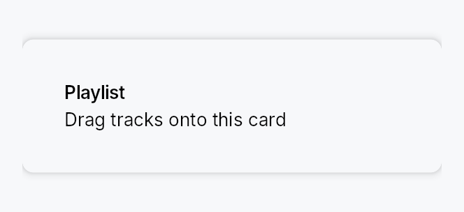
DropTarget — a transparent wrapping drop container.
Public types
| Kind | Name |
|---|---|
fn | band_depth — The depth of one edge band along the axis it is measured on: the caller's fraction of the extent, raised to floor when that fraction does not reach it |
fn | region_at_floored — region_at with band_depth's floor applied per axis |
fn | region_rect_floored — region_rect with band_depth's floor applied per axis — the paint side of region_at_floored, so the zone a user… |
struct | DropRegionSpec — Per-region configuration for a multi-zone DropTarget: an optional hint plus a reactive enabled flag |
struct | DropTarget — A transparent container that turns its child into a drop target |
Public functions
DropTarget
DropRegionSpec
| Returns | Function |
|---|---|
| Constructors | |
Self | new() |
| Builder methods | |
Self | hint(widget: impl teksilo_core::IntoTeksiChild) |
Self | enabled(enabled: impl Into<Prop<bool>>) |
Detailed description
Where DropZone is a standalone "drop files
here" placeholder with its own label / icon / Browse button, DropTarget is
a wrapping container: it turns any existing widget subtree into a drop
target without replacing its visual identity. The wrapped child fills the
bounds and is always visible; the widget adds a reactive highlight border +
tint while a drag hovers and, if a hint slot is set, fades in a centered
popup card ("Drop your image here").
It reacts to both internal drags (typed DragPayload) and external
(OS) drops (files / text / URIs), through the framework's normal drag
pipeline (on_drag_hover / on_drag_leave / on_drop).
// Wrap a panel; accept image files; show a hint while hovering.
DropTarget::new()
    .child(my_panel)
    .hint(TextWidget::new(lit!("Drop your image here")))
    .accept_external_extensions(["png", "jpg", "jpeg"])
    .on_drop(|payload, _pos, _ctx| { import(payload.files()); true });

// Typed internal drag — recovers the value even after an OS round-trip
// or across windows (the framework's typed re-entry).
DropTarget::new()
    .child(project_card)
    .on_drop_typed::<ProjectRef>(|project, _pos, ctx| {
        ctx.send_intent(AppIntent::Link(project));
        true
    });
Multi-zone drops
Beyond the single whole-bounds target, a DropTarget can expose up to five
independently enable-able DropRegions — Center / Top / Bottom /
Leading / Trailing — each with its own optional hint, and route the drop
by which zone the pointer released over. This is the VS Code-style
"drop on the centre to add, drop on an edge to split" affordance
(DockingLayout's pane split/stack zones are built on it). Declare regions with
DropTarget::region; the side zones share one DropTarget::zone_size_factor
(0.1..=1.0, the fraction of the axis each edge strip occupies — 0.2 is the
default fifth, 0.5 bisects) so you size them to the context. Route with
DropTarget::on_region_drop (or observe DropTarget::active_region_signal).
DropTarget::new()
    .child(editor_pane)
    .zone_size_factor(0.25)
    .region(DropRegion::Center,   |z| z.hint(TextWidget::new(lit!("Add as tab"))))
    .region(DropRegion::Leading,  |z| z.hint(TextWidget::new(lit!("Split left"))))
    .region(DropRegion::Trailing, |z| z.hint(TextWidget::new(lit!("Split right"))))
    .on_region_drop(|region, payload, _pos, ctx| { route(region, payload); true });
Declaring any region switches the target to exactly the declared regions;
declaring none keeps the Center-only whole-bounds default (.hint(w) is
sugar for .region(DropRegion::Center, |z| z.hint(w))). Leading / Trailing
map to left / right — this widget does not yet consult
LayoutContext::layout_direction, so RTL mirroring is a follow-up.
Each zone can be reactively enabled with z.enabled(signal) (default
true): a bound Signal<bool> disables the zone live — no rebuild — and its
strip then falls through to the next-priority enabled zone (or Center, or
rejects). A drop landing in a middle covered by no enabled zone is rejected;
on_region_drop therefore only ever receives an enabled region.
Styling
The per-zone highlight overlay + hint chrome is a Tier-3 DropTargetStyle;
the default RecipeDropTargetStyle
paints the active zone (centre → frame only, so the wrapped content shows
through; an edge strip → translucent fill + accent frame) and a full-bounds
error border on reject. Override per-call with DropTarget::style or
theme-wide via theme.style_slots.drop_target.
Accessibility
The wrapper is a Role::Group. Live is intentionally not set on the
group (that would announce every change to the wrapped child); instead the
recipe scopes Live::Polite to each hint card so a screen reader announces
the active zone's hint appearing. Each hint is gated by visible_when, so a
non-active zone's hint leaves the AT tree entirely.
Keyboard accessibility is the caller's responsibility
An OS drag cannot be initiated from the keyboard, and — unlike
DropZone, which ships a keyboard-operable
Browse… button as its WCAG 2.1.1 equivalent — DropTarget adds no
keyboard affordance of its own. That is by design: DropTarget wraps
existing content that is expected to already offer a keyboard path to the
same outcome (e.g. a card you can drop a project onto or open with a
context-menu "Link…" command). The drop is an enhancement, not the sole
path.
If you use DropTarget for an action that has no other affordance, you
must add a keyboard equivalent yourself (a button, menu item, or shortcut) —
otherwise the action is unreachable for keyboard-only users, and entirely
unavailable on any target with no external-DnD backend (all four desktop
backends are real — OLE on Windows, NSDraggingDestination on macOS,
wl_data_device on Wayland, XDND on X11). DropZone is the better choice
when the drop is the primary action.
Touch and pen
An edge zone's depth is zone_size_factor of the axis, floored per axis to
the density's target size: the fraction is the shape the caller asked for and
wins wherever it already conforms, and below that the floor takes over. Without
it a fifth of a small pane is a band no finger can land in, and the drop it
swallows goes to the neighbouring zone with no warning.
The floor is itself capped at a third of the extent, for the reason
partition_targets splits evenly
when its own floor cannot be met: on a target too small for
leading | centre | trailing at the floor, three equal bands keep every zone
reachable and visibly sub-floor, where an uncapped floor would let two opposing
bands meet and delete the centre.
One function answers both the hit test and the highlight
(band_depth), so the zone a user sees stays the zone that drops. A
custom DropTargetStyle that calls core's region_rect directly paints the
unfloored band; call region_rect_floored instead.
Density
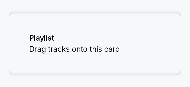
The picture above is the widget at TargetDensity::Compact, the mouse-and-keyboard ladder. Below is the same subject on the same canvas with only the ladder changed, so what moves is the density and nothing else — where the subject no longer fits, that is what the denser targets cost it at that size. See docs/density-and-targets.md.
Touch
API reference
📖 Full rustdoc API for this module
pub fn band_depth(...)
Import: use teksilo::widgets::drop_target::band_depth;
The depth of one edge band along the axis it is measured on: the caller's
fraction of the extent, raised to floor when that fraction does not reach
it.
A fraction alone cannot answer this. zone_size_factor is one number for
both axes, and it is the shape the caller wants — a fifth, a quarter, a
bisection — so on a large target it is right and must not be touched. On a
small enough one, any of those fractions is a band no finger can land in, and
the drop it swallows goes to the neighbouring zone with no warning. So the
fraction wins wherever it already conforms and the floor
takes over below that, which is the same shape as
dp — a floor that only ever raises,
leaving every target that was already big enough exactly as it was.
The floor itself is capped at a third of the extent, for the reason
partition_targets splits
evenly when its own floor cannot be met: on a target too small for
leading | centre | trailing at the floor, three equal bands keep every
zone reachable and visibly sub-floor, where an uncapped floor would let two
opposing bands meet and delete the centre.
#![allow(unused)]
fn main() {
pub fn band_depth(extent: f32, factor: f32, floor: f32) -> f32;
}
pub fn region_at_floored(...)
Import: use teksilo::widgets::drop_target::region_at_floored;
region_at with band_depth's floor
applied per axis.
Priority is core's, unchanged: leading → trailing → top → bottom → centre, so an overlapping pair still resolves the way the un-floored function does and a caller that reads the region index reads the same thing.
#![allow(unused)]
fn main() {
pub fn region_at_floored(
    local: Point,
    size: Size,
    set: teksilo_core::styles::DropRegionSet,
    factor: f32,
    floor: f32,
) -> Option<DropRegion>;
}
pub fn region_rect_floored(...)
Import: use teksilo::widgets::drop_target::region_rect_floored;
region_rect with band_depth's
floor applied per axis — the paint side of region_at_floored, so the
zone a user sees stays the zone that drops.
#![allow(unused)]
fn main() {
pub fn region_rect_floored(region: DropRegion, bounds: Rect, factor: f32, floor: f32) -> Rect;
}
pub struct DropRegionSpec
Import: use teksilo::widgets::DropRegionSpec;
Per-region configuration for a multi-zone DropTarget: an optional hint
plus a reactive enabled flag. Kept as a struct so more per-zone knobs can
land without a signature churn.
#![allow(unused)]
fn main() {
pub struct DropRegionSpec { /* fields */ }
}
Methods
pub fn new() -> Self
An enabled spec with no hint.
pub fn hint(mut self, widget: impl teksilo_core::IntoTeksiChild) -> Self
Widget shown (centered in this region's rect, inside a popup card) while a drag with an accepted payload hovers this region.
pub fn enabled(mut self, enabled: impl Into<Prop<bool>>) -> Self
Whether this zone is active — static or signal-bound (default true). A
bound Signal<bool> enables/disables the zone live, without a rebuild:
while disabled the zone stops hit-testing (its area falls through to the
next-priority enabled zone, or Center, or rejects), never highlights,
and never shows its hint. The enabled state is resolved on every drag
tick, so a .set(false) mid-drag takes effect on the next hover.
pub struct DropTarget
Import: use teksilo::widgets::DropTarget;
A transparent container that turns its child into a drop target. See the module docs.
#![allow(unused)]
fn main() {
pub struct DropTarget { /* fields */ }
}
Methods
pub fn new() -> Self
A drop target with no child yet — call Self::child (required).
pub fn child(mut self, widget: impl teksilo_core::IntoTeksiChild) -> Self
The wrapped content — fills the bounds and is always visible.
pub fn child_opt(self, widget: Option<impl teksilo_core::IntoTeksiChild>) -> Self
Attach widget when it is Some, and do nothing when it is None.
The conditional-child form. teksu!'s if without an else lowers to
this, and it is what cond.then(|| w) is for in a builder chain. None
adds no arena node, so nothing is laid out, painted, or published to the
accessibility tree, and a stack applies no spacing around it.
pub fn region( mut self, region: DropRegion, f: impl FnOnce(DropRegionSpec) -> DropRegionSpec, ) -> Self
Enable and configure a drop DropRegion. Declaring any region
switches the target to exactly the declared regions; declaring none
leaves the implicit Center-only whole-bounds default. The spec closure
configures the region (an optional hint, and a reactive enabled flag).
DropTarget::new()
    .child(editor)
    .zone_size_factor(0.25)
    .region(DropRegion::Center,   |z| z.hint(TextWidget::new(lit!("Add tab"))))
    .region(DropRegion::Leading,  |z| z.hint(TextWidget::new(lit!("Split left"))))
    .region(DropRegion::Trailing, |z| z.hint(TextWidget::new(lit!("Split right"))))
    .on_region_drop(|region, payload, _pos, ctx| { route(region, payload); true });
pub fn zone_size_factor(mut self, factor: f32) -> Self
The fraction of the axis each side zone occupies (clamped to
0.1..=1.0). 0.2 is the default fifth; 0.5 bisects. Applies to all
four edge zones in common; Center takes the leftover middle.
pub fn hint(mut self, widget: impl teksilo_core::IntoTeksiChild) -> Self
Widget shown centered inside a popup card while a drag with an accepted
payload hovers. Sugar for .region(DropRegion::Center, |z| z.hint(w)) —
the classic whole-bounds single-zone case.
pub fn accept_any(mut self) -> Self
Accept any payload (internal or external). Explicit form of the default.
pub fn accept_external(mut self) -> Self
Accept any external (OS) drop, regardless of content.
pub fn accept_external_files(mut self) -> Self
Accept external drops that carry at least one file. Optimistic at hover
on Wayland (where the file bytes only arrive at drop) if the source
advertises a text/uri-list.
pub fn accept_external_text(mut self) -> Self
Accept external text drops. Optimistic at hover on Wayland if the source advertises a text format.
pub fn accept_external_extensions<I, S>(mut self, extensions: I) -> Self where I: IntoIterator<Item = S>, S: AsRef<str>,
Accept external file drops whose extension is in extensions
(case-insensitive). At hover on Wayland the real check is deferred to
drop (no file bytes yet); it is optimistic if a text/uri-list is
advertised.
pub fn accept_typed<T: 'static>(mut self) -> Self
Accept internal drags whose payload carries a value of type T.
Ergonomic companion to Self::on_drop_typed.
pub fn accept_when(mut self, f: impl Fn(&DragPayload) -> bool + 'static) -> Self
Custom predicate — full control over payload inspection.
pub fn targeted_signal(mut self, signal: Signal<bool>) -> Self (default: None)
The widget writes true while a drag with an accepted payload is over
the target, false otherwise — SwiftUI's isTargeted pattern. Drive
custom visuals off this signal.
pub fn drag_state_signal(mut self, signal: Signal<DropTargetDragState>) -> Self (default: None)
Full three-state version of Self::targeted_signal.
pub fn active_region_signal(mut self, signal: Signal<Option<DropRegion>>) -> Self (default: None)
The widget writes which DropRegion an accepted drag is currently
over (None when idle, rejecting, or over a disabled middle). Drive
custom per-zone visuals off this.
pub fn on_drop( mut self, f: impl FnMut(DragPayload, Point, &mut EventContext) -> bool + 'static, ) -> Self
Handle a drop. Return true to accept, false to reject. Invoked only
when the accept filter passes.
pub fn on_drop_typed<T: 'static>( mut self, mut f: impl FnMut(T, Point, &mut EventContext) -> bool + 'static, ) -> Self
Ergonomic typed drop: implicitly sets accept_typed::<T>() and extracts
the typed value before invoking f. Last-call-wins with Self::on_drop.
pub fn on_region_drop( mut self, f: impl FnMut(DropRegion, DragPayload, Point, &mut EventContext) -> bool + 'static, ) -> Self
Region-aware drop: receives which DropRegion the pointer released
over, plus the payload. Last-call-wins with Self::on_drop — when set,
it is used instead of the plain on_drop. Invoked only when the accept
filter passes; return true to accept.
pub fn on_drag_leave(mut self, f: impl FnMut(&mut EventContext) + 'static) -> Self
Called when a drag leaves the target (pointer exit, drop completion, or cancel).
pub fn variant(mut self, variant: DropTargetVariant) -> Self (default: DropTargetVariant::Default)
Visual prominence of the hover indicator.
pub fn style(mut self, style: impl DropTargetStyle) -> Self
Per-call style override (Tier-3). Wins over the theme slot and the default recipe.