RadioTile
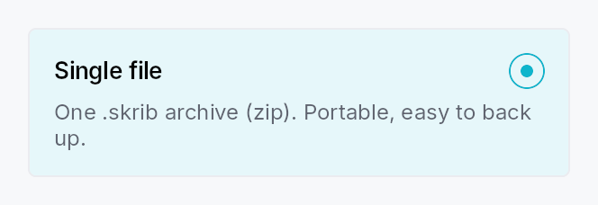
RadioTile — a "selectable card" radio option.
Public types
| Kind | Name |
|---|---|
enum | RadioTileIndicatorSide — Which side of the top row the radio indicator sits on |
struct | RadioTile — A single selectable-card radio option |
Public functions
RadioTile
Detailed description
A RadioTile behaves as a single radio button (Role::RadioButton,
set_toggled) rendered as a bordered, rounded card: a leading icon, a
bold title, an inline radio indicator, and a muted, wrapping description.
Multiple tiles share a Signal<usize> — selecting one writes its value,
which deselects every sibling observing the same signal (the RadioButton
model). Group them with
RadioTileGroup for layout,
roving keyboard navigation, and the AT "N of M" positional announcement.
Content model
Typed slots cover the common case (matching the reference design):
.icon(..), .title(..), .description(..). For arbitrary content, the
.body(..) slot replaces the description column with any widget subtree.
Accessibility
Reports Role::RadioButton with set_toggled mirroring selection, the
title as the accessible name, and the description as the accessible
description. When grouped, each tile emits
push_to_radio_group([sibling_ids]) plus set_position_in_set /
the group's set_size_of_set for "N of M". Inside a RadioTileGroup the tile is not
individually focusable — focus roves on the group (WAI-ARIA radiogroup),
and the group publishes active_descendant. A standalone tile is
focusable and responds to Space / Action::Click.
let selected = ctx.signal(0_usize);
RadioTileGroup::new(selected)
    .tile(RadioTile::new().icon(icon).title(tr!(single_file())).description(tr!(single_file_desc())))
    .tile(RadioTile::new().icon(icon2).title(tr!(bundle())).description(tr!(bundle_desc())))
Touch and pen
A tile is a whole-card target, comfortably past the floor at every density, and
it activates on the release. What the touch sweep changed is its pressed
appearance: it was written by the Space path alone, so the recipe painted a
state no pointer reached — on the one control where a press visual matters
most, because there is no smaller affordance inside the card to look at.
A tap by a contact also rests the tile idle rather than hovered, for the reason
ToolBox's header does: a finger sends no hover-leave, and the stale tint
becomes visible as soon as the selection moves to another tile.
Density
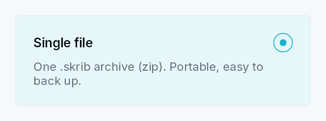
The picture above is the widget at TargetDensity::Compact, the mouse-and-keyboard ladder. Below is the same subject on the same canvas with only the ladder changed, so what moves is the density and nothing else — where the subject no longer fits, that is what the denser targets cost it at that size. See docs/density-and-targets.md.
Touch
API reference
📖 Full rustdoc API for this module
pub enum RadioTileIndicatorSide
Import: use teksilo::widgets::RadioTileIndicatorSide;
Which side of the top row the radio indicator sits on. Defaults to
Trailing (top-right in LTR), matching the reference design.
#![allow(unused)]
fn main() {
pub enum RadioTileIndicatorSide { /* variants */ }
}
Variants
Trailing— Trailing edge of the row — top-right in LTR, top-left in RTL.Leading— Leading edge of the row — top-left in LTR, top-right in RTL.
pub struct RadioTile
Import: use teksilo::widgets::RadioTile;
A single selectable-card radio option. See the module docs.
#![allow(unused)]
fn main() {
pub struct RadioTile { /* fields */ }
}
Methods
pub fn new() -> Self
Create a tile with no selection binding. The enclosing
RadioTileGroup assigns
this tile's value (its position) and shared selection signal. Use
selection for a standalone tile.
pub fn selection(mut self, value: usize, selected: Signal<usize>) -> Self
Bind this tile to an explicit value + shared Signal<usize> for use
outside a RadioTileGroup. Inside a group this is set automatically.
pub fn icon(mut self, widget: impl Widget + 'static) -> Self
Leading icon slot (top-left of the tile). Any widget — typically an
IconWidget.
pub fn icon_boxed(mut self, widget: Box<dyn Widget>) -> Self (default: None)
Leading icon slot, pre-boxed.
pub fn title(mut self, title: impl Into<LocalizedString>) -> Self (default: None)
Bold title text (the tile's accessible name).
pub fn description(mut self, text: impl Into<LocalizedString>) -> Self (default: None)
Muted, multi-line description (the tile's accessible description).
Ignored when a body is set.
pub fn body(mut self, widget: impl Widget + 'static) -> Self
Replace the description column with an arbitrary widget subtree. Takes
precedence over description. Note: a body's own
content is exposed to assistive technology as-is (unlike the typed
description, which is folded into the tile's accessible description).
pub fn body_boxed(mut self, widget: Box<dyn Widget>) -> Self (default: None)
Custom body slot, pre-boxed.
pub fn trailing(mut self, text: impl Into<LocalizedString>) -> Self (default: None)
Right-aligned trailing meta text (e.g. "20 chapters", "free-form
notes"). Tints to the accent color when the tile is selected. Most
useful with the compact vertical arrangement. Ignored when a
trailing_slot is set.
pub fn trailing_slot(mut self, widget: impl Widget + 'static) -> Self
Arbitrary right-aligned trailing widget (badge, count, chevron, …).
Takes precedence over trailing.
pub fn compact(mut self, compact: bool) -> Self (default: false)
Compact single-line arrangement: [indicator] [icon] [title] [Spacer] [trailing] with no description row — the vertical settings-list look.
RadioTileGroup::layout(TileLayout::Vertical) sets this automatically
(and moves the indicator to the leading edge).
pub fn title_style(mut self, style: impl Into<TextStyleProp>) -> Self
Override the title text style (default TextStyleRole::BodyBold).
pub fn title_color(mut self, color: impl Into<ColorProp>) -> Self
Override the title text color (default TextRole::Primary).
pub fn description_style(mut self, style: impl Into<TextStyleProp>) -> Self
Override the description text style (default TextStyleRole::Small).
pub fn description_color(mut self, color: impl Into<ColorProp>) -> Self
Override the description text color (default TextRole::Secondary).
pub fn enabled(mut self, enabled: impl Into<Prop<bool>>) -> Self (default: true)
Set the enabled state, statically or reactively. A disabled tile is skipped by the group's keyboard navigation and cannot be selected.
pub fn variant(mut self, variant: RadioTileVariant) -> Self
Pick the card variant (default Outlined).
pub fn show_indicator(mut self, show: bool) -> Self
Whether to render the inline radio indicator (default true). When
false, the selection cue is the card highlight alone.
pub fn indicator_side(mut self, side: RadioTileIndicatorSide) -> Self
Which side of the top row the radio indicator sits on (default Trailing).
pub fn style(mut self, style: impl RadioTileStyle) -> Self
Per-call style override — replaces the theme-wide RadioTileStyle
for just this tile.
pub fn tooltip(mut self, text: impl Into<LocalizedString>) -> Self
Attach a plain single-line tooltip shown on hover.
pub fn rich_tooltip(mut self, key: impl Into<String>) -> Self
Attach a rich tooltip resolved from the app-wide tooltip registry.
pub fn rich_tooltip_content(mut self, content: crate::tooltip::TooltipContent) -> Self
Attach a rich tooltip driven by inline TooltipContent.
pub fn composite_tooltip(mut self, content: impl Widget + 'static) -> Self
Attach a composite tooltip hosting an arbitrary widget tree.