SpinBox
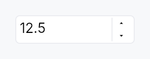
SpinBox — numeric input with increment/decrement buttons.
Public types
| Kind | Name |
|---|---|
enum | WrapMode — Out-of-range behavior when stepping past min or max |
enum | StepType — Step-size policy for each key/button press |
enum | WheelMode — When the mouse wheel is allowed to adjust the value |
enum | WidthPolicy — How the SpinBox decides its horizontal size envelope |
const | SPIN_BOX_STEP_BUTTON_WIDTH — Minimum total width |
const | SPIN_BOX_STEP_BUTTON_HEIGHT — Painted height of one stacked step button, in dp |
struct | SpinBox — Numeric input with step buttons |
trait | SpinValue — Numeric primitive that a SpinBox can hold |
Public functions
SpinBox
SpinValue
| Returns | Function |
|---|---|
| Constructors | |
Self | from_f64_saturating(v: f64) |
Option<Self> | parse(s: &str) |
| Builder methods | |
Self | saturating_add(rhs: Self) |
Self | saturating_sub(rhs: Self) |
Self | saturating_mul_u32(rhs: u32) |
| Methods | |
f64 | to_f64() |
String | format(decimals: u8) |
Self { /* default implementation */ } | clamp_value(min: Self, max: Self) |
| Associated functions | |
bool | is_integer() |
bool | is_valid_input_char(c: char) |
Detailed description
A generic composite over SpinValue
(integer and floating-point primitives), pairing the
TextInputField editing
primitive with a stacked pair of up/down step buttons. Semantics
are a synthesis of Qt's QSpinBox / QDoubleSpinBox, WinUI 3's
NumberBox, GTK's GtkSpinButton, and the W3C ARIA
spinbutton role.
Behaviour
- Value binding: a
Signal<T>is the single source of truth. Typing and stepping update it; external writes re-format the editable text. - Commit model: the user can type freely (subject to the
per-character input filter, which only the default parser has:
a custom
value_from_textis handed every character). The value is committed onEnteror on focus loss — at commit time the text is parsed, clamped into[min, max](or wrapped, perWrapMode), and reformatted. Invalid input reverts to the last known good value. - Stepping over typed text: every step (key, wheel, button,
assistive
Increment/Decrement) starts from what the field shows. Text typed and not yet committed is read first, exactly asEnterwould read it, and the step moves on from there: type 35, pressUpwith a step of 5, and the value is 40, reported once. Text that cannot be read steps nothing; the value goes back into the field, and the next press steps from it. This isQAbstractSpinBox::stepBy. - Keyboard:
Up/Down→ ±single_stepPageUp/PageDown→ ±page_step(default:10 × single_step)Enter→ commit (stays focused)Home/Endstay bound to the text cursor.QAbstractSpinBoxroutes both to its innerQLineEdit, and WinUI'sNumberBox, Blink, Avalonia and jQuery UI bind neither; typing the number reaches min and max anyway. Seedocs/range-keyboard.md.- A chord holding
Ctrl,AltorSuperis not the spin box's and falls through to the application;Shiftdoes not change the step.
- Mouse wheel: adjusts by
single_step— wheel down decreases, wheel up increases, matchingQAbstractSpinBox,GtkSpinButtonand WinUI'sNumberBox. Gated bywheel_mode(default: only when focused, to avoid accidental scroll changes). - Buttons: up/down buttons stack to the right of the field
by default; can be hidden with
button_layout. - Special value text: when the current value equals
minandspecial_value_textis set, the field shows that string instead of the formatted number (Qt's "Auto" / "None" / "Unlimited" affordance). It stays while the field has focus, as in Qt: keyboard focus selects it, so a number typed replaces it. - Adaptive step: with
StepType::Adaptive, the effective step tracks the decimal magnitude of the current value (Qt'sAdaptiveDecimalStepType). Useful for values that span many orders of magnitude in the same control. - Locale: the number follows the active locale's decimal
separator, digits and minus sign
(
localized, on by default); thousands separators are opt-in (use_grouping, off by default, as in Qt). Display, commit parse, stepping and the per-character input filter all read oneNumberPresentation, which a live language switch replaces, so they cannot disagree about which separator the field is using: a French user sees12,5, types12,5, and the numeric keypad's.still works. Rendering is a string transform over the value's ownDisplay, never anf64round-trip, so aSpinBox<i64>stays exact past 2^53. Turn it off for a number that is an identifier rather than a quantity (port, version component, database id). With noI18nManagerinstalled the active locale is the C locale and this is a no-op. - Custom formatter / parser: full override via
text_from_valueandvalue_from_text; together they let you implement currency, percentages with stored fraction, hex, duration, anything. A custom formatter/parser owns the whole convention — it is not re-punctuated by the locale layer.
Accessibility
The editing field is the spin button: one AccessKit node with
Role::SpinButton,
the label as its name, the numeric value, min,
max, step and jump, the field's text as its value and its text
runs, and the
Increment,
Decrement,
SetValue, and
Focus actions. It is
the node that holds focus, so a focus change reports the field's
name and value once, and a step moves the number a screen reader
is following. The composite's own node is structure and collapses;
it names the field as its
accessibility_proxy,
so an access_label, a FormLayout label, an
access_described_by or a tooltip given to the spin box lands on
the field. The suffix is painted and not part
of the text, so it is not announced.
SetValue accepts either payload shape, because both are sent in
the field: a number (macOS setAccessibilityValue: with an
NSNumber, AT-SPI's Value.SetCurrentValue) is clamped and
published as sent; a string (an NSString, the automation
set_value tool) takes the same parse Enter takes, so a custom
value_from_text and the locale's
decimal separator are honoured, and an unparseable one reverts the
display and is reported unhandled. A
read_only spin box advertises and services
none of the three mutating actions. The step buttons are
structurally part of the SpinBox and publish no separate a11y
nodes; stepping is the spin button's Increment and Decrement.
Example
use teksilo::widgets::{SpinBox, WrapMode};

let font_size = ctx.signal(12_i32);
ctx.add(
    SpinBox::new(font_size, 4, 72)
        .single_step(1)
        .page_step(10)
        .suffix(" pt"),
);

let gain_db = ctx.signal(0.0_f32);
ctx.add(
    SpinBox::new(gain_db, -60.0, 12.0)
        .single_step(0.5)
        .decimals(1)
        .suffix(" dB")
        .wrap_mode(WrapMode::Clamp),
);
Touch and pen
The step buttons are the controls sweep's one unreachable target, and
the reason is recorded rather than papered over. Each is 18 x 13 dp inside a
trailing column exactly its own width and exactly two buttons tall, so a
Widget::hit_outset has nowhere to grow (an outset never escapes its
parent); the field beside them takes presses of its own, so the miss-only
slop pass has an eligible bubble owner at distance zero; and two conforming
targets stacked need 88 dp of column, which no density projection of the
field produces. Reaching the floor here is a layout change — the desktop
stacked pair replaced by a side-by-side −/+ at coarse densities, as Material
does — and that is a design decision, not a targeting one. The value stays
fully reachable by keyboard (Up/Down, PageUp/PageDown) and by the
Increment / Decrement assistive actions.
One thing the sweep did fix. A step still fires on the press and arms
hold-to-repeat from it (Qt's QAbstractSpinBox convention — there is no
release to start a repeat from), but the repeat now stops on a
PointerCancel: a pan claimant winning the press used to leave the box
stepping for the rest of the session, because a cancel is terminal and no
PointerUp follows it.
What the box does about panning, it does by omission. It declares no
touch_action and makes no pan claim, so its subtree keeps the default
TouchAction::AUTO and a finger that comes to rest on it and then drags
is won by the enclosing scroller rather than changing the value. The
on_scroll handler below is a wheel handler and not a pan; it never sees
a finger.
Two tests in spin_box/tests.rs cover that, and only one of them can see
the second half of it. a_finger_pan_over_the_spin_box_scrolls_its_container
shows the pan reaching the scroller, but its box has the default
WheelMode::Focused and its fixture never focuses the field, so the
on_scroll below declines before the pan question is reached — a pan that
DID arrive would leave the value unchanged there anyway.
a_finger_pan_over_a_hover_wheel_spin_box_scrolls_its_container is the one
that can observe the claim: with WheelMode::Hover the handler runs for
every scroll that reaches the box, so a claim would step the value once per
synthesised sample.
P22, the scrollables migration, looked at the explicit
touch_action(PAN_Y) this file was asked for and decided against it.
It is a narrowing on top of the behaviour above rather than a restatement
of it: it would additionally forbid a horizontal pan and a pinch through
the field — a real cost to a spin box in a horizontally-scrolling toolbar,
or on a pinch-zoomable page — and it would buy nothing the omission does
not already give, because the claimant chain visits only the pan candidates
and never the generic bubble, so a boundary pan cannot reach the on_scroll
below however far it travels. The omission is the decision; the
hover-wheel test named above is what can witness it. P24 owns
spin_box/step_button.rs.
Density
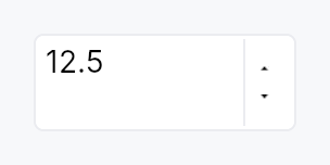
The picture above is the widget at TargetDensity::Compact, the mouse-and-keyboard ladder. Below is the same subject on the same canvas with only the ladder changed, so what moves is the density and nothing else — where the subject no longer fits, that is what the denser targets cost it at that size. See docs/density-and-targets.md.
Touch
API reference
📖 Full rustdoc API for this module
pub enum WrapMode
Import: use teksilo::widgets::WrapMode;
Out-of-range behavior when stepping past min or max.
Set via SpinBox::wrap_mode.
#![allow(unused)]
fn main() {
pub enum WrapMode { /* variants */ }
}
Variants
Clamp— Clamp tomin/max(default).Wrap— Wrap around: pastmaxjumps tomin, pastminjumps tomax. Matches Qt'sQAbstractSpinBox::wrapping.
pub enum StepType
Import: use teksilo::widgets::StepType;
Step-size policy for each key/button press.
Set via SpinBox::step_type.
#![allow(unused)]
fn main() {
pub enum StepType { /* variants */ }
}
Variants
Fixed— Always step bysingle_step(default).Adaptive— Step by the decimal power-of-ten immediately below the current value's magnitude — e.g. values 1–9 step by 1, 10–99 by 10, 100–999 by 100. Matches Qt'sAdaptiveDecimalStepType. Integer types honor the same rule using the magnitude of the absolute value.
pub enum WheelMode
Import: use teksilo::widgets::WheelMode;
When the mouse wheel is allowed to adjust the value.
Set via SpinBox::wheel_mode.
#![allow(unused)]
fn main() {
pub enum WheelMode { /* variants */ }
}
Variants
Focused— Wheel adjusts only when the field is focused. Default — prevents accidental changes when the user is scrolling a larger surrounding view.Hover— Wheel adjusts whenever the pointer is over the widget.Disabled— Wheel never adjusts the value; events bubble to the surrounding scroll container.
pub enum WidthPolicy
Import: use teksilo::widgets::spin_box::WidthPolicy;
How the SpinBox decides its horizontal size envelope.
Chosen via the width,
width_chars, and
fill_width builder methods — the enum
itself is the storage, not a separate public configuration
API.
#![allow(unused)]
fn main() {
pub enum WidthPolicy { /* variants */ }
}
Variants
Pixels(f32)— Cap the widget at a fixed logical-pixel width. Default isDEFAULT_PREFERRED_WIDTH(120 dp), matching Qt'sQSpinBoxsizeHint.Chars(u32)— Size the widget to fit this many reference digits ('0') plus the configured suffix, padding, and step buttons. Measurement uses the theme font at build time.Fill— Let the widget expand horizontally to fill whatever space the parent offers. Equivalent to an infinite pixel cap.
pub const SPIN_BOX_STEP_BUTTON_WIDTH
Import: use teksilo::widgets::spin_box::SPIN_BOX_STEP_BUTTON_WIDTH;
Minimum total width. Below this the stacked step buttons stop
fitting next to the field. Widgets narrower than this are
enforced to the minimum at layout time via MinSize.
Painted width of one stacked step button, in dp.
Below the 24 dp WCAG floor, and no hit mechanism reaches it — see the
"Touch and pen" section of this module and StepButton::children for the
measurement. The two steps are separate nodes stacked in a trailing column
exactly one button wide, so there is nothing for Widget::hit_outset to
grow into and nothing for partition_targets to carve; growing the paint
instead would widen every numeric field on a form. Named here so the hit
mechanisms and the chrome arithmetic below read the same number.
#![allow(unused)]
fn main() {
pub const SPIN_BOX_STEP_BUTTON_WIDTH: f32 = 18.0;
}
pub const SPIN_BOX_STEP_BUTTON_HEIGHT
Import: use teksilo::widgets::spin_box::SPIN_BOX_STEP_BUTTON_HEIGHT;
Painted height of one stacked step button, in dp. Only a fallback — the
real height is half the field's inner height (see build_step_buttons).
#![allow(unused)]
fn main() {
pub const SPIN_BOX_STEP_BUTTON_HEIGHT: f32 = 12.0;
}
pub struct SpinBox
Import: use teksilo::widgets::SpinBox;
Numeric input with step buttons. Generic over
SpinValue — pre-implemented for i32, i64, u32, u64,
usize, f32, and f64.
#![allow(unused)]
fn main() {
pub struct SpinBox<T: SpinValue> { /* fields */ }
}
Methods
pub fn new(value: Signal<T>, min: T, max: T) -> Self
Construct a new SpinBox bound to value with the given
inclusive range. min must be ≤ max.
pub fn style(mut self, style: impl teksilo_core::styles::SpinBoxStyle) -> Self
Per-call style override. Higher precedence than the theme-wide
style_slots.spin_box slot.
pub fn single_step(mut self, step: T) -> Self
Set the step size for Up / Down / single wheel tick /
button tap.
pub fn page_step(mut self, step: T) -> Self
Set the step size for PageUp / PageDown. When unset,
defaults to 10 × single_step at build time.
pub fn decimals(mut self, decimals: u8) -> Self
Number of decimal places shown for floating-point types. Ignored for integer types.
pub fn localized(mut self, on: bool) -> Self
Whether the number follows the active locale's conventions — decimal separator, digits, and minus sign. On by default.
A French user sees 12,5, not 12.5, and can type either: the
commit path de-localizes before parsing, and the input filter
accepts both the locale's separator and the ASCII one, so a
numeric keypad still works.
Turn it off for a number that is an identifier rather than a quantity — a port number, a version component, a database id, a pixel offset in a file format. Those read wrong grouped or re-punctuated, and their conventional form is the C-locale one.
Localization is a string transform over the value's own
Display, not a round-trip through f64, so a SpinBox<i64>
keeps full precision past 2^53.
With no I18nManager installed the active locale resolves to the
C locale, so this is a no-op in tests and in apps that have not
opted into i18n.
pub fn use_grouping(mut self, on: bool) -> Self
Whether the displayed number carries thousands separators.
Off by default, matching Qt (QAbstractSpinBox:: isGroupSeparatorShown is false unless asked for).
Separators help a large read-only quantity and get in the way of
a field being typed into, so this is opt-in per SpinBox rather
than a locale-wide default. Grouping follows the locale's own
group sizes, including the Indic lakh system (12,34,567).
Has no effect when localized is off.
pub fn suffix(mut self, text: impl Into<String>) -> Self
Qt-style non-editable trailing unit (e.g. " %", " px",
" dB"). Rendered flush-right inside the field's border;
the caret cannot enter it.
pub fn special_value_text(mut self, text: impl Into<LocalizedString>) -> Self
Text shown in place of the formatted value when the current
value equals min. Use for "Auto", "None", "Off",
"Unlimited" affordances where the minimum has special
semantics. The text stays while the field has focus, as
Qt's specialValueText does: keyboard focus selects it, so a
number typed replaces it, and a step moves off it.
pub fn wrap_mode(mut self, mode: WrapMode) -> Self
Set the out-of-range behavior when stepping past min or max
(default: Clamp).
pub fn step_type(mut self, step_type: StepType) -> Self
Set the step-size policy (default: Fixed). Use
StepType::Adaptive for values that span many orders of magnitude.
pub fn button_layout(mut self, layout: ButtonLayout) -> Self
Override the step-button layout (default: Stacked — stacked
up/down buttons to the right of the field).
pub fn show_buttons(mut self, show: bool) -> Self
Convenience wrapper over button_layout:
true → ButtonLayout::Stacked, false → ButtonLayout::Hidden.
Matches the Int UI guideline that SpinBoxes in dense forms
often hide the step buttons to reduce visual noise and let
keyboard / wheel carry the affordance — pass
.show_buttons(false) on those call sites.
pub fn wheel_mode(mut self, mode: WheelMode) -> Self
Set when the mouse wheel adjusts the value (default: Focused —
only when the inner field holds focus).
pub fn width(mut self, width: f32) -> Self
Cap the widget's horizontal size at a fixed logical-pixel
width. If the parent offers less, the SpinBox shrinks (down
to the internal 72 dp / 48 dp floor that keeps the buttons
and field from overlapping). Default: 120 dp, matching Qt
QSpinBox sizeHint and Int UI form density.
#![allow(unused)]
fn main() {
use teksilo_widgets::SpinBox;
use teksilo_core::signal::Signal;
let v = Signal::new(0_i32);
let _w = SpinBox::new(v.clone(), 0, 9999).width(80.0);        // narrow
let _w = SpinBox::new(v.clone(), 0, 9999).width(200.0);       // wider
let _w = SpinBox::new(v.clone(), 0, 9999).fill_width();       // stretch to parent
let _w = SpinBox::new(v.clone(), 0, 9999).width_chars(5);     // "fits 5 digits"
}
pub fn width_chars(mut self, chars: u32) -> Self
Size the widget to fit exactly chars reference digits plus
the configured suffix, padding, and step buttons. The
measurement uses the actual theme font at build time (same
SharedTypesetter the field draws with), so values stay
right under runtime theme switches and HiDPI scale changes.
#![allow(unused)]
fn main() {
use teksilo_widgets::SpinBox;
use teksilo_core::signal::Signal;
let port = Signal::new(8080_i32);
let pct = Signal::new(0_i32);
let _w = SpinBox::new(port, 0, 65_535).width_chars(5);           // 5 digits
let _w = SpinBox::new(pct, 0, 100).suffix(" %").width_chars(3);  // 3 + " %"
}
pub fn fill_width(mut self) -> Self
Let the widget expand to fill the horizontal space offered
by its parent, instead of capping at width.
Use inside toolbars, inspector panels, or an
Expand::horizontal column that should stretch with the
surrounding layout.
pub fn label(mut self, label: impl Into<LocalizedString>) -> Self
Set the accessible name announced by screen readers as the
control's label. ARIA requires spin buttons to have a label;
when none is set here the caller is responsible for labelling
via a FormLayout line, access_labelled_by or access_label
on the spin box, which all reach the editing field that holds
focus and publishes the spin button.
pub fn placeholder(mut self, text: impl Into<LocalizedString>) -> Self
Set the placeholder text shown in the field when it is empty.
pub fn enabled(mut self, enabled: impl Into<Prop<bool>>) -> Self
Set the enabled state, statically or reactively. Forwarded to
the arena at build time via
ctx.enabled_when(spinbox_id, self.enabled.clone()).
pub fn read_only(mut self, read_only: bool) -> Self
Make the value uneditable: no typing, no keyboard or wheel stepping,
no step buttons, and no assistive-technology Increment / Decrement
/ SetValue. Matches QAbstractSpinBox::readOnly, which likewise
stops stepBy. The field keeps focus and selection, so the value can
still be read and copied.
pub fn text_from_value(mut self, f: impl Fn(T) -> LocalizedString + 'static) -> Self
Override the value → display-string conversion. Receives the
raw value; returns whatever string should appear in the
field. Suffix and special_value_text still apply on top of
the returned string.
pub fn value_from_text(mut self, f: impl Fn(&str) -> Option<T> + 'static) -> Self
Override the parse step. Receives the field's raw text
(without the suffix, which is never part of the editable
content); returns Some(value) to accept or None to
reject. Invalid input reverts to the last good value on
commit.
Installing a parser also lifts the per-character input filter,
which admits only what the default numeric parse can read. The
parser owns the text convention, so a month field reading
"march" as 3 can be typed by name: every character reaches the
field, and whatever the parser refuses is reverted at commit.
pub fn on_value_changed(mut self, f: impl Fn(T, &mut EventContext) + 'static) -> Self
Closure fired each time the value is committed (keyboard
step, button tap, wheel tick, Enter, blur). Bound observers
on the value signal also see every change; use this hook
when the caller needs an EventContext (e.g. to fire an
intent).
pub fn tooltip(mut self, text: impl Into<LocalizedString>) -> Self
Attach a plain single-line tooltip shown after a hover delay.
Mutually exclusive with rich_tooltip,
rich_tooltip_content, and
composite_tooltip — each setter
clears the other two so the last call wins.
pub fn rich_tooltip(mut self, key: impl Into<String>) -> Self
Attach a rich tooltip looked up by registry key.
The key must match a TooltipContent
registered in the application's tooltip registry. Mutually
exclusive with tooltip,
rich_tooltip_content, and
composite_tooltip.
pub fn rich_tooltip_content(mut self, content: crate::tooltip::TooltipContent) -> Self
Attach a rich tooltip with inline content (no registry key
required). Mutually exclusive with tooltip,
rich_tooltip, and
composite_tooltip.
pub fn composite_tooltip(mut self, content: impl Widget + 'static) -> Self
Attach a composite tooltip whose body is an arbitrary widget
tree. Mutually exclusive with tooltip,
rich_tooltip, and
rich_tooltip_content.
pub fn value(&self) -> Signal<T>
The bound numeric value signal.
pub trait SpinValue
Import: none — SpinValue is public in a private module of teksilo-widgets and nothing re-exports it.
Numeric primitive that a SpinBox can hold.
Sealed: only the primitive integer and floating-point types implement this. See the module docs for the rationale.
Implementations must provide lossless parsing and round-trip
formatting (parse(format(v, d)) == Some(v) for any finite value
v and decimals d). Arithmetic is saturating so clamping into
[min, max] after a step cannot overflow.
#![allow(unused)]
fn main() {
pub trait SpinValue: sealed::Sealed + Copy + PartialOrd + Debug + 'static { /* associated items below */ }
}
Associated items
fn to_f64(self) -> f64;
Lossless widening to f64. Used for AccessKit's numeric
value / min / max / step properties and for
StepType::Adaptive decimal
analysis.
fn from_f64_saturating(v: f64) -> Self;
Narrowing from f64 with saturation at the type's full
range. For integers the conversion truncates toward zero,
matching Rust's as conversion semantics.
fn parse(s: &str) -> Option<Self>;
Parse a user-entered string. Leading/trailing whitespace is
ignored. Returns None for syntactically invalid input
(but NOT for out-of-range values — the SpinBox clamps
separately so users can type past the bound and see the
reformatted clamped result after blur).
fn format(self, decimals: u8) -> String;
Format for display.
For integer types, decimals is ignored. For floats, the
value is rendered with exactly decimals digits after the
decimal point — no scientific notation, no thousands
separator. Formatter closures on SpinBox
(text_from_value)
override this.
fn saturating_add(self, rhs: Self) -> Self;
Saturating addition. Out-of-type-range results clamp at
MAX (or MIN for negative overflow on signed types).
fn saturating_sub(self, rhs: Self) -> Self;
Saturating subtraction. See saturating_add.
fn saturating_mul_u32(self, rhs: u32) -> Self;
Saturating multiplication by a positive integer. Used for
page_step = multiplier × single_step when the caller
omits a page step.
fn is_integer() -> bool;
Whether this type has integer semantics (no fractional
component, no decimal separator in the default
format path). Controls the default
character filter and whether decimals has any effect.
fn is_valid_input_char(c: char) -> bool;
Default per-character input filter for the editable field.
Admits digits and, for signed types, -; float types also
admit ., +, e, E. Callers can override the whole
filter on the SpinBox builder.
fn clamp_value(self, min: Self, max: Self) -> Self { /* default implementation */ }
Clamp into an inclusive range. Falls through to
PartialOrd.