TextInput
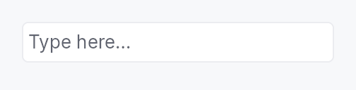
TextInput — styled single-line text field composite.
Public types
| Kind | Name |
|---|---|
enum | ValidationState — Validation state for the text input field |
struct | TextInput — Styled single-line text input composite |
Public functions
TextInput
Detailed description
Wraps the TextInputField
editing primitive in a bordered, padded frame with placeholder
overlay, validation, optional clear button, and leading/trailing
slots. All actual text editing is delegated to the field: every
configuration method here has a direct counterpart on the
primitive.
Most applications want TextInput. Choose
TextInputField directly
when you're building a composite of your own that already
supplies its frame — SpinBox is the canonical in-tree example.
Example
let search = ctx.signal(String::new());
TextInput::new(search.clone())
    .placeholder("Search...")
    .show_clear_button(true)
    .leading_slot(IconWidget::from_svg(SEARCH_ICON))
    .on_submit_fn(|ctx| ctx.send_intent(AppIntent::Search))
Appearance
text_style— the size, family and weight of the typed text and of the placeholder, from aTextStyleRole(follows the theme) or a fixedTextStyle. The field's height follows the style's line, so a small style gives a short field and a large one a tall field.text_alignment— where a text narrower than the field sits: start, centre or end, mirrored in a right-to-left layout. A longer text scrolls as usual.text_color— the colour of the text and the caret. A disabled field still greys out. For one colour at rest and another while editing, map the field's focus:input.handle().focused_signal().map(|f| if *f { TextRole::Primary } else { TextRole::Secondary }).min_height— replaces the minimum height the style and the density would give the field. Below 24 dp the field fails WCAG 2.5.8 unless the app offers a larger target for it.
None of them is set by default, and the field then looks as it always has.
Touch and pen
The trailing clear affordance is 16 dp of paint and a 24 dp target: raising
its box would widen every field in the workspace at Compact, so the
shortfall is made up between the pointer and the arena through
Widget::hit_outset — declared by the slot that takes the tap, because the
ring around an outset resolves to the declaring node rather than to a
descendant, and by a direct child of the row, because an outset never
escapes its parent. The slot keeps its 16 dp while the affordance is hidden
so the row does not jump, and withdraws its outset while there is nothing to
clear. The caret and selection behaviour of the field itself belongs to the
touch-text package.
Density
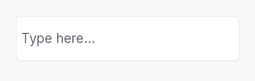
The picture above is the widget at TargetDensity::Compact, the mouse-and-keyboard ladder. Below is the same subject on the same canvas with only the ladder changed, so what moves is the density and nothing else — where the subject no longer fits, that is what the denser targets cost it at that size. See docs/density-and-targets.md.
Touch
API reference
📖 Full rustdoc API for this module
pub enum ValidationState
Import: use teksilo::widgets::ValidationState;
Validation state for the text input field.
Drives the inline feedback strip and border tint of TextInput.
#![allow(unused)]
fn main() {
pub enum ValidationState { /* variants */ }
}
Variants
None— No validation message — the field is pristine or valid.Error(LocalizedString)— The committed value is invalid;LocalizedStringis shown in red below the field.Warning(LocalizedString)— The committed value is suspicious but accepted;LocalizedStringis shown as a warning.Corrected(LocalizedString)— Last commit was auto-corrected; the field's value has already been replaced with the normalized form. The composite renders the message in secondary text and tints the border accent briefly (decay-managed by the framework's frame loop, not a concern of this enum).
pub struct TextInput
Import: use teksilo::widgets::TextInput;
Styled single-line text input composite.
See the module-level documentation for usage examples.
#![allow(unused)]
fn main() {
pub struct TextInput { /* fields */ }
}
Methods
pub fn new(text: Signal<String>) -> Self
Construct a new text input bound to text.
pub fn variant(mut self, variant: TextInputVariant) -> Self
Pick a Tier-1 design-language variant
(TextInputVariant::Outlined / Filled / Underline / Bare).
The IntUI default (crate::styles::RecipeTextInputStyle) honours
Outlined, Filled, and Bare; Underline falls back to
Outlined until per-side stroke recipes land.
pub fn style(mut self, style: impl TextInputStyle) -> Self
Override the active TextInputStyle for this widget instance
only. The widget keeps responsibility for caret blinking, IME
composition, the placeholder layering, the leading / trailing
slots and the validation strip — the style only paints the
frame (border / fill / corner radius).
pub fn placeholder(mut self, text: impl Into<LocalizedString>) -> Self
Set the placeholder text shown when the field is empty.
pub fn label(mut self, label: impl Into<LocalizedString>) -> Self
Accessible name for the field.
Applied to the inner TextInputField — the node that carries
Role::TextInput, holds focus, and reports the document's value.
It deliberately does not go on the composite's outer node: that
node is a Role::GenericContainer, which
accesskit_consumer::common_filter drops from the filtered tree
unconditionally, so a name placed there would be invisible to every
screen reader on every platform.
Stays locale-reactive: a tr!(...) name is re-resolved when the
locale changes, without a rebuild.
pub fn enabled(mut self, enabled: impl Into<Prop<bool>>) -> Self (default: true)
Set the enabled state, statically or reactively. Forwarded to the
arena and the inner TextInputField at build time.
pub fn read_only(mut self, read_only: bool) -> Self (default: false)
Set the field read-only: text is selectable and copyable but not editable.
pub fn max_length(mut self, max_length: usize) -> Self (default: None)
Limit the number of Unicode scalar values the field will accept.
pub fn show_clear_button(mut self, show: bool) -> Self
Show or hide the trailing ✕ button that clears the field text. Default: hidden.
pub fn min_width(mut self, w: f32) -> Self
Override the frame's intrinsic minimum width (default 65 dp). Use to express a design width for date / time / phone-number fields whose content is well-known and whose collapse to the generic 65 dp floor would look out of place.
pub fn min_height(mut self, height: f32) -> Self
Override the field's minimum height, in logical pixels.
By default the field is at least the style's control height — 28 dp
in the IntUI style, raised to the density's target size — or, when a
text_style is set, at least the density's target
size, with the style's line deciding the rest. This replaces that
floor with height, as given: the field still grows to fit its text,
and is centred in a taller box. The value reaches the active
TextInputStyle through TextInputStyleConfig::min_height; a
style that ignores it keeps its own minimum.
The field is the pointer target: a press anywhere in it places the caret. Below 24 dp it fails WCAG 2.2 SC 2.5.8 Target Size (Minimum) unless the app gives the same function a larger target elsewhere — an enclosing row that focuses the field when pressed, say.
pub fn text_style(mut self, style: impl Into<TextStyleProp>) -> Self (default: None)
The style the typed text is shaped in: its size, family and weight.
Forwarded to TextInputField::text_style, where the details live,
and given to the placeholder too, so the hint and the text it stands in
for read alike. The field's height follows the style's line: an 11 px
style gives a short field, a large one a tall field (see
min_height for the floor). A role tracks the
theme; the global text scale multiplies the size.
pub fn text_alignment(mut self, alignment: HAlignment) -> Self (default: None)
Where the text — and the placeholder — sits when it is narrower than
the field: at its start, in the middle, or at its end, mirrored in a
right-to-left layout. Text wider than the field scrolls as usual.
Forwarded to TextInputField::text_alignment.
pub fn text_color(mut self, color: impl Into<ColorProp>) -> Self (default: None)
The colour of the typed text and of the caret: a colour, a theme role
or a signal of either, resolved every paint. A disabled field still
paints the theme's disabled text colour. Forwarded to
TextInputField::text_color.
A different colour at rest and while editing follows the field's
focus, which handle exposes before the input is
built:
let input = TextInput::new(text);
let focused = input.handle().focused_signal();
let input = input.text_color(focused.map(|f| {
    if *f { TextRole::Primary } else { TextRole::Secondary }
}));
pub fn leading_slot(mut self, widget: impl Widget + 'static) -> Self
Set an arbitrary widget in the leading slot (before the text area).
Typically an IconButton or IconWidget.
pub fn trailing_slot(mut self, widget: impl Widget + 'static) -> Self
Set an arbitrary widget in the trailing slot (after the text area).
Typically an IconButton or IconWidget.
pub fn on_submit_fn(mut self, f: impl Fn(&mut EventContext) + 'static) -> Self
Closure invoked on Enter. Forwarded to TextInputField.
pub fn on_access_set_value( mut self, f: impl Fn(&str, &mut EventContext) -> bool + 'static, ) -> Self
Handle an assistive technology's whole-value write, given the string it
set. Forwarded 1:1 to TextInputField::on_access_set_value, where the
reasoning lives. Composites whose text projects a typed value —
SpinBox, the date and time editors — install one.
pub fn on_blur_fn(mut self, f: impl Fn(&mut EventContext) + 'static) -> Self
Closure invoked on focus loss. Forwarded to TextInputField.
pub fn char_filter(mut self, f: impl Fn(char) -> bool + 'static) -> Self
Per-character input-filter predicate. Forwarded to
TextInputField.
pub fn suffix(mut self, text: impl Into<String>) -> Self (default: String::new())
Non-editable trailing string (Qt's QSpinBox::suffix).
Forwarded to TextInputField.
pub fn input_mask(mut self, mask: impl Into<String>) -> Self (default: None)
Install an input mask (Qt grammar). Forwarded 1:1 to
TextInputField::input_mask. Composing widgets like
DateEdit use this to project the date format pattern
onto the editing surface.
pub fn input_purpose( mut self, purpose: crate::primitives::text_input_field::InputPurpose, ) -> Self (default: crate::primitives::text_input_field::InputPurpose::Normal)
Declare the field's semantic InputPurpose
(WCAG 1.3.5), forwarded to the inner TextInputField to select a
specialised AT role (e.g. Role::EmailInput).
pub fn active_descendant(mut self, active: Signal<Option<WidgetId>>) -> Self (default: None)
Publish active_descendant on the inner field, pointing at the row a
separate listbox is currently highlighting (the ARIA combobox pattern).
Forwarded 1:1 to TextInputField::active_descendant, which is where
it has to land: AT follows the focused node's active descendant, and
the inner field is the focusable one.
pub fn controls(mut self, listbox: Signal<Option<WidgetId>>) -> Self (default: None)
Publish a controls relation to the listbox this input drives.
Forwarded 1:1 to TextInputField::controls.
pub fn validator( mut self, f: impl Fn(&str) -> crate::primitives::text_input_field::ValidationOutcome + 'static, ) -> Self
Install a commit-time validator. Forwarded 1:1 to
TextInputField::validator. Pair with
Self::validation_feedback_signal (or
Self::validation_feedback) to surface the outcome
in the inline strip.
pub fn caret_position(&self) -> Signal<usize>
Reactive caret position. Mirrors the inner field's
TextInputField::caret_position after build. Capture
before ctx.add(text_input) — used by composing widgets
(DateEdit segment-stepping) that need to know which
segment Up/Down should step.
pub fn handle(&self) -> crate::primitives::TextFieldHandle
A live handle on the inner field — its text-editing commands, for a host outside the widget.
Mirrors TextInputField::handle, and exists for the same reason: an
application that routes Undo, Cut, Copy, Paste and Select All to
"whichever text surface holds the caret" must be able to reach every
such surface. A TextInput that could not be reached would silently
lose its own Ctrl+Z to whatever the host routed the chord at instead.
Like caret_setter, safe to take before build:
the handle reaches the field through a slot the widget fills in.
pub fn field_id(&self) -> std::rc::Rc<std::cell::Cell<Option<WidgetId>>>
The arena id of the inner field: the node that holds focus, carries
Role::TextInput and reports the document's value.
A TextInput is a composite whose outer node is a
Role::GenericContainer. That node is neither focusable nor present in
the filtered accessibility tree, so a host that has to name the focus
target cannot use the id ctx.add returned it. Two cases need the
name: a form sending focus back to the field a validator refused, and a
modal whose own initial_focus_hint picks one field out of several.
Empty until build runs, like caret_setter;
take the handle before ctx.add(text_input) and read it after.
A host that only needs "focus this input, whichever node that is" wants
EventContext::request_focus_into on the outer id instead, and no
handle at all.
pub fn caret_setter(&self) -> std::rc::Rc<dyn Fn(usize)>
Programmatic caret setter. Mirrors the inner field's
TextInputField::caret_setter. Returns a closure that
is a no-op until build runs; afterwards it walks the
inner field's state and moves the document cursor. Capture
before ctx.add(text_input).
pub fn validation_feedback_signal(&self) -> Signal<ValidationFeedback>
Reactive published validation feedback. Mirrors the inner
field's TextInputField::validation_feedback_signal
after build. Composing widgets observe this to compose
feedback across multiple fields (range editor's
worse-of-two ladder, etc.).
pub fn validation(mut self, validation: impl Into<Prop<ValidationState>>) -> Self
Bind an external ValidationState signal directly (e.g. when
validation runs server-side), or set a fixed initial value. Use
validation_feedback
when wiring a local validator's output.
A bound Signal becomes the shared write target used internally
(by the validator-feedback bridge) and externally by the caller —
preserving the two-way channel this method has always offered. A
static value seeds a fresh, unshared signal.
pub fn validation_feedback(mut self, feedback: Signal<ValidationFeedback>) -> Self
Bridge a Signal<ValidationFeedback> (typically from a
validator-equipped widget like DateEdit::validation_feedback_signal
or a custom TextInputField) into this composite's
ValidationState. The feedback is mirrored on every change,
translating outcomes into the composite's display vocabulary:
Pristine/Valid→ValidationState::NoneCorrected { message, .. }→ValidationState::Corrected(message)Invalid { message }→ValidationState::Error(message)
pub fn tooltip(mut self, text: impl Into<LocalizedString>) -> Self
Attach a plain tooltip. Accepts tr!(...) or lit!(...).
pub fn rich_tooltip_key(mut self, key: impl Into<String>) -> Self
Attach a registry-driven rich tooltip by key. Mutually exclusive with
tooltip and composite_tooltip (last call wins).
pub fn rich_tooltip(mut self, content: tooltip::TooltipContent) -> Self
Attach an inline rich tooltip from a pre-built tooltip::TooltipContent.
Mutually exclusive with tooltip and composite_tooltip (last call wins).
pub fn rich_tooltip_content(mut self, content: crate::tooltip::TooltipContent) -> Self
Attach an inline rich tooltip from a pre-built tooltip::TooltipContent.
Canonical alias for Self::rich_tooltip — matches the name used by
Button, ComboBox, and other widgets. Mutually exclusive with
tooltip and composite_tooltip (last call wins).
pub fn composite_tooltip( mut self, content: impl teksilo_core::widget::Widget + 'static, ) -> Self
Attach a composite tooltip — third tier, hosting an arbitrary
widget tree. See Button::composite_tooltip.
pub fn text(&self) -> Signal<String>
The reactive text content signal.