TimeEdit
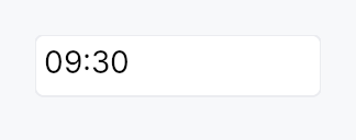
TimeEdit — text input for time-of-day, bound to Signal<Option<Time>>.
Public types
| Kind | Name |
|---|---|
enum | TimeFormat — 12h vs 24h time formatting |
enum | SecondsMode — Whether the seconds segment is shown in TimeEdit |
struct | TimeEdit — Single-line editable time-of-day field |
Public functions
TimeEdit
| Returns | Function |
|---|---|
| Constructors | |
Self | new(value: Signal<Option<Time>>) |
Self | required(value: Signal<Time>) |
| Builder methods | |
Self | style(style: impl teksilo_core::styles::DateEditStyle) |
Self | format(f: TimeFormat) |
Self | seconds(mode: SecondsMode) |
Self | format_pattern(p: impl Into<String>) |
Self | min_time(t: Time) |
Self | max_time(t: Time) |
Self | step_minutes(n: u32) |
Self | placeholder(text: impl Into<LocalizedString>) |
Self | enabled(enabled: impl Into<Prop<bool>>) |
Self | read_only(read_only: bool) |
Self | validation_behavior(behavior: ValidationBehavior) |
Self | width_policy(policy: crate::date_edit::WidthPolicy) |
Self | label(label: impl Into<LocalizedString>) |
Self | on_value_changed(f: impl Fn(Option<Time>, &mut EventContext) + 'static) |
Self | tooltip(text: impl Into<LocalizedString>) |
Self | rich_tooltip(key: impl Into<String>) |
Self | rich_tooltip_content(content: crate::tooltip::TooltipContent) |
Self | composite_tooltip(content: impl Widget + 'static) |
| Methods | |
Signal<ValidationFeedback> | validation_feedback_signal() |
Signal<Option<Time>> | value() |
Detailed description
Single-line editable time field with strftime-pattern parse/format
and optional 12h/24h mode + AM/PM. Same compositional pattern as
DateEdit (TextInputField + commit on
Enter/blur + step keys), without a popover (desktop convention is no
graphical time picker).
Behaviour
- Value binding:
Signal<Option<Time>>—Noneshows the placeholder. - Pattern: 24h default
%H:%M; 12h is%I:%M %p. Override viaformat_pattern. Add seconds withseconds(SecondsMode::Editable). - Keyboard (preview-pass on the wrapper): the step is
segment-relative — it moves the field under the caret (hour,
minute, second or AM/PM), which is what
QDateTimeEditdoes.- Arrow Up / Down → ±1 unit of that segment; Shift+ → ±10.
- PageUp / PageDown → ±10 units; Shift+ → ±100.
- Hours wrap within the day and minutes and seconds within the hour and minute, so a sweep never rolls the value over.
Accessibility
- Container —
Role::TimeInputwithset_valueformatted asHH:MM:SSandset_labelfrom.label(). - Underlying TextInputField keeps
Role::TextInputso AT knows it's editable. It is where focus lands, so it carries the same name (the.label(), or "Time"), and it is the composite'saccessibility_proxy: what an application gives theTimeEdit(access_label,access_described_by) lands on the field. As onDateEdit, the field's own name is read before alabelled_byrelation, so name a time field in a form with.label().
use teksilo_core::signal::Signal;
use teksilo_widgets::time_edit::{TimeEdit, TimeFormat, SecondsMode};

let value = Signal::new(None);
let _field = TimeEdit::new(value)
    .format(TimeFormat::Hour24)
    .seconds(SecondsMode::Hidden);
Touch and pen
See DateEdit's "Touch and pen" section: the whole
date/time family carries focus_within and on_key_preview only, and its
pointer surface is the embedded field, the trigger button and the popover.
Density
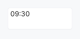
The picture above is the widget at TargetDensity::Compact, the mouse-and-keyboard ladder. Below is the same subject on the same canvas with only the ladder changed, so what moves is the density and nothing else — where the subject no longer fits, that is what the denser targets cost it at that size. See docs/density-and-targets.md.
Touch
API reference
📖 Full rustdoc API for this module
pub enum TimeFormat
Import: use teksilo::widgets::TimeFormat;
12h vs 24h time formatting.
Used with TimeEdit::format to lock the clock style independently of the locale default.
#![allow(unused)]
fn main() {
pub enum TimeFormat { /* variants */ }
}
Variants
Hour24— 24-hour clock (default —%H:%M).Hour12— 12-hour clock with AM/PM segment (%I:%M %p).
pub enum SecondsMode
Import: use teksilo::widgets::SecondsMode;
Whether the seconds segment is shown in TimeEdit.
#![allow(unused)]
fn main() {
pub enum SecondsMode { /* variants */ }
}
Variants
Hidden— Hide the seconds segment (default).Editable— Show and edit the seconds segment.
pub struct TimeEdit
Import: use teksilo::widgets::TimeEdit;
Single-line editable time-of-day field.
See the module documentation for full behaviour, pattern,
and keyboard details.
#![allow(unused)]
fn main() {
pub struct TimeEdit { /* fields */ }
}
Methods
pub fn new(value: Signal<Option<Time>>) -> Self
Construct bound to value (None = empty field; Some(t) = pre-filled time).
pub fn style(mut self, style: impl teksilo_core::styles::DateEditStyle) -> Self
Per-call DateEditStyle override (shared with DateEdit family).
pub fn required(value: Signal<Time>) -> Self
Construct with a required (non-nullable) Signal<Time>. The field
never shows None; the signal and the internal Option are kept in sync.
pub fn format(mut self, f: TimeFormat) -> Self
Lock the field to a specific clock (12h or 24h). When this
builder is not called, the field defaults to the user's
current locale via prefers_12_hour_clock (12h for en-US /
en-CA / en-AU / en-NZ / en-PH / en-IN / en-PK; 24h elsewhere).
pub fn seconds(mut self, mode: SecondsMode) -> Self
Show or hide the seconds segment. Default: SecondsMode::Hidden.
pub fn format_pattern(mut self, p: impl Into<String>) -> Self
Override the strftime-subset format pattern (e.g. "%H:%M:%S").
Bypasses the locale-derived and format-derived defaults entirely.
pub fn min_time(mut self, t: Time) -> Self (default: None)
Clamp the accepted value to at or after t (inclusive).
pub fn max_time(mut self, t: Time) -> Self (default: None)
Clamp the accepted value to at or before t (inclusive).
pub fn step_minutes(mut self, n: u32) -> Self
Set the ArrowUp / ArrowDown step in minutes. Default: 1. Must be ≥ 1.
Currently inert. Segment-aware stepping replaced the older whole-value step, and it moves the field under the caret by one of that segment's units rather than by a fixed number of minutes. The builder is kept on the public surface so callers that already configured it still compile, and as the hook a future per-segment custom step would use; it has no effect today.
pub fn placeholder(mut self, text: impl Into<LocalizedString>) -> Self
Text shown when the field is empty (value is None).
pub fn enabled(mut self, enabled: impl Into<Prop<bool>>) -> Self (default: true)
Set the enabled state, statically or reactively. Forwarded to the arena at build time.
pub fn read_only(mut self, read_only: bool) -> Self (default: false)
Allow display-only mode: text is selectable but not editable.
pub fn validation_behavior(mut self, behavior: ValidationBehavior) -> Self (default: ValidationBehavior::AutoCorrect)
How parse failures are surfaced. See
ValidationBehavior.
pub fn width_policy(mut self, policy: crate::date_edit::WidthPolicy) -> Self
How the widget claims horizontal space. See
WidthPolicy. Default
Default (natural mask-derived width).
pub fn validation_feedback_signal(&self) -> Signal<ValidationFeedback>
Reactive handle on the live validation feedback.
pub fn label(mut self, label: impl Into<LocalizedString>) -> Self
Set the accessible label for the field (announced by screen readers).
pub fn on_value_changed( mut self, f: impl Fn(Option<Time>, &mut EventContext) + 'static, ) -> Self
Callback invoked on every committed value change with the new
Option<Time> and a live EventContext.
pub fn tooltip(mut self, text: impl Into<LocalizedString>) -> Self
Attach a plain single-line tooltip shown after a hover delay. Clears any previously set rich or composite tooltip (last call wins).
pub fn rich_tooltip(mut self, key: impl Into<String>) -> Self
Attach a rich tooltip identified by a registry key. Clears any previously set plain or composite tooltip (last call wins).
pub fn rich_tooltip_content(mut self, content: crate::tooltip::TooltipContent) -> Self
Attach an inline rich tooltip from a crate::tooltip::TooltipContent
value. Clears any previously set plain or composite tooltip (last call wins).
pub fn composite_tooltip(mut self, content: impl Widget + 'static) -> Self
Attach a composite tooltip whose body is an arbitrary widget tree. Clears any previously set plain or rich tooltip (last call wins).
pub fn value(&self) -> Signal<Option<Time>>
The bound value signal — the same Signal passed to Self::new.