ToolBox
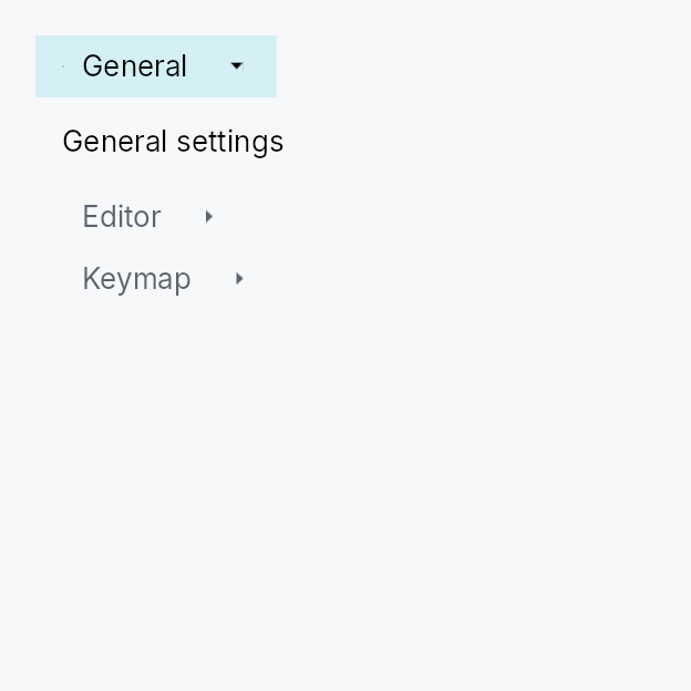
ToolBox — a vertical stack of collapsible sections, exactly one expanded at a time.
Public types
| Kind | Name |
|---|---|
enum | ToolBoxOrientation — Orientation of a ToolBox: how its collapsible sections are arranged |
struct | ToolBoxItem — One section of a ToolBox |
const | TOOL_BOX_HEADER_MIN_HEIGHT — ToolBox design tokens |
fn | tool_box_header_min_height — TOOL_BOX_HEADER_MIN_HEIGHT raised to the density's target_size (24 / 32 / 44 dp) |
const | TOOL_BOX_HEADER_PADDING_HORIZONTAL |
fn | tool_box_header_padding_horizontal — TOOL_BOX_HEADER_PADDING_HORIZONTAL scaled by the density's spacing_factor (1.00 / 1.15 / 1.30) |
const | TOOL_BOX_ICON_TEXT_SPACING |
fn | tool_box_icon_text_spacing — TOOL_BOX_ICON_TEXT_SPACING scaled by the density's spacing_factor (1.00 / 1.15 / 1.30) |
const | TOOL_BOX_CHEVRON_SIZE |
const | TOOL_BOX_INDICATOR_THICKNESS |
struct | ToolBox — A vertical container of collapsible sections with exactly one expanded at a time — the Int UI / QToolBox pattern |
Public functions
ToolBox
| Returns | Function |
|---|---|
| Constructors | |
Self | new(selected: Signal<usize>) |
| Builder methods | |
Self | orientation(orientation: ToolBoxOrientation) |
Self | fill(fill: bool) |
Self | collapsible(collapsible: bool) |
Self | horizontal() |
Self | on_header_drag(f: impl Fn(usize, &mut EventContext) + 'static) |
Self | item(label: impl Into<LocalizedString>, content: impl teksilo_core::IntoTeksiChild) |
Self | add(item: ToolBoxItem) |
Self | items<I>(items: I) |
Self | show_dividers(show: bool) |
ToolBoxItem
Detailed description
Semantic cousin of Qt's QToolBox and the collapsible groups in
IntelliJ's Settings dialog. Differs from Accordion
(single-item independent disclosure) and TabWidget
(horizontal tab bar with dormant panes) by combining vertical layout,
always-visible headers, and exclusive expansion in one widget.
Int UI visual language:
- flat, borderless headers (no corner radius)
- 1 dp accent indicator bar on the leading edge of the active header
- color-only emphasis (selected / hover / pressed surface roles)
- border IS the focus ring: an accent border at the theme's
focus_ring_width(2 dp under Int UI) appears on the focused header, no separate ring primitive - content swaps are instant — Int UI's house rule is to avoid
decorative animation for inline transitions; see
MotionTokens. Matches the existingTabWidgetprecedent where pane swaps have no transition.
let selected = ctx.signal(0_usize);
ToolBox::new(selected.clone())
    .item(lit!("Outline"),    outline_widget)
    .item(lit!("Properties"), properties_widget)
    .add(ToolBoxItem::new(lit!("Build"), build_widget).enabled(false))
Touch and pen
A section header activates from its tap, so it already actuates on the release. Two things did change:
- its pressed appearance is the framework's press now, not the keyboard path's — before, the recipe painted a state no pointer of either kind ever wrote;
- a tap by a contact rests the header idle rather than hovered. A finger
sends no hover-leave to correct a resting
Hoveredwith, so a tapped header stayed lit with nothing on it — visible once the selection moved elsewhere, because a selected header's own chrome hides the tint until then.
The optional header drag (on_header_drag, the dock panel's handle) needs no
declaration for a contact: DragActivation::Auto resolves to Immediate
where nothing competes for the axis, and to the hold where a scroller does.
Density
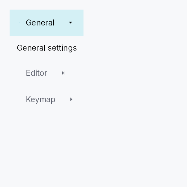
The picture above is the widget at TargetDensity::Compact, the mouse-and-keyboard ladder. Below is the same subject on the same canvas with only the ladder changed, so what moves is the density and nothing else — where the subject no longer fits, that is what the denser targets cost it at that size. See docs/density-and-targets.md.
Touch
API reference
📖 Full rustdoc API for this module
pub enum ToolBoxOrientation
Import: use teksilo::widgets::ToolBoxOrientation;
Orientation of a ToolBox: how its collapsible sections are arranged.
Vertical (the default) stacks sections
top-to-bottom with horizontal headers and an up/down chevron — the
classic QToolBox. Horizontal lays
sections left-to-right; each header becomes a narrow vertical strip
with its label rotated 90° and a left/right chevron. The horizontal form
is used by side-docks anchored to the top/bottom edges (where the wide,
short region calls for vertical header strips).
#![allow(unused)]
fn main() {
pub enum ToolBoxOrientation { /* variants */ }
}
Variants
Vertical— Sections stacked top-to-bottom; horizontal headers (default).Horizontal— Sections arranged left-to-right; vertical header strips with rotated labels and left/right chevrons.
pub struct ToolBoxItem
Import: use teksilo::widgets::ToolBoxItem;
One section of a ToolBox. Construct with ToolBoxItem::new and pass
to ToolBox::add, or use the convenience ToolBox::item builder
directly (it takes a widget or a WidgetId) when leading / trailing slots
and tooltip are not needed.
Layout of the header row:
[indicator] [leading?] [label] [spacer] [trailing?] [chevron]
Both leading and trailing accept any impl Widget — typical uses
are a small IconWidget, a Checkbox (checkable section), a
Badge (count), or a Button (per-row action).
#![allow(unused)]
fn main() {
pub struct ToolBoxItem { /* fields */ }
}
Methods
pub fn new(label: impl Into<LocalizedString>, content: impl Widget + 'static) -> Self
Build an item with an inline content widget. The label may come from
tr!(...) (translated) or lit!(...).
pub fn new_id(label: impl Into<LocalizedString>, content_id: WidgetId) -> Self
Build an item whose content is a pre-registered widget id.
pub fn leading(mut self, widget: impl Widget + 'static) -> Self
Attach a leading-slot widget rendered before the label (after
the selection indicator bar). Use for a small IconWidget, a
Checkbox for checkable sections, a Badge, or any other
label-sized widget. The slot widget owns its own events — a
Checkbox inside the leading slot toggles independently of
the header's own tap.
pub fn trailing(mut self, widget: impl Widget + 'static) -> Self
Attach a trailing-slot widget rendered between the row's flexible
spacer and the chevron. Use for per-row actions — a dismiss
button, a badge, a secondary Toggle. The slot widget owns its
own events: tapping a Button inside the trailing slot fires the
button's action; gesture recognisers on the trailing widget stop
the header's own tap from firing, so a close-button click does
not also select the section.
pub fn tooltip(mut self, text: impl Into<LocalizedString>) -> Self
Attach a plain-text tooltip shown after a hover delay on the header
row. The text may come from tr!(...) (translated, locale-reactive)
or lit!(...). Mirrors .tooltip(...) on Button / IconButton /
MenuItem. Clears any previously set rich or composite tooltip (the
last tooltip setter called wins).
pub fn rich_tooltip(mut self, key: impl Into<String>) -> Self
Attach a rich tooltip resolved from the app-wide
TooltipRegistry by key.
Clears any previously set plain or composite tooltip (the last
tooltip setter called wins).
pub fn rich_tooltip_content(mut self, content: TooltipContent) -> Self
Attach a rich tooltip driven by inline TooltipContent — for
one-offs that don't belong in the registry. Clears any previously
set plain or composite tooltip (the last tooltip setter called wins).
pub fn composite_tooltip(mut self, content: impl Widget + 'static) -> Self
Attach a composite tooltip — an arbitrary impl Widget body shown
in a larger, scrollable overlay after a longer hover delay. Use for
rich on-demand previews: charts, property tables, image thumbnails.
Clears any previously set plain or rich tooltip (the last tooltip
setter called wins).
pub fn enabled(mut self, enabled: impl Into<Prop<bool>>) -> Self
Disable the item: its header renders in the disabled text role,
click and keyboard activation are ignored, and arrow navigation
skips it. Accepts a static bool or a reactive Signal<bool>.
Read once at build time: a false snapshot is forwarded to the
arena via ctx.enabled_when(header_id, false), and the arena is then
the single source of truth, ANDing with ancestors — disabling the
surrounding ToolBox (or any ancestor) disables every item regardless
of this flag. The Prop itself is not handed to the arena, so
flipping a bound Signal<bool> after build has no effect until the
ToolBox is rebuilt.
pub const TOOL_BOX_HEADER_MIN_HEIGHT
Import: use teksilo::widgets::tool_box::TOOL_BOX_HEADER_MIN_HEIGHT;
ToolBox design tokens.
#![allow(unused)]
fn main() {
pub const TOOL_BOX_HEADER_MIN_HEIGHT: f32 = 28.0;
}
pub fn tool_box_header_min_height(...)
Import: use teksilo::widgets::tool_box::tool_box_header_min_height;
TOOL_BOX_HEADER_MIN_HEIGHT raised to the density's target_size
(24 / 32 / 44 dp). The identity at Compact.
#![allow(unused)]
fn main() {
pub fn tool_box_header_min_height(tokens: &InputTokens) -> f32;
}
pub const TOOL_BOX_HEADER_PADDING_HORIZONTAL
Import: use teksilo::widgets::tool_box::TOOL_BOX_HEADER_PADDING_HORIZONTAL;
#![allow(unused)]
fn main() {
pub const TOOL_BOX_HEADER_PADDING_HORIZONTAL: f32 = 12.0;
}
pub fn tool_box_header_padding_horizontal(...)
Import: use teksilo::widgets::tool_box::tool_box_header_padding_horizontal;
TOOL_BOX_HEADER_PADDING_HORIZONTAL scaled by the density's spacing_factor
(1.00 / 1.15 / 1.30).
#![allow(unused)]
fn main() {
pub fn tool_box_header_padding_horizontal(tokens: &InputTokens) -> f32;
}
pub const TOOL_BOX_ICON_TEXT_SPACING
Import: use teksilo::widgets::tool_box::TOOL_BOX_ICON_TEXT_SPACING;
#![allow(unused)]
fn main() {
pub const TOOL_BOX_ICON_TEXT_SPACING: f32 = 8.0;
}
pub fn tool_box_icon_text_spacing(...)
Import: use teksilo::widgets::tool_box::tool_box_icon_text_spacing;
TOOL_BOX_ICON_TEXT_SPACING scaled by the density's spacing_factor
(1.00 / 1.15 / 1.30).
#![allow(unused)]
fn main() {
pub fn tool_box_icon_text_spacing(tokens: &InputTokens) -> f32;
}
pub const TOOL_BOX_CHEVRON_SIZE
Import: use teksilo::widgets::tool_box::TOOL_BOX_CHEVRON_SIZE;
#![allow(unused)]
fn main() {
pub const TOOL_BOX_CHEVRON_SIZE: f32 = 12.0;
}
pub const TOOL_BOX_INDICATOR_THICKNESS
Import: use teksilo::widgets::tool_box::TOOL_BOX_INDICATOR_THICKNESS;
#![allow(unused)]
fn main() {
pub const TOOL_BOX_INDICATOR_THICKNESS: f32 = 1.0;
}
pub struct ToolBox
Import: use teksilo::widgets::ToolBox;
A vertical container of collapsible sections with exactly one expanded
at a time — the Int UI / QToolBox pattern.
The active section is driven by a caller-owned Signal<usize>; mirrors
TabWidget::new so persistence, synchronised
windows, and programmatic activation work identically.
#![allow(unused)]
fn main() {
pub struct ToolBox { /* fields */ }
}
Methods
pub fn new(selected: Signal<usize>) -> Self
Create a ToolBox driven by selected (visible section index). Set the
signal to 0 to open the first section by default; modify it
programmatically or share it across windows for synchronized state.
pub fn orientation(mut self, orientation: ToolBoxOrientation) -> Self
Set the section arrangement orientation (default
ToolBoxOrientation::Vertical).
pub fn fill(mut self, fill: bool) -> Self
Make the active section's panel fill the ToolBox's allotted space rather than size to its content's natural extent.
With fill on, the active panel stretches to the full cross axis and
flexes / shrinks (and clips) along the main axis, so a ToolBox placed
in a bounded region lays its content out at exactly the available
size — the QToolBox convention. A panel whose content carries a
trailing Spacer therefore pins a bottom toolbar to the visible
bottom edge instead of overflowing past it.
Default false (the panel keeps its content's natural size — the
historical behaviour, appropriate when the ToolBox itself lives inside
a scroll area).
pub fn collapsible(mut self, collapsible: bool) -> Self
Allow collapsing the active section: clicking (or Enter/Space on, or
the AT Collapse action of) the already-expanded header closes it, so
all sections can be collapsed at once. A subsequent click re-expands.
Default false — the classic "exactly one section open" behaviour. This
is what makes a single-section ToolBox a plain collapsible panel
(header toggles its content), e.g. a dock panel.
pub fn horizontal(mut self) -> Self
Shorthand for ToolBox::orientation``(``ToolBoxOrientation::Horizontal``).
pub fn on_header_drag(mut self, f: impl Fn(usize, &mut EventContext) + 'static) -> Self
Make each section header a drag source. f is invoked (with the
section index) when a drag gesture starts on a header; it should
begin a drag (e.g. ctx.start_drag(source, payload)). Tapping a
header still selects it — the gesture arena tells a tap from a drag.
pub fn item( self, label: impl Into<LocalizedString>, content: impl teksilo_core::IntoTeksiChild, ) -> Self
Append an item with an inline content widget. Convenience wrapper
around ToolBox::add that skips the ToolBoxItem builder for
the common label-plus-content case.
pub fn add(mut self, item: ToolBoxItem) -> Self
Append a fully-built ToolBoxItem — required when an icon,
tooltip, or disabled flag is needed.
pub fn items<I>(mut self, items: I) -> Self where I: IntoIterator<Item = ToolBoxItem>,
Append multiple items from an iterator.
pub fn show_dividers(mut self, show: bool) -> Self
Show a 1 dp BorderRole::Divider line between consecutive header /
panel rows. Default: false — IntelliJ Settings-style collapsibles
stack without explicit dividers, letting the flat background roles
delineate the rows.