ColorEdit
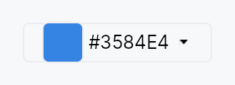
ColorEdit — compact field-style color picker trigger that opens
a popover containing a ColorPicker.
Public functions
ColorEdit
Detailed description
Direct analog of DateEdit. The
trigger is a Button with a reactive ColorSwatch in its
leading slot, the current hex as the label, and an optional
chevron in its trailing slot. Click, Enter, Space, or Alt+Down
opens the popover; Escape or click-outside closes it. The inner
picker writes through the same bound Signal<Color>, so external
observers see live updates as the user drags within the popover
(no commit step).
Built on PopoverButton:
the overlay wiring (dormant content + show / dismiss + AT
has_popup + expanded) lives there. This file is just the
ColorEdit-specific assembly — picker config pass-through, the
reactive trigger, and the nullable-binding bridge.
Accessibility
The trigger declares Role::Button
(via Button), HasPopup::Dialog
(via PopoverButton), and tracks the popover open state through
set_expanded. The label binds reactively to the hex value so
AT name updates as the picker mutates the bound color.
Example
use teksilo_core::signal::Signal;
use teksilo_tokens::Color;

let color = ctx.signal(Color::new(0.21, 0.52, 0.89, 1.0));
let _edit = ColorEdit::new(color)
    .alpha_enabled(true)
    .show_chevron(true);
Density
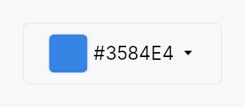
The picture above is the widget at TargetDensity::Compact, the mouse-and-keyboard ladder. Below is the same subject on the same canvas with only the ladder changed, so what moves is the density and nothing else — where the subject no longer fits, that is what the denser targets cost it at that size. See docs/density-and-targets.md.
Touch
API reference
📖 Full rustdoc API for this module
pub struct ColorEdit
Import: use teksilo::widgets::ColorEdit;
Compact color cell that opens a full ColorPicker in a popover when activated.
#![allow(unused)]
fn main() {
pub struct ColorEdit { /* fields */ }
}
Methods
pub fn new(value: Signal<Color>) -> Self
Bind to a non-nullable color signal. The trigger and the picker both read from and write to the same signal.
pub fn nullable(value: Signal<Option<Color>>) -> Self
Bind to a nullable color signal. None is treated as transparent
black for picker math; any user interaction produces a concrete
Some(color). To clear back to None, compose a separate
Clear button alongside the ColorEdit.
pub fn alpha_enabled(mut self, enabled: bool) -> Self
Enable or disable the alpha channel in the picker and the hex trigger label.
pub fn swatches(mut self, s: impl Into<Prop<Vec<Color>>>) -> Self
Provide a palette of preset swatches shown in the popover —
statically, or reactively via a bound Signal<Vec<Color>> so the
palette updates without reopening the popover.
pub fn swatch_columns(mut self, n: usize) -> Self
Number of columns in the preset swatch grid. Defaults to 6; clamped to at least 1.
pub fn picker_layout(mut self, l: ColorPickerLayout) -> Self
Select a popover layout variant — ColorPickerLayout::Compact
(default, minimal height) or Standard / Wide for richer controls.
pub fn show_rgb_spinners(mut self, s: bool) -> Self
Show or hide the RGB (0–255) component spinners in the popover.
pub fn show_hsv_spinners(mut self, s: bool) -> Self
Show or hide the HSV (hue/saturation/value) component spinners in the popover.
pub fn show_hex_input(mut self, s: bool) -> Self
Show or hide the hex string input in the popover.
pub fn show_hex_in_trigger(mut self, s: bool) -> Self
Show or hide the formatted hex value as the trigger button label.
pub fn show_chevron(mut self, s: bool) -> Self
Show or hide the trailing chevron glyph on the trigger button.
pub fn trigger_swatch_size(mut self, size: f32) -> Self
Override the size of the color swatch thumbnail in the trigger button (logical pixels).
pub fn placement(mut self, p: OverlayPlacement) -> Self
Override where the popover appears relative to the trigger.
Default is OverlayPlacement::BelowPreferred.
pub fn dismiss_behavior(mut self, b: DismissBehavior) -> Self
Override how the popover is dismissed. Default is
DismissBehavior::EscapeOrClickOutside.
pub fn label(mut self, label: impl Into<LocalizedString>) -> Self
Replace the trigger button's visible label with a static localized
string. When set, the hex value is no longer displayed in the trigger
(combine with .show_hex_in_trigger(false) if needed).
pub fn enabled(mut self, enabled: impl Into<Prop<bool>>) -> Self
Set the enabled state, statically or reactively. Forwarded to the arena at build time.
pub fn on_open(mut self, f: impl Fn() + 'static) -> Self
Install a callback fired when the color-picker popover opens.
The signature is Fn() (no EventContext)
because on_close is invoked from the overlay-dismiss path,
which has no ctx in scope. To keep the open/close pair
symmetric, on_open matches. If you need ctx in a
color-editing-mode callback, attach an on_tap on a sibling
trigger that wakes the editor explicitly.
pub fn on_close(mut self, f: impl Fn() + 'static) -> Self
Install a callback fired when the color-picker popover closes.
See on_open for why this is Fn() and not
Fn(&mut EventContext).
pub fn tooltip(mut self, text: impl Into<LocalizedString>) -> Self
Attach a plain single-line tooltip shown after a hover delay.
Mutually exclusive with rich_tooltip,
rich_tooltip_content, and
composite_tooltip — calling this
clears the other slots (last setter wins).
pub fn rich_tooltip(mut self, key: impl Into<String>) -> Self
Attach a rich tooltip identified by a registry key.
Mutually exclusive with tooltip,
rich_tooltip_content, and
composite_tooltip — calling this
clears the other slots (last setter wins).
pub fn rich_tooltip_content(mut self, content: crate::tooltip::TooltipContent) -> Self
Attach a rich tooltip from an inline TooltipContent value.
Mutually exclusive with tooltip,
rich_tooltip, and
composite_tooltip — calling this
clears the other slots (last setter wins).
pub fn composite_tooltip(mut self, content: impl Widget + 'static) -> Self
Attach a composite tooltip whose body is an arbitrary widget tree.
Mutually exclusive with tooltip,
rich_tooltip, and
rich_tooltip_content — calling
this clears the other slots (last setter wins).