ColorPicker
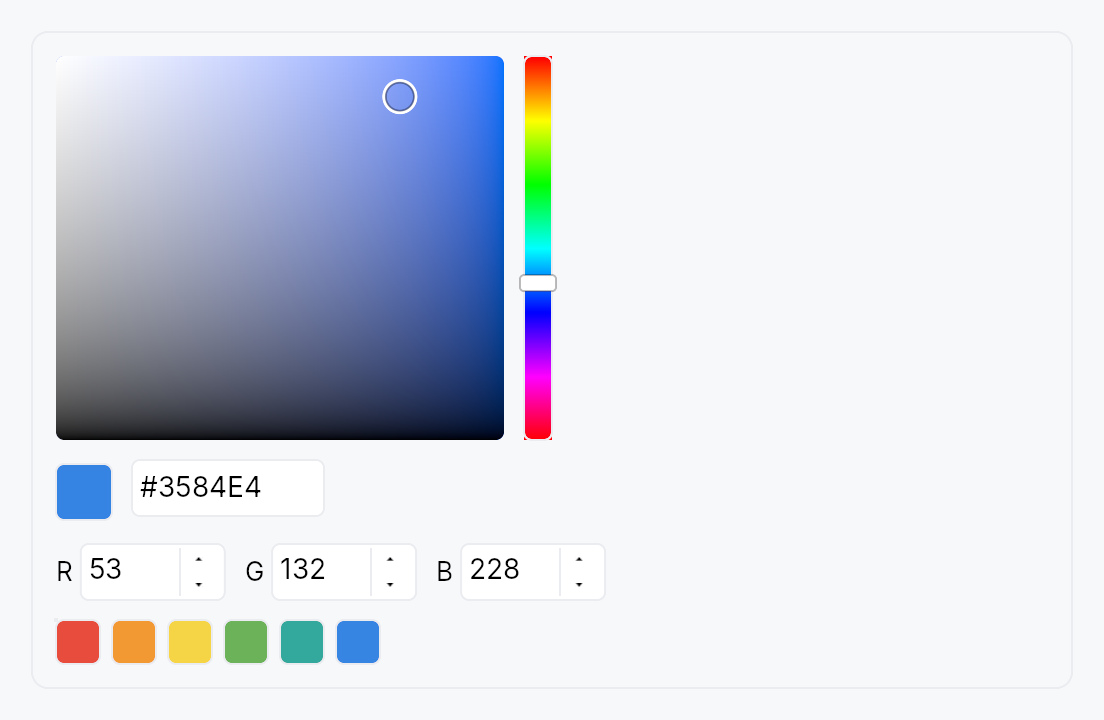
ColorPicker — embeddable composite color selector.
Public types
| Kind | Name |
|---|---|
const | DEFAULT_SWATCHES — Default 12-color preset palette (Int UI–flavored) |
struct | ColorPicker — Embeddable HSV+RGB+hex+alpha+swatches color picker |
Public functions
ColorPicker
Detailed description
Combines a 2D HSV canvas, 1D hue and alpha strips, RGB and HSV
component spinners, a hex input, a current-color preview, and an
optional preset swatch grid into a single bound widget. Driven by a
Signal<Color> (or Signal<Option<Color>>) source of truth — every
subcomponent reads from / writes to the same signal so the various
representations stay in lockstep.
Layouts
ColorPickerLayout::Compact— HSV canvas + hue strip + hex input. Minimal vertical footprint, suitable for popovers.ColorPickerLayout::Standard(default) — HSV canvas + hue strip + alpha strip (when enabled), with RGB spinners, hex input, and preset swatches stacked beneath. The everything-on layout for inspector panes and settings dialogs.ColorPickerLayout::Wide— HSV canvas with strips on the right, spinners stacked vertically alongside the swatch grid. For wide property pages.
Accessibility
Root: Role::Group with a localized
label and Live::Polite so screen readers announce committed color
changes. The HSV canvas's subtree is excluded from the AT tree
(no ARIA precedent for 2D pointer gestures); the hue strip, alpha
strip, RGB / HSV spinners, hex input, current-color preview, and
swatch grid each carry their own appropriate role and value.
Touch and pen
The hue strip, the alpha strip and the HSV canvas are continuous
manipulators — the value each produces is the press position — so all
three declare touch_action(NONE): a finger that lands on one adjusts it
rather than scrolling the surface the picker sits in. What NONE forbids,
with a test on it, is a two-contact pinch begun on one of them reaching the
surface underneath; the press capture each takes on its own PointerDown is
what separately keeps an enclosing scroller from taking the gesture away.
docs/touch-and-pen.md §7.3.
The strips are 14 dp across and cannot grow — the panel's column geometry is
built around them — so they make the 24 dp shortfall up between the pointer
and the arena, through Widget::hit_outset, on the short axis only. A
22 dp preset swatch earns the same widening, on both of its axes. The
strips also report what they painted through Widget::target_regions, so
the knob a user aims at is visible to a conformance audit even though no
layout ever produced it.
Density
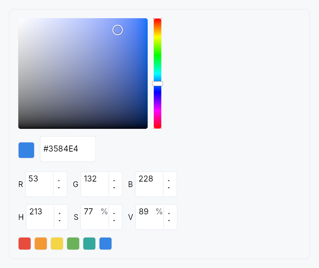
The picture above is the widget at TargetDensity::Compact, the mouse-and-keyboard ladder. Below is the same subject on the same canvas with only the ladder changed, so what moves is the density and nothing else — where the subject no longer fits, that is what the denser targets cost it at that size. See docs/density-and-targets.md.
Touch
API reference
📖 Full rustdoc API for this module
pub const DEFAULT_SWATCHES
Import: use teksilo::widgets::DEFAULT_SWATCHES;
Default 12-color preset palette (Int UI–flavored). Apps can use
this verbatim or pass their own via ColorPicker::swatches.
#![allow(unused)]
fn main() {
pub const DEFAULT_SWATCHES: `Color;
}
pub struct ColorPicker
Import: use teksilo::widgets::ColorPicker;
Embeddable HSV+RGB+hex+alpha+swatches color picker.
See the [module docsfor layout options, accessibility, and integration patterns. UseColorEdit`
to wrap this in a compact trigger + popover pattern.
use teksilo_core::signal::Signal;
use teksilo_tokens::Color;
use teksilo_widgets::color_picker::{ColorPicker, ColorPickerLayout};

let color = ctx.signal(Color::new(0.42, 0.70, 0.35, 1.0));
let _picker = ColorPicker::new(color)
    .layout(ColorPickerLayout::Compact)
    .alpha_enabled(false);
#![allow(unused)]
fn main() {
pub struct ColorPicker { /* fields */ }
}
Methods
pub fn new(value: Signal<Color>) -> Self
Bind to a non-nullable color signal.
pub fn nullable(value: Signal<Option<Color>>) -> Self
Bind to a nullable color signal. None is treated as
transparent black for picker math; any commit produces a
concrete Some(color). Apps that want a "clear to None"
affordance should expose a separate Clear button alongside
the picker.
pub fn style(mut self, style: impl teksilo_core::styles::ColorPickerStyle) -> Self
Per-call style override. Higher precedence than the theme-wide
style_slots.color_picker slot.
pub fn alpha_enabled(mut self, e: bool) -> Self
Enable or disable the alpha channel (hue-strip alpha strip + a spinner + hex digit pair).
pub fn show_hsv_canvas(mut self, s: bool) -> Self
Show or hide the 2D HSV gradient canvas. Hidden in headless or accessibility-only contexts where the pointer-drag surface is not useful.
pub fn show_hue_strip(mut self, s: bool) -> Self
Show or hide the vertical hue selection strip.
pub fn show_alpha_strip(mut self, s: bool) -> Self
Show or hide the vertical alpha strip. Defaults to the value of
alpha_enabled; call this to decouple them (e.g. show the strip
without enabling the alpha spinner).
pub fn show_rgb_spinners(mut self, s: bool) -> Self
Show or hide the RGB (0–255) component spinners row.
pub fn show_hsv_spinners(mut self, s: bool) -> Self
Show or hide the HSV (hue 0–359°, saturation 0–100%, value 0–100%) spinners row.
pub fn show_hex_input(mut self, s: bool) -> Self
Show or hide the hex string input field.
pub fn show_preview(mut self, s: bool) -> Self
Show or hide the current-color preview swatch (Standard / Wide layouts).
pub fn show_swatches(mut self, s: bool) -> Self
Show or hide the preset swatch grid (Standard / Wide layouts only).
pub fn show_footer(mut self, s: bool) -> Self
Show a Done / Cancel footer at the bottom of the picker.
Default false for embedded use (the bound signal is the
commit channel — there is no "uncommitted" state). Wrappers
that present the picker as a popover (e.g. ColorEdit)
flip this to true so the user has explicit accept / dismiss
affordances; the buttons fire Self::on_done /
Self::on_cancel respectively.
pub fn on_done(mut self, f: impl Fn(&mut EventContext) + 'static) -> Self
Callback fired when the user activates the footer's Done
button. The picker has already been writing through to the
bound signal as the user dragged / typed, so Done's job is
purely to dismiss the surrounding surface (popover, sheet,
dialog). Only meaningful when show_footer(true).
pub fn on_cancel(mut self, f: impl Fn(&mut EventContext) + 'static) -> Self
Callback fired when the user activates the footer's Cancel
button. The picker itself does not restore any value —
that's the caller's responsibility (e.g. ColorEdit captures a
snapshot at popover-open time and writes it back here). The
callback's typical implementation is
value.set(snapshot.get()); ctx.dismiss_self_overlay_chain();.
Only meaningful when show_footer(true).
pub fn swatches(mut self, s: impl Into<Prop<Vec<Color>>>) -> Self
Replace the default 12-color DEFAULT_SWATCHES with a custom
palette — statically, or reactively via a bound Signal<Vec<Color>>
that updates live without rebuilding the picker.
pub fn swatch_columns(mut self, n: usize) -> Self
Number of columns in the preset swatch grid. Defaults to 6; clamped to at least 1.
pub fn layout(mut self, l: ColorPickerLayout) -> Self
Select the overall layout variant. Defaults to ColorPickerLayout::Standard.
pub fn label(mut self, label: impl Into<LocalizedString>) -> Self
Set the accessible group label for the picker root node. Defaults to the localized "Color picker" string.
pub fn enabled(mut self, enabled: impl Into<Prop<bool>>) -> Self
Set the enabled state, statically or reactively. Forwarded to the arena at build time.
pub fn tooltip(mut self, text: impl Into<LocalizedString>) -> Self
Attach a plain single-line tooltip shown after a hover delay.
Mutually exclusive with Self::rich_tooltip, Self::rich_tooltip_content,
and Self::composite_tooltip — the last setter called wins.
pub fn rich_tooltip(mut self, key: impl Into<String>) -> Self
Attach a rich tooltip looked up from the registry by key.
Mutually exclusive with the other tooltip setters — the last call wins.
pub fn rich_tooltip_content(mut self, content: crate::tooltip::TooltipContent) -> Self
Attach an inline rich tooltip from an already-constructed crate::tooltip::TooltipContent.
Mutually exclusive with the other tooltip setters — the last call wins.
pub fn composite_tooltip(mut self, content: impl Widget + 'static) -> Self
Attach a composite tooltip whose body is an arbitrary widget tree.
Mutually exclusive with the other tooltip setters — the last call wins.
pub fn current(&self) -> Color
Read the current bound color. Convenience for tests / apps that
hold a ColorPicker reference; otherwise prefer reading the
Signal<Color> you passed in.