ComboBox
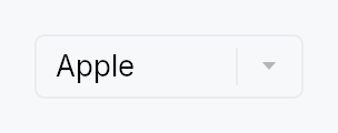
ComboBox — dropdown selection widget.
Public functions
ComboBox
Detailed description
Generic over the item type T: Clone + PartialEq + 'static. Selection is
value-based: the bound Signal<Option<T>> survives reorder and insertion
of the backing model. Items come from one of four input paths:
ComboBox::new— static list of localizable strings (the 90% case).ComboBox::from_items— static list of typed values.ComboBox::from_model— reactiveListModel<T>.ComboBox::from_source— externalListDataSource<Item = T>.
The dropdown panel's node is created during build() and kept dormant, but
its subtree is deferred — built the first time the combo is opened.
Keyboard
The keys move a highlight through the list, and only a commit changes the value: the W3C ARIA select-only combobox pattern. A reader arrowing to hear the options changes nothing, and an application acting on the value (a language switcher) acts once, on the option the user picked.
Enter/Space: open the list; in the open list, commit the highlighted option and close.ArrowDown/ArrowUp: open the list and move the highlight one item from the value, stopping at the ends; with no value,ArrowDownreaches the first item. Win32's combo box,QComboBox, GTK and the W3C ARIA listbox pattern all stop rather than wrap; a combo box is a value, and wrapping is the menu convention.Alt+ArrowDown/Alt+ArrowUp: open the list on the value (or the first item) without moving, and close it. The Win32 / WinForms / WPF chord and the ARIA combobox pattern.F4: toggle the list (Win32 / Qt / WPF).Escape: close the list and keep the value.Home/End: first / last item.PageUp/PageDown: one page, where a page ismax_visible_itemsrows.- Printable characters: type-ahead, within
type_ahead_timeout. - A chord holding
Ctrl,AltorSuperis not the combo box's and falls through to the application;Shiftis, so a capital letter still types.
Every key that moves the highlight opens the list first when it is
closed, so the reader hears the option it reaches. Focus stays on the
combo box (or, in a searchable list, on its
search field), which names the highlighted option as its
active_descendant: every platform adapter follows that as the focus.
The widget is split across four internal modules:
stateholds theItemSourceaccessor, the defaultmax_visible_itemsconstant, and the index helpers.itemholds the single-rowDropdownItemwidget.panelholds theDropdownPaneloverlay content and theFilteredItemListinner widget.testsholds the headless unit tests.
Touch and pen
The closed box is one target — the arrow column is paint inside it, not a second target — and it opens the dropdown from its tap, so already on the release. The field's hover tint is decoration with nothing behind it.
The dropdown's rows are menu rows and take the menu row's target floor at every
density; before this they measured against the raw Compact constant while a
MenuList's rows grew, and the panel that shows max_visible_items of them now
resolves the same number they do.
Density
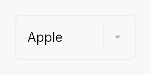
The picture above is the widget at TargetDensity::Compact, the mouse-and-keyboard ladder. Below is the same subject on the same canvas with only the ladder changed, so what moves is the density and nothing else — where the subject no longer fits, that is what the denser targets cost it at that size. See docs/density-and-targets.md.
Touch
API reference
📖 Full rustdoc API for this module
pub struct ComboBox
Import: use teksilo::widgets::ComboBox;
A dropdown selection widget.
// Simple: list of strings.
let selected = ctx.signal(None::<String>);
ComboBox::new(["Apple", "Banana", "Cherry"], selected)
    .placeholder(lit!("Select a fruit..."))

// Typed items: any T: Clone + PartialEq, plus a label extractor.
#[derive(Clone, PartialEq)] struct Fruit { name: String, emoji: &'static str }
let selected = ctx.signal(None::<Fruit>);
ComboBox::from_items(fruits, selected)
    .item_label(|f: &Fruit| lit!(format!("{} {}", f.emoji, f.name)))

// Model-backed: reactive.
let model = ListModel::from_vec(fruits);
ComboBox::from_model(model, selected)
    .item_label(|f: &Fruit| lit!(f.name.clone()))
    .max_visible_items(6)
#![allow(unused)]
fn main() {
pub struct ComboBox<T: Clone + PartialEq + 'static> { /* fields */ }
}
Methods
pub fn new( items: impl IntoIterator<Item = impl Into<String>>, selected: Signal<Option<String>>, ) -> Self
Create a ComboBox from a list of strings.
Accepts any impl Into<String> — string literals (&str),
owned Strings, resolved LocalizedStrings, etc. For
translated items, resolve translations before passing in,
e.g. vec![tr!(apple()).resolve_now(), ...].
pub fn from_items<F>( items: impl IntoIterator<Item = T>, selected: Signal<Option<T>>, item_label: F, ) -> Self where F: Fn(&T) -> LocalizedString + 'static,
Static list of typed items. item_label is the display extractor —
it's required at construction so the compiler enforces it rather
than a runtime check. For T = String, use ComboBox::new which
defaults to the identity label.
pub fn from_model<F>(model: ListModel<T>, selected: Signal<Option<T>>, item_label: F) -> Self where F: Fn(&T) -> LocalizedString + 'static,
Backed by a reactive ListModel<T>. Inserts, removes, and reorders
propagate into the dropdown automatically. If the currently-selected
value disappears from the model, selected becomes None.
pub fn from_source<S, F>(source: S, selected: Signal<Option<T>>, item_label: F) -> Self where S: ListDataSource<Item = T> + 'static, F: Fn(&T) -> LocalizedString + 'static,
Backed by a custom ListDataSource — for external or paged data.
pub fn item_label(mut self, f: impl Fn(&T) -> LocalizedString + 'static) -> Self
Override the display-label extractor. Rarely needed — prefer passing
item_label to the constructor. Useful for the ComboBox<String>
path when you want a non-identity projection.
pub fn render_item(mut self, f: impl Fn(&T, bool) -> Box<dyn Widget> + 'static) -> Self
Custom cell rendering. The closure receives the item and a flag indicating whether it is the currently-selected value.
The framework wraps the returned widget with the correct
Role::ListBoxOption accessibility and tap handler, so callers
do not need to manage a11y or selection dispatch themselves.
Reactivity. The bool argument is a snapshot at build time.
If the selection flips after the dropdown is open, the user's
subtree is not automatically re-rendered; the framework-managed
highlight background (behind the custom widget) does update, and
closing and re-opening the dropdown picks up the new state. If
you need a reactive appearance that tracks selection, close over
a Signal<Option<T>> in your closure and compare against the
item value inside a .map() / bind_* on primitives.
Accessibility. The wrapper's set_name(label) (from
item_label) is what screen readers announce. If the returned
widget includes its own text nodes (e.g. a bare TextWidget), the
label may be announced twice — one from the wrapper, one from the
inner text. Wrap primary text nodes in .a11y_hidden() to avoid
duplication, and reserve visible widgets for presentation only.
pub fn render_selected(mut self, f: impl Fn(&T) -> Box<dyn Widget> + 'static) -> Self
Custom renderer for the trigger's selected value — the widget shown
when the combo is closed. The parallel of render_item
for the trigger rather than the dropdown rows.
When set, the closed combo shows f(&value) for the current
selection instead of the plain text label (item_label). The
canonical use is a FontPicker rendering the selected family name in
its own typeface. The subtree is rebuilt whenever the selection
changes and whenever the locale changes (so a None-state
placeholder re-translates), without rebuilding the whole ComboBox.
Accessibility. The rendered subtree is excluded from the
accessibility tree — the ComboBox's own accessibility(builder)
already announces the selected value via set_value, so the custom
visual can never double-announce. When nothing is selected the
trigger shows the placeholder text.
pub fn on_select(mut self, f: impl Fn(&T, &mut EventContext) + 'static) -> Self
Register a callback fired when the user commits a selection — by
tapping a dropdown row, or pressing Enter (or Space) on the
option the keyboard highlighted. The callback receives the chosen
value and a live EventContext, so it can run context-bearing
actions that observing the bound selected signal cannot, such as
ctx.set_locale(...), navigation, or opening another overlay.
Moving through the list (arrows, type-ahead, Home / End, the page
keys) is not a commit and fires nothing, and neither does Enter on
the option that is the value already. So a context change made here
happens once, on the user's choice, never while they are still
listening to the options (WCAG 3.2.2).
It fires only on user-driven commits, not on external writes
to the selected signal (those are observed via ctx.effect).
The selected signal is updated before the callback runs.
pub fn max_visible_items(mut self, n: usize) -> Self
Maximum number of items shown before the dropdown becomes scrollable. Defaults to 8. Clamped to at least 1.
pub fn type_ahead_timeout(mut self, d: Duration) -> Self
Reset window for keyboard type-ahead. Keystrokes more than d apart
begin a fresh prefix; within d they extend it. Defaults to 500 ms,
matching MenuList::type_ahead_timeout. Pass Duration::ZERO to
treat each keystroke independently.
pub fn placeholder(mut self, text: impl Into<LocalizedString>) -> Self
Placeholder text shown in the trigger when selected is None.
Accepts a tr!(...) directly (resolved at build); use
placeholder_literal for an
untranslated string.
pub fn label(mut self, label: impl Into<LocalizedString>) -> Self
Accessible label describing what this combo box is for (e.g. "Fruit", "Font family"). Independent of the visible placeholder and of the current selection — screen readers announce this as the name of the control.
pub fn enabled(mut self, enabled: impl Into<Prop<bool>>) -> Self
Set the enabled state, statically or reactively. Forwarded to the arena at build time.
pub fn variant(mut self, variant: ComboBoxVariant) -> Self
Pick a Tier-1 design-language variant
(ComboBoxVariant::Outlined / Filled / Underline / Plain).
The active ComboBoxStyle decides what to do with the hint —
IntUI's default impl honours Outlined (default) and Plain;
a custom impl (Material 3, macOS, etc.) might paint differently.
pub fn style(mut self, style: impl ComboBoxStyle) -> Self
Override the active ComboBoxStyle for this widget instance
only. The default IntUI chrome (crate::styles::RecipeComboBoxStyle)
resolves its dimensions from theme.input (the density
InputTokens); custom impls
can paint anything they want around the selected-label slot.
pub fn text_style(mut self, style: impl Into<teksilo_core::color_prop::TextStyleProp>) -> Self
Override the selected-value text style (font, size, weight).
Accepts a TextStyleRole, a TextStyle, or a Signal of either.
Default (unset) is TextStyleRole::Body.
pub fn text_role(mut self, color: impl Into<teksilo_core::color_prop::ColorProp>) -> Self
Override the selected-value text color. Accepts Color, a role, or
a Signal of either. Default (unset) is enabled-derived
(Primary / Disabled); setting this replaces that cascade.
pub fn tooltip(mut self, text: impl Into<LocalizedString>) -> Self
Attach a plain tooltip that appears after a hover delay. The tooltip is anchored to the trigger only — with the framework's overlay-boundary gate it does not re-trigger while the pointer is over the open dropdown's option rows.
Mutually exclusive with rich_tooltip /
rich_tooltip_content /
composite_tooltip — last call wins.
pub fn rich_tooltip(mut self, key: impl Into<String>) -> Self
Attach a rich tooltip resolved from the app-wide tooltip registry.
The key is looked up via
TooltipRegistry at build
time; the resolved body supports inline markup, a shortcut chip,
and a "more" disclosure. Overrides any previously set tooltip.
pub fn rich_tooltip_content(mut self, content: crate::tooltip::TooltipContent) -> Self
Attach a rich tooltip driven by inline
TooltipContent — for one-off
tooltips that aren't worth registering centrally. Overrides any
previously set tooltip.
pub fn composite_tooltip(mut self, content: impl Widget + 'static) -> Self
Attach a composite tooltip — third tier, hosting an arbitrary
widget tree (tabbed sections, charts, conditional rows). Promotes
to a focusable Role::Dialog after the standard dwell. Overrides
any plain or rich tooltip previously set.
Searchable-mode builders. The search field is a TextInput, which
shares the RichTextEditor engine and therefore the teksilo-text
dependency.
pub fn searchable(mut self, enabled: bool) -> Self
Show a search field at the top of the dropdown panel and filter
the list live against the user's query. When true, items are
matched by the closure passed to filter, or —
if no filter is set — by a case-insensitive substring match on
the item_label.
The search input becomes a child of the dropdown panel only, not of the trigger: the closed combo box looks identical whether searchable or not.
The query signal is created internally. Use
search_query to supply your own if you
want to observe or drive the query externally.
pub fn search_query(mut self, query: Signal<String>) -> Self
Bind the search field to an external Signal<String>. Implies
searchable(true). Useful for observing or
programmatically setting the query from outside the widget
(e.g. a "Clear" button, persistence across sessions).
pub fn filter(mut self, f: impl Fn(&str, &T) -> bool + 'static) -> Self
Custom match predicate for searchable mode. Called on every
visible-item pass with the current query string (as typed, not
normalized) and a reference to the item; return true to keep
the item in the filtered list. Only consulted when
searchable is true. Ignored otherwise.