CommandLinkButton

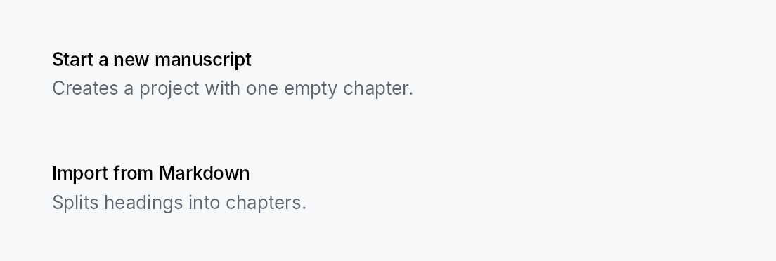
CommandLinkButton — large two-line button with icon, title, and subtitle. Used for wizard landing screens, onboarding choices, and any "card-shaped CTA" pattern.
Public types
| Kind | Name |
|---|---|
const | COMMAND_LINK_BUTTON_ICON_SIZE — CommandLinkButton design tokens |
const | COMMAND_LINK_BUTTON_ICON_TEXT_GAP |
fn | command_link_button_icon_text_gap — COMMAND_LINK_BUTTON_ICON_TEXT_GAP scaled by the density's spacing_factor (1.00 / 1.15 / 1.30) |
const | COMMAND_LINK_BUTTON_TITLE_DESCRIPTION_GAP |
fn | command_link_button_title_description_gap — COMMAND_LINK_BUTTON_TITLE_DESCRIPTION_GAP scaled by the density's spacing_factor (1.00 / 1.15 / 1.30) |
const | COMMAND_LINK_BUTTON_PADDING_HORIZONTAL |
fn | command_link_button_padding_horizontal — COMMAND_LINK_BUTTON_PADDING_HORIZONTAL scaled by the density's spacing_factor (1.00 / 1.15 / 1.30) |
const | COMMAND_LINK_BUTTON_PADDING_VERTICAL |
fn | command_link_button_padding_vertical — COMMAND_LINK_BUTTON_PADDING_VERTICAL scaled by the density's spacing_factor (1.00 / 1.15 / 1.30) |
const | COMMAND_LINK_BUTTON_MIN_HEIGHT |
fn | command_link_button_min_height — COMMAND_LINK_BUTTON_MIN_HEIGHT raised to the density's target_size (24 / 32 / 44 dp) |
struct | CommandLinkButton — A large two-line CTA button: icon + title + subtitle |
Public functions
CommandLinkButton
Detailed description
Modeled on Qt's QCommandLinkButton. Distinct from a regular
Button by its layout (HStack(icon + VStack(title + subtitle))) and default visual variant (Flat —
Int UI convention — with an interactive surface tint on hover).
CommandLinkButton::new(tr!(create_new_project()))
    .description(tr!(create_new_project_subtitle()))
    .icon(IconWidget::from_svg(NEW_PROJECT_ICON))
    .on_activate_fn(|ctx| ctx.send_intent(AppIntent::NewProject))
Touch and pen
Shares build_interaction_handlers with Button; see that
module's "Touch and pen" section. A command link is a tall, wide target by
construction, so no hit-widening mechanism is involved.
Density
The picture above is the widget at TargetDensity::Compact, the mouse-and-keyboard ladder. Below is the same subject on the same canvas with only the ladder changed, so what moves is the density and nothing else — where the subject no longer fits, that is what the denser targets cost it at that size. See docs/density-and-targets.md.
Touch
API reference
📖 Full rustdoc API for this module
pub const COMMAND_LINK_BUTTON_ICON_SIZE
Import: use teksilo::widgets::command_link_button::COMMAND_LINK_BUTTON_ICON_SIZE;
CommandLinkButton design tokens. The widget is a group-4 composite with no dedicated recipe module.
#![allow(unused)]
fn main() {
pub const COMMAND_LINK_BUTTON_ICON_SIZE: f32 = 28.0;
}
pub const COMMAND_LINK_BUTTON_ICON_TEXT_GAP
Import: use teksilo::widgets::command_link_button::COMMAND_LINK_BUTTON_ICON_TEXT_GAP;
#![allow(unused)]
fn main() {
pub const COMMAND_LINK_BUTTON_ICON_TEXT_GAP: f32 = 14.0;
}
pub fn command_link_button_icon_text_gap(...)
Import: use teksilo::widgets::command_link_button::command_link_button_icon_text_gap;
COMMAND_LINK_BUTTON_ICON_TEXT_GAP scaled by the density's spacing_factor
(1.00 / 1.15 / 1.30).
#![allow(unused)]
fn main() {
pub fn command_link_button_icon_text_gap(tokens: &InputTokens) -> f32;
}
pub const COMMAND_LINK_BUTTON_TITLE_DESCRIPTION_GAP
Import: use teksilo::widgets::command_link_button::COMMAND_LINK_BUTTON_TITLE_DESCRIPTION_GAP;
#![allow(unused)]
fn main() {
pub const COMMAND_LINK_BUTTON_TITLE_DESCRIPTION_GAP: f32 = 4.0;
}
pub fn command_link_button_title_description_gap(...)
Import: use teksilo::widgets::command_link_button::command_link_button_title_description_gap;
COMMAND_LINK_BUTTON_TITLE_DESCRIPTION_GAP scaled by the density's spacing_factor
(1.00 / 1.15 / 1.30).
#![allow(unused)]
fn main() {
pub fn command_link_button_title_description_gap(tokens: &InputTokens) -> f32;
}
pub const COMMAND_LINK_BUTTON_PADDING_HORIZONTAL
Import: use teksilo::widgets::command_link_button::COMMAND_LINK_BUTTON_PADDING_HORIZONTAL;
#![allow(unused)]
fn main() {
pub const COMMAND_LINK_BUTTON_PADDING_HORIZONTAL: f32 = 16.0;
}
pub fn command_link_button_padding_horizontal(...)
Import: use teksilo::widgets::command_link_button::command_link_button_padding_horizontal;
COMMAND_LINK_BUTTON_PADDING_HORIZONTAL scaled by the density's spacing_factor
(1.00 / 1.15 / 1.30).
#![allow(unused)]
fn main() {
pub fn command_link_button_padding_horizontal(tokens: &InputTokens) -> f32;
}
pub const COMMAND_LINK_BUTTON_PADDING_VERTICAL
Import: use teksilo::widgets::command_link_button::COMMAND_LINK_BUTTON_PADDING_VERTICAL;
#![allow(unused)]
fn main() {
pub const COMMAND_LINK_BUTTON_PADDING_VERTICAL: f32 = 14.0;
}
pub fn command_link_button_padding_vertical(...)
Import: use teksilo::widgets::command_link_button::command_link_button_padding_vertical;
COMMAND_LINK_BUTTON_PADDING_VERTICAL scaled by the density's spacing_factor
(1.00 / 1.15 / 1.30).
#![allow(unused)]
fn main() {
pub fn command_link_button_padding_vertical(tokens: &InputTokens) -> f32;
}
pub const COMMAND_LINK_BUTTON_MIN_HEIGHT
Import: use teksilo::widgets::command_link_button::COMMAND_LINK_BUTTON_MIN_HEIGHT;
#![allow(unused)]
fn main() {
pub const COMMAND_LINK_BUTTON_MIN_HEIGHT: f32 = 64.0;
}
pub fn command_link_button_min_height(...)
Import: use teksilo::widgets::command_link_button::command_link_button_min_height;
COMMAND_LINK_BUTTON_MIN_HEIGHT raised to the density's target_size
(24 / 32 / 44 dp). The identity at Compact.
#![allow(unused)]
fn main() {
pub fn command_link_button_min_height(tokens: &InputTokens) -> f32;
}
pub struct CommandLinkButton
Import: use teksilo::widgets::CommandLinkButton;
A large two-line CTA button: icon + title + subtitle.
#![allow(unused)]
fn main() {
pub struct CommandLinkButton { /* fields */ }
}
Methods
pub fn new(title: impl Into<LocalizedString>) -> Self
Create a CommandLinkButton with the given title text.
Chain .description(...) and .icon(...) to complete the card layout.
pub fn description(mut self, text: impl Into<LocalizedString>) -> Self
Optional descriptive subtitle rendered below the title.
pub fn icon(mut self, icon: IconWidget) -> Self
Leading icon — large enough to anchor the card visually (rendered at 28 dp).
pub fn enabled(mut self, enabled: impl Into<Prop<bool>>) -> Self
Set the enabled state, statically or reactively. Forwarded to the arena at build time.
pub fn on_activate_fn(mut self, f: impl Fn(&mut EventContext) + 'static) -> Self
Closure invoked on activation. Use ctx.send_intent(...) to
route through the Action / Intent system.
pub fn title_style( mut self, style: impl Into<teksilo_core::color_prop::TextStyleProp>, ) -> Self
Override the title's text style (font, size, weight). Accepts a
TextStyleRole, a TextStyle, or a Signal of either. Default
(unset) is TextStyleRole::BodyBold.
pub fn description_style( mut self, style: impl Into<teksilo_core::color_prop::TextStyleProp>, ) -> Self
Override the description's text style. Default is TextStyleRole::Body.
pub fn title_color(mut self, color: impl Into<teksilo_core::color_prop::ColorProp>) -> Self
Override the title's text color. Accepts Color, a role, or a
Signal of either. Default (unset) is TextRole::Primary.
pub fn description_color( mut self, color: impl Into<teksilo_core::color_prop::ColorProp>, ) -> Self
Override the description's text color. Default is TextRole::Secondary.
pub fn tooltip(mut self, text: impl Into<LocalizedString>) -> Self
Attach a plain single-line tooltip shown after a hover delay. Clears any previously set rich or composite tooltip.
pub fn rich_tooltip(mut self, key: impl Into<String>) -> Self
Attach a rich tooltip looked up by registry key. Clears any previously set plain or composite tooltip.
pub fn rich_tooltip_content(mut self, content: crate::tooltip::TooltipContent) -> Self
Attach a rich tooltip with inline content (no registry lookup). Clears any previously set plain or composite tooltip.
pub fn composite_tooltip(mut self, content: impl Widget + 'static) -> Self
Attach a composite tooltip hosting an arbitrary widget tree body. Clears any previously set plain or rich tooltip.