MessageBox
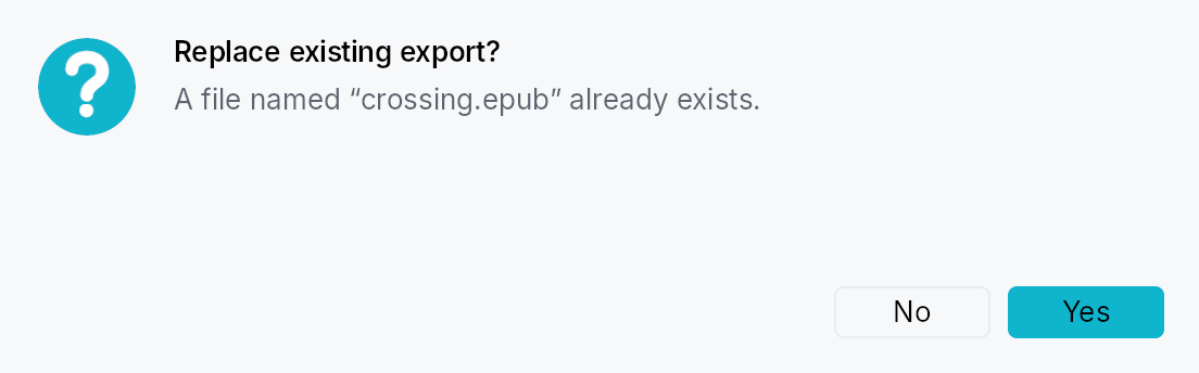
MessageBox — QMessageBox-style alert dialog.
Public types
| Kind | Name |
|---|---|
enum | MessageBoxSeverity — Alert severity level |
enum | ButtonRole — Semantic role of a message-box button |
enum | StandardButton — The Qt-modeled catalog of standard buttons |
struct | MessageBoxButton — A single button placement inside a MessageBox, including an optional per-instance label override |
enum | MessageBoxButtons — Pre-built button bundles covering the common MessageBox shapes |
enum | MessageBoxDismissal — How a MessageBox came to close |
struct | MessageBoxResult — Report passed to MessageBox::on_result when the dialog closes |
struct | MessageBox — A modal alert dialog that displays a severity icon, title, body text, and one or more buttons |
trait | EventContextMessageBoxExt — Extension trait on EventContext for ergonomic MessageBox presentation |
Public functions
MessageBox
StandardButton
| Returns | Function |
|---|---|
| Methods | |
ButtonRole | role() |
&'static str | intent_name() |
LocalizedString | default_label() |
MessageBoxButton
| Returns | Function |
|---|---|
| Constructors | |
Self | standard(kind: StandardButton) |
| Builder methods | |
Self | label(label: impl Into<LocalizedString>) |
MessageBoxResult
| Returns | Function |
|---|---|
| Methods | |
bool | was_dismissed() |
EventContextMessageBoxExt
| Returns | Function |
|---|---|
| Methods | |
present_message_box(mb: MessageBox) |
Detailed description
A higher-level surface built on top of ModalContainer
for the classic "tell the user something and ask for a response"
pattern: unsaved-changes prompts, error surfaces, confirmation
dialogs, and informational notices. Mirrors QMessageBox (Qt),
NSAlert (AppKit), and SwiftUI's .alert(...) while staying inside
Teksilo's idioms — closure result handlers, Signal/Prop
reactivity, Intent/Action/Shortcut routing for keyboard
defaults, and AccessKit Role::AlertDialog accessibility.
Quick tour
use teksilo::prelude::*;
use teksilo::widgets::{MessageBox, MessageBoxButtons, StandardButton};

fn on_close(ctx: &mut EventContext) {
    MessageBox::question(lit!("Save changes?"))
        .text(lit!("You have unsaved changes in report.skrib."))
        .informative_text(lit!("Your changes will be lost if you don't save them."))
        .buttons(MessageBoxButtons::SaveDiscardCancel)
        .default_button(StandardButton::Save)
        .escape_button(StandardButton::Cancel)
        .on_result(|r, ctx| match r.button {
            StandardButton::Save => save_and_close(ctx),
            StandardButton::Discard => close(ctx),
            _ => {}
        })
        .present(ctx);
}
# fn save_and_close(_: &mut EventContext) {}
# fn close(_: &mut EventContext) {}
Severity
MessageBoxSeverity controls the icon drawn beside the title and
its tint:
Information— info glyph,status_info_fgtint.Question— question mark glyph,accenttint.Warning— exclamation triangle,status_warning_fgtint.Critical— X-mark circle,status_error_fgtint. Also disables click-outside dismissal (Qt convention).None— no icon, no tint.
Severity is conveyed through the icon + title + text. Per Teksilo's
Int UI baseline, buttons are never colored as "destructive":
destructive intent lives in the dialog's severity and wording, not
in the button. See crate::button for details.
Default & escape buttons
default_button— activated by Enter (widget-scoped shortcut) and receives initial focus on open (viaModalRequest::focus_targetplusWidget::initial_focus_hint). Styled withButtonVariant::Filled.escape_button— activated by Escape. The fallback logic (for presets with no explicitescape_button) picks: explicitescape_button→ firstReject-role button →Cancel→ last button.
Each preset supplies a default: Ok for Ok and OkCancel, Save for
SaveDiscardCancel, Retry for RetryIgnoreAbort, and No for
YesNo and YesNoCancel.
The Yes/No default is the negative answer on purpose. An Ok/Cancel box
confirms something the user just asked for, so Ok is the answer they
meant. A Yes/No box asks a question they did not initiate, and it is
overwhelmingly asked before something irreversible — "Delete this?",
"Discard your changes?". Defaulting to Yes means Enter destroys, and
Enter is what a keyboard user presses on a dialog they have not
finished reading. Where the question is safe, default_button puts Yes
back in one reviewable line; the reverse default cannot be reviewed,
because there is nothing on the screen to review.
It matters more than it looks, because no platform announces which
button is the default: Node::keyboard_shortcut appears in none of
the three AccessKit adapters, so a screen-reader user discovers the
default only by pressing Enter. Where focus lands is the whole contract.
Title and button alignment
MessageBox::title_alignment places the title in the header's text
column (default Leading) and MessageBox::button_alignment places the
button row (default Trailing), both as teksilo_tokens::HAlignment.
macOS alerts centre both; Windows and GNOME keep the title leading and the
buttons trailing, which is the default. Leading and Trailing follow the
layout direction.
Result reporting
MessageBox::on_result takes impl Fn(MessageBoxResult, &mut EventContext) + 'static. The callback fires exactly once, whichever
route closes the dialog — button activation, Escape, a press outside, or a
programmatic dismissal — with MessageBoxResult::dismissal naming which
one. On a button activation the modal is then closed by the framework; on
the other routes it is already going away.
Accessibility
The widget exposes Role::AlertDialog, with set_modal(),
set_live(Live::Assertive), set_name(title), and
set_description(text + informative_text), so screen readers
announce the dialog by its title as it opens and find the text as its
description and by walking it. The ModalContainer that presents it
publishes no dialog of its own around it, and the content under it is
Live::Off, so the title is the one thing announced, once.
Density
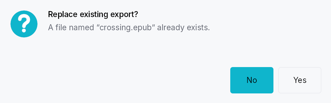
The picture above is the widget at TargetDensity::Compact, the mouse-and-keyboard ladder. Below is the same subject on the same canvas with only the ladder changed, so what moves is the density and nothing else — where the subject no longer fits, that is what the denser targets cost it at that size. See docs/density-and-targets.md.
Touch
API reference
📖 Full rustdoc API for this module
pub enum MessageBoxSeverity
Import: use teksilo::widgets::MessageBoxSeverity;
Alert severity level. Drives the icon glyph + tint shown beside the
title, and (for Critical) whether click-outside dismiss is enabled.
#![allow(unused)]
fn main() {
pub enum MessageBoxSeverity { /* variants */ }
}
Variants
None— No icon. Use for plain notices where an icon would be noise.Information— Informational notice — blue circle with "i" glyph.Question— Confirmation prompt — accent-tinted circle with "?" glyph.Warning— Non-fatal warning — amber triangle with "!" glyph.Critical— Critical error — red circle with an "X" glyph. Click-outside dismissal is disabled (Escape still works).
pub enum ButtonRole
Import: use teksilo::widgets::ButtonRole;
Semantic role of a message-box button. Used for fallback escape
resolution (Reject wins when no explicit escape button is set).
Teksilo deliberately does not render Destructive buttons with
a red fill — the dialog's severity icon and wording carry that
signal. See crate::button for the framework-level rationale.
#![allow(unused)]
fn main() {
pub enum ButtonRole { /* variants */ }
}
Variants
Accept— Confirms / proceeds. Ok, Yes, Save, Open, Apply, Retry.Reject— Bails out. Cancel, Close, No, Abort.Destructive— Data-loss action. Discard. (Same visuals as Regular — the severity of the surrounding MessageBox carries the warning.)Action— Side action. Help, Reset, RestoreDefaults, Ignore, and the "to all" variants.
pub enum StandardButton
Import: use teksilo::widgets::StandardButton;
The Qt-modeled catalog of standard buttons. Each variant resolves
to a localized label, a semantic ButtonRole, and a stable
intent-name string used internally for shortcut/action routing.
#![allow(unused)]
fn main() {
pub enum StandardButton { /* variants */ }
}
Variants
Ok— Accept / confirm.ButtonRole::Accept.Cancel— Cancel the operation.ButtonRole::Reject.Close— Close the dialog.ButtonRole::Reject.Yes— Confirm with "Yes".ButtonRole::Accept.No— Decline with "No".ButtonRole::Reject.YesToAll— Confirm all remaining items.ButtonRole::Accept.NoToAll— Decline all remaining items.ButtonRole::Reject.Save— Save changes.ButtonRole::Accept.SaveAll— Save all open items.ButtonRole::Accept.Discard— Discard changes without saving.ButtonRole::Destructive.Apply— Apply changes without closing.ButtonRole::Accept.Reset— Reset to defaults.ButtonRole::Action.RestoreDefaults— Restore factory defaults.ButtonRole::Action.Abort— Abort the current operation.ButtonRole::Reject.Retry— Retry the failed operation.ButtonRole::Accept.Ignore— Ignore the error and continue.ButtonRole::Action.Open— Open a file or resource.ButtonRole::Accept.Help— Show help.ButtonRole::Action.
Methods
pub fn role(self) -> ButtonRole
The button's semantic role — used internally by MessageBox's
escape-button fallback resolution, and available to callers that
want to inspect a MessageBoxButton's role.
pub fn intent_name(self) -> &'static str
Stable string id used as both the shortcut id and the intent name for routing default/escape key activations. Scoped to a MessageBox instance via widget-scoped shortcut registration, so the same id is safe to reuse across instances.
pub fn default_label(self) -> LocalizedString
Default label for the button. Resolved through the Fluent
catalog via tr_widget! so apps can override per-locale.
pub struct MessageBoxButton
Import: use teksilo::widgets::MessageBoxButton;
A single button placement inside a MessageBox, including an optional
per-instance label override. Callers usually build these via
From<StandardButton> (StandardButton::Ok.into()), or
construct them manually when Custom is needed.
#![allow(unused)]
fn main() {
pub struct MessageBoxButton { /* fields */ }
}
Fields
kind:StandardButton— Which standard button this is — drives role, intent name, and (whenlabel_overrideisNone) the label.label_override:Option<LocalizedString>— Optional explicit label that overrideskind.default_label(). Use sparingly: prefer translating the default via Fluent rather than hard-coding per-call labels.
Methods
pub fn standard(kind: StandardButton) -> Self
Build a button from a StandardButton with the default label.
pub fn label(mut self, label: impl Into<LocalizedString>) -> Self
Override the default translated label.
pub enum MessageBoxButtons
Import: use teksilo::widgets::MessageBoxButtons;
Pre-built button bundles covering the common MessageBox shapes.
Custom combinations go through MessageBox::add_button or
MessageBoxButtons::Custom.
#![allow(unused)]
fn main() {
pub enum MessageBoxButtons { /* variants */ }
}
Variants
Ok— Just Ok.OkCancel— Ok + Cancel, Ok default, Cancel escape.YesNo— Yes + No. No is the default, and No is the escape. See the module docs for why the default is the negative answer.YesNoCancel— Yes + No + Cancel. No is the default, Cancel is the escape — Enter takes the safe answer to the question asked, Escape leaves the dialog.SaveDiscardCancel— The unsaved-changes triad: Save + Discard + Cancel.RetryIgnoreAbort— The error-recovery triad: Retry + Ignore + Abort.Custom(Vec<MessageBoxButton>)— Explicit list. MessageBox preserves the order as the visual button order (leading Spacer pushes all buttons to the trailing edge; default button may appear anywhere).
pub enum MessageBoxDismissal
Import: use teksilo::widgets::MessageBoxDismissal;
How a MessageBox came to close.
This replaced a dismissed_by_escape: bool whose own rustdoc claimed to
cover scrim-click as well — a contract no code path could produce, because
the only writer was the Escape action. One field that names the route
cannot drift from its documentation the way two overlapping booleans can,
and the caller can finally tell "the user chose Cancel" from "the user
waved the dialog away", which for a Save/Discard/Cancel prompt are
different answers.
#![allow(unused)]
fn main() {
pub enum MessageBoxDismissal { /* variants */ }
}
Variants
Button— A button was chosen: clicked, or Enter on the default.Escape— Escape, resolved to the escape button.ClickOutside— A press outside the dialog, where itsModalCloseBehaviorpermits it.Programmatic— It went away for another reason — the application dismissed it, or an enclosing surface closed and took it along.buttonstill carries the escape-button resolution, because something has to be reported and that is the same answer Escape would have given.
pub struct MessageBoxResult
Import: use teksilo::widgets::MessageBoxResult;
Report passed to MessageBox::on_result when the dialog closes.
#![allow(unused)]
fn main() {
pub struct MessageBoxResult { /* fields */ }
}
Fields
button:StandardButton— Which button fired — either by click, Enter (the focused button, else the default), or escape-button resolution for any of the dismissal routes.checkbox_checked:bool— State of the "Don't show again" checkbox at dismiss time, when one was configured viaMessageBox::show_again_checkboxorMessageBox::show_again_checkbox_state.falsewhen no checkbox was attached.dismissal:MessageBoxDismissal— Which route closed the dialog.
Methods
pub fn was_dismissed(&self) -> bool
Whether the dialog went away without the user choosing a button.
The predicate the old dismissed_by_escape flag was reached for, minus
the claim that Escape was the only way to get there.
pub struct MessageBox
Import: use teksilo::widgets::MessageBox;
A modal alert dialog that displays a severity icon, title, body text, and one or more buttons.
Constructed via severity-named constructors (MessageBox::information,
MessageBox::warning, MessageBox::critical, MessageBox::question,
MessageBox::plain), configured fluently, and presented with
MessageBox::present. See the module documentation for the full guide.
#![allow(unused)]
fn main() {
pub struct MessageBox { /* fields */ }
}
Methods
pub fn information(title: impl Into<LocalizedString>) -> Self
Construct an informational MessageBox (Information severity).
pub fn warning(title: impl Into<LocalizedString>) -> Self
Construct a warning MessageBox (Warning severity).
pub fn critical(title: impl Into<LocalizedString>) -> Self
Construct a critical-error MessageBox (Critical severity).
Click-outside dismissal is disabled; use an explicit button or
Escape to close.
pub fn question(title: impl Into<LocalizedString>) -> Self
Construct a confirmation / question MessageBox (Question
severity).
pub fn plain(title: impl Into<LocalizedString>) -> Self
Construct a plain MessageBox with no severity icon.
pub fn text(mut self, text: impl Into<LocalizedString>) -> Self
Primary message line, rendered in typography.body with
text_primary. Prefer a short, self-contained sentence —
details belong in informative_text.
pub fn informative_text(mut self, text: impl Into<LocalizedString>) -> Self
Secondary, explanatory text rendered below the primary text in
typography.body with text_secondary. Matches Qt's
setInformativeText.
pub fn detailed_text(mut self, text: impl Into<LocalizedString>) -> Self
Detailed text hidden behind a "Show details" Accordion —
for technical diagnostics (stack traces, error codes). Matches
Qt's setDetailedText.
pub fn buttons(mut self, preset: MessageBoxButtons) -> Self
Apply a preset button bundle. Implicitly sets default and
escape buttons for the preset (both can be overridden via
MessageBox::default_button and
MessageBox::escape_button).
pub fn add_button(mut self, button: impl Into<MessageBoxButton>) -> Self
Append a single button. Use to augment a preset (rare) or to
build a bespoke button row without going through
MessageBoxButtons::Custom.
pub fn add_buttons( self, buttons: impl IntoIterator<Item = impl Into<MessageBoxButton>>, ) -> Self
Append several buttons from an iterator, in order.
The loop form of add_button, for a bespoke button
row built from data rather than spelled out one call at a time.
pub fn default_button(mut self, which: StandardButton) -> Self
Mark which button activates on Enter and receives initial
focus. Must refer to one of the buttons configured via
buttons / add_button.
pub fn escape_button(mut self, which: StandardButton) -> Self
Mark which button activates on Escape (and scrim-click, when allowed). Must refer to one of the configured buttons.
pub fn show_again_checkbox(mut self, label: impl Into<LocalizedString>) -> Self
Attach a "Don't show again"-style checkbox below the body.
Internally creates a Signal<bool> initialized to false and
reports its state in MessageBoxResult::checkbox_checked.
For external observation, use
MessageBox::show_again_checkbox_state instead.
pub fn show_again_checkbox_state(mut self, signal: Signal<bool>) -> Self
Like MessageBox::show_again_checkbox, but with a
caller-owned Signal<bool> so the checkbox state survives the
dialog lifetime (useful for "remember my choice" persistence).
pub fn title_alignment(mut self, alignment: HAlignment) -> Self
Where the title sits in the header's text column. Default
HAlignment::Leading. Center matches a macOS alert; Windows and
GNOME keep the title leading. Leading / Trailing follow the layout
direction, so they mirror in right-to-left locales.
pub fn button_alignment(mut self, alignment: HAlignment) -> Self
Where the button row sits along the bottom of the dialog. Default
HAlignment::Trailing. Center matches a macOS alert; Leading
packs the buttons at the start edge. Leading / Trailing follow the
layout direction, so they mirror in right-to-left locales.
pub fn on_result(mut self, f: impl Fn(MessageBoxResult, &mut EventContext) + 'static) -> Self
Register the result callback, invoked exactly once however the dialog closes — a button (by click, or by the Enter/Escape shortcut), a press outside, or a programmatic dismissal.
pub fn present(mut self, ctx: &mut EventContext)
Present the MessageBox as a modal on top of ctx's current
tree. Consumes self; callers who need to present multiple
dialogs with shared config should build a factory closure.
pub trait EventContextMessageBoxExt
Import: use teksilo::widgets::EventContextMessageBoxExt;
Extension trait on EventContext for ergonomic MessageBox
presentation. Mirrors ctx.present_modal(...) for the general
case.
#![allow(unused)]
fn main() {
pub trait EventContextMessageBoxExt { /* associated items below */ }
}
Associated items
fn present_message_box(&mut self, mb: MessageBox);
Present mb as a modal. Equivalent to mb.present(self).