Panel
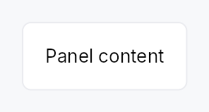
Panel — a themed single-child container that provides a background, border, corner radius, and padding.
Public functions
Panel
Detailed description
The equivalent of Qt's QFrame: a visual wrapper whose chrome comes from
the active PanelStyle trait
implementation. The IntUI default (RecipePanelStyle) honours four
PanelVariant presets (Plain /
Sunken / Raised / Highlighted) while still accepting per-call overrides
for background, border colour/width, corner radius, and padding. Apps
requiring a custom surface (frosted glass, brutalist frame) supply their
own impl PanelStyle per-call (.style(...)) or theme-wide via
theme.style_slots.panel.
Accessibility
Emits Role::Group by default. Call .a11y_presentational() to suppress
the group node when the panel is purely decorative (e.g. a toolbar
background that should not introduce a spurious container in the AT tree).
Either way the content is reachable: a presentational panel drops its own
node and keeps its children.
#![allow(unused)]
fn main() {
use teksilo_widgets::Panel;
use teksilo_widgets::primitives::TextWidget;
use teksilo_i18n::lit;
let _w = Panel::new()
    .padding(12.0)
    .child(TextWidget::new(lit!("Content")));
}
Density
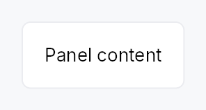
The picture above is the widget at TargetDensity::Compact, the mouse-and-keyboard ladder. Below is the same subject on the same canvas with only the ladder changed, so what moves is the density and nothing else — where the subject no longer fits, that is what the denser targets cost it at that size. See docs/density-and-targets.md.
Touch
API reference
📖 Full rustdoc API for this module
pub struct Panel
Import: use teksilo::widgets::Panel;
A themed container with background, border, corner radius, and padding.
#![allow(unused)]
fn main() {
pub struct Panel { /* fields */ }
}
Methods
pub fn new() -> Self
Construct a panel with default theme values (Plain variant, no manual overrides).
pub fn variant(mut self, variant: PanelVariant) -> Self
Pick the design-language variant. Default Plain. The active
PanelStyle decides what each variant means visually (the
IntUI default maps Plain → surface_main, Sunken →
surface_sunken, Raised → surface_raised, Highlighted →
accent_subtle_bg, with matching border defaults).
pub fn style(mut self, style: impl teksilo_core::styles::PanelStyle) -> Self
Per-call style override. Replaces the theme-wide default
PanelStyle for just this Panel instance — same role as
Button::style(...). Manual overrides (background,
border_color, etc.) are still passed to the style via
PanelStyleConfig; custom styles are free to honour or ignore
them.
pub fn a11y_presentational(mut self) -> Self
Mark the panel as presentational for assistive tech: the panel's
own node becomes a bare GenericContainer, which the platform
adapters drop, so its wrapping chrome (background, border,
padding) doesn't introduce a spurious Group node between an
outer widget (Toolbar, StatusBar, etc.) and the real content.
The children stay in the tree, promoted to the panel's parent.
pub fn child(mut self, widget: impl teksilo_core::IntoTeksiChild) -> Self
Set an inline child widget (deferred insertion).
pub fn child_opt(self, widget: Option<impl teksilo_core::IntoTeksiChild>) -> Self
Attach widget when it is Some, and do nothing when it is None.
The conditional-child form. teksu!'s if without an else lowers to
this, and it is what cond.then(|| w) is for in a builder chain. None
adds no arena node, so nothing is laid out, painted, or published to the
accessibility tree, and a stack applies no spacing around it.
pub fn background(mut self, color: impl Into<ColorProp>) -> Self
Override the background. Accepts Color, a SurfaceRole,
or a Signal<Color>. Default (unset) is SurfaceRole::Main.
pub fn border_color(mut self, color: impl Into<ColorProp>) -> Self
Override the border color. Accepts Color, a BorderRole,
or a Signal<Color>. Default (unset) is BorderRole::Default.
pub fn border_width(mut self, width: impl Into<Prop<f32>>) -> Self
Override the border width (default: the active PanelStyle recipe's own
border width — RecipePanelStyle uses 1 dp).
Accepts a static f32 or a reactive Signal<f32>.
pub fn corner_radius(mut self, radius: impl Into<Prop<f32>>) -> Self
Override the corner radius (default: theme radius_popup).
Accepts a static f32 or a reactive Signal<f32>.
pub fn padding(mut self, padding: impl Into<Prop<f32>>) -> Self
Override the padding (default: the active PanelStyle recipe's own
padding — RecipePanelStyle's 12 dp, density-scaled).
Accepts a static f32 or a reactive Signal<f32>.