TabWidget
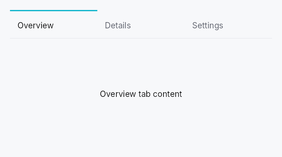
Tabbed-container widgets.
Public types
| Kind | Name |
|---|---|
type | StaticContentFactory — Closure that builds a static tab's content widget |
struct | TabWidget — All-in-one tabbed container |
enum | TabBarVisibility — Controls whether a TabWidget's tab strip is shown |
type | ContextMenuFactory — A reusable widget factory the framework calls every time a context menu opens |
enum | TabBarOrientation — Bar orientation |
enum | TabSizing — How wide each tab is: shared across all unpinned tabs, chosen per-tab from content, or stretched to fill the bar |
enum | TabDisplayMode — Bar-level control over what each tab shows — its icon, its label, or both |
enum | TabOverflowButton — When the trailing "show all tabs" overflow dropdown button appears |
struct | TabDelegate — Resolves per-tab UI from a model item |
const | STATIC_KIND — Sentinel kind reserved for static tabs accumulated via TabWidget::static_tab |
struct | TabHandle — One tab's identity, presentation, and state pointer |
struct | TabId — Stable identity of a tab |
type | IconFactory — Reusable factory for an IconWidget |
struct | TabInfo — Per-tab presentation metadata |
Public functions
TabWidget
TabDelegate
TabHandle
TabId
| Returns | Function |
|---|---|
| Constructors | |
Self | fresh() |
Self | from_raw(value: NonZeroU64) |
| Methods | |
NonZeroU64 | raw() |
TabInfo
Detailed description
Two public entry points:
-
TabBar<T>— a header strip driven by aListModel<T>/ListDataSourceand aTabDelegate<T>. Use it stand-alone when you want only the tab strip (e.g., a document tab strip whose content lives in a different panel or window). -
TabWidget— the all-in-one composition: bar above, contentSwitcherbelow, sharing one selection signal. Two construction flavors:static_tab(info, content)— fixed tabs accumulated at construction.dynamic_tab::<S>(kind, factory)+dynamic_model(model)— apps register a content factory per tabkind("plain-text-doc","image", …); the live tab list is a mutableListModel<TabHandle>mutated at runtime (open / close / reorder).
Static tabs always render first, in declaration order; dynamic
tabs follow. Selection is by stable TabId — drag-reorder and
model mutations never silently send the active selection to a
different tab.
Activating a tab scrolls it into view
When more tabs are open than the strip can show, activating one always reveals it — including when the activation is programmatic (writing the selection signal, the "show all tabs" overflow dropdown, an assistive-technology click). Pointer and keyboard activation move focus and would be revealed by the framework's focus follow anyway; the other paths move no focus, so the bar scrolls the header in itself, by the minimum needed to bring it fully inside the viewport.
The reveal is edge-triggered on the selection changing, not an invariant re-asserted every layout pass: once the reader has scrolled away from the active tab by hand, a rebuild for an unrelated reason — a retitled tab, a locale change, a tab opened elsewhere in the strip — leaves the viewport where they left it.
Accessibility
Both TabWidget and TabBar emit Role::TabList on the bar
and Role::Tab on each header. ARIA APG (tabs
pattern)
recommends providing an accessible name for the tab list
whenever a page hosts more than one — call
.access_label(tr!(editor_tabs()))
on the widget so screen readers can distinguish "editor tabs"
from "tool tabs":
TabWidget::new(selected)
    .static_tab(TabInfo::new().title(tr!(welcome())), welcome_panel)
    // ...
    .access_label(tr!(editor_tabs()))
Panels with no focusable descendants (a static text-only "About"
tab, a chart-only metrics tab) are unreachable by Tab key unless
opted in via TabInfo::focusable_panel(true).
Density
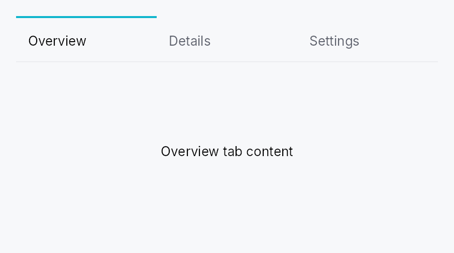
The picture above is the widget at TargetDensity::Compact, the mouse-and-keyboard ladder. Below is the same subject on the same canvas with only the ladder changed, so what moves is the density and nothing else — where the subject no longer fits, that is what the denser targets cost it at that size. See docs/density-and-targets.md.
Touch
API reference
📖 Full rustdoc API for this module
pub type StaticContentFactory
Import: use teksilo::widgets::StaticContentFactory;
Closure that builds a static tab's content widget. Called once
per static tab — on the TabWidget's first build that includes
it. The resulting pane is then memoized: rebuilds caused by
adjacent dynamic-model mutations reuse the same pane WidgetId, so
internal state (focus, scroll, animation progress, …) survives.
#![allow(unused)]
fn main() {
pub type StaticContentFactory = Rc<dyn Fn(&TabHandle) -> Box<dyn Widget>>;
}
pub struct TabWidget
Import: use teksilo::widgets::TabWidget;
All-in-one tabbed container. Builds a TabBar above a
Switcher of content panes, sharing one selection signal.
#![allow(unused)]
fn main() {
pub struct TabWidget { /* fields */ }
}
Methods
pub fn new(selected: Signal<Option<TabId>>) -> Self
Construct an empty TabWidget. Selection is None until
the first static_tab(...) / dynamic_model(...) adds a
tab and the framework activates it.
pub fn enabled(mut self, enabled: impl Into<Prop<bool>>) -> Self (default: true)
Enable or disable the whole widget. A disabled TabWidget greys out
and stops accepting focus / selection / keyboard input
(arena-gated). Distinct from per-tab TabInfo::enabled.
pub fn bar_visibility(mut self, visibility: impl Into<Prop<TabBarVisibility>>) -> Self
Set the tab-strip visibility policy (default
TabBarVisibility::Always). Use TabBarVisibility::WhenMultiple
to hide the strip while a single tab is present, or
TabBarVisibility::Never when an external selector (e.g. a
docking activity rail) drives selection.
Accepts a plain TabBarVisibility or a Signal<TabBarVisibility>.
Bound reactively, the strip appears and disappears in place — the
TabWidget itself is never torn down, so per-tab content state
(caret, scroll offset, focus) survives the flip. That is the point
of binding rather than swapping two TabWidgets in a Switcher:
an app-level "hide the chrome" mode must not cost the user their
place in the document.
A derived signal (.map(..) / .zip(..)) is fine here: binding
resolves through to the mutable roots and never calls observe.
pub fn tab_bar_height(mut self, dp: f32) -> Self
Override the tab-strip height (its cross-axis extent). None /
unset keeps the style's editor_height (50 dp under Int UI). Use for a denser
strip — e.g. dock side panels.
pub fn compact_bar(self) -> Self
Shorthand for a compact (38 dp) tab strip — denser than the standard
50 dp editor strip. Equivalent to self.tab_bar_height(38.0).
pub fn vertical(self) -> Self
Configure the bar to render vertically — pills stacked
top-to-bottom on the leading edge, content fills the trailing
area (sidebar / IDE-perspective convention). Equivalent to
self.orientation(TabBarOrientation::Vertical).
pub fn horizontal(self) -> Self
Configure the bar to render horizontally — pills laid out left-to-right above the content (browser tab convention). This is the default.
pub fn orientation(mut self, orientation: impl Into<Prop<TabBarOrientation>>) -> Self
Set the bar orientation, statically or reactively. Passing a
Signal<TabBarOrientation> replaces the internal orientation
signal with the external one — lets a parent widget toggle
orientation reactively (e.g. a "View → Vertical Tabs" toolbar
button) without recreating the TabWidget.
pub fn static_tab(mut self, info: TabInfo, content: impl teksilo_core::IntoTeksiChild) -> Self
Add a static tab — fixed for the widget's lifetime, with a
pre-built content widget. The content is registered in the
arena on the TabWidget's first build and memoized —
subsequent rebuilds (caused by adjacent dynamic-model
mutations) reuse the same pane WidgetId, preserving any
internal state the content owns.
pub fn static_tabs<W>(self, tabs: impl IntoIterator<Item = (TabInfo, W)>) -> Self where W: teksilo_core::IntoTeksiChild,
Add several static tabs from an iterator of (info, content) pairs.
The loop form of static_tab. Reach for it when the
tab set is data-driven and each tab needs more than a title; when a title
is all it needs, tabs is shorter.
pub fn tab( self, label: impl Into<LocalizedString>, content: impl teksilo_core::IntoTeksiChild, ) -> Self
Ergonomic shorthand for a title-only static tab:
tab(label, content) is static_tab(TabInfo::new().title(label), content). label accepts tr!(...) (translated) or lit!(...).
This is the method the teksu! tab: slot lowers to
(tab: lit!("Overview"), Card { … }).
pub fn tabs<L, W>(self, tabs: impl IntoIterator<Item = (L, W)>) -> Self where L: Into<LocalizedString>, W: teksilo_core::IntoTeksiChild,
Add several title-only static tabs from an iterator of
(label, content) pairs.
The loop form of tab, and the usual one once the tab set
comes from data rather than being written out tab by tab.
pub fn tab_ids<L>(self, tabs: impl IntoIterator<Item = (L, WidgetId)>) -> Self where L: Into<LocalizedString>,
Several title-only static tabs from an iterator of (label, id) pairs.
tabs accepts ids too, so this is the spelling that names
the id type rather than a capability the other method lacks. Reach for it
when a loop has already registered its panes and holds the WidgetIds.
pub fn static_tab_factory( mut self, info: TabInfo, factory: impl Fn(&TabHandle) -> Box<dyn Widget> + 'static, ) -> Self
Add a static tab whose content is constructed by a factory
closure. The factory is called once — on the slot's first
build — and the resulting pane is memoized just like
static_tab.
pub fn static_tab_ids(self, tabs: impl IntoIterator<Item = (TabInfo, WidgetId)>) -> Self
Add several static tabs from an iterator of (info, content_id) pairs.
static_tabs accepts ids too; this is the spelling
that names the id type, for panes the caller has already registered.
pub fn static_tab_with_id( mut self, id: TabId, info: TabInfo, content: impl Widget + 'static, ) -> Self
Add a static tab with a caller-provided TabId — useful
when external code (an app-event handler, a session-restore
path, a deep link) needs to flip selection to this tab by id.
The pane is memoized like static_tab.
pub fn static_tab_factory_with_id( mut self, id: TabId, info: TabInfo, factory: impl Fn(&TabHandle) -> Box<dyn Widget> + 'static, ) -> Self
Factory variant of static_tab_with_id.
pub fn dynamic_tab<S: Any + 'static>( mut self, kind: &'static str, factory: impl Fn(&TabHandle, &S) -> Box<dyn Widget> + 'static, ) -> Self
Register a dynamic-tab content factory keyed by kind. The
<S> type parameter pins the payload type — the framework
downcasts handle.payload to S before calling the
factory and panics with a clear message on kind/payload
mismatch, so Any never leaks into app code.
pub fn dynamic_model(mut self, model: ListModel<TabHandle>) -> Self (default: None)
Connect the dynamic-tab data source. Mutations rebuild the dynamic-tab subtree; static tabs are unaffected.
pub fn tab_sizing(mut self, mode: TabSizing) -> Self
Set the per-tab sizing strategy as a static value. Internally
stores it as a Signal<TabSizing> so the widget can be
retrofitted to reactive control via Self::sizing
without breaking existing call sites.
pub fn sizing(mut self, sizing: impl Into<Prop<TabSizing>>) -> Self
Bind the per-tab sizing strategy, statically or reactively —
flipping a bound signal swaps between Shared / Independent / Fill
live, with no rebuild on the parent's part. The signal is bound at
BindingLevel::Rebuild inside build;
memoized panes survive the rebuild so per-tab state is
preserved.
pub fn tab_display(mut self, mode: impl Into<Prop<TabDisplayMode>>) -> Self
Choose what every tab shows — icon, label, or both
(TabDisplayMode), statically or reactively. A bound signal can be
flipped to swap icon / text / icon+text live (the bar rebuilds,
memoized panes survive), with no rebuild on the parent's part. Bound
at BindingLevel::Rebuild.
pub fn tab_background(mut self, color: impl Into<teksilo_core::color_prop::ColorProp>) -> Self
All-states shorthand for the per-tab background — every tab
(selected, idle, hovered) paints this unless a per-state override
is set. Accepts any Color, SurfaceRole, or Signal<Color> (via
ColorProp). Default is
transparent. To tint the bar's backdrop instead, use
bar_background.
pub fn selected_tab_background( mut self, color: impl Into<teksilo_core::color_prop::ColorProp>, ) -> Self (default: None)
Background for the selected tab. Falls back to
tab_background, then transparent.
pub fn hover_tab_background( mut self, color: impl Into<teksilo_core::color_prop::ColorProp>, ) -> Self (default: None)
Background for the hovered (non-selected) tab. Falls back to
tab_background, then transparent.
pub fn idle_tab_background( mut self, color: impl Into<teksilo_core::color_prop::ColorProp>, ) -> Self (default: None)
Background for idle tabs (not selected, not hovered). Falls back
to tab_background, then transparent.
pub fn bar_background(mut self, color: impl Into<teksilo_core::color_prop::ColorProp>) -> Self
Set the bar-strip backdrop fill (behind headers, slots, arrows), independent of the per-tab backgrounds. Default transparent.
pub fn tab_dividers(mut self) -> Self
Draw a 1 dp divider between consecutive tabs. Off by default.
pub fn tab_divider_color( mut self, color: impl Into<teksilo_core::color_prop::ColorProp>, ) -> Self
Like tab_dividers with an explicit colour
(Color, BorderRole, or
Signal<Color>). Implies tab_dividers().
pub fn active_indicator( mut self, position: teksilo_core::styles::TabIndicatorPosition, ) -> Self
Choose which edge the active-tab highlight indicator hugs. Default
TabIndicatorPosition::OuterEdge;
InnerEdge
puts it below the label (horizontal) / trailing edge (vertical).
pub fn selected_text_role(mut self, role: teksilo_tokens::TextRole) -> Self
Set the text role used for the label (and matching icon tint)
on the selected tab. Default: teksilo_tokens::TextRole::Primary
— the Int UI editor-strip convention. Override to e.g.
teksilo_tokens::TextRole::Accent when the strip sits over a
tinted surface.
pub fn idle_text_role(mut self, role: teksilo_tokens::TextRole) -> Self
Set the text role used for the label (and matching icon tint)
on idle tabs (not selected, not disabled). Default:
teksilo_tokens::TextRole::Secondary. Disabled tabs always read
as teksilo_tokens::TextRole::Disabled regardless of this
setting.
pub fn min_tab_width(mut self, dp: f32) -> Self
Minimum scrollable-tab width in logical pixels. Default
DEFAULT_MIN_TAB_WIDTH.
pub fn max_tab_width(mut self, dp: f32) -> Self
Maximum scrollable-tab width in logical pixels. Default
DEFAULT_MAX_TAB_WIDTH.
pub fn pinned_tab_width(mut self, dp: f32) -> Self
Fixed width for pinned (icon-only) tabs in logical pixels. Default
DEFAULT_PINNED_TAB_WIDTH.
pub fn show_scroll_arrows(mut self, on: bool) -> Self
Show or hide the leading/trailing scroll-arrow buttons when tabs overflow. Default (unset) uses the style's preference.
pub fn overflow_button(mut self, mode: TabOverflowButton) -> Self
When the trailing "show all tabs" overflow dropdown appears. Default
(unset) is TabOverflowButton::Auto — shown only when the tab headers
overflow the bar's viewport. See TabOverflowButton for
Always / Never.
pub fn show_overflow_dropdown(mut self, on: bool) -> Self
Convenience over overflow_button: true maps
to TabOverflowButton::Always, false to TabOverflowButton::Never.
pub fn reorderable(mut self, on: bool) -> Self
Allow drag-to-reorder of tabs within the bar. Default false.
Setting on_reorder implies reorderable(true).
pub fn on_close(mut self, f: impl Fn(TabId, &mut EventContext) + 'static) -> Self
Install a close-tab handler. Receives the TabId of the
closed tab (not its index — indices are presentation-only)
and the firing EventContext. The latter lets the handler
open a confirmation dialog
(MessageBox::question(...).present(ctx)), dispatch an
intent, or otherwise route the close request before mutating
the underlying model. To veto, do nothing in the handler; to
confirm-then-close, only call the model mutator on accept.
If unset, the default behavior is to remove the tab from
dynamic_model without a prompt
(static tabs cannot be closed by default).
pub fn on_reorder(mut self, f: impl Fn(TabId, usize, &mut EventContext) + 'static) -> Self
Install a reorder handler. Receives (moved_tab_id, destination_index, ctx) in the unified static-then-dynamic
ordering. The firing EventContext lets the handler
confirm or dispatch the reorder via a dialog / intent
before mutating the model. If unset, the default behavior
is to reorder within the dynamic region of
dynamic_model. Implies
reorderable(true).
pub fn on_pin_toggle(mut self, f: impl Fn(TabId, bool, &mut EventContext) + 'static) -> Self
Install a pin-toggle handler — receives (tab_id, new_pinned_flag, ctx) when the user drags a tab across the
pinned ↔ unpinned boundary. The firing EventContext
lets the handler confirm or dispatch the transition via a
dialog / intent. Apps decide whether to actually mutate the
tab's info.pinned.
pub fn accept_external_tabs(mut self, on: bool) -> Self
Opt into cross-TabWidget tab transfer (app-internal
drag-and-drop between two tabbed containers). When enabled,
this widget's dynamic tabs can be dragged out to any other
accepting TabWidget, and it accepts tabs dragged in from one,
painting an insertion-line indicator between its tabs.
The dragged TabHandle moves intact — its Rc<dyn Any>
payload (the heavy per-tab state) is preserved, not rebuilt —
so the receiving widget must register a content factory for the
tab's kind via dynamic_tab.
Static tabs are excluded: they have no factory on a
receiving widget, so they can never be transferred out (they
still reorder in place if reorderable).
By default, accepting a tab inserts it into this widget's
dynamic_model and transferring one out
removes it from this widget's model. Override either side with
on_tab_received /
on_transfer_out. Default: off.
pub fn on_tab_received( mut self, f: impl Fn(TabHandle, usize, &mut EventContext) + 'static, ) -> Self
Override the target-side behaviour when a foreign tab is
dropped onto this widget. Receives (handle, insertion_index, ctx) where insertion_index is within the dynamic tab
region. The app inserts the handle into its own model. Implies
accept_external_tabs(true).
If unset, the default inserts the handle into
dynamic_model at the drop position.
pub fn on_transfer_out(mut self, f: impl Fn(TabId, &mut EventContext) + 'static) -> Self
Override the source-side behaviour after one of this widget's
tabs has been accepted by another TabWidget. Receives the
transferred TabId; the app removes it from its own model.
Implies accept_external_tabs(true).
If unset, the default removes the tab from
dynamic_model.
pub fn on_external_drop( mut self, f: impl Fn(&DragPayload, usize, &mut EventContext) -> bool + 'static, ) -> Self
Accept non-tab drops onto the tab bar — an in-app foreign
drag (e.g. a file dragged from a TreeView, carrying app data)
or an OS file/text/URL drop. The bar shows an insertion-line
indicator while such a payload hovers; on drop, f runs with
the raw DragPayload, the insertion index within the dynamic
region, and the firing context. Inspect the payload
(get_typed::<T>() / files() / text() / uris()) and, e.g.,
push a new TabHandle into your dynamic_model;
return true if accepted.
This is the "open a dropped file as a tab" hook (VS Code style).
Independent of accept_external_tabs.
OS drops also require TeksiloAppBuilder::install_external_dnd().
pub fn bar_leading_slot(mut self, w: impl teksilo_core::IntoTeksiChild) -> Self
Place a widget on the leading edge of the tab strip (before the first tab). Memoized: registered once on first build, reused on rebuilds.
pub fn bar_trailing_slot(mut self, w: impl teksilo_core::IntoTeksiChild) -> Self
Place a widget on the trailing edge of the tab strip (after the last
tab and overflow button). Memoized like
bar_leading_slot.
pub enum TabBarVisibility
Import: use teksilo::widgets::TabBarVisibility;
Controls whether a TabWidget's tab strip is shown.
The default is Always — fully
back-compatible with the historical behaviour. WhenMultiple hides the strip while a single tab
is present (the content fills the whole area) and shows it again
once a second tab appears; the evaluation is reactive because a
dynamic-model mutation already rebuilds the TabWidget.
Never always hides the strip (the
selector lives elsewhere — e.g. a docking activity rail).
#![allow(unused)]
fn main() {
pub enum TabBarVisibility { /* variants */ }
}
Variants
Always— Always render the tab strip (historical default).WhenMultiple— Show the strip only when two or more tabs are present.Never— Never render the strip; the content fills the whole area.
pub type ContextMenuFactory
Import: none — ContextMenuFactory is public in a private module of teksilo-widgets and nothing re-exports it.
A reusable widget factory the framework calls every time a context menu opens. Returns a fresh widget instance each call (the framework can't reuse a single widget across multiple openings).
Same shape as the framework's
teksilo_core::widget_builder::ContextMenuFactory — receives the
click position (in tab-local coords) and a full
EventContext, and returns Some(menu) to mount or None to
decline. The Rc wrapping is a tab-widget convenience: the
delegate clones the factory per-tab without reallocating.
#![allow(unused)]
fn main() {
pub type ContextMenuFactory = Rc<dyn Fn(Point, &mut EventContext) -> Option<Box<dyn Widget>>>;
}
pub enum TabBarOrientation
Import: none — TabBarOrientation is public in a private module of teksilo-widgets and nothing re-exports it.
Bar orientation. Selects between a horizontal row of tabs (default for browser-style document tabs) and a vertical column of pills (sidebar / IDE perspective convention).
#![allow(unused)]
fn main() {
pub enum TabBarOrientation { /* variants */ }
}
Variants
Horizontal— Tabs flow left-to-right in a horizontal row. Scroll axis is horizontal; a vertical wheel maps to horizontal scroll (Firefox / Chrome convention) whenvertical_wheel_scrolls_horizontallyis on.Vertical— Tabs flow top-to-bottom in a vertical column. Scroll axis is vertical; vertical wheel scrolls vertically. Pinned tabs render in a non-scrolling strip at the top of the column.
pub enum TabSizing
Import: none — TabSizing is public in a private module of teksilo-widgets and nothing re-exports it.
How wide each tab is: shared across all unpinned tabs, chosen per-tab from content, or stretched to fill the bar.
Shared and Independent size the layout axis (width in
horizontal bars, height in vertical bars); Fill sizes the tab's
width in both orientations — see each variant. See the module
docs of crate::tab_widget for how this is applied per
orientation. In wrap (multi-line horizontal) mode Independent is
forced regardless of this setting — equal-width tabs in a wrapping
row look like a tile grid and lose the bookmark-bar / pill-strip
aesthetic.
#![allow(unused)]
fn main() {
pub enum TabSizing { /* variants */ }
}
Variants
Shared— All non-pinned tabs share the same extent on the layout axis. The available region is divided equally across the unpinned count, then clamped to[min_tab_extent, max_tab_extent]. Below the min, content overflows into scroll. Above the max, slack is left as empty space at the trailing edge. In a vertical bar the layout axis is the pill height, so this yields uniform pills whose width fits the widest label (clamped to[min_tab_width, max_tab_width]).Independent— Each tab sizes to its content (icon + label + slots), clamped to[min_tab_extent, max_tab_extent]. Truncation via ellipsis when content hitsmax.Fill— Tabs stretch to the full width the bar is offered — no slack left over, no fit-to-content shrinking. The nav-rail / segmented-control look (VS Code's settings sidebar, a full-bleed tab strip). - Horizontal: the viewport width is divided equally across the unpinned tabs andmax_tab_widthis not applied, so the strip is filled edge to edge instead of leaving trailing slack.min_tab_widthstill holds — below it the headers overflow into scroll rather than squeezing to nothing. - Vertical: every pill takes the bar's full proposed width (the widest-label clamp is bypassed), so the tabs span the sidebar. Pill height is unchanged (the intrinsiceditor_height, or thetab_bar_heightoverride). With no width proposed at all (an unbounded measure — aCenter, anHStackasking for the natural size), there is nothing to fill: a vertical bar falls back to theSharedfit-to-widest-label width. Give the bar a bounded width (aFixedSize, anExpandin a sized parent) forFillto have any effect.
pub enum TabDisplayMode
Import: none — TabDisplayMode is public in a private module of teksilo-widgets and nothing re-exports it.
Bar-level control over what each tab shows — its icon, its label, or both.
Each tab still declares both a title and (optionally) an icon; this mode decides which are painted, so a caller can offer a "tab size" toggle (VS Code's activity-bar / panel convention) without rebuilding the tabs by hand. Icon-only tabs size to their icon (they don't pad out to a text width), and the full title is promoted to the hover tooltip.
#![allow(unused)]
fn main() {
pub enum TabDisplayMode { /* variants */ }
}
Variants
Auto— Render each tab exactly as itsTabInfodeclares — the title if set, the icon if set. The default; preserves per-tabno_title()control.Text— Title only — icons are hidden even when present.Icon— Icon only — the title becomes the hover tooltip. A tab with no icon falls back to its title's initial letter so the mode is never blank.IconText— Icon + title.
pub enum TabOverflowButton
Import: none — TabOverflowButton is public in a private module of teksilo-widgets and nothing re-exports it.
When the trailing "show all tabs" overflow dropdown button appears.
The dropdown is a chevron-down PopoverIconButton whose popover lists every
tab (a jump-to menu for tabs scrolled out of view). This mode governs when
the button itself is shown — independent of whether the tabs actually
overflow the viewport (which is what drives the scroll arrows).
#![allow(unused)]
fn main() {
pub enum TabOverflowButton { /* variants */ }
}
Variants
Auto— Show the button only when the tab headers overflow the bar's viewport — i.e. exactly when there is something scrolled out of view, the same condition that auto-reveals the scroll arrows. The default: the button stays out of the way until it is useful.Always— Always show the button whenever the bar has at least one tab, even when every tab is already visible (a persistent jump-to affordance).Never— Never show the button.
pub struct TabDelegate
Import: none — TabDelegate is public in a private module of teksilo-widgets and nothing re-exports it.
Resolves per-tab UI from a model item.
Required: a label callback. Everything else is optional and
defaults to "no leading icon, no slots, no tooltip, not closable,
not pinned, enabled".
#![allow(unused)]
fn main() {
pub struct TabDelegate<T: 'static> { /* fields */ }
}
Methods
pub fn new(label: impl Fn(usize, &T) -> LocalizedString + 'static) -> Self
Construct from the label callback. Every other field defaults to its identity behavior.
pub fn icon(mut self, f: impl Fn(usize, &T) -> Option<IconWidget> + 'static) -> Self
Per-tab leading icon (rendered before the label).
pub fn leading(mut self, f: impl Fn(usize, &T) -> Option<Box<dyn Widget>> + 'static) -> Self
Per-tab leading slot (between the icon and label, or before the label when no icon is present).
pub fn trailing(mut self, f: impl Fn(usize, &T) -> Option<Box<dyn Widget>> + 'static) -> Self
Per-tab trailing slot (between the label and the close button, or at the trailing edge when no close button is present).
pub fn context_menu( mut self, f: impl Fn(usize, &T) -> Option<ContextMenuFactory> + 'static, ) -> Self
Per-tab context menu factory. Activated by right-click /
long-press / accesskit::Action::ShowContextMenu.
The closure runs once per build and returns an optional
ContextMenuFactory. The factory itself is called every
time the menu opens, returning a fresh menu widget each call —
the framework cannot reuse a single widget instance across
multiple openings.
pub fn closable(mut self, f: impl Fn(usize, &T) -> bool + 'static) -> Self
Per-tab closable flag. When true, the tab gets a trailing
close button and middle-click / Delete close affordances.
Pinned tabs suppress the close button regardless of this flag
(pinned tabs only close via the context menu — Firefox
convention).
pub fn pinned(mut self, f: impl Fn(usize, &T) -> bool + 'static) -> Self
Per-tab pinned flag. Pinned tabs render in a leading non-scrolling region with a fixed icon-only width.
pub fn enabled(mut self, f: impl Fn(usize, &T) -> bool + 'static) -> Self
Per-tab enabled flag. Disabled tabs are visible but not activatable, skipped by keyboard navigation, and excluded from the close / pin / context-menu affordances.
pub fn tooltip(mut self, f: impl Fn(usize, &T) -> Option<LocalizedString> + 'static) -> Self
Per-tab tooltip text. Shown on hover via the existing
WidgetBuilder::tooltip mechanism.
pub fn rich_tooltip_key(mut self, f: impl Fn(usize, &T) -> Option<String> + 'static) -> Self
Per-tab rich-tooltip registry key. Returning Some(key) makes
the tab show a rich tooltip resolved against
TooltipRegistry.
pub fn rich_tooltip_content_with( mut self, f: impl Fn(usize, &T) -> Option<TooltipContent> + 'static, ) -> Self
Per-tab inline rich-tooltip content. Skips the registry — useful
for tooltips whose body depends on T's state.
pub fn composite_tooltip_with( mut self, f: impl Fn(usize, &T) -> Option<Box<dyn Widget>> + 'static, ) -> Self
Per-tab composite-tooltip body factory. Returning
Some(boxed_widget) makes the tab show a composite tooltip
containing that subtree. The closure runs at tab-header build
time (and on every rebuild after data changes), so the body
can carry per-tab dynamic state.
pub const STATIC_KIND
Import: none — STATIC_KIND is public in a private module of teksilo-widgets and nothing re-exports it.
Sentinel kind reserved for static tabs accumulated via
TabWidget::static_tab.
Application-level kind strings must not collide with this
value — the framework panics with a clear message at registration
if dynamic_tab is
called with this name.
#![allow(unused)]
fn main() {
pub const STATIC_KIND: &str = "__static__";
}
pub struct TabHandle
Import: none — TabHandle is public in a private module of teksilo-widgets and nothing re-exports it.
One tab's identity, presentation, and state pointer.
Clone is cheap: TabInfo is shallow (the icon is an
Rc<dyn Fn() -> IconWidget> factory) and payload is an
Rc<dyn Any>.
#![allow(unused)]
fn main() {
pub struct TabHandle { /* fields */ }
}
Fields
id:TabIdinfo:TabInfokind:&'static strpayload:Rc<dyn Any>
Methods
pub fn dynamic<S: Any + 'static>( id: TabId, kind: &'static str, info: TabInfo, state: S, ) -> Self
Construct a handle for the dynamic-tab path. The kind
must match a
dynamic_tab::<S>
registration on the TabWidget
where this handle lands; the framework downcasts
payload to S before calling the registered factory and
panics with a clear message on type mismatch.
pub fn dynamic_shared( id: TabId, kind: &'static str, info: TabInfo, payload: Rc<dyn Any>, ) -> Self
Construct a handle for the dynamic-tab path with a
pre-built Rc<dyn Any> payload — useful when several
handles share the same underlying state object.
pub struct TabId
Import: none — TabId is public in a private module of teksilo-widgets and nothing re-exports it.
Stable identity of a tab. Cheap to copy; persists across model reorders, rebuilds, and reorders triggered by drag-and-drop.
#![allow(unused)]
fn main() {
pub struct TabId(NonZeroU64);
}
Methods
pub fn fresh() -> Self
Allocate a new, never-before-seen id. Backed by a monotonic global counter — overflow is theoretically possible after 2^64 calls, at which point the universe has had bigger problems.
pub fn from_raw(value: NonZeroU64) -> Self
Wrap an externally-allocated key. Use this when the tab's
identity comes from an existing app-side store (document
UUID, file path hash, etc.) — calling TabId::fresh would
allocate a new id every restart, breaking session restore.
pub fn raw(self) -> NonZeroU64
The underlying non-zero u64. Useful when persisting tabs
across sessions: serialize this, restore via from_raw.
pub type IconFactory
Import: none — IconFactory is public in a private module of teksilo-widgets and nothing re-exports it.
Reusable factory for an IconWidget. Boxed in Rc so
TabInfo is Clone without forcing IconWidget: Clone.
#![allow(unused)]
fn main() {
pub type IconFactory = Rc<dyn Fn() -> IconWidget>;
}
pub struct TabInfo
Import: none — TabInfo is public in a private module of teksilo-widgets and nothing re-exports it.
Per-tab presentation metadata. Build with TabInfo::new and
fluent setters.
#![allow(unused)]
fn main() {
use teksilo_widgets::tab_widget::TabInfo;
use teksilo_widgets::primitives::IconWidget;
use teksilo_i18n::lit;
let _info = TabInfo::new()
    .title(lit!("Welcome"))
    .icon(|| IconWidget::checkmark(16.0))
    .closable(true);
}
#![allow(unused)]
fn main() {
pub struct TabInfo { /* fields */ }
}
Methods
pub fn new() -> Self
Empty defaults: no title, no icon, no tooltip, not closable, not pinned, enabled.
pub fn context_menu( mut self, f: impl Fn(Point, &mut EventContext) -> Option<Box<dyn Widget>> + 'static, ) -> Self
Attach a per-tab context menu (right-click the tab header). The
factory receives the click position (tab-local) and a full
EventContext, and returns Some(menu) to mount or None to
decline (falling through to an ancestor). Cloned per header build.
pub fn title(mut self, t: impl Into<LocalizedString>) -> Self (default: None)
Set the tab's title. Accepts tr!(...), a literal string,
or any value implementing Into<LocalizedString>.
None means icon-only (the pinned-tab presentation).
pub fn no_title(mut self) -> Self
Untitled — useful for icon-only tabs even when not pinned.
pub fn icon(mut self, factory: impl Fn() -> IconWidget + 'static) -> Self
Set the leading icon via a factory closure. The closure is
called each time the TabHeader
is built — typically once per tab lifetime, plus any rebuild
triggered by data-source mutations.
pub fn tooltip(mut self, t: impl Into<LocalizedString>) -> Self
Tooltip text shown on hover. If unset and the tab is
pinned, the framework promotes title
to the tooltip — pinned tabs render icon-only and otherwise
have no way for the user to identify them.
pub fn rich_tooltip(mut self, key: impl Into<String>) -> Self
Attach a rich tooltip resolved from the app-wide tooltip
registry. See Button::rich_tooltip.
pub fn rich_tooltip_content(mut self, content: crate::tooltip::TooltipContent) -> Self
Attach a rich tooltip driven by inline TooltipContent.
pub fn composite_tooltip<W>(mut self, factory: impl Fn() -> W + 'static) -> Self where W: Widget + 'static,
Attach a composite tooltip — third tier, hosting an arbitrary
widget tree. The factory closure is called each time the
tab's header rebuilds, so the body picks up theme / locale
changes naturally without retaining state across rebuilds.
pub fn closable(mut self, b: bool) -> Self
Whether the tab shows a close button + responds to
middle-click. Default: false.
pub fn pinned(mut self, b: bool) -> Self
Whether the tab renders in the leading pinned strip
(icon-only, fixed-width, no close button — Firefox / Chrome
convention). Default: false.
pub fn enabled(mut self, enabled: impl Into<teksilo_core::signal::Prop<bool>>) -> Self
Whether the tab can be activated. Disabled tabs render but
are skipped by keyboard navigation, can't be clicked, and
don't get the close button. Default: true.
Forwarded to the arena via ctx.enabled_when(header_id, false)
at build time when false. Ancestor-driven disable (e.g. a
disabled TabBar) ANDs with this flag automatically.
pub fn focusable_panel(mut self, b: bool) -> Self
Make the tab's content pane itself focusable, so keyboard users
can press Tab from the selected tab header and land inside
the panel.
Opt in for panels you know contain no focusable descendants —
a static text-only "About" tab, a chart-only metrics tab.
Panels that already host a Button, TextInput, ListView,
or any other interactive widget don't need this: focus will
flow naturally into the descendant.
ARIA: this implements the tabindex="0" requirement that an
empty tabpanel must be focusable so its content can be read
by screen readers in browse mode. AccessKit has no tabindex
field; the framework advertises Action::Focus on the panel
node to signal focusability to AT. Default: false.