Teksilo
Teksilo is a pure-Rust GUI framework for desktop applications. It combines a retained widget tree, reactive state, rich text, accessibility, internationalization, and GPU rendering.
Linux, Windows, and macOS are the primary targets. The API is pre-1.0. Read status and limitations before adopting it. The roadmap outlines the remaining work toward an API freeze targeted for January 2027 and summarizes development so far.
Start here
- Your first application: install Teksilo, open a window, and add reactive state.
- Features: widgets, text, layout, themes, data, and platform integration.
- Examples and tooling: run the catalog and configure
cargo teksilo. - Guide index: subsystem guides and API references.
- Contributing and project information: development setup, review policy, licensing, and support.
Who is this for
Teksilo targets desktop applications with sustained keyboard use, rich text, localization, and assistive-technology support: editors, writing tools, consoles, and administration interfaces. It also provides individual controls for smaller applications.
The default light and dark themes follow JetBrains' Int UI. Accessibility and translation support are built into the widget APIs. Test the completed application against its users' needs and applicable requirements; toolkit features alone do not establish application conformance.
Design priorities
Teksilo is a retained-tree framework inspired by Qt and the SwiftUI layouting.
- Composition with painting layered on top. The
Widgettrait offers bothbuild()(compose children) andpaint()(draw chrome); both methods are optional, and a single widget can do both. Most of the widgets are pure compositions of primitives (RectWidget,TextWidget,HStack,Padding);Card,Panel, overlays, and custom chrome layer paint on top of their composed children. - Accessibility at the trait level. Every widget declares its role and name in an
accessibility()method that sits besidelayout_responseandpaint. The AT tree is built alongside the widget tree, not reconstructed from it. - Compile-time-checked i18n. The
tr!macro reads.ftlfiles at proc-macro expansion time and rejects missing keys, missing arguments, and unknown arguments at build time. - Rich-text stack as foundation. The document model, shaping, BiDi, color emoji, and undo/redo are the foundation, not a widget on top. Even the plain
TextWidgetroutes through it. - Two API surfaces, one semantics. A fluent builder API for everything, plus an optional
teksu!macro for SwiftUI-style declarative syntax. The macro desugars one-to-one to builder calls, so you can mix both in one file.
Real-world example
Skribisto, a rich-text writing tool built with Teksilo, was ported from C++/Qt to Rust/Teksilo. It is available here.
A widget catalog example is available if you run cargo run -p widget-catalog in the Teksilo repo. It shows most of the widgets. Dozens of runnable examples are available in the examples/ directory of the Teksilo repo.
Your first application
Use a stable Rust toolchain. Linux builds also need the system libraries listed in the development setup.
Create the project
cargo new my-app
cd my-app
cargo add teksilo
Open a window
Replace src/main.rs with:
use teksilo::prelude::*; use teksilo::widgets::Button; fn main() { TeksiloAppBuilder::new() .theme(intui::light()) .initial_window( WindowConfig::new() .title("Hello Teksilo") .size(400, 300) .root(|tree, _state| { tree.add( Button::new(lit!("Click Me")) .on_activate_fn(|_ctx| println!("Clicked!")), ) }), ) .run(); }
Run the application:
cargo run
The window contains a button. Activating it prints Clicked! in the terminal.
Add reactive state
Replace src/main.rs with this counter:
use teksilo::prelude::*; use teksilo::widgets::{Button, TextWidget, VStack}; fn main() { TeksiloAppBuilder::new() .theme(intui::light()) .initial_window( WindowConfig::new() .title("Counter") .size(300, 150) .root(|tree, _state| { let count = Signal::new(0_i32); let label = count.map(|n| format!("Count: {n}")); tree.add( VStack::new() .spacing(12.0) .child(TextWidget::new(lit!("")).text(label)) .child( Button::new(lit!("Increment")) .on_activate_fn(move |_| { count.set(count.get() + 1) }), ), ) }), ) .run(); }
Run cargo run again. Each activation increments the count and updates the label.
Signal stores the count; map derives the label from its current value.
Continue with examples and tooling, layout, or events and gestures.
Features
Widgets. Around 100 widgets: buttons, lists, tables, trees, tabs, menus, dialogs, popovers, file/color/date pickers, calendar, charts, wizard, breadcrumb, masonry layout, split button, custom title bar, and rich text editor. The widget-catalog example shows most of them, others are in dedicated examples.
Text. Full rich-text stack: document model with tables, lists, and undo/redo; typesetting engine with shaping, bidirectional text, color emoji, and zoom without reflow. Even the plain TextWidget routes through it, so every label gets correct shaping and font fallback.
Layout. SwiftUI-style two-phase negotiation: parents propose sizes, children respond, parents place. Spacers and stretch behave like ordinary widgets, with no special cases.
Reactive state. One Signal<T> type, used everywhere. A color change repaints; a size change relayouts; nothing rebuilds that doesn't need to.
Data models. ListModel<T> and TreeModel<T> are generic over your domain type and drive ListView, TreeView, TableView, TreeTableView, GridView, Repeater, and TabBar<T> directly. Sort/filter projections, per-view tree expand state, shared selection, drag-and-drop reorder, and descendant-to-ancestor tri-state checkbox aggregation come built in.
Rendering. GPU-accelerated via wgpu, with text and graphics sharing one pipeline. When nothing is moving, the app is idle: no wasted frames, near-zero CPU and GPU use.
Accessibility. Every widget declares its role and name through AccessKit at the trait level, and a per-widget override surface adjusts labels, descriptions, roles, relationships, and actions when the default isn't right. The default light and dark themes meet WCAG 2.1 AA contrast (CI-enforced), an opt-in high-contrast variant follows the OS "increase contrast" setting (re-queried on window focus), and conformance obligations attach to the shipped application.
Internationalization. Translations are checked at compile time via macro on top of Fluent: missing or misspelled keys are build errors. Right-to-left layout, locale-aware number and date formatting, and re-rendering on locale change are built in.
Themes. Default light and dark, inspired by JetBrains' Int UI; switching is instant and preserves focus, scroll position, and selection. Native mode adopts the live desktop colours: on Linux the active palette (accent, surface, selection, tooltip colors) follows the desktop environment (GNOME, KDE, Cinnamon) and is re-read when the desktop changes it, with the shapes still Int UI's (see docs/native-theme.md). The presets are a separate thing: Material 3, Fluent (Windows 11), macOS Aqua and KDE Plasma (Breeze) ship behind the theme-material3 / theme-fluent / theme-macos / theme-kde features, each with its own geometry and widget chrome, and the KDE preset also gives Native mode on a Breeze desktop Breeze's shapes through native_theme_kde(). Apps can override anything from a single color to a whole widget's chrome via the four-tier styling system (tokens → variants → recipes → style protocols), described in docs/styling-system.md.
Input. Keyboard shortcuts, menus, and accessibility actions flow through one rebindable pipeline; a user remap updates every surface that mentions the binding. External-source events (databases, file watchers) bypass it; widgets subscribe directly.
Async. Optional main-thread executor for imperative async/.await inside handlers: spawn_local for UI futures, spawn_blocking to offload work, and spawn_local_with to deliver a result with a fresh context. Off by default: the core stays synchronous and pays nothing; teksilo-tokio / teksilo-async-std add reactors for awaiting native runtime futures (timers, sockets, reqwest). For "data arrives, UI reacts," the reactive subscription path above stays simpler. See docs/async.md.
Tooltips. Three tiers from one system: plain text, rich (inline markup + shortcut hint + expandable detail), and composite (arbitrary widget body). Rich and composite tooltips become focusable on dwell.
Animations. Composable wrappers for the common cases (collapse, fade, slide, crossfade, blur, shake, pulse). The animation-owning wrappers honor the system "reduce motion" setting; the value-driven wrappers (Blur, Rotate) carry no motion of their own and delegate that gating to the caller's animate site (to_or_snap).
Drag and drop. Intra-app DnD with typed payloads, drop indicators, and edge auto-scroll. Cross-application (OS) DnD is supported in both directions: inbound drops and outbound app-to-OS export.
Persistent settings. Reactive K/V store and typed structs with migrations, atomic writes, and crash-safe quarantine of corrupt files. Automatic window-state restore with monitor-aware geometry sanitize.
Scene canvas. Pannable, zoomable viewport for non-grid content: story corkboards, mind maps, node-graph editors, simple maps. Heavyweight Widget nodes and lightweight SceneItems coexist under one transform, with accessibility APIs for both tiers.
Charts. BarChart, LineChart, and PieChart (with donut and center slot), generic over the app's data type. Pluggable axis-label formatters and theme integration are built in.
Docking. DockingLayout is a VS Code-style dockable layout: a fixed centre slot and four collapsible, splittable side regions, with an activity rail, drag-to-dock, per-corner ownership, a lock-down policy, and a serializable layout state to save and restore. See docs/docking.md.
Terminal. An embeddable Terminal widget runs a real shell over a pseudo-terminal (ConPTY on Windows, openpty on Linux and macOS), with VT emulation by alacritty_terminal and the view by Teksilo: colors, cursor, scrollback, selection, mouse reporting and Role::Terminal accessibility. It renders into the wgpu surface like any other widget. Off by default, behind the terminal feature. See docs/terminal.md.
Live pictures. LiveImage shows a picture another thread rewrites at display rate: a VM screen, a video, a camera preview. A commit uploads only what changed and repaints no widget, a window nobody can see does no work for it, and a texture is freed at the first frame that no longer draws it, so GPU memory stays flat. Input maps to the source pixel under it, and the automation tools aim at and read back the picture's pixels. See docs/live-image.md.
Web view (prototype). Embed HTML / web content as a WebView widget. It behaves like a normal widget: SwiftUI-style layout, dormancy-aware visibility (a page parked in a tab is hidden and stops rendering), JS↔Rust messaging, two-way URL binding, and Role::WebView accessibility. Still a prototype. The default engine is wry (macOS WKWebView / Windows WebView2 / Linux-X11 WebKitGTK) and is functional: its engines are native OS views composited on top of the window, and on Linux it needs the WebKitGTK toolkit and, on a Wayland session, XWayland. The Servo backend (the native Wayland path) renders offscreen into a picture the widget draws inside the window, so its page clips and sits under popovers like any other widget. The widget forwards pointer, touch, wheel and keyboard input to it, and mirrors its page's accessibility tree into the application's. See docs/web-view.md.
Widget previewer. Storybook-style 3-pane explorer (navigator, canvas, knob form) for the widget catalog, with live property editing, multi-variant rendering, and PNG export. Custom widget libraries register via inventory::submit! and become previewable with no extra wiring.
Tooling. In-app debug inspector (F12, debug builds only) with tabs for tree, properties, accessibility, theme, locale, focus, shortcuts, overlays, data models, and pointers. Opt-in privacy-conscious telemetry stack with compile-time-validated event schemas and a schema-drift linter (cargo teksilo-telemetry-lint).
Agent automation (MCP). A Model Context Protocol server lets an AI agent observe (the live accessibility tree plus screenshots) and drive (accessibility actions, synthetic pointer / key / IME input) a Teksilo app, in-process, with no OS accessibility layer needed. A debug-only bridge drives a live running app on Linux, Windows and macOS, a Unix-domain socket where the platform has one, a named pipe on Windows, and no surface at all in a release build, and the running app publishes an endpoint descriptor, so an agent attaches with --attach rather than a socket path scraped out of a log; a headless mode runs the toolkit's CI harness (and is a kit for building your own headless test harness: teksilo_automation::execute against your own tree). It reuses the same AccessKit tree every widget already declares: a node id is stable while the widget lives (re-find after a structural rebuild). Complements, rather than replaces, a real screen-reader smoke test. See docs/automation-mcp.md.
See the guide index for detailed documentation.
See the widget catalog for examples and API links, or the guide index for subsystem documentation.
Examples and tooling
Tooling: cargo teksilo
Four things Teksilo relies on do not travel with the crate: the guides under
docs/, the 56 worked examples (every one is publish = false), the agent
skill, and the harness for driving a running app. That leaves anyone building
with Teksilo, and any AI assistant helping them, working from less than the
framework actually documents.
One install fixes it, and everything it answers is matched to the Teksilo
version your Cargo.lock resolved:
cargo install cargo-teksilo
cargo teksilo init # run inside your app
cargo teksilo symbol Button # exact public API, for your version
cargo teksilo symbol --crate data ListModel # 32 crates are queryable
cargo teksilo search "make a list scrollable"
cargo teksilo probe install # automation harness -> scripts/
init installs the probe harness and instructions for detected agents. Use
cargo teksilo init --agent codex --agent claude -y to select agents explicitly,
even without existing configuration. cargo teksilo agent install cursor installs
instructions only; agent list shows supported targets. User installation is
cargo teksilo agent install claude --user (also supported for Vibe and opencode).
Shared-file text outside the managed region is preserved; --force replaces
conflicting generated files.
Search uses BM25 until you run cargo teksilo model fetch. No lookup command
starts a model download. status --json and search --json provide structured
output; --verbose adds diagnostics and --quiet suppresses informational text.
If ONNX Runtime will not build on your platform, cargo install cargo-teksilo --no-default-features gives the same tool with lexical search instead of hybrid;
everything else is unchanged.
Full reference: agent-tooling.md.
Running the demos
git clone https://github.com/ferntech-eu/teksilo
cd teksilo
cargo run -p simple-button # the minimal app
cargo run -p widget-catalog # browse every widget
cargo run -p file-dialogs # native file dialogs
Inside a checkout, the extractor cargo teksilo symbol wraps is also directly
available:
python3 tools/extract_widget_api.py --list
python3 tools/extract_widget_api.py button calendar tree_view
See automation MCP for driving applications and the debug inspector for inspecting widgets at runtime.
Status and limitations
Status
Expect breaking changes between 0.x versions.
The test suite is roughly 9,400 tests in teksilo and over 12,000 across the whole stack. Tests target behavior (event dispatch, layout output, accessibility-tree structure), not implementation snapshots. The same widget tree runs under tests without a window, a GPU, or winit, and a simulated clock makes time-dependent behavior deterministic.
Teksilo builds on two earlier MPL-2.0 crates already at v1.x: text-document (rich-text document model) and text-typeset (typesetting engine).
Known gaps are listed below.
Project. Architecture, design reviews, code review and final acceptance were human; code generation and routine refactoring were LLM-assisted (Claude Opus and Mistral Medium) under that review.
Scale: 40+ framework crates · 700k+ lines of Rust · 100+ widgets · 1600+ builder methods.
Known gaps
- CJK IME composition. Latin and BiDi input compose correctly; Chinese, Japanese, and Korean input methods need to be tested by actual users.
- X11 verification breadth. The X11 custom title bar and drag-and-drop backends ship and are covered by protocol tests, but live verification has been done against KWin (via XWayland) and, in CI, Openbox. Other window managers are untested, and there is no run against a standalone Xorg server. A window manager without
_NET_WM_MOVERESIZEis detected up front and keeps native decorations rather than producing an immovable window. - Mobile and web. Linux, Windows and macOS are the primary targets. No mobile or web targets. Web support is technically possible, but would lose accessibility, which is a core goal of the framework.
- API stability. Pre-1.0; breaking changes are expected between minor versions. Yet, the biggest architecture changes of v0 are mostly settled, and the core concepts are unlikely to change drastically.
WebView prototype
The wry backend is functional. On Linux it requires WebKitGTK and uses XWayland
in a Wayland session. The Servo backend, used in a Wayland session, renders
pages inside the window and takes input, window.ipc messages and the page's
dialogs; its page's accessibility tree can be read but not acted on, it shows no
file or colour picker or context menu, and a page sees no physical key codes.
See WebView for backend requirements and restrictions.
Accessibility verification
Toolkit support does not establish application conformance. Review the accessibility issues, then test your application's keyboard and assistive-technology workflows.
Roadmap
Updated 6 October 2026.
Toward V1
The V1 API freeze is targeted for January 2027. The remaining work focuses on hardware validation and feedback from applications beyond the maintainer's own use cases. These tracks can proceed in parallel.
| Status | Goal | Remaining work |
|---|---|---|
| Pending validation | Touchscreen and stylus hardware | Exercise touch and pen input on real hardware, record device and platform results, and fix discovered defects. |
| Ongoing | Wider real-world use | Reproduce and fix bugs reported by other users, add regression coverage, and resolve API friction before the freeze. |
| Target: January 2027 | Public API freeze | Complete intended breaking changes, align documentation and examples, and establish the compatibility baseline for 1.x. |
Breaking changes remain possible between 0.x releases. The V1 release date is not yet set. Bug reports are welcome through the issue tracker, with a reproduction, Teksilo version, platform, and expected behavior where possible.
Delivered
These groups summarize the Git history by theme through 6 October 2026. Periods overlap because the areas developed together; improvements continue in each area. All dates below are in 2026.
| Theme | Main achievements | Period |
|---|---|---|
| Framework foundations | Retained widget tree, reactive state, layout, GPU rendering, focus, events, scrolling, and animation. Later work improved API consistency and GPU/backend fallbacks. | March to April; refinements through September |
| Desktop widgets and application integration | Controls, menus, dialogs, tabs, pickers, actions and shortcuts, multiple windows, settings, async execution, native desktop integration, and OS drag-and-drop. | April to July |
| Rich text and internationalization | Rich-text editing, clipboard interchange, IME integration, bidirectional caret movement, search, inline images, translation checks, reactive language changes, and locale-aware formatting. | April to August |
| Styling and themes | Reactive themes, semantic colors, configurable paint recipes, and widget style protocols. Material 3, Fluent, macOS, and KDE Plasma presets alongside Int UI, and a Native mode that follows the live desktop. | April to October |
| Data views, docking, and graphics | Virtualized data views, keyed selection, pluggable sources, editable tables, docking, charts, and a scene canvas with selection, snapping, transforms, and ink. Specialized surfaces include code editing, terminal, and log viewing. | April to July; scene extensions in September |
| Developer tooling and automation | Widget previewer, runtime inspector, DSL formatter and language server, screenshots, cross-platform MCP automation, and cargo teksilo. Documentation and onboarding consolidated in September and October. | April to October |
| Accessibility and input | Keyboard navigation, focus scopes, contrast checks, accessible text and actions, and screen-reader corrections. Unified touch, pen, and trackpad support shipped in 0.10.0; physical hardware validation remains pending. | Foundations in April; major extensions June to September |
| Off-thread content and live pictures | LiveImage for pictures another thread rewrites at display rate (VM screens, video, camera previews), uploading only what changed and freeing textures at the first frame without them. RepaintTrigger for off-thread content a single widget shows, with the terminal on it. Hidden windows draw nothing. Automation aims at and reads back a picture's pixels. | September to October |
Teksilo began on 31 March as FernUI, became Bastyde in May, and adopted the Teksilo name on 8 August. See status and limitations for current restrictions, including the prototype web view and verification gaps.
Release history
As of 2 October 2026, the latest tagged release is 0.14.2, dated 28 September. See the changelog for individual versions and detailed changes. The Git history also covers development before the changelog was introduced.
Contributing and project information
Development environment
Working on Teksilo itself needs nothing beyond a stable Rust toolchain and the
system libraries winit, wgpu and arboard link against. text-document and
text-typeset are ordinary crates.io dependencies, so a clone builds and tests
straight away:
git clone https://github.com/ferntech-eu/teksilo
cd teksilo
cargo test --workspace
On Debian or Ubuntu the system libraries are:
sudo apt-get install --no-install-recommends \
build-essential pkg-config \
libglib2.0-dev libgtk-3-dev libsoup-3.0-dev \
libwebkit2gtk-4.1-dev libjavascriptcoregtk-4.1-dev \
libxkbcommon-dev libxkbcommon-x11-0 libwayland-dev libxcb1-dev libx11-dev
Building against local text-document / text-typeset
The two siblings are developed alongside Teksilo, and a change in one is
usually made together with the change in the other. To build against local
checkouts rather than the published versions, check them out beside this
repository and create .cargo/config.toml:
# Local development overrides: NOT committed (see .gitignore).
#
# Cargo.toml declares `text-document` and `text-typeset` as ordinary crates.io
# dependencies, so a fresh clone and every CI job build without preparation.
# This file redirects them at the sibling checkouts so that edits there are
# picked up by the next `cargo build` here.
#
# Requires ../text-document and ../text-typeset beside this repository.
# Delete this file to build against the published versions instead.
[patch.crates-io]
text-document = { path = "../text-document/crates/public_api" }
text-typeset = { path = "../text-typeset" }
The layout it expects:
parent/
├── teksilo/ # this repository
├── text-document/
└── text-typeset/
That file is gitignored: it is per-machine, and keeping it out of the manifest
is what lets CI and a fresh clone resolve the siblings from crates.io with no
preparation step. When a sibling publishes a new version, bump the version in
[workspace.dependencies] in Cargo.toml, the patch carries no version of
its own, so a local build will not tell you that you are behind.
The committed Cargo.lock must resolve from crates.io without local patches.
Building with the overrides above can add local package entries and remove
registry checksums. Before committing a dependency change, run:
bash tools/relock-crates-io.sh
The script restores registry sources while preserving the tested versions. It
fails if those versions cannot be resolved without the local checkouts. CI
checks the committed lockfile with cargo metadata --locked.
teksilo-analytics-native is the exception to all of this. It is excluded from
the workspace (it builds protobuf from source, which needs cmake and a C++
toolchain) and depends on teksilo-collector-proto, which is not published;
that one keeps a plain path dependency on a sibling checkout. A default
cargo build never reaches it.
Architecture stack
Teksilo is part of a small stack:
- text-document, the document model. Required dependency.
- text-typeset, the typesetting engine. Required dependency.
- Qleany, an architecture materializer that generates Clean Architecture (Vertical Slice variant) in Rust or C++/Qt from a YAML manifest. Independent and optional; pairs naturally with Teksilo for application backends.
Contributing
Bug reports and patches are welcome. Please open an issue before sending a non-trivial pull request so we can discuss whether the change fits.
- The framework was built to support FernTech's application portfolio; roadmap priorities are weighted by what those applications need.
- Architectural changes need a design discussion first. Surface-level changes (new builder methods, bug fixes, new examples) are easier.
- Tests are required for new code. The suite runs headlessly, with no GPU or display server.
- The
teksu!macro and the builder API both need to keep working. New widgets should be usable from both.
No CLA. A DCO sign-off (git commit -s) on each commit is enough.
Authorship and review
The rules under which Teksilo is built:
-
Direct human communication is written by humans. PR messages, issues, posts, replies: no AI drafting, no AI polish. Common decency.
-
Documentation may be drafted by AI; every line is reviewed by a human. API examples must compile against the current API. Claims are checked, not skimmed.
-
Code, including tests, may be written by AI; every line is reviewed by a human. "Reviewed" means the reviewer understands the change well enough to defend it without the AI in the room. Blind vibe coding is forbidden. Plausible-looking code is not reviewed code.
-
Architecture and public API are human. AI implements within them; it does not design them. The load-bearing surface is specified by a human: the
Widgettrait,Signal/Prop, the event model, anything downstream apps depend on. -
Authors and reviewers, both human, are the voluntary bottleneck. Final responsibility rests with them, not the AI. They may use any tool to help, AI included; what is missed lands on them regardless. They take their time; high-speed AI output is not a reason for high-speed work.
-
The human who signs the work owns it, AI or not. Provenance is not disclosed in commits or PR text.
-
No AI has ever been condemned by judges. Only humans and companies have. Stay sharp.
License
Mozilla Public License 2.0. See LICENSE. Teksilo can be used in commercial and closed-source software without restriction; modifications to the Teksilo files themselves must be shared under MPL2 if distributed; application code that merely uses Teksilo is under its own license.
Commercial support
For priority bug fixes, written support, or an indemnification agreement, contact support@ferntech.eu. For everyone else, the issue tracker is the right place.
Trademark
"Teksilo"™ is a trademark of FernTech, a French company, the subject of French trademark application No. 5292025 (INPI, classes 9 and 42; pending).
The MPL-2.0 source license does not grant trademark rights. Forks and derivative works may use the source code under MPL-2.0 but must adopt a distinct name and distinct branding when distributed (compare Firefox / Iceweasel, Chromium / Chrome).
Nominative use ("built with Teksilo", "Teksilo-compatible widget", articles describing Teksilo) is fine. Distribution packagers may keep the Teksilo name for packages that track upstream releases, including backported fixes, dependency adjustments, and build-system changes; see TRADEMARKS.md for where that line falls.
See TRADEMARKS.md for the full policy; for anything it doesn't cover, contact trademarks@ferntech.eu.
Acknowledgments
Teksilo builds on the work of others: AccessKit; winit and wgpu; HarfBuzz (via harfrust), swash, fontdb, etagere, and ICU4X; unicode-bidi; Fluent and the Mozilla l10n team; the published design notes of the Druid, Masonry, and Xilem projects; and SwiftUI's layout protocol. Anthropic and Mistral provided the language models whose code generation contributed substantially under human review.
The theme presets follow design languages published by others: JetBrains' Int UI, which the default light and dark themes are drawn from; Microsoft's Fluent and the WinUI theme resources; Google's Material 3; Apple's macOS Human Interface Guidelines; and the Breeze style of KDE Plasma. Each preset is an independent implementation, and none of those vendors or projects is affiliated with or endorses Teksilo. See TRADEMARKS.md and NOTICE.
Maintaining these pages
Shared sections come from the repository README. Edit README.md, then run:
python3 tools/sync_readme_docs.py
python3 tools/sync_readme_docs.py --check
Text outside the generated markers is maintained in the documentation pages. The check runs for documentation pull requests and before site builds.
Guide index
Start with your first application, then choose a task. The sidebar contains the full guide and generated API catalog.
| Task | Guides |
|---|---|
| Compose a screen | Layout, widgets |
| Handle input | Events, shortcuts |
| Display collections | Models, sources, tables |
| Style the application | Styling, themes, animation |
| Support accessibility | Overrides, text scale, targets |
| Translate the application | Internationalization |
| Manage application state | Settings, windows, async |
| Build specialized views | Charts, scenes, docking, editors, live pictures |
| Support touch and pen | Pointer input, text editing, ink |
| Diagnose behavior | Inspector, automation, agent tooling |
| Extend the framework | Architecture, custom pointer controls |
Engineering records and review history are available in the repository. They are not chapters of this book.
Architecture
Teksilo retains a widget tree and runs event, layout, accessibility, and paint passes over it. This page describes the boundaries relevant to custom widgets and framework maintenance. Start with your first application for application setup.
Widget model
A Widget can compose children in build, draw in paint, or do both.
Layout uses a proposal-and-response model: parents propose sizes, children
respond, and parents place them. The widget arena owns mounted widgets and
provides stable identifiers for their lifetime.
Use layout primitives for composition and
events and gestures for input handling.
Button is a concrete example of a
composed control with theme, focus, and accessibility behavior.
State and updates
Signal<T> stores observable state. map derives a value; Prop<T> lets a
builder accept a static value or a signal. Bindings request repaint, layout, or
rebuild according to what changed. Keep observer handles alive while their
subscriptions are needed.
Handlers use EventContext to request structural changes. Deferred operations
run when the framework can safely mutate the tree. A rebuild can replace
widget IDs; do not retain an ID beyond the mounted widget's lifetime.
Use models for changing collections, visible_when for conditional visibility,
and the appropriate view for large collections. See data models.
Input and accessibility
Events follow preview and bubble dispatch. Pointer identity, capture, gesture arbitration, and cancellation belong to the framework. Custom controls must follow the pointer contract.
Widgets declare accessibility information beside their layout and paint methods. The framework builds an AccessKit tree and routes its actions to widgets. Applications can adjust labels, relationships, roles, and subtree behavior through accessibility overrides.
Keyboard bindings resolve through the shortcut, intent, and action pipeline. Input handling and accessibility support still require application-level testing.
Rendering and text
Widgets paint through the canvas abstraction. The renderer uses wgpu; platform integration owns windows and the event loop. Idle rendering is demand-driven. Animations and asynchronous activity must participate in wake-up scheduling. See idle and animation.
The text stack combines text-document for document operations and
text-typeset for shaping and layout. teksilo-text connects that stack to the
canvas. Application code can access the document model directly.
Crate boundaries
| Layer | Main crates |
|---|---|
| Values, colors, and theme tokens | teksilo-tokens |
| Drawing interface, live pictures, and waking a window from any thread | teksilo-canvas |
| Tree, state, layout, events, and styles | teksilo-core |
| Reactive collections | teksilo-data |
| Controls and specialized views | teksilo-widgets, teksilo-charts, teksilo-scene |
| Text integration | teksilo-text |
| GPU and operating-system integration | teksilo-render, teksilo-platform |
| Application lifecycle | teksilo-app |
| Application-facing exports and features | teksilo |
The core tree can be exercised without a window or GPU. Platform behavior and rendering need separate integration checks.
Common extension points
| Task | Reference |
|---|---|
| Change appearance | Styling, reactive themes |
| Add translation | Internationalization |
| Add windows | Multi-window |
| Persist state | Settings |
| Run asynchronous work | Async |
| Inspect a running application | Inspector, automation |
| Use declarative syntax | Macro reference |
Constraints
Keep widget state on the UI thread. Transfer background results through the supported event or async interfaces. Treat painting, layout, and observers as separate phases; avoid mutating data while holding a borrow that callbacks need.
The public API is pre-1.0. Verify extension code against the version used by the application. See status and limitations.
Reference
Engineering reference
Implementation details and review history are retained in the repository.
Teksilo Widget Catalog
A categorized index of every widget that ships in the workspace. One line
per widget; the source link is the authoritative reference. For full
public API surfaces (struct, builder methods, enums, module doc) of one
or more widgets, run python3 tools/extract_widget_api.py <Widget…>
or --all for everything.
For per-subsystem docs (data binding, accessibility overrides, animation, drag-and-drop, multi-window, settings, i18n, theming, shortcuts/intents/actions), see SUMMARY.md.
Styling status
All 42 themable widgets are on the four-tier styling system
(docs/styling-system.md): each ships a *Style
trait in teksilo-core::styles::* plus a default Recipe*Style impl in
teksilo-widgets/src/styles/*. The widget builds its parts, hands a
*StyleConfig to the active style, and uses the returned WidgetId
as its root child, no themable widget self-paints. Style resolution
is per-call .style(impl FooStyle) → theme-wide
theme.style_slots.<slot> → recipe default.
| Widget | Variant enum | Style trait | Slot |
|---|---|---|---|
Toggle | ToggleVariant (Switch/Pill/Square/Inset) | ToggleStyle | style_slots.toggle |
Button | ButtonVariant (Filled/Tinted/Outlined/Plain/Ghost/Link/Destructive) | ButtonStyle | style_slots.button |
Checkbox | CheckboxVariant (Square/Rounded/Circle) | CheckboxStyle | style_slots.checkbox |
RadioButton | RadioVariant (Circle/Square/Rounded) | RadioStyle | style_slots.radio |
RadioTile | RadioTileVariant (Outlined/Elevated/Filled) | RadioTileStyle | style_slots.radio_tile |
IconButton | IconButtonSize (Compact/Default/Toolbar/Large/Hero) | IconButtonStyle | style_slots.icon_button |
Panel | PanelVariant (Plain/Sunken/Raised/Highlighted) | PanelStyle | style_slots.panel |
Card | CardVariant (Plain/Elevated/Outlined/Filled) | CardStyle | style_slots.card |
TooltipWidget | , | TooltipStyle | style_slots.tooltip |
MenuItem | , | MenuItemStyle | style_slots.menu_item |
StandardListItem / StandardTreeItem | , | StandardItemStyle | style_slots.standard_item |
Popover | PopoverVariant (Default/Menu/Tooltip), surface | PopoverStyle | style_slots.popover |
ScrollBar | ScrollBarVariant (Permanent/Overlay/Thin) + ScrollBarOrientation | ScrollBarStyle | style_slots.scroll_bar |
TabBar | , (carries TabBarOrientation) | TabStyle | style_slots.tab |
ComboBox | ComboBoxVariant (Outlined/Filled/Underline/Plain) | ComboBoxStyle | style_slots.combo_box |
Slider | SliderVariant (Continuous/Discrete/Range) + SliderOrientation | SliderStyle | style_slots.slider |
TextInput | TextInputVariant (Outlined/Filled/Underline/Bare) | TextInputStyle | style_slots.text_input |
The 17 legacy per-widget dimension structs in teksilo-tokens::components
were deleted; their IntUI constants now live in the matching
teksilo-widgets/src/styles/recipe_*_style.rs modules. The dimension
data for non-themable widgets (toolbar, status bar, dialog, accordion,
badge, progress bar, table, …) lives directly in those same
recipe_*_style.rs modules as pub const blocks. Four sibling preset
crates ship, Material 3 (theme-material3), Fluent / Windows 11
(theme-fluent), macOS Aqua (theme-macos) and KDE Plasma's Breeze
(theme-kde). Image-backed styles, the ImageTheme TOML loader, and a
GTK4-Adwaita preset are still pending.
End-to-end demo of the slot bag + per-call override: see
examples/theme_styles/.
Layout primitives: crates/teksilo-widgets/src/primitives/
The composable building blocks of every widget tree. See layout-primitives.md for the layout protocol, slack distribution math, and worked examples.
- HStack, horizontal stack with cross-axis alignment, spacing, and slack distribution.
- VStack, vertical stack; same model.
- ZStack, overlay stack at a shared origin with two-axis alignment.
- Grid, fixed/fr/auto track grid (
TrackSize); explicit cell placement. - Wrap, flow layout that wraps to new rows when out of width.
- MasonryLayout, variable-height grid packing into the shortest column (Pinterest-style).
- ColumnFlow, newspaper columns whose count follows the available width: drops a column and re-partitions every child as the width shrinks. Contiguous source-order runs, so reading and focus order stay correct at every count;
min/max_column_width,max_columns,column_rule, opt-insemantic_list, reactivecolumn_count_signal(). Pair with aScrollAreafor vertical overflow. - FormLayout, labelled rows with column alignment for settings panels.
- Center, centers a single child within the space it is given (fills a bounded axis, shrink-wraps an open one;
flex = 0, so it does not claim stack slack, wrap inExpandfor that). - Expand, flex-basis-zero workhorse for ratio splits and full-bleed children.
- Shrinkable, shrink counterpart to
Expand: opts a child into compression (down to aminfloor) when a stack is over-constrained. Native shrink covers single-line / ellipsis text; controls (Buttonetc.) stay rigid and overflow viaToolbar. - Padding, uniform or per-edge inset around a single child (propagates flex/shrink/min).
- Spacer, flexible empty space that consumes slack via
flex = 1.0. - Divider, 1 dp themed line, horizontal or vertical.
- FixedSize, pins width/height regardless of parent proposal.
- MinSize, clamps response to a floor (touch-target enforcement, etc.).
- MaxSize, clamps response to a ceiling.
- AspectRatio, constrains a child to a fixed width-to-height ratio.
- Switcher, shows one of N children, driven by
Signal<usize>. - DeadZone, layout-transparent gesture dead zone: a press inside it never arms a drag/swipe on an ancestor. Wrap interactive controls (buttons, a
⋮menu) inside a draggable/swipeable container (a dock-panel header, a card, a list row) so clicking them, even with click jitter, can't start the ancestor's drag. The framework counterpart of Electron's-webkit-app-region: no-drag; backed by the node-levelgesture_dead_zoneflag (robust by construction, not a recognizer-timing race). - FocusScope, layout-transparent Tab traversal boundary (lives at crate root). Scopes its descendants'
tab_indexso sibling regions don't interleave, and traps or passes Tab viaTraversalScopePolicy::{Cycle, Continue}. See events-and-gestures.md §6.1. - TouchTarget, the last-resort hit-targeting mechanism: grows the layout around an undersized control to a conforming touch target, siblings reflowing, and only at
TargetDensity::Touch. Use only whenWidget::hit_outset(a thin grip claiming space, hit-only) and the miss-only slop pass (an isolated near-miss catch, also hit-only) aren't enough because a neighboring target leaves no space to borrow. See density-and-targets.md.
Visual primitives
Direct draw surfaces with no internal composition.
- RectWidget, themed rectangle (background, border, corner radius); reactive bindings.
- TextWidget, single-line text via the
TextBackend; reactive content + color. - IconWidget, vector icon rendered through the path atlas;
IconModefor tinted vs. raw. - ImageWidget, bitmap with
ImageFit(fill / contain / cover / none / scale-down). - LiveImage, a picture another thread rewrites many times a second (a VM screen, a video frame, a camera preview), fed through a
LiveImageSource: a commit repaints nothing, and the window uploads what changed; windows on one GPU upload a commit once. A producer that hands over whole frames writes through aLiveImageDiffWriter, which commits only what changed.LiveImageSizing,ImageFit, orientation,scaling(Trilinearbuilds a mip chain for thumbnails), device-pixel snapping, a placeholder while not live,pause_when_inactive,dim_when_disabled, and aLiveImageHandlethat maps widget points to source pixels. - ImageMask, CPU-side anti-aliased alpha mask (
ImageMaskShape); used by Avatar and other shaped-image patterns. - ValidationStrip, inline error/warning/success strip under a field.
- TextInputField, primitive single-line editable text used inside the higher-level field widgets.
- TwistArrow, small chevron that indicates and toggles a tree node's expansion (used by
TreeView/TreeTableView).
Containers and chrome
Themed framing, sectioning, and window-level structure.
- Panel, themed background + border + corner radius + padding.
- Card, elevated panel with shadow and optional header/footer slots.
- GroupBox, labelled bordered group for related controls.
- GroupHeader, section header (label + trailing rule line) for settings forms.
- Toolbar, command bar (
ToolbarAction/ToolbarItem) with automatic overflow: excess actions collapse into a⌄MenuListpopover (Qt extension / NSToolbar overflow / WinUI CommandBar). Per-action overflow priority,always_overflow, toggle, pinned custom widgets, collapsible custom widgets (overflow_asmenu row /overflow_widgetlive embedded control / theToolbarOverflowtrait), separators, flexible space, display mode, orientation,is_overflowing(). Full ARIA toolbar a11y (Role::Toolbar + orientation, roving tab-index + arrow nav, chevronHasPopup::Menu, no AT duplication of overflowed items). Built onLayoutContext::measure_intrinsic. Reference: docs/widgets/toolbar.md. - StatusBar, bottom-of-window status text strip with
Role::Status. - Banner, persistent inline info / success / warning / error strip (
BannerSeverity);Role::Status+Live::Polite. - DropZone, standalone "drop files here" target for external (OS) drag-and-drop;
accept_extensionsfilter,allow_multiple,on_files_dropped/on_text_dropped/on_urls_dropped, keyboard Browse fallback; Tier-3DropZoneStyle,Role::Group+Live::Polite. See drag-and-drop.md §11.4. - DropTarget, wrapping drop container: turns any child into a drop target without hiding it (the child stays fully visible; the highlight is a border, not a fill). Reacts to internal (typed
DragPayload) and external drops; optional centered hint popup;accept_external_*/accept_typed::<T>/accept_whenfilters,on_drop/on_drop_typed::<T>,targeted_signal(SwiftUIisTargetedpattern); Tier-3DropTargetStyle,Role::Group. See drag-and-drop.md §11.6. - Accordion, vertically stacked collapsible sections, multiple-open allowed.
- ToolBox, vertically stacked collapsible pages, exactly one expanded (Qt
QToolBoxanalog). - ScrollArea, viewport with overlay or permanent scrollbars (
ScrollBarMode,ScrollBarPolicy). - ScrollBar, standalone scrollbar, drag/track-click/keyboard.
- Splitter, N-pane resizable splitter with draggable, collapsible dividers, per-pane stretch, and a serializable
SplitterModel. See docs/widgets/splitter.md. - DockingLayout, VS Code-style dockable layout: a centre slot + 4 collapsible/splittable/draggable side regions (leading/trailing/top/bottom), per-corner ownership, activity rail, drag-to-dock five-zone overlay, and a serializable
DockingModel. See docs/widgets/docking.md. - TabWidget, tab bar + content switcher; data-source-driven
TabBar<T>underneath. See tab-widget.md. - Stepper, embeddable step-flow widget (Material / Ant / Flutter "stepper"): horizontal or vertical, linear or non-linear, per-step completion state.
- Wizard, thin modal launcher built on
Stepper: a multi-step flow with header, footer, and step switching. - Breadcrumb, clickable path segments with chevron separators (
BreadcrumbItem). Automatic overflow: when too narrow the middle crumbs collapse into a trailing-of-root…MenuListdropdown (Windows Explorer / web breadcrumb pattern) while the root + current crumb stay;is_overflowing()signal. RTL-aware separators (chevron mirrors). Built onmeasure_intrinsic+MenuList::item_when. - TitleBar, custom window title bar with drag region, resize strip, and window controls. See title-bar.md.
Buttons
- Button, seven
ButtonVariants (Filled / Tinted / Outlined / Plain / Ghost / Link / Destructive) × five interaction states;IconLocationfor leading/trailing icon; chrome via theButtonStyletrait (see Styling status above). Reference exemplar, read the source. - IconButton, square icon-only button at five
IconButtonSizesteps (Compact / Default / Toolbar / Large / Hero)..embedded()mode for trailing-slot use inside fields. IncludesBuiltInIconsfactory. - CommandLinkButton, large two-line CTA: leading icon + bold title + secondary description; flat surface.
- PopoverButton, Button preset that opens a Popover when activated (
type PopoverButton = PopoverWidget<Button>). - PopoverIconButton, IconButton variant of the same (
type PopoverIconButton = PopoverWidget<IconButton>). - OverlayTrigger, wraps an arbitrary non-button widget (a table-header filter glyph, a tag chip) so it can drive a
PopoverWidget: supplies the activate route,has_popup/expandeda11y annotations, and the arenaenabledgate thatPopoverButton/PopoverIconButtonget fromButton/IconButton. - SplitButton, main action region + chevron region that opens a related-actions menu.
Inputs and indicators
- Checkbox, two-state and tristate (
CheckState). - RadioButton, single radio, bound to a shared value via RadioGroup for mutual exclusion.
- RadioTile / RadioTileGroup, "selectable card" radios: icon + title + inline radio + wrapping description. N-ary group with
TileLayout::{Row, Grid, Column, Vertical}(equal-size cards, adaptive wrapping grid, or a compact settings list with trailing meta), a WAI-ARIA roving radiogroup keyboard, andRole::RadioGroup+ per-tileRole::RadioButton. - Toggle, on/off control; four
ToggleVariants (Switch / Pill / Square / Inset) via theToggleStyletrait. - Slider, horizontal or vertical, optional stepping. Arrows move one
step(1 % of the range by default),PageUp/PageDownonepage_step(ten times that, so 10 % of the range,QAbstractSlider::pageStep,GtkScaleand<input type=range>all agree),Home/Endthe bounds; both distances are published to assistive technology andAction::SetValueis serviced..value_tooltip(|v| ..)shows the value as text by the thumb ("-3.0 dB") while the slider is hovered, dragged or focused from the keyboard, following the thumb as it moves, and publishes the same text as the accessible value;.default_value(v)resets tovon a double-click or through a "Reset to default" accessibility action. See range-keyboard.md. - SegmentedControl, segmented chooser keyed by
SegmentId(so a contributed segment can't re-point the selection); segments that don't fit overflow into a chevron menu, with the selected one always visible;RadioGroupAT role. See segmented-control.md. - ComboBox, selection-only dropdown; virtualized via
ListViewpastmax_visible_items. - FontPicker, lists/searches/filters all installed fonts with per-row in-font samples; spacing + writing-system filters (off-thread coverage index). See font-picker.md.
- ProgressBar, determinate or indeterminate; linear.
- Spinner, circular-arc loading indicator on the shader-driven
AnimatedQuadKind::SpinnerArcpipeline; honoursprefers-reduced-motion. - Link, typographic hyperlink with hover and visited states.
- Badge, passive count/label pill.
- Avatar, user identity (image / initials fallback / hash-derived tint); circular / rounded-square / square shapes; presence indicator with corner positioning.
Text input family
- TextInput, styled single-line input on top of
TextInputField;ValidationState. - RichTextEditor, full editing surface with IME, formatting commands, undo/redo, intrinsic-mode sizing (
min_lines/max_lines); also runs read-only as the rich-text viewer (ScrollPolicy). - CodeEditor / PlainTextEditor, multi-line source / plain-text editors over one core: gutter, current-line band, injected language-agnostic indentation / comment / bracket handling, multiple carets, caret-anchored completion, paragraph/run accessibility. See docs/code-editor.md.
- LogView, read-only, append-only, tail-following streaming view scaling to 100k+ lines via windowed layout; derived follow-tail, scrollback cap, injected per-line severity colour, windowed accessibility. See docs/log-view.md.
- SpinBox, numeric input with
WrapMode,StepType,ButtonLayout,WheelMode,WidthPolicy. - SearchField, TextInput preset with leading magnifier glyph and clear-X;
Role::SearchInput. - PasswordField, secure entry with an embedded reveal toggle, character masking, Caps Lock warning, and clipboard protection.
EchoMode(Masked / NoEcho / RevealWhileTyping),RevealMode(Toggle / Hold / None),AtRevealPolicy(SwapRole / AlwaysProtected). Masks at the text-engine layer (Role::PasswordInput; plaintext never reaches the shaper, glyph atlas, or AT value while masked). On Linux the keys typed into it reach the AT-SPI registry without their characters (keycode and modifiers only; seeteksilo_platform::key_report). Demo:cargo run -p password-field. - FilePickerField, TextInput + Browse button wired to the native file dialog;
FilePickerKind::OpenFile / PickFolder / SaveFile. - InputDialog, single-field input modal: title + prompt + TextInput + Cancel/OK;
on_resultdeliversSome(value)/None.
Date and time
- Calendar, month grid with WAI-ARIA grid keyboard pattern;
CalendarMode::Single/Range(DateRange);WeekNumberDisplaytoggle. Locale-derived first day of week and format pattern. - DateEdit, date input with trailing calendar-icon trigger;
WidthPolicy,ValidationBehavior. - TimeEdit, time input;
TimeFormat,SecondsMode. - DateTimeEdit, combined date + time input.
- DateRangeEdit, two-date range input.
Color
- HexColorInput, hex code text input with live swatch.
- ColorEdit, compact color editor with swatch trigger.
- ColorPicker, full HSV picker;
ColorPickerLayoutcontrols panel arrangement. - ColorSwatch, single clickable color cell (
Role::ColorWell) for composing custom swatch rows/palettes outside the bundled grid;Prop<Color>-bound so it can track a live preview.
Menus
-
MenuBar, top-of-window menu strip; widget-based on Windows/Linux. On macOS it mirrors a declarative
MenuModelinto the systemNSMenu,MenuBar::from_model(..).native_on_macos(..)+install_native_menu(), see native-menu.md (on-device validation pending).MenuBar::buildinstalls anRc<dyn MenubarDispatcher>intoWindowStateon every platform so the framework can intercept F10,Alt+<letter>, and bare-Alt-tap before focus-based key dispatch, matching Win32'sWM_SYSKEYDOWNsemantics. ReturnsMenubarAction::{OpenMenu, FocusTrigger, Intercept}. Alt-tap is detected on theWindowState::alt_downfalling edge withother_key_pressed_during_alt == false. Mnemonic-derived chords NEVER enterShortcutRegistry, by constructionShortcutSettingscannot list them, which is the correct behaviour (mnemonics are derived from labels, change with locale, and are not user-rebindable per Win32 / GNOME HIG).macOS-specific behaviour: the dispatcher's
Alt+<letter>branch is compiled out on macOS because the OS rewrites Option+letter into accented characters (Option+E → ´, Option+F → ƒ) before winit hands the keystroke to the app, the chord can never match the mnemonic table, and intercepting would silently break accented text input. F10, bare-Alt-tap → focus menubar, and bare-letter activation inside an open menu all continue to work on macOS (none involves a transformed letter key). Mnemonic underlines are also hidden on macOS viacfg!(target_os = "macos")inMenuLabel::paintso the UI doesn't promise a chord that won't fire. Use F10 + arrows + Enter for keyboard menu navigation, and the existingShortcutsystem for Cmd+? accelerators. -
MenuList, overlay menu panel; accepts arbitrary
impl Widgetchildren.MenuSeparatorfor inline rules. Full keyboard suite: ArrowUp/Down + wrap,Home/End, Enter/Space activates the focused item, ArrowRight opens submenus, ArrowLeft/Esc bubble. Type-ahead with 500 ms default reset (.type_ahead_timeout(d)override), ASCII case-fold, separators skipped. In-menu mnemonic activation: bare letter (no modifiers) inside an open menu activates the item whose&-marker matches; mnemonic wins over type-ahead when both could fire. Surface:.inset(dp)sets the gap between the surface and its rows (default 4 dp; themax_visible_itemsscroll cap follows it), and.surface_style(style)gives one list its ownPopoverStyleahead of the theme's popover slot (which aComboBoxdropdown shares). -
MenuItem, keyboard-highlightable menu row with
for_shortcut(id)for live-rebinding labels. Three modes via builder methods:.checked(Signal<bool>)→Role::MenuItemCheckBox, checkmark glyph in the leading slot, click flips the bound signal..check_state(Signal<CheckState>)→ tri-state checkbox; click cycles Unchecked↔Checked (Indeterminate is external-source-only per Windows convention); rendered glyph: check / dash / spacer..radio(value, Signal<usize>)→Role::MenuItemRadio, filled-dot glyph whenselected == value. Radio items in the sameMenuListauto-group viaSignal::sameand announce "2 of N" viapush_to_radio_group.
All four (icon / check / tristate / radio) are mutually exclusive, a
debug_assert!fires if both.icon(...)and a check/radio mode are set. AT state mirrorsCheckboxexactly:set_toggled(bool)for binary,inner_mut().set_toggled(Toggled::Mixed)for Indeterminate. -
Mnemonics use the in-string Windows / Qt
&convention:&Saveunderlines 'S' when Alt is held;&&produces a literal&.MenuLabel(private leaf widget) renders the underline viacanvas.draw_underlinegated onWindowState::alt_down; the AT name strips the&, and the mnemonic letter is written toinner_mut().set_access_key("S")for Windows Narrator. Parser atmnemonic.rs. -
Safe-triangle submenu hover gate: the mechanism lives in
teksilo-core::overlay::safe_triangle, not in the widget, since both a sibling row's hover-switch and the overlay's ownPointerLeavedismissal grace must honour the same region. The trigger arms the region from its hover-leave (ctx.arm_overlay_safe_region(sub_id)); sibling rows read it viactx.pointer_in_overlay_safe_region(content_id). The enclosing MenuList'sSafeTriangleStatenow tracks only which submenu is open. A sibling submenu trigger's hover-switch instead callsctx.show_overlay_after_replacing_siblings(...), which dismisses the open sibling only when the new submenu opens, so a pointer merely crossing the row costs nothing.
Overlays and dialogs
See tooltips.md for the tooltip system.
- TooltipWidget, plain, rich, or composite tooltips (three tiers, per-anchor mutual exclusion); sticky-on-dwell promotion to non-modal
Role::Dialog;TooltipRegistryfor app-wide reuse. Rich tier carries inline markup + shortcut chip + "more" disclosure; composite tier (CompositeTooltipWidget) hosts an arbitrary widget tree (CK3-style: tabbed sections, charts, progress bars). - Popover, anchored overlay accepting arbitrary
impl Widgetcontent; configurable placement, dismissal, optional caret. - CommandPalette, type-to-run access to every registered command. Application-agnostic: its content is the tree's
ShortcutRegistry, so a command becomes searchable just by registering it (bound to a keystroke or not); activating a row sends the same intent a menu row or chord would.CommandPalette::new().present(ctx)shows it near the top of the window, dismissed by Escape or an outside click; a command runs in whatever the palette was opened over. - Dialog, modal dialog frame;
DialogContent/ModalContainerfor content + presentation. - MessageBox, predefined info/warning/error/question modals (
MessageBoxSeverity); semantic-role buttons (ButtonRole,StandardButton,MessageBoxButton,MessageBoxButtons) with platform-aware ordering; result viaMessageBoxResult. - Snackbar, queued auto-dismissing toast with animated slide-in.
- Toast, stackable, action-rich, severity-aware floating notification (
info/success/warning/error/loading); link + button actions;Toast::idupdate-in-place; persistent archive backing; corner-anchored hover-pause stack. The "upgrade path" fromSnackbar. Full reference: widgets/toast.md. - ToastHost, per-window invisible widget owning the toast queue + per-frame timer + hover-pause; mounted by
install_toast. - NotificationLog, archive UI: mark-all-read / clear toolbar + day-bucket section headers (Today / Yesterday / This week / Earlier) + replayable action buttons.
- NotificationCenterButton, bell icon + live unread-count badge + popover containing a
NotificationLog. Marks-all-read on popover open. - NotificationLogDialog, one-liner
::show(archive, ctx)modal preset. - Shadow, drop-shadow primitive used by elevated surfaces (
AttachedSidefor one-sided shadows).
Data-driven widgets
Backed by the teksilo-data reactive collections. See data-models.md for the underlying ListModel<T> / TreeModel<T> / SelectionModel / sort-filter projections. All five (ListView/TreeView/TableView/TreeTableView/GridView) share cross-widget row-drag export machinery, ActivateOn, ViewId, RowDragData<T>, in data_views.rs; see drag-and-drop.md §12.
- Repeater, non-virtualized siblings driven by
ListModel<T>change notifications; for small bounded collections. - ListView, virtualized vertical list for large/unbounded collections. Optional sections (
.sections(provider), the sameSectionProvider/grouping_sectionsasGridView): a full-width header row above each group (.section_header_delegate,.section_header_height), virtualized and counted in the scroll extent in all three row-height modes, with the current group's header pinned at the top by.pinned_section_headers(true). Indices stay item indices everywhere (selection, activation, keyboard, drag and drop); headers areRole::Headingnodes between theRole::ListBoxOptionrows. - GridView, virtualized 2D tile grid (photo-gallery / icon-view / collection-view) bound to
ListModel<T>/ListDataSource. PluggableGridLayoutStrategy:UniformGrid(fixed size / fixed column count / adaptive min-width),VariableRowGrid(rows sized to tallest tile, auto-measure + scroll-anchoring or exact.item_height),VirtualizedMasonry(Pinterest waterfall). FlatSelectionModel(Single/Multi) with click/Ctrl/Shift + rubber-band marquee, full 2D keyboard nav (arrows / Home-End / PageUp-Down / type-ahead / Alt+Arrow reorder), drag-to-reorder routed through the source'sdrag/can_accept/accept_drop(+on_item_dropescape hatch for foreign payloads), per-tile activation + context menu, sections (grouping_sections) with sticky pinned headers, empty/loading states, source-driven lazy loading (request_window+can_fetch_more/fetch_more+ placeholder rows), andRole::Grid > Role::GridCellaccessibility. See grid-view.md; democargo run -p grid-view. - TreeView, hierarchical list with twist-arrow expand/collapse. The 4-arg
new_with_contextvariant passes aTreeRowContextcarrying a one-linetoggle_callback()for chevron wiring. - StandardListItem, canonical row layout for
ListViewdelegates:[checkbox?] [leading_slot?] [center_slot?] [label] [Spacer] [trailing_slot?], plus an optional subtitle line with its own[subtitle_leading_slot?] [subtitle] [Spacer] [subtitle_trailing_slot?]. Selection / hover / pressed background routes throughSurfaceRole::Selected/AccentSubtle/Pressed(theme-driven, roundeditem_corner_radius: 8.0, mirrorsMenuItem/ComboBox). Optional two-state (Signal<bool>) or tri-state (Signal<CheckState>) checkbox at the start of the row, independent of row selection. See the worked example in examples/data_collections/src/main.rs. - StandardTreeItem,
StandardListItemplus depth-driven indent and a chevron column (always reserved, even for leaves, so labels at the same depth align)..from_entry(&FlatEntry)sets depth + has_children + is_expanded in one call;.on_chevron_toggle(...)/.on_chevron_toggle_rc(...)wires the chevron tap to aTreeSliceHandle::toggle_expandcallback (cleanest withTreeView::new_with_context);.on_checkbox_toggle(...)is the row checkbox's, forwarded to the embeddedCheckbox::on_change. - TableView, multi-column, virtualized; sort/filter via
SortFilterListModel, drag-resize and drag-reorder columns, pinned Leading/Trailing, cell + row selection, edit hooks, row drag-drop reorder, fullRole::TableAT tree. See table-view.md. - TreeTableView, hierarchical multi-column variant of TableView;
Role::TreeGrid. Optional full-width group rows (.full_width_row(..)+.full_width_row_delegate(..): one cell across every column, still a selectable, expandable, draggable row of the tree) and pinned ancestor rows (.pinned_ancestors(depth): the groups above the first visible row stay under the header, pushed up as the next one arrives). See table-view.md.
Worked TreeView delegate using both new pieces:
#![allow(unused)] fn main() { let tree_checks: TreeCheckedModel<Item> = state.app_state(); TreeView::new_with_context(model, move |item, entry, selected, ctx| { let mut row = StandardTreeItem::new(lit!(&item.title)) .from_entry(entry) .selected(selected) .on_chevron_toggle_rc(ctx.toggle_callback()); if entry.has_children { row = row.tristate_checkbox(tree_checks.signal_for(entry.node_id)); } Box::new(row) }) }
Charts: crates/teksilo-charts/src/
Sits at the same tier as teksilo-widgets (no dep on widgets). Series
data is a ChartModel<T>
(teksilo-data, see data-models.md), not a Prop/
Signal-bound Vec. See charts.md.
- BarChart, vertical or horizontal bars; single or grouped series; optional value labels, axis labels, grid lines, hover tooltips.
- LineChart, points connected by polylines; single or multiple series; optional area fill; hover tooltips on data points.
- PieChart, pie + donut variants; donut variant has a center slot.
All three sit on the Tier-3 styling ladder via
ChartStyle
(.style(...) / theme.style_slots.chart), an all-recipe trait
distinct from the widget world's make_*(cfg, ctx) -> WidgetId
traits; its default RecipeChartStyle lives in teksilo-charts
itself, not teksilo-widgets/src/styles/* (see
styling-system.md).
Gridlines support dashed/dotted patterns (theme-wide via a custom
ChartStyle, or per-axis via AxisConfig::gridline_dash); area and
donut fills support gradients. Full reference:
charts.md §11.
Shared infrastructure (axis.rs, legend.rs, palette.rs, layout.rs, hit.rs) is reused across all three; ChartSeries<T> / ChartDatum<T> construction DTOs live in teksilo-data and are re-exported from teksilo_charts.
Animation wrappers: crates/teksilo-widgets/src/animations/
Wrappers that animate a child subtree without the caller managing scheduler state. See animation.md for Signal<f32>::animate_to and the underlying scheduler.
- Fade, opacity tween 0↔1; layout-transparent.
- Pulse, sine-driven looping opacity oscillation (recording-indicator pattern).
- Cycle, cycles through children on a fixed period.
- Crossfade, keyed builder; old fades to new on key change.
- Collapse, height-collapse tween used by Accordion and disclosure patterns.
- Unroll, the horizontal sibling of
Collapse: a width-unroll tween for side panels and inline reveals. - SmoothSize, auto-sizes to the child's intrinsic size and animates every change (
SmoothSizeAxes). - Slide, slides a child in/out from a chosen edge (
SlideEdge); layout-stable. - Shake, damped horizontal oscillation triggered by a
Signal<u32>bump (invalid-input feedback). - Scale, uniform 2D scale 0↔1 (
ScaleOrigin); visual-only by default, optional layout-driving mode. - Rotate, rotates a child subtree by a
Prop<f32>angle in radians. - Blur, Gaussian-equivalent blur on the child subtree via dual-Kawase chain; sub-perceptual radii are zero-cost.
Settings widgets
Pre-built UI for common app-level concerns.
- ShortcutSettings, full keyboard-shortcut rebind UI: chords drawn as key caps that record a new chord when clicked, search by name or by keys, confirmation before a chord moves from another command, per-row and global reset, one Tab stop with arrow-key navigation. See shortcut-intent-action.md.
- PrivacySettings (
telemetryfeature), consent toggles for telemetry adapters; ties into the telemetry.md consent gate. - TextScaleControl, a specialized
SpinBox(80 %–200 %) for the global "grow all text" accessibility setting; binds the persistedTEXT_SCALE_KEY, applies app-wide on edit. See text-scale.md. - ThemeSwitcher, drop-in app-theme picker for settings screens & toolbars (native / OS-follow themes, persistence); applies app-wide on select.
- LanguageSwitcher, drop-in UI-language picker for settings screens; switches the active locale app-wide. See i18n.md.
Cross-references
- Layout protocol and slack distribution: layout-primitives.md
- Events, gestures, focus, attached handlers: events-and-gestures.md
- Accessibility overrides on every widget: accessibility-overrides.md
- Animation scheduler and
MotionTokens: animation.md - Theming and role-based color resolution: reactive-theme.md
- Drag and drop integration: drag-and-drop.md
- Settings persistence (
SettingsStore,SettingsFile<T>,MruList<T>): settings.md - Global text-scale accessibility setting (
TextScaleControl,ctx.text_scale,follow_text_scale): text-scale.md - i18n (
tr!,tr_signal!, locale-aware formatting): i18n.md - Shortcuts / intents / actions: shortcut-intent-action.md
- Multi-window orchestration: multi-window.md
- Inspector for runtime introspection: inspector.md
- Framework internals (Canvas, rendering pipeline, threading, testability): architecture.md
- Full per-widget API extraction:
python3 tools/extract_widget_api.py <Widget…>or--all
Layout Primitives
Companion to: architecture.md §2 (Layout Model) Scope: Reference for the layout primitives in crates/teksilo-widgets/src/primitives/, the containers and size wrappers every other widget composes against.
This document is a working reference: each primitive comes with a one-line summary, the public surface as you'd actually call it, the rule the layout engine applies, and at least one runnable example. Where two primitives can express the same intent, the trade-off is called out explicitly.
1. Mental model
Teksilo layout is a SwiftUI-style two-phase negotiation, recursive over the widget tree:
- The parent calls
child.layout_response(proposal, ctx). The child returns aLayoutResponse { size, flex, min, shrink }, the size it wants (a floor for growth), aflexweight for positive-slack distribution, amincompression floor, and ashrinkweight for over-constraint deficits.flexandshrinkare independent (CSS-flexbox grow vs shrink);From<Size>defaults to fully rigid (flex = 0,shrink = 0,min = size). - The parent decides each child's main-axis size (grow on surplus, shrink on a deficit), then measures each child's cross axis at its final main size (height-for-width), then calls
child.place_children(bounds, …)to position them.
SizeProposal { width: Option<f32>, height: Option<f32> } is the parent's offer. Some(_) means use this exact value; None means measure yourself, this axis is open. Stacks pass None on their main axis to let children declare their wanted size, and Some(bounds.cross) on the cross axis to let children fill it.
Three rules underlie every primitive in this document:
- Honest sizing. A widget that knows its size returns it. A widget that wants slack returns
flex > 0. The parent makes the placement decision; the child does not place itself. - Slack is a single rule. In an
HStack/VStack,slack = bounds.main − Σ wanted − Σ spacing. Whenslack ≥ 0each child's final size iswanted + (flex / Σ flex) × slack. Whenslack < 0(over-constraint) the deficit is distributed across children withshrink > 0proportional to their shrink weight, never belowmin(iterative clamp-and-redistribute). There is no special "spacer"/"expand"/"shrinkable" branch in the engine, they are ordinary widgets that reportflex > 0/shrink > 0. - Logical pixels, Leading / Trailing. All values in
f32logical px; the renderer multiplies by scale factor at the boundary.Leading/Trailingflip withLayoutDirection::RightToLeft.
Everything in the rest of this document follows from those three rules.
Stacks (HStack/VStack) ZStack Grid
┌─ HStack ───────────────────────┐ ┌─ ZStack ─────────┐ ┌─ Grid ────────┐
│ A │ B │ slack │ C │ │ │ ┌───────┐ │ │ A │ B │ C │
│ │ │ ←→ via flex │ │ │ │ │ bg │ ┌─fg─┐ │ ├───┼───┼───┤
└─ └─ └───────────── └─ └─ │ │ └───────┘ └────┘ │ │ D │ E │ F │
│ align=center │ └───┴───┴───┘
└────────────────────┘
2. The stack containers
Three containers cover almost everything: VStack, HStack, ZStack. They share the deferred children idiom, .child(widget) queues an inline child (it also accepts a pre-registered WidgetId), .children(iter) adds many at once, .child_opt(opt) is a no-op when None. Pick whichever fits the call site; you can mix them on one builder.
2.1 VStack: vertical stack
crates/teksilo-widgets/src/primitives/vstack.rs
Lays children top-to-bottom. Cross-axis (horizontal) alignment is HAlignment, default Leading. Spacing accepts a static f32 or a Signal<f32>.
#![allow(unused)] fn main() { use teksilo::prelude::*; VStack::new() .spacing(8.0) .alignment(HAlignment::Center) .child(TextWidget::new(lit!("Title")).style(TextStyleRole::BodyBold)) .child(TextWidget::new(lit!("Subtitle"))) .child(Button::new(lit!("Save"))) }
Sizing rule: wants Σ heights + spacing on the main axis, max(width) on the cross axis (or the offered width, when that is larger). If any child reports flex > 0 and the parent bounds the height, the VStack greedily claims the offered height so slack exists.
Cross-axis floor. Every child receives the VStack's full width as its proposal.width. A TextWidget in TextOverflow::Wrap will measure-and-wrap against that width; an HStack child fills that width.
2.2 HStack: horizontal stack
crates/teksilo-widgets/src/primitives/hstack.rs
Mirror of VStack. Cross-axis (vertical) alignment is VAlignment, default Center. RTL-aware: in LayoutDirection::RightToLeft, children are placed right-to-left automatically. There is no manual mirroring.
#![allow(unused)] fn main() { // Inside build(): bind spacing reactively to a theme token. let gap = ctx.theme_signal().map(|t| t.layout.control_gap); HStack::new() .spacing(gap) .alignment(VAlignment::Center) .child(IconWidget::checkmark(16.0)) .child(TextWidget::new(lit!("Save"))) .child(Spacer::new()) .child(Button::new(lit!("Cancel"))) // pushed to trailing edge }
2.3 ZStack: overlay stack
crates/teksilo-widgets/src/primitives/zstack.rs
Children overlap; later children paint on top. Size is the max of children's intrinsic sizes (heights re-measured at the proposed width, so a wrapping child reports its wrapped height); the proposal is otherwise only used as a fallback when no child has a queryable size. Container-level alignment is a full Alignment (both axes); per-child override via tree.set_alignment(id, …).
#![allow(unused)] fn main() { ZStack::new() .alignment(Alignment::TOP_TRAILING) .child(image_view) // the background .child( // close button in the corner Button::new(lit!("×")) .on_activate_fn(|ctx| ctx.send_intent(AppIntent::Close)), ) }
A common pattern: full-bleed background + foreground. Background widgets that report 0×0 for an unspecified proposal (e.g. RectWidget::new()) do not inflate the stack, only children with non-zero intrinsic size do. The place_children call then proposes the full ZStack bounds to every child, so an unsized background fills it.
2.4 Per-child alignment override
Container-level alignment applies uniformly. To diverge for one child, call tree.set_alignment(child_id, Alignment::BOTTOM_TRAILING). The override always takes a full two-axis Alignment; an HStack reads only the vertical axis, a VStack reads only the horizontal axis, a ZStack reads both. The override lives on the arena node, so it survives reactive theme switches, language flips, and reordering.
3. Slack and flex
Slack is the leftover space inside a stack after every child's wanted size and the inter-child spacing have been honored. It's distributed proportionally to each child's flex weight. Default flex is 0 (rigid). Two primitives ship flex > 0:
3.1 Spacer: fills available space
crates/teksilo-widgets/src/primitives/spacer.rs
Returns LayoutResponse::flexible(size, 1.0) where size is min_length on the enclosing stack's main axis and 0 on the cross axis (outside a stack, min_length on both). The min-length is a floor on the main axis (default 0); the parent stack adds slack share on top.
#![allow(unused)] fn main() { HStack::new() .child(label) .child(Spacer::new()) .child(button) // pushed to trailing HStack::new() .child(Spacer::new()) .child(label) .child(Spacer::new()) // centers `label` HStack::new() .child(a) .child(Spacer::new().min_length(20.0)) // ≥ 20 px gap, more if available .child(b) }
3.2 Expand: claim space and fill a child
crates/teksilo-widgets/src/primitives/expand.rs
Expand is the workhorse. It returns flex (default 1.0) and stretches its single child to its allocated bounds. Unlike Spacer, it has a child.
#![allow(unused)] fn main() { // Single panel filling the rest of the row: HStack::new() .child(sidebar) .child(Expand::new().child(main_panel)) // Ratio splits, Category-A flex layouts: HStack::new() .child(Expand::new().flex(1.0).child(left)) // 1/3 of slack .child(Expand::new().flex(2.0).child(right)) // 2/3 of slack // Single-axis variants, name the axis you compete for slack on: VStack::new() .child(header) // intrinsic height .child(Expand::vertical().child(content)) // takes remaining vertical .child(footer) // Opt out of fill, align the child at its natural size in claimed space: Expand::new() .align_child(Alignment::CENTER) // like Center, but claims slack (flex = 1) .child(label) }
Zero-basis vs auto-basis (CSS analog)
By default Expand reports wanted = 0 on its flex axes. That's CSS flex-basis: 0, slack divides cleanly by weight, regardless of the child's natural size. [Expand::flex(1).child(60), Expand::flex(2).child(40)] in 300 px splits exactly 100 / 200.
Switch with .respect_intrinsic() (CSS flex-basis: auto) when the parent is unconstrained on the flex axis. The child's natural size acts as a floor and slack is added on top. Use this inside an outer VStack with height = None, where zero-basis would let the child overflow because the parent has no bound to share.
Trade-off (called out at expand.rs:160): with respect_intrinsic, exact ratios bend by content. The same [1, 2] split inside a 300 px parent now gives 60 + 66 = 126 and 40 + 133 = 173 rather than 100 / 200. Keep zero-basis for ratio layouts and reach for respect_intrinsic only when you actually need the floor.
horizontal() / vertical() semantics
The named axis is the one the wrapper competes for slack on. Cross-axis behavior depends on whether the parent bound that axis:
Expand::vertical()inside aVStack(parent binds width, distributes height), fills the VStack's full width AND distributes vertical slack.Expand::horizontal()inside aVStack, claims the VStack's full width, but reportsflex = 0on the open vertical axis. It does not steal vertical slack from siblings, height stays at child intrinsic.
Symmetric for HStack. The behavior is documented at expand.rs:56-72.
3.3 Center: center a child within given space
crates/teksilo-widgets/src/primitives/center.rs
Centers a single child within the space Center is given. Per axis: it
fills an axis the parent bounded and shrink-wraps to the child on an axis
the parent left open. It reports flex = 0, a pure alignment wrapper, not a
space-claiming one.
#![allow(unused)] fn main() { Center::new().child(spinner) }
Consequence: a bare Center inside an HStack / VStack does not grab
the stack's slack, a stack leaves its main axis open, so Center sizes to its
child there (like Flutter's Center / Align, or Compose's Box), rather than
collapsing to zero. To center a child within the leftover space of a stack,
give it flex with Expand: Expand::horizontal { Center { w } } (the analogue
of Flutter's Expanded(child: Center(...))).
The child is measured under the constraint Center received (a
loose-but-bounded proposal, like Flutter's loose constraints): rigid children
keep their natural size and are centered; adaptive children respond to the
bound, an ellipsis TextWidget truncates at the slot width instead of
overflowing symmetrically around the center, and wrapping text reports its
real wrapped height. Expand's .align_child(...) mode measures its child
the same way.
3.4 Shrinkable: opt a child into compression
crates/teksilo-widgets/src/primitives/shrinkable.rs
The shrink counterpart to Expand. By default widgets are rigid: when a stack is over-constrained they keep their wanted size and overflow. Wrap a child in Shrinkable to let it absorb a share of the deficit, down to a floor:
#![allow(unused)] fn main() { // The label yields space before the (rigid) icon when the row is narrow: HStack::new() .child(Shrinkable::new().min_width(40.0).child(long_label)) .child(icon) // rigid, shrink == 0, never compresses }
Shrinkable preserves its child's flex (so a child can both grow and shrink) and forwards the proposal unchanged; when the stack compresses it, the child re-lays-out at the smaller size (a wrapped-text child re-wraps and reports its taller height via the height-for-width pass). The floor defaults to 0 on both axes, set .min_width / .min_height. Set .shrink(w) to weight how much of the deficit this child takes relative to siblings; .shrink(0.0) makes it rigid again.
"Compress A before B" = give A shrink > 0 and B shrink = 0: A absorbs the entire deficit (down to its floor) before B is touched.
Ordering shrink between children. The stack distributes a deficit iteratively. A child that reaches its floor is frozen there and hands its remaining share on to the other shrinkable children; a rigid sibling never shrinks. Weights are proportional, not strict priorities, so to shrink A fully before B starts, give A a much larger weight (say 1000 times B's). B then loses only a sub-pixel amount until A is at its floor, and takes the rest of the deficit from there.
Native shrink (no wrapper needed). Single-line / ellipsis TextWidget opts in for you: it reports shrink = 1 with a min of the ellipsis-glyph width, so display labels truncate-to-fit (tune with .min_shrink_width, disable with .no_shrink). Controls (Button, IconButton, Badge, ComboBox) are deliberately rigid, a truncated action reads poorly, so the desktop convention is to overflow excess actions into a menu rather than shrink them (see Toolbar). The wrappers Padding / ZStack / MinSize propagate flex + shrink + min, so a shrinkable child stays shrinkable through them, and a stack advertises its aggregate grow/shrink to its parent only on its own main axis.
3.5 Height-for-width
A stack decides each child's main-axis size first, then measures the cross axis at that final size. So a child whose height depends on its width, wrapped text, an AspectRatio image, reports the correct height for the width it actually got, and that height propagates up the tree (a wrapped paragraph in a narrowed Shrinkable grows taller, and its row grows with it).
To keep the resulting main-then-cross queries linear, layout_response is memoized per (widget, proposal) for the duration of a layout pass (WidgetArena::cached_layout_response, cleared each pass). A widget that deliberately writes state from layout_response (e.g. a debug probe) opts out via Widget::cacheable_layout() -> false.
Debugging over-constraint. When children still spill past their distributing parent (nothing left to shrink), the debug inspector paints Flutter-style yellow/black hazard stripes on the overhang, on by default, F12. See docs/inspector.md. Demo: cargo run -p over-constraint.
4. Size wrappers
Five primitives constrain what their child can be:
| Wrapper | Rule | When to use |
|---|---|---|
FixedSize | Child reports bound.width / bound.height (or its natural size on unbound axes); parent proposal is ignored on bound axes. | Dialog widths from settings, animated panel widths. |
MinSize | Child's wanted size is clamped upward on each constrained axis. | Hit targets, readable column widths. For a target, take the floor from the theme rather than hardcoding a number, see 4.2. |
MaxSize | Child's wanted size is clamped downward. Sets clips_children: true so overflow is scissored. | Reading-width caps (MaxSize::width(640.0)), modal max-height. |
AspectRatio | Wanted size fits within proposal at a fixed width / height. | Image previews, video tiles, square avatars. |
Padding | Wraps a child with insets; child receives proposal − insets, parent reports child + insets. | Inner spacing inside cards, dialogs, list rows. |
4.1 FixedSize
crates/teksilo-widgets/src/primitives/fixed_size.rs
#![allow(unused)] fn main() { // Static width, child decides height: FixedSize::new().width(280.0).child(content) // Reactive, animated sidebar: let sidebar_width = ctx.animated_signal(280.0); let sidebar = FixedSize::new() .width(sidebar_width.clone()) .child(sidebar_content); // Later, on toggle: ctx.animate().normal().standard().to_or_snap(&sidebar_width, 0.0); }
Both width and height accept impl Into<Prop<f32>>, pass an f32 for static, a Signal<f32> for reactive. The bound proposal is forwarded to the child, so wrap-aware children (TextWidget in TextOverflow::Wrap, ScrollArea, etc.) measure against the right constraint.
Without any binding, FixedSize just reports the child's natural size and ignores the parent proposal. That's how you opt a widget out of stretching inside an HStack where siblings expand.
4.2 MinSize
crates/teksilo-widgets/src/primitives/min_size.rs
#![allow(unused)] fn main() { // A minimum hit box. `RecipeButtonStyle::make_body` wraps a Button in one of // these, at `ButtonRecipe::min_size`, 72 x 24 dp at Compact for all three // variant recipes, raised per axis to the active density's `target_size` by // `density_min_size`: MinSize::new(recipe.min_size.width, recipe.min_size.height).child(content) // Single axis: MinSize::width(120.0).child(label) MinSize::height(36.0).child(row) // Reactive: MinSize::width(0.0).min_width(min_w_signal).child(text) }
A bounded proposal forwarded to the child is clamped upward to the minimum. A wrapping TextWidget inside MinSize::width(100) offered 60 measures against 100, the width it will be placed at, so its wrapped height is right. An unbounded axis is forwarded unbounded: the child answers with its ideal size, and the minimum applies to that answer, as SwiftUI's .frame(minWidth:) does. A minimum is a floor, never a size to measure at. Proposing it on an unbounded axis would make it a ceiling: an HStack measures its children unbounded on its main axis, so a Checkbox (whose row sits in a 24 dp MinSize hit area) would have its label squeezed to "…" in any row. Tested at min_size.rs:325-418 and in tests/labelled_controls_in_a_row.rs.
4.3 MaxSize
crates/teksilo-widgets/src/primitives/max_size.rs
#![allow(unused)] fn main() { // Reading-width cap on a long article: MaxSize::width(640.0).child(article_text) // Both axes, modal content with hard ceiling: MaxSize::new(800.0, 600.0).child(dialog_content) // Reactive, user-resizable panel: MaxSize::width(9999.0).max_width(panel_width).child(content) }
Symmetric to MinSize: proposal clamped downward, wanted size clamped downward. Sets clips_children: true when any constraint is active: content that exceeds the cap is scissored, not bled. Publishes no node of its own: a bare Role::GenericContainer, which the walker prunes and the adapters drop, so the child is reached as if the cap were not there.
4.4 AspectRatio
crates/teksilo-widgets/src/primitives/aspect_ratio.rs
#![allow(unused)] fn main() { AspectRatio::widescreen().child(video_thumbnail) // 16:9 AspectRatio::square().child(avatar) // 1:1 AspectRatio::new(4.0 / 3.0).child(legacy_photo) }
Picks the largest size matching the ratio that fits the proposal. Given width = Some(w), height is w / ratio. Given height = Some(h), width is h × ratio. Given both, fits within both. Given neither, returns 0×0, always wrap an unconstrained AspectRatio in a parent that bounds at least one axis.
The child fills the resolved bounds.
4.5 Padding
crates/teksilo-widgets/src/primitives/padding.rs
#![allow(unused)] fn main() { // All four insets: Padding::new(16.0, 24.0, 16.0, 24.0).child(content) // top, trailing, bottom, leading (RTL-aware) // Symmetric, vertical and horizontal pairs: Padding::symmetric(12.0, 16.0).child(content) // Uniform: Padding::uniform(16.0).child(content) // Reactive, track a theme-derived inset: let pad = ctx.theme_signal().map(|t| t.layout.section_gap); Padding::uniform(pad).child(content) }
All four arguments accept impl Into<Prop<f32>>, static or reactive. The child is proposed parent − insets; the wrapper reports child + insets. No alignment, the child is anchored to the inner top-leading corner and stretched to fill the inner rect.
5. The grid and flow containers
For tables of mixed-size content, multi-column flow, and form-style label/field pairs.
5.1 Grid: explicit row and column tracks
crates/teksilo-widgets/src/primitives/grid.rs
Children are placed in row-major order, child i goes to row i / cols, column i % cols. Tracks come in three sizing modes:
#![allow(unused)] fn main() { use teksilo::widgets::{Grid, TrackSize}; // 3 columns: [auto | 1fr | 80px], 2 rows of intrinsic height Grid::new() .columns(vec![ TrackSize::Auto, TrackSize::Fractional(1.0), TrackSize::Fixed(80.0), ]) .rows(vec![TrackSize::Auto, TrackSize::Auto]) .column_gap(8.0) .row_gap(4.0) .child(label_a) .child(field_a) .child(unit_a) .child(label_b) .child(field_b) .child(unit_b) }
Fixed(px), exactly that many logical pixels.Auto, sized to the largest child intrinsic size in that track.Fractional(weight), splits remaining space (after Fixed and Auto are claimed) by weight.
Two-pass layout. Auto tracks are resolved against children's unspecified-proposal width. Fractional tracks then take the remainder. Children that landed in Fractional columns narrower than their intrinsic single-line width are re-measured at the resolved column width, wrapping content reports its actual wrapped height instead of bleeding outside its cell. See grid.rs:230-300 for the reasoning.
Both column_gap and row_gap accept impl Into<Prop<f32>>.
5.2 Wrap: line-breaking flow
crates/teksilo-widgets/src/primitives/wrap.rs
A horizontal flow that wraps to the next line when a child won't fit. Each child keeps its intrinsic size; lines are packed greedily.
#![allow(unused)] fn main() { Wrap::new() .spacing(8.0) // between items on a line .line_spacing(4.0) // between lines .children(tag_strings.iter().map(|t| Badge::new(lit!(t.clone())))) }
Reports total height = Σ line heights + line gaps, where each line's height is the max child height on that line. Width reports the longest line (so an unconstrained Wrap collapses to its widest single-line case, wrap it in something that bounds width to actually trigger wrapping).
Use cases: tag clouds, toolbar overflow, chip lists, breadcrumb segments that fold to a second line on narrow windows.
5.3 MasonryLayout: Pinterest-style packing
crates/teksilo-widgets/src/primitives/masonry.rs
Variable-height grid where each child slots into the shortest column at the time. Column count is fixed; column width is (available_width − gaps) / columns. RTL-aware (column 0 is the rightmost in RTL).
#![allow(unused)] fn main() { MasonryLayout::new(3) // 3 columns .column_spacing(12.0) .item_spacing(8.0) .children(photos.iter().map(|p| PhotoCard::new(p.clone()))) }
Each child is queried at column-width to get its real height, then placed under the shortest column. Ties break leftmost-first. Used for heterogeneous-height cards where you want dense packing without the rigid row breaks of a grid.
When to choose: masonry over grid when item heights vary a lot and you don't mind that the visual row alignment is broken; grid over masonry when columns must align horizontally.
5.4 ColumnFlow: responsive columns that reflow
crates/teksilo-widgets/src/primitives/column_flow.rs
The newspaper model. Content runs down column 0, then down column 1. The column count is derived from the available width and min_column_width; when the width no longer affords N columns the layout drops to N−1 and every child is re-partitioned across the survivors. Children are atomic, one child never straddles a column boundary.
#![allow(unused)] fn main() { ScrollArea::new().child( ColumnFlow::new() .min_column_width(240.0) // as many ≥240 dp columns as fit .max_columns(4) // …but never more than 4 .column_spacing(16.0) .item_spacing(12.0) .children(articles.iter().map(|a| ArticleCard::new(a.clone()))), ) }
Pair it with a ScrollArea for vertical overflow: ColumnFlow reports its true content height (the tallest column), so the scroll extent comes out right.
Reading order is the whole design
Children are distributed as contiguous runs in source order, column 0 takes children 0..i, column 1 takes i..j. So source order, visual reading order, and focus order are the same thing at every column count:
wide narrower
┌────┐ ┌────┐ ┌────┐ ┌────┐ ┌────┐
│ 1 │ │ 3 │ │ 5 │ │ 1 │ │ 4 │
├────┤ ├────┤ ├────┤ ├────┤ ├────┤
│ 2 │ │ 4 │ │ 6 │ ───► │ 2 │ │ 5 │
└────┘ └────┘ └────┘ ├────┤ ├────┤
│ 3 │ │ 6 │
└────┘ └────┘
reading order: 1..6 reading order: 1..6
This is why ColumnFlow does not reuse MasonryLayout's shortest-column packing: masonry interleaves children (child 4 may land above child 3), which divorces the visual order from the source order. Teksilo's focus traversal and its AccessKit walk both derive from tree order, so an interleaving layout would read out of order. WCAG 1.3.2 Meaningful Sequence names multi-column text as its first example and blesses exactly this column-major order.
Because the order is right by construction, no aria-flowto is needed, that attribute is an advisory fallback for when the logical order is wrong, and it doesn't affect Tab order anyway.
Balancing
The partition minimises the tallest column, subject to keeping runs contiguous, and uses exactly k columns when there are at least k children. Six equal cards in three columns give [2, 2, 2]; four equal cards in three columns give [2, 1, 1] rather than [2, 2, ∅], both have the same tallest column, but stranding a trailing column looks broken.
Internally this bisects the column extent (greedy fill is the feasibility oracle) over a fixed iteration count. layout_response and place_children each run the search from scratch, there is no persisted partition state, following MasonryLayout, so the search is deterministic by construction and both hooks agree.
Column width
| Knob | Effect |
|---|---|
min_column_width(f32) | The narrowest a column may be; sets the count. Defaults to 240 dp. CSS column-width, SwiftUI GridItem(.adaptive(minimum:)), Compose GridCells.Adaptive(minSize). |
max_columns(usize) | Ceiling on the count however wide the layout gets. CSS's column-count when paired with column-width. |
max_column_width(f32) | The widest a column may be. Unset by default, so columns stretch to share the width evenly. |
alignment(HAlignment) | Where the block sits when max_column_width leaves leftover width. Defaults to Leading; RTL-aware. |
Set max_column_width when few columns fit a large display, two columns on a 4K monitor are otherwise ~1900 dp wide and unreadable. It's the same reason KDE's Kirigami.CardsLayout pairs minimumColumnWidth with maximumColumnWidth.
Reacting to the count
column_count_signal() -> Signal<usize> publishes the live count, written from the layout pass behind an equality guard so it only fires on a real change.
Binding contract. Safe for RepaintOnly / AccessibilityOnly consumers, and for Relayout consumers that do not feed back into this widget's own width. The count is a pure function of the width ColumnFlow is given, it never changes its own width, so it cannot oscillate on its own. But a Relayout consumer that resizes something which in turn resizes the ColumnFlow closes a feedback loop through the layout pass, which is what Widget::place_children's own documentation warns against.
Accessibility
By default ColumnFlow emits a bare Role::GenericContainer carrying no properties, and the accessibility walker prunes it, promoting the children to its parent in source order. That is the right outcome: a layout primitive contributes geometry, not meaning, and the reading order is already correct. Setting any property here, even an orientation, would keep the node alive as AT noise. For a layout, maximum accessibility means being invisible to assistive tech while preserving order.
Add semantics from the outside with the usual overrides:
#![allow(unused)] fn main() { ColumnFlow::new() .children(cards) .access_role(Role::Region) // a landmark users can jump to .access_label(tr!(latest_stories())) }
Or opt into list semantics when the children genuinely are a list of peers:
#![allow(unused)] fn main() { ColumnFlow::new().semantic_list(true).children(cards) // container → Role::List; each child → Role::ListItem with // position_in_set / size_of_set, so AT announces "list, 30 items", // "item 5 of 30". Costs one node per child. }
It is deliberately not Role::Grid: the ARIA grid pattern mandates arrow-key cell navigation and roving focus, which GridView implements and ColumnFlow does not. Claiming the role without the contract would lie to AT.
Column rule
.column_rule(width, color) draws a hairline centred in every inter-column gap, CSS column-rule. Decorative only; it emits no accessibility node. Pass BorderRole::Divider to track the theme.
Two limitations worth knowing
ColumnFlowis rigid (flex = 0,shrink = 0). It adapts when width is decided for it, as aVStackchild, inside aScrollArea, at a window root. As anHStackmain-axis child it gets its natural width and won't reflow; wrap it inExpandto claim main-axis width. Same asWrap.- It is not a CSS multicol port. CSS
column-fill: balancebalances within a column height it computes from a bounded block size.ColumnFlowderives the column count from the width and lets the height run free. No CSScolumn-fillmode does that.
When to choose: ColumnFlow when the column count should follow the width and items must read in order (article lists, card collections, settings panels). MasonryLayout when the count is fixed and dense packing beats reading order. Grid when cells must align in rows and columns. GridView when the items come from a ListModel and you need virtualization or cell-level keyboard navigation.
5.5 FormLayout: two-column label / field
crates/teksilo-widgets/src/primitives/form_layout.rs
A specialized two-column layout: label column auto-sizes to the widest label, field column takes the rest. Supports full-width rows for separators or wide inputs.
#![allow(unused)] fn main() { // host is a Signal<String>; port and timeout are Signal<u32>. FormLayout::new() .label_gap(12.0) .row_spacing(8.0) .label(tr!(connection_settings())) // emits Role::Form landmark .line(TextWidget::new(tr!(host())), TextInput::new(host)) .line(TextWidget::new(tr!(port())), SpinBox::new(port, 0u32, 65535u32)) .full_width(Divider::new()) .full_width(GroupHeader::new(tr!(advanced()))) .line(TextWidget::new(tr!(timeout_ms())), SpinBox::new(timeout, 0u32, 60_000u32)) }
.line(label, field)adds a paired row..full_width(widget)adds a row spanning both columns, sections, dividers, full-width inputs..label(LocalizedString)opts in to theRole::Formaccessibility landmark with that name. Without a label, the layout demotes toGenericContainer, an unnamed landmark hurts AT users more than it helps. Passtr!(…)directly.
Row height is max(label.height, field.height). The label column width is the widest label intrinsic, every row's label cell is sized to that uniform width, so the field columns line up vertically across all rows.
5.6 Switcher: show one child at a time
crates/teksilo-widgets/src/primitives/switcher.rs
Each mounted page carries a visible_when binding derived from selected.map(|i| i == index); unselected pages go dormant. Pages added with .child(widget) mount lazily, on first selection, and then persist. The Switcher reports the maximum size of its mounted pages at the incoming proposal, so flipping pages does not resize the slot.
#![allow(unused)] fn main() { let page = Signal::new(0_usize); Switcher::new(page.clone()) .child(welcome_view) .child(settings_view) .child(about_view) // Elsewhere: page.set(2); // jumps to about_view }
Use for tab content, wizard pages, or any "one of N visible" pattern. Publishes no node of its own (a bare Role::GenericContainer), so the visible child supplies the AT presentation; the pages not shown are dormant, which keeps them out of the tree. Switcher::capture_child_ids_into(rc) exposes child IDs to callers that need to wire AT relationships (TabWidget does this for the Tab → TabPanel controls link).
6. Spacers and visual separators
6.1 Divider: themed separator line
crates/teksilo-widgets/src/primitives/divider.rs
A 1 px (theme-tokenable) line. Horizontal by default, fills the proposal's main axis, claims thickness on the cross axis.
#![allow(unused)] fn main() { VStack::new() .child(header) .child(Divider::new()) // full-width horizontal rule .child(body) HStack::new() .child(left_pane) .child(Divider::vertical().thickness(2.0).color(BorderRole::Strong)) .child(right_pane) }
color() accepts the full ColorProp range, Color, a role (typically BorderRole), or Signal<Color>. Defaults to BorderRole::Divider. Emits Role::Splitter to AT.
Note: Divider is a visual separator, not a draggable splitter, for drag-to-resize panes, use Splitter from teksilo-widgets.
6.2 Spacing summary
| Need | Use |
|---|---|
| Push siblings to the edges | Spacer::new() |
| Hard gap with grow-if-available | Spacer::new().min_length(n) |
| Static gap between siblings | HStack::new().spacing(n) / VStack::new().spacing(n) |
| Visual divider line | Divider::new() |
| Inset around a child | Padding::uniform(n) / Padding::symmetric(v, h) / Padding::new(top, trailing, bottom, leading) |
7. When to use which
| Goal | Reach for |
|---|---|
| Vertical column of widgets | VStack |
| Horizontal row, RTL-safe | HStack |
| Background + foreground on the same area | ZStack |
| Push to one edge | Spacer in a stack |
| Equal split (1:1, 1:2, …) | Expand::flex(n) pairs in a stack |
| One panel takes the rest | Expand::new().child(panel) |
| Center one child | Center::new().child(w) |
| Force a minimum touch area | MinSize::new(min.width, min.height) with min = density_min_size(base, TargetAxes::BOTH, tokens), the floor is the density's, not the call site's (§4.2) |
| Cap reading width | MaxSize::width(640.0) |
| Dialog with a fixed width | FixedSize::new().width(w) |
| Animated panel width | FixedSize::new().width(animated_signal) |
| Locked aspect ratio (image, video) | AspectRatio::new(w/h) |
| Inner spacing | Padding |
| Tabular data with mixed track sizes | Grid |
| Tag cloud / toolbar overflow | Wrap |
| Pinterest-style heterogeneous cards | MasonryLayout |
| Columns that follow the width and read in order | ColumnFlow |
| Settings forms | FormLayout |
| Tab pages / wizard steps | Switcher |
When two primitives could express the same thing, prefer the more specific one, the name is a hint to the next reader. Spacer::new() instead of Expand::new() when you mean "empty pushable region." MinSize::new(w, h) instead of FixedSize::new().width(w).height(h) when you mean "at least," not "exactly", and for a target, take w and h from density_min_size rather than writing a number (§4.2). (Note Center is not a synonym for Expand::new().align_child(CENTER), it reports flex = 0 and shrink-wraps an open axis, so it does not claim stack slack; see §3.3.)
8. Reactive sizing
Every size constraint that takes an impl Into<Prop<f32>> is reactive. Pass an f32 for a static value, a Signal<f32> for reactive, or use BuildContext::animated_signal(value) for an animatable one.
Whenever a bound size value changes, the framework dirty-marks the wrapper for relayout (not just repaint). The relayout starts at the highest dirty ancestor and runs layout_response + place_children for each dirty subtree; clean subtrees are skipped. This is the same incremental-layout model browsers and Qt use.
#![allow(unused)] fn main() { // Animated drawer: let drawer_w = ctx.animated_signal(0.0); let drawer = FixedSize::new() .width(drawer_w.clone()) .child(drawer_content); let toggle = Button::new(lit!("Open")) .on_activate_fn({ let drawer_w = drawer_w.clone(); move |ctx| { let target = if drawer_w.get() > 0.0 { 0.0 } else { 280.0 }; ctx.animate().normal().standard().to_or_snap(&drawer_w, target); } }); }
Behavior under prefers-reduced-motion: to_or_snap snaps the value instead of tweening. The relayout still fires, just once instead of per-frame.
9. Composing your own
A custom layout container is an ordinary Widget that returns children from build(), picks a wanted size in layout_response, and places its children in place_children. The layout engine doesn't care whether a widget is shipped in teksilo-widgets or written in your app crate.
#![allow(unused)] fn main() { use teksilo_canvas::{Point, Rect, Size, SizeProposal}; use teksilo_core::widget::{LayoutContext, LayoutResponse, Widget, WidgetPlacement}; use teksilo_core::widget_id::WidgetId; #[derive(Debug)] struct StaggeredColumn { child_ids: Vec<WidgetId>, offset: f32, } impl Widget for StaggeredColumn { fn layout_response(&self, proposal: SizeProposal, ctx: &LayoutContext) -> LayoutResponse { let child_proposal = SizeProposal { width: proposal.width, height: None }; let mut total_h = 0.0; let mut max_w = 0.0_f32; for &id in &self.child_ids { if let Some(s) = ctx.child_size(id, child_proposal) { total_h += s.height; max_w = max_w.max(s.width + self.offset); } } Size::new(proposal.width.unwrap_or(max_w), total_h).into() } fn place_children( &self, bounds: Rect, _proposal: SizeProposal, children: &mut [WidgetPlacement], ctx: &LayoutContext, ) { let mut y = bounds.y; for (i, child) in children.iter_mut().enumerate() { let s = ctx.child_size(child.id, SizeProposal::with_width(bounds.width)) .unwrap_or(Size::ZERO); let dx = self.offset * (i as f32); child.origin = Point::new(bounds.x + dx, y); child.size = Size::new(s.width.min(bounds.width - dx), s.height); y += s.height; } } fn children(&self) -> Vec<WidgetId> { self.child_ids.clone() } } }
Three things to remember:
- Don't close over
bounds.widthfor the child proposal inlayout_response. That measures children against the parent's offered width, not the wrapper's bounds. Useproposal.width. - Match
place_children's child query to your sizing policy. Iflayout_responsequeried withSizeProposal::with_width(w), query the same way inplace_children, otherwise wrapping children measure twice with different results. - Honor flex. If your layout wants stacks-style slack distribution, sum
child_layout_response(...).flexand apply the standard rule. If your layout doesn't distribute slack, ignore flex; that's fine.
For testing, crates/teksilo-core/src/test_widgets.rs ships FillWidget and StackWidget (pub(crate)); for end-to-end layout tests use WidgetTree directly with tree.layout(SizeProposal::exact(w, h)) and assert tree.bounds(id).
A widget added as a tree root is laid out at the whole proposal, whatever its own size. On each axis the proposal gives, the root's bounds are that proposal, FixedSize included: a 30×30 widget added with tree.add(..) and laid out with SizeProposal::exact(100.0, 100.0) reports 100×100 (layout_widget_recursive in crates/teksilo-core/src/widget_tree/layout_impl.rs takes proposal.width.unwrap_or(desired.width)). To test a widget at its own size, propose nothing on that axis (tree.layout(SizeProposal::unspecified()), or with_width / with_height to pin one axis), or add it as a child of a stack (tree.add(HStack::new().child(id))) and assert on the child's bounds.
10. References
- Architecture: architecture.md §2 Layout Model
- Reactive layer: reactive-theme.md,
Signal<T>/Prop<T>in crates/teksilo-core/src/signal.rs - Animation tied to layout: animation.md
- Custom widget patterns:
Widgettrait, BuildContext - Visual tour:
cargo run -p widget-catalog,cargo run -p text-and-layout,cargo run -p data-grid
Events and gestures
Attach handlers to respond to activation, keyboard input, scrolling, and pointer
gestures. Use EventContext for deferred tree changes. Custom pointer controls
must also follow the pointer contract.
Minimal example
use teksilo::prelude::*; use teksilo::widgets::Button; fn main() { TeksiloAppBuilder::new() .theme(intui::light()) .initial_window( WindowConfig::new() .title("Activation") .size(400, 200) .root(|tree, _| tree.add( Button::new(lit!("Save")) .on_activate_fn(|_ctx| println!("Save requested")), )), ) .run(); }
Use activation for a button's semantic action. Use pointer handlers when the application needs a particular physical interaction. Keyboard and accessibility actions should reach the same application operation.
2. Preview and bubble: the two-pass model
Every event that targets a specific widget (via hit testing for pointer events, via the focused widget for keyboard events, via the target node for AccessKit actions) travels through the tree twice:
- Preview pass: root → target. Each ancestor gets a chance to consume the event before the target sees it. A
MenuListoverlay uses the preview pass to intercept Arrow keys before any menu item sees them; a modal scrim uses it to swallow pointer events that fall outside the modal. Preview handlers returnEventResponse::Handledto stop the pass. - Bubble pass: target → root. The target handles the event first; if it returns
Ignored, the event walks up the parent chain until something handles it or the root is reached. This is how aButton's.on_key(Key::Space)handler can be registered on the button itself, but Ctrl+S falls through to a root-levelAction.
root
│ preview: root first
↓
ancestor
│
↓
parent
│
↓
target ← event fires here
│ bubble: target first
↑
parent
│
↑
ancestor
│
↑
root
Implementation is a single walk per pass in
pointer_router.rs's
dispatch_to_widget_returning_handled: it collects ancestors, runs preview
top-down, then runs bubble target-up, returning on the first Handled.
The framework decides what "target" means per event type:
- Pointer events (
PointerDown,PointerMove,PointerUp,PointerEnter,PointerLeave,PointerCancel), hit-tested, deepest hit first. "Hit-tested" is more than a rectangle check: first the exact pass, which consultsWidget::hit_shape, a parent'sWidget::accepts_child_hit, and, for a child declaring one,Widget::hit_outset; then , only when the exact pass found nothing eligible, and only for a coarse pointer, the miss-only slop pass, which re-attributes the press to the nearest node still inside its earned outset. See Density & targets. A captured pointer skips all of that: its moves and its release are dispatched to the captor rather than to whatever is under it (the arbitration still advances, so an ancestor can take the press away, §4.2).PointerCancelnever hit-tests at all: the funnel delivers it to the captor, or failing that to the last node that accepted an event from that pointer. - Scroll events, routed by
window_positionwhen the producer supplies one (a synthesised touch pan always does, because a contact writes no hover and a positionless pan would route nowhere), and by the hovered, else focused, widget when it does not. The platform's wheel and trackpad samples carry no position, deliberately: hover is already under the cursor, so a hit test would find the same widget. A wheel or trackpad sample then bubbles to the neareston_scrollthat answersHandled. A pan a claimant won does not bubble: it walks that press's frozen claimant list and nothing else, which is what stops a boundary pan reaching aSpinBox's wheel handler. See §4.3. - KeyDown / KeyUp / IME, routed to the focused widget. Preview from root down, bubble focused-widget up.
- AccessKit actions, routed to the target node directly. No pointer, no
focus, the platform's AccessKit request carries a
NodeId. No preview pass; handler runs on the target only, then bubbles.
There is no "capture phase" distinct from preview, no event replay, no explicit listener list. The tree structure is the listener list.
An invisible layer still occludes
The exact pass takes the topmost node whose bounds contain the point, whether or not that node has a handler or paints anything. That is ordinary occlusion, and it is right: a card blocks the page behind it.
It catches out a helper widget, though. A ZStack offers every layer its full
size, so a layer that answers proposal.resolve(0.0, 0.0) (the stock answer of
a leaf with no content of its own, such as a frame-tick driver or a measuring
probe) is given the whole stack and becomes the topmost hit over all of it.
Every press over the panel then lands on the helper and bubbles from there,
even though the helper has no handler and nothing on screen marks it. The
controls under it receive nothing.
An invisible helper must therefore do one of two things:
- declare itself out of hit testing with
.hit_transparent(true)(the node and its subtree are pruned from both passes), or - answer
Size::ZEROfromlayout_response, so it has no area to be hit in.
A node with no area is also never a candidate of the coarse-pointer slop pass (see Density & targets), so a zero-size helper that does carry a handler cannot catch a near miss in the empty space around it.
An ancestor that owns a second picking system
A widget that picks its own content over the same area, a SceneView's
lightweight items, a chart's overlay marks, a terminal's link layer, has two
questions the ordinary preview/bubble split does not answer on its own.
"Did a descendant win the walk?" on_pointer_event fires on every strict
ancestor during preview and on the target during the bubble, so an ancestor
handler cannot otherwise tell the two apart.
EventContext::dispatch_target
is the router's own verdict, the innermost node the arena accepted, with
hit_transparent, hit_shape, accepts_child_hit and event_pass_through
already applied. Comparing it against the handler's own id is how such a widget
decides whether to yield. Re-deriving the answer from a rectangle instead is the
trap: it disagrees with the arena for exactly the nodes that override
hit_shape, and both halves then stand aside on the same point and the press is
dropped.
"Can I take this point from my own child?"
Widget::accepts_child_hit is a
defaulted per-point veto, consulted once per child in the reverse-sibling walk
and in the outset pre-pass. Returning false makes the walk fall through to the
next sibling exactly as a hit_shape rejection on that child would. It exists
because the tap is one of six things that resolve from the hit target, press
feedback, focus-on-release, the touch hold route, the cursor and drag are the
others, so a widget that can only answer in its own handler fixes one symptom
and leaves five. It is not a replacement for
HandlerSet::hit_transparent, which is the per-node declaration ("I never
absorb a press") and cannot say "reject this child here and accept it one pixel
over". Must be pure and cheap: it runs on every pointer sample.
The shipped consumer is teksilo-scene, see
Cross-tier hit-testing for the
occlusion rule it chose and why.
3. Attached handlers
Widget builders register event handlers via blanket-implemented methods on the WidgetBuilder trait. Every widget gets them for free:
#![allow(unused)] fn main() { ctx.add( MinSize::new(48.0, 48.0).child(content) .on_tap(|event, ctx| { // event is &TapEvent { position, button, modifiers, pointer } ctx.send_intent(AppIntent::Clicked); }) .on_hover(move |entered, _ctx| { interaction.set(if entered { InteractionState::Hovered } else { InteractionState::Idle }); }) .focusable(true) .cursor(CursorIcon::Pointer) ); }
Under the hood, the builder wraps the widget in a WidgetWithHandlers<W> that carries a HandlerSet. On arena insertion the handlers are moved onto the WidgetNode; the wrapper evaporates. At dispatch time the framework looks up the relevant closure on the node and calls it with the event data and an EventContext. Absent handlers are None and cost nothing.
3.1 Handler catalogue
event_handlers.rs defines the full set. Summarized:
| Handler | Fires when | Signature (simplified) |
|---|---|---|
on_tap | A single primary-button tap completes | FnMut(&TapEvent, &mut EventContext) |
on_double_tap | Two taps inside the pointer's own multi_tap_interval, no further apart than its multi_tap_slop | same |
on_triple_tap | Three, on the same terms | same |
on_long_press | Pointer held past the pointer's long_press | same |
on_hover | Pointer enters / leaves the widget's bounds | FnMut(bool, &mut EventContext) |
on_focus | Widget gains or loses focus | FnMut(bool, &mut EventContext) |
on_key | Focused widget receives a KeyDown / KeyUp | FnMut(&WidgetEvent, &mut EventContext) -> EventResponse |
on_key_preview | A KeyDown / KeyUp / IME event whose focused target is a strict descendant, preview pass only | same |
on_scroll | Scroll event hits the widget | same |
on_pointer_event | Low-level pointer escape hatch (any Pointer* variant) | same |
on_drag | Gesture-based drag, Started, Moved*, then Ended or Cancelled | FnMut(DragPhase, &mut EventContext) |
on_swipe | One-shot swipe with direction + velocity | FnMut(SwipeDirection, f32, &mut EventContext) |
on_pinch | Two contacts spreading or twisting, or the OS trackpad magnify / rotate stream, one ingress for both (§4) | FnMut(PinchPhase, &mut EventContext) |
on_pointer_cancel | The interaction was revoked rather than completed, terminal, no PointerUp follows | FnMut(&PointerInfo, CancelReason, &mut EventContext) |
on_drag_hover | DnD payload hovers over the widget | FnMut(&DragPayload, Point, &mut EventContext) -> DropFeedback |
on_drag_leave | Drag leaves the widget (target change, drop, cancel, or source destroyed) | FnMut(&mut EventContext) |
on_drag_tick | Per-frame tick while the widget is the current drop target | FnMut(Point, &mut EventContext) |
on_drop | DnD payload released on the widget | FnMut(DragPayload, Point, &mut EventContext) -> bool |
on_drag_ended | Source side: the drag this widget started finished, in-app drop, OS copy / move, or cancel | FnMut(DropOutcome, &mut EventContext) |
on_access_action | AccessKit action request targets the widget | FnMut(accesskit::Action, &mut EventContext) -> EventResponse |
on_access_action_request | Full AccessKit action with payload (SetTextSelection, SetValue, SetScrollOffset) | see source |
The two AccessKit slots are layered, not alternatives. Every installed one
fires for a single dispatched action, both shapes, and within each shape both
the app-installed handler and the widget's own, and the action counts as
handled if any of them says so. They have different owners:
on_access_action_request is what a widget reaches for when it needs
target_node or the payload (Slider, SpinBox, TextInputField,
CodeEditor, TabBar all do), while .on_access_action(..) is the
application's hook. The dispatcher used to prefer the payload shape when it
was set, which did not choose between two handlers for one job, it silently
disabled the app's handler on exactly the widgets that had migrated.
3.1.1 TapEvent: button + modifiers in the callback
The four click-style handlers (on_tap / on_double_tap / on_triple_tap / on_long_press) all receive a borrowed TapEvent:
#![allow(unused)] fn main() { #[non_exhaustive] pub struct TapEvent { pub position: Point, // widget-local coords pub button: PointerButton, // which button finalised the gesture pub modifiers: Modifiers, // held at the finalising event pub pointer: PointerInfo, // which pointer, mouse, finger, stylus } }
This lets a single handler discriminate by mouse button and modifier without falling back to on_pointer_event:
#![allow(unused)] fn main() { .on_tap(|event, ctx| match (event.button, event.modifiers) { (PointerButton::Primary, Modifiers::SHIFT) => extend_selection(ctx), (PointerButton::Primary, Modifiers::CTRL) => toggle_selection(ctx), (PointerButton::Primary, _) => set_selection(ctx), (PointerButton::Secondary, _) => show_quick_actions(ctx), _ => {} }) }
Modifiers come from the finalising event, Up for on_tap / on_double_tap / on_triple_tap, the held Down for on_long_press (which recognises on a timer before any Up). The struct is #[non_exhaustive] so future fields don't break match patterns or constructors.
Coordinate space (framework invariant). Every pointer / gesture position delivered to a handler,
on_tap/on_double_tap/on_triple_tap/on_long_press,on_drag(DragPhase), andon_pointer_event(PointerDown/Move/Up), is in that handler's widget-local space (relative to the node's top-left, with any ancestorScale/Rotatetransform undone). The framework converts once at dispatch viaWidgetArena::local_pointer_position; widgets must not subtract their own bounds origin. (Acontent_transformnode such asSceneViewis the one exception: it owns its view transform and receives positions in its parent-effective space.) The positions a handler is handed in window space,Scroll::window_position,PointerCancel::window_position,ctx.coalesced()andctx.pointer_position(), convert into the same space withctx.to_local(p), the conversion the event's own position went through; outside a handler,WidgetTree::window_to_localdoes the same andWidgetTree::local_to_windowis its inverse, which is how a test or a probe aims a press at a point inside a transformed widget. The drag-and-drop drop callbacks (on_drop/on_drag_hover/on_drag_tick) and thecontext_menufactory are dispatched on a separate path and likewise receive widget-local / window-local positions as documented at their own call sites.
3.1.2 Button-acceptance filter: default Primary, opt-in to more
Each of the four recognizers defaults to [ButtonMask::PRIMARY], left-click only. A right-click on a Button, Checkbox, MenuItem, etc. does not activate the widget; it can still open a context menu via .context_menu(...) or be handled directly via on_pointer_event. Multi-tap recognizers further require every tap in the sequence to use the same button, mixed-button sequences fail rather than spuriously firing.
To opt a handler into a wider button set, call the matching accept_*_buttons(...) knob:
#![allow(unused)] fn main() { Button::new(lit!("Action")) .accept_tap_buttons(ButtonMask::PRIMARY | ButtonMask::SECONDARY) .on_tap(|event, ctx| match event.button { PointerButton::Primary => primary_action(ctx), PointerButton::Secondary => alt_action(ctx), _ => {} }); }
The mask belongs to the handler beside it. A node carries two handler sets, the widget's own (wired in its build) and the one a builder chain attaches, and they share one recognizer, which accepts the union of their masks; each set's handler then runs only for a button in its own mask. So in the example above a right click runs alt_action and does not also activate the button, and widening an application's on_tap on a Slider adds a secondary click without making the slider jump to it. A mask set where no handler of that gesture is attached beside it reaches the widget's own handler instead, unless that handler declared a mask of its own: Button::new(..).accept_tap_buttons(ButtonMask::PRIMARY | ButtonMask::SECONDARY), with no on_tap, is how a right click activates the button itself.
ButtonMask exposes the obvious constants and bitwise operators; ButtonMask::ALL is the catch-everything shorthand and accept_any_button() on the recognizer types is the equivalent. The same family of knobs exists for double-tap (accept_double_tap_buttons), triple-tap (accept_triple_tap_buttons), and long-press (accept_long_press_buttons).
The PointerButton enum covers Primary, Secondary, Middle, plus Back and Forward (mouse 4 / 5). Platforms that don't surface the auxiliary buttons simply never emit them.
3.1.3 Other flag-like attachments
Plus a handful of flag-like attachments that don't take event-data closures:
| Flag | Purpose |
|---|---|
.focusable(true) | Opt the node into tab order |
.tab_index(n) | Explicit tab index, scoped to the nearest FocusScope (see §6), Some sorts before unindexed, ascending |
.cursor(CursorIcon::Pointer) | Cursor when pointer is over the widget |
.clips_children_on(true) | Scissor clipping to bounds (ScrollArea, MaxSize). The WidgetBuilder trait spells it clips_children_on because Widget::clips_children is already the &self query; HandlerSet and WidgetWithHandlers also accept .clips_children(true) |
.context_menu(factory) | Right-click overlay factory, see §3.1.4 |
.cursor(..) is a declaration, and the tree applies it on the
PointerEnter / PointerLeave pair alone, never on the moves in between. The
window's cursor otherwise moves only when a handler writes to it with
ctx.set_cursor(..), which is an override: it outranks the declaration of
the node under the pointer, and it outlives its own dispatch. So a handler that
sets a cursor while the pointer is inside a node owns the cursor until the
pointer leaves that node.
That is the right default for a handler that decides once, and a trap for one
that re-decides on every move, a scene arbitrating a lightweight item's cursor
against the card underneath it, a chart's overlay marks, a terminal's link
layer. Such a handler reaches points where it has no answer while the
pointer is still inside the same node: no hover transition fires there, so
nothing re-applies the node's declaration, and going quiet leaves the handler's
last word standing. Saying CursorIcon::Default instead is worse, it silently
overwrites the node's declaration with a wrong answer, and from the preview pass
it does so before the node has even spoken.
ctx.release_cursor() is the third answer, and the one those handlers want: it
withdraws the override so the node's declaration applies again, the cursor
counterpart of returning EventResponse::Ignored. It restores exactly what the
PointerEnter walk resolved for the current hover chain (Default if that
chain declared none), so it cannot disagree with the mechanism it defers to, and
it is a no-op for a handler that never spoke. Call it unconditionally rather
than tracking whether you once set a cursor.
Reading the cursor in a test. Two accessors, and they answer different questions:
| Reader | Answers | Moves when |
|---|---|---|
tree.current_cursor() | The cursor the window would show now (what teksilo-app hands to the OS), including any handler override | The hover owner enters or leaves a node, or a handler calls set_cursor / release_cursor. Not on a move within one node, so it is stale if a node's .cursor(..) changes under a pointer that does not move. |
tree.declared_cursor(id) | What node id itself declares, through .cursor(..) or apply_self_handlers(HandlerSet::new().cursor(..)), wherever the pointer is | The declaration changes (a rebuild). It never sees a handler override. |
declared_cursor is None for a node that declares nothing, which leaves the
cursor as it was on entry, and Some(CursorIcon::Default) for one that
declares the default cursor, which resets it. The automation inspect_node /
layout_tree tools report the declaration as cursor, and query_pointers
reports the current cursor (see automation-mcp.md).
3.1.4 Context-menu factory: Fn(Point, &mut EventContext) -> Option<Box<dyn Widget>>
Context menus live at a different tier from the four tap-family hooks. Instead of a recognizer-driven callback, the framework wires a single factory that produces the menu widget on demand. Four things reach it, a secondary press, the Shift+F10 / Menu chord, the AccessKit ShowContextMenu action, and a hold on a pointer that cannot hover (a finger has no secondary button; see touch_route), and all four go through one show_context_menu_for, which walks up the parent chain looking for the nearest ancestor with a factory installed, calls it with the click position (window-local) plus a full EventContext, and:
- Mounts the returned widget as an
OverlayLayer::InTreeoverlay anchored at the factory-owning widget, placed at the click position (for a coarse pointer, offset clear of the contact patch,OverlayPlacement::at_pointer_for). - Dismisses pre-existing overlays first, except any overlay that contains the right-clicked widget, so a right-click inside a modal editor does not tear down the modal it lives in.
- Saves the previously-focused widget for restoration when the menu dismisses.
- Focuses the menu content so keyboard navigation works immediately.
#![allow(unused)] fn main() { .context_menu(|position, ctx| { // Use `position` to identify what was right-clicked (a row in a // list, a node in a tree, an item under a hit-test). let row = pick_row_at(position.y)?; // Use `ctx` to read window state, query app-state, send intents, // or update Signals before the menu mounts. ctx.send_intent(AppIntent::TelemetryRightClick { row_id: row.id }); Some(Box::new(build_menu_for(row))) }) }
Only a pointer's position is a place the user chose. The keyboard chord and the ShowContextMenu action carry no point, so the factory is handed an anchor at the centre of the widget the menu is about (for a data view, the row its context_menu_key_target nominates). ctx.context_menu_trigger() says which route asked: ContextMenuTrigger::Pointer, Keyboard or Accessibility. Act on the point (move a caret to it, pick what is under it) only for Pointer. The built-in text surfaces do exactly that, so Shift+F10 in a field leaves the caret and the selection where the user put them, and the menu's Paste writes there.
The factory is Fn (re-entrant) and called fresh on every right-click, the menu's enabled / disabled flags read live state at the moment it opens, so a "Paste" item correctly greys out when the clipboard becomes empty between two right-clicks.
Returning None declines the click and the framework continues walking up the parent chain to the next ancestor with a factory. This lets a widget conditionally suppress its own menu without uninstalling the factory:
#![allow(unused)] fn main() { .context_menu(|_, _| if disabled.get() { None } else { Some(build_menu()) }) }
If every factory on the chain returns None, no menu opens and the press falls through to normal dispatch (any intents or signal writes the factories queued are still applied).
3.2 HandlerSet: handlers from inside build()
Attached handlers via WidgetBuilder methods only work on child widgets (ctx.add(MinSize::new().on_tap(...))). A composite widget that wants to install handlers on itself (typical for focusable containers that should swallow keyboard events) uses HandlerSet + ctx.apply_self_handlers:
#![allow(unused)] fn main() { fn build(&mut self, ctx: &mut BuildContext) -> Vec<WidgetId> { let handlers = HandlerSet::new() .focusable(self.enabled) .cursor(CursorIcon::Pointer) .on_tap(move |_event, ctx| { /* ... */ }) .on_key(move |event, ctx| { if let WidgetEvent::KeyDown { key: Key::Space, .. } = event { // handle activation return EventResponse::Handled; } EventResponse::Ignored }); ctx.apply_self_handlers(handlers); // ... then add children ... } }
Multiple apply_self_handlers calls across a widget's build() chain merge onto the node via EventHandlers::merge; two on_tap closures both run. This lets a composite widget compose its own behavior with a base trait's contributed handlers.
3.3 Why attached handlers won
The event()-method vs attached-handlers tradeoff flipped once three things became clear:
- Gesture auto-wiring. When a widget attaches
on_tap, the framework instantiates aTapRecognizerin the node's gesture arena on the fly. The widget author never touches the recognizer. Under the V1 model, every tappable widget had to declare the recognizer by hand. - Cheap composition. Wrapping a widget inside a
MinSizeand also listening for taps on the outer wrapper used to require a second widget with a customevent()impl. Now it's.child(content).on_tap(...), theMinSizedoesn't need to know its parent wrote a tap handler, because the handler is on the wrapper's node, not insideMinSize. - Mutation without
RefCell<Option<State>>. V1'sevent(&mut self, ...)required&mutaccess to state built inbuild(&self), forcing theRefCell<Option<State<T>>>pattern. Attached handlers close overSignal<T>clones, the signal itself is clone-friendly and internally cells its own storage, so the handler closure doesn't need&mut self.
4. Gesture recognizers: composition with backpressure
gesture.rs defines the recognizer state machines. Each is a pure, platform-free value type that consumes RawPointerEvent::{Down, Move, Up, Cancel} and emits GestureResult::{Pending, Recognized(GestureEvent), Failed}. Every raw event carries the PointerInfo that produced it and the EventTime the backend stamped it with.
Built-in recognizers (the four click-style ones default to ButtonMask::PRIMARY, call .accept_buttons(...) / .accept_any_button() to widen):
TapRecognizer, fires on a down-up without movement past the tap-slop threshold. Down/Up button must match.DoubleTapRecognizer, two taps inside the profile's multi-tap window. Both taps must use the same button.TripleTapRecognizer, three. Same button across all three.LongPressRecognizer, pointer held past the profile's long-press hold. Modifiers are captured atDown.DragRecognizer, emitsDragStartedonce the pointer moves past the drag-start threshold, thenDragMovedper move, thenDragEndedon pointer-up.SwipeRecognizer, pointer moves fast enough to qualify as a swipe in one of four cardinal directions.
Three more recognizers exist and are not installed from a handler, because none of them is one node's business:
PanRecognizer, a scroll container's claim on a direct pointer's drag. The router installs it on the nodes whosePanClaimthe frozenTouchActionpermits; its product is a synthesisedScrollrather than aGestureEvent, so it never lives in an arena. §4.3.TouchPinchRecognizer, one instance per window, held by the router, fed every contact. A pinch is arbitrated by contact count, not by which widget each finger landed on, so it cannot be a per-node recognizer: an arena serves exactly one contact. It emits the samePinchStarted/PinchChanged/PinchEndedthe OS trackpad path emits, and both streams arrive at the sameWidgetTree::dispatch_os_gesture, one ingress, so a widget that implementson_pinchgets a touchscreen for free. (Before it existed,on_pinchwas reachable on macOS and nowhere else, and the trackpad translator had become dead code.) Three or more contacts: the two earliest are used and the rest ignored, because rotation through three moving points is undefined; a contact leaving mid-pinch ends the gesture rather than promoting a spare, which would teleport the centre. One ingress carries one payload contract, stated onGestureEvent::PinchChanged:scaleandrotationare per-sample deltas against the previous sample, androtationis in radians (the platform translator converts winit's degrees at the seam). Fold each sample in,zoom *= scale,rotation += rotation, rather than assigning it; the gesture-start totals are separately available asTouchPinchRecognizer::cumulative_scale/cumulative_rotation.PalmWatch, the conservative fallback for a backend that cannot tell a palm from a finger, which is every one Teksilo ships (BackendCaps::reports_palmis false everywhere; a digitiser that does answer has its palms refused at the table, producing no event at all). It rejects a contact only when both hold for the contact's whole life: its reported patch is larger thanPALM_CONTACT_THRESHOLDon either axis, and it never travelled past the profile'stap_slop. A palm that slides is not rejected, false-rejecting a deliberate drag from a large contact is worse than passing a stationary palm, and the verdict is read only on the release, so nothing is revoked while the user might still be using it.
4.1 GestureArena: cooperating and competing
When a widget attaches multiple gesture handlers (on_tap + on_long_press), both recognizers run in parallel on the same event stream via GestureArena. The arena's rules:
- Each recognizer sees every raw event until it returns
RecognizedorFailed. - When one recognizes, competing recognizers are reset,
GestureRecognizer::resets_on_peer_recognitiondefaults totrue, winner-take-all (tap vs drag, long-press vs tap). - Cooperative recognizers opt out by returning
false:DoubleTapRecognizerandTripleTapRecognizerdo, so aDoubleTapfiring at click 2 does not wipe the triple-tap recognizer before click 3 arrives, and the two run to completion side-by-side.
Widget authors never touch the arena directly. Attaching handlers via WidgetBuilder or HandlerSet auto-wires the recognizers and the arena on the node.
4.1.1 RecognizerContext: where thresholds and time come from
A recognizer holds no thresholds and reads no clock. Both arrive per call, in a
RecognizerContext:
#![allow(unused)] fn main() { pub struct RecognizerContext<'a> { pub now: EventTime, // the tree's one input clock, never Instant::now() pub profile: GestureProfile, // the tuning for *this* pointer's kind pub local_bounds: Rect, // the owning node, origin at zero pub pointer: PointerInfo, // who is pointing pub streak: &'a TapStreak, // the node's tap count, see below } }
profile is theme.input.profile(pointer.kind): the mouse column is byte-for-byte the
constants Teksilo shipped before the touch programme (5 dp tap and drag slop, 10 dp
multi-tap slop, 300 ms multi-tap window, 500 ms long press, 200 dp/s and 30 dp for a
swipe), so a mouse behaves exactly as it did. A finger reads the touch column instead,
18 dp of slop, 40 dp of multi-tap slop, without any recognizer knowing that a finger
exists. Retuning Theme::input retunes every recognizer live, because the context is
rebuilt per dispatch rather than captured.
The builder overrides (TapRecognizer::max_distance, DragRecognizer::threshold,
LongPressRecognizer::min_duration, DoubleTapRecognizer::max_interval, …) still work
and still win over the profile. They are the exception, not the road: a widget that pins
a threshold pins it for every pointer kind.
now is an EventTime, a duration since the
tree epoch, produced by the tree's one InputClock. A test installs a ManualClock and
a long press, a double-tap window or a fling resolves exactly when the test says, with no
sleeping. Instant::now() is banned from the gesture layer outside its own test blocks,
and a source scan (no_wall_clock_in_gestures) fails the build if it reappears.
4.1.2 GestureArenaSet: one arena per contact
A GestureArena follows one press. That was enough while the only pointer was a
mouse; a touchscreen delivers two presses that overlap in time and each needs its own
recognizer state. So a node carries a
GestureArenaSet: the recognizer
list decided once when its handlers are read (as GestureProto factories), one arena
instantiated lazily per live PointerId, and the node's TapStreak.
A contact stops being followed the moment it lifts or is cancelled, touch ids are minted per press, so a set that kept them would grow without bound.
4.1.3 TapStreak: the tap count lives on the node
Counting taps used to live inside DoubleTapRecognizer and TripleTapRecognizer. It
cannot stay there: on a touchscreen the second tap of a double tap is a different
PointerId, a different contact, a different arena, so tap one's count would be
destroyed before tap two arrived, and touch double-tap would be structurally impossible.
The count therefore lives on the node, in a TapStreak that outlives every contact. The
arena set advances it once per qualifying release, before the recognizers see the
event; the recognizers only read cx.streak.count() and fire at two and three.
Continuation rule. A tap continues the streak when all of these hold, and starts a new streak (count 1) otherwise:
- it landed on the same node, true by construction, the streak is the node's;
- it used the same button as the previous tap;
now - last_up <= profile.multi_tap_interval;distance(press point, last_position) <= profile.multi_tap_slop;- no other gesture completed on the node in between, a drag, a swipe or a long press finishing resets the streak.
Condition 4 measures press to press. (The pre-P06 recognizers measured release to
release; the two differ only by the within-tap travel, which is itself bounded by the tap
slop.) A release that strayed further than multi_tap_slop from its own press does not
count as a tap at all: it neither advances the streak nor breaks it, which is what lets
"tap, press-and-scrub-and-release, tap" still read as a double tap. A streak of three
restarts at one, so a long burst keeps producing alternating double and triple taps.
An explicit max_interval / max_distance on a multi-tap recognizer can only ever
narrow the window, the streak is shared by every recognizer on the node and uses the
profile.
4.1.4 The two cancels
GestureArenaSet revokes in two grains, and the distinction is load-bearing:
cancel(pointer), terminal for that contact. Every recognizer it was feeding is cancelled, the contact stops being followed, and the node's streak is broken. This is what the system-level revocations raise: the window lost focus, a modal opened over the interaction, the OS took the pointer (CancelReason::{WindowDeactivated, ModalOpened, Platform, …}).cancel_taps(pointer), kills only the tap family (tap, double tap, triple tap, long press) and leaves everything else running. A drag the same press started keeps reporting.
The second is what WCAG 2.2 SC 2.5.2 ("Pointer Cancellation") needs: sliding a finger off
a control must abort its activation without aborting the drag the same press is
driving. Recognizers declare which family they are in via
GestureRecognizer::tap_family.
A RawPointerEvent::Cancel fed through the set does the same for the recognizers that
care: a running drag emits DragCancelled (so its handler can unwind) rather than a
DragEnded at wherever the pointer happened to be, and DragPhase/PinchPhase gained a
matching Cancelled arm. Both enums are now #[non_exhaustive].
4.1.5 Multi-contact policy
#![allow(unused)] fn main() { pub enum MultiContact { First, All } // default: First }
Declared per node with .multi_contact(..) on HandlerSet, WidgetWithHandlers or the
WidgetBuilder trait. Under First, the default, and what every widget written before
the touch programme assumes, a node serves its first contact and an extra contact is
terminated at that node: not delivered to it, and not bubbled to an ancestor either.
That last half is the point, and its scope is exactly the arena. Two fingers landing on
one button fire one tap: the second contact never gets the button's press and never
reaches an ancestor's arena to complete a tap there instead
(two_fingers_on_one_button_fire_one_tap).
What it does not do is silence the second contact. Capture, arbitration and press
ownership are per pointer, so the refused contact still opens a PointerSequence of its
own, still enrols an enclosing pan claimant, and still wins it at pan_slop, a second
finger inside a scroll area scrolls it, while the first goes on holding the button
(a_second_finger_on_a_button_in_a_scroller_pans_the_scroller). That is what the
platforms do, and it is not what reading First as "the extra contact is ignored" would
predict. Both tests are in crates/teksilo-core/tests/arbitration_matrix.rs.
All opts a genuine multi-touch surface (a pinch-zoom canvas, a piano keyboard) into
per-contact arenas.
4.2 The pointer sequence: cross-widget arbitration
The GestureArena is per-widget; there is no cross-widget arena. That
leaves a gap: a descendant's on_tap installs a TapRecognizer that
captures the pointer on PointerDown, which would otherwise route every
following PointerMove/PointerUp to the descendant alone, so an ancestor
that wants to start a drag (a SceneView behind tappable cards, a draggable
container wrapping tappable rows) would never see the move and could never
begin its drag. A scroll container, a widget driving its whole interaction
from an explicit capture_pointer(), and a wrapper claiming a press from the
preview pass all have the same problem, and the same right to compete for it.
The framework closes all of that with one arbitration object per live
pointer: a PointerSequence,
stored on that pointer's entry in the PointerTable, carrying the frozen hit
path, the frozen TouchAction, every enrolled competitor, and the winner once
one is decided.
#![allow(unused)] fn main() { pub struct PointerSequence { pointer: PointerInfo, path: Vec<WidgetId>, // frozen at press, target -> root touch_action: TouchAction, // frozen at press dead_zone_boundary: Option<WidgetId>, members: Vec<SequenceMember>, // innermost first winner: Option<WidgetId>, capture: Option<WidgetId>, press_origin: Point, last_position: Point, started_at: EventTime, pressed_owner: Option<WidgetId>, // …plus per-press bookkeeping: `terminating`, `taps_cancelled`, and the // `drag_activation_overrides` `set_drag_activation` stashes. } pub struct SequenceMember { pub id: WidgetId, pub role: MemberRole, // Gesture | Pan(PanClaim) | RawDrag | RawPreview pub eligible_at: Option<EventTime>, pub state: MemberState, // Possible | Held | Rejected | Won // …plus the self-drag half of a dual-role node, see below. } }
Read it with WidgetTree::sequence_members(PointerId) and
WidgetTree::sequence_winner(PointerId).
One node, one member: and the node that wants two roles
A node holds exactly one SequenceMember. decide, reject and hold are
all keyed on that, and enrol refuses a second.
Some nodes genuinely want two roles. A SceneView with selection or magnetism
on declares a PanClaim and carries on_drag on the same HandlerSet,
because its surface is both the camera and the marquee. Step 3 below enrols it
as the pan claimant before any handler runs, so when the enrolment walk later
reaches its drag, the slot is taken: enrol (for a node that took the press)
and enrol_drag (for one reached as an ancestor) both refuse, and its
DragActivation is never consulted. Its DragRecognizer then runs through the
ordinary capture dispatch, which precedes the arbitration walk, and latches at
drag_slop, half the travel the claim needs at pan_slop. A surface shaped
like that cannot pan under a finger at all.
PointerSequence::defer_own_drag is the second half's door. Rather than enrol
the node twice, it attaches the drag's activation to the member the node already
has:
#![allow(unused)] fn main() { pub(crate) has_own_drag: bool, // this member's node also owns on_drag pub(crate) own_drag_eligible_at: Option<EventTime>, // when its recognizers may run pub(crate) own_drag_withdrawn: bool, // …or never again this press }
The member goes on competing as a pan at pan_slop, while the node's own
recognizers are silenced until resolve_activation allows them, so Auto on a
direct pointer with an eligible pan means a hold, exactly as it does for any
other deferred drag. Whichever half ripens first takes the other out: a won pan
calls withdraw_own_drag (so a deferral ripening mid-pan cannot start a grab
under a scrolling finger) and a recognized self-drag calls promote_own_drag,
flipping the member's reported role to Gesture so sequence_members names the
half that actually won.
The deferral is a hold, not a timer. A press that has already travelled past
long_press_slop when the deadline arrives was never a hold, so
tick_sequence_timers withdraws its self-drag instead of arming it, the rule
LongPressRecognizer applies to itself, which fails on the first move past that
slop rather than waiting for its own timer. Without it a slow, deliberate pan
arms the grab simply by outlasting the clock: 18 dp at 400 ms and 30 dp at 600 ms
would start a marquee and kill the pan for the rest of the press, so the surface
would pan only for a fast finger. TapBoundary stays beside it as the second
positional rule and is not redundant, a radius bites on a surface the finger
never leaves, the node's own rect bites on a small node it slides off without
travelling far. Both apply only while the self-drag is still unripe: once the
hold has been served, travel is the grab doing its job.
The hold it spends is spent on one node. has_deferred_grab_for(id) is keyed
on a node, and long_press_is_a_grab reads it that way, so a deferred grab on a
container is not a declaration that everything inside it has given up its own
hold. Read sequence-wide it was: a SceneView with selection on took the touch
long press and the touch context menu away from every heavyweight widget placed
in it, and a drag-capable ancestor inside a scroller did the same to every
control beneath it. A finger has no secondary button, so the hold is the only
route those controls have to a context menu. arm_touch_route asks over the span
the route actually spends, the press target up to and including the node whose
affordance the hold would open, so the node arming a grab still cannot also open
its own menu, while a descendant's own menu is untouched. The subtree-wide claim
has one door and it is explicit: LongPressRole::DragHandle.
Neither door is open to a mouse. defer_own_drag refuses anything but a live
Pan member, and a mouse enrols none, so a dual-role node is enrolled by the
ordinary Gesture path and latches at the 5.0 dp it always did. The explicit
door is closed the same way, but by a gate rather than by construction:
long_press_is_a_grab walks the DragHandle ancestors only for a direct
pointer, because the declaration means the hold is this node's drag-start
route and a hold is that only where a drag waits for one. A mouse starts its
drag by moving while pressed, spends no hold, and therefore keeps it: a control
inside a DragHandle subtree still hears its own on_long_press under a mouse.
Without that gate, chaining data_views::row_grab_surface, which is what
.reorderable(true) and .exportable(..) do, deleted an application's
on_long_press on every data-view row under the mouse. The five scene view with its own claim rows in the matrix below pin both halves;
crates/teksilo-core/tests/dual_role_arbitration.rs pins the timing and scoping
rules above.
One on_drag can also mean several things, a marquee, an item grab, a magnet
port, and which one a press is cannot be known until the press has been
hit-tested. EventContext::set_drag_activation, called from a press handler,
overrides the node's declared activation for that press alone. It is stashed
on the PointerSequence, not written back onto the node, because
on_pointer_event previews root-first over every strict ancestor of the target:
a node that answers there also answers for presses an interactive descendant
owns, and a node write would outlive the press that chose it.
The ordered decision procedure
At press, the router hit-tests to a target and then, in order:
- Freezes the hit path (target → root) and the effective
TouchAction(effective_touch_action, the root-to-target intersection). Both are frozen for the life of the press: a rebuild mid-gesture cannot change who was competing, andEventContext::touch_action()reports the frozen value from inside every handler. - Records the innermost
gesture_dead_zonenode on that path as the enrolment boundary. Nothing at or above it may be enrolled, for a mouse exactly as for a finger. - Enrols the pan claimants on the path (
pan_candidates), innermost first. Only for a direct pointer, only where the claim's device mask admits it, and only on an axis the frozenTouchActionstill permits.
Then, in this order:
- The raw-preview pass runs FIRST and keeps its ROOT-FIRST order. The
first ancestor whose
on_pointer_eventanswersHandledclaims the press as aRawPreviewwinner. This order is load-bearing,rich_text/mouse.rsrelies on an outer wrapper seeing a press before an inner one, so previewers are deliberately not folded into the innermost-first member order. - An explicit
capture_pointer()from an undecided sequence is an arbitration act, not plumbing: the caller is enrolled as aRawDragmember, and for a precise pointer with no eligible pan competitor the sequence is decided there and then. Three shipped widgets drive their whole interaction this way, the splitter handle, the dock resize handle and the table column grip all answerIgnoredfromon_pointer_event, capture, and work fromPointerMovewith no recognizer at all. The framework's own captures (the gesture arena's Down..Up window, the drag pipeline's) go through a private implicit door and stake no claim. - Direct pointers take an implicit capture on the bubble target; mouse capture stays explicit, exactly as before.
- On move while undecided: timers before positional thresholds, then
members innermost-first.
- a
RawDragmember wins past the sequence's latch slop; - a
Gesturemember wins when its own recognizer recognizes, for a mouse, atdrag_slop; - a
Panmember wins only on an axis the frozenTouchActionpermits and only pastpan_slop, and a diagonal tie resolves by dominant axis then innermost; - a member with
DragActivation::AfterLongPresscannot win before its timer and self-rejects the instant the press leaves the tap boundary; - a dual-role
Panmember, one whose node also ownson_drag, is evaluated here only as the pan it is enrolled as; its own recognizers are driven by the ordinary move bubble and gated there by the same deferral. While that self-drag is still unripe it withdraws on either positional rule, travel pastlong_press_slop, which is what makes the deferral a hold rather than a timer, or leaving the tap boundary, the way a deferred member self-rejects, and it withdraws for good once the pan wins; slop_preciseapplies only to a direct pointer under a frozenTouchAction::NONE. A precise pointer always usesprofile.drag_slop. AGesturemember that took the press (thepressed_owner) is driven by the ordinary capture route and stops the walk: nothing above the innermost drag may win, which is the pre-existing "the innermost drag owns the gesture" rule. ARawDragand aPanmember of that same node are exempt, because this walk is the only place either is ever evaluated, so stopping there would leave a scroll container that also owns the press arena, which is every text surface, unable ever to pan itself. ARawPreviewstops the walk with theGesture, and never reaches it in practice: a preview claim decides the sequence as it is enrolled, and a decided sequence yields no candidates.
- a
- On up: the release sweep. Every member still following the press is fed
the terminating
Upso its recognizer clears the origin it recorded, which is what stops an ancestorDragRecognizerfrom staying armed and starting a phantom drag on the next hover move, and the pressed owner's own arena resolves its tap through the normal capture dispatch.
A member that loses keeps its handlers and loses only its recognizers: the router silences the arena of a rejected member, of every non-winner once a winner exists, of a peer while another member is holding, and of a member whose deferral timer has not yet elapsed. Losing an arbitration is not the same as being removed from the tree.
Why the mouse is unchanged
GestureProfile::pan_slop is None for a mouse and PanClaim::devices
defaults to direct pointers, so no pan member is ever eligible for a mouse.
Every mouse sequence is therefore decided at press (an explicit capture, a
preview claim) or arbitrated exactly as the old drag-observer mechanism
arbitrated it: ancestors innermost-first, each latching at its own drag_slop,
which on the mouse profile is the 5.0 dp it has always been. On touch the same
widget defers by drag_slop (18) and still beats a scroller, because
pan_slop (36) is larger.
Two consequences worth knowing, unchanged from before:
- A widget with its own
on_drag(a slider, a DnD row) is untouched, it is the innermost member and stops the walk, so only pure-tap descendants inside a draggable ancestor change behaviour. - A quick press-release on a card is still a tap; only a press-and-drag escalates to the ancestor. That is what makes "drag from on top of a select-only scene card starts a marquee, click selects it" work (see teksilo-scene.md "Drag mode").
TapBoundary: one predicate, three consumers
Where a press stops being a tap is decided once, by
TapBoundary::for_pointer(&pointer, &profile):
| Pointer | Boundary |
|---|---|
| Precise (mouse, pen) | Radius(profile.tap_slop), 5 dp for a mouse, exactly as before. |
| Coarse (finger) | Bounds, the pressed node's own rect. |
A finger's reported centre wanders several device pixels while resting on the
control it is pressing, so tap_slop must not independently cancel a coarse
tap that never left its target. The same predicate is (a) what TapRecognizer
fails on, (b) what the router uses to fire GestureArenaSet::cancel_taps, once
per press, when the pointer slides off, and (c) what clears the framework's
press visual (update_press), restoring it if the pointer comes back inside. WCAG 2.2 SC 2.5.2's "slide off to abort" is exactly rule (b): the
activation is abandoned, and a drag the same press started is not.
There is a fourth trigger for cancel_taps, and it exists because Bounds has
no answer for a surface that fills the window. A pan claimant that wins its
sequence has its own tap family revoked, at the same cancel_taps grain. A pan
that won is the press; leaving its TapRecognizer armed fires the claimant's
on_tap on the release as well, and on a viewport-filling claimant the slide-off
rule above never revokes it, the finger never leaves the node's rect. The
winner is not cancelled: it lost nothing, so it receives no PointerCancel, and
a drag the same press is driving is untouched.
Handler-side arbitration API
| Call | Meaning |
|---|---|
ctx.claim_gesture() | This node owns the press; every peer is cancelled. |
ctx.reject_gesture() | This node withdraws; its peers carry on. |
ctx.hold_gesture() | Defer this node's own answer, no peer may win while it holds, on the sample path and on the gesture timer alike. The silence is not a queue: a peer's gesture that ripens inside the hold is dropped, and the release does not deliver it late. Auto-releases at profile.max_hold (250 ms in every shipped profile). For an application recognizer awaiting an answer it does not have yet; the framework never holds. |
ctx.release_gesture() | End the hold. |
ctx.owns_pointer() | Whether this node still holds the pointer's capture. A widget driving an interaction from PointerMove should gate on it: capture is an arbitration act, so a widget that lost the press must stop driving even though its own state says it started one. |
ctx.set_drag_activation(a) | From a press handler: choose when this node's own drag may begin, for this press alone, overriding the build-time .drag_activation(..). For a node whose single on_drag means several things, a marquee, an item grab, a magnet port, because the answer depends on what the press landed on and the press handler has already hit-tested. Stashed on the sequence, so it dies with the press. Inert anywhere but a press handler. |
gesture_dead_zone stays itself
.gesture_dead_zone(true) (and the DeadZone
wrapper) marks a subtree whose presses may not enrol any ancestor as a
Gesture, Pan or RawDrag member, kind-independently.
It is not sugar for .touch_action(TouchAction::NONE). A mouse ignores
touch actions entirely, so the substitution would delete the mouse behaviour
the flag exists for; and on a direct pointer it would drop the latch to
slop_precise and turn the dead zone's own regression, "a jittery click on a
header button must not drag the panel", into a 2 px hair trigger.
DeadZone also installs a no-op on_tap / on_drag pair. That is not
redundant with the boundary and is deliberately kept: the flag governs
enrolment, and a press landing on the wrapper's own bare area (a gap between
the controls it wraps) needs something to take the press so it never reaches
the ancestor's recognizer at all. The absorbing on_tap is what gives the
wrapper an arena, which stops the bubble; the boundary is what stops the
ancestors from competing anyway.
sequence_members in tests
The observable form of the arbitration, and the successor to the deleted
armed_drag_observers():
#![allow(unused)] fn main() { tree.pointer_down_button(button_center, PointerButton::Primary); assert!( tree.sequence_members(PointerId::MOUSE).is_empty(), "a dead zone blocks the draggable ancestor from competing", ); }
The arbitration matrix
crates/teksilo-core/tests/arbitration_matrix.rs is the whole decision
procedure written out as a table: pointer kind × frozen TouchAction × member
set × movement vector → the named winner and each loser's exact cancel. The
table below is that file's fixtures, the_documented_table_matches_the_fixtures
fails if the two drift, and prints the replacement.
Each row is a core-only fixture reproducing the named widget's arbitration shape — the handlers it installs, the claims it declares and the capture it takes — not the widget itself, which lives in a crate teksilo-core cannot depend on. A row's claimant is the enclosing scroller the real shape would sit in, written out, except where the named widget declares one itself. So read a row as what the framework does with this shape.
| Scenario | Pointer | Frozen | Members at press (innermost first) | Movement → winner | Losers cancelled | What it pins |
|---|---|---|---|---|---|---|
| list row | mouse | AUTO | row Gesture/Possible | (+0, +4) → —; (+0, +5) → row | — | a mouse never enrols a pan claimant, so the row's own drag is the only competitor and it latches at 5 dp. Three redundant gates enforce the no-enrolment half — begin_sequence's is_direct guard, PanClaim::devices' DIRECT default and the mouse profile's absent pan_slop — and no single deletion reddens it: removing the is_direct guard moves nothing in teksilo-core at all, and removing the DIRECT default moves only the pen rows. It covers the rule, not any one implementation of it; see the header for which of the three have been mutated |
| list row | touch | AUTO | row Gesture/Possible, scroller Pan/Possible | (+0, +17) → —; (+0, +19) → row | scroller PeerClaimed | the reorder wins at drag_slop (18) before the scroller's pan_slop (36) is reached, and the claimant is told |
| slider thumb | touch | NONE | slider Gesture/Possible | (+0, +17) → —; (+0, +19) → slider | — | TouchAction::NONE keeps the enclosing claimant out of the member list entirely — there is no loser to cancel. Two independent gates enforce it (pan_candidates' axis filter and PointerSequence::pan_is_eligible's), so this row goes red only when both are removed: it covers the rule, not either implementation of it |
| text selection | mouse | PAN_Y | — | (+0, +20) → —; (+0, +60) → — | — | a mouse selection is owned by the capture, not by the arbitration: no competitor is ever enrolled. Redundant gates enforce that — begin_sequence's is_direct guard, PanClaim::devices' DIRECT default and the mouse profile's absent pan_slop — so the row covers the rule. The row on which a device set and a profile's pan_slop are each singly observable is text selection · pen, on a pointer those two gates admit |
| text selection | touch | PAN_Y | scroller Pan/Possible | (+0, +20) → —; (+0, +40) → scroller | — | a frozen PAN_Y admits the claim it agrees with: the pan wins at 36 dp and the editor — the captor, but not a member — is never cancelled |
| text selection | pen | PAN_Y | scroller Pan/Possible | (+0, +6) → —; (+0, +9) → scroller | — | what this row alone asserts is the enrolment — that a pen puts the claimant in the member list at all, which PanClaim::devices' DIRECT default decides — and the threshold it then pans at, bracketed by the two steps: past 6 dp and by 9, i.e. GestureProfile::PEN's own pan_slop and not a finger's 36. Either gate reddens it, identically — it says a gate moved, not which — and it is not the sole witness to either: the column grip · pen row and a_pen_loses_an_explicit_capture_to_a_drag_capable_ancestor read the same two through the DragActivation they resolve on the capture-versus-ancestor path, and neither asserts this row's threshold |
| scene marquee | mouse | AUTO | container Gesture/Possible | (+4, +0) → —; (+5, +0) → container | — | the marquee reaches through the tapped card's capture and latches at 5 dp; the card is not a member, so it is not cancelled. Nothing above it claims a pan, so — unlike the other mouse rows — the empty pan half is the fixture's doing, not the mouse's |
| scene marquee | touch | AUTO | container Gesture/Possible | (+17, +0) → —; (+19, +0) → container | — | with no pan claimant above it, DragActivation::Auto resolves to Immediate and the marquee latches at drag_slop |
| scene marquee in a scroller | touch | AUTO | container Gesture/Possible, scroller Pan/Possible | (+0, +20) → —; (+0, +37) → scroller | container PeerClaimed | an eligible pan defers the marquee to AfterLongPress, so it cannot win at 19 dp the way the unscrolled marquee does; the pan takes the press at 36 and cancels it |
| scene marquee in a scroller, press at the edge | touch | AUTO | container Gesture/Possible, scroller Pan/Possible | (+0, +20) → —; (+0, +37) → scroller | — | a coarse pointer's tap boundary is the member's own bounds, not a slop radius: 20 dp off a press near the edge leaves them, the deferred marquee withdraws itself, and a member that withdrew is never cancelled |
| scene view with its own claim | mouse | AUTO | view Gesture/Possible | (+0, +4) → —; (+0, +6) → view | — | the mouse cannot reach the dual-role arm at all: it enrols no pan member, so the node's own drag takes the slot by the ordinary enrol and latches at 5 dp. defer_own_drag refuses anything but a live Pan member, which is what makes that a structural guarantee rather than an observation |
| scene view with its own claim | touch | AUTO | view Pan/Possible | (+0, +20) → —; (+0, +37) → view | — | one node, one member — enrolled as the Pan claim begin_sequence put there before any handler ran. Its own drag gets a say through defer_own_drag, which resolves Auto against that claim to AfterLongPress: so 20 dp latches nothing and the pan takes the press at 36. Before that arm existed the drag latched at 18 and this surface could not pan under a finger at all |
| scene view with its own claim | pen | AUTO | view Pan/Possible | (+0, +4) → —; (+0, +9) → view | — | a pen is precise but direct, so resolve_activation defers its drag too and it pans at PEN's own pan_slop (8) rather than marqueeing at its drag_slop (2). Consistent with column grip · pen, and the lever for a surface that wants otherwise is EventContext::set_drag_activation per press, not a pointer-kind clause in the resolution |
| scene view with its own claim, over a widget item | touch | AUTO | view Pan/Possible | (+0, +20) → —; (+0, +37) → view | — | the second door to the same refusal: the captor is the item, so the view is reached by the ancestor walk, whose enrol_drag opens with the same enrol. Same answer — the pan at 36 — but reached through the branch a heavyweight scene item's press goes through |
| scene view with its own claim, over a widget item | mouse | AUTO | view Gesture/Possible | (+0, +4) → —; (+0, +6) → view | — | and the mouse is unreachable at that door too: with no pan member the ancestor walk's enrol_drag succeeds, so the view is an ordinary Gesture ancestor latching at 5 dp — the scene marquee rows' behaviour, on a node that also declares a claim |
| drag region | mouse | AUTO | region Gesture/Possible | (+4, +0) → —; (+5, +0) → region | — | the window move starts from DragPhase::Started, never from the press: an implicit arena capture decides nothing |
| drag region | touch | AUTO | region Gesture/Possible | (+17, +0) → —; (+19, +0) → region | — | same rule for a finger, at the finger's slop |
| tab strip vs tab drag | mouse | AUTO | tab Gesture/Possible | (+4, +0) → —; (+5, +0) → tab | — | the horizontal twin of the list row: the tab's own drag is the only mouse competitor, and the same three redundant gates keep the strip's claim out — the rule, not one implementation of it |
| tab strip vs tab drag | touch | AUTO | tab Gesture/Possible, strip Pan/Possible | (+17, +0) → —; (+19, +0) → tab | strip PeerClaimed | dragging a tab beats scrolling the strip on the same axis, for the same reason a reorder beats a list scroll |
| column grip | mouse | AUTO | grip RawDrag/Won, ancestor Gesture/Rejected | (+4, +0) → grip; (+40, +0) → grip | — | an explicit capture by an indirect pointer decides at the press; the ancestor is enrolled already-rejected and so is never cancelled. The strip's claim is absent for the same three redundant gates the other mouse rows name |
| column grip | touch | AUTO | grip RawDrag/Possible, strip Pan/Possible, ancestor Gesture/Possible | (+17, +0) → —; (+19, +0) → grip | strip PeerClaimed, ancestor PeerClaimed | a contact's explicit capture does not decide at the press: the grip latches at latch_slop, which under AUTO is 18, and both live competitors are told |
| column grip declaring NONE | touch | NONE | grip RawDrag/Possible, ancestor Gesture/Possible | (+1, +0) → —; (+3, +0) → grip | ancestor PeerClaimed | under a frozen NONE a direct pointer's RawDrag drops to the jitter floor (2 dp) — the only production reader of PointerSequence::latch_slop's precise branch |
| column grip | pen | AUTO | grip RawDrag/Possible, strip Pan/Possible, ancestor Gesture/Possible | (+1, +0) → —; (+3, +0) → grip | strip PeerClaimed | a pen is precise but direct, so the press-time decision does not fire and the grip latches on travel instead; the eligible pan defers the ancestor, which both leaves the grip room to latch and withdraws the ancestor — unannounced — as the press leaves its 2 dp tap boundary |
| column grip declaring NONE | pen | NONE | grip RawDrag/Possible, ancestor Gesture/Possible | (+1, +0) → —; (+3, +0) → ancestor | grip PeerClaimed | recorded defect, not a rule. NONE removes the pan competitor and so re-resolves the ancestor from AfterLongPress to Immediate; the two slops that then compete are the grip's latch_slop — slop_precise, 2 dp, under a frozen NONE — and the ancestor's DragRecognizer threshold, PEN.drag_slop, also 2 dp, so the tie goes to dispatch order and the ordinary bubble reaches the ancestor first. See a_pen_loses_an_explicit_capture_to_a_drag_capable_ancestor |
| column grip declaring MANIPULATION | touch | MANIPULATION | grip RawDrag/Possible, strip Pan/Possible, ancestor Gesture/Possible | (+1, +0) → —; (+3, +0) → —; (+19, +0) → grip | strip PeerClaimed, ancestor PeerClaimed | latch_slop's precise branch keys on NONE exactly, not on any action narrower than AUTO: MANIPULATION forbids nothing the pan arbitration reads, so the grip stays at 18 dp and 3 dp of travel decides nothing. Widen that condition to != AUTO and this row — alone — goes red at step 1 |
| two-axis scroller under PAN_X | touch | PAN_X | — | (+30, +0) → —; (+40, +0) → — | — | a claim is excluded entirely, never narrowed: a two-axis scroller inside a PAN_X region pans on neither axis, not on the permitted one. The only row that separates pan_candidates' axis filter from PointerSequence::pan_is_eligible's — the latter asks whether any claimed axis survives and would admit this claim, so deleting the former alone reddens this row and no other |
| two-axis scroller under PAN | touch | PAN | scroller Pan/Possible | (+30, +0) → —; (+40, +0) → scroller | — | the control for the PAN_X row: the same claim, the same fixture, the same travel along the same axis — admitted, because PAN carries both pan bits, and the one thing that differs is the frozen action. Without it the row above would pass just as well if pan_candidates returned nothing at all |
| nested previewers | mouse | AUTO | outer RawPreview/Won | (+40, +0) → outer | — | the raw-preview pass is root-first and the first Handled claims the press, so the inner previewer never runs |
| nested previewers | touch | AUTO | outer RawPreview/Won | (+40, +0) → outer | — | a preview claim is unconditional: unlike an explicit capture it decides for a coarse pointer too |
4.3 Touch action and pan claims
Two node properties declare what a direct pointer (touch, pen) may do to a
subtree, independently of whether the widget has attached any handler at all.
The types, the builders, and the two path folds that read them live in
crates/teksilo-core/src/pointer/touch_action.rs.
Both are read at press, folded once and frozen onto the press's
PointerSequence,
TouchAction gates which axes a pan member may win on and is what
EventContext::touch_action() reports; PanClaim is what enrols a scroll
container as a competitor in the first place.
TouchAction, the CSS touch-action model. A node declares one; the
effective value for a target is the intersection of its own declaration
with every ancestor's, root to target (WidgetTree::effective_touch_action,
in widget_tree/pointer_state.rs), an ancestor can only narrow what a
descendant permits, never widen it.
| Constant | Permits |
|---|---|
TouchAction::AUTO (default) | Everything, pan on both axes, pinch-zoom, and any other default touch behavior. |
TouchAction::NONE | Nothing, the subtree reserves every contact for its own gesture handling. |
TouchAction::PAN_X | Horizontal panning only. |
TouchAction::PAN_Y | Vertical panning only. |
TouchAction::PAN | Panning on either axis (PAN_X | PAN_Y). |
TouchAction::PINCH_ZOOM | Pinch-to-zoom only. |
TouchAction::MANIPULATION | Panning and pinch-zoom, no other default gesture (PAN | PINCH_ZOOM). |
Set it with .touch_action(TouchAction::…), available on WidgetBuilder,
HandlerSet, and WidgetWithHandlers, the same three surfaces every other
node-level property (gesture_dead_zone, event_pass_through, …) is set
through.
PanClaim, a node's declaration that it is a pan surface: it wants
to consume a direct pointer's drag as content panning. Declared
independently of TouchAction, a scrollable states "I pan" via
PanClaim regardless of what its own touch_action permits; TouchAction
is what the arbitration consults to decide whether a claim further down the
chain is still reachable. WidgetTree::pan_candidates collects
every claim from a target up to the root, innermost first, the order a
boundary pan will chain along once nested scrollables hand off at their
edges.
A scroll container declares itself, .scroll_container(PanAxes::…),
rather than being inferred from the presence of an on_scroll handler.
That inference would be wrong more often than not: SpinBox increments its
value on wheel, TabBar remaps wheel to horizontal tab scroll, and
SceneView zooms on Ctrl-wheel, every one of those has an on_scroll
handler and none of them is a pan. .scroll_container(axes) is sugar for a
PanClaim with devices: PointerKindMask::DIRECT and kinetic: true; reach
for the .pan_claim(PanClaim { .. }) escape hatch directly for a claim that
isn't kinetic, or that widens/narrows the device mask.
A mouse ignores TouchAction entirely. It has no contact patch to
restrict, and it already scrolls with the wheel rather than by dragging
content, there is nothing for a mouse to read here. This is also why
PanClaim::devices defaults to PointerKindMask::DIRECT (touch + pen) and
never PointerKindMask::MOUSE: however a widget declares its pan claim, a
mouse drag is never read as a pan.
5. EventContext: the deferred-operations pattern
Handlers don't mutate the tree directly. They request mutations on their EventContext and the framework applies them after the dispatch finishes:
#![allow(unused)] fn main() { pub struct EventContext<'ops> { // tree structure tree_mutations: Vec<TreeMutation>, // SetDormant / Activate / Destroy // focus focus_requests: Vec<WidgetId>, focus_into_requests: Vec<WidgetId>, clear_focus_requested: bool, // overlays overlay_requests: Vec<OverlayRequest>, overlay_dismissals: Vec<OverlayId>, delayed_overlay_requests: Vec<...>, timed_overlay_requests: Vec<...>, dismiss_scope: Option<DismissScope>, // All / AllExceptHosts / the source's menu chain // modals modal_requests: Vec<ModalRequest>, dismiss_modal: bool, // repaint / layout repaint_requests: Vec<WidgetId>, // intents + shortcuts pending_intents: Vec<Intent>, pending_key_capture: Option<KeyCaptureSlot>, pending_shortcut_mutations: Vec<ShortcutMutation>, // window-level theme_request: Option<Theme>, locale_request: Option<String>, close_window_requested: bool, // cursor, Set(icon) or Release (hand it back to the hovered node's // own `.cursor(..)` declaration); see §3.1.3 cursor_request: Option<CursorRequest>, declared_cursor_request: Option<CursorIcon>, // frame loop frame_requested: bool, // ... } }
This single-pass deferral matters for two reasons:
- Safety. A handler that destroys its own widget, then inspects state on that widget, would crash. Deferring the destroy until after the handler returns avoids use-after-free without runtime cost.
- Ordering. Multiple handlers along the bubble path can each queue mutations; the framework applies them in a well-defined order (intents first, then tree mutations, then repaints). A widget author doesn't have to reason about mid-handler tree shape changes.
5.1 Ambient ops available from any handler
Via EventContext, any handler can:
ctx.set_theme(theme), swap the app theme in every window; the trees are dirty-marked for relayout and repaint, not rebuilt, so focus and scroll offsets survive.ctx.set_locale(id), switch i18n locale; dirty-marks locale-bound signals.ctx.close_window(), request the owning window close.ctx.request_focus(widget_id), programmatic focus transfer (overlay content on open, first error field on submit). A target on a page the same handler is showing is focused once the next layout has woken it (§6).ctx.clear_focus(), drop keyboard focus so that nothing is focused (§6).ctx.dismiss_all_overlays(), useful after menu item activation.ctx.send_intent(AppIntent::X), fire a typed intent; framework walks source → root invoking any matchingAction. See shortcut-intent-action.md.ctx.request_frame(), ask the event loop to pump one more frame (caret blink restart, drag auto-scroll, pending document events).ctx.app_state::<T>(), look up an app-scoped value registered onTeksiloAppBuilderbyTypeId.ctx.set_cursor(icon)/ctx.release_cursor(), override the cursor, or hand it back to the hovered node's own declaration (§3.1.3).
And, for the pointer being dispatched:
ctx.pointer()/pointer_kind()/pointer_position(), who is pointing, and where (window-logical).ctx.capture_pointer()/capture_pointer_id(id)/release_pointer()/owns_pointer(), per-pointer capture, which is also an arbitration act (§4.2).ctx.claim_gesture()/reject_gesture()/hold_gesture()/release_gesture(), the arbitration API.ctx.cancel_pointer_sequence(reason), revoke this pointer's press from inside a handler; queued behind the current sample, never inline.ctx.is_pressed()/press_is_inside()/press_pending(), the framework's press state, for a handler that has to branch on the press rather than paint it.ctx.touch_action()/scroll_phase()/scroll_source(), the frozen action, and what kind of scroll this is.
These are the methods that make it possible to build app-level behavior (menu routing, theme switching, shortcut rebind UIs) without any global statics or hardcoded backchannels.
6. Focus management
Focus is a single Option<WidgetId> stored on the tree. Tab / Shift+Tab moves it across widgets whose node has focusable = true. The framework publishes three signals that widgets can observe:
- The currently focused node id (read via
tree.focused()). - Focus origin,
#[non_exhaustive] FocusOrigin { Keyboard, Pointer(PointerKind), Programmatic, Accessibility }, so a consumer matches with a_arm andPointer(_)where the device does not matter.KeyboardandAccessibilityreveal the focus ring;Pointer(_)hides it (a direct-pointer focus assignment setsfocus_visiblefalse, one tree-level signal, so it has to be set rather than merely not set, or a keyboard focus followed by a tap would leave a ring behind);Programmaticcarries no modality of its own and leaves the ring as the last real interaction left it, which is what:focus-visibledoes forelement.focus().FocusOrigin::POINTERis the constant for a site that knows the keyboard was not involved and cannot know which device was, it saysPointer(PointerKind::Unknown)rather than claiming a finger was a mouse. - For a direct pointer, focus is assigned on the
PointerUp, guarded by "the release landed on the same focusable as the press". - Focus-gained / focus-lost events dispatched to widgets via
on_focus(gained: bool, ctx).
Programmatic focus transfer goes through ctx.request_focus(id). The framework also exposes first_focusable_descendant(id) for modal openers (dialogs that should land focus on the primary action button, it returns the widget Tab would land on first, respecting the scope rules below) and ScrollIntoView synthesized on focus change so that tab-focusing an offscreen widget scrolls the nearest clipping ancestor to reveal it.
Focus cleanup on destroy is automatic: destroying a focused widget clears focus; the next input event that requires focus routes to the nearest focusable ancestor or root.
A request into a hidden page waits for the page. A handler that shows a
Switcher page or a visible_when branch and asks for focus inside it makes
the request while its target is still dormant: the page wakes only during
the next layout pass. So a request whose target is dormant
(ctx.request_focus, ctx.request_focus_into, BuildContext::focus /
focus_into, WidgetTree::focus) does not move focus at once. It is kept, as
the exact node it names, and settled at the end of the next layout pass, once
activation has settled and the bounds are fresh: if the target is active by
then, focus moves to it (a request_focus_into / composite request picks the
first focusable descendant at that point); if it is still dormant, or has been
destroyed, the request is dropped rather than kept for later. There is one
pending request at a time, and anything that moves focus in the meantime (a
newer request, a click, Tab) or clear_focus cancels it. The request also
takes precedence over the rebuild's own focus restore, so a request for the
second control on a page lands there and not on the page's first.
A click on space with nothing focusable keeps focus where it was. A press moves focus only when the router finds a focusable node at or above the hit target; a click on a label, on a panel's padding or on a toolbar's empty stretch changes nothing, for a mouse and for a touch alike. This is deliberate and matches Qt and AppKit: the caret stays in the field while the user clicks around it. Browsers blur instead. An app that wants that behaviour opts in on its background:
#![allow(unused)] fn main() { background.on_tap(|_, ctx| ctx.clear_focus()) }
clear_focus is a move to nothing. ctx.clear_focus() (deferred like the
other requests; calls made after it in the same handler still apply) and
WidgetTree::clear_focus() (immediate, for tests and code outside a handler)
leave nothing focused, with everything a focus move carries: FocusLost on the
node that had focus, every focus_within on its ancestors turned false, a
data view's selection shown as unfocused, the focus ring hidden, a non-modal
overlay that focus was in closed as on Tab-away, the accessibility tree
updated, and any pending request cancelled. Focus is set to None before
FocusLost is delivered, so a FocusLost handler that puts focus somewhere
else makes an ordinary move.
An assistive technology's Action::Focus takes the same walk, but only from a node that advertises the action. A composite publishes one AT node on a root that is not itself focusable (a ComboBox or a DateEdit keeps focus on an inner leaf), and each adds Action::Focus in its own accessibility(), so the walk lands where the keys go. A SpinBox publishes its node on the focusable field itself, through Widget::accessibility_proxy, so a Focus there needs no walk. An editor publishes its node on a text body that is not focusable, through the same hook, so a Focus there puts the keyboard on the editor that body stands for. Everything else (a Panel, a GroupBox, a landmark, a label) is not focusable and offers no Focus; walking in from any non-focusable node moved the keyboard onto the first control inside it, a node the technology could have named itself and did not, and then reported success. Such a node now reports the action unhandled instead.
6.1 Traversal scopes (FocusScope)
Tab order is not one flat global ring, it is a tree of traversal scopes. Every focusable widget belongs to its nearest enclosing FocusScope; the whole window (or, while a centered modal is open, that modal's content) is an implicit root scope. Within a scope, members, focusable leaves and nested scopes, each counted as one unit, are ordered by scoped tab_index (then document order). Because tab_index is compared only among siblings of the same scope, two sibling scopes that both number their children 1, 2, 3 never interleave. This is Teksilo's analogue of Flutter FocusTraversalGroup / WPF KeyboardNavigation.TabNavigation.
A scope is declared by wrapping a subtree in the layout-transparent FocusScope wrapper, which carries a TraversalScopePolicy governing what Tab does at the scope's ends:
| Policy | At the scope boundary |
|---|---|
Continue | Tab flows out into the enclosing scope's next member. Groups + scopes tab_index numbering without trapping focus, e.g. dock panels in a continuous Tab order. |
Cycle | Tab wraps within the scope and never leaves via keyboard, modal dialogs only. |
#![allow(unused)] fn main() { // teksu!: a modal dialog whose Tab order is confined to its own content FocusScope(TraversalScopePolicy::Cycle) { Button::new(lit!("OK")) Button::new(lit!("Cancel")) } // builder form FocusScope::new(TraversalScopePolicy::Cycle).child(dialog_body) }
Not for popovers or menus. A non-modal overlay is dismissed when keyboard
focus leaves it (see Overlays follow focus out, below), the behaviour ARIA's
Disclosure and Menu patterns call for, and what stops an open panel from
covering the focus ring that just left it (WCAG 2.2 SC 2.4.11). Cycle-wrapping
one traps focus so that dismissal never fires.
The root scope is implicitly Cycle (whole-tree last↔first wrap, the historical behavior). A centered modal overlay folds into the same mechanism: its content subtree becomes the root Cycle scope, so Tab is confined to the modal with no special-case code. The FocusScope node itself is forced non-focusable (it is a boundary, never a Tab stop). A subtree with no FocusScope behaves exactly like the old flat wrapping ring.
A centered modal holds off a screen reader's own requests too. While it is up, an AccessKit action aimed at a node behind it (a click, a focus request, any other) is refused and reported unhandled, so the automation bridge answers it with its unhandled-action error; the modal's content and every overlay opened over it take requests as before. The page stays in the tree a reader walks.
Not to be confused with
view_focus_*.BuildContext::begin_view_focus/view_focus_active(formerly thefocus_scopechrome API) is an unrelated build-time mechanism that tracks "does this data view's subtree hold focus" to drive selection chrome and focus rings. It has nothing to do with Tab traversal. Traversal scopes are theFocusScopewidget +set_traversal_scope.
Implemented in cycle_focus (the recursive scope-tree walk) and set_traversal_scope (the node marker, directly usable from headless tests).
Overlays follow focus out
A non-modal overlay is dismissed when keyboard focus leaves it. Menus, popovers, dropdown panels and suggestion lists do not contain focus; Tab is an exit gesture for all of them, and the panel goes when focus does. Widgets get this for free, there is nothing to wire, and nothing to wrap.
This is what the patterns those surfaces implement actually specify. ARIA APG's Menu pattern is unqualified: Tab "moves focus out of the menu or menubar, and closes all menus and submenus", only the arrows navigate within. A popover implements Disclosure, which mandates no containment. The alternative, trapping, is legal (WCAG 2.1.2 is satisfied by Escape alone) but unsupported by any of those patterns, and it leaves the real defect in place: an open panel sitting over the focus ring that just left it, which is WCAG 2.2 SC 2.4.11 Focus Not Obscured (Minimum), Level AA.
An overlay is eligible when it is positioned at its anchor, Below, Above, TrailingEdge, AtPointer, NearAnchor, BelowPreferred. Those hang off a control, so "focus left that control" means something. The viewport-placed variants are excluded, and deliberately: Centered is the modal (the one surface whose pattern does contain focus), FullViewport is its scrim, and BottomCenter / ViewportCorner are notifications. A snackbar is shown from a focused button and leaves it focused, an anchor-aware rule that did not exclude it would tear the snackbar down on the user's very next keystroke, overriding both its timer and .persistent(). A toast's lifetime belongs to its timer, never to where the keyboard happens to be.
Two further exclusions: an overlay already fading out (dismissing it again collapses the tween it is mid-way through), and tooltips, which tooltip_focus_leave_outside owns end-to-end with a deliberately wider test, it keeps a tip alive while focus rests on its anchor, the normal state of a focus-promoted tip.
DismissBehavior is not consulted. It selects which of Escape / click-outside / hover-out apply, an orthogonal axis: a popover that opted out of click-outside did not thereby ask to survive being tabbed away from.
An overlay's anchor counts as part of it. A non-searchable ComboBox keeps focus on its trigger the whole time its dropdown is open, and a SearchField keeps it in the text input while suggestions float below, focus is never inside the overlay, so a content-only test would conclude nothing was ever open. Arriving on the anchor still counts as leaving, though, so Shift+Tab off the front of a popover closes it and lands on the trigger, where Escape would have left you.
Nested overlays close as a cascade: the walk goes up parent_overlay and dismisses the outermost eligible level, which takes every level below it, APG's plural "all menus and submenus", while stopping at a host surface so a menu never drags its hosting dialog, composite tooltip or revealed menubar down with it.
Implemented in dismiss_overlays_left_by_focus, called from focus_with_origin_ops, the single funnel every focus change passes through, so Tab, click-to-focus, AccessKit and ctx.request_focus are all covered by one mechanism.
6.5 Drag-and-drop lifecycle
Target-side handlers fire in a strict order. A widget that accepts drops should assume this sequence and own the cleanup of any feedback state it sets:
on_drag_hover(payload, pos, ctx) -> DropFeedback, fires on everyPointerMovewhile this widget is the drop target (pointer inside its bounds and the framework picked it viafind_drop_target_at_or_above). The widget typically stashes its own feedback state (an insertion line y, a highlight rect) and returns the matchingDropFeedbackdescriptor.posis in target-local coordinates, origin at the target widget's top-left, so drop-index math can reuse the same coordinate system as the target's ownboundsandpaintlayout.on_drag_tick(local_pos, ctx), fires once per layout pass while the widget is the current drop target. Use for per-frame behaviours that must keep progressing when the pointer is stationary: viewport-edge auto-scroll (linear ramp inside an edge zone), spring-loaded folder expansion after a dwell time. Receives the pointer position in widget-local coordinates.on_drag_leave(ctx), fires exactly once when this widget stops being the drop target. The framework emits it for all four leave scenarios: pointer moved to a different target, drop completed (on this or another target), Escape-cancelled, or the drag source was destroyed mid-drag. Widgets MUST clear any feedback state they set inon_drag_hoverhere, the framework does not touch widget-owned state.on_drop(payload, pos, ctx) -> bool, fires onPointerUponly if this widget is the drop target at the release position. Already preceded byon_drag_leave(so feedback is cleared by the time the drop handler decides acceptance). Returnstrueif accepted.
Framework guarantees the ordering: on_drag_leave runs before on_drop on the same widget for a successful drop, and before cleanup_drag_preview for cancels. The DragPreview overlay (created via EventContext::start_drag_with_preview) follows the pointer throughout and is dismissed by the framework in all paths, widgets don't manage it.
7. Synthetic events
The framework dispatches a few synthetic events the widget code doesn't see from the platform:
PointerEnter/PointerLeave. Derived fromPointerMoveby comparing the hit target frame-over-frame. A widget moving out from under a stationary pointer still getsPointerLeave, the hit target changed even if the pointer didn't. Both follow the hover owner (the most recent pointer that can hover: a mouse, or a pen in proximity), so a contact produces neither. When a pen in proximity takes hover from a live mouse, the mouse's node gets aPointerLeaveand the pen's gets aPointerEnter.FocusGained/FocusLost. Issued when focus moves.ScrollIntoView { target_bounds, margin, align, motion, applied_scroll }. Issued by the focus system after a focus change to a widget outside the viewport. Each clipping ancestor, innermost first, handles it by adjusting its scroll offset and reports the shift it applied throughapplied_scroll, so the next container out is asked about where the target will land.- Synthetic clicks.
ctx.synthetic_click(id)dispatches a simulatedPointerDown+PointerUpat the widget's center, used by menu item activation (Enter on a keyboard-focused item) and other keyboard activations that want to go through the full tap path. An AccessKitAction::Clickdoes not go through it: it is delivered to the target node'son_access_action*handlers (§3.1).
8. Testing
Events are synthesizable from tests without a real platform. Build them with the
constructors rather than by struct literal, each one fills in
PointerInfo::mouse at the tree epoch, so a test that says nothing about
pointers keeps meaning what it meant before pointers were distinguishable:
#![allow(unused)] fn main() { let mut tree = WidgetTree::new(); let btn_id = tree.add(Button::new(lit!("OK")).on_activate_fn(|ctx| { ctx.send_intent(AppIntent::Confirm); })); tree.layout(SizeProposal::exact(200.0, 100.0)); // A mouse tap at the button's centre. let at = tree.bounds(btn_id).center(); tree.dispatch_event(WidgetEvent::pointer_down(at, PointerButton::Primary, Modifiers::NONE)); tree.dispatch_event(WidgetEvent::pointer_up(at, PointerButton::Primary, Modifiers::NONE)); }
A finger, a stylus, a pinch, a fling come from WidgetTree's simulated
input methods, which go through the sample door rather than the legacy event
door:
#![allow(unused)] fn main() { let finger = tree.new_contact(); // one identity per press let below = Point::new(at.x, at.y + 40.0); tree.touch_down(finger, at); tree.touch_move(finger, below); tree.touch_up(finger, below); tree.assert_no_leaked_pointer_state(); }
Also there: pen_down / pen_move / pen_up / pen_hover, touch_cancel,
tap_with(kind, point), long_press_at, touch_drag, fling, pinch,
set_density, and the arbitration queries sequence_winner /
sequence_members / touch_action_for / live_pointers / is_pressed.
synthesise_tap(id) still runs the preview-bubble walk with a fabricated event
where only the handler matters.
A press and a release built by hand as PointerSamples and handed to
dispatch_pointer form a tap as well, whatever timestamps the test gives them,
so on_tap, Button::on_activate_fn and a composing widget's own on_tap all
fire. For a tap in one call, click(id) taps the centre of a widget and
tap_with(PointerKind::Mouse, point) a point.
Timing-sensitive behaviour, a long press, a multi-tap window, a fling, a
press-feedback delay, an animation, runs on the tree's one simulated clock:
advance_time(Duration) moves all of them together. Nothing sleeps, and nothing
in the gesture layer may read Instant::now() (a source scan enforces it).
No Xvfb, no GPU, no display server required.
9. Design rules in one list
- Widget authors register typed closures per event type; no monolithic
event()method. - Events travel preview (root → target) then bubble (target → root); first
Handledstops the pass. - Attach handlers on children with
.on_foo(…)viaWidgetBuilder; attach on self withHandlerSet+ctx.apply_self_handlers. - Gesture recognizers are auto-wired from attached handlers. Within one node a
GestureArenaarbitrates cooperation and reset, one arena per live contact, under aGestureArenaSet, with the tap count on the node itself. Across nodes there is onePointerSequenceper live pointer, and the ordered decision procedure in §4.2 says who wins. - A pointer has an identity, a kind, buttons, axes and a timestamp, and every
Pointer*andScrollevent carries them. Read them throughctx.pointer()/ctx.pointer_kind(). There is no "touch mode": a mouse, a finger and a pen can be live at once, each with its own capture, its own arbitration and its own gesture profile. - Every position a handler receives is widget-local except the two fields named
window_position(ScrollandPointerCancel), which are routing and velocity coordinates by contract. - A
PointerCancelis terminal: noPointerUpfollows, and nothing may activate. - Handlers express mutations by calling methods on
EventContext; the framework applies them after dispatch. ctx.send_intent(X)is the single way to request app-level behavior from a handler;ctx.set_theme / set_locale / close_window / request_focus / dismiss_all_overlayscover the framework-level ambient ops.- Focus is a single optional WidgetId; transfers happen via
ctx.request_focus(id); Tab/Shift+Tab walks a tree ofFocusScopes (scopedtab_index, per-scopeContinue/Cyclepolicy), defaulting to a flat document-order ring when no scopes are present. - Everything is headless-testable, dispatch synthetic events, advance the simulated clock, inspect the tree.
See also
- porting-widgets-to-the-pointer-model.md, the numbered contract a widget satisfies to be correct under a finger and a pen.
- touch-and-pen.md, the pointer model itself: identity, the one clock, the platform seam, the press, the performance budget.
- density-and-targets.md, the three density ladders, the three hit mechanisms, the gesture-profile tables §4.1.1 quotes.
- kinetic-scrolling.md, where a won pan claim's deltas go, and the physics behind a fling.
- animation.md,
Signal<f32>::animate_toand the scheduler. Handlers that kick off motion (toggle thumb, accordion height, snackbar slide-in) callanimate_toon animation-capable signals; the docs here and there are two halves of the "handler runs → something moves" path. - shortcut-intent-action.md, how intents travel source → root and fire
Actions; rebindable keystrokes viaShortcutRegistry. - architecture.md §22 Window Management, modal-vs-modeless, window focus routing.
- architecture.md §13 Overlay System, overlay stack, click-outside, Escape cascade, focus-restore on dismiss.
- crates/teksilo-core/src/event_handlers.rs,
EventHandlersstruct. - crates/teksilo-core/src/widget_builder.rs, blanket-impl builder methods.
- crates/teksilo-core/src/gesture.rs, recognizer state machines.
- crates/teksilo-core/src/pointer/touch_action.rs,
TouchAction/PanAxes/PanClaim(§4.3). - crates/teksilo-core/src/widget_tree/pointer_state.rs,
effective_touch_action/pan_candidates, the two path folds (§4.3). - crates/teksilo-core/src/widget_tree/pointer_router.rs, the dispatch walk and the sample doors.
- crates/teksilo-core/src/gesture/sequence.rs,
PointerSequenceand the decision procedure it documents (§4.2). - crates/teksilo-core/src/pointer.rs,
PointerInfo/PointerId/EventTime/CancelReason. - crates/teksilo-core/src/widget.rs,
EventContext. - crates/teksilo-widgets/src/focus_scope.rs, the
FocusScopetraversal-scope wrapper (§6.1). - crates/teksilo-core/src/widget_tree/focus_impl.rs,
cycle_focusscope-tree traversal and theview_focus_*chrome signals (set_traversal_scopeitself is onWidgetTreeinwidget_tree.rs).
Styling System
Use theme tokens for application-wide values, variants for standard appearances, and style traits for custom widget chrome.
Tier 0: Tokens (colors, shapes, motion, typography, layout)
Tier 1: Variants (per-widget closed enums: Filled / Plain / …)
Tier 2: Recipes (paint vocabulary, shape, fill, border, shadow)
Tier 3: Style protocols (`trait FooStyle { fn make_body(...) -> WidgetId }`)
The default implementations of Tier 3 (the Recipe*Style types
shipped in teksilo-widgets/src/styles/) read Tier 2 recipes; the
default recipes read Tier 0 tokens. So Tier 3 contains Tiers 0-2 for
the IntUI preset, but the trait protocol at Tier 3 is the escape
hatch that lets apps replace the entire chrome of any widget without
touching the widget source.
Mental model: which tier do I use for X?
| Task | Tier | API |
|---|---|---|
| Tweak a color across the whole app | 0 | theme.colors.accent = … |
| Make a single Button's label red | n/a | Button::text_role(Color::RED) (always-allowed prop override; a per-instance fill goes through .style(...)) |
| Pick "outlined" instead of "filled" on a Button | 1 | Button::variant(ButtonVariant::Outlined) |
| Make every Outlined Button thicker | 2 | Modify a BorderRecipe in the IntUI preset, OR ship a new preset |
| Replace Button chrome entirely (glassmorphism / brutalist / Material-3) | 3 | impl ButtonStyle for MyGlassButton then theme.style_slots.button = Some(Rc::new(MyGlassButton)) |
| Reskin from designer-exported SVGs | 3 | An image-backed impl ButtonStyle (a built-in ImageBackedButtonStyle + manifest loader is planned, not shipped) |
Implement and install a style trait when token and variant changes are insufficient.
Tier 0: Tokens
The five token groups (ColorTokens, ShapeTokens, LayoutTokens,
TypographyTokens, MotionTokens) live in
teksilo-tokens/src/. They're pure data
structs with no widget knowledge.
Theme aggregates the five token groups plus an id, appearance, the
input/density tokens, and the typed style-slot bag:
#![allow(unused)] fn main() { pub struct Theme { pub id: ThemeId, // "intui.light", "custom", … pub appearance: ThemeAppearance, // Light | Dark, required pub colors: ColorTokens, pub layout: LayoutTokens, pub typography: TypographyTokens, pub shape: ShapeTokens, pub motion: MotionTokens, pub input: InputTokens, // density, target sizes, gesture slop pub style_slots: ComponentStyleSlots, // typed Rc<dyn FooStyle> slots pub extensions: ThemeExtensions, } }
There is no Theme::default(). Apps explicitly pick a preset:
#![allow(unused)] fn main() { use teksilo::prelude::intui; let theme = intui::light(); // or intui::dark() }
Other presets ship as opt-in Cargo features (Material 3, macOS, Fluent, KDE), only IntUI is bundled by default.
Reactive. Theme lives behind a Signal<Theme> on
WidgetTree, set_theme(...) dirty-marks every widget for relayout
and repaint without rebuilding the tree. Focus, scroll offsets, and animation
state survive theme swaps. See
docs/reactive-theme.md.
Extensions. theme.with_extension::<MyPalette>(...) /
theme.extension::<MyPalette>() attach app-specific extras that don't
fit any of the five token groups. Cheap (TypeId lookup), arbitrary
type.
How a widget goes grey when disabled
A widget is disabled when its own enabled prop is false or any ancestor's
is, a control inside a disabled form is disabled. Its chrome greys by one
of two routes, and there is a trap in each.
Role-driven chrome dims for free. ColorProp::resolve(theme, effective_enabled), which every role-driven leaf (TextWidget,
IconWidget, RectWidget) calls at paint time, substitutes the disabled
counterpart of a role in a disabled subtree: any TextRole →
TextRole::Disabled; the accent family (SurfaceRole::Accent /
AccentHover / AccentPressed, BorderRole::Accent) → their
AccentDisabled counterpart; and the neutral interactive
SurfaceRole::Field / BorderRole::Field → their Disabled counterpart.
This is why most recipes never mention is_disabled.
Note:️ The substitution only reaches roles. ColorProp::Bound(Signal<Color>)
resolves to s.get() and ignores enabled entirely, so a recipe that folds
per-state colours into a flat reactive colour (as RecipeButtonStyle does via
PerStateRecipe + bind_fill) gets no paint-time safety net, and must
select its WidgetState::Disabled from cfg.is_disabled.
Neutral controls must opt into a Field role. The substitution
deliberately leaves passive surfaces alone, a disabled Panel keeps its
surface. It has to: a text field's frame and a passive Panel both painted
SurfaceRole::Content, so the hook could not tell them apart, and dimmed
neither. That is what Field is for. It resolves identically to Content
while enabled and substitutes to Disabled when not, so a field dims and a
panel does not:
#![allow(unused)] fn main() { // A field's frame. No `is_disabled` needed for the resting case, the role // dims itself at paint, from the live arena. let bg = RectWidget::new().background(SurfaceRole::Field); // The border still consults `is_disabled`, so disabled outranks *focus*. let border_role = cfg.is_focused.zip(&cfg.is_disabled).map(|(f, d)| { if *d { BorderRole::Disabled } else if *f { BorderRole::Focused } else { BorderRole::Field } }); }
SurfaceRole::Disabled / BorderRole::Disabled resolve to the neutral
surface_disabled / border_disabled tokens. Do not reach for
AccentDisabled here: it is a washed-out accent (pale cyan in IntUI),
right for an accent-filled Button and wrong for a grey field.
Getting the signal. ctx.effective_enabled_signal(self_id).map(|on| !*on)
ANDs the widget's own enabled prop with every ancestor's. It is a node-resident
signal that the framework refreshes from the live arena each state-change pass,
so it may be bound to a prop and passed to ctx.effect.
It is deliberately not a signal derived by walking ancestors at call time. A
widget's parent is still None while its own build() runs, insert_widget
inserts the node parentless and wires the parent only after build() returns,
so such a walk sees an empty chain and captures the widget's own enabled prop
as the whole answer, permanently. Prefer a Field role over the signal where you
can: the paint-time route reads the live tree and cannot go stale.
Raw-colour widgets bypass all of this. Anything shaping through a
RichTextEngine (e.g. TextInputField) hands GPU colours straight to the
engine, so the substitution above never reaches its glyphs on its own. Resolve
against ctx.effective_enabled in paint instead, including any ColorProp
the app set (TextInputField::text_color resolves one there every paint).
Color::mix and non-finite factors
darken, lighten, desaturated, and ColorTokens::for_inactive_window
(the window-deactivation accent projection, see
window-activation.md) all bottom out in
Color::mix(other, t). t is clamped to [0, 1] before use, but a bare
t.clamp(0.0, 1.0) is not enough on its own: f32::clamp returns NaN for
a NaN input rather than saturating it, so a NaN factor used to poison
every channel and produce an unrenderable colour. Color::mix now maps a
NaN factor to 0.0 (returning self unchanged) before clamping, the
safest reading of an undefined mix. ±inf needs no such special case: the
clamp already maps them to 1.0 / 0.0 correctly. A caller deriving t
from a ratio that can legitimately divide by zero no longer needs to guard
it before calling mix.
Tier 1: Variants
Each themable widget exposes a closed *Variant enum naming its
design-language presentations. The variant is a hint: the active
Tier-3 style decides what it means.
#![allow(unused)] fn main() { ButtonVariant { Filled, Tinted, Outlined, Plain, Ghost, Link, Destructive } ToggleVariant { Switch, Pill, Square, Inset } CheckboxVariant { Square, Rounded, Circle } RadioVariant { Circle, Square, Rounded } IconButtonSize { Compact, Default, Toolbar, Large, Hero } // size = variant for IconButton CardVariant { Plain, Elevated*, Outlined, Filled } // * = #[default] PanelVariant { Plain, Sunken, Raised, Highlighted } PopoverVariant { Default, Menu, Tooltip } SliderVariant { Continuous, Discrete, Range } TextInputVariant { Outlined, Filled, Underline, Bare } ComboBoxVariant { Outlined, Filled, Underline, Plain } ScrollBarVariant { Permanent, Overlay, Thin } AvatarShape { Circle, RoundedSquare, Square } // and AvatarSize, AvatarCorner, AvatarPresence RadioTileVariant { Outlined, Elevated, Filled } DropTargetVariant { Default, Prominent, Subtle, None } // border weight // SplitButton reuses ButtonVariant }
Card defaults to Elevated (shadow + surface_main), the "just
works" Card that matches pre-refactor behaviour. Use
.variant(CardVariant::Plain) for a flat surface.
The remaining themable widgets are variant-free: MenuItem,
StandardListItem / StandardTreeItem, TabBar, TooltipWidget,
Dialog, Snackbar, Banner, SegmentedControl, ProgressBar,
Link, Badge, SearchField, SpinBox, DateEdit, ColorPicker,
Calendar, RichTextEditor, ListView / TreeView (via
ListContainerStyle), TableView / TreeTableView (via TableStyle).
Their style traits take a *StyleConfig with no variant field,
the design language has a single canonical shape, or the variant
distinction lives elsewhere (e.g. ProgressBarKind for determinate
vs indeterminate).
Slider and ScrollBar additionally carry an orientation enum
(SliderOrientation, ScrollBarOrientation) alongside the variant,
since orientation changes layout, not just paint.
Several widgets have multi-method style traits where chrome
decomposes into named slots (e.g. TabStyle::make_body +
make_bar). See Multi-method styles below
for the full list.
Set per-call: Button::new(lit!("Save")).variant(ButtonVariant::Outlined).
Set per-app via a custom Tier-3 style that defaults a variant for
unspecified callers.
IntUI variant policy. Int UI is intentionally minimalist about
button styling, destructive actions live in confirmation dialogs
where the body carries the warning, not the button. So the IntUI
RecipeButtonStyle collapses several variants:
Destructive → Filled, Tinted/Outlined → Plain, Link → Ghost.
Other design languages (Material 3, Fluent, macOS, KDE) honour them
distinctly.
Tier 2: Recipes
Recipes are pure data describing paint vocabulary. They live in
teksilo-core/src/styles/recipe.rs.
Primitive recipe types:
#![allow(unused)] fn main() { pub enum ShapeRecipe { Rect { corner_radius: CornerRadius }, Pill, // corner = min(w,h)/2 Circle, } pub enum FillRecipe { Solid(RecipeColor), // overlay composited over base at `alpha` → flat color. The M3 / // Fluent "state layer" (hover = 8 %, pressed = 12 % on-color). StateLayer { base: RecipeColor, overlay: RecipeColor, alpha: f32 }, LinearGradient { stops: Vec<GradientStop>, angle_deg: f32 }, RadialGradient { stops: Vec<GradientStop>, center: (f32, f32), radius: f32 }, None, } pub struct BorderRecipe { pub width: f32, pub color: RecipeColor, pub style: BorderStyle, // Solid | Dashed { dash, gap } | Dotted { gap } pub position: BorderPosition, // Inside | Center | Outside (now honoured) pub sides: Option<BorderSides>, // None = uniform; Some = per-side widths } // BorderSides { top, trailing, bottom, leading: f32 }, e.g. // BorderRecipe::underline(w, color) for an M3/Fluent filled-field underline. pub struct ShadowRecipe { pub offset: Vec2, pub blur: f32, pub spread: f32, pub color: RecipeColor, } }
Per-state cascades. Most widgets need different recipes for hover
/ pressed / focused / disabled. The answer is
PerStateRecipe<T> with an explicit fallback chain, Teksilo's
take on Flutter's WidgetStateProperty<T>:
#![allow(unused)] fn main() { pub struct PerStateRecipe<T> { pub idle: T, pub hover: Option<T>, // falls back to idle pub pressed: Option<T>, // falls back to hover, then idle pub focused: Option<T>, // falls back to hover, then idle pub disabled: Option<T>, // falls back to idle } }
PerStateRecipe::resolve(WidgetState) -> &T walks the chain. No
closures, fully Serde-serialisable, theme-file-friendly.
Colors in recipes. Recipes hold a RecipeColor enum (not
ColorProp), Static | Surface(SurfaceRole) | Border(BorderRole) | Text(TextRole), so the full theme cascade still applies but the
recipe stays plain data (serializes cleanly for inspector JSON Export
and TOML image-theme manifests).
Gradients are rendered. FillRecipe::LinearGradient /
RadialGradient paint through the SDF gradient pipeline (via
PaintProp, the gradient-or-solid fill prop RectWidget accepts).
Anything Into<ColorProp> is also Into<PaintProp> as a solid, so
existing fills are unchanged.
Configurable dimensions per widget. Every themable widget now
surfaces a public FooRecipe dimension struct, and its
RecipeFooStyle carries recipe: FooRecipe with a
RecipeFooStyle::new(recipe) constructor. Default fills the recipe
from the IntUI pub const dimension block (kept as the default source),
so a theme can tweak just the dimensions without writing a new Tier-3
impl:
#![allow(unused)] fn main() { let toggle = RecipeToggleStyle::new(ToggleRecipe { track_width: 52.0, track_height: 32.0, thumb_diameter: 24.0, thumb_inset: 4.0, }); theme.style_slots.toggle = Some(Rc::new(toggle)); }
The four multi-method widgets (Tab, Dialog, Table, Calendar) expose a
flat recipe each (TabRecipe, DialogRecipe, TableRecipe,
CalendarRecipe). A handful with no tunable dimensions (SpinBox,
SplitButton, GridView, ListContainer, RichTextEditor) stay unit structs.
Tier 3: Style protocols
The escape hatch. Each themable widget exposes a trait:
#![allow(unused)] fn main() { pub trait ButtonStyle: 'static { fn make_body(&self, cfg: &ButtonStyleConfig, ctx: &mut BuildContext) -> WidgetId; } pub struct ButtonStyleConfig { pub label: WidgetId, // pre-built label subtree pub is_pressed: Signal<bool>, pub is_hovered: Signal<bool>, pub is_focused: Signal<bool>, pub is_disabled: Signal<bool>, pub variant: ButtonVariant, // a hint; impl may ignore } }
The widget builds the parts (label, optional icon, four state
signals), hands the bag to the active style, and uses the returned
WidgetId as its root child. Everything else, background, border,
focus ring, padding, min size, is the style's responsibility.
ButtonStyle also has two defaulted hooks for the label colour, which the
Button resolves before make_body runs: label_text_role(variant)
answers once per variant, and label_text_role_for(variant, state) is asked
again each time the interaction state changes (idle, hovered, pressed,
focused), so a style can brighten the label on hover. The second forwards to
the first by default and a None keeps the built-in mapping; the change is a
repaint, not a rebuild. A per-call Button::text_role(...) wins over both.
Checkbox and RadioButton keep their label and caption text on the widget
rather than in the style: .label_style(..) / .label_color(..) and
.caption_style(..) / .caption_color(..) override the defaults (Body /
Primary, Small / Secondary), and a role colour still dims when the control is
disabled. MessageBox takes .title_alignment(..) and .button_alignment(..)
for the platform's alert layout (macOS centres both).
The trait is 'static only (not Send + Sync) because all Teksilo
trees are single-threaded by construction; Rc<dyn FooStyle> is the
public alias (SharedButtonStyle and friends).
Same shape across widgets. The style traits live in
teksilo-core/src/styles/, one per
ComponentStyleSlots slot. All but three return WidgetId from their
make_* methods and take a *StyleConfig describing the inputs that
vary by widget; the exceptions are all-recipe traits that hand back
paint data instead, ChartStyle (bar_fill / area_fill /
donut_fill / gridline), GridViewStyle (focus_ring / marquee /
insertion / pinned_header_surface) and TextSelectionStyle
(handle / magnifier). The trait
is the public API; everything below it is implementation. The full
list lives in the migration status table.
Worked example: a Material-3-flavoured Button
#![allow(unused)] fn main() { use std::rc::Rc; use teksilo_core::build_context::BuildContext; use teksilo_core::styles::{ButtonStyle, ButtonStyleConfig}; use teksilo_core::widget_id::WidgetId; use teksilo_tokens::{CornerRadius, SurfaceRole}; use teksilo_widgets::primitives::{Padding, RectWidget, ZStack}; struct MaterialFilledButton; impl ButtonStyle for MaterialFilledButton { fn make_body(&self, cfg: &ButtonStyleConfig, ctx: &mut BuildContext) -> WidgetId { // Material 3 filled buttons are tall (40 dp), pill-shaped, with // a small elevation that lifts on hover. State-driven `Accent` / // `AccentHover` / `AccentPressed` cover the surface; disabled // collapses to a flat translucent grey. let bg = cfg.is_pressed .zip3(&cfg.is_hovered, &cfg.is_disabled) .map(|(pressed, hovered, disabled)| { if *disabled { SurfaceRole::AccentDisabled } else if *pressed { SurfaceRole::AccentPressed } else if *hovered { SurfaceRole::AccentHover } else { SurfaceRole::Accent } }); let rect = ctx.add( RectWidget::new() .background(bg) .corner_radius(CornerRadius::uniform(20.0)), ); let padded_label = ctx.add( Padding::symmetric(10.0, 24.0) // M3 spec: 10×24 .child(cfg.label), ); ctx.add(ZStack::new().child(rect).child(padded_label)) } } }
Install per-call: Button::new(lit!("Save")).style(MaterialFilledButton).
Install theme-wide:
#![allow(unused)] fn main() { let mut theme = intui::light(); theme.style_slots.button = Some(Rc::new(MaterialFilledButton)); }
The widget honours this precedence at every build():
per-call .style(...) > theme.style_slots.button > RecipeButtonStyle::default()
Tested end-to-end in
teksilo-widgets/src/button.rs
under theme_slot_supplies_button_style_when_no_override /
per_call_style_override_wins_over_theme_slot.
Built-in presets
| Preset | Where | Status |
|---|---|---|
intui::light / intui::dark | teksilo_core::presets::intui | shipped, the default look |
material3::light / material3::dark | teksilo-theme-material3 crate | shipped, Material 3 |
fluent::light / fluent::dark | teksilo-theme-fluent crate | shipped, Windows 11 / WinUI 3 |
macos::light / macos::dark | teksilo-theme-macos crate | shipped, macOS Aqua / Dark Aqua |
kde::light / kde::dark | teksilo-theme-kde crate | shipped, KDE Plasma's Breeze |
| Image-backed themes | teksilo-image-theme crate | not yet shipped |
The four sibling presets are behind the umbrella features theme-material3,
theme-fluent, theme-macos and theme-kde, and the prelude re-exports each
crate under its short name (material3, fluent, macos, kde).
KDE Plasma's Breeze (kde, teksilo-theme-kde) differs from the others in
where its colours come from. They are a KDE colour scheme, read and resolved by
teksilo-kde-scheme exactly as KDE resolves it: kde::light() and
kde::dark() are the stock Breeze Light and Dark, kde::from_scheme(&scheme)
the theme of any scheme (light or dark as KDE judges it),
kde::light_with_accent(PlasmaAccent::Purple.color()) the stock scheme with
Plasma's accent applied, and kde::from_desktop(&desktop, density) the theme
of a KDE desktop as it is configured (its scheme with the user's accent, its
fonts, its animation speed, its breezerc). The scheme's own colours stay on
the KdePalette theme extension. Where the scheme falls short of WCAG, the
colour tokens are lifted by rule and the extension keeps the vendor colour. The
geometry is Breeze's (a 5 px radius, text-driven control heights, a 2 px focus
ring half inside the control), the motion Breeze's 100 ms linear, and the
text sizes and line boxes Noto Sans's and Hack's at Plasma's defaults. The
default build draws them in Teksilo's bundled faces; the font features
bundled-fonts (embeds Noto Sans and Hack) and system-fonts (names them) are
the crate's own and are not forwarded by the umbrella, so an app that wants
Plasma's faces depends on teksilo-theme-kde directly and passes
kde::font_registrar() to TeksiloAppBuilder::register_fonts.
It uses three hooks the other presets do not need. Its PaintProjection paints
the scheme's own Inactive and high-contrast colours instead of the generic
desaturation (see window-activation.md), its list
rows return SelectionEmphasis::WindowActive from
StandardItemStyle::selection_emphasis, because Qt mutes a selection per
window and not per focused view, and its menu rows return a label role from
MenuItemStyle::pressed_label_role (a held-down menu row is filled with the
accent, so its label takes the on-accent text role). Which widgets carry Breeze's own chrome and
which keep Teksilo's recipe styles built with Breeze's metrics is listed under
"Known limitations" in the crate documentation.
The colours of the desktop a program is running on, as opposed to a preset that reproduces a design language, are the job of Native mode; see native-theme.md.
Each preset is just a function returning Theme. Apps can write their
own without depending on any sibling crate:
#![allow(unused)] fn main() { pub fn brutalist_light() -> Theme { let mut theme = intui::light(); theme.colors.accent = Color::new(1.0, 0.0, 0.4, 1.0); // hot pink theme.shape.radius_control = 0.0; // sharp control corners theme.style_slots.button = Some(Rc::new(MyBrutalistButton)); theme.style_slots.checkbox = Some(Rc::new(MyBrutalistCheckbox)); theme } }
Custom widgets and the styling system
Writing your own composing widget? Three steps to make it themable:
- Declare a closed
MyWidgetVariantenum for the design-language presentations users can pick (mirrorButtonVariant's shape). - Define a
MyWidgetStyletrait in your own crate with amake_body(cfg, ctx) -> WidgetIdsignature. Thecfgstruct exposes the inputs that vary by interaction state (Signal<bool>s for hover/pressed/etc.), the variant, and pre-built child subtrees. - Ship a
RecipeMyWidgetStyleas the default impl. Add a slot to your own slot-bag struct (or attach viatheme.extensionsif you only need app-internal use).
The trait pattern doesn't require buying into Teksilo's slot bag,
you can ship the trait + default impl and let users override via
MyWidget::style(...) per call. The slot bag is for theme-wide
installation; it's optional, but it's how the framework's themable
widgets get reskinned across an app.
See also
- docs/reactive-theme.md, Signal-backed Theme, color signals, theme swaps without rebuild.
- docs/widgets-overview.md, per-widget variant + style trait references.
- docs/accessibility-overrides.md,
style trait impls do not participate in accessibility; the
widget owns its
accessibility(builder)regardless of which style is installed.
Reactive Theme Reference
This doc covers the reactive layer, how
Themeflows throughSignals, roles, and props so a theme swap repaints without a rebuild. For the broader styling picture (the four-tier ladder: tokens → variants → recipes → style protocols,Themeconstruction, per-widget*Variantenums and*Styletraits), seestyling-system.md.
Teksilo runs its theme through three layers of reactive primitives:
| Layer | Type | Lives on | Purpose |
|---|---|---|---|
| Root signal | Signal<Theme> | WidgetTree | Source of truth; set_theme fires this |
| Role enums | TextRole, SurfaceRole, BorderRole, TextStyleRole | teksilo-tokens | Name what a value represents, not which literal it is |
| Props | ColorProp, TextStyleProp | teksilo-core | Unified input type accepted by widget builders |
The rules:
set_themenever rebuilds. It updates the signal and dirty-marks every node; the next layout/paint pass reads the new theme and repaints affected widgets. Focus, scroll offsets, expanded panels, all interaction state survives a theme switch.- Roles resolve at paint/layout time. A widget that stores
ColorProp::TextRole(TextRole::Primary)looks upctx.theme.colors.text_primaryin itspaint, never at build time. - User code almost never needs to name
theme_signal. Builders accept roles directly;Signal<Role>covers the interaction-driven case.
Quick reference
#![allow(unused)] fn main() { use teksilo::prelude::*; // re-exports Color, Role enums, ColorProp, TextStyleProp // Plain text, default role is TextRole::Primary. TextWidget::new(lit!("Hello")) // Role-based color: resolved against current theme, reactive. TextWidget::new(lit!("Error!")).color(TextRole::Error) // Role-based typography: same story, but the text style role. TextWidget::new(lit!("Section")).style(TextStyleRole::BodyBold) // Static color: frozen literal. TextWidget::new(lit!("Custom")).color(Color::from_hex("#FF00FF")) // Reactive signal (usually interaction state): repaints on signal change. TextWidget::new(lit!("")).text(status).color(hover_color_signal) // Panel with role-based surface and border. Panel::new() .background(SurfaceRole::Raised) .border_color(BorderRole::Default) .corner_radius(8.0) // Reactive SurfaceRole, the role itself depends on interaction state. let bg_role = interaction.map(|s| match s { InteractionState::Hovered => SurfaceRole::Hover, InteractionState::Pressed => SurfaceRole::Pressed, _ => SurfaceRole::Transparent, }); RectWidget::new().background(bg_role) }
WidgetTree::set_theme
#![allow(unused)] fn main() { pub fn set_theme(&mut self, theme: Theme) }
Declared at crates/teksilo-core/src/widget_tree.rs (around line 2120). Sequence:
self.theme = theme.clone(), the cached&Themeaccessor still works.self.theme_signal.set(theme), fires observers (derivedSignal<Theme>s, role-carryingColorProps via their bindings).self.recompute_effective_theme(), re-derives the cached effective theme the walkers read (typography scaled by the global text scale).self.arena.mark_all_dirty(), every node needs layout and paint.self.a11y_dirty = true, labels re-shape under the new typography, so their text runs are re-walked.
No rebuild_built_widgets call, no focus clearing. set_locale follows the same pattern on locale_signal.
For per-subtree overrides:
#![allow(unused)] fn main() { tree.set_theme_override(panel_id, |theme| { theme.colors.surface_main = Color::from_hex("#..."); }); }
This only marks the subtree dirty; layout/paint contexts resolve ancestor overrides via WidgetArena::resolve_theme.
Constructing and loading themes
Built-in presets
There is no Theme::default() / Theme::*_default(). Theme lives in
teksilo-core::styles and is built through a preset constructor:
#![allow(unused)] fn main() { use teksilo::prelude::intui; let light = intui::light(); // teksilo_core::presets::intui::light let dark = intui::dark(); }
Both are neutral Int UI baselines, not visually distinctive, designed to be customized. Apps usually start from one of them and override the slots they care about. For the full styling picture (variants, recipes, style traits) see styling-system.md.
The sibling presets (material3, fluent, macos, kde) follow the same shape, behind the umbrella features theme-material3, theme-fluent, theme-macos and theme-kde.
Themes that follow the desktop
TeksiloAppBuilder::theme_mode(ThemeMode::FollowSystem) and ThemeMode::Native hand the choice to the desktop, and the app's WindowManager keeps every window's theme in step with it. Each change is an ordinary set_theme on each window's tree, so it is a re-tint with no rebuild: focus and scroll position survive, and so does the shape of every widget that was already built. The desktop's changes are heard as they happen (an OsThemeWatch on Linux) and re-read; a re-read that changes nothing a theme was resolved from sets no theme. A theme built from the desktop carries the id system.
The consequence worth knowing is the one set_theme always has: a swap changes the theme's tokens, but a widget chose its chrome (which style slot paints it) when it was built. A tree built as Int UI that is switched to Breeze, or to Native mode on a Breeze desktop, is Breeze's colours on Int UI's shapes; build the window in the mode to get both. What each mode reads, native_theme_kde(), and the live watch are in native-theme.md.
Programmatic customization via struct spread
Theme (teksilo-core::styles) and the token structs ColorTokens, TypographyTokens, ShapeTokens, LayoutTokens, MotionTokens (teksilo-tokens) are plain structs. Override the fields you want and spread the rest from a preset base:
#![allow(unused)] fn main() { use teksilo_core::styles::Theme; use teksilo_tokens::{ColorTokens, TypographyTokens, TextStyle, Color}; use teksilo::prelude::intui; let editor_light = Theme { colors: ColorTokens { accent: Color::from_hex("#2E7D32"), accent_hover: Color::from_hex("#1B5E20"), text_on_accent: Color::WHITE, surface_main: Color::from_hex("#FAFAF5"), ..ColorTokens::light_default() }, typography: TypographyTokens { body: TextStyle { family: "Literata".to_string(), size: 16.0, ..TextStyle::default() }, ..TypographyTokens::default() }, ..intui::light() }; tree.set_theme(editor_light); }
ColorTokens::light_default() and the other raw-token defaults still live in teksilo-tokens, only the Theme-level constructor moved.
The same pattern works for sub-trees via set_theme_override(panel_id, |theme| { ... }) (see above).
Loading from a file
Theme and every token struct derive serde::Serialize and serde::Deserialize, so themes round-trip through any serde format the app picks (TOML, JSON, RON, YAML). The style_slots and extensions fields are #[serde(skip)], a deserialized Theme gets empty defaults for those, so style-trait overrides are re-installed in code, not loaded from the file. The runtime cost is one read + one deserialize + one set_theme call:
#![allow(unused)] fn main() { use std::fs; use teksilo_core::styles::Theme; let toml = fs::read_to_string("themes/editor-light.toml")?; let theme: Theme = toml::from_str(&toml)?; tree.set_theme(theme); }
Authoring a theme file is the inverse, toml::to_string(&intui::light())? writes a complete starter file the user can edit.
Partial files: current limitation
The token structs do not carry #[serde(default)] on their fields, so a file missing any field fails to deserialize. (The exceptions are InputTokens, defaulted at struct level, and Theme::id / Theme::input, defaulted so older files still load.) To accept hand-edited theme files that only specify a few overrides, the app needs to do the merge itself, typically by deserializing into an Option-wrapped or serde_json::Value shape, then folding non-null values onto a base produced by intui::light(). A future change can add #[serde(default)] so partial files merge automatically; until it lands, treat the file format as "all fields required."
Role enums
All defined in crates/teksilo-tokens/src/roles.rs, exported from teksilo_tokens::{TextRole, SurfaceRole, BorderRole, TextStyleRole} and re-exported through teksilo::prelude.
TextRole
Foreground text color.
Primary (default), Secondary, Disabled, OnAccent, Accent, Error, Warning, Success, OnError, OnErrorContainer, Link, LinkHover, LinkVisited, TooltipText, TooltipShortcut, EditorFg, EditorGutterFg.
SurfaceRole
Filled-area color (panel backgrounds, button fills, selection highlights).
Main (default), Content, Raised, Sunken, Hover, Pressed, Selected, SelectedInactive, AltRow, Accent, AccentHover, AccentPressed, AccentDisabled, Field, Disabled, AccentSubtle, StatusInfo, StatusSuccess, StatusWarning, StatusError, ErrorContainer, Container, ContainerRaised, ContainerSunken, TooltipBg, EditorBg, EditorCaret, EditorCurrentLineBg, EditorSelectionBg, Scrim, Transparent (paints nothing, the "no surface" slot in interaction chains).
The OnError/*Container roles are the cross-design-language slots shared by Material 3 / Fluent / macOS / KDE / GTK4-Adwaita; design-language-specific colors (M3 secondary/tertiary triads, full tonal ladder) live in per-theme extensions instead.
BorderRole
Stroke color.
Default (default), Strong, Focused, Error, Warning, Divider, DividerStrong, TooltipBorder, Accent, AccentDisabled, Field, Disabled, Transparent.
Disabled auto-dim. When a leaf resolves a role-based ColorProp in a disabled subtree (enabled == false), TextRole substitutes Disabled and the accent SurfaceRole/BorderRole family (Accent/AccentHover/AccentPressed, BorderRole::Accent) substitutes its AccentDisabled counterpart, and the neutral interactive SurfaceRole::Field / BorderRole::Field substitute Disabled, so role-driven control chrome dims without per-widget handling. Other surfaces/borders pass through (a disabled Panel keeps its surface). ColorProp::undimmed(..) opts a colour that carries state (a save indicator, a severity) out of the substitution. See styling-system.md, "How a widget goes grey when disabled".
TextStyleRole
Typography role.
Body (default), BodyBold, Small, SmallBold, Tiny, Mono.
Every role has a resolve(&ColorTokens) (or resolve(&TypographyTokens) for TextStyleRole) method. Paint/layout code already calls those under the hood when reading a ColorProp / TextStyleProp.
Adding a role. Add the variant to the enum, extend resolve(..), re-export from teksilo::prelude. Add a role only when more than one widget repeatedly wants the same token, otherwise a .color(Color::..) literal is fine.
ColorProp
#![allow(unused)] fn main() { pub enum ColorProp { Static(Color), Bound(Signal<Color>), TextRole(TextRole), SurfaceRole(SurfaceRole), BorderRole(BorderRole), DynamicTextRole(Signal<TextRole>), DynamicSurfaceRole(Signal<SurfaceRole>), DynamicBorderRole(Signal<BorderRole>), Undimmed(Box<ColorProp>), // built by ColorProp::undimmed(..) } }
Widget color builders accept impl Into<ColorProp>. Every input shape above implements From (except Undimmed), plus From<Prop<Color>> for migrating legacy callers and From<RecipeColor>. Call cp.resolve(&theme, enabled) in paint (pass ctx.effective_enabled, which drives the disabled substitution) and cp.register_if_bound(self_id, registry, level) in build to hook signal-bearing variants into dirty-tracking.
Role variants need no binding registration, the tree-wide mark_all_dirty inside set_theme already forces a repaint.
Which variant to use
| Case | Variant | How to construct |
|---|---|---|
| "Normal" theme color | TextRole / SurfaceRole / BorderRole | .color(TextRole::Primary) |
| Interaction-dependent color (hover, focus, pressed) | DynamicSurfaceRole (etc.) | .background(interaction.map(|s| match s { .. })) |
| Brand / decoration color not in the theme | Static | .color(Color::from_hex("#...")) |
| Externally-provided signal (not tied to theme) | Bound | .color(user_color_signal) |
Legacy code still using Prop<Color> | via From impl | pass-through; no changes required |
TextStyleProp
#![allow(unused)] fn main() { pub enum TextStyleProp { Static(TextStyle), Role(TextStyleRole), } }
TextWidget::style(...) and the other style-accepting builders take impl Into<TextStyleProp>. Default is TextStyleRole::Body, so a bare TextWidget::new(lit!("x")) follows the theme typography.
Resolved at paint/layout via prop.resolve(&ctx.theme.typography). Changing Theme::typography on a running tree updates every TextWidget that uses a role; widgets that passed a raw TextStyle stay frozen (that's the user intent, custom fonts stay custom).
Interaction-driven colors: the Signal<Role> pattern
For state-dependent colors (hover, pressed, focus, disabled), emit a Signal<Role> from the interaction signal and pass it as ColorProp directly, the paint layer handles the theme lookup. No explicit theme_signal zip.
Template: a variant × state role map
#![allow(unused)] fn main() { fn resolve_bg_role(variant: ButtonVariant, state: InteractionState) -> SurfaceRole { match (variant, state) { (ButtonVariant::Filled, InteractionState::Hovered) => SurfaceRole::AccentHover, (ButtonVariant::Filled, InteractionState::Pressed) => SurfaceRole::AccentPressed, (ButtonVariant::Filled, _) => SurfaceRole::Accent, (ButtonVariant::Ghost, InteractionState::Hovered) => SurfaceRole::Hover, (ButtonVariant::Ghost, _) => SurfaceRole::Transparent, // ... Tinted / Outlined / Link / Destructive ... _ => SurfaceRole::Transparent, // Plain, the default variant } } impl Widget for Button { fn build(&mut self, ctx: &mut BuildContext) -> Vec<WidgetId> { let interaction = ctx.signal(InteractionState::Idle); let variant = self.variant; let bg_role = interaction.map(move |s| resolve_bg_role(variant, *s)); let text_role = interaction.map(move |s| resolve_text_role(variant, *s)); let border_role = interaction.map(move |s| resolve_border_role(variant, *s)); ctx.add( RectWidget::new() .background(bg_role) .border_color(border_role) // ... ); // TextWidget inside picks up the text role the same way. } } }
The interaction signal is the only upstream root the role signals observe. When the user moves the mouse off the button, only interaction fires; when the theme changes, mark_all_dirty triggers the repaint and the paint-time resolve(&theme) picks up the new colors. Two separate triggers, same rendering path.
Button itself no longer builds this chrome: it hands it to the active ButtonStyle, and RecipeButtonStyle folds per-state colours through PerStateRecipe; the widget keeps only resolve_text_role for its label. The role-map shape above is what RecipeSplitButtonStyle (resolve_bg_role / resolve_border_role) and CommandLinkButton use; menu_list::KeyboardHighlightWrapper and combo_box::DropdownItem are smaller walk-throughs.
When Signal<Role> doesn't fit
Three cases keep an explicit theme_signal:
- Color transformations (
token.with_alpha(0.2)etc.), no role represents "accent at 12 % alpha"; usetheme_signal.map(|t| t.colors.accent.with_alpha(0.12))to get aSignal<Color>. - Effects on external state, the rich-text engine's per-frame palette, for instance. See
primitives/text_input_field.rsfor thectx.effect(&theme_signal, move |theme| { ... })pattern. - Layout snapshots,
let shape = ctx.theme_signal().get().shapeat the top ofbuild()captures corner radii;let layout = ctx.theme_signal().get().layoutcaptures spacing values. These rarely differ across themes; the snapshot is fine.
Dimension props (Prop<f32>)
Layout primitives accept impl Into<Prop<f32>> for dimensions that may come from a theme-derived signal:
| Primitive | Method | File |
|---|---|---|
HStack / VStack / Wrap | .spacing(...) | primitives/hstack.rs, vstack.rs, wrap.rs |
Grid | .column_gap(...) / .row_gap(...) | primitives/grid.rs |
Padding | Padding::new / uniform / symmetric | primitives/padding.rs |
MinSize / MaxSize / FixedSize | .min_width / .min_height, .max_width / .max_height, .width / .height | primitives/min_size.rs, max_size.rs, fixed_size.rs |
RectWidget | .border_width(...) (and .corner_radius(...), a Prop<CornerRadius>) | primitives/rect_widget.rs |
Pass a static f32, a Signal<f32>, or a Prop<f32>; the builder registers a BindingLevel::Relayout binding for signal variants so layout re-runs on theme-driven spacing changes.
DX: what developers should write
Good (most common paths):
#![allow(unused)] fn main() { // "I want a normal label": zero color code. TextWidget::new(lit!("Status")) // "I want an error-colored label": one role. TextWidget::new(lit!(msg)).color(TextRole::Error) // "I want a raised panel": one role. Panel::new().background(SurfaceRole::Raised).child(...) // "I want a Bold Heading": one style role. TextWidget::new(lit!("Settings")).style(TextStyleRole::BodyBold) }
Good (custom / reactive):
#![allow(unused)] fn main() { // Frozen brand color. Panel::new().background(Color::from_hex("#e2007a")) // Signal-driven non-theme color. Panel::new().background(animated_banner_color) // Interaction-driven role (the important pattern for new widgets). let bg = interaction.map(|s| map_to_surface_role(*s)); RectWidget::new().background(bg) }
Avoid (legacy pattern, only keep when no role fits):
#![allow(unused)] fn main() { // Don't write this for normal theme colors: .color(ctx.theme_signal().map(|t| t.colors.text_primary)) // Write this instead: .color(TextRole::Primary) }
Migration cheat sheet
| Old form | New form |
|---|---|
.color(ctx.theme().colors.text_primary) | .color(TextRole::Primary) (or drop, it's the default) |
.background(theme.colors.surface_raised) | .background(SurfaceRole::Raised) |
.border_color(theme.colors.border) | .border_color(BorderRole::Default) |
.style(theme.typography.body_bold.clone()) | .style(TextStyleRole::BodyBold) |
.color(theme_signal.map(|t| t.colors.X)) | .color(TextRole::X) (if X has a role) |
.background(theme_signal.map(|t| t.colors.X)) | .background(SurfaceRole::X) |
interaction.zip(&theme_signal).map(|(s, t)| resolve_bg(s, &t.colors)) | interaction.map(|s| resolve_bg_role(s)) returning Signal<SurfaceRole> |
Files to know
| File | Contents |
|---|---|
crates/teksilo-tokens/src/roles.rs | Role enums + resolve |
crates/teksilo-core/src/color_prop.rs | ColorProp, TextStyleProp, From impls |
crates/teksilo-core/src/widget_tree.rs | set_theme, set_locale, theme_signal, locale_signal |
crates/teksilo-core/src/build_context.rs | BuildContext::theme(), theme_signal(), locale_signal() |
crates/teksilo-widgets/src/styles/recipe_split_button_style.rs | Signal<Role> variant × state pattern |
crates/teksilo-widgets/src/primitives/text_widget.rs | Default role usage, paint-time resolve |
crates/teksilo-widgets/src/panel.rs | ColorProp props + default fallbacks |
Native theme
An app can let the desktop decide how it looks. ThemeMode says how:
| Mode | The theme is | Set with |
|---|---|---|
Manual (default) | the one the app picked | .theme(intui::light()) |
FollowSystem | Int UI light or dark, as the desktop's light or dark preference says | .theme_mode(ThemeMode::FollowSystem) |
Native | Int UI in the desktop's own colours, or a theme of the app's own making | .theme_mode(ThemeMode::Native) |
At runtime a handler switches to Native with ctx.follow_system_theme(), which
is what the "System" entry of a ThemeSwitcher
calls, and back to Manual with ctx.set_theme(..).
This page is about Native: what it reads on each platform, how an app gives it
shapes as well as colours, and what it does when the desktop changes.
What Native mode reads
teksilo_platform::os_theme::query_native_desktop() answers with a
NativeDesktop: os, the colour report (OsThemeColors: light or dark
preference, accent, window, button, selection and tooltip colours, the
content-view colours, links and status colours), and kde, the KDE desktop
itself on a KDE Plasma session (None elsewhere). Every colour is an
Option; a colour the desktop does not state is left to the Int UI default.
| Platform | What the report holds |
|---|---|
| Linux, KDE Plasma | everything below |
| Linux, GNOME | light or dark and the accent colour from the desktop portal (the GNOME named accent as a fallback), and the surface, selection and tooltip colours of the active GTK theme's CSS |
| Linux, Cinnamon | the accent inferred from a Mint-Y theme's name, and the colours of the GTK theme |
| macOS, Windows | only a light or dark state, from the window system (window.theme()); no colours |
Where the desktop states no light or dark preference of its own (macOS, Windows), the window system's state decides, and a window with none reads as light. Where it states one, the desktop wins.
The KDE reader
A session is a KDE session when XDG_CURRENT_DESKTOP lists KDE or
KDE_FULL_SESSION is true. The reader is teksilo-kde-scheme: it does no
I/O itself, and teksilo-platform hands it the environment and the contents of
the files it asks for. It reads:
- the
kdeglobalscascade (system layers,kdedefaults, the user's file), with KDE's immutable (Kiosk) entries honoured; - the colour scheme in effect: the
[Colors:*]groups ofkdeglobals, which already carry any accent the user chose; when there are none, the look-and-feel package's colours, else the scheme named by[General] ColorScheme, else Breeze Light, with[General] AccentColorapplied to it as Plasma applies it; - the five desktop fonts,
[KDE] AnimationDurationFactorand[KDE] widgetStyle; - the
breezerccascade: every Breeze widget-style key, carried asBreezeStyleConfig(the preset paints from the menu opacity, the window shadow and the busy progress bar).
The light or dark preference is KDE's own judgement of the scheme (the window
background's grey value), the rule KDE reports to applications. On a session
whose kdeglobals cannot be read at all, the report falls back to the
desktop portal's preference and accent and there is no kde value.
An animation speed of 0 (AnimationDurationFactor) also turns on the
reduced-motion preference. forceFontDPI is not read: no current Plasma
component honours it.
From a report to a theme
When Native mode needs a theme (a window opening, the desktop changing, a
switch to Native mode) it builds a NativeThemeRequest { desktop, dark, density } and calls resolve_native_theme(factory, &request):
- if the app installed a factory with
TeksiloAppBuilder::native_themeand it answersSome(theme), that is the theme; - otherwise it is
presets::intui::from_os(&desktop.os, dark): Int UI with its colours replaced by the desktop's.
NativeThemeRequest is #[non_exhaustive]; build one with
NativeThemeRequest::new(&desktop, dark, density).
resolve_native_theme sets no id and applies no density. The window manager
does both for every theme that follows the OS (Native and FollowSystem alike):
the theme gets the id system, so a ThemeSwitcher shows "System" as selected,
and is projected onto the density of the window it is for.
A factory is for an app that wants the desktop's shapes too:
TeksiloAppBuilder::new()
.theme_mode(ThemeMode::Native)
.native_theme(|request| {
// `None` keeps Int UI in the desktop's colours.
let kde = request.desktop.kde.as_ref()?;
my_theme_for(kde, request.dark, request.density)
})
.run();configured_native_theme() returns the installed factory, for an install hook
or a test.
native_theme_kde()
With the theme-kde feature the prelude has TeksiloAppBuilderKdeExt, and
TeksiloAppBuilder::new()
.theme_mode(ThemeMode::Native)
.native_theme_kde()
.initial_window(WindowConfig::new().root(|tree, _state| tree.add(MyRoot::new())))
.run();installs kde_native_theme as the factory. It answers
kde::native_theme(desktop, density): the desktop's colour scheme with the
user's accent, its fonts, its animation speed and its breezerc settings, in
Breeze's geometry and widget chrome. It answers only for a Breeze desktop:
kdeglobals [KDE] widgetStyle absent, empty or Breeze. For a KDE desktop
styled with Fusion, Oxygen or Kvantum, for a KDE desktop with no settings and
for every other desktop it answers None, and Native mode keeps Int UI in the
desktop's colours, because a Teksilo app in Breeze's shapes would not match the
other applications there.
Setting a factory does not select Native mode; combine it with .theme_mode.
ThemeMode::FollowSystem never asks the factory.
Native mode and the KDE preset are two things
- Native mode adopts the live desktop colours. With no factory it works on GNOME, Cinnamon and KDE alike, and the shapes are Int UI's.
- The KDE preset is Breeze.
kde::light()andkde::dark()are the stock Breeze Light and Dark in Breeze's shapes, with no desktop involved, on any platform.kde::from_scheme,kde::from_desktopandkde::native_themebuild the theme of a given scheme or desktop. See the styling system.
native_theme_kde() is the two together.
Following the desktop while the app runs
Under Native and FollowSystem, the window manager starts an
OsThemeWatch (Linux; elsewhere OsThemeWatch::new answers None and the
window system's own light or dark notification is all there is). It listens on
the D-Bus session bus, on a thread of its own, for:
- the desktop portal's
SettingChangedfor the appearance namespace (colour scheme, accent colour, contrast, reduced motion) and for KDE'sorg.kde.kdeglobals.*namespaces; - KDE's
org.kde.KGlobalSettings.notifyChange; - KDE's
org.kde.kconfig.notify.ConfigChangedforkdeglobalsandbreezerc.
A change that arrives as several signals within a few milliseconds is reported
once, 150 ms after the first. The window manager then reads the desktop again
and gives each window the theme it now resolves to; a re-read that changes
nothing a theme was resolved from sets no theme. The reduced-motion preference is
refreshed from the same signal. On a session with no bus, or a signal that
never came, a change to kdeglobals or breezerc is found by modification time
the next time a window takes focus. Under Manual nothing is watched.
Known limitation: switching re-tints, the shapes stay
A widget's chrome (which Tier-3 style paints it) is chosen when the widget is
built, from the theme the tree has then. Changing the theme later is a colour
swap, with no rebuild, which is why it keeps focus and scroll position. So:
- a window built while the app is in Native mode asks the factory, and shows Breeze's shapes on a Breeze desktop;
- switching to Native mode at runtime, picking "System" in a
ThemeSwitcher, or the desktop changing its colours re-tints the windows that are open, but keeps the shapes they were built with. If the desktop moves from Breeze to another widget style while the app runs, the open windows keep Breeze's shapes until they are built again; - the same holds between presets: picking
kde-darkin the title-bar switcher ofwidget-catalogover a tree built as Int UI changes the colours only.cargo run -p widget-catalog -- --theme kde-darkbuilds the tree in Breeze's chrome, and--theme systembuilds it in Native mode.
See the reactive theme for why a theme swap never rebuilds.
Testing
NativeDesktop::new(OsThemeColors::new(..)) builds a report with no KDE
settings, and KdeDesktop::new(KdeColorScheme::breeze_dark()) a KDE desktop at
Plasma's defaults, so a test can call resolve_native_theme or a factory
without a desktop. teksilo-kde-scheme takes the environment and the files as
arguments for the same reason.
The Breeze preset in the running catalog
tools/reader/kde_visual_check.sh checks the KDE preset as it renders in the
real widget-catalog, and in Native mode on a KDE desktop. It builds the debug
catalog and teksilo-automation-mcp, then runs everything in a private session
(tools/reader/private_session.sh: its own D-Bus bus, kwin_wayland --virtual
and configuration home). The session keeps the desktop's XDG_CONFIG_DIRS,
which on Plasma lists ~/.config/kdedefaults and /etc/xdg, so the check
gives the catalog and Plasma's tools a configuration list of their own, one
private directory, and sets KDE_SKIP_KDERC: no kdeglobals of the machine
(its widget style, fonts, animation factor or default scheme) reaches what is
measured, and neither the catalog nor Plasma's tools write to the desktop or
~/.config. For --theme kde-light, kde-dark and system in turn, it gives
the private configuration a Breeze scheme with plasma-apply-colorscheme,
starts the catalog as on a KDE session, and measures over the automation bridge
the push button, the tooltip of an icon button, line edit, combo box, spin box,
check box and radio button rows, switch, slider, progress bar, list and tree rows,
table header, menu row, tab and scroll bars. It prints each height beside
Plasma 6.8's own (tools/kde_golden/vectors/sizes.json), the specification's
and the preset's, with the documented deviations, and fails on a control more
than 1 px from the preset's height or missing from the catalog. The table row,
and the ListView and TreeView rows, are printed as INFO and not judged: the
catalog sets their heights itself. In system mode it then switches the desktop
to Breeze Dark and to another accent while the catalog runs. For each change it
checks that the window presented a frame without any input (the catalog's
TEKSILO_IDLE_TRACE counts the frames drawn to the window, and the span after
the change is compared with the same span when nothing changed), that the
widget tree, rendered offscreen by the bridge's screenshots, paints in the new
colours, and that it is the same widget tree. The screenshots do not read the
frame on screen. It needs kwin_wayland and Plasma's
plasma-apply-colorscheme, so it is not part of cargo test.
Animation
Use animated signals for value transitions and animation wrappers for common visual effects. Prefer immediate feedback for ordinary input state changes. Use theme motion tokens and respect the reduced-motion setting.
2. Signal as the animation substrate
The entire animation API is attached to Signal<f32>. There is no separate Animation type for widget authors to manage, no AnimationController, no lifetime tracking by hand:
#![allow(unused)] fn main() { // Somewhere in build() or a handler: knob_position.animate_to(1.0, Duration::from_millis(150), Easing::EaseInOut); }
The knob_position: Signal<f32> then interpolates from its current value to the target over the given duration. Any widget observing the signal (via Prop<f32>, via observe(), or via binding.bind_to(..., BindingLevel::RepaintOnly)) re-paints on each tick as the value slides. Because animation flows through the same signal plumbing as any other reactive value, animated widgets do not need special awareness of the scheduler.
A signal created with Signal::new(0.0_f32) does not support animation, animate_to panics. Animation-capable signals are created with Signal::new_animated(value), or, the usual path inside a widget's build(), with BuildContext::animated_signal(value), which also registers the signal with the tree's scheduler so the scheduler can cancel the animation if the owning widget is rebuilt or destroyed (see §4 below).
3. Easing and durations live in tokens
Easing curves and standard durations are design tokens, not ad-hoc magic numbers. They live in crates/teksilo-tokens/src/motion.rs:
#![allow(unused)] fn main() { pub enum Easing { Linear, EaseIn, EaseOut, EaseInOut, // General CSS cubic-bezier(x1,y1,x2,y2), for design-language motion // specs that don't reduce to the named curves (M3 emphasized, Fluent). // Build via `ctx.animate().cubic_bezier(x1,y1,x2,y2)` / `.m3_emphasized()`. CubicBezier { x1: f32, y1: f32, x2: f32, y2: f32 }, } pub struct MotionTokens { pub duration_instant: Duration, // 0 ms, most state changes pub duration_fast: Duration, // 120 ms, tooltip fade, interactive feedback pub duration_normal: Duration, // 200 ms, notification slide pub duration_slow: Duration, // 300 ms, dialog scale-in pub duration_collapse: Duration, // 200 ms, accordion / disclosure tween pub duration_indeterminate_sweep: Duration, // 900 ms, indeterminate sweep / spinner period pub easing_standard: Easing, // mild ease-out } }
Widgets reach for MotionTokens through the current Theme. Int UI's guidance, one mild ease-out for everything, is the default; a theme can override if a platform target wants a different feel. Avoid hardcoding durations in widget code when a token fits; the tokens are the lever a designer rebrands a theme through.
The Easing::apply(t) method takes a linear parameter t ∈ [0, 1] and returns the eased value in the same range. lerp(a, b, t) in the same file does plain linear interpolation; the scheduler combines the two to produce each frame's value.
4. The scheduler: what the framework owns
AnimationScheduler is the signal-tween scheduler, one of three
visibility-aware motion subsystems on WidgetTree. The other two are
AnimatedQuadRegistry
(shader-driven quad uniforms, Spinner, ProgressBar::indeterminate,
animated IconWidget; see
idle-and-animation.md)
and
FrameTickScheduler
(per-frame-effect closures, Pulse, Cycle; see §5.6 below). All
three share the
motion_visibility
helpers so the visibility gate is one canonical primitive.
Widget code never constructs AnimationScheduler directly. Its job is
small but non-trivial:
- Tick every active animation on each frame the tree pumps. Current value =
lerp(start, end, easing.apply(t));tis elapsed/duration clamped to[0, 1]. - Stop cleanly when an animation reaches its target (set exactly the end value on the terminal tick, regardless of epsilon quantization).
- Pause looping animations when the window is occluded or unfocused (
set_window_active(false)). The scheduler reports no next deadline for a paused loop, so a spinner in a hidden window doesn't keep the event loop inWaitUntil. On resume, each loop's start time is rebased by the time it spent paused, a sweep paused at 50% resumes from 50%, phase-continuous, not snapped. One-shot tweens run on without focus, for the same reason they are exempt from the offscreen gate below: aCollapseopened in an unfocused window (by an assistive technology, an automation client, or the app itself) would otherwise hold its body at zero height until the window was focused again. A tween ends within its duration, so the cost is bounded. - Cancel when the driving widget disappears.
cancel_by_widget(id)runs whenever a widget is rebuilt or destroyed. Otherwise aSignal<f32>clone in the scheduler would outlive its widget, silently ticking a signal whose observers no longer exist. - Skip offscreen ticks for looping animations. If a widget hasn't painted in the latest paint epoch, the scheduler holds back ticks for any looping animation it owns, keeps the animation alive internally but doesn't drive work through it. This avoids re-paints for spinners and indeterminate progress bars inside a minimized split-view pane or a closed accordion subtree. One-shot animations always tick regardless of paint epoch: a widget like
Collapsewhose own size depends on the animated value (zero height when collapsed → never painted → never re-stamped) would deadlock if the gate also covered one-shots. The cost is bounded, a one-shot with no observers on screen still completes indurationand then stops itself.
The frame-loop integration point is WidgetTree::process_pending_animations (called from layout()) plus scheduler.tick(now, &arena, paint_epoch) called from the event loop. Widget authors don't invoke either directly.
4.1 Why animated_signal specifically
BuildContext::animated_signal(value) is the one-line way to get an animation-capable Signal<f32> that is correctly tied to the calling widget's lifetime:
#![allow(unused)] fn main() { fn build(&mut self, ctx: &mut BuildContext) -> Vec<WidgetId> { self.knob_position = ctx.animated_signal(if self.on.get() { 1.0 } else { 0.0 }); // ... } }
The signal it returns supports animate_to, is registered with the scheduler, and has its owner recorded as ctx.self_id(). When the widget is rebuilt (or destroyed), the scheduler cancels all animations on signals owned by that widget, no orphan tickers.
If a widget constructs its Signal<f32> outside build() (a handful of widgets do, to share the signal with callers), it can call ctx.register_animated_signal(&signal) inside build() to associate the signal with the current widget for cancellation purposes. See ScrollArea and TreeView for examples.
4.2 animate_looping for indeterminate work
For animations that should run until explicitly cancelled, spinners, marquee tickers, indeterminate progress bars, Signal::animate_looping(target, period, easing, frame_interval) sets the signal to its start value each time it reaches the target and loops indefinitely. This is the path used by ProgressBar in indeterminate mode:
#![allow(unused)] fn main() { self.indeterminate_pos = ctx.animated_signal(0.0); self.indeterminate_pos.animate_looping( 1.0, ctx.theme().motion.duration_indeterminate_sweep, Easing::Linear, Some(INDETERMINATE_FRAME_INTERVAL), ); }
Looping animations respect prefers_reduced_motion: widgets check ctx.prefers_reduced_motion() before starting them and fall back to a static representation when the user has disabled motion. Non-looping transitions typically don't need the check, a one-shot 150 ms ease is below the threshold most accessibility guidance worries about, but looping ones always do.
4.3 AnimationSpec: the recommended façade
Reaching for animate_to(target, Duration::from_millis(150), Easing::EaseInOut) directly works, but it shifts three responsibilities onto the call site: pulling the right MotionTokens constant from the theme, picking pixel-stable epsilon / frame_interval defaults for looping animations, and remembering to honour prefers_reduced_motion. AnimationSpec is a fluent builder that captures all three at construction time:
#![allow(unused)] fn main() { // One-shot, theme-aware, accessibility-aware: let spec = ctx.animate().fast().standard(); spec.to_or_snap(&knob_position, target); // ^^^^^^^^^^^^ snaps without tween under prefers-reduced-motion // Looping with sub-perceptual epsilon and 60 Hz throttle baked in: ctx.animate().sweep().linear().to(&sweep_pos, 1.0); // ^^^^^^^ implies looping(), reads duration_indeterminate_sweep }
Duration presets (fast() / normal() / slow() / collapse() / sweep() / instant()) all read from the live theme's MotionTokens, no hardcoded Duration::from_millis(...) literals at the call site. Easing presets (standard() / linear() / ease_in_out() / etc.) similarly pull easing_standard from tokens. looping() flips on sub-perceptual ε = 1/255 and a 60 Hz frame interval (16.667 ms), the safe defaults for paint-bound loops, matching the most common display refresh rate so a continuous loop advances once per vsync; frame_interval(d) overrides for slower loops (e.g. 66 ms = 15 Hz for a wide sweep where the eye can't resolve faster motion). to(&signal, target) always tweens; to_or_snap(&signal, target) snaps without tween when prefers_reduced_motion is true.
AnimationSpec is a thin façade, it constructs an AnimationRequest and calls Signal<f32>::try_animate_with_options. The lower-level animate_to / animate_looping paths remain public; reach for them only when you need control the spec doesn't expose (custom epsilon for non-pixel signals, max_duration for indefinite loops with a bounded budget). Source: crates/teksilo-core/src/animation_builder.rs.
5. Worked examples from the widget tree
5.1 Toggle thumb: the canonical transform transition
crates/teksilo-widgets/src/toggle.rs:
#![allow(unused)] fn main() { fn build(&mut self, ctx: &mut BuildContext) -> Vec<WidgetId> { let initial = if self.on.get() { 1.0 } else { 0.0 }; self.knob_position = ctx.animated_signal(initial); let knob_spec = ctx.animate().fast().standard(); // ... let toggle = move || { let new_on = !on.get(); on.set(new_on); let target = if new_on { 1.0 } else { 0.0 }; knob_spec.to_or_snap(&knob_position, target); }; // ... } }
knob_positionis recreated eachbuild(), not preserved across rebuilds. This is intentional: rebuilds are rare (theme change, structural dirty), and the value is trivially restorable fromself.on.- The
paint()method readsknob_position.get()directly and positions the knob atlerp(left_edge, right_edge, position). - No
Signal::map, noProp::Boundwrapping needed, direct read in paint is fine because the scheduler'ssignal.set()on each tick already dirty-marks the widget for repaint via the binding registry. to_or_snapquietly snaps to the target without tweening when the platform reportsprefers_reduced_motion, same handler code, accessible by default.
5.2 Accordion / Collapse: animating a layout dimension
Accordion wraps its content in a Collapse widget, the reusable primitive for the "animate child between hidden and natural height" pattern. Collapse drives an internal Signal<f32> from 0..1 with ctx.animate().collapse().standard().to_or_snap(...), and its layout_response reports natural * progress while place_children always lays the child out at its full natural size. The framework's clip pass crops the overflow during the tween. Effect: the visible height interpolates over the full duration without the child being squashed (which would re-wrap text and produce flicker).
Animating a layout-participating dimension is more expensive than animating a paint-only value, the binding level is Relayout, not RepaintOnly, so the tree dirtys the accordion's ancestor's layout on each tick. Use sparingly. Paint-only targets (offsets, scales, opacities, see §5.6) are cheaper.
5.3 Snackbar slide-in
crates/teksilo-widgets/src/snackbar.rs uses animate_to on a slide-offset signal that the paint phase applies as a y translation. The snackbar is placed via OverlayPlacement::BottomCenter and the animation slides the overlay in from below. At auto-dismiss time, the same signal animates back to its offscreen position before the overlay is removed.
5.4 Smooth programmatic scroll
When ScrollArea receives a ScrollIntoView request (for example after tab-focusing a child that is offscreen), it calls scroll_y.animate_to(target_offset, ...) instead of scroll_y.set(target_offset). The user sees the viewport slide to the new position rather than jumping. See scroll_area.rs.
5.5 Icon widget: sprite-sheet frame animation
icon_widget.rs animates a frame-index signal looping over the frame count for animated WebP icons. Frame interval comes from the asset, not from MotionTokens, this is a content-driven animation, not a UI transition.
5.6 Wrap-and-go animation widgets
Animation wrappers live under crates/teksilo-widgets/src/animations/ and are re-exported flat from teksilo::widgets. They package the common animation patterns so callers don't re-implement them:
Fadewraps a child and tweens an internal opacity signal between 0 and 1 driven by aSignal<bool>. Layout-transparent: the child reports its full natural size at all opacity values. Built onBuildContext::set_opacity, a node-level opacity scope (parallel toclips_children) emitted by the rendering walker asSetOpacity/RestoreOpacitydraw commands wrapping the subtree. Sub-perceptual opacities (< 1/512) are short-circuited, no draw passes.Collapse, see §5.2. The accordion-pattern primitive.Scalewraps a child and animates a uniform 2D scale on its entire subtree, driven by aProp<bool>. Built onBuildContext::set_transform(see §5.7), the renderer composes the scale matrix onto its transform stack so the wrapped subtree's text and shapes visually shrink together. Two modes: visual-only (default,reflow=false), the slot stays at the child's natural size, only the visual content scales around the chosen origin (use for overlay enter/exit, "boop" feedback); reflow (.reflow(true)), the wrapper's reported size shrinks with progress so siblings reflow as the wrapped content disappears (use for "card removal", pair withScaleOrigin::TopLeadingso the visual stays anchored at the slot's top-left as it collapses). Distinct fromCollapse:Collapseshrinks one axis and "wipes" content via clipping (text inside stays full-size);Scaleshrinks uniformly and text/icons visually get smaller.Rotatewraps a child and applies a 2D rotation (radians) to its subtree viaset_transform. Layout-stable. No internal animation, the caller owns the angle signal and pairs it withSignal::animate_tofor animated rotations. Use for animated chevrons (replacing the old "flip-two-static-icons" trick), spinning loaders not covered bySpinner, dial controls.Blurwraps a child and applies a Gaussian-equivalent blur to the entire subtree, driven by aProp<f32>radius (logical pixels). Built onBuildContext::set_blur(see §5.7), the renderer redirects the subtree's draws into an intermediate texture, runs a dual-Kawase chain at the requested radius, and composites the blurred result back at the widget's bounds. Layout-transparent: the child reports its full natural size at all radii. Sub-perceptual radii (< 0.5) are short-circuited at the walker, no offscreen pass, no allocation. Use for modal backdrops, click-to-reveal sensitive content (numerics / characters obscured by the blur), out-of-focus emphasis, animated frosted glass on modal show. Pair with ananimated_signalandanimate_tofor animated enable/disable. See §5.8 for the offscreen-pass cost model.Spinner, circular-arc loading indicator backed byAnimatedQuadKind::SpinnerArc, the shader-driven path (see idle-and-animation.md §"Three animation paths, signal vs shader vs per-frame-effect"). Onequeue.write_bufferofAnimParams+ onedraw_indexedper frame;paint()does not run while spinning. Edges are anti-aliased viafwidthsmoothstep ramps in the fragment shader. Honoursprefers-reduced-motionwith a static three-quarter arc fallback.
Pulse and Cycle drive their continuous motion through the per-frame-effect path rather than AnimationScheduler (which only knows linear tweens) or AnimatedQuadRegistry (which is paint-time GPU plumbing). They register a closure on ctx.frame_tick() for the tick action and a ctx.subscribe_frame_tick() RAII guard for visibility-aware chain management, the framework re-arms the frame chain after every render iff at least one subscriber's owner widget was painted in that frame, so a Pulse parked inside a non-selected Switcher branch contributes zero idle frames and resumes phase-continuous on the next show. The chain bootstrap (request_frame on subscription) and resume (post-render arm after the visible_when-driven repaint) are both handled by the framework. Widget code in the new shape:
#![allow(unused)] fn main() { pub struct Pulse { // … frame_tick_sub: Option<FrameTickSubscription>, } impl Widget for Pulse { fn build(&mut self, ctx: &mut BuildContext) -> Vec<WidgetId> { // … set_opacity, reduced-motion early-out, … ctx.effect(&ctx.frame_tick(), move |&delta| { // mutate opacity from sine of accumulated phase }); self.frame_tick_sub = None; // drop old guard first self.frame_tick_sub = Some(ctx.subscribe_frame_tick()); // … } } }
If you find yourself reaching for ctx.frame_request_handle().set(true) from inside a frame_tick effect for a visual continuous animation, prefer subscribe_frame_tick() instead, the raw handle keeps the event loop pumping regardless of visibility, while the scheduler-backed path auto-pauses on hidden owners. The raw handle is still the right tool for short-lived, owner-driven needs that aren't visibility-bound (caret blink that depends on focus state, drag auto-scroll while the pointer is captured).
Other wrappers in the same module, SmoothSize, Crossfade, Slide, Shake, are documented inline in their source files; run cargo run -p animations-kit for a visual showcase of every wrapper.
5.7 Per-node paint scopes
The framework ships four per-node paint scopes that wrapper widgets attach to themselves:
BuildContext::set_opacity(id, prop), the original. Render walker emitsSetOpacity(value)/RestoreOpacityaround the subtree; renderer maintains a stack and multiplies through. Bound atRepaintOnly. Used byFade,Pulse,Crossfade,OverlayRequest::with_fade.set_clips_children(id, true), a per-node clip rectangle to the node's own bounds. Used byScrollArea,Collapse,MaxSize,Slide,Shake,SmoothSize,Scale,Rotate, anything whose subtree may overshoot the slot.BuildContext::set_transform(id, prop), added withScaleandRotate. Render walker emitsPushTransform(matrix)/PopTransformaround the subtree; renderer maintains a transform stack. Bound atRepaintOnlyby default; reflow-driving wrappers (e.g.Scale::reflow(true)) must additionally bind their driver signal to themselves atRelayoutfor layout to track the value.BuildContext::set_blur(id, prop), added withBlur. Render walker emitsBeginBlurredSubtree { bounds, radius }/EndBlurredSubtreearound the subtree; the renderer redirects drawing into an intermediate texture, runs a dual-Kawase blur chain at the requested radius, and composites the blurred result back. Bound atRepaintOnly. The only scope that triggers an offscreen render pass and per-frame texture allocation, see §5.8.
Scope nesting order on a single node, from outermost to innermost: BeginBlurredSubtree → SetOpacity → PushTransform → ...paint.... Reverse on close. The blur scope is OUTER on purpose: it captures the already-faded, already-transformed subtree into the intermediate texture so animated fade-in-and-blur behaves intuitively (the blur is applied to whatever the user would see, post-fade, post-transform).
The transform scope has one non-obvious twist worth pinning down for future widget authors: SetTransform semantics are "compose with stack-top", not "set absolute". A widget's own canvas-level transforms (canvas.translate(5, 5) etc.) emit SetTransform commands relative to the widget's own identity baseline; under a wrapper push, the renderer composes them onto the stack-top transform instead of clobbering it. With an empty stack (the default for any widget not under a transform wrapper), stack_top = identity and composition is a no-op, the change is purely additive and backwards-compatible. Identity-valued transforms are skipped at the walker layer (no push/pop emitted), so wrappers at their rest pose pay zero per-frame cost. Sub-perceptual blur radii (< 0.5 px) are similarly skipped, animated 0 → target_radius enable patterns pay zero cost when fully off.
5.8 Offscreen render passes: when blur breaks the single-pass model
The renderer is single-pass by default: every DrawCommand flows into one wgpu::RenderPass targeting the surface texture. Blur is the exception. A BeginBlurredSubtree { bounds, radius } / EndBlurredSubtree pair carves out a sub-pass that:
- Allocates an intermediate RGBA8 texture sized to
bounds × scale_factor(drawn from a renderer-side recycled pool keyed on power-of-two sizes, no per-frame allocation hot path). - Renders the subtree's draw commands into that texture (with a translation pushed onto the transform stack so the subtree paints at
(0, 0)of the intermediate). - Runs the dual-Kawase chain on it:
N = ceil(log2(radius))downsample passes (each halves the texture, applies a 4-tap bilinear shader), thenNupsample passes back to the source size with a different 4-tap shader. - Composites the final blurred texture into the parent pass at
boundsvia the standard quad pipeline (which already samples textures, this is just a textured-quad blit).
Each blur scope = N + N + 1 small render passes per frame for typical UI radii (R = 8–24 → N = 3–5). Cheap individually, but every blur scope opens a new pass on the encoder and breaks batch coalescing on the surrounding draws, don't sprinkle Blur widgets through a list view. Stable layouts (modal backdrops, sensitive-content panels, frosted side panels) are the natural fit.
The reference for this offscreen-render pattern is png_export.rs, which has been creating intermediate RENDER_ATTACHMENT | COPY_SRC textures and routing the renderer at them since the widget previewer shipped, the blur engine generalises that pattern into a recursive sub-pass.
For overlays, OverlayRequest::with_fade(duration) is the recommended path for tooltip / popover / snackbar fade-in / fade-out. The framework wires opacity internally, caller specifies just the duration:
#![allow(unused)] fn main() { tree.show_overlay( OverlayRequest::new(content_id, anchor, placement, dismiss) .with_fade(theme.motion.duration_fast), ); }
When a fade duration is set, WidgetTree creates an animated Signal<f32>, applies it as an opacity scope on the content (via set_opacity, same primitive Fade uses), kicks off the 0→1 tween at show time, and on dismiss reverses to 0 then defers the actual stack removal by duration so the tween plays out before the content goes dormant. The OverlayManager tracks fade-out state on a dual sim/real clock so headless tests can use tree.advance_time(...) to drive deterministic dismissal.
6. When NOT to use the animation system
Animation via animate_to is for a value that crosses time smoothly. It is not for:
- Color shifts on hover / press. Those are instant in Int UI's vocabulary. Express them as
Signal<Role>mapped from the interaction state signal (see reactive-theme.md §"Interaction-driven colors"). No scheduler involved; color resolves from the current theme per frame. - Caret blink. The caret is either drawn or not, on a cadence. It uses
BuildContext::frame_tick()+request_frame()to pump the event loop on a schedule and flips a boolean, no smooth interpolation happens, soanimate_towould be the wrong tool. - Fade-in of a list of items appearing on filter change. Decorative; Int UI's guidance is "don't." If the visual disruption is bad enough to warrant fade, consider whether the list widget itself should not disrupt, for example, a virtualized list that only creates newly-visible items, rather than full remount on filter change.
- Tooltip delay. The opening delay is a timer, not an animation. Once the tooltip appears, its fade-in is driven by
OverlayRequest::with_fade(theme.motion.duration_fast)(see §5.6), the framework owns the opacity tween, callers do not roll their ownanimate_toon the tooltip content. - Single-axis disclosure (an accordion section opening, a drawer expanding to a known height). Use
Collapseinstead ofScale,Collapseclips on one axis without re-running text layout or applying a transform scope, so it's cheaper and the visual ("shutter rolls down, text stays at full size") matches what users expect for disclosure.Scaleis for uniform shrink-around-a-pivot ("card disappears", "icon boops"), where the visual content itself should get smaller. - Per-list-row blur or anything that animates blur radius every frame.
Bluris the most expensive scope in the framework, every enabled scope opens a separate render pass and runs2N+1Kawase passes per frame. For "fade-blur on reveal" patterns, animate the radius up to a static value and leave it there. For per-row obscuration of sensitive data, prefer a per-row text-redaction primitive over wrapping each row inBlur.
7. Testing animations deterministically
The WidgetTree::advance_time(duration) method on the test_api advances the tree's simulated clock and runs the scheduler with the new now. This makes animation tests deterministic without needing real wall time:
#![allow(unused)] fn main() { let mut tree = WidgetTree::new(); let toggle_id = tree.add(Toggle::new(Signal::new(false))); tree.layout(SizeProposal::exact(200.0, 100.0)); // Trigger the toggle's tap handler: tree.click(toggle_id); // Advance past the 150 ms animation: tree.advance_time(Duration::from_millis(150)); // Assert the knob is fully at position 1.0: // (read through a test-api accessor, not shown) }
Headless tests that never call render() have paint_epoch == 0; the scheduler treats that as "all widgets visible" so the per-widget visibility gate doesn't make tests flaky.
AnimationScheduler::active_count() and has_active() are public for tests that want to assert the scheduler is (or isn't) still running.
8. Design rules in one list
- Recommended entry point:
ctx.animate().<duration>().<easing>().to_or_snap(&signal, target)(§4.3). CapturesMotionTokens, easing presets, andprefers_reduced_motionin one place. - Lower-level entry points for cases the spec doesn't cover:
Signal<f32>::animate_to(...),animate_looping(...),try_animate_with_options(AnimationRequest). - Create the signal with
BuildContext::animated_signal(value)insidebuild(). That handles scheduler registration and widget-lifetime cancellation. - Respect
ctx.prefers_reduced_motion()before starting a looping animation;to_or_snapalready does it for one-shots. - Durations come from
MotionTokens(duration_fast/_normal/_slow/_collapse/_indeterminate_sweep), not from literal constants in widget code. Literal constants are acceptable for one-off durations a designer doesn't plan to retune (icon sprite frame intervals, for example). - Easing curves come from
Easing.EaseInOutfor symmetric transitions (toggle thumbs),EaseOut/easing_standardfor appearance (snackbar slide-in, dialog fade),Linearfor loops and indeterminate work.Easing::CubicBezier { x1, y1, x2, y2 }(viactx.animate().cubic_bezier(...)or the.m3_emphasized()preset) is the general escape hatch for a design language's own motion curve. - For common shapes, fade an overlay, collapse a section, show a spinner, reach for
Fade/Collapse/Spinner/OverlayRequest::with_fade(§5.6) before hand-rolling a signal-driven path. - Don't animate colors, hovers, presses, focus states, or anything instant in Int UI's vocabulary, those are reactive theme work, not scheduler work.
See also
- reactive-theme.md, reactive theming for the "it's not really animation, it's just reactive color" path (hover, press, focus).
- architecture.md §20 Threading, where the per-frame tick fits in the event loop.
- crates/teksilo-core/src/animation.rs, scheduler source.
- crates/teksilo-core/src/signal.rs (
Signal<f32>::animate_toet al). - crates/teksilo-tokens/src/motion.rs,
EasingandMotionTokens.
Idle and animation: the zero-frame rule
The rule
An idle app must draw zero frames. Not "almost zero". Not "a
cheap 60 Hz". Zero, rendered_frames == 0 in the
TEKSILO_IDLE_TRACE=1 trace, ControlFlow::Wait in winit, no GPU submit,
no rendering-related wake-ups. Other application services can still wake the process.
"Idle" means:
- No user input (no cursor move, click, key, scroll, resize).
- No pending tooltip / delayed overlay / gesture deadline.
- No accessibility rebuild in flight.
If those conditions hold and the event loop still wakes up, it is a bug. Track it down.
Why so absolute
Teksilo is meant for long-running desktop apps. A 60 Hz idle pump costs CPU, GPU, battery, fan noise, and, on laptops, holds the package out of deep C-states. Compounded across every running animation, every unfocused window, every background process, it is the difference between "I left it open" and "my battery is dead".
A framework that draws at idle normalises wasted cycles. We refuse.
The machinery that enforces it
Four gates, applied uniformly across three motion subsystems:
- Signal-tween path,
Signal<f32>::animate_to/animate_looping, scheduled byAnimationScheduler. - Shader-quad path,
ctx.animated_quad(kind), scheduled byAnimatedQuadRegistry. - Per-frame-effect path,
ctx.subscribe_frame_tick(), scheduled byFrameTickScheduler. Used by widgets whose tick is neither a linear tween nor a quad uniform,Pulse(sine oscillation),Cycle(discrete index step), and any future hand-rolledframe_tickconsumer.
All three consult the same visibility primitives in
motion_visibility
(alive, painted_this_frame, painted_recently) so the
"is my owner visible enough to keep waking?" decision has one
canonical answer per scheduler shape. Any new source of idle wakes
must be designed to respect the gates below, or add its own
scheduler that consults the same helpers.
-
Widget-drop / rebuild auto-cancel. The scheduler holds strong
Signal<f32>clones; without an explicit cancel on widget death, a rebuilt widget leaks its old animation forever and ticks against an orphaned signal.WidgetTree::rebuild_single_widgetanddestroy_subtreeboth callscheduler.cancel_by_widget(id)before reconstructing. If you add a new lifecycle path that replaces widget state, it must do the same. (animation.rs, widget_tree.rs) -
Per-window active flag.
WindowEvent::Focused(false)(and on macOS,Occluded(true)) callstree.set_window_active(false), which makesAnimationScheduler::tickskip every looping animation andnext_deadlineleave them out. Once the last one-shot tween has finished, the event loop falls through toControlFlow::Wait. On resume, each loop'sstart_timeis rebased by the time it spent paused so phase is continuous, a half-swept sweep resumes at 50%, not snapped forward. One-shot tweens are not paused, for the reason gate 3 exempts them: aCollapseopened in a window without focus would otherwise keep its body at no height until the window was focused again. (app.rs, window_manager.rs) -
Per-widget paint-epoch visibility.
WidgetTree::paint_epochticks on every non-cache-hitrender().paint_widget_cachedstampslast_painted_epochon each widget whose bounds survive clip intersection. The sharedmotion_visibilityhelpers turn that into a yes/no for each scheduler:-
Signal-tween path uses
painted_recently(last_painted_epoch + 1 >= paint_epoch), tolerant, because the signalseton each tick dirties its widget, which forces a non-cache-hit paint that bumps both values in lockstep; the+1slack just rounds out the layout-then-paint adjacency on freshly-visible widgets. -
Shader-quad path and per-frame-effect path use
painted_this_frame(last_painted_epoch == paint_epoch), strict, because their tick does not dirty the widget. The shader path advances per-slot uniforms in a buffer the fragment shader samples; the per-frame-effect path mutates a signal whose binding may or may not propagate to a paint dirty. Tolerance there would treat a never-painted widget (last_painted_epoch = 0,paint_epoch = 1) as visible forever, the originalPulse/Cyclebug, where a Pulse parked inside a non-selectedSwitcherbranch kept the event loop pumping at full frame rate.
Result: a scrolled-off spinner, an off-tab Pulse, an oscillating indicator inside a collapsed accordion all stop ticking. When the widget scrolls / switches back in, the resulting paint re-stamps its epoch,
update_control_flowre-queriesnext_deadlineinpost_event(signal + quad paths) andWidgetTree::renderre-arms the frame tick after every visible-subscriber paint (per-frame-effect path), and motion resumes phase-continuous.Signal-path one-shots are not gated by visibility. A widget like
Collapsedrives a one-shot 0..1 progress signal that determines its own height, so when collapsed, its bounds are zero, it never paints, never re-stampslast_painted_epoch, and a visibility gate would chicken-and-egg the expand: never tick, never grow, never paint. The signal scheduler gates only looping entries; the shader and per-frame-effect schedulers don't ship a one-shot shape, so the loop-only carve-out is signal-only.paint_epoch == 0is the "never rendered" sentinel: always visible, so headless unit tests that only calllayout()don't regress. (rendering_impl.rs, arena.rs, animation.rs, animated_quad.rs, frame_tick_scheduler.rs) -
-
Pixel-stable ε, mandatory terminal bypass. Each
AnimationRequestcan carry anepsilon(unit: the signal's own units, so usually logical pixels). Intermediate ticks skipsignal.setwhen the value hasn't moved by at least ε, no dirt, no frame. Terminal ticks (completion, loop restart) always set unconditionally so one-shots land on exactlyend_value. Ship ε for any looping animation whose minimum visible delta is known (ProgressBar → 1 px of track width is a safe choice).
The idle-work audit
WidgetTree::needs_redraw() is the predicate the event loop uses to
decide between ControlFlow::Wait and ControlFlow::WaitUntil. If
it returns true, the app is not idle, even if nothing visible is
animating. Any new "is there work pending" signal must be
included in this predicate, and paused/hidden variants must be
excluded. The scheduler's has_running (pause-aware) rather than
has_active (pause-oblivious) is the reference pattern; a paused
scheduler that still said has_active == true would defeat every
gate above.
Verifying you haven't regressed the rule
Run the catalog with the idle trace. A truly idle app emits no trace line at all (the trace is written on each wake, no wake, no line):
cargo build --profile profiling -p widget-catalog
TEKSILO_IDLE_TRACE=1 timeout 10 ./target/profiling/widget-catalog 2> /tmp/idle.log
wc -l /tmp/idle.log # expect 0
CPU and GPU deltas can be read from the kernel:
# Process CPU over 10s (see /tmp/measure_idle.sh in the tree for the
# full script: samples /proc/<pid>/stat and sysfs gpu_busy_percent)
/tmp/measure_idle.sh
# Expect: cpu < 0.5%, gpu delta ≈ baseline.
If the numbers are above baseline, something in the tree is waking the loop. Classify it:
- Looping animation not paused? Check
tree.is_window_active()and the widget'slast_painted_epochvs.tree.paint_epoch. - Timer source you forgot? Every timer-backed deadline must flow
through
next_timer_deadlinein overlay_impl.rs. If it doesn't, the event loop can't decide whether to sleep. - Poll mode forced?
ControlFlow::Pollis reserved for the async executor's loop-tick (loop_tick_poll), which must process runnable tasks as fast as possible and is not an animation. The per-frame-effect path (request_frameor a re-arm: Pulse, Cycle, caret blink, drag auto-scroll) does not force Poll, it publishes a fixed 60 Hz deadline viaWidgetTree::frame_tick_deadline, folded intonext_timer_deadline, so continuous animations render throughControlFlow::WaitUntilat 60 Hz regardless of the display's refresh rate. (It used to force Poll, which free-ran at the panel's refresh, a singlePulse/Cyclemeasured 300 fps / ~45 % CPU on a 300 Hz panel vs. 60 fps / ~13 % CPU after the cap.) This matches the signal-tweenAnimationSchedulerand shader-quadAnimatedQuadRegistry, which already pace at the same 16.667 ms interval. A throttled subscription (ctx.subscribe_frame_tick_throttled(interval)) stretches the wait for its own tick tointervaland nothing else: the render-end re-arm and a rawrequest_frameare separate flags with separate paces, so the announcer, a caret or a drag auto-scroll still gets its frame at 60 Hz while a once-a-minute clock is on screen. For visual continuous animations (Pulse, Cycle, …), preferctx.subscribe_frame_tick()over the rawframe_request_handle().set(true)re-arm, the scheduler-backed path automatically pauses the chain when the owner widget is hidden, while the raw handle keeps the event loop pumping regardless of visibility.
When in doubt, bisect: remove widgets from the scene until the idle returns to zero. The last removal is the culprit.
For widget authors
If your widget schedules anything time-driven, animation, timer,
poll, deferred callback, it must have an explicit answer for each
of the four gates. ctx.prefers_reduced_motion() is a fifth pre-gate
for decorative motion: honor it, and you get the zero-motion
accessibility behavior and a free idle win.
Off-thread content: RepaintTrigger
ctx.request_frame() is the UI-thread way to ask for a redraw. But some
widgets have content that changes on a background thread: a terminal
emulator's PTY-reader thread, a video decoder, a streaming data source. Those
threads can't touch the widget tree, and a bare wake-up is not enough: a plain
redraw re-presents each node's cached paint frame, so the render walker never
re-runs paint() for a node it still thinks is clean.
A teksilo_core::RepaintTrigger is the off-thread analogue of request_frame,
for one widget. The widget attaches it in every build(); the background
thread stores its change, then requests:
#![allow(unused)] fn main() { // in build(): ctx.attach_repaint_trigger(&self.trigger); // on the background thread, after storing the change: trigger.request_repaint(); // what the widget paints changed trigger.request_relayout(); // its size or what layout reads changed }
The request marks only that widget and wakes only its window. It respects the zero-frame rule: nothing is scheduled, a frame is drawn only when a request arrives, so a terminal whose child prints nothing draws zero frames (a focused one still blinks its caret, two frames a second). Requests coalesce: a burst before the next frame is one wake, and a widget that is not painted (dormant, clipped out) keeps its request for when it is, at the cost of one wake until then however many requests follow. A request pending when the widget is rebuilt is still pending after it.
Content that must be taken in whether or not the widget is shown (a
terminal's output, whose screen, title and exit status must stay current in a
background tab) uses request_pull() and a pull hook registered with
ctx.on_trigger_pull(|| …). The hook runs in the layout pass of the next
frame and returns a PullOutcome: a widget that is not shown takes its
content in without its window drawing a frame for it, and repaints when it is
shown again.
A repaint asks the window for a redraw directly. A relayout and a pull reach the window as a posted wake instead, which reaches a window that draws nothing (minimised, hidden, or its redraw held by the compositor); its event loop then decides. If a widget the window showed in its last frame has one pending, it draws a frame at once, which takes it in and repaints; otherwise it runs a frame that draws nothing, at most ten a second.
The older RepaintWindowRequest { window_id }, posted through
AppEventPoster::post_external, is deprecated: it repaints every widget of the
window and redraws every window. teksilo-terminal uses the trigger; see
terminal.md.
Off-thread pixels: LiveImage
A picture another thread rewrites at display rate (a VM screen, a video, a
camera preview) is not a repaint at all. The producer commits into a
LiveImageSource. The commit wakes each window that shows the source once,
until that window's next frame, and the frame uploads the changed bytes into
its texture while it replays its cached paint. No paint() runs, no widget is
marked, nothing lays out, and no AppEvent is posted outside macOS. A producer
that stops committing costs nothing, so a paused VM screen draws zero frames.
Only a change of the source's size or status relayouts the widget. See
live-image.md.
Windows nobody can see
A minimised window, or one the platform reports fully occluded, draws
nothing: no acquire, no render, no present, no live-picture upload. On macOS
so does every window while the displays sleep, the screen is locked or
another user's session has the console: AppKit does not report those as
occlusion for a window already showing, so teksilo-platform's
SessionWatch hears them from the system's notifications. A hidden
window's state stays current all the same. Idle callbacks run, layout runs (so clocks and
off-thread content advance), and the accessibility tree is delivered, because
a screen reader can act on a window nobody sees. A request for a redraw to
such a window marks a non-visual tick instead. Ticks run at most ten times a
second per window, whatever asks for them. Going hidden draws one last frame,
and coming back asks for one redraw. A pixel wake from a producer is dropped
while the window is hidden, and the first frame after it is shown uploads the
latest commit.
On Wayland the compositor decides what is shown. A window presents with
pre_present_notify, so winit holds each later redraw until the compositor's
frame callback. A compositor sends no callback to a surface it does not show,
and winit reports no minimise on Wayland. So a redraw still undelivered after
100 ms counts as withheld, and the window is ticked like a hidden one until
the redraw arrives. Neither a hidden window nor one whose redraw is on its way
can make the loop spin on a timer deadline that is already due.
Three animation paths: signal vs shader vs per-frame-effect
Teksilo carries three motion paths that coexist. Pick by shape:
| Path | When to use | Cost when visible | paint() re-runs per frame? |
|---|---|---|---|
Signal<f32>::animate_to / animate_looping (via AnimationScheduler) | Tweens driving arbitrary values: scroll offsets, sidebar slide, toggle knob, slider fill width, any custom interpolation your paint() consumes. One-shots and looping. | CPU: signal.set → paint() → vertex-buffer rewrite → wgpu submit. Tight but per-frame. | Yes. |
ctx.animated_quad(kind) (via AnimatedQuadRegistry) | Decorative motion that fits a quad + shader: ProgressBar::indeterminate (procedural sweep), Spinner (procedural arc), animated IconWidget (sprite-atlas frame cycling), future shimmer / skeleton | CPU: one queue.write_buffer of the AnimParams struct (64 B per active quad) + one draw_indexed call. paint() does not run. | No. |
ctx.subscribe_frame_tick() (via FrameTickScheduler) | Per-frame-effect closures that don't fit a tween or a quad: Pulse (sine opacity), Cycle (discrete index advance every period), and similar "I just need a callback every frame while my widget is visible" patterns. | CPU: framework re-arms the chain post-render iff at least one subscriber's owner painted this frame; effect closure mutates state via signals, cost matches whatever the closure does. | Yes (the closure typically dirties bound props, which dirty the widget). |
Use signal when paint() needs the current animated value to
compute its draw commands (e.g., scroll offset shifts every child's
coordinates). Use shader when the animation's visual is
expressible as "draw a quad, let a fragment shader decide pixels
from a small state struct." Use per-frame-effect when neither
fits and you genuinely need a closure called each visible frame.
The widget-level surface for the third path:
#![allow(unused)] fn main() { // On `self`: frame_tick_sub: Option<FrameTickSubscription>, // In `build()`: ctx.effect(&ctx.frame_tick(), move |&delta| { // mutate signals, advance phase, … }); self.frame_tick_sub = None; // drop the old guard first self.frame_tick_sub = Some(ctx.subscribe_frame_tick()); }
The chain auto-arms while at least one subscriber's owner is
painted, dies cleanly when all are hidden (parked inside a
non-selected Switcher branch, scrolled off-screen, …), and
resumes phase-continuous on a hidden→visible transition because
the visible_when flip's Relayout dirty triggers a repaint that
paints the subscriber, which the post-render arm then detects.
Widget-author surface. In build():
#![allow(unused)] fn main() { // Procedural sweep (ProgressBar). self.handle = Some(ctx.animated_quad(AnimatedQuadKind::IndeterminateSweep { period: Duration::from_millis(900), sweep_ratio: 0.42, track_color: SurfaceRole::Sunken.into(), fill_color: SurfaceRole::Accent.into(), })); // Procedural arc (Spinner). Anti-aliased via fwidth smoothstep // in shaders/anim_procedural.wgsl, soft alpha at radial bounds and // arc start/end. Pipeline already uses ALPHA_BLENDING, so the soft // alpha composites correctly. self.handle = Some(ctx.animated_quad(AnimatedQuadKind::SpinnerArc { period: theme.motion.duration_indeterminate_sweep, arc_fraction: 0.75, stroke_fraction: 0.12, color: TextRole::Accent.into(), })); // Sprite atlas (animated IconWidget, frames pre-packed into a grid). self.handle = Some(ctx.animated_quad(AnimatedQuadKind::SpriteCycle { image_name: atlas_name.clone(), frame_count, cols, rows, period: icon.total_duration(), tint: Some(TextRole::Primary.into()), // None for FullColor icons })); }
In paint():
#![allow(unused)] fn main() { canvas.draw_animated_quad(bounds, handle.slot(), AnimatedQuadClass::Procedural); // or: AnimatedQuadClass::Sprite { image_name: atlas_name.clone() } }
The four gates (pause-on-window-unfocused, per-widget paint-epoch
visibility, widget-drop/rebuild auto-cancel, prefers_reduced_motion)
apply to all three paths in identical shape, they share the
motion_visibility
helpers and rebuild auto-cancel by RAII (the signal scheduler via
scheduler.cancel_by_widget(id), the shader registry via slot
deallocation on widget destruction, the frame-tick scheduler via
the FrameTickSubscription Drop guard the widget stores on
itself). The only difference is where the tick runs: CPU-side
through a signal for the tween path, shader-side through a uniform
buffer for the quad path, CPU-side through an arbitrary closure
for the per-frame-effect path.
Adding a new kind: extend AnimatedQuadKind, add a kind: u32
discriminator branch in shaders/anim_procedural.wgsl (or
anim_sprite.wgsl for texture-sampling kinds), and update
AnimatedQuadRegistry::compute_params to populate the shared
AnimParams struct from the kind's fields.
Framework-level cost at 60 Hz
The shader-driven scenes (examples/animations,
examples/animations-kit)
measure ~5 % CPU per process. The per-frame-effect scenes
(Pulse / Cycle chains in widget_catalog --tab animations)
measured ~50 % CPU at first 60 Hz profile, roughly 10× the
shader path. The cost was not in the renderer; it was in the widget
tree's per-frame infrastructure that runs around it.
Profiling at 60 Hz (perf record -F 999 -g --call-graph fp on a
release+debug build) found the framework-level hotspots; the
optimisation work brought the catalog scene from ~50 % CPU to ~28 % CPU through:
| Phase | What it fixed | Recovery on catalog scene |
|---|---|---|
| 1, A11y dirty-gate | layout() was unconditionally setting a11y_dirty = true every layout pass; the AT tree was rebuilt every animation tick (build_accessibility_recursive walked the whole tree at 60 Hz). Fixed by setting a11y_dirty only at events that actually change AT shape (activation transitions, overlay show / dismiss, focus changes, AccessibilityOnly bindings). | ~3.3 pt |
| 2, Streaming arena iterators | WidgetArena::active_ids() allocated a Vec<WidgetId> on every call. Three call sites per frame accounted for ~13 % CPU together. Replaced with active_ids_iter() (zero-alloc streaming) for read-only callers and a pooled active_ids_scratch: Vec<WidgetId> on WidgetTree for the one mutation-during-iter caller (tick_gestures_with_ops, post-render dirty clear, post-layout layout-flag clear). | ~13 pt |
| 3, Gesture-owners set | Per-frame gesture tick walked every active widget, even though only a handful actually carry a gesture arena. Added gesture_owners: HashSet<WidgetId> on WidgetTree; ensure_gesture_arena inserts on attach, rebuild / destroy paths remove. tick_gestures_with_ops and next_gesture_deadline now iterate just the owners. | ~3 pt (mostly absorbed by Phase 2) |
| 4, Source-indexed binding registry | BindingRegistry was a flat Vec<Binding> walked linearly each frame; flush_dirty called is_dirty() per binding, even though many bindings shared one underlying source signal. Replaced with HashMap<source_id, BindingGroup> so is_dirty() runs once per unique source (~30-40 in the catalog) instead of per binding (~100-300+). Phase 4 also unified flush_dirty + flush_accessibility_dirty into one flush_all_dirty call to fix a latent bug where the two flushes raced on a shared per-Signal dirty flag. | ~5 pt |
Total: catalog scene from ~50 % CPU to ~28 % CPU sustained at 60 Hz.
Verification: bench/perf_post_phase4_summary.md (bench directory).
Damage rects: measured, deferred
A natural next optimisation for shader-driven animations would be
damage rects: track per-frame dirty regions, set
wgpu::RenderPass::set_scissor_rect so the GPU only rasterises the
changed pixels, and pass a damage region to the OS compositor so it
skips recompositing the rest of the window. Wayland has
wl_surface.damage_buffer; macOS has CAMetalLayer dirty rects.
We measured before committing to this. Two profiling rounds:
-
First round (8 s window on the Animated tab of
examples/animations, pre-Phase-1 framework code): the process showed ~1.83 % CPU on one core, dominated by wgpu staging-belt activity forqueue.write_buffer(anim_uniforms, 8 KiB)and command encoding. None of it was rasterisation time. -
Second round (60 Hz, full measurement on the catalog
--tab animationsscene): the framework-level path dominated at 50.7 % CPU, withqueue.write_buffernot in the top 22 hotspots, wgpu's per-queue staging belt amortises it completely. The work above (Phases 1-4) addressed the actual bottlenecks. Damage rects would still target a small slice (renderer at 1.5-5 % depending on scene) and remain deferred.
Revisit when any of these trigger:
- 120 Hz looping animations become common (we're 60 Hz).
- Target display resolution goes 4K / multi-monitor.
- Many simultaneous animated widgets (dozens of spinners across a dashboard).
- Battery-sensitive hand-held / laptop deployment where every milliwatt counts.
- Real workload profiling shows rasterisation or compositor cost exceeding the framework / renderer cost.
Cheaper follow-up that would actually help today: the
AnimatedQuadRegistry already tracks dirty slot ranges via
take_dirty_ranges (Phase 0). A future renderer
revision can use that to upload only the changed slots instead of
the full scratch_slice, single-call-site change in
teksilo-render, useful when many quads idle (e.g. paused indicators).
Accessibility Overrides Reference
Teksilo widgets declare their own a11y info via Widget::accessibility(&self, builder: &mut AccessNodeBuilder): Button emits Role::Button + label, Slider emits Role::Slider + numeric range, a Panel that is a11y_presentational publishes a bare Role::GenericContainer the adapters drop, etc. Use builder-level overrides for icon-only labels, composite reading order, live regions, and custom actions.
The override layer is a one-method-per-concern surface (.access_label, .access_role, .access_merge_subtree, …) on WidgetBuilder and WidgetWithHandlers, analogous to SwiftUI's .accessibility* modifiers and Flutter's Semantics(...). App authors annotate widgets from the outside without touching widget internals.
#![allow(unused)] fn main() { Button::new(tr!(save_icon())) .icon(IconWidget::from_svg_icon(&save_icon), IconLocation::IconOnly) .access_label(tr!(save())) // icon-only button needs a name for AT .access_shortcut_id("app.save") // tracks user rebinds via ShortcutRegistry .access_action(Action::ShowContextMenu, |ctx| ctx.send_intent(AppIntent::Menu)); }
Mental model in one line:
HandlerSet (carries) → WidgetNode (owns) → tree walker (applies) → accesskit::Node
No shipped example exercises this surface end to end; the in-crate tests (see Testing patterns) are the executable reference.
Where overrides live
The override surface piggy-backs on the existing handler-extraction plumbing, the same path that already mirrors cursor, clips_children, focus_within_signal from HandlerSet onto WidgetNode.
- Builder chain,
Widget::new(...).access_label(...).access_role(...)each return aWidgetWithHandlers<W>whoseHandlerSetcarries anOption<Box<AccessibilityOverrides>>. The firstaccess_*call lazily allocates the box; subsequent calls extend it. (The subtree mode is the one exception:access_subtree/access_exclude_subtree/access_merge_subtreeset a separateHandlerSet::access_subtreefield, mirrored ontoWidgetNode::access_subtree.) - Insertion,
WidgetTree::add(...)callstake_handler_set()on the wrapper andapply_handler_set(crates/teksilo-core/src/arena.rs) mirrors the box onto the persistentWidgetNode::access_overridesfield, merging it into any block the node already carries (later scalars win, lists append, twocustomizeclosures chain) rather than replacing it. After this point, the wrapper has no override state, the source of truth is on the node. - AT tree build, when the framework calls
WidgetTree::sync_accessibility(), the walker (build_accessibility_recursivein crates/teksilo-core/src/widget_tree/accessibility_emit_impl.rs) runsnode.widget.accessibility(builder)first (so the inner widget emits its defaults), then callsnode.access_overrides.apply(builder)to layer the overrides on top.
Subsequent sync_accessibility() calls re-run the walker if the AT cache is dirty, which also dirties on ShortcutRegistry::version() bumps so access_shortcut_id tracks rebinds (see Shortcuts below), and on a locale switch so tr!(...) overrides re-resolve.
Method reference
Naming: .access_* prefix throughout. Three tiers by frequency of use.
Tier 1: labeling and state
| Method | Sets | Notes |
|---|---|---|
.access_label(s) | Node::label | What screen readers announce. Replaces widget-emitted name. |
.access_label(lit!(s)) | same | Explicitly untranslated string, lit! is the grep marker (convention; see Internationalization). |
.access_description(s) | Node::description | Long-form context. |
.access_description(lit!(s)) | same | Explicitly untranslated string, lit! is the grep marker (convention; see Internationalization). |
.access_hint(s) | Node::description | Alias for access_description (SwiftUI parity, AccessKit has no separate hint slot). |
.access_hint(lit!(s)) | same | Explicitly untranslated string, lit! is the grep marker (convention; see Internationalization). |
.access_value(s) | Node::value | Current value (sliders, spin boxes, text input). |
.access_value(lit!(s)) | same | Explicitly untranslated string, lit! is the grep marker (convention; see Internationalization). |
.access_role(role) | Node::role | Replace widget-emitted role. |
.access_hidden(b) | Node::hidden flag | impl Into<Prop<bool>>: a bool or a Signal<bool> (bound at AccessibilityOnly, so the node appears / disappears reactively). true hides the node and its whole subtree from AT (to drop only the node's own role and keep its content, use access_role(Role::GenericContainer)); false un-hides (clears even widget-emitted hidden on this node, but cannot reveal a node under a hidden ancestor). |
.access_disabled(bool) | Node::disabled flag | true marks disabled, false clears even arena-driven disabled. A plain bool, unlike access_hidden, not reactive. |
Tier 2: relationships, live regions, identity
| Method | Sets | Notes |
|---|---|---|
.access_identifier(s) | Node::author_id | Stable test/debug id (like data-testid). Not user-visible. |
.access_controls(target_id) | Node::controls | Append. ARIA aria-controls. |
.access_described_by(target_id) | Node::described_by, and Node::description | Append. ARIA aria-describedby. No AccessKit 0.25 adapter reads the relation, so the tree also writes the target's text into the node's description, which every platform does read; see A description from described_by. |
.access_labelled_by(target_id) | Node::labelled_by | Append. |
.access_live(mode) | Node::live | Politeness for status regions (Polite, Assertive). Inherited by every descendant that sets none, and the adapters announce each named one; Off stops it (see Hidden is for decoration, never for a wrapper). |
.access_current(c) | Node::aria_current | Mark this as the current item in its container (aria-current). |
.access_has_popup(kind) | Node::has_popup | Disclosure flag, Menu, Listbox, Dialog, … |
.access_orientation(o) | Node::orientation | Sliders, scrollbars, separators. |
Naming a container from its visible title
A container that copies its title into its own name says the same string
twice: once as the container's name, once as the label under it. Point at
the label instead, accesskit_consumer builds the container's name by
concatenating its labelled_by targets' values, so the title is announced
once and stays a label a reader can still find, review by character, and
route a braille cell to.
#![allow(unused)] fn main() { let title = ctx.add(TextWidget::new(tr!(unsaved_changes()))); let panel = ctx.add(VStack::new().child(title).child(body)); ctx.access_labelled_by(panel, title); // BuildContext's post-mount form of `.access_labelled_by(..)` }
Two rules the framework enforces, and one it cannot:
- A container named through the relation must not also set a name. The consumer prefers a node's own label, so setting both silently drops the relation and announces a copy that no longer tracks the title.
- A relation target absent from the emitted tree, a dormant tab panel, a pruned stack, used to panic the consumer's relation walk. The walker now strips such a target; the relation simply goes quiet.
- Live regions are the exception.
Banner,ToastandMessageBoxkeep their ownset_nameand hide their title label instead. The adapters do followlabelled_byfor a live node's name, so such a region is announced by its title as it appears; but they check a node's name only when that node's own data changed, so a new title on the label it points at announces nothing.
A composite whose content carries the title implements
Widget::accessible_title_node
and the shell wires the relation for it, that is how Dialog and
InputDialog are named. It supersedes accessible_title_hint, which
returns a copy of the string; the hint remains for content that has no
label node to point at.
A composite that publishes itself through the field that holds focus
Some composites keep everything a screen reader reads on one inner widget.
A SpinBox's editing field holds the focus, the caret, the text and the
value, so the field is the node focus lands on, and the one an assistive
technology announces. It therefore carries the spin box's role, name and
numeric range, and the composite's own node is structure
(Role::GenericContainer), which the presentational pass collapses.
An application, though, only ever has the composite's id: FormLayout
names it with labelled_by, an app calls .access_label(..),
.access_described_by(..) or .tooltip(..) on it. A composite in this
shape returns the inner widget from
Widget::accessibility_proxy,
and the walker then:
- applies every override attached to the composite to the proxy's node, after the proxy's own, so what the application attached still wins; a chain of composites applies innermost first, so the outermost wins;
- keeps none of them on the composite's own node;
- gives the proxy the tooltip the composite owns, which would otherwise fall to the chrome it is anchored on;
- points every
controls/described_by/labelled_bytarget naming the composite at the proxy; - offers the context menu the composite owns on the proxy's node.
The text surfaces are the other shape: RichTextEditor, CodeEditor,
PlainTextEditor and LogView take focus and the keys on the composite
itself, and keep their text on a body that is not focusable. A screen reader
reads the node an update names as focus when it arrives, and the Linux
adapter reports caret and selection moves only for that node, so while a
composite with a proxy holds keyboard focus, the update names the proxy as
the focus. An assistive Focus on a proxy that is not focusable itself puts
the keyboard on the composite, where its focus handlers run.
accessibility_node, find_by_label and find_by_role answer the same
way the walk emits. Only a live, strict descendant counts, and only while
the walk reaches it: the composite and every widget between the two walked
normally (Inherit). Otherwise the overrides stay where they were attached.
Tier 3: subtree modes, numeric, actions, escape hatch
| Method | Effect |
|---|---|
.access_exclude_subtree() | Prune all descendants from the AT tree. Parent still emitted. |
.access_merge_subtree() | Lift descendant labels / values / actions into parent, prune descendants. |
.access_subtree(mode) | Set explicit AccessSubtreeMode::{Inherit, Exclude, Merge}. |
.access_numeric_value(v) | Node::numeric_value. |
.access_numeric_range(min, max) | Node::min_numeric_value + max_numeric_value. |
.access_numeric_step(s) | Node::numeric_value_step. |
.access_action(action, handler) | Advertise an AT action AND register a callback. |
.access_remove_action(action) | Suppress an action the widget emitted. |
.access_custom_action(label, handler) | SwiftUI accessibilityAction(named:), appears in VoiceOver's Actions rotor. Also advertises Action::CustomAction, without which adapters don't expose the list. |
.access_custom_action(lit!(label), handler) | Explicitly untranslated label (lit! grep marker). |
.access_shortcut_literal(s) | Pre-formatted chord string ("Ctrl+S"). |
.access_shortcut_id(id) | Bind to a registered Shortcut id; tracks user rebinds. |
.access_customize(|builder| ...) | Final escape hatch, runs last, full &mut AccessNodeBuilder access. |
Subtree modes
By default the AT tree mirrors the widget tree one-to-one, every widget emits one AT node, descendants are visible to AT. access_subtree controls how the walker handles descendants of the annotated node.
Inherit (default)
Normal walk. Descendants emit their own nodes. Used implicitly everywhere.
Exclude: access_exclude_subtree()
Keep the parent in the AT tree, prune all descendants. Equivalent to Flutter's excludeSemantics: true.
#![allow(unused)] fn main() { HStack::new() .child(IconWidget::from_svg_icon(logo_icon)) .child(TextWidget::new(lit!("Teksilo"))) .child(TextWidget::new(lit!("Pure-Rust GUI"))) .access_label(lit!("Teksilo logo")) .access_exclude_subtree(); }
Without access_exclude_subtree, a screen reader would walk all three children individually: "graphic", "Teksilo", "Pure-Rust GUI". With it, AT sees one node named "Teksilo logo".
Use for purely decorative composites: animated logos, icon clusters, splash content.
Merge: access_merge_subtree()
Keep the parent, but lift descendants' a11y info into the parent before pruning. The whole composite reads as one AT element. Equivalent to Flutter's mergeAllDescendants: true and SwiftUI's .accessibilityElement(children: .combine).
#![allow(unused)] fn main() { Card::new() .header(TextWidget::new(lit!("New message"))) .content( VStack::new() .child(TextWidget::new(lit!("From Alice"))) .child(TextWidget::new(lit!("Hey, are we still on for…"))), ) .access_merge_subtree(); }
VoiceOver announces the card as one element: "New message From Alice Hey, are we still on for…" (names are joined with a single space). Screen-reader navigation stops collapse, so an AT user moves card-by-card instead of line-by-line within the card. Keyboard Tab order is not affected, merge prunes the AT tree only, so a focusable descendant is still a Tab stop, and the AT focus resolves to the merged parent while it holds focus.
Merge accumulator rules:
| Source | Merged into parent | Rule |
|---|---|---|
descendant name | parent name | Append with single space; existing parent name kept first if any. |
descendant value | parent value | First non-empty wins, and only if the parent has no value of its own. |
| descendant supported actions | parent action set | Union, deduplicated. |
descendant role | , | Discarded. Parent's role wins. |
descendant numeric_value / range / step | , | Discarded. |
descendant hidden / disabled | , | Discarded, except that a hidden descendant (access_hidden(true) or widget-emitted set_hidden()) contributes nothing at all to the merge. Parent's state governs the merged element. |
descendant description / controls / described_by / labelled_by | , | Currently dropped (no AccessNodeBuilder getters); use access_customize on the parent if you need them. |
A hidden descendant keeps its whole subtree out of the merge, not only its own name: the adapters treat everything under a hidden node as hidden, so text merged from there would be read aloud on the merged node after the widget hid it.
Nested subtree modes:
MergecontainingExcludesomewhere, Exclude wins for that subtree (descendants of the excluded node contribute nothing to the merge).MergecontainingMerge, the inner merge runs first into a temp builder, the outer merge then absorbs the inner's already-merged label as one element.Excludecontaining anything, outer Exclude prunes everything; inner modes never run.
What merge can't reach. Widgets that don't expose their internals to the arena (e.g. a hand-rolled paint()-only widget that draws its own icon + label without inserting child WidgetNodes) have no descendants for the merge walker to find. Those widgets' authors should set accessibility() correctly internally; consumers can still use .access_label(...) to override the parent. This is an inherent property of the arena-based tree, not a deferred feature.
Automatic presentational collapse (no opt-in)
Layout primitives (HStack, VStack, ZStack, Center, Grid, Wrap, Padding, Expand, FixedSize, …) emit empty Role::GenericContainer / Role::Unknown AT nodes purely to carry visual structure. VoiceOver announces a bare GenericContainer as "group", so a composing control whose chrome is built from these primitives (a Button, a Checkbox, …) would otherwise read as "Save, button, group". To prevent that, the walker runs a final pass that collapses semantically-empty container nodes and promotes their children to the parent, the same "ignored / presentational node" pruning browsers do. Chains of nested empty containers collapse in one pass, so a Button → Padding → Center → HStack → (hidden label) subtree becomes a single childless Role::Button leaf.
This is automatic and requires no annotation. A node is collapsed only when, after the framework's structural additions (children, bounds, arena-driven disabled) are set aside, it is a bare node of its role, i.e. role is GenericContainer or Unknown and it carries no name, value, description, live region, popup, relationship, identifier, action, or any other author/widget property. The moment a container gains semantic content it is kept:
- An
HStackwith.access_label(lit!("Toolbar"))→Role::GenericContainerwith a name → kept in the update. The platform adapters still drop aGenericContainerfrom the tree they expose, name or no name (accesskit_consumer'scommon_filteranswers the role withExcludeNode), so the name is not heard; addaccess_role(Role::Group)for a named group. - A
Panel(Role::Group) orGroupBox→ non-presentational role → kept. - The Window root, the currently-focused node, and any node referenced by another node's
controls/described_by/labelled_by→ always kept.
So you rarely need Exclude just to silence layout scaffolding, that happens for free. Reach for Exclude / Merge only when you want to prune or combine descendants that do carry semantics (decorative icon clusters with labels, multi-line cards, …).
Action callbacks
AT-invoked actions arrive as WidgetEvent::AccessAction { action, target, target_node, data } on the widget's on_access_action handler. The override system layers an additional callback path on top of any user-installed handler.
Standard actions: access_action
#![allow(unused)] fn main() { use teksilo::core::accesskit::Action; let widget = my_widget .access_action(Action::ShowContextMenu, |ctx| { ctx.send_intent(AppIntent::OpenMenu); }) .access_action(Action::Increment, |ctx| { ctx.send_intent(AppIntent::StepUp); }); }
Both calls advertise the action on the AT node AND register the callback. Multiple access_action calls register separate callbacks for distinct actions; the dispatcher routes each invoked action to the matching callback.
Layering with on_access_action. If the developer also calls .on_access_action(|action, ctx| …) (or .on_access_action_request(…)) directly, both fire for the same dispatched event, the user-installed handlers first, then the override-registered callback; the event counts as handled if either handles it. Builder ordering doesn't matter; the dispatcher (pointer_router.rs) reads node.access_overrides.actions directly.
Action suppression: access_remove_action
A widget like Button emits Action::Click and Action::Focus unconditionally (and the walker adds Focus to any focusable node and ShowContextMenu to any node with a context menu, before overrides apply). To neutralize one (e.g. a Button used purely as a layout shim that shouldn't appear clickable to AT):
#![allow(unused)] fn main() { my_button.access_remove_action(Action::Click); }
Applied after the widget's accessibility() runs but before override-advertised actions are added, so a subsequent .access_action(Action::Click, …) call re-advertises Click with the override's callback.
Custom-named actions: access_custom_action
SwiftUI's accessibilityAction(named:) parity. The label is exposed verbatim by AT software (e.g. VoiceOver's Actions rotor reads "Reply to message").
#![allow(unused)] fn main() { my_message .access_custom_action(tr!(reply_now()), |ctx| { ctx.send_intent(AppIntent::Reply); }) .access_custom_action(tr!(delete()), |ctx| { ctx.send_intent(AppIntent::Delete); }); }
Each entry is assigned a stable i32 id in declaration order. AT triggers a custom action via WidgetEvent::AccessAction { action: Action::CustomAction, data: Some(ActionData::CustomAction(idx)), .. } and the dispatcher routes by idx into access_overrides.custom_actions.
The entries are appended to whatever custom actions the widget publishes itself, so a Slider given .access_custom_action(..) still offers its own "Reset to default". The dispatcher hands one CustomAction(id) to the widget's own handler and to the override entry at that index alike, which is why a widget that publishes custom actions numbers them clear of the low ids the overrides take (Slider uses 1000).
Shortcuts
Two variants for announcing a chord on the AT node, pick by where the binding lives.
.access_shortcut_id("app.save"): the production path
Bind to a Shortcut registered in ShortcutRegistry. The walker resolves the current effective primary keystroke at AT-build time and writes it via KeyStroke::Display ("Ctrl+S"; "Cmd+S" on macOS, where a declared Ctrl resolves to ⌘). On a user rebind via ShortcutSettings, the registry's version() signal bumps and sync_accessibility dirties the AT cache automatically, the announcement updates without any explicit signaling from the settings UI.
#![allow(unused)] fn main() { // Somewhere in your root widget's build(), register the Shortcut. ctx.register_shortcut_global( Shortcut::new("app.save").name("Save") .primary(KeyStroke::ctrl(Key::S)) .build(), ); ctx.register_action(Action::new("app.save").on_invoke(|_, ctx| save(ctx))); // On the Save button, bind the AT announcement to the same id. Button::new(tr!(save())) .on_activate_fn(|ctx| ctx.send_intent(AppIntent::Save)) .access_shortcut_id("app.save"); }
If the registry has no entry for id yet (registration hasn't happened, or the app spelled the id wrong), the announcement is silently omitted, same fallback as MenuItem::for_shortcut(...) and TooltipContent::for_shortcut(...).
.access_shortcut_literal("Ctrl+S"): the explicit-string path
Frozen pre-formatted string. Use for chords NOT going through the Shortcut system: platform-native keys (Tab, Esc), app-internal hotkeys not exposed to user rebinding, or stand-alone demos.
#![allow(unused)] fn main() { my_button.access_shortcut_literal("Ctrl+Shift+P"); }
Does NOT track rebinds, that's the literal variant's tradeoff. For chords routed through Shortcut, prefer access_shortcut_id or the announcement and the actual binding will drift.
See shortcut-intent-action.md for the full Shortcut/Intent/Action pipeline.
Internationalization
User-visible string methods (access_label, access_description, access_hint, access_value, access_custom_action) accept impl Into<Prop<String>>. With the i18n feature enabled, teksilo_i18n::LocalizedString (the type produced by tr!(...)) implements From<LocalizedString> for Prop<String>, so:
#![allow(unused)] fn main() { button .access_label(tr!(save())) // Fluent-translated .access_description(tr!(save_explanation())) .access_custom_action(tr!(publish_now()), |ctx| ctx.send_intent(AppIntent::Publish)); }
flows through unchanged. The user-visible string overrides (access_label, access_description, access_hint, access_value, access_custom_action) take impl Into<Prop<String>> and store a Prop<String>, so tr!(...) stays locale-reactive: the accessibility tree re-walks on a locale change and re-resolves the announced value, no composite rebuild required. (AccessibilityOverrides lives in teksilo-core, which can't name LocalizedString; the bridge is From<LocalizedString> for Prop<String>.)
For explicitly-untranslated AT strings, wrap with lit!(...): access_label(lit!("Debug")). A bare &str still compiles, because impl From<&str> for Prop<String> exists so that call sites written against the older impl Into<String> setters kept working when the setters widened. lit! is therefore a convention, not a compiler-enforced requirement. Use it anyway: it is what makes an untranslated AT string greppable in a one-pass audit, and it records the omission as a decision rather than an oversight. The #[doc(hidden)] _literal twins (access_label_literal, etc.) remain only as the literal path reachable from inside teksilo-core itself (where lit! isn't available); application code uses lit!.
State clearing
AccessNodeBuilder::set_hidden() and set_disabled() flip flags on. Some widgets call those setters unconditionally (e.g. an ImageWidget marked a11y_hidden() calls set_hidden()). To un-set widget-emitted state, the override system exposes:
.access_hidden(false)clears even widget-emittedset_hidden()on this node. Full clear (no framework re-application of hidden). It reaches this node's own flag only: a node under a hidden ancestor stays hidden, because the adapters inherit the flag from every ancestor..access_disabled(false)clears widget-emitted disabled AND arena-driven disabled. The framework's gate ataccessibility_emit_impl.rsrespects the override, so even a.disabled(true)set on the widget's enabled-state can be overridden for AT purposes.
Real use cases:
- App author uses an image marked decorative in a place where a screen reader user does need it, and gives it
.access_hidden(false)with an.access_label(...). - App author force-disables a Button visually pending a save, but wants AT to keep announcing it as enabled because the disabled state is transient.
- Test scaffolding asserts a widget is exposed regardless of internal decorative plumbing.
Hidden is for decoration, never for a wrapper
set_hidden() hides the node and everything under it. accesskit_consumer, which the AT-SPI, UIA and macOS adapters all read the tree through, treats a node as hidden when any ancestor is and filters a hidden node out with its whole subtree (ExcludeSubtree). Only the focused node is let back through, alone: a reader lands on it by Tab and finds nothing around it, and its parent does not list it. Use it for what really is decoration: an icon, a separator, a scroll bar, a painter, a label that repeats a name its parent already carries.
A widget that is only chrome around content a reader needs (a panel, a frame a style draws, a layout shell, a row wrapper) publishes a bare Role::GenericContainer instead. The walker prunes it (see Automatic presentational collapse) and, if something keeps it in the update, the adapters still drop it and promote its children (ExcludeNode). Every style protocol that wraps content (DialogStyle::make_panel, and make_body on CardStyle, PanelStyle, SnackbarStyle, ToastStyle, PopoverStyle for its Menu variant and RadioTileStyle) says so, and accessibility::audit::focusable_nodes_hidden flags a control that takes focus inside a hidden subtree, which is how the mistake shows.
Under a live region the wrapper has one more thing to say. A node's politeness is inherited by every descendant that sets none (accesskit_consumer node.rs:906-910), and the AT-SPI, UIA and macOS adapters all announce each named node that enters the filtered tree, or is renamed there, with a politeness other than off. So a region meant to be announced by its own name (a toast, a snackbar, a banner, a message box, the calendar grid, whose name is the month) is announced once for its name and once more for every named node its content holds, the moment that content can be reached. Orca speaks each announcement with interrupt set, so what is left at the end is whichever came last in the consumer's hash order. A hidden wrapper used to stop this by hiding the content; the wrapper that replaces it gives its content Live::Off instead: a GenericContainer with Live::Off is kept in the update, where its descendants inherit the Off, and the adapters still drop it and promote its children. SnackbarStyle::make_body and ToastStyle::make_body say so. A region whose content is meant to be heard as it changes, a StatusBar with announce_changes(true), keeps the inheritance.
Synthetic children: access_customize
Widgets like RichTextEditor emit synthetic AT children (paragraphs, text-runs) via push_paragraph_child / push_text_run_child, these live inside the parent's emitted Node, not as separate WidgetNodes in the arena. The override system can't reach them through .access_* modifiers (which target whole widgets, not sub-nodes).
The supported path is access_customize, which runs last in the apply pipeline with full &mut AccessNodeBuilder access:
#![allow(unused)] fn main() { my_widget.access_customize(|builder| { // builder.inner_mut() exposes the underlying accesskit::Node, any // AccessKit field the typed surface doesn't cover is reachable. builder.inner_mut().set_class_name("custom-widget"); builder.inner_mut().set_role_description("special panel"); }); }
Same escape-hatch model AccessKit itself uses internally. The closure runs every time the AT tree is built, so it has consistent re-render semantics with the rest of the override layer.
Apply order: the full pipeline
For each widget the AT walker visits, the sequence is:
node.widget.accessibility(&mut builder), inner widget emits role, name, value, actions, hidden/disabled, etc. The walker then addsShowContextMenu(node has a context-menu factory) andFocus(node is focusable) if not already present.overrides.apply(&mut builder)in this order:- Scalars:
label,description,value,role(replace ifSome). - State flags:
hidden/disabledset or clear based onSome(true)/Some(false). - Identity:
identifier→set_author_id. - Relationships:
controls,described_by,labelled_by(append). - Live region /
aria_current/keyboard_shortcutliteral /has_popup/orientation. - Numeric:
numeric_value,min,max,step. - Action suppression:
removed_actions(callremove_action). - Action advertisement:
actions(calladd_action). - Custom actions: append
Vec<accesskit::CustomAction>with sequential ids to the widget's own, and advertiseAction::CustomAction. customizeclosure runs last with fullinner_mut()access.
- Scalars:
- Walker post-processing:
- Resolve
access_shortcut_idagainstShortcutRegistry(this needs tree access, so it lives outsideapply()). - For a node that stands for composites (
accessibility_proxy), apply their overrides next, innermost composite first. A composite that names a proxy skips step 2 and step 3.1 on its own node. - Subtree dispatch: for
Merge, walk descendants and absorb into the current builder; forExclude, prune.
- Resolve
- Framework finalization:
- Push child NodeIds (skipped for Exclude / Merge).
- Inject layout bounds (plus a transform at a content-transform boundary such as
SceneView). - Re-apply
set_disabled()from the arena's enabled-flag UNLESS the override hasdisabled: Some(false). - Tooltip →
push_described_bywhen the tooltip is shown (its text then comes back as the description in the tree-wide pass below), otherwise its text as a staticdescription. builder.build(id)→ produces(NodeId, accesskit::Node, synthetic_children, synthetic_local_bounds).
After every widget has been visited, tree-wide passes run over the assembled node list: a relation target naming a composite with a proxy is pointed at the proxy; a nameless TreeItem / ListBoxOption row takes its name from its first named descendant; semantically-empty GenericContainer / Unknown nodes are dropped and their children promoted to the parent, exempting the root, the focused node, and relationship targets (see Automatic presentational collapse); children and relation targets (controls / described_by / labelled_by) naming a node absent from the update are stripped; and, last, every node's described_by targets are written into its description (below).
A description from described_by
aria-describedby works in a browser because the browser computes the
description from the referenced nodes. AccessKit 0.25 does not:
accesskit_consumer gives a node a description from its own property only,
and no adapter exports the relation (the AT-SPI relation set carries
ControllerFor alone, UIA answers ControllerFor and never DescribedBy,
macOS links controls). A field described only by the relation is described
to nobody. So the last tree-wide pass does the browser's part: each target's
text (its name, or failing that the text of what it contains, without its
hidden parts) is appended to the node's own description, and that is what
Orca, NVDA and VoiceOver read (AT-SPI Description, UIA FullDescription,
AXHelp). The relation is kept; Orca, which follows it, reads it only when
the description is empty, so nothing is read twice.
A description is what a reader says as focus arrives. A message
appearing is the business of a live region: the target itself, as a
ValidationStrip is, or an announcement. Two facts about the readers shape
what the pass writes around focus, both read from their sources:
- Orca speaks a change to the description of the node it holds as focus, and does not check that the text is new. The adapters send an update's node changes before its focus move, so while Orca hears them it still holds the node focus is leaving.
- A focus move cuts an announcement made in the same update on Orca, which stops speaking to read the new focus, and not on NVDA, which reads the new focus after it.
So, on the node focus is on and every node it is inside:
- while focus stays, and in the update focus leaves, the description gains nothing new; a message that went away is dropped at once, so the description is never stale. A node focus has left takes what it held back in the next update, which the tree asks for;
- on Windows, a text that a live region announces in the update focus arrives in is left out of that arrival, so a field focused in the very update its error is announced says the error once, through NVDA's announcement. On Linux the arrival keeps it, since Orca cuts the announcement and the arrival is the one voice left; macOS does the same, since VoiceOver is unverified and a text left out of both would reach nobody;
- the framework's own announcer (
ctx.announce) never speaks in the update focus moves in: it says its message in the next update, after the new focus, so every reader hears it whole, and the arrival leaves its text out on every platform.
What is held back is read the next time focus arrives. Only Orca speaks a
change while focus stays: NVDA maps no event to a FullDescription change,
and macOS posts no notification for one. So a message that must be heard the
moment it appears needs a live region on every platform, and one without it
is heard on the next arrival, the same on all three.
Testing patterns
All headless. Assertions go through WidgetTree::accessibility_node(id) (synthetic snapshot) or WidgetTree::sync_accessibility() (full TreeUpdate, useful when checking pruning, custom_actions, controls relationships, etc.). sync_accessibility() always returns the complete tree, never a delta, so a test that wants to know whether something changed compares WidgetTree::at_version() (bumps only when the content differs) or the node itself between two syncs; the update it returns is not what an adapter is fed, which is deliver_accessibility.
What a screen reader is told, as opposed to what the tree holds, is read with WidgetTree::announcements_since(seq): every announcement the platform adapters would have spoken from the updates sync_accessibility() has returned, a ctx.announce(…) and a live region's change alike. Take the last seq before the action, act, sync once, and read what came after:
#![allow(unused)] fn main() { let seq = tree.announcements_since(0).last().map_or(0, |a| a.seq); tree.press_key(Key::Enter, Modifiers::NONE); // a handler calls ctx.announce("Saved") tree.sync_accessibility(); let said: Vec<String> = tree.announcements_since(seq).into_iter().map(|a| a.text).collect(); assert_eq!(said, ["Saved"]); }
The sync is what records them, so nothing is there before it. A tree built with WidgetTree::new() records from its first update; the tree of a window teksilo-app opens records only when the automation bridge is installed.
A test about what a screen reader is told as a node leaves the tree and comes back reads the update the platform adapter is handed, WidgetTree::deliver_accessibility(window_focused), through accesskit_consumer. sync_accessibility() keeps every node's own id; a node that returns is handed a new one on its way to the adapter, because the AT-SPI adapter announced the old one defunct as it left.
#![allow(unused)] fn main() { use teksilo::core::accesskit::{Action, Role, HasPopup}; // Scalar override let mut tree = WidgetTree::new(); let id = tree.add(MyWidget.access_label(lit!("Publish"))); tree.layout(SizeProposal::exact(100.0, 40.0)); assert_eq!(tree.accessibility_node(id).name(), Some("Publish")); // Action callback let flag = Signal::new(false); let cb = flag.clone(); let id = tree.add(MyWidget.access_action(Action::ShowContextMenu, move |_| cb.set(true))); tree.layout(...); tree.dispatch_event(WidgetEvent::AccessAction { action: Action::ShowContextMenu, target: Some(id), target_node: widget_id_to_node_id(id), data: None, }); assert!(flag.get()); // Subtree merge let title = tree.add(FillWidget::new().label("Title")); let body = tree.add(FillWidget::new().label("Body")); let card = tree.add(StackWidget::new().child(title).child(body).access_merge_subtree()); tree.layout(...); let update = tree.sync_accessibility(); assert_eq!(tree.text_content(card), Some("Title Body".to_string())); // Children pruned from output: assert!(find_node(&update, title).is_none()); assert!(find_node(&update, body).is_none()); // Shortcut id auto-tracks rebinds tree.shortcut_registry_mut().register( Shortcut::new("app.save").name("Save").primary(KeyStroke::ctrl(Key::S)).build(), ); let id = tree.add(MyButton.access_shortcut_id("app.save")); let node = find_node(&tree.sync_accessibility(), id).unwrap(); assert_eq!(node.keyboard_shortcut(), Some("Ctrl+S")); // "Cmd+S" on macOS tree.shortcut_registry_mut().rebind_primary("app.save", Some(KeyStroke::ctrl(Key::Q))); let node = find_node(&tree.sync_accessibility(), id).unwrap(); assert_eq!(node.keyboard_shortcut(), Some("Ctrl+Q")); }
The in-crate tests at crates/teksilo-core/src/widget_tree/accessibility_impl.rs (the access_* ones) cover every method in this reference, including all subtree-mode edge cases (nested Exclude-in-Merge, Merge-in-Merge), action-callback layering with on_access_action, custom-action dispatch by index, state-clearing for both hidden and disabled, and the i18n Into<Prop<String>> conversion path (with locale-reactive re-walk covered by an integration test in teksilo-app).
End-to-end demo
No shipped example demonstrates the whole override surface on widgets (the scene_* demos use the parallel access_* builders on scene items). To verify a11y output of any demo against a real assistive tech stack:
cargo run -p widget-catalog
# In another terminal:
accerciser # Linux AT-SPI inspector
Navigate to the control you annotated and confirm the announced name, the keyboard shortcut field and any has_popup value match the overrides you set.
Styling never touches accessibility
The Tier-3 styling system (see styling-system.md) lets an app swap a widget's entire chrome, Button::style(MyGlassButton), theme.style_slots.toggle = Some(...), an image-backed theme, but style trait impls do not participate in the accessibility tree. A *Style::make_body return is decoration only; the widget owns its accessibility(builder) output and all .access_* overrides regardless of which style is installed. A glassmorphism button and the default RecipeButtonStyle button announce identically. This keeps AT identity stable across theme swaps and reskins, switching themes at runtime never disturbs a screen-reader's cursor or the AccessKit node ids.
Related references
- styling-system.md, the four-tier styling ladder; style traits decorate, they do not annotate.
- shortcut-intent-action.md, the
Shortcut/Intent/Actionpipeline that.access_shortcut_idbinds to. - events-and-gestures.md,
on_access_actionandon_access_action_requestevent handlers (what.access_actionlayers on top of). - reactive-theme.md, how locale and theme changes propagate without a composite rebuild (on the AT side, a locale switch dirties the cache and the re-walk keeps
.access_label(tr!(...))translations current). - teksu-macro-reference.md,
teksu!DSL syntax forname: valuebody items (howaccess_*overrides are written insideteksu!). - crates/teksilo-core/src/widget_builder.rs,
AccessibilityOverridesstruct,AccessSubtreeModeenum, everyaccess_*method definition. - crates/teksilo-core/src/widget_tree/accessibility_emit_impl.rs, walker integration, the tree-wide passes,
merge_descendants_intohelper. - crates/teksilo-core/src/widget_tree/accessibility_impl.rs,
sync_accessibility, the test accessors, and the unit tests. - crates/teksilo-core/src/widget_tree/accessibility_description_impl.rs: the description written from
described_by, and the platform sources its rules rest on. - automation-mcp.md, the in-process AT tree + AT-action channel exposed as a Model Context Protocol server, so an agent can observe and drive the same accessibility surface these overrides shape.
Explore by touch, and what the framework says out loud
Two accessibility questions that only arise once an application is driven by a finger: is a touch a tap or a probe?, and what does the framework itself announce when a gesture ends? This page answers both, plus the third thing the two depend on — the coordinate space Teksilo reports rectangles in.
1. One transform, at the root
AccessKit reads a node's bounds in the coordinate space of the nearest
ancestor carrying a transform, and expects the transformed result to be in
physical pixels, relative to the window origin. Teksilo lays out, paints,
hit-tests and drives automation in logical pixels throughout, and no
emitter — the core walker, teksilo-charts' marks, teksilo-scene's items and
magnets — knows the display scale.
The reconciliation is a single Affine::scale(device_scale_factor) on the root
Role::Window node. accesskit_consumer accumulates a node's transform with
every ancestor's up to the root, so one transform reaches every descendant,
including synthetic children — text runs, chart marks, scene items — that
hang off a widget with no transform of its own. It also scales the
per-character positions and widths a text run carries, which live in the same
node space and which a per-rectangle fix-up would silently miss.
The rule this creates, and the reason it is worth stating: no emitter may
multiply a rectangle by a scale factor. Doing so double-scales it. The core
walker's conformance is pinned by emitted_bounds_stay_logical_at_scale_two;
the charts and scene emitters are in crates the core test cannot reach — the
dependency runs the other way — so each is pinned in its own crate:
a_mark_emits_its_own_rectangle_and_not_a_scaled_one for charts, and, for
scene, the pre-existing a11y_bounds_default_to_screen_projection and
a11y_bounds_scene_mode_reports_raw_scene_coords.
Two consequences worth knowing:
- Automation is unaffected.
teksilo-automationreads a node's raw bounds and injects logical coordinates, so it keeps agreeing with the pointer path. Rewriting the emitted rectangles into physical pixels instead would have broken everydrag_nodeand point-addressed operation. - The AccessKit hit test stays exact. Teksilo's touch slop (
hit_outsetand the miss-only slop pass) lives inWidgetTree::hit_testand never touches an emitted rectangle. A future enlargement of touch targets must not be implemented by inflatingset_bounds.
Not fixed by this, and not claimed to be: a subtree wrapped in Scale or
Rotate still reports its untransformed bounds to assistive technology.
BuildContext::set_transform writes an arena property that the renderer and
the hit-test path both read (WidgetArena::effective_transform) and that the
accessibility walker does not. teksilo-scene avoids the problem by projecting
through its own view transform before emitting; a widget-tier transform scope
has no such projection. That is a separate, pre-existing defect.
2. The explore-by-touch gate
While a platform's touch-exploration mode is on — VoiceOver on iOS, TalkBack's "Explore by touch", Narrator touch mode — a touch is a probe: the first tap announces what is under the finger and a second activates it.
WidgetTree::set_explore_by_touch chooses the policy:
| Mode | In force when |
|---|---|
Off (default) | never |
Auto | the operating system reports an active screen reader |
On | always |
WidgetTree::explore_by_touch_active() resolves it.
Why Auto asks the OS and not AccessKit
An AccessKit adapter activates for anything that walks the accessibility tree: a screen magnifier, a voice-control front end, a UI-automation inspector, a tree browser like Accerciser. None of those want a touch to become a probe. Treating activation as evidence of a screen reader would switch exploring on under an inspector and make the application untouchable.
(Teksilo's own automation bridge is not one of them: it calls
WidgetTree::sync_accessibility in process and never goes through the platform
adapter, so it activates nothing.)
So the flag comes from the platform, through
teksilo_platform::AccessibilityPreferences::screen_reader:
| Platform | Source | Caveat |
|---|---|---|
| Linux | AT-SPI org.a11y.Status.ScreenReaderEnabled on org.a11y.Bus, the same status object accesskit_unix watches for the neighbouring IsEnabled | Advisory. Orca sets it; an assistive technology that never touches the status object will not. No bus, a sandbox that cannot reach the session bus, or a bus that does not answer within the reader's 500 ms call timeout all answer Unknown. |
| Windows | SPI_GETSCREENREADER | Narrator / NVDA / JAWS set it, Magnifier does not — the discrimination we want. Windows does not reliably clear it if an assistive technology terminates without doing so itself, so a stale true is the failure mode. |
| macOS | NSWorkspace::isVoiceOverEnabled | VoiceOver only, which is the only screen reader on the platform. Zoom and Voice Control do not set it. |
| other | — | Unknown |
ScreenReaderState::Unknown behaves as "no": a platform that cannot answer
must not switch the interaction model.
The asymmetry: attaching proves nothing, detaching proves something
AccessKit activation never sets ScreenReaderState::Active, for the reasons
above. AccessKit deactivation does set Inactive: when the last client
detaches there is no screen reader attached either, whatever the OS flag still
says — which is also the answer to Windows' stale-flag caveat.
WidgetTree::set_at_client_attached holds that rule, and only the
true → false edge acts, so the per-frame push of the flag cannot undo a
fresh OS reading.
What is not implemented
Nothing in the framework branches on explore_by_touch_active() yet. The
touch-as-probe interaction it gates — first tap announces, second activates,
and the gesture recognizers stepping aside for both — has no owner. This page
documents a supply, a policy and a query; a test
(touch_still_reaches_a_handler_with_an_accesskit_client_attached) fences the
default so that attaching an assistive technology today changes nothing about
where a tap lands.
3. What the framework announces
Framework announcements go through EventContext::announce /
BuildContext::announce and the machinery in teksilo_core::announcer. There
is no parallel mechanism; WidgetTree::announce_unless_widget_speaks below is
a guard in front of that same door, not a second one.
Three rules govern them.
One utterance per gesture end. Not per frame, not per delta. A gesture in
progress is not news; its outcome is. This has to be enforced by the producer:
Announcer deliberately queues rather than coalesces, because
last-write-wins drops the first of two things the user needed to hear.
Quiet when the widget already speaks.
WidgetTree::announce_unless_widget_speaks(widget, message) skips the message
if the last built accessibility tree carried, inside widget's subtree, a live
node the platform adapters would speak for: in the filtered tree, not hidden,
with a name, and live through a politeness set inside the subtree. A hidden
region, or a Status holding its text as a value, is silent on every platform
and does not count; nor does a control that is live only because it sits in
somebody else's live region, such as a toast's action, since the region saying
its own name says nothing about that control. It reads one tree behind, as
the announcement is queued during dispatch, and the live text it would
duplicate belongs to the update built before it. A widget speaking for the
first time in the same dispatch is therefore not yet visible to the check,
which errs toward saying something rather than toward silence.
The words are the application's. teksilo-i18n depends on teksilo-core,
so nothing in core can name a LocalizedString or reach a translation bundle.
An English sentence spoken into a French screen reader is worse than silence,
so core-originated announcements take their wording from a closure the
application registers.
The list
| Announcement | Producer | State |
|---|---|---|
| Density switched | WidgetTree::set_input_density, via the wording registered with set_density_announcement | implemented. Fires once per real switch (the no-op guard on a repeated set is what makes it once), and is silent if no wording is registered. |
| Long-press opened a context menu | the tree-owned long-press route (touch_route), via the wording registered with set_context_menu_announcement | implemented. The route is the fourth caller of show_context_menu_for, beside a secondary-button press, the keyboard chord and the AccessKit ShowContextMenu action; it announces once, only when a menu actually opened, and is silent if no wording is registered. |
| Selection changed by a drag handle | TouchSelection, in text_touch | not implemented — and the reason has changed. The controller exists and every editing surface is a host; what is missing is a wording door. Core cannot name a LocalizedString, so a core-originated announcement needs a registration hook, and the only two that exist are set_density_announcement and set_context_menu_announcement. |
| Fling settled, naming the new first visible item | the scrollable data views | not implemented: "first visible item" is teksilo-widgets state that teksilo-core cannot name. So this one belongs to the widget rather than to the fling, and no data view raises it. |
| Each committed text-editing command | TextAction::{Cut, Copy, Paste, SelectAll, Custom} | not implemented, for the first row's reason: the commands exist and are committed from both the touch toolbar and the context menu; the wording door does not exist. |
None of the three is blocked on the announcement machinery, and only one is still blocked on its producer. Two of them want the same small thing — a registration hook in the shape of the two that already work, so the application supplies the sentence. The third wants a widget-side announcement, because the fact it would speak is widget state.
Each will speak at its gesture's terminal edge, through
announce_unless_widget_speaks — the quieter of the two doors, which the
long-press route already uses. The density switch does not: it is not about any
one widget, so it has none whose live region could be duplicating it, and it goes
through the plain announce.
4. Reviewed rather than tested
Three statements on this page are true by review of one-line platform calls that no Linux CI host can execute, and belong on a hardware sign-off checklist:
SPI_GETSCREENREADERreturns non-zero while Narrator is running on Windows.NSWorkspace::isVoiceOverEnabledreturns true while VoiceOver is running on macOS.- An
accesskit_winitadapter really does call the activation, action and deactivation handlers Teksilo installs. The policy those handlers carry — the published-tree snapshot, the attached flag, the redraw wakeup — is unit tested headless inteksilo-platform; that the adapter invokes them at all needs a real window.
The Linux reply decoding is tested without a bus: decode_bool and the
other zbus decoders in teksilo-platform's linux_portal module are checked
over constructed reply values. The reads themselves are tested against a
private dbus-daemon serving a fake AT-SPI status object, when
TEKSILO_DBUS_TESTS=1 is set.
See also
- Single-pointer alternatives to dragging — the other half of the pointer-accessibility story, SC 2.5.7.
- Density & targets — SC 2.5.8 and the target audit.
- Touch & pen — the pointer model, including why a contact never produces hover.
- Porting a widget to the pointer model — clause 6, on giving every hover-gated affordance a second route.
Known accessibility limitations
This file records accessibility gaps that Teksilo cannot close from within its own code because they depend on an external component. Everything achievable inside the framework is implemented; the items below are the residual, documented for anyone assembling a conformance statement (EN 301 549 ACR, US Section 508 VPAT, RGAA déclaration de conformité).
WCAG 1.3.5 Identify Input Purpose — full autofill tokens (AccessKit-blocked)
Status: partially met. The remainder is blocked upstream in AccessKit; no Teksilo-side action is possible or planned.
Teksilo exposes a field's semantic purpose to assistive technology via
TextInputField::input_purpose(..) / TextInput::input_purpose(..)
(InputPurpose::{Normal, Email, Phone, Url, Number, Search}), which sets the
matching specialised AccessKit role (Role::EmailInput, PhoneNumberInput,
UrlInput, NumberInput, SearchInput). A screen reader therefore announces
the field kind ("email, edit text") rather than a generic "edit text".
What is not achievable: the full WCAG 1.3.5 success criterion also expects
the complete HTML autocomplete-token vocabulary — given-name,
family-name, street-address, postal-code, cc-number, bday, and the
rest — so the platform / an autofill agent can pre-fill known user data.
AccessKit 0.24.1 has no node property that carries these tokens (its
AutoComplete { Inline, List, Both } enum is the unrelated aria-autocomplete
popup-behaviour hint, not the field-purpose token). This is an AccessKit /
underlying platform-API limitation, not a Teksilo omission: there is nothing in
the accessibility protocol to write the token into.
Consequence for conformance: an app can satisfy the role/kind half of 1.3.5 today; the autofill-token half is unavailable on this toolkit until AccessKit grows such a field. Note the specialised input roles Teksilo does set are 2.1-only concepts and are outside US Section 508's WCAG-2.0 scope.
Selection contrast (resolved)
The default theme's surface_selected is a subtle pale wash that does not, on
its own, reach WCAG SC 1.4.11's 3:1 non-text contrast as a flat fill. This is
now addressed on two levels: (1) selected StandardListItem / StandardTreeItem
rows draw a thin BorderRole::Focused boundary (accent teal, >= 3:1) even
without keyboard focus — a non-color-alone cue satisfying SC 1.4.1 / 1.4.11; and
(2) the opt-in high-contrast theme (ColorTokens::for_high_contrast) also uses
a stronger surface_selected fill.
Residual: the TableView / TreeTableView selection band is painted through a
separate TableStyle path, not the StandardItemStyle boundary above, so it
does not yet carry the same boundary cue — a follow-up for those two widgets.
WCAG 1.4.12 Text Spacing — Not Applicable (WCAG2ICT)
SC 1.4.12 is a web criterion: its premise is that content survives a user-injected text-spacing override (a browser user stylesheet / bookmarklet that forces line-height ≥ 1.5, letter-spacing ≥ 0.12em, etc.). Native desktop software exposes no such injection mechanism, so — per W3C WCAG2ICT, which EN 301 549 defers to for applying WCAG to non-web software — the criterion does not apply where the software provides no text-spacing-override facility.
Teksilo already ships the primary readability adjustment as a first-class
control — the global text scale (TextScaleControl, 80–200 %, applied
app-wide through effective_theme) — and its reflow/shrink layout prevents
clipping or overlap when text enlarges. An independent line/letter-spacing
control (a "reading-comfort" slider, chiefly of benefit to dyslexic readers)
remains a possible product feature, not a conformance requirement; if built
later it needs a text-typeset shaping hook (letter-spacing per glyph +
line-height multiplier), the tokens threaded through TypographyTokens →
WidgetTree, and a settings-bound control parallel to TextScaleControl.
Conformance position: 1.4.12 → N/A for the toolkit (no user spacing-override mechanism); text enlargement is covered by the text-scale control. Defensible under EN 301 549 / RGAA per WCAG2ICT.
described_by reaches no assistive technology by itself (AccessKit-shaped, met in Teksilo)
Status: met. The relation is still unexported upstream; Teksilo computes the description a browser would.
AccessKit 0.25 carries a described_by relation on the node, but nothing
resolves it: accesskit_consumer::Node::description() reads only the node's own
description property, and none of the three adapters exports the relation —
macOS maps AXHelp from description(), Windows maps
UIA_FullDescriptionPropertyId from description, and the AT-SPI relation set
carries controls alone. A node described only through the relation would
describe itself to nobody, and until 2026-09-24 that was every validated field
in the framework: TextInput, PasswordField, DateTimeEdit and
DateRangeEdit pointed at their error message and nobody heard it on arriving
at the field.
The tree's last pass now does what a browser's accessible-description
computation does with aria-describedby: it writes each target's text into the
node's description, which all three adapters read (see
A description from described_by).
The relation is kept beside it.
Three platform facts remain, and shape that pass rather than block it:
- VoiceOver exposes a description as
AXHelp, a hint: it is read after a delay or on VO-Shift-H, not in the focus utterance. Orca and NVDA read it as focus arrives. - Orca speaks any change to the description of the node it holds as focus, without checking that the text is new, while NVDA and VoiceOver speak none; and it still holds the node focus is leaving while it hears the changes of the update focus leaves in. So around focus the pass adds nothing new while focus stays or as it leaves: the message appearing is the live region's to say, and the description is for coming back.
- Orca cuts an announcement made in the update focus moves in, to read the new focus; NVDA reads the new focus after it. So a text announced as focus arrives is left out of the arrival on Windows, and kept in it elsewhere, where the arrival is the one voice left.
Text-run colour and per-run language (AccessKit-shaped, Teksilo-side work)
A text run carries weight, italic, underline and strikethrough but no
foreground colour and no per-run language, so a syntax-highlighted editor
exposes runs whose colours assistive technology cannot see, and a quoted
sentence in another language is read in the document's voice. AccessKit has
the properties (set_foreground_color, set_background_color, set_language);
Teksilo does not yet emit them. Tracked as §5.9 of the internal audit — a
Teksilo omission, not an upstream block.
Last reviewed: 2026-09-06.
Two AT actions deliberately not advertised (decisions, not gaps)
An AccessKit client acts on what a node advertises: accesskit_consumer
filters by supports_action, and VoiceOver's rotor and Narrator's scan build
their verb lists from it. Advertising an action the widget does not service is
therefore worse for a user than not advertising it — the verb appears and does
nothing when chosen. Two omissions were raised as possible defects and are
recorded here as decisions.
TextInputField does not advertise Action::ScrollIntoView. Its
handle_access_action (primitives/text_input_field.rs) answers Ignored to
that action, and nothing else would pick it up: ScrollIntoView is inert in the
top-level event router and reaches a container only through the
clipping-ancestor walk from EventContext::ensure_visible, never through the AT
action path. Revealing a field is the enclosing ScrollArea's job and already
works. What the field does advertise — Focus, and, when it can service them,
SetValue, ReplaceSelectedText and SetTextSelection — is pinned by
the_field_advertises_the_actions_an_assistive_client_may_invoke and
a_read_only_or_protected_field_withdraws_the_actions_it_cannot_service in
text_input/tests.rs.
RichTextEditor does advertise ScrollIntoView and services it, by revealing
its caret (rich_text.rs, the (Action::ScrollIntoView, _) arm).
TextWidget advertises no actions at all. It is a leaf label: it has no
on_access_action handler, takes no focus, and holds no value a client could
set. Every action AccessKit defines for it would be unserviced. Its
accessibility contribution is its name and its Role::TextRun children (see
the text-ranges work), which is what a screen reader reviews it by; a client
that wants it brought on screen goes through the scroll container around it, as
above.
CodeEditor and LogView advertise ScrollIntoView and do not service it
Status: open defect, not a limit. code_editor/a11y.rs's finish adds
Action::ScrollIntoView to the node for both wrappers, but the shared
handle_access_action in the same file has no arm for it — it falls through to
_ => EventResponse::Ignored. So a screen reader offers the verb on a code
editor and on a log view, and choosing it does nothing. This is the same
mistake as advertising an unserviced action anywhere else, and it is the
opposite of the TextInputField decision above.
Fixing the CodeEditor half is small: keyboard::ensure_caret_visible(state)
already exists and does exactly what RichTextEditor's arm does. The LogView
half needs a decision first — a log view follows its tail, so "reveal the
caret" may fight follow_tail, and it is not obvious whether an AT reveal
should suspend tail-following the way a user scroll does. Left unfixed rather
than guessed at, because a log that silently stops following its tail is a
worse bug than a verb that does nothing.
Added 2026-09-08 alongside the touch programme's scrollables review.
Last reviewed: 2026-07-02.
Testing what a screen reader gets
tools/reader/ runs a Teksilo example in a private, invisible desktop session
and records what a screen reader receives from it: the AT-SPI events the
application emits, the tree a reader walks, and what Orca 46.1 would say. It
exists because every check that reads the tree as Teksilo builds it (the
automation snapshot, the announcement ring, a unit test on a TreeUpdate)
passed over defects that a screen reader hit at once: dialogs whose content no
adapter could reach, announcements Orca dropped, descriptions no platform
read. This reads what the platform adapter hands a reader, on Linux.
tools/reader/reader.py list # the scenarios
tools/reader/reader.py run announcer-calendar-arrows --orca
tools/reader/reader.py tabwalk spin-box --orca # Tab through any example
tools/reader/reader.py tree widget-catalog -- --tab overlays
tabwalk and tree take --lang, --env NAME=VALUE (repeatable) for the
example's environment, and the example's own arguments after --.
Build the example first (cargo build -p <package>); the harness runs
target/debug/<package> and never builds. Each run writes a directory under
target/reader/ (or --out DIR):
| file | what it holds |
|---|---|
report.txt | per act: the events and Orca's speech on one timeline, then each check and observation |
run.json | everything, for tools: every event, every Orca log line, every result, the trees |
events.jsonl | the raw AT-SPI event stream, one event a line, monotonic time stamps |
orca-debug.out | Orca's whole debug log (with --orca) |
tree-<act>.txt | the tree a reader walks, as an outline, after the acts that took one |
app.log | the example's own output |
Exit status: 0 when every check passed and nothing was observed, 2 when a
check failed or an observation was made (a finding), 1 when something could
not be run.
What it needs
Linux with KDE's kwin_wayland 6, dbus-run-session, gdbus, Python 3 with
gi.repository.Atspi (libatspi 2.52), gcc, wayland-scanner, the
wayland-client development files and plasma-wayland-protocols
(/usr/share/plasma-wayland-protocols/fake-input.xml). With --orca, Orca
46.1 at /usr/bin/orca and Xwayland. It was written against Orca 46.1 and
KWin 6.6; another Orca may log differently.
The private session
private_session.sh wraps every run; reader.py re-runs itself inside one
when started from the desktop, and refuses to act in any session it did not
make. The session has:
- its own D-Bus session bus, and so its own AT-SPI bus and registry;
- its own runtime directory, made with
mktemp -d, mode0700, set before the bus starts. With the desktop's, a privateat-spi-bus-launcheronce took the desktop's own socket (at-spi/bus_0) and deleted it on exit, leaving the user's screen reader with no accessibility bus. The script checks that socket before and after every run and fails loudly if it went missing; - its own KWin (
kwin_wayland --virtual), which draws to no screen but sends frame callbacks, so everything that waits on a frame runs as on a desktop; noDISPLAY; - its own configuration and data homes, a US keyboard layout and English
messages (
TEKSILO_READER_LANGoverrides the language); - settings in memory (
GSETTINGS_BACKEND=memory): turning accessibility on is a settings write, and through dconf it would land in the user's own; - no sound: PulseAudio, PipeWire and speech-dispatcher point at sockets that do not exist, and Orca speaks to a null speech server.
Every process on the private bus is killed when the run ends.
What it records
The event stream. A listener process (reader_lib/listener.py) records
every object:, window:, document: and focus: event the application
emits on the private AT-SPI bus, which is every event the AccessKit adapter
can emit (accesskit_atspi_common/src/events.rs), stamped with the system's
monotonic clock.
The tree. The listener walks the application on AT-SPI and records, for
every node, what a reader can ask: role, name, description, states,
attributes (posinset, setsize, placeholder-text, …), relations,
actions, value, text, locale, extents. This is the tree after
accesskit_consumer's filter, as every adapter lists children: a hidden node
and its whole subtree are gone, a GenericContainer is replaced by its
children.
What Orca says (--orca). Orca 46.1 runs in the private session with a
null speech server that writes every utterance and every stop into its debug
log; the report reads SPEECH OUTPUT, NULL SPEECH: stop and Orca's event
manager lines out of it. A stop cuts what was being said. The null server
cannot tell how long an utterance lasts, so the report estimates it (about 14
characters a second, Orca's default rate, each utterance queued behind the
last) and marks an utterance cut when a stop falls inside that estimate.
Orca is started through a small shim over its own launcher that leaves its
process name alone (so the user's own Orca does not refuse to start beside
it), limits its single-instance check to the private bus, and line-buffers
its log; nothing in Orca itself is changed.
How an act is done
A scenario is a Python function over a Run. Each act is a window of time:
entering it leaves the application alone for a moment (settle), then the
steps run, then what followed them is recorded for record seconds.
from reader_lib.checks import announced, focused, said
from reader_lib.scenario import Scenario
def body(run):
run.grab_focus(role="push button", name="Next month")
with run.act("Space on Next month", [announced("June 2026"), said("June 2026")],
should="the calendar moves on and the reader hears the new month"):
run.key("space")
SCENARIOS = [Scenario("my-scenario", "datetime-pickers", body, "what it covers")]
Three ways to act, which are not the same thing to a screen reader:
run.key("Tab"),run.key("Alt+F", "Down"),run.type("abc"): real keys, pressed through the private KWin'sorg_kde_kwin_fake_inputby a small client (fake_key.c, compiled once intotarget/reader/.bin/), one client for the whole run so the seat stays still. They reach the example through the compositor and winit, so window-level keys (F10, Alt, Caps Lock) work. Orca hears them as the application reports them to the AT-SPI registry, which is how its legacy keyboard device learns of keys in a Wayland session (teksilo_platform::key_report), so key echo, caret speech that depends on the last key, and Orca's own commands are exercised (scenarios/fix_key_report.py).run.action("click", role=..., name=...): an AT-SPI action, what a screen reader's own activation does.run.grab_focus(...)asks for focus the same way.run.bridge(): the automation bridge (teksilo_probe). A bridge request runs an accessibility sync of its own, which no adapter is handed, and itsinject_keygoes into the widget tree, past winit. Use it only to set a scene the other two cannot reach; an act that uses it is marked so.
run.find(...), run.find_all(...), run.wait_for(...) and run.snapshot(label)
read the bus; run.close_window() and run.resize_window(w, h) ask the
private KWin to close or resize the window, as its decorations would, and
run.pointer_to(x, y) moves the pointer (it is parked in the output's
bottom-right corner at the start, so nothing opens a hover tooltip by itself).
Keep every step inside an act, scene setting included (label it "scene: ..."): before each act the harness waits for Orca to finish with whatever came before, and starts the act's part of Orca's log after it, but an act's checks only see its own window.
What is judged
Checks are what a scenario states a reader should get
(reader_lib/checks.py): said, not_said, said_once, announced,
not_announced, focused, focus_stays, event, no_event, in_tree,
not_in_tree, custom. A check on speech is skipped without --orca. Text
checks match a substring with spaces and case ignored, so said("checked")
also passes on "not checked"; say what you mean.
Orca's speech is credited by cause, not by the clock. Orca's main loop
stalls for seconds on a loaded machine. After each act the harness matches the
act's events that Orca listens to (read from Orca's own "registering listener"
lines) to Orca's receipt of each, in order, and waits until Orca has received
the last and gone quiet (at most ORCA_TAIL longer for an application that
never goes quiet, such as a live chart). A report line says when Orca lagged.
Observations are made on every act whatever the scenario says, because each is wrong for any reader anywhere:
- an announcement from a node the bus had already been told was defunct (Orca drops it);
- an announcement that reached the bus with the act's first focus change, in the same accessibility update (within 25 ms before it): Orca stops speech to read a new focus, so it is cut;
- Orca ignoring an event because its source was defunct, except the focus loss of a node just removed, which Orca drops on every close and a reader never misses;
- Orca's speech cut by a stop. An act that presses several keys in a row
cuts its own speech the way a fast typist does. Orca's echo of a key (the
null speech server logs it as
key event) is markedechoand never counted as cut: the next key cuts it for any typist.
The launch act also runs a tree audit (reader_lib/audit.py): a window
with no name, a focusable control with no name, a dialog with no name, an
unnamed scroll pane, a node the adapter could not answer for.
What it proves, and what it does not
It proves what the Linux adapter (accesskit_atspi_common through
accesskit_unix) hands a reader, and what Orca 46.1 does with it, for the
acts a scenario performs, on the machine it runs on.
It does not show:
- Windows and macOS. The UIA and macOS adapters are different code; a finding here is a Linux finding until their source says otherwise, and a claim about NVDA, JAWS or VoiceOver rests on reading their source.
- Orca reading the keyboard itself, as it does on an X11 session. In a
Wayland session libatspi 2.52 gives Orca its legacy keyboard device, which
learns of a key only when the application reports it to the AT-SPI registry
(
DeviceEventController.NotifyListenersSync), as the GTK and Qt bridges andteksilo_platform::key_reportdo. KWin 6.6 offers the newerorg.freedesktop.a11y.KeyboardMonitor, which this libatspi does not use. The harness presses keys through the compositor, so Orca hears exactly what the application reports, as it would on the user's own Wayland desktop. - Timing on another machine. A cut is estimated from Orca's log; a race that loses here may win on a faster machine, and the other way round. Run a scenario more than once before trusting a result that depends on timing.
- Braille. Braille output is off.
- Orca in another language.
Scenario(orca_lang=...)sets Orca'sLANG, but where the distribution installs Orca's translations under/usr/share/locale-langpack(Ubuntu), Orca 46.1 looks only in/usr/share/localeand stays English.
The tree the harness walks is read fresh from the application each time
(libatspi's cache is cleared first). Orca's own view may differ: libatspi
refuses accesskit_unix's cache signals (each report counts them), so a
client that read a node before it left keeps what it read, and a node that
comes back under an id the adapter removed is dead to it.
The automation bridge's own record (its node snapshot, its announcement ring) is not what a platform received, and the harness never judges by it.
Single-pointer alternatives to dragging
WCAG 2.2 SC 2.5.7 Dragging Movements (AA) says that any function operated by a dragging movement must also be operable with a single pointer without dragging. It is a requirement about paths, not about pointers: a mouse user with a tremor, a finger on a small screen, a head-pointer, a switch device and an assistive client all fail the same way on a drag.
Teksilo's answer is that a widget which reorders, resizes or relocates something by drag also offers the same operation as a command. This page is the enumeration of those commands, the vocabulary they share, and the rule for adding one.
The exhaustive list of dragging operations in the workspace, with the state of each, is the drag census. This page is what discharges it.
Four obligations, not one
A command that exists but cannot be reached, or can be reached but does something different from the drag, is not an alternative. So every operation below carries four things, and they are not interchangeable:
- A real menu row — a row in a menu the user can open, not an API an application has to wire.
- A keyboard route — reachable with no pointer at all.
- An AccessKit custom action — for a client that has neither. A node's
custom actions are only reachable when the node also advertises
Action::CustomAction; the framework adds it wherever it advertises any. - One utterance on commit — through
EventContext::announce. Silence after a keyboard command is indistinguishable from a refusal.
The load-bearing one is unwritten above and is the reason for the shape of the implementation: the alternative must make the same model change the drag makes. Each operation's tests assert that by driving the drag and the alternative over the same model and comparing.
One mechanism, four surfaces
Reordering appears in nine of the census's drags, and the four obligations are
the same four in all of them, so they are written once in
common::ordered_move.
Six of the nine use it today; the table at the end of this page says what each of
the rest still needs.
Its central type is OrderedMove — four values (Prev, Next, First,
Last), not a signed step. "Move to the far end" is one model change and one
utterance, where repeating a step would be many of each.
The important property is that a consumer builds one closure and the menu
row, the chord and the custom action all call it. Three implementations of one
command can disagree; one cannot. RowCommands::install is the whole per-row
wiring, and the keyboard handler calls the same closure it was given.
The commit itself travels as the (target, position) pair a pointer drop
carries, never as a destination index. The five data views commit a reorder by
handing that pair to the bound source's accept_drop / reorder_within, and the
source — not the view — owns what it means. Routing the alternative around that
would be a second implementation of the same operation, which is exactly what an
alternative must not be.
The keyboard vocabulary
Alt plus a direction, with one platform exception noted below. It is what
outliners and tab strips already use for this, and it is what the data views that
already had a keyboard reorder used, so it is not new vocabulary.
| Chord | Meaning |
|---|---|
Alt + the collection's own two arrows | one place earlier / later |
Alt+Home / Alt+End | to the first / last position |
accelerator + ] / [ in a tree | indent / outdent — the reparenting drop |
Alt+Right / Alt+Left in a tree, off macOS only | the same two |
Alt+Up / Alt+Down in a grid | one whole row earlier / later |
The tree's reparent has two spellings because macOS spends ⌥→ / ⌥← on
expanding and collapsing a whole subtree, which AppKit's own outline view claims;
binding the arrows there would take a working chord away to add one that already
has another spelling. The bracket pair works on every platform, with
Modifiers::command() making it ⌘ on macOS and Ctrl elsewhere.
Two directions read off the screen rather than off the order, and so mirror under
RTL: the horizontal arrows of a horizontally-ordered collection, and the
arrow spelling of a tree's reparent. Home, End, ] and [ never mirror —
they name positions in the order, which does not flip.
A move that would change nothing is not offered at all: no menu row, no custom action, nothing announced. That is what keeps a row already at the top from advertising a move to the top.
Where the menu rows live
The framework installs its own context menu on the thing being moved — the row, the tile, the tab header. Two consequences worth knowing:
- An application's own per-row, per-tile or per-tab menu wins: an application that writes one owns that surface's menu. The custom actions and the chord are unaffected, so the command stays reachable by two other routes. How the precedence is arranged differs by widget and is stated at each site — a factory nearer the click wins the context-menu walk, and where the framework and the application would install on the same node the framework installs first so the application's replaces it.
- The menu appears only where the drag does. A view that was never made reorderable gains nothing: the obligation is to make an existing drag reachable, not to add one.
What is announced
One utterance per completed command, and only on a command that changed something. A refused move says nothing — there is no event to report, and "moved" when nothing moved is worse than silence.
A reorder names the new position within the set the move was made in: for a tree that is the row's own siblings, not the flattening, because that is the set the move was about. A reparent names the new level instead, because that is what changed. A 2-D value names both of its axes, because both of them are the value.
Where the widget already speaks for itself, the framework does not speak over it.
A GridView publishes its selection as a live value, and a move that carries the
selection forward leaves that value unchanged, so the move is the only thing
said.
Operations with a route
Each row cites the census row it discharges. Every one of them has all four
obligations and a test per obligation in
tests/non_drag_alternatives.rs.
| Census | Operation | Commands |
|---|---|---|
| 9 | ListView row reorder | the four moves |
| 10 | TreeView row reorder and reparent | the four moves among siblings + indent / outdent |
| 11 | TableView row reorder | the four moves |
| 12 | TreeTableView row reorder and reparent | the four moves among siblings + indent / outdent |
| 13 | GridView tile reorder | the four moves + a whole-row step |
| 16 | tab reorder within a bar | the four moves |
| 4 | the saturation × brightness field | a step per axis, plus the numeric entry beside it |
The colour field is the one that is not a reorder, and it is the one where the menu obligation is discharged by a control rather than a menu row: a colour field has no menu to put rows in, and its numeric entry is on by default so an application does not have to ask for it. In the compact picker layout there is no room for that entry, which is why the field's own arrow keys are the route that exists in every layout.
Adding one
For a new widget that reorders something by drag:
- Build one closure that performs the move through whatever path the drop takes,
and announces. For a data view that is
RowMover::commit, which does both. - Hand it to
RowCommands::installon the node being moved. That is the menu row and the custom action. - Decode the chord with
OrderedMove::from_key(andTreeMove::from_key, for a widget that also reparents) in the widget'son_key, and call the same closure. - Write the five tests: it exists, it is keyboard-reachable, it is advertised as a custom action, it makes the same model change the drag makes, and it announces once.
Step 4's fourth item is the one that cannot be skipped, and the way to write it is to drive the real drag in the same test and compare the model. A test that asserts a menu row is present passes when the row does nothing.
Its second item has a shape that must be written a particular way.
WidgetTree::focus carries no focusable guard, so focusing the subject and
pressing the chord proves the handler runs and says nothing about whether a
keyboard user can arrive: the whole test stays green after focusable(true) is
deleted from the widget. Assert the traversal graph instead —
WidgetTree::tab_stops_within contains the node, or, for a roving tab-index
composite where only the current item is a stop, that the strip contributes
exactly one and that the arrows move the cursor inside it.
What is still drag-only
These are open, with what each needs. The census carries the full reasoning.
| Census | Operation | What it needs |
|---|---|---|
| 7, 8 | TableView / TreeTableView column resize and reorder | a focusable header row with a roving tab index — the prerequisite both share, since the header cell takes no focus today. Ctrl+Shift plus the horizontal arrows, which the census proposed, is not available: table_view/keyboard.rs's arrow arm already reads it as an additive selection extension. |
| 14, 17, 19, 29 | cross-widget row export, cross-bar tab transfer, the five-zone dock drops, DropTarget drops | a framework-level keyboard pick-up / put-down mode (census row 30). All four are the same shape — a payload leaving one surface for another — and all four are retired by that one mechanism. |
| 21 | activity-rail reorder | the rail's own on_key plus two rows in docking/context_menu.rs, using the visible-index mapping its drop handler already computes. |
| 22 | ToolBox section header drag | a paired on_header_move(index, direction) hook the widget calls, so every consumer of on_header_drag inherits an alternative rather than writing one. |
| 23 | embedded-image resize in rich text | image commands in rich_text/context_menu.rs, which has none, plus a numeric size entry. |
| 26 | scene marquee selection | a focus ring roving over lightweight items, which have no WidgetId to focus; Ctrl+A alone does not reach every selection a marquee can make. |
| 31, 32 | window move and resize under custom chrome | Move and Size rows in title_bar/window_menu.rs driving a keyboard nudge mode — the Win32 system-menu convention. Only where Teksilo's fallback menu is in use: where the platform owns a window menu, a long press or a secondary click asks the OS for it and its own Move entry is the route. |
| 37 | terminal range selection | a scrollback selection cursor; the terminal has no caret for Shift+arrow to extend from. Word, line and select-all already need no drag. |
See also
- The drag census — every dragging operation in the workspace, and the state of each.
- Porting a widget to the pointer model — clause 11 on what a hold means, and the obligation a draggable widget carries.
- Accessibility overrides — the
.access_*surface, includingaccess_custom_action. - Density and targets — SC 2.5.8, the other pointer criterion.
Global text scale (accessibility "grow all text")
A single app-wide setting that magnifies all text for low-vision users, persisted across launches and exposed through a ready-made settings control. It is the framework analogue of the "Text size" slider in an OS accessibility panel.
- One source of truth. The user factor (
1.0= 100 %) multiplies the OS accessibility text-scale preference; the product is the effective text scale. - No rebuild. Changing the scale marks the tree dirty (relayout + repaint); focus, scroll offsets, and interaction state survive.
- Persisted + restored automatically. Any app that installs settings gets startup restore for free.
For app developers
Drop in the control
TextScaleControl is a specialized SpinBox (80 %–200 %, step 10 %). Bind it to
the persisted key and place it in a settings window, it both persists the value
and applies it app-wide on edit. No other wiring.
#![allow(unused)] fn main() { use teksilo::prelude::*; // re-exports TEXT_SCALE_KEY use teksilo::widgets::TextScaleControl; // inside build(): let scale = ctx.settings().signal_for(&TEXT_SCALE_KEY); ctx.add(TextScaleControl::new(scale).label(tr!(text_size()))); }
Requirements: the app must install settings (.application(...) /
.app_paths(...) + .settings(SettingsBundle::new())). With settings present,
teksilo-app reads accessibility.text_scale at startup and seeds every
window; apps without settings simply stay at 1.0.
Apply / read it programmatically
- From any handler:
ctx.set_text_scale(factor)applies app-wide (every window) after the handler returns, same model asctx.set_theme/ctx.set_locale. Persist alongside it viactx.settings().signal_for(&TEXT_SCALE_KEY).set(...)(theTextScaleControldoes both for you). - Read the current factor at build via
ctx.text_scale(), or bind the reactivectx.text_scale_signal()(Signal<f32>) for values that must update without a rebuild.
How it works
Font sizes flow through Theme.typography (TypographyTokens), resolved on
every layout/paint pass. The tree keeps a cached effective_theme =
the active theme with its typography scaled by user_scale × OS_factor, and
the layout + paint walkers read it. So every widget that sizes text from
ctx.theme.typography scales for free, TextWidget, Button, Badge,
ListItem, MenuItem, TableView cells, and so on, with zero per-widget code.
The same combined factor is published two more ways for surfaces that size text from a source other than typography:
LayoutContext::text_scale/PaintContext::text_scale, thef32factor, read during layout/paint.WidgetTree::text_scale_signal()(andBuildContext::text_scale_signal()), a reactiveSignal<f32>for build-time binders.
effective_text_scale and the signal are written in one place
(WidgetTree::recompute_effective_theme), so theme, OS-pref, and user-scale
changes all stay consistent.
Editable text and the rich-text engine
Editable widgets (TextInput, SpinBox, DateEdit, hex color input) and
RichTextEditor shape text through a per-widget RichTextEngine, whose size
does not come from ctx.theme.typography by default: the engine shapes in its
font service's default font at that font's default size. They scale via a true
per-engine logical font scale in text-typeset:
RichTextEngine::set_font_scale(f) multiplies the resolved font size before
shaping, so advances, line heights, content height, and wrapping all grow
correctly. Driven automatically from ctx.text_scale at layout/paint.
A single-line field can take its size from the theme after all:
TextInput::text_style / TextInputField::text_style accept a
TextStyleRole (resolved against the theme's typography, and again when the
theme changes) or a fixed TextStyle. The style's size reaches the engine as
part of the same font scale, so the global text scale still multiplies it:
engine.font_scale = ctx.text_scale × style.size / engine default size
The field's height follows: one line of style.size × style.line_height,
times the text scale, with the shaped line centred in it. The style's family
and weight are filled onto the disposable layout snapshot, never onto the
document; the weight is applied on the variable face's wght axis when the
glyphs are rasterised.
This is distinct from two pre-existing factors, see the comparison below.
font_scale vs scale_factor
scale_factor | font_scale | |
|---|---|---|
| Question | physical px per logical px (HiDPI) | how big, logically (a11y + per-editor size) |
| Acts at | rasterization | shaping (size before layout) |
| Changes logical metrics? | No (cancels out) | Yes (grows + reflows) |
| Glyph sharpness | densifies | densifies (larger ppem) |
| Scope | global service | per-engine |
They are orthogonal and never double-count: physical shaping size =
base_pt × font_scale × scale_factor; logical metrics = base_pt × font_scale.
The standalone single-line shapers used by TextWidget/Canvas pass
font_scale = 1.0 (their size is already theme-scaled), which is what keeps
label text from being scaled twice.
Per-editor text size
RichTextEditor / CodeEditor / PlainTextEditor::font_size_scale(f) (and
set_font_size_scale on the rich-text handle) multiplies into the engine font
scale alongside a11y:
engine.font_scale = (follow_text_scale ? ctx.text_scale : 1.0) × font_size_scale
Use that for a "Text size 125%" preference. Editors no longer expose page zoom.
Opt-in / opt-out surfaces
A few surfaces don't follow the scale automatically, by design:
| Surface | Default | Knob |
|---|---|---|
IconWidget | off (fixed-footprint glyphs) | .follow_text_scale(true) |
Severity badges (Banner/Toast/MessageBox/NotificationLog) | on | (built in, enabled on the badge's icons) |
RichTextEditor | on | .follow_text_scale(false) to opt out (e.g. a WYSIWYG editor whose font sizes are document content) |
teksilo-scene TextItem | off (the scene has its own pan/zoom) | .follow_text_scale(true) |
Calendar | on (rebuilds with scaled cell/header constants) | , |
IconWidget::follow_text_scale(true) multiplies the reported size by
ctx.text_scale; paint fills the enlarged bounds automatically.
Reference
- Persisted key:
teksilo_settings::TEXT_SCALE_KEY("accessibility.text_scale", default1.0). - Widget:
TextScaleControl. - Core:
WidgetTree::{set_user_text_scale, effective_text_scale, text_scale_signal}(widget_tree.rs);text_scaleonLayoutContext/PaintContext;EventContext::set_text_scale. - App fan-out + startup seed:
WindowManager::{set_text_scale, set_initial_text_scale, drain_pending_text_scale_requests}(window_manager.rs). - Engine font scale:
RichTextEngine::set_font_scale(teksilo-text) →DocumentFlow::set_font_scale(text-typeset). - Demo:
cargo run -p widget-catalog, theTextScaleControlin the title bar next to the language buttons grows the whole catalog live.
Density and targets
Theme::input contains target dimensions and gesture thresholds. Choose a
density for the application and use the input tokens when implementing controls.
The three densities
TargetDensity selects one of three ladders. Compact is the default.
Compact | Comfortable | Touch | |
|---|---|---|---|
target_size | 24 dp | 32 dp | 44 dp |
grab_size | 6 dp | 10 dp | 16 dp |
slop_budget | 12 dp | 12 dp | 16 dp |
spacing_factor | 1.00 | 1.15 | 1.30 |
reveal | OnHover | OnHover | Always |
min_target_conformance | 24 dp | 24 dp | 24 dp |
pen_hit_slop | 2 dp | 2 dp | 2 dp |
lines_per_notch | 3.0 | 3.0 | 3.0 |
touch_enabled | true | true | true |
reveal is Always at Touch because a finger never hovers: an affordance that
only appears on hover is unreachable with one.
The 24 / 44 / 48 ruling
Three numbers get quoted as "the minimum touch target", and they are not interchangeable. Teksilo commits to the following reading, and the field names encode it:
- 24 dp is WCAG 2.2 SC 2.5.8 Target Size (Minimum), level AA. This is the
conformance floor, and it is what
min_target_conformanceholds. It is 24 dp at every density and is never scaled, not by density, not by the global text scale. ATargetRole::Targetdimension may never come out below it. - 44 dp is Apple's Human Interface Guidelines minimum, and WCAG 2.2
SC 2.5.5 Target Size (Enhanced), level AAA. It is the
Touchladder'starget_size. 44 dp must never be called AA. Calling the enhanced criterion by the minimum criterion's name is the single most common way a conformance claim goes wrong, and it inflates what an app is promising. - 48 dp is Material 3's touch-target minimum, from M3's Accessibility,
Touch targets. It is a design-language rule, not a WCAG level. The
teksilo-theme-material3preset applies it atTouchonly, viamaterial3::input_tokens; atCompactandComfortableit is the generic ladder unchanged, and every other preset stays at 44 on theTouchrung. The preset registers that function as itsDensityProjection, so a density switch keeps the 48 rather than falling back to the generic ladder (a_density_switch_keeps_material3s_own_48_dp_target).
So: conformance is 24, Apple and AAA are 44, Material is 48. A target that
reaches 24 dp conforms at AA even at Compact, which is why the Compact ladder
is a legitimate default and not a deferred accessibility debt.
Reading and switching density
#![allow(unused)] fn main() { // In build(): the values, plus the helpers that encode the floors. let tokens = &ctx.theme().input; let row_height = teksilo_core::styles::density::dp(28.0, TargetRole::Target, tokens); let gap = teksilo_core::styles::density::spacing(8.0, tokens); // Which ladder is active. let density = ctx.density(); }
The three helpers live in teksilo_core::styles::density (re-exported from
teksilo-widgets) so teksilo-terminal, teksilo-webview and teksilo-scene
reach them without a widgets dependency:
| helper | effect |
|---|---|
dp(base, TargetRole::Target, tokens) | base.max(target_size) |
dp(base, TargetRole::Grab, tokens) | base.max(grab_size) |
dp(base, TargetRole::Decoration, tokens) | base, unchanged |
spacing(base, tokens) | base * spacing_factor |
density_min_size(size, axes, tokens) | raises only the named axes to target_size |
Each is the identity at Compact for a value that already conforms. They
only ever raise: a control that is already generous keeps its own size.
Switch density through the tree, not by hand:
#![allow(unused)] fn main() { tree.set_input_density(TargetDensity::Touch); }
WidgetTree::set_input_density writes theme.with_density(d) and marks the
tree for a rebuild, not merely set_theme's layout-and-paint dirty pass. A target
size is baked in build() (a MinSize wrapper, a recipe's metrics, how many
Toolbar items fit), and marking layout cannot re-bake it. It reuses the same
mark_needs_rebuild + mark_ancestors_need_layout path a
BindingLevel::Rebuild binding takes, so focus restoration, the AccessKit
re-walk and interaction-state revalidation all come for free.
Theme::with_density itself is a token projection only for a theme with
no DensityProjection (a raw-token theme, or IntUI). It replaces input and
carries style_slots and extensions across verbatim; it does not re-run any
recipe constructor, because there is nothing in such a theme to re-run, every
ComponentStyleSlots slot is None there, and each widget builds its
Recipe*Style lazily at its own build site from ctx.theme().input. A slot an
app installed itself is preserved as it is, so a hand-written Tier-3 style keeps
whatever metrics its author gave it. A preset that installs slots of its own
(Material 3, Fluent, macOS, KDE) registers a DensityProjection, and with_density
takes that function's answer instead, so the preset's own chrome follows the
density.
DensityPolicy describes how the density is chosen: Fixed(Compact) is the
default, and FollowLastPointer { coarse, fine, hysteresis } declares tracking
the most recent pointer kind with a settling delay so a stray event cannot
thrash a full tree rebuild. WidgetTree::set_density_policy only stores the
policy: storing Fixed(d) does not switch density (call set_input_density),
and FollowLastPointer is not yet acted on by anything, what a stray tap
should cost is still undecided (see the density_policy field in
widget_tree.rs).
Hit targeting: three mechanisms, three domains
A target that is too small is not one problem, it is three, and they want three different answers. Teksilo has one mechanism for each, and they do not overlap.
| what it is | when it runs | what it costs | |
|---|---|---|---|
Widget::target_regions | a widget reports the sub-targets it paints inside one node | never, reporting only | nothing |
Widget::hit_outset | a node absorbs presses past its own edges | inside the exact pass | nothing; hit-only |
| The miss-only slop pass | a press that hit nothing is re-attributed to the nearest small target | only after the exact pass found nothing eligible | nothing; hit-only |
TouchTarget | the slot around a control actually grows | layout, at Touch density only | siblings reflow |
Which one do you need?
- Is your control painted inside another widget's node, a scroll bar's
thumb, a slider's knob, a header cell's filter affordance? Then nothing can
see it, and you owe the framework a
target_regionsreport before either of the other two can help. - Does it need to beat a neighbour? A splitter gutter lies across the panes
it divides, and the panes are painted on top of it. Only
hit_outsetcan win that, because it runs inside the exact pass. - Is it alone, with nothing nearby to steal from, a radio dot, a checkbox, a chart mark? The slop pass. Widening its rectangle would take presses from the row it sits in; catching a miss takes them from nobody.
- Does it sit in a tight row of other targets, with no space to borrow? Then
no amount of hit trickery will do, and
TouchTargetis the honest answer.
Widget::target_regions: reporting
#![allow(unused)] fn main() { fn target_regions(&self, bounds: Rect) -> Vec<TargetRegion> { let [label, filter] = partition_targets(bounds, &[0.8, 0.2], 24.0, dir)[..] else { … }; vec![TargetRegion::target(label, 0), TargetRegion::target(filter, 1)] } }
TargetRegion { rect, role, part }. part is the widget's own discriminator;
role decides the floor an audit measures it against. Build the rectangles with
partition_targets rather than by hand, so the geometry the widget paints
and the geometry it reports cannot drift apart.
partition_targets(bounds, fractions, min, direction) splits one node's
rectangle horizontally into a zone per fraction. Weights normalise by their
own sum; every zone gets at least min dp by clamp-and-redistribute; the result
is indexed in reading order, so zones[0] is the leading zone and no caller
re-orders for RTL; the tiling is exact. When min × zones exceeds the width
there is no conforming partition, and it splits the width evenly, every
zone stays reachable and visibly sub-floor, which is what the target audit is
for, rather than a zone silently vanishing at a narrow width.
A vertical split (a TreeView row's before / into / after thirds, a drop
target's edge bands) is DropRegion's job; it has to answer in two dimensions
anyway.
A zone's floor is a floor, not a fraction
Both in-node splitters state their zones as proportions, a header cell's
filter affordance as its glyph plus padding against the label's remainder, a
DropTarget's edge band as a fraction of the axis, and a proportion of a small
node is a zone nothing can hit. Both raise a sub-floor zone to the density's
target_size and take the difference from its neighbour, which is the same
clamp-and-redistribute partition_targets performs, and both cap the floor so
the starved case degrades the way that function's does rather than losing a zone:
a header cell splits evenly, a drop target's floor stops at a third of the extent
so leading | centre | trailing keeps its middle.
Unlike an outset, a zone floor is not pointer-kind-gated, and it cannot be: a zone boundary is one number per node, the widget paints its highlight from it, and a boundary that moved with the device would mean the zone a user sees is not the zone that acts. It is safe without a gate because it only ever bites where the declared proportion had already produced a zone too small for anyone, a fifth of a 100 dp pane is 20 dp for a mouse too.
Widget::hit_outset: inside the exact pass
#![allow(unused)] fn main() { fn hit_outset(&self, kind: PointerKind, tokens: &InputTokens) -> EdgeInsets { if kind.is_direct() { EdgeInsets::uniform(9.0) } else { EdgeInsets::ZERO } } }
Within one parent, children that declare an outset are offered the point before the ordinary reverse-sibling walk, nearest first. That is why a 6 dp splitter gutter wins over the panes lying on top of it, and why two adjacent grips split the difference at the midpoint instead of letting sibling order decide.
Four rules, each pinned by a test:
- Hit-only. No layout moves, nothing repaints differently, and a Compact build renders byte for byte as it did.
- It never escapes the parent. The recursion tests the parent's own bounds
before it looks at a child, so an outset can only claim space the parent
already owns, through a
clips_childrenancestor included. - Zero for a precise pointer, unless the widget opts every kind in
deliberately. A mouse hot-spot is exact and occludes nothing, so widening its
targets steals clicks. No shipped
hit_outsetopts a mouse in; the rich-text image grip, which widens for every kind because its mouse target is genuinely undersized, does so inside its own hit routine (grip_reachinrich_text/mouse.rs) rather than through an outset. - Resolved through the child. A point inside the child still resolves
normally, descendants win,
hit_shapeis honoured, and only a point in the ring resolves to the child itself.
The conventional grip value is 9 dp direct / 0 dp precise, which lifts a 6 dp gutter to a 24 dp target.
The miss-only slop pass
Runs only when the exact pass found nothing that would act on the press.
Every node near the point is asked how far away it really is
(Widget::hit_distance, defaulting to the distance to its rectangle; a round
control overrides it beside its existing hit_shape), and the nearest one still
inside its earned outset takes the press.
A node's outset is
((up_to − min(width, height)) / 2).clamp(0, radius)
with radius from the pointer's profile, 0 dp mouse / 8 dp touch / 2 dp
pen, capped for a coarse pointer by slop_budget (12 / 12 / 16 dp), and
up_to the density's target_size. A node already at least up_to on its
smaller axis therefore earns nothing: a scrim, a page, a list row are
excluded by arithmetic rather than by a rule. And because the mouse radius is
0.0 at every density, every mouse hit test is exactly the one Teksilo has
always run, the pass short-circuits before it walks anything.
The bubble-path rule
The exact hit's entire bubble path is examined. A slop candidate wins only if that path carries no eligible handler at all, or the candidate is strictly closer than the bubble owner's uninflated shape.
This is what keeps the obvious counter-example correct: a press on a row label 5 dp from an inline checkbox stays on the row. The row owns the press at distance zero, and nothing beats zero. Turn the row inert and the same press does reach the checkbox, which is the case the mechanism exists for.
Eligibility
| rule | why |
|---|---|
| earns a non-zero outset | the formula excludes anything already at up_to |
| has an area: non-zero width and height | a zero-size helper (a frame-tick driver, a probe) would earn the whole radius and catch every miss in the empty space around it |
| would act on a press (a pointer handler, or focusable) | re-attributing to an inert node swallows a press silently |
| enabled, its own state and every ancestor's | a disabled control ignores presses |
| not read-only | likewise; answered by the TextSurface registry, via a probe the tree hands the arena |
no no_hit_slop | the explicit opt-out |
not event_pass_through, but its children are | it absorbs nothing, so widening it punches a hole in what is behind |
not inside a hit_transparent subtree | those are pruned whole, as in the exact pass |
no clips_children ancestor's uninflated rect excludes the point | slop never reaches out of a scroller |
| inside the topmost overlay layer the exact pass entered | a press in an open menu can never reach the page behind it |
hit_distance answers Some(d) with 0 < d ≤ outset | d = 0 is the exact pass's business; None withdraws the widget |
A ModalScrim never participates. The size formula already excludes a
full-viewport node, but the scrim says no_hit_slop outright so the guarantee
does not depend on how large it happens to be.
Under a transform the point is inverse-mapped and the local distance is converted to screen dp through the transform's minimum singular value, the axis along which a local unit buys the fewest screen pixels, so the reach never comes out shorter than the token promised on any axis. For a chain of transforms the product of the per-node minima is a lower bound on the composed minimum, so a deep stack errs towards being generous rather than short.
Precedence: one chain
no_hit_slop > node .hit_slop(..) > Widget::hit_outset / Widget::hit_slop > density default
.hit_slop(HitSlop { radius, up_to }) and .no_hit_slop() are WidgetBuilder
methods, available on any widget and on HandlerSet. no_hit_slop is the head
of one chain covering both widening mechanisms: it silences the widget's
hit_outset as well as its slop. It is per-node, not per-subtree, to take a
whole subtree out of hit-testing use hit_transparent.
An outset claim is not a slop candidate
The chain is one chain in a second sense, and it has to be said outright because
the two mechanisms otherwise compete: when the exact pass resolved its point
through some node's hit_outset, the miss-only pass returns that hit unchanged
and never runs its comparison. The claim was already made, inside the pass that
is allowed to make it, so there is nothing left to re-attribute. The whole path
from the root to the exact hit is checked, because the outset pre-pass resolves
its candidate through the ordinary recursion, the node the exact pass returns
may be a descendant of the grip that won the point.
Without that rule the outset loses every time it is contested. A grip only ever
claims a point at a positive distance from its own uninflated shape, which is
exactly the condition under which the bubble-path rule lets a slop candidate
through: any slop-eligible node lying under the ring is strictly closer than the
grip, so it takes the press. The symptom is perverse rather than merely wrong: a
grip's reach shrinks as the density gets coarser, because raising up_to from
24 to 44 dp turns neighbours that could earn nothing into candidates that can.
And it is not confined to the coarse densities, at Compact any neighbour still
under 24 dp is already a candidate, which is a shipped control rather than a
hypothetical: a SearchField's clear button reaches 24 × 24 dp at Compact with
this rule and 22 × 24 without it, while a TableView's scroll bar reaches 32 dp
across its thickness at Touch with it and 18 dp without. Both figures are
assertions,
an_outsets_claim_survives_the_slop_pass_in_the_shipped_controls in
crates/teksilo-target-conformance/tests/conformance.rs, not prose. The predicate
is won_through_outset in arena.rs, consulted by apply_slop before it walks
any candidate; no_hit_slop still silences the outset and the slop together,
which is what keeps one chain one.
TouchTarget: the residue
#![allow(unused)] fn main() { TouchTarget::new().child(close_button) // 44 dp slot at Touch, child centred TouchTarget::new().reserve_space(false).child(w) // nothing moves; hit area widens instead }
Inert at Compact and Comfortable: it forwards its child's full layout
response, grow weight, shrink weight and compression floor, unchanged.
Compact is the density every existing layout was designed at, and
Comfortable is served by the recipes' own density projection, which raises a
control's own dimensions rather than padding around it. Touch is the ladder
where a 24 dp control still falls 20 dp short and no recipe can close the gap
from inside.
Measuring conformance: the audit and its fixture lists
teksilo_core::accessibility::target_audit measures how big every target in a
laid-out tree actually is to a finger, driven by named fixture lists, the
stock widget catalog's in crates/teksilo-target-conformance, plus
tests/target_conformance.rs in teksilo-charts and teksilo-scene. The walker does not add the
mechanisms above up: every one of them is conditional, so it proposes a growth
and then confirms it against the real hit test, probing outward from the point a
user aims at. The module docs carry the reasoning; five rules govern writing a
fixture, and each of them was learnt by a fixture that measured nothing.
- Build the subject inside the container it ships in. A control alone in a stack over-reports: with no eligible handler on the bubble path the slop pass tops up every near miss, so a broken control measures as conformant. A tappable row around it is what makes the fixture discriminate.
- Give the subject the handler its real container gives it. A
ListViewinstalls its rows' press handler only when it has aSelectionModel; aNotificationLog's rows are inert withouton_entry_invoked; aTwistArrowdeclares no outset without anon_click. Omit one and the subject is not a target at all, and the audit measures the furniture around it. - Lay out twice where the affordance is gated by a value layout publishes.
Toolbar::is_overflowingandSegmentedControl's overflow flag are written fromplace_childrenand bound atRelayout, so after one pass the overflow chevron is still dormant. - Assert what was measured, not what appears in the path. A subject's own type name appears in the path of everything beneath it, so a check that reads the whole path is satisfied by a child; the claim has to be about the measured node.
- Configure the subject so the regions it reports exist. A
Widget::target_regionsimplementation may return an empty list for a default configuration, and it takes every part with it, a table's header cell reports nothing at all unless one of its columns is filterable, so its label zone, filter zone and resize grip go unmeasured together. A hook left unmeasured this way can be deleted with the gate still green, which is the one failure the gate exists to prevent; the check is that everytarget_regionsimplementation in the crate contributes at least one measured part.
Two things the audit cannot see, by construction rather than by omission: a
target with no arena node (a ListView row where the view routes presses by
index, a text surface's selection handles, a close affordance carved out of one
node's rectangle) unless its widget reports it from Widget::target_regions;
and an affordance revealed by hover, which does not exist at all below
RevealPolicy::Always, which is the correct answer for a finger, since a
finger never hovers.
Gesture profiles
theme.input.gestures holds one GestureProfile per pointer-kind family;
InputTokens::profile(kind) picks one, with PointerKind::Unknown mapping to
the mouse profile (the conservative choice, tightest slop, no hit outset).
Distances are logical pixels (dp), velocities are dp/second.
| field | MOUSE | TOUCH | PEN |
|---|---|---|---|
tap_slop | 5.0 | 18.0 | 2.0 |
drag_slop | 5.0 | 18.0 | 2.0 |
multi_tap_slop | 10.0 | 40.0 | 12.0 |
slop_precise | 2.0 | 2.0 | 2.0 |
long_press_slop | 5.0 | 18.0 | 10.0 |
hit_slop | 0.0 | 8.0 | 2.0 |
pan_slop | None | 36.0 | 8.0 |
long_press | 500 ms | 500 ms | 500 ms |
multi_tap_interval | 300 ms | 300 ms | 300 ms |
press_feedback_delay | 100 ms | 100 ms | 100 ms |
max_hold | 250 ms | 250 ms | 250 ms |
min_fling_velocity | 50.0 | 50.0 | 50.0 |
max_fling_velocity | 8000.0 | 8000.0 | 8000.0 |
swipe_min_velocity | 200.0 | 300.0 | 200.0 |
swipe_min_distance | 30.0 | 40.0 | 30.0 |
drag_activation | Auto | Auto | Auto |
Every profile satisfies
pan_slop.unwrap_or(∞) > drag_slop >= tap_slop >= slop_precise, asserted by a
test: a pan must be harder to start than a drag, and nothing may sink below the
precise-device jitter floor.
A pen's slops are tighter than a mouse's on purpose, the value of a stylus is
precision, and inheriting 5 dp would throw it away. Its long_press_slop is
the exception, and is deliberately larger than its drag slop: a hand resting on
a tablet drifts over half a second, and cancelling at 2 dp would make the
gesture unusable.
Where each constant comes from
The MOUSE column is exactly what Teksilo shipped before the touch programme,
so selecting it is a no-op. The citations below are provenance: they name the
pre-programme site each number was read off, which is why several of them are
overrides or hardcoded constants the tokens have since replaced. They are the
place to grep from, not a claim about where the value is read today, that is
InputTokens::profile(kind), everywhere. The values themselves are pinned
against this page by the_documented_gesture_profiles_are_the_shipped_ones in
crates/teksilo-tokens/src/input.rs, which parses the table above.
| constant | source |
|---|---|
tap_slop 5.0 | TapRecognizer::new's max_distance, teksilo-core/src/gesture/tap.rs |
drag_slop 5.0 | DragRecognizer::new's threshold, gesture/drag.rs, and the explicit .threshold(5.0) at widget_tree/gesture_dispatch_impl.rs |
multi_tap_slop 10.0 | max_distance on DoubleTapRecognizer::new (gesture/multi_tap.rs) and TripleTapRecognizer::new (:216) |
long_press_slop 5.0 | LongPressRecognizer::new's max_distance, gesture/long_press.rs |
long_press 500 ms | LongPressRecognizer::new's min_duration, gesture/long_press.rs |
multi_tap_interval 300 ms | max_interval on both multi-tap recognizers, gesture/multi_tap.rs and :217 |
swipe_min_velocity 200.0 | SwipeRecognizer::new, gesture/swipe.rs |
swipe_min_distance 30.0 | SwipeRecognizer::new, gesture/swipe.rs |
hit_slop 0.0 | no slop pass exists today, a mouse hit is exact |
pan_slop None | a mouse scrolls with the wheel, never by dragging content |
lines_per_notch 3.0 | the constant teksilo-platform's event_translation module used to hardcode; it now multiplies by self.input.lines_per_notch instead, and lines_per_notch_comes_from_the_input_tokens pins that it does |
The TOUCH and PEN columns are new:
| constant | source |
|---|---|
touch tap_slop / drag_slop / long_press_slop 18.0 | Flutter kTouchSlop |
touch pan_slop 36.0 | Flutter kPanSlop, defined there as kTouchSlop * 2 |
touch multi_tap_slop 40.0 | Flutter kDoubleTapSlop |
long_press 500 ms | Flutter kLongPressTimeout |
multi_tap_interval 300 ms | Flutter kDoubleTapTimeout |
touch hit_slop 8.0 | Android ViewConfiguration, 8 dp |
min_fling_velocity 50.0 / max_fling_velocity 8000.0 | Android ViewConfiguration MINIMUM_FLING_VELOCITY / MAXIMUM_FLING_VELOCITY, dp/s |
press_feedback_delay 100 ms | Flutter kPressTimeout / Android ViewConfiguration.getTapTimeout() |
max_hold 250 ms | a Teksilo choice between kPressTimeout (100 ms) and kLongPressTimeout (500 ms); no upstream constant |
pen slop_precise / tap_slop / drag_slop 2.0, long_press_slop 10.0, multi_tap_slop 12.0, hit_slop 2.0, pan_slop 8.0 | Teksilo choices; a digitizer's jitter is the floor, and the long-press allowance covers hand drift |
touch swipe_min_velocity 300.0 / swipe_min_distance 40.0 | raised over the mouse column so an imprecise finger drag is not read as a deliberate swipe |
Scroll physics
theme.input.scroll_physics holds the fling / settle / overscroll constants.
They are live: every scrollable surface passes them into its own
KineticScroller at build time (filled from ctx.theme().input.scroll_physics
at each of the nine adopting build sites, through ScrollHandlingOptions::physics
at six, and common::text_scroll::text_surface_behavior at the three text
surfaces), and
the tree's own fling pump reads them from the effective theme. Retuning a theme's
physics retunes the feel; the constants are on the page because scroll feel is
muscle memory and a value nobody can trace is a value nobody can review.
| field | value | source |
|---|---|---|
physics | Platform | Bouncing on macOS/iOS, Clamping elsewhere |
clamping_deceleration_rate | ≈ 2.3582 | Android OverScroller::DECELERATION_RATE, ln(0.78)/ln(0.9) |
clamping_inflexion | 0.35 | Android OverScroller::INFLEXION |
clamping_friction | 0.015 | Android ViewConfiguration scroll friction |
bouncing_decay_per_second | 0.135 | Flutter BouncingScrollSimulation |
spring_mass | 0.5 | Flutter SpringDescription |
spring_stiffness | 100.0 | Flutter SpringDescription |
spring_damping_ratio | 1.1 | just overdamped, the content never overshoots on the way back |
rubber_band_factor | 0.52 | iOS / Flutter frictionFactor |
The touch kill switch
theme.input.touch_enabled is a runtime switch, true by default:
#![allow(unused)] fn main() { tree.set_touch_enabled(false); }
With it off, the platform translator drops touch input and the router installs no touch-only recognizers, so an app can fall back to mouse-only behaviour without a rebuild of the binary. It is repaint-level only, turning touch off changes which events are accepted, never a dimension.
Environment flags
Environment carries three input-related platform facts, pushed in by
teksilo-platform exactly as prefers_reduced_motion is:
prefers_touch: Option<bool>, the OS's stated preference for a touch-first UI (Windows tablet mode, a convertible in slate posture).Nonewhen the platform does not report one, which leaves the density where the app put it.screen_reader: ScreenReaderState,Unknown/Inactive/Active.explore_by_touch: ExploreByTouch,Off/Auto/On. While touch exploration is on (VoiceOver, TalkBack, Narrator touch mode) a touch is a probe: the first tap announces, the second activates, and gesture recognition must step aside for it.
All three default to today's behaviour. They are core-side enums rather than a
re-export because AccessibilityPreferences lives in teksilo-platform, and
teksilo-core cannot name it.
See also
- Porting a widget to the pointer model
, clause 7 (routing a dimension through
dp) and clause 8 (which hit hook to implement), as a checklist. - Touch & pen, the pointer model these tokens tune.
- Events & gestures, where the profiles are consumed.
- The density inventory, every dimension in the workspace, its class, and its mechanism.
- The accessibility audit §3.7, what the target-conformance gate does and does not cover.
Window-active appearance
Teksilo adjusts carets, selections, and themed colors when a window loses OS focus. Custom widgets can read the active-window state or opt into dimming.
What "active" means
A window is active when it is focused AND not occluded, it holds OS
keyboard focus and isn't fully hidden behind another window. This is computed
per window by teksilo-app from winit's Focused / Occluded events and
published as a reactive signal on each window's widget tree.
window_active is distinct from view focus. A ListView can hold keyboard
focus within its window while that window is inactive. The vivid selection
shows only when both are true (view focused and window active); otherwise
the selection is muted. The same muted colour serves both "focus is elsewhere in
this window" and "this window is inactive", matching macOS's single
"unemphasized" selection colour and GTK's :backdrop.
State is per window: deactivating one window never affects another (there is no app-wide fan-out, unlike theme or text-scale).
Reading it
| Surface | API |
|---|---|
In build(), reactive | ctx.window_active_signal() -> Signal<bool> (bind at RepaintOnly) |
In build(), one-shot | ctx.window_active() -> bool |
In paint() | ctx.window_active: bool (on PaintContext) |
| In an event handler | ctx.window_active() -> bool (on EventContext) |
| On the tree | WidgetTree::window_active_signal() / is_window_active() |
It starts true, a window must not be born inactive before its first focus
event arrives. A flip triggers a repaint only (never a relayout): geometry is
unchanged, so the caret keeps its space and nothing reflows.
Automatic behaviour (no opt-in)
These are correctness, not features, so they are on by default:
- Accent desaturation (theme-side, covers every control). When the window is
inactive, the paint walker swaps in a theme projection
(
ColorTokens::for_inactive_window, unless the theme registers its ownPaintProjection, see below) whose accent family and focus indicators are desaturated toward graphite, the macOS / QtQPalette::Inactivemodel. Because every themed control resolves its accent from the liveColorTokensat paint time, this single swap greys out all of them with no per-widget code: the default (Filled)Button,Toggle's on-track, checkedCheckbox/RadioButton, the selectedTabBartab andSegmentedControlsegment,Sliderfills,ProgressBar,Badge, links-as-accent, and focus rings (BorderRole::Focused/focus_ring). It applies to any preset that populates these tokens, IntUI, Material 3 (whereaccent= M3 primary), and future presets, for free. Deliberately untouched: selection, status, and text tokens (see below). - Caret hiding. The text caret hides in an inactive window for every caret
policy, in both text stacks (
RichTextEditorand everyTextInput/PasswordField/SpinBox/SearchFieldbuilt onTextInputField). It returns immediately when the window reactivates and the field still holds focus. There is no opt-out, every native toolkit hides the caret here. - Selection desaturation. A selected row/cell/run shows the vivid selection only while its view is focused and the window is active; otherwise it falls back to the muted inactive colour. This is handled per widget (not theme-side) because it depends on view focus, which a theme projection can't express. Covered surfaces:
| Widget | Active role / token | Inactive role / token |
|---|---|---|
StandardListItem / StandardTreeItem | SurfaceRole::Selected | SurfaceRole::SelectedInactive |
TableView / TreeTableView | SurfaceRole::Selected | SurfaceRole::SelectedInactive |
RichTextEditor | editor_selection_bg | selection_bg_inactive |
TextInput family | selection_bg_active | selection_bg_inactive |
Keyboard focus rings grey out (not hide) in an inactive window, uniformly, via
the theme-side accent projection above, no per-widget check. MenuList is
excluded by design, an open menu is always active.
A style chooses what mutes a list row's selection
For StandardListItem / StandardTreeItem the "view focused and window
active" rule above is the default of a style hook,
StandardItemStyle::selection_emphasis() -> SelectionEmphasis:
SelectionEmphasis | A selected row is emphasised while | Used by |
|---|---|---|
ViewFocusedAndWindowActive (default) | its view holds keyboard focus and its window is active | IntUI, Fluent, macOS, Material 3 |
WindowActive | its window is active, whichever view holds focus | the KDE preset (Breeze), and any style following Qt's per-window colour groups |
Qt picks a palette colour group per window: in an active window every view
paints its selection with the active Highlight, focused or not, so only the
window going inactive mutes it. A style that returns WindowActive gets that;
the KDE preset's list and tree rows do. What they are muted to is the
SelectedInactive token, which the KDE preset fills with the scheme's own
Inactive highlight (see below) rather than Int UI's hand-tuned grey.
The row reads the hook for its foregrounds: the label, the subtitle and a tree
row's chevron take selected_label_role only while the row is emphasised. A
style reads the same hook for its chrome through
SelectionEmphasis::emphasised(&cfg.is_focused, &cfg.is_window_active), so a
solid selection fill and the text on it change together. The shipped
RecipeStandardItemStyle keeps the default, so a style that delegates its chrome
to it and returns WindowActive has to paint its own selection to follow its
rule.
Tests that assume a selected row mutes when its view loses focus therefore hold for the presets on the default only; scope them per preset.
Single-line fields hide their selection when they lose focus
The table above is the window axis. On the view-focus axis the
TextInput family (TextInput, PasswordField, SpinBox, SearchField,
DateEdit / TimeEdit / DateTimeEdit, HexColorInput, and anything else
built on TextInputField) does not desaturate, it paints no selection at
all while the field itself is unfocused, even in an active window. So a form
of fields tabbed through in turn shows exactly one selection: the one that the
keystrokes reach.
That follows the native single-line entry everywhere except GTK. A Win32 edit
control hides the selection on focus-out unless created with ES_NOHIDESEL
(WinForms: TextBoxBase.HideSelection, default true); QLineEdit's
focusOutEvent calls deselect() for every focus reason except
ActiveWindowFocusReason and PopupFocusReason; and an NSTextField that
stops being first responder has the shared field editor detached from it, so
there is no selection left to draw. Qt's carve-out is the same distinction made
here: losing the window dims, losing the caret hides.
Multi-line editors (RichTextEditor, CodeEditor, LogView) stay on the
desaturating rule for both axes, QTextEdit, NSTextView and every code
editor keep a blurred view's selection visible, because there it marks a region
of a document being worked on rather than a transient edit state.
The selection state is kept across blur in both families (the right-click Copy path needs it, and native fields keep it too); only the painting changes.
Custom selection colours stay fixed
If an app sets an explicit selection colour, e.g.
RichTextEditor::editor(doc).selection_color(my_blue), that colour is used
as-is and is not auto-desaturated when the window goes inactive. This
matches macOS, where an app-set selection colour opts out of system management.
Only theme-driven (default) selections desaturate.
DimWhenInactive: opt-in for custom content
The automatic layers cover stock widgets. For custom content an app wants to fade back in a background window (a colourful side panel, a bespoke accent surface), wrap it:
#![allow(unused)] fn main() { use teksilo::prelude::*; ctx.add(DimWhenInactive::new().factor(0.4).child(my_panel)); // 40 % when inactive ctx.add(DimWhenInactive::new().child(my_panel)); // default 70 % }
The wrapper drives a node-level opacity scope from window_active_signal.
There is no WidgetBuilder::dim_when_inactive: it was the one builder method
returning a foreign wrapper instead of WidgetWithHandlers<Self>, so the rest
of a chain past it resolved against DimWhenInactive, whose child replaces
its pending child, and VStack::new().dim_when_inactive(0.7).child(a).child(b)
silently built DimWhenInactive > b. It was removed, and
teksilo_teksu_guard::foreign_wrapper_returns now fails the build if a method
of that shape comes back. It is layout- and a11y-transparent, and the opacity
snaps (no tween), correct under prefers-reduced-motion, since window
activation is an OS state change, not a user-initiated motion.
A theme's own inactive and high-contrast colours: PaintProjection
The accent desaturation above is a fixed transform of the tokens. It suits a
palette that defines no inactive colours of its own, which is every palette
built from tokens alone. A theme whose source palette does define them (a
desktop colour scheme with an inactive colour group, say) registers a
PaintProjection instead, and paints those colours:
#![allow(unused)] fn main() { use teksilo::core::styles::{PaintState, Theme}; fn project(theme: &Theme, state: PaintState) -> Theme { let mut out = theme.clone(); if !state.window_active { out.colors = my_inactive_colors(theme); } if state.high_contrast { out = out.for_high_contrast(); // keep the generic part it wants } out } let theme = my_theme().with_paint_projection(project); }
The paint walker asks Theme::for_paint_state(PaintState { window_active, high_contrast }) for the theme of each frame. With a PaintProjection
registered, that is the hook's answer; without one it is the generic chain,
for_inactive_window when the window is inactive and then for_high_contrast
when the "increase contrast" preference is set. That last step lifts the
theme's own accent, focus ring, secondary text and selection fills (focused
and unfocused) until they reach 7:1 for text and 4.5:1 for the ring, keeping
their hue. The hook receives the active theme and both flags at once, so it
decides how they combine, and it replaces the generic chain entirely:
Theme::for_inactive_window and Theme::for_high_contrast stay the generic
transforms and do not consult it. Only change colours in a hook. The swap is
repaint-only, so geometry a hook changes is not honoured.
The KDE preset is the example. A KDE colour scheme defines an Inactive
colour group, so teksilo-theme-kde registers a PaintProjection that paints
it: for an inactive window the theme takes the tokens it computed from the
scheme's Inactive state, and for the high-contrast preference its own
high-contrast tokens, in the combination the state names. For Breeze that is a
selection and accent muted toward the window colour (the window colour tinted
toward the selection colour, as Plasma paints a backdrop window) with the focus
ring unchanged, where the generic chain would desaturate the accent toward
graphite and dim the ring. The scheme's colours therefore decide what muting
looks like, which is why the muting is "scheme-driven". A theme whose
colours an app changed after building it gets the generic chain over the app's
colours instead, so an app's override is never painted over. Combined with SelectionEmphasis::WindowActive above, a Breeze list's
selection stays vivid while its view lacks focus and mutes only with its window.
Colours a recipe bakes at build time (a Filled button's fill and focus
border, held as a ColorProp::Bound) resolve through the same call,
Theme::paint_colors, against BuildContext::window_active_signal and
BuildContext::high_contrast_signal, so they follow the hook, and the
high-contrast preference, like the colours resolved at paint.
Keeping a widget vivid when inactive
There is no need to opt out of the automatic behaviour for normal apps. If a
widget genuinely must stay vivid regardless of window focus (a live status
indicator, a kiosk display), paint it directly from theme tokens and simply
don't consult ctx.window_active, or, app-wide, never call
set_window_active(false).
Accessibility
Caret hiding and selection desaturation are paint-only. They do not change the AccessKit tree, the announced selection state, or any node value, a screen reader still reports the selection and caret position normally. The visual change is purely cosmetic.
Testing
WidgetTree::set_window_active(bool) drives the state in a headless test:
#![allow(unused)] fn main() { let mut tree = WidgetTree::new().with_theme(intui::light()); let id = tree.add(some_editor); tree.layout(SizeProposal::exact(400.0, 300.0)); // ...focus the widget... tree.set_window_active(false); let _ = tree.render(); // assert the caret is gone / the selection colour swapped }
A fresh tree starts active (is_window_active() == true). See the tests in
crates/teksilo-core/src/dim_when_inactive.rs,
crates/teksilo-widgets/src/rich_text/tests.rs, and the
window_active-named tests under teksilo-widgets.
Demo
cargo run -p multi-window, two windows, each with a status label, a
TextInput, and a DimWhenInactive panel. Click between them to watch the
inactive window hide its caret, mute its selection, dim its panel, and flip its
status label.
Implementation notes
- The reactive primitive lives on
WidgetTree(window_active_signal), written byset_window_activeand threaded ontoPaintContext/BuildContext/EventContextexactly like the global text-scale value. - A focus flip calls
WidgetArena::mark_all_needs_paint_only(), a repaint of every active node, with no relayout and no cache clearing. Window-focus changes are rare (user-driven), so this is cheaper thanset_theme'smark_all_dirty(which also relayouts) and means any paint-timectx.window_activereader is correct without per-widget binding ceremony. - The frame-loop
tick()of each text stack has no context, sobuild()registers an effect onwindow_active_signalthat mirrors the value onto the editor state and, on deactivation, hides the caret synchronously (the frame loop may not tick while the window is parked).
Internationalization Reference
Teksilo's i18n stack (teksilo-i18n + teksilo-i18n-macros) is reactive
end-to-end and compile-time-validated. Translation keys live in
.ftl files (Mozilla Fluent syntax); the proc macros parse those files
at compile time and reject typos at build time, not at runtime; the
runtime resolution is mediated by a thread-local
I18nManager that owns one
FluentBundle per locale and exposes signals for the active locale,
the active layout direction, and a translation version counter that
fires on locale changes and on .ftl hot reloads.
Mental model in one line:
I18nConfig → I18nManager → bundles + signals → tr! / NumberFormatter / ... → reactive widgets
End-to-end example:
examples/internationalization.
Canonical app shape
use teksilo::app::TeksiloAppBuilder; use teksilo::i18n::I18nConfig; use teksilo::prelude::*; fn main() { let config = I18nConfig::new() .source_locale("en-US".parse().unwrap()) .supported_locales([ "en-US".parse().unwrap(), "fr-FR".parse().unwrap(), "ar-SA".parse().unwrap(), ]) .compile_in(&[ ("en-US", &[include_str!("../locales/en-US.ftl")]), ("fr-FR", &[include_str!("../locales/fr-FR.ftl")]), ("ar-SA", &[include_str!("../locales/ar-SA.ftl")]), ]) .auto_detect_os_locale(true) .fallback_locale("en-US".parse().unwrap()) .framework_locales(teksilo::widgets::framework_locales()); TeksiloAppBuilder::new() .theme(intui::light()) .i18n(config) .initial_window( WindowConfig::new() .title("My App") .size(800, 600) .root(|tree, _state| tree.add(Root::new())), ) .run(); }
Notes:
TeksiloAppBuilder::i18n(config)installs the resultingI18nManageron the thread-local; once installed, everytr!/tr_signal!/current_locale()/NumberFormattercall in the same thread routes through it.compile_inregisters.ftlstrings (typically pulled in viainclude_str!) so they're embedded in the binary. Usecompile_in_locales!for the multi-locale × multi-file case.- The framework's own widget strings come from
teksilo::widgets::framework_locales(), this is what givesMenuBar,Dialog, accessibility labels, keystroke names, etc. their localized text. Apps almost always want this. teksilo::prelude::*re-exportstr/tr_widget/LocalizedString/I18nConfig/LanguageIdentifier(gated on thei18ncargo feature). The reactive macros (tr_signal,tr_signal_widget) and the formatter types (NumberFormatter,TeksiloDateTimeFormatter,TeksiloDateTime,NumberStyle,DateStyle,TimeStyle) are reachable through theteksilo::i18n::*path, they're not in the prelude (yet), so import them explicitly.
I18nConfig
Source. Builder for the manager's initial state. Methods are chainable and order-independent.
| Method | Purpose |
|---|---|
new() | Defaults: source en-US, auto_detect_os_locale = true, fallback_locale = en-US, no resources. |
.source_locale(LanguageIdentifier) | The locale the source .ftl is written in (used as the bundle of last resort). |
.supported_locales(impl IntoIterator<Item = LanguageIdentifier>) | What the app advertises as available; powers UI locale pickers and auto-detect filtering. |
.fallback_locale(LanguageIdentifier) | Locale to fall back to if neither user choice nor OS detection lands on a supported locale. |
.user_locale(Option<LanguageIdentifier>) | Explicit user override (e.g. read from SettingsStore). Beats both auto-detect and fallback. |
.auto_detect_os_locale(bool) | Toggle the sys-locale step in I18nManager::resolve_initial_locale. |
.compile_in(&[(&str, &[&'static str])]) | Register compiled-in resources: per-locale arrays of .ftl source strings (typically include_str! outputs). Accumulates, see Composing catalogues. |
.framework_locales(&'static [...]) | Register framework strings (teksilo::widgets::framework_locales()). |
.override_widget_strings(&'static [...]) | App-supplied overrides for framework strings, pass after framework_locales to win in the tr_widget! lookup chain. |
.runtime_override(LanguageIdentifier, PathBuf) | Watch a .ftl file or a directory of them on disk and rebuild that locale's bundle on every save (translator workflow; not for production use). Pass the directory whenever the locale ships more than one file. See Hot reload. |
.test_only(source: &str, msgs: &[(&str, &str)]) | Construct a config for headless tests with inline messages, skipping .ftl files entirely. |
.with_locale(loc: &str, msgs: &[(&str, &str)]) | Add another locale's inline messages to a test_only config. |
Test config example:
#![allow(unused)] fn main() { use teksilo_i18n::{I18nConfig, I18nManager}; let cfg = I18nConfig::test_only("en-US", &[ ("greeting", "Hello, World!"), ("welcome", "Hello, { $name }!"), ]) .with_locale("fr-FR", &[ ("greeting", "Bonjour, le monde !"), ("welcome", "Bonjour, { $name } !"), ]); let mgr = I18nManager::from_config(&cfg); teksilo_i18n::thread_local::install(mgr.clone()); }
Composing catalogues from several crates
compile_in accumulates across calls, and repeated registrations of the
same locale are merged into that locale's single bundle. An application can
therefore compose its own catalogue with catalogues shipped by extensions,
plugins or sibling crates, none of which has to know the others exist:
#![allow(unused)] fn main() { let mut cfg = I18nConfig::new() .source_locale("en-US".parse().unwrap()) .supported_locales(["en-US".parse().unwrap(), "fr-FR".parse().unwrap()]) .compile_in(compile_in_locales!( base = "../locales/", locales = ["en-US", "fr-FR"], files = ["main.ftl"], )); for ext in &extensions { cfg = cfg.compile_in(ext.locales()); // merged into the same bundles } }
Two rules follow from Fluent's own semantics, and both are pinned by
crates/teksilo-i18n/tests/compile_in_additive.rs:
- First registration of a key wins.
FluentBundle::add_resourcekeeps the existing definition and reports the duplicate on stderr; it does not override. Register the application's catalogue first, and have contributors namespace their keys (myext-panel-title) rather than rely on shadowing. - A locale only a contributor supplies still gets its own bundle. Adding
fr-FRfrom an extension does not fold those strings into the application'sen-US.
Compile-time key validation is per calling crate: tr! resolves against the
.ftl files of the crate it is written in (see TEKSILO_I18N_SOURCE_DIR), so
each contributor validates its own keys against its own catalogue.
Locale resolution precedence
I18nManager::resolve_initial_locale
picks the active locale at startup using this precedence (first match wins):
-
config.user_locale, explicit app choice (e.g. read fromSettingsStore). Honored only if it's insupported_locales. -
OS locale, if
auto_detect_os_localeis on (the default). The writer's whole preferred-language chain is read from thesys-localecrate and walked in order; the first entry any supported locale can serve wins. Each entry is offered three tiers, narrowest first, before the next entry is tried at all:- exact, every subtag agrees;
- same language and script, any region, an OS-reported
en-GBmatches a supporteden-US, andfr,fr-CA,fr-BEorfr-CHall match a supportedfr-FR; - same language, script named on only one side,
zh-Hansmatches a supportedzh-Hans-CN. A script named on both sides and disagreeing is never bridged, sozh-Hanscan not land onzh-Hant-TW.
Per-entry rather than exact-across-the-whole-chain-first on purpose: a chain of
["fr-CA", "en-US"]means "French, and English if you must", so the near miss on the first entry must beat the exact hit on the second. An entry that does not parse as a language tag is stepped over. -
config.fallback_locale, returned unconditionally if neither of the above produced a hit. Defaults toen-USif not set; not validated againstsupported_locales, so make sure the fallback actually has a bundle.
The picked locale is later applied via manager.set_locale(...),
typically called by TeksiloAppBuilder at startup, or by app code in
response to a settings change. set_locale itself does validate
against supported_locales and silently no-ops on an unsupported
target, so an out-of-tree fallback (e.g. a typo) silently degrades
to whatever the active locale already was.
tr! / tr_widget!
Compile-time-validating proc macros. Source:
teksilo-i18n-macros.
#![allow(unused)] fn main() { use teksilo::i18n::tr; let label = tr!(greeting()); // no args let hello = tr!(welcome(name = user_name)); // one arg let nested = tr!(auth::login_title()); // namespaced key }
Compile-time checks:
- The macro looks for the source
.ftlin this order: directory atTEKSILO_I18N_SOURCE_DIR(env var, dir of.ftlfiles) → single file atTEKSILO_I18N_SOURCE_PATH(env var, one.ftlfile) → directory at$CARGO_MANIFEST_DIR/locales/en-US/(auto-detected if it exists) → single file at$CARGO_MANIFEST_DIR/locales/en-US.ftl(the fallback). Both layouts are first-class, flat-file projects and multi-fileauth.ftl/editor.ftl/... projects work without configuration. - It checks the message key exists, and that every named arg matches
a
$variabledeclared in the message. Missing key, missing arg, unknown arg, all producecompile_error!at the call site, with Levenshtein-based "did you mean" hints for typos. - Every parsed
.ftlfile is registered as a build dependency via an emittedinclude_bytes!, so cargo rebuilds the calling crate when the source file changes.
Key path → Fluent key mapping:
tr!(count_items())→ fluent keycount-items(single underscore inside a segment becomes a dash).tr!(auth::login_title())→ fluent keyauth__login-title(the::separator becomes__; pick keys accordingly).__inside a segment is reserved and rejected, use::for nesting.
Runtime behaviour:
tr!(...) expands to a LocalizedString:
#![allow(unused)] fn main() { pub struct LocalizedString { /* resolver: Rc<dyn Fn() -> String> */ } }
The resolver closure captures the args by clone and, when invoked,
calls resolve_message(key, args) against the active manager's app
bundle. Two ways to consume it:
ls.resolve_now() -> String, eagerly resolve once.ls.to_signal() -> Signal<String>, reactive: re-resolves on every bump of the manager'sversion_signal, which fires on locale changes and.ftlhot reloads.
From impls let tr!(...) slot into common widget builder shapes:
#![allow(unused)] fn main() { impl From<LocalizedString> for Prop<String> // Bound if manager installed, Static otherwise impl From<LocalizedString> for String // eager resolve_now() }
There is deliberately no From<&str> / From<String> / From<&String>
for LocalizedString (dropped in a843006f, and the absence is documented
at the bottom of
localized_string.rs). A bare
string therefore does not compile where impl Into<LocalizedString> is
expected, so it can never silently become an untranslated label. Build one
explicitly instead, tr!(...) for translated copy, lit!(...)
(= LocalizedString::literal, which does take impl Into<String>) for copy
that is intentionally untranslated, which is what makes one grep for
tr! / lit! find every user-visible string.
Note the asymmetry: Prop<String> does have a From<&str>
(signal.rs), so the access_* override
setters, which take impl Into<Prop<String>>, still accept a bare &str. There
lit! is a convention rather than a compiler-enforced one, see
accessibility-overrides.md.
tr_widget!(...) has the same surface but routes through the
manager's framework-strings lookup chain (override active → framework
active → override source → framework source → key placeholder). Used
inside teksilo-widgets and any app crate that ships overrides for
framework strings.
Fallback behaviour: when no manager is installed (e.g. low-level
widget tests) or the active bundle lacks the key, the resolver
returns the source-language reconstruction of the message, the
macro pre-parses the source .ftl for simple-pattern messages
(literal text + { $var } substitutions) and emits an inline
fallback. A message with a selector, a plural, a function call or a
reference cannot be put back together that way, so the macro embeds
its source instead, with every message and term it refers to, and a
bundle in the source language formats it at runtime: "1 item
selected", not the key.
tr_signal! / tr_signal_widget!
Reactive variant for Signal<T>-inside-translated-sentence,
when a reactive numeric, string, or temporal value belongs in the
middle of a localized message and the whole sentence must re-render
when the value, the locale, or a .ftl hot reload fires.
#![allow(unused)] fn main() { let count: Signal<i64> = ctx.signal(0); let price: Signal<f64> = ctx.signal(0.0); let label: Signal<String> = tr_signal!( cart_summary(count = count, price = price) ); // label re-renders on: // count.set(...), any arg signal change // price.set(...), any arg signal change // manager.set_locale(…), locale change // reload_from_path(…), hot reload (version bump) }
Argument shape: every named arg must be a Signal<T> where
T: Clone + 'static and FluentValue: From<T> (which covers the
standard numeric types, String, and TeksiloDateTime). For static
values, plain tr! is the right tool, tr_signal! is purely for
reactive interpolation.
The macro auto-clones the signal expressions, so the caller's handle survives:
#![allow(unused)] fn main() { let count = ctx.signal(0_i64); let price = ctx.signal(0.0_f64); let label = tr_signal!(cart_summary(count = count, price = price)); count.set(5); // fine, count was cloned, not moved }
Why this exists: the two non-macro alternatives both fail. Hand-
rolling signal.zip(locale).map(|(v, _)| tr!(...).resolve_now())
silently drops .ftl hot-reload re-renders (bypasses the version
signal). HStack-juxtaposing translated-prefix + numeric-widget
hardcodes prefix-then-value word order, breaking i18n correctness in
languages where the variable goes elsewhere in the sentence
(Japanese, Arabic, Hindi). tr_signal! is the correct path for
both.
Compile-time validation: identical to tr!, same KeyMap
parser, same key-existence + arg-name checks. The only difference is
the lowering: tr_signal! emits a Signal<String> subscribed to
each arg signal plus the version signal via Signal::observe +
attach_keepalive, instead of a LocalizedString resolver closure.
Observer cleanup on drop is verified in
tests/format_integration.rs
, dropping the result signal returns the source signals' observer
counts to baseline.
tr_signal_widget! mirrors tr_widget!: same surface, routes
through the framework-strings lookup chain.
Locale-aware formatting
Numbers, dates, and times that change with the user's locale flow
through one ICU4X-backed layer. Two consumer paths share the same
cache, so a UI mixing translated and untranslated displays stays
internally consistent on , vs ., grouping, currency suffixes, etc.
Bundle-side: NUMBER() / DATETIME() inside .ftl messages
I18nManager auto-installs a set_formatter callback on every
bundle and registers a DATETIME Fluent function. So .ftl messages
can use { NUMBER($v) } and { DATETIME($ts, dateStyle: "long") }
and they render correctly across locales, no app-side wiring.
# locales/en-US.ftl
price-display = The price is { NUMBER($v) }
last-saved = Last saved on { DATETIME($ts, dateStyle: "long") }
#![allow(unused)] fn main() { use teksilo::i18n::{tr, TeksiloDateTime}; tr!(price_display(v = 1234.56)) // "The price is 1,234.56" tr!(last_saved(ts = TeksiloDateTime::from(some_jiff_zoned))) }
For numeric args pass any f64/i32/u64/etc. (already covered by
FluentValue: From<T>). For date/time args, wrap in
TeksiloDateTime.
Signal-side: NumberFormatter / TeksiloDateTimeFormatter
For displays that don't go through translated messages, SpinBox values, TableView cells, status bars, numeric inputs:
#![allow(unused)] fn main() { use teksilo::i18n::{ DateStyle, TeksiloDateTimeFormatter, NumberFormatter, NumberStyle, }; // Plain decimal with locale-aware grouping. let display: Signal<String> = NumberFormatter::new() .fraction_digits(2, 2) .format(price_signal); // Signal<f64> → Signal<String> // Currency: the locale's own symbol, positioned the way the locale // positions it, "1 234,50 €" in fr-FR, "€1,234.50" in en-US. let cost = NumberFormatter::new() .currency("EUR") // implies NumberStyle::Currency .format(amount_signal); // Percent: value × 100, then the locale's percent form, "12,5 %" // in fr-FR, "%12,5" in tr-TR. let progress = NumberFormatter::new() .percent() // implies NumberStyle::Percent .format(ratio_signal); // Date/time. let when = TeksiloDateTimeFormatter::new() .date_style(DateStyle::Long) .format(timestamp_signal); // Signal<jiff::civil::DateTime> → Signal<String> }
The format(...) method accepts impl Into<Prop<f64>> (resp.
Prop<jiff::civil::DateTime>), so plain values work too:
#![allow(unused)] fn main() { let s = NumberFormatter::new().format(987_654.321_f64).get(); // "987,654.321" in en-US, "987 654,321" in fr-FR }
Result signals re-render on:
- The value signal firing (when bound to one).
manager.set_locale(...).manager.reload_from_path(...), version-signal bumps drive recomputation.
If no I18nManager is installed on the thread (low-level widget
tests, isolated benchmarks), the formatter falls back to und
locale, the result is non-empty but locale-naive.
NumberFormatter builder methods:
| Method | Default | Purpose |
|---|---|---|
.style(NumberStyle) | Decimal | Set the style explicitly. |
.currency(impl Into<String>) | , | Set ISO-4217 code; implies Currency style. Renders the locale's symbol. |
.percent() | , | Implies Percent style; multiplies value by 100. |
.fraction_digits(min: u8, max: u8) | none | Min zero-pads; max rounds half-to-even. |
.use_grouping(bool) | true | Toggle locale grouping separators. |
TeksiloDateTimeFormatter builder methods:
| Method | Default | Purpose |
|---|---|---|
.date_style(DateStyle) | Medium if neither set | Long/Medium/Short. |
.date_fields(DateFields) | YearMonthDay | Which fields the date names: YearMonthDay, YearMonthDayWeekday (CLDR's full date at Long), or YearMonth (a month with its year; a time style beside it is ignored). |
.time_style(TimeStyle) | none | Long/Medium/Short. |
.calendar_system(CalendarSystem) | LocalePreferred | The calendar the date is counted in. CLDR gives some locales a calendar other than the Gregorian one (Persian for fa-IR, the Buddhist era for th-TH); Gregorian keeps a date that names a day of a Gregorian grid on that grid's calendar. |
.format(...) takes Prop<jiff::civil::DateTime>;
.format_zoned(...) takes Prop<jiff::Zoned> (rendered as
wall-clock value at the zoned datetime's zone).
.format_in_locale(value, &lang) renders one civil datetime in a
locale the caller names, once, as a plain String, through the same
ICU cache. It is for a string asked for at a moment of the caller's
choosing, such as an accessibility name computed when its node is
published, where a signal would have nothing to follow:
#![allow(unused)] fn main() { let spoken = TeksiloDateTimeFormatter::new() .date_style(DateStyle::Long) .date_fields(DateFields::YearMonthDayWeekday) .format_in_locale(day.at(0, 0, 0, 0), &"fr-FR".parse()?); // "lundi 31 août 2026"; "Monday, August 31, 2026" in en-US }
ICU picks the pattern for the whole combination, which is why a date is never assembled from translated weekday and month names: the fields come out in the locale's order and grammar ("31 августа" after a day in Russian, "август 2026 г." for the month alone).
TeksiloDateTime
The wrapper that bridges jiff types into Fluent's FluentValue
type system as a FluentValue::Custom. Used as a tr! argument
for the bundle-side DATETIME() function:
#![allow(unused)] fn main() { let now = jiff::Zoned::now(); let civil = jiff::civil::date(2026, 5, 4).at(14, 35, 0, 0); TeksiloDateTime::from(now) // From<jiff::Zoned> TeksiloDateTime::from(civil) // From<jiff::civil::DateTime> TeksiloDateTime::from_zoned(now) // explicit constructor TeksiloDateTime::from_civil(civil) // explicit constructor }
TeksiloDateTime implements From<...> for FluentValue<'static>, so
tr! accepts it as an argument value directly.
ICU coverage
Backed by icu_decimal 2.x, icu_datetime 2.x and
icu_experimental 0.6, all with the compiled_data feature (CLDR
baked into the binary; no runtime data provisioning).
- Decimal, full locale-aware grouping, digit shaping, signs.
- Percent, value × 100, then ICU's
PercentFormatter. The sign is the locale's own and sits where the locale puts it:"12.5%"in en-US,"12,5 %"(no-break space) in fr-FR,"%12,5"in tr-TR. - Currency, ICU's
CurrencyFormatterwith the short symbol:"$1,234.50"in en-US,"1 234,50 $US"in fr-FR. Two consequences worth knowing:- ICU applies the currency's CLDR fraction precision, which
overrides
.fraction_digits(...).JPYrenders"¥1,235", not"¥1,234.50". This is ECMA-402 behaviour. .use_grouping(false)does not reach currency: theCurrencyFormatterconstructors build their ownDecimalFormatterand expose no seam to pass ours. ACurrencystyle with no code, or a code ICU rejects, falls back to plain decimal rather than rendering a wrong currency.
- ICU applies the currency's CLDR fraction precision, which
overrides
- DateTime, full ICU support via
CompositeDateTimeFieldSet.
Reading numbers back: NumberSymbols
NumberFormatter is display-only and f64-based. For an editable
numeric surface you need the other direction too, and you need it to
agree with the display exactly, so NumberSymbols recovers a
locale's separators, signs and digits from ICU's own formatted
output rather than from a provider struct. It formats probe values
through the same DecimalFormatter the display path uses and reads
the separators out of the [parts] annotations, so the symbols are
the ones the formatter actually emits, by construction.
#![allow(unused)] fn main() { use teksilo::i18n::{NumberSymbols, delocalize_number}; let sym = NumberSymbols::current(); // or ::for_locale(&lang) sym.decimal_separator(); // "," in fr-FR sym.group_separator(); // "\u{202f}" in fr-FR sym.minus_sign(); // "−" (U+2212) in sv-SE sym.zero_digit(); // '٠' in ar-EG // Display → C locale, ready for `str::parse`. delocalize_number("1 234,56"); // Some("1234.56") in fr-FR // C locale → display. Takes and returns a *string*, so an i64 past // 2^53 keeps full precision, an f64 round-trip would not. sym.localize("9007199254740993", true); // "9,007,199,254,740,993" }
Parsing is lenient, matching ICU's default: whitespace is ignored
anywhere, and ASCII digits are accepted even where the numbering
system is not latn (people type on the keyboard they have). One
ambiguity is resolved in CLDR's favour, in a locale whose group
separator is . (de-DE), "1.5" reads as 15, because that is what
a . means when de-DE writes a number.
SpinBox is built on this; see the "Locale" section of
cargo run -p spin-box.
Binary-size cost from the ICU additions is ~2 MB stripped (release
build, with the CLDR subset baked in). No formatters cargo feature
flag, these types are always on.
Cache lifetime
ICU formatter instances are cached per (LanguageIdentifier, options). The bundle-side path uses IntlLangMemoizer::with_try_get
(per-bundle cache, lives as long as the bundle). The Signal-side
path uses a thread-local RefCell<HashMap<...>> (lives for the
thread's lifetime). First call per (lang, opts) constructs an ICU
formatter via the Memoizable trait; subsequent calls reuse the
cached instance. Construction is the expensive step (CLDR data
lookup); the cached instances are immutable and format() is cheap.
Direction (LTR / RTL)
I18nManager::direction_signal() exposes a Signal<LayoutDirection>
(LeftToRight | RightToLeft) computed via
rtl_from_locale when the
active locale changes. The window manager applies it to the widget
tree before the locale-driven composite rebuild, so HStack lays
out children Leading→Trailing → Trailing→Leading without any
widget-side wiring.
The internationalization example flips between en-US / fr-FR /
ar-SA to demonstrate this.
Hot reload
For translator workflows where editing a .ftl should immediately
re-render the running app:
#![allow(unused)] fn main() { let config = I18nConfig::new() .compile_in(&[("en-US", &[include_str!("../locales/en-US.ftl")])]) .runtime_override("fr-FR".parse().unwrap(), "/tmp/translation.ftl".into()); }
runtime_override(locale, path) registers a path. At startup the
manager wires an FtlFileWatcher
on it and calls manager.reload_from_path(locale, path) on every
change. That rebuilds the bundle and bumps version_signal, which
triggers every tr!-bound and Signal-side formatter to re-resolve.
Hot reload is for development only. Production apps ship
compile_in-bundled .ftl and don't expose runtime overrides.
The CLI flag pattern from
examples/internationalization:
cargo run -p internationalization -- \
--translation-dev fr-FR=/tmp/fr.ftl \
--translation-dev ar-SA=/tmp/ar.ftl
Point it at the directory, not one file
path is either a single .ftl file or a directory of them, and
for a multi-file catalogue only the directory form is correct.
A locale's bundle is the merge of every resource registered for it
(see Composing catalogues),
so an app shipping main.ftl + tooltips.ftl + tags.ftl has one
fr-FR bundle built from three files. reload_from_path replaces
that bundle. Point the override at one of the three and saving it drops
every key the other two defined. Those keys fall back to the source
locale silently, so the translator watches most of the app revert to
English with no error printed anywhere:
runtime_override("fr-FR", "locales/fr-FR/main.ftl") # ✗ one file of three
save main.ftl → fr-FR bundle = main.ftl alone
every tooltips.ftl / tags.ftl key now resolves via en-US
runtime_override("fr-FR", "locales/fr-FR") # ✓ the directory
save any of them → fr-FR bundle = all three, merged, as the binary ships it
Directory mode reads the .ftl files directly inside path. There
is no recursion, so pointing at locales/ rather than locales/fr-FR/
finds nothing and errors instead of quietly loading a sibling locale's
strings into the wrong bundle. Files are merged sorted by file name,
because Fluent keeps the first definition of a key and read_dir order
is unspecified: without the sort, a key defined in two files could
resolve differently between two saves of the same unchanged directory.
Failure is atomic. Every file is parsed before the bundle is assembled,
so one malformed file mid-edit leaves the previous bundle in place and
returns ReloadError rather
than installing a half-built catalogue that matches no build. A
directory holding no .ftl at all is ReloadError::NoFtlFiles. Cross-
file key collisions are logged and tolerated, exactly as
build_bundle_from_resources tolerates them at startup. Hot reload's job
is to reproduce what the shipped binary does, and refusing where the
compiled build loads happily would strand the translator on a stale
bundle.
The watcher follows the same split: a file target watches its parent
directory (catching the write-temp-then-rename pattern editors use,
which invalidates an inode watch on the file itself), while a
directory target is watched as-is. Climbing to its parent would
watch locales/ and wake every locale on any one locale's save. On a
directory, only .ftl writes wake the sink, so the swap files and
.ftl~ backups editors scatter alongside don't each cost a re-parse;
the sink is then handed the directory, not the file that changed,
which is what makes the rebuild read all of them.
Registering the same locale twice does not merge the two paths. Each change rebuilds that locale from whichever path fired, so pass the directory that holds both instead.
Switching locale at runtime
Any handler with an EventContext can flip the active locale:
#![allow(unused)] fn main() { Button::new(tr!(lang_french())) .on_activate_fn(|ctx| ctx.set_locale("fr-FR")) }
EventContext::set_locale(impl Into<String>) defers a tree-level
locale request; the framework parses the tag, calls
manager.set_locale(lid), applies the resulting layout direction
change (if any), and rebuilds composite widgets so tr! lookups
captured at build time get re-evaluated.
Reactive consumers (anything bound via tr!.to_signal(),
tr_signal!, NumberFormatter::format, TeksiloDateTimeFormatter::format)
update without a rebuild, their underlying version_signal /
locale_signal observers fire immediately. The composite rebuild
exists so tr!(...) calls embedded inside build() pick up new
text on the next layout pass.
Thread-local accessors
Every running thread that has called
teksilo_i18n::thread_local::install(mgr)
can reach the active manager via these crate-root functions:
| Function | Returns |
|---|---|
current_locale() | Option<Signal<LanguageIdentifier>> |
current_direction() | Option<Signal<LayoutDirection>> |
current_version_signal() | Option<Signal<u64>> |
current_supported_locales() | Option<Vec<LanguageIdentifier>> |
install and clear are exposed under teksilo_i18n::thread_local::*
for test harnesses; production apps shouldn't call them directly,
TeksiloAppBuilder::i18n(...) does it for you.
with_active(|mgr| ...) -> Option<R> runs a closure with a borrow
of the active manager if one is installed. Used internally by
resolve_message and the formatter signal builders; rarely needed
in app code.
compile_in_locales! declarative sugar
For multi-locale × multi-file projects, write the slice with the declarative macro instead of by hand:
#![allow(unused)] fn main() { use teksilo_i18n::compile_in_locales; let cfg = I18nConfig::new() .compile_in(compile_in_locales!( base = "../locales/", locales = ["en-US", "fr-FR", "es-ES", "ar-SA"], files = ["main.ftl", "auth.ftl", "editor.ftl"], )); }
Expands to:
#![allow(unused)] fn main() { &[ ("en-US", &[ include_str!("../locales/en-US/main.ftl"), include_str!("../locales/en-US/auth.ftl"), include_str!("../locales/en-US/editor.ftl"), ]), ("fr-FR", &[ /* …same files… */ ]), // … ] }
Constraints:
- Every
locale × filecombination must exist on disk,include_str!fails at compile time on a missing file. baseis relative to the source file that invokes the macro, not the crate root. For a binary crate withmain.rsinsrc/and locales at<crate>/locales/, the correct base is"../locales/".- If a locale ships a different subset of files, fall back to writing the explicit slice by hand, the sugar assumes uniform coverage.
Common pitfalls
Translation key not found at compile time. The macro reports
"translation key foo not found in <path>" with a Levenshtein-
based "did you mean" suggestion. Check the path it printed, if
it's wrong, set TEKSILO_I18N_SOURCE_PATH (single file) or
TEKSILO_I18N_SOURCE_DIR (directory) in the calling crate's
environment.
tr!(héllo()) rejected. Fluent message ids are ASCII-only
([a-zA-Z][a-zA-Z0-9_-]*). The macro rejects non-ASCII segments
upfront with a clearer message than "key not found".
{ NUMBER($v) } renders as {NUMBER()} placeholder. Means
bundle.add_builtins() wasn't called on the bundle. Every bundle
created via I18nManager (whether from from_config,
reload_from_path, framework registration) goes through
configure_bundle, which calls add_builtins. If you're seeing
this, you constructed a FluentBundle manually outside the
manager, don't.
tr_signal! resolver fires, but the displayed text doesn't
update. The result Signal<String> is dropped. The macro
attaches observers via attach_keepalive, so observer lifetimes
are tied to the result signal. If you bind the result to a widget
that's later removed, the observers detach automatically, that's
correct behaviour, not a bug.
Hot reload turned most of the app back to English. The
runtime_override is pointed at a single .ftl in a locale that ships
several. Reloading one file replaces the locale's whole bundle, so every
key the other files defined falls back to the source locale. Point the
override at the directory, as described in
Point it at the directory, not one file.
Signal<String> fallback when no manager is installed. Both
LocalizedString::to_signal() and the formatter signals work
without an installed manager; they emit a static or default-locale
value once and never re-render. Useful for low-level widget tests
that shouldn't pull in i18n state.
Calling format!("{}", ls) on a LocalizedString. Doesn't
work, there's no Display impl, and adding one would make it
ambiguous whether it resolves now or returns the resolver's debug
form. Use ls.resolve_now() or ls.to_signal() instead.
Files reference
| Topic | Path |
|---|---|
I18nConfig builder | crates/teksilo-i18n/src/config.rs |
I18nManager + bundle wiring | crates/teksilo-i18n/src/manager.rs |
LocalizedString + to_signal | crates/teksilo-i18n/src/localized_string.rs |
| Locale-aware formatting (Number/DateTime) | crates/teksilo-i18n/src/format.rs |
| Hot-reload file watcher | crates/teksilo-i18n/src/file_watcher.rs |
| Directory-override tests | crates/teksilo-i18n/tests/runtime_override_dir.rs |
| Layout direction (RTL) | crates/teksilo-i18n/src/direction.rs |
| Thread-local + crate-root accessors | crates/teksilo-i18n/src/thread_local.rs |
tr! / tr_widget! / tr_signal! / tr_signal_widget! | crates/teksilo-i18n-macros/src/lib.rs |
compile_in_locales! declarative macro | crates/teksilo-i18n/src/lib.rs |
| End-to-end demo | examples/internationalization |
| Format integration tests | crates/teksilo-i18n/tests/format_integration.rs |
tr! integration tests | crates/teksilo-i18n/tests/tr_macro.rs |
GridView: Virtualized 2D Tile Grid
GridView<T> is the photo-gallery / icon-view / file-manager-grid /
collection-view widget, the 2D sibling of ListView
and TableView. It is bound to a ListModel<T> / ListDataSource, realizes
only the tiles currently visible (plus a buffer), reflows on resize, and is
supports keyboard navigation and AccessKit.
Source: crates/teksilo-widgets/src/grid_view.rs
(+ grid_view/ submodules). Demo: cargo run -p grid-view.
#![allow(unused)] fn main() { use teksilo::widgets::{GridView, GridSizing, grouping_sections}; GridView::new(model, |tc| { Box::new(card_for(tc.item, tc.is_selected)) }) .sizing(GridSizing::Adaptive { min_width: 140.0, max_width: Some(220.0), height: 110.0 }) .spacing(10.0) .selection(selection_model) // Multi → marquee + Ctrl/Shift .reorderable(true) .sections(grouping_sections(&model, |p| p.album)) .pinned_section_headers(true) .a11y_label("Photo library") }
Layout strategies
A pluggable GridLayoutStrategy drives virtualization; three ship:
| Strategy | Selected by | Heights | Notes |
|---|---|---|---|
| Uniform (default) | .sizing(...) / .tile_size / .column_count | fixed | Exact O(1) positions. The common photo/icon grid. |
| Variable row | .variable_row_heights(estimated) | each row = tallest tile | SwiftUI LazyVGrid. Auto-measure + scroll-anchoring, or exact via .item_height(i). |
| Waterfall | .waterfall(estimated) | per-item | Pinterest column-balanced flow. No scroll-anchoring (items reflow across columns). O(n) per layout on height change, fine for hundreds–low-thousands. |
Tile sizing ([GridSizing]):
Fixed { width, height }, exact tile size; column count derived (tiles not stretched).FixedColumnCount { count, height }, exactlycountstretched columns.Adaptive { min_width, max_width, height }, fit as many ≥min_widthcolumns as possible, stretch up tomax_width(CSSrepeat(auto-fill, minmax(...))/ FluttermaxCrossAxisExtent).
Sugar: .tile_size(w, h), .column_count(n, h). Spacing: .column_spacing,
.row_spacing, .spacing (both), .content_inset(EdgeInsets).
Column bounds and alignment. .min_columns(n) and .max_columns(n) bound
the count Fixed and Adaptive derive from the width; FixedColumnCount
ignores both (its count is the answer). When min_columns asks for more
columns than a Fixed width affords, the tiles narrow to share the width
(never horizontal overflow); the tile height stays what the sizing says, so
a tile that must hold an aspect ratio sizes its own content from the width it
is handed. If the minimum exceeds the maximum, the maximum wins. Without a
min_columns, a Fixed tile keeps its width even in a viewport narrower than
one tile.
A block of columns narrower than the content (a Fixed width, an Adaptive
max_width, a max_columns cap) is placed by .column_alignment(HAlignment):
Leading (the default: tiles against the leading inset, leftover trailing),
Center, or Trailing. Leading and trailing swap in a right-to-left layout;
the order of the columns within the block is the same in both directions. Only
the columns move: a section header and a detail band span the
content width, and the marquee, drag-reorder insertion bar, focus ring and
accessibility bounds all follow the offset.
An album grid of fixed 182 dp cards at a fixed pitch, two to ten columns, the leftover split on both sides rather than stretched into the cards:
GridView::new(albums, |tc| album_card(tc))
.sizing(GridSizing::Fixed { width: 182.0, height: 230.0 })
.min_columns(2)
.max_columns(10)
.column_alignment(HAlignment::Center)
Reactive sizing. .sizing(...) accepts impl Into<Prop<GridSizing>>, so it
takes a plain GridSizing or a Signal<GridSizing>. A bound signal is
observed at BindingLevel::Rebuild: changing it rebuilds the cached layout
strategy and reflows the grid, the internal scroll_y / focused_index /
selection are field signals on the same widget instance, so they survive the
rebuild (no scroll jump). This is the "card-size slider" path, drive a
Signal<GridSizing> from a Slider and the tiles resize live. (.tile_size /
.column_count set a static size and clear any bound signal.)
Variable heights under virtualization
Off-screen tiles aren't built, so their heights are unknown. Two paths:
- Auto-measure (default for
variable_row_heights/waterfall): the body pane measures each realized tile (ctx.child_size, height-for-width) and feeds it back. Unmeasured rows use the estimate. When a corrected estimate shifts content at/above the viewport top,VariableRowGridadjustsscroll_yto keep it visually stationary (one-frame latency, no jump). Backed by a prefix-sum offset table with O(log n) row↔y lookups (PrefixSumOffsets, shared with the 1-D row widgets,ListView/TreeView/TableView/TreeTableView, fromcommon/row_offsets.rs). After each measure pass a realization re-check compares the corrected visible range against the realized tile range and requests a rebuild when tiles measured shorter than the estimate would otherwise leave a gap at the viewport bottom, convergence is guaranteed by the sub-pixel measurement epsilon. When a measure pass changes the content total, the pane pokes the container (aRelayout-bound signal) somax_scroll_yand the thumb ratio, computed parent-first, before the measurements, are re-derived next frame; without the poke, content past the estimated total would stay unreachable until the next scroll. - Exact (
.item_height(index)): row heights are seeded exactly asmax(item_height(i))over the row, exact scrollbar, zero jitter, no measurement.
Because PrefixSumOffsets is shared with the 1-D row widgets, a
zero-height row (.item_height has no floor above 0.0) hit-tests the
same way here as it does for TableView/TreeTableView's drop targeting,
row_at's raw result is the hit-tested tile index, so see
table-view.md "Which row a y coordinate resolves to" for
the degenerate-height tie-break.
Selection
Pass a flat SelectionModel (None / Single / Multi). Mouse: click =
select, Ctrl+click = toggle, Shift+click = reading-order range (Finder /
Explorer). Ctrl+A = select-all, a no-op in Single/None mode, matching
ListView and TableView; the grid's handler gates on Multi (and leaves the
chord unclaimed otherwise), and SelectionModel::select_all enforces the same
rule for any other caller. Multi mode adds rubber-band marquee, a
drag on the empty background sweeps a rectangle and selects every intersecting
tile (Ctrl/Shift at drag-start = additive). The hit-test is geometric, so it
selects tiles outside the realized window. .on_selection_changed(|set|) fires
on every change (interactive or programmatic), so it carries no input modifiers;
.on_tile_activate, which receives an EventContext, is the callback for
modifiers at the moment of input. .marquee_selection(false)
disables marquee.
Keyed selection
A SelectionModel holds positions, so sorting an album grid by artist or year,
or narrowing a filter, leaves it on whatever tiles moved into those positions.
Build the grid with from_source_keyed instead and the selection is held by the
source's key:
#![allow(unused)] fn main() { let albums = SortFilterListModel::new(model).with_comparator("year", by_year); let selected = KeyedSelectionModel::<usize>::new(SelectionMode::Multi); GridView::from_source_keyed(albums.clone(), selected.clone(), |tc| { Box::new(album_tile(tc.item, tc.is_selected)) }) }
The contract is ListView::from_source_keyed's:
- the selection stays on its items through a reorder, a filter and a lazy source's sliding window (a tile that is not loaded is selected by its key, and is shown selected when it loads);
- clicks, Ctrl/⌘-clicks, Shift-clicks, the keyboard and the marquee all write keys;
- an item the source no longer shows, removed or filtered out, leaves the selection;
- a
ListModel's keys are its positions, so over a bareListModela keyed selection stays on positions, through areplace_alltoo, asListView::from_source_keyed's does; aSortFilterListModelover it keys each item by its place in the model underneath, which a sort or a filter does not change; .on_selection_changed(|set|)still receives positions: those the selected keys have when the selection changes. A sort moves them without changing the selection, so it does not fire.
In a Single selection the keyboard cursor stays on the selected tile through
a sort. Selecting still rebuilds no tile node: each tile watches its own state.
Keyboard navigation
Focus (the current item) is tracked separately from selection and shown by a
painted focus ring. In Single mode the two stay one tile: the keys move them
together, and a selection the application sets moves the focus onto it. Matrix
(RTL-aware; horizontal arrows swap):
| Keys | Action |
|---|---|
| Arrow ←/→ | ±1 (within row; .wrap_navigation(true) to cross rows) |
| Arrow ↑/↓ | ±columns |
| Home / End | first / last item of the collection |
| Ctrl+Home / Ctrl+End | the same, without moving a Multi selection (a Single one follows the cursor) |
| Ctrl+Arrow | move the focus without touching a Multi selection (a Single one follows the cursor) |
| Ctrl+Space | toggle the focused tile's selection |
| PageUp / PageDown | ± a viewport of rows + scroll |
| Space | close the open tile's detail band; else check the focused tile if it holds a checkbox, else toggle (Multi) / select (Single) |
| Enter | with .detail_row, open the tile's detail band (in a Single selection with no .on_tile_activate, also select the tile), or close the open one; then .on_tile_activate. Without a band, or on a tile with nothing to disclose: .on_tile_activate, else select |
| ↓ on the open tile / ↑ in its band | into the band's first focusable control / back to the tile (see Detail band) |
| Esc | clear focus |
| Ctrl+A | select all (Multi mode only); Ctrl+Shift+A deselects |
| Alt+Arrow / Alt+Home / Alt+End | reorder the focused tile (when .reorderable); Alt+↑/↓ moves it a whole row |
| printable | type-ahead (needs .type_ahead_label(i); .type_ahead_timeout) |
| Tab | .tab_traversal(WithinGrid | OutOfGrid) (default OutOfGrid); Ctrl+Tab always leaves the grid |
Shift + any navigation extends the selection range. Every navigation scrolls the new focus into view.
The cursor from outside
The current tile, the keyboard cursor, is readable and settable through the grid's handle (see Scrolling):
let handle = grid.handle();
let current = handle.cursor_signal(); // Signal<Option<usize>>, read-only
let _keep = current.observe(move |tile| status.set(describe(*tile))); // held while needed
handle.set_cursor(Some(12)); // the ring and the active descendant move
handle.ensure_index_visible(12, ScrollAnchor::Auto);cursor() is None until the grid has been navigated, clicked or given a
cursor; the keys then start from the first selected tile. set_cursor clamps an
index past the end to the last tile (and removes the cursor on an empty grid),
and leaves keyboard focus, the selection and the scroll offset alone; the next
arrow key steps from it. Like a reveal, it may be called before the grid is
mounted.
In a Multi selection the cursor and the selection are separate. After
→, Ctrl+→, Ctrl+↓ in three columns the selection is still tile 0 while
the cursor, the focus ring and the active descendant are on tile 4, and
selection.select(20) from outside leaves the cursor on tile 4. Code that acts
on "the tile the user is on" (a status line, context actions, keyboard
extensions of its own) reads the cursor, not the first selected tile. In a
Single selection the two are one tile: a selection written from outside
moves the cursor onto it.
An open detail band needs no walk of its own either: ↓ on the open tile
enters the band's first focusable control and ↑ from there returns to the
tile (see Detail band).
Scrolling
.scroll_y_signal() / .max_scroll_y_signal() / .viewport_ratio_y_signal()
expose the reactive scroll state (wire an external ScrollBar with
.show_scrollbar(false) so it survives rebuilds). .overscroll_behavior(Chain | Contain) controls scroll chaining.
To scroll the grid from outside, take a handle: .handle() returns a
GridViewHandle, cheap to clone, usable before the grid is mounted and through
all its rebuilds.
let handle = grid.handle();
handle.scroll_to_index(30, ScrollAnchor::Start); // force a position
handle.ensure_index_visible(30, ScrollAnchor::Auto); // only if not fully visible
handle.reveal_band(30); // the tile and its open bandScrollAnchor is Auto | Start | Center | End. A handle computes no offset
when it is called: it records the request (a later one replaces one still
pending) and asks for a relayout, and the layout applies it after measuring the
detail band and settling the scroll anchoring. A request made before mount is
applied by the first layout, and one made in the same turn as opening a band
lands where the new layout puts the tile. That is the difference from writing
scroll_y yourself: expanded.set(Some(0)); scroll.set(668.0) ends at 756,
because the layout keeps the content under the top edge still across the band
opening and takes 668 for an offset of the old layout, while
expanded.set(Some(0)); handle.scroll_to_index(30, ScrollAnchor::Start) puts
tile 30 at the top, at 668.
The builder's own .ensure_index_visible(i, ScrollAnchor) and
.scroll_to_index(i, ScrollAnchor) take the same arguments but compute the
offset when they are called, from the last layout: before the first layout they
do nothing. Both ensure_index_visibles leave a fully visible tile alone,
whatever the anchor.
Touch
Everything a finger does here, where a press commits the selection, why the rubber-band marquee waits for a hold, and how the reorder gets out of the pan's way, is the shared five-view contract in Data views under a finger.
Lazy / incremental loading
There is no view-level on_near_end hook, incremental loading is a source
capability. When bound to a ListDataSource, the body pane calls
request_window(start..end) for the visible+buffer range each realize pass, and
when the scroll nears the end it consults can_fetch_more() → fetch_more() to
grow an append-only source. A tile whose item isn't resident yet (with_item
returns None) and whose row_state(i) is Loading renders a placeholder at
the estimated tile size instead of being skipped, so selection and focus still
work while the page loads. (.is_loading(signal) + .loading_view(...) is the
separate, whole-grid "first page is loading" overlay.) See
data-source.md.
Drag-and-drop reorder
.reorderable(true) enables intra-grid drag (and keyboard Alt+Arrow / Alt+Home / Alt+End). Drags
route through the bound source's DnD capabilities: a tile is draggable only when
the source's drag(key) returns CanDrag; on hover the geometric
(target, position) is validated by can_accept(query) (a vertical insertion
bar shows an accepted landing; a rejected one suppresses it); the drop commits
via accept_drop(commit). A ListModel-backed source moves the item by
default. .on_item_drop(|payload, index, ctx| -> bool) is the escape hatch for
foreign / external payloads (cross-view or OS drops) the source's
can_accept rejects, it accepts at a flat insertion index, reusing the
framework DnD pipeline.
Sections & sticky headers
.sections(provider) groups the flat model; a header is rendered above each
section's tile band. grouping_sections(&model, key_fn) builds a provider by
partitioning consecutive equal-key runs. .section_header_delegate(|section, title|) customizes the header (default: bold title text);
.section_header_height(h). .pinned_section_headers(true) keeps the current
section's header pinned to the top while scrolling (one reused slot widget).
Sections compose with the uniform tile layout. The flat index space is
unchanged, so selection and keyboard navigation are unaffected.
Detail band
The "album expansion" of a desktop music library: activating a tile opens a full-width band directly under the row that holds it (the album's track list), the rows after it move down, and the band stays under its row when a resize changes the column count.
#![allow(unused)] fn main() { let open = Signal::new(None::<usize>); GridView::from_source(albums, |tc| Box::new(album_tile(tc.item))) .expanded_index(open.clone()) // which tile is disclosed .detail_row(|tc| Some(Box::new(track_list(tc.item)) as Box<dyn Widget>)) .detail_row_when(|tc| !tc.item.tracks.is_empty()) // optional; which tiles have one .detail_row_height(|_index| 240.0) // optional; measured otherwise .tile_a11y_label(|i| album_title(i)) }
.detail_row(|tc| -> Option<Box<dyn Widget>>)receives the disclosed tile'sTileContext, the one the tile delegate gets, item included.Nonemeans the tile has nothing to disclose and the band takes no space. It is also asked when a tile is activated, to learn whether the tile has anything to disclose, and the content it returns then is dropped: keep it cheap and free of side effects..detail_row_when(|tc| -> bool)says which tiles have a band without building one, from the sameTileContext. A tile it answersfalsefor is not a disclosure: no expanded state orExpandfor assistive technology, nothing opens on activation or on an.expanded_indexnaming it, and.detail_rowis not asked for it. It is asked as each tile is built (when the tile is realized, after a change to the data, when its selectedness flips), so answer from the item, cheaply, and agree with.detail_row. A tile of a lazy source whose item has not arrived counts as having a band until it arrives..expanded_index(Signal<Option<usize>>)is the disclosed tile. The grid writes it when a tile is activated (a click per.activate_on, or Enter): activating a tile opens its band and scrolls it into view, activating the open tile closes it, and.on_tile_activatestill fires, after the band has opened or closed. Activating a tile with nothing to disclose opens nothing and leaves a band open elsewhere as it is. Writing the signal from outside opens and closes the band, without scrolling. Without it the grid keeps a signal of its own..detail_row_height(|index| -> f32)sizes the band. Without it the band is measured height-for-width at the content width (the viewport less its side insets), as the variable-height tiles are, with the same scroll anchoring when its height changes above the viewport top.
Layout. The band sits one row gap under the open row, and everything after
it moves down by the band and a row gap: in max_scroll_y, in the focus ring,
the drop indicator and every scroll-into-view (the keyboard's, .ensure_index_visible,
a tile's ScrollIntoView action, and focus moving onto a control in the band,
which the grid scrolls into view when the framework asks it to). It is not a
row of the grid: tiles keep their row and column numbers. It works with the
uniform grid, .variable_row_heights / .item_height (the band goes under the
row's tallest tile) and .sections (it opens inside its section and the
following headers move down). A .waterfall has no rows, so the band is
ignored there.
A band that opens, closes, moves or changes height above the viewport leaves the tiles on screen where they are: the scroll offset takes the difference. When the viewport's top edge is inside the band, the rows under it stay put. The realized window is the one the viewport would hold with no band, so a band that changes needs no tile the grid has not realized already.
Following the tile. An insert, a removal or a move keeps the band on its
tile, and removing the tile closes it. A reset (a SortFilterListModel sort or
filter, ListModel::replace_all) keeps it on its tile when the source has item
keys, and closes it when the source has none or the tile is gone. A ListModel's
keys are its positions, which say nothing about where an item went, so a
ListModel closes the band on a reset whether it is given to new,
from_source or from_source_keyed.
Keyboard. Enter on a tile opens its band. In a Single selection with no
.on_tile_activate it also selects the tile, as Enter does without a band; a
Multi selection is left as it is, so Ctrl+arrows and Enter look at a tile
without collapsing the selection onto it. Enter or Space on the open tile
closes it, and leaves the selection alone. On a tile with
nothing to disclose Enter and Space do what they do without a band. ↓ from the
open tile moves focus to the first focusable control in the band, scrolled into
view; ↑ there, when the control does not use it, returns focus to the grid with
the cursor on the tile. A band with nothing focusable is stepped over like any
other key. Arrows between tiles step over the band, and while focus is in the
band the grid's own keys stand aside, so a key the band's content lets through
moves no tile. A band that closes, or moves to content with nothing focusable,
while focus is inside it hands focus back to the grid with the cursor on its
tile, whatever closed it: a button in the band, a shortcut, a screen reader's
Collapse.
Rubber band. The marquee selects tiles where they are, so it never selects the band, and a press on the band starts no marquee.
Accessibility. The band is a Role::Group, read right after its tile's
row. It is named after its tile's .tile_a11y_label, labelled by the tile node
without one, and named "Details of item N" (in the user's language) when the
tile has scrolled out of the realized window and has no node to lend. A tile
publishes expanded, offers Expand or Collapse (which open and close the
band for a screen reader, with no double click needed), and, while open, a
controls relation to the band. With .detail_row_when, only the tiles it
accepts do. Without it every tile does, one with nothing to disclose included,
because knowing otherwise means building its band's content for every tile the
grid realizes; its Expand opens nothing and it stays collapsed. The grid's row and column counts and each tile's position in the set
are unchanged. Opening, closing and moving the band replace no tile node; a
scroll it causes (the reveal of a band a user opened) realizes tiles as any
scroll does.
Scrolling to it. GridViewHandle::reveal_band(i) scrolls the least that
shows tile i's row and its open band, the row first when they do not fit
together, as the grid does when a user opens a band; with i's band not open it
shows the tile alone. Write expanded and call it in the same turn: the band is
measured before the request is applied. See Scrolling.
A long band. .detail_visible_span_signal() is the part of the open band on
screen, in band-local coordinates: max(0, scroll_y − band.y) .. min(band.height, scroll_y + viewport_height − band.y). It is None while no
band is open or the open one is entirely off screen, and it is written after the
scroll offset is clamped, only when it changes. A band holding hundreds of rows
realizes only those in the span, a window of rows between two spacers, with no
copy of the grid's placement arithmetic:
const ROW: f32 = 24.0;
let grid = GridView::new(albums, album_card);
let span = grid.detail_visible_span_signal().clone();
grid.detail_row(move |tc| {
let n = tc.item.tracks.len();
let first = span.map(|s| s.as_ref().map_or(0, |r| (r.start / ROW) as usize));
let last = span.map(move |s| s.as_ref().map_or(0, |r| ((r.end / ROW).ceil() as usize).min(n)));
// `window` holds tracks[first..last], refilled when the span moves.
let window = track_window(&tc.item.tracks, &first, &last);
Some(Box::new(
VStack::new()
.child(FixedSize::new().height(first.map(|f| *f as f32 * ROW)))
.child(Repeater::new(window, |track| track_row(track)))
.child(FixedSize::new().height(last.map(move |l| (n - *l) as f32 * ROW))),
))
})Lifetime. The band widget is a child of the grid, not of the body pane, so scrolling, resizing and a lazy source loading a window keep its content (a track list's own scroll and focus). The content is rebuilt when the band moves to another tile, when its own tile's item arrives (until then it holds a placeholder), and when the grid's rows change: an insert, a removal, a move, an update or a reset.
Other
.on_tile_activate(|index, ctx|), double-click / Enter (distinct from selection)..tile_context_menu(|index, pos, ctx| -> Option<Box<dyn Widget>>), per-tile menu..empty_view(|| ...)when the model is empty;.loading_view(|| ...)+.is_loading(signal)for an overlaid loading state.- RTL is honored automatically (column 0 draws at the trailing edge; horizontal arrows swap).
Theming
GridView renders tiles through the app delegate, so its only widget-owned
chrome is paint-time decoration. The Tier-3 GridViewStyle protocol exposes
that as recipe data, focus ring (GridFocusRingRecipe), marquee
(GridMarqueeRecipe), drag-insertion bar (GridInsertionRecipe), and the
sticky-header surface role. Each method has a default, so a custom style
overrides only what it cares about. Precedence: .style(...) per-call →
theme.style_slots.grid_view theme-wide → the stock RecipeGridViewStyle.
The container itself uses theme roles (BorderRole::Focused / Accent,
SurfaceRole::Raised) by default.
Accessibility
The container emits Role::Grid with the logical row_count /
column_count (not the realized window), multiselectable in Multi mode,
active_descendant pointing at the focused tile (roving focus), and the
selection count as its value, in the user's language ("3 éléments
sélectionnés"). Each tile is wrapped in Role::GridCell
with 1-based row_index / column_index and its own 1-based
position_in_set; the total (size_of_set) sits on the Role::Grid
container beside the row and column counts, because AccessKit resolves an
item's set size by walking up from it. Section headers are
Role::RowHeader. Screen readers announce "row R, column C, N of M".
The grid is not a live region. A live node is announced by its name, which a
Grid takes from its label, so a live grid never said its value, and every
named tile inherited the politeness and was announced as it scrolled into the
realized window. A click, a key, an assistive click or a marquee that changes
how many tiles are selected says the new count once, through the tree's
announcer; moving a single selection says no count, since the tile a reader
lands on says it is selected.
Keyboard focus stays on the grid, which names the tile under the cursor as its
active descendant. A tile offers Click and ScrollIntoView, not Focus: a
screen reader's focus request on a tile moves nothing, and its click chooses
the tile and moves the cursor there. A change of selection rebuilds only the
tiles whose selectedness it flipped, below their GridCell nodes, so the tile
under the cursor keeps its node and its selected state changes in place.
.tile_a11y_label(|index| String) sets each GridCell's accessible name
(e.g. "Title, Type") so a screen reader announces a concise item name in
addition to the row/column position; without it the cell name is left to its
contents.
Tests
Headless (no GPU): crates/teksilo-widgets/src/grid_view/tests.rs
plus unit tests in layout/strategy.rs and, for the prefix-sum table
(layout/offsets.rs is now only a re-export shim), common/row_offsets.rs. Coverage:
virtualization window, column derivation, tile placement (uniform / variable /
waterfall / sectioned), prefix-sum + anchoring, selection (by index and by
key), 2D keyboard, reorder (source accept_drop), type-ahead, source-driven
lazy loading (fetch_more + placeholder rows), the detail band (layout,
following its tile, keys, rubber band, accessibility, reveal, focus, scroll
anchoring, tile node identity, a lazy source's window loads, its visible span),
GridViewHandle (before mount, across rebuilds, in the same turn as opening a
band; the cursor read, set, clamped and observed), and accessibility roles. tests/grid_view_keyed_selection_cost.rs bounds what a
keyed selection costs as the grid grows, counting allocated bytes and key
reads rather than time.
teksu! Macro Reference
A block-structured DSL for Teksilo widget trees. teksu! is a thin syntactic
transform: every invocation desugars one-to-one to Teksilo V2 builder calls
at macro-expansion time. No hidden allocation, no runtime parsing, no
virtual tree, the output is exactly the code you could have written by
hand.
This document is the user-facing reference, and it is normative for behaviour: where it and the design spec disagree, this document is right. For the design rationale (why the grammar has this shape, what was left out, and what shipped differently from what was designed), see teksu-language-spec-v3.md.
Labels in these examples. For brevity the examples below pass bare string literals (
Button("Save")). With the defaulti18nfeature a widget label is aLocalizedStringand there is noFrom<&str>, so in a real app wrap it:Button(lit!("Save"))(untranslated) orButton(tr!(save()))(translated).teksu!passes whatever is inside(…)verbatim, so the wrapping just goes inside the parens. The fake widgets used to demonstrate macro mechanics (Probe,Tag,Marker, …) take a plain&strand need no wrapping.
Importing
#![allow(unused)] fn main() { use teksilo::prelude::*; // also provides: teksu! // or: use teksilo::teksu; }
Invocation
Two forms:
#![allow(unused)] fn main() { teksu!(ctx => <root-element>) // inserts the root via ctx.add, returns WidgetId teksu!(<root-element>) // returns a widget value (for .child(...), etc.) }
ctx in the preamble is an identifier, name it whatever your local
is called (tree, build_ctx, ctx, …). The => is literal syntax.
Expansion routes every internal add call through that ident, so
teksu!(tree => ...) emits tree.add(...).
Without the preamble, expansion falls back to an unqualified ctx
when bindings are present, that local must be in scope at the call
site. A block with no bindings (escapes included: #{ expr } lowers to
a plain .child(expr)) doesn't need ctx available.
Elements
An element is TypePath [::ctor] [(args)] [{ body }]. The constructor
part is optional, the macro emits ::new(args) when you omit it:
#![allow(unused)] fn main() { Button("Click") // → Button::new("Click") Button::new(lit!("Click")) // → Button::new(lit!("Click")) VStack // → VStack::new() Padding::uniform(24.0) // → Padding::uniform(24.0) }
Dispatch rule: the last path segment's first character decides. A
lowercase first letter (or a leading underscore) marks an explicit
constructor, emitted as-is. An UpperCamel first letter marks a type
name, the macro appends ::new automatically.
Positional args
Whatever sits in (...) is passed verbatim to the callable:
#![allow(unused)] fn main() { TitleBar(host_ident) // → TitleBar::new(host_ident) Padding::symmetric(12.0, 8.0) // → Padding::symmetric(12.0, 8.0) }
Body
The { ... } block contains body items: properties, bindings, bare
children, structural forms, body-position escapes. Items are separated
by newlines; commas between items are accepted as optional
separators (so Panel { padding: 8.0, background: RED } on one line works
the same as two newline-separated properties).
Properties
name: value desugars to a builder method call:
#![allow(unused)] fn main() { TextWidget("Hello") { style: t.body_bold.clone() color: c.text_primary } // ↓ TextWidget::new("Hello").style(t.body_bold.clone()).color(c.text_primary) }
Multi-argument properties
Commas continue the argument list until the parser sees a token that looks like a new body item:
#![allow(unused)] fn main() { TitleBar(host) { border: theme.colors.text_secondary, 2.0 background: theme.colors.surface_pressed } // ↓ .border(color, 2.0).background(...) }
A comma followed by a name: property, a structural keyword (if,
for, match, let), a spread .., an escape #{, or a binding
name = terminates the arg list, those tokens start a new body item.
An UpperCamel element after a comma stays as a continuation argument (so
tab: "Overview", Card { ... } works).
Argument-free bare-lowercase property
A single lowercase identifier at body position is a zero-arg method call:
#![allow(unused)] fn main() { Expand { respect_intrinsic TextWidget("Body") } // ↓ Expand::new().respect_intrinsic().child(TextWidget::new("Body")) }
Standing alone is the operative part. A lowercase identifier that continues
into a call or a method chain is a Rust expression producing a widget and
becomes a child instead (section("Metadata"), row(1).spacing(4.0)), so your
own helper functions are children like any element. See
Real widgets.
Category A children
Stacks, panels, and single-child wrappers accept children by bare element at body position:
#![allow(unused)] fn main() { VStack { spacing: 12.0 TextWidget("Title") { style: t.body_bold.clone() } TextWidget("Body") Button("OK") { on_activate_fn: |ctx| ctx.send_intent(AppIntent::Submit) } } // ↓ VStack::new().spacing(12.0) // .child(TextWidget::new("Title").style(t.body_bold.clone())) // .child(TextWidget::new("Body")) // .child(Button::new("OK").on_activate_fn(|ctx| ctx.send_intent(AppIntent::Submit))) }
Body items are emitted in source order, with one exception: a property
naming a WidgetBuilder method is moved to the end of the chain (see
Handlers). You can interleave properties and children
freely either way.
Category B slots
Widgets with named slots (Card, TabWidget, Dialog, Accordion and others)
address content by slot name, not by bare child. The set the macro
recognises well enough to emit a targeted hint for is
teksilo_parse::diag::is_category_b_widget; a widget outside it fails
with the compiler's own "no method named child" instead:
#![allow(unused)] fn main() { Card { header: TextWidget("Title") { style: t.body_bold.clone() } content: VStack { spacing: 12.0 TextWidget("Line one") TextWidget("Line two") } footer: Button("OK") { on_activate_fn: |ctx| ctx.send_intent(AppIntent::Ok) } padding: 16.0 } }
Slot values and scalar properties share syntax; the widget's builder decides what each name means. A bare child inside a Category B widget produces a targeted compile-time error pointing at the right slot name.
Real widgets
Everything above is shown on stacks, panels and single-control widgets, which
makes the DSL look like it only reaches static chrome. It does not. A positional argument list and a
property value are both handed to the builder verbatim, so a delegate closure,
a model handle and a Signal pass through untouched, and an accumulator
builder (add_column, line, item, dock) is a property written more than
once.
Every block in this section was compiled and mounted in a real WidgetTree.
Data views take their delegate as a positional argument
#![allow(unused)] fn main() { teksu!(ctx => ListView(rows, |_index, item: &Row, selected| { let subtitle = format!("{} words", item.count); Box::new( StandardListItem::new(lit!(&item.title)) .subtitle(lit!(subtitle)) .selected(selected), ) }) { item_height: 44.0 selection: selection } ) }
Builder equivalent: ListView::new(rows, delegate).item_height(44.0).selection(selection).
Nothing inside (...) is parsed by the macro, so the closure body is ordinary
Rust, multi-statement included. An explicit constructor works the same way, and
the shape generalises to every data view:
#![allow(unused)] fn main() { teksu!(ctx => TreeView::new_with_context(tree, |item: &Row, entry, selected, row| { Box::new( StandardTreeItem::new(lit!(&item.title)) .from_entry(entry) .selected(selected) .on_chevron_toggle_rc(row.toggle_callback()), ) }) { item_height: 28.0 row_click_expands: true } ) }
Builder equivalent: TreeView::new_with_context(tree, delegate).item_height(28.0).row_click_expands(true).
A repeated property is how you drive an accumulator
TableView has no children, it has columns, and add_column is an ordinary
builder method, so write it once per column:
#![allow(unused)] fn main() { teksu!(ctx => TableView(rows) { add_column: Column::new("title", lit!("Title"), |row: &Row, _cell| { Box::new(TextWidget::new(lit!(&row.title))) }) add_column: Column::new("count", lit!("Words"), |row: &Row, _cell| { Box::new(TextWidget::new(lit!(row.count.to_string()))) }) row_height: 28.0 } ) }
Builder equivalent: two chained .add_column(...) calls, then .row_height(28.0),
in that order (non-WidgetBuilder properties keep their source position).
FormLayout is the same shape with a two-argument row method. The comma
continues the argument list, and an UpperCamel element after it stays an
argument instead of becoming a child, which is what makes a row accumulator
readable:
#![allow(unused)] fn main() { teksu!(ctx => FormLayout { row_spacing: 10.0 label_gap: 12.0 line: TextWidget(lit!("Name")), TextInput(name) line: TextWidget(lit!("Author")), TextInput(author) full_width: Button(lit!("Save")) } ) }
Builder equivalent: .row_spacing(10.0).label_gap(12.0).line(label, field).line(label, field).full_width(button).
MenuList mixes an accumulator with the argument-free bare-lowercase form:
#![allow(unused)] fn main() { teksu!(ctx => MenuList { item: MenuItem::new(lit!("&Save")) item: MenuItem::new(lit!("Save &As")) separator item: MenuItem::new(lit!("&Quit")) } ) }
and Toolbar carries two accumulators side by side, action and item:
#![allow(unused)] fn main() { teksu!(ctx => Toolbar { action: ToolbarAction::new(lit!("New"), || IconWidget::chevron_down(16.0)) action: ToolbarAction::new(lit!("Open"), || IconWidget::chevron_up(16.0)) item: ToolbarItem::separator() button_size: IconButtonSize::Compact } ) }
Builder equivalent in both cases: one chained call per line, in source order.
Tabs
tab takes a label and a content widget, which is the "UpperCamel after a
comma stays an argument" rule doing real work:
#![allow(unused)] fn main() { teksu!(ctx => TabWidget(selected) { tab: lit!("Overview"), Card { content: TextWidget(lit!("Summary")) } tab: lit!("Details"), VStack { spacing: 8.0 TextWidget(lit!("Line one")) TextWidget(lit!("Line two")) } } ) }
Builder equivalent: .tab(lit!("Overview"), Card::new().content(..)).tab(lit!("Details"), VStack::new()..).
The delegate-driven form is the same property with a TabInfo and a factory
closure. TabInfo { ... } at an argument position is a teksu element, not a
Rust struct literal, so it lowers to TabInfo::new().title(..).closable(..):
#![allow(unused)] fn main() { teksu!(ctx => TabWidget(selected) { static_tab_factory: TabInfo { title: lit!("Notes"), closable: true }, |_handle| { Box::new(TextWidget::new(lit!("Notes body"))) } } ) }
Builder equivalent: .static_tab_factory(TabInfo::new().title(lit!("Notes")).closable(true), factory).
Switcher takes bare children, and a Signal in its constructor
Switcher has .child(..), so it is a Category A container whose selection
arrives as a constructor argument:
#![allow(unused)] fn main() { teksu!(ctx => Switcher(page) { TextWidget(lit!("Page 0")) TextWidget(lit!("Page 1")) Panel { TextWidget(lit!("Page 2")) } } ) }
Builder equivalent: Switcher::new(page).child(..).child(..).child(..).
page is a Signal<usize>. A Signal or Prop constructor argument needs no
special handling anywhere in a block:
#![allow(unused)] fn main() { teksu!(ctx => VStack { spacing: 8.0 Toggle(on) Slider(value, 0.0, 1.0) } ) }
DockingLayout
#![allow(unused)] fn main() { teksu!(ctx => DockingLayout(model) { center: Panel { TextWidget(lit!("Editor")) } dock: DockWidget::new(explorer, lit!("Explorer"), |_id| { TextWidget::new(lit!("Files")) }) dock: DockWidget::new(problems, lit!("Problems"), |_id| { TextWidget::new(lit!("No problems")) }) } ) }
Builder equivalent: .center(panel).dock(..).dock(..). center is a slot and
dock an accumulator; the DSL does not distinguish between them, and neither
does the builder.
Your own helpers are children too
A lowercase identifier that continues into a call or a method chain is a Rust
expression producing a widget, and lowers to .child(expr). It works at body
position and inside a structural arm:
#![allow(unused)] fn main() { teksu!(ctx => VStack { spacing: 8.0 section("Metadata") section("Layout").spacing(4.0) if show { section("Advanced") } boxed_branch(5) } ) }
given fn section(title: &str) -> VStack and
fn boxed_branch(n: i32) -> Box<dyn Widget>. A lowercase identifier standing
alone is still the argument-free property (respect_intrinsic), so the two forms do
not collide.
What genuinely does not work
Each form below was compiled; the message is the one rustc prints.
An UpperCamel method chain as a property value.
#![allow(unused)] fn main() { Panel { child: Button::new(lit!("Save")).tooltip(lit!("Write to disk")) } }
error: expected a property name, child element, binding, or `#{ expr }` escape
|
| child: Button::new(lit!("Save")).tooltip(lit!("Write to disk"))
| ^
The caret sits on the .. Write the body form instead, which compiles:
child: Button(lit!("Save")) { tooltip: lit!("Write to disk") }. This is the
UpperCamel case only: a chain rooted in a lowercase path is an expression and
passes through, so padding: pad.max(4.0) is fine.
A Rust struct literal as a property value, or at body position. Both are
parsed as teksu elements, so the field names become builder calls and the type
name gets a ::new:
#![allow(unused)] fn main() { Panel { hit_slop: HitSlop { radius: 8.0, up_to: 44.0 } } }
error[E0599]: no associated function or constant named `new` found for struct `HitSlop` in the current scope
|
| hit_slop: HitSlop { radius: 8.0, up_to: 44.0 }
| ^^^^^^^ associated function or constant not found in `HitSlop`
Parenthesise it: hit_slop: (HitSlop { radius: 8.0, up_to: 44.0 }) compiles.
Enum variants are unaffected: Type::Variant and Type::Variant(inner) are
recognised as expressions.
A fifth if or match arm.
error: teksu! supports up to 4 if-chain arms; wrap deeper chains in `Box<dyn Widget>` or split into a helper
error: teksu! supports up to 4 match arms; wrap deeper dispatches in `Box<dyn Widget>` or split into a helper
Both errors point at the if / match keyword. Box<dyn Widget> implements
Widget, so a helper returning one is a child like any other (boxed_branch(5)
above).
A parenthesised child. Body items are separated by whitespace, and Rust
reads (a) (b) as a call, so a parenthesised item would silently swallow the
next one as its argument. The form is rejected rather than allowed to do that:
error: expected a property name, child element, binding, or `#{ expr }` escape
|
| (section("one"))
| ^
Use the property form, where the argument list is delimited:
#![allow(unused)] fn main() { VStack { child: (section("one")) section("two") } }
A child head that Rust would read as a continuation. Body items are
separated by whitespace, not punctuation, so a head that can continue the
previous expression is rejected rather than allowed to swallow its neighbour:
* (a *b is a multiplication), & (a &b is a bitwise and, and no reference
type implements Widget anyway), and ( as above. A keyword-rooted head is
accepted, because nothing continues into self, Self, crate or super:
#![allow(unused)] fn main() { VStack { self.row(x) crate::ui::header() } }
A Rust struct literal at body position is read as an element. Card { title: t }
is Card::new().title(t), because the element form and Rust's struct literal are
the same tokens. If the type has no such builder the compiler says so:
error[E0599]: no associated function or constant named `new` found for struct `Card`
|
| Card { title: t, root: None }
| ^^^^ function or associated item not found in `Card`
Wrap it in the escape, which is what the escape is for:
#![allow(unused)] fn main() { VStack { #{ Card { title: t, root: None } } } }
Bindings: name = Element
A binding names the WidgetId of an inserted widget so you can reference
it later. Bindings hoist to the enclosing teksu! block:
#![allow(unused)] fn main() { teksu!(ctx => VStack { status = TextWidget("Ready") Button("Open") { on_activate_fn: |ctx| ctx.send_intent(AppIntent::Open) access_described_by: status } } ) // ↓ { let status = ctx.add(TextWidget::new("Ready")); ctx.add( VStack::new() .child(status) .child( Button::new("Open") .on_activate_fn(|ctx| ctx.send_intent(AppIntent::Open)) .access_described_by(status), ) ) } }
A binding name is scoped to the whole block, not to the body it appears in, and two bindings sharing a name silently alias. See Limitations.
Binding at a slot position
A binding works at a slot position with no special routing: a slot method
takes impl IntoTeksiChild, so the same name accepts the id.
#![allow(unused)] fn main() { Card { header: title = TextWidget("Manuscript") { style: bold } content: VStack { Button("Focus title") { on_tap: move |_, ctx| ctx.request_focus(title) } } } // ↓ // { // let title = ctx.add(TextWidget::new("Manuscript").style(bold)); // Card::new() // .header(title) // .content(VStack::new().child( // Button::new("Focus title") // .on_tap(move |_, ctx| ctx.request_focus(title)) // )) // } }
title is in scope for any subsequent item in the same teksu! block,
including nested closures.
Escape: #{ expr }
Insert any Rust expression that produces a child at a body or slot
position: a WidgetId already in the arena, or a widget value.
#![allow(unused)] fn main() { let toolbar_id = ctx.add(build_toolbar()); teksu!(ctx => VStack { #{ toolbar_id } // an id already in the arena #{ Card { title: t, root: None } } // a Rust struct literal #{ registry.lookup(key)? } // any expression, really } ) }
Both arms go through one method. At body position the escape lowers to
.child(expr), and every container's child takes impl IntoTeksiChild,
which is implemented for WidgetId (attach the existing node) and blanket for
every Widget (insert a new one).
The escape earns its keep on the struct literal. A bare Card { .. } at body
position is an element, so the escape is the one thing that says "this is
Rust, not teksu". Two containers do not take an id this way, Cycle and
RadioGroup, because neither has anywhere to put one.
A slot takes the escape the same way, under its own name:
#![allow(unused)] fn main() { Card { header: #{ existing_header_id } // → .header(existing_header_id) } }
A binding or #{ } escape is only needed when the same widget ID is
referenced from multiple places (e.g. a handler closure captures it).
If you just want to attach a pre-existing ID once, the equivalent
property form, child: id for a body child, slot_name: id for a
Category B slot, is shorter and is plain Rust inside the argument
position. There is no _id variant to remember: one name per slot,
and it takes either.
Structural forms
if / else if / else
#![allow(unused)] fn main() { // No-else: child_opt path. VStack { if is_logged_in { ProfileCard(user) } } // ↓ .child_opt(if is_logged_in { Some(ProfileCard::new(user)) } else { None }) // Two arms: TeksiBranch<L, R>. VStack { if is_logged_in { ProfileCard(user) } else { Button("Sign in") { on_activate_fn: |ctx| ctx.send_intent(AppIntent::SignIn) } } } // Three or four arms: TeksiBranch3 / TeksiBranch4. VStack { if count == 0 { TextWidget("Empty") } else if count == 1 { TextWidget("One item") } else { TextWidget(format!("{count} items")) } } }
Limits: up to 4 arms. Deeper dispatches use match or split into a
helper function returning Box<dyn Widget>.
Conditions are boolean expressions. For reactive visibility, bind a
Signal<bool> through the widget's own API (e.g.
ctx.visible_when(id, signal)).
match
#![allow(unused)] fn main() { VStack { match state { State::Loading => Spinner(16.0), State::Loaded(data) => DataView(data.clone()), State::Error(msg) => ErrorBanner(msg.clone()), } } // ↓ .child(match state { ... TeksiBranch3::{A,B,C}(...) }) }
2–4 arms supported. Each arm's body is a single element.
for
#![allow(unused)] fn main() { VStack { for item in items.iter() { let id = item.id; let title = item.title.clone(); ListItem(title) { on_tap: move |_, ctx| ctx.send_intent(AppIntent::Select(id)) } } } // ↓ .children(items.iter().map(|item| { // let id = item.id; // let title = item.title.clone(); // ListItem::new(title).on_tap(move |_, ctx| ctx.send_intent(AppIntent::Select(id))) // })) }
The for-body is zero or more let bindings followed by a single
element. The lets exist so move-closures capture owned values instead
of references.
let at body position
Introduces a local used by subsequent body items:
#![allow(unused)] fn main() { VStack { let heading_style = t.body_bold.clone(); let accent = c.accent; TextWidget("Title") { style: heading_style.clone(), color: accent } TextWidget("Body") { style: t.body.clone(), color: accent } } }
Switches the enclosing element to statement-sequence form. The let is scoped to the element's body block.
..spread
Inline an iterator of children, each passed to .child(..) (so WidgetIds
or widget values):
#![allow(unused)] fn main() { VStack { TextWidget("Header") ..plugin_widgets // for id in plugin_widgets { __parent.child(id) } TextWidget("Footer") } }
rust { ... }
Imperative escape for code that isn't a single element. Two shapes,
determined by whether the block's last statement has a trailing ;:
#![allow(unused)] fn main() { // Expression form, block value becomes a child. VStack { TextWidget("Header") rust { let tag = if cond { "a" } else { "b" }; MyWidget::new(tag) // no trailing ; } TextWidget("Footer") } // Side-effect form, runs for effect, produces no child. VStack { rust { ctx.subscribe_event(origin, move |e| { /* ... */ }); } TextWidget("Status") } }
Side-effect form forces statement-sequence lowering.
Under the ctx => preamble the whole tree is the argument of ctx.add(...),
so a block that borrows ctx mutably (like the subscribe_event call above)
conflicts with that borrow. Make such calls before the macro, or use the
no-preamble form and ctx.add the result yourself.
Handlers
Handlers are properties whose value is a closure. The macro preserves
closure syntax verbatim, move, capture, and arity stay as you wrote
them.
#![allow(unused)] fn main() { Button("Click") { on_activate_fn: |ctx| ctx.send_intent(AppIntent::Submit) } Button("Click") { on_tap: |_, ctx| ctx.send_intent(AppIntent::Submit) } Button("Click") { on_tap: move |_, ctx| { if counter.get() > 0 { ctx.send_intent(AppIntent::Submit); } } } }
Whether a handler attaches to the element itself or to an inner widget is the builder's concern; the DSL does not distinguish.
Reorder rule
A property is moved to the end of the emitted builder chain when its
name is a method on the WidgetBuilder trait that returns
WidgetWithHandlers<T>. Every other body item keeps its source
position, and relative order within each of the two groups is preserved.
The return type is the criterion, not the on_ prefix: a wrapping method
replaces the widget with WidgetWithHandlers<T>, which exposes none of
the widget's own setters, so anything written after it, a child, a
spacing, a named slot, would resolve against the wrapper and fail. The
reorder is what lets you write handlers and children in any order.
Every family of WidgetBuilder method is covered: gestures, focus and
keyboard, pointer events and cancellation, touch and pointer arbitration
(touch_action and the pan/hit-slop declarations), drag and drop,
accessibility overrides, and the framework-level node properties. The
authoritative list is teksilo_parse::diag::is_widget_builder_method;
the teksilo-teksu-guard crate fails the build if it falls behind the
trait, so a method added to the trait cannot silently stop being
reordered.
A WidgetBuilder method that takes no argument is written in the
argument-free bare-lowercase form and is reordered the same way:
#![allow(unused)] fn main() { Panel { no_hit_slop padding: 8.0 TextWidget("Body") } // ↓ Panel::new() // .padding(8.0) // .child(TextWidget::new("Body")) // .no_hit_slop() }
Desugaring cheat sheet
‹E› stands for the recursive lowering of a nested teksu element.
| Surface form | Expansion |
|---|---|
TypePath(args) | TypePath::new(args) |
TypePath::ctor(args) | TypePath::ctor(args) |
name: value | .name(value) |
name: a, b | .name(a, b) |
name (bare lowercase) | .name() |
Bare UpperCamel(...) at body | .child(‹E›) |
| Bare lowercase call or method chain at body | .child(expr) |
name = ‹E› at body | hoisted let name = ctx.add(‹E›); + .child(name) |
name = ‹E› in slot s | hoisted let + .s(name) |
#{ expr } at body | .child(expr) (an id or a widget) |
#{ expr } in slot s | .s(expr) (an id or a widget) |
if cond { ‹E› } | .child_opt(if cond { Some(‹E›) } else { None }) |
if cond { ‹A› } else { ‹B› } | .child(if cond { TeksiBranch::L(‹A›) } else { TeksiBranch::R(‹B›) }) |
match x { p => ‹E›, … } | .child(match x { p => TeksiBranchN::…(‹E›), … }) |
for p in it { ‹E› } | .children((it).map(|p| ‹E›)) |
..expr | stmt-form for id in expr { __parent = __parent.child(id); } |
rust { … expr } | .child({ … expr }) |
rust { …; } | inline side-effect block |
Diagnostics
The macro emits one targeted error for the common mistake:
- Bare child inside a Category B widget, "
Cardis a Category B widget with named slots, usecontent: <widget>instead of a bare child element". Points at the misplaced child.
Its other errors are structural and self-explanatory: a multi-arm if
without a final else, more than four if / match arms, a match
with fewer than two arms, and an if / else / for body holding more
than one element.
Everything else (unknown property, wrong handler arity, constructor typo, type mismatches on property values) surfaces as a regular rustc diagnostic under the user's token, thanks to span-preserving emission.
Limitations
- 4-arm cap on
if/match: chains beyond four arms must be split into a helper returningBox<dyn Widget>(or refactored tomatch).Box<dyn Widget>implementsWidget, so the helper's result is a bare child like any other. - Binding names are one flat namespace per block: every binding
hoists to the same
letlist at the root of the expansion, and the tree expression is emitted after all of them. Two bindings sharing a name therefore alias. The second shadows the first, both attach sites resolve to the later widget, and the earlier one is constructed and attached nowhere. Nothing rejects it and nothing looks wrong until it is on screen, so keep names distinct within a block. (The case does not arise from structural arms: a binding is not legal inside anif/else/match/forarm, which holds exactly one element.) - A hoisted
letruns unconditionally: a binding isctx.add(...), so the widget is built and inserted into the arena whether or not the branch that mentions it is taken. Binding is not a way to build a subtree lazily. - Reactive-if is not special-cased:
if signal { ... }wheresignal: Signal<bool>does not auto-bindvisible_when. Writevisible_when: signalas a property on the element (aWidgetBuildermethod, so it is reordered to the end), or bindctx.visible_when(id, signal)on a pre-registered child. - Struct literals need parens:
prop: MyStruct { ... }is parsed as a teksu element (per the spec's "commit on distinctive prefix" rule), at a property value and at body position alike. To pass a Rust struct literal, wrap it:prop: (MyStruct { ... })at a property value,#{ MyStruct { ... } }at body position (where parentheses are rejected). Enum variants don't need this wrapping, sinceprop: Type::Variantandprop: Type::Variant(inner)are recognized as expressions by theirUpperCamel::UpperCamelshape. The error when you forget is in What genuinely does not work. - No UpperCamel method chains at property-arg position: write
item: MenuItem::new("x").on_activate_fn(f).tooltip("t")as body form,item: MenuItem("x") { on_activate_fn: f, tooltip: "t" }. The body form reads uniformly with top-level elements and skips the element-vs-expression ambiguity. Chains rooted in a lowercase path (signal.map(...),pad.max(4.0),items.iter().collect()) need no workaround: they go through the expression path unconditionally. For an UpperCamel-rooted chain that doesn't fit the body form (rare), wrap it in parens:prop: (MyWrapper::from(x).finalize()). - An expression child must not start with punctuation that could continue the
previous item.
(,*and&are rejected, because body items are whitespace-separated and Rust reads(a) (b),a *banda &bas one expression each. Writechild: (expr). Keyword-rooted heads (self.row(x),crate::ui::header()) are accepted; nothing continues into them. - rust-analyzer: the macro expands cleanly under rust-analyzer's
proc-macro server; IDE features work on the expanded code. If you see
"expected an expression" errors on non-Rust-shaped tokens (
#{ }, bare-lowercase properties,Widget { body }at body position), the proc-macro server has stopped expanding, reload it from the command palette (rust-analyzer: Restart server) or rebuild the workspace.
Further reading
- teksu-language-spec-v3.md: the design rationale, its worked translations, a changelog of where the shipped macro diverged from the design, and Why there is no v4, which carries the September 2026 measurements and the two exits that stay available if the question reopens.
- crates/teksilo/tests/teksi/pass/ , trybuild fixtures exercising every supported form.
- crates/teksilo-parse/src/, the parser and IR; crates/teksilo-macros/src/, the lowering (parse → IR → lower).
cargo teksilo-fmt: formatter for teksu! blocks
rustfmt treats macro bodies as opaque token streams and won't descend
into a teksu!(...) invocation, so the DSL inside is hand-formatted by
default. cargo teksilo-fmt fills the gap: it walks Rust source files,
finds every teksu! invocation, reformats the body, and writes the
file back in place. Source outside teksu! blocks is byte-for-byte
unchanged, cargo fmt still owns Rust formatting.
For the surface language the formatter normalizes, see teksu-macro-reference.md.
Installation
The crate ships in this workspace under crates/cargo-teksilo-fmt. Install it with:
cargo install --path crates/cargo-teksilo-fmt
cargo install puts the binary in ~/.cargo/bin/cargo-teksilo-fmt,
which Cargo picks up as the cargo teksilo-fmt subcommand from any
directory. Verify with:
cargo teksilo-fmt --version
To uninstall: cargo uninstall cargo-teksilo-fmt.
Usage
cargo teksilo-fmt [OPTIONS] [paths...]
OPTIONS:
--check Read-only; exit 1 if any file would change
--quiet, -q Suppress per-file output
--help, -h Print help
--version, -V Print version
POSITIONAL:
paths Files or directories to format. Directories
are walked recursively for *.rs, skipping
target/ and hidden directories. Defaults to
the current directory.
Examples:
cargo teksilo-fmt # format from CWD
cargo teksilo-fmt --check # CI mode: exit 1 if dirty
cargo teksilo-fmt examples/widget_catalog # format one example
cargo teksilo-fmt src/main.rs src/build.rs # format specific files
Files containing no teksu! token are skipped before parsing, there's
no measurable cost on a workspace where most modules don't use the DSL.
Writes are atomic: the formatted output goes into a sibling
NamedTempFile and is renamed into place. An interrupted run never
leaves a truncated source file on disk.
What gets normalized
The formatter rewrites the shape of teksu! bodies. Rust
expressions inside (property values, positional args, closure bodies,
escape exprs, rust { … } blocks) are spliced verbatim from source,
the formatter does not reformat Rust.
Layout rules (v1):
- 4-space indent per nesting level.
- Elements with a non-empty body span multiple lines:
Type(args) {\n <items>\n}. - Elements with no body or with an empty
{}body emit on one line without braces:Divider { }→Divider. - One body item per line. Properties keep
name: valueshape. - Property order is preserved verbatim. The macro lowering reorders
handler properties (
on_tap,cursor, …) to the end of the chain at compile time; that's a lowering concern, not the formatter's, so what you wrote is what you get back. - The
ctx => <element>preamble joins to the root element on the same line:teksu!(ctx =>\n VStack { … })becomesteksu!(ctx => VStack { … }). - Continuation lines are aligned to where the user already had the
body's outermost
}in source, the closing brace of the reformatted output lands at the same column.
Trivia preservation
Comments and blank lines between body items survive a reformat.
#![allow(unused)] fn main() { // before teksu!(ctx => VStack { spacing: 12.0 // user-added section header Button(lit!("Save")) Button(lit!("Cancel")) } ) // after, unchanged teksu!(ctx => VStack { spacing: 12.0 // user-added section header Button(lit!("Save")) Button(lit!("Cancel")) } ) }
How it works: syn::ParseStream discards comments before they reach
the IR, so the formatter runs a separate pass over the original
TokenStream using proc_macro2::Span::byte_range() to record the
inter-token gaps in source. The pretty-printer then drains that table
by byte offset, emitting each comment / blank-line marker at the
right indent level before the next body item.
Multiple consecutive blank lines collapse to a single blank line.
Comments inside Rust expressions (e.g. Button(/* note */ lit!("ok")))
are preserved automatically because expression values are sliced
verbatim from source, they ride along with the rest of the slice.
CI integration
Use --check to fail the build when any file would be reformatted:
# .github/workflows/lint.yml (or equivalent)
- name: teksilo-fmt
run: cargo teksilo-fmt --check
--check is read-only, prints Would reformat: <path> for each dirty
file, and exits 1 if any.
For a pre-commit hook, run without --check:
# .git/hooks/pre-commit
cargo teksilo-fmt --quiet
git add -u
Library API
The CLI is a thin wrapper around the teksilo-fmt library crate. Editor integrations can call into it directly:
#![allow(unused)] fn main() { use teksilo_fmt::{format_block, format_file, FmtConfig, FmtError}; // Format a single teksu! body string (the contents inside the macro parens): let cfg = FmtConfig::default(); let formatted = format_block("ctx => VStack { spacing: 8.0 }", &cfg)?; // Format every teksu! invocation in a Rust file's source: let new_source = format_file(&source_text, &cfg)?; }
Both functions are pure: they take a &str and return a String.
There's no I/O at the library level. format_file detects the host
file's line ending convention (LF or CRLF) and applies it to every
newline the formatter emits, so a CRLF file round-trips as CRLF.
FmtConfig is empty in v1, every invocation produces canonical
output. Style knobs may be added later; defaults will not change for
existing invocations.
Editor integration (LSP)
The teksilo-fmt-lsp crate ships a minimal Language Server Protocol server that wraps the formatter. Install:
cargo install --path crates/teksilo-fmt-lsp
The server speaks JSON-RPC over stdio and advertises a single
capability: documentFormattingProvider. Wire it into your editor
as a secondary formatter for Rust files (rust-analyzer stays
your primary).
Helix
# ~/.config/helix/languages.toml
[language-server.teksilo-fmt-lsp]
command = "teksilo-fmt-lsp"
[[language]]
name = "rust"
language-servers = [{ name = "rust-analyzer" }, { name = "teksilo-fmt-lsp" }]
VS Code
VS Code needs an extension to register an LSP server. See the
dedicated walkthrough in teksilo-fmt-vscode.md,
it covers two paths: a five-minute Run on Save hook (no LSP) and a
small custom extension that registers teksilo-fmt-lsp for Rust
documents.
Neovim (nvim-lspconfig)
local configs = require('lspconfig.configs')
configs.teksilo_fmt_lsp = {
default_config = {
cmd = { 'teksilo-fmt-lsp' },
filetypes = { 'rust' },
root_dir = require('lspconfig.util').root_pattern('Cargo.toml'),
settings = {},
},
}
require('lspconfig').teksilo_fmt_lsp.setup{}
Behavior
- On every
textDocument/formattingrequest, the server runsteksilo_fmt::format_fileon the buffer contents and returns either an empty edit list (already canonical) or a single full-documentTextEdit(entire buffer replaced with formatted output). - A parse error in the host file or in any
teksu!body is treated as "leave it alone", the server returns empty edits, mirroring howrustfmtbehaves on save when Rust source is mid-edit. - Document sync is full (mode 1): every change resends the whole text. Cheaper than maintaining incremental-diff state for a format-only server.
Architecture
Four crates, layered:
- teksilo-parse, parser and IR for the
teksu!DSL. Extracted fromteksilo-macrosso non-proc-macro consumers (the formatter, future linters, editor tooling) can build on the same grammar without depending on aproc-macro = truecrate. The proc-macro crate now depends on it. - teksilo-fmt, pure formatter library.
Pretty-printer, byte-range trivia scanner, host-file
teksu!-macro visitor, LF/CRLF detection. - cargo-teksilo-fmt, CLI binary. File
walker, in-place rewriter with atomic writes,
--checkmode. - teksilo-fmt-lsp, LSP server binary.
Hand-rolled JSON-RPC over stdio (no tokio); thin wrapper around
format_file.
The CLI and LSP have no teksu! grammar knowledge, all parsing and
printing happens in the library crates.
Limitations (v1)
- Closure / multi-line expression bodies inside property values
use uniform dedent + reindent. The output is round-trip stable
(
format(format(x)) == format(x)) but brace alignment inside a closure body may drift one level from what hand-formatting would produce. Hand-fix as needed; the alignment doesn't affect parsing. - Empty bodies normalize to bodyless form:
Divider { }becomesDivider. The two are semantically identical to the macro; the formatter picks one. ctx =>line-break collapse: actx =>preamble joins to the root element on the same line, even if the user wrote them across lines. Multi-line preambles aren't a documented form anywhere; the formatter standardizes on the joined shape.- No configurable rules. Indent width, brace style, and reflow
thresholds are fixed. Configurability may come in a later version
through
FmtConfig.
Related
- teksu-macro-reference.md, surface language for the DSL the formatter operates on.
- teksu-language-spec-v3.md, design rationale, with worked translations of widget-catalog examples. The reference above is normative for behaviour.
- crates/teksilo/tests/teksi/pass/
, trybuild fixtures that double as canonical examples of well-
formatted
teksu!blocks.
Using teksilo-fmt in VS Code
This guide walks through wiring teksilo-fmt-lsp
into VS Code so teksu! blocks reformat on save alongside rust-analyzer.
There are two practical paths:
- Path A, no LSP, run-on-save: invoke
cargo teksilo-fmtfrom a shell hook on every save. Simplest setup, no extension authoring. - Path B, LSP via a tiny custom extension: install
teksilo-fmt-lspand a ~30-line VS Code extension that registers it for Rust files. More moving parts, but you get the LSP capability surface (so it composes with rust-analyzer cleanly and obeys VS Code's standard format-on-save flow).
If you just want it to work today, do Path A. If you're already authoring VS Code extensions or want format-on-save to participate in the editor's normal formatter chain, do Path B.
Path A: run-on-save
1. Install the CLI
cargo install --path crates/cargo-teksilo-fmt
Verify:
cargo teksilo-fmt --version
2. Install the Run on Save extension
Open the Extensions view (Ctrl+Shift+X), search for emeraldwalk.runonsave
("Run on Save" by emeraldwalk), and install it.
3. Configure the hook
Add this to your workspace settings.json
(.vscode/settings.json at the repo root):
{
"emeraldwalk.runonsave": {
"commands": [
{
"match": "\\.rs$",
"isAsync": true,
"cmd": "cargo teksilo-fmt --quiet \"${file}\""
}
]
}
}
That's it. Save any .rs file and the hook runs cargo teksilo-fmt on
just that file. Files without teksu! are skipped before parsing
(cheap string scan), so the cost on non-teksu files is negligible.
Notes
- The hook runs after VS Code's own formatter (rust-analyzer / rustfmt). That's the right ordering, rustfmt formats Rust, then teksilo-fmt formats teksu! bodies, then the buffer is saved-then- reloaded by VS Code if the on-disk file changed.
- The async write is safe with
cargo teksilo-fmt's atomic-rename strategy, VS Code reloads the buffer when it sees the inode change. - Use
${workspaceFolder}instead of${file}if you want every save to format the entire workspace (slower; usually overkill).
Path B: LSP via a custom extension
Use this if you want the formatter to participate in VS Code's normal Format Document / Format Document With… UI, or if you're already authoring a VS Code extension and want to bundle this in.
1. Install the LSP server binary
cargo install --path crates/teksilo-fmt-lsp
Verify the binary is on PATH:
which teksilo-fmt-lsp
teksilo-fmt-lsp --help 2>&1 | head -3 || true
(teksilo-fmt-lsp doesn't print help, it just speaks JSON-RPC on
stdio. The which check is enough.)
2. Scaffold the extension
Create a directory anywhere outside this repo (e.g.
~/.vscode/teksilo-fmt-extension/) with the following files.
package.json
{
"name": "teksilo-fmt-vscode",
"displayName": "teksilo-fmt",
"description": "Format teksu! DSL blocks via teksilo-fmt-lsp",
"version": "0.1.0",
"publisher": "local",
"engines": { "vscode": "^1.75.0" },
"categories": ["Formatters"],
"activationEvents": ["onLanguage:rust"],
"main": "./out/extension.js",
"contributes": {},
"scripts": {
"compile": "tsc -p ./",
"watch": "tsc -watch -p ./"
},
"dependencies": {
"vscode-languageclient": "^9.0.1"
},
"devDependencies": {
"@types/node": "^20",
"@types/vscode": "^1.75.0",
"typescript": "^5.3.0"
}
}
tsconfig.json
{
"compilerOptions": {
"module": "commonjs",
"target": "es2022",
"outDir": "out",
"lib": ["es2022"],
"sourceMap": true,
"strict": true
},
"include": ["src/**/*"]
}
src/extension.ts
import * as vscode from 'vscode';
import {
LanguageClient,
LanguageClientOptions,
ServerOptions,
TransportKind,
} from 'vscode-languageclient/node';
let client: LanguageClient | undefined;
export function activate(context: vscode.ExtensionContext) {
const config = vscode.workspace.getConfiguration('teksiloFmt');
const command = config.get<string>('serverPath') ?? 'teksilo-fmt-lsp';
const serverOptions: ServerOptions = {
run: { command, transport: TransportKind.stdio },
debug: { command, transport: TransportKind.stdio },
};
const clientOptions: LanguageClientOptions = {
documentSelector: [{ scheme: 'file', language: 'rust' }],
};
client = new LanguageClient(
'teksiloFmt',
'teksilo-fmt LSP',
serverOptions,
clientOptions,
);
client.start();
}
export function deactivate(): Thenable<void> | undefined {
return client?.stop();
}
3. Build the extension
cd ~/.vscode/teksilo-fmt-extension
npm install
npm run compile
4. Sideload it
The simplest way is the Run Extension command:
- Open the extension folder in VS Code.
- Press
F5to launch a development host with the extension loaded.
For a permanent install without packaging:
- Symlink the folder into
~/.vscode/extensions/:ln -s ~/.vscode/teksilo-fmt-extension ~/.vscode/extensions/local.teksilo-fmt-vscode-0.1.0 - Restart VS Code.
For team-wide distribution, package with vsce package and share the
.vsix file (each developer runs code --install-extension teksilo-fmt-vscode-0.1.0.vsix).
5. Configure format-on-save
VS Code can run multiple formatters in sequence. Add this to your
workspace settings.json so rust-analyzer formats Rust first, then
teksilo-fmt formats teksu! bodies:
{
"[rust]": {
"editor.formatOnSave": true,
"editor.defaultFormatter": "rust-lang.rust-analyzer",
"editor.codeActionsOnSave": {
"source.formatDocument": "explicit"
}
}
}
To explicitly invoke teksilo-fmt on demand, use the Format Document
With… command (Ctrl+Shift+P → "Format Document With…") and pick
teksilo-fmt LSP. To make teksilo-fmt the default formatter (instead of
rust-analyzer), change editor.defaultFormatter to "local.teksilo-fmt-vscode".
Most users will want rust-analyzer as default and teksilo-fmt as a
secondary action.
6. (Optional) Custom server path
If teksilo-fmt-lsp isn't on PATH, point the extension at it:
{
"teksiloFmt.serverPath": "/home/you/.cargo/bin/teksilo-fmt-lsp"
}
The extension reads this on activation; reload the window after changing it.
Troubleshooting
Nothing happens on save. First check that the binary works at all:
echo '' | teksilo-fmt-lsp
(It should sit waiting for input. Press Ctrl+C to exit.)
If that works, open VS Code's Output panel and select the teksilo-fmt LSP channel, initialization errors and JSON-RPC traffic land there.
Format on save reformats things I didn't expect.
The formatter has documented normalizations (empty bodies collapse,
ctx => joins to root). Run cargo teksilo-fmt --check src/your-file.rs
from the terminal to see the exact diff before letting the editor
apply it.
Format-on-save fights with rust-analyzer.
With both formatters wired and formatOnSave true, VS Code runs only
the default formatter. To run both, either:
- Use Path A (run-on-save shell command) instead of the LSP, that runs after VS Code's own format pass.
- Add a code action that invokes both (
source.formatDocumentfor rust-analyzer, then a custom command for teksilo-fmt). See VS Code's code-actions-on-save docs.
The extension says "teksilo-fmt-lsp not found".
Set teksiloFmt.serverPath explicitly in settings (step 6) or add
~/.cargo/bin to your shell's PATH and restart VS Code.
Why two paths?
Path A is a five-minute setup with no maintenance burden, cargo teksilo-fmt is a self-contained tool, the Run on Save extension is
maintained by someone else, and there's nothing for you to keep
working as VS Code or LSP versions drift.
Path B integrates with VS Code's first-class formatter chain, but you own a TypeScript extension. For most users, including a single developer working on a personal project, Path A is the right trade-off. Path B is worth it when you have multiple developers and want the formatter discoverable through VS Code's standard UI rather than needing every dev to install a third-party extension and edit their settings.
Both paths use the same underlying formatter, produce the same output, and can coexist (set up Path A as a fallback when the extension isn't loaded, for example).
Related
- teksilo-fmt.md, full reference for the formatter, including library API, normalization rules, and architecture.
- crates/teksilo-fmt-lsp/, server source.
- crates/cargo-teksilo-fmt/, CLI source.
Shortcut / Intent / Action Reference
Teksilo's input-to-behavior pipeline has three first-class concepts:
Shortcut, a rebindable keyboard binding (KeyStroke→ intent name). Owned by theShortcutRegistry; user rebindings layer on top of widget-declared defaults.Intent, a runtime "something wants to happen" message: a stable name plus an optional type-erased payload. Produced by shortcuts, by widgets viactx.send_intent(...), or programmatically.Action, a widget-owned handler bound to an intent name. When an intent dispatches, the framework walks source-widget → root and lets the first matching enabled action consume (or propagate) it.
Pipeline in one line: KeyStroke → Shortcut → Intent → Action handler.
Typed DTO bridge between an app's intent enum and the runtime
usually derived with #[derive(IntentKind)] from teksilo-macros.
Full end-to-end example:
examples/shortcuts_demo.
Mental model: three paths, one dispatcher
Every intent hits the same dispatcher, actions don't care where the intent came from. The three firing paths:
| Path | How the intent is built | Anchor for source→root walk |
|---|---|---|
| Shortcut (keyboard chord) | Registry invokes on_activate or synthesizes Intent::new | Focused widget or root fallback |
Widget handler (ctx.send_intent) | Handler builds or returns an Into<Intent> value | The originating widget |
| Programmatic (tests, tools) | Build Intent by hand or via IntentKind::into_intent | First arena root (WidgetTree::run_with_event_context) |
The name is the dispatch key; the payload (if any) is downcastable data the handler extracts when it needs typed fields.
KeyStroke
A single chord, one Key plus its Modifiers:
#![allow(unused)] fn main() { KeyStroke::new(Key::S, Modifiers::CTRL) KeyStroke::ctrl(Key::S) // same thing KeyStroke::ctrl_shift(Key::S) KeyStroke::command(Key::S) // ⌘S on macOS, Ctrl+S elsewhere KeyStroke::command_shift(Key::S) KeyStroke::alt(Key::Enter) KeyStroke::new(Key::PageUp, Modifiers::NONE) // plain PageUp }
Display renders "Ctrl+S" style text. Widgets displaying shortcuts to users
should call teksilo_widgets::keystroke_format::format_keystroke() which handles
platform-specific symbols (⌘ on macOS) and locale-aware modifier names via
tr_widget! (e.g., "Strg" in German). Serialize/Deserialize are derived
so user overrides can be persisted.
Ctrl means ⌘ on macOS
Desktop platforms disagree about which key carries application accelerators, and
on macOS the disagreement is not cosmetic: Control there belongs to the text
system and to the secondary click, while ⌘ is what a user presses for Save or
Find. So a declared shortcut default written with Ctrl is read as the
platform's primary accelerator and resolves to ⌘ on macOS, the convention Qt
spells Qt::CTRL, and the one Teksilo's native menu bar has always applied to
its key equivalents. Write the chord once:
#![allow(unused)] fn main() { Shortcut::new("editor.find").primary(KeyStroke::ctrl(Key::F)).build() // Ctrl+F on Windows and Linux, ⌘F on macOS, one declaration, no cfg branching. }
KeyStroke::command(Key::F) is the same chord with the intent stated outright;
prefer it for chords built outside the registry, such as the labels a
context menu renders for itself. Modifiers::COMMAND and Modifiers::command()
are the raw forms, for widgets testing a live Modifiers value.
Three consequences worth knowing:
- User overrides are literal. A chord captured in a settings UI is taken exactly as pressed, so physical ⌃F stays bindable on macOS. Only declared defaults go through the convention.
- A chord that names
Superexplicitly is left alone, soCtrl+Supersurvives as the genuine ⌃⌘ two-modifier chord. - Some chords really are Control everywhere. Ctrl+Tab cycles tabs on macOS
too (⌘⇥ belongs to the application switcher and never reaches an app), and the
⌘ form of Space, H or Q is taken by the system. Declare those with
ShortcutBuilder::literal_modifiers()and no rewriting happens on any platform:
#![allow(unused)] fn main() { Shortcut::new("view.next_tab") .literal_modifiers() .primary(KeyStroke::ctrl(Key::Tab)) .build() }
Caret motion is a separate question
Inside a text surface the accelerator is not the whole story. macOS lays the
caret motions out across three modifiers, ⌥←/→ for word, ⌘←/→ for the
line edge, ⌘↑/↓ for the document, where Windows and Linux use Ctrl+←/→
plus bare Home/End. No single "is the accelerator held?" flag can express
that, so RichTextEditor, CodeEditor and every field built on
TextInputField read their arrows through
common::text_nav instead.
That is internal to the widgets; app-declared Shortcuts are unaffected.
Shortcut
Declarative, rebindable record. Built with a fluent ShortcutBuilder:
#![allow(unused)] fn main() { use teksilo::core::shortcut::{KeyStroke, Shortcut, ShortcutScope}; Shortcut::new("app.save") // stable id (dispatch key) .name("Save") // menu/settings label .category("file") // grouping key (stable, orders groups) .category_label(tr!(menu_file())) // what the group header says .primary(KeyStroke::ctrl(Key::S)) // default primary chord .secondary(KeyStroke::new(Key::F12, Modifiers::NONE)) // .scope(ShortcutScope::Global) // default // .scope_to(scope_root_id) // widget-scoped variant // .enabled_when(has_selection_signal) // reactive "live" predicate // .propagate_when_disabled(false) // consume-when-disabled instead // .on_activate(|ks, ctx| AppIntent::ScrollBy(...)) // parametric .build(); }
Key fields (source):
id: &'static str, stable key used for persistence, menu lookups (MenuItem::for_shortcut), and dispatch. Dot-style convention:"editor.format.bold". Doubles as the intent name when.intent(...)isn't set.primary/secondary, the two default chords. User overrides (loaded from disk or set through the settings UI) are applied per slot independently.scope: ShortcutScope,Global(fires regardless of focus) orScoped(WidgetId)(fires only when focus is inside that subtree). Widget-declared shortcuts default to scoped; app-level declarations use global.on_activate, optional closure invoked at activation time. Receives the matchedKeyStroke(so you can branch on which chord fired) and anEventContext(for side effects). Returns anythingInto<Intent>, typically anIntentKindvariant. Omit when the shortcut only needs the name: the registry synthesizesIntent::new(intent_name)for you.enabled_when: Option<Prop<bool>>, reactive "is this shortcut live?" predicate (the builder takes anyimpl Into<Prop<bool>>, so aSignal<bool>or a plainbool). Whenfalse, the shortcut is treated as if not registered, the keystroke falls through to the focused widget's normalon_keydispatch. Compose composite predicates with theSignal<bool>combinators (and/or/not) orSignal::zipfor typed tuples.propagate_when_disabled: bool, controls what happens when the matchingActionis disabled:true(default) lets the intent continue bubbling;falseconsumes at that level ("owned but dormant").
Composing enabled_when predicates
enabled_when takes any Signal<bool>, and Signal ships combinators
for multi-source predicates that correctly dirty-track every upstream
root:
#![allow(unused)] fn main() { let editor_focused: Signal<bool> = …; let readonly: Signal<bool> = …; let in_editor: Signal<bool> = …; // `focus && !readonly && in_editor`, each source registered independently // with the binding registry, so widgets observing `when` re-render on any flip. let when = editor_focused.and(&readonly.not()).and(&in_editor); Shortcut::new("edit.format.bold") .primary(KeyStroke::ctrl(Key::B)) .enabled_when(when) .build(); }
Available on Signal<bool>: and, or, not. Available on any
Signal<T: Clone>: zip(&Signal<U>) -> Signal<(T, U)>,
zip3(&Signal<U>, &Signal<V>) -> Signal<(T, U, V)>, and map for
arbitrary projections. The same combinators work for Action::enabled_when.
ShortcutRegistry
Two-layer store, both keyed by shortcut id (&'static str):
- Defaults, records registered by widgets during
build()or declared statically viaWidget::declare_shortcuts. Re-registering the same id upserts: code-owned fields are refreshed, the user override is preserved. Id is the unique key, so two widgets declaring the same id share the entry, see Same-id collisions. - Overrides, user-supplied keystroke rebindings keyed by shortcut id, persisted across widget rebuilds (graveyard semantics, a widget that disappears and reappears keeps its customised bindings).
The merged view is EffectiveShortcut:
primary/secondary = user override if touched, else declared default.
Menus, tooltips, and dispatch consume this shape.
Every mutation bumps ShortcutRegistry::version(), a Signal<u64>.
Menus, tooltips, and settings widgets observe it and re-read through
effective(id) to refresh labels after rebinds.
Registration from a widget
Inside build():
#![allow(unused)] fn main() { // Widget-scoped (default: Scoped(self_id), fires only when focus is // inside the widget's subtree): ctx.register_shortcut( Shortcut::new("editor.format.bold") .name("Bold") .primary(KeyStroke::ctrl(Key::B)) .build(), ); // App-level (Global, fires regardless of focus): ctx.register_shortcut_global( Shortcut::new("app.save") .name("Save") .primary(KeyStroke::ctrl(Key::S)) .build(), ); }
Both register with ownership: when the widget is destroyed or
rebuilt, the framework calls unregister_all_for_owner(widget_id) so
stale entries don't leak.
Static declaration: Widget::declare_shortcuts
ctx.register_shortcut runs from build(), so a chord only enters
the registry once its owning widget has actually been built. That's
fine for always-mounted widgets, build() runs immediately on
insert. It's not fine when the widget lives behind a lazy
boundary:
- A
Switcherarm that hasn't been selected yet (lazy mount: the page widget stays Boxed until first selection). - A subtree gated by a feature flag or a closed disclosure.
- Anything else that defers
build().
For those cases, the chord won't appear in ShortcutSettings (or any
other registry consumer) until the user happens to visit that
subtree at least once. A rebind UI whose contents depend on where
you've clicked is the wrong shape.
Widget::declare_shortcuts(&self) -> Vec<Shortcut> opts in to
eager registration of metadata, same id and keystrokes, no
handler:
#![allow(unused)] fn main() { impl Widget for SaveTools { fn declare_shortcuts(&self) -> Vec<Shortcut> { // Metadata only, no on_activate, no captured state. vec![ Shortcut::new("app.save") .name("Save") .primary(KeyStroke::ctrl(Key::S)) .build(), ] } fn build(&mut self, ctx: &mut BuildContext) -> Vec<WidgetId> { // Install the handler. Same id, the registry upserts. let do_save = self.do_save.clone(); ctx.register_shortcut( Shortcut::new("app.save") .name("Save") .primary(KeyStroke::ctrl(Key::S)) .on_activate(move |_, _| { (do_save)(); Intent::new("app.save") }) .build(), ); // ... } } }
The framework walks declare_shortcuts at three sites:
- Insertion,
tree.add(w)/ctx.add_child(parent, w), right after handler-set extraction, beforebuild(). - Rebuild, right after
unregister_all_for_ownerwipes the previous build's registrations, so declared metadata survives the rebuild cycle even ifbuild()only conditionally re-registers. Switcher::build, for every still-Pendingslot. The Switcher pre-registers each lazy page's declared shortcuts owned by itself, so the chord is visible from the moment the Switcher builds, without mounting the page. When the page is eventually mounted, the insertion walk re-registers the same id owned by the page widget; the registry's idempotent upsert transfers ownership cleanly and preserves any user override.
When you need it. Any widget that might live behind a lazy boundary, or any widget whose chord must appear in a rebind UI on the first frame regardless of which views the user has visited.
When you don't. Always-mounted widgets (app root, top-level
toolbar, modeless docked panels). Build-time register_shortcut
already runs immediately on insert, same visibility, no
duplication.
Pairing convention. When you opt in, mirror the metadata in
both methods (same id, name, default keystrokes). declare_shortcuts
omits on_activate; register_shortcut adds it. The registry's
upsert refreshes the entry with the handler-bearing version when
build() runs.
The default impl is empty (fn declare_shortcuts(&self) -> Vec<Shortcut> { Vec::new() }),
so existing widgets keep working unchanged. This is strictly
opt-in.
Same-id collisions
The registry is keyed by id, not by (id, owner). Two widgets
registering the same id is not an error, it's intentional aliasing.
Concrete behaviour:
defaults: HashMap<&'static str, Shortcut>, the second registration replaces the first (last-write-wins). Metadata, default keystrokes, and handler from the loser are discarded.overrides: HashMap<String, KeyStrokeOverride>, one override per id. A user rebind of"app.save"applies to whichever shortcut is currently indefaults. Two widgets sharing an id share the user rebind.by_ownertracks one owner per id at a time. The newer registration'sregister_ownedcallsdetach_owner_indexto pull the id off the previous owner's cleanup list, then the new owner inherits it. Destroying the previous owner doesn't touch the entry; destroying the current owner removes it (and any remaining declaration would have to re-register to refill).
Use this intentionally. If two widgets implement the same
logical action ("app.save" from a toolbar button, a menu item,
and a keyboard chord all targeting the same code), declaring the
same id is correct, the user rebinds once, all three follow.
The footgun. Two unrelated widgets accidentally picking the
same id. Rebinding one silently rebinds the other. Hierarchical
dotted ids prevent this in practice (editor.format.bold, not just
bold); there's no namespacing enforcement at the type level.
Framework-internal chords use a __ prefix by convention
(__teksilo_inspector.pick) so app ids can't collide with them.
Same-chord precedence
Distinct ids may bind the same chord, a normal IDE pattern (a
global Ctrl+W "close window" alongside a panel-scoped Ctrl+W "close
tab"). When a chord matches more than one enabled shortcut, the
dispatcher resolves them by focus and scope specificity, not by id
order:
- Applicability first. A
Scoped(id)binding is a candidate only when the focused widget is insideid's subtree. AGlobalbinding is always a candidate. - Most-specific scope wins. An applicable
Scopedbinding beats aGlobalone. Among nested applicable scopes, the one closest to the focused widget (deepest) wins. - Id order is only a tiebreak within equal specificity (the
deterministic
(category, id)order ofiter_effective).
So with focus in the editor, the editor-scoped Ctrl+W fires; move
focus to the sidebar and the global Ctrl+W fires instead. An
inapplicable scoped binding never "eats" the chord from an applicable
global one, and a global binding never shadows an in-focus scoped one.
Scope applicability needs the widget tree (descendant checks), which the
registry can't see, so it hands back every candidate via
matches_by_keystroke and the dispatcher does the focus-aware
selection. (find_by_keystroke, which returns just the first by id
order, ignores scope and is for non-dispatch queries only.)
This is cross-id collision resolution by focus; it is distinct from
the rebind-time conflict check (find_conflict,
used by the settings UI to auto-unbind), and from the same-id
aliasing above.
Per-slot overrides
User overrides are per-slot (SlotOverride::{Default, Bound(ks), Unbound}):
Default, delegate to whatever default the shortcut currently declares (a later code-side change flows through).Bound(ks), lock the slot to this chord.Unbound, lock the slot to no chord.
Rebinding primary does not disturb secondary, and vice versa. The
registry's rebind_primary / rebind_secondary only touch the
targeted slot, they do not auto-unbind conflicting shortcuts.
Use ShortcutRegistry::find_conflict(keystroke, excluding_id) before
rebinding if you want the "exactly one effective binding per chord"
invariant; that is what the pre-built
ShortcutSettings
widget does when it records a chord. By default it asks first: the
row shows "Ctrl+S is already used by Save" with Reassign and Cancel,
and nothing changes until the user answers.
CaptureHandle: one-shot key capture
Used to implement "press a chord" rebind UIs. ctx.begin_key_capture
returns a CaptureHandle: the
next KeyDown bypasses shortcut resolution and runs the callback
with access to the registry and an EventContext. RAII: dropping the
handle cancels an unfired capture.
#![allow(unused)] fn main() { let handle = ctx.begin_key_capture(|ks, registry, _ctx| { // Escape cancels, Del/Backspace unbinds, everything else rebinds. registry.rebind_primary("app.save", Some(ks)); }); self.active_capture = Some(handle); // hold onto it }
Re-arming (calling begin_key_capture again while a previous handle
is still alive) creates a fresh slot; the old slot is already orphaned
so dropping the old handle cancels only the old slot, no race with
the newer capture. The pre-built
ShortcutSettings
widget packages this flow: each chord is a control that records a new
chord when activated, refuses keys that cannot be shortcuts (a bare
letter, Shift plus a letter, reserved chords such as Ctrl+Tab), asks
before taking a chord from another command, and resets a changed row.
Intent
Runtime message, name + optional payload. Construction:
#![allow(unused)] fn main() { use teksilo::core::Intent; // Name-only (parameter-less): let i = Intent::new("app.save"); // Typed payload (any T: 'static, stored in an Rc<dyn Any>): let i = Intent::with_payload("app.scroll_by", -1_i32); let i = Intent::with_payload("app.add_item", my_dto); // Blanket conversion from any IntentKind variant: let i: Intent = AppIntent::Save.into(); }
Recover the payload by type:
#![allow(unused)] fn main() { if let Some(&delta) = intent.payload::<i32>() { … } }
from_intent is the typed counterpart when the payload was built from
an IntentKind:
#![allow(unused)] fn main() { if let Some(AppIntent::Open(path)) = AppIntent::from_intent(intent) { open_file(path); } }
IntentResponse
Action handlers return IntentResponse:
Handled(default), stop walking; the intent is consumed here.Propagated, observe-and-keep-going; ancestor widgets also get a chance. Useful when a widget wants to react (update a draft indicator) but lets an ancestor perform the primary action.
ActionBuilder::on_invoke always reports Handled, use
on_invoke_with_response when you need to propagate.
IntentKind: typed DTO bridge
Use #[derive(IntentKind)] on an enum that catalogs the app's intents.
Each variant declares its name via #[name = "..."]:
#![allow(unused)] fn main() { use teksilo::IntentKind; #[derive(Debug, IntentKind)] enum AppIntent { // Unit variants, no payload fields: #[name = "app.save"] Save, #[name = "app.quit"] Quit, // Tuple variants, whole variant is the payload: #[name = "app.open"] Open(String), #[name = "app.scroll_by"] ScrollBy(i32), // Struct variants work identically: #[name = "app.goto_line"] GoToLine { line: u32 }, // Complex payloads are fine too: #[name = "app.add_item"] AddItem { id: i64, dto: CreateItemDto }, } }
What the derive generates (verbatim):
#![allow(unused)] fn main() { impl IntentKind for AppIntent { fn into_intent(self) -> Intent { let name: &'static str = match &self { Self::Save => "app.save", Self::Open(..) => "app.open", Self::GoToLine { .. } => "app.goto_line", // ... }; Intent::with_payload(name, self) } fn from_intent(intent: &Intent) -> Option<&Self> { intent.payload::<Self>() } } }
A blanket impl<K: IntentKind> From<K> for Intent lets most call sites
skip the explicit .into_intent():
#![allow(unused)] fn main() { ctx.send_intent(AppIntent::Save); // unit ctx.send_intent(AppIntent::Open(path)); // tuple ctx.send_intent(AppIntent::GoToLine { line: 42 }); // struct }
Why the derive is dumb on purpose
The macro never inspects fields. Any variant shape works, unit,
tuple, struct, arbitrary user types, because the whole variant is
stored as the payload. The only requirement: the enum itself is
'static (typically trivially true).
Trade-off this codifies: Teksilo sits between Flutter's fully-typed
Intents (no strings anywhere) and Qt's string-keyed QAction.
Names are the dispatch key; IntentKind layers compile-time checking
on top when the app opts in. Third-party widgets can still declare
intents without knowing the consuming app's enum.
Action
Widget-owned handler for one intent name:
#![allow(unused)] fn main() { use teksilo::core::{Action, IntentResponse}; ctx.register_action( Action::new("app.save") .on_invoke(|_intent, _ctx| { println!("saved"); }), ); }
Key bits:
- One action per intent name per widget. Register multiple for different names on the same widget if needed; at a given level, if two actions match the same name, the first (by declaration order) wins.
intent: &'static str, the dispatch key. Must exactly matchIntent::name. Typo-safety comes fromIntentKind's name attributes, not from the action side.enabled_when: Option<Prop<bool>>, reactive predicate (builder takesimpl Into<Prop<bool>>). Whenfalse, the action is skipped during dispatch (the intent propagates past this level as if no match existed here, unless the firing shortcut haspropagate_when_disabled == false, in which case it is consumed dormant).on_invoke(|intent, ctx| …), handler that always reportsHandled.on_invoke_with_response(|intent, ctx| …) -> IntentResponse, when the handler needs to decideHandledvsPropagatedat runtime.
Scoped vs global actions
ctx.register_action(action) attaches the action to the registering widget's
node, it only fires when that widget is on the intent's source→root walk.
That's right for actions co-located with their UI (a panel handling a command
fired from within itself).
ctx.register_action_global(action) registers an app-global action consulted
as a dispatch fallback, after the source→root walk finds no consuming node
action, so it fires no matter where the intent originated. Use it for app-wide
commands whose handler lives at the app root but whose triggers are scattered
across the tree and the window chrome:
- A menu-bar dropdown renders in an overlay, not under the widget that
built the menu, so a
MenuEntry::intent("app.x")dispatched from it will not reach an action registered withregister_actionon a sibling widget (e.g. the app body). This is the most common footgun: the menu item looks wired but nothing happens. - A global shortcut with no widget focused anchors at the arena root; a scoped action deep in the tree won't be on that walk.
register_action_global is the action-side counterpart to
register_shortcut_global. Ownership applies: the action is torn down when the
registering widget rebuilds or is destroyed. Multiple globals for the same intent
name fire in registration order, honouring IntentResponse (Handled stops,
Propagated continues to the next global).
#![allow(unused)] fn main() { // App root: command reachable from the menu bar, a shortcut, and content alike. ctx.register_shortcut_global( Shortcut::new("view.toggle_sidebar").primary(KeyStroke::ctrl(Key::B)).build(), ); ctx.register_action_global( Action::new("view.toggle_sidebar").on_invoke(|_i, _c| sidebar.toggle()), ); }
Handler patterns: extract only when needed
The framework already name-matches before invoking a handler, an
action's invocation is proof of intent.name == action.intent. You
only call from_intent when you need the typed fields.
#![allow(unused)] fn main() { // Unit intent, no fields to extract, react by name alone. // This also means the handler fires whether the intent came from // a shortcut (name-only) or from `send_intent(AppIntent::Save)`. Action::new("app.save").on_invoke(|_intent, _ctx| { println!("[action] Save"); }); // Data-bearing intent, extract the typed variant: Action::new("app.open").on_invoke(|intent, _ctx| { if let Some(AppIntent::Open(path)) = AppIntent::from_intent(intent) { open_file(path); } }); }
Dispatch walk
From
widget_tree::dispatch_intent:
- Build the chain
source → parent → … → root. - For each
idin the chain:- Skip if the node is inactive or disabled.
- Find the first action on that node whose
intent == intent.name. If none, continue to the parent. - If the action is disabled: restore it and either
continue(whenpropagate_when_disabled) orreturn(otherwise). - Invoke the handler. On
Handled→ return. OnPropagated→ continue.
- Global fallback. If the chain walk consumed nothing, consult the
window-global actions (registered via
register_action_global) in registration order. First enabled match handles it (Handled→ stop,Propagated→ next global). This is position-independent, so it catches intents from menu-bar overlays and root-anchored shortcuts that the source→root walk would otherwise miss.
Handlers may call ctx.send_intent(...) from inside; those intents
queue and drain after the current one, until the queue empties. FIFO
ordering.
Source anchoring
- Shortcut path: anchor is the focused widget for scoped shortcuts. Global shortcuts use the focused widget when present, otherwise fall back to the first arena root, so global shortcuts fire even before anything has been focused or after the focused widget is destroyed by a rebuild.
ctx.send_intent(...): anchor is the widget whose handler ran. Defaultpropagate_when_disabled = true, programmatic sends have no shortcut to consult and take the least-surprising path. Note:️ When the handler runs in an overlay (menu dropdown, popover), the anchor is the overlay's content, whose source→root walk does not pass through the widget that opened it, register an app-global action (register_action_global) for commands fired from menus/chrome.- Outside any handler (a test, an app-layer hook):
WidgetTree::dispatch_intentis crate-internal; callctx.send_intent(...)insidetree.run_with_event_context(ops, |ctx| …), which anchors at the first arena root.
Focus invalidation on destroy
WidgetTree::destroy_subtree clears the focused and hovered widget
when they point at the widget about to be destroyed. Without this, a
rebuild of a currently-focused subtree (classic scenario: hitting
Rebind and editing a chord) would leave focus pointing at a dead id,
making subsequent global shortcuts look dead until the user clicked
elsewhere.
Interaction with on_key_preview
A KeyDown event flows through three stages, in this order:
- Shortcut resolution. The registry is consulted before any
widget dispatch.
ShortcutRegistry::matches_by_keystrokeyields every enabled shortcut bound to the chord; the dispatcher then picks the one whose scope applies to the current focus (see Same-chord precedence above). If an applicable shortcut is found, its intent is dispatched, and the key event is consumed if an action handled the intent. When nothing did (no action matched, or every one returnedPropagated), the event falls through to stage 2 as if no shortcut had matched. So does an event for which no candidate applies (every match is aScopedbinding outside the focused subtree). - Ancestor key preview. If no shortcut matched, the framework
walks the focused widget's strict ancestors root → parent-of-target,
firing
on_key_previewon each. ReturningEventResponse::Handledconsumes the event. - Focused widget bubble. If preview returned
Ignoredfor every ancestor, the focused widget's ownon_keyruns, then the event bubbles to ancestors via theiron_keyslots.
Two things run ahead of stage 1: an armed begin_key_capture takes the
KeyDown outright, and a focused surface built with
.keyboard_capture(true) (a terminal) skips shortcut resolution entirely,
so a host Ctrl+C shortcut cannot steal the chord it forwards to its child.
Implication: shortcuts always win over on_key_preview. An
ancestor that wants to override a registered shortcut should also
register a shortcut (with enabled_when gating which one fires when
both are eligible), on_key_preview cannot stop a shortcut because
shortcuts are resolved first. Use on_key_preview for chords not
in the registry: a messenger composer claiming Enter that nobody
registered as a shortcut, a list view consuming arrow keys that no
ancestor declared.
Standard edit shortcuts: cut, copy, paste, undo, redo, select all
Every widget tree registers seven global shortcuts at creation, one per
StandardEdit command.
The id is also the intent name:
| Command | Id | Default chord |
|---|---|---|
| Undo | edit.undo | Ctrl+Z |
| Redo | edit.redo | Ctrl+Shift+Z and Ctrl+Y (Ctrl+Y first on Windows) |
| Cut | edit.cut | Ctrl+X |
| Copy | edit.copy | Ctrl+C |
| Paste | edit.paste | Ctrl+V |
| Paste Unformatted | edit.paste_plain | Ctrl+Shift+V |
| Select All | edit.select_all | Ctrl+A |
Ctrl is ⌘ on macOS, as for every declared chord. They sit in the edit
category, so ShortcutSettings lists them under Edit, in the user's
language (teksilo-app names them in every window it opens), and a user
can rebind them or give them a second chord like any other shortcut.
The text widgets (TextInputField and everything built on it,
RichTextEditor, CodeEditor, LogView) and the select-all of the data
views (ListView, TreeView, TableView, TreeTableView, GridView)
do not match these chords in on_key. Each registers an action per command
on its own node, so the focused widget, the start of the walk, runs the
command. A widget that declines one (Cut in a read-only field, a command
its filter refuses, select-all in a single-selection list) returns
Propagated: the intent goes on up the walk, and if nothing takes it the
key reaches the focused widget as a plain KeyDown.
A widget of your own that copies, pastes or selects all should do the
same: register an Action for the edit.* id rather than match the
chord. A widget that still matches Ctrl+C keeps copying on it after the
user has moved Copy elsewhere.
Editor shortcuts: format and code commands
The editors' own commands work the same way, with one difference: they exist only while an editor that runs them does.
| Command | Id | Default chord | Declared by |
|---|---|---|---|
| Bold | format.bold | Ctrl+B | RichTextEditor |
| Italic | format.italic | Ctrl+I | RichTextEditor |
| Underline | format.underline | Ctrl+U | RichTextEditor |
| Insert Paragraph | format.insert_paragraph | Ctrl+Enter | RichTextEditor |
| Toggle Comment | code.toggle_comment | Ctrl+/ and Ctrl+Shift+/ | CodeEditor |
| Duplicate | code.duplicate | Ctrl+D | CodeEditor |
The ids are on
FormatShortcut and CodeShortcut.
Ctrl+Shift+/ is there for the layouts that type / with Shift (AZERTY,
German): the chord arrives with Shift held. Each editable editor declares its
set with BuildContext::register_shortcut_shared, so ShortcutSettings
lists Bold under Format only in an application that has a rich-text editor,
and a read-only viewer declares nothing.
A shared registration is one global entry with several owners. The editors
cannot use register_shortcut_global: an owned id belongs to one widget and
goes with it, so destroying one editor would take Bold from every other.
register_shortcut_shared keeps the entry while any owner lives, the last one
to go removes it, and the user's binding waits in the registry for the next
editor, as every override does. Use it for any command several instances of a
widget run, each from an Action of its own.
Routing an application's own undo
An application that wants one Undo command (one chord, one menu row)
handles edit.undo; it does not register Ctrl+Z itself, which would
conflict with the standard shortcut:
#![allow(unused)] fn main() { ctx.register_action_global(Action::new(StandardEdit::Undo.id()).on_invoke(|_, _| { app_undo(); })); }
The order of the walk does the routing. With a text widget focused, its own action is reached first and undoes its text; with focus anywhere else, the walk ends at the application's action. A rename box in a table cell, a search field, an input inside a dialog the application did not write: each undoes itself, without the application knowing it exists.
Two cases still need the application to ask which widget holds the caret:
- Menus and toolbars. A menu row's intent starts its walk in the menu's overlay, which never passes through the editor, so it reaches only the global action.
- A refused history. An editor whose filter refuses Undo (a forward-only writing mode, a read-only review pass) declines it, and the intent then reaches the application's action. Routing it to the application's own history there would defeat the mode.
Every text widget calls
BuildContext::register_text_surface,
so the tree answers both completely:
#![allow(unused)] fn main() { // Once, during build, the handle shares the tree's focus signal, so it // stays live and can be read from a frame tick. let surfaces = ctx.text_surfaces(); // In the global edit.undo action: match surfaces.focused() { Some(surface) if surface.history_frozen() => {} // refused: do nothing Some(surface) => surface.undo(), // drive the caret's own widget None => app_undo(), // no text surface: the app's own history } }
TextSurfaces::focused() yields an Rc<dyn TextSurface>, undo/redo,
history_frozen, selection, read-only, clipboard, select-all, for
whichever widget holds the focus, whatever kind it is. Registrations are
owned by the registering widget and torn down on its rebuild or destroy,
exactly like register_action_global.
A custom text widget should call register_text_surface too. Failing to
is not a compile error and will not be noticed until an application
routes one of these commands from a menu and your widget quietly loses it.
Falling back when the caret's history is empty
By default a focused text widget answers Undo and Redo even when it has nothing to step through, so from the keyboard the application's action is reached only where no text widget has focus. An application whose Undo falls back to a wider history once the caret's own is exhausted (and says so, in a menu row that names what it will undo) turns that on for the whole tree:
#![allow(unused)] fn main() { // Once, in the root's build. ctx.text_surfaces().set_empty_history_passes_on(true); }
RichTextEditor, TextInputField and every field built on it, and
CodeEditor then decline Undo when their document has nothing to undo,
and Redo when it has nothing to redo, and the intent climbs to the
application's action as it does from a refused history. They ask the
document when the command runs, not the debounced can_undo signal, so a
character typed a moment earlier is still undone in the widget. Leave it
off unless the application announces the fallback: otherwise Ctrl+Z in an
empty search field undoes something the user is not looking at.
End-to-end skeleton
#![allow(unused)] fn main() { use teksilo::IntentKind; use teksilo::core::{Action, Intent}; use teksilo::core::shortcut::{KeyStroke, Shortcut}; use teksilo::prelude::*; #[derive(Debug, IntentKind)] enum AppIntent { #[name = "app.save"] Save, #[name = "app.open"] Open(String), #[name = "app.scroll_by"] ScrollBy(i32), } impl Widget for Root { fn build(&mut self, ctx: &mut BuildContext) -> Vec<WidgetId> { // --- Shortcuts --- ctx.register_shortcut_global( Shortcut::new("app.save") .name("Save") .primary(KeyStroke::ctrl(Key::S)) .build(), ); ctx.register_shortcut_global( Shortcut::new("app.scroll_by") .name("Scroll by page") .primary(KeyStroke::new(Key::PageUp, Modifiers::NONE)) .secondary(KeyStroke::new(Key::PageDown, Modifiers::NONE)) // Parametric: chord drives the payload. .on_activate(|ks, _ctx| { let delta = if ks.key == Key::PageUp { -1 } else { 1 }; AppIntent::ScrollBy(delta) }) .build(), ); // --- Actions --- // Global: the File menu below renders in an overlay, so its intent's // source→root walk never passes through `Root` (see "Scoped vs global // actions"). ctx.register_action_global( Action::new("app.save") .on_invoke(|_intent, _ctx| println!("saved")), ); ctx.register_action(Action::new("app.open").on_invoke(|intent, _ctx| { if let Some(AppIntent::Open(path)) = AppIntent::from_intent(intent) { open_file(path); } })); ctx.register_action(Action::new("app.scroll_by").on_invoke(|intent, _ctx| { if let Some(AppIntent::ScrollBy(delta)) = AppIntent::from_intent(intent) { scroll(*delta); } })); // --- UI, menus, buttons, tooltips all reference shortcuts // by id. Labels refresh when the user rebinds because the // widgets observe `shortcut_registry.version()`. let menu = MenuBar::new().menu(lit!("File"), || { Box::new(MenuList::new().item( MenuItem::new(lit!("Save")) .for_shortcut("app.save") .on_activate_fn(|ctx| ctx.send_intent(AppIntent::Save)), )) }); let save_button = Button::new(lit!("Save")) .on_activate_fn(|ctx| ctx.send_intent(AppIntent::Save)); let root = ctx.add(VStack::new().child(menu).child(save_button)); self.root_child_id = Some(root); vec![root] } // layout_response delegates to root child… } }
Cheat sheet
| Task | API |
|---|---|
| Declare a keyboard shortcut | Shortcut::new("id").primary(KeyStroke::…).build() |
| Register widget-scoped | ctx.register_shortcut(shortcut) |
| Register app-level | ctx.register_shortcut_global(shortcut) |
| Declare metadata eagerly (lazy-safe) | fn declare_shortcuts(&self) -> Vec<Shortcut> on the Widget impl |
| Parametric payload | .on_activate(|ks, ctx| AppIntent::X(…)) |
| Disable reactively | .enabled_when(signal) |
| Composite predicate (AND/OR/NOT) | a.and(&b.not()), a.or(&b), s.not() on Signal<bool> |
| Tuple multi-source signal | a.zip(&b), a.zip3(&b, &c) |
| Switch to a selected inner signal | selector.flat_map(|t| inner_signal(t)) |
| Consume when disabled | .propagate_when_disabled(false) |
| Declare a handler | Action::new("id").on_invoke(|intent, ctx| …) |
| Propagate after observing | .on_invoke_with_response(|i, c| IntentResponse::Propagated) |
| Register handler on widget | ctx.register_action(action) |
| Register app-global handler (menu/chrome) | ctx.register_action_global(action) |
| Fire programmatically | ctx.send_intent(AppIntent::X) |
| Typed enum bridge | #[derive(IntentKind)] + #[name = "…"] on each variant |
| Recover typed variant | AppIntent::from_intent(intent) |
| Raw payload lookup | intent.payload::<T>() |
| Observe registry changes | ctx.shortcut_registry().version(), Signal<u64> |
| Effective view of a shortcut | ctx.effective_shortcut("id"), merged defaults + overrides |
| Menu label follows rebinds | MenuItem::new(...).for_shortcut("id") |
| Tooltip shows chord + rebinds live | TooltipContent::new(...).for_shortcut("id") |
| Rebind UI out of the box | ShortcutSettings::new() |
| One-shot key capture | ctx.begin_key_capture(|ks, registry, ctx| …), returns CaptureHandle |
See also
- Working demo:
examples/shortcuts_demo/src/main.rs - Source:
crates/teksilo-core/src/shortcut.rs,intent.rs,action.rs - Derive macro:
crates/teksilo-macros/src/intent_kind.rs - Pre-built settings widget:
crates/teksilo-widgets/src/shortcut_settings.rs - Architecture §11: one-paragraph summary pointing back here
Scrolling: making content scrollable
Wrap the content in a ScrollArea.
That is the whole answer for ordinary content, a settings page, a form, a long
VStack, a Panel of cards:
#![allow(unused)] fn main() { use teksilo::prelude::*; // lit!, Signal, … use teksilo::widgets::{Padding, ScrollArea, TextWidget, VStack}; let page = VStack::new() .spacing(12.0) .child(TextWidget::new(lit!("Section one"))) .children(rows); ScrollArea::new().child(Padding::uniform(16.0).child(page)) }
The scroll offset lives in reactive Signal<f32>s the area owns, one per axis.
A mouse wheel, a trackpad stream, a finger's pan, a keyboard focus move into
off-screen content, and an assistive technology's scroll action all end up
writing those same signals, so there is one source of truth and nothing to wire
up.
But do not reach for it reflexively. The five virtualized data views and the three text surfaces scroll themselves, and wrapping one is a bug with three symptoms, see §2 before you wrap anything that shows a list.
Verified against teksilo 0.13.1. Sources: scroll_area.rs,
scroll_bar.rs,
common/scrollable.rs.
Framework internals: architecture.md §3. Touch physics:
kinetic-scrolling.md.
1. The minimal case
ScrollArea takes exactly one content child, set with .child(w) (any
impl Widget) or .from_id(id) (a WidgetId you already registered with
ctx.add). Everything else is a default you can leave alone:
#![allow(unused)] fn main() { use teksilo::widgets::ScrollArea; let id = ctx.add(ScrollArea::new().child(long_content)); }
Out of the box that gives you: overlay scroll bars that appear on overflow and
expand under the pointer, a 150 ms eased wheel, pan-to-scroll with a kinetic
fling for a finger, clipping to the viewport, scroll-chaining to an outer
scroller at the boundary, and a Role::ScrollView accessibility node with the
scroll actions the axes actually support.
The one thing the area cannot supply for itself is height. A scroll area
takes its height from its parent on purpose, if it sized to its content it
would grow to fit everything and there would be nothing to scroll. In a VStack
that means giving it the leftover space:
#![allow(unused)] fn main() { use teksilo::widgets::{Expand, ScrollArea, VStack}; VStack::new() .child(header) // rigid .child(Expand::new().child(ScrollArea::new().child(body))) .child(status_bar) // rigid }
Without the Expand the area reports a rigid 200 dp (or whatever
preferred_height says) and the page scrolls inside a 200 dp slot with acres of
empty space below it. See §9.
2. Widgets that scroll themselves
This is the distinction that matters most, and it does not follow from anything
visible in an app's own code: a ListView looks like content, so wrapping it in
a ScrollArea looks like the obvious move. It is not. The virtualized data views
and the text surfaces each install
ScrollableBehavior
directly, build their own ScrollBar
children, and set clips_children on their own node. They are scroll
containers.
| Widget | Scrolls itself | What to do |
|---|---|---|
ListView, TreeView | Yes (vertical) | Give it a height. Never wrap. |
TableView, TreeTableView | Yes (both axes) | Give it a height. Never wrap. |
GridView | Yes (vertical) | Give it a height. Never wrap. |
LogView, CodeEditor, RichTextEditor | Yes (both axes) | Give it a height. Wrap only under the rule below. |
SceneView (teksilo-scene) | Own pan/zoom camera | Never wrap. |
Repeater | No | Wrap it. |
VStack / HStack / Grid / Wrap / ColumnFlow / MasonryLayout / FormLayout | No | Wrap it. |
Panel, Card, GroupBox, ToolBox, Accordion | No | Wrap the content, or wrap the container. |
MenuList, MessageBox, NotificationLog, TabBar, CompositeTooltip, RadioTileGroup | Already embed a ScrollArea | Nothing. |
Repeater is the one that catches people out in the other direction: it is
data-driven like ListView, but it is explicitly not virtualized (every
item has a live widget at all times, that is what lets its children stay
stateful editors) and it does no scrolling. A Repeater over a long model
belongs inside a ScrollArea.
What actually goes wrong when you wrap a data view
Three things, and only the third is obvious:
- The list collapses to its fallback size. A
ScrollAreaproposesSizeProposal { width: Some(viewport_width), height: None }to its content. For a virtualizing widget an unbounded height is a measurement question, not an allocation, so it answers its fallback, 300 × 200 forListView/TreeView, 400 × 300 for the tables, 400 × 400 forGridView(common/viewport.rs). The list is then 200 dp tall no matter how much room the page has, and the outerScrollAreahas 200 dp of content and nothing to scroll. - Virtualization is measuring the wrong viewport. These widgets decide in
build()how many rows to realize, from a cached viewport height that only an allocation is allowed to write. The module docs oncommon/viewport.rsrecord what happens when a measurement's fallback reaches that cache:buildrealizes rows for the fallback,place_childrensees the real rect, bumps the rebuild version, andbuildreads the fallback again, a rebuild every frame, rendering an empty hole while burning a core. - Two scroll bars. The inner view's own bar plus the outer area's, one inside the other, each scrolling a different thing.
Sizing a data view instead
Give it real space rather than an unbounded proposal, the same Expand you
would give a ScrollArea:
#![allow(unused)] fn main() { use teksilo::widgets::{Expand, ListView, Panel, VStack}; VStack::new() .child(toolbar) .child(Expand::new().child(Panel::new().child(list_id))) // list fills the rest }
FixedSize, a Splitter pane, a DockingLayout dock, a TabWidget page and
the window root all allocate a definite height too. What does not is a bare
VStack/HStack child slot (rigid, flex = 0) or a ScrollArea.
The one legitimate nesting
A text surface deliberately sized to its content inside a scrolling page, the
long-form document editor, the messenger composer. RichTextEditor and
CodeEditor take a per-axis
ScrollPolicy whose AlwaysOff
variant exists for exactly this, and RichTextEditor::editor(..).min_lines(n) /
.max_lines(n) switch it from greedy to intrinsic sizing so it reports a real
height to the page:
#![allow(unused)] fn main() { RichTextEditor::editor(doc) .min_lines(3) .max_lines(12) .v_scroll_policy(ScrollPolicy::AlwaysOff) }
The reveal walk handles the rest: RichTextEditor overrides
Widget::focus_reveal_rect to nominate the caret line rather than its whole
(page-tall) box, so focusing it scrolls the page to the caret instead of to the
editor's bottom. See §5.
3. Axes, scroll bars, and visibility
Both axes are always live. A ScrollArea claims a pan on PanAxes::BOTH and
publishes a max_scroll per axis from layout; an axis whose content fits has
max_scroll == 0, declines everything, and chains outward. There is no
"direction" knob, you constrain an axis by constraining the content (a child
that sizes to the proposed width never overflows horizontally), and you hide a
bar with its policy.
Display mode, ScrollBarMode, set with .scroll_bar_style(..):
| Mode | Behaviour |
|---|---|
Overlay (default) | Floats over the content: thin indicator at rest, full interactive track on pointer proximity. Does not reduce the viewport. |
Permanent | A layout sibling of the viewport, reserving its full thickness at all times, the classic Windows/GTK gutter. The viewport is narrower and stays a constant width. |
Thin | Floats like Overlay but never expands past the thin indicator. Drag and track-click still work against the full slot. |
Per-axis visibility, ScrollBarPolicy, set with
.vertical_scroll_bar_policy(..) / .horizontal_scroll_bar_policy(..):
AsNeeded (default, shown when the axis overflows), AlwaysOn, AlwaysOff.
AlwaysOff hides the bar; it does not stop the content scrolling on a wheel, on
a pan, or from the AT scroll actions.
#![allow(unused)] fn main() { ScrollArea::new() .child(content) .scroll_bar_style(ScrollBarMode::Permanent) .horizontal_scroll_bar_policy(ScrollBarPolicy::AlwaysOff) .scroll_bar_thickness(10.0) }
No keyboard. Stated plainly because it is a real limitation and easy to
assume away: ScrollArea installs no key handler, and ScrollBar's
arrow / Home / End / Page arms sit on a node built focusable(false) and
hidden from AT, so no keyboard user reaches them. A keyboard user scrolls a
ScrollArea by moving focus, the reveal walk scrolls the container to whatever
they Tab to. Content with no focusable descendants is, today, keyboard-
unreachable inside a ScrollArea; the data views bind their own PageUp /
PageDown / Home / End and are unaffected (see
data-view-keyboard.md).
touch-and-pen.md §10.2 carries the gap as an open finding.
Other knobs worth knowing:
.smooth_scrolling(bool)(default on) and.smooth_scroll_duration(Duration)(default 150 ms), applies to bothScrollDelta::LinesandScrollDelta::Pixels, because a high-resolution wheel on Wayland delivers notches as pixels and animating only one path makes a fast flick jump..line_height(f32)(default 20 dp), pixels per line for line-based wheels..widget_resizable(bool), stretch content smaller than the viewport to fill it (Qt'sQScrollArea::setWidgetResizable)..overscroll_behavior(OverscrollBehavior::{Chain, Contain}), the CSSoverscroll-behaviormodel.Chain(default) declines at the boundary so the event reaches an ancestor scroller;Containabsorbs it. Note that a scroller whose content fits entirely is always at its boundary, so underChainit passes the wheel through, setContainon a fit-to-content panel that should swallow it regardless..scroll_past_end(fraction), extends the scroll range byfractionof a viewport without adding any widget, padding, or layout. The typewriter-scroll case: to pin a caret at mid-viewport the view must be able to travel half a viewport past the last line, or the pin quietly stops working over the final page. Takes animpl Into<Prop<f32>>, a plain value, or aSignal<f32>so it can follow a setting live.
4. Layout: the unbounded proposal
ScrollArea is an ordinary container. It claims the space its parent offers in
layout_response, and in place_children it proposes
SizeProposal { width: Some(viewport_width), height: None } to its content and
positions it at (viewport.x − scroll_x, viewport.y − scroll_y). The scroll
offset is a placement offset: there is no coordinate-transform layer, hit
testing needs no special case, and every bound the arena stores is already in
screen space (architecture.md §3.1–3.2).
Three consequences you will actually meet.
The height comes from the parent, the width follows the content. The
asymmetry is deliberate. An area that took its height from its content would
never need to scroll; an area that took its width from its viewport would
collapse inside a width-hugging parent (a menu, a popover) and clip every row.
So when the parent proposes no width the area measures the content's natural
width and reports that. preferred_size(w, h) overrides both axes and a 0.0
width there means zero, not "no preference", use preferred_height(h) when you
want to cap the height and let the width keep hugging, which is what a scrolling
menu needs.
An unbounded proposal changes how the child measures. SizeProposal is a
proposal, not a constraint: the child answers with the size it wants and may
exceed the proposed width (which is how horizontal overflow is detected at all).
But a child that branches on proposal.height.is_none() sees a different
question inside a ScrollArea than it does anywhere else, which is precisely
why the virtualized views must not be wrapped (§2),
and why height-for-width content (wrapped text, aspect-ratio images) works
correctly here: it is measured at its final width, and the height it reports
becomes the scrollable range.
Layout runs twice when a Permanent bar is in play. Reserving the vertical
gutter narrows the viewport, which can make the content taller, which can bring
the horizontal axis into overflow. place_children measures optimistically,
resolves both bars, and re-measures only if the vertical reservation changed.
Clipping is one flag: Widget::clips_children (or .clips_children(true) on a
HandlerSet, .clips_children_on(true) through the WidgetBuilder trait). The paint walker pushes the node's bounds as a
clip rect before recursing and pops it after, and the renderer maps that to a
wgpu scissor rect; nested clippers intersect via a stack.
5. Programmatic scrolling and the reveal walk
Nothing scrolls a container by reaching into it. Everything goes through
WidgetEvent::ScrollIntoView, dispatched by the framework's reveal walk
(WidgetTree::scroll_rect_into_view,
focus_impl.rs).
Focus. When focus lands on a widget, the framework walks strictly outward
from it and, for every ancestor whose clips_children viewport does not already
contain the target, dispatches ScrollIntoView so that container adjusts its
offset. Two details are load-bearing:
- The walk fires only for keyboard, programmatic and assistive-technology focus, never for a pointer press. A widget the user just clicked is by definition already visible, and auto-scrolling on click yanks a tall editor to its far end on the stale pre-click caret.
- The focused widget itself is excluded. A scrollable widget is responsible for revealing an interior rect inside its own viewport; the walk handles the containers around it. That is what prevents a double-scroll against a widget's own caret-follow.
From a handler. EventContext carries the caller-driven forms. All take
absolute tree (window) coordinates and are queued, then drained after the
handler returns:
#![allow(unused)] fn main() { use teksilo::core::event::ScrollMotion; ctx.ensure_visible(rect); // minimal reveal ctx.ensure_visible_with_margin(rect, 12.0); // …with breathing room ctx.ensure_widget_visible(id); // a mounted child, by id ctx.ensure_visible_aligned(caret, 0.5, ScrollMotion::Instant); // pin at mid-viewport }
ensure_visible is ScrollAlign::Minimal: it does nothing when the rect is
already fully visible. ensure_visible_aligned is ScrollAlign::Fraction(f),
0.0 flush top, 0.5 centred, 1.0 flush bottom, and scrolls whether or not
the target is already visible, which is what makes typewriter scrolling
possible; a caret that only moved the view once it fell off the edge would not be
pinned to anything. Alignment applies to the innermost scroll container
only; everything further out falls back to a minimal reveal, because an outer
container's job is to bring the inner viewport on screen, not to align a
rectangle it does not own. A clipping wrapper that does not scroll (a MaxSize
capping a text column, an animation) is passed over: it has no on_scroll
handler, so it could not act on the pin, and it must not use it up for the
ScrollArea above it.
ScrollMotion::{Instant, Smooth} is separate from the container's own
smooth_scrolling because the right answer depends on the request: a caret
pinned on every keystroke must snap (animating it is the "bouncing screen" users
complain about in other editors), while a page-down or a search hit gliding reads
as polish. A container with smooth_scrolling(false) jumps either way.
The _from variants (ensure_visible_from(owner, rect),
ensure_visible_aligned_from) walk another widget's ancestors. Use them when
the handler is not inside the thing being revealed, a find banner's Next button
sits beside the scrolling page, so a reveal walked from the button climbs out
through the banner and never meets the scroll container the match is in. It fails
silently: the match is selected, the counter moves, and the viewport does not
follow.
Nested containers. Each handling container reports how far it scrolled
through the applied_scroll back-channel on the event; the walk shifts the
target rect by the negated delta before asking the next one outward, so the outer
container targets where the child will land once the inner's deferred scroll
applies, not its pre-scroll position. A handler that leaves the cell zero simply
gets no re-targeting, which is exact for the ordinary single-container case.
What a widget must do to participate. Two seams:
- To be scrolled into view at a useful granularity, override
Widget::focus_reveal_rect(&self, bounds) -> Option<Rect>and return the sub-rectangle that matters, the caret line, the selected row. The defaultNonereveals the whole box, which for a page-tall widget scrolls its container to the bottom on a click that only meant to place a caret.RichTextEditoris the shipped example. - To be a scroll container, set
clips_childrenand install anon_scrollhandler that matchesWidgetEvent::ScrollIntoView, the router deliversScrollandScrollIntoViewto the same handler slot.ScrollAreadoes this; so doesteksilo-scene'sSceneView, which clips and answers the reveal by panning its camera, so a caret moving inside aRichTextEditorembedded on a scene card moves the camera with no app wiring. Clipping without handling is legal and common (MaxSize,Accordion,Splitter), those nodes are visited and simply do not move.
Direct APIs. The data views expose their own imperatives, which is the right
door when the target is a virtualized row that has no arena node to reveal:
ListView::scroll_to_index(i), TableView::scroll_to_row(r) (and
TreeTableView), GridView::scroll_to_index(i, ScrollAnchor::Center) /
ensure_index_visible, LogViewHandle::scroll_to_bottom() (the handle from
LogView::handle()). For a ScrollArea itself,
write the offset signal: area.scroll_y_signal().set(0.0), or
animate_to(..) for a glide. Read max_scroll_y_signal() for "is there more?"
chrome and viewport_ratio_y_signal() for a custom position indicator.
ScrollArea::restore_scroll_y(offset) is the session-restore path.
max_scroll_y is zero until the content has been measured, so an offset written
before that is clamped to zero and the page paints at the top for a frame before
jumping. restore_scroll_y stores it and applies it inside layout as soon as the
range is long enough to hold it, it is a one-shot, it stands down the moment
anything else moves the scroll, and it never yanks a reader back after a later
reflow.
6. Touch, pan, and kinetic behaviour
A finger scrolls a ScrollArea because the area declares itself a pan
surface, not because it handles on_scroll. ScrollableBehavior::install
attaches both halves, the handler and the PanClaim, and a surface that
installs one without the other scrolls on a wheel and ignores a finger entirely.
The declaration is never inferred from an on_scroll handler, deliberately:
SpinBox increments on a wheel, TabBar remaps a notch sideways, SceneView
zooms. On your own node:
#![allow(unused)] fn main() { use teksilo::core::pointer::touch_action::{PanAxes, TouchAction}; my_surface .scroll_container(PanAxes::Y) // sugar: DIRECT pointers, kinetic on .touch_action(TouchAction::PAN_Y) // what a direct pointer may do here }
.pan_claim(PanClaim { .. }) is the escape hatch for a non-kinetic claim or a
different device mask. .touch_action(..) is the CSS touch-action model,
intersected root→target and frozen at press; a mouse never consults it.
A mouse is unchanged by any of this: pan_slop is None for the mouse profile,
so no pan member is ever eligible and the wheel remains its scroll device.
Two behaviours are worth knowing at the app level:
.rubber_band(bool)is off by default, and the default is load-bearing. A surface that follows the finger past its own end has absorbed the movement, so a nested area that banded could never hand the gesture to the container around it. The band belongs to the outermost surface of a scroll chain. When on,overscroll_signal() -> Signal<Vec2>reports how far past the range the content is being held (the scroll offset itself never leaves the range), which is what a surface binds to draw a stretch or a glow.prefers-reduced-motionhard-clamps it whatever the setting says.- An overlay bar is revealed during a pan. A contact produces no hover, so an overlay bar would otherwise stay hidden under the very gesture moving it; the area raises a reveal signal for as long as the pan is in flight.
Everything about the physics, the two curves, the constants, the fling
hand-off, the macOS momentum rule, reduced motion, and the four rules for
adopting ScrollableBehavior in a custom surface, lives in
kinetic-scrolling.md. Data views under a finger
(when a press commits, reorder vs. scroll, the column-header strip) are in
data-view-touch.md.
Shift+wheel scrolls a ScrollArea horizontally by default (the Windows and
GTK convention, the same as TabBar and the two table views). The remap is
shift_wheel_remap, and it is deliberately narrow: it rewrites only a wheel or
trackpad delta that has no horizontal component of its own, so macOS, which sends
horizontal deltas itself, is unaffected, and a finger's pan is never remapped. It
applies only while the area can actually scroll horizontally, so a vertical-only
area keeps scrolling vertically with Shift held, and a notch the area cannot
absorb (already at the end) chains to the container around it instead of
scrolling y. .shift_wheel_scrolls_horizontally(false) turns it off for content
that binds Shift+wheel itself.
Revealing the bars on hover. An overlay or thin bar is normally shown by
proximity to the bar, or by a pan. .reveal_bars_on_hover(true) (default off)
also shows both bars while the mouse or a hovering pen is over the area, through
the same reveal signal the pan raises, so the style draws them exactly as for a
pan; a contact produces no hover, so touch behaviour is unchanged. A pan in
flight, or a density that always reveals, keeps the bars up when the pointer
leaves. There is no delay: the reveal follows hover enter and leave directly, and
any fade belongs to the ScrollBarStyle. Ignored in ScrollBarMode::Permanent.
7. Accessibility
Usually nothing to do. The scroll system produces two AccessKit nodes and only one of them is visible to AT.
ScrollArea → Role::ScrollView, carrying scroll_x / scroll_y with
their min and max, clips_children, and Action::ScrollUp / ScrollDown /
ScrollLeft / ScrollRight, advertised only for the directions that can
actually move, so a screen reader knows which way there is content. Each action
scrolls 90 % of a viewport. Rows that are not realized do not exist in the arena
and so do not appear in the AT tree; a virtualized view carries
pos_in_set / size_of_set on its visible rows so "item 5 of 200" still reads
correctly.
ScrollBar → hidden (set_hidden()). It is pointer chrome. Exposing it adds
a spurious Tab stop and a second way to say the same thing, so AT scrolls through
the parent ScrollView's actions and navigates the content region directly.
Note: an earlier design gave
ScrollBarits ownRole::ScrollBarwithset_numeric_valueandAction::SetValue. It was not built;architecture.md§3.6 and §3.10 record why, and the roster above is what 0.13.1 emits.
What an app author does have to do: make sure the content is reachable. Because
ScrollArea has no keyboard handler (§3),
a scrolling region whose content has no focusable descendants can be scrolled by
AT and by pointer but not by the keyboard. For a long read-only region, prefer a
widget that owns its own keyboard scrolling (LogView, a read-only
RichTextEditor) over a ScrollArea full of TextWidgets.
For a finger, the bar stays 8–12 dp wide at every density, growing it would move
the content beside it, and a scroll bar is chrome. The thumb is reached instead
through Widget::hit_outset, which widens the node to the 48 dp Android reserves
for a scrollbar touch target without moving or repainting anything, and the
minimum thumb length follows the density (24 dp Compact, 44 dp Touch). A precise
pointer gets no outset: a cursor's hot-spot is exact, and widening its targets
steals clicks from the content. See density-and-targets.md.
8. Styling
Scroll-bar chrome is a Tier-3 style protocol,
ScrollBarStyle:
#![allow(unused)] fn main() { pub trait ScrollBarStyle: 'static { fn make_body(&self, cfg: &ScrollBarStyleConfig, ctx: &mut BuildContext) -> WidgetId; // Defaulted: 24 at the compact density, 32 comfortable, 44 touch. fn min_thumb_length(&self, tokens: &InputTokens) -> f32 { /* ... */ } } }
ScrollBarStyleConfig hands the style everything reactive it needs,
scroll_ratio, viewport_ratio, is_hovered, is_dragging, is_idle, plus
orientation, variant, min_thumb_length and an optional thumb_color
override. The default RecipeScrollBarStyle
(recipe)
paints all three variants from IntUI tokens.
min_thumb_length is the shortest the thumb may get on a long document. The
bar asks its style for it at build time, sizes its thumb from the answer, and
takes its hit test and its drag from the same thumb, so the config's
min_thumb_length is that answer. The macOS preset floors the thumb at 28 and
Fluent at 30 at the compact density, both raised to the density's target size
above it. A bar's own .min_thumb_length(..) wins over the style.
Install it theme-wide:
#![allow(unused)] fn main() { theme.style_slots.scroll_bar = Some(Rc::new(MyScrollBarStyle)); }
ScrollArea has no per-call .style(..) for its bars; per-instance overrides go
on a ScrollBar you construct yourself (the custom-scroll-host path). What
ScrollArea does forward is a thumb tint,
.scroll_bar_thumb_color(impl Into<ColorProp>), accepting a Color, a theme
role, or a Signal, resolved against the live theme at paint. Use it where the
area sits on a surface the surface-relative tokens do not suit: a tooltip's
inverse chip, a branded panel.
One obligation if you write a style. A horizontal bar's scroll_ratio == 0.0
is the start of the content, which in a right-to-left window is the
right-hand edge, ScrollArea places its content that way and the bar mirrors
its hit-test and drag to match. A style that offsets the thumb from bounds.x
unconditionally paints it at the far end of the track while the content shows its
beginning, and grabbing it jumps. Read PaintContext::layout_direction at
paint time (a locale change repaints without rebuilding) and mirror the
offset. The widget cannot enforce this, and it is only visible in an RTL locale.
9. Troubleshooting
Nothing scrolls; the content is just clipped, or the area is a short box in a
tall space. The area's parent gave it an unbounded height, so it fell back to
preferred_height (or 200 dp) and its content was never taller than that. Wrap
it in Expand, put it in a FixedSize, or make it the content of something that
allocates a definite height (a Splitter pane, a TabWidget page, the window
root). The reverse spelling of the same bug: an area whose content sizes to the
proposed width can never overflow horizontally, so the horizontal bar never
appears.
Two scroll bars, or scrolling that fights itself. You wrapped a widget that
already scrolls, see §2. Remove the
ScrollArea and give the inner view a height instead.
A virtualized list renders nothing, or renders an empty hole while the CPU
spins. Same cause: its cached viewport height is the measurement fallback
rather than a real allocation, so build() realizes rows for a viewport that
does not exist and place_children immediately asks for a rebuild. Almost always
an enclosing ScrollArea; occasionally a hand-written parent that proposes
height: None in place_children.
A wheel over one panel scrolls the page behind it. OverscrollBehavior::Chain
is the default, and a scroller whose content fits is always at its boundary, so
it declines and the event chains outward. Set
.overscroll_behavior(OverscrollBehavior::Contain) on the panel that should
absorb it.
Scroll position jumps to the top after an unrelated change. The ScrollArea
was destroyed and rebuilt. A ScrollArea owns its offset signals in
ScrollArea::new(), so a parent whose build() re-runs and calls
ctx.add(ScrollArea::new()...) again gets a fresh widget at offset zero. A theme
or locale change does not do this (both are relayout/repaint, not rebuild),
look for a BindingLevel::Rebuild binding on the parent. Fix it the way the
framework's own memoizing containers do: have the parent return true from
Widget::preserves_children_on_rebuild() and re-attach the cached WidgetId, so
the child subtree, focus, scroll offset, text contents, subscriptions, survives
(architecture.md §8).
A restored scroll position paints at the top for one frame, then jumps. Use
restore_scroll_y(offset) instead of writing scroll_y_signal() directly: the
range is zero until the content has been measured, so a direct write is clamped
away.
Focusing something scrolls the page to the wrong place. The focused widget is
taller than the viewport and reveals its whole box. Override
Widget::focus_reveal_rect to nominate the interior rect that matters
(§5).
A typewriter pin stops working on the last page. The view has run out of
range. Buy some with .scroll_past_end(1.0 - fraction), it extends the range
without adding padding or layout.
PageUp / PageDown do nothing. ScrollArea has no keyboard handler; this
is expected, not a regression. See §3.
Data-view keyboard navigation
The five data views, ListView,
TreeView,
TableView,
TreeTableView and
GridView, answer one keyboard
contract. This page is that contract, plus the three places Teksilo knowingly
departs from a platform, a toolkit or an ARIA pattern, and why.
The chord table itself lives in one module,
common/list_nav.rs, as
pure functions over (key, modifiers, view kind). Each view keeps only its own
index arithmetic. Before that module the five views had three different answers
for Home.
The bindings
Linear = ListView, TreeView. TileGrid = GridView. CellGrid = TableView /
TreeTableView in a cell-selection mode; in a row-selection mode those two read
as Linear.
| Chord | Linear | TileGrid | CellGrid |
|---|---|---|---|
Home / End | first / last item | first / last item | first / last cell of the row |
Ctrl+Home / End | the same, selection untouched¹ | the same, selection untouched¹ | the corner (TableView) or the same column (TreeTableView), selection untouched¹ |
PageUp / PageDown | ± one viewport of rows | ± one viewport of rows | ± one viewport of rows, column kept |
Shift+any of the above | extend from the anchor | " | " |
Ctrl+Shift+any | extend additively | " | " |
Ctrl+↑/↓ | move the cursor only¹ | move the cursor only¹ | move the cursor only¹ |
Space | check the row if it has a checkbox, else toggle (Multi) / select (Single) | check the tile if it has a checkbox, else toggle (Multi) / select (Single) | check the cell if it has a checkbox, else toggle its selection |
Ctrl+Space | toggle the focused row | toggle the focused tile | select the column (MultiCell) |
Shift+Space | , | , | select the row (MultiCell) |
Enter | activate | activate | activate the row |
Ctrl+A / Ctrl+Shift+A | select all / deselect all (Multi only) | " | " |
Escape | , | clear the focus ring | end the edit, else clear the ring |
F2 | , | , | begin editing |
* / + / - | tree only: expand the subtree / one level / collapse | , | tree table: the same |
← / → | tree only: collapse-or-ascend / expand-then-descend | ±1 tile | ±1 cell (tree column: expand / collapse) |
¹ In a multiple selection. A single selection moves with the cursor on every navigation key; see the next section.
A ListView grouped with .sections(..) keeps this table unchanged. Its
section headers are not items, so every chord moves between items and steps
over the headers, and a page key whose distance ends on a header lands on the
first item under it. An item revealed by a key brings its section's header
into view when it is the first item of the section, and stops below the pinned
header when .pinned_section_headers(true) is set.
Since the cursor never lands on a header, a control in one (a "play all"
button, say) cannot be reached the way a row's checkbox is, through Space on
the cursor's row. It is a Tab stop instead, while its header is on screen:
Tab goes from the list to the controls of the headers in view, top to
bottom. The pinned copy takes no Tab stop, and neither does the header it
covers; moving the cursor to the section's first item brings that header back
into view.
A TreeTableView full-width row (.full_width_row(..)) is one cell across
every column. The cursor keeps its column on it, so stepping on to an ordinary
row lands back in that column, but Home and End leave it where it is,
Tab passes it in one press, the expand and collapse arrows act on it from
any column as on the tree column (← on a collapsed band moves up to its
parent), and no column of it opens an editor. With
.pinned_ancestors(depth), a row revealed by a key stops below the ancestors
pinned over it.
The modifier rules, stated once
In a multiple selection, Ctrl (⌘ on macOS) on a navigation key never
changes the selection. It may still change the destination, in a cell
grid Ctrl+Home escalates from the row's start to the table's corner, but it
suppresses the selection update. GTK4's GtkListBase registers every
navigation key with a (select, modify, extend) triple, and its Control
variant clears select, which skips the selection call; Qt's
extendedSelectionCommand returns NoUpdate for any navigation key with
Control held. Teksilo's arrows already followed this rule; the edge and
page keys now do too, which makes it the general case rather than an exception.
In a single selection, every navigation key moves the selection with the
cursor, the accelerator included. Moving the cursor alone is there to
assemble a multiple selection, one Ctrl+Space at a time. A view that holds
one entry has nothing to assemble, and would be left with two current rows:
the cursor, which the view publishes as its active descendant and a screen
reader announces, and the selection, which the application's actions read.
This is Qt's SingleSelection, whose selectionCommand answers a key press
onto an unselected index with ClearAndSelect, Control held or not. The ARIA
single-select listbox defines no Control chords, so nothing in it asks for a
cursor-only move. It applies wherever the selection holds one entry: a
SelectionMode::Single model, a TableSelectionMode::SingleRow or
SingleCell table, and a MultiRow or MultiCell table handed a model that
is itself single. GTK4 reads it differently; see the deviations below.
And the cursor moves with the selection. A selection the application sets , a list landing on today's entry each time it takes focus, a model shifting the selected row past an insert, moves the cursor onto it, in the same views. Otherwise the row the user last reached would stay the one announced, and the next arrow key would start from it. A multiple selection keeps its cursor where the user left it, and so does a selection with no row the view shows (emptied, or keyed on a row this view filters out). A grid or a table with no cursor yet gets none this way; its cursor appears with the first key or click.
A TreeView over an index SelectionModel gets no delta from a structural
change, an insert above, an expand, to shift the selection by. Its cursor
follows the row by identity, and in a single selection it takes the selection
along, so the row selected stays the row the user was on, as it would in a
ListView or under keyed_selection. A multiple selection keeps its indices.
A selected row that disappears leaves the selection where it was.
A row's own controls
A row, cell or tile is not a focus target, the container is, and all five views take those subtrees out of the Tab order. A listbox is one Tab stop with a cursor moving inside it, and a per-row stop would be worse than merely non-conforming: only realized rows exist, so the number of Tab stops, and which rows they belong to, would follow the scroll position.
That leaves anything interactive inside a row with no keyboard route, so a row
publishes one: BuildContext::set_keyboard_toggle names what Space should do
when the row holds the cursor. Checkbox publishes its own, so a checkbox
anywhere in a row, cell or tile is reachable with no wiring at all, whether it
came from StandardListItem or from a hand-written cell delegate. Any other
control calls set_keyboard_toggle to opt in.
The scope is the smallest navigable unit: ListView and TreeView look in the
focused row, TableView and TreeTableView in the focused cell (a
table can carry more than one checkbox column, so "the row's checkbox" would be
arbitrary), and GridView in the focused tile.
Space therefore means "check this" on a row that has a checkbox, what Windows
does for a checkbox list view, and what a visible checkbox looks like it should
answer to, and Ctrl+Space keeps meaning "toggle the selection". A row
without a checkbox publishes nothing, so Space still moves the selection there.
A tristate row goes Checked ↔ Unchecked and never sets Indeterminate, which
belongs to the model's descendant aggregation rather than to a keystroke.
Ctrl+↑/↓ and Ctrl+Space read physical Control on every platform,
including macOS, where the rest of the family reads ⌘. ⌘Space is Spotlight, and
⌘↑/⌘↓ already mean something else in a Finder list, so this Explorer-style
cursor pair has no ⌘ counterpart to move to. The asymmetry is deliberate, and
it is what leaves ⌘↑/⌘↓ free for the macOS aliases below.
A Shift range is recomputed from the anchor, never accumulated. Reversing
the gesture shrinks it: Shift+End then Shift+Home leaves one range, not the
whole collection. Ctrl+Shift keeps whatever the previous gesture selected, so
a second disjoint range can be built without losing the first. The anchor moves
on a plain click or arrow and on Ctrl+Space, in either direction, which
is the clause that makes Ctrl+arrow away → Ctrl+Space → Shift+arrow
extend from the row just picked. See
SelectionModel.
Scope: what Home is scoped to
A row is a Home target iff ←/→ move a cell cursor. That is the
discriminator every stack uses, and it is not the widget's name:
- Lists and trees have no column cursor, so
Homeis the first item, the ARIA listbox and tree patterns, Qt'sQListView/QTreeView, GTK'sGtkListBase. - A
TableViewin a row-selection mode has no column cursor either, so itsHomeis the first row. This is what Explorer's details view does. Before this,Homemoved the column in every mode, which madeShift+Homean effective no-op in the defaultMultiRow. - A
TableViewin a cell mode does have one, soHomeis the row's start andCtrl+Homethe corner, the ARIA grid pattern and Qt'sQTableView. ATreeTableViewin a cell mode keeps the column onCtrl+Home: the ARIA treegrid pattern says "the cell in the first row in the same column as the cell that had focus", where the grid pattern says the corner. The two disagree deliberately, and both widgets share one keyboard module, so this is the one place it branches on which pattern the table is. - A
GridView's rows are a reflow artifact: they change with the window width, so the same keypress would land somewhere different after a resize.Homeis therefore the absolute first tile, which is whatGtkGridViewand Qt'sQListViewin icon mode both do. See the deviations below.
Paging
Every view pages by geometry, not by index ± page_size: the row-offset
table (common::row_metrics) for the four row views, the layout strategy's
real tile rectangles for GridView. With variable or auto-measured heights the
two answers differ, and the estimate drifts as measurements converge. Paging
always moves at least one row, even when a single row is taller than the
viewport.
Three deliberate deviations
All three are recorded here so there is a link to hand whoever files them.
macOS: Home/End/PageUp/PageDown move the selection
AppKit does not. NSTableView implements scrollToBeginningOfDocument: and
not moveToBeginningOfDocument:, so on a Mac these four keys scroll the
view and leave the selection where it is, and Shift+Home/Shift+End are dead
chords with nothing in the responder chain to service them. The native
consequence is that no key selects the first row.
Teksilo does not reproduce that, for the same reason no other cross-platform
toolkit does: GTK4, Qt's item views, wxWidgets, Slint and VS Code all bind these
four identically on all three platforms. GTK4's entire list key-binding block
contains exactly one #ifdef __APPLE__, and it wraps select-all. A framework
that shipped AppKit's reading would ship a list a keyboard cannot reach the top
of.
What Teksilo does add on macOS is a short list of chords that are dead otherwise and mean something specific there:
| Chord | Meaning | Precedent |
|---|---|---|
⌘↓ | activate the focused row | Finder "Command–Down Arrow: Open the selected item"; VS Code's list.select macOS secondary |
⌘↑ | collapse, else ascend to the parent | Finder's enclosing folder; VS Code's list.collapse macOS secondary |
⌥→ / ⌥← | expand / collapse a whole subtree | AppKit's expandItem:expandChildren:, documented as the Option-click twin |
⌘↑/⌘↓ are deliberately not first/last. That is the text idiom; in a
Mac list those chords already mean parent and open, so binding them to the ends
of the collection would collide with the platform rather than conform to it.
⌥→ is macOS-only for the mirror-image reason: on Windows Alt+Right is
history-forward.
A single selection: the accelerator selects
GTK4 does not. GtkListBase binds Control with every navigation key to a move
that skips the selection, whatever the selection model, so a GtkListView over
a GtkSingleSelection can walk its cursor away from the selected row. Teksilo
keeps that move only where it assembles a multiple selection. In a single one
it leaves a screen reader announcing a row that no action uses, and a
ListView or TreeView row paints nothing to show where the cursor went.
Teksilo follows Qt's SingleSelection instead, in all five views.
GridView: Home ignores the ARIA grid rule
The ARIA grid pattern says Home moves "to the first cell in the row that
contains focus". That rule is written for a data grid, where a row is a
semantic unit. In a wrapped tile grid it is not: the row exists only because
the tiles wrapped at the current width. GtkGridView and QListView in icon
mode both resolve Home absolutely, and so does Teksilo. Row and column
indices are still published accurately, so assistive technology can still
report a tile's position.
Chords Teksilo deliberately does not bind
| Chord | Why not |
|---|---|
Backspace = go to parent | GTK and the Win32 tree view both do it, but the Explorer shell takes it for history-back and it clears the type-ahead buffer. ← already covers it. |
Alt+Right = recursive expand | History-forward on Windows. macOS gets ⌥→, where no such conflict exists. |
Escape = clear the selection | No platform documents it. Escape is cancel-edit → cancel type-ahead → close popup. |
Ctrl+Alt+arrows/Home/End/Page | Owned by NVDA and JAWS for table reading, and Ctrl+Option+… by VoiceOver. |
Numpad-only * / + / - | Microsoft's own interaction guidelines say not to bind keypad-only keys; both key locations produce the same character anyway. Note the corollary: Shift is not rejected on these three, because * and + are shifted keys on every Latin layout and the modifier state still reports it. |
Type-ahead
Opt-in per view via .type_ahead_label(…). A printable character with no
Ctrl/Alt/Super (Shift is allowed) moves the cursor to the next row
whose label starts with the accumulated term; repeating the same character
cycles among the matches rather than growing the prefix, which is what the ARIA
patterns and every desktop implementation do. Case folding is full Unicode, so
an accented label is reachable.
The 500 ms reset (.type_ahead_timeout) sits between Qt's 400 ms and Dolphin's
1000 ms. Windows derives its own from the double-click time, 4× natively,
2× in WPF, so there is no single number to match.
In a table, a printable key opens the cell editor instead where the column
declares EditTriggers::ANY_KEY. A grid cannot have both type-to-search and
type-to-edit on bare letters, and the editor wins; the WinForms default
(EditOnKeystrokeOrF2) makes the same choice.
Accessibility
- A selectable
TableViewannouncesRole::Grid, notRole::Table. AccessKit's consumer will not treatTableas a selection container, so a multi-select table announced that way exposed no selection at all to UIA.Role::Tableis kept forTableSelectionMode::None, where the static-structure role is the right one. - In a cell-selection mode the cells announce
Role::GridCell, which is the only cell role AccessKit gives the UIASelectionItempattern. - Focus and selection are published as two independent facts.
Ctrl+arrow exists precisely to make them disagree, and binding active-descendant to the selection would hide disjoint selection from assistive technology. In a single selection neither a navigation key, nor a selection the application sets, nor a structural change makes them disagree. Only a selection on a row the view does not show can, since the cursor has no row to go to. - All five views advertise and answer
Action::ScrollIntoView, the one scroll action every AccessKit adapter consumes. Advertising is the load-bearing half: each adapter gates its scroll pattern on the node supporting the action, so a handler installed without one is invisible to a real screen reader. The tree views answerAction::ExpandandAction::Collapse, on branch rows only, a leaf that advertised them would be the same advertised-and-inert bug one level down.
Known upstream limitations. A selected row does not report IsSelected
on Windows: Role::Row is absent from accesskit_windows' selection-item list,
which carries its own // TODO: tables (#29). And Role::TreeGrid maps to
NSAccessibilityTableRole rather than OutlineRole, so a TreeTableView's
hierarchy reads flat under VoiceOver while a TreeView's does not.
Testing both platforms from one host
ListNavConvention::CURRENT is a cfg! constant, so a Linux test run would
otherwise only ever see half of the rule, and the half it could not see is the
one the rule exists for. Every convention-dependent function therefore has a
_for twin taking the convention explicitly, the same split
common/text_nav.rs and
Modifiers::with_command_convention already
use. What the twins cannot test is delivery: that Fn+← arrives as
NamedKey::Home on a Mac is only observable on one.
Bounded-scalar keyboard navigation
Seven widgets hold one bounded number and let the keyboard move it,
Slider,
SpinBox,
ScrollBar, the colour picker's
hue and
alpha strips, a
Splitter handle and a
dock resize handle.
This page is their keyboard contract, and the places Teksilo knowingly departs
from a platform.
Before the shared module they gave four different answers for the same four
keys: the slider had no paging, the spin box no Home/End, the strips both,
the handles neither. None of them looked at the modifiers, so every one of them
answered Ctrl+Home and reported the key handled, swallowing a chord the
application had bound.
The chord table lives in one module,
common/range_nav.rs, as a
pure function over (key, modifiers, kind, axis, direction). Each widget keeps
only its own arithmetic. It is the bounded-scalar sibling of
common/list_nav.rs and
data-view-keyboard.md, deliberately the same shape.
The three topologies
The discriminator is not the widget's name but two questions: does the control
have a range the user can page through, and does something else already own
Home/End?
Scalar, the whole range belongs to the keyboard:Slider,HueStrip,AlphaStrip,ScrollBar.Divider, a boundary whose "value" is a position:SplitterHandle,DockResizeHandle.TextEditable, a number behind an editable field:SpinBox.
The bindings
| Chord | Scalar | Divider | TextEditable |
|---|---|---|---|
← / → | ± one step (horizontal or both axes) | ± one step (horizontal divider) | , (the caret's) |
↑ / ↓ | ± one step (vertical or both axes) | ± one step (vertical divider) | ± one step |
PageUp / PageDown | ± one page | , | ± one page |
Home / End | minimum / maximum | the two limits | , (the caret's) |
Shift + any of the above | the same chord | the same chord | the same chord |
Ctrl / Alt / Super + any | falls through | falls through | falls through |
Enter | , | toggle the adjacent collapsible pane | commit |
Enter sits under the modifier rule like everything else in the table. It
was matched before the modifier test on both handles, so Ctrl+Enter collapsed
a splitter pane or hid a dock side and reported the key handled, the one row of
this table those two did not honour, while every other key on them did.
The modifier rule, stated once
A chord holding Ctrl, Alt or Super is not the control's, and reaches
the global Shortcut/Action pipeline instead. Before this, every one of the seven
widgets consumed such a chord: Ctrl+Home drove a slider to its minimum,
Ctrl+ArrowUp stepped a spin box, Ctrl+PageDown scrolled a scroll bar, each
reporting the key handled, so no ancestor ever saw it.
Shift is deliberately not rejected. It is not a distinct chord on any
bounded scalar, QAbstractSlider and Blink's range input never inspect the
modifiers, and Teksilo's single-line field binds nothing to Shift+↑, so
rejecting it would make the chord dead rather than deferential. Callers that
give Shift their own meaning (the date and time editors use it as a ×10
multiplier) read it themselves.
This is the same rule, for the same reason, as
list_nav::tree_chord and
MenuList's type-ahead guard, and it is now literally the same function,
range_nav::is_accelerator_chord. It had been spelled out at five call sites,
and they had already diverged.
AltGr is the one exception, and it belongs to text, not to this table. The
third-level shift on every non-US layout reaches an application as Ctrl+Alt on
Windows, X11 and Wayland alike, it is how a German keyboard types @, a French
one €, a Polish one ą. Refusing it in a type-ahead arm made every
character behind AltGr dead while the unshifted ones kept working, so the
feature half-worked in exactly the locales that needed it most. That question is
range_nav::is_text_entry_chord, deliberately not the negation of the
accelerator test: an AltGr+↓ is still not this table's chord, because an arrow
key is not a character. macOS has no AltGr, it composes with Option, and
the OS rewrites the keystroke before the application sees it, exactly as the
menu bar's mnemonics document, so neither predicate needs a platform branch.
range_nav also owns disclosure_chord, the Alt+↓ / Alt+↑ / F4 table
that shows and hides a drop-down. ComboBox, DateEdit and PopoverWidget
each hand-rolled it, and disagreed about F4: it is a drop-down field's
chord, and PopoverWidget, which also backs toolbar chevrons and menu buttons
, deliberately leaves that variant unmatched.
Step sizes
A page is not required to be a multiple of a step. ScrollBar measures its
own, exactly as NavMove::Page is measured from the row-offset table.
| Widget | Fine step | Coarse step |
|---|---|---|
Slider | step, default 1 % of the range | page_step, default 10 × step ⇒ 10 % of the range |
SpinBox | single_step, default 1 | page_step, default 10 × single_step |
HueStrip | 1° | 15° |
AlphaStrip | 0.01 | 0.10 |
ScrollBar | step_size | one measured viewport, degrading to the step where the content barely overflows |
SplitterHandle | keyboard_step_px | , |
DockResizeHandle | a fixed keyboard step | , |
Slider's default lands on 10 % of the range, which is simultaneously
QAbstractSlider::pageStep, GtkScale's page increment and what WebKit and
Blink give <input type=range>.
The page keys name a direction in the content, not on screen: PageUp is
one viewport back and PageDown one forward on either axis. Unlike the arrows
they therefore do not follow a scroll bar's orientation, reading them
geometrically made a horizontal bar's PageUp scroll forward, the opposite of
the vertical bar beside it.
Why this carries no platform branch
Like list_nav and unlike
text_nav, there is nothing
to branch on. Qt's QAbstractSlider::keyPressEvent, GTK4's GtkScale, the
Win32 trackbar and <input type=range> in both WebKit and Blink bind these keys
identically on all three platforms; none has a platform guard.
Three deliberate deviations
Recorded here so there is a link to hand whoever files them.
macOS has no jump-to-extremum key, and Teksilo binds one anyway
StandardKeyBinding.dict spends Home/End on scrollToBeginningOfDocument:
and scrollToEndOfDocument:, and PageUp/PageDown on scrollPageUp: /
scrollPageDown:. NSStepper answers only the arrows. On a laptop keyboard all
four need Fn+arrow to press at all. So a Mac has no key that drives a slider
to either end.
Teksilo does not reproduce that, for the same reason it does not reproduce
NSTableView's reading of the same four keys (see
data-view-keyboard.md): it would ship a slider a
keyboard cannot drive to its own bounds, and no cross-platform toolkit does it.
A SpinBox does not bind Home/End, against the ARIA pattern
The W3C ARIA spinbutton pattern lists Home → minimum and End → maximum as
required, and concedes in the same breath that a text-editable spinbutton
also honours the platform's single-line text-editing keys. Every desktop
implementation resolves that tension the same way Teksilo does:
| Toolkit | Arrows | Page | Home / End |
|---|---|---|---|
Qt QAbstractSpinBox | ±1 (Ctrl ⇒ ×10) | stepBy(±10) | → the inner QLineEdit; only Shift+Home/End is special-cased, to keep the selection out of the prefix and suffix |
WinUI 3 NumberBox | SmallChange | LargeChange, default 10 | not bound |
Blink HandleKeydownEventForSpinButton | only ↑/↓ | not bound | not bound |
Avalonia NumericUpDown | ↑/↓, Enter | not bound | not bound |
| jQuery UI Spinner | ↑/↓ | page, default 10 | not bound |
GTK4 GtkSpinButton | step | page | bare → the entry; Ctrl+Home/Ctrl+End → min/max |
In a text field Home and End are the caret's, and no value is unreachable
without them: typing the number always works, and the AT SetValue action is
serviced. GTK's Ctrl+Home/Ctrl+End is the one outlier, and Teksilo declines
it: Ctrl+Home is the document chord on the two platforms that have one, so a
spin box inside a scrollable form would steal it, and it would be the single
binding in this table that fires with an accelerator, one line below the rule
that says accelerators fall through.
A dock divider's extremes are hide and show
DockResizeHandle maps Home to hiding its side and End to showing it. For a
side that can collapse, "give everything to the centre" is what the low extreme
means; there is no numeric minimum short of it. Home falls through when
collapsing is locked by policy.
Right-to-left
←/→ mirror with the layout direction. ↑/↓, Home/End and the page
keys do not: they name points in value space rather than on screen, so the
minimum is the minimum in either direction. Qt flips on isRightToLeft(), and
only the horizontal pair.
A control mirrors in all of its readings or in none of them. Mirroring the
keys alone would leave the ← key and a leftward drag moving the thumb in
opposite directions, which is worse than not mirroring at all, so each of
these moved its paint, its pointer mapping and its arrows together.
| Widget | Mirrors? | What that meant |
|---|---|---|
SplitterHandle | yes | Its pane order and drag math had been mirrored since it shipped; only the keyboard was left behind, so → pulled the divider left. |
DockResizeHandle | yes | Its pointer path already inverted per side (side_main); the keyboard did not. |
Slider | yes | The minimum sits at the leading edge, so the fill grows leftward from a thumb that travels the other way. Read from PaintContext::layout_direction at paint time and EventContext::is_rtl at event time, so a locale flip needs no rebuild. A custom SliderStyle must do the same, the widget cannot enforce it, and the trait says so. |
ScrollBar (horizontal) | yes | ScrollArea had already mirrored: it anchors content to the right and grows scroll_x leftward. The thumb did not, so at scroll_x = 0 the content showed its beginning while the thumb sat at the far end of the track. The hit-test, the drag delta and the track-click direction key off one predicate, and so does the painted thumb, which was mirrored last: a ScrollBarStyle that offsets from bounds.x unconditionally draws the thumb at one end of the track while the grab region sits at the other, so it jumps the moment it is touched. The trait says so, the way SliderStyle's does. |
HueStrip, AlphaStrip | n/a | Only ever built vertical (their orientation builder is pub(crate) and the colour picker passes Vertical), and the vertical axis has no leading/trailing to mirror. Nothing to do until a horizontal strip exists. |
The vertical axis puts the maximum at the top
Independent of the layout direction, and now uniform across every vertical
bounded scalar in the framework: Slider, HueStrip and AlphaStrip all place
their minimum at the bottom. Qt's QSlider, GTK4's GtkScale, the Win32
trackbar and <input type=range> agree, and it is what makes ArrowUp, which
this table reports as an increase, raise the thumb.
All three grew their value downward before, so ArrowUp increased the value and
moved the thumb down: the keys and the pointer drove the control in opposite
directions on screen. The geometry moved rather than the chord table, because
the chord table is the part every other toolkit agrees on. For the hue strip
that also reverses the rainbow texture, so hue 0 is at the bottom.
A vertical ScrollBar is not an exception to this and never was: a scroll
offset grows downward by definition, which is why range_nav::towards_trailing
exists to convert an increase in the value into a direction on screen.
Chords Teksilo deliberately does not bind
| Chord | Why not |
|---|---|
Ctrl+Home / Ctrl+End on a spin box | GTK alone binds it. Ctrl+Home is the document chord where one exists, so a spin box in a scrollable form would steal it, and typing the number already reaches either end. |
PageUp / PageDown on a divider | No unit a page could be a multiple of. The ARIA window-splitter pattern asks only for Home/End, and QSplitterHandle binds no page keys. |
← / → on a spin box | The caret's, on every platform. |
↑ / ↓ on a horizontal scroll bar | The vertical bar beside it owns them. |
Ctrl+↑ / Ctrl+↓ as a ×10 step (Qt's stepModifier) | Redundant with PageUp/PageDown, which apply the same ×10 by default, and on macOS those two chords are Mission Control and Application Windows. |
Ctrl+Alt + anything | Owned by NVDA and JAWS for table reading, and Ctrl+Option+… by VoiceOver. Same row as in data-view-keyboard.md. |
Escape to revert a slider or a spin box | No platform documents it, and Escape already means cancel-edit → close-popup → close-dialog. |
Accessibility
Every one of these publishes numeric_value, min_numeric_value,
max_numeric_value and numeric_value_step; the ones with a coarse step also
publish numeric_value_jump, so an assistive technology can announce both
distances.
An assistive technology's write lands on the same grid the arrows walk: the
advertised numeric_value_step, an arrow press and Increment all move by the
control's effective step, so a write that snapped to something else produced a
value no other path could reach, and one a screen reader would then announce.
A Slider that configures no step gets the 1 %-of-range grid its arrows already
use, a hundred positions, which is what <input type=range> gives a stepless
range too.
A write the widget refuses reports the action unhandled. SetValue on a
text-projected composite used to answer Handled whatever the host's parse
said, so "twelve" in Orca's value entry and in macOS's
setAccessibilityValue: both read back as success while the field quietly
reverted. A read-only field refuses the two writing actions outright, on the
inner text node as well as on the composite root, because not advertising an
action is not the same as refusing it: an adapter dispatches what the technology
asks for, and AT-SPI publishes EditableText off the interface set rather than
off the action list.
Slider and SpinBox service Action::SetValue in both payload shapes,
because both are sent in the field: a number (macOS setAccessibilityValue:
with an NSNumber; AT-SPI's Value.SetCurrentValue, which is how Orca sets a
slider or a spin button) and a string (an NSString; Teksilo's own automation
set_value tool, which sends only strings). AT-SPI publishes the Value
interface off numeric_value alone, so SetCurrentValue reaches these widgets
whether or not the action is advertised; macOS instead gates AXValue
settability on the advertisement, which is why both widgets advertise it, and
why a read-only SpinBox advertises none of the three mutating actions rather
than claiming a settability it does not have.
A date or time editor publishes two nodes, its own root and the
Role::TextInput of its field beneath it, and an assistive technology may
resolve either. Setting the root goes through the widget's own handler; setting
the field used to replace the displayed string and stop there, leaving the
typed value stale until the next blur and never firing on_value_changed. The
field now commits through its host when the host asks it to
(TextInputField::on_access_set_value, which SpinBox and the date and time
editors install), so both nodes land the same value by the same parse. A
SpinBox publishes one node, because its editing field is the
Role::SpinButton (see Widget::accessibility_proxy in
accessibility-overrides.md): a string written to
it takes the same route, and a number or a step bubbles from the field to the
spin box's own handler. The host is handed the string rather than left to
re-read the bound signal, which the field syncs only on the next frame tick. A
plain TextInput installs nothing: its bound Signal<String> is the value,
so the write has already landed.
ScrollBar is the exception: its node is set_hidden() and it is
focusable(false), because assistive technology scrolls through the parent
ScrollView's Scroll* actions. Nothing in the framework focuses a scroll bar,
so its key handler is reachable today only by a programmatic
WidgetTree::focus, a test, or an application that opts in. It is routed
through the shared table anyway, so the behaviour is correct if that ever
changes.
Testing both directions from one host
range_move takes rtl as a parameter rather than reading a cfg! constant,
so both branches are reachable from one host's test run, the same split
text_nav and
list_nav::mac_alias already use. The chord table is unit-tested in isolation;
the widget end goes through WidgetTree::press_key(key, modifiers), with
WidgetTree::set_layout_direction covering the mirrored case.
Data views under a finger
The five data views, ListView,
TreeView,
TableView,
TreeTableView and
GridView, answer one touch
contract, the way data-view-keyboard.md is one keyboard
contract. This page is that contract, and the two rulings behind it.
Everything here is about a direct pointer, a finger or a pen. A mouse behaves exactly as it always has, and every rule below says how that is arranged, because "the mouse must not move" is the constraint the design was built under rather than a hope.
1. When a press commits
A press from a mouse is already a click: nothing else can want it, so a row selects the moment it goes down. A press from a finger is not. The same contact is the opening sample of a scroll, and a scrolling finger must leave the selection exactly as it found it.
That cannot be arranged by checking something at the release. A selection
written in the PointerDown handler is already written by the time any release
is dispatched, whatever the release then decides. So the write itself moves:
for a direct pointer, data_views::deferred_select records what the press
decided, plain, accelerator or shift, and applies it on the release, where
release_completes_the_press can still refuse it.
The table below says "row"; a GridView tile is the same commit site under
the same rule, and every line of it holds for a tile too.
| mouse / pen-as-cursor | finger, pen | |
|---|---|---|
| plain press on an unselected row | selects now | records; selects on release |
| accelerator press | toggles now | records; toggles on release |
| shift press | extends now | records; extends on release |
| plain press on an already-selected row | records; collapses on release | records; collapses on release |
| the nav cursor | moves with the selection | moves with the selection |
The last row of that table is the one deferral a mouse always had: pressing an
already-selected row keeps the whole multi-selection alive so a drag can carry
all of it, and collapses to the pressed row only on a release without a drag,
the Explorer / Finder convention. TableView's cell selection is a second
commit site with its own coordinate pair and its own model; it carries the same
rule separately.
A release is refused in the two ways a row loses the press without seeing a
cancel: a peer claimed the contact (the scrollable above it won its PanClaim,
so the press is now a scroll), or the pointer left the press's tap boundary.
Refusal clears the recorded decision rather than postponing it, so it can
never fire on some later release the row does own.
The claim this earns, stated exactly. A pan commits nothing a click would have committed, whichever half of the click the widget used to act on. It is not "a pan changes no selection": an accessibility action, a keyboard step, or the application's own code may change the selection during a pan, and none of those is the pan's doing.
2. Reorder, marquee, and the hold
A drag and a scroll want the same gesture from the same contact.
DragActivation settles it: a precise
pointer latches immediately, a direct one waits for a long press so the
scrollable underneath gets first refusal.
The policy binds only a drag hung on a node that strictly encloses whatever
captured the press, that is the one place the tree reads it. A drag on the
capturing node itself is invisible to it, and worse: the router dispatches a
move to the captor before it advances the arbitration, so such a drag latches
at drag_slop (18 dp) and decides the sequence before any claim can be
evaluated at pan_slop (36 dp). A view arranged that way neither scrolls nor
drags.
So a no-op tap (data_views::press_absorber) guarantees a gesture arena to
whatever a data_views::DragSurface will enclose, a row of the four row views
when that row is a drag source (reorderable or exportable; where there is no
surface there is nothing to arm), and GridView's body pane, which carries the
marquee, and the reorder or the marquee hangs on that surface one node further
out. Every grid tile takes the tap as well, drag source or not, for a reason
that has nothing to do with dragging: the pane above it holds one, so a tile
without an arena of its own loses the press to the pane, and a release
dispatched to the pane and bubbled target→root never reaches a tile below it.
The result:
- a mouse resolves
AutotoImmediateand latches at 5 dp, exactly as before; - a finger resolves it to
AfterLongPress: a pan wins, and a contact held still past the profile'slong_pressreorders (or marquees) instead.
One known limit, and it is a defect rather than a design. A deferred drag is
revoked if the first sample after the hold lands outside the row that was
pressed, a coarse pointer's press boundary is the pressed node's own bounds, and
ending the press takes the drag member with it. drag_slop is 18 dp and a
default TreeView row is 28, so on short rows a real finger's first reported
sample is as likely as not to be outside, and the reorder silently becomes a
scroll. The measurements, and the question for whoever owns the sequence, are on
a_finger_reorder_survives_its_first_sample_leaving_the_row in
data_view_drag.rs, which is
#[ignore]d against it. The grid's marquee is unaffected: its press is captured
by the body pane, whose bounds are the whole viewport.
A second known limit: an ancestor that captures the press
A plain row, no reorder, no export, carries no gesture arena of its own, and
does not need one while nothing above it competes. An application can put one
there by wrapping the view in anything tappable, and then the wrapper captures
the press, the release is dispatched to the wrapper and bubbled wrapper→root, and
the row never sees the release its press deferred. Measured: a plain ListView
inside a ZStack carrying an on_tap, selection preset to [0], a finger tap on
row 5 → the selection stays [0]. A mouse still selects, because a mouse commits
on the press and the press bubble does reach the row.
This is the same mechanism that made GridView tiles select nothing under a
finger, where the competing captor was the grid's own body pane and so was
present by default. The obvious fix, the absorber applied unconditionally at the
four row sites, as GridView now applies it to tiles, was tried and measured: it
fixes this, and it breaks TableView's cell selection under a finger, because
the row's new arena takes the press the cell needs in order to commit on its
release. So the fix is the four sites plus a cell-level absorber plus a ruling
on which node owns a press when an application wraps a data view in a tappable
container. a_finger_tap_on_a_list_row_under_a_tappable_ancestor_still_selects_it
in data_view_selection.rs
is #[ignore]d against it and carries the numbers.
The long-press collision ruling
Where a row has both a reorder and a context menu, the reorder wins the
hold. A held contact on a draggable row is picking it up; that is the gesture
users arrive with from every touch list they have used. The row's context menu
therefore needs another route, and three are already there: an overflow
affordance the application places in the row, the secondary button, and
Shift+F10 / the AccessKit ShowContextMenu action, the last of which is not a
pointer gesture at all and so cannot collide with anything.
Both halves of that ruling are now delivered, by the tree-owned touch route
(touch_route):
- a reorderable row's hold no longer fires the row's own
on_long_pressas well. The framework's implicit predicate is the deferral itself, a live sequence member whose activation was put off to the long-press deadline, but it is keyed on that member's own node, and a row's drag lives one level out on itsDragSurfacewrapper, so what actually answers here is the explicitLongPressRole::DragHandlethatdata_views::row_grab_surfaceputs on the wrapper. Either way it needs no cooperation from the row, whose handler belongs to the application's delegate and which no data view could gate. - a row with no reorder opens its context menu on a hold, through the same
show_context_menu_fora secondary press reaches.
A mouse keeps its hold, on a reorderable row as much as on a plain one,
because on a row both claims are inferred. It enrols no pan competitor, so
DragActivation::Auto is never resolved to AfterLongPress on its sequence and
nothing is deferred by that route; and long_press_is_a_grab walks the
DragHandle ancestors only for a direct pointer, because a mouse latches its
drag on travel and so spends no hold on one. That second half is a gate, not a
construction: without it, .reorderable(true) / .exportable(..) silently
deleted the row delegate's on_long_press under the mouse. The pair
a_reorderable_rows_hold_does_not_also_fire_its_own_long_press (finger, silent)
and a_mouse_hold_on_a_reorderable_row_still_fires_its_own_long_press (mouse,
fires) in data_view_drag.rs
pin both, and must disagree.
What a mouse does not keep is a hold a node asked for by name. An application
that puts DragActivation::AfterLongPress on a node itself, rather than
leaving the framework to infer it, is declaring that the hold is that node's
drag-start route, and PointerSequence::resolve_activation passes a declared
activation straight through instead of synthesising one. So that node's grab is
deferred to the hold for every pointer kind, and its own on_long_press is
suppressed under a mouse as well. No data view declares one, which is why a row
is not affected;
an_explicitly_deferred_grab_takes_the_hold_from_every_pointer_kind in
touch_route.rs pins
the case so the two rules are not confused for one.
3. The column-header strip is a pan surface
TableView and TreeTableView scroll from their header strip, the band across
the top of the view (32 dp by default), and exactly where a thumb lands. The header cell therefore
answers Ignored to a plain press rather than claiming it: a Handled in the
root-first preview pass is read as a preview claim and decides the sequence,
which is what used to leave the strip dead to a finger in both axes.
Two consequences worth knowing:
- the sort cycle fires on a release that still completes its press, and that one
question answers both halves.
release_completes_the_pressis refused when a peer claim took the press, which is how a header press that a scrollable'sPanClaimwon stops sorting the table it just scrolled, and when the pointer left the press'sTapBoundary, which is the movement check, sized for the pointer holding it: atap_slopradius for a mouse, the pressed cell's own bounds for a finger. The cell measures no distance of its own; that would be a second hardcoded radius for the framework's own question; - a column reorder waits for a hold, like the row reorder does, but by a
different mechanism. It escalates from a raw
PointerMoveat 5 dp, and no pan slop is below that; the cell keeps receiving moves for as long as the contact is over it, so a horizontal swipe along the strip used to pick a column up instead of scrolling the table sideways (measured:max_scroll_x512,scroll_x0, the columns swapped). A rawstart_dragis not a member of the pointer sequence, so the tree resolves noDragActivationfor it, the cell reads along_pressrecognizer instead, which is the hold source that path has. A swipe therefore pans; a held contact reorders. One knock-on: the hold on a header cell is now the reorder's, so anything that later wants a header context menu has to share it.
4. Drop bands on a tree row
A drop on a hierarchical row lands before it, into it, or after it, by where in the row's height the pointer is. Those were plain thirds, 9.33 dp each on a default 28 dp tree row, which is fine for a cursor and too fine for a fingertip.
common/drop_bands.rs
owns the rule now, and all four sites read it, both views' on_drag_hover
(which decides the affordance the user sees) and both on_drop (which decides
what happens), so the insertion line cannot promise a position the drop does not
take. A coarse pointer widens the two edge bands toward a floor and Into
takes what is left, because Before/After are the universal reorder while
Into is the tree-only reparent and has two other routes: the spring-load (hover
a branch, it expands, and its children offer a Before at the position wanted)
and the keyboard.
The floor is not always reachable, and the module says so rather than
pretending. Three bands at the coarse floor need three times it of row; a cap
keeps Into alive instead of letting the floor eat it, so below the row height
at which the cap and the floor cross, the floor divided by the cap's fraction,
the edge bands are the widest they can be while leaving Into reachable at all,
and that is narrower than the floor. Every band has positive
extent at every positive row height, which is the invariant that matters: a band of zero
would be a drop position no pointer could express. A precise pointer keeps the
plain thirds at every height.
The bands do not move with TargetDensity. Density describes how big the UI's
own targets are; this describes how precisely a device can be parked inside a
row whose height the application chose, the same argument
common::drag_autoscroll makes for the auto-scroll edge band, which is a
pointer-kind question for the same reason.
5. Tests
| What | Where |
|---|---|
| a pan scrolls each view, and commits nothing a release would have | scrollables_touch.rs |
| what a press commits, and when | data_view_selection.rs |
| reorder, marquee, the hold, the header strip, and the drop bands through a real view | data_view_drag.rs |
| the band arithmetic itself | inline in common/drop_bands.rs |
| the affordance reading the same bands as the drop | tree_view/tests.rs |
Tooltip Reference
Tooltips are overlays that surface ancillary information about a control, summoned by a hover, by keyboard focus, or, for a pointer that cannot hover, by a hold. Teksilo ships three tiers that share one attachment pipeline:
- Plain tooltips, a single localized string in a themed rounded-rect surface. Pure-text, ephemeral, no interaction.
- Rich tooltips, a registry-driven content surface that may carry inline
markup (
*italic*,**bold**,label), a shortcut hint, an Accordion-revealed "more" body, and a sticky-on-dwell promotion to a focusable, click-through Dialog. - Composite tooltips, host an arbitrary widget tree (Crusader Kings 3
style: tabbed sections, charts, progress bars, conditional rows, dynamic
numeric values). Same dwell-to-sticky machinery as rich tooltips. "Primary
only" by construction, has no inline-markup body and no registry key, so
it cannot be the target of a
labelcascade from a rich tooltip. Child widgets inside the composite body keep their own.tooltip(...)/.rich_tooltip(...)setters and cascade normally.
All three ride the same WidgetTree machinery (hover/focus tracking, delay
scheduling, overlay show/dismiss, fade-in animation). The choice of tier is
made per-anchor by which builder method you call on the host widget. The
three setters are mutually exclusive (last-call-wins): each setter clears
the other two.
| Layer | Type | Crate | What it does |
|---|---|---|---|
| Plain content widget | TooltipWidget | teksilo-widgets | Themed rounded-rect with one line of text |
| Rich content widget | RichTooltipWidget | teksilo-widgets | Body + shortcut chip + "more" disclosure + dwell indicator |
| Composite content widget | CompositeTooltipWidget | teksilo-widgets | Surface hosting an arbitrary widget tree (TabWidget, charts, progress bars, conditional rows, dynamic values) with dwell-to-sticky promotion |
| Registry | TooltipRegistry / TooltipContent | teksilo-widgets | Thread-local catalog keyed by short stable ids |
| Attach helpers | attach_rich_tooltip* / attach_composite_tooltip* | teksilo-widgets | Wire a tooltip onto an anchor inside build() |
| Tree machinery | WidgetTree::attach_tooltip* | teksilo-core | Hover/focus tracking, dwell promotion, overlay lifetime |
| Visual progress | DwellIndicator | teksilo-widgets | Pie-wedge / pin glyph for sticky-on-dwell |
| Tokens | TooltipStyle (trait) / constants in recipe_tooltip_style.rs | teksilo-core / teksilo-widgets | TOOLTIP_PADDING_HORIZONTAL, TOOLTIP_PADDING_VERTICAL, TOOLTIP_CORNER_RADIUS, TOOLTIP_MAX_WIDTH; composite variants prefixed COMPOSITE_TOOLTIP_* |
Quick start
Plain tooltip on any widget
#![allow(unused)] fn main() { use teksilo::prelude::*; Button::new(tr!(save())) .tooltip(tr!(save_hint())) // i18n .on_activate_fn(|ctx| ctx.send_intent(AppIntent::Save)); }
.tooltip(...) accepts impl Into<LocalizedString>. The grep-marker
.tooltip(lit!("...")) exists as a #[doc(hidden)] shim for tests and
scaffolding.
Rich tooltip from the registry
use teksilo::prelude::*; use teksilo::widgets::tooltip::TooltipContent; fn main() { TeksiloAppBuilder::new() .register_tooltips(vec![ TooltipContent::new("save-as", tr!(save_as_tooltip())) .for_shortcut("app.save_as"), TooltipContent::new("autosave", tr!(autosave_tooltip())) .with_more(tr!(autosave_tooltip_more())), ]) .initial_window(WindowConfig::new().root(|tree, _| { tree.add(Button::new(tr!(save_as())).rich_tooltip("save-as")) })) .run(); }
Two attachment paths once registered:
.rich_tooltip("save-as"), registry key lookup at build time..rich_tooltip_content(TooltipContent::new(...)), inline content; bypasses the registry. Useful for one-off tooltips, tests, and per-row tips on data-driven widgets.
Composite tooltip (CK3-style)
For tooltips that need a full widget tree, tabs, charts, progress bars,
conditional rows, dynamic numeric values, use .composite_tooltip(content):
#![allow(unused)] fn main() { use teksilo::prelude::*; Button::new(tr!(province_info())) .composite_tooltip( VStack::new() .spacing(8.0) .child(TextWidget::new(tr!(province_header())).style(TextStyleRole::BodyBold)) .child(ProgressBar::new(prosperity_signal)) .child( Grid::new() .columns(vec![TrackSize::Auto, TrackSize::Auto]) .child(TextWidget::new(tr!(food()))) .child(TextWidget::new(lit!(food_value))) .child(TextWidget::new(tr!(trade()))) .child(TextWidget::new(lit!(trade_value))), ), ); }
The dwell-to-sticky machinery is reused from rich tooltips: at 2 s the role
flips Tooltip → Dialog, dismiss swaps to EscapeOrClickOutside, and the
surface becomes Tab-reachable. Rare interactive descendants (a "Pin"
button, an internal TabWidget) work cleanly post-promotion.
The default delay is theme.motion.tooltip_delay_heavy (700 ms, slower than
the 500 ms tooltip_delay used by plain/rich tooltips, because composite
surfaces are heavier and shouldn't pop on transient hover). Default
max_width × max_height are
both 480 dp (COMPOSITE_TOOLTIP_MAX_WIDTH / COMPOSITE_TOOLTIP_MAX_HEIGHT
constants in teksilo-widgets/src/styles/recipe_tooltip_style.rs),
configurable per-instance with .max_width(f32) / .max_height(f32) on
CompositeTooltipWidget.
No registry, no :key cascade target. Composite tooltips are widget
trees, not data, they don't fit the TooltipRegistry's
Vec<TooltipContent> model and have no stable id to address in markup. The
"primary-only" constraint is structural, not enforced at runtime: there is
simply no key to write in label.
Cascading from a composite tooltip
A child widget inside the composite body (e.g. a stat row's
Button::rich_tooltip("modifier-detail")) keeps working as ordinary widget
composition, its own build() runs the existing rich-attach path, and the
nested overlay opens via OverlayLayer::InTree parented to the composite
tooltip's overlay. Mix tiers freely.
Last-call-wins setter matrix
The three setters are mutually exclusive, every setter clears the other two.
| Setter | Sets | Clears |
|---|---|---|
.tooltip(text) / .tooltip(lit!(text)) | plain text | rich source, composite body |
.rich_tooltip(key) / .rich_tooltip_content(c) | rich source | plain text, composite body |
.composite_tooltip(w) | composite body | plain text, rich source |
This is preserved across every widget that exposes the tooltip flavors, which is now essentially every interactive control:
- Buttons:
Button,IconButton,CommandLinkButton,SplitButton(separate.tooltip(...)and.chevron_tooltip(...)matrices),PopoverWidget/Popover,NotificationCenterButton. - Inputs:
TextInput,PasswordField,SearchField,SpinBox,TextScaleControl,ComboBox,HexColorInput,FilePickerField,DateEdit/TimeEdit/DateTimeEdit/DateRangeEdit,ColorEdit/ColorPicker/ColorSwatch. - Selection controls:
Checkbox,RadioButton,Toggle,Slider,SegmentedControl(per-Segment). - Misc controls & rows:
Avatar,Badge,Breadcrumb,Stepper,StandardListItem/StandardTreeItem,ToolBox,Link,MenuItem. - Presets that forward to an inner control:
ThemeSwitcher,LanguageSwitcher(both forward onto their innerComboBox). - Data / command delegates:
TabInfo/TabDelegatefor tab strips,ToolbarActionforToolbarcommands.
Clone value types (Segment via SegmentedControl, ToolbarAction)
are stored by value in a Vec and cloned, so they cannot hold a
Box<dyn Widget> (which is not Clone). Their .composite_tooltip(...)
therefore takes a factory closure, impl Fn() -> Box<dyn Widget>
(stored as an Rc, invoked once per build to produce a fresh body),
rather than an impl Widget instance. The plain and rich setters are
unaffected (LocalizedString and RichTooltipSource are both Clone).
Not applicable: Toast is a presentable request builder, not a
Widget, it has no build() or visible root of its own. Its tooltip is
stored as data and rendered by toast/surface.rs; the multi-flavor
setters don't apply to it.
Outside the matrix: Slider::value_tooltip(format) is a live value
readout, not a fourth tier, and it neither clears nor is cleared by the three
setters above. It is up at once on hover, keyboard focus and drag rather than
after a dwell, survives the press that starts a drag, follows the thumb, and is
an overlay the slider raises itself with the tooltip chrome
(TooltipWidget) as its surface, so none of the machinery on this page (dwell,
reshow, sticky promotion, the description path) applies to it. A slider can
carry both: the hint keeps its delay, its place under the slider and its
accessible description, and the readout's text is the slider's accessible
value. See the Slider module documentation.
The readout behaves like a plain tooltip where the rest of the window is
concerned. Its surface takes no input, so the slider shows it as an inert
overlay (OverlayRequest::inert): a press or a hover on the bubble belongs to
whatever is under it, a press there still closes a click-outside popover it is
outside of, and Escape takes it down without being spent on it: the field or
dialog the user pressed Escape for still gets the key. It records no focus to give back, focus leaving the slider
does not close it while the pointer is still on the slider, and it is
re-placed from the slider's bounds on every layout pass, so a scroll or a
resize carries it along.
Tooltips and a control's own overlay
A control that opens an overlay (the ComboBox dropdown, a Popover, a
date picker's calendar) keeps that overlay's content as an arena child
of the trigger. A tooltip on the trigger (or any ancestor) is suppressed
while the pointer is over that overlay's content: tooltip_pointer_enter
only fires when the hovered widget is within the anchor's scope and no
active-overlay boundary separates them (WidgetTree::tooltip_hover_targets_anchor).
So opening a dropdown and hovering its rows never re-triggers the combo's
tooltip, while a tooltip attached to a widget inside the overlay (e.g. a
dropdown row's own tooltip) still fires.
Registration: TeksiloAppBuilder::register_tooltips
The application's tooltip catalog is a single Vec<TooltipContent> registered
once at boot. The bundle is frozen into a thread-local TooltipRegistry before
the first frame builds, both run() and build_headless() install it
before invoking the root builder, so tooltip widgets created during the very
first build can resolve their content immediately.
#![allow(unused)] fn main() { TeksiloAppBuilder::new() .register_tooltips(vec![ /* ... */ ]) .run(); }
Calling register_tooltips more than once on the same builder simply replaces
the previous catalog (the registry only sees the final list when run /
build_headless fires). Calling install_tooltip_registry directly twice on
the same thread panics in debug builds; release builds keep the first
installation. Tests reset between cases via the crate-internal
_reset_tooltip_registry helper.
TooltipContent builder
#![allow(unused)] fn main() { pub struct TooltipContent { pub key: String, pub text: LocalizedString, pub more: Option<LocalizedString>, pub shortcut_label: Option<String>, // literal override pub shortcut_id: Option<&'static str>, // ShortcutRegistry binding } }
| Method | Behavior |
|---|---|
TooltipContent::new(key, text) | Construct with body only |
.with_more(LocalizedString) | Long-form body revealed by the Accordion disclosure inside a sticky tooltip |
.with_shortcut_label("Ctrl+Shift+S") | Manual shortcut hint, used verbatim, takes precedence over for_shortcut |
.for_shortcut("app.save_as") | Bind the chip to a registered Shortcut id; the effective primary keystroke is read from the tree's ShortcutRegistry and tracks user rebinds (the registry's version signal triggers a Rebuild-level rebind on the tooltip widget) |
.has_more() / .has_shortcut() | Predicates used by the layout |
The body is a LocalizedString, so production code uses tr!(...); literal
strings only show up in tests and demos via lit!(...).
URL scheme inside the body
Inline links inside body text use the :key prefix to address other tooltip
entries:
#![allow(unused)] fn main() { TooltipContent::new( "autosave", tr!(autosave_with_link()), // "Teksilo autosaves. See `details`…" ) }
TooltipRegistry::parse_url(":autosave-details") returns Some("autosave-details").
Every other URL scheme, http://, https://, mailto:, bare paths, passes
through unchanged and is dispatched to open::that(url) (the OS default
handler) when clicked, so production code spawns a browser / mail client
without extra wiring. The open::that call is suppressed under cfg(test)
so unit tests don't actually launch external apps.
When a body contains label links, the rich tooltip widget
pre-creates dormant RichTooltipWidget children for every registered
target during its build() (matching the menu-submenu pattern in
menu_item.rs). Each child is marked a cascade child, which suppresses
its dwell-to-sticky indicator and reads as a persistent, focusable
Role::Dialog (advertising Focus) straight away, it's opened by an
explicit click and is already persistent, so the hover-to-sticky affordance
and the ephemeral Role::Tooltip don't apply.
Clicking a link activates the matching child and calls ctx.show_overlay(...)
anchored to the parent tooltip's own widget id, positioned 8 px below it,
with dismiss behavior EscapeOrClickOutside.
The request passes parent_overlay: None, but the event dispatcher fills it
in with the containing tooltip's overlay (overlay_ancestor_for_widget), so
the child is linked to its parent: dismissing the parent cascade-closes the
whole subtree (OverlayManager::dismiss_immediate's BFS), while Escape
dismisses the top-most level first. A runaway cascade, e.g. a cyclic
A → B → A :key loop, is bounded by MAX_OVERLAY_NESTING_DEPTH, so the
overlay stack can't grow without limit.
Attaching tooltips inside build()
Most widgets expose .tooltip(...) / .rich_tooltip(...) builder methods
that wire everything internally. When you author a custom anchor you reach
the same machinery through BuildContext:
#![allow(unused)] fn main() { // Plain tooltip, caller-managed delay. let tooltip_id = ctx.add(TooltipWidget::new(tr!(save_hint()))); let delay = ctx.theme().motion.tooltip_delay; ctx.attach_tooltip(anchor_id, tooltip_id, delay); // Rich tooltip from the registry, recommended path. let delay = ctx.theme().motion.tooltip_delay; crate::tooltip::attach_rich_tooltip(ctx, anchor_id, "save-as", delay); // Rich tooltip from inline content (no registry lookup). let delay = ctx.theme().motion.tooltip_delay; crate::tooltip::attach_rich_tooltip_content( ctx, anchor_id, TooltipContent::new("inline", tr!(inline_body())), delay, ); // Source-driven, accepts either a key or an inline content. let delay = ctx.theme().motion.tooltip_delay; crate::tooltip::attach_rich_tooltip_source( ctx, anchor_id, source, // RichTooltipSource delay, ); }
RichTooltipSource is the union type accepted by builder methods that want
to take either form:
#![allow(unused)] fn main() { pub enum RichTooltipSource { Key(String), Content(TooltipContent), } impl<T: Into<String>> From<T> for RichTooltipSource { /* … */ } }
The attach helpers do three things:
- Construct the content widget (
TooltipWidget/RichTooltipWidget). - Insert it into the arena via
ctx.add(...)and immediately mark it dormant , it has no parent on the visible scene; the overlay manager activates it on show. - Register a
TooltipEntryon the tree with the anchor id, content id, delay, and (for rich) the dwell threshold + a sharedshown_atsink.
Default delays
All tooltip dwell delays are theme-defined on MotionTokens
(motion.rs), so apps retune the feel
in one place. Each widget reads the value at build() time via
ctx.theme().motion.*.
| Path | Field | Default |
|---|---|---|
| Plain + rich tooltips (all widgets) | motion.tooltip_delay | 500 ms |
| Composite tooltips + scene-item tips | motion.tooltip_delay_heavy | 700 ms |
| Subsequent tip while a tip is open / just dismissed | motion.tooltip_reshow_delay | 100 ms |
Defaults match desktop OS norms (Windows TTDT_INITIAL / GTK
gtk-tooltip-timeout ≈ 500 ms; Windows TTDT_RESHOW ≈ 100 ms). Themes
(including Material 3) inherit MotionTokens::default() unless they
override motion.
The reshow shortening is proportional, not a floor. Windows derives
TTDT_RESHOW as TTDT_INITIAL / 5, and the two tokens encode exactly that
ratio (100 ms of 500 ms); effective_tooltip_delay applies the ratio rather
than clamping to the absolute value. So on the warm path a 500 ms entry
reshows at 100 ms and a 700 ms heavy entry at 140 ms, a heavier surface
keeps the proportionally longer statement of intent it exists for, instead of
collapsing to the light tier's 100 ms.
Two things deliberately do not keep a session warm: a pinned (sticky) tooltip, which would otherwise hold every other anchor on the 100 ms path for as long as it stays up, and, since the grace is 1 s, any hover that starts more than a second after the last tip closed.
Widgets that need a custom value pass an explicit Duration to
attach_tooltip.
BuildContext surface
| Method | Use |
|---|---|
attach_tooltip(anchor, content, delay) | Plain tooltip, hover, or a hold on a pointer that cannot hover |
attach_tooltip_with_sticky(anchor, content, delay, sticky_after) | Tooltip that auto-promotes after sticky_after of visible time |
attach_tooltip_with_sticky_sink(anchor, content, delay, sticky_after, shown_at_sink) | Same plus a shared Rc<Cell<Option<Instant>>> the tree updates on show/dismiss; the rich widget reads it from paint() to drive its dwell indicator without a paint-gap heuristic |
promote_tooltip_to_sticky(content_id) | Manual promotion, flag the entry sticky and swap the overlay to EscapeOrClickOutside |
Lifecycle: hover, delay, show, fade
The WidgetTree keeps a Vec<TooltipEntry> and visits it once per processed
event batch. The state-machine is:
- Hover enter (
tooltip_pointer_enter). The innermost entry whoseanchor_idcontains the entered widget recordshover_start = nowand the pointer position ashover_origin. No overlay yet. Only one entry arms: a row inside a panel that both carry tooltips would otherwise mature two tips and stack them on top of each other, so the most specific anchor, measured by arena depth, not attach order, wins. - Stationary filter (
tooltip_pointer_moved). While the tip is still pending, moving more than ~4 logical px fromhover_originrestarts the timer (Windows-style hover-tracking slop). Intentional pause, not fly-by, shows the tip. - Delay tick (
process_tooltips/process_tooltips_real). Each entry whose elapsed time sincehover_start≥ the effective delay is shown. Effective delay is the entry'sdelay, scaled by the theme'stooltip_reshow_delay : tooltip_delayratio while a tooltip session is active (any non-sticky tip currently shown, or withinTOOLTIP_SESSION_GRACE= 1 s of the last dismiss). An entry whose content announces no text is skipped rather than opening an empty bubble. On show:arena.activateon the dormant content,show_overlaywith placementNearAnchor { offset: (0, 8) }and dismiss behaviorPointerLeave { delay: 100 ms }. Theshown_at_sim/shown_at_realtimestamps are recorded; the optionalshown_at_sinkis updated. - Fade-in. Tooltips fade in over
MotionTokens::duration_fast(~120 ms). Reduced-motion users get an instant snap (no fade animation), and so does the warm reshow path, a 120 ms fade would cost more than the ~100 ms the shortened delay just saved. - Hover leave (
tooltip_pointer_leave). Pending timers are cancelled. Shown non-sticky tips stay until the overlay stack's 100 ms leave-grace (WCAG 1.4.13 Hoverable). Sticky tooltips (post-promotion) survive, the user dismisses them viaEscapeOrClickOutside.
Steps 1, 2 and 5 are the hover owner's alone. A contact writes no hover
state, receives no PointerEnter and no PointerLeave, and so passes through
none of them; a finger's route into the same entries is the hold, below.
Under a finger: the hold
A contact produces no hover, ever, so none of the machinery above runs for one,
and no tooltip is reachable through it. The route that replaces it is a long
press, and it is the tree's rather than any widget's, see
teksilo_core::widget_tree::touch_route.
It has to be the tree's for one reason above all: the most load-bearing
hover-only tooltip in the framework is the one on a disabled control, the
"why is this greyed out?" answer, which hover reaches because
tooltip_pointer_enter sits beside, not behind, the is_enabled gate that
dispatch_to_widget applies. A disabled node's events stop at that gate, and a
gesture arena is only ever installed past it, so a disabled node has none and
can recognise nothing at all. The hold is therefore a deadline hung off the press
record, resolved in the same pass as the press-feedback delay and a standing
hold's expiry.
Three things follow, and they are what a caller sees:
- It picks the same entry a hover would, the innermost whose anchor contains the pressed node, and it shows it through the same pass, so the content and blank-body checks are not duplicated and cannot drift.
- It is touch only. A pen hovers and has a barrel button, so its hold stays its own; a mouse keeps its dwell.
- It retires itself. Nothing leaves it and nothing moves focus off it, so the
surface carries an expiry of its own (
TOUCH_TOOLTIP_DISMISS) alongsideEscapeand a press outside.
A widget's own on_long_press always wins over the route, and a hold that is
already arming a grab, a reorderable row under a finger, is spent, so no tip
appears there either. LongPressRole on the node selects or suppresses the route
for cases the framework cannot infer.
Suppression and dismissal
Beyond hover-leave, five things retire a tooltip:
| Trigger | Pending dwell | Shown non-sticky | Sticky |
|---|---|---|---|
PointerDown anywhere (tooltip_pointer_press) | cancelled | dismissed | kept |
Drag session active (tooltip_cancel_pending_dwell) | cancelled | , | kept |
Window deactivated (tooltip_window_deactivated) | cancelled | dismissed | kept |
Escape (try_dismiss_top_on_escape) | , | dismissed | dismissed |
Its own expiry, for a tip a hold summoned (TOUCH_TOOLTIP_DISMISS) | , | dismissed | n/a, a hold-shown tip is not promoted |
A press means the user already knows what the control does, so a tip must not
pop after the click that answered it, nor sit over what was just clicked,
Windows and GTK both behave this way. A drag owns the pointer, and
process_tooltips_real runs from the layout pass the drag keeps driving, so
dwells are cleared each pass rather than left to ripen into a stray overlay.
Escape scans the overlay stack top-down for the first
Escape-dismissible overlay instead of consulting only the top. That satisfies
WCAG 2.2 SC 1.4.13(a) Dismissible for hover content, and stops a tooltip
raised over an open menu from swallowing the keystroke meant for the menu
underneath. Manual overlays remain opaque to the scan. An overlay shown
inert (OverlayRequest::inert, such as the slider's value readout) is never
the scan's target, whatever its DismissBehavior: it is retired before the
scan, without consuming the key, as a shown tooltip is, if its
DismissBehavior is one Escape closes.
Waking the event loop
WidgetTree::next_timer_deadline() folds every timing source the tooltip
machinery needs the loop to wake for: the pending-tooltip delay, the per-step
dwell wake-ups, delayed overlays, auto-dismiss, and the PointerLeave
leave-grace. That last one matters as much as the first: the pointer's final
motion event only starts the 100 ms grace, so without a deadline for its end
the loop would sit in ControlFlow::Wait and the tooltip would stay on screen
until some unrelated input redrew the window. See
idle-and-animation.md.
Entry lifetime
attach_tooltip* is called from build(), so it re-runs on every rebuild.
An anchor owns at most one tooltip: attaching retires any previous entry
for that anchor and destroys its content subtree, and destroying a widget
reaps the tooltip it anchored. Without both, the entry table would grow by one
dead row (plus one orphaned arena node, since ctx.add creates a parentless
one that the rebuild teardown never reaches) on every rebuild, and that table
is scanned on every pointer move, four times per layout pass, on every
event-loop wake, and once per widget during the accessibility walk.
Sticky-on-dwell (rich tooltips)
Rich tooltips opt into a 2-second dwell timer that promotes a hover-shown
tooltip into a focusable, click-through Dialog. Promotion advertises focus
but does not steal it: the panel becomes focusable and AT-reachable and
the user Tabs in (the correct non-modal-panel pattern), whatever the user
was doing keeps keyboard focus. The threshold lives in
DWELL_PROMOTION and is
Duration::from_secs(2); it's split into 4 visible quarters of 500 ms each,
driving the DwellIndicator
in the tooltip's top-right corner.
Visual progression of the indicator:
| Step | Glyph |
|---|---|
| 0 | Empty 14×14 circle outline (just shown) |
| 1 | 25 % pie wedge filled (12 → 3 o'clock) |
| 2 | 50 % wedge |
| 3 | 75 % wedge |
| 4 / sticky | Filled pin icon (head + downward triangle tail) |
The dwell mechanism wires up two reactive signals (Signal<u32> step,
Signal<bool> sticky) inside RichTooltipWidget. On every paint the
widget recomputes both from the authoritative shown_at sink, the tree
writes Some(now) on show and None on dismiss, so the widget never
needs to track its own visibility heuristically.
When the dwell threshold elapses, WidgetTree::process_tooltips_impl
sweeps the active rich tooltips and calls
promote_tooltip_to_sticky(content_id):
- The entry's
is_stickyflag flips totruesotooltip_pointer_leaveno longer auto-dismisses it. - The overlay's dismiss behavior is swapped to
EscapeOrClickOutside. - The tooltip's a11y role flips from
Role::TooltiptoRole::Dialogand the AT node advertisesAction::Focus(the rebind happens atBindingLevel::AccessibilityOnly, so no relayout / repaint cost). - The widget itself is
focusable(true)unconditionally (avoiding a rebuild on every sticky flip), but only the sticky form is meaningfully reachable, ephemeral tooltips dismiss on pointer-leave so users can't realistically Tab into them.
The auto-promote sweep marks the entire tooltip subtree needs_paint on
every dwell-window frame, so the indicator's pie wedge advances visibly as
the user keeps hovering.
Accordion "more" disclosure
When TooltipContent::with_more(...) is set, the rich tooltip's footer row
contains an Accordion whose title is the literal string "More" and
whose content is the long-form body (also markup-aware). The Accordion's
expand state is a ctx.signal(false) owned by the tooltip widget, the
disclosure animates open in place once the user clicks the chevron, which
is only practically reachable after the tooltip has gone sticky (clicks
on a non-sticky tooltip would otherwise dismiss it via PointerLeave).
Keyboard / a11y promotion
Pointer users reach the rich-tooltip interactive surface via the 2-second
dwell. Keyboard and screen-reader users get the same access via focus
promotion, WidgetTree::tooltip_focus_enter is called when a widget
gains keyboard focus and immediately shows + promotes any rich tooltip
whose anchor_id is in the focused subtree (in either direction,
composite widgets like Button attach the tooltip to an inner subtree
root but keep focus on the outer node, so the check accepts an
ancestor-or-descendant relationship).
Plain tooltips are deliberately not auto-shown on focus, their text reaches assistive tech through the described control's accessible description, wired in the AccessKit pass, which is the W3C-recommended pattern for supplementary hints. That is the whole of what makes the asymmetry acceptable, so it has to actually land on the control.
Which node the description lands on
Not necessarily the anchor. A composing control (Button, Toggle, and
the two dozen widgets shaped like them) hangs the tooltip overlay off an
inner chrome node, the thing with the right bounds to open against, while
its role, its name and its focusability stay on its own outer node.
Emitting the description on the anchor put it on an unnamed box beside the
control: present in the tree, attached to nothing anyone reads. Since a
plain tooltip is never auto-shown on focus, that description is the
entire non-pointer path for the tier, and it reached nobody.
So every BuildContext::attach_tooltip* records the widget that was
building as the tooltip's description_owner_id, and the AccessKit pass
honours it, but only where that node is unambiguously the one being
described. Three ways a claim is declined, each falling back to the anchor,
which is where the description sat before any of this and so is always safe:
- Contested. One
build()can attach many tooltips, andself_id()is the same for all of them: a list body pane attaches one per visible row, every one naming the pane. Granting that would put one row's text on the pane and lose every other row's outright. A contested claim is no claim.SplitButton, which tooltips its main region and its chevron separately, declines for the same reason and keeps both on their own regions. - Anonymous. A widget whose own
accessibility()leaves it a content-freeGenericContaineris not a node a description can be read from,TextInputsays so out loud, keeping the real role on an inner field, so it does not get to hold one. - Already spoken for. A description the widget wrote itself
(
MenuItem::trailing_hint) is specific where a tooltip's is supplementary, and both land in the one scalar field. The specific wins.
Overlay placement, hover hit-testing, dwell, focus promotion and retirement
all go on reading anchor_id. Only the accessibility walk reads the owner.
The AccessKit pass emits one of two forms, depending on whether the tooltip is currently on screen:
- Shown,
described_bypointing at the live tooltip content node, the richer relation, since the node is genuinely in the tree and navigable. No AccessKit 0.25 adapter reads that relation, so the tree's last pass writes the content's text back into the anchor'sdescription(see A description fromdescribed_by): a reader hears the same text whether the tooltip is on screen or not. - Not shown, the content's announced text copied onto the anchor as a
static
description, harvested from the content widget's ownaccessibility()(all three tiers publish their body as the node name).
The second form is what actually carries the majority tier. A described_by
relation can only reference a node that exists in the emitted tree, and a
dormant tooltip's content is excluded from it, so gating the wiring on "is
the overlay shown" left plain tooltips, which are never auto-shown on focus,
with no screen-reader path at all. The text is read at walk time, so a locale
change or a Signal<String> swap is picked up by the same AT re-walk that
already tracks both.
When focus moves away from a focus-promoted tooltip,
tooltip_focus_leave_outside dismisses it unless the new focus is
inside either the anchor's subtree or the tooltip-content subtree (so
Tab-into the tooltip to click an inline link keeps it open). Pointer-
dwelled stickies survive focus changes intact, they're only dismissed
via Escape or click-outside, matching the existing mouse UX.
Accessibility roles
| State | Role | Notes |
|---|---|---|
TooltipWidget (always) | Role::Tooltip with set_name(text) | Plain text, no interaction |
RichTooltipWidget (ephemeral) | Role::Tooltip with set_name(body_text_resolved) | Body and shortcut child TextWidgets are a11y_hidden so the parent owns the announcement |
RichTooltipWidget (sticky) | Role::Dialog + Action::Focus | Tab-reachable, click-through |
DwellIndicator | Role::GenericContainer | Decorative, content meaning lives on the tooltip itself |
Inline shortcut chips are bound to the ShortcutRegistry so user rebinds
re-render the chip on the next pass (the registry's version signal is
bound at BindingLevel::Rebuild).
Theming knobs
Tooltip layout constants are defined in
teksilo-widgets/src/styles/recipe_tooltip_style.rs:
#![allow(unused)] fn main() { pub const TOOLTIP_PADDING_HORIZONTAL: f32 = 10.0; pub const TOOLTIP_PADDING_VERTICAL: f32 = 6.0; pub const TOOLTIP_CORNER_RADIUS: f32 = 8.0; pub const TOOLTIP_MAX_WIDTH: f32 = 320.0; pub const TOOLTIP_SHADOW_DENSITY: f32 = 1.0; // Composite variant: pub const COMPOSITE_TOOLTIP_PADDING_HORIZONTAL: f32 = 12.0; pub const COMPOSITE_TOOLTIP_PADDING_VERTICAL: f32 = 12.0; pub const COMPOSITE_TOOLTIP_CORNER_RADIUS: f32 = 8.0; pub const COMPOSITE_TOOLTIP_MAX_WIDTH: f32 = 480.0; pub const COMPOSITE_TOOLTIP_MAX_HEIGHT: f32 = 480.0; pub const COMPOSITE_TOOLTIP_SHADOW_DENSITY: f32 = 0.7; }
Per-instance overrides on CompositeTooltipWidget: .max_width(f32) /
.max_height(f32). Apps that need different global defaults can install a
custom impl TooltipStyle via theme.style_slots.tooltip.
Color tokens (Theme::colors):
| Token | Role | Default (light + dark, both intentionally dark) |
|---|---|---|
tooltip_bg | SurfaceRole::TooltipBg | #1E1F22 |
tooltip_text | TextRole::TooltipText | #DFE1E5 |
tooltip_border | BorderRole::TooltipBorder | #393B40 |
tooltip_shortcut | TextRole::TooltipShortcut | #9DA0A8 |
Int UI's house style: tooltip surfaces stay dark in both light and dark themes
for high-contrast popups (also reused by Snackbar). The OS-theme bridge
(theme.rs) lets a host OS override
tooltip_bg / tooltip_text if the platform exposes corresponding values.
Motion knobs come from MotionTokens:
| Token | Default | Used for |
|---|---|---|
duration_fast | 120 ms | Tooltip fade-in (and matching fade-out for sticky dismiss) |
The RichTooltipWidget clamps its proposal width to TOOLTIP_MAX_WIDTH in
layout_response so long bodies wrap rather than stretching the surface
horizontally. Layout uses a Grid (Fractional + Auto columns) so the body
text receives a width proposal that excludes the trailing shortcut chip and
the dwell indicator, HStack + Spacer would propose the body's natural
single-line width and the chip / indicator would overflow.
Builder API surface (per-widget)
The canonical surface is the same four methods on every widget listed under Supported widgets above:
#![allow(unused)] fn main() { .tooltip(text) // plain, impl Into<LocalizedString> .rich_tooltip(key) // rich, registry key, impl Into<String> .rich_tooltip_content(content) // rich, inline TooltipContent .composite_tooltip(widget) // composite, impl Widget + 'static }
The last setter wins, calling .tooltip(...) after .rich_tooltip(...)
clears the rich source, and vice versa.
Exceptions and extras worth knowing:
| Widget(s) | Difference |
|---|---|
SplitButton | Mirrors all four onto its chevron with a parallel chevron_tooltip / chevron_rich_tooltip / chevron_rich_tooltip_content / chevron_composite_tooltip matrix. |
SegmentedControl (per-Segment), ToolbarAction | Clone value types: .composite_tooltip(...) takes a factory impl Fn() -> Box<dyn Widget> (not an impl Widget instance), since Box<dyn Widget> isn't Clone. |
TextInput, PasswordField | Also keep a legacy rich_tooltip_key(key) alias predating the canonical rich_tooltip(key); prefer the canonical name. |
TabDelegate | Closure-driven per-tab delegate, rich_tooltip_key / rich_tooltip_content_with / composite_tooltip_with take Fn(&T) -> … closures rather than fixed values. |
ThemeSwitcher, LanguageSwitcher | Thin ComboBox presets; the four setters forward onto the inner ComboBox. |
Toast | Not applicable, a request builder, not a Widget; tooltip is data rendered by toast/surface.rs. |
tooltip_literal is a permanent #[doc(hidden)] shim that wraps a raw
String in LocalizedString::literal, same grep marker as
Button::new_literal, intended for tests and explicitly-untranslated call
sites.
Authoring tip: pre-create dormant content
The plain attach_tooltip API takes a content_id you already inserted
into the arena. The pattern inside an anchor widget's build() is:
#![allow(unused)] fn main() { fn build(&mut self, ctx: &mut BuildContext) -> Vec<WidgetId> { let root = ctx.add(/* visible subtree */); if let Some(text) = self.tooltip_text.as_deref() { let tooltip = ctx.add(TooltipWidget::new(lit!(text))); ctx.attach_tooltip(root, tooltip, Duration::from_millis(500)); } self.root_child_id = Some(root); vec![root] } }
attach_tooltip_inner immediately calls arena.set_dormant(content_id),
so callers don't need their own dormant marker, but they must not place
the tooltip widget under a visible parent. The standard pattern is
ctx.add(tooltip_widget) (which inserts at the arena top level) followed
by the attach_* call.
See also
- Overlays in architecture.md, overlay
manager,
OverlayRequest, dismiss behaviors. - reactive-theme.md,
ColorProp, role-driven colors, Signal-bound theme switching. - shortcut-intent-action.md, the
ShortcutRegistrythat backsTooltipContent::for_shortcut. - accessibility-overrides.md, builder-level
AT augmentation, including
.access_described_by(tooltip_content_id)for explicitaria-describedbywiring, and how its text becomes the described node's description. - idle-and-animation.md, how the idle event loop
uses
next_timer_deadline()to schedule pending-tooltip wake-ups.
Overlays: placement and dismissal
An overlay is content that renders outside the layout hierarchy, a menu, a
dropdown, a tooltip, a modal, a toast, a selection handle. OverlayManager
owns the stack; this page is the contract for the two decisions it makes on
every one of them: where does it go and what closes it.
Source: crates/teksilo-core/src/overlay.rs,
overlay/placement_impl.rs,
overlay/viewport.rs,
overlay/direction.rs,
overlay/text_affordance.rs.
1. The area an overlay may occupy
Placement clamps into OverlayViewport::usable(direction), not into the window.
#![allow(unused)] fn main() { OverlayViewport { size: Size, // the window safe_area: EdgeInsets, // notch, rounded corner, home indicator (RTL-aware) occluded: Option<Rect>, // soft keyboard, IME candidate window } }
usable() insets the window by safe_area and then, when something is
covering it, keeps the largest rectangle the occlusion leaves behind. A
keyboard spanning the bottom leaves the band above it; a candidate window
docked to a side leaves the band beside it; and neither case needs the platform
to name an edge, because platforms report a rectangle. An occlusion that covers
everything is ignored, nowhere is better than anywhere, and collapsing the
area would send every overlay to the origin.
OverlayViewport: From<(f32, f32)>, and that default, whole window, no
insets, no occlusion, reduces to the pre-existing behaviour to the pixel. A
desktop window's placement is unchanged.
The one placement that ignores all of it is FullViewport, the modal scrim: a
scrim that respected the safe area would leave the notch undimmed and the
content behind it legible, which is the one thing a scrim exists to prevent.
2. Placements
| Placement | Anchored to | Notes |
|---|---|---|
Below | anchor rect | at least the anchor's width; leading-edge aligned; x clamped into usable(), y is not, it drops below the anchor and may run past the bottom |
Above | anchor rect | at least the anchor's width; leading-edge aligned, x clamped; sits above the anchor, shrunk to the room there rather than clamped down onto it, see §2.1 |
TrailingEdge | anchor rect | submenus; flips to the leading side when it does not fit; y clamped at both ends |
BelowPreferred | anchor rect | at least the anchor's width; drops below, flips above; when it fits on neither side, the roomier side, shrunk to it, see §2.1 |
NearAnchor { offset } | anchor rect | tooltips; direction-aware horizontal anchoring, x clamped at both ends, y flips above and clamps to the top |
AtPointer(point) | a point | the mouse context menu, unchanged; x clamped at both ends, y flips above and clamps to the top |
AtPointerAvoiding { point, avoid } | a point | the touch context menu, see §3 |
AboveSelection { selection } | a text range | the selection toolbar, see §4 |
Centered | viewport | modals; centres inside usable() |
BottomCenter | viewport | snackbars |
ViewportCorner { corner, margin } | viewport | toasts; corner is RTL-resolved |
FullViewport | window | the scrim; ignores insets and occlusion |
Below, Above and BelowPreferred widen the panel to at least the anchor's
width. That is the drop-down convention, a list hanging off a field spans the
field, and it is why a combo box's list never comes out narrower than the box.
The panel is still as wide as its content asks when that is wider. Content that
must keep its own width, a small popover off a wide trigger for instance, wants
NearAnchor (below or above, leading edges aligned) or TrailingEdge (beside
the anchor); both size the panel to its content alone.
2.1 A panel never covers its own anchor
Above and BelowPreferred flip upward, and a panel taller than the room above
its anchor lands at a negative y with its first rows, a popover's title, a
combo box's first item, clipped by the window. The obvious repair, clamping y
to the top of usable(), is worse than the disease: for a rigid panel the clamp
can only ever bite when the panel is taller than the room above, which is
exactly when clamping slides it down onto the control that opened it. A user
who cannot see the combo box cannot see what they are choosing for.
So the clamp yields to the anchor, and the panel is shrunk instead:
- While it fits, nothing changes. Below if the room below holds it, else
above if the room above does, the same
y, to the pixel, as before. - Neither side holds it → the roomier side, shrunk to that room. A tie
keeps the flip upward. The shrink is real rather than cosmetic: the overlay
pass lays content out at
SizeProposal::exact(bounds.width, bounds.height), so a shorter rect is a shorter list that scrolls, not a full-height list drawn off the edge of the window with rows nobody can reach. - No room on either side → the ideal position is kept. An anchor that reaches the top of the usable area, a control occupying the whole window, leaves nothing to shrink into, and an empty panel is not an improvement on a badly placed one. The panel hangs off the anchor's edge; the anchor stays visible either way.
AtPointer and NearAnchor do clamp to the top, and keep doing so: what they
hang off is a pointer position or a tooltip's target, neither of which the panel
is being read against.
3. Contact avoidance
A mouse cursor is an arrow drawn beside the pixel it names, so a menu whose corner lands on that pixel is fully visible. A finger is an opaque disc centred on it, so the same menu opens with its first two rows underneath the hand.
The fix is not an offset, one large enough for a thumb is absurd for a stylus , but a rectangle to keep clear, sized from the contact patch the digitiser reported:
#![allow(unused)] fn main() { OverlayPlacement::at_pointer_for(point, &pointer) }
- precise pointer (mouse, pen) →
AtPointer(point), byte for byte as before; - coarse pointer (finger) →
AtPointerAvoiding { point, avoid }whereavoidis the reported contact patch centred onpoint, floored at 24 × 24 dp (ASSUMED_CONTACT_PATCH, the smallest thing a finger is ever asked to hit is therefore the smallest rectangle it can be assumed to cover).
This decision lives in at_pointer_for, not at the call sites. A menu that
forgot to ask opens under the finger, and there is no way to notice that from a
mouse. In core the single point-anchored menu route is
WidgetTree::show_context_menu_for, which every .context_menu(..) factory
passes through, reached by a secondary press, by the ShowContextMenu AT
action, by the context-menu key, and by a hold on a pointer that cannot
hover (touch_route).
Quadrant preference. Four candidates, in order: inline-start of the contact, inline-end, below it, above it. The first two clear on the horizontal axis and so accept any vertical position, which is what lets the vertical clamp run without ever undoing the clearance; the last two are the transpose. Only a panel as large as the usable area falls through to the both-axes clamp, where overlap is unavoidable by construction.
Inline-start first because a hand reaches in from the reader's own side, so the far side is the one that stays visible under it.
4. The selection toolbar
AboveSelection { selection } floats 8 dp above the selection's bounding
rectangle, centred on it, flipping below when the selection is against the top
of the usable area. What it hangs off is a range of text, not a widget, so its
anchor field is bookkeeping and it does not follow focus out of that widget.
When it cannot be centred, the edge that survives is the one the line starts at: left under LTR, right under RTL.
5. The text-affordance band
Overlays sort by band first and show order second:
OverlayBand::TextAffordance selection handles, magnifier, selection toolbar
OverlayBand::Standard menus, dialogs, popovers, tooltips, toasts (default)
A selection handle raised while a menu is open therefore lands under the
menu, not on top of it. Raise one with WidgetTree::show_overlay_in_band.
The band exists for two reasons a plain overlay cannot satisfy:
- Clipping. Every real editor sits inside something with
clips_children. A handle hangs below the last line and a magnifier above the caret, exactly the geometry the clip removes. - Dismissal. Every tap that moves a caret is "outside" a selection handle, so outside-press dismissal would retire the handles on the first tap that used them. Overlays in this band are exempt from it; their lifetime belongs to the controller that raised them.
6. Outside-press dismissal
Dismissal is layered, not stack-wide: a press inside overlay k is still outside every overlay above k, so those close and k and below survive.
6.1 A mouse dismisses on the press
Unchanged. The press closes what it is outside of and then falls through to the widget beneath, so one click both closes the menu and actuates the control under it. The single exception is a press on a click-opened overlay's own anchor, which is consumed, the anchor's tap handler would otherwise reopen what the press just closed. A primary press there is always consumed. Another button is consumed when the anchor opens on it, that is when a tap with that button would reach a tap handler between the node pressed and the anchor: a right click on an open right-click trigger closes it, and a right click on an open left-click trigger closes it and falls through, to the trigger's context menu for instance.
6.1.1 A trigger that opens on another button
OverlayTrigger opens on whichever buttons the widget it wraps accepts taps
from. To open on a right click, give the wrapped widget
.accept_tap_buttons(ButtonMask::SECONDARY):
#![allow(unused)] fn main() { PopoverWidget::new(OverlayTrigger::around( tag_chip.accept_tap_buttons(ButtonMask::SECONDARY), )) .content(tag_menu) }
ButtonMask::PRIMARY | ButtonMask::SECONDARY opens on either. The second click
with the same button closes the popover again, per the rule above.
That is defensible for a cursor: it names one pixel, and the user could see that pixel the whole time they were aiming at it.
6.2 A direct pointer dismisses on the release
It is not defensible for a finger. The menu is the only thing the user was looking at; the control underneath is one they never saw. So a direct pointer arms instead:
#![allow(unused)] fn main() { OverlayManager::arm_dismiss(pointer, point, busy) -> DismissArm { will_dismiss, suppress_beneath } OverlayManager::commit_dismiss(pointer, point) -> (dismissed, focus_restore, anchors) OverlayManager::abort_dismiss(pointer) -> bool }
Arms are tracked per PointerId. While one stands:
- the arming
Downis withheld from the widget beneath, nothing is pressed, nothing is captured, no arbitration opens; - the release commits it, and the
Upis consumed too, so nothing beneath ever sees half a press; - a cancel aborts it, having delivered nothing at all;
- a release that landed inside an overlay the arm named aborts it as well, the finger slid onto the menu and changed its mind.
A press that would close nothing arms nothing; otherwise every touch in a window with no overlay open would be eaten.
6.3 A busy contact protects what it is working in
arm_dismiss and the mouse path both take busy: the points at which other
pointers hold a live press. Each raises the floor of the layered rule to the
overlay it is inside, so a second finger landing on the page while the first is
dragging a menu's scrollbar is not a dismissal gesture.
"Live press" is
press_is_revocable
, the same predicate the cancel funnel uses, deliberately reused rather than
restated. A pointer with neither a sequence nor a capture has no interaction
that could be taken away, so it has none to protect either. Two consequences
fall out of that: a contact that is merely holding an arm does not block
another contact's dismissal, and a pointer inside its terminal Up is exempt.
7. RTL
One resolver, in
overlay/direction.rs, turns
a reading direction into a physical side. Deriving that answer separately in
each consumer is how two of them end up disagreeing.
| Concept | LTR | RTL |
|---|---|---|
InlineDirection::Forward | right | left |
InlineDirection::Backward | left | right |
AtPointerAvoiding preferred quadrant | left of the contact | right of the contact |
AboveSelection overflow keeps | the left edge | the right edge |
SelectionHandleKind::Start | left of the selection | right of the selection |
SelectionHandleKind::End | right of the selection | left of the selection |
SwipeDirection::Right means | Forward | Backward |
DnD auto-scroll Backward band | leading (left) strip | leading (right) strip |
ViewportCorner::TopTrailing | top-right | top-left |
TouchAction::PAN_X | horizontal | horizontal, not mirrored |
The pan axes are axis-relative and stay that way. "This subtree may pan
horizontally" is a statement about the x axis, not about reading order, and
mirroring it under RTL would silently forbid the gesture the author permitted.
InlineDirection::from_swipe answering None for a vertical swipe is the same
rule from the other end: only the inline axis resolves through a direction.
Helpers: InlineDirection::{side, to_swipe, from_swipe},
SelectionHandleKind::{inline, side}, inline_edge_band, inline_band_at.
Native (OS) Menu Bar
Teksilo can mirror a menu into the platform's native menu surface, the
global menu bar at the top of the screen on macOS (NSApplication.mainMenu). A
serious desktop app is expected to present its menus this way on macOS; an
in-window strip alone reads as non-native.
The design is a single declarative model consumed by two renderers:
- the in-window
MenuBarwidget, and - a platform
NativeMenuBackend(realNSMenuon macOS; a no-op everywhere else).
MenuModel ──┬─► MenuBar::from_model(..) (in-window dropdowns)
(widgets) └─► NativeMenuSnapshot ─► NSMenu (macOS global bar)
(plain data, crosses into teksilo-platform)
Quick start
#![allow(unused)] fn main() { use teksilo::widgets::{MenuBar, MenuModel, MenuEntry, NativeMenuMode}; // 1. Install the native-menu service on the app. TeksiloAppBuilder::new() .install_native_menu() .initial_window(WindowConfig::new().root(|tree, _| tree.add(Root::new()))) .run(); // 2. Build one model, render it both ways. let model = MenuModel::new() .menu(tr!(file()), |m| m .item(MenuEntry::new(tr!(new())).intent("app.new").shortcut("app.new")) .separator() .item(MenuEntry::new(tr!(quit())).intent("app.quit").shortcut("app.quit"))) .menu(tr!(view()), |m| m .item(MenuEntry::new(tr!(show_grid())).checkable(grid_visible.clone()))); let bar = ctx.add( MenuBar::from_model(model).native_on_macos(NativeMenuMode::Suppress), ); }
Item activations route through the usual Intent/Action pipeline (with
IntentSource::Menu), so the same Action::new("app.new") fires whether the
item was chosen from the native menu, the in-window menu, or its keyboard
shortcut.
Demo: cargo run -p native-menu.
The model
MenuModel (in teksilo-widgets) is a cloneable handle (Rc inside) holding a
tree of MenuNodes with a version: Signal<u64>:
MenuModel::menu(title, |m| …), a top-level menu.MenuModel::standard(role), a platform-standard menu (StandardMenuRole::App/Window/Help); rendered natively, ignored in-window.- inside a menu:
MenuItems::item(MenuEntry),.separator(),.submenu(title, |m| …).
MenuEntry is the leaf builder:
| method | effect |
|---|---|
.intent("app.x") | fire intent by name on activation |
.on_activate(|ctx| …) | run a closure (after the intent) |
.shortcut("app.x") | display + bind the ShortcutRegistry chord |
.enabled(prop) | static or Signal<bool>, greys out reactively (both surfaces) |
.visible(prop) | static or Signal<bool>, hide reactively in-window (native: omitted at build) |
.checkable(Signal<bool>) | two-state check item, activation flips the signal (two-way) |
.checked(Signal<bool>) | two-state check item, reflect-only, the checkmark mirrors the signal but activation does not write it; pair with .intent/.on_activate |
.tri_checkable(Signal<CheckState>) | tri-state check item |
.radio(value, Signal<usize>) | radio item within a group |
Each MenuEntry is assigned a process-unique
MenuItemId, the token the native
backend round-trips on activation.
NativeMenuMode (the macOS flag)
MenuBar::native_on_macos(mode):
Off(default), in-window bar only; the native bar is untouched.Suppress, on macOS, mirror to the OS bar and hide the in-window strip (only its leading/trailing slots render). The native-looking choice.Coexist, mirror to the OS bar and keep the in-window strip too.
On non-macOS targets the flag is ignored and the in-window bar always renders
(the native backend is a no-op there). The architecture is platform-neutral, so
a Windows HMENU / Linux DBus app-menu backend can be added later without
touching the model or the widget.
Driving the menu from anywhere in the app
You never reach into the menu widget. Two channels reach it from any handler:
Trigger a command, fire the intent (no handle needed):
#![allow(unused)] fn main() { ctx.send_intent(Intent::new("app.save")); // runs Action "app.save" }
Change per-item state, bind a Signal to the entry and .set() it from
anywhere (keep the signal in app_state or a captured clone):
#![allow(unused)] fn main() { let can_save = Signal::new(false); MenuEntry::new(lit!("&Save")).intent("app.save").enabled(can_save.clone()); // deep in the app: can_save.set(true); // greys in/out live, in-window AND native }
enabled / checkable / tri_checkable / radio / visible are all
signal-driven and update without a rebuild (the native path observes the signal
and calls update_item; the in-window path binds it directly).
A derived signal works here too, enabled(unsaved.and(&backup_mode.not()))
is a normal binding, not a special case: Signal::observe registers on the
mutable roots a derived signal was built from. The one shape it cannot follow is
flat_map, whose inner signal is re-selected as it is read; such a row keeps the
state it was installed with in the global bar and does not follow later
changes. The in-window menu binds it directly and stays live either way.
Dynamic structure (add / remove items at runtime)
MenuModel is a cloneable handle with &self mutators. Each bumps version;
a from_model bar binds version at Rebuild level, so the in-window dropdowns
re-derive and the native menu re-installs automatically.
#![allow(unused)] fn main() { // Pre-allocate an id so you can address a submenu later: let recent = MenuItemId::next(); let model = MenuModel::new() .menu(tr!(file()), |m| m.submenu_with_id(recent, tr!(open_recent()), |s| s)); // ...anywhere later (hold a clone of `model`): let entry = MenuEntry::new(lit!("doc.txt")).on_activate(|_| open()); let id = entry.id(); // MenuEntry::new allocates the id model.push_item(recent, entry); // returns true if `recent` was found model.remove(id); // remove any item/submenu by id let edit = model.push_menu(tr!(edit()), |m| m.item(...)); // add a top-level menu model.modify(|nodes| { /* full control: reorder, retitle, … */ }); }
| method | effect |
|---|---|
push_item(into, entry) -> bool | append an item to the submenu with id into; false if not found |
push_separator(into) -> bool | append a separator; false if not found |
push_menu(title, |m| …) -> MenuItemId | add a top-level menu |
remove(id) -> bool | remove an item or submenu anywhere |
modify(|&mut Vec<MenuNode>| …) | arbitrary structural edit (escape hatch) |
menu_with_id / submenu_with_id let you assign ids up front so submenus are
addressable.
Reactivity summary
- Per-item
enabled/visible/ check / radio, live, no rebuild (native:update_item; in-window: direct signal binding /item_when). - Structural add/remove,
versionbump → automatic rebuild + native re-install. - Locale / shortcut-rebind of native titles / key equivalents, re-resolved on the next rebuild or window re-focus (the in-window bar reflects them immediately). Trigger a refresh sooner by touching the model (e.g. any mutator) if needed.
Shortcuts and key equivalents
.shortcut("id") resolves the chord from the ShortcutRegistry. On the native
menu it becomes an NSMenuItem key equivalent, so AppKit fires the item
directly, the keystroke never reaches the widget tree, so there is no
double-fire with the in-app shortcut dispatcher.
Modifier mapping follows the cross-platform convention (as in Qt's Qt::CTRL):
a declared Ctrl is the primary accelerator modifier and resolves to ⌘ on
macOS, so KeyStroke::ctrl(Key::S) shows as ⌘S. Alt→⌥, Shift→⇧.
The rewriting happens once, in the registry, see
Shortcuts, Intents and Actions
, so the menu row and the in-app dispatcher advertise and fire the same chord.
A shortcut declared literal_modifiers(), or a chord the user rebound to
physical ⌃, arrives here untouched and gets ⌃ as its key equivalent.
Multi-window
There is one global menu bar on macOS; it follows the focused window. Each
window installs its own snapshot (NativeMenuHandle::set_window_menu), and
teksilo-app calls activate_window on WindowEvent::Focused so the focused
window's menu becomes mainMenu. The menu + its activation map are dropped when
the window closes.
Standard macOS menus
The App / Window / Help menus carry system selectors (About / Hide / Quit, Minimize / Zoom, the live window list) but their labels go through i18n like every other widget, the platform layer never hardcodes English. Declare them with localized strings:
#![allow(unused)] fn main() { use teksilo::widgets::StandardMenu; MenuModel::new() .standard_menu(StandardMenu::app() .title(tr!(app_name())) // bold app-name submenu .about(tr!(about())) .settings(tr!(settings())) // "Settings…", needs settings_intent too .settings_intent("app.settings") .hide(tr!(hide())) .quit(tr!(quit()))) // e.g. "Quitter" on a French system .menu(tr!(file()), |m| …) .standard_menu(StandardMenu::window()); // Minimize / Zoom + window list }
StandardMenu::{app, window, help}give Englishlit!defaults; passtr!to localize..standard(role)is sugar for the all-default menu.- A default App menu is auto-injected as the leading menu if the model declares none (so ⌘Q always works), labels resolved through the widget layer, not the platform crate.
- Window adds Minimize (⌘M,
performMiniaturize:) + Zoom (performZoom:) and registers the menu with AppKit so the live window list appears. - Help is a localized titled submenu registered as the help menu. Custom Help
items beyond that are best declared as a normal
.menu(...).
Settings…
macOS keeps app settings in the application menu, under About, on ⌘,, and
neither the placement nor the chord is reachable from an ordinary MenuEntry,
since the App menu is filled in by the platform. StandardMenu::settings_intent
puts the row there:
#![allow(unused)] fn main() { StandardMenu::app() .settings(tr!(settings())) // "Settings…" (macOS 13+; "Preferences…" before) .settings_intent("app.settings") // same intent the in-window command fires .settings_shortcut("app.settings") // …and the same registered chord }
Unlike Quit there is no system fallback, no platform opens an arbitrary app's
settings on its own, so leaving settings_intent unset omits the row rather
than rendering one that does nothing. Route it to the same intent your in-window
Settings command uses and the two stay one command.
Note: Quit, and apps with something to lose
The App menu's Quit is bound to AppKit's terminate: by default. That is
what makes ⌘Q work with no wiring at all, but terminate: exits the process
directly: it does not run winit's exit path, so no LoopExiting hook, no
close guard, nothing the app registered.
An in-app ⌘Q shortcut does not save you. AppKit dispatches main-menu key equivalents before the responder chain, so the App menu's item wins and the app's own shortcut never sees the keystroke, the app looks wired up and is not. The same is true of a Quit row the app puts in its own File menu.
So an app that must ask before exiting, unsaved work to confirm, a session to flush, a job to stop, routes the item instead:
#![allow(unused)] fn main() { MenuModel::new().standard_menu( StandardMenu::app() .title(tr!(app_name())) .quit(tr!(quit())) .quit_intent("app.quit") // the app's own guarded action .quit_shortcut("app.quit"), // …advertised at the chord the registry holds ); }
Quit then becomes an ordinary routed item, same ⌘Q, same
Intent/Action pipeline as every other menu item, IntentSource::Menu, and
the app owns the exit from that point on: nothing terminates on its behalf.
Leave quit_intent unset and the platform behaviour is unchanged, which is also
what the auto-injected default App menu uses (a model that declares no App menu
has declared no quit handler to route to either).
Chords on the two routed rows
Quit and Settings are the only rows the platform places for you, so they are the
only ones that cannot carry a MenuEntry::shortcut. Name the registered
shortcut with quit_shortcut / settings_shortcut instead, and the chord is
resolved from the ShortcutRegistry exactly as every other row's is, same
primary-accelerator convention, same response to a user's rebind.
Unset, the row falls back to the platform convention (⌘Q, ⌘,), right for an app that registered no such shortcut, and wrong the moment one exists: a hardcoded ⌘Q stays live after the user moves Quit elsewhere and shadows wherever they moved it to, because the platform dispatches a main-menu key equivalent before the responder chain. Naming a shortcut that currently resolves to nothing leaves the row with no key equivalent rather than resurrecting the convention, the app said where the chord comes from, and it says none right now.
Architecture
| layer | type | crate |
|---|---|---|
| id token | MenuItemId | teksilo-core |
| rich model | MenuModel / MenuEntry / MenuItemState | teksilo-widgets |
| model → native bridge | menu::native::install (+ reactive observers) | teksilo-widgets |
| boundary data | NativeMenuSnapshot / NativeMenuNode / MenuItemDelta | teksilo-platform |
| trait + handle | NativeMenuBackend / NativeMenuHandle | teksilo-platform |
| macOS impl | NSMenu builder + TeksiloMenuTarget | teksilo-platform/native_menu/macos.rs |
| app wiring | install_native_menu, payload router, focus arbitration | teksilo-app |
The platform boundary type is plain, already-resolved data, teksilo-platform
never sees the widgets model. The macOS item callback posts a
NativeMenuEventPayload through AppEventPoster::post_external, routed back into
the originating window's tree exactly like the file-dialog / external-DnD paths.
WebView: Embedded Web Content
Status: prototype. The wry backend (the default) is functional on macOS / Windows / Linux-X11 and, via XWayland, on Linux/Wayland. The Servo backend (the native Wayland path) renders pages inside the window and takes pointer, touch, wheel and keyboard input,
window.ipcmessages, the page's dialogs and its accessibility tree. See Servo backend: requirements & status.
WebView embeds HTML / web content in a Teksilo window, for documentation
panes, license dialogs, OAuth flows, Markdown previews, help centers,
dashboards, or any HTML/SPA-driven surface. It lives in its own crate,
teksilo-webview, behind the umbrella web-view feature.
Source: crates/teksilo-webview/. Demo:
cargo run -p web-view-demo.
#![allow(unused)] fn main() { use teksilo::prelude::*; // brings TeksiloAppBuilderWebViewExt into scope use teksilo::web_view::WebView; TeksiloAppBuilder::new() .theme(intui::light()) .install_web_view_default() // installs the engine (wry by default) .initial_window(WindowConfig::new().title("Docs").size(1000, 720).root(|tree, _| { tree.add( WebView::new() .url("https://example.com") .title_signal(title_signal.clone()) // window title follows the page .loading_signal(loading_signal.clone()) .on_message(|msg, _ctx| println!("JS said: {msg}")), ) })) .run(); }
Two ways an engine shows its page
The platform engines, WKWebView (macOS), WebView2 (Windows) and WebKitGTK (Linux/X11), all through wry, own their rendering and live as a native OS subview on top of Teksilo's wgpu surface. Most of this page is about that case: the widget has to position, clip and hide a view the wgpu pass cannot reach.
Servo renders offscreen instead, into a picture the widget draws inside the
wgpu pass like any other content (a LiveImage). A backend says which kind it
is with WebViewBackend::rendering() (WebViewRendering::NativeSubview or
WebViewRendering::Surface); for a surface engine the widget forwards input
itself (WebViewHandle::send_input), since there is no native view for the OS
to deliver it to.
Either way WebView mirrors the
established platform-backend pattern (FileDialogBackend,
ExternalDndBackend): a swappable WebViewBackend creates an engine-specific
WebViewHandle; a per-app WebViewRegistry (in app_state) routes
JS→Rust / lifecycle events back into the widget tree. The engine is pluggable;
the widget feels native to Teksilo.
Two architectural consequences fall out of "the engine is a native subview" (a surface engine has neither):
- Visibility doesn't ride the paint pass, see Dormancy bridge.
- Z-order is above wgpu, see Z-order.
Engines and feature flags
teksilo-webview is engine-agnostic; the engine is chosen by cargo feature on
the umbrella teksilo crate. wry is the default engine.
| Feature | Engine(s) compiled | install_web_view_default() installs |
|---|---|---|
web-view | wry | WryBackend (macOS / Windows / Linux-X11) |
web-view-servo (implies web-view) | wry + Servo | ServoBackend under a Wayland session, WryBackend everywhere else (runtime, via is_wayland) |
web-view-headless | none | NoopWebViewBackend (renders nothing) |
- wry by default. Enabling
web-viewgives a working webview with no extra flag.cargo run -p web-view-demorenders via wry. - Servo is additive, Wayland-only at runtime.
web-view-servoimpliesweb-view, so it ships both engines; Servo is only selected under Wayland, where wry's WebKitGTK can't reparent into a child window. Elsewhere the platform's own engine, through wry, is the better page renderer. web-view-headlessis the no-engine escape hatch (mirrorsfile-dialog-trait): the widget + event routing, the inert no-op backend. Use for headless tests, or apps that install their own backend withinstall_web_view(custom_backend).- A true Servo-only target (Linux-only / no-GTK) bypasses the umbrella:
depend on
teksilo-webviewdirectly withfeatures = ["servo-backend"]and passServoBackend::new()toinstall_web_view(...).
Pinned versions: wry = 0.57.0, servo = 0.5.0.
Linux build dependencies (wry / WebKitGTK)
wry's Linux backend is WebKitGTK, so building anything that enables web-view
on Linux (including web-view-demo) needs the GTK / WebKit2GTK development
headers. On Debian / Ubuntu:
sudo apt install libpango1.0-dev libgdk-pixbuf-2.0-dev libatk1.0-dev \
libgtk-3-dev libjavascriptcoregtk-4.1-dev libwebkit2gtk-4.1-dev
macOS (WKWebView) and Windows (WebView2) need no extra system packages.
wry on Linux needs the GTK loop pumped (and X11)
WebKitGTK runs on the GTK / GLib main loop and embeds only as an X11 child window. A winit app must therefore, on Linux:
- Init GTK, handled automatically;
WryBackend::opencallsgtk::init(). - Pump the GLib loop each turn, winit doesn't, so the page never paints
otherwise. Call [
teksilo_webview::pump_gtk_events] fromTeksiloAppBuilder::on_loop_tick, holding the poll source high while aWebViewis alive:
(#![allow(unused)] fn main() { let poll = std::rc::Rc::new(std::cell::Cell::new(true)); TeksiloAppBuilder::new() .on_loop_tick(poll.clone(), || { teksilo::web_view::pump_gtk_events(); false }) // … }pump_gtk_eventsis a no-op off Linux / without the wry engine, so the call is portable.) - Run under X11, winit 0.30 picks Wayland whenever
WAYLAND_DISPLAYis set, and hands wry a Wayland handle it can't embed into. On a Wayland session, switch to XWayland before the event loop is built (unsetWAYLAND_DISPLAY, setGDK_BACKEND=x11), or build--features servofor the native Wayland engine.examples/web_view_demodoes this automatically (see itsforce_xwayland_for_wry).
The continuous poll (step 2) keeps the loop awake; that is the cost of hosting a
GTK engine inside a winit app today. A future revision may pump only while a
WebView is mounted.
Servo backend: requirements & status
Servo (servo = 0.5.0) is the native Wayland engine: pure Rust, no GTK
reparenting problem, nothing on the window wgpu presents to. Building
--features servo and running on Wayland selects it (via
is_wayland).
How it renders. Each page renders into an OpenGL context of the backend's
own, on the GPU's hardware adapter (the software one where there is none, with
a warning through on_console_message), with no window. Servo runs on its own
threads and asks the UI thread to run it; teksilo-app answers with
WebViewRegistry::pump.
Each new frame is read back from the GPU without stalling the UI thread and
committed to the WebView's picture through a diffing writer, so a frame
identical to the last costs no upload and wakes no window. The page therefore
clips, sits under popovers and dialogs, and scrolls inside a ScrollArea like
any other widget, and it is in automation screenshots. Measured on a Radeon
890M: a median 1.9 ms of the UI thread per 1920 x 1080 frame.
Idle. A page that is dormant (a parked tab) or scrolled out of view is
hidden and throttled in Servo and reads nothing back. Measured in
web-view-demo --features servo (a debug build, in a nested KWin session):
a page whose counter changes once a second costs one rendered frame a second,
the frame its picture asks for, and the same page parked in the demo's other
tab costs none. Servo's animation frames
run at most 60 a second, and only while the page animates, instead of Servo's
own 120 Hz timer. That clock is not tied to the display's refresh: a page
animates at 60 frames a second on a 120 Hz display.
Input. The widget forwards what lands on the page to Servo, at the page
pixel it landed on: mouse buttons and moves, touch and pen contacts, the
wheel, and, once the page holds the keyboard (a click in it, or Enter on the
focused frame), keys and input-method text. Ctrl+Tab and Ctrl+Shift+Tab leave
the page, and focus leaving the frame takes the keyboard from the page.
Application shortcuts resolve before the page sees a key, as a browser's own
shortcuts do over a focused page: Copy, Cut and Paste (rebound or not, from a
menu or the keyboard) act on the page's selection; Select All, Undo and Redo
reach it as the plain keys they were. The page's cursor shows over it, and the
input method's candidate window opens beside its caret. Teksilo's key events
carry the logical key and the text it produced, not the physical key, so a page
sees KeyboardEvent.code as "Unidentified".
Messages. window.ipc.postMessage(m) reaches on_message as on wry. It
travels as a fetch of a private teksilo-ipc: URL, answered on Servo's
network threads, so two messages posted back to back may arrive out of order.
Dialogs. A page's alert(), confirm(), prompt() and <select> lists
go to the WebViewControlPresenter in app state (teksilo_webview::controls).
install_web_view_default installs WidgetsControlPresenter, which shows them
with MessageBox, InputDialog and a modal MenuList, titled so the page's
text is not mistaken for the application's. A <select> list opens centred,
with nothing highlighted until an arrow key or type-ahead moves onto an option.
With no presenter installed, each gets its default answer at once. File and
colour pickers and the page's context menu are not shown; they are cancelled.
Accessibility. Servo hands its page's accessibility tree to the backend
rather than to the OS. The widget mirrors it under its own Role::WebView node
(WebViewEvent::PageAccessibility), so a screen reader reads the page's
headings, paragraphs, links and text inside the application's tree. It is a
tree to read: Servo takes no accessibility actions back, so the page is entered
and operated through the frame (Enter, or the frame's Click) and the input
the widget forwards.
Inline HTML. A page loaded with .html(...) or load_html travels as a
data: URL, so a base_url does not apply to it, and the widget reports its
URL as about:blank, as wry does.
One engine per process. Servo allows one engine per process, so every web
view a ServoBackend opens shares it. A second ServoBackend in the same
process shows the error state.
Build requirements (Linux). Servo pulls a large native toolchain on top of the wry/WebKitGTK deps above. Expect to install (Debian/Ubuntu names; exact set varies with the Servo release):
# LLVM/Clang + media + font/graphics stack Servo links against
sudo apt install llvm clang libclang-dev \
gstreamer1.0-plugins-base libgstreamer-plugins-base1.0-dev \
libgstreamer1.0-dev gstreamer1.0-plugins-good gstreamer1.0-plugins-bad \
libfontconfig1-dev libfreetype-dev libxcb1-dev libx11-dev \
libgl1-mesa-dev libegl1-mesa-dev
Servo's own build setup docs
are authoritative; ./mach bootstrap in a Servo checkout lists the current
system packages for your distro. The first build also downloads and compiles the
entire Servo tree, many GB and a long compile.
Pin pkcs1. The rsa release in Servo's dependencies does not compile
against pkcs1 0.8.0-rc.5, which its requirement allows, so a fresh lockfile
fails to build. Pin the release this repository's lockfile holds:
cargo update -p pkcs1 --precise 0.8.0-rc.4
A smoke test renders a real page through the whole path with no window:
cargo test -p teksilo-webview --features servo-backend --test servo_smoke --release -- --ignored
(it needs OpenGL; LIBGL_ALWAYS_SOFTWARE=1 runs it on llvmpipe). The Servo
workflow (.github/workflows/servo.yml) runs it
on every change to the crate or the lockfile, and weekly.
Installing the subsystem
TeksiloAppBuilderWebViewExt (re-exported through teksilo::prelude) adds two
builder methods:
install_web_view_default(), installs the feature-selected engine (table above).install_web_view(backend), install an explicitWebViewBackend(a native engine, a custom backend, orMemoryWebViewBackendfor tests).
Both register a WebViewRegistry in app_state; every WebView reaches it
via ctx.app_state::<WebViewRegistry>().
The WebView widget
#![allow(unused)] fn main() { WebView::new() .url("https://example.com") // OR .html("<!doctype html>…") OR .source(WebSource::*) .user_agent("MyApp/1.0") .transparent(true) .devtools(cfg!(debug_assertions)) .input_mode(WebViewInput::Native) // who owns the pointer over the page (see below) .url_signal(url_signal) // Signal<String>, TWO-WAY (see below) .title_signal(title_signal) // Signal<String>, updated on title change .loading_signal(loading_signal) // Signal<bool>, true between page-load start/finish .on_message(|msg: String, ctx| { … }) // JS → Rust (window.ipc.postMessage) .on_title_changed(|title, ctx| { … }) .on_navigation(|nav, ctx| { … }) // observer, NavigationInfo (no veto, see below) .on_page_load(|state, ctx| { … }) // PageLoadState::{Started, Finished} .on_download_started(|d, ctx| { … }) // DownloadStart { url, suggested_path } .on_download_finished(|o, ctx| { … }) // DownloadOutcome { path, success } .on_console_message(|level, text, ctx| { … }) // the page's console, the backend's reports .style(MyWebViewStyle) // Tier-3 overlay chrome override }
Imperative controls (call via ctx.with_widget_mut::<WebView>(id, RepaintOnly, |w| …)):
load_url, eval, post_message (Rust → JS), reload, go_back,
go_forward, stop, open_devtools / close_devtools (runtime toggle; no-op
where unsupported). The stable routing identity is WebView::id() -> WebViewId.
Who owns the pointer over the page
A native subview is above the wgpu surface for input as well as for pixels: the
OS routes a press over its rectangle to the engine, and Teksilo is not told.
input_mode(WebViewInput) is the declaration of which side owns that rectangle.
Native (default) | Transparent | |
|---|---|---|
touch_action over the region | NONE | unset (AUTO) |
| miss-only slop / grip outsets | off (no_hit_slop) | as any other widget |
| a pointer event that does reach the node | answered, and the pointer's live sequence revoked | declined, so it bubbles |
| the engine is asked to pass input through | no | yes |
Native is what a browser-shaped view wants: links, form fields, the page's
own scrolling and its own long-press menus are the page's business, so Teksilo
claims nothing over the region. touch_action(NONE) stops a pan, a pinch or a
tree-owned hold forming anywhere on the hit path, an enclosing ScrollArea must
not also move under the finger while the page scrolls itself, and no_hit_slop
makes the painted rectangle the exact contract in both directions: no neighbouring
control may claim a press that landed on the page, and the page claims none that
missed it.
The third thing Native does is tear down a pointer it is handed. A press
Teksilo does see over the page is a press it will stop seeing samples for the
moment the engine takes it, and leaving that interaction alive strands whatever
it belonged to, an arbitration waiting for movement that never arrives, a press
record waiting for a release the OS will deliver to the page instead. So the
widget revokes it through the one cancel funnel
(EventContext::cancel_pointer_sequence). The reason it uses is Deactivated,
the taxonomy's explicit catch-all: the pointer was not revoked by the platform,
by a peer or by a modal, an embedded native surface simply owns it from here on,
and no variant says that. What the widget cannot see is a pointer already
captured elsewhere that wanders over the page: a captured pointer's moves route
to its captor, so the crossing is invisible to the web view.
Transparent is for a view that renders rather than interacts, a document
preview, a rendered chart, a kiosk banner, and it is the mode to reach for when
app widgets, menus or a dialog have to be operable over the page. Teksilo then
owns the rectangle: the node widens and bubbles like any other widget, no
sequence is revoked, and the engine is asked to stop taking input
(WebViewHandle::set_input_passthrough).
The engine half is a request, not a guarantee, and which engine honours it is a property of that engine's embedding API, not of Teksilo:
| Backend | set_input_passthrough(true) |
|---|---|
wry | Unsupported. wry::WebView's whole mutating surface is set_cookie, set_background_color, set_bounds and set_visible; none of them touches the native surface's hit region. The call is answered with a WebViewEvent::ConsoleMessage, this crate's channel for an operation a backend cannot perform. |
servo | Never asked. A surface engine receives only the input the widget forwards, so in Transparent the widget forwards each event and lets it bubble as well. |
MemoryWebViewBackend | Recorded as WebViewOp::SetInputPassthrough, which is what lets a headless test assert the widget asked. |
NoopWebViewBackend | No surface, nothing to do. |
Two-way url_signal. The engine writes the resolved URL into the bound signal
on navigation-finish, and an external url_signal.set("…") drives programmatic
navigation (equivalent to load_url). The engine's own echo is filtered, so the
two directions don't loop. The initial page comes from .url() / .html()
/ .source(); the signal's value at build time is taken as the baseline and
does not trigger a navigation, url_signal governs navigation after the first
load. (Don't bind the same signal directly to an editable TextInput, or every
keystroke navigates, drive navigation from a "Go" button / Enter handler that
sets the signal instead.)
Observers, not vetoes. on_navigation and on_download_* are notification
callbacks. Teksilo delivers backend events on a later event-loop tick (posted,
not delivered inline), so a synchronous decision can't be returned to the
engine: a navigation cannot be cancelled from on_navigation
(NavigationInfo::can_cancel is always false today), and a download's
destination path cannot be redirected from on_download_started. Use them for
URL-bar sync, logging, progress UI, and toasts.
Lifecycle. build() creates the style-driven overlay (loading/error chrome)
and captures the host TeksiloWindowId; the native engine subview is opened
from a post-mount EventContext (BuildContext::run_after_mount) because
that is the only place the OS parent window handle, app_state, and the event
poster are all reachable together. Bounds track via place_children;
visibility via the activation bridge (below); teardown is RAII, dropping the
WebViewHandle tears down the native subview.
Styling. The overlay chrome is a Tier-3 WebViewStyle
(teksilo_core::styles); the default RecipeWebViewStyle paints a state-tinted
wash (loading / error / transparent-when-ready). Override per-call with
.style(...) or theme-wide via theme.style_slots.web_view.
Accessibility. The widget emits a single Role::WebView node named from the
title binding. A native engine publishes the page's own AT tree to the OS, so
Teksilo does not duplicate it; Servo hands it to the backend instead, and the
widget mirrors it under its node (see
the Servo section).
Keyboard: the frame, then the page. The web view is focusable, so Tab
reaches it and the style paints a focus ring around the frame, necessary
because the widget draws no content of its own to show focus on. Landing there
does not hand the keyboard to the engine; Enter or Space does
(WebViewHandle::set_focus), and so does an AT-invoked Click or Focus. Every
other key is declined, so the frame is never a trap: Tab cycles straight off it.
The two-step is deliberate. A WebView has two disjoint focus rings and two
AT trees, AccessKit's and the engine's platform tree, and once the native
subview owns the keyboard, Teksilo stops receiving keys altogether. An automatic
hand-off on Tab would therefore be a one-way door out of the app's own focus
cycle. Getting back out of an entered page is the engine's and the OS's business,
not something the toolkit can guarantee; this is the same reason the web
platform treats an <iframe> as a focus scope you enter rather than fall into.
A surface page is different: Teksilo keeps receiving the keys and forwards them,
so Ctrl+Tab always leaves it.
Apps whose web view is the window content can take the one-step form with
.enter_page_on_focus(true). .focus_page() is the programmatic equivalent of
Enter, and .focused_signal() reports whether the frame holds focus (it can
say nothing about what happens once the page has been entered).
A consequence for anyone assembling a conformance artifact: a WebView-embedding application cannot inherit the toolkit's 2.1.1 or 4.1.2 posture for the page. It must scope the embedded content separately.
The dormancy / visibility bridge
This section and the next are about a native subview. A surface page is painted like any other content, so the invariant below holds for it; the widget still tells the engine when the page is dormant or scrolled out of view, so that it stops rendering, and gives it the widget's whole box rather than the visible strip.
This is the one place WebView breaks a framework invariant, and it is handled
automatically, but worth understanding.
Every ordinary widget composites through the wgpu pass, so "not painted"
means "not on screen." A WebView's engine subview lives outside that
pass, so when a Switcher
/ TabWidget / visible_when gate parks the widget dormant, the framework
merely stops painting it, the native surface keeps floating over the output,
showing stale content over whatever is now visible.
WebView closes the gap with a framework primitive added for exactly this
case: a per-node activation signal (BuildContext::activation_signal),
which the arena flips on every Active↔Dormant transition (batched at the end
of the visibility pass, mirroring focus_within/hover_within). The widget
bridges it to the engine: tab-away → handle.set_visible(false),
tab-back → set_visible(true). A WebView opened while already parked starts
hidden (no flash). This is the only case where a widget must mirror framework
visibility onto an OS resource; any future native-embed widget (video surface,
native map) reuses activation_signal the same way.
Three reasons, one set_visible
Dormancy is one of three independent reasons the subview may have to stand down, and they are resolved into a single call so the engine is never told a visibility that accounts for only one of them (a page parked in an unselected tab and scrolled out of view must not reappear when only the scroll changes):
- Dormant, the activation signal above.
- Clipped away, nothing clips a subview for us. It is parented to the
top-level window, so a
WebViewinside a scrolledScrollAreawould keep the page painted over whatever sits outside the viewport, at full size, for as long as it stayed mounted.place_childrentherefore walks the widget'sclips_childrenancestors and mirrors the intersection: the visible strip while some of the page is in view, andset_visible(false)once none of it is. Mirroring the intersection is the only geometric channel there is,set_boundspositions and sizes, and no engine here exposes a clip region, so a partly clipped page is laid out to the visible strip rather than cropped to it. - Covered by an overlay, see the next section.
The overlay check is the one thing that cannot be decided in place_children:
overlays are positioned after the main tree is laid out, so a layout pass reads
the bounds an overlay had before it opened, and nothing marks the tree dirty again
once they are known. The paint walk runs after both and is handed the frame's own
rects, so the check lives in Widget::after_paint.
JS ↔ Rust messaging
- JS → Rust: the page calls
window.ipc.postMessage("…"); it surfaces ason_message(|msg, ctx| …). (wry built-in; on Servo through a private URL scheme, see the Servo section.) - Rust → JS:
webview.post_message("…")dispatches ateksilo-messageMessageEvent; the page listens withaddEventListener('teksilo-message', e => …).e.datais the opaque string you sent (the app layer decides JSON / MsgPack / plain text).
Z-order with overlays
Native subviews sit above the wgpu surface, so a Teksilo overlay, a tooltip,
a popover, a dropdown, a modal dialog, would render under a WebView where the
two overlap, and the OS would route a press over that region to the engine rather
than to the overlay.
So the subview stands down while an interactive overlay covers the page: the
widget intersects its own bounds with OverlayManager::interactive_rects() in
after_paint and issues set_visible(false) for as long as one of them overlaps,
restoring the page when the overlay goes. That is the only way a menu or a dialog
over a web view is both visible and operable; nothing in the toolkit can reach
over a native child.
Two consequences worth stating. The page is hidden, not dimmed, an overlay
covering a corner of a large web view blanks all of it, because visibility is the
only lever the embedding APIs give us. And a fading overlay does not count:
interactive_rects excludes overlays whose fade-out has begun, so a dismissing
tooltip gives the page straight back.
An app that wants a Teksilo overlay to sit beside a live page rather than
replace it should keep the two regions disjoint, or open the overlay as a popup OS
window via ctx.open_window(...) (the approach Electron uses for context menus
over webviews).
Multi-window & lifetime
- A
WebViewis bound to theTeksiloWindowIdit was mounted in. WindowManager::close_windowpurges the window'sWebViewRegistryregistrations, so a late backend event can't fire into a torn-down tree.- Moving a
WebViewbetween windows is not supported in v1 (matches Tauri / Electron).
Testing
MemoryWebViewBackend records every backend op (open / set_bounds /
set_visible / load_url / …) into a shared MemoryWebViewRecords, with no
GPU / window / engine. The headless suite
(tests/basic_lifecycle.rs)
covers open/teardown, bounds tracking, the headline dormancy assertion, a
WebView parked in a real Switcher issues set_visible(false) on tab-away
and set_visible(true) on tab-back, plus two-way url_signal navigation,
download-event delivery to the callbacks, and the runtime devtools toggle.
tests/input_and_clip.rs
covers the input model (both modes, by mouse and by finger, against a fixture
with a tappable ancestor over the page, the only shape in which the two modes
give different answers), the pointer teardown, the clip chain, the overlay yield
and the engine-focus hand-off.
tests/surface.rs covers surface
mode on MemoryWebViewBackend::surface(): the picture, input forwarded at the
page pixel, the keyboard shared with the app, a clipped and a scrolled-out
page, overlays, the cursor, and where the page's dialogs go. All three run on
the crate's default features, i.e. with no engine at all, so what they
assert is the framework half of each
mechanism: whether a real engine honours set_input_passthrough is a property of
that engine and no headless test can reach it. The Servo smoke test (above) and
crates/teksilo/tests/webview_controls.rs
(the dialogs WidgetsControlPresenter shows) cover the rest.
Install it with
install_web_view(MemoryWebViewBackend::new().0) (or the memory_registry()
one-liner) and pump post-mount opens with tree.run_mount_actions(&mut NoopWindowOps).
Known limitations
- Custom-protocol handlers (
app://serving local SPAs) are not yet plumbed throughWebViewAttributes, only scheme names are carried, no dispatch closure. Load local content inline with.html(...)for now. - The Servo backend shows no file or colour picker or context menu, a page's accessibility tree can be read but not acted on, and a page sees no physical key codes. See Servo backend: requirements & status.
load_htmlbase_urlis ignored on wry: wry's ownload_htmltakes none, so relative URLs in the page have no base to resolve against.- A wry page's own console output stays in the engine. Its developer
tools show it;
on_console_messagereceives only the wry backend's own reports. On Servo it receives the page's console too. - HiDPI / monitor moves mid-flight: wry handles its native engines; Servo renders at the widget's size times the window's scale, one frame pixel per device pixel, and follows a scale change.
- Memory of an open WebView with heavy content is non-trivial (~50–150 MB
for WebView2 / WKWebView); a
WebViewis not a cheap widget. - Leaving an entered page is not under Teksilo's control for a native
subview. Once
set_focus()has handed the keyboard to the engine subview, the toolkit sees no further keystrokes, so it cannot offer an escape chord the way akeyboard_capturesurface can. Whether Tab at the end of the document returns focus to the host window is engine- and platform-dependent and is not verified here. - Engine focus is reported by the page, not by the engine. A click inside the
page takes the OS keyboard, and Teksilo's own focus follows it onto the frame,
otherwise whatever held focus goes on believing it still does, caret blinking.
The event that says so is
WebViewEvent::EngineFocusChanged(bool), published asWebView::page_focused_signal(). wry exposes no focus-changed callback, so the wry backend injects an initialization script that forwardswindow'sfocus/blurover the same IPC channel behind a reserved message prefix (FOCUS_IPC_PREFIX), a page that posts that exact prefix itself loses the message. The blur direction moves nothing: it says the page gave the keyboard up, not where it went. None of this is exercised by the headless suite; it needs a real engine and a display.
Drag and Drop
Companion to: architecture.md §14, events-and-gestures.md
Scope: The full DnD lifecycle, source-side handlers, target-side handlers, preview overlay, coordinate conventions, auto-scroll / spring-loaded folders, keyboard equivalence, what a finger changes, and how ListView / TreeView use it.
1. What DnD means here
Three distinct user stories share the same mechanics in Teksilo:
- Intra-widget reordering, drag a row inside a list or a node inside a tree. No serialisation; the payload is a typed Rust value.
- Inter-widget transfer, drag a row from one list into another, or drop a file shortcut onto a bookmarks bar. Also a typed payload, possibly with a MIME-annotated byte representation for adapter layers.
- External (OS) drops, accept files / text / URLs dragged in from a file manager or another app. Built on the same primitives plus a per-OS
ExternalDndBackend. Inbound is shipped on every desktop target (macOS verified; Windows OLE, Waylandwl_data_deviceand X11 XDND cfg-gated), see §11 and theDropZonewidget. - External (OS) export, drag a file / text / URL out of a Teksilo window into another application. Shipped on every desktop target (macOS and Wayland verified; Windows OLE and X11 XDND cfg-gated), the source needs no new API: a normal
start_dragwhose payload carries MIME data auto-escalates to a native OS drag when the pointer leaves the window. See §11.5.
All flows reuse the same payload type, the same handler set, and the same gesture recognizer. Only the source of the events differs (in-app gesture vs. OS backend).
2. Payload: DragPayload
Every drag carries a DragPayload. It can hold:
- A typed Rust value, stored via
DragPayload::typed(value), retrieved viapayload.get_typed::<T>()/take_typed::<T>()or probed withhas_typed::<T>(). - Zero or more MIME-annotated byte representations, added via
with_mime(mime_type, bytes), queried viamime_types()/get_mime(mime). Populated for external (OS) drops (e.g.text/uri-list,text/plain) alongside the typedfiles()/text()/uris()accessors; see §11.
Typed payloads are fast-path: no serialisation, sender and receiver just agree on a Rust type. Drop targets check acceptance during hover without touching the bytes:
#![allow(unused)] fn main() { // On the source: let payload = DragPayload::typed(MyRowId(i)); ctx.start_drag_with_preview(source_id, payload, preview_widget); // On the target: handlers = handlers.on_drag_hover(move |payload, pos, _ctx| { if payload.has_typed::<MyRowId>() { DropFeedback::InsertionLine { y: insertion_y, width: w } } else { DropFeedback::NoFeedback } }); }
3. Starting a drag: source side
A widget becomes a drag source by attaching on_drag. The framework auto-wires a DragRecognizer (press → threshold → recognise) into the widget's gesture arena and fires on_drag with a DragPhase:
#![allow(unused)] fn main() { use teksilo::core::gesture::DragPhase; handlers = handlers.on_drag(move |phase, ctx| { if let DragPhase::Started { .. } = phase { ctx.start_drag_with_preview( self_id, DragPayload::typed(RowRef { index: i }), Box::new(build_preview(i)), ); } }); }
Two source APIs on EventContext:
| Call | Effect |
|---|---|
start_drag(source, payload) | Start a drag with no visible preview. Cursor still turns into Grabbing; target-side feedback still fires. Useful for "abstract" drags where the row itself doesn't move (e.g. colour pickers). |
start_drag_with_preview(source, payload, Box<dyn Widget>) | Same, plus a floating overlay that tracks the pointer. ListView / TreeView use this, they re-invoke their delegate for the dragged row and wrap it in a raised panel (see crates/teksilo-widgets/src/drag_preview.rs). |
When the drag arms depends on the device. A cursor has nothing else to do
with a press, so it latches as soon as the pointer passes the drag threshold,
the desktop convention, unchanged. A finger's press is contested: the scrollable
underneath wants the same movement, and a drag that latched first would make the
list unscrollable from any row that can be reordered. So a direct pointer waits
out a long press before the grab is armed, and the pan gets first refusal. That
is one rule, DragActivation, resolved
per sequence rather than per widget: Auto, the default on every node, means
immediate for a precise pointer or a subtree that has claimed the axis outright,
and after-long-press for a coarse one with a pan competitor. A widget that knows
better states Immediate or AfterLongPress explicitly. One consequence is
worth stating outright: a row that is a drag source can no longer offer its hold
for anything else, so its context menu belongs on Secondary / Shift+F10 / the
AccessKit ShowContextMenu action, or on a visible overflow affordance.
Three cursor / capture invariants the framework guarantees for the source:
current_cursorswitches toCursorIcon::Grabbingat drag start and resets toDefaulton drop / cancel / source-destroyed.- Pointer capture is installed on the
sourcewidget passed tostart_dragwhen the session starts. The source keeps receivingPointerMove/PointerUpeven when the cursor leaves its bounds. Escapecancels: the preview overlay is dismissed, the session cleared and capture released, thenon_drag_leavefires on the current target and the source'son_drag_endedreceivesDropOutcome::Cancelled.- The session records which pointer is carrying the drag, once, at
start_drag. Most of a drag then runs where there is no sample to ask, the per-layout tick (§4.2) and an OS drag's phases, delivered from a platform thread, and that recorded pointer is whatEventContextreports throughout, so a handler that branches on the device gets the same answer at every stage of one drag.
4. Dropping: target side
A widget becomes a drop target by attaching at least on_drag_hover or on_drop. Target hit-testing uses find_drop_target_at_or_above: hit-test the pointer position, walk up until a node with either handler is found.
Target-side handlers fire in this strict order, each at most once per role per drag:
4.1 on_drag_hover(payload, local_pos, ctx) -> DropFeedback
Fires on every PointerMove while this widget is the current drop target. Two jobs:
- Decide acceptance. Inspect
payloadviahas_typed/mime_types. If this target doesn't want this payload, returnDropFeedback::NoFeedback(and make sure youron_dropalso rejects it, nothing enforces consistency). - Provide visual feedback. Return
DropFeedback::InsertionLine { y, width }(between-items insertion),DropFeedback::HighlightRect { rect, color }(drop-into container), orDropFeedback::Accept(accepted, but the widget draws its own signal-driven visual). The framework stores the descriptor on the active session for anything that wants to render it; the widget itself is responsible for actually drawing the feedback in itspaint().
#![allow(unused)] fn main() { handlers = handlers.on_drag_hover(move |payload, pos, _ctx| { if !payload.has_typed::<RowRef>() { feedback_signal.set(None); return DropFeedback::NoFeedback; } let insertion_y = compute_insertion_y(pos, scroll.get(), item_height); feedback_signal.set(Some((insertion_y, content_width))); DropFeedback::InsertionLine { y: insertion_y, width: content_width } }); }
Coordinates are target-local, origin at the target widget's top-left, in logical pixels. Same coordinate system as the target's own bounds / paint, so drop-index math doesn't have to know where the widget sits in the window. (Before we fixed this the indicator was offset by the header height; see the regression test on_drag_hover_and_on_drop_receive_widget_local_coordinates in drag_drop_impl.rs.)
4.2 on_drag_tick(local_pos, ctx)
Fires once per layout pass while this widget is the current drop target. Use it for per-frame behaviours that must keep progressing when the pointer is stationary:
- Viewport-edge auto-scroll. When the pointer dwells inside a band at the edge of a scrollable target, the widget nudges its own scroll signal each frame, on a linear ramp capped at a fixed velocity. The four row views and the
TabBarstrip ship it fromon_drag_tick, andGridView's marquee runs the same ramp from its own frame tick (it is a plain gesture drag with noDragPayloadsession, so no drag tick fires for it). The band and the ramp live incommon::drag_autoscroll; §6.2 gives the rule. - Spring-loaded folders.
TreeViewrecords which flat row the pointer sits over inon_drag_hover, together with the time it first saw it.on_drag_tickchecks elapsed time againstSPRING_DELAY_MS = 700; after the dwell, a collapsed branch auto-expands so the user can drop into its children.
#![allow(unused)] fn main() { handlers = handlers.on_drag_tick(move |pos, _ctx| { // edge-scroll (drag_autoscroll::step against the kind's band) // spring-open (dwell → expand(node)) }); }
on_drag_tick is the only DnD hook that isn't event-driven. The framework fires it from WidgetTree::layout itself, right after the animation scheduler tick.
It still knows which device is dragging. ctx.pointer() / ctx.pointer_kind() answer for the pointer that started the drag, not for whatever the last sample happened to be, the drag session records it at start_drag and the tree installs it around the tick (WidgetTree::process_drag_tick). This matters because a tick has no sample behind it at all, so without that the context would report its default, a mouse, for the whole of a finger drag, and the edge band below is chosen from the kind.
4.3 on_drag_leave(ctx)
Fires exactly once when this widget stops being the current drop target. The framework emits it for all four leave scenarios:
| Scenario | Trigger |
|---|---|
| Pointer moved to a different target | handle_drag_move detects prev_target != drop_target |
| Drop completed on this or another target | handle_drag_drop, before on_drop runs |
| Drag cancelled | Escape key, or EventContext::cancel_drag() |
| Source destroyed mid-drag | revalidate_interaction_state after the arena loses the source widget |
Widgets MUST clear their feedback state in on_drag_leave. The framework owns the session state but never touches widget-owned Signals or Cells. ListView / TreeView clear their drop_feedback signal here; that's what makes the insertion line vanish the instant the pointer exits.
#![allow(unused)] fn main() { let feedback_for_leave = self.drop_feedback.clone(); handlers = handlers.on_drag_leave(move |_ctx| { feedback_for_leave.set(None); }); }
4.4 on_drop(payload, local_pos, ctx) -> bool
Fires once on PointerUp, on the target the hover settled on (§4.5). Already preceded by on_drag_leave, so by the time on_drop runs the feedback state is cleared. Return true if the drop was accepted.
#![allow(unused)] fn main() { handlers = handlers.on_drop(move |mut payload, pos, _ctx| { if let Some(drag_data) = payload.take_typed::<RowRef>() { apply_reorder(drag_data, pos); true } else { false } }); }
The return value reaches the drag's source as DropOutcome::InApp { accepted } in its on_drag_ended (§11.5), that is how a data view decides whether an exported Move should remove its rows (§12.4). A false does not re-bubble the drop to another target; the target was already chosen during the hover. The payload itself is moved into the handler either way.
4.5 Drop-target bubbling: nested targets
When drop targets nest (a per-row DropTarget inside a reorderable
ListView, a cell target inside a table), a hover doesn't stop at the deepest
one. The framework walks up from the hit target through successive drop
targets, firing each one's on_drag_hover, and stops at the first that
engages, returns a non-NoFeedback response (is_engaged()):
- A target that returns
DropFeedback::NoFeedbackdoes not want this payload, so the drag bubbles to the next drop target above it. This is what lets a reorderable view behind a per-rowDropTargetstill receive a drag the row rejected. - If an ancestor engages, every rejecting target passed on the way up is
cleared (
on_drag_leave) so none leaves a stuck "forbidden" border, the drag is accepted above them. - If nothing engages, the drag is genuinely rejected: the deepest drop target keeps its own reject affordance and becomes the tracked target; ancestors above it are cleared.
A target with an on_drop but no on_drag_hover engages optimistically
(Accept, no visual), so it can still receive the drop, on_drop makes the
final call on release. On PointerUp the drop goes to whichever target the
hover settled on; the same engage-or-bubble walk re-runs at the release position
only when there is none (a quick drag with no hover, or a settled target
destroyed mid-drag).
5. The preview overlay
When a drag starts with start_drag_with_preview, the framework:
- Inserts the preview widget as a root via
add_boxed, which runsbuild(), so composite preview widgets actually instantiate their child subtrees. (Plainarena.insertdoesn't run build; using it here leaves the preview rendering an empty widget, which is what "no floating indicator" looked like before we fixed it.) - Creates an overlay with
OverlayLayer::InTree+OverlayPlacement::AtPointer(Point::ZERO), superseded on the first move (see below). - Marks the preview content
needs_layoutso the next layout pass runsposition_overlaysand actually positions the overlay at the pointer rather than leaving it at(0, 0).
On every PointerMove during drag, handle_drag_move re-places the overlay at the pointer and marks the preview content needs_layout again, without the dirty mark, layout() short-circuits (any_needs_layout() is false) and the overlay stays pinned at its previous position.
The preview is kept clear of a coarse contact. A cursor is an arrow drawn beside the pixel it names, so a preview whose corner sits on that pixel is fully visible; a finger is an opaque disc centred on it, so the same preview is behind the hand carrying it. The placement therefore goes through OverlayPlacement::at_pointer_for, the one branch every point-anchored panel shares: a coarse pointer gets AtPointerAvoiding with the reported contact patch as the rectangle to clear, and everything else gets the AtPointer it has always had, unchanged. The fix is a rectangle rather than an offset because an offset large enough for a thumb is absurd for a stylus.
Cleanup: cleanup_drag_preview() dismisses the overlay and destroys its content subtree. It runs on drop, Escape cancel, and explicit cancel_drag.
The DragPreview wrapper
ListView / TreeView (and TableView, TreeTableView, GridView and the TabBar strip) don't hand the raw delegate widget to start_drag_with_preview, they wrap it in a small DragPreview composite that:
- Applies a fixed
(width, height)so aSpacerinside the delegate doesn't collapse under the overlay's unbounded proposal. - Wraps the inner in
Panel::new().background(SurfaceRole::Raised).corner_radius(6.0)so the floating row reads as picked-up against the window.
Custom widgets can use DragPreview too, but it's pub(crate) today, if you need one, either re-implement the pattern locally or open a PR to make it public.
6. Scrolling during a drag
Two related interactions, both handled by the framework:
6.1 Mouse-wheel scroll over a drop target
While active_drag is Some, WidgetEvent::Scroll is routed to the drag session's current_target instead of the normally-hovered widget. The drop target's on_scroll handler (e.g. ListView's internal one) fires, updating its scroll signal. The framework then synthesises a re-hover at the stationary pointer so drop-index math, feedback line, and preview placement all refresh against the new scroll offset. Implementation: the WidgetEvent::Scroll arm of the active_drag.is_some() match in dispatch_event_impl.
6.2 Viewport-edge auto-scroll
Each scrolling drop target implements this in its own on_drag_tick (§4.2), but the rule is shared: common::drag_autoscroll owns the band and the ramp, and every caller reads it from there.
The band follows the pointer kind, not the density. What makes an edge band right or wrong is how finely the user can park a pointer near an edge, which is a property of the device: a cursor lands where it is put, a fingertip covers several millimetres and its reported centre wanders. So a coarse pointer gets a wider band and a precise one keeps exactly the band every view hard-coded before the rule was shared. The velocity cap is a rate rather than a dimension and does not move with either. band_for and the two constants carry the numbers, and their tests assert them.
The kind comes from the drag session (§4.2), which is what makes it reachable from a tick at all.
7. Keyboard equivalence
Every drag operation should have a keyboard-accessible equivalent that emits the same semantic command. ListView / TreeView implement this via Alt+Arrow (in their on_key handler), which synthesizes the same RowDragData a drag would and routes it through the source's accept_drop, the path on_drop takes, ending in ListModel::move_item / TreeModel::move_node for the stock sources (§9). The semantic operation is decoupled from the input gesture.
This is a contract, not a framework feature, nothing forces a custom drop target to provide a keyboard path. For anything accessible, you have to.
8. Lifecycle summary: one drag, one diagram
┌─────────────────────────────────────────────┐
source widget │ │
─────────── │ ▼
on_drag(Started) → start_drag[_with_preview] → preview overlay created
(AtPointer)
── cursor switches to Grabbing, pointer_captured_by = source widget ──
drop target (whichever widget find_drop_target_at_or_above returns):
PointerMove ─► on_drag_hover(payload, LOCAL pos) ─► DropFeedback
│
├─► on_drag_tick(LOCAL pos) (each layout pass)
│ ↳ edge-scroll, spring-open
│
target changes ─────────────►│ on_drag_leave (prev target)
│
Escape / cancel ─────────────►│ cleanup_drag_preview
│ pointer_captured_by = None
│ current_cursor = Default
│ on_drag_leave (current target)
│ on_drag_ended(Cancelled) (source)
│
PointerUp on target ─────────► cleanup_drag_preview
pointer_captured_by = None
current_cursor = Default
on_drag_leave (current target)
on_drop(payload, LOCAL pos)
on_drag_ended(InApp { accepted }) (source)
scroll wheel during drag:
Scroll ─► routed to active_drag.current_target.on_scroll
└─► synthesised re-hover so feedback refreshes
9. ListView / TreeView as drop targets: how they wire it up
Both widgets combine every primitive above, but the acceptance decision and
the commit are owned by the backing data source, not the view (see
data-source.md §3). The view supplies geometry and rendering;
the source answers can_accept / accept_drop. Reading
list_view.rs and
tree_view.rs as reference examples:
drop_feedbacksignal (bound atBindingLevel::RepaintOnly), set byon_drag_hover, cleared byon_drag_leave. Reading it inpaint()is enough; the binding dirties the widget when the signal changes.on_drag(per item wrapper), fires only when the source'sdrag(key)returnsCanDrag; emits the shared publicRowDragData<T> { source: ViewId, rows: Vec<usize>, items: Option<Vec<T>> }typed payload (one type for all five data views) and aDragPreviewbuilt by re-invoking the delegate for the dragged row.rowsis the selection-aware dragged set;itemsisSomeonly when the view opted into.exportable(..). The identity is a kind-tagged, process-globalViewIdso a foreign drag is never misread as a same-view reorder.on_drag_hover(on the list/tree itself), computes the geometric(target, position)from local Y + scroll offset, asks the sourcecan_accept, and sets the feedback signal to match the verdict (Accept→ the affordance for the effective position,Reject→ suppress,Redirect→ snap).TreeViewalso records the hovered node + timestamp for spring-load. The row under a givenyis resolved by the samePrefixSumOffsets::row_ata click uses, so the two agree even at a zero-height row boundary, see table-view.md "Which row aycoordinate resolves to" for the degenerate-height tie-breakrow_atapplies. In aListViewgrouped with.sections(..)theyfirst goes through the section headers, and through the pinned copy of the current one, which counts as that section's header. A drop on a header, or on the lower half of the row above it, inserts at the boundary before the section's first item, and the index handed to the source is an item index either way. That boundary is one index and two places on screen, above the header and under it, and which section the dropped rows join is the section provider's decision. The line assumes the provider's counts survive the drop, as they do forgrouping_sectionsand for a provider that does not read the items: rows of the same list dragged down from above the boundary close the section before the header, since the source removes them before reinserting them, so the line is drawn above the header; rows dragged up from below, and rows from another view, open the section after it, with the line under the header. A provider that groups by the items' content, such as theByArtistprovider in theListView::sectionsdocumentation, files a moved item under its own key wherever it is dropped: with such a provider the line at a section boundary shows where in the list the rows go, not which section they join. A line the pinned copy would cover is drawn at its edge, and the line is painted over the rows and the copy.
The two affordances must not look alike
A tree answers two different questions during a drag, and TreeView /
TreeTableView paint them differently on purpose:
| Verdict | Affordance | Recipe |
|---|---|---|
Before / After | an insertion line at the row boundary, indented to the depth the dropped row lands at | ListInsertionRecipe (role, thickness, indent_step) |
Into | a rounded box round the target row, inset on every side | ListDropIntoRecipe (role, fill_alpha, corner_radius, inset, thickness) |
Both properties are load-bearing, and both were once absent:
- The inset. Painted flush to the row, the
Intobox shares its top edge with aBeforeline and its bottom edge with anAfterline, and the drag ghost covers the vertical sides that would have told them apart, so all three hovers read as "an accent bar at a row boundary" and the writer cannot tell a reparent from a reorder. A theme settinginsetto zero re-creates exactly that. - The indent. Un-indented, an
Afterline says nothing about whose sibling the row becomes: "after this scene, still inside the chapter" and "after the chapter" draw the same pixels. The depth travels on the feedback signal (DropViz::{Line, Rect}) sopaintcan multiply it by the step; the hover handler reads it from the source'sFlatEntry, and a foreign drop, which lands at a flat index with no nesting the view can promise, reports depth 0 rather than claiming one.
TreeTableView measures its indent from the tree column's leading edge, not
the body's: .tree_column() and a user column-reorder can move the twist/indent
gutter off the leading slot.
on_drag_tick, edge auto-scroll, on the shared band and ramp (§6.2).TreeViewadditionally checks the spring-load timer and expands the hovered branch after the dwell.on_drag_leave, clears the feedback signal and the spring-load timer.on_drop, re-queriescan_accept; if notReject, routes the commit to the source'saccept_drop. A same-viewRowDragDatais aDragSource::SameViewthe source applies (aListModelreorders in place, one row viamove_item, a multi-row block viamove_items; aTreeModel-backed sourcemove_nodes with the cycle guard); a cross-view or OS payload arrives asDragSource::Foreign { payload }at the sameaccept_drop, which downcasts it. The same-view reorder only runs when the view isreorderable.on_key, Alt+ArrowUp / Alt+ArrowDown synthesize the sameRowDragDataand route it throughaccept_drop, so the keyboard contract travels the identical path.
10. Testing
Everything is headless. The key harness helpers (on WidgetTree):
| Helper | Purpose |
|---|---|
dispatch_event(WidgetEvent::PointerDown/Move/Up/...) | Feed raw events |
advance_time(Duration) | Advance the sim clock (used by tooltip / long-press delays) |
overlay_manager().len() / .active_ids() / .bounds_for(id) | Inspect active overlays (incl. drag preview) |
widget_as_any(id) | Downcast a widget for test introspection (via the Widget::as_any hook) |
active_drag.is_some() (pub(crate), in teksilo-core tests only) | Check whether a session is live |
Common patterns from the existing suite:
- Core-level lifecycle tests (drag_drop_impl.rs tests module), use
FillWidget/InsetWidget/StackWidgetwith handlers attached directly, drive events withtree.dispatch_event(...), assert viaRc<Cell<u32>>counters andtree.active_drag. Theon_drag_leave_*tests are the canonical examples. - Widget-level integration tests (list_view/tests.rs, tree_view/tests.rs), build a real
ListView/TreeViewwith aListModel/TreeModel, run the full gesture chain via adrag_itemhelper, assert the model's observable state (with_item,root_count) and the feedback signal via thewidget_as_anydowncast. - Drag across a rebuild,
drag_survives_rebuild_triggered_by_selectioninlist_view/tests.rspins the scenario where clicking a row triggers a selection-driven rebuild betweenPointerDownand the firstPointerMove. The drag must still complete. - External handlers survive rebuild,
external_handlers_survive_rebuildin widget_builder.rs pins the handler-bucket invariant: closures attached viaSomeWidget::new().on_tap(...)must keep firing after the widget rebuilds in place.
See events-and-gestures.md §8 for the general testing patterns.
11. External (OS) drag-and-drop: across the app boundary
Files dragged from the file manager, or text / URLs dragged from another
application, enter through a platform backend and then reuse the entire
in-app pipeline above. There is no separate handler surface: an OS drop is just
a DragPayload with origin() == DragOrigin::External, dispatched through the
same on_drag_hover / on_drag_leave / on_drop. The reverse direction,
dragging out of the app, is covered in §11.5.
11.1 What the payload carries
For external drags, DragPayload exposes typed accessors instead of (or
alongside) the text/uri-list etc. MIME bytes:
#![allow(unused)] fn main() { fn on_drop(payload: DragPayload, _pos, ctx) -> bool { if payload.is_external() { for path in payload.files() { import(path); } // &[PathBuf] if let Some(text) = payload.text() { paste(text); } // Option<&str> for url in payload.uris() { open(url); } // &[String] (non-file) } true } }
EventContext::drag_is_external() is the same query for the on_drag_leave /
on_drag_tick handlers, which don't receive the payload.
11.2 The backend trait
ExternalDndBackend registers
the app as the OS drop target for a window and, for each phase
(Entered { data, position } / Moved / Left / Cancelled /
Dropped { data, position }, plus DragEnded { outcome } when an outbound
drag this window started finishes), posts an ExternalDndEventPayload through
AppEventPoster::post_external, the same channel file dialogs use.
teksilo-app routes it to the window's tree and drives
WidgetTree::{begin,update,end,cancel,abort}_external_drag, which construct a
DragSession (with source_widget = None, is_external = true, no pointer
capture, no preview overlay) and run the normal handle_drag_move /
handle_drag_drop path.
Apps opt in with TeksiloAppBuilder::install_external_dnd(). Each window is
registered on creation and revoked on close.
Left versus Cancelled. They differ in one thing, and it is the reason
both exist: a leave re-parks the typed payload of an app-originated drag that
was re-entered into this window, because the OS drag is still in flight and the
next window it enters must be able to pick it up (§11.5); an abort must not,
because a parked payload belonging to a finished drag could be misclaimed by the
next genuine drag from another application. No OS tells a destination that a
foreign drag was aborted rather than merely leaving, wl_data_device sends
leave, XDND sends XdndLeave, OLE calls DragLeave and AppKit calls
draggingExited: in both cases, so what a backend reports as Cancelled is
its own outbound drag ending while it was over one of this app's windows. There
is a second, platform-independent route to the same conclusion: the outbound
stash is process-wide, so a window holding a re-entered session whose stash has
gone notices on its next layout pass and drops the session
(WidgetTree::reap_dead_reentered_drag). Without one of the two, a drag dragged
out of window A, over window B, then aborted left B showing a highlighted drop
target for a drag that no longer existed, for the rest of the process, since the
OS sends B nothing further.
Which device is dragging. Nothing in wl_data_device, XDND, OLE
IDropTarget or NSDraggingDestination names the source's device to the
destination, so a drag from another application is credited to
PointerKind::Unknown, which reads as precise everywhere a kind is consulted,
the behaviour every OS drop had before pointers were distinguishable. The one
case that is knowable is the app's own escalated drag re-entering a window, and
there the pointer is recovered from the outbound stash alongside the typed
payload, so a finger's cross-window drag reads as a finger.
The widget's verdict reaches the OS. A backend must answer the drag source
synchronously on its own thread, XDND requires an XdndStatus for every
XdndPosition, Wayland wants wl_data_offer::accept plus set_actions, which
happens before the widget tree has seen the position, so a backend's first answer
can only be about whether the offered formats are readable. That is why the OS
went on showing "will accept" over a target that refuses the payload. The tree
now pushes the engaged/refused answer back down through
WindowOps::set_drop_accepted → ExternalDndGuard::set_drop_accepted, and only
when it changes, because each call is a round trip and a motion stream would
otherwise repeat the same answer every sample. The negotiated operation follows
the bit, Copy when accepted, none when refused, Copy being the only operation
Teksilo advertises in either direction (§11.5).
11.3 Per-platform status
| Platform | Inbound backend | Outbound (export) | Notes |
|---|---|---|---|
| macOS | NSDraggingDestination on a transparent overlay NSView | NSDraggingSource on the same overlay | Full position + files + text + URLs. Both directions verified. |
| Windows | OLE IDropTarget (RevokeDragDrop winit's, then RegisterDragDrop ours) | OLE IDropSource + DoDragDrop (deferred off the dispatch that armed it) | Inbound: full position + formats. |
| Wayland | wl_data_device from the seat | wl_data_source + start_drag | No winit conflict (winit leaves Wayland DnD unimplemented). Both directions verified. |
| X11 | XDND v5 via an XdndProxy helper window | XDND source: owns XdndSelection, polls the pointer, serves the selection (incl. INCR) | Full position + arbitrary MIME types. See §11.3.1. |
winit's own DroppedFile / HoveredFile events are not used: they carry no
cursor position, files only, and nothing on Wayland, insufficient for a
drop-zone widget that must hit-test position.
11.3.1 X11: why a proxy window, and why no pointer grab
Two things about X11 shape the backend, and both are worth knowing before
reading external_dnd/x11.rs.
Inbound needs XdndProxy. XDND messages are ClientMessages sent with an
empty event mask, which the X protocol delivers only to the client that
created the destination window. winit created the toplevel and pumps its own
connection, and exposes no hook into its X event stream (WindowExtX11 is an
empty trait), so a second connection cannot see them, and winit's own built-in
XDND handling (files only, no position) cannot be turned off. The spec's own
answer is XdndProxy: a window may name another window that "should be checked
for XdndAware and should receive all the client messages". Teksilo creates a
1×1 InputOnly helper window on its own connection, marks it XdndAware and
self-pointing XdndProxy (the spec's stale-proxy guard), and points the
toplevel's XdndProxy at it. GTK 3/4, Qt 5/6 and Java/AWT all honour this with
the same validation, covering every mainstream toolkit and file manager.
Outbound needs no pointer grab. An XDND source conventionally grabs the
pointer to keep receiving motion over other applications' windows. Teksilo
cannot: X11 pointer grabs are exclusive per client, and the ButtonPress that
started the drag already gave winit's connection an implicit grab lasting until
release, GrabPointer from the backend would return AlreadyGrabbed every
time, not occasionally. It does not need one: QueryPointer is unaffected by
grabs and reports both position and button state, so the drag is driven by
polling the backend's own connection while the button is held.
And that poll answers for a finger too, with no per-device branch, which is
worth stating because it is the opposite of what the other three backends need.
X11 promotes a pointer-emulating touch onto the virtual core pointer, position
and buttons alike; winit filters the emulated button events client-side, but the
master device's own state is what QueryPointer reports and the emulation drives
it. That promotion is the same fact the event translator's phantom-motion
suppressor exists for, and it is pinned by a test beside the backend rather than
left as a comment, so a platform that stopped promoting fails an assertion instead
of silently stranding every touch export on its first poll tick.
Coordinates are converted root-physical → window-logical using the scale factor
pushed down by the app layer (ExternalDndGuard::set_scale_factor), since X11
has no per-window DPI to query the way Win32's GetDpiForWindow does.
Two protocol details are easy to get wrong and are worth stating explicitly.
When a target names an XdndProxy, only the address changes: messages go to
the proxy but must still name the real window in the window field, or a proxy
fronting several windows cannot route the drop (the bug Chromium tracks as
crbug.com/41278320). Conversely, target→source replies (XdndStatus,
XdndFinished) name the source, the recipient, with our own window in
data[0]; GTK routes replies by xclient.window and discards anything else.
Target resolution is cached on the root-child that the QueryPointer each tick
already performs reports, so staying over one window costs a single round trip
rather than the dozens a full tree descent plus per-ancestor property reads
would.
Known limitation. A source that ignores XdndProxy, a hand-rolled XDND
client; no mainstream toolkit does, reaches winit's built-in handler instead,
whose events Teksilo does not consume, so such a drop is ignored rather than
delivered. Raw Xt/Motif clients speak _MOTIF_DRAG_*, not XDND, and were never
reachable.
11.4 The DropZone widget
DropZone is the ready-made
"drop files here" target: hover accept/reject highlight, accept_extensions
filter, allow_multiple policy, on_files_dropped / on_text_dropped /
on_urls_dropped callbacks, and a keyboard-operable Browse… button (the
WCAG 2.1.1 equivalent, since an OS drag can't be keyboard-initiated). It is a
Tier-3 themable widget (DropZoneStyle) and announces hover / success /
rejection through a Live::Polite status line. Demo: cargo run -p file-drop.
Accessibility note. AccessKit models no drag/drop Action, and ARIA's
aria-grabbed / aria-dropeffect are deprecated. The supported pattern is
therefore live-region announcements (the status line) plus the always-present
keyboard fallback (Browse), not a synthetic drag action.
11.5 Outbound export (app → OS)
Dragging a file / text / URL out of a Teksilo window into another
application. The model is unified, escalate-at-boundary: a drag is not
pre-committed to "internal" or "external", the destination decides. DragPayload
already carries both representations (a typed Box<dyn Any> fast-path and
mime_data), so the source side needs no new API, a drag becomes
OS-exportable simply by populating mime_data (via DragPayload::with_mime):
#![allow(unused)] fn main() { row.on_drag(|phase, ctx| { if let DragPhase::Started { .. } = phase { let uri_list = format!("file://{path}\r\n"); ctx.start_drag( row_id, DragPayload::typed(item).with_mime("text/uri-list", uri_list.into_bytes()), ); } }); }
Teksilo runs its normal in-app drag (preview overlay, on_drag_hover feedback).
When the pointer leaves the window carrying an OS-exportable payload, the
framework escalates to a native OS drag (WidgetTree::try_escalate_to_os_drag →
WindowOps::begin_os_drag → the backend's ExternalDndGuard::begin_drag). Drops
that never leave the window keep the typed fast-path untouched.
Completion, on_drag_ended. A single source-side hook fires once per drag,
with a DropOutcome:
#![allow(unused)] fn main() { row.on_drag_ended(|outcome, ctx| match outcome { DropOutcome::InApp { accepted } => { /* dropped on an in-app target */ } DropOutcome::OsCopy => { /* exported to another app (copy) */ } DropOutcome::OsMove => { /* exported as a move */ } DropOutcome::Cancelled => { /* Escape / dropped on nothing / OS rejected */ } }); }
The advertised OS operation is Copy only, never Move, so the destination
can't physically relocate a dragged file off disk; move-out would be an explicit
opt-in, not the baseline.
Typed re-entry + cross-window DnD. Once escalated, the OS owns the drag, but
the original typed payload is parked in an app-global stash for the drag's
lifetime. If the OS drag wanders back over any window of the app, the source
window or another one, that window recovers the typed payload and presents it
as a normal internal drag (so get_typed::<T>() works), while also exposing the
files() / text() / uris() view derived from the MIME (so DropZone-style
targets accept it too). This is what enables drag-and-drop between two windows
of the same app. Limitation: an in-app drop that crossed the window boundary
reports OsCopy (the OS's view), not InApp, drops that never left report
InApp.
Per-platform: macOS uses NSDraggingSource + beginDraggingSessionWithItems:event:source:
(triggering event from NSApp.currentEvent); Windows runs OLE DoDragDrop on the
next event-loop turn (it spins its own modal loop, so it cannot run inside the
dispatch that armed the escalation); Wayland uses wl_data_source +
wl_data_device.start_drag with a press serial captured on the DnD thread (see
below; the Drop handler skips the pipe-read for a self-drag to avoid a
single-thread deadlock); X11 owns XdndSelection from its proxy window
and polls the pointer rather than grabbing it (§11.3.1). A backend that cannot
start the drag (nothing exportable, or on Wayland no press serial for the
dragging device) declines (begin_drag returns false) and the framework keeps
the in-app drag alive. Demo: the "Drag OUT" rows
and "Internal drop target" in cargo run -p file-drop.
Which press opened the grab, the one thing the platform must be told.
WindowOps::begin_os_drag carries the dragging device's PointerKind down to the
backend, and on Wayland that is load-bearing rather than informational:
wl_data_device::start_drag converts the implicit grab named by the serial it is
given, a mouse opens one with wl_pointer::button and a finger with
wl_touch::down, and handing over the wrong one makes the compositor refuse the
request silently, no drag starts and no terminal event ever arrives, so the
framework is left waiting for a drag that never existed. The DnD thread therefore
binds wl_touch beside wl_pointer and keeps the latest press serial per device
class (TouchSerialSource); a device with no press of its own yields no serial
rather than the other device's, so the backend declines cleanly and the framework
tears its bookkeeping down. Before this a finger could not export a drag at all.
11.6 The DropTarget widget
DropTarget is the wrapping
counterpart to DropZone: instead of being a standalone "drop here" placeholder,
it turns any existing widget subtree into a drop target without replacing its
look. The wrapped child fills the bounds and stays fully visible; the highlight is
a border stroked over the child (never an opaque fill that would hide it), plus
an optional popup hint card centered in the zone. It reacts to both internal
(typed DragPayload) and external (OS) drops through the same
on_drag_hover / on_drag_leave / on_drop pipeline.
#![allow(unused)] fn main() { // Wrap a panel; accept image files; show a hint while an accepted drag hovers. DropTarget::new() .child(my_panel) .hint(TextWidget::new(lit!("Drop your image here"))) .accept_external_extensions(["png", "jpg", "jpeg"]) .on_drop(|payload, _pos, _ctx| { import(payload.files()); true }); // Typed internal drag, recovers the value even after an OS round-trip or // across windows (§11.5 typed re-entry), since it rides the unchanged // target-side pipeline. DropTarget::new() .child(project_card) .on_drop_typed::<ProjectRef>(|project, _pos, ctx| { ctx.send_intent(AppIntent::Link(project)); true }); }
Accept filtering (last-call-wins; default = accept everything once on_drop
is set): accept_any, accept_external / accept_external_files /
accept_external_text / accept_external_extensions([…]), accept_typed::<T>(),
or accept_when(|payload| …) for full control. The external-extension filters
mirror DropZone's Wayland-aware split, optimistic at hover (file bytes haven't
arrived yet, only advertised formats), real check at drop. on_drop re-checks the
filter before invoking the callback (the hover gate is visual only; the framework
still routes the drop to the target).
Caller-observable state. targeted_signal(Signal<bool>) (SwiftUI's
isTargeted pattern, true only while an accepted drag hovers) and
drag_state_signal(Signal<DropTargetDragState>) (full Idle / HoverAccept /
HoverReject) let the surrounding UI drive its own visuals. on_drop_typed::<T>
implicitly sets accept_typed::<T>() and hands the extracted T to the callback.
Multi-zone drops
Beyond one whole-bounds target, a DropTarget can expose up to five
independently enable-able regions, DropRegion::{Center, Top, Bottom, Leading, Trailing}, each with its own optional hint, and route the drop by
where the pointer released. DockingLayout's pane split/stack drop zones are
built on it; the pure hit-test (region_at) and geometry (region_rect) live in
teksilo-core::styles, and the widget applies them through its floored twins
drop_target::region_at_floored / region_rect_floored (see the floor below).
#![allow(unused)] fn main() { DropTarget::new() .child(editor_pane) // The four SIDE zones share one factor (0.1..=1.0): the fraction of the // axis each edge strip occupies. 0.2 = fifth (default), 0.5 = bisect. .zone_size_factor(0.25) .region(DropRegion::Center, |z| z.hint(TextWidget::new(lit!("Add as tab")))) .region(DropRegion::Leading, |z| z.hint(TextWidget::new(lit!("Split left")))) .region(DropRegion::Trailing, |z| z.hint(TextWidget::new(lit!("Split right")))) // Region-aware drop (wins over on_drop); also `.active_region_signal(..)`. .on_region_drop(|region, payload, _pos, ctx| { route(region, payload); true }); }
- Declaring any region switches the target to exactly the declared regions;
declaring none keeps the
Center-only whole-bounds default (.hint(w)is sugar for.region(DropRegion::Center, |z| z.hint(w))). - Each zone takes a reactive
z.enabled(signal)(defaulttrue): a boundSignal<bool>disables the zone live, without a rebuild, it stops hit-testing (its strip falls through to the next-priority enabled zone, orCenter, or rejects), never highlights, and never shows its hint. region_at_flooredclassifies the target-local pointer (§4.1) against the currently enabled zones, side zones aresize_factor-thick strips tested in leading→trailing→top→bottom priority; a middle covered by no enabled zone resolves toCenterwhen enabled, else the drop is rejected (the hover never engages there, andon_region_droponly ever receives an enabled region).- The active zone highlights (centre → frame only so the wrapped content shows through; an edge strip → translucent fill + accent frame) and only that zone's hint appears, centered within the zone rect. Accept uses this per-zone overlay; a reject paints a full-bounds error border.
Leading/Trailingmap to left / right, the widget does not yet consultLayoutContext::layout_direction, so RTL mirroring is a follow-up.- An edge zone's depth has a floor, per axis:
size_factorof the extent, but never less than the density'starget_size, and never more than a third of the extent (past that the strips would leave no middle). So a shallow strip on a small target stays reachable rather than becoming a hairline. A customDropTargetStylemust paint withdrop_target::region_rect_floored, not core'sregion_rect, or the highlight will disagree with the zone that acts, those two answers coming from one function is the point of it being exported. The floor is not pointer-kind-gated, unlike a hit outset: the acting zone and the painted zone have to be the same rectangle, and there is only one of those, so a small target's boundary moves for a mouse too.
Styling. Tier-3 DropTargetStyle (default RecipeDropTargetStyle); per-call
DropTarget::style(…) or theme-wide theme.style_slots.drop_target.
DropTargetVariant (Default 2 px / Prominent 3 px / Subtle 1 px / None)
sets the highlight-frame weight. Each hint is gated with visible_when on a
derived "is this region the active accepted-hover?" signal, so an inactive
zone's hint is culled from paint and the accessibility tree; Live::Polite
on the card announces it appearing.
Accessibility. Role::Group. Unlike DropZone, Live is not placed on the
group itself (that would announce every change to the wrapped child), it is scoped
to each hint card. There is no Browse fallback: DropTarget wraps arbitrary content,
which provides its own keyboard affordances.
Demo: the "Internal drop target" panel in cargo run -p file-drop is a single-zone
DropTarget recovering a typed String; cargo run -p drag-and-drop adds a
multi-zone target (leading = play next / centre = add / trailing = favourite, each
with its own hint).
12. Dragging rows OUT of a data view: cross-widget export
Sections 9 and 4 cover a row reordering within its own view and a source
owning can_accept / accept_drop. This section is the other direction:
letting a user drag row(s) out of a ListView / TreeView / TableView /
TreeTableView / GridView and drop them elsewhere, on a
DropTarget, a DropZone,
another data view, or the OS. All five views share one opt-in builder surface.
12.1 The payload: RowDragData<T>
Every data-view row drag carries the public, generic
RowDragData<T>:
#![allow(unused)] fn main() { pub struct RowDragData<T: 'static> { pub source: ViewId, // kind-tagged, process-global identity pub rows: Vec<usize>, // origin's flat visible indices (drag-start) pub items: Option<Vec<T>>, // clones, Some only for an export drag } }
It occupies the single typed slot of the DragPayload
and serves both audiences: the origin's own erased classifier reads source to
recognise a same-view reorder (its accept path uses the rows' stable keys,
resolved at drag-start, rows is informational and goes stale if the source
reflows mid-drag); a foreign receiver reads items. A plain .reorderable(true) drag carries items == None, so a
reorder-only view is never accidentally consumed elsewhere, a receiver gates on
RowDragData::is_export().
12.2 Send side: opting rows into export
| Builder (on every data view) | Effect |
|---|---|
.exportable(DragTransferMode) (where T: Clone) | Carry items clones so a foreign target gets typed rows; also makes rows a drag source without reorderable. Move removes the origin rows once a foreign target accepts them; Copy keeps them. |
.export_external(|&[T]| -> Vec<(String, Vec<u8>)>) (where T: Clone) | Additionally advertise MIME (text/plain, text/uri-list, an app application/x-…) so a DropZone / the OS can take the drag. Implies .exportable. |
.on_rows_transferred_out(|&[usize], ctx|) | Override the Move removal (rows are delivered descending so index-by-index removal stays valid). Default: the source's on_drag_out. |
The dragged set is selection-aware: pressing an already-selected row keeps
the whole multi-selection (the collapse-to-one is deferred to a release without
a drag), so dragging one member of a selection exports them all. Rows whose item
isn't resident (a lazy Loading row) are dropped from the export so rows and
items stay aligned.
12.3 Receive side
-
A
DropTarget/DropZone/ any widget elsewhere, already works: name the sameTand read it:#![allow(unused)] fn main() { DropTarget::new() .accept_when(|p| p.get_typed::<RowDragData<Chapter>>().is_some_and(|d| d.is_export())) .on_drop(|mut p, _pos, _ctx| { if let Some(items) = p.take_typed::<RowDragData<Chapter>>().and_then(|d| d.items) { trash.extend(items); return true; } false }) .child(trash_bin); } -
Another data view, two ways: (a) a custom
ListDataSource/TreeDataSourcewhosecan_accept/accept_dropinspect theDragSource::Foreign { payload }(§9); or (b) the zero-custom-source sugar.accept_foreign_rows(true)+.on_rows_received(\|Vec<T>, insertion_index, ctx\|)on the receiving view, which inserts the dropped items into your model. -
TreeTableViewis not source-pluggable (it wraps a concreteSortFilterTreeModel<T>), so it exposes a raw escape hatch in addition to the typed sugar:.on_foreign_drop(\|&DragPayload, target: NodeId, DropPosition, ctx\| -> bool).
12.4 Completion (move-vs-copy)
The framework delivers the outcome to the source's on_drag_ended. The view sets
a self_reorder_flag when it handled a same-view reorder, so a Move only
removes rows that a foreign target accepted, never double-removing after an
own reorder. Move caveats: removal fires for an in-app drop in the same
window (DropOutcome::InApp { accepted: true }) or a genuine OS move; shipped
OS backends advertise copy only, so a drag exported to another application or
another window is a copy (the origin row is kept, see §13). For a
ListModel-backed view (key == index) the move-out removes by drag-start
indices; mutate a shared model mid-drag and use .on_rows_transferred_out with
your own stable identity.
12.5 Correctness notes
ViewId is a process-global, kind-tagged id (so a ListView and a TreeView
can never collide and misread a foreign drag as a same-view reorder). Multi-row
same-view reorder lands the block contiguously (ListModel::move_items
emits ItemsMoved so index selection follows; trees re-anchor and drop
descendants of another dragged node, and reject a drop into a dragged
subtree). See the integration tests in
list_view/tests.rs (exportable_*,
accept_foreign_rows_receives_from_another_view,
two_views_over_same_model_do_not_spuriously_reorder).
13. Non-goals: what DnD does NOT do yet
- Cross-window / re-entry move semantics. A drop that crossed the window boundary reports
OsCopy, neverOsMove/InApp, the source can't know to delete its item. True app-internal move across windows would need a private-MIME handshake beyond the current Copy-only export. (A data-view.exportable(Move)drag therefore behaves as a copy across the window boundary, see §12.4.) - Telling a foreign OS drag's device apart. No inbound protocol names the source's pointer kind to the destination, so a drag from another application is credited to
PointerKind::Unknownand treated as precise: hover slop, drop bands and any widget branch on the kind all read it as a cursor even when a finger is doing the dragging. The app's own drag re-entering one of its windows is the exception and does carry the real device (§11.2). - A drag icon on X11. XDND has no drag image in the wire protocol; GTK and Qt each create their own override-redirect window and reposition it per motion, which needs an ARGB visual and a running compositor to avoid drawing a black rectangle. Teksilo changes the cursor instead, so
DragImageDatais ignored on X11. (No backend receives one yet: escalation passesNone, and macOS / Windows ignore the parameter too.) - Non-
XdndProxyX11 sources. See §11.3.1, a source that ignores the proxy reaches winit's built-in handler and its drop is not delivered. No mainstream toolkit is affected. - Translucent previews. The current
DragPreviewuses a raised surface, no transparency. The primitive now exists (BuildContext::set_opacity, theFadewrapper), butDragPreviewdoes not apply it yet. - Public
preview_builder(..)on ListView / TreeView. Today the preview is always a delegate-builtDragPreview. Apps that need a differently-styled preview have to re-implement the full reorderable widget or wait for the builder API.
See also
- architecture.md §14 Drag and Drop, the design rationale and the three DnD scenarios.
- events-and-gestures.md §4 Gesture recognizers, how
DragRecognizerfits into the gesture arena. - data-models.md §9 Drag-and-drop integration, how
ListModel::move_item/TreeModel::move_node/DataChange::ItemsMoved/TreeChange::NodeMovedplug into the drop handlers. - shortcut-intent-action.md, when a drop should fire a typed
Intentinstead of mutating a model directly. - crates/teksilo-core/src/drag_payload.rs, drag_state.rs, the framework types.
- crates/teksilo-widgets/src/list_view.rs, tree_view.rs, drag_preview.rs, the canonical widget integrations.
- crates/teksilo-platform/src/external_dnd.rs, the external (OS) drag backend trait (
ExternalDndGuard::begin_dragfor outbound,set_drop_acceptedfor the inbound verdict),TouchSerialSource, the handle, and the no-op / memory backends; external_dnd/macos.rs (NSDraggingSource), external_dnd/wayland.rs (wl_data_source), external_dnd/windows.rs (OLE), external_dnd/x11.rs (XDND); drop_zone.rs, the standaloneDropZonewidget; drop_target.rs, the wrappingDropTargetwidget (§11.6). - Outbound escalation + typed re-entry live in crates/teksilo-core/src/widget_tree/drag_drop_impl.rs (
try_escalate_to_os_drag,handle_os_drag_ended, the global typed-payload stash);DropOutcome/OutboundDragData/DragImageData/DragPayload::{to_outbound,is_os_exportable,enrich_external_from_mime}in drag_payload.rs;WindowOps::begin_os_drag/set_drop_acceptedin window/ops.rs; the shared auto-scroll band in common/drag_autoscroll.rs. - examples/drag_and_drop, runnable in-app DnD demo; examples/file_drop, external (OS) drop demo.
Multi-Window Reference
Teksilo's multi-window system is signal-driven and synchronous.
A single WindowConfig describes any window you want to open (initial
or runtime); per-window state lives in a reactive
WindowState that widgets
bind against; handlers open, focus, and close windows through
EventContext methods that
return real ids immediately.
Mental model in one line:
WindowConfig → (WindowManager::create_window OR ctx.open_window) → (WindowState signals, tree, winit window)
Every signal on WindowState is two-way: app writes push to the OS,
OS-initiated changes write back into the same signals (re-entrancy
guarded so observers don't echo).
Full end-to-end example:
examples/multi_window.
Canonical app shape
Every Teksilo app opens exactly one initial window via
TeksiloAppBuilder::initial_window(WindowConfig). Secondary windows are
opened from handler code via EventContext::open_window.
use teksilo::prelude::*; use teksilo::app::TeksiloAppBuilder; fn main() { TeksiloAppBuilder::new() .theme(intui::light()) .initial_window( WindowConfig::new() .title("My App") .size(1200, 800) .min_size(640, 400) .initial_placement(WindowPlacement::Floating) .root(|tree, _state| tree.add(AppRoot::new())), ) .run(); }
Notes:
TeksiloAppBuilderhas no.window_title,.window_size,.root, or.custom_chrome, every window is described byWindowConfig. One conceptual surface, no special-casing for the initial window.root_builderreceives(tree, WindowState), the state clone is how a widget can bind against its own window's signals at construction time, without going through aBuildContext.
WindowConfig
The single entry point for creating any window. Uniform whether you
pass it to TeksiloAppBuilder::initial_window at startup or to
EventContext::open_window from a handler.
#![allow(unused)] fn main() { pub struct WindowConfig { pub title: String, // also feeds WindowState::title pub string_id: Option<String>, // stable lookup key for find_window pub app_id: Option<String>, // Wayland xdg app_id / X11 WM_CLASS; ignored elsewhere pub size: (u32, u32), // restored size; always set pub position: Option<(i32, i32)>, // restored position; None = WM picks pub min_size: Option<(u32, u32)>, pub max_size: Option<(u32, u32)>, pub restore_geometry: bool, // read the saved geometry back? (default true) pub initial_placement: WindowPlacement, pub decorations: DecorationsMode, pub resizable: bool, pub size_to_content: SizeToContent, // Off (default) | Height, dialogs that grow with content pub always_on_top: bool, pub skip_taskbar: bool, pub activate_from_env: bool, // consume an xdg_activation startup token (Wayland) pub icon: Option<WindowIcon>, pub modal: Option<ModalConfig>, pub root_builder: Option<RootBuilder>, pub post_root_builder: Option<PostRootBuilder>, pub on_close_requested: Option<CloseGuard>, // see "Intercepting close / quit" pub can_close: Option<Prop<bool>>, pub on_close_blocked: Option<CloseBlockedCallback>, pub on_removed: Option<WindowRemovedCallback>, // fires once, after teardown } }
Persisting geometry without restoring it
string_id normally governs both halves of window-state persistence: a window
with an id has its geometry saved on every move/resize, and restored at
creation. restore_geometry splits them.
They need splitting whenever several windows share one geometry slot, a multi-window (or, like Skribisto, multi-process) app that remembers "where the window was" rather than "where this document's window was". Restore the saved geometry into every window and they all land on the same pixel, stacked. What you want is:
- the first window: restore it, reopen where the user left off;
- any window opened alongside it: let the window manager place it (it cascades), but still save its geometry, so whichever window the user moved or closed last is the one that reopens.
That second case is id(..) + restore_geometry(false):
#![allow(unused)] fn main() { WindowConfig::new() .id("main") // still persists into this slot .restore_geometry(peers.is_empty()) // ...but only the first one restores }
With position left None, the WM picks the spot. This is the behaviour of
Word, Firefox and most document apps.
Per-document geometry (Scrivener, Sublime, the JetBrains IDEs) is a different design: it keys the slot on the document, so windows never collide and every one restores. It only works if the document is known before the window is created , i.e. a launcher/welcome window that opens a separate document window, rather than a blank window that later loads a document into itself.
Builder form for the common cases:
#![allow(unused)] fn main() { WindowConfig::new() .title("Inspector") .id("inspector") // ctx.find_window("inspector") → Some(id) .size(420, 640) .min_size(320, 400) .position(120, 80) .initial_placement(WindowPlacement::Floating) .decorations(DecorationsMode::CustomChrome) .resizable(true) .always_on_top(true) // floating tool palette .skip_taskbar(true) // not in the taskbar/dock .icon(WindowIcon::from_rgba(rgba, w, h)) .root(|tree, state| tree.add(Inspector::new(state))) }
WindowPlacement
Unified enum for the four top-level placement states every desktop OS supports:
| Variant | Meaning |
|---|---|
Floating | Regular overlapping window, uses WindowState::size / position as current geometry |
Maximized | Fills the current monitor's work area |
Fullscreen | Exclusive fullscreen (Space-based on macOS) |
Minimized | Hidden to the taskbar / dock |
Size and position are not inside Floating. They live on
WindowState as their own signals and always hold the last-known
restored values, matching macOS frameAutosaveName and Windows
WINDOWPLACEMENT behavior, so "un-maximize" and "un-fullscreen"
restore the window to the right rect without ambiguity.
Transitions between any two variants are legal; the platform layer
preserves the restored rect as you cross through Maximized /
Fullscreen / Minimized.
DecorationsMode
| Variant | Meaning |
|---|---|
Native | OS-provided title bar, borders, resize handles. Default |
CustomChrome | No native title bar; a PlatformTitleBarHost is attached so the app can paint its own. On X11, falls back to Native when the window manager lacks _NET_WM_MOVERESIZE (see title-bar.md) |
None | Borderless, no host, splash screens, popups, fully chrome-less embeds |
ModalConfig
Modal dialogs are an Option<ModalConfig> on WindowConfig, not two
separate flags. The type system enforces that a modal always names its
parent:
#![allow(unused)] fn main() { .modal(ModalConfig { parent: ctx.window().unwrap().id(), focus_target: Some(ok_button_id), // optional explicit initial focus }) }
Short form when you only need the parent:
#![allow(unused)] fn main() { .modal_to(ctx.window().unwrap().id()) }
Modal semantics are preserved from the previous ModalRequest path:
input-blocking on the parent, Z-order child-window attachment
(WM_TRANSIENT_FOR / xdg_toplevel.set_parent / AppKit
addChildWindow:ordered:), refocus-on-stolen-focus.
WindowIcon
Raw RGBA8 buffer + dimensions. width × height × 4 bytes exactly; the
app-level manager validates on creation and logs + drops invalid icons
(the window still opens with the platform default).
#![allow(unused)] fn main() { let rgba: Vec<u8> = /* load from disk, decode PNG, … */; WindowConfig::new().icon(WindowIcon::from_rgba(rgba, 64, 64)) }
WindowState
Per-window reactive state. Cloneable handle to an Rc<WindowStateInner>
so signals and command queue are shared across clones. Widgets get a
clone from ctx.window() (in both BuildContext and EventContext).
#![allow(unused)] fn main() { pub struct WindowState { inner: Rc<WindowStateInner> } impl WindowState { pub fn id(&self) -> TeksiloWindowId; pub fn string_id(&self) -> Option<&str>; // Writable signals. App-side writes queue a `WindowCommand` to the // OS; OS-initiated writes flow back through `*_from_os` setters // with a re-entrancy guard. pub fn placement(&self) -> &Signal<WindowPlacement>; pub fn title(&self) -> &Signal<String>; pub fn size(&self) -> &Signal<(u32, u32)>; pub fn position(&self) -> &Signal<(i32, i32)>; pub fn resizable(&self) -> &Signal<bool>; pub fn always_on_top(&self) -> &Signal<bool>; // OS-driven, read-only in practice: no observer, so an app write // reaches no OS call. Pull focus with `focus()` instead. pub fn focused(&self) -> &Signal<bool>; pub fn caps_lock(&self) -> &Signal<bool>; pub fn alt_down(&self) -> &Signal<bool>; // Imperative one-shots. Each pushes a single `WindowCommand` on // the next drain. pub fn request_attention(&self, kind: UserAttentionKind); pub fn focus(&self); // carries a pending activation token, if any pub fn set_activation_token(&self, token: String); // Wayland raise; consumed by focus() pub fn close(&self); } }
Binding widgets to window state
At build() time, pick up the state from ctx.window() and build
derived signals you pass to widgets:
#![allow(unused)] fn main() { impl Widget for AppRoot { fn build(&mut self, ctx: &mut BuildContext) -> Vec<WidgetId> { let fs = ctx.window() .expect("AppRoot requires a window") .placement() .map(|p| p.is_fullscreen()); let label = fs.map(|f| if *f { "Exit fullscreen" } else { "Fullscreen" }.to_string()); vec![ctx.add( Button::new(lit!("Fullscreen")) .label(label) // Prop<String>; the bound signal wins .on_activate_fn(|ctx| { let Some(w) = ctx.window() else { return }; let next = if w.placement().get().is_fullscreen() { WindowPlacement::Floating } else { WindowPlacement::Fullscreen }; w.placement().set(next); }), )] } // ... } }
The button label re-renders automatically when fullscreen is toggled,
whether the toggle came from the button itself, the F11 shortcut, or
the user pressing the green traffic light on macOS. All three paths
write into the same placement() signal.
Two-way OS sync: how it works
WindowState::new wires an observer to every writable signal
(focused has none, it is purely OS-driven). The observer:
- Checks the
applying_from_osflag onWindowStateInner. - If set (OS-initiated write): does nothing, the OS already knows.
- If unset (app-initiated write): pushes a
WindowCommandonto the sharedpending_os_commandsqueue.
Each event-loop tick:
teksilo-app'shandle_window_event_innertranslates winitResized/Moved/Focusedevents into calls likestate.set_placement_from_os(new)/set_size_from_os(size). These flipapplying_from_ostotruebefore writing the signal, suppressing the observer's outbound echo.- After event dispatch,
WindowManager::drain_window_commandsdrains each live window's command queue and translates each command into the corresponding winit call.
This is the re-entrancy guard from Compose Multiplatform
#1489:
without it, an OS-initiated state change would loop back through the
observer as an app-initiated OS call, desynchronizing OS and app mid-
animation. The guard is the single concrete mechanism that makes
WindowState safe as a shared source of truth.
See state.rs for the
implementation; see state.rs tests
for os_side_write_does_not_enqueue_command and
os_side_write_still_notifies_derived_signals.
EventContext multi-window API
Every handler receives a &mut EventContext that carries an
&mut dyn WindowOps borrowed from the app-level window manager for
the duration of dispatch.
#![allow(unused)] fn main() { impl EventContext<'_> { pub fn window(&self) -> Option<&WindowState>; pub fn open_window(&mut self, config: WindowConfig) -> TeksiloWindowId; pub fn open_modal(&mut self, request: ModalRequest) -> Option<TeksiloWindowId>; pub fn find_window(&self, string_id: &str) -> Option<TeksiloWindowId>; pub fn focus_window(&mut self, id: TeksiloWindowId); pub fn close_window(&mut self); // current window, GUARDED pub fn close_window_forced(&mut self); // current window, bypasses the guard pub fn close_window_by_id(&mut self, id: TeksiloWindowId); pub fn window_state(&self, id: TeksiloWindowId) -> Option<WindowState>; pub fn windows(&self) -> Vec<WindowState>; pub fn request_activation_token(&mut self, id: TeksiloWindowId, cb: Box<dyn FnOnce(Option<String>)>); pub fn request_activation_token_self(&mut self, cb: Box<dyn FnOnce(Option<String>)>); } }
The two request_activation_token* calls mint an xdg_activation_v1 token
to hand to another window or process so it can raise itself on Wayland; the
callback receives None wherever the platform cannot provide one.
open_window is synchronous
When you call ctx.open_window(config), the winit-level window is
created before the call returns. The returned TeksiloWindowId is
immediately usable, you can pass it to focus_window, read its
window_state(id), or reference it as a modal parent in a subsequent
open_window call in the same handler.
#![allow(unused)] fn main() { ctx.register_action(Action::new("app.help").on_invoke(|_i, ctx| { if let Some(id) = ctx.find_window("help") { ctx.focus_window(id); // second press → raise existing return; } // First press → create the window; id is valid from this line on. let id = ctx.open_window( WindowConfig::new() .title("Help") .id("help") // stable key for find_window .size(720, 480) .root(|tree, _state| tree.add(HelpRoot)), ); // Could immediately e.g. write an initial state signal on the new // window by looking it up via ctx.window_state(id). let _ = id; })); }
Under the hood: WindowOpsImpl::open_window calls
WindowManager::create_window(config, event_loop), which builds the
winit window, wires WindowState observers, runs the root builder,
registers ManagedWindow in the windows map, and returns the id.
Nothing is deferred.
Ergonomic patterns
Idempotent open (single-instance preferences, inspector):
#![allow(unused)] fn main() { .on_invoke(|_i, ctx| { match ctx.find_window("preferences") { Some(id) => ctx.focus_window(id), None => { ctx.open_window(/* ... */); } } }) }
Document window (one window per file):
#![allow(unused)] fn main() { .on_invoke(|intent, ctx| { let AppIntent::OpenDocument(path) = AppIntent::from_intent(intent).unwrap() else { return; }; let wid = format!("doc:{}", path.display()); if let Some(id) = ctx.find_window(&wid) { ctx.focus_window(id); return; } let path = path.clone(); ctx.open_window( WindowConfig::new() .title(format!("{}, My App", path.file_name().unwrap().to_string_lossy())) .id(wid) .size(1200, 800) .root(move |tree, _state| tree.add(DocumentRoot::open(path))), ); }) }
Opening a window from a background thread (on_external_with_ctx):
Both recipes above run inside a handler, where an EventContext already
exists. A background thread has none, and neither does
TeksiloAppBuilder::on_app_event, which receives &AppEvent and nothing
else, so ctx.open_window is simply not reachable from there (calling it on
a standalone context panics: "open_window called outside of a dispatch").
on_external_with_ctx is the hook for that case. It is offered every
AppEvent::External payload that no framework router claimed, together with
a live EventContext minted from the focused window (or the primary one),
and returns true when the payload was the app's:
#![allow(unused)] fn main() { // A single-instance app. The second launch forwards its argv over a socket // and exits; this process's listener thread posts it with // `AppEventProxy::send_external`, and the "document window" recipe above // runs against the resulting context. TeksiloAppBuilder::new() .on_ready(spawn_ipc_listener) // background thread → send_external .on_external_with_ctx(move |payload, ctx| { let Some(req) = payload.downcast_ref::<OpenDocument>() else { return false; // not ours, leave it unclaimed }; let wid = format!("doc:{}", req.path.display()); match ctx.find_window(&wid) { Some(id) => ctx.focus_window(id), None => { ctx.open_window(document_window_config(&req.path)); } } true }) }
Notes:
- Framework payload types (file-dialog results, external drag-and-drop events,
async completions, native-menu choices, WebView and automation-bridge
payloads,
CloseWindowRequest, title-bar synthetics, the deprecatedRepaintWindowRequest) are handled before this hook and never reach it, so it never has to defend against them. - It is a single slot, like
on_app_event, a second call replaces the first. For fan-out useregister_app_event_observer, which composes (but gets no context). - With no window open there is nowhere to mint a context from, and the call is silently skipped.
- On Wayland, a launcher that hands you an
XDG_ACTIVATION_TOKENshould have it forwarded in the payload and applied viaWindowState::set_activation_tokenbeforefocus(), or the compositor treats the raise as unsolicited.
Cross-window read (dim the inspector when the main window is fullscreen):
#![allow(unused)] fn main() { // In a handler on the inspector window: let main_id = ctx.find_window("main").unwrap(); if let Some(main_state) = ctx.window_state(main_id) { let dim = main_state.placement().map(|p| p.is_fullscreen()); // Use `dim` as a derived signal inside the inspector's UI. } }
Modal dialogs
EventContext::open_modal is a thin wrapper that builds a
WindowConfig with ModalConfig { parent: ctx.window().id(), focus_target }
(plus the request's title / size) and calls open_window. It always
opens a native window, so the request's presentation is not consulted,
and it returns None outside a dispatch or for a
ModalContent::ExistingWidget request (only Deferred content can be
built into a fresh tree). Use it when you already have a
ModalRequest in hand:
#![allow(unused)] fn main() { ctx.open_modal(ModalRequest { content: ModalContent::Deferred(Box::new(|tree| tree.add(ConfirmQuit::new()))), presentation: ModalPresentation::NativeWindow, close_behavior: ModalCloseBehavior::EscapeOrClickOutside, title: Some("Confirm quit".into()), size: Some((420, 180)), focus_target: Some(ok_button_id), on_dismiss: None, }); }
For the general case (may land in-tree or in a native window),
ctx.present_modal(request) picks the presentation at dispatch time
based on ModalPresentation::Auto and platform capability.
Intercepting close / quit: confirmation guards
A window can refuse to close. Each WindowConfig carries an optional
close guard that the framework runs, with a real EventContext
for that window's own tree, before any interactive close gesture
tears the window down:
- the OS close button,
Alt+F4,Cmd+W(winitCloseRequested); - a custom-chrome (Teksilo-drawn) title-bar close button;
- a handler calling
ctx.close_window().
The guard returns CloseResponse::Close to let the close proceed, or
CloseResponse::Veto to cancel it. Quitting the app is just the last
window closing, so a guard that vetoes the final window's close also
keeps the app alive.
Guards are strictly per-window, closing one window never consults another's guard, so this is correct for multi-window apps: an editor window with unsaved changes can veto its own close while a tool palette beside it closes freely.
Veto-then-reissue (the async-confirmation pattern)
A confirmation dialog is asynchronous, it waits for a click, so the guard cannot answer "close?" synchronously. The idiomatic shape is to veto now, confirm, then re-issue a forced close:
#![allow(unused)] fn main() { use teksilo::prelude::*; // CloseResponse use teksilo::widgets::{MessageBox, MessageBoxButtons, StandardButton, EventContextMessageBoxExt}; WindowConfig::new() .title("Editor") .on_close_requested(move |ctx| { if !dirty.get() { return CloseResponse::Close; // nothing unsaved → just close } ctx.present_message_box( MessageBox::question(lit!("Close window?")) .text(lit!("The document has unsaved changes.")) .buttons(MessageBoxButtons::SaveDiscardCancel) .on_result(move |r, ctx| match r.button { StandardButton::Save => { save(); ctx.close_window_forced(); } StandardButton::Discard => ctx.close_window_forced(), _ => {} // Cancel → stay open }), ); CloseResponse::Veto // hold the window open for now }); }
ctx.close_window_forced() is the escape hatch: it closes the window
unconditionally, bypassing the guard, so the second close (from the
dialog's button) actually goes through instead of re-prompting.
Reactive sugar: can_close + on_close_blocked
When the gate is a single reactive flag, skip the closure:
#![allow(unused)] fn main() { let may_close = dirty.not(); // Signal<bool> WindowConfig::new() .can_close(may_close) // false → veto .on_close_blocked(move |ctx| { // fired only when blocked ctx.present_message_box(/* confirmation … */); }); }
can_close is evaluated before on_close_requested: a false signal
short-circuits to a veto and fires on_close_blocked; a true signal
(or no signal) falls through to the guard, then to closing.
Which closes are guarded
| Close origin | Guarded? |
|---|---|
OS close button / Alt+F4 / Cmd+W | Yes yes |
| Custom-chrome title-bar close button | Yes yes |
ctx.close_window() | Yes yes |
ctx.close_window_forced() | No bypasses |
ctx.close_window_by_id(id) | No bypasses (explicit programmatic close) |
WindowState::close() | No bypasses |
| Modal-dismissal / framework teardown | No bypasses |
A window with no guard configured always closes immediately, the guard
machinery only runs when on_close_requested or can_close is set.
Working demo: cargo run -p close-confirmation (main window: full
on_close_requested + Save/Discard/Cancel; second window: the
can_close sugar).
TeksiloAppBuilder::run() lifecycle
run()builds aTeksiloAppHandlerand spins up the winit event loop.- On
resumed(), the handler callsWindowManager::create_window(initial_window_config, event_loop), synchronous winit creation, widget tree built, first paint requested. - On every
winit::WindowEvent:- Event translation →
WidgetEvent. dispatch_in_window(winit_id, evt, event_loop), temporarily removes the window from the map, constructsWindowOpsImplwith&mut WindowManager+&ActiveEventLoop, callstree.dispatch_event_with_ops(evt, ops), reinserts the window.- Handlers can call
ctx.open_window(...)which synchronously reacheswm.create_window(...), modal parents attach to either the dispatching window (via the stashed raw handle on the ops object) or to another window that's still in the map.
- Event translation →
- After dispatch,
post_event:- Drains tree-level pending operations (locale, theme, follow-system theme, text scale, close-window).
- Processes modal requests and dismissals.
- Drains
pending_closes(WindowManager::process_pending, from any source:ctx.close_window(),ctx.close_window_by_id(id), close requests viaTitleBarHostCallbacks::request_close). Each entry is either guarded (interactive gestures, runs the window's close guard, may be vetoed) or forced (explicit programmatic closes + framework teardown, unconditional). See Intercepting close / quit above. - Runs queued post-mount actions.
- Drains every window's
pending_os_commands(WindowManager::drain_window_commands) and applies them via winit calls. AWindowCommand::Closefromstate.close()is re-queued there as a forced close, torn down on the next tick'sprocess_pending.
handle_redraw_requestedrunslayout_with_ops+render_with_ops, both thread ops through, so state-change-triggered handlers (data-driven rebuilds, delayed overlays, drag-tick) can open windows too.
WindowOps and the dispatch re-entry pattern
WindowOps is a trait in teksilo-core; teksilo-app provides
WindowOpsImpl. This is what lets EventContext::open_window route
into WindowManager::create_window synchronously without teksilo-core
depending on teksilo-app.
#![allow(unused)] fn main() { // teksilo-core pub trait WindowOps { fn open_window(&mut self, config: WindowConfig) -> TeksiloWindowId; fn find_window(&self, string_id: &str) -> Option<TeksiloWindowId>; fn window_state(&self, id: TeksiloWindowId) -> Option<WindowState>; fn windows(&self) -> Vec<WindowState>; fn focus_window(&mut self, id: TeksiloWindowId); fn close_window_by_id(&mut self, id: TeksiloWindowId); // …plus defaulted hooks: activation tokens, the parent window // handle (file dialogs), the IME cursor area, outbound OS drags, // soft-keyboard support. } }
Temporary-removal re-entry
Inside TeksiloAppHandler::dispatch_in_window:
#![allow(unused)] fn main() { let Some(mut current) = self.wm.take_managed(winit_id) else { return }; // SAFETY: the current window is held in `current`; the map no longer // contains it. WindowOpsImpl holds `&mut self.wm` (minus the current // window) + `&ActiveEventLoop` + the current window's raw handle so // modal parents pointing at it still resolve. { let mut ops = WindowOpsImpl::new(&mut self.wm, event_loop, current.teksilo_id, current_handle, // not on macOS current_arc); current.tree.dispatch_event_with_ops(evt, &mut ops); } self.wm.reinsert_managed(winit_id, current); }
The dispatching window is removed from the windows map for the
duration of the handler run. That releases the mutable borrow on
self.wm.windows[winit_id] so WindowOpsImpl::open_window can call
self.wm.create_window(...) without borrow conflicts. The stashed
raw window handle lets modal-parent lookups reach back to the
dispatching window.
If you're a handler, none of this is visible, you just call
ctx.open_window(...) and it returns an id.
Integration points
TitleBar widget
The title bar's maximize / restore / close buttons and double-click
handler now write directly to WindowState::placement (through
ctx.window()). The button glyph swap is driven by a derived signal:
#![allow(unused)] fn main() { let show_restore = ctx .window() .map(|w| w.placement().map(|p| p.is_maximized() || p.is_fullscreen())) .unwrap_or_else(|| Signal::new(false)); }
(A fullscreen window is restorable too, so it shows "restore", never "maximize".)
The PlatformTitleBarHost trait shrank, it no longer owns minimize,
toggle_maximize, close, is_maximized, is_maximized_signal, or
notify_window_resized. It keeps only what's genuinely chrome-specific
(insets, whether it renders its own controls or needs custom resize
handles, drag/resize interaction, hit regions, show_window_menu /
has_window_menu).
Custom chrome now works with DecorationsMode::Native windows too,
the TitleBar widget binds to WindowState::placement either way.
Tests / headless
Standalone WidgetTrees without an attached app use NoopWindowOps:
tree.dispatch_event(evt), wraps withNoopWindowOpstree.layout(proposal), wraps withNoopWindowOpstree.render(), wraps withNoopWindowOpstree.tick_gestures(now), wraps withNoopWindowOpstree.focus(id)/tree.focus_with_origin(id, origin), wrapstree.dismiss_overlay(id), wraps
A handler that calls ctx.open_window(...) from any of these paths
panics (by design, the test has no event loop to create a window in).
ctx.find_window, ctx.window_state, ctx.windows return None /
empty.
teksilo-app uses the _with_ops variants internally so real apps get
fully-threaded ops on every code path.
Checklist for common tasks
Add a fullscreen toggle to my app
- Register a shortcut for
F11. - Register an
Actionthat readsctx.window().placement()and writes the oppositeFloating/Fullscreen. - Widgets that want to reflect the state derive from
ctx.window().placement().map(|p| p.is_fullscreen()).
Open a "Preferences" window that's single-instance
#![allow(unused)] fn main() { ctx.register_action(Action::new("app.preferences").on_invoke(|_i, ctx| { match ctx.find_window("preferences") { Some(id) => ctx.focus_window(id), None => { ctx.open_window( WindowConfig::new() .title("Preferences") .id("preferences") .size(640, 480) .root(|tree, _state| tree.add(Preferences::new())), ); } } })); }
Show a confirm-quit native modal
#![allow(unused)] fn main() { ctx.open_modal(ModalRequest::deferred(|tree| tree.add(ConfirmQuit::new())) .presentation(ModalPresentation::NativeWindow) .title("Confirm quit") .size(420, 180)); }
Custom chrome on the initial window
#![allow(unused)] fn main() { WindowConfig::new() .title("My App") .size(1200, 800) .decorations(DecorationsMode::CustomChrome) .root(|tree, _state| tree.add(AppRoot::new())) }
The root widget typically places a TitleBar at the top of its
layout; its maximize / close buttons bind to WindowState automatically.
Read the main window's size from a secondary window
#![allow(unused)] fn main() { // In a handler on any window: if let Some(main_id) = ctx.find_window("main") { if let Some(main_state) = ctx.window_state(main_id) { let (w, h) = main_state.size().get(); // Use w, h ... } } }
Or keep a live subscription by cloning the Signal<(u32, u32)> and
installing an observer through the current window's build context.
Reference
- End-to-end demo:
examples/multi_window. - Implementation:
- Types,
crates/teksilo-core/src/window/ - Dispatch,
crates/teksilo-core/src/widget_tree/pointer_router.rs - Window manager,
crates/teksilo-app/src/window_manager.rs EventContextmethods,crates/teksilo-core/src/widget/event_context.rs
- Types,
- Related docs:
title-bar.md, custom chrome integrationshortcut-intent-action.md, the input pipeline that typically drivesopen_windowcallsreactive-theme.md, the signal systemWindowStateis built on
TitleBar Reference
Teksilo replaces the native OS title bar with a widget-level one when an application opts into custom chrome. The title bar is a single cross-platform widget (TitleBar); the window-manipulation plumbing (drag, zoom, close, inset measurements) lives behind a per-OS trait (PlatformTitleBarHost). The widget never touches NSWindow, HWND, or xdg_toplevel directly.
| Layer | Type | Crate | What it does |
|---|---|---|---|
| Widget | TitleBar | teksilo-widgets | Lays out the bar, dispatches gestures, renders controls |
| Host trait | PlatformTitleBarHost | teksilo-core | Seam between the widget and the OS |
| Backends | WaylandHost / MacOsHost / WindowsHost / X11Host | teksilo-platform | Concrete per-OS implementations |
| Resize frame | WindowFrame | teksilo-widgets | Optional invisible edge-resize overlay for borderless windows |
The backend is constructed by WindowManager when the app opts into custom chrome, and handed to the widget tree. You retrieve it from the root-builder closure and pass it to TitleBar::new.
Quick start
use teksilo::prelude::*; use teksilo::widgets::{Expand, RectWidget, TextWidget, TitleBar, VStack, ZStack}; fn main() { TeksiloAppBuilder::new() .theme(intui::dark()) .initial_window( WindowConfig::new() .title("My App") .size(900, 600) .decorations(DecorationsMode::CustomChrome) // opt in .root(|tree, _state| { let theme = tree.theme().clone(); let title_bar: Box<dyn Widget> = match tree.title_bar_host() { Some(host) => Box::new( TitleBar::new(host) .height(40.0) .background(theme.colors.surface_pressed) .leading(TextWidget::new(lit!(" My App"))) .center(TextWidget::new(lit!("drag · double-click to maximize"))), ), // Some configurations have no backend, e.g. X11 with a window manager // that lacks `_NET_WM_MOVERESIZE`, where a borderless window could not // be moved. Always handle the `None` arm. None => Box::new(TextWidget::new(lit!( "(custom chrome unsupported, native decorations)", ))), }; let body = Expand::new().child( ZStack::new() .child(RectWidget::new().background(theme.colors.surface_main)) .child(TextWidget::new(lit!("body content"))), ); let title_bar_id = tree.add_boxed(title_bar); let body_id = tree.add(body); tree.add(VStack::new().spacing(0.0).child(title_bar_id).child(body_id)) }), ) .run(); }
Two entry points matter:
WindowConfig::decorations(DecorationsMode::CustomChrome), opts the window into custom chrome.WidgetTree::title_bar_host(), returnsOption<Rc<dyn PlatformTitleBarHost>>.Nonemeans either the app didn't opt in or the platform has no backend for this window (X11 without a_NET_WM_MOVERESIZE-capable window manager). Always handle both arms; a fallback view keeps the app usable on the unsupported path.
Working demo: examples/title_bar_demo/src/main.rs, cargo run -p title-bar-demo.
Layout model
TitleBar is a horizontal band with five slots:
┌──────────┬───────────┬──────────────────────┬────────────┬──────────────┐
│ leading │ leading │ drag region │ trailing │ window │
│ inset │ slot │ (center / flex) │ slot │ controls │
└──────────┴───────────┴──────────────────────┴────────────┴──────────────┘
host-reserved host-rendered
- Leading inset,
host.reserved_leading_inset(). Blank. Reserved so the OS can draw over it; on macOS this is where the traffic lights land. Windows/Wayland returnSize::ZERO. - Leading slot,
.leading(widget). App icon, menu bar, title text. - Drag region, the center slot is wrapped in a flex
DragRegion: unconsumed presses callhost.begin_drag(), double-clicks toggle maximize viaWindowState::placement, right-clicks callhost.show_window_menu(). - Trailing slot,
.trailing(widget). Search field, action buttons. - Window controls, min/max/close cluster. Rendered only when
host.renders_custom_controls()istrue(Windows + Wayland; never on macOS, the OS traffic lights already cover this).
#![allow(unused)] fn main() { TitleBar::new(host) .height(40.0) // default: 40 logical px .background(theme.colors.surface_pressed) // default: transparent .border(theme.colors.text_secondary, 2.0) // 1px+ bottom rule .leading(leading_widget) // accepts a widget or a WidgetId .center(center_widget) // accepts a widget or a WidgetId .trailing(trailing_widget) // accepts a widget or a WidgetId .close_action(|ctx| ctx.close_window()) // optional override }
Full builder surface in title_bar.rs.
Per-platform behavior
The widget is identical everywhere; the host decides what renders where. TitleBar::build reads host.reserved_leading_inset() + host.renders_custom_controls() on every rebuild.
| Capability | Wayland | macOS | Windows | X11 |
|---|---|---|---|---|
custom_chrome supported | yes | yes | yes | yes, if the WM implements _NET_WM_MOVERESIZE |
reserved_leading_inset() | ZERO | ~78×22 (traffic-light cluster) | ZERO | ZERO |
renders_custom_controls() | true | false | true | true |
needs_custom_resize_handles() | true | false | false (OS handles via WM_NCHITTEST) | true |
begin_drag() | winit drag_window | winit drag_window | winit drag_window | winit drag_window (EWMH _NET_WM_MOVERESIZE) |
begin_resize(edge) | winit drag_resize_window | Unsupported (NSWindow handles edges) | winit drag_resize_window | winit drag_resize_window |
has_window_menu() | true | true | true | false, no OS menu exists; TitleBar builds its own |
show_window_menu(at) | xdg-shell show_window_menu | no-op (Ok(())) | SendMessage(WM_SYSCOMMAND, SC_KEYMENU) | Unsupported (never called) |
update_hit_regions(&HitRegions) | no-op | no-op | snapshot stored for WM_NCHITTEST (logical→physical converted via GetDpiForWindow) | no-op |
| Snap-layout flyout (Win11) | n/a | n/a | yes, proc returns HTMAXBUTTON for the maximize-button rect | n/a |
X11: conditional support, and the window menu
X11 has no protocol for "the client draws its own frame". Decorations are
switched off with _MOTIF_WM_HINTS, after which _NET_WM_MOVERESIZE is the
only way the window can be moved or resized, so a window manager that does
not implement it would leave the window borderless and immovable. Teksilo
therefore probes before committing: it reads _NET_SUPPORTED (after validating
_NET_SUPPORTING_WM_CHECK with the spec's two-step self-pointing handshake) on
a short-lived connection of its own, once per process, before the window is
created, because the decoration flag has to be chosen at WindowAttributes
time. If the probe fails, or no EWMH window manager is running,
title_bar_host() returns None and the app keeps native decorations.
There is also no system window menu on X11: winit's show_window_menu is an
empty stub there and _GTK_SHOW_WINDOW_MENU is not implemented by KWin
(KDE bug 454756). Rather than
leave right-click dead, has_window_menu() reports false and TitleBar
builds an ordinary Teksilo menu (Restore / Maximize / Minimize / Close) driving
the same WindowState::placement signals its buttons use. Any future platform
without an OS menu gets the same fallback for free.
Going borderless does not cost keyboard window management: Alt+F7 / Alt+F8 and the WM's own window-menu shortcut are global window-manager bindings, independent of who draws the frame.
On macOS, because renders_custom_controls() is false, WindowControls never enters the tree, the OS's native traffic lights are what you see.
Window minimize / maximize / close are not trait methods. They flow through WindowState::placement (a Signal<WindowPlacement>) and WindowState::close, WindowControls mutates these and the app-level apply_window_command translates each WindowCommand into the matching winit call. OS-initiated changes flow back via set_placement_from_os (re-entrancy guarded).
PlatformTitleBarHost trait
Full signature in teksilo-core/src/window_chrome.rs. The trait is intentionally !Send + !Sync (it owns platform-handle Rcs) and is passed around as Rc<dyn PlatformTitleBarHost>.
| Method | Purpose |
|---|---|
reserved_leading_inset() -> Size | Blank leading-edge area the OS draws over (macOS traffic lights); ZERO elsewhere |
reserved_trailing_inset() -> Size | Reserved trailing-edge area (always ZERO today) |
renders_custom_controls() -> bool | Whether the widget should draw min/max/close |
needs_custom_resize_handles() -> bool | Whether the app should install a WindowFrame overlay |
begin_drag() -> Result<(), PlatformError> | Start interactive window move |
begin_resize(ResizeEdge) -> Result<(), PlatformError> | Start interactive resize from an edge/corner |
show_window_menu(Point) -> Result<(), PlatformError> | Show the system window menu |
update_hit_regions(&HitRegions) | Per-frame snapshot of drag + button rects; only the Windows backend uses it (WM_NCHITTEST) |
title_bar_widget_id(ControlTarget) -> Option<WidgetId> | Resolve a button target to its widget id; Windows uses this to route synthetic taps from WM_NCLBUTTONUP |
set_button_hover(ControlTarget, bool) | Inject non-client hover from WM_NCMOUSEMOVE (Windows) |
register_hover_signal(ControlTarget, Signal<bool>) | WindowControls registers the per-button hover signal at build time so the host can drive it |
Window-state mutations (minimize, maximize, close) are not trait methods. The widget tree mutates WindowState::placement / WindowState::close directly; the app-level apply_window_command translates them into the matching winit calls. This means a custom close_action override on TitleBar is honoured on every backend including Windows, the ControlButton's on_tap runs the override regardless of how the click arrived (widget tree or synthetic tap from the wndproc).
PlatformError::Unsupported vs PlatformError::Os(String), Unsupported means the platform has no way to do it (begin_resize on macOS); Os(String) means the OS call failed at runtime. The string is for logs, not programmatic matching.
Widget::after_paint aggregation
TitleBar overrides Widget::after_paint (gated on wants_after_paint() == true) to publish a single complete HitRegions snapshot per frame. The hook receives a read-only WidgetTreeView so the parent can read the resolved bounds of memoised descendants, the drag region and the three ControlButtons registered by WindowControls via a shared layout sink. Wayland and macOS hosts ignore the published payload (their update_hit_regions is a no-op); the Windows host converts logical→physical via GetDpiForWindow(hwnd) and stores the snapshot under a Mutex for WM_NCHITTEST to consume.
This is also why per-button publishing from ControlButton::paint would be wrong: update_hit_regions is replace-semantics, so concurrent publishes by sibling controls would each clobber the previous payload. Aggregation in the parent is the only correct approach.
The close action
The close button on WindowControls has two paths:
- Default, the button's
on_tapcallsEventContext::close_window, which queues aWindowCommand::Closeon the window'sWindowState. The app drains the queue on the next event-loop tick (winit 0.30 has no synchronousWindow::request_close, so we hop through the command queue). - Override,
TitleBar::close_action(|ctx| …)replaces the defaulton_tapentirely. Useful when the app wants to confirm unsaved work first, or to send anIntentfor a root-levelAction:
#![allow(unused)] fn main() { TitleBar::new(host).close_action(|ctx| ctx.close_window()) // or: TitleBar::new(host).close_action(|ctx| ctx.send_intent(AppIntent::RequestQuit)) }
The override fires on every backend including Windows: when the OS reports WM_NCLBUTTONUP over the close-button rect, teksilo-platform posts a TitleBarSyntheticEvent through AppEvent::External, the dispatcher resolves the button's WidgetId via host.title_bar_widget_id(Close), and WidgetTree::synthesise_tap runs the same on_tap handler the override installed.
Reactive maximize
TitleBar derives the maximize signal from the hosting window's WindowState::placement:
#![allow(unused)] fn main() { let is_maximized_signal = ctx .window() .map(|w| w.placement().map(|p| p.is_maximized())) .unwrap_or_else(|| Signal::new(false)); }
End-to-end flow:
user clicks maximize ─► ControlButton on_tap fires:
w.placement().set(Maximized | Floating)
│
▼
observer enqueues WindowCommand::SetPlacement(...)
│
▼
WindowManager::drain_window_commands → apply_window_command
│
▼
winit `set_maximized(true|false)`
│
▼
OS zooms, fires WindowEvent::Resized
│
▼
TeksiloAppHandler::window_event → set_placement_from_os(...)
(re-entrancy guarded, observers don't echo)
│
▼
placement signal flips → Switcher swaps glyph
(currently both children render □, see below)
OS-initiated maximizes (macOS green-light zoom, Windows drag-to-top snap, Wayland xdg_toplevel.state changes) all flow through the same WindowEvent::Resized arm, so the placement signal is always consistent with the OS. Applications can subscribe to drive their own iconography from the same signal.
macOS caveat.
NSWindow.isZoomedtracks traffic-light zoom only. Native fullscreen (green light + Option, or-[NSWindow toggleFullScreen:]) puts the window on its own Space and leavesisZoomedfalse. The title bar isn't visible during fullscreen anyway, so we don't track that state.
Glyph fallback. Both Switcher children currently use
□(U+25A1, Geometric Shapes). The semantically nicer "two stacked squares" glyphs (❐U+2750 Dingbats,⧉U+29C9 Math Symbols,🗗U+1F5D7 Symbols and Pictographs) and even neighbouring Geometric Shapes glyphs like▭U+25AD all render as missing on Windows because text-typeset's font fallback chain only reliably hits□from Segoe UI's basic geometric coverage (same root cause as the close button using U+00D7 instead of U+2715). State is still distinguished by the OS window itself, the action toggling correctly viaWindowState::placement, and the reactive a11y name (Maximize/Restoreviatr_widget!). A future pass can swap to custom rect-primitive icons to restore the visual delta.
WindowFrame: edge resize for borderless windows
On Wayland and (eventually) Windows, a borderless window has no OS-drawn frame, so nothing catches clicks at the 1-pixel edge for a resize. WindowFrame solves that with an invisible overlay of resize strips along the four edges and four corners.
#![allow(unused)] fn main() { match tree.title_bar_host() { Some(host) if host.needs_custom_resize_handles() => tree.add(WindowFrame::new(host).thickness(6.0).content(inner)), _ => inner, // macOS, or no host } }
Gate on needs_custom_resize_handles(); on macOS NSWindow still services edge resize even with titlebarAppearsTransparent + fullSizeContentView, and installing the overlay would fight the OS.
Content fills the whole window, the strips sit on top. Hit-testing walks children in reverse insertion order so strips win clicks within thickness pixels of an edge; interior clicks fall through to the content. Default thickness 6 logical pixels, matching the common Windows 11 / GNOME convention.
Builder: .new(host) → .thickness(f32) → .content(widget) (accepts a widget or a WidgetId) / .content_boxed(Box<dyn Widget>).
Touch: grab sizes, the multi-contact guard, and the Wayland limitation
The 6 dp visual is preserved exactly
Every grip in the window chrome, the Splitter gutter, the DockResizeHandle, the WindowFrame's resize strips and corners, is painted 6 dp at every density. None of them is routed through the density dp floor, because a strip is an overlay drawn over the window's own edge and a gutter is space taken from the panes either side: widening the paint would eat content rather than empty space. A Compact build renders byte for byte what it always did.
What a finger gets instead is Widget::hit_outset, consulted inside the exact hit-test pass. The arena offers an outset-declaring child the press against its inflated bounds before the ordinary reverse-sibling walk, which is why a widened gutter beats the panes painted on top of it rather than losing to whichever is last. Nothing about it touches layout: no rectangle moves, nothing repaints differently, and place_children is not consulted.
The band is TargetRole::Target's floor. Two shapes, because the two situations differ:
| Grip | Painted | Band (Compact) | Band (Comfortable) | Band (Touch) | Inflation |
|---|---|---|---|---|---|
Splitter gutter | 6 dp | 24 dp | 32 dp | 44 dp | 9 / 13 / 19 dp each side, the gutter lies between two panes, so both halves are reachable and the shortfall is split |
DockResizeHandle | 6 dp | 24 dp | 32 dp | 44 dp | as above, also an interior divider |
WindowFrame edge strip | 6 dp | 24 dp | 32 dp | 44 dp | 18 / 26 / 38 dp on both sides of the thickness axis; the outward half falls off the window and is discarded by the parent's clip, so the reachable band is thickness + inward = the target size, all of it inward |
WindowFrame corner | 6 × 6 dp | 24 dp | 32 dp | 44 dp | as the edge, but on all four sides, both axes are the diagonal grab |
Three rules the numbers obey:
- Zero for a precise pointer, at every density. A mouse hot-spot is exact and occludes nothing; widening its targets would steal presses from the panes and the content. Every band above is
PointerKind::is_direct()-only. dpis a floor, so an already-generous grip earns nothing. A theme that paints a 32 dp gutter gets no outset at Compact at all.- The outset is silenced wherever the grip would refuse the press, a disabled splitter handle, a handle parked because a neighbouring pane is hidden. A widened node that then ignores the press is a hole punched in whatever is behind it.
An edge strip never inflates along its own length: that would reach past the window corner into the adjacent edge, which the corner cells already serve. Where two bands overlap the arena settles them by distance to each grip's own uninflated rectangle, not by sibling order, so the midpoint between two adjacent grips belongs to the nearer one.
The multi-contact guard
PlatformTitleBarHost::begin_resize hands the window to the compositor for the rest of the gesture, and a splitter or dock drag captures an anti-jump offset measured from the pressing pointer's position. Both must therefore serve exactly one contact.
MultiContact::First governs the gesture arena, not raw pointer dispatch, so a second finger's PointerDown still reaches a widget's on_pointer_event. Each of the three grips gates that press on ctx.pointer().primary:
- a
ResizeStriprefuses to ask for a second interactive resize against a live one; - a
SplitterHandleand aDockResizeHandlerefuse to recapture the drag offset, without the gate the first finger's next move would be measured against the intruder's position and the divider would leap by the distance between them. (owns_pointeralready stops the intruder's moves; it is the press that does the damage.)
A mouse is always primary, so none of these gates ever fires for one. Per W3C Pointer Events, a lifted primary does not hand the role on mid-sequence, so after a two-finger touch the surviving contact cannot start a resize, release and press again.
Wayland: a finger cannot move the window, and that is not a to-do
BackendCaps::touch_window_drag is false on every platform, Wayland included. xdg_toplevel::move needs a serial from an input event on a toplevel the compositor agrees the client owns, and winit 0.30's drag_window harvests a pointer serial internally, a finger cannot reach it however the app asks. The request would not fail loudly; the compositor drops a request whose serial does not match, so calling it anyway would be a silent no-op.
DragRegion therefore does not call begin_drag for a direct pointer. The finger's route is a long press, which asks the platform for its system window menu (xdg_toplevel.show_window_menu on Wayland), and that menu's Move entry is how a finger moves the window. It is also the WCAG 2.5.7 single-pointer alternative to the dragging operation. A mouse reaches the same menu with the secondary button, unchanged.
Where the platform has no window menu of its own, X11, where winit's show_window_menu is an empty stub and _GTK_SHOW_WINDOW_MENU is unimplemented by KWin, the fallback menu is DragRegion's own .context_menu(..) factory, opened through the framework's long-press context-menu route rather than through a second copy of the opening machinery. That fallback menu has no Move entry today; X11's window manager keyboard bindings (Alt+F7 / Alt+F8) remain available regardless of who draws the frame.
Be honest about what the tests prove. A headless test drives a fake PlatformTitleBarHost, which will happily record a begin_drag a compositor would have ignored, so no test in the suite can detect the real Wayland failure. What the suite pins is the policy: that DragRegion does not ask, and that the long press asks for the menu instead. Confirming that a finger really can move a window through the menu on a live compositor is a hardware-checklist line.
Telling the OS the same number
Where the window manager answers the resize hit test itself, Windows, through WM_NCHITTEST, the frame's strips never see the press, so the two layers must agree about the band or a finger lands in the gap between them.
WindowFrame publishes its coarse band (the widened one, in logical pixels) as HitRegions::resize_borders from its own after_paint, every frame. HitRegions is a whole-snapshot channel with one aggregator per window, TitleBar::after_paint collects the drag region, the dead-zone holes and the three control buttons, so the two are told apart by shape: a payload carrying a non-zero resize_borders and nothing else is a band update and writes only that field; anything else replaces the snapshot whole. The aggregator never produces the first shape (it builds from HitRegions::new() and leaves the band zero), including for the deliberately empty snapshot it publishes to clear its regions when the control cluster is hidden. after_paint is post-order, so wrapping the title bar, the canonical WindowFrame::content(VStack { TitleBar, body }), puts the band update after the aggregate every frame.
The Windows proc then resolves the band per edge with title_bar_host::resize_band:
- a precise pointer gets
SM_CXPADDEDBORDER + SM_CXFRAMEexactly, so an 8 px border does not become 24 px for every window edge in the app; - a coarse one (
GetCurrentInputMessageSourcereportingIMDT_TOUCH/IMDT_PEN) takes the published band where it is wider; - the band never shrinks, a published value narrower than the OS metric is ignored, so a frame built with a 2 dp strip cannot take away resize area the window manager was already giving.
When the source cannot be read, WM_NCHITTEST sent by DefWindowProc's own mouse tracking rather than by a real input packet, the answer is "precise", so the fallback is the metric the window has always used.
Windows backend
The Windows host extends the DWM-drawn frame into the client area with a 1-pixel top inset (the magic value that preserves Win11's rounded corners, 0 gives square corners), then installs a SetWindowSubclass proc on the HWND to intercept the non-client messages that would otherwise hand control back to the OS frame. winit's own wndproc was registered at class-registration time via raw SetWindowLongPtrW and runs first; the comctl32 subclass chain fires after and falls through to DefSubclassProc for messages we don't intercept. AccessKit's WM_GETOBJECT subclass is a separate slot and they coexist.
Messages the proc handles:
WM_NCCALCSIZE, zero non-client insets so the client area covers the full window. WhenIsZoomedis true, restore the systemSM_CXFRAME + SM_CXPADDEDBORDERinsets and clamp to the monitor work area so the maximized window doesn't cover the taskbar.WM_NCHITTEST, returnHTLEFT/HTTOP/ corner codes for the outer N pixels (so the OS handles the resize loop natively, with the right cursor and snap behavior), N beingresize_band(os_metric, published, coarse), which is the OS metric exactly for a mouse and the widget layer's published coarse band for a finger or a pen;HTCAPTIONfor the widget's drag region, andHTMINBUTTON/HTMAXBUTTON/HTCLOSEfor the control-button rects. ReturningHTMAXBUTTONis what makes Win11 show the snap-layout flyout on hover.no_dragholes are tested before the button and drag rects and returnHTCLIENT, they carve out both the dead-zoned interactive controls the app placed inside the caption and any overlay floating over it (a revealed hamburger menu bar, a tall modal), which must win over every chrome rect beneath it.WM_NCLBUTTONDOWNover a button hit code, return 0 to preventDefSubclassProcfrom entering its built-in press-tracking modal loop, which would otherwise consume the matchingWM_NCLBUTTONUPitself (user-visible symptom: the button appears to need a double-click).WM_NCLBUTTONUPover a button hit code, post aTitleBarSyntheticEventthroughAppEventProxy::send_external_boxed. The teksilo-app dispatcher resolves the matchingWidgetIdviahost.title_bar_widget_id(target)and callsWidgetTree::synthesise_tapto run the button'son_taphandler.close_actionoverrides fire here.WM_NCMOUSEMOVE/WM_NCMOUSELEAVE, postTitleBarHoverEventfor the same reason. The host writes the matchingSignal<bool>(registered byWindowControlsviahost.register_hover_signal(...)at build time); an effect insideControlButtonmaps the bool to its visualbg_signal, so OS-driven hover renders identically to widget-tree hover.WM_DPICHANGED, re-callDwmExtendFrameIntoClientAreaso rounded corners survive a DPI change (winit handles the resize but doesn't re-extend). Falls through toDefSubclassProcfor the rest.WM_NCPAINT/WM_NCACTIVATE, return early (0andTRUErespectively) so DWM doesn't paint legacy caption-button artwork over our pixels and the frame doesn't flicker on focus changes.
Hit-region snapshot. TitleBar::after_paint publishes a single complete HitRegions per frame. Wayland and macOS backends ignore it; the Windows host converts the logical-pixel rects and the resize band to physical pixels via GetDpiForWindow(hwnd) and merges into a Mutex<HitRegions> shared with the proc (merge_hit_regions: a band-only payload updates only resize_borders, anything else replaces the snapshot whole, see "Telling the OS the same number" above). The proc takes the lock once per message, so the band that decides the edges and the rects that decide everything after them cannot disagree; if it's contended (re-entry via SendMessage) there is no snapshot and no band, so the OS metric stands and the message falls through to HTCLIENT rather than blocking the message pump.
#![allow(unused)] fn main() { pub struct HitRegions { pub minimize: Option<Rect>, pub maximize: Option<Rect>, pub close: Option<Rect>, pub minimize_id: Option<WidgetId>, pub maximize_id: Option<WidgetId>, pub close_id: Option<WidgetId>, pub drag: Vec<Rect>, // multiple → non-rectangular drag pub no_drag: Vec<Rect>, // holes: HTCLIENT wins over everything pub resize_borders: ResizeBorders, // per-edge widths, the coarse grab band } }
The Vec<Rect> for drag lets apps split the drag band around a centered search field or title pill without losing draggability. no_drag collects the holes after_paint carves back out of the published chrome, from two sources: every DeadZone-marked control inside the drag region (clipped to the drag rect), and every interactive overlay's intersection with the title bar strip, an overlay floats above the chrome in widget land, so the wndproc tests these holes before the button rects as well as before drag. The overlay half is what makes a hamburger MenuBar's revealed bar clickable on Windows: it is an overlay anchored outside the drag region, so no DeadZone walk can reach it, and without the hole its menu titles over the caption would return HTCAPTION and drag the window instead of opening. The *_id companions are the routing target for synthetic-tap forwarding. maximize_id specifically points to the Switcher wrapping the two glyph buttons (not to either glyph child): the inactive Switcher child is dormant and reports Rect::ZERO, but the Switcher container itself is always laid out by the parent HStack, so its bounds are stable across the floating ↔ maximized swap. WidgetTree::synthesise_tap dispatches the click at the Switcher's bounds-center, and the normal hit-test routing then delivers it to whichever child is currently visible.
File reference
Widget layer:
- crates/teksilo-widgets/src/title_bar.rs,
TitleBarbuilder + layout - crates/teksilo-widgets/src/title_bar/controls.rs,
WindowControls,ControlButton - crates/teksilo-widgets/src/title_bar/drag_region.rs,
DragRegion - crates/teksilo-widgets/src/title_bar/window_frame.rs,
WindowFrame - crates/teksilo-widgets/src/title_bar/resize_strip.rs,
ResizeStripand its grab band - crates/teksilo-widgets/src/splitter/handle.rs, the
Splittergutter's grab band - crates/teksilo-widgets/src/docking/resize_handle.rs, the dock divider's grab band
Core trait:
Backends:
- crates/teksilo-platform/src/title_bar_host.rs, factory
- crates/teksilo-platform/src/title_bar_host/macos.rs
- crates/teksilo-platform/src/title_bar_host/wayland.rs
- crates/teksilo-platform/src/title_bar_host/windows.rs
- crates/teksilo-platform/src/title_bar_host/x11.rs
App integration:
- crates/teksilo-app/src/app.rs,
TeksiloAppBuilder,CloseWindowRequest - crates/teksilo-app/src/window_manager.rs, host construction +
WindowEvent::Resizedhook - crates/teksilo-core/src/widget_tree.rs,
WidgetTree::title_bar_host
Demo:
Touch and pen
Standard widgets use the framework pointer and gesture system for mouse, touch, and stylus input. Custom widgets should use the same event context rather than track a global mouse position.
Minimal example
This helper can be called from a pointer handler:
#![allow(unused)] fn main() { use teksilo::prelude::*; fn inspect_pointer(ctx: &EventContext) { let kind = ctx.pointer_kind(); let position = ctx.pointer_position(); println!("{kind:?} at {position:?}"); } }
pointer_position() is optional and uses window-logical coordinates;
ctx.to_local(p) converts a window-logical point into the handler's own space.
pointer() provides the current pointer identity and axes. Outside pointer,
scroll, gesture, or drag dispatch, the context uses fallback pointer information;
do not interpret that fallback as a new physical sample.
Common operations
- Use activation handlers for buttons. A direct-pointer press can become a pan or be cancelled before activation.
- Use
pointer_kind()to distinguish coarse input from mouse input. - Use
owns_pointer()when handling moves during a captured interaction. - Handle
PointerCancelas terminal: clear drag, pressed, and preview state. - Use
coalesced()before the current sample when every stylus position matters. These samples also use window-logical coordinates; convert each withctx.to_local. - Use
scroll_source()andscroll_phase()to distinguish wheel input, touch panning, and trackpad momentum. - Provide a press or keyboard route for controls otherwise exposed only on hover.
Related guides
| Task | Guide |
|---|---|
| Implement a custom control | Pointer contract |
| Attach handlers or recognizers | Events and gestures |
| Choose target sizes | Density and targets |
| Implement scrolling | Kinetic scrolling |
| Edit text with a finger | Touch text editing |
| Draw with a stylus | Ink |
| Support an on-screen keyboard | Soft keyboard |
Constraints
Touch and pen capabilities vary by backend, device, and compositor. A finger does not generate hover. Stylus pressure, tilt, proximity, and batched samples must be treated as capabilities, not universal inputs.
The current Wayland integration cannot initiate native window movement with a touch serial. Test custom window chrome on the target compositor. Hardware verification is still required for touch, stylus, trackpad, and screen reader combinations; headless tests do not establish device support.
Reference
Engineering reference
Implementation details and review history are retained in the repository.
Porting a widget to the pointer model
Scope: the contract a widget has to satisfy to be correct under a finger and a stylus as well as under a mouse. One numbered clause per obligation, each with the rule, how to satisfy it, and what checks it, because a clause nothing checks is a suggestion.
Who this is for: anyone writing a widget that handles a pointer at all, in
this repository or outside it. Nothing here is specific to teksilo-widgets; the
whole contract is expressed against teksilo-core's public surface.
What you inherit for free. Identity, capture, arbitration, press state, cancellation, hit widening, tap counting and the gesture clock are the framework's. A widget that satisfies these clauses does not implement any of them. Read Touch & pen for the model, Events & gestures for the dispatch and arbitration procedure, and Density & targets for the sizing side.
The invariant every clause is written under. At TargetDensity::Compact
with a mouse, a correct port changes nothing: same latch distances, same
activation instants, same layout, same paint. Each clause below says what a
mouse does, and in every case it is what it did before.
1. Declare what a direct pointer may do to your subtree
A widget that owns its whole gesture says so, and a widget that scrolls says so. Nothing is inferred from the handlers you attach.
#![allow(unused)] fn main() { // A control whose gesture is the whole press: no ancestor may pan through it. handlers.touch_action(TouchAction::NONE) // A surface a finger drags to scroll. One of three spellings: handlers.scroll_container(PanAxes::Y) // the sugar handlers.pan_claim(PanClaim { axes, devices, kinetic: true }) // the explicit form ScrollableBehavior::new(axes).axes(PanAxes::BOTH).install(handlers) // teksilo-widgets }
TouchAction is
intersected root-to-target and frozen at the press; a mouse never consults
it at all. PanClaim is what enrols your node as a pan competitor, only for
the pointer kinds its devices mask admits, which by default is direct pointers
only, so a mouse never pans.
Two mistakes the shipped code has already made, both worth stating:
- An
on_scrollhandler does not make you a pan surface.SpinBoxincrements on a wheel notch,TabBarremaps a vertical notch to horizontal,SceneViewzooms on Ctrl-wheel. None is a pan, and none may absorb a finger that is trying to scroll the container around it. This is why pannability is declared and never inferred, and why the claimant walk visits only the frozen claimant list and never the ordinary bubble. - A narrower action than you need is a silent bug.
TouchAction::NONEon a control that only wants to stop a pan also forbids a pinch and every delayed gesture through it. Declare the narrowest thing that is true:PAN_Ysays "a vertical pan may pass through me", not "I pan".
Declarers of NONE in the shipped catalogue: Slider, the ColorPicker hue
strip, alpha strip and HSV canvas, the Splitter handle, the DockingLayout
resize handle, the TitleBar resize strip, WebView (an engine subview owns
its own gestures), and, outside the catalogue, the Inspector's Pointers tab. Pan claimants:
ScrollArea plus, through ScrollableBehavior, the five data views and the three
text surfaces, nine surfaces from one implementation; Terminal and SceneView
declare their own claims directly, because neither scrolls a pixel offset in
[0, max] (a terminal's is a ring position quantised to lines, a scene's is a
camera).
Checked by crates/teksilo-core/tests/arbitration_matrix.rs (a claimant's
axis filter, and the NONE rows), and by spin_box/tests.rs's
a_finger_pan_over_a_hover_wheel_spin_box_scrolls_its_container for the
inference trap.
2. A press is not an activation, for a direct pointer
Commit on the release, and only when the release still belongs to the press that opened it:
#![allow(unused)] fn main() { .on_pointer_event(|event, ctx| match event { WidgetEvent::PointerDown { .. } if ctx.pointer_kind().is_direct() => { // Decide, do not apply. EventResponse::Ignored } WidgetEvent::PointerUp { .. } if ctx.press_is_inside() => { apply(ctx); EventResponse::Handled } _ => EventResponse::Ignored, }) }
EventContext::press_is_inside is the whole predicate. It is false once the
pointer has left the press's tap boundary, the same predicate that fails the
tap and fires cancel_taps, and false once a peer has claimed the sequence, so
a press that turned into a scroll commits nothing. It stays true through a
press-feedback delay: a finger that lands and lifts inside 100 ms has still
clicked; the delay withholds the visual, not the press.
No release-time predicate can rescue a value already written on PointerDown.
That is the whole reason the write moves rather than being guarded.
Three things stay on the press, and the boundary is worth knowing so you can
tell which side of it your widget is on. A continuous manipulator whose
output is the press position, a splitter divider, a scroll-bar thumb, a
slider, a text-selection anchor, has nothing to defer, because deferring would
make it jump rather than drag. An auto-repeat needs a press to start
counting from. And an interaction the OS takes over from the press onward,
begin_resize hands the window to the compositor's own resize loop, which never
returns a release, has no release to move to. Everything else defers. The full
census, entry by entry, is in
touch-and-pen.md §7.3.
Checked by each widget's own release test; the shape to copy is
deferred_select in crates/teksilo-widgets/src/data_views.rs, whose
on_down / on_up pair is shared by all five data views.
3. PointerCancel is terminal
#![allow(unused)] fn main() { .on_pointer_cancel(|pointer, reason, ctx| { // Unwind. Nothing may activate. }) }
No PointerUp follows a cancel for that pointer, and one that arrives anyway is
swallowed. A widget that only unwinds on PointerUp leaks its interaction state
the first time a modal opens, a window loses focus, an OS drag starts, or a peer
claims the sequence. The reasons are enumerated,
CancelReason has fifteen variants and
is #[non_exhaustive], so match with a _ arm.
The distinction from PointerUp is semantic, not cosmetic: an Up means the user
finished, so a drag drops and a tap fires; a cancel means the interaction is
being taken away, so state is unwound and nothing may activate.
You do not have to release capture, clear the press visual, stop a fling you
started, or drop the sequence, the funnel
(WidgetTree::cancel_pointer)
does all of that before your handler runs. What is yours is the state the
framework cannot see: a half-built preview, an anchor, a pending edit.
Checked by assert_no_leaked_pointer_state() after every sequence in the
core suites, and by one test per producer.
4. Branch on ctx.pointer_kind(), never on a global
#![allow(unused)] fn main() { if ctx.pointer_kind().is_direct() { /* finger or stylus on glass */ } if ctx.pointer_kind().is_coarse() { /* a contact patch, not a hot-spot */ } if ctx.pointer_kind().hovers() { /* mouse, or a pen in proximity */ } }
There is no "touch mode". A hybrid machine has a mouse, a touchscreen and a pen
live at the same time, each with its own identity, its own capture and its own
gesture profile, and the kind that matters is the kind of the pointer being
dispatched right now. Read it from the context rather than from the event, so
a handler that only needs "was this a finger?" does not have to destructure
PointerInfo.
Pick the predicate by what you are deciding, not by habit:
is_direct() for what the gesture means (a finger's press is the opening
sample of a possible scroll); is_coarse() for geometry (a contact patch
occludes what it touches, a hot-spot does not); hovers() for reachability
(see clause 6). A pen is direct and precise and hovers, which is why one
flag cannot answer all three.
Two dispatches carry a pointer without carrying a sample, and both report a
truthful one: a gesture the timer recognised reports the contact that held,
and a drag-and-drop handler reports the pointer that started the drag.
Outside any pointer, scroll, gesture or drag dispatch, an assistive-technology
action, a hand-built test context, pointer() is the mouse at the tree epoch,
which is the answer every such handler got before pointers were
distinguishable.
5. Gate every PointerMove arm on owns_pointer()
A widget that drives its interaction from PointerMove after an explicit
ctx.capture_pointer() must confirm it still holds the pointer:
#![allow(unused)] fn main() { WidgetEvent::PointerMove { position, .. } => { if !dragging.get() || !ctx.owns_pointer() { return EventResponse::Ignored; } // … } }
Capture is per pointer and it is also an arbitration act: capturing from an
undecided sequence enrols you as a RawDrag member, and you can lose, to a
peer that claims, to a drag-capable ancestor, to a cancel. Your own dragging
flag records that you started; owns_pointer() is the only thing that says
you still own the gesture. A second contact arriving elsewhere in the tree also
generates moves, and without the gate they reach an arm that assumes they are
yours.
Shipped captors, all four gated: splitter/handle.rs,
docking/resize_handle.rs, table_view/header.rs,
teksilo-inspector/src/resize_handle.rs.
6. Expect no hover, ever, for a contact
on_hover, hover_within, PointerEnter / PointerLeave, the cursor, and
tooltip dwell all follow the hover owner, the most recent pointer that can
hover, which is a mouse or a pen in proximity. A contact is never the hover
owner and writes no hover state at all.
So an affordance that only appears on hover is unreachable with a finger. Every such affordance needs a second route, and the framework provides three:
- a hold,
long_press_role(LongPressRole::Tooltip | ContextMenu)selects what the tree-owned long-press route does with your subtree, and your ownon_long_pressalways takes precedence over it; - always-visible at coarse densities,
InputTokens::revealisRevealPolicy::AlwaysatTouchfor exactly this reason; - an overflow affordance with a keyboard and an assistive-technology route,
which is what a row's
⋮is.
The census of every hover-gated affordance in the framework, with the route each one took, is hover-affordance-census.md.
7. Route dimensions through dp, density_min_size and spacing
#![allow(unused)] fn main() { use teksilo_core::styles::density::{density_min_size, dp, spacing}; let h = dp(28.0, TargetRole::Target, &ctx.theme.input); // 28 / 32 / 44 let s = density_min_size(base, TargetAxes::HEIGHT, tokens); // one or both axes let gap = spacing(8.0, tokens); // ×1.00 / 1.15 / 1.30 }
The tokens are theme.input, reached as ctx.theme.input from layout_response
and paint (where the theme is a field on the context) and ctx.theme().input
from build.
dp is a floor, not a scale. It is base.max(target_size), so routing a
dimension whose Compact value is below 24 dp through it raises that
dimension at Compact and breaks the invariant this whole document is written
under. The rule, enforced by a test that parses
density-inventory.md:
A
Targetdimension routes throughdponly if its Compact value already clears 24 dp. Everything below that keeps its paint at every density and takes its conformance from the hit mechanisms in clause 8.
A TargetRole::Decoration, a rule, an icon, a badge, is returned unchanged
and must never be routed as a target.
Two further consequences of the floor, both of which have already cost a package a rewrite:
- Once a control's own box is projected to
target_size, its miss-only slop top-up is exactly zero. The slop pass serves controls that stay small; it is not a fallback for one the projection has already grown. - A density assertion must be an equality, or must say why a bound is
enough.
>=passes for the wrong reason more often than it fails for the right one, a root row handed the whole viewport satisfies any floor at every density.
8. Implement the hit hooks your shape actually needs
Four hooks, four disjoint jobs. Implement the ones that describe your widget and none of the others.
| Hook | Answers | Implement when |
|---|---|---|
hit_shape(local, bounds) -> bool | is this point inside my silhouette? | your paint is not your rectangle, a disc, a wedge, a rounded handle |
hit_distance(local, bounds) -> Option<f32> | how far outside am I? | same, and you want near-misses measured to the shape rather than to the box |
hit_outset(kind, tokens) -> EdgeInsets | how far beyond my bounds do I still take a press? | you are a thin grip, a gutter, a divider, a resize edge |
target_regions(bounds) -> Vec<TargetRegion> | which targets do I paint inside my one node? | you draw several controls on one canvas, a thumb in a lane, a knob on a track, a label beside a filter |
Three things about them that are easy to get wrong:
hit_outsetis zero for a precise pointer unless you deliberately say otherwise. A mouse hot-spot is exact and occludes nothing, so widening its targets steals clicks from neighbours. Checkkind.is_direct().hit_outsetnever escapes its parent. It is consulted among a node's direct children, inside a recursion that has already tested the parent's own bounds, so a grip whose wrapper hugs it claims nothing at all. If the outset has to reach, the parent must be big enough to lend the space.target_regionsis reporting only, and its one consumer today is the audit. Implementing it changes no layout and no hit test, the router does not route by it. What it buys is that the conformance audit can see the targets a widget paints inside its own node; without it those targets do not exist as far as any gate is concerned, and a 12 dp thumb inside a 200 dp lane measures as a 200 dp target. Build the rects withpartition_targetswhere the split is a horizontal division (it splits the width only), so the geometry you paint and the geometry you report cannot drift.
How to know your hook is doing anything. hit_outset and the framework's
own miss-only slop pass are redundant in the geometry a naive test builds:
both deliver a near-miss press, and a subject sitting in a bare stack has no
eligible handler on its bubble path, so the slop pass catches the press whether
or not your outset exists. When P24 first measured this, most of the
hit_outset implementations in the tree at the time passed their own deletion
for exactly this reason, the count is not restated because the tree carries a
different number of them now and the rule is about the geometry, not the
population. The
discriminating fixture puts an eligible bubble owner on the path, a
tappable row containing the control, which is what a swatch in a picker row or a
chevron in a tree row actually is, because the rule then requires a slop
candidate to be strictly closer than the row, which a mere near-miss is not.
Checked by crates/teksilo-core/src/widget_tree/hit_targeting_tests.rs, and
by three fixture-driven gates: the stock widget catalog's in
teksilo-target-conformance, plus tests/target_conformance.rs in
teksilo-charts and teksilo-scene. Note the boundary: those three lists exist
and four crates that own targets have none (teksilo-inspector,
teksilo-terminal, teksilo-preview-ui, teksilo-webview). The widget list
sweeps all four shipped presets; charts and scene sweep Int UI alone. A green
gate says the named fixtures conform, not that the framework does. The table is
in accessibility-internal-audit.md §3.7.
9. Never read the wall clock in a recognizer
Time arrives in RecognizerContext::now,
an EventTime measured from the one tree epoch. Thresholds arrive in the same
context as profile, the GestureProfile for this pointer's kind. A
recognizer therefore holds no thresholds and reads no clock, which is what lets
a test install a ManualClock and have a long press, a double-tap window, a
fling and an animation resolve exactly when it says, with no sleeping.
Instant::now() is banned from the gesture layer outside its own test blocks,
and a source scan enforces it: no_wall_clock_in_gestures in
gesture.rs, with two further tests
asserting that the scan's own source stripper has not eaten the file it was
meant to read.
The same rule reaches beyond recognizers: a widget that needs a deadline asks
the tree for one rather than sampling a clock, so
WidgetTree::next_input_deadline can fold it into the single
ControlFlow::WaitUntil.
10. Two positional fields are window-space, and their names say so
Every position a handler receives is widget-local, the router localises on delivery, with exactly two exceptions, both named for it:
WidgetEvent::Scroll::window_positionWidgetEvent::PointerCancel::window_position
Both are window-logical by contract, because both are routing and velocity coordinates rather than content coordinates. The router routes by the first, and routing is necessarily window-space. And a pan's samples feed a velocity tracker that follows the pointer: localisation resolves against the captor's current bounds on every event, so a localised position would credit that tracker with the motion of the very widget being measured, reachable on a chained pan, where the inner claimant is offered every sample while the outer absorbs and translates it.
A widget that needs content coordinates converts at the use site, from its
own bounds. Terminal learned this the expensive way: it read the field raw and
reported the wrong cell to the child application, reproducing a defect its own
comment records having made once already. The frame is in the name now because a
name is checked by the compiler at every read and a paragraph like this one is
checked by nobody.
Note the asymmetry at the door: ScrollSample::position, the ingress type, is
plain position, at the door there is only one frame it could be in. The
rename is on the delivered event, where a handler could mistake it for a local
point.
Checked by scroll_and_cancel_stay_in_window_space_while_a_press_is_localised
(in pointer_state.rs),
so a later "consistency fix" goes red instead of quiet. Its two assertions are
guarded by two different mechanisms, Scroll by localize_event having no arm
for it, PointerCancel by the cancel funnel recording the table's own position
verbatim on a route that never localises at all, and the test's own doc says
which is which, because neither can stand in for the other.
11. One contact by default; a hold has a tree-owned meaning
MultiContact::First is the default and is what every widget written before the
pointer model assumes: your node serves its first contact, and an extra
contact is terminated at your node, not delivered to you, and not bubbled to an
ancestor either. Two fingers on one button fire one tap.
What that does not do is silence the second contact. Capture, arbitration and
press ownership are per pointer, so the refused contact still opens a sequence
of its own and can still win an enclosing pan claim, a second finger inside a
scroll area scrolls it while the first goes on holding the button. Opt into
MultiContact::All only for a genuine multi-touch surface (a pinch canvas, a
keyboard of keys).
A hold that you do not handle is not wasted: the tree's own long-press route
opens a context menu or shows a tooltip, resolved from what your subtree offers.
long_press_role(..) picks; LongPressRole::DragHandle says the hold is your
grab, and suppresses long-press recognition on your subtree, declare it when
your grab is one the framework's own deferral cannot see, i.e. an explicit
capture_pointer rather than a drag recognizer. It binds direct pointers
only: a mouse latches a drag on travel and spends no hold, so a control inside
your subtree still hears its own hold under one, and you must not rely on
DragHandle to suppress anything there.
12. A new Widget hook has to be forwarded, and that is now a compile error
WidgetWithHandlers<W> and the TeksiBranch family forward the Widget trait
method by method. A hook missing from those lists is silently inert the
moment any builder method touches the widget, which is every widget that takes
an attached handler. This was a real defect twice: hit_shape was missing from
the list, and later both hit_shape and hit_distance could be deleted from
it with thousands of tests green, because every test called the hooks on a bare
struct.
All four impls now #[deny(clippy::missing_trait_methods)], so an
unforwarded method fails the lint rather than passing the suite, including a
method that does not exist yet. A new hook still owes a test that reaches it
through a builder method, because the lint proves the forward exists and not
that it forwards to the right place.
Checking a port
The test API (widget_tree/test_api.rs)
drives every kind of pointer headlessly on a manual clock, no display server,
no GPU, no sleeps:
#![allow(unused)] fn main() { let mut tree = WidgetTree::new(); tree.set_density(TargetDensity::Touch); let id = tree.add(subject); tree.layout(SizeProposal::exact(400.0, 300.0)); let finger = tree.new_contact(); // mint an identity tree.touch_down(finger, Point::new(50.0, 50.0)); tree.touch_move(finger, Point::new(50.0, 90.0)); tree.touch_up(finger, Point::new(50.0, 90.0)); tree.assert_no_leaked_pointer_state(); }
new_contact() mints a fresh PointerId the way the platform allocator does,
one per press, because a backend reuses its own contact ids the moment a finger
lifts. Reusing one across two presses is not a shortcut; it is a different
scenario.
Also available: pen_down / pen_move / pen_up / pen_hover,
tap_with(kind, point), long_press_at, touch_drag, fling, pinch,
touch_cancel, set_density, advance_time, and the arbitration queries
sequence_winner / sequence_members / touch_action_for / live_pointers /
is_pressed.
Two habits that decide whether your test is worth having:
- Delete the mechanism and confirm the test goes red. Reading cannot tell a test that pins a mechanism from a test that merely happens to pass; only mutation can. Every finding in the list above was found that way.
- A test that focuses a node and dispatches a key proves the handler runs, and
says nothing about reachability.
WidgetTree::focus(id)does not check that the node is focusable. A claim of keyboard reachability must assert that the node appears intree.tab_stops_within(root)(defined intest_api.rs).
See also
- Touch & pen, the pointer model, the clock, the platform seam, the press.
- Events & gestures, dispatch, recognizers, the sequence and the ordered decision procedure.
- Density & targets, the three ladders, the three hit mechanisms, the conformance audit.
- Kinetic scrolling, adopting
ScrollableBehavior. - Touch text editing, the host checklist for a text surface.
- Single-pointer alternatives to dragging, the obligation a draggable widget carries.
Soft keyboard
On-screen keyboard support depends on the platform backend. Text surfaces must check that capability and account for any reported keyboard occlusion.
1. The capability
#![allow(unused)] fn main() { pub enum SoftKeyboardSupport { None, ViaAccessibility, Explicit } }
Read it from a handler:
#![allow(unused)] fn main() { if ctx.soft_keyboard_support() == SoftKeyboardSupport::None { // Nothing will rise. Offer an in-app affordance instead. } }
The three answers differ in what a caller may promise a user, not in how much code stands behind them.
None, the framework has no keyboard request to send, and makes no promise that anything will rise on its own. Either the platform has no software keyboard at all, or it has one whose appearance is the platform's business and not reliable enough to promise. A request is dropped. A text surface that expects a finger has to offer its own affordance.ViaAccessibility, a keyboard exists and is guaranteed to rise when a text control takes focus through the accessibility layer, so a touch-driven text surface needs no affordance of its own. There is still no request to make: the framework's ordinary IME-allowance reconcile is what summons it, and an explicit ask would at best duplicate that and at worst cancel a live composition (§3). The guarantee is the whole difference fromNone.Explicit, a keyboard exists and can be shown and hidden on demand. Only a backend that can honour both directions may report this. A toggle whose current state is unknown cannot, because "show" would sometimes hide.
BackendCaps::osk carries the same value, and soft_keyboard::support_for is
the pure function behind both, so every row is asserted from any host,
including the two a Linux runner cannot boot.
2. Per platform
| answer | why | |
|---|---|---|
| Windows | Explicit | ITipInvocation::Toggle on the UIHostNoLaunch coclass, plus a visibility probe |
| macOS | None | no client-facing request exists |
| Wayland | None | the zwp_text_input_v3 version winit binds has no request to make, and no panel can be promised |
| X11 | None | no request in the core protocol, XInput2 or EWMH |
Windows
The touch keyboard is TabTip.exe, reached through the undocumented
ITipInvocation COM interface. Its one method is Toggle, there is no Show
and no Hide, so honouring both directions means finding the keyboard's own
window (IPTip_Main_Window, or the ApplicationFrameWindow that hosts it on
Windows 10 and later), asking whether it is visible, and poking the toggle only
when the state is the wrong one. That decision is
soft_keyboard::should_toggle, a pure function, and it is what makes
Explicit honest here rather than a toggle wearing a promise.
Windows also raises the keyboard for a UIA text pattern under touch focus, so the accessibility path works too; the probe is what stops the two from fighting.
Verification status. Written against the
windowscrate 0.62 API and the published GUIDs, and not yet exercised on a Windows host. Windows 11 22H2 changed the touch-keyboard model, so this is a hardware sign-off item. Everything decidable without an OS, the capability row, the toggle decision, the request resolution, is unit-tested.
macOS
No API lets a desktop app raise a software keyboard. The Accessibility Keyboard
is a user setting under System Settings ▸ Accessibility ▸ Keyboard and has no
client-facing request. NSTextInputClient raises the IME candidate window,
which is not a keyboard.
Wayland
This is the answer worth spelling out, because it is not the one you would guess.
zwp_text_input_v3 as winit speaks it has no way to ask. The interface's
version 1, the version winit 0.30 binds
(globals.bind(queue_handle, 1..=1, ..)), has no show_input_panel request:
v1 and v2 of the protocol family had one, v3 dropped it, and version 2 of
the v3 interface has since added show_input_panel / hide_input_panel back
(they are in the wayland-protocols this workspace ships). Nothing in winit
0.30 binds that version or exposes the requests, so from where Teksilo stands
there is no explicit verb to send, and what a panel does instead is follow the
enable + commit pair the framework already issues when a text widget takes
focus.
That is the shape ViaAccessibility describes, and Wayland still does not get
that row, because that row is a guarantee, and this is not one.
Mutter needs that pair twice before it shows the panel
(GNOME/mutter#1506), and
winit 0.30 sends it exactly once per set_ime_allowed(true), so a GNOME
session can end up with a focused field and no keyboard. Teksilo does not work
around it, and the reason is not laziness:
- The only reachable second
enableis a secondset_ime_allowed(true), andenableis specified to reset "the state associated withpreedit_string,commit_string, anddelete_surrounding_textevents". It destroys a live composition. - Binding a second
zwp_text_input_v3of our own, the pattern the pen and drag-and-drop backends use to reach the compositor past winit, does not help for the double enable. The protocol says requests to enable a text input while another is enabled on the same seat must be ignored.
So the choice is between a keyboard that sometimes does not appear and a
composition that sometimes vanishes mid-word. This is the side of it that loses
no user data, and None is the capability row that matches it. A widget that
offers its own affordance is right on the session where nothing rises, and
merely redundant on the session where something does; a widget told
ViaAccessibility would offer nothing, and on GNOME the field would be
unreachable.
The route to Explicit on Wayland, when it opens. Bind our own
zwp_text_input_manager_v3 at interface version 2 on winit's display, the
pattern pen/wayland.rs already uses, and send show_input_panel /
hide_input_panel, which are ordinary requests and not the enable the
seat serialises. That is not done here because the value of it turns entirely
on compositor support for a version-2 interface that is new, and a capability
row is a promise: Explicit may not be claimed on the strength of a request
the compositor is free to ignore. Verifying it is a hardware sign-off item, not
a code change.
X11
On-screen keyboards are separate clients driven by AT-SPI or by the user. There is no client request in the core protocol, in XInput2, or in any EWMH hint.
3. Why a request never re-asserts IME allowance
EventContext::request_soft_keyboard records a request; the app layer applies
it once per dispatch, after its IME-allowance reconcile. That order is the
whole rule.
On a platform whose keyboard follows the IME enable, "asking" means
re-asserting allowance, and re-asserting allowance is what destroys a live
composition. So the request resolves to nothing there, and nothing on that path
calls set_ime_allowed. Placing a caret with a finger while a composition is
in flight keeps the preedit because the code that would have destroyed it is
not reachable from the request.
soft_keyboard::resolve is that decision as a pure function, and it is tested
per capability row. Explicit has no such hazard, its request goes to the
keyboard's own control, not through the IME channel, so it is passed through,
and the "is it already up?" question belongs to should_toggle inside the
platform call.
How the guarantee is stated. A promise about a call that must not happen
can only be tested where that call would have been visible, so the two winit
pushes (set_ime_purpose / set_ime_allowed) are behind
input_loop::InputChrome::set_ime rather than written inline in the event
loop. input_loop::settle_ime is the reconcile and the request in one function,
in that order, and the assertion is that a turn at a focus that has not moved,
which is every turn of a live composition, pushes nothing at all. The
alternative, asserting that a document still reads "ni" after the request,
holds no matter what the code does, because apply_soft_keyboard_request has no
route to a TextDocument in the first place.
4. The occluded band
A keyboard covers part of the window. WidgetTree::set_occluded_inset is
where that rectangle is reported, and overlay placement keeps the largest free
slab: a
Centered modal recomputes against the band above the keyboard, and pins to
the top of it when it is taller than the band rather than sliding off-screen.
A rectangle, not a named edge, because that is what a platform reports and because a candidate window docked to a side is the same problem with a different geometry.
Scope: this reaches overlay placement only. The root layout proposal is
still the whole window, so a keyboard rising does not reflow the document
behind it, which is what the desktop convention wants, and what keeps a
keyboard appearing from being a full relayout. Bringing a focused field out
from behind the band is a scroll against WidgetTree::usable_viewport, not a
resize.
Where the rectangle comes from is the same undocumented window lookup as §2's
Windows path, and for the same reason it exists nowhere else: macOS has no
keyboard to find, zwp_text_input_v3 has no event that carries the input
panel's geometry at all, and under X11 the keyboard is an unrelated client with
no hint saying where it is.
Nothing notifies us when it moves or goes away, so teksilo-app re-reads it,
at most four times a second, and only on an event-loop turn it was awake for
anyway. An idle app never looks, and an idle app is not placing overlays. The
consequence to state plainly: a keyboard the user dismissed is noticed within
that quarter second rather than immediately.
5. The safe area, which is the same shape of problem
A window owns a rectangle; it does not always get all of it. A display cutout
eats the top, a rounded corner clips the corners, a home indicator reserves the
bottom. teksilo_platform::safe_area reads it and teksilo-app hands it to
WidgetTree::set_safe_area when a window is created and after every resize and
scale change, from where it reaches the same overlay viewport as the occluded
band.
Only macOS reports one on the desktop (NSView.safeAreaInsets, macOS 11+),
and there only when the window covers the camera housing, in practice, full
screen on a 14"/16" MacBook Pro. Windows has no cutout and no client-area
inset API; neither Wayland nor X11 carries a display cutout in any stable
protocol. Those three zeroes are answers, stated at the branch that returns
them.
SafeAreaSides names physical edges, left and right, not leading and
trailing, because that is what a platform reports, and it is the widget
tree, which knows the layout direction, that decides which is which.
6. What this does not do
- It does not decide when to ask, and that is now an unowned gap rather
than a dependency. When this page was written the touch text contract did not
exist; it does now, and every editing surface is a host, and still no widget
calls
request_soft_keyboard. Its only callers areteksilo-app's own tests of the plumbing that drainsEventContext::soft_keyboard_request(input_loop.rs). What is missing is the policy: which gesture on which surface counts as a request (a caret placed by a release? a hold that selected a word? a focus arriving from aTab?), and what an automatic mode should mean for each, no policy type exists yet to carry that choice. TouchSelection::report_ime_areais gone. Each editing stack reports the IME area from its own touch paths, the direct-pointer arm of itsmouse.rs, a second reporter in itsplace_caret_at, and a third on a caret-handle drag, so a caret a finger placed or dragged does move the candidate area. The stacks use their own reporter rather than a controller-side one deliberately: it holds the focus / read-only / layout guard and the dedup that keeps an input method from feeding an unchanged rectangle back as a fresh empty preedit. What the controller supplies instead is the question:text_touch::drag_moves_the_caret(kind, phase)says which handle-drag samples moved a caret, and the host answers them with its own reporter. Seedocs/touch-and-pen.md§10.1 for the drag gap that closing this found.- It does not learn instantly that the user dismissed the keyboard by hand; see the polling note in §4.
- It does not raise a keyboard on
None, and it will not pretend to.
Source
crates/teksilo-platform/src/soft_keyboard.rs, the capability, the resolution, the toggle decision, the Windows pathcrates/teksilo-platform/src/safe_area.rs,SafeAreaSidesand the per-OS readcrates/teksilo-core/src/window/ops.rs,SoftKeyboardSupport,WindowOps::soft_keyboard_supportcrates/teksilo-core/src/overlay/viewport.rs, how the two insets become one usable rectangle
See also
- Touch text editing, the contract that would decide when to ask.
- Touch & pen, the pointer model, and §9's list of what a hardware sign-off has to check by hand.
- Overlays, how the occluded and safe-area insets reach a placement.
Touch text editing
A mouse edits text with a cursor that is one pixel wide, hovers before it
commits, and has a second button for a menu. A finger has none of that. It
covers the character it is aiming at, it cannot hover, it has no second button,
and the caret it just placed is under the fingertip that placed it. Every
platform answers with the same three pieces of chrome, selection handles, a
magnifier, and a selection toolbar, and Teksilo's version of them lives
in teksilo_core::text_touch.
The mouse path is untouched. Every pointer entry point begins by asking
PointerKind::is_direct() and returns Ignored without reading or writing any
state when the answer is no, so an editor that installs the controller edits
byte for byte as it did before. on_long_press asks the same question of the
gesture rather than of the context, because a hold is recognised by a timer
and not by a sample, see checklist step 3. A stylus is direct and gets the
whole affordance set: a pen selects text the way a finger does.
Where the pieces live
| Piece | Crate | Why there |
|---|---|---|
TextHitSource, TouchSelection, TextAffordances | teksilo-core | The terminal selects text (read-only) and deliberately does not depend on teksilo-widgets. An embedded WebView is not a consumer, its engine owns the page's selection and paints its own handles. |
TextAffordanceLayer, SelectionHandle, TextMagnifier | teksilo-core | Same reason, and they are single-node batched paint, nothing about them needs the widget catalogue. |
PaintContext::replay | teksilo-core | The magnifier's mechanism; see below. |
TextSelectionStyle, TextSelectionHandleRecipe, TextMagnifierRecipe | teksilo-core | The Tier-3 protocol, alongside every other style trait. |
RecipeTextSelectionStyle | teksilo-widgets | The shipped IntUI look, like every other Recipe*Style. |
| The selection toolbar | the host's own menu rows | It is a context menu: same commands, same rows, one implementation of each. The controller decides which commands to offer and where to hang them; it does not paint a second menu widget. A host that raises it through show_overlay_in_band keeps the caret in the editor, at the cost of the menu's keyboard route, see checklist step 5. |
The controller contract
#![allow(unused)] fn main() { trait TextHitSource { fn offset_at(&self, point: Point) -> usize; fn caret_rect(&self, offset: usize) -> Rect; fn word_range_at(&self, offset: usize) -> Range<usize>; fn line_range_at(&self, offset: usize) -> Range<usize>; fn selection(&self) -> Range<usize>; fn set_selection(&mut self, range: Range<usize>); fn selection_bounds(&self) -> Option<Rect>; fn viewport(&self) -> Rect; fn document_len(&self) -> usize; fn is_editable(&self) -> bool; fn allows_copy(&self) -> bool { true } // a password field says no fn clipboard_actions(&self) -> ClipboardActions { /* derived */ } } }
Every point and rectangle is in window logical coordinates, the space an
overlay is positioned in, and the space a PointerDown arrives in at the tree.
It is not the space a handler receives one in: the router localizes before
dispatch, so a host converts on the way in and on the way out. See
Coordinates for the two
conversions and why they differ. Anywhere else and the handles disagree with the
caret the moment the editor is scrolled.
clipboard_actions has a derived default: Cut needs an editable surface, a
selection and permission to copy; Copy needs the last two; Paste needs the
first; Select All is offered only while nothing is selected. A read-only surface
therefore ends up with a Copy-only toolbar, and a password field with neither
Cut nor Copy while it is masked, without either case being special-cased
anywhere. That second answer depends on the host resolving allows_copy from the
predicate its own Cut and Copy consult rather than from a developer opt-in flag,
see checklist step 1.
What it does not answer
TextHitSource is geometry. Performing a command, cut, paste, undo, is
TextSurface, which every text
widget already registers. The two meet only at clipboard_actions, which says
which commands to offer, so there is exactly one implementation of each.
Coordinates, and the two conversions a host needs
The contract is window coordinates. The router hands a handler
widget-local ones: localize_event rewrites every pointer position, and
localize_gesture every TapEvent position, through
WidgetArena::local_pointer_position before the target sees it. A host that
forwards what it was given puts each affordance one viewport origin away from
the text it marks. Two conversions, and they are not interchangeable:
- A pointer sample uses
EventContext::pointer_position, which is the window position of the sample being dispatched. This is the only source that stays correct for the affordance widgets: those are placed on the handle geometry, so they move while they are being dragged, and a local-plus-origin conversion would have to guess which placement the router localized against, the published geometry can already be a sample ahead of the arena bounds when two moves land in one frame.tree_pointer_positionis not a substitute: it reports the pointer table's elected primary, which prefers the mouse, so on a machine with both it answers for the wrong device. - A long press has no sample, it is recognised by a timer, and
pointer_positionisNonethere, so it convertslocal + viewport_origin. That is exact, because the editor does not move mid-press.
Host checklist
Written before any host existed, then corrected in place twice, first by the
single-line family, which was the first host
(teksilo-widgets/src/primitives/text_input_field/touch.rs), and then by the core
work that followed it, which is where the intro, step 3, step 4's placement rule
and the Limits list get their corrections. Where a step is a correction, it says
what it used to prescribe.
-
Implement
TextHitSourceover the state the editor keeps, not over the command handle it registers as aTextSurface. Every controller entry point wants&mut TouchSelectionand&mut dyn TextHitSourceat once, so a controller stored inside that state needs two overlapping borrows of oneRefCellon every call: the controller is a sibling of the state, and theTextHitSourceis a short-lived wrapper around a borrow of it.allows_copyis the predicate the surface's own Cut and Copy consult at the moment they run, not a developer opt-in flag that a reveal toggle overrides. Otherwise the touch toolbar refuses a Copy the same surface's keyboard and context menu allow.A one-line surface should pin the vertical coordinate to its line in
offset_at. Affordances hang deliberately off the line, a handle's disc sits a dozen dp below the descender, so hit-testing a point at its ownymisses the glyph row for everyxand lands at the document end for all of them. -
Own a
TouchSelection. Build it inbuild(), not in a handler:reduced_motionhas no accessor onEventContext, so the preference has to be captured while aBuildContextis in hand. Pass it the handle metrics and the lens metrics from the active style, so the rectangles it computes are the ones the layer paints:#![allow(unused)] fn main() { let style = ctx.theme().style_slots.text_selection.clone() .unwrap_or_else(|| Rc::new(RecipeTextSelectionStyle::for_tokens(&ctx.theme().input))); let handle = style.handle(ctx.theme()); let lens = style.magnifier(ctx.theme()); let controller = TouchSelection::new() .metrics(HandleMetrics::from(&handle)) .magnifier_metrics(lens.radius, lens.half_height, lens.rise, lens.scale) .reduced_motion(ctx.prefers_reduced_motion()); }The
magnifier_metricsline is the correction: without it the controller computes a lens from this module's own constants while the widget frames one from the style's, and a theme that resizes the lens gets two different rectangles. -
Wire the host's own pointer arms, and translate every handle-drag sample. A host that mounts the affordance layer (step 4) wires two things, and
handle_pointeris neither of them:on_long_press, forwarded from the editor's own, passing the gesture's ownevent.pointerand a window point, sinceTapEvent::positionis widget-local (see Coordinates above). It needs no pointer-kind guard of its own:TouchSelection::on_long_pressreads the gesture's device off itspointerargument and is inert for an indirect one.- The release arm, in the editor's own pointer path, calling
TouchSelection::raiseonce the caret is placed. The arm has to be the host's because a finger's press must be able to end as a scroll, which the controller cannot see: a direct pointer places no caret on the press, and places one on a release that still belongs to it. A hold spends the press, it fires before the finger lifts, so record which contact the hold answered for and skip that release, or every hold ends as a tap over the word it just selected.
Handle presses do not arrive on this path at all. The handles are widgets above the editor and are offered the press first, so they drive
TouchSelection::drag_handlefrom the layer's own nodes, naming the kind instead of hit-testing for it.handle_pointeris the named alternative for a host that paints its own handles instead of mounting the layer: it hit-tests the published handle geometry itself. ItsPointerDownarm is unreachable for a layer-mounting host, and its release arm raises unconditionally for a direct pointer, which a host that must let a press end as a scroll cannot use, so no shipped host calls it. This step used to prescribe it as the way in for every host, alongsideon_long_press.That
pointerargument onon_long_pressis why the signature is shaped that way. A hold is recognised by the gesture timer, not by a pointer sample, and the tree's in-flight input snapshot is saved and restored around every dispatch , so an entry point readingEventContext::pointer_kindthere was told the mouse whatever the device was, and refused every finger. Two fixes, and a host should know both: the tree now installs the holding contact for the length of a timer dispatch (InputSnapshot::for_recognized_gesture), so anything a hold handler asks the context about, the device, the pointer id, the captor, the frozenTouchAction, is now answered for the contact that held; and the controller's guard reads the gesture, so it holds for a host driving it from somewhere with no snapshot behind it at all (an assistive-technology action, its own timer).The release predicate.
ctx.press_is_inside(), the predicate the data views' release-time commits ask, is the framework's tap boundary, and for a coarse pointer that boundary is the pressed node's whole rectangle. That is the right rule for a control, where the node is one target and a finger covers it, and the wrong one here, where the target is a character: a finger can pan a tall document a long way without ever leaving it, so the release would place a caret wherever the finger happened to stop. Any multi-line surface therefore needs a second gate as well, the release's travel from where the press landed, against that pointer's owntap_slop. The shipped one isEditorTouch::press_is_still_a_tap(rich_text/touch_mount.rs), which records the press's window position onPointerDownand refuses a release that travelled further than a tap of its kind may. The shipped single-line family askspress_is_insidealone (text_input_field/mouse.rs, throughdata_views::release_completes_the_press), and that is enough there for two reasons that do not survive a taller surface: a strip that short cannot absorb a vertical pan, so a panning finger leaves the rectangle; and a press whose pan an ancestor scrollable won is refused by the same predicate.The grab offset, which a multi-line host owes on every drag sample.
TouchSelection::update_draghit-tests the raw contact position, and a handle's disc hangs deliberately off the line, above it for aStart, below it for anEndor a caret, so the fingertip does not cover the character the handle points at. Hand the controller the raw sample and it asks the surface for the offset at a point a disc's rise away from the glyph row: on a multi-line document that resolves onto a neighbouring line, and on a one-line one it falls past the text and clamps to the document's end. Which way out is available is decided by the surface, not by taste. A one-line surface pins the vertical coordinate inoffset_at(step 1) and owes nothing here. A surface with more than one line has no line to pin to, so the correction belongs to the drag: capturecaret centre − grab pointatHandleDragPhase::Begin, while the pre-drag geometry still stands, and add it to every sample of that drag. It is the ordinary grab offset every drag carries.EditorTouch::drag_offset(rich_text/touch_mount.rs) is the shipped one, shared by both multi-line editors;dragging_the_end_handle_extends_the_selection(rich_text/touch_tests.rs) is the assertion it holds up, and without the translation that drag resolves onto no character the handle marks. This is a core-contract gap worked around host-side: the fix that would retire the rule isupdate_dragtaking the caret the handle marks, or the drag phase carrying the offset, and until then every multi-line host owes it. -
Mount a
TextAffordanceLayerin theOverlayBand::TextAffordanceband viaEventContext::show_overlay_in_band, built withBuildContext::add_detached, never a bareadd, which hands back a node nothing owns and strands another copy on every rebuild.Place it with
FullViewport, which is the placement this band was written for, and give the content rootevent_pass_through(true). The layer positions each handle in window coordinates, so the overlay only has to contain them for the hit-test walk to descend, and it does not have to be re-placed as a handle moves.This is the step that was wrong, and the shape of the correction matters because it is what the router now guarantees. An overlay is chosen by its bounds,
OverlayManager::hit_testpicks the topmost overlay whose rectangle contains the press, andhit_test_withused to return whatever that overlay's content answered,Noneincluded. A viewport-sized affordance overlay therefore made the editor under it stop taking presses altogether, which is why this step used to prescribe a content root sized to the union of the handles' hit rectangles.hit_test_withnow falls through to the tree when the chosen overlay's content root declaresevent_pass_throughand its subtree claimed nothing; every other overlay still ends the search inside itself, which is what keeps the miss-only slop pass confined to one layer. So a press on a handle reaches the handle, and a press anywhere else reaches the editor.One press still belongs to the wrapper, and it is the reason to keep one at all: a cursor's click on a handle. The handle refuses an indirect pointer, and the editor never sees the press because a handle is a different root, so without a wrapper that click is swallowed and the touch chrome stands with nothing able to remove it.
event_pass_throughremoves a node from hit-testing, not from the bubble path of a descendant that was hit, so a pass-through content root is told about presses on its own children and about nothing else. Answer that one by placing the caret and dismissing. A cursor's click anywhere else in the editor should dismiss too, and that arm belongs in the editor's own mouse path.Nothing needs reclaiming on rebuild: the detached content dies with the build that made it, and
gc_orphaned_overlaysdismisses, at the next layout, every overlay whose content is no longer active. -
Raise the toolbar from
controller.toolbar(), usingSelectionToolbarRequest::placement(), and re-place it as the selection moves withEventContext::update_overlay_placement_by_content.Two corrections. First, not
ClickOutside: a direct pointer's outside press is armed rather than dismissed, the framework withholds both the down and the up from the tree, on the grounds that a finger covers what it is about to actuate, so with a click-outside toolbar up, the next touch anywhere, including on a selection handle, is spent closing the menu and every gesture needs doing twice.EscapeKeyis skipped by that rule entirely, which leaves Escape working and the host owning every other way down. Second, the toolbar raised this way does not take focus:show_overlay_in_banddeliberately records no focus-restore, because nothing in this band takes focus from the anchor. That is what keeps the caret in the editor; it also means such a toolbar has no keyboard route of its own, which is the correct trade for chrome that only a direct pointer raises.The controller offers a toolbar for any state with a command worth offering, including a bare caret, where it is Paste and Select All. Whether to raise one is the host's: a menu opening on every tap in a text field is not what any platform does, and the toolbar belongs to a deliberate selection (a hold, a multi-tap, the end of a handle drag).
-
Report the IME area, not the keyboard, and report it from your own reporter. The shipped text stacks dedupe the area against the last one they sent, because re-forwarding an unchanged rectangle echoes back a fresh empty preedit on some winit IME backends and sustains a feedback loop; a controller-side reporter would leave that cache stale as well as skipping the focus and layout guard, which is why the controller offers none.
Report on every route that moves the caret, not only the press. A press is the obvious one; the two that get missed are the caret-handle drag and the assistive-technology
SetValueon a caret handle, both of which move the caret inside the controller,update_dragwritesset_selection(moving..moving), where nothing downstream can see it. Asktext_touch::drag_moves_the_caret(kind, phase)rather than deciding for yourself: it excludes aStart/Enddrag, which chooses a range rather than an insertion point and which the mouse's own drag-extend does not report either, and it excludesCancel, which moves nothing.Either way, report the area only. Re-asserting IME allowance cancels a live composition, and a touch caret placement during composition must preserve the preedit.
-
Dismiss it yourself. The affordance band is exempt from outside-press dismissal, every tap that moves a caret is "outside" a handle, so call
TouchSelection::dismiss()when focus leaves, the content changes, the surface becomes read-only, or the window deactivates. The last two of those are the ones only the host can serve: the effects that watch window activation and the bound text have noEventContext, so they cannot dismiss an overlay at all, which is why retirement is the controller publishing empty geometry rather than an overlay teardown. CallTouchSelection::refresh(..)after any selection change the controller did not make, a keystroke, an undo, an assistive client'sSetTextSelection, the editor's own multi-tap.Gate every affordance node on the controller's published state with
visible_when, and give each overlay anOverlayRequest::on_dismissthat clears whatever the gate reads. The framework takes overlays down on paths the host does not drive, a right-click clears the transient overlays before mounting its menu, Escape closes the top one, a modal clears the stack, and avisible_when(true)node that no overlay hosts any more is an ordinary root that paints wherever layout puts it.
The magnifier
A lens 96 dp wide and 44 dp tall, raised 40 dp above the contact, magnifying
1.25×. It appears only while a handle is being dragged, and not at all under
prefers-reduced-motion, a lens that appears unbidden and then chases the
finger is precisely the movement that preference is about, and the selection
works without it.
1.25 is the glyph atlas's raster-scale ladder's first step above 1.0
(quantize_raster_scale, geometric with ratio 1.25), so a future implementation
that raised the raster scale for the replay would land on a bucket rather than
add one. The shipped replay does not raise it: it re-emits the host's text
layer through the same PaintContext, so the glyphs are shaped and rasterised
at their normal size and the lens stretches them on the GPU. The factor keeps
that door open; it is not walked through today.
It is a replay, not a framebuffer readback. RenderFrame is a display list
that the renderer consumes once per frame and never reads back, but it carries
SetClip / ClearClip and SetTransform, so the same content can simply be
emitted a second time inside a transform-and-clip scope. That is
PaintContext::replay, and it is why the host supplies its text layer as a
painting closure rather than as pixels.
Three consequences, all of them contracts:
- The closure is re-entered during the same frame. Anything it mutates
happens twice per frame. Anything it borrows must already have been released
by the host's own
paint, that half is checkable, because a closure that re-borrows aRefCellthe host still holds panics deterministically (overlay content is painted in a separate walk, after the main tree's paint has returned). The mutation half is not checkable at all: a counter advanced twice or a cache keyed by "the last paint" is invisible to the framework and shows up only as wrong content in the lens. A host that cannot meet this callsTouchSelection::magnifier(false)and mounts no lens. - Only the text layer. A closure that draws the editor's own chrome, border, focus ring, scroll bars, puts a magnified copy of the frame over the document.
- The lens is a rectangle.
DrawCommand::SetCliptakes aRectand the renderer realises it as a scissor rectangle; the pipeline has no path clip, no stencil and no mask pass, so a rounded clip is not expressible today. A frame drawn with corner radiusrtherefore leavesr × (√2 − 1)dp of magnified content standing outside each of its corners, 4 dp at a 10 dp radius, which a 1 dp frame does not begin to cover. The shipped style answers this by drawing a rectangular frame, which is exactly the clip, so nothing escapes; a style may raisemagnifier_corner_radiusand accept the corners. A genuinely rounded loupe needs a masked clip in the renderer, which is out of this contract's reach.
Handles
24 dp of painted disc inside a 44 dp square target. The disc is a decoration
and is the same at every density, it is already sized for a fingertip, while
the target is a TargetRole::Target, so it can never come out below the
density's own target_size. On the shipped ladder that floor never bites, 44 dp
is already at or above every rung, so the handle's target is a constant 44 dp
at all three densities. Target
conformance is measured on the rectangle the pointer meets, which is the rule
docs/density-and-targets.md states for any affordance whose hit area is
widened rather than its ink. The grab_size ladder, 6 / 10 / 16 dp across
Compact / Comfortable / Touch, is deliberately not used: it tops out at
16 dp, so it is below the 24 dp WCAG 2.2 floor at every rung, Touch included.
Placement rules, all of them driven by reachability rather than by taste:
- The disc hangs above the line for a
Starthandle and below it forEndandCaret, so the two ends of a one-line selection do not sit on top of each other. - When the preferred side does not fit in the surface's viewport the handle takes the other one. A handle under the last line of an editor whose bottom is the window's would otherwise be off screen entirely.
- A target that hangs off the edge is nudged back, but only as far as it can go without losing the disc it belongs to. What remains on screen still clears the 24 dp floor, which is what the nudge is for.
- A caret scrolled out of the viewport has no handle. Leaving one behind would put a live 44 dp target over unrelated content.
Logical order (Start, End) becomes a physical side in exactly one place,
SelectionHandleKind::side,
so a right-to-left mirror can never be applied twice: Start is on the left in
English and on the right in Arabic.
Dragging one end past the other grows the range on the far side rather than
collapsing the selection, so the finger keeps hold of the edge it grabbed and
the range can be grown back the way it came. Which kind of handle is under
the finger afterwards is read back out of the resulting range, symmetrically in
either crossing direction: the finger holds the Start once it is before the
end that stayed put and the End once it is after it. Nothing records the
crossing.
Accessibility
A handle is a Role::Slider whose numeric value is the text offset it marks,
with 0..document_len as its range and a step of one character, and it accepts
Action::SetValue. That is the whole contract, and it is deliberately not
paired with Action::Focus: handles are not focusable. The affordance band
is anchor-independent, so the framework never moves focus into it, and a Tab stop
appearing in the middle of a sentence the instant a finger touched it would be
worse than useless to a keyboard user, who has arrow keys and Shift for the
same job.
The magnifier's node is marked hidden, aria-hidden, so it is out of
navigation and out of hit-testing: the lens shows what is already in the tree,
and announcing it would read the same sentence twice. The affordance
layer itself is a bare GenericContainer, which the accessibility walker prunes,
so it adds no traversal stop between the editor and its handles.
The selection toolbar is built from the host's own context-menu rows, so it
inherits their accessibility. Its focus behaviour follows the door it is
raised through, not the rows: show_overlay_in_band records no focus-restore and
moves no focus, so a toolbar raised that way leaves the caret in the editor and
has no keyboard route of its own. A host that wants the keyboard route raises the
same rows through the router's context-menu path instead, and gives up the
caret's focus for as long as the menu is open.
Single-line surfaces
TextInput, PasswordField, SearchField, HexColorInput, FilePickerField,
SpinBox, DateEdit, TimeEdit, DateTimeEdit and DateRangeEdit all build on
one primitive, so one adoption inside
primitives/text_input_field/touch.rs reaches every one of them, and everything
composed from them. Two properties of a one-line editor shape that adoption:
- The vertical coordinate carries no information, so
offset_atpins it to the line. Without that, every press on the strip a handle occupies, which is below the text by construction, resolves to the end of the document. - A handle's target is larger than the field at every density but one. The
target is a constant 44 dp square (Apple's HIG minimum and WCAG 2.2 SC 2.5.5
AAA, not the 24 dp AA conformance floor, see
docs/density-and-targets.md); the field's own height is whichever is larger of its recipe constant and the density'starget_size, so it climbs the ladder and only reaches 44 dp atTargetDensity::Touch. Below that the two handles of a short selection blanket the text between them and a little either side. A tap there adjusts that end of the selection rather than placing a caret; a tap clear of both ends places one. It is not something the affordances can shrink their way out of, because the target is the conformance surface.
The password exception
A secure field gets no magnifier, revealed or not, and both switches are set: the controller stops computing a request and the layer builds no lens node. Either alone would leave the other able to reintroduce it. The reason is the revealed case rather than the masked one, masking already keeps plaintext out of the shaper, the atlas and the accessibility value, so a lens over a masked field would show nothing but larger bullets, while a lens over a revealed one shows the password magnified and raised 40 dp clear of the fingertip that asked for it.
The toolbar needs no exception, because clipboard_actions derives Cut and Copy
from allows_copy and the field answers that with the same predicate its own
Ctrl+C uses: masked, neither is offered; revealed, both are. Paste and Select
All stay on offer throughout, neither reveals anything.
Handles and the toolbar are suppressed entirely in one further state:
EchoMode::NoEcho while masked lays out an empty source, so every offset
hit-tests to zero and every caret rectangle is the same rectangle. There is no
geometry to hang an affordance off, and three handles stacked at the start of an
empty line would be visible nonsense.
Multi-line surfaces
RichTextEditor, CodeEditor, PlainTextEditor and LogView, four widgets
over two state types, share one mount,
teksilo-widgets/src/rich_text/touch_mount.rs. It owns the controller, the two
overlays (a FullViewport pass-through one for the handles and the lens, a
standard-band one for the toolbar) and the pass-through content root that lets a
cursor's click reach a handle. It sits under rich_text rather than in common
because code_editor already reaches into rich_text for its hit test and its
painter, and rich_text is the lower of the two in the crate's own dependency
order.
What the mount cannot do for a host is the coordinate conversion: everything
in teksilo_core::text_touch is stated in window coordinates and the router hands
a handler widget-local ones, so each stack converts on the way in and on the way
out, where the editor's body sits inside its wrapper is a per-stack fact. That is
the same pair of conversions the section above describes; the mount just makes
them the host's only obligation.
Three properties of these surfaces that the single-line family does not have:
- A read-only surface still selects.
LogViewhas no caret, so its affordance set is the two selection handles and a Copy-only toolbar, which is the stateclipboard_actionsderives rather than a mode anything declares. - A hold is the selection gesture, and the press commits nothing. The caret lands on a release that still belongs to its press; a hold selects the word under the contact and raises the handles and the toolbar together.
- The context menu is the toolbar. The
CodeEditorfamily gained its right-click menu from the same builder that produces the touch toolbar, so a command exists once and both routes reach it.
Limits
- The lens clip is rectangular, so the shipped lens frame is too. See above.
- A handle drag hit-tests the raw contact, with no compensation for the rise
the disc is drawn at, so the contract hands every host a sample that is off the
glyph row by design. A one-line surface absorbs it by pinning
offset_at's vertical coordinate; every other host owes the grab-offset translation in checklist step 3. Retiring it means changing the contract,update_dragtaking the caret the handle marks, or the drag phase carrying the offset, so no host can do it. - A pass-through overlay falls through; nothing else does.
hit_test_withcontinues to the tree only when the chosen overlay's content root declaresevent_pass_throughand its subtree claimed nothing. An overlay content root markedhit_transparent, stronger, and claiming nothing by construction, is deliberately not included: the one overlay that needs to be seen past regardless is the drag preview, and the hit-test already takes an explicit exclusion for it, so widening two flags at once would be one behaviour tested and one merely hoped for. - The two coordinate conversions carry no transform term, so an editor under a scene or zoom transform reports affordance geometry in the untransformed space. The shipped single-line stack's two existing window-space paths, the OS IME candidate area and the context-menu caret, already share that limitation.
selection_bounds()is one rectangle, not a list of per-line rectangles: the only consumer is the toolbar's placement, and the engines behind the shipped editors expose a union box. A surface with per-line geometry returns its union.- Nothing in the framework can verify that a magnifier painter is pure.
See also
- Porting a widget to the pointer model , the general contract; this page is the text-surface specialisation of it.
- Soft keyboard, the request nobody makes yet, and the IME candidate area.
- Touch & pen §7, the press, and why a caret lands on the release.
- Density & targets, where a handle's 44 dp target comes from and why it is not the 24 dp floor.
Kinetic Scrolling
Velocity tracking, fling physics and the rubber band, implemented once in
teksilo-core::kinetic.
1. The two physics, and when each applies
Two families ship. They are genuinely different conventions, not tunings of one
curve, and the choice is made once per scrollable by its
OverscrollStyle:
ClampingSimulation | BouncingSimulation | |
|---|---|---|
| Upstream | Android OverScroller | Flutter BouncingScrollSimulation (iOS UIScrollView) |
| Selected by | OverscrollStyle::Clamp | OverscrollStyle::RubberBand |
| In-range motion | friction spline | exponential decay |
| At the boundary | stops dead | overshoots, spring pulls it back |
| Feels like | Windows, GTK, Android | macOS, iOS |
ScrollPhysics::Platform, the default, resolves to Bouncing on macOS and
iOS and to Clamping everywhere else, through
resolve_platform_physics. An
app that wants one feel on every OS states Clamping or Bouncing outright.
The style picks both the drag behaviour and the fling simulation, because they are one decision. A surface that clamped under the finger but bounced on release would read as two different scrollables sharing a rectangle.
The third piece: the rubber band
rubber_band belongs to
neither simulation. It is the drag-time companion to the bouncing feel, the
falling-gain curve that makes content resist a finger past the edge. The fling
never calls it: past the edge, the spring is the return.
Flutter states the rule as a gain, frictionFactor(f) = 0.52·(1 − f)², where f
is how far past the edge the content already is as a fraction of the viewport.
iOS is documented with a closed form, (1 − 1/(x·c/d + 1))·d. These are the same
curve: integrating Flutter's gain over the finger's travel yields iOS's closed
form exactly, with c = 0.52 in place of Apple's 0.55. The derivation is written
out at the function, and a unit test measures the gain at five points along the
curve and checks it against 0.52·(1 − f)², so the claim that the two upstream
statements agree is asserted, not just asserted-in-prose.
rubber_band_inverse recovers the finger travel from a damped displacement. A
drag that resumes from an overscrolled position (a fling left the content past
the edge, then a finger grabbed it) has to continue from the right point on the
curve rather than restart at its origin.
2. The constants
Every value is traceable to upstream and is cited at its definition together with the arithmetic that produces it. Scroll feel is muscle memory; a curve that is merely plausible reads as broken, and "plausible" cannot be reviewed.
Velocity tracker
Declared in
kinetic/velocity.rs.
| Constant | Value | Source |
|---|---|---|
HISTORY_SIZE | 20 samples | Flutter VelocityTracker._historySize |
HORIZON | 100 ms | Flutter _horizonMilliseconds |
MIN_SAMPLE_SIZE | 3 samples | Flutter _minSampleSize |
STOP_GAP | 40 ms | Flutter _assumePointerMoveStoppedMilliseconds |
| fit degree | 2 | Flutter LeastSquaresSolver(…).solve(2) |
Flutter took all five from Android's LeastSquaresVelocityTrackerStrategy.
They are load-bearing, not decorative. The 100 ms horizon is what makes a long slow drag ending in a flick report the flick rather than the drag. The 40 ms gap is what makes a pointer that stopped, waited, then lifted report zero rather than the velocity it had before the pause. The degree-2 fit is what lets a decelerating finger report the velocity it actually had at release rather than its average over the window, the reason a two-point difference is not good enough.
Fewer than three usable samples yields None, not a guess.
Clamping physics
Declared in
ScrollPhysicsTokens, consumed in
kinetic/simulation.rs.
| Constant | Value | Source |
|---|---|---|
clamping_deceleration_rate | ln(0.78)/ln(0.9) ≈ 2.358202 | Android OverScroller.DECELERATION_RATE |
clamping_inflexion | 0.35 | Android OverScroller.INFLEXION |
clamping_friction | 0.015 | Android ViewConfiguration.getScrollFriction() |
START_TENSION | 0.5 | Android OverScroller.START_TENSION |
END_TENSION | 1.0 | Android OverScroller.END_TENSION |
NB_SAMPLES | 100 | Android OverScroller.NB_SAMPLES |
| gravity | 9.80665 m/s² | Android SensorManager.GRAVITY_EARTH |
| inches per metre | 39.37 | Android mPhysicalCoeff |
| pixels per inch | 160 | Android density 1.0, see below |
| tuning factor | 0.84 | Android mPhysicalCoeff |
mPhysicalCoeff = 9.80665 × 39.37 × 160 × 0.84 = 51890.2017.
Why 160 ppi. Android computes ppi = displayMetrics.density × 160. Teksilo's
logical pixel is the density-1 Android pixel, that is what "dp" means, so the
substitution is density 1.0. Flutter makes the same substitution when it
hardcodes 61774.04968 (= 9.80665 × 39.37 × 160).
Android's SPLINE_POSITION table is rebuilt by the same bisection rather
than approximated by a cubic fit, so a reader can put the code next to
OverScroller.java and check it line by line. Android's companion SPLINE_TIME
table is not reproduced: it serves startScroll's viscous-fluid interpolator,
not the fling.
Bouncing physics
| Constant | Value | Source |
|---|---|---|
bouncing_decay_per_second | 0.135 | Flutter BouncingScrollSimulation, UIScrollView.decelerationRate.normal (0.998) to the 1000th power |
spring_mass | 0.5 | Flutter SpringDescription |
spring_stiffness | 100 | Flutter SpringDescription |
spring_damping_ratio | 1.1 | just overdamped, the return never oscillates back past the edge |
maxSpringTransferVelocity | 5000 dp/s | Flutter BouncingScrollSimulation.maxSpringTransferVelocity |
rubber_band_factor | 0.52 | Flutter BouncingScrollPhysics.frictionFactor (iOS uses 0.55) |
The 1.1 damping ratio makes the spring overdamped (cmk = damping² − 4·m·k = 242 − 200 = 42 > 0), which is deliberate: a scroll edge that springs back and
overshoots inward reads as a bug. A unit test asserts the return is monotone.
Settle tolerances
| Constant | Value | Source |
|---|---|---|
SETTLE_DISTANCE_TOLERANCE | 0.1 dp | Flutter ScrollPhysics.tolerance 1/(devicePixelRatio × 10) at dpr 1 |
SETTLE_VELOCITY_TOLERANCE | 20 dp/s | Flutter ScrollPhysics.tolerance 1/(0.050 × devicePixelRatio) at dpr 1 |
FLING_FRAME_INTERVAL | 16 667 µs | 60 Hz, matching FrameTickScheduler and the animation schedulers |
Flutter's generic Tolerance.defaultTolerance (1e-3) is deliberately not
used: at scroll scale it keeps a simulation nominally alive for seconds after
the last visible movement.
Fling velocity gates
Read from the active
GestureProfile, not from the physics
tokens, because they are properties of the input device rather than of the
surface:
| Constant | Value | Source |
|---|---|---|
min_fling_velocity | 50 dp/s | Android ViewConfiguration.MINIMUM_FLING_VELOCITY |
max_fling_velocity | 8000 dp/s | Android ViewConfiguration.MAXIMUM_FLING_VELOCITY |
A release below the floor returns false and starts nothing at all, that is
the point of the floor, so a slow release settles where the finger left it
rather than drifting. A release above the ceiling is scaled down to it,
direction preserved: clamped, never refused.
The three deliberate divergences from upstream
Each is documented at its site in the source, with its reason:
f64least-squares arithmetic. A degree-2 Vandermonde matrix built from millisecond-scale abscissae is ill-conditioned enough that single precision visibly moves the answer. Flutter usesdoublefor the same reason; Teksilo's public surface staysf32.- The underdamped spring's decay rate. Flutter spells it
-(damping / 2.0 * mass), that is−(c/2)·m, where the damped-oscillator solution calls for−c/(2m). The two agree only atmass == 1, which is Flutter's default and why the divergence has survived there. Teksilo's spring hasmass == 0.5, so the textbook form is used. Not reachable with the shipped tokens (ratio 1.1 is overdamped). - The signed spring hand-off velocity. Flutter caps the hand-off with a
bare
math.minon a quantity it has already made positive; Teksilo caps the magnitude of the signed velocity, so the leading and trailing hand-offs are one expression and the spring is always launched in the direction the content was actually travelling.
Plus one pin: SPLINE_POSITION[0] is set to exactly 0. Android pins only the far
end ([NB_SAMPLES] = 1.0), leaving the near end at the bisection's ~2.3e-5
residue, invisible there because Android starts a fling from the current scroll
position, but a ScrollSimulation is asked for position(0) directly, and
2.3e-5 of a 2157 dp fling is a 0.05 dp jump at the instant the finger lifts.
3. Reduced motion
prefers-reduced-motion is not advisory here. With
KineticScroller::set_reduced_motion(true):
- A fling does not coast. It collapses to a settle that completes on the very
next
tick, so the content arrives at a legal offset in one step rather than sliding. Turning the preference on mid-coast collapses the running coast too, rather than letting it play out. - The rubber band is hard-clamped. The content stops at the boundary instead of following the finger past it and springing back. The reported overscroll is always zero.
FlingDriver::startis a no-op, and a running coast is dropped. A re-dispatched fling has no settle to collapse to, because the target already has the content where the finger left it.
That is the scrolling half of the accessibility rule, and the only half this module owns. The magnifier's appearance and follow, the selection toolbar's entrance, the long-press tooltip fade, the scrollbar reveal fade, the overlay reposition on a soft-keyboard inset, and the density-switch relayout each belong to the package that owns that surface.
4. The macOS momentum rule
macOS, and a precision trackpad on any host that forwards its phases,
simulates the coast itself and delivers it as a stream of
ScrollPhase::Momentum deltas. Starting a Teksilo fling on top of that is the
classic double-momentum bug: two independent simulations moving the same
content, so the content speeds up when the finger lifts.
The guard is a phase-aware entry point, so that no call site has to remember the rule, the phase is already in hand at every release:
#![allow(unused)] fn main() { scroller.set_os_momentum(caps.reports_os_momentum); // once, from the backend // …then, at every release: scroller.fling_for_phase(sample.phase, velocity, profile); }
fling_for_phase starts a coast only when should_fling_for_phase allows it:
ScrollPhase | Flings? | Why |
|---|---|---|
Ended | only if the host does not report its own momentum | the fingers lifted and nobody else is animating |
Fling | yes | the host reported a release velocity and handed the coast to us |
Momentum | never | the host is already animating, this is the bug |
MomentumEnded | never | same |
Discrete, Began, Changed, Cancelled | never | not a release |
should_fling_for_phase is public, for a consumer that must ask before it has a
velocity. Calling plain fling bypasses the guard; do that only where the phase
is already known to be a release Teksilo owns.
5. The two driver types
KineticScroller: one surface's physics
Owned by a scrollable. Holds the offset, the range, a VelocityTracker, and at
most one running simulation.
#![allow(unused)] fn main() { let mut s = KineticScroller::new(OverscrollStyle::RubberBand); s.set_range_y(0.0, content_height - viewport_height); s.set_viewport(viewport_size); // only the rubber band reads this s.set_reduced_motion(ctx.prefers_reduced_motion()); // While the finger is down: let step = s.pan(time, pointer_position, offset_delta); // step.offset, clamped into the range // step.overscroll, how far past it, after the rubber band // step.absorbed, per axis: did this axis take any of the movement? // On release: if s.fling_for_phase(phase, velocity, profile) { /* schedule ticks */ } // Each frame while animating (`None` once the coast has finished): if let Some(step) = s.tick(now) { … } }
ScrollStep::absorbed is the boundary hand-off signal. An axis that absorbed
nothing has nothing left to give, so the event belongs to an ancestor
scrollable. It answers one question, did the content actually move by more than
SCROLL_MOVE_EPSILON?, which is why an axis asked for nothing and an axis asked
for 50 dp that could only give a rounding error both report false. Both must
chain.
Sign conventions. pan's delta is a change in scroll offset (positive =
the offset grows); position is the pointer, recorded only for the velocity
estimate. pointer_velocity() therefore follows the finger, and a surface that
drags its content opposite to the finger negates before passing it to fling,
which takes its velocity in offset space.
next_deadline() is one frame after the last movement, or None when nothing is
animating.
FlingDriver: the tree's fling pump
The other fling shape: a coast re-dispatched as scroll deltas rather than applied to one scroller's own offset.
The distinction is chaining. A scroller's fling belongs to that scroller and stops at its bounds. A driver's fling belongs to the tree: each tick it hands out a delta for the target widget, and if the target declines the delta because it has reached its end, the caller chains it to an ancestor exactly as it would chain a wheel event. That is what makes a flick that runs out of inner list scroll the outer one.
The driver holds simulations only, bounds live with the widgets that receive the deltas, so its simulations are unbounded coasts.
It integrates on the existing per-frame path rather than running a cadence of
its own: FlingDriver::with_scheduler(tree_scheduler.clone()) takes one
FrameTickSubscription per coasting target and releases it when the coast ends.
FrameTickScheduler is an Rc handle, so the clone shares the tree's table
rather than creating a second one.
The tree builds one at construction and drives it from tick_flings_with_ops,
which rides the pass a host already runs each wake (tick_gestures_with_ops),
a coast is an input deadline like a long press, and giving it a second call site
would mean every host had to learn one. WidgetTree::advance_time ticks it too,
so a headless test moves a fling with the same call that moves an animation.
6. The hand-off rule
A coast, and the pan that launches it, are delivered along the claimant
chain: the frozen pan_candidates list, from the container that took the claim
outward, and nothing else. teksilo-core::widget_tree::pan_arbiter owns the
walk. Three rules govern the boundary, and all three exist to keep an existing
contract rather than to invent one.
Whole events, never remainders
Per event, delivery is all-or-nothing, exactly as the wheel already is:
scroll_response answers Handled if the axis absorbed anything and Ignored
at a hard boundary
(common/scroll.rs). On
Ignored the router re-delivers the same whole event to the next container
outward.
There is no fractional residual and no back-channel. Both are tempting, and both are wrong here:
EventResponseis binary. It cannot carry "I took 30 of your 50 pixels", so a residual would mean a new return type on every scroll handler in the workspace, a delta-path change in every scrollable at once.- What it would buy is invisible. The difference between handing the ancestor the whole 50 and handing it the leftover 20 is one frame of one gesture, at a boundary the user is already crossing.
So the chain hands over events. A container that declines one is offered the next one first again, because the claim never left it.
Nothing is told a lie
The claimant the chain moves past receives no PointerCancel and no
pan-ended. It did not lose the gesture; it declined one event. Cancelling it
would tear down its own gesture state in the middle of a drag it is still
winning, and a terminal phase would make it release a rubber band it is still
holding.
OverscrollBehavior::Contain, declared on the node via
.overscroll_behavior(..), read by the chain, stops the walk even when the
claimant absorbed nothing, so a self-contained panel never lets a boundary pan
escape into the page behind it.
Claimants only
The chain visits the PanClaim holders and never the generic bubble. This is
not an optimisation. The bubble path from a nested list to the window root passes
through nodes that handle on_scroll without being scroll containers at all: a
SpinBox increments its value on wheel, a TabBar remaps wheel to horizontal
tab scrolling. A boundary pan that reached either would change a number or switch
a tab, silently, because the user ran out of list. PanClaim is the declaration
that tells them apart, and the chain reads nothing else.
Wheel and trackpad keep ScrollDelivery::Bubble, the route they have always
had. Only ScrollSource::TouchPan chains along claimants, and a mouse never
forms a pan claim, so mouse wheel chaining is unchanged.
A fling chains identically, because it is dispatched through the same door
(dispatch_scroll, with ScrollPhase::Fling) and walks the same frozen list. A
coast the whole chain declines is stopped: it has nothing left to move.
7. One pinch ingress
WidgetTree::dispatch_os_gesture(gesture, at, ops) is the only way a
GestureEvent::Pinch* reaches a widget. Two producers arrive there:
- the OS trackpad stream (
PinchGesture/RotationGesture), which winit reports without a position,atisNoneand the route falls back to the hover owner's last position, then the hovered widget, then the focused one, then the root; TouchPinchRecognizer(gesture/pinch.rs), which derives the same three phases from two contacts under aPINCH_ZOOM-permitting subtree and supplies the contact midpoint asat.
One ingress is the point. SceneView::on_pinch used to be reachable on macOS
and nowhere else, and a second, touch-only event family would have doubled the
handler surface and guaranteed the same drift again. A test asserts the two
streams are identical, not merely similar.
One ingress also means one payload contract, and it is stated on
GestureEvent::PinchChanged: scale and rotation are per-sample deltas
against the previous sample of the same gesture, and rotation is in
radians. A consumer folds each sample in (zoom *= scale,
rotation += rotation) rather than assigning it. Deltas rather than values
cumulative since the start, because the trackpad arm cannot produce a cumulative
value, winit reports a change per event and hands over no gesture-start baseline
to divide by; the recognizer, which has one, keeps it under
TouchPinchRecognizer::cumulative_scale / cumulative_rotation so the two
readings never share a name. Degrees are converted where the unit is known, in
teksilo_platform::event_translation's rotation_gesture, and never in a
consumer.
Third and later contacts are ignored: rotation through three moving points has no unique rigid transform, so the recognizer takes the two earliest contacts and says so rather than averaging something. A contact leaving mid-pinch ends the gesture, promoting a spare into its slot would teleport the centre and the span.
8. Testing
Unit tests assert hand-derived closed-form reference values, not goldens this implementation produced, so a reader can re-derive them from upstream without running anything. The two anchor cases:
- The exact point.
getSplineDecelerationis zero exactly whenINFLEXION·v == friction·mPhysicalCoeff, i.e. atv = 2223.8658dp/s. There the duration is exactly 1 second and the distance is exactlyfriction·mPhysicalCoeff = 778.3530dp, no tolerance argument needed. v = 4000dp/s.l = ln(1.7986697) = 0.5870473, duration= exp(0.4322239) = 1.54068s, distance= 778.3530 × exp(1.0192697) = 2156.95dp. The identitydistance == friction·mPhysicalCoeff · duration^DECELfalls out of the two formulas and is asserted alongside, so a future edit cannot break one without breaking the other.
Flutter's side is anchored the same way: x(1 s) = 431.964, dx(1 s) = 135,
finalX = 499.381 for the friction coast at 1000 dp/s; and
x(0.1 s) = end + 30.437 for the overdamped spring released 50 dp out at rest.
Property tests live in
crates/teksilo-core/tests/prop_kinetic.rs
and follow property-testing.md, including its safe run
protocol (--no-run, then the binary under ulimit -v) and its rule that
dependent generator inputs must be coupled with prop_flat_map, so an extent of
1e6 can never pair with a step of 1e-6.
Adopting ScrollableBehavior
common::scrollable is the
widget-side half. A surface adopts it in four steps, and ScrollArea
(scroll_area.rs) is the
reference to copy.
1. Own a scroller. One Rc<RefCell<KineticScroller>> field, built in the
widget's constructor rather than in build, so the physics survives a rebuild:
#![allow(unused)] fn main() { scroller: Rc::new(RefCell::new(KineticScroller::new(OverscrollStyle::Clamp))), }
2. Publish the viewport from layout. The rubber-band curve is a fraction of
the viewport, and the layout pass is the only place that number exists. The cell
is a RefCell precisely so a &self place_children can write it:
#![allow(unused)] fn main() { self.scroller .borrow_mut() .set_viewport(Vec2::new(viewport_width, viewport_height)); }
3. Install the behaviour in build. Both halves at once, the handler and
the pan claim:
#![allow(unused)] fn main() { let axes = ScrollableAxes { x, y, max_x, max_y, overscroll }; let behavior = ScrollableBehavior::new(axes) .with_scroller(self.scroller.clone()) .axes(PanAxes::BOTH) .overscroll(self.overscroll_behavior) .smooth(self.smooth_scrolling) .line_height(self.line_height) .reduced_motion(ctx.prefers_reduced_motion()) .physics(ctx.theme().input.scroll_physics); ctx.apply_self_handlers(behavior.install(HandlerSet::new())); }
4. Keep your own scroll-adjacent arms in .before(..). It runs first for
every event and answers an Option, which is the difference between owning an
event and merely watching one. Return None to observe and fall through, the
shared handler then runs on that same event, which is how a surface does
bookkeeping ahead of a delta it still wants applied. Return Some(response) to
claim the event: the shared handler does not run at all, and response is the
surface's answer. Some(Handled) is the usual claim (a ScrollIntoView
reveal); Some(Ignored) is for an arm that consumed the event and could not
move, the tables' Shift+wheel remap at its horizontal end, where the whole
original event must chain outward and must not be applied a second time on
the way past.
The four rules that are easy to get wrong
An offset must be Signal::new_animated on a surface with smooth on and
a range on that axis: animate_to on a plain Signal<f32> panics. Both paths
write an axis only when its clamp actually moved, so an axis whose range is
permanently zero is never written and may stay plain, which is what lets a
vertical-only view pin its horizontal axis, and what lets the three text
surfaces keep the plain signals they have always had.
The claim is not optional. install attaches it, but a surface that hand-
rolls the handler and forgets .scroll_container(..) / .pan_claim(..) scrolls
on a wheel and ignores a finger entirely, because pan_candidates is a list of
claimants and it would not be on it.
The rubber band is off by default, and should stay off on anything nested. A band absorbs the movement, so a surface that follows the finger past its own end can never hand the gesture to the container around it. The band belongs to the outermost surface of a scroll chain.
The end of a gesture is not movement. ScrollPhase::Ended carries a zero
delta and is answered Ignored even under Contain, so the claimant walk
carries it to every container outward and each releases its own band. A claimant
that answered Handled there would leave the ones around it holding a band
nobody told them to let go of.
What the surface does not do
It does not run the coast. A release hands its velocity to the tree's
FlingDriver (§5), whose deltas come back as ScrollPhase::Fling samples on the
same chain. The surface applies them with a hard clamp, the driver's
simulation is unbounded, so stopping at the boundary and declining, which is what
chains the coast outward, is the surface's job.
It also does not read a clock, subscribe to frame ticks, or animate. Everything it does happens inside an event.
See also
- Porting a widget to the pointer model , clause 1 on declaring a pan claim, which is what routes a finger's drag here.
- Events & gestures §4.3, the arbitration a pan claim competes in, and the claimant chain a won claim is delivered along.
- Touch & pen, velocity samples, the one clock, and the coalesced history the tracker is fed from.
- Density & targets, where
ScrollPhysicsTokensand the fling velocity gates live on the theme.
Engineering notes retain the implementation history and measurements.
Data models
Use teksilo-data to share observable collections between application state and
views. Cloning a model handle shares its state; it does not copy the collection.
Minimal example
use teksilo_data::ListModel; fn main() { let items = ListModel::from_vec(vec![String::from("First")]); let _observer = items.observe_changes(|change| println!("{change:?}")); items.push(String::from("Second")); assert_eq!(items.len(), 2); }
Keep the observer handle alive while the subscription is needed. Drop it to unsubscribe. A view observes its model to update its displayed items.
Choose a model
| Need | Type |
|---|---|
| In-memory list | ListModel<T> |
| Sorted or filtered list | SortFilterListModel<T> |
| In-memory hierarchy | TreeModel<T> |
| Independent expansion of a shared tree | TreeSlice<T> |
| Sorted or filtered tree | SortFilterTreeModel<T> |
| External or lazily loaded data | ListDataSource or TreeDataSource |
| External outline with stable domain keys | TreeDataSlice<K, T> and TreeRowFilter<K, T> |
| Shared row selection | SelectionModel or keyed selection models |
| Check state | CheckedModel, TreeCheckedModel, or KeyedTreeCheckedModel |
| Chart series | ChartModel<T> |
Common operations
Use push, insert, remove, set, or clear to change a list. Read an item
through with_item(index, callback); the callback scopes the internal borrow.
Use reconcile_by_key when replacing external data while preserving identity.
Do not mutate a model while holding a borrow into it.
Use Repeater for small, changing groups of widgets. Use ListView, TableView,
or GridView when rows or tiles need virtualization. For trees, keep expansion
state per view when two views must expand independently.
To bring an item into view after changing the model, do not compute a scroll
offset from the model: take the view's handle (ListView::handle,
TreeView::handle, TableView::handle, TreeTableView::handle) and call its
scroll_to_index / ensure_index_visible (scroll_to_row /
ensure_row_visible for the tables). The view applies the request at its next
layout pass, once the change has reached the row heights, so it may follow the
mutation in the same turn. See table-view.md.
The same handle carries the view's keyboard cursor for ListView, TreeView
and GridView: cursor(), set_cursor(Some(i)) and a read-only
cursor_signal() (the tables expose focused_cell_signal() /
set_focused_cell on the view). In a multiple selection the cursor and the
selection are separate (Ctrl+Arrow moves the cursor alone), so code acting on
"the row the user is on" reads the cursor. Setting it moves the active
descendant, and the grid's focus ring, without moving keyboard focus or the
selection; it does not scroll, so follow it with ensure_index_visible.
A view can share its selection model with another view. Match the selection key type to the source: index-based identity and stable domain identity have different behavior when items move or are filtered.
For a database, filesystem, or paged service, implement a data-source trait rather than copying the entire dataset into a second in-memory model. See data sources for loading, identity, and drag-and-drop contracts.
Chart data
ChartModel stores series and points. ChartWindow and ChartAggregate provide
windowing and aggregation building blocks; applications compose them explicitly.
ChartSelection can be shared by chart widgets. See charts.
Constraints
- Model handles use UI-thread ownership. Pass background results to the UI before mutating them; do not share the handles across threads.
- Keep subscriptions and projection handles alive while a view depends on them.
- Stable keys are required when selection must survive reordering or replacement.
- A reactive model is not persistent storage. Use settings or the application's database for persistence.
Reference
Engineering reference
Implementation details and review history are retained in the repository.
Data Sources: the read-and-command interface
The four data views, ListView, TreeView, TableView, TreeTableView,
do not own a private store they mutate. They read from, and command, a
data source: a trait the application implements (or reuses a built-in impl
of) that owns the truth. This is Teksilo's answer to Qt's QAbstractItemModel
capability protocol, flags / canDropMimeData / dropMimeData for drag-and-
drop, canFetchMore / fetchMore for lazy loading, but expressed as
defaulted methods on concrete-T source traits, not a type-erased
QVariant/QModelIndex base class. A view reads &T directly; the source
answers "may this drop happen?" and "apply it"; the view only renders the
verdict and routes the commit.
There are two traits, both in teksilo-data:
| Trait | Shape | Built-in impls |
|---|---|---|
ListDataSource | flat list | ListModel<T>, SortFilterListModel<T> |
TreeDataSource | per-view flattened tree | TreeSlice<T>, SortFilterTreeModel<T>, TreeDataSlice<K, T> |
Neither is object-safe (associated types + generic with_item/with_entry),
so a view consumes it generically via from_source(...) and erases it into an
internal closure bundle, the view type stays ListView<T> / TreeView<T>,
not ListView<T, S>. The Key is captured at the from_source boundary,
so it never leaks into the view's type parameters.
When to implement a source vs. use a built-in model. A bounded, in-memory collection that the view-model owns is a
ListModel/TreeModel(which are sources, see the matrix below); reach for them first. Implement a source trait directly when the truth lives elsewhere (a DB cursor, an entity store, a paged feed) or doesn't fit in memory. Then there is no second copy to keep in sync. See data-models.md §14.
1. The core read surface
ListDataSource
#![allow(unused)] fn main() { pub trait ListDataSource: 'static { type Item: 'static; type Key: ItemKey; // identity fn len(&self) -> usize; // TOTAL (incl. not-yet-loaded) fn with_item<R>(&self, index: usize, f: impl FnOnce(&Self::Item) -> R) -> Option<R>; fn observe_changes(&self, f: impl Fn(&DataChange) + 'static) -> ObserverHandle; // defaulted ↓ fn is_empty(&self) -> bool { self.len() == 0 } fn key_at(&self, index: usize) -> Option<Self::Key> { None } fn index_of(&self, key: &Self::Key) -> Option<usize> { None } fn first_changed_index(&self) -> Option<usize> { None } // … DnD + lazy capability methods (§3, §4) … } }
A read-only in-memory source implements only len + with_item +
observe_changes. with_item returns None for an out-of-bounds index or
an in-bounds index whose data isn't resident yet (a lazy window miss, §4).
TreeDataSource
A tree source exposes its per-view flattened, currently-visible rows (the
TreeSlice shape, expand state is per view, so two TreeViews over one source
have independent expansion):
#![allow(unused)] fn main() { pub trait TreeDataSource: 'static { type Item: 'static; type Key: ItemKey; fn visible_count(&self) -> usize; fn with_entry<R>(&self, flat_index: usize, f: impl FnOnce(&Self::Item, &FlatEntry<Self::Key>) -> R) -> Option<R>; fn key_at(&self, flat_index: usize) -> Option<Self::Key>; fn flat_index_of(&self, key: &Self::Key) -> Option<usize>; fn parent(&self, key: &Self::Key) -> Option<Self::Key>; // sibling nav + cycle guard fn child_keys(&self, key: &Self::Key) -> Vec<Self::Key>; fn version_signal(&self) -> Signal<u64>; // bound at Rebuild fn is_expanded(&self, key: &Self::Key) -> bool; fn set_expanded(&self, key: &Self::Key, expanded: bool); // defaulted ↓ fn first_changed_index(&self) -> Option<usize> { None } fn contains_key(&self, key: &Self::Key) -> bool { self.flat_index_of(key).is_some() } // … DnD + lazy capability methods (§3, §4) … } }
FlatEntry<K = NodeId> { node_id: K, depth, has_children, is_expanded } carries
the per-row tree metadata the delegate needs. Trees drive the view off
version_signal() (bumps on every structural/projection change) plus
first_changed_index() (the divergence prefix that lets row-height caches and
other per-row state survive a reflatten).
contains_key is visibility-independent: a node collapsed under an ancestor
(or scrolled out of a lazy window) still exists. It's what keyed-selection
pruning consults, so a collapsed-but-present node keeps its selection and only a
deleted node is dropped. The default is visible-only, an external store whose
nodes persist while collapsed should override it.
2. Wiring a view
#![allow(unused)] fn main() { // Flat: let list = ListView::from_source(source, |index, item: &Row, selected| { Box::new(StandardListItem::new(lit!(item.title.clone())).selected(selected)) }); // Tree: the delegate gets a `TreeRow` (depth / has_children / is_expanded + // a one-call chevron `toggle_callback()`). It is not a `FlatEntry`, so set the // three fields directly rather than through `from_entry`: let tree = TreeView::from_source(source, |item: &Node, row, selected| { Box::new(StandardTreeItem::new(lit!(item.name.clone())) .depth(row.depth) .has_children(row.has_children) .is_expanded(row.is_expanded) .selected(selected) .on_chevron_toggle_rc(row.toggle_callback())) }); }
The built-in models implement the trait, so ListView::from_source(list_model, …) / TreeView::from_source(tree_slice, …) work unchanged; the model-taking
constructors (ListView::new(list_model, …), TreeView::new(tree_model, …) /
new_with_context, TableView::new(list_model), TreeTableView::new(tree_model))
are sugar that reads better for the in-memory case. TableView::from_source(source) then adds columns
via the builder; TreeTableView fuses a TreeDataSource with columns. See
table-view.md.
3. Capability: drag-and-drop validation
The source owns DnD. The view never paints an "always valid" insertion line; it
asks the source on every hover and refuses a rejected drop. The vocabulary
(dnd_types) is shared by all four
data views (and adapted by TabBar):
#![allow(unused)] fn main() { enum DragEligibility { CanDrag, NoDrag } // the transferable gate enum DragSource<'a, K> { SameView { key: K }, Foreign { payload: &'a DragPayload } } struct DropQuery<'a, K> { source: DragSource<'a, K>, target: K, position: DropPosition } enum DropResponse { Accept, Reject, Redirect(DropPosition) } struct DropCommit<'a, K> { source: DragSource<'a, K>, target: K, position: DropPosition } enum DropPosition { Before, Into, After } // Into = reparent (trees only) }
The source methods (all default to inert, NoDrag / Reject / false / no-op):
#![allow(unused)] fn main() { fn drag(&self, key: &Self::Key) -> DragEligibility; // may this row start a drag? fn can_accept(&self, q: &DropQuery<'_, Self::Key>) -> DropResponse; // hover verdict fn accept_drop(&self, c: DropCommit<'_, Self::Key>) -> bool; // apply fn reorder_within(&self, sources: &[Self::Key], target: &Self::Key, position: DropPosition) -> bool; // multi-row same-view commit fn on_drag_out(&self, key: &Self::Key); // source-side completion }
reorder_within has a working default that applies the dragged rows one by one
through accept_drop so they land contiguously (the tree default first rejects a
drop into one of the dragged subtrees and skips rows nested under another dragged
row); ListModel overrides it with its index-safe move_items block move.
Flow per drag:
- Start. A row begins a drag only if
drag(key) == CanDrag. The view emits aRowDragData<T> { source: ViewId, rows, items }typed payload (shared by all the data views viadata_views;itemsisSomeonly for an.exportable(..)view). - Hover. The view computes the geometric
(target_key, position)and callscan_accept.Acceptpaints the insertion line / reparent box;Rejectpaints the no-drop affordance and will refuse;Redirect(pos)snaps the indicator topos(e.g. a container that takes children but not sibling reorder redirectsBefore/After→Into). This is the pre-drop validation the integrated reorder never had. - Drop. The view re-queries
can_accept; if notReject, it callsaccept_drop(commit). A store-backed source mutates itsVec/arena; an external source routes to its command (a domainmove_node, an SQLUPDATE). - Cross-view / external. A drag from another view or the OS arrives as
DragSource::Foreign { payload }; the source downcasts the payload itself (payload.get_typed::<MyPaletteDrop>(),payload.files(), …). The samecan_accept/accept_droppath covers intra-view reorder, list→list transfer, palette→outline drop, and OS file drops, one protocol, not a bolt- on. - Source-side completion. After a
Foreigndrop is accepted elsewhere, the framework callson_drag_out(key)on the origin source. A shared/command-backed source no-ops it; an independent model uses it to drop the moved row. (Same-view reorders don't fire it.)
Keyboard reorder. Alt+Arrow (and Alt+Home / Alt+End for the far
ends) turns the move into the same (target, position) pair a pointer drop would
carry, for trees, the sibling target derived from parent/child_keys, and
commits it through the source's accept_drop / reorder_within. The decoding and
commit live once in common::ordered_move, shared with the row context menu and
the AccessKit custom actions, and all five data views (GridView included) use it.
Tree reorder helpers. Custom TreeDataSource impls building on a
TreeModel can reuse
tree_apply_reorder (applies a
(source, target, position) move with the remove-then-insert index adjustment)
and tree_is_desc_or_self (the cycle guard, you cannot drop a node into its
own subtree). The built-in TreeSlice / SortFilterTreeModel accept_drop
impls are built on them.
4. Capability: lazy / windowed loading
There is no view-level on_near_end hook, incremental loading is a source
capability (all defaulted to fully-resident):
#![allow(unused)] fn main() { enum RowState { Ready, Loading } fn row_state(&self, index: usize) -> RowState; // is this row resident? fn request_window(&self, range: Range<usize>); // load the visible+buffer window fn can_fetch_more(&self) -> bool; // append-only growth available? fn fetch_more(&self); // pull the next page }
Each realize pass the view calls request_window(start..end) for its visible +
buffer range, and when the scroll nears the end consults can_fetch_more() →
fetch_more(). A row whose with_item/with_entry returns None and whose
row_state(i) == Loading is rendered as a placeholder skeleton at the row's
estimated height instead of being skipped, so selection, focus, and scroll math
stay stable while the page loads. A Loading row keeps its PrefixSumOffsets
estimate (it is never set_row_height-ed), so layout doesn't jump.
Two shapes are supported:
- Windowed (total known, sliding resident window, the 1M-row DB):
len()/visible_count()returns the total;row_stateisLoadingoutside the resident window;request_windowslides the window. - Append (total unknown, infinite scroll):
can_fetch_more/fetch_moregrow the source.
When a page lands, a flat source emits DataChange::WindowLoaded { range }, a
variant distinct from ItemsInserted so index-based SelectionModel does
not index-shift (the rows already existed; only their data arrived); the
divergence prefix is range.start. Trees need no new variant, a
version_signal() bump + first_changed_index() cover it. The page fetch itself
runs off-thread / on the app executor and updates the resident buffer on the
main thread (the existing AsyncCompletionHandle machinery); the next realize
swaps placeholders for real rows and place_children re-measures.
5. Keyed selection
Index-based SelectionModel is unstable under windowing and external reorder (a
position means a different row after a slide). KeyedSelectionModel<K> stores a
HashSet<K> keyed by source identity, plus the range anchor as a key, so
selection survives reorders, filters, window-slides, and stays consistent across
two views of one source.
#![allow(unused)] fn main() { let keyed = KeyedSelectionModel::new(SelectionMode::Multi); let list = ListView::from_source_keyed(source, keyed.clone(), delegate); // keyed.select(k) / .toggle(k) / .extend_to(target, &ordered_visible_keys) // .is_selected(&k) / .selected_keys() / .selection_signal() }
The view resolves is_selected(source.key_at(i)) at the realization loop and
select(key) in the click handler. On ItemsRemoved / Reset it calls
prune_missing(|k| source has k), for trees that consults contains_key, so a
collapsed-but-present node keeps its selection. extend_to ranges over the
current visible key order; an anchor scrolled out gracefully degrades to single
select. from_source_keyed (all four views) opts in; plain from_source keeps
index selection.
6. Built-in implementation matrix
| Type | Trait | Key | DnD | Lazy |
|---|---|---|---|---|
ListModel<T> | ListDataSource | usize | accept_drop = move_item (reorder_within = move_items), can_accept = Accept for a same-view Before/After | resident |
SortFilterListModel<T> | ListDataSource | usize (source index) | inert (sorted view) | resident |
TreeSlice<T> | TreeDataSource | NodeId | accept_drop = move_node w/ cycle guard | resident |
SortFilterTreeModel<T> | TreeDataSource | NodeId | as TreeSlice | resident |
TreeDataSlice<K, T> | TreeDataSource | your K | policy injected (set_drag_policy / set_drop_resolver / set_reorder), cycle guard first | resident |
TreeModel<T> is not itself a TreeDataSource, it carries no per-view
expand state; wrap it in a TreeSlice (independent expansion per view) or a
SortFilterTreeModel, or feed an indent-ordered outline to a TreeDataSlice. External sources supply their own Key (an i64 entity
id, a Uuid, …) and implement the trait directly, that domain key is exactly
what removes the need for a mirror model.
See also
- data-models.md, the built-in models, projections, the
first_changed_index()divergence side-channel (§13), and projecting an external source of truth (§14). - table-view.md,
TableView/TreeTableViewcolumns, row heights, and source binding. - grid-view.md,
GridViewrides the sameListDataSourcecapabilities (drag routing +fetch_more+ placeholders). - drag-and-drop.md, the framework DnD pipeline the source
protocol routes through,
DropTarget/DropZone, and drop-target bubbling. - Source: list_data_source.rs, tree_data_source.rs, dnd_types.rs, keyed_selection_model.rs.
Settings and persistence
Use teksilo::settings for preferences, recent-item lists, and window geometry.
Changes can notify widgets through signals and data models.
Minimal example
use teksilo::prelude::*; use teksilo::settings::SettingsBundle; use teksilo::widgets::TextWidget; fn main() { TeksiloAppBuilder::new() .theme(intui::light()) .application("eu", "Example", "SettingsDemo") .settings(SettingsBundle::new().with_window_state(true)) .initial_window( WindowConfig::new() .id("main") .title("Settings demo") .size(640, 400) .root(|tree, _| tree.add(TextWidget::new(lit!("Window geometry is saved")))), ) .run(); }
application selects the application directories. A stable window id enables
geometry restoration when the window-state service is installed.
Choose a storage type
| Type | Use | Write behavior |
|---|---|---|
SettingsStore | Named scalar preferences exposed as signals | Debounced patches for changed keys |
SettingsFile<T> | A typed struct with schema migrations | Synchronous write from mutate or replace |
PersistedListModel<T> | Persistent collections with stable keys | Debounced keyed operations |
MruList<T> | Recent items with deduplication, pinning, and a limit | Uses PersistedListModel<T> |
Cloned handles share state. Register additional handles with .app_state(...);
SettingsBundle opens the preference store and optional window-state service.
Common operations
- Read or update a registered preference through
SettingsStore::signal_for. - Use
SettingsFile::mutateto change fields in the latest on-disk value. - Use
SettingsFile::replaceonly when replacing the entire value is intended. - Implement
Versionedand supply aMigratorfor a typed file's schema changes. - Use
MruList::openfor recent documents or projects. See the recent-projects example. - Keep a window's
idstable across launches. Restored geometry is checked against the available monitors; Wayland controls final window placement.
Concurrent writes and reloads
Writes use a file lock and atomic replacement. This prevents interleaved file writes, but it does not resolve every application-level conflict.
| Operation | Concurrent behavior |
|---|---|
| Store updates to different keys | Changed-key patches preserve unrelated keys |
| Store updates to the same key | The later applied write wins |
SettingsFile::mutate | The closure receives a fresh value read under the lock |
SettingsFile::replace | Replaces the whole value, including a peer's fields |
| Persistent list operations | Replay keyed insert, update, remove, or clear operations |
A closure that assigns a stale whole-object snapshot can still discard a peer's
changes. Prefer field updates based on the value passed to mutate.
The running application installs a watcher when .settings(...) is configured.
Custom persistent handles must be registered with SettingsRegistry to receive
watcher updates. Outside the app event loop, call Reloadable::reload_from_disk
or SettingsFile::reload_if_stale explicitly.
Constraints
SettingsFilewrites synchronously. Avoid writing on every pointer move or frame.- Persistent-list row reordering does not produce a persistence operation. Store ordering explicitly if the application needs it.
- A write to one settings file is not a transaction across several files.
- Use
SettingsFile::load_strictwhen invalid data must be reported instead of falling back to defaults. Handle write errors and shutdown flushing explicitly. - Handles are intended for the UI thread. Do not share them across threads.
Reference
Engineering reference
Implementation details and review history are retained in the repository.
Telemetry
The optional telemetry subsystem routes application events through a consent
store and a reporting adapter. Enable the telemetry feature on teksilo and
add teksilo-telemetry at the matching framework version.
Minimal example
This example uses StubReporter, an in-memory reporter that sends no network
requests. It demonstrates installation and the consent UI without requiring a
collector or credentials.
use std::rc::Rc; use teksilo::prelude::*; use teksilo::settings::SettingsBundle; use teksilo::widgets::PrivacySettings; use teksilo_telemetry::{StubReporter, TelemetryBundle}; fn main() { let reporter = Rc::new(StubReporter::anonymous()); TeksiloAppBuilder::new() .theme(intui::light()) .application("eu", "Example", "TelemetryDemo") .settings(SettingsBundle::new()) .telemetry(TelemetryBundle::new(1).with_anonymous(reporter)) .initial_window( WindowConfig::new() .title("Telemetry settings") .size(640, 600) .root(|tree, _| tree.add(PrivacySettings::new())), ) .run(); }
Common operations
- Use
TelemetryBundle::with_anonymousorwith_pseudonymousto install an adapter. At least one is required. - Install
PrivacySettingsfor consent, scope controls, and supported data export or erasure actions. - Use
TelemetryExt::try_telemetryfrom a build context to access the opened consent store, reporter, and recent-event log. - Define application events in the telemetry schema and use the generated event API. See the schema example.
- Inspect the reporter's recent log during development. It records events that passed the consent gate, not proof that a remote server received them.
Choose an adapter
| Adapter | Purpose | Setup |
|---|---|---|
StubReporter | Local tests | Included in teksilo-telemetry |
PlausibleAdapter | Anonymous reporting to Plausible | Add teksilo-analytics-plausible and configure the domain and endpoint |
OtlpAdapter | OTLP/HTTP logs | Configure the OTLP adapter and collector |
TeksiloAdapter | Teksilo's separate gRPC collector | Requires the excluded native-adapter project and its collector dependencies |
For a network example, run or inspect
telemetry_plausible.
The native adapter is excluded from the main workspace and currently declares
older framework dependency requirements. It is not the starting point for a
current application; reconcile its dependencies and collector setup first.
Consent and limits
The framework's DynamicReporter checks consent before forwarding an event.
Application code that calls an adapter directly bypasses that gate. Keep
application reporting on the framework path.
Anonymous mode does not attach an installation identifier. Pseudonymous mode can attach one. Inspect event payloads and server behavior when defining the application's privacy policy; the mode name alone does not characterize all collected data.
Data export, erasure, retry, and queue persistence depend on the chosen adapter. A recent-event entry does not guarantee remote delivery. Withdrawing consent and deleting data already stored on a server are separate operations.
The supplied controls support application privacy workflows. Their presence does not establish legal compliance for the application or its backend.
Reference
Engineering reference
Implementation details and review history are retained in the repository.
Async Runtime Reference
Scope: the optional, opt-in teksilo-async crate (plus the teksilo-tokio
/ teksilo-async-std reactor adapters), a main-thread async executor for
imperative async inside UI handlers.
Mental model in one line:
TeksiloAppBuilder::install_async() → ctx.spawn_local(async move { … }) → Signal::set(result)
Teksilo keeps the view layer synchronous: async is the backend's concern.
This crate is the escape hatch for the cases where a handler wants to write
linear async / .await, sequencing or branching several awaits in one place
, instead of restructuring into callbacks. It is off by default; nothing in
teksilo-core or teksilo-app gains an async dependency unless you opt in.
When to use it (and when not to)
| You want… | Use |
|---|---|
| Background work → push a result into the reactive UI | The data path: ctx.subscribe_event(...) + Signal::set (no executor). See architecture.md §9.4. |
A handler that does let a = f().await; let b = g(a).await; sig.set(b); | ctx.spawn_local(...) (this crate). |
| Offload one blocking call and await its result | spawn_blocking(...) (this crate). |
.await a native tokio / async-std future (timer, socket, reqwest) | teksilo-tokio / teksilo-async-std. |
For the common "kick off work, update the UI when it lands" case the reactive
data path is simpler and needs no executor, reach for spawn_local only when
the imperative shape genuinely reads better. (Teksilo apps backed by a separate
data layer generally keep async in that layer entirely.)
The three crates
| Crate | Adds | Depends on |
|---|---|---|
teksilo-async | the executor, spawn_local / spawn_local_with, spawn_blocking, install_async() | teksilo-app, teksilo-core (+ async-channel, thiserror) |
teksilo-tokio | install_async_tokio() + TokioHandle; awaits native Tokio futures | teksilo-async + tokio |
teksilo-async-std | install_async_async_std(); awaits native async-std futures | teksilo-async + async-std |
teksilo-async alone is runtime-free: spawn_blocking offloads to a plain
std::thread, so you can run blocking work and await its result with no async
runtime at all. The adapter crates only add the ability to .await native
ecosystem futures directly.
Through the umbrella teksilo crate these are the async, tokio, and
async-std features (the latter two imply async). The spawn surface is in
the prelude when enabled.
Quick start
use teksilo::prelude::*; // brings the spawn extension traits when `async` is on fn main() { TeksiloAppBuilder::new() .theme(intui::light()) .install_async() // ← register the executor .initial_window(/* … */) .run(); } // inside an event handler (`&mut EventContext`): let status = self.status.clone(); // Signal<Status> (Rc clone) ctx.spawn_local(async move { status.set(Status::Loading); // spawn_blocking returns Result<T, BlockingError> (Err only if it panics) let report = spawn_blocking(move || expensive_report(&input)).await; status.set(match report { // resume on the UI thread Ok(r) => Status::Ready(r), Err(e) => Status::Failed(e.to_string()), }); }) .detach(); // fire-and-forget; drop the handle instead to cancel
Demo: cargo run -p async-demo.
The owned-handles model
A spawn_local future is single-threaded (!Send) and runs on the UI thread.
It captures Rc-based Signal handles and mutates them on resume, that is
how an async result reaches the UI. There is no EventContext after .await
(it is borrow-transient, it exists only during a synchronous event dispatch),
so UI updates flow through owned handles, exactly matching the reactive model.
spawn_local is fire-and-forget, its future's output is (); surface results
by setting a Signal, or use spawn_local_with (below) for a one-shot callback
that runs with a context.
This is deliberately the same shape as Slint's spawn_local: capture
component/state handles, set them on resume.
spawn_local_with: a fresh context for one-shot ambient ops
When the result needs an ambient op that requires an EventContext
(open_window, send_intent, set_theme, …), use spawn_local_with. The
future body runs handle-only; the result is delivered to a callback with a
fresh EventContext bound to the originating window's tree:
#![allow(unused)] fn main() { ctx.spawn_local_with( async move { fetch_report(url).await }, // body: handle-only move |report, ctx: &mut EventContext| { // completion: real ctx, on the origin window ctx.open_window(WindowConfig::new().title("Report").root(/* report */)); }, ) .detach(); // keep it alive, dropping the handle cancels }
For a multi-step sequence of ambient ops, chain: the completion callback can
itself spawn the next future. There is intentionally no re-entrant
"current context" available mid-future, that would couple the executor to
window internals and reopen the RefCell double-borrow class. (It could be
added later as a separate, additive API if a real need appears.)
spawn_blocking
#![allow(unused)] fn main() { let result = teksilo_async::spawn_blocking(move || expensive_sync_call()).await; // result: Result<T, BlockingError> }
Runs the closure on a dedicated std::thread and resolves to
Result<T, BlockingError> through a one-shot channel. Needs no async runtime,
the channel's waker nudges the executor when the worker finishes. The closure
and its result must be Send; the awaiting task stays on the UI thread. A panic
in the closure is caught on the worker and surfaced as
BlockingError::Panicked, it does not unwind through the UI thread.
Threading & the loop hook (zero idle cost)
The executor is driven once per event-loop turn by an async-agnostic hook
in teksilo-app:
#![allow(unused)] fn main() { TeksiloAppBuilder::on_loop_tick(poll_source: Rc<Cell<bool>>, tick: impl FnMut() -> bool) }
teksilo-app only ever sees FnMut + Rc<Cell<bool>>, it has no async
dependency. Each turn (about_to_wait) the hook polls the executor; a true
return triggers a repaint of the open windows (a task may have mutated a
Signal). While idle the loop sleeps in ControlFlow::Wait (zero CPU) until a
task is woken.
The wake path is the crux of the cross-thread story. Every task's leaf futures
are polled with one shared Waker (Arc<ExecWaker>, Send + Sync). On
wake, possibly from a spawn_blocking worker thread or a runtime's reactor
thread, it sets an atomic flag and nudges the winit event loop through the
(Send + Sync) AppEventPoster. It never touches the !Send task queue; the
main thread re-polls live tasks on the next tick. Tasks are dropped on
completion; dropping a TaskHandle cancels (the future is dropped on the next
tick), and .detach() lets it run independently.
Reactor notes: tokio vs async-std
teksilo-tokioowns a multi-threadtokio::runtime::Runtime(reactor + timer driver on background threads).install_async_tokio()wraps each tick inruntime.enter(), so a Tokio leaf future polled on the UI thread registers with that background driver and registers the executor'sWakeras its wake target. When the timer/socket is ready, the background driver wakes the executor and the loop ticks again.TokioHandle(in app-state) exposes.spawn()forSendtasks and.handle().teksilo-async-stdneeds no per-tick guard, async-std's reactor is global and auto-starting, soinstall_async_async_std()is justinstall_async()plus the async-std dependency.
Both are validated headlessly (a real sleep awaited on the executor resolves)
in each crate's tests/.
Relationship to the subscription data path
The reactive data path (EventSource / ctx.subscribe_event) and this executor
are complementary, not competing:
- A background publisher (a data layer's long operation, a file
watcher, a message bus) →
subscribe_event→Signal::set. No executor; the result is pushed in. Best for "data arrives, UI reacts." - An imperative flow that sequences/branches awaits in one handler →
spawn_local. Best when the callback shape would fragment the logic.
Both deliver their effects on the UI thread and both update the UI through
Signals.
Testing
A headless tree has no event loop, so nothing ticks the executor and nothing
routes a spawn_local_with completion. Drive both by hand:
#![allow(unused)] fn main() { let mut app = TeksiloAppBuilder::new().install_async().build_headless(); let rt = app.tree.app_context().app_state::<AsyncRuntimeHandle>().unwrap().clone(); app.tree.run_with_event_context(&mut NoopWindowOps, |ctx| { ctx.spawn_local_with(async { 21 * 2 }, |value, ctx| { /* ambient ops */ }).detach(); }); rt.tick(); // poll the future rt.completions().drain_into(&mut app.tree); // run the callback with a fresh context }
AsyncCompletionHandle::drain_into delivers every completion that is ready,
each through run_with_event_context with a no-op window sink, and returns how
many ran. A context with no window binds spawn_local_with to window 0
instead of panicking, which is the id HeadlessApp gives its stub window. A
future that awaits spawn_blocking needs several ticks while the worker
finishes; loop on tick until pending_len() is non-zero, then drain.
Events from an EventSource
The data path needs no executor, but it does need a poster. A source publishes
on its own thread, the framework hands each event to the tree's
AppEventPoster, and the app's event loop runs the subscribe_event callback
on the UI thread. A headless tree has no event loop, so a test gives the tree a
poster that keeps what it is given, then replays it:
#![allow(unused)] fn main() { use std::any::Any; use std::sync::{Arc, Mutex}; use teksilo::core::event_source::{SubscriptionId, TreeAppContext}; use teksilo::core::{AppEventPoster, EventSourceAdapter}; #[derive(Default)] struct Recorder(Mutex<Vec<(SubscriptionId, Box<dyn Any + Send>)>>); impl AppEventPoster for Recorder { fn post_subscription_event(&self, sub_id: SubscriptionId, event: Box<dyn Any + Send>) { self.0.lock().unwrap().push((sub_id, event)); } } let poster = Arc::new(Recorder::default()); let mut tree = WidgetTree::new(); // Before the widgets are added: their build() registers the subscriptions. tree.set_app_context(Rc::new(TreeAppContext::with_source_and_poster( EventSourceAdapter::new(bus.clone()), // your EventSource poster.clone(), ))); tree.add(MyPanel::new()); tree.layout(SizeProposal::exact(400.0, 300.0)); bus.publish(Event::Saved); // reaches the poster, not the widget for (sub_id, event) in poster.0.lock().unwrap().drain(..) { tree.app_context().dispatch_subscription_event(sub_id, &*event); } }
A subscribe_event_with_ctx callback takes an EventContext, so it is
replayed inside run_with_event_context. The tree is borrowed there, so clone
the app context first:
#![allow(unused)] fn main() { let app = tree.app_context().clone(); for (sub_id, event) in poster.0.lock().unwrap().drain(..) { tree.run_with_event_context(&mut NoopWindowOps, |ctx| { app.dispatch_subscription_event_with_ctx(sub_id, &*event, ctx); }); } }
Limitations
spawn_localfutures cannot hold anEventContextacross.await; ambient ops post-await go throughspawn_local_with's completion callback or aSignalanActionwatches.- A
spawn_blockingclosure panic is caught and returned asBlockingError::Panicked. A panic in aspawn_localbody (your own async code) still propagates on the UI thread, keep those panic-free. - The adapters bring their runtime as a normal dependency; enabling both
tokioandasync-stdin one binary pulls both runtimes (rarely desirable). - Task progress repaints all open windows (not just the one whose
Signalchanged), matching thesubscribe_eventdata path. Negligible for single- window apps; a per-window targeted repaint would need framework-level dirty tracking.
Code reference
| Concern | File |
|---|---|
Executor, AsyncRuntimeHandle, TaskHandle, cross-thread waker | crates/teksilo-async/src/executor.rs |
spawn_blocking | crates/teksilo-async/src/blocking.rs |
EventContextAsyncExt (spawn_local / spawn_local_with) | crates/teksilo-async/src/ext.rs |
install_async() | crates/teksilo-async/src/install.rs |
Completion router (registry + Send payload) | crates/teksilo-core/src/async_completion.rs |
Neutral loop hook (on_loop_tick, poll source) | crates/teksilo-app/src/app.rs |
| Completion routing + window-close purge | crates/teksilo-app/src/app.rs, window_manager.rs |
| Tokio adapter | crates/teksilo-tokio/src/lib.rs |
| async-std adapter | crates/teksilo-async-std/src/lib.rs |
| Demo | examples/async_demo/src/main.rs |
Docking: building a VS Code-style shell
DockingLayout gives you the shape
every IDE, DAW and 3D tool has: one centre that is always there (your
editor, your canvas, your document), surrounded by four sides the user can
resize, collapse, re-tab and drag panels between.
You describe it twice and only twice: a DockingModel
that owns the layout state, and a list of DockWidget declarations that say
what each panel is called and how to build its content. Everything else, the
tab strips, the activity rail, the splitters, the drag targets, the context
menus, the accessibility tree, the widget builds for you.
#![allow(unused)] fn main() { use teksilo::prelude::*; use teksilo::widgets::{ DockOpenLocation, DockSide, DockWidget, DockWidgetId, DockingLayout, DockingModel, }; let model = DockingModel::new(); let explorer = DockWidgetId::fresh(); let shell = DockingLayout::new(model.clone()) .center(my_editor()) .dock(DockWidget::new(explorer, lit!("Explorer"), |_| file_tree())); model.open_dock(explorer, DockOpenLocation::side(DockSide::Leading)); }
Those five lines are the whole layout: an editor filling the window, a 260 dp Explorer panel on the leading edge, a draggable divider between them, and a keyboard- and screen-reader-navigable structure you did not write. §1 puts them in a widget that runs.
Verified against teksilo 0.13.1. Sources:
docking.rs,
docking/model.rs,
docking/panel.rs,
docking/activity_bar.rs.
Exact public surface: the generated catalog page.
Runnable demo: examples/docking,
cargo run -p docking.
1. The minimal case, in context
Those calls are not free-floating. The model and the side configuration belong
to your root widget's constructor; the layout and the placement calls belong to
its build(). The shape that actually runs:
use teksilo::prelude::*; use teksilo::widgets::{ DockOpenLocation, DockSide, DockWidget, DockWidgetId, DockingLayout, DockingModel, Expand, VStack, }; #[derive(Debug)] struct Shell { model: DockingModel, explorer: DockWidgetId, root: Option<WidgetId>, } impl Shell { fn new() -> Self { // Model + side configuration: once, here. Neither is persisted. let model = DockingModel::new(); model.set_side_rail(DockSide::Leading, 48.0); Self { model, explorer: DockWidgetId::fresh(), root: None } } } impl Widget for Shell { fn build(&mut self, ctx: &mut BuildContext) -> Vec<WidgetId> { let layout = DockingLayout::new(self.model.clone()) .center(my_editor()) .dock(DockWidget::new(self.explorer, lit!("Explorer"), |_| file_tree())); // `.dock(…)` registered the dock immediately, so placement comes after it. // Both calls are safe on every re-run of `build()`, see §3. self.model .open_dock(self.explorer, DockOpenLocation::side(DockSide::Leading)); let root = ctx.add( VStack::new() .child(my_toolbar()) .child(Expand::new().flex(1.0).child(layout)), ); self.root = Some(root); vec![root] } fn layout_response(&self, proposal: SizeProposal, ctx: &LayoutContext) -> LayoutResponse { self.root .and_then(|id| ctx.child_size(id, proposal)) .unwrap_or_else(|| proposal.resolve(0.0, 0.0)) .into() } fn children(&self) -> Vec<WidgetId> { self.root.into_iter().collect() } } fn main() { TeksiloAppBuilder::new() .theme(intui::light()) .initial_window( WindowConfig::new() .title("Shell") .size(1280, 860) .root(|tree, _state| tree.add(Shell::new())), ) .run(); }
Three rules about where the pieces live:
- The model outlives the widget. Keep the
DockingModelon your root widget (or in app state) and handDockingLayout::newa clone. It is anRc<RefCell<…>>handle,.clone()shares, it does not copy. Every "toggle the sidebar" button in your app drives that same handle. - Dock ids are yours to hold.
DockWidgetId::fresh()mints one; store it in a struct field. Everything you will ever want to do to a panel later (open it, reveal it, ask whether it is open) is addressed by that id. DockingLayoutreportsflex = 0. In aVStackwith a toolbar above it, you have to hand it the leftover space explicitly, hence theExpandabove. Dropped, the layout collapses to its (small) intrinsic height.
.center(…) accepts either a widget value or a WidgetId you already
registered with ctx.add. If you never call it you get a blank surface, which
is fine while you are getting the sides right.
For more than a couple of panels, .docks(…) and .rails(…) take iterators:
#![allow(unused)] fn main() { DockingLayout::new(model.clone()) .center(editor) .docks(vec![explorer_dock, search_dock, terminal_dock]) }
2. The four levels
Everything in this guide is one of four nested things, and knowing which one you mean makes the API read itself:
| Level | What it is | Addressed by |
|---|---|---|
| Side | One of the four edges: Leading, Trailing, Top, Bottom | DockSide |
| Activity (tab) | One entry in the side's tab strip or activity rail | DockTabId |
| Pane | One slot of the activity's Splitter | (side, tab_idx, pane_idx), a DockLoc |
| Dock | The panel itself: a title, an icon, a content factory | DockWidgetId |
Three of these types are exported from the module rather than the crate root,
so they need the longer path: use teksilo::widgets::docking::{DockLoc, DockSideState, DockTabState};. Everything else in this guide is reachable as
teksilo::widgets::<Name>.
One dock per pane, always. An activity holding two docks is a two-pane
splitter; there is no third nesting level inside a pane. Leading and
Trailing are writing-direction-relative (left/right swap under RTL);
Top and Bottom never mirror.
A side starts hidden and empty. It becomes visible the first time a dock
lands on it, open_dock sets visible = true for you, so the initial layout
is just a few open_dock calls.
3. Placing docks: activities and panes
DockOpenLocation says where a dock goes, and its two modes are the difference
between "another tab" and "share this tab":
#![allow(unused)] fn main() { // A new activity of its own (a new entry in the rail / tab strip). model.open_dock(terminal, DockOpenLocation::side(DockSide::Bottom).new_tab()); // Stack into the side's currently-selected activity, as another pane. model.open_dock(problems, DockOpenLocation::side(DockSide::Bottom).stack()); }
DockOpenLocation::side(s) defaults to .stack(), and stacking into an empty
side creates the first activity, so the common "Explorer and Search grouped in
one Source activity" reads:
#![allow(unused)] fn main() { model.open_dock(explorer, DockOpenLocation::side(DockSide::Leading)); model.open_dock(search, DockOpenLocation::side(DockSide::Leading).stack()); model.set_dock_activity_title(explorer, lit!("Source")); }
That last line matters more than it looks. An activity with no explicit title
borrows the title of the dock in its first non-collapsed pane, so a grouped
activity silently renames itself not only when the user reorders its panes, but
when they merely collapse the lead one's accordion. set_dock_activity_title(id, title) pins it. set_tab_title(tab_id, title) is the same thing addressed by
DockTabId, and takes an Option<LocalizedString> rather than a bare title:
Some(…) pins, None clears the override and hands the label back to the
primary dock. Either way it is app config, set it each run, it is not
persisted.
open_dock is idempotent per side, re-opening a dock that is already on
its target side is a no-op with no version churn, which is what makes it safe
to call from a build() that re-runs. move_dock is a one-line alias for it
and inherits the same early return, so it is not the escape hatch: to
re-place a dock within the side it already occupies, call promote_to_tab,
split_into_tab or stack_into_tab.
Placing a dock you never registered is a debug_assert! in a debug build and a
silent no-op in release, the one ordering mistake that costs a beginner an
afternoon. .dock(…) registers immediately, so declaring before placing is
enough; is_registered(id) is the read-back when your dock list is
data-driven.
The other placement calls exist mostly so the drag-and-drop machinery has something to call, but they are public and you can drive them yourself:
| Call | Effect |
|---|---|
promote_to_tab(id, side, at_tab) | Pull a dock out into its own new activity at that index |
split_into_tab(id, side, tab_idx, pane_idx, before) | Insert as a pane before/after an existing one |
stack_into_tab(id, side, tab_idx) | Append as a pane of that activity |
move_dock(id, loc) | Alias for open_dock, detaches and re-places only when the side differs |
close_dock(id) / close_tab(tab_id) | Remove a dock, or a whole activity |
move_tab(tab_id, target_side, at_tab) | Move an entire activity to another side |
4. Sides: size, minimum, visibility
Per side, in logical pixels:
#![allow(unused)] fn main() { model.set_side_size(DockSide::Leading, 320.0); // stored content width model.set_side_min_size(DockSide::Leading, 180.0); // the drag floor }
Defaults are 260 dp (min 120) for the leading/trailing columns and 200 dp (min 80) for the top/bottom bands. Size and minimum are app config, not user state, with one asymmetry: the size is persisted (the user dragged it), the minimum is not (you declare it each run).
Visibility is animated by default:
#![allow(unused)] fn main() { model.toggle_side_visible(DockSide::Bottom); model.set_side_visible(DockSide::Trailing, true); model.set_side_visible_immediate(DockSide::Trailing, false); // no tween }
A collapsing side does not reflow its content at a shrinking width, it lays it out at full size and slides it out under a clip, so a collapse costs nothing per frame. Fully collapsed, the content goes dormant: out of paint, out of the focus ring, out of the accessibility tree.
The user resizes a side by dragging the 6 dp divider between it and the centre.
That divider is a real focusable control: arrows step it by 16 dp, Home hides
the side, End shows it, Enter toggles it, a double-click hides it, and
dragging 30 dp past the minimum snaps it shut. A finger gets a widened grab
band (24 dp compact, 44 dp touch) without the divider itself getting fatter.
Reopening a hidden side depends on its presentation, and this is the one geometry rule worth internalising:
- A hidden leading / trailing side keeps its activity rail, if it has one. The rail is the reopen affordance, that is why it lives outboard of the collapsing region.
- A hidden top / bottom band collapses completely, rail included (a
vertical rail cannot stand in a zero-depth band). You must give the user
another way back: a toolbar button, a menu item, a shortcut, all calling
set_side_visibleorreveal_dock.
5. Tabs or an activity rail
Each side surfaces its activities one of two ways.
Strip (the default) is the side's own tab bar, drawn inside the collapsing region. It is always drawn, single activity or not, so a lone panel reads as a tab rather than as a bespoke title bar, which is also what lets a sole-pane dock go headerless in §6.
Rail is the VS Code activity bar, the
DockActivityBar widget: a
vertical icon column outboard of the content, always visible. Clicking an inactive item selects it and shows the
side; clicking the active item hides the side again. Switch a side into it by
giving it a rail thickness:
#![allow(unused)] fn main() { model.set_side_rail(DockSide::Leading, 48.0); // non-zero ⇒ Rail presentation }
Then style it with a DockRail, passed to the layout:
#![allow(unused)] fn main() { use teksilo::widgets::{DockRail, IconButtonSize, IconWidget}; DockingLayout::new(model.clone()) .rail( DockRail::new(DockSide::Leading) .size(IconButtonSize::Large) .divider() .top_slot(|| app_logo()) .bottom_slot(|| settings_button()) .overflow_icon(|| IconWidget::chevron_down(18.0)), ) }
top_slot / bottom_slot pin a widget above the items and at the far end.
leading_slot / trailing_slot are their Strip-presentation counterparts,
but with a weaker contract: they live inside the side's TabWidget, so
they vanish when the side is hidden. Anything that must survive a hidden side
belongs in a rail slot, or outside the docking system entirely.
overflow_icon earns its keep on short windows: when the items no longer fit,
the surplus are parked and reached through a popover behind that glyph. Without
it they simply clip.
.background(color) tints the rail strip and .divider_color(color) overrides
the line .divider() draws; both take the usual impl Into<ColorProp>, so a
theme role stays reactive and a bare Color pins it.
Dockless buttons on the rail
A DockAction looks like an activity item but opens no panel, VS Code's
Accounts and Manage gears:
#![allow(unused)] fn main() { use teksilo::widgets::{DockAction, DockActionId, DockActionPlacement}; const SETTINGS: DockActionId = DockActionId::named("app.settings"); DockRail::new(DockSide::Leading).action( DockAction::new(SETTINGS, lit!("Settings"), || gear_icon(), |ctx| { ctx.send_intent(AppIntent::OpenSettings) }) .placement(DockActionPlacement::Pinned), ) }
DockActionId::named derives a stable id from a string, identical across runs
and machines, which is what keeps an automation script that clicks your
settings gear from going flaky. Placement is Start (before the activities),
End (after them, still flowing) or Pinned (past the spacer, anchored to the
far edge). Actions are deliberately restricted: never draggable, never hidable,
never overflow-parked, never persisted.
.actions(iter) is the loop form when the cluster comes from data. Beside
.placement, an action carries .tooltip(text) (defaults to the label, and is
ignored in Icon + Label rail mode, which paints the label inline) and
.enabled(impl Into<Prop<bool>>), pass a Signal<bool> to grey a command out
live, with no rebuild.
Three things to know. Actions render in Rail presentation only, a side
flipped back to Strip drops the whole cluster, so mirror it in
trailing_slot if that transition is reachable in your app. .toggled(sig)
is reflect-only: it paints the selected surface while the signal is true, but
activating the action does not write it, your on_activate must. And ids must
be unique per rail: a duplicate (two actions declared with the same id, or
an FNV-1a collision between two DockActionId::named values) is a
debug_assert!, because in release both buttons still render and "click the
settings action" quietly becomes ambiguous.
Item and tab display modes
Users switch these from the context menu; you can set the starting point:
#![allow(unused)] fn main() { use teksilo::widgets::{DockRailItemSize, DockTabDisplay}; model.set_side_rail_size(DockSide::Leading, DockRailItemSize::Labeled); model.set_side_tab_display(DockSide::Bottom, DockTabDisplay::IconText); }
DockRailItemSize is Default / Compact / Labeled (icon plus a 90°-rotated
title). Compact shrinks the rail to the standard IconButtonSize::Default,
whatever larger size DockRail::size asked for, it is deliberately not the
extra-small IconButtonSize::Compact, because a rail glyph is the activity's
only identifier and has to stay legible. DockTabDisplay is Text / Icon /
IconText. In any icon-bearing mode a dock with no icon falls back to its
title's initial, so the mode is never a silent no-op.
A rail slot that wants to match the current item size binds
model.rail_size_mode_signal(side) inside its factory, the rail rebuilds its
slots on every change, so reading the signal there is enough:
#![allow(unused)] fn main() { .bottom_slot({ let mode = model.rail_size_mode_signal(DockSide::Leading); move || { // Compact == IconButtonSize::Default, not IconButtonSize::Compact, // match the items, don't undershoot them. let size = if mode.get() == DockRailItemSize::Compact { IconButtonSize::Default } else { IconButtonSize::Large }; IconButton::new(gear_icon()).size(size).tooltip(lit!("Settings")) } }) }
6. Dock headers and view actions
A dock that shares its activity with others gets an Accordion header
automatically: it titles the panel, drags it, and collapses it. A dock that is
the sole pane of its activity is bare by default, its tab or rail item is
already its header, and opts in with .show_header(true). The predicate is the
pane count, not the dock count: a side holding three single-dock activities
renders all three bare.
Either header can carry inline view actions, the VS Code "New File / Collapse All" pattern:
#![allow(unused)] fn main() { use teksilo::widgets::{ToolbarAction, ToolbarItem}; DockWidget::new(explorer, lit!("Explorer"), |_| file_tree()) .icon(|| folder_icon(18.0)) .show_header(true) .header_actions(|_id| vec![ ToolbarItem::action( ToolbarAction::new(lit!("New File"), || plus_icon(14.0)) .on_activate(|ctx| ctx.send_intent(AppIntent::NewFile)), ), ToolbarItem::action( ToolbarAction::new(lit!("Collapse All"), || chevron_icon(14.0)) .priority(-1) .on_activate(|ctx| ctx.send_intent(AppIntent::CollapseAll)), ), ]) .default_location(DockOpenLocation::side(DockSide::Leading)) }
You return a flat list and the framework does the rest: it hosts them in a
Toolbar, so they gain overflow (lowest priority collapses into a ⌄
menu when the header is tight) and the right axis for free, a horizontal
row on a leading/trailing side, a vertical column in a rotated top/bottom strip.
Never write that orientation logic yourself. ToolbarItem::custom(w) pins an
arbitrary widget instead of a collapsible action.
Beside your actions sits a framework-owned ⋮ options menu, offering
"Move to new activity" / "Move to side" for a grouped dock, or "Hide" /
"Move to" for a sole-pane one. There is deliberately no Close row: the user
can only hide, because hiding is reversible from the activities checklist and
closing would leave no way back. (close_dock / close_tab exist for your own
code, see §3.)
.default_location(loc) is where toggle_dock and reveal_dock put a dock
when you call them without a target.
7. What the user can rearrange: and how to stop them
Out of the box the user can: drag an activity along the rail or tab strip to reorder it, drag it onto another side's rail or strip to move it, drag a dock's header onto another pane to split or stack, resize and collapse any side, and hide an activity from its context menu.
Drag-to-dock works on a pane's five zones: drop on the centre to join
that activity as another pane; drop on an edge fifth to split before or
after the pane you are over. Those zones are a plain multi-zone DropTarget at
zone_size_factor(0.2), strictly proportional, with no pixel floor. On a 60 dp
pane an edge zone is 12 dp and stays 12 dp, so a layout that can get that narrow
needs a minimum size that keeps the zones hittable.
Right-click an activity for: Hide "<name>", Move to ▸, a checkable list
of every activity on that side, and Activity bar size ▸ (rail) or
Tab size ▸ (tab). Right-clicking the rail's empty background gives the
checklist and the size submenu, without the per-activity rows, that is the way
back when the user has hidden everything.
A Strip-presentation side grows a trailing hamburger for the same purpose.
To take affordances away, declare a DockPolicy:
#![allow(unused)] fn main() { use teksilo::widgets::DockPolicy; DockingLayout::new(model.clone()) .policy(DockPolicy { allow_dock_drag: false, ..DockPolicy::default() }) }
| Flag | Removes |
|---|---|
allow_activity_drag | Rail/tab reordering and moving, plus every "Move to" menu |
allow_dock_drag | Dragging a dock out of a split pane by its header |
allow_side_collapse | Hiding a side by handle, double-click, Home, Enter, or rail click, resizing still works |
allow_activity_hide | The context-menu Hide and the checklist |
DockPolicy::locked() clears all four. Every flag gates the user affordance
only, your own toggle_side_visible, open_dock, set_tab_hidden keep
working, so a locked layout is still a layout your app drives.
Policy lives on the model: DockingLayout::policy(…) is sugar for
model.set_policy(p), and model.policy() reads it back. So it is not a
construction-time decision, a "Lock layout" checkbox in your View menu is one
set_policy call. It is app-declared each run and is not persisted.
To remove a whole edge, disable it:
#![allow(unused)] fn main() { DockingLayout::new(model.clone()).disable_side(DockSide::Top) }
A disabled side renders nothing, reserves no space, refuses drops and rejects
placement calls. Its docks stay in the model and reappear when you re-enable it
with model.set_side_enabled(side, true), disable_side is one-way builder
sugar, so the model setter (with is_side_enabled to read it back) is the only
route out.
Relocation menus iterate enabled_move_targets(from), so a disabled side is
never offered as a target that would be silently refused.
8. Driving the layout from your own chrome
Your menu bar and toolbar talk to the model directly. The reads are reactive, so a "View ▸ Explorer" checkmark tracks the panel without any wiring:
#![allow(unused)] fn main() { MenuItem::new(lit!("Explorer")) .reflect_checked(model.dock_open_signal(explorer)) .on_activate_fn({ let model = model.clone(); move |_| model.toggle_dock(explorer) }) }
reflect_checked (rather than checked) is the right half of that pair: the
model owns the truth, the menu only mirrors it.
| Want | Call |
|---|---|
| Show a panel, opening its side and selecting its tab | reveal_dock(id) |
| Open/close a panel at its default location | toggle_dock(id) |
| Show/hide a whole edge | set_side_visible(side, b) / toggle_side_visible(side) |
| Is it open? | is_dock_open(id) → bool, dock_open_signal(id) → Signal<bool> |
| Is the edge showing? | is_side_visible(side), side_visible_signal(side) |
| Which activity is selected? | side_selected_tab(side), side_selected_tab_signal(side) |
| Select one | select_tab(side, idx) or select_tab_by_id(side, tab_id) |
| Where does a dock live? | dock_location(id) → Option<DockLoc> |
| Which activity holds it? | activity_of(id) → Option<DockTabId> |
| Hide/restore an activity | set_tab_hidden(tab_id, b), is_tab_hidden(tab_id) |
| Is this dock declared yet? | is_registered(id) |
| How is the edge configured? | side_size, side_min_size, side_presentation, side_rail_thickness, side_has_rail |
| How many activities, and what title is pinned on one? | tab_count(side), tab_title(tab_id) (the explicit override; None when the label derives from a dock) |
| Who owns a corner? | corner_owner(corner) |
Prefer select_tab_by_id over select_tab anywhere the index could be stale:
the rail and strip skip hidden activities, so their visible order is not the
model's. tab_id_at(side, idx) is the live inverse when you need to go the
other way.
Two Signal<u64>s report that something moved. version() bumps on
structure, a tab, pane or side added or removed, and the widget binds it
at BindingLevel::Rebuild. geometry_version() bumps on size, visibility and
corner ownership, bound at Relayout. Observe the first if you want to
autosave without polling; the split is also the concrete form of the
rebuild-versus-relayout rule §12 states in prose.
9. Corners
A docking layout is a border layout with configurable corners, Qt's
QMainWindow model. By default the top and bottom bands span the full width
and the leading/trailing columns occupy the middle:
#![allow(unused)] fn main() { use teksilo::widgets::DockCorner; // Let the sidebar run to the bottom of the window instead. model.set_corner(DockCorner::BottomLeading, DockSide::Leading); }
The owner must be one of the corner's two adjacent sides. Ownership degrades
gracefully when the owning side is hidden, and everything clamps non-negative,
so no window size, down to 0×0, produces an overlapping rectangle.
10. Persisting the layout
export_state() returns a DockLayoutState: per-side size, visibility,
presentation, selection, the full activity → pane tree, hidden flags, rail and
tab display modes, and corner ownership. It is Serialize + Deserialize + Versioned, so it drops straight into teksilo-settings:
#![allow(unused)] fn main() { use teksilo::settings::{Migrator, SettingsFile}; use teksilo::widgets::DockLayoutState; let layout: SettingsFile<DockLayoutState> = SettingsFile::load(paths.config_file("layout.toml"), Migrator::new())?; // At startup, after every `.dock(...)` is registered: model.import_state(&layout.borrow()); // On quit, or whenever `version()` / `geometry_version()` tells you // something moved (see §8): layout.replace(model.export_state())?; }
What is not in there, by design, is everything you declare in code: content
factories, header actions, icons, titles, minimum sizes, rail thickness,
DockPolicy, DockRail slots. That is Qt saveState parity, reconstruct the
app config each run, restore only what the user changed.
Four consequences:
- Register before you import, and before you open.
import_statedrops dock ids it does not know, so a dock declared after the import is simply missing from the restored layout, andopen_dockon an unregistered id is a debug assert and a release no-op (§3). Do all your.dock(…)calls first. - Ids must be stable across runs.
DockWidgetId::fresh()is fine as long as you mint them in a fixed order at startup, since the raw values are what the file stores. If that makes you nervous, the id is a plainpub struct DockWidgetId(pub u64), so you can write your own constants:const EXPLORER: DockWidgetId = DockWidgetId(1);. - Presentation is user state; rail thickness is not, and the pair does not
round-trip.
import_staterestores a side'spresentationverbatim but never touches itsrail_thickness, andside_rail_thicknessreports 0 for any side that is not in Rail presentation. So a file saved in Strip silently cancels theset_side_rail(side, 48.0)your constructor ran, taking the rail's wholeDockActioncluster with it, while a file saved in Rail, in an app that never calledset_side_rail, leaves a side with no rail and no tab strip: no selector at all. Callset_side_railafterimport_state, not before. - Pane sizes survive only an intact pane count. The per-activity
Splitterstate is restored only when every pane in the file is still known; one dropped id therefore discards that whole activity's sizing, not just that pane's.
Otherwise import_state is forgiving: unknown ids dropped, emptied panes and
activities pruned, selections clamped (including off a hidden tab). A file from
a newer build is refused rather than truncated.
11. Accessibility and keyboard
You get this without asking:
- Each side's content region is a named
Role::Complementarylandmark ("Leading panel", "Bottom panel", …). - An activity rail is a
Role::TabListwithRole::Tabitems and acontrolsrelation pointing at the content region it governs; a rail's dockless actions form a separateRole::Toolbarcluster beside it, never inside the tab list, because ARIA forbids non-tab children there. Each composite is one Tab stop with its own roving arrow/Home/Endcycle. - Every resize divider is a
Role::Splitterwith arrows,Home,EndandEnter, and AccessKitIncrement/Decrement/Collapse/Expand. - Collapsed and hidden content is dormant, so it is not in the AT tree and Tab skips it, there is no phantom focus stop behind a closed panel.
Your part is to give each dock a real title (it becomes the tab name, the rail tooltip, the landmark name and the menu label) and an icon if you use any icon-bearing display mode.
12. What v1 does not do
Discover these here rather than by hitting them:
- No floating windows. A dock cannot be torn off into its own window. There is no API for it.
- No cross-window docking. One
DockingLayoutper window; panels do not move between windows. - No recursive nesting. An activity is a flat
Splitterof panes, one dock each. You cannot nest a splitter inside a pane. - Content is rebuilt on structural moves. Dragging a dock to another side re-runs its content factory; transient widget state inside it is lost. Resizing, showing/hiding a side and switching tabs do not rebuild, those are relayout and repaint. Keep anything worth preserving in a model your factory reads, not in the widget.
- RTL divider drag is not mirrored. The layout itself mirrors correctly under RTL, and the divider's keyboard direction is correct, but its drag math is not yet RTL-aware.
- No
Closeoffered to the user.close_dock/close_tabare public and your code may call them; what the framework never puts in a menu is a Close, because hiding is reversible and closing would leave no way back, see §6. - Hidden-activity state is not reactively observable from app code.
is_tab_hiddenis a snapshot; there is no public signal for it (unlikedock_open_signalandside_visible_signal). - The rail's restore menu is pointer-only. Once every activity on a Rail side is hidden, the right-click background menu is the only restore path and it is not keyboard-reachable; give keyboard users their own affordance.
13. Troubleshooting
The centre went blank after a structural change. You are probably rebuilding
your own root and handing .center(…) a fresh widget each time. DockingLayout
preserves the centre subtree across its own rebuilds; if your parent widget
rebuilds, it must preserve its children too, return true from
Widget::preserves_children_on_rebuild() and re-attach the cached WidgetId.
A panel I opened is nowhere to be seen. Three usual causes: the side is
disabled (set_side_enabled(side, false) makes every placement call a silent
no-op); the activity is hidden (is_tab_hidden); or the side is a hidden
top/bottom band, which takes its rail down with it, give the user an external
button (see §4).
open_dock did nothing. Either it is idempotent per side, a dock already
on that side stays where it is, panes and all, or the dock was never
registered, which is a debug_assert! in debug and a silent return in release.
Check is_registered(id), and put every .dock(…) before the placement calls.
For the idempotent case, move_dock is an alias and will do exactly as little;
use promote_to_tab / split_into_tab / stack_into_tab to re-place a dock
within its own side.
The activity renamed itself. An untitled activity borrows the title of its
first non-collapsed pane, so this fires when a pane is reordered and when
the user simply collapses the lead one's accordion. Pin it with
set_dock_activity_title(dock_id, title), or set_tab_title(tab_id, Some(title)) if you hold the DockTabId.
My rail actions disappeared. The side is in Strip presentation, and actions
are Rail-only. Two ways it gets there: set_side_rail(side, 0.0), or, far more
often, import_state restoring a Strip presentation over the
set_side_rail(side, 48.0) your constructor ran, since presentation is
persisted and rail thickness is not. Call set_side_rail after the import
(§10), and mirror the cluster in
DockRail::trailing_slot if the flip is genuinely reachable.
The restored layout is missing half its panels. import_state ran before
the .dock(…) declarations, so it dropped ids it had never seen. Register
first, import second. If the panels are there but the sizes inside one
activity reset, that is the same cause one level down: pane sizes are restored
only when every pane in the file survived.
A restored side has no rail and no tab strip. The file carried Rail
presentation into a run that never called set_side_rail, so there is no rail
to build and the strip is suppressed. Call set_side_rail after
import_state, see §10.
A rail slot widget stayed the wrong size after the user switched to Compact.
The slot factory is not reading rail_size_mode_signal. The rail rebuilds its
slots on the change, but a factory that hardcodes a size cannot notice, see
§5.
Everything is greyed out / nothing drags. Check for a DockPolicy, a
locked() policy removes every user affordance while leaving your programmatic
calls working, which looks exactly like this.
Reference
- Generated catalog page, the exact public surface of every type named here.
examples/docking, the full shell: activity rail, grouped activities, header actions, corner flip, lock toggle, export/restore.- Splitter, the pane splitter a docking activity is
built from, and the state type
DockLayoutStateembeds. - Tab widget, the strip presentation's underlying widget.
- Drag & drop, the drop-target machinery behind drag-to-dock.
- Settings & persistence,
SettingsFile,Migrator,AppPaths. - A horizontal activity rail for top and bottom,
a backlog note: why a hidden top/bottom band takes its rail with it, and what
fixing that would cost. Written for a contributor, so it is a chapter of this
book but is deliberately not in the retrieval corpus,
cargo teksilo showwill not find it.
TableView and TreeTableView
Two tabular widgets for Teksilo: a flat
TableView<T> over any
ListDataSource<Item = T> and a hierarchical
TreeTableView<T> over a
SortFilterTreeModel<T>
(from_projection), a plain TreeModel<T> (new), or any TreeDataSource<Item = T>
(from_source / from_source_keyed).
They share the same column model, header strip, drag/resize/reorder,
filter popover, keyboard map, and accessibility wrappers; only the body
pane differs. The header strip is a widget of its own,
TableHeader, which also works over
rows an application lays out itself.
This page is the reference for the public surface and the design contracts you can rely on.
At a glance
#![allow(unused)] fn main() { use teksilo::data::{SelectionMode, SelectionModel, SortDirection, SortFilterListModel}; use teksilo::prelude::*; use teksilo::widgets::{ Column, ColumnWidth, GridLines, TableAlignment as Alignment, TableSelectionMode, TableView, TextWidget, }; let model = ListModel::from_vec(rows()); let selection = SelectionModel::new(SelectionMode::Multi); let proxy = SortFilterListModel::new(model) .with_comparator("name", |a, b| a.name.cmp(&b.name)) .with_predicate("name", |t| { let needle = t.to_lowercase(); Box::new(move |row| row.name.to_lowercase().contains(&needle)) }); let table = TableView::from_source(proxy.clone()) .add_column( Column::new("name", lit!("Name"), |row, _| { Box::new(TextWidget::new(lit!(row.name.clone()))) }) .width(ColumnWidth::Flex(2.0)) .sortable(true) .filterable(true), ) .row_height(28.0) .alternating_rows(true) .grid_lines(GridLines::Horizontal) .selection_mode(TableSelectionMode::MultiRow) .selection(selection.clone()); // One-shot wiring: the proxy now consumes the table's signals. proxy.sort_signal(table.sort_signal().clone()); proxy.filters_signal(table.filters_signal().clone()); table.set_sort(Some("name"), SortDirection::Ascending); }
TreeTableView is identical in shape; built from a SortFilterTreeModel<T>
(from_projection) it adds a tree_column(id) (default: the first column)
plus an optional filter_mode(...):
#![allow(unused)] fn main() { let proxy = SortFilterTreeModel::new(model) .filter_mode(TreeFilterMode::KeepAncestors) .with_predicate("name", /* … */); let tree = TreeTableView::from_projection(proxy.clone()) .add_column(/* tree column with the twist arrow */ name_col) .add_column(size_col) .tree_column("name") .selection_mode(TableSelectionMode::MultiRow); }
Row heights
Three mutually exclusive modes (the last builder call wins), identical on
TableView and TreeTableView:
#![allow(unused)] fn main() { .row_height(28.0) // uniform, the default fast path .row_height_fn(|row| { /* … */ }) // exact per-row callback .auto_row_height(30.0) // measured, 30 px estimate seed }
- Uniform (
row_height), every row is the same height. Pure arithmetic, no allocation; this is the historical behavior and stays the default, at the activeTableStyle'srow_height(28 px under IntUI at Compact, raised to the density's target size above it; 24 px under macOS and 40 px under Fluent at Compact). Arow_height(..)the app sets wins over the style. - Exact (
row_height_fn), a pure callbackfn(visible_index) -> f32seeds a prefix-sum offset table (O(log n) row↔y lookups). No measurement pass, exact scrollbar, zero jitter. The callback is re-swept from the first changed index on every model change, so it must be deterministic for the data it indexes. - Auto-measure (
auto_row_height(estimate)), each realized row reports the height of its tallest cell, measured at the cell's column width (height-for-width, wrapped text just works). Unrealized rows assume the estimate. Two consequences:- Scroll anchoring: when a correction shifts content above the
viewport top,
scroll_yis adjusted in the same pass so on-screen content doesn't jump (one-frame latency). - Scrollbar settle: the root computes scrollbar totals before the body pane measures, so the thumb geometry settles one frame after a measurement change. A realization re-check guarantees rows always tile the full viewport even when the estimate was far too large.
- Scroll anchoring: when a correction shifts content above the
viewport top,
PageUp / PageDown page by visual distance (the row one viewport
above/below the current row's top), not by a fixed rows-per-page count.
Invalidation: which heights survive a model change
Measured/seeded heights are keyed by visible index, so the question on
every change is "from which row on are they stale?". The projection
layers answer it: SortFilterListModel, SortFilterTreeModel,
TreeSlice, and TreeDataSlice expose first_changed_index() (see
data-models.md), and the tables consume it
automatically:
- appending rows keeps every measured height (divergence = old length),
even though
SortFilterListModelnotifies with a blanketReset; - expanding/collapsing a
TreeTableViewnode keeps the heights of all rows above the toggle, no scroll jump; - a sort flip invalidates from the first reordered row.
Which row a y coordinate resolves to
row_height_fn / item_height_fn / item_height are public callbacks with
no floor above 0.0, and spacing defaults to 0.0, a zero-height row is an
ordinary, supported configuration (a filtered-to-nothing group header, a
collapsed detail row), not a corner case to route around. The shared
PrefixSumOffsets
table underlies both the exact and auto-measure modes and its row_at(y) is
the single place that resolves a pixel coordinate to a row index, it's what
both a click and a drag-drop hover call, so it is also the raw drop-target
identity in TreeView/TreeTableView DnD and the hit-tested tile in
GridView (see drag-and-drop.md §9).
A fully degenerate table, every row height and the spacing are
zero, the fully-collapsed-or-filtered-to-nothing case, used to disagree
with RowMetrics::uniform's equivalent geometry: Uniform::row_at
short-circuits on step <= 0.0 and answers row 0, while the offset table
ties every entry and partition_point resolved to the last tied index,
answering the final row instead. PrefixSumOffsets::row_at now checks the
same degeneracy structurally (every offset equal and the last row's own
height is zero) and answers 0, so a click and a drop at the same y
agree regardless of which row-height mode the view uses.
That check is deliberately narrower than "resolve every tie to the first
index." A partially degenerate table, a run of zero-height rows
between two real ones, must keep the last-tied answer: heights
[50, 0, 50] give offsets [0, 50, 50, 100], and at y = 50 the right row
is 2, the real row that actually starts there, not the invisible row 1.
Answering with a zero-height row there would silently retarget a click or a
drop onto a row nothing is drawn for.
Scrolling to a row
To bring a row into view from code, take the view's handle while building the tree, before the view is added, and keep it wherever the code that scrolls lives (a view-model, a search box's handler):
#![allow(unused)] fn main() { let table = TableView::new(model.clone()).add_column(name_col); let rows = table.handle(); // TableViewHandle; TreeTableViewHandle let table_id = ctx.add(table); // Later, from any handler, even in the same turn as a model change: model.insert(0, fresh_row); rows.ensure_row_visible(found); // the minimum scroll, none if visible rows.scroll_to_row(found); // or: align the row to the top }
The handle is a cheap Clone, may be taken and used before the view is
mounted, and survives the view's rebuilds. It never computes an offset when it
is called: it records the request and asks for a layout pass, and the body
pane applies it there, after the auto-measure pass and the scroll anchoring
have settled the row offsets. Three consequences:
- a request made before the first layout is applied at that layout;
- a model change made in the same turn (rows inserted above, a
TreeTableViewnode expanded) is accounted for, including the larger scroll range it makes; - with
auto_row_height, the target's own height is a guess until the row is realized, so the request is applied again on the pass that measures it. The row lands where it should within a few frames, not on the first.
A later request replaces a pending one. A request on a view with no rows is
dropped; a row past the end reveals the last row. TreeTableView rows are
flat visible indices, and with pinned_ancestors the row stops below its
pinned ancestors, as every other reveal does.
The views also have scroll_to_row / ensure_row_visible as methods on the
builder value. Those compute the offset when called, against the scroll
range and viewport of the last layout pass: before the first layout that range
is zero, and after a same-turn model change it still describes the old rows.
They are kept for code that already holds the view and has laid it out; prefer
the handle.
Column model
A column is a generic descriptor over the row type:
#![allow(unused)] fn main() { pub struct Column<T: 'static> { /* … */ } Column::new("id", lit!("ID"), |row, ctx| Box::new(TextWidget::new(lit!(row.id.to_string())))) .width(ColumnWidth::Fixed(64.0)) // Fixed | Flex(factor) | Auto .min_width(40.0) .max_width(200.0) .alignment(Alignment::Trailing) // Leading | Center | Trailing .sortable(true) .filterable(true) // exposes the filter popover affordance .resizable(true) // default true .reorderable(true) // COLUMN drag-reorder; default true .pinned(PinnedSide::Leading) // Leading | None | Trailing .truncation(TruncationPolicy::Ellipsis) // Ellipsis | None | Fade .editable(true); // cells may open an editor (see Editing) }
Column ids are the persistence key for sort, filter, width, and order signals, keep them stable across releases.
CellContext passed to the cell delegate carries:
| Field | Meaning |
|---|---|
row_index | visible row (post sort/filter) |
col_id | the column's stable id |
col_index | display position (0-based, post pin + reorder) |
is_selected | true when this row (or cell, in cell-mode) is selected |
is_focused | true when this cell carries the keyboard focus |
is_hovered | true when the pointer is over this cell |
is_editing | true when editing_cell_signal == Some((row, col_index)) |
depth | Some(level) in TreeTableView, None in TableView |
is_tree_column | true on the column hosting the twist arrow |
Stretch the last column
#![allow(unused)] fn main() { table.stretch_last_column(true) // TableView and TreeTableView; default off }
Qt's stretchLastSection, NSTableView's lastColumnOnlyAutoresizingStyle:
the last column in display order takes whatever width the other columns
leave, so a pixel-sized table (Fixed / Auto columns, or widths the user
has dragged) never ends in a bare strip at its trailing edge. It is
positional, not a property of a column, after a reorder the new last
column stretches and the previous one goes back to its own width.
While a column stretches:
- its declared width is the floor it grows from, capped by its
max_width; - its own entry in
column_widths_signalis ignored, and its trailing grip is disabled (no AccessKit Increment/Decrement either), because any size the user gave it the stretch would take straight back. The grip on its leading edge still resizes its predecessor, and resizing any other column reflows it; - once the other columns exceed the viewport there is nothing left to stretch into: it sits at its own width and the pane scrolls, as in Qt.
Flex columns already share every spare pixel among themselves, so a table
of Flex columns looks the same with or without it.
Sort / filter / widths / order: the signal contract
Both widgets publish six reactive signals. Mutating any of them triggers the right rebuild level (no full layout when scrolling, no rebuild when only the focus ring moves, etc.).
| Signal | Type | Mutated by | Persist via |
|---|---|---|---|
sort_signal | Signal<Option<(String, SortDirection)>> | header click cycle, set_sort, clear_sort | SettingsFile<T> |
filters_signal | Signal<HashMap<String, String>> | filter popover, set_filter, clear_filters | SettingsFile<T> |
column_widths_signal | Signal<HashMap<String, f32>> | header drag-resize, set_column_width | SettingsFile<T> |
column_order_signal | Signal<Vec<String>> | header drag-reorder, set_column_order | SettingsStore key (e.g. table.order) |
column_pinning_signal | Signal<HashMap<String, PinnedSide>> | drag across pane boundary, set_column_pinning | SettingsFile<T> |
focused_cell_signal | Signal<Option<(usize, usize)>> | keyboard nav, set_focused_cell, clear_focused_cell, a selection change in a single-selection table | (transient) |
Adopting signals the application owns
By default a view creates its sort, width, order and filter signals itself. Hand it signals the application already holds and it adopts them instead, so several views (a library shown four ways), or a view-model, share one state without mirroring it through observers:
#![allow(unused)] fn main() { let sort = Signal::new(None); let widths = Signal::new(HashMap::new()); let order = Signal::new(Vec::new()); let filters = Signal::new(HashMap::new()); let table = TableView::from_source(proxy.clone()) .add_column(name_col) .add_column(size_col) .bind_sort(sort.clone()) .bind_column_widths(widths.clone()) .bind_column_order(order.clone()) .bind_filters(filters.clone()); // The projection reads the same two signals the header writes. proxy.sort_signal(sort.clone()); proxy.filters_signal(filters.clone()); // A second view built with the same four `bind_*` calls follows every edit. }
TreeTableView has the same four builders, and the getters
(sort_signal(), column_widths_signal(), …) return the adopted signal. The
contract:
- Adopting writes nothing. A view never seeds an adopted signal: not when
it is built, mounted, laid out or rebuilt. What the signal holds is what the
view shows, and an empty map, an empty list or
Nonemeans the declared defaults. The view writes only for a user gesture (a header click, a resize drag, a reorder drop, the filter popover, an AccessKit increment) or an imperative setter (set_sort,set_column_widths, …). - Ids a view does not declare are ignored when read and kept when
written. A width, a filter or an order entry for a column the view lacks
changes nothing in it; a column with no width entry takes its declared
ColumnWidth. A reorder drop moves the dragged column and leaves every other entry where it was, and a resize or a filter edit only touches its own key, so views with different column sets can share one map. TheFlexcolumns before a resized one keep their widths in the view the resize was made in, and only there (see Column resize); a sort on a column a view lacks leaves its rows unsorted, so aTreeTableViewstill reorders them. - No feedback loop. A view answers a change by relaying out or rebuilding, never by writing back, so two views bound to the same signals settle after one pass.
- Bind before any imperative setter. A setter called earlier in the builder chain wrote the view's own signal, which the bind then replaces.
There is no bind_ builder for the pinning map: a reorder drop that crosses a
pane seam pins the column in the view it was dropped on only.
Persistence
Use teksilo-settings to round-trip the layout. A
SettingsStore key whose type matches a view's signal can be adopted
directly, with nothing to keep in sync:
#![allow(unused)] fn main() { const TABLE_ORDER: SettingsKey<Vec<String>> = SettingsKey::new("table.order", Vec::new); let table = table.bind_column_order(ctx.settings().signal_for(&TABLE_ORDER)); }
State that is not one signal of the view's type (the sort encoded as a
string, or a map held in a SettingsFile<T>), and a view that keeps its own
signals, need a round trip instead. A typical shape, shown for the order:
#![allow(unused)] fn main() { const TABLE_SORT: SettingsKey<String> = SettingsKey::new("table.sort", String::new); const TABLE_ORDER: SettingsKey<Vec<String>> = SettingsKey::new("table.order", Vec::new); let order = ctx.settings().signal_for(&TABLE_ORDER); // Signal<Vec<String>> // Restore before the table is mounted, then keep both directions in sync. // `TableView` is not `Clone` (it is moved into the tree), so the closures // hold clones of its signal, which share state with the mounted table. // Hold the returned `ObserverHandle`s for as long as the table lives, // dropping one unsubscribes it. table.set_column_order(order.get()); let table_order = table.column_order_signal().clone(); let restore = order.observe({ let table_order = table_order.clone(); move |o| if table_order.get() != *o { table_order.set(o.clone()) } }); let persist = table_order.observe({ let order = order.clone(); move |o| if order.get() != *o { order.set(o.clone()) } }); // Repeat for sort (encoded as a string). }
The map-valued signals, widths, filters, pinning, cannot be SettingsStore
keys: a HashMap serializes as a TOML table, which the store's nested-key
model cannot tell apart from a group of keys, so signal_for panics at
registration. Persist them in one app-layout struct through a
SettingsFile<T> instead (its writes are synchronous, so
pair a widths round trip with ColumnResizePolicy::OnRelease, or write on
your own debounce).
The signal API is the persistence boundary on purpose, the widget
emits, the application persists. There are no on_*_changed hooks; an
observe on the signal is the same thing without the typo surface.
Note the shape: two observers pointing at each other. Signal::set carries
no equality check by design, so such a pair is an unbounded mutual
recursion unless one edge guards its write, and a ColumnResizePolicy::Live
resize writes a width on every pointer move, so the loop would fire on the
first tick of the first drag. The table's imperative setters,
set_column_widths, set_column_width, set_sort, clear_sort,
set_filter, clear_filters, set_column_order, set_column_pinning, are
therefore equality-guarded: an unchanged value neither writes nor
notifies, which is what makes the round trip settle after one pass. A write
straight to the signal (as in the closures above, which cannot reach the
moved TableView) or through a transform of your own must guard its own
edge the same way.
SortFilterListModel<T> vs raw signals
The minimum the widget needs is the signals above; you can apply
sort and filter manually in your own observe on sort_signal /
filters_signal. Don't. Use the proxy:
#![allow(unused)] fn main() { let proxy = SortFilterListModel::new(model) .with_comparator("name", |a, b| a.name.cmp(&b.name)) .with_predicate("name", |t| { /* … */ }); let table = TableView::from_source(proxy.clone()); proxy.sort_signal(table.sort_signal().clone()); proxy.filters_signal(table.filters_signal().clone()); }
The proxy:
- maintains a single visible-index map shared between sort and filter,
- emits
DataChange::Resetonce per upstream change (one rebuild, not two), except anItemUpdatedthat neither changes the row's filter verdict nor moves it past a neighbour, which is forwarded as a scopedItemUpdated(see below), - reports
first_changed_index()so measured row heights survive theReset.
Because the proxy speaks Reset, an index-based SelectionModel behind it is
cleared by every sort, filter, or upstream structural change. Where the
selection must survive those, use keyed selection (TableView::from_source_keyed
with a KeyedSelectionModel; the proxy's key is the row's source index, which
no sort/filter reprojection renumbers).
For trees, SortFilterTreeModel<T>
plays the same role, plus a TreeFilterMode switch:
| Mode | Behaviour |
|---|---|
HideNonMatching | rows that don't match are hidden, taking their entire subtree with them |
KeepAncestors | a match keeps every ancestor visible (file-tree convention; the default) |
KeepDescendants | a match keeps its full subtree visible (useful for "find a folder, see what's inside") |
TreeTableView::filter_mode(...) forwards to the proxy in place, calling
it on the builder mutates the shared Rc<RefCell<…>> even though the
method consumes Self. It only has an effect on a view built with
from_projection; the other constructors hold no proxy to forward to.
Incremental updates for a single-row edit
A DataChange::ItemUpdated (list) or TreeChange::NodeUpdated (tree) from
the upstream model doesn't always force the full filter/sort/flatten pass
described above. Both proxies first try a cheap fast path: re-check just the
edited row's filter verdict and its rank against its current visible
neighbours, instead of re-filtering and re-sorting every row. They fall back
to the full rebuild whenever the row enters/leaves the visible set, or moves
past a neighbour, including a neighbour it now ties with. The tie case
matters because the full rebuild sorts with Vec::sort_by, which is
stable, so it always resolves a tie the same way (source index for the list,
original sibling order for the tree); leaving an edited row in its old slot
on a tie would disagree with that reprojection, and the row would visibly
jump the next time an unrelated mutation forced a full rebuild.
The two proxies pay a different price for that correctness.
SortFilterListModel compares source indices directly, so it still takes
the fast path for a tie that's already in stable order. SortFilterTreeModel
would have to walk tree.children(parent) to recover a tied node's sibling
index, so it bails to a full reprojection on any tie rather than pay that
cost on every update. Sorting a large tree on a low-cardinality column (a
status enum, a boolean) therefore falls back to a full reprojection more
often than the equivalent flat list would, worth knowing when picking what
column to sort on.
The header on its own: TableHeader
Both views draw their column header with
TableHeader, and
an application can use it by itself, over rows it lays out itself: a section
list whose group rows span every column, an album card beside its tracks. It
has the same resize grips, sort cycle, drag-reorder, pinned panes, filter
popover and Role::ColumnHeader nodes as the views, because the views'
header is this widget.
#![allow(unused)] fn main() { let widths = Signal::new(HashMap::new()); let sort = Signal::new(None); let order = Signal::new(Vec::new()); let scroll = Signal::new(0.0_f32); // the horizontal offset of the rows below let header = TableHeader::new(vec![ ColumnSpec::new("title", lit!("Title")).sortable(true), ColumnSpec::new("length", lit!("Length")) .width(ColumnWidth::Fixed(80.0)) .sortable(true), ]) .widths(widths.clone()) .sort(sort.clone()) .order(order.clone()) .scroll_x(scroll.clone()); // What each column was laid out at: line the rows' cells up with this. let columns = header.resolved_widths_signal().clone(); }
A column is a ColumnSpec:
a Column<T> without its cell delegate. It has the same builders and defaults
for the id, title, width / min_width / max_width, alignment,
sortable, filterable, resizable, reorderable and pinned, and a
Column<T> carries one and forwards those builders to it.
State. widths, sort, order and scroll_x, plus pinning and
filters, adopt application signals under the same contract as the views'
bind_* builders (above). A signal
the header is not handed is its own, read back with widths_signal(),
sort_signal(), order_signal(), pinning_signal(), filters_signal() or
scroll_x_signal(). Give a TableView the same signals and the header and the
table follow each other. resize_policy and stretch_last_column are the
views' knobs of the same name.
Layout. The width map holds overrides, not the layout. What the header laid
each column out at, after the overrides, the declared widths, the Flex share
and the min / max clamps, is resolved_widths_signal(): a
Signal<Vec<(String, f32)>> of (column id, width) per displayed column, in
display order, written when the header is placed in a layout pass and only
when it changed. Leading-pinned columns come first and stay put under
scroll_x; trailing-pinned ones come last.
Rows follow it one layout pass late, unless they read it in their own
place_children and are laid out after the header (below it in the same
stack). Only the header's bounds settle the widths, so a row that sizes itself
from them in layout_response, a FixedSize bound to a width derived from the
signal for instance, has already been measured when they are written, and is
relaid out on the next pass. During a live resize drag such a row trails the
header by a frame, and a headless test needs a second layout() before it
lines up.
On its own the header resolves its widths
against its own bounds, clips its cells to them, takes the active
TableStyle's header_height when its parent leaves the height free, and paints the ColumnResizePolicy::OnRelease
guide line within the strip only.
Accessibility. The strip is the Role::Row with row index 1 and its cells
are the Role::ColumnHeader nodes described below. It does
not announce a table: place it inside the container that announces the rows
under it as a table or a grid.
Inside a view the header is hosted: the view resolves the widths and the
display order (its body needs both before the header is placed), rebuilds the
header along with itself, holds the resize-drag state, which a relayout keeps,
and paints the OnRelease guide across its rows. A rebuild abandons a resize
in flight, hosted or not: it re-creates the header cells, and the pointer
capture the drag depends on goes with them.
The filter popover
When Column::filterable(true), the header cell paints a small funnel
glyph at the trailing end (just before the resize zone). Tapping it
opens a Popover anchored to
the glyph; the popover content is a TextInput with a trailing clear
IconButton that write the filters_signal[col_id] slot.
- The popover dismisses on Escape or click-outside (default
DismissBehavior::EscapeOrClickOutside). - The typed term is applied on Enter, not per keystroke (applying each character would re-query the source and rebuild the table, tearing down the popover mid-word); the clear button empties the field and applies at once. Empty text removes the column's entry from the map; a non-empty string inserts/replaces it.
- The glyph tints
TextRole::Accentwhen the column has an active filter andTextRole::Secondaryotherwise.
Callers that already use SortFilterListModel<T> /
SortFilterTreeModel<T> get filtered output for free,
filters_signal re-projects the visible list whenever the popover
mutates the map.
The editor inside the popover is the stock TextInput, so it has the full
single-line editing surface (IME, clipboard, caret navigation); the filter UI
is available in any TableView/TreeTableView build.
The header's pointer handler reserves a filter zone at the trailing edge (resize handle + filter glyph + a small padding tolerance) so that PointerDown over the popover trigger reaches the trigger instead of being eaten by the sort-cycle handler. Outside that zone, a click on the header label still cycles the sort as before.
Selection
TableSelectionMode picks the model:
| Mode | Backing model | Notes |
|---|---|---|
None | , | clicks just move focus |
SingleRow | teksilo_data::SelectionModel | replaces; modifier keys ignored |
MultiRow (default) | teksilo_data::SelectionModel with SelectionMode::Multi | Ctrl-click toggles, Shift-click extends, Shift+Arrow extends |
SingleCell | CellSelectionModel | Excel-style; one (row,col) at a time |
MultiCell | CellSelectionModel | rectangular extension via Shift+Arrow / Shift+Click |
Both selection models auto-adjust on DataChange::ItemsInserted /
ItemsRemoved / ItemsMoved, so selection follows fine-grained upstream
mutation; a DataChange::Reset, which a SortFilterListModel emits on every
sort or filter change, clears an index-based selection. A
KeyedSelectionModel (via from_source_keyed) prunes only the keys that
disappeared, so it survives sorting and filtering.
TreeTableView accepts both row and cell modes. With a plain
SelectionModel, selection is keyed by the flat visible index of the
tree projection; expanding/collapsing re-numbers indices, so don't pin such a
selection across an expand_all() without a re-mapping step. To key it by
node identity instead, pass a KeyedSelectionModel, .keyed_selection(..)
(NodeId-keyed) or from_source_keyed(source, keyed), which survives
expand / collapse / filter / reorder.
Editing
The widget is the keyboard handler; the cell delegate is the editor swap. Wire it in three lines:
#![allow(unused)] fn main() { let table = TableView::from_source(proxy) // ... .edit_triggers(EditTriggers::default()) // F2 | ANY_KEY | DOUBLE_CLICK .on_cell_edit_request(|row, col_id, ctx| { // open your editor: a TextInputField bound to the row's value, // a date picker, a colour picker, … }); let column = Column::new("amount", lit!("Amount"), move |row, ctx| { if ctx.is_editing { // Swap in your editor while editing_cell_signal matches. Box::new(TextInputField::new(state_for(row.id))) } else { Box::new(TextWidget::new(lit!(format!("{}", row.amount)))) } }) .editable(true); }
EditTriggers selects which gestures begin an edit. It is a bitflag
set, not a closed enum: compose the flags you want with |.
| Flag | Gesture |
|---|---|
EditTriggers::NONE | nothing the view does opens an editor |
EditTriggers::F2 | F2 on the focused cell |
EditTriggers::ANY_KEY | any printable character typed on the focused cell |
EditTriggers::SINGLE_CLICK | one click on the cell; claims the press, so it no longer selects the row |
EditTriggers::DOUBLE_CLICK | double-click on the cell; takes the gesture from row activation on that column only |
EditTriggers::ALL | every flag at once |
#![allow(unused)] fn main() { .edit_triggers(EditTriggers::F2 | EditTriggers::SINGLE_CLICK) }
EditTriggers::default() is F2 | ANY_KEY | DOUBLE_CLICK (Excel-like).
Set it per view with TableView::edit_triggers / TreeTableView::edit_triggers,
or per column with Column::edit_triggers, which wins where a column sets one.
Only cells of a Column::editable column ever open an editor, whatever the
triggers say. Note that ANY_KEY does not deliver the opening keystroke
into the editor (the editor does not exist until the next build), so it reads
as "F2 with an extra key" and it shadows type-ahead on every editable column.
editing_cell_signal is the source of truth for "which cell is in edit mode";
begin_edit and end_edit give you imperative control.
Escape ends the edit (the framework's keyboard handler reads
editing_cell_signal and clears it before falling back to the focus
clear behaviour).
Keyboard
| Key | Effect |
|---|---|
| Arrow keys | move focused cell within the visible grid |
| Home / End | cell modes: first / last column of the row. Row modes: first / last row |
| Ctrl-Home / Ctrl-End | first / last row without moving a selection that can hold several rows or cells; a single one follows the cursor (a flat table in a cell mode jumps to the corner cell; TreeTableView keeps the column) |
| PgUp / PgDn | scroll one page; focus moves the same number of rows |
| Tab / Shift+Tab | next / previous cell in row order, wrapping rows (configurable via tab_traversal) |
| Shift + Arrow | extend selection in MultiRow / MultiCell modes |
| Ctrl + Arrow | move the focused cell without touching a selection that can hold several rows or cells; a single one follows the cursor |
| Ctrl-Tab / Ctrl-Shift-Tab | leave the table (next / previous focusable widget), the escape from cell traversal |
| Space | check the focused cell if it holds a checkbox, else toggle selection at focus |
| Ctrl-Space / Shift-Space | MultiCell: select the column / the row (Excel and the ARIA grid pattern) |
| Enter | invoke on_row_activate (or fall back to toggle-select) |
| Ctrl-A | select all rows / cells in multi modes; Ctrl-Shift-A deselects |
| F2 / typing | begin edit (gated by EditTriggers) |
| Escape | end edit if any, else clear focus |
| ArrowLeft on tree column | collapse the row when expanded, else move to its parent (TreeTableView) |
* / + / - | expand the whole subtree / expand one level / collapse (TreeTableView) |
| ArrowRight on tree column | expand the row when collapsed and has children (TreeTableView) |
| On a full-width row | ArrowLeft / ArrowRight act as on the tree column, from any column; it is one cell to Home / End and Tab, and opens no editor (TreeTableView, see Group rows) |
The same handler powers both widgets via the
RowNavigator
trait, FlatNavigator for TableView, TreeNavigator for
TreeTableView.
Group rows and pinned ancestors (TreeTableView)
A tree whose upper levels are groups, songs under albums under artists, reads best when the group rows span the whole table ("an artist · 12 songs | 3 albums | 52:10") and the group being scrolled through stays in sight. Two builders do that:
#![allow(unused)] fn main() { let library = TreeTableView::from_projection(proxy.clone()) .add_column(title_col) // the tree column .add_column(album_col) .add_column(time_col) .full_width_row(|row: &Row| !row.is_song()) .full_width_row_delegate(|row, _cx| { Box::new(TextWidget::new(lit!(row.summary()))) }) .pinned_ancestors(2); // the artist, then the album }
Full-width rows
full_width_row(|item| -> bool) picks the rows drawn as one cell across
every column; full_width_row_delegate(|item, &CellContext| -> Box<dyn Widget>)
builds that cell, the band, the way a column delegate builds a cell. Without a
delegate the band shows the tree column's own cell, laid across the row. The
band's CellContext describes it as the tree column: col_id and
col_index are the tree column's, is_tree_column is true, is_focused
holds while the cursor is on the row in any column, and is_selected while
the row is selected (in a cell mode, while any of its cells is). A row whose
item is still loading is never full-width.
The row stays a row of the tree:
- it selects, activates (Enter, the click
activate_onnames), drags, takes drops and answers type-ahead as any row does; - its indent and chevron are drawn in the band, where the tree column draws them; the chevron toggles it, and ArrowLeft / ArrowRight collapse and expand it whatever column the cursor is in;
- in cell navigation it is one cell: ArrowLeft / ArrowRight act as on
the tree column, so ArrowLeft on a collapsed band moves up to its parent
as on any row; Home / End leave the cursor where it is; Tab and Shift+Tab
pass it in one press; no column of it opens an editor (F2, typing,
begin_editall do nothing on it). The cursor keeps the column it arrived with, so ArrowDown onto an ordinary row lands back in that column.
Width and horizontal scroll. The band is as wide as the columns together, or the row when they are wider, starting at the row's leading edge. It stays in the viewport while the columns scroll sideways, so a group row stays readable. Its chevron sits where the tree column's does with the columns unscrolled: in line with the rows around it while the tree column is the first column (the default) or a pinned one.
Row height follows the view's mode like any row's: the uniform height,
the row_height_fn callback, or under auto_row_height the band measured at
its width. Column dividers (GridLines::Vertical) stop at a band rather than
crossing it; the alternating tint, the selection band and the horizontal grid
lines run across it as across any row, to the same width. The focus ring
surrounds the whole band.
Pinned ancestors
pinned_ancestors(depth) keeps the ancestor rows of the first visible row
pinned under the header, outermost first and at most depth levels of them,
the "sticky scroll" of code editors. 0, the default, pins nothing.
- A pinned row is pushed up by the next row at its level as that row arrives,
as
ListView's pinned section header is, so it never covers a row it is not an ancestor of. A deeper pinned row slides under the one above it. - A pinned row is a copy: the real row's cells, or its band for a
full-width row, at the real row's height, on the header's
SurfaceRole::Raisedsurface. It shows the row's content, not its selection or focus (its delegates are told neither), and its chevron is a picture. A copy is rebuilt a frame after the scroll that changes the row it stands for, and is hidden until then rather than showing the previous row; a line under a hidden one is hidden too. - Under
auto_row_heightthe copy measures its row, as the row measures itself once laid out. An ancestor the view scrolled past without laying it out (a jump into the middle of a long group) takes its measured height a frame after it is pinned; a reveal made before then counts it at the estimate. - A press on a pinned row does what a plain click on the real row would: it
ends an open cell edit (
on_cell_edit_dismissed), selects the row and puts the cursor on it (the cursor keeps its column), activates it underActivateOn::SingleClick, and scrolls it back into view right under its own pinned ancestors. A double click on a copy does not activate the row, and a press never reaches a control drawn inside the copy. - Every reveal the view makes stops below the ancestors that would be pinned
over the row: the keyboard moving the cursor,
ensure_row_visible,scroll_to_row(which aligns the row under its ancestors rather than to the very top), taking focus, and the rows' ScrollIntoView action. So a copy never covers the row the cursor is on. - The copies are hidden from assistive technology and take no Tab stop; the real rows stay where they are in the tree, scrolled under the copies like any row above the viewport.
- The stack is re-derived on every layout from the flattening, so an expand, a collapse, an insert or a re-source above or inside it shows on the next frame.
A drop over a pinned row lands on the row it shows, in its top, middle or bottom third like a drop on the row itself, and the insertion line or box is drawn over the copy. The rows scrolled under the stack take no drop until they come out from under it.
Drag & drop
Under a finger the rules differ, and they are shared with the other four data views: Data views under a finger covers when a press commits the selection, why both reorders, rows and columns, wait for a hold, why the column-header strip is a pan surface, and how the tree-table's drop bands widen.
Column resize
The grip is centred on the divider: it reaches RESIZE_HANDLE_WIDTH
(default 4 px) into the cell on each side, the same PM_HeaderGripMargin
convention QHeaderView uses. So a header cell owns two grips, the one at
its reading-order trailing edge, which resizes its own column, and the one at
its leading edge, which resizes its predecessor, whose trailing edge that
same divider is. Aiming at the seam and landing a pixel late therefore still
resizes, instead of cycling the sort or starting a reorder drag.
Two exceptions narrow a grip:
- Pane seams. The leading grip is suppressed when the predecessor sits in
a different pinned pane. Once
scroll_xis nonzero the column on the far side of a seam is not the one visually adjacent to it, so that boundary is not a column divider. - Very narrow columns. Each half is capped at a quarter of the cell's
width, so a column dragged down to a small
min_widthkeeps a central band for click-to-sort and reorder-drag instead of becoming all grip.
The header strip paints a separator at every column boundary,
independent of GridLines, in the header the separator
is the affordance (it is the only thing showing where the grip is), which is
why every desktop table draws header separators unconditionally. GridLines
stays a body decoration.
Cursor switches to CursorIcon::ColResize over either grip and is held for
the whole drag (the pointer is captured and can travel far outside the
header). PointerDown captures the pointer and records the target column's
width; PointerMove updates column_widths_signal. Two policies:
#![allow(unused)] fn main() { table.column_resize_policy(ColumnResizePolicy::Live) // commit on every tick (default) table.column_resize_policy(ColumnResizePolicy::OnRelease) // commit on PointerUp }
Under OnRelease nothing moves until the button comes up, so the view paints
a full-height guide line at the prospective divider for the duration of the
drag, the same rubber band Qt and Excel show.
Only the columns after the divider reflow. The grabbed divider follows the
pointer one-for-one; the columns before it keep their widths and the Flex
columns after it absorb the difference (once none of them can, the pane
overflows into horizontal scroll). That is NSTableView's and QHeaderView's
behaviour, and it needs one thing from the write: a Flex column that
precedes the resized one and has no override yet is frozen at its current
width in the same update. Otherwise the solver would share the resized
column's delta among every flex column, the preceding ones included, so the
column's leading edge would slide the other way and the divider would track
the pointer at a fraction of its speed (or not at all, with all the remaining
flex weight ahead of it). The frozen widths are the ones already on screen, so
nothing jumps; they simply stop flexing on later window resizes, exactly as a
column the user sized by hand does.
Where the frozen widths go depends on whose map it is:
- The view's own
column_widths_signal: into it, with the resized column. Apps that persist it will therefore see entries for those columns too, and a restored layout matches the one the user left. - An adopted map (
bind_column_widths,TableHeader::widths): into the view, and the map gets the resized column alone. An adopted map may be shared by a view of another width, where the frozen columns have other widths; written into the map, they would stop flexing there too and leave it a gap or an overflow. The view keeps its frozen widths until the map's entries for its columns change from anywhere else (a reset, a setter, another view resizing a column the two share), and is laid out from the map alone again from then on. A persisted adopted map restores the widths the user set; the flex columns flex again.
The committed width is clamped to the column's [min_width, max_width]
before it is written, so column_widths_signal, the handle apps read
back and persist, always mirrors what the table actually renders (the
solver re-applies the same clamp when it resolves widths).
The handler converts window-space pointer coordinates into cell-local
coordinates using the cell's window origin, captured in
place_children. Without that translation, the resize zone test would
misfire from anywhere in any column past the first one.
A drag is abandoned if the window goes inactive mid-gesture: the OS delivers no PointerUp to a window that lost focus with the button down, and the stale state would otherwise keep dragging the column on the next bare pointer move.
Accessibility. A resizable column header advertises AccessKit
Increment / Decrement, each stepping the column by COLUMN_RESIZE_STEP
(8 px) with the same clamping as a drag, the non-pointer path for screen
readers, switch access, and the automation MCP. No
numeric value or range is published on the ColumnHeader node: it would be
announced on every ordinary pass over the table, which costs the common case
to serve a rare one.
Column reorder
Drag a header cell from outside the resize zone, after a long press if the
pointer is coarse, so a finger's swipe along the strip stays a horizontal pan
(data-view-touch.md §3). The column-reorder
drag emits ColumnReorderDragData { col_id, source_table_id }. The
header strip is the drop target; dropping inside the leading-pinned
pane re-pins the column to Leading, dropping inside the
trailing-pinned pane re-pins to Trailing, otherwise the column joins
the unpinned middle stream, a column declared .pinned(..) included (its
column_pinning_signal entry is then PinnedSide::None; a drop back
into the pane it declares removes the entry). Only the dragged column
moves in column_order_signal; every other entry, including those of
columns the view lacks, stays where it was. A pane exists only while a
column is pinned to it, so with nothing pinned a drop at either end of
the strip is a plain move to the first or last slot. Inter-table drops
are rejected by source_table_id mismatch.
Row reorder
Row drag-and-drop is owned by the backing source, not the view (see
data-source.md §3). The view computes a geometric
(target, position), asks the source can_accept on every hover (an
insertion line shows an accepted landing; a Reject suppresses it),
and commits via the source's accept_drop on release, there is no
on_row_drop callback. target is a row index resolved from the pointer's
y the same way a click resolves one, see "Which row a y coordinate
resolves to" above for the
zero-height-row tie-break that keeps a click and a drop agreeing.
TableView. Set .reorderable(true) on the table (distinct from
Column::reorderable, which reorders columns and defaults to true; the
table-level flag reorders rows and defaults to false); a row drag emits the
shared RowDragData<T> { source: ViewId, rows, items }. An intra-table
reorder is a DragSource::SameView the source's accept_drop applies
(a ListModel<T> reorders in place); a cross-table or external drop
arrives as DragSource::Foreign { payload } at the same
accept_drop, which downcasts the payload. Keyboard reorder
(Alt+Arrow, Alt+Home/End) turns the move into the same
(target, position) a pointer drop carries and commits it through the
same accept_drop / reorder_within.
TreeTableView. Set .reorderable(true); a row drag routes through
the tree source with the cycle guard, tree_apply_reorder refuses
to drop a node into its own subtree, and handles the
insertion-vs-reparent (Before/After sibling vs Into child) index
math. Reorder is suppressed while the view is sorted by one of its own
columns (a sorted projection has no stable insertion target); a shared
bind_sort naming a column the view lacks does not count. Alt+Arrow
keyboard reorder is likewise routed through the source.
Accessibility
TableViewroot:Role::Grid(a keyboard-driven, selectable table;Role::TablewhenTableSelectionMode::None) withrow_count(header inclusive when shown) +column_count.TreeTableViewroot:Role::TreeGrid, same counts.- Each header cell:
Role::ColumnHeaderwithcolumn_indexand, on the active sort column,sort_direction. - Each body row:
Role::Rowwithrow_index(1-based; header is row 1, first body row is row 2). OnTreeTableView, the row also carrieslevel(1-based depth),expandedfor non-leaf rows, and its position among its siblings. - Each body cell:
Role::Cell(Role::GridCellin the cell-selection modes, where the cell is the selectable unit) withrow_indexandcolumn_index, plusselectedreflecting the current selection. - A
TreeTableViewfull-width row keeps its row node (level, expanded, position) and holds one cell: column index 1 with acolumn_spanof every displayed column, the band as its content, and the level and expanded state the tree column's cell would carry. No AccessKit adapter in this workspace readscolumn_spanyet; it is the property AccessKit defines for this, on the node it belongs to. - Pinned ancestor rows are copies, hidden from assistive technology with their whole subtree; the real rows stay where they are in the tree.
- The filter popover's trigger inherits the popover's
set_expandedstate and is named"Filter", locating it via screen-reader search is the same as locating any popover button.
Virtualization vs accessibility: only rendered rows materialize cell
nodes, but set_row_count(total) keeps screen readers aware of the
full size. Action::ScrollIntoView on an unmaterialized row routes
through ensure_row_visible, which is the same path the keyboard
PgDn handler uses.
Theme tokens
| Surface | Role |
|---|---|
| header background | SurfaceRole::Raised |
| header bottom divider | BorderRole::DividerStrong |
| body even-row bg | none (the surface behind shows through) |
body odd-row bg (alternating_rows) | SurfaceRole::AltRow |
| row selected bg | SurfaceRole::Selected while the view is focused and the window active, else SurfaceRole::SelectedInactive |
| cell focus ring | BorderRole::Focused |
| grid lines | BorderRole::Divider |
| sort indicator (active) | TextRole::Accent |
| filter glyph (inactive) | TextRole::Secondary |
| filter glyph (active) | TextRole::Accent |
Static numbers (ROW_HEIGHT, HEADER_HEIGHT, RESIZE_HANDLE_WIDTH,
GRID_LINE_THICKNESS, TREE_INDENT_PER_LEVEL, …) are pub consts in
recipe_table_style
They are snapshot at build time, like every other widget. The row and header
heights a view lays out come from the active TableStyle's row_height and
header_height, which RecipeTableStyle answers from its TableRecipe;
ROW_HEIGHT and HEADER_HEIGHT are the IntUI values that recipe starts from.
What is and isn't shipped
Shipped: virtualized flat + hierarchical bodies, header drag-resize,
header drag-reorder (with cross-pane re-pinning), pinned columns
(Leading / Trailing), sort cycle (None → Asc → Desc → None), filter
popover with reset, MultiRow / MultiCell selection with shift +
ctrl semantics, full keyboard nav with focus ring, edit hooks via
editing_cell_signal + on_cell_edit_request, row drag-drop reorder
on TableView and TreeTableView, tree expand/collapse via twist +
ArrowLeft/Right, tree filter modes, Role::Table / TreeGrid
(Role::Grid when selectable) accessibility with row indices and sort direction,
sort / width / order / filter state adopted from application signals
(bind_sort, bind_column_widths, bind_column_order, bind_filters) and
shared between views, the column header as a widget of its own
(TableHeader over ColumnSpecs, with resolved_widths_signal) for rows an
application lays out itself, and on TreeTableView full-width group rows
(full_width_row + full_width_row_delegate) and pinned ancestor rows
(pinned_ancestors).
Intentionally not shipped:
- spreadsheet-style cell merging at the layout level (the one cell that
spans columns is a
TreeTableViewfull-width row's band, which spans all of them), - formula evaluation / computed cells,
- multi-row column-group headers,
- footer / summary rows (compose a
StatusBarbelow the table), - in-table filter chip bar.
Deltas you may notice: Column::header_override is stored on
the column but the default header rendering ignores it for now;
Column::alignment and Column::truncation are likewise persisted on
the descriptor but the user's cell delegate handles its own alignment
and truncation; row_header_column, cell_label, row_label, and
auto_truncation_tooltip builders are not yet wired (their
row-header role and name-override slots exist on CellA11y). These are gaps,
not bugs.
Demos
cargo run -p data-grid, 1000-row flatTableViewwithSortFilterListModel,MultiRowselection, alternating rows, and filterable name/email/role columns.cargo run -p tree-table-view, mock filesystemTreeTableViewwithKeepAncestorsfiltering, twist-arrow expand/collapse, folders drawn as full-width rows, the folders above the first visible row pinned under the header, and the same drag-resize / drag-reorder behaviour as the flat table.
CodeEditor, PlainTextEditor, and LogView
Three multi-line text surfaces over one core
(crates/teksilo-widgets/src/code_editor/):
CodeEditor, a source editor: a line-number gutter, a current-line band, indentation, bracket handling, multiple carets, and completion.PlainTextEditor, the same core with the code affordances off and wrapping on: a notes field, a commit message, a description box.LogView, a read-only, append-only, tail-following streaming view that scales to 100 000+ lines. Its own page: Log view.
They are one implementation because they differ in configuration, not in kind , all three are a run of lines with a caret in it. A widget per face would triplicate the caret, selection, IME, clipboard, scrolling, and accessibility and let them drift.
Why not RichTextEditor
RichTextEditor already edits
multi-line text, and this deliberately does not build on it. Its command
vocabulary is tables, lists, blockquotes, and bold, reusing it would put
Tab-navigates-a-table-cell and Ctrl+B-emboldens into a source file, where the
first is wrong and the second is meaningless. Its state carries a table-aware
Ctrl+A ladder and a rich clipboard fragment; this one carries an indent policy
and a caret vector. What the two genuinely share, the caret blink clock, the
debounce window, the scroll arithmetic, lives in the crate-internal
common::editor_runtime,
used by both, so the overlap is factored, not copied.
Language-agnostic by construction
There is no Language enum anywhere in this module. Comment tokens, bracket
pairs, indent width, and completion candidates are
CodeConfig values the
application supplies: the editor knows how to toggle a line comment, not that
Rust uses //. Guessing would be worse than not knowing, inserting // into a
Python file corrupts it silently, so the defaults do only what needs no language
knowledge (indent, auto-indent) and leave comment toggling and bracket handling
off until the application says what the tokens are.
#![allow(unused)] fn main() { use teksilo::widgets::{CodeEditor, COMMON_BRACKETS}; use teksilo::text_document::TextDocument; let doc = TextDocument::new(); doc.set_plain_text(source).unwrap(); let editor = CodeEditor::new(doc) .font_family("monospace") // a code editor wants a monospace family .line_comment("//") // enables Ctrl+/ .bracket_pairs(COMMON_BRACKETS.to_vec()) .auto_close_brackets(true) // typing '(' inserts ')' .bracket_matching(true) // the caret's bracket + its match wash .completion_provider(|ctx| complete(ctx.prefix)); let handle = editor.handle(); // drive it from a toolbar / status bar }
CodeEditor::read_only(doc) is the same, minus a visible caret: navigation,
selection, and copy only, Role::Document. The only commands it can offer are
therefore Copy and Select All, nothing that would change the text. Its
right-click menu carries both rows; its touch toolbar shows whichever of the two
the live selection allows, see
Pointer input.
Builders
Shared by CodeEditor and PlainTextEditor:
| Builder | Effect |
|---|---|
wrap_mode(WrapMode) | CodeEditor defaults to None (a wrapped source line breaks the gutter's one-number-per-line correspondence); PlainTextEditor defaults to Word. |
min_lines / max_lines | Switch from greedy to intrinsic sizing, grow with content up to max_lines, then scroll (the composer pattern). |
font_family / font_size_scale / follow_text_scale | Typography. follow_text_scale (default on) grows text with the global accessibility scale; font_size_scale is a per-editor logical multiplier. |
background | Color, a theme role, or a Signal. |
on_change(Fn) | Fired once per drain batch that contained a real edit. |
context_menu(factory) / default_context_menu(bool) | Replace or suppress the built-in right-click menu, see The right-click menu. |
CodeEditor-only:
| Builder | Effect |
|---|---|
v_scroll_policy / h_scroll_policy | Auto (default) / AlwaysOn / AlwaysOff. |
text_color / caret_color / selection_color | Color, a theme role, or a Signal. |
window_to_clip(bool) | Cull the render to the visible clip band, only for an editor laid out at full document height inside an outer ScrollArea. |
gutter(bool) (default on) | The line-number gutter. |
current_line_highlight(bool) (default on) | A full-width band under the caret's line. |
indent_style / tab_width / use_soft_tabs | Spaces of a width, or tabs rendered a width wide. |
auto_indent(bool) (default on) | Enter carries the line's leading whitespace. |
line_comment(token) | Enables Ctrl+/. Unset leaves it a no-op rather than guessing. |
bracket_pairs(pairs) / auto_close_brackets / bracket_matching | Delimiter handling. Empty pairs (the default) disables both. |
completion_provider(Fn) / auto_complete(bool) | See Completion. |
Code semantics
Every command in keyboard.rs
is driven by injected configuration and is a single atomic undo step:
- Auto-indent on Enter carries the previous line's indentation (and splits a
{}pair onto its own indented line when the caret is between them). - Smart Tab / Shift+Tab, soft or hard tabs; with a selection, indent / dedent every touched line. Because Tab indents, Ctrl+Tab / Ctrl+Shift+Tab move focus out of the editor, forward and back, and write nothing (Control on macOS too, where ⌘⇥ is the application switcher). The editor's text node names both chords in its description, which AT-SPI, UIA and macOS all read. A read-only viewer does not take Tab, so Tab leaves it.
- Ctrl+/ toggles the configured line comment on the caret's line or selection.
- Ctrl+D duplicates the selection, or the caret's whole line when there is none; Alt+↑ / Alt+↓ move the line.
- Auto-close, type-over, and pair-backspace for configured brackets;
bracket matching publishes the caret's bracket and its partner as a
reactive
Signal<Option<(usize, usize)>>(viahandle.bracket_match()) and washes both cells behind the text. - Multiple carets,
Ctrl+Alt+↑/↓add a caret above/below, Alt-click adds one at the pointer; typing goes to every caret at once, in one undo step. The accessibility tree reports only the primary caret.
Caret motion follows the platform
Word-jump, the line edge and the document edge sit on different modifiers on
macOS than they do elsewhere, and the difference is not a simple substitution,
so the chords are read through
common::text_nav rather
than from an "is the accelerator held?" flag:
| motion | Windows / Linux | macOS |
|---|---|---|
| character | ← → | ← → |
| word | Ctrl+←/→ | ⌥←/→ |
| line edge | Home End | ⌘←/→, Home End |
| document edge | Ctrl+Home/End | ⌘↑/↓, ⌘Home/End |
| delete word | Ctrl+⌫ Ctrl+⌦ | ⌥⌫ ⌥⌦ |
Alt+↑/↓ stays on move-line here on every platform, macOS included, that is
the binding every code editor ships, and it takes precedence over the
paragraph motion the rich-text editor puts there. ⌘⌫ means delete-to-line-start
on macOS, which is not implemented; it falls through to a plain single-character
delete rather than removing more than was asked for.
Shift extends the selection over any of them, and the policy filter is asked
about the motion that actually runs, a MoveWordLeft veto bites on ⌥←
exactly as it bites on Ctrl+←.
Pointer input: two devices
A precise pointer edits exactly as it always has, and that is a property this
package tests rather than assumes: a press places the caret at the press, a drag
selects what it crosses, Alt-click adds a caret, and a double or triple click
selects the word or the line. Nothing a mouse does reaches any of the machinery
below.
A direct pointer, a finger, a pen, commits nothing on the press. The same
contact is the opening sample of a pan, and a panning finger has to leave the
caret and the selection exactly as it found them; no release-time test can rescue
a caret already written on PointerDown, so the write itself moved to the
release. Two conditions gate it, and both are needed:
- the press was not claimed by a scrollable above
(
release_completes_the_press), and - it travelled no further than a tap of its own kind may (18 dp for a finger).
The second exists because the framework's tap boundary for a coarse pointer is the pressed node's rectangle, the right rule for a control, where the whole node is one target and a finger covers it, and the wrong one for a text surface, whose target is a character. An editor is also both the press's owner and the pan's claimant, so nothing is ever "claimed elsewhere": without the radius check a finger could pan a tall editor from the first line to the last and land a caret wherever it stopped.
Two press-time commitments therefore have no direct-pointer form, each deliberately:
| commitment | why not, and what replaces it |
|---|---|
| drag-select | a finger's drag pans; the range is chosen with the selection handles below |
Alt-click's extra caret | there is no Alt on a touch screen. Ctrl+Alt+↑/↓ stays the route, and a hold collapses a multi-caret set, because a touch selection is one range |
(The rich text editor gives up two more, picking selected text up to drag it, and grabbing a picture's resize grip. A source document has neither.)
Selecting with a finger
A hold selects the word under the contact and raises the touch chrome: two 24 dp handles inside 44 dp targets, and a selection toolbar. Dragging a handle adjusts that end; dragging one past the other grows the range on the far side rather than collapsing it. Two details of the drag are worth knowing:
- The sample is translated onto the caret the handle marks, not taken raw. A handle's disc hangs off the line on purpose, so the fingertip does not cover the character it is pointing at, and hit-testing the fingertip would resolve onto the next line.
- Dragging into the viewport's edge band auto-scrolls, so a selection can
grow past the visible text. The band is the shared
common::drag_autoscrollone every dragging view uses, which for a finger is 64 dp. It scrolls as the contact moves through the band; a finger held perfectly still there does not keep scrolling.
The toolbar is the right-click menu's own rows, one set of rows, built from one list, so neither surface can offer a command the keyboard would refuse: both read the same policy the chords are filtered through.
What each surface does with the live state differs, by design. The menu greys
a row it cannot honour, the desktop convention, and gates it on the document
having any content (Paste aside: the clipboard it reads is not visible from here),
so it offers Cut with no selection. The toolbar omits what
it cannot offer, which is what every platform's touch toolbar does, and it is the
stricter of the two on state: Cut and Copy need a selection, Paste needs an
editable surface, and Select All is offered only while nothing is selected. So a
hold on an editable surface puts up Cut / Copy / Paste, and a hold on a read-only
one, a viewer, a LogView, puts up Copy alone. A tap on a read-only surface
raises no handle at all: the caret handle is the one that moves a caret, and
the controller offers it only on an editable surface.
The chrome is retired by a cursor's press anywhere in the surface, by focus leaving, and by a keystroke that moves the caret. The affordance band is exempt from the framework's outside-press dismissal, every caret-moving tap is outside a handle, so those are the surface's own job.
Full contract, including the magnifier and the accessibility of a handle: Touch text editing.
The right-click menu
Cut / Copy / Paste / Select All, built fresh on each right-click so every row's
enabled state reflects the live selection and the live policy. All three faces
gained it in the same package that gave them a finger: they had none before,
so the only route to the clipboard was a chord, and LogView, where copying is
the only thing a reader can do at all, had only Ctrl+C.
Each row asks the predicate the surface's own chord asks, so the menu can neither
offer a Cut the editor refuses nor refuse a Copy it allows. Cut is offered with no
selection, because it takes the caret's whole line, the convention Ctrl+X
already followed here. Replace the menu with context_menu(factory) or suppress
it with default_context_menu(false); neither touches the touch toolbar, which is
raised by a selection rather than by a button a finger does not have.
The on-screen keyboard
Two things follow a caret placed by a pointer, and neither did before:
- The IME candidate area is reported, as it already was for every caret move made by a key. Without it the candidate list, and the suggestion strip an on-screen keyboard draws, stays beside wherever the caret was last typed to.
- A viewport that gets smaller re-reveals the caret. The keyboard rising under
a focused editor is the case that makes this a correctness matter rather than a
nicety. Growing the viewport deliberately does not chase the caret: growth
reveals more text and never pushes it out, and a reader scrolled away would
otherwise be yanked back every time a window edge moved. A
LogViewis exempt: pulling its offset would fight its own follow-tail rule, which is derived from that very offset.
Completion
Supply candidates with completion_provider(Fn(&CompletionContext) -> Vec<CompletionItem>);
the editor filters them by the word before the caret, shows a caret-anchored
popup, and replaces the word on accept. Language-agnostic, the app knows the
candidates (keywords, in-scope names, an LSP reply), the editor knows the
mechanics. Without a provider there is no completion.
CompletionContextcarries theprefix,line,column, and documentposition.CompletionItemisnew(label).insert_text(..).detail(..).kind(CompletionKind).- The editor owns the keys while the popup is open (Up/Down/PageUp-Down/Enter/Tab/
Escape), the popup is a detached overlay, not an ancestor, so keys cannot
bubble to it. The ARIA listbox pattern (
HasPopup::Listbox+AutoComplete::Listactive_descendant) is on the editor node.
auto_complete(false)restricts opening toCtrl+Space.
Accessibility
Both the editor and the log present their text to assistive technology as
Role::TextRun children of their own node, one run per visual line, or
several linked runs where a line is split by syntax highlighting or by the
255-character cap, built by the shared walk in
a11y.rs on top of
teksilo_core::accessibility::text_runs. Each run carries the per-character
byte lengths, word starts, bounding box, reading direction and per-character
extents a screen reader needs to speak, navigate and route braille to, plus:
- Same-line run linking (
next_on_line/previous_on_line) so a reader navigating by line does not stop at each syntax-highlight colour boundary. - A trailing newline on each line's last run (AccessKit's line-break contract; the caret can never address it).
- Chunking of runs over 255 characters into linked ≤255-character runs,
word_startsare character indices stored asu8, so a long line would otherwise lose word navigation past character 255.
The runs hang directly off the editor's node. They used to hang off a
Role::Paragraph per line, and that node was doing two kinds of damage:
accesskit_consumer::common_filter does not exclude Paragraph, so every line
was an object-navigation stop of its own; and a run's update routes to its
filtered parent, which was the Paragraph, which supports no text ranges, so
macOS, Windows and AT-SPI all dropped every text-change event the editor
produced. Removing it cost the "line 42 of 200" ordinal, which needed
position_in_set on those nodes. Line position is available through line
navigation on every platform, and in the gutter, which is hidden from AT.
Editable surfaces report Role::MultilineTextInput and advertise SetValue /
ReplaceSelectedText / SetTextSelection; read-only ones report Role::Document
(not Role::Code, which accesskit_consumer excludes from text-range support, so
a caret could not be tracked through it) and advertise, of those three,
SetTextSelection alone. Both also advertise Focus and ScrollIntoView, which
are not text edits and are offered whatever the policy, the contrast above is
about the actions that write.
An AT-initiated SetTextSelection resolves back to a document cursor position
through a per-run synthetic-node map. The editor walks the whole bounded document
(cached); the log walks only its visible window, see Log view.
Rendering & scale
The body paints via the shared
rich_text::paint::paint_frame
over the RichTextEngine. For a
bounded document the standard full layout is right; for the unbounded streaming
case the LogView uses the windowed layout path, the text-stack additions that
make that possible (windowed layout_window, O(1) append, front-truncate) are
documented in Log view, which also carries the before/after
benchmark table.
Testing
The core is fully headless, no GPU, no display. Tests run against the private
engine's fixed metrics and verify the editor's own logic (viewport adoption,
caret bookkeeping, event classification, policy gating, the a11y walk), not
shaping, which is text-typeset's own suite's job. See
code_editor/tests.rs and,
for the pointer / menu / touch behaviour above, both devices, all three faces,
code_editor/touch_tests.rs.
Demos
cargo run -p code_editor # gutter, brackets, comment toggle, multi-caret,
# an injected highlighter and completion
cargo run -p log_view # the streaming face, see docs/log-view.md
LogView
Use LogView for an append-only text stream with selection, copying, scrollback,
and optional tail following. It shares text-editing infrastructure with
CodeEditor but manages incoming data and painting separately.
Two costs, bounded
A naive multi-line view over a growing document has two costs that grow without
bound. LogView answers each; the numbers below are from
text-typeset's own streaming baseline measurements
(a 65-char log line, no-wrap, 16 px).
Appending one line
Because a block-count change invalidates a full layout, a consumer with no tail-append entry point is forced to re-lay-out the whole document on every appended line, O(N):
| Lines | Full relayout (per line) | Windowed append (per line) | speedup |
|---|---|---|---|
| 1 000 | 10.9 ms | ~10 µs | 1 046× |
| 10 000 | 113 ms | ~10 µs | 11 655× |
| 100 000 | 1.167 s | ~10 µs | 117 007× |
The LogView never re-lays-out the whole buffer: drain_events, told the state
is streaming, sets a re-window flag instead of forcing a relayout, and a frame's
arrivals are batched into one append_lines.
Holding a large buffer
A resident shaped line costs ≈ 6.5 KB, so laying out the whole document is the real memory sink:
| Lines | Fully resident | Windowed (viewport only) |
|---|---|---|
| 1 000 | 10.8 MB | 3.7 MB |
| 10 000 | 68.1 MB | 3.7 MB |
| 100 000 | 622.9 MB | 3.7 MB (168× less) |
LogView shapes only the rows the viewport can show, via
RichTextEngine::layout_window_from_snapshots,
placing each row arithmetically at y = index × row_height; the scrollbar spans
the whole document even though almost none of it is shaped. Render already culls
to the viewport, so shaping the rest only ever cost memory. The document's raw
text (a rope, ≈ 65 B a line) is cheap by comparison, ~6.5 MB at 100 k.
The text-stack additions
The windowed path is additive to the sibling crates, so RichTextEditor's paths
are byte-for-byte unchanged:
- text-typeset,
DocumentFlow::{layout_window, set_uniform_extent, add_block, remove_leading, block_params_for}. - teksilo-text,
RichTextEngine::{layout_window, layout_window_from_snapshots, set_uniform_extent, append_block, remove_leading, block_visual_info}. - text-document,
TextDocument::{append_line, append_lines, truncate_front}(undoable-false, all-or-nothing), whose events now also reachon_changesubscribers, not only the poll path.
Windowing internals
The visible window (first, count) is computed from the scroll offset and a
learned uniform row height (all three of the render window, the a11y window, and
the a11y-change check share one window_bounds helper so they cannot disagree).
Rows are located by chaining character positions through the rope
(snapshot_block_at_position), each row is one O(log n) snapshot, not the O(n)
block walk TextBlock::next would be, forward from a cached (row, position)
anchor that the tail-following hot path advances a few rows at a time. Windowing
is therefore O(window · log n) in steady state, with a cold O(n) locate only on a
far scrollbar jump or after an eviction drops the anchor.
The document's block_count stat does not count its initial empty block, so the
view keeps an authoritative line count instead and fills that initial block with
the first line, a fresh log opens on real content, not a blank line.
Following the tail
Following is derived from scroll position, not a mode flag that fights the
user: the view sticks to the bottom only while it is already at the bottom
(scroll_y ≥ max_scroll_y − ε). Scroll up to read history and it pauses; scroll
back (or scroll_to_bottom()) and it resumes, the behaviour of every terminal,
and the one that composes correctly with a stray key or click nudging the
viewport. Set follow_tail(false) to hold position as the buffer grows.
Scrollback
scrollback_limit(n) evicts the oldest lines past n from the front. Eviction
is amortised over a slack band that scales down with the cap (so a small cap is
still honoured tightly), and truncate_front shifts the cursors automatically, so
a live selection stays glued to surviving text. Unset (the default) keeps every
line: memory stays flat in the line count (only the window is shaped), but the
raw text accumulates in the rope and each append stays linear in the document
size, so a genuinely unbounded, sustained high-rate producer should set a cap.
Reading it: pointer, menu, and a finger
A log is read, selected and copied, and every route to that is the code editor's (Pointer input) with the read-only policy applied. What that comes to here:
- A right-click opens a menu of Copy and Select All. Cut and Paste are absent
because the surface's own
Ctrl+XandCtrl+Vare refused by the same filter the menu asks. Before this there was no menu at all, soCtrl+Cwas the only way to get a line out of a log, and on a touch device there is noCtrl. - A hold selects the word under the finger, raises the two selection handles that adjust the range, and puts up a toolbar of Copy, Select All is offered only while nothing is selected, and a hold has just selected something. Dragging a handle into the viewport's edge band auto-scrolls, so a selection can grow past the visible rows, which, in a windowed log, means past the rows that are currently shaped: freshly scrolled rows shape as they arrive and the hit-test resolves them.
- A tap places the caret. It is invisible, the caret policy is
Hidden, but it is not inert: with no selection this surface's Copy takes the caret's whole line, so a tap is what aims it. A tap raises no handle: the caret handle is the one that moves a caret, and the controller offers it only on a surface that is editable, so a 44 dp target over the text would offer nothing here. - A finger's drag pans, in both axes: an unwrapped log line that runs off the right cannot be read otherwise.
Two of the editor's on-screen-keyboard behaviours are deliberately absent, each for its own reason. The IME candidate area is never reported, because the surface is read-only and so no input method is allowed on it. And a viewport that shrinks does not re-reveal the caret: pulling this view's scroll offset anywhere would fight its own follow-tail rule, which is derived from that offset, so a "correction" would silently switch following back on.
Accessibility
Role::Document (not Role::Log, that role is excluded from accesskit's
text-range support, so a reader could not track a caret through it), read-only,
with the same paragraph/run walk as the editor
(a11y.rs), but windowed:
only the visible lines are emitted as paragraphs (numbered by global line, "line
41 002 of 128 449"), so an append re-walks O(window), not O(document). The tree
re-walks on the log's own a11y_version, bumped only when the visible window
changes, a scroll crossing a row, a following-tail append, an eviction, not on a
sub-row pixel scroll or a tail append arriving while the reader is scrolled away.
Opt into a Live::Polite region for new lines with announce_appends(true), off
by default, because a live region is right for a handful of meaningful events and
hostile for a build log at fifty lines a second.
Threading
The handle is UI-thread (Rc). Feeding a log from a background thread (a PTY
reader, a tracing layer) means marshalling the lines to the UI thread first,
through the app's async executor, or a channel drained in a handler. Each append
wakes the view, which otherwise stops asking for frames when idle.
Demo
cargo run -p log_view # a synthetic ~40-lines/frame producer, severity
# colour, follow-tail, a 50k scrollback cap, and a
# "Burst 10k" button to watch the windowing hold
Live pictures
LiveImage shows a picture that another thread rewrites many times a second:
a virtual machine's screen, a video frame, a camera preview, a remote desktop.
The producer thread writes pixels into a LiveImageSource. Each window that
shows the source uploads what changed since its last frame and draws it where
the widget last painted. The pixels never pass through the widget, the widget
tree or an event.
#![allow(unused)] fn main() { use teksilo::prelude::*; use teksilo::widgets::{LiveImage, LiveImageSizing}; let screen = LiveImageSource::new(LivePixelFormat::Bgrx8); let writer = screen.writer(); std::thread::spawn(move || loop { let frame = render_next_frame(); // 720 × 1280 BGRX writer.write_frame(720, 1280, &frame, 720 * 4).unwrap(); }); let view = LiveImage::new(screen) .sizing(LiveImageSizing::Aspect) .alt(lit!("Virtual machine screen")); }
Run the showcase with cargo run -p live-image-demo. Its 60 Hz producer
redraws a phone-shaped guest screen and takes the guest's input. A second
window can show the same source.
What a frame costs
A commit that changes only pixels:
- runs no
paint(), marks no widget and lays nothing out. The window replays its cached frame and uploads the changed bytes into its texture; - wakes each window that shows the source once, however many commits come before that window's next frame. The frame uploads the union of everything that changed since that window's last upload;
- wakes a window nobody can see (minimised, hidden) not at all. That window uploads the latest commit when it is shown again.
Only a change of the source's size or status relayouts and repaints the
widget. The statuses are Disconnected, Waiting and Live. A producer that
stops committing costs nothing: the window draws no frame for it.
Each window holds one texture per source it shows, however many widgets show that source. The texture goes at the first frame that does not draw the picture: when the widget is destroyed, scrolled out, on a dormant page, or its window closes. A small texture (4 MiB at most) of a source that committed once waits in a 16 MiB pool instead, so a thumbnail scrolled out and back is not uploaded again. GPU memory follows what is on screen, without leaking or growing.
Writing pixels
LiveImageWriter is Send and Clone; any number of threads may write. Two
ways to write:
- One-shot calls:
write_frame(a whole frame, resizing if needed),write_rect,resize,clear, andswap_frame.swap_frameinstalls the producer's own buffer without a copy and hands the previous one back for reuse. - Transactions:
writer.lock()returns aLiveImageWriteGuard. Write through it withwrite_rect,fill_rect,copy_within,rows_mut, orpixels_mutplusmark_dirty, then callcommit(). A transaction dropped withoutcommit()publishes nothing; its changes go out with the next commit. Each commit is one generation.
Mark only what changed. The renderer uploads the marked rectangles and nothing else: a guest that moves its cursor uploads a few kilobytes, not a frame.
The guard holds the source's lock, so keep transactions short. Decode into a
buffer of your own and copy it in with write_rect. A render that finds the
lock held draws the previous frame rather than wait, and the producer's unlock
wakes the window. The guard is !Send. To have clippy refuse a guard held
across an .await, configure await-holding-invalid-types as the workspace's
clippy.toml does.
LivePixelFormat takes RGBA, BGRA, and the alpha-less RGBX and BGRX, so a
producer never converts pixels. A source refuses a side above
LiveImageSource::MAX_DIMENSION (16,384) and a frame above MAX_BYTES
(1 GiB). A frame larger than one render's upload budget (128 MiB) fills over
several frames, while the previous picture keeps showing. A torn frame never
shows.
The source tells a producer how its frames are used:
is_observed(): some window draws the source;generation()anddisplayed_generation(): what was committed, and what a window last presented;is_displayed(): the latest commit is on screen. A producer that renders on demand waits for it before rendering the next frame.
writer_exclusive() starts a new writer session and revokes the writers of
the old one: a stream that restarts cannot have a stale thread overwrite the
new stream. When the last writer of a session drops, the source frees its
pixels and becomes Disconnected. Keep a writer alive for as long as the
picture should show.
Producers that hand over whole frames
Some producers have no damage tracking. A VM host copies its guest's
framebuffer at every vsync, a remote desktop receives whole screens, and a
renderer redraws everything. Give such a producer a LiveImageDiffWriter:
#![allow(unused)] fn main() { let mut writer = LiveImageDiffWriter::new(screen.writer()); loop { let frame = guest.framebuffer(); // the whole frame, every time writer.write_frame(720, 1280, frame, 720 * 4)?; // Some(generation), or None } }
write_frame compares the frame with the last one it wrote and commits only
the rows that changed, each cut to the span of pixels that changed in it. A
frame identical to the last one commits nothing: it takes no lock, wakes no
window and uploads nothing, so a still guest fed at 60 Hz costs the window
nothing. The comparison runs on the producer's thread, against a copy of the
last frame the writer keeps, so it costs one frame of memory, and about what
a plain write_frame costs in time: roughly 50 µs for 720 × 1280 in a
release build. It never runs under the source's lock.
The result is the frame handed over. When something else changed the source
since this writer's last commit (another writer, a clear, a resize, an
abandoned transaction), the next frame goes out whole. forget() forces
that too, and writer() reaches the plain writer for the source's other
operations. The one change it cannot see is another writer's write through
pixels_mut left unmarked in a transaction that ended without a commit;
such pixels reach no window either, until something marks them.
Placing the picture
LiveImageSizing picks the widget's box:
Aspect(the default): the largest box with the picture's aspect ratio inside what the parent proposes, rounded to whole device pixels;Fill: the whole proposal, with the picture letterboxed inside it;Natural: one source pixel per logical pixel. Withdevice_pixels(true), one per device pixel.
width, height and size pin the box and win over the mode. Inside the
box, fit (an ImageFit) and alignment place the picture,
orientation (an ImageOrientation) turns it, and scaling (a
ScalingFilter) samples it:
Linear;Nearest, for pixel art and anything a test reads back by pixel;Trilinear, which samples a mip chain built on the GPU, for a picture shown much smaller than its source.
The picture's edges snap to the device-pixel grid, also under an ancestor's
scale, and snap again when that scale changes; the renderer draws a picture
shown one texel to one device pixel on the grid. pixel_snap(false) turns
both off, for a picture whose position is animated, where each snap would
show as a step.
background fills the letterbox. While the source is not Live, it fills the
whole box, and placeholder text is centred on it.
pause_when_inactive(true) stops a picture uploading while its window is
inactive. The window keeps the last frame it uploaded, and shows the latest
commit in one upload once it is active again. dim_when_disabled(true) dims
the picture in a disabled subtree. By default it keeps its full strength
there.
Taking input
LiveImage handles no input itself. A VM screen attaches the handlers it
needs through WidgetBuilder and maps each position it receives to the source
pixel under it with the widget's LiveImageHandle:
#![allow(unused)] fn main() { let handle = LiveImageHandle::new(); let to_guest = handle.clone(); LiveImage::new(screen) .with_handle(&handle) .alt(lit!("Guest screen")) .focusable(true) .keyboard_capture(true) // every key reaches on_key; Ctrl+Tab still leaves .multi_contact(MultiContact::All) // every finger, not just the first .touch_action(TouchAction::NONE) // no pan, no pinch: the guest has them .on_pointer_event(move |event, _ctx| { if let WidgetEvent::PointerDown { position, .. } = event && let Some((x, y)) = to_guest.map_to_source(*position) { send_to_guest(x, y); } EventResponse::Handled }) }
map_to_source uses the placement the last paint drew from, so a point maps
to the pixel shown under it, whatever the fit, the orientation, the snapping
and the window's scale. On the letterbox it returns None; map_from_source
goes the other way. LiveImage::handle() returns the same handle for a widget
built without with_handle, as long as it is called before a WidgetBuilder
method wraps the widget.
Accessibility
The picture is one Role::Image node named by alt; a decorative picture
calls a11y_hidden instead. Pixels are not accessible content, and a commit
never changes the node. The node changes only with the source's status: the
placeholder is its description while it shows. If a status change should be
announced, the app announces it itself, reading handle.status().
Testing
A headless test needs no GPU.
teksilo::canvas::live_image::testing::LiveImageMirror runs the renderer's
live pass with textures in memory. It takes the same decisions as the GPU
renderer, from the same code, and reports what it uploaded, so a test reads
back exactly what a window would draw. For the real renderer, render into an
offscreen texture with Renderer::render_capture on a
test_support::create_offscreen_renderer and read it back with
try_read_texture_rgba. A capture always shows the latest commit: it uploads
through a pause, and waits up to a second for a producer that holds the
lock.
The automation bridge has three things for live pictures; see automation-mcp.md:
live_image_stats {node}: the source's, the attachment's and the window's counters;live_image_map {node}: where the picture lies and how source pixels map to window points;source: [x, y]oninject_pointer,long_pressand touch steps, which presses the centre of a guest pixel.
A screenshot's live_images metadata says which commit each picture in the
image shows. The probe harness's teksilo_probe.live_image wraps all of this,
and example_live_image.py drives the demo end to end.
Measuring
-
Renderer::live_texture_stats()(alsoPlatformWindow::live_texture_stats()) reports what a window holds and uploads: textures and their bytes, parked ones apart, uploads and their bytes,write_texturecalls, contended frames and lost devices. Two windows showing one source upload each commit once: the second to draw it copies the first's texture on the GPU, whichsibling_copiescounts. -
Renderer::live_texture_timings()gives percentiles of the live pass's frame time, of how long the renderer holds a source's lock, and of the delay from a commit to its upload, each over its latest 1,024 samples. Debug builds always have it; a release build needs teksilo-render'slive-image-timingsfeature. -
TEKSILO_IDLE_TRACE=1prints the window's wakes once a second while anything wakes it. It prints nothing while no producer commits. -
With the
live-image-timingsfeature onteksilo(orteksilo-app), each idle-trace line is followed by one per window drawing a live picture, in release builds too:teksilo_idle_trace_live t=12.004 window=WindowId(1) textures=1 bytes=3686400 uploads=60 copies=0 contended=0 prepare_us={p50:96,p90:150,p99:291,max:410,n:1024} lock_hold_us={…} commit_to_upload_us={…}uploads,copies(of another window's texture) andcontendedcount since the window's previous line; the percentiles are microseconds over the latest 1,024 samples (n).PlatformWindow::live_texture_timings()reads the same figures. The demo forwards the feature:cargo run -p live-image-demo --release --features live-image-timings. -
cargo run -p live-image-bench --release --features live-image-timingsshows one picture fed by a chosen workload (--workload rects|full|copy,--size,--rotate-every, a second window opened and closed on a schedule,--churn), andtools/live_image_measure.pyruns the acceptance scenarios with it on Linux, reading the trace, the UI thread's CPU time and the process's GPU memory.
See also
- Idle and animation: the zero-frame rule, and
RepaintTriggerfor off-thread content that is not pixels. - The widget's catalog page.
- The design record: the protocol, the renderer's decisions and the measurements behind them.
Terminal (Console)
teksilo-terminal is an embeddable terminal-emulator widget with AccessKit support,
a real shell running over a pseudo-terminal on Windows (ConPTY / "modern
terminal"), Linux and macOS. It is the framework's answer to VS Code's
integrated terminal, Qt QTermWidget, GTK VteTerminal, and SwiftTerm.
#![allow(unused)] fn main() { use teksilo::prelude::*; // with the `terminal` feature enabled let terminal = Terminal::new() // runs the user's default shell .scrollback_lines(10_000) .cursor_shape(CursorStyle::Beam) .on_title_changed(|t| println!("title: {t}")); }
Run the showcase: cargo run -p terminal-demo.
Design: Teksilo owns the view, not the emulator
A VT emulator (escape-sequence parsing, the cell grid, scrollback, reflow) is a
correctness-critical domain library, not a GUI concern, reinventing it would
be a mistake. So the split mirrors teksilo-data ("a peer of the GUI, not part
of it") and teksilo-webview (a heavy engine behind a feature flag):
- The view (this crate), grid rendering, keyboard→byte encoding, mouse
reporting, selection,
Role::Terminalaccessibility, theming, lifecycle. - The engine, the PTY + VT model, behind the [
TerminalEngine] trait. The default backend (featurealacritty, on via the umbrella'sterminalfeature) pairsportable-pty(ConPTY / openpty) withalacritty_terminal(the VT parser + grid + scrollback). Nothing in this crate parses escape codes.
Unlike a wry WebView, the terminal renders into the wgpu surface, so it
keeps full accessibility, theming, and the opacity/blur/transform paint scopes,
and needs no native-subview compositing.
The crate sits at the teksilo-widgets tier but depends only on teksilo-core,
teksilo-tokens, teksilo-canvas, and teksilo-platform (for the clipboard).
It is off by default, apps that don't embed a terminal pull neither a PTY
layer nor a VT parser.
Public API
Terminal: the widget builder
| Group | Methods |
|---|---|
| Construction | Terminal::new() (default shell), Terminal::with_command(cmd), Terminal::with_engine_factory(f) (custom engine) |
| Process | .command(TerminalCommand), .shell(program, args), .working_directory(p), .env(k, v), .on_close(TerminalClosePolicy) |
| Appearance | .font(TextStyle) (defaults to theme.typography.mono; must be monospace, a proportional font misaligns the grid and logs a one-time warning), .color_scheme(ColorScheme), .cursor_shape(CursorStyle), .cursor_blink(bool), .follow_text_scale(bool), .style(impl TerminalStyle) |
| Behaviour | .scrollback_lines(n), .scroll_on_output(bool), .bell(BellStyle), .read_only(bool), .mouse_reporting(bool), .touch_mouse_reporting(TouchReporting), .alt_sends_escape(bool), .label(name) |
| Events | .on_title_changed(Fn(&str)) (OSC 0/2), .on_child_exited(Fn(TerminalExit)), .on_bell(Fn()), .on_cwd_changed(Fn(&str)) (OSC 7) |
TerminalController: drive it from anywhere
terminal.controller() returns a cloneable handle (the ListModel/SceneModel
pattern). It holds a Weak reference, so keeping a controller never keeps the
child process alive after the widget is gone.
#![allow(unused)] fn main() { let ctrl = terminal.controller(); ctrl.feed_text("cargo build\n"); // write to the child ctrl.clear(); // clear the screen ctrl.scroll_to_bottom(); ctrl.select_all(); }
- Write:
write(bytes),feed_text(&str),paste(&str)(bracketed-paste aware). - Control:
clear(),reset(),scroll_to_bottom(),scroll_lines(i32),select_all(),clear_selection(),selection_text(). - Reactive read (each returns a
Signal):title_signal(),cwd_signal(),child_running_signal(),has_selection_signal(),is_alt_screen_signal(),columns_signal(),rows_signal(),exit_signal().
Colour scheme
ColorScheme carries the 16 themeable ANSI slots (0..=7 normal, 8..=15
bright) plus default foreground/background/cursor/selection. ColorScheme::dark()
(the default) and ColorScheme::light() ship; the xterm 256-colour cube and
24-bit truecolour are resolved automatically. Because colour resolution is a
view concern (the engine reports colours symbolically), a running shell
re-themes live when you swap the scheme.
Keyboard, mouse, clipboard
- Every key reaches the child, the widget is a keyboard-capture surface
(see below), so
Ctrl+Cinterrupts,Ctrl+W/Ctrl+T/Alt+<key>reach the shell, not the host app's shortcuts. Application-cursor and function-key modes are honoured. - Copy / paste,
Ctrl+Shift+C/Ctrl+Shift+V(⌘C / ⌘V on macOS). Paste is wrapped in bracketed-paste markers when the child enables the mode. The clipboard is the app-installedClipboardHandle(teksilo-app'sclipboardfeature). - Selection, drag to select (word on double-click, line on triple-click, rectangular with Alt). A drag that leaves the widget keeps extending: the gesture arena takes the pointer for the whole press.
- Scrollback, the wheel,
Shift+PageUp/Shift+PageDown, and a finger (below); a keystroke snaps back to the prompt. A wheel notch the terminal cannot use is still absorbed, the way every terminal absorbs it, the finger's pan is the one that chains outward at the end of the ring. A trackpad's sub-line samples are banked until they add up to a line, so a slow two-finger scroll moves the ring instead of being rounded away. - Mouse reporting, when a full-screen app (vim, tmux) enables it, presses /
releases / drags / wheel are reported (SGR + legacy X10), each naming the cell
the pointer is over, the wheel included, so a program that splits its window
can tell which pane the notch happened in. A wheel notch is routed by hover and
carries no position of its own, so its cell is the one the cursor was last seen
on.
Shiftforces local selection instead. A direct pointer is governed separately by.touch_mouse_reporting(..)and is not reported by default. - Leaving the terminal,
Ctrl+Tab/Ctrl+Shift+Tabmove focus to the next / previous widget. PlainTabandShift+Tabbelong to the child (they are encoded as\tand CSI Z), so this chord is the way out; it is reserved by the dispatcher for everykeyboard_capturesurface and never reaches the widget. Ctrl, not ⌘, on macOS as well, ⌘⇥ is the application switcher. The terminal advertises it to assistive technology as its keyboard shortcut.
Touch
A finger needs three things from a terminal, a way to scroll it, a way to select text, and a way to reach the clipboard, and there is one thing it must not be given, which is the child program's mouse stream. The shipped policy is one sentence per gesture:
| Gesture | What it does |
|---|---|
| One finger, dragged | Pans the scrollback, with a kinetic hand-off on release. |
| Two fingers | The same pan, at one finger's rate, and never reported to the child, see TouchReporting below. |
| Double / triple tap | Selects a word / a line, then raises two selection handles. |
| Handle dragged | Adjusts that end of the selection, snapping to the cell grid. |
| Hold | Opens the context menu: Copy / Paste / Select all / Clear. |
The pan, and why it is not ScrollableBehavior
The workspace's scrollables adopt
common::scrollable and get
velocity, fling and rubber band from teksilo-core::kinetic
(kinetic-scrolling.md §9 lists which). The terminal
cannot, and not only because that helper lives in teksilo-widgets: its offset
is a scrollback ring position quantised to whole lines, not a pixel offset
with a maximum. Three consequences, and they are the whole design:
- a sample worth less than a line has to be banked, not applied and not
dropped.
TerminalState::scroll_residueis that bank, shared by the finger and the trackpad; - there is no fractional position to rubber-band and nothing to settle onto, so a kinetic pan here means exactly: line steps arriving at frame rate from the tree's fling pump, stopping when the simulation stops or the ring ends. There is no overscroll and no spring, and adding one would need a continuum the model does not have;
- a pan that runs out of scrollback answers
Ignored, so the rest of the gesture chains to whatever encloses the terminal, the ordinary claimant-chain rule. The wheel deliberately does not: it keeps absorbing unconditionally, which is both what every terminal does and the byte-for-byte mouse behaviour this work was not allowed to change.
The claim itself is one builder call,
.pan_claim(PanClaim { axes: PanAxes::Y, kinetic: true, .. }), direct pointers
only by PanClaim's own default, so the wheel keeps the bubble route it has
always had and only a finger walks the claimant chain.
Selection by finger
The terminal implements
TextHitSource over its cell grid
and mounts the framework's affordance layer, so touch selection is the same
machinery every text surface uses. Two things are specific to a grid:
- the document is the visible screen and an offset is a cell:
offset = line * columns + column,document_len() == columns * rows. So an offset is a cell boundary, andoffset_atrounds to the nearest one rather than truncating into the cell the point is inside, which is what makes a dragged handle snap to the grid rather than hover between two columns; - those offsets are viewport offsets, so anything that scrolls the view retires the affordances rather than trying to follow them. New output does not: the engine holds its selection in buffer coordinates and the snapshot re-projects it, so the handles move with the text;
- a handle's disc hangs a radius off the row it marks, so the host translates
every drag sample back onto that row, the grab offset is captured when the drag
begins and added to each sample after. Because
offset_atfloors the vertical axis and a trailing handle's anchor sits past the row's bottom edge, an untranslated sample resolves a whole row away however small the radius is. Same correction, same shape, as the rich-text host's.
is_editable() is false, the cursor belongs to the child program, so there is
no caret to place, no caret handle and nothing a Cut could remove. A cursor
raises no handles at all: it has a drag for adjusting a selection, and two discs
hanging off the grid would be in its way.
No selection toolbar is raised. The terminal has one menu and it is the context menu; a second, nearly-identical bar at the end of a handle drag would be two mechanisms for one job.
The context menu
Reached three ways, a hold (the tree-owned long-press route, which resolves here
because the widget installs a context_menu factory and no on_long_press
handler), a right-click, and an assistive client's ShowContextMenu. Its rows are
not a list held in the widget: Copy / Paste / Select all come from
TextHitSource::clipboard_actions, the same answer a selection toolbar would
read, so the menu cannot offer a Copy with nothing selected or a Paste into a
read-only terminal. Clear is the terminal's own. There is no Cut.
The menu widget is written in this crate, by hand, because MenuList lives
in teksilo-widgets and this crate does not depend on it. What that costs is
plain: a flat list of rows, no submenus, no separators, no icons, no shortcut
column, no mnemonics, and English labels (this crate has no message bundle). It is
a menu for four commands, and an application that wants a richer or translated
one installs its own context_menu factory on an ancestor, the terminal's is
consulted first only because the walk starts at the target.
Its rows do follow the density ladder: the row-height floor is a base passed
through dp(.., TargetRole::Target, ..), the same projection the selection
handles' diameters take, so a menu opened by a finger is sized for one. A row
still grows past that floor when its label's line is taller.
TouchReporting
.touch_mouse_reporting(..) decides what a direct pointer is reported to the
child as while that child has mouse tracking on. The default is Off, and it is
a decision rather than a simplification: a finger has no hover, no buttons and no
sub-cell resolution, so reporting it gives a full-screen program a stream it
cannot use well while spending the only gesture vocabulary the view has, with
the contact routed to the child there is no tap to select with, no hold to open a
menu with and no drag to scroll with.
AsButton1 hands a single contact over as mouse button 1: the same bytes a
left button produces (ESC [ < 0 ; col ; row M on press, 32, button 1 plus
the motion bit, on each move, … m on release under SGR; the legacy X10 triple
otherwise). Nothing on the wire says it was a finger; there is no VT encoding
that could. Two or more simultaneous contacts are never reported, so a
two-finger pan still reaches the scrollback, that is the way back once one
finger belongs to the child.
Accessibility
The terminal exposes a native Role::Terminal node (all three OS backends).
Its children are one Role::TextRun per visible row, several linked runs on a
row past 255 columns, so a screen reader reviews the screen with its normal
text-navigation commands; the VT cursor maps to the AT caret. Each run carries
its own box and per-character extents, so a magnifier follows the review cursor
and a braille cell routes to the cell under it. New output is announced through a separate,
small Role::Status + Live::Polite region (the last completed line) rather
than by re-announcing the whole screen, the way screen readers actually consume
ARIA live regions. Verify with the automation MCP (snapshot_tree,
pull_announcements) or Orca / VoiceOver / Narrator.
The node advertises Action::ScrollUp / Action::ScrollDown, and both move the
viewport by a page, the meaning those two actions carry everywhere else in
the framework, and the only workable one here, since a screen reader driving a
10 000-line buffer a line at a time would need one action per line. Each selection
handle is a Role::Slider over the document's cell offsets, with SetValue as
its whole contract; handles are deliberately outside the Tab ring.
Two framework primitives this widget rests on
Both are generally useful and live in teksilo-core, not just here. The
terminal introduced the first; the second replaced the per-window repaint
request it introduced:
WidgetBuilder::keyboard_capture(bool), while focused, the node receives everyKeyDownraw, bypassing shortcut → intent → action resolution. Any "capture all keys" surface (a terminal, a game viewport, a modal editor) wants it. One chord is reserved and never delivered:Ctrl+Tab/Ctrl+Shift+Tabalways cycle focus, so a capture surface cannot become a keyboard trap (WCAG 2.1.2) however greedily itson_keybehaves. Escape is not reserved, overlay back-navigation runs ahead of the capture check only while an overlay is actually open.RepaintTrigger: the PTY-reader thread queues what it read and asks the terminal's trigger for a pull; the terminal's pull hook takes the output in during the next frame's layout, whether or not the terminal is shown, and only the terminal repaints. A terminal in a background tab or a hidden window keeps its screen, title, working directory and exit status current without its window drawing a frame for it. Output not yet taken in is bounded at 4 MiB: past it the child waits on its write until the terminal catches up. A pull parses for at most 8 ms and leaves the rest to the next, so a flood never holds the UI thread. The caret blinks on one-shot wakes, two a second, not sixty, and not at all while no caret is in view. Canonical treatment: idle-and-animation.md "Off-thread content".
Limitations (v1)
- Application-keypad mode (numpad-specific sequences) is not yet delivered,
it needs a physical-key/location bit threaded through
WidgetEvent::KeyDown, a separate framework change (numpad keys currently arrive as their NumLock-dependent logical key). Everything else, arrows, F1–F24, Insert, Home/End/PageUp/Down, works. - Search over scrollback, split-panes inside one terminal, sixel/kitty image graphics, and ligatures are out of scope for v1.
- Move-out / cross-window child transfer is not supported.
- Rendering is per-cell
draw_text; GPU cell batching is a future optimisation. - The context menu's labels are English; see above for why and for the way out.
- A handle drag over a block (Alt-drag) selection continues it as a flowing
one:
set_selectiontakes an offset range, which is what a flowing selection is, and there is no range shape that means "rectangle". TextHitSource::word_range_atis a run of non-blank cells, which is simpler than the word the mouse's double-click gets (that goes through the engine's own separator set, which is not exposed as a range). The two cannot be seen to differ in the shipped terminal, a hold opens the menu rather than selecting a word, so nothing calls it, but a host drivingTouchSelectionitself should know.- Nothing paints the ring's ends: there is no overscroll to show, per the pan section above.
Files
- Widget: crates/teksilo-terminal/src/terminal.rs
(+
state.rs,render.rs,input.rs,mouse.rs,a11y.rs,style.rs,color_scheme.rs). - Touch: touch.rs (the
TextHitSourceover the grid, the controller mount, the affordance overlay's content root, and the fallback selection style) and menu.rs (the context menu).TouchReportingis in mouse.rs beside the report encoder it governs. Tests: tests/touch.rs. Contract: text-touch-editing.md; the pan's place in the workspace's scroll physics: kinetic-scrolling.md. - Engine trait + types: engine.rs; default backend: alacritty_engine.rs
- Framework primitives:
keyboard_capturein widget_builder.rs;RepaintTriggerin off_thread/repaint_trigger.rs; the reader queue in reader.rs. - Demo: examples/terminal_demo/src/main.rs.
TabWidget and TabBar
Two cooperating widgets for tabbed content in Teksilo: a header-only
TabBar<T> driven by any
ListDataSource<Item = T>
and a TabDelegate<T>,
and an all-in-one TabWidget
that pairs a TabBar with a Switcher of content panes, sharing one
Signal<Option<TabId>> selection.
TabBar<T> is the primitive: use it on its own when the header strip
lives in one panel and the content lives somewhere else (a separate
window, a different splitter pane, or a flat document area below).
TabWidget is the convenience composition for the common "header above
content" pattern.
This page is the reference for the public surface and the contracts you can rely on.
At a glance
#![allow(unused)] fn main() { use teksilo::data::ListModel; use teksilo::prelude::*; use teksilo::widgets::{ TabBarOrientation, TabDisplayMode, TabHandle, TabId, TabInfo, TabSizing, TabWidget, TextWidget, VStack, }; #[derive(Debug)] struct DocState { title: String, edits: Signal<usize>, } let selected: Signal<Option<TabId>> = Signal::new(None); let model: ListModel<TabHandle> = ListModel::from_vec(vec![ TabHandle::dynamic( TabId::fresh(), "doc", TabInfo::new() .title(lit!("Doc 1")) .closable(true), DocState { title: "Doc 1".into(), edits: Signal::new(0) }, ), ]); let tw = TabWidget::new(selected.clone()) .static_tab( TabInfo::new() .title(lit!("Welcome")) .pinned(true), TextWidget::new(lit!("Welcome page")), ) .dynamic_tab::<DocState>("doc", |_handle, state| { Box::new(VStack::new() .child(TextWidget::new(lit!(state.title.clone()))) .child(TextWidget::new(lit!("…")))) as Box<dyn Widget> }) .dynamic_model(model.clone()) .reorderable(true) .tab_sizing(TabSizing::Shared); }
Stand-alone TabBar<T> looks the same minus the content-side machinery.
TabBar is generic over any item type T; supply a TabDelegate<T> that
extracts presentation from your items and an id_of closure that produces
the stable TabId for each item:
#![allow(unused)] fn main() { use teksilo::widgets::{TabBar, TabDelegate}; // Example with a custom item type. struct DocItem { id: TabId, title: String, closable: bool, pinned: bool } let bar = TabBar::horizontal( model, // ListModel<DocItem> TabDelegate::new(|_, item: &DocItem| lit!(item.title.clone())) .closable(|_, item| item.closable) .pinned(|_, item| item.pinned), selected, |_, item: &DocItem| item.id, ) .tab_sizing(TabSizing::Shared) .reorderable(true); }
TabHandle / TabInfo / TabId
A tab's runtime identity is split across three types, each with one job:
TabId, stable identity. ANonZeroU64wrapper. Allocate fresh ids withTabId::fresh()(a monotonic counter), or wrap an external key withTabId::from_raw(NonZeroU64)when the identity comes from app-side storage (document UUID, file-path hash, …), fresh ids would re-allocate every restart and break session-restore round-trips.TabInfo, presentation metadata:title,icon,tooltip,closable,pinned,enabled(pluscontext_menu, rich / composite tooltips andfocusable_panel). Title and tooltip areLocalizedString(accepttr!(...)); the icon is a factory closure (noIconWidget: Clonerequirement) called each build, so it picks up theme/state changes naturally.TabHandle, the thing that lives in the data source. Carriesid,info, akinddiscriminator, and anRc<dyn Any>payload. Heavy state (the document, the image, the page) lives onpayload, not on the content widget. Reorders, sort/filter rebuilds, and pin-toggle rebuilds destroy and recreate widgets freely; the handle's payload is stable and the registered factory produces a fresh view over it whenever the framework needs one.
TabHandle::clone() is cheap: TabInfo is shallow (the icon is an
Rc<dyn Fn() -> IconWidget> factory) and payload is an Rc<dyn Any>.
Static vs dynamic tabs
TabWidget accepts both shapes side by side. Static tabs always render
first, in declaration order; dynamic tabs follow.
Static tabs are fixed for the widget's lifetime. The content is built
once and memoized, subsequent rebuilds (caused by adjacent
dynamic-model mutations, locale changes, theme flips) reuse the same pane
WidgetId, so per-pane state (focus, scroll, animation progress) is
preserved.
| Builder | Content shape | Notes |
|---|---|---|
static_tab(info, content) | impl Widget + 'static or a WidgetId | One-shot ownership; consumed on first build. A pre-registered id (the teksu! DSL path) is used as-is. |
tab(label, content) | same as static_tab | Title-only shorthand for static_tab(TabInfo::new().title(label), content). |
static_tabs(iter) / tabs(iter) | iterators of the two forms above | Loop forms; static_tab_ids / tab_ids spell the WidgetId case. |
static_tab_factory(info, fn(&TabHandle) -> Box) | factory closure | Called once on first build. |
static_tab_with_id(id, info, content) | impl Widget + 'static + caller-chosen id | Use when external code (deep links, session restore) flips selection by id. |
static_tab_factory_with_id(id, info, factory) | factory closure + caller-chosen id | Factory variant of the above. |
Dynamic tabs are produced from a ListModel<TabHandle> (or any
ListDataSource<Item = TabHandle>). One factory is registered per
kind:
#![allow(unused)] fn main() { .dynamic_tab::<DocState>("doc", |handle, state: &DocState| { Box::new(DocPane::new(state)) as Box<dyn Widget> }) .dynamic_model(model) }
The <S> type parameter pins the payload type. The framework downcasts
handle.payload to S before calling the factory and panics with a
clear "tab kind X was registered for Y but payload has different type"
message on mismatch, Any never leaks into app code. The kind
"__static__" is reserved for static tabs and panics at registration.
Dynamic panes are also memoized, keyed by TabId. The memo map is
pruned every build to drop entries whose tab is no longer in the model;
their widgets become unreachable and the arena reaps them.
When to use which
- Always-present features that ship with the app (Welcome, Settings, a Console pane in an IDE, the editor's main perspective list) → static.
- User-opened items that come and go at runtime (open documents, open images, open chat threads) → dynamic.
- Session-restored items: dynamic, with
TabId::from_raw(...)rehydrated from storage so deep links keep working.
Cross-boundary reorders (drag a dynamic tab past a static tab in the
unified ordering) are silently rejected by the default reorder
handler, the framework warns once per process and keeps the move from
happening. Install an explicit on_reorder(...) to interleave them.
TabDelegate<T>: the per-item resolver
TabBar<T> is generic over the data source's item type, so the bar
needs a closure-of-closures to extract per-tab presentation. That's
TabDelegate<T>:
#![allow(unused)] fn main() { pub struct TabDelegate<T: 'static> { /* … */ } TabDelegate::new(|i, item: &T| label_for(i, item)) // required .icon(|i, item| item.icon().map(IconWidget::from)) .leading(|i, item| None::<Box<dyn Widget>>) .trailing(|i, item| None::<Box<dyn Widget>>) .context_menu(|i, item| factory_for(i, item)) .closable(|i, item| item.is_closable()) .pinned(|i, item| item.is_pinned()) .enabled(|i, item| !item.is_locked()) .tooltip(|i, item| item.tooltip()); }
Closures run at build time, every build. Mutating an item through
ListModel::set(i, …) fires DataChange::ItemUpdated which rebuilds
the bar, closures re-run, labels and icons re-resolve. Locale changes
propagate the same way because LocalizedString already carries
reactive resolution semantics. There is no eager resolve_now().
TabWidget has its own delegate-free shape (static_tab(...) /
dynamic_tab::<S>(...)) and constructs a TabDelegate<TabHandle>
internally that reads from handle.info. You only touch
TabDelegate<T> directly when you build a stand-alone TabBar<T> over
a custom T.
TabBar vs TabWidget
The split is data flow, not features. TabBar owns:
- the header strip layout (axis-aware: horizontal row / vertical column)
- pinned-tab partition (leading icon-only strip)
- scroll viewport with arrows + wheel remap
- the "show all tabs" overflow dropdown
- per-tab close button (suppressed on pinned tabs)
- drag-to-reorder + insertion-line drop indicator + edge auto-scroll
- cross-bar tab transfer (
accept_external_tabs/on_tab_received/on_transfer_out) and non-tab / OS drops (on_external_drop) - per-tab tooltip via
WidgetBuilder::tooltip - bar-leading and bar-trailing slots
- accessibility for the header tree (
Tabrole +controls()relation)
TabWidget adds:
- the
Switcherof content panes - static + dynamic tab registration
- pane memoization across rebuilds
- the unified ordering (static-then-dynamic) over the bar's index space
- callback translation: bar speaks indices, app callbacks speak
TabId
Either widget works in the teksu! DSL; both publish their selection
through Signal<Option<TabId>>.
Selection: Signal<Option<TabId>>
Selection is id-based. The bar holds a stable TabId per item
(extracted by the id_of closure passed to the constructor) and the
public selected_id signal is the source of truth across reorders /
removals / locale changes. Internal index-based code (keyboard nav,
scroll, click) reads a private selected_index signal that the bar
keeps in bidirectional sync with selected_id at build time.
What this guarantees:
- Reorder preserves selection. Drag a tab from position 2 to position 0 with that tab selected → it is still selected after the move. The id matches; the index re-resolves.
- Out-of-range writes are absorbed.
selected_id.set(Some(id))for an id not in the model leaves the visible state alone (no panic, no blank content). - External code drives it cleanly. A "Go to tab" command sets
selected_id; the bar follows. A toolbar's "open Settings" button setsselected_id.set(Some(self.settings_id))and the framework does the rest.
The framework's stale-id fallback: when the active tab is closed, the bar selects the next neighbour (browser convention), the index of the tab that took the closed tab's slot, or the new last tab if the closed tab was at the end.
Orientation: reactive
TabBarOrientation
is Horizontal (default) or Vertical. On TabWidget:
#![allow(unused)] fn main() { TabWidget::new(selected) .horizontal() // default .vertical() // sidebar / IDE-perspective convention // or, reactive, driven by an external signal: let orient = Signal::new(TabBarOrientation::Horizontal); TabWidget::new(selected).orientation(orient.clone()); // later: orient.set(TabBarOrientation::Vertical); // bar flips, panes preserved }
TabWidget binds the orientation signal at BindingLevel::Rebuild so
flipping it from a toolbar button rebuilds the outer layout (HStack ↔
VStack) and re-creates the inner TabBar with the new orientation.
Memoized panes survive the rebuild, focus, scroll, and per-document
state are preserved.
TabBar<T> chooses orientation through its constructor only:
TabBar::horizontal(...) / TabBar::vertical(...). Switching at
runtime means rebuilding the bar, which is what the TabWidget
wrapper does for you.
Vertical bars use upright text (single-line, ellipsis-truncated),
not rotated glyphs. Rotated text breaks hit-testing and focus-ring
math, and Teksilo's text-typeset integration doesn't yet support
per-glyph layout rotation. This matches VS Code's activity-bar style.
Tab sizing: Shared vs Independent
#![allow(unused)] fn main() { pub enum TabSizing { /// All non-pinned tabs share the same extent on the layout axis, /// width in horizontal, height in vertical. Available region /// divided equally, clamped to [min_tab_extent, max_tab_extent]. Shared, /// Each tab sizes to its content (icon + label + slots), clamped /// to [min_tab_extent, max_tab_extent]. Truncation via ellipsis /// when content hits max. Independent, /// Tabs stretch to the full width the bar is offered. Horizontal: /// the width is divided equally with no `max_tab_width` clamp /// (`min_tab_width` still holds). Vertical: every pill takes the /// bar's full width; pill height is unchanged. Fill, } }
| Orientation | "Layout axis" | Default | Meaning |
|---|---|---|---|
Horizontal | width | Shared | Uniform tab widths (Firefox / Chrome convention). |
Vertical | height | Shared | Uniform pill heights, fixed at the style's editor_height. |
Pinned tabs are always fixed-extent (pinned_tab_width) regardless
of TabSizing, that's what "pinned" means visually.
The two orientations apply Shared sizing differently:
-
Horizontal divides the viewport width across tabs (Firefox / Chrome convention) and clamps by the
min_tab_width/max_tab_widthknobs:available = scroll_region_width n = unpinned_count ideal = available / n target = clamp(ideal, min_tab_width, max_tab_width)If
target * n < available, slack is left as trailing empty space inside the scroll region (tabs do not stretch pastmax). Iftarget * n > available, content overflows into scroll (arrows, wheel remap, dropdown engage normally). -
Vertical does NOT divide the viewport. Sidebar pills stay at the intrinsic per-tab height (the tab style's
editor_height, 50 dp under Int UI) regardless of how tall the bar is. A 800 dp bar with 4 tabs gives 4 pills of 50 dp at the top, not 4 × 200 dp bands. This matches VS Code, IntelliJ tool-window tabs, and the user expectation of sidebar tabs being short pills. Themin_tab_width/max_tab_widthknobs are width-defaulted (96 / 240) and intentionally don't apply to vertical's height axis, they'd force pills unreasonably tall.
Fill is the nav-rail / full-bleed look; it needs a bounded width to fill
(with no width proposed, a vertical bar falls back to Shared).
Reactive: TabWidget::sizing(Signal<TabSizing>) rebinds at
BindingLevel::Rebuild so toggling Shared ↔ Independent ↔ Fill is a
one-line operation from a toolbar button.
Tab display mode: icon / text / icon + text
Each tab declares both a title and (optionally) an icon; a bar-level
TabDisplayMode decides what is painted, so an app can offer a "tab size"
toggle (VS Code's panel / activity-bar convention) without rebuilding the tabs
by hand:
#![allow(unused)] fn main() { pub enum TabDisplayMode { Auto, // render each tab as its TabInfo declares (default; back-compat) Text, // title only, icons hidden even when present Icon, // icon only, title promoted to the hover tooltip IconText, // icon + title } }
Set it statically with TabWidget::tab_display(mode) or reactively with
TabWidget::tab_display(Signal<TabDisplayMode>) (bound at
BindingLevel::Rebuild, like sizing). A stand-alone TabBar::tab_display
takes a plain mode.
Mode-specific behaviour:
Iconblanks the visible label so the header sizes to its icon (Independentsizing) instead of padding out to a text width, and promotes the title to the tooltip when the caller set none. A tab with no icon falls back to its title's initial letter, so the mode is never blank.Textdrops the icon;IconTextkeeps both (and so doesAuto, which is the identity transform, they differ only in intent).- The content
TabPanelkeeps its real title as its AT name in every mode, so a screen reader navigating to the panel still hears the full name even when the chrome is icon-only. The tab header also keeps the original title as its AT name (the visible label is a presentation detail). - Icon-only sizing is still floored by
min_tab_width(the bar's row clamps every tab to it). With the default editor-tab minimum an icon-only tab won't shrink much; set a smallmin_tab_width(..)(asDockingLayoutdoes) for a compact, content-sized icon strip.
This is what DockingLayout builds its per-side "Tab size" menu on.
Pinned tabs
Tabs with info.pinned = true render in a leading non-scrolling
strip at fixed pinned_tab_width (default 32 dp), icon-only, with no
close button. This is the Firefox / Chrome convention.
Critical contract: the model does not need to keep pinned items contiguous. At render time the bar partitions the source:
items = source.iter()
pinned_view = items.filter(|(i, it)| delegate.pinned(i, it))
unpinned_view = items.filter(|(i, it)| !delegate.pinned(i, it))
Indices in callbacks (on_close(i), selected.set(i),
on_reorder(from, to)) remain model indices, not view positions.
A pinned tab's title is promoted to its tooltip (replacing any tooltip the caller set), pinned tabs render icon-only and otherwise have no way for the user to identify them on hover.
DnD across the pinned/unpinned boundary fires
on_pin_toggle(model_index, new_pinned_flag). The app decides whether
to actually mutate info.pinned; the bar reports the desired
transition without applying it itself (pinning is app semantics).
Close, reorder, pin handlers
#![allow(unused)] fn main() { TabWidget::new(selected) // … .on_close(|id: TabId, ctx: &mut EventContext| { // default behavior: remove from dynamic_model. // static tabs are not auto-closable. }) .on_reorder(|moved_id: TabId, dest_index: usize, ctx: &mut EventContext| { // default behavior: ListModel::move_item within the dynamic region only. // implies .reorderable(true). }) .on_pin_toggle(|id: TabId, new_pinned: bool, ctx: &mut EventContext| { // no default, pinning is app semantics. }); }
Note the indirection: TabWidget callbacks speak TabId, but inside,
the bar receives indices. The wrapper translates at the boundary using
the index_to_id table captured at build time. On stand-alone
TabBar<T> the callbacks are Fn(usize, &mut EventContext) /
Fn(usize, usize, &mut EventContext), the caller is closer to the data
source and may prefer indices. Every callback receives the firing
EventContext, so a close can be routed through a confirmation dialog
before the model is mutated.
on_reorder(...) implicitly sets reorderable(true). The default
reorder handler refuses cross-boundary moves (dynamic past static) and
prints a one-shot stderr warning pointing at the install-explicit-handler
fix; high-frequency drag events do not spam the log.
Middle-click on a closable tab fires on_close (Firefox convention).
Pinned tabs suppress the close button regardless of closable.
Drag & drop
Drag-reorder follows the same pattern ListView uses. Each tab header
is a drag source; the bar is the drop target.
- Payload.
TabBarDragData<T> { source_index, source_bar_id, source_id, item }, generic over the bar's item type.source_bar_iddistinguishes an intra-bar reorder (matches the bar's own id) from a cross-bar transfer (see below); being generic overTmeans aTabBar<T>only ever downcasts a drag started by a peerTabBar<T>, so unrelated drags never match.itemcarries a clone of the dragged item for cross-bar transfer (Nonefor reorder-only / non-transferable tabs). - Insertion math.
on_drag_hovercomputes the insertion boundary from pointer position relative to tab boundaries (per-axis: x for horizontal, y for vertical). The boundary is published through aSignal<Option<f32>>handed to the tab style's bar chrome (TabBarChromeConfig::drop_indicator), which paints it. - Drop indicator. A 2 dp accent-color line at the insertion boundary. Vertical line for horizontal bar, horizontal line for vertical bar, both the paint and the hover-to-insertion-boundary math are axis-aware.
- Edge auto-scroll.
on_drag_tickramps scroll velocity inside a 32 dp edge zone, capped at 12 dp/frame, same constants asListView. - Pinned/unpinned model index translation. Insertion is computed in
unpinned-view space; the bar maintains an
unpinned_to_modelmap and converts before applying the post-removal-1adjustment (from < to_model → to_model - 1) and callingon_reorder(from_model, adjusted_to). - Cross-pane drops (drop a non-pinned tab into the pinned strip, or
vice versa) fire
on_pin_toggleinstead ofon_reorder.
Drag-reorder is fully wired in both orientations.
Cross-TabWidget transfer: migrating tabs between containers
Opt-in app-internal drag-and-drop between two tabbed containers: drag
a tab out of one TabWidget and drop it between the tabs of another. The
dragged TabHandle moves intact, its Rc<dyn Any> payload (the heavy
per-tab state) is preserved, not rebuilt, so a half-edited document
keeps its scroll position, undo stack, and so on after the move.
#![allow(unused)] fn main() { let model_a: ListModel<TabHandle> = ...; let model_b: ListModel<TabHandle> = ...; let group_a = TabWidget::new(sel_a) .dynamic_model(model_a.clone()) .dynamic_tab::<DocState>("doc", |_h, s| Box::new(doc_pane(s))) .accept_external_tabs(true); // both send and receive let group_b = TabWidget::new(sel_b) .dynamic_model(model_b.clone()) .dynamic_tab::<DocState>("doc", |_h, s| Box::new(doc_pane(s))) .accept_external_tabs(true); }
accept_external_tabs(true) makes a widget both a transfer source
(its dynamic tabs become draggable to other accepting widgets) and a
target (it accepts tabs dragged in, painting the usual insertion-line
indicator). With the defaults above, accepting a tab inserts it into the
receiver's dynamic_model and the source removes it from its own, each
container mutates only its own model.
Override either side:
#![allow(unused)] fn main() { .on_tab_received(|handle: TabHandle, dyn_index: usize, ctx| { // target side: insert `handle` into our model at the dynamic-region index }) .on_transfer_out(|tab_id: TabId, ctx| { // source side: one of our tabs landed elsewhere, remove it }) }
How it works (the "split, each bar owns its model" model):
- The source publishes a payload carrying a clone of the
TabHandle(cheap, the heavy state is behind anRc). - On drop in a different bar, the target's
on_dropcallson_tab_receivedwith the moved handle and the model insertion index (no-1correction, there's no source slot in this model). - The source is notified via the framework's native
on_drag_ended(DropOutcome::InApp { accepted: true })hook, which fireson_transfer_out. A self-reorder flag (set by the source bar's ownon_drop, which runs beforeon_drag_ended) suppresseson_transfer_outon intra-bar reorders so a just-reordered tab is never wrongly removed.
Constraints:
- Static tabs are excluded, they have no content factory on a
receiving widget, so they're never transferable (they still reorder in
place).
TabWidgetinstalls the predicate that enforces this. - Type-safe interop only:
TabWidget↔TabWidget(both areTabBar<TabHandle>underneath). ATabBar<OtherT>never matches. - Same-window only. Cross-window transfer is feasible via the DnD
layer's typed re-entry but needs
mime_dataon the payload to escalate at the window boundary, not wired here. - Requires
T: Clone(TabHandleis). Stand-aloneTabBar<T>exposes the sameaccept_external_tabs/on_tab_received/on_transfer_outmethods, index-based.
Non-tab drops: on_external_drop (open a dropped file as a tab)
Accept payloads that aren't tabs: an in-app foreign drag (a row
dragged from a TreeView / ListView carrying app data) or an OS
file / text / URL drop. This is the "drag a file onto the tab bar to open
it" gesture (VS Code style).
#![allow(unused)] fn main() { TabWidget::new(sel) .dynamic_model(model.clone()) .dynamic_tab::<DocState>("doc", |_h, s| Box::new(doc_pane(s))) .on_external_drop(move |payload, dyn_index, _ctx| { if let Some(node) = payload.get_typed::<TreeFileNode>() { // in-app drag model.insert(dyn_index, open_doc(node)); return true; } if let Some(path) = payload.files().first() { // OS file drop model.insert(dyn_index, open_path(path)); return true; } false // not interested → rejected }); }
- The bar branches its drop handler three ways: tab-payload intra-bar
reorder → tab-payload cross-bar transfer → non-tab payload →
on_external_drop(a failedTabBarDragData<T>downcast leaves the payload intact for inspection). - OS drops reuse the same
on_droppath, so installing the handler makes the bar an OS-drop target automatically, the app must still callTeksiloAppBuilder::install_external_dnd()for the OS pipeline. - Independent of
accept_external_tabs: a bar can do tab-migration, file-opening, both, or neither. - The hover insertion-line is optimistic (shown for any non-tab
payload while the handler is installed); the closure's
boolreturn is authoritative at drop time.
Demo: cargo run -p tab-migration.
Overflow chrome
When the headers row doesn't fit the viewport, three affordances engage (all toggleable):
Scroll arrows
Two IconButtons (chevron-leading, chevron-trailing, embedded mode) flank the
scrollable region. Visibility is dynamic: leading visible iff
scroll_x > 0, trailing visible iff scroll_x < max_scroll_x. Click
animates scroll_x by ~one tab-width via Signal::animate_to with
MotionTokens::duration_normal.
#![allow(unused)] fn main() { .show_scroll_arrows(true) // default }
Mouse wheel mapping
On a horizontal bar, vertical-only wheel deltas remap to horizontal scroll (Firefox / Chrome convention). Shift+wheel always remaps, regardless of orientation, useful on touchpads where two-finger scroll is ambiguous. Diagonal trackpad gestures pass through.
#![allow(unused)] fn main() { // stand-alone TabBar only; TabWidget keeps both defaults .vertical_wheel_scrolls_horizontally(true) // default .shift_wheel_scrolls_horizontally(true) // default }
Wheel "lines" are converted to pixels at 64 dp/line (≈ one tab-width per notch) so a single notch scrolls one full tab into view.
"Show all tabs" overflow dropdown
A single trailing PopoverIconButton with a chevron icon. Clicking it
opens a Popover containing a ListView of every tab (pinned
included). Activating an item sets selected_id and dismisses the
popover.
#![allow(unused)] fn main() { .overflow_button(TabOverflowButton::Auto) // default }
TabOverflowButton governs when the button appears:
| Mode | Behaviour |
|---|---|
Auto (default) | Shown only when the tab headers overflow the viewport, the same condition that reveals the scroll arrows (visible_when on the ScrollArea's max_scroll signal). Stays out of the way until it is useful. |
Always | Shown whenever the bar has at least one tab, even when everything fits (a persistent fast-jump affordance, the old default). |
Never | Never built. |
show_overflow_dropdown(bool) is a convenience over overflow_button:
true → Always, false → Never. The popover's surface is a Panel
with SurfaceRole::Raised and bounded height (max 320 dp, 28 dp per
row at the compact density, raised to the density's target size),
scrolling internally on long lists.
The dropdown advertises HasPopup::Menu to AccessKit so screen readers
announce it as a popup trigger.
Keyboard ScrollIntoView
Tab keyboard nav into an off-screen tab is handled by the framework's
existing WidgetEvent::ScrollIntoView path on ScrollArea, when a
tab header gains focus and lies outside the viewport, ScrollArea
auto-scrolls to bring it on-screen. No tab-specific code is needed.
Bar slots
Two stable widget positions for app chrome that should travel with the bar:
#![allow(unused)] fn main() { .bar_leading_slot(small_breadcrumb_or_logo) // before the pinned strip .bar_trailing_slot(new_tab_button_toolbar) // after the dropdown }
Both accept impl Widget + 'static or a pre-registered WidgetId (the
teksu! DSL path). The slot widget is
registered once on first build and memoized, subsequent rebuilds
reuse the same id, so a slot's internal state (button hover, tooltip
visibility, focus) survives bar rebuilds.
Slots scroll with the bar's outer chrome, not with the headers row , a "+" button in the trailing slot stays visible regardless of horizontal scroll position.
Appearance: backgrounds, text colour, dividers, indicator
All of these builders exist on both TabBar and TabWidget (the
TabWidget form forwards to its inner bar). They tune the default
RecipeTabStyle; an app that needs more than colour replaces the whole
chrome with TabBar::style(impl TabStyle) or theme.style_slots.tab (see
styling-system.md).
Per-tab backgrounds (selected / hover / idle)
Each tab state can paint its own background. Precedence is
selected > hover > idle; each state resolves to its own override,
else the tab_background shorthand, else transparent:
#![allow(unused)] fn main() { TabWidget::new(selected) .tab_background(SurfaceRole::Sunken) // shorthand: all states .selected_tab_background(SurfaceRole::Raised) // current tab .hover_tab_background(SurfaceRole::Hover) // hovered (non-selected) .idle_tab_background(SurfaceRole::Transparent) // the other tabs }
Each accepts any Color, SurfaceRole, or Signal<Color> (an
impl Into<ColorProp>). Internally the three states are three flush
RectWidgets gated by visible_when, switching state just toggles
which one paints (a repaint, never a rebuild), so selection state and
focus survive.
Tab text colour
Per-state text colour is set with the text-role builders (the label and its icon tint follow the role):
#![allow(unused)] fn main() { .selected_text_role(TextRole::Primary) // default .idle_text_role(TextRole::Secondary) // default; also used on hover }
Disabled tabs always read as TextRole::Disabled. (Full per-state font
style, e.g. bold-when-selected, is not a built-in knob; use a custom
TabStyle if you need it.)
Bar background
The bar's backdrop fill is independent of the per-tab backgrounds:
#![allow(unused)] fn main() { .bar_background(SurfaceRole::Sunken) // behind headers, slots, arrows }
Default is transparent.
Dividers between tabs
#![allow(unused)] fn main() { .tab_dividers() // 1 dp BorderRole::Divider line .tab_divider_color(BorderRole::DividerStrong) // or an explicit colour (implies on) }
A line is drawn between consecutive tabs in both the scrollable row
and the pinned strip. In the scrollable row it is an on-top overlay that
scrolls with the tabs; in the pinned strip it is an interleaved
Divider widget.
Active-tab indicator position
The highlight that marks the selected tab defaults to the outer edge (top for a horizontal bar, leading for a vertical bar). Move it to the inner edge, below the label on a horizontal bar, trailing on a vertical bar, with:
#![allow(unused)] fn main() { use teksilo::widgets::TabIndicatorPosition; .active_indicator(TabIndicatorPosition::InnerEdge) // below the text (horizontal) }
OuterEdge (default) and InnerEdge together cover all four edges
across the two orientations, and the vertical leading/trailing edges are
resolved against the layout direction (RTL-correct). A custom TabStyle
receives the choice on TabStyleConfig::indicator_position and may
interpret it freely.
Keyboard
| Key | Effect |
|---|---|
ArrowLeft / ArrowUp | move selection to previous enabled tab |
ArrowRight / ArrowDown | move selection to next enabled tab |
Home | jump to first enabled tab |
End | jump to last enabled tab |
Enter / Space | activate the tab and move focus into its content panel (first focusable descendant) |
Delete | close the focused tab if closable |
Alt + axis arrows | move the focused tab one place (reorderable bars; the horizontal arrows swap under RTL) |
Alt+Home / Alt+End | move the focused tab to the start / end |
Middle-click | close the clicked tab if closable (mouse, not keyboard) |
Disabled tabs are skipped by all keyboard navigation. Out-of-range
selection writes are absorbed harmlessly. Focus moves with selection;
ScrollArea scrolls the bar to keep the focused tab visible via the
existing ScrollIntoView event.
Enter and Space behave identically, both let keyboard / screen-reader
users dive from the tab strip straight into the panel without hunting for
the Tab stop. This matches the desktop tab-control convention (Windows /
JAWS: Space or Enter invokes a tab and a well-built control sets focus to
the start of the panel) and the Spacebar/Enter keyboard-parity guidance for
invocable controls. The dive lands on the panel's first focusable control; a
panel that opted into focusability itself (TabInfo::focusable_panel(true))
with no inner controls receives focus directly; a panel with neither leaves
focus on the header (it is never trapped on a non-interactive container).
This is TabWidget-only, a standalone TabBar has no content panel, so
Enter / Space there only activate.
The framework dispatches both ArrowLeft/Up and ArrowRight/Down to the "prev/next" handlers regardless of orientation, the same key map works for horizontal and vertical bars without re-mapping.
Accessibility
- TabBar root:
Role::TabListwithorientation = Horizontal | Vertical. - Each tab header:
Role::Tab, withselected = boolreflecting the active tab. Thecontrols()relation points at the tab's content-panelWidgetIdwhen the bar is composed insideTabWidget. - Each content pane:
Role::TabPanel, named after the tab's resolved title. - Every header advertises
accesskit::Action::Click(suppressed while the tab is disabled) andaccesskit::Action::Focus, plus itsposition_in_set. - Closable tabs: advertise a "Close" custom action for AT. Closing is
also reachable from the keyboard with Delete on the focused
header, and by pointer through the trailing close
IconButton, whose i18n tooltip doubles as its accessible name. That button is deliberately non-focusable and hidden until the header is hovered (always shown at a density that reveals every affordance, such as Touch), so Tab walks between headers instead of into them. - Reorderable tabs: advertise custom actions "Move Left" / "Move Right" / "Move to Start" / "Move to End" (or "Move Up" / "Move Down" / "Move to Top" / "Move to Bottom" on vertical bars), invoking the same reorder path drag-drop uses. AT users can't drag, so this is the supported reorder affordance. Pinned tabs don't advertise them.
- Overflow dropdown:
HasPopup::Menu. - Scroll arrows:
IconButtons named by their tooltips "Scroll tabs left" / "Scroll tabs right" ("Scroll tabs up" / "Scroll tabs down" on a vertical bar).
The full TabList → Tab → TabPanel hierarchy is what AT software
expects from a tabbed container, and matches what Firefox and Chrome
publish for their own browser tabs.
Theme tokens
| Surface | Role |
|---|---|
| bar-strip backdrop | bar_background (settable) |
| per-tab fill | tab_background (settable) |
| label text, selected | selected_text_role (settable) |
| label text, idle | idle_text_role (settable) |
| label text, disabled | TextRole::Disabled (always) |
| accent indicator (selected) | theme.colors.accent |
| bar bottom separator | BorderRole::Default (TabBar::separator(false) removes it) |
| close button hover | SurfaceRole::Hover |
| drop indicator line | theme.colors.accent |
| overflow popover surface | SurfaceRole::Raised |
| overflow popover border | BorderRole::Default |
Both default to transparent and accept any Color, SurfaceRole, or
Signal<Color> (via [ColorProp]). bar_background paints the strip's
backdrop: leading slot, pinned strip, scroll arrows, headers row,
overflow dropdown, and trailing slot all share the surface, so the bar
reads as a single plane regardless of how the chrome is composed.
tab_background is the all-states shorthand for the tabs themselves;
selected_tab_background, hover_tab_background and
idle_tab_background override it for one state each and fall back to it
when unset.
selected_text_role defaults to TextRole::Primary (the Int UI
editor-strip convention); idle_text_role defaults to
TextRole::Secondary. Override either to e.g. TextRole::Accent /
TextRole::Tertiary when the strip sits over a tinted surface and
the default cascade reads with insufficient contrast. Disabled tabs
always render at TextRole::Disabled.
The tab geometry comes from the active TabStyle, through two
defaulted accessors a bar and its headers read at layout time:
TabStyle::editor_height(tokens), the outer height of one tab: the strip height of a horizontal bar and the pill height of a vertical one. Int UI'sRecipeTabStyleanswersTAB_EDITOR_HEIGHT(50 dp at every density); the macOS preset answers 26 dp and the Fluent preset 32 dp at the compact density, both raised to the density's target size above it.TabWidget::tab_bar_height(dp)/compact_bar()(38 dp) override it.TabStyle::padding_horizontal(tokens), the gap between a tab's edges and its content along the bar. Int UI answersTAB_PADDING_HORIZONTAL(12 dp at the compact density, scaled by the spacing factor above it); Fluent answers 8 dp. Pinned tabs centre their icon and ignore it.
A custom impl TabStyle that overrides neither gets the Int UI numbers.
The remaining static number is a pub const in
recipe_tab_style:
TAB_UNDERLINE_ACTIVE(default 2 dp), thickness of the selection indicator. The indicator's color comes fromtheme.colors.accent.
The accent indicator paints at the top edge in horizontal bars and
the leading edge in vertical bars. Out of the box tabs use a uniform
surface across all states (tab_background, transparent unless you set
it); selection is conveyed by the accent indicator and the label-color
shift only, the Int UI editor-strip convention. Reach for the per-state
backgrounds only when a design needs a filled selected tab.
#![allow(unused)] fn main() { TabWidget::new(selected) .bar_background(SurfaceRole::Content) // role-driven, theme-aware .selected_tab_background(SurfaceRole::Raised) // per-state tab fill (optional) .selected_text_role(TextRole::Primary) // override the selected label color .idle_text_role(TextRole::Secondary); // override the idle label color }
What is and isn't shipped
Shipped:
- horizontal + vertical orientations, both reactive
- shared / independent sizing, both reactive
- static + dynamic tabs in one widget, with pane memoization across rebuilds (focus, scroll, animation, rich-text editor history all survive)
- closable tabs (button + middle-click), with selection re-anchoring
- pinned tabs (icon-only fixed-width leading strip, no close button, tooltip-promoted title)
- drag-to-reorder with insertion-line indicator, edge auto-scroll, and
pinned/unpinned cross-boundary
on_pin_togglesemantics - horizontal scroll with leading + trailing arrow buttons and dynamic visibility
- mouse-wheel-to-horizontal mapping (configurable: vertical-only, shift-only, both, neither)
- "show all tabs" overflow dropdown via
PopoverIconButton+ListView - keyboard navigation: arrow keys, Home/End, Enter/Space, Delete, Alt+arrows / Alt+Home/End reorder
- accessibility:
TabList/Tab/TabPanelroles; "Move …" custom actions for AT-driven reorder; "Close" custom action;HasPopupon the dropdown TabWidget::bar_visibility(TabBarVisibility::{Always, WhenMultiple, Never}), statically or bound to a signal, hides the strip without tearing down the panesSignal<Option<TabId>>selection that survives reorders, removals, locale and theme changes
Intentionally not shipped:
- multi-line / wrapping horizontal bar (was prototyped via
Wrap::max_lines(...); dropped, lots of layout machinery for a feature most desktop apps don't use, and the overflow dropdown covers the same fast-jump need) - touchscreen flick momentum on the scroll viewport (desktop trackpads
hit the existing
ScrollDelta::Pixelspath withEasing::EaseOutanimation; touch flicks would needScrollArea↔SwipeRecognizerwiring, ~150 LOC, separate task) - a separate tool-window tab height: vertical bars use the same
editor_heightas horizontal ones
Demos
cargo run -p tab-widget, full showcase: static tabs (pinned, disabled, default), three dynamic tabs from aListModel<TabHandle>, registereddynamic_tab::<DocState>factory, "+ New tab" trailing button, theme / orientation / sizing toggle buttons, drag-reorder, overflow dropdown, pinned-tab tooltip promotion, status bar showing the resolved selection.cargo run -p widget-catalog, TabWidget appears in the catalog for visual regression checks.
SegmentedControl
A row of mutually exclusive segments, view mode, time period, document view. Source: crates/teksilo-widgets/src/segmented_control.rs.
Two things distinguish it from the rest of the radio family
(RadioButton,
RadioTileGroup):
selection is keyed, not positional, and the control has a real
width story, segments that do not fit move into a chevron menu
rather than all of them compressing into ellipsised stubs.
#![allow(unused)] fn main() { const LIST: SegmentId = SegmentId::from_u64(1); const GRID: SegmentId = SegmentId::from_u64(2); const COLUMNS: SegmentId = SegmentId::from_u64(3); let view = ctx.signal(Some(LIST)); SegmentedControl::new(view.clone()) .label(tr!(view_mode())) .segment(Segment::new(tr!(list_view())).id(LIST).icon(|| IconWidget::list(14.0))) .segment(Segment::new(tr!(grid_view())).id(GRID).icon(|| IconWidget::grid(14.0))) .segment(Segment::new(tr!(columns())).id(COLUMNS)) }
Identity
Selection is a Signal<Option<SegmentId>>.
SegmentId
mirrors TabId: a NonZeroU64 newtype with
fresh(), from_raw() / raw(), and a const fn from_u64() so an app
can declare its segments as constants.
Segment::new(label) allocates a fresh id, so a throwaway control needs
none. Declare them explicitly when the selection is persisted, or
when a segment can be contributed by another crate.
Why keyed at all? Because the positional alternative fails silently. Bind
a Signal<usize> to a control and a Switcher, let a plugin insert a
segment at position 1, and every index below it now points at the wrong
pane, with no error, no panic, and nothing in the type system to catch
it. TabWidget learned this already; this is the same fix.
Framework-allocated ids start at 2^48, so a small app constant,
from_u64(1), the first thing anyone writes, can never collide with a
fresh() id.
Pairing with a Switcher
Switcher is index-driven. index_signal is the adapter:
#![allow(unused)] fn main() { Switcher::new(segmented_control::index_signal(&view, &[LIST, GRID, COLUMNS])) .child(list_pane) .child(grid_pane) .child(columns_pane) }
When position really is the meaning
Some state is positional by construction: an enum discriminant over a
fixed ALL array, a settings choice, a preview knob. indexed binds a
Signal<usize> directly, mirrored both ways:
#![allow(unused)] fn main() { SegmentedControl::indexed(bucket_idx.clone()) .segments([lit!("×2"), lit!("×4"), lit!("×8")]) }
Reach for it only when the segment list is closed and local. A
persisted selection, or segments another crate can contribute to, belong
on new, an index stops meaning the same thing the moment a segment is
inserted ahead of it, which is the whole reason selection is keyed.
Positions address the declared list, so hiding a segment does not
renumber the others.
Width
By default ([SegmentOverflow::Menu]) segments that do not fit move into
a trailing chevron menu, and the rest keep a legible width.
Declaration order is stable, with exactly one exception: the selected segment is always visible. If it would have been pushed into the menu it takes the last slot, and it stays there until something else is chosen from the menu, so the strip does not reshuffle under the pointer. The promotion is forgotten once the control is wide enough for everything, so a later unrelated narrowing starts from clean declaration order instead of resurrecting a minutes-old pick.
Declared: [A][B][C][D][E][F][G] fits 4 + chevron
start, A selected [A][B][C][D][v] menu: E F G
pick F from menu [A][B][C][F][v] menu: D E G
click A (F stays) [A][B][C][F][v] menu: D E G
pick D from menu [A][B][C][D][v] menu: E F G
widen to full fit [A][B][C][D][E][F][G]
This is deliberately not MRU. A bar whose items reorder by recency is harder to use than one that does not, adaptive menus in Office are the cautionary case. Only one slot ever moves, and only when you reach into the menu.
SegmentOverflow::Compress opts out: every segment stays on the strip
and labels ellipsize, which is the right call for two or three short
segments that will never realistically overflow.
Knobs
| Method | Effect |
|---|---|
.overflow(SegmentOverflow) | Menu (default) or Compress. |
.sizing(SegmentSizing) | Uniform (default, every visible segment the same width, measured against the widest) or Fit (each its own width, leftover shared). |
.display(SegmentDisplay) | Auto (default) / Text / Icon / IconText. Icon-only fits far more segments, so it is worth reaching for before overflow engages; the label becomes the tooltip, and a segment with no icon falls back to its label so the mode is never a silent no-op. |
.fill_width(bool) | true (default) claims the offered width; false hugs the segments and makes the control shrinkable, so an over-constrained stack compresses it instead of letting it spill. |
is_overflowing() -> Signal<bool> reports whether anything is currently
in the menu, republished from place_children behind an equality guard,
like Toolbar::is_overflowing. Safe for RepaintOnly /
AccessibilityOnly consumers, and for Relayout consumers that do not
feed back into this control's own width (a caption beside it is fine; a
container that resizes the control from it is not).
Widths come from real measurement
(LayoutContext::measure_intrinsic),
including for segments currently in the menu, that is how the control
knows when they fit again. The height follows the measured content with
the 24 dp design constant as a floor, so a raised global text scale
grows the control rather than clipping it.
Reactivity
| Method | Level |
|---|---|
.enabled(impl Into<Prop<bool>>) | whole control |
Segment::disabled(impl Into<Prop<bool>>) | per segment; read at event time, so a bound signal changes keyboard stepping with no rebuild |
Segment::visible(impl Into<Prop<bool>>) | per segment; removes it from the strip, the menu, the keyboard order and the a11y tree |
Hidden and overflowed are different states: an overflowed segment is still reachable from the chevron menu, a hidden one is not there at all. Hiding is structural, it renumbers the live list, so it triggers a rebuild; the keyed selection survives that, which is again why it is keyed.
on_change
#![allow(unused)] fn main() { .on_change(|id, ctx| ctx.set_locale(locale_for(id))) }
Fires for user-driven changes, click, arrow key, assistive technology,
overflow menu, and hands over an EventContext, so the control can do
things a bare Signal write cannot. Programmatic writes to the bound
signal do not fire it: there is no event in flight to carry. Observe the
signal for those.
Keyboard and accessibility
Role::RadioGroup on the control, with active_descendant pointing at
the selected segment and Increment / Decrement AT actions.
Role::RadioButton per segment. The selected segment is checked: it
carries toggled, the field every adapter reads as a radio button's
state, and no segment carries selected. Each carries "N of M" over the whole
segment list, segments in the overflow menu are still part of the set,
so the count deliberately exceeds the number of rendered radios on a
narrow control. push_to_radio_group lists only the segments actually on
the strip: a segment in the menu publishes no AccessKit node, and
referencing it would dangle.
| Key | Effect |
|---|---|
| ← / → | previous / next selectable segment, wrapping; RTL-swapped, resolved at event time so a locale flip needs no rebuild |
| Home / End | first / last selectable segment |
Disabled segments are skipped. Stepping onto a segment that is in the overflow menu promotes it into view, so the keyboard reaches every segment without opening the menu.
Name the group with .label(...), matching RadioGroup::label /
RadioTileGroup::label. .access_label(...) also works, the control
itself is the semantic node.
Tab stops
One while everything fits. Two while overflowing: the group, then the
chevron. An overflow menu no keyboard can reach is not an overflow menu,
and the chevron cannot join the arrow sequence because here arrows move
selection, not a roving focus (unlike Toolbar).
Segments in the menu are dormant, so they are pruned from the
accessibility tree; their menu rows are their representation there,
rendered as real Role::MenuItemRadio rows. The open menu therefore
forms its own, smaller radio group with its own "N of M".
Styling
Tier-3 SegmentedControlStyle,
via .style(...) per call or theme.style_slots.segmented_control
theme-wide. Default:
RecipeSegmentedControlStyle.
The chrome paints the frame, hover tint, selected-segment surface, overflow divider and focus ring, never text or icons, which stay composed widgets so they remain locale- and theme-reactive.
Because a control can overflow, the chrome cannot derive segment
rectangles by dividing its bounds by n. The widget publishes resolved
geometry each layout pass through SegmentSlots:
#![allow(unused)] fn main() { pub struct SegmentSlotGeometry { pub frame: Rect, pub segments: Vec<Rect>, // one per visible slot, reading order pub order: Vec<usize>, // order[slot] = live segment index pub overflow: Option<Rect>, } }
order is what maps a segment to a slot; the two coincide until a
segment is promoted. overflow is paint-only, the trigger is a real
widget whose bounds come from the layout pass, so never hit-test against
that rect.
Testing
Anything asserting structural state, which segments are active,
node counts, geometry, needs two layout() calls. A Signal::set from
place_children dirties the binding registry, but process_state_changes
only turns that into dormancy transitions at the top of the next
layout. A real app never notices (the window manager re-lays out whenever
needs_reconcile()); a bare WidgetTree does. Toolbar's suite has the
same requirement.
#![allow(unused)] fn main() { fn settle(tree: &mut WidgetTree, width: f32, height: f32) { tree.layout(SizeProposal::exact(width, height)); tree.layout(SizeProposal::exact(width, height)); } }
Note that MockTextBackend ignores the TextStyle it is handed (fixed
8 px per char, 16 px line height), so headless text never changes size,
a text-scale assertion there proves nothing about this widget.
Demo: cargo run -p widget-catalog (Inputs tab). The seven-segment
showcase sits in a slider-driven fixed-width box, the same shape as the
collapsible_menu_bar example's responsive bar, so the overflow
behaviour can be watched without resizing the window, with a caption
bound to is_overflowing() narrating the current state.
FontPicker
A font-family selector. It lists every
installed font family, previews each one, and binds the choice to a
Signal<Option<String>> (the family name) that plugs straight into
TextStyle.family / RichTextEditor::set_font_family.
#![allow(unused)] fn main() { use teksilo::prelude::*; use teksilo::widgets::FontPicker; let family: Signal<Option<String>> = Signal::new(None); VStack::new() .child(TextWidget::new(tr!(font())).style(TextStyleRole::BodyBold)) .child( FontPicker::new(family.clone()) .on_select(|name, _ctx| editor.set_font_family(name)), ); }
Source: crates/teksilo-widgets/src/font_picker.rs.
Demo: cargo run -p font-picker. Also on the widget catalog's Rich text tab
(cargo run -p widget-catalog).
What it does
- Self-populates from the app's shared typesetter, no font list is
passed in. (Reads
ctx.app_state::<SharedTypesetter>()at build time, the same pathSpinBoxuses for text measurement.) - Previews each font. By default every row shows the family name in a legible UI font next to a tiny sample rendered in that font; the sample text is chosen for the font's writing system (a Cyrillic font previews Cyrillic, an Arabic font previews Arabic, …). The closed control shows the selected family in its own typeface.
- Searchable (type to filter hundreds of fonts) and filterable by spacing (monospaced / proportional) and by writing system.
- Built on
ComboBox, so it inherits complete keyboard navigation, type-ahead, virtualization (the dropdown never materializes hundreds of rows), and AccessKit wiring (Role::ComboBox+HasPopup::Listbox,Role::ListBox/ListBoxOptionrows,set_value/set_expanded).
API
#![allow(unused)] fn main() { FontPicker::new(selected: Signal<Option<String>>) -> Self // family name = source of truth // Item source .families(impl IntoIterator<Item = impl Into<String>>) // override enumeration (names only) .families_with_meta(Vec<(String, FontMeta)>) // + inject monospaced/writing systems // Filtering (accept a static value or a Signal for a reactive toolbar) .spacing_filter(impl Into<Prop<FontSpacingFilter>>) // Any | Monospaced | Proportional .writing_system(impl Into<Prop<Option<WritingSystem>>>) // restrict to a script // Preview .preview_mode(FontPreviewMode) // NameThenSample (default) | NameInOwnFont | NameInSystemFont .preview_in_own_font(bool) // false ⇒ NameInSystemFont .sample_text(impl Into<String>) // global sample override .sample_text_for(WritingSystem, impl Into<String>) // per-script sample (Qt setSampleTextForSystem) .sample_text_for_family(family, text) // per-font sample (Qt setSampleTextForFont) .show_selected_in_own_font(bool) // trigger in the font's own face (default true) // ComboBox passthrough .placeholder(..) / .label(..) / .enabled(bool) / .variant(ComboBoxVariant) / .style(impl ComboBoxStyle) .max_visible_items(usize) / .searchable(bool) [default true] / .search_query(Signal<String>) .on_select(impl Fn(&str, &mut EventContext)) // apply hook .tooltip(..) / .rich_tooltip(..) / .rich_tooltip_content(..) / .composite_tooltip(..) }
The bound value is the family name string, matching how fonts are named
everywhere in the stack, so it drops straight into TextStyle { family, .. }
or RichTextEditor::set_font_family(name). There is no ambient "app font"
(unlike theme/locale), so on_select is where you apply the choice and the
signal is the source of truth.
Filters are programmatic
Like Qt / GTK / UIKit, the spacing and writing-system filters are set in code,
not exposed as in-widget chrome. Bind them to Signals and drive them from
your own controls next to the picker, the demo pairs the picker with a
"Monospace only" checkbox and a writing-system dropdown. The in-dropdown search
field (type-to-filter) is the one filter that lives inside the widget.
Reactive filtering re-runs even while the dropdown is open: a filter change
recomputes the visible names and pushes them into the picker's backing
ListModel (replace_all), which rebuilds only the dropdown list, not the
whole control. The currently-selected family is always kept in the list so a
filter change never silently clears your choice.
Writing-system detection is off-thread
A font's writing systems (Latin, Cyrillic, CJK, …) are read from its OS/2
table's ulUnicodeRange (script coverage) and ulCodePageRange (the
CJK-language + Vietnamese distinction, which shares codepoints and so can't be
told apart from Unicode coverage alone, the same heuristic Qt uses), with a
cmap sample-codepoint cross-check for fonts whose OS/2 ranges are absent or
wrong. This lives in text-typeset
(text_typeset::font::writing_system::writing_systems_for_face, built on
ttf-parser).
Classifying a font means reading its bytes, so doing it for a whole system is hundreds of file reads, far too much for the UI thread. The picker therefore builds the coverage index on a background thread the first time it mounts and polls readiness on the frame tick. Until the index is ready the writing-system filter shows the unfiltered list and samples fall back to a Latin default; the list narrows (and samples upgrade to their real scripts) once it completes. The UI never blocks. Spacing filtering is instant, it uses only font metadata, no bytes.
WritingSystem mirrors Qt's QFontDatabase::WritingSystem set (Latin, Greek,
Cyrillic, …, Simplified/Traditional Chinese, Japanese, Korean, Vietnamese,
Symbol, Ogham, Runic, N'Ko). It is re-exported at teksilo::text::WritingSystem.
Accessibility
The control inherits ComboBox's complete AccessKit surface: Role::ComboBox
with HasPopup::Listbox, the selected family announced via set_value (the
placeholder via set_placeholder when empty), set_expanded, aria-controls
to the open listbox, and AutoComplete::List in searchable mode; the popup is
Role::ListBox, carrying the currently visible option count as size_of_set,
and each row is a Role::ListBoxOption with its own position_in_set. The
arrows move a highlight and commit nothing, so on_select runs once, on
Enter: the highlighted row is the one selected option and the
active_descendant of the search field that keeps focus, which every platform
adapter follows as the focus, so a screen reader names each family as the
arrows reach it. Typing in the search field drops the highlight and hands the
reader's focus back to the field. The count belongs on the container, not the row: AccessKit
resolves an item's set size by walking up from it, so a size_of_set written
on the option is read by no adapter. The in-font sample on each row
is decorative and hidden from assistive technology, the row's accessible name
is the plain family string, so a screen reader reads "DejaVu Sans", never the
sample text or a tofu glyph.
Testing
The .families(...) / .families_with_meta(...) overrides make the picker
fully testable headlessly (no font backend): the latter injects synthetic
monospaced + writing-system metadata so the spacing and writing-system filter
predicates are exercised deterministically. See the tests in
font_picker.rs.
Scope
Family selection only, exactly like Qt's QFontComboBox. Face / weight / style
/ size selection is a larger control, Qt splits it into QFontDialog, and is
out of scope here. Simplified vs Traditional Chinese is a best-effort heuristic
from OS/2 code-page bits (the codepoints are shared; the difference is
glyph-variant, undecidable from coverage alone).
The text-typeset additions
The picker needed two capabilities surfaced from the external text-typeset
crate (both cheap plumbing over data the font stack already had):
- Enumeration,
TextFontService::families()/family_names()/family_is_monospaced()(fontdb metadata; no bytes loaded). - Writing-system coverage,
TextFontService::writing_system_index_builder()returns aSendsnapshot whosebuild()computes the per-family coverage map off-thread, plus theWritingSystem/WritingSystemSettypes. Reads OS/2 via a newttf-parserdependency (already present transitively through fontdb, so no newly-compiled crate).
Both are re-exported through teksilo-text and reachable from a widget's
build() via ctx.app_state::<SharedTypesetter>().
Charts
teksilo-charts provides bar, line, and pie/donut widgets backed by
ChartModel<T> or a ChartWindow<T> tail projection. Add teksilo-charts at the same version as the framework.
Minimal example
use teksilo::prelude::*; use teksilo_charts::{BarChart, ChartModel, ChartSeries}; fn main() { TeksiloAppBuilder::new() .theme(intui::light()) .initial_window( WindowConfig::new() .title("Revenue") .size(640, 400) .root(|tree, _| { let mut revenue = ChartSeries::<String>::new("Revenue"); revenue.push("Q1".into(), 12.5); revenue.push("Q2".into(), 18.3); let model = ChartModel::from_series_vec(vec![revenue]); tree.add(BarChart::new(model).grid(true).value_labels(true)) }), ) .run(); }
Common operations
| Task | API |
|---|---|
| Show bars, lines, or slices | BarChart, LineChart, PieChart |
| Set labels and number formatting | AxisConfig::label and formatter |
| Show a legend | legend(true) and legend_position(...) |
| Update data | Mutate the shared ChartModel |
| Share a selected datum | Pass a ChartSelection to .selection(...) |
| Change chart appearance | Install a ChartStyle |
| Show the last N samples | Pass ChartWindow::new(model.clone(), n) to a chart |
| Aggregate samples | Compute buckets with ChartAggregate in application code |
Use patterns as well as color when series must remain distinguishable without color perception. Give the chart and its series meaningful labels.
Streaming history and scrolling
LineChart fits all supplied points into its current plot width. It does not
increase its width as samples arrive and has no built-in history scrollbar,
panning, or time viewport. Crowded category labels tilt and then use a stride;
this changes labels, not the number of points drawn.
The x-axis is categorical: samples are spaced by index, even when their labels are timestamps. Unequal polling intervals are not represented as unequal gaps.
For a readable live tail, pass a ChartWindow directly. This constructor support
is available on dev; published 0.14.3 only accepts ChartModel.
#![allow(unused)] fn main() { use teksilo_charts::{AxisConfig, ChartModel, ChartWindow, LineChart}; let history = ChartModel::<String>::new(); let gpu = history.add_series("GPU"); let tail = ChartWindow::new(history.clone(), 120); let chart = LineChart::new(tail.clone()) .axis_y(AxisConfig::new().range(0.0, 100.0)) .legend(true); history.push_point(gpu, "00:01".into(), 42.0); tail.set_window_size(60); }
BarChart, PieChart and ChartLegend accept the same ChartSource inputs.
Window slices borrow the source points. Appends, changes to the window size,
colors, patterns and legend visibility remain reactive. Hover and selection
indices are relative to the visible window, so a point at index zero changes
identity when the tail slides. Do not use those indices as persistent sample IDs.
A window bounds rendering, not storage. The source above retains every sample. For a long-running dashboard, choose a retention limit and remove old source points, archive them, or aggregate them. Keep the model in app state so rebuilding the widget tree does not reset history.
A ScrollArea can scroll a deliberately wider child, for example a chart wrapped
in a FixedSize with an explicit width. That scrolls widget geometry; it does not
provide a time-domain viewport or bound rendering work. A chart has no fixed
360 by 280 minimum: its intrinsic minimum depends on labels and legend layout.
BarChart
Vertical or horizontal bars, single or grouped series. Value labels, grid lines, axis titles, and an embedded legend are all opt-in flags on the builder.
#![allow(unused)] fn main() { use teksilo_charts::{AxisConfig, BarChart, BarGrouping, ChartModel, ChartSeries, LegendPosition}; let mut revenue = ChartSeries::<String>::new("Revenue"); revenue.push("Q1".into(), 12.5); revenue.push("Q2".into(), 18.3); revenue.push("Q3".into(), 9.8); revenue.push("Q4".into(), 22.1); let model = ChartModel::from_series_vec(vec![revenue]); BarChart::new(model) .grid(true) .value_labels(true) .legend(true) .legend_position(LegendPosition::Bottom) .axis_y( AxisConfig::new() .label("USD (k)") .formatter(|v| format!("${:.0}", v)), ) .axis_x(AxisConfig::new().label("Quarter")) .bar_corner_radius(2.0) }
The y-domain auto-includes zero, bars without a zero baseline aren't
legible, and the bar of a 100→102 series on a [100, 102] axis looks
identical to a 0→2 series on a [0, 100] axis. Override with
AxisConfig::range(min, max) if you really mean it.
LineChart
Polyline per series with optional area fill, the shared datum readout and an embedded legend.
#![allow(unused)] fn main() { use teksilo_charts::{AxisConfig, ChartModel, ChartSeries, LineChart}; let mut series = ChartSeries::<String>::new("Latency p99"); series.push("Mon".into(), 142.0); series.push("Tue".into(), 138.5); // ... let model = ChartModel::from_series_vec(vec![series]); LineChart::new(model) .grid(true) .points(true) .area_fill(true) .area_fill_opacity(0.15) .hover_tooltip(true) .axis_y(AxisConfig::new().label("ms")) }
The y-domain pads ±5% so points at the data extremes don't sit on the
axis edge. nice_ticks then snaps ticks outward, which can extend the
range slightly past the padding, that's the standard data-viz
behavior and matches matplotlib / d3.
PieChart (and donut)
One widget for both shapes. Set inner_radius_ratio == 0.0 (the
default) for a pie; any positive value is a donut. The optional
center widget slot is silently ignored when the ratio is 0.0,
so swapping pie ↔ donut at runtime is safe.
#![allow(unused)] fn main() { use teksilo_charts::{ChartDatum, ChartModel, LegendPosition, PieChart, PieLabelMode}; use teksilo::widgets::{TextWidget, VStack}; let data: Vec<ChartDatum<String>> = /* … */; let total = format!("${:.0}", data.iter().map(|d| d.value).sum::<f32>()); let model = ChartModel::from_points(data); PieChart::new(model) .donut(0.55) .label_mode(PieLabelMode::Outside) .show_percentages(true) .legend(true) .legend_position(LegendPosition::Trailing) .center( VStack::new() .child(TextWidget::new(lit!("Total")).style(TextStyleRole::Tiny)) .child(TextWidget::new(lit!(total))), ) }
The center slot follows the existing Option<PendingChild> pattern
used by Card,
DialogContent, and
GroupBox: one builder,
.center(impl IntoTeksiChild), taking either a widget or a WidgetId,
resolved in build() via ctx.add_boxed.
The placement is the largest square inscribed in the donut hole
(side = inner_radius * √2). A TextWidget for the total / a
VStack of label + value / a small IconWidget all fit comfortably;
larger compositions need to be self-clipping.
Constraints
- Bars support single and grouped series; stacked bars are not implemented.
- Axes use linear tick generation. There is no logarithmic axis or calendar-aware tick spacing. A custom label formatter changes labels, not tick placement.
- Data changes update layout and paint without animated data transitions.
ChartWindowandChartAggregateare application-side building blocks; chart widgets do not install them automatically.- Check legend target sizes at Compact density and test keyboard and assistive-technology navigation in the application.
Reference
Engineering reference
Implementation details and review history are retained in the repository.
Scene viewport
Use teksilo-scene for content positioned in scene coordinates: diagrams,
corkboards, maps, and node editors. A SceneView adds pan and zoom to a Scene.
Add teksilo-scene alongside teksilo at the same framework version.
Minimal example
use teksilo::prelude::*; use teksilo::widgets::TextWidget; use teksilo_scene::{Scene, SceneView}; fn main() { TeksiloAppBuilder::new() .theme(intui::light()) .initial_window( WindowConfig::new() .title("Scene") .size(800, 600) .root(|tree, _| { let mut scene = Scene::new(); scene.add_widget( TextWidget::new(lit!("Hello scene")), Rect::new(40.0, 40.0, 200.0, 80.0), ); tree.add(SceneView::new(scene)) }), ) .run(); }
Common operations
| Task | API |
|---|---|
| Add an interactive widget | Scene::add_widget(widget, rect) |
| Add lightweight geometry | Scene::add_item(item, position) |
| Set the scene extent | Scene::set_scene_rect(Some(rect)) |
| Configure selection | SceneView::selection_mode and SceneSelection |
| Build movable cards with embedded controls | SceneCard |
| Share content between views | SceneModel and per-view delegates |
| Keep the camera in application state | SceneViewState |
| Follow a data collection | SceneListAdapter |
| Add an overview | SceneMinimap |
Use widgets for controls that need layout, focus, and keyboard input. Use
SceneItem implementations such as RectItem, PathItem, or TextItem for
lightweight content. Give meaningful items accessible names and roles.
Coordinates and interaction
Item geometry uses scene or parent coordinates. Pointer samples from
EventContext use window coordinates. Convert explicitly before applying a
pointer position to scene geometry.
Pan and zoom change the view transform. They do not change the model's item positions. Each view of a shared model can have its own camera and selection. For selection, item flags, drag modes, and magnet connections, use the scene API reference.
Editing after mount
For a shared SceneModel, keep a cloned model handle in application state and
mutate that handle. Each view observes the shared model. Heavyweight content
uses data payloads and per-view delegates, so views create separate widgets.
For a view-owned Scene, access a mounted SceneView through
EventContext::with_widget_mut and edit its scene_mut() value. Select an
appropriate binding level for the mutation. The
corkboard example demonstrates shared
models, delegates, selection, runtime edits, and separate cameras.
Constraints
- Keep adapters and observer handles alive for as long as synchronization is needed.
- Do not share mounted widget instances between views. Share application data.
- Choose item visibility, hit testing, and accessibility behavior separately. A decorative item should not become an unexplained focus target.
- Test keyboard navigation and off-screen accessibility for the application's scene. See scene accessibility.
- Ink tools must process batched pointer samples. See ink.
Reference
Engineering reference
Implementation details and review history are retained in the repository.
Scene accessibility
A scene's visual arrangement is not necessarily a useful reading order. Use the scene accessibility API to name meaningful items, group them logically, and control off-screen enumeration.
Minimal example
For a small scene whose items should remain enumerable outside the viewport:
use teksilo_scene::{A11yOffScreenMode, Scene, SceneView}; fn main() { let scene = Scene::new(); let _view = SceneView::new(scene) .a11y_off_screen_mode(A11yOffScreenMode::AllItems); }
Populate the scene as shown in the scene guide. Test this policy with representative data before applying it to a large scene.
Common operations
| Task | API or policy |
|---|---|
| Limit off-screen enumeration | A11yOffScreenMode |
| Use visual structure as the default | A11yMode::Cooperative |
| Supply a separate logical structure | A11yMode::StrictlyParallel |
| Group related items | A11yGroup and logical parent relationships |
| Expose relationships | Scene accessibility relation APIs |
| Announce relevant changes | Live-region settings on logical nodes |
| Label or adjust a widget | Accessibility overrides |
ViewportPlusN { n: 1 } is the default off-screen policy. ViewportOnly limits
enumeration to the viewport. AllItems keeps the complete scene available and
can increase the number of live widgets and accessibility nodes.
Visibility and focus
Retention controls which heavyweight widgets stay alive. Accessibility policy controls which items are enumerated. A retained widget outside the accessibility region can remain alive without appearing in the accessibility tree.
Focus, pointer capture, and active drags can keep a card live outside the usual retention region. Check the resulting keyboard order and screen-reader behavior when changing retention or enumeration settings.
Constraints
- Decorative geometry should not create unexplained focus targets.
- Avoid announcing every pointer sample or every paint update. Announce semantic changes that help the user understand the result.
- Provide keyboard operations for actions exposed through dragging or magnets.
- Logical groups and relations need stable targets after removal or replacement.
- Framework nodes and actions do not establish application accessibility. Test representative scenes with keyboard navigation and target screen readers.
Reference
Engineering reference
Implementation details and review history are retained in the repository.
Ink
The framework provides pointer samples, scene content, and drawing primitives.
The application owns stroke storage, editing tools, and the meaning of ink for
accessibility. Working example: cargo run -p scene-ink.
1. What the framework provides
| need | where |
|---|---|
| every sample the platform delivered | EventContext::coalesced, populated by PenBatching::Coalesce |
| a stroke between two notes | SceneLayer::Interleaved |
| a surface that repaints on its own | WetLayer |
| a growing path that is not quadratic | Path::stamp → an O(1) mask-cache key |
Everything else, the brush, the outline, erase, persistence, undo, is the app's. Brush feel is policy, and undo belongs to the data layer.
2. Every sample, and the handler that loses them
A digitizer runs at 200–360 Hz and a window's message rate does not, so a platform hands over batches. Two answers, and the trade is real:
#![allow(unused)] fn main() { TeksiloAppBuilder::new() .pen_batching(PenBatching::Coalesce) // one dispatch per drain }
PerPacket(the default) spends a whole tree dispatch, hit test, arbitration turn, handler walk, on every packet. Nothing is coalesced.Coalescespends one dispatch per drain and puts the intermediate positions inPointerSample::coalesced, each keeping its own time and its own axes.
Transitions are never folded: Down, Up, a button change and proximity
enter/leave each keep their own sample under either mode, so no recognizer sees
a different sequence, only the number of PointerMoves between two transitions
changes.
A tool reads both, in this order, and is then correct under either mode and on every backend:
#![allow(unused)] fn main() { for c in ctx.coalesced() { // oldest first, excluding the packet's own stroke.extend(to_scene(c.window_position), c.axes.pressure.unwrap_or(0.5)); } if let Some(p) = ctx.pointer_position() { // …then the newest stroke.extend(to_scene(p), ctx.pointer().effective_pressure()); } }
Both are window-logical, like Scroll::window_position and for the same
reason: a batch has no single widget to localise against. Project with
SceneView::view_transform_signal.
A dispatch that is not a sample, a gesture the timer recognised, a drag-and-drop tick, an assistive-technology action, reports an empty list. It batched nothing, and handing back whichever sample arrived last would attribute its positions to a gesture that did not produce them.
Use on_pointer_event, not on_drag
on_drag is where a canvas tool would naturally live, and it is the wrong
place. DragRecognizer returns Pending for every move inside the drag slop
and then reports DragStarted at the press position, so the samples that
crossed the slop, the first few millimetres of the stroke, where its taper and
pressure ramp live, are never delivered at all. Pinned by
the_drag_recognizer_swallows_the_start_of_a_stroke in
crates/teksilo-scene/tests/ink_layer.rs.
3. Where the ink lives
A dried stroke is a lightweight PathItem in
SceneLayer::Interleaved,
at the ink layer's z:
#![allow(unused)] fn main() { let id = model.add_item(PathItem::new(outline(&points, &brush)), Point::ZERO); model.set_layer(id, SceneLayer::Interleaved); model.set_z(id, INK_Z); }
Under puts ink below every note and Over above every note; neither
is the OneNote case. Interleaved shares the cards' PaintKey rank, so the
stroke and the notes order against each other by z, in paint and in hit
alike.
What it orders against: and what it does not
Cards. Interleaved slots the item into the arena's z-sorted child walk,
and the children of a SceneView are its heavyweight widgets. So the notes in
the paragraph above have to be heavyweight, add_widget / add_widget_item,
real widgets in the arena, for any of this to mean anything.
It does not order the item against the other two bands. The whole Under
band is painted inside SceneView::paint, which runs before the first child;
the whole Over band inside post_paint, after the last. So an interleaved
item is above every Under item and below every Over item whatever the zs
say, and, the case that surprises, in a scene made only of lightweight
items an interleaved item is on top of everything, because the child walk it
was slotted into is empty.
A lightweight-only page that wants ink under some of its content wants Under
and a z; a page that wants the OneNote behaviour wants the content it is
drawing on to be cards. examples/scene_ink is the second, and its
the_page_paints_the_ink_between_its_two_notes test renders the real page and
reads the draw order back rather than asserting that a field was assigned.
It costs one arena node per interleaved item, so group the layer, do not band
each stroke: a GroupItem holding a page's strokes is one node, one z, and,
see §6, one AT node.
4. The wet surface
#![allow(unused)] fn main() { let wet = WetLayer::new(move |canvas, ctx| stroke.borrow().paint(canvas, ctx)); let view = SceneView::with_model(model).wet_layer(wet.clone()); // in the pointer handler, after appending: wet.request_repaint(ctx); }
request_repaint marks one node per view that mounted the layer. No
relayout, no rebuild, no accessibility walk, and, the point, no repaint of the
scene's item bands.
WetLayer is a cloneable handle in the same sense SceneModel is: mount it in
two views (an overview beside a detail pane) and both paint it, and both are
repainted. One qualification, and it is a property of the door rather than of
the handle: a repaint is requested through an EventContext, which belongs to
one window's tree, so request_repaint refreshes the mounts in the calling
context's own window and leaves a mount in another window to that window's own
frame.
A WidgetId is a per-arena slot key and every tree mints the same ones, so the
mount's window narrows the candidates without deciding them, two window-less
trees (two headless tests) both wear None, and None == None there is two
unknowns comparing equal, not a match. request_repaint therefore does not push
the ids it holds at EventContext::request_repaint; it resolves each one in the
calling tree through EventContext::with_widget_mut, which hands the node over
only if it downcasts to the wet node's own type, and the closure then checks the
node belongs to this layer. A foreign id reaches nothing, because an ordinary
widget does not opt into Widget::as_any_mut; one that does is a debug_assert
failure rather than a silent mark, in release the assertion is skipped and that
node takes the repaint-only mark anyway, which costs one repaint of something
already on screen and never a mutation. The two gates are
a_repaint_asked_for_in_one_tree_does_not_mark_another_trees_slot, which stages
exactly that collision, and
a_handler_repaints_the_wet_surface_through_request_repaint, which is the
positive half, a typed door reaches nothing at all if the node forgets to
override as_any_mut, and a wet stroke that silently stops refreshing is the
worse bug of the two.
WetLayer::nodes() reports WetNode { id, window } rather than a bare id for
the same reason: a caller driving the repaint itself, mark_needs_paint in a
test, is the one who has to say which tree the id is for, so the window it was
mounted in travels with it.
SceneView::foreground cannot do this. The render walker computes one
needs_paint per node and gates that node's paint and its post_paint with
it, so invalidating the foreground re-runs the whole Under band with it.
The wet node is the view's last child: above every card and every interleaved
item, under the Over band and the view's own chrome. An app whose dried ink
lives in Over will see a stroke rise one step as it dries; Interleaved has
no such step.
5. The cost, measured
A wet stroke grows by a point per sample and is re-filled every frame. Two costs decide whether that is affordable, and only one of them is the rasterizer.
The cache key used to be the whole story. PathCacheKey hashed every
PathCommand, so a cache hit, the case where the mask is already resident
and the frame has nothing to do, cost O(n). Path now carries a rolling
content stamp maintained as commands are appended, and the key reads that one
word:
| points | cache hit, before | cache hit, after |
|---|---|---|
| 100 | 1.2 µs | ~0.09 µs |
| 500 | 6.2 µs | ~0.09 µs |
| 2 000 | 10.6 µs | ~0.06 µs |
Linear, to flat: an 8.6× spread across the three sizes became none. Over a
2 000-point stroke that alone was tens of milliseconds of hashing spent to
discover that nothing needed doing. The "before" column is the same harness with
the command walk put back, which is also how
a_cache_hit_does_not_scale_with_the_paths_length fails if the stamp is
removed.
The rasterizer is irreducible, so do not re-fill the whole outline. Even with an O(1) key, re-filling the growing path every frame stays superlinear because tiny-skia sees a longer path each time:
| points | whole outline, per sample | chunked, per sample |
|---|---|---|
| 100 | 44 µs | 16 µs |
| 500 | 56 µs | 17 µs |
| 2 000 | 227 µs | 18 µs |
(Absolute figures move with the machine and with what else is running; the shape, one column superlinear, the other flat, is what the gates assert. One run, so the two columns and the figures quoted below them are comparable.)
The pattern that works is an immutable committed prefix plus a short live tail: freeze the stroke into ~32-point chunks as it goes, and re-rasterize only the tail. Note what the chunked column measures: one re-raster per sample. A real tool rasterizes once per frame however many samples arrived, so the per-frame cost is that figure once, not once per point.
Every chunk is a cache hit, so what the pattern costs per sample is n / 32
hits plus one rasterize of a tail of at most 33 points, not O(1), which
this page used to claim. The rasterize is the floor: the per-sample figure at
100 points, where there is barely a chunk to look up, is already 15.7 µs. The
hits are the part that grows with the stroke, and the key fix is what keeps that
growth small, measured per sample at 2 000 points, 18.3 µs with the stamp
against 24.0 with the command walk.
Which is to say the key fix is worth about a third of this column, not an order
of magnitude, the order of magnitude is between the two columns. So
a_chunked_stroke_stays_flat is not the stamp's gate and does not fail when
the stamp is removed; a_cache_hit_does_not_scale_with_the_paths_length is,
and does (~1× to 8.4×). Nor could the chunked test be made into one: the
comparison that shows the stamp is between two builds, and a timing test can
only compare measurements taken in one process. What the chunked test gates is
the pattern, which it asserts against a whole-outline measurement taken beside
it.
scene-ink does exactly this; the numbers come from cargo test -p teksilo-render --release --test wet_stroke_cost -- --ignored --nocapture, and
the two shapes are pinned as gates in the same file.
The brush's translucency picks the primitive, and there is no third option.
Opaque ink can overlap chunk seams invisibly. A translucent highlighter cannot:
SetOpacity is a per-draw alpha multiply, not a group composite, so overlapping
stamps double-darken. A highlighter must be one filled outline per stroke,
pays the full re-raster, and must throttle its outline rebuild to the display
refresh while still recording every sample.
Dried ink has an atlas ceiling. Each stroke's mask is its bounding box ×
scale_factor² texels in a 4096² atlas with per-frame LRU eviction. A 40×40 dp
letter at 2× is ~6 400 texels; one long sweeping diagonal is ~800 000. It
degrades by re-rasterizing rather than failing, but a dense page of long strokes
will thrash, another reason to keep strokes short and grouped.
6. Accessibility: the decision that matters
Every visible lightweight item gets a synthetic Role::GraphicsObject AT node.
A page with 500 strokes would therefore publish 500 unnamed graphics nodes.
They are viewport-culled, which the heavyweight tier is not, but 500 nameless
nodes in the viewport is worse than Qt's zero, because Qt's zero is at
least honest.
So:
#![allow(unused)] fn main() { PathItem::new(outline).access_hidden(true) // per stroke }
and give the layer one named node with an app-supplied text alternative, a
GroupItem with a label, or the note container the ink belongs to. A screen
reader should hear "handwritten note: three lines", not five hundred
"graphic"s.
The band itself changes nothing here: an Interleaved item keeps exactly the
synthetic node it had in Under, and the paint node that carries it is left out
of accessibility_children. Pinned by
the_interleaved_band_does_not_move_the_accessibility_tree.
7. The representation to copy
Not framework code. This is the shape that works, assembled from the three implementations worth copying.
perfect-freehand's geometry. A closed outline polygon, not a centre-line:
spline points offset perpendicular to the local tangent by a per-point radius.
Variable width is not expressible as a constant-width stroked path, which is
exactly why Fabric.js cannot do pressure, and why this is a fill_path and never
a stroke_path.
#![allow(unused)] fn main() { r(p) = size / 2 * (1 - thinning * (1 - p)) // radius from pressure s[i] = s[i-1] + (raw[i] - s[i-1]) * (1 - streamline) // smoothing, on INPUT }
Smooth the input, before any geometry. Wet and dry must call the identical outline function or the stroke visibly changes shape the instant it dries, the classic ink bug, and nothing in the framework can enforce it for you.
PencilKit's storage. Keep the sampled control points and regenerate the
outline; do not store the polygon. A brush change is then a re-render, and the
points map 1:1 onto PointerAxes + EventTime. Teksilo reports W3C
tilt_x/tilt_y; convert to the azimuth/altitude every brush engine wants at
the use site:
#![allow(unused)] fn main() { let (tx, ty) = (tilt_x.to_radians(), tilt_y.to_radians()); let azimuth = ty.tan().atan2(tx.tan()); let altitude = FRAC_PI_2 - tx.tan().hypot(ty.tan()).atan(); }
PencilKit's erase, which is the best idea in any of them. Point-erase is a
mask, not geometry surgery: keep a list of closed polygons and subtract them
at fill time with FillRule::EvenOdd. Undo of an erase is masks.pop(), no
re-sampling, no stroke splitting, no ItemId churn, and it is undoable for
free, in the data layer, which is where undo belongs.
Where pressure comes from when there is none. PointerAxes::pressure is
None on a mouse and on most touchscreens. PointerInfo::effective_pressure
returns the W3C 0.5-while-buttons-down fallback, which is a flat stroke. A tool
that wants taper on a mouse derives width from speed instead, which is why
the per-sample EventTime on each coalesced position is load-bearing and not a
nicety.
Icons and Resources
Overview
Teksilo supports three icon formats, SVG, PNG, and WebP, embedded at compile time via the res!() macro. Icons are tintable by default: their color follows the theme and interaction state (hover, pressed, disabled) automatically.
Supported Formats
| Format | Use case | Tintable | Notes |
|---|---|---|---|
| SVG | Vector icons (preferred) | Yes | Scales to any size without loss |
| PNG | Raster icons | Yes | Fixed resolution, best at native size |
| WebP | Raster icons (smaller files) | Yes | Use lossless encoding for icons |
| Other | Arbitrary files | N/A | Embedded as raw &'static [u8] |
Usage
Embedding resources with res!()
Place resource files under resources/ in your crate root:
my-app/
Cargo.toml
src/
main.rs
resources/
icons/
save.svg
star.png
clock.webp
Embed and use them:
#![allow(unused)] fn main() { // SVG, returns &'static SvgIcon, compile-time validated let save = teksilo::res!("resources/icons/save.svg"); // PNG, returns &'static RasterIcon, compile-time validated let star = teksilo::res!("resources/icons/star.png"); // WebP, returns &'static RasterIcon (static) or &'static AnimatedIcon (animated) let clock = teksilo::res!("resources/icons/clock.webp"); // Unknown extensions, returns &'static [u8], existence checked only let font = teksilo::res!("resources/fonts/custom.ttf"); }
The macro validates known formats at compile time: SVG is parsed with the real SvgIcon parser and rejected if it contains no drawable geometry (an <image>/embedded-bitmap-only SVG fails, since the icon renderer skips <image> and <text>); PNG and WebP are checked by magic bytes (PNG's 8-byte signature + IHDR chunk; WebP's RIFF/WEBP signature). Unknown extensions are embedded as raw bytes without validation, only file existence is checked.
Using icons in buttons
#![allow(unused)] fn main() { let save = teksilo::res!("resources/icons/save.svg"); // Leading icon, most common Button::new(lit!("Save")) .icon(IconWidget::from_svg_icon(save), IconLocation::Leading) .variant(ButtonVariant::Plain) // Icon only, toolbars Button::new(lit!("Save")) .icon(IconWidget::from_svg_icon(save), IconLocation::IconOnly) .variant(ButtonVariant::Ghost) // Raster icon let star = teksilo::res!("resources/icons/star.png"); Button::new(lit!("Favorite")) .icon(IconWidget::from_raster(star, 24.0), IconLocation::Leading) }
The button controls the icon's display size via the BUTTON_ICON_SIZE constant (default 16dp) in teksilo-widgets. The icon's color is bound to the button's text color signal, it follows hover, pressed, disabled, and theme changes automatically.
Icon locations
IconLocation | Layout |
|---|---|
None | No icon (default) |
Leading | Icon left of label |
Trailing | Icon right of label |
IconOnly | Icon only, no label |
Top | Icon above label |
Bottom | Icon below label |
Standalone icons (outside buttons)
#![allow(unused)] fn main() { // SVG, size defaults to viewBox, override with icon_size() IconWidget::from_svg_icon(icon).icon_size(32.0).color(Color::RED) // Programmatic, built-in shapes IconWidget::checkmark(24.0) IconWidget::chevron_down(16.0) IconWidget::chevron_right(16.0) // From raw SVG string (no res! macro, parses at runtime) IconWidget::from_svg(include_str!("../resources/icons/save.svg")) }
Tintable vs full-color mode
Icons default to tintable mode: the image is treated as an alpha mask and tinted with the widget's color property. This enables theme-aware coloring.
For icons that should keep their original colors (e.g., app logos, colored emoji):
#![allow(unused)] fn main() { IconWidget::from_raster(logo, 32.0).mode(IconMode::FullColor) }
In full-color mode, the icon's RGB is rendered directly; the widget color only controls opacity.
Raster images and GPU memory
A window uploads each raster it draws to a GPU texture, with a mip chain. How long the texture stays depends on how the widget got its pixels.
A shared texture, kept until the window closes. ImageWidget::new(&icon) without a mask, and IconWidget::from_raster, name the texture after the icon's identity:
- Clones of one
RasterIconshare its pixels and its texture, and ares!()raster is a single static value, so showing one image in many widgets costs one texture (one per mode forIconWidget). - Every
RasterIcon::decodeandRasterIcon::from_rawcall is a new identity, even for the same bytes. - The texture is never freed before the window closes, even once no widget shows the icon.
A texture of its own, freed with the widget. ImageWidget::from_raw and any ImageWidget with a mask hold their pixels in a source of their own, and so does an Avatar's image. The window frees that texture at the first frame that does not draw the widget, because it was destroyed, scrolled out or parked, and uploads it again if the widget comes back. GPU memory follows what is on screen.
Pick by how long the image lives:
- A bounded set of long-lived images (toolbar art, a logo, a handful of placeholders):
res!()or a cachedRasterIcon, shown withImageWidget::new(&icon). - Images that come and go, such as album covers or thumbnails in a virtualized grid:
ImageWidget::from_raw(pixels, width, height). Keep the decoded pixels in an application cache if decoding is expensive. A tile then costs a texture only while it is drawn.
Building tiles with ImageWidget::new(&icon) from icons decoded at runtime is the case to avoid: each new identity keeps its texture until the window closes. Debug builds print a warning when one window holds more than 256 shared image textures.
Creating Icon Assets
SVG icons
Use any SVG editor. Icons should be single-color paths on a transparent background. Fill and stroke colors in the SVG are ignored, the rendering color comes from the theme.
Standard viewBox: 0 0 24 24 (Material Design convention).
PNG icons
Export as white shape on transparent background (RGBA). The luminance of the image becomes the alpha mask for tinting.
- Use 24x24 or 48x48 pixels for standard icons
- Export as RGBA PNG (not indexed/palette)
WebP icons
Use lossless encoding. Lossy WebP with separate alpha planes (VP8X + ALPH chunks) may not decode correctly. Lossless WebP (VP8L) stores RGBA natively and works reliably.
With ImageMagick:
convert -size 24x24 xc:none -fill none -stroke white -strokewidth 2 \
-draw "circle 12,12 12,3" \
-define webp:lossless=true \
icon.webp
With cwebp:
cwebp -lossless input.png -o icon.webp
WebP is ~40-60% smaller than PNG for the same quality, making it a good choice for apps with many icons.
Animated WebP
Animated WebP icons (loading spinners, status indicators) are supported. The res!() macro auto-detects animation and returns &'static AnimatedIcon. Use IconWidget::from_animated() to render.
Frame cycling is automatic and loops continuously. Each frame should use lossless encoding.
Debug Inspector Reference
teksilo-inspector is an in-app debug surface for Teksilo applications.
It compiles to nothing in release builds (everything lives behind
cfg(debug_assertions)) and adds zero overhead when not enabled.
Mental model in one line:
TeksiloAppBuilder.install_inspector_in_debug() → F12 toggles a bottom panel inside every window
The panel hosts ten tabs: live widget tree + properties + accessibility, theme + locale switchers, focus chain, registered shortcuts, active overlays, registered data models, and the pointer/density readout. Plus a toolbar with a picker tool, a bounds-overlay mode selector, an opacity slider for the overlay strokes, and a pointer watch.
End-to-end smoke example: cargo run -p simple-button then press F12.
Enabling the inspector
One line at the builder, regardless of release/debug. The
TeksiloAppBuilderInspectorExt extension trait is re-exported from the
umbrella prelude (teksilo::prelude::*) so install_inspector_in_debug()
is callable without an extra import or dependency:
#![allow(unused)] fn main() { use teksilo::prelude::*; TeksiloAppBuilder::new() .theme(intui::light()) .install_inspector_in_debug() // no-op in release .initial_window(WindowConfig::new()…) .run(); }
The inspector ships behind the umbrella's inspector feature
(default-on). To drop it (and the teksilo-inspector dependency it
pulls in), depend on teksilo with default-features = false and
re-add only the features you need.
Apps that drop the feature can still call
install_inspector_in_debug only if they take a direct dependency
on teksilo-inspector themselves.
install_inspector_in_debug is a no-op stub when
!cfg(debug_assertions), so the call site stays clean of #[cfg]
lines. In debug builds it:
- Parses
--teksilo-inspectorfromstd::env::args()andTEKSILO_INSPECTOR=1(or=true) from the environment to seed the inspector's initial visibility. - Stores a shared
InspectorState(toggle / selection / picker mode / overlay mode / opacity / user-root ids) intoapp_state. - Registers an app-wide
DefaultPostRoothook throughTeksiloAppBuilder::register_post_root, which composes with other window chrome such as the toast host rather than replacing it, that wraps every window's user root withInspectorShelland registers the F12 shortcut. - If the app has wired a
SettingsStoreviaTeksiloAppBuilder::settings(...), bridges the inspector's persistent preferences to it (see Persistence below).
Toggling the inspector
| Path | What it does |
|---|---|
| F12 | Global shortcut, owned by the user-root widget per window. Toggles the panel on/off. |
--teksilo-inspector CLI arg | Open the inspector at startup. |
TEKSILO_INSPECTOR=1 env | Same as the CLI arg. |
× toolbar button | Closes the panel (F12 reopens). |
InspectorState::toggle() | The public door. Reach the state through ctx.app_state::<InspectorState>() and put the inspector behind whatever the application already has, a debug menu item, a hidden button, a gesture of its own. |
| A hold in the bottom-trailing corner | The framework's own coarse-pointer door, see below. |
| Persisted state | If the app uses SettingsStore, the toggle remembers its last state across launches. |
#![allow(unused)] fn main() { if let Some(inspector) = ctx.app_state::<teksilo_inspector::InspectorState>() { inspector.toggle(); } }
The corner grip
F12 is a keyboard chord, so on a machine with no keyboard the inspector needs
another way in. Once a session has produced a coarse pointer sample, a
finger, a grip appears in the window's bottom-trailing corner while the panel
is closed, and a hold on it opens the panel. It advertises Role::Button
with the same action, so an assistive-technology user reaches it too.
What it costs is exactly one corner: the grip's node fills the window but is
hittable only inside its own square (Widget::hit_shape), which is the density's
target size, so a press anywhere else reaches the application unchanged. Inside
the square the press belongs to the grip. It paints a visible mark for that
reason, the cost is never silent, and it is not mounted at all until a finger
has been seen, so a mouse-driven session never grows one.
The shortcut id is __teksilo_inspector.toggle. The double-underscore
prefix marks it as framework-reserved, do not bind it from app code.
It is also shown dimmed in the inspector's Shortcuts tab.
Panel keyboard shortcuts
Once the panel is open, a handful of chords speed up common actions.
They are scoped to the panel subtree, they only fire when focus is
on the panel or one of its descendants, so Ctrl+P / Ctrl+B / Esc
never shadow the user app's own bindings. Click anywhere in the panel
(a tab header, a button) to take focus, then:
| Key | Action |
|---|---|
| Ctrl+P | Toggle the picker tool (same as the toolbar Pick button). |
| Ctrl+B | Cycle bounds overlay: Off → Sel → All → Off. |
| Ctrl+Tab | Switch to the next tab. |
| Ctrl+Shift+Tab | Switch to the previous tab. |
| Esc | If picker mode is active, stop picking. Otherwise close the panel. |
Ctrl+P and Ctrl+B follow the platform accelerator (⌘P / ⌘B on macOS);
Ctrl+Tab and Ctrl+Shift+Tab stay literal Control everywhere, because ⌘⇥ is
the macOS application switcher.
All five share the framework-reserved __teksilo_inspector.* prefix and
appear dimmed in the Shortcuts tab.
Toolbar
[ Pick ] [ Off | Sel | All ] [ ── opacity ── ] [ Overflow ] [ Watch ] [ × ]
- Pick, toggles the picker tool. While picking, a transparent
overlay covers the user-root area. Clicking on a widget opens a
context menu listing the deepest-hit widget plus its ancestors
(up to 10 entries, walking up to the user-root inclusive). Pick
any row to select that level, useful for composites where the
deepest hit is an inner leaf (e.g. a
TextWidgetinside aButton) but you want the wrapping widget. Click outside the menu or press Escape to dismiss; the picker auto-exits after one selection or dismissal. - Bounds overlay,
Off(no overlay),Sel(stroke around the selected widget only),All(stroke every widget; layout primitives in cyan, content widgets in magenta; cursor-following tooltip with type + size, see Bounds overlay color legend). - Opacity slider, dims the bounds-overlay strokes for dense UIs. Range 0.1 .. 1.0.
- Overflow toggle, turns the overflow overlay on/off (see below). A check mark in the label reflects the state.
- Watch, arms the Pointers tab's live contact readout. While it is armed a full-window surface takes every pointer event, so the application receives none: the label says which state it is in, and the surface paints a tint and a mark under each contact. Off by default.
- ×, closes the panel.
Overflow overlay
Independent of the bounds-overlay mode and on by default in debug builds: wherever a distributing container's children spill past its bounds, the inspector paints Flutter-style yellow/black hazard stripes on the overhang plus a bright red border, so over-constrained layouts are impossible to miss. It paints even with the panel closed (any time the inspector is installed).
Detection rules (in highlight.rs,
collect_overflow):
- Only distributing containers are checked,
HStack,VStack,Grid,FormLayout, so intentional overlap (ZStack, scene content, overlays) never false-positives. - Containers that clip their children (
ScrollArea,MaxSize) are skipped , their overflow is expected and clipped away. - An overhang under
0.5 pxis ignored (rounding noise).
After over-constraint handling,
shrinkable content compresses to fit and shows no stripes; stripes mean the
layout genuinely cannot fit (only rigid children, or every shrinkable child
already at its min). Toggle from the toolbar; the choice persists via
__teksilo_inspector.overflow_overlay. Demo: cargo run -p over-constraint.
Tabs
| Tab | What it shows |
|---|---|
| Tree | Live widget hierarchy, indented by depth. Click a row to select. Top text input filters by case-insensitive substring match against each type's last segment. When the picker resolves to a widget that's currently off-screen, the row scrolls into view automatically (skipped when the user clicked the row directly, the row is already on-screen). Excludes every InspectorShell subtree (multi-window safe). |
| Properties | For the selected widget: type, bounds, dirty flags, parent, children count, activation, clips_children, event_pass_through, plus a single-line debug_repr row. Copy button dumps every row plus the full multi-line Debug repr to the clipboard via ClipboardHandle. Right-click any row to open a Copy value context menu that copies just that row's value. |
| Accessibility | Role / name / value / advertised actions / toggled / expanded / selected / hidden, from the widget's accessibility(builder) output. |
| Theme | Preset buttons (Light / Dark), clicking calls EventContext::set_theme(...). Apply folds every per-row draft back into the active theme; Reset discards drafts and re-syncs from the active theme. Export dumps the current Theme as pretty JSON to the clipboard; Import parses the clipboard JSON back into a Theme and applies it (silently ignores parse errors). Below: a curated list of editable colors (accent, surfaces, text roles, borders, status colors), then an alpha slider for each of the eight shape-shadow tokens. Each row carries a ColorEdit field, clicking it opens a ColorPicker popover with HSV canvas, hue / alpha strips, RGB spinners, hex input, and preset swatches. The picker writes through to the row's draft on every drag; Apply commits the batch. |
| Locale | Every locale declared in I18nConfig::supported_locales. Click a row to call EventContext::set_locale(...). The active locale is highlighted. |
| Focus | Current focused widget plus its ancestor chain (root → leaf). Leaf shown in primary color, ancestors dimmed. |
| Shortcuts | Every shortcut in the tree's ShortcutRegistry with its effective primary keystroke. Framework-reserved ids (__-prefixed) are dimmed. |
| Overlays | Active overlays from OverlayManager, with their content + anchor labels. |
| Pointers | Two halves. Always live: the input tokens in force (density, target and grab sizes, slop budget, the touch profile's thresholds) and every node in the user tree that declares a pointer policy, a pan claim, a touch_action, a gesture dead zone, a hit-slop policy, a multi-contact policy, a drag activation, each with the effective touch action folded down its ancestor chain beside its own. That is the half that answers "why does this not pan under a finger": the answer is usually a declaration several nodes above the one that should have panned. Behind Watch: the live contacts, with kind, position, frozen touch action and press state. |
| Models | Data models registered via .debug_named(...) (see Data models). For each: name, kind (ListModel, TreeModel, SelectionModel, KeyedSelectionModel, ChartModel, ChartSelection), and len. Click a row to select it, its debug_dump output is shown below. With nothing selected, the most recently registered model is dumped (dimmed row highlight). Click the same row again to clear the selection. |
Data models
To make a model show up in the Models tab, call .debug_named("…")
after construction. Available on ListModel<T>, TreeModel<T>,
SelectionModel, KeyedSelectionModel<K>, ChartModel<T> and
ChartSelection:
#![allow(unused)] fn main() { use teksilo_data::{ListModel, SelectionMode, SelectionModel, TreeModel}; let recents: ListModel<RecentProject> = ListModel::from_vec(load_recents()).debug_named("recents"); let outline: TreeModel<OutlineNode> = TreeModel::new().debug_named("outline"); let row_selection: SelectionModel = SelectionModel::new(SelectionMode::Multi).debug_named("rows"); }
ListModel, TreeModel and ChartModel require T: Debug + 'static
(used by the dump). debug_named is always available, in release builds it is a
no-op pass-through, so call sites do not need #[cfg] lines.
Internally, each model registers a Weak<dyn ModelDebug> adapter in
the thread-local teksilo_data::debug_registry:
ListModel/TreeModel/ChartModel, the adapter holds aWeakto the model's innerRc<RefCell<…>>, so it never extends the model's lifetime. When the last model handle drops, the registration becomes dead and is pruned on the nextsnapshot().SelectionModel/KeyedSelectionModel/ChartSelection, no shared inner to hang the adapter on; the strong adapterRclives inside anRc<RefCell<Option<…>>>cloned across handles. When the last clone drops, the holder reaches zero, the adapter is freed, and the registry'sWeakgoes dead.
In every case, the inspector never keeps a model alive past its natural lifetime.
Persistence
When TeksiloAppBuilder::settings(SettingsBundle::new()) has been wired,
the inspector bridges six signals to keys under the framework-reserved
__teksilo_inspector.* namespace:
__teksilo_inspector.open(bool), last toggle state. Once a value has been persisted it seeds the panel at startup and wins over--teksilo-inspector/TEKSILO_INSPECTOR; the flags decide only while nothing has been persisted yet.__teksilo_inspector.overflow_overlay(bool), the toolbar's Overflow toggle.__teksilo_inspector.bounds_mode("off"/"selection"/"all")__teksilo_inspector.overlay_opacity(f32)__teksilo_inspector.active_tab(i64), index of the last-used panel tab. Stored asi64because TOML lacks unsigned integers andusizewidth varies by target. Out-of-range values seed at 0.__teksilo_inspector.panel_height(f32), last user-set panel height. Clamped to[120, 720]on load and on every observer fire so a hand-edited or stale value can't shrink the panel below the toolbar or grow it past the user-root.
Bridging is one-way (state → store), with the persisted value used as
the initial seed. Bridge wiring runs once per process, on the first
window's creation. Apps without SettingsStore configured see no
behavior change.
The panel grows / shrinks via a 6 px top-edge resize handle.
Drag captures the pointer, anchors at the click point in widget-local
coords, and updates state.panel_height on every move so the handle's
top edge tracks the cursor exactly under live layout.
Bounds overlay color legend
When the bounds overlay is set to All:
- Cyan strokes, layout primitives (anything whose
Widget::type_name()contains::primitives::,HStack,VStack,ZStack,Padding,Expand,Spacer,FixedSize,Switcher,Center, …). - Magenta strokes, content widgets (everything else).
- Blue accent, the currently selected widget, drawn 2 px on top.
A small cursor-following tooltip also follows the mouse in
All mode, showing the deepest widget under the pointer and its
laid-out size, for example Button · 96×32. Background tint matches
the bounds-stroke color (cyan for layout primitives, magenta for
content widgets); positioned above the widget by default, flipping
below or shifting left if it would clip the user-root area. Suppressed
when the cursor is over the inspector's own panel. Driven off the
framework's WidgetTree::hovered_signal() (added in slice 6), no
polling.
All mode also paints spacing bands behind the strokes:
- Yellow fill, the four
Padding-inset bands between aPaddingwidget's outer rect and its child's inner rect (top, bottom, leading, trailing). - Green fill, the gap between consecutive
HStack/VStacksiblings, spanning the parent's cross-axis extent.
The bands are translucent so the underlying widget colors still show through. Use the opacity slider to dim them for dense UIs.
Limitations
- Hit-test ignores
set_transformscopes. Picking under a rotated or scaled subtree returns the widget at its pre-transform bounds. Acceptable for a debug picker. - Bounds-overlay AllBounds mode walks the arena once per layout
pass. Cost is ~O(N) per frame while active. Toggle to
Off/Selwhen not actively inspecting layout. - Theme tab edits a curated subset of
ColorTokens. Sixteen commonly-edited fields are surfaced, plus the eight shape-shadow alphas; the remaining tokens (typography, spacing, etc.) are read-only. The Apply / Reset buttons commit or discard the per-row drafts; Light / Dark / Import switch the active theme and re-sync drafts via the same observer. - Multi-window picker exclusion tracks every window's user-root
id in
state.user_root_ids: Signal<Vec<WidgetId>>. The picker and the tree walks start from those roots, so the inspector never resolves into its own chrome, and opening a second window no longer shadows widgets in older windows. - A 6 dp strip cannot be widened at Compact. The strip abuts the application's own content, so any reach it took there would be taken from a press the application may want; at Compact it stays a 6 dp mouse target, and a finger gets it through the framework's miss-only slop pass wherever nothing competes for the press. At Touch the slot around it is target-sized, which is the one density where changing the layout is allowed.
- Row heights follow the density only where rows are pressed. The Tree,
Properties, Models and Locale tabs, whose rows are targets, picked by
dividing a press's y by the row height, take the density's
target_sizeat any density that admits a finger, and keep the dense 18 dp at Compact. The read-only listings (Overlays, Shortcuts, Focus, Accessibility, Theme, Pointers) keep 18 dp at every density: a row nothing can press is not a target, and growing it would trade the whole listing's legibility for a hit box no pointer wants. - A density switch does not re-bake the application's own widgets while the
inspector is installed.
WidgetTree::set_input_densitymarks every root for rebuild, and after wrapping, the shell is the only root; the shell re-attaches the application's root rather than rebuilding it (it has to, it did not build it and cannot), so the application keeps the dimensions its last build chose until something else rebuilds it. Before the shell re-attached it, the same switch destroyed it.
Where the code lives
- Crate: crates/teksilo-inspector/
- Entry point: crates/teksilo-inspector/src/lib.rs
- Shared state: crates/teksilo-inspector/src/state.rs
- Wrapping shell: crates/teksilo-inspector/src/shell.rs
- Highlight overlay: crates/teksilo-inspector/src/highlight.rs
- Picker tool: crates/teksilo-inspector/src/picker.rs
- Resize handle: crates/teksilo-inspector/src/resize_handle.rs
, 6 dp of paint at every density, given a target-sized slot at Touch by a
TouchTargetin the shell (the framework's miss-only slop pass tops it up inside that slot), and answering theIncrement/Decrementactions it advertises so an assistive-technology user can resize the panel without a drag - Corner grip (the coarse-pointer door): crates/teksilo-inspector/src/grip.rs
- Pointers tab + its watch surface: crates/teksilo-inspector/src/tabs/pointers.rs
- Panel keyboard shortcuts: crates/teksilo-inspector/src/keyboard.rs
- Persistence: crates/teksilo-inspector/src/persistence.rs
- Tabs: crates/teksilo-inspector/src/tabs/
- Debug-registry hook: crates/teksilo-data/src/debug_registry.rs
Related core API additions (debug-build only in spirit)
These public APIs were added to teksilo-core to support the inspector
but are not gated by cfg, they are useful for any tooling that
wants to introspect a running tree:
WidgetTree::hovered() -> Option<WidgetId>WidgetTree::hovered_signal() -> Signal<Option<WidgetId>>, reactive mirror updated at every hover change (added in slice 6 to drive the AllBounds tooltip without polling)WidgetTree::focused_signal() -> Signal<Option<WidgetId>>, reactive mirror of focused id, drives the inspector's Focus tab without polling (added in slice 7)OverlayManager::version() -> &Signal<u64>, bumped on every show/dismiss, drives the inspector's Overlays tab without polling (added in slice 7)WidgetTree::hit_test(point)(overlay-aware and mouse-exact;hit_test_foris the per-pointer twin)WidgetArena::hit_test_at(point, exclude)WidgetBuilder::event_pass_through(bool)and the correspondingWidgetNode::event_pass_throughfieldWindowConfig::post_root(F)per-window root-wrapping hookLayoutContext::widget_bounds(id),widget_at_point(point, exclude),arena(),focused(),shortcut_registry(),overlay_manager()teksilo_app::DefaultPostRoot, an app-wide defaultpost_rootwrapper, registered throughTeksiloAppBuilder::register_post_root(which composes hooks rather than replacing one)
Automation MCP: Drive a Teksilo App from an Agent
Use teksilo-automation-mcp to inspect the AccessKit tree, capture screenshots,
and send input or accessibility actions. Use live attach for a running debug
application, or build a headless harness for tests. This does not replace
operating-system screen-reader testing.
Two modes
| Mode | Command | What it drives |
|---|---|---|
| Headless (default) | teksilo-automation-mcp --headless | A built-in demo app owned entirely in-process on a dedicated thread. No display, GPU daemon, or AT layer needed. The right mode for CI and agent test-authoring. |
| Live (attach) | teksilo-automation-mcp --attach | A running app that opted into the debug-only in-app bridge, found from the descriptor it publishes. The agent drives the real window the user sees. --connect <endpoint> --token <uuid> names one by hand. |
Both speak MCP over stdio.
Headless
teksilo-automation-mcp --headless
A dedicated std::thread owns a HeadlessApp and the async rmcp handlers
marshal Send DTOs to it; the !Send WidgetTree never leaves that thread.
Screenshots render offscreen on the tree thread via pollster::block_on
(reusing teksilo_render::test_support::create_test_renderer, the same
offscreen path the widget previewer's PNG export uses).
What the stock binary drives. teksilo-automation-mcp --headless builds a
small built-in demo (a heading, two buttons, a text field, a checkbox, a
list-row-in-a-scroller fixture the touch ops' arbitration checks press, and a
96 × 64 live picture whose pixels encode their position and generation, with
buttons that commit one frame or start a 60 Hz producer), it
is the toolkit's own conformance harness and a worked reference, not your
app. To headlessly automate your app there are two paths:
- Build a tiny harness with the GUI-free
teksilo-automationcrate: own your app'sWidgetTreeon one thread (or reuse a headless test tree) and callteksilo_automation::execute(&mut tree, &mut ops, &op, &settle)per request.executeworks against anyWidgetTree, so this is ~a screenful of glue, but it is a kit, not a turnkey "point it at my app" binary. - Use the live
--attachmode below, the turnkey "drive my real app" path today (needs a display and a running debug build).
Live (attach)
A debug build opts in with one line:
#![allow(unused)] fn main() { use teksilo::prelude::*; TeksiloAppBuilder::new() .theme(intui::light()) .install_automation_bridge_in_debug() // debug-only; a no-op in release .initial_window(/* ... */) .run(); }
On startup it binds this platform's private endpoint, publishes a small endpoint descriptor naming it, and prints how to attach:
teksilo-automation: bridge endpoint = /run/user/1000/teksilo-automation/12345.d/s
teksilo-automation: descriptor = /run/user/1000/teksilo-automation/12345.json
TEKSILO_AUTOMATION_TOKEN=8f3c…
teksilo-automation: attach with `teksilo-automation-mcp --attach-pid 12345` (or --connect /run/user/1000/teksilo-automation/12345.d/s --token 8f3c…)
On Windows the endpoint is a named pipe and the descriptor lives under
%LOCALAPPDATA%, but nothing else changes:
teksilo-automation: bridge endpoint = \\.\pipe\teksilo-automation-12828
teksilo-automation: descriptor = C:\Users\you\AppData\Local\Teksilo\teksilo-automation\12828.json
Attach with any of:
teksilo-automation-mcp --attach # the newest live app
teksilo-automation-mcp --attach-pid 12345 # one specific process
teksilo-automation-mcp --list # what is live right now
teksilo-automation-mcp --connect <endpoint> --token <uuid> # explicit escape hatch
teksilo-automation-mcp --help # usage
teksilo-automation-mcp --version # the binary's version
--token may be omitted when $TEKSILO_AUTOMATION_TOKEN holds it, which is
the form the startup banner prints it in, so the line above can be exported
verbatim, and which --help names beside the flag. A value-taking flag whose
value is missing is an error, not a shrug: --connect with nothing after it
used to fall through and start the demo server while the caller believed it
was driving their app.
The five modes, --headless, --attach, --attach-pid, --connect and
--list, are mutually exclusive, declared as one clap argument
group rather than resolved by precedence, --attach --list is a usage error
naming both flags, not a silent win for whichever branch the dispatch happened
to test first. A usage error (an unknown flag, a missing value, two modes, a
--attach-pid that is not a number) exits 2 and prints to stderr; a mode
that parses and then fails, no bridge behind a pid, --connect with no token
anywhere, exits 1. --help and --version print to stdout and exit 0.
--attach reads the descriptor, so the same command works on all three
platforms and there is nothing to copy out of stderr. It and --list probe
each descriptor before offering it, and remove only one with nothing listening
behind it, left by an app that exited without unwinding (exit(), a crash, a
kill). A bridge that is merely busy is kept; the probe answers in three states
for exactly that reason (see the limitations below).
Each rmcp tool handler writes the op to the endpoint and reads one reply; the
in-app bridge thread reads it and posts an AutomationPayload (carrying a
Send reply channel) through the existing AppEvent::External path, and the
winit main thread runs the op against the real window, the settle runs
synchronously on the main thread, never across a frame boundary.
If the main thread does not answer within 15 s, it is inside a native modal
loop (a file dialog, menu tracking, a window drag), the bridge replies
BRIDGE_TIMEOUT and keeps serving, rather than blocking forever and holding
the single connection slot for the life of the process.
Time, and handing it back
advance_clock, settle and wait_for_condition all move the tree's
simulated clock. That clock drives two things: the input timeline, gesture
deadlines, tap streaks, press-feedback delays, fling decay, and the animation
scheduler. While an op runs, both read that clock and nothing else: two
dispatches with no advance between them are stamped the same instant, and
animations age by exactly what the op advanced. That is what makes the op
deterministic on every host regardless of how long the main thread actually
took.
For a live window that freeze must not outlast the op, and it does not: the
executor calls WidgetTree::resume_real_time() before it replies, once at the
end of execute, so no op arm has to remember it, and once at the end of
run_settle, so a caller that reaches the settle without going through
execute is covered too. Both axes go back on the wall clock there, each in the
way its own state requires (see
touch-and-pen.md § 2.2). For an
animation that means it resumes from the phase the op left it at, driven by real
frames again, not stuck at that phase, and not snapped to its end.
For the input timeline, what was advanced is carried forward as an offset rather than discarded, so:
- the timeline never runs backwards (a monotone event time is what every velocity fit, tap streak and hold depends on, and re-issuing a time already handed out corrupts all three);
- the user's next real press, drag and hold are timed from the real clock again, each with its own distinct timestamp;
- a deadline the app arms afterwards is reported to the event loop as a
future instant, so
ControlFlow::WaitUntilstill ripens instead of waking immediately, finding nothing due, and spinning.
The visible consequence is that a jump you asked for is real: after
advance_clock(500) the app's idea of elapsed time is permanently 500 ms
further along than the wall clock. Timed UI that was already pending, a tooltip
dwell, a long press, a coasting fling, resolves as if that half-second had
passed, because from the app's point of view it did.
settle's max_anim_frames bounds the animation frames an op will advance
through before it gives up waiting for the tree to go quiet; it bounds the op,
not the app, and the app keeps animating on real frames once the op has
returned.
The endpoint descriptor
// <runtime dir>/teksilo-automation/<pid>.json, 0600, or owner-only by ACL
{
"version": 1,
"pid": 12345,
"transport": "unix", // or "named_pipe"
"address": "/run/user/1000/teksilo-automation/12345.d/s",
"token": "8f3c…",
"app": "widget-catalog",
"started_unix_ms": 1772000000000
}
| OS | Runtime directory | Endpoint |
|---|---|---|
| Linux | $XDG_RUNTIME_DIR if set, else $TMPDIR | Unix socket, 0700 dir + 0600 socket |
| macOS | $XDG_RUNTIME_DIR if set, else $TMPDIR (per-user, per-boot) | Unix socket, 0700 dir + 0600 socket |
| Windows | %LOCALAPPDATA%\Teksilo | Named pipe with an owner-only DACL |
The Unix rows are one rule, not two: $XDG_RUNTIME_DIR is honoured wherever
it is set, and only when it is not does the directory fall back to
std::env::temp_dir(), $TMPDIR, which on Darwin is the per-user per-boot
/var/folders/…/T/. macOS never sets $XDG_RUNTIME_DIR itself, but a nix
shell, a container, or a remote session can, and then the descriptor is there
rather than under $TMPDIR. Read the path out of the descriptor (or out of
--list) rather than reconstructing it.
Install
Add the automation feature to the umbrella crate (debug-only by design):
[dependencies]
teksilo = { version = "0.13", features = ["automation"] }
install_automation_bridge_in_debug() is gated on debug_assertions: a
release build with the feature on still contains no socket, token, or
bridge, the method is the identity. The GUI-free DTO toolkit is available as
teksilo::automation for writing harnesses against the same protocol.
The server binary builds from cargo build -p teksilo-automation-mcp.
Tool surface (36 tools)
Every tool that changes the UI accepts an optional settle argument (see the
settle model below), and so does screenshot, it is catalogued non-mutating,
but it settles before capturing, because a PNG of a half-run animation answers
no question anyone asked. The two exceptions to the pattern are advance_clock,
which takes only millis because it is the clock op, and the read-only query
tools, snapshot_tree, read_node, layout_tree, inspect_node,
find_node, assert_node, list_windows, query_pointers, get_overlays,
get_shortcuts, list_live_regions, pull_announcements, live_image_stats,
live_image_map, which observe without touching the tree. Every tool's parameters are deny_unknown_fields, so sending settle
where it is not accepted is a hard error, not a silent no-op; that is
deliberate, since the alternative is a script that believes it settled and
never did.
Node ids come from snapshot_tree / find_node and are the raw AccessKit
NodeId values, derived deterministically from the widget id. An id is
stable for the lifetime of the widget instance (across
relayout, repaint, theme, and locale changes, which mutate widgets in place),
but a structural rebuild that destroys and recreates the widget, a
data-model change, a Switcher swap, a Rebuild-level binding, allocates a
new id. So caching an id is the payoff over an OS handle for in-place
changes; after a structural change, re-find_node (by role/label, which
carries the usual label fragility) rather than reuse a possibly-stale id.
Query, snapshot_tree {window_id?, max_depth?}, read_node {node},
find_node {role?, label?}, assert_node {node, kind, value?/flag?},
list_windows {}, query_pointers {}
max_depth bounds the walk from the root, and on a real app it is usually the
difference between a reply you can read and one you cannot: take a shallow
snapshot first, then descend from a node you picked out of it.
assert_node's kind is one of role_equals, label_equals,
label_contains, value_equals, document_text_equals (each taking the
expected string in value), toggled, expanded, selected, disabled
(each taking the expected bool in flag), or exists / focused /
supports_text_ranges, which take neither. An unrecognised kind is
refused rather than defaulted, the same reason every op's parameters are
deny_unknown_fields: a probe that asks a question the server does not
understand must not be quietly answered with a different one.
A failed assert_node is a tool error (isError = true) carrying
code: "ASSERTION_FAILED" and a message with the actual and expected values.
A node reference that names nothing comes back as code: "NOT_FOUND" instead,
because "the button is not focused" and "there is no such button" are different
bugs and a probe that cannot tell them apart chases the wrong one. The one
exception is kind: "exists", where a missing node is a genuine answer and so
reports ASSERTION_FAILED.
The decision is made in the toolkit, not in this server, so the socket bridge
and any direct execute caller behave identically.
Layout / geometry, layout_tree {max_depth?, include_debug?},
inspect_node {node}
Drive (AT actions), invoke_action, focus_node, set_value,
expand, collapse, scroll
scroll takes ctrl / shift / alt / meta / command alongside dx /
dy, all defaulting to false. A modifier-held wheel is a different gesture
from a plain one, WidgetEvent::Scroll carries modifiers precisely so an app
can implement Ctrl-wheel-to-zoom, so a probe for such a feature must be able
to send one, not merely a bare wheel.
The wheel turns at the centre of the node as drawn (the centre of its resolved
bounds, transforms included, where right_click and drag_node aim), or at
at: [x, y], a node-local point: the tool hovers that point first, so the
widget under it is the one scrolled.
By default the delta is pixels and the sample reports
ScrollSource::Programmatic, the app scrolled itself. A handler that branches
on the source (one notch per item for a wheel, follow-exactly for a driver)
therefore sees a driven scroll for what it is; it used to be told Wheel,
because that is what a source-less legacy scroll event lowers to. The route
is the wheel's: only a TouchPan walks the pan claimants, so a programmatic
scroll bubbles from the hovered widget exactly as a wheel notch does and no
pan claimant competes for it. lines: true sends what a wheel notch sends
instead: a ScrollDelta::Lines delta, which the widget turns into rows or text
lines itself, reported as ScrollSource::Wheel.
Synthetic input, inject_pointer, right_click, inject_key,
type_text, type_ime, drag_node, inject_touch_sequence, pinch,
fling, long_press, cancel_pointer
inject_pointer and inject_key take the same five modifier flags, and
command is the one to reach for whenever the chord means "the
accelerator", save, copy, select-all, accelerator-click to extend a
selection. It is Control on Windows and Linux and Command (⌘) on macOS, which is
what a shortcut declared Ctrl+S resolves to there (see
Actions, Intents & Shortcuts). So on macOS
ctrl: true injects a key that matches no binding, and reports success,
because the key really was injected, it just bound to nothing, while
command: true is the same script on all three platforms. ctrl stays literal
Control everywhere, for the chords that genuinely are Control on macOS too
(Ctrl+Tab, a terminal's Ctrl+C).
Aiming inside a node. Every coordinate is window-logical px, like node
bounds. inject_pointer, long_press and each inject_touch_sequence step
also take node: then x and y are local to that node, the position its
own handlers receive. The tool sends the press at
WidgetTree::local_to_window(node, (x, y)), the inverse of the conversion the
dispatcher applies before a handler sees a position, so the handler receives
exactly (x, y), to rounding under a rotation. Adding the node's
bounds.x/bounds.y gives the same point only when no transform sits above the
node: under a Scale, a Rotate or inside a SceneView it lands somewhere
else. A synthetic node (a scene item, a text run) has no handlers of its own,
so a point local to it would be local to its owner's frame instead; it is
refused with BAD_ARGUMENT, naming the owner to aim at. A touch sequence
resolves every node it names before its first step, so one that is missing
dispatches nothing.
Aiming at a live picture's pixel. In place of x and y, the same three
tools take source: [x, y], a pixel of the LiveImage that node names. The
press lands at the centre of where that source pixel is drawn, whatever the
fit, the orientation, the device-pixel snapping, the window's scale and any
transform above the picture. A pixel outside the source is refused with
BAD_ARGUMENT, and so is one the press would not reach, because it would land
on another widget: cropped out of view by the fit (under Cover or None),
past an ancestor's box or clip, or under a widget drawn over the picture. That
last test is the hit test the press itself takes, for its pointer kind, so a
grip's wider reach for a finger counts. The refusal names the node the press
would reach. A node that shows no live picture is
BAD_ARGUMENT, and one not yet laid out is NO_GEOMETRY. Give x and y, or
source: exactly one of the two.
type_text types as a keyboard does. Each character is one key pressed and
released, the press carrying the character as its text:
- an ASCII letter is its named key,
AtoZ, with Shift held for a capital; - a space is Space, a line break (
\n,\ror\r\n) is one Enter, a tab is Tab; - any other character is that character's key, with no modifier, because which modifier types a symbol depends on the keyboard layout.
So a shortcut on a letter fires as it would under a user's fingers, a widget
that matches Key::A sees an A, and a Tab in a field that does not take one
moves focus. Text that must arrive without keys is committed through the input
method: type_ime {commit}. The same rules are WidgetTree::type_text, so a
widget test and a probe type alike.
inject_key sends one key, its press then its release. Two arguments
refine it:
textis what the press types, as a keyboard attaches it. Omitted, it is the platform's own: the control character of Enter, Tab, Space, Backspace and Escape, and nothing for any other key, so{key: "a"}alone types nothing.phaseispress(the default),downorup. Adownleaves the key held across calls until anupreleases it, which is how a probe holds a key through other input or repeats its press as a held key repeats. Atexton anupis refused: a release carries none.
A key is named by the name its Display gives, which is how get_shortcuts
reports a chord (Ins, Menu, F13), or spelled out (insert,
contextmenu); a single character names its own key.
Introspection, get_overlays, get_shortcuts, list_live_regions,
pull_announcements
Time / settle, advance_clock, settle, wait_for_condition
Live pictures, live_image_stats, live_image_map
live_image_stats {node}returns aLiveImage's counters.sourcehas the generation, the displayed generation, commits, wakes and writers.attachmenthas the window generation, frames drawn, captures, uploads, deferred and paused frames, and paints.textureshas what the window's renderer holds and uploads for live pictures, andwakesthe window's wake counters. Frames flow whengenerationrises andwindow_generationfollows, whilepaintsstays flat. Headless,texturesis absent until the first screenshot creates the renderer, andwakesis always absent: there is no window.live_image_map {node, source?, source_rect?, window?}returns where the picture lies in the window:content,visible(the part inside the widget's box), the source and displayed sizes, the orientation and the scale. Withsourceit addssource_point, the window-logical centre of that pixel. Withsource_rectit addssource_window_rect. Withwindowit addspixel, the source pixel drawn at that point, ornullon the letterbox. A picture with no placement yet answersNO_GEOMETRY.
Visual, screenshot (returns an MCP image content block)
snapshot_tree returns { root, focus, nodes: [SemanticNode…] }, where each
SemanticNode carries id, role, label, value, description,
toggled, expanded, selected, level, disabled, focused, live,
numeric_value, bounds, actions, and children. Optional fields are
omitted from the JSON when absent, so a node is as small as what it actually
declares.
Two of those are easy to overlook and load-bearing. description is the
accessible description, the sentence an AT reads after the name, and it is
where a whole tier of the tooltip system lives: a plain tooltip is never
auto-shown on focus, so its text reaches a screen reader only as the
described control's description, and a probe that reads only label cannot
tell a wired-up hint from a missing one. level is a tree row's 1-based
hierarchy depth; a client aiming a synthetic pointer at a row's disclosure
chevron cannot compute its x without it, because the chevron sits one indent
step per level in from the row's leading edge.
layout_tree and inspect_node expose the full widget/layout (arena)
tree, the same data the debug inspector's Tree + Properties tabs show, and
strictly richer than the accessibility snapshot: it includes widgets the AT
tree prunes (layout primitives like HStack/Padding/Spacer, dormant
Switcher branches, presentational / access_exclude widgets), so an agent
can debug layout (overlap, clipping, off-screen, wrong size), not just
semantics. Each LayoutNode carries id, type (the concrete Rust type
name), bounds, active, clips_children, cursor (the cursor the widget
declares, as col_resize, pointer, ... ; absent when it declares none,
which is not default), parent, children, and, when
requested (include_debug, or always for inspect_node), debug, the
widget's Debug repr (its constructor parameters). Layout nodes are keyed by
the same node-id space as the AT tools, so when a widget appears in both,
the two records share an id and can be correlated. (Coordinates are logical
window-relative pixels, identical to the AT bounds.)
Touch, pen and the pointer queries
A Teksilo app tunes hit targeting, gesture slop, hover and the whole cross-widget arbitration off which device is pointing, so a probe that can only be a mouse cannot reach any of it. Six tools plus one argument close that.
inject_pointer takes a kind, mouse (the default), touch or pen.
A mouse is the pre-touch path; a touch or pen builds a real pointer sample
and enters through the tree's pointer door, so the kind reaches the hit test,
the per-kind slop, the hover rules and the arbitration. pen also carries
pressure (0.0–1.0) and tilt ([tilt_x, tilt_y] in degrees), the axes a
digitizer reports.
Each device reports what its real counterpart does. A mouse holds the buttons
the previous ops pressed: a down adds its button, a move keeps what is held,
an up takes its button away, so a handler reading ctx.pointer().buttons
mid-drag sees the button and query_pointers shows the mouse down. A finger or
a stylus carries the W3C primary flag the platform translator gives it: a
finger is primary when no other finger is live, a stylus when no finger is. The
flag is decided when the pointer arrives and kept for its life, so the second
finger of a gesture is not promoted when the first lifts. That matters to a
widget that serves only the primary contact, such as a splitter or a dock
handle. pressure, tilt and pointer_id are refused on
a mouse rather than ignored: a silently-dropped pressure is the same defect
as a silently-dropped misspelled field.
inject_touch_sequence {steps} is the multi-finger op, and the one to
reach for whenever the gesture is more than a single sample. Each step is
{contact?, phase, x, y, advance_ms?}: phase is down / move / up /
cancel, contact names a finger by slot (default 0), and advance_ms
advances the simulated clock before that sample.
The op is self-contained on purpose. Contact identities are minted by the framework's allocator, not chosen by the client, and the executor holds no state between ops, so a gesture split across ops would have no way to name the same finger twice. Naming fingers by slot inside one op does, and the reply says which identity each slot got.
The reply is where the arbitration becomes visible. For every step it returns
that pointer's whole state: touch_action (the value frozen at the press,
under the name it is declared by, AUTO, NONE, PAN_X, PAN_Y, PAN,
PINCH_ZOOM, MANIPULATION), sequence_members (every competitor, innermost
first, each with node, role, gesture / pan / raw_drag /
raw_preview, and state, possible / held / rejected / won), and
sequence_winner once one has been decided. A sequence that stops short of its
up leaves the finger down, which is how a live arbitration stays
observable at all.
// Press a list row and drag it 19 dp down, watching who wins.
inject_touch_sequence { "steps": [
{ "phase": "down", "x": 200, "y": 150 },
{ "phase": "move", "x": 200, "y": 167 },
{ "phase": "move", "x": 200, "y": 169 }
] }
// → steps[0].pointer.touch_action == "AUTO"
// steps[0].pointer.sequence_members == [row gesture/possible, scroller pan/possible]
// steps[1].pointer.sequence_winner == null (nobody yet)
// steps[2].pointer.sequence_winner == <the row> (it latched)
pinch, fling and long_press are the three named shapes, each doing
the one thing a hand-rolled sequence gets wrong. A pinch lands both fingers
before either moves, because the recogniser's reference span is the distance
between the two landings. A fling spreads its samples over over_ms of
simulated time at one 60 Hz frame each, a drag latches on distance, a fling
hands a velocity to the scroller, and a flick described by too few or
too-far-apart samples yields no velocity at all and silently never flings. A
long_press holds for exactly the device's own threshold, read off the active
input profile, so the call means "hold long enough" without the script knowing
the number.
query_pointers lists every live pointer, id, kind, primary flag, whether
it is down, position, pressure/tilt, capture, and the same arbitration fields
listed above. The mouse's report (the hover owner's, so a pen in proximity
too) also carries cursor, the cursor the window shows now: the tree's running
answer, which follows hover transitions and handler overrides and so differs
from a hovered node's declared cursor when a handler has overridden it. An
inject_touch_sequence reply already names the identity each of its own slots
got; query_pointers is how to learn one otherwise, and is therefore what a
script reaches for before addressing a contact with inject_pointer {pointer_id} or cancel_pointer. A mouse appears once it has
produced a sample and stays for the life of the tree; a finger appears at its
press and is gone after its up or cancel.
cancel_pointer {pointer_id} revokes a pointer the way the system does, a
compositor grab, a wl_touch.cancel, a lost capture. It is not an up: no
tap completes, the end position carries no meaning, and every widget working on
the pointer is told through the cancel funnel. It is how a probe tests the paths
an app only meets when the OS takes a gesture away from it.
Determinism. Every touch and pen op puts the tree on the simulated clock
before its first sample, so a step that asked for no interval gets none. (An
inject_pointer with kind: mouse does not: it is the pre-touch path, and
nothing about it is timed.) On the
wall clock two consecutive samples are stamped however many nanoseconds apart
the host took to dispatch them, and a drag meaning "travel 200 dp, no time
passes" would instead describe a flick at some thousands of dp per second,
differently on every machine. The clock is handed back to the wall at the end of
every op, so a live attached window keeps measuring real gestures.
Density
set_density {density} switches the app between compact (desktop
mouse-and-keyboard), comfortable (hybrid devices, large-cursor users) and
touch (finger-first). It is how a probe checks that a layout still fits, and
that its targets still clear their minimum, at the density a tablet user gets.
Treat every node id you hold as dead afterwards. A density change rebuilds
every root, a target size is baked in build(), and marking layout and paint
cannot re-bake it, so every widget a build() created is destroyed and
recreated with a fresh WidgetId, and therefore a fresh NodeRef. In a real
app that is the whole tree below the roots. Re-snapshot_tree or re-find_node
after it. Setting the density the app already has is a no-op and keeps the ids,
so a script may set it defensively without paying for it.
Right-click & context menus
Teksilo context menus are attached with the .context_menu(factory) builder
and open on a Secondary PointerDown, a real right-click. To open one from
automation, use the node-based right_click tool:
// 1. Find the row / cell / item you want the menu for.
find_node { "role": "Row", "label": "report.pdf" } // → { "node": 123 }
// 2. Right-click it, injects a secondary press+release at its centre.
right_click { "node": 123 }
// 3. Read the menu that opened, then pick an item.
get_overlays // → { "count": 1, … }
find_node { "role": "MenuItem", "label": "Rename" } // → { "node": 456 }
invoke_action { "node": 456, "action": "click" }
Equivalent alternatives, in order of preference:
right_click(node), the clearest verb; no coordinate math. Preferred.invoke_action(node, "show_context_menu"), theShowContextMenuAT action. It routes to the same.context_menu(..)factory (unless the widget wires its ownShowContextMenuhandler, which then wins). This is exactly what a screen reader's "show context menu" does.inject_pointer(x, y, button="secondary"), the low-level path. Only reach for it when you need a menu at a specific point rather than a node's centre; you must supply coordinates yourself (from a node'sbounds).
After any of these, settle runs automatically, so the very next
snapshot_tree / get_overlays / find_node sees the mounted menu. Dismiss it
with inject_key { "key": "escape" } or by clicking elsewhere.
Multi-window routing
Every tool accepts an optional window_id (the TeksiloWindowId raw value
from list_windows). window_id: None resolves to the focused window, else
the primary. Headless is single-tree, so routing is always unambiguous there.
The settle model
After a mutating op, the executor settles the tree so the next snapshot
reflects the change, then re-syncs the AT tree. The settle argument (all
fields optional) is:
| Field | Default | Meaning |
|---|---|---|
clock_millis | 0 | Advance the simulation clock first. One clock: gesture deadlines, press feedback, flings, animations, tooltip and overlay timers all move with it. |
max_anim_frames | 60 | Cap on 16 ms simulated frames (~1 s). A perpetually-looping animation hits the cap, expected. |
layout_after | true | Run a layout pass after ticking, so height-for-width / reflow settles before the AT re-walk. |
settle_timeout_ms | 500 | The budget. For a settle it is a hard wall-clock cap; exceeding it ends the settle (the live bridge reports SETTLE_TIMEOUT). For wait_for_condition the same field is a simulated-time budget, see below. |
The settle loop is simulation-clock-driven (advance_time doesn't wait
on VSync or OS events), so it can't deadlock, it progresses to quiescence or
the cap. wait_for_condition polls snapshot → predicate on the same clock
until a node_exists / node_value / node_gone / at_version_at_least
condition holds, else WAIT_TIMEOUT. Those are the values of the kind tag a
client sends, not Rust variant names: node_exists takes role? / label?,
node_value takes node + expected, node_gone takes node, and
at_version_at_least takes version.
Its budget is spent as simulated 16 ms frames, not as wall clock, so the
same wait resolves identically on every host. A wall-clock bound made the
outcome depend on the platform's timer granularity: the loop slept 1 ms per
poll, and a 1 ms sleep costs up to 15.6 ms on Windows, so the same budget bought
roughly a fifteenth of the frames and a fifteenth of the simulated time, a wait
that passed on Linux timed out on Windows, with nothing in the reply to say why.
Nothing else can move the tree while the loop runs (it is !Send and this
thread owns it), so simulated frames are the only thing that can make the
predicate true, and the sleep bought no progress at all. A wall-clock backstop
remains at 1× the budget (floor 250 ms), and only so a pathological tree,
one that rebuilds unboundedly every frame, cannot spin forever; it must never
be what ends an ordinary wait, which is why it is not a larger multiple. The
live bridge clamps settle_timeout_ms to 2 s precisely so no op can freeze the
winit main thread for longer, and a 10× backstop quietly turned that into 20 s,
past even the bridge's own 15 s reply deadline, so the client was told its
request had timed out while the UI stayed frozen.
Live regions & announcements
Teksilo has no OS AT layer in headless mode, and no in-process way to observe
what the platform spoke. So the WidgetTree replays every update it hands
out through accesskit_consumer, the diff the AT-SPI, Windows and macOS
adapters are all built on, and records in a ring what those adapters would
announce. pull_announcements { since_seq } drains it. An entry is a live
node's name, as the adapters compute it, when the node enters the filtered
tree and when its name changes while it stays there, with the politeness the
node has or inherits from a live ancestor. A node the adapters cannot hear is
not recorded:
- a hidden node, and anything inside a hidden subtree;
- a node its clipping parent has scrolled out of view (one scrolled back in is recorded, as an arrival);
- a live node whose text is only a
value, unless it is aRole::Label, since every other role is named by its label; - a blank name.
Two things only some platforms announce are left out, so that a probe never reads as heard what one screen reader kept quiet about: a change of politeness alone (Windows and macOS announce it, AT-SPI does not), and the rest of a subtree that comes back whole (AT-SPI announces every live node in it, the others only the nodes that changed). The ring models what the adapters are handed, not what the screen reader then does with it: Orca 46.1, for one, speaks every announcement by interrupting the one before.
The replay is a second pass of the consumer over every node of every
update, so a tree records only when asked
(WidgetTree::set_records_announcements). A tree built with
WidgetTree::new() records from its first update, which covers the headless
server and every test. A window teksilo-app opens records only when the app
called install_automation_bridge_in_debug(), which asks for it before any
window opens. A release build has no bridge, and its windows record nothing.
list_live_regions reports the nodes that declare a politeness and that a
platform adapter walks, so a hidden region and the framework's idle
announcer nodes are not in it.
Screenshots
screenshot renders the window (or, with node, that node's bounds) to a PNG
and returns it as an MCP image content block, alongside a metadata block:
{ "width": 1600, "height": 1200, "scale": 2.0 }
warnings is added only when there is one to report (see the WebView blind
spot below), and live_images only when the image shows a live picture: for
each one, its node, the generation the image holds, whether it drew an
older picture or only the background (deferred), and its rect in the image's
pixels. A producer keeps committing between two calls, so this is the exact
record of what the PNG holds; reading live_image_stats afterwards races with
it. A capture shows each picture's latest commit, through a pause and in a
window nobody can see.
scale is not decoration. Pixel dimensions are physical, and a live window
on a HiDPI display is not laid out at that size: an 800×600 logical window
captures as 1600×1200 at scale: 2.0. Every coordinate elsewhere in the
toolkit, node bounds, inject_pointer, is logical, so without scale a
caller cannot relate a pixel it can see to a point it can click, and a script
written against one display silently mis-aims on another. Headless always
reports scale: 1.0, where the two coincide.
A node's bounds is the resolved rectangle, not the raw AccessKit property:
AccessKit states a node's box "in the coordinate space of the nearest ancestor
with a non-None transform", and inside a SceneView that space is the
scene's, not the window's. snapshot_tree and the pointer tools both compose
the chain (teksilo_core::accessibility::audit::logical_bounds) and stop short
of the root's device scale, so what a snapshot reports and what inject_pointer
aims at are the same logical window coordinates at any pan, zoom or rotation.
- Headless: an offscreen
RENDER_ATTACHMENT | COPY_SRCtexture in a fixedRgba8UnormSrgbformat, rendered via the test renderer, read back, PNG-encoded, identical bytes on every backend. - Live:
PlatformWindow::capture_offscreenrenders the live frame into an offscreen texture in the window's own surface format (the swapchain texture lacksCOPY_SRC), swizzling BGRA→RGBA as needed, that branch is the one DX12 and Metal take. The bridge base64-encodes the PNG and the attach client rehydrates it to an image block.
Adapter selection is a search, not a single request: the preferred adapter
first, then an explicit software fallback if it yields no device. A host can
enumerate an adapter it cannot actually open, a VM's OpenGL driver is the
common case, while a perfectly good software device (DX12 WARP, llvmpipe) sits
behind force_fallback_adapter. Treating the first failure as fatal reported
"no GPU" on machines that have one, which is what made screenshots unavailable
on GPU-less Windows hosts and CI runners. When nothing yields a device the
tool returns GPU_UNAVAILABLE; when a device is lost mid-readback it returns
GPU_READBACK_FAILED. Both are non-fatal and the session survives.
That device is opened once per process and shared by every offscreen
renderer. Two D3D12 WARP devices rasterizing at the same time fault inside
d3d10warp.dll, Microsoft's software rasterizer, which is what a GPU-less
Windows host and the CI runners actually use, so a device per caller made any
two concurrent screenshots a coin-flip on the process surviving, with the crash
landing in WARP rather than anywhere we could catch it. Each caller still gets
its own Renderer, and therefore its own glyph and path atlases, so nothing
leaks between them.
WebView blind spot: a native WebView subview (wry's engines) composites
on top of the wgpu surface and is invisible to the readback (a transparent
hole). When the AT tree contains a WebView node and the installed backend is
a native one, the screenshot reply adds
warnings: ["webview_hole_possible"]. There is no platform-capture workaround
in scope. A surface engine's page (Servo) is drawn into the frame, so it is in
the capture and carries no warning. The headless server cannot tell the two
apart and warns for any WebView node.
Security model
The live bridge is defence-in-depth:
- Feature- and debug-gated. Every item that binds the endpoint, generates
the token, or spawns the bridge thread is
#[cfg(debug_assertions)]; a release build'sinstall_automation_bridge_in_debug()is the identity. A shipped release binary contains no endpoint, token, or bridge. - A private local endpoint, never TCP. Each platform uses the mechanism it
actually provides, and each refuses to bind rather than fall back to a weaker
mode:
- Linux / macOS, a Unix-domain socket in a per-process directory created
0700bymkdir's own mode (so it is never briefly world-reachable, that ordering is what closes the bind→chmod TOCTOU), with the socket itself0600. Removed on startup and on bridge-thread exit.sockaddr_un::sun_pathis 104 bytes on macOS, and Darwin's$TMPDIRalready spends about half of that, so the path is measured against a 100-byte ceiling before use and a short/tmp/tka-<pid>is tried if the preferred one will not fit, overflow is not truncation,bindsimply fails. The fallback keeps the same per-process0700discipline, so it is a shorter path and not a weaker one; and its parent runs the same not-taken-on-trust check as the descriptor directory two bullets down, which a stock/tmpfails, world-writable, and not something a non-root process may tighten, rather than settling into a shared home. It is a guard against an unbindable path, not a routine location. - Windows, a named pipe with an explicit owner-only DACL
(
D:P(A;;GA;;;<user SID>)). This is not the default: a pipe created with a null security descriptor grants read access to Everyone and the anonymous account, so the descriptor is always built from the process token's user SID.PIPE_REJECT_REMOTE_CLIENTSis set in the samedwPipeModebitmask as a second layer against the SMB path, it does not keep out other local users, so it is never a substitute for the DACL.
- Linux / macOS, a Unix-domain socket in a per-process directory created
- An owner-only endpoint descriptor. It carries the token, so how it is
written is part of the boundary, not housekeeping. On Unix the staging file is
opened with
create_newand the0600mode in the sameopen, never create-then-chmod, which would leave the token at the umask default (0644 as a rule) for the window in between: the same TOCTOU the socket'smkdirmode exists to close.create_newalso refuses to follow a symlink planted at the staging path, so a writable parent cannot redirect the token elsewhere. The directory's owner is then checked before the token reaches the disk, the empty0600file just created is itself proof of our uid, which is how the check is made with nolibc, and only then is the file written and renamed into place, so a reader never sees it half-written. On Windows both the directory and the file inherit the per-user%LOCALAPPDATA%ACL. - A descriptor directory that is not taken on trust. An already-existing one
must be a real directory,
symlink_metadata, so a symlink pointing at a directory we do own is still refused, because the target is not what we would be protecting, and is tightened to0700if anything else can reach it.$XDG_RUNTIME_DIRis per-user by spec and Darwin's$TMPDIRis per-user per-boot, but the fallback for a Unix with neither is the shared/tmp, where another local user can createteksilo-automation/first. AcceptingAlreadyExistsblindly there would publish a token-bearing descriptor into a directory somebody else controls, and let the listing pick up descriptors they planted. That fallback is the case this bullet and the one above it are written for. - Single connection at a time, single in-flight request, with a 16 MiB cap on a request frame (256 MiB on a reply, which can carry a screenshot). A reply too large to frame is replaced by a typed error rather than desyncing the stream.
- A handshake bounded end to end, not just per read. The transport gets a
10 s read deadline and the token read gets a 10 s deadline for the handshake
as a whole, checked between bytes. Both are needed. The transport's
deadline is per-
read, and the token is read one byte at a time, a buffered reader would pull the first frame into its buffer along with the token line, andtry_clone-ing the connection to recover has no clean equivalent on a Windows pipe, so on its own a per-read bound lets a peer drip one byte just under the timeout and hold the single connection slot for the 512-byte token cap × 10 s, which is the exact denial the deadline exists to prevent. Once the peer is authenticated the deadline is cleared again: requests arrive sporadically over a long-lived connection. - Per-process UUID token: the client must send the token as the first line or the connection is dropped. Compared without early-exit, so the comparison leaks neither length nor prefix.
- Bounded main-thread settle. Because the live settle runs on the winit
main thread, the bridge clamps
max_anim_frames ≤ 120andsettle_timeout_ms ≤ 2000so no op can freeze the UI for more than ~2 s. Headless keeps the caller's values (no UI to freeze). - A bridge that always answers. The reply wait is bounded (15 s,
BRIDGE_TIMEOUT), so a main thread stuck in a native modal loop costs one request rather than the connection slot for the life of the process.
The threat model is a trusted local user: the OS refuses the connection to
anyone else, and the token is a second gate. The token is printed to stderr and
stored in the descriptor, so anyone who can read the app's stderr (or
/proc/<pid>/environ when it's pinned) can drive the UI; this is a dev-tool
stance, kept out of production by the debug gate above. Regression guard:
the debug-only banner string only exists in the gated spawn_bridge_thread, so
a release binary with the feature on must not contain it. The test-automation
CI job runs exactly this, on all three OSes, against
automation_bridge_smoke, the cheapest binary that actually wires the bridge:
banner="teksilo-automation: bridge endpoint"
cargo build -p automation_bridge_smoke
grep -qa "$banner" target/debug/automation_bridge_smoke \
|| { echo "the canary string is absent from the DEBUG build"; exit 1; }
cargo build --release -p automation_bridge_smoke
! grep -qa "$banner" target/release/automation_bridge_smoke \
|| { echo "BRIDGE LEAKED INTO RELEASE"; exit 1; }
Both directions matter. Absent-from-release is the assertion, but a grep for a
string that no longer exists anywhere passes for the wrong reason, so the debug
build is checked to still contain it, otherwise renaming the banner would
retire the canary in silence and nobody would find out until a release shipped
a live bridge. (On Windows both paths take a .exe suffix.)
Headless mode has no endpoint at all.
Reading text (snapshot_tree / read_node)
Every visible label now carries AccessKit text runs, one per visual line,
so a screen reader can review it by character, word and line. Those runs are
not listed in a node's children: accesskit_consumer's own filter
excludes them from object navigation, so a reader never lands on one, and
listing them would bury a snapshot under nodes nothing can reach. They stay
in the update and stay addressable by read_node, assert_node and
invoke_action.
What a probe usually wants is on the node itself:
{ "id": 42, "role": "Label", "label": "Unsaved changes",
"text": { "run_count": 1, "document_text": "Unsaved changes",
"has_geometry": true, "direction": "left_to_right" } }
text is absent on a node that carries no ranges, which is the thing to
assert about a label, because a label can have a name and still be
unreviewable. assert_node gained supports_text_ranges and
document_text_equals for exactly that.
label is now the name an adapter would announce, resolved through
labelled_by: a dialog named by pointing at its visible title reports that
title here, where the raw property is empty. The unresolved property is kept
as raw_label, and only when the two differ.
Documented limitations
- Native WebView pixels in screenshots (compositor hole, warned, not captured). A Servo page is captured.
- Release-build automation: debug-gated by design.
- Golden screenshots are Linux-only: font rasterisation differs per OS, so cross-platform screenshot assertions are structural (size, scale, non-blank), not pixel-exact.
- One client at a time. The bridge serves strictly one connection and one in-flight request. A second client is not refused: it waits, in the kernel backlog on Unix, on the second pipe instance on Windows (the pipe allows two so a client arriving the instant the previous one leaves still finds something listening), until the accept loop comes back round. On Windows a further client that finds no free instance retries for 5 s and then fails with "the automation bridge is already serving another client"; on Unix the wait is unbounded.
- A busy bridge is still a live bridge. A probe answers in three states, not
two:
Live(a bridge answered),Busy(something is listening but could not take us, the single slot is occupied, or the server is between accepts) andDead(an unambiguous nothing-is-there: no socket or pipe, or theECONNREFUSEDof the classic stale-socket corpse).--listand--attachprune only onDead, because a caller acts on that answer by deleting the descriptor: conflating busy with dead meant a read-only-looking--listpermanently unregistered a perfectly healthy app because somebody else got there first, after which--attach-pidcould never find it again for the life of the process. - macOS App Sandbox: a sandboxed build cannot bind outside its container. Structurally moot (the bridge is debug-gated and a sandboxed release build can never contain it), but worth knowing.
- This complements, not replaces, a real screen-reader OS round-trip.
Architecture
The wire protocol is serde DTOs, never closures or !Send handles. One
core function does the work, in the GUI-free teksilo-automation crate:
#![allow(unused)] fn main() { teksilo_automation::execute( tree: &mut WidgetTree, ops: &mut dyn WindowOps, op: &AutomationOp, settle: &SettleSpec, ) -> AutomationReply }
WidgetTree is Rc/RefCell-based and therefore !Send, so it lives on
exactly one thread; the async / socket layers marshal Send DTOs to it.
list_windows and screenshot are the only ops execute can't serve (they
need the window manager / a GPU); both return HOST_REQUIRED, and the
headless tree thread and the live bridge serve them with the context they
alone hold.
| Crate | Role |
|---|---|
teksilo-automation | GUI-free toolkit: DTOs, execute, RecordingWindowOps, the tool catalog, and wire, the framing, token handshake and endpoint descriptor, shared verbatim by both ends. Mirrors teksilo-data's core-only-peer design. |
teksilo-automation-mcp | The rmcp server binary (--headless / --attach) + offscreen screenshots. tokio / rmcp are confined here. |
teksilo-app (automation feature) | The debug-only in-app bridge: policy only, token, accept loop, main-thread routing. No cfg on the OS, no async runtime in the framework. |
teksilo-platform (automation feature) | automation_transport, bind/accept/connect and their per-OS access control (Unix socket, Windows named pipe). The live-window readback, PlatformWindow::capture_offscreen, is not behind the feature: it is an ordinary method on the window, usable by anything that wants an offscreen frame. |
The split between the last two is the same one the crate already draws for
external_dnd and native_menu: the OS primitive lives in teksilo-platform
behind a backend trait, and the subsystem that uses it stays platform-agnostic.
The protocol lives one level lower still, in teksilo-automation, because both
ends speak it and it needs no OS at all, which is what makes it exhaustively
testable over an in-memory buffer on every platform.
RecordingWindowOps is why an AT action that opens a window (a menu item, a
"New window" button) never crashes the headless server: instead of panicking
on open_window, it records the request and returns a synthetic id.
Run snippets
# Headless MCP server (CI / agent test-authoring; no display or GPU daemon needed,
# screenshots try a real adapter, then a software one, and return GPU_UNAVAILABLE
# only if neither yields a device):
teksilo-automation-mcp --headless
# Drive a live running app (after `install_automation_bridge_in_debug()`):
teksilo-automation-mcp --attach # the newest one
teksilo-automation-mcp --attach-pid 12345 # a specific process
teksilo-automation-mcp --list # what is live right now
# Live-bridge smoke test (needs a display; works on Linux, macOS and Windows):
cargo run -p automation_bridge_smoke
# : or keep it alive for an external client:
cargo run -p automation_bridge_smoke -- --serve
Testing
- Toolkit (
teksilo-automation): unit tests driven throughexecute(), each validating the producedTreeUpdatewith the realaccesskit_consumer. - Wire protocol (
teksilo-automation::wire): framing round-trips, empty and truncated frames, oversize refusal on both read and write, the token-line cap, and that the handshake leaves the first frame intact, all in memory, so the whole protocol is covered on every platform with no socket. Plus, on Unix, that the published descriptor and its staging file are0600from the moment they exist: an after-the-fact permissions assertion is one a create-then-chmodwould also pass, so the staging file is what the test actually looks at. - Transport (
teksilo-platform::automation_transport): bind → connect → round-trip over whatever this platform actually uses, plus the read deadline (it must reportTimedOutand leave the stream usable, not kill it). On Unix it also asserts the owner-only permissions,0600socket in a0700directory, and that dropping the listener takes the per-process directory with it. On Windows the coverage is narrower and worth stating plainly: that the process token's SID resolves at all (if it does not,bindmust fail rather than fall back to the permissive default descriptor) and that the security descriptor built from it is non-null and non-inheritable. The DACL's own ACEs are not walked back and asserted, so "owner-only" rests on the construction, not on a test. What is tested there is the instance behaviour a busy bridge depends on: that a second pipe instance can exist while the first is in use, and that a client can connect immediately after the previous one is released. - MCP conformance (
teksilo-automation-mcp): the tool router, the async-handler ⇄ tree-thread marshaling, and a screenshot that decodes to PNG magic bytes (skipped when no GPU). - Server end-to-end (
teksilo-automation-mcp/tests/stdio_smoke.rs): spawns the real binary and speaks JSON-RPC to it, argument parsing, the rmcp stdio transport, the!Sendtree thread and the serde round-trip. Needs no display and no GPU, so it runs on all three OSes in the ordinarycargo test. - Golden screenshots behind the
golden-testsfeature (cargo test -p teksilo-automation-mcp --features golden-tests), inline per-channel pixel compare with tolerance ≤ 2,UPDATE_GOLDENS=1to refresh. Linux-only by policy: font rasterisation differs per OS, so the cross-platform assertions are structural rather than pixel-exact. - Bridge round-trip (
examples/automation_bridge_smoke): a real app +install_automation_bridge_in_debug(), a client that discovers the endpoint from the published descriptor and runssnapshot → invoke → re-snapshot → screenshot, asserting the descriptor and socket are owner-only. Run per-OS in CI by thetest-automationjob, which also carries the release canary.
See also: Accessibility overrides, Scene accessibility.
Agent tooling
cargo teksilo provides API lookup, documentation search, and an automation
harness for the Teksilo version resolved by your application.
Install and initialize
Install the tool version matching the app (0.13.0 or later), then run inside its Cargo project:
cargo install cargo-teksilo --version <version> --locked
cargo teksilo init
init installs the harness and instructions for detected agents after a short
confirmation. Use -y in scripts. To select agents explicitly, including ones
with no existing configuration:
cargo teksilo init --agent codex --agent claude -y
cargo teksilo agent install cursor cline
cargo teksilo agent list
Explicit selection creates directories as needed. Agent IDs are claude,
cursor, windsurf, cline, copilot, codex, vibe, and opencode.
Claude receives the full skill; other targets receive instructions in their
rules format or a managed AGENTS.md section. Surrounding shared-file text is
preserved. Use --force to replace conflicting generated files.
agent install installs instructions only. User installation supports Claude,
Vibe, and opencode, with no project harness:
cargo teksilo agent install claude --user
cargo teksilo agent list --user
Commands
cargo teksilo symbol Button
cargo teksilo symbol --crate data ListModel
cargo teksilo search "make a list scrollable"
cargo teksilo search "make a list scrollable" --json
cargo teksilo show docs/scroll-area.md --lines 166-172
cargo teksilo probe install
cargo teksilo status
cargo teksilo status --json
cargo teksilo --version
Search paths refer to the bundled corpus. Read them with show, even when
those files are absent from your application. show --list lists the corpus.
An application built against a teksilo checkout rather than a release still
gets the release's text from search and show; both say so when the
checkout's copy of a document they print is different.
symbol requires Python 3; other commands do not.
An application that keeps teksilo behind a Cargo feature needs nothing extra:
when its default features leave teksilo out, the commands resolve with every
feature enabled, and status names the feature that turns teksilo on.
status reports the resolved app version and installed tooling without
changing the lockfile. When this tool, or the automation server or formatter on
PATH, is older than the app's release, it prints the command that updates it. --verbose adds paths and diagnostics. --quiet
suppresses informational output while preserving results, errors, and the
line that says which release answered.
Updating after a framework upgrade
After moving the app to a new Teksilo release, install the matching tool, then update what it installed:
cargo install cargo-teksilo --version <version> --locked
cargo teksilo update
update lists what differs from this release and asks before changing it: the
probe harness, the project's agent instructions, and the
teksilo-automation-mcp and cargo-teksilo-fmt binaries on PATH, which it
reinstalls with cargo install into the root they came from. Nothing absent is
installed. Use -y in scripts, -i to confirm each action (it also shows the
equivalent command, such as cargo teksilo agent install claude --force), or
--dry-run to list the changes and make none.
cargo teksilo update --agent # the project's agent instructions only
cargo teksilo update --user # the instructions under your home directory instead
An agent copy that differs from this release may hold local edits, which
update replaces once confirmed. Probe files with local edits are listed by
name; with -y, they are replaced only with --force. A tool older than the
app is refused, because it would write an older release's files; status says
so and prints the cargo install command.
update and init never wait for an answer nobody can give. When stdin is not
a terminal, or $CI or $CLAUDECODE is set, they print the listing and exit
with an error that names -y, and -i refuses before printing anything. The
shipped instructions tell an agent to run --dry-run, show the user the list,
and pass -y once they agree. A session that is already running keeps the
instructions it started with, and an MCP client keeps the server it spawned, so
update ends by saying which to restart.
Semantic search
Download the model explicitly:
cargo teksilo model fetch
Until the model is cached, search uses BM25. Initialization and lookup commands
do not download weights. search --lexical always uses BM25. To build without
ONNX Runtime:
cargo install cargo-teksilo --no-default-features
Focused search
Use an exact type name when you know it. Matching headings receive a score bonus of at most 10%, keeping relevance to the full query primary. Ordinary prose queries retain the usual ranking. To exclude unrelated domains, restrict the corpus path:
cargo teksilo search "scrolling history" --path docs/charts.md
cargo teksilo search "worker samples" --path examples/chart_demo/ --kind example
--path is a case-sensitive prefix over bundled paths, applied to both lexical
and semantic candidates before fusion. It does not search your filesystem.
An unmatched prefix returns no results. Use show --list to find available paths.
The app guide is also searchable at crates/teksilo/src/app_guide.md.
Version matching
Patch differences produce a short note. Major and minor mismatches are refused.
Within a workspace, resolution follows the selected app. Conflicting framework
versions at a virtual workspace root are rejected; run from the intended app.
For unpublished versions, install from the matching framework checkout with
cargo install --path <checkout>/crates/cargo-teksilo --locked.
CLI migration
The previous interface has been removed:
| Previous | Replacement |
|---|---|
setup | init |
setup --user | agent install <agents...> --user |
probe | probe install |
version | --version for the tool; status for the app |
Automatic model download / --no-model | Explicit model fetch |
Reference
Widget Catalog
Every public widget in teksilo-widgets, grouped by category. Each page links to its full rustdoc API reference.
Layout primitives: crates/teksilo-widgets/src/primitives/
- AspectRatio — AspectRatio — a single-child wrapper that constrains layout to a fixed width-to-height ratio
- Center — Center — a single-child wrapper that centers its child within the available space
- ColumnFlow —
ColumnFlow— flows children into as many columns as the width affords, re-partitioning every child when a column is gained or lost - DeadZone —
DeadZone— a gesture dead zone wrapper - Divider — Divider — a themed separator line that visually partitions content
- Expand — Expand — a layout modifier that claims slack space in a stack and stretches its child to fill the allocated bounds
- FixedSize — FixedSize — a layout modifier that pins a child to its natural size, optionally overriding one or both dimensions with a reactive value
- FocusScope —
FocusScope— a layout-transparent wrapper that declares a traversal boundary for Tab / Shift+Tab focus cycling - FormLayout — FormLayout — a two-column settings or preferences form layout
- Grid — Grid — a 2D layout container with explicit row and column tracks
- HStack — HStack — a horizontal layout container that distributes children left-to-right
- MasonryLayout — MasonryLayout — a variable-height grid that packs children into the shortest column (Pinterest-style)
- MaxSize — MaxSize — a layout modifier that caps a child to a maximum width and/or height
- MinSize — MinSize — a layout modifier that ensures a child reaches a minimum width and/or height
- Padding — Padding — a single-child layout container that adds insets around its child
- Shrinkable — Shrinkable — a layout modifier that allows its child to compress under an over-constraint
- Spacer — Spacer — an invisible, flexible gap that claims all available space on the container's main axis
- Switcher — Switcher — a container that shows exactly one child page at a time
- TouchTarget —
TouchTarget— the last resort of the three hit-targeting mechanisms: the one that actually moves things - VStack — VStack — a vertical layout container that distributes children top-to-bottom
- Wrap — Wrap — a horizontal flow layout that wraps children to the next line when they exceed the available width
- ZStack — ZStack — a layout container that layers children on top of each other
Visual primitives
- IconWidget — IconWidget — a vector or raster icon rendered at a configurable size
- ImageMaskShape — Anti-aliased alpha masking for raster images — circle / rounded-square / square coverage applied in-place to RGBA8 pixel buffers
- ImageWidget — ImageWidget — displays a raster image (PNG, WebP) with a configurable sizing policy, content-fit mode, and intra-box alignment
- LiveImage — LiveImage — shows a picture another thread rewrites many times a second
- RectWidget — RectWidget — a leaf widget that paints a filled and/or stroked rounded rectangle
- TextInputField —
TextInputField— editable single-line text surface primitive - TextWidget — TextWidget — a leaf widget that renders a localized text string
- TwistArrow — TwistArrow — a small chevron that indicates and toggles a tree node's expansion
- ValidationStrip — ValidationStrip — a small inline message shown below a text field to surface a validation outcome
Containers and chrome
- Accordion — Accordion — a collapsible section with a clickable header that shows or hides its content when activated
- Banner — Banner — persistent inline status strip (info / success / warning / error)
- Breadcrumb — Breadcrumb — a navigational trail with automatic overflow into a
…menu - Card — Card — a surface container with optional header, content, and footer slots
- DockingLayout —
DockingLayout— a VS Code-style dockable layout: a fixed centre slot (the app's main content) surrounded by four collapsible, splittable, draggable side… - DropTarget —
DropTarget— a transparent wrapping drop container - DropZone —
DropZone— a "drop files here" target for external (OS) drag-and-drop - GroupBox — GroupBox — titled cluster of controls in Int UI / Jewel style
- GroupHeader — GroupHeader — a horizontal section header: label followed by a trailing rule line that fills the remaining width
- Panel — Panel — a themed single-child container that provides a background, border, corner radius, and padding
- ScrollArea — ScrollArea — a clipping viewport that scrolls its content on wheel, on a finger's pan, and on assistive-technology actions
- ScrollBar — ScrollBar — pointer and keyboard affordance for a
ScrollArea - Splitter — N-pane split container with draggable, collapsible dividers
- StatusBar — StatusBar — a horizontal chrome bar at the bottom of a window for status information
- Stepper —
Stepper— a modern, embeddable step-flow widget (Material/Ant/Flutter "stepper"), andWizard, a thin modal launcher built on it - TabWidget — Tabbed-container widgets
- TitleBar — Custom window title bar widget
- Toolbar —
Toolbar— a command bar with automatic overflow - ToolBox — ToolBox — a vertical stack of collapsible sections, exactly one expanded at a time
- Wizard —
Wizard— a thin modal launcher aroundStepper
Buttons
- Button — Button — a labelled, activatable action trigger
- CommandLinkButton — CommandLinkButton — large two-line button with icon, title, and subtitle
- IconButton — IconButton — a square, icon-only, flat-surface button
- OverlayTrigger —
OverlayTrigger— the shared "this widget opens that overlay" wrapper - SplitButton — SplitButton — a button split into two regions sharing a single frame
Inputs and indicators
- Avatar —
Avatar— circular (or rounded-square / square) user-identity widget - Badge — Badge — a pill-shaped label for tags, status indicators, and counts
- Checkbox — Checkbox — a two-state or tristate checkbox with an optional label
- ComboBox — ComboBox — dropdown selection widget
- FontPicker — FontPicker — a drop-in font-family selector
- Link — Link — a clickable text label rendered as underlined inline text
- ProgressBar — ProgressBar — a bar showing progress from 0.0 to 1.0
- RadioButton — RadioButton — mutually exclusive selection control
- RadioGroup — RadioGroup — invisible layout container that groups
RadioButtons and wires their accessibility metadata - RadioTile — RadioTile — a "selectable card" radio option
- RadioTileGroup — RadioTileGroup — an N-ary group of
RadioTiles with single selection - SegmentedControl — SegmentedControl — mutually exclusive segments in a horizontal row
- Slider — Slider — a draggable value selector bound to a
Signal<f32> - Spinner —
Spinner— a shader-driven circular-arc loading indicator - Toggle — Toggle — an animated on/off switch bound to a
Signal<bool>
Text input family
- CodeEditor — The public editing surfaces:
CodeEditorandPlainTextEditor - FilePickerField —
FilePickerField— a text-input preset for path entry with a Browse button - InputDialog — InputDialog — a
QInputDialog-style modal that prompts the user for a single string - LogView —
LogView— a read-only, append-only, tail-following streaming view - PasswordField —
PasswordField— secure single-line text entry with a reveal toggle, masking, Caps Lock warning, and clipboard protection - RichTextEditor — Rich text editor and viewer widget
- SearchField — SearchField — a
TextInputpreset configured for search workflows: leading magnifier glyph, default-on clear-X, and an optional anchored suggestions… - SpinBox —
SpinBox— numeric input with increment/decrement buttons - TextInput —
TextInput— styled single-line text field composite
Date and time
- Calendar —
Calendar— month-grid date picker, standalone widget - DateEdit —
DateEdit— text input + calendar popover, bound toSignal<Option<Date>> - DateRangeEdit —
DateRangeEdit— single unified control for picking aDateRange - DateTimeEdit —
DateTimeEdit— single unified control for picking aDateTime - TimeEdit —
TimeEdit— text input for time-of-day, bound toSignal<Option<Time>>
Color
- ColorEdit —
ColorEdit— compact field-style color picker trigger that opens a popover containing aColorPicker - ColorPicker —
ColorPicker— embeddable composite color selector - ColorSwatch —
ColorSwatch— single clickable color cell withRole::ColorWell - HexColorInput —
HexColorInput— single-line#RRGGBB[AA]color editor
Menus
- MenuBar — MenuBar — a horizontal application menu bar with keyboard-driven dropdowns
- MenuItem — MenuItem — a single command row in a menu or context menu
- MenuList — MenuList — a themed vertical menu container with keyboard navigation
Overlays and dialogs
- AttachedSide — Layered drop-shadow helper for elevated surfaces
- CommandPalette — CommandPalette — type-to-run access to every command an app has registered
- Dialog — Modal dialogs — a trigger button that presents a centered modal panel
- MessageBox — MessageBox — QMessageBox-style alert dialog
- NotificationCenterButton —
NotificationCenterButton— bell icon with an unread-count badge that opens aNotificationLogpopover when clicked - NotificationLog —
NotificationLog— a scrollable, day-bucketed list of archived notifications - PopoverWidget —
PopoverWidget<T>— a generic trigger that opens a popover when activated, plus thePopoverButton/PopoverIconButtonaliases - Snackbar — Snackbar — a transient, button-triggered floating notification surface
- Toast — Toast notification — stackable, action-rich, severity-aware floating notification (the "upgrade path" from
Snackbar) - ToastHost —
ToastHost— invisible sibling widget that owns the toast queue - TooltipWidget — Tooltip system — hover-triggered overlays with configurable delay
Data-driven widgets
- GridView — Virtualized 2D tile grid bound to a
ListModel<T>/ListDataSource - ListView — ListView — a virtualized, scrollable list backed by a reactive data model
- Repeater — Repeater — non-virtualized dynamic widget list driven by a
ListModel<T> - StandardListItem — Canonical row layout for
ListView/TreeViewdelegates - TableView —
TableView<T>— generic, virtualized, accessible tabular widget - TreeTableView —
TreeTableView<T>— hierarchical multi-column data table with expand/collapse - TreeView — TreeView — a virtualized, expandable/collapsible hierarchical list widget
Animation wrappers: crates/teksilo-widgets/src/animations/
- Blur —
Blur— a wrapper widget that applies a Gaussian-equivalent blur to its child subtree, driven by aProp<f32>radius (in logical pixels) - Collapse —
Collapse— a wrapper widget that animates its child between hidden and natural size when an externalSignal<bool>toggles - Crossfade —
Crossfade— when an externalSignal<K>changes, the previous content fades out while the new content fades in over the same window - Cycle —
Cycle— show one of N children at a time, advancing on a fixed period - Fade —
Fade— a wrapper widget that animates its child between hidden (opacity 0) and visible (opacity 1) when an externalSignal<bool>toggles - Pulse —
Pulse— a wrapper widget that pulses its child's opacity between aminandmaxvalue on a fixed period, sine-shaped - Rotate —
Rotate— wraps a child and applies a 2D rotation to its entire subtree, driven by an externalProp<f32>of radians - Scale —
Scale— wraps a child and animates a uniform 2D scale on its entire subtree when an externalProp<bool>toggles - Shake —
Shake— wraps a child and plays a damped horizontal oscillation whenever an external triggerSignal<u32>is bumped - Slide —
Slide— wraps a child and slides it in or out from a chosen edge when an externalSignal<bool>toggles - SmoothSize —
SmoothSize— auto-sizes the slot to fit the child's intrinsic size, but tweens the change instead of jumping - Unroll —
Unroll— the horizontal sibling ofCollapse
Settings widgets
- LanguageSwitcher — LanguageSwitcher — a drop-in UI-language picker for settings screens
- PrivacySettings — PrivacySettings — a user-facing panel for telemetry consent management
- ShortcutSettings — ShortcutSettings: the user-facing panel for browsing and rebinding an application's shortcuts
- TextScaleControl —
TextScaleControl— the settings control that grows all text in the app - ThemeSwitcher — ThemeSwitcher — a drop-in app-theme picker for settings screens & toolbars
Other
- ActivateOn — Shared substrate for the data views' source-owned drag-and-drop + lazy loading
- CodeEditorHandle — Multi-line plain-text and code editing surfaces
- FormatShortcut — The editors' own rebindable commands: bold and the rest of
RichTextEditor's formatting (FormatShortcut), comment and… - NotificationEntry — Persistent notification archive — the storage and data-model layer backing
NotificationLog,NotificationCenterButton, andNotificationLogDialog - PopoverSurface —
PopoverSurface— the themed panel a popover's content sits in - TreeRowMeta — Type-erased data source adapter for
TreeView
TabWidget (submodule)
- TabBar —
TabBar<T>— header strip driven by a data source
TableView (submodule)
- TableHeader —
TableHeader— the column header strip ofTableViewandTreeTableView, and a widget of its own for an…
TitleBar (submodule)
- DragRegion —
DragRegion— flexible drag region inside aTitleBar - ResizeStrip — A thin invisible widget that forwards a window resize gesture to the platform host when the user presses the primary button inside it
- WindowControls — The minimize / maximize / close button cluster on the trailing edge of a
TitleBar - WindowFrame — A borderless-window frame: an invisible overlay of resize strips and corner cells along the four edges of a single content widget
Toast (submodule)
- ToastSurface —
ToastSurface— the rendered chrome of one toast
Accordion
Accordion — a collapsible section with a clickable header that shows or hides its content when activated.
Public types
| Kind | Name |
|---|---|
const | ACCORDION_HEADER_HEIGHT — Height of the accordion header row in pixels (vertical mode) |
fn | accordion_header_height — ACCORDION_HEADER_HEIGHT raised to the density's target_size (24 / 32 / 44 dp) |
const | ACCORDION_HEADER_PADDING_HORIZONTAL — Horizontal padding inside the accordion header on the leading and trailing edges |
fn | accordion_header_padding_horizontal — ACCORDION_HEADER_PADDING_HORIZONTAL scaled by the density's spacing_factor (1.00 / 1.15 / 1.30) |
const | ACCORDION_INDICATOR_SIZE — Size of the chevron disclosure indicator icon in pixels |
const | ACCORDION_INDICATOR_GAP — Gap between the disclosure indicator and the title label |
fn | accordion_indicator_gap — ACCORDION_INDICATOR_GAP scaled by the density's spacing_factor (1.00 / 1.15 / 1.30) |
const | ACCORDION_CORNER_RADIUS — Corner radius of the keyboard-focus ring painted on the accordion header |
enum | AccordionOrientation — Orientation of an Accordion: how its header sits relative to its content |
struct | Accordion — A collapsible section widget whose header button shows or hides attached content |
Public functions
Accordion
Detailed description
In the default vertical mode a horizontally-spanning header row sits above the
content; clicking or pressing Space/Enter toggles visibility with an animated
height disclosure (via Collapse).
A horizontal mode flips the header into a narrow vertical strip with a rotated
label — used by top/bottom sides of a DockingLayout. Fill mode (.fill(true))
is designed for fixed-size slots such as Splitter panes: the content fills all
available space and collapse animation is driven externally by the enclosing
pane rather than by an internal height tween.
Accessibility
The header is announced as Role::Button with aria-expanded reflecting the
current state, and aria-controls pointing at the content region
(Role::Region). Space/Enter toggle the disclosure; AT "click" actions are
also handled. The focus ring appears only on keyboard focus (not on pointer
clicks), matching the IntUI convention.
#![allow(unused)] fn main() { use teksilo_widgets::accordion::Accordion; use teksilo_core::signal::Signal; use teksilo_i18n::lit; let expanded = Signal::new(false); let _accordion = Accordion::new(lit!("Advanced settings"), expanded); }
Touch and pen
The header is one target on the density ladder and toggles from its tap, so on
the release. Where a dock panel installs on_header_drag, the same header is
also a drag source: DragActivation::Auto resolves that to Immediate when
nothing competes for the axis and to the hold when a scroller does, so a contact
needs no declaration to move a panel — and a press that lifts without
travelling still toggles.
The trailing slot is wrapped in a DeadZone, so
its action buttons and ⋮ menu take a press — jitter and all — without arming
the panel drag behind them.
Density
The picture above is the widget at TargetDensity::Compact, the mouse-and-keyboard ladder. Below is the same subject on the same canvas with only the ladder changed, so what moves is the density and nothing else — where the subject no longer fits, that is what the denser targets cost it at that size. See docs/density-and-targets.md.
Touch
API reference
📖 Full rustdoc API for this module
pub const ACCORDION_HEADER_HEIGHT
Import: use teksilo::widgets::accordion::ACCORDION_HEADER_HEIGHT;
Height of the accordion header row in pixels (vertical mode).
#![allow(unused)] fn main() { pub const ACCORDION_HEADER_HEIGHT: f32 = 28.0; }
pub fn accordion_header_height(...)
Import: use teksilo::widgets::accordion::accordion_header_height;
ACCORDION_HEADER_HEIGHT raised to the density's target_size
(24 / 32 / 44 dp). The identity at Compact.
#![allow(unused)] fn main() { pub fn accordion_header_height(tokens: &InputTokens) -> f32; }
pub const ACCORDION_HEADER_PADDING_HORIZONTAL
Import: use teksilo::widgets::accordion::ACCORDION_HEADER_PADDING_HORIZONTAL;
Horizontal padding inside the accordion header on the leading and trailing edges.
#![allow(unused)] fn main() { pub const ACCORDION_HEADER_PADDING_HORIZONTAL: f32 = 8.0; }
pub fn accordion_header_padding_horizontal(...)
Import: use teksilo::widgets::accordion::accordion_header_padding_horizontal;
ACCORDION_HEADER_PADDING_HORIZONTAL scaled by the density's spacing_factor
(1.00 / 1.15 / 1.30).
#![allow(unused)] fn main() { pub fn accordion_header_padding_horizontal(tokens: &InputTokens) -> f32; }
pub const ACCORDION_INDICATOR_SIZE
Import: use teksilo::widgets::accordion::ACCORDION_INDICATOR_SIZE;
Size of the chevron disclosure indicator icon in pixels.
#![allow(unused)] fn main() { pub const ACCORDION_INDICATOR_SIZE: f32 = 12.0; }
pub const ACCORDION_INDICATOR_GAP
Import: use teksilo::widgets::accordion::ACCORDION_INDICATOR_GAP;
Gap between the disclosure indicator and the title label.
#![allow(unused)] fn main() { pub const ACCORDION_INDICATOR_GAP: f32 = 6.0; }
pub fn accordion_indicator_gap(...)
Import: use teksilo::widgets::accordion::accordion_indicator_gap;
ACCORDION_INDICATOR_GAP scaled by the density's spacing_factor
(1.00 / 1.15 / 1.30).
#![allow(unused)] fn main() { pub fn accordion_indicator_gap(tokens: &InputTokens) -> f32; }
pub const ACCORDION_CORNER_RADIUS
Import: use teksilo::widgets::accordion::ACCORDION_CORNER_RADIUS;
Corner radius of the keyboard-focus ring painted on the accordion header.
#![allow(unused)] fn main() { pub const ACCORDION_CORNER_RADIUS: f32 = 4.0; }
pub enum AccordionOrientation
Import: use teksilo::widgets::AccordionOrientation;
Orientation of an Accordion: how its header sits relative to its
content. Vertical (the default) is a
horizontal header row above the content; Horizontal
is a narrow vertical header strip (rotated-90° label, left/right
chevron) beside the content — used by top/bottom dock sides.
#![allow(unused)] fn main() { pub enum AccordionOrientation { /* variants */ } }
Variants
Vertical— Header row above the content (default).Horizontal— Vertical header strip beside the content.
pub struct Accordion
Import: use teksilo::widgets::Accordion;
A collapsible section widget whose header button shows or hides attached content.
Supply the title and a Signal<bool> for the expanded state, then attach
content via .content(w) or
.content(id). The signal can be toggled externally
(e.g. from a "collapse all" button) and the disclosure animation will follow.
#![allow(unused)] fn main() { pub struct Accordion { /* fields */ } }
Methods
pub fn new(title: impl Into<LocalizedString>, expanded: Signal<bool>) -> Self
Create a new accordion with the given title and an external expanded signal.
The accordion starts collapsed or expanded according to the initial value of
expanded. Toggling the signal later drives the disclosure animation.
pub fn orientation(mut self, orientation: AccordionOrientation) -> Self
Set the header orientation (default AccordionOrientation::Vertical).
pub fn horizontal(mut self) -> Self
Shorthand for Accordion::orientation``(``AccordionOrientation::Horizontal``).
pub fn fill(mut self, fill: bool) -> Self
Make the expanded content fill the accordion's allotted space (the
leftover after the header) — instead of the default natural-height
disclosure — while keeping the collapse/expand animated. Use when the
accordion lives in a fixed-size slot such as a Splitter pane (a dock
panel): the content lays out at exactly the available size (no narrow
content, no overflow) and the header tween still plays. Default false.
pub fn on_header_drag(mut self, f: impl Fn(&mut EventContext) + 'static) -> Self
Make the header a drag source: a drag gesture starting on it fires
f (which should begin a drag, e.g. ctx.start_drag(source, payload)).
Tap-to-toggle is unaffected — the gesture arena tells a tap from a drag.
pub fn trailing(mut self, widget: impl teksilo_core::IntoTeksiChild) -> Self
Place a widget at the trailing end of the header, before the disclosure
chevron — an options (⋮) button, an inline action toolbar, etc. The
slot's own controls capture their gestures (innermost hit wins), so
clicking them does not toggle the accordion. Mirrors
ToolBoxItem::trailing /
TabWidget::bar_trailing_slot.
pub fn title_color(mut self, color: impl Into<ColorProp>) -> Self
Override the header foreground color used for the title text and
chevron icon. Defaults to TextRole::Primary. Accepts a literal
Color, a TextRole/SurfaceRole, or a Signal<Color>.
pub fn title_style(mut self, style: impl Into<TextStyleProp>) -> Self (default: None)
Override the header title's text style. Use this to make the
disclosure label smaller (e.g. inside a tooltip) or to match a
non-body typography role. Accepts a static
TextStyle or a
TextStyleRole.
pub fn content(mut self, widget: impl teksilo_core::IntoTeksiChild) -> Self
Set an inline content widget (deferred insertion).
ActivateOn
Shared substrate for the data views' source-owned drag-and-drop + lazy loading.
Public types
| Kind | Name |
|---|---|
enum | ActivateOn — How a data-view row/tile is activated (opened/committed) by pointer — distinct from selection, which also moves on arrow-key navigation |
struct | ViewId — Opaque, kind-tagged, process-unique identity of a drag-capable data-view instance |
enum | DragTransferMode — What the origin view does to its own rows once a drag is accepted by a foreign target (a different DropTarget / view / the OS) |
struct | RowDragData — The public, generic drag payload every data-view row (or selected set) emits |
struct | RowAnchor — Active drag-drop feedback a tree data view paints itself: a between-rows insertion line (Before/After) or a highlighted row (an into-container drop) |
Public functions
RowDragData
| Returns | Function |
|---|---|
| Methods | |
Option<&[T]> | items() |
Option<Vec<T>> | into_items() |
bool | is_export() |
usize | len() |
bool | is_empty() |
RowAnchor
Detailed description
Centralizes the vocabulary the four data views (ListView / TreeView /
TableView / TreeTableView) share, so DnD validation (can_accept) and
the lazy placeholder are wired one way everywhere:
RowDragData— the public, generic intra-app drag payload a row (or a whole selected set) emits. The receiving source distinguishes its OWN reorder (matchingViewId) from a foreign drop, and translates the origin'srows→ its own key viakey_at, so the source'sKeytype never leaks into the view. When the origin opted into export it also carriesitems(clones of the draggedT), so a foreignDropTarget, a different data view, or the OS can consume the drag.DropIndicator— whatpaintrenders;allowed == falseis the pre-commit forbidden affordance.flat_insertion_target— maps a flat insertion index to the(target, position)paircan_accept/accept_dropexpect.default_placeholder— the skeleton for aLoadingrow.
API reference
📖 Full rustdoc API for this module
pub enum ActivateOn
Import: use teksilo::widgets::ActivateOn;
How a data-view row/tile is activated (opened/committed) by pointer —
distinct from selection, which also moves on arrow-key navigation. Mirrors
the platform split other toolkits expose (Qt
SH_ItemView_ActivateItemOnSingleClick, GTK activate-on-single-click).
Enter/Space always activates regardless of this mode.
Pass to ListView::activate_on, TreeView::activate_on, etc.
#![allow(unused)] fn main() { pub enum ActivateOn { /* variants */ } }
Variants
SingleClick— One primary click activates the row (KDE / web / Scrivener convention). Selection and activation happen on the same click.DoubleClick— A double primary click activates the row; the first click only selects it (Finder / Explorer / Qt and GTK default). This is theDefault.
pub struct ViewId
Import: use teksilo::widgets::ViewId;
Opaque, kind-tagged, process-unique identity of a drag-capable data-view
instance. Used to tell a view's OWN reorder (SameView) from a foreign drop
on the receive side. Apps only ever compare two ViewIds for equality (e.g.
out of a received RowDragData); there is no public constructor, and the
value is stable for a view instance's lifetime, so it is safe to compare
even across windows (each mint is globally unique).
#![allow(unused)] fn main() { pub struct ViewId(ViewKind, usize); }
pub enum DragTransferMode
Import: use teksilo::widgets::DragTransferMode;
What the origin view does to its own rows once a drag is accepted by a
foreign target (a different DropTarget / view / the OS). Purely an
origin-side cleanup choice — the receiver is unaffected. A same-view reorder
is never a transfer, so this never applies to it.
#![allow(unused)] fn main() { pub enum DragTransferMode { /* variants */ } }
Variants
Copy— Leave the origin rows in place (the dragged data is duplicated).Move— Remove the dragged rows from the origin once accepted elsewhere (or exported as an OS move). This is theDefault.
pub struct RowDragData
Import: use teksilo::widgets::RowDragData;
The public, generic drag payload every data-view row (or selected set)
emits. It occupies the single typed slot of a
teksilo_core::drag_payload::DragPayload and serves both audiences:
- the origin view's own erased classifier reads
source+rowsto recognise a same-view reorder; - a foreign consumer (another view's custom
ListDataSource, aDropTarget::accept_typed::<RowDragData<T>>(), oron_rows_received) readsitems.
items is Some only when the origin view opted into export via
.exportable(..) (which requires T: Clone); a plain .reorderable(true)
drag carries items == None (nothing outside the origin could use it
anyway), so a reorder-only view is never accidentally droppable elsewhere.
#![allow(unused)] fn main() { pub struct RowDragData<T: 'static> { /* fields */ } }
Fields
source:ViewId— Identity of the view that started the drag.rows:Vec<usize>— The dragged rows as the origin view's flat visible indices at drag-start, ascending. Informational (row count, app callbacks): the origin's accept path resolves the dragged rows' stable keys at drag-start and never re-reads these indices at hover/drop time — they go stale the moment the source reflows mid-drag (a spring-load auto-expand, a peer write). A foreign consumer should readitemsinstead.items:Option<Vec<T>>— Clones of the dragged items,rows-ordered.Nonefor a reorder-only (non-exportable) drag.
Methods
pub fn items(&self) -> Option<&[T]>
The dragged items, if this is an export drag (.exportable(..) was set
on the origin). None for a reorder-only drag.
pub fn into_items(self) -> Option<Vec<T>>
Consume the payload for its items (avoids cloning on the receive side).
pub fn is_export(&self) -> bool
Whether this drag carries exportable items — i.e. the origin opted into
.exportable(..). A foreign receiver should gate on this (a reorder-only
payload has the same Rust type but carries nothing usable).
pub fn len(&self) -> usize
Number of dragged rows.
pub fn is_empty(&self) -> bool
Whether no rows are carried (never true for a real drag).
pub struct RowAnchor
Import: none — RowAnchor is public in a private module of teksilo-widgets and nothing re-exports it.
Active drag-drop feedback a tree data view paints itself: a between-rows insertion line (Before/After) or a highlighted row (an into-container drop).
Shared by TreeView and TreeTableView so both render the same affordance
for the same source verdict.
A stable handle to a row in a data view.
Per-row event handlers (a chevron toggle, a click, an activation) are built once and then live as long as the row widget does, so capturing the flat index they were built at is fragile: expanding a branch above, applying a filter, or sorting shifts every index below, and the stale handler would act on whatever row moved into that slot.
A RowAnchor closes over the row's source-owned identity instead and
resolves the row's current position on demand. The key never surfaces in
the anchor's type — it is captured inside the resolver, so views stay
key-agnostic (TreeSource and
ListSource both erase it).
Sources without identity (a bare ListModel, or any source that leaves
key_at at its None default) get a fixed anchor that always reports the
index it was built with — no worse than capturing the index directly.
A bare ListModel has no identity to offer (a Vec row is its position),
so anchors over one are fixed. SortFilterListModel keys rows by their
source index, which no sort/filter reprojection renumbers — so anchors
over a projection do track their row across a filter change, which is the
flat fragility in practice. They can still mis-resolve inside the window
between an upstream insert/remove and the rebuild it schedules, since that
does renumber source indices; no worse than the captured index they replace.
The tree sources all carry real identity.
Precondition: keys must be unique. Resolution falls back to a lookup by key, which returns the first match, so a source handing out duplicate keys would silently redirect an anchor onto a different row — the very failure this type exists to prevent.
#![allow(unused)] fn main() { pub struct RowAnchor { /* fields */ } }
Methods
pub fn index(&self) -> Option<usize>
The row's current flat index, or None if it no longer exists in the
source (it was deleted, or filtered away).
pub fn is_live(&self) -> bool
Whether the row still exists.
AspectRatio
AspectRatio — a single-child wrapper that constrains layout to a fixed width-to-height ratio.
Public functions
AspectRatio
| Returns | Function |
|---|---|
| Constructors | |
Self | new(ratio: f32) |
Self | widescreen() |
Self | square() |
| Builder methods | |
Self | child(widget: impl teksilo_core::IntoTeksiChild) |
Self | child_opt(widget: Option<impl teksilo_core::IntoTeksiChild>) |
Detailed description
Given a proposal, AspectRatio computes the largest rectangle that fits
within both dimensions while satisfying width / height == ratio. When
only one axis is constrained by the parent, the other is derived from the
ratio. The child is stretched to the resulting rectangle. The widget
publishes no node of its own to assistive technology: it is a bare
Role::GenericContainer, which the walker prunes, and its child carries
all semantic meaning. It is never hidden, which would take the child out of
every platform's tree with it.
When to use
- Embedding images, thumbnails, or video placeholders that must stay letter-boxed regardless of the available space.
- Ensuring a square avatar or tile layout against an unconstrained parent axis.
#![allow(unused)] fn main() { use teksilo_widgets::primitives::{AspectRatio, RectWidget}; // 16:9 video placeholder let _thumbnail = AspectRatio::new(16.0 / 9.0) .child(RectWidget::new()); }
Density
The picture above is the widget at TargetDensity::Compact, the mouse-and-keyboard ladder. Below is the same subject on the same canvas with only the ladder changed, so what moves is the density and nothing else — where the subject no longer fits, that is what the denser targets cost it at that size. See docs/density-and-targets.md.
Touch
API reference
📖 Full rustdoc API for this module
pub struct AspectRatio
Import: use teksilo::widgets::AspectRatio;
A single-child wrapper that maintains a fixed width/height ratio.
#![allow(unused)] fn main() { pub struct AspectRatio { /* fields */ } }
Methods
pub fn new(ratio: f32) -> Self
Create a new aspect ratio wrapper. Ratio is width / height.
pub fn widescreen() -> Self
Convenience for 16:9 aspect ratio.
pub fn square() -> Self
Convenience for 1:1 aspect ratio.
pub fn child(mut self, widget: impl teksilo_core::IntoTeksiChild) -> Self
Set an inline child widget to constrain; the child is stretched to the computed aspect-ratio rectangle.
pub fn child_opt(self, widget: Option<impl teksilo_core::IntoTeksiChild>) -> Self
Attach widget when it is Some, and do nothing when it is None.
The conditional-child form. teksu!'s if without an else lowers to
this, and it is what cond.then(|| w) is for in a builder chain. None
adds no arena node, so nothing is laid out, painted, or published to the
accessibility tree, and a stack applies no spacing around it.
AttachedSide
Layered drop-shadow helper for elevated surfaces.
Public types
| Kind | Name |
|---|---|
const | DENSITY_TOOLTIP — Inner-rim alpha multiplier for tooltips — full intensity for maximum lift |
const | DENSITY_SURFACE — Inner-rim alpha multiplier for cards, popovers, and menus — moderate lift |
const | DENSITY_DIALOG — Inner-rim alpha multiplier for snackbars and dialogs — subtle lift |
enum | AttachedSide — Which geometric edge of the surface is attached to its trigger and should have shadow drawing suppressed on that side |
fn | paint_layered_shadow — Paint a two-layer drop shadow behind a rounded rect |
Detailed description
Composes two Shadows underneath a rounded rect:
outer— the wide soft halo (typicallytheme.shape.shadow_*).inner— the sharp short-blur rim that gives the surface a clearly "lifted" edge instead of a vague glow (typically the matchingtheme.shape.shadow_inner_*).
The inner token's geometry (offset_y, blur, color.rgb) is used
verbatim. Only color.a is modulated: the painted alpha is
density × inner.color.a(), with density ∈ [0.0, 1.0] provided by
the per-component shadow_density field. This keeps every visual
knob in the theme while letting individual surfaces dial intensity.
Common density presets:
1.0— tooltips (full inner-rim alpha, punchy "lift").~0.5— cards, popovers, menus (moderate).0.0— disable inner rim entirely (single-layer outer only).
Attached side
Popovers, menus and combo-box dropdowns sit attached to the widget
that opened them. On the side that touches the trigger, drawing a
halo would visually cut the surface off from its anchor. Pass an
AttachedSide to suppress shadow on that side.
// Typical usage inside a custom widget's paint() method:
use teksilo_widgets::shadow::{paint_layered_shadow, DENSITY_SURFACE};
paint_layered_shadow(
canvas, bounds, radius,
&ctx.theme.shape.shadow_sm,
&ctx.theme.shape.shadow_inner_sm,
DENSITY_SURFACE,
None,
);
API reference
📖 Full rustdoc API for this module
pub const DENSITY_TOOLTIP
Import: use teksilo::widgets::shadow::DENSITY_TOOLTIP;
Inner-rim alpha multiplier for tooltips — full intensity for maximum lift.
#![allow(unused)] fn main() { pub const DENSITY_TOOLTIP: f32 = 1.0; }
pub const DENSITY_SURFACE
Import: use teksilo::widgets::shadow::DENSITY_SURFACE;
Inner-rim alpha multiplier for cards, popovers, and menus — moderate lift.
#![allow(unused)] fn main() { pub const DENSITY_SURFACE: f32 = 0.5; }
pub const DENSITY_DIALOG
Import: use teksilo::widgets::shadow::DENSITY_DIALOG;
Inner-rim alpha multiplier for snackbars and dialogs — subtle lift.
#![allow(unused)] fn main() { pub const DENSITY_DIALOG: f32 = 0.3; }
pub enum AttachedSide
Import: use teksilo::widgets::shadow::AttachedSide;
Which geometric edge of the surface is attached to its trigger and should have shadow drawing suppressed on that side. Geometric (Top / Bottom / Left / Right), not RTL-aware — callers working in Leading/Trailing terms must resolve to a geometric side using the active layout direction before calling.
#![allow(unused)] fn main() { pub enum AttachedSide { /* variants */ } }
Variants
Top— Suppress the shadow halo on the top edge (e.g. a dropdown opening downward).Bottom— Suppress the shadow halo on the bottom edge (e.g. a popover opening upward).Left— Suppress the shadow halo on the left edge.Right— Suppress the shadow halo on the right edge.
pub fn paint_layered_shadow(...)
Import: use teksilo::widgets::shadow::paint_layered_shadow;
Paint a two-layer drop shadow behind a rounded rect.
The outer shadow is drawn unchanged. If density × inner.color.a()
is above the sub-perceptual threshold (1/255), the inner shadow is
drawn on top with its alpha scaled by density. This gives a "lift"
look — a wide soft halo with a sharp close rim.
When attached is Some(side), both shadow draws are clipped so
the penumbra on that side is hidden — matching the visual where
the surface is attached to its anchor (popover under its trigger,
dropdown under its combo box, etc.).
If both layers would be sub-perceptual (e.g. theme has zero alphas
or density of 0), this function returns without emitting any draw
commands.
// In a widget's paint() method:
use teksilo_widgets::shadow::{paint_layered_shadow, AttachedSide, DENSITY_SURFACE};
paint_layered_shadow(
canvas, bounds, radius,
&ctx.theme.shape.shadow_sm, &ctx.theme.shape.shadow_inner_sm,
DENSITY_SURFACE, None,
);
#![allow(unused)] fn main() { pub fn paint_layered_shadow( canvas: &mut Canvas, bounds: Rect, radius: CornerRadius, outer: &Shadow, inner: &Shadow, density: f32, attached: Option<AttachedSide>, ); }
Avatar

Avatar — circular (or rounded-square / square) user-identity widget.
Public functions
Avatar
Detailed description
Displays either a person's image (clipped to the configured shape via a CPU-side anti-aliased alpha mask applied at construction time) or their initials over a hash-derived background colour. Optional presence indicator (Online / Offline / Away / Busy) and outer ring. Can be made activable to serve as a user-menu trigger.
#![allow(unused)] fn main() { use teksilo_widgets::{Avatar, AvatarPresence, AvatarSize}; use teksilo_canvas::raster::RasterIcon; use teksilo_i18n::lit; use teksilo_core::Intent; let face = RasterIcon::from_raw(vec![0u8; 4 * 4 * 4], 4, 4); // Image with a presence dot. let _w = Avatar::with_image(&face) .alt(lit!("Jane Doe")) .presence(AvatarPresence::Online) .size(AvatarSize::Medium); // Hash-tinted initials, auto-derived from a name. let _w = Avatar::with_name(lit!("Jane Doe")).size(AvatarSize::Large); // Click target — opens a user menu via an intent. let _w = Avatar::with_image(&face) .label(lit!("Open user menu")) .alt(lit!("Jane Doe")) .on_activate_fn(|ctx| ctx.send_intent(Intent::new("app.open-user-menu"))); }
The widget reuses ImageWidget for the image path and hands bg /
border / focus ring / presence to the active AvatarStyle, whose
default (RecipeAvatarStyle) draws them via Canvas. Hash-derived
background tints come from theme.colors.chart_palette (Okabe-Ito),
so they track the active theme automatically.
Touch and pen
A tappable avatar activates on the release, like every other tap target.
The four shipped sizes (24 / 32 / 48 / 64 dp) already clear the 24 dp target
floor, but AvatarSize::Custom need not, so a clickable avatar declares a
Widget::hit_outset that lifts an undersized one to the density's target —
zero for the shipped sizes, and zero for a decorative avatar, which takes no
press and must not punch a hole in what it sits on.
Density
The picture above is the widget at TargetDensity::Compact, the mouse-and-keyboard ladder. Below is the same subject on the same canvas with only the ladder changed, so what moves is the density and nothing else — where the subject no longer fits, that is what the denser targets cost it at that size. See docs/density-and-targets.md.
Touch

API reference
📖 Full rustdoc API for this module
pub struct Avatar
Import: use teksilo::widgets::Avatar;
Circular (or rounded-square / square) user-identity widget showing either a photo or hash-tinted initials, with an optional presence dot.
Static and reactive content fields coexist: each knob (name, image,
alt, label, presence) has a static constructor or setter and a
bind_* counterpart that takes a Signal. When a signal is bound it
wins; the static value acts as a fallback. Signal-bound rebuilds fire at
BindingLevel::Rebuild so inner children are recreated with fresh values —
the canonical pattern for a "logged-out → logged-in" transition.
#![allow(unused)] fn main() { pub struct Avatar { /* fields */ } }
Methods
pub fn with_initials(initials: impl Into<LocalizedString>) -> Self
Create an avatar from an explicit initials string. Uppercases and
truncates to at most 2 chars; empty input yields "?".
pub fn with_name(name: impl Into<LocalizedString>) -> Self
Create an avatar from a display name; initials are derived
automatically ("Jane Doe" → "JD", "jane.doe@x.com" → "JD",
"Cher" → "C", "" → "?"), and the full name is used as the
hash seed for the background tint so users with identical initials
still get distinct colours.
pub fn with_image(icon: &RasterIcon) -> Self
Create an avatar from a decoded RasterIcon. The pixels are
centre-cropped to a square and CPU-masked to the configured shape
at the first build(). Call .alt(...) to provide a
screen-reader name for the image.
pub fn from_raw_image(pixels: Vec<u8>, width: u32, height: u32) -> Self
Create an avatar from raw RGBA pixels (width × height × 4 bytes).
Same pixel-layout convention as ImageWidget::from_raw.
pub fn style(mut self, style: impl teksilo_core::styles::AvatarStyle) -> Self
Per-call style override for the avatar chrome.
pub fn size(mut self, size: AvatarSize) -> Self
Set the avatar's discrete size. Default: AvatarSize::Medium (32 dp).
pub fn shape(mut self, shape: AvatarShape) -> Self
Set the avatar's clip shape. Default: AvatarShape::Circle.
pub fn fallback_initials(mut self, initials: impl Into<LocalizedString>) -> Self
Override the initials shown when the image is hidden via
image_visible(false) or fails to register. Defaults to the
derived initials if with_image was paired with with_name,
otherwise "?".
pub fn image_visible(mut self, visible: impl Into<Prop<bool>>) -> Self
Reactive image visibility. When unbound it's true. When bound
to a Signal<bool> and the value is false, the initials
fallback paints in place of the image — same logical bounds, no
layout shift.
pub fn background(mut self, color: impl Into<ColorProp>) -> Self
Override the auto hash-derived background. Accepts a Color,
a role, or a Signal<Color>.
pub fn foreground(mut self, color: impl Into<ColorProp>) -> Self
Override the auto-contrast text colour for the initials. Auto (unset) picks white over dark backgrounds and near-black over light ones, computed at paint time from the resolved bg's luminance.
pub fn seed(mut self, seed: impl Into<String>) -> Self
Override the seed string used to pick a hash-derived background
from the theme's chart palette. Defaults to the resolved name
(when constructed via with_name) or the initials.
pub fn border(mut self, width: f32) -> Self
Outer ring thickness. A non-zero value enables the ring (drawn
in BorderRole::Default unless Self::border_color overrides
it). 0.0 disables the ring.
pub fn border_color(mut self, color: impl Into<ColorProp>) -> Self
Override the outer ring colour. Accepts a Color, a theme role,
or a Signal<Color>. Has no effect unless Self::border is also
set to a positive width.
pub fn presence(mut self, presence: AvatarPresence) -> Self
Show a presence indicator dot. Pass AvatarPresence::Online,
Offline, Away, or Busy.
pub fn presence_corner(mut self, corner: AvatarCorner) -> Self
Choose which corner the presence dot occupies. Default:
AvatarCorner::BottomTrailing.
pub fn label(mut self, label: impl Into<LocalizedString>) -> Self
Override the accessible name. When unset:
- image-mode →
altif set, else the initials ("?"when none) - initials-mode → the initials.
pub fn alt(mut self, alt: impl Into<LocalizedString>) -> Self
Image alt text — distinct from label so a clickable avatar
can have a button label like "Open user menu" while still
describing the image as "Jane Doe".
pub fn a11y_hidden(mut self) -> Self
Hide from the a11y tree entirely. Use only when an adjacent label conveys the avatar's meaning.
pub fn on_activate_fn(mut self, f: impl Fn(&mut EventContext) + 'static) -> Self
Make the avatar activable. Promotes the a11y role to
Role::Button and adds Action::Click / Action::Focus. Tap,
Enter, and Space all fire the closure. Cursor changes to
Pointer on hover.
pub fn has_popup(mut self, kind: teksilo_core::accesskit::HasPopup) -> Self
Declare that this avatar is a disclosure trigger for a popup
(typically HasPopup::Menu for a user-menu trigger). Surfaces
via set_has_popup in the a11y node so screen readers
announce the avatar as "menu button" / "has popup". Only takes
effect when paired with .on_activate_fn(...) — without an
activation handler the avatar isn't a trigger.
pub fn expanded_when(mut self, signal: impl Into<Prop<bool>>) -> Self
Bind a signal reporting whether this avatar's popup is
currently visible. The wrapping Popover / overlay manager owns
the signal and flips it on show / dismiss; Avatar reads it in
accessibility() to publish set_expanded. Only meaningful
alongside .has_popup(...).
pub fn tooltip(mut self, text: impl Into<LocalizedString>) -> Self
Attach a plain single-line tooltip shown after the hover delay.
Mutually exclusive with Self::rich_tooltip,
Self::rich_tooltip_content, and Self::composite_tooltip —
this call clears the other three slots.
pub fn rich_tooltip(mut self, key: impl Into<String>) -> Self
Attach a rich tooltip identified by a registry key. The tooltip
content is resolved from the application's TooltipRegistry at
hover time. Mutually exclusive with the other tooltip setters —
this call clears the other three slots.
pub fn rich_tooltip_content(mut self, content: crate::tooltip::TooltipContent) -> Self
Attach a rich tooltip from inline crate::tooltip::TooltipContent
without a registry key. Mutually exclusive with the other tooltip
setters — this call clears the other three slots.
pub fn composite_tooltip(mut self, content: impl Widget + 'static) -> Self
Attach a composite tooltip whose body is an arbitrary widget tree.
Shown after the longer tooltip_delay_heavy delay. Mutually
exclusive with the other tooltip setters — this call clears the
other three slots.
pub fn name_signal(mut self, signal: Signal<String>) -> Self
Bind the user's display name to a signal. The displayed
initials are auto-derived from the current value
(derive_initials), and the same value is used as the hash
seed for the background tint. Bound at
BindingLevel::Rebuild so the inner children regenerate on
flip — the canonical login-flow pattern:
let user_name: Signal<String> = ctx.signal(String::new());
Avatar::with_initials(lit!("?")) // logged-out fallback
.name_signal(user_name.clone())
.image_signal(user_avatar_signal)
pub fn image_signal(mut self, signal: Signal<Option<Rc<RasterIcon>>>) -> Self
Bind the image source. None ⇒ initials fallback. Each
non-None value is masked to the configured AvatarShape by
the inner ImageWidget. Bound at BindingLevel::Rebuild.
pub fn alt_signal(mut self, signal: Signal<Option<String>>) -> Self
Bind the image alt text. Bound at BindingLevel::AccessibilityOnly
— only the screen-reader projection is affected.
pub fn label_signal(mut self, signal: Signal<Option<String>>) -> Self
Bind the accessible label. Bound at
BindingLevel::AccessibilityOnly.
pub fn presence_signal(mut self, signal: Signal<Option<AvatarPresence>>) -> Self
Bind the presence indicator. None hides the dot. Bound at
BindingLevel::Rebuild — the dot's colour and the a11y
description flip together so a rebuild keeps both layers in
sync.
Badge

Badge — a pill-shaped label for tags, status indicators, and counts.
Public functions
Badge
Detailed description
Badge renders a short piece of text inside a rounded-pill container.
Common uses include tag chips on list items, unread-count bubbles in
navigation rails, and severity labels in alert rows. The pill chrome
(corner radius, padding, surface tint) is driven by the active
BadgeStyle; callers may swap it per-instance (.style(...)) or
theme-wide via theme.style_slots.badge.
When to use
- Inline chip that annotates another widget (version tag, "NEW" label).
- Standalone count indicator; pair with
SeverityBadgefor icon-backed status glyphs.
Accessibility
Announces as Role::Label with its resolved text as the AT name.
The inner TextWidget is hidden from AT to avoid double-announcement;
the badge emits that label's text runs from its own node instead, so a
reader can review the text by character, word and line rather than only
hear it.
#![allow(unused)] fn main() { use teksilo_widgets::Badge; use teksilo_i18n::lit; use teksilo_tokens::Color; let _badge = Badge::new(lit!("NEW")) .background(Color::new(0.2, 0.6, 1.0, 1.0)); }
Touch and pen
Nothing to do, and it is worth saying why: a Badge carries no pointer
handler of any kind — no tap, no hover, no drag — so it is not a target,
takes no press and needs no widened hit area. Its only pointer-adjacent
feature is a tooltip, whose touch route is the long press the tooltip
package owns. A badge that an app makes tappable does so by wrapping it,
and the wrapper is the target.
Density
The picture above is the widget at TargetDensity::Compact, the mouse-and-keyboard ladder. Below is the same subject on the same canvas with only the ladder changed, so what moves is the density and nothing else — where the subject no longer fits, that is what the denser targets cost it at that size. See docs/density-and-targets.md.
Touch

API reference
📖 Full rustdoc API for this module
pub struct Badge
Import: use teksilo::widgets::Badge;
A pill-shaped label for displaying tags, counts, or status.
#![allow(unused)] fn main() { pub struct Badge { /* fields */ } }
Methods
pub fn new(label: impl Into<LocalizedString>) -> Self
Construct a badge with the given label text.
pub fn style(mut self, style: impl teksilo_core::styles::BadgeStyle) -> Self
Per-call style override for the badge pill chrome. Replaces the
theme-wide default BadgeStyle for just this instance.
pub fn background(mut self, color: impl Into<ColorProp>) -> Self
Override the badge background. Accepts Color, a
SurfaceRole / TextRole,
or a Signal<Color>. Default (unset) is SurfaceRole::AccentSubtle.
pub fn text_role(mut self, color: impl Into<ColorProp>) -> Self
Override the badge text color. Accepts Color, a role, or a signal.
Default (unset) is the theme's status_info_fg.
pub fn text_style(mut self, style: impl Into<teksilo_core::color_prop::TextStyleProp>) -> Self
Override the label's text style (font, size, weight). Accepts a
TextStyleRole, a TextStyle, or a Signal of either. Default
(unset) is TextStyleRole::Tiny.
pub fn tooltip(mut self, text: impl Into<LocalizedString>) -> Self
Attach a plain single-line tooltip shown after a hover delay.
Mutually exclusive with rich_tooltip,
rich_tooltip_content, and
composite_tooltip — the last setter called wins.
pub fn rich_tooltip(mut self, key: impl Into<String>) -> Self
Attach a rich tooltip identified by a registry key.
Mutually exclusive with tooltip,
rich_tooltip_content, and
composite_tooltip — the last setter called wins.
pub fn rich_tooltip_content(mut self, content: crate::tooltip::TooltipContent) -> Self
Attach a rich tooltip from inline TooltipContent.
Mutually exclusive with tooltip,
rich_tooltip, and
composite_tooltip — the last setter called wins.
pub fn composite_tooltip(mut self, content: impl Widget + 'static) -> Self
Attach a composite tooltip with an arbitrary widget tree body.
Mutually exclusive with tooltip,
rich_tooltip, and
rich_tooltip_content — the last setter called wins.
Banner

Banner — persistent inline status strip (info / success / warning / error).
Public functions
Banner
Detailed description
A non-transient, full-width callout for app-level conditions: deprecation
notices, "you have unsaved changes", trial-expiry warnings, license
issues, restored-from-cache notices, etc. Distinct from
Snackbar (transient, corner-anchored) and
MessageBox (modal).
Banner::warning(tr!(unsaved_changes()))
.description(tr!(close_loses_changes()))
.action(Button::new(tr!(save_now()))
.on_activate_fn(|ctx| ctx.send_intent(AppIntent::SaveNow)))
.on_dismiss(|ctx| ctx.send_intent(AppIntent::DismissBanner))
Density
The picture above is the widget at TargetDensity::Compact, the mouse-and-keyboard ladder. Below is the same subject on the same canvas with only the ladder changed, so what moves is the density and nothing else — where the subject no longer fits, that is what the denser targets cost it at that size. See docs/density-and-targets.md.
Touch

API reference
📖 Full rustdoc API for this module
pub struct Banner
Import: use teksilo::widgets::Banner;
A persistent inline status strip.
#![allow(unused)] fn main() { pub struct Banner { /* fields */ } }
Methods
pub fn style(mut self, style: impl teksilo_core::styles::BannerStyle) -> Self
Per-call style override for the banner strip chrome. Replaces
the theme-wide default BannerStyle for just this instance.
pub fn info(title: impl Into<LocalizedString>) -> Self
Construct an info-severity banner.
pub fn success(title: impl Into<LocalizedString>) -> Self
Construct a success-severity banner.
pub fn warning(title: impl Into<LocalizedString>) -> Self
Construct a warning-severity banner.
pub fn error(title: impl Into<LocalizedString>) -> Self
Construct an error-severity banner.
pub fn description(mut self, text: impl Into<LocalizedString>) -> Self
Optional secondary line of text rendered below the title.
pub fn action(mut self, widget: impl Widget + 'static) -> Self
Trailing widget — typically a Button or
an HStack of buttons. Placed before the optional dismiss button.
pub fn on_dismiss(mut self, f: impl Fn(&mut EventContext) + 'static) -> Self
Attach a trailing dismiss (X) button. The closure runs when the
user clicks it; the host is expected to remove the banner from the
tree (typically by toggling a Signal<bool> driving a Switcher).
Blur
Blur — a wrapper widget that applies a Gaussian-equivalent blur
to its child subtree, driven by a Prop<f32> radius (in logical
pixels).
Public functions
Blur
| Returns | Function |
|---|---|
| Constructors | |
Self | new(radius: impl Into<Prop<f32>>) |
| Builder methods | |
Self | child(widget: impl teksilo_core::IntoTeksiChild) |
Self | child_opt(widget: Option<impl teksilo_core::IntoTeksiChild>) |
Detailed description
Built on BuildContext::set_blur, a per-node paint scope parallel
to set_opacity and set_transform. The framework's render walker
emits BeginBlurredSubtree { bounds, radius } before this widget's
paint and EndBlurredSubtree afterwards; the renderer redirects
drawing into an intermediate texture, runs a dual-Kawase blur chain
at the requested radius, and composites the blurred result back into
the parent pass.
Sub-perceptual radii (< 0.5 px) skip the Begin/End pair entirely so
animated 0 → target_radius enable patterns have zero per-frame
cost when fully off.
// Static frosted-glass backdrop:
ctx.add(Blur::new(15.0).child(modal_backdrop));
// Click-to-reveal sensitive content:
let visible = ctx.signal(false);
let radius = visible.map(|&v| if v { 0.0 } else { 12.0 });
ctx.add(Blur::new(radius).child(secret_text));
// Animated frosted-glass on modal show:
let radius = ctx.animated_signal(0.0_f32);
ctx.animate().normal().standard().to_or_snap(&radius, 15.0);
ctx.add(Blur::new(radius).child(content));
Layout semantics
Blur does not change layout. The wrapped child reports its full
natural size at all blur radii; only the visual paint output is
affected.
Performance
Blur is the most expensive paint scope in the framework — every
enabled blur scope drives N+M+1 small render passes per frame
(N downsamples, M upsamples, +1 composite). Don't put it on
widgets that animate every frame at full radius. For "fade-blur on
reveal" patterns, animate the radius up to a static value and leave
it there. See docs/animation.md §5.8.
Density
The picture above is the widget at TargetDensity::Compact, the mouse-and-keyboard ladder. Below is the same subject on the same canvas with only the ladder changed, so what moves is the density and nothing else — where the subject no longer fits, that is what the denser targets cost it at that size. See docs/density-and-targets.md.
Touch
API reference
📖 Full rustdoc API for this module
pub struct Blur
Import: use teksilo::widgets::Blur;
Wraps a child and applies a Gaussian-equivalent blur to the entire
subtree, driven by an external Prop<f32> radius (logical pixels).
#![allow(unused)] fn main() { pub struct Blur { /* fields */ } }
Methods
pub fn new(radius: impl Into<Prop<f32>>) -> Self
Build a blur wrapper bound to radius (in logical pixels).
Accepts any Prop<f32> source — f32, Signal<f32>, or
Prop<f32>. Sub-perceptual radii (< 0.5) are a no-op.
pub fn child(mut self, widget: impl teksilo_core::IntoTeksiChild) -> Self
Inline child widget (deferred insertion).
pub fn child_opt(self, widget: Option<impl teksilo_core::IntoTeksiChild>) -> Self
Attach widget when it is Some, and do nothing when it is None.
The conditional-child form. teksu!'s if without an else lowers to
this, and it is what cond.then(|| w) is for in a builder chain. None
adds no arena node, so nothing is laid out, painted, or published to the
accessibility tree, and a stack applies no spacing around it.
Breadcrumb

Breadcrumb — a navigational trail with automatic overflow into a … menu.
Public types
| Kind | Name |
|---|---|
const | BREADCRUMB_ITEM_HEIGHT — Minimum height of a single breadcrumb segment in logical pixels |
const | BREADCRUMB_ITEM_PADDING_HORIZONTAL — Horizontal inner padding of each segment pill in logical pixels |
fn | breadcrumb_item_padding_horizontal — BREADCRUMB_ITEM_PADDING_HORIZONTAL scaled by the density's spacing_factor (1.00 / 1.15 / 1.30) |
const | BREADCRUMB_SEPARATOR_GAP — Gap reserved for the chevron separator between adjacent segments |
fn | breadcrumb_separator_gap — BREADCRUMB_SEPARATOR_GAP scaled by the density's spacing_factor (1.00 / 1.15 / 1.30) |
const | BREADCRUMB_CORNER_RADIUS — Corner radius of the interactive segment hover/focus rectangle |
struct | BreadcrumbItem — A single breadcrumb segment definition |
struct | Breadcrumb — A breadcrumb navigation row with automatic overflow: when the trail is too wide, the middle crumbs collapse into a trailing-of-root … menu while the… |
Public functions
Breadcrumb
| Returns | Function |
|---|---|
| Constructors | |
Self | new() |
| Builder methods | |
Self | label(text: impl Into<LocalizedString>) |
Self | item(item: BreadcrumbItem) |
Self | items(items: impl IntoIterator<Item = BreadcrumbItem>) |
Self | item_id(id: WidgetId) |
Self | item_ids(ids: impl IntoIterator<Item = WidgetId>) |
Self | trailing_slot(widget: impl teksilo_core::IntoTeksiChild) |
| Methods | |
Signal<bool> | is_overflowing() |
BreadcrumbItem
Detailed description
Breadcrumb renders a horizontal row of labelled segments separated by
chevron glyphs, representing a hierarchical path (file system, settings
hierarchy, wizard steps, etc.). When the trail is too wide to fit its
container, middle segments are automatically collapsed into a … popover
menu — the root and the current (last) segment always stay visible,
matching Windows Explorer, macOS path bar, and web breadcrumb conventions.
Building a trail
#![allow(unused)] fn main() { use teksilo_widgets::{Breadcrumb, BreadcrumbItem}; use teksilo_core::Intent; use teksilo_i18n::lit; let _bc = Breadcrumb::new() .item(BreadcrumbItem::new(lit!("Home")) .on_activate_fn(|ctx| ctx.send_intent(Intent::new("app.nav.home")))) .item(BreadcrumbItem::new(lit!("Projects")) .on_activate_fn(|ctx| ctx.send_intent(Intent::new("app.nav.projects")))) .item(BreadcrumbItem::current(lit!("Teksilo"))); }
Accessibility
The container uses Role::Navigation; each segment uses Role::Link.
The current crumb sets aria-current="page". The decorative separator
chevrons are hidden from the AT tree. The … overflow button declares
HasPopup::Menu.
Touch and pen
A crumb navigates on the release. It is as wide as its label, so a short one
("A / B / C", a drive letter) can land under the 24 dp target floor; it
declares a Widget::hit_outset that makes the shortfall up between the
pointer and the arena, so the trail's own geometry never moves. The current
crumb and a trail with no navigation action declare none — a widened node
that then refuses the press is a hole in whatever is behind it.
Density
The picture above is the widget at TargetDensity::Compact, the mouse-and-keyboard ladder. Below is the same subject on the same canvas with only the ladder changed, so what moves is the density and nothing else — where the subject no longer fits, that is what the denser targets cost it at that size. See docs/density-and-targets.md.
Touch

API reference
📖 Full rustdoc API for this module
pub const BREADCRUMB_ITEM_HEIGHT
Import: use teksilo::widgets::breadcrumb::BREADCRUMB_ITEM_HEIGHT;
Minimum height of a single breadcrumb segment in logical pixels.
#![allow(unused)] fn main() { pub const BREADCRUMB_ITEM_HEIGHT: f32 = 20.0; }
pub const BREADCRUMB_ITEM_PADDING_HORIZONTAL
Import: use teksilo::widgets::breadcrumb::BREADCRUMB_ITEM_PADDING_HORIZONTAL;
Horizontal inner padding of each segment pill in logical pixels.
#![allow(unused)] fn main() { pub const BREADCRUMB_ITEM_PADDING_HORIZONTAL: f32 = 6.0; }
pub fn breadcrumb_item_padding_horizontal(...)
Import: use teksilo::widgets::breadcrumb::breadcrumb_item_padding_horizontal;
BREADCRUMB_ITEM_PADDING_HORIZONTAL scaled by the density's spacing_factor
(1.00 / 1.15 / 1.30).
#![allow(unused)] fn main() { pub fn breadcrumb_item_padding_horizontal(tokens: &InputTokens) -> f32; }
pub const BREADCRUMB_SEPARATOR_GAP
Import: use teksilo::widgets::breadcrumb::BREADCRUMB_SEPARATOR_GAP;
Gap reserved for the chevron separator between adjacent segments.
#![allow(unused)] fn main() { pub const BREADCRUMB_SEPARATOR_GAP: f32 = 4.0; }
pub fn breadcrumb_separator_gap(...)
Import: use teksilo::widgets::breadcrumb::breadcrumb_separator_gap;
BREADCRUMB_SEPARATOR_GAP scaled by the density's spacing_factor
(1.00 / 1.15 / 1.30).
#![allow(unused)] fn main() { pub fn breadcrumb_separator_gap(tokens: &InputTokens) -> f32; }
pub const BREADCRUMB_CORNER_RADIUS
Import: use teksilo::widgets::breadcrumb::BREADCRUMB_CORNER_RADIUS;
Corner radius of the interactive segment hover/focus rectangle.
#![allow(unused)] fn main() { pub const BREADCRUMB_CORNER_RADIUS: f32 = 4.0; }
pub struct BreadcrumbItem
Import: use teksilo::widgets::BreadcrumbItem;
A single breadcrumb segment definition.
#![allow(unused)] fn main() { pub struct BreadcrumbItem { /* fields */ } }
Methods
pub fn new(label: impl Into<LocalizedString>) -> Self
Construct a non-current (navigable) breadcrumb segment.
pub fn current(label: impl Into<LocalizedString>) -> Self
Construct the current (last) breadcrumb segment, announced
with aria-current="page". Current segments are never
collapsed into the overflow … menu.
pub fn on_activate_fn(mut self, f: impl Fn(&mut EventContext) + 'static) -> Self
Closure invoked on activation.
pub fn tooltip(mut self, text: impl Into<LocalizedString>) -> Self
Attach a plain single-line tooltip to this breadcrumb segment, shown after a hover delay. Clears any previously set rich or composite tooltip.
pub fn rich_tooltip(mut self, key: impl Into<String>) -> Self
Attach a rich tooltip to this breadcrumb segment, looked up by registry key. Clears any previously set plain or composite tooltip.
pub fn rich_tooltip_content(mut self, content: crate::tooltip::TooltipContent) -> Self
Attach a rich tooltip to this breadcrumb segment from inline content. Clears any previously set plain or composite tooltip.
pub fn composite_tooltip(mut self, content: impl Widget + 'static) -> Self
Attach a composite tooltip (arbitrary widget tree) to this breadcrumb segment. Clears any previously set plain or rich tooltip.
pub struct Breadcrumb
Import: use teksilo::widgets::Breadcrumb;
A breadcrumb navigation row with automatic overflow: when the trail is
too wide, the middle crumbs collapse into a trailing-of-root … menu while
the root and the current (last) crumb stay visible — the standard breadcrumb
collapse (Windows Explorer / web breadcrumbs / macOS path bar).
#![allow(unused)] fn main() { pub struct Breadcrumb { /* fields */ } }
Methods
pub fn new() -> Self
Construct an empty breadcrumb trail. Add segments with
item and item_id.
pub fn label(mut self, text: impl Into<LocalizedString>) -> Self
Accessible name for the Navigation landmark — distinguishes
this breadcrumb from other nav landmarks on the page
(e.g. "Files", "Settings"). Screen readers announce it as the
name of the landmark when it gains focus or is summoned.
pub fn item(mut self, item: BreadcrumbItem) -> Self
Append a BreadcrumbItem segment to the trail. Items are rendered
in insertion order, separated by chevron glyphs. Middle items (neither
root nor current) may be collapsed into the … overflow menu.
pub fn items(self, items: impl IntoIterator<Item = BreadcrumbItem>) -> Self
Append several BreadcrumbItem segments from an iterator, in order.
The loop form of item, and the usual one: a trail is
normally walked out of a path rather than written crumb by crumb.
pub fn item_id(mut self, id: WidgetId) -> Self
Insert a pre-registered widget as a breadcrumb segment slot. The caller is responsible for the segment's visual + interaction. Note: a pre-registered crumb never collapses into the overflow menu (the breadcrumb has no label/action to synthesize a menu row from) — it is treated like the root/current crumbs as always-visible.
pub fn item_ids(self, ids: impl IntoIterator<Item = WidgetId>) -> Self
Insert several pre-registered widgets as breadcrumb segment slots.
The id-carrying twin of items. Like item_id, none of
these crumbs ever collapses into the overflow menu.
pub fn trailing_slot(mut self, widget: impl teksilo_core::IntoTeksiChild) -> Self
Append a trailing widget after all segments, pushed to the far edge
by an intervening Spacer. Common uses: a search icon, refresh button,
or current-path copy button. When a trailing slot is set, the breadcrumb
spans the full proposed width.
pub fn is_overflowing(&self) -> Signal<bool>
Reactive signal that is true whenever any crumb is collapsed into the
overflow … menu — for adaptive chrome.
Button

Button — a labelled, activatable action trigger.
Public types
| Kind | Name |
|---|---|
enum | InteractionState — Internal interaction state |
enum | IconLocation — Where an optional icon is placed relative to the button label |
struct | Button — A labelled action trigger; use Button::new and chain builder methods |
Public functions
Button
Detailed description
Button is the primary action surface in Teksilo. It renders a text
label (optionally with a leading, trailing, top, or bottom icon), fires
a closure on click / Space / Enter / AT click, and advertises seven
design-language variants via ButtonVariant. Chrome (fill, border,
focus ring, padding) is delegated to the active ButtonStyle; the
default RecipeButtonStyle implements the Int UI token ladder.
When to use
- Primary action:
.variant(ButtonVariant::Filled)— one per context. - Secondary / cancel: default
ButtonVariant::Plain. - Danger:
ButtonVariant::Destructive(IntUI maps this to Filled). - Text-only link:
ButtonVariant::Link/ButtonVariant::Ghost.
Touch and pen
The pressed visual is the framework's, not the button's own: the router
keeps one press record per contact and Button mirrors it onto its
InteractionState (bind_press_interaction). That buys four things a
PointerDown / PointerUp pair inside a handler cannot see — a press that
slides off its target goes out and comes back on re-entry (WCAG 2.2
SC 2.5.2), a press a pan claimant or an ancestor drag wins is cleared with
no release to hang the reset on, a cancel clears it, and a press inside a
scrollable withholds the visual for 100 ms so a finger that turns out to be
scrolling never flashes a highlight. docs/touch-and-pen.md §7.1.
Activation has always been on_tap, so it already lands on the release.
After a mouse or pen release the button rests hovered as it always has;
after a finger release it rests idle, because a finger sends no
hover-leave to correct a hovered state with.
The whole family — IconButton, CommandLinkButton, every Toolbar
command — shares build_interaction_handlers and gets all of this with it.
Label colour
The label and icon take their colour from the interaction state
(OnAccent on accent fills, Primary otherwise, Link for links). The
active ButtonStyle may redirect it per variant with label_text_role,
or per variant and state with label_text_role_for — for example to
brighten the label on hover. Both are repaint-only; a per-call
Button::text_role wins over them.
Accessibility
Announces as Role::Button with the resolved label as its AT name.
Keyboard: Space / Enter activate; the lone-KeyUp guard prevents spurious
re-activation when a shortcut consumes the KeyDown and returns focus here.
#![allow(unused)] fn main() { use teksilo_widgets::{Button, ButtonVariant}; use teksilo_i18n::lit; use teksilo_core::Intent; let _btn = Button::new(lit!("Save")) .variant(ButtonVariant::Filled) .on_activate_fn(|ctx| ctx.send_intent(Intent::new("app.save"))); }
Density
The picture above is the widget at TargetDensity::Compact, the mouse-and-keyboard ladder. Below is the same subject on the same canvas with only the ladder changed, so what moves is the density and nothing else — where the subject no longer fits, that is what the denser targets cost it at that size. See docs/density-and-targets.md.
Touch

API reference
📖 Full rustdoc API for this module
pub enum InteractionState
Import: use teksilo::widgets::button::InteractionState;
Internal interaction state.
#![allow(unused)] fn main() { pub enum InteractionState { /* variants */ } }
Variants
IdleHoveredPressedFocusedDisabled
pub enum IconLocation
Import: use teksilo::widgets::IconLocation;
Where an optional icon is placed relative to the button label.
#![allow(unused)] fn main() { pub enum IconLocation { /* variants */ } }
Variants
None— No icon (default).IconOnly— Icon only, no label.Leading— Icon to the left of the label.Trailing— Icon to the right of the label.Top— Icon above the label.Bottom— Icon below the label.
pub struct Button
Import: use teksilo::widgets::Button;
A labelled action trigger; use Button::new and chain builder methods.
#![allow(unused)] fn main() { pub struct Button { /* fields */ } }
Methods
pub fn new(label: impl Into<LocalizedString>) -> Self
Construct a button from a LocalizedString label. The label may
come from tr!(...) (translated) or lit!(...)
(explicit non-translated). When an I18nManager is installed, a
tr!(...) label becomes a Prop::Bound that observes the locale
version signal, so the inner TextWidget re-renders on a locale
switch without rebuilding the Button — matching TextWidget::new.
lit!(...) and the no-manager case resolve to a static String.
pub fn current_variant(&self) -> ButtonVariant
Returns the configured visual variant. Used by wrappers like
PopoverButton that
derive their own chrome colors from the same recipe-resolution
path the inner Button uses.
pub fn share_interaction(mut self, signal: Signal<InteractionState>) -> Self
Bind the button's internal interaction state to a caller-owned
Signal<InteractionState> instead of letting build() allocate
its own. Used by wrapper widgets like
PopoverButton whose
disclosure caret needs to match the label's color across hover
/ press / focus / disabled states.
The provided signal never carries Disabled: the arena's
enabled-state is the single source of truth since the
single-sourced-enabled refactor, so a wrapper mirrors the disabled
look from ButtonStyleConfig::is_disabled (or lets its own leaves
dim at paint via PaintContext::effective_enabled) rather than
from this signal.
pub fn variant(mut self, variant: ButtonVariant) -> Self
Set the Tier-1 design-language variant. The active
ButtonStyle decides whether to honour or remap it (the IntUI
default RecipeButtonStyle collapses Destructive → Filled,
Tinted/Outlined → Plain, Link → Ghost).
pub fn style(mut self, style: impl ButtonStyle) -> Self
Override the active ButtonStyle for this widget instance
only. Useful for one-off custom-painted buttons (glassmorphism
CTA, Material-3 ripple, etc.) without forking the Button.
pub fn label(mut self, label: impl Into<teksilo_core::signal::Prop<String>>) -> Self
Bind the button's label to a reactive source — replaces the
static label captured at new(...). Accepts any
impl Into<Prop<String>>: a Signal<String> for live
updates, or a plain String (which is the same as constructing
the button with that string). Mirrors
TextWidget::text.
The inner label TextWidget is built with the bound prop, so
the visible text refreshes without rebuilding the Button. The
AT node's set_name reads the current value via Prop::get.
Translation note: derive the signal with
state.map(|s| tr!(status_label(value = s)).resolve_now()) for translated
reactive labels — Button only sees the resolved String.
pub fn on_activate_fn(mut self, f: impl Fn(&mut EventContext) + 'static) -> Self
Closure invoked on activation. Use ctx.send_intent(...) to
route activation through the Action/Intent system, or inline
the behavior directly.
pub fn tooltip(mut self, text: impl Into<LocalizedString>) -> Self
Attach a tooltip that appears after a hover delay.
pub fn rich_tooltip(mut self, key: impl Into<String>) -> Self
Attach a rich tooltip resolved from the app-wide tooltip registry.
The key is looked up via
TooltipRegistry at build
time; the resolved body text supports inline markup
(label, *italic*, **bold**) and the entry's
shortcut / long-form "more" fields are rendered automatically.
Overrides any previously set plain .tooltip(...) text.
pub fn rich_tooltip_content(mut self, content: crate::tooltip::TooltipContent) -> Self
Attach a rich tooltip driven by inline
TooltipContent — for
one-off tooltips that aren't worth registering in the central
catalog. Overrides any previously set plain .tooltip(...).
pub fn composite_tooltip( mut self, content: impl teksilo_core::widget::Widget + 'static, ) -> Self
Attach a composite tooltip — third tier, hosting an arbitrary
widget tree (Crusader Kings 3 style: tabbed sections, charts,
progress bars, conditional rows). Promotes to a focusable
Role::Dialog after the user dwells for the standard
promotion threshold. Overrides any plain or rich tooltip
previously set on this button.
pub fn enabled(mut self, enabled: impl Into<Prop<bool>>) -> Self
Set the enabled state, statically or reactively. Disabled buttons
ignore input and dim their content (the framework's
PaintContext::effective_enabled propagates through to the
label/icon leaves). Forwarded into the arena via
ctx.enabled_when(self_id, self.enabled.clone()) at build time —
a bound signal updates live as it changes.
pub fn text_role(mut self, role: impl Into<teksilo_core::color_prop::ColorProp>) -> Self
Override the label and icon's tint with a static ColorProp.
When set, the button ignores its style and the auto-derived
idle/hover/press text-role cascade — both the label text and
any icon are bound directly to this prop instead. Use for chrome
whose host enforces a single text role across all of its
sub-widgets (e.g. tab-bar overflow-dropdown triggers that must
match the strip's idle_text_role regardless of hover state).
Accepts Color, TextRole, Signal<Color>, or Signal<TextRole>.
pub fn text_style(mut self, style: impl Into<teksilo_core::color_prop::TextStyleProp>) -> Self
Override the label's text style (font, size, weight). By default the
label uses the inner TextWidget's default style; pass a
TextStyleRole (e.g. TextStyleRole::BodyBold), a TextStyle, or a
Signal of either to change it — e.g. to make the label bold.
Orthogonal to Button::text_role, which only sets the color.
pub fn icon(mut self, icon: IconWidget, location: IconLocation) -> Self
Add an icon to the button at the specified location.
pub fn icon_keeps_color(mut self) -> Self
Keep the icon's own colour instead of tinting it to the label's.
The mirror of MenuItem::icon_keeps_color,
and it exists for the same reason: an icon whose colour is the information.
A filter chip carrying a user-chosen tag colour, a legend swatch, a status
disc — tinting those to the label's foreground destroys the one thing they
carry, while tinting is exactly right for a glyph that merely repeats the
label.
Two consequences worth knowing, both inherited from
ColorProp's own rules rather than
special-cased here:
- The colour must clear contrast against every fill the button takes — an accent-filled selected state as well as the resting surface.
- A literal colour does not dim when the button is disabled. An icon that should dim wants a role instead, and then it does not need this.
pub fn has_popup(mut self, kind: teksilo_core::accesskit::HasPopup) -> Self
Declare that this button is a disclosure trigger for a
popup (menu, dialog, listbox, tree, grid). Surfaced via
set_has_popup in the a11y node so screen readers announce
it as leading into the named popup kind.
pub fn expanded_when(mut self, signal: impl Into<Prop<bool>>) -> Self
Bind a signal reporting whether this button's popup is
currently visible. The Popover / Dialog wrapper owns the
signal and flips it on show / dismiss; Button reads it in
accessibility() to publish set_expanded. Only
meaningful alongside .has_popup(...).
pub fn leading(mut self, widget: impl Widget + 'static) -> Self
Insert a widget at the leading edge of the button's content
(left in LTR, right in RTL). Composes with .icon(...): the
final order is [leading_slot, icon+label, trailing_slot],
separated by btn::BUTTON_ICON_LABEL_GAP. Single-slot —
calling .leading(...) again replaces the previous slot.
Stack multiple widgets with an explicit HStack.
The slot widget paints itself and emits its own a11y. Button
does not retint it (so e.g. a ColorSwatch keeps its own
color through every interaction state). If the slot widget
declares an AT role of its own — ColorSwatch is the canonical
case (Role::ColorWell) — pass widget.access_hidden(true)
so the trigger reads as a single Button node instead of a
Button containing a redundant ColorWell child.
pub fn trailing(mut self, widget: impl Widget + 'static) -> Self
Same as leading but at the trailing edge
(right in LTR, left in RTL). Common uses: chevron-down hint
on disclosure triggers, clear-X on search fields, status
badges on segmented control segments.
Calendar
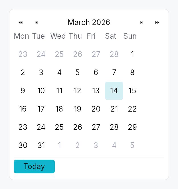
Calendar — month-grid date picker, standalone widget.
Public types
| Kind | Name |
|---|---|
struct | DateRange — Inclusive range of two dates, with start <= end enforced at construction |
enum | CalendarMode — What the calendar body is showing — drives the WPF/Avalonia "header-zoom" UX where clicking the title cycles to a coarser grid, letting the user reach any… |
enum | WeekNumberDisplay — Whether and how week numbers are displayed in the leading column of the day grid |
struct | Calendar — Standalone month-grid date picker |
Public functions
Calendar
| Returns | Function |
|---|---|
| Constructors | |
Self | single(value: Signal<Option<Date>>) |
Self | range(value: Signal<Option<DateRange>>) |
| Builder methods | |
Self | first_day_of_week(w: Weekday) |
Self | week_numbers(mode: WeekNumberDisplay) |
Self | show_today_button(show: bool) |
Self | show_navigation(show: bool) |
Self | min_date(d: Date) |
Self | max_date(d: Date) |
Self | disabled_date_filter(f: impl Fn(Date) -> bool + 'static) |
Self | label(label: impl Into<LocalizedString>) |
Self | enabled(enabled: impl Into<Prop<bool>>) |
Self | on_selection_changed(f: impl Fn(Option<Date>, &mut EventContext) + 'static) |
Self | on_range_changed(f: impl Fn(Option<DateRange>, &mut EventContext) + 'static) |
Self | on_month_changed(f: impl Fn(YearMonth, &mut EventContext) + 'static) |
Self | on_activate(f: impl Fn(Date, &mut EventContext) + 'static) |
| Methods | |
Signal<YearMonth> | visible_month_signal() |
Signal<Date> | focused_date_signal() |
Signal<CalendarMode> | mode_signal() |
DateRange
| Returns | Function |
|---|---|
| Constructors | |
Self | new(a: Date, b: Date) |
| Methods | |
bool | contains(d: Date) |
CalendarMode
| Returns | Function |
|---|---|
| Builder methods | |
Self | demote() |
Detailed description
A self-contained calendar with month/year navigation, a 6×7 day grid,
keyboard navigation matching the WAI-ARIA grid pattern, and full
AccessKit instrumentation (Role::Grid + per-cell Role::GridCell).
Used standalone for event apps and scheduling, and embedded in
DateEdit's popover.
Selection modes
Calendar::single— pick one day. Bound toSignal<Option<Date>>.Calendar::range— pick a start + end day. Bound toSignal<Option<DateRange>>. Click first day → click second day to commit. Escape mid-selection cancels the in-progress anchor.
Behaviour
- Visible month is independent of the selection — navigating past the selected month doesn't lose the selection.
- Today highlight draws a ring around today's cell whenever it's
in the visible month. Color comes from
BorderRole::Focused, painted by the activeCalendarStyle::make_day_cell. - Out-of-month cells (the leading days from the previous month
and trailing days from the next month that fill the 6×7 grid) are
rendered with
TextRole::Disabledand remain selectable (matching macOS / Material). To prevent selection usedisabled_date_filter. - Keyboard (matches the WAI-ARIA
gridpattern):- Arrow keys: move focus by one day.
- Home / End: first / last day of week.
- Ctrl+Home / Ctrl+End: first / last day of month.
- PageUp / PageDown: previous / next month.
- Shift+PageUp / Shift+PageDown: previous / next year.
- Enter / Space: commit focused day to selection.
- Escape: in range mode mid-selection, cancel anchor; otherwise bubble (popover hosts close).
T: jump focus to today.
- Keyboard in the months and years views: the cursor is the month
(or year) shown, highlighted in the grid.
- Arrow keys: move by one month (year) across a row, by a row of three up and down.
- PageUp / PageDown: a year back or on (a decade in the years view).
- Enter / Space: open the month under the cursor on its days (the year on its months). Nothing is selected.
- Escape: back to the days of the month under the cursor. A date field's popup takes Escape first and closes, and opens again on its days.
- Activating the header title zooms out and takes the keyboard into the grid, on the month (year) shown.
Accessibility
Every string below is in the user's language. The words come from the
framework's Fluent bundle, so an application that registers
framework_locales() gets them translated; every date inside them is
written by ICU for the widget tree's locale, in the locale's own order
and grammar and on the Gregorian calendar the grid is laid out in, never
assembled from numbers or from translated names (see
common::datetime::written).
- Container:
Role::Grid, named after the visible month ("Calendar, May 2026", "Calendrier, mai 2026"). It is not a live region: a live grid announced its name and each weekday header as it opened, and then focus said its name again. A change of month made from the keyboard moves the focus to a day of the new month (see the day cells below), whose name says the month. One made from a header arrow or the Today button, where focus stays on the button, is announced once through the tree's announcer: the title as it now reads, or today's date in full. The value is the day under the keyboard cursor in full, then the selection when there is one: "Saturday, May 2, 2026 (selected: Friday, May 1, 2026)". With the cursor on the one selected day, the day is said once: "Friday, May 1, 2026 (selected)". A range is joined by words ("… to …"), not an en-dash, which some screen readers skip. The value is for a client that reads the grid; the cursor is heard through the focus. UIA and macOS raise a value-changed event on the grid, which is not the focus while a day is; AT-SPI carries a string value on no interface. - Header arrow buttons:
Role::Buttonwith localized labels ("Previous month", "Next month") andAction::Clickadvertised. - Header month/year label:
Role::Button, aGhostButtonwhose activation demotesCalendarModeone level, swapping the body for the coarser grid in place, and moves focus to the grid; no popup is opened. Its name is its title: the month and year, the year, or the decade in words ("2020 to 2029"). - Month and year cells of the zoomed views:
Role::GridCell, a month named with its year ("mai 2026"),Action::Clickadvertised, no Tab stop of their own: the grid names the one under the cursor as its active descendant, as it does a day. - Weekday header row:
Role::RowofRole::ColumnHeadercells, each labelled with the long weekday name (e.g. "Monday"). - Weeks:
Role::Row, each holding its seven day cells, so the grid isGrid > Row > GridCellin every platform's tree. - Day cells:
Role::GridCellnamed by the day in full ("Saturday, May 2, 2026", "samedi 2 mai 2026"),set_selected,set_aria_current(Date)on today,set_disabledfor filter rejections, andAction::Clickadvertised. Keyboard focus stays on the Calendar root, which names the cell under the cursor as its active descendant while it holds focus in the day view. AccessKit reports that cell as the focus on AT-SPI, UIA and macOS, so each arrow press, and each change of month, is a focus change to the new day, which is what a screen reader speaks.
Example
use teksilo::widgets::{Calendar, common::datetime::Date};
let date = ctx.signal(Some(Date::constant(2026, 5, 2)));
ctx.add(
Calendar::single(date.clone())
.show_today_button(true)
.on_selection_changed(|d, ctx| ctx.send_intent(MyIntent::DateChanged(d))),
);
Touch and pen
A day cell is a tap target, not a manipulator, and the distinction
decides what it declares. Its activation is on_tap, so it already lands on
the release; its 32 dp box already clears the WCAG 2.2 SC 2.5.8 floor at
Compact and follows the density ladder above it; and it produces no value
from the press position and owns no drag. It therefore does not declare
touch_action(NONE): a finger that comes to rest on a day and then drags is
scrolling the dialog or form the calendar sits in, which is what a user
expects and what declaring NONE would forbid for nothing gained.
Density
The picture above is the widget at TargetDensity::Compact, the mouse-and-keyboard ladder. Below is the same subject on the same canvas with only the ladder changed, so what moves is the density and nothing else — where the subject no longer fits, that is what the denser targets cost it at that size. See docs/density-and-targets.md.
Touch
API reference
📖 Full rustdoc API for this module
pub struct DateRange
Import: use teksilo::widgets::DateRange;
Inclusive range of two dates, with start <= end enforced at
construction. Used by Calendar::range.
#![allow(unused)] fn main() { pub struct DateRange { /* fields */ } }
Fields
start:Dateend:Date
Methods
pub fn new(a: Date, b: Date) -> Self
Construct a range; swaps start and end if needed so the
invariant start <= end always holds.
pub fn contains(&self, d: Date) -> bool
true iff d is between start and end inclusive.
pub enum CalendarMode
Import: use teksilo::widgets::calendar::CalendarMode;
What the calendar body is showing — drives the WPF/Avalonia
"header-zoom" UX where clicking the title cycles to a coarser
grid, letting the user reach any year in 2-3 clicks instead of
many chevron presses. Default CalendarMode::Days.
#![allow(unused)] fn main() { pub enum CalendarMode { /* variants */ } }
Variants
Days— 6×7 day grid for the visible month. Title shows "May 2026". Header chevrons step by ±1 month and ±1 year.Months— 4×3 grid of months. Title shows "2026". Header chevrons step by ±1 year. Picking a cell zooms back intoSelf::Days.Years— 4×3 grid of years (current decade). Title shows "2020 to 2029". Header chevrons step by ±10 years (one decade). Picking a cell zooms back intoSelf::Months.
Methods
pub fn demote(self) -> Self
Mode after demoting one level (clicking the header title).
Years is the coarsest level — no further demotion.
pub enum WeekNumberDisplay
Import: use teksilo::widgets::WeekNumberDisplay;
Whether and how week numbers are displayed in the leading column of the day grid.
#![allow(unused)] fn main() { pub enum WeekNumberDisplay { /* variants */ } }
Variants
None— No week-number column (default).Iso8601— ISO 8601 week number — week 1 is the week containing the first Thursday of the year. Adds a narrow column to the left of the day grid.
pub struct Calendar
Import: use teksilo::widgets::Calendar;
Standalone month-grid date picker. See the module docs for
the full feature list and a usage example.
#![allow(unused)] fn main() { pub struct Calendar { /* fields */ } }
Methods
pub fn single(value: Signal<Option<Date>>) -> Self
Construct a calendar in single-selection mode bound to a nullable date signal.
pub fn range(value: Signal<Option<DateRange>>) -> Self
Construct a calendar in range-selection mode bound to a nullable date-range signal.
pub fn first_day_of_week(mut self, w: Weekday) -> Self
Override the locale-derived first day of the week.
pub fn week_numbers(mut self, mode: WeekNumberDisplay) -> Self
Show or hide the leading week-number column.
pub fn show_today_button(mut self, show: bool) -> Self
Show a "Today" button in the footer that jumps focus and selection (in single mode) to today.
pub fn show_navigation(mut self, show: bool) -> Self
Show or hide the prev/next month navigation arrows.
pub fn min_date(mut self, d: Date) -> Self
Earliest allowed date; days before this read as disabled.
pub fn max_date(mut self, d: Date) -> Self
Latest allowed date; days after this read as disabled.
pub fn disabled_date_filter(mut self, f: impl Fn(Date) -> bool + 'static) -> Self
Per-cell predicate. true ⇒ cell is disabled (no click, no
keyboard commit, AT marks disabled).
pub fn label(mut self, label: impl Into<LocalizedString>) -> Self
Override the AT label. Default: "Calendar, May 2026" (localized, derived from the visible month).
pub fn enabled(mut self, enabled: impl Into<Prop<bool>>) -> Self
Set the enabled state, statically or reactively. Forwarded to the
arena at build time — a bound Signal<bool> updates live.
pub fn on_selection_changed( mut self, f: impl Fn(Option<Date>, &mut EventContext) + 'static, ) -> Self
Fired when the selection changes. In range mode use
on_range_changed instead — this
callback fires on every committed-day change in range mode too,
passing the just-committed endpoint.
pub fn on_range_changed( mut self, f: impl Fn(Option<DateRange>, &mut EventContext) + 'static, ) -> Self
Fired in range mode whenever a range is committed (second click
of the pair). None fires when the user resets via Escape or
when the bound value is externally cleared.
pub fn on_month_changed(mut self, f: impl Fn(YearMonth, &mut EventContext) + 'static) -> Self
Fired when the visible month changes (navigation arrows, keyboard PageUp/Down, today jump).
pub fn on_activate(mut self, f: impl Fn(Date, &mut EventContext) + 'static) -> Self
Fired in single mode on Enter or click (i.e. when the user "double commits"). Distinct from selection change; popover hosts use this to dismiss themselves only on a real click, not on keyboard navigation.
pub fn visible_month_signal(&self) -> Signal<YearMonth>
Reactive accessor for the currently-visible month.
pub fn focused_date_signal(&self) -> Signal<Date>
Reactive accessor for the focused-cell date.
pub fn mode_signal(&self) -> Signal<CalendarMode>
Reactive accessor for the body mode (Days / Months / Years). Drives the header-zoom UX. Apps can read this to react to mode changes, or write to it to programmatically zoom in/out.
Card

Card — a surface container with optional header, content, and footer slots.
Public functions
Card
| Returns | Function |
|---|---|
| Constructors | |
Self | new() |
| Builder methods | |
Self | header(widget: impl teksilo_core::IntoTeksiChild) |
Self | content(widget: impl teksilo_core::IntoTeksiChild) |
Self | footer(widget: impl teksilo_core::IntoTeksiChild) |
Self | shadow(shadow: Shadow) |
Self | background(color: impl Into<ColorProp>) |
Self | corner_radius(radius: impl Into<Prop<f32>>) |
Self | padding(padding: impl Into<Prop<f32>>) |
Self | variant(variant: CardVariant) |
Self | style(style: impl teksilo_core::styles::CardStyle) |
Detailed description
Card renders an opaque or tinted rounded-rectangle backdrop, an optional
drop shadow, and up to three stacked content slots (header / content /
footer). It is the standard building block for list-item cards, dashboard
tiles, onboarding panels, and any widget that needs a visually distinct
raised or outlined surface. Chrome (shadow, background, corner radius,
padding) is delegated to the active CardStyle
so the visual language can be changed per-call (.style(...)) or
theme-wide via theme.style_slots.card.
When to use
CardVariant::Elevated— a dashboard tile or list card that should "float" above the page surface.CardVariant::Outlined— a bordered grouping box without shadow.CardVariant::Plain— the content sits on the default surface; no visible chrome (useful for spacing only).
Accessibility
Announces as Role::Group. The slots' own accessibility nodes are
included in the subtree; the card itself carries no additional AT name.
#![allow(unused)] fn main() { use teksilo_widgets::Card; use teksilo_core::styles::CardVariant; use teksilo_widgets::primitives::TextWidget; use teksilo_i18n::lit; let _card = Card::new() .variant(CardVariant::Elevated) .content(TextWidget::new(lit!("Hello, card!"))); }
Density
The picture above is the widget at TargetDensity::Compact, the mouse-and-keyboard ladder. Below is the same subject on the same canvas with only the ladder changed, so what moves is the density and nothing else — where the subject no longer fits, that is what the denser targets cost it at that size. See docs/density-and-targets.md.
Touch

API reference
📖 Full rustdoc API for this module
pub struct Card
Import: use teksilo::widgets::Card;
A card container with shadow, background, and optional header/content/footer.
#![allow(unused)] fn main() { pub struct Card { /* fields */ } }
Methods
pub fn new() -> Self
Construct an empty card with no slots and the default CardVariant::Plain.
pub fn header(mut self, widget: impl teksilo_core::IntoTeksiChild) -> Self
Set the header slot (topmost section) to an inline widget.
pub fn content(mut self, widget: impl teksilo_core::IntoTeksiChild) -> Self
Set the main content slot (middle section) to an inline widget.
pub fn footer(mut self, widget: impl teksilo_core::IntoTeksiChild) -> Self
Set the footer slot (bottommost section) to an inline widget.
pub fn shadow(mut self, shadow: Shadow) -> Self
Override the drop shadow. Accepts a Shadow token (see
teksilo_tokens::Shadow). The default shadow comes from the active
CardStyle for the chosen CardVariant.
pub fn background(mut self, color: impl Into<ColorProp>) -> Self
Override the background. Default (unset) is the variant's default
(SurfaceRole::Main for Plain/Outlined/Elevated, SurfaceRole::Raised
for Filled). Accepts Color, a role, or Signal<Color>.
pub fn corner_radius(mut self, radius: impl Into<Prop<f32>>) -> Self
Override the corner radius (default: CARD_CORNER_RADIUS in the active CardStyle's recipe — see recipe_card_style.rs).
Accepts a static f32 or a reactive Signal<f32>.
pub fn padding(mut self, padding: impl Into<Prop<f32>>) -> Self
Override the padding (default: CARD_PADDING in the active CardStyle's recipe — see recipe_card_style.rs).
Accepts a static f32 or a reactive Signal<f32>.
pub fn variant(mut self, variant: CardVariant) -> Self
Pick the design-language variant. Default Plain. The active
CardStyle decides what each variant means visually (the IntUI
default maps Plain → no shadow + surface_main, Elevated →
shadow_md + surface_main, Outlined → border + surface_main,
Filled → shadow_md + surface_raised).
pub fn style(mut self, style: impl teksilo_core::styles::CardStyle) -> Self
Per-call style override. Replaces the theme-wide default
CardStyle for just this Card instance.
Center
Center — a single-child wrapper that centers its child within the available space.
Public functions
Center
| Returns | Function |
|---|---|
| Constructors | |
Self | new() |
| Builder methods | |
Self | child(widget: impl teksilo_core::IntoTeksiChild) |
Self | child_opt(widget: Option<impl teksilo_core::IntoTeksiChild>) |
Detailed description
On a bounded axis (the parent proposes an exact size), Center fills
that dimension and places the child in the middle. On an unbounded axis
(the parent leaves it open, as a stack does on its main axis), Center
shrink-wraps to the child's natural size rather than collapsing to zero —
this prevents the child from overflowing a prior sibling. Center always
reports flex = 0, so it never claims slack from a stack's distribution
pass; to center content within leftover space, wrap it in an Expand:
Expand::horizontal().child(Center::new().child(w)).
The child is measured under the constraint Center received (a
loose-but-bounded proposal, like Flutter's Center): rigid children keep
their natural size and are centered, while adaptive children respond to
the bound — an ellipsis TextWidget truncates at the slot width instead
of overflowing symmetrically, and wrapping text reports its real wrapped
height.
When to use
- Center a small widget inside a bounded slot (e.g., an icon in a fixed square cell).
- Shrink-wrap and center an element inside a layout that provides an exact proposal in both axes.
For claiming all remaining stack space and then centering within it, use
Expand wrapping Center instead.
#![allow(unused)] fn main() { use teksilo_widgets::primitives::{Center, RectWidget}; // Center a rect in the full slot provided by its parent let _centered = Center::new().child(RectWidget::new()); }
Density
The picture above is the widget at TargetDensity::Compact, the mouse-and-keyboard ladder. Below is the same subject on the same canvas with only the ladder changed, so what moves is the density and nothing else — where the subject no longer fits, that is what the denser targets cost it at that size. See docs/density-and-targets.md.
Touch
API reference
📖 Full rustdoc API for this module
pub struct Center
Import: use teksilo::widgets::Center;
Centers a single child within the space this widget is given.
Sizing follows the incoming constraint, per axis: Center fills a
bounded axis (the tree root, or inside an Expand / wrapper that
proposes exact bounds) and shrink-wraps to the child on an unbounded
axis. So a bare Center does not claim slack inside an HStack /
VStack — those leave their main axis open, and Center sizes to its
child there (like Flutter's Center / Align, or Compose's Box),
rather than collapsing to zero and letting the child overflow.
Centering and expanding are separate concerns: Center reports
flex = 0 and is a pure alignment wrapper, never a space-claiming one. To
center a child within the leftover space of a stack, give it flex with
Expand — Expand::horizontal { Center { child } } (the analogue of
Flutter's Expanded(child: Center(...))).
#![allow(unused)] fn main() { pub struct Center { /* fields */ } }
Methods
pub fn new() -> Self
Create a new Center with no child attached.
pub fn child(mut self, widget: impl teksilo_core::IntoTeksiChild) -> Self
Set an inline child widget (deferred insertion).
pub fn child_opt(self, widget: Option<impl teksilo_core::IntoTeksiChild>) -> Self
Attach widget when it is Some, and do nothing when it is None.
The conditional-child form. teksu!'s if without an else lowers to
this, and it is what cond.then(|| w) is for in a builder chain. None
adds no arena node, so nothing is laid out, painted, or published to the
accessibility tree, and a stack applies no spacing around it.
Checkbox
Checkbox — a two-state or tristate checkbox with an optional label.
Public functions
Checkbox
Detailed description
Checkbox renders a square (or rounded-square / circle) toggle box
alongside an optional label and caption. Two modes are supported:
- Two-state (
Checkbox::new): toggles aSignal<bool>betweentrue(checked) andfalse(unchecked) on click or Space. - Tristate (
Checkbox::tristate): cycles aSignal<CheckState>betweenCheckedandUncheckedon user interaction; theIndeterminatestate is set only by external sources such asTreeCheckedModelaggregation — clicking fromIndeterminategoes toChecked, not a further third state.
Chrome (box shape, fill, focus ring) is driven by the active
CheckboxStyle; three visual variants are available via
CheckboxVariant.
Label styling
The label is Body / Primary and the caption Small / Secondary by
default. Checkbox::label_style / Checkbox::label_color and
Checkbox::caption_style / Checkbox::caption_color override them.
A theme role colour still dims when the checkbox is disabled; a literal
Color stays as given.
Touch and pen
The pressed state comes from the framework press
(docs/touch-and-pen.md §7.1) rather than from this widget: sliding off
abandons it, sliding back on restores it, and a pan claimant winning the
press clears it with no release. Before the controls sweep is_pressed
could only ever be set by a keyboard Space, so a mouse-down showed no
pressed chrome at all — themes that paint one (IntUI's checked box, Material
3's state layer) now get it from every pointer.
The 24 dp MinSize around the 19 dp glyph already meets the WCAG 2.2
SC 2.5.8 floor at Compact and follows the density ladder above it, so no
hit-widening mechanism is involved.
Accessibility
Announces as Role::CheckBox. A label is required in debug builds
unless .labelled_externally() is set (for embedding inside a composite
row that owns the AT name). Keyboard: Space toggles; lone-KeyUp guard
prevents spurious toggle when focus is restored after a shortcut.
#![allow(unused)] fn main() { use teksilo_widgets::Checkbox; use teksilo_core::signal::Signal; use teksilo_i18n::lit; let checked = Signal::new(false); let _cb = Checkbox::new(checked) .label(lit!("Accept terms and conditions")); }
Density
The picture above is the widget at TargetDensity::Compact, the mouse-and-keyboard ladder. Below is the same subject on the same canvas with only the ladder changed, so what moves is the density and nothing else — where the subject no longer fits, that is what the denser targets cost it at that size. See docs/density-and-targets.md.
Touch
API reference
📖 Full rustdoc API for this module
pub struct Checkbox
Import: use teksilo::widgets::Checkbox;
A checkbox that toggles a Signal<bool> or cycles a Signal<CheckState>.
#![allow(unused)] fn main() { pub struct Checkbox { /* fields */ } }
Methods
pub fn new(checked: Signal<bool>) -> Self
Create a two-state checkbox bound to a Signal<bool>.
pub fn tristate(state: Signal<CheckState>) -> Self
Create a tristate checkbox bound to a Signal<CheckState>.
User clicks toggle Checked ↔ Unchecked (clicking from Indeterminate
checks the whole). The Indeterminate state is reserved for external
sources — TreeCheckedModel aggregation when descendants are mixed,
"select all" indicators, etc. Matches the Outlook / Files-app
folder-checkbox semantic. Useful for parent checkboxes in tree views.
pub fn on_change(mut self, f: impl Fn(bool, &mut EventContext) + 'static) -> Self
Run f when the user checks or unchecks this box, with the
checked-ness the activation produced and an EventContext, so it can do
what a bare Signal write cannot (ctx.send_intent(...),
ctx.set_theme(...), opening a window). Fires for the pointer, for
Space, for an assistive-technology Click, and for Space on a data
view's focused row.
Does not fire for programmatic writes to the bound signal — there is
no event in flight to carry. Observe the signal for that. The signal
stays the source of truth either way: it is written first, and f sees
the value it now holds.
A tristate checkbox reports a bool too: activation cycles
Checked ↔ Unchecked only, and Indeterminate is external-source-only.
pub fn labelled_externally(mut self) -> Self
Declare that this checkbox's accessible name comes from an
ancestor, suppressing the visual label/caption AND the
debug-time "missing accessible label" assertion. Use it when
the checkbox is embedded inside a composite that owns the
row's name (e.g. StandardListItem / StandardTreeItem,
where the row's accessibility(builder) calls set_name(...)
with the row label).
A11y contract: the caller MUST guarantee that an
addressable AT ancestor provides the name — either via that
ancestor's own accessibility() impl or a builder-level
.access_label* override. Without it the AT tree exposes a
Role::CheckBox node with no name; screen readers announce
"checkbox, checked" with no context. The Outlook /
Files-app row pattern (where the row label covers the
embedded checkbox) is the supported use case.
Spelled the same way on Toggle.
pub fn label(mut self, label: impl Into<LocalizedString>) -> Self
Set the visible label rendered to the right of the checkbox box,
also used as the AT name. Required unless .labelled_externally() is set.
pub fn caption(mut self, text: impl Into<LocalizedString>) -> Self
Secondary explanatory text rendered below the label, left-aligned
with the label (not the box). Uses the small / text_secondary
style. Has no effect unless label(...) is also set.
pub fn label_style( mut self, style: impl Into<teksilo_core::color_prop::TextStyleProp>, ) -> Self
Override the label's text style (font, size, weight). Accepts a
TextStyleRole, a TextStyle, or a Signal of either. Default is
TextStyleRole::Body.
pub fn label_color(mut self, color: impl Into<teksilo_core::color_prop::ColorProp>) -> Self
Override the label's text color. Accepts Color, a theme role, or a
Signal of either. Default is TextRole::Primary. A role still dims
to the disabled color when the checkbox is disabled; a literal Color
stays as given.
pub fn caption_style( mut self, style: impl Into<teksilo_core::color_prop::TextStyleProp>, ) -> Self
Override the caption's text style. Default is TextStyleRole::Small.
pub fn caption_color(mut self, color: impl Into<teksilo_core::color_prop::ColorProp>) -> Self
Override the caption's text color. Accepts Color, a theme role, or
a Signal of either. Default is TextRole::Secondary. A role still
dims to the disabled color when the checkbox is disabled; a literal
Color stays as given.
pub fn enabled(mut self, enabled: impl Into<Prop<bool>>) -> Self (default: true)
Set the enabled state, statically or reactively. Forwarded to the
arena via ctx.enabled_when(self_id, self.enabled.clone()) at
build time — a bound Signal<bool> updates live.
pub fn variant(mut self, variant: CheckboxVariant) -> Self
Pick the design-language variant. Default Square. The active
CheckboxStyle impl decides what the variant means visually
(the IntUI RecipeCheckboxStyle honours all three variants
directly via corner-shape changes).
pub fn style(mut self, style: impl teksilo_core::styles::CheckboxStyle) -> Self
Per-call style override. Replaces the theme-wide default
CheckboxStyle for just this Checkbox instance — same role as
Button::style(...).
pub fn tooltip(mut self, text: impl Into<LocalizedString>) -> Self
Attach a plain tooltip shown after a hover delay. Clears any previously set rich or composite tooltip (last-call wins).
pub fn rich_tooltip(mut self, key: impl Into<String>) -> Self
Attach a rich tooltip resolved from the app-wide tooltip
registry. See Button::rich_tooltip.
pub fn rich_tooltip_content(mut self, content: crate::tooltip::TooltipContent) -> Self
Attach a rich tooltip driven by inline TooltipContent.
pub fn composite_tooltip( mut self, content: impl teksilo_core::widget::Widget + 'static, ) -> Self
Attach a composite tooltip — third tier, hosting an arbitrary
widget tree. See Button::composite_tooltip.
CodeEditor
The public editing surfaces: CodeEditor and PlainTextEditor.
Public types
| Kind | Name |
|---|---|
struct | CodeEditor — A multi-line source-code editing surface: gutter, current-line highlight, indentation, bracket handling, and multiple carets |
struct | PlainTextEditor — A multi-line plain-text editing surface — the code editor with its code affordances off and wrapping on |
Public functions
CodeEditor
PlainTextEditor
Detailed description
The wrapper is the focus + event target; it owns the gutter (optional), the
paint-only body, and the overlay scrollbars, joined to them only through the
shared CodeEditorState. This mirrors
RichTextEditor exactly — the wrapper carries focus so a future style may
place the body anywhere in its chrome without the focus semantics moving —
and adds the two things a source editor needs on top: a line-number gutter to
the left, and a paint pass that draws the current-line band (across gutter and
body) and the matched-bracket cells behind the text.
PlainTextEditor is the same machinery with the code affordances off and
wrapping on — a notes field, a commit message — so the two never drift.
Pan to scroll
The surface installs common::scrollable::ScrollableBehavior
— the shared wheel arithmetic, a finger's pan, and the PanClaim. The wheel
path is unchanged: no tween (these offsets are plain signals), 16 dp a line,
Ignored at a hard boundary so the page around it takes the rest, and a
repaint asked for exactly when an axis moved.
The claim serves this surface even though it also owns the press
arena, which its double- and triple-tap recognizers give it. The router
stops its arbitration walk at the press owner only for a Gesture member,
whose recognizer the capture dispatch is already driving; a Pan member is
decided in that walk and nowhere else, so it is exempt. A finger on the
text therefore scrolls the text, and hands the gesture outward only at this
surface's own boundary. See docs/kinetic-scrolling.md §10.1.
API reference
📖 Full rustdoc API for this module
pub struct CodeEditor
Import: use teksilo::widgets::CodeEditor;
A multi-line source-code editing surface: gutter, current-line highlight, indentation, bracket handling, and multiple carets.
Construct with CodeEditor::new (editable) or CodeEditor::read_only
(view + select + copy). Every code affordance is injected configuration, not
a built-in language — see CodeConfig.
#![allow(unused)] fn main() { pub struct CodeEditor { /* fields */ } }
Methods
pub fn new(document: TextDocument) -> Self
An editable code editor bound to document: gutter on, current-line
highlight on, no wrapping. Code affordances (comment token, bracket
pairs) stay off until the application supplies them — the editor never
guesses a language.
pub fn read_only(document: TextDocument) -> Self
A read-only code viewer bound to document: no caret, navigation and
copy only, Role::Document. Still gets the gutter and syntax colours.
pub fn label(mut self, label: impl Into<teksilo_i18n::LocalizedString>) -> Self
Accessible name for the editor.
Applied to the body that holds the text, which is the node focus is
published on and the one a screen reader announces ("Code, entry"). The
editor's own node is structure that no adapter shows. An
.access_label(..), .access_labelled_by(..) or tooltip attached to
the editor reaches the same node.
Stays locale-reactive: a tr!(...) name is re-resolved when the
locale changes, without a rebuild.
pub fn context_menu( mut self, factory: impl Fn( teksilo_canvas::Point, &mut teksilo_core::widget::EventContext, ) -> Option<Box<dyn teksilo_core::widget::Widget>> + 'static, ) -> Self
Replace the built-in right-click menu with factory, called on each
right-click with the window position of the click. Returning None
shows no menu.
A replacement is responsible for repositioning the caret if it wants the
platform convention — the built-in menu does it through
context_menu::factory, and only when a pointer opened the menu
(EventContext::context_menu_trigger).
Shift+F10 hands the factory an anchor, not a place the user chose.
pub fn default_context_menu(mut self, enabled: bool) -> Self
Whether to install the built-in Cut / Copy / Paste / Select All menu
(default true). false lets a right-click bubble past the editor, so an
application can render its own menu from outside; a factory installed with
context_menu wins over this either way.
The touch selection toolbar is not affected. It is raised by the controller rather than by a right-click, its rows are the same four commands, and a surface with no menu still has to be usable by a finger — which has no second button and no chord.
pub fn wrap_mode(self, mode: WrapMode) -> Self
Set the line-wrap mode. CodeEditor defaults to WrapMode::None (source
lines must not fold, or the gutter's one-number-per-line correspondence
breaks); pair with .h_scroll_policy(Auto) to scroll wide lines.
pub fn v_scroll_policy(mut self, policy: ScrollPolicy) -> Self
Vertical scrollbar policy (default Auto).
pub fn h_scroll_policy(mut self, policy: ScrollPolicy) -> Self
Horizontal scrollbar policy (default Auto).
pub fn overscroll_behavior(mut self, behavior: OverscrollBehavior) -> Self
Wheel scroll-chaining at the editor's scroll boundary. Chain (default)
hands leftover scroll to an enclosing scrollable; Contain absorbs it.
pub fn window_to_clip(self, on: bool) -> Self
Cull the render to the visible clip band (default false). Turn on only
for an editor deliberately laid out at full document height inside an
outer ScrollArea (v_scroll_policy(AlwaysOff) + min_lines(1)): the
body's bounds then span the whole document, and this renders only the
on-screen slice instead of every line. A normally-scrolling editor already
renders just a viewport's worth, so it needs nothing.
pub fn min_lines(mut self, lines: u32) -> Self
Minimum visible height in lines — switches the editor from greedy (fill
the proposal) to intrinsic sizing (grow with content up to max_lines,
then scroll). The composer pattern.
pub fn max_lines(mut self, lines: u32) -> Self
Maximum visible height in lines — caps intrinsic growth.
pub fn font_family(self, family: impl Into<String>) -> Self
Fallback font family for the document's text. None (the default) keeps
the typesetter's registry default; a code editor should pass a monospace
family so columns line up.
pub fn font_size_scale(self, scale: f32) -> Self
Per-editor logical font-size multiplier (1.0 = 100 %), composed with
the accessibility text scale when follow_text_scale
is on. Sharp — shapes at a larger ppem.
pub fn follow_text_scale(self, follow: bool) -> Self
Whether the editor grows text with the global accessibility text scale
(default true). Turn off for a WYSIWYG surface whose font sizes are
document content. Composed with font_size_scale.
pub fn on_change(self, callback: impl Fn() + 'static) -> Self
A callback fired once per drain batch that contained a real content edit.
pub fn background(self, color: impl Into<teksilo_core::color_prop::ColorProp>) -> Self
Override the editor background colour (accepts Color, a theme role, or a
Signal). None-equivalent default tracks the theme's editor_bg.
pub fn text_color(self, color: impl Into<teksilo_core::color_prop::ColorProp>) -> Self
Override the text colour. Default tracks the theme's editor_fg.
pub fn caret_color(self, color: impl Into<teksilo_core::color_prop::ColorProp>) -> Self
Override the caret colour. Default tracks the theme's editor_caret.
pub fn selection_color(self, color: impl Into<teksilo_core::color_prop::ColorProp>) -> Self
Override the selection colour. A pinned colour opts out of the window-inactive desaturation.
pub fn gutter(mut self, show: bool) -> Self
Whether the line-number gutter is shown (default true).
pub fn current_line_highlight(self, on: bool) -> Self
Whether the caret's line gets a full-width background wash (default
true for CodeEditor).
pub fn indent_style(self, style: IndentStyle) -> Self
Set the indentation style directly (spaces of a width, or tabs rendered a width wide).
pub fn tab_width(self, width: u8) -> Self
Set the indent width, keeping the current spaces-vs-tabs kind.
pub fn use_soft_tabs(self, soft: bool) -> Self
Whether indentation is written with spaces (true, the default) or a tab
character (false), keeping the current width.
pub fn auto_indent(self, on: bool) -> Self
Whether Enter carries the current line's indentation onto the new line
(default true).
pub fn bracket_pairs(self, pairs: impl Into<Vec<BracketPair>>) -> Self
The delimiter pairs the editor auto-closes and match-highlights. Empty (the default) disables both.
pub fn auto_close_brackets(self, on: bool) -> Self
Whether typing an opener inserts its closing partner (default false;
needs configured bracket_pairs).
pub fn bracket_matching(self, on: bool) -> Self
Whether the delimiter matching the caret's is highlighted (default
false; needs configured bracket_pairs).
pub fn line_comment(self, token: impl Into<String>) -> Self
The token that starts a line comment ("//", "#", "--"). Enables
Ctrl+/ comment toggling; unset (the default) leaves it a no-op rather
than guessing.
pub fn completion_provider( self, provider: impl Fn(&CompletionContext) -> Vec<CompletionItem> + 'static, ) -> Self
Supply the completion candidates. The provider is called for the word
being completed and given a CompletionContext; the editor filters its
result by the live prefix, shows the popup, and replaces the word on
accept. Language-agnostic — the app knows the candidates, the editor knows
the mechanics. Without a provider there is no completion.
pub fn auto_complete(self, auto: bool) -> Self
Whether typing an identifier character opens the completion popup
automatically (default true). When off, only Ctrl+Space opens it.
pub fn handle(&self) -> CodeEditorHandle
A cloneable handle to drive the editor from a toolbar, shortcut, or test.
pub struct PlainTextEditor
Import: use teksilo::widgets::PlainTextEditor;
A multi-line plain-text editing surface — the code editor with its code affordances off and wrapping on. A notes field, a commit message, a description box.
It shares CodeEditor's machinery (caret, selection, IME, clipboard,
scrolling, accessibility); the difference is configuration, so the two never
drift. Construct with PlainTextEditor::new / PlainTextEditor::read_only.
#![allow(unused)] fn main() { pub struct PlainTextEditor { /* fields */ } }
Methods
pub fn new(document: TextDocument) -> Self
An editable plain-text editor bound to document: no gutter, no
current-line highlight, word wrapping, and no code affordances.
pub fn read_only(document: TextDocument) -> Self
A read-only plain-text viewer bound to document.
pub fn min_lines(mut self, lines: u32) -> Self
Restrict growth to [min, max] lines (intrinsic sizing — the composer
pattern).
pub fn max_lines(mut self, lines: u32) -> Self
Cap intrinsic growth at lines.
pub fn wrap_mode(mut self, mode: WrapMode) -> Self
Set the line-wrap mode (default Word).
pub fn font_family(mut self, family: impl Into<String>) -> Self
Fallback font family.
pub fn follow_text_scale(mut self, follow: bool) -> Self
Whether the editor follows the global accessibility text scale.
pub fn font_size_scale(mut self, scale: f32) -> Self
Per-editor logical font-size multiplier (1.0 = 100 %).
pub fn on_change(mut self, callback: impl Fn() + 'static) -> Self
A callback fired on each content-changing edit batch.
pub fn background(mut self, color: impl Into<teksilo_core::color_prop::ColorProp>) -> Self
Override the background colour.
pub fn context_menu( mut self, factory: impl Fn( teksilo_canvas::Point, &mut teksilo_core::widget::EventContext, ) -> Option<Box<dyn teksilo_core::widget::Widget>> + 'static, ) -> Self
Replace the built-in right-click menu — see
CodeEditor::context_menu.
pub fn default_context_menu(mut self, enabled: bool) -> Self
Whether to install the built-in right-click menu — see
CodeEditor::default_context_menu.
pub fn label(mut self, label: impl Into<teksilo_i18n::LocalizedString>) -> Self
Accessible name for the editor: see CodeEditor::label.
pub fn handle(&self) -> CodeEditorHandle
A cloneable handle to drive the editor.
CodeEditorHandle
Multi-line plain-text and code editing surfaces.
Public types
| Kind | Name |
|---|---|
struct | CodeEditorHandle — A handle onto a live editor, cloneable and detachable from the widget |
struct | CompletionItem — A completion candidate |
enum | CompletionKind — The category of a completion candidate — drives a small leading badge only |
struct | CompletionContext — What a completion provider is told about the caret when asked for candidates |
enum | IndentStyle — How a line's leading indentation is written |
struct | BracketPair — A pair of characters the editor treats as opening and closing delimiters |
const | COMMON_BRACKETS — The three pairs that are structural in essentially every bracketed language |
struct | CodeConfig — Editing behaviour the code editor applies, all supplied by the application |
Public functions
CodeEditorHandle
| Returns | Function |
|---|---|
| Methods | |
usize | cursor_position() |
teksilo_core::Signal<usize> | cursor_position_signal() |
teksilo_core::Signal<usize> | caret_count() |
teksilo_core::Signal<Option<(usize, usize)>> | bracket_match() |
teksilo_core::Signal<bool> | has_selection() |
teksilo_core::Signal<bool> | can_undo() |
undo() | |
redo() | |
copy(ctx: &teksilo_core::widget::EventContext<'_>) | |
cut(ctx: &teksilo_core::widget::EventContext<'_>) | |
paste(ctx: &teksilo_core::widget::EventContext<'_>) | |
select_all() | |
bool | is_read_only() |
teksilo_core::Signal<bool> | can_redo() |
teksilo_core::Signal<u64> | document_version() |
teksilo_core::Signal<f32> | scroll_y() |
CompletionItem
| Returns | Function |
|---|---|
| Constructors | |
Self | new(label: impl Into<String>) |
| Builder methods | |
Self | insert_text(text: impl Into<String>) |
Self | detail(detail: impl Into<String>) |
Self | kind(kind: CompletionKind) |
IndentStyle
BracketPair
| Returns | Function |
|---|---|
| Constructors | |
Self | new(open: char, close: char) |
CodeConfig
| Returns | Function |
|---|---|
| Methods | |
Option<char> | closing_for(open: char) |
Option<char> | opening_for(close: char) |
Detailed description
Three faces over one core:
CodeEditor— a source editor: gutter, current-line highlight, indentation, bracket handling, multiple carets.PlainTextEditor— the same core with the code affordances off and wrapping on: a notes field, a commit message, a description box.LogView— read-only, append-only, tail-following.
They are one implementation because they differ in configuration, not in kind. All three are a monospaced-or-not run of lines with a caret in it; a separate widget per face would triplicate the caret, selection, IME, clipboard, scrolling, and accessibility and let them drift.
Why not RichTextEditor
RichTextEditor already edits multi-line text, and this deliberately does
not build on it. Its command vocabulary is tables, lists, blockquotes, and
bold — reusing it would put Tab-navigates-a-table-cell and
Ctrl+B-emboldens into a source file, where the first is wrong and the second
is meaningless. Its state carries a table-aware Ctrl+A ladder and a rich
clipboard fragment; this one carries an indent policy and a caret vector.
The overlap is real but it is the clock — the caret blink, the debounce
window, the scroll arithmetic — and that lives in the crate-internal
common::editor_runtime, shared by both.
Language-agnostic by construction
There is no Language enum here. Comment tokens, bracket pairs, indent
width, and highlighting are CodeConfig values the application supplies:
the editor knows how to toggle a line comment, not that Rust uses //.
Guessing would be worse than not knowing — inserting // into a Python file
corrupts it silently.
Density
The picture above is the widget at TargetDensity::Compact, the mouse-and-keyboard ladder. Below is the same subject on the same canvas with only the ladder changed, so what moves is the density and nothing else — where the subject no longer fits, that is what the denser targets cost it at that size. See docs/density-and-targets.md.
Touch
API reference
📖 Full rustdoc API for this module
pub struct CodeEditorHandle
Import: use teksilo::widgets::CodeEditorHandle;
A handle onto a live editor, cloneable and detachable from the widget.
The EditorHandle pattern: an app keeps one to drive the editor from a
toolbar, a shortcut, or a test without holding the widget itself.
#![allow(unused)] fn main() { pub struct CodeEditorHandle { /* fields */ } }
Methods
pub fn cursor_position(&self) -> usize
The caret's document position.
pub fn cursor_position_signal(&self) -> teksilo_core::Signal<usize>
The primary caret's document position — a character offset into the whole document, not a line or column — as a reactive signal. Bind it in a status bar to show a caret position that tracks every caret move, not only edits.
pub fn caret_count(&self) -> teksilo_core::Signal<usize>
Live caret count — 1 unless multi-caret editing is active.
pub fn bracket_match(&self) -> teksilo_core::Signal<Option<(usize, usize)>>
The bracket next to the caret and its match, as document positions, or
None. Populated only when the editor was configured with
match_brackets and bracket pairs; a status surface can bind it, or an
app can read it to drive its own overlay.
pub fn has_selection(&self) -> teksilo_core::Signal<bool>
pub fn can_undo(&self) -> teksilo_core::Signal<bool>
pub fn undo(&self)
Undo this editor's last edit.
The handle could report can_undo long before it could
act on it, which left a host able to light an Undo button here and
unable to make it do anything. Ctrl+Z inside the widget always worked;
this is the same command from outside.
pub fn redo(&self)
Redo this editor's last undone edit.
pub fn copy(&self, ctx: &teksilo_core::widget::EventContext<'_>)
Copy the selection to the clipboard.
pub fn cut(&self, ctx: &teksilo_core::widget::EventContext<'_>)
Cut the selection to the clipboard.
pub fn paste(&self, ctx: &teksilo_core::widget::EventContext<'_>)
Paste over the selection.
pub fn select_all(&self)
Select the whole document.
pub fn is_read_only(&self) -> bool
Is this editor refusing edits?
pub fn can_redo(&self) -> teksilo_core::Signal<bool>
pub fn document_version(&self) -> teksilo_core::Signal<u64>
Bumps on every content or format change.
pub fn scroll_y(&self) -> teksilo_core::Signal<f32>
pub struct CompletionItem
Import: none — CompletionItem is public in a private module of teksilo-widgets and nothing re-exports it.
A completion candidate. Build with CompletionItem::new and the fluent
setters; insert_text defaults to label.
#![allow(unused)] fn main() { pub struct CompletionItem { /* fields */ } }
Fields
label:String— The text shown in the list.insert_text:String— The text that replaces the word being completed when accepted. Defaults tolabel.detail:Option<String>— Optional dimmed detail shown at the trailing edge of the row (a type, a signature, a source).kind:CompletionKind— A category driving the row's leading badge — purely visual, no behaviour.
Methods
pub fn new(label: impl Into<String>) -> Self
A candidate whose inserted text is its label.
pub fn insert_text(mut self, text: impl Into<String>) -> Self
Override the text inserted on accept (when it differs from the label).
pub fn detail(mut self, detail: impl Into<String>) -> Self
Trailing dimmed detail (a type or signature).
pub fn kind(mut self, kind: CompletionKind) -> Self
The leading badge category.
pub enum CompletionKind
Import: none — CompletionKind is public in a private module of teksilo-widgets and nothing re-exports it.
The category of a completion candidate — drives a small leading badge only. Deliberately a fixed, language-neutral set: the editor renders a glyph, the application decides which candidate is which kind.
#![allow(unused)] fn main() { pub enum CompletionKind { /* variants */ } }
Variants
TextKeywordFunctionMethodVariableFieldTypeModuleConstantSnippet
pub struct CompletionContext
Import: none — CompletionContext is public in a private module of teksilo-widgets and nothing re-exports it.
What a completion provider is told about the caret when asked for candidates.
#![allow(unused)] fn main() { pub struct CompletionContext<'a> { /* fields */ } }
Fields
prefix:&'a str— The identifier characters immediately before the caret.line:&'a str— The whole current line.column:usize— The caret's column within the line (character index).position:usize— The caret's absolute document position.
pub enum IndentStyle
Import: none — IndentStyle is public in a private module of teksilo-widgets and nothing re-exports it.
How a line's leading indentation is written.
#![allow(unused)] fn main() { pub enum IndentStyle { /* variants */ } }
Variants
Spaces(u8)—widthspaces per indent level.Tabs{ width: u8 }— One tab character per level, renderedwidthcolumns wide.
Methods
pub fn unit(&self) -> String
The text one indent level inserts.
pub fn width(&self) -> u8
How many columns one level occupies on screen. Both styles need this: spaces to know how many to strip on dedent, tabs to render the stop.
pub struct BracketPair
Import: none — BracketPair is public in a private module of teksilo-widgets and nothing re-exports it.
A pair of characters the editor treats as opening and closing delimiters.
Used for auto-closing and for match highlighting. The application declares
the set, because the same character means different things per language:
< is a bracket in a generic parameter list and a less-than sign in
arithmetic, and only the caller knows which document this is.
#![allow(unused)] fn main() { pub struct BracketPair { /* fields */ } }
Fields
open:charclose:char
Methods
pub const fn new(open: char, close: char) -> Self
pub const COMMON_BRACKETS
Import: none — COMMON_BRACKETS is public in a private module of teksilo-widgets and nothing re-exports it.
The three pairs that are structural in essentially every bracketed language. A convenience starting point, not a default — an editor with no configured pairs simply does no bracket handling, which is correct for prose or a log.
#![allow(unused)] fn main() { pub const COMMON_BRACKETS: &[BracketPair] = &[ BracketPair::new('(', ')'), BracketPair::new('[', ']'), BracketPair::new('{', '}'), ]; }
pub struct CodeConfig
Import: none — CodeConfig is public in a private module of teksilo-widgets and nothing re-exports it.
Editing behaviour the code editor applies, all supplied by the application.
#![allow(unused)] fn main() { pub struct CodeConfig { /* fields */ } }
Fields
indent:IndentStyle— How indentation is written and how wide a level is.auto_indent:bool— Whether Enter carries the current line's leading whitespace onto the new line.line_comment:Option<String>— Token that starts a line comment ("//","#","--",";").NonedisablesCodeCommand::ToggleLineCommententirely rather than guessing.brackets:Vec<BracketPair>— Delimiter pairs for auto-closing and match highlighting. Empty disables both.auto_close_brackets:bool— Whether typing an opening delimiter inserts its closing partner.match_brackets:bool— Whether the delimiter matching the caret's is highlighted.
Methods
pub fn closing_for(&self, open: char) -> Option<char>
The closing partner for open, if it is a configured opening delimiter.
pub fn opening_for(&self, close: char) -> Option<char>
The opening partner for close, if it is a configured closing delimiter.
Collapse
Collapse — a wrapper widget that animates its child between
hidden and natural size when an external Signal<bool> toggles.
Public functions
Collapse
| Returns | Function |
|---|---|
| Constructors | |
Self | new(expanded: Signal<bool>) |
| Builder methods | |
Self | child(widget: impl teksilo_core::IntoTeksiChild) |
Self | child_opt(widget: Option<impl teksilo_core::IntoTeksiChild>) |
Detailed description
Drives a progress: Signal<f32> ∈ [0, 1] (0 = collapsed,
1 = expanded) and reports its own size as (natural_w, natural_h * progress) while the child lays out at full natural size — the
framework's clip pass crops the overflow. This keeps the animation
visible across the whole duration, instead of compressing the
visible portion into the final few milliseconds (which is what
happened when an animated MaxSize::max_height slid against a
10000-px sentinel that vastly overshot the child's natural height).
let expanded = ctx.signal(false);
ctx.add(Collapse::new(expanded.clone()).child(advanced_settings));
// ...elsewhere:
expanded.set(true); // animates open over `motion.duration_collapse`
Honors prefers-reduced-motion: under reduced motion, progress
snaps to its end value instead of tweening.
API reference
📖 Full rustdoc API for this module
pub struct Collapse
Import: use teksilo::widgets::Collapse;
Wraps a child and animates it between hidden (progress=0) and
natural size (progress=1), driven by an external Signal<bool>.
#![allow(unused)] fn main() { pub struct Collapse { /* fields */ } }
Methods
pub fn new(expanded: Signal<bool>) -> Self
Build a collapse wrapper bound to expanded. Initially
collapsed iff expanded.get() is false at the first
build().
pub fn child(mut self, widget: impl teksilo_core::IntoTeksiChild) -> Self
Inline child widget (deferred insertion).
pub fn child_opt(self, widget: Option<impl teksilo_core::IntoTeksiChild>) -> Self
Attach widget when it is Some, and do nothing when it is None.
The conditional-child form. teksu!'s if without an else lowers to
this, and it is what cond.then(|| w) is for in a builder chain. None
adds no arena node, so nothing is laid out, painted, or published to the
accessibility tree, and a stack applies no spacing around it.
ColorEdit
ColorEdit — compact field-style color picker trigger that opens
a popover containing a ColorPicker.
Public functions
ColorEdit
Detailed description
Direct analog of DateEdit. The
trigger is a Button with a reactive ColorSwatch in its
leading slot, the current hex as the label, and an optional
chevron in its trailing slot. Click, Enter, Space, or Alt+Down
opens the popover; Escape or click-outside closes it. The inner
picker writes through the same bound Signal<Color>, so external
observers see live updates as the user drags within the popover
(no commit step).
Built on PopoverButton:
the overlay wiring (dormant content + show / dismiss + AT
has_popup + expanded) lives there. This file is just the
ColorEdit-specific assembly — picker config pass-through, the
reactive trigger, and the nullable-binding bridge.
Accessibility
The trigger declares Role::Button
(via Button), HasPopup::Dialog
(via PopoverButton), and tracks the popover open state through
set_expanded. The label binds reactively to the hex value so
AT name updates as the picker mutates the bound color.
Example
use teksilo_core::signal::Signal;
use teksilo_tokens::Color;
let color = ctx.signal(Color::new(0.21, 0.52, 0.89, 1.0));
let _edit = ColorEdit::new(color)
.alpha_enabled(true)
.show_chevron(true);
Density
The picture above is the widget at TargetDensity::Compact, the mouse-and-keyboard ladder. Below is the same subject on the same canvas with only the ladder changed, so what moves is the density and nothing else — where the subject no longer fits, that is what the denser targets cost it at that size. See docs/density-and-targets.md.
Touch
API reference
📖 Full rustdoc API for this module
pub struct ColorEdit
Import: use teksilo::widgets::ColorEdit;
Compact color cell that opens a full ColorPicker in a popover when activated.
#![allow(unused)] fn main() { pub struct ColorEdit { /* fields */ } }
Methods
pub fn new(value: Signal<Color>) -> Self
Bind to a non-nullable color signal. The trigger and the picker both read from and write to the same signal.
pub fn nullable(value: Signal<Option<Color>>) -> Self
Bind to a nullable color signal. None is treated as transparent
black for picker math; any user interaction produces a concrete
Some(color). To clear back to None, compose a separate
Clear button alongside the ColorEdit.
pub fn alpha_enabled(mut self, enabled: bool) -> Self
Enable or disable the alpha channel in the picker and the hex trigger label.
pub fn swatches(mut self, s: impl Into<Prop<Vec<Color>>>) -> Self
Provide a palette of preset swatches shown in the popover —
statically, or reactively via a bound Signal<Vec<Color>> so the
palette updates without reopening the popover.
pub fn swatch_columns(mut self, n: usize) -> Self
Number of columns in the preset swatch grid. Defaults to 6; clamped to at least 1.
pub fn picker_layout(mut self, l: ColorPickerLayout) -> Self
Select a popover layout variant — ColorPickerLayout::Compact
(default, minimal height) or Standard / Wide for richer controls.
pub fn show_rgb_spinners(mut self, s: bool) -> Self
Show or hide the RGB (0–255) component spinners in the popover.
pub fn show_hsv_spinners(mut self, s: bool) -> Self
Show or hide the HSV (hue/saturation/value) component spinners in the popover.
pub fn show_hex_input(mut self, s: bool) -> Self
Show or hide the hex string input in the popover.
pub fn show_hex_in_trigger(mut self, s: bool) -> Self
Show or hide the formatted hex value as the trigger button label.
pub fn show_chevron(mut self, s: bool) -> Self
Show or hide the trailing chevron glyph on the trigger button.
pub fn trigger_swatch_size(mut self, size: f32) -> Self
Override the size of the color swatch thumbnail in the trigger button (logical pixels).
pub fn placement(mut self, p: OverlayPlacement) -> Self
Override where the popover appears relative to the trigger.
Default is OverlayPlacement::BelowPreferred.
pub fn dismiss_behavior(mut self, b: DismissBehavior) -> Self
Override how the popover is dismissed. Default is
DismissBehavior::EscapeOrClickOutside.
pub fn label(mut self, label: impl Into<LocalizedString>) -> Self
Replace the trigger button's visible label with a static localized
string. When set, the hex value is no longer displayed in the trigger
(combine with .show_hex_in_trigger(false) if needed).
pub fn enabled(mut self, enabled: impl Into<Prop<bool>>) -> Self
Set the enabled state, statically or reactively. Forwarded to the arena at build time.
pub fn on_open(mut self, f: impl Fn() + 'static) -> Self
Install a callback fired when the color-picker popover opens.
The signature is Fn() (no EventContext)
because on_close is invoked from the overlay-dismiss path,
which has no ctx in scope. To keep the open/close pair
symmetric, on_open matches. If you need ctx in a
color-editing-mode callback, attach an on_tap on a sibling
trigger that wakes the editor explicitly.
pub fn on_close(mut self, f: impl Fn() + 'static) -> Self
Install a callback fired when the color-picker popover closes.
See on_open for why this is Fn() and not
Fn(&mut EventContext).
pub fn tooltip(mut self, text: impl Into<LocalizedString>) -> Self
Attach a plain single-line tooltip shown after a hover delay.
Mutually exclusive with rich_tooltip,
rich_tooltip_content, and
composite_tooltip — calling this
clears the other slots (last setter wins).
pub fn rich_tooltip(mut self, key: impl Into<String>) -> Self
Attach a rich tooltip identified by a registry key.
Mutually exclusive with tooltip,
rich_tooltip_content, and
composite_tooltip — calling this
clears the other slots (last setter wins).
pub fn rich_tooltip_content(mut self, content: crate::tooltip::TooltipContent) -> Self
Attach a rich tooltip from an inline TooltipContent value.
Mutually exclusive with tooltip,
rich_tooltip, and
composite_tooltip — calling this
clears the other slots (last setter wins).
pub fn composite_tooltip(mut self, content: impl Widget + 'static) -> Self
Attach a composite tooltip whose body is an arbitrary widget tree.
Mutually exclusive with tooltip,
rich_tooltip, and
rich_tooltip_content — calling
this clears the other slots (last setter wins).
ColorPicker
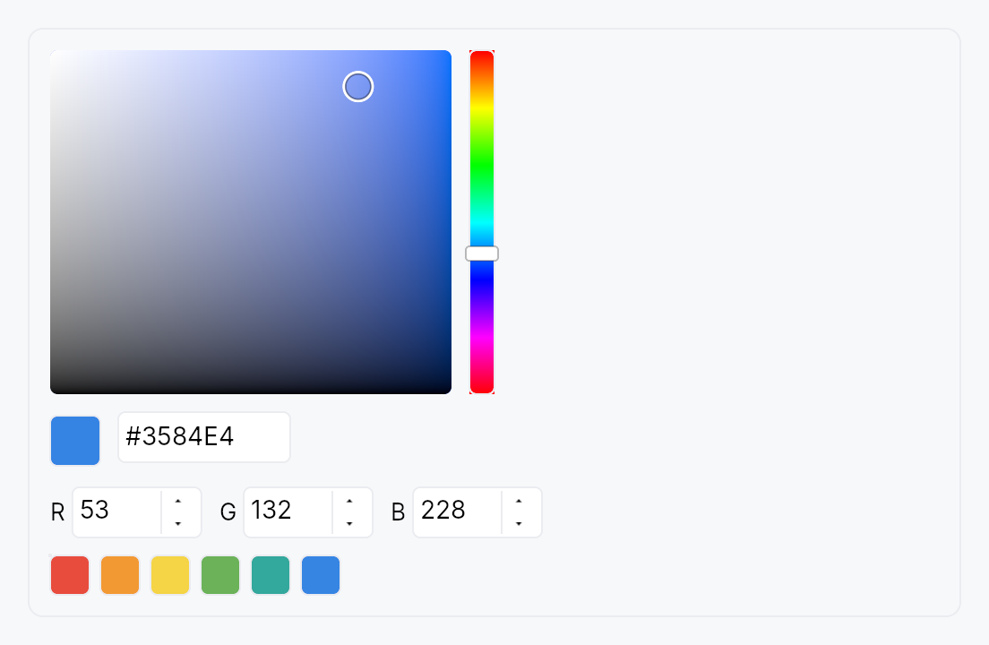
ColorPicker — embeddable composite color selector.
Public types
| Kind | Name |
|---|---|
const | DEFAULT_SWATCHES — Default 12-color preset palette (Int UI–flavored) |
struct | ColorPicker — Embeddable HSV+RGB+hex+alpha+swatches color picker |
Public functions
ColorPicker
Detailed description
Combines a 2D HSV canvas, 1D hue and alpha strips, RGB and HSV
component spinners, a hex input, a current-color preview, and an
optional preset swatch grid into a single bound widget. Driven by a
Signal<Color> (or Signal<Option<Color>>) source of truth — every
subcomponent reads from / writes to the same signal so the various
representations stay in lockstep.
Layouts
ColorPickerLayout::Compact— HSV canvas + hue strip + hex input. Minimal vertical footprint, suitable for popovers.ColorPickerLayout::Standard(default) — HSV canvas + hue strip + alpha strip (when enabled), with RGB spinners, hex input, and preset swatches stacked beneath. The everything-on layout for inspector panes and settings dialogs.ColorPickerLayout::Wide— HSV canvas with strips on the right, spinners stacked vertically alongside the swatch grid. For wide property pages.
Accessibility
Root: Role::Group with a localized
label and Live::Polite so screen readers announce committed color
changes. The HSV canvas's subtree is excluded from the AT tree
(no ARIA precedent for 2D pointer gestures); the hue strip, alpha
strip, RGB / HSV spinners, hex input, current-color preview, and
swatch grid each carry their own appropriate role and value.
Touch and pen
The hue strip, the alpha strip and the HSV canvas are continuous
manipulators — the value each produces is the press position — so all
three declare touch_action(NONE): a finger that lands on one adjusts it
rather than scrolling the surface the picker sits in. What NONE forbids,
with a test on it, is a two-contact pinch begun on one of them reaching the
surface underneath; the press capture each takes on its own PointerDown is
what separately keeps an enclosing scroller from taking the gesture away.
docs/touch-and-pen.md §7.3.
The strips are 14 dp across and cannot grow — the panel's column geometry is
built around them — so they make the 24 dp shortfall up between the pointer
and the arena, through Widget::hit_outset, on the short axis only. A
22 dp preset swatch earns the same widening, on both of its axes. The
strips also report what they painted through Widget::target_regions, so
the knob a user aims at is visible to a conformance audit even though no
layout ever produced it.
Density
The picture above is the widget at TargetDensity::Compact, the mouse-and-keyboard ladder. Below is the same subject on the same canvas with only the ladder changed, so what moves is the density and nothing else — where the subject no longer fits, that is what the denser targets cost it at that size. See docs/density-and-targets.md.
Touch
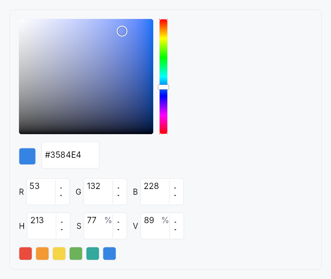
API reference
📖 Full rustdoc API for this module
pub const DEFAULT_SWATCHES
Import: use teksilo::widgets::DEFAULT_SWATCHES;
Default 12-color preset palette (Int UI–flavored). Apps can use
this verbatim or pass their own via ColorPicker::swatches.
#![allow(unused)] fn main() { pub const DEFAULT_SWATCHES: `Color; }
pub struct ColorPicker
Import: use teksilo::widgets::ColorPicker;
Embeddable HSV+RGB+hex+alpha+swatches color picker.
See the [module docsfor layout options, accessibility, and integration patterns. UseColorEdit`
to wrap this in a compact trigger + popover pattern.
use teksilo_core::signal::Signal;
use teksilo_tokens::Color;
use teksilo_widgets::color_picker::{ColorPicker, ColorPickerLayout};
let color = ctx.signal(Color::new(0.42, 0.70, 0.35, 1.0));
let _picker = ColorPicker::new(color)
.layout(ColorPickerLayout::Compact)
.alpha_enabled(false);
#![allow(unused)] fn main() { pub struct ColorPicker { /* fields */ } }
Methods
pub fn new(value: Signal<Color>) -> Self
Bind to a non-nullable color signal.
pub fn nullable(value: Signal<Option<Color>>) -> Self
Bind to a nullable color signal. None is treated as
transparent black for picker math; any commit produces a
concrete Some(color). Apps that want a "clear to None"
affordance should expose a separate Clear button alongside
the picker.
pub fn style(mut self, style: impl teksilo_core::styles::ColorPickerStyle) -> Self
Per-call style override. Higher precedence than the theme-wide
style_slots.color_picker slot.
pub fn alpha_enabled(mut self, e: bool) -> Self
Enable or disable the alpha channel (hue-strip alpha strip + a spinner + hex digit pair).
pub fn show_hsv_canvas(mut self, s: bool) -> Self
Show or hide the 2D HSV gradient canvas. Hidden in headless or accessibility-only contexts where the pointer-drag surface is not useful.
pub fn show_hue_strip(mut self, s: bool) -> Self
Show or hide the vertical hue selection strip.
pub fn show_alpha_strip(mut self, s: bool) -> Self
Show or hide the vertical alpha strip. Defaults to the value of
alpha_enabled; call this to decouple them (e.g. show the strip
without enabling the alpha spinner).
pub fn show_rgb_spinners(mut self, s: bool) -> Self
Show or hide the RGB (0–255) component spinners row.
pub fn show_hsv_spinners(mut self, s: bool) -> Self
Show or hide the HSV (hue 0–359°, saturation 0–100%, value 0–100%) spinners row.
pub fn show_hex_input(mut self, s: bool) -> Self
Show or hide the hex string input field.
pub fn show_preview(mut self, s: bool) -> Self
Show or hide the current-color preview swatch (Standard / Wide layouts).
pub fn show_swatches(mut self, s: bool) -> Self
Show or hide the preset swatch grid (Standard / Wide layouts only).
pub fn show_footer(mut self, s: bool) -> Self
Show a Done / Cancel footer at the bottom of the picker.
Default false for embedded use (the bound signal is the
commit channel — there is no "uncommitted" state). Wrappers
that present the picker as a popover (e.g. ColorEdit)
flip this to true so the user has explicit accept / dismiss
affordances; the buttons fire Self::on_done /
Self::on_cancel respectively.
pub fn on_done(mut self, f: impl Fn(&mut EventContext) + 'static) -> Self
Callback fired when the user activates the footer's Done
button. The picker has already been writing through to the
bound signal as the user dragged / typed, so Done's job is
purely to dismiss the surrounding surface (popover, sheet,
dialog). Only meaningful when show_footer(true).
pub fn on_cancel(mut self, f: impl Fn(&mut EventContext) + 'static) -> Self
Callback fired when the user activates the footer's Cancel
button. The picker itself does not restore any value —
that's the caller's responsibility (e.g. ColorEdit captures a
snapshot at popover-open time and writes it back here). The
callback's typical implementation is
value.set(snapshot.get()); ctx.dismiss_self_overlay_chain();.
Only meaningful when show_footer(true).
pub fn swatches(mut self, s: impl Into<Prop<Vec<Color>>>) -> Self
Replace the default 12-color DEFAULT_SWATCHES with a custom
palette — statically, or reactively via a bound Signal<Vec<Color>>
that updates live without rebuilding the picker.
pub fn swatch_columns(mut self, n: usize) -> Self
Number of columns in the preset swatch grid. Defaults to 6; clamped to at least 1.
pub fn layout(mut self, l: ColorPickerLayout) -> Self
Select the overall layout variant. Defaults to ColorPickerLayout::Standard.
pub fn label(mut self, label: impl Into<LocalizedString>) -> Self
Set the accessible group label for the picker root node. Defaults to the localized "Color picker" string.
pub fn enabled(mut self, enabled: impl Into<Prop<bool>>) -> Self
Set the enabled state, statically or reactively. Forwarded to the arena at build time.
pub fn tooltip(mut self, text: impl Into<LocalizedString>) -> Self
Attach a plain single-line tooltip shown after a hover delay.
Mutually exclusive with Self::rich_tooltip, Self::rich_tooltip_content,
and Self::composite_tooltip — the last setter called wins.
pub fn rich_tooltip(mut self, key: impl Into<String>) -> Self
Attach a rich tooltip looked up from the registry by key.
Mutually exclusive with the other tooltip setters — the last call wins.
pub fn rich_tooltip_content(mut self, content: crate::tooltip::TooltipContent) -> Self
Attach an inline rich tooltip from an already-constructed crate::tooltip::TooltipContent.
Mutually exclusive with the other tooltip setters — the last call wins.
pub fn composite_tooltip(mut self, content: impl Widget + 'static) -> Self
Attach a composite tooltip whose body is an arbitrary widget tree.
Mutually exclusive with the other tooltip setters — the last call wins.
pub fn current(&self) -> Color
Read the current bound color. Convenience for tests / apps that
hold a ColorPicker reference; otherwise prefer reading the
Signal<Color> you passed in.
ColorSwatch
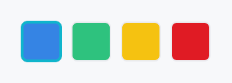
ColorSwatch — single clickable color cell with Role::ColorWell.
Public functions
ColorSwatch
Detailed description
Public widget so apps can compose their own swatch rows or palettes
outside of the bundled SwatchGrid. Renders an optional checkerboard
underlay when color.a() < 1.0 so transparent swatches read correctly.
The displayed color is a Prop<Color> — pass a static Color for a
fixed palette entry or a Signal<Color> for a live preview that
re-paints whenever the bound value changes (used by ColorPicker's
current-color preview and ColorEdit's trigger swatch).
Accessibility
Declares Role::ColorWell; set_color_value carries the RGBA value
and set_value carries the formatted hex string so braille and
voice output both have a human-readable form. Selected swatches
append a localized "selected" suffix to their announced name.
#![allow(unused)] fn main() { use teksilo_widgets::color_picker::ColorSwatch; use teksilo_tokens::Color; let _swatch = ColorSwatch::new(Color::new(0.21, 0.52, 0.89, 1.0)) .size(24.0) .corner_radius(4.0); }
Density
The picture above is the widget at TargetDensity::Compact, the mouse-and-keyboard ladder. Below is the same subject on the same canvas with only the ladder changed, so what moves is the density and nothing else — where the subject no longer fits, that is what the denser targets cost it at that size. See docs/density-and-targets.md.
Touch
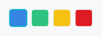
API reference
📖 Full rustdoc API for this module
pub struct ColorSwatch
Import: use teksilo::widgets::ColorSwatch;
Single-cell color swatch.
The displayed color is a Prop<Color> — pass a Color for a
static palette entry (the common case in SwatchGrid) or a
Signal<Color> for a live preview that re-paints when the bound
value changes (used by ColorPicker's current-color preview and
ColorEdit's trigger).
#![allow(unused)] fn main() { pub struct ColorSwatch { /* fields */ } }
Methods
pub fn new(color: impl Into<teksilo_core::signal::Prop<Color>>) -> Self
Create a swatch displaying color. Accepts a static Color or a
Signal<Color> (via impl Into<Prop<Color>>); a reactive value
re-paints the cell whenever the signal changes.
pub fn selected(mut self, selected: bool) -> Self (default: false)
Mark the swatch as currently selected, which paints an accent border and appends a localized "selected" suffix to the AT name.
pub fn label(mut self, label: impl Into<LocalizedString>) -> Self
Override the accessible label. Default is a localized "Color: #RRGGBB" string derived from the displayed color's hex value.
pub fn size(mut self, size: f32) -> Self
Set the swatch cell size in logical pixels (square). Defaults to
the theme's recipe_color_picker_style::SWATCH_SIZE.
pub fn corner_radius(mut self, r: f32) -> Self
Set the corner radius of the swatch cell in logical pixels.
Defaults to recipe_color_picker_style::SWATCH_CORNER_RADIUS.
pub fn enabled(mut self, enabled: impl Into<teksilo_core::signal::Prop<bool>>) -> Self
Set the enabled state, statically or reactively. Forwarded to the arena at build time.
pub fn on_activate_fn(mut self, f: impl Fn(&mut EventContext) + 'static) -> Self
Register an activation callback invoked on tap, Enter, Space, or
the Action::Click accessibility action.
pub fn tooltip(mut self, text: impl Into<LocalizedString>) -> Self
Attach a plain single-line tooltip shown after a hover delay.
Mutually exclusive with Self::rich_tooltip, Self::rich_tooltip_content,
and Self::composite_tooltip — this call clears the other slots.
pub fn rich_tooltip(mut self, key: impl Into<String>) -> Self
Attach a rich tooltip looked up from the tooltip registry by key.
Mutually exclusive with Self::tooltip, Self::rich_tooltip_content,
and Self::composite_tooltip — this call clears the other slots.
pub fn rich_tooltip_content(mut self, content: crate::tooltip::TooltipContent) -> Self
Attach a rich tooltip with inline content (no registry lookup required).
Mutually exclusive with Self::tooltip, Self::rich_tooltip,
and Self::composite_tooltip — this call clears the other slots.
pub fn composite_tooltip(mut self, content: impl Widget + 'static) -> Self
Attach a composite tooltip whose body is an arbitrary widget tree.
Mutually exclusive with Self::tooltip, Self::rich_tooltip,
and Self::rich_tooltip_content — this call clears the other slots.
ColumnFlow
ColumnFlow — flows children into as many columns as the width affords,
re-partitioning every child when a column is gained or lost.
Public functions
ColumnFlow
| Returns | Function |
|---|---|
| Constructors | |
Self | new() |
| Builder methods | |
Self | min_column_width(width: f32) |
Self | max_column_width(width: f32) |
Self | max_columns(max: usize) |
Self | column_spacing(spacing: impl Into<Prop<f32>>) |
Self | item_spacing(spacing: impl Into<Prop<f32>>) |
Self | alignment(alignment: HAlignment) |
Self | column_rule(width: f32, color: impl Into<ColorProp>) |
Self | semantic_list(enabled: bool) |
Self | child(widget: impl teksilo_core::IntoTeksiChild) |
Self | children(iter: impl IntoIterator<Item = impl teksilo_core::IntoTeksiChild>) |
Self | child_opt(widget: Option<impl teksilo_core::IntoTeksiChild>) |
| Methods | |
Signal<usize> | column_count_signal() |
Detailed description
The newspaper / CSS multi-column model: content runs down column 0, then
down column 1, and so on. The column count is derived from the available
width and min_column_width — when the
width no longer affords N columns the layout drops to N−1 and all
children are re-partitioned across the survivors. Children are atomic: one
child never straddles a column boundary.
Pair it with a ScrollArea for vertical
overflow — ColumnFlow reports its true content height (the tallest
column), so the scroll extent is correct.
#![allow(unused)] fn main() { use teksilo_widgets::primitives::column_flow::ColumnFlow; use teksilo_widgets::primitives::TextWidget; use teksilo_widgets::scroll_area::ScrollArea; use teksilo_i18n::lit; let _view = ScrollArea::new().child( ColumnFlow::new() .min_column_width(240.0) .max_columns(4) .column_spacing(16.0) .item_spacing(12.0) .child(TextWidget::new(lit!("First"))) .child(TextWidget::new(lit!("Second"))) .child(TextWidget::new(lit!("Third"))), ); }
Reading order
Children are distributed as contiguous runs in source order — column 0
takes children 0..i, column 1 takes i..j. So source order, visual
reading order, and focus order are the same thing, at every column count.
This is why ColumnFlow does not reuse
MasonryLayout's shortest-column
packing, which interleaves children and would divorce the visual order from
the source order.
Accessibility
By default ColumnFlow emits a bare Role::GenericContainer carrying no
properties, which the accessibility walker prunes, promoting the children
to its parent in source order. That is the correct outcome for a layout
primitive: it contributes geometry, not semantics, and the reading order is
already right. Add semantics from the outside with .access_role(..) /
.access_label(..), or opt into list semantics with
semantic_list.
Relationship to CSS multi-column
Close, but not identical. CSS column-fill: balance balances content within
a column height it computes from a bounded block size; ColumnFlow derives
the column count from the width and lets the height run free (a
ScrollArea absorbs it). No CSS column-fill mode does that, so don't read
this as a CSS multicol port.
Density
The picture above is the widget at TargetDensity::Compact, the mouse-and-keyboard ladder. Below is the same subject on the same canvas with only the ladder changed, so what moves is the density and nothing else — where the subject no longer fits, that is what the denser targets cost it at that size. See docs/density-and-targets.md.
Touch
API reference
📖 Full rustdoc API for this module
pub struct ColumnFlow
Import: use teksilo::widgets::ColumnFlow;
A layout that flows its children into as many columns as the available width affords, re-partitioning every child when a column is gained or lost.
wide narrower
┌────┐ ┌────┐ ┌────┐ ┌────┐ ┌────┐
│ 1 │ │ 3 │ │ 5 │ │ 1 │ │ 4 │
├────┤ ├────┤ ├────┤ ├────┤ ├────┤
│ 2 │ │ 4 │ │ 6 │ ───► │ 2 │ │ 5 │
└────┘ └────┘ └────┘ ├────┤ ├────┤
│ 3 │ │ 6 │
└────┘ └────┘
Reading order is 1..6 at both widths. See the module docs.
#![allow(unused)] fn main() { pub struct ColumnFlow { /* fields */ } }
Methods
pub fn new() -> Self
Create a ColumnFlow with a 240 dp minimum column width, no maximum
column width, and no column-count cap.
pub fn min_column_width(mut self, width: f32) -> Self (default: DEFAULT_MIN_COLUMN_WIDTH)
The narrowest a column may be. The column count is the largest N whose
columns are all at least this wide — CSS column-width / SwiftUI
GridItem(.adaptive(minimum:)) / Compose GridCells.Adaptive(minSize).
A value of zero or less pins the layout to a single column.
pub fn max_column_width(mut self, width: f32) -> Self
The widest a column may be. Unset by default, so columns stretch to share the full width evenly.
Set it to stop columns becoming unreadably wide when few of them fit a
large display — the reason KDE's Kirigami.CardsLayout pairs
minimumColumnWidth with maximumColumnWidth. When it bites, the
columns no longer fill the width and
alignment decides where the block sits.
pub fn max_columns(mut self, max: usize) -> Self
Never use more than max columns however wide the layout gets.
Also decides the count when the width is unconstrained (inside a
size-to-content parent such as a popover): unset, that case reports one
column, matching CSS column-count: auto in a shrink-to-fit context.
Clamped to at least 1.
pub fn column_spacing(mut self, spacing: impl Into<Prop<f32>>) -> Self (default: 0.0)
Horizontal gap between columns. Accepts an f32 or a Signal<f32>.
pub fn item_spacing(mut self, spacing: impl Into<Prop<f32>>) -> Self (default: 0.0)
Vertical gap between items within a column. Accepts an f32 or a
Signal<f32>.
Named for items rather than rows because there are no rows here: a column's items are independent of its neighbours'.
pub fn alignment(mut self, alignment: HAlignment) -> Self
Where the column block sits when it does not fill the available width.
Only observable once max_column_width clamps
the columns narrower than their even share — otherwise the columns
consume the whole width and there is nothing to align. Defaults to
HAlignment::Leading; RTL-aware.
pub fn column_rule(mut self, width: f32, color: impl Into<ColorProp>) -> Self
Draw a rule of width dp, centred in every inter-column gap — CSS
column-rule.
Purely decorative: it emits no accessibility node. Accepts a Color, a
theme role, or a Signal. Pass BorderRole::Divider to track the
theme's divider colour.
pub fn semantic_list(mut self, enabled: bool) -> Self
Expose the children to assistive technology as a list.
The container becomes Role::List carrying the set size, and every
child is wrapped in a layout-transparent node reporting Role::ListItem
with its position, so a screen reader announces "list, 30 items" and
"item 5 of 30" rather than reading 30 unrelated widgets.
Off by default: a layout primitive should not invent semantics its content may not have. Turn it on when the children genuinely are a list of peers. Costs one extra node per child.
pub fn child(mut self, widget: impl teksilo_core::IntoTeksiChild) -> Self
Add an inline child widget (deferred insertion).
pub fn children( mut self, iter: impl IntoIterator<Item = impl teksilo_core::IntoTeksiChild>, ) -> Self
Add multiple inline children from an iterator.
pub fn child_opt(mut self, widget: Option<impl teksilo_core::IntoTeksiChild>) -> Self
Conditionally add a child. No-op if None.
pub fn column_count_signal(&self) -> Signal<usize>
The live column count, as a reactive signal.
Lets an app follow the reflow — swapping to a compact header at one column, say. Written from the layout pass behind an equality guard, so it only fires when the count actually changes.
Binding contract. Safe for RepaintOnly / AccessibilityOnly
consumers, and for Relayout consumers that do not feed back into this
widget's own width. The count is a pure function of the width
ColumnFlow is given — it never changes its own width, so it cannot
oscillate on its own. But a Relayout consumer that resizes something
which in turn resizes this ColumnFlow closes a feedback loop through
the layout pass, which is exactly what
Widget::place_children's own documentation warns against.
ComboBox
ComboBox — dropdown selection widget.
Public functions
ComboBox
Detailed description
Generic over the item type T: Clone + PartialEq + 'static. Selection is
value-based: the bound Signal<Option<T>> survives reorder and insertion
of the backing model. Items come from one of four input paths:
ComboBox::new— static list of localizable strings (the 90% case).ComboBox::from_items— static list of typed values.ComboBox::from_model— reactiveListModel<T>.ComboBox::from_source— externalListDataSource<Item = T>.
The dropdown panel's node is created during build() and kept dormant, but
its subtree is deferred — built the first time the combo is opened.
Keyboard
The keys move a highlight through the list, and only a commit changes the value: the W3C ARIA select-only combobox pattern. A reader arrowing to hear the options changes nothing, and an application acting on the value (a language switcher) acts once, on the option the user picked.
Enter/Space: open the list; in the open list, commit the highlighted option and close.ArrowDown/ArrowUp: open the list and move the highlight one item from the value, stopping at the ends; with no value,ArrowDownreaches the first item. Win32's combo box,QComboBox, GTK and the W3C ARIA listbox pattern all stop rather than wrap; a combo box is a value, and wrapping is the menu convention.Alt+ArrowDown/Alt+ArrowUp: open the list on the value (or the first item) without moving, and close it. The Win32 / WinForms / WPF chord and the ARIA combobox pattern.F4: toggle the list (Win32 / Qt / WPF).Escape: close the list and keep the value.Home/End: first / last item.PageUp/PageDown: one page, where a page ismax_visible_itemsrows.- Printable characters: type-ahead, within
type_ahead_timeout. - A chord holding
Ctrl,AltorSuperis not the combo box's and falls through to the application;Shiftis, so a capital letter still types.
Every key that moves the highlight opens the list first when it is
closed, so the reader hears the option it reaches. Focus stays on the
combo box (or, in a searchable list, on its
search field), which names the highlighted option as its
active_descendant: every platform adapter follows that as the focus.
The widget is split across four internal modules:
stateholds theItemSourceaccessor, the defaultmax_visible_itemsconstant, and the index helpers.itemholds the single-rowDropdownItemwidget.panelholds theDropdownPaneloverlay content and theFilteredItemListinner widget.testsholds the headless unit tests.
Touch and pen
The closed box is one target — the arrow column is paint inside it, not a second target — and it opens the dropdown from its tap, so already on the release. The field's hover tint is decoration with nothing behind it.
The dropdown's rows are menu rows and take the menu row's target floor at every
density; before this they measured against the raw Compact constant while a
MenuList's rows grew, and the panel that shows max_visible_items of them now
resolves the same number they do.
Density
The picture above is the widget at TargetDensity::Compact, the mouse-and-keyboard ladder. Below is the same subject on the same canvas with only the ladder changed, so what moves is the density and nothing else — where the subject no longer fits, that is what the denser targets cost it at that size. See docs/density-and-targets.md.
Touch
API reference
📖 Full rustdoc API for this module
pub struct ComboBox
Import: use teksilo::widgets::ComboBox;
A dropdown selection widget.
// Simple: list of strings.
let selected = ctx.signal(None::<String>);
ComboBox::new(["Apple", "Banana", "Cherry"], selected)
.placeholder(lit!("Select a fruit..."))
// Typed items: any T: Clone + PartialEq, plus a label extractor.
#[derive(Clone, PartialEq)] struct Fruit { name: String, emoji: &'static str }
let selected = ctx.signal(None::<Fruit>);
ComboBox::from_items(fruits, selected)
.item_label(|f: &Fruit| lit!(format!("{} {}", f.emoji, f.name)))
// Model-backed: reactive.
let model = ListModel::from_vec(fruits);
ComboBox::from_model(model, selected)
.item_label(|f: &Fruit| lit!(f.name.clone()))
.max_visible_items(6)
#![allow(unused)] fn main() { pub struct ComboBox<T: Clone + PartialEq + 'static> { /* fields */ } }
Methods
pub fn new( items: impl IntoIterator<Item = impl Into<String>>, selected: Signal<Option<String>>, ) -> Self
Create a ComboBox from a list of strings.
Accepts any impl Into<String> — string literals (&str),
owned Strings, resolved LocalizedStrings, etc. For
translated items, resolve translations before passing in,
e.g. vec![tr!(apple()).resolve_now(), ...].
pub fn from_items<F>( items: impl IntoIterator<Item = T>, selected: Signal<Option<T>>, item_label: F, ) -> Self where F: Fn(&T) -> LocalizedString + 'static,
Static list of typed items. item_label is the display extractor —
it's required at construction so the compiler enforces it rather
than a runtime check. For T = String, use ComboBox::new which
defaults to the identity label.
pub fn from_model<F>(model: ListModel<T>, selected: Signal<Option<T>>, item_label: F) -> Self where F: Fn(&T) -> LocalizedString + 'static,
Backed by a reactive ListModel<T>. Inserts, removes, and reorders
propagate into the dropdown automatically. If the currently-selected
value disappears from the model, selected becomes None.
pub fn from_source<S, F>(source: S, selected: Signal<Option<T>>, item_label: F) -> Self where S: ListDataSource<Item = T> + 'static, F: Fn(&T) -> LocalizedString + 'static,
Backed by a custom ListDataSource — for external or paged data.
pub fn item_label(mut self, f: impl Fn(&T) -> LocalizedString + 'static) -> Self
Override the display-label extractor. Rarely needed — prefer passing
item_label to the constructor. Useful for the ComboBox<String>
path when you want a non-identity projection.
pub fn render_item(mut self, f: impl Fn(&T, bool) -> Box<dyn Widget> + 'static) -> Self
Custom cell rendering. The closure receives the item and a flag indicating whether it is the currently-selected value.
The framework wraps the returned widget with the correct
Role::ListBoxOption accessibility and tap handler, so callers
do not need to manage a11y or selection dispatch themselves.
Reactivity. The bool argument is a snapshot at build time.
If the selection flips after the dropdown is open, the user's
subtree is not automatically re-rendered; the framework-managed
highlight background (behind the custom widget) does update, and
closing and re-opening the dropdown picks up the new state. If
you need a reactive appearance that tracks selection, close over
a Signal<Option<T>> in your closure and compare against the
item value inside a .map() / bind_* on primitives.
Accessibility. The wrapper's set_name(label) (from
item_label) is what screen readers announce. If the returned
widget includes its own text nodes (e.g. a bare TextWidget), the
label may be announced twice — one from the wrapper, one from the
inner text. Wrap primary text nodes in .a11y_hidden() to avoid
duplication, and reserve visible widgets for presentation only.
pub fn render_selected(mut self, f: impl Fn(&T) -> Box<dyn Widget> + 'static) -> Self
Custom renderer for the trigger's selected value — the widget shown
when the combo is closed. The parallel of render_item
for the trigger rather than the dropdown rows.
When set, the closed combo shows f(&value) for the current
selection instead of the plain text label (item_label). The
canonical use is a FontPicker rendering the selected family name in
its own typeface. The subtree is rebuilt whenever the selection
changes and whenever the locale changes (so a None-state
placeholder re-translates), without rebuilding the whole ComboBox.
Accessibility. The rendered subtree is excluded from the
accessibility tree — the ComboBox's own accessibility(builder)
already announces the selected value via set_value, so the custom
visual can never double-announce. When nothing is selected the
trigger shows the placeholder text.
pub fn on_select(mut self, f: impl Fn(&T, &mut EventContext) + 'static) -> Self
Register a callback fired when the user commits a selection — by
tapping a dropdown row, or pressing Enter (or Space) on the
option the keyboard highlighted. The callback receives the chosen
value and a live EventContext, so it can run context-bearing
actions that observing the bound selected signal cannot, such as
ctx.set_locale(...), navigation, or opening another overlay.
Moving through the list (arrows, type-ahead, Home / End, the page
keys) is not a commit and fires nothing, and neither does Enter on
the option that is the value already. So a context change made here
happens once, on the user's choice, never while they are still
listening to the options (WCAG 3.2.2).
It fires only on user-driven commits, not on external writes
to the selected signal (those are observed via ctx.effect).
The selected signal is updated before the callback runs.
pub fn max_visible_items(mut self, n: usize) -> Self
Maximum number of items shown before the dropdown becomes scrollable. Defaults to 8. Clamped to at least 1.
pub fn type_ahead_timeout(mut self, d: Duration) -> Self
Reset window for keyboard type-ahead. Keystrokes more than d apart
begin a fresh prefix; within d they extend it. Defaults to 500 ms,
matching MenuList::type_ahead_timeout. Pass Duration::ZERO to
treat each keystroke independently.
pub fn placeholder(mut self, text: impl Into<LocalizedString>) -> Self
Placeholder text shown in the trigger when selected is None.
Accepts a tr!(...) directly (resolved at build); use
placeholder_literal for an
untranslated string.
pub fn label(mut self, label: impl Into<LocalizedString>) -> Self
Accessible label describing what this combo box is for (e.g. "Fruit", "Font family"). Independent of the visible placeholder and of the current selection — screen readers announce this as the name of the control.
pub fn enabled(mut self, enabled: impl Into<Prop<bool>>) -> Self
Set the enabled state, statically or reactively. Forwarded to the arena at build time.
pub fn variant(mut self, variant: ComboBoxVariant) -> Self
Pick a Tier-1 design-language variant
(ComboBoxVariant::Outlined / Filled / Underline / Plain).
The active ComboBoxStyle decides what to do with the hint —
IntUI's default impl honours Outlined (default) and Plain;
a custom impl (Material 3, macOS, etc.) might paint differently.
pub fn style(mut self, style: impl ComboBoxStyle) -> Self
Override the active ComboBoxStyle for this widget instance
only. The default IntUI chrome (crate::styles::RecipeComboBoxStyle)
resolves its dimensions from theme.input (the density
InputTokens); custom impls
can paint anything they want around the selected-label slot.
pub fn text_style(mut self, style: impl Into<teksilo_core::color_prop::TextStyleProp>) -> Self
Override the selected-value text style (font, size, weight).
Accepts a TextStyleRole, a TextStyle, or a Signal of either.
Default (unset) is TextStyleRole::Body.
pub fn text_role(mut self, color: impl Into<teksilo_core::color_prop::ColorProp>) -> Self
Override the selected-value text color. Accepts Color, a role, or
a Signal of either. Default (unset) is enabled-derived
(Primary / Disabled); setting this replaces that cascade.
pub fn tooltip(mut self, text: impl Into<LocalizedString>) -> Self
Attach a plain tooltip that appears after a hover delay. The tooltip is anchored to the trigger only — with the framework's overlay-boundary gate it does not re-trigger while the pointer is over the open dropdown's option rows.
Mutually exclusive with rich_tooltip /
rich_tooltip_content /
composite_tooltip — last call wins.
pub fn rich_tooltip(mut self, key: impl Into<String>) -> Self
Attach a rich tooltip resolved from the app-wide tooltip registry.
The key is looked up via
TooltipRegistry at build
time; the resolved body supports inline markup, a shortcut chip,
and a "more" disclosure. Overrides any previously set tooltip.
pub fn rich_tooltip_content(mut self, content: crate::tooltip::TooltipContent) -> Self
Attach a rich tooltip driven by inline
TooltipContent — for one-off
tooltips that aren't worth registering centrally. Overrides any
previously set tooltip.
pub fn composite_tooltip(mut self, content: impl Widget + 'static) -> Self
Attach a composite tooltip — third tier, hosting an arbitrary
widget tree (tabbed sections, charts, conditional rows). Promotes
to a focusable Role::Dialog after the standard dwell. Overrides
any plain or rich tooltip previously set.
Searchable-mode builders. The search field is a TextInput, which
shares the RichTextEditor engine and therefore the teksilo-text
dependency.
pub fn searchable(mut self, enabled: bool) -> Self
Show a search field at the top of the dropdown panel and filter
the list live against the user's query. When true, items are
matched by the closure passed to filter, or —
if no filter is set — by a case-insensitive substring match on
the item_label.
The search input becomes a child of the dropdown panel only, not of the trigger: the closed combo box looks identical whether searchable or not.
The query signal is created internally. Use
search_query to supply your own if you
want to observe or drive the query externally.
pub fn search_query(mut self, query: Signal<String>) -> Self
Bind the search field to an external Signal<String>. Implies
searchable(true). Useful for observing or
programmatically setting the query from outside the widget
(e.g. a "Clear" button, persistence across sessions).
pub fn filter(mut self, f: impl Fn(&str, &T) -> bool + 'static) -> Self
Custom match predicate for searchable mode. Called on every
visible-item pass with the current query string (as typed, not
normalized) and a reference to the item; return true to keep
the item in the filtered list. Only consulted when
searchable is true. Ignored otherwise.
CommandLinkButton
CommandLinkButton — large two-line button with icon, title, and subtitle. Used for wizard landing screens, onboarding choices, and any "card-shaped CTA" pattern.
Public types
| Kind | Name |
|---|---|
const | COMMAND_LINK_BUTTON_ICON_SIZE — CommandLinkButton design tokens |
const | COMMAND_LINK_BUTTON_ICON_TEXT_GAP |
fn | command_link_button_icon_text_gap — COMMAND_LINK_BUTTON_ICON_TEXT_GAP scaled by the density's spacing_factor (1.00 / 1.15 / 1.30) |
const | COMMAND_LINK_BUTTON_TITLE_DESCRIPTION_GAP |
fn | command_link_button_title_description_gap — COMMAND_LINK_BUTTON_TITLE_DESCRIPTION_GAP scaled by the density's spacing_factor (1.00 / 1.15 / 1.30) |
const | COMMAND_LINK_BUTTON_PADDING_HORIZONTAL |
fn | command_link_button_padding_horizontal — COMMAND_LINK_BUTTON_PADDING_HORIZONTAL scaled by the density's spacing_factor (1.00 / 1.15 / 1.30) |
const | COMMAND_LINK_BUTTON_PADDING_VERTICAL |
fn | command_link_button_padding_vertical — COMMAND_LINK_BUTTON_PADDING_VERTICAL scaled by the density's spacing_factor (1.00 / 1.15 / 1.30) |
const | COMMAND_LINK_BUTTON_MIN_HEIGHT |
fn | command_link_button_min_height — COMMAND_LINK_BUTTON_MIN_HEIGHT raised to the density's target_size (24 / 32 / 44 dp) |
struct | CommandLinkButton — A large two-line CTA button: icon + title + subtitle |
Public functions
CommandLinkButton
Detailed description
Modeled on Qt's QCommandLinkButton. Distinct from a regular
Button by its layout (HStack(icon + VStack(title + subtitle))) and default visual variant (Flat —
Int UI convention — with an interactive surface tint on hover).
CommandLinkButton::new(tr!(create_new_project()))
.description(tr!(create_new_project_subtitle()))
.icon(IconWidget::from_svg(NEW_PROJECT_ICON))
.on_activate_fn(|ctx| ctx.send_intent(AppIntent::NewProject))
Touch and pen
Shares build_interaction_handlers with Button; see that
module's "Touch and pen" section. A command link is a tall, wide target by
construction, so no hit-widening mechanism is involved.
Density
The picture above is the widget at TargetDensity::Compact, the mouse-and-keyboard ladder. Below is the same subject on the same canvas with only the ladder changed, so what moves is the density and nothing else — where the subject no longer fits, that is what the denser targets cost it at that size. See docs/density-and-targets.md.
Touch
API reference
📖 Full rustdoc API for this module
pub const COMMAND_LINK_BUTTON_ICON_SIZE
Import: use teksilo::widgets::command_link_button::COMMAND_LINK_BUTTON_ICON_SIZE;
CommandLinkButton design tokens. The widget is a group-4 composite with no dedicated recipe module.
#![allow(unused)] fn main() { pub const COMMAND_LINK_BUTTON_ICON_SIZE: f32 = 28.0; }
pub const COMMAND_LINK_BUTTON_ICON_TEXT_GAP
Import: use teksilo::widgets::command_link_button::COMMAND_LINK_BUTTON_ICON_TEXT_GAP;
#![allow(unused)] fn main() { pub const COMMAND_LINK_BUTTON_ICON_TEXT_GAP: f32 = 14.0; }
pub fn command_link_button_icon_text_gap(...)
Import: use teksilo::widgets::command_link_button::command_link_button_icon_text_gap;
COMMAND_LINK_BUTTON_ICON_TEXT_GAP scaled by the density's spacing_factor
(1.00 / 1.15 / 1.30).
#![allow(unused)] fn main() { pub fn command_link_button_icon_text_gap(tokens: &InputTokens) -> f32; }
pub const COMMAND_LINK_BUTTON_TITLE_DESCRIPTION_GAP
Import: use teksilo::widgets::command_link_button::COMMAND_LINK_BUTTON_TITLE_DESCRIPTION_GAP;
#![allow(unused)] fn main() { pub const COMMAND_LINK_BUTTON_TITLE_DESCRIPTION_GAP: f32 = 4.0; }
pub fn command_link_button_title_description_gap(...)
Import: use teksilo::widgets::command_link_button::command_link_button_title_description_gap;
COMMAND_LINK_BUTTON_TITLE_DESCRIPTION_GAP scaled by the density's spacing_factor
(1.00 / 1.15 / 1.30).
#![allow(unused)] fn main() { pub fn command_link_button_title_description_gap(tokens: &InputTokens) -> f32; }
pub const COMMAND_LINK_BUTTON_PADDING_HORIZONTAL
Import: use teksilo::widgets::command_link_button::COMMAND_LINK_BUTTON_PADDING_HORIZONTAL;
#![allow(unused)] fn main() { pub const COMMAND_LINK_BUTTON_PADDING_HORIZONTAL: f32 = 16.0; }
pub fn command_link_button_padding_horizontal(...)
Import: use teksilo::widgets::command_link_button::command_link_button_padding_horizontal;
COMMAND_LINK_BUTTON_PADDING_HORIZONTAL scaled by the density's spacing_factor
(1.00 / 1.15 / 1.30).
#![allow(unused)] fn main() { pub fn command_link_button_padding_horizontal(tokens: &InputTokens) -> f32; }
pub const COMMAND_LINK_BUTTON_PADDING_VERTICAL
Import: use teksilo::widgets::command_link_button::COMMAND_LINK_BUTTON_PADDING_VERTICAL;
#![allow(unused)] fn main() { pub const COMMAND_LINK_BUTTON_PADDING_VERTICAL: f32 = 14.0; }
pub fn command_link_button_padding_vertical(...)
Import: use teksilo::widgets::command_link_button::command_link_button_padding_vertical;
COMMAND_LINK_BUTTON_PADDING_VERTICAL scaled by the density's spacing_factor
(1.00 / 1.15 / 1.30).
#![allow(unused)] fn main() { pub fn command_link_button_padding_vertical(tokens: &InputTokens) -> f32; }
pub const COMMAND_LINK_BUTTON_MIN_HEIGHT
Import: use teksilo::widgets::command_link_button::COMMAND_LINK_BUTTON_MIN_HEIGHT;
#![allow(unused)] fn main() { pub const COMMAND_LINK_BUTTON_MIN_HEIGHT: f32 = 64.0; }
pub fn command_link_button_min_height(...)
Import: use teksilo::widgets::command_link_button::command_link_button_min_height;
COMMAND_LINK_BUTTON_MIN_HEIGHT raised to the density's target_size
(24 / 32 / 44 dp). The identity at Compact.
#![allow(unused)] fn main() { pub fn command_link_button_min_height(tokens: &InputTokens) -> f32; }
pub struct CommandLinkButton
Import: use teksilo::widgets::CommandLinkButton;
A large two-line CTA button: icon + title + subtitle.
#![allow(unused)] fn main() { pub struct CommandLinkButton { /* fields */ } }
Methods
pub fn new(title: impl Into<LocalizedString>) -> Self
Create a CommandLinkButton with the given title text.
Chain .description(...) and .icon(...) to complete the card layout.
pub fn description(mut self, text: impl Into<LocalizedString>) -> Self
Optional descriptive subtitle rendered below the title.
pub fn icon(mut self, icon: IconWidget) -> Self
Leading icon — large enough to anchor the card visually (rendered at 28 dp).
pub fn enabled(mut self, enabled: impl Into<Prop<bool>>) -> Self
Set the enabled state, statically or reactively. Forwarded to the arena at build time.
pub fn on_activate_fn(mut self, f: impl Fn(&mut EventContext) + 'static) -> Self
Closure invoked on activation. Use ctx.send_intent(...) to
route through the Action / Intent system.
pub fn title_style( mut self, style: impl Into<teksilo_core::color_prop::TextStyleProp>, ) -> Self
Override the title's text style (font, size, weight). Accepts a
TextStyleRole, a TextStyle, or a Signal of either. Default
(unset) is TextStyleRole::BodyBold.
pub fn description_style( mut self, style: impl Into<teksilo_core::color_prop::TextStyleProp>, ) -> Self
Override the description's text style. Default is TextStyleRole::Body.
pub fn title_color(mut self, color: impl Into<teksilo_core::color_prop::ColorProp>) -> Self
Override the title's text color. Accepts Color, a role, or a
Signal of either. Default (unset) is TextRole::Primary.
pub fn description_color( mut self, color: impl Into<teksilo_core::color_prop::ColorProp>, ) -> Self
Override the description's text color. Default is TextRole::Secondary.
pub fn tooltip(mut self, text: impl Into<LocalizedString>) -> Self
Attach a plain single-line tooltip shown after a hover delay. Clears any previously set rich or composite tooltip.
pub fn rich_tooltip(mut self, key: impl Into<String>) -> Self
Attach a rich tooltip looked up by registry key. Clears any previously set plain or composite tooltip.
pub fn rich_tooltip_content(mut self, content: crate::tooltip::TooltipContent) -> Self
Attach a rich tooltip with inline content (no registry lookup). Clears any previously set plain or composite tooltip.
pub fn composite_tooltip(mut self, content: impl Widget + 'static) -> Self
Attach a composite tooltip hosting an arbitrary widget tree body. Clears any previously set plain or rich tooltip.
CommandPalette
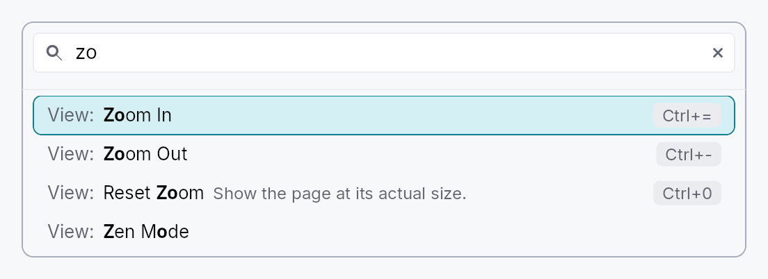
CommandPalette — type-to-run access to every command an app has registered.
Public types
| Kind | Name |
|---|---|
struct | PaletteCommand — One command as the palette sees it |
struct | CommandPalette — Type-to-run access to every registered command |
Public functions
CommandPalette
| Returns | Function |
|---|---|
| Constructors | |
Self | new() |
| Builder methods | |
Self | placeholder(text: impl Into<LocalizedString>) |
Self | empty_text(text: impl Into<LocalizedString>) |
Self | include(f: impl Fn(&PaletteCommand) -> bool + 'static) |
Self | on_dismiss(f: impl Fn(&mut EventContext) + 'static) |
Self | show_disabled(show: bool) |
| Methods | |
Signal<String> | query_signal() |
present(ctx: &mut EventContext) |
Detailed description
The palette is application-agnostic: it holds no list of its own and knows
nothing about any particular app. Its content is the tree's
ShortcutRegistry, which already
carries everything a palette row needs — a localized
name, an optional category to group by, an
optional description, the effective keystroke (user rebinds merged in), and a
live enabled verdict. Activating a row sends the command's intent, which is the
same path a menu row or the chord itself takes.
That has a consequence worth stating plainly, because it is the whole design:
a command does not need a keystroke to appear here. iter_effective() yields
every registered entry, bound or not, so an app makes a command searchable by
registering it with a name and no chord:
// Reachable from the palette, and rebindable by the user later, without
// occupying a keystroke today.
ctx.register_shortcut_global(
Shortcut::new("document.export")
.name("Export…")
.category("File")
.build(),
);
Running a command
Activating a row (Enter, or a click) closes the palette, which hands focus
back to whatever the user was working in, and then sends the command's
intent from there, as its keystroke would have been sent
(EventContext::send_intent_from_focus). So a command answers wherever
its action is registered: on the editor the palette was opened over, on
one of that editor's ancestors, or window-wide.
That is also why a presented palette lists the commands that act on the
focused editor: the standard edit commands every tree registers
(StandardEdit: cut, copy, paste, undo, redo, select all) and the
editors' own (FormatShortcut,
CodeShortcut). A palette embedded
in a surface of the caller's keeps the focus in its own search field, where
those commands would act on the query, so it leaves them out.
Presenting it
CommandPalette::present shows it as a modal near the top of the window,
dismissed by Escape or a click outside:
ctx.register_action_global(Action::new("app.command_palette").on_invoke(|_, ctx| {
CommandPalette::new().present(ctx);
}));
Presenting it as a window-level modal is deliberate, not incidental: a palette
is routinely opened from a menu, and a menu is itself a transient overlay.
Anchoring to the invoking widget would render the palette inside the menu that
opened it, positioned against a surface that is about to disappear. It is
anchored by its top edge (ModalPlacement::Top) rather than centred: the
palette is as tall as its list, and a centred one would move its search field
with every keystroke that changed the number of matches.
What a row shows
One line: the category, muted (File:), then the command's name, with the
letters the query matched in bold, then its description when it has one,
muted and the first to give way to a long name, and the effective shortcut,
user rebinds merged in, drawn as a key at the trailing edge. Rows grow with
the global text scale.
Matching
Typing filters by subsequence, not substring, so ndw finds "New Window" and
expdoc finds "Export document". Matches score higher when the typed letters land
consecutively and on word starts, so the most literal reading of a query sorts
first. An empty query lists everything in the registry's own deterministic
(category, id) order. The category takes part in matching, so file new finds
the New command filed under File.
A query can usually land in a command in more than one way (exp in "File:
Export": the e of "File", or the E of "Export"); the best-scoring way is
kept, and its letters are the ones the row shows in bold.
The category a reader sees and matches against is the shortcut's
category_label when it has one, and its category key otherwise. Give a
localized label (.category_label(tr!(…))) and keep the key stable: the key
orders the groups, so it must not change with the language, and the label is
what a French reader types (fichier nouveau). Settings ▸ Keymap
(ShortcutSettings) uses the same pair, and names the group of shortcuts that
declared no category from the widget catalogue
(shortcut-settings-uncategorized).
Keyboard
Focus stays in the search field throughout: that is what makes a palette feel like one. Arrow keys are not editing keys for the field, so they bubble to the palette's own handler, which moves the highlight (wrapping at either end) and scrolls it into view; PageUp and PageDown move it a viewport at a time. Home and End stay with the field, which moves its caret with them. Enter runs the highlighted command; Escape dismisses.
Typing re-filters the list and nothing else: the list is a sibling of the search field, not its parent, so the field keeps its caret, its selection and an input method's composition from one keystroke to the next.
Density
The picture above is the widget at TargetDensity::Compact, the mouse-and-keyboard ladder. Below is the same subject on the same canvas with only the ladder changed, so what moves is the density and nothing else — where the subject no longer fits, that is what the denser targets cost it at that size. See docs/density-and-targets.md.
Touch
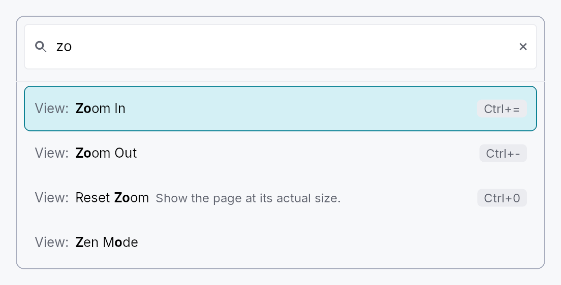
API reference
📖 Full rustdoc API for this module
pub struct PaletteCommand
Import: use teksilo::widgets::PaletteCommand;
One command as the palette sees it.
A read-only projection of a registered shortcut, handed to
CommandPalette::include so an app can decide what belongs in its palette
without the widget growing knowledge of any app's command names. Deliberately
not the Shortcut itself: that type carries the activation closure and the
rebinding machinery, neither of which a filter predicate has any business
reaching.
#![allow(unused)] fn main() { pub struct PaletteCommand { /* fields */ } }
Fields
id:&'static str— The stable registry id, e.g."work.export".name:String— The localized display name, already resolved for the active locale.category:Option<&'static str>— The grouping key, if the command declared one: stable across languages, so anCommandPalette::includefilter can match on it.category_text:Option<String>— The category as the reader sees it, already resolved for the active locale: the command'scategory_label, or the key when it gave none.description:Option<String>— The longer explanation, if the command declared one.keystroke:Option<KeyStroke>— The effective primary chord (user rebinds merged in), orNonewhen the command has no keystroke at all, which is normal for a palette-only command.enabled:bool— Whether the command's ownenabled_whenpredicate currently says yes.intent:&'static str— The intent name activation sends. Falls back toSelf::idwhen the command declared no explicit intent, exactly as the keystroke dispatcher does.
pub struct CommandPalette
Import: use teksilo::widgets::CommandPalette;
Type-to-run access to every registered command. See the module docs.
#![allow(unused)] fn main() { pub struct CommandPalette { /* fields */ } }
Methods
pub fn new() -> Self
A palette over every command in the tree's registry.
pub fn placeholder(mut self, text: impl Into<LocalizedString>) -> Self (default: None)
Replace the search field's placeholder text.
pub fn empty_text(mut self, text: impl Into<LocalizedString>) -> Self (default: None)
Replace the text shown when nothing matches the query.
pub fn include(mut self, f: impl Fn(&PaletteCommand) -> bool + 'static) -> Self
Keep only the commands this predicate accepts.
The usual reasons are to hide the command that opens the palette itself, and to drop registry entries that are key bindings rather than commands a person would look for by name.
pub fn on_dismiss(self, f: impl Fn(&mut EventContext) + 'static) -> Self
Run this after a command is activated, and when Escape is pressed.
present installs its own, so this is for callers embedding
the palette in a surface they manage themselves.
pub fn show_disabled(mut self, show: bool) -> Self
Also list commands whose enabled_when predicate currently says no, greyed
out and inert. Off by default: a palette answers "what can I do now", and a
row that cannot run is a row that has to be explained.
pub fn query_signal(&self) -> Signal<String>
The query signal, so a caller can seed or observe what was typed.
pub fn present(self, ctx: &mut EventContext)
Show the palette near the top of the window, dismissed by Escape or a
click outside. See the module docs on why this is window-level.
Crossfade
Crossfade — when an external Signal<K> changes, the
previous content fades out while the new content fades in over
the same window. Like Switcher,
but animated.
Public functions
Crossfade
| Returns | Function |
|---|---|
| Constructors | |
Self | new(key_signal: Signal<K>, builder: impl Fn(&K) -> Box<dyn Widget> + 'static) |
| Builder methods | |
Self | duration(duration: Duration) |
Detailed description
let tab = Signal::new(Tab::Overview);
ctx.add(
Crossfade::new(tab.clone(), |t| match t {
Tab::Overview => Box::new(overview_panel()),
Tab::Details => Box::new(details_panel()),
}),
);
Behavior
On each key change, both the previous-key widget and the
current-key widget are rebuilt (via the supplied builder) and
mounted side-by-side in a ZStack. The previous fades 1→0 while
the current fades 0→1 over the configured duration. On the next
key change, the previously-outgoing widget is torn down and the
cycle repeats.
Builders should be cheap — they may run more than once per lifetime as the user navigates through several keys. For data- heavy panels, hoist expensive state out of the builder closure.
Reduced motion
Honours prefers-reduced-motion: snaps the opacity changes
instead of tweening (instant swap).
API reference
📖 Full rustdoc API for this module
pub struct Crossfade
Import: use teksilo::widgets::Crossfade;
Animated swap between widgets keyed by an external signal.
#![allow(unused)] fn main() { pub struct Crossfade<K: Eq + Clone + 'static> { /* fields */ } }
Methods
pub fn new(key_signal: Signal<K>, builder: impl Fn(&K) -> Box<dyn Widget> + 'static) -> Self
New Crossfade driven by key_signal. The builder closure
constructs the widget for a given key value. Builders can be
invoked multiple times across the widget's lifetime as the
user transitions through keys.
pub fn duration(mut self, duration: Duration) -> Self
Override the crossfade duration. Default: MotionTokens::duration_normal.
Cycle
Cycle — show one of N children at a time, advancing on a fixed
period. The "rotating loading tip" / status display pattern.
Public functions
Cycle
| Returns | Function |
|---|---|
| Constructors | |
Self | new() |
| Builder methods | |
Self | period(period: Duration) |
Self | child(widget: impl Widget + 'static) |
Self | child_opt(widget: Option<impl Widget + 'static>) |
Self | children(iter: impl IntoIterator<Item = impl Widget + 'static>) |
Detailed description
ctx.add(
Cycle::new()
.period(Duration::from_secs(3))
.child(TextWidget::new(lit!("Tip: press Cmd-K to search")))
.child(TextWidget::new(lit!("Tip: hold Shift to multi-select")))
.child(TextWidget::new(lit!("Tip: drag the divider to resize"))),
);
Internally a Switcher whose
Signal<usize> index is incremented by a per-frame effect.
Children share a ZStack slot — at any given moment only the
selected child is visible (others are dormant).
Reduced motion
Honours prefers-reduced-motion: pins on the first child and
does not install the timer driver. Subsequent children are still
built (so widget construction is identical) but are never shown.
API reference
📖 Full rustdoc API for this module
pub struct Cycle
Import: use teksilo::widgets::Cycle;
A wrapper that cycles through its children on a fixed period.
#![allow(unused)] fn main() { pub struct Cycle { /* fields */ } }
Methods
pub fn new() -> Self
New cycle with default 3 s period.
pub fn period(mut self, period: Duration) -> Self
Step interval — how long each child is visible before advancing to the next. Default 3 s.
pub fn child(mut self, widget: impl Widget + 'static) -> Self
Append a child to the rotation.
pub fn child_opt(self, widget: Option<impl Widget + 'static>) -> Self
Attach widget when it is Some, and do nothing when it is None.
The conditional-child form. teksu!'s if without an else lowers to
this, and it is what cond.then(|| w) is for in a builder chain. None
adds no arena node, so nothing is laid out, painted, or published to the
accessibility tree, and a stack applies no spacing around it.
pub fn children(mut self, iter: impl IntoIterator<Item = impl Widget + 'static>) -> Self
Append children from an iterator.
DateEdit
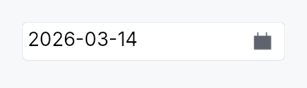
DateEdit — text input + calendar popover, bound to Signal<Option<Date>>.
Public types
| Kind | Name |
|---|---|
enum | WidthPolicy — How a datetime widget claims horizontal space |
enum | ValidationBehavior — How the date editor reacts to out-of-range or partially invalid input |
struct | DateEdit — Single-line date input with optional calendar popover |
Public functions
DateEdit
Detailed description
A single-line editable date field. The underlying surface is a
TextInputField displaying the formatted date; commit on Enter or
blur parses the input against the active pattern, clamps to
[min_date, max_date], and writes the result back. A trailing
calendar-icon button opens a Calendar
popover anchored below the field for graphical date selection.
Behaviour
- Value binding:
Signal<Option<Date>>is the source of truth. External writes re-format the text.Noneshows the placeholder. - Pattern: locale-derived strftime-subset (
%Y-%m-%d,%m/%d/%Y, …); override viaformat_pattern. - Step keys (preview-pass on the field): the step is
segment-relative — it moves the field under the caret (year,
month or day), which is what
QDateTimeEditdoes.- Arrow Up / Down → ±1 unit of that segment; Shift+ → ±10.
- Page Up / Page Down → ±10 units; Shift+ → ±100.
Alt+ArrowDown(or click the calendar icon) → opens the calendar popover;Alt+ArrowUpcloses it andF4toggles it.- A chord holding
CtrlorSuperis not the field's and falls through to the application.
- Calendar popover: dismisses on click-outside or Escape,
commits on cell click. The request carries no
fade_duration, so it appears and goes without a fade. - Min / Max: clamps on commit and on step. Out-of-range values in the popover cell are disabled.
Accessibility
- Container:
Role::DateInput, named from the.label()builder, its value the selected day in full in the tree's locale ("samedi 2 mai 2026", "Saturday, May 2, 2026"), andset_placeholderwhen the value isNone. The field inside shows the editable pattern; this value is written for someone listening, not for a parser. UIA and macOS expose it; AT-SPI carries a string value on no interface. - Calendar trigger button —
Role::Button, named from its tooltip.set_has_popup(HasPopup::Grid)andset_expanded(open)sit on the container node above, not on the button. - Internally the editing surface remains a
Role::TextInputfor AT discoverability (so screen readers know it accepts text); the wrapper carries the DateInput role on the outer node. The field is where focus lands, so it carries the same name, and it is the composite'saccessibility_proxy: anaccess_labelor anaccess_described_bygiven to theDateEditlands on the field. Alabelled_byrelation (aFormLayoutrow's) lands there too, but AccessKit reads a node's own name before its relations, so name a date field in a form with.label(). - The calendar opens on the date the field holds (the text typed in it is committed first), on its days, whatever an earlier opening left.
Example
use teksilo::widgets::{DateEdit, common::datetime::Date};
let date = ctx.signal(Some(Date::constant(2026, 5, 2)));
ctx.add(
DateEdit::new(date.clone())
.min_date(Date::constant(2020, 1, 1))
.max_date(Date::constant(2030, 12, 31))
.label(lit!("Birth date")),
);
Touch and pen
Nothing to declare here, and the reason applies to the whole date/time
family (TimeEdit,
DateTimeEdit,
DateRangeEdit): the composite's
own handler set carries focus_within and on_key_preview only — no tap,
no drag, no scroll — so its pointer surface is entirely the embedded text
field, the trigger IconButton and the popover Calendar, each of which
answers for itself. In particular the family does not declare
touch_action(NONE): it produces no value from a press position, and
declaring it would stop a finger scrolling a form that contains a date
field.
Density
The picture above is the widget at TargetDensity::Compact, the mouse-and-keyboard ladder. Below is the same subject on the same canvas with only the ladder changed, so what moves is the density and nothing else — where the subject no longer fits, that is what the denser targets cost it at that size. See docs/density-and-targets.md.
Touch
API reference
📖 Full rustdoc API for this module
pub enum WidthPolicy
Import: use teksilo::widgets::WidthPolicy;
How a datetime widget claims horizontal space.
Shared across DateEdit, TimeEdit, DateRangeEdit, and
DateTimeEdit. For the two-half widgets the policy applies to
the trailing half only — the leading half always sizes to its
mask-derived natural width so the date never reflows when only
the time half changes.
#![allow(unused)] fn main() { pub enum WidthPolicy { /* variants */ } }
Variants
Default— Default. The widget claims its natural width: the mask-derived empty template (__/__/____for ISO date,__:__for 24h time) measured in the theme body font plus surrounding chrome. The footprint stays fixed as the user types — Int UI form-density convention. This is theDefault.Fill— The widget expands to fill the horizontal space its parent offers, instead of capping at the natural mask width. Use inside toolbars, inspector panels, or anExpand::horizontalcolumn that should stretch with the surrounding layout.
pub enum ValidationBehavior
Import: use teksilo::widgets::date_edit::ValidationBehavior;
How the date editor reacts to out-of-range or partially invalid input.
#![allow(unused)] fn main() { pub enum ValidationBehavior { /* variants */ } }
Variants
AutoCorrect— Out-of-range inputs are clamped to the nearest valid value (e.g.12/50/2026→12/31/2026) and announced viaLive::Polite. Matches macOS Calendar and iOS DatePicker. This is theDefault.Reject— Out-of-range inputs are rejected with an inline error message; the field's text is left as-typed so the user can correct it. The bound value is unchanged until a valid date is committed. Matches Excel / Material strict-validation patterns. Use for high-precision contexts where silently rounding is unacceptable.
pub struct DateEdit
Import: use teksilo::widgets::DateEdit;
Single-line date input with optional calendar popover. See the
module docs for the full feature list.
#![allow(unused)] fn main() { pub struct DateEdit { /* fields */ } }
Methods
pub fn new(value: Signal<Option<Date>>) -> Self
Construct a date editor bound to a nullable date signal.
pub fn style(mut self, style: impl teksilo_core::styles::DateEditStyle) -> Self
Per-call style override for the date-edit chrome.
pub fn required(value: Signal<Date>) -> Self
Construct from a non-nullable date signal. Internally backed by
a Signal<Option<Date>> proxy that mirrors the source in both
directions. The placeholder is normally unused — the proxy is
initialized to Some(value.get()), and only goes None
transiently when a commit clears the text (the mirror then leaves
the source alone until the next valid commit re-establishes it).
pub fn min_date(mut self, d: Date) -> Self (default: None)
Clamp the selectable range from below. Dates earlier than d
are clamped up to d on commit and on step, and are shown as
disabled in the calendar popover.
pub fn max_date(mut self, d: Date) -> Self (default: None)
Clamp the selectable range from above. Dates later than d
are clamped down to d on commit and on step, and are shown as
disabled in the calendar popover.
pub fn format_pattern(mut self, pat: impl Into<String>) -> Self (default: None)
Override the locale-derived format pattern (strftime subset, see
crate::common::datetime::pattern).
pub fn placeholder(mut self, text: impl Into<LocalizedString>) -> Self
Text displayed when the bound value is None. Defaults to empty
(no placeholder rendered).
pub fn first_day_of_week(mut self, w: Weekday) -> Self
Override which weekday heads the calendar's column grid. Defaults to the locale's convention if not set.
pub fn show_calendar_button(mut self, show: bool) -> Self
Show or hide the trailing calendar-icon trigger button that opens
the calendar popover. Default true.
pub fn calendar_popover_placement(mut self, p: OverlayPlacement) -> Self
Override where the calendar popover appears relative to the field.
Default is OverlayPlacement::BelowPreferred.
pub fn enabled(mut self, enabled: impl Into<Prop<bool>>) -> Self (default: true)
Set the enabled state, statically or reactively. Forwarded to the arena at build time.
pub fn read_only(mut self, read_only: bool) -> Self (default: false)
Make the field read-only: text is selectable and copyable but not editable, and step keys are suppressed.
pub fn validation_behavior(mut self, behavior: ValidationBehavior) -> Self
How parse failures are surfaced. Default
ValidationBehavior::AutoCorrect (clamp + announce); switch
to ValidationBehavior::Reject for strict-validation form
contexts.
pub fn width_policy(mut self, policy: WidthPolicy) -> Self
How the widget claims horizontal space. Default
WidthPolicy::Default — the field sizes to its natural
mask-derived width. Switch to WidthPolicy::Fill to make
the field stretch to fill the parent's offered width
(toolbar / inspector pattern).
pub fn validation_feedback_signal(&self) -> Signal<ValidationFeedback>
Reactive handle on the live validation feedback (mirrored from
the inner field). Composites that want to render their own
feedback UI elsewhere can bind to this; the default
ValidationStrip slot below the field uses it internally.
pub fn label(mut self, label: impl Into<LocalizedString>) -> Self
Set the accessible label for the field (also shown by any paired
FormLayout label slot). Defaults to the localized "Date" string.
pub fn on_value_changed( mut self, f: impl Fn(Option<Date>, &mut EventContext) + 'static, ) -> Self
Register a callback fired on every committed value change with the
new Option<Date> and a live EventContext. Fires only on
user-driven commits (typing + blur, Enter, calendar selection),
not on external writes to the bound signal.
pub fn value(&self) -> Signal<Option<Date>>
Return a clone of the bound value signal for external observation.
pub fn tooltip(mut self, text: impl Into<LocalizedString>) -> Self
Attach a plain single-line tooltip shown after a hover delay.
Mutually exclusive with Self::rich_tooltip,
Self::rich_tooltip_content, and Self::composite_tooltip —
this call clears those slots.
pub fn rich_tooltip(mut self, key: impl Into<String>) -> Self
Attach a rich tooltip looked up by registry key. Mutually exclusive
with Self::tooltip, Self::rich_tooltip_content, and
Self::composite_tooltip — this call clears those slots.
pub fn rich_tooltip_content(mut self, content: crate::tooltip::TooltipContent) -> Self
Attach a rich tooltip from inline content. Mutually exclusive with
Self::tooltip, Self::rich_tooltip, and
Self::composite_tooltip — this call clears those slots.
pub fn composite_tooltip(mut self, content: impl Widget + 'static) -> Self
Attach a composite tooltip whose body is an arbitrary widget tree.
Mutually exclusive with Self::tooltip, Self::rich_tooltip,
and Self::rich_tooltip_content — this call clears those slots.
DateRangeEdit

DateRangeEdit — single unified control for picking a DateRange.
Public functions
DateRangeEdit
Detailed description
Visually one widget: a single bordered frame containing two
TextInputField halves separated by a painted arrow glyph, with
a trailing built-in calendar button that opens a shared
Calendar::range popover. Backed by Signal<Option<DateRange>>.
┌──────────────────────────────────────┐
│ 05/12/2026 → 05/19/2026 │ 📅 │
└──────────────────────────────────────┘
Why one frame?
Two adjacent DateEdits (one frame each) visually read as two
separate fields that happen to be next to each other. A single
frame says "this is one range". Same affordance the user is used
to from booking sites and analytics dashboards.
Behaviour
- Two text halves — each masked from the resolved date pattern,
each with its own validator + segment-stepping (Up/Down on the
focused segment matches
DateEdit). - Painted arrow separator — a thin chevron-right glyph, no text.
Visual only; AT users see the wrapper's
Role::DateInput. - One trailing calendar button — Int UI
IconButton::embedded()with the calendar glyph. Opens a single popover hostingCalendar::rangebound to the outer signal. The two-anchor click model (start-then-end) commits the range and closes the popover. No per-half calendar buttons — there's only one calendar, anchored to the wrapper. - One frame — focus-aware border (
BorderRole::Focusedwhile any half holds focus, otherwiseDefault), validation-aware border (ErrorforInvalid,FocusedforCorrected). - One validation strip below the frame — composed feedback from both halves (worse of the two wins).
Accessibility
- Container:
Role::DateInput, its value the two days in full joined by words in the tree's locale ("du vendredi premier mai 2026 au mardi 5 mai 2026", "Friday, May 1, 2026 to Tuesday, May 5, 2026"), the samecalendar-date-rangemessage the range calendar speaks. - Each
TextInputFieldcarries its own AT node, aRole::TextInputnamed for its half ("Start date", "End date"); the wrapper'sRole::DateInputprovides the range semantics. A half re-roledRole::DateInputreached Orca as a date editor, which it reads without its text. - The calendar opens on the start the field holds, on its days, with no range begun, whatever an earlier opening left.
// Requires ctx.signal() — shown as ignore per convention.
use teksilo_widgets::date_range_edit::DateRangeEdit;
use jiff::civil::Weekday;
let range = ctx.signal(None);
let _w = DateRangeEdit::new(range.clone())
.first_day_of_week(Weekday::Monday)
.on_value_changed(|r, _ctx| println!("{r:?}"));
Touch and pen
See DateEdit's "Touch and pen" section.
Density
The picture above is the widget at TargetDensity::Compact, the mouse-and-keyboard ladder. Below is the same subject on the same canvas with only the ladder changed, so what moves is the density and nothing else — where the subject no longer fits, that is what the denser targets cost it at that size. See docs/density-and-targets.md.
Touch
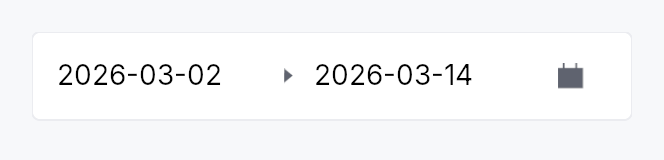
API reference
📖 Full rustdoc API for this module
pub struct DateRangeEdit
Import: use teksilo::widgets::DateRangeEdit;
Two-handle date picker over Signal<Option<DateRange>>. See the
module docs for the visual layout and behaviour.
#![allow(unused)] fn main() { pub struct DateRangeEdit { /* fields */ } }
Methods
pub fn new(value: Signal<Option<DateRange>>) -> Self
Create a date-range picker bound to value.
pub fn style(mut self, style: impl teksilo_core::styles::DateEditStyle) -> Self
Per-call DateEditStyle override (shared with DateEdit family).
pub fn min_date(mut self, d: Date) -> Self
Restrict the selectable start and end dates to those on or after d.
pub fn max_date(mut self, d: Date) -> Self
Restrict the selectable start and end dates to those on or before d.
pub fn format_pattern(mut self, p: impl Into<String>) -> Self
Override the strftime-subset format pattern for both halves
(e.g. "%d/%m/%Y"). Defaults to the locale-derived pattern.
pub fn placeholder_start(mut self, text: impl Into<LocalizedString>) -> Self
Placeholder shown in the start half when no date is set.
pub fn placeholder_end(mut self, text: impl Into<LocalizedString>) -> Self
Placeholder shown in the end half when no date is set.
pub fn first_day_of_week(mut self, w: Weekday) -> Self
Override which weekday appears in the first column of the calendar popup.
pub fn enabled(mut self, enabled: impl Into<Prop<bool>>) -> Self
Set the enabled state, statically or reactively. Forwarded to the arena at build time.
pub fn read_only(mut self, read_only: bool) -> Self
Make both halves read-only; the calendar button is also disabled.
pub fn label(mut self, label: impl Into<LocalizedString>) -> Self
Accessible label for the wrapper Role::DateInput node. When not set,
falls back to the localized date-range-edit-name message.
pub fn validation_behavior(mut self, behavior: ValidationBehavior) -> Self
How both halves handle invalid or out-of-range text on blur / Enter.
Defaults to ValidationBehavior::AutoCorrect.
pub fn end_width_policy(mut self, policy: crate::date_edit::WidthPolicy) -> Self
How the trailing (end) half claims horizontal space. The
leading (start) half always sizes to its natural mask width;
the end half follows this policy. Default
WidthPolicy::Default (natural width); pass
WidthPolicy::Fill to make the end half absorb extra
space the parent offers.
pub fn tooltip(mut self, text: impl Into<LocalizedString>) -> Self
Show a plain single-line tooltip on hover. Mutually exclusive with the rich / composite tooltip slots — this setter clears the other two so the last call wins.
pub fn rich_tooltip(mut self, key: impl Into<String>) -> Self
Show a rich tooltip sourced from the registry by key. Mutually
exclusive with the plain / composite tooltip slots — this setter clears
the other two so the last call wins.
pub fn rich_tooltip_content(mut self, content: crate::tooltip::TooltipContent) -> Self
Show a rich tooltip from an inline TooltipContent value. Mutually
exclusive with the plain / registry-key tooltip slots — this setter
clears the other two so the last call wins.
pub fn composite_tooltip(mut self, content: impl Widget + 'static) -> Self
Show a composite tooltip whose body is an arbitrary widget tree. Mutually exclusive with the plain / rich tooltip slots — this setter clears the other two so the last call wins.
pub fn validation_feedback_signal(&self) -> Signal<ValidationFeedback>
Reactive handle on the composed validation feedback (worse of the two
halves — Invalid > Corrected > Valid > Pristine).
pub fn on_value_changed( mut self, f: impl Fn(Option<DateRange>, &mut EventContext) + 'static, ) -> Self
Callback invoked whenever the range changes (including when one half
clears its value). Receives the new Option<DateRange> and an
EventContext for dispatching intents or side effects.
pub fn value(&self) -> Signal<Option<DateRange>>
Clone the underlying Signal<Option<DateRange>> for external binding.
DateTimeEdit
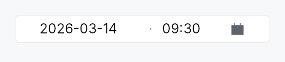
DateTimeEdit — single unified control for picking a DateTime.
Public functions
DateTimeEdit
Detailed description
Visually one widget: a single bordered frame containing a date
TextInputField half, a small painted separator, a time
TextInputField half, and a trailing built-in calendar button that
opens a Calendar popover anchored below the wrapper. Backed by
Signal<Option<DateTime>>.
┌──────────────────────────────────────┐
│ 05/02/2026 · 14:35 │ 📅 │
└──────────────────────────────────────┘
Why one frame?
Two adjacent DateEdit + TimeEdit (one frame each) visually read
as two separate fields that happen to be next to each other. A single
frame says "this is one moment in time" — same affordance the user
is used to from booking sites, calendar apps, and form builders.
Behaviour
- Two text halves — date pattern on the left (locale-derived strftime subset), time pattern on the right (24h or 12h, with or without seconds). Each half carries its own input mask, validator, and segment-stepping (Up/Down on the focused segment).
- Painted separator — a thin middle-dot glyph (
·), no text. Visual only; AT users see the wrapper'sRole::DateTimeInput. The separator can be replaced with a custom string viaseparator(rendered as styled secondary text). - One trailing calendar button — Int UI
IconButton::embedded()with the calendar glyph. Opens a single popover hostingCalendar::singlebound to the date half. Picking a cell commits the date and closes the popover; the time half retains whatever the user typed. - One frame — focus-aware border (
BorderRole::Focusedwhile any half holds focus, otherwiseDefault), validation-aware border (ErrorforInvalid,FocusedforCorrected). - One validation strip below the frame — composed feedback from both halves (worse of the two wins).
Accessibility
- Container:
Role::DateTimeInput, its value the day in full and the time in the tree's locale ("samedi 2 mai 2026 à 14:35", "Saturday, May 2, 2026 at 2:35 PM"), with the seconds only when the field shows them. The clock is the locale's: an explicit.time_format(...)changes what the field shows, not how the value is read. - Each
TextInputFieldkeeps its own AT node, aRole::TextInputnamed for its half ("Date", "Time"); the wrapper'sRole::DateTimeInputprovides the datetime semantics. The halves were re-roledRole::DateInput/Role::TimeInput, which the AT-SPI adapter hands a reader as a date editor, and Orca reads a date editor by its name and role alone: "Date date editor.", never the date. An editable text field is read with its text. - The calendar opens on the date the date half holds, on its days, whatever an earlier opening left.
// Requires ctx.signal() — shown as ignore per convention.
use teksilo_widgets::date_time_edit::DateTimeEdit;
use teksilo_widgets::time_edit::SecondsMode;
let datetime = ctx.signal(None);
let _w = DateTimeEdit::new(datetime.clone())
.seconds(SecondsMode::Hidden)
.on_value_changed(|dt, _ctx| println!("{dt:?}"));
Touch and pen
See DateEdit's "Touch and pen" section.
Density
The picture above is the widget at TargetDensity::Compact, the mouse-and-keyboard ladder. Below is the same subject on the same canvas with only the ladder changed, so what moves is the density and nothing else — where the subject no longer fits, that is what the denser targets cost it at that size. See docs/density-and-targets.md.
Touch
API reference
📖 Full rustdoc API for this module
pub struct DateTimeEdit
Import: use teksilo::widgets::DateTimeEdit;
Single unified datetime picker over Signal<Option<DateTime>>. See
the module docs for the visual layout and behaviour.
#![allow(unused)] fn main() { pub struct DateTimeEdit { /* fields */ } }
Methods
pub fn new(value: Signal<Option<DateTime>>) -> Self
Create a datetime picker backed by the optional value signal.
pub fn style(mut self, style: impl teksilo_core::styles::DateEditStyle) -> Self
Per-call DateEditStyle override (shared with DateEdit family).
pub fn required(value: Signal<DateTime>) -> Self
Create a datetime picker backed by a required (non-optional) signal.
The widget wraps it in an Option proxy internally and keeps the two
in sync via ctx.effect — the outer signal is never set to None.
pub fn date_format_pattern(mut self, p: impl Into<String>) -> Self
Override the strftime-subset format pattern for the date half
(e.g. "%d/%m/%Y"). Defaults to the locale-derived pattern.
pub fn time_format(mut self, f: TimeFormat) -> Self
Lock the time half to a specific clock (12h or 24h). When this
builder is not called, the time half defaults to the user's
current locale via prefers_12_hour_clock — same rule as
standalone TimeEdit.
pub fn seconds(mut self, mode: SecondsMode) -> Self
Whether the time half includes a seconds field. Defaults to SecondsMode::Hidden.
pub fn min(mut self, dt: DateTime) -> Self
Earliest selectable datetime (inclusive). Both the calendar cell and the text validator enforce this floor.
pub fn max(mut self, dt: DateTime) -> Self
Latest selectable datetime (inclusive). Both the calendar cell and the text validator enforce this ceiling.
pub fn step_minutes(mut self, n: u32) -> Self
Minute increment for Up/Down segment stepping on the minute field.
Defaults to 1; values below 1 are clamped to 1.
Currently inert, exactly as on TimeEdit: segment-aware
stepping moves the field under the caret by one of that
segment's units (±1, ±10 with Shift, ±10 / ±100 on the page
keys) rather than by a fixed number of minutes. The builder is
kept on the public surface so callers that already configured it
still compile, and as the hook a future per-segment custom step
would use; it has no effect today.
pub fn first_day_of_week(mut self, w: Weekday) -> Self
Override which weekday appears in the first column of the calendar popup.
pub fn show_calendar_button(mut self, show: bool) -> Self
Show or hide the trailing calendar button. Default true.
pub fn separator(mut self, s: impl Into<String>) -> Self
Override the painted middle-dot separator with a custom string (rendered as styled secondary text between the two halves). Pass an empty string to suppress the separator entirely.
pub fn placeholder(mut self, text: impl Into<LocalizedString>) -> Self
Placeholder shown when the datetime is None.
pub fn enabled(mut self, enabled: impl Into<Prop<bool>>) -> Self
Set the enabled state, statically or reactively. Forwarded to the arena at build time.
pub fn read_only(mut self, read_only: bool) -> Self
Make both halves read-only; the calendar button is also disabled.
pub fn label(mut self, label: impl Into<LocalizedString>) -> Self
Accessible label for the wrapper Role::DateTimeInput node. When not
set, falls back to the localized date-time-edit-name message.
pub fn validation_behavior(mut self, behavior: ValidationBehavior) -> Self
How parse failures are surfaced. Forwarded to both halves — each half uses the same behaviour.
pub fn time_width_policy(mut self, policy: crate::date_edit::WidthPolicy) -> Self
How the trailing (time) half claims horizontal space. The
leading (date) half always sizes to its natural mask width;
the time half follows this policy. Default
WidthPolicy::Default (natural width); pass
WidthPolicy::Fill to make the time half absorb extra
space the parent offers.
pub fn validation_feedback_signal(&self) -> Signal<ValidationFeedback>
Reactive handle on the composed validation feedback. Reflects
whichever half is more severe (Invalid > Corrected > Valid > Pristine).
pub fn on_value_changed( mut self, f: impl Fn(Option<DateTime>, &mut EventContext) + 'static, ) -> Self
Callback invoked whenever the datetime changes. Receives the new
Option<DateTime> and an EventContext for dispatching intents.
pub fn tooltip(mut self, text: impl Into<LocalizedString>) -> Self
Show a plain single-line tooltip after a hover delay. Mutually
exclusive with rich_tooltip / rich_tooltip_content /
composite_tooltip — each setter clears the other three so the
last call wins.
pub fn rich_tooltip(mut self, key: impl Into<String>) -> Self
Show a rich tooltip identified by a registry key. Mutually
exclusive with tooltip / rich_tooltip_content /
composite_tooltip — each setter clears the other three so the
last call wins.
pub fn rich_tooltip_content(mut self, content: crate::tooltip::TooltipContent) -> Self
Show a rich tooltip with inline content. Mutually exclusive with
tooltip / rich_tooltip / composite_tooltip — each setter
clears the other three so the last call wins.
pub fn composite_tooltip(mut self, content: impl Widget + 'static) -> Self
Show a composite tooltip whose body is an arbitrary widget tree.
Mutually exclusive with tooltip / rich_tooltip /
rich_tooltip_content — each setter clears the other three so
the last call wins.
pub fn value(&self) -> Signal<Option<DateTime>>
Clone the underlying Signal<Option<DateTime>> for external binding.
DeadZone
DeadZone — a gesture dead zone wrapper.
Public functions
DeadZone
| Returns | Function |
|---|---|
| Constructors | |
Self | new() |
| Builder methods | |
Self | child(widget: impl teksilo_core::IntoTeksiChild) |
Self | child_opt(widget: Option<impl teksilo_core::IntoTeksiChild>) |
Detailed description
Touch and pen
The no-op tap and drag pair is kept, and it is not redundant with the
gesture_dead_zone flag: the flag governs whether an ancestor may enrol this
subtree's press as a member of its own gesture, while the absorbers are what
give the wrapper a gesture arena — and the arena is what stops the bubble for a
press on the wrapper's own bare area, the gap between the controls it protects.
Reviewed under the arbitration package with that conclusion; nothing about it is
pointer-kind-specific.
API reference
📖 Full rustdoc API for this module
pub struct DeadZone
Import: use teksilo::widgets::DeadZone;
A layout-transparent wrapper whose subtree is a gesture dead zone: a pointer press inside it never arms a drag/swipe recognizer on any ancestor.
Wrap interactive controls (buttons, a ⋮ options menu, a slider) that sit
inside a draggable / swipeable container — a dock-panel header, a card, a
list row, a scene item — so clicking them, even with the few pixels of
pointer jitter a real click carries, can never start the ancestor's drag.
The container's own drag still works everywhere outside the dead zone. This
is the framework counterpart of Electron's -webkit-app-region: no-drag.
It is robust structurally, not by a timing-dependent gesture race: it
sets the node-level gesture_dead_zone
flag, which the framework's drag-arming honours by refusing to arm any
ancestor above this node. (It also carries a no-op tap/drag so a press on the
dead zone's own bare area — a gap between controls — is absorbed too.)
// A draggable dock header whose action buttons don't drag the panel:
HStack::new()
.child(title)
.child(DeadZone::new().child(
HStack::new()
.child(IconButton::new(new_icon).on_activate_fn(..))
.child(options_button),
))
Layout-transparent: it reports its child's size and fills the child to its own bounds, so dropping it in is size-neutral.
#![allow(unused)] fn main() { pub struct DeadZone { /* fields */ } }
Methods
pub fn new() -> Self
A new, empty dead zone. Attach content with child or
child.
pub fn child(mut self, widget: impl teksilo_core::IntoTeksiChild) -> Self
Wrap an inline widget.
pub fn child_opt(self, widget: Option<impl teksilo_core::IntoTeksiChild>) -> Self
Attach widget when it is Some, and do nothing when it is None.
The conditional-child form. teksu!'s if without an else lowers to
this, and it is what cond.then(|| w) is for in a builder chain. None
adds no arena node, so nothing is laid out, painted, or published to the
accessibility tree, and a stack applies no spacing around it.
Dialog
Modal dialogs — a trigger button that presents a centered modal panel.
Public types
| Kind | Name |
|---|---|
struct | ModalContainer — Rounded panel chrome that wraps a modal dialog's content widget |
struct | ModalScrim — Full-viewport dimming scrim painted behind a ModalContainer |
struct | DialogContent — Convenience body layout for a modal dialog: optional title, supporting text, scrollable body slot, and a Divider-separated footer row |
struct | Dialog — A trigger button that presents a modal dialog when activated |
Public functions
Dialog
| Returns | Function |
|---|---|
| Constructors | |
Self | new(label: impl Into<LocalizedString>) |
| Builder methods | |
Self | content<W, F>(factory: F) |
Self | variant(variant: ButtonVariant) |
Self | enabled(enabled: impl Into<Prop<bool>>) |
Self | presentation(presentation: ModalPresentation) |
Self | close_behavior(close_behavior: ModalCloseBehavior) |
Self | trigger(trigger: impl teksilo_core::IntoTeksiChild) |
ModalContainer
| Returns | Function |
|---|---|
| Constructors | |
Self | new(content: impl Widget + 'static) |
| Builder methods | |
Self | padding(padding: f32) |
Self | min_width(min_width: f32) |
Self | style(style: impl teksilo_core::styles::DialogStyle) |
Self | title(title: impl Into<LocalizedString>) |
ModalScrim
| Returns | Function |
|---|---|
| Constructors | |
Self | new() |
| Builder methods | |
Self | style(style: impl teksilo_core::styles::DialogStyle) |
Self | dismiss_target(target: Rc<Cell<Option<OverlayId>>>) |
Self | click_to_dismiss(enabled: bool) |
DialogContent
| Returns | Function |
|---|---|
| Constructors | |
Self | new() |
| Builder methods | |
Self | title(title: impl Into<LocalizedString>) |
Self | supporting_text(text: impl Into<LocalizedString>) |
Self | body(body: impl teksilo_core::IntoTeksiChild) |
Self | footer(footer: impl teksilo_core::IntoTeksiChild) |
Detailed description
Three cooperating types cover the common dialog use-case. Dialog is the
high-level entry point: a Button (or custom trigger) that, on activation,
presents a ModalContainer above a full-viewport dimming ModalScrim.
DialogContent is the convenience body layout — a VStack with an
optional title, supporting text, scrollable body slot, and a footer slot
separated by a Divider.
When to use
Dialog::new(label).content(|| …)for the common "button opens dialog" pattern.Dialog::new(label).trigger(my_icon_button).content(|| …)to use a custom widget as the trigger instead of the defaultButton.ModalContainer::new(content)directly when you need to present a modal from handler code viactx.present_modal(ModalRequest::…)rather than a persistent trigger.
Accessibility
ModalContainer is a Role::Dialog node and announces set_modal().
Its accessible name defaults to the DialogContent title (via
Widget::accessible_title_hint) or falls back to the localized
a11y_dialog_name message; pass .title(tr!(…)) to the container for an
explicit override. When the content's own node is already a dialog (a
MessageBox's Role::AlertDialog, a CommandPalette's Role::Dialog),
the container publishes no node of its own, so a reader meets one dialog
and hears its title once. The trigger button advertises HasPopup::Dialog and
set_expanded tracks whether the modal is currently open.
use teksilo_widgets::dialog::{Dialog, DialogContent};
use teksilo_i18n::lit;
let _d = Dialog::new(lit!("Open settings"))
.content(|| {
DialogContent::new()
.title(lit!("Settings"))
.supporting_text(lit!("Adjust your preferences below."))
});
Touch and pen
The trigger is a Button (or, with .trigger(..), the caller's widget wrapped
in the same activation handlers), and both actuate on the release. The footer's
buttons are buttons.
The scrim is the one full-viewport node that has to receive exactly the presses
that land on it, so it says no_hit_slop outright rather than relying on the
slop pass's size formula to exclude it by arithmetic — see
scrim_hit_targeting_tests below. Its dismissal is a tap, so it too waits for
the release.
Density
The picture above is the widget at TargetDensity::Compact, the mouse-and-keyboard ladder. Below is the same subject on the same canvas with only the ladder changed, so what moves is the density and nothing else — where the subject no longer fits, that is what the denser targets cost it at that size. See docs/density-and-targets.md.
Touch
API reference
📖 Full rustdoc API for this module
pub struct ModalContainer
Import: use teksilo::widgets::ModalContainer;
Rounded panel chrome that wraps a modal dialog's content widget.
All visual dimensions (padding, corner radius, min-width, shadow) are owned
by the active DialogStyle; per-instance
overrides are available via Self::padding and Self::min_width.
#![allow(unused)] fn main() { pub struct ModalContainer { /* fields */ } }
Methods
pub fn new(content: impl Widget + 'static) -> Self
Wrap content inside a modal panel with default chrome.
pub fn padding(mut self, padding: f32) -> Self
Override the content padding (logical pixels) from the theme default.
pub fn min_width(mut self, min_width: f32) -> Self
Override the minimum panel width (logical pixels) from the theme default.
pub fn style(mut self, style: impl teksilo_core::styles::DialogStyle) -> Self
Per-call style override for the modal panel chrome. Replaces the
theme-wide default DialogStyle for just this container.
pub fn title(mut self, title: impl Into<LocalizedString>) -> Self
Accessible title for the dialog, announced as the dialog's name
when the content paints no title of its own. Content that does —
e.g. DialogContent::title — names the dialog by pointing at that
label and wins over this string, so the two should match. Content
that is itself a dialog names itself, and the container then
publishes no node for this title to name.
pub struct ModalScrim
Import: use teksilo::widgets::ModalScrim;
Full-viewport dimming scrim painted behind a ModalContainer.
Mounted by the modal-presentation pipeline (teksilo-app) as a separate
OverlayPlacement::FullViewport overlay pushed BEFORE the centered
modal overlay so it z-orders below the panel. The chrome itself is
delegated to the active DialogStyle::make_scrim; clicking the
scrim dismisses the linked modal when the modal's
ModalCloseBehavior permits click-outside dismissal.
The dismissal cascade is wired via
OverlayManager::set_parent_overlay AFTER both overlays are
pushed — the scrim's parent_overlay is set to the modal's id, so
any dismiss of the modal cascades through dismiss_immediate and
also dismisses the scrim. The scrim's own dismiss behavior is
Manual — it never dismisses itself directly.
#![allow(unused)] fn main() { pub struct ModalScrim { /* fields */ } }
Methods
pub fn new() -> Self
Build a new scrim; wire it with Self::dismiss_target and
Self::click_to_dismiss after construction.
pub fn style(mut self, style: impl teksilo_core::styles::DialogStyle) -> Self
Per-call style override for the scrim chrome. Replaces the
theme-wide default DialogStyle for just this scrim.
pub fn dismiss_target(mut self, target: Rc<Cell<Option<OverlayId>>>) -> Self
Handle to the modal-overlay id the scrim dismisses on click.
The framework fills this AFTER the modal is pushed (see the
in-tree modal pipeline in teksilo-app).
pub fn click_to_dismiss(mut self, enabled: bool) -> Self (default: false)
Enable click-to-dismiss on the scrim. Should mirror whether the
modal's ModalCloseBehavior permits click-outside dismissal.
pub struct DialogContent
Import: use teksilo::widgets::DialogContent;
Convenience body layout for a modal dialog: optional title, supporting text,
scrollable body slot, and a Divider-separated footer row.
#![allow(unused)] fn main() { pub struct DialogContent { /* fields */ } }
Methods
pub fn new() -> Self
Create an empty dialog body with no sections set.
pub fn title(mut self, title: impl Into<LocalizedString>) -> Self (default: None)
Bold title shown at the top of the content area. Also propagated to
the enclosing ModalContainer via accessible_title_hint.
pub fn supporting_text(mut self, text: impl Into<LocalizedString>) -> Self (default: None)
Secondary description text shown below the title.
pub fn body(mut self, body: impl teksilo_core::IntoTeksiChild) -> Self
Main scrollable content slot (any widget).
pub fn footer(mut self, footer: impl teksilo_core::IntoTeksiChild) -> Self
Footer slot separated from the body by a Divider (typically action
buttons like "OK" / "Cancel").
pub struct Dialog
Import: use teksilo::widgets::Dialog;
A trigger button that presents a modal dialog when activated.
Renders as a Button by default; call .trigger(w) to replace it with any
widget. The content is lazily constructed by a factory closure each time the
dialog opens — no persistent widget subtree is kept while the dialog is closed.
#![allow(unused)] fn main() { pub struct Dialog { /* fields */ } }
Methods
pub fn new(label: impl Into<LocalizedString>) -> Self
Build a dialog trigger with label as the button text and accessible name.
pub fn content<W, F>(mut self, factory: F) -> Self where W: Widget + 'static, F: Fn() -> W + 'static,
Factory closure that builds the dialog's content each time it opens. Required — the dialog panics at build time if no factory is set.
pub fn variant(mut self, variant: ButtonVariant) -> Self
Visual style of the default trigger button. Has no effect when
.trigger(…) replaces the button with a custom widget.
pub fn enabled(mut self, enabled: impl Into<Prop<bool>>) -> Self
Enable or disable the trigger button, statically or reactively
(default true).
pub fn presentation(mut self, presentation: ModalPresentation) -> Self
Override the modal presentation mode (default ModalPresentation::Auto).
pub fn close_behavior(mut self, close_behavior: ModalCloseBehavior) -> Self
Override how the dialog may be closed (default EscapeOrClickOutside).
pub fn trigger(mut self, trigger: impl teksilo_core::IntoTeksiChild) -> Self
Replace the default Button trigger with a custom widget. The widget
receives the same tap / key / AT-action handlers as the button would.
Divider

Divider — a themed separator line that visually partitions content.
Public types
| Kind | Name |
|---|---|
struct | Divider — A themed separator line |
const | DIVIDER_THICKNESS — Default visual thickness of a Divider stroke |
Public functions
Divider
| Returns | Function |
|---|---|
| Constructors | |
Self | new() |
Self | horizontal() |
Self | vertical() |
| Builder methods | |
Self | thickness(thickness: f32) |
Self | color(color: impl Into<ColorProp>) |
Detailed description
Divider renders a single hairline stroke (DIVIDER_THICKNESS = 1 dp by
default) using the theme's divider color. It comes in two orientations:
horizontal (the default, spans the proposed width and has a fixed 1 dp
height) and vertical (spans the proposed height, 1 dp wide). Both the
thickness and the color can be overridden per-instance without a custom
style.
Accessibility
The widget emits Role::Splitter, which matches the ARIA separator pattern
and signals a structural boundary to screen readers.
#![allow(unused)] fn main() { use teksilo_widgets::primitives::Divider; // Horizontal rule between two content sections let _rule = Divider::new(); // Vertical rule inside a toolbar let _vbar = Divider::vertical(); }
Density
The picture above is the widget at TargetDensity::Compact, the mouse-and-keyboard ladder. Below is the same subject on the same canvas with only the ladder changed, so what moves is the density and nothing else — where the subject no longer fits, that is what the denser targets cost it at that size. See docs/density-and-targets.md.
Touch

API reference
📖 Full rustdoc API for this module
pub struct Divider
Import: use teksilo::widgets::Divider;
A themed separator line. Thickness defaults to DIVIDER_THICKNESS
and the color defaults to BorderRole::Divider; both can be overridden.
#![allow(unused)] fn main() { pub struct Divider { /* fields */ } }
Methods
pub fn new() -> Self
Create a horizontal Divider with default theme thickness and color.
pub fn horizontal() -> Self
Create a horizontal Divider — alias for Divider::new().
pub fn vertical() -> Self
Create a vertical Divider that spans the proposed height.
pub fn thickness(mut self, thickness: f32) -> Self
Override the stroke thickness in logical pixels; defaults to
DIVIDER_THICKNESS (1 dp).
pub fn color(mut self, color: impl Into<ColorProp>) -> Self (default: None)
Override the line color. Accepts Color, a role (typically
BorderRole), or a Signal<Color>.
pub const DIVIDER_THICKNESS
Import: use teksilo::widgets::primitives::divider::DIVIDER_THICKNESS;
Default visual thickness of a Divider stroke. Divider has no
per-widget Recipe*Style module, so the constant lives alongside
the widget that reads it.
#![allow(unused)] fn main() { pub const DIVIDER_THICKNESS: f32 = 1.0; }
DockingLayout
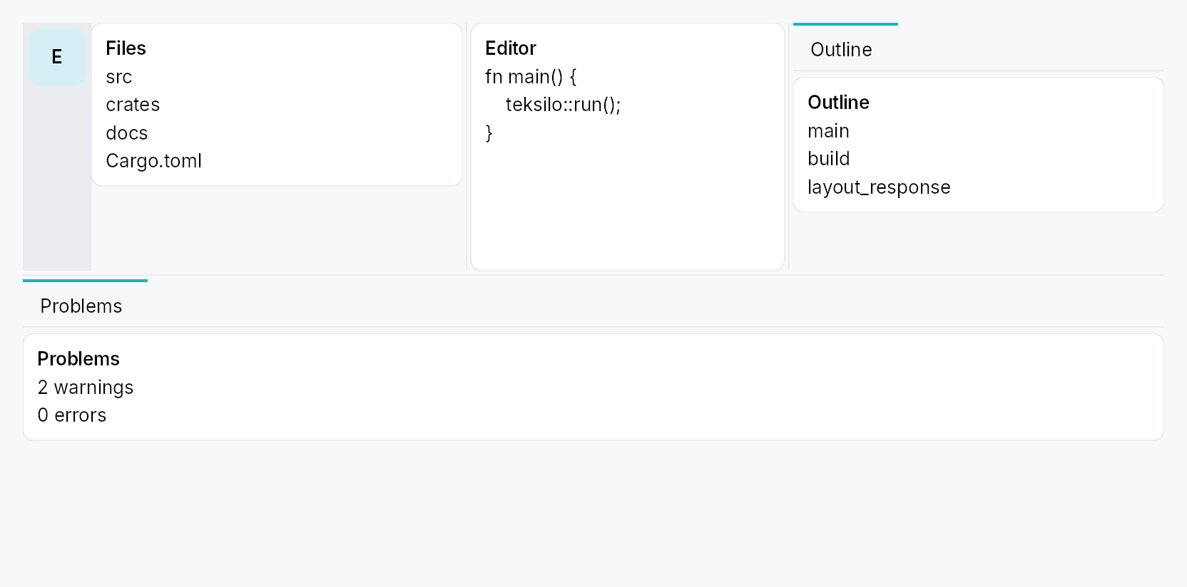
DockingLayout — a VS Code-style dockable layout: a fixed centre slot
(the app's main content) surrounded by four collapsible, splittable,
draggable side regions (leading / trailing / top / bottom), backed by a
cloneable, serializable DockingModel.
Public types
| Kind | Name |
|---|---|
struct | DockingLayout — The docking layout widget |
type | DockRailSlot — Factory for a rail slot widget (rebuilt on each rail rebuild) |
struct | DockActionId — Stable identity for a DockAction |
enum | DockActionPlacement — Where a DockAction sits along the rail's column |
struct | DockAction — A dockless command button in the activity rail: it looks and behaves like an activity item, but opens no panel — activating it just runs a closure |
struct | DockRail — App-facing configuration for a side's activity rail (Rail presentation) |
enum | DockSide — One of the four dockable sides |
enum | DockCorner — One of the four corners of the container |
struct | CornerOwners — Which side owns each corner |
struct | DockWidgetId — Process-unique identity for a registered dock widget (the atomic unit) |
struct | DockTabId — Process-unique identity for a dock tab (a tab of a side's TabWidget) |
enum | TabPresentation — How a side surfaces its tabs: an in-side strip (the TabWidget's own bar) or an always-visible activity rail outboard of the collapsible content |
enum | DockOpenMode — Placement mode for a programmatically-opened dock |
struct | DockOpenLocation — Target for DockingModel::open_dock / DockingModel::move_dock |
enum | DockRailItemSize — Activity-bar item size for a side's rail (context-menu "Activity bar size") |
enum | DockTabDisplay — How a side's dock tabs render (context-menu "Tab size") |
struct | DockPolicy — App-declared policy that locks down end-user layout edits on a DockingLayout |
struct | DockingModel — The shared docking-layout model |
struct | DockWidget — App-facing declaration of a dock widget: identity, chrome metadata, and a lazy content factory |
struct | DockLayoutState — The full serializable snapshot of a DockingModel |
Public functions
DockingLayout
| Returns | Function |
|---|---|
| Constructors | |
Self | new(model: DockingModel) |
| Builder methods | |
Self | rail(rail: DockRail) |
Self | rails(rails: impl IntoIterator<Item = DockRail>) |
Self | center(widget: impl teksilo_core::IntoTeksiChild) |
Self | policy(policy: DockPolicy) |
Self | disable_side(side: DockSide) |
Self | dock(dock: DockWidget) |
Self | docks(docks: impl IntoIterator<Item = DockWidget>) |
DockActionId
| Returns | Function |
|---|---|
| Constructors | |
Self | named(name: &str) |
Self | from_raw(v: u64) |
| Methods | |
u64 | raw() |
DockAction
| Returns | Function |
|---|---|
| Constructors | |
Self | new(id: DockActionId, label: impl Into<LocalizedString>, icon: impl Fn() -> IconWidget + 'static, on_activate: impl Fn(&mut EventContext) + 'static) |
| Builder methods | |
Self | placement(placement: DockActionPlacement) |
Self | tooltip(tooltip: impl Into<LocalizedString>) |
Self | enabled(enabled: impl Into<Prop<bool>>) |
Self | toggled(state: Signal<bool>) |
| Methods | |
DockActionId | id() |
DockRail
DockSide
| Returns | Function |
|---|---|
| Methods | |
bool | is_horizontal_axis() |
| Constants and types | |
[DockSide | ALL |
DockCorner
| Returns | Function |
|---|---|
| Methods | |
(DockSide, DockSide) | adjacent_sides() |
| Constants and types | |
[DockCorner | ALL |
CornerOwners
| Returns | Function |
|---|---|
| Methods | |
DockSide | owner(corner: DockCorner) |
set(corner: DockCorner, owner: DockSide) |
DockWidgetId
| Returns | Function |
|---|---|
| Constructors | |
Self | fresh() |
Self | from_raw(v: u64) |
| Methods | |
u64 | raw() |
DockTabId
| Returns | Function |
|---|---|
| Constructors | |
Self | fresh() |
Self | from_raw(v: u64) |
| Methods | |
u64 | raw() |
DockOpenLocation
| Returns | Function |
|---|---|
| Constructors | |
Self | side(side: DockSide) |
| Builder methods | |
Self | stack() |
Self | new_tab() |
DockRailItemSize
| Returns | Function |
|---|---|
| Methods | |
bool | shows_label() |
DockTabDisplay
| Returns | Function |
|---|---|
| Methods | |
bool | shows_icon() |
bool | shows_text() |
DockPolicy
| Returns | Function |
|---|---|
| Constructors | |
Self | locked() |
DockingModel
DockWidget
Detailed description
The structure is four levels deep:
DockingLayout
└── Centre + 4 Sides
└── Side = [optional DockActivityBar rail] + collapsible content region
└── content region holds ONE TabWidget (strip optional / replaced
by the rail)
└── Tab → DockArrangement (a Splitter of panes, each a single
DockWidget or a ToolBox of DockWidgets)
└── DockWidget — the atomic dockable unit
Density
The picture above is the widget at TargetDensity::Compact, the mouse-and-keyboard ladder. Below is the same subject on the same canvas with only the ladder changed, so what moves is the density and nothing else — where the subject no longer fits, that is what the denser targets cost it at that size. See docs/density-and-targets.md.
Touch
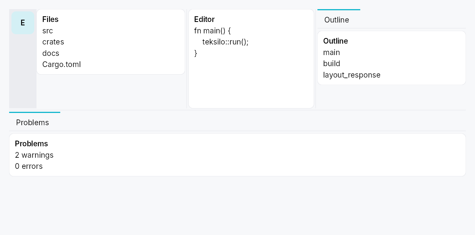
API reference
📖 Full rustdoc API for this module
pub struct DockingLayout
Import: use teksilo::widgets::DockingLayout;
The docking layout widget. See the module docs.
let model = DockingModel::new();
// …declare panels + an initial layout on `model`…
DockingLayout::new(model.clone())
.center(editor)
.dock(DockWidget::new(EXPLORER, lit!("Explorer"), |_| Explorer::new()))
#![allow(unused)] fn main() { pub struct DockingLayout { /* fields */ } }
Methods
pub fn new(model: DockingModel) -> Self
Create a docking layout over a model.
pub fn rail(mut self, rail: DockRail) -> Self
Configure a side's activity rail (item size, top/bottom slots, overflow
trigger). The side still needs DockingModel::set_side_rail to put it
in Rail presentation; this only styles the rail. See DockRail.
pub fn rails(self, rails: impl IntoIterator<Item = DockRail>) -> Self
Configure several sides' activity rails from an iterator.
The loop form of rail. Each rail carries its own side, so
a later entry for a side already configured replaces it.
pub fn center(mut self, widget: impl teksilo_core::IntoTeksiChild) -> Self
Set the always-present centre content (the app's main area).
pub fn policy(self, policy: DockPolicy) -> Self
Lock down end-user layout edits (sugar for DockingModel::set_policy).
See DockPolicy.
pub fn disable_side(self, side: DockSide) -> Self
Disable a side (sugar for DockingModel::set_side_enabled``(side, false)):
it renders nothing, reserves no space, and rejects docks.
pub fn dock(self, dock: DockWidget) -> Self
Declare a dock widget (its content factory + chrome metadata). The
dock is registered immediately, so the app may set the initial layout
on the model (open_dock / import_state) before mounting.
pub fn docks(self, docks: impl IntoIterator<Item = DockWidget>) -> Self
Declare several dock widgets from an iterator, in order.
The loop form of dock, and the usual one once an app has
more than a couple of panels to register.
pub type DockRailSlot
Import: none — DockRailSlot is public in a private module of teksilo-widgets and nothing re-exports it.
Factory for a rail slot widget (rebuilt on each rail rebuild).
A slot that wants to match the rail's current item size binds
DockingModel::rail_size_mode_signal
— the rail rebuilds its slots whenever the size mode changes, so reading the
signal in the factory is enough to keep the slot in step.
#![allow(unused)] fn main() { pub type DockRailSlot = Rc<dyn Fn() -> Box<dyn Widget>>; }
pub struct DockActionId
Import: none — DockActionId is public in a private module of teksilo-widgets and nothing re-exports it.
Stable identity for a DockAction.
Not used for persistence — a rail action carries no user-mutable state,
so nothing about it is serialized (see DockLayoutState's
"app-config is reconstructed each run" rule). It exists so the accessibility
tree and the automation bridge can address a given action stably across
runs; a fresh-per-run id would make every script that clicks a rail action
flaky.
#![allow(unused)] fn main() { pub struct DockActionId(u64); }
Methods
pub const fn named(name: &str) -> Self
Derive a stable id from a caller-chosen name — identical across runs,
processes and machines. Prefer this over from_raw:
it removes the hand-picked-u64-literal collision hazard entirely.
const so ids can be declared as module-scope const items, the same
way apps already declare their DockWidgetIds.
# use teksilo_widgets::docking::DockActionId;
const SETTINGS: DockActionId = DockActionId::named("app.settings");
assert_eq!(SETTINGS, DockActionId::named("app.settings"));
assert_ne!(SETTINGS, DockActionId::named("app.about"));
pub const fn from_raw(v: u64) -> Self
Wrap a raw value. Prefer named.
pub const fn raw(self) -> u64
pub enum DockActionPlacement
Import: none — DockActionPlacement is public in a private module of teksilo-widgets and nothing re-exports it.
Where a DockAction sits along the rail's column.
#![allow(unused)] fn main() { pub enum DockActionPlacement { /* variants */ } }
Variants
Start— Before the first activity item, in the flowing cluster.End— After the last activity item and after the overflow trigger, still in the flowing cluster — the group grows downward with the tabs.Pinned— Past the flexible spacer, anchored to the rail's far edge regardless of how many activities exist — VS Code's Accounts / Manage-gear cluster. Where a Settings gear belongs.
pub struct DockAction
Import: none — DockAction is public in a private module of teksilo-widgets and nothing re-exports it.
A dockless command button in the activity rail: it looks and behaves like an activity item, but opens no panel — activating it just runs a closure.
Declared on DockRail::action rather than on
DockingModel because nothing about an action is
user-mutable, which is state.rs's own test for what is not persisted —
so (like the rail's slots) it is per-view app config, reconstructed each
run. A rail action is deliberately more
restricted than a real activity: it is never draggable, never hidable, has
no "Move to" menu, and is never overflow-parked — it is reserved space. That
matches every surveyed precedent (VS Code's fixed Accounts / Manage cluster;
IntelliJ's stripe, whose only non-tool-window button is IDE-owned chrome).
DockRail::new(DockSide::Leading).action(
DockAction::new(
DockActionId::named("app.settings"),
lit!("Settings"),
|| IconWidget::gear(),
|ctx| ctx.send_intent(Intent::new("app.settings")),
)
.placement(DockActionPlacement::Pinned),
)
#![allow(unused)] fn main() { pub struct DockAction { /* fields */ } }
Methods
pub fn new( id: DockActionId, label: impl Into<LocalizedString>, icon: impl Fn() -> IconWidget + 'static, on_activate: impl Fn(&mut EventContext) + 'static, ) -> Self
Declare a rail action. Defaults to DockActionPlacement::End,
enabled, untoggled, with the label as its hover tooltip.
pub fn placement(mut self, placement: DockActionPlacement) -> Self (default: DockActionPlacement::End)
Where the action sits along the rail. See DockActionPlacement.
pub fn tooltip(mut self, tooltip: impl Into<LocalizedString>) -> Self
Override the hover tooltip (defaults to the label). Ignored in
Icon + Label rail mode, which paints the label inline instead.
pub fn enabled(mut self, enabled: impl Into<Prop<bool>>) -> Self (default: true)
Enable / disable the action. Accepts a bool or a Signal<bool>.
pub fn toggled(mut self, state: Signal<bool>) -> Self (default: None)
Paint the selected surface while state is true — the same
highlight an open activity gets. Reflect-only: activating the
action does not write state; on_activate must.
pub fn id(&self) -> DockActionId
The action's id.
pub struct DockRail
Import: none — DockRail is public in a private module of teksilo-widgets and nothing re-exports it.
App-facing configuration for a side's activity rail (Rail presentation).
Pass to DockingLayout::rail. All knobs are
optional; an unconfigured rail uses IconButtonSize::Large items, no
slots, and no overflow affordance (items just clip if the side is too
short).
#![allow(unused)] fn main() { pub struct DockRail { /* fields */ } }
Methods
pub fn new(side: DockSide) -> Self
Configure the rail for side.
pub fn size(mut self, size: IconButtonSize) -> Self
Pick one size for every rail item (IconButtonSize::Compact …
Hero). Default IconButtonSize::Large.
pub fn background(mut self, color: impl Into<ColorProp>) -> Self
Override the rail strip's background. Accepts Color, a
SurfaceRole, or a Signal<Color>.
Default (unset) is SurfaceRole::Sunken.
pub fn divider(mut self) -> Self
Draw a 1 dp divider line between the rail and the side's content, on
the rail's content-facing edge (RTL-aware). Uses BorderRole::Divider.
Off by default. See divider_color for a custom
colour.
pub fn divider_color(mut self, color: impl Into<ColorProp>) -> Self (default: None)
Like divider, but with an explicit colour. Accepts
Color, a BorderRole, or a
Signal<Color>.
pub fn top_slot<W: Widget + 'static>(mut self, f: impl Fn() -> W + 'static) -> Self
Widget pinned above the items (e.g. a logo / hamburger). To track the
rail's item size, bind
DockingModel::rail_size_mode_signal
inside the factory.
pub fn bottom_slot<W: Widget + 'static>(mut self, f: impl Fn() -> W + 'static) -> Self
Widget pinned at the bottom of the rail (e.g. settings / account). To
track the rail's item size, bind
DockingModel::rail_size_mode_signal
inside the factory.
pub fn leading_slot<W: Widget + 'static>(mut self, f: impl Fn() -> W + 'static) -> Self
Widget pinned at the start of this side's Strip-presentation tab
bar (via TabWidget::bar_leading_slot).
The Rail-presentation counterpart is top_slot.
Weaker contract than top_slot. top_slot/bottom_slot sit on the
DockActivityBar, which is built whenever the side has a rail — they
survive the side being collapsed. leading_slot/trailing_slot sit
inside the side's TabWidget, which lives within the collapsing
SideClipPane, so they disappear with the content when the side is
hidden. If your content must survive a hidden side, use Rail
presentation, or host it outside the docking system.
pub fn trailing_slot<W: Widget + 'static>(mut self, f: impl Fn() -> W + 'static) -> Self
Widget pinned at the end of this side's Strip-presentation tab
bar. Composed before the side's own "hidden activities" hamburger when
both are present, so neither is dropped. See
leading_slot for the visibility contract.
pub fn action(mut self, action: DockAction) -> Self
Append a dockless command button to this side's rail. Declaration
order is render order within a placement. See DockAction.
Rail presentation only. A side in
TabPresentation::Strip renders no
actions at all — and set_side_rail
can flip presentation at runtime, so a side that flips Rail → Strip drops
its whole action cluster. If that is reachable in your app, mirror the
cluster with trailing_slot, which the same
DockRail can carry alongside its actions.
pub fn actions(self, actions: impl IntoIterator<Item = DockAction>) -> Self
Append several dockless command buttons from an iterator, in order.
The loop form of action, for a rail whose command
cluster comes from data. The same duplicate-id debug_assert! applies to
every action in the iterator.
pub fn overflow_icon(mut self, f: impl Fn() -> IconWidget + 'static) -> Self
Choose the glyph for the overflow trigger — the item shown (in place of the surplus items) when they don't all fit. Tapping it opens a popover list of the overflowed entries.
pub enum DockSide
Import: none — DockSide is public in a private module of teksilo-widgets and nothing re-exports it.
One of the four dockable sides. Leading/Trailing are
writing-direction-relative (mirrored under RTL by the caller); Top/
Bottom never mirror.
#![allow(unused)] fn main() { pub enum DockSide { /* variants */ } }
Variants
Leading— Left in LTR, right in RTL.Trailing— Right in LTR, left in RTL.TopBottom
Methods
pub const ALL: [DockSide;
All four sides, in a stable order.
pub fn is_horizontal_axis(self) -> bool
True for the vertical columns (leading / trailing), whose long axis is vertical — they stack their dock content top-to-bottom.
pub enum DockCorner
Import: none — DockCorner is public in a private module of teksilo-widgets and nothing re-exports it.
One of the four corners of the container. Each corner is owned by exactly
one of its two adjacent sides (Qt setCorner).
#![allow(unused)] fn main() { pub enum DockCorner { /* variants */ } }
Variants
TopLeadingTopTrailingBottomLeadingBottomTrailing
Methods
pub const ALL: [DockCorner;
All four corners.
pub fn adjacent_sides(self) -> (DockSide, DockSide)
The two sides adjacent to this corner: (horizontal side, vertical side) — i.e. (Leading|Trailing, Top|Bottom).
pub struct CornerOwners
Import: none — CornerOwners is public in a private module of teksilo-widgets and nothing re-exports it.
Which side owns each corner. Default = the classic IDE shell where the top and bottom bars span the full width and the leading / trailing columns occupy only the middle band.
#![allow(unused)] fn main() { pub struct CornerOwners { /* fields */ } }
Fields
top_leading:DockSidetop_trailing:DockSidebottom_leading:DockSidebottom_trailing:DockSide
Methods
pub fn owner(&self, corner: DockCorner) -> DockSide
pub fn set(&mut self, corner: DockCorner, owner: DockSide)
pub struct DockWidgetId
Import: none — DockWidgetId is public in a private module of teksilo-widgets and nothing re-exports it.
Process-unique identity for a registered dock widget (the atomic unit).
#![allow(unused)] fn main() { pub struct DockWidgetId(pub u64); }
Methods
pub fn fresh() -> Self
Mint a fresh, process-unique id.
pub fn from_raw(v: u64) -> Self
pub fn raw(self) -> u64
pub struct DockTabId
Import: none — DockTabId is public in a private module of teksilo-widgets and nothing re-exports it.
Process-unique identity for a dock tab (a tab of a side's TabWidget).
#![allow(unused)] fn main() { pub struct DockTabId(pub u64); }
Methods
pub fn fresh() -> Self
pub fn from_raw(v: u64) -> Self
pub fn raw(self) -> u64
pub enum TabPresentation
Import: none — TabPresentation is public in a private module of teksilo-widgets and nothing re-exports it.
How a side surfaces its tabs: an in-side strip (the TabWidget's own bar) or an always-visible activity rail outboard of the collapsible content.
#![allow(unused)] fn main() { pub enum TabPresentation { /* variants */ } }
Variants
Strip— In-side tab strip (always shown, even for a single tab).Rail— External always-visible activity rail; the in-side strip is suppressed.
pub enum DockOpenMode
Import: none — DockOpenMode is public in a private module of teksilo-widgets and nothing re-exports it.
Placement mode for a programmatically-opened dock.
#![allow(unused)] fn main() { pub enum DockOpenMode { /* variants */ } }
Variants
Stack— Stack into the side's currently-selected tab (as an extra Splitter pane).NewTab— Create a brand-new tab holding just this dock.
pub struct DockOpenLocation
Import: none — DockOpenLocation is public in a private module of teksilo-widgets and nothing re-exports it.
Target for DockingModel::open_dock / DockingModel::move_dock.
#![allow(unused)] fn main() { pub struct DockOpenLocation { /* fields */ } }
Fields
side:DockSidemode:DockOpenMode
Methods
pub fn side(side: DockSide) -> Self
Default placement on a side (stack into the active tab).
pub fn stack(mut self) -> Self
Stack into the side's active tab.
pub fn new_tab(mut self) -> Self
Open as a fresh tab.
pub enum DockRailItemSize
Import: none — DockRailItemSize is public in a private module of teksilo-widgets and nothing re-exports it.
Activity-bar item size for a side's rail (context-menu "Activity bar size").
#![allow(unused)] fn main() { pub enum DockRailItemSize { /* variants */ } }
Variants
Default= 0— The rail's configured size (DockRail::size); icon only, title on hover.Compact= 1— Compact items — the standardIconButtonSize::Defaultregardless of the rail's configured (larger) size; icon only, title on hover. Not the extra-smallCompactbutton: a rail glyph is the activity's identifier and must stay legible.Labeled= 2— Icon at the configured size plus a 90°-rotated title beneath it (the vertical-accordion look). The title shows inline, so no hover tooltip.
Methods
pub fn shows_label(self) -> bool
Whether this mode paints the title inline (rotated) rather than only as a hover tooltip.
pub enum DockTabDisplay
Import: none — DockTabDisplay is public in a private module of teksilo-widgets and nothing re-exports it.
How a side's dock tabs render (context-menu "Tab size").
#![allow(unused)] fn main() { pub enum DockTabDisplay { /* variants */ } }
Variants
Text= 0— Title text only (the default).Icon= 1— The dock's icon only (falls back to the title initial if it has none).IconText= 2— Icon + title.
Methods
pub fn shows_icon(self) -> bool
Whether this mode shows the icon glyph.
pub fn shows_text(self) -> bool
Whether this mode shows the title text.
pub struct DockPolicy
Import: none — DockPolicy is public in a private module of teksilo-widgets and nothing re-exports it.
App-declared policy that locks down end-user layout edits on a
DockingLayout. Each flag removes a user
affordance only — the programmatic DockingModel API (a "Toggle panel"
button, open_dock, set_tab_hidden, …) keeps working regardless, so the
app can still drive the layout it has locked for the user.
App-declared each run (like rail_thickness / min_size / DockRail)
— not persisted in DockLayoutState. Set it with
DockingModel::set_policy. Default = everything allowed; DockPolicy::locked
= everything forbidden.
#![allow(unused)] fn main() { pub struct DockPolicy { /* fields */ } }
Fields
allow_activity_drag:bool— The user may drag activities (rail items / tab headers) to reorder them or move them between sides, and relocate them via the context-menu "Move to" submenu. Defaulttrue.allow_dock_drag:bool— The user may drag a single dock out of a split pane (its accordion header is a drag handle). Defaulttrue.allow_side_collapse:bool— The user may hide / collapse a whole side — via the resize handle (drag-past-min snap, double-click, keyboard) or by clicking the active activity-rail item. Defaulttrue.allow_activity_hide:bool— The user may hide an activity from the context menu. Defaulttrue.
Methods
pub fn locked() -> Self
A fully locked layout — no user drag, no collapse, no activity hide. The app's programmatic API still drives it.
pub struct DockingModel
Import: none — DockingModel is public in a private module of teksilo-widgets and nothing re-exports it.
The shared docking-layout model. Clone = share-by-handle.
#![allow(unused)] fn main() { pub struct DockingModel(Rc<RefCell<Inner>>); }
Methods
pub fn new() -> Self
A fresh model: four empty, hidden sides and the default corner owners.
pub fn version(&self) -> Signal<u64>
Structural version — bump on tab / pane / section / side add-remove.
The widget binds this at BindingLevel::Rebuild.
pub fn geometry_version(&self) -> Signal<u64>
Geometry version — bump on side size / visibility / corner change.
The widget binds this at BindingLevel::Relayout.
pub fn consume_animate_flag(&self) -> bool
Read-and-reset the "animate the next side show/hide" latch.
pub fn is_registered(&self, id: DockWidgetId) -> bool
Whether a dock id is known (its content factory + meta are registered).
pub fn set_side_rail(&self, side: DockSide, thickness: f32)
Set a side's activity-rail thickness and presentation. A non-zero rail
switches the side to TabPresentation::Rail; the in-side strip is
then suppressed.
pub fn set_side_size(&self, side: DockSide, size: f32)
Set a side's stored content size (px). Relayout only (no rebuild).
pub fn set_side_min_size(&self, side: DockSide, min: f32)
Set a side's minimum content size (px).
pub fn set_policy(&self, policy: DockPolicy)
Set the app's DockPolicy — locks down end-user layout edits (the
programmatic API keeps working). Structural → rebuild.
pub fn policy(&self) -> DockPolicy
The app's current DockPolicy (cheap Copy; read by the widgets in
build() to gate their user affordances).
pub fn set_side_enabled(&self, side: DockSide, enabled: bool)
Enable / disable a whole side. A disabled side renders nothing, reserves no space, is not a drop target, and rejects placement / moves to it; its docks stay in the model and reappear when re-enabled. Structural → rebuild.
pub fn is_side_enabled(&self, side: DockSide) -> bool
Whether a side is enabled (default true).
pub fn set_side_visible(&self, side: DockSide, visible: bool)
Show / hide a whole side (animated).
pub fn set_side_visible_immediate(&self, side: DockSide, visible: bool)
Show / hide a side immediately (no animation — drag-driven).
pub fn toggle_side_visible(&self, side: DockSide)
Toggle a side's visibility (animated).
pub fn select_tab(&self, side: DockSide, tab_idx: usize)
Select the active tab of a side. Repaint only (the Switcher swaps via
its bound selected_tab signal — no rebuild, no relayout).
pub fn select_tab_by_id(&self, side: DockSide, tab_id: DockTabId)
Select a side's active tab by id (position-independent — used by the rail / strip, whose visible order may skip hidden tabs).
pub fn set_tab_hidden(&self, tab_id: DockTabId, hidden: bool)
Hide / show one activity (tab). A hidden activity stays registered (so it remains listable + restorable) but is dropped from the rail and tab strip. Hiding the selected tab moves the selection to the nearest still- visible tab. Structural → rebuild.
pub fn is_tab_hidden(&self, tab_id: DockTabId) -> bool
Whether an activity (tab) is currently hidden.
pub fn side_rail_size(&self, side: DockSide) -> DockRailItemSize
Current activity-bar item size for a side.
pub fn set_side_rail_size(&self, side: DockSide, size: DockRailItemSize)
Set a side's activity-bar item size (reactive → the rail rebuilds).
pub fn rail_size_mode_signal(&self, side: DockSide) -> Signal<DockRailItemSize>
Reactive activity-bar size mode for a side — fires whenever the user
switches Default / Compact / Icon + Label (via the context menu or
set_side_rail_size). Bind it to adapt any
external widget — a rail's slotted controls, an app toolbar — to the
rail's current item size. (The rail rebuilds its slots on every change,
so a slot factory that reads this signal stays in step.)
pub fn side_tab_display(&self, side: DockSide) -> DockTabDisplay
Current dock-tab display mode for a side.
pub fn set_side_tab_display(&self, side: DockSide, display: DockTabDisplay)
Set a side's dock-tab display mode (reactive → the strip rebuilds).
pub fn set_corner(&self, corner: DockCorner, owner: DockSide)
Set the owner of a corner (must be one of its two adjacent sides).
pub fn open_dock(&self, id: DockWidgetId, loc: DockOpenLocation)
Open (or move) a dock onto a side. Already-open docks are relocated (never duplicated).
pub fn promote_to_tab(&self, id: DockWidgetId, side: DockSide, at_tab: usize)
Drag a dock out into its own new tab on side, inserted at at_tab.
pub fn split_into_tab( &self, id: DockWidgetId, side: DockSide, tab_idx: usize, pane_idx: usize, before: bool, )
Drop a dock into an existing tab's Splitter as a new Single pane,
before (before = true) or after the pane at pane_idx.
pub fn stack_into_tab(&self, id: DockWidgetId, side: DockSide, tab_idx: usize)
Drop a dock into a tab as a new Splitter pane appended after its existing panes (the "centre" drop — join this group without choosing a split direction). Each pane is its own Accordion.
pub fn move_dock(&self, id: DockWidgetId, loc: DockOpenLocation)
Move a dock to another location (close + open in one notify).
pub fn close_tab(&self, tab_id: DockTabId)
Close a whole tab (and every dock it holds).
pub fn move_tab(&self, tab_id: DockTabId, target_side: DockSide, at_tab: usize)
Move a whole tab (its arrangement + every dock + selection) to another
side, re-deriving the Splitter orientation. Inserted at at_tab.
pub fn close_dock(&self, id: DockWidgetId)
Close (remove) a dock from the layout.
pub fn toggle_dock(&self, id: DockWidgetId)
Toggle a dock: close it if open, else open it on its default location.
pub fn reveal_dock(&self, id: DockWidgetId)
Reveal a dock: ensure it is open, show + select its side / tab.
pub fn is_dock_open(&self, id: DockWidgetId) -> bool
pub fn dock_location(&self, id: DockWidgetId) -> Option<DockLoc>
pub fn dock_open_signal(&self, id: DockWidgetId) -> Signal<bool>
A reactive true-while-open signal for an external rail / toolbar.
pub fn is_side_visible(&self, side: DockSide) -> bool
pub fn side_visible_signal(&self, side: DockSide) -> Signal<bool>
pub fn side_selected_tab_signal(&self, side: DockSide) -> Signal<usize>
pub fn side_selected_tab(&self, side: DockSide) -> usize
pub fn side_presentation(&self, side: DockSide) -> TabPresentation
pub fn side_size(&self, side: DockSide) -> f32
pub fn side_min_size(&self, side: DockSide) -> f32
pub fn side_rail_thickness(&self, side: DockSide) -> f32
pub fn side_has_rail(&self, side: DockSide) -> bool
pub fn corner_owner(&self, corner: DockCorner) -> DockSide
pub fn tab_count(&self, side: DockSide) -> usize
pub fn tab_id_at(&self, side: DockSide, idx: usize) -> Option<DockTabId>
The id of the tab at idx in a side's full tab list. The live inverse
of select_tab_by_id — the strip's
index → id selection sync uses it so both directions resolve against the
current order and agree across a reorder (a build-time snapshot would
disagree and feed back unboundedly).
pub fn set_tab_title(&self, tab_id: DockTabId, title: Option<LocalizedString>)
Give an activity (tab) a stable, explicit name, independent of which dock
occupies pane 0 (e.g. a grouped "Source Control" activity holding a file
tree and a git pane). Pass None to clear it (the label then derives from
the primary dock again). App-config — reconstructed each run, like dock
titles; not persisted. Structural → rebuild.
pub fn tab_title(&self, tab_id: DockTabId) -> Option<LocalizedString>
The explicit title set on an activity (None when it derives from its
primary dock).
pub fn activity_of(&self, dock_id: DockWidgetId) -> Option<DockTabId>
The activity (tab) currently holding a dock — apps hold stable
DockWidgetIds, so this is the bridge to address the enclosing tab.
pub fn set_dock_activity_title( &self, dock_id: DockWidgetId, title: impl Into<LocalizedString>, )
Sugar: name the activity that currently holds dock_id. The natural way
to title a grouped activity from app code that holds the dock id.
pub fn enabled_move_targets(&self, from: DockSide) -> Vec<DockSide>
The enabled sides a tab / dock on from can be relocated to (every side
except from, keeping only is_side_enabled).
The "Move to" menus iterate this so a disabled side is never offered as a
silently-rejected target.
pub fn export_state(&self) -> super::state::DockLayoutState
Serialize the user-controllable layout state (sizes / visibility / selections / arrangement structure / corners). App-config (rail thickness, mins, content factories) is reconstructed each run.
pub fn import_state(&self, state: &super::state::DockLayoutState)
Restore a previously-exported state. Unknown dock ids are dropped,
emptied panes / tabs pruned, selections clamped. Bumps version.
pub struct DockWidget
Import: none — DockWidget is public in a private module of teksilo-widgets and nothing re-exports it.
App-facing declaration of a dock widget: identity, chrome metadata, and a
lazy content factory. Collect these on DockingLayout::dock.
#![allow(unused)] fn main() { pub struct DockWidget { /* fields */ } }
Methods
pub fn new<W: Widget + 'static>( id: DockWidgetId, title: impl Into<LocalizedString>, factory: impl Fn(DockWidgetId) -> W + 'static, ) -> Self
Declare a dock widget. factory builds its content the first time the
dock appears (and after it is closed and re-opened).
pub fn icon(mut self, f: impl Fn() -> IconWidget + 'static) -> Self
Set the dock's tab / rail icon.
pub fn header_actions( mut self, f: impl Fn(DockWidgetId) -> Vec<ToolbarItem> + 'static, ) -> Self
Attach a factory for the dock's inline header actions — a flat list
of ToolbarActions shown before the ⋮ options button, the VS Code
"view actions" pattern ("New File", "Collapse All", …). Built on demand
each time the dock is placed into a header. The framework hosts them in a
Toolbar, so the actions gain overflow (when the header is tight,
the lowest-priority actions collapse into a
⌄ menu) and the correct axis for free — a horizontal row on leading
/ trailing sides, a vertical column on the rotated top / bottom strip. The
actions appear in any header the dock has: the multi-pane Accordion
header always, and the sole-pane (bare) header when
show_header(true) is set.
Each item is a ToolbarItem — a collapsible
ToolbarAction via
ToolbarItem::action, or a pinned arbitrary widget (a SplitButton, a
search field, …) via ToolbarItem::custom.
DockWidget::new(id, lit!("Explorer"), build).header_actions(|_| vec![
ToolbarItem::action(ToolbarAction::new(lit!("New File"), new_icon).on_activate(..)),
ToolbarItem::custom(CreateSplitButton::new(..)),
])
pub fn show_header(mut self, show: bool) -> Self
Give a sole-pane (bare) dock its own header bar (title + actions +
⋮ options). Default false. The multi-pane Accordion header is always
present regardless; this only governs the bare case. Turn it on to get a
discoverable options button (and inline header_actions) on a dock that
is the only one on its side.
pub fn default_location(mut self, loc: DockOpenLocation) -> Self
The location used when the dock is opened via toggle / reveal
without an explicit target.
pub struct DockLayoutState
Import: none — DockLayoutState is public in a private module of teksilo-widgets and nothing re-exports it.
The full serializable snapshot of a DockingModel.
#![allow(unused)] fn main() { pub struct DockLayoutState { /* fields */ } }
Fields
version:u32leading:DockSideStatetrailing:DockSideStatetop:DockSideStatebottom:DockSideStatecorners:CornerOwners
DragRegion
DragRegion — flexible drag region inside a TitleBar.
Public functions
DragRegion
| Returns | Function |
|---|---|
| Constructors | |
Self | new(host: Rc<dyn PlatformTitleBarHost>) |
Self | with_child(host: Rc<dyn PlatformTitleBarHost>, child: Box<dyn Widget>) |
Self | with_child_id(host: Rc<dyn PlatformTitleBarHost>, id: WidgetId) |
| Builder methods | |
Self | close_action(action: Option<Rc<dyn Fn(&mut teksilo_core::widget::EventContext)>>) |
Detailed description
Captures pointer events that are not consumed by inner content and
forwards them to the platform host: drag gestures begin a window move,
double taps toggle maximize, and right-clicks open the system window
menu (Wayland only). On Windows the drag rect is published into
HitRegions::drag so the wndproc subclass returns HTCAPTION for
the same area — but the actual publish happens from
crate::title_bar::TitleBar::after_paint, which aggregates this
drag region and the three control buttons into one snapshot per
frame. This widget no longer publishes from paint().
The region grows via flex = 1.0 to claim all remaining horizontal
space in the parent HStack, so it naturally sits between any leading
widgets (app icon, document title) and the trailing WindowControls
cluster. An optional child widget — typically a centered title — is
placed at the full region bounds and passes pointer events upward to
the drag handler when it does not consume them.
A finger on the title bar
The drag region is deliberately not a press-time actor: the window move
starts from DragPhase::Started, after the recognizer has decided the
press is a drag, which is why a quick press still reaches the double-tap
recognizer and why a contact that turns out to be a scroll is never stolen.
Nothing here changes that.
Three routes serve a contact:
- Double tap → maximise / restore. The same handler a double click drives; the multi-tap recognizer already tunes its slop per pointer kind, so a finger's looser aim is accounted for without a second code path.
- Long press → the window menu. A mouse reaches it with the secondary
button, which a finger does not have. Where the platform owns the menu
(Wayland's
xdg_toplevel.show_window_menu) the long press asks the host for it, and that menu's Move entry is a finger's only route to a window move — see below. Where it does not (X11), this widget's.context_menu(..)factory is the menu, and it is reached through the framework's own long-press context-menu route rather than through a second copy of the opening machinery here. - Drag → nothing, on purpose.
BackendCaps::touch_window_dragisfalseon every platform Teksilo supports, and it is not a to-do:xdg_toplevel::moveneeds a serial from an input event on a toplevel the compositor agrees the client owns, and winit 0.30'sdrag_windowharvests a pointer serial internally, so a finger cannot reach it however the app asks. Calling it anyway would be a silent no-op — the compositor drops a request whose serial does not match — so the drag handler does not call it for a direct pointer, and the long-press menu is the documented alternative. This is also the WCAG 2.5.7 single-pointer alternative to the dragging operation. A headless test cannot detect the real failure (a fakePlatformTitleBarHostwill happily record abegin_dragthat a compositor would have ignored), so this is a hardware-checklist line.
// Used internally by TitleBar; the snippet shows the construction pattern.
let region = DragRegion::with_child(host.clone(), TextWidget::new(lit!("My App")));
API reference
📖 Full rustdoc API for this module
pub struct DragRegion
Import: use teksilo::widgets::DragRegion;
Flexible, hit-transparent region inside a title bar that routes pointer events to the platform host for window dragging, maximize-toggle, and the system window menu.
#![allow(unused)] fn main() { pub struct DragRegion { /* fields */ } }
Methods
pub fn new(host: Rc<dyn PlatformTitleBarHost>) -> Self
Create a drag region with no inner content — the entire region is a pure drag handle.
pub fn with_child(host: Rc<dyn PlatformTitleBarHost>, child: Box<dyn Widget>) -> Self
Create a drag region wrapping an arbitrary boxed child widget (typically a centered title). Pointer events not consumed by the child bubble up to the drag handler.
pub fn with_child_id(host: Rc<dyn PlatformTitleBarHost>, id: WidgetId) -> Self
Create a drag region with an already-registered child identified by id.
Use this when the child widget was added to the tree before constructing the
region (e.g. when you need the child's WidgetId for another reference).
pub fn close_action( mut self, action: Option<Rc<dyn Fn(&mut teksilo_core::widget::EventContext)>>, ) -> Self (default: None)
Forward the title bar's close-action override, so the fallback window menu's Close entry matches the close button. No effect on platforms that provide their own window menu.
DropTarget
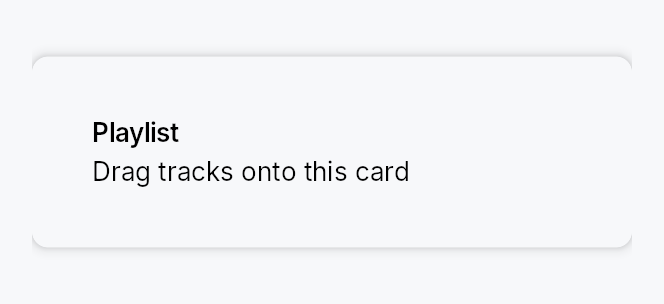
DropTarget — a transparent wrapping drop container.
Public types
| Kind | Name |
|---|---|
fn | band_depth — The depth of one edge band along the axis it is measured on: the caller's fraction of the extent, raised to floor when that fraction does not reach it |
fn | region_at_floored — region_at with band_depth's floor applied per axis |
fn | region_rect_floored — region_rect with band_depth's floor applied per axis — the paint side of region_at_floored, so the zone a user… |
struct | DropRegionSpec — Per-region configuration for a multi-zone DropTarget: an optional hint plus a reactive enabled flag |
struct | DropTarget — A transparent container that turns its child into a drop target |
Public functions
DropTarget
DropRegionSpec
| Returns | Function |
|---|---|
| Constructors | |
Self | new() |
| Builder methods | |
Self | hint(widget: impl teksilo_core::IntoTeksiChild) |
Self | enabled(enabled: impl Into<Prop<bool>>) |
Detailed description
Where DropZone is a standalone "drop files
here" placeholder with its own label / icon / Browse button, DropTarget is
a wrapping container: it turns any existing widget subtree into a drop
target without replacing its visual identity. The wrapped child fills the
bounds and is always visible; the widget adds a reactive highlight border +
tint while a drag hovers and, if a hint slot is set, fades in a centered
popup card ("Drop your image here").
It reacts to both internal drags (typed DragPayload) and external
(OS) drops (files / text / URIs), through the framework's normal drag
pipeline (on_drag_hover / on_drag_leave / on_drop).
// Wrap a panel; accept image files; show a hint while hovering.
DropTarget::new()
.child(my_panel)
.hint(TextWidget::new(lit!("Drop your image here")))
.accept_external_extensions(["png", "jpg", "jpeg"])
.on_drop(|payload, _pos, _ctx| { import(payload.files()); true });
// Typed internal drag — recovers the value even after an OS round-trip
// or across windows (the framework's typed re-entry).
DropTarget::new()
.child(project_card)
.on_drop_typed::<ProjectRef>(|project, _pos, ctx| {
ctx.send_intent(AppIntent::Link(project));
true
});
Multi-zone drops
Beyond the single whole-bounds target, a DropTarget can expose up to five
independently enable-able DropRegions — Center / Top / Bottom /
Leading / Trailing — each with its own optional hint, and route the drop
by which zone the pointer released over. This is the VS Code-style
"drop on the centre to add, drop on an edge to split" affordance
(DockingLayout's pane split/stack zones are built on it). Declare regions with
DropTarget::region; the side zones share one DropTarget::zone_size_factor
(0.1..=1.0, the fraction of the axis each edge strip occupies — 0.2 is the
default fifth, 0.5 bisects) so you size them to the context. Route with
DropTarget::on_region_drop (or observe DropTarget::active_region_signal).
DropTarget::new()
.child(editor_pane)
.zone_size_factor(0.25)
.region(DropRegion::Center, |z| z.hint(TextWidget::new(lit!("Add as tab"))))
.region(DropRegion::Leading, |z| z.hint(TextWidget::new(lit!("Split left"))))
.region(DropRegion::Trailing, |z| z.hint(TextWidget::new(lit!("Split right"))))
.on_region_drop(|region, payload, _pos, ctx| { route(region, payload); true });
Declaring any region switches the target to exactly the declared regions;
declaring none keeps the Center-only whole-bounds default (.hint(w) is
sugar for .region(DropRegion::Center, |z| z.hint(w))). Leading / Trailing
map to left / right — this widget does not yet consult
LayoutContext::layout_direction, so RTL mirroring is a follow-up.
Each zone can be reactively enabled with z.enabled(signal) (default
true): a bound Signal<bool> disables the zone live — no rebuild — and its
strip then falls through to the next-priority enabled zone (or Center, or
rejects). A drop landing in a middle covered by no enabled zone is rejected;
on_region_drop therefore only ever receives an enabled region.
Styling
The per-zone highlight overlay + hint chrome is a Tier-3 DropTargetStyle;
the default RecipeDropTargetStyle
paints the active zone (centre → frame only, so the wrapped content shows
through; an edge strip → translucent fill + accent frame) and a full-bounds
error border on reject. Override per-call with DropTarget::style or
theme-wide via theme.style_slots.drop_target.
Accessibility
The wrapper is a Role::Group. Live is intentionally not set on the
group (that would announce every change to the wrapped child); instead the
recipe scopes Live::Polite to each hint card so a screen reader announces
the active zone's hint appearing. Each hint is gated by visible_when, so a
non-active zone's hint leaves the AT tree entirely.
Keyboard accessibility is the caller's responsibility
An OS drag cannot be initiated from the keyboard, and — unlike
DropZone, which ships a keyboard-operable
Browse… button as its WCAG 2.1.1 equivalent — DropTarget adds no
keyboard affordance of its own. That is by design: DropTarget wraps
existing content that is expected to already offer a keyboard path to the
same outcome (e.g. a card you can drop a project onto or open with a
context-menu "Link…" command). The drop is an enhancement, not the sole
path.
If you use DropTarget for an action that has no other affordance, you
must add a keyboard equivalent yourself (a button, menu item, or shortcut) —
otherwise the action is unreachable for keyboard-only users, and entirely
unavailable on any target with no external-DnD backend (all four desktop
backends are real — OLE on Windows, NSDraggingDestination on macOS,
wl_data_device on Wayland, XDND on X11). DropZone is the better choice
when the drop is the primary action.
Touch and pen
An edge zone's depth is zone_size_factor of the axis, floored per axis to
the density's target size: the fraction is the shape the caller asked for and
wins wherever it already conforms, and below that the floor takes over. Without
it a fifth of a small pane is a band no finger can land in, and the drop it
swallows goes to the neighbouring zone with no warning.
The floor is itself capped at a third of the extent, for the reason
partition_targets splits evenly
when its own floor cannot be met: on a target too small for
leading | centre | trailing at the floor, three equal bands keep every zone
reachable and visibly sub-floor, where an uncapped floor would let two opposing
bands meet and delete the centre.
One function answers both the hit test and the highlight
(band_depth), so the zone a user sees stays the zone that drops. A
custom DropTargetStyle that calls core's region_rect directly paints the
unfloored band; call region_rect_floored instead.
Density
The picture above is the widget at TargetDensity::Compact, the mouse-and-keyboard ladder. Below is the same subject on the same canvas with only the ladder changed, so what moves is the density and nothing else — where the subject no longer fits, that is what the denser targets cost it at that size. See docs/density-and-targets.md.
Touch
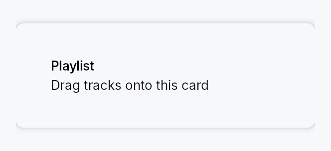
API reference
📖 Full rustdoc API for this module
pub fn band_depth(...)
Import: use teksilo::widgets::drop_target::band_depth;
The depth of one edge band along the axis it is measured on: the caller's
fraction of the extent, raised to floor when that fraction does not reach
it.
A fraction alone cannot answer this. zone_size_factor is one number for
both axes, and it is the shape the caller wants — a fifth, a quarter, a
bisection — so on a large target it is right and must not be touched. On a
small enough one, any of those fractions is a band no finger can land in, and
the drop it swallows goes to the neighbouring zone with no warning. So the
fraction wins wherever it already conforms and the floor
takes over below that, which is the same shape as
dp — a floor that only ever raises,
leaving every target that was already big enough exactly as it was.
The floor itself is capped at a third of the extent, for the reason
partition_targets splits
evenly when its own floor cannot be met: on a target too small for
leading | centre | trailing at the floor, three equal bands keep every
zone reachable and visibly sub-floor, where an uncapped floor would let two
opposing bands meet and delete the centre.
#![allow(unused)] fn main() { pub fn band_depth(extent: f32, factor: f32, floor: f32) -> f32; }
pub fn region_at_floored(...)
Import: use teksilo::widgets::drop_target::region_at_floored;
region_at with band_depth's floor
applied per axis.
Priority is core's, unchanged: leading → trailing → top → bottom → centre, so an overlapping pair still resolves the way the un-floored function does and a caller that reads the region index reads the same thing.
#![allow(unused)] fn main() { pub fn region_at_floored( local: Point, size: Size, set: teksilo_core::styles::DropRegionSet, factor: f32, floor: f32, ) -> Option<DropRegion>; }
pub fn region_rect_floored(...)
Import: use teksilo::widgets::drop_target::region_rect_floored;
region_rect with band_depth's
floor applied per axis — the paint side of region_at_floored, so the
zone a user sees stays the zone that drops.
#![allow(unused)] fn main() { pub fn region_rect_floored(region: DropRegion, bounds: Rect, factor: f32, floor: f32) -> Rect; }
pub struct DropRegionSpec
Import: use teksilo::widgets::DropRegionSpec;
Per-region configuration for a multi-zone DropTarget: an optional hint
plus a reactive enabled flag. Kept as a struct so more per-zone knobs can
land without a signature churn.
#![allow(unused)] fn main() { pub struct DropRegionSpec { /* fields */ } }
Methods
pub fn new() -> Self
An enabled spec with no hint.
pub fn hint(mut self, widget: impl teksilo_core::IntoTeksiChild) -> Self
Widget shown (centered in this region's rect, inside a popup card) while a drag with an accepted payload hovers this region.
pub fn enabled(mut self, enabled: impl Into<Prop<bool>>) -> Self
Whether this zone is active — static or signal-bound (default true). A
bound Signal<bool> enables/disables the zone live, without a rebuild:
while disabled the zone stops hit-testing (its area falls through to the
next-priority enabled zone, or Center, or rejects), never highlights,
and never shows its hint. The enabled state is resolved on every drag
tick, so a .set(false) mid-drag takes effect on the next hover.
pub struct DropTarget
Import: use teksilo::widgets::DropTarget;
A transparent container that turns its child into a drop target. See the module docs.
#![allow(unused)] fn main() { pub struct DropTarget { /* fields */ } }
Methods
pub fn new() -> Self
A drop target with no child yet — call Self::child (required).
pub fn child(mut self, widget: impl teksilo_core::IntoTeksiChild) -> Self
The wrapped content — fills the bounds and is always visible.
pub fn child_opt(self, widget: Option<impl teksilo_core::IntoTeksiChild>) -> Self
Attach widget when it is Some, and do nothing when it is None.
The conditional-child form. teksu!'s if without an else lowers to
this, and it is what cond.then(|| w) is for in a builder chain. None
adds no arena node, so nothing is laid out, painted, or published to the
accessibility tree, and a stack applies no spacing around it.
pub fn region( mut self, region: DropRegion, f: impl FnOnce(DropRegionSpec) -> DropRegionSpec, ) -> Self
Enable and configure a drop DropRegion. Declaring any region
switches the target to exactly the declared regions; declaring none
leaves the implicit Center-only whole-bounds default. The spec closure
configures the region (an optional hint, and a reactive enabled flag).
DropTarget::new()
.child(editor)
.zone_size_factor(0.25)
.region(DropRegion::Center, |z| z.hint(TextWidget::new(lit!("Add tab"))))
.region(DropRegion::Leading, |z| z.hint(TextWidget::new(lit!("Split left"))))
.region(DropRegion::Trailing, |z| z.hint(TextWidget::new(lit!("Split right"))))
.on_region_drop(|region, payload, _pos, ctx| { route(region, payload); true });
pub fn zone_size_factor(mut self, factor: f32) -> Self
The fraction of the axis each side zone occupies (clamped to
0.1..=1.0). 0.2 is the default fifth; 0.5 bisects. Applies to all
four edge zones in common; Center takes the leftover middle.
pub fn hint(mut self, widget: impl teksilo_core::IntoTeksiChild) -> Self
Widget shown centered inside a popup card while a drag with an accepted
payload hovers. Sugar for .region(DropRegion::Center, |z| z.hint(w)) —
the classic whole-bounds single-zone case.
pub fn accept_any(mut self) -> Self
Accept any payload (internal or external). Explicit form of the default.
pub fn accept_external(mut self) -> Self
Accept any external (OS) drop, regardless of content.
pub fn accept_external_files(mut self) -> Self
Accept external drops that carry at least one file. Optimistic at hover
on Wayland (where the file bytes only arrive at drop) if the source
advertises a text/uri-list.
pub fn accept_external_text(mut self) -> Self
Accept external text drops. Optimistic at hover on Wayland if the source advertises a text format.
pub fn accept_external_extensions<I, S>(mut self, extensions: I) -> Self where I: IntoIterator<Item = S>, S: AsRef<str>,
Accept external file drops whose extension is in extensions
(case-insensitive). At hover on Wayland the real check is deferred to
drop (no file bytes yet); it is optimistic if a text/uri-list is
advertised.
pub fn accept_typed<T: 'static>(mut self) -> Self
Accept internal drags whose payload carries a value of type T.
Ergonomic companion to Self::on_drop_typed.
pub fn accept_when(mut self, f: impl Fn(&DragPayload) -> bool + 'static) -> Self
Custom predicate — full control over payload inspection.
pub fn targeted_signal(mut self, signal: Signal<bool>) -> Self (default: None)
The widget writes true while a drag with an accepted payload is over
the target, false otherwise — SwiftUI's isTargeted pattern. Drive
custom visuals off this signal.
pub fn drag_state_signal(mut self, signal: Signal<DropTargetDragState>) -> Self (default: None)
Full three-state version of Self::targeted_signal.
pub fn active_region_signal(mut self, signal: Signal<Option<DropRegion>>) -> Self (default: None)
The widget writes which DropRegion an accepted drag is currently
over (None when idle, rejecting, or over a disabled middle). Drive
custom per-zone visuals off this.
pub fn on_drop( mut self, f: impl FnMut(DragPayload, Point, &mut EventContext) -> bool + 'static, ) -> Self
Handle a drop. Return true to accept, false to reject. Invoked only
when the accept filter passes.
pub fn on_drop_typed<T: 'static>( mut self, mut f: impl FnMut(T, Point, &mut EventContext) -> bool + 'static, ) -> Self
Ergonomic typed drop: implicitly sets accept_typed::<T>() and extracts
the typed value before invoking f. Last-call-wins with Self::on_drop.
pub fn on_region_drop( mut self, f: impl FnMut(DropRegion, DragPayload, Point, &mut EventContext) -> bool + 'static, ) -> Self
Region-aware drop: receives which DropRegion the pointer released
over, plus the payload. Last-call-wins with Self::on_drop — when set,
it is used instead of the plain on_drop. Invoked only when the accept
filter passes; return true to accept.
pub fn on_drag_leave(mut self, f: impl FnMut(&mut EventContext) + 'static) -> Self
Called when a drag leaves the target (pointer exit, drop completion, or cancel).
pub fn variant(mut self, variant: DropTargetVariant) -> Self (default: DropTargetVariant::Default)
Visual prominence of the hover indicator.
pub fn style(mut self, style: impl DropTargetStyle) -> Self
Per-call style override (Tier-3). Wins over the theme slot and the default recipe.
DropZone
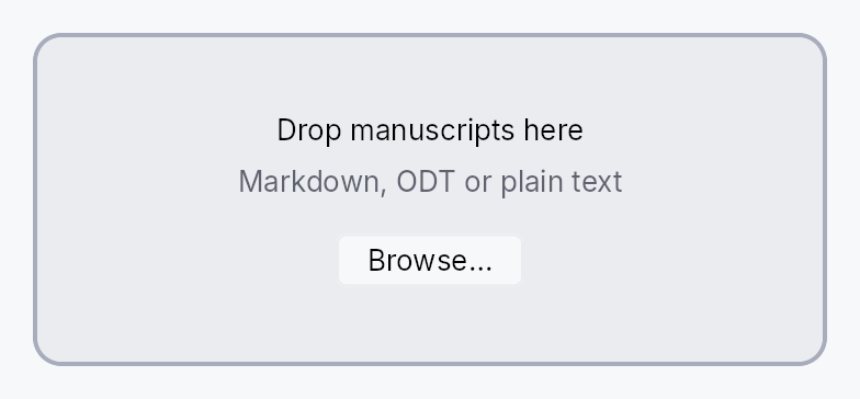
DropZone — a "drop files here" target for external (OS) drag-and-drop.
Public functions
DropZone
Detailed description
A bordered, tinted region that accepts files / text / URLs dragged in from the operating system (Finder, Explorer, Nautilus) or another application. It reacts to hover (accept / reject highlight) and fires typed callbacks on drop. Because an OS drag cannot be initiated from the keyboard, the zone also offers a keyboard-operable Browse… button (opening the native file dialog) as the WCAG 2.1.1 equivalent.
DropZone::new(tr!("drop_images_here"))
.subtitle(tr!("png_or_jpeg"))
.accept_extensions(["png", "jpg", "jpeg"])
.allow_multiple(true)
.on_files_dropped(|paths, _ctx| { /* import paths */ });
External drops are delivered through the framework's normal drag pipeline
(on_drag_hover / on_drag_leave / on_drop) once
install_external_dnd is wired and a backend
is available. All four desktop backends are real (OLE on Windows,
NSDraggingDestination on macOS, wl_data_device on Wayland, XDND on X11
— see teksilo-platform/src/external_dnd.rs), so the Browse button is the
keyboard route rather than a fallback for a platform that cannot drop.
Styling
The bordered, tinted chrome is a Tier-3 DropZoneStyle; the default
RecipeDropZoneStyle tracks the
interaction state. Override per-call with DropZone::style or theme-wide
via theme.style_slots.drop_zone.
Accessibility
The zone is a Role::Group labelled by its prompt, with a Live::Polite
status line that announces hover ("Drop to add 3 files"), success
("3 files added"), and rejection. AccessKit models no drag/drop action and
ARIA's aria-grabbed / aria-dropeffect are deprecated, so live-region
announcements plus the Browse fallback are the supported pattern.
Touch and pen
The zone is one target and the whole surface of it, so nothing here needs a floor or an outset, and an external drop carries no press to move to a release. The keyboard Browse fallback is what makes the action reachable at all where there is no OS drag-and-drop backend; it is not a touch affordance and is documented at its own builder.
Density
The picture above is the widget at TargetDensity::Compact, the mouse-and-keyboard ladder. Below is the same subject on the same canvas with only the ladder changed, so what moves is the density and nothing else — where the subject no longer fits, that is what the denser targets cost it at that size. See docs/density-and-targets.md.
Touch
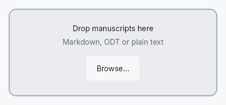
API reference
📖 Full rustdoc API for this module
pub struct DropZone
Import: use teksilo::widgets::DropZone;
A drop target for external (OS) drag-and-drop. See the module docs.
#![allow(unused)] fn main() { pub struct DropZone { /* fields */ } }
Methods
pub fn new(label: impl Into<LocalizedString>) -> Self
Build a drop zone with the given prompt (e.g. tr!("drop_files_here")).
The label may come from tr!(...) (translated) or
lit!(...); it is stored as a LocalizedString and handed to the
prompt's TextWidget, so a tr!(...) label re-resolves on a locale
switch without rebuilding the zone — the same model as
Button::new.
pub fn subtitle(mut self, text: impl Into<LocalizedString>) -> Self (default: None)
Secondary line under the prompt (e.g. tr!("png_or_jpeg")).
pub fn accept_extensions<I, S>(mut self, extensions: I) -> Self where I: IntoIterator<Item = S>, S: Into<String>,
Restrict accepted files to these extensions (without leading dots, case-insensitive). Empty (the default) accepts any file. Text and URL drops are unaffected.
pub fn allow_multiple(mut self, allow: bool) -> Self
Whether more than one file may be dropped at once. Default true.
When false, a multi-file drop is rejected.
pub fn show_browse_button(mut self, show: bool) -> Self
Show or hide the keyboard-operable Browse button. Default true.
It is the zone's only route that is not a drag. Turning it off leaves the drop as the sole way in, which fails WCAG 2.2 SC 2.5.7 (Dragging Movements) as well as SC 2.1.1 — so an application that hides it owes the same action another affordance of its own, reachable by keyboard and by a single pointer. See the non-drag alternatives page.
pub fn starting_dir(mut self, path: impl Into<PathBuf>) -> Self
Directory the Browse button's dialog opens in. If unset, the OS default is used.
The same builder FilePickerField::starting_dir
offers, and for the same reason: an app that remembers where its writer last
picked files has no way to say so otherwise, because this widget builds its own
FileDialogRequest internally rather than taking one.
pub fn browse_label(mut self, label: impl Into<LocalizedString>) -> Self
pub fn icon(mut self, icon: impl Widget + 'static) -> Self
An icon widget shown above the prompt (any widget — typically an
IconWidget).
pub fn style(mut self, style: impl DropZoneStyle) -> Self
Override the Tier-3 DropZoneStyle for this instance only.
pub fn on_files_dropped( mut self, f: impl FnMut(Vec<PathBuf>, &mut EventContext) + 'static, ) -> Self
Called with the dropped (or browsed) file paths. Files are only accepted when this is set.
pub fn on_text_dropped(mut self, f: impl FnMut(String, &mut EventContext) + 'static) -> Self
Called with dropped plain text. Text drops are only accepted when set.
pub fn on_urls_dropped( mut self, f: impl FnMut(Vec<String>, &mut EventContext) + 'static, ) -> Self
Called with dropped non-file URLs. URL drops are only accepted when set.
Expand
Expand — a layout modifier that claims slack space in a stack and stretches its child to fill the allocated bounds.
Public functions
Expand
| Returns | Function |
|---|---|
| Constructors | |
Self | new() |
Self | horizontal() |
Self | vertical() |
| Builder methods | |
Self | flex(flex: f32) |
Self | align_child(alignment: Alignment) |
Self | respect_intrinsic() |
Self | child(widget: impl teksilo_core::IntoTeksiChild) |
Self | child_opt(widget: Option<impl teksilo_core::IntoTeksiChild>) |
Detailed description
Inside an HStack or
VStack, Expand participates in the flex
distribution pass by reporting a non-zero flex weight (default 1.0).
The parent stack distributes leftover space proportionally to each child's
flex weight. Expand::new() competes on both axes;
Expand::horizontal() and Expand::vertical() restrict competition to
the named axis so they do not accidentally steal slack from orthogonal
siblings. By default the wrapped child is stretched to the full allocated
rectangle; call .align_child(alignment) to keep the child at its natural
size and align it within the slot instead.
The default flex basis is zero (CSS flex-basis: 0), giving exact
proportional ratios. Call .respect_intrinsic() to switch to auto
basis where the child's natural size acts as a floor before flex slack is
added.
#![allow(unused)] fn main() { use teksilo_widgets::primitives::{HStack, Expand, RectWidget}; // Two panels sharing horizontal space in a 1:2 ratio let _row = HStack::new() .child(Expand::new().flex(1.0).child(RectWidget::new())) .child(Expand::new().flex(2.0).child(RectWidget::new())); }
Density
The picture above is the widget at TargetDensity::Compact, the mouse-and-keyboard ladder. Below is the same subject on the same canvas with only the ladder changed, so what moves is the density and nothing else — where the subject no longer fits, that is what the denser targets cost it at that size. See docs/density-and-targets.md.
Touch
API reference
📖 Full rustdoc API for this module
pub struct Expand
Import: use teksilo::widgets::Expand;
Layout modifier that claims space along one or both axes from its parent and stretches its child to fill it.
In an HStack / VStack, Expand participates in flex slack
distribution: it returns a LayoutResponse with flex (default 1.0),
so the parent stack hands it a share of the leftover space proportional
to flex. Default basis is zero — the wrapped child's natural size
does NOT count in the rigid pool, which gives clean ratio layouts. Call
Expand::respect_intrinsic to switch to auto basis (CSS
flex-basis: auto), where the child's natural size acts as a floor and
flex adds slack on top.
Expand::new() is the common case: claim space, fill the child.
Use .flex(n) to change the ratio (e.g. 1:2 by pairing flex(1) with
flex(2)). Use .align_child(...) to opt out of fill and align the
child at its natural size within the claimed bounds.
horizontal() / vertical() semantics. The named axis is the one
the wrapper competes for slack on. Both sizing and flex behavior
follow from that:
-
Sizing: when the parent binds an axis (
proposal.{axis} = Some), the wrapper claims that axis regardless of its name. SoExpand::vertical(child)inside aVStack(which binds width and leaves height open) fills the VStack's full width AND distributes vertical slack via flex. Cross-axis collapse to child intrinsic only happens when the parent left that axis open too. -
Flex contribution: the wrapper reports its
flexweight only on axes the parent is distributing (i.e. left open).Expand::horizontal()inside aVStackreportsflex = 0on the open vertical axis, so it does NOT compete for vertical slack with siblings — it just claims the cross-axis width and sits at its child's intrinsic height. Symmetric forExpand::vertical()inside anHStack.
#![allow(unused)] fn main() { pub struct Expand { /* fields */ } }
Methods
pub fn new() -> Self
Expand on both axes. Default flex(1), child fills bounds.
pub fn horizontal() -> Self
Compete for slack on the horizontal axis only. Inside an HStack,
distributes flex on width while claiming bound height as-is. Inside
a VStack (which binds width and distributes height), claims the
VStack's full width but reports flex = 0 so it doesn't steal
vertical slack from siblings — height stays at child intrinsic.
pub fn vertical() -> Self
Compete for slack on the vertical axis only. Inside a VStack,
distributes flex on height while claiming bound width as-is. Inside
an HStack (which binds height and distributes width), claims the
HStack's full height but reports flex = 0 so it doesn't steal
horizontal slack from siblings — width stays at child intrinsic.
pub fn flex(mut self, flex: f32) -> Self
Override the flex weight reported to a parent stack. flex(0.0) opts
out of slack distribution (the wrapper still claims any offered
proposal, useful inside non-stack containers). Default: 1.0.
pub fn align_child(mut self, alignment: Alignment) -> Self (default: None)
Opt out of stretching the child. The child is laid out at its
natural size and positioned within the Expand's bounds according
to alignment.
pub fn respect_intrinsic(mut self) -> Self
Switch to auto flex basis — the wrapped child's natural size
acts as a floor on each flex axis, and the parent stack adds slack
on top via the flex weight. Useful when the wrapper sits inside an
unconstrained parent (e.g. an outer VStack with height = None),
where the default zero-basis would let the child overflow because
the parent has no bound to share.
Trade-off: with respect_intrinsic, exact ratios bend by content
width — [Expand::flex(1).child(60), Expand::flex(2).child(40)] in
300 px gives 60 + 66 = 126 and 40 + 133 = 173 rather than
100 / 200. Without it (the default), the same layout splits
exactly 100 / 200.
Do not use this inside a bounded parent
The floor is a hard one: Expand reports shrink = 0, so if the
child's natural size exceeds what the parent can offer, the resulting
over-constraint deficit cannot be absorbed and later siblings are
pushed outside the bounds.
This bites hardest with children whose natural size is large and
content-driven. A vertical TabBar
answers an unbounded height query with its stacked height — every tab,
one below another. So:
// 21 tabs => the bar's natural height is ~1050 dp.
VStack::new()
.child(Expand::vertical().respect_intrinsic().child(tab_widget))
.child(status_bar)
makes the VStack want 1050 + status_bar, at every window size. The
status bar is placed at y=1050 and stays below the fold until the window
is grown past it — the bar never scrolls, because it was never asked to
fit. Dropping respect_intrinsic() fixes it: the bar takes the slack
left after the status bar and scrolls its tabs internally.
Rule of thumb: reach for this only when the parent genuinely has no
bound to share (height = None). When the parent is bounded — a window
root, a sized pane — the default zero basis is what you want.
pub fn child(mut self, widget: impl teksilo_core::IntoTeksiChild) -> Self
Set an inline child widget (deferred insertion).
pub fn child_opt(self, widget: Option<impl teksilo_core::IntoTeksiChild>) -> Self
Attach widget when it is Some, and do nothing when it is None.
The conditional-child form. teksu!'s if without an else lowers to
this, and it is what cond.then(|| w) is for in a builder chain. None
adds no arena node, so nothing is laid out, painted, or published to the
accessibility tree, and a stack applies no spacing around it.
Fade
Fade — a wrapper widget that animates its child between hidden
(opacity 0) and visible (opacity 1) when an external
Signal<bool> toggles.
Public functions
Fade
| Returns | Function |
|---|---|
| Constructors | |
Self | new(visible: impl Into<Prop<bool>>) |
| Builder methods | |
Self | child(widget: impl teksilo_core::IntoTeksiChild) |
Self | child_opt(widget: Option<impl teksilo_core::IntoTeksiChild>) |
Detailed description
Drives an opacity: Signal<f32> ∈ [0, 1] and applies it to its
own subtree via BuildContext::set_opacity. The framework's
render walker emits SetOpacity(value) before this widget's
paint and RestoreOpacity afterwards, so the multiplier composes
correctly with ancestor opacity scopes via the canvas's stacked
opacity model.
let visible = ctx.signal(false);
ctx.add(Fade::new(visible.clone()).child(tooltip_content));
// ...elsewhere:
visible.set(true); // fades in over `motion.duration_fast`
Layout semantics
Fade does not change layout. The wrapped child reports its full
natural size at all opacity values, so reserving space for a
to-be-faded-in widget works the same whether the widget is fully
visible or fully hidden.
For overlays where the dismiss should be deferred until the
fade-out completes (tooltip / popover / snackbar / dialog),
prefer OverlayRequest::with_fade
instead — that path coordinates the dismiss with the tween so the
overlay survives until the opacity reaches zero.
Reduced motion
Honours prefers-reduced-motion: under reduced motion the
opacity snaps to its end value instead of tweening.
API reference
📖 Full rustdoc API for this module
pub struct Fade
Import: use teksilo::widgets::Fade;
Wraps a child and animates the entire subtree's opacity between
0 and 1, driven by an external Signal<bool>.
#![allow(unused)] fn main() { pub struct Fade { /* fields */ } }
Methods
pub fn new(visible: impl Into<Prop<bool>>) -> Self
Build a fade wrapper bound to visible. Initially hidden iff
visible.get() is false at the first build().
Accepts any Prop<bool> source — Signal<bool>, Prop<bool>,
or a plain bool (for static "always visible" / "always
hidden" cases without a tween).
pub fn child(mut self, widget: impl teksilo_core::IntoTeksiChild) -> Self
Inline child widget (deferred insertion).
pub fn child_opt(self, widget: Option<impl teksilo_core::IntoTeksiChild>) -> Self
Attach widget when it is Some, and do nothing when it is None.
The conditional-child form. teksu!'s if without an else lowers to
this, and it is what cond.then(|| w) is for in a builder chain. None
adds no arena node, so nothing is laid out, painted, or published to the
accessibility tree, and a stack applies no spacing around it.
FilePickerField

FilePickerField — a text-input preset for path entry with a Browse button.
Public types
| Kind | Name |
|---|---|
enum | FilePickerKind — Which file-dialog kind the trailing button opens |
struct | FilePickerField — A single-line path entry field with a trailing Browse button that invokes the native file dialog and writes the chosen path back into the bound Signal<String> |
Public functions
FilePickerField
Detailed description
Combines a TextInput with a trailing IconButton (the folder/browse glyph)
that opens a native file dialog and writes the chosen path back into the bound
Signal<String>. The three FilePickerKind variants map to the three
single-result dialog modes: open a file, pick a folder, or save a file.
Multi-file selection does not fit the "one editable line" pattern; use the
file-dialog API directly for that.
// Requires ctx.signal() — shown as ignore per convention.
let path = ctx.signal(String::new());
let _f = FilePickerField::new(path.clone())
.kind(FilePickerKind::OpenFile)
.add_filter("Images", &["png", "jpg"])
.placeholder(lit!("Choose a file…"));
Density
The picture above is the widget at TargetDensity::Compact, the mouse-and-keyboard ladder. Below is the same subject on the same canvas with only the ladder changed, so what moves is the density and nothing else — where the subject no longer fits, that is what the denser targets cost it at that size. See docs/density-and-targets.md.
Touch

API reference
📖 Full rustdoc API for this module
pub enum FilePickerKind
Import: use teksilo::widgets::FilePickerKind;
Which file-dialog kind the trailing button opens.
#![allow(unused)] fn main() { pub enum FilePickerKind { /* variants */ } }
Variants
OpenFile— Open an existing file. Default.PickFolder— Pick an existing folder.SaveFile— Pick a new or existing file location for saving.
pub struct FilePickerField
Import: use teksilo::widgets::FilePickerField;
A single-line path entry field with a trailing Browse button that invokes the
native file dialog and writes the chosen path back into the bound Signal<String>.
#![allow(unused)] fn main() { pub struct FilePickerField { /* fields */ } }
Methods
pub fn new(text: Signal<String>) -> Self
Construct a FilePickerField bound to text. The visible string
is updated on a successful pick; existing content is shown as-is.
pub fn kind(mut self, kind: FilePickerKind) -> Self (default: FilePickerKind::OpenFile)
Pick the dialog kind opened by the Browse button.
pub fn dialog_title(mut self, title: impl Into<LocalizedString>) -> Self (default: None)
Title shown in the file-dialog window caption.
pub fn starting_dir(mut self, path: impl Into<PathBuf>) -> Self
Directory the dialog opens in. If not set, the OS default is used.
pub fn default_file_name(mut self, name: impl Into<String>) -> Self (default: None)
Pre-filled file name for the FilePickerKind::SaveFile dialog.
No-op for OpenFile / PickFolder.
pub fn add_filter(mut self, label: impl Into<String>, extensions: &[&str]) -> Self
Append an extension filter (label + extensions without leading dots). Repeat to add multiple rows.
pub fn add_filters<'a, L, E>(self, filters: impl IntoIterator<Item = (L, E)>) -> Self where L: Into<String>, E: AsRef<[&'a str]>,
Append several extension filters from an iterator of
(label, extensions) pairs, in order.
The loop form of add_filter, for a filter list that
comes from data. The second element of each pair is anything that reads
as a &[&str], so both ["txt", "md"] and &["txt", "md"][..] work.
pub fn on_pick(mut self, f: impl Fn(&FileDialogResult, &mut EventContext) + 'static) -> Self
Hook invoked with the raw FileDialogResult after the dialog
closes — useful when the caller needs to react to cancellation
or backend errors. The bound text signal is already updated by
the time this fires (on success).
pub fn placeholder(mut self, text: impl Into<LocalizedString>) -> Self
Placeholder text shown when the field is empty.
pub fn label(mut self, label: impl Into<LocalizedString>) -> Self
Accessible name for the path field.
pub fn validation(mut self, validation: impl Into<Prop<ValidationState>>) -> Self (default: None)
Bind an external ValidationState signal — shown as the same inline
error/warning strip and border tint the inner TextInput renders (e.g.
"the chosen folder does not exist / is not writable").
pub fn enabled(mut self, on: impl Into<Prop<bool>>) -> Self (default: true)
Set the initial enabled state for the text field and Browse button. Forwarded to the arena at build time.
pub fn tooltip(mut self, text: impl Into<LocalizedString>) -> Self
Attach a plain single-line tooltip shown after the hover delay. Clears any previously set rich or composite tooltip (last call wins).
pub fn rich_tooltip(mut self, key: impl Into<String>) -> Self
Attach a rich tooltip by registry key. Clears any previously set plain or composite tooltip (last call wins).
pub fn rich_tooltip_content(mut self, content: crate::tooltip::TooltipContent) -> Self
Attach a rich tooltip from inline crate::tooltip::TooltipContent.
Clears any previously set plain or composite tooltip (last call wins).
pub fn composite_tooltip(mut self, content: impl Widget + 'static) -> Self
Attach a composite tooltip whose body is an arbitrary widget tree. Clears any previously set plain or rich tooltip (last call wins).
FixedSize
FixedSize — a layout modifier that pins a child to its natural size, optionally overriding one or both dimensions with a reactive value.
Public functions
FixedSize
| Returns | Function |
|---|---|
| Constructors | |
Self | new() |
| Builder methods | |
Self | child(widget: impl teksilo_core::IntoTeksiChild) |
Self | child_opt(widget: Option<impl teksilo_core::IntoTeksiChild>) |
Self | width(state: impl Into<Prop<f32>>) |
Self | height(state: impl Into<Prop<f32>>) |
Detailed description
Without bindings, FixedSize ignores the parent's size proposal and
always reports the child's intrinsic size. This is useful for widgets
that must not be stretched or compressed by their containing stack —
icons, chips, or thumbnails that must stay at their designed size
regardless of the surrounding layout.
With width or
height, the corresponding dimension is
locked to a reactive Signal<f32> value; the signal change triggers a
relayout automatically. Unbound dimensions still fall back to the child's
natural size.
#![allow(unused)] fn main() { use teksilo_widgets::primitives::{FixedSize, RectWidget}; use teksilo_core::signal::Signal; let sidebar_width = Signal::new(240.0_f32); // Pin the sidebar width to a reactive signal let _sidebar = FixedSize::new() .width(sidebar_width) .child(RectWidget::new()); }
API reference
📖 Full rustdoc API for this module
pub struct FixedSize
Import: use teksilo::widgets::FixedSize;
Layout modifier that prevents a widget from expanding beyond its natural size, or constrains it to specific reactive dimensions.
Without bindings, reports the child's natural size (ignoring parent proposal).
With width/height, constrains to the bound values.
#![allow(unused)] fn main() { pub struct FixedSize { /* fields */ } }
Methods
pub fn new() -> Self
Create a FixedSize with no child and no dimension bindings; the child's
natural size will be used for both axes.
pub fn child(mut self, widget: impl teksilo_core::IntoTeksiChild) -> Self
Set an inline child widget (deferred insertion).
pub fn child_opt(self, widget: Option<impl teksilo_core::IntoTeksiChild>) -> Self
Attach widget when it is Some, and do nothing when it is None.
The conditional-child form. teksu!'s if without an else lowers to
this, and it is what cond.then(|| w) is for in a builder chain. None
adds no arena node, so nothing is laid out, painted, or published to the
accessibility tree, and a stack applies no spacing around it.
pub fn width(mut self, state: impl Into<Prop<f32>>) -> Self (default: None)
Bind width to a reactive state. When the state changes, relayout is triggered.
pub fn height(mut self, state: impl Into<Prop<f32>>) -> Self (default: None)
Bind height to a reactive state. When the state changes, relayout is triggered.
FocusScope
FocusScope — a layout-transparent wrapper that declares a traversal
boundary for Tab / Shift+Tab focus cycling.
Public functions
FocusScope
| Returns | Function |
|---|---|
| Constructors | |
Self | new(policy: TraversalScopePolicy) |
| Builder methods | |
Self | child(widget: impl teksilo_core::IntoTeksiChild) |
Self | child_opt(widget: Option<impl teksilo_core::IntoTeksiChild>) |
Detailed description
Descendants' tab_index values are scoped to the nearest enclosing
FocusScope: two sibling scopes that both number their children 1, 2, 3
never interleave — each scope is an independent, ordered unit within its
parent. The TraversalScopePolicy controls what Tab does at the scope's
ends:
Continue— Tab flows out of the scope into the enclosing scope's next member (grouping only). Use for logical regions in a continuous Tab order, e.g. dock panels.Cycle— Tab wraps within the scope and never leaves via keyboard. Use for modal dialogs.
// A modal dialog whose Tab order is confined to its own content:
FocusScope::new(TraversalScopePolicy::Cycle).child(dialog_body)
Do not Cycle-wrap a popover, menu or dropdown panel. Those are
non-modal, and the framework dismisses a non-modal overlay when keyboard
focus leaves it — which is what their ARIA patterns (Disclosure, Menu) ask
for, and what keeps an open panel from sitting over the focus ring that
left it. Trapping focus inside one prevents that dismissal from ever
firing. A centered modal needs no wrapper at all: cycle_focus already
roots traversal at the topmost centered overlay's content.
Layout & accessibility
FocusScope imposes no layout — it reports its child's natural size and
places the child at its own bounds (like Fade). It is a
structural boundary, not an AT element: the wrapped child owns its own
accessibility semantics. The scope node is never itself a Tab stop
(BuildContext::set_traversal_scope forces it non-focusable).
API reference
📖 Full rustdoc API for this module
pub struct FocusScope
Import: use teksilo::widgets::FocusScope;
Wraps a child subtree and declares it a Tab traversal scope. See the
module documentation for semantics.
#![allow(unused)] fn main() { pub struct FocusScope { /* fields */ } }
Methods
pub fn new(policy: TraversalScopePolicy) -> Self
Create a traversal scope with the given boundary policy.
pub fn child(mut self, widget: impl teksilo_core::IntoTeksiChild) -> Self
Inline child widget (deferred insertion — the form teksu! lowers to).
pub fn child_opt(self, widget: Option<impl teksilo_core::IntoTeksiChild>) -> Self
Attach widget when it is Some, and do nothing when it is None.
The conditional-child form. teksu!'s if without an else lowers to
this, and it is what cond.then(|| w) is for in a builder chain. None
adds no arena node, so nothing is laid out, painted, or published to the
accessibility tree, and a stack applies no spacing around it.
FontPicker
FontPicker — a drop-in font-family selector.
Public types
| Kind | Name |
|---|---|
enum | FontSpacingFilter — Spacing filter, mirroring the monospaced / proportional axis of Qt's QFontComboBox::FontFilters |
enum | FontPreviewMode — How each row — and the closed trigger — previews a font |
struct | FontMeta — Per-family metadata for headless testing / restricted font sets via FontPicker::families_with_meta |
struct | FontPicker — A font-family selector built on ComboBox |
Public functions
FontPicker
Detailed description
A ComboBox preset that lists every installed font family and lets
the user pick one, in the tradition of Qt's QFontComboBox, GTK's
FontChooser, and UIKit's UIFontPickerViewController. It
- self-populates from the app's shared typesetter
(
ctx.app_state::<SharedTypesetter>()→families()), so no font list is passed in; - previews each font: every row shows the family name in a legible
system font next to a tiny sample rendered in that font
(
FontPreviewMode::NameThenSample, the default), and the closed trigger shows the selected family in its own typeface; - is searchable (type to filter hundreds of fonts) and
filterable by spacing (
FontSpacingFilter) and by writing system (WritingSystem); - binds the choice to a
Signal<Option<String>>(the family name), which plugs straight intoTextStyle.family/RichTextEditor::set_font_family.
let family: Signal<Option<String>> = Signal::new(None);
VStack::new()
.child(TextWidget::new(tr!(font())).style(TextStyleRole::BodyBold))
.child(FontPicker::new(family.clone())
.on_select(|name, _ctx| editor.set_font_family(name)));
Writing-system detection is off-thread
Classifying which scripts a font covers parses its OS/2 table, i.e. reads the font file — hundreds of reads for a full system. The picker therefore builds the coverage index on a background thread the first time it mounts and polls readiness on the frame tick; until the index is ready the writing-system filter shows the unfiltered list and samples fall back to a Latin default. Spacing (monospaced / proportional) filtering is instant (it uses only font metadata, no bytes).
Only family selection is offered, matching Qt's QFontComboBox. Face /
weight / size selection belongs to a larger font dialog and is out of
scope.
Density
The picture above is the widget at TargetDensity::Compact, the mouse-and-keyboard ladder. Below is the same subject on the same canvas with only the ladder changed, so what moves is the density and nothing else — where the subject no longer fits, that is what the denser targets cost it at that size. See docs/density-and-targets.md.
Touch
API reference
📖 Full rustdoc API for this module
pub enum FontSpacingFilter
Import: use teksilo::widgets::FontSpacingFilter;
Spacing filter, mirroring the monospaced / proportional axis of Qt's
QFontComboBox::FontFilters. Cheap — it reads only font metadata.
#![allow(unused)] fn main() { pub enum FontSpacingFilter { /* variants */ } }
Variants
Any— Show all fonts (default).Monospaced— Only monospaced fonts.Proportional— Only proportional (non-monospaced) fonts.
pub enum FontPreviewMode
Import: use teksilo::widgets::FontPreviewMode;
How each row — and the closed trigger — previews a font.
#![allow(unused)] fn main() { pub enum FontPreviewMode { /* variants */ } }
Variants
NameThenSample— Family name in a legible system font, then a tiny sample rendered in the font itself (the default). The sample text is chosen for the font's writing system.NameInOwnFont— Family name rendered in its own typeface (the Qt / UIKit default).NameInSystemFont— Family name in the system font, no in-font sample (UIKitdisplayUsingSystemFont). Maximum legibility.
pub struct FontMeta
Import: use teksilo::widgets::FontMeta;
Per-family metadata for headless testing / restricted font sets via
FontPicker::families_with_meta. In a real app this data comes from
the shared typesetter instead.
#![allow(unused)] fn main() { pub struct FontMeta { /* fields */ } }
Fields
monospaced:bool— Whether the family is monospaced (drivesFontSpacingFilter).writing_systems:WritingSystemSet— The scripts the family covers (drives the writing-system filter and the per-row sample text).
pub struct FontPicker
Import: use teksilo::widgets::FontPicker;
A font-family selector built on ComboBox. See the module docs.
#![allow(unused)] fn main() { pub struct FontPicker { /* fields */ } }
Methods
pub fn new(selected: Signal<Option<String>>) -> Self
Create a picker bound to selected (the chosen family name). The
list is enumerated from the app's shared typesetter at build time.
pub fn families(mut self, families: impl IntoIterator<Item = impl Into<String>>) -> Self
Override the family list instead of enumerating from the typesetter.
Family names only — spacing is treated as proportional and
writing-system coverage is unknown (the writing-system filter shows
all). For deterministic filter tests, prefer
families_with_meta.
pub fn families_with_meta(mut self, families: Vec<(String, FontMeta)>) -> Self
Override the family list and its metadata (monospaced + writing systems). Enables headless testing of the spacing / writing-system filters and the script-aware sample without a font backend.
pub fn spacing_filter(mut self, filter: impl Into<Prop<FontSpacingFilter>>) -> Self (default: FontSpacingFilter::Any)
Restrict the list by spacing (monospaced / proportional). Accepts a
static value or a Signal for a reactive filter toolbar.
pub fn writing_system(mut self, ws: impl Into<Prop<Option<WritingSystem>>>) -> Self (default: None)
Restrict the list to fonts covering a writing system. None shows
all. Accepts a static value or a Signal. The first time a
non-None value is applied, the coverage index is built off-thread;
until it is ready the list is unfiltered.
pub fn preview_mode(mut self, mode: FontPreviewMode) -> Self
Choose how rows (and the trigger) preview each font. Default
FontPreviewMode::NameThenSample.
pub fn preview_in_own_font(mut self, on: bool) -> Self
Convenience: true keeps the default preview; false switches to
FontPreviewMode::NameInSystemFont (UIKit displayUsingSystemFont).
pub fn sample_text(mut self, text: impl Into<String>) -> Self (default: None)
Global sample text override (used when the font's writing system has no more specific sample). Mirrors GTK's preview text.
pub fn sample_text_for(mut self, ws: WritingSystem, text: impl Into<String>) -> Self
Per-writing-system sample override (Qt setSampleTextForSystem).
pub fn sample_text_for_family( mut self, family: impl Into<String>, text: impl Into<String>, ) -> Self
Per-family sample override (Qt setSampleTextForFont) — for fonts
whose script the generic sample doesn't suit (icon fonts, etc.).
pub fn show_selected_in_own_font(mut self, on: bool) -> Self
Whether the closed trigger renders the selected family in its own
typeface (default true; Qt behaviour). No effect in
FontPreviewMode::NameInSystemFont.
pub fn placeholder(mut self, text: impl Into<LocalizedString>) -> Self
Placeholder shown when nothing is selected. Defaults to a localized "Select a font…".
pub fn label(mut self, label: impl Into<LocalizedString>) -> Self
Accessible / control label. Defaults to a localized "Font".
pub fn enabled(mut self, enabled: impl Into<Prop<bool>>) -> Self (default: true)
Enable / disable the control, statically or reactively.
pub fn variant(mut self, variant: ComboBoxVariant) -> Self
Design-language variant, forwarded to the inner ComboBox.
pub fn style(mut self, style: impl ComboBoxStyle) -> Self
Per-call ComboBoxStyle override, forwarded to the inner combo.
pub fn max_visible_items(mut self, n: usize) -> Self
Maximum rows shown before the dropdown scrolls (default 8).
pub fn searchable(mut self, on: bool) -> Self
Enable / disable the in-dropdown search field (default true).
pub fn search_query(mut self, query: Signal<String>) -> Self
Drive the search field from an external query signal (implies
searchable).
pub fn on_select(mut self, f: impl Fn(&str, &mut EventContext) + 'static) -> Self
React to a commit with a live EventContext — the place to apply
the chosen font (e.g. editor.set_font_family(name)).
pub fn tooltip(mut self, text: impl Into<LocalizedString>) -> Self
Attach a plain tooltip, forwarded to the inner ComboBox.
Mutually exclusive with the rich / composite variants — last-call-wins.
pub fn rich_tooltip(mut self, key: impl Into<String>) -> Self
Attach a registry-keyed rich tooltip, forwarded to the inner combo.
pub fn rich_tooltip_content(mut self, content: crate::tooltip::TooltipContent) -> Self
Attach an inline rich tooltip, forwarded to the inner combo.
pub fn composite_tooltip(mut self, content: impl Widget + 'static) -> Self
Attach a composite tooltip hosting an arbitrary widget tree, forwarded to the inner combo.
FormatShortcut
The editors' own rebindable commands: bold and the rest of
RichTextEditor's formatting
(FormatShortcut), comment and duplicate in
CodeEditor (CodeShortcut).
Public types
| Kind | Name |
|---|---|
const | FORMAT_CATEGORY — The settings-UI category of every FormatShortcut |
const | CODE_CATEGORY — The settings-UI category of every CodeShortcut |
enum | FormatShortcut — A formatting command of RichTextEditor |
enum | CodeShortcut — A command of CodeEditor |
Public functions
FormatShortcut
| Returns | Function |
|---|---|
| Constructors | |
Option<Self> | from_id(id: &str) |
| Methods | |
&'static str | id() |
Shortcut | shortcut() |
| Constants and types | |
[FormatShortcut | ALL |
CodeShortcut
| Returns | Function |
|---|---|
| Constructors | |
Option<Self> | from_id(id: &str) |
| Methods | |
&'static str | id() |
Shortcut | shortcut() |
| Constants and types | |
[CodeShortcut | ALL |
Detailed description
They work as the standard edit commands do
(StandardEdit): a global shortcut
whose id is also the intent name, and an action on each editor that runs
it, so the focused editor answers. Where the standard set is registered in
every tree, these exist only while an editor that runs them does: each
editable instance declares them with
register_shortcut_shared,
and the shortcut goes with the last. A read-only viewer declares none. A
settings UI therefore lists Bold only in an application that has a
rich-text editor, and a user's binding waits in the registry for the next
one.
An application that binds one of these chords to a global shortcut of its own shares it with the editor's while an editor exists.
API reference
📖 Full rustdoc API for this module
pub const FORMAT_CATEGORY
Import: use teksilo::widgets::editor_shortcuts::FORMAT_CATEGORY;
The settings-UI category of every FormatShortcut.
#![allow(unused)] fn main() { pub const FORMAT_CATEGORY: &str = "format"; }
pub const CODE_CATEGORY
Import: use teksilo::widgets::editor_shortcuts::CODE_CATEGORY;
The settings-UI category of every CodeShortcut.
#![allow(unused)] fn main() { pub const CODE_CATEGORY: &str = "code"; }
pub enum FormatShortcut
Import: use teksilo::widgets::FormatShortcut;
A formatting command of RichTextEditor. Its id is both the
shortcut id and the intent name.
#![allow(unused)] fn main() { pub enum FormatShortcut { /* variants */ } }
Variants
Bold—format.bold, Ctrl+B (⌘B on macOS).Italic—format.italic, Ctrl+I (⌘I on macOS).Underline—format.underline, Ctrl+U (⌘U on macOS).InsertParagraph—format.insert_paragraph, Ctrl+Enter (⌘Enter on macOS): a new paragraph even inside a table cell, where Enter moves to the cell below.
Methods
pub const ALL: FormatShortcut;`
Every formatting command, in the order a settings UI lists them.
pub const fn id(self) -> &'static str
The shortcut id, which is also the intent name.
pub fn from_id(id: &str) -> Option<Self>
The command whose [id`` is id`.
pub fn shortcut(self) -> Shortcut
The shortcut an editor declares for this command: its default chord, a
name in the active language, and the FORMAT_CATEGORY category.
pub enum CodeShortcut
Import: use teksilo::widgets::CodeShortcut;
A command of CodeEditor. Its id is both the shortcut id and
the intent name.
#![allow(unused)] fn main() { pub enum CodeShortcut { /* variants */ } }
Variants
ToggleComment—code.toggle_comment, Ctrl+/ (⌘/ on macOS), and Ctrl+Shift+/ for the layouts that type/with Shift (AZERTY, German).Duplicate—code.duplicate, Ctrl+D (⌘D on macOS): the caret's line, or the selection, below itself.
Methods
pub const ALL: CodeShortcut;`
Every code command, in the order a settings UI lists them.
pub const fn id(self) -> &'static str
The shortcut id, which is also the intent name.
pub fn from_id(id: &str) -> Option<Self>
The command whose [id`` is id`.
pub fn shortcut(self) -> Shortcut
The shortcut an editor declares for this command: its default chords, a
name in the active language, and the CODE_CATEGORY category.
FormLayout
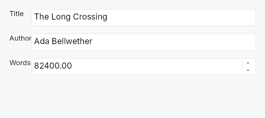
FormLayout — a two-column settings or preferences form layout.
Public functions
FormLayout
Detailed description
Children are added as label/field pairs via FormLayout::line (inline
widgets) or FormLayout::line (pre-registered IDs). Full-width rows
that span both columns — section headers, Dividers, or banners — are
added via FormLayout::full_width / FormLayout::full_width. The
label column auto-sizes to the widest label across all pairs so all field
inputs are left-aligned. RTL layouts are handled automatically: the label
column migrates to the trailing side and the field column moves to the
leading side. Dormant rows are excluded from both measurement and
placement.
When an accessible name is provided via FormLayout::label, the widget
emits Role::Form so screen-reader users can navigate directly to the
form. Without a name it demotes to a presentational GenericContainer.
#![allow(unused)] fn main() { use teksilo_widgets::primitives::{FormLayout, TextWidget, RectWidget}; use teksilo_i18n::lit; let _form = FormLayout::new() .label_gap(8.0) .row_spacing(6.0) .line(TextWidget::new(lit!("Name:")), RectWidget::new()) .line(TextWidget::new(lit!("Email:")), RectWidget::new()); }
Density
The picture above is the widget at TargetDensity::Compact, the mouse-and-keyboard ladder. Below is the same subject on the same canvas with only the ladder changed, so what moves is the density and nothing else — where the subject no longer fits, that is what the denser targets cost it at that size. See docs/density-and-targets.md.
Touch
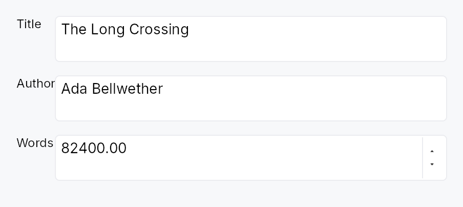
API reference
📖 Full rustdoc API for this module
pub struct FormLayout
Import: use teksilo::widgets::FormLayout;
A two-column form layout with auto-sized label column.
Children are added as label/field pairs via line() or as
full-width rows via full_width(). The label column
auto-sizes to the widest label; the field column takes the remaining
space.
┌─ label col ─┐ gap ┌── field col ──────────────┐
│ Name: │ │ [___________________] │
│ Email: │ │ [___________________] │
├─────────────┴─────┴────────────────────────────┤
│ ── Advanced ────────────────────────────────── │ ← full_width
├─ label col ─┐ gap ┌── field col ──────────────┐
│ Port: │ │ [____] │
└─────────────┘ └────────────────────────────┘
#![allow(unused)] fn main() { pub struct FormLayout { /* fields */ } }
Methods
pub fn new() -> Self
Create an empty FormLayout with zero label gap and zero row spacing.
pub fn label_gap(mut self, gap: f32) -> Self (default: 0.0)
Horizontal gap between the label column and the field column.
pub fn row_spacing(mut self, spacing: f32) -> Self (default: 0.0)
Vertical gap between rows.
pub fn label(mut self, label: impl Into<LocalizedString>) -> Self (default: None)
Set an accessible name for this form. When set, the widget emits
the Role::Form landmark so assistive-technology users can
navigate directly to it and distinguish it from other forms on
the page. When unset, the widget demotes to a presentational
GenericContainer — an unnamed landmark is worse than no
landmark for AT users.
pub fn line( mut self, label: impl teksilo_core::IntoTeksiChild, field: impl teksilo_core::IntoTeksiChild, ) -> Self
Add a label/field pair row.
pub fn lines<L, F>(self, rows: impl IntoIterator<Item = (L, F)>) -> Self where L: teksilo_core::IntoTeksiChild, F: teksilo_core::IntoTeksiChild,
Add several label/field pair rows from an iterator of (label, field)
pairs, in order.
The loop form of line, and the usual one once the form is
generated from a settings schema rather than written row by row.
pub fn line_ids(self, rows: impl IntoIterator<Item = (WidgetId, WidgetId)>) -> Self
Add several label/field pair rows from an iterator of
(label_id, field_id) pairs, in order.
lines accepts ids in both columns too, so this is the
spelling that states the id types outright rather than a capability the
other method lacks. Reach for it when a loop has already registered both
columns and naming the type reads better than inferring it.
pub fn full_width(mut self, widget: impl teksilo_core::IntoTeksiChild) -> Self
Add a full-width row spanning both columns.
pub fn full_width_rows( self, iter: impl IntoIterator<Item = impl teksilo_core::IntoTeksiChild>, ) -> Self
Add several full-width rows from an iterator, in order.
The loop form of full_width, for a run of banners
or section headers that comes from data.
Grid
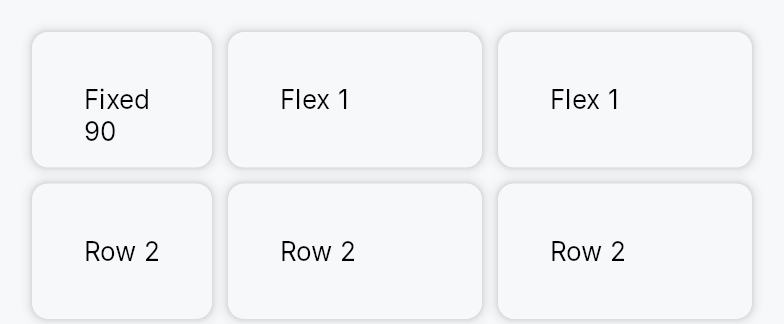
Grid — a 2D layout container with explicit row and column tracks.
Public types
| Kind | Name |
|---|---|
enum | TrackSize — Sizing mode for a single row or column track in a Grid |
struct | Grid — A 2D grid layout container with explicit track declarations |
Public functions
Grid
| Returns | Function |
|---|---|
| Constructors | |
Self | new() |
| Builder methods | |
Self | columns(columns: Vec<TrackSize>) |
Self | rows(rows: Vec<TrackSize>) |
Self | column_gap(gap: impl Into<Prop<f32>>) |
Self | row_gap(gap: impl Into<Prop<f32>>) |
Self | child(widget: impl teksilo_core::IntoTeksiChild) |
Self | children(iter: impl IntoIterator<Item = impl teksilo_core::IntoTeksiChild>) |
Self | child_opt(widget: Option<impl teksilo_core::IntoTeksiChild>) |
Detailed description
Columns and rows are declared as TrackSize slices supporting three
sizing modes: Fixed(px) (exact logical pixels), Auto (sized to the
largest child in that track), and Fractional(fr) (share of the remaining
space after fixed and auto tracks are allocated — the CSS fr unit).
Children are placed in row-major order: child 0 occupies cell
(row=0, col=0), child 1 (row=0, col=1), and so on. Dormant children
are excluded from placement while keeping their siblings at their original
cell positions, so toggling a cell visible/dormant does not shift other
cells.
Fractional columns fall back to the child's natural width when the parent provides no width constraint (intrinsic-measurement pass), preventing wrap-aware children from reporting inflated heights.
#![allow(unused)] fn main() { use teksilo_widgets::primitives::{Grid, TrackSize, RectWidget}; // Two equal columns with a fixed 40 dp row, separated by an 8 dp gap let _grid = Grid::new() .columns(vec![TrackSize::Fractional(1.0), TrackSize::Fractional(1.0)]) .rows(vec![TrackSize::Fixed(40.0)]) .column_gap(8.0) .child(RectWidget::new()) .child(RectWidget::new()); }
Density
The picture above is the widget at TargetDensity::Compact, the mouse-and-keyboard ladder. Below is the same subject on the same canvas with only the ladder changed, so what moves is the density and nothing else — where the subject no longer fits, that is what the denser targets cost it at that size. See docs/density-and-targets.md.
Touch
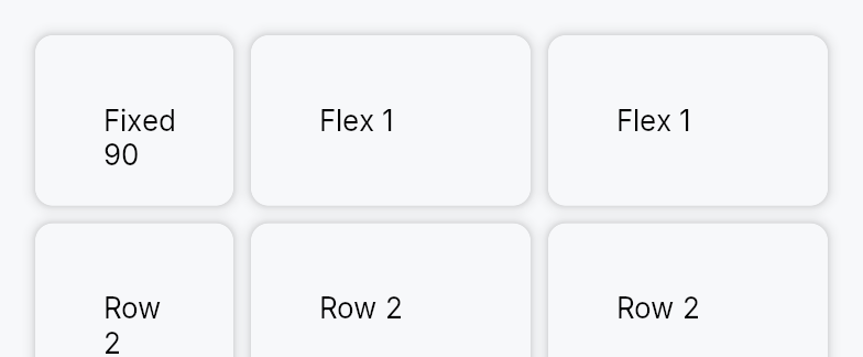
API reference
📖 Full rustdoc API for this module
pub enum TrackSize
Import: use teksilo::widgets::TrackSize;
Sizing mode for a single row or column track in a Grid.
#![allow(unused)] fn main() { pub enum TrackSize { /* variants */ } }
Variants
Fixed(f32)— Fixed size in logical pixels regardless of available space.Fractional(f32)— Share of the remaining space afterFixedandAutotracks are resolved; equivalent to the CSSfrunit. MultipleFractionaltracks divide the remainder proportionally to their weights.Auto— Sized to the largest intrinsic dimension among all children in the track; expands to fill content, never clips.
pub struct Grid
Import: use teksilo::widgets::Grid;
A 2D grid layout container with explicit track declarations.
#![allow(unused)] fn main() { pub struct Grid { /* fields */ } }
Methods
pub fn new() -> Self
Create a new Grid with a single Auto column and a single Auto
row; configure track definitions with columns and
rows.
pub fn columns(mut self, columns: Vec<TrackSize>) -> Self
Set the column track definitions; each entry describes one column's sizing mode.
pub fn rows(mut self, rows: Vec<TrackSize>) -> Self
Set the row track definitions; each entry describes one row's sizing mode.
pub fn column_gap(mut self, gap: impl Into<Prop<f32>>) -> Self (default: 0.0)
Set the inter-column gap. Accepts static f32 or Signal<f32>.
pub fn row_gap(mut self, gap: impl Into<Prop<f32>>) -> Self (default: 0.0)
Set the inter-row gap. Accepts static f32 or Signal<f32>.
pub fn child(mut self, widget: impl teksilo_core::IntoTeksiChild) -> Self
Append an inline child widget in the next cell (row-major order).
pub fn children( mut self, iter: impl IntoIterator<Item = impl teksilo_core::IntoTeksiChild>, ) -> Self
Append multiple inline children from an iterator, each occupying the next cell in row-major order.
pub fn child_opt(mut self, widget: Option<impl teksilo_core::IntoTeksiChild>) -> Self
Append an optional inline child; a None value is a no-op, keeping
subsequent children at their original cell positions.
GridView

Virtualized 2D tile grid bound to a ListModel<T> / ListDataSource.
Public types
| Kind | Name |
|---|---|
struct | TileContext — Context passed to the tile delegate for each realized tile |
struct | GridView — A virtualized 2D tile grid backed by a ListModel<T> |
struct | GridViewHandle — A handle on a GridView's scroll position, for a caller outside the widget: a toolbar, a "show current" command, a search result, an… |
enum | GridTabTraversal — How Tab moves out of (or within) the grid |
trait | SectionProvider — Partitions a flat model into display sections |
struct | GroupingSections — A SectionProvider built by partitioning consecutive equal-key runs of an (already ordered) model |
Public functions
GridView
GridViewHandle
| Returns | Function |
|---|---|
| Methods | |
Option<usize> | cursor() |
set_cursor(index: Option<usize>) | |
Signal<Option<usize>> | cursor_signal() |
scroll_to_index(index: usize, anchor: ScrollAnchor) | |
ensure_index_visible(index: usize, anchor: ScrollAnchor) | |
reveal_band(index: usize) |
SectionProvider
| Returns | Function |
|---|---|
| Methods | |
usize | section_count() |
usize | items_in_section(section: usize) |
String | section_title(section: usize) |
Vec<usize> { /* default implementation */ } | section_counts() |
Detailed description
GridView is the photo-gallery / icon-view / file-manager-grid /
collection-view widget — the 2D sibling of ListView
and TableView. It realizes only the
tiles currently visible (plus a buffer), reflows on resize, supports
single / multi selection with 2D keyboard navigation, and is fully
accessible (Role::Grid → Role::GridCell).
The layout is pluggable via GridLayoutStrategy: the stock
UniformGrid gives fixed tile size / fixed column count /
adaptive min-width grids, VariableRowGrid sizes each row to its
tallest tile, and VirtualizedMasonry flows items into the
currently-shortest column. Marquee selection, drag-reorder, sections
and sticky headers are layered over whichever one is in force.
GridView::new(model, |tc| {
Box::new(Card::new().child(TextWidget::new(lit!(&tc.item.name))))
})
.sizing(GridSizing::Adaptive { min_width: 120.0, max_width: None, height: 140.0 })
.spacing(8.0)
.selection(selection_model)
Column bounds and alignment
GridView::min_columns and GridView::max_columns bound the column
count that GridSizing::Fixed and GridSizing::Adaptive derive from the
width (GridSizing::FixedColumnCount ignores both). A floor the width
cannot afford narrows the tiles to share it, never overflowing
horizontally; the tile height stays the sizing's. GridView::column_alignment
places a block of columns narrower than the content at the leading edge (the
default), the centre or the trailing edge, swapping sides in a right-to-left
layout. Section headers and the detail band keep spanning the content width;
tiles, the rubber band, the insertion bar and the focus ring follow the
offset. An album grid of fixed 182 dp cards, two to ten columns, centred:
GridView::new(albums, |tc| album_card(tc))
.sizing(GridSizing::Fixed { width: 182.0, height: 230.0 })
.min_columns(2)
.max_columns(10)
.column_alignment(HAlignment::Center)
Selection by position or by key
GridView::selection takes a SelectionModel, which holds positions.
A grid that is sorted or filtered under its selection, or fed by a lazy
source, is built with GridView::from_source_keyed instead: a
KeyedSelectionModel holds the source's keys, so the selection stays on
the same items when they move. Both reach the grid through the facade the
other data views use (data_views::RowSelection), which turns each click,
key and rubber band into an index or a key.
The detail band
GridView::detail_row gives a tile a full-width band that opens directly
under the row holding it, the "album expansion" of a music library. The
band is not a tile and not a row of the grid: a layout strategy wrapped
around the grid's own (detail::DetailRowStrategy) moves everything below
the open row down by the band, so virtualization, the scroll range, the
focus ring and the rubber band account for it without knowing about it, and
tiles keep their row and column numbers. The band widget is a child of this
root rather than of the body pane, so it survives the pane's rebuilds on
scroll and resize, and a lazy source loading a window. A waterfall has no
rows and ignores it. See the module docs of grid_view/detail.rs.
Focus inside the band is revealed like focus anywhere: this root answers
the framework's WidgetEvent::ScrollIntoView, which a scroll container is
sent when a descendant it clips takes focus.
Scrolling from outside
GridView::handle returns a GridViewHandle, a cheap clone usable
before the grid is mounted and through all its rebuilds:
scroll_to_index,
ensure_index_visible and
reveal_band (a tile and its open band
together). A handle computes no offset when it is called: it records the
request, and the next layout applies it once the band is measured and the
scroll anchoring has run. Opening a band and scrolling to a tile under it
in one turn therefore lands the tile where it was asked to be, which an
offset written from outside does not: the layout keeps the content under
the top edge still across the band opening, and takes that offset for
one of the old layout. The builder's own scroll_to_index and
ensure_index_visible act at call time, so before the first layout they
do nothing.
let handle = grid.handle();
// later, from a command:
expanded.set(Some(album));
handle.reveal_band(album);
The keyboard cursor
The grid has one current tile, its keyboard cursor: the tile the arrow
keys step from, the one the focus ring marks while the grid holds keyboard
focus, and the one it names to assistive technology as its active
descendant. The same GridViewHandle reads and moves it:
cursor,
set_cursor (clamped to the last tile;
keyboard focus, the selection and the scroll offset are left alone) and
cursor_signal, which an application
observes to key a status line or its context actions on the current tile.
Like a reveal, a cursor set before the grid is mounted is there at its
first build.
The cursor and the selection are one tile in a single selection: the keys
move them together, and a selection written from outside moves the cursor
onto it. In a multiple selection they are separate: Ctrl+Arrow moves
the cursor and leaves the selection, so after →, Ctrl+→, Ctrl+↓ the
selection is still tile 0 while the cursor, the ring and the active
descendant are on tile 4 (in three columns), and a selection written from
outside leaves the cursor where it was. Read the cursor, not the first
selected tile, for "the tile the user is on".
An open detail band is on the keyboard path
already: ↓ on the open tile moves focus into its band, onto its first
control, while the cursor stays on the tile, and ↑ from the band's top
comes back to it. A band with no control to focus is stepped over. An
application has no walk of its own to write.
A long band
A band that holds hundreds of rows, an album's tracks say, need not build
them all. GridView::detail_visible_span_signal publishes the part of
the open band on screen, in band-local coordinates, and only when it
changes, so the band can realize the rows in the span and stand spacers
in for the rest, with no copy of the grid's placement arithmetic:
const ROW: f32 = 24.0;
let grid = GridView::new(albums, album_card);
let span = grid.detail_visible_span_signal().clone();
grid.detail_row(move |tc| {
let n = tc.item.tracks.len();
let first = span.map(|s| s.as_ref().map_or(0, |r| (r.start / ROW) as usize));
let last = span.map(move |s| {
s.as_ref().map_or(0, |r| ((r.end / ROW).ceil() as usize).min(n))
});
// `window` holds tracks[first..last], refilled when the span moves.
let window = track_window(&tc.item.tracks, &first, &last);
Some(Box::new(
VStack::new()
.child(FixedSize::new().height(first.map(|f| *f as f32 * ROW)))
.child(Repeater::new(window, |track| track_row(track)))
.child(FixedSize::new().height(last.map(move |l| (n - *l) as f32 * ROW))),
))
})
Pan to scroll
The view installs common::scrollable::ScrollableBehavior,
which gives it the shared wheel arithmetic, a finger's pan and the
PanClaim that puts it on a pan's claimant chain. A pan scrolls it, the
release coasts, and a pan it cannot absorb hands the whole event to the
container outside — never a residual. Vertical only, despite the grid: this
view owns no horizontal offset, so a horizontal pan is declined and chains
outward. A pan that starts on a tile scrolls rather than activating it.
The rubber band, and why it is not on this node
In teksilo_data::SelectionMode::Multi a drag on the empty background
sweeps a selection rectangle. That drag deliberately does not live on
this view's own node, which is the one carrying the PanClaim.
The reason it was structural has since been fixed in the framework: a node
that both declares a claim and carries on_drag is now given a say through
PointerSequence::defer_own_drag, which resolves its
teksilo_tokens::DragActivation against the claim it is competing with.
Before that arm existed the claim holder's own drag latched at drag_slop
and decided the sequence before the claim could win at pan_slop, so a
Multi-selection grid did not scroll under a finger from anywhere at all,
and a finger on the background swept a band immediately rather than after a
hold.
What the surface still buys is scope, and that is why it stays. This
root's children are the body pane, the scrollbar, the pinned section header,
the empty view, the loading view and the focus overlay — all siblings, most
of them filling the same rectangle. A marquee hung here would be a drag
ancestor of every one of them; hung on a DragSurface that encloses the body
pane alone, it sweeps the background and nothing else. The wrapper is also
not this view's to remove in any case: the four row views wrap each row
in one, and a row is not a claimant, so defer_own_drag — which refuses
anything but a live MemberRole::Pan member — cannot reach it. See
crate::data_views::DragSurface.
So the body pane carries a no-op tap that gives it an arena of its own (the
press is captured inside the surface, not by it) and the marquee's drag
hangs on a DragSurface that strictly encloses the pane — the shape the tree
arms DragActivation for through its ancestor walk, which is what makes the
marquee wait for a long press under a finger and latch at 5 dp under a mouse.
Every tile carries that same no-op tap as well, for a reason with nothing to do with dragging. With the pane holding one, a tile without an arena of its own leaves the pane as the press captor — and a release is dispatched to the captor and then bubbled target→root, which never reaches a tile beneath it. A plain selectable grid lost both its finger tap and, under a mouse, the release that collapses a multi-selection that way.
Density
The picture above is the widget at TargetDensity::Compact, the mouse-and-keyboard ladder. Below is the same subject on the same canvas with only the ladder changed, so what moves is the density and nothing else — where the subject no longer fits, that is what the denser targets cost it at that size. See docs/density-and-targets.md.
Touch

API reference
📖 Full rustdoc API for this module
pub struct TileContext
Import: use teksilo::widgets::TileContext;
Context passed to the tile delegate for each realized tile.
Richer than ListView's (index, &item, selected) — carries the 2D
grid coordinates and focus state (mirrors TableView's CellContext).
There is intentionally no is_hovered: hover changes on every
mouse-move and is handled per-tile inside the delegate's own widget
(its interaction signal), never by rebuilding the grid.
#![allow(unused)] fn main() { pub struct TileContext<'a, T: 'static> { /* fields */ } }
Fields
index:usize— Flat model index.row:usize— Row in the logical grid (0-based).col:usize— Column in the logical grid (0-based).item:&'a T— Borrow of the item.is_selected:bool— Whether this tile is in the selection set.is_focused:bool— Whether this tile is the keyboard-focus current item. A build-time snapshot — the canonical focus indicator is the grid's painted focus ring (it does not rebuild tiles), so a delegate reading this for custom styling accepts a one-rebuild lag.
pub struct GridView
Import: use teksilo::widgets::GridView;
A virtualized 2D tile grid backed by a ListModel<T>.
#![allow(unused)] fn main() { pub struct GridView<T: 'static> { /* fields */ } }
Methods
pub fn new( model: ListModel<T>, delegate: impl Fn(&TileContext<'_, T>) -> Box<dyn Widget> + 'static, ) -> Self
Create a grid backed by a ListModel<T>. The delegate builds the
widget for each tile from a TileContext.
pub fn from_source<S: teksilo_data::ListDataSource<Item = T>>( source: S, delegate: impl Fn(&TileContext<'_, T>) -> Box<dyn Widget> + 'static, ) -> Self
Create a grid backed by any ListDataSource (large / external data).
pub fn from_source_keyed<S: teksilo_data::ListDataSource<Item = T>>( source: S, keyed: KeyedSelectionModel<S::Key>, delegate: impl Fn(&TileContext<'_, T>) -> Box<dyn Widget> + 'static, ) -> Self where S::Key: ItemKey,
Create a grid backed by any ListDataSource with keyed selection.
The KeyedSelectionModel<S::Key> holds the selected items by the
source's key, not by position, so a selection survives the grid being
sorted (by artist, by year), narrowed by a filter, or a lazy source
sliding its loaded window: it stays on the same items. Clicks,
Ctrl/⌘-clicks, Shift-clicks, the keyboard and the rubber band all write
keys. An item the source no longer shows (removed, or filtered out
here) leaves the selection, as in ListView.
on_selection_changed still reports
indices: the positions the selected keys have when the selection
changes. A sort moves them without changing the selection, so it does
not fire. The view stays GridView<T>; the index↔key mapping is
captured from the concrete source here. Mutually exclusive with
selection (the last one set wins).
pub fn enabled(mut self, enabled: impl Into<Prop<bool>>) -> Self
Enable or disable the whole view. A disabled view greys out and stops accepting focus / selection / keyboard input (arena-gated).
pub fn sizing(mut self, sizing: impl Into<Prop<GridSizing>>) -> Self
Set the tile sizing / column-count policy.
Accepts a plain GridSizing (static) or a Signal<GridSizing>
(reactive). A bound signal is observed at BindingLevel::Rebuild: when
it changes, build() rebuilds the cached layout strategy and reflows —
the internal scroll_y / focused_index / selection are field signals on
the same widget instance, so they survive the rebuild (no scroll jump).
This is the card-size-slider path; mirrors
TabWidget::sizing.
pub fn tile_size(mut self, width: f32, height: f32) -> Self
Sugar for GridSizing::Fixed — every tile is exactly width × height.
pub fn column_count(mut self, count: usize, tile_height: f32) -> Self
Sugar for GridSizing::FixedColumnCount — exactly count columns.
pub fn variable_row_heights(mut self, estimated: f32) -> Self
Switch to variable row heights: each row is sized to its tallest
tile (SwiftUI LazyVGrid semantics). estimated seeds rows that
haven't been measured yet; the scroll position is anchored when an
estimate is later corrected. Combine with
item_height for exact heights.
pub fn item_height(mut self, f: impl Fn(usize) -> f32 + 'static) -> Self
Supply an exact per-item natural height. Width-independent, so it
doesn't depend on the runtime column count: VariableRowGrid sizes
each row to max(item_height(i)) over its items. Implies variable row
heights, gives an exact scrollbar, and removes anchoring jitter.
pub fn waterfall(mut self, estimated: f32) -> Self
Switch to a Pinterest-style waterfall: per-item variable heights flow
into the currently-shortest column. Column count comes from the
configured sizing; heights are auto-measured (or
exact via item_height). estimated seeds
unmeasured items.
pub fn column_spacing(mut self, spacing: f32) -> Self
Horizontal gap between tiles (default 8).
pub fn row_spacing(mut self, spacing: f32) -> Self
Vertical gap between tile rows (default 8).
pub fn spacing(mut self, spacing: f32) -> Self
Set both column and row spacing.
pub fn content_inset(mut self, inset: EdgeInsets) -> Self
Inset from the scroll-content edge to the tiles.
pub fn min_columns(mut self, count: usize) -> Self
Never fewer than count columns (at least 1).
Bounds the count a GridSizing::Fixed or GridSizing::Adaptive
derives from the width; ignored by GridSizing::FixedColumnCount,
whose count is already the answer. When the width cannot afford
count columns of the sizing's width, the tiles narrow to share
the width — the grid never overflows horizontally. The tile height is
kept as the sizing gives it (a card gets narrower, not shorter), so a
tile that must hold its aspect ratio sizes its own content from the
width it is handed. If min_columns exceeds
max_columns, the maximum wins.
pub fn max_columns(mut self, count: usize) -> Self
Never more than count columns (at least 1), however wide the viewport.
Bounds the count a GridSizing::Fixed or GridSizing::Adaptive
derives from the width; ignored by GridSizing::FixedColumnCount.
Under Fixed the tiles keep their width and the leftover is placed by
column_alignment; under Adaptive they
stretch to share the width of the capped count, up to max_width.
pub fn column_alignment(mut self, alignment: HAlignment) -> Self
Where the block of columns sits in the viewport when it is narrower
than the content: HAlignment::Leading (the default, the tiles
against the leading inset, leftover trailing), Center or
Trailing. Leading and trailing swap in a right-to-left layout. Only
the columns move: a section header and a detail_row
band span the content width. The order of the columns within the
block is the same in both directions.
Only a layout that leaves width over has anything to place: a
GridSizing::Fixed grid, an Adaptive one with max_width, or any
grid capped by max_columns.
pub fn selection(mut self, sel: SelectionModel) -> Self
Set the index-based selection model (modes None / Single /
Multi). It holds positions: for a selection that stays on its items
through a sort or a filter, build the grid with
from_source_keyed instead.
pub fn on_selection_changed(mut self, f: impl Fn(&BTreeSet<usize>) + 'static) -> Self
Called whenever the selection set changes — including programmatic changes — with the new set of selected indices. For a keyed selection these are the positions its keys have at that moment.
Because it also fires for programmatic changes, it carries no input
modifiers and no EventContext;
for the modifiers held at the moment of input, use
on_tile_activate, which receives one.
pub fn marquee_selection(mut self, enabled: bool) -> Self
Enable / disable rubber-band marquee selection (default enabled; only
active when the selection model is in Multi mode).
pub fn wrap_navigation(mut self, enabled: bool) -> Self
Whether arrow navigation wraps across row/grid edges (default false).
pub fn tab_traversal(mut self, traversal: GridTabTraversal) -> Self
How Tab moves out of (or within) the grid (default OutOfGrid).
pub fn show_scrollbar(mut self, show: bool) -> Self
Suppress the internal scrollbar (mount your own via the signal accessors so it survives rebuilds).
pub fn overscroll_behavior(mut self, behavior: OverscrollBehavior) -> Self
Scroll-chaining behavior at the boundary (default Chain).
pub fn smooth_scrolling(mut self, enabled: bool) -> Self
Enable or disable animated wheel scrolling (enabled by default).
pub fn smooth_scroll_duration(mut self, duration: Duration) -> Self
Duration of the smooth scroll animation (default 150 ms).
pub fn scroll_bar_style(mut self, style: ScrollBarMode) -> Self
How the scroll bar is displayed (default Permanent). Overlay
and Thin float the bar over the content instead of reserving a
layout column, mirroring ScrollArea::scroll_bar_style.
pub fn scroll_y_signal(&self) -> &Signal<f32>
The vertical scroll offset signal.
pub fn max_scroll_y_signal(&self) -> &Signal<f32>
The maximum scroll offset signal (content_height - viewport_height).
pub fn viewport_ratio_y_signal(&self) -> &Signal<f32>
The vertical viewport-to-content ratio signal (drives the thumb size).
pub fn detail_visible_span_signal(&self) -> &Signal<Option<std::ops::Range<f32>>>
The part of the open detail band that is on screen, in band-local
coordinates: max(0, scroll_y − band.y) .. min(band.height, scroll_y + viewport_height − band.y), where band.y is the band's top in the
grid's content. None while no band is open, and while the open band
is entirely off screen.
Written by each layout after the scroll offset is clamped, and only when it changes, so an observer is not told of a scroll that leaves the band's visible part as it was. Meant for a band holding far more than a viewport shows, hundreds of tracks say, that realizes only the rows in the span: a window of rows between two spacers, with no copy of the grid's placement arithmetic. See the module docs, "A long band".
pub fn handle(&self) -> GridViewHandle
A GridViewHandle on this grid: scroll it to a tile, or to a tile
and its detail band, from outside the widget.
Usable at once and for the grid's whole life: a request made before
the grid is mounted is applied at its first layout, and the handle
keeps working through every rebuild. A request is applied by the
layout, after it has measured the detail band and settled the scroll
anchoring, so one made in the same turn as opening a band lands where
the new layout puts the tile. Prefer it to
scroll_to_index and
ensure_index_visible, which compute
the offset when they are called.
pub fn ensure_index_visible(&self, index: usize, anchor: ScrollAnchor)
Bring index into view: nothing when the tile is already fully
visible, otherwise a scroll per anchor, as
scroll_to_index.
Computed at call time from the last layout's geometry and clamped to
its scroll range. Before the grid has been laid out there is no
geometry and this does nothing, and a change of layout made in the
same turn (a detail band opened above the tile) is not yet counted.
GridViewHandle::ensure_index_visible has neither limit.
pub fn scroll_to_index(&self, index: usize, anchor: ScrollAnchor)
Scroll to index, forcing its position in the viewport per anchor;
ScrollAnchor::Auto scrolls the least that shows it.
Computed at call time, with the limits
ensure_index_visible documents: it
does nothing before the grid's first layout.
GridViewHandle::scroll_to_index has neither limit.
pub fn sections<P: SectionProvider>(mut self, provider: P) -> Self
Group the flat model into sections, rendering a header above each section's tile band. Sections compose with the uniform tile layout.
pub fn section_header_delegate( mut self, f: impl Fn(usize, &str) -> Box<dyn Widget> + 'static, ) -> Self
Custom section-header widget builder (section_index, title). Without
it a default bold-text header is used.
pub fn section_header_height(mut self, height: f32) -> Self
Height of each section header row (default 28).
pub fn pinned_section_headers(mut self, enabled: bool) -> Self
Keep the current section's header pinned to the top while scrolling
through it (SwiftUI pinnedViews:[.sectionHeaders]).
pub fn a11y_label(mut self, label: impl Into<String>) -> Self
Accessible label for the grid container.
pub fn style(mut self, style: impl GridViewStyle) -> Self
Per-call Tier-3 decoration style override (focus ring, marquee,
insertion bar, pinned-header surface). Precedence: this override →
theme.style_slots.grid_view → the stock RecipeGridViewStyle.
pub fn empty_view(mut self, f: impl Fn() -> Box<dyn Widget> + 'static) -> Self
Widget shown when the model is empty.
pub fn loading_view(mut self, f: impl Fn() -> Box<dyn Widget> + 'static) -> Self
Widget overlaid while is_loading reads true.
pub fn is_loading(mut self, flag: impl Into<Prop<bool>>) -> Self
Reactive loading flag; when true the loading_view
is shown above the grid.
pub fn reorderable(mut self, enabled: bool) -> Self
Enable intra-grid drag reordering (and keyboard Alt+Arrow). The move is
routed through the source's accept_drop (a built-in ListModel
reorders via move_item; an external source applies its own command).
pub fn exportable(mut self, mode: DragTransferMode) -> Self where T: Clone,
Make tiles droppable outside this view — on a
DropTarget, another data view, or the OS.
A dragged tile (or the whole selection, when the pressed tile is part of
a multi-selection) carries clones of its items in a public
RowDragData<T>, so a foreign receiver can pull
them out with payload.get_typed::<RowDragData<T>>() /
DropTarget::on_drop_typed::<RowDragData<T>>() — no serialization. This
also makes tiles a drag source even without reorderable.
mode chooses what happens to the origin rows once a foreign target
accepts them: DragTransferMode::Move removes them (via the source's
on_drag_out, or on_rows_transferred_out),
DragTransferMode::Copy leaves them. A same-view reorder is never a
transfer, so mode never affects it. Requires T: Clone.
pub fn export_external(mut self, f: impl Fn(&[T]) -> Vec<(String, Vec<u8>)> + 'static) -> Self where T: Clone,
Additionally advertise the dragged tiles as MIME data so they can be
dropped on a DropZone or exported to another
application / window via the OS. f maps the dragged items to
(mime_type, bytes) pairs (e.g. text/plain, text/uri-list, an
app-specific application/x-…). Implies exportable
(defaulting to DragTransferMode::Move if not already set). Requires
T: Clone.
pub fn on_rows_transferred_out( mut self, f: impl Fn(&[usize], &mut teksilo_core::widget::EventContext) + 'static, ) -> Self
Override how rows moved out to a foreign target are removed from this
view. Receives the dragged rows' indices (descending-safe) and the live
context. Without this, an exportable
Move drag removes them through the source's
on_drag_out (works out of the box for a ListModel).
pub fn accept_foreign_rows(mut self, accept: bool) -> Self
Accept exported rows dropped from a different view or source without
writing a custom ListDataSource. Pair with
on_rows_received, which is handed the dropped
items and the insertion index. (Same-view reorder is
reorderable; a custom ListDataSource can still
accept foreign drops through its can_accept/accept_drop instead.)
pub fn on_rows_received( mut self, f: impl Fn(Vec<T>, usize, &mut teksilo_core::widget::EventContext) + 'static, ) -> Self
Handler for rows accepted via accept_foreign_rows:
(items, insertion_index, ctx). Insert them into your model at the
index.
pub fn on_item_drop( mut self, f: impl Fn( teksilo_core::drag_payload::DragPayload, usize, &mut teksilo_core::widget::EventContext, ) -> bool + 'static, ) -> Self
Accept external drops at a flat insertion index. Returns true when
the drop is accepted.
pub fn on_tile_activate( mut self, f: impl Fn(usize, &mut teksilo_core::widget::EventContext) + 'static, ) -> Self
Called when a tile is activated (a click per activate_on,
or Enter on the focused tile) — the "open / default action", distinct
from selection.
pub fn activate_on(mut self, mode: crate::data_views::ActivateOn) -> Self
Choose single- vs double-click tile activation (default
ActivateOn::DoubleClick). Enter activates in either
mode.
pub fn tile_context_menu( mut self, f: impl Fn(usize, Point, &mut teksilo_core::widget::EventContext) -> Option<Box<dyn Widget>> + 'static, ) -> Self
Per-tile context-menu factory: (index, pointer_position, ctx) →
optional menu widget.
pub fn type_ahead_label(mut self, f: impl Fn(usize) -> String + 'static) -> Self
Supply a per-item label for type-ahead navigation (typing letters jumps to the first matching item). Required to enable type-ahead.
pub fn tile_a11y_label(mut self, f: impl Fn(usize) -> String + 'static) -> Self
Supply a per-item accessible name applied to each tile's GridCell
(Node::label), so a screen reader announces a concise item name in
addition to the row/column position. Without it, the cell's name is left
to its contents.
pub fn type_ahead_timeout(mut self, timeout: std::time::Duration) -> Self
Type-ahead reset timeout (default 500 ms; ZERO disables).
pub fn expanded_index(mut self, expanded: Signal<Option<usize>>) -> Self
The disclosed tile: Some(index) opens a full-width band under the
row holding tile index (see detail_row),
None closes it. The grid writes it when a tile is activated (not for
a tile with nothing to disclose), and follows writes made from
outside. Without this the grid keeps its own signal.
pub fn detail_row( mut self, f: impl Fn(&TileContext<'_, T>) -> Option<Box<dyn Widget>> + 'static, ) -> Self
The content of the detail band: the "album expansion" of a music library, a full-width band opened directly under the row that holds the activated tile.
f receives the disclosed tile's TileContext, the same one the
tile delegate gets, and returns the band's content, or None when the
tile has nothing to disclose. It is also asked when a tile is
activated, to learn whether it has anything, and its answer dropped,
so it should be cheap and have no side effects. The band pushes the
following rows down, and stays under its tile when a resize changes
the column count.
With a band, activating a tile (a click per
activate_on, or Enter) opens it and scrolls it
into view, and activating the open tile closes it;
on_tile_activate still fires. A tile with
nothing to disclose opens nothing. In a single selection, Enter also
selects the tile whose band it opens, unless the application has an
activation of its own; a multiple selection is left as it is. Space on
the open tile closes it. ↓ from the open tile
moves focus to the first focusable control in the band, scrolling it
into view, and ↑ from there, when the control does not use it, returns
to the tile. A band that closes with focus inside it hands focus back
to the grid, on its tile. Arrows between tiles step over the band, and
the rubber band selects no band.
The band follows its tile when the tile moves. A source with item keys
is followed through a sort or a filter (a reset); a source without
them is followed through inserts, removals and moves, and closes the
band on a reset. A ListModel's keys are its positions, which
identify no item across a reset, so it counts as a source without
keys here, through from_source as through
new. The band closes when its tile is removed.
The band is measured height-for-width at the content width, or sized
by detail_row_height. It works with the
uniform grid, variable_row_heights and
sections. A waterfall has no
rows to put it under and ignores it. A band that opens, closes or
moves above the viewport leaves the visible tiles where they are. Its
content is rebuilt when the band moves to another tile, when its own
tile's item arrives from a lazy source, and when the grid's rows
change (an insert, a removal, a move, an update, a reset); a lazy
source loading other windows leaves it as it is.
Accessibility: the band is a Role::Group, read after its tile's
row, named after its tile's tile_a11y_label,
or labelled by the tile, or, with the tile outside the realized
window, "Details of item N" in the user's language. A tile carries an
expanded state, Expand / Collapse actions and, while open, a
controls relation to the band. Without
detail_row_when every tile does, one with
nothing to disclose included, since knowing otherwise means building
its band, and that one stays collapsed. The grid's row and column
counts and the tiles' positions do not count the band.
pub fn detail_row_when(mut self, f: impl Fn(&TileContext<'_, T>) -> bool + 'static) -> Self
Which tiles have a detail band, answered without building one: f
receives the tile's TileContext, as
detail_row does, and returns false for a tile
with nothing to disclose.
Such a tile is not a disclosure. Assistive technology hears no
expanded state on it and is offered no Expand or Collapse, which it
would be otherwise. Activating it opens nothing, detail_row is not
asked for it, and expanded_index naming it
opens no band.
f is asked as each tile is built: when it comes into the realized
window, after a change to the data, and when its selectedness flips.
Answer from the item, cheaply and with no side effects, and agree with
detail_row: a tile f accepts and detail_row gives nothing for is
offered as expandable, and opens nothing. A tile of a lazy source
whose item has not arrived is offered until it does. Without
detail_row, this does nothing.
pub fn detail_row_height(mut self, f: impl Fn(usize) -> f32 + 'static) -> Self
The detail band's height for the tile at index, instead of measuring
it. See detail_row.
pub struct GridViewHandle
Import: none — GridViewHandle is public in a private module of teksilo-widgets and nothing re-exports it.
A handle on a GridView's scroll position, for a
caller outside the widget: a toolbar, a "show current" command, a search
result, an observer of the application's own state.
Taken with GridView::handle, cheap to clone,
and usable at once: a request made before the grid is mounted is kept and
applied at its first layout, and the handle keeps working through every
rebuild of the grid. Each method records a request and asks for a
relayout; the layout applies it after it has measured the detail band and
settled the scroll anchoring, so a request made in the same turn as a
change of layout lands where the new layout puts the tile:
// Open the band of tile 0 and put tile 30 at the top, in one turn.
expanded.set(Some(0));
handle.scroll_to_index(30, ScrollAnchor::Start);
Only the latest request is applied: a later one replaces one still pending. A request for a tile the grid does not have when it is applied does nothing.
The handle also reads and moves the grid's keyboard cursor, the tile
the arrow keys step from, the focus ring marks and assistive technology is
told is current: cursor,
set_cursor and cursor_signal.
In a multiple selection the cursor and the selection are separate: the
accelerator with an arrow moves the cursor alone, and a selection written
from outside leaves the cursor where it was.
#![allow(unused)] fn main() { pub struct GridViewHandle { /* fields */ } }
Methods
pub fn cursor(&self) -> Option<usize>
The tile the keyboard cursor is on, or None while the grid has no
cursor: it has not been navigated, clicked or given one by
set_cursor. With no cursor the keys start from
the first selected tile, and from the first or last tile when nothing
is selected.
In a single selection the cursor follows the selection: the keys move
them together, and a selection written from outside moves the cursor
onto it. In a multiple selection they are separate: the accelerator
with an arrow (Ctrl+Arrow) moves the cursor alone, and a selection
written from outside leaves the cursor where it was.
pub fn set_cursor(&self, index: Option<usize>)
Move the keyboard cursor to tile index, or remove it with None.
An index past the last tile is clamped to the last tile; on an empty grid the cursor is removed. The focus ring moves at the next paint, while the grid holds keyboard focus, and the grid names the tile as its active descendant at the next accessibility update when the tile is realized. The next arrow key steps from it.
Keyboard focus and the selection are left alone, and the grid does not
scroll: pair it with ensure_index_visible
to bring the tile into view. Usable before the grid is mounted (the
first build finds the cursor there) and across its rebuilds. In a
single selection the next change of selection puts the cursor back on
the selected tile.
pub fn cursor_signal(&self) -> Signal<Option<usize>>
A read-only signal of the cursor, as cursor reports
it, for an application to observe or bind: a status line naming the
current tile, actions enabled for it. It changes with every write of
the cursor, by the keys, a click, the data shifting it or
set_cursor.
pub fn scroll_to_index(&self, index: usize, anchor: ScrollAnchor)
Scroll to tile index, forcing its position in the viewport per
anchor: ScrollAnchor::Start puts its top at the viewport's top,
Center centres it,
End puts its bottom at the viewport's bottom,
and Auto scrolls the least that shows it.
Clamped to the scroll range. Applied at the next layout.
pub fn ensure_index_visible(&self, index: usize, anchor: ScrollAnchor)
Bring tile index into view: nothing when it is already fully
visible, otherwise a scroll per anchor, as
scroll_to_index. Applied at the next
layout, against the layout it will be shown in.
pub fn reveal_band(&self, index: usize)
Scroll so tile index and its open detail band are both visible:
the least scroll that shows the span from the top of the tile's row
to the bottom of its band, and the row first when the two do not fit
together, so the band reads as the tile's. This is what the grid does
itself when a user opens a band.
When index's band is not open at the layout that applies it (no
detail_row, another tile disclosed,
or a tile with nothing to disclose), the tile alone is brought into
view, as ensure_index_visible with
ScrollAnchor::Auto. Open the band and call this in the same turn:
the band is measured before the request is applied.
pub enum GridTabTraversal
Import: none — GridTabTraversal is public in a private module of teksilo-widgets and nothing re-exports it.
How Tab moves out of (or within) the grid.
#![allow(unused)] fn main() { pub enum GridTabTraversal { /* variants */ } }
Variants
OutOfGrid— Tab releases focus to the next focusable widget in the window.WithinGrid— Tab advances to the next tile (wrapping rows); Shift+Tab the previous.
pub trait SectionProvider
Import: none — SectionProvider is public in a private module of teksilo-widgets and nothing re-exports it.
Partitions a flat model into display sections.
#![allow(unused)] fn main() { pub trait SectionProvider: 'static { /* associated items below */ } }
Associated items
fn section_count(&self) -> usize;
Number of sections.
fn items_in_section(&self, section: usize) -> usize;
Number of items in section.
fn section_title(&self, section: usize) -> String;
Display title for section.
fn section_counts(&self) -> Vec<usize> { /* default implementation */ }
Per-section item counts, in order. Used by the layout strategy.
pub struct GroupingSections
Import: none — GroupingSections is public in a private module of teksilo-widgets and nothing re-exports it.
A SectionProvider built by partitioning consecutive equal-key runs of
an (already ordered) model. The titles come from each run's key.
#![allow(unused)] fn main() { pub struct GroupingSections { /* fields */ } }
GroupBox
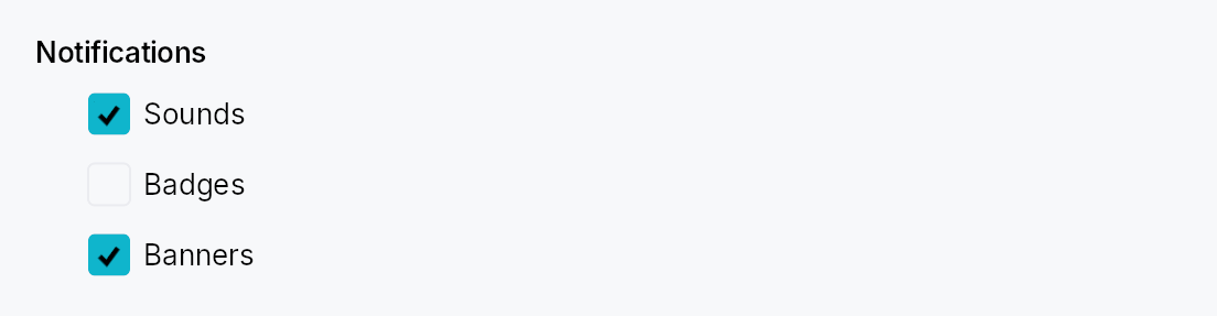
GroupBox — titled cluster of controls in Int UI / Jewel style.
Public types
| Kind | Name |
|---|---|
const | GROUP_BOX_CONTENT_INDENT — Horizontal indent of the content area below the title (dp) |
fn | group_box_content_indent — GROUP_BOX_CONTENT_INDENT scaled by the density's spacing_factor (1.00 / 1.15 / 1.30) |
const | GROUP_BOX_TITLE_CONTENT_SPACING — Vertical gap between the title row and the content area (dp) |
fn | group_box_title_content_spacing — GROUP_BOX_TITLE_CONTENT_SPACING scaled by the density's spacing_factor (1.00 / 1.15 / 1.30) |
const | GROUP_BOX_CHECKBOX_GAP — Gap between the checkbox and the adjacent title label in checkable mode (dp) |
fn | group_box_checkbox_gap — GROUP_BOX_CHECKBOX_GAP scaled by the density's spacing_factor (1.00 / 1.15 / 1.30) |
struct | GroupBox — A titled cluster of controls with optional enable/disable toggle |
Public functions
GroupBox
| Returns | Function |
|---|---|
| Constructors | |
Self | new(title: impl Into<LocalizedString>) |
| Builder methods | |
Self | checkable(checked: Signal<bool>) |
Self | child(widget: impl teksilo_core::IntoTeksiChild) |
Self | child_opt(widget: Option<impl teksilo_core::IntoTeksiChild>) |
Detailed description
A bold title (optionally preceded by a checkbox) sits above an indented content area. No border, no frame — pure composition. The standard use is grouping related settings controls on a preferences sheet or form — the IntelliJ "group" pattern.
In checkable mode, unchecking disables event dispatch to every descendant
of the content area (via ctx.enabled_when with ancestor propagation) AND
paints a translucent surface overlay over the content so it reads as
greyed-out. The title checkbox itself stays interactive.
When to use
- GroupBox — logical cluster with a title; optional enable/disable toggle for the whole cluster. Use for settings sections.
GroupHeader— lighter-weight "soft divider + caption" without a content slot; use to label regions that are not collapsed or disabled as a unit.
Accessibility
The box node carries Role::Group and its name is set to the title
string. When checkable and unchecked, set_disabled() is set on the
group node so assistive technology announces the cluster as unavailable.
#![allow(unused)] fn main() { use teksilo_widgets::GroupBox; use teksilo_widgets::primitives::TextWidget; use teksilo_i18n::lit; let _w = GroupBox::new(lit!("Indentation")) .child(TextWidget::new(lit!("Tab width: 4"))); }
Density
The picture above is the widget at TargetDensity::Compact, the mouse-and-keyboard ladder. Below is the same subject on the same canvas with only the ladder changed, so what moves is the density and nothing else — where the subject no longer fits, that is what the denser targets cost it at that size. See docs/density-and-targets.md.
Touch
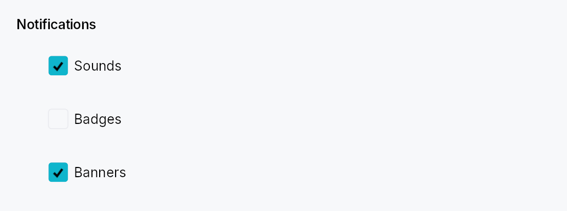
API reference
📖 Full rustdoc API for this module
pub const GROUP_BOX_CONTENT_INDENT
Import: use teksilo::widgets::group_box::GROUP_BOX_CONTENT_INDENT;
Horizontal indent of the content area below the title (dp).
#![allow(unused)] fn main() { pub const GROUP_BOX_CONTENT_INDENT: f32 = 24.0; }
pub fn group_box_content_indent(...)
Import: use teksilo::widgets::group_box::group_box_content_indent;
GROUP_BOX_CONTENT_INDENT scaled by the density's spacing_factor
(1.00 / 1.15 / 1.30).
#![allow(unused)] fn main() { pub fn group_box_content_indent(tokens: &InputTokens) -> f32; }
pub const GROUP_BOX_TITLE_CONTENT_SPACING
Import: use teksilo::widgets::group_box::GROUP_BOX_TITLE_CONTENT_SPACING;
Vertical gap between the title row and the content area (dp).
#![allow(unused)] fn main() { pub const GROUP_BOX_TITLE_CONTENT_SPACING: f32 = 8.0; }
pub fn group_box_title_content_spacing(...)
Import: use teksilo::widgets::group_box::group_box_title_content_spacing;
GROUP_BOX_TITLE_CONTENT_SPACING scaled by the density's spacing_factor
(1.00 / 1.15 / 1.30).
#![allow(unused)] fn main() { pub fn group_box_title_content_spacing(tokens: &InputTokens) -> f32; }
pub const GROUP_BOX_CHECKBOX_GAP
Import: use teksilo::widgets::group_box::GROUP_BOX_CHECKBOX_GAP;
Gap between the checkbox and the adjacent title label in checkable mode (dp).
#![allow(unused)] fn main() { pub const GROUP_BOX_CHECKBOX_GAP: f32 = 6.0; }
pub fn group_box_checkbox_gap(...)
Import: use teksilo::widgets::group_box::group_box_checkbox_gap;
GROUP_BOX_CHECKBOX_GAP scaled by the density's spacing_factor
(1.00 / 1.15 / 1.30).
#![allow(unused)] fn main() { pub fn group_box_checkbox_gap(tokens: &InputTokens) -> f32; }
pub struct GroupBox
Import: use teksilo::widgets::GroupBox;
A titled cluster of controls with optional enable/disable toggle.
See the module documentation for the checkable-mode details and
the GroupHeader sibling.
#![allow(unused)] fn main() { pub struct GroupBox { /* fields */ } }
Methods
pub fn new(title: impl Into<LocalizedString>) -> Self
Create a non-checkable group box with the given title.
pub fn checkable(mut self, checked: Signal<bool>) -> Self
Turn this into a checkable GroupBox. When the signal is false, events
to descendants of the content area are blocked via effective-enabled
ancestor propagation. The title checkbox itself stays interactive.
pub fn child(mut self, widget: impl teksilo_core::IntoTeksiChild) -> Self
Set the content widget inline (deferred insertion).
pub fn child_opt(self, widget: Option<impl teksilo_core::IntoTeksiChild>) -> Self
Attach widget when it is Some, and do nothing when it is None.
The conditional-child form. teksu!'s if without an else lowers to
this, and it is what cond.then(|| w) is for in a builder chain. None
adds no arena node, so nothing is laid out, painted, or published to the
accessibility tree, and a stack applies no spacing around it.
GroupHeader

GroupHeader — a horizontal section header: label followed by a trailing rule line that fills the remaining width.
Public functions
GroupHeader
| Returns | Function |
|---|---|
| Constructors | |
Self | new(label: impl Into<LocalizedString>) |
| Builder methods | |
Self | style(style: impl Into<TextStyleProp>) |
Self | color(color: impl Into<ColorProp>) |
Self | gap(gap: f32) |
Detailed description
Used to segment settings pages, preference sheets, and forms into labelled
regions without the heavier chrome of a GroupBox.
Int UI and Jewel use this pattern as a lightweight "soft divider with a
caption" between groups of related controls.
#![allow(unused)] fn main() { use teksilo_widgets::GroupHeader; use teksilo_i18n::lit; let _w = GroupHeader::new(lit!("Appearance")); }
Trivially composed from existing primitives:
HStack → TextWidget + Expand(Divider).
Density
The picture above is the widget at TargetDensity::Compact, the mouse-and-keyboard ladder. Below is the same subject on the same canvas with only the ladder changed, so what moves is the density and nothing else — where the subject no longer fits, that is what the denser targets cost it at that size. See docs/density-and-targets.md.
Touch

API reference
📖 Full rustdoc API for this module
pub struct GroupHeader
Import: use teksilo::widgets::GroupHeader;
A labelled section header with a trailing rule line.
#![allow(unused)] fn main() { pub struct GroupHeader { /* fields */ } }
Methods
pub fn new(label: impl Into<LocalizedString>) -> Self
Create a section header with the given label.
pub fn style(mut self, style: impl Into<TextStyleProp>) -> Self
Override the label's text style (font, size, weight, …). Accepts a
static TextStyle or a
TextStyleRole.
pub fn color(mut self, color: impl Into<ColorProp>) -> Self
Override the label's color. Useful when a consumer wants to
emphasise a header with an accent. Accepts a literal Color, a
TextRole/SurfaceRole, or a Signal<Color>.
pub fn gap(mut self, gap: f32) -> Self
Horizontal gap between the label and the rule line. Defaults to 8 dp.
HexColorInput
HexColorInput — single-line #RRGGBB[AA] color editor.
Public functions
HexColorInput
Detailed description
A specialization of TextInput that wires an input mask, a
hex-digit character filter, and a strict commit-time validator on top
of the standard text-editing surface. Bound to a Signal<Color>
(required) or Signal<Option<Color>> (nullable). External writes to
the bound signal reformat the field text — but only when the field
is unfocused, so a user typing "FF" in the middle of a long color
code isn't clobbered by a sibling widget tweaking the value.
Behaviour
- Parsing:
#RRGGBB(case-insensitive);#RRGGBBAAifalpha_enabled;#RGBshort-form expands to#RRGGBBifshort_form_enabled. Each accepted form may be normalized to uppercase on commit (configurable). - Char filter: only
[0-9a-fA-F#]admitted while typing. - Mask:
\\#hhhhhh(or\\#hhhhhhhhwith alpha) — theTextInputFieldmask grammar (h= hex digit slot,\\literal escape). - Validation: commits on Enter / Tab-out / blur. Returns
ValidationOutcome::Valid/ValidationOutcome::Corrected/ValidationOutcome::Invalidwhich the inner field maps to a visible inline strip via the standardvalidation_feedbackbridge. - Nullable: empty (after trim) commits
None; non-empty parses normally and commitsSome(color).
Example
let color = ctx.signal(Color::from_hex("#3584E4"));
ctx.add(
HexColorInput::new(color)
.alpha_enabled(true)
.label("Background"),
);
Density
The picture above is the widget at TargetDensity::Compact, the mouse-and-keyboard ladder. Below is the same subject on the same canvas with only the ladder changed, so what moves is the density and nothing else — where the subject no longer fits, that is what the denser targets cost it at that size. See docs/density-and-targets.md.
Touch
API reference
📖 Full rustdoc API for this module
pub struct HexColorInput
Import: use teksilo::widgets::HexColorInput;
Single-line hex color editor.
#![allow(unused)] fn main() { pub struct HexColorInput { /* fields */ } }
Methods
pub fn new(value: Signal<Color>) -> Self
Bind to a non-nullable color signal. Empty / invalid input surfaces an error and keeps the previous value. Commits on Enter or blur.
pub fn nullable(value: Signal<Option<Color>>) -> Self
Bind to a nullable color signal. Empty input commits None;
invalid input surfaces an error and keeps the previous value.
Commits on Enter or blur.
pub fn alpha_enabled(mut self, enabled: bool) -> Self
Enable or disable the alpha channel (#RRGGBBAA form). Default false
(#RRGGBB only). When enabled, the input mask and parser both switch
to the 8-digit form; existing values are immediately reformatted.
pub fn short_form_enabled(mut self, enabled: bool) -> Self
Allow CSS #RGB short-form input (each digit doubles: #F0A →
#FF00AA). Default true. When committed, the short form is expanded
and a Corrected feedback is shown to the user.
pub fn require_hash(mut self, required: bool) -> Self
Require the # prefix during input. Default true. Set to false
to accept bare RRGGBB hex digits (e.g. CSS custom property editors).
pub fn uppercase(mut self, upper: bool) -> Self
Normalize committed values to uppercase hex digits. Default true
(#FF0000). Set to false for lowercase (#ff0000). Existing
values are reformatted immediately.
pub fn label(mut self, label: impl Into<LocalizedString>) -> Self
Attach a visible label above the field and use it as the AT name.
pub fn placeholder(mut self, placeholder: impl Into<LocalizedString>) -> Self
Placeholder text shown when the field is empty. Defaults to the
framework's locale-specific #RRGGBB / #RRGGBBAA hint.
pub fn enabled(mut self, enabled: impl Into<Prop<bool>>) -> Self
Set the enabled state, statically or reactively. Forwarded to the arena at build time.
pub fn read_only(mut self, read_only: bool) -> Self
Put the field in read-only mode; the value is displayed but cannot be
edited. Forwarded to the inner TextInput.
pub fn width(mut self, width: f32) -> Self
Set a minimum intrinsic width for the field in logical pixels.
pub fn on_value_changed( mut self, f: impl Fn(Option<Color>, &mut teksilo_core::widget::EventContext) + 'static, ) -> Self
Called after a successful commit with the new color value (None on a
nullable binding when the field is cleared). Not called when the previous
and new values are identical.
pub fn on_invalid( mut self, f: impl Fn(&str, &mut teksilo_core::widget::EventContext) + 'static, ) -> Self
Called after a commit attempt when the input is invalid, with the raw typed string. The field is left as-is so the user can correct the value.
pub fn tooltip(mut self, text: impl Into<LocalizedString>) -> Self
Attach a plain single-line tooltip shown after the standard hover delay.
Mutually exclusive with Self::rich_tooltip, Self::rich_tooltip_content,
and Self::composite_tooltip — each setter clears the other three so
the last call wins.
pub fn rich_tooltip(mut self, key: impl Into<String>) -> Self
Attach a rich tooltip driven by a registry key.
Mutually exclusive with Self::tooltip, Self::rich_tooltip_content,
and Self::composite_tooltip — each setter clears the other three so
the last call wins.
pub fn rich_tooltip_content(mut self, content: crate::tooltip::TooltipContent) -> Self
Attach a rich tooltip from inline crate::tooltip::TooltipContent.
Mutually exclusive with Self::tooltip, Self::rich_tooltip,
and Self::composite_tooltip — each setter clears the other three so
the last call wins.
pub fn composite_tooltip(mut self, content: impl Widget + 'static) -> Self
Attach a composite tooltip whose body is an arbitrary widget tree.
Mutually exclusive with Self::tooltip, Self::rich_tooltip,
and Self::rich_tooltip_content — each setter clears the other three so
the last call wins.
pub fn validation_feedback_signal(&self) -> Signal<ValidationFeedback>
Reactive handle on the inner TextInput's published validation
feedback. Mirrors the inner field's signal after build().
HStack
HStack — a horizontal layout container that distributes children left-to-right.
Public functions
HStack
| Returns | Function |
|---|---|
| Constructors | |
Self | new() |
| Builder methods | |
Self | spacing(spacing: impl Into<Prop<f32>>) |
Self | alignment(alignment: VAlignment) |
Self | child(widget: impl teksilo_core::IntoTeksiChild) |
Self | children(iter: impl IntoIterator<Item = impl teksilo_core::IntoTeksiChild>) |
Self | child_opt(widget: Option<impl teksilo_core::IntoTeksiChild>) |
Detailed description
Children are given their intrinsic width and the stack's cross-axis height.
Positive slack (leftover space) is distributed among children that carry a
non-zero flex weight (e.g. Spacer, Expand); negative slack (over-constraint)
is absorbed by children with a non-zero shrink weight (e.g. a single-line
TextWidget). Vertical alignment defaults to VAlignment::Center and can be
overridden per-container or per-child.
For a vertical counterpart see VStack.
#![allow(unused)] fn main() { use teksilo_widgets::primitives::{HStack, TextWidget, Spacer}; use teksilo_i18n::lit; let _row = HStack::new() .spacing(8.0) .child(TextWidget::new(lit!("Label"))) .child(Spacer::new()) .child(TextWidget::new(lit!("Value"))); }
Density
The picture above is the widget at TargetDensity::Compact, the mouse-and-keyboard ladder. Below is the same subject on the same canvas with only the ladder changed, so what moves is the density and nothing else — where the subject no longer fits, that is what the denser targets cost it at that size. See docs/density-and-targets.md.
Touch
API reference
📖 Full rustdoc API for this module
pub struct HStack
Import: use teksilo::widgets::HStack;
Horizontal layout container that distributes children left-to-right.
Cross-axis (vertical) alignment defaults to VAlignment::Center and may be
overridden globally via alignment or per-child via
WidgetTree::set_alignment.
#![allow(unused)] fn main() { pub struct HStack { /* fields */ } }
Methods
pub fn new() -> Self
Create an empty HStack with no spacing and VAlignment::Center.
pub fn spacing(mut self, spacing: impl Into<Prop<f32>>) -> Self (default: 0.0)
Set inter-child spacing. Accepts a static f32 or a reactive
Signal<f32> — use a signal derived from
ctx.theme_signal() to track theme-driven spacing changes.
pub fn alignment(mut self, alignment: VAlignment) -> Self (default: VAlignment::Center)
Set the vertical alignment for children that are shorter than the stack's height.
pub fn child(mut self, widget: impl teksilo_core::IntoTeksiChild) -> Self
Add an inline child widget (deferred insertion).
pub fn children( mut self, iter: impl IntoIterator<Item = impl teksilo_core::IntoTeksiChild>, ) -> Self
Add multiple inline children from an iterator.
pub fn child_opt(mut self, widget: Option<impl teksilo_core::IntoTeksiChild>) -> Self
Conditionally add a child. No-op if None.
IconButton

IconButton — a square, icon-only, flat-surface button.
Public types
| Kind | Name |
|---|---|
struct | IconButton — A square, icon-only, flat-surface button |
struct | BuiltInIcons — Icon factory set for predefined built-in buttons |
Public functions
IconButton
BuiltInIcons
| Returns | Function |
|---|---|
| Constructors | |
Self | defaults() |
| Associated functions | |
set_global(icons: Self) |
Detailed description
Five sizes covering both embedded use (inside another widget's
trailing slot — TextInput's clear-X, ComboBox's chevron, SearchField's
magnifier) and stand-alone use (toolbars, rich menus, hero CTAs).
The .embedded() flag opts into the JetBrains "built-in" look —
dimmer icon at rest (Secondary), brightening on hover (Primary),
flashing accent on press — so an IconButton living inside a TextInput
doesn't compete visually with the field's text. Without the flag the
icon stays at full visual weight (Primary at rest), the right default
for stand-alone toolbar / menu rows.
#![allow(unused)] fn main() { use teksilo_widgets::{IconButton}; use teksilo_widgets::primitives::IconWidget; use teksilo_i18n::lit; use teksilo_core::Intent; const MY_SVG: &str = "<svg xmlns='http://www.w3.org/2000/svg'/>"; // Stand-alone toolbar use — full-weight icon. let _w = IconButton::new(IconWidget::from_svg(MY_SVG)) .toolbar() .tooltip(lit!("Save")) .on_activate_fn(|ctx| ctx.send_intent(Intent::new("app.save"))); // Embedded inside a TextInput's trailing slot — dim until hover. let _w = IconButton::clear() .embedded() .on_activate_fn(|ctx| ctx.send_intent(Intent::new("app.clear"))); }
Predefined constructors
Common roles ship with the appropriate icon and an i18n tooltip
(which doubles as the AT name). They are size- and mode-agnostic —
call .embedded(), .toolbar(), .large(), etc. to configure:
#![allow(unused)] fn main() { use teksilo_widgets::IconButton; use teksilo_core::signal::Signal; let visible = Signal::new(false); let _w = IconButton::browse().embedded(); // 24 dp, dim — TextInput trailing let _w = IconButton::clear().embedded(); // 24 dp, dim — clear-X let _w = IconButton::search().toolbar(); // 30 dp, full weight — toolbar let _w = IconButton::visibility_toggle(visible); // password-field eye toggle }
Bistate
Two distinct toggle modes:
IconButton::toggle— surface-tint bistate: clicking flips the boundSignal<bool>; whiletrue, the background reads asSurfaceRole::Selected("on"). Same icon throughout. The pin-this-row / select-this-tool pattern.IconButton::toggle_with_icon— surface-tint and icon-swap bistate: same surface flip plus the icon glyph swaps to a second icon. The visibility-toggle pattern (eye ↔ eye-off).
Slot convention
Host widgets that accept icon buttons follow the trailing_slot
convention established by TabWidget:
#![allow(unused)] fn main() { use teksilo_widgets::{IconButton, TextInput}; use teksilo_widgets::primitives::HStack; use teksilo_core::signal::Signal; use teksilo_core::Intent; let value = Signal::new(String::new()); let _w = TextInput::new(value) .trailing_slot(HStack::new().spacing(0.0) .child(IconButton::clear().embedded().on_activate_fn(|ctx| ctx.send_intent(Intent::new("app.clear")))) .child(IconButton::browse().embedded().on_activate_fn(|ctx| ctx.send_intent(Intent::new("app.browse")))) ); }
Touch and pen
Shares build_interaction_handlers with Button, so it
gets the framework press, release activation and slide-off abort with it —
see that module's "Touch and pen" section. Every shipped size clears the
24 dp target floor at Compact (Compact and Default are both 24 dp) and
follows the density ladder above it.
Density
The picture above is the widget at TargetDensity::Compact, the mouse-and-keyboard ladder. Below is the same subject on the same canvas with only the ladder changed, so what moves is the density and nothing else — where the subject no longer fits, that is what the denser targets cost it at that size. See docs/density-and-targets.md.
Touch

API reference
📖 Full rustdoc API for this module
pub struct IconButton
Import: use teksilo::widgets::IconButton;
A square, icon-only, flat-surface button. See module docs for embedded vs stand-alone modes, the five sizes, and the two bistate toggle modes.
#![allow(unused)] fn main() { pub struct IconButton { /* fields */ } }
Methods
pub fn new(icon: IconWidget) -> Self
Create an icon button from a custom icon. Defaults to
IconButtonSize::Default (24 dp) and stand-alone visual mode.
Apply .embedded() for the JetBrains "built-in" dim look,
and one of the size methods (.large() / .toolbar() /
.hero()) or .size(...) to pick a different size.
pub fn style(mut self, style: impl teksilo_core::styles::IconButtonStyle) -> Self
Per-call style override. Replaces the theme-wide default
IconButtonStyle for just this IconButton instance — same role
as Button::style(...). The override fully owns the background +
border + size composition; icon coloring stays on the widget.
pub fn style_shared(mut self, style: SharedIconButtonStyle) -> Self (default: None)
Per-call style override from an already-shared
SharedIconButtonStyle (Rc<dyn IconButtonStyle>). Same effect as
style but takes the erased handle directly, so a host
(e.g. a Toolbar applying one style to all its icon buttons) can share a
single Rc instead of cloning a concrete style per button.
pub fn size_variant(&self) -> IconButtonSize
Returns the configured size variant. Used by wrappers like
PopoverIconButton
that need to reason about the trigger's footprint at build time
(e.g. to skip a corner decoration that wouldn't fit at Compact).
pub fn is_embedded(&self) -> bool
Returns whether the button is in the JetBrains "built-in" /
embedded color profile (Secondary at rest). Mirror getter to
size_variant for wrappers that want to
derive their own chrome colors from the same icon role.
pub fn share_interaction(mut self, signal: Signal<InteractionState>) -> Self (default: None)
Bind the button's internal interaction state to a caller-owned
Signal<InteractionState> instead of letting build() allocate
its own. Used by wrapper widgets like
PopoverIconButton
whose disclosure caret needs to match the icon's color across
hover / press / focus / disabled states.
The interaction signal never carries Disabled: the arena's
enabled_state is the single source of truth, so a wrapper that
also needs the disabled look reads
ctx.effective_enabled_signal(..) beside this signal.
pub fn embedded(mut self) -> Self
Opt into the embedded visual treatment — the JetBrains
"built-in button" look. Icon dims to Secondary at rest,
brightens to Primary on hover, flashes Accent on press —
designed to live inside another widget's trailing slot
(TextInput's clear-X, ComboBox's chevron) without competing
visually with the host's content. Default mode is stand-alone
(icon at full visual weight, Primary always).
pub fn icon_role(mut self, role: impl Into<teksilo_core::color_prop::ColorProp>) -> Self (default: None)
Override the icon's tint with a static ColorProp. When set,
the icon ignores embedded and the auto-derived idle/hover/press
role cascade — its color is bound directly to this prop instead.
Use for chrome whose host enforces a single text role across all
of its sub-widgets (e.g. tab-bar scroll arrows that must match
the tab strip's idle_text_role regardless of hover state).
Accepts Color, TextRole, Signal<Color>, or Signal<TextRole>.
It replaces the interaction cascade (idle / hover / press / focus),
not the disabled substitution: a role passed here still resolves to
TextRole::Disabled in a disabled subtree, like every other
role-derived color (see ColorProp::resolve).
That is what a disabled
control should look like. When the tint is semantic state that stays
true even though the button can't be pressed — a save/sync indicator, a
validation badge — wrap it: .icon_role(ColorProp::undimmed(role)).
pub fn focusable(mut self, on: bool) -> Self
Whether the button takes keyboard focus. Default true —
the button is focusable when enabled. Set to false for
embedded-control patterns where the parent owns focus and
keyboard interaction goes through the parent (e.g. the
close button inside a tab header — Tab moves between tabs,
not onto their close buttons).
pub fn tooltip(mut self, text: impl Into<LocalizedString>) -> Self
Attach a tooltip that appears after a hover delay. Required — the tooltip text doubles as the AT name for icon-only buttons.
pub fn rich_tooltip(mut self, key: impl Into<String>) -> Self
Attach a rich tooltip resolved from the app-wide tooltip
registry. See Button::rich_tooltip.
pub fn rich_tooltip_content(mut self, content: crate::tooltip::TooltipContent) -> Self
Attach a rich tooltip driven by inline TooltipContent.
pub fn composite_tooltip( mut self, content: impl teksilo_core::widget::Widget + 'static, ) -> Self
Attach a composite tooltip — third tier, hosting an arbitrary
widget tree. See Button::composite_tooltip.
pub fn composite_tooltip_boxed( mut self, content: Box<dyn teksilo_core::widget::Widget>, ) -> Self
Attach a composite tooltip from an already-boxed widget — the boxed twin
of composite_tooltip, for hosts that build
the body via a Fn() -> Box<dyn Widget> factory (e.g. a ToolbarAction).
pub fn enabled(mut self, enabled: impl Into<Prop<bool>>) -> Self (default: true)
Set the enabled state, statically or reactively. Disabled
buttons ignore input and dim their icon (handled by the
framework's PaintContext::effective_enabled). Forwarded into
the arena via ctx.enabled_when(self_id, self.enabled.clone())
at build time — a bound signal updates live as it changes.
For a reactive enabled state — e.g. a toolbar button that
enables only when the caret is inside a table — pass a
Signal<bool> here, or call ctx.enabled_when(button_id, my_signal) from the composing widget's build() instead of
(or in addition to) this builder. Both routes write to the
same arena enabled_state; an external enabled_when
registered after this builder runs wins (last-write semantics)
and updates reactively from the signal.
pub fn size(mut self, size: IconButtonSize) -> Self (default: IconButtonSize::Default)
Set the size variant. Most callers prefer the named shortcuts
large / toolbar /
hero; use .size(...) for Compact or for
programmatic size selection.
pub fn toolbar(mut self) -> Self
Shortcut for .size(IconButtonSize::Toolbar) (30 dp) — the
IntelliJ side-toolbar density (left / right / top window edges).
pub fn large(mut self) -> Self
Shortcut for .size(IconButtonSize::Large) (40 dp) —
emphasized stand-alone buttons in rich menus and detail panes.
pub fn hero(mut self) -> Self
Shortcut for .size(IconButtonSize::Hero) (50 dp) — hero /
landing-screen CTAs.
pub fn on_activate_fn(mut self, f: impl Fn(&mut EventContext) + 'static) -> Self
Closure invoked on activation. Fires after the toggle signal (if any) is flipped, so apps observing the closure see the post-flip state.
pub fn toggle(mut self, state: Signal<bool>) -> Self
Enable surface-tint bistate: clicking flips state and the
background reads as SurfaceRole::Selected while state == true.
The icon glyph is unchanged. Pin / select / lock-toggle pattern.
on_activate_fn, if any, still fires after the flip.
For the eye / eye-off pattern where the icon glyph also changes,
use toggle_with_icon instead.
pub fn toggle_with_icon(mut self, state: Signal<bool>, toggled_icon: IconWidget) -> Self
Enable surface-tint plus icon-swap bistate: clicking flips
state, the background flips to Selected, and the icon
swaps to toggled_icon. The visibility-toggle pattern (eye ↔
eye-off). For surface-only bistate (icon stays the same), use
toggle.
pub fn has_popup(mut self, kind: teksilo_core::accesskit::HasPopup) -> Self (default: None)
Declare that this button is a disclosure trigger for a popup
(menu, dialog, listbox, …). Surfaced via set_has_popup in
the a11y node so screen readers announce it as opening the
named popup kind. Wired automatically by
PopoverIconButton.
pub fn expanded_when(mut self, signal: impl Into<Prop<bool>>) -> Self (default: None)
Bind a signal reporting whether this button's popup is
currently visible. The popover wrapper owns the signal and
flips it on show / dismiss; IconButton reads it in
accessibility() to publish set_expanded. Only meaningful
alongside has_popup.
pub fn browse() -> Self
Browse button (ellipsis icon). Opens a file/directory chooser.
pub fn expand() -> Self
Expand button (diagonal resize arrows). Enlarges a constrained field.
pub fn search() -> Self
Search button (magnifier icon). Triggers a search.
pub fn copy() -> Self
Copy button (clipboard icon). Copies the field content.
pub fn clear() -> Self
Clear button (X icon). Clears the field content.
pub fn add() -> Self
Add button (plus icon). Adds a new entry.
pub fn bell() -> Self
Notification bell. Used by
NotificationCenterButton
— the bell-icon trigger that opens the notification log popover.
pub fn menu() -> Self
Menu / hamburger button (three horizontal bars). Used by the
collapsible MenuBar as the
collapsed representation that reveals the bar when activated.
Advertises HasPopup::Menu for assistive technology.
pub fn more() -> Self
"More actions" / overflow button — three vertical dots (the kebab
⋮). The conventional trigger for a per-item options menu (view-header
…, list-row overflow). Advertises HasPopup::Menu for assistive
technology. Pair with a PopoverIconButton + MenuList (use .bare()
so the menu isn't wrapped in a second popover surface).
pub fn visibility_toggle(visible: Signal<bool>) -> Self
Visibility toggle (eye / eye-off). Toggles password visibility.
Uses the icon-swap bistate mode internally — the icon advertises
the expected action, matching the prevailing password-field
convention (1Password, Bitwarden, KeePass, Chrome, GitHub):
eye (open) while the value is hidden, suggesting "click to
reveal"; eye_off (closed) once revealed, suggesting "click to
hide". set_toggled still reports the literal current state, so
AT readers are not misled.
For a current-state-instead semantics (icon shows what IS),
build your own with toggle_with_icon
and the eye glyphs in the opposite order.
The visible signal is flipped on each click. The host widget reads
it to decide whether to mask or show the text.
pub struct BuiltInIcons
Import: use teksilo::widgets::BuiltInIcons;
Icon factory set for predefined built-in buttons.
Each field is a function pointer that creates an IconWidget.
The default implementation uses SVG icons embedded in teksilo-widgets.
Overriding
Call BuiltInIcons::set_global at app startup (before creating any
built-in buttons) to replace the default icon set:
#![allow(unused)] fn main() { use teksilo_widgets::{BuiltInIcons}; use teksilo_widgets::primitives::IconWidget; const MY_BROWSE_SVG: &str = "<svg xmlns='http://www.w3.org/2000/svg'/>"; const MY_CLEAR_SVG: &str = "<svg xmlns='http://www.w3.org/2000/svg'/>"; BuiltInIcons::set_global(BuiltInIcons { browse: || IconWidget::from_svg(MY_BROWSE_SVG), clear: || IconWidget::from_svg(MY_CLEAR_SVG), ..BuiltInIcons::defaults() }); }
#![allow(unused)] fn main() { pub struct BuiltInIcons { /* fields */ } }
Fields
browse:fn() -> IconWidgetexpand:fn() -> IconWidgetsearch:fn() -> IconWidgetcopy:fn() -> IconWidgetclear:fn() -> IconWidgetadd:fn() -> IconWidgetbell:fn() -> IconWidgeteye:fn() -> IconWidgeteye_off:fn() -> IconWidgetmenu:fn() -> IconWidgetmore:fn() -> IconWidgetreset:fn() -> IconWidget— Counter-clockwise arrow: put a value back to its default.keyboard:fn() -> IconWidget— A keyboard: type or record keys.
Methods
pub fn defaults() -> Self
Return the default icon set (SVGs embedded in teksilo-widgets).
pub fn set_global(icons: Self)
Set the global icon set. Call at app startup before creating any
built-in buttons. Can only be set once: the global is a
process-wide OnceLock, so the first set wins and any later
call is ignored (and warns). It is also locked in the first time
global() reads it, so set it before any built-in
button is created. Use defaults() with struct
update syntax to override only specific icons.
IconWidget

IconWidget — a vector or raster icon rendered at a configurable size.
Public types
| Kind | Name |
|---|---|
enum | IconMode — Whether an icon is rendered as a theme-tinted mask or in its original colors |
struct | IconWidget — A leaf widget that renders an icon from a path, SVG string, PNG, or WebP source |
Public functions
IconWidget
| Returns | Function |
|---|---|
| Constructors | |
Self | from_path(path: Path, size: f32) |
Self | checkmark(size: f32) |
Self | dash(size: f32) |
Self | radio_dot(size: f32) |
Self | chevron_down(size: f32) |
Self | chevron_right(size: f32) |
Self | chevron_left(size: f32) |
Self | chevron_up(size: f32) |
Self | from_svg(svg_str: &str) |
Self | from_svg_icon(icon: &SvgIcon) |
Self | from_png(data: &'static [u8], size: f32) |
Self | from_webp(data: &'static [u8], size: f32) |
Self | from_raster(icon: &RasterIcon, size: f32) |
Self | from_animated(icon: &AnimatedIcon, size: f32) |
| Builder methods | |
Self | mode(mode: IconMode) |
Self | color(color: impl Into<ColorProp>) |
Self | icon_size(size: f32) |
Self | follow_text_scale(follow: bool) |
Detailed description
Supports multiple source formats: programmatic Path (checkmarks,
chevrons, dots), SVG strings, PNG, static WebP, and animated WebP. Icons
default to tintable mode — the pixels are treated as an alpha mask
and multiplied by the widget's color property (defaults to
TextRole::Primary) so they follow theme switches automatically.
IconMode::FullColor preserves original pixel colors and is appropriate
for emoji-style graphics or brand logos.
For arbitrary-aspect-ratio photos or artwork see
ImageWidget.
Accessibility
Icons are decorative by default — they set no accessibility role and
announce nothing. The parent widget (e.g. Button, IconButton) is
responsible for the accessible label.
#![allow(unused)] fn main() { use teksilo_widgets::primitives::icon_widget::{IconWidget, IconMode}; use teksilo_tokens::TextRole; let _check = IconWidget::checkmark(20.0); let _chevron = IconWidget::chevron_down(16.0) .color(TextRole::Primary) .follow_text_scale(false); }
Density
The picture above is the widget at TargetDensity::Compact, the mouse-and-keyboard ladder. Below is the same subject on the same canvas with only the ladder changed, so what moves is the density and nothing else — where the subject no longer fits, that is what the denser targets cost it at that size. See docs/density-and-targets.md.
Touch

API reference
📖 Full rustdoc API for this module
pub enum IconMode
Import: use teksilo::widgets::primitives::icon_widget::IconMode;
Whether an icon is rendered as a theme-tinted mask or in its original colors.
Applies to every source an IconWidget can hold — raster and SVG. For an
SVG the two modes select between the two representations the parser builds
(see teksilo_canvas::svg): Tintable draws the merged
silhouette in the widget's color, FullColor walks the
document-ordered ops and honours each shape's own fill / stroke / gradient.
The default is Tintable, which is what a UI glyph wants —
it follows the theme into dark mode. Reach for
FullColor for artwork whose colors are the content: a
brand mark, a flag, a colored file-type badge. A currentColor shape inside
full-color artwork still takes the widget's color, so the two are mixable.
#![allow(unused)] fn main() { pub enum IconMode { /* variants */ } }
Variants
Tintable— Treat as an alpha mask: tint the whole icon with the widget's color.FullColor— Render the icon's own colors; the widget color suppliescurrentColorand its alpha attenuates the result.
pub struct IconWidget
Import: use teksilo::widgets::IconWidget;
A leaf widget that renders an icon from a path, SVG string, PNG, or WebP source.
#![allow(unused)] fn main() { pub struct IconWidget { /* fields */ } }
Methods
pub fn from_path(path: Path, size: f32) -> Self
Create an icon from a custom path. The path should be defined in coordinates matching the given size (e.g., 0..24 for size=24).
pub fn checkmark(size: f32) -> Self
A checkmark icon (✓) at the given size.
pub fn dash(size: f32) -> Self
A short horizontal dash at the given size — used as the indeterminate-state glyph for tristate menu items (mirrors the Windows "mixed-state" convention).
pub fn radio_dot(size: f32) -> Self
A small filled disc centered in the given size — used as the selected-state glyph for radio menu items.
pub fn chevron_down(size: f32) -> Self
A downward-pointing chevron (▼) at the given size.
pub fn chevron_right(size: f32) -> Self
A right-pointing chevron (▶) at the given size.
pub fn chevron_left(size: f32) -> Self
A left-pointing chevron (◀) at the given size.
pub fn chevron_up(size: f32) -> Self
An upward-pointing chevron (▲) at the given size.
pub fn from_svg(svg_str: &str) -> Self
Create an icon from an SVG string. Parses the SVG and extracts
geometry, ignoring any colors in the SVG. Display size defaults
to the SVG's viewBox dimensions; use icon_size
to override.
If parsing fails, logs the error in debug mode and produces an empty icon.
pub fn from_svg_icon(icon: &SvgIcon) -> Self
Create an icon from a pre-parsed SvgIcon. Display size
defaults to the SVG's viewBox; use icon_size
to override. Scaling is deferred to paint time.
pub fn from_png(data: &'static [u8], size: f32) -> Self
Create an icon from PNG data.
If decoding fails, logs the error in debug mode and produces an empty icon.
pub fn from_webp(data: &'static [u8], size: f32) -> Self
Create an icon from WebP data. Auto-detects static vs animated.
If decoding fails, logs the error in debug mode and produces an empty icon.
pub fn from_raster(icon: &RasterIcon, size: f32) -> Self
Create an icon from a pre-decoded RasterIcon.
Accepts a reference — full-color mode shares the icon's pixels, and
tintable mode keeps an alpha mask computed from them.
The texture is named after the icon's identity, so every widget showing this icon (or a clone of it) in one mode shares one texture. Like every static image texture it lives as long as the window: an icon decoded afresh for each widget gets a texture of its own each time.
pub fn from_animated(icon: &AnimatedIcon, size: f32) -> Self
Create an icon from a pre-decoded AnimatedIcon.
Accepts a reference — frame data is copied internally.
Named after its first frame's identity, with the same sharing and
lifetime as from_raster.
pub fn mode(mut self, mode: IconMode) -> Self
Set the icon rendering mode (tintable or full-color). Re-computes cached pixel data for raster/animated icons.
pub fn color(mut self, color: impl Into<ColorProp>) -> Self
Set the tint. Accepts any impl Into<ColorProp>:
- A raw
Color— a frozen literal. - A
TextRole/SurfaceRole/BorderRole— resolved against the theme at paint time (reactive across theme switches). - A
Signal<Color>— reactive state (usually interaction-driven).
pub fn icon_size(mut self, size: f32) -> Self
Set the display size of the icon. The path/image is scaled to fit this size during rendering. This does not affect the design-time coordinate space — SVG paths scale correctly.
pub fn follow_text_scale(mut self, follow: bool) -> Self
Make this icon grow with the global accessibility text scale
(ctx.text_scale). Off by default. Enable for icons that sit inline
with text and should scale together — e.g. status glyphs in a
SeverityBadge. The reported (and rendered) size becomes
display_size × text_scale.
ImageMaskShape
Anti-aliased alpha masking for raster images — circle / rounded-square / square coverage applied in-place to RGBA8 pixel buffers.
Public types
| Kind | Name |
|---|---|
enum | ImageMaskShape — Shape of the alpha mask applied to an image |
fn | center_crop_square — Crop the source RGBA buffer to a centered square of edge min(w, h) |
fn | apply_alpha_mask — Apply an alpha mask in-place to an RGBA8 buffer |
Detailed description
The retained renderer's Canvas::set_clip is rectangular-only, so to
crop a photo into a circle (avatar, contact icon, channel thumbnail,
etc.) we modulate the source image's alpha channel with a per-pixel
coverage value computed analytically. 4×4 super-sampling (16
sub-samples per pixel) gives a smooth edge at the small sizes these
masks are typically used at (≤96 logical pixels).
Used directly by ImageWidget::mask and
by Avatar. Other widgets that want a non-rectangular image silhouette
can call apply_alpha_mask and center_crop_square directly.
#![allow(unused)] fn main() { use teksilo_widgets::primitives::image_mask::{ImageMaskShape, apply_alpha_mask}; let mut pixels = vec![255u8; 32 * 32 * 4]; // opaque white 32×32 apply_alpha_mask(&mut pixels, 32, 32, ImageMaskShape::Circle); // Corner pixels are now transparent; the center is still opaque. assert_eq!(pixels[3], 0); // top-left alpha assert_eq!(pixels[(16 * 32 + 16) * 4 + 3], 255); // center alpha }
API reference
📖 Full rustdoc API for this module
pub enum ImageMaskShape
Import: use teksilo::widgets::primitives::ImageMaskShape;
Shape of the alpha mask applied to an image.
RoundedSquare carries the corner radius as a fraction of the
shorter side (0.0 ⇒ square, 0.5 ⇒ circle), matching the convention
Avatar and ImageWidget::mask accept on their public APIs. The
apply_alpha_mask helper expects a radius in pixels — convert
before calling.
#![allow(unused)] fn main() { pub enum ImageMaskShape { /* variants */ } }
Variants
None— No mask. The pixels pass through unchanged.Circle— Inscribed circle in the image's bounding square (after a centred crop to the shorter side).RoundedSquare(f32)— Rounded rectangle. The carriedf32is the corner radius as a fraction ofmin(width, height), clamped to0.0..=0.5.
pub fn center_crop_square(...)
Import: use teksilo::widgets::primitives::image_mask::center_crop_square;
Crop the source RGBA buffer to a centered square of edge min(w, h).
The returned buffer is side * side * 4 bytes. If the input is
already square, a copy of the original is returned.
#![allow(unused)] fn main() { pub fn center_crop_square(pixels: &[u8], width: u32, height: u32) -> (Vec<u8>, u32); }
pub fn apply_alpha_mask(...)
Import: use teksilo::widgets::primitives::image_mask::apply_alpha_mask;
Apply an alpha mask in-place to an RGBA8 buffer. RGB channels are
preserved; only alpha is modulated by the coverage value, so a
pre-multiplied source remains pre-multiplied (the alpha-channel-only
transformation matches RasterIcon::to_alpha_mask).
The shape accepts the public ImageMaskShape surface; the
RoundedSquare radius is interpreted as a fraction of
min(width, height), clamped to 0.0..=0.5. None is a no-op.
#![allow(unused)] fn main() { pub fn apply_alpha_mask(pixels: &mut [u8], width: u32, height: u32, shape: ImageMaskShape); }
ImageWidget
ImageWidget — displays a raster image (PNG, WebP) with a configurable sizing policy, content-fit mode, and intra-box alignment.
Public functions
ImageWidget
| Returns | Function |
|---|---|
| Constructors | |
Self | new(icon: &RasterIcon) |
Self | from_raw(pixels: Vec<u8>, width: u32, height: u32) |
| Builder methods | |
Self | mask(shape: ImageMaskShape) |
Self | fit(fit: ImageFit) |
Self | alignment(alignment: Alignment) |
Self | width(w: f32) |
Self | height(h: f32) |
Self | size(w: f32, h: f32) |
Self | resizable(resizable: bool) |
Self | alt(text: impl Into<String>) |
Self | a11y_hidden() |
Detailed description
Unlike IconWidget which is designed
for small square tintable icons, ImageWidget handles arbitrary aspect
ratios and defaults to full-color rendering.
Sizing model
Two independent concerns, mirroring Qt's QLabel/QPixmap, SwiftUI's
Image, and CSS's replaced-element model:
- Box size — how big the widget's layout rectangle is.
width/height/sizepin a fixed logical extent. A pinned axis is rigid: it is reported as-is and is never scaled up to a parent's proposal (this is the SwiftUI.frame(width:height:)/ Qt fixed-size behaviour). Pinning only one axis derives the other from the image's aspect ratio (CSSwidth: Npx; height: auto).- With no axis pinned the widget reports its natural pixel size.
By default (
resizable= true) a constraining proposal scales that natural size down/up while preserving aspect ratio;resizable(false)locks it to the raw pixel dimensions (SwiftUI's default non-.resizable()image).
- Content fit — how the image pixels map into that box, via
ImageFit(Contain/Cover/Fill/ScaleDown/None, the CSSobject-fitset) plusalignment(the CSSobject-positionequivalent) for where slack/overflow lands. Modes that overflow the box (Cover, andNoneon an oversized image) are clipped to the box so the image never bleeds past its layout rectangle.
For a fixed 32×32 logo: ImageWidget::new(icon).size(32.0, 32.0) — the
box is exactly 32×32 and the artwork is letterboxed inside it
(Contain, the default).
#![allow(unused)] fn main() { use teksilo_canvas::RasterIcon; use teksilo_widgets::primitives::image_widget::{ImageWidget, ImageFit}; use teksilo_widgets::primitives::image_mask::ImageMaskShape; // A 64×64 source pinned to a fixed 32×32 box, with no masking. let icon = RasterIcon::from_raw(vec![255; 64 * 64 * 4], 64, 64); let _logo = ImageWidget::new(&icon).size(32.0, 32.0); // Cover a square avatar slot and crop to a circle. let _avatar = ImageWidget::new(&icon) .mask(ImageMaskShape::Circle) .fit(ImageFit::Cover) .alt("User avatar") .size(48.0, 48.0); }
API reference
📖 Full rustdoc API for this module
pub struct ImageWidget
Import: use teksilo::widgets::ImageWidget;
A widget that displays a raster image (PNG, WebP, or raw RGBA pixels) with configurable fit and alignment.
#![allow(unused)] fn main() { pub struct ImageWidget { /* fields */ } }
Methods
pub fn new(icon: &RasterIcon) -> Self
Create from a decoded RasterIcon (e.g., from res!()).
The texture is named after the icon's identity, so every
ImageWidget showing this icon (or a clone of it) in a window shares
one texture, uploaded once.
That texture, with its mip chain, stays on the GPU for the life of the
window and is never freed, even once no widget shows the icon. Each
distinct identity keeps one: a clone of the icon is the same identity,
but the same bytes decoded again are a new one. Keep decoded images
in an application cache and clone them, rather than decoding per
widget or per realization: in a virtualized grid of runtime images
such as album covers, a cover decoded each time its tile scrolls into
view leaves one more texture behind each time. Pixels shown once, or
that change, belong on from_raw, whose texture
goes with the widget; a mask takes that path too.
pub fn from_raw(pixels: Vec<u8>, width: u32, height: u32) -> Self
Create from raw RGBA pixel data, width × height, tightly packed.
The pixels are written once into a live source when the widget is
first built, without a copy. The window's texture for them goes with
the first frame that does not draw the widget (it was destroyed,
scrolled out or parked), so GPU memory follows what is on screen,
and comes back with one upload. Input the source refuses (a zero
side, a buffer shorter than width × height × 4, a side over
LiveImageSource::MAX_DIMENSION) draws nothing, and says so once
on standard error.
pub fn mask(mut self, shape: ImageMaskShape) -> Self
Apply an anti-aliased alpha mask to the image at construction time. The pixels are first centre-cropped to the shorter side (so the mask shape is geometrically consistent regardless of the source aspect ratio), then their alpha channel is modulated by the mask coverage. RGB is preserved.
Cover fit is the natural pairing — the masked square fills
the avatar/thumbnail bounds and the masked-out corners stay
transparent. Contain works but may letterbox. The default
fit (Contain) is left unchanged so callers explicitly pick
a fit when they apply a mask.
The masked picture is the widget's own, written once into a live
source as from_raw's is: the icon's shared
texture is left alone. ImageMaskShape::None is a no-op.
pub fn fit(mut self, fit: ImageFit) -> Self (default: ImageFit::Contain)
Set the content-fit mode — how the image pixels map into the box.
See ImageFit.
pub fn alignment(mut self, alignment: Alignment) -> Self
Set where the fitted image sits within the box when the active fit
leaves slack or crops (the CSS object-position analogue). Defaults
to Alignment::CENTER. Leading/Trailing resolve against the
active layout direction (RTL-aware).
pub fn width(mut self, w: f32) -> Self (default: None)
Pin a fixed display width (in logical pixels). The width axis
becomes rigid — reported as-is and never scaled to a parent
proposal. With no height pinned, the height derives from the
image's aspect ratio (CSS width: Npx; height: auto).
pub fn height(mut self, h: f32) -> Self (default: None)
Pin a fixed display height (in logical pixels). The height axis becomes rigid. With no width pinned, the width derives from the image's aspect ratio.
pub fn size(mut self, w: f32, h: f32) -> Self
Pin both display width and height (in logical pixels). The box is
exactly this size, rigid on both axes; the image content is fitted
inside it via the fit mode. This is the
fixed-size-logo case — .size(32.0, 32.0).
pub fn resizable(mut self, resizable: bool) -> Self
Control whether, with no axis pinned, a constraining parent
proposal scales the natural pixel size (true, the default) or the
box stays locked to the raw pixel dimensions (false). Equivalent
to opting out of SwiftUI's .resizable(). No effect once a
dimension is pinned via width /
height / size.
pub fn alt(mut self, text: impl Into<String>) -> Self (default: None)
Set the accessibility alt text.
pub fn a11y_hidden(mut self) -> Self
Mark this image as decorative — hidden from the accessibility
tree. Use when the image's semantic content is already conveyed
by adjacent text (e.g. a hero image next to its caption). ARIA
equivalent of alt="" / role="presentation".
InputDialog
InputDialog — a QInputDialog-style modal that prompts the user for
a single string. Built on the same present_modal infrastructure as
MessageBox, with a TextInput
body between the prompt and the Ok / Cancel buttons.
Public types
| Kind | Name |
|---|---|
type | ValidateResult — Verdict from an InputDialog::validate callback |
struct | InputDialog — A single-field input modal |
Public functions
InputDialog
Detailed description
Use MessageBox when the dialog
conveys information without requiring data; use InputDialog when
the modal needs to capture exactly one short string. Forms longer
than a single field belong in a custom Dialog.
InputDialog::new(tr!(rename_title()))
.prompt(tr!(rename_prompt()))
.default_text(current_name)
.placeholder("New name")
.on_result(|result, _ctx| {
if let Some(name) = result {
rename(name);
}
})
.present(ctx);
Live validation
validate runs on every keystroke and both disables OK
and shows its message under the field, so a value the caller cannot accept can never
be submitted:
InputDialog::new(tr!(save_as_template_title()))
.validate(move |name| {
if name.trim().is_empty() {
Err(None) // block, say nothing
} else if let Some(clash) = taken(name) {
Err(Some(tr!(duplicate(name = clash)))) // block, and explain
} else {
Ok(())
}
})
.on_result(|result, _| { /* only ever called with a valid value */ })
.present(ctx);
Err(None) is the "not yet" case — it disables OK without printing anything, which
is what an untouched empty field wants: shouting at someone before they have typed
is noise, and the greyed button already says the dialog is not ready. A message is
withheld until the field has been edited for the same reason, so a caller can return
Err(Some(..)) for the empty case without it flashing on open.
API reference
📖 Full rustdoc API for this module
pub type ValidateResult
Import: use teksilo::widgets::input_dialog::ValidateResult;
Verdict from an InputDialog::validate callback.
Ok(()) accepts. Err(None) blocks silently; Err(Some(msg)) blocks and shows
msg beneath the field once it has been edited.
#![allow(unused)] fn main() { pub type ValidateResult = Result<(), Option<LocalizedString>>; }
pub struct InputDialog
Import: use teksilo::widgets::InputDialog;
A single-field input modal.
#![allow(unused)] fn main() { pub struct InputDialog { /* fields */ } }
Methods
pub fn new(title: impl Into<LocalizedString>) -> Self
Construct a new input dialog with the given title.
pub fn prompt(mut self, text: impl Into<LocalizedString>) -> Self
Prompt rendered above the input field. Optional but recommended.
pub fn placeholder(mut self, text: impl Into<LocalizedString>) -> Self
Placeholder shown when the field is empty.
pub fn default_text(mut self, text: impl Into<String>) -> Self
Initial value pre-filled into the field.
pub fn ok_label(mut self, label: impl Into<LocalizedString>) -> Self
Override the OK button label (defaults to the framework's translated "OK" string).
pub fn cancel_label(mut self, label: impl Into<LocalizedString>) -> Self
Override the Cancel button label (defaults to the framework's translated "Cancel" string).
pub fn on_result(mut self, f: impl Fn(Option<String>, &mut EventContext) + 'static) -> Self
Result callback. Invoked exactly once when the user accepts
(Some(value)) or cancels (None).
pub fn validate(mut self, f: impl Fn(&str) -> ValidateResult + 'static) -> Self
Install a live validator, run on every keystroke.
While it returns Err, the OK button is disabled and Enter does nothing, so
on_result is only ever called with a value the validator
accepted (or with None, for Cancel). Err(Some(msg)) shows msg under the
field; Err(None) blocks without saying anything.
The message is withheld until the field has been edited, so a validator that rejects the empty string does not greet the writer with an error on a dialog they have not yet typed into. The disabled OK is what communicates "not yet" there.
Distinct from TextInput::validator,
which fires on commit and cannot gate a dialog's accept path.
pub fn present(self, ctx: &mut EventContext)
Present the dialog as a modal on top of ctx's tree. Consumes
self.
LanguageSwitcher
LanguageSwitcher — a drop-in UI-language picker for settings screens.
Public functions
LanguageSwitcher
| Returns | Function |
|---|---|
| Constructors | |
Self | new() |
| Builder methods | |
Self | variant(variant: ComboBoxVariant) |
Self | label(label: impl Into<LocalizedString>) |
Self | locales(locales: Vec<LanguageIdentifier>) |
Self | tooltip(text: impl Into<LocalizedString>) |
Self | rich_tooltip(key: impl Into<String>) |
Self | rich_tooltip_content(content: crate::tooltip::TooltipContent) |
Self | composite_tooltip(content: impl Widget + 'static) |
Detailed description
A thin ComboBox preset that lists the application's supported
locales and switches the active locale on selection. Each entry is
shown as its endonym — the language's own name — followed by the
BCP-47 tag, e.g. français (fr-FR), Deutsch (de-DE),
العربية (ar-SA). Showing endonyms (not "French", "German", "Arabic")
means a speaker of each language can always find their own in the list.
Zero-config: drop it into a settings panel and it
- self-populates from the installed
I18nManager(teksilo_i18n::current_supported_locales()), - shows the active locale as the current selection
(
teksilo_i18n::current_locale()), - switches the app locale on selection via
EventContext::set_locale, which the window manager fans out to every window (re-translating text and flipping layout direction for RTL locales like Arabic), - and keeps its selection in sync if the locale is changed elsewhere.
// In a settings panel's build():
VStack::new()
.child(TextWidget::new(tr!(ui_language())).style(TextStyleRole::BodyBold))
.child(LanguageSwitcher::new())
Endonyms come from ICU4X CLDR data via
teksilo_i18n::language_endonym; an unknown tag falls back to the
raw BCP-47 tag. When no I18nManager is configured the switcher
renders an empty, placeholder ComboBox.
Density
The picture above is the widget at TargetDensity::Compact, the mouse-and-keyboard ladder. Below is the same subject on the same canvas with only the ladder changed, so what moves is the density and nothing else — where the subject no longer fits, that is what the denser targets cost it at that size. See docs/density-and-targets.md.
Touch
API reference
📖 Full rustdoc API for this module
pub struct LanguageSwitcher
Import: use teksilo::widgets::LanguageSwitcher;
A UI-language picker built on ComboBox. See the module docs.
#![allow(unused)] fn main() { pub struct LanguageSwitcher { /* fields */ } }
Methods
pub fn new() -> Self
Create a switcher that auto-discovers the supported locales from
the active I18nManager.
pub fn variant(mut self, variant: ComboBoxVariant) -> Self
Pick the inner ComboBox's design-language variant.
pub fn label(mut self, label: impl Into<LocalizedString>) -> Self
Set the accessible / control label (defaults to "Language").
Pass a tr!(...) to localize it.
pub fn locales(mut self, locales: Vec<LanguageIdentifier>) -> Self (default: None)
Override the locale list instead of auto-discovering it from the
active I18nManager. Useful in previews / tests, or to restrict
the offered set.
pub fn tooltip(mut self, text: impl Into<LocalizedString>) -> Self
Attach a plain tooltip, forwarded to the inner ComboBox.
Mutually exclusive with the rich / composite variants — last
call wins.
pub fn rich_tooltip(mut self, key: impl Into<String>) -> Self
Attach a rich tooltip resolved from the app-wide registry,
forwarded to the inner ComboBox. Overrides any previously
set tooltip.
pub fn rich_tooltip_content(mut self, content: crate::tooltip::TooltipContent) -> Self
Attach a rich tooltip driven by inline
TooltipContent, forwarded to
the inner ComboBox. Overrides any previously set tooltip.
pub fn composite_tooltip(mut self, content: impl Widget + 'static) -> Self
Attach a composite tooltip hosting an arbitrary widget tree,
forwarded to the inner ComboBox. Overrides any previously
set tooltip.
Link

Link — a clickable text label rendered as underlined inline text.
Public functions
Link
Detailed description
Link is Teksilo's hyperlink control: it responds to tap, Enter, and
Space like a Button, but renders as styled underlined text rather than a
bordered box. It supports an optional url field (informational — the app
decides whether and how to open it), a reactive visited state that shifts
the text colour, and all three tooltip tiers (plain / rich / composite).
Keyboard behaviour follows the platform link convention: Space and Enter
activate; a bare KeyUp with no preceding KeyDown is ignored (lone-KeyUp
guard). The focus ring appears only after keyboard navigation
(focus_visible), not after a mouse click.
Accessibility
Role::Link with the label as the AT name. When url is set it is
forwarded to set_url so screen readers can announce the destination.
Exposes Action::Click and Action::Focus.
#![allow(unused)] fn main() { use teksilo_widgets::Link; use teksilo_i18n::lit; let _w = Link::new(lit!("Open documentation")) .url("https://example.com/docs"); }
Touch and pen
The pressed state is the framework's (docs/touch-and-pen.md §7.1), so it
survives a slide-off and comes back on re-entry, and a pan claimant winning
the press clears it with no release. Following the link lands on the
release, as it always did.
A link is text-height, so it can fall under the 24 dp target floor. What
carries it is WCAG 2.2 SC 2.5.8's inline exception — the target's size is
constrained by the line height of the text it is set in — and not the
miss-only slop pass, which this module used to claim as well. The pass
re-attributes a near miss only where the exact hit's whole bubble path
carries no eligible handler, so it is denied wherever the link sits inside a
row that takes presses: a link in a list row, a link in an archived
notification. Measured by the target-conformance gate (the
teksilo-target-conformance crate): 112 × 17 dp beside a
tappable row label and 32 × 17 dp as a notification's replay action both
reach exactly their own 17 dp on the short axis, at all three densities.
Density
The picture above is the widget at TargetDensity::Compact, the mouse-and-keyboard ladder. Below is the same subject on the same canvas with only the ladder changed, so what moves is the density and nothing else — where the subject no longer fits, that is what the denser targets cost it at that size. See docs/density-and-targets.md.
Touch

API reference
📖 Full rustdoc API for this module
pub struct Link
Import: use teksilo::widgets::Link;
A clickable text link that renders as underlined inline text.
#![allow(unused)] fn main() { pub struct Link { /* fields */ } }
Methods
pub fn new(text: impl Into<LocalizedString>) -> Self
Create a link with the given display text.
pub fn visited(mut self, visited: impl Into<Prop<bool>>) -> Self
Mark the link's target as visited. Drives TextRole::LinkVisited
when no transient interaction (hover / press) is active. Visited
is overridden by hover/press, following the web convention. The
app owns the signal (typically backed by URL-history state).
pub fn style(mut self, style: impl teksilo_core::styles::LinkStyle) -> Self
Per-call style override for the link chrome.
pub fn on_activate_fn(mut self, f: impl Fn(&mut EventContext) + 'static) -> Self
Closure invoked on activation.
pub fn url(mut self, url: impl Into<String>) -> Self
Set a URL for the link (informational — not automatically opened).
pub fn tooltip(mut self, text: impl Into<LocalizedString>) -> Self
Attach a plain single-line tooltip shown after a hover delay.
Mutually exclusive with rich_tooltip / composite_tooltip — last call wins.
pub fn rich_tooltip(mut self, key: impl Into<String>) -> Self
Attach a rich tooltip resolved from the app-wide tooltip
registry. See Button::rich_tooltip.
pub fn rich_tooltip_content(mut self, content: crate::tooltip::TooltipContent) -> Self
Attach a rich tooltip driven by inline TooltipContent.
pub fn composite_tooltip( mut self, content: impl teksilo_core::widget::Widget + 'static, ) -> Self
Attach a composite tooltip — third tier, hosting an arbitrary
widget tree. See Button::composite_tooltip.
pub fn get_url(&self) -> Option<&str>
Return the URL previously set via url, if any.
pub fn enabled(mut self, enabled: impl Into<Prop<bool>>) -> Self
Set the enabled state, statically or reactively. Forwarded to the
arena at build time — a bound Signal<bool> updates live as it
changes.
ListView
ListView — a virtualized, scrollable list backed by a reactive data model.
Public types
| Kind | Name |
|---|---|
struct | ListView — A virtualized scrollable list backed by a ListModel<T> or ListDataSource |
struct | ListViewHandle — A handle on a mounted ListView, to scroll it to an item from outside the widget — a view-model reacting to a search hit, a "jump to" command |
Public functions
ListView
ListViewHandle
| Returns | Function |
|---|---|
| Methods | |
scroll_to_index(index: usize) | |
ensure_index_visible(index: usize) | |
Option<usize> | cursor() |
set_cursor(index: Option<usize>) | |
Signal<Option<usize>> | cursor_signal() |
Detailed description
ListView<T> materializes widget subtrees only for the rows currently
visible in its viewport (plus a configurable buffer). Scrolling and model
changes trigger a localized rebuild that touches only the newly-visible
slice, leaving the rest of the tree untouched. The data source is a
ListModel<T> (in-memory, reactive) or any ListDataSource<Item = T>
(lazy / external). A delegate closure (index, &T, selected) -> Box<dyn Widget>
produces each row widget on demand.
Row heights come in three modes: uniform (item_height, the 32 dp
default and fastest path), exact callback (item_height_fn — pure,
deterministic per-row sizes), and auto-measured (auto_item_height —
height-for-width measurement with scroll anchoring so content above the
viewport stays put while estimates converge).
Sections
sections groups the items under full-width header
rows (a song list grouped by artist, a log grouped by day) from the same
provider GridView takes, and
grouping_sections builds one from runs of
equal keys. The headers belong to the scrolled content: they are
virtualized with the rows, counted in the scroll extent, and laid out in all
three height modes, while being exactly
section_header_height tall themselves
(28 dp by default, as in GridView).
pinned_section_headers keeps the
header of the section at the top of the viewport pinned there, until the
next section's header pushes it out.
A header is not an item. Selection, activation, type-ahead, keyboard
navigation, scroll_to_index and drag and drop all speak indices into the
model, and the keys step over the headers. A drop on a header, or on the
pinned copy of one, inserts at the boundary before its section's first
item; the insertion line shows on which side of the header the dropped
rows land (see sections).
Scrolling to an item
handle returns a ListViewHandle, a cheap Clone
taken before the view is added and usable from any handler afterwards. Its
scroll_to_index and
ensure_index_visible are applied at
the next layout pass, after row measurement and scroll anchoring, so they
may follow a model change in the same turn, or be called before mount:
#![allow(unused)] fn main() { use teksilo_widgets::ListView; use teksilo_widgets::primitives::TextWidget; use teksilo_data::ListModel; use teksilo_i18n::lit; let model: ListModel<String> = ListModel::from_vec(vec!["Alpha".into()]); let list = ListView::new(model.clone(), |_i, item, _selected| { Box::new(TextWidget::new(lit!(item))) }); let handle = list.handle(); // … `ctx.add(list)`; then, from a handler: model.insert(0, "Fresh".into()); handle.ensure_index_visible(0); }
The builder-value methods of the same names compute the offset when they are called, against the last layout pass.
The keyboard cursor
The list has one current row, its keyboard cursor: the row the arrow keys
step from and the one it names to assistive technology as its active
descendant while it holds keyboard focus. The same ListViewHandle
reads and moves it: cursor,
set_cursor (clamped to the last row;
keyboard focus, the selection and the scroll offset are left alone) and
cursor_signal, for an application to
observe. A cursor set before mount is there at the first build.
In a single selection the cursor follows the selection. In a multiple
selection the two are separate: Ctrl+↓ moves the cursor and leaves
the selection, so after ↓, Ctrl+↓, Ctrl+↓ the selection is still row 0
while the cursor and the active descendant are on row 2, and a selection
written from outside leaves the cursor where it was. Read the cursor, not
the first selected row, for "the row the user is on".
Pan to scroll
The view installs common::scrollable::ScrollableBehavior,
which gives it the shared wheel arithmetic, a finger's pan and the
PanClaim that puts it on a pan's claimant chain. A pan scrolls it, the
release coasts, and a pan it cannot absorb hands the whole event to the
container outside — never a residual. Vertical only: this view owns no
horizontal offset, so a horizontal pan is declined and chains outward. A pan
that starts on a row scrolls rather than activating it or collapsing a
multi-selection onto it.
When to use
- Large or dynamically-loaded lists (thousands of rows) — use
ListView. - Small, always-all-visible collections — use
Repeaterinstead. - Hierarchical data — use
TreeView. - Multi-column tabular data — use
TableView.
Accessibility
The widget is Role::ListBox; each row is wrapped in
Role::ListBoxOption with set_selected state. Those are the interactive
ARIA roles — listbox / option — not the static list / listitem pair,
because this widget has keyboard navigation and selection.
Each row publishes its 1-based position_in_set in the model, and the
container publishes the model's length as size_of_set, so a screen reader
says "row 147 of 200" rather than counting the realized window. The count
sits on the container because AccessKit resolves an item's set size by
walking up from it, unlike ARIA's per-item aria-setsize.
A section header is a Role::Heading named by its section's title, placed
just before the section's first realized row in the reading order. It is
not an option, so it takes no position in the set and the rows keep theirs
in the whole model. A header stays realized as long as any row of its
section is, however far above the viewport it has scrolled, so the rows a
screen reader can reach are always read under a heading naming their
section. The pinned copy of a header is hidden from assistive technology,
which reads that in-flow header instead.
The container is the focusable node and rows deliberately are not. The
container names the cursor's row as its active descendant, which is the row
assistive technology calls current, and each row says through
set_selected whether it is selected. In a single selection the two are one
row: the keys move them together, and a selection the application sets
moves the cursor onto it. The row subtree is kept out of the Tab order, so a
control the delegate puts in a row (the checkbox StandardListItem embeds,
most often) never becomes a Tab stop of its own. Such a control publishes a
keyboard toggle instead, which Space runs. A control in a section header
has no cursor to be reached through, so it is a Tab stop while its header
is on screen. Full
keyboard navigation: arrows, Home, End, PageUp, PageDown (each moving the
selection; in a multiple selection, Ctrl on an arrow or the accelerator on
the others moves only the cursor), Shift for a range and Ctrl+Shift for an
additive one, Space (checks the row when it carries a checkbox, else
select/toggle), Enter (activate), Ctrl+A / Ctrl+Shift+A (select all /
deselect), Ctrl+Arrow and Ctrl+Space (the disjoint-selection pair),
type-ahead (opt-in via type_ahead_label), and Shift+F10 or the Menu key
for the selected row's context menu. On macOS, Cmd+Down opens the focused
row. The chord table and its rationale are in
docs/data-view-keyboard.md.
#![allow(unused)] fn main() { use teksilo_widgets::ListView; use teksilo_widgets::primitives::TextWidget; use teksilo_data::{ListModel, SelectionMode, SelectionModel}; use teksilo_i18n::lit; struct Item { name: String } let model: ListModel<Item> = ListModel::from_vec(vec![Item { name: "Alpha".into() }]); let sel = SelectionModel::new(SelectionMode::Single); let _w = ListView::new(model, |_i, item, _selected| { Box::new(TextWidget::new(lit!(&item.name))) }) .item_height(32.0) .selection(sel); }
Density
The picture above is the widget at TargetDensity::Compact, the mouse-and-keyboard ladder. Below is the same subject on the same canvas with only the ladder changed, so what moves is the density and nothing else — where the subject no longer fits, that is what the denser targets cost it at that size. See docs/density-and-targets.md.
Touch
API reference
📖 Full rustdoc API for this module
pub struct ListView
Import: use teksilo::widgets::ListView;
A virtualized scrollable list backed by a ListModel<T> or ListDataSource.
See the module-level documentation for the full feature overview.
#![allow(unused)] fn main() { pub struct ListView<T: 'static> { /* fields */ } }
Methods
pub fn new( model: ListModel<T>, delegate: impl Fn(usize, &T, bool) -> Box<dyn Widget> + 'static, ) -> Self
Create a new ListView backed by a ListModel<T>.
The delegate closure receives (index, &item, selected) and returns
a boxed widget for that item.
pub fn from_source<S: teksilo_data::ListDataSource<Item = T>>( source: S, delegate: impl Fn(usize, &T, bool) -> Box<dyn Widget> + 'static, ) -> Self
Create a ListView backed by a custom ListDataSource.
Use this for large or external datasets that cannot fit in memory.
The source must implement ListDataSource<Item = T>.
pub fn from_source_keyed<S: teksilo_data::ListDataSource<Item = T>>( source: S, keyed: KeyedSelectionModel<S::Key>, delegate: impl Fn(usize, &T, bool) -> Box<dyn Widget> + 'static, ) -> Self where S::Key: ItemKey,
Create a ListView backed by a custom ListDataSource with keyed
selection. The KeyedSelectionModel<S::Key> tracks selection by source
identity, so it survives reorders, filters, lazy window-slides, and
stays consistent across two views of the same source. The view stays
key-less (ListView<T>) — the index↔key mapping is captured from the
concrete source here. Mutually exclusive with
selection (the last one set wins).
pub fn enabled(mut self, enabled: impl Into<Prop<bool>>) -> Self
Enable or disable the whole view. A disabled view greys out and stops accepting focus / selection / keyboard input (arena-gated).
pub fn overscroll_behavior(mut self, behavior: OverscrollBehavior) -> Self
Set the scroll-chaining behavior at the boundary (default
OverscrollBehavior::Chain; Contain
disables chaining to an ancestor scrollable).
pub fn smooth_scrolling(mut self, enabled: bool) -> Self
Enable or disable animated wheel scrolling (enabled by default).
pub fn smooth_scroll_duration(mut self, duration: Duration) -> Self
Duration of the smooth scroll animation (default 150 ms).
pub fn scroll_bar_style(mut self, style: ScrollBarMode) -> Self
How the scroll bar is displayed (default Permanent). Overlay
and Thin float the bar over the content instead of reserving a
layout column, mirroring ScrollArea::scroll_bar_style.
pub fn item_height(mut self, height: f32) -> Self
Set the fixed height per item (default 32.0) — the uniform fast
path. Mutually exclusive with item_height_fn
and auto_item_height; the last mode
setter wins.
pub fn item_height_fn(mut self, f: impl Fn(usize) -> f32 + 'static) -> Self
Per-item heights from a callback. The callback must be pure (same index + same data → same height); it is re-swept from the first changed index on every model change. No measurement pass runs — this is the deterministic variable-height path.
pub fn auto_item_height(mut self, estimated: f32) -> Self
Auto-measured item heights: each realized row is measured at the
list's content width (height-for-width), unrealized rows assume
estimated. Scroll anchoring keeps content above the viewport
stationary as estimates are corrected. estimated should be a
typical row height — a wrong estimate only costs realization
churn while measurements settle, never incorrect layout.
pub fn spacing(mut self, spacing: f32) -> Self
Set spacing between items (default 0.0). With
sections it also separates a section's last item
from the next header; a header sits directly on its first item.
pub fn sections<P: SectionProvider>(mut self, provider: P) -> Self
Group the items into sections, with a full-width header row above each
one. Takes the same provider as GridView::sections:
grouping_sections partitions runs of
equal keys, or implement SectionProvider yourself.
Headers are rows of the scrolled content: they are virtualized with the
items, counted in the scroll extent, and compose with all three
row-height modes. They are not items. Every index the view takes or
reports — selection, on_activate, type-ahead,
scroll_to_index, drag and drop — is still an
index into the model, and the arrow keys step from item to item over
the headers.
A drop on a header inserts at the boundary before its section's first
item, as a drop on the lower half of the row above the header does:
one index, two places on screen. Which section the dropped rows join is
the provider's decision, made when it next counts. The insertion line
assumes the counts survive the drop, as they do for
grouping_sections and for any provider that does not read the items.
Rows of this list dragged down from above the boundary then close the
section before the header, since the source takes them out before
putting them back, and the line is drawn above it. Rows dragged up from
below, and rows dropped from another view, open the section after it,
and the line is drawn under the header. A provider that groups by the
items' content, such as the ByArtist provider below, puts a moved
item in the section of its own key wherever it is dropped. With such a
provider the line at a section boundary shows where in the list the
rows go, not which section they join.
The view reads the provider's counts again after every change the
model reports, so a provider that derives them from the live model
follows inserts, removals and resets. grouping_sections groups the
model as it is when called; for a model that changes, derive the counts
on demand instead:
#![allow(unused)] fn main() { use teksilo_widgets::{ListView, SectionProvider}; use teksilo_widgets::primitives::TextWidget; use teksilo_data::ListModel; use teksilo_i18n::lit; struct Song { artist: String, title: String } /// Runs of songs by the same artist, read from the model each time. struct ByArtist(ListModel<Song>); impl ByArtist { fn runs(&self) -> Vec<(String, usize)> { let mut runs: Vec<(String, usize)> = Vec::new(); for i in 0..self.0.len() { let artist = self.0.with_item(i, |s| s.artist.clone()).unwrap_or_default(); match runs.last_mut() { Some((last, count)) if *last == artist => *count += 1, _ => runs.push((artist, 1)), } } runs } } impl SectionProvider for ByArtist { fn section_count(&self) -> usize { self.runs().len() } fn items_in_section(&self, s: usize) -> usize { self.runs()[s].1 } fn section_title(&self, s: usize) -> String { self.runs()[s].0.clone() } fn section_counts(&self) -> Vec<usize> { self.runs().into_iter().map(|(_, count)| count).collect() } } let songs = ListModel::from_vec(vec![ Song { artist: "Ada".into(), title: "One".into() }, Song { artist: "Ada".into(), title: "Two".into() }, Song { artist: "Bea".into(), title: "Three".into() }, ]); let _list = ListView::new(songs.clone(), |_i, song, _selected| { Box::new(TextWidget::new(lit!(&song.title))) }) .sections(ByArtist(songs)) .pinned_section_headers(true); }
pub fn section_header_delegate( mut self, f: impl Fn(usize, &str) -> Box<dyn Widget> + 'static, ) -> Self
Build each section's header row from (section_index, title), the
title being the provider's. Without it a header is the title as plain
text. The same signature as
GridView::section_header_delegate.
Whatever it builds, the row is published to assistive technology as a
heading named by the title, so a text label in it that repeats the
title should be hidden
(TextWidget::a11y_hidden)
or it is read twice; the default header hides its own.
A control inside it is a Tab stop while the header is on screen. A
control in a row is not, because the list's cursor reaches it (Space
runs its keyboard toggle), and the cursor steps over headers. Tab then
goes from the list to the controls of the headers in view, top to
bottom. The pinned copy is a picture
of the header and takes no Tab stop, and neither does the header it
covers; arrowing to the section's first item brings that header back
into view.
pub fn section_header_height(mut self, height: f32) -> Self
Height of each section header row (default 28, as in GridView).
Headers are not measured, in any row-height mode: the delegate's
widget is given exactly this height.
pub fn pinned_section_headers(mut self, enabled: bool) -> Self
Keep the header of the section holding the top of the viewport pinned
there while its rows scroll beneath it; the next section's header
pushes it up as it arrives. Rows revealed by the keyboard, by
ensure_index_visible and by
scroll_to_index stop below it.
The pinned copy is drawn on an opaque surface and is hidden from
assistive technology, which reads the section's own header instead. A
drop on it is a drop on that header, and a control in it takes no Tab
stop (see section_header_delegate).
pub fn selection(mut self, sel: SelectionModel) -> Self
Set the index-based selection model (positions). For identity-based
selection that survives reorder / filter / window-slide, build the view
with from_source_keyed instead.
pub fn realized_row_ids(&self) -> Rc<RefCell<Vec<(usize, WidgetId)>>>
A shared handle to the live (model index → row node id) map of the
realized rows, rewritten at the end of every build.
The id is the row's Role::ListBoxOption wrapper — the node an
active_descendant has to point at. Take the handle before moving the
view into the tree; it is populated on the first build.
This exists for the ARIA combobox / listbox pattern, where keyboard
focus stays on a text field while the arrow keys move a highlight
through this list (a command palette, a type-ahead picker). The field's
AT node publishes active_descendant pointing here, so a screen reader
announces each row as the highlight moves without focus ever leaving
the input.
A ListView that holds focus itself does not need this handle: it
publishes its own active_descendant from accessibility(), pointing
at whichever row the keyboard is on. It used to publish none, on the
assumption that holding focus was enough, and that assumption is what
made every Teksilo list silent to NVDA.
Only realized rows are present — a row scrolled outside the
virtualization window has no widget, so look-ups for it return None.
Callers should scroll_to_index the row they intend to announce.
pub fn reorderable(mut self, enabled: bool) -> Self
Enable intra-widget drag reordering.
When enabled, rows can be dragged within this ListView to reorder them.
The move is routed through the source's accept_drop — a ListModel
reorders in place, an external source routes the move to its store. The
hover indicator reflects the source's can_accept verdict, so a
forbidden drop shows no insertion line. Keyboard equivalent:
Alt+ArrowUp/Down.
pub fn exportable(mut self, mode: DragTransferMode) -> Self where T: Clone,
Make rows droppable outside this view — on a
DropTarget, another data view, or the OS.
A dragged row (or the whole selection, when the pressed row is part of a
multi-selection) carries clones of its items in a public
RowDragData<T>, so a foreign receiver can pull
them out with payload.get_typed::<RowDragData<T>>() /
DropTarget::on_drop_typed::<RowDragData<T>>() — no serialization. This
also makes rows a drag source even without reorderable.
mode chooses what happens to the origin rows once a foreign target
accepts them: DragTransferMode::Move removes them (via the source's
on_drag_out, or on_rows_transferred_out),
DragTransferMode::Copy leaves them. A same-view reorder is never a
transfer, so mode never affects it. Requires T: Clone.
Move caveats. The row is removed only when the drop is accepted by an
in-app target in the same window (DropOutcome::InApp { accepted: true })
or the OS reports a genuine move. Shipped OS backends advertise copy
only, so a drag exported to another application — or to another window
of the same app — is treated as a copy: the origin row is kept and the
receiver must own its own copy semantics. Also, for a ListModel-backed
view (whose key is the row index) the move-out removes by the indices
captured at drag-start; if a shared handle to the same model is mutated
while the drag is in flight, those indices can point at different rows —
use a keyed source, or on_rows_transferred_out
with your own stable identity, for models that change mid-drag.
pub fn export_external(mut self, f: impl Fn(&[T]) -> Vec<(String, Vec<u8>)> + 'static) -> Self where T: Clone,
Additionally advertise the dragged rows as MIME data so they can be
dropped on a DropZone or exported to another
application / window via the OS. f maps the dragged items to
(mime_type, bytes) pairs (e.g. text/plain, text/uri-list, an
app-specific application/x-…). Implies exportable
(defaulting to DragTransferMode::Move if not already set). Requires
T: Clone.
pub fn on_rows_transferred_out( mut self, f: impl Fn(&[usize], &mut teksilo_core::widget::EventContext) + 'static, ) -> Self
Override how rows moved out to a foreign target are removed from this
view. Receives the dragged rows' indices (descending-safe) and the live
context. Without this, an exportable
Move drag removes them through the source's
on_drag_out (works out of the box for a ListModel).
pub fn accept_foreign_rows(mut self, accept: bool) -> Self
Accept exported rows dropped from a different view or source without
writing a custom ListDataSource. Pair with
on_rows_received, which is handed the dropped
items and the insertion index. (Same-view reorder is
reorderable; a custom ListDataSource can still
accept foreign drops through its can_accept/accept_drop instead.)
pub fn on_rows_received( mut self, f: impl Fn(Vec<T>, usize, &mut teksilo_core::widget::EventContext) + 'static, ) -> Self
Handler for rows accepted via accept_foreign_rows:
(items, insertion_index, ctx). Insert them into your model at the
index.
pub fn on_activate( mut self, f: impl Fn(usize, &mut teksilo_core::widget::EventContext) + 'static, ) -> Self
Set the row-activation handler — invoked with the flat row index and
the live EventContext on a click
(per activate_on) or Enter on the focused row.
The context lets the handler open a modal, toast, or dispatch an intent —
matching TableView::on_row_activate
/ GridView::on_tile_activate.
Distinct from selection: arrow-key navigation and Space move /
toggle the selection but do not activate.
pub fn activate_on(mut self, mode: crate::data_views::ActivateOn) -> Self
Choose single- vs double-click activation (default
ActivateOn::DoubleClick). Enter activates in
either mode.
pub fn row_tooltip_sticky(mut self, on: bool) -> Self
Enable type-ahead ("type to jump"): with this set, typing a
printable character while the list has keyboard focus jumps the
selection to the next row whose label starts with the accumulated
search term, wrapping around (Qt keyboardSearch / macOS &
Windows type-select). label(&item) yields the searchable text for
a row; matching is case-insensitive (a Unicode fold, so an accented
label is reachable). A pause longer than the
type_ahead_timeout starts a fresh term.
Whether a composite row tooltip offers dwell-to-sticky promotion.
Default true.
Turn it off for a read-only row card: with nothing to reach into there is nothing to pin, so the countdown indicator would promise an interaction that does not exist and the surface would outlive the pointer for no reason.
pub fn row_tooltip( mut self, f: impl Fn(usize, &T) -> Option<teksilo_i18n::LocalizedString> + 'static, ) -> Self
Per-row plain tooltip: one line of text for the row under the pointer.
The resolver receives the row's flat index and its item; returning
None leaves that row without a tip. Mutually exclusive with
row_rich_tooltip and
row_composite_tooltip — last setter
wins, matching the per-widget tooltip matrix.
Opens to the row's trailing side, never below it: rows stack vertically, so a tip below would cover the next row.
pub fn row_rich_tooltip( mut self, f: impl Fn(usize, &T) -> Option<crate::tooltip::RichTooltipSource> + 'static, ) -> Self
Per-row rich tooltip — a registry key or inline
TooltipContent. See
row_tooltip for the shared semantics.
pub fn row_composite_tooltip( mut self, f: impl Fn(usize, &T) -> Option<Box<dyn Widget>> + 'static, ) -> Self
Per-row composite tooltip — an arbitrary widget tree describing the row.
The body is built for every realized row (the virtualization window)
and rebuilt with it, so keep the resolver cheap and defer anything
costly to the body's own first paint, which only runs if the tip is
actually shown. See row_tooltip for the rest.
pub fn type_ahead_label(mut self, label: impl Fn(&T) -> String + 'static) -> Self
pub fn type_ahead_timeout(mut self, timeout: Duration) -> Self
Reset window between keystrokes before the type-ahead search term clears (default 500 ms). A zero duration disables type-ahead.
pub fn show_scrollbar(mut self, show: bool) -> Self
Suppress the internal scroll bar. Use when the caller wants to
mount its own ScrollBar outside the ListView (keeping it alive
across rebuilds so a thumb drag isn't torn down when the visible
range shifts past the buffer). The caller is expected to wire
the external bar up to the signals returned by
scroll_y_signal,
max_scroll_y_signal and
viewport_ratio_y_signal.
pub fn scroll_y_signal(&self) -> &Signal<f32>
The current vertical scroll offset, in logical pixels. Drives the
viewport position and the scroll bar thumb. Exposed so external
logic (e.g. a parent widget implementing custom scroll-into-view)
can read or drive the scroll directly — prefer
scroll_to_index /
ensure_index_visible when possible.
pub fn max_scroll_y_signal(&self) -> &Signal<f32>
The maximum scroll offset, content_height - viewport_height.
Updated during layout. Exposed for callers that mount their own
external scrollbar via show_scrollbar(false).
pub fn viewport_ratio_y_signal(&self) -> &Signal<f32>
The vertical viewport-to-content ratio (0.0..1.0). Drives the thumb size on any external scrollbar.
pub fn scroll_to_index(&self, index: usize)
Scroll so the given model index is aligned to the top of the viewport, now, against the scroll range and row offsets of the last layout pass.
The offset is computed and clamped when this is called, to the
max_scroll_y that pass wrote. Before the
view has been laid out that range is 0, so the call scrolls to the
top and does nothing more; after a model change in the same turn the
range still describes the old list. On a list that is already mounted,
or to scroll before the first layout, use a handle,
which defers the computation to the next layout pass.
With sections, the first item of a section brings
its header to the top with it, and with
pinned_section_headers every item
stops below the pinned header.
pub fn ensure_index_visible(&self, index: usize)
Scroll the minimum distance needed to bring the given model
index fully into view. No-op if already visible. Sections are
honoured as in scroll_to_index.
Like scroll_to_index, this computes the offset when it is called,
against the viewport and scroll range of the last layout pass; a
handle defers it to the next one.
pub fn handle(&self) -> ListViewHandle
A handle that scrolls this list once it is mounted.
Take it while describing the tree, before the view is handed to
ctx.add(...); it stays attached to the view across rebuilds. See
ListViewHandle.
pub struct ListViewHandle
Import: use teksilo::widgets::ListViewHandle;
A handle on a mounted ListView, to scroll it to an item from outside
the widget — a view-model reacting to a search hit, a "jump to" command.
Cheap to clone, valid before the view is mounted, and it survives the view's rebuilds. Its methods never compute an offset when they are called: they record the request and ask for a layout pass, and the view applies it there, after row measurement and scroll anchoring have settled. So a model change made in the same turn (rows inserted above, say) is accounted for, a request made before mount is applied at the first layout, and a later request replaces an earlier pending one. A request on an empty list is dropped; an index past the end reveals the last item.
The handle also reads and moves the list's keyboard cursor, the row
the arrow keys step from and assistive technology is told is current:
cursor, set_cursor and
cursor_signal. In a multiple selection the cursor
and the selection are separate: the accelerator with an arrow moves the
cursor alone, and a selection written from outside leaves the cursor where
it was.
#![allow(unused)] fn main() { use teksilo_widgets::ListView; use teksilo_widgets::primitives::TextWidget; use teksilo_data::ListModel; use teksilo_i18n::lit; let model: ListModel<String> = ListModel::from_vec(vec!["Alpha".into()]); let list = ListView::new(model, |_i, item, _selected| { Box::new(TextWidget::new(lit!(item))) }); let handle = list.handle(); // … `ctx.add(list)`, then later, from any handler: handle.scroll_to_index(120); }
#![allow(unused)] fn main() { pub struct ListViewHandle { /* fields */ } }
Methods
pub fn scroll_to_index(&self, index: usize)
Scroll so the given model index is aligned to the top of the
viewport, as far as the scroll range allows, at the next layout pass.
Sections are honoured as in ListView::scroll_to_index.
pub fn ensure_index_visible(&self, index: usize)
Scroll the minimum distance that brings the given model index fully
into view, at the next layout pass; no scroll when it already is.
Sections are honoured as in ListView::ensure_index_visible.
pub fn cursor(&self) -> Option<usize>
The model index the keyboard cursor is on, or None while the list
has no cursor: it has not been navigated, clicked or given one by
set_cursor. With no cursor the keys start from
the first selected row, and from the first or last row when nothing is
selected.
In a single selection the cursor follows the selection: the keys move
them together, and a selection written from outside takes the cursor
off any other row (it reads None then, and the keys start from the
selection). In a multiple selection they are separate: the accelerator
with an arrow (Ctrl+Arrow) moves the cursor alone, and a selection
written from outside leaves the cursor where it was.
pub fn set_cursor(&self, index: Option<usize>)
Move the keyboard cursor to model index index, or remove it with
None.
An index past the last row is clamped to the last row; on an empty list the cursor is removed. While the list holds keyboard focus it names the row as its active descendant at the next accessibility update, when the row is realized; the next arrow key steps from it.
Keyboard focus and the selection are left alone, and the list does
not scroll: pair it with
ensure_index_visible to bring the row
into view. Usable before the list is mounted (the first build finds
the cursor there) and across its rebuilds. In a single selection the
next change of selection takes the cursor back to the selected row.
pub fn cursor_signal(&self) -> Signal<Option<usize>>
A read-only signal of the cursor, as cursor reports
it, for an application to observe or bind: a status line naming the
current row, actions enabled for it. It changes with every write of
the cursor, by the keys, a click, the data shifting it or
set_cursor.
LiveImage
LiveImage — shows a picture another thread rewrites many times a second.
Public types
| Kind | Name |
|---|---|
enum | LiveImageSizing — How a LiveImage sizes its box |
struct | LiveImage — Shows a LiveImageSource |
struct | LiveImageHandle — A handle to a LiveImage, for the UI thread: the size and status of what it shows, where it shows it, and the mapping between its points and the source's… |
Public functions
LiveImage
| Returns | Function |
|---|---|
| Constructors | |
Self | new(source: impl Into<Prop<LiveImageSource>>) |
| Builder methods | |
Self | fit(fit: ImageFit) |
Self | alignment(alignment: Alignment) |
Self | sizing(sizing: LiveImageSizing) |
Self | width(width: f32) |
Self | height(height: f32) |
Self | size(width: f32, height: f32) |
Self | device_pixels(on: bool) |
Self | scaling(scaling: ScalingFilter) |
Self | orientation(orientation: ImageOrientation) |
Self | pixel_snap(on: bool) |
Self | background(color: impl Into<ColorProp>) |
Self | placeholder(text: impl Into<Prop<String>>) |
Self | alt(text: impl Into<Prop<String>>) |
Self | a11y_hidden() |
Self | pause_when_inactive(pause: impl Into<Prop<bool>>) |
Self | dim_when_disabled(on: bool) |
Self | with_handle(handle: &LiveImageHandle) |
| Methods | |
LiveImageHandle | handle() |
LiveImageHandle
| Returns | Function |
|---|---|
| Constructors | |
Self | new() |
| Methods | |
Option<WidgetId> | widget_id() |
Option<LiveImageSource> | source() |
Signal<LiveImageStatus> | status() |
Signal<Option<(u32, u32)>> | frame_size() |
Option<ImageGeometry> | geometry() |
Option<(u32, u32)> | map_to_source(local: Point) |
Option<(u32, u32)> | map_to_source_clamped(local: Point) |
Option<(f32, f32)> | map_to_source_f32(local: Point) |
Option<Rect> | map_from_source(rect: PixelRect) |
LiveImageStats | stats() |
Detailed description
A virtual machine's screen, a video frame, a camera preview: the pixels
never pass through the widget. A producer writes a
LiveImageSource from any thread through a LiveImageWriter; the
window's renderer uploads what changed since its last frame and draws it
where this widget's last paint put it. A commit that changes only pixels
runs no paint(), marks no widget and repaints nothing else: the window
replays its cached frame. Only a change of the source's size or status
(resized, Waiting, Live, Disconnected) relayouts and repaints this
widget. A producer that hands over whole frames, changed or not, writes
through a LiveImageDiffWriter instead, which commits only what changed
and nothing for an identical frame.
Sizing
LiveImageSizing picks the box: Aspect (the default) is the largest
box with the picture's aspect ratio inside the proposal, rounded to whole
device pixels; Fill takes the whole proposal and letterboxes; Natural
is one source pixel per logical pixel (device_pixels
makes it one per device pixel). width,
height and size pin the box
and win over the mode. Inside the box the picture is placed by an
ImageFit and an Alignment, turned by an ImageOrientation, and
its edges snap to the device-pixel grid.
#![allow(unused)] fn main() { use teksilo_widgets::primitives::live_image::{LiveImage, LiveImageSizing}; use teksilo_widgets::primitives::live_image::{LiveImageSource, LivePixelFormat}; use teksilo_widgets::primitives::ImageFit; let screen = LiveImageSource::new(LivePixelFormat::Bgrx8); let writer = screen.writer(); // The producer keeps its writer: when the last one drops, the source // frees its pixels and the picture goes. std::thread::spawn(move || loop { let frame = vec![0u8; 720 * 1280 * 4]; // the guest's next frame writer.write_frame(720, 1280, &frame, 720 * 4).unwrap(); std::thread::sleep(std::time::Duration::from_millis(16)); }); let _view = LiveImage::new(screen) .sizing(LiveImageSizing::Aspect) .fit(ImageFit::Contain) .alt("Virtual machine screen"); }
Input
LiveImage handles no input. An app that forwards pointer input to what
the picture shows attaches its handlers through WidgetBuilder and maps
the positions they receive with the widget's LiveImageHandle, taken
before a WidgetBuilder method wraps the widget (or injected with
with_handle):
map_to_source gives the source pixel
a point shows, from the same placement paint drew. A position handed in
window space (Scroll::window_position) goes through
EventContext::to_local first.
Accessibility
One Role::Image node named by alt; a decorative
picture calls a11y_hidden instead. Pixels are
not accessible content, and a commit never changes the node: only a
status change does, when the placeholder
becomes or stops being its description.
Density
The picture above is the widget at TargetDensity::Compact, the mouse-and-keyboard ladder. Below is the same subject on the same canvas with only the ladder changed, so what moves is the density and nothing else — where the subject no longer fits, that is what the denser targets cost it at that size. See docs/density-and-targets.md.
Touch
API reference
📖 Full rustdoc API for this module
pub enum LiveImageSizing
Import: use teksilo::widgets::LiveImageSizing;
How a LiveImage sizes its box. LiveImage::width,
LiveImage::height and LiveImage::size pin it and win over the
mode.
#![allow(unused)] fn main() { pub enum LiveImageSizing { /* variants */ } }
Variants
Aspect— The largest box with the picture's aspect ratio inside the proposal, each side rounded to whole device pixels. It scales up as well as down; an axis the proposal leaves open follows the other one. With no frame size yet, the proposal on its bounded axes, else zero.Fill— The whole proposal, growing into a stack's slack; thefitplaces the picture and the rest is letterbox. An axis the proposal leaves open follows the picture's aspect ratio.Natural— The picture's own size, rigid: one source pixel per logical pixel, or per device pixel withdevice_pixels. Zero with no frame size yet.
pub struct LiveImage
Import: use teksilo::widgets::LiveImage;
Shows a LiveImageSource. See the module documentation.
#![allow(unused)] fn main() { pub struct LiveImage { /* fields */ } }
Methods
pub fn new(source: impl Into<Prop<LiveImageSource>>) -> Self
Show source. A Signal<LiveImageSource> switches sources: the
widget rebuilds and attaches the new one, keeping its handle's
Signals, and the window lets go of the old one's texture at its next
frame. A small picture its source committed once is kept a while
instead, in case it comes back.
pub fn fit(mut self, fit: ImageFit) -> Self
How the picture fills its box: the CSS object-fit set. Default
ImageFit::Contain. Cover, and None on a picture larger than
the box, crop it to the box.
pub fn alignment(mut self, alignment: Alignment) -> Self
Where the picture sits in its box when the fit leaves room or crops.
Leading and Trailing follow the layout direction. Default
Alignment::CENTER.
pub fn sizing(mut self, sizing: LiveImageSizing) -> Self
How the box is sized. Default LiveImageSizing::Aspect.
pub fn width(mut self, width: f32) -> Self
Pin the box's width, in logical pixels; its height follows the picture's aspect ratio (zero before the first frame).
pub fn height(mut self, height: f32) -> Self
Pin the box's height, in logical pixels; its width follows the picture's aspect ratio (zero before the first frame).
pub fn size(mut self, width: f32, height: f32) -> Self
Pin the box to width × height logical pixels.
pub fn device_pixels(mut self, on: bool) -> Self
Measure the picture's own size in device pixels: one source pixel
per device pixel instead of per logical pixel. The fit starts from
that size too: ImageFit::None draws the whole picture at it, and
ImageFit::ScaleDown never grows it past it. With
sizing(Natural), fit(ImageFit::None) and
scaling(ScalingFilter::Nearest), every texel lands on one device
pixel, at any device scale. Default false.
pub fn scaling(mut self, scaling: ScalingFilter) -> Self
How the picture is sampled when drawn at another size. Default
ScalingFilter::Linear; Nearest keeps an integer upscale crisp,
and Trilinear keeps a thumbnail drawn below half size from
aliasing.
pub fn orientation(mut self, orientation: ImageOrientation) -> Self
How the picture is turned or mirrored for display. A quarter turn
swaps the width and height the box is sized from. Default
ImageOrientation::Normal.
pub fn pixel_snap(mut self, on: bool) -> Self
Snap the picture's edges to the device-pixel grid, which keeps a 1:1 picture sharp. An edge moves by less than one device pixel. Turn it off only for a picture whose box is animated, where that step would show: the placement is then left where the layout puts it, and the renderer does not snap a one-to-one picture either. Snapping applies under translations and scales; a rotated or skewed ancestor turns it off. Default true.
pub fn background(mut self, color: impl Into<ColorProp>) -> Self
The fill of the letterbox, and of the whole box while the source is
not Live. A role or a Signal follows the theme and the window.
Default transparent.
pub fn placeholder(mut self, text: impl Into<Prop<String>>) -> Self
Text shown centred in the box while the source is not Live
(secondary text, body style, truncated to the box), and the node's
description then. Painted, so it takes no input. Default empty.
pub fn alt(mut self, text: impl Into<Prop<String>>) -> Self
The accessible name of the picture. A tr! string follows the
locale. Give it, or call a11y_hidden: a debug
build asserts one of them.
pub fn a11y_hidden(mut self) -> Self
Hide a decorative picture from assistive technology: what it shows is said by text beside it.
pub fn pause_when_inactive(mut self, pause: impl Into<Prop<bool>>) -> Self
Stop uploading while the window is inactive: not focused, or covered
where the platform reports it. The picture keeps the last frame it
uploaded and a commit no longer wakes the window; once the window is
active again, the next frame shows the latest commit, in one upload.
A change of size or status still applies, a picture with nothing of
its size uploaded yet still gets its first frame, and a screenshot
shows the latest commit all the same. The pause belongs to the
window's texture: while another widget of the window shows the same
source unpaused, both stay live. A Signal<bool> turns it on and off
as the user decides. Default false.
pub fn dim_when_disabled(mut self, on: bool) -> Self
Dim the picture in a disabled subtree, by the theme's
disabled_content_opacity
over the widget's background, which then fills the whole box. By
default a live picture keeps its full strength when an ancestor is
disabled: a VM's screen is content, not a control. A commit still
repaints nothing while dimmed. Default false.
pub fn with_handle(mut self, handle: &LiveImageHandle) -> Self
Drive this widget through handle, made beforehand with
LiveImageHandle::new: the form a teksu! tree can use, where
handle cannot be called. A handle follows one
widget; handing it to a second moves it there.
pub fn handle(&self) -> LiveImageHandle
A handle to this widget, for the UI thread: its source's size and
status, its placement, and the mapping from widget-local points to
source pixels. Take it before a WidgetBuilder method wraps the
widget.
pub struct LiveImageHandle
Import: use teksilo::widgets::LiveImageHandle;
A handle to a LiveImage, for the UI thread: the size and status of
what it shows, where it shows it, and the mapping between its points and
the source's pixels. Clone is an Rc clone; !Send.
It owns the widget's Signals from construction, so it works before the widget mounts, and they stay the same across a switch of source. It does not keep the widget alive: once the widget is gone, it has no placement.
#![allow(unused)] fn main() { pub struct LiveImageHandle { /* fields */ } }
Methods
pub fn new() -> Self
A handle for a widget not built yet, which takes it with
LiveImage::with_handle.
pub fn widget_id(&self) -> Option<WidgetId>
The widget's id while it is mounted.
pub fn source(&self) -> Option<LiveImageSource>
The source the widget shows; None until a widget took the handle.
pub fn status(&self) -> Signal<LiveImageStatus>
The source's status as the window's last layout saw it: the same Signal across switches of source.
pub fn frame_size(&self) -> Signal<Option<(u32, u32)>>
The frame size layout uses: the source's buffer, else its size hint, as the window's last layout saw it. The same Signal across switches of source.
pub fn geometry(&self) -> Option<ImageGeometry>
The placement of the last layout, widget-local: the one paint draws
and the mappings below use. None before the first layout, with no
frame size, or once the widget is gone.
pub fn map_to_source(&self, local: Point) -> Option<(u32, u32)>
The source pixel whose displayed square contains the widget-local
point local; None on the letterbox, outside the widget, or
without a placement. A pointer handler's positions are widget-local.
pub fn map_to_source_clamped(&self, local: Point) -> Option<(u32, u32)>
The source pixel nearest local: the point is clamped into the
picture first, for a drag that leaves it. None only without a
placement.
pub fn map_to_source_f32(&self, local: Point) -> Option<(f32, f32)>
Continuous source coordinates of local, unclamped: pixel k spans
[k, k + 1).
pub fn map_from_source(&self, rect: PixelRect) -> Option<Rect>
Where the source pixels of rect are displayed, widget-local: to
place an overlay on what the picture shows.
pub fn stats(&self) -> LiveImageStats
The source's counters and, while the widget is mounted, its attachment's; zero attachment counters otherwise.
LogView
LogView — a read-only, append-only, tail-following streaming view.
Public types
| Kind | Name |
|---|---|
struct | LogView — A read-only, append-only, tail-following log / console view |
struct | LogViewHandle — A cloneable handle to append to a LogView and drive it |
Public functions
LogView
LogViewHandle
| Returns | Function |
|---|---|
| Methods | |
append(text: &str) | |
append_line(line: &str) | |
append_lines<I, S>(lines: I) | |
clear() | |
scroll_to_bottom() | |
teksilo_core::Signal<usize> | line_count() |
teksilo_core::Signal<u64> | document_version() |
teksilo_core::Signal<f32> | scroll_y() |
teksilo_core::Signal<f32> | max_scroll_y() |
Detailed description
The third face of the editor core, and the one that is not an editor. A
program writes to it, forever, faster than a person types; a person only
reads, scrolls, selects, and copies. That inversion is why it does not share
the editor's frame step — the details are in log_stream
— but it is the same CodeEditorState, so
selection, copy, scrolling, theming, and accessibility come for free and
cannot drift from the editors'.
What it adds over the read-only code viewer:
- Scale. Only the visible rows are ever laid out, so a 100 000-line
buffer costs a viewport's worth of memory, not the document's. Feed it a
scrollback_limitto bound the raw text too. - Following the tail. New lines stick the view to the bottom while it is already at the bottom; scroll up to read history and it pauses, scroll back and it resumes — derived from position, never a fight.
- Severity colour. An injected classifier paints a line by what it is (an error line red). Language-agnostic: the view colours a line, the application decides what an error looks like.
Pan to scroll
The surface installs common::scrollable::ScrollableBehavior
— the shared wheel arithmetic, a finger's pan, and the PanClaim. The wheel
path is unchanged: no tween (these offsets are plain signals), 16 dp a line,
Ignored at a hard boundary so the page around it takes the rest, and a
repaint asked for exactly when an axis moved.
The claim serves this surface even though it also owns the press
arena, which its double- and triple-tap recognizers give it. The router
stops its arbitration walk at the press owner only for a Gesture member,
whose recognizer the capture dispatch is already driving; a Pan member is
decided in that walk and nowhere else, so it is exempt. A finger on the
text therefore scrolls the text, and hands the gesture outward only at this
surface's own boundary. See docs/kinetic-scrolling.md §10.1.
Density
The picture above is the widget at TargetDensity::Compact, the mouse-and-keyboard ladder. Below is the same subject on the same canvas with only the ladder changed, so what moves is the density and nothing else — where the subject no longer fits, that is what the denser targets cost it at that size. See docs/density-and-targets.md.
Touch
API reference
📖 Full rustdoc API for this module
pub struct LogView
Import: use teksilo::widgets::LogView;
A read-only, append-only, tail-following log / console view.
Construct with LogView::new, feed it with a LogViewHandle from
handle, and add it to the tree. It owns an internal
document; the application never touches one directly, it only appends lines.
#![allow(unused)] fn main() { pub struct LogView { /* fields */ } }
Methods
pub fn new() -> Self
A fresh, empty log view: read-only, no caret, no wrapping, following the
tail, unbounded. Attach a handle and append to it.
pub fn label(mut self, label: impl Into<teksilo_i18n::LocalizedString>) -> Self
Accessible name for the log.
Applied to the body that holds the lines, which is the node focus is
published on and the one a screen reader announces ("Build output,
document"). The view's own node is structure that no adapter shows. An
.access_label(..), .access_labelled_by(..) or tooltip attached to
the view reaches the same node.
Stays locale-reactive: a tr!(...) name is re-resolved when the
locale changes, without a rebuild.
pub fn context_menu( mut self, factory: impl Fn( teksilo_canvas::Point, &mut teksilo_core::widget::EventContext, ) -> Option<Box<dyn teksilo_core::widget::Widget>> + 'static, ) -> Self
Replace the built-in right-click menu with factory, called on each
right-click with the window position of the click. Returning None
shows no menu.
pub fn default_context_menu(mut self, enabled: bool) -> Self
Whether to install the built-in Copy / Select All menu (default true).
false lets a right-click bubble past the view.
The touch selection toolbar is not affected: it is raised by the controller rather than by a right-click, and a log a finger cannot copy from is a log a finger cannot use.
pub fn follow_tail(self, follow: bool) -> Self
Whether new lines stick the view to the bottom when it is already there
(default true). Off makes the view hold position while it grows.
pub fn scrollback_limit(self, limit: usize) -> Self
Cap the retained lines: older lines beyond limit are evicted from the
front. Unset (the default) keeps every line — memory stays flat in the
line count, since only the visible window is ever shaped, but the raw text
accumulates in the document and each append stays linear in the document's
size. A genuinely unbounded, sustained high-rate producer should therefore
set a limit; a bounded or bursty one need not. The cap is soft: eviction
is batched, so the count can briefly exceed limit (by a band that scales
down with the cap).
pub fn severity_highlighter(self, classify: impl Fn(&str) -> Option<Color> + 'static) -> Self
Colour each line by what it is: the classifier maps a line's text to a
colour, or None to leave it in the default colour. The view knows how
to colour a line; the application knows what an error line looks like.
pub fn announce_appends(self, announce: bool) -> Self
Whether appended lines are announced to assistive technology (default
false). Off is the right default: a live region is correct for a
handful of meaningful events and hostile for a build log at fifty lines a
second. The application says which it is.
pub fn font_family(self, family: impl Into<String>) -> Self
Fallback font family. A log reads best monospaced, so columns align; pass a monospace family here.
pub fn follow_text_scale(self, follow: bool) -> Self
Whether the view grows text with the global accessibility text scale
(default true).
pub fn v_scroll_policy(mut self, policy: ScrollPolicy) -> Self
Vertical scrollbar policy (default Auto).
pub fn h_scroll_policy(mut self, policy: ScrollPolicy) -> Self
Horizontal scrollbar policy (default Auto).
pub fn background(self, color: impl Into<teksilo_core::color_prop::ColorProp>) -> Self
Override the background colour (accepts a Color, theme role, or
Signal). Default tracks the theme's editor_bg.
pub fn text_color(self, color: impl Into<teksilo_core::color_prop::ColorProp>) -> Self
Override the default text colour. Per-line severity colours (from
severity_highlighter) still win.
pub fn selection_color(self, color: impl Into<teksilo_core::color_prop::ColorProp>) -> Self
Override the selection colour.
pub fn handle(&self) -> LogViewHandle
A cloneable handle to append to the view and drive it from anywhere.
pub struct LogViewHandle
Import: use teksilo::widgets::LogViewHandle;
A cloneable handle to append to a LogView and drive it.
Use it on the UI thread — from an event handler, a timer, or an async
completion. It holds an Rc, so it is not Send; feeding a log from a
background thread (a PTY reader, a tracing layer) means marshalling the lines
to the UI thread first — through the app's async executor, or a channel whose
receiver is drained in a handler. Each append wakes the view, which otherwise
stops asking for frames when idle.
#![allow(unused)] fn main() { pub struct LogViewHandle { /* fields */ } }
Methods
pub fn append(&self, text: &str)
Append text, split into lines on \n. A single trailing newline is a
terminator, not a blank line, so it is dropped; embedded blank lines are
kept. Enqueues for the next frame and wakes the view.
pub fn append_line(&self, line: &str)
Append one line. \n is still split defensively — the document rejects a
block containing one — so a value that turns out to be multi-line becomes
several lines rather than an error.
pub fn append_lines<I, S>(&self, lines: I) where I: IntoIterator<Item = S>, S: AsRef<str>,
Append many lines.
pub fn clear(&self)
Empty the view, resetting it to its pristine state. UI-thread only.
pub fn scroll_to_bottom(&self)
Scroll to the bottom, resuming tail-following. UI-thread only.
pub fn line_count(&self) -> teksilo_core::Signal<usize>
The live line count — a status bar can bind it.
pub fn document_version(&self) -> teksilo_core::Signal<u64>
Bumps on every content change.
pub fn scroll_y(&self) -> teksilo_core::Signal<f32>
The vertical scroll offset — a follow-state indicator can read it against
max_scroll_y.
pub fn max_scroll_y(&self) -> teksilo_core::Signal<f32>
The maximum vertical scroll offset.
MasonryLayout
MasonryLayout — a variable-height grid that packs children into the shortest column (Pinterest-style).
Public functions
MasonryLayout
| Returns | Function |
|---|---|
| Constructors | |
Self | new(column_count: usize) |
| Builder methods | |
Self | column_spacing(spacing: f32) |
Self | item_spacing(spacing: f32) |
Self | child(widget: impl teksilo_core::IntoTeksiChild) |
Self | children(iter: impl IntoIterator<Item = impl teksilo_core::IntoTeksiChild>) |
Self | child_opt(widget: Option<impl teksilo_core::IntoTeksiChild>) |
Detailed description
Each child is measured at the shared column width and placed into whichever column currently has the lowest accumulated height. Ties between equal-height columns are broken by column index (leftmost wins). All columns share the same width; column and item spacing are independently configurable. RTL layout mirrors the column order so the first logical child still goes to the leading edge.
#![allow(unused)] fn main() { use teksilo_widgets::primitives::masonry::MasonryLayout; use teksilo_widgets::primitives::TextWidget; use teksilo_i18n::lit; let _grid = MasonryLayout::new(3) .column_spacing(8.0) .item_spacing(8.0) .child(TextWidget::new(lit!("Tall card"))) .child(TextWidget::new(lit!("Short card"))) .child(TextWidget::new(lit!("Another card"))); }
Density
The picture above is the widget at TargetDensity::Compact, the mouse-and-keyboard ladder. Below is the same subject on the same canvas with only the ladder changed, so what moves is the density and nothing else — where the subject no longer fits, that is what the denser targets cost it at that size. See docs/density-and-targets.md.
Touch
API reference
📖 Full rustdoc API for this module
pub struct MasonryLayout
Import: use teksilo::widgets::MasonryLayout;
A masonry (Pinterest-style) layout that packs children into the shortest column.
Children are placed left-to-right into whichever column is currently shortest. All children receive the same column width; their heights are determined by each child's intrinsic size at that width.
┌──────┐ ┌──────┐ ┌──────┐
│ A │ │ B │ │ C │
│ │ │ │ └──────┘
│ │ └──────┘ ┌──────┐
└──────┘ ┌──────┐ │ F │
┌──────┐ │ E │ │ │
│ D │ └──────┘ └──────┘
└──────┘
#![allow(unused)] fn main() { pub struct MasonryLayout { /* fields */ } }
Methods
pub fn new(column_count: usize) -> Self
Create a masonry layout with the given number of columns.
The count is clamped to a minimum of 1.
pub fn column_spacing(mut self, spacing: f32) -> Self (default: 0.0)
Horizontal gap between columns.
pub fn item_spacing(mut self, spacing: f32) -> Self (default: 0.0)
Vertical gap between items within the same column.
pub fn child(mut self, widget: impl teksilo_core::IntoTeksiChild) -> Self
Add an inline child widget (deferred insertion).
pub fn children( mut self, iter: impl IntoIterator<Item = impl teksilo_core::IntoTeksiChild>, ) -> Self
Add multiple inline children from an iterator.
pub fn child_opt(mut self, widget: Option<impl teksilo_core::IntoTeksiChild>) -> Self
Conditionally add a child. No-op if None.
MaxSize
MaxSize — a layout modifier that caps a child to a maximum width and/or height.
Public functions
MaxSize
| Returns | Function |
|---|---|
| Constructors | |
Self | new(width: f32, height: f32) |
Self | width(width: f32) |
Self | height(height: f32) |
| Builder methods | |
Self | max_width(state: impl Into<Prop<f32>>) |
Self | max_height(state: impl Into<Prop<f32>>) |
Self | child(widget: impl teksilo_core::IntoTeksiChild) |
Self | child_opt(widget: Option<impl teksilo_core::IntoTeksiChild>) |
Detailed description
The child is proposed the lesser of the parent's proposal and the configured maximum on each axis; the reported size is then clamped again so a child that intrinsically overshoots the cap is always contained. Axes with no maximum set are passed through unchanged.
MaxSize clips its child when a maximum is active (clips_children() == true)
so content that still overflows after layout does not bleed into adjacent widgets.
Maximum values can be static or bound to a reactive Signal<f32>
for animated or data-driven constraints.
For the inverse operation (ensuring a minimum size) see MinSize.
#![allow(unused)] fn main() { use teksilo_widgets::primitives::{MaxSize, TextWidget}; use teksilo_i18n::lit; // Cap a text widget to 240 logical pixels wide. let _w = MaxSize::width(240.0) .child(TextWidget::new(lit!("This text will not exceed 240 dp."))); }
API reference
📖 Full rustdoc API for this module
pub struct MaxSize
Import: use teksilo::widgets::MaxSize;
Layout modifier that enforces a maximum width and/or height on a single child widget.
Constraints can be static or bound to a reactive Signal<f32> for dynamic resizing.
#![allow(unused)] fn main() { pub struct MaxSize { /* fields */ } }
Methods
pub fn new(width: f32, height: f32) -> Self
Cap both axes: the child's width will not exceed width and its height will not exceed height.
pub fn width(width: f32) -> Self
Cap only the width axis; the height axis is unconstrained by this modifier.
pub fn height(height: f32) -> Self
Cap only the height axis; the width axis is unconstrained by this modifier.
pub fn max_width(mut self, state: impl Into<Prop<f32>>) -> Self
Bind max width to a reactive state.
pub fn max_height(mut self, state: impl Into<Prop<f32>>) -> Self
Bind max height to a reactive state.
pub fn child(mut self, widget: impl teksilo_core::IntoTeksiChild) -> Self
Set an inline child widget (deferred insertion).
pub fn child_opt(self, widget: Option<impl teksilo_core::IntoTeksiChild>) -> Self
Attach widget when it is Some, and do nothing when it is None.
The conditional-child form. teksu!'s if without an else lowers to
this, and it is what cond.then(|| w) is for in a builder chain. None
adds no arena node, so nothing is laid out, painted, or published to the
accessibility tree, and a stack applies no spacing around it.
MenuBar

MenuBar — a horizontal application menu bar with keyboard-driven dropdowns.
Public types
| Kind | Name |
|---|---|
enum | CollapsePolicy — Controls when a collapsible MenuBar switches from the full inline bar to the hamburger IconButton representation |
struct | MenuBar — A horizontal application menu bar with labelled trigger buttons and dropdown menus |
Public functions
MenuBar
Detailed description
MenuBar renders a row of labelled trigger buttons; activating one opens a
dropdown MenuList as an overlay. Menus can be added via the fluent
.menu(label, factory) API or built from a declarative MenuModel
(the single source of truth shared with the native macOS menu bar via
from_model + native_on_macos). Leading and trailing slots accept
arbitrary widget content (an app icon or a search field, for example).
Keyboard. F10 and bare-Alt-tap focus the first trigger without opening
a menu; Alt+letter opens the menu whose label carries a matching mnemonic
marker (&File → Alt+F). On macOS the Alt+letter branch is suppressed
because the OS rewrites Option+letter for accented character composition —
F10 and bare-Alt-tap continue to work. Once a dropdown is open, ArrowLeft
and ArrowRight cycle between top-level menus, and Escape closes the active
one and returns focus to the trigger.
Hamburger / collapsible mode. Call .collapsible() to let the bar
collapse to a single hamburger IconButton when its intrinsic width
exceeds the allotted space (CollapsePolicy::Responsive). .collapse_policy(Always)
forces the hamburger regardless of width.
Accessibility
The bar carries Role::MenuBar; each trigger is Role::MenuItem with
set_has_popup(Menu) and set_expanded tracking the open dropdown.
Mnemonic letters are announced via set_access_key for Windows Narrator.
#![allow(unused)] fn main() { use teksilo_widgets::{MenuBar, MenuList, MenuItem}; use teksilo_i18n::lit; use teksilo_core::Intent; let _w = MenuBar::new() .menu(lit!("File"), || Box::new( MenuList::new() .item(MenuItem::new(lit!("New")).on_activate_fn(|ctx| ctx.send_intent(Intent::new("app.new")))) .separator() .item(MenuItem::new(lit!("Quit")).on_activate_fn(|ctx| ctx.send_intent(Intent::new("app.quit")))) )) .menu(lit!("Edit"), || Box::new( MenuList::new() .item(MenuItem::new(lit!("Cut")).on_activate_fn(|ctx| ctx.send_intent(Intent::new("app.cut")))) )); }
Density
The picture above is the widget at TargetDensity::Compact, the mouse-and-keyboard ladder. Below is the same subject on the same canvas with only the ladder changed, so what moves is the density and nothing else — where the subject no longer fits, that is what the denser targets cost it at that size. See docs/density-and-targets.md.
Touch

API reference
📖 Full rustdoc API for this module
pub enum CollapsePolicy
Import: use teksilo::widgets::CollapsePolicy;
Controls when a collapsible MenuBar switches from the full inline bar
to the hamburger IconButton representation.
#![allow(unused)] fn main() { pub enum CollapsePolicy { /* variants */ } }
Variants
Responsive— Collapse to a hamburger only when the bar's intrinsic width exceeds the width it is allotted; otherwise show the full inline bar. Mirrors the responsiveToolbaroverflow behaviour.Always— Always show the hamburger, regardless of available width. The "force hamburger" / compact mode.
pub struct MenuBar
Import: use teksilo::widgets::MenuBar;
A horizontal application menu bar with labelled trigger buttons and dropdown menus.
Each top-level entry becomes a focusable trigger; activating it opens a
floating MenuList overlay. See the module documentation for the full
keyboard, mnemonic, and collapsible-mode details.
#![allow(unused)] fn main() { pub struct MenuBar { /* fields */ } }
Methods
pub fn new() -> Self
Create an empty menu bar with no menus, slots, or collapse policy.
pub fn from_model(model: crate::menu::MenuModel) -> Self
Build a menu bar from a declarative MenuModel
— the single source of truth shared with the native OS menu bar. Each
top-level menu in the model becomes an in-window dropdown; combine with
native_on_macos to also mirror it into the
macOS system menu bar.
pub fn native_on_macos(mut self, mode: crate::menu::NativeMenuMode) -> Self (default: crate::menu::NativeMenuMode::Off)
Choose how this bar behaves on macOS, where the convention is a global
menu bar at the top of the screen. Requires the bar to have been built
with from_model and the app to have called
install_native_menu(). No effect on other platforms (the in-window bar
renders there regardless).
pub fn collapsible(mut self) -> Self
Enable the optional hamburger representation. When there
isn't room for the full inline bar, it collapses to a single
hamburger (☰) IconButton; activating it (click, Alt+
mnemonic, F10, or bare-Alt-tap) reveals the full bar as a
floating overlay over content. Clicking outside the bar or
pressing Escape hides it again.
Uses CollapsePolicy::Responsive. Observe the collapsed state
via is_collapsed, or bind your own signal
with collapsed_signal.
pub fn collapsed_signal(mut self, collapsed: Signal<bool>) -> Self
Like collapsible, but uses the supplied
signal as the collapsed-state source so the application can
observe (and react to) collapse transitions. The responsive
decision writes this signal (it is not a plain read-only
input) — kept as a Signal<bool> rather than Prop<bool> since a
static value would have nowhere to receive those writes.
pub fn collapse_policy(mut self, policy: CollapsePolicy) -> Self
Set the collapse policy (and enable collapsible mode).
CollapsePolicy::Always forces the hamburger regardless of
available width — i.e. collapsed by default.
pub fn hamburger_size(mut self, size: IconButtonSize) -> Self
Set the size variant of the collapsed-mode hamburger
IconButton. Mirrors IconButton::size — pick
IconButtonSize::Toolbar, IconButtonSize::Large,
IconButtonSize::Hero, etc. so the hamburger matches the
surrounding chrome. Defaults to IconButtonSize::Default.
pub fn is_collapsed(&self) -> Signal<bool>
A clone of the collapsed-state signal (true while the
hamburger is shown). Call after collapsible.
pub fn no_dispatcher_install(mut self) -> Self
Skip the window-state dispatcher install. The MenuBar still
renders, intercepts mouse clicks, and supports keyboard
navigation when its triggers have focus — only F10 /
Alt+letter / Alt-tap routing through the window-level slot is
disabled. Use this for demo / showcase MenuBars that share a
window with a primary functional MenuBar — the slot is
single-occupancy and a second install would debug_assert!.
pub fn menu( mut self, label: impl Into<LocalizedString>, factory: impl Fn() -> Box<dyn Widget> + 'static, ) -> Self
Add a top-level menu entry. label is the trigger text (supports &
mnemonic markers, e.g. "&File"); factory is called each build to
produce the dropdown content — typically a MenuList.
pub fn leading_slot(mut self, widget: impl Widget + 'static) -> Self
Add content before the menu buttons (e.g. an app icon). Call more than once to stack several.
Takes the widget by value, like every other widget's slot. MenuBar
builds it once and reuses it across rebuilds (it
preserves_children_on_rebuild),
so the slot — and any state it holds — survives a theme / locale /
model-version rebuild.
pub fn leading_slots(self, iter: impl IntoIterator<Item = impl Widget + 'static>) -> Self
Add several widgets before the menu buttons, in iterator order.
The loop form of leading_slot, which already
stacks on repeat calls: this is the same thing in one call.
pub fn trailing_slot(mut self, widget: impl Widget + 'static) -> Self
Add content after the menu buttons (e.g. a search box or avatar).
Like leading_slot, taken by value and preserved
across rebuilds.
pub fn trailing_slots(self, iter: impl IntoIterator<Item = impl Widget + 'static>) -> Self
Add several widgets after the menu buttons, in iterator order.
The loop form of trailing_slot, which already
stacks on repeat calls: this is the same thing in one call.
MenuItem
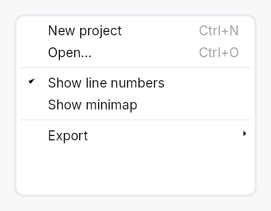
MenuItem — a single command row in a menu or context menu.
Public functions
MenuItem
Detailed description
Each item consists of an optional leading icon, a label, an optional
trailing shortcut label, and an activation closure. MenuItem is
non-generic: actions are type-erased closures identical to Button's
on_activate_fn model. Submenus are declared with MenuItem::submenu
— the factory runs during build(), and the nested MenuList it
returns stays a dormant, deferred subtree until first wanted.
Every item operates in one of three modes selected by builder methods:
| Builder | AT Role | Leading glyph |
|---|---|---|
| (default) | Role::MenuItem | icon or blank |
.checked(signal) | Role::MenuItemCheckBox | checkmark / blank |
.check_state(signal) | Role::MenuItemCheckBox | check / dash / blank |
.reflect_checked(signal) | Role::MenuItemCheckBox | checkmark (read-only) |
.radio(value, selected) | Role::MenuItemRadio | filled dot / blank |
Check and radio modes are mutually exclusive with .icon(...) — the
Windows convention reserves the leading slot for state glyphs on
checkable items; a debug_assert! fires when both are set.
An icon that keeps its own colour
.icon(...) recolours whatever it is handed with the row's text role, so the
glyph follows hover, press and disabled alongside the label. That is right for
an icon that says the same thing as the label, and wrong for one whose colour
is the content — a tag's swatch, a status light, a colour a person chose.
.icon_keeps_color() leaves it alone. Two costs come with it: the icon no
longer follows the highlight (on a style whose highlighted row is a solid
accent fill, it has to carry its own contrast against that fill), and a
literal colour does not dim in a disabled row — ColorProp::Static and
Bound ignore the enabled state, while every role variant substitutes its
disabled counterpart. An icon that should dim wants a role, and then it does
not want this at all.
#![allow(unused)] fn main() { use teksilo_widgets::{MenuItem, primitives::IconWidget}; use teksilo_canvas::{Path, Point}; use teksilo_i18n::lit; use teksilo_tokens::Color; let swatch = IconWidget::from_path(Path::circle(Point::new(5.0, 5.0), 4.5), 10.0) .color(Color::from_hex("#e91e63")); let _w = MenuItem::new(lit!("Characters")) .icon(swatch) .icon_keeps_color(); }
Mnemonic markers use the in-string & convention (&Save →
underline 'S' when Alt is held; && → literal &). The enclosing
MenuList wires bare-letter in-menu activation automatically.
#![allow(unused)] fn main() { use teksilo_widgets::MenuItem; use teksilo_i18n::lit; use teksilo_core::Intent; let _w = MenuItem::new(lit!("&Save")) .on_activate_fn(|ctx| ctx.send_intent(Intent::new("app.save"))); }
Density
The picture above is the widget at TargetDensity::Compact, the mouse-and-keyboard ladder. Below is the same subject on the same canvas with only the ladder changed, so what moves is the density and nothing else — where the subject no longer fits, that is what the denser targets cost it at that size. See docs/density-and-targets.md.
Touch
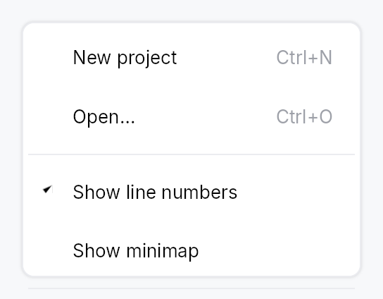
API reference
📖 Full rustdoc API for this module
pub struct MenuItem
Import: use teksilo::widgets::MenuItem;
A single command row in a MenuList or context menu.
See the module documentation for the full mode table, mnemonic syntax, and submenu construction pattern.
#![allow(unused)] fn main() { pub struct MenuItem { /* fields */ } }
Methods
pub fn new(label: impl Into<LocalizedString>) -> Self
Create a plain menu item with the given label and no action yet.
pub fn on_activate_fn(mut self, f: impl Fn(&mut EventContext) + 'static) -> Self
Closure invoked on activation. Note: shortcut label auto-lookup is not available with this variant since there is no typed command to look up.
pub fn label(&self) -> String
Read the item's display label. Exposed so SplitButton (and any other compound widget that embeds a MenuItem) can mirror the label in its own chrome.
pub fn label_localized(&self) -> LocalizedString
Like label but returns the unresolved
LocalizedString, so embedders can mirror the label reactively
(re-resolving on a locale switch) instead of freezing a snapshot.
pub fn action(&self) -> Option<Rc<dyn Fn(&mut EventContext)>>
Clone out a shared handle to the activation closure. Returns None
when this MenuItem has no action (e.g. it's a submenu trigger). The
returned Rc aliases MenuItem's own internal handle — invoking it
has the same effect as the user clicking this menu item (minus the
overlay dismissal that the tap handler also performs).
pub fn icon(mut self, icon: IconWidget) -> Self
Set a leading icon.
pub fn icon_keeps_color(mut self) -> Self
Keep the icon's own colour rather than tinting it with the row's.
A menu icon normally says the same thing as the label beside it, so it takes
the row's text role and follows it through hover, press and disabled — which
is why icon recolours whatever it is handed. Some icons are
not that. A tag's swatch, a status light, a colour a person chose: there the
colour is the content, and tinting it to the menu's foreground deletes the
only thing the icon was there to say.
Opt-in, because the default is right for nearly every row, and keeping a colour has two costs the caller takes on:
- It does not follow the highlight. On a style whose highlighted row is a solid accent fill (the macOS recipe), the icon has to carry its own contrast against that fill as well as against the menu's surface.
- It does not dim when the row is disabled — if it is a literal colour.
That is
ColorProp's own rule everywhere, not a special case here:StaticandBoundignore the enabled state, while every role variant substitutes its disabled counterpart. An icon that should dim should be given a role instead, and then it does not need this at all.
Ignored in the check and radio modes, which draw an indicator glyph of the framework's own rather than the caller's icon.
pub fn shortcut_label(mut self, label: impl Into<String>) -> Self
Set a trailing shortcut label (e.g., "Ctrl+X"). Shortcut labels are typically not translated (they're the key combination literal), so this accepts a plain string.
pub fn trailing_hint(mut self, text: impl Into<LocalizedString>) -> Self
Set a trailing descriptive hint (e.g. "inside", "after parent") — a secondary phrase explaining what the item will do, rendered in the same trailing slot as an accelerator but semantically unrelated to one.
Prefer this over shortcut_label for any
trailing text that is not a key combination. It differs in two ways
that matter:
- it takes a
LocalizedString, so atr!(...)hint re-resolves on a live locale change instead of being frozen at build time; - it is announced as the item's accessible description, not as
keyboard_shortcut— a screen reader would otherwise read the phrase out as if it were a chord to press.
Independent of the accelerator: an item may carry both, in which case the chord renders first and the hint follows it.
pub fn for_shortcut(mut self, id: &'static str) -> Self
Bind the trailing shortcut label to a registered
Shortcut by its stable id.
The effective primary keystroke is bound reactively, via a
per-id signal, so a rebind performed through
ShortcutRegistry
refreshes the chord in place — the item itself is never rebuilt
for shortcut changes.
A manual shortcut_label takes
precedence when both are set.
pub fn enabled(mut self, enabled: impl Into<Prop<bool>>) -> Self
Set the enabled state — static or signal-bound. A bound Signal<bool>
enables/disables the item reactively (paint and AT follow), so
MenuItem::new(...).enabled(can_save_signal) greys out live without a
rebuild. Cursor is always Pointer (see build); disabled items are
gated by the arena before hover runs, so a NotAllowed cursor cannot
be applied from a build-time snapshot of this prop either.
pub fn style(mut self, style: impl teksilo_core::styles::MenuItemStyle) -> Self
Per-call style override. Replaces the theme-wide default
MenuItemStyle for just this MenuItem instance.
pub fn text_style(mut self, style: impl Into<teksilo_core::color_prop::TextStyleProp>) -> Self
Override the label's text style (font, size, weight). Accepts a
TextStyleRole, a TextStyle, or a Signal of either. Default
(unset) is TextStyleRole::Body.
pub fn text_role(mut self, color: impl Into<teksilo_core::color_prop::ColorProp>) -> Self
Override the label text color. Accepts Color, a role, or a
Signal of either. Default (unset) is the interaction/enabled
cascade; setting this replaces that cascade (the hover / disabled
tint no longer applies), so reserve it for chrome that enforces a
fixed text role.
pub fn tooltip(mut self, text: impl Into<LocalizedString>) -> Self
Attach a tooltip that appears after a hover delay, same mechanism
as Button::tooltip.
pub fn rich_tooltip(mut self, key: impl Into<String>) -> Self
Attach a rich tooltip resolved from the app-wide tooltip
registry. Body text supports inline markup
(label, *italic*, **bold**); the entry's shortcut
and long-form "more" fields are rendered automatically.
pub fn rich_tooltip_content(mut self, content: crate::tooltip::TooltipContent) -> Self
Attach a rich tooltip driven by inline TooltipContent.
pub fn composite_tooltip(mut self, content: impl Widget + 'static) -> Self
Attach a composite tooltip — third tier, hosting an arbitrary
widget tree. See Button::composite_tooltip.
pub fn submenu( label: impl Into<LocalizedString>, factory: impl Fn() -> Box<dyn Widget> + 'static, ) -> Self
Create a submenu trigger item. The factory is invoked during build() to
pre-create the submenu content (typically a MenuList), which is kept
dormant until the hover delay elapses.
pub fn submenu_delay(mut self, delay: Duration) -> Self
Set a custom submenu open delay (default: 400 ms, IntelliJ's value;
see DEFAULT_SUBMENU_OPEN_DELAY for what that delay also buys).
pub fn is_submenu(&self) -> bool
Whether this is a submenu trigger.
pub fn checked(mut self, state: Signal<bool>) -> Self
Bind this item to a two-state Signal<bool>. The item renders
Role::MenuItemCheckBox; activation flips the signal. By
Windows convention, the leading icon slot becomes a checkmark
when the signal is true, blank otherwise.
Mutually exclusive with check_state
and radio — last call wins.
pub fn reflect_checked(mut self, state: impl Into<Prop<bool>>) -> Self
Render Role::MenuItemCheckBox whose checkmark reflects state
read-only: activation does NOT write the signal — the truth lives
elsewhere (a model / method), and this item's on_activate/intent is
responsible for the change, after which state updates the checkmark
reactively. Use for "View ▸ Sidebar / Full Screen"-style commands that
mirror externally-owned state (e.g. DockingModel::dock_open_signal),
where two-way checked would fight the model.
Mutually exclusive with the other check / radio binders — last call wins.
pub fn check_state(mut self, state: Signal<CheckState>) -> Self
Bind this item to a tri-state Signal<CheckState>. The item
renders Role::MenuItemCheckBox; activation cycles
Unchecked ↔ Checked (per Windows / Checkbox
convention: Indeterminate is reserved for external sources
like TreeCheckedModel; clicking from Indeterminate
promotes to Checked).
The leading-slot glyph is checkmark for Checked, dash
for Indeterminate, blank for Unchecked — matching the
Windows mixed-state convention.
Mutually exclusive with checked
and radio — last call wins.
pub fn radio(mut self, value: usize, selected: Signal<usize>) -> Self
Bind this item to a radio group via a shared Signal<usize>.
Activation writes value into selected; all radio items
sharing the same selected signal observe the change and
update their leading-slot dot accordingly. The item renders
Role::MenuItemRadio.
For "2 of 3"-style AT announcement, the enclosing
MenuList groups radio items
by selection-signal identity and emits push_to_radio_group
relationships automatically — no app-side wiring required.
Mutually exclusive with checked
and check_state — last call
wins.
MenuList
MenuList — a themed vertical menu container with keyboard navigation.
Public types
| Kind | Name |
|---|---|
struct | MenuSeparator — A 1 dp horizontal divider line between groups of menu items |
struct | MenuList — A themed vertical dropdown menu panel with keyboard navigation and type-ahead |
Public functions
MenuList
Detailed description
MenuList is the dropdown panel used by MenuBar, MenuContext, and
popover-style menus. It provides a themed surface (background, rounded
border, drop shadow) and owns the full keyboard navigation stack:
ArrowUp/Down moves focus, Enter activates, Escape bubbles to the
enclosing overlay host, Home and End jump to the first/last visible item.
Type-ahead search jumps to the next item whose stripped label starts with
the accumulated keystrokes (500 ms reset window by default).
Items are added with .item(widget) (any impl Widget, but typically a
MenuItem); separators with .separator(). Conditional rows use
.item_when(widget, visible_prop) — a hidden row collapses to zero height
and is skipped by keyboard navigation. For very long lists (recent files,
etc.) call .max_visible_items(n) to cap the panel height and wrap the
content in a ScrollArea.
Two knobs shape the surface. .inset(dp) sets the gap between the menu
surface and its rows (default 4 dp; the max_visible_items scroll cap
follows it). .surface_style(style) gives this one list its own
PopoverStyle — frame, fill, shadow — ahead of the theme's popover slot,
which a ComboBox dropdown shares; other lists are unaffected.
Safe-triangle hover gate. When the pointer leaves a submenu trigger's
row with the submenu still up, the trigger arms the safe region (the apex
and the cone live in teksilo_core::overlay) and publishes that submenu's
id on a MenuList-wide shared state, so sibling items can skip their
hover-switch while the cursor travels diagonally toward the submenu.
Accessibility
Role::Menu, named after what opened it (a MenuBar trigger, the
MenuItem::submenu row, a PopoverButton's button), with the keyboard
highlight as its active descendant: the menu keeps keyboard focus, and a
screen reader is told of each move of the highlight as a focus change to
the row. Each row is Role::MenuItem / Role::MenuItemCheckBox /
Role::MenuItemRadio as declared by the item, and carries its position
among the menu's shown rows, whose count the menu carries. Radio items in
the same list also auto-group via push_to_radio_group.
#![allow(unused)] fn main() { use teksilo_widgets::{MenuList, MenuItem}; use teksilo_i18n::lit; use teksilo_core::Intent; let _w = MenuList::new() .item(MenuItem::new(lit!("Cut")).on_activate_fn(|ctx| ctx.send_intent(Intent::new("app.cut")))) .item(MenuItem::new(lit!("Copy")).on_activate_fn(|ctx| ctx.send_intent(Intent::new("app.copy")))) .separator() .item(MenuItem::new(lit!("Paste")).on_activate_fn(|ctx| ctx.send_intent(Intent::new("app.paste")))); }
Density
The picture above is the widget at TargetDensity::Compact, the mouse-and-keyboard ladder. Below is the same subject on the same canvas with only the ladder changed, so what moves is the density and nothing else — where the subject no longer fits, that is what the denser targets cost it at that size. See docs/density-and-targets.md.
Touch
API reference
📖 Full rustdoc API for this module
pub struct MenuSeparator
Import: use teksilo::widgets::MenuSeparator;
A 1 dp horizontal divider line between groups of menu items.
#![allow(unused)] fn main() { pub struct MenuSeparator; }
pub struct MenuList
Import: use teksilo::widgets::MenuList;
A themed vertical dropdown menu panel with keyboard navigation and type-ahead.
See the module documentation for the full feature description.
#![allow(unused)] fn main() { pub struct MenuList { /* fields */ } }
Methods
pub fn new() -> Self
Create an empty menu list with no items, no height cap, and the default 500 ms type-ahead reset window.
pub fn inset(mut self, inset: f32) -> Self
Set the gap, in dp, between the menu surface and its rows, on every
side. Defaults to 4 dp. A smaller value lets the rows (and their
hover / highlight bands) reach nearer the surface's frame, which
suits a thin or accent-coloured border. Negative values are treated
as zero. The scroll cap of max_visible_items
follows the same value.
pub fn surface_style(mut self, style: impl PopoverStyle) -> Self
Give this list its own surface: background, border, corner radius
and shadow come from style instead of the theme's popover slot.
Precedence, highest first: this per-list style, the theme's
style_slots.popover, the built-in RecipePopoverStyle. Only this
list is affected; a ComboBox dropdown or another menu keeps the
theme's. The style is asked for PopoverVariant::Menu.
pub fn type_ahead_timeout(mut self, d: Duration) -> Self
Override the type-ahead buffer reset window. Defaults to 500ms
to match Windows' menubar convention. Tests use
Duration::ZERO to force every keypress to start a fresh
search.
pub fn attached_side(mut self, side: crate::shadow::AttachedSide) -> Self (default: None)
Suppress drop-shadow drawing on the side that visually merges
with the menu's trigger. See crate::shadow::AttachedSide
for the available edges.
pub fn item(mut self, widget: impl Widget + 'static) -> Self
Add a menu item (typically a MenuItem).
pub fn items(self, iter: impl IntoIterator<Item = impl Widget + 'static>) -> Self
Add several menu items from an iterator, in order.
The loop form of item: reach for it when the rows come
from data rather than being written out one call at a time.
pub fn item_when( self, widget: impl Widget + 'static, visible: impl Into<teksilo_core::signal::Prop<bool>>, ) -> Self
Add a menu item that is shown only while visible is true. When the
gate is false the row collapses to zero height (no gap) and keyboard
navigation skips it — arrows, Home/End, Enter, type-ahead, and
mnemonic activation all ignore it. Used e.g. by a Toolbar's overflow
menu, where each row is present only while its inline twin is collapsed.
Because a hidden row never claims its mnemonic letter, two gated rows that are mutually exclusive may share one — the letter resolves to whichever is visible when it is pressed.
pub fn items_when<W, V>(self, iter: impl IntoIterator<Item = (W, V)>) -> Self where W: Widget + 'static, V: Into<teksilo_core::signal::Prop<bool>>,
Add several gated rows from an iterator of (widget, visible) pairs.
The loop form of item_when, for a gated row set
built from data. Each pair carries its own gate, so the rows appear and
disappear independently.
pub fn item_boxed_when( mut self, widget: Box<dyn Widget>, visible: impl Into<teksilo_core::signal::Prop<bool>>, ) -> Self
item_when for an already-boxed widget — used when
the row type is decided at runtime (e.g. a menu row that is either a
MenuItem or an embedded control).
pub fn items_boxed_when<V>(self, iter: impl IntoIterator<Item = (Box<dyn Widget>, V)>) -> Self where V: Into<teksilo_core::signal::Prop<bool>>,
Add several gated rows from an iterator of (widget, visible) pairs.
The loop form of item_boxed_when, for a gated
row set built from data. Each pair carries its own gate, so the rows may
appear and disappear independently.
pub fn separator(mut self) -> Self
Add a separator line.
pub fn header(mut self, widget: impl Widget + 'static) -> Self
Add a non-interactive section caption (typically a crate::GroupHeader).
Skipped by Arrow/Home/End navigation and type-ahead, exactly like
separator. The caller passes any impl Widget, but it
must expose its own accessible name/role via accessibility() (as
GroupHeader does) or it is silently pruned from the AT tree as a
content-free container.
pub fn max_visible_items(mut self, n: usize) -> Self
Cap the panel height to roughly n * item_height and make the
content scrollable when that height is exceeded. Clamped to at
least 1. Useful for long menus (e.g. a "Recent files" list) —
without this, a very long menu grows to exceed the window.
Note: items are still materialized eagerly; this is a viewport cap, not virtualization. See the module-level note.
MessageBox
MessageBox — QMessageBox-style alert dialog.
Public types
| Kind | Name |
|---|---|
enum | MessageBoxSeverity — Alert severity level |
enum | ButtonRole — Semantic role of a message-box button |
enum | StandardButton — The Qt-modeled catalog of standard buttons |
struct | MessageBoxButton — A single button placement inside a MessageBox, including an optional per-instance label override |
enum | MessageBoxButtons — Pre-built button bundles covering the common MessageBox shapes |
enum | MessageBoxDismissal — How a MessageBox came to close |
struct | MessageBoxResult — Report passed to MessageBox::on_result when the dialog closes |
struct | MessageBox — A modal alert dialog that displays a severity icon, title, body text, and one or more buttons |
trait | EventContextMessageBoxExt — Extension trait on EventContext for ergonomic MessageBox presentation |
Public functions
MessageBox
StandardButton
| Returns | Function |
|---|---|
| Methods | |
ButtonRole | role() |
&'static str | intent_name() |
LocalizedString | default_label() |
MessageBoxButton
| Returns | Function |
|---|---|
| Constructors | |
Self | standard(kind: StandardButton) |
| Builder methods | |
Self | label(label: impl Into<LocalizedString>) |
MessageBoxResult
| Returns | Function |
|---|---|
| Methods | |
bool | was_dismissed() |
EventContextMessageBoxExt
| Returns | Function |
|---|---|
| Methods | |
present_message_box(mb: MessageBox) |
Detailed description
A higher-level surface built on top of ModalContainer
for the classic "tell the user something and ask for a response"
pattern: unsaved-changes prompts, error surfaces, confirmation
dialogs, and informational notices. Mirrors QMessageBox (Qt),
NSAlert (AppKit), and SwiftUI's .alert(...) while staying inside
Teksilo's idioms — closure result handlers, Signal/Prop
reactivity, Intent/Action/Shortcut routing for keyboard
defaults, and AccessKit Role::AlertDialog accessibility.
Quick tour
use teksilo::prelude::*;
use teksilo::widgets::{MessageBox, MessageBoxButtons, StandardButton};
fn on_close(ctx: &mut EventContext) {
MessageBox::question(lit!("Save changes?"))
.text(lit!("You have unsaved changes in report.skrib."))
.informative_text(lit!("Your changes will be lost if you don't save them."))
.buttons(MessageBoxButtons::SaveDiscardCancel)
.default_button(StandardButton::Save)
.escape_button(StandardButton::Cancel)
.on_result(|r, ctx| match r.button {
StandardButton::Save => save_and_close(ctx),
StandardButton::Discard => close(ctx),
_ => {}
})
.present(ctx);
}
# fn save_and_close(_: &mut EventContext) {}
# fn close(_: &mut EventContext) {}
Severity
MessageBoxSeverity controls the icon drawn beside the title and
its tint:
Information— info glyph,status_info_fgtint.Question— question mark glyph,accenttint.Warning— exclamation triangle,status_warning_fgtint.Critical— X-mark circle,status_error_fgtint. Also disables click-outside dismissal (Qt convention).None— no icon, no tint.
Severity is conveyed through the icon + title + text. Per Teksilo's
Int UI baseline, buttons are never colored as "destructive":
destructive intent lives in the dialog's severity and wording, not
in the button. See crate::button for details.
Default & escape buttons
default_button— activated by Enter (widget-scoped shortcut) and receives initial focus on open (viaModalRequest::focus_targetplusWidget::initial_focus_hint). Styled withButtonVariant::Filled.escape_button— activated by Escape. The fallback logic (for presets with no explicitescape_button) picks: explicitescape_button→ firstReject-role button →Cancel→ last button.
Each preset supplies a default: Ok for Ok and OkCancel, Save for
SaveDiscardCancel, Retry for RetryIgnoreAbort, and No for
YesNo and YesNoCancel.
The Yes/No default is the negative answer on purpose. An Ok/Cancel box
confirms something the user just asked for, so Ok is the answer they
meant. A Yes/No box asks a question they did not initiate, and it is
overwhelmingly asked before something irreversible — "Delete this?",
"Discard your changes?". Defaulting to Yes means Enter destroys, and
Enter is what a keyboard user presses on a dialog they have not
finished reading. Where the question is safe, default_button puts Yes
back in one reviewable line; the reverse default cannot be reviewed,
because there is nothing on the screen to review.
It matters more than it looks, because no platform announces which
button is the default: Node::keyboard_shortcut appears in none of
the three AccessKit adapters, so a screen-reader user discovers the
default only by pressing Enter. Where focus lands is the whole contract.
Title and button alignment
MessageBox::title_alignment places the title in the header's text
column (default Leading) and MessageBox::button_alignment places the
button row (default Trailing), both as teksilo_tokens::HAlignment.
macOS alerts centre both; Windows and GNOME keep the title leading and the
buttons trailing, which is the default. Leading and Trailing follow the
layout direction.
Result reporting
MessageBox::on_result takes impl Fn(MessageBoxResult, &mut EventContext) + 'static. The callback fires exactly once, whichever
route closes the dialog — button activation, Escape, a press outside, or a
programmatic dismissal — with MessageBoxResult::dismissal naming which
one. On a button activation the modal is then closed by the framework; on
the other routes it is already going away.
Accessibility
The widget exposes Role::AlertDialog, with set_modal(),
set_live(Live::Assertive), set_name(title), and
set_description(text + informative_text), so screen readers
announce the dialog by its title as it opens and find the text as its
description and by walking it. The ModalContainer that presents it
publishes no dialog of its own around it, and the content under it is
Live::Off, so the title is the one thing announced, once.
Density
The picture above is the widget at TargetDensity::Compact, the mouse-and-keyboard ladder. Below is the same subject on the same canvas with only the ladder changed, so what moves is the density and nothing else — where the subject no longer fits, that is what the denser targets cost it at that size. See docs/density-and-targets.md.
Touch
API reference
📖 Full rustdoc API for this module
pub enum MessageBoxSeverity
Import: use teksilo::widgets::MessageBoxSeverity;
Alert severity level. Drives the icon glyph + tint shown beside the
title, and (for Critical) whether click-outside dismiss is enabled.
#![allow(unused)] fn main() { pub enum MessageBoxSeverity { /* variants */ } }
Variants
None— No icon. Use for plain notices where an icon would be noise.Information— Informational notice — blue circle with "i" glyph.Question— Confirmation prompt — accent-tinted circle with "?" glyph.Warning— Non-fatal warning — amber triangle with "!" glyph.Critical— Critical error — red circle with an "X" glyph. Click-outside dismissal is disabled (Escape still works).
pub enum ButtonRole
Import: use teksilo::widgets::ButtonRole;
Semantic role of a message-box button. Used for fallback escape
resolution (Reject wins when no explicit escape button is set).
Teksilo deliberately does not render Destructive buttons with
a red fill — the dialog's severity icon and wording carry that
signal. See crate::button for the framework-level rationale.
#![allow(unused)] fn main() { pub enum ButtonRole { /* variants */ } }
Variants
Accept— Confirms / proceeds. Ok, Yes, Save, Open, Apply, Retry.Reject— Bails out. Cancel, Close, No, Abort.Destructive— Data-loss action. Discard. (Same visuals as Regular — the severity of the surrounding MessageBox carries the warning.)Action— Side action. Help, Reset, RestoreDefaults, Ignore, and the "to all" variants.
pub enum StandardButton
Import: use teksilo::widgets::StandardButton;
The Qt-modeled catalog of standard buttons. Each variant resolves
to a localized label, a semantic ButtonRole, and a stable
intent-name string used internally for shortcut/action routing.
#![allow(unused)] fn main() { pub enum StandardButton { /* variants */ } }
Variants
Ok— Accept / confirm.ButtonRole::Accept.Cancel— Cancel the operation.ButtonRole::Reject.Close— Close the dialog.ButtonRole::Reject.Yes— Confirm with "Yes".ButtonRole::Accept.No— Decline with "No".ButtonRole::Reject.YesToAll— Confirm all remaining items.ButtonRole::Accept.NoToAll— Decline all remaining items.ButtonRole::Reject.Save— Save changes.ButtonRole::Accept.SaveAll— Save all open items.ButtonRole::Accept.Discard— Discard changes without saving.ButtonRole::Destructive.Apply— Apply changes without closing.ButtonRole::Accept.Reset— Reset to defaults.ButtonRole::Action.RestoreDefaults— Restore factory defaults.ButtonRole::Action.Abort— Abort the current operation.ButtonRole::Reject.Retry— Retry the failed operation.ButtonRole::Accept.Ignore— Ignore the error and continue.ButtonRole::Action.Open— Open a file or resource.ButtonRole::Accept.Help— Show help.ButtonRole::Action.
Methods
pub fn role(self) -> ButtonRole
The button's semantic role — used internally by MessageBox's
escape-button fallback resolution, and available to callers that
want to inspect a MessageBoxButton's role.
pub fn intent_name(self) -> &'static str
Stable string id used as both the shortcut id and the intent name for routing default/escape key activations. Scoped to a MessageBox instance via widget-scoped shortcut registration, so the same id is safe to reuse across instances.
pub fn default_label(self) -> LocalizedString
Default label for the button. Resolved through the Fluent
catalog via tr_widget! so apps can override per-locale.
pub struct MessageBoxButton
Import: use teksilo::widgets::MessageBoxButton;
A single button placement inside a MessageBox, including an optional
per-instance label override. Callers usually build these via
From<StandardButton> (StandardButton::Ok.into()), or
construct them manually when Custom is needed.
#![allow(unused)] fn main() { pub struct MessageBoxButton { /* fields */ } }
Fields
kind:StandardButton— Which standard button this is — drives role, intent name, and (whenlabel_overrideisNone) the label.label_override:Option<LocalizedString>— Optional explicit label that overrideskind.default_label(). Use sparingly: prefer translating the default via Fluent rather than hard-coding per-call labels.
Methods
pub fn standard(kind: StandardButton) -> Self
Build a button from a StandardButton with the default label.
pub fn label(mut self, label: impl Into<LocalizedString>) -> Self
Override the default translated label.
pub enum MessageBoxButtons
Import: use teksilo::widgets::MessageBoxButtons;
Pre-built button bundles covering the common MessageBox shapes.
Custom combinations go through MessageBox::add_button or
MessageBoxButtons::Custom.
#![allow(unused)] fn main() { pub enum MessageBoxButtons { /* variants */ } }
Variants
Ok— Just Ok.OkCancel— Ok + Cancel, Ok default, Cancel escape.YesNo— Yes + No. No is the default, and No is the escape. See the module docs for why the default is the negative answer.YesNoCancel— Yes + No + Cancel. No is the default, Cancel is the escape — Enter takes the safe answer to the question asked, Escape leaves the dialog.SaveDiscardCancel— The unsaved-changes triad: Save + Discard + Cancel.RetryIgnoreAbort— The error-recovery triad: Retry + Ignore + Abort.Custom(Vec<MessageBoxButton>)— Explicit list. MessageBox preserves the order as the visual button order (leading Spacer pushes all buttons to the trailing edge; default button may appear anywhere).
pub enum MessageBoxDismissal
Import: use teksilo::widgets::MessageBoxDismissal;
How a MessageBox came to close.
This replaced a dismissed_by_escape: bool whose own rustdoc claimed to
cover scrim-click as well — a contract no code path could produce, because
the only writer was the Escape action. One field that names the route
cannot drift from its documentation the way two overlapping booleans can,
and the caller can finally tell "the user chose Cancel" from "the user
waved the dialog away", which for a Save/Discard/Cancel prompt are
different answers.
#![allow(unused)] fn main() { pub enum MessageBoxDismissal { /* variants */ } }
Variants
Button— A button was chosen: clicked, or Enter on the default.Escape— Escape, resolved to the escape button.ClickOutside— A press outside the dialog, where itsModalCloseBehaviorpermits it.Programmatic— It went away for another reason — the application dismissed it, or an enclosing surface closed and took it along.buttonstill carries the escape-button resolution, because something has to be reported and that is the same answer Escape would have given.
pub struct MessageBoxResult
Import: use teksilo::widgets::MessageBoxResult;
Report passed to MessageBox::on_result when the dialog closes.
#![allow(unused)] fn main() { pub struct MessageBoxResult { /* fields */ } }
Fields
button:StandardButton— Which button fired — either by click, Enter (the focused button, else the default), or escape-button resolution for any of the dismissal routes.checkbox_checked:bool— State of the "Don't show again" checkbox at dismiss time, when one was configured viaMessageBox::show_again_checkboxorMessageBox::show_again_checkbox_state.falsewhen no checkbox was attached.dismissal:MessageBoxDismissal— Which route closed the dialog.
Methods
pub fn was_dismissed(&self) -> bool
Whether the dialog went away without the user choosing a button.
The predicate the old dismissed_by_escape flag was reached for, minus
the claim that Escape was the only way to get there.
pub struct MessageBox
Import: use teksilo::widgets::MessageBox;
A modal alert dialog that displays a severity icon, title, body text, and one or more buttons.
Constructed via severity-named constructors (MessageBox::information,
MessageBox::warning, MessageBox::critical, MessageBox::question,
MessageBox::plain), configured fluently, and presented with
MessageBox::present. See the module documentation for the full guide.
#![allow(unused)] fn main() { pub struct MessageBox { /* fields */ } }
Methods
pub fn information(title: impl Into<LocalizedString>) -> Self
Construct an informational MessageBox (Information severity).
pub fn warning(title: impl Into<LocalizedString>) -> Self
Construct a warning MessageBox (Warning severity).
pub fn critical(title: impl Into<LocalizedString>) -> Self
Construct a critical-error MessageBox (Critical severity).
Click-outside dismissal is disabled; use an explicit button or
Escape to close.
pub fn question(title: impl Into<LocalizedString>) -> Self
Construct a confirmation / question MessageBox (Question
severity).
pub fn plain(title: impl Into<LocalizedString>) -> Self
Construct a plain MessageBox with no severity icon.
pub fn text(mut self, text: impl Into<LocalizedString>) -> Self
Primary message line, rendered in typography.body with
text_primary. Prefer a short, self-contained sentence —
details belong in informative_text.
pub fn informative_text(mut self, text: impl Into<LocalizedString>) -> Self
Secondary, explanatory text rendered below the primary text in
typography.body with text_secondary. Matches Qt's
setInformativeText.
pub fn detailed_text(mut self, text: impl Into<LocalizedString>) -> Self
Detailed text hidden behind a "Show details" Accordion —
for technical diagnostics (stack traces, error codes). Matches
Qt's setDetailedText.
pub fn buttons(mut self, preset: MessageBoxButtons) -> Self
Apply a preset button bundle. Implicitly sets default and
escape buttons for the preset (both can be overridden via
MessageBox::default_button and
MessageBox::escape_button).
pub fn add_button(mut self, button: impl Into<MessageBoxButton>) -> Self
Append a single button. Use to augment a preset (rare) or to
build a bespoke button row without going through
MessageBoxButtons::Custom.
pub fn add_buttons( self, buttons: impl IntoIterator<Item = impl Into<MessageBoxButton>>, ) -> Self
Append several buttons from an iterator, in order.
The loop form of add_button, for a bespoke button
row built from data rather than spelled out one call at a time.
pub fn default_button(mut self, which: StandardButton) -> Self
Mark which button activates on Enter and receives initial
focus. Must refer to one of the buttons configured via
buttons / add_button.
pub fn escape_button(mut self, which: StandardButton) -> Self
Mark which button activates on Escape (and scrim-click, when allowed). Must refer to one of the configured buttons.
pub fn show_again_checkbox(mut self, label: impl Into<LocalizedString>) -> Self
Attach a "Don't show again"-style checkbox below the body.
Internally creates a Signal<bool> initialized to false and
reports its state in MessageBoxResult::checkbox_checked.
For external observation, use
MessageBox::show_again_checkbox_state instead.
pub fn show_again_checkbox_state(mut self, signal: Signal<bool>) -> Self
Like MessageBox::show_again_checkbox, but with a
caller-owned Signal<bool> so the checkbox state survives the
dialog lifetime (useful for "remember my choice" persistence).
pub fn title_alignment(mut self, alignment: HAlignment) -> Self
Where the title sits in the header's text column. Default
HAlignment::Leading. Center matches a macOS alert; Windows and
GNOME keep the title leading. Leading / Trailing follow the layout
direction, so they mirror in right-to-left locales.
pub fn button_alignment(mut self, alignment: HAlignment) -> Self
Where the button row sits along the bottom of the dialog. Default
HAlignment::Trailing. Center matches a macOS alert; Leading
packs the buttons at the start edge. Leading / Trailing follow the
layout direction, so they mirror in right-to-left locales.
pub fn on_result(mut self, f: impl Fn(MessageBoxResult, &mut EventContext) + 'static) -> Self
Register the result callback, invoked exactly once however the dialog closes — a button (by click, or by the Enter/Escape shortcut), a press outside, or a programmatic dismissal.
pub fn present(mut self, ctx: &mut EventContext)
Present the MessageBox as a modal on top of ctx's current
tree. Consumes self; callers who need to present multiple
dialogs with shared config should build a factory closure.
pub trait EventContextMessageBoxExt
Import: use teksilo::widgets::EventContextMessageBoxExt;
Extension trait on EventContext for ergonomic MessageBox
presentation. Mirrors ctx.present_modal(...) for the general
case.
#![allow(unused)] fn main() { pub trait EventContextMessageBoxExt { /* associated items below */ } }
Associated items
fn present_message_box(&mut self, mb: MessageBox);
Present mb as a modal. Equivalent to mb.present(self).
MinSize
MinSize — a layout modifier that ensures a child reaches a minimum width and/or height.
Public functions
MinSize
| Returns | Function |
|---|---|
| Constructors | |
Self | new(width: f32, height: f32) |
Self | width(width: f32) |
Self | height(height: f32) |
| Builder methods | |
Self | min_width(state: impl Into<Prop<f32>>) |
Self | min_height(state: impl Into<Prop<f32>>) |
Self | child(widget: impl teksilo_core::IntoTeksiChild) |
Self | child_opt(widget: Option<impl teksilo_core::IntoTeksiChild>) |
Detailed description
The child's reported size is clamped upward so it never falls below the
configured minimum on each constrained axis. A bounded proposal below the
minimum is raised to it before it is forwarded, so that wrap-aware children
(e.g. a multi-line TextWidget) measure against the width they will
actually be placed into. An unbounded axis stays unbounded: the child
answers with its ideal size, and the minimum applies to that answer, as
SwiftUI's .frame(minWidth:) does. Axes with no minimum set are passed
through unchanged.
MinSize propagates the child's flex and shrink weights so that a
Spacer or Expand inside MinSize still participates in stack
slack-distribution; the child's own compression floor is composed with
the MinSize floor.
For the inverse operation (capping a maximum size) see MaxSize.
Hit targets: take the floor from the theme
MinSize is the mechanism for a minimum hit box, but the number belongs to
the active density rather than to the call site. Route it through
density_min_size (or
dp(.., TargetRole::Target, ..)), which raises the named axes to
theme.input.target_size — 24 dp at Compact, 32 at Comfortable, 44 at
Touch, and 48 under the Material 3 preset. That is what every shipped
recipe does; see docs/density-and-targets.md.
#![allow(unused)] fn main() { use teksilo_widgets::primitives::{MinSize, icon_widget::IconWidget}; use teksilo_core::styles::density::density_min_size; use teksilo_tokens::{InputTokens, TargetAxes, TargetDensity}; let tokens = InputTokens::for_density(TargetDensity::Touch); let base = teksilo_canvas::Size::new(20.0, 20.0); // The density decides the floor; the call site only says "both axes". let min = density_min_size(base, TargetAxes::BOTH, &tokens); let _tap_target = MinSize::new(min.width, min.height) .child(IconWidget::checkmark(20.0)); }
A hard-coded literal is right only where the number is a design dimension
that must not move with density. Where it is a target, name its bar: 24 dp is
WCAG 2.2 SC 2.5.8 Target Size (Minimum), level AA — the floor
min_target_conformance holds at every density; 44 dp is Apple's HIG minimum
and SC 2.5.5 Target Size (Enhanced), level AAA, which is what the Touch
ladder aims for. 44 dp is never the AA figure.
API reference
📖 Full rustdoc API for this module
pub struct MinSize
Import: use teksilo::widgets::MinSize;
Layout modifier that enforces a minimum width and/or height on a single child widget.
Constraints can be static or bound to a reactive Signal<f32> for dynamic resizing.
#![allow(unused)] fn main() { pub struct MinSize { /* fields */ } }
Methods
pub fn new(width: f32, height: f32) -> Self
Enforce a minimum on both axes: the child's width will be at least width and its height at least height.
pub fn width(width: f32) -> Self
Enforce a minimum only on the width axis; the height axis is unconstrained by this modifier.
pub fn height(height: f32) -> Self
Enforce a minimum only on the height axis; the width axis is unconstrained by this modifier.
pub fn min_width(mut self, state: impl Into<Prop<f32>>) -> Self
Bind min width to a reactive state.
pub fn min_height(mut self, state: impl Into<Prop<f32>>) -> Self
Bind min height to a reactive state.
pub fn child(mut self, widget: impl teksilo_core::IntoTeksiChild) -> Self
Set an inline child widget (deferred insertion).
pub fn child_opt(self, widget: Option<impl teksilo_core::IntoTeksiChild>) -> Self
Attach widget when it is Some, and do nothing when it is None.
The conditional-child form. teksu!'s if without an else lowers to
this, and it is what cond.then(|| w) is for in a builder chain. None
adds no arena node, so nothing is laid out, painted, or published to the
accessibility tree, and a stack applies no spacing around it.
NotificationCenterButton
NotificationCenterButton — bell icon with an unread-count badge that
opens a NotificationLog popover when clicked.
Public functions
NotificationCenterButton
Detailed description
Composed as a ZStack { PopoverIconButton(bell), Badge }. The badge
shows the current unread count and is hit-transparent so clicks always
reach the bell beneath. On popover close the archive's mark_all_read
is called and the badge resets — matching the GitHub / Slack / JetBrains
convention. Most apps mount this in a StatusBar or TitleBar trailing
slot; all popover behaviour is self-managed with no further wiring.
Accessibility
The inner IconButton carries the bell Role::Button label; the outer
container is a bare Role::GenericContainer, which every adapter steps
through to the button. It is never hidden: a hidden node takes its whole
subtree out of every platform's tree, the button with it. The badge count is not
separately announced — the button label and badge label together convey
the state to sighted users; AT users interact through the button itself.
// Typical setup — archive comes from install_toast_default():
let archive: Rc<NotificationArchiveModel> = ctx.app_state().unwrap();
let bell = NotificationCenterButton::new(archive)
.on_action_invoked(|_entry, action, ctx| {
if let Some(name) = &action.intent_name {
ctx.send_intent(teksilo_core::Intent::new(name));
}
});
Density
The picture above is the widget at TargetDensity::Compact, the mouse-and-keyboard ladder. Below is the same subject on the same canvas with only the ladder changed, so what moves is the density and nothing else — where the subject no longer fits, that is what the denser targets cost it at that size. See docs/density-and-targets.md.
Touch
API reference
📖 Full rustdoc API for this module
pub struct NotificationCenterButton
Import: use teksilo::prelude::NotificationCenterButton; — in teksilo::prelude::*.
Bell-icon trigger + unread-count badge + popover that contains a
NotificationLog. On popover close the entries in this bell's
scope are marked read (the user is presumed to have seen the
toasts now).
#![allow(unused)] fn main() { pub struct NotificationCenterButton { /* fields */ } }
Methods
pub fn new(archive: Rc<NotificationArchiveModel>) -> Self
Construct bound to a shared archive. The archive is typically
held in app_state and cloned to every consumer.
pub fn for_window(mut self, window_id: TeksiloWindowId) -> Self
Scope this bell to window window_id: its badge counts unread
among entries routed to that window (plus any Broadcast
entry), and its popover shows only those. Overrides any
previous for_window / for_audience call.
pub fn for_audience(mut self, audience: ToastAudience) -> Self
Scope this bell to audience: its badge counts unread among
entries routed to that audience (plus any Broadcast entry),
and its popover shows only those. Overrides any previous
for_window / for_audience call.
pub fn size(mut self, size: IconButtonSize) -> Self
Bell-icon size. Default IconButtonSize::Toolbar (30 dp) —
matches the JetBrains status-bar density.
pub fn show_badge_when_zero(mut self, show: bool) -> Self
Whether to keep the badge visible when the unread count is
zero. Default false (badge hidden when no unread). Apps
that want a persistent "0" indicator pass true.
pub fn max_badge_count(mut self, max: u32) -> Self
Cap the displayed badge count. Default 99 — counts above
the cap display as "99+". Set to u32::MAX to disable the
cap.
pub fn placement(mut self, p: OverlayPlacement) -> Self
Popover placement relative to the bell. Default
BelowPreferred — flips above when the button is near the
viewport bottom edge.
pub fn on_action_invoked( mut self, f: impl Fn(&NotificationEntry, &ArchivedAction, &mut EventContext) + 'static, ) -> Self
Threaded into the embedded NotificationLog —
see NotificationLog::on_action_invoked for the contract.
Wire this to dispatch archived actions; without it the
action buttons in the log are inert.
pub fn tooltip(mut self, text: impl Into<LocalizedString>) -> Self
Attach a plain single-line tooltip shown after a hover delay.
Mutually exclusive with rich_tooltip,
rich_tooltip_content, and
composite_tooltip — the last setter
called wins.
pub fn rich_tooltip(mut self, key: impl Into<String>) -> Self
Attach a rich tooltip identified by a registry key.
Mutually exclusive with tooltip,
rich_tooltip_content, and
composite_tooltip.
pub fn rich_tooltip_content(mut self, content: crate::tooltip::TooltipContent) -> Self
Attach a rich tooltip from inline crate::tooltip::TooltipContent.
Mutually exclusive with tooltip,
rich_tooltip, and
composite_tooltip.
pub fn composite_tooltip(mut self, content: impl Widget + 'static) -> Self
Attach a composite tooltip containing an arbitrary widget tree.
Mutually exclusive with tooltip,
rich_tooltip, and
rich_tooltip_content.
NotificationEntry
Persistent notification archive — the storage and data-model layer
backing NotificationLog, NotificationCenterButton, and
NotificationLogDialog.
Public types
| Kind | Name |
|---|---|
struct | NotificationEntry — A single archived notification entry rendered by NotificationLog and persisted under NotificationArchive::Persistent |
struct | NotificationUpdate — One in-place mutation applied when a Toast with the same id as an existing entry is presented again |
enum | ArchivedActionStyle — Visual presentation of an archived action button |
struct | ArchivedAction — A single action stored alongside an archived notification entry |
const | DEFAULT_ARCHIVE_LIMIT — Default per-archive entry cap |
const | ARCHIVE_FILE_NAME — File-name (without extension) used for the persistent archive |
const | UPDATE_HISTORY_LIMIT — How many NotificationUpdate records one row keeps |
enum | NotificationArchive — Storage mode for the notification archive |
struct | NotificationArchiveModel — Shared model — clones share state |
struct | NotificationLogDialog — One-liner modal preset around NotificationLog |
Public functions
NotificationArchive
| Returns | Function |
|---|---|
| Constructors | |
Self | in_memory() |
Self | in_memory_with_limit(limit: usize) |
Self | persistent(file_name: impl Into<String>) |
Self | persistent_with_limit(file_name: impl Into<String>, limit: usize) |
| Methods | |
usize | limit() |
NotificationArchiveModel
| Returns | Function |
|---|---|
| Constructors | |
Result<Self, NotificationArchiveError> | open(archive: &NotificationArchive, paths: &AppPaths, debounce: Duration) |
Self | in_memory() |
| Methods | |
&ListModel<NotificationEntry> | entries() |
&Signal<usize> | unread_count() |
&Signal<u64> | version_signal() |
usize | limit() |
Result<(), SettingsFileError> | flush_now() |
push(entry: NotificationEntry) | |
push_update(entry: NotificationEntry) | |
mark_read_where(mut predicate: impl FnMut(&NotificationEntry) -> bool) | |
mark_all_read() | |
clear() | |
clear_where(mut predicate: impl FnMut(&NotificationEntry) -> bool) | |
remove_by_id(id: u64) |
NotificationLogDialog
Detailed description
Every toast presented through the toast registry is mirrored into a
NotificationArchiveModel when archiving is enabled via
ToastInstallOptions::archive. The model is a
ListModel<NotificationEntry> plus an
unread-count signal — shaped for one-line binding to the notification
UI family. Two storage variants are available: an in-memory session-only
ring buffer (NotificationArchive::InMemory) and a file-backed
persistent store (NotificationArchive::Persistent) that survives app
restarts. Action callbacks attached via raw closures are lost on
archival; actions that should remain re-invokable from the log carry an
intent_name that the log replays through ctx.send_intent(...).
When to use
- Pair with
TeksiloAppBuilder::install_toast_default()to get the full bell-button + log + persistence stack for free. - Construct
NotificationArchiveModel::in_memorydirectly in tests or custom toast setups.
// In app boot, after install_toast:
let archive = ctx.app_state::<Rc<RefCell<NotificationArchiveModel>>>().unwrap();
let log = NotificationLog::new(archive.clone());
API reference
📖 Full rustdoc API for this module
pub struct NotificationEntry
Import: use teksilo::prelude::NotificationEntry; — in teksilo::prelude::*.
A single archived notification entry rendered by NotificationLog and
persisted under NotificationArchive::Persistent. Carries plain owned
fields only — no closures, no Rc<dyn Fn> — so it is Serialize-friendly.
#![allow(unused)] fn main() { pub struct NotificationEntry { /* fields */ } }
Fields
id:u64— Stable per-archive id (separate from the runtimeToast::iddedup key — that one lives indedup_idbelow). Assigned by the archive on first push; never reused.severity:BannerSeverity— Severity of the notice as it now stands: the latest in-place update's, else the original push's. Drives the log's row glyph + severity-chip filter.priority:ToastPrioritytitle:String— Resolved title (LocalizedString::resolve_now()snapshot).body:Option<String>actions:Vec<ArchivedAction>— The actions the notice offers as it now stands. An in-place update replaces them; one that offers none leaves none.timestamp:jiff::Timestamp— Wall-clock time the notice was last raised: its first push, or the latest time a notice with the samededup_idwas raised again after the first had left the screen. In-place updates of a notice still on screen leave it alone. The log's day-bucket computation runs against this in the user's local timezone.group:Option<String>— Optional grouping key for the log's visual section headers.source:Option<String>— Optional originating-feature tag (e.g."build","sync"). Surfaced as a chip in the log row.read:bool— Flipped when the user opens the log popover. Drives the bell badge'sunread_countsignal.dedup_id:Option<String>—Toast::id(...)value, if any — used for update-in-place merge logic. New entries with a matchingdedup_idmerge into the existing row rather than creating a separate one (seeNotificationArchiveModel::pushandpush_update).updates:Vec<NotificationUpdate>— Later presents of the sameToast::id(...): one per in-place update that changed what the row shows, and one per time the notice was raised again. Holds the most recentUPDATE_HISTORY_LIMIT. Empty on a freshly-pushed entry.route:ToastRoute— Mirrored from the originatingLiveEntry::route(seeToastRegistry::entry_to_archive) — drives which bell(s) show this entry and which bell's "mark all read" / "clear" affects it. Defaults toToastRoute::Broadcaston deserialization when the field is absent (anotifications.tomlwritten before this feature existed): treating pre-upgrade history as broadcast keeps it visible in every window's bell, rather than it silently vanishing from all of them the moment routing scopes are introduced.
pub struct NotificationUpdate
Import: use teksilo::widgets::NotificationUpdate;
One in-place mutation applied when a Toast with the same id as an
existing entry is presented again. The archive merges these onto the
existing row — the "Uploading 3 of 7 → Upload complete" pattern.
#![allow(unused)] fn main() { pub struct NotificationUpdate { /* fields */ } }
Fields
timestamp:jiff::Timestamptitle:Option<String>body:Option<String>progress:Option<f32>
pub enum ArchivedActionStyle
Import: use teksilo::widgets::ArchivedActionStyle;
Visual presentation of an archived action button. Maps one-to-one to
ToastActionStyle; re-declared as a self-contained Serialize-friendly
enum so the archive type does not depend on ButtonVariant.
#![allow(unused)] fn main() { pub enum ArchivedActionStyle { /* variants */ } }
Variants
Link— JetBrains-style hyperlink in the body row.PrimaryButton— Filled (primary CTA).SecondaryButton— Plain (secondary).Destructive— Destructive (red-tinted).
pub struct ArchivedAction
Import: use teksilo::widgets::ArchivedAction;
A single action stored alongside an archived notification entry. Only
re-invokable from NotificationLog when intent_name is set — actions
whose live closure has torn down render as inert descriptive labels.
#![allow(unused)] fn main() { pub struct ArchivedAction { /* fields */ } }
Fields
label:String— Resolved label snapshot.intent_name:Option<String>— Intent name for archive replay throughctx.send_intent(...).Nonefor closure-only actions; the log renders these as non-clickable past-action tags.style:ArchivedActionStylecloses_on_invoke:bool— Mirrors the live action'scloses_toastflag. The log uses it informationally only — a replayed Intent fires and the archive row itself doesn't dismiss (since it's not a live toast).
pub const DEFAULT_ARCHIVE_LIMIT
Import: none — DEFAULT_ARCHIVE_LIMIT is public in a private module of teksilo-widgets and nothing re-exports it.
Default per-archive entry cap. IntelliJ's notification log keeps hundreds of entries with no cap visible to the user; we pick a pragmatic limit so persistent files don't grow unbounded.
#![allow(unused)] fn main() { pub const DEFAULT_ARCHIVE_LIMIT: usize = 200; }
pub const ARCHIVE_FILE_NAME
Import: none — ARCHIVE_FILE_NAME is public in a private module of teksilo-widgets and nothing re-exports it.
File-name (without extension) used for the persistent archive.
Resolved through AppPaths::config_file into
<config_dir>/<app>/notifications.toml.
#![allow(unused)] fn main() { pub const ARCHIVE_FILE_NAME: &str = "notifications"; }
pub const UPDATE_HISTORY_LIMIT
Import: none — UPDATE_HISTORY_LIMIT is public in a private module of teksilo-widgets and nothing re-exports it.
How many NotificationUpdate
records one row keeps. A progress notice that reports each step in its
wording records one update per step, and an id an app reuses for every
run of an operation gathers them from every run, so a row keeps the most
recent ones and drops the oldest. The row itself always shows the notice
as it now stands, whatever the history kept.
#![allow(unused)] fn main() { pub const UPDATE_HISTORY_LIMIT: usize = 20; }
pub enum NotificationArchive
Import: none — NotificationArchive is public in a private module of teksilo-widgets and nothing re-exports it.
Storage mode for the notification archive. Passed inside
ToastInstallOptions::archive to the install helper.
#![allow(unused)] fn main() { pub enum NotificationArchive { /* variants */ } }
Variants
InMemory{ limit: usize }— Session-only — entries live in aListModelfor the running session. Cheap, no disk I/O. Default for apps that don't install aSettingsBundle.Persistent{ file_name: String, limit: usize }— File-backed viaPersistedListModel. The path is built at install time fromAppPaths::config_fileusing the configuredfile_name.
Methods
pub fn in_memory() -> Self
In-memory archive with the default 200-entry cap.
pub fn in_memory_with_limit(limit: usize) -> Self
In-memory archive with a custom cap.
pub fn persistent(file_name: impl Into<String>) -> Self
File-backed archive resolved through AppPaths::config_file
at install time. The default file name ("notifications")
yields <config_dir>/<app>/notifications.toml. Apps that
want a different name pass it here; tests pass an arbitrary
name and use AppPaths::for_testing(tmpdir).
pub fn persistent_with_limit(file_name: impl Into<String>, limit: usize) -> Self
pub fn limit(&self) -> usize
pub struct NotificationArchiveModel
Import: none — NotificationArchiveModel is public in a private module of teksilo-widgets and nothing re-exports it.
Shared model — clones share state. Constructed by the install
helper from NotificationArchive + AppPaths; apps reach it
via ctx.app_state::<Rc<NotificationArchiveModel>>().
NotificationLog and NotificationCenterButton
consume this model directly.
#![allow(unused)] fn main() { pub struct NotificationArchiveModel { /* fields */ } }
Methods
pub fn open( archive: &NotificationArchive, paths: &AppPaths, debounce: Duration, ) -> Result<Self, NotificationArchiveError>
Construct from a NotificationArchive config. For
Persistent mode, resolves the path through AppPaths.
Tests use AppPaths::for_testing(tmpdir) + Duration::ZERO
debounce.
pub fn in_memory() -> Self
Convenience: construct an NotificationArchive::InMemory
archive with the default cap, without going through paths.
Mostly useful for tests and apps that explicitly want no
persistence.
pub fn entries(&self) -> &ListModel<NotificationEntry>
Reactive handle on the entries. Bind to a ListView /
Repeater for live UI.
pub fn unread_count(&self) -> &Signal<usize>
Signal of the unread count. Drives the bell-button badge.
pub fn version_signal(&self) -> &Signal<u64>
Reactive handle on the archive's mutation version. Widgets
that render the archive (NotificationLog,
NotificationCenterButton) bind to this at
BindingLevel::Rebuild, in every window — one signal is enough
for N of them, see
ToastRegistry::version_signal
for the history of why that had to be said out loud.
pub fn limit(&self) -> usize
pub fn flush_now(&self) -> Result<(), SettingsFileError>
Force the persistent backing file to disk synchronously.
No-op for InMemory. Tests call this between mutations and
re-opening the file to verify persistence.
pub fn push(&self, entry: NotificationEntry)
Push a notice that has just been raised. Inserts at index 0
(newest first), evicts the oldest if the resulting length exceeds
limit. Stamps the entry's id field from next_id. Bumps
unread_count when the entry is unread (which is the typical case
from a toast push).
If entry.dedup_id matches an existing row, the notice is that row
raised again: an operation that failed this morning and fails again
now, under the same Toast::id. No new row
is inserted. The row moves to the front, takes the entry's
timestamp, records a
NotificationUpdate and
takes the entry's read state, which makes it unread again, even when
the notice says exactly what it said before: the log and the bell show
that it happened again. Every other field is merged as
push_update describes.
pub fn push_update(&self, entry: NotificationEntry)
Push an in-place update of a notice that is still on screen: a
progress notice's next step, or its result. This is what the toast
registry calls when a Toast::id matches a live toast.
If entry.dedup_id matches an existing row, that row is updated in
place: same position, and it keeps the time the notice was raised.
The row then shows the notice as it now stands, the way the live
toast it mirrors does:
title,body,severity,priority,actionsandrouteare the update's. An update offering no actions leaves the row offering none: a progress notice's Cancel must not outlive the notice that said the work was cancelled, nor stand in for the Open and See report a finished one offers.groupandsourceare the update's when it names them, and stay as they were when it does not.id,timestamp(when the notice was raised, which places the row in the log) anddedup_idstay.- A
NotificationUpdateis appended when the update changes what the row shows (its wording, severity or actions), carrying the update's timestamp and whichever of title and body changed. A row keeps the most recentUPDATE_HISTORY_LIMITof them. An update that repeats the row exactly records nothing and leaves its read state alone. - A change gives the row the update's read state, which for a toast
is unread.
unread_countcounts rows, so it grows only when the row had been read.
With no matching row (the user cleared it, or it was evicted), the
update is pushed as a new row, like push.
pub fn mark_read_where(&self, mut predicate: impl FnMut(&NotificationEntry) -> bool)
Mark every UNREAD entry matching predicate as read,
decrementing unread_count by exactly how many were flipped.
This is the scoped counterpart of mark_all_read:
a bell scoped to one window/audience must only mark ITS
entries read on close — calling the unscoped mark_all_read
from a scoped bell would incorrectly clear every OTHER
window's/audience's unread state too.
pub fn mark_all_read(&self)
Mark every archived entry as read; reset unread_count to 0.
Called by NotificationCenterButton when its popover closes.
pub fn clear(&self)
Clear the entire archive (resets unread_count to 0).
pub fn clear_where(&self, mut predicate: impl FnMut(&NotificationEntry) -> bool)
Remove every entry matching predicate, decrementing
unread_count for each removed entry that was unread. The
scoped counterpart of clear: a bell scoped to
one window/audience must only clear ITS entries — the unscoped
clear() wipes the ENTIRE shared archive (every window's
history), which would be wrong for a scoped "Clear" button.
pub fn remove_by_id(&self, id: u64)
Remove the entry with the given stable id (see
NotificationEntry::id — "assigned by the archive on first
push; never reused"). Updates unread_count if the removed entry
was unread. No-op (no version bump) when no entry has that id.
Deliberately id-based rather than index-based: an index is a
snapshot of the list's shape at the moment it was read, and is
meaningless once anything else — a concurrent peer-process reload
merged in via the live archive, another push, another remove —
has shifted rows out from under it. A caller that captured "the row
I want to dismiss" as an index earlier and replays it later against
a since-mutated list can silently remove the wrong entry; keying
off id instead re-resolves the row's current position at the
moment of removal, so it always removes the entry the caller meant.
pub struct NotificationLogDialog
Import: none — NotificationLogDialog is public in a private module of teksilo-widgets and nothing re-exports it.
One-liner modal preset around NotificationLog. Apps usually
wire this to a menu item or shortcut (e.g. "Window → Notification
Log…").
#![allow(unused)] fn main() { pub struct NotificationLogDialog; }
Methods
pub fn show(archive: Rc<NotificationArchiveModel>, ctx: &mut EventContext)
Present the dialog with the standard chrome (title + 720x520 default size, escape-or-click-outside dismissal).
pub fn show_with( archive: Rc<NotificationArchiveModel>, ctx: &mut EventContext, configure: impl FnOnce(NotificationLog) -> NotificationLog + 'static, )
Same as show, but lets the caller configure the embedded
NotificationLog (e.g. attach an on_action_invoked hook
for archive replay).
NotificationLog
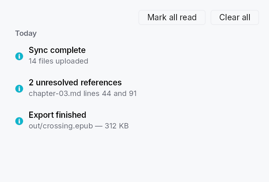
NotificationLog — a scrollable, day-bucketed list of archived notifications.
Public functions
NotificationLog
Detailed description
Renders a NotificationArchiveModel as a scrollable column of
StandardListItem rows grouped under section headers (Today /
Yesterday / This week / Earlier), computed against the user's local
timezone on every archive mutation. An optional toolbar row provides
mark-all-read and clear buttons. Unread rows show the title in
BodyBold; read rows use Body. An empty-state hint is shown when the
archive is empty.
Sizing
The log grows into a host that bounds its height and compresses
inside one shorter than its natural height (floored at one row);
only a host that hugs its content — which is how the overlay layer
measures the NotificationCenterButton
popover — falls back to preferred_width /
preferred_height. Row text is
elided, not wrapped, with the full text on the row's rich
tooltip: notification prose is arbitrary and the log does not
control its own width, so a wrapping row would over-constrain
itself and push its trailing action buttons out of view.
When to use
- Embed directly inside a side panel or settings page for an in-app notification centre.
- Wrap in
NotificationCenterButtonfor the standard bell-icon-with-popover pattern. - Call
NotificationLogDialog::showfor a one-line modal presentation.
let archive: Rc<NotificationArchiveModel> = ctx.app_state().unwrap();
let log = NotificationLog::new(archive)
.on_action_invoked(|_entry, action, ctx| {
if let Some(name) = &action.intent_name {
ctx.send_intent(teksilo_core::Intent::new(name));
}
});
Touch and pen
A log row is a StandardListItem, so its target floor follows the density
ladder with every other list row, and its tap replays the entry on the release.
The trailing action strip is made of Links and Buttons, each its own target.
Density
The picture above is the widget at TargetDensity::Compact, the mouse-and-keyboard ladder. Below is the same subject on the same canvas with only the ladder changed, so what moves is the density and nothing else — where the subject no longer fits, that is what the denser targets cost it at that size. See docs/density-and-targets.md.
Touch
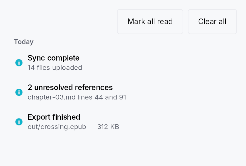
API reference
📖 Full rustdoc API for this module
pub struct NotificationLog
Import: use teksilo::prelude::NotificationLog; — in teksilo::prelude::*.
Configurable archive log. Shipped chrome:
- mark-all-read + clear buttons in a toolbar row;
- empty-state hint when the archive is empty;
- day-bucket section headers (Today / Yesterday / This week / Earlier) above the rows for each bucket — computed against the user's local timezone, recomputed on every archive mutation;
StandardListItemrows with unread-as-bold differentiation.
A SearchField filter and a severity-chip filter can be composed by apps using the existing widget toolkit.
#![allow(unused)] fn main() { pub struct NotificationLog { /* fields */ } }
Methods
pub fn new(archive: Rc<NotificationArchiveModel>) -> Self
Construct a log bound to the shared archive. The archive is
expected to outlive the log (typically held in app_state).
pub fn for_window(mut self, window_id: TeksiloWindowId) -> Self
Scope this log to entries routed to window window_id (plus
any Broadcast entry) — the shape a NotificationCenterButton
mounted in that window wants for its popover body. Overrides
any previous for_window / for_audience call.
pub fn for_audience(mut self, audience: ToastAudience) -> Self
Scope this log to entries routed to audience (plus any
Broadcast entry). Overrides any previous for_window /
for_audience call.
pub fn show_toolbar(mut self, show: bool) -> Self
Whether to render the toolbar row (mark-all-read + clear).
Default true. Apps that want a chrome-less log (e.g. inside
a custom panel that supplies its own toolbar) pass false.
pub fn empty_state(mut self, f: impl Fn() -> Box<dyn Widget> + 'static) -> Self
Override the empty-state hint. Default: a centered "No notifications" text. Pass a factory returning any widget for a custom empty view (illustration, call-to-action, …).
A factory rather than a widget because the log rebuilds on every archive mutation: the view has to be re-creatable each time the archive goes empty again, not just the first time.
log.empty_state(|| Box::new(TextWidget::new(tr!(inbox_zero()))))
pub fn preferred_width(mut self, width: f32) -> Self
Width the log reports when the host proposes an unbounded one.
Default 380 dp.
This is load-bearing for the popover presentation
(NotificationCenterButton):
the overlay layer measures its content with a fully unbounded
proposal, and a StandardListItem asked for an intrinsic
width reports only its chrome, so without a preferred width the
popover would size itself to whatever the two toolbar buttons
happen to measure (~248 dp with the stock labels) and elide
every title to a stub. Hosts that DO bound the width (a dialog,
a side panel) ignore this value.
pub fn preferred_height(mut self, height: f32) -> Self
Height of the scrolling list area when the host proposes an
unbounded height. Default 320 dp.
The log always grows into a host that bounds its height (it reports a flex weight), so this only sets the natural height a content-hugging host — again, the popover — sizes itself to.
pub fn on_entry_invoked( mut self, f: impl Fn(&NotificationEntry, &mut EventContext) + 'static, ) -> Self
Called when the user clicks anywhere on an archived entry's row body (outside any specific action button). The default behaviour is no-op — the log is read-only display unless callers wire this hook.
pub fn on_action_invoked( mut self, f: impl Fn(&NotificationEntry, &ArchivedAction, &mut EventContext) + 'static, ) -> Self
Called when an archived action button is clicked. Apps wire
this hook to replay the action — typically by mapping the
ArchivedAction::intent_name to one of the app's registered
Actions via ctx.send_intent(...). Without this hook
configured the action buttons are inert (the log keeps them
visible for archival context).
Actions without an intent_name render as non-clickable
past-action tags regardless of this hook — there's nothing
for the framework to dispatch against once the live closure
has torn down.
log.on_action_invoked(|_entry, action, ctx| {
// Bridge the dynamic intent_name to one of the app's
// typed AppIntent variants:
match action.intent_name.as_deref() {
Some("app.build.retry") => ctx.send_intent(AppIntent::BuildRetry),
Some(name) => log::warn!("unknown archived intent: {name}"),
None => {}
}
})
OverlayTrigger
OverlayTrigger — the shared "this widget opens that overlay" wrapper.
Public functions
OverlayTrigger
| Returns | Function |
|---|---|
| Constructors | |
Self | around(widget: impl Widget + 'static) |
Self | around_id(id: WidgetId) |
| Builder methods | |
Self | named(name: impl Into<String>) |
Self | on_activate(f: impl Fn(&mut EventContext) + 'static) |
| Methods | |
bool | has_on_activate() |
Detailed description
Used by Dialog, Snackbar, Wizard and PopoverWidget whenever a
caller replaces the default Button trigger with a widget of their own.
One control, on whichever node takes focus
To a screen reader a trigger is one control, and the node focus lands on is
that control: it carries the role, the name, the popup state, and it
answers Enter, Space and the AT Click. Which node that is depends on what
was wrapped, and is decided once, as it mounts:
- A widget that takes no focus (a panel, a glyph, a label): the trigger's own node is the button. It is the Tab stop and it carries everything above.
- A control of its own (a
Button, anIconButton, anything that is or holds a focus stop, even one disabled as it mounts): that control is the button. Its role and its own text stand, the opening routes and the popup state are added to it, and the trigger's node is structure, which the tree walk leaves out. The name given to the trigger is not used there: the control's own text is what a sighted user reads on it, and a second button around the first would be one control heard as two.
Pointer, touch and pen
The trigger has no geometry and no press visual of its own: it forwards the
caller's child, whose target and appearance are the child's. The opener is
an on_tap, attached beside the handlers already there (the external
bucket), so it happens on the release for every pointer kind and never
replaces what the child does itself. It goes on two nodes:
- the wrapped widget, so a tap anywhere on it opens, its margins and its non-interactive parts included;
- the wrapped control, when that is a node inside the widget rather
than the widget itself. A control that handles taps of its own takes a
tap before any ancestor sees it, so an opener left on the wrapper alone
would answer Enter, Space and a reader's
Clickand never a click.
A tap is delivered to the innermost node that recognizes it, and nowhere else, so a click on the control opens once, beside the control's own response to it.
Opening on another button
The trigger opens on the buttons the wrapped widget accepts taps from,
ButtonMask::PRIMARY unless
it says otherwise. To open on a right click, give the wrapped widget
.accept_tap_buttons(ButtonMask::SECONDARY); the inner control gets the
same mask for the opener, so a left click on it stays the control's own.
A second click with the same button on an open trigger closes it.
PopoverWidget::new(OverlayTrigger::around(
tag_chip.accept_tap_buttons(ButtonMask::SECONDARY),
))
.content(tag_menu)
API reference
📖 Full rustdoc API for this module
pub struct OverlayTrigger
Import: use teksilo::widgets::OverlayTrigger;
Wraps an arbitrary widget so it can drive a popover.
PopoverButton and PopoverIconButton cover the two stock triggers; this
is the third case — a trigger that is not a button, such as a table
header's filter glyph or a tag chip. It supplies what those two get from
Button/IconButton: a Tab stop, an activate route (pointer, Enter/Space,
and the AT Click action), the has_popup / expanded disclosure
annotations, and the arena-level enabled gate. A wrapped widget that is a
control already keeps its own focus, role and name; see the module docs.
PopoverWidget::new(OverlayTrigger::around(my_glyph))
.content(my_panel)
.placement(OverlayPlacement::BelowPreferred)
#![allow(unused)] fn main() { pub struct OverlayTrigger { /* fields */ } }
Methods
pub fn around(widget: impl Widget + 'static) -> Self
Wrap any widget as a popover trigger.
pub fn around_id(id: WidgetId) -> Self
around for a widget already inserted by id.
pub fn named(self, name: impl Into<String>) -> Self
Set the trigger's accessible name.
Used when the wrapped widget takes no focus of its own. A wrapped control keeps its own name.
pub fn has_on_activate(&self) -> bool
Whether an activate handler is already installed.
pub fn on_activate(mut self, f: impl Fn(&mut EventContext) + 'static) -> Self
Install the overlay's open/close handler. Routed onto the wrapped widget
as a pointer tap, and onto the node that takes focus as Enter/Space and
the AT Click action.
Padding
Padding — a single-child layout container that adds insets around its child.
Public functions
Padding
Detailed description
Padding shrink-wraps a child widget and enlarges it by configurable insets
on each of the four sides. Horizontal insets are leading/trailing
(logical), not left/right (physical), so they flip automatically in RTL
locales. Each inset accepts a static f32 or a reactive Signal<f32>; a
bound inset schedules a relayout whenever the signal fires, so theme-derived
spacing values take effect without rebuilding the widget tree.
The grow weight, shrink weight, and compression floor reported by the child
are forwarded through the padding so a flexible or shrinkable child inside a
Padding stays flexible or shrinkable from the parent's perspective.
When to use
- Adding whitespace around a widget without wrapping it in a stack.
- Applying asymmetric insets (e.g. extra leading inset for a list item).
- Reacting to a
Signal-driven spacing token.
Use Padding::uniform when all four sides are equal, and
Padding::symmetric when horizontal and vertical insets differ.
#![allow(unused)] fn main() { use teksilo_widgets::primitives::{Padding, TextWidget}; use teksilo_i18n::lit; // 12 dp padding on every side: let _w = Padding::uniform(12.0) .child(TextWidget::new(lit!("Hello"))); }
Density
The picture above is the widget at TargetDensity::Compact, the mouse-and-keyboard ladder. Below is the same subject on the same canvas with only the ladder changed, so what moves is the density and nothing else — where the subject no longer fits, that is what the denser targets cost it at that size. See docs/density-and-targets.md.
Touch
API reference
📖 Full rustdoc API for this module
pub struct Padding
Import: use teksilo::widgets::Padding;
A layout container that adds padding (insets) around a single child.
See the module documentation for the full feature description and
an example. Construct with Padding::new, Padding::uniform, or
Padding::symmetric; attach a child with .child(widget) or
.child(id).
#![allow(unused)] fn main() { pub struct Padding { /* fields */ } }
Methods
pub fn new( top: impl Into<Prop<f32>>, trailing: impl Into<Prop<f32>>, bottom: impl Into<Prop<f32>>, leading: impl Into<Prop<f32>>, ) -> Self
Create a padding with explicit per-side insets.
Argument order mirrors CSS shorthand: (top, trailing, bottom, leading).
trailing and leading are logical — they map to physical right and
left in LTR and are swapped in RTL.
pub fn uniform(amount: impl Into<Prop<f32>>) -> Self
Create a padding with the same inset on all four sides.
pub fn symmetric(vertical: impl Into<Prop<f32>>, horizontal: impl Into<Prop<f32>>) -> Self
Create a padding with equal top/bottom insets and equal leading/trailing insets.
vertical applies to both top and bottom; horizontal applies to both
leading and trailing sides (logical, RTL-aware).
pub fn child(mut self, widget: impl teksilo_core::IntoTeksiChild) -> Self
Set an inline child widget (deferred insertion).
pub fn child_opt(self, widget: Option<impl teksilo_core::IntoTeksiChild>) -> Self
Attach widget when it is Some, and do nothing when it is None.
The conditional-child form. teksu!'s if without an else lowers to
this, and it is what cond.then(|| w) is for in a builder chain. None
adds no arena node, so nothing is laid out, painted, or published to the
accessibility tree, and a stack applies no spacing around it.
Panel
Panel — a themed single-child container that provides a background, border, corner radius, and padding.
Public functions
Panel
Detailed description
The equivalent of Qt's QFrame: a visual wrapper whose chrome comes from
the active PanelStyle trait
implementation. The IntUI default (RecipePanelStyle) honours four
PanelVariant presets (Plain /
Sunken / Raised / Highlighted) while still accepting per-call overrides
for background, border colour/width, corner radius, and padding. Apps
requiring a custom surface (frosted glass, brutalist frame) supply their
own impl PanelStyle per-call (.style(...)) or theme-wide via
theme.style_slots.panel.
Accessibility
Emits Role::Group by default. Call .a11y_presentational() to suppress
the group node when the panel is purely decorative (e.g. a toolbar
background that should not introduce a spurious container in the AT tree).
Either way the content is reachable: a presentational panel drops its own
node and keeps its children.
#![allow(unused)] fn main() { use teksilo_widgets::Panel; use teksilo_widgets::primitives::TextWidget; use teksilo_i18n::lit; let _w = Panel::new() .padding(12.0) .child(TextWidget::new(lit!("Content"))); }
Density
The picture above is the widget at TargetDensity::Compact, the mouse-and-keyboard ladder. Below is the same subject on the same canvas with only the ladder changed, so what moves is the density and nothing else — where the subject no longer fits, that is what the denser targets cost it at that size. See docs/density-and-targets.md.
Touch
API reference
📖 Full rustdoc API for this module
pub struct Panel
Import: use teksilo::widgets::Panel;
A themed container with background, border, corner radius, and padding.
#![allow(unused)] fn main() { pub struct Panel { /* fields */ } }
Methods
pub fn new() -> Self
Construct a panel with default theme values (Plain variant, no manual overrides).
pub fn variant(mut self, variant: PanelVariant) -> Self
Pick the design-language variant. Default Plain. The active
PanelStyle decides what each variant means visually (the
IntUI default maps Plain → surface_main, Sunken →
surface_sunken, Raised → surface_raised, Highlighted →
accent_subtle_bg, with matching border defaults).
pub fn style(mut self, style: impl teksilo_core::styles::PanelStyle) -> Self
Per-call style override. Replaces the theme-wide default
PanelStyle for just this Panel instance — same role as
Button::style(...). Manual overrides (background,
border_color, etc.) are still passed to the style via
PanelStyleConfig; custom styles are free to honour or ignore
them.
pub fn a11y_presentational(mut self) -> Self
Mark the panel as presentational for assistive tech: the panel's
own node becomes a bare GenericContainer, which the platform
adapters drop, so its wrapping chrome (background, border,
padding) doesn't introduce a spurious Group node between an
outer widget (Toolbar, StatusBar, etc.) and the real content.
The children stay in the tree, promoted to the panel's parent.
pub fn child(mut self, widget: impl teksilo_core::IntoTeksiChild) -> Self
Set an inline child widget (deferred insertion).
pub fn child_opt(self, widget: Option<impl teksilo_core::IntoTeksiChild>) -> Self
Attach widget when it is Some, and do nothing when it is None.
The conditional-child form. teksu!'s if without an else lowers to
this, and it is what cond.then(|| w) is for in a builder chain. None
adds no arena node, so nothing is laid out, painted, or published to the
accessibility tree, and a stack applies no spacing around it.
pub fn background(mut self, color: impl Into<ColorProp>) -> Self
Override the background. Accepts Color, a SurfaceRole,
or a Signal<Color>. Default (unset) is SurfaceRole::Main.
pub fn border_color(mut self, color: impl Into<ColorProp>) -> Self
Override the border color. Accepts Color, a BorderRole,
or a Signal<Color>. Default (unset) is BorderRole::Default.
pub fn border_width(mut self, width: impl Into<Prop<f32>>) -> Self
Override the border width (default: the active PanelStyle recipe's own
border width — RecipePanelStyle uses 1 dp).
Accepts a static f32 or a reactive Signal<f32>.
pub fn corner_radius(mut self, radius: impl Into<Prop<f32>>) -> Self
Override the corner radius (default: theme radius_popup).
Accepts a static f32 or a reactive Signal<f32>.
pub fn padding(mut self, padding: impl Into<Prop<f32>>) -> Self
Override the padding (default: the active PanelStyle recipe's own
padding — RecipePanelStyle's 12 dp, density-scaled).
Accepts a static f32 or a reactive Signal<f32>.
PasswordField

PasswordField — secure single-line text entry with a reveal
toggle, masking, Caps Lock warning, and clipboard protection.
Public types
| Kind | Name |
|---|---|
enum | RevealMode — How the reveal affordance behaves |
struct | PasswordField — Secure single-line text entry |
Public functions
PasswordField
Detailed description
A thin, ergonomic preset over a secure
TextInputField composed
SpinBox-style: the field + an embedded reveal button live inside
one bordered frame with a unified focus halo. Masking happens at the
text-engine layer (one echo glyph per source char), so the
plaintext never reaches the shaper or glyph atlas while masked, and
caret / selection / hit-test stay correct.
On Linux, while a screen reader is attached, Teksilo reports each key
to the AT-SPI registry, which is how Orca hears keys in a Wayland
session (teksilo_platform::key_report). A key typed into this field,
revealed or not, goes there without its character: no text, and the
keysym VoidSymbol. Its physical keycode and modifiers still go,
because Orca matches its own commands on them, so a process listening
to the registry can tell which physical keys were pressed. GTK 3 and
Qt report the character too.
Feature parity target: Qt QLineEdit echo modes, SwiftUI
SecureField, WinUI PasswordBox / PasswordRevealMode, and the
Android password_toggle.
Example
let password = ctx.signal(String::new());
PasswordField::new(password.clone())
.label(tr!(password())) // or .label(lit!("Password"))
.placeholder(tr!(password_hint())) // i18n-first; `_literal` twins bypass i18n
.validator(|s| if s.len() >= 8 {
ValidationOutcome::Valid
} else {
ValidationOutcome::Invalid { message: "Too short".into() }
})
Density
The picture above is the widget at TargetDensity::Compact, the mouse-and-keyboard ladder. Below is the same subject on the same canvas with only the ladder changed, so what moves is the density and nothing else — where the subject no longer fits, that is what the denser targets cost it at that size. See docs/density-and-targets.md.
Touch

API reference
📖 Full rustdoc API for this module
pub enum RevealMode
Import: use teksilo::widgets::RevealMode;
How the reveal affordance behaves. Mirrors WinUI's
PasswordRevealMode.
#![allow(unused)] fn main() { pub enum RevealMode { /* variants */ } }
Variants
Toggle— A click (or Space / Enter while focused) flips between masked and revealed. Backed byIconButton::visibility_toggle; fully keyboard- and screen-reader-accessible. (Default.)Hold— Press-and-hold to reveal, release to re-mask (WinUI "Peek"). Pointer-oriented; preferTogglefor keyboard accessibility.None— No reveal button — the field is always masked per itsEchoMode.
pub struct PasswordField
Import: use teksilo::widgets::PasswordField;
Secure single-line text entry. See the module docs.
#![allow(unused)] fn main() { pub struct PasswordField { /* fields */ } }
Methods
pub fn new(password: Signal<String>) -> Self
Construct a secure field bound to password.
pub fn placeholder(mut self, text: impl Into<LocalizedString>) -> Self
Placeholder shown when empty. Never masked.
pub fn label(mut self, label: impl Into<LocalizedString>) -> Self
Accessible name, applied to the Role::PasswordInput field node.
Strongly recommended for screen-reader users.
pub fn enabled(mut self, enabled: impl Into<Prop<bool>>) -> Self (default: true)
Set the enabled state, statically or reactively. Forwarded to the
arena at build time — a bound Signal<bool> updates live as it
changes.
pub fn read_only(mut self, read_only: bool) -> Self (default: false)
Read-only: selection works, edits don't.
pub fn max_length(mut self, max_length: usize) -> Self (default: None)
Hard cap on length in chars.
pub fn char_filter(mut self, f: impl Fn(char) -> bool + 'static) -> Self
Per-character input filter (applied to keystrokes, IME commits, and paste).
pub fn validator(mut self, f: impl Fn(&str) -> ValidationOutcome + 'static) -> Self
Commit-time validator (Enter / blur). Drives the inline
validation strip and aria-invalid.
pub fn on_submit_fn( mut self, f: impl Fn(&mut teksilo_core::widget::EventContext) + 'static, ) -> Self
Fired on Enter (focus stays put).
pub fn on_blur_fn( mut self, f: impl Fn(&mut teksilo_core::widget::EventContext) + 'static, ) -> Self
Fired once per focus-loss.
pub fn min_width(mut self, width: f32) -> Self
Minimum frame width (logical px). Default 65.
pub fn variant(mut self, variant: TextInputVariant) -> Self
Frame variant (Outlined / Filled / Underline / Bare).
pub fn style(mut self, style: impl TextInputStyle) -> Self
Per-instance style override.
pub fn echo_char(mut self, c: char) -> Self
Override the masking glyph (default '•').
pub fn echo_mode(mut self, mode: EchoMode) -> Self
Set the EchoMode (default EchoMode::Masked).
pub fn reveal_mode(mut self, mode: RevealMode) -> Self
Set the RevealMode (default RevealMode::Toggle).
pub fn revealed(mut self, revealed: Signal<bool>) -> Self
Bind an external reveal signal (shared with other UI, observed
for analytics, or driven programmatically). Defaults to an
internal signal exposed via revealed_signal.
pub fn allow_copy(mut self, allow: bool) -> Self
Permit copy / cut even while masked (default false). Copy is
always allowed while revealed regardless of this flag.
pub fn caps_lock_warning(mut self, on: bool) -> Self
Show a Caps Lock warning when focused with Caps Lock on (default
true). The warning is announced to screen readers via a polite
live region.
pub fn at_reveal_policy(mut self, policy: AtRevealPolicy) -> Self
How a revealed field reports to assistive tech (default
AtRevealPolicy::SwapRole).
pub fn tooltip(mut self, text: impl Into<LocalizedString>) -> Self
Plain single-line tooltip shown on hover.
Mutually exclusive with rich_tooltip_key,
rich_tooltip,
rich_tooltip_content, and
composite_tooltip — calling any of them
clears the others.
pub fn rich_tooltip_key(mut self, key: impl Into<String>) -> Self
Registry-keyed rich tooltip.
Mutually exclusive with the other tooltip setters.
pub fn rich_tooltip_content(mut self, content: tooltip::TooltipContent) -> Self
Inline rich tooltip (canonical name: accepts a
TooltipContent directly without a
registry key).
Mutually exclusive with the other tooltip setters.
pub fn rich_tooltip(mut self, content: tooltip::TooltipContent) -> Self
Inline rich tooltip.
Mutually exclusive with the other tooltip setters.
Prefer rich_tooltip_content for the
canonical API.
pub fn composite_tooltip(mut self, content: impl Widget + 'static) -> Self
Composite (arbitrary-widget) tooltip.
Mutually exclusive with the other tooltip setters.
pub fn revealed_signal(&self) -> Signal<bool>
The reveal-state signal (true = plaintext shown). Useful to
observe or drive reveal programmatically.
pub fn text(&self) -> Signal<String>
The bound password signal.
PopoverSurface
PopoverSurface — the themed panel a popover's content sits in.
Public functions
PopoverSurface
Detailed description
Style infrastructure, not a widget an app mounts: RecipePopoverStyle (and
any PopoverStyle replacing it) constructs one in make_body, and
PopoverWidget shows the result as its overlay. It lived in popover.rs
beside the standalone Popover widget until that type was removed; the two
were never related beyond sharing a file.
API reference
📖 Full rustdoc API for this module
pub struct PopoverSurface
Import: use teksilo::widgets::PopoverSurface;
#![allow(unused)] fn main() { pub struct PopoverSurface { /* fields */ } }
Methods
pub fn new( content: PendingChild, placement: OverlayPlacement, show_caret: bool, caret_size: f32, name: String, content_padding: EdgeInsets, background: SurfaceRole, corner_radius: f32, presentational: bool, ) -> Self
PopoverWidget
PopoverWidget<T> — a generic trigger that opens a popover when
activated, plus the PopoverButton / PopoverIconButton aliases.
Public types
| Kind | Name |
|---|---|
trait | PopoverTrigger — A trigger widget usable with PopoverWidget |
type | PopoverCustom — A popover whose trigger is an arbitrary widget, wrapped in OverlayTrigger |
struct | PopoverWidget — A trigger paired with a popover surface |
type | PopoverButton — A Button that opens a popover when activated |
type | PopoverIconButton — An IconButton that opens a popover when activated |
Public functions
PopoverWidget
PopoverTrigger
| Returns | Function |
|---|---|
| Builder methods | |
Self | with_shared_interaction(signal: Signal<InteractionState>) |
Self | with_has_popup(kind: HasPopup) |
Self | with_expanded_when(open: Signal<bool>) |
Self | with_on_activate(f: impl Fn(&mut EventContext) + 'static) |
| Methods | |
bool { /* default implementation */ } | suppress_caret() |
Signal<TextRole> | caret_role(interaction: &Signal<InteractionState>) |
bool | has_on_activate() |
| Associated functions | |
HasPopup | default_has_popup() |
bool | default_show_caret() |
Detailed description
Wraps a caller-built trigger (T: PopoverTrigger) with overlay
wiring: owns a popover_open: Signal<bool> toggled on activate /
dismiss, sets has_popup and expanded_when on the inner trigger so
AT announces the disclosure state, adds the popover content as a
dormant subtree whose panel is built the first time it is opened, and
shows / hides it via OverlayRequest. The
set_dormant + activate + show_overlay sequence and the
dismiss-callback shape match DateEdit
so behavior across the disclosure family stays consistent.
Keyboard
Beyond whatever activates the trigger itself, Alt+ArrowDown opens the
popover and Alt+ArrowUp closes it — the platform disclosure chord
(Win32 / WinForms / WPF drop-downs, and the W3C ARIA combobox pattern).
Every consumer inherits it, so PopoverButton, PopoverIconButton
and ColorEdit share one
implementation. F4 is deliberately not bound here: this generic also
backs toolbar chevrons and menu buttons, which carry no such
convention, so the drop-down fields bind it themselves.
#![allow(unused)] fn main() { use teksilo_widgets::{Button, ButtonVariant, IconButton, MenuList, MenuItem, PopoverButton, PopoverIconButton}; use teksilo_widgets::primitives::TextWidget; use teksilo_i18n::lit; // Text trigger (HasPopup::Dialog by default, no caret): let _w = PopoverButton::new(Button::new(lit!("Choose…")).variant(ButtonVariant::Plain)) .content(TextWidget::new(lit!("Pick"))); // Icon trigger (HasPopup::Menu by default, corner caret on): let _w = PopoverIconButton::new(IconButton::add().toolbar()) .content(MenuList::new().item(MenuItem::new(lit!("New file")))); }
Trigger configuration overrides
build() configures the inner trigger by calling has_popup,
expanded_when, and on_activate_fn (and share_interaction when a
caret is shown). These replace any previous values the caller set
— in particular any on_activate_fn set before ::new is discarded,
because the activate slot is owned by the popover wiring. Use
on_open / on_close, or observe open_signal, for side effects;
on_close_with also says why the popover closed (a DismissReason:
an outside press, Escape, the popover closing itself, a cascade).
Per-trigger differences (the PopoverTrigger trait)
Button and IconButton differ only in: the default has_popup
kind, whether the disclosure caret shows by default, whether the
caret is suppressed (IconButton at Compact), and how the caret's
color is derived. Those four points live behind PopoverTrigger;
everything else is shared by the generic.
API reference
📖 Full rustdoc API for this module
pub trait PopoverTrigger
Import: use teksilo::widgets::PopoverTrigger;
A trigger widget usable with PopoverWidget. Implemented for
Button, IconButton and OverlayTrigger. Captures the few
points where the triggers differ; everything else is handled by the
generic wrapper.
#![allow(unused)] fn main() { pub trait PopoverTrigger: Widget + Sized + 'static { /* associated items below */ } }
Associated items
fn default_has_popup() -> HasPopup;
The has_popup kind announced by AT when the caller doesn't
override it. Button → HasPopup::Dialog; IconButton →
HasPopup::Menu.
fn default_show_caret() -> bool;
Whether the disclosure caret is painted by default. Button →
false (text buttons advertise via an inline trailing chevron);
IconButton → true (icon-only triggers have no label slot).
fn suppress_caret(&self) -> bool { /* default implementation */ }
Whether the caret must be suppressed for this trigger regardless
of the flag (e.g. IconButton at Compact has no room).
Default: never suppressed.
fn caret_role(&self, interaction: &Signal<InteractionState>) -> Signal<TextRole>;
The TextRole the disclosure caret tints with, derived from the
shared interaction signal so the caret and trigger tint together
across hover / press / focus / disabled. Only called when a caret
is shown.
fn with_shared_interaction(self, signal: Signal<InteractionState>) -> Self;
Share an externally-allocated interaction signal so the caret colour tracks the trigger's state (hover / press / focus / disabled) exactly.
fn with_has_popup(self, kind: HasPopup) -> Self;
Annotate the trigger with the given has_popup kind for AT.
fn with_expanded_when(self, open: Signal<bool>) -> Self;
Bind the trigger's set_expanded disclosure state to open.
fn with_on_activate(self, f: impl Fn(&mut EventContext) + 'static) -> Self;
Install the popover's open/close handler as the trigger's activate callback.
fn has_on_activate(&self) -> bool;
Return true if the trigger already has an activate handler set by
the caller — the wrapper replaces it and will warn at build time.
pub type PopoverCustom
Import: use teksilo::widgets::PopoverCustom;
A popover whose trigger is an arbitrary widget, wrapped in
OverlayTrigger.
The third stock shape beside PopoverButton and PopoverIconButton,
and what replaced the standalone Popover widget: that type existed only
because this generic could not take a non-button trigger.
#![allow(unused)] fn main() { pub type PopoverCustom = PopoverWidget<OverlayTrigger>; }
pub struct PopoverWidget
Import: use teksilo::widgets::PopoverWidget;
A trigger paired with a popover surface. See the module docs for the
contract on which trigger properties get overridden during build().
Use the PopoverButton / PopoverIconButton aliases for the
concrete trigger types.
#![allow(unused)] fn main() { pub struct PopoverWidget<T: PopoverTrigger> { /* fields */ } }
Methods
pub fn new(trigger: T) -> Self
Wrap a pre-configured trigger. The popover content is set
separately via Self::content (required).
pub fn content(mut self, content: impl Widget + 'static) -> Self
Set the popover content — added to the tree as a dormant subtree
during build(), woken via
EventContext::activate
when the trigger fires. Required.
pub fn placement(mut self, p: OverlayPlacement) -> Self
Override the popover's placement relative to the trigger.
Default: OverlayPlacement::BelowPreferred.
pub fn dismiss_behavior(mut self, b: DismissBehavior) -> Self
Override the dismiss behavior. Default:
DismissBehavior::EscapeOrClickOutside.
pub fn fade_duration(mut self, d: Duration) -> Self
Animate the overlay in / out over the given duration. Default:
no fade. See OverlayRequest::with_fade for the mechanism.
pub fn has_popup_kind(mut self, k: HasPopup) -> Self
Override the has_popup kind announced by AT. Defaults to the
trigger type's PopoverTrigger::default_has_popup.
pub fn show_disclosure_caret(mut self, on: bool) -> Self
Whether to paint the disclosure triangle in the trigger's
bottom-right corner. Defaults to the trigger type's
PopoverTrigger::default_show_caret. The caret is
suppressed automatically when
PopoverTrigger::suppress_caret returns true (e.g.
IconButton at Compact) regardless of this flag. AT-hidden —
the popup is announced via set_has_popup + set_expanded.
pub fn on_open(mut self, f: impl Fn() + 'static) -> Self
Notification fired on the rising edge of the popover (after the
overlay show request is dispatched). No EventContext — observe
Self::open_signal from your build() if you need
frame / dispatch context.
pub fn on_close(mut self, f: impl Fn() + 'static) -> Self
Notification fired on the falling edge of the popover (when the overlay's dismiss callback runs).
Replaces any on_close_with set before it. Use
that one to learn how the popover was closed.
pub fn on_close_with(mut self, f: impl Fn(DismissReason) + 'static) -> Self
on_close, told why the popover closed.
The DismissReason is the overlay manager's own:
OutsidePress— a press outside the panel, including a click on the trigger itself while the popover is open (the press closes it before the trigger sees it);Escape— Escape pressed in the panel;Programmatic— the popover closed itself:Alt+ArrowUp, Enter or Space on the trigger, theopen_actiontoggle, Tab out of the panel, or the application dismissing it;Cascade— an overlay this popover was opened from went away and took it along.
The enum is #[non_exhaustive], so match it with a wildcard arm.
Replaces any on_close set before it.
pub fn open_signal(&self) -> Signal<bool>
Observe-only handle to the popover-open state.
Read-back only — writing this does not open the popover. Presenting
an overlay needs an EventContext (show_overlay + request_focus),
which no signal observer has; this field is the mirror the trigger writes
after it has done that work. To open the popover from somewhere other
than its trigger, use open_action.
pub fn open_action(mut self, intent: &'static str) -> Self (default: None)
Register a named global action that toggles this popover, so a menu
entry, a global shortcut or ctx.send_intent(...) can open it — not only
a click on its own trigger.
Without this a popover is reachable by pointer alone. on_open /
on_close are notification-only and open_signal is a read-back mirror
(see its doc), so an app that wanted "Go to… ⌘G" next to its button had
no way to wire the second half. Action handlers are the one place that
does get an EventContext, which is exactly what presenting an overlay
requires — so the action runs the identical toggle the trigger runs, and
the two can never drift.
Registered with register_action_global, deliberately: intents walk
source-widget → root, and a menu renders in an overlay that is a
sibling of the popover's own subtree, so a plain register_action would
never be reached from a menu item. Pair it with
register_shortcut_global in the app for the keystroke.
PopoverButton::new(Button::new(tr!(go_to())))
.content(palette)
.open_action("go.to")
// elsewhere: MenuEntry::new(tr!(go_to())).intent("go.to").shortcut("go.to")
pub fn surface(mut self, variant: PopoverVariant) -> Self
Choose which themed PopoverVariant surface wraps the content.
Default is PopoverVariant::Default (elevated panel with
padding + shadow). The surface is resolved from the active
PopoverStyle (theme.style_slots.popover), so it themes
app-wide.
pub fn bare(mut self) -> Self
Opt OUT of the themed surface: the content is added raw, with no
background / border / padding. Use when the content already
supplies its own chrome — a MenuList (which
routes through the Menu PopoverStyle itself) or a hand-rolled
surface Panel. Without this, such content would be
double-chromed.
pub fn surface_style(mut self, style: impl PopoverStyle) -> Self
Per-call PopoverStyle override for the surface (highest
precedence over the theme slot and the built-in default). Mirrors
the per-call override the standalone Popover used to offer. No effect under
bare.
pub fn surface_name(mut self, name: impl Into<String>) -> Self (default: String::new())
Accessible name for the surface's Role::Dialog node. Without one
the surface is named by the trigger that opens it. No effect under
bare or for the Menu variant (which is
presentational).
pub fn tooltip(mut self, text: impl Into<teksilo_i18n::LocalizedString>) -> Self
Show a plain single-line tooltip on the trigger after a hover delay.
Mutually exclusive with rich_tooltip,
rich_tooltip_content, and
composite_tooltip — each setter clears
the other three so the last call wins. The tooltip anchors on the
trigger, not on the popover content.
pub fn rich_tooltip(mut self, key: impl Into<String>) -> Self
Show a rich tooltip (looked up by registry key) on the trigger after a hover delay. Mutually exclusive with the other tooltip setters — the last call wins.
pub fn rich_tooltip_content(mut self, content: crate::tooltip::TooltipContent) -> Self
Show an inline rich tooltip (pre-built TooltipContent) on the
trigger after a hover delay. Mutually exclusive with the other tooltip
setters — the last call wins.
pub fn composite_tooltip(mut self, content: impl Widget + 'static) -> Self
Show a composite tooltip (arbitrary widget tree) on the trigger after a longer hover delay. Mutually exclusive with the other tooltip setters — the last call wins.
pub type PopoverButton
Import: use teksilo::widgets::PopoverButton;
A Button that opens a popover when activated. Alias for
PopoverWidget<Button> — HasPopup::Dialog, no caret by default.
#![allow(unused)] fn main() { pub type PopoverButton = PopoverWidget<Button>; }
pub type PopoverIconButton
Import: use teksilo::widgets::PopoverIconButton;
An IconButton that opens a popover when activated. Alias for
PopoverWidget<IconButton> — HasPopup::Menu, corner caret on by
default (skipped at Compact).
#![allow(unused)] fn main() { pub type PopoverIconButton = PopoverWidget<IconButton>; }
PrivacySettings
Available under:
#[cfg(feature = "telemetry")]
PrivacySettings — a user-facing panel for telemetry consent management.
Public functions
PrivacySettings
| Returns | Function |
|---|---|
| Constructors | |
Self | new() |
| Builder methods | |
Self | compact(compact: bool) |
Self | show_identity_row(show: bool) |
Self | show_mode_switch(show: bool) |
Self | show_inspect(show: bool) |
Self | inspect_event_count(n: usize) |
Self | privacy_policy_url(url: impl Into<String>) |
Self | data_processor_name(name: impl Into<String>) |
Detailed description
Embeddable in any container — typically a Dialog for first-run consent
or a dedicated tab in the app's settings UI. Reads from
OpenedTelemetry and writes to ConsentStore; the UI rebuilds
whenever the consent state signal changes. When no telemetry is registered
in app_state the widget renders a graceful placeholder so apps without
analytics pay nothing.
Sections (top-to-bottom)
- Plain-language Art. 13 notice — controller, processor name,
purposes, lawful basis, retention, recipients, withdrawal right.
All strings flow through
tr_widget!against keys defined incrates/teksilo-widgets/locales/en-US.ftlandfr-FR.ftlunder theprivacy-*namespace. Apps install the framework bundle viaI18nConfig::framework_locales(teksilo_widgets::framework_locales()). - Per-scope toggles — one per
ConsentScopefield, intersected withreporter.supported_scopes()so toggles for unsupported scopes are hidden, not just disabled. Toggles work fromUnknown(auto-transition toGrantedwith the toggled scope) andGrantedstates; they're disabled when state isDenieduntil the user clicks Withdraw → Accept. - Accept all / Reject all — equal-prominence buttons (CNIL parity rule, GDPR Art. 7).
- Identity row (pseudonymous mode only) — install_id display, Get-my-data button (Art. 15 + 20), Erase-my-data button (Art. 17).
- Inspect data sent — accordion listing the most-recent events from the bundle's recent-log ring buffer.
- Mode switch (when both adapters configured) — confirm-button pair to flip anonymous ↔ pseudonymous.
- Footer — Withdraw consent (equal prominence to Accept, GDPR Art. 7(3)).
When no OpenedTelemetry is registered in app_state, the
widget renders a "Telemetry not configured" placeholder. Apps that
ship without analytics pay nothing.
// Embed in a Dialog for first-run consent (compact mode).
let panel = PrivacySettings::new()
.compact(true)
.data_processor_name("Acme Corp")
.privacy_policy_url("https://example.com/privacy");
API reference
📖 Full rustdoc API for this module
pub struct PrivacySettings
Import: use teksilo::widgets::PrivacySettings; — needs teksilo's telemetry feature.
Settings widget for telemetry consent. Construct with
PrivacySettings::new and embed in any container.
#![allow(unused)] fn main() { pub struct PrivacySettings { /* fields */ } }
Methods
pub fn new() -> Self
Create a PrivacySettings widget with full layout and all sections shown.
pub fn compact(mut self, compact: bool) -> Self
Use a compact layout suited for first-run modals: hides the mode-switch
section and tightens spacing. Defaults to false (full settings panel).
pub fn show_identity_row(mut self, show: bool) -> Self
Show or hide the install-id / GDPR Art. 15 + 17 identity row in
pseudonymous mode. Set to false when the host app supplies its own
equivalent UI. Defaults to true.
pub fn show_mode_switch(mut self, show: bool) -> Self
Show or hide the anonymous ↔ pseudonymous mode-switch section when both
adapters are configured. Has no effect if only one mode is available.
Defaults to true.
pub fn show_inspect(mut self, show: bool) -> Self
Show or hide the "Inspect data sent" accordion that lists recent events
from the telemetry ring buffer. Defaults to true.
pub fn inspect_event_count(mut self, n: usize) -> Self
Maximum number of recent events shown in the inspect accordion. Clamped to at least 1. Defaults to 50.
pub fn privacy_policy_url(mut self, url: impl Into<String>) -> Self (default: None)
Surface a "Read full privacy policy" link in the Art. 13 notice. When not set the link is hidden — the controller is responsible for hosting their own policy page.
pub fn data_processor_name(mut self, name: impl Into<String>) -> Self
Plain-text controller name used in the Art. 13 notice ("Data is
processed by <name>"). Defaults to "the application".
ProgressBar

ProgressBar — a bar showing progress from 0.0 to 1.0.
Public functions
ProgressBar
| Returns | Function |
|---|---|
| Constructors | |
Self | new(value: f32) |
Self | indeterminate() |
| Builder methods | |
Self | value(state: impl Into<Prop<f32>>) |
Self | orientation(orientation: Orientation) |
Self | thickness(thickness: f32) |
Self | track_color(color: impl Into<ColorProp>) |
Self | fill_color(color: impl Into<ColorProp>) |
Self | style(style: impl teksilo_core::styles::ProgressBarStyle) |
Self | label(text: impl Into<LocalizedString>) |
Detailed description
Supports determinate (fixed or reactive value), indeterminate (animated
sweep), horizontal, and vertical orientations. The stationary chrome (track
and determinate fill) is delegated to ProgressBarStyle; the indeterminate
sweep is widget-owned (motion infrastructure is not chrome). Three paint
paths exist internally:
- Horizontal indeterminate uses the shader-driven animated-quad
pipeline.
ProgressBar::buildregisters anAnimatedQuadHandleand mounts a singleIndeterminateSweepLeafwhosepaint()issues onedraw_animated_quadper frame; the shader composes the track + moving fill in a procedural draw. The recipe frame is NOT mounted in this case (the shader self-paints both). - Vertical indeterminate keeps the signal-based path. The
recipe frame paints the track; an
IndeterminateSweepLeafin signal mode paints a moving fill rect on top driven by aSignal<f32>::animate_looping. - Determinate mounts the recipe frame only; the frame paints the track plus a proportional fill rect.
#![allow(unused)] fn main() { use teksilo_widgets::ProgressBar; use teksilo_core::signal::Signal; // Static determinate bar at 70 %: let _bar = ProgressBar::new(0.7).thickness(6.0); // Reactive determinate bar: let progress = Signal::new(0.0_f32); let _bar = ProgressBar::new(0.0).value(progress); // Indeterminate (animated sweep): let _spinner_bar = ProgressBar::indeterminate(); }
Density
The picture above is the widget at TargetDensity::Compact, the mouse-and-keyboard ladder. Below is the same subject on the same canvas with only the ladder changed, so what moves is the density and nothing else — where the subject no longer fits, that is what the denser targets cost it at that size. See docs/density-and-targets.md.
Touch

API reference
📖 Full rustdoc API for this module
pub struct ProgressBar
Import: use teksilo::widgets::ProgressBar;
A progress bar — determinate or indeterminate, horizontal or vertical.
#![allow(unused)] fn main() { pub struct ProgressBar { /* fields */ } }
Methods
pub fn new(value: f32) -> Self
Create a determinate progress bar with a static value (0.0–1.0).
pub fn indeterminate() -> Self
Create an indeterminate progress bar (animated sweep).
pub fn value(mut self, state: impl Into<Prop<f32>>) -> Self
Bind the progress value to a reactive state.
pub fn orientation(mut self, orientation: Orientation) -> Self
Set the bar's orientation. Default is Orientation::Horizontal.
Vertical bars use the shader-driven animation path only for horizontal;
vertical indeterminate bars use the signal-driven path instead.
pub fn thickness(mut self, thickness: f32) -> Self
Set the bar's narrow dimension in logical pixels. For horizontal bars this is the height; for vertical bars this is the width. Default is the active style's thickness, 4.0 for the shipped style.
pub fn track_color(mut self, color: impl Into<ColorProp>) -> Self
Override the track background. Default (unset) is SurfaceRole::Sunken.
Accepts Color, roles, or Signal<Color>.
pub fn fill_color(mut self, color: impl Into<ColorProp>) -> Self
Override the fill / sweep color. Default (unset) is SurfaceRole::Accent.
Accepts Color, roles, or Signal<Color>.
pub fn style(mut self, style: impl teksilo_core::styles::ProgressBarStyle) -> Self
Per-call style override for the stationary chrome (track +
determinate fill). The indeterminate sweep is widget-owned and
always uses the shader-quad / signal-driven path described in
the module doc; the style supplies the sweep's colour
recipe via fill_color_override / track_color_override.
pub fn label(mut self, text: impl Into<LocalizedString>) -> Self
Accessible name for the progress bar.
Pulse
Pulse — a wrapper widget that pulses its child's opacity between
a min and max value on a fixed period, sine-shaped.
Public functions
Pulse
| Returns | Function |
|---|---|
| Constructors | |
Self | opacity(min: f32, max: f32) |
| Builder methods | |
Self | period(period: Duration) |
Self | child(widget: impl teksilo_core::IntoTeksiChild) |
Self | child_opt(widget: Option<impl teksilo_core::IntoTeksiChild>) |
Detailed description
The classic "blinking red light" / recording-indicator / attention beacon pattern. The wrapped subtree pulses smoothly (sine interpolation), giving a breathing-light feel rather than a hard on/off blink.
ctx.add(
Pulse::opacity(0.3, 1.0)
.period(Duration::from_millis(1200))
.child(RectWidget::new().background(Color::RED)),
);
Layout semantics
Layout-transparent — the child reports its full natural size at
all opacity values. Identical layout footprint to Fade.
Reduced motion
Honours prefers-reduced-motion: skips the per-frame driver and
pins opacity at the midpoint (min + max) / 2. The subtree stays
visible at a steady, non-distracting brightness so the indicator
still communicates "active" without animating.
API reference
📖 Full rustdoc API for this module
pub struct Pulse
Import: use teksilo::widgets::Pulse;
Wraps a child and pulses its opacity smoothly between min and
max on a fixed period. Useful for recording indicators,
notification beacons, and attention-grabbing status icons.
#![allow(unused)] fn main() { pub struct Pulse { /* fields */ } }
Methods
pub fn opacity(min: f32, max: f32) -> Self
Wrap a subtree in an opacity pulse between min and max
(both clamped to 0..=1). Uses a sine wave so the transitions
at both extremes are smooth, not abrupt.
pub fn period(mut self, period: Duration) -> Self
Override the pulse period (full cycle min → max → min).
Default: MotionTokens::duration_indeterminate_sweep (~900 ms),
the same continuous-loop budget the indeterminate progress bar
and spinner use — so a re-themed motion stack stays consistent.
pub fn child(mut self, widget: impl teksilo_core::IntoTeksiChild) -> Self
Inline child widget (deferred insertion).
pub fn child_opt(self, widget: Option<impl teksilo_core::IntoTeksiChild>) -> Self
Attach widget when it is Some, and do nothing when it is None.
The conditional-child form. teksu!'s if without an else lowers to
this, and it is what cond.then(|| w) is for in a builder chain. None
adds no arena node, so nothing is laid out, painted, or published to the
accessibility tree, and a stack applies no spacing around it.
RadioButton
RadioButton — mutually exclusive selection control.
Public functions
RadioButton
Detailed description
Multiple RadioButtons share a Signal<usize>; selecting one writes its
value to the signal, which automatically deselects every sibling that
observes the same signal. The widget is non-generic: values are usize
indices into the caller's choice list. Wrap related buttons in a
RadioGroup to provide the AT "2 of 3"
positional announcement required by ARIA.
Label styling
The label is Body / Primary and the caption Small / Secondary by
default. RadioButton::label_style / RadioButton::label_color and
RadioButton::caption_style / RadioButton::caption_color override
them. A theme role colour still dims when the button is disabled; a literal
Color stays as given.
Touch and pen
Same shape as Checkbox: the pressed state is the
framework's (docs/touch-and-pen.md §7.1), selection lands on the release,
and the 24 dp MinSize around the 19 dp dot already clears the conformance
floor at Compact.
Accessibility
Reports Role::RadioButton with set_toggled mirroring the selected
state. Responds to Action::Click from assistive technology. The focus
ring is keyboard-only (:focus-visible gated by the input-modality
signal). When wrapped in RadioGroup, each button emits
push_to_radio_group([sibling_ids]) so screen readers can announce
positional membership.
#![allow(unused)] fn main() { use teksilo_widgets::RadioButton; use teksilo_core::signal::Signal; use teksilo_i18n::lit; let selected = Signal::new(0_usize); let _r0 = RadioButton::new(0, selected.clone()).label(lit!("Light")); let _r1 = RadioButton::new(1, selected.clone()).label(lit!("Dark")); let _r2 = RadioButton::new(2, selected.clone()).label(lit!("System")); }
Density
The picture above is the widget at TargetDensity::Compact, the mouse-and-keyboard ladder. Below is the same subject on the same canvas with only the ladder changed, so what moves is the density and nothing else — where the subject no longer fits, that is what the denser targets cost it at that size. See docs/density-and-targets.md.
Touch
API reference
📖 Full rustdoc API for this module
pub struct RadioButton
Import: use teksilo::widgets::RadioButton;
A single radio button option that writes value into a shared Signal<usize> on selection.
#![allow(unused)] fn main() { pub struct RadioButton { /* fields */ } }
Methods
pub fn on_change(mut self, f: impl Fn(usize, &mut EventContext) + 'static) -> Self
Run f when the user selects this button and it was not already
selected, with this button's value and an EventContext, so it can do
what a bare Signal write cannot (ctx.send_intent(...),
ctx.set_locale(...), opening a window). Fires for the pointer, for
Space, and for an assistive-technology Click.
Re-activating the selected button writes the signal, as every path does, but reports nothing: that is not a change. Programmatic writes to the bound signal report nothing either — there is no event in flight to carry. Observe the signal for those.
pub fn new(value: usize, selected: Signal<usize>) -> Self
Create a radio button with the given value and shared selection signal.
pub fn label(mut self, label: impl Into<LocalizedString>) -> Self
Set the visible label text displayed to the right of the radio circle.
pub fn caption(mut self, text: impl Into<LocalizedString>) -> Self
Secondary explanatory text rendered below the label, left-aligned
with the label (not the radio circle). Uses the small /
text_secondary style. Has no effect unless label(...) is also set.
pub fn label_style( mut self, style: impl Into<teksilo_core::color_prop::TextStyleProp>, ) -> Self
Override the label's text style (font, size, weight). Accepts a
TextStyleRole, a TextStyle, or a Signal of either. Default is
TextStyleRole::Body.
pub fn label_color(mut self, color: impl Into<teksilo_core::color_prop::ColorProp>) -> Self
Override the label's text color. Accepts Color, a theme role, or a
Signal of either. Default is TextRole::Primary. A role still dims
to the disabled color when the radio button is disabled; a literal Color
stays as given.
pub fn caption_style( mut self, style: impl Into<teksilo_core::color_prop::TextStyleProp>, ) -> Self
Override the caption's text style. Default is TextStyleRole::Small.
pub fn caption_color(mut self, color: impl Into<teksilo_core::color_prop::ColorProp>) -> Self
Override the caption's text color. Accepts Color, a theme role, or
a Signal of either. Default is TextRole::Secondary. A role still
dims to the disabled color when the radio button is disabled; a literal
Color stays as given.
pub fn enabled(mut self, enabled: impl Into<Prop<bool>>) -> Self (default: true)
Set the enabled state, statically or reactively. Forwarded to
the arena via ctx.enabled_when(self_id, self.enabled.clone())
at build time.
pub fn variant(mut self, variant: RadioVariant) -> Self
Pick the design-language variant. Default Circle. The active
RadioStyle impl decides what the variant means visually.
pub fn style(mut self, style: impl teksilo_core::styles::RadioStyle) -> Self
Per-call style override. Replaces the theme-wide default
RadioStyle for just this RadioButton instance.
pub fn tooltip(mut self, text: impl Into<LocalizedString>) -> Self
Attach a plain single-line tooltip shown on hover.
pub fn rich_tooltip(mut self, key: impl Into<String>) -> Self
Attach a rich tooltip resolved from the app-wide tooltip
registry. See Button::rich_tooltip.
pub fn rich_tooltip_content(mut self, content: crate::tooltip::TooltipContent) -> Self
Attach a rich tooltip driven by inline TooltipContent.
pub fn composite_tooltip( mut self, content: impl teksilo_core::widget::Widget + 'static, ) -> Self
Attach a composite tooltip — third tier, hosting an arbitrary
widget tree. See Button::composite_tooltip.
RadioGroup
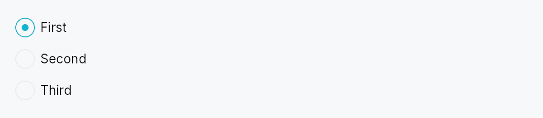
RadioGroup — invisible layout container that groups RadioButtons
and wires their accessibility metadata.
Public functions
RadioGroup
| Returns | Function |
|---|---|
| Constructors | |
Self | new() |
| Builder methods | |
Self | orientation(orientation: Orientation) |
Self | spacing(spacing: f32) |
Self | label(label: impl Into<LocalizedString>) |
Self | radio(button: RadioButton) |
Self | radios(buttons: impl IntoIterator<Item = RadioButton>) |
Self | child(widget: impl Widget + 'static) |
Self | children(iter: impl IntoIterator<Item = impl Widget + 'static>) |
Self | child_opt(widget: Option<impl Widget + 'static>) |
Detailed description
Radios are a fundamentally group-based control: screen readers need
to announce "2 of 3" positional info, which AccessKit models via
push_to_radio_group([sibling_ids]) on each radio button. Loose
RadioButtons scattered in an HStack can't self-assemble this
relation because they have no knowledge of their siblings.
RadioGroup solves this by owning a shared Rc<RefCell<Vec<WidgetId>>>
buffer, injecting it into each RadioButton child before adding
them to the arena, and populating the buffer with each radio's
WidgetId as it's created. RadioButton::accessibility() reads
the buffer and emits the push_to_radio_group calls.
The widget is a pure layout wrapper — it delegates actual
rendering to an HStack or VStack under the hood. Its own
accessibility node carries Role::RadioGroup + an optional
accessible name.
let selected = ctx.signal(0_usize);
RadioGroup::new()
.label(lit!("Theme"))
.radio(RadioButton::new(0, selected.clone()).label(lit!("Light")))
.radio(RadioButton::new(1, selected.clone()).label(lit!("Dark")))
.radio(RadioButton::new(2, selected.clone()).label(lit!("System")))
Density
The picture above is the widget at TargetDensity::Compact, the mouse-and-keyboard ladder. Below is the same subject on the same canvas with only the ladder changed, so what moves is the density and nothing else — where the subject no longer fits, that is what the denser targets cost it at that size. See docs/density-and-targets.md.
Touch
API reference
📖 Full rustdoc API for this module
pub struct RadioGroup
Import: use teksilo::widgets::RadioGroup;
Invisible layout container that groups RadioButtons for
accessibility. Arranges children in an HStack or VStack
and carries Role::RadioGroup on its own a11y node.
#![allow(unused)] fn main() { pub struct RadioGroup { /* fields */ } }
Methods
pub fn new() -> Self
Create an empty radio group with vertical orientation and 8 dp spacing.
pub fn orientation(mut self, orientation: Orientation) -> Self
Layout orientation. Defaults to Vertical — most radio groups
read top-to-bottom.
pub fn spacing(mut self, spacing: f32) -> Self (default: 8.0)
Gap between children.
pub fn label(mut self, label: impl Into<LocalizedString>) -> Self
Accessible name for the group — e.g. "Theme", "Font family". Screen readers announce this before individual radio labels.
pub fn radio(mut self, button: RadioButton) -> Self
Add a radio button. The group's shared sibling-id buffer is
injected into the radio at build time so its accessibility
impl can publish group membership via push_to_radio_group.
pub fn radios(self, buttons: impl IntoIterator<Item = RadioButton>) -> Self
Add several radio buttons from an iterator, in order.
The loop form of radio, and the usual one: a radio group
is normally generated from the list of choices it offers. Each button
gets the group's shared sibling-id buffer exactly as radio gives it.
pub fn child(mut self, widget: impl Widget + 'static) -> Self
Add a non-radio child (divider, caption label, etc.). Passed straight through to the internal stack without a11y wiring.
pub fn children(self, iter: impl IntoIterator<Item = impl Widget + 'static>) -> Self
Add several non-radio children from an iterator, in order.
The loop form of child. Like child, none of these get
the group's a11y wiring: use radios for the buttons.
pub fn child_opt(self, widget: Option<impl Widget + 'static>) -> Self
Attach widget when it is Some, and do nothing when it is None.
The conditional-child form. teksu!'s if without an else lowers to
this, and it is what cond.then(|| w) is for in a builder chain. None
adds no arena node, so nothing is laid out, painted, or published to the
accessibility tree, and a stack applies no spacing around it.
RadioTile
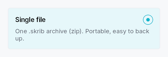
RadioTile — a "selectable card" radio option.
Public types
| Kind | Name |
|---|---|
enum | RadioTileIndicatorSide — Which side of the top row the radio indicator sits on |
struct | RadioTile — A single selectable-card radio option |
Public functions
RadioTile
Detailed description
A RadioTile behaves as a single radio button (Role::RadioButton,
set_toggled) rendered as a bordered, rounded card: a leading icon, a
bold title, an inline radio indicator, and a muted, wrapping description.
Multiple tiles share a Signal<usize> — selecting one writes its value,
which deselects every sibling observing the same signal (the RadioButton
model). Group them with
RadioTileGroup for layout,
roving keyboard navigation, and the AT "N of M" positional announcement.
Content model
Typed slots cover the common case (matching the reference design):
.icon(..), .title(..), .description(..). For arbitrary content, the
.body(..) slot replaces the description column with any widget subtree.
Accessibility
Reports Role::RadioButton with set_toggled mirroring selection, the
title as the accessible name, and the description as the accessible
description. When grouped, each tile emits
push_to_radio_group([sibling_ids]) plus set_position_in_set /
the group's set_size_of_set for "N of M". Inside a RadioTileGroup the tile is not
individually focusable — focus roves on the group (WAI-ARIA radiogroup),
and the group publishes active_descendant. A standalone tile is
focusable and responds to Space / Action::Click.
let selected = ctx.signal(0_usize);
RadioTileGroup::new(selected)
.tile(RadioTile::new().icon(icon).title(tr!(single_file())).description(tr!(single_file_desc())))
.tile(RadioTile::new().icon(icon2).title(tr!(bundle())).description(tr!(bundle_desc())))
Touch and pen
A tile is a whole-card target, comfortably past the floor at every density, and
it activates on the release. What the touch sweep changed is its pressed
appearance: it was written by the Space path alone, so the recipe painted a
state no pointer reached — on the one control where a press visual matters
most, because there is no smaller affordance inside the card to look at.
A tap by a contact also rests the tile idle rather than hovered, for the reason
ToolBox's header does: a finger sends no hover-leave, and the stale tint
becomes visible as soon as the selection moves to another tile.
Density
The picture above is the widget at TargetDensity::Compact, the mouse-and-keyboard ladder. Below is the same subject on the same canvas with only the ladder changed, so what moves is the density and nothing else — where the subject no longer fits, that is what the denser targets cost it at that size. See docs/density-and-targets.md.
Touch
API reference
📖 Full rustdoc API for this module
pub enum RadioTileIndicatorSide
Import: use teksilo::widgets::RadioTileIndicatorSide;
Which side of the top row the radio indicator sits on. Defaults to
Trailing (top-right in LTR), matching the reference design.
#![allow(unused)] fn main() { pub enum RadioTileIndicatorSide { /* variants */ } }
Variants
Trailing— Trailing edge of the row — top-right in LTR, top-left in RTL.Leading— Leading edge of the row — top-left in LTR, top-right in RTL.
pub struct RadioTile
Import: use teksilo::widgets::RadioTile;
A single selectable-card radio option. See the module docs.
#![allow(unused)] fn main() { pub struct RadioTile { /* fields */ } }
Methods
pub fn new() -> Self
Create a tile with no selection binding. The enclosing
RadioTileGroup assigns
this tile's value (its position) and shared selection signal. Use
selection for a standalone tile.
pub fn selection(mut self, value: usize, selected: Signal<usize>) -> Self
Bind this tile to an explicit value + shared Signal<usize> for use
outside a RadioTileGroup. Inside a group this is set automatically.
pub fn icon(mut self, widget: impl Widget + 'static) -> Self
Leading icon slot (top-left of the tile). Any widget — typically an
IconWidget.
pub fn icon_boxed(mut self, widget: Box<dyn Widget>) -> Self (default: None)
Leading icon slot, pre-boxed.
pub fn title(mut self, title: impl Into<LocalizedString>) -> Self (default: None)
Bold title text (the tile's accessible name).
pub fn description(mut self, text: impl Into<LocalizedString>) -> Self (default: None)
Muted, multi-line description (the tile's accessible description).
Ignored when a body is set.
pub fn body(mut self, widget: impl Widget + 'static) -> Self
Replace the description column with an arbitrary widget subtree. Takes
precedence over description. Note: a body's own
content is exposed to assistive technology as-is (unlike the typed
description, which is folded into the tile's accessible description).
pub fn body_boxed(mut self, widget: Box<dyn Widget>) -> Self (default: None)
Custom body slot, pre-boxed.
pub fn trailing(mut self, text: impl Into<LocalizedString>) -> Self (default: None)
Right-aligned trailing meta text (e.g. "20 chapters", "free-form
notes"). Tints to the accent color when the tile is selected. Most
useful with the compact vertical arrangement. Ignored when a
trailing_slot is set.
pub fn trailing_slot(mut self, widget: impl Widget + 'static) -> Self
Arbitrary right-aligned trailing widget (badge, count, chevron, …).
Takes precedence over trailing.
pub fn compact(mut self, compact: bool) -> Self (default: false)
Compact single-line arrangement: [indicator] [icon] [title] [Spacer] [trailing] with no description row — the vertical settings-list look.
RadioTileGroup::layout(TileLayout::Vertical) sets this automatically
(and moves the indicator to the leading edge).
pub fn title_style(mut self, style: impl Into<TextStyleProp>) -> Self
Override the title text style (default TextStyleRole::BodyBold).
pub fn title_color(mut self, color: impl Into<ColorProp>) -> Self
Override the title text color (default TextRole::Primary).
pub fn description_style(mut self, style: impl Into<TextStyleProp>) -> Self
Override the description text style (default TextStyleRole::Small).
pub fn description_color(mut self, color: impl Into<ColorProp>) -> Self
Override the description text color (default TextRole::Secondary).
pub fn enabled(mut self, enabled: impl Into<Prop<bool>>) -> Self (default: true)
Set the enabled state, statically or reactively. A disabled tile is skipped by the group's keyboard navigation and cannot be selected.
pub fn variant(mut self, variant: RadioTileVariant) -> Self
Pick the card variant (default Outlined).
pub fn show_indicator(mut self, show: bool) -> Self
Whether to render the inline radio indicator (default true). When
false, the selection cue is the card highlight alone.
pub fn indicator_side(mut self, side: RadioTileIndicatorSide) -> Self
Which side of the top row the radio indicator sits on (default Trailing).
pub fn style(mut self, style: impl RadioTileStyle) -> Self
Per-call style override — replaces the theme-wide RadioTileStyle
for just this tile.
pub fn tooltip(mut self, text: impl Into<LocalizedString>) -> Self
Attach a plain single-line tooltip shown on hover.
pub fn rich_tooltip(mut self, key: impl Into<String>) -> Self
Attach a rich tooltip resolved from the app-wide tooltip registry.
pub fn rich_tooltip_content(mut self, content: crate::tooltip::TooltipContent) -> Self
Attach a rich tooltip driven by inline TooltipContent.
pub fn composite_tooltip(mut self, content: impl Widget + 'static) -> Self
Attach a composite tooltip hosting an arbitrary widget tree.
RadioTileGroup
RadioTileGroup — an N-ary group of RadioTiles with single selection.
Public types
| Kind | Name |
|---|---|
enum | TileLayout — How a RadioTileGroup arranges its tiles |
struct | RadioTileGroup — An N-ary, single-selection group of selectable-card radios |
Public functions
RadioTileGroup
| Returns | Function |
|---|---|
| Constructors | |
Self | new(selected: Signal<usize>) |
| Builder methods | |
Self | label(label: impl Into<LocalizedString>) |
Self | tile(tile: RadioTile) |
Self | tiles(tiles: impl IntoIterator<Item = RadioTile>) |
Self | layout(layout: TileLayout) |
Self | spacing(spacing: f32) |
Self | line_spacing(spacing: f32) |
Self | row_height(height: f32) |
Self | enabled(enabled: impl Into<Prop<bool>>) |
Self | style(style: impl teksilo_core::styles::RadioTileStyle) |
Detailed description
Like SegmentedControl, the
tile count is not fixed: add any number of tiles, all sharing one
Signal<usize>. The group owns:
- Layout — an equal-size
TileLayout::Row, an adaptive wrappingTileLayout::Grid, a full-widthTileLayout::Column, or a compact fixed-heightTileLayout::Verticalsettings list. Row and Grid equalize tile size (uniform width + the tallest tile's height) via a customplace_childrenmeasuring each tile height-for-width — stacks have no cross-axis stretch, so the group does the sizing. - Keyboard — the WAI-ARIA roving radiogroup pattern: the group is a
single Tab stop; Arrow keys move selection (selection follows focus),
Home/End jump, disabled tiles are skipped.
Increment/DecrementAT actions mirror the arrows for switch access. - Accessibility —
Role::RadioGroupwithactive_descendantpointing at the selected tile; each tile isRole::RadioButtonand declares its siblings viapush_to_radio_group(for "N of M").
let selected = ctx.signal(0_usize);
RadioTileGroup::new(selected)
.label(tr!(project_format()))
.tile(RadioTile::new().icon(a).title(tr!(single_file())).description(tr!(single_file_desc())))
.tile(RadioTile::new().icon(b).title(tr!(bundle())).description(tr!(bundle_desc())))
.layout(TileLayout::Row)
Density
The picture above is the widget at TargetDensity::Compact, the mouse-and-keyboard ladder. Below is the same subject on the same canvas with only the ladder changed, so what moves is the density and nothing else — where the subject no longer fits, that is what the denser targets cost it at that size. See docs/density-and-targets.md.
Touch
API reference
📖 Full rustdoc API for this module
pub enum TileLayout
Import: use teksilo::widgets::TileLayout;
How a RadioTileGroup arranges its tiles.
#![allow(unused)] fn main() { pub enum TileLayout { /* variants */ } }
Variants
Row— A single horizontal row of equal-width, equal-height tiles (the tiles stretch to the tallest). The reference "two cards side-by-side" layout.Grid{ min_tile_width: f32 }— A wrapping grid whose column count adapts to the available width:cols = floor((width + spacing) / (min_tile_width + spacing)), at least one. All cells share the same width and the tallest tile's height.Column— A vertical column of full-width tiles, each its natural height. Tiles keep their full card content (icon + title + description).Vertical— A vertical list of compact fixed-height full-width rows:[radio] [icon] [title] [Spacer] [trailing], no description — the settings-list look. Every row is a fixed height taken from the activeRadioTileStyle(the theme'sRadioTileRecipe::vertical_row_height, 44 dp by default; override per-group withRadioTileGroup::row_height), and the group switches each tile to the compact arrangement (leading radio) automatically.
pub struct RadioTileGroup
Import: use teksilo::widgets::RadioTileGroup;
An N-ary, single-selection group of selectable-card radios. See the
module docs.
#![allow(unused)] fn main() { pub struct RadioTileGroup { /* fields */ } }
Methods
pub fn new(selected: Signal<usize>) -> Self
Create a group bound to the shared selection signal. Add tiles with
tile / tiles.
pub fn label(mut self, label: impl Into<LocalizedString>) -> Self (default: None)
Accessible name for the group (announced before individual tiles).
pub fn tile(mut self, tile: RadioTile) -> Self
Add a tile. Its value (position) and shared selection signal are
assigned automatically.
pub fn tiles(mut self, tiles: impl IntoIterator<Item = RadioTile>) -> Self
Add several tiles from an iterator.
pub fn layout(mut self, layout: TileLayout) -> Self
Choose the layout (default TileLayout::Row).
pub fn spacing(mut self, spacing: f32) -> Self
Override the gap between tiles along the main axis (and grid columns).
Defaults to 6 dp for TileLayout::Vertical, 12 dp otherwise.
pub fn line_spacing(mut self, spacing: f32) -> Self (default: 12.0)
Gap between rows in TileLayout::Grid.
pub fn row_height(mut self, height: f32) -> Self
Override the fixed row height for TileLayout::Vertical compact rows.
Takes precedence over the theme value
(RadioTileRecipe::vertical_row_height, 44 dp by default). No effect on
other layouts.
pub fn enabled(mut self, enabled: impl Into<Prop<bool>>) -> Self (default: true)
Set the enabled state for the whole group, statically or reactively.
pub fn style(mut self, style: impl teksilo_core::styles::RadioTileStyle) -> Self
Forward a RadioTileStyle to every tile that doesn't set its own
.style(...).
RectWidget
RectWidget — a leaf widget that paints a filled and/or stroked rounded rectangle.
Public functions
RectWidget
| Returns | Function |
|---|---|
| Constructors | |
Self | new() |
| Builder methods | |
Self | background(paint: impl Into<PaintProp>) |
Self | border_sides(sides: impl Into<Prop<Option<BorderSides>>>) |
Self | border_position(position: BorderPosition) |
Self | border_color(color: impl Into<ColorProp>) |
Self | border_width(width: impl Into<Prop<f32>>) |
Self | corner_radius(radius: impl Into<Prop<CornerRadius>>) |
Detailed description
RectWidget has no intrinsic content: it fills whatever space its parent
proposes (or reports 0×0 when unconstrained) and draws a fill (solid color
or gradient), an optional border (a uniform stroke positioned inside / center
/ outside, or per-side edge fills for an underline), and an optional corner
radius. It is the low-level building block for card backgrounds, focus rings,
dividers, underlined fields, and highlight overlays.
The fill accepts impl Into<PaintProp> — anything Into<ColorProp> (a raw
Color, a theme role such as SurfaceRole::Hover, or a Signal<Color>) for
a solid, plus PaintProp::Linear / Radial for a gradient. Border color
accepts impl Into<ColorProp>, so reactive interaction-driven colors require
no extra wiring.
#![allow(unused)] fn main() { use teksilo_tokens::{Color, CornerRadius}; use teksilo_widgets::primitives::RectWidget; // A pill-shaped accent badge background: let _w = RectWidget::new() .background(Color::from_rgba(0.2, 0.5, 1.0, 1.0)) .corner_radius(CornerRadius::uniform(12.0)); }
Density
The picture above is the widget at TargetDensity::Compact, the mouse-and-keyboard ladder. Below is the same subject on the same canvas with only the ladder changed, so what moves is the density and nothing else — where the subject no longer fits, that is what the denser targets cost it at that size. See docs/density-and-targets.md.
Touch
API reference
📖 Full rustdoc API for this module
pub struct RectWidget
Import: use teksilo::widgets::RectWidget;
A leaf widget that paints a filled and/or stroked rounded rectangle.
See the module documentation for the full feature description.
All visual properties accept impl Into<ColorProp> (colors/roles/signals) or
impl Into<Prop<f32>> / impl Into<Prop<CornerRadius>> (static or reactive)
— so the common "fill with theme surface, border with theme border" setup is
just .background(SurfaceRole::Main).border_color(BorderRole::Default).
#![allow(unused)] fn main() { pub struct RectWidget { /* fields */ } }
Methods
pub fn new() -> Self
Create a fully transparent, zero-border rectangle with no corner radius.
pub fn background(mut self, paint: impl Into<PaintProp>) -> Self
Fill. Accepts Color, a theme role (SurfaceRole, etc.), a
Signal<Color>, or a PaintProp (e.g. a gradient).
pub fn border_sides(mut self, sides: impl Into<Prop<Option<BorderSides>>>) -> Self (default: None)
Per-side border widths (e.g. BorderSides::bottom for an
underline). When set, overrides the uniform stroke; sides are
drawn as edge fills in border_color.
pub fn border_position(mut self, position: BorderPosition) -> Self (default: BorderPosition::Center)
Where a uniform stroke sits relative to the rect edge
(inside / center / outside). Ignored when border_sides is set.
pub fn border_color(mut self, color: impl Into<ColorProp>) -> Self
Border color. Accepts Color, a theme role (BorderRole, etc.),
or a Signal<Color>.
pub fn border_width(mut self, width: impl Into<Prop<f32>>) -> Self (default: 0.0)
Stroke width, in logical pixels. Accepts a static value or a reactive Signal<f32>.
pub fn corner_radius(mut self, radius: impl Into<Prop<CornerRadius>>) -> Self (default: CornerRadius::ZERO)
Corner radius for the fill and stroke. Accepts a CornerRadius (per-corner
control) or a reactive Signal<CornerRadius>.
Repeater
Repeater — non-virtualized dynamic widget list driven by a ListModel<T>.
Public types
| Kind | Name |
|---|---|
enum | RepeaterLayout — How a Repeater arranges its item widgets |
struct | Repeater — A non-virtualized dynamic collection that creates one child widget per item in a ListModel<T> |
Public functions
Repeater
| Returns | Function |
|---|---|
| Constructors | |
Self | new(model: ListModel<T>, factory: impl Fn(&T) -> Box<dyn Widget> + 'static) |
Self | indexed(model: ListModel<T>, factory: impl Fn(usize, &T) -> Box<dyn Widget> + 'static) |
| Builder methods | |
Self | layout(layout: RepeaterLayout) |
Self | horizontal() |
Self | wrap() |
Self | spacing(spacing: f32) |
Self | line_spacing(line_spacing: f32) |
Detailed description
Repeater creates one child widget per item in a ListModel<T>
using a caller-supplied factory closure, arranging them along one axis
(RepeaterLayout::Vertical by default) or as a wrapping flow
(RepeaterLayout::Wrap). It is not virtualized: every item has a live
widget at all times. That is a deliberate trade — it is what lets the
children keep real, stateful widgets (text editors, forms) mounted, which a
virtualizing ListView cannot do because it recycles
off-screen rows.
Repeater::new — reconciling (the default)
The factory takes &item and each child widget is reused across model
changes. When the model mutates, Repeater reads the
DataChange it emits and applies the minimal edit to its child set: an
insert builds one new widget, a remove reaps one, a move reorders, an
in-place update rebuilds only that item — every other child keeps its
existing widget, and with it its focus, selection, caret, scroll offset,
in-flight text edit, and undo history.
This makes Repeater a fit for a stack of editors — e.g. a document
rendered as a column of RichTextEditors,
one per scene/block:
Repeater::new(scenes, |scene| {
Box::new(RichTextEditor::editor(scene.document()))
})Inserting, deleting, or reordering a scene costs one widget's worth of work
instead of reshaping every editor in the document, and the editor the user is
typing in keeps its caret. Because the factory has no index, position shifts
are safe by construction: reuse can never leave a widget showing content
derived from a stale position. The one requirement is that an item's
content only changes through the model (via set/replace_all), which is
always true for a ListModel.
#![allow(unused)] fn main() { use teksilo_widgets::Repeater; use teksilo_widgets::primitives::TextWidget; use teksilo_data::ListModel; use teksilo_i18n::lit; let model: ListModel<u32> = ListModel::from_vec(vec![1, 2, 3]); let _w = Repeater::new(model, |item| { Box::new(TextWidget::new(lit!(format!("item {item}")))) }) .spacing(4.0); }
Repeater::indexed — full rebuild (position-in-content)
When the content genuinely depends on position — a numbered list, "N of M",
a ranking that must renumber on reorder — use indexed.
Its factory takes (index, &item), and on any model change the whole
child subtree is torn down and rebuilt, so the index every widget shows is
always current. This is the right pick for cheap, stateless, position-derived
rows; it does not preserve per-child state across changes (that is the
reason to prefer new whenever the index isn't content).
Accessibility
Repeater imposes no accessibility semantics of its own — it is a
transparent layout wrapper, so its children surface directly into the
surrounding AT subtree and their own roles decide how they read. When the
children genuinely form a named list, menu, or toolbar, opt in with the
standard builder overrides that every widget supports — these stay
locale-reactive:
use teksilo_core::accesskit::Role;
Repeater::new(tags, factory)
.access_role(Role::List)
.access_label(tr!(tags()))Density
The picture above is the widget at TargetDensity::Compact, the mouse-and-keyboard ladder. Below is the same subject on the same canvas with only the ladder changed, so what moves is the density and nothing else — where the subject no longer fits, that is what the denser targets cost it at that size. See docs/density-and-targets.md.
Touch
API reference
📖 Full rustdoc API for this module
pub enum RepeaterLayout
Import: use teksilo::widgets::repeater::RepeaterLayout;
How a Repeater arranges its item widgets.
#![allow(unused)] fn main() { pub enum RepeaterLayout { /* variants */ } }
Variants
Vertical— A vertical column, top to bottom (default). Gap =Repeater::spacing.Horizontal— A horizontal row, leading to trailing (RTL-aware viaHStack). Gap =Repeater::spacing.Wrap— A horizontal flow that wraps to the next line when items exceed the available width — chip rows, badge lists.Repeater::spacingis the inter-item gap,Repeater::line_spacingthe inter-line gap.
pub struct Repeater
Import: use teksilo::widgets::Repeater;
A non-virtualized dynamic collection that creates one child widget per item in a ListModel<T>.
See the module-level docs for the two build modes, layout options,
and accessibility guidance.
#![allow(unused)] fn main() { pub struct Repeater<T: 'static> { /* fields */ } }
Methods
pub fn new(model: ListModel<T>, factory: impl Fn(&T) -> Box<dyn Widget> + 'static) -> Self
Create a Repeater in reconciling mode (the default): item widgets are reused across model changes, so each child keeps its state (focus, caret, selection, scroll, undo history) when siblings are inserted, removed, or reordered.
The factory receives &item only — it must not depend on the item's
position, which is what makes reuse safe when items shift. This is the
mode for a stack of stateful widgets such as RichTextEditors. If the
content genuinely depends on position (a numbered list), use
Repeater::indexed instead. See the module-level docs for the
full rationale.
pub fn indexed( model: ListModel<T>, factory: impl Fn(usize, &T) -> Box<dyn Widget> + 'static, ) -> Self
Create a Repeater in full-rebuild mode: the factory receives
(index, &item) and the entire child subtree is rebuilt on any model
change, so position-derived content stays current.
Use this only when the content depends on the item's position (row
numbers, "N of M", a ranking that renumbers on reorder). It does not
preserve per-child state across changes — prefer Repeater::new
whenever the index isn't part of what each item renders.
pub fn layout(mut self, layout: RepeaterLayout) -> Self
Choose how items are arranged (default RepeaterLayout::Vertical).
pub fn horizontal(self) -> Self
Arrange items horizontally — shorthand for .layout(RepeaterLayout::Horizontal).
pub fn wrap(self) -> Self
Arrange items as a wrapping flow — shorthand for .layout(RepeaterLayout::Wrap).
pub fn spacing(mut self, spacing: f32) -> Self
Set the gap between items along the main axis (default 0.0). For
RepeaterLayout::Wrap this is the inter-item (horizontal) gap.
pub fn line_spacing(mut self, line_spacing: f32) -> Self
Set the gap between lines for RepeaterLayout::Wrap (default 0.0).
Ignored by the single-axis layouts.
ResizeStrip
A thin invisible widget that forwards a window resize gesture to the platform host when the user presses the primary button inside it. Used to build a 6-px resize frame around a borderless window on Wayland.
Public functions
ResizeStrip
Detailed description
This is the frame complement to crate::title_bar::DragRegion: drag
moves the window, resize strips drag the window edges. On platforms
that don't expose Window::drag_resize_window (notably winit's macOS
backend), PlatformTitleBarHost::begin_resize returns
PlatformError::Unsupported and the strip becomes a silent no-op —
macOS handles edge resize via its own native chrome.
Reaching a 6 dp edge with a finger
The strip's thickness is fixed at every density — it is an overlay drawn over the window's own edge, so widening it would eat into content rather than into empty space, and the frame would start swallowing presses meant for the app.
The grab is Widget::hit_outset instead: for a direct pointer the strip
is offered the press against bounds inflated inward to the density's target
size (24 dp Compact, 44 dp Touch), and the arena's outset pre-pass runs
before the ordinary reverse-sibling walk, so the widened band beats the
content underneath. An edge strip inflates only across its thickness; a
corner cell inflates on all four sides, since both of its axes are the
diagonal grab. For a precise pointer the outset is zero and a mouse press
resolves exactly where it always did.
Two strips whose bands overlap are settled by distance to their own uninflated rectangles, not by sibling order, so the midpoint between two adjacent edges belongs to the nearer one.
One resize per gesture
PlatformTitleBarHost::begin_resize hands the window to the compositor
for the rest of the gesture, so it must be asked once. The press that asks
is gated on the pointer being the primary one: a second finger landing
on the frame while a resize is already running would ask for a second
interactive resize of the same window, which on Wayland means a second
xdg_toplevel::resize against a live one. A mouse is always primary, so the
gate never fires for one.
API reference
📖 Full rustdoc API for this module
pub struct ResizeStrip
Import: use teksilo::widgets::ResizeStrip;
A single edge of a resize frame. Construct one per side and lay them out around your content (HStack of left + content + right inside a VStack of top + middle + bottom is the conventional shape — see the title bar demo for an example).
#![allow(unused)] fn main() { pub struct ResizeStrip { /* fields */ } }
Methods
pub fn horizontal( host: Rc<dyn PlatformTitleBarHost>, edge: ResizeEdge, thickness: f32, ) -> Self
Build a horizontal (top / bottom) strip of the given height. The width is unconstrained — the strip claims whatever its parent container offers, so it can stretch across the full window width.
pub fn vertical(host: Rc<dyn PlatformTitleBarHost>, edge: ResizeEdge, thickness: f32) -> Self
Build a vertical (left / right) strip of the given width. The height is unconstrained.
pub fn corner(host: Rc<dyn PlatformTitleBarHost>, edge: ResizeEdge, size: f32) -> Self
Build a square corner cell of the given size. The corner handles a
diagonal resize gesture (e.g. TopLeft does NW/SE resize). Should
be placed on top of the edge strips at the four corners so the
framework's hit-test routes the click to the corner rather than
the adjacent edge.
RichTextEditor
Rich text editor and viewer widget.
Public types
| Kind | Name |
|---|---|
enum | ScrollPolicy — Scroll bar visibility policy for RichTextEditor, applied independently per axis |
enum | EditSource — How a piece of text reached the document — the channel, not the author |
struct | RichTextEditor |
struct | EditorHandle — A clone-able, 'static handle to a RichTextEditor's shared state |
struct | WeakEditorHandle — An EditorHandle that does not keep its editor alive |
struct | ImageActivation — An inline image the user clicked |
struct | EditorTextDrag — Rich text being dragged out of an editor |
struct | ImageResize — A resize the reader finished dragging |
Public functions
RichTextEditor
EditorHandle
WeakEditorHandle
| Returns | Function |
|---|---|
| Methods | |
Option<EditorHandle> | upgrade() |
Detailed description
Two construction presets share the same implementation: RichTextEditor::editor
provides a full editing surface (blinking caret, keyboard commands, clipboard,
undo/redo, Role::MultilineTextInput) and RichTextEditor::read_only is a
view-only surface (hidden caret, mutations rejected, Role::Document). Both
bind to an external TextDocument
via on_change subscriptions, so any number of editors and viewers can share
one document and observe each other's edits live.
The widget owns a per-widget RichTextEngine (typesetter), and drives its own
scroll bars independently of ScrollArea to avoid the wrap/scrollbar circular
measurement dependency. Use RichTextEditor::min_lines /
RichTextEditor::max_lines to switch from greedy sizing to intrinsic
(messenger-composer) sizing. A detachable EditorHandle lets toolbars and
palette panels issue formatting commands from closures that cannot borrow the
editor directly.
use teksilo_text::text_document::TextDocument;
let doc = TextDocument::new();
let editor = RichTextEditor::editor(doc)
.min_lines(3)
.max_lines(8)
.wrap_mode(WrapMode::Word);
Pan to scroll
The surface installs common::scrollable::ScrollableBehavior
— the shared wheel arithmetic, a finger's pan, and the PanClaim. The wheel
path is unchanged: no tween (these offsets are plain signals), 16 dp a line,
Ignored at a hard boundary so the page around it takes the rest, and a
repaint asked for exactly when an axis moved.
The claim serves this surface even though it also owns the press
arena, which its double- and triple-tap recognizers give it. The router
stops its arbitration walk at the press owner only for a Gesture member,
whose recognizer the capture dispatch is already driving; a Pan member is
decided in that walk and nowhere else, so it is exempt. A finger on the
text therefore scrolls the text, and hands the gesture outward only at this
surface's own boundary. See docs/kinetic-scrolling.md §10.1.
Density
The picture above is the widget at TargetDensity::Compact, the mouse-and-keyboard ladder. Below is the same subject on the same canvas with only the ladder changed, so what moves is the density and nothing else — where the subject no longer fits, that is what the denser targets cost it at that size. See docs/density-and-targets.md.
Touch
API reference
📖 Full rustdoc API for this module
pub enum ScrollPolicy
Import: use teksilo::widgets::rich_text::ScrollPolicy;
Scroll bar visibility policy for RichTextEditor, applied independently per axis.
#![allow(unused)] fn main() { pub enum ScrollPolicy { /* variants */ } }
Variants
Auto— Show the scroll bar only when content overflows the visible area (default).AlwaysOn— Always show the scroll bar, reserving gutter space even when content fits.AlwaysOff— Never show the scroll bar; useful when embedding the editor inside an outerScrollAreaor in headless tests.
pub enum EditSource
Import: use teksilo::widgets::rich_text::EditSource;
How a piece of text reached the document — the channel, not the author.
Deliberately framework-generic, and deliberately small. These are the routes a toolkit can actually observe: which input path the characters came down. What that means is the application's to decide, and every application will decide differently — a writing tool cares that dictation is not typing, a code editor cares that a snippet is not either, and a form cares about none of it. Teksilo says what it saw; it does not interpret.
⚠ Not evidence of who wrote anything. Text typed one character at a time was typed one character at a time, and that is the entire claim. Anything further — who, or whether a person at all — is an inference this cannot make and no consumer of it should pretend to.
#![allow(unused)] fn main() { pub enum EditSource { /* variants */ } }
Variants
Keyboard— Typed, one key at a time.Ime— The settled result of an IME composition — CJK/Kana candidate selection, a dead-key accent. Separate fromSelf::Keyboardbecause the characters that land are not the keys that were pressed.Clipboard— Pasted, as plain text or as HTML.Accessibility— Arrived through an assistive technology: AccessKit'sSetValueorReplaceSelectedText, which is how dictation and a braille display write. Never folded intoSelf::Keyboard. For some people this is typing, and a toolkit that reported it as something else — or as nothing — would be quietly erasing how they work.Programmatic— Inserted by the application itself rather than by anything the person at the keyboard did: a template, a substitution, a completion.
pub struct RichTextEditor
Import: use teksilo::widgets::rich_text::RichTextEditor;
#![allow(unused)] fn main() { pub struct RichTextEditor { /* fields */ } }
Methods
pub fn read_only(document: TextDocument) -> Self
Construct a read-only rich text viewer bound to document. The
document can also back an editable RichTextEditor::editor in
another part of the UI — both widgets receive document events
independently via on_change subscriptions.
pub fn editor(document: TextDocument) -> Self
Construct an editable rich text editor bound to document.
Uses the full editor preset: every command accepted, caret
blinks, MultilineTextInput accessibility role, full clipboard
support. Multiple editors on the same document share live edits
via per-widget on_change subscriptions.
pub fn label(mut self, label: impl Into<teksilo_i18n::LocalizedString>) -> Self
Accessible name for the editor.
Applied to the body that holds the text, which is the node focus is
published on and the one a screen reader announces: "Notes, entry" for
an editor, "Chapter one, document" for a viewer. The editor's own node
is structure that no adapter shows. An .access_label(..),
.access_labelled_by(..) or tooltip attached to the editor reaches the
same node.
Stays locale-reactive: a tr!(...) name is re-resolved when the
locale changes, without a rebuild.
pub fn style(mut self, style: impl RichTextEditorStyle) -> Self
Per-call style override for the editor chrome (border, padding,
focus ring). Replaces the theme-wide
style_slots.rich_text_editor and the IntUI default
RecipeRichTextEditorStyle for just this editor.
pub fn content_padding(mut self, amount: f32) -> Self
Set a uniform padding (logical pixels) between the text content
and the editor's chrome. Replaces the style's default insets
(TextInput-style for editable, none for read-only). Use
content_padding_symmetric or
content_padding_each for
per-axis / per-edge control.
pub fn content_padding_symmetric(mut self, vertical: f32, horizontal: f32) -> Self
Set vertical and horizontal padding (logical pixels) between the text content and the editor's chrome. Replaces the style's default insets.
pub fn content_padding_each(mut self, top: f32, right: f32, bottom: f32, left: f32) -> Self
Set per-edge padding (top, right, bottom, left) between the
text content and the editor's chrome. Replaces the style's
default insets.
pub fn content_padding_top(mut self, top: f32) -> Self
Set just the top inset between the text and the chrome. Leaves
the other edges at their previously-set values, defaulting to
0.0 for any edge never touched.
pub fn content_padding_right(mut self, right: f32) -> Self
Set just the right inset between the text and the chrome.
pub fn content_padding_bottom(mut self, bottom: f32) -> Self
Set just the bottom inset between the text and the chrome.
pub fn content_padding_left(mut self, left: f32) -> Self
Set just the left inset between the text and the chrome.
pub fn wrap_mode(self, mode: WrapMode) -> Self
Set the line-wrap mode. WrapMode::Word (the default) wraps at word
boundaries; WrapMode::None allows horizontal overflow — pair with
.h_scroll_policy(ScrollPolicy::Auto) to expose a scroll bar.
pub fn show_highlights(self, show: bool) -> Self
Whether this view applies the document's syntax / search / spell
highlighting. editor defaults to true; read_only defaults to
false (a bare preview). A highlights-off view pulls a clean
snapshot (no highlights at all, even metric ones like keyword bold) and
ignores paint-only highlight events entirely, so it does zero work when
the shared document's search/spell highlights change.
pub fn annotation_spans(self, spans: Vec<TextAnnotationSpan>) -> Self
Declare the annotations (comment threads) covering ranges of this document, for the accessibility tree only.
Each span becomes a Role::Comment node, and every Role::TextRun it
covers points at it through AccessKit's details relation — the W3C
annotations pattern, and the reason a screen reader can say "has comment"
and let the user navigate in rather than reciting the thread every time the
caret crosses the span.
Painting is a separate concern: a highlight session draws the underline. A highlight carries no text and this carries no colour, so neither is derivable from the other and both are supplied independently.
pub fn set_highlight_mask(&self, mask: teksilo_text::text_document::HighlightMask)
Set which highlight sessions this view renders, at runtime.
HighlightMask::all shows every
session on the document (the default);
HighlightMask::only shows a
chosen set — which is how a per-editor find banner
keeps one pane's find highlighting out of another pane over the same document.
show_highlights(false) still overrides this to nothing.
Forces a re-pull on the next tick so the change is visible immediately.
pub fn typography_defaults(self, defaults: EditorTypographyDefaults) -> Self
Set the initial non-destructive default typography (font family / line
height / first-line indent) applied to runs and blocks that carry no
explicit override. Applied before the first layout. These are display
defaults — they never mutate the bound document (no undo entry, no
modified); use set_typography_defaults
or EditorHandle::set_typography_defaults to change them after mount.
Preferred text size is font_size_scale.
pub fn background(self, color: impl Into<ColorProp>) -> Self
Override the editor background fill. Accepts a Color, a theme role
(SurfaceRole::Content, …), or a Signal. Threaded into the active
RichTextEditorStyle's make_body, so the common case ("give the
editor a surface") needs no custom style. None uses the style's
default surface.
pub fn selection_color(self, color: impl Into<ColorProp>) -> Self
Override the selection-highlight color. Accepts a Color, theme role,
or Signal. Resolved against the active theme on every paint; None
uses the engine/theme default.
pub fn caret_color(self, color: impl Into<ColorProp>) -> Self
Override the caret / insertion-point color. Accepts a Color, theme
role, or Signal. Resolved against the active theme on every paint;
None tracks the theme's editor_caret role.
pub fn text_color(self, color: impl Into<ColorProp>) -> Self
Override the default text color. Accepts a Color, theme role, or
Signal. Resolved against the active theme on every paint; None
tracks the theme's editor_fg role (so dark / light swaps follow
automatically). A role or Signal stays reactive; a bare Color pins
it.
pub fn v_scroll_policy(mut self, policy: ScrollPolicy) -> Self
Set the vertical scroll-bar visibility policy.
pub fn h_scroll_policy(mut self, policy: ScrollPolicy) -> Self
Set the horizontal scroll-bar visibility policy.
pub fn estimate_height_before_layout(self, on: bool) -> Self
Window paint-time culling to the accumulated ancestor clip rather than this editor's own bounds.
Enable this only for an editor deliberately laid out at its full
document height inside an outer ScrollArea
(v_scroll_policy(ScrollPolicy::AlwaysOff), no max_lines) — "dubious
mode". Such an editor's own viewport spans the whole document, so the
viewport-derived render cull keeps nothing; this makes it cull to the
visible clip band instead, so a huge document only rasterizes the rows on
screen. Correct under nested ScrollAreas (the clip is the intersection of
all clipping ancestors), and positioning / hit-testing are unaffected.
A normal self-scrolling editor already culls correctly from its own scroll offset and doesn't need this — leave it off (the default). (The window is computed relative to the editor's own scroll offset as well, so enabling it on a self-scroller degrades to a correct-but-redundant cull rather than rendering the wrong rows.) Guess this editor's height from its text until something has laid it out.
content_height() is 0 until layout_full has run, and that waits for the
editor to have been through a frame on screen. The zero falls through to the
min_lines floor, so an editor that has never been shown claims the same few
lines whatever it holds.
For an editor that is on screen that is invisible — it lays out on the first frame and the floor never shows. Turn this on for one that may not be: a row of a long column, most of which is below the fold. There the page's height is the sum of its rows' claims, so the scroll extent starts wrong by an order of magnitude and settles a row at a time as the reader arrives — and anything drawing that extent draws the settling.
Off by default, deliberately. The estimate is crude by construction, and an editor that lays out immediately gains nothing from it while every consumer of its first-frame size pays for the guess — including the windowed-render path, whose culling is derived from the editor's own bounds.
Never a floor: it goes through the same clamp a real height does, so
max_lines still caps it and an over-estimate corrects downwards when the
layout lands.
pub fn window_to_clip(self, on: bool) -> Self
pub fn scroll_policy(mut self, policy: ScrollPolicy) -> Self
Set the same scroll-bar visibility policy on both axes.
pub fn follow_caret_in_page(self, follow: bool) -> Self
Whether moving the caret also scrolls any enclosing scroll area to keep the caret on screen — the standard editor "caret stays visible as you type / navigate" behaviour. On by default.
It fires only on a caret move, never on a plain wheel / scrollbar
scroll, so the reader can still scroll freely away from the caret and the
view holds until the caret next moves. This is what makes an editor that
grows to its content with its own scroll suppressed (a flowing page
inside an outer ScrollArea) track the caret at all — there the editor's
internal caret-visibility is a no-op, so the enclosing-page follow is the
only mechanism that reveals the caret. Pass false for the rare layout
where a caret change must never move the surrounding page.
pub fn typewriter(self, anchor: Option<f32>) -> Self
Typewriter scrolling: pin the caret's line at fraction of the way
down the enclosing scroll area — 0.0 at the top, 0.5 centred, 1.0
at the bottom — and let the document scroll under it. None (the
default) leaves the ordinary minimal-reveal follow in charge.
Unlike that follow, which only acts once the caret would leave the viewport, a pin re-asserts on every caret move, so the line being written holds a constant height on screen. The classic writing-app feature.
Three behaviours come with it, each of them the consensus answer among the editors that ship this well:
- The pointer stands the pin down. A click places the caret without scrolling, and that position becomes the new resting place; a drag-selection is never interrupted. The next keystroke resumes pinning. Editors that re-centre on pointer input instead have open bugs about the view fighting the mouse and about drag-selection becoming unusable.
- The rendered row is pinned, not the paragraph. Under soft wrap a long paragraph spans several visual rows; pinning the logical line would leave the caret far from the mark.
- Typing snaps, page jumps glide. Animating a pin that updates on every keystroke is what produces the "screen bouncing" complaint other implementations attract.
Requires follow_caret_in_page (on by
default). fraction is clamped to 0.0..=1.0.
Near the start of the document the pin gives way to the scroll range —
the caret rides above its line until there is room — and near the end it
would do the same, which is usually not what you want: pair this with
ScrollArea::scroll_past_end(1.0 - fraction) so the last line can still
reach the pin.
Takes a plain value, like typography_defaults;
to follow a setting live, push changes onto the handle with
EditorHandle::set_typewriter.
pub fn overscroll_behavior(mut self, behavior: OverscrollBehavior) -> Self
Set the wheel scroll-chaining behavior at the editor's boundary
(default OverscrollBehavior::Chain). With Chain, a wheel event the
editor can no longer absorb (already at the top/bottom, or content that
fits so there is nothing to scroll) is declined so it bubbles to an
ancestor scrollable — an editor embedded in a scrolling form/page lets
the page scroll once the editor reaches its edge.
OverscrollBehavior::Contain keeps the event at the editor instead.
Mirrors the identical knob on ScrollArea / ListView / TableView /
GridView.
pub fn min_lines(mut self, n: u32) -> Self
Set a minimum height (in lines of text) for the editor's intrinsic size.
Setting either min_lines or max_lines
switches the editor from greedy sizing (consume the
proposal) to intrinsic sizing: size_that_fits returns
clamp(content_height, min_lines × line_height, max_lines × line_height)
for the dimension the parent leaves unspecified. A parent
like VStack proposes unbounded height to non-Expand
children, so the editor lands at its intrinsic height —
exactly the messenger-composer / chat-input pattern.
A parent that forces the height (e.g. FixedSize) wins
regardless. This is intentional and matches Teksilo's
general layout discipline: parents always have the final
say on the dimensions they pin.
min_lines measures the visible text area, not the outer
widget — min_lines(1) reports a height equal to one line
of text at the typesetter's default font + size, even
before the document has any content.
pub fn max_lines(mut self, n: u32) -> Self
Set a maximum height (in lines of text) for the editor's intrinsic size. Past this cap the vertical scroll bar absorbs further content growth.
See min_lines for the intrinsic-mode
switch and the parent-proposal interaction. max_lines
measures the visible text area, not the outer widget.
pub fn follow_text_scale(self, follow: bool) -> Self
Whether this editor's text grows with the global accessibility text
scale (ctx.text_scale). Defaults to true — like every other text
surface, the editor magnifies when the user raises the app-wide text
size. Pass false for an editor whose font sizes are document
content (a WYSIWYG / print-layout editor) that must stay at its true
point size regardless of the reader's UI accessibility setting.
Composed with font_size_scale:
engine.font_scale = (follow ? text_scale : 1.0) × font_size_scale.
pub fn font_size_scale(self, scale: f32) -> Self
Per-editor logical font-size multiplier (1.0 = 100 %). Applied
before shaping (same channel as accessibility text scale), so text
grows, re-wraps, and stays sharp — the knob for a "Text size"
preference. Composed as
(follow_text_scale ? ctx.text_scale : 1.0) × font_size_scale.
Clamped to [0.1, 10.0]. Use set_font_size_scale
after mount.
pub fn context_menu( mut self, factory: impl Fn( teksilo_canvas::Point, &mut teksilo_core::widget::EventContext, ) -> Option<Box<dyn teksilo_core::widget::Widget>> + 'static, ) -> Self
Replace the built-in right-click context menu with a
user-provided factory. Same shape as the framework's
teksilo_core::widget_builder::ContextMenuFactory: the
closure receives the click position (widget-local) and a full
EventContext, and returns
Some(menu_widget) to mount or None to decline (falling
through to the next ancestor with a factory).
Taking this branch disables the default menu unconditionally.
The framework's
show_context_menu_for handles
the overlay lifecycle (open at pointer, dismiss on
click-outside / Escape, focus-restore on dismiss), so the
factory only needs to build the menu content.
This is an inherent method: it shadows the blanket
WidgetBuilder::context_menu
trait method so the user can chain it directly on the editor.
Internally, the factory is installed on the editor's arena
node via the same HandlerSet::context_menu plumbing.
pub fn default_context_menu(mut self, enabled: bool) -> Self
Enable (default) or disable the widget's built-in right-click
context menu (Cut / Copy / Paste / Paste Unformatted / Select
All). When disabled, right-click bubbles past the widget
unhandled and
context_target_at stays
available for applications that render their own menu.
Note: if a user factory is installed via
context_menu, that factory wins
regardless of this flag — this setter only governs the
default menu.
pub fn font_registrar(self, registrar: &dyn FontRegistrar) -> Self
Install a custom font registrar for the fallback private
engine. Only has effect when the editor is built outside a
windowed teksilo-app — once build() sees a SharedTypesetter
in app_state, the private engine is replaced with one that
shares the app's typesetter and this registrar is ignored.
pub fn on_change(self, f: impl Fn() + 'static) -> Self
Install a callback fired once per batch of genuine user content
edits (typing, paste, cut, delete) — and not on a programmatic
set_djot / set_markdown / set_html load or a document reset, and
not while an IME composition (CJK/Kana candidate preview, dead-key
accent) is still in progress — only the settled result of a commit
fires it. The callback runs on the UI thread during the editor's frame
drain, so it may touch Signals directly — e.g. flip a "dirty" flag or
kick a debounced autosave. Replaces any prior change callback on this
editor.
For a reactive change token (which also bumps on loads/format-only
changes, and on intermediate IME composition steps), observe
document_version instead.
pub fn on_text_inserted(self, f: impl Fn(EditSource, usize) + 'static) -> Self
Install a callback fired at each insertion, with the
EditSource the text came through and how many characters it was.
Additive to on_change rather than a replacement for
it, because they answer different questions. on_change fires once per
drain batch and says that the document changed — the right shape for a
dirty flag and a debounced autosave, and the wrong one for counting: a
batch can carry a typed run and a paste, and after the fact nothing can
tell them apart.
Reported where the text is, not derived afterwards. Every site below
holds the literal &str about to be inserted, so the count is what was
actually written rather than a position delta — which is a different
number the moment an insertion replaces a selection.
Fires for text arriving through:
- the keyboard, once per batched run of typed characters;
- an IME commit, once for the settled result and never for the intermediate composition states;
- a paste, of plain text or HTML;
- an assistive technology, through AccessKit's
SetValueandReplaceSelectedText.
It does not fire for a programmatic set_djot / set_markdown /
set_html load, for undo or redo, or for a format-only change: none of
those is text arriving.
Replaces any prior callback on this editor. Runs on the UI thread.
pub fn document_version(&self) -> Signal<u64>
Reactive counter that bumps on every document change (content edits,
format changes, load events). Starts at 0. Use as a change token to
invalidate external caches.
pub fn cursor_position(&self) -> usize
Current cursor position in the document, in character units. Exposed for tests and for applications that need to mirror the caret position externally (status bar, outline panel, etc.).
pub fn cursor_anchor(&self) -> usize
Current selection anchor (equal to cursor_position when there
is no selection).
pub fn is_composing(&self) -> bool
true while an IME composition (CJK/Kana candidate preview, dead-key
accent) is actively in progress — i.e. on_change
is currently suppressed for this editor. Exposed so a caller doing its
own while-typing scanning (e.g. an autocorrect feature) can gate its
own trigger logic the same way, as defense-in-depth alongside
on_change's own gate.
pub fn cursor_position_signal(&self) -> Signal<usize>
Reactive cursor position signal. Observers fire whenever the cursor moves (arrow keys, click, Home/End, …). Useful for status bars and tests.
pub fn cursor_anchor_signal(&self) -> Signal<usize>
Reactive selection anchor signal.
pub fn has_selection(&self) -> Signal<bool>
Reactive signal — true whenever the editor has a non-empty
selection. Updates synchronously after every cursor mutation.
pub fn can_undo(&self) -> Signal<bool>
Reactive undo-availability signal, suitable for toolbar button enable-state. Updated through the frame loop's debounce drain so toolbars don't flicker during rapid editing.
pub fn can_redo(&self) -> Signal<bool>
Reactive redo-availability signal.
pub fn caret_char_format(&self) -> TextFormat
Read the current character format at the widget's caret — the right source for toolbars that mirror bold/italic/underline state.
When a selection is active, the format is read from
selection_start()
rather than position().
Rationale (matches godot-rich-text's query_char_format):
position() lands at the end of the selection and may fall
on a run with different formatting (or past the last character,
on an empty virtual element) — a toolbar observing that value
would flicker or lie. selection_start() always points at the
first character of the selected range, so the reading is
stable and matches what a user would expect from "tell me the
format of what I have selected."
pub fn scroll_y(&self) -> Signal<f32>
Reactive vertical scroll offset in logical pixels. Bind to a scroll bar or observe for scroll-position persistence.
pub fn scroll_x(&self) -> Signal<f32>
Reactive horizontal scroll offset in logical pixels. Non-zero
only when wrap_mode is WrapMode::None.
pub fn context_target_at(&self, point: Point) -> Option<hit_test::ContextTarget>
Classify what is under point in the widget's local coordinates
(origin at the widget's top-left, scroll offset handled
internally by the typesetter), for applications building an
external context menu. Returns None if the point does not
land on any hit region.
pub fn selected_text(&self) -> String
Currently selected text, or an empty string if nothing is selected.
pub fn select_all(&self)
Select the entire document programmatically. Equivalent to the final step of the Ctrl+A ladder; resets the ladder state so a subsequent Ctrl+A starts fresh at level 1.
pub fn deselect(&self)
Clear any current selection.
pub fn insert_text(&self, text: &str)
Insert plain text at the widget's caret. Replaces any selection.
pub fn insert_html(&self, html: &str)
Insert a fragment parsed from HTML at the widget's caret.
Replaces any selection. Uses text-document's
TextCursor::insert_html,
which parses the HTML into a DocumentFragment and inserts it.
pub fn insert_djot(&self, djot: &str)
Insert a fragment parsed from djot at the widget's caret.
Replaces any selection. Uses text-document's
TextCursor::insert_djot,
which parses the djot into a DocumentFragment and inserts it — so
unlike insert_text, block-level source really
does produce new blocks rather than literal newlines in one paragraph.
pub fn insert_block(&self)
Split the current block at the widget's caret, as pressing Enter does.
pub fn insert_image(&self, name: &str, alt: &str, width: u32, height: u32)
Insert an inline image by logical resource name. width and
height are in logical pixels.
alt is the image's accessible description and its export representation. It is
passed straight through rather than defaulted here: the caller is the only layer
that knows what the picture shows, and an empty string chosen on its behalf would
be an accessibility decision made silently by a widget wrapper.
pub fn delete_selection(&self)
Delete the current selection. No-op when nothing is selected.
pub fn select_word(&self)
Select the word under the widget's caret.
pub fn select_line(&self)
Select the paragraph / block under the widget's caret.
pub fn set_caret_position(&self, position: usize)
Move the caret to an absolute character position. Collapses any
existing selection (passes MoveMode::MoveAnchor). Resets
CursorAffinity to Downstream — programmatic placement
can't know whether the caller wanted the upstream side of a
wrap boundary, so we default to the same placement that
existed before affinity was introduced.
pub fn focused_signal(&self) -> Signal<bool>
Reactive signal — true while this editor holds keyboard focus.
A per-editor find banner (Ctrl+F) targets whichever editor is focused, and the split
view has two of them; focused_side only names the Primary/Secondary pane, not which
editor. This is the per-editor answer, mirroring has_selection.
pub fn select_range(&self, start: usize, end: usize)
Select the character range start, end)`, **without** collapsing — unlike [`set_caret_position, which always moves both ends together.
The anchor lands at start and the caret (focus) at end, so the standard selection
highlight marks the range and a subsequent replace acts on it. Used to select a search
match. (The non-collapsing two-call shape is the same one the AccessKit
SetTextSelection handler uses.)
pub fn reveal_range( &self, ctx: &mut teksilo_core::widget::EventContext, start: usize, end: usize, ) -> bool
Scroll the character range ``start, end)` into view within the enclosing scroll area.
Reveals an arbitrary offset range — the current search match — rather than the live caret the follow-into-view path tracks, and works whether or not the editor is focused.
Returns whether it could. false means this editor has no layout to locate the
range in — never laid out, or parked dormant in a tab that is not on screen — and
nothing was requested. A caller holding several editors over one document (two split
panes; a stream row and that row's own tab) must try the next rather than take the
first as the answer: revealing through a dormant one silently does nothing, which
reads as "the viewport does not follow".
Under [`typewriter`` scrolling the range is pinned to the anchor rather than merely revealed, so a search walks matches to the same height the caret writes at instead of leaving them wherever they happened to fall. Because a search jump is a deliberate, screen-sized move, it glides.
pub fn set_bold(&self, enabled: bool)
Apply bold to the current selection. A no-op when nothing is
selected — the document model has no typing format. Pairs with
is_bold and toggle_bold.
pub fn set_italic(&self, enabled: bool)
Apply italic to the current selection.
pub fn set_underline(&self, enabled: bool)
Apply underline to the current selection.
pub fn set_strikethrough(&self, enabled: bool)
Apply strikethrough to the current selection.
pub fn set_font_size(&self, size: u32)
Set the font size (in points) for the current selection.
pub fn set_font_family(&self, family: impl Into<String>)
Set the font family for the current selection. family must be
a name resolvable by the shared typesetter's font registrar.
pub fn toggle_bold(&self)
Toggle bold on the current selection, reading the current state
via caret_char_format. Matches the
Ctrl+B keyboard shortcut's behaviour.
pub fn toggle_italic(&self)
Toggle italic; see toggle_bold.
pub fn toggle_underline(&self)
Toggle underline; see toggle_bold.
pub fn toggle_strikethrough(&self)
Toggle strikethrough; see toggle_bold.
pub fn set_superscript(&self, enabled: bool)
Raise the selection to superscript, or drop it back to the baseline.
pub fn set_subscript(&self, enabled: bool)
Lower the selection to subscript, or drop it back to the baseline.
pub fn set_vertical_alignment(&self, alignment: CharVerticalAlignment)
Set the selection's vertical alignment directly. Normal is the
baseline; Middle exists in the model but has no toolbar affordance.
pub fn get_vertical_alignment(&self) -> CharVerticalAlignment
The caret's vertical alignment, Normal when unset.
pub fn is_superscript(&self) -> bool
True while the caret sits in superscript text.
pub fn is_subscript(&self) -> bool
True while the caret sits in subscript text.
pub fn toggle_superscript(&self)
Flip superscript on the selection. Turning it on replaces subscript.
pub fn toggle_subscript(&self)
Flip subscript on the selection. Turning it on replaces superscript.
pub fn apply_block_format(&self, fmt: BlockFormat)
Set an arbitrary BlockFormat on the caret's current block.
The higher-level helpers set_alignment
and set_heading_level go through
this method. Exposed so apps that need less common fields
(indent, left_margin, line_height, …) don't have to
reach through TextDocument::cursor() and lose the widget's
caret continuity.
pub fn apply_text_format(&self, fmt: TextFormat)
Set an arbitrary TextFormat on the current selection.
Public counterpart of the private apply_char_format helper,
for apps that need fields beyond the dedicated
set_bold / set_italic / … setters (e.g. letter_spacing,
foreground_color).
pub fn set_alignment(&self, alignment: Alignment)
Set the paragraph alignment for the current block (or the block containing the selection anchor).
pub fn clear_direction(&self)
Unset the block's direction, handing the paragraph back to automatic detection.
Not the same as setting left-to-right. An explicit direction
pins the paragraph and overrides the bidi algorithm, so
"clearing" a direction by writing LeftToRight would force
Arabic and Hebrew prose to lay out backwards. Only an unset
direction lets the text speak for itself.
pub fn set_direction(&self, direction: TextDirection)
Set the base reading direction of the current block.
This is the paragraph direction, not a character property: it decides which edge unaligned text sits against and, more importantly, overrides the bidi algorithm's first-strong-character guess — which misreads an Arabic paragraph opening with a Latin acronym as left-to-right.
pub fn set_heading_level(&self, level: u8)
Set the heading level of the current block. 0 = plain
paragraph; 1..=6 follow the HTML <h1>..<h6> convention.
pub fn insert_list(&self, ordered: bool)
Create a list at the current selection. ordered = true uses
decimal numbering; ordered = false uses a bullet disc.
Choose a specific style with create_list.
pub fn create_list(&self, style: ListStyle)
Create a list with an explicit ListStyle. Exposed for
applications that want e.g. lowercase Roman numerals or circle
bullets.
pub fn indent(&self)
Increase the nesting depth of the caret's current list item by
one. No-op when the caret is not inside a list. Equivalent to
pressing Tab while the caret is on a list item — same behaviour,
same nest_current_list_item codepath, exposed for toolbar
buttons that do not want to synthesise key events.
Also a no-op at the editor's list ceiling (level 16, a top-level item being level 1). A list item in a blockquote or a table cell moves as one in the main text does; in a table cell, where Tab moves to the next cell, this is the way to nest an item.
pub fn outdent(&self)
Decrease the nesting depth of the caret's current list item by
one. No-op at depth 0 (use Backspace at block-start to exit
the list entirely). Toolbar counterpart of Shift+Tab.
pub fn remove_from_list(&self)
Take the caret's block out of its list entirely, leaving a plain paragraph. No-op when the caret is not inside a list.
outdent deliberately stops at depth 0 — Shift+Tab
should not silently destroy the list — so a toolbar that offers
"remove list formatting" needs this instead. Backspace at block-start
reaches the same codepath from the keyboard.
pub fn current_list_style(&self) -> Option<ListStyle>
The style of the list the caret's paragraph belongs to, or None
outside a list. What a toolbar reads to show its "Bullets" or
"Numbering" button pressed; list_style_is_ordered says which.
pub fn set_list_style(&self, style: ListStyle)
Give the caret's whole list style, keeping its depth: every item of
it, not only the caret's. No-op outside a list.
pub fn toggle_list(&self, ordered: bool)
The press of a word processor's "Bullets" (ordered == false) or
"Numbering" (ordered == true) button, as one undo step:
- in a list of that kind, the caret's paragraph (or every selected one) leaves the list;
- in a list of the other kind, the caret's whole list changes kind (with a selection, the selected paragraphs become one new list);
- outside a list, the paragraphs become one, as
insert_listdoes.
"Kind" is list_style_is_ordered: a circle-bullet list is a bullet
list, and a roman-numbered one a numbered list.
pub fn is_in_blockquote(&self) -> bool
True iff the caret currently sits inside a blockquote frame at any nesting depth. Used by the toolbar to drive the toggle button's pressed state and the context menu's label.
pub fn selection_spans_multiple_frames(&self) -> bool
True iff the current selection spans more than one frame. The "Toggle blockquote" affordance is disabled in this case because wrapping a cross-frame range has no well-defined semantics (different blocks already belong to different containers).
pub fn toggle_blockquote(&self)
Wrap the current block (or selection) in a blockquote, or unwrap the innermost enclosing blockquote if already inside one. No-op (returns silently) when the selection spans multiple frames.
The wrap is also a no-op where it would take a block past the editor's quote ceiling (64 levels), including a quote the selection holds: the wrap takes the whole selection one level deeper. The unwrap is never limited.
pub fn increase_blockquote_depth(&self)
Equivalent to pressing Tab inside a blockquote — wraps the current block in a deeper nested quote. No-op when the caret is not in a quote, and where the wrap would take a block past the editor's quote ceiling (64 levels).
pub fn decrease_blockquote_depth(&self)
Take the caret's block out of one blockquote nesting level. At depth 1 this unwraps the block to a plain paragraph. No-op when the caret is not in a quote.
Shift+Tab in a quote does the same outside a list or a table. On a list
item it is a list outdent instead (see outdent): it
moves the item one list level up and leaves the quote around it alone.
This command takes a list item out of one quote level and keeps its
list level.
pub fn insert_table(&self, rows: usize, columns: usize)
Insert a fresh rows × columns table at the caret. Any
existing selection is replaced.
pub fn remove_current_table(&self)
Remove the table containing the caret (if any). No-op when the caret is not inside a table.
pub fn insert_row_above(&self)
Insert a row above the caret's current table row. No-op when outside a table.
pub fn insert_row_below(&self)
Insert a row below the caret's current table row.
pub fn insert_column_before(&self)
Insert a column before the caret's current table column.
pub fn insert_column_after(&self)
Insert a column after the caret's current table column.
pub fn remove_current_row(&self)
Remove the caret's current table row.
pub fn remove_current_column(&self)
Remove the caret's current table column.
pub fn is_in_table(&self) -> bool
Whether the caret is currently inside a table cell.
pub fn is_bold(&self) -> bool
Whether the current selection / typing position is bold.
pub fn is_italic(&self) -> bool
Whether italic.
pub fn set_link(&self, href: &str)
Point the selection at href.
Merges, so formatting already on the range is kept. A collapsed
selection formats nothing (as everywhere else), so a caller linking
existing text should select it first — see
link_at_caret for the range of a link already
there.
pub fn clear_link(&self)
Take the link off the selection, leaving its text.
pub fn link_at_caret(&self) -> Option<LinkExtent>
The link the caret is in, and how far it reaches.
Coalesced across the runs an inner mark splits a link into, so the
range covers the whole link rather than the piece under the caret.
None when the caret is not on a link.
pub fn is_link(&self) -> bool
Whether the caret / selection sits on a link.
pub fn is_underline(&self) -> bool
Whether underline.
pub fn is_strikethrough(&self) -> bool
Whether strikethrough.
pub fn get_heading_level(&self) -> u8
Current heading level (0 = plain paragraph). Reads the caret's current block format.
pub fn get_alignment(&self) -> Alignment
Current block alignment.
pub fn get_direction(&self) -> Option<TextDirection>
The block's explicitly-set reading direction, if it has one.
None means the bidi algorithm decides from the text.
pub fn undo(&self)
Undo the most recent edit. Mirrors Ctrl+Z. No-op when the undo stack is empty.
pub fn break_undo_merge(&self)
Close the current undo entry, so the next edit starts a new one.
Typing coalesces into word-sized undo steps by looking only at the shape of two edits — adjacent, moments apart. It cannot see that the user did something else in between, somewhere else in the application, that they would remember as a dividing line. A host that knows one was crossed says so here, and the burst before it stops merging with the burst after.
pub fn redo(&self)
Redo the most recently undone edit. Mirrors Ctrl+Y / Ctrl+Shift+Z. No-op when the redo stack is empty.
pub fn begin_edit_block(&self)
Begin grouping subsequent edits into a single undo entry.
Must be paired with end_edit_block. Prefer
edit_block, which pairs them for you.
pub fn end_edit_block(&self)
Close the group opened by begin_edit_block.
pub fn edit_block<R>(&self, edits: impl FnOnce() -> R) -> R
Run edits as one undo entry.
The scoped form of begin_edit_block — the
block is closed even if edits returns early, which hand-pairing gets
wrong eventually.
pub fn set_default_language(&self, language: &str)
Set the document-wide default language (ISO 639-1 code, e.g. "en", "fr", "de"). Blocks that don't set their own language inherit it for hyphenation. Forces a full re-layout so the change takes effect on the next frame. No-op-safe if the document rejects the update.
pub fn default_language(&self) -> String
The document-wide default language (ISO 639-1 code). Defaults to
"en" when never set.
pub fn handle(&self) -> EditorHandle
Cheap clone-able handle for external toolbars / palettes — see
EditorHandle. The handle shares the editor's internal
state (same Rc<RefCell<…>>), so mutations through the handle
are immediately observable through the editor's reactive
signals (and vice versa).
Use this when the caller needs to invoke editor commands from
on_activate_fn / ctx.effect closures that outlive the
borrow of &editor: RichTextEditor itself is move-only
(the optional context-menu factory holds a Box<dyn Fn>,
which prevents Clone).
pub fn copy(&self, ctx: &teksilo_core::widget::EventContext)
Copy the current selection to the system clipboard (plain + HTML payloads). No-op when there is no selection.
All clipboard methods take &EventContext because they only
need read access — the clipboard handle is looked up via
ctx.app_state::<ClipboardHandle>(). A call site that holds
&mut EventContext can pass &ctx directly; Rust reborrows
automatically.
pub fn cut(&self, ctx: &teksilo_core::widget::EventContext)
Cut the current selection: copy first, then remove.
pub fn paste(&self, ctx: &teksilo_core::widget::EventContext)
Paste from the system clipboard. Prefers an in-process fragment
over HTML over plain text — see
rich_text/clipboard.rs.
pub fn paste_unformatted(&self, ctx: &teksilo_core::widget::EventContext)
Paste plain text only, stripping any rich payload.
pub fn can_paste(&self, ctx: &teksilo_core::widget::EventContext) -> bool
Whether a paste would insert anything — true iff the system
clipboard carries text or an HTML payload (the shapes
paste can consume; an HTML-only clipboard pastes
fine, so probing plain text alone would under-report).
Clipboard contents are not reactively observable, so this is a
point-in-time query rather than a Signal: pass the active
EventContext. It probes
the clipboard (an X11 HTML probe can round-trip to the selection
owner), so a menu / toolbar builder should re-query when the menu
opens, not per frame. Returns false when no clipboard backend
is installed (headless or feature-off builds) — the same
"silently no-op" degradation the paste path itself uses.
pub fn set_font_size_scale(&self, scale: f32)
Set the per-editor logical font-size multiplier (1.0 = 100 %).
Composed with accessibility text scale at paint; forces relayout.
See font_size_scale.
pub fn get_font_size_scale(&self) -> f32
Current per-editor font-size scale (1.0 = 100 %).
pub fn set_typography_defaults(&self, defaults: EditorTypographyDefaults)
Set the non-destructive default typography at runtime. Re-lays out and schedules a repaint. Never mutates the document.
pub fn get_typography_defaults(&self) -> EditorTypographyDefaults
Current default typography (see typography_defaults).
pub fn set_typewriter(&self, anchor: Option<f32>)
Set the typewriter-scrolling anchor at runtime — see
typewriter. None turns pinning off.
Takes effect on the next caret move rather than scrolling immediately: a pin is a follow rule, and re-anchoring the page the instant a setting changes would jump the view under a reader who is not even typing.
pub fn get_typewriter(&self) -> Option<f32>
Current typewriter anchor (see typewriter).
pub fn set_command_filter(&self, filter: policy::CommandFilter)
Narrow (or restore) what the keyboard may do on this mounted editor.
The other three policy dimensions — caret, accessibility role, clipboard
surface — describe what kind of surface this is and are fixed at
construction; only the command filter is a mode the host can change
while the writer is looking at it. Swapping in
CommandFilter::ForwardOnly gives a forward-only drafting mode;
CommandFilter::All restores ordinary editing.
Every gate reads the filter live — the keyboard dispatch, the default context menu, and drag-and-drop — so this takes effect on the next event without rebuilding the widget.
pub fn command_filter(&self) -> policy::CommandFilter
The filter currently in force (see
set_command_filter).
pub fn set_caret_highlight(&self, highlight: Option<caret_highlight::CaretHighlight>)
Draw an ambient band behind the sentence — or paragraph — the caret is in.
None (the default) draws nothing and registers no session on the document. The band
shows only while this editor has focus, so two panes over one document never band
twice, and it disappears when focus leaves the editor entirely.
The band is registered below every other highlight layer, so a find match or a spell
squiggle always paints over it. Give it a paint-only format — a background colour —
or it will force a reshape on every caret move.
pub fn get_caret_highlight(&self) -> Option<caret_highlight::CaretHighlight>
What this editor's caret band is currently configured to draw.
pub fn caret_window_rect(&self) -> Option<teksilo_canvas::Rect>
The caret's rectangle in absolute window (tree) coordinates, or
None when the editor is unfocused or has not been laid out yet.
The same rect the OS-IME reporting and the caret follow use, exposed for hosts that need to position something against the caret (and for tests that need to assert where a pin actually put it).
pub fn format_version(&self) -> Signal<u64>
Signal that bumps on every format-only document event (bold /
italic / heading / alignment / list style changes …).
Distinct from document_version,
which also bumps on content changes. Useful for toolbar
observers that want to refresh button state on format changes
without flickering during plain typing.
pub fn document_loaded_count(&self) -> Signal<u64>
Signal that bumps once per document-loaded event (fires when
an async set_html / set_markdown import completes). Starts
at 0; observers see a new value each time a long import
finishes.
pub fn on_link_activated( self, handler: impl Fn(&str, &mut teksilo_core::widget::EventContext) + 'static, ) -> Self
Install a callback fired when the user Primary-clicks a link
(an element with an anchor href). The callback receives the
href string and the active EventContext.
The callback replaces any prior link-click callback on this builder chain. To stop observing, reconstruct the editor without the setter.
pub fn on_image_missing( self, resolve: impl Fn(&str) -> Option<(String, Vec<u8>)> + 'static, ) -> Self
Supply an image's bytes on demand, when the document has no resource under that name.
An inline image references its pixels by name, and those pixels live on the document. So a name that arrives without them — which is exactly what pasting an image into a second editor is, since the interchange format carries the reference and not the bytes — lays out at its full size and paints nothing.
Rather than make every host re-scan its document after every edit for names that have appeared, the editor asks for what it is missing, once, at the moment it needs it. The bytes are written onto the document, so the answer is permanent and every later reader (a save, an export, a second view of the same document) sees them too.
One hook serves paste, drag-and-drop, and an undo that re-inserts a deleted image, without any of them knowing it exists.
pub fn on_files_dropped( self, handler: impl Fn(&[std::path::PathBuf], &mut teksilo_core::widget::EventContext) + 'static, ) -> Self
Install a callback fired when files are dropped on the editor.
The editor places the caret at the drop point and then hands the paths over: what a dropped file means — a picture to embed, a link to write, a document to include — is the host's policy, and a text editor that guessed would be wrong for every host but one.
Without this, file drops are declined, and the drag bubbles to whatever ancestor claims it.
pub fn on_image_resized( self, handler: impl Fn(&ImageResize, &mut teksilo_core::widget::EventContext) + 'static, ) -> Self
Install a callback fired when the reader finishes dragging one of a selected image's corner grips.
The widget does not resize the picture itself. It cannot: an image's
display size lives in the host's own document format (an attribute, a
style, a column of a table), and only the host knows how to write it
there so it survives a save. So the drag reports a size and the host
decides what that means — the same division of labour as
on_image_activated.
Fired once, on release. During the drag the widget shows an outline at the proposed size, which costs no relayout and keeps one gesture to one entry on the host's undo stack.
pub fn on_image_activated( self, handler: impl Fn(&ImageActivation, &mut teksilo_core::widget::EventContext) + 'static, ) -> Self
Install a callback fired when the user Primary-clicks an inline
image. The callback receives the activation (see
ImageActivation) and the active EventContext.
pub struct EditorHandle
Import: use teksilo::widgets::rich_text::EditorHandle;
A clone-able, 'static handle to a RichTextEditor's shared
state.
Use this when a toolbar, palette, command panel, or other external
widget needs to invoke editor commands from on_activate_fn /
ctx.effect closures that outlive the borrow of &editor.
RichTextEditor itself is move-only (the optional
custom_context_menu factory holds a Box<dyn Fn>, which prevents
Clone), so a closure cannot just capture editor.clone().
Obtain a handle via RichTextEditor::handle() and clone it into
each closure that needs to issue commands.
EditorHandle mirrors the toolbar-relevant subset of the editor's
public API:
- Inline character formatting —
set_bold/toggle_bold/is_boldand the italic / underline / strikethrough variants. - Block-level formatting —
set_alignment,set_heading_level,apply_block_format,insert_list,indent/outdent. - Tables —
insert_tableand the per-row / per-column / remove operations, plusis_in_tablefor contextual UI enable state. - History —
undo/redo. - Clipboard —
copy/cut/paste/paste_unformatted, pluscan_pastefor Paste enable-state — so a context-menu factory (which can only capture a handle, never the editor that owns it) can rebuild Cut / Copy / Paste / Paste-Unformatted. - Selection —
select_all/delete_selection. - Reactive signal accessors —
format_version,cursor_position_signal,cursor_anchor_signal,has_selection,can_undo/can_redo— so callers that hold only anEditorHandlecan derive bound signals without keeping a separateRichTextEditorreference.
Cloning is cheap (an Rc clone). All clones share the same
underlying state — mutations through any clone, through other
clones, or through the originating RichTextEditor are all
immediately observable through the same signals.
#![allow(unused)] fn main() { pub struct EditorHandle { /* fields */ } }
Methods
pub fn downgrade(&self) -> WeakEditorHandle
A handle that does not keep this editor alive.
Capture this, not self, in any handler the editor stores — see
WeakEditorHandle for which those are and what a strong capture costs.
pub fn to_djot(&self) -> String
This editor's content as Djot.
The counterpart to insert_djot: a toolbar or command that can
write into an editor it did not build should be able to read it back the same way.
Without this the only route to the text is the host's own document bookkeeping,
which knows about the editors it mounted and not about the ones a list or a card
grid created — so a command ends up working on some surfaces and silently doing
nothing on others.
Empty string on a serialisation error, matching TextDocument::to_djot's own
callers: a command reading an editor has no better answer than "nothing there", and
propagating a Result here would push that decision onto every call site.
pub fn to_plain_text(&self) -> String
This editor's content as the addressable plain text — the view whose character offsets are the document's own.
The counterpart to to_djot for a caller that has an
offset (a caret, a selection, a click) and needs to know what is there.
An inline image appears as its U+FFFC, so offsets into this string are
offsets into the document, character for character — which the .txt
export's view deliberately is not.
Empty string on error, for the same reason to_djot returns one.
pub fn is_empty(&self) -> bool
Whether this editor holds no text at all.
character_count() == 0, so a document of one empty paragraph is empty but one
holding only spaces is not. The distinction a caller usually wants is
to_plain_text().trim().is_empty(), and this is the cheap O(1) pre-check. The Djot
does not answer it: from text-document 1.12.3 on, to_djot keeps a
paragraph's edge spaces between {} markers, so a paragraph of spaces writes a
non-empty text.
pub fn focused_signal(&self) -> Signal<bool>
Reactive signal — true while this editor holds keyboard focus.
See RichTextEditor::focused_signal.
pub fn select_range(&self, start: usize, end: usize)
Select the character range [start, end) without collapsing (anchor at
start, caret at end). See RichTextEditor::select_range.
pub fn replace_range(&self, start: usize, end: usize, text: &str)
Replace the character range ``start, end)withtext`, leaving the caret
after the inserted text.
The counterpart to [`select_range`` for callers that must rewrite a span rather than merely reveal it — a spell-check correction picked from a context menu, an autocorrect, a replace-this-occurrence action. It goes through the widget's internal cursor, so the edit behaves exactly like typed text: it lands on the editor's undo stack as one entry (the replacement is a single insert-over-selection), fires the document's change notifications, and leaves the caret where the user would expect it.
Offsets are character positions, the same space
cursor_position and select_range use. The
inserted text inherits the character format at start, so correcting a
word inside italic prose stays italic.
Reaching through TextDocument::cursor
instead would mutate the document behind the widget's back, leaving the
caret decoupled from the edit — use this.
pub fn replace_range_from(&self, start: usize, end: usize, text: &str, source: EditSource)
As replace_range, saying which channel the text
came through for on_text_inserted.
replace_range itself reports EditSource::Programmatic, which is
what a handle-driven edit is by default: a toolbar, a menu command, a
substitution the application made. An application that knows better
should say so here rather than let the default stand. The distinction
that matters most is an edit which merely puts back what the person
typed — undoing an autocorrect, say. Those characters were typed, they
are being typed again, and reporting them as the application's own work
would credit the application with the writer's words.
One call rather than an insert plus a separate report, so the two cannot drift apart at a call site that later grows a second early return.
pub fn insert_text(&self, text: &str)
Insert plain text at the caret, replacing any selection. The
EditorHandle counterpart of
RichTextEditor::insert_text, for callers
that hold only a handle — a toolbar button or a global menu command.
pub fn add_image_resource(&self, name: &str, mime_type: &str, bytes: &[u8]) -> bool
Register an image's bytes on this editor's document, under name.
An inline image stores only a name; the paint pass resolves it to pixels through the document's resource table. So an image inserted without this lays out and stays blank — and the name is also what a reload resolves against, which is why a host restoring a document has to register its images before the first paint rather than at insertion time only.
On the handle rather than only on the widget because commands operate on whichever editor has focus, including ones a list or card grid built that the host never mounted itself.
pub fn image_resource_size(&self, name: &str) -> Option<(u32, u32)>
The natural pixel size of a registered image, decoded from its bytes.
What the file actually is, not what the document asks it to be shown at — so a host offering "reset to the original size" restores the picture's own dimensions rather than a number remembered from when it was inserted, which is wrong the moment the file behind the name is replaced.
Decodes on call. That is deliberate: this answers an explicit, rare request, and caching it would mean holding a second copy of every image in the document for a question almost nobody asks.
pub fn has_image_resource(&self, name: &str) -> bool
Whether this editor's document already has an image under name.
Registering the same name twice appends a second resource row, so a host re-registering on every paint would grow the document without bound.
pub fn insert_djot(&self, djot: &str)
Insert a fragment parsed from djot at the caret, replacing any selection.
Unlike insert_text, which drops its bytes into the
current block verbatim (a \n becomes literal content, not a new
paragraph), this parses block-level djot into a DocumentFragment, so
inserting a standalone paragraph really does create one.
pub fn insert_block(&self)
Split the current block at the caret, as pressing Enter does.
pub fn insert_paragraph(&self, text: &str) -> bool
Insert text as a paragraph of its own at the caret: split here, fill
the new block, split again, so whatever followed the caret continues in a
third block.
Deliberately one call rather than three. Composing
insert_block + insert_text + insert_block from outside re-enters the
widget three times, and an application that rebuilds its editor in
response to the first change notification is left driving a handle that
no longer points at the mounted widget — the split lands and the text
silently does not. Doing the whole edit under a single borrow, with one
signal sync at the end, makes it atomic from the caller's side.
Returns false if any step failed, leaving the document as far as it
got. Steps are not attempted after a failure: filling and re-splitting
on top of a split that did not happen produces a mangled paragraph rather
than a partial one, and the caller has no way to tell.
pub fn selection(&self) -> (usize, usize)
The live selection as (anchor, position), unordered — anchor is where the
selection started, position is where the caret is, so a backwards drag
reports anchor > position. Equal values mean no selection.
Both ends are read under a single borrow, so the pair cannot tear. That is
the reason to prefer this over pairing cursor_position
with cursor_anchor_signal: the former is a live
read of the cursor while the latter is a mirror refreshed on sync, so combining
them mixes two different moments in time and can invent — or miss — a selection
if the mirror lags. A caller deciding "is there a selection, and over what"
wants one consistent answer.
pub fn selected_text(&self) -> String
The selected text, or an empty string when nothing is selected.
O(selection), not O(document). Pairs with selection
for a caller that needs the range and what is in it — a link dialog
pre-filling its display name from what the writer highlighted, say.
pub fn range_rect(&self, start: usize, end: usize) -> Option<Rect>
The window-space rectangle enclosing the character range ``start, end)`.
The inverse of [`offset_at_point``: that maps a point to an offset, this maps offsets back to a point. It is what a decoration drawn outside the editor — a margin annotation, a connector leader, a bracket spanning a paragraph — needs in order to line itself up with the text it refers to.
Coordinates match what the arena stores (viewport_origin + engine-local −
scroll), so the result can be compared with any other widget's bounds
directly, and it tracks scrolling for free.
None before the first full layout. Focus is not required — a margin
annotation must stay aligned whether or not the writer is typing.
pub fn offset_rect(&self, offset: usize) -> Option<Rect>
The window-space caret rectangle at one offset — a zero-width
range_rect, and the anchor point for a marker drawn at
one end of a span (the triangle at a comment's tail).
pub fn range_content_rect(&self, start: usize, end: usize) -> Option<Rect>
The content-space rectangle enclosing ``start, end)` — y = 0 at the top of the laid-out text, unaffected by scrolling and by where the editor sits in the window.
The scroll-free counterpart to [range_rect``, and the one to reach for when the question is *what proportion of the document is this* rather than *where is this on screen*. Divided by content_height` it gives a fraction an overview
strip can draw against, for offsets the writer has long scrolled past —
which window space cannot express at all, since it reports those relative to
a viewport they are nowhere near.
None before the first full layout. Focus is not required.
pub fn offset_content_rect(&self, offset: usize) -> Option<Rect>
The content-space caret rectangle at one offset — a zero-width
range_content_rect.
pub fn document_version(&self) -> Signal<u64>
Reactive counter that bumps on every document change — the handle mirror of
RichTextEditor::document_version.
The change token a decoration drawn outside the editor binds, so it re-derives when the text moves under it. Without it such a widget has only the scroll metrics to go on, and those move on a reflow but not on an edit that leaves the height alone — which is most edits, and exactly the ones that shift the offsets a mark is anchored to.
pub fn content_height(&self) -> Option<f32>
Height of the laid-out text, in the same space
range_content_rect reports.
The denominator that turns a content rect into a fraction of the document.
None before the first full layout — the same gate the rect queries use, so
a caller that has one has the other and the division is never against a
stale height.
This is the text's height, not the widget's: an editor laid out taller than its content (a short scene in a tall pane) reports the text.
pub fn offset_at_point(&self, window_point: Point) -> Option<usize>
Hit-test a point — in window coordinates, as a
context_menu factory receives it — to a
document character offset. None when the point resolves to no text
(past the last glyph on an empty line, outside the body, etc.).
Lets a custom context-menu factory resolve "the word under the pointer" from the right-click position, since a bare right-click does not move the caret on its own.
pub fn reposition_caret_for_context_menu(&self, window_point: Point)
Reposition the caret to a right-click point (window coordinates)
unless the click lands inside the current selection (then the selection
is preserved). Call this at the top of a custom
context_menu factory so the menu's Paste
— and any caret-relative action — operates where the user clicked, exactly
as the built-in menu and the single-line field do.
Only when a pointer opened the menu
(EventContext::context_menu_trigger):
a menu opened from the keyboard is handed an anchor in the middle of the
editor, and moving the caret there sends Paste away from where the user is.
pub fn reveal_range( &self, ctx: &mut teksilo_core::widget::EventContext, start: usize, end: usize, ) -> bool
Scroll the character range [start, end) into view, reporting whether this editor
could — it has a layout to locate the range in, and is on screen rather than parked
dormant. See RichTextEditor::reveal_range.
When it answers false because there is no layout yet, the coarser
reveal_widget is the way to get one.
pub fn reveal_widget(&self, ctx: &mut teksilo_core::widget::EventContext) -> bool
Scroll the editor itself into view — the coarse fallback for the one case
reveal_range cannot serve at all. Reports whether this
editor could: it has been built, so the arena knows a widget to scroll to, and
it is on screen rather than parked dormant.
A row of a stream that has never been painted has no full layout, so there is
no rect to locate an offset in and reveal_range answers false — for ever,
because the row only gets a layout when it is painted and it is only painted
when it comes on screen. That is a deadlock a range reveal has no way out of:
a match found in row 31 of a Book leaves the page exactly where it was, with
the counter cheerfully reading 1 of 40.
Revealing by widget breaks it, because the arena knows where row 31 is laid
out whether or not its text has been shaped. The row comes on screen, the next
paint gives it a layout, and a later reveal_range can then put the match
itself where the caller wants it. Coarser on purpose: this reveals the row,
not the offset inside it.
pub fn focus(&self, ctx: &mut teksilo_core::widget::EventContext)
Move keyboard focus onto the editor. Lets a control built above the editor — a find banner returning focus to the prose on Escape — put the caret back where the user expects. A no-op until the editor has built at least once (its wrapper id is stashed then).
pub fn caret_char_format(&self) -> TextFormat
Read the current character format at the caret. When a selection
is active, reads from selection_start() rather than
position() so toolbar bistate stays stable across selection
extension (same rule as
RichTextEditor::caret_char_format).
pub fn set_bold(&self, enabled: bool)
Apply bold to the current selection.
pub fn set_italic(&self, enabled: bool)
Apply italic to the current selection.
pub fn set_underline(&self, enabled: bool)
Apply underline to the current selection.
pub fn set_strikethrough(&self, enabled: bool)
Apply strikethrough to the current selection.
pub fn set_font_family(&self, family: impl Into<String>)
Set the font family for the current selection (a character-format
change applied over the selected range). Like the other char-format
setters (set_bold, …), this is a no-op when there is no
selection — the document model has no typing/pending format, so a
bare caret has no range to format. family must be a name resolvable
by the shared typesetter's font registrar — e.g. a value chosen from
a FontPicker.
pub fn set_font_size(&self, size: u32)
Set the font size (in points) for the current selection.
pub fn set_typography_defaults(&self, defaults: EditorTypographyDefaults)
Set the non-destructive default typography (font family / line height /
first-line indent) filled onto runs and blocks with no explicit
override. Unlike set_font_family /
set_font_size — which mutate the selected text —
this is a display-time default: it never touches the document, undo
stack, or modified flag. Schedules a relayout + repaint.
pub fn get_typography_defaults(&self) -> EditorTypographyDefaults
Current default typography.
pub fn set_font_size_scale(&self, scale: f32)
Set the per-editor logical font-size multiplier. See
RichTextEditor::set_font_size_scale.
pub fn get_font_size_scale(&self) -> f32
Current per-editor font-size scale (1.0 = 100 %).
pub fn set_typewriter(&self, anchor: Option<f32>)
Set the typewriter-scrolling anchor — the EditorHandle counterpart of
RichTextEditor::set_typewriter. None turns pinning off.
This is the door a host uses to keep the pin following a live setting,
the same way set_typography_defaults
keeps typography following one.
pub fn get_typewriter(&self) -> Option<f32>
Current typewriter anchor.
pub fn set_command_filter(&self, filter: policy::CommandFilter)
Narrow (or restore) what the keyboard may do — the EditorHandle
counterpart of RichTextEditor::set_command_filter, for hosts that
drive a drafting mode from a settings or session effect after the editor
is mounted.
pub fn command_filter(&self) -> policy::CommandFilter
The filter currently in force on this editor.
pub fn set_caret_highlight(&self, highlight: Option<caret_highlight::CaretHighlight>)
Draw an ambient band behind the caret's sentence or paragraph — the EditorHandle
counterpart of RichTextEditor::set_caret_highlight, for hosts that re-push it from a
settings or theme effect after the editor is mounted.
pub fn get_caret_highlight(&self) -> Option<caret_highlight::CaretHighlight>
What this editor's caret band is currently configured to draw.
pub fn caret_window_rect(&self) -> Option<teksilo_canvas::Rect>
The caret's rectangle in absolute window (tree) coordinates — the
EditorHandle counterpart of RichTextEditor::caret_window_rect.
None when unfocused or not yet laid out.
pub fn apply_text_format(&self, fmt: TextFormat)
Apply an arbitrary TextFormat (escape hatch for fields not
covered by the dedicated setters: letter_spacing,
foreground_color, …).
pub fn toggle_bold(&self)
Toggle bold on the current selection.
pub fn toggle_italic(&self)
Toggle italic on the current selection.
pub fn toggle_underline(&self)
Toggle underline on the current selection.
pub fn toggle_strikethrough(&self)
Toggle strikethrough on the current selection.
pub fn is_bold(&self) -> bool
Whether the selection / typing position is bold.
pub fn is_italic(&self) -> bool
Whether italic.
pub fn set_link(&self, href: &str)
Point the selection at href.
Merges, so formatting already on the range is kept. A collapsed
selection formats nothing (as everywhere else), so a caller linking
existing text should select it first — see
link_at_caret for the range of a link already
there.
pub fn clear_link(&self)
Take the link off the selection, leaving its text.
pub fn link_at_caret(&self) -> Option<LinkExtent>
The link the caret is in, and how far it reaches.
Coalesced across the runs an inner mark splits a link into, so the
range covers the whole link rather than the piece under the caret.
None when the caret is not on a link.
pub fn is_link(&self) -> bool
Whether the caret / selection sits on a link.
pub fn is_underline(&self) -> bool
Whether underline.
pub fn is_strikethrough(&self) -> bool
Whether strikethrough.
pub fn set_superscript(&self, enabled: bool)
Raise the selection to superscript, or return it to the baseline.
pub fn set_subscript(&self, enabled: bool)
Lower the selection to subscript, or return it to the baseline.
pub fn set_vertical_alignment(&self, alignment: CharVerticalAlignment)
Set the selection's vertical alignment directly.
pub fn get_vertical_alignment(&self) -> CharVerticalAlignment
The caret's vertical alignment, Normal when unset.
pub fn is_superscript(&self) -> bool
True while the caret sits in superscript text.
pub fn is_subscript(&self) -> bool
True while the caret sits in subscript text.
pub fn toggle_superscript(&self)
Flip superscript on the selection. Turning it on replaces subscript.
pub fn toggle_subscript(&self)
Flip subscript on the selection. Turning it on replaces superscript.
pub fn apply_block_format(&self, fmt: BlockFormat)
Apply an arbitrary BlockFormat to the caret's block.
pub fn set_alignment(&self, alignment: Alignment)
Set paragraph alignment for the caret's block.
pub fn clear_direction(&self)
Unset the block's direction, handing the paragraph back to automatic detection.
Not the same as setting left-to-right. An explicit direction
pins the paragraph and overrides the bidi algorithm, so
"clearing" a direction by writing LeftToRight would force
Arabic and Hebrew prose to lay out backwards. Only an unset
direction lets the text speak for itself.
pub fn set_direction(&self, direction: TextDirection)
Set the base reading direction of the caret's block. See
RichTextEditor::set_direction.
pub fn set_heading_level(&self, level: u8)
Set heading level for the caret's block. 0 = plain paragraph,
1..=6 follow the HTML <h1>..<h6> convention.
pub fn get_alignment(&self) -> Alignment
Current block alignment.
pub fn get_direction(&self) -> Option<TextDirection>
The block's explicitly-set reading direction, if it has one.
None means the writer never chose — the bidi algorithm decides
from the text. That is a genuinely different state from an
explicit left-to-right, so it is reported rather than defaulted:
a toggle needs to show "auto" as its own setting.
pub fn get_heading_level(&self) -> u8
Current heading level (0 = plain paragraph).
pub fn insert_list(&self, ordered: bool)
Wrap the caret's block in a list. ordered = true uses decimal
numbering, false uses bullet discs.
pub fn create_list(&self, style: ListStyle)
Wrap the caret's block in a list with an explicit
ListStyle.
pub fn indent(&self)
Indent the caret's current list item by one nesting level.
No-op when the caret is not inside a list, and at the list ceiling (see
RichTextEditor::indent). Equivalent to Tab.
pub fn outdent(&self)
Outdent the caret's current list item by one nesting level. No-op at depth 0. Equivalent to Shift+Tab.
pub fn remove_from_list(&self)
Take the caret's block out of its list entirely, leaving a plain paragraph. No-op when the caret is not inside a list.
See RichTextEditor::remove_from_list for why this is separate from
outdent, which stops at depth 0 by design.
pub fn current_list_style(&self) -> Option<ListStyle>
The style of the caret's list, or None outside a list. See
RichTextEditor::current_list_style.
pub fn set_list_style(&self, style: ListStyle)
Give the caret's whole list style, keeping its depth. No-op outside a
list. See RichTextEditor::set_list_style.
pub fn toggle_list(&self, ordered: bool)
The press of a "Bullets" or "Numbering" button, as one undo step. See
RichTextEditor::toggle_list.
pub fn is_in_blockquote(&self) -> bool
True iff the caret currently sits inside a blockquote frame at any nesting depth.
pub fn selection_spans_multiple_frames(&self) -> bool
True iff the selection spans more than one frame — the "Toggle blockquote" affordance should be disabled in this case.
pub fn toggle_blockquote(&self)
Wrap the current block/selection in a blockquote, or unwrap the
innermost enclosing blockquote if already inside one. Toolbar
counterpart for a Ctrl+Shift+Q-style toggle. The wrap does nothing
where it would take a block past the quote ceiling (see
RichTextEditor::toggle_blockquote).
pub fn increase_blockquote_depth(&self)
Wrap the current block in a deeper nested quote. Equivalent to
Tab inside a blockquote: a no-op outside a quote and at the quote
ceiling (see RichTextEditor::increase_blockquote_depth).
pub fn decrease_blockquote_depth(&self)
Pop the caret out of one blockquote nesting level. Shift+Tab does the
same in a quote outside a list or a table; on a list item it is a list
outdent and leaves the quote alone (see
RichTextEditor::decrease_blockquote_depth).
pub fn insert_table(&self, rows: usize, columns: usize)
Insert a fresh rows × columns table at the caret.
pub fn remove_current_table(&self)
Remove the table containing the caret. No-op outside a table.
pub fn insert_row_above(&self)
Insert a row above the caret's current table row.
pub fn insert_row_below(&self)
Insert a row below the caret's current table row.
pub fn insert_column_before(&self)
Insert a column before the caret's current table column.
pub fn insert_column_after(&self)
Insert a column after the caret's current table column.
pub fn remove_current_row(&self)
Remove the caret's current table row.
pub fn remove_current_column(&self)
Remove the caret's current table column.
pub fn is_in_table(&self) -> bool
Whether the caret is currently inside a table cell.
pub fn undo(&self)
Undo the most recent edit. No-op when the undo stack is empty.
pub fn break_undo_merge(&self)
Close the current undo entry, so the next edit starts a new one.
Typing coalesces into word-sized undo steps by looking only at the shape of two edits — adjacent, moments apart. It cannot see that the user did something else in between, somewhere else in the application, that they would remember as a dividing line. A host that knows one was crossed says so here, and the burst before it stops merging with the burst after.
pub fn redo(&self)
Redo the most recently undone edit. No-op when the redo stack is empty.
pub fn begin_edit_block(&self)
Begin grouping subsequent edits into a single undo entry. Pair with
end_edit_block, or prefer the scoped
edit_block.
pub fn end_edit_block(&self)
Close the group opened by begin_edit_block.
pub fn edit_block<R>(&self, edits: impl FnOnce() -> R) -> R
Run edits as one undo entry — the pairing-safe form.
pub fn copy(&self, ctx: &teksilo_core::widget::EventContext)
Copy the current selection to the system clipboard (plain + HTML
payloads). No-op when there is no selection. See
RichTextEditor::copy.
pub fn cut(&self, ctx: &teksilo_core::widget::EventContext)
Cut the current selection: copy first, then remove. See
RichTextEditor::cut.
pub fn paste(&self, ctx: &teksilo_core::widget::EventContext)
Paste from the system clipboard. Prefers an in-process fragment
over HTML over plain text. See RichTextEditor::paste.
pub fn paste_unformatted(&self, ctx: &teksilo_core::widget::EventContext)
Paste plain text only, stripping any rich payload. See
RichTextEditor::paste_unformatted.
pub fn can_paste(&self, ctx: &teksilo_core::widget::EventContext) -> bool
Whether a paste would insert anything — true iff the system
clipboard carries text or an HTML payload. A point-in-time
query (clipboard contents are not reactively observable), taking
the active EventContext.
Use it to drive a context-menu / toolbar Paste enable-state,
re-querying on menu-open. Mirrors RichTextEditor::can_paste.
pub fn select_all(&self)
Select the entire document programmatically. Resets the Ctrl+A
ladder so a subsequent Ctrl+A starts fresh at level 1. Mirrors
RichTextEditor::select_all.
pub fn delete_selection(&self)
Delete the current selection. No-op when nothing is selected.
Mirrors RichTextEditor::delete_selection.
pub fn format_version(&self) -> Signal<u64>
Bumps on every format-only document event (bold / italic /
heading / alignment / list-style changes). See
RichTextEditor::format_version.
pub fn cursor_position(&self) -> usize
The live caret offset — reads cursor.position() directly, unbatched. Unlike
cursor_position_signal, whose stored value lags one frame
behind a just-typed printable character (the insert is deferred to the frame loop and the
signal is only re-synced on the next caret event), this always reflects the true caret —
what a host that recomputes highlights on a frame tick must read. Mirrors
RichTextEditor::cursor_position.
pub fn is_composing(&self) -> bool
true while an IME composition is actively in progress. Mirrors
RichTextEditor::is_composing.
pub fn cursor_position_signal(&self) -> Signal<usize>
Reactive caret position signal.
pub fn cursor_anchor_signal(&self) -> Signal<usize>
Reactive selection anchor signal.
pub fn has_selection(&self) -> Signal<bool>
Reactive selection-non-empty signal.
pub fn can_undo(&self) -> Signal<bool>
Reactive undo-availability signal (toolbar enable-state source).
pub fn can_redo(&self) -> Signal<bool>
Reactive redo-availability signal.
pub struct WeakEditorHandle
Import: use teksilo::widgets::rich_text::WeakEditorHandle;
An EditorHandle that does not keep its editor alive.
For a callback the editor itself stores. on_image_activated,
on_image_resized, on_link_activated, on_files_dropped, on_change,
on_text_inserted and the image resolver are all kept on the editor's own
state, so a handler that captures an EditorHandle by value makes the state
own itself. Nothing can break that ring afterwards: the widget can be
destroyed, its tree dropped and its window closed, and the editor — with its
document, its cursor and its shaped layout — stays resident for the life of
the process. It is a leak with no owner left to blame, and it is easy to write,
because reaching for editor.handle() is the obvious way for such a handler to
act on the editor it belongs to.
Capture this instead and upgrade inside the handler. The
handler runs only while the editor is alive, which is the only time it could
have done anything anyway.
let editor = RichTextEditor::editor(doc);
let weak = editor.handle().downgrade();
let editor = editor.on_image_activated(move |activation, _ctx| {
let Some(handle) = weak.upgrade() else { return };
handle.select_range(activation.offset, activation.offset + 1);
});
A factory the builder stores rather than the state —
context_menu is the one today — may hold a
strong handle safely, because it dies with the widget.
#![allow(unused)] fn main() { pub struct WeakEditorHandle { /* fields */ } }
Methods
pub fn upgrade(&self) -> Option<EditorHandle>
The handle, if its editor is still alive.
pub struct ImageActivation
Import: use teksilo::widgets::rich_text::ImageActivation;
An inline image the user clicked.
Carries the offset as well as the name because a document may hold the same
picture more than once — a name alone cannot say which one was clicked, so
a host acting on the click (selecting it, editing its size, replacing it)
would be guessing. The offset addresses the image's single U+FFFC, so
select_range(offset, offset + 1) selects exactly it.
#![allow(unused)] fn main() { pub struct ImageActivation { /* fields */ } }
Fields
name:String— The image's resource name — thesrcthe document stores.offset:usize— Character offset of the image within the document.
pub struct EditorTextDrag
Import: use teksilo::widgets::rich_text::EditorTextDrag;
Rich text being dragged out of an editor.
The typed fast path for editor-to-editor drags: it carries the
DocumentFragment itself, so formatting, tables and inline images survive a
move the way they survive a copy/paste — where the text/plain MIME
alternative the drag also advertises (for other applications) could only
carry the words.
source and range are what let the drop tell a move from a copy:
dropped back into the editor it came from, the original has to be removed,
and only the source editor can say which range that was.
#![allow(unused)] fn main() { pub struct EditorTextDrag { /* fields */ } }
Fields
source:teksilo_core::WidgetId— The editor the text was picked up from.range:(usize, usize)— The dragged range in that editor, as document offsets.fragment:teksilo_text::text_document::DocumentFragment— The dragged content, with its formatting.text:String— The same content as plain text — the drop's fallback, and the bytes handed to another application when the drag leaves the window.
pub struct ImageResize
Import: use teksilo::widgets::rich_text::ImageResize;
A resize the reader finished dragging.
Reported once, on release, rather than continuously: the document is the durable record and rewriting it on every pointer move would put a hundred entries on the undo stack for one gesture.
#![allow(unused)] fn main() { pub struct ImageResize { /* fields */ } }
Fields
name:String— The image's resource name.offset:usize— Character offset of itsU+FFFC— the identity, since a document may hold one picture in several places.width:u32— The new display size in logical pixels, proportions preserved.height:u32
Rotate
Rotate — wraps a child and applies a 2D rotation to its entire
subtree, driven by an external Prop<f32> of radians. Layout-
stable: the wrapper reports the child's natural size at all
angles; only the visual content rotates within the slot.
Public functions
Rotate
| Returns | Function |
|---|---|
| Constructors | |
Self | new(angle: impl Into<Prop<f32>>) |
| Builder methods | |
Self | origin(origin: ScaleOrigin) |
Self | child(widget: impl teksilo_core::IntoTeksiChild) |
Self | child_opt(widget: Option<impl teksilo_core::IntoTeksiChild>) |
Detailed description
let angle = ctx.animated_signal(0.0);
ctx.add(Rotate::new(angle.clone()).child(chevron));
// Animate to 90° on expand:
angle.animate_to(std::f32::consts::FRAC_PI_2, Duration::from_millis(150), Easing::EaseOut);
No internal animation — the caller owns the angle signal and pairs
it with Signal::animate_to (or ctx.animate()) for animated
rotations. This keeps the widget composable: bind it to interaction
state for hover-on rotation, to an animated signal for spinning
loaders, to a constant for static decorative rotation.
Use cases: animated chevrons (the disclosure-state pattern, today
faked by visibility-toggling two static chevron icons), spinning
loaders not covered by Spinner, "shake your
head no" rotation feedback, dial controls.
Reduced motion
Rotate doesn't introduce motion — it just applies whatever the
caller's angle signal currently holds. Reduced-motion handling
belongs at the caller's animate_to site (use to_or_snap or
gate the animation behind prefers_reduced_motion).
Density
The picture above is the widget at TargetDensity::Compact, the mouse-and-keyboard ladder. Below is the same subject on the same canvas with only the ladder changed, so what moves is the density and nothing else — where the subject no longer fits, that is what the denser targets cost it at that size. See docs/density-and-targets.md.
Touch
API reference
📖 Full rustdoc API for this module
pub struct Rotate
Import: use teksilo::widgets::Rotate;
Wraps a child widget and rotates its entire subtree by an externally-driven angle in radians.
#![allow(unused)] fn main() { pub struct Rotate { /* fields */ } }
Methods
pub fn new(angle: impl Into<Prop<f32>>) -> Self
Create a rotate wrapper bound to angle (radians); accepts a
static f32 or a reactive Signal<f32>. Default pivot: Center.
pub fn origin(mut self, origin: ScaleOrigin) -> Self
Pivot point for the rotation. Default Center.
pub fn child(mut self, widget: impl teksilo_core::IntoTeksiChild) -> Self
Inline child widget (deferred insertion).
pub fn child_opt(self, widget: Option<impl teksilo_core::IntoTeksiChild>) -> Self
Attach widget when it is Some, and do nothing when it is None.
The conditional-child form. teksu!'s if without an else lowers to
this, and it is what cond.then(|| w) is for in a builder chain. None
adds no arena node, so nothing is laid out, painted, or published to the
accessibility tree, and a stack applies no spacing around it.
Scale
Scale — wraps a child and animates a uniform 2D scale on its
entire subtree when an external Prop<bool> toggles. Drives a
progress: Signal<f32> ∈ [0, 1] (0 = invisible, 1 = at rest) and
applies it as a centered (or origin-pivoted) scale transform via
BuildContext::set_transform — the renderer's transform stack
composes it onto the subtree.
Public types
| Kind | Name |
|---|---|
enum | ScaleOrigin — Pivot point for the scale matrix, expressed relative to the wrapper's slot rectangle |
struct | Scale — Wraps a child widget and animates a uniform 2D visual scale on its subtree when an external Prop<bool> toggles between visible and hidden |
Public functions
Scale
| Returns | Function |
|---|---|
| Constructors | |
Self | new(visible: impl Into<Prop<bool>>) |
| Builder methods | |
Self | reflow(reflow: bool) |
Self | origin(origin: ScaleOrigin) |
Self | duration(duration: Duration) |
Self | easing(easing: Easing) |
Self | child(widget: impl teksilo_core::IntoTeksiChild) |
Self | child_opt(widget: Option<impl teksilo_core::IntoTeksiChild>) |
Detailed description
let visible = ctx.signal(false);
ctx.add(Scale::new(visible.clone()).child(card));
visible.set(true); // scale-in around the slot center
Two layout modes
- Visual-only (default) —
reflow=false. The slot stays at the child's natural size at all scale values; only the visual content shrinks/grows around the chosen origin. Use for: overlay enter/exit, "boop" feedback on a Card, focus emphasis. Pair withCenterorigin (the default). - Reflow —
.reflow(true). The wrapper'slayout_responsereturnschild_size * progress, so siblings reflow as the child shrinks to nothing. The visual content scales by the same factor, fitting exactly within the shrunken slot. Use for: a Card that disappears by shrinking with surrounding cards filling the gap. Pair withTopLeadingorigin (so the visual stays anchored at the slot's top-left as it shrinks — otherwise the visual drifts while the slot shrinks).
Why this isn't just Collapse
Collapse animates only one axis (height by default) and "wipes"
content via clipping — text inside stays at full size, only the
visible portion shrinks. Scale shrinks uniformly on both axes,
and text/icons visually get smaller. Different visual vocabulary,
different use cases.
Reduced motion
Honours prefers-reduced-motion: snaps progress to its end value
(visible / hidden) instead of tweening.
API reference
📖 Full rustdoc API for this module
pub enum ScaleOrigin
Import: use teksilo::widgets::ScaleOrigin;
Pivot point for the scale matrix, expressed relative to the wrapper's slot rectangle.
#![allow(unused)] fn main() { pub enum ScaleOrigin { /* variants */ } }
Variants
Center— Scale around the centre of the slot. Default for visual-only mode.TopLeading— Pin the top-leading corner; content grows/shrinks toward the bottom-trailing.TopTrailing— Pin the top-trailing corner; content grows/shrinks toward the bottom-leading.BottomLeading— Pin the bottom-leading corner; content grows/shrinks toward the top-trailing.BottomTrailing— Pin the bottom-trailing corner; content grows/shrinks toward the top-leading.
pub struct Scale
Import: use teksilo::widgets::Scale;
Wraps a child widget and animates a uniform 2D visual scale on its
subtree when an external Prop<bool> toggles between visible and hidden.
#![allow(unused)] fn main() { pub struct Scale { /* fields */ } }
Methods
pub fn new(visible: impl Into<Prop<bool>>) -> Self
Create a scale wrapper bound to visible; accepts a static bool
or a reactive Signal<bool>. Defaults: visual-only (no layout
reflow), Center origin, MotionTokens::duration_normal +
easing_standard.
pub fn reflow(mut self, reflow: bool) -> Self
When true, the wrapper's reported size shrinks with progress
(siblings reflow). Pair with .origin(ScaleOrigin::TopLeading)
for the "card removal" pattern. Default: false (visual-only).
pub fn origin(mut self, origin: ScaleOrigin) -> Self
Pivot point for the scale matrix. Default Center for visual-
only mode; consider TopLeading when reflow=true.
pub fn duration(mut self, duration: Duration) -> Self
Override the tween duration. Default: MotionTokens::duration_normal.
pub fn easing(mut self, easing: Easing) -> Self
Override the easing. Default: MotionTokens::easing_standard.
pub fn child(mut self, widget: impl teksilo_core::IntoTeksiChild) -> Self
Inline child widget (deferred insertion).
pub fn child_opt(self, widget: Option<impl teksilo_core::IntoTeksiChild>) -> Self
Attach widget when it is Some, and do nothing when it is None.
The conditional-child form. teksu!'s if without an else lowers to
this, and it is what cond.then(|| w) is for in a builder chain. None
adds no arena node, so nothing is laid out, painted, or published to the
accessibility tree, and a stack applies no spacing around it.
ScrollArea
ScrollArea — a clipping viewport that scrolls its content on wheel, on a finger's pan, and on assistive-technology actions.
Public types
| Kind | Name |
|---|---|
enum | ScrollBarMode — How the scroll bar is presented relative to the viewport content |
enum | ScrollBarPolicy — Controls when the scroll bar appears for a given axis |
struct | ScrollArea — A clipping viewport that makes any child widget scrollable |
Public functions
ScrollArea
Detailed description
Wrap any widget in ScrollArea to make it scrollable. The scroll position
is stored in reactive Signal<f32> signals (one per axis), shared with the
built-in ScrollBar children. Two display
modes cover most use cases: Overlay (the default, macOS-style thin-at-rest
indicator that expands on hover) and Permanent (a layout-consuming gutter
always on screen). Use ScrollBarPolicy to control when each axis shows.
Pan to scroll
ScrollArea is the reference adopter of ScrollableBehavior: it
declares a both-axis pan claim, so a direct pointer dragging its content is
synthesised by the router into a positioned Scroll and delivered along the
claimant chain. A release hands its velocity to the tree's fling driver,
whose coast arrives back here as ordinary scroll deltas and stops — and
chains outward — at the boundary, exactly as a wheel notch does. A mouse
never pans: the wheel is its scroll device, and its behaviour here is
unchanged in every particular.
Following the finger past the end is off by default
(ScrollArea::rubber_band); a nested area that banded at its own end could
never hand the gesture to the container around it.
Wheel and hover
Shift held over a vertical wheel scrolls the area horizontally when it has
horizontal range (ScrollArea::shift_wheel_scrolls_horizontally, on by
default). Overlay bars can be shown for as long as the pointer is over the
area (ScrollArea::reveal_bars_on_hover, off by default).
Accessibility
Reports Role::ScrollView with per-axis scroll_y / scroll_x position
and limit fields. Advertises ScrollUp / ScrollDown / ScrollLeft /
ScrollRight actions only for the axes that actually overflow, so AT clients
(NVDA, JAWS, VoiceOver) know which directions are reachable.
#![allow(unused)] fn main() { use teksilo_widgets::scroll_area::{ScrollArea, ScrollBarMode}; use teksilo_widgets::primitives::MinSize; let _w = ScrollArea::new() .child(MinSize::new(0.0, 2000.0)) .scroll_bar_style(ScrollBarMode::Permanent) .smooth_scrolling(true); }
Density
The picture above is the widget at TargetDensity::Compact, the mouse-and-keyboard ladder. Below is the same subject on the same canvas with only the ladder changed, so what moves is the density and nothing else — where the subject no longer fits, that is what the denser targets cost it at that size. See docs/density-and-targets.md.
Touch
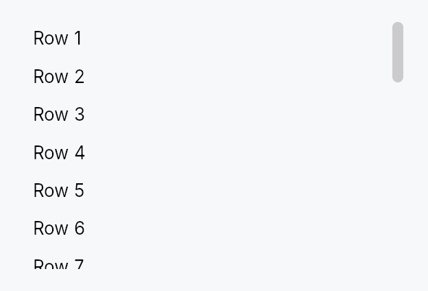
API reference
📖 Full rustdoc API for this module
pub enum ScrollBarMode
Import: use teksilo::widgets::ScrollBarMode;
How the scroll bar is presented relative to the viewport content.
#![allow(unused)] fn main() { pub enum ScrollBarMode { /* variants */ } }
Variants
Overlay— Scroll bar overlays the content (macOS-style): a thin passive indicator is painted while scrolling; the full interactive track expands on pointer proximity. Does not reduce the viewport width.Permanent— Scroll bar is a permanent layout sibling of the viewport, reserving its full thickness and always remaining interactive — the classic Windows/Linux gutter style.Thin— Floats over the content likeOverlaybut only ever shows the thin resting indicator, never the full track. A passive scroll-position display for minimal UIs; drag and track-click still work against the full slot bounds. Not the keyboard. The bar's arrow /Home/End/Pagearms sit on a node builtfocusable(false), so no keyboard user reaches them under any of the three modes — seeScrollBarPolicy::AlwaysOff, which states the same limit from the other side, anddocs/touch-and-pen.md§10.2, which carries it as an open finding.
pub enum ScrollBarPolicy
Import: use teksilo::widgets::ScrollBarPolicy;
Controls when the scroll bar appears for a given axis.
#![allow(unused)] fn main() { pub enum ScrollBarPolicy { /* variants */ } }
Variants
AsNeeded— Show the scroll bar only when content exceeds the viewport size (default).AlwaysOn— Always show the scroll bar, even when content fits without scrolling.AlwaysOff— Never show the scroll bar; the content still scrolls on a wheel, on a finger's pan, and from the assistive-technology scroll actions the viewport advertises. Not from the keyboard:ScrollAreainstalls no key handler, and the arrow / Home / End / Page arms onScrollBarbelong to a node builtfocusable(false), so no keyboard user reaches them. A focused descendant is still revealed — that isScrollIntoView, not a key the viewport handles.
pub struct ScrollArea
Import: use teksilo::widgets::ScrollArea;
A clipping viewport that makes any child widget scrollable.
The scroll offset per axis is stored in a reactive Signal<f32>, shared
with the built-in ScrollBar children. See ScrollBarMode for display
options and ScrollBarPolicy for per-axis visibility control.
#![allow(unused)] fn main() { pub struct ScrollArea { /* fields */ } }
Methods
pub fn new() -> Self
Create a new ScrollArea with overlay scroll bars, smooth scrolling, and no content yet.
pub fn rubber_band(mut self, enabled: bool) -> Self
Let a finger drag the content past its end, with decreasing gain, and
release it on the lift — the iOS / Flutter BouncingScrollPhysics feel.
Off by default, and the default is load-bearing. A surface that follows the finger past its end has absorbed the movement, so a nested area that banded could never hand the gesture to the container around it. The band belongs to the outermost area of a scroll chain.
prefers-reduced-motion hard-clamps it whatever this says.
pub fn overscroll_signal(&self) -> Signal<Vec2>
How far past its range the content is currently being held, per axis,
after the band. Always ZERO with Self::rubber_band off.
The scroll offset itself never leaves the range, so this is the signal a surface binds to draw a stretch or a glow; ignoring it is correct.
pub fn child(mut self, child: impl teksilo_core::IntoTeksiChild) -> Self
Set the scrollable content widget.
pub fn child_opt(self, widget: Option<impl teksilo_core::IntoTeksiChild>) -> Self
Attach widget when it is Some, and do nothing when it is None.
The conditional-child form. teksu!'s if without an else lowers to
this, and it is what cond.then(|| w) is for in a builder chain. None
adds no arena node, so nothing is laid out, painted, or published to the
accessibility tree, and a stack applies no spacing around it.
pub fn from_id(child: WidgetId) -> Self
Construct from an already-registered child WidgetId.
pub fn scroll_bar_style(mut self, style: ScrollBarMode) -> Self
Set the scroll bar display mode (Overlay, Permanent, or Thin).
pub fn scroll_bar_thumb_color(mut self, color: impl Into<ColorProp>) -> Self (default: None)
Tint the built-in scroll bars' thumb with an explicit colour instead of
the theme's scrollbar_thumb* tokens. Accepts anything
impl Into<ColorProp> — a Color, a theme role, or a Signal —
resolved against the live theme at paint, so roles/signals stay
reactive. Forwarded to both scroll bars via
ScrollBar::thumb_color.
Use when the area sits on a surface the surface-relative tokens don't
suit — e.g. a tooltip's inverse chip (TextRole::TooltipText).
pub fn vertical_scroll_bar_policy(mut self, policy: ScrollBarPolicy) -> Self
Set the vertical scroll bar visibility policy.
pub fn horizontal_scroll_bar_policy(mut self, policy: ScrollBarPolicy) -> Self
Set the horizontal scroll bar visibility policy.
pub fn line_height(mut self, lh: f32) -> Self (default: 20.0)
Set the pixels-per-line used when translating line-based wheel events.
pub fn scroll_bar_thickness(mut self, thickness: f32) -> Self (default: 12.0)
Set the scroll bar thickness in logical pixels (applies to both axes).
pub fn widget_resizable(mut self, resizable: bool) -> Self (default: false)
When true, content smaller than the viewport is stretched to fill it.
Similar to Qt's QScrollArea::setWidgetResizable(true).
pub fn shift_wheel_scrolls_horizontally(mut self, enabled: bool) -> Self
Whether Shift held over a vertical wheel scrolls the area sideways
(default true) — the Windows and GTK convention, and the one
TabBar and the table views already follow.
The remap applies only to a wheel notch or trackpad delta with no horizontal component of its own, and only while the area can actually scroll horizontally: a vertical-only area keeps scrolling vertically with Shift held, and a real horizontal delta (macOS sends one itself) is never rewritten. A finger's pan is never remapped. Turn it off for an area whose content binds Shift+wheel to something else.
pub fn reveal_bars_on_hover(mut self, enabled: bool) -> Self
Show the scroll bars while the pointer is over the area (default
false), and hide them again when it leaves.
Overlay and thin bars are otherwise revealed only by proximity to the
bar itself, or by a finger's pan. With this on, a bar appears as soon as
the mouse (or a hovering pen) enters the area, through the same reveal
a touch pan raises, so the style renders it exactly as it does for a
pan; a contact never produces hover, so touch is unchanged. Ignored for
ScrollBarMode::Permanent, whose bar is always there.
pub fn smooth_scrolling(mut self, enabled: bool) -> Self
Enable or disable smooth animated scrolling for wheel events.
Enabled by default. Applies to both line-based (ScrollDelta::Lines)
and pixel-based (ScrollDelta::Pixels) wheel events — on Wayland and
other platforms with high-resolution scroll axes, mouse wheel notches
are delivered as pixel deltas, so animating both paths is required for
a fast flick to feel smooth instead of jumping.
pub fn smooth_scroll_duration(mut self, duration: Duration) -> Self
Set the duration of the smooth scroll animation (default: 150ms).
pub fn scroll_past_end(mut self, fraction: impl Into<Prop<f32>>) -> Self
Allow scrolling past the end of the content by fraction of the
viewport height (default 0.0 — the last pixel of content stops flush
with the bottom of the viewport).
This extends the scroll range only. It adds no widget, no padding and no layout, so it cannot interfere with the content's own padding — a distinction worth keeping, since padding-based implementations of this idea in other toolkits are a recurring source of "single-line content is scrollable" bugs.
The motivating case is typewriter scrolling: to pin the caret's line at
the middle of the viewport, the view must be able to scroll half a
viewport past the last line, or the pin quietly stops working over the
final page — exactly where a writer spends their time. Pair with
EventContext::ensure_visible_aligned, passing 1.0 - fraction here
for a pin at fraction.
Accepts a literal or a Signal<f32>, so it can follow a setting live.
Negative values are treated as 0.0.
pub fn preferred_size(mut self, width: f32, height: f32) -> Self
Set a preferred size returned when the parent proposes unconstrained dimensions. If not set, falls back to cached content size or 300×200.
This overrides both axes. If you only want to cap the height and let
the width follow the content — the usual case for a menu or popover, which
must be as wide as its widest row — use preferred_height instead.
Passing a width of 0.0 here does not mean "no preference": it means
zero, and the scroll area will collapse.
pub fn preferred_height(mut self, height: f32) -> Self (default: None)
Cap the height when the parent proposes an unconstrained one, while letting the width continue to follow the content.
This is what a scrolling menu/popover wants: it must not grow taller than
its viewport, but it must still be as wide as its widest item. Using
preferred_size with a 0.0 width for this
collapses the panel to its minimum width and clips every row — the parent
proposes an unconstrained width (it is hugging its content), so the 0.0
is taken literally.
pub fn overscroll_behavior(mut self, behavior: OverscrollBehavior) -> Self
Set the scroll-chaining behavior at the boundary. Default
OverscrollBehavior::Chain (a boundary scroll bubbles to an ancestor
scrollable); OverscrollBehavior::Contain absorbs it instead.
pub fn restore_scroll_y(self, offset: f32) -> Self
Land offset on the first layout pass at which this area has a real
scrollable range, then forget it.
max_scroll_y is 0.0 until the content has been measured, so an
offset a host writes before that first measurement is clamped away to
zero and the page paints at the top for a frame before jumping to
where it should have started. This stores the offset instead and
applies it itself, inside layout, as soon as max_scroll_y becomes
nonzero, before the ordinary clamp would otherwise discard it, so the
very first frame the content is measured on is already laid out at
the restored position, with no visible jump.
It is a one-shot: once applied, it is dropped, so a later reflow (a wider window, an edit that lengthens the document) never yanks the reader back to where they came in. The offset is still clamped to the real range when it lands: past the end it lands at the end, negative it lands at zero.
offset <= 0.0 is a no-op: there is nothing to restore, and it clears
any previously armed offset rather than leaving it pending.
An area that never calls this behaves exactly as it always has.
pub fn scroll_y_signal(&self) -> &Signal<f32>
Get the vertical scroll position signal (for external observation).
pub fn scroll_x_signal(&self) -> &Signal<f32>
Get the horizontal scroll position signal (for external observation).
pub fn max_scroll_y_signal(&self) -> &Signal<f32>
Maximum vertical scroll offset for the current content
(content_height − viewport_height, or 0 when content fits), plus any
range bought with scroll_past_end.
External callers bind to this for "is there more to scroll?"
chrome (e.g. trailing scroll-arrow visibility).
pub fn viewport_ratio_y_signal(&self) -> &Signal<f32>
Fraction of the scrollable height currently visible (1.0 when
everything fits) — what sizes the vertical scroll bar's thumb. Accounts
for scroll_past_end, so the thumb stays
proportional to the range the user can actually travel.
pub fn max_scroll_x_signal(&self) -> &Signal<f32>
Maximum horizontal scroll offset for the current content. External callers bind to this for "is there more to scroll?" chrome (e.g. trailing scroll-arrow visibility on a tab bar).
ScrollBar
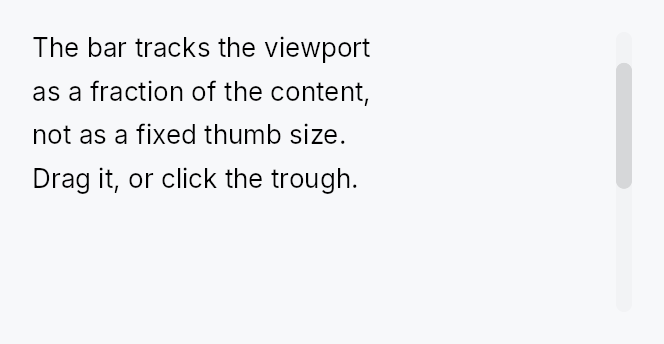
ScrollBar — pointer and keyboard affordance for a ScrollArea.
Public types
| Kind | Name |
|---|---|
const | SCROLLBAR_COARSE_TARGET — The width a scroll bar's thumb must be reachable across for a finger |
const | SCROLLBAR_MIN_THUMB_LENGTH — The shipped minimum thumb length, at Compact |
const | SCROLLBAR_PART_THUMB — Which part of the bar a TargetRegion describes |
const | SCROLLBAR_PART_TRACK — The track either side of the thumb: a tap there pages |
struct | ScrollBar — A scroll bar that shares reactive scroll-position state with a ScrollArea |
Public functions
ScrollBar
Detailed description
ScrollBar reads and writes a shared Signal<f32> scroll position and a
Signal<f32> viewport/content ratio, both supplied by its owning ScrollArea.
Interaction (thumb drag, track click, keyboard Up/Down/Home/End, hover) is
handled here; all painting is delegated to the active ScrollBarStyle impl so
the look is fully theme-overridable.
Most applications do not need to construct a ScrollBar directly — ScrollArea
creates and manages the bars automatically. Use this type when building a custom
scroll host (e.g. the RichTextEditor manages its own bars to avoid the
wrap/scrollbar circular dependency).
Reaching the thumb with a finger
The bar is 8–12 dp wide, and it stays that way at every density: growing it
would move the content beside it, and a scroll bar is chrome. The thumb is
reached instead by the two mechanisms built for exactly this — the node
widens for a coarse pointer through Widget::hit_outset, to the 48 dp
Android reserves for a scrollbar touch target, and the thumb itself is
published through Widget::target_regions so the target-conformance audit
can see a rectangle that is painted inside one leaf node and would otherwise
be invisible to it. A precise pointer gets no outset at all: a cursor's
hot-spot is exact, and widening its targets steals clicks from the content.
Because the outset widens the bar across the scroll axis, every decision about whether a press is on the thumb is taken along the axis only — a finger 15 dp inboard of an 8 dp bar is beside the thumb, not past it.
The minimum thumb length is the active style's
ScrollBarStyle::min_thumb_length, which follows the density (24 dp
Compact, 44 dp Touch under the shipped style), so a short thumb on a long
document is still something a finger can land on.
Accessibility
Hidden from AT via set_hidden(). Scroll actions (Up/Down/Left/Right) are
advertised on the parent ScrollView node, not on the bar, so screen readers
navigate the content region directly without stopping on the thumb.
#![allow(unused)] fn main() { use teksilo_widgets::scroll_bar::{ScrollBar, ScrollBarOrientation, ScrollBarVariant}; use teksilo_core::signal::Signal; let position = Signal::new(0.0_f32); let max_scroll = Signal::new(500.0_f32); let viewport_ratio = Signal::new(0.4_f32); let _bar = ScrollBar::new( ScrollBarOrientation::Vertical, position, max_scroll, viewport_ratio, ) .thickness(8.0) .variant(ScrollBarVariant::Overlay); }
Density
The picture above is the widget at TargetDensity::Compact, the mouse-and-keyboard ladder. Below is the same subject on the same canvas with only the ladder changed, so what moves is the density and nothing else — where the subject no longer fits, that is what the denser targets cost it at that size. See docs/density-and-targets.md.
Touch
API reference
📖 Full rustdoc API for this module
pub const SCROLLBAR_COARSE_TARGET
Import: use teksilo::widgets::scroll_bar::SCROLLBAR_COARSE_TARGET;
The width a scroll bar's thumb must be reachable across for a finger.
Android's ViewConfiguration.MIN_SCROLLBAR_TOUCH_TARGET — the bar keeps its
8–12 dp paint at every density and reaches this through
Widget::hit_outset, which moves nothing and repaints nothing.
#![allow(unused)] fn main() { pub const SCROLLBAR_COARSE_TARGET: f32 = 48.0; }
pub const SCROLLBAR_MIN_THUMB_LENGTH
Import: use teksilo::widgets::scroll_bar::SCROLLBAR_MIN_THUMB_LENGTH;
The shipped minimum thumb length, at Compact.
A bar takes its floor from the active style's
ScrollBarStyle::min_thumb_length at build time: the shipped style and
the trait default both answer this value raised to the density's
target_size (32 dp at Comfortable, 44 dp at Touch), and a preset answers
its own (28 dp under macOS, 30 dp under Fluent, at Compact). Before its
first build a bar uses this value. A
min_thumb_length override wins over all of
them.
#![allow(unused)] fn main() { pub const SCROLLBAR_MIN_THUMB_LENGTH: f32 = 24.0; }
pub const SCROLLBAR_PART_THUMB
Import: use teksilo::widgets::scroll_bar::SCROLLBAR_PART_THUMB;
Which part of the bar a TargetRegion describes.
Reported so an audit — and a router routing a coarse press — can tell the grab affordance from the paging surface around it.
#![allow(unused)] fn main() { pub const SCROLLBAR_PART_THUMB: u16 = 0; }
pub const SCROLLBAR_PART_TRACK
Import: use teksilo::widgets::scroll_bar::SCROLLBAR_PART_TRACK;
The track either side of the thumb: a tap there pages.
#![allow(unused)] fn main() { pub const SCROLLBAR_PART_TRACK: u16 = 1; }
pub struct ScrollBar
Import: use teksilo::widgets::ScrollBar;
A scroll bar that shares reactive scroll-position state with a ScrollArea.
Supports thumb drag, track-click page scroll, and keyboard Up/Down/Left/Right/Home/End navigation. Hidden from AT — see module docs.
#![allow(unused)] fn main() { pub struct ScrollBar { /* fields */ } }
Methods
pub fn new( orientation: ScrollBarOrientation, scroll_position: Signal<f32>, max_scroll: Signal<f32>, viewport_ratio: Signal<f32>, ) -> Self
Create a new ScrollBar with shared state.
scroll_position: sharedSignal<f32>for current scroll offsetmax_scroll: sharedSignal<f32>for maximum scroll offsetviewport_ratio: sharedSignal<f32>for viewport/content ratio (0.0..1.0)
pub fn thickness(mut self, thickness: f32) -> Self (default: 8.0)
Set the bar thickness (width for vertical, height for horizontal).
pub fn min_thumb_length(mut self, len: f32) -> Self (default: None)
Set the minimum thumb length in pixels, overriding the active style.
Left unset the floor is the active style's
ScrollBarStyle::min_thumb_length at the tree's density: under the
shipped style SCROLLBAR_MIN_THUMB_LENGTH raised to the density's
target size (24 dp at Compact, 44 dp at Touch), so a short thumb on a
long document stays something a finger can land on.
pub fn reveal(mut self, revealed: Signal<bool>) -> Self
Show the bar for as long as revealed is true, whatever hover says.
An overlay bar is normally revealed by pointer proximity, which a
contact never produces. ScrollArea raises this while a finger's pan is
in flight; a density whose RevealPolicy
is Always seeds it true at build. It only ever adds a reveal — nothing
here can hide a bar that hover has shown.
pub fn step_size(mut self, step: f32) -> Self (default: 40.0)
Set the scroll step for keyboard navigation.
pub fn visual(mut self, variant: ScrollBarVariant) -> Self
Set the visual variant. The active ScrollBarStyle picks how
to paint each variant; the IntUI default ships Permanent /
Overlay / Thin out of the box.
pub fn variant(mut self, variant: ScrollBarVariant) -> Self
Alias for visual using the new variant naming.
pub fn style(mut self, style: impl ScrollBarStyle) -> Self
Override the active ScrollBarStyle for this widget instance only.
pub fn thumb_color(mut self, color: impl Into<ColorProp>) -> Self (default: None)
Tint the thumb with an explicit colour instead of the theme's
scrollbar_thumb* tokens. Accepts anything impl Into<ColorProp> —
a Color, a theme role (TextRole/SurfaceRole/…), or a Signal;
resolved against the live theme at paint, so roles and signals stay
reactive. The active ScrollBarStyle derives the idle/hover/pressed
states from this tint. Use when the bar sits on a surface the
surface-relative tokens don't suit — a tooltip's inverse chip, a
branded panel. Mirrors Button::text_role.
SearchField

SearchField — a TextInput preset
configured for search workflows: leading magnifier glyph, default-on
clear-X, and an optional anchored suggestions popover with keyboard
navigation and the ARIA combobox-with-listbox accessibility pattern.
The popover is shown via OverlayRequest so it floats above sibling
content and escapes ancestor clipping (same pattern as ComboBox).
Public functions
SearchField
Detailed description
let query = ctx.signal(String::new());
SearchField::new(query.clone())
.placeholder("Search documents")
.with_suggestions(|prefix| {
FRUITS.iter()
.filter(|f| f.to_lowercase().starts_with(&prefix.to_lowercase()))
.map(|s| s.to_string())
.collect()
})
.on_select(|value, _ctx| println!("picked: {value}"))
.on_submit_fn(|ctx| ctx.send_intent(AppIntent::Search))
Design — comparison with searchable ComboBox
A searchable ComboBox and a SearchField are visually similar
but semantically different:
- ComboBox is a value picker — the bound state is the selected item from a known list. The text input is a transient filter, embedded inside the dropdown popup; the closed combo shows the selected value, not the user's query.
- SearchField is a query input — the bound state is the
query string itself. The text input is always visible at the
top level; suggestions are completion hints, not the source of
truth. The bound
Signal<String>keeps whatever the user typed, even if no suggestion matches.
The two share the same dropdown-of-options machinery in spirit;
a future refactor could lift a common OverlayList<T> primitive
out of both. For now they're separate so each can keep a small
API surface tuned to its semantics.
Accessibility
The field is Role::SearchInput with HasPopup::Listbox and
AutoComplete::List. When the popup is open it advertises
set_expanded(true) and set_controls(listbox_id) (mapped to
accesskit::NodeId via widget_id_to_node_id). Each row is
Role::ListBoxOption with set_selected(is_highlighted) and
set_position_in_set(idx + 1); the Role::ListBox container
carries the matching set_size_of_set(total), since AccessKit
resolves a set size by walking up from the item. Together they
let screen readers announce "Apple, 1 of 5".
Density
The picture above is the widget at TargetDensity::Compact, the mouse-and-keyboard ladder. Below is the same subject on the same canvas with only the ladder changed, so what moves is the density and nothing else — where the subject no longer fits, that is what the denser targets cost it at that size. See docs/density-and-targets.md.
Touch

API reference
📖 Full rustdoc API for this module
pub struct SearchField
Import: use teksilo::widgets::SearchField;
A search input with optional inline suggestions popup.
#![allow(unused)] fn main() { pub struct SearchField { /* fields */ } }
Methods
pub fn new(text: Signal<String>) -> Self
Create a search field bound to text, the reactive query string.
pub fn style(mut self, style: impl teksilo_core::styles::SearchFieldStyle) -> Self
Per-call SearchFieldStyle override.
pub fn placeholder(mut self, text: impl Into<LocalizedString>) -> Self
Set the placeholder text shown when the query is empty.
pub fn label(mut self, label: impl Into<LocalizedString>) -> Self
Set an accessible label for the field (announced by screen readers, not visually shown).
pub fn drives_listbox( mut self, listbox: Signal<Option<WidgetId>>, active: Signal<Option<WidgetId>>, ) -> Self
Wire this field to a listbox the caller owns, so arrow keys that
move a highlight through that list are announced while focus stays here
(the ARIA combobox pattern). listbox is the list's node, active the
currently-highlighted row's node; both are forwarded to the inner
TextInputField, which is the node that actually holds focus and
therefore the only one whose active_descendant assistive technology
follows.
This is for a search field driving a list built by its host — a
command palette, a filter box above a results view. The built-in
suggestion popup (suggestions) wires itself and needs none of this.
pub fn enabled(mut self, on: impl Into<Prop<bool>>) -> Self (default: true)
Set the initial enabled state. Forwarded to the arena at build time.
pub fn on_submit_fn(mut self, f: impl Fn(&mut EventContext) + 'static) -> Self
Install a callback invoked when the user presses Enter (or activates the search action).
pub fn with_suggestions(mut self, f: impl Fn(&str) -> Vec<String> + 'static) -> Self
Provider that returns suggestions for the current query string.
When set, the popup appears below the field as soon as the
user types at least Self::min_chars characters and the
provider returns a non-empty list.
pub fn max_suggestions(mut self, n: usize) -> Self
Cap the number of suggestions shown in the popup (default 8, minimum 1).
pub fn min_chars(mut self, n: usize) -> Self
Minimum number of characters the user must type before suggestions appear (default 1).
pub fn on_select(mut self, f: impl Fn(&str, &mut EventContext) + 'static) -> Self
Install a callback invoked when the user picks a suggestion (tap, Enter, or Space).
pub fn tooltip(mut self, text: impl Into<LocalizedString>) -> Self
Show a plain one-line tooltip after a hover delay.
Mutually exclusive with rich_tooltip,
rich_tooltip_content, and
composite_tooltip — calling this
clears the other slots (last call wins).
pub fn rich_tooltip(mut self, key: impl Into<String>) -> Self
Show a registry-driven rich tooltip keyed by key.
Mutually exclusive with the other tooltip setters — last call wins.
pub fn rich_tooltip_content(mut self, content: crate::tooltip::TooltipContent) -> Self
Show an inline rich tooltip with the given TooltipContent.
Mutually exclusive with the other tooltip setters — last call wins.
pub fn composite_tooltip(mut self, content: impl Widget + 'static) -> Self
Show a composite tooltip whose body is an arbitrary widget tree.
Mutually exclusive with the other tooltip setters — last call wins.
SegmentedControl

SegmentedControl — mutually exclusive segments in a horizontal row.
Public types
| Kind | Name |
|---|---|
enum | SegmentDisplay — What a segment paints: its icon, its label, or both |
enum | SegmentSizing — How the visible segments divide the control's width |
enum | SegmentOverflow — What the control does when its segments do not fit |
struct | Segment — One segment descriptor: a localized label with a stable SegmentId, an optional leading icon, a hover tooltip, and reactive disabled / visible flags |
fn | index_signal — Derive a Switcher-compatible index from a keyed selection |
struct | SegmentedControl — A segmented control binding a Signal<Option<SegmentId>> to a row of mutually exclusive segments |
struct | SegmentId — Stable identity of a segment |
Public functions
SegmentedControl
Segment
| Returns | Function |
|---|---|
| Constructors | |
Self | new(label: impl Into<LocalizedString>) |
| Builder methods | |
Self | id(id: SegmentId) |
Self | icon(factory: impl Fn() -> IconWidget + 'static) |
Self | tooltip(text: impl Into<LocalizedString>) |
Self | rich_tooltip(key: impl Into<String>) |
Self | rich_tooltip_content(content: crate::tooltip::TooltipContent) |
Self | composite_tooltip(factory: impl Fn() -> Box<dyn Widget> + 'static) |
Self | disabled(disabled: impl Into<Prop<bool>>) |
Self | visible(visible: impl Into<Prop<bool>>) |
| Methods | |
SegmentId | segment_id() |
SegmentId
| Returns | Function |
|---|---|
| Constructors | |
Self | fresh() |
Self | from_raw(value: NonZeroU64) |
Self | from_u64(value: u64) |
| Methods | |
NonZeroU64 | raw() |
u64 | get() |
Detailed description
Each segment is a real composed widget — a centered icon + label with
a reactive tint — built from a Segment descriptor. Selection is
bound to a Signal<Option<SegmentId>>: keyed, not positional, so
inserting or removing a segment never silently re-points the
selection at a different one. The chrome (rounded frame, hover tint,
selected-segment surface) is delegated to the active
SegmentedControlStyle.
const LIST: SegmentId = SegmentId::from_u64(1);
const GRID: SegmentId = SegmentId::from_u64(2);
let view = ctx.signal(Some(LIST));
SegmentedControl::new(view.clone())
.segment(Segment::new(tr!(list_view())).id(LIST).icon(|| IconWidget::list(14.0)))
.segment(Segment::new(tr!(grid_view())).id(GRID).icon(|| IconWidget::grid(14.0)))
// Pairing with a Switcher:
Switcher::new(segmented_control::index_signal(&view, &[LIST, GRID]))
When to use
- Use a
SegmentedControlfor mutually exclusive modes that read well as a compact horizontal strip (view mode, time period). - Prefer a
ComboBoxwhen the options are many and the strip form buys nothing — though a segmented control no longer breaks down at seven segments, because it overflows (below). - Prefer
RadioButton/RadioTileGroupwhen the options need vertical space or descriptions.
Width: overflow, not squeeze
When the segments do not fit, the ones that do not fit move into a
trailing chevron menu rather than all of them compressing into
ellipsised stubs (SegmentOverflow::Menu, the default; opt out with
SegmentOverflow::Compress).
Declaration order is stable, with exactly one exception: the selected segment is always visible. If it would have been pushed into the menu it takes the last slot, and it stays there until another segment is chosen from the menu — so the strip does not reshuffle under the pointer, and the promotion is forgotten once the control is wide enough to show everything again.
Declared: [A][B][C][D][E][F][G] fits 4 + chevron
start, A selected [A][B][C][D][v] menu: E F G
pick F from menu [A][B][C][F][v] menu: D E G
click A (F stays) [A][B][C][F][v] menu: D E G
widen to full fit [A][B][C][D][E][F][G]
Accessibility
Role::RadioGroup on the control with active_descendant pointing at
the selected segment; Role::RadioButton per segment, carrying
"N of M" over the whole segment list — including segments currently in
the overflow menu, which are still reachable. Arrow keys cycle
selection (RTL-aware, resolved at event time) and Home/End jump to the
ends, both skipping disabled segments; stepping onto an overflowed
segment promotes it into view. Increment/Decrement AT actions
mirror the arrows.
The strip is one tab stop. While the control is overflowing the chevron adds a second, because an overflow menu that no keyboard can reach is not an overflow menu; it cannot join the arrow sequence, since here arrows move selection rather than a roving focus.
Touch and pen
Nothing changed for the controls sweep, and the reasons are worth recording.
A segment activates from on_tap, so it already lands on the release and a
finger that slides off one selects nothing. The recipe's own 24 dp height
meets the WCAG 2.2 SC 2.5.8 floor at Compact and follows the density ladder
above it, and the 12 dp horizontal padding puts every segment's width over
it too — so none of the three hit-targeting mechanisms is involved. And
teksilo_core::styles::SegmentedControlStyleConfig
carries no pressed state, so there is no press visual to move onto the
framework press.
Density
The picture above is the widget at TargetDensity::Compact, the mouse-and-keyboard ladder. Below is the same subject on the same canvas with only the ladder changed, so what moves is the density and nothing else — where the subject no longer fits, that is what the denser targets cost it at that size. See docs/density-and-targets.md.
Touch

API reference
📖 Full rustdoc API for this module
pub enum SegmentDisplay
Import: use teksilo::widgets::SegmentDisplay;
What a segment paints: its icon, its label, or both.
Set on the control with
SegmentedControl::display; it
applies to every segment. Mirrors TabWidget's TabDisplayMode.
Icon-only is the classic compact fallback before overflow kicks in:
a bar of icon-only segments fits far more of them, so switching to
Icon can be the difference between a
complete strip and a chevron menu.
#![allow(unused)] fn main() { pub enum SegmentDisplay { /* variants */ } }
Variants
Auto— Paint whatever the segment declares — icon and label when both are present, label alone otherwise. The default, and the behaviour of everySegmentedControlbefore this mode existed.Text— Label only. A declared icon is suppressed.Icon— Icon only; the label is promoted to the hover tooltip (unless the segment already declares one). A segment with no icon falls back to its label, so the mode is never a silent no-op.IconText— Icon and label. Identical toAutofor a segment that declares both; kept for parity withTabDisplayModeso a caller can be explicit.
pub enum SegmentSizing
Import: use teksilo::widgets::SegmentSizing;
How the visible segments divide the control's width.
#![allow(unused)] fn main() { pub enum SegmentSizing { /* variants */ } }
Variants
Uniform— Every visible segment gets the same width — the Apple / IntUI look, and the behaviour of everySegmentedControlbefore this knob existed. The fit calculation uses the widest segment's natural width as the unit, so segments never look ragged.Fit— Every visible segment gets its own natural width, and leftover space (when the control fills a wider slot) is shared equally. Fits more short segments before overflowing, at the cost of an uneven strip.
pub enum SegmentOverflow
Import: use teksilo::widgets::SegmentOverflow;
What the control does when its segments do not fit.
#![allow(unused)] fn main() { pub enum SegmentOverflow { /* variants */ } }
Variants
Menu— Move the segments that do not fit into a trailing chevron menu, keeping the rest at a legible width. The selected segment is always among the visible ones. This is the default.Compress— Keep every segment on the strip and let them compress, truncating labels with an ellipsis. The behaviour of everySegmentedControlbefore overflow existed — appropriate for two or three short segments that will never realistically overflow.
pub struct Segment
Import: use teksilo::widgets::Segment;
One segment descriptor: a localized label with a stable
SegmentId, an optional leading icon, a hover tooltip, and
reactive disabled / visible flags.
#![allow(unused)] fn main() { pub struct Segment { /* fields */ } }
Methods
pub fn new(label: impl Into<LocalizedString>) -> Self
A text segment with a freshly allocated SegmentId. The label
may come from tr!(...) (translated — follows a live locale
switch) or lit!(...) (untranslated).
Call id when the segment needs a stable identity —
one that survives a restart, or that another crate can name.
pub fn id(mut self, id: SegmentId) -> Self
Give this segment an app-chosen stable identity, replacing the
fresh id new allocated. Use this whenever the
selection is persisted or the segment is contributed by another
crate.
pub fn segment_id(&self) -> SegmentId
This segment's identity.
pub fn icon(mut self, factory: impl Fn() -> IconWidget + 'static) -> Self
Add a leading icon. The factory is invoked at build time (and on rebuild); the icon's tint is bound reactively to the segment's selected / focus / enabled state so it matches the label.
pub fn tooltip(mut self, text: impl Into<LocalizedString>) -> Self
Hover tooltip — most useful for icon-only segments.
Mutually exclusive with rich_tooltip /
rich_tooltip_content /
composite_tooltip — last call wins.
pub fn rich_tooltip(mut self, key: impl Into<String>) -> Self
Rich hover tooltip resolved from the app-wide registry by key.
Mutually exclusive with tooltip /
rich_tooltip_content /
composite_tooltip — last call wins.
pub fn rich_tooltip_content(mut self, content: crate::tooltip::TooltipContent) -> Self
Rich hover tooltip driven by an inline
TooltipContent entry
(no registry key needed).
Mutually exclusive with tooltip /
rich_tooltip /
composite_tooltip — last call wins.
pub fn composite_tooltip(mut self, factory: impl Fn() -> Box<dyn Widget> + 'static) -> Self
Composite hover tooltip built by a factory closure at attach time.
The factory is called once per build() to produce the tooltip
body widget. It is stored as an Rc<dyn Fn> so that Segment
remains Clone.
Mutually exclusive with tooltip /
rich_tooltip /
rich_tooltip_content — last call wins.
pub fn disabled(mut self, disabled: impl Into<Prop<bool>>) -> Self (default: false)
Disable this segment: not selectable via click or keyboard, dimmed, and announced disabled to assistive tech.
Accepts a bool or a Signal<bool> — a bound signal flips the
segment live, with no rebuild, and keyboard stepping honours
the new value immediately (the flags are read at event time, not
snapshotted at build time).
pub fn visible(mut self, visible: impl Into<Prop<bool>>) -> Self (default: true)
Hide this segment entirely: it leaves the strip, the overflow menu, the keyboard order, and the accessibility tree, and it is excluded from the overflow calculation.
Distinct from overflowed — an overflowed segment is still
reachable from the chevron menu, a hidden one is not there at all.
Accepts a bool or a Signal<bool>; a bound signal re-runs the
overflow plan with no rebuild.
pub fn index_signal(...)
Import: use teksilo::widgets::segmented_control::index_signal;
Derive a Switcher-compatible index from a keyed selection.
SegmentedControl is keyed precisely so that a contributed segment
cannot silently re-point the selection, but Switcher is index-driven
— this is the adapter between the two. Unknown or absent ids resolve
to 0, matching Switcher's own out-of-range behaviour.
Switcher::new(segmented_control::index_signal(&view, &[LIST, GRID, COLUMNS]))
.child(list_pane)
.child(grid_pane)
.child(columns_pane)
#![allow(unused)] fn main() { pub fn index_signal(selected: &Signal<Option<SegmentId>>, ids: &[SegmentId]) -> Signal<usize>; }
pub struct SegmentedControl
Import: use teksilo::widgets::SegmentedControl;
A segmented control binding a Signal<Option<SegmentId>> to a row of
mutually exclusive segments. Build the segment list with
segment or segments.
#![allow(unused)] fn main() { pub struct SegmentedControl { /* fields */ } }
Methods
pub fn new(selected: Signal<Option<SegmentId>>) -> Self
Create an empty segmented control bound to selected. Add segments
with segment or segments.
pub fn indexed(index: Signal<usize>) -> Self
Bind a positional Signal<usize> instead of a keyed
selection, mirrored in both directions.
Use this only when position is the meaning and the segment list
is closed and local — an enum discriminant over a fixed ALL
array, a Switcher index, a settings choice. For anything else
prefer new: an index silently stops meaning the
same thing the moment a segment is inserted ahead of it, which is
the entire reason selection is keyed. A persisted selection, or
segments contributed by another crate, are both firmly in
"anything else".
Positions address the declared list, so a segment hidden with
Segment::visible does not renumber the others.
// `bucket_idx` already drives the rollup maths and a Switcher.
SegmentedControl::indexed(bucket_idx.clone())
.segments([lit!("×2"), lit!("×4"), lit!("×8")])
pub fn segment(mut self, segment: impl Into<Segment>) -> Self
Append one segment. Accepts a Segment or, via
From<LocalizedString>, a bare tr!(...) / lit!(...) label
(which gets a freshly allocated SegmentId).
pub fn segments(mut self, segments: impl IntoIterator<Item = impl Into<Segment>>) -> Self
Append several segments. Label-only:
.segments([tr!(day()), tr!(week())]); rich:
.segments([Segment::new(...).id(DAY).icon(...), ...]).
pub fn segment_ids(&self) -> Vec<SegmentId>
The ids of the segments added so far, in declaration order.
Convenient for feeding index_signal without repeating the list.
pub fn enabled(mut self, enabled: impl Into<Prop<bool>>) -> Self (default: true)
Set the enabled state, statically or reactively. Forwarded to
the arena at build time via
ctx.enabled_when(segmented_control_id, self.enabled.clone()).
pub fn label(mut self, label: impl Into<LocalizedString>) -> Self (default: None)
Accessible name for the group — e.g. "View mode". Screen readers
announce it before the selected segment. Matches
RadioGroup::label and
RadioTileGroup::label.
pub fn on_change(mut self, f: impl Fn(SegmentId, &mut EventContext) + 'static) -> Self
Called whenever the user changes the selection — by click, arrow
key, assistive technology, or the overflow menu. Receives the
newly selected SegmentId and an EventContext, so it can do
things a bare Signal write cannot (ctx.set_locale(...),
ctx.send_intent(...), opening a window).
Does not fire for programmatic writes to the bound signal — there is no event in flight to carry. Observe the signal for that.
pub fn style(mut self, style: impl teksilo_core::styles::SegmentedControlStyle) -> Self
Per-call override for the segmented-control chrome.
pub fn text_style(mut self, style: impl Into<teksilo_core::color_prop::TextStyleProp>) -> Self
Override every segment's label text style (font, size, weight).
Accepts a TextStyleRole, a TextStyle, or a Signal of either.
Default (unset) is TextStyleRole::Small. Text color stays
state-driven and is intentionally not overridable here.
pub fn display(mut self, display: SegmentDisplay) -> Self
What each segment paints: its icon, its label, or both. See
SegmentDisplay. Icon-only fits far more segments, so it is
worth reaching for before the control starts overflowing.
pub fn sizing(mut self, sizing: SegmentSizing) -> Self
How the visible segments divide the width. See SegmentSizing.
pub fn overflow(mut self, mode: SegmentOverflow) -> Self
What to do when the segments do not fit. See SegmentOverflow.
pub fn is_overflowing(&self) -> Signal<bool>
Reactive "some segments are in the overflow menu right now".
Republished from place_children behind an equality guard, so it
is safe for RepaintOnly / AccessibilityOnly consumers and for
Relayout consumers that do not feed back into this control's own
width. Mirrors Toolbar::is_overflowing.
pub fn fill_width(mut self, fill: bool) -> Self
Whether the control claims all the width offered to it (the default, and the behaviour before this knob existed) or hugs its segments.
false also makes the control shrinkable: in an over-constrained
stack it compresses — and overflows — instead of spilling past its
bounds.
pub struct SegmentId
Import: none — SegmentId is public in a private module of teksilo-widgets and nothing re-exports it.
Stable identity of a segment. Cheap to copy; survives rebuilds, locale changes, and segments being inserted around it.
#![allow(unused)] fn main() { pub struct SegmentId(NonZeroU64); }
Methods
pub fn fresh() -> Self
Allocate a new, never-before-seen id. Backed by a monotonic global counter — overflow is theoretically possible after 2^64 calls, at which point the universe has had bigger problems.
Segment::new calls this for you, so a
control that never persists its selection needs no explicit ids.
Allocations start at 2^48, so they can never collide with a small
constant an app declared through from_u64.
pub const fn from_raw(value: NonZeroU64) -> Self
Wrap an externally-allocated key. Use this when the segment's
identity comes from an app-side store (a view-mode enum
discriminant, a plugin key hash, …) — calling SegmentId::fresh
would allocate a new id every restart, breaking a persisted
selection.
pub const fn from_u64(value: u64) -> Self
const convenience over from_raw, so an app
can declare its segments as constants:
# use teksilo_widgets::SegmentId;
const SYNOPSIS: SegmentId = SegmentId::from_u64(1);
const CHAPTER: SegmentId = SegmentId::from_u64(2);
Panics
If value is zero. Because this is a const fn, a literal zero
is caught at compile time rather than at run time.
pub const fn raw(self) -> NonZeroU64
The underlying non-zero u64. Serialize this to persist a
selection across sessions; restore via from_raw
or from_u64.
pub const fn get(self) -> u64
The underlying value as a plain u64.
Shake
Shake — wraps a child and plays a damped horizontal oscillation
whenever an external trigger Signal<u32> is bumped. The classic
invalid-input feedback: wrong password, failed form validation,
"no more results" wall.
Public functions
Shake
| Returns | Function |
|---|---|
| Constructors | |
Self | new(trigger: Signal<u32>) |
| Builder methods | |
Self | amplitude(px: f32) |
Self | duration(duration: Duration) |
Self | cycles(cycles: f32) |
Self | child(widget: impl teksilo_core::IntoTeksiChild) |
Self | child_opt(widget: Option<impl teksilo_core::IntoTeksiChild>) |
Detailed description
let shake_trigger = ctx.signal(0_u32);
ctx.add(
Shake::new(shake_trigger.clone())
.child(text_input_field),
);
// ...elsewhere, on validation failure:
shake_trigger.set(shake_trigger.get() + 1);
Layout semantics
Layout-stable: the wrapper reports the child's full natural size and clips the oscillating-out-of-bounds excursions on each side. Siblings don't reflow. The shake is a pure visual offset.
Reduced motion
Honours prefers-reduced-motion: the trigger no-ops. The widget
is still focusable / interactive — the visual feedback just
doesn't play. Pair with another a11y-friendly cue (red border,
error text) when error state must be communicated.
API reference
📖 Full rustdoc API for this module
pub struct Shake
Import: use teksilo::widgets::Shake;
Wraps a child and plays a damped horizontal-oscillation shake each time the trigger signal value changes.
#![allow(unused)] fn main() { pub struct Shake { /* fields */ } }
Methods
pub fn new(trigger: Signal<u32>) -> Self
Build a shake wrapper. Bumping trigger (any new value) plays
one shake cycle.
pub fn amplitude(mut self, px: f32) -> Self
Peak horizontal offset in logical pixels. Default 8 px.
pub fn duration(mut self, duration: Duration) -> Self
Override the total shake duration. Default:
MotionTokens::duration_slow (~300 ms) — the same one-shot
"this should feel deliberate" budget dialogs use.
pub fn cycles(mut self, cycles: f32) -> Self
Number of full back-and-forth oscillations within duration.
Default 4 cycles. Higher = jitterier; lower = wobblier.
pub fn child(mut self, widget: impl teksilo_core::IntoTeksiChild) -> Self
Inline child widget (deferred insertion).
pub fn child_opt(self, widget: Option<impl teksilo_core::IntoTeksiChild>) -> Self
Attach widget when it is Some, and do nothing when it is None.
The conditional-child form. teksu!'s if without an else lowers to
this, and it is what cond.then(|| w) is for in a builder chain. None
adds no arena node, so nothing is laid out, painted, or published to the
accessibility tree, and a stack applies no spacing around it.
ShortcutSettings
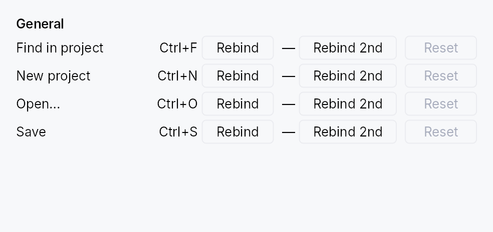
ShortcutSettings: the user-facing panel for browsing and rebinding an application's shortcuts.
Public types
| Kind | Name |
|---|---|
struct | ShortcutConflict — Describes a rebind that collides with an existing binding |
struct | ShortcutSettings — A settings panel for browsing and rebinding application shortcuts |
Public functions
ShortcutSettings
| Returns | Function |
|---|---|
| Constructors | |
Self | new() |
| Builder methods | |
Self | with_filter(filter: Signal<String>) |
Self | modified_only(signal: Signal<bool>) |
Self | toolbar(show: bool) |
Self | confirm_conflicts(yes: bool) |
Self | on_conflict(f: impl Fn(&ShortcutConflict) + 'static) |
Detailed description
It lists every shortcut in the tree's
ShortcutRegistry, grouped
by category, one row per command:
[ Search commands or keys ] [⌨] [ ] Modified only [Reset all…]
File
New project [Ctrl] [N] +
Open… [Ctrl] [O] +
● Save [Ctrl] [Shift] [S] [Ctrl] [S] ↺
Format
Bold ( Press keys… ) +
Press the new shortcut. Esc cancels, Del removes it.
- The chord is the control. Each chord is drawn as key caps; click
it (or focus it and press Enter or Space) to record a new one. The
first column is the shortcut, the second its alternative (
+adds one). Delete or Backspace on a focused chord removes it. - Recording shows "Press keys…" in a field the width of its column, so the list never reflows. Escape or Tab cancels; Delete or Backspace removes the chord; leaving the field cancels too. A key that cannot be a shortcut is refused with the reason, and recording goes on: a printable key needs Ctrl, Alt or ⌘ (Shift alone types a capital), and chords the system keeps (Alt+F4, Alt+Tab, ⌘Tab, ⌘Space, …) and Ctrl+Tab (the way out of a control that keeps Tab) are reserved.
- Conflicts are confirmed. A chord another command already uses
is not taken from it until the user presses "Reassign" on the line
that appears under the row.
confirm_conflicts(false)reassigns at once instead; either wayon_conflictis told. - Changed rows are marked with a dot and get a reset button, which puts that command's declared defaults back. "Reset all…" in the toolbar does it for every command, after a confirmation.
- Search matches a command's name, its group, its description and the text of its chords ("ctrl+s" finds Save). The keyboard button next to the field finds by chord instead: press it, press the keys, and the list shows the commands that use exactly that chord. "Modified only" narrows the list to the commands the user changed.
Commands are sorted by name within a group and groups by their title, both in the interface language. Every visible string comes from the framework's locale bundles.
Keyboard. The list is one Tab stop. The arrow keys move between rows and between a row's chord, alternative and reset button; Home and End go to the first and last row. Every control carries its command in its accessible name ("Save: Ctrl+S"), its description and whether the user changed it in its description, and the group titles are headings.
The widget owns the armed key capture. Dropping the widget cancels it, so navigating away mid-recording cannot rebind the next key pressed somewhere else.
The list grows with its content and does not scroll; place the widget
in a ScrollArea when there are more shortcuts than fit.
// Inside a settings Dialog build():
ctx.add(
ShortcutSettings::new()
.on_conflict(|c| println!("{} loses its shortcut", c.displaced_name)),
);
Density
The picture above is the widget at TargetDensity::Compact, the mouse-and-keyboard ladder. Below is the same subject on the same canvas with only the ladder changed, so what moves is the density and nothing else — where the subject no longer fits, that is what the denser targets cost it at that size. See docs/density-and-targets.md.
Touch
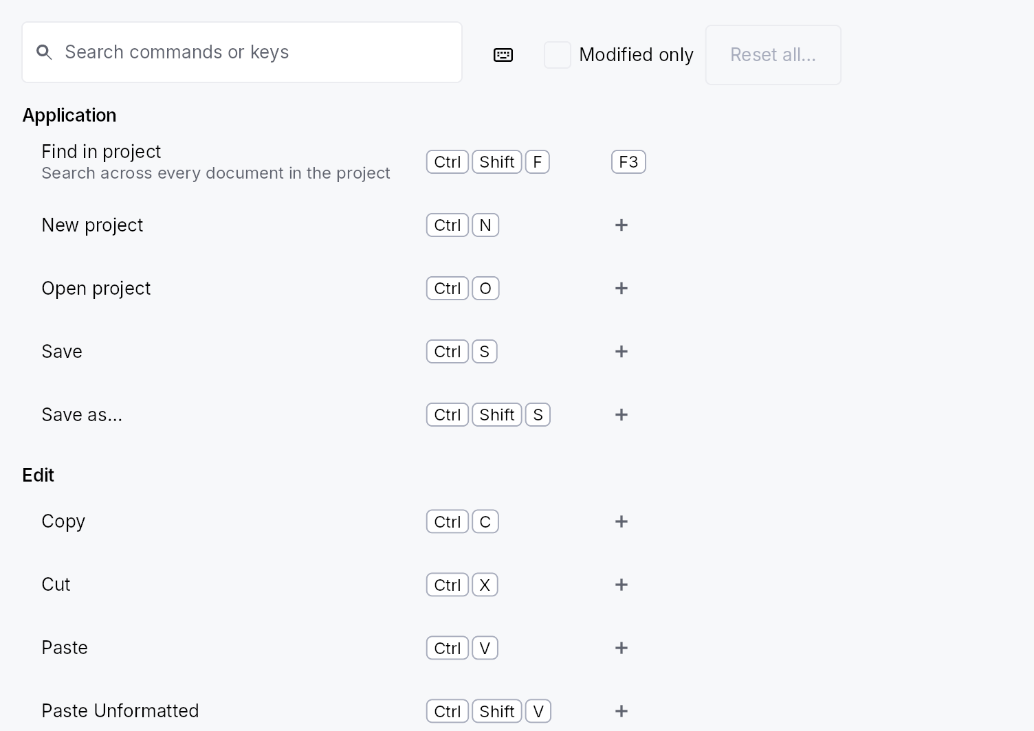
API reference
📖 Full rustdoc API for this module
pub struct ShortcutConflict
Import: use teksilo::widgets::shortcut_settings::ShortcutConflict;
Describes a rebind that collides with an existing binding.
Passed to the ShortcutSettings::on_conflict callback so the app
can surface a toast ("Save lost its Ctrl+S binding").
#![allow(unused)] fn main() { pub struct ShortcutConflict { /* fields */ } }
Fields
displaced_id:String— Id of the shortcut that currently owns the chord and loses it if the rebind goes ahead.displaced_name:String— Display name of that shortcut (its registryname).keystroke:KeyStroke— The chord being assigned to the new target.
pub struct ShortcutSettings
Import: use teksilo::widgets::ShortcutSettings;
A settings panel for browsing and rebinding application shortcuts.
See the module documentation for what it shows and how it behaves.
#![allow(unused)] fn main() { pub struct ShortcutSettings { /* fields */ } }
Methods
pub fn new() -> Self
A panel listing every shortcut registered in the tree's
ShortcutRegistry, with its toolbar, asking before it takes a chord
from another command.
pub fn with_filter(mut self, filter: Signal<String>) -> Self (default: None)
Bind the search text to filter. The toolbar's search field edits
this signal, and anything else may write it too: a command palette
handing a query over, an app's own search box when the toolbar is
off. The list shows the shortcuts whose name, group, description or
chord contains the text (case-insensitive); an empty string shows
everything.
pub fn modified_only(mut self, signal: Signal<bool>) -> Self (default: None)
Bind "Modified only" to signal: while it is true the list shows
only the shortcuts the user changed. The toolbar's checkbox edits
the same signal.
pub fn toolbar(mut self, show: bool) -> Self
Show the toolbar (search field, find by keys, "Modified only",
"Reset all…"). On by default. Turn it off when the surrounding UI
already has a search field, and drive the list through
with_filter and
modified_only.
pub fn confirm_conflicts(mut self, yes: bool) -> Self
Ask before a rebind takes a chord from another shortcut. On by
default: the colliding rebind shows "{chord} is already used by
{command}" under the row with Reassign and Cancel, and nothing
changes until the user answers. With false the other shortcut
loses the chord at once, and a screen reader is told which one.
pub fn on_conflict(mut self, f: impl Fn(&ShortcutConflict) + 'static) -> Self
Register a callback fired whenever a rebind collides with an
existing binding, regardless of confirm_conflicts. The
callback receives the displaced shortcut's id, name, and the
chord, so the app can surface a toast. It fires before the
displaced binding is removed (when asking first, before the user
has answered).
Shrinkable
Shrinkable — a layout modifier that allows its child to compress under an over-constraint.
Public functions
Shrinkable
| Returns | Function |
|---|---|
| Constructors | |
Self | new() |
| Builder methods | |
Self | shrink(weight: f32) |
Self | min_width(min: f32) |
Self | min_height(min: f32) |
Self | child(widget: impl teksilo_core::IntoTeksiChild) |
Self | child_opt(widget: Option<impl teksilo_core::IntoTeksiChild>) |
Detailed description
By default every widget is rigid: when a stack runs out of main-axis room, rigid
children keep their wanted size and overflow the bounds. Shrinkable opts a child
into the over-constraint distribution: the stack divides any deficit across all
shrinkable children proportional to their shrink weight,
never below the min_width / min_height
floor set here.
Shrinkable is the shrink counterpart to
Expand: while Expand claims leftover slack
(grow), Shrinkable absorbs excess pressure (shrink). The two are independent
— a child can both grow on surplus and shrink on deficit by wrapping with
Shrinkable and setting a non-zero flex on the inner widget.
When to use
- A long text label that should ellipsize before a rigid icon/badge loses space.
- A thumbnail image column that may compress while a fixed sidebar stays at full width.
- "Compress A before B": give A
Shrinkable, leave B rigid (shrink = 0).
Ordering shrink between children
The stack distributes a deficit iteratively. A child that reaches its floor is frozen at it, and its unspent share goes on to the other shrinkable children; a rigid sibling never shrinks. Weights are proportional, not strict priorities: to shrink A fully before B starts, give A a much larger weight (say 1000 times B's). B then loses only a sub-pixel amount until A reaches its floor, and takes the rest of the deficit from there.
#![allow(unused)] fn main() { use teksilo_widgets::primitives::{HStack, Shrinkable, TextWidget}; use teksilo_i18n::lit; // The label shrinks as far as 48 dp; the button stays rigid. let _row = HStack::new() .child(Shrinkable::new().min_width(48.0) .child(TextWidget::new(lit!("A long label that may compress")).single_line())) .child(TextWidget::new(lit!("Rigid"))); }
API reference
📖 Full rustdoc API for this module
pub struct Shrinkable
Import: use teksilo::widgets::Shrinkable;
Layout modifier that lets its child be compressed when a stack is
over-constrained — the shrink counterpart to Expand.
By default widgets do not shrink: when an HStack/VStack runs out of
room, rigid children keep their wanted size and overflow. Wrap a child in
Shrinkable to opt it into compression: the parent distributes any deficit
across shrinkable children proportional to their shrink weight, never below
the floor set here.
#![allow(unused)] fn main() { use teksilo_widgets::primitives::{HStack, Shrinkable, TextWidget, IconWidget}; use teksilo_i18n::lit; let long_label = TextWidget::new(lit!("A very long label that may need to shrink")); let icon = IconWidget::chevron_right(16.0); // The label gives up space before the (rigid) icon when the row is narrow: let _w = HStack::new() .child(Shrinkable::new().min_width(40.0).child(long_label)) .child(icon); // rigid — never shrinks }
The stack distributes a deficit iteratively: a child that reaches its floor
is frozen there and hands its remaining share on to the other shrinkable
children, and a rigid sibling never shrinks. To shrink A fully before B
starts, give A a much larger shrink weight (for example
1000 times B's); B then loses only a sub-pixel amount until A is at its floor.
Shrinkable preserves its child's grow weight (flex) and cross size, so a
child can both grow on surplus and shrink on a deficit. It forwards the
parent's proposal to the child unchanged; when the stack compresses it, the
child is re-laid-out at the smaller size (so e.g. a wrapped-text child
re-wraps and reports its taller height via the height-for-width pass).
Floor caveat. The default floor is 0 on both axes, which lets the
child shrink to nothing. Set min_width /
min_height to a sensible minimum — the caller owns
this choice (unlike the stock height-stable widgets, which report their own
natural floor).
#![allow(unused)] fn main() { pub struct Shrinkable { /* fields */ } }
Methods
pub fn new() -> Self
A shrinkable wrapper with shrink weight 1.0 and a zero floor.
pub fn shrink(mut self, weight: f32) -> Self
Set the shrink weight (relative share of an over-constraint deficit this
child absorbs). Clamped to >= 0; 0 makes the child rigid again.
pub fn min_width(mut self, min: f32) -> Self
Set the minimum width the child may be compressed to.
pub fn min_height(mut self, min: f32) -> Self
Set the minimum height the child may be compressed to.
pub fn child(mut self, widget: impl teksilo_core::IntoTeksiChild) -> Self
Wrap an inline child widget (deferred insertion).
pub fn child_opt(self, widget: Option<impl teksilo_core::IntoTeksiChild>) -> Self
Attach widget when it is Some, and do nothing when it is None.
The conditional-child form. teksu!'s if without an else lowers to
this, and it is what cond.then(|| w) is for in a builder chain. None
adds no arena node, so nothing is laid out, painted, or published to the
accessibility tree, and a stack applies no spacing around it.
Slide
Slide — wraps a child and slides it in or out from a chosen
edge when an external Signal<bool> toggles. Common patterns:
drawers, snackbars, side panels, banner notifications.
Public types
| Kind | Name |
|---|---|
enum | SlideEdge — Which edge the child slides in from / out to |
struct | Slide — Wraps a child widget and translates it in or out from one edge of its slot whenever visible flips |
Public functions
Slide
| Returns | Function |
|---|---|
| Constructors | |
Self | new(visible: impl Into<Prop<bool>>) |
| Builder methods | |
Self | from(edge: SlideEdge) |
Self | child(widget: impl teksilo_core::IntoTeksiChild) |
Self | child_opt(widget: Option<impl teksilo_core::IntoTeksiChild>) |
Detailed description
let visible = ctx.signal(false);
ctx.add(
Slide::new(visible.clone())
.from(SlideEdge::Bottom)
.child(snackbar_content),
);
// ...elsewhere:
visible.set(true); // slides in from below
Layout semantics
Slide's own slot stays in its laid-out position; the child is
translated within the slot via place_children. The wrapper
clips so a sliding-in child doesn't bleed past the slot edges.
The wrapper reports the child's full natural size at all
progress values — siblings don't reflow as the child slides.
For a "slide + fade" effect (notification snackbar), wrap the
child in Fade before passing it to Slide:
#![allow(unused)] fn main() { use teksilo_widgets::animations::{Slide, Fade, SlideEdge}; use teksilo_widgets::primitives::TextWidget; use teksilo_core::signal::Signal; use teksilo_i18n::lit; let visible = Signal::new(false); let snackbar_content = TextWidget::new(lit!("Changes saved")); let _w = Slide::new(visible.clone()) .from(SlideEdge::Bottom) .child(Fade::new(visible).child(snackbar_content)); }
Reduced motion
Honours prefers-reduced-motion: snaps the child instantly into
or out of position instead of tweening.
API reference
📖 Full rustdoc API for this module
pub enum SlideEdge
Import: use teksilo::widgets::SlideEdge;
Which edge the child slides in from / out to.
Leading and Trailing honour layout direction (RTL flips them);
the resolution happens in place_children via the layout context.
#![allow(unused)] fn main() { pub enum SlideEdge { /* variants */ } }
Variants
Leading— Slide from the leading edge (left in LTR, right in RTL). Suits drawers and side panels.Trailing— Slide from the trailing edge (right in LTR, left in RTL).Top— Slide from the top edge. Suits drop-down banners or navigation bars.Bottom— Slide from the bottom edge. Suits snackbars and bottom sheets.
pub struct Slide
Import: use teksilo::widgets::Slide;
Wraps a child widget and translates it in or out from one edge of
its slot whenever visible flips.
#![allow(unused)] fn main() { pub struct Slide { /* fields */ } }
Methods
pub fn new(visible: impl Into<Prop<bool>>) -> Self
Create a slide wrapper bound to visible; accepts a static bool
or a reactive Signal<bool>. Defaults to SlideEdge::Bottom —
override with .from(...).
pub fn from(mut self, edge: SlideEdge) -> Self (default: SlideEdge::Bottom)
Edge the child slides in from (and out to).
pub fn child(mut self, widget: impl teksilo_core::IntoTeksiChild) -> Self
Inline child widget (deferred insertion).
pub fn child_opt(self, widget: Option<impl teksilo_core::IntoTeksiChild>) -> Self
Attach widget when it is Some, and do nothing when it is None.
The conditional-child form. teksu!'s if without an else lowers to
this, and it is what cond.then(|| w) is for in a builder chain. None
adds no arena node, so nothing is laid out, painted, or published to the
accessibility tree, and a stack applies no spacing around it.
Slider

Slider — a draggable value selector bound to a Signal<f32>.
Public types
| Kind | Name |
|---|---|
const | SLIDER_PART_BODY — Widget::target_regions part id for the whole press surface — the track plus everything either side of it, which is what a tap or a drag acts on |
const | SLIDER_PART_THUMB — Widget::target_regions part id for the knob |
enum | SliderValueTooltipPlacement — Where Slider::value_tooltip's readout sits, set with Slider::value_tooltip_placement |
struct | Slider — A draggable value selector bound to a Signal<f32> in a continuous or discrete range |
Public functions
Slider
Detailed description
The widget owns all input handling: pointer drag (click-to-jump and
thumb-drag), the keyboard, and the Increment / Decrement /
SetValue accessibility actions. All visual chrome is delegated to a
SliderStyle implementation; the
IntUI default ships out of the box and is also the theme-wide slot
override target (theme.style_slots.slider).
Keyboard
ArrowRight/ArrowUpandArrowLeft/ArrowDown— onestep, defaulting to 1 % of the range.PageUp/PageDown— onepage_step, defaulting to ten times the step and so to 10 % of the range. That isQAbstractSlider::pageStep,GtkScale's page increment, and what<input type=range>gives in both WebKit and Blink.Home/End— the minimum and the maximum.- A chord holding
Ctrl,AltorSuperis not the slider's and falls through to the application;Shiftdoes not change the step.
The chord table is shared with every other bounded-scalar control; see
docs/range-keyboard.md.
Accessibility
Exposes Role::Slider with numeric value, min, max, step, the page
distance as numeric_value_jump, and orientation. Screen readers
announce the current value on every change. SetValue accepts a
number or a numeric string and snaps it to step, so an assistive
technology's write lands on the same grid a drag does — AT-SPI's
Value.SetCurrentValue is how Orca sets a slider, and macOS gates
setAccessibilityValue: settability on the action being advertised.
The focus ring follows the :focus-visible heuristic — visible after
keyboard interaction, invisible after a pointer tap.
#![allow(unused)] fn main() { use teksilo_core::signal::Signal; use teksilo_widgets::Slider; let volume = Signal::new(0.5_f32); let _w = Slider::new(volume, 0.0, 1.0).step(0.05); }
Value readout and reset
value_tooltip shows the value as text beside the
thumb — "-3.0 dB" on an equalizer band — while the pointer is over the
slider, while a drag is moving it, and while it has keyboard focus. It is up
at once rather than after a hover delay, follows the thumb wherever the
slider goes, and changes as the value does. It takes no input: a press or a
hover on it belongs to what is under it, and Escape takes it down without
keeping the key from the field the user pressed it for. The same text
becomes the slider's accessible value, beside the number, so a reader that
speaks a value's text says "-3.0 dB" rather than "-3".
value_tooltip_placement moves the
readout: Above or
Below the thumb, or
FollowPointer, which rides
the pointer rather than the thumb while a drag moves the value — useful on
a stepped slider, whose thumb snaps away from the hand. The default,
Auto, is the placement described
above. value_tooltip_style paints this
slider's readout with a TooltipStyle of its own instead of the theme's
tooltip chrome.
default_value adds a way back: a double-click on
the slider, or the "Reset to default" accessibility action, puts the value
back to the default, as a user change, so on_change
reports it.
#![allow(unused)] fn main() { use teksilo_core::signal::Signal; use teksilo_i18n::lit; use teksilo_widgets::{Slider, SliderValueTooltipPlacement}; let gain = Signal::new(0.0_f32); let _band = Slider::new(gain, -12.0, 12.0) .step(0.5) .label(lit!("Low shelf")) .value_tooltip(|db| lit!(format!("{db:+.1} dB"))) .value_tooltip_placement(SliderValueTooltipPlacement::Below) .default_value(0.0); }
Clicks, presses and buttons
A click on the track jumps the value to it, on release; a drag moves it
from the moment the pointer has travelled far enough to be a drag. Both
answer to the primary button only. An application that wants a click of
its own on the slider — a secondary-click reset, say — attaches its own
on_tap and widens that handler's mask; the slider's track click stays on
the primary button, and the secondary click is the application's alone:
#![allow(unused)] fn main() { use teksilo_core::event::ButtonMask; use teksilo_core::signal::Signal; use teksilo_core::widget_builder::WidgetBuilder; use teksilo_widgets::Slider; let gain = Signal::new(0.0_f32); let reset = gain.clone(); let _w = Slider::new(gain, -12.0, 12.0) .on_tap(move |_, _| reset.set(0.0)) .accept_tap_buttons(ButtonMask::SECONDARY); }
jump_on_press moves the value as soon as a mouse
button goes down rather than on release, and a drag carries on from there.
A finger's or a pen's press still writes nothing until it is a tap or a
drag: such a press may yet become a scroll.
Touch and pen
A slider is a continuous manipulator: the value it produces is the
press position, so a finger that lands on it adjusts it — even inside a
scrolling form, and from the first movement rather than after a long-press
timer. Two separate things deliver that. The press capture the drag takes
makes the slider the innermost member of the pointer's sequence, which is
what stops an enclosing scroller winning the gesture. touch_action(NONE)
is the declaration on top: it forbids every default touch behaviour on the
hit path, which in practice means a two-contact pinch started on the
slider never reaches the surface under it. docs/touch-and-pen.md §7.3.
teksilo_core::widget::Widget::target_regions
reports what the style painted inside the slider's one node: the whole node
as the press surface, and the knob as the grab affordance, sized through the
resolved style's density-aware thumb_diameter_for. Nothing else in the
tree can see the knob — it is drawn on the same canvas as the track — so
this is the only way a conformance audit or a coarse-press router learns it
is there.
Right-to-left. A horizontal slider's minimum sits at the leading edge, which is the right-hand one in an RTL UI, so both the painted fill and the position→value map mirror. They were previously mirrored in neither, so an RTL slider's knob moved away from the finger dragging it.
Density
The picture above is the widget at TargetDensity::Compact, the mouse-and-keyboard ladder. Below is the same subject on the same canvas with only the ladder changed, so what moves is the density and nothing else — where the subject no longer fits, that is what the denser targets cost it at that size. See docs/density-and-targets.md.
Touch

API reference
📖 Full rustdoc API for this module
pub const SLIDER_PART_BODY
Import: use teksilo::widgets::slider::SLIDER_PART_BODY;
Widget::target_regions part id for the whole press surface — the track
plus everything either side of it, which is what a tap or a drag acts on.
#![allow(unused)] fn main() { pub const SLIDER_PART_BODY: u16 = 0; }
pub const SLIDER_PART_THUMB
Import: use teksilo::widgets::slider::SLIDER_PART_THUMB;
Widget::target_regions part id for the knob.
#![allow(unused)] fn main() { pub const SLIDER_PART_THUMB: u16 = 1; }
pub enum SliderValueTooltipPlacement
Import: use teksilo::widgets::SliderValueTooltipPlacement;
Where Slider::value_tooltip's readout sits, set with
Slider::value_tooltip_placement.
Every placement keeps the readout clear of the strip the thumb occupies across the whole slider, so it covers neither the knob nor what the style draws beside the track, and flips to the other side when the window has no room on the one asked for.
#![allow(unused)] fn main() { pub enum SliderValueTooltipPlacement { /* variants */ } }
Variants
Auto— Above a horizontal slider's thumb, or below it near the top of the window; beside a vertical slider's thumb, on the inline-start side when there is room. The default.Above— Above the thumb, centred on it, below when the window has no room above. On a vertical slider this sits over the track above the thumb.Below— Below the thumb, centred on it, above when the window has no room below. On a vertical slider this sits over the track below the thumb.FollowPointer— WhereAutoputs it, but at the pointer rather than the thumb while a drag is moving the value: along the slider's axis it tracks the pointer, past either end of the track too, where the thumb has stopped. Hovered or focused from the keyboard, it sits by the thumb asAutodoes.
pub struct Slider
Import: use teksilo::widgets::Slider;
A draggable value selector bound to a Signal<f32> in a continuous
or discrete range. Visual chrome is fully delegated to a
SliderStyle implementation.
#![allow(unused)] fn main() { pub struct Slider { /* fields */ } }
Methods
pub fn new(value: Signal<f32>, min: f32, max: f32) -> Self
Create a horizontal slider bound to value with the given inclusive
range. Use orientation to switch to vertical.
pub fn on_change( mut self, f: impl Fn(f32, &mut teksilo_core::widget::EventContext) + 'static, ) -> Self
Run f for every value this control produces under the user's
hand, with an EventContext, so it can do what a bare Signal write
cannot (ctx.send_intent(...), opening a window). Fires for a track
click, for each step of a drag, for the arrows, for an assistive
technology's Increment / Decrement / SetValue, and for a reset to
the default_value.
A drag fires this repeatedly — once per value it actually produces, not once per pointer sample, since a write that changes nothing reports nothing. It is still the wrong place for work that should happen once per interaction: persisting to disk, a network call, an undo entry. There is no commit-on-release callback yet; observe the signal and do that work when the value settles.
Does not fire for programmatic writes to the bound signal — there is no event in flight to carry. Observe the signal for that.
pub fn step(mut self, step: f32) -> Self
Set the discrete step size for keyboard arrows and accessibility Increment/Decrement actions. When unset, defaults to 1 % of the range.
pub fn page_step(mut self, page_step: f32) -> Self
Set the step size for PageUp / PageDown. When unset, ten times the
effective step — so with the default step of 1 % of the
range a page is 10 % of it, which is what QAbstractSlider::pageStep,
GtkScale's page increment and <input type=range> in both WebKit and
Blink all give, and the same 10 x rule
SpinBox::page_step uses.
pub fn orientation(mut self, orientation: Orientation) -> Self
Set the slider orientation (Horizontal by default). Vertical
sliders map Up/Down arrow keys to increase/decrease.
pub fn enabled(mut self, enabled: impl Into<Prop<bool>>) -> Self (default: true)
Set the enabled state, statically or reactively. Forwarded to
the arena at build time via
ctx.enabled_when(slider_id, self.enabled.clone()).
pub fn variant(mut self, variant: SliderVariant) -> Self
Pick a Tier-1 design-language variant
(SliderVariant::Continuous / Discrete / Range). The
active SliderStyle decides what to do with the hint —
IntUI's default impl paints ticks for Discrete and ignores
Range (the widget itself doesn't yet wire dual-thumb
behaviour).
pub fn tick_count(mut self, count: u32) -> Self
Configure the tick count for a Discrete slider. The
IntUI default paints n evenly spaced tick marks above the
track (or to the leading side for vertical orientation).
pub fn style(mut self, style: impl SliderStyle) -> Self
Override the active SliderStyle for this widget instance
only.
pub fn label(mut self, label: impl Into<LocalizedString>) -> Self
Set an accessible name for the slider, announced by screen readers. ARIA requires sliders to have a label; when none is set here the caller is responsible for labelling via a wrapping element.
pub fn tooltip(mut self, text: impl Into<LocalizedString>) -> Self
Attach a plain single-line tooltip shown after a hover delay.
Mutually exclusive with rich_tooltip,
rich_tooltip_content, and
composite_tooltip — the last setter
wins and clears the others. Independent of
value_tooltip, which neither replaces nor is
replaced by any of them.
pub fn rich_tooltip(mut self, key: impl Into<String>) -> Self
Attach a rich tooltip driven by a registry key. The registry entry supplies title, body markup, optional shortcut chip and cascade links. Mutually exclusive with the other tooltip setters.
pub fn rich_tooltip_content(mut self, content: crate::tooltip::TooltipContent) -> Self
Attach a rich tooltip from an inline TooltipContent
value, bypassing the registry lookup. Mutually exclusive with the
other tooltip setters.
pub fn composite_tooltip(mut self, content: impl Widget + 'static) -> Self
Attach a composite tooltip whose body is an arbitrary widget tree.
Uses the heavier tooltip_delay_heavy delay. Mutually exclusive
with the other tooltip setters.
pub fn value_tooltip(mut self, format: impl Fn(f32) -> LocalizedString + 'static) -> Self
Show the value as text by the thumb, formatted by format, while the
slider is hovered, dragged, or focused from the keyboard.
Unlike a tooltip, the readout is up at once, with no
hover delay; a press does not close it, so it stays up through a drag;
and it moves with the thumb and changes as the value does, without a
rebuild. By default it sits above a horizontal slider's thumb, or below
it near the top of the window, and beside a vertical slider, on the
inline-start side when there is room, so it covers neither the thumb
nor the track; value_tooltip_placement
picks another side. It is re-placed on every layout pass from where the
slider is then, so it follows a value the application writes, a scroll
that moves the slider and a resize that stretches it. Its chrome is the
theme's tooltip chrome unless
value_tooltip_style gives it another.
It takes no input of its own. A press or a hover on it reaches what is under it, and a press there closes a popover it is outside of. Escape hides it until the next hover, drag or key, and goes on to whatever else wanted the key, the focused field included, as a plain tooltip's Escape does. Focus leaving the slider takes it down only when nothing else holds it up: the pointer still on the slider keeps it.
The text is also the slider's accessible value, published beside the number: UI Automation and macOS carry it, so a reader there says "-3.0 dB" rather than "-3". AT-SPI carries the number alone, so Orca keeps reading the number.
format receives the value the bound signal holds, on every change to
it. It returns a LocalizedString, so a tr!(..) message
re-resolves on a locale change and lit!(..) serves text that is not
translated.
A tooltip, rich or composite tooltip set beside it
keeps its hover delay, its place under the slider and the accessible
description it gives, and both show; to name the control in the
readout instead, say so in format.
pub fn value_tooltip_placement(mut self, placement: SliderValueTooltipPlacement) -> Self
Choose where the value_tooltip readout sits:
above or below the thumb, or at the pointer while a drag moves the
value. SliderValueTooltipPlacement::Auto by default, which is where
the readout has always gone. Has no effect without a value_tooltip.
pub fn value_tooltip_style(mut self, style: impl TooltipStyle) -> Self
Paint the value_tooltip readout with style
rather than the active theme's tooltip chrome
(theme.style_slots.tooltip, else the built-in recipe). Only this
slider's readout changes; its plain, rich or composite
tooltip keeps the theme's. Has no effect without a
value_tooltip.
pub fn jump_on_press(mut self, on: bool) -> Self
Move the value to the pointer as soon as a mouse button goes down on the slider, rather than when the click is released or a drag starts. Off by default.
With it off, a press writes nothing: the value moves when the pointer
has travelled far enough to start a drag, or to the click's position
when it is released without one. With it on, a primary press of a
mouse moves the value to the pointer at once, a drag that follows
carries on from there without a jump, and the release of a click adds
nothing. on_change reports the press's value as a
user change.
Touch and pen keep the default whatever this says: a contact landing
on a slider may be the start of a scroll or of something an ancestor
claims, so it writes nothing until it is a drag or a tap. The second
press of a double-click does not jump either when a
default_value is set, since that click resets.
The keyboard and the accessibility actions are unaffected.
pub fn default_value(mut self, value: f32) -> Self
Let the user put the value back to value: with a double-click on the
slider, or with the "Reset to default" accessibility action, which this
also advertises.
The reset is a user change, written through the same path as a drag or
an arrow key, so on_change reports it unless the
value was already there. It is clamped to the range and not snapped to
the step: a default between two steps lands where it
was asked to. A double-click's first click jumps the value to where it
landed, as every click on the track does, so on_change reports that
value and then the default; further clicks in the same burst leave the
default where it is. A disabled slider ignores the double-click, and
neither offers nor takes the action.
An application's own .access_custom_action(..) on the slider is
offered beside the reset, not instead of it.
SmoothSize
SmoothSize — auto-sizes the slot to fit the child's intrinsic
size, but tweens the change instead of jumping. The "empty panel
that suddenly must grow gracefully to accept new content" pattern.
Public types
| Kind | Name |
|---|---|
enum | SmoothSizeAxes — Which axes participate in the size tween |
struct | SmoothSize — Wraps a child widget and animates the wrapper's reported size toward the child's current natural size whenever that size changes |
Public functions
SmoothSize
| Returns | Function |
|---|---|
| Constructors | |
Self | new() |
| Builder methods | |
Self | axes(axes: SmoothSizeAxes) |
Self | duration(duration: Duration) |
Self | easing(easing: Easing) |
Self | child(widget: impl teksilo_core::IntoTeksiChild) |
Self | child_opt(widget: Option<impl teksilo_core::IntoTeksiChild>) |
Detailed description
ctx.add(
SmoothSize::new()
.axes(SmoothSizeAxes::Both)
.child(Panel::new().child(content_signal)),
);
For explicit size animation (target is a numeric signal you
already drive, e.g. a sidebar width), use the existing
FixedSize::new().width(animated_signal) + Signal::animate_to
pattern instead — that path doesn't need to measure the child every
frame.
Layout semantics
- The wrapper measures the child's natural size at the proposal each layout pass.
- When the natural size differs from the current animation target (above 0.5 px), kicks off a new tween.
size_that_fitsreturns the current animated value — what the wrapper actually occupies right now, not the target.- The child is always laid out at its full natural size and clipped
to the wrapper's smaller animated bounds. Same trick as
Collapse— the child's own internal layout doesn't reflow each frame, only the clip rect changes.
Reduced motion
Honours prefers-reduced-motion: snaps to the natural size each
layout pass instead of tweening.
API reference
📖 Full rustdoc API for this module
pub enum SmoothSizeAxes
Import: use teksilo::widgets::SmoothSizeAxes;
Which axes participate in the size tween. Use Width or Height
to leave the other axis tracking the child's natural size
instantly.
#![allow(unused)] fn main() { pub enum SmoothSizeAxes { /* variants */ } }
Variants
Width— Animate width changes only; height snaps to natural immediately.Height— Animate height changes only; width snaps to natural immediately.Both— Animate both width and height changes. Default.
pub struct SmoothSize
Import: use teksilo::widgets::SmoothSize;
Wraps a child widget and animates the wrapper's reported size toward the child's current natural size whenever that size changes.
#![allow(unused)] fn main() { pub struct SmoothSize { /* fields */ } }
Methods
pub fn new() -> Self
New wrapper. Both axes animate by default.
pub fn axes(mut self, axes: SmoothSizeAxes) -> Self (default: SmoothSizeAxes::Both)
Restrict the tween to one axis (the other tracks the child's natural size instantly).
pub fn duration(mut self, duration: Duration) -> Self
Override the tween duration. Default: MotionTokens::duration_normal.
pub fn easing(mut self, easing: Easing) -> Self
Override the easing curve. Default: MotionTokens::easing_standard.
pub fn child(mut self, widget: impl teksilo_core::IntoTeksiChild) -> Self
Inline child widget (deferred insertion).
pub fn child_opt(self, widget: Option<impl teksilo_core::IntoTeksiChild>) -> Self
Attach widget when it is Some, and do nothing when it is None.
The conditional-child form. teksu!'s if without an else lowers to
this, and it is what cond.then(|| w) is for in a builder chain. None
adds no arena node, so nothing is laid out, painted, or published to the
accessibility tree, and a stack applies no spacing around it.
Snackbar
Snackbar — a transient, button-triggered floating notification surface.
Public functions
Snackbar
Detailed description
A Snackbar pairs a trigger (a Button by default, or any custom
widget via .trigger(...)) with a dormant content surface. Activating
the trigger presents the surface as an OverlayPlacement::BottomCenter
overlay and dismisses it automatically after a configurable timeout
(default: 4 s). The surface stays until dismissed when .persistent()
is set. Only one snackbar can be shown at a time — presenting a second
one dismisses the first.
For richer, stackable, severity-aware notifications see the
Toast system, which also maintains a
persistent NotificationArchiveModel.
Accessibility
The content surface exposes Role::Alert with Live::Polite so
screen readers announce the notification without interrupting the user.
Supply .announcement(...) to give the alert a descriptive name
instead of the generic "notification" fallback.
use teksilo_widgets::{Snackbar};
use teksilo_i18n::lit;
use teksilo_widgets::primitives::TextWidget;
use teksilo_tokens::TextRole;
// In build():
ctx.add(
Snackbar::new(lit!("Undo"))
.content(TextWidget::new(lit!("File deleted.")).color(TextRole::TooltipText))
.announcement(lit!("File deleted."))
.auto_dismiss_after(std::time::Duration::from_secs(5)),
);
Touch and pen
The trigger activates on the release, whether it is the default Button or a
caller's widget, and the actions inside the surface are buttons and links with
their own targets. Nothing here actuates on a press.
Density
The picture above is the widget at TargetDensity::Compact, the mouse-and-keyboard ladder. Below is the same subject on the same canvas with only the ladder changed, so what moves is the density and nothing else — where the subject no longer fits, that is what the denser targets cost it at that size. See docs/density-and-targets.md.
Touch
API reference
📖 Full rustdoc API for this module
pub struct Snackbar
Import: use teksilo::widgets::Snackbar;
A button-triggered transient notification surface.
Call .content(...) to supply the notification body, then add the
widget to the tree. The trigger label is shown as a Button (or a
custom widget via .trigger(...)); activating it presents the
content surface at the bottom center of the window.
#![allow(unused)] fn main() { pub struct Snackbar { /* fields */ } }
Methods
pub fn new(label: impl Into<LocalizedString>) -> Self
Create a snackbar whose default trigger button shows label.
pub fn style(mut self, style: impl teksilo_core::styles::SnackbarStyle) -> Self
Per-call style override for the snackbar surface chrome.
Replaces the theme-wide default SnackbarStyle for just this
instance.
pub fn content(mut self, content: impl teksilo_core::IntoTeksiChild) -> Self
The snackbar body — the message (and optional inline action) shown on the floating surface.
The default surface is the high-contrast (dark) tooltip_bg,
the same one tooltips use, and it stays dark in light theme.
So any TextWidget you pass here must set
.color(TextRole::TooltipText) (and actions can use
TooltipText / TooltipShortcut) — the default TextRole::Primary
is dark and renders nearly invisible on the dark surface in light
theme. If you install a light-surface SnackbarStyle, color the
content to match that instead.
pub fn variant(mut self, variant: ButtonVariant) -> Self
Override the default trigger ButtonVariant (default: Plain).
pub fn enabled(mut self, enabled: impl Into<Prop<bool>>) -> Self
Set the enabled state of the trigger, statically or reactively.
pub fn dismiss_behavior(mut self, dismiss: DismissBehavior) -> Self
Override the overlay dismiss behavior (default: ClickOutside).
pub fn auto_dismiss_after(mut self, duration: Duration) -> Self
Set the auto-dismiss timeout. The overlay is removed after this duration without user interaction (default: 4 s).
pub fn persistent(mut self) -> Self
Keep the snackbar visible until explicitly dismissed; disables the auto-dismiss timeout.
pub fn trigger(mut self, trigger: impl teksilo_core::IntoTeksiChild) -> Self
Replace the default Button trigger with a custom widget. The
widget is wired for tap, keyboard (Enter/Space), and AT Click
activation automatically.
pub fn announcement(mut self, text: impl Into<LocalizedString>) -> Self
Screen-reader announcement string — used as the Alert's
accessible name when the snackbar appears. Without this
the surface falls back to the generic a11y_snackbar_name
i18n string, which says "notification" but can't describe
the specific message. Set this whenever the snackbar
conveys information the user needs to hear (errors,
confirmations, status changes).
Spacer

Spacer — an invisible, flexible gap that claims all available space on the container's main axis.
Public functions
Spacer
| Returns | Function |
|---|---|
| Constructors | |
Self | new() |
| Builder methods | |
Self | min_length(min: f32) |
Detailed description
Place a Spacer inside an HStack or
VStack to push adjacent siblings to opposite
edges; flank a child with two spacers to centre it. A spacer carries flex
weight 1.0 and zero wanted size, so it soaks up leftover slack without
imposing a cross-axis floor. min_length sets a hard
minimum so the gap never collapses below a fixed amount under tight layout.
#![allow(unused)] fn main() { use teksilo_widgets::primitives::{HStack, Spacer, TextWidget}; use teksilo_i18n::lit; // Title hugs the leading edge, badge is pushed to the trailing edge. let _row = HStack::new() .child(TextWidget::new(lit!("Title"))) .child(Spacer::new()) .child(TextWidget::new(lit!("NEW"))); }
Density
The picture above is the widget at TargetDensity::Compact, the mouse-and-keyboard ladder. Below is the same subject on the same canvas with only the ladder changed, so what moves is the density and nothing else — where the subject no longer fits, that is what the denser targets cost it at that size. See docs/density-and-targets.md.
Touch

API reference
📖 Full rustdoc API for this module
pub struct Spacer
Import: use teksilo::widgets::Spacer;
An invisible, flexible gap that claims a container's leftover main-axis space.
#![allow(unused)] fn main() { pub struct Spacer { /* fields */ } }
Methods
pub fn new() -> Self
Create a spacer with no minimum length (collapses fully when the container has no slack to give).
pub fn min_length(mut self, min: f32) -> Self (default: 0.0)
Set a hard floor, in logical pixels, on the spacer's main-axis size.
The container still adds its slack share on top; the floor only matters when the container is too cramped to grant any slack. The cross axis is unaffected, so a horizontal spacer never inflates its stack's height.
SpinBox
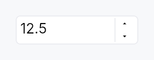
SpinBox — numeric input with increment/decrement buttons.
Public types
| Kind | Name |
|---|---|
enum | WrapMode — Out-of-range behavior when stepping past min or max |
enum | StepType — Step-size policy for each key/button press |
enum | WheelMode — When the mouse wheel is allowed to adjust the value |
enum | WidthPolicy — How the SpinBox decides its horizontal size envelope |
const | SPIN_BOX_STEP_BUTTON_WIDTH — Minimum total width |
const | SPIN_BOX_STEP_BUTTON_HEIGHT — Painted height of one stacked step button, in dp |
struct | SpinBox — Numeric input with step buttons |
trait | SpinValue — Numeric primitive that a SpinBox can hold |
Public functions
SpinBox
SpinValue
| Returns | Function |
|---|---|
| Constructors | |
Self | from_f64_saturating(v: f64) |
Option<Self> | parse(s: &str) |
| Builder methods | |
Self | saturating_add(rhs: Self) |
Self | saturating_sub(rhs: Self) |
Self | saturating_mul_u32(rhs: u32) |
| Methods | |
f64 | to_f64() |
String | format(decimals: u8) |
Self { /* default implementation */ } | clamp_value(min: Self, max: Self) |
| Associated functions | |
bool | is_integer() |
bool | is_valid_input_char(c: char) |
Detailed description
A generic composite over SpinValue
(integer and floating-point primitives), pairing the
TextInputField editing
primitive with a stacked pair of up/down step buttons. Semantics
are a synthesis of Qt's QSpinBox / QDoubleSpinBox, WinUI 3's
NumberBox, GTK's GtkSpinButton, and the W3C ARIA
spinbutton role.
Behaviour
- Value binding: a
Signal<T>is the single source of truth. Typing and stepping update it; external writes re-format the editable text. - Commit model: the user can type freely (subject to the
per-character input filter, which only the default parser has:
a custom
value_from_textis handed every character). The value is committed onEnteror on focus loss — at commit time the text is parsed, clamped into[min, max](or wrapped, perWrapMode), and reformatted. Invalid input reverts to the last known good value. - Stepping over typed text: every step (key, wheel, button,
assistive
Increment/Decrement) starts from what the field shows. Text typed and not yet committed is read first, exactly asEnterwould read it, and the step moves on from there: type 35, pressUpwith a step of 5, and the value is 40, reported once. Text that cannot be read steps nothing; the value goes back into the field, and the next press steps from it. This isQAbstractSpinBox::stepBy. - Keyboard:
Up/Down→ ±single_stepPageUp/PageDown→ ±page_step(default:10 × single_step)Enter→ commit (stays focused)Home/Endstay bound to the text cursor.QAbstractSpinBoxroutes both to its innerQLineEdit, and WinUI'sNumberBox, Blink, Avalonia and jQuery UI bind neither; typing the number reaches min and max anyway. Seedocs/range-keyboard.md.- A chord holding
Ctrl,AltorSuperis not the spin box's and falls through to the application;Shiftdoes not change the step.
- Mouse wheel: adjusts by
single_step— wheel down decreases, wheel up increases, matchingQAbstractSpinBox,GtkSpinButtonand WinUI'sNumberBox. Gated bywheel_mode(default: only when focused, to avoid accidental scroll changes). - Buttons: up/down buttons stack to the right of the field
by default; can be hidden with
button_layout. - Special value text: when the current value equals
minandspecial_value_textis set, the field shows that string instead of the formatted number (Qt's "Auto" / "None" / "Unlimited" affordance). It stays while the field has focus, as in Qt: keyboard focus selects it, so a number typed replaces it. - Adaptive step: with
StepType::Adaptive, the effective step tracks the decimal magnitude of the current value (Qt'sAdaptiveDecimalStepType). Useful for values that span many orders of magnitude in the same control. - Locale: the number follows the active locale's decimal
separator, digits and minus sign
(
localized, on by default); thousands separators are opt-in (use_grouping, off by default, as in Qt). Display, commit parse, stepping and the per-character input filter all read oneNumberPresentation, which a live language switch replaces, so they cannot disagree about which separator the field is using: a French user sees12,5, types12,5, and the numeric keypad's.still works. Rendering is a string transform over the value's ownDisplay, never anf64round-trip, so aSpinBox<i64>stays exact past 2^53. Turn it off for a number that is an identifier rather than a quantity (port, version component, database id). With noI18nManagerinstalled the active locale is the C locale and this is a no-op. - Custom formatter / parser: full override via
text_from_valueandvalue_from_text; together they let you implement currency, percentages with stored fraction, hex, duration, anything. A custom formatter/parser owns the whole convention — it is not re-punctuated by the locale layer.
Accessibility
The editing field is the spin button: one AccessKit node with
Role::SpinButton,
the label as its name, the numeric value, min,
max, step and jump, the field's text as its value and its text
runs, and the
Increment,
Decrement,
SetValue, and
Focus actions. It is
the node that holds focus, so a focus change reports the field's
name and value once, and a step moves the number a screen reader
is following. The composite's own node is structure and collapses;
it names the field as its
accessibility_proxy,
so an access_label, a FormLayout label, an
access_described_by or a tooltip given to the spin box lands on
the field. The suffix is painted and not part
of the text, so it is not announced.
SetValue accepts either payload shape, because both are sent in
the field: a number (macOS setAccessibilityValue: with an
NSNumber, AT-SPI's Value.SetCurrentValue) is clamped and
published as sent; a string (an NSString, the automation
set_value tool) takes the same parse Enter takes, so a custom
value_from_text and the locale's
decimal separator are honoured, and an unparseable one reverts the
display and is reported unhandled. A
read_only spin box advertises and services
none of the three mutating actions. The step buttons are
structurally part of the SpinBox and publish no separate a11y
nodes; stepping is the spin button's Increment and Decrement.
Example
use teksilo::widgets::{SpinBox, WrapMode};
let font_size = ctx.signal(12_i32);
ctx.add(
SpinBox::new(font_size, 4, 72)
.single_step(1)
.page_step(10)
.suffix(" pt"),
);
let gain_db = ctx.signal(0.0_f32);
ctx.add(
SpinBox::new(gain_db, -60.0, 12.0)
.single_step(0.5)
.decimals(1)
.suffix(" dB")
.wrap_mode(WrapMode::Clamp),
);
Touch and pen
The step buttons are the controls sweep's one unreachable target, and
the reason is recorded rather than papered over. Each is 18 x 13 dp inside a
trailing column exactly its own width and exactly two buttons tall, so a
Widget::hit_outset has nowhere to grow (an outset never escapes its
parent); the field beside them takes presses of its own, so the miss-only
slop pass has an eligible bubble owner at distance zero; and two conforming
targets stacked need 88 dp of column, which no density projection of the
field produces. Reaching the floor here is a layout change — the desktop
stacked pair replaced by a side-by-side −/+ at coarse densities, as Material
does — and that is a design decision, not a targeting one. The value stays
fully reachable by keyboard (Up/Down, PageUp/PageDown) and by the
Increment / Decrement assistive actions.
One thing the sweep did fix. A step still fires on the press and arms
hold-to-repeat from it (Qt's QAbstractSpinBox convention — there is no
release to start a repeat from), but the repeat now stops on a
PointerCancel: a pan claimant winning the press used to leave the box
stepping for the rest of the session, because a cancel is terminal and no
PointerUp follows it.
What the box does about panning, it does by omission. It declares no
touch_action and makes no pan claim, so its subtree keeps the default
TouchAction::AUTO and a finger that comes to rest on it and then drags
is won by the enclosing scroller rather than changing the value. The
on_scroll handler below is a wheel handler and not a pan; it never sees
a finger.
Two tests in spin_box/tests.rs cover that, and only one of them can see
the second half of it. a_finger_pan_over_the_spin_box_scrolls_its_container
shows the pan reaching the scroller, but its box has the default
WheelMode::Focused and its fixture never focuses the field, so the
on_scroll below declines before the pan question is reached — a pan that
DID arrive would leave the value unchanged there anyway.
a_finger_pan_over_a_hover_wheel_spin_box_scrolls_its_container is the one
that can observe the claim: with WheelMode::Hover the handler runs for
every scroll that reaches the box, so a claim would step the value once per
synthesised sample.
P22, the scrollables migration, looked at the explicit
touch_action(PAN_Y) this file was asked for and decided against it.
It is a narrowing on top of the behaviour above rather than a restatement
of it: it would additionally forbid a horizontal pan and a pinch through
the field — a real cost to a spin box in a horizontally-scrolling toolbar,
or on a pinch-zoomable page — and it would buy nothing the omission does
not already give, because the claimant chain visits only the pan candidates
and never the generic bubble, so a boundary pan cannot reach the on_scroll
below however far it travels. The omission is the decision; the
hover-wheel test named above is what can witness it. P24 owns
spin_box/step_button.rs.
Density
The picture above is the widget at TargetDensity::Compact, the mouse-and-keyboard ladder. Below is the same subject on the same canvas with only the ladder changed, so what moves is the density and nothing else — where the subject no longer fits, that is what the denser targets cost it at that size. See docs/density-and-targets.md.
Touch
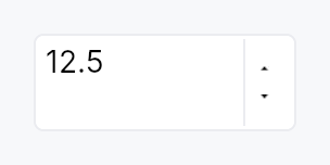
API reference
📖 Full rustdoc API for this module
pub enum WrapMode
Import: use teksilo::widgets::WrapMode;
Out-of-range behavior when stepping past min or max.
Set via SpinBox::wrap_mode.
#![allow(unused)] fn main() { pub enum WrapMode { /* variants */ } }
Variants
Clamp— Clamp tomin/max(default).Wrap— Wrap around: pastmaxjumps tomin, pastminjumps tomax. Matches Qt'sQAbstractSpinBox::wrapping.
pub enum StepType
Import: use teksilo::widgets::StepType;
Step-size policy for each key/button press.
Set via SpinBox::step_type.
#![allow(unused)] fn main() { pub enum StepType { /* variants */ } }
Variants
Fixed— Always step bysingle_step(default).Adaptive— Step by the decimal power-of-ten immediately below the current value's magnitude — e.g. values 1–9 step by 1, 10–99 by 10, 100–999 by 100. Matches Qt'sAdaptiveDecimalStepType. Integer types honor the same rule using the magnitude of the absolute value.
pub enum WheelMode
Import: use teksilo::widgets::WheelMode;
When the mouse wheel is allowed to adjust the value.
Set via SpinBox::wheel_mode.
#![allow(unused)] fn main() { pub enum WheelMode { /* variants */ } }
Variants
Focused— Wheel adjusts only when the field is focused. Default — prevents accidental changes when the user is scrolling a larger surrounding view.Hover— Wheel adjusts whenever the pointer is over the widget.Disabled— Wheel never adjusts the value; events bubble to the surrounding scroll container.
pub enum WidthPolicy
Import: use teksilo::widgets::spin_box::WidthPolicy;
How the SpinBox decides its horizontal size envelope.
Chosen via the width,
width_chars, and
fill_width builder methods — the enum
itself is the storage, not a separate public configuration
API.
#![allow(unused)] fn main() { pub enum WidthPolicy { /* variants */ } }
Variants
Pixels(f32)— Cap the widget at a fixed logical-pixel width. Default isDEFAULT_PREFERRED_WIDTH(120 dp), matching Qt'sQSpinBoxsizeHint.Chars(u32)— Size the widget to fit this many reference digits ('0') plus the configured suffix, padding, and step buttons. Measurement uses the theme font at build time.Fill— Let the widget expand horizontally to fill whatever space the parent offers. Equivalent to an infinite pixel cap.
pub const SPIN_BOX_STEP_BUTTON_WIDTH
Import: use teksilo::widgets::spin_box::SPIN_BOX_STEP_BUTTON_WIDTH;
Minimum total width. Below this the stacked step buttons stop
fitting next to the field. Widgets narrower than this are
enforced to the minimum at layout time via MinSize.
Painted width of one stacked step button, in dp.
Below the 24 dp WCAG floor, and no hit mechanism reaches it — see the
"Touch and pen" section of this module and StepButton::children for the
measurement. The two steps are separate nodes stacked in a trailing column
exactly one button wide, so there is nothing for Widget::hit_outset to
grow into and nothing for partition_targets to carve; growing the paint
instead would widen every numeric field on a form. Named here so the hit
mechanisms and the chrome arithmetic below read the same number.
#![allow(unused)] fn main() { pub const SPIN_BOX_STEP_BUTTON_WIDTH: f32 = 18.0; }
pub const SPIN_BOX_STEP_BUTTON_HEIGHT
Import: use teksilo::widgets::spin_box::SPIN_BOX_STEP_BUTTON_HEIGHT;
Painted height of one stacked step button, in dp. Only a fallback — the
real height is half the field's inner height (see build_step_buttons).
#![allow(unused)] fn main() { pub const SPIN_BOX_STEP_BUTTON_HEIGHT: f32 = 12.0; }
pub struct SpinBox
Import: use teksilo::widgets::SpinBox;
Numeric input with step buttons. Generic over
SpinValue — pre-implemented for i32, i64, u32, u64,
usize, f32, and f64.
#![allow(unused)] fn main() { pub struct SpinBox<T: SpinValue> { /* fields */ } }
Methods
pub fn new(value: Signal<T>, min: T, max: T) -> Self
Construct a new SpinBox bound to value with the given
inclusive range. min must be ≤ max.
pub fn style(mut self, style: impl teksilo_core::styles::SpinBoxStyle) -> Self
Per-call style override. Higher precedence than the theme-wide
style_slots.spin_box slot.
pub fn single_step(mut self, step: T) -> Self
Set the step size for Up / Down / single wheel tick /
button tap.
pub fn page_step(mut self, step: T) -> Self
Set the step size for PageUp / PageDown. When unset,
defaults to 10 × single_step at build time.
pub fn decimals(mut self, decimals: u8) -> Self
Number of decimal places shown for floating-point types. Ignored for integer types.
pub fn localized(mut self, on: bool) -> Self
Whether the number follows the active locale's conventions — decimal separator, digits, and minus sign. On by default.
A French user sees 12,5, not 12.5, and can type either: the
commit path de-localizes before parsing, and the input filter
accepts both the locale's separator and the ASCII one, so a
numeric keypad still works.
Turn it off for a number that is an identifier rather than a quantity — a port number, a version component, a database id, a pixel offset in a file format. Those read wrong grouped or re-punctuated, and their conventional form is the C-locale one.
Localization is a string transform over the value's own
Display, not a round-trip through f64, so a SpinBox<i64>
keeps full precision past 2^53.
With no I18nManager installed the active locale resolves to the
C locale, so this is a no-op in tests and in apps that have not
opted into i18n.
pub fn use_grouping(mut self, on: bool) -> Self
Whether the displayed number carries thousands separators.
Off by default, matching Qt (QAbstractSpinBox:: isGroupSeparatorShown is false unless asked for).
Separators help a large read-only quantity and get in the way of
a field being typed into, so this is opt-in per SpinBox rather
than a locale-wide default. Grouping follows the locale's own
group sizes, including the Indic lakh system (12,34,567).
Has no effect when localized is off.
pub fn suffix(mut self, text: impl Into<String>) -> Self
Qt-style non-editable trailing unit (e.g. " %", " px",
" dB"). Rendered flush-right inside the field's border;
the caret cannot enter it.
pub fn special_value_text(mut self, text: impl Into<LocalizedString>) -> Self
Text shown in place of the formatted value when the current
value equals min. Use for "Auto", "None", "Off",
"Unlimited" affordances where the minimum has special
semantics. The text stays while the field has focus, as
Qt's specialValueText does: keyboard focus selects it, so a
number typed replaces it, and a step moves off it.
pub fn wrap_mode(mut self, mode: WrapMode) -> Self
Set the out-of-range behavior when stepping past min or max
(default: Clamp).
pub fn step_type(mut self, step_type: StepType) -> Self
Set the step-size policy (default: Fixed). Use
StepType::Adaptive for values that span many orders of magnitude.
pub fn button_layout(mut self, layout: ButtonLayout) -> Self
Override the step-button layout (default: Stacked — stacked
up/down buttons to the right of the field).
pub fn show_buttons(mut self, show: bool) -> Self
Convenience wrapper over button_layout:
true → ButtonLayout::Stacked, false → ButtonLayout::Hidden.
Matches the Int UI guideline that SpinBoxes in dense forms
often hide the step buttons to reduce visual noise and let
keyboard / wheel carry the affordance — pass
.show_buttons(false) on those call sites.
pub fn wheel_mode(mut self, mode: WheelMode) -> Self
Set when the mouse wheel adjusts the value (default: Focused —
only when the inner field holds focus).
pub fn width(mut self, width: f32) -> Self
Cap the widget's horizontal size at a fixed logical-pixel
width. If the parent offers less, the SpinBox shrinks (down
to the internal 72 dp / 48 dp floor that keeps the buttons
and field from overlapping). Default: 120 dp, matching Qt
QSpinBox sizeHint and Int UI form density.
#![allow(unused)] fn main() { use teksilo_widgets::SpinBox; use teksilo_core::signal::Signal; let v = Signal::new(0_i32); let _w = SpinBox::new(v.clone(), 0, 9999).width(80.0); // narrow let _w = SpinBox::new(v.clone(), 0, 9999).width(200.0); // wider let _w = SpinBox::new(v.clone(), 0, 9999).fill_width(); // stretch to parent let _w = SpinBox::new(v.clone(), 0, 9999).width_chars(5); // "fits 5 digits" }
pub fn width_chars(mut self, chars: u32) -> Self
Size the widget to fit exactly chars reference digits plus
the configured suffix, padding, and step buttons. The
measurement uses the actual theme font at build time (same
SharedTypesetter the field draws with), so values stay
right under runtime theme switches and HiDPI scale changes.
#![allow(unused)] fn main() { use teksilo_widgets::SpinBox; use teksilo_core::signal::Signal; let port = Signal::new(8080_i32); let pct = Signal::new(0_i32); let _w = SpinBox::new(port, 0, 65_535).width_chars(5); // 5 digits let _w = SpinBox::new(pct, 0, 100).suffix(" %").width_chars(3); // 3 + " %" }
pub fn fill_width(mut self) -> Self
Let the widget expand to fill the horizontal space offered
by its parent, instead of capping at width.
Use inside toolbars, inspector panels, or an
Expand::horizontal column that should stretch with the
surrounding layout.
pub fn label(mut self, label: impl Into<LocalizedString>) -> Self
Set the accessible name announced by screen readers as the
control's label. ARIA requires spin buttons to have a label;
when none is set here the caller is responsible for labelling
via a FormLayout line, access_labelled_by or access_label
on the spin box, which all reach the editing field that holds
focus and publishes the spin button.
pub fn placeholder(mut self, text: impl Into<LocalizedString>) -> Self
Set the placeholder text shown in the field when it is empty.
pub fn enabled(mut self, enabled: impl Into<Prop<bool>>) -> Self
Set the enabled state, statically or reactively. Forwarded to
the arena at build time via
ctx.enabled_when(spinbox_id, self.enabled.clone()).
pub fn read_only(mut self, read_only: bool) -> Self
Make the value uneditable: no typing, no keyboard or wheel stepping,
no step buttons, and no assistive-technology Increment / Decrement
/ SetValue. Matches QAbstractSpinBox::readOnly, which likewise
stops stepBy. The field keeps focus and selection, so the value can
still be read and copied.
pub fn text_from_value(mut self, f: impl Fn(T) -> LocalizedString + 'static) -> Self
Override the value → display-string conversion. Receives the
raw value; returns whatever string should appear in the
field. Suffix and special_value_text still apply on top of
the returned string.
pub fn value_from_text(mut self, f: impl Fn(&str) -> Option<T> + 'static) -> Self
Override the parse step. Receives the field's raw text
(without the suffix, which is never part of the editable
content); returns Some(value) to accept or None to
reject. Invalid input reverts to the last good value on
commit.
Installing a parser also lifts the per-character input filter,
which admits only what the default numeric parse can read. The
parser owns the text convention, so a month field reading
"march" as 3 can be typed by name: every character reaches the
field, and whatever the parser refuses is reverted at commit.
pub fn on_value_changed(mut self, f: impl Fn(T, &mut EventContext) + 'static) -> Self
Closure fired each time the value is committed (keyboard
step, button tap, wheel tick, Enter, blur). Bound observers
on the value signal also see every change; use this hook
when the caller needs an EventContext (e.g. to fire an
intent).
pub fn tooltip(mut self, text: impl Into<LocalizedString>) -> Self
Attach a plain single-line tooltip shown after a hover delay.
Mutually exclusive with rich_tooltip,
rich_tooltip_content, and
composite_tooltip — each setter
clears the other two so the last call wins.
pub fn rich_tooltip(mut self, key: impl Into<String>) -> Self
Attach a rich tooltip looked up by registry key.
The key must match a TooltipContent
registered in the application's tooltip registry. Mutually
exclusive with tooltip,
rich_tooltip_content, and
composite_tooltip.
pub fn rich_tooltip_content(mut self, content: crate::tooltip::TooltipContent) -> Self
Attach a rich tooltip with inline content (no registry key
required). Mutually exclusive with tooltip,
rich_tooltip, and
composite_tooltip.
pub fn composite_tooltip(mut self, content: impl Widget + 'static) -> Self
Attach a composite tooltip whose body is an arbitrary widget
tree. Mutually exclusive with tooltip,
rich_tooltip, and
rich_tooltip_content.
pub fn value(&self) -> Signal<T>
The bound numeric value signal.
pub trait SpinValue
Import: none — SpinValue is public in a private module of teksilo-widgets and nothing re-exports it.
Numeric primitive that a SpinBox can hold.
Sealed: only the primitive integer and floating-point types implement this. See the module docs for the rationale.
Implementations must provide lossless parsing and round-trip
formatting (parse(format(v, d)) == Some(v) for any finite value
v and decimals d). Arithmetic is saturating so clamping into
[min, max] after a step cannot overflow.
#![allow(unused)] fn main() { pub trait SpinValue: sealed::Sealed + Copy + PartialOrd + Debug + 'static { /* associated items below */ } }
Associated items
fn to_f64(self) -> f64;
Lossless widening to f64. Used for AccessKit's numeric
value / min / max / step properties and for
StepType::Adaptive decimal
analysis.
fn from_f64_saturating(v: f64) -> Self;
Narrowing from f64 with saturation at the type's full
range. For integers the conversion truncates toward zero,
matching Rust's as conversion semantics.
fn parse(s: &str) -> Option<Self>;
Parse a user-entered string. Leading/trailing whitespace is
ignored. Returns None for syntactically invalid input
(but NOT for out-of-range values — the SpinBox clamps
separately so users can type past the bound and see the
reformatted clamped result after blur).
fn format(self, decimals: u8) -> String;
Format for display.
For integer types, decimals is ignored. For floats, the
value is rendered with exactly decimals digits after the
decimal point — no scientific notation, no thousands
separator. Formatter closures on SpinBox
(text_from_value)
override this.
fn saturating_add(self, rhs: Self) -> Self;
Saturating addition. Out-of-type-range results clamp at
MAX (or MIN for negative overflow on signed types).
fn saturating_sub(self, rhs: Self) -> Self;
Saturating subtraction. See saturating_add.
fn saturating_mul_u32(self, rhs: u32) -> Self;
Saturating multiplication by a positive integer. Used for
page_step = multiplier × single_step when the caller
omits a page step.
fn is_integer() -> bool;
Whether this type has integer semantics (no fractional
component, no decimal separator in the default
format path). Controls the default
character filter and whether decimals has any effect.
fn is_valid_input_char(c: char) -> bool;
Default per-character input filter for the editable field.
Admits digits and, for signed types, -; float types also
admit ., +, e, E. Callers can override the whole
filter on the SpinBox builder.
fn clamp_value(self, min: Self, max: Self) -> Self { /* default implementation */ }
Clamp into an inclusive range. Falls through to
PartialOrd.
Spinner

Spinner — a shader-driven circular-arc loading indicator.
Public functions
Spinner
| Returns | Function |
|---|---|
| Constructors | |
Self | new(size: f32) |
| Builder methods | |
Self | period(period: Duration) |
Self | arc_fraction(arc_fraction: f32) |
Self | stroke_fraction(stroke_fraction: f32) |
Self | color(color: impl Into<ColorProp>) |
Self | label(text: impl Into<LocalizedString>) |
Detailed description
Uses the same per-slot uniform-buffer pipeline as
ProgressBar::indeterminate (an
AnimatedQuadKind variant), so per-frame cost is one
queue.write_buffer(64 B) + draw_indexed — the widget's paint()
does not re-run between frames and there's no signal-dirty-mark
cascade.
#![allow(unused)] fn main() { use teksilo_widgets::Spinner; use teksilo_tokens::TextRole; use teksilo_i18n::lit; let _s = Spinner::new(24.0) .color(TextRole::Secondary) .label(lit!("Loading")); }
Defaults match the typical CSS spinner: a quarter-circle (90°) arc rotating clockwise from the top, completing one full rotation every 900 ms.
Honours prefers-reduced-motion: registers no animated quad and
falls back to a static arc of the same length (arc_fraction,
a quarter-circle by default) — the indicator is still visible
(so the user can tell the surface is busy) but doesn't rotate.
Density
The picture above is the widget at TargetDensity::Compact, the mouse-and-keyboard ladder. Below is the same subject on the same canvas with only the ladder changed, so what moves is the density and nothing else — where the subject no longer fits, that is what the denser targets cost it at that size. See docs/density-and-targets.md.
Touch

API reference
📖 Full rustdoc API for this module
pub struct Spinner
Import: use teksilo::widgets::Spinner;
A circular-arc loading indicator driven by a GPU shader quad.
Decorative — pair with .label to give screen readers
context. Honours prefers-reduced-motion by falling back to a static
three-quarter arc.
#![allow(unused)] fn main() { pub struct Spinner { /* fields */ } }
Methods
pub fn new(size: f32) -> Self
Construct a spinner of the given square edge length (logical pixels). Use small sizes (16–24) for inline spinners and larger (32–64) for full-content placeholders.
pub fn period(mut self, period: Duration) -> Self
Override the rotation period. Default: 900 ms (one full rotation per period).
pub fn arc_fraction(mut self, arc_fraction: f32) -> Self
Override the arc length as a fraction of the full circle. Default: 0.25 (a quarter-circle "comet tail" arc).
pub fn stroke_fraction(mut self, stroke_fraction: f32) -> Self
Override the stroke thickness as a fraction of the spinner's edge length. Default: 0.12 (so a 24-px spinner has a ~3-px stroke).
pub fn color(mut self, color: impl Into<ColorProp>) -> Self
Override the arc colour. Default: TextRole::Secondary so the
spinner picks up theme-aware text-tier styling.
pub fn label(mut self, text: impl Into<LocalizedString>) -> Self
Accessible name (e.g. "Loading", "Uploading file"). Without this, screen readers announce a bare "progress indicator" with no context.
SplitButton
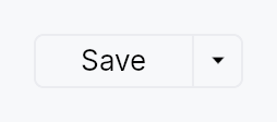
SplitButton — a button split into two regions sharing a single frame.
Public types
| Kind | Name |
|---|---|
const | SPLIT_BUTTON_HEIGHT — SplitButton design tokens |
fn | split_button_height — SPLIT_BUTTON_HEIGHT raised to the density's target_size (24 / 32 / 44 dp) |
const | SPLIT_BUTTON_MIN_WIDTH |
fn | split_button_min_width — SPLIT_BUTTON_MIN_WIDTH raised to the density's target_size (24 / 32 / 44 dp) |
const | SPLIT_BUTTON_PADDING_HORIZONTAL |
fn | split_button_padding_horizontal — SPLIT_BUTTON_PADDING_HORIZONTAL scaled by the density's spacing_factor (1.00 / 1.15 / 1.30) |
const | SPLIT_BUTTON_PADDING_VERTICAL |
fn | split_button_padding_vertical — SPLIT_BUTTON_PADDING_VERTICAL scaled by the density's spacing_factor (1.00 / 1.15 / 1.30) |
const | SPLIT_BUTTON_CORNER_RADIUS |
const | SPLIT_BUTTON_BORDER_WIDTH |
const | SPLIT_BUTTON_CHEVRON_WIDTH |
const | SPLIT_BUTTON_DIVIDER_WIDTH |
const | SPLIT_BUTTON_CHEVRON_ICON_SIZE |
const | SPLIT_BUTTON_ICON_LABEL_GAP — Gap between an optional main-region leading icon and the label |
fn | split_button_icon_label_gap — SPLIT_BUTTON_ICON_LABEL_GAP scaled by the density's spacing_factor (1.00 / 1.15 / 1.30) |
struct | SplitButton — A button split into a default-action region and a chevron dropdown region |
Public functions
SplitButton
Detailed description
The left region is the default action: it shows the label of the
currently-selected item and, on click, fires that item's command
(behaving like a regular Button). The right
region is a narrow chevron zone that, on click, opens a
MenuList of related actions. Picking an
action from the dropdown fires it and promotes its index to become the
new default for the session (IntelliJ's "remember last used"
convention).
SplitButton reuses MenuItem verbatim
for the dropdown rows — the caller passes real MenuItem values via
.item(...), so icons, shortcut labels, enabled flags, and separators
all come for free.
#![allow(unused)] fn main() { use teksilo_widgets::{SplitButton, MenuItem, ButtonVariant}; use teksilo_i18n::lit; use teksilo_core::Intent; let _w = SplitButton::new() .item(MenuItem::new(lit!("Run")).on_activate_fn(|ctx| ctx.send_intent(Intent::new("app.run")))) .item(MenuItem::new(lit!("Run Tests")).on_activate_fn(|ctx| ctx.send_intent(Intent::new("app.run-tests")))) .separator() .item(MenuItem::new(lit!("Debug")).on_activate_fn(|ctx| ctx.send_intent(Intent::new("app.debug")))) .variant(ButtonVariant::Plain); }
Touch and pen
The action half is a target in its own right and needs nothing. The chevron
half is 22 dp wide at every density — a dimension below the conformance floor
cannot be routed through dp, which is a floor and would widen the paint at
Compact — so it declares a Widget::hit_outset instead, with the whole
shortfall on its leading edge: the trailing edge is the control's own
frame, and an outset never escapes its parent.
That means a direct pointer aiming between the halves gets the chevron, and a
precise pointer gets exactly what is painted (hit_outset is zero for one).
Of the two halves the action half is the wider, so it is the one that lends
the dp — and the press it loses at its trailing edge is a press aimed at the
chevron.
Density
The picture above is the widget at TargetDensity::Compact, the mouse-and-keyboard ladder. Below is the same subject on the same canvas with only the ladder changed, so what moves is the density and nothing else — where the subject no longer fits, that is what the denser targets cost it at that size. See docs/density-and-targets.md.
Touch
API reference
📖 Full rustdoc API for this module
pub const SPLIT_BUTTON_HEIGHT
Import: use teksilo::widgets::split_button::SPLIT_BUTTON_HEIGHT;
SplitButton design tokens.
#![allow(unused)] fn main() { pub const SPLIT_BUTTON_HEIGHT: f32 = 24.0; }
pub fn split_button_height(...)
Import: use teksilo::widgets::split_button::split_button_height;
SPLIT_BUTTON_HEIGHT raised to the density's target_size
(24 / 32 / 44 dp). The identity at Compact.
#![allow(unused)] fn main() { pub fn split_button_height(tokens: &InputTokens) -> f32; }
pub const SPLIT_BUTTON_MIN_WIDTH
Import: use teksilo::widgets::split_button::SPLIT_BUTTON_MIN_WIDTH;
#![allow(unused)] fn main() { pub const SPLIT_BUTTON_MIN_WIDTH: f32 = 72.0; }
pub fn split_button_min_width(...)
Import: use teksilo::widgets::split_button::split_button_min_width;
SPLIT_BUTTON_MIN_WIDTH raised to the density's target_size
(24 / 32 / 44 dp). The identity at Compact.
#![allow(unused)] fn main() { pub fn split_button_min_width(tokens: &InputTokens) -> f32; }
pub const SPLIT_BUTTON_PADDING_HORIZONTAL
Import: use teksilo::widgets::split_button::SPLIT_BUTTON_PADDING_HORIZONTAL;
#![allow(unused)] fn main() { pub const SPLIT_BUTTON_PADDING_HORIZONTAL: f32 = 14.0; }
pub fn split_button_padding_horizontal(...)
Import: use teksilo::widgets::split_button::split_button_padding_horizontal;
SPLIT_BUTTON_PADDING_HORIZONTAL scaled by the density's spacing_factor
(1.00 / 1.15 / 1.30).
#![allow(unused)] fn main() { pub fn split_button_padding_horizontal(tokens: &InputTokens) -> f32; }
pub const SPLIT_BUTTON_PADDING_VERTICAL
Import: use teksilo::widgets::split_button::SPLIT_BUTTON_PADDING_VERTICAL;
#![allow(unused)] fn main() { pub const SPLIT_BUTTON_PADDING_VERTICAL: f32 = 0.0; }
pub fn split_button_padding_vertical(...)
Import: use teksilo::widgets::split_button::split_button_padding_vertical;
SPLIT_BUTTON_PADDING_VERTICAL scaled by the density's spacing_factor
(1.00 / 1.15 / 1.30).
#![allow(unused)] fn main() { pub fn split_button_padding_vertical(tokens: &InputTokens) -> f32; }
pub const SPLIT_BUTTON_CORNER_RADIUS
Import: use teksilo::widgets::split_button::SPLIT_BUTTON_CORNER_RADIUS;
#![allow(unused)] fn main() { pub const SPLIT_BUTTON_CORNER_RADIUS: f32 = 4.0; }
pub const SPLIT_BUTTON_BORDER_WIDTH
Import: use teksilo::widgets::split_button::SPLIT_BUTTON_BORDER_WIDTH;
#![allow(unused)] fn main() { pub const SPLIT_BUTTON_BORDER_WIDTH: f32 = 1.0; }
pub const SPLIT_BUTTON_CHEVRON_WIDTH
Import: use teksilo::widgets::split_button::SPLIT_BUTTON_CHEVRON_WIDTH;
#![allow(unused)] fn main() { pub const SPLIT_BUTTON_CHEVRON_WIDTH: f32 = 22.0; }
pub const SPLIT_BUTTON_DIVIDER_WIDTH
Import: use teksilo::widgets::split_button::SPLIT_BUTTON_DIVIDER_WIDTH;
#![allow(unused)] fn main() { pub const SPLIT_BUTTON_DIVIDER_WIDTH: f32 = 1.0; }
pub const SPLIT_BUTTON_CHEVRON_ICON_SIZE
Import: use teksilo::widgets::split_button::SPLIT_BUTTON_CHEVRON_ICON_SIZE;
#![allow(unused)] fn main() { pub const SPLIT_BUTTON_CHEVRON_ICON_SIZE: f32 = 12.0; }
pub const SPLIT_BUTTON_ICON_LABEL_GAP
Import: use teksilo::widgets::split_button::SPLIT_BUTTON_ICON_LABEL_GAP;
Gap between an optional main-region leading icon and the label.
#![allow(unused)] fn main() { pub const SPLIT_BUTTON_ICON_LABEL_GAP: f32 = 6.0; }
pub fn split_button_icon_label_gap(...)
Import: use teksilo::widgets::split_button::split_button_icon_label_gap;
SPLIT_BUTTON_ICON_LABEL_GAP scaled by the density's spacing_factor
(1.00 / 1.15 / 1.30).
#![allow(unused)] fn main() { pub fn split_button_icon_label_gap(tokens: &InputTokens) -> f32; }
pub struct SplitButton
Import: use teksilo::widgets::SplitButton;
A button split into a default-action region and a chevron dropdown region.
See the module-level documentation for a usage overview.
#![allow(unused)] fn main() { pub struct SplitButton { /* fields */ } }
Methods
pub fn new() -> Self
Standard SplitButton: picking an item from the dropdown both fires the item's action and promotes it to become the new default for the session. The main region's label and click action update to match the most recently picked item.
pub fn new_static() -> Self
Static-default SplitButton: the main region is pinned to
initial_selected (default 0) and never changes after the
user picks something from the dropdown. Picking an item still
fires that item's action — only the promotion is skipped.
Use this when the main region represents a semantically fixed primary action (e.g. "Commit") and the dropdown offers related variants ("Commit and Push", "Commit and Push to…") that should not displace the primary.
pub fn item(mut self, item: MenuItem) -> Self
Add a menu item. The item is reused verbatim as a row of the dropdown, and its label + action are also used to drive the main region (when its index is the current default).
pub fn items(self, items: impl IntoIterator<Item = MenuItem>) -> Self
Add several menu items from an iterator, in order.
The loop form of item, and the usual one: a split
button's dropdown is normally built from a list of commands.
pub fn separator(mut self) -> Self
Add a separator row in the dropdown. Separators are skipped when
computing item indices for initial_selected.
pub fn variant(mut self, variant: ButtonVariant) -> Self (default: ButtonVariant::Plain)
Set the visual style variant (filled, plain, ghost, …) for the entire
button frame. Mirrors the same variants as
Button::variant.
pub fn icon(mut self, icon: IconWidget) -> Self
Set a leading icon for the main (default-action) region, rendered before
the label (mirrors Button::icon with
IconLocation::Leading). Unlike the per-row MenuItem::icons, this glyph
is fixed regardless of which item is the current default — use it for a
stable action affordance (e.g. a "+" add glyph).
The icon's tint follows the main-region label (the variant/interaction
cascade, or text_role when overridden), so any
colour set on the passed IconWidget is replaced — same contract as
Button. Its size is left alone, so .icon_size(..) on the caller's
widget is honoured.
pub fn style(mut self, style: impl SplitButtonStyle) -> Self
Override the Tier-3 frame chrome for this instance. Takes precedence
over theme.style_slots.split_button and the built-in
RecipeSplitButtonStyle.
pub fn text_style(mut self, style: impl Into<teksilo_core::color_prop::TextStyleProp>) -> Self
Override the main-region label text style (font, size, weight).
Accepts a TextStyleRole, a TextStyle, or a Signal of either.
Default (unset) is the inner TextWidget default — e.g. pass
TextStyleRole::BodyBold for a bold default action.
pub fn text_role(mut self, color: impl Into<teksilo_core::color_prop::ColorProp>) -> Self
Override the control's text colour — the main-region label, its
leading icon, and the chevron, which the
variant/interaction cascade tints together. Accepts Color, a role,
or a Signal of either. Default (unset) is that cascade; setting this
replaces it wholesale (loses hover/disabled tint).
pub fn enabled(mut self, enabled: impl Into<Prop<bool>>) -> Self (default: true)
Set the enabled state, statically or reactively. Forwarded to the arena at build time.
pub fn initial_selected(mut self, index: usize) -> Self
Which item index (counting only items, not separators) should be the initial default. Defaults to 0.
pub fn tooltip(mut self, text: impl Into<LocalizedString>) -> Self
Attach a tooltip to the main (default-action) region. Same hover
delay as Button::tooltip.
pub fn rich_tooltip(mut self, key: impl Into<String>) -> Self
Attach a rich tooltip to the main region.
pub fn rich_tooltip_content(mut self, content: crate::tooltip::TooltipContent) -> Self
Attach a rich tooltip to the main region driven by inline TooltipContent.
pub fn composite_tooltip( mut self, content: impl teksilo_core::widget::Widget + 'static, ) -> Self
Attach a composite tooltip to the main region.
pub fn chevron_tooltip(mut self, text: impl Into<LocalizedString>) -> Self
Override the tooltip shown on hover over the trailing chevron region. When unset, the chevron gets a default "Show dropdown menu" tooltip so its affordance isn't silent.
pub fn chevron_rich_tooltip(mut self, key: impl Into<String>) -> Self
Attach a rich tooltip to the chevron region.
pub fn chevron_rich_tooltip_content(mut self, content: crate::tooltip::TooltipContent) -> Self
Attach a rich tooltip to the chevron region driven by inline TooltipContent.
pub fn chevron_composite_tooltip( mut self, content: impl teksilo_core::widget::Widget + 'static, ) -> Self
Attach a composite tooltip to the chevron region.
Splitter
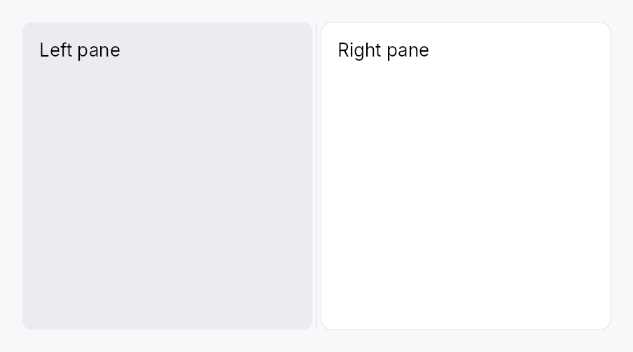
N-pane split container with draggable, collapsible dividers.
Public types
| Kind | Name |
|---|---|
struct | Splitter — An N-pane resizable split container driven by a SplitterModel |
struct | PaneDescriptor — Per-pane configuration passed to SplitterModel::from_panes / SplitterModel::insert_pane |
struct | PaneSnapshot — Immutable per-pane view handed to the pure distribute sizing function (the internal splitter::distribute engine) |
struct | PaneState — Persistable per-pane layout state |
struct | SplitterState — Full serializable snapshot of a SplitterModel's sizes + collapsed flags |
struct | SplitterModel — A shared, cloneable handle to a splitter's layout state |
Public functions
Splitter
PaneDescriptor
| Returns | Function |
|---|---|
| Constructors | |
Self | new() |
| Builder methods | |
Self | size(size: f32) |
Self | min_size(min: f32) |
Self | max_size(max: f32) |
Self | stretch(stretch: f32) |
Self | collapsible(collapsible: bool) |
Self | collapsed(collapsed: bool) |
Self | collapsed_size(px: f32) |
Self | visible(visible: bool) |
SplitterModel
Detailed description
Splitter arranges N ≥ 2 panes along one axis (per Orientation)
with N − 1 grabbable handles between them — the Qt QSplitter
model. All layout state (per-pane size / min / max / stretch /
collapsed) lives in a shared, cloneable SplitterModel; the app
holds a clone to read, mutate, persist, and import/export, while the
widget renders it and reacts to the model's version signal.
Strengths carried over from the old two-pane SplitView: anti-jump
drag, keyboard resize, Role::Splitter accessibility, per-pane content
clipping, RTL-correct horizontal layout. New: N panes, per-pane
stretch (container-resize policy), animated collapse with four triggers
(programmatic / double-click / drag-past-min snap / keyboard), a Tier-3
SplitterStyle, and serializable import/export. It is the building
block DockingLayout is built from.
Collapsing and hiding a pane each have an animated door
(SplitterModel::set_collapsed, SplitterModel::set_pane_visible) and
an instant one (SplitterModel::set_collapsed_immediate,
SplitterModel::set_pane_visible_immediate) for restoring a layout.
let model = SplitterModel::from_panes(vec![
PaneDescriptor::new().size(220.0).min_size(160.0).stretch(0.0).collapsible(true),
PaneDescriptor::new().stretch(1.0).min_size(320.0),
PaneDescriptor::new().size(280.0).stretch(0.0).collapsible(true),
], Orientation::Horizontal);
Splitter::new(model.clone())
.pane(sidebar).pane(editor).pane(inspector)
.pane_label(0, tr!(sidebar()));
Density
The picture above is the widget at TargetDensity::Compact, the mouse-and-keyboard ladder. Below is the same subject on the same canvas with only the ladder changed, so what moves is the density and nothing else — where the subject no longer fits, that is what the denser targets cost it at that size. See docs/density-and-targets.md.
Touch
API reference
📖 Full rustdoc API for this module
pub struct Splitter
Import: use teksilo::widgets::Splitter;
An N-pane resizable split container driven by a SplitterModel.
See the module-level documentation for a usage overview and
constructor patterns.
#![allow(unused)] fn main() { pub struct Splitter { /* fields */ } }
Methods
pub fn new(model: SplitterModel) -> Self
Create a Splitter bound to the given model. Panes must be appended
with pane in model order.
pub fn pane(mut self, widget: impl teksilo_core::IntoTeksiChild) -> Self
Append a content pane (model order). Call once per pane; the count
must match model.pane_count().
pub fn panes(self, iter: impl IntoIterator<Item = impl teksilo_core::IntoTeksiChild>) -> Self
Append several content panes from an iterator, in model order.
The loop form of pane. The total pane count still has to
match model.pane_count().
pub fn child(self, widget: impl teksilo_core::IntoTeksiChild) -> Self
teksu! ergonomic alias for pane: a bare child in a
Splitter { ... } block lowers to .child(...).
pub fn children( self, iter: impl IntoIterator<Item = impl teksilo_core::IntoTeksiChild>, ) -> Self
teksu! ergonomic alias for panes: a for loop in a
Splitter { ... } block lowers to .children(...).
pub fn child_opt(self, widget: Option<impl teksilo_core::IntoTeksiChild>) -> Self
Attach widget when it is Some, and do nothing when it is None.
The conditional-child form. teksu!'s if without an else lowers to
this, and it is what cond.then(|| w) is for in a builder chain. None
adds no arena node, so nothing is laid out, painted, or published to the
accessibility tree, and a stack applies no spacing around it.
pub fn pane_label(mut self, index: usize, label: impl Into<Prop<String>>) -> Self
Set an accessible region name for pane index (locale-reactive).
Labeled panes become a named Role::Group; unlabeled panes stay
AT-transparent (their content represents itself).
pub fn style(mut self, style: impl SplitterStyle) -> Self
Override the active SplitterStyle for this instance only.
pub fn enabled(mut self, enabled: impl Into<Prop<bool>>) -> Self (default: true)
Enable or disable handle dragging. When false, divider handles are
rendered inert — the pane layout is still valid but the user cannot
resize panes. Read once at build time: a bound Signal is
snapshotted, not tracked.
pub struct PaneDescriptor
Import: none — PaneDescriptor is public in a private module of teksilo-widgets and nothing re-exports it.
Per-pane configuration passed to SplitterModel::from_panes /
SplitterModel::insert_pane. Public fields + Default so it can
be built with struct-literal ..Default::default() syntax, or via the
fluent setters.
#![allow(unused)] fn main() { pub struct PaneDescriptor { /* fields */ } }
Fields
initial_size:Option<f32>— Initial main-axis size in px.None⇒ take an equal share (the first layout equalizes via the stretch path).min_size:f32— Hard compression floor in px.max_size:Option<f32>— Optional growth ceiling in px.stretch:f32— Container-resize slack weight (QtsetStretchFactor).0.0⇒ rigid (keeps its size on resize);>0⇒ absorbs slack ∝ weight.collapsible:bool— Whether the user may collapse this pane (drag-snap / double-click / keyboard). Programmaticset_collapsedignores this flag (it governs interactive collapse only, like Qt'schildrenCollapsible).collapsed:bool— Initial collapsed state.collapsed_size:f32— The main-axis size a collapsed pane folds down to (default0⇒ fully gone). Set this to keep a sliver visible while collapsed — e.g. an accordion's header height, so the pane shrinks to just its header and can be re-expanded from there. The pane restores to its prior size on expand regardless.visible:bool— Whether the pane is present at all. Unlikecollapsed(which folds the pane but keeps its grabbable gutter), a hidden pane removes both the pane and an adjacent gutter from the layout — it reads as absent. Toggled reactively viaset_pane_visible.
Methods
pub fn new() -> Self
pub fn size(mut self, size: f32) -> Self (default: None)
pub fn min_size(mut self, min: f32) -> Self (default: SPLITTER_MIN_PANE_SIZE)
pub fn max_size(mut self, max: f32) -> Self (default: None)
pub fn stretch(mut self, stretch: f32) -> Self (default: 1.0)
pub fn collapsible(mut self, collapsible: bool) -> Self (default: false)
pub fn collapsed(mut self, collapsed: bool) -> Self (default: false)
pub fn collapsed_size(mut self, px: f32) -> Self
Size a collapsed pane folds down to (default 0). See
collapsed_size.
pub fn visible(mut self, visible: bool) -> Self (default: true)
pub struct PaneSnapshot
Import: none — PaneSnapshot is public in a private module of teksilo-widgets and nothing re-exports it.
Immutable per-pane view handed to the pure distribute sizing
function (the internal splitter::distribute engine).
#![allow(unused)] fn main() { pub struct PaneSnapshot { /* fields */ } }
Fields
stored_size:f32min_size:f32max_size:Option<f32>stretch:f32collapsed:boolcollapsed_size:f32visible:bool
pub struct PaneState
Import: none — PaneState is public in a private module of teksilo-widgets and nothing re-exports it.
Persistable per-pane layout state. Captures the user-controllable
values (size + collapsed); structural config (min/max/stretch/
collapsible) is app-declared and not serialized — Qt saveState
parity.
#![allow(unused)] fn main() { pub struct PaneState { /* fields */ } }
Fields
stored_size:f32collapsed:bool
pub struct SplitterState
Import: none — SplitterState is public in a private module of teksilo-widgets and nothing re-exports it.
Full serializable snapshot of a SplitterModel's sizes + collapsed
flags. Round-trips through SplitterModel::export_state /
import_state and implements
Versioned so apps persist it through
SettingsFile<SplitterState> + Migrator (TOML).
#![allow(unused)] fn main() { pub struct SplitterState { /* fields */ } }
Fields
version:u32panes:Vec<PaneState>
pub struct SplitterModel
Import: none — SplitterModel is public in a private module of teksilo-widgets and nothing re-exports it.
A shared, cloneable handle to a splitter's layout state. Clone =
share-by-handle (cheap Rc bump).
#![allow(unused)] fn main() { pub struct SplitterModel(Rc<RefCell<SplitterModelInner>>); }
Methods
pub fn new(n: usize, orientation: Orientation) -> Self
n equal-share panes (each stretch = 1, min = SPLITTER_MIN_PANE_SIZE).
pub fn from_panes(panes: Vec<PaneDescriptor>, orientation: Orientation) -> Self
Build from explicit per-pane descriptors.
pub fn handle_count(&self) -> usize
Number of distinct handles to this model (1 = unshared).
pub fn set_stored_size(&self, index: usize, size: f32)
pub fn set_stored_size_silent(&self, index: usize, size: f32)
Like set_stored_size but without a version
bump — for writes made from inside a layout/effect pass that is already
relaying out (e.g. capturing the displayed size as the collapse
reference), where a bump would re-enter the effect.
pub fn set_pair_sizes(&self, index: usize, size_a: f32, size_b: f32)
Set both sides of handle index (panes index and index+1) in
one mutation — a single version bump, so a drag produces exactly
one relayout per move.
pub fn set_min_size(&self, index: usize, min: f32)
pub fn set_max_size(&self, index: usize, max: Option<f32>)
pub fn set_stretch(&self, index: usize, stretch: f32)
pub fn set_collapsible(&self, index: usize, collapsible: bool)
pub fn set_collapsed(&self, index: usize, collapsed: bool)
Programmatically collapse/expand pane index, animated. Ignores
the collapsible flag (that flag only gates interactive triggers).
pub fn set_collapsed_immediate(&self, index: usize, collapsed: bool)
Collapse/expand pane index instantly (no tween). Used by the
drag handlers — the pointer is already the motion.
pub fn toggle_collapsed(&self, index: usize)
Toggle pane index's collapsed state, animated.
pub fn set_collapsed_size(&self, index: usize, px: f32)
Set the size pane index folds down to when collapsed (default 0).
See PaneDescriptor::collapsed_size. No version bump on its own — it
only affects the next collapse.
pub fn set_pane_visible(&self, index: usize, visible: bool)
Show or hide pane index (animated). A hidden pane removes both the
pane and an adjacent gutter from the layout — it reads as absent,
unlike a collapsed pane (which keeps its grabbable gutter). The pane
must be pre-mounted in the Splitter; this is the reactive "add /
remove a pane from a fixed set" trick (no rebuild).
pub fn set_pane_visible_immediate(&self, index: usize, visible: bool)
Show or hide pane index instantly (no tween): the next layout
already has the pane removed from, or restored to, the split. The
counterpart of Self::set_collapsed_immediate, for a caller that is
restoring a layout or reacting to something that is already the motion.
pub fn is_pane_visible(&self, index: usize) -> bool
pub fn consume_animate_flag(&self) -> bool
Read-and-reset the "animate the next collapse change?" latch. The
widget's collapse effect calls this once per version bump; it
resets to true so the default (programmatic) path animates.
pub fn insert_pane(&self, index: usize, desc: PaneDescriptor)
Insert a pane at index (clamped to [0, len]). A None
initial_size takes the average of the existing panes' sizes; the
next layout rebalances. The app must rebuild the Splitter widget
to supply the new pane's content (retained-mode: changing a
container's child set is a rebuild; the model keeps the
persistent size/collapse state across it).
pub fn remove_pane(&self, index: usize)
Remove the pane at index (no-op if out of range). The app must
rebuild the Splitter widget to drop the corresponding content.
pub fn replace_pane_desc(&self, index: usize, desc: PaneDescriptor)
Replace the metadata of pane index (keeps its current size unless
the descriptor specifies one).
pub fn set_gutter_thickness(&self, thickness: f32)
pub fn set_snap_offset(&self, offset: f32)
pub fn set_keyboard_step_px(&self, step: f32)
pub fn set_orientation(&self, orientation: Orientation)
pub fn pane_count(&self) -> usize
pub fn stored_size(&self, index: usize) -> f32
pub fn min_size(&self, index: usize) -> f32
pub fn max_size(&self, index: usize) -> Option<f32>
pub fn stretch(&self, index: usize) -> f32
pub fn is_collapsible(&self, index: usize) -> bool
pub fn collapsed_size(&self, index: usize) -> f32
The size pane index folds to when collapsed (default 0). See
PaneDescriptor::collapsed_size.
pub fn is_collapsed(&self, index: usize) -> bool
pub fn orientation(&self) -> Orientation
pub fn gutter_thickness(&self) -> f32
pub fn snap_offset(&self) -> f32
pub fn keyboard_step_px(&self) -> f32
pub fn version(&self) -> Signal<u64>
The reactive version signal. The Splitter widget binds this at
BindingLevel::Relayout.
pub fn pane_snapshots(&self) -> Vec<PaneSnapshot>
Immutable per-pane snapshot for the pure sizing engine.
pub fn export_state(&self) -> SplitterState
Snapshot the per-pane sizes + collapsed flags into a serializable
SplitterState.
pub fn import_state(&self, state: &SplitterState) -> bool
Restore sizes + collapsed flags from a SplitterState. Returns
false (and changes nothing) if the pane count doesn't match — the
structural config must be reconstructed first. Restoration is
instant (collapsed panes don't animate open on load).
StandardListItem
Canonical row layout for ListView / TreeView delegates.
Public types
| Kind | Name |
|---|---|
struct | StandardListItem — Canonical single-line or two-line row layout for use in a ListView |
struct | StandardTreeItem — Canonical row layout for a TreeView — StandardListItem plus a depth-driven indent column and an always-reserved chevron column |
Public functions
StandardListItem
StandardTreeItem
Detailed description
Two widgets:
StandardListItem— primary line[checkbox?] [leading_slot?] [center_slot?] [label] [Spacer] [trailing_slot?]with optional subtitle line[subtitle_leading_slot?] [subtitle] [Spacer] [subtitle_trailing_slot?].StandardTreeItem— same plus depth-driven indent + chevron column (always reserved, even for leaves, so labels at the same depth align).
Selection / hover / pressed background mirrors MenuItem /
ComboBox: rounded RectWidget (item_corner_radius: 8.0),
horizontally inset so corners are visible, theme-driven via
SurfaceRole so light/dark/custom themes propagate without
rebuild.
Canonical TreeView wiring
use teksilo::data::{TreeCheckedModel, TreeModel};
use teksilo::widgets::{StandardTreeItem, TreeView};
let tree: TreeModel<Item> = ...;
let checks = TreeCheckedModel::new(tree.clone());
TreeView::new_with_context(tree, move |item, entry, selected, ctx| {
let mut row = StandardTreeItem::new(lit!(item.title.clone()))
.from_entry(entry)
.selected(selected)
.leading_slot(IconWidget::from_svg(FOLDER_ICON).icon_size(16.0))
.on_chevron_toggle_rc(ctx.toggle_callback());
if entry.has_children {
row = row.tristate_checkbox(checks.signal_for(entry.node_id));
} else {
row = row.checkbox(checks.bool_signal_for(entry.node_id));
}
Box::new(row)
})
.row_click_expands(false) // chevron is the only toggle target
Wiring rules:
TreeView::new_with_contextexposes aTreeRowContextthat yieldstoggle_callback()for chevron clicks. Pair with.row_click_expands(false)so body clicks don't also toggle.- For tristate parent rows, bind to
signal_for(node). For leaves, preferbool_signal_for(node)— the model's bool ↔ tristate bridge runs ancestor recompute on writes either way. from_entry(&FlatEntry)is shorthand for.depth(entry.depth).has_children(entry.has_children) .is_expanded(entry.is_expanded).
Accessibility
StandardListItem.accessibility() sets the row's name (label
only) and description (subtitle, if any) — structural role +
position/level/expanded/selected come from the parent's
ListItemWrapper / TreeItemWrapper wrapper. The embedded Checkbox
receives an access_label* override carrying the row label so
screen readers announce "checkbox, checked, [label]" rather than
a nameless Role::CheckBox. The chevron's TwistArrow is
decorative (set_hidden); the row's expanded state is owned by
the wrapper.
Touch and pen
A row's height is a target floor and follows the density ladder. The row
asks the style it was built with for that floor, through
StandardItemStyle::min_height_single_line
and its two-line twin. The shipped recipe answers 28 / 44 dp at Compact, and
a preset that writes its own (macOS 24, Fluent 40) gets that height.
A row's press is not the row's. Inside a ListView or a TreeView the
body pane owns the tap, the double tap and the reorder drag, and resolves which
row they mean by coordinate; the framework press belongs to the node whose
gesture arena took it, so a row's own pressed_signal is structurally always
false. The Pressed chrome the recipe paints is therefore reachable only
through a caller-supplied interaction_signal. Changing that means ruling on
which node owns a press when a data view is wrapped in something tappable,
which is an open design question rather than a widget change.
Hover is decoration plus the reveal policy: at a density that reveals every
affordance the row pins its reveal signal on, so trailing actions do not
depend on a hover a contact never produces.
Density
The picture above is the widget at TargetDensity::Compact, the mouse-and-keyboard ladder. Below is the same subject on the same canvas with only the ladder changed, so what moves is the density and nothing else — where the subject no longer fits, that is what the denser targets cost it at that size. See docs/density-and-targets.md.
Touch
API reference
📖 Full rustdoc API for this module
pub struct StandardListItem
Import: use teksilo::widgets::StandardListItem;
Canonical single-line or two-line row layout for use in a ListView.
See the module-level documentation for the full slot layout and
wiring rules.
#![allow(unused)] fn main() { pub struct StandardListItem { /* fields */ } }
Methods
pub fn new(label: impl Into<LocalizedString>) -> Self
Create a list item with the given primary label.
pub fn style(mut self, style: impl teksilo_core::styles::StandardItemStyle) -> Self
Per-call style override. Replaces the theme-wide default
StandardItemStyle for just this row instance.
pub fn subtitle(mut self, text: impl Into<LocalizedString>) -> Self
Set an optional secondary line below the primary label.
pub fn leading_slot(mut self, widget: impl Widget + 'static) -> Self
Leading slot — placed AFTER the optional checkbox, BEFORE the
center slot. Typical: IconWidget, avatar, color swatch.
pub fn leading_slot_boxed(mut self, widget: Box<dyn Widget>) -> Self
Box<dyn Widget> variant of leading_slot.
pub fn center_slot(mut self, widget: impl Widget + 'static) -> Self
Center slot — placed BETWEEN the leading slot and the label.
Typical: status dot, colored category bar, drag-handle gripper,
key-binding chip. Distinct from leading_slot: leading is the
row's icon identity, center is label-adjacent decoration.
pub fn center_slot_boxed(mut self, widget: Box<dyn Widget>) -> Self
Box<dyn Widget> variant of center_slot.
pub fn trailing_slot(mut self, widget: impl Widget + 'static) -> Self
Trailing slot — placed AFTER the flex Spacer on the primary line. Typical: badge, count, status pill, secondary IconButton.
pub fn trailing_slot_boxed(mut self, widget: Box<dyn Widget>) -> Self
Box<dyn Widget> variant of trailing_slot.
pub fn subtitle_leading_slot(mut self, widget: impl Widget + 'static) -> Self
Leading slot for the subtitle line. No-op without subtitle(...).
pub fn subtitle_leading_slot_boxed(mut self, widget: Box<dyn Widget>) -> Self
Box<dyn Widget> variant of subtitle_leading_slot.
pub fn subtitle_trailing_slot(mut self, widget: impl Widget + 'static) -> Self
Trailing slot for the subtitle line. No-op without subtitle(...).
pub fn subtitle_trailing_slot_boxed(mut self, widget: Box<dyn Widget>) -> Self
Box<dyn Widget> variant of subtitle_trailing_slot.
pub fn checkbox(mut self, checked: Signal<bool>) -> Self
Optional two-state checkbox at the start of the row.
Mutually exclusive with tristate_checkbox — last call wins.
pub fn tristate_checkbox(mut self, state: Signal<CheckState>) -> Self
Optional tri-state checkbox bound to Signal<CheckState>.
User clicks toggle Checked ↔ Unchecked (clicking from
Indeterminate checks the whole); Indeterminate is reserved for
external sources such as TreeCheckedModel aggregation. Mutually
exclusive with checkbox — last call wins.
pub fn on_checkbox_toggle( mut self, f: impl Fn(bool, &mut teksilo_core::widget::EventContext) + 'static, ) -> Self
Run f when the user flips this row's checkbox, forwarded to the
embedded Checkbox::on_change:
same contract, same four paths, including Space on the focused row.
Reach for it only when flipping the box has to touch the ambient
context (ctx.send_intent(..), opening a dialog). To read or react to
check state, bind the row's box to a CheckedModel and use that:
is_checked / checked_indices / checked_count, or
checked_signal() for the reactive view. The model is the source of
truth and it survives the row being recycled by virtualization, which a
per-row callback does not.
pub fn selected(mut self, selected: impl Into<Prop<bool>>) -> Self
Set the selection state, statically or reactively via a bound
Signal<bool>.
pub fn enabled(mut self, enabled: impl Into<Prop<bool>>) -> Self
Set the enabled state, statically or reactively via a bound
Signal<bool> / Prop<bool>.
pub fn label_style( mut self, style: impl Into<teksilo_core::color_prop::TextStyleProp>, ) -> Self
Override the label's text style (font, size, weight). Accepts a
TextStyleRole, a TextStyle, or a Signal of either. Default is
TextStyleRole::Body.
pub fn subtitle_style( mut self, style: impl Into<teksilo_core::color_prop::TextStyleProp>, ) -> Self
Override the subtitle's text style. Default is TextStyleRole::Small.
pub fn label_color(mut self, color: impl Into<teksilo_core::color_prop::ColorProp>) -> Self
Override the label's text color. Accepts Color, a role, or a
Signal of either. Default (unset) is enabled-derived
(Primary / Disabled); setting this replaces that cascade.
pub fn subtitle_color(mut self, color: impl Into<teksilo_core::color_prop::ColorProp>) -> Self
Override the subtitle's text color. Default (unset) is
TextRole::Secondary.
pub fn interaction_signal(mut self, signal: Signal<InteractionState>) -> Self
Share the row's interaction state — idle, hovered, pressed.
A row that shows its actions only while the pointer is over it is a standard pattern — a search result offering replace and dismiss, a list offering remove — and it cannot be built from outside without knowing when the row is hovered. The row already tracks that; this is the handle on it.
The signal is written by the row, not read: pass one in and watch it.
To gate revealed controls, use reveal_signal
instead. This one reports hover, and hover is a mouse's alone — a
trailing slot gated on Hovered is a slot a finger can never reach.
pub fn reveal_signal(mut self, signal: Signal<bool>) -> Self
Whether this row's revealed controls should be reachable, which is not the same question as whether the row is hovered.
interaction_signal reports the row's
interaction state, and a caller gating a trailing slot on Hovered has
built something a finger can never reach: a contact produces no hover,
ever, so the controls never appear. This signal is the same intent
stated as intent, and the row answers it per density — hover while the
density reveals on hover, and permanently true at a density whose
RevealPolicy is Always, where nothing is going to hover.
Gate the slot on this, not on the interaction state, and reserve the space the controls take — the row reflows otherwise, under the pointer trying to hit them.
pub fn label_slot(mut self, widget: impl Widget + 'static) -> Self
Draw this instead of the label's text, keeping the label as the row's accessible name.
For a row whose label is not plain text: a search result with the matched
run picked out of its excerpt, a diff line, anything built from runs rather
than from a string. The label passed to new is still what
accessibility reports, so the row keeps a name a screen reader can read —
which is the whole reason this is a replacement for the drawing and not a
replacement for the label.
The widget is laid out where the text would have been, so it inherits the
row's spacing and its place beside the leading and trailing slots.
label_style, label_color and
label_overflow do not reach it: it draws itself.
pub fn label_overflow(mut self, overflow: TextOverflow) -> Self
pub fn subtitle_overflow(mut self, overflow: TextOverflow) -> Self
Truncate the subtitle instead of wrapping it. Default (unset) is
TextOverflow::Wrap.
Same rationale as label_overflow — and the
usual culprit, since subtitles carry long secondary text (file paths,
URLs). TextOverflow::Ellipsis(EllipsisMode::Middle) suits a path: it
keeps both the root and the file name legible.
pub fn tooltip(mut self, text: impl Into<LocalizedString>) -> Self
Attach a plain tooltip shown after the standard hover delay.
Mutually exclusive with rich_tooltip,
rich_tooltip_content, and
composite_tooltip — the last setter called
wins and clears the other slots.
pub fn rich_tooltip(mut self, key: impl Into<String>) -> Self
Attach a rich tooltip looked up from the global tooltip registry by key.
Mutually exclusive with tooltip,
rich_tooltip_content, and
composite_tooltip — the last setter called
wins and clears the other slots.
pub fn rich_tooltip_content(mut self, content: crate::tooltip::TooltipContent) -> Self
Attach a rich tooltip from an inline TooltipContent
value (no registry lookup required).
Mutually exclusive with tooltip,
rich_tooltip, and
composite_tooltip — the last setter called
wins and clears the other slots.
pub fn composite_tooltip(mut self, content: impl Widget + 'static) -> Self
Attach a composite tooltip whose body is an arbitrary widget tree.
Mutually exclusive with tooltip,
rich_tooltip, and
rich_tooltip_content — the last setter
called wins and clears the other slots.
pub struct StandardTreeItem
Import: use teksilo::widgets::StandardTreeItem;
Canonical row layout for a TreeView — StandardListItem plus
a depth-driven indent column and an always-reserved chevron column.
See the module-level documentation for the canonical TreeView
wiring pattern and wiring rules.
#![allow(unused)] fn main() { pub struct StandardTreeItem { /* fields */ } }
Methods
pub fn new(label: impl Into<LocalizedString>) -> Self
Create a tree item with the given primary label.
pub fn interaction_signal(mut self, signal: Signal<InteractionState>) -> Self
See StandardListItem::interaction_signal: the row's own hover/press
state. To gate revealed controls use
reveal_signal.
pub fn reveal_signal(mut self, signal: Signal<bool>) -> Self
See StandardListItem::reveal_signal: whether this row's revealed
controls should be reachable, answered per density.
pub fn label_slot(mut self, widget: impl Widget + 'static) -> Self
See StandardListItem::label_slot: draw this instead of the label's
text, keeping the label as the row's accessible name.
pub fn subtitle(mut self, text: impl Into<LocalizedString>) -> Self
pub fn leading_slot(mut self, widget: impl Widget + 'static) -> Self
Forwarded to the inner StandardListItem — see its
leading_slot.
pub fn leading_slot_boxed(mut self, widget: Box<dyn Widget>) -> Self
Box<dyn Widget> variant of leading_slot.
pub fn center_slot(mut self, widget: impl Widget + 'static) -> Self
Forwarded to the inner StandardListItem — see its
center_slot.
pub fn center_slot_boxed(mut self, widget: Box<dyn Widget>) -> Self
Box<dyn Widget> variant of center_slot.
pub fn trailing_slot(mut self, widget: impl Widget + 'static) -> Self
Forwarded to the inner StandardListItem — see its
trailing_slot.
pub fn trailing_slot_boxed(mut self, widget: Box<dyn Widget>) -> Self
Box<dyn Widget> variant of trailing_slot.
pub fn subtitle_leading_slot(mut self, widget: impl Widget + 'static) -> Self
Forwarded to the inner StandardListItem — see its
subtitle_leading_slot.
pub fn subtitle_leading_slot_boxed(mut self, widget: Box<dyn Widget>) -> Self
Box<dyn Widget> variant of
subtitle_leading_slot.
pub fn subtitle_trailing_slot(mut self, widget: impl Widget + 'static) -> Self
Forwarded to the inner StandardListItem — see its
subtitle_trailing_slot.
pub fn subtitle_trailing_slot_boxed(mut self, widget: Box<dyn Widget>) -> Self
Box<dyn Widget> variant of
subtitle_trailing_slot.
pub fn checkbox(mut self, checked: Signal<bool>) -> Self
Forwarded to the inner StandardListItem — see its
checkbox.
pub fn on_checkbox_toggle( mut self, f: impl Fn(bool, &mut teksilo_core::widget::EventContext) + 'static, ) -> Self
Forwarded to the inner StandardListItem — see its
on_checkbox_toggle. Distinct
from on_chevron_toggle, which is the
expand / collapse control.
pub fn tristate_checkbox(mut self, state: Signal<CheckState>) -> Self
Forwarded to the inner StandardListItem — see its
tristate_checkbox.
pub fn selected(mut self, selected: impl Into<Prop<bool>>) -> Self
Set the selection state, statically or reactively via a bound
Signal<bool>. Forwarded to the inner StandardListItem — see
its selected.
pub fn enabled(mut self, enabled: impl Into<Prop<bool>>) -> Self
Set the enabled state, statically or reactively via a bound
Signal<bool> / Prop<bool>. Forwarded to the inner
StandardListItem.
pub fn label_style( mut self, style: impl Into<teksilo_core::color_prop::TextStyleProp>, ) -> Self
Override the label's text style. Forwarded to the inner
StandardListItem — see its
label_style.
pub fn subtitle_style( mut self, style: impl Into<teksilo_core::color_prop::TextStyleProp>, ) -> Self
Override the subtitle's text style. Forwarded to the inner
StandardListItem — see its
subtitle_style.
pub fn label_color(mut self, color: impl Into<teksilo_core::color_prop::ColorProp>) -> Self
Override the label's text color. Forwarded to the inner
StandardListItem — see its label_color(...).
pub fn subtitle_color(mut self, color: impl Into<teksilo_core::color_prop::ColorProp>) -> Self
Override the subtitle's text color. Forwarded to the inner
StandardListItem — see its subtitle_color(...).
pub fn label_overflow(mut self, overflow: TextOverflow) -> Self
Truncate the primary label instead of wrapping it. Forwarded to the
inner StandardListItem — see its
label_overflow.
pub fn subtitle_overflow(mut self, overflow: TextOverflow) -> Self
Truncate the subtitle instead of wrapping it. Forwarded to the inner
StandardListItem — see its
subtitle_overflow.
pub fn style(mut self, style: impl teksilo_core::styles::StandardItemStyle) -> Self
Per-call style override for the row chrome. Forwarded to the
inner StandardListItem — see its style(...) for the
precedence rules (per-call > theme.style_slots.standard_item >
RecipeStandardItemStyle).
pub fn tooltip(mut self, text: impl Into<LocalizedString>) -> Self
Attach a plain tooltip shown after the standard hover delay.
Forwarded to the inner StandardListItem — see its
tooltip.
pub fn rich_tooltip(mut self, key: impl Into<String>) -> Self
Attach a rich tooltip looked up from the global tooltip registry by key.
Forwarded to the inner StandardListItem — see its
rich_tooltip.
pub fn rich_tooltip_content(mut self, content: crate::tooltip::TooltipContent) -> Self
Attach a rich tooltip from an inline
TooltipContent value.
Forwarded to the inner StandardListItem — see its
rich_tooltip_content.
pub fn composite_tooltip(mut self, content: impl Widget + 'static) -> Self
Attach a composite tooltip whose body is an arbitrary widget tree.
Forwarded to the inner StandardListItem — see its
composite_tooltip.
pub fn depth(mut self, depth: usize) -> Self (default: 0)
Set the indent depth (0 = root level). Each level adds one
STANDARD_ITEM_TREE_INDENT_STEP of leading whitespace.
pub fn has_children(mut self, has: bool) -> Self (default: false)
Declare whether the node has children, which determines whether the chevron column is interactive or decorative-only.
pub fn is_expanded(mut self, expanded: impl Into<Prop<bool>>) -> Self (default: false)
Set the expanded state, statically or reactively via a bound
Signal<bool>.
pub fn from_entry(self, entry: &FlatEntry) -> Self
Convenience for the TreeView delegate path:
.from_entry(entry) sets depth + has_children + is_expanded.
pub fn on_chevron_toggle( mut self, f: impl Fn(&mut teksilo_core::widget::EventContext) + 'static, ) -> Self
Click handler for the chevron — the expand / collapse control, not
the row's checkbox, which is on_checkbox_toggle
on the inner item. Wired only when has_children is true. Typical use:
.on_chevron_toggle(ctx.toggle_callback()) from a TreeRowContext
(see TreeView::new_with_context).
The callback receives the firing EventContext so apps can
dispatch an intent (e.g. lazy-load children on expand), open
a dialog, or otherwise route the toggle through the framework
before mutating model state.
pub fn on_chevron_toggle_rc( mut self, f: Rc<dyn Fn(&mut teksilo_core::widget::EventContext)>, ) -> Self (default: None)
Variant accepting an already-Rc'd callback. Useful when the
same callback is shared across multiple call sites without an
extra clone — e.g. TreeRowContext::toggle_callback() returns
this shape directly.
StatusBar

StatusBar — a horizontal chrome bar at the bottom of a window for status information.
Public types
| Kind | Name |
|---|---|
const | STATUS_BAR_HEIGHT — StatusBar design tokens |
const | STATUS_BAR_PADDING_HORIZONTAL |
fn | status_bar_padding_horizontal — STATUS_BAR_PADDING_HORIZONTAL scaled by the density's spacing_factor (1.00 / 1.15 / 1.30) |
const | STATUS_BAR_ITEM_GAP |
fn | status_bar_item_gap — STATUS_BAR_ITEM_GAP scaled by the density's spacing_factor (1.00 / 1.15 / 1.30) |
struct | StatusBar — A status bar for displaying information at the bottom of a window |
Public functions
StatusBar
Detailed description
The bar publishes Role::Status so assistive technology can discover it as
a status landmark. It is not a live region by default — use
announce_changes(true) only for bars that
surface transient messages worth reading aloud (e.g. "Saved"), not for bars
showing continuous data like cursor position or zoom level that would flood
the screen reader. Visual chrome (background, border, corner radius) is
delegated to an inner Panel.
#![allow(unused)] fn main() { use teksilo_widgets::StatusBar; use teksilo_widgets::primitives::TextWidget; use teksilo_i18n::lit; let _bar = StatusBar::new() .child(TextWidget::new(lit!("Ln 1, Col 1"))) .announce_changes(false); }
Density
The picture above is the widget at TargetDensity::Compact, the mouse-and-keyboard ladder. Below is the same subject on the same canvas with only the ladder changed, so what moves is the density and nothing else — where the subject no longer fits, that is what the denser targets cost it at that size. See docs/density-and-targets.md.
Touch

API reference
📖 Full rustdoc API for this module
pub const STATUS_BAR_HEIGHT
Import: use teksilo::widgets::status_bar::STATUS_BAR_HEIGHT;
StatusBar design tokens.
#![allow(unused)] fn main() { pub const STATUS_BAR_HEIGHT: f32 = 22.0; }
pub const STATUS_BAR_PADDING_HORIZONTAL
Import: use teksilo::widgets::status_bar::STATUS_BAR_PADDING_HORIZONTAL;
#![allow(unused)] fn main() { pub const STATUS_BAR_PADDING_HORIZONTAL: f32 = 8.0; }
pub fn status_bar_padding_horizontal(...)
Import: use teksilo::widgets::status_bar::status_bar_padding_horizontal;
STATUS_BAR_PADDING_HORIZONTAL scaled by the density's spacing_factor
(1.00 / 1.15 / 1.30).
#![allow(unused)] fn main() { pub fn status_bar_padding_horizontal(tokens: &InputTokens) -> f32; }
pub const STATUS_BAR_ITEM_GAP
Import: use teksilo::widgets::status_bar::STATUS_BAR_ITEM_GAP;
#![allow(unused)] fn main() { pub const STATUS_BAR_ITEM_GAP: f32 = 2.0; }
pub fn status_bar_item_gap(...)
Import: use teksilo::widgets::status_bar::status_bar_item_gap;
STATUS_BAR_ITEM_GAP scaled by the density's spacing_factor
(1.00 / 1.15 / 1.30).
#![allow(unused)] fn main() { pub fn status_bar_item_gap(tokens: &InputTokens) -> f32; }
pub struct StatusBar
Import: use teksilo::widgets::StatusBar;
A status bar for displaying information at the bottom of a window.
Visual chrome is delegated to an inner Panel. By default the bar
uses the SurfaceRole::Sunken surface with square corners (a bar
spanning the window edge shouldn't be rounded); override the surface
with background, the corners with
corner_radius, or add a frame with
border_color / border_width.
Accessibility: the bar publishes Role::Status (→ AT-SPI StatusBar,
macOS AXApplicationStatus, Windows UIA_StatusBarControlTypeId) so
it is discoverable as a status landmark. It is not a live region
by default — a status bar showing continuously-changing data (cursor
position, zoom level, word count) would otherwise flood the screen
reader. Call announce_changes(true) for a
bar that surfaces transient messages worth reading aloud ("Saved").
#![allow(unused)] fn main() { pub struct StatusBar { /* fields */ } }
Methods
pub fn new() -> Self
Create an empty status bar with default styling (SurfaceRole::Sunken,
square corners, no live region).
pub fn child(mut self, widget: impl teksilo_core::IntoTeksiChild) -> Self
Add an inline child widget (deferred insertion).
pub fn children( self, iter: impl IntoIterator<Item = impl teksilo_core::IntoTeksiChild>, ) -> Self
Add several inline children from an iterator.
The loop form of child: one call where a chain of
.child(..) would otherwise repeat per element.
pub fn child_opt(self, widget: Option<impl teksilo_core::IntoTeksiChild>) -> Self
Attach widget when it is Some, and do nothing when it is None.
The conditional-child form. teksu!'s if without an else lowers to
this, and it is what cond.then(|| w) is for in a builder chain. None
adds no arena node, so nothing is laid out, painted, or published to the
accessibility tree, and a stack applies no spacing around it.
pub fn background(mut self, color: impl Into<ColorProp>) -> Self
Override the background surface. Accepts Color, a
SurfaceRole, or a Signal<Color>.
Default (unset) is SurfaceRole::Sunken.
pub fn corner_radius(mut self, radius: impl Into<Prop<f32>>) -> Self
Override the corner radius. Accepts a static f32 or a reactive
Signal<f32>. Default (unset) is 0.0 — square corners.
pub fn border_color(mut self, color: impl Into<ColorProp>) -> Self (default: None)
Override the border color. Accepts Color, a
BorderRole, or a Signal<Color>.
Only painted when border_width > 0.
pub fn border_width(mut self, width: impl Into<Prop<f32>>) -> Self
Override the border width. Accepts a static f32 or a reactive
Signal<f32>. Default (unset) is 0.0 — no border.
pub fn name(mut self, name: impl Into<Prop<String>>) -> Self
Override the accessible name announced for the bar. Accepts a
static string, a Signal<String>, or a tr!(...)
LocalizedString (locale-reactive).
Default (unset) is the localized "Status".
pub fn announce_changes(mut self, announce: bool) -> Self
Control whether content changes are announced by assistive tech.
Default false: the Role::Status landmark is published (still
navigable) but the bar is not a live region, so continuously-changing
data (cursor position, zoom, word count) doesn't flood the screen
reader. Set true to make it a Live::Polite region for bars that
surface transient messages worth reading aloud ("Saved").
Stepper
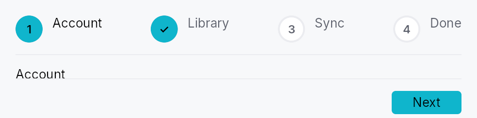
Stepper — a modern, embeddable step-flow widget (Material/Ant/Flutter
"stepper"), and Wizard, a thin modal launcher built on it.
Public types
| Kind | Name |
|---|---|
enum | StepperOrientation — Indicator-strip orientation for a Stepper |
enum | ChromePosition — Where the optional chrome slot (banner / sidebar) sits relative to the stepper body |
struct | Stepper — An embeddable multi-step flow widget |
struct | StepperController — Shared handle controlling a Stepper |
enum | StepStatus — Lifecycle state of a single step, surfaced in the indicator strip and (for the active step) as aria-current="step" |
struct | Step — One page in a Stepper |
Public functions
Stepper
StepperController
| Returns | Function |
|---|---|
| Constructors | |
Self | new(step_count: usize) |
| Methods | |
next() | |
skip() | |
back() | |
go_to(idx: usize) | |
reset() | |
set_status(idx: usize, status: StepStatus) | |
set_visible(idx: usize, visible: bool) | |
usize | current() |
StepStatus | status(idx: usize) |
bool | visited(idx: usize) |
bool | skipped(idx: usize) |
bool | is_visible(idx: usize) |
bool | is_reachable(idx: usize) |
Option<usize> | next_reachable(from: usize) |
bool | has_next() |
usize | step_count() |
bool | can_back() |
Signal<usize> | current_step_signal() |
Signal<u64> | version_signal() |
StepStatus
| Returns | Function |
|---|---|
| Methods | |
bool | is_optional() |
Step
Detailed description
A stepper shows a visible step-indicator strip above (or beside) a
content area driven by a Switcher, with a
footer of Back / Skip / Help / Next / Finish controls. It supports linear
and non-linear (clickable) navigation, optional + skippable steps, per
step validation gating, a generic chrome slot, and a
StepperController handle for programmatic reset / jump / introspection.
Data flow
The application owns its form state as Signals. A step's content factory
captures clones of those signals (write side); Step::complete_when
derives the Next gate from the same signals; and
Stepper::on_finish reads them back — plus the StepperController for
per-step introspection (visited / skipped) — to branch on the choices
made. There is no QVariant field registry: plain shared signals are the
cross-step channel.
#[derive(Clone)]
struct Form { name: Signal<String>, plan: Signal<Plan> }
let form = Form { name: Signal::new(String::new()), plan: Signal::new(Plan::Free) };
Stepper::new()
.step(Step::new(lit!("Account"))
.content({ let f = form.clone(); move || TextInput::new().text(f.name.clone()) })
.complete_when(form.name.map(|n| !n.is_empty())))
.step(Step::new(lit!("Plan"))
.content({ let f = form.clone(); move || plan_picker(f.plan.clone()) }))
.on_finish({ let f = form.clone(); move |_ctx, ctrl| {
match f.plan.get() { Plan::Free => {/* … */} Plan::Pro => {/* … */} }
let _ = ctrl.skipped(1);
}});
Density
The picture above is the widget at TargetDensity::Compact, the mouse-and-keyboard ladder. Below is the same subject on the same canvas with only the ladder changed, so what moves is the density and nothing else — where the subject no longer fits, that is what the denser targets cost it at that size. See docs/density-and-targets.md.
Touch
API reference
📖 Full rustdoc API for this module
pub enum StepperOrientation
Import: use teksilo::widgets::StepperOrientation;
Indicator-strip orientation for a Stepper.
#![allow(unused)] fn main() { pub enum StepperOrientation { /* variants */ } }
Variants
Horizontal— Markers in a row, content below (default).Vertical— Markers in a column on the leading side, content beside.
pub enum ChromePosition
Import: use teksilo::widgets::ChromePosition;
Where the optional chrome slot (banner / sidebar) sits relative to the stepper body.
#![allow(unused)] fn main() { pub enum ChromePosition { /* variants */ } }
Variants
Leading— Leading column (left in LTR). Forced toTopin vertical orientation.Top— Banner above the stepper body.
pub struct Stepper
Import: use teksilo::widgets::Stepper;
An embeddable multi-step flow widget. See the module docs for the
data-flow pattern and a usage example.
#![allow(unused)] fn main() { pub struct Stepper { /* fields */ } }
Methods
pub fn new() -> Self
Create an empty Stepper. Append steps with step or
steps and provide a finish callback with
on_finish.
pub fn step(mut self, step: Step) -> Self
Append a single Step definition.
pub fn steps(mut self, steps: impl IntoIterator<Item = Step>) -> Self
Append multiple Step definitions from an iterator.
pub fn controller(mut self, controller: StepperController) -> Self (default: None)
Drive the stepper with an externally-held controller (for programmatic reset / jump / introspection). If omitted, the stepper creates its own.
pub fn orientation(mut self, orientation: StepperOrientation) -> Self (default: StepperOrientation::Horizontal)
Set the indicator-strip orientation (horizontal or vertical).
pub fn vertical(mut self) -> Self
Shorthand for .orientation(StepperOrientation::Vertical).
pub fn non_linear(mut self, non_linear: bool) -> Self
Allow jumping between steps by clicking their indicators (the markers
become Role::Tab). Linear (default) markers are Role::ListItem.
pub fn circle_size(mut self, size: f32) -> Self (default: DEFAULT_CIRCLE_SIZE)
Override the marker circle diameter (logical px).
pub fn chrome(mut self, chrome: impl Widget + 'static) -> Self
A generic chrome widget (banner / sidebar) — the modern replacement for QWizard's watermark pixmap.
It lands in the leading column by default
(ChromePosition::Leading, QWizard's watermark slot), i.e. a full
height sidebar. For a title banner pair it with
.chrome_position(ChromePosition::Top), or the chrome renders as a
wide sidebar holding a few words.
pub fn chrome_position(mut self, position: ChromePosition) -> Self (default: ChromePosition::Leading)
Choose where the optional chrome widget sits relative to the stepper
body. Forced to ChromePosition::Top when
orientation is Vertical.
pub fn back_label(mut self, label: impl Into<LocalizedString>) -> Self
Override the "Back" button label. Default: "Back".
pub fn next_label(mut self, label: impl Into<LocalizedString>) -> Self
Override the "Next" button label. Default: "Next".
pub fn finish_label(mut self, label: impl Into<LocalizedString>) -> Self
Override the "Finish" button label. Default: "Finish".
pub fn skip_label(mut self, label: impl Into<LocalizedString>) -> Self
Override the "Skip" button label. Default: "Skip".
pub fn help( mut self, label: impl Into<LocalizedString>, action: impl Fn(&mut EventContext, &StepperController) + 'static, ) -> Self
Add a Help button + callback to the footer.
pub fn cancel( mut self, label: impl Into<LocalizedString>, action: impl Fn(&mut EventContext, &StepperController) + 'static, ) -> Self
Add a Cancel button + callback to the footer.
pub fn on_finish<R: IntoFinishOutcome>( mut self, action: impl Fn(&mut EventContext, &StepperController) -> R + 'static, ) -> Self
Called when Finish is activated on the last step. Receives the event
context and the controller (for skipped / visited introspection);
read collected values from the form signals your steps wrote.
The callback may refuse. Its return value goes through the
IntoFinishOutcome bridge — () always succeeds, while false,
Err(_), or FinishOutcome::Rejected keep the stepper on the last
step and mark it StepStatus::Error (a Wizard modal stays
open). This is the
Finish counterpart of Step::validate_on_next — for the case where
the commit itself can fail (disk full, name taken, server refused):
.on_finish(move |ctx, _ctrl| match create_project(&name.get()) {
Ok(()) => true,
Err(e) => { status.set(e.to_string()); false }
})
pub fn enter_advances(mut self, enter_advances: bool) -> Self
Whether pressing Enter activates the footer's primary button
(Next, or Finish on the last step). Default: true.
The key is handled on the bubble pass at the stepper root, so a
focused control that wants Enter for itself — a Button, a multi-line
editor, a list row — consumes it first and the stepper never sees it.
A single-line form field lets it through, which is where the "Enter
means Next" contract is expected. Gates apply exactly as they do to a
click: a blocked complete_when / validate_on_next refuses the same
way.
Turn it off for a step whose body treats Enter as content in a way the framework cannot see.
pub fn tooltip(mut self, text: impl Into<LocalizedString>) -> Self
Attach a plain single-line tooltip to this stepper. Clears any previously set rich or composite tooltip.
pub fn rich_tooltip(mut self, key: impl Into<String>) -> Self
Attach a rich tooltip identified by a registry key. Clears any previously set plain or composite tooltip.
pub fn rich_tooltip_content(mut self, content: crate::tooltip::TooltipContent) -> Self
Attach a rich tooltip with inline content. Clears any previously set plain or composite tooltip.
pub fn composite_tooltip(mut self, content: impl Widget + 'static) -> Self
Attach a composite tooltip (arbitrary widget body). Clears any previously set plain or rich tooltip.
pub struct StepperController
Import: none — StepperController is public in a private module of teksilo-widgets and nothing re-exports it.
Shared handle controlling a Stepper.
#![allow(unused)] fn main() { pub struct StepperController { /* fields */ } }
Methods
pub fn new(step_count: usize) -> Self
A controller for a stepper with step_count steps, starting at step 0.
pub fn next(&self)
Advance to the next reachable step, recording the current one on
the back-stack. Invisible (Step::visible_when)
and StepStatus::Disabled steps are stepped over; a no-op when none
remains.
pub fn skip(&self)
Mark the current (optional) step skipped, then advance like
next.
pub fn back(&self)
Return to the most recently visited reachable step (the back-stack top). Entries that became unreachable meanwhile are popped and skipped. No-op on an empty stack.
pub fn go_to(&self, idx: usize)
Jump to step idx (non-linear), recording the current step on the
back-stack so back returns here. A no-op when idx is
out of range or not reachable.
pub fn reset(&self)
Reset to the first reachable step: clears the back-stack, restores the
statuses the stepper was declared with (so a Disabled / Optional
step keeps its character), and clears visited/skipped flags. Per-step
visibility is app-owned and left untouched.
pub fn set_status(&self, idx: usize, status: StepStatus)
Override a step's StepStatus (e.g. mark it Error after async
validation). Setting StepStatus::Disabled takes the step out of the
flow — next / go_to skip it — but does
not move off it if it is the active step.
pub fn set_visible(&self, idx: usize, visible: bool)
Show or hide step idx. A hidden step is skipped by
next / back / go_to
and drops out of the indicator strip — the branching-wizard shape
("this step only if you chose X") without maintaining two step lists.
Usually driven declaratively by
Step::visible_when; this is the
imperative twin. Hiding the active step does not navigate away from
it — hide steps the user has not reached yet.
pub fn current(&self) -> usize
pub fn status(&self, idx: usize) -> StepStatus
pub fn visited(&self, idx: usize) -> bool
true if step idx has ever been the active step.
pub fn skipped(&self, idx: usize) -> bool
true if step idx was skipped via skip.
pub fn is_visible(&self, idx: usize) -> bool
true if step idx is visible (see set_visible).
pub fn is_reachable(&self, idx: usize) -> bool
true if step idx participates in the flow — visible and not
StepStatus::Disabled.
pub fn next_reachable(&self, from: usize) -> Option<usize>
The next reachable step after from, if any.
pub fn has_next(&self) -> bool
true if next would move — i.e. the active step is not
the last reachable one. The footer shows Next when this holds and
Finish when it does not.
pub fn step_count(&self) -> usize
pub fn can_back(&self) -> bool
true if there is a previously-visited, still-reachable step to
return to.
pub fn current_step_signal(&self) -> Signal<usize>
The active-step signal — the stepper's Switcher and indicators bind
to it.
pub fn version_signal(&self) -> Signal<u64>
Bumped on every structural mutation; bind at BindingLevel::Rebuild.
pub enum StepStatus
Import: none — StepStatus is public in a private module of teksilo-widgets and nothing re-exports it.
Lifecycle state of a single step, surfaced in the indicator strip and
(for the active step) as aria-current="step".
Mirrors the modern stepper status model (Ant wait/process/finish/error,
Flutter StepState): Upcoming = not yet reached, Active = currently
shown, Complete = validated, Error = failed validation, Disabled =
unreachable, Optional = reachable but skippable, Skipped = an optional
step the user bypassed.
#![allow(unused)] fn main() { pub enum StepStatus { /* variants */ } }
Variants
UpcomingActiveCompleteErrorDisabledOptionalSkipped
Methods
pub fn is_optional(self) -> bool
true for Optional — the only status that surfaces a Skip button.
pub struct Step
Import: none — Step is public in a private module of teksilo-widgets and nothing re-exports it.
One page in a Stepper.
A step carries a localized title, optional supporting_text, a content
factory (the body shown when the step is active), and an optional
completion gate. The recommended data-flow pattern: the application owns
its form state as Signals, the content factory binds widgets to those
signals (write side), and complete_when derives
the Next gate from the same signals.
#![allow(unused)] fn main() { pub struct Step { /* fields */ } }
Methods
pub fn new(title: impl Into<LocalizedString>) -> Self
pub fn content<W, F>(mut self, factory: F) -> Self where W: Widget + 'static, F: Fn() -> W + 'static,
The body shown while this step is active. The factory may capture
clones of the application's form Signals to read/write step input.
pub fn content_boxed(mut self, factory: impl Fn() -> Box<dyn Widget> + 'static) -> Self
The body shown while this step is active, as a boxed widget — the escape hatch for a body whose concrete type varies at runtime.
content is generic over one W: Widget, and
Box<dyn Widget> does not itself implement Widget, so a step whose
body branches on app state cannot be expressed as a single content
factory. Box each branch instead of duplicating the surrounding
builder:
Step::new(lit!("Details")).content_boxed({
let purpose = purpose.clone();
move || -> Box<dyn Widget> {
match purpose.get() {
Purpose::Novel => Box::new(novel_form()),
Purpose::Import => Box::new(import_form()),
}
}
})
pub fn supporting_text(mut self, text: impl Into<LocalizedString>) -> Self (default: None)
Secondary line under the title in the header / indicator.
pub fn status(mut self, status: StepStatus) -> Self (default: StepStatus::Upcoming)
Set the step's initial StepStatus.
pub fn optional(mut self, optional: bool) -> Self
Mark the step optional (reachable but skippable — surfaces a Skip
button while active). Equivalent to .status(StepStatus::Optional).
pub fn complete_when(mut self, signal: impl Into<teksilo_core::signal::Prop<bool>>) -> Self (default: None)
Reactive Next gate: while this step is active, Next is enabled iff
signal is true. Derive it from the same form signals the step's
content writes — e.g. name.map(|n| !n.is_empty()).
pub fn validate_on_next(mut self, f: impl Fn() -> bool + 'static) -> Self
Imperative validation fallback: checked on the Next click. Returning
false blocks navigation. Prefer complete_when
where a reactive signal is available.
pub fn visible_when(mut self, visible: impl Into<teksilo_core::signal::Prop<bool>>) -> Self (default: None)
Reactive visibility: while visible is false this step drops out of
the flow — Next / Back / indicator clicks skip it, and its marker is
hidden from the indicator strip (and from AT).
This is how a branching wizard is expressed: declare every step once and gate the conditional ones on the choice that selects them, instead of maintaining one step list per branch.
let purpose = Signal::new(Purpose::Novel);
Stepper::new()
.step(Step::new(lit!("Purpose")).content(|| purpose_picker()))
.step(Step::new(lit!("Import source"))
.visible_when(purpose.map(|p| *p == Purpose::Import))
.content(|| import_form()))
Hiding the step the user is currently on does not navigate away from it — gate steps ahead of the choice, not the one making it.
Switcher
Switcher — a container that shows exactly one child page at a time.
Public functions
Switcher
| Returns | Function |
|---|---|
| Constructors | |
Self | new(selected: Signal<usize>) |
| Builder methods | |
Self | capture_child_ids_into(out: Rc<RefCell<Vec<WidgetId>>>) |
Self | child(widget: impl teksilo_core::IntoTeksiChild) |
Self | child_opt(widget: Option<impl teksilo_core::IntoTeksiChild>) |
Self | children(iter: impl IntoIterator<Item = impl teksilo_core::IntoTeksiChild>) |
Detailed description
Switcher is the fundamental tab/wizard/step primitive: it owns N child
pages and exposes only the one whose index matches the Signal<usize> it
was constructed with. Switching is a signal write — the framework responds
with a relayout that shows the new page and dormantizes all others (excluded
from focus traversal, accessibility tree, hit-test, and paint).
Lazy mount. Pages added via child /
children / child
stay unconstructed until their index is selected for the first time. Once
mounted, the page's subtree persists for the Switcher's lifetime — switching
away then back finds it in the exact state the user left it (focus, scroll
offsets, text-input contents, signal subscriptions). Pages added via
child are pre-mounted by the caller and treated
eagerly.
The Switcher itself reports the maximum natural size across every
currently-mounted page and stretches each placed page to its own bounds —
all pages share the same slot, so the container size never jumps on a switch.
#![allow(unused)] fn main() { use teksilo_widgets::primitives::{Switcher, TextWidget}; use teksilo_core::signal::Signal; use teksilo_i18n::lit; let page = Signal::new(0_usize); let _w = Switcher::new(page.clone()) .child(TextWidget::new(lit!("Step 1"))) // built at startup (index 0 is default) .child(TextWidget::new(lit!("Step 2"))) // built on first page.set(1) .child(TextWidget::new(lit!("Step 3"))); // built on first page.set(2) }
API reference
📖 Full rustdoc API for this module
pub struct Switcher
Import: use teksilo::widgets::Switcher;
A container that shows exactly one child at a time, driven by a
Signal<usize> index.
Lazy mount. A page added via Self::child / Self::child
/ Self::children stays unconstructed until its index is first
selected. Once mounted, the page's subtree persists for the
Switcher's lifetime — switching away then back finds it in the
state the user left it (focus, scroll, text-input contents, …).
Pages added via Self::child are pre-mounted by the caller
and treated eagerly: no lazy benefit, no semantic change.
The Switcher itself reports the maximum natural size across every
currently-mounted page and stretches each placed child to its own
bounds (top-leading, RTL-aware). Hidden pages keep their subtree
laid out but invisible via per-page visible_when bindings.
#![allow(unused)] fn main() { use teksilo_widgets::primitives::{Switcher, TextWidget}; use teksilo_core::signal::Signal; use teksilo_i18n::lit; let page = Signal::new(0_usize); let _w = Switcher::new(page.clone()) .child(TextWidget::new(lit!("Page 0"))) // built at startup .child(TextWidget::new(lit!("Page 1"))) // built when page.set(1) .child(TextWidget::new(lit!("Page 2"))); // built when page.set(2) }
#![allow(unused)] fn main() { pub struct Switcher { /* fields */ } }
Methods
pub fn new(selected: Signal<usize>) -> Self
Create a Switcher driven by selected. The initially selected index
is selected.get() at build time; page 0 is mounted immediately if that
is the starting value (the most common case).
pub fn capture_child_ids_into(mut self, out: Rc<RefCell<Vec<WidgetId>>>) -> Self (default: None)
Capture each mounted page's WidgetId into an externally owned
buffer during build(). Use when the caller needs to reference
pages after they're added to the arena — e.g. for accessibility
relations like Tab → TabPanel.
The buffer reflects the currently-mounted set, not every
declared page. With lazy mount, a page added via child(...)
only appears in the buffer once it has been selected for the
first time. Callers that need every id up front should pass
pre-mounted ids via Self::child instead — those are
eagerly recorded.
pub fn child(mut self, widget: impl teksilo_core::IntoTeksiChild) -> Self
Add a child page. An impl Widget stays Boxed until its index is
selected for the first time, then is mounted into the arena
and kept alive across selection changes. A WidgetId (an
already-mounted page) is pre-mounted immediately instead, built
eagerly regardless of the selected index — see Slot::PreMounted.
pub fn child_opt(self, widget: Option<impl teksilo_core::IntoTeksiChild>) -> Self
Attach widget when it is Some, and do nothing when it is None.
The conditional-child form. teksu!'s if without an else lowers to
this, and it is what cond.then(|| w) is for in a builder chain. None
adds no arena node, so nothing is laid out, painted, or published to the
accessibility tree, and a stack applies no spacing around it.
pub fn children( self, iter: impl IntoIterator<Item = impl teksilo_core::IntoTeksiChild>, ) -> Self
Add multiple child pages from an iterator (lazy, same as
Self::child).
TabBar
TabBar<T> — header strip driven by a data source.
Public types
| Kind | Name |
|---|---|
const | DEFAULT_MIN_TAB_WIDTH — Default min width for an unpinned tab |
fn | default_min_tab_width — DEFAULT_MIN_TAB_WIDTH raised to the density's target_size (24 / 32 / 44 dp) |
const | DEFAULT_MAX_TAB_WIDTH — Default max width for an unpinned tab |
const | DEFAULT_TAB_SPACING — Default spacing between tab headers in the row |
fn | default_tab_spacing — DEFAULT_TAB_SPACING scaled by the density's spacing_factor (1.00 / 1.15 / 1.30) |
const | DEFAULT_BAR_SLOT_SPACING — Default spacing between the bar's leading slot, scroll area, and trailing slot |
fn | default_bar_slot_spacing — DEFAULT_BAR_SLOT_SPACING scaled by the density's spacing_factor (1.00 / 1.15 / 1.30) |
const | DEFAULT_PINNED_TAB_WIDTH — Default width (in dp) of a pinned tab — icon-only squares |
fn | default_pinned_tab_width — DEFAULT_PINNED_TAB_WIDTH raised to the density's target_size (24 / 32 / 44 dp) |
struct | TabBarDragData — Drag payload published by a tab header when the user starts dragging it |
struct | TabBar — A reactive header strip that pulls its tab list from a data source and writes the active tab into a shared Signal<Option<TabId>> |
Public functions
TabBar
Detailed description
Horizontal and vertical orientations, with shared / independent
sizing. Bar-leading and bar-trailing slots are wired. Overflow is
handled by a ScrollArea around the headers row, plus optional
scroll arrows and a "show all tabs" overflow dropdown (both on by
default); whichever tab is activated is scrolled back into view (see
RevealState). Closable tabs (with middle-click close),
drag-to-reorder with edge auto-scroll, and a leading icon-only
pinned-tab strip are all supported. Multi-line (multi-row) wrapping
is the one layout mode not yet implemented.
The data source is consumed via the pub(crate) ListSource
abstraction so callers can pass either a ListModel<T> (clonable,
mutable) or any external ListDataSource<Item = T> (a database
cursor, a virtual list, …) without TabBar having to carry a generic
source parameter.
Accessibility
The bar emits Role::TabList with an aria-orientation
reflecting whether it was built with TabBar::horizontal or
TabBar::vertical. When a page hosts more than one tab list,
give each one an accessible name via
.access_label(tr!(tab_list_name()))
so screen readers can distinguish them (ARIA APG recommendation).
use teksilo_widgets::tab_widget::{TabBar, TabDelegate, TabId};
use teksilo_data::ListModel;
use teksilo_core::signal::Signal;
#[derive(Clone)]
struct Tab { id: TabId, title: String }
let model: ListModel<Tab> = ListModel::new();
let selected: Signal<Option<TabId>> = Signal::new(None);
let delegate = TabDelegate::new(|_i, t: &Tab| teksilo_i18n::lit!(t.title.clone()));
let _bar = TabBar::horizontal(model, delegate, selected, |_i, t| t.id)
.reorderable(true)
.tab_dividers();
API reference
📖 Full rustdoc API for this module
pub const DEFAULT_MIN_TAB_WIDTH
Import: use teksilo::widgets::tab_widget::DEFAULT_MIN_TAB_WIDTH;
Default min width for an unpinned tab.
#![allow(unused)] fn main() { pub const DEFAULT_MIN_TAB_WIDTH: f32 = 96.0; }
pub fn default_min_tab_width(...)
Import: none — default_min_tab_width is public in a private module of teksilo-widgets and nothing re-exports it.
DEFAULT_MIN_TAB_WIDTH raised to the density's target_size
(24 / 32 / 44 dp). The identity at Compact.
#![allow(unused)] fn main() { pub fn default_min_tab_width(tokens: &InputTokens) -> f32; }
pub const DEFAULT_MAX_TAB_WIDTH
Import: use teksilo::widgets::tab_widget::DEFAULT_MAX_TAB_WIDTH;
Default max width for an unpinned tab.
#![allow(unused)] fn main() { pub const DEFAULT_MAX_TAB_WIDTH: f32 = 240.0; }
pub const DEFAULT_TAB_SPACING
Import: use teksilo::widgets::tab_widget::DEFAULT_TAB_SPACING;
Default spacing between tab headers in the row. 0.0 so tabs sit
flush against each other (Firefox / Chrome convention) — adjacent
tab boundaries are visually separated by the per-tab borders, not
by an empty gap.
#![allow(unused)] fn main() { pub const DEFAULT_TAB_SPACING: f32 = 0.0; }
pub fn default_tab_spacing(...)
Import: none — default_tab_spacing is public in a private module of teksilo-widgets and nothing re-exports it.
DEFAULT_TAB_SPACING scaled by the density's spacing_factor
(1.00 / 1.15 / 1.30).
#![allow(unused)] fn main() { pub fn default_tab_spacing(tokens: &InputTokens) -> f32; }
pub const DEFAULT_BAR_SLOT_SPACING
Import: use teksilo::widgets::tab_widget::DEFAULT_BAR_SLOT_SPACING;
Default spacing between the bar's leading slot, scroll area, and trailing slot.
#![allow(unused)] fn main() { pub const DEFAULT_BAR_SLOT_SPACING: f32 = 8.0; }
pub fn default_bar_slot_spacing(...)
Import: none — default_bar_slot_spacing is public in a private module of teksilo-widgets and nothing re-exports it.
DEFAULT_BAR_SLOT_SPACING scaled by the density's spacing_factor
(1.00 / 1.15 / 1.30).
#![allow(unused)] fn main() { pub fn default_bar_slot_spacing(tokens: &InputTokens) -> f32; }
pub const DEFAULT_PINNED_TAB_WIDTH
Import: use teksilo::widgets::tab_widget::DEFAULT_PINNED_TAB_WIDTH;
Default width (in dp) of a pinned tab — icon-only squares.
#![allow(unused)] fn main() { pub const DEFAULT_PINNED_TAB_WIDTH: f32 = 32.0; }
pub fn default_pinned_tab_width(...)
Import: none — default_pinned_tab_width is public in a private module of teksilo-widgets and nothing re-exports it.
DEFAULT_PINNED_TAB_WIDTH raised to the density's target_size
(24 / 32 / 44 dp). The identity at Compact.
#![allow(unused)] fn main() { pub fn default_pinned_tab_width(tokens: &InputTokens) -> f32; }
pub struct TabBarDragData
Import: use teksilo::widgets::tab_widget::TabBarDragData;
Drag payload published by a tab header when the user starts dragging it.
Generic over the bar's item type T so a TabBar<T> only ever
downcasts (get_typed::<TabBarDragData<T>>()) a drag started by
another TabBar<T> — a drag from a TabBar<OtherT> simply never
matches, giving cross-bar transfer type-safety for free.
Two consumers:
- Intra-bar reorder: the bar's own
on_dropmatchessource_bar_id == self_idand usessource_indexto drivemove_item.itemis unused on this path (and may beNone). - Cross-bar transfer: a different bar that opted in via
accept_external_tabstakesitemby value and hands it to itson_tab_receivedcallback.itemisSomeonly when the source bar opted in and the per-tab transferable predicate allows it (static tabs are excluded).
#![allow(unused)] fn main() { pub struct TabBarDragData<T: 'static> { /* fields */ } }
Fields
source_index:usize— Model index of the dragged tab in the source bar.source_bar_id:WidgetId— Widget id of the sourceTabBar. The receiving bar compares it to its own id to tell an intra-bar reorder from a cross-bar transfer.source_id:TabId— Stable id of the dragged tab — handed to the source bar'son_transfer_outso the app can remove it by id.item:Option<T>— A clone of the dragged item, carried for cross-bar transfer.Nonewhen the source bar didn't opt into transfer or the tab is non-transferable (e.g. a static tab).
pub struct TabBar
Import: use teksilo::widgets::TabBar;
A reactive header strip that pulls its tab list from a data source
and writes the active tab into a shared Signal<Option<TabId>>.
Selection is id-based: the bar holds a stable TabId per
item (extracted via the id_of closure passed to the constructor)
and the public selected_id signal is the source of truth across
reorders / removals / locale changes. Internal index-based work
(keyboard nav, scroll-to-active, click activation) reads a
private selected_index signal that the bar keeps in
bidirectional sync with selected_id at build time.
#![allow(unused)] fn main() { pub struct TabBar<T: 'static> { /* fields */ } }
Methods
pub fn horizontal( model: ListModel<T>, delegate: TabDelegate<T>, selected_id: Signal<Option<TabId>>, id_of: impl Fn(usize, &T) -> TabId + 'static, ) -> Self
Construct a horizontal tab bar from a ListModel<T>.
Default sizing is TabSizing::Shared.
selected_id is the id-based selection signal — written by
the bar on click / keyboard / drag-drop and observable by
callers. id_of(index, &item) extracts the stable TabId
from each model item.
pub fn horizontal_from_source<S: ListDataSource<Item = T>>( source: S, delegate: TabDelegate<T>, selected_id: Signal<Option<TabId>>, id_of: impl Fn(usize, &T) -> TabId + 'static, ) -> Self
Construct a horizontal tab bar from any ListDataSource.
Default sizing is TabSizing::Shared.
pub fn vertical( model: ListModel<T>, delegate: TabDelegate<T>, selected_id: Signal<Option<TabId>>, id_of: impl Fn(usize, &T) -> TabId + 'static, ) -> Self
Construct a vertical tab bar from a ListModel<T>. Tabs
stack top-to-bottom as horizontal pills (icon + label + close
button arranged left-to-right within each pill). Default
sizing is TabSizing::Shared — uniform pill heights.
pub fn vertical_from_source<S: ListDataSource<Item = T>>( source: S, delegate: TabDelegate<T>, selected_id: Signal<Option<TabId>>, id_of: impl Fn(usize, &T) -> TabId + 'static, ) -> Self
Construct a vertical tab bar from any ListDataSource.
pub fn tab_sizing(mut self, mode: TabSizing) -> Self
Override the per-tab sizing strategy. See TabSizing.
pub fn tab_display(mut self, mode: TabDisplayMode) -> Self
Choose what every tab shows — icon, label, or both. See
TabDisplayMode. Default TabDisplayMode::Auto (render each tab as
its TabInfo declares).
pub fn min_tab_width(mut self, dp: f32) -> Self
Minimum width (in dp) any unpinned tab will be drawn at.
Default: DEFAULT_MIN_TAB_WIDTH.
In horizontal orientation this clamps the per-tab width.
In vertical orientation every tab is forced to the bar's
cross-axis width, so the same knob defines the bar's minimum
width — the sidebar adapts to the widest piece of bar content
(tab labels or a slot widget) and never shrinks below this floor.
Vertical pill heights stay at the tab style's editor_height
regardless of this knob.
Under TabSizing::Fill a vertical bar takes the width it is
offered outright, so this floor no longer applies to it; in a
horizontal Fill bar it still does (the tabs overflow into
scroll rather than squeeze below it).
pub fn tab_bar_height(mut self, dp: f32) -> Self
Override the tab-strip cross-axis extent (the strip height for a
horizontal bar; the per-tab pill height for a vertical one). None
keeps the style's editor_height. Use for a compact bar.
pub fn max_tab_width(mut self, dp: f32) -> Self
Maximum width (in dp) any unpinned tab will be drawn at — long
labels truncate with an ellipsis at this width.
Default: DEFAULT_MAX_TAB_WIDTH.
In horizontal orientation this clamps the per-tab width.
In vertical orientation it caps the whole sidebar's width —
see min_tab_width for the symmetric
adapt-to-content rule.
TabSizing::Fill ignores this cap in both orientations — filling
the bar is the point, and a cap would leave exactly the slack the
mode exists to remove.
pub fn tab_spacing(mut self, dp: f32) -> Self
Override the spacing (in dp) between adjacent tab headers in
the row. Default: DEFAULT_TAB_SPACING.
pub fn pinned_tab_width(mut self, dp: f32) -> Self
Width (in dp) of an icon-only pinned tab.
Default: DEFAULT_PINNED_TAB_WIDTH.
pub fn tab_background(mut self, color: impl Into<teksilo_core::color_prop::ColorProp>) -> Self
All-states shorthand for the per-tab background — every tab
(selected, idle, hovered) paints this unless a per-state override
below is set. Accepts any Color, SurfaceRole, or Signal<Color>
(via ColorProp).
Default None = transparent. To tint the bar's backdrop instead,
use bar_background.
pub fn selected_tab_background( mut self, color: impl Into<teksilo_core::color_prop::ColorProp>, ) -> Self
Background for the selected tab. Falls back to
tab_background, then transparent.
pub fn hover_tab_background( mut self, color: impl Into<teksilo_core::color_prop::ColorProp>, ) -> Self
Background for the hovered (non-selected) tab. Falls back to
tab_background, then transparent.
pub fn idle_tab_background( mut self, color: impl Into<teksilo_core::color_prop::ColorProp>, ) -> Self
Background for idle tabs (not selected, not hovered). Falls back
to tab_background, then transparent.
pub fn bar_background(mut self, color: impl Into<teksilo_core::color_prop::ColorProp>) -> Self
Set the backdrop fill spanning the whole bar strip (behind the
headers, slots, and scroll arrows). Independent of the per-tab
backgrounds. Accepts any Color, SurfaceRole, or Signal<Color>.
Default None = transparent.
pub fn tab_dividers(mut self) -> Self
Draw a 1 dp divider between consecutive tabs (scrollable and pinned
strips). Off by default. See tab_divider_color.
pub fn tab_divider_color( mut self, color: impl Into<teksilo_core::color_prop::ColorProp>, ) -> Self
Like tab_dividers, but with an explicit
colour. Accepts any Color, BorderRole,
or Signal<Color>. Implies tab_dividers().
pub fn active_indicator( mut self, position: teksilo_core::styles::TabIndicatorPosition, ) -> Self
Choose which edge the active-tab highlight indicator hugs. Default
TabIndicatorPosition::OuterEdge
(top for horizontal / leading for vertical);
InnerEdge
puts it below the label (horizontal) / on the trailing edge (vertical).
Honoured by the default RecipeTabStyle; a custom
TabStyle may interpret it freely.
pub fn selected_text_role(mut self, role: TextRole) -> Self
Set the text role used for the label (and matching icon tint)
on the selected tab. Default: TextRole::Primary — the
Int UI editor-strip convention. Override to e.g.
TextRole::Accent when the strip sits over a tinted surface.
pub fn idle_text_role(mut self, role: TextRole) -> Self
Set the text role used for the label (and matching icon tint)
on idle tabs (not selected, not disabled). Default:
TextRole::Secondary. Disabled tabs always read as
TextRole::Disabled regardless of this setting.
pub fn style(mut self, style: impl teksilo_core::styles::TabStyle) -> Self
Override the active TabStyle
for every header in this bar. The widget keeps responsibility
for the label / icon / close button composition, the
optional per-state tab backgrounds, and all input handling;
the style only paints the accent indicator and focus ring
chrome via make_body. Per-call override > theme slot >
built-in RecipeTabStyle default.
pub fn on_pin_toggle(mut self, f: impl Fn(usize, bool, &mut EventContext) + 'static) -> Self
Install a pin-toggle handler called whenever the user crosses
a pinned tab over the unpinned region or vice-versa during a
drag. Receives (model_index, new_pinned_flag, ctx). The
firing EventContext lets the handler confirm the
transition via a dialog or route it through an intent before
mutating the item; apps decide whether to actually flip the
pinned state.
pub fn bar_leading_slot(mut self, w: impl teksilo_core::IntoTeksiChild) -> Self
Bar-level leading slot — a widget rendered before the headers row, and before the pinned-tab strip.
pub fn bar_trailing_slot(mut self, w: impl teksilo_core::IntoTeksiChild) -> Self
Bar-level trailing slot — a widget rendered after the headers row, and after the overflow dropdown.
pub fn separator(mut self, on: bool) -> Self
Toggle the 1 dp bottom separator the bar paints under the headers. Default: on.
pub fn show_scroll_arrows(mut self, on: bool) -> Self
Toggle the leading + trailing scroll-arrow buttons. They auto-show when the headers row overflows the bar's viewport, and click animates the scroll position by one tab-width. Default: on.
pub fn overflow_button(mut self, mode: TabOverflowButton) -> Self
When the trailing "show all tabs" overflow dropdown appears — a
Popover with a MenuList of every tab. Default:
TabOverflowButton::Auto (shown only when the headers overflow the
viewport). See TabOverflowButton for Always / Never.
pub fn show_overflow_dropdown(mut self, on: bool) -> Self
Convenience over overflow_button: true maps
to TabOverflowButton::Always, false to TabOverflowButton::Never.
Prefer overflow_button(TabOverflowButton::Auto) for the default
"only when overflowing" behaviour.
pub fn vertical_wheel_scrolls_horizontally(mut self, on: bool) -> Self
On a horizontal bar, treat a plain vertical-wheel event as a horizontal scroll (Firefox / Chrome convention). Has no effect on vertical or multi-line bars (those still scroll vertically). Default: on.
pub fn shift_wheel_scrolls_horizontally(mut self, on: bool) -> Self
Shift + vertical wheel forces a horizontal scroll regardless
of orientation. Default: on.
pub fn on_close(mut self, f: impl Fn(usize, &mut EventContext) + 'static) -> Self
Install a close-tab handler called whenever the user clicks a
closable tab's close button, middle-clicks the tab header, or
presses Delete on a focused tab. The handler receives the
firing EventContext so it can open a confirmation dialog
(ctx.present_modal(MessageBox::confirm(...))), dispatch an
intent, or otherwise route the close request through the
framework. To veto the close, do nothing in the handler; to
confirm-then-close, run the confirmation flow and only mutate
the underlying model on accept.
If unset and the bar is backed by a ListModel<T>, the
default behavior is to remove the item at the given index
from the model (no confirmation, no ctx needed for that path).
pub fn reorderable(mut self, on: bool) -> Self
Enable drag-to-reorder. Each tab header becomes a drag source
and the bar accepts drops anywhere along the headers row,
painting an insertion-line indicator at the would-be
position. On drop the bar calls on_reorder
— falling back to ListModel::move_item when the bar is
backed by a ListModel<T> and no explicit handler is set.
Default: off.
pub fn on_reorder(mut self, f: impl Fn(usize, usize, &mut EventContext) + 'static) -> Self
Install a reorder handler called whenever the user drag-drops
a tab to a new position. Receives (from, to, ctx) —
from/to are model indices and ctx is the firing
EventContext so the handler can open a confirmation
dialog or dispatch an intent before persisting the move.
Implies reorderable(true).
pub fn accept_external_tabs(mut self, on: bool) -> Self where T: Clone,
Opt into cross-bar tab transfer. When enabled, this bar's
headers become transfer drag sources (their drag payload
carries a clone of the dragged item) and the bar accepts
tabs dragged from other TabBar<T>s, painting the same
insertion-line indicator as an intra-bar reorder.
Requires T: Clone — the dragged item is cloned into the
payload (cheap for handle-like T whose heavy state lives
behind an Rc). Default: off.
Pair with on_tab_received (this bar,
as a drop target — insert the item into your model) and
on_transfer_out (the source bar —
remove the tab from your model).
pub fn on_tab_received(mut self, f: impl Fn(T, usize, &mut EventContext) + 'static) -> Self where T: Clone,
Install the target-side callback fired when a foreign tab is
dropped onto this bar. Receives (item, insertion_index, ctx)
— the moved item (taken by value from the drag payload), the
model index in this bar where it should land, and the firing
context. The app inserts the item into its own model. Implies
accept_external_tabs(true).
pub fn on_transfer_out(mut self, f: impl Fn(TabId, &mut EventContext) + 'static) -> Self where T: Clone,
Install the source-side callback fired after one of this bar's
tabs has been accepted by a different bar. Receives the
transferred tab's TabId; the app removes it from its own
model. Not fired for intra-bar reorders (those go through
on_reorder) or rejected / cancelled
drags. Implies accept_external_tabs(true).
pub fn on_external_drop( mut self, f: impl Fn(&DragPayload, usize, &mut EventContext) -> bool + 'static, ) -> Self
Accept non-tab drops onto the bar — an in-app foreign drag
(e.g. a file dragged from a TreeView, carrying app data) or an
OS file/text/URL drop. The bar paints the same insertion-line
indicator while such a payload hovers, and on drop calls f
with the raw DragPayload, the model insertion index, and the
firing context. Return true if accepted — the app inspects the
payload (get_typed::<T>() / files() / text() / uris())
and mints whatever it needs (e.g. opens a tab).
Independent of accept_external_tabs:
a bar can accept foreign tabs, non-tab payloads, both, or
neither. OS drops additionally require the app to have called
TeksiloAppBuilder::install_external_dnd().
Note: the hover indicator is optimistic — it shows for any
non-tab payload while this handler is installed; f's return
value is authoritative at drop time.
TableHeader
TableHeader — the column header strip of TableView
and TreeTableView, and a widget of its own for an
application that lays out its own rows under columns: a section list with
full-width group rows, an album card beside its tracks.
Public functions
TableHeader
| Returns | Function |
|---|---|
| Constructors | |
Self | new(columns: Vec<ColumnSpec>) |
| Builder methods | |
Self | widths(widths: Signal<HashMap<String, f32>>) |
Self | sort(sort: Signal<Option<(String, SortDirection)>>) |
Self | order(order: Signal<Vec<String>>) |
Self | pinning(pinning: Signal<HashMap<String, PinnedSide>>) |
Self | filters(filters: Signal<HashMap<String, String>>) |
Self | scroll_x(scroll_x: Signal<f32>) |
Self | resize_policy(policy: ColumnResizePolicy) |
Self | stretch_last_column(on: bool) |
| Methods | |
&Signal<HashMap<String, f32>> | widths_signal() |
&Signal<Option<(String, SortDirection)>> | sort_signal() |
&Signal<Vec<String>> | order_signal() |
&Signal<HashMap<String, PinnedSide>> | pinning_signal() |
&Signal<HashMap<String, String>> | filters_signal() |
&Signal<f32> | scroll_x_signal() |
&Signal<Vec<(String, f32)>> | resolved_widths_signal() |
Detailed description
Both views compose this widget, so there is one header implementation: the
HeaderCells (label, sort indicator, filter popover, the resize grip on
each divider, the column-reorder drag, Role::ColumnHeader with its sort
direction and AccessKit Increment / Decrement), the strip that lays them
out in pinned and scrolling bands and paints their separators, and the drop
target that turns a reorder drag into a new column order.
State
The header's state is six signals — the width overrides, the sort, the
column order, the pinning overrides, the filters and the horizontal scroll
offset. Each builder (widths,
sort, order,
pinning, filters,
scroll_x) adopts an application's signal; one
that is not given is the header's own, read back through its getter. The
rules are the views' ("Column state an application owns" in the
table_view module docs): the header writes nothing
into these signals until the user acts on it, ignores ids it does not
declare, and keeps them when it writes. Hand the same signals to a
TableView and the two stay in step.
The width map holds overrides, not the layout: a column with no entry
takes its declared ColumnWidth. What the header actually laid each
column out at is resolved_widths_signal,
which is what rows of an application's own read to line their cells up.
Hosted
Inside a view the header is hosted (TableHeader::hosted): the view
resolves the widths and the display order (its body needs both before the
header is placed), paints the OnRelease resize guide across the whole
table, rebuilds the header whenever its state changes, and holds the
resize-drag state, which a relayout keeps. A rebuild abandons an
in-flight resize, hosted or not: it destroys the cells and the pointer
capture with them (see TableHeader::build). A standalone header does
all of that itself, within its own bounds, which it clips to.
API reference
📖 Full rustdoc API for this module
pub struct TableHeader
Import: use teksilo::widgets::TableHeader;
A table's column header strip: one Role::ColumnHeader cell per column,
with click-to-sort, drag-to-resize on every divider, drag-to-reorder,
pinned columns, the filter popover and a horizontal scroll offset to follow
a scrolled body.
let widths = Signal::new(HashMap::new());
let sort = Signal::new(None);
let header = TableHeader::new(vec![
ColumnSpec::new("title", lit!("Title")).sortable(true),
ColumnSpec::new("length", lit!("Length"))
.width(ColumnWidth::Fixed(80.0))
.sortable(true),
])
.widths(widths.clone())
.sort(sort.clone());
let layout = header.resolved_widths_signal().clone(); // line rows up with this
A header announces itself as the Role::Row with row index 1, its cells as
Role::ColumnHeaders, so place it inside the container that announces the
rows under it as a table or a grid.
See the module docs for how its state is
shared and for how a view hosts it.
#![allow(unused)] fn main() { pub struct TableHeader { /* fields */ } }
Methods
pub fn new(columns: Vec<ColumnSpec>) -> Self
A header over columns, in declaration order. Every piece of state it
is not handed is its own.
pub fn widths(mut self, widths: Signal<HashMap<String, f32>>) -> Self
Adopt widths as the map of column id → width override; a column
with no entry takes its declared ColumnWidth. A resize drag writes
the resized column only. Each Flex column before it keeps its
current width in this header, but not in the map, which other views
may share at other widths.
pub fn sort(mut self, sort: Signal<Option<(String, SortDirection)>>) -> Self
Adopt sort as the active sort. A click on a sortable column cycles it
None → ascending → descending → None.
pub fn order(mut self, order: Signal<Vec<String>>) -> Self
Adopt order as the column order, a list of column ids; columns it
does not name follow in declaration order. A reorder drop writes it.
pub fn pinning(mut self, pinning: Signal<HashMap<String, PinnedSide>>) -> Self
Adopt pinning as the per-column pinning overrides, which win over
each ColumnSpec::pinned; PinnedSide::None unpins a column
declared pinned. A reorder drop writes it: an entry when the drop puts
the column in a pane other than the one it declares, none when it
puts it back.
pub fn filters(mut self, filters: Signal<HashMap<String, String>>) -> Self
Adopt filters as the per-column filter text the filter popover of a
filterable column edits.
pub fn scroll_x(mut self, scroll_x: Signal<f32>) -> Self
Follow scroll_x, the horizontal offset of the body under the header:
the unpinned columns shift left by it, the pinned ones stay put.
pub fn resize_policy(mut self, policy: ColumnResizePolicy) -> Self
Whether a resize writes its width on every pointer move (Live, the
default) or on release (OnRelease, with a guide line meanwhile).
pub fn stretch_last_column(mut self, on: bool) -> Self
Let the last column in display order take the width the others leave
— see TableView::stretch_last_column.
Default off.
pub fn widths_signal(&self) -> &Signal<HashMap<String, f32>>
The width overrides — the signal widths adopted, or
the header's own.
pub fn sort_signal(&self) -> &Signal<Option<(String, SortDirection)>>
The active sort — the signal sort adopted, or the
header's own.
pub fn order_signal(&self) -> &Signal<Vec<String>>
The column order — the signal order adopted, or the
header's own.
pub fn pinning_signal(&self) -> &Signal<HashMap<String, PinnedSide>>
The pinning overrides — the signal pinning
adopted, or the header's own.
pub fn filters_signal(&self) -> &Signal<HashMap<String, String>>
The filters — the signal filters adopted, or the
header's own.
pub fn scroll_x_signal(&self) -> &Signal<f32>
The horizontal offset the header follows — the signal
scroll_x adopted, or the header's own (which
stays at 0).
pub fn resolved_widths_signal(&self) -> &Signal<Vec<(String, f32)>>
(column id, width) for each displayed column, in display order: the
widths the header laid its cells out at, after the overrides, the
declared widths, the Flex share and the min / max clamps. Written
when the header is placed in a layout pass, and only when it changed;
bind a row's layout to it to line the row's cells up with the columns.
Leading-pinned columns come first and do not move with scroll_x, nor
do the trailing-pinned ones at the end.
Rows follow it one layout pass late, unless they read it in their
own place_children and are laid out after the header (below it in
the same stack): only the header's bounds settle the widths, and a row
that sizes itself from them in layout_response (a FixedSize bound
to a width derived from this, say) has been measured by then, so it is
relaid out on the next pass. During a live resize drag such a row
trails the header by a frame, and a headless test needs a second
layout() before it lines up.
Published by a standalone header only; a view hosting the header lays its rows out from the same widths directly.
TableView
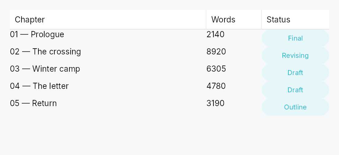
TableView<T> — generic, virtualized, accessible tabular widget.
Public types
| Kind | Name |
|---|---|
struct | TableView — Generic, virtualized, accessible table with sortable / filterable / resizable columns |
struct | TableViewHandle — A handle on a mounted TableView, to scroll it to a row from outside the widget — a view-model reacting to a search hit, a "go to row" command |
enum | ColumnWidth — How a column's width is determined during layout |
enum | PinnedSide — Whether a column is pinned to one side of the table |
enum | Alignment — Horizontal alignment of a cell's content within its column |
enum | TruncationPolicy — Strategy when a cell's text overflows its column |
enum | GridLines — Whether the table draws grid lines between rows / columns |
enum | ColumnResizePolicy — Whether column resize commits the new width on every drag tick (Live) or only on Ended (OnRelease) |
struct | EditTriggers — Which gestures open a cell editor — a set, composed with |, after Qt's QAbstractItemView::EditTriggers |
enum | TabTraversal — Tab / Shift-Tab traversal policy across cells of a row |
struct | CellContext — Per-cell context handed to a column's cell delegate during build |
struct | ColumnContext — Per-column-header context handed to a column's header delegate |
struct | ColumnSpec — What a column is to its header: id, title, width policy and the user gestures it allows — every part of a Column except how its cells are built |
struct | Column — Single column declaration |
enum | TableSelectionMode — Selection mode for a TableView or TreeTableView |
struct | CellSelectionModel — Cell-level selection state for TableSelectionMode::SingleCell / MultiCell |
Public functions
TableView
TableViewHandle
| Returns | Function |
|---|---|
| Methods | |
scroll_to_row(row: usize) | |
ensure_row_visible(row: usize) |
EditTriggers
| Returns | Function |
|---|---|
| Builder methods | |
Self | union(other: Self) |
Self | intersection(other: Self) |
| Methods | |
bool | contains(other: Self) |
bool | is_empty() |
| Constants and types | |
Self | NONE |
Self | F2 |
Self | ANY_KEY |
Self | SINGLE_CLICK |
Self | DOUBLE_CLICK |
Self | ALL |
ColumnSpec
| Returns | Function |
|---|---|
| Constructors | |
Self | new(id: impl Into<String>, title: impl Into<LocalizedString>) |
| Builder methods | |
Self | width(w: ColumnWidth) |
Self | min_width(px: f32) |
Self | max_width(px: f32) |
Self | alignment(a: Alignment) |
Self | resizable(b: bool) |
Self | reorderable(b: bool) |
Self | sortable(b: bool) |
Self | filterable(b: bool) |
Self | pinned(side: PinnedSide) |
| Methods | |
&str | id() |
Column
| Returns | Function |
|---|---|
| Constructors | |
Self | new(id: impl Into<String>, header: impl Into<LocalizedString>, cell: impl Fn(&T, &CellContext) -> Box<dyn Widget> + 'static) |
| Builder methods | |
Self | width(w: ColumnWidth) |
Self | min_width(px: f32) |
Self | max_width(px: f32) |
Self | alignment(a: Alignment) |
Self | resizable(b: bool) |
Self | reorderable(b: bool) |
Self | sortable(b: bool) |
Self | filterable(b: bool) |
Self | editable(b: bool) |
Self | edit_triggers(triggers: EditTriggers) |
Self | pinned(side: PinnedSide) |
Self | truncation(p: TruncationPolicy) |
Self | header_override(f: impl Fn(&ColumnContext) -> Box<dyn Widget> + 'static) |
| Methods | |
EditTriggers | effective_edit_triggers(view: EditTriggers) |
&str | id() |
TableSelectionMode
| Returns | Function |
|---|---|
| Methods | |
bool | is_cell_mode() |
bool | is_multi() |
CellSelectionModel
Detailed description
Built atop the ListModel<T> /
ListDataSource data layer in
teksilo-data and the teksilo-core TableStyle. Mirrors Qt's
QTableView, SwiftUI's Table, and JavaFX's TableView.
The core skeleton: single body pane, row-virtualized with alternating
backgrounds, grid lines, Role::Table > Role::Row > Role::Cell
accessibility, multi-row selection, and an empty-state slot. Headers,
sort, filter, resize, reorder, pinning, cell selection, and editing are
also included. Row heights come in three modes: uniform (row_height,
the default fast path), exact per-row callback (row_height_fn), and
auto-measured (auto_row_height — rows grow to their tallest cell,
height-for-width). See docs/table-view.md "Row heights".
The header strip is a TableHeader over the columns'
ColumnSpecs, which this view and TreeTableView
both compose and which works on its own over rows an application lays out
itself.
Column state an application owns
The sort, the column widths, the column order and the filters live in four
signals the table publishes (sort_signal(), column_widths_signal(),
column_order_signal(), filters_signal()). By default the table creates
them. bind_sort,
bind_column_widths,
bind_column_order and
bind_filters make the table adopt signals the
application already holds instead, so several views, or a view-model, share
one state without mirroring it.
- Adopting writes nothing. The table never seeds an adopted signal: not
when it is built, mounted, laid out or rebuilt. What the signal holds is
what the table shows; an empty map, an empty list or
Nonemeans the declared defaults. The table writes only for a user gesture (a header click, a resize drag, a reorder drop, the filter popover, an AccessKit increment) or an imperative setter (set_sort,set_column_widths, …). - Ids the table does not declare are ignored when read and kept when
written. A width, a filter or an order entry for a column this table
lacks changes nothing here, and a reorder in this table moves the
dragged column and leaves every other entry where it was. A column with
no width entry takes its declared
ColumnWidth. - A resize writes one width into an adopted map. The
Flexcolumns before the grip keep their widths, so the divider follows the pointer, but in this table only: the widths they had here are not the widths they have in a view of another size sharing the map. A table on its own map writes them into it, so the map it persists matches what it shows. - No feedback loop. A view reacts to a change by relaying out or rebuilding, never by writing back, so two views bound to the same signals follow each other's edits and settle after one pass.
- Bind before any imperative setter. A setter called earlier in the builder chain wrote the table's own signal, which the bind replaces.
use teksilo_data::ListModel;
use teksilo_widgets::table_view::{Column, ColumnWidth, TableView};
use teksilo_i18n::lit;
struct Person { name: String, age: u32 }
let model: ListModel<Person> = ListModel::new();
let _table = TableView::new(model)
.add_column(Column::new("name", ColumnWidth::Flex(1.0))
.label(lit!("Name"))
.cell(|p: &Person, _cx| Box::new(
teksilo_widgets::primitives::TextWidget::new(
teksilo_i18n::lit!(p.name.clone())
)
)))
.add_column(Column::new("age", ColumnWidth::Fixed(60.0))
.label(lit!("Age"))
.cell(|p: &Person, _cx| Box::new(
teksilo_widgets::primitives::TextWidget::new(
teksilo_i18n::lit!(p.age.to_string())
)
)))
.alternating_rows(true)
.row_height(32.0);
Scrolling to a row
handle returns a TableViewHandle, a cheap Clone
taken before the table is added and usable from any handler afterwards. Its
scroll_to_row and
ensure_row_visible are applied at
the next layout pass, after row measurement and scroll anchoring, so they
may follow a model change in the same turn, or be called before mount:
#![allow(unused)] fn main() { use teksilo_data::ListModel; use teksilo_widgets::TableView; let model: ListModel<String> = ListModel::new(); let table = TableView::new(model.clone()); let handle = table.handle(); // … add the columns, `ctx.add(table)`; then, from a handler: model.insert(0, "Fresh".into()); handle.ensure_row_visible(0); }
The builder-value methods of the same names compute the offset when they are called, against the last layout pass. See docs/table-view.md, "Scrolling to a row".
Pan to scroll
The view installs common::scrollable::ScrollableBehavior,
which gives it the shared wheel arithmetic, a finger's pan and the
PanClaim that puts it on a pan's claimant chain. A pan scrolls it, the
release coasts, and a pan it cannot absorb hands the whole event to the
container outside — never a residual. A pan that starts on a row scrolls
rather than activating it or collapsing a multi-selection onto it. Both axes
are claimed. Shift+wheel still
scrolls the columns, and a finger's pan is never remapped by a held Shift:
the remap is a wheel convention, and turning a drag sideways is not what
the hand asked for.
Density
The picture above is the widget at TargetDensity::Compact, the mouse-and-keyboard ladder. Below is the same subject on the same canvas with only the ladder changed, so what moves is the density and nothing else — where the subject no longer fits, that is what the denser targets cost it at that size. See docs/density-and-targets.md.
Touch
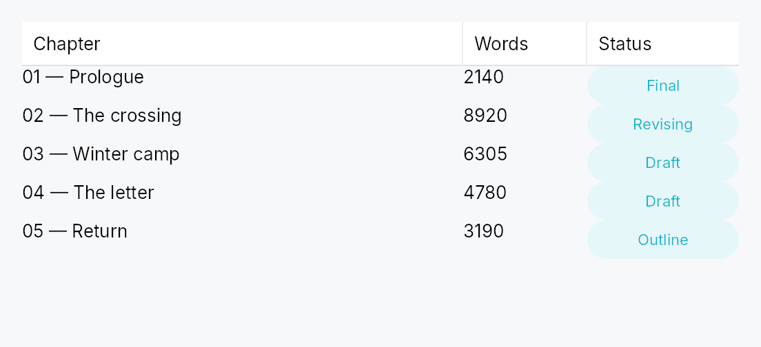
API reference
📖 Full rustdoc API for this module
pub struct TableView
Import: use teksilo::widgets::TableView;
Generic, virtualized, accessible table with sortable / filterable / resizable columns.
Construct with TableView::new (from a ListModel<T>)
or TableView::from_source (any ListDataSource), then chain builder methods
to configure columns, row heights, selection, and so on. See module docs for the full
feature list and row-height modes.
#![allow(unused)] fn main() { pub struct TableView<T: 'static> { /* fields */ } }
Methods
pub fn new(model: ListModel<T>) -> Self
Wrap a ListModel<T>.
pub fn from_source<S: ListDataSource<Item = T>>(source: S) -> Self
Wrap any ListDataSource<Item = T> (e.g. a
SortFilterListModel<T>).
The source owns DnD validation (can_accept / accept_drop) and
lazy windowing (row_state / request_window / fetch_more); a
read-only source leaves the defaults inert.
pub fn from_source_keyed<S: ListDataSource<Item = T>>( source: S, keyed: KeyedSelectionModel<S::Key>, ) -> Self where S::Key: ItemKey,
Wrap any ListDataSource<Item = T> with keyed row selection. The
KeyedSelectionModel<S::Key> tracks selection by source identity, so it
survives reorders / filters / lazy window-slides and stays consistent
across two views of the same source. The view stays TableView<T> — the
index↔key mapping is captured from the concrete source here. Equivalent
to from_source(..) plus an identity-based replacement for
selection.
pub fn enabled(mut self, enabled: impl Into<Prop<bool>>) -> Self
Enable or disable the whole view. A disabled view greys out and stops accepting focus / selection / keyboard input (arena-gated).
pub fn overscroll_behavior(mut self, behavior: OverscrollBehavior) -> Self
Set the scroll-chaining behavior at the boundary (default
OverscrollBehavior::Chain; Contain
disables chaining to an ancestor scrollable).
pub fn smooth_scrolling(mut self, enabled: bool) -> Self
Enable or disable animated wheel scrolling (enabled by default). When disabled, wheel events snap immediately to the new offset.
pub fn type_ahead_label(mut self, label: impl Fn(&T) -> String + 'static) -> Self
Enable type-ahead ("type to jump"): typing a printable character
while the table has keyboard focus jumps the focused row to the next
row whose label starts with the accumulated search term, wrapping
around (Qt keyboardSearch / macOS & Windows type-select).
label(&item) yields the searchable text for a row; matching is
ASCII-case-insensitive. A pause longer than the
type_ahead_timeout starts a fresh term.
On an editable column whose EditTriggers is type-to-edit, typing
starts an edit instead — type-ahead applies on non-editable columns
(or when no type-to-edit trigger is configured).
pub fn type_ahead_timeout(mut self, timeout: Duration) -> Self
Reset window between keystrokes before the type-ahead search term clears (default 500 ms). A zero duration disables type-ahead.
pub fn smooth_scroll_duration(mut self, duration: Duration) -> Self
Duration of the smooth scroll animation (default 150 ms).
pub fn scroll_bar_style(mut self, style: ScrollBarMode) -> Self
How the scroll bar is displayed (default Permanent). Overlay
and Thin float the bar over the content instead of reserving a
layout column for it, mirroring ScrollArea::scroll_bar_style.
pub fn add_column(mut self, col: Column<T>) -> Self
Append a single Column<T> definition to the table.
pub fn columns(mut self, cols: impl IntoIterator<Item = Column<T>>) -> Self
Append multiple Column<T> definitions from an iterator.
pub fn row_height(mut self, height: f32) -> Self
Fixed row height, the uniform fast path. Default: the active
TableStyle's
row_height, 28 px
under IntUI at the Compact density. Mutually exclusive with
row_height_fn and
auto_row_height; the last mode setter
wins.
pub fn row_height_fn(mut self, f: impl Fn(usize) -> f32 + 'static) -> Self
Per-row heights from a callback over the visible row index. The
callback must be pure (same index + same data → same height); it
is re-swept from the first changed index on every model change
(a SortFilterListModel source reports that index through
first_changed_index, so sort/filter/append keep the valid
prefix). No measurement pass runs.
pub fn auto_row_height(mut self, estimated: f32) -> Self
Auto-measured row heights: each realized row reports the height
of its tallest cell measured at the cell's column width
(height-for-width), unrealized rows assume estimated. Scroll
anchoring keeps content above the viewport stationary as
estimates are corrected; the scrollbar settles one frame after a
measurement change.
pub fn header_height(mut self, height: f32) -> Self
Override the column header row height in logical pixels. Default: the
active TableStyle's
header_height,
32 px under IntUI at the Compact density.
pub fn show_header(mut self, visible: bool) -> Self
Show or hide the column header row. Default: visible.
pub fn column_resize_policy(mut self, policy: ColumnResizePolicy) -> Self
Set how column widths are redistributed when columns are
added, resized, or the table's own width changes. See
ColumnResizePolicy.
pub fn tab_traversal(mut self, mode: TabTraversal) -> Self
Control how Tab / Shift+Tab navigate between cells. See
TabTraversal.
pub fn edit_triggers(mut self, trigger: EditTriggers) -> Self
Set which user action opens a cell editor. See EditTriggers.
pub fn on_cell_edit_request( mut self, f: impl Fn(usize, &str, &mut teksilo_core::widget::EventContext) + 'static, ) -> Self
Hook fired by the keyboard handler when an edit trigger fires
on the focused cell. Receives (row_index, col_id, ctx).
pub fn on_cell_edit_dismissed( mut self, f: impl Fn(usize, &str, &mut teksilo_core::widget::EventContext) + 'static, ) -> Self
Callback invoked when an open cell editor should end because the pointer went somewhere else: a press that lands on any cell other than the one being edited. Receives the editing cell's flat row index and column id, so the owner can commit (or discard) whatever is in its buffer, then clear its own editing state.
The counterpart of on_cell_edit_request,
and the view cannot do it alone: the framework owns which cell is being
edited, but only the owner knows what an ended edit means — commit,
discard, or refuse a value that will not parse.
Why a press and not a focus change. "The editor lost focus" is the obvious signal and it cannot be used: a body pane rebuilds constantly — selection, filtering, scroll, a reload from elsewhere — and every rebuild destroys and re-creates the open editor, so focus leaves it many times during an edit the writer never interrupted. A press on another cell is unambiguous and happens exactly once.
pub fn on_row_activate( mut self, f: impl Fn(usize, &mut teksilo_core::widget::EventContext) + 'static, ) -> Self
Callback invoked when a row is activated: a click or a double click per
activate_on, or Enter on the focused row.
Receives the flat row index.
The pointer half is a gesture, so it arbitrates against a pan and against the reorder drag through the gesture arena: a click activates, a drag does not.
pub fn reorderable(mut self, enabled: bool) -> Self
Enable drag-to-reorder of rows (pointer drag + keyboard
Alt+ArrowUp/Down). Distinct from
Column::reorderable, which reorders
columns and defaults to true; this defaults to false.
The move is routed through the backing source's accept_drop: a
ListModel reorders in place, an external source routes the move to
its store. Per-hover the source's can_accept decides whether the
drop is allowed — a forbidden position shows no insertion line and
the drop is refused. A row may also be forbidden from dragging at
all (the source's drag gate). Cross-table / external drops arrive
at accept_drop as DragSource::Foreign; a bare ListModel
rejects them, an external source decides.
pub fn reorderable_rows(self, enabled: bool) -> Self
Renamed to reorderable, matching ListView,
GridView, TreeView and TreeTableView — this was the only view in
the family spelling it differently.
pub fn exportable(mut self, mode: DragTransferMode) -> Self where T: Clone,
Make rows droppable outside this view — on a
DropTarget, another data view, or the OS.
A dragged row (or the whole selection, when the pressed row is part of a
multi-selection) carries clones of its items in a public
RowDragData<T>, so a foreign receiver can pull
them out with payload.get_typed::<RowDragData<T>>() /
DropTarget::on_drop_typed::<RowDragData<T>>() — no serialization. This
also makes rows a drag source even without reorderable.
mode chooses what happens to the origin rows once a foreign target
accepts them: DragTransferMode::Move removes them (via the source's
on_drag_out, or on_rows_transferred_out),
DragTransferMode::Copy leaves them. A same-view reorder is never a
transfer, so mode never affects it. Requires T: Clone.
pub fn export_external(mut self, f: impl Fn(&[T]) -> Vec<(String, Vec<u8>)> + 'static) -> Self where T: Clone,
Additionally advertise the dragged rows as MIME data so they can be
dropped on a DropZone or exported to another
application / window via the OS. f maps the dragged items to
(mime_type, bytes) pairs (e.g. text/plain, text/uri-list, an
app-specific application/x-…). Implies exportable
(defaulting to DragTransferMode::Move if not already set). Requires
T: Clone.
pub fn on_rows_transferred_out( mut self, f: impl Fn(&[usize], &mut teksilo_core::widget::EventContext) + 'static, ) -> Self
Override how rows moved out to a foreign target are removed from this
view. Receives the dragged rows' indices (descending-safe) and the live
context. Without this, an exportable
Move drag removes them through the source's
on_drag_out (works out of the box for a ListModel).
pub fn accept_foreign_rows(mut self, accept: bool) -> Self
Accept exported rows dropped from a different view or source without
writing a custom ListDataSource. Pair with
on_rows_received, which is handed the dropped
items and the insertion index. (Same-view reorder is
reorderable; a custom ListDataSource can still
accept foreign drops through its can_accept/accept_drop instead.)
pub fn on_rows_received( mut self, f: impl Fn(Vec<T>, usize, &mut teksilo_core::widget::EventContext) + 'static, ) -> Self
Handler for rows accepted via accept_foreign_rows:
(items, insertion_index, ctx). Insert them into your model at the
index.
pub fn activate_on(mut self, mode: crate::data_views::ActivateOn) -> Self
Choose single- vs double-click activation for on_row_activate (default
ActivateOn::DoubleClick). Enter/Space activates in
either mode.
pub fn selection_mode(mut self, mode: TableSelectionMode) -> Self
Choose the row-selection granularity (None / Single / Multi).
See TableSelectionMode.
pub fn selection(mut self, sel: SelectionModel) -> Self
Set the index-based row selection model (positions). For identity-based
selection that survives reorder / filter / window-slide, build the view
with from_source_keyed instead.
pub fn cell_selection(mut self, sel: CellSelectionModel) -> Self
Install an independent cell-selection model on top of row selection.
See CellSelectionModel.
pub fn alternating_rows(mut self, enabled: bool) -> Self
Paint every other row with a tinted background. Default: off.
pub fn grid_lines(mut self, kind: GridLines) -> Self
Draw horizontal and/or vertical grid lines between cells.
See GridLines.
pub fn stretch_last_column(mut self, on: bool) -> Self
Let the last column in display order take up whatever width the
other columns leave, so the table never ends in a bare strip at its
trailing edge — Qt's stretchLastSection, NSTableView's
lastColumnOnlyAutoresizingStyle. Default: off.
Positional, not a property of a column: after a reorder it is the new last column that stretches and the previous one goes back to its own width. While a column stretches, its declared width is the floor it grows from, its user-resize override is ignored, and its trailing grip is disabled (no AccessKit Increment/Decrement either): any size the user gave it, the stretch would take straight back. Resizing any other column reflows it. Once the other columns exceed the viewport there is nothing left to stretch into — the last column sits at its own width and the pane scrolls, as in Qt.
Flex columns already share every spare pixel among themselves, so
a table of Flex columns looks the same either way: this is for
pixel-sized tables (Fixed / Auto, or widths the user has set)
that would otherwise end in a gap.
pub fn a11y_label(mut self, label: impl Into<LocalizedString>) -> Self
Provide an accessible label for the table (aria-label). Required
when the page hosts more than one table so screen readers can
distinguish them.
pub fn show_internal_scrollbars(mut self, show: bool) -> Self
Show or hide the built-in vertical and horizontal scroll bars. Default:
visible. Set to false when an external scroll bar is wired to
scroll_y_signal.
pub fn empty_view(mut self, f: impl Fn() -> Box<dyn Widget> + 'static) -> Self
Widget shown when the source is empty.
pub fn bind_sort(mut self, sort: Signal<Option<(String, SortDirection)>>) -> Self
Use sort as this table's sort state instead of a signal of its own:
header clicks and set_sort write it, and a write
from anywhere else updates the header. sort_signal
returns it. Bind the same signal to a
SortFilterListModel to re-sort
the rows.
The table writes nothing into it until the user sorts; see the module docs, "Column state an application owns", for the full contract.
pub fn bind_column_widths(mut self, widths: Signal<HashMap<String, f32>>) -> Self
Use widths as this table's map of column id → width instead of a
signal of its own: a resize drag and
set_column_width write it, and a write from
anywhere else resizes the columns. A column with no entry takes its
declared ColumnWidth; an entry for a column the table lacks is
ignored. A resize writes the resized column's entry alone; the Flex
columns before it keep their widths in this table, not in the map.
column_widths_signal returns it.
See the module docs, "Column state an application owns".
pub fn bind_column_order(mut self, order: Signal<Vec<String>>) -> Self
Use order as this table's column order instead of a signal of its
own: a reorder drop and set_column_order
write it, and a write from anywhere else reorders the columns. Ids the
table lacks are skipped when it lays out and kept in place when it
writes. column_order_signal returns it.
See the module docs, "Column state an application owns".
pub fn bind_filters(mut self, filters: Signal<HashMap<String, String>>) -> Self
Use filters as this table's per-column filter text instead of a
signal of its own: the filter popover and
set_filter write it.
filters_signal returns it. Bind the same
signal to a SortFilterListModel
to filter the rows.
See the module docs, "Column state an application owns".
pub fn scroll_y_signal(&self) -> &Signal<f32>
Current vertical scroll offset in logical pixels.
pub fn max_scroll_y_signal(&self) -> &Signal<f32>
Maximum vertical scroll offset — total_content_height − viewport_height.
pub fn viewport_ratio_y_signal(&self) -> &Signal<f32>
Viewport-to-content height ratio, used by external scroll bar thumbs.
pub fn scroll_x_signal(&self) -> &Signal<f32>
Current horizontal scroll offset of the Middle (unpinned) pane, in
logical pixels. Leading/Trailing-pinned columns are unaffected —
see Column::pinned.
pub fn max_scroll_x_signal(&self) -> &Signal<f32>
Maximum horizontal scroll offset — middle_content_width − middle_viewport_width.
pub fn viewport_ratio_x_signal(&self) -> &Signal<f32>
Middle-pane viewport-to-content width ratio, used by external horizontal scroll bar thumbs.
pub fn sort_signal(&self) -> &Signal<Option<(String, SortDirection)>>
Active sort: Some((col_id, dir)) or None when unsorted.
Mutated by header clicks (cycle: None → Asc → Desc → None) and by
set_sort / clear_sort. The
signal adopted by bind_sort, if any.
Bind a SortFilterListModel to
drive a re-sort of the underlying data:
let proxy = SortFilterListModel::new(model)
.with_comparator("name", |a, b| a.name.cmp(&b.name));
proxy.sort_signal(table.sort_signal().clone());
pub fn column_widths_signal(&self) -> &Signal<HashMap<String, f32>>
Map of column id → user-overridden width. The table writes entries
only for a resize: the resized column's, and — when the map is its
own — one for each Flex column before it, frozen at the width it
had. Missing keys mean "use the declared width policy". The signal
adopted by bind_column_widths, if any.
pub fn column_order_signal(&self) -> &Signal<Vec<String>>
Column ids in display order. Updated when the user drags a
header to reorder, or imperatively via
set_column_order. When empty, the
declared order applies. Pinned-side groups (Leading / None /
Trailing) are always honored — the entries inside this signal
only re-sort within each group. The signal adopted by
bind_column_order, if any.
pub fn column_pinning_signal(&self) -> &Signal<HashMap<String, PinnedSide>>
Per-id pinning override map. A key here puts the column on that side,
PinnedSide::None unpinning a column declared pinned; missing keys
fall back to the declared Column::pinned. Updated when the user
drags a column across a pane boundary.
pub fn focused_cell_signal(&self) -> &Signal<Option<(usize, usize)>>
Currently keyboard-focused cell, as (row_index, display_col),
or None when no cell is focused. Mutated by the keyboard
handler (Arrow keys / Tab / Home / End / PgUp / PgDn /
Ctrl-Home / Ctrl-End / Escape), by direct
set_focused_cell /
clear_focused_cell calls, and — in a
table whose selection holds one row or cell — by any selection change
that leaves an existing cursor off the selection, which moves the
cursor onto it.
pub fn set_focused_cell(&self, row: usize, col: usize)
Move the focused cell. Out-of-range values are silently clamped when the next layout runs.
pub fn clear_focused_cell(&self)
Remove keyboard focus from any cell (equivalent to pressing Escape).
pub fn editing_cell_signal(&self) -> &Signal<Option<(usize, usize)>>
Cell currently in edit mode, or None when no editor is open.
Cell delegates inspect this via CellContext::is_editing and
swap in an editor widget when matched.
pub fn begin_edit(&self, row: usize, col_id: &str)
Begin editing the cell (row, col_id). Silently no-ops if col_id
isn't a currently-displayed column, or if row is outside the visible
range — an out-of-range target would otherwise strand editing_cell on
a row nothing can match.
Callable before the view is mounted, which is the only point at
which a consumer can seed a freshly constructed view with an edit
target it already holds. display_indices is a cache build() fills,
so a pre-mount call finds it empty; the order is recomputed on demand
in that case rather than resolving against nothing and no-opping for a
third, undocumented reason.
pub fn end_edit(&self)
Close the active cell editor without committing (the field's on_blur still fires).
pub fn filters_signal(&self) -> &Signal<HashMap<String, String>>
Per-column filter text. Updated by filter affordances in
header cells and by
set_filter / clear_filters.
The signal adopted by bind_filters, if any.
Bind a SortFilterListModel<T> to drive the upstream data:
let proxy = SortFilterListModel::new(model)
.with_predicate("name", |t| {
let needle = t.to_string();
Box::new(move |r: &Row| r.name.contains(&needle))
});
proxy.filters_signal(table.filters_signal().clone());
pub fn set_filter(&self, col_id: &str, text: &str)
Set or clear the filter text for a single column. An empty text removes
the entry for col_id (same as clearing the filter for that column).
pub fn clear_filters(&self)
Remove all active column filters.
pub fn scroll_to_row(&self, row: usize)
Scroll so that row is aligned to the top of the viewport, now,
against the row offsets and scroll range of the last layout pass.
The offset is clamped when this is called, to the range that pass
wrote. Before the table has been laid out that range is 0, so the
call scrolls to the top and nothing more; after a model change in the
same turn the range still describes the old rows. On a mounted table,
or to scroll before the first layout, use a handle,
which defers the computation to the next layout pass.
pub fn set_sort(&self, col_id: Option<&str>, dir: SortDirection)
Set the active sort imperatively. Equivalent to writing to
sort_signal directly, except that an unchanged
value neither writes nor notifies — see
set_column_widths.
pub fn clear_sort(&self)
Clear the active sort.
pub fn set_column_width(&self, col_id: &str, width: f32)
Set or remove a single column's user-resized width override.
A non-positive width removes the entry (the column reverts to
its declared width policy).
pub fn set_column_widths(&self, widths: HashMap<String, f32>)
Replace the full width-override map (typically used to restore a persisted layout).
A no-op when the map is unchanged, so the documented
signal round trip (see docs/table-view.md, "Persistence", which shows
it for the column order) terminates instead of recursing: Signal::set has no equality check of
its own, and a live resize writes a width on every pointer move.
pub fn set_column_order(&self, order: Vec<String>)
Replace the column-order list. Ids not declared on this table are silently dropped on the next layout pass.
pub fn set_column_pinning(&self, col_id: &str, side: PinnedSide)
Put a single column on side: PinnedSide::Leading or
PinnedSide::Trailing pins it, PinnedSide::None unpins it, a
column declared pinned (Column::pinned) included.
Writes column_pinning_signal the way a
header drag does: an entry for a column moved off its declared side,
and none for a column put back on it.
pub fn ensure_row_visible(&self, row: usize)
Scroll the minimum distance needed to make row visible, now, against
the viewport, row offsets and scroll range of the last layout pass. A
no-op before the first layout pass, when the viewport height is not yet
known. A handle defers the computation to the next
layout pass instead.
pub fn handle(&self) -> TableViewHandle
A handle that scrolls this table once it is mounted.
Take it while describing the tree, before the table is handed to
ctx.add(...); it stays attached to the table across rebuilds. See
TableViewHandle.
pub struct TableViewHandle
Import: use teksilo::widgets::TableViewHandle;
A handle on a mounted TableView, to scroll it to a row from outside
the widget — a view-model reacting to a search hit, a "go to row" command.
Cheap to clone, valid before the table is mounted, and it survives the table's rebuilds. Its methods never compute an offset when they are called: they record the request and ask for a layout pass, and the table applies it there, after row measurement and scroll anchoring have settled. So a model change made in the same turn (rows inserted above, say) is accounted for, a request made before mount is applied at the first layout, and a later request replaces an earlier pending one. A request on a table with no rows is dropped; a row past the end reveals the last row.
#![allow(unused)] fn main() { use teksilo_data::ListModel; use teksilo_widgets::TableView; let model: ListModel<String> = ListModel::new(); let table = TableView::new(model); let handle = table.handle(); // … add the columns, `ctx.add(table)`, then later, from any handler: handle.ensure_row_visible(1_250); }
#![allow(unused)] fn main() { pub struct TableViewHandle { /* fields */ } }
Methods
pub fn scroll_to_row(&self, row: usize)
Scroll so that row is aligned to the top of the viewport, as far as
the scroll range allows, at the next layout pass.
pub fn ensure_row_visible(&self, row: usize)
Scroll the minimum distance that makes row fully visible, at the
next layout pass; no scroll when it already is.
pub enum ColumnWidth
Import: none — ColumnWidth is public in a private module of teksilo-widgets and nothing re-exports it.
How a column's width is determined during layout.
#![allow(unused)] fn main() { pub enum ColumnWidth { /* variants */ } }
Variants
Fixed(f32)— Exact pixel width. Clamped bymin_width/max_width.Flex(f32)— Share of the leftover space proportional to the flex factor — behaves like CSSflex-grow. The factor must be> 0.0.Auto— Intrinsic content width (currently approximated by the table'smin_column_width_defaulttoken; refined to probe the header label and visible cells).
pub enum PinnedSide
Import: none — PinnedSide is public in a private module of teksilo-widgets and nothing re-exports it.
Whether a column is pinned to one side of the table.
#![allow(unused)] fn main() { pub enum PinnedSide { /* variants */ } }
Variants
Leading— Pinned against the leading edge — stays visible during horizontal scroll.None— Not pinned — scrolls horizontally with the body.Trailing— Pinned against the trailing edge.
pub enum Alignment
Import: none — Alignment is public in a private module of teksilo-widgets and nothing re-exports it.
Horizontal alignment of a cell's content within its column.
#![allow(unused)] fn main() { pub enum Alignment { /* variants */ } }
Variants
LeadingCenterTrailing
pub enum TruncationPolicy
Import: none — TruncationPolicy is public in a private module of teksilo-widgets and nothing re-exports it.
Strategy when a cell's text overflows its column.
#![allow(unused)] fn main() { pub enum TruncationPolicy { /* variants */ } }
Variants
Ellipsis—…-elide the trailing portion. Default.None— Don't truncate; let the cell content draw beyond the column edge (the body pane's clip will hide it).Fade— Fade the trailing portion — gradient mask.
pub enum GridLines
Import: none — GridLines is public in a private module of teksilo-widgets and nothing re-exports it.
Whether the table draws grid lines between rows / columns.
#![allow(unused)] fn main() { pub enum GridLines { /* variants */ } }
Variants
NoneHorizontalVerticalBoth
pub enum ColumnResizePolicy
Import: none — ColumnResizePolicy is public in a private module of teksilo-widgets and nothing re-exports it.
Whether column resize commits the new width on every drag tick (Live)
or only on Ended (OnRelease).
#![allow(unused)] fn main() { pub enum ColumnResizePolicy { /* variants */ } }
Variants
LiveOnRelease
pub struct EditTriggers
Import: none — EditTriggers is public in a private module of teksilo-widgets and nothing re-exports it.
Which gestures open a cell editor — a set, composed with |, after
Qt's QAbstractItemView::EditTriggers.
A set rather than an enum of named combinations, because the combinations
are the caller's to choose: "one click" and "F2 or one click" are ordinary
requests that a closed enum of F2 / F2OrType / F2OrTypeOrDoubleClick / DoubleClick / None could not express at all.
Set table-wide with TableView::edit_triggers
/ TreeTableView::edit_triggers, and
per column with Column::edit_triggers — the column wins where it sets
one. Only cells of an editable column ever open an
editor, whatever the triggers say; the two are the same split Qt makes
between a view's editTriggers and an item's ItemIsEditable.
SINGLE_CLICK claims the press. A cell that edits on one click does not
also select its row — the same trade any interactive cell content already
makes, and the reason it is per column: put it on the columns that are
nothing but a value, and leave the row's own column alone.
#![allow(unused)] fn main() { pub struct EditTriggers(u8); }
Methods
pub const NONE: Self = Self(0);
Editing is never opened by the view. Cells of an editable column still
render normally; nothing reaches on_cell_edit_request.
pub const F2: Self = Self(1 << 0);
F2 on the focused cell.
pub const ANY_KEY: Self = Self(1 << 1);
Any printable character typed on the focused cell. Note that the keystroke that opens the editor is not delivered into it — the editor does not exist until the next build — so this reads as "F2 with an extra key", and it shadows type-ahead on every editable column.
pub const SINGLE_CLICK: Self = Self(1 << 2);
A single click on the cell. Claims the press, so that cell no longer selects its row.
pub const DOUBLE_CLICK: Self = Self(1 << 3);
A double click on the cell. It takes the gesture from row activation on this column — a column that edits on double-click must not also open its row on the same click — while every other column still activates.
pub const ALL: Self = Self(0b0000_1111);
Every trigger at once.
pub const fn contains(self, other: Self) -> bool
true when every trigger in other is present.
pub const fn is_empty(self) -> bool
true when nothing opens an editor.
pub const fn union(self, other: Self) -> Self
pub const fn intersection(self, other: Self) -> Self
pub enum TabTraversal
Import: none — TabTraversal is public in a private module of teksilo-widgets and nothing re-exports it.
Tab / Shift-Tab traversal policy across cells of a row.
Regardless of the policy, Ctrl+Tab / Ctrl+Shift+Tab always move focus
out of the table to the next / previous focusable widget — the reliable
escape from CellsThenRows, so keyboard focus is never trapped.
#![allow(unused)] fn main() { pub enum TabTraversal { /* variants */ } }
Variants
CellsThenRows— Tab moves to the next cell within the row, then wraps to the first cell of the next row. Default. (Ctrl+Tab leaves the table.)OutOfTable— Tab leaves the table once the focused cell is reached at the row boundary; the focus owner is whatever follows the table in tab order.
pub struct CellContext
Import: none — CellContext is public in a private module of teksilo-widgets and nothing re-exports it.
Per-cell context handed to a column's cell delegate during build.
#![allow(unused)] fn main() { pub struct CellContext { /* fields */ } }
Fields
row_index:usize— Row index in the visible-list space (post sort/filter).col_id:String— Column id (slug supplied at construction).col_index:usize— Visible-column index, starting at 0 in display order.is_selected:bool— Whether this row (or this specific cell, in cell-selection mode) is part of the current selection.is_focused:bool— Whether this cell currently carries the keyboard focus.is_hovered:bool— Whether the pointer is hovering this cell.is_editing:bool— Whetherediting_cell_signalmatches this cell.depth:Option<usize>—TreeTableViewonly — depth of the row in the hierarchy.Nonefor flat tables.is_tree_column:bool—TreeTableViewonly — true on the column hosting the twist arrow.
pub struct ColumnContext
Import: none — ColumnContext is public in a private module of teksilo-widgets and nothing re-exports it.
Per-column-header context handed to a column's header delegate.
#![allow(unused)] fn main() { pub struct ColumnContext { /* fields */ } }
Fields
col_id:Stringcol_index:usizesort:Option<SortDirection>— Active sort direction if this column is the current sort column.filter_text:String— Current filter text (empty = no filter).is_hovered:bool
pub struct ColumnSpec
Import: none — ColumnSpec is public in a private module of teksilo-widgets and nothing re-exports it.
What a column is to its header: id, title, width policy and the user
gestures it allows — every part of a Column except how its cells are
built.
TableHeader takes a list of these, which is what
lets an application put the table header over rows it lays out itself.
A Column<T> carries one too and forwards its builders to it, so the
two declare a column with the same calls and the same defaults.
The id must be a stable, unique string: it is the key the sort, the filters, the width map and the column order use.
#![allow(unused)] fn main() { pub struct ColumnSpec { /* fields */ } }
Methods
pub fn new(id: impl Into<String>, title: impl Into<LocalizedString>) -> Self
A column with a stable id and a localized title. Defaults: a
Flex(1.0) width, resizable, reorderable, neither sortable nor
filterable, unpinned.
pub fn width(mut self, w: ColumnWidth) -> Self
How the column's width is resolved. Default Flex(1.0).
pub fn min_width(mut self, px: f32) -> Self
The narrowest the column resolves or resizes to. Default: the table
style's MIN_COLUMN_WIDTH_DEFAULT.
pub fn max_width(mut self, px: f32) -> Self
The widest the column resolves or resizes to. Default: unbounded.
pub fn alignment(mut self, a: Alignment) -> Self
Horizontal alignment of the column's content. Default Leading.
pub fn resizable(mut self, b: bool) -> Self
Whether the header's divider grip resizes the column. Default true.
pub fn reorderable(mut self, b: bool) -> Self
Whether the header cell can be dragged to reorder the column.
Default true.
pub fn sortable(mut self, b: bool) -> Self
Whether a click on the header cycles the sort. Default false.
pub fn filterable(mut self, b: bool) -> Self
Whether the header offers the filter popover. Default false.
pub fn pinned(mut self, side: PinnedSide) -> Self
Which side, if any, the column is pinned to. Default None.
pub fn id(&self) -> &str
Stable column id.
pub struct Column
Import: none — Column is public in a private module of teksilo-widgets and nothing re-exports it.
Single column declaration. Column ids must be stable, unique strings — they're the persistence key for sort, filter, width, and ordering.
#![allow(unused)] fn main() { pub struct Column<T: 'static> { /* fields */ } }
Methods
pub fn new( id: impl Into<String>, header: impl Into<LocalizedString>, cell: impl Fn(&T, &CellContext) -> Box<dyn Widget> + 'static, ) -> Self
Create a column with a stable id, a localized header label, and a
cell builder that takes &T plus a CellContext and returns a
boxed widget.
pub fn width(mut self, w: ColumnWidth) -> Self
pub fn min_width(mut self, px: f32) -> Self
pub fn max_width(mut self, px: f32) -> Self
pub fn alignment(mut self, a: Alignment) -> Self
pub fn resizable(mut self, b: bool) -> Self
pub fn reorderable(mut self, b: bool) -> Self
pub fn sortable(mut self, b: bool) -> Self
pub fn filterable(mut self, b: bool) -> Self
pub fn editable(mut self, b: bool) -> Self
Mark the column as editable. Default false. F2 / type-to-edit
only enter edit mode on cells of editable columns; the
on_cell_edit_request hook also fires only for these. Cells of
non-editable columns continue to render their static delegate
regardless of editing_cell.
pub fn edit_triggers(mut self, triggers: EditTriggers) -> Self (default: None)
Override the view's EditTriggers for this column alone.
The reason the set is not only table-wide: a table's columns rarely want the same gesture. A tree column has to keep click-to-select and double-click-to-open, while the plain value columns beside it are exactly where one click to edit belongs. Unset columns inherit the view's set.
pub fn effective_edit_triggers(&self, view: EditTriggers) -> EditTriggers
The triggers in force for this column, given the view's set — the question the body pane and the key handler both ask, and the one an application's own tests want to ask about their column set.
A non-editable column never opens an editor, whatever either says.
pub fn pinned(mut self, side: PinnedSide) -> Self
pub fn truncation(mut self, p: TruncationPolicy) -> Self
pub fn header_override( mut self, f: impl Fn(&ColumnContext) -> Box<dyn Widget> + 'static, ) -> Self
Override the default header rendering (label + sort/filter
indicators). The closure receives a ColumnContext reflecting
the current sort/filter state.
pub fn id(&self) -> &str
Stable column id (the persistence key for sort, filter, width, and ordering signals).
pub enum TableSelectionMode
Import: none — TableSelectionMode is public in a private module of teksilo-widgets and nothing re-exports it.
Selection mode for a TableView or TreeTableView.
#![allow(unused)] fn main() { pub enum TableSelectionMode { /* variants */ } }
Variants
None— No selection allowed.SingleRow— At most one row selected at a time.MultiRow— Multiple rows selectable; Ctrl-click toggles, Shift-click extends. Default.SingleCell— Excel-style: at most one cell selected at a time.MultiCell— Excel-style: rectangular cell selection.
Methods
pub fn is_cell_mode(self) -> bool
Whether the mode operates on cells rather than entire rows.
pub fn is_multi(self) -> bool
Whether the mode allows more than one entry to be selected.
pub struct CellSelectionModel
Import: none — CellSelectionModel is public in a private module of teksilo-widgets and nothing re-exports it.
Cell-level selection state for TableSelectionMode::SingleCell /
MultiCell. Tracks (row, col) pairs in visible-index space.
Mirrors teksilo_data::SelectionModel's API surface (signal-backed,
auto-adjustable on data mutations) but keyed by (row, col) instead of
row alone.
#![allow(unused)] fn main() { pub struct CellSelectionModel { /* fields */ } }
Methods
pub fn new(mode: TableSelectionMode) -> Self
Construct a model. Panics if mode is not a cell mode —
callers in row mode should use teksilo_data::SelectionModel.
pub fn mode(&self) -> TableSelectionMode
pub fn selection_signal(&self) -> Signal<BTreeSet<(usize, usize)>>
pub fn is_selected(&self, row: usize, col: usize) -> bool
pub fn count(&self) -> usize
pub fn select(&self, row: usize, col: usize)
Replace the selection with the single cell (row, col) and set
the anchor.
pub fn toggle(&self, row: usize, col: usize)
Toggle the cell (row, col) (Ctrl-click). In SingleCell mode
this behaves like select.
pub fn extend_to(&self, row: usize, col: usize)
Extend the selection to include the rectangular range from the
anchor to (row, col). In SingleCell mode this falls back to
select.
pub fn select_cells(&self, cells: impl IntoIterator<Item = (usize, usize)>)
Replace the selection with an arbitrary set of cells, committing it as the base a following Shift range extends around.
Backs the two spreadsheet chords a rectangle cannot express: Ctrl+Space
selects a column and Shift+Space a row, neither of which is an
anchor-to-cursor block.
Declines outside MultiCell for the reason select_all
declines outside a cell mode: a set of cells is not something a
single-selection or row-selection model can hold, and quietly storing
one would break the mode's own invariant.
pub fn select_all(&self, row_count: usize, col_count: usize)
pub fn clear(&self)
pub fn adjust_for_row_insert(&self, at_row: usize, count: usize)
Adjust selection after count rows are inserted starting at
at_row. Existing selections at indices >= at_row shift up.
pub fn adjust_for_row_remove(&self, at_row: usize, count: usize)
Adjust selection after count rows starting at at_row are
removed. Selections within the removed range are dropped; later
rows shift down.
pub fn adjust_for_row_move(&self, from: usize, to: usize, count: usize)
Adjust selection after a block of count rows moved from from to
to (a post-removal index, matching ListModel::move_item). Selected
cells follow their rows; columns are untouched.
pub fn adjust_for_column_insert(&self, at_col: usize, count: usize)
Adjust selection after count columns are inserted at at_col.
Reserved for future dynamic-column support. TableView/TreeTableView
columns are declared once via .add_column()/.columns() and are
static for the widget's lifetime — there is no runtime insert/remove
API today, so nothing calls this. A column reorder or pin-toggle
permutes positions instead (see remap_columns),
which is what the current views actually use. Kept (not removed) as
public API in case a future dynamic-column feature needs the
offset-shift semantics this and adjust_for_column_remove
already implement and test.
pub fn adjust_for_column_remove(&self, at_col: usize, count: usize)
Adjust selection after count columns starting at at_col are
removed.
Reserved for future dynamic-column support — see the doc comment on
adjust_for_column_insert; nothing
calls this today for the same reason.
TabWidget
Tabbed-container widgets.
Public types
| Kind | Name |
|---|---|
type | StaticContentFactory — Closure that builds a static tab's content widget |
struct | TabWidget — All-in-one tabbed container |
enum | TabBarVisibility — Controls whether a TabWidget's tab strip is shown |
type | ContextMenuFactory — A reusable widget factory the framework calls every time a context menu opens |
enum | TabBarOrientation — Bar orientation |
enum | TabSizing — How wide each tab is: shared across all unpinned tabs, chosen per-tab from content, or stretched to fill the bar |
enum | TabDisplayMode — Bar-level control over what each tab shows — its icon, its label, or both |
enum | TabOverflowButton — When the trailing "show all tabs" overflow dropdown button appears |
struct | TabDelegate — Resolves per-tab UI from a model item |
const | STATIC_KIND — Sentinel kind reserved for static tabs accumulated via TabWidget::static_tab |
struct | TabHandle — One tab's identity, presentation, and state pointer |
struct | TabId — Stable identity of a tab |
type | IconFactory — Reusable factory for an IconWidget |
struct | TabInfo — Per-tab presentation metadata |
Public functions
TabWidget
TabDelegate
TabHandle
TabId
| Returns | Function |
|---|---|
| Constructors | |
Self | fresh() |
Self | from_raw(value: NonZeroU64) |
| Methods | |
NonZeroU64 | raw() |
TabInfo
Detailed description
Two public entry points:
-
TabBar<T>— a header strip driven by aListModel<T>/ListDataSourceand aTabDelegate<T>. Use it stand-alone when you want only the tab strip (e.g., a document tab strip whose content lives in a different panel or window). -
TabWidget— the all-in-one composition: bar above, contentSwitcherbelow, sharing one selection signal. Two construction flavors:static_tab(info, content)— fixed tabs accumulated at construction.dynamic_tab::<S>(kind, factory)+dynamic_model(model)— apps register a content factory per tabkind("plain-text-doc","image", …); the live tab list is a mutableListModel<TabHandle>mutated at runtime (open / close / reorder).
Static tabs always render first, in declaration order; dynamic
tabs follow. Selection is by stable TabId — drag-reorder and
model mutations never silently send the active selection to a
different tab.
Activating a tab scrolls it into view
When more tabs are open than the strip can show, activating one always reveals it — including when the activation is programmatic (writing the selection signal, the "show all tabs" overflow dropdown, an assistive-technology click). Pointer and keyboard activation move focus and would be revealed by the framework's focus follow anyway; the other paths move no focus, so the bar scrolls the header in itself, by the minimum needed to bring it fully inside the viewport.
The reveal is edge-triggered on the selection changing, not an invariant re-asserted every layout pass: once the reader has scrolled away from the active tab by hand, a rebuild for an unrelated reason — a retitled tab, a locale change, a tab opened elsewhere in the strip — leaves the viewport where they left it.
Accessibility
Both TabWidget and TabBar emit Role::TabList on the bar
and Role::Tab on each header. ARIA APG (tabs
pattern)
recommends providing an accessible name for the tab list
whenever a page hosts more than one — call
.access_label(tr!(editor_tabs()))
on the widget so screen readers can distinguish "editor tabs"
from "tool tabs":
TabWidget::new(selected)
.static_tab(TabInfo::new().title(tr!(welcome())), welcome_panel)
// ...
.access_label(tr!(editor_tabs()))
Panels with no focusable descendants (a static text-only "About"
tab, a chart-only metrics tab) are unreachable by Tab key unless
opted in via TabInfo::focusable_panel(true).
Density
The picture above is the widget at TargetDensity::Compact, the mouse-and-keyboard ladder. Below is the same subject on the same canvas with only the ladder changed, so what moves is the density and nothing else — where the subject no longer fits, that is what the denser targets cost it at that size. See docs/density-and-targets.md.
Touch
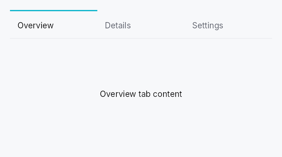
API reference
📖 Full rustdoc API for this module
pub type StaticContentFactory
Import: use teksilo::widgets::StaticContentFactory;
Closure that builds a static tab's content widget. Called once
per static tab — on the TabWidget's first build that includes
it. The resulting pane is then memoized: rebuilds caused by
adjacent dynamic-model mutations reuse the same pane WidgetId, so
internal state (focus, scroll, animation progress, …) survives.
#![allow(unused)] fn main() { pub type StaticContentFactory = Rc<dyn Fn(&TabHandle) -> Box<dyn Widget>>; }
pub struct TabWidget
Import: use teksilo::widgets::TabWidget;
All-in-one tabbed container. Builds a TabBar above a
Switcher of content panes, sharing one selection signal.
#![allow(unused)] fn main() { pub struct TabWidget { /* fields */ } }
Methods
pub fn new(selected: Signal<Option<TabId>>) -> Self
Construct an empty TabWidget. Selection is None until
the first static_tab(...) / dynamic_model(...) adds a
tab and the framework activates it.
pub fn enabled(mut self, enabled: impl Into<Prop<bool>>) -> Self (default: true)
Enable or disable the whole widget. A disabled TabWidget greys out
and stops accepting focus / selection / keyboard input
(arena-gated). Distinct from per-tab TabInfo::enabled.
pub fn bar_visibility(mut self, visibility: impl Into<Prop<TabBarVisibility>>) -> Self
Set the tab-strip visibility policy (default
TabBarVisibility::Always). Use TabBarVisibility::WhenMultiple
to hide the strip while a single tab is present, or
TabBarVisibility::Never when an external selector (e.g. a
docking activity rail) drives selection.
Accepts a plain TabBarVisibility or a Signal<TabBarVisibility>.
Bound reactively, the strip appears and disappears in place — the
TabWidget itself is never torn down, so per-tab content state
(caret, scroll offset, focus) survives the flip. That is the point
of binding rather than swapping two TabWidgets in a Switcher:
an app-level "hide the chrome" mode must not cost the user their
place in the document.
A derived signal (.map(..) / .zip(..)) is fine here: binding
resolves through to the mutable roots and never calls observe.
pub fn tab_bar_height(mut self, dp: f32) -> Self
Override the tab-strip height (its cross-axis extent). None /
unset keeps the style's editor_height (50 dp under Int UI). Use for a denser
strip — e.g. dock side panels.
pub fn compact_bar(self) -> Self
Shorthand for a compact (38 dp) tab strip — denser than the standard
50 dp editor strip. Equivalent to self.tab_bar_height(38.0).
pub fn vertical(self) -> Self
Configure the bar to render vertically — pills stacked
top-to-bottom on the leading edge, content fills the trailing
area (sidebar / IDE-perspective convention). Equivalent to
self.orientation(TabBarOrientation::Vertical).
pub fn horizontal(self) -> Self
Configure the bar to render horizontally — pills laid out left-to-right above the content (browser tab convention). This is the default.
pub fn orientation(mut self, orientation: impl Into<Prop<TabBarOrientation>>) -> Self
Set the bar orientation, statically or reactively. Passing a
Signal<TabBarOrientation> replaces the internal orientation
signal with the external one — lets a parent widget toggle
orientation reactively (e.g. a "View → Vertical Tabs" toolbar
button) without recreating the TabWidget.
pub fn static_tab(mut self, info: TabInfo, content: impl teksilo_core::IntoTeksiChild) -> Self
Add a static tab — fixed for the widget's lifetime, with a
pre-built content widget. The content is registered in the
arena on the TabWidget's first build and memoized —
subsequent rebuilds (caused by adjacent dynamic-model
mutations) reuse the same pane WidgetId, preserving any
internal state the content owns.
pub fn static_tabs<W>(self, tabs: impl IntoIterator<Item = (TabInfo, W)>) -> Self where W: teksilo_core::IntoTeksiChild,
Add several static tabs from an iterator of (info, content) pairs.
The loop form of static_tab. Reach for it when the
tab set is data-driven and each tab needs more than a title; when a title
is all it needs, tabs is shorter.
pub fn tab( self, label: impl Into<LocalizedString>, content: impl teksilo_core::IntoTeksiChild, ) -> Self
Ergonomic shorthand for a title-only static tab:
tab(label, content) is static_tab(TabInfo::new().title(label), content). label accepts tr!(...) (translated) or lit!(...).
This is the method the teksu! tab: slot lowers to
(tab: lit!("Overview"), Card { … }).
pub fn tabs<L, W>(self, tabs: impl IntoIterator<Item = (L, W)>) -> Self where L: Into<LocalizedString>, W: teksilo_core::IntoTeksiChild,
Add several title-only static tabs from an iterator of
(label, content) pairs.
The loop form of tab, and the usual one once the tab set
comes from data rather than being written out tab by tab.
pub fn tab_ids<L>(self, tabs: impl IntoIterator<Item = (L, WidgetId)>) -> Self where L: Into<LocalizedString>,
Several title-only static tabs from an iterator of (label, id) pairs.
tabs accepts ids too, so this is the spelling that names
the id type rather than a capability the other method lacks. Reach for it
when a loop has already registered its panes and holds the WidgetIds.
pub fn static_tab_factory( mut self, info: TabInfo, factory: impl Fn(&TabHandle) -> Box<dyn Widget> + 'static, ) -> Self
Add a static tab whose content is constructed by a factory
closure. The factory is called once — on the slot's first
build — and the resulting pane is memoized just like
static_tab.
pub fn static_tab_ids(self, tabs: impl IntoIterator<Item = (TabInfo, WidgetId)>) -> Self
Add several static tabs from an iterator of (info, content_id) pairs.
static_tabs accepts ids too; this is the spelling
that names the id type, for panes the caller has already registered.
pub fn static_tab_with_id( mut self, id: TabId, info: TabInfo, content: impl Widget + 'static, ) -> Self
Add a static tab with a caller-provided TabId — useful
when external code (an app-event handler, a session-restore
path, a deep link) needs to flip selection to this tab by id.
The pane is memoized like static_tab.
pub fn static_tab_factory_with_id( mut self, id: TabId, info: TabInfo, factory: impl Fn(&TabHandle) -> Box<dyn Widget> + 'static, ) -> Self
Factory variant of static_tab_with_id.
pub fn dynamic_tab<S: Any + 'static>( mut self, kind: &'static str, factory: impl Fn(&TabHandle, &S) -> Box<dyn Widget> + 'static, ) -> Self
Register a dynamic-tab content factory keyed by kind. The
<S> type parameter pins the payload type — the framework
downcasts handle.payload to S before calling the
factory and panics with a clear message on kind/payload
mismatch, so Any never leaks into app code.
pub fn dynamic_model(mut self, model: ListModel<TabHandle>) -> Self (default: None)
Connect the dynamic-tab data source. Mutations rebuild the dynamic-tab subtree; static tabs are unaffected.
pub fn tab_sizing(mut self, mode: TabSizing) -> Self
Set the per-tab sizing strategy as a static value. Internally
stores it as a Signal<TabSizing> so the widget can be
retrofitted to reactive control via Self::sizing
without breaking existing call sites.
pub fn sizing(mut self, sizing: impl Into<Prop<TabSizing>>) -> Self
Bind the per-tab sizing strategy, statically or reactively —
flipping a bound signal swaps between Shared / Independent / Fill
live, with no rebuild on the parent's part. The signal is bound at
BindingLevel::Rebuild inside build;
memoized panes survive the rebuild so per-tab state is
preserved.
pub fn tab_display(mut self, mode: impl Into<Prop<TabDisplayMode>>) -> Self
Choose what every tab shows — icon, label, or both
(TabDisplayMode), statically or reactively. A bound signal can be
flipped to swap icon / text / icon+text live (the bar rebuilds,
memoized panes survive), with no rebuild on the parent's part. Bound
at BindingLevel::Rebuild.
pub fn tab_background(mut self, color: impl Into<teksilo_core::color_prop::ColorProp>) -> Self
All-states shorthand for the per-tab background — every tab
(selected, idle, hovered) paints this unless a per-state override
is set. Accepts any Color, SurfaceRole, or Signal<Color> (via
ColorProp). Default is
transparent. To tint the bar's backdrop instead, use
bar_background.
pub fn selected_tab_background( mut self, color: impl Into<teksilo_core::color_prop::ColorProp>, ) -> Self (default: None)
Background for the selected tab. Falls back to
tab_background, then transparent.
pub fn hover_tab_background( mut self, color: impl Into<teksilo_core::color_prop::ColorProp>, ) -> Self (default: None)
Background for the hovered (non-selected) tab. Falls back to
tab_background, then transparent.
pub fn idle_tab_background( mut self, color: impl Into<teksilo_core::color_prop::ColorProp>, ) -> Self (default: None)
Background for idle tabs (not selected, not hovered). Falls back
to tab_background, then transparent.
pub fn bar_background(mut self, color: impl Into<teksilo_core::color_prop::ColorProp>) -> Self
Set the bar-strip backdrop fill (behind headers, slots, arrows), independent of the per-tab backgrounds. Default transparent.
pub fn tab_dividers(mut self) -> Self
Draw a 1 dp divider between consecutive tabs. Off by default.
pub fn tab_divider_color( mut self, color: impl Into<teksilo_core::color_prop::ColorProp>, ) -> Self
Like tab_dividers with an explicit colour
(Color, BorderRole, or
Signal<Color>). Implies tab_dividers().
pub fn active_indicator( mut self, position: teksilo_core::styles::TabIndicatorPosition, ) -> Self
Choose which edge the active-tab highlight indicator hugs. Default
TabIndicatorPosition::OuterEdge;
InnerEdge
puts it below the label (horizontal) / trailing edge (vertical).
pub fn selected_text_role(mut self, role: teksilo_tokens::TextRole) -> Self
Set the text role used for the label (and matching icon tint)
on the selected tab. Default: teksilo_tokens::TextRole::Primary
— the Int UI editor-strip convention. Override to e.g.
teksilo_tokens::TextRole::Accent when the strip sits over a
tinted surface.
pub fn idle_text_role(mut self, role: teksilo_tokens::TextRole) -> Self
Set the text role used for the label (and matching icon tint)
on idle tabs (not selected, not disabled). Default:
teksilo_tokens::TextRole::Secondary. Disabled tabs always read
as teksilo_tokens::TextRole::Disabled regardless of this
setting.
pub fn min_tab_width(mut self, dp: f32) -> Self
Minimum scrollable-tab width in logical pixels. Default
DEFAULT_MIN_TAB_WIDTH.
pub fn max_tab_width(mut self, dp: f32) -> Self
Maximum scrollable-tab width in logical pixels. Default
DEFAULT_MAX_TAB_WIDTH.
pub fn pinned_tab_width(mut self, dp: f32) -> Self
Fixed width for pinned (icon-only) tabs in logical pixels. Default
DEFAULT_PINNED_TAB_WIDTH.
pub fn show_scroll_arrows(mut self, on: bool) -> Self
Show or hide the leading/trailing scroll-arrow buttons when tabs overflow. Default (unset) uses the style's preference.
pub fn overflow_button(mut self, mode: TabOverflowButton) -> Self
When the trailing "show all tabs" overflow dropdown appears. Default
(unset) is TabOverflowButton::Auto — shown only when the tab headers
overflow the bar's viewport. See TabOverflowButton for
Always / Never.
pub fn show_overflow_dropdown(mut self, on: bool) -> Self
Convenience over overflow_button: true maps
to TabOverflowButton::Always, false to TabOverflowButton::Never.
pub fn reorderable(mut self, on: bool) -> Self
Allow drag-to-reorder of tabs within the bar. Default false.
Setting on_reorder implies reorderable(true).
pub fn on_close(mut self, f: impl Fn(TabId, &mut EventContext) + 'static) -> Self
Install a close-tab handler. Receives the TabId of the
closed tab (not its index — indices are presentation-only)
and the firing EventContext. The latter lets the handler
open a confirmation dialog
(MessageBox::question(...).present(ctx)), dispatch an
intent, or otherwise route the close request before mutating
the underlying model. To veto, do nothing in the handler; to
confirm-then-close, only call the model mutator on accept.
If unset, the default behavior is to remove the tab from
dynamic_model without a prompt
(static tabs cannot be closed by default).
pub fn on_reorder(mut self, f: impl Fn(TabId, usize, &mut EventContext) + 'static) -> Self
Install a reorder handler. Receives (moved_tab_id, destination_index, ctx) in the unified static-then-dynamic
ordering. The firing EventContext lets the handler
confirm or dispatch the reorder via a dialog / intent
before mutating the model. If unset, the default behavior
is to reorder within the dynamic region of
dynamic_model. Implies
reorderable(true).
pub fn on_pin_toggle(mut self, f: impl Fn(TabId, bool, &mut EventContext) + 'static) -> Self
Install a pin-toggle handler — receives (tab_id, new_pinned_flag, ctx) when the user drags a tab across the
pinned ↔ unpinned boundary. The firing EventContext
lets the handler confirm or dispatch the transition via a
dialog / intent. Apps decide whether to actually mutate the
tab's info.pinned.
pub fn accept_external_tabs(mut self, on: bool) -> Self
Opt into cross-TabWidget tab transfer (app-internal
drag-and-drop between two tabbed containers). When enabled,
this widget's dynamic tabs can be dragged out to any other
accepting TabWidget, and it accepts tabs dragged in from one,
painting an insertion-line indicator between its tabs.
The dragged TabHandle moves intact — its Rc<dyn Any>
payload (the heavy per-tab state) is preserved, not rebuilt —
so the receiving widget must register a content factory for the
tab's kind via dynamic_tab.
Static tabs are excluded: they have no factory on a
receiving widget, so they can never be transferred out (they
still reorder in place if reorderable).
By default, accepting a tab inserts it into this widget's
dynamic_model and transferring one out
removes it from this widget's model. Override either side with
on_tab_received /
on_transfer_out. Default: off.
pub fn on_tab_received( mut self, f: impl Fn(TabHandle, usize, &mut EventContext) + 'static, ) -> Self
Override the target-side behaviour when a foreign tab is
dropped onto this widget. Receives (handle, insertion_index, ctx) where insertion_index is within the dynamic tab
region. The app inserts the handle into its own model. Implies
accept_external_tabs(true).
If unset, the default inserts the handle into
dynamic_model at the drop position.
pub fn on_transfer_out(mut self, f: impl Fn(TabId, &mut EventContext) + 'static) -> Self
Override the source-side behaviour after one of this widget's
tabs has been accepted by another TabWidget. Receives the
transferred TabId; the app removes it from its own model.
Implies accept_external_tabs(true).
If unset, the default removes the tab from
dynamic_model.
pub fn on_external_drop( mut self, f: impl Fn(&DragPayload, usize, &mut EventContext) -> bool + 'static, ) -> Self
Accept non-tab drops onto the tab bar — an in-app foreign
drag (e.g. a file dragged from a TreeView, carrying app data)
or an OS file/text/URL drop. The bar shows an insertion-line
indicator while such a payload hovers; on drop, f runs with
the raw DragPayload, the insertion index within the dynamic
region, and the firing context. Inspect the payload
(get_typed::<T>() / files() / text() / uris()) and, e.g.,
push a new TabHandle into your dynamic_model;
return true if accepted.
This is the "open a dropped file as a tab" hook (VS Code style).
Independent of accept_external_tabs.
OS drops also require TeksiloAppBuilder::install_external_dnd().
pub fn bar_leading_slot(mut self, w: impl teksilo_core::IntoTeksiChild) -> Self
Place a widget on the leading edge of the tab strip (before the first tab). Memoized: registered once on first build, reused on rebuilds.
pub fn bar_trailing_slot(mut self, w: impl teksilo_core::IntoTeksiChild) -> Self
Place a widget on the trailing edge of the tab strip (after the last
tab and overflow button). Memoized like
bar_leading_slot.
pub enum TabBarVisibility
Import: use teksilo::widgets::TabBarVisibility;
Controls whether a TabWidget's tab strip is shown.
The default is Always — fully
back-compatible with the historical behaviour. WhenMultiple hides the strip while a single tab
is present (the content fills the whole area) and shows it again
once a second tab appears; the evaluation is reactive because a
dynamic-model mutation already rebuilds the TabWidget.
Never always hides the strip (the
selector lives elsewhere — e.g. a docking activity rail).
#![allow(unused)] fn main() { pub enum TabBarVisibility { /* variants */ } }
Variants
Always— Always render the tab strip (historical default).WhenMultiple— Show the strip only when two or more tabs are present.Never— Never render the strip; the content fills the whole area.
pub type ContextMenuFactory
Import: none — ContextMenuFactory is public in a private module of teksilo-widgets and nothing re-exports it.
A reusable widget factory the framework calls every time a context menu opens. Returns a fresh widget instance each call (the framework can't reuse a single widget across multiple openings).
Same shape as the framework's
teksilo_core::widget_builder::ContextMenuFactory — receives the
click position (in tab-local coords) and a full
EventContext, and returns Some(menu) to mount or None to
decline. The Rc wrapping is a tab-widget convenience: the
delegate clones the factory per-tab without reallocating.
#![allow(unused)] fn main() { pub type ContextMenuFactory = Rc<dyn Fn(Point, &mut EventContext) -> Option<Box<dyn Widget>>>; }
pub enum TabBarOrientation
Import: none — TabBarOrientation is public in a private module of teksilo-widgets and nothing re-exports it.
Bar orientation. Selects between a horizontal row of tabs (default for browser-style document tabs) and a vertical column of pills (sidebar / IDE perspective convention).
#![allow(unused)] fn main() { pub enum TabBarOrientation { /* variants */ } }
Variants
Horizontal— Tabs flow left-to-right in a horizontal row. Scroll axis is horizontal; a vertical wheel maps to horizontal scroll (Firefox / Chrome convention) whenvertical_wheel_scrolls_horizontallyis on.Vertical— Tabs flow top-to-bottom in a vertical column. Scroll axis is vertical; vertical wheel scrolls vertically. Pinned tabs render in a non-scrolling strip at the top of the column.
pub enum TabSizing
Import: none — TabSizing is public in a private module of teksilo-widgets and nothing re-exports it.
How wide each tab is: shared across all unpinned tabs, chosen per-tab from content, or stretched to fill the bar.
Shared and Independent size the layout axis (width in
horizontal bars, height in vertical bars); Fill sizes the tab's
width in both orientations — see each variant. See the module
docs of crate::tab_widget for how this is applied per
orientation. In wrap (multi-line horizontal) mode Independent is
forced regardless of this setting — equal-width tabs in a wrapping
row look like a tile grid and lose the bookmark-bar / pill-strip
aesthetic.
#![allow(unused)] fn main() { pub enum TabSizing { /* variants */ } }
Variants
Shared— All non-pinned tabs share the same extent on the layout axis. The available region is divided equally across the unpinned count, then clamped to[min_tab_extent, max_tab_extent]. Below the min, content overflows into scroll. Above the max, slack is left as empty space at the trailing edge. In a vertical bar the layout axis is the pill height, so this yields uniform pills whose width fits the widest label (clamped to[min_tab_width, max_tab_width]).Independent— Each tab sizes to its content (icon + label + slots), clamped to[min_tab_extent, max_tab_extent]. Truncation via ellipsis when content hitsmax.Fill— Tabs stretch to the full width the bar is offered — no slack left over, no fit-to-content shrinking. The nav-rail / segmented-control look (VS Code's settings sidebar, a full-bleed tab strip). - Horizontal: the viewport width is divided equally across the unpinned tabs andmax_tab_widthis not applied, so the strip is filled edge to edge instead of leaving trailing slack.min_tab_widthstill holds — below it the headers overflow into scroll rather than squeezing to nothing. - Vertical: every pill takes the bar's full proposed width (the widest-label clamp is bypassed), so the tabs span the sidebar. Pill height is unchanged (the intrinsiceditor_height, or thetab_bar_heightoverride). With no width proposed at all (an unbounded measure — aCenter, anHStackasking for the natural size), there is nothing to fill: a vertical bar falls back to theSharedfit-to-widest-label width. Give the bar a bounded width (aFixedSize, anExpandin a sized parent) forFillto have any effect.
pub enum TabDisplayMode
Import: none — TabDisplayMode is public in a private module of teksilo-widgets and nothing re-exports it.
Bar-level control over what each tab shows — its icon, its label, or both.
Each tab still declares both a title and (optionally) an icon; this mode decides which are painted, so a caller can offer a "tab size" toggle (VS Code's activity-bar / panel convention) without rebuilding the tabs by hand. Icon-only tabs size to their icon (they don't pad out to a text width), and the full title is promoted to the hover tooltip.
#![allow(unused)] fn main() { pub enum TabDisplayMode { /* variants */ } }
Variants
Auto— Render each tab exactly as itsTabInfodeclares — the title if set, the icon if set. The default; preserves per-tabno_title()control.Text— Title only — icons are hidden even when present.Icon— Icon only — the title becomes the hover tooltip. A tab with no icon falls back to its title's initial letter so the mode is never blank.IconText— Icon + title.
pub enum TabOverflowButton
Import: none — TabOverflowButton is public in a private module of teksilo-widgets and nothing re-exports it.
When the trailing "show all tabs" overflow dropdown button appears.
The dropdown is a chevron-down PopoverIconButton whose popover lists every
tab (a jump-to menu for tabs scrolled out of view). This mode governs when
the button itself is shown — independent of whether the tabs actually
overflow the viewport (which is what drives the scroll arrows).
#![allow(unused)] fn main() { pub enum TabOverflowButton { /* variants */ } }
Variants
Auto— Show the button only when the tab headers overflow the bar's viewport — i.e. exactly when there is something scrolled out of view, the same condition that auto-reveals the scroll arrows. The default: the button stays out of the way until it is useful.Always— Always show the button whenever the bar has at least one tab, even when every tab is already visible (a persistent jump-to affordance).Never— Never show the button.
pub struct TabDelegate
Import: none — TabDelegate is public in a private module of teksilo-widgets and nothing re-exports it.
Resolves per-tab UI from a model item.
Required: a label callback. Everything else is optional and
defaults to "no leading icon, no slots, no tooltip, not closable,
not pinned, enabled".
#![allow(unused)] fn main() { pub struct TabDelegate<T: 'static> { /* fields */ } }
Methods
pub fn new(label: impl Fn(usize, &T) -> LocalizedString + 'static) -> Self
Construct from the label callback. Every other field defaults to its identity behavior.
pub fn icon(mut self, f: impl Fn(usize, &T) -> Option<IconWidget> + 'static) -> Self
Per-tab leading icon (rendered before the label).
pub fn leading(mut self, f: impl Fn(usize, &T) -> Option<Box<dyn Widget>> + 'static) -> Self
Per-tab leading slot (between the icon and label, or before the label when no icon is present).
pub fn trailing(mut self, f: impl Fn(usize, &T) -> Option<Box<dyn Widget>> + 'static) -> Self
Per-tab trailing slot (between the label and the close button, or at the trailing edge when no close button is present).
pub fn context_menu( mut self, f: impl Fn(usize, &T) -> Option<ContextMenuFactory> + 'static, ) -> Self
Per-tab context menu factory. Activated by right-click /
long-press / accesskit::Action::ShowContextMenu.
The closure runs once per build and returns an optional
ContextMenuFactory. The factory itself is called every
time the menu opens, returning a fresh menu widget each call —
the framework cannot reuse a single widget instance across
multiple openings.
pub fn closable(mut self, f: impl Fn(usize, &T) -> bool + 'static) -> Self
Per-tab closable flag. When true, the tab gets a trailing
close button and middle-click / Delete close affordances.
Pinned tabs suppress the close button regardless of this flag
(pinned tabs only close via the context menu — Firefox
convention).
pub fn pinned(mut self, f: impl Fn(usize, &T) -> bool + 'static) -> Self
Per-tab pinned flag. Pinned tabs render in a leading non-scrolling region with a fixed icon-only width.
pub fn enabled(mut self, f: impl Fn(usize, &T) -> bool + 'static) -> Self
Per-tab enabled flag. Disabled tabs are visible but not activatable, skipped by keyboard navigation, and excluded from the close / pin / context-menu affordances.
pub fn tooltip(mut self, f: impl Fn(usize, &T) -> Option<LocalizedString> + 'static) -> Self
Per-tab tooltip text. Shown on hover via the existing
WidgetBuilder::tooltip mechanism.
pub fn rich_tooltip_key(mut self, f: impl Fn(usize, &T) -> Option<String> + 'static) -> Self
Per-tab rich-tooltip registry key. Returning Some(key) makes
the tab show a rich tooltip resolved against
TooltipRegistry.
pub fn rich_tooltip_content_with( mut self, f: impl Fn(usize, &T) -> Option<TooltipContent> + 'static, ) -> Self
Per-tab inline rich-tooltip content. Skips the registry — useful
for tooltips whose body depends on T's state.
pub fn composite_tooltip_with( mut self, f: impl Fn(usize, &T) -> Option<Box<dyn Widget>> + 'static, ) -> Self
Per-tab composite-tooltip body factory. Returning
Some(boxed_widget) makes the tab show a composite tooltip
containing that subtree. The closure runs at tab-header build
time (and on every rebuild after data changes), so the body
can carry per-tab dynamic state.
pub const STATIC_KIND
Import: none — STATIC_KIND is public in a private module of teksilo-widgets and nothing re-exports it.
Sentinel kind reserved for static tabs accumulated via
TabWidget::static_tab.
Application-level kind strings must not collide with this
value — the framework panics with a clear message at registration
if dynamic_tab is
called with this name.
#![allow(unused)] fn main() { pub const STATIC_KIND: &str = "__static__"; }
pub struct TabHandle
Import: none — TabHandle is public in a private module of teksilo-widgets and nothing re-exports it.
One tab's identity, presentation, and state pointer.
Clone is cheap: TabInfo is shallow (the icon is an
Rc<dyn Fn() -> IconWidget> factory) and payload is an
Rc<dyn Any>.
#![allow(unused)] fn main() { pub struct TabHandle { /* fields */ } }
Fields
id:TabIdinfo:TabInfokind:&'static strpayload:Rc<dyn Any>
Methods
pub fn dynamic<S: Any + 'static>( id: TabId, kind: &'static str, info: TabInfo, state: S, ) -> Self
Construct a handle for the dynamic-tab path. The kind
must match a
dynamic_tab::<S>
registration on the TabWidget
where this handle lands; the framework downcasts
payload to S before calling the registered factory and
panics with a clear message on type mismatch.
pub fn dynamic_shared( id: TabId, kind: &'static str, info: TabInfo, payload: Rc<dyn Any>, ) -> Self
Construct a handle for the dynamic-tab path with a
pre-built Rc<dyn Any> payload — useful when several
handles share the same underlying state object.
pub struct TabId
Import: none — TabId is public in a private module of teksilo-widgets and nothing re-exports it.
Stable identity of a tab. Cheap to copy; persists across model reorders, rebuilds, and reorders triggered by drag-and-drop.
#![allow(unused)] fn main() { pub struct TabId(NonZeroU64); }
Methods
pub fn fresh() -> Self
Allocate a new, never-before-seen id. Backed by a monotonic global counter — overflow is theoretically possible after 2^64 calls, at which point the universe has had bigger problems.
pub fn from_raw(value: NonZeroU64) -> Self
Wrap an externally-allocated key. Use this when the tab's
identity comes from an existing app-side store (document
UUID, file path hash, etc.) — calling TabId::fresh would
allocate a new id every restart, breaking session restore.
pub fn raw(self) -> NonZeroU64
The underlying non-zero u64. Useful when persisting tabs
across sessions: serialize this, restore via from_raw.
pub type IconFactory
Import: none — IconFactory is public in a private module of teksilo-widgets and nothing re-exports it.
Reusable factory for an IconWidget. Boxed in Rc so
TabInfo is Clone without forcing IconWidget: Clone.
#![allow(unused)] fn main() { pub type IconFactory = Rc<dyn Fn() -> IconWidget>; }
pub struct TabInfo
Import: none — TabInfo is public in a private module of teksilo-widgets and nothing re-exports it.
Per-tab presentation metadata. Build with TabInfo::new and
fluent setters.
#![allow(unused)] fn main() { use teksilo_widgets::tab_widget::TabInfo; use teksilo_widgets::primitives::IconWidget; use teksilo_i18n::lit; let _info = TabInfo::new() .title(lit!("Welcome")) .icon(|| IconWidget::checkmark(16.0)) .closable(true); }
#![allow(unused)] fn main() { pub struct TabInfo { /* fields */ } }
Methods
pub fn new() -> Self
Empty defaults: no title, no icon, no tooltip, not closable, not pinned, enabled.
pub fn context_menu( mut self, f: impl Fn(Point, &mut EventContext) -> Option<Box<dyn Widget>> + 'static, ) -> Self
Attach a per-tab context menu (right-click the tab header). The
factory receives the click position (tab-local) and a full
EventContext, and returns Some(menu) to mount or None to
decline (falling through to an ancestor). Cloned per header build.
pub fn title(mut self, t: impl Into<LocalizedString>) -> Self (default: None)
Set the tab's title. Accepts tr!(...), a literal string,
or any value implementing Into<LocalizedString>.
None means icon-only (the pinned-tab presentation).
pub fn no_title(mut self) -> Self
Untitled — useful for icon-only tabs even when not pinned.
pub fn icon(mut self, factory: impl Fn() -> IconWidget + 'static) -> Self
Set the leading icon via a factory closure. The closure is
called each time the TabHeader
is built — typically once per tab lifetime, plus any rebuild
triggered by data-source mutations.
pub fn tooltip(mut self, t: impl Into<LocalizedString>) -> Self
Tooltip text shown on hover. If unset and the tab is
pinned, the framework promotes title
to the tooltip — pinned tabs render icon-only and otherwise
have no way for the user to identify them.
pub fn rich_tooltip(mut self, key: impl Into<String>) -> Self
Attach a rich tooltip resolved from the app-wide tooltip
registry. See Button::rich_tooltip.
pub fn rich_tooltip_content(mut self, content: crate::tooltip::TooltipContent) -> Self
Attach a rich tooltip driven by inline TooltipContent.
pub fn composite_tooltip<W>(mut self, factory: impl Fn() -> W + 'static) -> Self where W: Widget + 'static,
Attach a composite tooltip — third tier, hosting an arbitrary
widget tree. The factory closure is called each time the
tab's header rebuilds, so the body picks up theme / locale
changes naturally without retaining state across rebuilds.
pub fn closable(mut self, b: bool) -> Self
Whether the tab shows a close button + responds to
middle-click. Default: false.
pub fn pinned(mut self, b: bool) -> Self
Whether the tab renders in the leading pinned strip
(icon-only, fixed-width, no close button — Firefox / Chrome
convention). Default: false.
pub fn enabled(mut self, enabled: impl Into<teksilo_core::signal::Prop<bool>>) -> Self
Whether the tab can be activated. Disabled tabs render but
are skipped by keyboard navigation, can't be clicked, and
don't get the close button. Default: true.
Forwarded to the arena via ctx.enabled_when(header_id, false)
at build time when false. Ancestor-driven disable (e.g. a
disabled TabBar) ANDs with this flag automatically.
pub fn focusable_panel(mut self, b: bool) -> Self
Make the tab's content pane itself focusable, so keyboard users
can press Tab from the selected tab header and land inside
the panel.
Opt in for panels you know contain no focusable descendants —
a static text-only "About" tab, a chart-only metrics tab.
Panels that already host a Button, TextInput, ListView,
or any other interactive widget don't need this: focus will
flow naturally into the descendant.
ARIA: this implements the tabindex="0" requirement that an
empty tabpanel must be focusable so its content can be read
by screen readers in browse mode. AccessKit has no tabindex
field; the framework advertises Action::Focus on the panel
node to signal focusability to AT. Default: false.
TextInput
TextInput — styled single-line text field composite.
Public types
| Kind | Name |
|---|---|
enum | ValidationState — Validation state for the text input field |
struct | TextInput — Styled single-line text input composite |
Public functions
TextInput
Detailed description
Wraps the TextInputField
editing primitive in a bordered, padded frame with placeholder
overlay, validation, optional clear button, and leading/trailing
slots. All actual text editing is delegated to the field: every
configuration method here has a direct counterpart on the
primitive.
Most applications want TextInput. Choose
TextInputField directly
when you're building a composite of your own that already
supplies its frame — SpinBox is the canonical in-tree example.
Example
let search = ctx.signal(String::new());
TextInput::new(search.clone())
.placeholder("Search...")
.show_clear_button(true)
.leading_slot(IconWidget::from_svg(SEARCH_ICON))
.on_submit_fn(|ctx| ctx.send_intent(AppIntent::Search))
Appearance
text_style— the size, family and weight of the typed text and of the placeholder, from aTextStyleRole(follows the theme) or a fixedTextStyle. The field's height follows the style's line, so a small style gives a short field and a large one a tall field.text_alignment— where a text narrower than the field sits: start, centre or end, mirrored in a right-to-left layout. A longer text scrolls as usual.text_color— the colour of the text and the caret. A disabled field still greys out. For one colour at rest and another while editing, map the field's focus:input.handle().focused_signal().map(|f| if *f { TextRole::Primary } else { TextRole::Secondary }).min_height— replaces the minimum height the style and the density would give the field. Below 24 dp the field fails WCAG 2.5.8 unless the app offers a larger target for it.
None of them is set by default, and the field then looks as it always has.
Touch and pen
The trailing clear affordance is 16 dp of paint and a 24 dp target: raising
its box would widen every field in the workspace at Compact, so the
shortfall is made up between the pointer and the arena through
Widget::hit_outset — declared by the slot that takes the tap, because the
ring around an outset resolves to the declaring node rather than to a
descendant, and by a direct child of the row, because an outset never
escapes its parent. The slot keeps its 16 dp while the affordance is hidden
so the row does not jump, and withdraws its outset while there is nothing to
clear. The caret and selection behaviour of the field itself belongs to the
touch-text package.
Density
The picture above is the widget at TargetDensity::Compact, the mouse-and-keyboard ladder. Below is the same subject on the same canvas with only the ladder changed, so what moves is the density and nothing else — where the subject no longer fits, that is what the denser targets cost it at that size. See docs/density-and-targets.md.
Touch
API reference
📖 Full rustdoc API for this module
pub enum ValidationState
Import: use teksilo::widgets::ValidationState;
Validation state for the text input field.
Drives the inline feedback strip and border tint of TextInput.
#![allow(unused)] fn main() { pub enum ValidationState { /* variants */ } }
Variants
None— No validation message — the field is pristine or valid.Error(LocalizedString)— The committed value is invalid;LocalizedStringis shown in red below the field.Warning(LocalizedString)— The committed value is suspicious but accepted;LocalizedStringis shown as a warning.Corrected(LocalizedString)— Last commit was auto-corrected; the field's value has already been replaced with the normalized form. The composite renders the message in secondary text and tints the border accent briefly (decay-managed by the framework's frame loop, not a concern of this enum).
pub struct TextInput
Import: use teksilo::widgets::TextInput;
Styled single-line text input composite.
See the module-level documentation for usage examples.
#![allow(unused)] fn main() { pub struct TextInput { /* fields */ } }
Methods
pub fn new(text: Signal<String>) -> Self
Construct a new text input bound to text.
pub fn variant(mut self, variant: TextInputVariant) -> Self
Pick a Tier-1 design-language variant
(TextInputVariant::Outlined / Filled / Underline / Bare).
The IntUI default (crate::styles::RecipeTextInputStyle) honours
Outlined, Filled, and Bare; Underline falls back to
Outlined until per-side stroke recipes land.
pub fn style(mut self, style: impl TextInputStyle) -> Self
Override the active TextInputStyle for this widget instance
only. The widget keeps responsibility for caret blinking, IME
composition, the placeholder layering, the leading / trailing
slots and the validation strip — the style only paints the
frame (border / fill / corner radius).
pub fn placeholder(mut self, text: impl Into<LocalizedString>) -> Self
Set the placeholder text shown when the field is empty.
pub fn label(mut self, label: impl Into<LocalizedString>) -> Self
Accessible name for the field.
Applied to the inner TextInputField — the node that carries
Role::TextInput, holds focus, and reports the document's value.
It deliberately does not go on the composite's outer node: that
node is a Role::GenericContainer, which
accesskit_consumer::common_filter drops from the filtered tree
unconditionally, so a name placed there would be invisible to every
screen reader on every platform.
Stays locale-reactive: a tr!(...) name is re-resolved when the
locale changes, without a rebuild.
pub fn enabled(mut self, enabled: impl Into<Prop<bool>>) -> Self (default: true)
Set the enabled state, statically or reactively. Forwarded to the
arena and the inner TextInputField at build time.
pub fn read_only(mut self, read_only: bool) -> Self (default: false)
Set the field read-only: text is selectable and copyable but not editable.
pub fn max_length(mut self, max_length: usize) -> Self (default: None)
Limit the number of Unicode scalar values the field will accept.
pub fn show_clear_button(mut self, show: bool) -> Self
Show or hide the trailing ✕ button that clears the field text. Default: hidden.
pub fn min_width(mut self, w: f32) -> Self
Override the frame's intrinsic minimum width (default 65 dp). Use to express a design width for date / time / phone-number fields whose content is well-known and whose collapse to the generic 65 dp floor would look out of place.
pub fn min_height(mut self, height: f32) -> Self
Override the field's minimum height, in logical pixels.
By default the field is at least the style's control height — 28 dp
in the IntUI style, raised to the density's target size — or, when a
text_style is set, at least the density's target
size, with the style's line deciding the rest. This replaces that
floor with height, as given: the field still grows to fit its text,
and is centred in a taller box. The value reaches the active
TextInputStyle through TextInputStyleConfig::min_height; a
style that ignores it keeps its own minimum.
The field is the pointer target: a press anywhere in it places the caret. Below 24 dp it fails WCAG 2.2 SC 2.5.8 Target Size (Minimum) unless the app gives the same function a larger target elsewhere — an enclosing row that focuses the field when pressed, say.
pub fn text_style(mut self, style: impl Into<TextStyleProp>) -> Self (default: None)
The style the typed text is shaped in: its size, family and weight.
Forwarded to TextInputField::text_style, where the details live,
and given to the placeholder too, so the hint and the text it stands in
for read alike. The field's height follows the style's line: an 11 px
style gives a short field, a large one a tall field (see
min_height for the floor). A role tracks the
theme; the global text scale multiplies the size.
pub fn text_alignment(mut self, alignment: HAlignment) -> Self (default: None)
Where the text — and the placeholder — sits when it is narrower than
the field: at its start, in the middle, or at its end, mirrored in a
right-to-left layout. Text wider than the field scrolls as usual.
Forwarded to TextInputField::text_alignment.
pub fn text_color(mut self, color: impl Into<ColorProp>) -> Self (default: None)
The colour of the typed text and of the caret: a colour, a theme role
or a signal of either, resolved every paint. A disabled field still
paints the theme's disabled text colour. Forwarded to
TextInputField::text_color.
A different colour at rest and while editing follows the field's
focus, which handle exposes before the input is
built:
let input = TextInput::new(text);
let focused = input.handle().focused_signal();
let input = input.text_color(focused.map(|f| {
if *f { TextRole::Primary } else { TextRole::Secondary }
}));
pub fn leading_slot(mut self, widget: impl Widget + 'static) -> Self
Set an arbitrary widget in the leading slot (before the text area).
Typically an IconButton or IconWidget.
pub fn trailing_slot(mut self, widget: impl Widget + 'static) -> Self
Set an arbitrary widget in the trailing slot (after the text area).
Typically an IconButton or IconWidget.
pub fn on_submit_fn(mut self, f: impl Fn(&mut EventContext) + 'static) -> Self
Closure invoked on Enter. Forwarded to TextInputField.
pub fn on_access_set_value( mut self, f: impl Fn(&str, &mut EventContext) -> bool + 'static, ) -> Self
Handle an assistive technology's whole-value write, given the string it
set. Forwarded 1:1 to TextInputField::on_access_set_value, where the
reasoning lives. Composites whose text projects a typed value —
SpinBox, the date and time editors — install one.
pub fn on_blur_fn(mut self, f: impl Fn(&mut EventContext) + 'static) -> Self
Closure invoked on focus loss. Forwarded to TextInputField.
pub fn char_filter(mut self, f: impl Fn(char) -> bool + 'static) -> Self
Per-character input-filter predicate. Forwarded to
TextInputField.
pub fn suffix(mut self, text: impl Into<String>) -> Self (default: String::new())
Non-editable trailing string (Qt's QSpinBox::suffix).
Forwarded to TextInputField.
pub fn input_mask(mut self, mask: impl Into<String>) -> Self (default: None)
Install an input mask (Qt grammar). Forwarded 1:1 to
TextInputField::input_mask. Composing widgets like
DateEdit use this to project the date format pattern
onto the editing surface.
pub fn input_purpose( mut self, purpose: crate::primitives::text_input_field::InputPurpose, ) -> Self (default: crate::primitives::text_input_field::InputPurpose::Normal)
Declare the field's semantic InputPurpose
(WCAG 1.3.5), forwarded to the inner TextInputField to select a
specialised AT role (e.g. Role::EmailInput).
pub fn active_descendant(mut self, active: Signal<Option<WidgetId>>) -> Self (default: None)
Publish active_descendant on the inner field, pointing at the row a
separate listbox is currently highlighting (the ARIA combobox pattern).
Forwarded 1:1 to TextInputField::active_descendant, which is where
it has to land: AT follows the focused node's active descendant, and
the inner field is the focusable one.
pub fn controls(mut self, listbox: Signal<Option<WidgetId>>) -> Self (default: None)
Publish a controls relation to the listbox this input drives.
Forwarded 1:1 to TextInputField::controls.
pub fn validator( mut self, f: impl Fn(&str) -> crate::primitives::text_input_field::ValidationOutcome + 'static, ) -> Self
Install a commit-time validator. Forwarded 1:1 to
TextInputField::validator. Pair with
Self::validation_feedback_signal (or
Self::validation_feedback) to surface the outcome
in the inline strip.
pub fn caret_position(&self) -> Signal<usize>
Reactive caret position. Mirrors the inner field's
TextInputField::caret_position after build. Capture
before ctx.add(text_input) — used by composing widgets
(DateEdit segment-stepping) that need to know which
segment Up/Down should step.
pub fn handle(&self) -> crate::primitives::TextFieldHandle
A live handle on the inner field — its text-editing commands, for a host outside the widget.
Mirrors TextInputField::handle, and exists for the same reason: an
application that routes Undo, Cut, Copy, Paste and Select All to
"whichever text surface holds the caret" must be able to reach every
such surface. A TextInput that could not be reached would silently
lose its own Ctrl+Z to whatever the host routed the chord at instead.
Like caret_setter, safe to take before build:
the handle reaches the field through a slot the widget fills in.
pub fn field_id(&self) -> std::rc::Rc<std::cell::Cell<Option<WidgetId>>>
The arena id of the inner field: the node that holds focus, carries
Role::TextInput and reports the document's value.
A TextInput is a composite whose outer node is a
Role::GenericContainer. That node is neither focusable nor present in
the filtered accessibility tree, so a host that has to name the focus
target cannot use the id ctx.add returned it. Two cases need the
name: a form sending focus back to the field a validator refused, and a
modal whose own initial_focus_hint picks one field out of several.
Empty until build runs, like caret_setter;
take the handle before ctx.add(text_input) and read it after.
A host that only needs "focus this input, whichever node that is" wants
EventContext::request_focus_into on the outer id instead, and no
handle at all.
pub fn caret_setter(&self) -> std::rc::Rc<dyn Fn(usize)>
Programmatic caret setter. Mirrors the inner field's
TextInputField::caret_setter. Returns a closure that
is a no-op until build runs; afterwards it walks the
inner field's state and moves the document cursor. Capture
before ctx.add(text_input).
pub fn validation_feedback_signal(&self) -> Signal<ValidationFeedback>
Reactive published validation feedback. Mirrors the inner
field's TextInputField::validation_feedback_signal
after build. Composing widgets observe this to compose
feedback across multiple fields (range editor's
worse-of-two ladder, etc.).
pub fn validation(mut self, validation: impl Into<Prop<ValidationState>>) -> Self
Bind an external ValidationState signal directly (e.g. when
validation runs server-side), or set a fixed initial value. Use
validation_feedback
when wiring a local validator's output.
A bound Signal becomes the shared write target used internally
(by the validator-feedback bridge) and externally by the caller —
preserving the two-way channel this method has always offered. A
static value seeds a fresh, unshared signal.
pub fn validation_feedback(mut self, feedback: Signal<ValidationFeedback>) -> Self
Bridge a Signal<ValidationFeedback> (typically from a
validator-equipped widget like DateEdit::validation_feedback_signal
or a custom TextInputField) into this composite's
ValidationState. The feedback is mirrored on every change,
translating outcomes into the composite's display vocabulary:
Pristine/Valid→ValidationState::NoneCorrected { message, .. }→ValidationState::Corrected(message)Invalid { message }→ValidationState::Error(message)
pub fn tooltip(mut self, text: impl Into<LocalizedString>) -> Self
Attach a plain tooltip. Accepts tr!(...) or lit!(...).
pub fn rich_tooltip_key(mut self, key: impl Into<String>) -> Self
Attach a registry-driven rich tooltip by key. Mutually exclusive with
tooltip and composite_tooltip (last call wins).
pub fn rich_tooltip(mut self, content: tooltip::TooltipContent) -> Self
Attach an inline rich tooltip from a pre-built tooltip::TooltipContent.
Mutually exclusive with tooltip and composite_tooltip (last call wins).
pub fn rich_tooltip_content(mut self, content: crate::tooltip::TooltipContent) -> Self
Attach an inline rich tooltip from a pre-built tooltip::TooltipContent.
Canonical alias for Self::rich_tooltip — matches the name used by
Button, ComboBox, and other widgets. Mutually exclusive with
tooltip and composite_tooltip (last call wins).
pub fn composite_tooltip( mut self, content: impl teksilo_core::widget::Widget + 'static, ) -> Self
Attach a composite tooltip — third tier, hosting an arbitrary
widget tree. See Button::composite_tooltip.
pub fn text(&self) -> Signal<String>
The reactive text content signal.
TextInputField
TextInputField — editable single-line text surface primitive.
Public types
| Kind | Name |
|---|---|
enum | InputPurpose — The semantic purpose of a text field, surfaced to assistive technology as a specialised AccessKit role (WCAG 1.3.5 Identify Input Purpose / EN 301 549) |
enum | EchoMode — How a secure (TextInputField::secure) field echoes typed characters |
enum | AtRevealPolicy — How a revealed secure field reports to assistive technology |
struct | TextInputField — Editable single-line text surface primitive |
struct | TextFieldHandle — A live handle on a TextInputField — its text-editing commands, for a caller outside the widget |
enum | ValidationOutcome — What a validator returns for a given commit attempt |
enum | ValidationFeedback — What composites render |
Public functions
TextInputField
TextFieldHandle
| Returns | Function |
|---|---|
| Constructors | |
Self | detached() |
| Methods | |
Signal<bool> | focused_signal() |
bool | is_live() |
String | text() |
bool | has_selection() |
bool | allows_copy() |
bool | is_read_only() |
select_all() | |
copy(ctx: &EventContext) | |
cut(ctx: &EventContext) | |
paste(ctx: &EventContext) | |
undo() | |
redo() | |
Signal<bool> | can_undo() |
Signal<bool> | can_redo() |
ValidationFeedback
| Returns | Function |
|---|---|
| Methods | |
bool | is_invalid() |
bool | is_corrected() |
Option<String> | message() |
Detailed description
This is the raw editing primitive that powers the styled
TextInput composite and any
other widget that needs inline editable text — SpinBox being
the primary second consumer.
Unlike TextInput, TextInputField paints no frame, no
placeholder overlay, no validation border, and hosts no trailing
slots: it is the focusable text area only. Compose it yourself
with RectWidget, Padding, icons, clear buttons, etc. to
build a styled control. Focus indication is the composite's
responsibility — the Int UI convention is to thicken the
enclosing frame's border to focus_ring_width and recolor it
to the accent focus-ring color.
Features:
- Bound
Signal<String>for two-way text binding. - Full keyboard editing (arrow keys, Home/End, Backspace/Delete, Ctrl+X/C/V, Ctrl+A, Ctrl+Z/Y), IME commit, and pointer caret positioning and drag-select.
- Optional per-character input filter
(
TextInputField::char_filter), max-length cap (TextInputField::max_length), and read-only mode (TextInputField::read_only). - Commit hooks: Enter fires
on_submit_fnand focus loss fireson_blur_fn. - Non-editable trailing
suffix, rendered flush-right inside the field's bounds (Qt'sQSpinBox::suffix). Caret cannot enter it; clicks past the text end clamp to the last character. - Appearance:
text_styleshapes the text in aTextStyleRoleor aTextStyle(size, family, weight) and sizes the field to one line of it;text_alignmentplaces a text narrower than the field at its start, centre or end;text_colorcolours the text and the caret, from a colour, a role or a signal. All three are unset by default, and the field then looks as it always has. - Right-click context menu (Cut / Copy / Paste / Select All).
- AccessKit
Role::TextInputwith value, selection, and character/word boundary metadata.
Example
let text = ctx.signal(String::new());
ctx.add(
TextInputField::new(text.clone())
.placeholder("Enter a name…")
.char_filter(|c| !c.is_ascii_digit())
.on_submit_fn(|ctx| ctx.send_intent(MyIntent::Save)),
);
API reference
📖 Full rustdoc API for this module
pub enum InputPurpose
Import: use teksilo::widgets::InputPurpose;
The semantic purpose of a text field, surfaced to assistive technology as a specialised AccessKit role (WCAG 1.3.5 Identify Input Purpose / EN 301 549).
This is the in-framework-achievable part of SC 1.3.5: a screen reader
announces "email, edit text" instead of a generic "edit text". The FULL
HTML autocomplete-token vocabulary (given-name, postal-code,
cc-number, …) that drives OS/browser autofill has no representation in
AccessKit 0.24 and therefore cannot be exposed from Teksilo — see
docs/a11y/a11y_issues.md. Password entry is configured via
TextInputField::secure, not here.
#![allow(unused)] fn main() { pub enum InputPurpose { /* variants */ } }
Variants
Normal— Ordinary free text (Role::TextInput).Email— Email address (Role::EmailInput).Phone— Telephone number (Role::PhoneNumberInput).Url— URL (Role::UrlInput).Number— Numeric entry — e.g. a quantity or code (Role::NumberInput).Search— Search query (Role::SearchInput).
pub enum EchoMode
Import: use teksilo::widgets::EchoMode;
How a secure (TextInputField::secure) field echoes typed
characters. Mirrors Qt's QLineEdit::EchoMode.
#![allow(unused)] fn main() { pub enum EchoMode { /* variants */ } }
Variants
Masked— Replace every character with the echo glyph (default'•'). The plaintext stays in the boundSignal<String>but never reaches the text engine while masked.NoEcho— Show nothing at all — not even the length. The caret stays at the start. Qt'sNoEcho.RevealWhileTyping— Show plaintext while the field is focused (being edited) and re-mask on blur. Qt'sPasswordEchoOnEdit.
pub enum AtRevealPolicy
Import: use teksilo::widgets::AtRevealPolicy;
How a revealed secure field reports to assistive technology.
#![allow(unused)] fn main() { pub enum AtRevealPolicy { /* variants */ } }
Variants
SwapRole— When revealed, expose the field as a normalRole::TextInputcarrying the plaintext value — matching what is visibly on screen and the webtype=password ↔ type=textswap. When masked, it reverts toRole::PasswordInput. (Default.)AlwaysProtected— Always reportRole::PasswordInputand never expose plaintext to assistive tech, even while visually revealed. Higher confidentiality at the cost of consistency with the screen.
pub struct TextInputField
Import: use teksilo::widgets::TextInputField;
Editable single-line text surface primitive.
See the module docs for the full feature list and a
compositional example.
#![allow(unused)] fn main() { pub struct TextInputField { /* fields */ } }
Methods
pub fn new(text: Signal<String>) -> Self
Construct a new field bound to text.
pub fn placeholder(mut self, text: impl Into<String>) -> Self
Declarative placeholder string. The field itself paints
nothing for placeholder — that visual is the composite
parent's responsibility (TextInput overlays a
TextWidget). The string is still stored here and published
via AccessKit's placeholder property so screen readers
announce it.
pub fn enabled(mut self, enabled: impl Into<Prop<bool>>) -> Self
Set the enabled state, statically or reactively. Disabled blocks input and AccessKit interaction. Forwarded to the arena at build time.
pub fn read_only(mut self, read_only: bool) -> Self
Mark the field read-only. Caret and selection still work; inserts, deletes, paste, undo/redo, and cut are all no-ops.
pub fn max_length(mut self, max_length: usize) -> Self
Hard cap on document length in chars (grapheme count is
approximated — each char counts as one unit, matching
String::chars().count()).
pub fn on_submit_fn(mut self, f: impl Fn(&mut EventContext) + 'static) -> Self
Closure fired on Enter. Unlike on_blur_fn, this does
not move focus — the field stays focused and the caret
stays where it was.
pub fn on_access_set_value( mut self, f: impl Fn(&str, &mut EventContext) -> bool + 'static, ) -> Self
Handle an assistive technology's whole-value write, given the string it set.
Leave it unset for a field whose bound Signal<String> is the
value: the write has already landed and there is nothing to derive.
Install one for a field whose text is a projection of a typed value,
as SpinBox and the date and time editors are. There the string is
only a display of the real value, so without this an
Action::SetValue resolved against the inner text node changes what is
shown, leaves the typed value stale until the next blur, and never
fires the host's change callback — an assistive technology or an
automation client sees a success and the wrong value. The composite's
own node handles SetValue properly; this closes the same door on the
text node beneath it.
The string is handed over rather than read back from the bound signal because the document→signal sync is deferred to the next frame tick, so a host reading the signal here would parse the text from before this edit and revert.
pub fn on_blur_fn(mut self, f: impl Fn(&mut EventContext) + 'static) -> Self
Closure fired once per focus-loss, after selection/scroll have been reset. SpinBox-style callers parse and reformat here; validators revalidate here.
pub fn char_filter(mut self, f: impl Fn(char) -> bool + 'static) -> Self
Per-character input-filter predicate. Applied uniformly to
keyboard input, IME commits, and clipboard paste so a filtered
field cannot receive disallowed characters through any path.
Composes with max_length and the built-in control/newline
strip (filter runs after the strip). Whole-string validity
(e.g. "at most one decimal point") is a commit-time concern
for on_blur / on_submit.
pub fn suffix(mut self, text: impl Into<Prop<String>>) -> Self
Static non-editable trailing string rendered flush-right
inside the field's bounds (Qt's QSpinBox::suffix). The
caret cannot enter the suffix; clicks past the text end
position the caret at the last editable character.
Accepts a static String/&str or a reactive Signal<String> /
Prop<String>; when bound, the field re-measures the suffix glyphs
and relayouts the editable text viewport each time the signal fires.
Typical use: a SpinBox with special_value_text binds an empty
string to the suffix whenever the value equals min, and the
configured unit string otherwise.
pub fn text_height(mut self, height: f32) -> Self
Override the intrinsic text-area height. The field is a
pure leaf with no theme lookup of its own; by default it
reports DEFAULT_TEXT_HEIGHT. A wrapping composite like
TextInput passes the TEXT_FIELD_HEIGHT recipe constant
(in crate::styles::recipe_text_input_style) minus
border + padding here so the visuals line up with the
rest of the form.
Wins over the line height a text_style would
derive: a composite that passes both asked for this height.
pub fn text_style(mut self, style: impl Into<TextStyleProp>) -> Self
The style the text is shaped in: its size, family and weight.
Accepts a TextStyleRole, resolved
against the theme's typography and re-resolved when the theme changes,
or a fixed TextStyle. The global text scale multiplies the size
either way, as it does for every text in the tree.
The style also sets the field's height: unless
text_height overrides it, the text area is one
line of size × line_height tall, and the shaped line is centred in it.
An 11 px style makes a short field, a 20 px one a tall field.
The family resolves through the app's font registry like any other
text: a family that is not registered falls back to the default face,
with a warning on the console. The weight is honoured when the family
has that weight (a variable face covers every weight). The style's
letter_spacing is not applied to the editable text, and its
line_height sizes the field without spacing the glyphs.
Unset, the field shapes in the text engine's default font at its default size, exactly as before this setting existed.
pub fn text_alignment(mut self, alignment: HAlignment) -> Self
Where the text sits when it is narrower than the field.
HAlignment::Leading puts it at the start of the field — the left
edge in a left-to-right layout, the right edge in a right-to-left one —
HAlignment::Center in the middle and HAlignment::Trailing at
the end. Text wider than the field scrolls horizontally to follow the
caret, as an unaligned field does. The caret, a click, the selection,
the IME candidate window, the touch handles and the character extents a
screen reader is given all follow the placement.
Unset, the text starts at the left edge whatever the layout direction, as it always has.
pub fn text_color(mut self, color: impl Into<ColorProp>) -> Self
The colour of the text and of the caret.
Accepts a Color, a theme role, a
Signal<Color> or a Signal<TextRole>, resolved against the theme
every time the field paints, so a role follows the theme and a signal
repaints the field when it changes. A disabled field paints the theme's
disabled text colour whatever is set here, unless the colour is wrapped
in ColorProp::undimmed.
A different colour at rest and while editing is a signal of the
field's focus, which handle exposes before the field
is built:
let field = TextInputField::new(text);
let focused = field.handle().focused_signal();
let field = field.text_color(focused.map(|f| {
if *f { TextRole::Primary } else { TextRole::Secondary }
}));
Unset, the text is the theme's primary text colour.
pub fn interaction_signal(mut self, signal: Signal<InteractionState>) -> Self
Bind an externally-owned InteractionState signal. The
field writes Focused on focus gain and Idle on loss;
other states (Hovered, Pressed, Disabled) are the
composite's responsibility. When unset, the field owns a
private signal that observers can still read via
interaction, but composites
that drive a focus ring or border color usually want to
push their own.
pub fn input_mask(mut self, mask: impl AsRef<str>) -> Self
Set an input mask (Qt grammar). Constrains accepted characters
per position, auto-derives the empty-state template
(__/__/____ for 99/99/9999), and routes typed chars
through the mask's class filter.
Composes with char_filter: a char must
pass both the mask's per-position class AND the user's
char_filter to be accepted.
On parse error (only the trailing-backslash case in practice), the mask is silently dropped — the field falls back to its no-mask behaviour rather than panicking.
pub fn mask_placeholder(mut self, c: char) -> Self
Override the visible character used for unfilled editable mask
positions. Default: the TEXT_FIELD_MASK_PLACEHOLDER_CHAR
recipe constant (in crate::styles::recipe_text_input_style,
_).
pub fn validator(mut self, f: impl Fn(&str) -> ValidationOutcome + 'static) -> Self
Install a validator. The closure runs on every commit (Enter,
Tab-out, focus loss) and returns a ValidationOutcome that
drives validation_feedback_signal.
Does not run per-keystroke — that's char_filter's
job. Mixing per-keystroke text rewriting with validation
produces caret-jump bugs and is explicitly out of scope.
pub fn secure(mut self, echo_mode: EchoMode) -> Self
Turn this into a secure (password) field with the given
EchoMode. Masking happens at the text-engine layer (one echo
glyph per source char), so the plaintext never reaches the
shaper or glyph atlas while masked, and caret / selection /
hit-test stay correct. Also defaults allow_copy to false and
declares the focused node an ImePurpose::Password surface — the
OS IME stays enabled so non-Latin passwords can still be composed,
with the preedit masked on screen and hidden from AT. Pair with
revealed for a reveal toggle.
pub fn input_purpose(mut self, purpose: InputPurpose) -> Self
Declare the field's semantic InputPurpose (WCAG 1.3.5), which
selects a specialised AccessKit role (EmailInput, PhoneNumberInput,
…) so screen readers announce the field's kind. Ignored while secure
(the password role wins). Does not change IME behaviour — winit's
ImePurpose has no email/number/url variants — nor drive OS autofill,
which AccessKit cannot express (see docs/a11y/a11y_issues.md).
pub fn active_descendant(mut self, active: Signal<Option<WidgetId>>) -> Self
Publish active_descendant pointing at the row a separate list is
currently highlighting — the ARIA combobox pattern.
Keyboard focus stays in this field while arrow keys move a highlight through a listbox elsewhere in the tree (a command palette, a type-ahead picker, a suggestion popup). Assistive technology follows the focused node's active descendant, so the announcement has to be published here, on the node that actually holds focus — not on the composite ancestor that owns the list. Without it the arrow keys move a highlight that is announced to nobody.
Bound at AccessibilityOnly, so moving the highlight re-walks the AT
tree without a rebuild or a repaint. Pair with controls.
pub fn controls(mut self, listbox: Signal<Option<WidgetId>>) -> Self
Publish a controls relation to the listbox this field drives, so an
AT client can navigate from the input to the list it is filtering.
The companion of active_descendant.
pub fn echo_char(mut self, c: char) -> Self
Override the masking glyph (default '•', U+2022). Any
uniform-width character works; the engine emits exactly one per
source char.
pub fn revealed(mut self, revealed: Signal<bool>) -> Self
Bind the reveal toggle. When the signal is true the field
shows plaintext regardless of EchoMode; when false it
masks. Shared with the eye IconButton::visibility_toggle.
pub fn at_reveal_policy(mut self, policy: AtRevealPolicy) -> Self
How a revealed secure field reports to assistive tech. Default
AtRevealPolicy::SwapRole.
pub fn allow_copy(mut self, allow: bool) -> Self
Permit (or forbid) copy / cut. Plain fields default true;
secure flips the default to false. Even when
false, copy is allowed while the field is revealed.
pub fn validation_feedback_signal(&self) -> Signal<ValidationFeedback>
Reactive handle on the published ValidationFeedback state.
Composites bind to this to render the inline feedback strip
below the field. Always present; reads Pristine until the
first commit (or forever if no validator is installed).
pub fn text(&self) -> Signal<String>
The Signal<String> this field is bound to.
pub fn share_handle(mut self, handle: &TextFieldHandle) -> Self
Adopt an existing handle instead of minting one.
For a composing widget — TextInput wraps this field — that must hand
out a handle of its own before it builds the field it will delegate
to. Sharing the slot and the focus signal makes the wrapper's handle and
the field's the same handle, rather than two that agree by accident.
pub fn handle(&self) -> TextFieldHandle
A live handle on this field, valid before and after build.
The counterpart of RichTextEditor::handle, and the reason it exists:
an application that routes Undo, Cut, Copy, Paste and Select All to
"whichever text surface holds the caret" has to be able to drive every
such surface, not only the rich editors. Without this, a menu built for
those commands can only grey them out over a rename field or a search
box while the field's own key handling still works — a menu that lies
about what the keyboard can do.
Like caret_setter, the handle reaches its state through the slot the
widget late-populates, so it may be taken while the tree is being
described and used once it is live.
pub fn interaction(&self) -> Signal<InteractionState>
The interaction signal this field writes on focus changes. Call before inserting the field into the tree.
pub fn caret_position(&self) -> Signal<usize>
Reactive caret position in the field's text (in usize char
offsets). Updates after every keyboard or pointer action that
moves the cursor. Used by composing widgets that need to know
where the caret is — e.g. DateEdit reads this to figure out
which date segment Up/Down should step.
pub fn caret_setter(&self) -> std::rc::Rc<dyn Fn(usize)>
Returns a callable that programmatically sets the caret
position (in char offsets) on the field. Capture this on the
builder BEFORE ctx.add(...) consumes the field; call it
after a programmatic text rewrite to restore the caret to the
right column instead of leaving it at the document end (the
default behaviour of cursor.insert_text).
The returned closure becomes a no-op until build() runs;
after build it walks the field's inner state and moves the
document cursor to position, clamped to the document
length. Used by DateEdit / TimeEdit segment-stepping to
keep the caret within its current segment after Up/Down.
pub struct TextFieldHandle
Import: use teksilo::widgets::TextFieldHandle;
A live handle on a TextInputField — its text-editing commands, for a
caller outside the widget.
Every method is a no-op before the field is built (and after it is destroyed), which is the honest answer rather than a panic: a menu row bound to a field that is no longer on screen should do nothing, not crash.
#![allow(unused)] fn main() { pub struct TextFieldHandle { /* fields */ } }
Methods
pub fn detached() -> Self
A handle not yet attached to any field — for a composing widget that
hands one out before building the field it will delegate to. Every
method answers "nothing" until TextInputField::share_handle binds it.
pub fn focused_signal(&self) -> Signal<bool>
true while this field holds the keyboard focus. Observable, so a
router can follow the caret without polling.
pub fn is_live(&self) -> bool
Is the widget built and still alive?
pub fn text(&self) -> String
The field's current text.
pub fn has_selection(&self) -> bool
Is any text selected right now?
pub fn allows_copy(&self) -> bool
May this field's content be copied at all? A password field says no —
see TextInputField::allow_copy.
pub fn is_read_only(&self) -> bool
Is the field refusing edits? Cut and Paste are meaningless when it is.
pub fn select_all(&self)
Select the whole field.
pub fn copy(&self, ctx: &EventContext)
Copy the selection to the clipboard.
pub fn cut(&self, ctx: &EventContext)
Cut the selection to the clipboard.
pub fn paste(&self, ctx: &EventContext)
Paste over the selection.
pub fn undo(&self)
Undo this field's own last edit.
pub fn redo(&self)
Redo this field's own last undone edit.
pub fn can_undo(&self) -> Signal<bool>
Is there anything to undo? Debounced like the editor's twin.
pub fn can_redo(&self) -> Signal<bool>
Is there anything to redo?
pub enum ValidationOutcome
Import: none — ValidationOutcome is public in a private module of teksilo-widgets and nothing re-exports it.
What a validator returns for a given commit attempt.
#![allow(unused)] fn main() { pub enum ValidationOutcome { /* variants */ } }
Variants
Valid— Input is valid as typed. The field commits unchanged and the feedback signal flips toValidationFeedback::Valid.Corrected{ corrected: String, message: LocalizedString }— Input was accepted after normalization. The field replaces its text withcorrected, the boundSignal<String>observes the new value, and the feedback signal carriesmessagefor composites to surface as a polite announcement. Use for clamping, completion, and reformat. Examples:"12/50/2026"→Corrected { corrected: "12/31/2026", … }for "day clamped to month length";"2026"→Corrected { corrected: "2026-01-01", … }for "year-only completed to start of year".Invalid{ message: LocalizedString }— Input is rejected. The field reverts its text to the pre-edit value and the feedback signal carriesmessagefor composites to surface as an assertive error.
pub enum ValidationFeedback
Import: none — ValidationFeedback is public in a private module of teksilo-widgets and nothing re-exports it.
What composites render. Distinct from ValidationOutcome: the
outcome is the validator's return value (no time concept); the
feedback adds a since instant so the visual layer can decay an
auto-correction announcement after a window without re-running the
validator.
#![allow(unused)] fn main() { pub enum ValidationFeedback { /* variants */ } }
Variants
Pristine— No commit has happened yet, or the user is editing again after a previous outcome (typing always clears prior feedback).Valid— Last commit returnedValidationOutcome::Valid. Composites typically render this identically toPristine— the distinction matters for tests and for callers that want to signal "yes, it's confirmed valid" with a checkmark.Corrected{ message: LocalizedString, since: Instant }— Last commit returnedValidationOutcome::Corrected.sinceis the wall-clock instant the correction was applied; composites use it to decay the visual aftercorrected_pulse_duration_msfrom the theme.Invalid{ message: LocalizedString }— Last commit returnedValidationOutcome::Invalid. Persists until the user edits again or an externalPristinereset.
Methods
pub fn is_invalid(&self) -> bool
Convenience: is this state currently signalling an error?
pub fn is_corrected(&self) -> bool
Convenience: was the last commit auto-corrected?
pub fn message(&self) -> Option<String>
Human-readable message, if any.
TextScaleControl
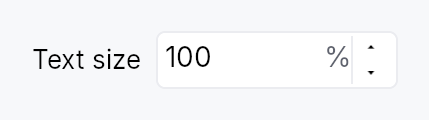
TextScaleControl — the settings control that grows all text in the app.
Public functions
TextScaleControl
| Returns | Function |
|---|---|
| Constructors | |
Self | new(factor_signal: Signal<f32>) |
| Builder methods | |
Self | label(label: impl Into<LocalizedString>) |
Self | tooltip(text: impl Into<LocalizedString>) |
Self | rich_tooltip(key: impl Into<String>) |
Self | rich_tooltip_content(content: crate::tooltip::TooltipContent) |
Self | composite_tooltip(content: impl Widget + 'static) |
Detailed description
Drop this into a preferences/settings window to let low-vision users scale
every piece of text uniformly (the framework multiplies the active theme's
typography by the chosen factor — see
WidgetTree::set_user_text_scale).
It is a thin specialization of SpinBox that displays a percent
(80 %–200 %, step 10 %) and, on each edit, both persists the value and
applies it app-wide — so the developer only has to place the widget.
Bind it to the persisted factor signal, typically the settings-backed
teksilo_settings::TEXT_SCALE_KEY:
use teksilo::prelude::*;
use teksilo::widgets::TextScaleControl;
// inside build():
let scale = ctx.settings().signal_for(&teksilo_settings::TEXT_SCALE_KEY);
ctx.add(TextScaleControl::new(scale).label(tr!(text_size())));
Writing the bound signal triggers the SettingsStore's debounced auto-save
(persistence), and the widget's on_value_changed calls
EventContext::set_text_scale
(immediate app-wide application). At startup teksilo-app reads the saved
key and seeds every window, so the chosen size is restored automatically.
Density
The picture above is the widget at TargetDensity::Compact, the mouse-and-keyboard ladder. Below is the same subject on the same canvas with only the ladder changed, so what moves is the density and nothing else — where the subject no longer fits, that is what the denser targets cost it at that size. See docs/density-and-targets.md.
Touch
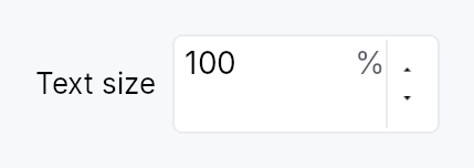
API reference
📖 Full rustdoc API for this module
pub struct TextScaleControl
Import: use teksilo::widgets::TextScaleControl;
A specialized SpinBox for the global user text-scale setting.
See the module docs for the persistence + app-wide application
contract. Construct with TextScaleControl::new, optionally attach a
visible label, and place it in a settings view.
#![allow(unused)] fn main() { pub struct TextScaleControl { /* fields */ } }
Methods
pub fn new(factor_signal: Signal<f32>) -> Self
Construct bound to factor_signal (a scale factor where 1.0 = 100 %).
Pass ctx.settings().signal_for(&teksilo_settings::TEXT_SCALE_KEY) to get
automatic persistence; any Signal<f32> works for ad-hoc / preview use.
pub fn label(mut self, label: impl Into<LocalizedString>) -> Self
Attach a visible label placed to the leading side of the spinbox
(e.g. tr!(text_size())). Also used as the control's accessible name.
pub fn tooltip(mut self, text: impl Into<LocalizedString>) -> Self
Attach a plain tooltip that appears after a hover delay.
Clears any previously set rich or composite tooltip (last-call wins).
pub fn rich_tooltip(mut self, key: impl Into<String>) -> Self
Attach a rich tooltip resolved from the app-wide tooltip registry.
key is looked up in the
TooltipRegistry at build time.
Clears any previously set plain or composite tooltip (last-call wins).
pub fn rich_tooltip_content(mut self, content: crate::tooltip::TooltipContent) -> Self
Attach a rich tooltip driven by inline
TooltipContent.
Clears any previously set plain or composite tooltip (last-call wins).
pub fn composite_tooltip(mut self, content: impl Widget + 'static) -> Self
Attach a composite tooltip that hosts an arbitrary widget body.
The content widget is rendered inside the tooltip overlay after the
heavy hover delay. Clears any previously set plain or rich tooltip
(last-call wins).
TextWidget
TextWidget — a leaf widget that renders a localized text string.
Public functions
TextWidget
| Returns | Function |
|---|---|
| Constructors | |
Self | new(text: impl Into<LocalizedString>) |
| Builder methods | |
Self | color(color: impl Into<ColorProp>) |
Self | style(style: impl Into<TextStyleProp>) |
Self | overflow(overflow: TextOverflow) |
Self | single_line() |
Self | min_shrink_width(min: f32) |
Self | no_shrink() |
Self | max_lines(n: usize) |
Self | text_backend(backend: Rc<RefCell<dyn teksilo_canvas::TextBackend>>) |
Self | text(state: impl Into<Prop<String>>) |
Self | markup(enabled: bool) |
Self | on_link_click<F>(handler: F) |
Self | on_link_hover<F>(handler: F) |
Self | a11y_hidden() |
| Methods | |
String | resolved_text() |
TextGeometryHandle | geometry_handle() |
Detailed description
TextWidget is the building block for every visible label in the framework.
It delegates measurement and rasterization to the TextBackend and supports
three overflow modes: TextOverflow::Wrap (default — grows vertically),
TextOverflow::Ellipsis with trailing, middle, or leading truncation, and
a minimal markup subset (label, *italic*, **bold**) with
per-link click/hover dispatch.
Text and color accept either static values or reactive Signal/Prop bindings.
The default color role is TextRole::Primary, resolved against the active
theme at paint time, so theme switches update text color without any explicit
binding or rebuild.
Accessibility
A TextWidget is reviewable by default: it emits AccessKit text runs —
one per visual line, with a position and an advance for every character
— so a screen reader's review cursor can walk it, a braille cell can be
routed to the word under it, and AXBoundsForRange and its Windows and
Linux equivalents can answer. Runs are excluded from object navigation
by accesskit_consumer's own filter, so they add no stops to anyone's
traversal and no targets to any hit test.
Geometry is always present: real when a text backend measured the label,
and a zero-width box at its leading edge when none did. Never absent —
Range::bounding_boxes() discards every box it has collected on the
first run missing any of bounds, direction, positions or widths, so one
geometry-less run would take the whole label's geometry with it.
A label inside a control that owns the same accessible name must call
a11y_hidden, or a reader hears the string
twice. Standalone body text should not.
Single-line / ellipsis text opts into shrink by default: an over-constrained
stack compresses the label down to the ellipsis-glyph width before the label
overflows. Call no_shrink to restore rigid behavior,
or min_shrink_width to set a custom floor.
Wrap-mode text is height-variable and therefore always rigid; opt it into
compression with Shrinkable.
#![allow(unused)] fn main() { use teksilo_widgets::primitives::TextWidget; use teksilo_i18n::lit; // Single-line label that truncates with a trailing ellipsis if too narrow: let _w = TextWidget::new(lit!("Save document")).single_line(); }
Touch and pen
Inline links are reachable by a plain tap: the handler at on_tap follows
the link run under the press with no modifier of any kind. (The touch
inventory recorded this file as Ctrl-gated and therefore unreachable by
touch; that gate was rich_text/mouse.rs's — modifiers.command() || read_only, since widened to kind.is_direct() || read_only || command_held — and never existed here.) The hover cursor over a link run
is a mouse and pen affordance and costs a finger nothing.
A link run is text-height and its size is constrained by the line height of the text around it, which is exactly WCAG 2.2 SC 2.5.8's inline exception, so it is not raised to the 24 dp floor and is not reported as a target region.
Density
The picture above is the widget at TargetDensity::Compact, the mouse-and-keyboard ladder. Below is the same subject on the same canvas with only the ladder changed, so what moves is the density and nothing else — where the subject no longer fits, that is what the denser targets cost it at that size. See docs/density-and-targets.md.
Touch
API reference
📖 Full rustdoc API for this module
pub struct TextWidget
Import: use teksilo::widgets::TextWidget;
#![allow(unused)] fn main() { pub struct TextWidget { /* fields */ } }
Methods
pub fn new(text: impl Into<LocalizedString>) -> Self
Construct a text widget whose content is a LocalizedString. The
text may come from tr!(...) (reactive, re-resolves on locale
change) or from lit!("…") for genuinely
non-translated strings.
pub fn color(mut self, color: impl Into<ColorProp>) -> Self
Set the text color. Accepts any impl Into<ColorProp>:
- A raw
Color— a frozen literal. - A
TextRole— resolved against the theme at paint time (reactive across theme switches). - A
Signal<Color>— reactive state (typically interaction-driven).
The default role is TextRole::Primary, so .color(...) is only
needed when a label wants a non-default theme role (Secondary,
Error, Accent, ...) or a custom color.
pub fn style(mut self, style: impl Into<TextStyleProp>) -> Self
Set the text style. Accepts a raw TextStyle, a
TextStyleRole, or any value implementing
Into<TextStyleProp>. Using a role resolves at paint/layout time, so
theme typography changes take effect without a rebuild.
pub fn overflow(mut self, overflow: TextOverflow) -> Self
Set how the widget handles text that doesn't fit in the proposed
width. Default is TextOverflow::Wrap.
pub fn single_line(self) -> Self
Shorthand for .overflow(TextOverflow::Ellipsis(EllipsisMode::Trailing)).
Use this on labels inside single-line containers (buttons, menu items,
tab headers, badges, status bar cells, etc.) so long text truncates
with a trailing "…" instead of wrapping onto multiple lines.
pub fn min_shrink_width(mut self, min: f32) -> Self
Override the compression floor for single-line / ellipsis text — the narrowest width an over-constrained stack may shrink this label to before truncating stops. Defaults to the ellipsis-glyph width.
pub fn no_shrink(mut self) -> Self
Opt this label out of native shrink: it reports a rigid size and overflows (rather than truncating) when its stack is over-constrained.
pub fn max_lines(mut self, n: usize) -> Self
Cap the paragraph at n lines when wrapping. Only meaningful
in TextOverflow::Wrap mode — ignored for ellipsis modes.
Lines beyond the cap are silently dropped.
pub fn text_backend(mut self, backend: Rc<RefCell<dyn teksilo_canvas::TextBackend>>) -> Self
Override the text backend used for measurement and rasterization.
In normal app code the framework provides the backend automatically;
this method is used by headless tests that inject a MockTextBackend.
pub fn text(mut self, state: impl Into<Prop<String>>) -> Self
Set the text content. Accepts a static String/&str or a reactive
Signal<String> / Prop<String> (resolved and re-rendered on change).
pub fn resolved_text(&self) -> String
Get the current text value (resolves from state if bound).
pub fn markup(mut self, enabled: bool) -> Self
Enable inline markup parsing. When enabled, the text is parsed as a minimal markdown subset:
label— inline link*italic*— italic run**bold**— bold run
Links are dispatched via on_link_click
and colored using theme.colors.text_link.
pub fn on_link_click<F>(mut self, handler: F) -> Self where F: Fn(&str, &mut EventContext) + 'static,
Called when an inline link is tapped. Enables markup automatically.
pub fn on_link_hover<F>(mut self, handler: F) -> Self where F: Fn(&str, bool, Rect, &mut EventContext) + 'static,
Called when an inline link is hovered (enter/leave). Receives
the URL, a bool indicating whether the pointer entered (true)
or left (false), and the widget-local rect of the link span
(so anchoring popups next to the link is cheap). Enables markup
automatically.
pub fn a11y_hidden(mut self) -> Self
Hide this text from the accessibility tree. Use this when the
TextWidget is a visual label fragment inside another control
that already owns its accessible name via set_name —
otherwise screen readers announce the same string twice
(once for the control, once for the embedded Label node).
Standalone body text (dialog descriptions, form instructions,
read-only display values) should NOT set this — it stays as a
Role::Label node.
pub fn geometry_handle(&self) -> TextGeometryHandle
A handle onto what this label last measured.
For the controls that own their accessible name but paint their
text through a hidden TextWidget — Badge, GroupHeader — and
so have to emit that text's runs from their own node. The handle
is empty until the label has been placed, and the geometry it
carries is in window space, so the borrower reports it as absolute.
The borrower must place the donor rigidly at its own origin: a move re-places absolute rects by the borrower's delta, so a composite that repositions its donor independently should register local rects instead.
ThemeSwitcher
ThemeSwitcher — a drop-in app-theme picker for settings screens & toolbars.
Public functions
ThemeSwitcher
Detailed description
A thin ComboBox preset that switches the application theme. By default
it offers three entries — Light, Dark, and System — where
System follows the native OS theme live: it adopts the OS's actual colours
(GNOME / KDE / Cinnamon on Linux) and tracks OS light/dark changes at
runtime, falling back to the built-in light/dark presets on platforms
without OS-colour support.
Zero-config: drop ThemeSwitcher::new() into a settings panel or toolbar and
it
- shows the active theme as the current selection (matched by the theme's
stable
ThemeId), - switches the app theme on selection via
EventContext::set_theme(fixed themes) orEventContext::follow_system_theme(System), - and stays in sync if the theme changes elsewhere (a menu, the inspector, or an OS light/dark toggle).
// In a settings panel or toolbar:
Toolbar::new().child(HStack::new().child(Spacer::new()).child(ThemeSwitcher::new()))
Labels are translated via the framework Fluent bundle (tr_widget!),
with an English literal fallback so a host app that hasn't installed an
I18nManager still reads "Light / Dark / System" rather than raw keys.
Custom themes: .themes([(label, theme), …]) replaces Light/Dark with an
app-supplied set (e.g. the teksilo-theme-{fluent,kde,macos,material3} presets);
.system(false) drops the System entry.
Density
The picture above is the widget at TargetDensity::Compact, the mouse-and-keyboard ladder. Below is the same subject on the same canvas with only the ladder changed, so what moves is the density and nothing else — where the subject no longer fits, that is what the denser targets cost it at that size. See docs/density-and-targets.md.
Touch
API reference
📖 Full rustdoc API for this module
pub struct ThemeSwitcher
Import: use teksilo::widgets::ThemeSwitcher;
A drop-in app-theme picker built on ComboBox. See the module docs.
#![allow(unused)] fn main() { pub struct ThemeSwitcher { /* fields */ } }
Methods
pub fn new() -> Self
Create a switcher offering Light / Dark / System (the System entry follows the OS theme live).
pub fn variant(mut self, variant: ComboBoxVariant) -> Self
Pick the inner ComboBox's design-language variant.
pub fn label(mut self, label: impl Into<LocalizedString>) -> Self
Set the accessible / control label (defaults to the translated "Theme").
pub fn themes( mut self, themes: impl IntoIterator<Item = (impl Into<LocalizedString>, Theme)>, ) -> Self
Replace the default Light/Dark fixed-theme list with an app-supplied set
of (label, theme) pairs — e.g. the teksilo-theme-* presets. The
System (follow-OS) entry is still appended unless system
is false.
pub fn system(mut self, include: bool) -> Self
Whether to offer the "System" (follow-OS) entry. Default true.
pub fn tooltip(mut self, text: impl Into<LocalizedString>) -> Self
Attach a plain tooltip, forwarded to the inner ComboBox.
Mutually exclusive with the rich / composite variants — last
call wins.
pub fn rich_tooltip(mut self, key: impl Into<String>) -> Self
Attach a rich tooltip resolved from the app-wide registry,
forwarded to the inner ComboBox. Overrides any previously
set tooltip.
pub fn rich_tooltip_content(mut self, content: crate::tooltip::TooltipContent) -> Self
Attach a rich tooltip driven by inline
TooltipContent, forwarded to
the inner ComboBox. Overrides any previously set tooltip.
pub fn composite_tooltip(mut self, content: impl Widget + 'static) -> Self
Attach a composite tooltip hosting an arbitrary widget tree,
forwarded to the inner ComboBox. Overrides any previously
set tooltip.
TimeEdit
TimeEdit — text input for time-of-day, bound to Signal<Option<Time>>.
Public types
| Kind | Name |
|---|---|
enum | TimeFormat — 12h vs 24h time formatting |
enum | SecondsMode — Whether the seconds segment is shown in TimeEdit |
struct | TimeEdit — Single-line editable time-of-day field |
Public functions
TimeEdit
| Returns | Function |
|---|---|
| Constructors | |
Self | new(value: Signal<Option<Time>>) |
Self | required(value: Signal<Time>) |
| Builder methods | |
Self | style(style: impl teksilo_core::styles::DateEditStyle) |
Self | format(f: TimeFormat) |
Self | seconds(mode: SecondsMode) |
Self | format_pattern(p: impl Into<String>) |
Self | min_time(t: Time) |
Self | max_time(t: Time) |
Self | step_minutes(n: u32) |
Self | placeholder(text: impl Into<LocalizedString>) |
Self | enabled(enabled: impl Into<Prop<bool>>) |
Self | read_only(read_only: bool) |
Self | validation_behavior(behavior: ValidationBehavior) |
Self | width_policy(policy: crate::date_edit::WidthPolicy) |
Self | label(label: impl Into<LocalizedString>) |
Self | on_value_changed(f: impl Fn(Option<Time>, &mut EventContext) + 'static) |
Self | tooltip(text: impl Into<LocalizedString>) |
Self | rich_tooltip(key: impl Into<String>) |
Self | rich_tooltip_content(content: crate::tooltip::TooltipContent) |
Self | composite_tooltip(content: impl Widget + 'static) |
| Methods | |
Signal<ValidationFeedback> | validation_feedback_signal() |
Signal<Option<Time>> | value() |
Detailed description
Single-line editable time field with strftime-pattern parse/format
and optional 12h/24h mode + AM/PM. Same compositional pattern as
DateEdit (TextInputField + commit on
Enter/blur + step keys), without a popover (desktop convention is no
graphical time picker).
Behaviour
- Value binding:
Signal<Option<Time>>—Noneshows the placeholder. - Pattern: 24h default
%H:%M; 12h is%I:%M %p. Override viaformat_pattern. Add seconds withseconds(SecondsMode::Editable). - Keyboard (preview-pass on the wrapper): the step is
segment-relative — it moves the field under the caret (hour,
minute, second or AM/PM), which is what
QDateTimeEditdoes.- Arrow Up / Down → ±1 unit of that segment; Shift+ → ±10.
- PageUp / PageDown → ±10 units; Shift+ → ±100.
- Hours wrap within the day and minutes and seconds within the hour and minute, so a sweep never rolls the value over.
Accessibility
- Container —
Role::TimeInputwithset_valueformatted asHH:MM:SSandset_labelfrom.label(). - Underlying TextInputField keeps
Role::TextInputso AT knows it's editable. It is where focus lands, so it carries the same name (the.label(), or "Time"), and it is the composite'saccessibility_proxy: what an application gives theTimeEdit(access_label,access_described_by) lands on the field. As onDateEdit, the field's own name is read before alabelled_byrelation, so name a time field in a form with.label().
use teksilo_core::signal::Signal;
use teksilo_widgets::time_edit::{TimeEdit, TimeFormat, SecondsMode};
let value = Signal::new(None);
let _field = TimeEdit::new(value)
.format(TimeFormat::Hour24)
.seconds(SecondsMode::Hidden);
Touch and pen
See DateEdit's "Touch and pen" section: the whole
date/time family carries focus_within and on_key_preview only, and its
pointer surface is the embedded field, the trigger button and the popover.
Density
The picture above is the widget at TargetDensity::Compact, the mouse-and-keyboard ladder. Below is the same subject on the same canvas with only the ladder changed, so what moves is the density and nothing else — where the subject no longer fits, that is what the denser targets cost it at that size. See docs/density-and-targets.md.
Touch
API reference
📖 Full rustdoc API for this module
pub enum TimeFormat
Import: use teksilo::widgets::TimeFormat;
12h vs 24h time formatting.
Used with TimeEdit::format to lock the clock style independently of the locale default.
#![allow(unused)] fn main() { pub enum TimeFormat { /* variants */ } }
Variants
Hour24— 24-hour clock (default —%H:%M).Hour12— 12-hour clock with AM/PM segment (%I:%M %p).
pub enum SecondsMode
Import: use teksilo::widgets::SecondsMode;
Whether the seconds segment is shown in TimeEdit.
#![allow(unused)] fn main() { pub enum SecondsMode { /* variants */ } }
Variants
Hidden— Hide the seconds segment (default).Editable— Show and edit the seconds segment.
pub struct TimeEdit
Import: use teksilo::widgets::TimeEdit;
Single-line editable time-of-day field.
See the module documentation for full behaviour, pattern,
and keyboard details.
#![allow(unused)] fn main() { pub struct TimeEdit { /* fields */ } }
Methods
pub fn new(value: Signal<Option<Time>>) -> Self
Construct bound to value (None = empty field; Some(t) = pre-filled time).
pub fn style(mut self, style: impl teksilo_core::styles::DateEditStyle) -> Self
Per-call DateEditStyle override (shared with DateEdit family).
pub fn required(value: Signal<Time>) -> Self
Construct with a required (non-nullable) Signal<Time>. The field
never shows None; the signal and the internal Option are kept in sync.
pub fn format(mut self, f: TimeFormat) -> Self
Lock the field to a specific clock (12h or 24h). When this
builder is not called, the field defaults to the user's
current locale via prefers_12_hour_clock (12h for en-US /
en-CA / en-AU / en-NZ / en-PH / en-IN / en-PK; 24h elsewhere).
pub fn seconds(mut self, mode: SecondsMode) -> Self
Show or hide the seconds segment. Default: SecondsMode::Hidden.
pub fn format_pattern(mut self, p: impl Into<String>) -> Self
Override the strftime-subset format pattern (e.g. "%H:%M:%S").
Bypasses the locale-derived and format-derived defaults entirely.
pub fn min_time(mut self, t: Time) -> Self (default: None)
Clamp the accepted value to at or after t (inclusive).
pub fn max_time(mut self, t: Time) -> Self (default: None)
Clamp the accepted value to at or before t (inclusive).
pub fn step_minutes(mut self, n: u32) -> Self
Set the ArrowUp / ArrowDown step in minutes. Default: 1. Must be ≥ 1.
Currently inert. Segment-aware stepping replaced the older whole-value step, and it moves the field under the caret by one of that segment's units rather than by a fixed number of minutes. The builder is kept on the public surface so callers that already configured it still compile, and as the hook a future per-segment custom step would use; it has no effect today.
pub fn placeholder(mut self, text: impl Into<LocalizedString>) -> Self
Text shown when the field is empty (value is None).
pub fn enabled(mut self, enabled: impl Into<Prop<bool>>) -> Self (default: true)
Set the enabled state, statically or reactively. Forwarded to the arena at build time.
pub fn read_only(mut self, read_only: bool) -> Self (default: false)
Allow display-only mode: text is selectable but not editable.
pub fn validation_behavior(mut self, behavior: ValidationBehavior) -> Self (default: ValidationBehavior::AutoCorrect)
How parse failures are surfaced. See
ValidationBehavior.
pub fn width_policy(mut self, policy: crate::date_edit::WidthPolicy) -> Self
How the widget claims horizontal space. See
WidthPolicy. Default
Default (natural mask-derived width).
pub fn validation_feedback_signal(&self) -> Signal<ValidationFeedback>
Reactive handle on the live validation feedback.
pub fn label(mut self, label: impl Into<LocalizedString>) -> Self
Set the accessible label for the field (announced by screen readers).
pub fn on_value_changed( mut self, f: impl Fn(Option<Time>, &mut EventContext) + 'static, ) -> Self
Callback invoked on every committed value change with the new
Option<Time> and a live EventContext.
pub fn tooltip(mut self, text: impl Into<LocalizedString>) -> Self
Attach a plain single-line tooltip shown after a hover delay. Clears any previously set rich or composite tooltip (last call wins).
pub fn rich_tooltip(mut self, key: impl Into<String>) -> Self
Attach a rich tooltip identified by a registry key. Clears any previously set plain or composite tooltip (last call wins).
pub fn rich_tooltip_content(mut self, content: crate::tooltip::TooltipContent) -> Self
Attach an inline rich tooltip from a crate::tooltip::TooltipContent
value. Clears any previously set plain or composite tooltip (last call wins).
pub fn composite_tooltip(mut self, content: impl Widget + 'static) -> Self
Attach a composite tooltip whose body is an arbitrary widget tree. Clears any previously set plain or rich tooltip (last call wins).
pub fn value(&self) -> Signal<Option<Time>>
The bound value signal — the same Signal passed to Self::new.
TitleBar
Custom window title bar widget.
Public types
| Kind | Name |
|---|---|
type | CloseAction — Type alias for the user-supplied close action that overrides the close button's default ctx.close_window() |
struct | TitleBar — A custom window title bar |
Public functions
TitleBar
Detailed description
TitleBar replaces a window's native chrome with a horizontal bar that
can host menus, tools, and the standard window controls (minimize /
maximize / close). The platform plumbing — beginning a window drag,
returning the right WM_NCHITTEST codes on Windows, repositioning the
macOS traffic lights — lives behind the
PlatformTitleBarHost trait in
teksilo-platform. The widget itself is platform-agnostic.
Construct a TitleBar from inside the root-builder closure, fetching
the host from the widget tree:
.root(|tree, _state| {
let host = tree.title_bar_host().expect("custom_chrome enabled");
tree.add(
VStack::new()
.child(TitleBar::new(host)
.background(theme.colors.surface_raised)
.border(theme.colors.border, 1.0)
.leading(TextWidget::new(lit!("My App"))))
.child(Expand::new().child(/* body */)))
})
API reference
📖 Full rustdoc API for this module
pub type CloseAction
Import: use teksilo::widgets::title_bar::CloseAction;
Type alias for the user-supplied close action that overrides the close
button's default ctx.close_window(). Set via TitleBar::close_action.
#![allow(unused)] fn main() { pub type CloseAction = Rc<dyn Fn(&mut EventContext)>; }
pub struct TitleBar
Import: use teksilo::widgets::TitleBar;
A custom window title bar.
Layout (left to right):
[leading inset] [leading slot] [drag region (flexible)] [trailing slot] [trailing inset] [window controls]
The leading inset reserves space for the OS-drawn traffic lights on
macOS. The drag region is a Spacer-style flex
child that absorbs all leftover horizontal space and forwards
pointer / drag / double-tap gestures to the platform host. The window
controls (minimize / maximize / close) are rendered only when the host
advertises PlatformTitleBarHost::renders_custom_controls — i.e. on
Windows and Wayland but not on macOS.
This widget builds exactly once
build consumes the leading / center / trailing slots with take(), so a
second pass finds them all None and produces a bar containing nothing but
window controls — no menu, no title, no tools. Nothing here may therefore
carry a BindingLevel::Rebuild
binding. Reactive state on this widget is expressed either as a
RepaintOnly colour prop or, for structure, as dormancy via
teksilo_core::BuildContext::visible_when on an always-built child — which is how
controls_visible works. Memoising the
resolved slot ids is not a workaround: a rebuild replaces the inner row
and prunes its subtree, so the cached ids dangle and re-adding them yields
an empty bar just the same.
#![allow(unused)] fn main() { pub struct TitleBar { /* fields */ } }
Methods
pub fn new(host: Rc<dyn PlatformTitleBarHost>) -> Self
Construct a TitleBar bound to the given platform host.
The maximize/restore glyph follows WindowState::placement via
ctx.window() at build time — the host no longer owns the
maximize signal.
pub fn controls_visible(mut self, visible: impl Into<Prop<bool>>) -> Self
Show or hide the minimize / maximize / close cluster. Default true.
Accepts a plain bool or a Signal<bool>. Applied through the
framework's own dormancy (teksilo_core::BuildContext::visible_when), so a flip
costs a relayout and never a rebuild of the bar: a dormant node is
skipped by layout, hit-test, focus and paint, so a hidden cluster takes
no space and receives no input. A derived (.map) signal is fine —
binding resolves through to the mutable roots and never calls observe.
The case this exists for is fullscreen.
WindowPlacement::Fullscreen
is documented as "covers the entire display, title bar and all chrome
hidden", and every desktop convention agrees: macOS hides the traffic
lights, Windows fullscreen has no caption buttons, browsers and editors
hide their chrome outright. Minimize and maximize are meaningless for a
window with no frame. An app drawing custom chrome
(DecorationsMode::CustomChrome) owns
that decision itself, because the framework cannot hide a title bar the
app composed — so it gates it here.
An app that hides these must keep some other visible way out of fullscreen: a menu item, an on-screen button, or a documented shortcut.
pub fn height(mut self, height: f32) -> Self
Set the title bar's logical-pixel height. Default: 40.
pub fn background(mut self, color: impl Into<ColorProp>) -> Self
Fill the title bar with a solid background color. Default: transparent (the window's clear color shows through).
Accepts a Color, a Signal<Color>, or any of the role types
(SurfaceRole, TextRole, BorderRole, or their Signal<…>
variants). Role values resolve at paint time, so the title bar
retints live across ctx.set_theme(...) switches.
pub fn border(mut self, color: impl Into<ColorProp>, width: f32) -> Self
Draw a 1px-or-thicker bottom border separating the title bar from the body.
Color accepts the same range as Self::background; pair with
BorderRole::Default for a theme-tracking divider.
pub fn leading(mut self, widget: impl teksilo_core::IntoTeksiChild) -> Self
Set the leading-edge content (e.g. app icon, menus). Rendered to the right of the macOS traffic-light inset.
pub fn center(mut self, widget: impl teksilo_core::IntoTeksiChild) -> Self
Set the center content (e.g. search box, breadcrumbs). Wrapped in a flexible drag region: clicks that are not consumed by the child initiate a window drag.
pub fn trailing(mut self, widget: impl teksilo_core::IntoTeksiChild) -> Self
Set the trailing-edge content (e.g. user avatar, notification bell). Rendered before the window controls.
pub fn close_action(mut self, action: impl Fn(&mut EventContext) + 'static) -> Self
Override the close-button action. When set, the close button calls
this closure instead of the default ctx.close_window() — the hook
for a "save before closing?" guard. The application typically ends
the closure by calling EventContext::close_window itself, or by
sending an Intent whose root-level Action handler calls it.
Toast
Toast notification — stackable, action-rich, severity-aware floating
notification (the "upgrade path" from Snackbar).
Public types
| Kind | Name |
|---|---|
const | DEFAULT_TOAST_AUTO_DISMISS — Default auto-dismiss duration when the caller does not override it (matches IntelliJ BALLOON and Material Snackbar maximum) |
enum | ToastDismissCause — Why a toast was dismissed — delivered to the on_dismiss callback |
struct | ToastAudience — Opaque per-app routing token |
enum | ToastRoute — Resolved delivery target for a toast (and, mirrored, its archived NotificationEntry) |
enum | ToastActionStyle — How a ToastAction should be rendered inside the toast surface |
type | ToastActionCallback — Type-erased callback for a ToastAction |
struct | ToastAction — One actionable element inside a Toast — a button or hyperlink the user can click to drive a domain action |
struct | ToastHandle — Returned by Toast::present (and ctx.show_toast(toast)) |
type | ToastDismissCallback — Type-erased on_dismiss callback receiving the cause + context |
struct | Toast — Toast — a present-able request (NOT a Widget) |
trait | EventContextToastExt — Convenience methods on EventContext for the toast system |
struct | ToastRegistry — Cheap to clone (Rc<RefCell<…>>) |
Public functions
Toast
ToastAudience
| Returns | Function |
|---|---|
| Constructors | |
Self | new(id: u64) |
| Methods | |
u64 | raw() |
ToastAction
| Returns | Function |
|---|---|
| Constructors | |
Self | new(label: impl Into<LocalizedString>, on_invoke: impl Fn(&mut EventContext) + 'static) |
Self | primary(label: impl Into<LocalizedString>, on_invoke: impl Fn(&mut EventContext) + 'static) |
Self | destructive(label: impl Into<LocalizedString>, on_invoke: impl Fn(&mut EventContext) + 'static) |
| Builder methods | |
Self | style(style: ToastActionStyle) |
Self | closes_toast(closes: bool) |
Self | shortcut_id(id: impl Into<String>) |
Self | tooltip(text: impl Into<LocalizedString>) |
| Methods | |
String | label() |
&ToastActionStyle | style_ref() |
bool | closes_toast_flag() |
Option<&str> | shortcut_id_ref() |
Option<&LocalizedString> | tooltip_ref() |
ToastActionCallback | callback() |
ToastHandle
| Returns | Function |
|---|---|
| Methods | |
u64 | entry_id() |
bool | is_alive() |
dismiss(ctx: &mut EventContext) |
EventContextToastExt
| Returns | Function |
|---|---|
| Methods | |
ToastHandle | show_toast(toast: Toast) |
dismiss_toast(handle: &ToastHandle) |
ToastRegistry
| Returns | Function |
|---|---|
| Constructors | |
Self | new(options: super::host::ToastInstallOptions) |
Self | with_archive(options: super::host::ToastInstallOptions, archive: Rc<NotificationArchiveModel>) |
| Methods | |
Option<Rc<NotificationArchiveModel>> | archive() |
&Signal<u64> | version_signal() |
Signal<usize> | hover_count_signal() |
Signal<Option<ToastAudience>> | window_audience_signal(window_id: TeksiloWindowId) |
set_window_audience(window_id: TeksiloWindowId, audience: Option<ToastAudience>) | |
forget_window(window_id: TeksiloWindowId) | |
usize | live_count() |
| Associated functions | |
show_settings_write_failed() |
Detailed description
Distinct from siblings:
Snackbar— single-instance, message-only. Callingpresent_snackbardismisses all other overlays first.Banner— persistent inline strip, not a floating overlay.MessageBox— modal dialog. Blocks interaction with the rest of the UI.
A Toast is built with one of the four severity constructors
(info / success / warning / error) plus a loading variant,
configured via builder methods, and presented with
ctx.show_toast(toast) (see
toast::ext::EventContextToastExt)
or toast.present(ctx). A ToastHost
installed via TeksiloAppBuilder.install_toast(opts) from the teksilo
umbrella accepts the request, picks a free slot from its pool, and
mounts a ToastSurface as one of its own children, placed at
the configured viewport corner by the host's place_children. No
overlay system involvement — toasts are regular widgets in the
arena.
ctx.show_toast(
Toast::warning(tr!(unsaved_changes()))
.body(tr!(close_anyway_question()))
.action(ToastAction::primary(tr!(save()), |c| c.send_intent(AppIntent::Save)))
.action(ToastAction::new(tr!(discard()), |c| c.send_intent(AppIntent::Discard)))
);
API reference
📖 Full rustdoc API for this module
pub const DEFAULT_TOAST_AUTO_DISMISS
Import: use teksilo::widgets::toast::DEFAULT_TOAST_AUTO_DISMISS;
Default auto-dismiss duration when the caller does not override
it (matches IntelliJ BALLOON and Material Snackbar maximum).
#![allow(unused)] fn main() { pub const DEFAULT_TOAST_AUTO_DISMISS: Duration = Duration::from_secs(10); }
pub enum ToastDismissCause
Import: use teksilo::prelude::ToastDismissCause; — in teksilo::prelude::*.
Why a toast was dismissed — delivered to the on_dismiss callback.
#![allow(unused)] fn main() { pub enum ToastDismissCause { /* variants */ } }
Variants
Timeout—auto_dismiss_afterreached zero (timer expired naturally).ActionInvoked— AToastActionwithcloses_toast(true)(the default) fired.CloseClicked— The user clicked the close (X) button.EscapePressed— The user pressed Escape while focus was inside the toast.Programmatic—ToastHandle::dismisswas called from app code.HostShutdown— The host's window is being torn down.SlotPoolFull— The host's slot pool was atmax_visibleand this toast was dropped (Normal priority overflow) or was evicted by a higher-priority arrival. Reported synthetically soon_dismissalways fires once per toast — apps that track outstanding toasts via the callback don't leak.SwipeDismissed— The user swiped the surface away. The touch counterpart of the close button, which is small, hover-adjacent chrome; a swipe is the whole surface and needs no aim.
pub struct ToastAudience
Import: use teksilo::prelude::ToastAudience; — in teksilo::prelude::*.
Opaque per-app routing token. teksilo has no notion of what an
"audience" means to the host app (a document, a project, a user
session, …) — it only ever compares and hashes this value. Apps
mint their own tokens (typically one per open document/window
group) via ToastAudience::new and pass the same value to
Toast::target(...) and ToastRegistry::set_window_audience(...)
to link the two sides of the routing decision.
#![allow(unused)] fn main() { pub struct ToastAudience(u64); }
Methods
pub fn new(id: u64) -> Self
Construct a token from an app-chosen u64. The app owns the
meaning entirely — teksilo never inspects the value beyond
equality/hash.
pub fn raw(&self) -> u64
The raw numeric value, for debugging/serialization by the app.
pub enum ToastRoute
Import: use teksilo::prelude::ToastRoute; — in teksilo::prelude::*.
Resolved delivery target for a toast (and, mirrored, its archived
NotificationEntry).
Three levels, from narrowest to widest:
Window— exactly the window that presented the toast. This is the default when aToastcarries no explicit.target()/.broadcast()and was presented through a realEventContext(i.e.ctx.show_toast(...)/toast.present(ctx)from an actual input handler) — seeEventContextToastExt::show_toast.Audience— every window currently assigned the givenToastAudienceviaToastRegistry::set_window_audience.Broadcast— every window, unconditionally. Also the fallback when a toast is enqueued with no window AND no explicit target (e.g.ToastRegistry::show_settings_write_failed, which fires from a backgroundAppEventobserver with noEventContextat all) — an app-wide message with nothing narrower to route by.
#![allow(unused)] fn main() { pub enum ToastRoute { /* variants */ } }
Variants
Window(TeksiloWindowId)— Delivered only to the window with this id. Never publicly constructible from aToastbuilder — only the framework stamps this, from a realEventContext::window()at present time — so an app can't accidentally fabricate a route to a window it doesn't own.Audience(ToastAudience)— Delivered to every window currently assigned this audience.Broadcast— Delivered to every window, unconditionally.
pub enum ToastActionStyle
Import: use teksilo::prelude::ToastActionStyle; — in teksilo::prelude::*.
How a ToastAction should be rendered inside the toast surface.
#![allow(unused)] fn main() { pub enum ToastActionStyle { /* variants */ } }
Variants
Link— JetBrains-style hyperlink. Rendered inline with the body row. Default — minimal visual weight, scales to many actions.Button{ variant: crate::button::ButtonVariant }— Material / Windows-style button. Rendered in a dedicated row below the body. Use for primary calls-to-action ("Retry", "Save", "Discard").
pub type ToastActionCallback
Import: use teksilo::widgets::toast::ToastActionCallback;
Type-erased callback for a ToastAction. Fn (not FnMut) so
the same callback can be wrapped in an Rc and dispatched from
multiple paths (tap, keyboard, AT custom action).
#![allow(unused)] fn main() { pub type ToastActionCallback = Rc<dyn Fn(&mut EventContext)>; }
pub struct ToastAction
Import: use teksilo::prelude::ToastAction; — in teksilo::prelude::*.
One actionable element inside a Toast — a button or hyperlink
the user can click to drive a domain action.
#![allow(unused)] fn main() { pub struct ToastAction { /* fields */ } }
Methods
pub fn new( label: impl Into<LocalizedString>, on_invoke: impl Fn(&mut EventContext) + 'static, ) -> Self
Build an action with the default Link style and
closes_toast = true (IntelliJ "expiring action" semantics).
pub fn primary( label: impl Into<LocalizedString>, on_invoke: impl Fn(&mut EventContext) + 'static, ) -> Self
Shorthand for ToastAction::new(label, on_invoke).style(Button { Filled }).
The visual-weight default for primary calls-to-action.
pub fn destructive( label: impl Into<LocalizedString>, on_invoke: impl Fn(&mut EventContext) + 'static, ) -> Self
Shorthand for the destructive button variant — red-tinted for confirm-style "Delete" / "Discard" actions.
pub fn style(mut self, style: ToastActionStyle) -> Self
Override the action's visual style. Default is Link.
pub fn closes_toast(mut self, closes: bool) -> Self
Whether invoking this action also dismisses the toast. Default
is true — matches IntelliJ's "expiring action" semantics.
Set to false for actions that toggle state without closing
(e.g. "Show details" disclosure inside a sticky toast).
pub fn shortcut_id(mut self, id: impl Into<String>) -> Self
Associate the action with a registered Shortcut id. The live
toast renders nothing extra for it — the action's own callback
is the source of truth there. The id is carried so the archived
form of this action (in
NotificationLog)
is re-invokable by name through the existing Intent
dispatcher.
pub fn tooltip(mut self, text: impl Into<LocalizedString>) -> Self
Optional tooltip text shown when the pointer hovers the action.
pub fn label(&self) -> String
Resolve the action label to a plain string using the current locale.
pub fn style_ref(&self) -> &ToastActionStyle
Return the action's rendering style (link vs button variant).
pub fn closes_toast_flag(&self) -> bool
Return true when invoking this action also dismisses the toast.
pub fn shortcut_id_ref(&self) -> Option<&str>
Return the associated Shortcut id, if any.
pub fn tooltip_ref(&self) -> Option<&LocalizedString>
Return the optional tooltip text, if one was set via tooltip.
pub fn callback(&self) -> ToastActionCallback
Clone the invocation callback — cheap because the underlying closure is Rc-wrapped.
pub struct ToastHandle
Import: use teksilo::prelude::ToastHandle; — in teksilo::prelude::*.
Returned by Toast::present (and ctx.show_toast(toast)). Cheap
to clone (Rc<Inner>). Lets app code dismiss the toast
programmatically or check whether it is still alive.
Dropping the handle does NOT dismiss the toast — toasts have their own lifecycle managed by the host (timer + manual paths). The handle is the OPTIONAL "I want to control this toast later" hook.
#![allow(unused)] fn main() { pub struct ToastHandle { /* fields */ } }
Methods
pub fn entry_id(&self) -> u64
Stable per-toast id. Two ToastHandles pointing at the same
underlying toast share the same entry_id. The id is unique
per ToastRegistry (per app) — it doesn't survive across app
restarts.
pub fn is_alive(&self) -> bool
Whether the toast is still in the registry's live set (timer
hasn't expired, user hasn't dismissed, host hasn't shut down).
Always false for overflow-dropped toasts.
pub fn dismiss(&self, ctx: &mut EventContext)
Programmatically dismiss the toast with cause
ToastDismissCause::Programmatic. No-op if the toast is
already dismissed (timer, user, host shutdown).
pub type ToastDismissCallback
Import: use teksilo::widgets::toast::ToastDismissCallback;
Type-erased on_dismiss callback receiving the cause + context.
#![allow(unused)] fn main() { pub type ToastDismissCallback = Rc<dyn Fn(ToastDismissCause, &mut EventContext)>; }
pub struct Toast
Import: use teksilo::prelude::Toast; — in teksilo::prelude::*.
Toast — a present-able request (NOT a Widget). Construct with one
of the severity-named constructors, configure via builder methods,
then call .present(ctx) or ctx.show_toast(self). Internally the
builder is consumed and its data is moved into a slot on the
installed ToastHost.
See the module docs for the full conceptual overview.
#![allow(unused)] fn main() { pub struct Toast { /* fields */ } }
Methods
pub fn info(title: impl Into<LocalizedString>) -> Self
Info-severity toast (status confirmation, neutral notice).
pub fn success(title: impl Into<LocalizedString>) -> Self
Success-severity toast ("Saved", "Connected", "Build finished").
pub fn warning(title: impl Into<LocalizedString>) -> Self
Warning-severity toast.
pub fn error(title: impl Into<LocalizedString>) -> Self
Error-severity toast. Defaults to Live::Assertive.
pub fn loading(title: impl Into<LocalizedString>) -> Self
Loading-style toast — Info severity with a
Spinner as the leading widget.
Persistent by default; the app calls
ToastHandle::dismiss (typically from the operation's
completion callback) or replaces it with a success/error toast.
pub fn body(mut self, text: impl Into<LocalizedString>) -> Self
Optional secondary line below the title.
pub fn leading(mut self, widget: impl Widget + 'static) -> Self
Replace the default severity glyph with a custom leading widget (spinner, app icon, avatar). Boxes the widget so the toast remains object-safe.
pub fn action(mut self, action: ToastAction) -> Self
Append a ToastAction (link or button) to the toast.
pub fn actions(self, actions: impl IntoIterator<Item = ToastAction>) -> Self
Append several ToastActions from an iterator, in order.
The loop form of action. Toasts carry few actions, so
reach for it only when the set is genuinely data-driven.
pub fn primary_action( self, label: impl Into<LocalizedString>, on_invoke: impl Fn(&mut EventContext) + 'static, ) -> Self
Shorthand for appending a filled-button primary action — equivalent to
.action(ToastAction::primary(label, on_invoke)).
pub fn auto_dismiss_after(mut self, duration: Duration) -> Self
Override the auto-dismiss countdown. Pass Duration::ZERO for immediate dismissal
on the next timer tick; call persistent to disable the timer entirely.
pub fn persistent(mut self) -> Self
Disable auto-dismiss — the toast persists until the user
clicks the close X, invokes a closes_toast action, or the
app calls ToastHandle::dismiss.
pub fn priority(mut self, priority: ToastPriority) -> Self
Set the queue priority. High / Urgent entries evict the oldest Normal entry
when the slot pool is full; Urgent also forces Live::Assertive regardless of severity.
pub fn id(mut self, id: impl Into<String>) -> Self
Stable identity for the "progress toast updates in place"
pattern. A subsequent enqueue whose Toast carries the same
id as a still-live entry mutates that entry's fields
(severity, title/body, route, …) in place instead of appending
a new toast — see ToastRegistry::enqueue's update-in-place
merge for the exact behaviour.
The id also names the notice's row in the notification log. An
update of the live toast updates that row where it is. A toast raised
under the id once the earlier one has left the screen is a new
occurrence: the row comes back to the top, unread, dated when it came
back, even if it says the same as before. See
NotificationArchiveModel::push
and push_update.
Hazard: this id must be unique per logical operation, not just per call site
The merge matches on id ALONE — no route/window/audience
check — and then OVERWRITES the existing entry's route with
the new toast's resolved target. That's intentional: it's what
lets a progress toast whose audience becomes known partway
through retarget itself in place. But it also means that if
TWO DIFFERENT windows (or two different audiences) each
present a toast using the SAME id for what are, to the app,
two DIFFERENT operations, the second enqueue finds the
first window's still-live entry, mutates its text/severity to
the second operation's, and steals its route out from under
it — the first window's toast is not dismissed, not
callback'd, just silently overwritten and gone, while the
second window's operation ends up displayed under the wrong
route besides.
teksilo deliberately does NOT make the dedup key route-aware
(matching on (id, route) together) — that would break the
intentional retargeting case above. So in a multi-window /
multi-document app, do not reuse one static string id across
windows for what is conceptually a per-document (or otherwise
per-audience) operation — export, delete, save, etc. Fold the
document/audience identity into the id yourself, e.g.
format!("export-{work_id}") rather than a bare "export"
constant, so two windows running the same kind of operation
on two different documents never collide on one entry.
pub fn on_click(mut self, f: impl Fn(&mut EventContext) + 'static) -> Self
Treat a click on the toast body as a meaningful action — the
callback fires on tap. Cursor changes to Pointer over the body.
pub fn on_dismiss( mut self, f: impl Fn(ToastDismissCause, &mut EventContext) + 'static, ) -> Self
Notification of dismissal. Fires exactly once per toast on any dismiss path (timer, action invocation, close click, escape, swipe, programmatic, host shutdown, slot-pool overflow).
pub fn show_close_button(mut self, show: bool) -> Self
Show or hide the trailing close (×) button. Default true.
pub fn closable_on_escape(mut self, allow: bool) -> Self
Whether pressing Escape while the toast is focused dismisses it. Default true. Set to false in apps that have a custom Escape-handling story (focus trap, modal-style toast).
pub fn announcement(mut self, text: impl Into<LocalizedString>) -> Self
Override the screen-reader announcement text without changing the visible title. Useful when the visible title is iconic ("3") but the spoken text needs context ("3 unread messages").
pub fn archive(mut self, archive: bool) -> Self
Whether this toast is added to the persistent archive that
drives NotificationLog.
Default true. Set false for noise-suppressing
transient notifications like quick "Copied!" feedback.
pub fn style(mut self, style: impl teksilo_core::styles::ToastStyle) -> Self
Override the visual chrome for this toast instance. Takes precedence over the
theme-wide style_slots.toast slot and the built-in RecipeToastStyle default.
pub fn target(mut self, audience: ToastAudience) -> Self
Route this toast to every window currently assigned audience
(via ToastRegistry::set_window_audience), instead of the
default origin-window. Overrides any previous .target() /
.broadcast() call — last setter wins.
pub fn broadcast(mut self) -> Self
Route this toast to every window, unconditionally — for
genuinely app-wide messages (a data-loss warning, an update
available notice) rather than one window's concern. Overrides
any previous .target() call — last setter wins.
pub fn present(self, ctx: &mut EventContext) -> ToastHandle
Submit the toast through the installed
ToastHost. Equivalent to
ctx.show_toast(self). Returns a ToastHandle for
programmatic control. If install_toast was not called the
returned handle is in the "dropped" state (is_alive returns
false) and a one-shot stderr warning fires explaining the omission.
pub trait EventContextToastExt
Import: none — EventContextToastExt is public in a private module of teksilo-widgets and nothing re-exports it.
Convenience methods on EventContext for the toast system. The
registry is looked up via EventContext::app_state — the
install_toast extension trait registers ToastRegistry there
at app boot.
All methods are no-ops (returning a dropped ToastHandle where
applicable) when install_toast was not called — a one-shot
log::warn! fires the first time the missing registration is
detected, so missing installs surface in logs without crashing
app code that defensively calls show_toast.
#![allow(unused)] fn main() { pub trait EventContextToastExt { /* associated items below */ } }
Associated items
fn show_toast(&mut self, toast: Toast) -> ToastHandle;
Present a Toast through the installed
ToastHost. Returns a
ToastHandle for programmatic control.
fn dismiss_toast(&mut self, handle: &ToastHandle);
Programmatically dismiss a toast by handle, with cause
ToastDismissCause::Programmatic. Equivalent to
handle.dismiss(ctx). No-op if the toast has already been
dismissed.
pub struct ToastRegistry
Import: none — ToastRegistry is public in a private module of teksilo-widgets and nothing re-exports it.
Cheap to clone (Rc<RefCell<…>>). All public methods take &self
and use interior mutability.
#![allow(unused)] fn main() { pub struct ToastRegistry { /* fields */ } }
Methods
pub fn new(options: super::host::ToastInstallOptions) -> Self
Construct a registry with the given options and no archive.
Used by tests and by apps that don't want notification
persistence. The install helper in teksilo calls
with_archive instead.
pub fn with_archive( options: super::host::ToastInstallOptions, archive: Rc<NotificationArchiveModel>, ) -> Self
Construct a registry that mirrors every archived-eligible
toast push into archive. Toasts presented with
archive(false) are NOT mirrored (used for transient
"Copied!" feedback that shouldn't pollute the log).
pub fn archive(&self) -> Option<Rc<NotificationArchiveModel>>
Access the underlying notification archive (if configured).
NotificationLog and NotificationCenterButton read from
this directly.
pub fn version_signal(&self) -> &Signal<u64>
Reactive signal bumped on every queue mutation. Every
ToastHost binds this at BindingLevel::Rebuild, in every
window, and app code may also poll it directly to assert "did
something change" without going through a widget tree at all.
One signal is enough for N windows. It was not always: dirty
tracking used to be a bool living on the signal that each
WidgetTree's reconcile pass read and cleared, so whichever
window reconciled first consumed the flag and every other
window's ToastHost silently — and permanently — skipped its
rebuild. Toast routing was the first feature to need
shared-state-fanned-out-to-every-window, so it was the first to
hit that, and it carried a HashMap<TeksiloWindowId, Signal<u64>>
of per-window duplicates plus a fan-out on every bump to work
around it. Signal now tracks a monotone generation and each
BindingRegistry remembers what it last acted on
(teksilo_core::binding::BindingGroup::last_seen), so consumers
no longer contend and the duplicates are gone.
pub fn hover_count_signal(&self) -> Signal<usize>
Shared hover-pause refcount. Surfaces increment / decrement on hover-enter / leave; the host's frame-tick effect reads it.
pub fn window_audience_signal( &self, window_id: TeksiloWindowId, ) -> Signal<Option<ToastAudience>>
Get-or-create the audience signal for window_id. The first
call for a given window allocates a fresh Signal::new(None);
every later call (from that window's ToastHost, or from app
code) returns the SAME signal, so binding to it once and
mutating it later both work through this one accessor.
pub fn set_window_audience(&self, window_id: TeksiloWindowId, audience: Option<ToastAudience>)
Assign (or clear, with None) the audience for window_id.
Retargets that window's toast host + bell immediately — both
are bound to this signal at BindingLevel::Rebuild. Reached
exactly like the registry itself: ctx.app_state::<ToastRegistry>().
Typical call site: a window-activation / active-document-changed
handler that keeps a window's audience in sync with what it's
currently showing.
pub fn forget_window(&self, window_id: TeksiloWindowId)
Drop window_id's entry from window_audiences.
Call this from the app's window-teardown hook — the same place
that tears down the ToastHost mounted in that window.
set_window_audience(window_id, None) is NOT a substitute.
That call only overwrites the signal's value; the map entry
(and the Signal's backing Rc<RefCell<..>> allocation) stays
alive. Without a call to forget_window, every window ever
opened for the life of the process leaves one live Signal in
the map behind forever — an unbounded leak in exactly the
shape a long-running, multi-window app has (open/close windows
repeatedly across a session).
Safe even if some other code still holds a clone of the
removed Signal: a Signal is Rc<RefCell<..>> under the
hood, so dropping the registry's map entry only drops this
reference to it — any clone a still-alive holder kept keeps
reading/writing exactly as before, unaffected by the map
removal (Rc content doesn't disappear just because one owner
let go of it). The only real hazard is calling this too early:
Self::window_audience_signal is get-or-create, so if the
torn-down window's own ToastHost (or any other live widget)
calls it again AFTER forget_window, it transparently
allocates a brand-new Signal::new(_) under the same key
rather than erroring — fine for a window that is genuinely gone
(nothing is bound to the discarded signal any more, so no
rebuild is missed), but it means this must be called from
teardown itself, not from a handler the window's own event loop
might still reach afterwards.
Idempotent: forgetting a window id that was never registered
(or was already forgotten) is a safe no-op — HashMap::remove
on a missing key does nothing.
pub fn show_settings_write_failed(
Enqueue the framework's toast for a permanently-discarded
teksilo-settings write — the write-side counterpart of
AppEvent::SettingsWriteFailed (a DebouncedWriter gave up
after MAX_WRITE_ATTEMPTS retries, or was force-flushed still
failing at process teardown, and its queued patches were
dropped). This is data loss, not a status blip: Error severity
and persistent (no auto-dismiss), naming the file that failed.
Framework-level and crate-internal to the join point: the
locale-validated strings can only live in teksilo-widgets
(tr_widget! resolves against this crate's own
locales/*.ftl), so the toast is built here rather than at the
call site. teksilo::install_toast (the umbrella crate — the
one place that sees both teksilo-app's AppEvent and this
ToastRegistry) calls this from a
TeksiloAppBuilder::register_app_event_observer closure, so
every app with toast installed surfaces the loss automatically,
with no per-app wiring.
No EventContext is available at the call site — this fires
from a background AppEvent observer, not a widget event
handler — so this goes straight to enqueue rather than
through EventContextToastExt::show_toast. The only situation
enqueue needs a context for is invoking the slot-pool-overflow
on_dismiss callback; this toast never sets one, so if the pool
is already full and this arrival evicts/drops an entry, there is
nothing behind that callback to lose — the overflow result is
dropped here deliberately, not silently.
pub fn live_count(&self) -> usize {
Test-only: how many entries are currently live.
ToastHost
ToastHost — invisible sibling widget that owns the toast queue.
Public types
| Kind | Name |
|---|---|
struct | ToastInstallOptions — Configuration for the installed ToastHost |
struct | ToastHost — Invisible sibling widget that owns the toast queue |
Public functions
ToastHost
| Returns | Function |
|---|---|
| Constructors | |
Self | new(registry: ToastRegistry, options: ToastInstallOptions) |
Self | wrapping(_user_root: WidgetId, registry: ToastRegistry, options: ToastInstallOptions) |
Detailed description
Installed by install_toast(opts) in the teksilo umbrella. The
umbrella's TeksiloAppBuilderToastExt::install_toast registers a
DefaultPostRoot closure that wraps
every window's root with a ZStack of [user_root, ToastHost].
The host renders its toast surfaces as direct children, positioned
absolutely at the configured viewport corner. The wrapping ZStack
ensures toasts paint above the user content; the host itself fills
the viewport (so its children — the toasts — have absolute screen
coordinates to anchor against) and is event_pass_through outside
the toast bounds so the user can still interact with content below.
No overlay system involvement — toasts are regular widgets in the arena. The host owns the per-frame timer + hover-pause; expired entries are removed from the registry's queue, the version signal is bumped, the host rebuilds, and the expired entry's surface is destroyed.
The host reconciles: a rebuild keeps the surface of every toast
still live and builds one only for a toast that has just appeared.
A surface is a live region, and every platform announces a live
node when it enters the tree, so a host that rebuilt every surface
on every queue change read every toast still up again each time one
came or went, and destroyed the control a keyboard user was on. An
update in place (Toast::id) rebuilds only that toast's surface,
which keeps what did not change (see
ToastSurface).
Routing: each host filters live_entry_ids() down to entries whose
ToastRoute matches its own window id / assigned audience, or that
are Broadcast. Every host binds the SAME
ToastRegistry::version_signal at BindingLevel::Rebuild — one
signal reaches N windows, because each window's WidgetTree owns
its own BindingRegistry and that registry remembers the
generation it last reconciled (see
teksilo_core::binding::BindingRegistry). A host that matches
nothing in a given rebuild just produces zero new surfaces, which
is cheap and lets one shared queue serve every window without a
per-window registry.
API reference
📖 Full rustdoc API for this module
pub struct ToastInstallOptions
Import: use teksilo::prelude::ToastInstallOptions; — in teksilo::prelude::*.
Configuration for the installed ToastHost. Passed to
install_toast in the teksilo umbrella crate.
#![allow(unused)] fn main() { pub struct ToastInstallOptions { /* fields */ } }
Fields
corner:Corner— Which viewport corner the toasts anchor to. DefaultBottomTrailing(matches JetBrains IntelliJ and Windows system tray conventions). Under RTL, Trailing flips to the physical left edge.margin:Vec2— Outer margin from the corner — (x, y) in logical pixels. Default(24, 24).gap:f32— Vertical gap between stacked toasts. Default8.0.max_visible:usize— Maximum simultaneously visible toasts PER ROUTE BUCKET — each window, each audience andBroadcastget their own budget (seeToastRegistry::enqueue). Default5. Normal priority overflow drops; High / Urgent evict the oldest Normal in the same bucket.entry_width:f32— Fixed width for each toast surface. Default380.0(matches IntelliJ balloon width).pause_on_hover_group:bool— When true (default), hovering any toast pauses every timer. When false, only the hovered toast pauses (libadwaita behaviour).archive:Option<NotificationArchive>— Notification archive —Nonedisables archival entirely (apps don't need a NotificationLog). Default:Some(NotificationArchive::persistent(ARCHIVE_FILE_NAME)), which writes to<config>/notifications.tomlviaPersistedListModel. Apps that don't haveAppPathsconfigured (SettingsBundlenot installed) should explicitly override toSome(NotificationArchive::in_memory())orNone—Persistentwill fail at install time without aconfig_dir.initial_audience:Option<ToastAudience>— Audience to seed this window with, the first time itsToastHostobserves a real window (seeToastHost::build). DefaultNone— the window starts unassigned (its toasts/bell show only origin-window-routed and broadcast entries) until app code callsToastRegistry::set_window_audienceexplicitly. Becauseinstall_toast'sDefaultPostRootclosure clones the SAMEToastInstallOptionsfor every window it wraps, this field gives every window the SAME initial audience — it is NOT a way to give distinct windows distinct starting audiences through the shared install path. Apps that need per-window initial audiences should callset_window_audienceright after creating each window instead (typically from the window-opened handler that also knows which document/session that window is showing).
pub struct ToastHost
Import: use teksilo::prelude::ToastHost; — in teksilo::prelude::*.
Invisible sibling widget that owns the toast queue. Installed once
per window by the install_toast extension trait via a
DefaultPostRoot closure (see teksilo::toast_install).
Renders its toast surfaces as direct children positioned at the
configured corner. Use ZStack::new().child(user_root).child(host)
to put the host above the user content.
#![allow(unused)] fn main() { pub struct ToastHost { /* fields */ } }
Methods
pub fn new(registry: ToastRegistry, options: ToastInstallOptions) -> Self
Construct a host bound to the given registry. Add to the tree
alongside the user root inside a ZStack.
pub fn wrapping( _user_root: WidgetId, registry: ToastRegistry, options: ToastInstallOptions, ) -> Self
Backwards-compatibility alias for ergonomic post-root
installation: an app that already has a wrapping ZStack can
construct a host via the standalone new(...). This helper
ignores _user_root and just returns that host — the ZStack
wrapping is owned by install_toast itself, so this is
since the wrapping is owned by install_toast itself, this is
rarely called by user code.
ToastSurface
ToastSurface — the rendered chrome of one toast.
Public types
| Kind | Name |
|---|---|
struct | ToastSurfaceData — Snapshot data passed to a ToastSurface for one live entry |
struct | ToastSurface — One rendered toast — chrome owned by ToastStyle::make_body, functional pieces (glyph, body, action row, close button) owned by this widget |
Public functions
ToastSurface
| Returns | Function |
|---|---|
| Constructors | |
Self | new(data: ToastSurfaceData, leading_widget: Option<Box<dyn Widget>>, registry: ToastRegistry, closable_on_escape: bool) |
Detailed description
Built by ToastHost for each live entry. Owns the severity
glyph, title + body column, action row, close button, and the
Role::Alert / Role::Status AccessKit node mapping. The visual
chrome (background, padding, layout) is delegated to the active
ToastStyle via make_body.
An update in place (Toast::id) rebuilds the surface of that one
entry, and the rebuild reconciles: the surface's own node stays
(so the toast is announced again only if its name changed), and the
glyph, title, body, each action and the close button are kept when
the update left them as they were. A progress toast updated every
160 ms therefore keeps the Cancel a keyboard user is on, and a kept
action calls the action of the latest update, not of the one that
built it.
API reference
📖 Full rustdoc API for this module
pub struct ToastSurfaceData
Import: use teksilo::widgets::toast::surface::ToastSurfaceData;
Snapshot data passed to a ToastSurface for one live entry. Owned
by the host's LiveEntry and cloned into the surface at build
time. Rc<...> fields keep callbacks cheap to copy.
#![allow(unused)] fn main() { pub struct ToastSurfaceData { /* fields */ } }
Fields
entry_id:u64severity:ToastSeveritypriority:teksilo_core::styles::ToastPrioritytitle:LocalizedStringbody:Option<LocalizedString>announcement:Option<LocalizedString>actions:Rc<Vec<ToastAction>>show_close_button:boolon_click:Option<Rc<dyn Fn(&mut teksilo_core::widget::EventContext)>>style_override:Option<SharedToastStyle>body_state:teksilo_core::signal::Signal<u8>— Clamped / unfolded state of the body, owned by the live entry so it survives the host's surface rebuilds — seeLiveEntry::body_state.
pub struct ToastSurface
Import: use teksilo::widgets::ToastSurface;
One rendered toast — chrome owned by ToastStyle::make_body,
functional pieces (glyph, body, action row, close button) owned
by this widget. Built once per entry by the host; an update in
place rebuilds it and keeps what did not change (see the module
docs).
#![allow(unused)] fn main() { pub struct ToastSurface { /* fields */ } }
Methods
pub fn new( data: ToastSurfaceData, leading_widget: Option<Box<dyn Widget>>, registry: ToastRegistry, closable_on_escape: bool, ) -> Self
Build a surface for a single live toast entry. Called by ToastHost
once per live registry entry during each rebuild pass. leading_widget is Some for
Toast::loading (a spinner) and None for severity-glyph entries (a SeverityBadge
is synthesised in build). closable_on_escape mirrors the matching Toast field.
pub fn _default_dismiss(...) (hidden)
Convert milliseconds to a Duration — used for default tests.
#![allow(unused)] fn main() { pub fn _default_dismiss() -> std::time::Duration; }
Toggle
Toggle — an animated on/off switch bound to a Signal<bool>.
Public functions
Toggle
Detailed description
Renders as a sliding-knob switch (IntUI default) or one of the alternate
ToggleVariant shapes. All visual chrome is delegated to a ToggleStyle
impl; the widget itself owns only event handling (tap, Space, AccessKit
Click). The IntUI recipe
(crate::styles::RecipeToggleStyle) ships out of the box; apps install a
custom look per-call with .style(impl ToggleStyle) or theme-wide via
theme.style_slots.toggle = Some(Rc::new(…)).
Accessibility
Emits Role::Switch with toggled reflecting the signal value. Always pair
with .label(…) — the debug build asserts that a label is present, and
screen readers will announce "switch" with no context if it is absent.
Example
#![allow(unused)] fn main() { use teksilo_widgets::Toggle; use teksilo_core::signal::Signal; use teksilo_i18n::lit; let dark_mode = Signal::new(false); let _w = Toggle::new(dark_mode) .label(lit!("Dark mode")); }
Touch and pen
The pressed state is the framework's (docs/touch-and-pen.md §7.1) — a
Material 3 thumb that grows on press must not stay grown after the finger
has slid off the switch, nor grow under a finger that turns out to be
scrolling the list the switch sits in. The flip lands on the release.
Density
The picture above is the widget at TargetDensity::Compact, the mouse-and-keyboard ladder. Below is the same subject on the same canvas with only the ladder changed, so what moves is the density and nothing else — where the subject no longer fits, that is what the denser targets cost it at that size. See docs/density-and-targets.md.
Touch
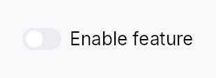
API reference
📖 Full rustdoc API for this module
pub struct Toggle
Import: use teksilo::widgets::Toggle;
An animated toggle switch bound to a Signal<bool>.
#![allow(unused)] fn main() { pub struct Toggle { /* fields */ } }
Methods
pub fn new(on: Signal<bool>) -> Self
Create a toggle bound to on. The signal is both read (to paint the
current state) and written (flipped on each activation).
See on_change when flipping it has to reach the
ambient context rather than only app state.
pub fn label(mut self, label: impl Into<LocalizedString>) -> Self
Accessible label announced by AT and optionally displayed beside the switch.
pub fn on_change(mut self, f: impl Fn(bool, &mut EventContext) + 'static) -> Self
Run f when the user flips this switch, with the value the
activation produced and an EventContext, so it can do what a bare
Signal write cannot (ctx.send_intent(...), ctx.set_theme(...),
opening a window). Fires for the pointer, for Space, and for an
assistive-technology Click.
Does not fire for programmatic writes to the bound signal — there is
no event in flight to carry. Observe the signal for that. The signal
stays the source of truth either way: it is written first, and f sees
the value it now holds.
Spelled the same way on Checkbox.
pub fn labelled_externally(mut self) -> Self
Declare that this toggle's accessible name comes from a sibling label
widget, wired by a container after mount (FormLayout::line does this
via access_labelled_by).
Without it the debug assertion in accessibility() fires even though
the toggle is properly labelled: the labelled_by relation is pushed
post-mount, so accessibility() cannot see it and every form-hosted
toggle looks nameless. Setting .label(..) instead would satisfy the
assert but render the text a second time, beside a label column that
already has it.
pub fn enabled(mut self, enabled: impl Into<Prop<bool>>) -> Self (default: true)
Set the enabled state, statically or reactively. Forwarded to the
arena via ctx.enabled_when(self_id, self.enabled.clone()) at
build time.
pub fn variant(mut self, variant: ToggleVariant) -> Self
Pick a Tier-1 design-language variant
(ToggleVariant::Switch / Pill / Square / Inset). The
active ToggleStyle decides what to do with the hint —
IntUI's default impl honours all four; a custom impl might
ignore the variant entirely.
pub fn style(mut self, style: impl ToggleStyle) -> Self
Override the active ToggleStyle for this widget instance
only. Useful for one-off custom-painted toggles in a single
view.
pub fn tooltip(mut self, text: impl Into<LocalizedString>) -> Self
Attach a plain single-line tooltip shown after a hover delay.
Mutually exclusive with rich_tooltip,
rich_tooltip_content, and
composite_tooltip — the last setter
called wins and clears the others.
pub fn rich_tooltip(mut self, key: impl Into<String>) -> Self
Attach a rich tooltip looked up by registry key.
Mutually exclusive with the other tooltip setters — the last setter called wins and clears the others.
pub fn rich_tooltip_content(mut self, content: crate::tooltip::TooltipContent) -> Self
Attach a rich tooltip from an inline crate::tooltip::TooltipContent
value rather than a registry key.
Mutually exclusive with the other tooltip setters — the last setter called wins and clears the others.
pub fn composite_tooltip(mut self, content: impl Widget + 'static) -> Self
Attach a composite tooltip whose body is an arbitrary widget tree.
Mutually exclusive with the other tooltip setters — the last setter called wins and clears the others.
Toolbar

Toolbar — a command bar with automatic overflow.
Public types
| Kind | Name |
|---|---|
const | TOOLBAR_HEIGHT_DEFAULT — Toolbar design tokens |
fn | toolbar_height_default — TOOLBAR_HEIGHT_DEFAULT raised to the density's target_size (24 / 32 / 44 dp) |
const | TOOLBAR_SPACING |
fn | toolbar_spacing — TOOLBAR_SPACING scaled by the density's spacing_factor (1.00 / 1.15 / 1.30) |
enum | ToolbarOrientation — Layout axis of the toolbar |
struct | ToolbarAction — A toolbar command: a label + an icon (both required), plus optional tooltip/toggle, an activation handler, an overflow priority, and an always_overflow… |
trait | ToolbarOverflow — A widget that knows how to represent itself in a Toolbar's overflow menu when it is collapsed (NSToolbar menuFormRepresentation / Qt QWidgetAction) |
struct | ToolbarItem — One slot in a Toolbar |
struct | Toolbar — A command bar with automatic overflow |
Public functions
Toolbar
ToolbarAction
ToolbarOverflow
| Returns | Function |
|---|---|
| Methods | |
ToolbarAction | toolbar_menu_form() |
ToolbarItem
| Returns | Function |
|---|---|
| Constructors | |
Self | action(action: ToolbarAction) |
Self | custom(widget: impl Widget + 'static) |
Self | custom_id(id: WidgetId) |
Self | collapsible(widget: impl Widget + ToolbarOverflow + 'static) |
Self | separator() |
Self | flexible_space() |
| Builder methods | |
Self | overflow_as(menu_form: ToolbarAction) |
Self | overflow_widget(factory: impl Fn() -> Box<dyn Widget> + 'static) |
Detailed description
Excess actions collapse into a trailing chevron (⌄) that opens a popover
menu, mirroring Qt's QToolBar extension button, macOS NSToolbar's
overflow menu, and WinUI CommandBar. Synthesized API:
- Actions (
ToolbarAction) — a command with a label + icon (both required), an optional tooltip, enabled state, optional toggle (checkable) or dropdownmenu, an overflow priority (NSToolbar: lowest priority collapses first), and analways_overflowflag (WinUI secondary commands). Each action has a toolbar form (anIconButton, or aPopoverIconButtonwhen it carries a menu) and a menu form (aMenuItem, or a submenu), so it renders correctly whether inline or in the overflow menu. - Pinned widgets (
ToolbarItem::custom) — arbitrary widgets (a search field, aSegmentedControl) that never collapse. - Collapsible widgets — an arbitrary widget that does overflow, by
supplying an overflow representation (NSToolbar
menuFormRepresentation/ QtQWidgetAction): a menu row (ToolbarAction) viaToolbarItem::custom(w).overflow_as(action)(orToolbarOverflow+ToolbarItem::collapsible; an icon-only control reuses its icon as the menu glyph), or a live embedded widget viaToolbarItem::custom(w).overflow_widget(f)(the factory rebuilds the control — e.g. aComboBoxbound to the same signal — inside the menu so it stays usable while collapsed). When the bar is tight the inline widget is hidden and its overflow form appears in the menu. - Separators and flexible space (NSToolbar
flexibleSpace). - Toolbar-wide
button_size(defaultCompact),button_style(a sharedIconButtonStylefor every action), and orientation.
Overflow is computed every layout pass from each item's intrinsic size
(measured even while collapsed, via
LayoutContext::measure_intrinsic),
so items reappear correctly as the bar widens — no stale-width glitches.
The chevron's drop-down is a real MenuList whose rows are gated by
MenuList::item_when,
so it sizes compactly to the currently-collapsed rows, carries standard
menu chrome, takes focus when opened, and supports arrow / Home / End /
Enter keyboard navigation (skipping the hidden rows).
Accessibility (ARIA toolbar pattern). The bar emits Role::Toolbar
with its orientation and name. It is a single Tab stop with roving
tab-index: arrow keys move focus among the visible controls (and the
chevron), Home/End jump to the ends. The chevron announces
HasPopup::Menu and its expanded state; overflowed actions are dormant
(absent from the AT tree), represented instead by their menu items — so no
action is announced twice. Toggle actions carry Toggled.
// on_activate requires an EventContext — use ignore.
use teksilo_widgets::toolbar::{Toolbar, ToolbarAction, ToolbarItem};
use teksilo_i18n::lit;
let _bar = Toolbar::new()
.action(ToolbarAction::new(lit!("Save"), save_icon).on_activate(|ctx| { /* ... */ }))
.action(ToolbarAction::new(lit!("Undo"), undo_icon).priority(-1))
.item(ToolbarItem::flexible_space());
Touch and pen
Nothing to do here, and it is worth recording why: every command on the bar
is an IconButton or a PopoverIconButton, so each one inherits the
framework press, release activation and slide-off abort from the button
family, and each is already 24 dp at Compact
(IconButtonSize::Compact/Default). The bar itself carries only roving
keyboard navigation and takes no press of its own. The overflow chevron is
gated on the layout-derived is_overflowing signal, not on hover, so it is
reachable by a finger without any reveal policy.
Density
The picture above is the widget at TargetDensity::Compact, the mouse-and-keyboard ladder. Below is the same subject on the same canvas with only the ladder changed, so what moves is the density and nothing else — where the subject no longer fits, that is what the denser targets cost it at that size. See docs/density-and-targets.md.
Touch

API reference
📖 Full rustdoc API for this module
pub const TOOLBAR_HEIGHT_DEFAULT
Import: use teksilo::widgets::toolbar::TOOLBAR_HEIGHT_DEFAULT;
Toolbar design tokens.
#![allow(unused)] fn main() { pub const TOOLBAR_HEIGHT_DEFAULT: f32 = 40.0; }
pub fn toolbar_height_default(...)
Import: use teksilo::widgets::toolbar::toolbar_height_default;
TOOLBAR_HEIGHT_DEFAULT raised to the density's target_size
(24 / 32 / 44 dp). The identity at Compact.
#![allow(unused)] fn main() { pub fn toolbar_height_default(tokens: &InputTokens) -> f32; }
pub const TOOLBAR_SPACING
Import: use teksilo::widgets::toolbar::TOOLBAR_SPACING;
#![allow(unused)] fn main() { pub const TOOLBAR_SPACING: f32 = 4.0; }
pub fn toolbar_spacing(...)
Import: use teksilo::widgets::toolbar::toolbar_spacing;
TOOLBAR_SPACING scaled by the density's spacing_factor
(1.00 / 1.15 / 1.30).
#![allow(unused)] fn main() { pub fn toolbar_spacing(tokens: &InputTokens) -> f32; }
pub enum ToolbarOrientation
Import: use teksilo::widgets::ToolbarOrientation;
Layout axis of the toolbar.
#![allow(unused)] fn main() { pub enum ToolbarOrientation { /* variants */ } }
Variants
Horizontal— Items flow left-to-right (default).Vertical— Items flow top-to-bottom.
pub struct ToolbarAction
Import: use teksilo::widgets::ToolbarAction;
A toolbar command: a label + an icon (both required), plus optional
tooltip/toggle, an activation handler, an overflow priority, and an
always_overflow flag. Renders as an icon-only IconButton inline (the
label is its tooltip + accessible name) and as a labelled MenuItem in the
overflow menu.
#![allow(unused)] fn main() { pub struct ToolbarAction { /* fields */ } }
Methods
pub fn new(label: impl Into<LocalizedString>, icon: impl Fn() -> IconWidget + 'static) -> Self
A new action with the given (translatable) label and icon factory,
and a no-op handler. The label is the inline button's tooltip +
accessible name (the button is icon-only); the icon factory builds the
glyph for both the inline IconButton and the overflow menu row
(IconWidget isn't Clone, so it is a factory).
pub fn menu(mut self, factory: impl Fn() -> MenuList + 'static) -> Self
Turn this action into a dropdown: its inline control becomes a
PopoverIconButton that opens the MenuList built by factory
(instead of a plain button that runs on_activate), and in the overflow
it becomes a submenu. MenuList isn't Clone, so pass a factory that
builds a fresh one. Mutually exclusive with on_activate / toggle
(the menu owns the interaction).
pub fn tooltip(mut self, text: impl Into<LocalizedString>) -> Self
Plain-text tooltip shown after a hover delay (the inline button is icon-only; with none set, the label is used). Overrides any previously set rich tooltip — every setter clears the other so last-call wins.
pub fn rich_tooltip(mut self, key: impl Into<String>) -> Self
Attach a rich tooltip resolved from the app-wide tooltip registry.
The key is looked up via
TooltipRegistry at build
time; the resolved body text supports inline markup
(label, *italic*, **bold**) and the entry's
shortcut / "more" fields are rendered automatically.
Overrides any previously set plain .tooltip(...) — every setter
clears the other so last-call wins.
pub fn rich_tooltip_content(mut self, content: crate::tooltip::TooltipContent) -> Self
Attach a rich tooltip driven by inline
TooltipContent — for
one-off tooltips that aren't worth registering in the central
catalog. Overrides any previously set plain .tooltip(...).
pub fn composite_tooltip(mut self, factory: impl Fn() -> Box<dyn Widget> + 'static) -> Self
Attach a composite tooltip whose body is built by factory — an
arbitrary widget tree (tabbed sections, charts, conditional rows).
Because ToolbarAction is Clone, the body is supplied as a
factory closure (not a Box<dyn Widget> instance, which is not
Clone); the closure is invoked to produce a fresh body for the
inline button. Overrides any previously set tooltip — every setter
clears the others so last-call wins.
pub fn enabled(mut self, enabled: impl Into<Prop<bool>>) -> Self (default: true)
Enabled state, static or reactive.
pub fn on_activate(mut self, f: impl Fn(&mut EventContext) + 'static) -> Self
Activation handler (tap / Enter / Space / AT click / menu activate).
pub fn toggle(mut self, state: Signal<bool>) -> Self (default: None)
Make this a checkable (toggle) action bound to state. Inline it reads
as a pressed toggle button; in overflow as a checkmark menu item.
pub fn priority(mut self, priority: i32) -> Self
Overflow priority — actions with the lowest priority collapse into
the menu first (NSToolbar semantics). Default 0.
pub fn always_overflow(mut self) -> Self
Always live in the overflow menu, never inline (WinUI secondary command).
pub trait ToolbarOverflow
Import: use teksilo::widgets::ToolbarOverflow;
A widget that knows how to represent itself in a Toolbar's overflow menu
when it is collapsed (NSToolbar menuFormRepresentation / Qt
QWidgetAction). Implement this on a widget and add it with
ToolbarItem::collapsible to make it overflow into the chevron menu as
the returned ToolbarAction (a menu row), instead of staying pinned.
For widgets that are best represented in the menu as themselves (a
ComboBox, a slider) rather than as a one-shot menu row, use
ToolbarItem::overflow_widget instead — it embeds a live widget in the
menu.
#![allow(unused)] fn main() { pub trait ToolbarOverflow { /* associated items below */ } }
Associated items
fn toolbar_menu_form(&self) -> ToolbarAction;
The menu-form representation shown when this widget overflows.
pub struct ToolbarItem
Import: use teksilo::widgets::ToolbarItem;
One slot in a Toolbar.
#![allow(unused)] fn main() { pub struct ToolbarItem { /* fields */ } }
Methods
pub fn action(action: ToolbarAction) -> Self
A collapsible command.
pub fn custom(widget: impl Widget + 'static) -> Self
A pinned arbitrary widget (never collapses) — e.g. a search field. Make
it collapsible with overflow_as.
pub fn custom_id(id: WidgetId) -> Self
A pinned arbitrary widget by pre-registered id.
pub fn collapsible(widget: impl Widget + ToolbarOverflow + 'static) -> Self
A collapsible widget that supplies its own menu form via
ToolbarOverflow. When the bar is too narrow, the widget is hidden
and its toolbar_menu_form() appears in the overflow menu.
pub fn overflow_as(mut self, menu_form: ToolbarAction) -> Self
Make a custom widget collapsible with an explicit menu
row — the ToolbarAction shown when it overflows (NSToolbar
menuFormRepresentation). Best for controls whose menu form is a
single command; an icon-only inline control reuses its icon here as the
menu item's leading glyph (pass it to ToolbarAction::new).
pub fn overflow_widget(mut self, factory: impl Fn() -> Box<dyn Widget> + 'static) -> Self
Make a custom widget collapsible by embedding a live
widget in the overflow menu — the factory rebuilds the control (e.g.
a ComboBox bound to the same signal) so it stays fully interactive
while collapsed, instead of degrading to a one-shot menu row. Best for
stateful inputs (combo boxes, sliders) that have no meaningful single
"command" representation.
pub fn separator() -> Self
A separator line between groups.
pub fn flexible_space() -> Self
Flexible space that pushes the following items to the trailing edge
(NSToolbar flexibleSpace). Collapses to nothing when over-constrained.
pub struct Toolbar
Import: use teksilo::widgets::Toolbar;
A command bar with automatic overflow. See the module docs.
#![allow(unused)] fn main() { pub struct Toolbar { /* fields */ } }
Methods
pub fn new() -> Self
Create an empty toolbar with the default orientation (horizontal) and
Compact, ghost icon buttons. Add commands with action
or layout items with item.
pub fn item(mut self, item: ToolbarItem) -> Self
Add an item (action, pinned widget, separator, flexible space).
pub fn items(self, items: impl IntoIterator<Item = ToolbarItem>) -> Self
Add several items from an iterator, in order.
The loop form of item: reach for it when the command set
is data-driven rather than written out call by call.
pub fn action(self, action: ToolbarAction) -> Self
Sugar for .item(ToolbarItem::action(a)).
pub fn actions(self, actions: impl IntoIterator<Item = ToolbarAction>) -> Self
Add several collapsible commands from an iterator.
The loop form of action, for a command set built from
data rather than spelled out one call at a time.
pub fn child(self, widget: impl teksilo_core::IntoTeksiChild) -> Self
Add a pinned inline child widget (sugar for
.item(ToolbarItem::custom(widget))). Pinned widgets never collapse
into the overflow menu — use action for collapsible
commands.
pub fn children( self, iter: impl IntoIterator<Item = impl teksilo_core::IntoTeksiChild>, ) -> Self
Add several pinned inline children from an iterator.
The loop form of child. Like child, every widget added
this way is pinned and never collapses into the overflow menu.
pub fn child_opt(self, widget: Option<impl teksilo_core::IntoTeksiChild>) -> Self
Attach widget when it is Some, and do nothing when it is None.
The conditional-child form. teksu!'s if without an else lowers to
this, and it is what cond.then(|| w) is for in a builder chain. None
adds no arena node, so nothing is laid out, painted, or published to the
accessibility tree, and a stack applies no spacing around it.
pub fn orientation(mut self, orientation: ToolbarOrientation) -> Self
Set the layout axis (default ToolbarOrientation::Horizontal).
pub fn button_size(mut self, size: IconButtonSize) -> Self
Size variant applied to every action's inline IconButton and the
overflow chevron (default IconButtonSize::Compact).
pub fn button_style(mut self, style: impl IconButtonStyle) -> Self
A toolbar-wide IconButtonStyle applied to every action button and the
overflow chevron — one shared style for the whole bar (the icon-button
analogue of theme.style_slots). Default: the theme's flat / ghost
icon-button style.
pub fn spacing(mut self, spacing: f32) -> Self (default: None)
Gap between consecutive toolbar items in logical pixels. Overrides the
density's toolbar_spacing (TOOLBAR_SPACING at Compact).
pub fn label(mut self, label: impl Into<LocalizedString>) -> Self
Override the accessible name (default: the localized "Toolbar").
pub fn compact(mut self, compact: bool) -> Self
Compact (shrink-to-fit) sizing. By default a toolbar fills the main
extent it is offered (it is meant to span a full command bar). In compact
mode it instead reports its natural content extent as the wanted size
and is shrinkable down to its collapsed minimum (the pinned items plus
the overflow chevron) — so it sits as a tight cluster when there is room,
composes next to other widgets (e.g. a title and a Spacer) without
claiming their space, and still collapses excess actions into the ⌄
menu when the slot is genuinely too narrow. Use it to embed a toolbar in a
constrained header rather than a full-width bar.
pub fn is_overflowing(&self) -> Signal<bool>
Reactive signal that is true whenever any action is collapsed into the
overflow menu (WinUI IsOverflowOpen-adjacent introspection).
ToolBox
ToolBox — a vertical stack of collapsible sections, exactly one expanded at a time.
Public types
| Kind | Name |
|---|---|
enum | ToolBoxOrientation — Orientation of a ToolBox: how its collapsible sections are arranged |
struct | ToolBoxItem — One section of a ToolBox |
const | TOOL_BOX_HEADER_MIN_HEIGHT — ToolBox design tokens |
fn | tool_box_header_min_height — TOOL_BOX_HEADER_MIN_HEIGHT raised to the density's target_size (24 / 32 / 44 dp) |
const | TOOL_BOX_HEADER_PADDING_HORIZONTAL |
fn | tool_box_header_padding_horizontal — TOOL_BOX_HEADER_PADDING_HORIZONTAL scaled by the density's spacing_factor (1.00 / 1.15 / 1.30) |
const | TOOL_BOX_ICON_TEXT_SPACING |
fn | tool_box_icon_text_spacing — TOOL_BOX_ICON_TEXT_SPACING scaled by the density's spacing_factor (1.00 / 1.15 / 1.30) |
const | TOOL_BOX_CHEVRON_SIZE |
const | TOOL_BOX_INDICATOR_THICKNESS |
struct | ToolBox — A vertical container of collapsible sections with exactly one expanded at a time — the Int UI / QToolBox pattern |
Public functions
ToolBox
| Returns | Function |
|---|---|
| Constructors | |
Self | new(selected: Signal<usize>) |
| Builder methods | |
Self | orientation(orientation: ToolBoxOrientation) |
Self | fill(fill: bool) |
Self | collapsible(collapsible: bool) |
Self | horizontal() |
Self | on_header_drag(f: impl Fn(usize, &mut EventContext) + 'static) |
Self | item(label: impl Into<LocalizedString>, content: impl teksilo_core::IntoTeksiChild) |
Self | add(item: ToolBoxItem) |
Self | items<I>(items: I) |
Self | show_dividers(show: bool) |
ToolBoxItem
Detailed description
Semantic cousin of Qt's QToolBox and the collapsible groups in
IntelliJ's Settings dialog. Differs from Accordion
(single-item independent disclosure) and TabWidget
(horizontal tab bar with dormant panes) by combining vertical layout,
always-visible headers, and exclusive expansion in one widget.
Int UI visual language:
- flat, borderless headers (no corner radius)
- 1 dp accent indicator bar on the leading edge of the active header
- color-only emphasis (selected / hover / pressed surface roles)
- border IS the focus ring: an accent border at the theme's
focus_ring_width(2 dp under Int UI) appears on the focused header, no separate ring primitive - content swaps are instant — Int UI's house rule is to avoid
decorative animation for inline transitions; see
MotionTokens. Matches the existingTabWidgetprecedent where pane swaps have no transition.
let selected = ctx.signal(0_usize);
ToolBox::new(selected.clone())
.item(lit!("Outline"), outline_widget)
.item(lit!("Properties"), properties_widget)
.add(ToolBoxItem::new(lit!("Build"), build_widget).enabled(false))
Touch and pen
A section header activates from its tap, so it already actuates on the release. Two things did change:
- its pressed appearance is the framework's press now, not the keyboard path's — before, the recipe painted a state no pointer of either kind ever wrote;
- a tap by a contact rests the header idle rather than hovered. A finger
sends no hover-leave to correct a resting
Hoveredwith, so a tapped header stayed lit with nothing on it — visible once the selection moved elsewhere, because a selected header's own chrome hides the tint until then.
The optional header drag (on_header_drag, the dock panel's handle) needs no
declaration for a contact: DragActivation::Auto resolves to Immediate
where nothing competes for the axis, and to the hold where a scroller does.
Density
The picture above is the widget at TargetDensity::Compact, the mouse-and-keyboard ladder. Below is the same subject on the same canvas with only the ladder changed, so what moves is the density and nothing else — where the subject no longer fits, that is what the denser targets cost it at that size. See docs/density-and-targets.md.
Touch
API reference
📖 Full rustdoc API for this module
pub enum ToolBoxOrientation
Import: use teksilo::widgets::ToolBoxOrientation;
Orientation of a ToolBox: how its collapsible sections are arranged.
Vertical (the default) stacks sections
top-to-bottom with horizontal headers and an up/down chevron — the
classic QToolBox. Horizontal lays
sections left-to-right; each header becomes a narrow vertical strip
with its label rotated 90° and a left/right chevron. The horizontal form
is used by side-docks anchored to the top/bottom edges (where the wide,
short region calls for vertical header strips).
#![allow(unused)] fn main() { pub enum ToolBoxOrientation { /* variants */ } }
Variants
Vertical— Sections stacked top-to-bottom; horizontal headers (default).Horizontal— Sections arranged left-to-right; vertical header strips with rotated labels and left/right chevrons.
pub struct ToolBoxItem
Import: use teksilo::widgets::ToolBoxItem;
One section of a ToolBox. Construct with ToolBoxItem::new and pass
to ToolBox::add, or use the convenience ToolBox::item builder
directly (it takes a widget or a WidgetId) when leading / trailing slots
and tooltip are not needed.
Layout of the header row:
[indicator] [leading?] [label] [spacer] [trailing?] [chevron]
Both leading and trailing accept any impl Widget — typical uses
are a small IconWidget, a Checkbox (checkable section), a
Badge (count), or a Button (per-row action).
#![allow(unused)] fn main() { pub struct ToolBoxItem { /* fields */ } }
Methods
pub fn new(label: impl Into<LocalizedString>, content: impl Widget + 'static) -> Self
Build an item with an inline content widget. The label may come from
tr!(...) (translated) or lit!(...).
pub fn new_id(label: impl Into<LocalizedString>, content_id: WidgetId) -> Self
Build an item whose content is a pre-registered widget id.
pub fn leading(mut self, widget: impl Widget + 'static) -> Self
Attach a leading-slot widget rendered before the label (after
the selection indicator bar). Use for a small IconWidget, a
Checkbox for checkable sections, a Badge, or any other
label-sized widget. The slot widget owns its own events — a
Checkbox inside the leading slot toggles independently of
the header's own tap.
pub fn trailing(mut self, widget: impl Widget + 'static) -> Self
Attach a trailing-slot widget rendered between the row's flexible
spacer and the chevron. Use for per-row actions — a dismiss
button, a badge, a secondary Toggle. The slot widget owns its
own events: tapping a Button inside the trailing slot fires the
button's action; gesture recognisers on the trailing widget stop
the header's own tap from firing, so a close-button click does
not also select the section.
pub fn tooltip(mut self, text: impl Into<LocalizedString>) -> Self
Attach a plain-text tooltip shown after a hover delay on the header
row. The text may come from tr!(...) (translated, locale-reactive)
or lit!(...). Mirrors .tooltip(...) on Button / IconButton /
MenuItem. Clears any previously set rich or composite tooltip (the
last tooltip setter called wins).
pub fn rich_tooltip(mut self, key: impl Into<String>) -> Self
Attach a rich tooltip resolved from the app-wide
TooltipRegistry by key.
Clears any previously set plain or composite tooltip (the last
tooltip setter called wins).
pub fn rich_tooltip_content(mut self, content: TooltipContent) -> Self
Attach a rich tooltip driven by inline TooltipContent — for
one-offs that don't belong in the registry. Clears any previously
set plain or composite tooltip (the last tooltip setter called wins).
pub fn composite_tooltip(mut self, content: impl Widget + 'static) -> Self
Attach a composite tooltip — an arbitrary impl Widget body shown
in a larger, scrollable overlay after a longer hover delay. Use for
rich on-demand previews: charts, property tables, image thumbnails.
Clears any previously set plain or rich tooltip (the last tooltip
setter called wins).
pub fn enabled(mut self, enabled: impl Into<Prop<bool>>) -> Self
Disable the item: its header renders in the disabled text role,
click and keyboard activation are ignored, and arrow navigation
skips it. Accepts a static bool or a reactive Signal<bool>.
Read once at build time: a false snapshot is forwarded to the
arena via ctx.enabled_when(header_id, false), and the arena is then
the single source of truth, ANDing with ancestors — disabling the
surrounding ToolBox (or any ancestor) disables every item regardless
of this flag. The Prop itself is not handed to the arena, so
flipping a bound Signal<bool> after build has no effect until the
ToolBox is rebuilt.
pub const TOOL_BOX_HEADER_MIN_HEIGHT
Import: use teksilo::widgets::tool_box::TOOL_BOX_HEADER_MIN_HEIGHT;
ToolBox design tokens.
#![allow(unused)] fn main() { pub const TOOL_BOX_HEADER_MIN_HEIGHT: f32 = 28.0; }
pub fn tool_box_header_min_height(...)
Import: use teksilo::widgets::tool_box::tool_box_header_min_height;
TOOL_BOX_HEADER_MIN_HEIGHT raised to the density's target_size
(24 / 32 / 44 dp). The identity at Compact.
#![allow(unused)] fn main() { pub fn tool_box_header_min_height(tokens: &InputTokens) -> f32; }
pub const TOOL_BOX_HEADER_PADDING_HORIZONTAL
Import: use teksilo::widgets::tool_box::TOOL_BOX_HEADER_PADDING_HORIZONTAL;
#![allow(unused)] fn main() { pub const TOOL_BOX_HEADER_PADDING_HORIZONTAL: f32 = 12.0; }
pub fn tool_box_header_padding_horizontal(...)
Import: use teksilo::widgets::tool_box::tool_box_header_padding_horizontal;
TOOL_BOX_HEADER_PADDING_HORIZONTAL scaled by the density's spacing_factor
(1.00 / 1.15 / 1.30).
#![allow(unused)] fn main() { pub fn tool_box_header_padding_horizontal(tokens: &InputTokens) -> f32; }
pub const TOOL_BOX_ICON_TEXT_SPACING
Import: use teksilo::widgets::tool_box::TOOL_BOX_ICON_TEXT_SPACING;
#![allow(unused)] fn main() { pub const TOOL_BOX_ICON_TEXT_SPACING: f32 = 8.0; }
pub fn tool_box_icon_text_spacing(...)
Import: use teksilo::widgets::tool_box::tool_box_icon_text_spacing;
TOOL_BOX_ICON_TEXT_SPACING scaled by the density's spacing_factor
(1.00 / 1.15 / 1.30).
#![allow(unused)] fn main() { pub fn tool_box_icon_text_spacing(tokens: &InputTokens) -> f32; }
pub const TOOL_BOX_CHEVRON_SIZE
Import: use teksilo::widgets::tool_box::TOOL_BOX_CHEVRON_SIZE;
#![allow(unused)] fn main() { pub const TOOL_BOX_CHEVRON_SIZE: f32 = 12.0; }
pub const TOOL_BOX_INDICATOR_THICKNESS
Import: use teksilo::widgets::tool_box::TOOL_BOX_INDICATOR_THICKNESS;
#![allow(unused)] fn main() { pub const TOOL_BOX_INDICATOR_THICKNESS: f32 = 1.0; }
pub struct ToolBox
Import: use teksilo::widgets::ToolBox;
A vertical container of collapsible sections with exactly one expanded
at a time — the Int UI / QToolBox pattern.
The active section is driven by a caller-owned Signal<usize>; mirrors
TabWidget::new so persistence, synchronised
windows, and programmatic activation work identically.
#![allow(unused)] fn main() { pub struct ToolBox { /* fields */ } }
Methods
pub fn new(selected: Signal<usize>) -> Self
Create a ToolBox driven by selected (visible section index). Set the
signal to 0 to open the first section by default; modify it
programmatically or share it across windows for synchronized state.
pub fn orientation(mut self, orientation: ToolBoxOrientation) -> Self
Set the section arrangement orientation (default
ToolBoxOrientation::Vertical).
pub fn fill(mut self, fill: bool) -> Self
Make the active section's panel fill the ToolBox's allotted space rather than size to its content's natural extent.
With fill on, the active panel stretches to the full cross axis and
flexes / shrinks (and clips) along the main axis, so a ToolBox placed
in a bounded region lays its content out at exactly the available
size — the QToolBox convention. A panel whose content carries a
trailing Spacer therefore pins a bottom toolbar to the visible
bottom edge instead of overflowing past it.
Default false (the panel keeps its content's natural size — the
historical behaviour, appropriate when the ToolBox itself lives inside
a scroll area).
pub fn collapsible(mut self, collapsible: bool) -> Self
Allow collapsing the active section: clicking (or Enter/Space on, or
the AT Collapse action of) the already-expanded header closes it, so
all sections can be collapsed at once. A subsequent click re-expands.
Default false — the classic "exactly one section open" behaviour. This
is what makes a single-section ToolBox a plain collapsible panel
(header toggles its content), e.g. a dock panel.
pub fn horizontal(mut self) -> Self
Shorthand for ToolBox::orientation``(``ToolBoxOrientation::Horizontal``).
pub fn on_header_drag(mut self, f: impl Fn(usize, &mut EventContext) + 'static) -> Self
Make each section header a drag source. f is invoked (with the
section index) when a drag gesture starts on a header; it should
begin a drag (e.g. ctx.start_drag(source, payload)). Tapping a
header still selects it — the gesture arena tells a tap from a drag.
pub fn item( self, label: impl Into<LocalizedString>, content: impl teksilo_core::IntoTeksiChild, ) -> Self
Append an item with an inline content widget. Convenience wrapper
around ToolBox::add that skips the ToolBoxItem builder for
the common label-plus-content case.
pub fn add(mut self, item: ToolBoxItem) -> Self
Append a fully-built ToolBoxItem — required when an icon,
tooltip, or disabled flag is needed.
pub fn items<I>(mut self, items: I) -> Self where I: IntoIterator<Item = ToolBoxItem>,
Append multiple items from an iterator.
pub fn show_dividers(mut self, show: bool) -> Self
Show a 1 dp BorderRole::Divider line between consecutive header /
panel rows. Default: false — IntelliJ Settings-style collapsibles
stack without explicit dividers, letting the flat background roles
delineate the rows.
TooltipWidget
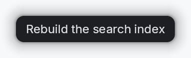
Tooltip system — hover-triggered overlays with configurable delay.
Public functions
TooltipWidget
| Returns | Function |
|---|---|
| Constructors | |
Self | new(text: impl Into<LocalizedString>) |
Self | bound(text: impl Into<Prop<String>>) |
| Builder methods | |
Self | style(style: impl teksilo_core::styles::TooltipStyle) |
Detailed description
Three tiers, increasing in expressive power:
TooltipWidget— single line of localized text in a themed rounded rect. Attached via the per-widget.tooltip(...)setter.RichTooltipWidget—TooltipContent-driven (body + optional long-form "more" disclosure + shortcut chip), inline-markup body solabelcascade links resolve againstTooltipRegistry. Attached via.rich_tooltip(key)/.rich_tooltip_content(content). On dwell it flips its AT role toRole::Dialogand advertises aFocusaction — keyboard focus is not auto-transferred; the user Tabs in (the correct non-modal-panel a11y pattern).composite::CompositeTooltipWidget— hosts an arbitraryimpl Widget + 'staticbody inside the same chrome with a larger surface budget. Crusader Kings 3-style: tabbed sections, charts, progress bars, conditional rows. Attached via.composite_tooltip(content). "Primary-only" by construction — has no inline-markup body and no registry key, so it cannot be the target of alabelcascade. Child widgets inside the body keep their own tooltip setters and cascade normally.
All three tiers share the same overlay machinery, hover/focus
tracking, and dwell-promotion timer in teksilo-core. The per-widget
setters (.tooltip / .rich_tooltip / .composite_tooltip) are
mutually exclusive (last-one-wins): each setter clears the others.
Example — plain tooltip
#![allow(unused)] fn main() { use teksilo_widgets::tooltip::TooltipWidget; use teksilo_i18n::lit; let _tip = TooltipWidget::new(lit!("Save the current file")); }
Density
The picture above is the widget at TargetDensity::Compact, the mouse-and-keyboard ladder. Below is the same subject on the same canvas with only the ladder changed, so what moves is the density and nothing else — where the subject no longer fits, that is what the denser targets cost it at that size. See docs/density-and-targets.md.
Touch
API reference
📖 Full rustdoc API for this module
pub struct TooltipWidget
Import: use teksilo::widgets::TooltipWidget;
A tooltip content widget — a themed rounded rect with text.
Composes a TextWidget with Small typography in tooltip_text color,
then delegates the chrome (shadow, dark background, corner radius,
padding) to the active TooltipStyle (default
crate::styles::RecipeTooltipStyle). Apps install per-call
(TooltipWidget::new(...).style(impl TooltipStyle)) or theme-wide
via theme.style_slots.tooltip = Some(Rc::new(MyTooltip)).
#![allow(unused)] fn main() { pub struct TooltipWidget { /* fields */ } }
Methods
pub fn new(text: impl Into<LocalizedString>) -> Self
Construct a tooltip from a localized string. With an I18nManager
installed the body stays locale-reactive (re-resolves on locale
change); otherwise it's a static snapshot.
pub fn bound(text: impl Into<Prop<String>>) -> Self
Construct a tooltip whose body is driven by a Signal<String>
(or any Prop<String>). Mutating the signal re-renders the
tooltip in place — used when a single dormant tooltip surface is
reused across many anchors and its text is set just before each
show. Callers wanting locale reactivity should resolve their
LocalizedString against the active locale when setting the
signal.
pub fn style(mut self, style: impl teksilo_core::styles::TooltipStyle) -> Self
Per-call style override. Replaces the theme-wide default
TooltipStyle for just this TooltipWidget instance.
TouchTarget
TouchTarget — the last resort of the three hit-targeting mechanisms:
the one that actually moves things.
Public functions
TouchTarget
| Returns | Function |
|---|---|
| Constructors | |
Self | new() |
| Builder methods | |
Self | size(dp: f32) |
Self | reserve_space(reserve: bool) |
Self | child(widget: impl teksilo_core::IntoTeksiChild) |
Self | child_opt(widget: Option<impl teksilo_core::IntoTeksiChild>) |
API reference
📖 Full rustdoc API for this module
pub struct TouchTarget
Import: use teksilo::widgets::primitives::TouchTarget;
Give an undersized control a conforming touch target, growing the layout
around it when nothing cheaper will do — and only at
TargetDensity::Touch.
When you need this, and when you do not
Teksilo has three ways to make a target reachable, and they are ordered by how much they disturb:
Widget::hit_outset— a thin grip claims the space around it. Hit-only; nothing moves. This is what a splitter gutter or a column resize strip uses.- The miss-only slop pass — an isolated small control catches a near miss. Hit-only; nothing moves. This is what a radio dot or a chart mark uses.
TouchTarget— this. The control genuinely needs room, because the thing beside it is also a target and there is no space to borrow. It changes layout, so siblings reflow.
Reach for (3) only when (1) and (2) cannot work: when a control sits in a tight row of other controls, so widening its hit area would take presses from its neighbours rather than from empty space. Everything else the density sweep already handles by projecting the recipes.
Why Touch only
At Compact and Comfortable this wrapper is the identity: it reports
its child's own response, unchanged, and adds no hit outset. Compact is the
density every existing layout was designed at and every layout golden was
recorded at, and Comfortable is served by the recipes' own density
projection, which raises a control's own dimensions rather than padding
around it. Touch is the ladder where a 24 dp control still falls 20 dp
short of the target and no recipe can close the gap from inside.
// A 16 dp close affordance in a dense tab strip: at Touch it is given a
// 44 dp slot and centred in it; at Compact nothing changes at all.
TouchTarget::new().child(close_button)
reserve_space
reserve_space(true)(the default) — the slot reports at leastsizeon both axes and centres the child in it. Siblings reflow.reserve_space(false)— the slot reports the child's own size and declares aWidget::hit_outsetthat brings the hit area up tosizeinstead. Nothing moves; the target overlaps whatever is beside it. Use it when the row has slack in one direction but you cannot spend it.
#![allow(unused)] fn main() { pub struct TouchTarget { /* fields */ } }
Methods
pub fn new() -> Self
A new wrapper at the density's own target_size. Attach content with
child or child.
pub fn size(mut self, dp: f32) -> Self
Override the target size, in dp. Defaults to the density's
InputTokens::target_size (44 dp at Touch).
pub fn reserve_space(mut self, reserve: bool) -> Self
Whether the slot takes the room it needs (true, the default) or widens
only the hit area (false). See the type docs.
pub fn child(mut self, widget: impl teksilo_core::IntoTeksiChild) -> Self
Wrap an inline widget.
pub fn child_opt(self, widget: Option<impl teksilo_core::IntoTeksiChild>) -> Self
Attach widget when it is Some, and do nothing when it is None.
The conditional-child form. teksu!'s if without an else lowers to
this, and it is what cond.then(|| w) is for in a builder chain. None
adds no arena node, so nothing is laid out, painted, or published to the
accessibility tree, and a stack applies no spacing around it.
TreeRowMeta
Type-erased data source adapter for TreeView.
Public types
| Kind | Name |
|---|---|
struct | TreeRowMeta — Key-erased per-row flat metadata, derived from the source's FlatEntry |
struct | TreeRow — Per-row context handed to a TreeView::from_source delegate — the key-erased counterpart of the built-in… |
Public functions
TreeRow
| Returns | Function |
|---|---|
| Methods | |
Rc<dyn Fn(&mut EventContext)> | toggle_callback() |
Detailed description
Wraps any TreeDataSource behind a uniform set of Rc<dyn Fn(..)> closures
keyed on the visible flat index, so TreeView<T> requires no extra type
parameter for the source's Key. Each closure resolves index → Key (via
key_at) before forwarding to the source's parent, set_expanded,
can_accept, etc. The Key type is fully captured here and never surfaces
in the view.
Both built-in and external backings flow through
TreeSource::from_data_source: the TreeView::new(TreeModel) path wraps a
Rc<TreeSlice<T>> (which implements TreeDataSource<Key = NodeId>), while
TreeView::from_source wraps an external TreeDataSource with its own Key.
The only built-in-vs-external difference — the NodeId-typed TreeRowContext
handed to the legacy delegate — lives in tree_view.rs, not here.
API reference
📖 Full rustdoc API for this module
pub struct TreeRowMeta
Import: use teksilo::widgets::TreeRowMeta;
Key-erased per-row flat metadata, derived from the source's FlatEntry.
#![allow(unused)] fn main() { pub struct TreeRowMeta { /* fields */ } }
Fields
depth:usize— Depth in the tree (0 for roots).has_children:bool— Whether this row has children in the source.is_expanded:bool— Whether this row is currently expanded.
pub struct TreeRow
Import: use teksilo::widgets::TreeRow;
Per-row context handed to a TreeView::from_source
delegate — the key-erased counterpart of the built-in
TreeRowContext. Carries the row's flat metadata
plus a one-call chevron toggle that flips the row's expansion through the
source (by index → key → set_expanded).
#![allow(unused)] fn main() { pub struct TreeRow { /* fields */ } }
Fields
depth:usize— Depth in the tree (0 for roots).has_children:bool— Whether this row has children in the source.is_expanded:bool— Whether this row is currently expanded.
Other fields are not public.
Methods
pub fn toggle_callback(&self) -> Rc<dyn Fn(&mut EventContext)>
Toggle callback for this row's chevron. Wires in one line:
.on_chevron_toggle_rc(row.toggle_callback()).
TreeTableView
TreeTableView<T> — hierarchical multi-column data table with expand/collapse.
Public types
| Kind | Name |
|---|---|
struct | TreeTableView — Hierarchical multi-column widget |
struct | TreeTableViewHandle — A handle on a mounted TreeTableView, to scroll it to a row from outside the widget — a view-model revealing the node a search found, say |
Public functions
TreeTableView
TreeTableViewHandle
| Returns | Function |
|---|---|
| Methods | |
scroll_to_row(row: usize) | |
ensure_row_visible(row: usize) |
Detailed description
Sibling of TableView for tree-shaped data. Each row carries
a depth level; one designated column (the tree column, defaulting to the first)
shows a twist (chevron) and an indent gutter that toggles the row's children.
Backed by a SortFilterTreeModel<T> so sort, filter, and expand state compose
without extra bookkeeping. Shares the header (a hosted
TableHeader), column, keyboard, and selection
modules with TableView.
Rows live in a TreeBodyPane — a sibling of the scrollbar — so buffer-exit /
selection / expand rebuilds are never deferred mid-thumb-drag. Three row-height
modes: uniform (row_height, fast path), exact per-flat-index callback
(row_height_fn), and auto-measured (auto_row_height — grows to tallest cell).
Common patterns
A checkbox column. Selection and "checked" are different things — a
checkbox column wants its own state, with parent/child propagation. Build it
from TreeCheckedModel over the same tree
the view projects.
A cell delegate receives (&T, &CellContext) and CellContext carries no
node identity — only row_index. So
capture the projection and resolve the row's NodeId through it:
let proxy = SortFilterTreeModel::new(tree);
let checks = TreeCheckedModel::new(proxy.tree());
let for_cells = proxy.clone();
let col = Column::new("done", lit!("Done"), move |_item, cx: &CellContext| {
match for_cells.visible_node_id(cx.row_index) {
Some(node) => Box::new(Checkbox::new(checks.check_state(node))) as Box<dyn Widget>,
None => Box::new(Spacer::new()),
}
});
For a tree whose identity is a domain key rather than a NodeId, use
KeyedTreeCheckedModel instead — it
survives a full re-source, which a NodeId-keyed set cannot.
Group rows that span the table, and the group kept in sight. A tree
whose upper levels are groups — songs under albums under artists — draws
those rows as one band across every column with
full_width_row and
full_width_row_delegate, and
keeps the groups being scrolled through pinned under the header with
pinned_ancestors:
let view = TreeTableView::from_projection(proxy)
.columns(columns)
.full_width_row(|row: &Row| !row.is_song())
.full_width_row_delegate(|row, _cx: &CellContext| {
Box::new(TextWidget::new(lit!(row.summary()))) as Box<dyn Widget>
})
.pinned_ancestors(2); // the artist, then the album
A band is still a row of the tree — it selects, drags, expands from its chevron and answers type-ahead — and one cell to the keyboard and to assistive technology. The pinned rows are copies, pushed up as the next group arrives, hidden from assistive technology, and every reveal stops below them. The two builders say the rest.
Accessibility
Root emits Role::TreeGrid; rows carry set_level + set_expanded.
ArrowLeft / ArrowRight on the tree column collapse / expand. A full-width
row holds one cell, spanning every column.
// Column delegates capture closures — use ignore.
use teksilo_widgets::TreeTableView;
use teksilo_data::TreeModel;
# struct File { name: String }
# let model: TreeModel<File> = TreeModel::new();
let _view = TreeTableView::new(model).row_height(28.0);
Scrolling to a row
handle returns a TreeTableViewHandle, a
cheap Clone taken before the view is added and usable from any handler
afterwards. Its scroll_to_row and
ensure_row_visible take a flat
visible row index and are applied at the next layout pass, after row
measurement and scroll anchoring, so they may follow an expansion in the
same turn, or be called before mount:
#![allow(unused)] fn main() { use teksilo_data::TreeModel; use teksilo_widgets::TreeTableView; let model: TreeModel<String> = TreeModel::new(); let view = TreeTableView::new(model); let handle = view.handle(); // … add the columns, `ctx.add(view)`; then, from a handler, after // expanding the row's ancestors in the same turn: handle.ensure_row_visible(42); }
The builder-value methods of the same names compute the offset when they are called, against the last layout pass.
Pan to scroll
The view installs common::scrollable::ScrollableBehavior,
which gives it the shared wheel arithmetic, a finger's pan and the
PanClaim that puts it on a pan's claimant chain. A pan scrolls it, the
release coasts, and a pan it cannot absorb hands the whole event to the
container outside — never a residual. A pan that starts on a row scrolls
rather than activating it or collapsing a multi-selection onto it. Both axes
are claimed. Shift+wheel still
scrolls the columns, and a finger's pan is never remapped by a held Shift:
the remap is a wheel convention, and turning a drag sideways is not what
the hand asked for.
Density
The picture above is the widget at TargetDensity::Compact, the mouse-and-keyboard ladder. Below is the same subject on the same canvas with only the ladder changed, so what moves is the density and nothing else — where the subject no longer fits, that is what the denser targets cost it at that size. See docs/density-and-targets.md.
Touch
API reference
📖 Full rustdoc API for this module
pub struct TreeTableView
Import: use teksilo::widgets::TreeTableView;
Hierarchical multi-column widget. See module documentation.
#![allow(unused)] fn main() { pub struct TreeTableView<T: 'static> { /* fields */ } }
Methods
pub fn from_projection(proxy: SortFilterTreeModel<T>) -> Self
Wrap a SortFilterTreeModel<T>.
pub fn from_source<S: TreeDataSource<Item = T> + 'static>(source: S) -> Self
Build a tree table over any TreeDataSource — an external source of
truth (an entity store, a database, a virtual filesystem) carrying
its own Key, so it needs no TreeModel mirror.
This is the tree-table sibling of
TreeView::from_source. Because the
source owns identity, its expand state (and a keyed selection) survive a
full re-source — which a TreeModel mirror cannot guarantee, since
NodeIds are reassigned on rebuild.
The NodeId-typed methods (expand,
projection, keyed_selection)
do not apply here and no-op; drive expansion through the source itself.
Row drag-reorder is wired on this path: a drop routes through the source's
own drag / can_accept / accept_drop, exactly as
TreeView does — so the
source owns both the cycle guard and the commit. Note that
TreeDataSlice::drag defaults to NoDrag: an
external source must opt its rows in before anything can be dragged.
pub fn from_source_keyed<S: TreeDataSource<Item = T> + 'static>( source: S, keyed: KeyedSelectionModel<S::Key>, ) -> Self where S::Key: teksilo_data::ItemKey,
Like from_source but with keyed selection:
the KeyedSelectionModel<S::Key> tracks rows by source identity, so it
survives expand / collapse, sort / filter and a full re-source. Pruning
consults the source's contains_key, so a collapsed-but-present row
keeps its selection. The view stays TreeTableView<T> — the Key is
captured here.
pub fn new(model: TreeModel<T>) -> Self
Wrap a raw TreeModel<T> — convenience for callers that don't
need sort/filter. Internally builds an identity
SortFilterTreeModel.
pub fn enabled(mut self, enabled: impl Into<Prop<bool>>) -> Self
Enable or disable the whole view. A disabled view greys out and stops accepting focus / selection / keyboard input (arena-gated).
pub fn overscroll_behavior(mut self, behavior: OverscrollBehavior) -> Self
Set the scroll-chaining behavior at the boundary (default
OverscrollBehavior::Chain; Contain
disables chaining to an ancestor scrollable).
pub fn smooth_scrolling(mut self, enabled: bool) -> Self
Enable or disable animated wheel scrolling (enabled by default). When disabled, wheel events snap immediately to the new offset.
pub fn type_ahead_label(mut self, label: impl Fn(&T) -> String + 'static) -> Self
Enable type-ahead ("type to jump"): typing a printable character
while the tree-table has keyboard focus jumps the focused row to the
next visible row whose label starts with the accumulated search term,
wrapping around (Qt keyboardSearch / macOS & Windows type-select).
label(&item) yields the searchable text; matching is
ASCII-case-insensitive. A pause longer than the
type_ahead_timeout starts a fresh term.
pub fn type_ahead_timeout(mut self, timeout: Duration) -> Self
Reset window between keystrokes before the type-ahead search term clears (default 500 ms). A zero duration disables type-ahead.
pub fn smooth_scroll_duration(mut self, duration: Duration) -> Self
Duration of the smooth scroll animation (default 150 ms).
pub fn scroll_bar_style(mut self, style: ScrollBarMode) -> Self
How the scroll bar is displayed (default Permanent). Overlay
and Thin float the bar over the content instead of reserving a
layout column for it, mirroring ScrollArea::scroll_bar_style.
pub fn add_column(mut self, col: Column<T>) -> Self
Append a column definition. Columns are displayed in declaration order unless reordered by the user.
pub fn reorderable(mut self, enabled: bool) -> Self
Enable drag-to-reorder of rows (pointer drag + keyboard
Alt+ArrowUp/Down). Distinct from
Column::reorderable, which reorders
columns and defaults to true; this defaults to false.
A drop reparents/reorders the dragged node in the underlying
TreeModel (top third of a row = Before, middle = Into / make-child,
bottom = After). The move is cycle-guarded — dropping a node onto
itself or into its own subtree is refused (no insertion line). Reorder
is suppressed while the view is sorted by one of its own columns:
with the visible order driven by the sort, a manual reorder would have
no visible effect. A sort a shared bind_sort
holds for a column this view lacks does not count.
pub fn exportable(mut self, mode: DragTransferMode) -> Self where T: Clone,
Make rows droppable outside this view — on a
DropTarget, another data view, or the OS.
A dragged row (or the whole selection, when the pressed row is part of a
multi-selection) carries clones of its items in a public
RowDragData<T>, so a foreign receiver can pull
them out with payload.get_typed::<RowDragData<T>>() /
DropTarget::on_drop_typed::<RowDragData<T>>() — no serialization. This
also makes rows a drag source even without reorderable.
mode chooses what happens to the origin rows once a foreign target
accepts them: DragTransferMode::Move removes them — by default,
directly from the underlying TreeModel (any dragged node that is a
descendant of another dragged node is skipped, since removing the
ancestor already removes it); override via
on_rows_transferred_out.
DragTransferMode::Copy leaves them. A same-view reorder is never a
transfer, so mode never affects it. Requires T: Clone.
pub fn export_external(mut self, f: impl Fn(&[T]) -> Vec<(String, Vec<u8>)> + 'static) -> Self where T: Clone,
Additionally advertise the dragged rows as MIME data so they can be
dropped on a DropZone or exported to another
application / window via the OS. f maps the dragged items to
(mime_type, bytes) pairs (e.g. text/plain, text/uri-list, an
app-specific application/x-…). Implies exportable
(defaulting to DragTransferMode::Move if not already set). Requires
T: Clone.
pub fn on_rows_transferred_out( mut self, f: impl Fn(&[usize], &mut EventContext) + 'static, ) -> Self
Override how rows moved out to a foreign target are removed from this
view. Receives the dragged rows' flat visible indices (as captured at
drag-start) and the live context. Without this, an
exportable Move drag
removes the dragged nodes directly from the underlying TreeModel
(leaf-first / descending — a dragged node that is a descendant of
another dragged node is skipped, since removing the ancestor already
removes its whole subtree).
pub fn accept_foreign_rows(mut self, accept: bool) -> Self
Accept exported rows dropped from a different view or source
without writing a custom source. Pair with
on_rows_received, which is handed the
dropped items and the target flat row index. (Same-view reorder is
reorderable.)
pub fn on_rows_received( mut self, f: impl Fn(Vec<T>, usize, &mut EventContext) + 'static, ) -> Self
Handler for rows accepted via
accept_foreign_rows: (items, target flat row index, ctx). Insert them into your tree at/near the index.
pub fn on_foreign_drop( mut self, f: impl Fn(&DragPayload, NodeId, DropPosition, &mut EventContext) -> bool + 'static, ) -> Self
Raw escape hatch for a foreign drop.
Projection path only. This hook is NodeId-typed and predates
from_source; over an external source there is no
NodeId to hand it, so it never fires. Prefer
accept_foreign_rows +
on_rows_received, which are source-agnostic.
A source-backed view expresses foreign-accept through its source's own
capability closures (can_accept / accept_drop), like ListView /
TableView; this hook is what a projection-backed view has instead,
since a SortFilterTreeModel carries no such closures.
This fires for any payload NOT recognized as this view's own row
drag — a different view's RowDragData<T>, or a
completely different payload type — dropped on a node: (payload, target node, drop position, ctx) -> accepted. Tried after
on_rows_received, so the typed sugar wins
when both are set and the payload happens to carry an exportable
RowDragData<T>.
pub fn activate_on(mut self, mode: crate::data_views::ActivateOn) -> Self
Choose single- vs double-click activation for on_row_activate (default
ActivateOn::DoubleClick). Enter/Space activates in
either mode.
pub fn columns(mut self, cols: impl IntoIterator<Item = Column<T>>) -> Self
Append multiple columns from an iterator.
pub fn tree_column(mut self, col_id: impl Into<String>) -> Self
Designate which column hosts the twist + indent. Default: the first column.
pub fn indent_per_level(mut self, px: f32) -> Self
Override the per-depth indent in the tree column in logical pixels (default
comes from the active TableStyle).
pub fn full_width_row(mut self, is_full_width: impl Fn(&T) -> bool + 'static) -> Self
Draw the rows whose item satisfies is_full_width as one cell across
every column instead of a cell per column: a group row ("an artist ·
12 songs | 3 albums | 52:10") over rows that fill the columns. What the
band shows comes from
full_width_row_delegate; without one
it shows the tree column's own cell, laid across the row.
Asked of the item, like the cell delegates; a row whose item is still loading is never full-width. The predicate is read on every build and on every key press, so keep it to a field test.
The row stays a row of the tree in every other respect: it selects, activates, drags, takes drops and answers type-ahead as any row does, its chevron (indent and twist) sits in the band, and ←/→ act on it as on the tree column from any column: they collapse and expand it, and ← on a collapsed band moves up to its parent. In cell navigation the band is one cell: Home and End stay on it, Tab passes it as one stop, and no column of it opens an editor. The cursor keeps the column it arrived with, so stepping on to an ordinary row lands back in that column.
The band is as wide as the columns together, or the row when they are
wider, so beside columns narrower than the view it ends where a row's
selection band, alternating tint and focus ring do. It stays in the
viewport while the columns
scroll sideways, so a group row stays readable; its chevron sits where
the tree column's does with the columns unscrolled. Its height comes
from the view's height mode like any row's: the uniform height, the
row_height_fn callback, or, under
auto_row_height, the band measured at its
width.
To assistive technology the row is unchanged (Role::Row with its
level, expanded state and position) and holds one Role::Cell
(Role::GridCell in the cell modes) at column 1, with a column span of
every column and the band as its content.
pub fn full_width_row_delegate( mut self, delegate: impl Fn(&T, &CellContext) -> Box<dyn Widget> + 'static, ) -> Self
Build the band of a full_width_row from its
item, as a Column's delegate builds a cell. The context describes
the band as the tree column, whose chevron it carries: col_id and
col_index are the tree column's and is_tree_column is true;
is_focused holds while the cursor is on the row, in any column, and
is_selected while the row is selected (in a cell mode, while any of
its cells is). The indent and the chevron are drawn before the
delegate's widget, as in the tree column.
Does nothing without full_width_row, which
says which rows get it.
pub fn pinned_ancestors(mut self, depth: usize) -> Self
Keep the ancestor rows of the first visible row pinned under the
header while the view scrolls, outermost first and at most depth
levels of them: the "sticky scroll" of code editors, the artist and
then the album over the songs. 0 (the default) pins nothing.
A pinned row is pushed up by the next row at its level as that row
arrives, as a pinned section header is, so it never covers a row it is
not an ancestor of. It is a copy, drawn with the real row's cells (its
band, for a full_width_row) at the real row's
height, on the header's surface. The copy shows the row's content, not
its selection or its focus, and its chevron is a picture. Under
auto_row_height the copy measures the row,
as the row does once laid out: an ancestor the view scrolled past
without laying it out takes its height a frame after it is pinned, and
a reveal made before then counts it at the estimate.
A press on a pinned row does what a plain click on the real row would:
it ends an open cell edit, selects the row and puts the cursor on it,
activates it under ActivateOn::SingleClick,
and scrolls it back into view, right under its own pinned ancestors. A
double click on a copy does not activate it, and a press never reaches
a control drawn inside the copy. A drop on a pinned row lands on the
row it shows, and its indicator is drawn over the copy.
Every reveal the view makes (the keyboard moving the cursor,
ensure_row_visible,
scroll_to_row, taking focus, the
ScrollIntoView action) stops below the ancestors that would be pinned
over the row, so a copy never covers the row the cursor is on.
The copies are hidden from assistive technology and are not focusable; the real rows stay where they are in the tree, scrolled under the copies like any row off the top. The stack is re-derived on every layout, so an expand, a collapse, an insert or a re-source above or inside it shows on the next frame.
pub fn row_height(mut self, height: f32) -> Self
Fixed row height, the uniform fast path. Default: the active
TableStyle's
row_height, 28 px
under IntUI at the Compact density. Mutually exclusive with
row_height_fn and
auto_row_height; the last mode setter
wins.
pub fn row_height_fn(mut self, f: impl Fn(usize) -> f32 + 'static) -> Self
Per-row heights from a callback over the flat (visible) row index. The callback must be pure (same index + same data → same height); it is re-swept from the first changed flat index on every projection rebuild (expand/collapse/sort/filter/mutation). No measurement pass runs.
pub fn auto_row_height(mut self, estimated: f32) -> Self
Auto-measured row heights: each realized row reports the height
of its tallest cell measured at the cell's column width
(height-for-width), unrealized rows assume estimated. Scroll
anchoring keeps content above the viewport stationary; measured
heights above a toggled row survive expand/collapse
(divergence-driven invalidation). The scrollbar settles one
frame after a measurement change.
pub fn header_height(mut self, height: f32) -> Self
Override the header row height in logical pixels. Default: the active
TableStyle's
header_height,
32 px under IntUI at the Compact density.
pub fn show_header(mut self, visible: bool) -> Self
Show or hide the column header row (default true).
pub fn selection_mode(mut self, mode: TableSelectionMode) -> Self
Set the row/cell selection mode (default
TableSelectionMode::MultiRow).
pub fn selection(mut self, sel: SelectionModel) -> Self
Set the index-based row selection model (visible positions). For
identity-based selection that survives expand / collapse / sort /
filter / structural edits, use keyed_selection
instead.
pub fn keyed_selection(mut self, keyed: KeyedSelectionModel<NodeId>) -> Self
Set a keyed row selection model (by NodeId). Selection is tracked by
node identity, so it survives expand / collapse, sort / filter, and node
moves — and stays consistent if two views share the projection. Pruned
of deleted nodes on each projection change. Mutually exclusive with
selection (last one set wins).
Only meaningful on the from_projection /
new paths, whose identity is NodeId; a no-op over an
external source, which carries its own key — use
from_source_keyed there.
pub fn cell_selection(mut self, sel: CellSelectionModel) -> Self
Attach a cell-level selection model (row and column axes tracked independently).
pub fn alternating_rows(mut self, enabled: bool) -> Self
Paint odd-indexed rows with the SurfaceRole::AlternatingRow tint
(default false).
pub fn grid_lines(mut self, kind: GridLines) -> Self
Paint horizontal and/or vertical dividers between cells.
pub fn stretch_last_column(mut self, on: bool) -> Self
Let the last column in display order take up whatever width the
other columns leave, so the table never ends in a bare strip at its
trailing edge — Qt's stretchLastSection, NSTableView's
lastColumnOnlyAutoresizingStyle. Default: off.
Positional, not a property of a column: after a reorder it is the new last column that stretches and the previous one goes back to its own width. While a column stretches, its declared width is the floor it grows from, its user-resize override is ignored, and its trailing grip is disabled (no AccessKit Increment/Decrement either): any size the user gave it, the stretch would take straight back. Resizing any other column reflows it. Once the other columns exceed the viewport there is nothing left to stretch into — the last column sits at its own width and the pane scrolls, as in Qt.
Flex columns already share every spare pixel among themselves, so
a table of Flex columns looks the same either way: this is for
pixel-sized tables (Fixed / Auto, or widths the user has set)
that would otherwise end in a gap.
pub fn a11y_label(mut self, label: impl Into<LocalizedString>) -> Self
Accessible label for the whole tree table, announced by AT as the table's name.
pub fn show_internal_scrollbars(mut self, show: bool) -> Self
Show or hide the widget's internal vertical and horizontal scroll bars
(default true). Set to false when the table lives inside an external
ScrollArea.
pub fn column_resize_policy(mut self, policy: ColumnResizePolicy) -> Self
Control how column widths are distributed when the table is resized
(default Proportional).
pub fn tab_traversal(mut self, mode: TabTraversal) -> Self
Set the keyboard Tab traversal direction inside the table (default CellsThenRows).
pub fn edit_triggers(mut self, trigger: EditTriggers) -> Self
Set which user gestures open an in-place cell editor — a set, composed
with | (default F2 | ANY_KEY | DOUBLE_CLICK). See EditTriggers.
pub fn on_cell_edit_request( mut self, f: impl Fn(usize, &str, &mut EventContext) + 'static, ) -> Self
Callback invoked when the user requests an in-place cell edit (e.g.
double-click when edit_triggers contains DOUBLE_CLICK). Receives the flat row
index, the column id, and a mutable EventContext.
pub fn on_cell_edit_dismissed( mut self, f: impl Fn(usize, &str, &mut EventContext) + 'static, ) -> Self
Callback invoked when an open cell editor should end because the pointer went somewhere else: a press that lands on any cell other than the one being edited. Receives the editing cell's flat row index and column id, so the owner can commit (or discard) whatever is in its buffer, then clear its own editing state.
The counterpart of on_cell_edit_request,
and the view cannot do it alone: the framework owns which cell is being
edited, but only the owner knows what an ended edit means — commit,
discard, or refuse a value that will not parse.
Why a press and not a focus change. "The editor lost focus" is the obvious signal and it cannot be used: a body pane rebuilds constantly — selection, filtering, scroll, a reload from elsewhere — and every rebuild destroys and re-creates the open editor, so focus leaves it many times during an edit the writer never interrupted. A press on another cell is unambiguous and happens exactly once.
pub fn on_row_activate(mut self, f: impl Fn(usize, &mut EventContext) + 'static) -> Self
Callback invoked when a row is activated (double-click or Enter, per
activate_on). Receives the flat row index.
pub fn filter_mode(self, mode: TreeFilterMode) -> Self
Forward mode to the underlying projection. The proxy holds its
state behind Rc<RefCell>, so calling .filter_mode() on a
clone mutates the shared inner — effectively persisting the
choice on self.proxy.
pub fn bind_sort(mut self, sort: Signal<Option<(String, SortDirection)>>) -> Self
Use sort as this view's sort state instead of a signal of its own:
header clicks and set_sort write it, a write from
anywhere else updates the header, and
sort_signal returns it. Bind the same signal to
the SortFilterTreeModel to re-sort the rows; one signal shared by
both is what lets a projection keep its preset comparators while the
header drives it.
The view writes nothing into it until the user sorts; see
TableView's module docs, "Column state an
application owns".
pub fn bind_column_widths(mut self, widths: Signal<HashMap<String, f32>>) -> Self
Use widths as this view's map of column id → width instead of a
signal of its own: a resize drag and
set_column_width write it, and a write from
anywhere else resizes the columns. A column with no entry takes its
declared width; an entry for a column the view lacks is ignored. A
resize writes the resized column's entry alone; the Flex columns
before it keep their widths in this view, not in the map.
column_widths_signal returns it.
pub fn bind_column_order(mut self, order: Signal<Vec<String>>) -> Self
Use order as this view's column order instead of a signal of its
own: a reorder drop and set_column_order
write it, and a write from anywhere else reorders the columns. Ids the
view lacks are skipped when it lays out and kept in place when it
writes. column_order_signal returns it.
pub fn bind_filters(mut self, filters: Signal<HashMap<String, String>>) -> Self
Use filters as this view's per-column filter text instead of a
signal of its own: the filter popover and
set_filter write it, and
filters_signal returns it. Bind the same
signal to the SortFilterTreeModel to filter the rows.
pub fn scroll_y_signal(&self) -> &Signal<f32>
Current vertical scroll offset in logical pixels.
pub fn max_scroll_y_signal(&self) -> &Signal<f32>
Maximum vertical scroll offset (content height − viewport height).
pub fn viewport_ratio_y_signal(&self) -> &Signal<f32>
Viewport-to-content height ratio — drives the scrollbar thumb size.
pub fn scroll_x_signal(&self) -> &Signal<f32>
Current horizontal scroll offset of the Middle (unpinned) pane, in logical pixels. Leading/Trailing-pinned columns are unaffected.
pub fn max_scroll_x_signal(&self) -> &Signal<f32>
Maximum horizontal scroll offset — middle_content_width − middle_viewport_width.
pub fn viewport_ratio_x_signal(&self) -> &Signal<f32>
Middle-pane viewport-to-content width ratio.
pub fn sort_signal(&self) -> &Signal<Option<(String, SortDirection)>>
Active sort state: Some((col_id, direction)) or None for unsorted.
This is the header's state, not the data's. Clicking a sort header writes here; nothing reorders rows until you bind this onto the backing projection yourself:
let proxy = SortFilterTreeModel::new(tree)
.with_comparator("name", |a: &Row, b: &Row| a.name.cmp(&b.name));
proxy.sort_signal(view.sort_signal().clone());
The binding is deliberately not automatic: a projection may already
carry preset comparators, predicates, and a filter mode, and adopting
the view's empty signal at construction would clobber them. To share
one signal between the two from the start, hand it to
bind_sort; this returns the adopted signal then.
pub fn filters_signal(&self) -> &Signal<HashMap<String, String>>
Active per-column filters keyed by column id.
Like sort_signal, this holds the header's state
only — bind it onto the projection to actually filter rows:
let proxy = SortFilterTreeModel::new(tree)
.with_predicate("name", |t| {
let needle = t.to_string();
Box::new(move |r: &Row| r.name.contains(&needle))
});
proxy.filters_signal(view.filters_signal().clone());
The signal adopted by bind_filters, if any.
pub fn column_widths_signal(&self) -> &Signal<HashMap<String, f32>>
User-resized column widths in logical pixels, keyed by column id. The
view writes entries only for a resize: the resized column's, and —
when the map is its own — one for each Flex column before it, frozen
at the width it had. A missing key means the declared width. The
signal adopted by bind_column_widths, if
any.
pub fn column_order_signal(&self) -> &Signal<Vec<String>>
Current column display order as a list of column ids. The signal
adopted by bind_column_order, if any.
pub fn focused_cell_signal(&self) -> &Signal<Option<(usize, usize)>>
Keyboard-focused cell as (row, display_column_index), or None.
In a tree table whose selection holds one row or cell, a selection change that leaves an existing cursor off the selection moves the cursor onto it.
pub fn editing_cell_signal(&self) -> &Signal<Option<(usize, usize)>>
Cell currently being edited as (row, display_column_index), or None.
pub fn projection(&self) -> Option<&SortFilterTreeModel<T>>
Access the underlying SortFilterTreeModel (for programmatic sort /
filter / expand outside of the builder API).
None when the view was built from an external
teksilo_data::TreeDataSource via
from_source — there is no TreeModel-backed
projection to hand back in that case.
pub fn expand(&self, node: NodeId)
Expand the subtree rooted at node.
pub fn collapse(&self, node: NodeId)
Collapse the subtree rooted at node.
pub fn toggle(&self, node: NodeId)
Toggle the expand/collapse state of node.
pub fn expand_all(&self)
Expand all nodes in the tree.
pub fn collapse_all(&self)
Collapse all nodes in the tree.
pub fn set_focused_cell(&self, row: usize, col: usize)
Move keyboard focus to the cell at (row, col).
pub fn clear_focused_cell(&self)
Clear the keyboard-focused cell.
pub fn set_sort(&self, col_id: Option<&str>, dir: SortDirection)
Programmatically sort by col_id (pass None to clear the sort).
Equality-guarded, like every persisted-layout setter here — see
set_column_widths.
pub fn set_filter(&self, col_id: &str, text: &str)
Set or clear the filter text for a single column.
pub fn clear_filters(&self)
pub fn empty_view(mut self, f: impl Fn() -> Box<dyn Widget> + 'static) -> Self
Widget shown when no rows are visible — an empty tree, or a filter that matched nothing. Without one, the body region is simply blank.
pub fn clear_sort(&self)
Clear the active sort.
pub fn scroll_to_row(&self, row: usize)
Scroll so that row (a flat visible index) is aligned to the top of
the viewport, now, against the row offsets and scroll range of the last
layout pass. A no-op before the first layout pass.
The offset is clamped when this is called, to the range that pass
wrote, so after a structural change in the same turn (a node expanded
above the row) it still describes the old rows. On a mounted view, or
to scroll before the first layout, use a handle,
which defers the computation to the next layout pass.
With pinned_ancestors, the top it is
aligned to is the bottom of its own pinned ancestors.
pub fn ensure_row_visible(&self, row: usize)
Scroll the minimum distance needed to make row (a flat visible
index) visible, now, against the viewport, row offsets and scroll range
of the last layout pass. A no-op before the first layout pass, when the
viewport height is not yet known. A handle defers the
computation to the next layout pass instead.
With pinned_ancestors, "visible" means
below the ancestors that would be pinned over it.
pub fn set_column_width(&self, col_id: &str, width: f32)
Set or remove a single column's user-resized width override.
A non-positive width removes the entry (the column reverts to
its declared width policy).
pub fn set_column_widths(&self, widths: HashMap<String, f32>)
Replace the full width-override map (typically used to restore a persisted layout).
Equality-guarded for the same reason as
TableView::set_column_widths:
the documented settings round-trip would otherwise recurse without
bound on the first tick of a live resize drag.
pub fn set_column_order(&self, order: Vec<String>)
Replace the column-order list. Ids not declared on this table are silently dropped on the next layout pass.
pub fn column_pinning_signal(&self) -> &Signal<HashMap<String, PinnedSide>>
Current column pinning overrides, keyed by column id. Wins over
each column's declared Column::pinned.
pub fn set_column_pinning(&self, col_id: &str, side: PinnedSide)
Put a single column on side: PinnedSide::Leading or
PinnedSide::Trailing pins it, PinnedSide::None unpins it, a
column declared pinned (Column::pinned) included.
Writes column_pinning_signal the way a
header drag does: an entry for a column moved off its declared side,
and none for a column put back on it.
pub fn begin_edit(&self, row: usize, col_id: &str)
Begin editing the cell (row, col_id). Silently no-ops if col_id
isn't a currently-displayed column, or if row is outside the visible
range — an out-of-range target would otherwise strand editing_cell on
a row nothing can match.
Callable before the view is mounted, which is the only point at
which a consumer can seed a freshly constructed view with an edit
target it already holds. display_indices is a cache build() fills,
so a pre-mount call finds it empty; the order is recomputed on demand
in that case rather than resolving against nothing and no-opping for a
third, undocumented reason.
A full_width_row has no cell of any column
to edit, so a row that is one is a no-op too.
pub fn end_edit(&self)
Close the active cell editor without committing (the field's on_blur still fires).
pub fn handle(&self) -> TreeTableViewHandle
A handle that scrolls this view once it is mounted.
Take it while describing the tree, before the view is handed to
ctx.add(...); it stays attached to the view across rebuilds. See
TreeTableViewHandle.
pub struct TreeTableViewHandle
Import: use teksilo::widgets::TreeTableViewHandle;
A handle on a mounted TreeTableView, to scroll it to a row from
outside the widget — a view-model revealing the node a search found, say.
Rows are addressed by their flat visible index, as by
TreeTableView::scroll_to_row: the position of the row among the rows
currently shown, counting the children of expanded nodes and skipping those
of collapsed ones. With pinned_ancestors
the row is revealed below the ancestors pinned over it.
Cheap to clone, valid before the view is mounted, and it survives the view's rebuilds. Its methods never compute an offset when they are called: they record the request and ask for a layout pass, and the view applies it there, after row measurement and scroll anchoring have settled. So a structural change made in the same turn (a node expanded above the target, say) is accounted for, a request made before mount is applied at the first layout, and a later request replaces an earlier pending one. A request on a view with no rows is dropped; a row past the end reveals the last row.
#![allow(unused)] fn main() { use teksilo_data::TreeModel; use teksilo_widgets::TreeTableView; let model: TreeModel<String> = TreeModel::new(); let view = TreeTableView::new(model); let handle = view.handle(); // … add the columns, `ctx.add(view)`; later, after expanding the row's // ancestors: handle.ensure_row_visible(42); }
#![allow(unused)] fn main() { pub struct TreeTableViewHandle { /* fields */ } }
Methods
pub fn scroll_to_row(&self, row: usize)
Scroll so that row (a flat visible index) is aligned to the top of
the viewport, as far as the scroll range allows, at the next layout
pass.
pub fn ensure_row_visible(&self, row: usize)
Scroll the minimum distance that makes row (a flat visible index)
fully visible, at the next layout pass; no scroll when it already is.
TreeView
TreeView — a virtualized, expandable/collapsible hierarchical list widget.
Public types
| Kind | Name |
|---|---|
struct | TreeRowContext — Per-row context passed to a 4-arg TreeView delegate |
struct | TreeView |
struct | TreeViewHandle — A handle on a mounted TreeView, to scroll it to a row from outside the widget — a view-model revealing the node a search found, say |
Public functions
TreeView
TreeRowContext
| Returns | Function |
|---|---|
| Methods | |
std::rc::Rc<dyn Fn(&mut teksilo_core::widget::EventContext)> | toggle_callback() |
TreeSliceHandle<T> | slice_handle() |
teksilo_data::NodeId | node_id() |
TreeViewHandle
| Returns | Function |
|---|---|
| Methods | |
scroll_to_index(index: usize) | |
ensure_index_visible(index: usize) | |
Option<usize> | cursor() |
set_cursor(index: Option<usize>) | |
Signal<Option<usize>> | cursor_signal() |
Detailed description
Displays a TreeModel<T> as an indented tree.
Internally each view owns a TreeSlice for independent
expand state, so two TreeViews on the same model can be open at different
depths simultaneously. Only rows in the visible viewport + a small buffer have
live widgets — rows outside the buffer are dormant, matching ListView's
virtualization model. An external TreeDataSource
is also accepted via TreeView::from_source when the data lives outside a
TreeModel.
Row heights come in three modes: uniform (item_height, default fast path),
exact per-flat-index callback (item_height_fn), and auto-measured
(auto_item_height — height-for-width per row, scroll-anchored).
Scrolling to a row
handle returns a TreeViewHandle, a cheap Clone
taken before the view is added and usable from any handler afterwards. Its
scroll_to_index and
ensure_index_visible take a flat
visible row index and are applied at the next layout pass, after row
measurement and scroll anchoring, so they may follow an expansion in the
same turn, or be called before mount:
#![allow(unused)] fn main() { use teksilo_widgets::TreeView; use teksilo_widgets::primitives::TextWidget; use teksilo_data::TreeModel; use teksilo_i18n::lit; let model: TreeModel<String> = TreeModel::new(); let tree = TreeView::new(model, |item, _entry, _selected| { Box::new(TextWidget::new(lit!(item))) }); let handle = tree.handle(); // … `ctx.add(tree)`; then, from a handler, after expanding the row's // ancestors in the same turn: handle.ensure_index_visible(42); }
The keyboard cursor
The tree has one current row, its keyboard cursor: the row the arrow keys
step from and the one it names to assistive technology as its active
descendant while it holds keyboard focus. The same TreeViewHandle
reads and moves it, in flat visible indices:
cursor,
set_cursor (clamped to the last visible
row; keyboard focus, the selection and the scroll offset are left alone)
and cursor_signal, for an application
to observe. The cursor follows its row through an expansion or a collapse
above it, whoever set it. A cursor set before mount is there at the first
build.
In a single selection the cursor follows the selection. In a multiple
selection the two are separate: Ctrl+↓ moves the cursor and leaves
the selection, and a selection written from outside leaves the cursor
where it was. Read the cursor, not the first selected row, for "the row
the user is on".
Pan to scroll
The view installs common::scrollable::ScrollableBehavior,
which gives it the shared wheel arithmetic, a finger's pan and the
PanClaim that puts it on a pan's claimant chain. A pan scrolls it, the
release coasts, and a pan it cannot absorb hands the whole event to the
container outside. Vertical only: this view owns no horizontal offset, so a
horizontal pan is declined and chains outward. A pan that starts on a row
scrolls rather than activating it, toggling its chevron, or collapsing a
multi-selection onto it — the three things a release on that row commits.
Activation is a gesture, so the arbitration cancels it; the chevron and the
deferred collapse are raw PointerUp arms the arbitration cannot reach, so
each asks data_views::release_completes_the_press whether the release still
belongs to the row.
Keyboard
Arrows move the cursor; Home / End reach the first and last visible
row and PageUp / PageDown a viewport of them, each moving the selection
unless the accelerator is held, which moves the cursor alone — in a
multiple selection only: a single selection always moves with the cursor,
a selection the application sets moves the cursor onto it, and a
structural change carries the selection along with its row. Shift
extends a range from the anchor and Ctrl+Shift extends it additively.
→ opens a closed node and, on one already open, moves into its first
child; ← closes an open node and, on a leaf or a closed one, ascends to
the parent. Both mirror under RTL. * expands the whole subtree, + and
- one level. Space selects or toggles, Enter activates, Ctrl+A and
Ctrl+Shift+A select and deselect everything, and Ctrl+Arrow with
Ctrl+Space build a disjoint selection. On macOS ⌘↓ opens a row, ⌘↑
ascends, and ⌥→/⌥← expand or collapse a subtree.
The full table, and why some of it is platform-specific, is in docs/data-view-keyboard.md.
Example
#![allow(unused)] fn main() { use teksilo_widgets::TreeView; use teksilo_widgets::primitives::{HStack, Padding, TextWidget}; use teksilo_data::TreeModel; use teksilo_i18n::lit; struct Item { title: String } let tree_model: TreeModel<Item> = TreeModel::new(); let _w = TreeView::new(tree_model, |item, entry, _selected| { let indent = entry.depth as f32 * 20.0; Box::new(HStack::new() .child(Padding::new(0.0, 0.0, 0.0, indent)) .child(TextWidget::new(lit!(&item.title)))) }) .item_height(28.0); }
Density
The picture above is the widget at TargetDensity::Compact, the mouse-and-keyboard ladder. Below is the same subject on the same canvas with only the ladder changed, so what moves is the density and nothing else — where the subject no longer fits, that is what the denser targets cost it at that size. See docs/density-and-targets.md.
Touch
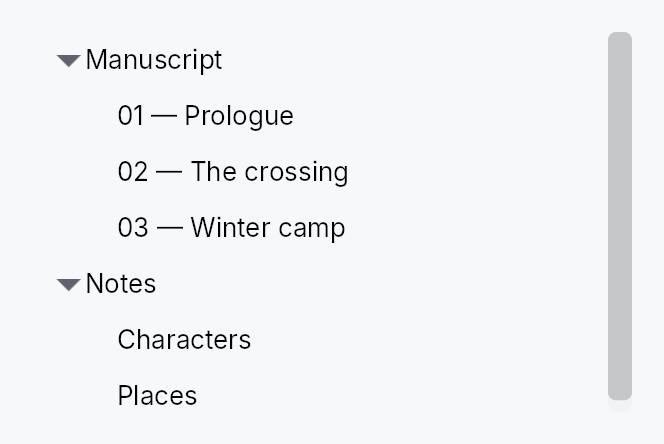
API reference
📖 Full rustdoc API for this module
pub struct TreeRowContext
Import: use teksilo::widgets::TreeRowContext;
Per-row context passed to a 4-arg TreeView delegate. Carries a
reference to the slice handle and the row's NodeId so the
delegate can wire chevron toggles and other tree-aware behavior
without manually cloning state outside the closure.
Created internally by TreeView::new_with_context. Not
constructed directly by user code.
#![allow(unused)] fn main() { pub struct TreeRowContext<'a, T: 'static> { /* fields */ } }
Methods
pub fn toggle_callback(&self) -> std::rc::Rc<dyn Fn(&mut teksilo_core::widget::EventContext)>
Toggle callback for this row's chevron. Wires in one line:
.on_chevron_toggle_rc(ctx.toggle_callback()).
pub fn slice_handle(&self) -> TreeSliceHandle<T>
Cloned handle to the slice — call .toggle_expand(node),
.expand(node), .collapse(node) directly.
pub fn node_id(&self) -> teksilo_data::NodeId
The NodeId of this row in the backing TreeModel.
pub struct TreeView
Import: use teksilo::widgets::TreeView;
#![allow(unused)] fn main() { pub struct TreeView<T: 'static> { /* fields */ } }
Methods
pub fn handle(&self) -> TreeViewHandle
A handle that scrolls this tree once it is mounted.
Take it while describing the tree, before the view is handed to
ctx.add(...); it stays attached to the view across rebuilds. See
TreeViewHandle.
pub fn new( model: TreeModel<T>, delegate: impl Fn(&T, &FlatEntry, bool) -> Box<dyn Widget> + 'static, ) -> Self
Create a new TreeView backed by a TreeModel<T>.
The delegate receives (&item, &FlatEntry, selected) and returns a
boxed widget. The FlatEntry provides depth, has_children, and
is_expanded for rendering indentation and expand/collapse toggles.
pub fn new_with_context( model: TreeModel<T>, delegate: impl Fn(&T, &FlatEntry, bool, &TreeRowContext<'_, T>) -> Box<dyn Widget> + 'static, ) -> Self
Like new, but the delegate also receives a
TreeRowContext from which .toggle_callback() can be
pulled in a single line — eliminating the need to manually
clone the slice handle outside the closure.
#![allow(unused)] fn main() { use teksilo_widgets::{TreeView, StandardTreeItem}; use teksilo_data::TreeModel; use teksilo_i18n::lit; struct Item { title: String } let model: TreeModel<Item> = TreeModel::new(); let _w = TreeView::new_with_context(model, |item, entry, selected, ctx| { Box::new( StandardTreeItem::new(lit!(&item.title)) .from_entry(entry) .selected(selected) .on_chevron_toggle_rc(ctx.toggle_callback()) ) }); }
pub fn from_source<S: TreeDataSource<Item = T>>( source: S, delegate: impl Fn(&T, &TreeRow, bool) -> Box<dyn Widget> + 'static, ) -> Self
Create a TreeView backed by any TreeDataSource — an external source of
truth (e.g. an entity store) carrying its own Key, so it needs no
TreeModel mirror. The delegate receives (&item, &TreeRow, selected);
TreeRow exposes depth / has_children / is_expanded and a one-call
chevron toggle_callback(). Drop validation + lazy windowing route
through the source's can_accept / accept_drop / row_state.
pub fn from_source_keyed<S: TreeDataSource<Item = T>>( source: S, keyed: KeyedSelectionModel<S::Key>, delegate: impl Fn(&T, &TreeRow, bool) -> Box<dyn Widget> + 'static, ) -> Self where S::Key: ItemKey,
Like from_source but with keyed selection: the
KeyedSelectionModel<S::Key> tracks selection by source identity, so it
survives expand / collapse / filter / reorder and stays consistent across
two views of the same source. The view stays TreeView<T> — the Key is
captured here. Pruning consults the source's
contains_key, so a
collapsed-but-present node keeps its selection.
pub fn enabled(mut self, enabled: impl Into<Prop<bool>>) -> Self
Enable or disable the whole view. A disabled view greys out and stops accepting focus / selection / keyboard input (arena-gated).
pub fn overscroll_behavior(mut self, behavior: OverscrollBehavior) -> Self
Set the scroll-chaining behavior at the boundary (default
OverscrollBehavior::Chain; Contain
disables chaining to an ancestor scrollable).
pub fn item_height(mut self, height: f32) -> Self
Set the fixed height per row (default 28.0) — the uniform fast
path. Mutually exclusive with item_height_fn
and auto_item_height; the last mode
setter wins.
pub fn smooth_scrolling(mut self, enabled: bool) -> Self
Enable or disable animated wheel scrolling (enabled by default). When disabled, wheel events snap immediately to the new offset.
pub fn smooth_scroll_duration(mut self, duration: Duration) -> Self
Duration of the smooth scroll animation (default 150 ms).
pub fn scroll_signal(mut self, scroll: Signal<f32>) -> Self
Scroll from a signal the caller owns, so the position survives the view.
A TreeView mints its own by default, which is right for a tree whose
lifetime is the writer's: it is created once and scrolls until they leave.
It is wrong for one inside a dock, whose content is torn down and rebuilt
whenever the layout changes -- opening a panel beside it, or the first
reveal of the band a result previews into. The tree comes back at the top,
and the row the writer was reading is somewhere above it.
Hold the signal wherever the model lives and the position outlives the widget, as the expand set already does.
⚠ Pass an animated signal (Signal::new_animated) unless smooth
scrolling is off: the view animates this one, and a plain signal makes
every wheel notch a jump.
pub fn scroll_bar_style(mut self, style: ScrollBarMode) -> Self
How the scroll bar is displayed (default Permanent). Overlay
and Thin float the bar over the content instead of reserving a
layout column for it, mirroring ScrollArea::scroll_bar_style.
pub fn item_height_fn(mut self, f: impl Fn(usize) -> f32 + 'static) -> Self
Per-row heights from a callback over the flat (visible) index. The callback must be pure (same index + same data → same height); it is re-swept from the first changed flat index on every model change or expand/collapse. No measurement pass runs.
pub fn auto_item_height(mut self, estimated: f32) -> Self
Auto-measured row heights: each realized row is measured at the
tree's content width (height-for-width), unrealized rows assume
estimated. Scroll anchoring keeps content above the viewport
stationary as estimates are corrected; measured heights above a
toggled row survive expand/collapse (divergence-driven
invalidation).
pub fn row_click_expands(mut self, b: bool) -> Self
Whether a row-body PointerUp on a branch row auto-toggles its
expansion (default true). Set to false when the delegate
provides its own chevron tap target (e.g. StandardTreeItem)
— without this, the auto-toggle fires in addition to the
chevron's own click and they cancel out, leaving the row
expanded only on body clicks.
pub fn selection(mut self, sel: SelectionModel) -> Self
Set the index-based selection model (visible positions). Unlike
ListView (where every structural change carries an insert/remove
DataChange the selection index-shifts against), a TreeView's
structural changes — including expand/collapse — surface only as a
version bump, with no delta to shift a selected index by. The
keyboard cursor tracks its row by identity (a RowAnchor), and in a
single selection the view keeps the cursor on the selected row, so
the selection follows that row to its new position. In a multiple
selection a moved row's old index is only clamped into range, not
followed. A selected row that disappears — removed, or hidden by a
collapse — leaves the selection at its clamped position in either mode.
For selection that survives all of these, use
keyed_selection instead.
pub fn keyed_selection(mut self, keyed: KeyedSelectionModel<NodeId>) -> Self
Set a keyed selection model (by NodeId). Selection is tracked by node
identity, so it survives expand / collapse, filtering, and node moves —
and stays consistent if two views share the model. Pruned of deleted
nodes on each slice change. Mutually exclusive with
selection (last one set wins).
pub fn reorderable(mut self, enabled: bool) -> Self
Enable intra-widget drag reordering.
When enabled, tree rows can be dragged to reparent or reorder them. Before/Into/After is chosen by where in the row the pointer drops; the move is cycle-guarded — a drop onto the node itself or into its own subtree is refused and shows no insertion line. Keyboard equivalent: Alt+ArrowUp/Down.
pub fn exportable(mut self, mode: DragTransferMode) -> Self where T: Clone,
Make rows droppable outside this view — on a
DropTarget, another data view, or the OS.
A dragged row (or the whole selection, when the pressed row is part of a
multi-selection) carries clones of its items in a public
RowDragData<T>, so a foreign receiver can pull
them out with payload.get_typed::<RowDragData<T>>() /
DropTarget::on_drop_typed::<RowDragData<T>>() — no serialization. This
also makes rows a drag source even without reorderable.
mode chooses what happens to the origin rows once a foreign target
accepts them: DragTransferMode::Move removes them (via the source's
on_drag_out, or on_rows_transferred_out),
DragTransferMode::Copy leaves them. A same-view reorder is never a
transfer, so mode never affects it. Requires T: Clone.
pub fn export_external(mut self, f: impl Fn(&[T]) -> Vec<(String, Vec<u8>)> + 'static) -> Self where T: Clone,
Additionally advertise the dragged rows as MIME data so they can be
dropped on a DropZone or exported to another
application / window via the OS. f maps the dragged items to
(mime_type, bytes) pairs (e.g. text/plain, text/uri-list, an
app-specific application/x-…). Implies exportable
(defaulting to DragTransferMode::Move if not already set). Requires
T: Clone.
pub fn on_rows_transferred_out( mut self, f: impl Fn(&[usize], &mut teksilo_core::widget::EventContext) + 'static, ) -> Self
Override how rows moved out to a foreign target are removed from this
view. Receives the dragged rows' indices (descending-safe) and the live
context. Without this, an exportable
Move drag removes them through the source's
on_drag_out (works out of the box for a TreeSlice/TreeModel).
pub fn accept_foreign_rows(mut self, accept: bool) -> Self
Accept exported rows dropped from a different view or source without
writing a custom TreeDataSource. Pair with
on_rows_received, which is handed the dropped
items and the insertion index. (Same-view reorder is
reorderable; a custom TreeDataSource can still
accept foreign drops through its can_accept/accept_drop instead.)
pub fn on_rows_received( mut self, f: impl Fn(Vec<T>, usize, &mut teksilo_core::widget::EventContext) + 'static, ) -> Self
Handler for rows accepted via accept_foreign_rows:
(items, insertion_index, ctx). Insert them into your model at the
index.
pub fn on_activate( mut self, f: impl Fn(usize, &mut teksilo_core::widget::EventContext) + 'static, ) -> Self
Set the row-activation handler — invoked with the flat row index on a
primary click on the row body (per activate_on,
which defaults to a double click), or Enter on the focused row.
Activation is distinct from selection: arrow-key navigation and
Space move / toggle the selection but do not activate, so a view
can open/commit a row on a deliberate click/Enter without firing on
every navigation step.
pub fn activate_on(mut self, mode: crate::data_views::ActivateOn) -> Self
Choose single- vs double-click activation (default
ActivateOn::DoubleClick — the cross-platform
convention; pass SingleClick for the
KDE/web/Scrivener feel). Enter activates in either mode.
pub fn row_tooltip_sticky(mut self, on: bool) -> Self
Whether a composite row tooltip offers dwell-to-sticky promotion.
Default true.
Turn it off for a read-only row card: with nothing to reach into there is nothing to pin, so the countdown indicator would promise an interaction that does not exist and the surface would outlive the pointer for no reason.
pub fn row_tooltip( mut self, f: impl Fn(usize, &T) -> Option<teksilo_i18n::LocalizedString> + 'static, ) -> Self
Per-row plain tooltip: one line of text for the row under the pointer.
The resolver receives the row's flat index and its item; returning
None leaves that row without a tip. Mutually exclusive with
row_rich_tooltip and
row_composite_tooltip — last setter
wins, matching the per-widget tooltip matrix.
Opens to the row's trailing side, never below it: rows stack vertically, so a tip below would cover the next row.
pub fn row_rich_tooltip( mut self, f: impl Fn(usize, &T) -> Option<crate::tooltip::RichTooltipSource> + 'static, ) -> Self
Per-row rich tooltip — a registry key or inline
TooltipContent, both of which
convert into RichTooltipSource.
See row_tooltip for the shared semantics.
pub fn row_composite_tooltip( mut self, f: impl Fn(usize, &T) -> Option<Box<dyn teksilo_core::widget::Widget>> + 'static, ) -> Self
Per-row composite tooltip — an arbitrary widget tree describing the row.
The body is built for every realized row (the virtualization window)
and rebuilt with it, so keep the resolver cheap and defer anything
costly to the body's own first paint, which only runs if the tip is
actually shown. See row_tooltip for the rest.
pub fn type_ahead_label(mut self, label: impl Fn(&T) -> String + 'static) -> Self
Enable type-ahead ("type to jump"): typing a printable character
while the tree has keyboard focus jumps the selection to the next
visible row whose label starts with the accumulated search term,
wrapping around (Qt keyboardSearch / macOS & Windows type-select).
label(&item) yields the searchable text; matching is
ASCII-case-insensitive. A pause longer than the
type_ahead_timeout starts a fresh term.
pub fn type_ahead_timeout(mut self, timeout: Duration) -> Self
Reset window between keystrokes before the type-ahead search term clears (default 500 ms). A zero duration disables type-ahead.
pub fn expand(&self, node: teksilo_data::NodeId)
Expand a node programmatically. No-op on the from_source path (which
owns its own expand state — use the source's set_expanded).
pub fn collapse(&self, node: teksilo_data::NodeId)
Collapse a node programmatically. No-op on the from_source path.
pub fn toggle(&self, node: teksilo_data::NodeId)
Toggle a node's expand/collapse state. No-op on the from_source path.
pub fn expand_all(&self)
Expand all nodes. No-op on the from_source path.
pub fn collapse_all(&self)
Collapse all nodes. No-op on the from_source path.
pub fn tree_slice(&self) -> Option<&TreeSlice<T>>
Access the internal TreeSlice (for persistence of expand state).
None on the from_source path, which has no
TreeSlice (the external source owns expand state).
pub struct TreeViewHandle
Import: use teksilo::widgets::TreeViewHandle;
A handle on a mounted TreeView, to scroll it to a row from outside the
widget — a view-model revealing the node a search found, say.
Rows are addressed by their flat visible index: the position of the row among the rows currently shown, counting the children of expanded nodes and skipping those of collapsed ones (the index the delegate's selection and the keyboard use).
Cheap to clone, valid before the view is mounted, and it survives the view's rebuilds. Its methods never compute an offset when they are called: they record the request and ask for a layout pass, and the view applies it there, after row measurement and scroll anchoring have settled. So a structural change made in the same turn (a node expanded above the target, say) is accounted for, a request made before mount is applied at the first layout, and a later request replaces an earlier pending one. A request on an empty tree is dropped; an index past the end reveals the last row.
The handle also reads and moves the tree's keyboard cursor, the row the
arrow keys step from and assistive technology is told is current:
cursor, set_cursor and
cursor_signal, in the same flat visible indices.
In a multiple selection the cursor and the selection are separate: the
accelerator with an arrow moves the cursor alone, and a selection written
from outside leaves the cursor where it was.
#![allow(unused)] fn main() { use teksilo_widgets::TreeView; use teksilo_widgets::primitives::TextWidget; use teksilo_data::TreeModel; use teksilo_i18n::lit; let model: TreeModel<String> = TreeModel::new(); let tree = TreeView::new(model, |item, _entry, _selected| { Box::new(TextWidget::new(lit!(item))) }); let handle = tree.handle(); // … `ctx.add(tree)`; later, after expanding the node's ancestors: handle.ensure_index_visible(42); }
#![allow(unused)] fn main() { pub struct TreeViewHandle { /* fields */ } }
Methods
pub fn scroll_to_index(&self, index: usize)
Scroll so the row at the given flat visible index is aligned to the top of the viewport, as far as the scroll range allows, at the next layout pass.
pub fn ensure_index_visible(&self, index: usize)
Scroll the minimum distance that brings the row at the given flat visible index fully into view, at the next layout pass; no scroll when it already is.
pub fn cursor(&self) -> Option<usize>
The flat visible index the keyboard cursor is on, or None while the
tree has no cursor: it has not been navigated, clicked or given one by
set_cursor. With no cursor the keys start from
the first selected row, and from the first or last row when nothing is
selected.
The cursor follows its row: an expansion or a collapse above it, or an
insertion, moves the index with the row, and a row that leaves the
visible rows takes the cursor with it. In a single selection
the cursor follows the selection: the keys move them together, and a
selection written from outside moves the cursor onto it. In a multiple
selection they are separate: the accelerator with an arrow
(Ctrl+Arrow) moves the cursor alone, and a selection written from
outside leaves the cursor where it was.
pub fn set_cursor(&self, index: Option<usize>)
Move the keyboard cursor to the row at flat visible index index, or
remove it with None.
An index past the last visible row is clamped to that row; on an empty tree the cursor is removed. While the tree holds keyboard focus it names the row as its active descendant at the next accessibility update, when the row is realized; the next arrow key steps from it, and the cursor follows that row through later structural changes.
Keyboard focus and the selection are left alone, and the tree does not
scroll: pair it with
ensure_index_visible to bring the row
into view. Usable before the tree is mounted and across its rebuilds;
in a single selection the tree seats the cursor on the selected row
when it is built and whenever the selection changes.
pub fn cursor_signal(&self) -> Signal<Option<usize>>
A read-only signal of the cursor, as cursor reports
it, for an application to observe or bind: a status line naming the
current row, actions enabled for it. It changes with every write of
the cursor, by the keys, a click, a structural change moving it or
set_cursor.
TwistArrow
TwistArrow — a small chevron that indicates and toggles a tree node's expansion.
Public functions
TwistArrow
| Returns | Function |
|---|---|
| Constructors | |
Self | new(size: f32, has_children: bool, expanded: bool) |
| Builder methods | |
Self | color(color: impl Into<ColorProp>) |
Self | on_click(f: impl Fn(&mut EventContext) + 'static) |
Detailed description
Renders a right-pointing arrow when collapsed and a down-pointing arrow when
expanded; a leaf node (where has_children is false) paints nothing but
reserves its slot so the indent column stays aligned across all rows.
The glyph flips direction under right-to-left layout.
Accessibility-decorative: the chevron hides itself from the AT tree and
the parent row's node owns set_expanded.
// TwistArrow is typically instantiated by TreeView row delegates and requires
// an EventContext to wire the tap callback. The snippet below shows the
// construction pattern used inside a custom tree-row build().
let arrow = TwistArrow::new(16.0, true, false)
.on_click(|ctx| ctx.send_intent(teksilo_core::Intent::new("tree.toggle")));
Touch and pen
A 12 dp chevron is half the 24 dp target floor and cannot grow — the indent
column is the tree's own geometry. It declares a Widget::hit_outset
instead, which is the one mechanism that can win here: the chevron's
neighbour is the row, the row takes presses, and a point inside the row is
at distance zero from it, so the miss-only slop pass could never reach the
chevron. Zero for a leaf chevron and for a decorative one, which take no
press.
Density
The picture above is the widget at TargetDensity::Compact, the mouse-and-keyboard ladder. Below is the same subject on the same canvas with only the ladder changed, so what moves is the density and nothing else — where the subject no longer fits, that is what the denser targets cost it at that size. See docs/density-and-targets.md.
Touch
API reference
📖 Full rustdoc API for this module
pub struct TwistArrow
Import: use teksilo::widgets::primitives::TwistArrow;
Small interactive chevron rendered in the leading indent column of a tree row.
#![allow(unused)] fn main() { pub struct TwistArrow { /* fields */ } }
Methods
pub fn new(size: f32, has_children: bool, expanded: bool) -> Self
Construct a chevron. size is the square side length in logical pixels;
has_children determines whether the glyph is painted; expanded
determines the glyph direction (down = expanded, right/left = collapsed).
pub fn color(mut self, color: impl Into<ColorProp>) -> Self
Override the glyph colour. Accepts a Color, a TextRole, or a
Signal of either.
The default TextRole::Secondary is a muted grey, which is right on
every row that is not filled. It is not right on one that is: a
design language whose selected row is a solid accent capsule flips
its label to TextRole::OnAccent through
StandardItemStyle::selected_label_role, and a chevron left behind
at Secondary then sits on that capsule at roughly 2.5:1 — under
WCAG SC 1.4.11's 3:1 floor, and visibly wrong beside a white label.
StandardTreeItem passes the row's own label role here so the two
always move together.
pub fn on_click(mut self, f: impl Fn(&mut EventContext) + 'static) -> Self
Install a tap handler. Receives the firing EventContext
so consumers can dispatch intents (e.g. lazy-load children on
expand) or open dialogs from the chevron toggle.
Unroll
Unroll — the horizontal sibling of Collapse.
Public types
| Kind | Name |
|---|---|
enum | UnrollFrom — Which edge stays anchored as the child unrolls |
struct | Unroll — Wraps a child widget and reveals or hides it along the horizontal axis by animating the wrapper's reported width between zero and the child's natural width |
Public functions
Unroll
| Returns | Function |
|---|---|
| Constructors | |
Self | new(expanded: Signal<bool>) |
Self | from_progress(progress: Signal<f32>) |
| Builder methods | |
Self | child(widget: impl teksilo_core::IntoTeksiChild) |
Self | child_opt(widget: Option<impl teksilo_core::IntoTeksiChild>) |
Self | reveal_from(from: UnrollFrom) |
| Methods | |
Option<Signal<f32>> | progress_signal() |
Detailed description
Animates a child's width between zero and natural while the child
keeps its full natural layout — the framework's clip pass crops the
overflow, so the visible reveal tracks progress linearly across the
whole duration and the child never reflows mid-animation. This is the
same "lay out full, clip the shrinking axis" trick the docking
Splitter uses for its side expand/collapse (ClipPane).
Two drivers:
Unroll::new(expanded)— self-animated, likeCollapse. Flips between 0 and natural width overMotionTokens::duration_collapsewheneverexpandedtoggles.Unroll::from_progress(progress)— driven by an external animatedSignal<f32>∈ [0, 1]. Use when something else owns the tween — e.g. an overlay whose deferred dismissal rolls the width back into its anchor before going dormant.
The reveal edge is chosen with reveal_from:
UnrollFrom::Leading (default) keeps the leading edge pinned and
grows trailing-ward — the "slide out from a button on the left"
shape; UnrollFrom::Trailing mirrors it.
Honors prefers-reduced-motion: the self-animated driver snaps to
its end value instead of tweening (the external driver's owner is
responsible for its own reduced-motion policy).
#![allow(unused)] fn main() { use teksilo_widgets::animations::{Unroll, UnrollFrom}; use teksilo_widgets::primitives::TextWidget; use teksilo_core::signal::Signal; use teksilo_i18n::lit; let expanded = Signal::new(false); let _w = Unroll::new(expanded) .reveal_from(UnrollFrom::Leading) .child(TextWidget::new(lit!("Reveal me"))); }
API reference
📖 Full rustdoc API for this module
pub enum UnrollFrom
Import: use teksilo::widgets::UnrollFrom;
Which edge stays anchored as the child unrolls.
#![allow(unused)] fn main() { pub enum UnrollFrom { /* variants */ } }
Variants
Leading— Pin the leading edge; reveal trailing-ward (default).Trailing— Pin the trailing edge; reveal leading-ward.
pub struct Unroll
Import: use teksilo::widgets::Unroll;
Wraps a child widget and reveals or hides it along the horizontal axis by animating the wrapper's reported width between zero and the child's natural width. See the module docs for the two available drivers.
#![allow(unused)] fn main() { pub struct Unroll { /* fields */ } }
Methods
pub fn new(expanded: Signal<bool>) -> Self
Self-animated wrapper bound to expanded. Initially rolled up
iff expanded.get() is false at the first build().
pub fn from_progress(progress: Signal<f32>) -> Self
Externally-driven wrapper. progress (an animated 0..1 signal)
is read every layout; the caller owns the tween. Use when an
overlay or other coordinator drives the reveal lifecycle.
pub fn child(mut self, widget: impl teksilo_core::IntoTeksiChild) -> Self
Inline child widget (deferred insertion).
pub fn child_opt(self, widget: Option<impl teksilo_core::IntoTeksiChild>) -> Self
Attach widget when it is Some, and do nothing when it is None.
The conditional-child form. teksu!'s if without an else lowers to
this, and it is what cond.then(|| w) is for in a builder chain. None
adds no arena node, so nothing is laid out, painted, or published to the
accessibility tree, and a stack applies no spacing around it.
pub fn reveal_from(mut self, from: UnrollFrom) -> Self
Set the edge that stays anchored as the child unrolls. Defaults
to UnrollFrom::Leading.
pub fn progress_signal(&self) -> Option<Signal<f32>>
Return the live progress signal (0.0 = rolled up, 1.0 = fully
unrolled). Returns None before the first build(). Useful for
tests and external coordinators that need to observe or gate on
the current animated progress.
ValidationStrip

ValidationStrip — a small inline message shown below a text field to surface a validation outcome.
Public functions
ValidationStrip
| Returns | Function |
|---|---|
| Constructors | |
Self | new(feedback: Signal<ValidationFeedback>) |
Detailed description
Bound to a Signal<ValidationFeedback> produced by a
TextInputField. The strip
renders nothing when the feedback is Pristine or Valid, and shows a
single-line message in the appropriate role when Invalid (error colour,
Live::Assertive) or Corrected (secondary text, Live::Polite).
The strip is layout-stable: in the hidden state it reports zero height so
the surrounding layout does not reflow on every commit.
It carries Role::Status so screen readers announce the message through
the appropriate live region without any composite-side wiring.
// ValidationStrip is constructed with a `Signal<ValidationFeedback>`
// obtained from a live `TextInputField` — it needs BuildContext to wire up.
// Typical usage inside a composing widget's build():
let (field_id, fb_signal) = build_text_input_field(ctx, ...);
let strip = ctx.add(ValidationStrip::new(fb_signal));
Density
The picture above is the widget at TargetDensity::Compact, the mouse-and-keyboard ladder. Below is the same subject on the same canvas with only the ladder changed, so what moves is the density and nothing else — where the subject no longer fits, that is what the denser targets cost it at that size. See docs/density-and-targets.md.
Touch

API reference
📖 Full rustdoc API for this module
pub struct ValidationStrip
Import: use teksilo::widgets::primitives::ValidationStrip;
Inline validation-feedback strip. See module docs.
#![allow(unused)] fn main() { pub struct ValidationStrip { /* fields */ } }
Methods
pub fn new(feedback: Signal<ValidationFeedback>) -> Self
Construct a strip bound to a feedback signal — typically
field.validation_feedback_signal() from the same widget.
VStack

VStack — a vertical layout container that distributes children top-to-bottom.
Public functions
VStack
| Returns | Function |
|---|---|
| Constructors | |
Self | new() |
| Builder methods | |
Self | spacing(spacing: impl Into<Prop<f32>>) |
Self | alignment(alignment: HAlignment) |
Self | child(widget: impl teksilo_core::IntoTeksiChild) |
Self | children(iter: impl IntoIterator<Item = impl teksilo_core::IntoTeksiChild>) |
Self | child_opt(widget: Option<impl teksilo_core::IntoTeksiChild>) |
Detailed description
Each child is offered the full container width and its intrinsic preferred
height. Positive slack (container height minus the sum of children heights
minus spacing) is distributed among children that declare a non-zero flex
weight (e.g. Expand). Over-constraint
deficits are absorbed by children with a non-zero shrink weight.
Cross-axis (horizontal) alignment defaults to Leading and can be
overridden per container with VStack::alignment or per child via
WidgetTree::set_alignment.
Use VStack when children should be stacked vertically with a configurable
gap; use HStack for the horizontal
counterpart.
#![allow(unused)] fn main() { use teksilo_widgets::primitives::{VStack, TextWidget}; use teksilo_i18n::lit; let _col = VStack::new() .spacing(8.0) .child(TextWidget::new(lit!("Heading"))) .child(TextWidget::new(lit!("Body text"))); }
Density
The picture above is the widget at TargetDensity::Compact, the mouse-and-keyboard ladder. Below is the same subject on the same canvas with only the ladder changed, so what moves is the density and nothing else — where the subject no longer fits, that is what the denser targets cost it at that size. See docs/density-and-targets.md.
Touch

API reference
📖 Full rustdoc API for this module
pub struct VStack
Import: use teksilo::widgets::VStack;
Vertical layout container that distributes children top-to-bottom
based on their intrinsic sizes. Cross-axis alignment is controlled
by HAlignment (default: Leading).
#![allow(unused)] fn main() { pub struct VStack { /* fields */ } }
Methods
pub fn new() -> Self
Create an empty vertical stack with Leading alignment and zero spacing.
pub fn spacing(mut self, spacing: impl Into<Prop<f32>>) -> Self (default: 0.0)
Set inter-child spacing. Accepts a static f32 or a reactive
Signal<f32>.
pub fn alignment(mut self, alignment: HAlignment) -> Self (default: HAlignment::Leading)
Set the cross-axis (horizontal) alignment applied to every child that
does not have a per-child override set via WidgetTree::set_alignment.
pub fn child(mut self, widget: impl teksilo_core::IntoTeksiChild) -> Self
Add an inline child widget (deferred insertion).
pub fn children( mut self, iter: impl IntoIterator<Item = impl teksilo_core::IntoTeksiChild>, ) -> Self
Add multiple inline children from an iterator.
pub fn child_opt(mut self, widget: Option<impl teksilo_core::IntoTeksiChild>) -> Self
Conditionally add a child. No-op if None.
WindowControls
The minimize / maximize / close button cluster on the trailing edge of
a TitleBar. Rendered only when
PlatformTitleBarHost::renders_custom_controls is true
(Windows, Wayland, and X11 with a capable window manager; never on macOS).
Public types
| Kind | Name |
|---|---|
struct | WindowControlsLayout — Layout snapshot that WindowControls exports to its parent TitleBar so the after_paint aggregator can read the per-button WidgetIds |
type | ControlAction — Action invoked when a ControlButton is tapped |
struct | ControlButton — A compact, flush-fitting window-control button |
struct | WindowControls — The minimize / maximize / close cluster, laid out as an HStack of ControlButtons |
Public functions
WindowControls
| Returns | Function |
|---|---|
| Constructors | |
Self | new(host: Rc<dyn PlatformTitleBarHost>, show_restore: Signal<bool>, close_action: Option<CloseAction>) |
ControlButton
| Returns | Function |
|---|---|
| Constructors | |
Self | new(glyph: &'static str, width: f32, height: f32, fg: impl Into<ColorProp>) |
| Builder methods | |
Self | hover_background(role: SurfaceRole) |
Self | on_tap(action: impl Fn(&mut EventContext) + 'static) |
Detailed description
These are deliberately NOT built on top of the regular Button widget:
Button carries a 72 dp minimum width, themed padding, focus ring and
border, none of which are appropriate for a flush-fitting Win11-style
window control. Instead, each control is a small composing widget
ControlButton built from primitives (FixedSize + ZStack +
RectWidget + Center + TextWidget) so we inherit centering, theming and
reactive hover for free.
The maximize/restore swap is driven by a Signal<bool> (show_restore,
sourced from WindowState::placement): the a11y name and action toggle
between Maximize and Restore. The glyph itself does not swap — both
states render □, since text-typeset's font fallback has no reliable
"two stacked squares" glyph (see WindowControls::build).
Touch and pen
A control cell clears the conformance floor on both axes at every density, so nothing here needs widening, and each button activates on the release. The cell is not density-projected: its height is the title bar's, which the platform chrome sizes, and raising it at Touch would overflow the bar.
The hover tint is decoration. On Windows the OS owns hover over the non-client area, which is what the external hover signal is for; a contact produces no hover on any platform and loses nothing by it.
API reference
📖 Full rustdoc API for this module
pub struct WindowControlsLayout
Import: use teksilo::widgets::title_bar::WindowControlsLayout;
Layout snapshot that WindowControls exports to its parent TitleBar
so the after_paint aggregator can read the per-button WidgetIds.
Populated during WindowControls::build.
The maximize slot is the Switcher that wraps the two glyph
buttons (□ / ❐), not either child directly: the inactive
Switcher child is dormant and has Rect::ZERO bounds, but the
Switcher container itself is always laid out by the parent
HStack and has valid bounds. A synthetic tap dispatched at the
Switcher's bounds-center routes through hit-testing to whichever
child is currently visible.
#![allow(unused)] fn main() { pub struct WindowControlsLayout { /* fields */ } }
Fields
minimize_id:WidgetIdmaximize_id:WidgetIdclose_id:WidgetId
pub type ControlAction
Import: use teksilo::widgets::title_bar::ControlAction;
Action invoked when a ControlButton is tapped.
#![allow(unused)] fn main() { pub type ControlAction = Rc<dyn Fn(&mut EventContext)>; }
pub struct ControlButton
Import: use teksilo::widgets::title_bar::ControlButton;
A compact, flush-fitting window-control button.
Composes existing primitives — a FixedSize cell wrapping a ZStack
of (hover background, centred glyph). Hover state is tracked in a
Signal<bool> that drives a derived Signal<SurfaceRole> background,
so a hover change repaints with no relayout. Both the glyph color
(fg) and the hover surface are stored as roles (ColorProp /
SurfaceRole) that resolve against the current theme at paint time —
so the cluster retints live across ctx.set_theme(...) without a
rebuild.
#![allow(unused)] fn main() { pub struct ControlButton { /* fields */ } }
Methods
pub fn new(glyph: &'static str, width: f32, height: f32, fg: impl Into<ColorProp>) -> Self
Create a control button with the given Unicode glyph, fixed cell dimensions, and
foreground color role. The hover background defaults to transparent until overridden
via hover_background.
pub fn hover_background(mut self, role: SurfaceRole) -> Self
Set the surface role painted over the title bar background while the pointer is inside
the button cell. The default is SurfaceRole::Transparent (flat).
pub fn on_tap(mut self, action: impl Fn(&mut EventContext) + 'static) -> Self
Register the callback invoked when the user taps this button.
pub struct WindowControls
Import: use teksilo::widgets::WindowControls;
The minimize / maximize / close cluster, laid out as an HStack of
ControlButtons. Each cell drives the window directly through
WindowState::placement / ctx.close_window(); the host is used only
to register each button's external hover signal.
#![allow(unused)] fn main() { pub struct WindowControls { /* fields */ } }
Methods
pub fn new( host: Rc<dyn PlatformTitleBarHost>, show_restore: Signal<bool>, close_action: Option<CloseAction>, ) -> Self
Build the minimize / maximize / close cluster for the given platform host.
show_restore drives the maximize ↔ restore swap: true renders the
Restore affordance (a11y name and action), false the Maximize
one. It is deliberately not called is_maximized: a window is also
restorable — and must not offer "maximize" — while it is
WindowPlacement::Fullscreen,
which WindowPlacement::is_maximized reports as false. See
crate::title_bar::TitleBar's own derivation.
close_action overrides the default ctx.close_window() behaviour (e.g.
to show a "save before closing?" dialog).
WindowFrame
A borderless-window frame: an invisible overlay of resize strips and corner cells along the four edges of a single content widget.
Public types
| Kind | Name |
|---|---|
struct | WindowFrame — Invisible overlay of resize strips and corner cells that gives a borderless window draggable edges |
const | WINDOW_FRAME_RESIZE_THICKNESS — Logical-pixel thickness of each resize strip, and the frame's default |
Public functions
WindowFrame
| Returns | Function |
|---|---|
| Constructors | |
Self | new(host: Rc<dyn PlatformTitleBarHost>) |
| Builder methods | |
Self | thickness(t: f32) |
Self | content(w: impl teksilo_core::IntoTeksiChild) |
Self | content_boxed(w: Box<dyn Widget>) |
| Methods | |
ResizeBorders | coarse_resize_borders(tokens: &InputTokens) |
Detailed description
WindowFrame is the canonical way to wrap a TitleBar + body for an
undecorated Wayland window. The content child fills the entire window
bounds — there is no visible padding — and the resize strips +
corners sit on top of the content along the edges. teksilo-core's
hit_test_recursive walks children in reverse insertion order, so
the strips and corners (added after content) get first crack at any
click that lands within thickness pixels of an edge; clicks
anywhere else fall through to the content.
Layout (with thickness = t):
┌─top─edge───────────────────────┐ ← top strip overlays content (0, 0, w, t)
│TL│ │TR│ ← corners overlay the strip ends
│──│ │──│
│L │ content (full) │R │ ← content fills (0, 0, w, h)
│──│ │──│
│BL│ │BR│
└─bottom─edge────────────────────┘
t defaults to 6 logical pixels but is configurable via
WindowFrame::thickness. With a small thickness the frame is
visually undetectable; the cursor only changes (and the resize
gesture only triggers) when the pointer is within t pixels of the
window boundary — with a mouse. A finger reaches the same edge
through each strip's Widget::hit_outset, which widens the band to
the density's target size without moving a pixel of layout; see
resize_strip.
Telling the OS the same number
On a platform where the window manager answers the resize hit test itself
— Windows, through WM_NCHITTEST — the frame's own strips never see the
press, so the two layers have to agree about how wide the band is or a
finger lands in the gap between them. The frame therefore publishes its
coarse band (the widened one, in logical pixels) as
HitRegions::resize_borders every frame, and the backend applies it to
coarse messages only, never shrinking the band a mouse gets.
That channel has one publisher per window — TitleBar
aggregates the drag region and the control buttons into one snapshot from
its own after_paint. The frame does not compete with it: the snapshot it
publishes carries a non-zero resize_borders and nothing else, which is the
documented shape a backend reads as a band update rather than a
replacement. after_paint is post-order, so wrapping the title bar (the
canonical shape — WindowFrame::content(VStack { TitleBar, body })) puts
the band update after the aggregate snapshot every frame.
Wrapping the frame in a WidgetBuilder method is safe:
WidgetWithHandlers forwards wants_after_paint / after_paint along with
the rest of the trait, so WindowFrame::new(host).content(..).on_tap(..)
still publishes. It did not always — the wrapper's forwarding list was
incomplete, and an unforwarded hook silences a publish with no diagnostic —
so the list is now exhaustive and lint-guarded at its own impl.
API reference
📖 Full rustdoc API for this module
pub struct WindowFrame
Import: use teksilo::widgets::WindowFrame;
Invisible overlay of resize strips and corner cells that gives a borderless window
draggable edges. The content child fills the full client area with no visible inset;
the strips are hit-test-only overlays along the outer thickness pixels.
#![allow(unused)] fn main() { pub struct WindowFrame { /* fields */ } }
Methods
pub fn new(host: Rc<dyn PlatformTitleBarHost>) -> Self
Create a frame bound to the given platform host. Use thickness
and content to configure it before adding to the tree.
pub fn thickness(mut self, t: f32) -> Self
Logical-pixel thickness of each resize strip. Default:
WINDOW_FRAME_RESIZE_THICKNESS.
pub fn content(mut self, w: impl teksilo_core::IntoTeksiChild) -> Self
Set the inner content widget — typically a VStack containing a
TitleBar and the application body.
pub fn content_boxed(mut self, w: Box<dyn Widget>) -> Self
Set the inner content widget from an already-boxed value. Prefer content
for unboxed widgets; use this variant when the concrete type is not known at the call site.
pub fn coarse_resize_borders(&self, tokens: &InputTokens) -> ResizeBorders
The band a coarse pointer actually catches on each edge, in logical
pixels: the strip's painted thickness widened to the density's target
size by Widget::hit_outset (24 dp Compact, 44 dp Touch).
This is what the frame publishes as HitRegions::resize_borders so a
backend that answers the resize hit test itself can use the same number.
It is deliberately not the mouse band: a mouse keeps the painted
thickness, and a backend must never shrink its own metric to this.
Uniform across the four edges — every strip is built at the same thickness — so a caller reading one field reads them all.
pub const WINDOW_FRAME_RESIZE_THICKNESS
Import: use teksilo::widgets::title_bar::WINDOW_FRAME_RESIZE_THICKNESS;
Logical-pixel thickness of each resize strip, and the frame's default.
The same 6 dp gutter the Splitter and the dock resize handle use. It is
fixed at every density: the strip is a hit-test-only overlay drawn over
the window's own edge, so widening it would eat into the content rather
than into empty space. A coarse pointer reaches it through
Widget::hit_outset (24 dp, 44 at Touch) over an unchanged 6 dp visual —
see engineering/docs/density-inventory.md and the touch design's Constants table.
#![allow(unused)] fn main() { pub const WINDOW_FRAME_RESIZE_THICKNESS: f32 = 6.0; }
Wizard
Wizard — a thin modal launcher around Stepper.
Public functions
Wizard
Detailed description
Renders as a button (or a custom .trigger(...) widget) that opens a modal
containing a Stepper built from the same Steps. The modal's Cancel and
a wrapped Finish both dismiss it.
API reference
📖 Full rustdoc API for this module
pub struct Wizard
Import: use teksilo::widgets::Wizard;
A button (or custom trigger) that opens a modal Stepper.
Wizard::new(label) renders as a Filled Button whose tap opens a
full-screen modal containing a Stepper built from the same Steps.
The modal's auto-injected Cancel button and the wrapped Finish both dismiss
it. Override the trigger with trigger to use any widget
instead of the default button.
#![allow(unused)] fn main() { pub struct Wizard { /* fields */ } }
Methods
pub fn new(label: impl Into<LocalizedString>) -> Self
Create a wizard trigger button with the given label. The label is also used as the modal title.
pub fn step(mut self, step: Step) -> Self
Append a single Step to the wizard.
pub fn steps(mut self, steps: impl IntoIterator<Item = Step>) -> Self
Append multiple Steps from an iterator.
pub fn variant(mut self, variant: ButtonVariant) -> Self
Set the visual variant of the trigger button (default Filled).
pub fn enabled(mut self, enabled: impl Into<Prop<bool>>) -> Self (default: true)
Enable or disable the trigger button, statically or reactively. When disabled, tapping or pressing the trigger is a no-op.
pub fn non_linear(mut self, non_linear: bool) -> Self
Allow jumping between steps by clicking their indicators (the
markers become Role::Tab). Default: linear.
pub fn presentation(mut self, presentation: ModalPresentation) -> Self (default: ModalPresentation::Auto)
Control how the modal is presented (auto, sheet, full-screen, …).
pub fn close_behavior(mut self, close_behavior: ModalCloseBehavior) -> Self (default: ModalCloseBehavior::Manual)
Control how the modal is dismissed (manual, click-outside, …).
pub fn size(mut self, width: u32, height: u32) -> Self
Set the preferred modal size in logical pixels. Default 640 × 460.
pub fn back_label(mut self, label: impl Into<LocalizedString>) -> Self
Override the "Back" button label inside the modal. Default: "Back".
pub fn next_label(mut self, label: impl Into<LocalizedString>) -> Self
Override the "Next" button label inside the modal. Default: "Next".
pub fn finish_label(mut self, label: impl Into<LocalizedString>) -> Self
Override the "Finish" button label inside the modal. Default: "Finish".
pub fn skip_label(mut self, label: impl Into<LocalizedString>) -> Self
Override the "Skip" button label inside the modal. Default: "Skip".
pub fn cancel_label(mut self, label: impl Into<LocalizedString>) -> Self
Override the "Cancel" button label inside the modal. Default: "Cancel".
pub fn on_finish<R: IntoFinishOutcome>( mut self, action: impl Fn(&mut EventContext, &StepperController) -> R + 'static, ) -> Self
Called when Finish is activated on the last step.
The callback may refuse: its return value goes through
IntoFinishOutcome (() always succeeds; false / Err(_) /
FinishOutcome::Rejected do not). A rejected finish leaves the modal
open on the last step and marks it
StepStatus::Error — the right response to
a commit that failed.
pub fn trigger(mut self, trigger: impl Widget + 'static) -> Self
Wrap
Wrap — a horizontal flow layout that wraps children to the next line when they exceed the available width.
Public functions
Wrap
| Returns | Function |
|---|---|
| Constructors | |
Self | new() |
| Builder methods | |
Self | spacing(spacing: impl Into<Prop<f32>>) |
Self | line_spacing(spacing: impl Into<Prop<f32>>) |
Self | child(widget: impl teksilo_core::IntoTeksiChild) |
Self | children(iter: impl IntoIterator<Item = impl teksilo_core::IntoTeksiChild>) |
Self | child_opt(widget: Option<impl teksilo_core::IntoTeksiChild>) |
Detailed description
Children are placed left-to-right (or right-to-left under RTL layout) and
wrapped to the next line when the next item would exceed the container
width. Each line's height is the tallest child on that line. Use
spacing for the horizontal gap between items and
line_spacing for the vertical gap between lines.
Wrap is the right choice for chip rows, badge lists, and any collection
whose items vary in width and should reflow as the container resizes. For
a fixed grid use crate::primitives::Grid instead.
#![allow(unused)] fn main() { use teksilo_widgets::primitives::{Wrap, TextWidget}; use teksilo_i18n::lit; let _chips = Wrap::new() .spacing(8.0) .line_spacing(6.0) .child(TextWidget::new(lit!("Rust"))) .child(TextWidget::new(lit!("GUI"))) .child(TextWidget::new(lit!("Desktop"))); }
Density
The picture above is the widget at TargetDensity::Compact, the mouse-and-keyboard ladder. Below is the same subject on the same canvas with only the ladder changed, so what moves is the density and nothing else — where the subject no longer fits, that is what the denser targets cost it at that size. See docs/density-and-targets.md.
Touch
API reference
📖 Full rustdoc API for this module
pub struct Wrap
Import: use teksilo::widgets::Wrap;
A horizontal flow layout that wraps children to the next line.
#![allow(unused)] fn main() { pub struct Wrap { /* fields */ } }
Methods
pub fn new() -> Self
Create an empty Wrap container with zero spacing.
pub fn spacing(mut self, spacing: impl Into<Prop<f32>>) -> Self (default: 0.0)
Horizontal spacing between items on the same line. Accepts a static
f32 or a reactive Signal<f32>.
pub fn line_spacing(mut self, spacing: impl Into<Prop<f32>>) -> Self (default: 0.0)
Vertical spacing between lines. Accepts a static f32 or a
reactive Signal<f32>.
pub fn child(mut self, widget: impl teksilo_core::IntoTeksiChild) -> Self
Add an inline child widget (deferred insertion).
pub fn children( mut self, iter: impl IntoIterator<Item = impl teksilo_core::IntoTeksiChild>, ) -> Self
Add multiple inline children from an iterator.
pub fn child_opt(mut self, widget: Option<impl teksilo_core::IntoTeksiChild>) -> Self
Conditionally add a child. No-op if None.
ZStack
ZStack — a layout container that layers children on top of each other.
Public functions
ZStack
| Returns | Function |
|---|---|
| Constructors | |
Self | new() |
| Builder methods | |
Self | alignment(alignment: Alignment) |
Self | child(widget: impl teksilo_core::IntoTeksiChild) |
Self | children(iter: impl IntoIterator<Item = impl teksilo_core::IntoTeksiChild>) |
Self | child_opt(widget: Option<impl teksilo_core::IntoTeksiChild>) |
Detailed description
The container sizes itself to the maximum width and maximum height across
all children, measured at an unspecified proposal so background rects do not
inflate the size. Height additionally takes a width-bounded query when the
parent bound the width, so a wrapping child reports the height it will really
occupy rather than a single line; see layout_response for why that query is
width-only. Each child is then offered the full container bounds and
positioned according to the container-level Alignment (default: CENTER);
individual children can override alignment via WidgetTree::set_alignment.
The primary use-cases are layered UIs — a background RectWidget beneath
a TextWidget, a floating badge over a button icon — and card-like
compositions where a paint layer and a content layer share the same bounds.
Children that expand to fill their proposal (e.g. RectWidget) fill the
full ZStack area; children with fixed intrinsic sizes are positioned by
alignment.
Every layer is offered the stack's full size, so a widget that answers
proposal.resolve(0.0, 0.0) fills the whole stack. Being on top, it takes
every press over the stack even with no handler, which is correct
occlusion. An invisible helper layer (a frame-tick driver, say) should be
.hit_transparent(true) or answer Size::ZERO.
Propagates shrink weight and minimum size when any child opts in, so
wrapping a shrinkable single-line label in a ZStack stays shrinkable.
#![allow(unused)] fn main() { use teksilo_widgets::primitives::{ZStack, TextWidget}; use teksilo_widgets::RectWidget; use teksilo_i18n::lit; use teksilo_tokens::SurfaceRole; let _card = ZStack::new() .child(RectWidget::new().background(SurfaceRole::Raised)) .child(TextWidget::new(lit!("Hello"))); }
Density
The picture above is the widget at TargetDensity::Compact, the mouse-and-keyboard ladder. Below is the same subject on the same canvas with only the ladder changed, so what moves is the density and nothing else — where the subject no longer fits, that is what the denser targets cost it at that size. See docs/density-and-targets.md.
Touch
API reference
📖 Full rustdoc API for this module
pub struct ZStack
Import: use teksilo::widgets::ZStack;
A layout container that stacks children on top of each other.
Size = max of children sizes. Children are positioned according to
the container's Alignment (default: center), with per-child overrides.
#![allow(unused)] fn main() { pub struct ZStack { /* fields */ } }
Methods
pub fn new() -> Self
Create an empty ZStack with center alignment.
pub fn alignment(mut self, alignment: Alignment) -> Self (default: Alignment::CENTER)
Set the alignment applied to every child that does not have a
per-child override set via WidgetTree::set_alignment.
pub fn child(mut self, widget: impl teksilo_core::IntoTeksiChild) -> Self
Add an inline child widget (deferred insertion).
pub fn children( mut self, iter: impl IntoIterator<Item = impl teksilo_core::IntoTeksiChild>, ) -> Self
Add multiple inline children from an iterator.
pub fn child_opt(mut self, widget: Option<impl teksilo_core::IntoTeksiChild>) -> Self
Conditionally add a child. No-op if None.
Data Collections
Every public type in teksilo-data, grouped by category. Each page links to its full rustdoc API reference.
Models
- ChartAggregate —
ChartAggregate<T>— a bucket/rollup projection over acrate::ChartModel - ChartChange — ChartChange — change notifications and stable series identifiers for chart collections
- ChartModel —
ChartModel<T>— concrete reactive multi-series chart data model - ChartSelection —
ChartSelection— point-level selection state for chart widgets - ChartSource — Shared chart input for a complete model or a live tail projection
- ChartWindow —
ChartWindow<T>— a "last N points per series" streaming projection over acrate::ChartModel - CheckedModel —
CheckedModel— per-row checkbox state for flat collection widgets - CheckState —
CheckState— tri-state checkbox value shared by the data layer and widgets - DataChange —
DataChange— change notifications for flat collections - ItemKey — Shared capability types for the data-source drag-and-drop + lazy protocol
- KeyedSelectionModel —
KeyedSelectionModel<K>— identity-based selection for collection widgets - KeyedTreeCheckedModel —
KeyedTreeCheckedModel<K>— per-node checkbox state for a tree keyed by a stable domain id, with optional descendant→ancestor tristate aggregation - ListDataSource —
ListDataSource— read-and-command interface for a flat collection behind aListView/TableView - ListModel —
ListModel<T>— concrete reactive list backed by aVec<T> - SelectionModel — SelectionModel — index-based selection state for collection widgets
- SeriesPattern —
SeriesPattern— the non-colour channel that identifies a chart series - SortFilterListModel — Composable sort + filter projection over a flat list source
- SortFilterTreeModel — Composable sort + filter projection over a hierarchical tree
- TreeChange — TreeChange — change notifications and stable node identifiers for tree collections
- TreeCheckedModel —
TreeCheckedModel— per-node checkbox state for a tree, with optional descendant→ancestor tristate aggregation - TreeDataSlice —
TreeDataSlice— the reusableTreeDataSourceengine for an external, indent-ordered tree (an entity store, a database, a virtual filesystem) that is… - TreeDataSource —
TreeDataSource— read-and-command interface for hierarchical data behind aTreeView/TreeTableView - TreeModel —
TreeModel— concrete reactive tree with shared, cloneable handles - TreeRowFilter —
TreeRowFilter— sort + tree-aware filter over aTreeRowstream - TreeSlice —
TreeSlice— per-view flattened projection of aTreeModel
ChartAggregate
ChartAggregate<T> — a bucket/rollup projection over a crate::ChartModel.
Public types
| Kind | Name |
|---|---|
enum | ChartAggregateFn — A reduction applied to the numeric values within one bucket |
struct | ChartAggregate — A bucket/rollup projection over a ChartModel<T> |
Public functions
ChartAggregate
| Returns | Function |
|---|---|
| Constructors | |
Self | new(source: ChartModel<T>, bucket_size: usize, aggregate_fn: ChartAggregateFn) |
| Methods | |
set_bucket_size(bucket_size: usize) | |
set_aggregate_fn(aggregate_fn: ChartAggregateFn) | |
usize | bucket_size() |
usize | series_count() |
Vec<SeriesId> | series_ids() |
usize | point_count(series: SeriesId) |
Option<R> | with_series<R>(series: SeriesId, f: impl FnOnce(&str, Option<&ColorProp>, bool) -> R) |
Option<R> | with_point<R>(series: SeriesId, index: usize, f: impl FnOnce(&ChartDatum<T>) -> R) |
ObserverHandle | observe_changes(f: impl Fn(&ChartChange) + 'static) |
Option<usize> | first_changed_index(series: SeriesId) |
ChartAggregateFn
| Returns | Function |
|---|---|
| Methods | |
f32 | apply(values: &[f32]) |
Detailed description
Wraps a ChartModel<T> and exposes each series
reduced into fixed-size buckets of bucket_size source points, each
bucket collapsed to one crate::ChartDatum via a ChartAggregateFn
(Mean / Sum / Min / Max / First / Last / Custom) — the
"downsample a long series for display" pattern (a year of daily
sensor readings shown as weekly means, a tick feed shown as 1-minute
bars). Bucket b covers source indices [b*bucket_size, min((b+1)*bucket_size, n)); a trailing partial bucket is included. A
bucket's category is its first member's category.
Unlike crate::ChartWindow (which reads straight through to the
source), ChartAggregate materializes its buckets — a bucket's
category is a clone of a source point's category, so constructing or
rebuilding a ChartAggregate<T> requires T: Clone. Once built,
read-only queries (point_count, with_point, …) need only T: 'static.
Reactivity
A tail append that doesn't change the bucket count updates the
now-not-yet-full last bucket in place (PointUpdated); a tail append
that starts a new bucket finalizes the previous last bucket
(PointUpdated) and appends the new one(s) (PointsInserted).
Symmetrically, a tail removal that doesn't eliminate the last bucket
recomputes it in place (PointUpdated, since it lost some of its
points); one that eliminates one or more trailing buckets recomputes the
new last bucket the same way and then drops the buckets beyond it
(PointsRemoved). A mid-series insert or removal (front or interior)
falls back to a full per-series rebuild reported as
SeriesDataReplaced. A PointUpdated recomputes just its own bucket.
use teksilo_data::{ChartModel, ChartAggregate, ChartAggregateFn};
let model: ChartModel<i32> = ChartModel::new();
let s = model.add_series("daily");
for i in 0..70 {
model.push_point(s, i, i as f32);
}
let weekly = ChartAggregate::new(model, 7, ChartAggregateFn::Mean);
assert_eq!(weekly.point_count(s), 10); // 70 / 7
API reference
📖 Full rustdoc API for this module
pub enum ChartAggregateFn
Import: use teksilo::data::ChartAggregateFn;
A reduction applied to the numeric values within one bucket.
#![allow(unused)] fn main() { pub enum ChartAggregateFn { /* variants */ } }
Variants
Mean— Arithmetic mean of the bucket's values (0.0for an empty bucket).Sum— Sum of the bucket's values.Min— Smallest value in the bucket.Max— Largest value in the bucket.First— The bucket's first value.Last— The bucket's last value.Custom(Rc<dyn Fn(&[f32]) -> f32>)— A caller-supplied reduction.
Methods
pub fn apply(&self, values: &[f32]) -> f32
Apply the reduction to a bucket's values.
On an empty slice, every built-in variant returns 0.0
(Mean/Min/Max/First/Last) or the empty sum (Sum, also
0.0) — a uniform, unsurprising convention rather than Min/Max
leaking their fold seed (±INFINITY) into a chart value. Custom
returns whatever the supplied closure computes for &[]. No internal
caller actually passes an empty slice — compute_bucket_datum bails
out before calling apply for an empty bucket — so this only bites a
direct caller.
pub struct ChartAggregate
Import: use teksilo::data::ChartAggregate;
A bucket/rollup projection over a ChartModel<T>.
See the module documentation for semantics.
#![allow(unused)] fn main() { pub struct ChartAggregate<T: 'static> { /* fields */ } }
Methods
pub fn new(source: ChartModel<T>, bucket_size: usize, aggregate_fn: ChartAggregateFn) -> Self
Wrap source, bucketing every series into groups of bucket_size
source points reduced via aggregate_fn. bucket_size is clamped
to a minimum of 1.
pub fn set_bucket_size(&self, bucket_size: usize)
Change the bucket size, rebuilding every series and emitting
ChartChange::Reset. Clamped to a minimum of 1.
pub fn set_aggregate_fn(&self, aggregate_fn: ChartAggregateFn)
Change the aggregate reduction, rebuilding every series and emitting
ChartChange::Reset.
pub fn bucket_size(&self) -> usize
The configured bucket size.
pub fn series_count(&self) -> usize
Number of series (same set as the source).
pub fn series_ids(&self) -> Vec<SeriesId>
The series ids, in the source's display order.
pub fn point_count(&self, series: SeriesId) -> usize
Number of buckets currently materialized for series.
pub fn with_series<R>( &self, series: SeriesId, f: impl FnOnce(&str, Option<&ColorProp>, bool) -> R, ) -> Option<R>
Access a series' metadata (delegates straight through to the
source). Returns None if series is unknown.
pub fn with_point<R>( &self, series: SeriesId, index: usize, f: impl FnOnce(&ChartDatum<T>) -> R, ) -> Option<R>
Access the bucket at index within series. Returns None if
series or index is unknown.
pub fn observe_changes(&self, f: impl Fn(&ChartChange) + 'static) -> ObserverHandle
Register an observer for translated bucket changes. Returns an
ObserverHandle — dropping it removes the callback.
pub fn first_changed_index(&self, series: SeriesId) -> Option<usize>
First bucket index of series whose content may differ since the
latest translated change. None if series is unknown or
unaffected yet.
ChartChange
ChartChange — change notifications and stable series identifiers for chart collections.
Public types
| Kind | Name |
|---|---|
struct | SeriesId — Opaque identifier for a series in a ChartModel |
enum | ChartChange — Describes a mutation to a chart's series or point data |
Detailed description
SeriesId is an opaque, stable handle for a series in a crate::ChartModel.
Because ChartModel is backed by a slotmap, SeriesId values survive arbitrary
series insertions, removals, and reorders — only removing the series itself
invalidates it. ChartChange describes exactly what mutated (at the series
level or the point level within a series) so that projections
(ChartWindow, ChartAggregate) and consumers (ChartSelection) can refresh
or adjust incrementally instead of rebuilding from scratch.
Consumers typically receive ChartChange values through an observer
registered via crate::ChartModel::observe_changes, which fires
synchronously (before the registering call returns) after each mutation.
// ChartModel::observe_changes returns an ObserverHandle whose drop
// unregisters the callback — keep it alive for the observer's lifetime.
use teksilo_data::{ChartModel, ChartChange};
let model: ChartModel<String> = ChartModel::new();
let _handle = model.observe_changes(|change| {
println!("{change:?}");
});
model.add_series("Revenue");
// prints: SeriesInserted { index: 0, series: SeriesId(...) }
API reference
📖 Full rustdoc API for this module
pub struct SeriesId
Import: use teksilo::data::SeriesId;
Opaque identifier for a series in a ChartModel.
SeriesId values are stable across mutations — inserting or removing
other series does not invalidate existing SeriesId handles (they are
SlotMap keys).
#![allow(unused)] fn main() { pub struct SeriesId(slotmap::DefaultKey); }
pub enum ChartChange
Import: use teksilo::data::ChartChange;
Describes a mutation to a chart's series or point data. Emitted by
ChartModel<T> automatically.
#![allow(unused)] fn main() { pub enum ChartChange { /* variants */ } }
Variants
SeriesInserted{ index: usize, series: SeriesId }— A series was inserted at the given index.SeriesRemoved{ series: SeriesId }— A series (and all of its points) was removed.SeriesMoved{ series: SeriesId, from: usize, to: usize }— A series was moved to a new position among its siblings.SeriesRenamed{ series: SeriesId }— A series' display name changed.SeriesColorChanged{ series: SeriesId }— A series' explicit color changed (set or cleared). Bumpscrate::ChartModel::style_versionrather thancrate::ChartModel::structure_version.SeriesPatternChanged{ series: SeriesId }— A series' explicitSeriesPatternchanged (set or cleared). Paint-only, likeSeriesColorChanged: it bumpscrate::ChartModel::style_version, notstructure_version.SeriesVisibilityChanged{ series: SeriesId }— A series' visibility flag changed.PointsInserted{ series: SeriesId, range: std::ops::Range<usize> }— Points were inserted;rangeholds the indices of the newly inserted points withinseries.PointsRemoved{ series: SeriesId, range: std::ops::Range<usize> }— Points were removed;rangeholds the indices they occupied before removal withinseries.PointUpdated{ series: SeriesId, index: usize }— A single point's data changed in place without any structural shift.SeriesDataReplaced{ series: SeriesId }— A series' entire point list was replaced; consumers must discard cached state for that series and rebuild it.Reset— The entire chart was replaced. Consumers should discard all state and rebuild.
ChartModel
ChartModel<T> — concrete reactive multi-series chart data model.
Public types
| Kind | Name |
|---|---|
struct | ChartDatum — One numeric data point at a category/x-axis position, with an optional per-point color that overrides the series color (bar charts only) |
struct | ChartSeries — A named series of data points with an optional explicit color and a visibility flag, used to construct a ChartModel (via ChartModel::from_series_vec)… |
struct | SeriesView — A read-only, borrowed view over one series — returned by ChartModel::with_series_view / ChartModel::with_all_series |
struct | ChartModel — A concrete reactive multi-series chart data model |
Public functions
ChartModel
ChartDatum
| Returns | Function |
|---|---|
| Constructors | |
Self | new(category: T, value: f32) |
| Builder methods | |
Self | with_color(color: impl Into<ColorProp>) |
ChartSeries
| Returns | Function |
|---|---|
| Constructors | |
Self | new(name: impl Into<String>) |
| Builder methods | |
Self | color(color: impl Into<ColorProp>) |
Self | pattern(pattern: SeriesPattern) |
Self | visibility(visible: bool) |
Self | data(points: Vec<ChartDatum<T>>) |
| Methods | |
push(category: T, value: f32) |
Detailed description
ChartModel<T> owns an ordered collection of named series, each holding a
Vec<ChartDatum<T>> (a category: T paired with a numeric value: f32),
in a flat SlotMap arena — the same shape as crate::TreeModel. Every
mutation (series add/remove/move/rename/recolor/repattern/show-hide,
point push/insert/remove/update/replace) emits a ChartChange to all
registered observers and bumps one of two reactive version signals:
ChartModel::style_version (color and pattern changes only — a
paint-only signal a chart can bind at BindingLevel::RepaintOnly) or
ChartModel::structure_version (everything else — series/point shape,
bound at BindingLevel::Relayout/Rebuild). Series identity is a stable,
versioned SeriesId (a SlotMap key) that is never reused after removal.
Cloning produces a second handle to the same data — all handles share
series/points and receive the same change notifications. Register
observers via observe_changes; the
returned ObserverHandle is RAII — dropping it unregisters the callback.
For a bounded "last N points" streaming view use
ChartWindow. For bucketed/rolled-up display use
ChartAggregate. For point-level selection use
ChartSelection.
#![allow(unused)] fn main() { use teksilo_data::{ChartModel, ChartSeries, ChartDatum}; let model = ChartModel::from_series_vec(vec![ ChartSeries::new("Revenue").data(vec![ ChartDatum::new("Q1".to_string(), 10.0), ChartDatum::new("Q2".to_string(), 20.0), ]), ]); assert_eq!(model.series_count(), 1); let s = model.series_id_at(0).unwrap(); assert_eq!(model.point_count(s), 2); model.push_point(s, "Q3".to_string(), 30.0); assert_eq!(model.point_count(s), 3); }
API reference
📖 Full rustdoc API for this module
pub struct ChartDatum
Import: use teksilo::data::ChartDatum;
One numeric data point at a category/x-axis position, with an optional per-point color that overrides the series color (bar charts only).
#![allow(unused)] fn main() { pub struct ChartDatum<T> { /* fields */ } }
Fields
category:Tvalue:f32color:Option<ColorProp>
Methods
pub fn new(category: T, value: f32) -> Self
pub fn with_color(mut self, color: impl Into<ColorProp>) -> Self (default: None)
Override this point's color (a bar's fill). Ignored by line/pie charts, which color by series.
pub struct ChartSeries
Import: use teksilo::data::ChartSeries;
A named series of data points with an optional explicit color and a
visibility flag, used to construct a ChartModel (via
ChartModel::from_series_vec) or to describe one series' desired
shape. Unlike the model, visible here is a plain bool — reactivity
lives in the model's ChartModel::structure_version /
ChartModel::style_version signals, not in this construction DTO.
#![allow(unused)] fn main() { pub struct ChartSeries<T> { /* fields */ } }
Fields
name:Stringcolor:Option<ColorProp>pattern:Option<SeriesPattern>— The non-colour channel identifying this series — a dash pattern on a line, a marker shape on a point, a hatch on a filled region.Nonetakes the pattern for the series' position (SeriesPattern::for_index), which is why the channel exists even with no application code. Set it when a series' identity must survive a reorder. SeeSeriesPattern.visible:boolpoints:Vec<ChartDatum<T>>
Methods
pub fn new(name: impl Into<String>) -> Self
pub fn color(mut self, color: impl Into<ColorProp>) -> Self (default: None)
pub fn pattern(mut self, pattern: SeriesPattern) -> Self (default: None)
Pin this series' non-colour channel instead of taking the one its
position implies. See SeriesPattern.
pub fn visibility(mut self, visible: bool) -> Self (default: true)
pub fn push(&mut self, category: T, value: f32)
pub fn data(mut self, points: Vec<ChartDatum<T>>) -> Self (default: Vec::new())
pub struct SeriesView
Import: use teksilo::data::SeriesView;
A read-only, borrowed view over one series — returned by
ChartModel::with_series_view / ChartModel::with_all_series.
#![allow(unused)] fn main() { pub struct SeriesView<'a, T> { /* fields */ } }
Fields
id:SeriesIdname:&'a strcolor:Option<&'a ColorProp>pattern:Option<SeriesPattern>— The series' explicit non-colour channel, orNoneto take the one its position implies. SeeSeriesPattern.visible:boolpoints:&'a [ChartDatum<T>]
pub struct ChartModel
Import: use teksilo::data::ChartModel;
A concrete reactive multi-series chart data model.
ChartModel<T> is Clone — cloning produces a second handle to the same
data. Multiple charts can hold clones and all see the same series and
points, and receive the same ChartChange notifications.
#![allow(unused)] fn main() { pub struct ChartModel<T: 'static> { /* fields */ } }
Methods
pub fn new() -> Self
Create an empty chart model with no series.
pub fn from_series_vec(series: Vec<ChartSeries<T>>) -> Self
Build a model directly from a vector of ChartSeries DTOs — the
primary constructor. Populates the arena in one pass with no
per-item notification (mirrors crate::ListModel::from_vec).
pub fn from_points(points: Vec<ChartDatum<T>>) -> Self
Build a model with a single anonymous, visible series holding
points — the flat/pie-chart path where series structure doesn't
matter.
pub fn only_series(&self) -> Option<SeriesId>
The model's sole series id, iff it has exactly one series.
pub fn add_series(&self, name: impl Into<String>) -> SeriesId
Append a new, empty, visible series named name.
pub fn insert_series(&self, index: usize, name: impl Into<String>) -> SeriesId
Insert a new, empty, visible series named name at index.
Panics
Panics if index > series_count().
pub fn remove_series(&self, series: SeriesId)
Remove a series and all of its points.
Panics
Panics if series is unknown.
pub fn rename_series(&self, series: SeriesId, name: impl Into<String>)
Rename a series. A no-op (no notify, no version bump) if name
already matches the current value.
Panics
Panics if series is unknown.
pub fn set_series_color(&self, series: SeriesId, color: impl Into<ColorProp>)
Set a series' explicit color. Bumps Self::style_version (not
Self::structure_version) — this is a paint-only change. A no-op
(no notify, no version bump) if color already matches the current
value.
Panics
Panics if series is unknown.
pub fn clear_series_color(&self, series: SeriesId)
Clear a series' explicit color (falls back to the chart's palette).
Bumps Self::style_version. A no-op (no notify, no version bump)
if the series already has no explicit color.
Panics
Panics if series is unknown.
pub fn set_series_pattern(&self, series: SeriesId, pattern: SeriesPattern)
Set a series' explicit SeriesPattern — the non-colour channel that
identifies it. Bumps Self::style_version (paint-only), like
set_series_color. A no-op if unchanged.
Panics
Panics if series is unknown.
pub fn clear_series_pattern(&self, series: SeriesId)
Clear a series' explicit pattern, falling back to the one its position
implies. Bumps Self::style_version. A no-op if already unset.
Panics
Panics if series is unknown.
pub fn set_series_visible(&self, series: SeriesId, visible: bool)
Show or hide a series. A no-op (no notify, no version bump) if
visible already matches the current value.
Panics
Panics if series is unknown.
pub fn move_series(&self, series: SeriesId, to: usize)
Move a series to a new position among its siblings. A no-op (no
notify, no version bump) if to is already the series' position.
Panics
Panics if series is unknown or to is out of bounds.
pub fn clear(&self)
Remove every series.
pub fn push_point(&self, series: SeriesId, category: T, value: f32)
Append a point to the end of series.
Panics
Panics if series is unknown.
pub fn insert_point(&self, series: SeriesId, index: usize, category: T, value: f32)
Insert a point at index within series.
Panics
Panics if series is unknown or index > point_count(series).
pub fn remove_point(&self, series: SeriesId, index: usize) -> ChartDatum<T>
Remove and return the point at index within series.
Panics
Panics if series is unknown or index >= point_count(series).
pub fn update_point(&self, series: SeriesId, index: usize, category: T, value: f32)
Replace the point at index within series.
Panics
Panics if series is unknown or index >= point_count(series).
pub fn replace_series_data(&self, series: SeriesId, points: Vec<ChartDatum<T>>)
Replace series' entire point list.
Panics
Panics if series is unknown.
pub fn series_count(&self) -> usize
Number of series.
pub fn series_ids(&self) -> Vec<SeriesId>
The series ids, in display order.
pub fn series_id_at(&self, index: usize) -> Option<SeriesId>
The series id at index, if any.
pub fn series_index_of(&self, series: SeriesId) -> Option<usize>
The display index of series, if it exists.
pub fn point_count(&self, series: SeriesId) -> usize
Number of points in series (0 if unknown).
pub fn with_series<R>( &self, series: SeriesId, f: impl FnOnce(&str, Option<&ColorProp>, bool) -> R, ) -> Option<R>
Access a series' metadata (name, color, visibility) via a callback.
Returns None if series is unknown.
pub fn with_point<R>( &self, series: SeriesId, index: usize, f: impl FnOnce(&ChartDatum<T>) -> R, ) -> Option<R>
Access a point within series via a callback. Returns None if the
series or index is unknown.
pub fn with_series_view<R>( &self, series: SeriesId, f: impl FnOnce(SeriesView<'_, T>) -> R, ) -> Option<R>
Access a whole-series view (metadata + points slice) via a callback.
Returns None if series is unknown.
pub fn with_all_series<R>(&self, f: impl FnOnce(&[SeriesView<'_, T>]) -> R) -> R
Access every series as an ordered slice of views via a callback.
pub fn structure_version(&self) -> Signal<u64>
Structural version signal — bumped by every mutation except a color
or pattern change (series add/remove/move/rename/show-hide, all point
ops). Bind at BindingLevel::Relayout or Rebuild.
Ordering: every mutator notifies the ChartChange observers
registered via Self::observe_changes before bumping this
signal — see the note on observe_changes for what that means for a
callback that reads the signal back synchronously.
pub fn style_version(&self) -> Signal<u64>
Style version signal — bumped only by a series color or pattern
change. Bind at BindingLevel::RepaintOnly. Same notify-before-bump
ordering as Self::structure_version — see
Self::observe_changes.
pub fn observe_changes(&self, f: impl Fn(&ChartChange) + 'static) -> ObserverHandle
Register an observer that is called on every mutation.
Returns an ObserverHandle — dropping it removes the callback.
Ordering contract: every mutator calls this observer before
bumping Self::structure_version / Self::style_version (see
e.g. rename_series, push_point) — notify, then bump. This is
intentional, not an implementation accident: it lets a ChartChange
callback distinguish "did I get here via the change I'm reacting to"
from "did something else bump the version already", by comparing the
version signal's value inside the callback against a value captured
before the mutation. The flip side: a callback that reads
structure_version()/style_version() synchronously inside
itself always observes the pre-bump value for the mutation
currently being notified — the bump hasn't happened yet. Don't use
the version signal from inside a ChartChange observer as a proxy
for "has this specific mutation been applied" — the ChartChange
argument already tells you that; use the signal for external
bind-and-rerun consumers (widgets), not from within the notify path
itself.
pub fn debug_named(self, _name: impl Into<String>) -> Self
Register this model with the debug inspector under name. In
release builds (!cfg(debug_assertions)) this is a no-op
pass-through so call sites stay free of #[cfg] lines.
Idempotent on repeated calls — the latest registration wins.
The registration drops automatically when the last ChartModel
handle is freed (the adapter the registry holds is Weak).
ChartSelection
ChartSelection — point-level selection state for chart widgets.
Public functions
ChartSelection
| Returns | Function |
|---|---|
| Constructors | |
Self | new(mode: SelectionMode) |
Self | attached<T: 'static>(mode: SelectionMode, model: &ChartModel<T>) |
| Builder methods | |
Self | debug_named(_name: impl Into<String>) |
| Methods | |
attach<T: 'static>(model: &ChartModel<T>) | |
SelectionMode | mode() |
Signal<HashSet<(SeriesId, usize)>> | selection_signal() |
bool | is_selected(series: SeriesId, index: usize) |
Vec<(SeriesId, usize)> | selected_points() |
usize | count() |
select_point(series: SeriesId, index: usize) | |
toggle_point(series: SeriesId, index: usize) | |
extend_to(series: SeriesId, target: usize) | |
select_points(points: impl IntoIterator<Item = (SeriesId, usize)>, additive: bool) | |
clear() | |
adjust(change: &ChartChange) | |
prune(exists: impl Fn(SeriesId, usize) -> bool) |
Detailed description
ChartSelection manages which (series, point index) pairs are
selected across a crate::ChartModel — the chart counterpart of
crate::SelectionModel (flat lists) and
crate::KeyedSelectionModel (keyed collections). It is a
share-by-clone handle: pass a clone to each chart that should share
selection state. The current selection is exposed as a reactive
Signal<HashSet<(SeriesId, usize)>> so widgets can bind to it without
polling.
HashSet (not BTreeSet) is used because SeriesId is intentionally
not Ord (it's an opaque SlotMap key, mirroring crate::NodeId) —
there is no natural ordering across series, only within one series'
point indices. This is the same rationale as
crate::KeyedSelectionModel, which uses HashSet<K> for the same
reason.
Three selection behaviours are available via
SelectionMode: None, Single, and Multi
(toggle + anchor-based range extension). ChartSelection::extend_to
only extends within the anchor's own series — a cross-series "range" has
no natural order, so it falls back to a single-point select.
ChartSelection::adjust keeps selected points consistent as the
source model mutates (series removed, points inserted/removed) — call it
from your own model observer, or skip the wiring entirely with
ChartSelection::attached (equivalently, ChartSelection::attach on
an existing selection), which subscribes internally and calls adjust
for you, the same way crate::ChartWindow/crate::ChartAggregate
self-wire in their own constructors. Forgetting to wire adjust up
manually otherwise leaves the selection silently stale after a mutation.
#![allow(unused)] fn main() { use teksilo_data::{ChartModel, ChartSelection, SelectionMode}; let model: ChartModel<i32> = ChartModel::new(); let s = model.add_series("s"); for i in 0..5 { model.push_point(s, i, i as f32); } let sel = ChartSelection::attached(SelectionMode::Multi, &model); sel.select_point(s, 1); sel.extend_to(s, 3); assert_eq!(sel.count(), 3); // (s,1), (s,2), (s,3) model.remove_point(s, 0); // upstream mutation — no manual adjust() call assert_eq!(sel.count(), 3); // (s,0), (s,1), (s,2) — shifted down sel.clear(); assert_eq!(sel.count(), 0); }
API reference
📖 Full rustdoc API for this module
pub struct ChartSelection
Import: use teksilo::data::ChartSelection;
Point-level selection state for a chart, keyed by (series, point index). See module documentation for semantics.
#![allow(unused)] fn main() { pub struct ChartSelection { /* fields */ } }
Methods
pub fn new(mode: SelectionMode) -> Self
Create a new chart selection with the given mode.
pub fn attached<T: 'static>(mode: SelectionMode, model: &ChartModel<T>) -> Self
Create a selection that self-wires to model: every ChartChange
the model emits is automatically routed through Self::adjust, so
a point removed or shifted upstream never leaves a stale selected
index behind. Equivalent to ChartSelection::new(mode) plus
model.observe_changes(|c| sel.adjust(c)), minus the easy-to-forget
wiring — mirrors how crate::ChartWindow and
crate::ChartAggregate self-wire in their own constructors. The
manual Self::adjust path still works — call it yourself instead
if you'd rather relay through a custom change pipeline.
pub fn attach<T: 'static>(&self, model: &ChartModel<T>)
Subscribe this selection to model's changes, applying
Self::adjust on every ChartChange. The subscription is held
internally (shared across clones — see Clone), so it stays alive
as long as any handle to this selection does; calling attach
again (on this handle or any clone) drops the previous subscription
and installs the new one.
The subscription closure captures only selection + anchor, not a
full Self — capturing Self would pull in attach_handle too,
which holds this very ObserverHandle, forming an Rc cycle that
would leak the subscription instead of tearing down when every
ChartSelection handle drops.
pub fn mode(&self) -> SelectionMode
The selection mode.
pub fn selection_signal(&self) -> Signal<HashSet<(SeriesId, usize)>>
A clone of the selection signal for reactive binding.
pub fn is_selected(&self, series: SeriesId, index: usize) -> bool
Whether (series, index) is currently selected.
pub fn selected_points(&self) -> Vec<(SeriesId, usize)>
The currently selected points (unordered snapshot).
pub fn count(&self) -> usize
Number of selected points.
pub fn select_point(&self, series: SeriesId, index: usize)
Select a single point, clearing the previous selection and setting the anchor.
pub fn toggle_point(&self, series: SeriesId, index: usize)
Toggle a point (Ctrl+click in Multi mode; acts as select_point in
Single mode).
pub fn extend_to(&self, series: SeriesId, target: usize)
Extend the selection from the anchor to (series, target) (for
Shift+click). Only extends within the anchor's own series — if
the anchor is unset or belongs to a different series, falls back to
a single-point select of (series, target).
pub fn select_points( &self, points: impl IntoIterator<Item = (SeriesId, usize)>, additive: bool, )
Replace the selection with points (or, when additive, union
them into the current selection). Used by rubber-band / marquee
selection. In Single mode an arbitrary one wins; None mode is a
no-op.
pub fn clear(&self)
Clear the selection and anchor.
pub fn adjust(&self, change: &ChartChange)
React to an upstream ChartChange, keeping selection consistent
with the model: a removed or wholesale-replaced series drops its
selected points (and the anchor, if it pointed there); point
insertions/removals shift or drop indices within their series.
Series metadata changes (rename/recolor/visibility/move/insert) and
in-place point updates never affect which points are selected.
pub fn prune(&self, exists: impl Fn(SeriesId, usize) -> bool)
Drop any selected point for which exists returns false.
pub fn debug_named(self, _name: impl Into<String>) -> Self
Register this selection with the debug inspector under name. In
release builds (!cfg(debug_assertions)) this is a no-op
pass-through so call sites stay free of #[cfg] lines.
Idempotent on repeated calls — the latest registration wins. The
registration drops automatically when the last ChartSelection
handle is freed (the strong adapter Rc lives inside a shared
holder; the registry holds only a Weak).
ChartSource
Shared chart input for a complete model or a live tail projection.
Public functions
ChartSource
| Returns | Function |
|---|---|
| Methods | |
R | with_all_series<R>(f: impl FnOnce(&[SeriesView<'_, T>]) -> R) |
Option<R> | with_series_view<R>(series: SeriesId, f: impl FnOnce(SeriesView<'_, T>) -> R) |
Option<R> | with_series<R>(series: SeriesId, f: impl FnOnce(&str, Option<&ColorProp>, bool) -> R) |
set_series_visible(series: SeriesId, visible: bool) | |
Vec<SeriesId> | series_ids() |
usize | series_count() |
Option<SeriesId> | series_id_at(index: usize) |
Option<SeriesId> | only_series() |
usize | point_count(series: SeriesId) |
Signal<u64> | structure_version() |
Signal<u64> | style_version() |
ObserverHandle | observe_changes(f: impl Fn(&ChartChange) + 'static) |
API reference
📖 Full rustdoc API for this module
pub enum ChartSource
Import: use teksilo::data::ChartSource;
A reactive chart input. Conversions retain shared handles and copy no points.
Window point indices (including hover and selection indices) are local to the visible tail. A window bounds the displayed data, not source storage.
#![allow(unused)] fn main() { pub enum ChartSource<T: 'static> { /* variants */ } }
Variants
Model(ChartModel<T>)— All points in the model.Window(ChartWindow<T>)— The last configured number of points in each series.
Methods
pub fn with_all_series<R>(&self, f: impl FnOnce(&[SeriesView<'_, T>]) -> R) -> R
Read the visible series and borrowed point slices.
pub fn with_series_view<R>( &self, series: SeriesId, f: impl FnOnce(SeriesView<'_, T>) -> R, ) -> Option<R>
Read one visible series, using window-local point indices.
pub fn with_series<R>( &self, series: SeriesId, f: impl FnOnce(&str, Option<&ColorProp>, bool) -> R, ) -> Option<R>
Read series metadata from the source.
pub fn set_series_visible(&self, series: SeriesId, visible: bool)
Change source visibility, for interactive legends.
pub fn series_ids(&self) -> Vec<SeriesId>
Ordered series identifiers.
pub fn series_count(&self) -> usize
Number of series, including hidden series.
pub fn series_id_at(&self, index: usize) -> Option<SeriesId>
Series at the given display position.
pub fn only_series(&self) -> Option<SeriesId>
Sole series, when the source has exactly one.
pub fn point_count(&self, series: SeriesId) -> usize
Number of visible points in a series.
pub fn structure_version(&self) -> Signal<u64>
Reactive version for geometry and accessible data.
pub fn style_version(&self) -> Signal<u64>
Reactive version for colors and patterns.
pub fn observe_changes(&self, f: impl Fn(&ChartChange) + 'static) -> ObserverHandle
Observe changes using indices relative to this input.
ChartWindow
ChartWindow<T> — a "last N points per series" streaming projection over
a crate::ChartModel.
Public functions
ChartWindow
| Returns | Function |
|---|---|
| Constructors | |
Self | new(source: ChartModel<T>, window_size: usize) |
| Methods | |
usize | window_size() |
set_window_size(window_size: usize) | |
ChartModel<T> | source() |
Signal<u64> | structure_version() |
Signal<u64> | style_version() |
R | with_all_series<R>(f: impl FnOnce(&[SeriesView<'_, T>]) -> R) |
Option<R> | with_series_view<R>(series: SeriesId, f: impl FnOnce(SeriesView<'_, T>) -> R) |
usize | series_count() |
Vec<SeriesId> | series_ids() |
usize | point_count(series: SeriesId) |
Option<R> | with_series<R>(series: SeriesId, f: impl FnOnce(&str, Option<&ColorProp>, bool) -> R) |
Option<R> | with_point<R>(series: SeriesId, index: usize, f: impl FnOnce(&ChartDatum<T>) -> R) |
ObserverHandle | observe_changes(f: impl Fn(&ChartChange) + 'static) |
Option<usize> | first_changed_index(series: SeriesId) |
Detailed description
Wraps a ChartModel<T> and exposes the tail
window_size points of every series — the live-scrolling-strip-chart
pattern (a sensor feed, a log-rate graph, a stock ticker). Unlike
crate::ChartAggregate, ChartWindow copies no point data: it
tracks, per series, the source index of the window's first visible point
(starts) and delegates every read straight through to the source. That
means a ChartWindow<T> needs no T: Clone bound at all.
Reactivity
The upstream ChartChange stream is translated, not collapsed to a
blanket Reset (unlike crate::SortFilterListModel, where an
arbitrary sort-key move makes fine-grained translation unsafe — a
fixed-size tail window has no such hazard): a tail append into a full
window becomes a PointsRemoved + PointsInserted pair (the window
slides), a tail append into a still-growing window becomes a plain
PointsInserted, and symmetrically a tail removal (trimming the
series' own end — e.g. discarding a bad trailing reading) becomes the
mirror-image PointsRemoved + PointsInserted pair: points beyond the
new total drop out of the window, and if the window slid backward to
stay full, the newly-uncovered prefix is revealed as an insertion.
Anything that isn't a clean tail append/removal (a mid-series insert or
removal) falls back to a per-series rebuild reported as
SeriesDataReplaced.
use teksilo_data::{ChartModel, ChartWindow};
let model: ChartModel<i32> = ChartModel::new();
let s = model.add_series("sensor");
for i in 0..100 {
model.push_point(s, i, i as f32);
}
let window = ChartWindow::new(model.clone(), 10);
assert_eq!(window.point_count(s), 10); // last 10 points only
API reference
📖 Full rustdoc API for this module
pub struct ChartWindow
Import: use teksilo::data::ChartWindow;
A "last N points per series" streaming projection over a ChartModel<T>.
See the module documentation for semantics.
#![allow(unused)] fn main() { pub struct ChartWindow<T: 'static> { /* fields */ } }
Methods
pub fn new(source: ChartModel<T>, window_size: usize) -> Self
Wrap source, showing only the last window_size points of every
series.
pub fn window_size(&self) -> usize
The configured window size.
pub fn set_window_size(&self, window_size: usize)
Change the window size, rebuilding every series and emitting
ChartChange::Reset.
pub fn source(&self) -> ChartModel<T>
Access the source model. Visibility changes made by a legend are shared with every other view of this model.
pub fn structure_version(&self) -> Signal<u64>
Reactive version for changes to the visible data or window size.
pub fn style_version(&self) -> Signal<u64>
Reactive version for source colors and patterns.
pub fn with_all_series<R>(&self, f: impl FnOnce(&[SeriesView<'_, T>]) -> R) -> R
Read windowed series as borrowed slices, without copying point data.
pub fn with_series_view<R>( &self, series: SeriesId, f: impl FnOnce(SeriesView<'_, T>) -> R, ) -> Option<R>
Read a single windowed series. Indices are relative to the window.
pub fn series_count(&self) -> usize
Number of series (same set as the source).
pub fn series_ids(&self) -> Vec<SeriesId>
The series ids, in the source's display order.
pub fn point_count(&self, series: SeriesId) -> usize
Number of points currently visible in the window for series.
pub fn with_series<R>( &self, series: SeriesId, f: impl FnOnce(&str, Option<&ColorProp>, bool) -> R, ) -> Option<R>
Access a series' metadata (delegates straight through to the
source). Returns None if series is unknown.
pub fn with_point<R>( &self, series: SeriesId, index: usize, f: impl FnOnce(&ChartDatum<T>) -> R, ) -> Option<R>
Access the point at window-local index within series. Returns
None if series is unknown or index is outside the window.
pub fn observe_changes(&self, f: impl Fn(&ChartChange) + 'static) -> ObserverHandle
Register an observer for translated window changes. Returns an
ObserverHandle — dropping it removes the callback.
pub fn first_changed_index(&self, series: SeriesId) -> Option<usize>
First window-local index of series whose content may differ since
the latest translated change. Per-series (chart data is 2-level:
series, then points), unlike
SortFilterListModel::first_changed_index's
single flat value. None if series is unknown or unaffected yet.
CheckedModel
CheckedModel — per-row checkbox state for flat collection widgets.
Public functions
CheckedModel
| Returns | Function |
|---|---|
| Constructors | |
Self | new() |
| Methods | |
Signal<BTreeSet<usize>> | checked_signal() |
Signal<bool> | signal_for(index: usize) |
adjust_for_insert(start: usize, count: usize) | |
adjust_for_remove(start: usize, count: usize) | |
adjust_for_move(from: usize, to: usize, count: usize) | |
bool | is_checked(index: usize) |
Vec<usize> | checked_indices() |
usize | checked_count() |
check(index: usize) | |
uncheck(index: usize) | |
toggle(index: usize) | |
check_all(count: usize) | |
clear() |
Detailed description
Tracks which rows in a list view are marked (checked), independently of which row is selected. Selection (cursor position) and checked-ness (persistent marks) are orthogonal axes — the Outlook / Files-app convention where you can check many items and then act on them all.
The model issues one writable Signal<bool> per row index via
CheckedModel::signal_for; repeated calls for the same index return the
same cached handle. A Checkbox widget writes to that signal on click;
the model observes every per-index signal and keeps a central
Signal<BTreeSet<usize>> in sync so consumers can react to the complete
checked set without subscribing to each row individually.
CheckedModel is a share-by-clone handle (Rc<RefCell<…>> internally);
cloning produces a second handle to the same state. When rows are inserted,
removed, or reordered, call the corresponding adjust_for_* method so that
checked state follows the moved items rather than sticking to stale indices.
For hierarchical lists with descendant→ancestor tristate aggregation, see
crate::TreeCheckedModel instead.
#![allow(unused)] fn main() { use teksilo_data::CheckedModel; let model = CheckedModel::new(); model.check(1); model.check(3); assert!(model.is_checked(1)); assert_eq!(model.checked_count(), 2); model.toggle(1); assert!(!model.is_checked(1)); }
API reference
📖 Full rustdoc API for this module
pub struct CheckedModel
Import: use teksilo::data::CheckedModel;
Per-row checkbox state for a flat list, with a reactive aggregate checked-set.
#![allow(unused)] fn main() { pub struct CheckedModel { /* fields */ } }
Methods
pub fn new() -> Self
Creates a new, empty CheckedModel with no rows checked.
pub fn checked_signal(&self) -> Signal<BTreeSet<usize>>
Reactive view of the full checked-set.
pub fn signal_for(&self, index: usize) -> Signal<bool>
Writable per-index signal. Repeat calls cache the same handle —
any consumer (the model itself, the Checkbox widget, an external
observer) writing through it propagates to the central
checked_signal().
pub fn adjust_for_insert(&self, start: usize, count: usize)
Shift checked-state after count rows are inserted at start.
Indices >= start move up by count.
pub fn adjust_for_remove(&self, start: usize, count: usize)
Shift checked-state after count rows starting at start are removed.
Checked rows in start..start+count are dropped; later rows shift down.
pub fn adjust_for_move(&self, from: usize, to: usize, count: usize)
Shift checked-state after a block of count rows moved from from to
to (a post-removal index, matching ListModel::move_item). Checked
rows follow their items.
pub fn is_checked(&self, index: usize) -> bool
Returns true if the row at index is currently checked.
pub fn checked_indices(&self) -> Vec<usize>
Returns a sorted Vec of every currently checked row index.
pub fn checked_count(&self) -> usize
Returns the number of currently checked rows.
pub fn check(&self, index: usize)
Marks the row at index as checked; notifies observers if the state changed.
pub fn uncheck(&self, index: usize)
Marks the row at index as unchecked; notifies observers if the state changed.
pub fn toggle(&self, index: usize)
Flips the checked state of the row at index; notifies observers.
pub fn check_all(&self, count: usize)
Checks every row in 0..count; notifies observers for each row that was unchecked.
pub fn clear(&self)
Unchecks every currently checked row; notifies observers for each change.
CheckState
CheckState — tri-state checkbox value shared by the data layer and widgets.
Public functions
CheckState
| Returns | Function |
|---|---|
| Builder methods | |
Self | next_tristate() |
| Methods | |
bool | is_filled() |
Detailed description
Represents the three visual states of a checkbox: unchecked, checked, and
indeterminate (partial — some but not all descendants are checked). Lives in
teksilo-data rather than teksilo-widgets so that crate::TreeCheckedModel
can produce Signal<CheckState> values without inverting the dependency graph.
From<bool> converts a plain two-state boolean (e.g. from a filter predicate)
into Unchecked or Checked, making it easy to bridge non-tristate sources.
#![allow(unused)] fn main() { use teksilo_data::CheckState; let state = CheckState::Indeterminate; assert!(state.is_filled()); assert_eq!(state.next_tristate(), CheckState::Unchecked); assert_eq!(CheckState::from(true), CheckState::Checked); }
API reference
📖 Full rustdoc API for this module
pub enum CheckState
Import: use teksilo::data::CheckState;
#![allow(unused)] fn main() { pub enum CheckState { /* variants */ } }
Variants
Unchecked— The checkbox is unchecked (no fill, no mark).Checked— The checkbox is fully checked (filled with a check mark).Indeterminate— Some but not all descendants are checked; shown as a dash or partial fill.
Methods
pub fn is_filled(self) -> bool
Whether the box shows a filled background (checked or indeterminate).
pub fn next_tristate(self) -> Self
Cycle to the next state: Unchecked → Checked → Indeterminate → Unchecked.
DataChange
DataChange — change notifications for flat collections.
Public types
| Kind | Name |
|---|---|
enum | DataChange — Describes a mutation to a flat list |
fn | map_index_after_move — Map an index through a DataChange::ItemsMoved { from, to, count } |
fn | adjust_single_index_for_change — Map a single index anchor (not a selection set) through a DataChange, or None if the row the anchor pointed at no longer exists (it was removed, or… |
Detailed description
Describes the mutations that crate::ListModel (and crate::ListDataSource
implementors) emit to their subscribers. Consumers such as ListView,
TableView, and SortFilterListModel receive a DataChange through their
observer and update their internal state (measured row heights, selection
indices, sort projections) incrementally rather than rebuilding from scratch.
Most variants carry index ranges so that observers can perform O(affected)
work. Reset is the fallback when the change cannot be expressed
incrementally; consumers must discard all cached state and re-query the source.
Also provided: map_index_after_move, a pure function that maps a single
index through an ItemsMoved operation — used by crate::CheckedModel and
crate::SelectionModel to keep index-based state in sync after reorders.
#![allow(unused)] fn main() { use teksilo_data::data_change::{DataChange, map_index_after_move}; // An insertion at row 2 shifts index 5 to 6. let change = DataChange::ItemsInserted { range: 2..3 }; // map_index_after_move: move row 0 to position 2 (post-removal index). let new_idx = map_index_after_move(0, 0, 2, 1); assert_eq!(new_idx, 2); }
API reference
📖 Full rustdoc API for this module
pub enum DataChange
Import: use teksilo::data::DataChange;
Describes a mutation to a flat list. Emitted by crate::ListModel automatically
and by crate::ListDataSource implementors manually.
#![allow(unused)] fn main() { pub enum DataChange { /* variants */ } }
Variants
ItemsInserted{ range: Range<usize> }— Rows were inserted;rangeholds the indices of the newly inserted items.ItemsRemoved{ range: Range<usize> }— Rows were removed;rangeholds the indices they occupied before removal.ItemsMoved{ from: usize, to: usize, count: usize }— A contiguous block ofcountrows moved fromfromtoto(post-removal index).ItemUpdated{ index: usize }— A single row's data changed in place without any structural shift.WindowLoaded{ range: Range<usize> }— A window of previously-Loadingrows becameReady(lazy / windowed sources). Semantically likeItemsInsertedfor a row-height cache (divergence =range.start), but no rows were added — the count was already declared — so aSelectionModelmust NOT index-shift for it.Reset— The entire list was replaced; consumers must discard all cached state and rebuild.
pub fn map_index_after_move(...)
Import: use teksilo::data::map_index_after_move;
Map an index through a DataChange::ItemsMoved { from, to, count }.
Mirrors ListModel::move_item: the contiguous block from..from+count is
removed, then reinserted so its first item lands at to (a post-removal
index). Returns where idx ends up after the move. Used by index-based
state (selection, checked-set) to follow items across a reorder.
#![allow(unused)] fn main() { pub fn map_index_after_move(idx: usize, from: usize, to: usize, count: usize) -> usize; }
pub fn adjust_single_index_for_change(...)
Import: use teksilo::data::data_change::adjust_single_index_for_change;
Map a single index anchor (not a selection set) through a
DataChange, or None if the row the anchor pointed at no longer
exists (it was removed, or the whole list was reset).
This is the same shift semantics as map_index_after_move /
SelectionModel::adjust_for_* / CheckedModel::adjust_for_*, specialized
for a bare Option<usize> anchor that has no "membership" to prune —
e.g. ListView's keyboard-focus index. Used so a single-anchor consumer
doesn't have to re-derive insert/remove/move shift logic by hand.
ItemsInserted: the anchor shifts up by the inserted count if it sat at or after the insertion point, otherwise it's untouched.ItemsRemoved: the anchor shifts down past the removed range; if the anchor itself pointed into the removed range, it is dropped (None) — the row it followed is gone.ItemsMoved: delegates tomap_index_after_move(the anchor follows its row, or shifts around the moved block like everyone else).ItemUpdated/WindowLoaded: no structural shift — the anchor is unchanged.Reset: the anchor is dropped (None) — nothing about the old indexing survives a wholesale replacement.
#![allow(unused)] fn main() { pub fn adjust_single_index_for_change(idx: usize, change: &DataChange) -> Option<usize>; }
ItemKey
Shared capability types for the data-source drag-and-drop + lazy protocol.
Public types
| Kind | Name |
|---|---|
trait | ItemKey — A stable, hashable identity for a row/node |
enum | RowState — Whether a realized row's data is resident yet |
enum | DropPosition — Where, relative to a target row, a drop lands |
enum | DragEligibility — Whether a row may begin a drag at all (the per-item transferable gate, Qt's Qt::ItemIsDragEnabled / TabBar's with_transferable_predicate) |
enum | DragSource — Who is dragging, from the receiving source's point of view |
struct | DropQuery — A hover-time question posed to a source: "may source drop at position relative to target?" The source answers with a DropResponse |
enum | DropResponse — A source's verdict on a DropQuery |
struct | DropCommit — A drop the user actually committed, handed to accept_drop to apply |
Detailed description
These types are the Teksilo-shaped equivalent of Qt's
flags/canDropMimeData/dropMimeData (DnD validation) and
canFetchMore/fetchMore (lazy loading), expressed as defaulted methods on
ListDataSource and
TreeDataSource. A source owns the answer to
"may this drop happen?" (can_accept) and "apply the move" (accept_drop);
the view merely renders the source's verdict and routes the commit. This is
what lets an external source of truth (e.g. an entity store) drive a
view without the view ever mutating a mirror model.
Key types
ItemKey— blanket identity trait for anyClone + Eq + Hash + Debug + 'statictype.RowState— whether a lazy row's data is resident (Ready) or still loading (Loading).DragEligibility— per-row drag gate returned byListDataSource::drag.DropPosition— where a drop lands relative to the target row.DragSource— who is dragging: the same view (intra-view reorder) or a foreign view/OS drop.DropQuery/DropResponse— hover-time can-I-drop? query and verdict.DropCommit— the committed drop handed toaccept_drop.
// Example: implementing can_accept for a custom ListDataSource
fn can_accept(&self, query: &teksilo_data::DropQuery<'_, usize>) -> teksilo_data::DropResponse {
match &query.source {
teksilo_data::DragSource::SameView { .. } => teksilo_data::DropResponse::Accept,
teksilo_data::DragSource::Foreign { .. } => teksilo_data::DropResponse::Reject,
}
}
API reference
📖 Full rustdoc API for this module
pub trait ItemKey
Import: use teksilo::data::ItemKey;
A stable, hashable identity for a row/node. Blanket-implemented for every
Clone + Eq + Hash + Debug + 'static type, so usize, NodeId, i64,
String, Uuid, … all qualify with no extra work.
In-memory models use positional keys (usize for ListModel, NodeId for
TreeModel); external sources use their own domain key (an entity id), which
is exactly what removes the need to mirror them into a built-in model.
#![allow(unused)] fn main() { pub trait ItemKey: Clone + Eq + std::hash::Hash + std::fmt::Debug + 'static { /* associated items below */ } }
pub enum RowState
Import: use teksilo::data::RowState;
Whether a realized row's data is resident yet. A windowed/lazy source returns
Loading for indices outside its resident window; the view renders a
placeholder skeleton for those and calls request_window to pull them.
#![allow(unused)] fn main() { pub enum RowState { /* variants */ } }
Variants
Ready— Item data is resident;with_item/with_entryreturnsSome.Loading— The row exists (counts againstlen/visible_count) but its data is not yet loaded;with_item/with_entryreturnsNone.
pub enum DropPosition
Import: use teksilo::data::DropPosition;
Where, relative to a target row, a drop lands. Into (reparent) is only
meaningful for trees; flat lists reject it.
#![allow(unused)] fn main() { pub enum DropPosition { /* variants */ } }
Variants
Before— Immediately before the target (sibling, same level).Into— As a child of the target (reparent — trees only).After— Immediately after the target (sibling, same level).
pub enum DragEligibility
Import: use teksilo::data::DragEligibility;
Whether a row may begin a drag at all (the per-item transferable gate, Qt's
Qt::ItemIsDragEnabled / TabBar's with_transferable_predicate).
#![allow(unused)] fn main() { pub enum DragEligibility { /* variants */ } }
Variants
CanDrag— The row can be dragged.NoDrag— The row cannot be dragged (the gesture is suppressed).
pub enum DragSource
Import: use teksilo::data::DragSource;
Who is dragging, from the receiving source's point of view.
SameView is an intra-view reorder identified by the dragged row's key.
Foreign is everything else — an in-app drag from another view or an OS
drop — carried as a type-erased DragPayload the source downcasts itself
(e.g. a designer source downcasts to its palette-drop type, a list source to
its item type, an OS drop to files). This single distinction is exactly what
TabBar already encodes via its source_bar_id.
#![allow(unused)] fn main() { pub enum DragSource<'a, K> { /* variants */ } }
Variants
SameView{ key: K }— An intra-view reorder;keyidentifies the dragged row.Foreign{ payload: &'a DragPayload }— A drag from another view or the OS; downcastpayloadto interpret it.
pub struct DropQuery
Import: use teksilo::data::DropQuery;
A hover-time question posed to a source: "may source drop at position
relative to target?" The source answers with a DropResponse.
#![allow(unused)] fn main() { pub struct DropQuery<'a, K> { /* fields */ } }
Fields
source:DragSource<'a, K>— Who is dragging.target:K— The row currently hovered.position:DropPosition— Where, relative totarget, the drop would land.
pub enum DropResponse
Import: use teksilo::data::DropResponse;
A source's verdict on a DropQuery. Drives the hover affordance and gates
the commit.
#![allow(unused)] fn main() { pub enum DropResponse { /* variants */ } }
Variants
Accept— Allowed: paint the insertion line / reparent box at this position.Reject— Forbidden: paint the no-drop affordance; the drop will be refused.Redirect(DropPosition)— Allowed, but only at a different position — the view snaps its indicator to.0(e.g. a container that accepts children but not sibling reorder redirectsBefore/After→Into).
pub struct DropCommit
Import: use teksilo::data::DropCommit;
A drop the user actually committed, handed to accept_drop to apply.
#![allow(unused)] fn main() { pub struct DropCommit<'a, K> { /* fields */ } }
Fields
source:DragSource<'a, K>— Who dragged.target:K— The row dropped onto.position:DropPosition— Where, relative totarget, the drop landed (after anyRedirect).
KeyedSelectionModel
KeyedSelectionModel<K> — identity-based selection for collection widgets.
Public functions
KeyedSelectionModel
| Returns | Function |
|---|---|
| Constructors | |
Self | new(mode: SelectionMode) |
| Builder methods | |
Self | debug_named(_name: impl Into<String>) |
| Methods | |
SelectionMode | mode() |
Signal<HashSet<K>> | selection_signal() |
bool | is_selected(key: &K) |
Vec<K> | selected_keys() |
usize | count() |
select(key: K) | |
toggle(key: K) | |
extend_to(target: K, ordered_keys: &[K]) | |
extend_to_additive(target: K, ordered_keys: &[K]) | |
select_keys(keys: impl IntoIterator<Item = K>, additive: bool) | |
clear() | |
prune_missing(exists: impl Fn(&K) -> bool) |
Detailed description
KeyedSelectionModel<K> stores selection as a set of
source-defined keys rather than visible indices. This is what
SelectionModel cannot do: survive lazy
window-slides and external reorders, and stay consistent across two views of
the same source that scroll/sort/filter independently (selection is a set of
identities, not positions). It coexists with the index-based
SelectionModel — views opt into one or the other.
Shift+click range extension is index-ordered by nature, so extend_to takes
the current visible key order from the caller (the projection) at click
time; the anchor is stored as a key so it survives scrolling out of the
resident window. The selection is exposed as a reactive
Signal<HashSet<K>> via selection_signal().
When to use
Use KeyedSelectionModel when rows are identified by a stable domain key
(entity id, file path, UUID) that survives reorders, sorts, and lazy-loading
evictions. Use SelectionModel when rows are
identified by their current visible index (simple in-memory lists).
#![allow(unused)] fn main() { use teksilo_data::KeyedSelectionModel; use teksilo_data::SelectionMode; let sel: KeyedSelectionModel<u64> = KeyedSelectionModel::new(SelectionMode::Multi); sel.select(10); sel.toggle(20); sel.toggle(30); assert_eq!(sel.count(), 3); sel.toggle(10); // deselect assert!(!sel.is_selected(&10)); sel.clear(); assert_eq!(sel.count(), 0); }
API reference
📖 Full rustdoc API for this module
pub struct KeyedSelectionModel
Import: use teksilo::data::KeyedSelectionModel;
Selection state keyed by source-defined identity rather than visible index.
The selection set is exposed as a Signal<HashSet<K>> (via
selection_signal) so widgets
observe it reactively without polling. Cloning the model shares the same
selection and anchor across all handles. The Shift+click anchor is stored as
a K so it survives lazy-window evictions and visible-order changes.
#![allow(unused)] fn main() { pub struct KeyedSelectionModel<K: ItemKey> { /* fields */ } }
Methods
pub fn new(mode: SelectionMode) -> Self
Create a new keyed selection model with the given mode.
pub fn mode(&self) -> SelectionMode
The selection mode.
pub fn selection_signal(&self) -> Signal<HashSet<K>>
A clone of the selection signal for reactive binding.
pub fn is_selected(&self, key: &K) -> bool
Whether key is currently selected (O(1)).
Read through a borrow rather than Signal::get, which clones the
whole set: a view asks this once per position it shows, and a copy
per question made that the item count times the selection.
pub fn selected_keys(&self) -> Vec<K>
The currently selected keys (unordered snapshot).
pub fn count(&self) -> usize
Number of selected items (O(1), through a borrow, as
is_selected reads).
pub fn select(&self, key: K)
Select a single key, clearing previous selection and setting the anchor.
pub fn toggle(&self, key: K)
Toggle a key (Ctrl+click in Multi mode; acts as select in Single).
pub fn extend_to(&self, target: K, ordered_keys: &[K])
Extend the selection from the anchor to target over the current visible
key order (Shift+click). ordered_keys is the projection's visible order
at click time. If the anchor isn't currently visible (scrolled out /
evicted), falls back to a single-key select.
pub fn extend_to_additive(&self, target: K, ordered_keys: &[K])
Extend from the anchor to target, keeping whatever was selected when
this gesture began (Ctrl+Shift+navigation).
The keyed twin of
SelectionModel::extend_to_additive:
the range is unioned with the live selection captured on the gesture's
first keystroke, so a second disjoint range can be built without losing
the first, and the range still shrinks when reversed.
pub fn select_keys(&self, keys: impl IntoIterator<Item = K>, additive: bool)
Replace the selection with keys (or, when additive, union them in).
Used by rubber-band selection. In Single mode an arbitrary one wins.
pub fn clear(&self)
Clear the selection and anchor.
pub fn prune_missing(&self, exists: impl Fn(&K) -> bool)
Drop any selected key (and the anchor) for which exists returns false.
Call after a removal/reset to prune deleted rows — the index-based
adjust_for_insert/adjust_for_remove are unnecessary here because keys
are stable across inserts, moves, sorts and filters.
pub fn debug_named(self, _name: impl Into<String>) -> Self
Register this model with the debug inspector under name; no-op in
release builds (!cfg(debug_assertions)). Returns self for chaining.
KeyedTreeCheckedModel
KeyedTreeCheckedModel<K> — per-node checkbox state for a tree keyed by a
stable domain id, with optional descendant→ancestor tristate aggregation.
Public functions
KeyedTreeCheckedModel
| Returns | Function |
|---|---|
| Constructors | |
Self | new(children: impl Fn(&K) -> Vec<K> + 'static, parent: impl Fn(&K) -> Option<K> + 'static) |
Self | from_source<S>(source: S) |
| Builder methods | |
Self | with_mode(mode: AggregateMode) |
| Methods | |
AggregateMode | aggregate_mode() |
set_aggregate_mode(mode: AggregateMode) | |
Signal<CheckState> | signal_for(key: K) |
Signal<bool> | bool_signal_for(key: K) |
CheckState | check_state(key: &K) |
check(key: K) | |
uncheck(key: K) | |
toggle(key: K) | |
Vec<K> | checked_keys() |
clear() | |
prune_missing(exists: impl Fn(&K) -> bool) | |
reaggregate() |
Detailed description
The keyed counterpart of TreeCheckedModel — the
checkbox twin of KeyedSelectionModel. Where
TreeCheckedModel is bound to a TreeModel<T> and keyed by NodeId, this
model is keyed by your domain key K (an entity id, a tagged enum) and
takes the tree shape as two injected closures (children + parent), so
it composes over a TreeDataSlice or any
TreeDataSource — the "select scenes to export"
tristate over an external outline, without mirroring into a TreeModel.
Because identity is the domain key (stable across a full re-source), a
node's check state survives the tree reloading — a checked scene stays
checked after the backend refreshes. Use prune_missing
after a reload to drop the state of nodes that no longer exist.
Semantics, cascade behaviour, the Signal<CheckState> / Signal<bool>
bridge, and the re-entry guard are identical to TreeCheckedModel — see its
module docs for the detail. This model is a
share-by-clone handle (Rc<RefCell<…>> internally).
Example
use teksilo_data::{KeyedTreeCheckedModel, CheckState, TreeDataSlice, TreeRow};
// An outline: Binder(1) → { Chapter(2) → Scene(3), Scene(4) }
let slice: TreeDataSlice<u64, &str> = TreeDataSlice::from_rows(vec![
TreeRow::new(1, "Binder", 0),
TreeRow::new(2, "Chapter", 1),
TreeRow::new(3, "Scene A", 2),
TreeRow::new(4, "Scene B", 1),
]);
let checked = KeyedTreeCheckedModel::from_source(slice.clone());
let _ = (checked.signal_for(1), checked.signal_for(2), checked.signal_for(3), checked.signal_for(4));
checked.check(3); // one scene under the chapter
assert_eq!(checked.check_state(&2), CheckState::Checked); // chapter has only Scene A → Checked
assert_eq!(checked.check_state(&1), CheckState::Indeterminate); // Binder: 2 of {chapter, Scene B}
API reference
📖 Full rustdoc API for this module
pub struct KeyedTreeCheckedModel
Import: use teksilo::data::KeyedTreeCheckedModel;
Per-node checkbox state for a domain-keyed tree, with optional
descendant→ancestor tristate aggregation. See the module docs.
#![allow(unused)] fn main() { pub struct KeyedTreeCheckedModel<K: ItemKey> { /* fields */ } }
Methods
pub fn new( children: impl Fn(&K) -> Vec<K> + 'static, parent: impl Fn(&K) -> Option<K> + 'static, ) -> Self
Create a model over a tree whose shape is given by two closures:
children(key) -> Vec<K> and parent(key) -> Option<K>. Uses the
default AggregateMode::DescendantsDriveAncestors.
pub fn from_source<S>(source: S) -> Self where S: TreeDataSource<Key = K> + Clone + 'static,
Create a model whose tree shape is read from a cloneable
TreeDataSource (e.g. a TreeDataSlice). The
source is cloned into the shape closures, so the model reflects the live
tree — call prune_missing after the source
reloads to drop state for removed nodes.
pub fn with_mode(self, mode: AggregateMode) -> Self
Set the AggregateMode at construction.
pub fn aggregate_mode(&self) -> AggregateMode
The current AggregateMode.
pub fn set_aggregate_mode(&self, mode: AggregateMode)
Change the cascade behaviour; takes effect on the next write.
pub fn signal_for(&self, key: K) -> Signal<CheckState>
Writable Signal<CheckState> for key (cached). External writes trigger
the configured aggregation pass. The cascade observer is wired
idempotently — including for a signal first materialised by a cascade
(write_state) before its own signal_for was ever called — so binding a
lazily-realised (e.g. virtualized) row still cascades on write.
pub fn bool_signal_for(&self, key: K) -> Signal<bool>
Two-state Signal<bool> projection of signal_for
(cached, writable). Checked → true; anything else → false. See
crate::TreeCheckedModel::bool_signal_for.
pub fn check_state(&self, key: &K) -> CheckState
The current CheckState for key (Unchecked if never touched).
pub fn check(&self, key: K)
Set key to CheckState::Checked (triggers cascade + ancestor recompute).
pub fn uncheck(&self, key: K)
Set key to CheckState::Unchecked (triggers cascade + ancestor recompute).
pub fn toggle(&self, key: K)
Toggle key: a leaf under DescendantsDriveAncestors cycles two-state;
a branch or AggregateMode::None cycles the full tristate sequence.
pub fn checked_keys(&self) -> Vec<K>
All keys whose current state is exactly CheckState::Checked. May
include stale keys after a tree mutation — call prune_missing
or filter against the current tree yourself.
pub fn clear(&self)
Reset all known nodes to CheckState::Unchecked.
Writes every tracked key directly via the internal write_state
helper (per-key cascade-suppressed) instead of signal_for(..).set(..)'s normal
path, which would, for every currently-checked key, cascade the
write down its whole descendant subtree and recompute every
ancestor up to the root — redundant here, since every tracked key
ends up Unchecked and "all children unchecked" is already the
correct parent aggregate. See TreeCheckedModel::clear
for the non-keyed twin of this same optimization.
pub fn prune_missing(&self, exists: impl Fn(&K) -> bool)
Drop cached check state (and its signals/observers) for every key for
which exists(&key) returns false, then reaggregate
surviving parents against the current tree. Call after a reload so a
deleted node's state doesn't linger in checked_keys() and the
ancestors it used to affect show the correct tristate. Mirrors
crate::KeyedSelectionModel::prune_missing.
pub fn reaggregate(&self)
Recompute every surviving parent's aggregate from the current tree
shape + leaf states, deepest first. Call after the backing tree's
structure changed (a reload that added/removed/moved nodes) so parent
tristates reflect the new children; prune_missing
does this for you. A no-op under AggregateMode::None.
ListDataSource
ListDataSource — read-and-command interface for a flat collection behind a ListView /
TableView.
Public functions
ListDataSource
| Returns | Function |
|---|---|
| Methods | |
usize | len() |
bool { /* default implementation */ } | is_empty() |
Option<R> | with_item<R>(index: usize, f: impl FnOnce(&Self::Item) -> R) |
Option<Self::Key> { /* default implementation */ } | key_at(_index: usize) |
Option<usize> { /* default implementation */ } | index_of(_key: &Self::Key) |
ObserverHandle | observe_changes(f: impl Fn(&DataChange) + 'static) |
Option<usize> { /* default implementation */ } | first_changed_index() |
DragEligibility { /* default implementation */ } | drag(_key: &Self::Key) |
DropResponse { /* default implementation */ } | can_accept(_query: &DropQuery<'_, Self::Key>) |
bool { /* default implementation */ } | accept_drop(_commit: DropCommit<'_, Self::Key>) |
bool { /* default implementation */ } | reorder_within(sources: &[Self::Key], target: &Self::Key, position: DropPosition) |
on_drag_out(_key: &Self::Key) | |
RowState { /* default implementation */ } | row_state(_index: usize) |
request_window(_range: Range<usize>) | |
bool { /* default implementation */ } | can_fetch_more() |
fetch_more() | |
| Constants and types | |
type | Item |
type | Key |
Detailed description
ListDataSource is the flat-list peer of
TreeDataSource: a positional read API plus the
capability protocol (identity, DnD validation, lazy loading). It is the
input every flat data view reads through. The built-in ListModel<T> and
SortFilterListModel<T> implement it; an external/huge source
(a paged database cursor, a 1M-row windowed feed) implements it directly and owns its
own paging behind row_state/request_window/fetch_more.
Not object-safe (associated types + generic with_item); ListView
consumes it generically via ListView::from_source and erases it into a
closure bundle. The DnD and lazy methods default to inert / fully-resident,
so a read-only in-memory source implements only len + with_item +
observe_changes.
When to use
Prefer ListModel<T> when your data fits in memory and you want
automatic DataChange notifications with no extra work. Implement ListDataSource
directly when the source is external, huge, or requires lazy window-based loading —
the view calls request_window each build pass and fetch_more near the end.
#![allow(unused)] fn main() { use teksilo_data::{ListModel, ListDataSource}; // ListModel<T> implements ListDataSource — pass it directly to any flat view. let model = ListModel::from_vec(vec!["alpha", "beta", "gamma"]); // Access via the ListDataSource interface: let _len = model.len(); let _first = model.with_item(0, |s| *s); assert_eq!(_len, 3); assert_eq!(_first, Some("alpha")); }
API reference
📖 Full rustdoc API for this module
pub trait ListDataSource
Import: use teksilo::data::ListDataSource;
A data source for a flat collection viewed by ListView, TableView, and GridView.
The trait separates the read interface (len, with_item) from the capability
protocol: identity (key_at/index_of), drag-and-drop validation
(drag/can_accept/accept_drop/on_drag_out), and lazy loading
(row_state/request_window/can_fetch_more/fetch_more). All capability
methods have inert defaults, so a minimal implementation only needs len,
with_item, and observe_changes.
#![allow(unused)] fn main() { pub trait ListDataSource: 'static { /* associated items below */ } }
Associated items
type Item: 'static;
The item type exposed by this data source.
type Key: ItemKey;
The stable per-row identity. In-memory ListModel uses usize (the
index); external sources use their own domain key so keyed selection /
DnD survive reorders without a mirror model.
fn len(&self) -> usize;
Number of rows (the total, including not-yet-loaded ones for a windowed source — the scrollbar needs it).
fn is_empty(&self) -> bool { /* default implementation */ }
Whether the source is empty.
fn with_item<R>(&self, index: usize, f: impl FnOnce(&Self::Item) -> R) -> Option<R>;
Access the item at index via a callback. Returns None for an
out-of-bounds index OR an in-bounds index whose data is still
Loading (see row_state).
fn key_at(&self, _index: usize) -> Option<Self::Key> { /* default implementation */ }
The stable key of the row at index. Default None (no identity);
sources that support keyed selection / DnD override it.
fn index_of(&self, _key: &Self::Key) -> Option<usize> { /* default implementation */ }
The index of a key, if currently present. Default None.
fn observe_changes(&self, f: impl Fn(&DataChange) + 'static) -> ObserverHandle;
Register an observer that is called on every mutation; dropping the
returned ObserverHandle unregisters the callback automatically.
fn first_changed_index(&self) -> Option<usize> { /* default implementation */ }
First index whose content may differ after the change just delivered —
rows 0..index are unchanged. None means unknown (full change).
fn drag(&self, _key: &Self::Key) -> DragEligibility { /* default implementation */ }
Whether the row may begin a drag (the transferable gate).
fn can_accept(&self, _query: &DropQuery<'_, Self::Key>) -> DropResponse { /* default implementation */ }
Whether a hovered drop is permitted (and where) — the pre-commit verdict.
fn accept_drop(&self, _commit: DropCommit<'_, Self::Key>) -> bool { /* default implementation */ }
Apply a committed drop. Returns whether it was applied.
fn reorder_within( &self, sources: &[Self::Key], target: &Self::Key, position: DropPosition, ) -> bool { /* default implementation */ }
Reorder a whole set of this source's OWN rows so they land contiguously
at a drop gap — the multi-row same-view reorder commit. sources are the
dragged rows' keys in the origin's visible order; target / position
name the drop gap. Returns whether anything moved.
The default moves them one at a time, re-anchoring each after the
previous so they stay contiguous and keep their relative order — correct
for a source with stable keys. ListModel, whose
key is the index (so a single move renumbers everything), overrides
this with a direct block move; a single-row drag needs neither and just
falls through to one accept_drop.
fn on_drag_out(&self, _key: &Self::Key) { /* default implementation */ }
Called on the origin source after one of its rows was accepted by a different view (source-side completion). Shared/command-backed sources no-op this; independent models use it to drop the moved row.
fn row_state(&self, _index: usize) -> RowState { /* default implementation */ }
Whether the row at index is loaded.
fn request_window(&self, _range: Range<usize>) { /* default implementation */ }
Nudge the source to load the given range (the view calls this each build with its visible + buffer window).
fn can_fetch_more(&self) -> bool { /* default implementation */ }
Whether more rows can be appended (infinite scroll).
fn fetch_more(&self) { /* default implementation */ }
Fetch the next page (append-only growth).
ListModel
ListModel<T> — concrete reactive list backed by a Vec<T>.
Public functions
ListModel
| Returns | Function |
|---|---|
| Constructors | |
Self | new() |
Self | from_vec(items: Vec<T>) |
| Builder methods | |
Self | debug_named(_name: impl Into<String>) |
| Methods | |
usize | len() |
bool | is_empty() |
Option<R> | with_item<R>(index: usize, f: impl FnOnce(&T) -> R) |
push(item: T) | |
insert(index: usize, item: T) | |
T | remove(index: usize) |
set(index: usize, item: T) | |
move_item(from: usize, to: usize) | |
bool | move_items(indices: &[usize], insert_gap: usize) |
replace_all(items: Vec<T>) | |
clear() | |
ObserverHandle | observe_changes(f: impl Fn(&DataChange) + 'static) |
reconcile_by_key<K: Eq + Hash>(new_items: Vec<T>, key_fn: impl Fn(&T) -> K) |
Detailed description
ListModel<T> stores items in a heap-allocated Vec<T> behind
Rc<RefCell<…>>. Cloning a handle shares the same underlying data — there
is no deep copy. Every mutation method (push, insert, remove, set,
move_item, replace_all, clear) drops the internal borrow before
notifying observers, so observer callbacks may safely call read methods
(len, with_item) without a re-entrant borrow.
ListModel<T> implements ListDataSource directly, so it can be handed
to any ListView / TableView without adaption. For lists too large to
hold in memory, implement ListDataSource directly on your own type
(paged database cursor, windowed feed, etc.).
When to use
Use ListModel<T> when the full list fits in memory and you want automatic
change notifications with no extra setup. Use a custom ListDataSource
when the source is external, huge, or lazy-loaded.
Notifications
Observers registered via ListModel::observe_changes receive a
DataChange describing the minimal change: ItemsInserted,
ItemsRemoved, ItemUpdated, ItemsMoved, or Reset. The
ObserverHandle returned is RAII — dropping
it unregisters the callback immediately.
#![allow(unused)] fn main() { use teksilo_data::ListModel; let model: ListModel<&str> = ListModel::new(); model.push("alpha"); model.push("beta"); model.push("gamma"); assert_eq!(model.len(), 3); let second = model.with_item(1, |s| *s); assert_eq!(second, Some("beta")); model.set(0, "ALPHA"); model.remove(2); assert_eq!(model.len(), 2); }
API reference
📖 Full rustdoc API for this module
pub struct ListModel
Import: use teksilo::data::ListModel;
A concrete reactive list that stores items in a Vec<T>.
ListModel<T> is Clone — cloning produces a second handle to the same
data. Multiple widgets can hold clones and all see the same items.
Every mutation method modifies the internal Vec, drops the mutable borrow,
then notifies observers. By the time any observer runs, the borrow is
released and shared borrows (len(), with_item()) are safe.
#![allow(unused)] fn main() { pub struct ListModel<T: 'static> { /* fields */ } }
Methods
pub fn new() -> Self
Create an empty list model.
pub fn from_vec(items: Vec<T>) -> Self
Create a list model from an existing vector.
pub fn len(&self) -> usize
Number of items in the list.
pub fn is_empty(&self) -> bool
Whether the list is empty.
pub fn with_item<R>(&self, index: usize, f: impl FnOnce(&T) -> R) -> Option<R>
Access an item by index via a callback. Returns None if out of bounds.
The callback pattern avoids returning a reference that would need to
outlive the RefCell borrow guard.
pub fn push(&self, item: T)
Append an item to the end of the list.
pub fn insert(&self, index: usize, item: T)
Insert an item at the given index.
Panics
Panics if index > len().
pub fn remove(&self, index: usize) -> T
Remove and return the item at the given index.
Panics
Panics if index >= len().
pub fn set(&self, index: usize, item: T)
Replace the item at the given index.
Panics
Panics if index >= len().
pub fn move_item(&self, from: usize, to: usize)
Move an item from one index to another.
The item at from is removed, then inserted at to (post-removal index).
Panics
Panics if either index is out of bounds.
pub fn move_items(&self, indices: &[usize], insert_gap: usize) -> bool
Move a set of items so they land contiguously at a drop gap,
preserving their relative order — the multi-row same-view reorder
commit. indices are the items' current positions (any order;
out-of-range entries are ignored); insert_gap is the destination in
0..=len expressed in the pre-move indexing (i.e. "land before the item
currently at insert_gap"; len = at the end).
Returns whether anything moved (false if indices held no in-range
entry). A contiguous source block emits a single
DataChange::ItemsMoved — so index-based selection follows the moved
rows; a non-contiguous set emits DataChange::Reset (that permutation
is not expressible as one ItemsMoved, and selection is dropped). For a
single index prefer move_item.
pub fn replace_all(&self, items: Vec<T>)
Replace the entire list contents.
pub fn clear(&self)
Remove all items from the list.
pub fn observe_changes(&self, f: impl Fn(&DataChange) + 'static) -> ObserverHandle
Register an observer that is called on every mutation.
Returns an ObserverHandle — dropping it removes the callback.
pub fn reconcile_by_key<K: Eq + Hash>(&self, new_items: Vec<T>, key_fn: impl Fn(&T) -> K)
Reconcile the list's contents with new_items, matching old and new
rows by key (key_fn) instead of wholesale-replacing them, and
emitting the minimal set of granular DataChanges needed to reach
that state — never DataChange::Reset.
This is the primitive a live view needs when a peer process (or any
other out-of-band writer) reloads a backing file and the merged
result must land in a ListModel that a ListView is currently
displaying, without wiping the user's selection or keyboard focus
mid-interaction. replace_all/clear always emit Reset, and a
Reset unconditionally clears a positional SelectionModel
(RowSelection::from_index) — reconcile_by_key is how a caller
avoids that.
Change order
The changes are emitted in two stages, coalescing contiguous runs into a single event each:
- Removals first. One
DataChange::ItemsRemovedper contiguous run of keys present in the old list but absent fromnew_items, emitted back to front so every range is still valid, in the old indices, at the moment it is removed. - One left-to-right walk over the target order. Each surviving
row is handled when the walk reaches it: a
DataChange::ItemsMoved(a single-row block) if it is not yet in its target slot — skipped for rows already in place, so an append-only or remove-only reload emits no moves — then aDataChange::ItemUpdatedif its content differs (T: PartialEq; the stored value is replaced with the incoming one). Brand-new keys are buffered and flushed as oneDataChange::ItemsInsertedrun just before the next survivor, or at the end of the walk.
So after the removals, moves, updates and inserts are interleaved in
walk order, not grouped by kind: reconciling [(1,"a"),(2,"b")]
into [(1,"a"),(2,"B"),(3,"c")] emits ItemUpdated { index: 1 } and
then ItemsInserted { range: 2..3 }.
Every change's indices are valid against the list as it stands
after the previous change (a sequential index space), not against
the list before reconcile_by_key or after it. A consumer that
applies the changes one at a time, in the order delivered, stays
correct; one that batches them by kind (all removals, then all moves,
…) or replays them out of order does not.
If new_items is identical (same keys, same order, same content, by
PartialEq) to the current contents, no change is emitted and no
observer runs — reconciling with unchanged data is silent.
Preconditions
key_fn must be a pure, stable function of an item's identity (not
its content) and keys must be unique within both the current list
and new_items. See # Panics below — an unstable key_fn or a
duplicate within new_items panics; a duplicate within the current
list is silently tolerated and leaves the extra copies behind, which
is worse.
Panics
Panics (via an internal .expect) if key_fn is not stable — it
returns a different key for the same item across the two calls this
method makes to it (once while snapshotting the current list's keys,
once while re-deriving a key during the write pass) — or if a key is
duplicated within the current list or within new_items. Both
break the same invariant the write pass relies on: "the item that
was accounted for under this key is still findable at or after the
write cursor." A duplicate key means two different items raced to
claim one key slot, so by the time the second one is processed the
slot the accounting expected is already gone. This is this crate's
usual documented-panic-on-contract-violation style (see e.g.
TreeModel::remove) — a caller-side bug
surfaced immediately as a panic, not silently wrong data.
Complexity
Re-ordering is a straightforward left-to-right pass that moves each
out-of-place survivor into its target slot; it is correct and always
granular, but is not guaranteed to emit the mathematically fewest
possible ItemsMoved events for an adversarial permutation (an
LIS-based scheme could do slightly better there). For the common
case this primitive targets — a peer append/remove/edit merged back
in — the existing relative order of untouched rows is preserved
as-is, so no moves are emitted at all.
pub fn debug_named(self, _name: impl Into<String>) -> Self
Register this model with the debug inspector under name. In
release builds (!cfg(debug_assertions)) this is a no-op
pass-through so call sites stay free of #[cfg] lines.
Idempotent on repeated calls — the latest registration wins.
The registration drops automatically when the last ListModel
handle is freed (the adapter the registry holds is Weak).
SelectionModel
SelectionModel — index-based selection state for collection widgets.
Public types
| Kind | Name |
|---|---|
enum | SelectionMode — Selection behavior mode |
struct | SelectionModel — Manages selection state for a collection widget |
Public functions
SelectionModel
| Returns | Function |
|---|---|
| Constructors | |
Self | new(mode: SelectionMode) |
| Builder methods | |
Self | debug_named(_name: impl Into<String>) |
| Methods | |
SelectionMode | mode() |
Signal<BTreeSet<usize>> | selection_signal() |
bool | is_selected(index: usize) |
Vec<usize> | selected_indices() |
usize | count() |
select(index: usize) | |
toggle(index: usize) | |
extend_to(index: usize) | |
extend_to_additive(index: usize) | |
select_indices(indices: impl IntoIterator<Item = usize>, additive: bool) | |
select_all(count: usize) | |
clear() | |
adjust_for_insert(start: usize, count: usize) | |
adjust_for_remove(start: usize, count: usize) | |
adjust_for_move(from: usize, to: usize, count: usize) | |
invalidate_anchor_from(first_changed: usize) |
Detailed description
SelectionModel manages which flat indices are selected in a
ListView, TreeView, TableView, or GridView. It is a
share-by-clone handle (Rc<RefCell<…>> internally): pass a clone to
each view that should share selection state. The current selection is
exposed as a reactive Signal<BTreeSet<usize>> so widgets can bind to
it without polling.
Three selection behaviours are available via SelectionMode: None
(read-only / no interaction), Single (at most one item), and Multi
(Ctrl+click toggle + Shift+click range extension via an internal anchor).
Mutators automatically notify all Signal observers after every change,
and the helper methods adjust_for_insert / adjust_for_remove /
adjust_for_move keep selected indices consistent when the underlying
source mutates.
When to use SelectionModel vs KeyedSelectionModel
Use SelectionModel (this type) for views that are backed by a plain
ListModel<T> or a SortFilterListModel<T> where position is the
natural identity. Use crate::KeyedSelectionModel when items carry a
stable app-defined key (e.g. a NodeId or a UUID) and selection must
survive sort/filter rebuilds or window slides that renumber visible indices.
#![allow(unused)] fn main() { use teksilo_data::{SelectionModel, SelectionMode}; let sel = SelectionModel::new(SelectionMode::Multi); sel.select(2); // clear-and-select index 2, anchor = 2 sel.toggle(5); // add index 5 (Ctrl+click behaviour) sel.extend_to(8); // extend from anchor 5 to 8 (Shift+click behaviour) assert!(sel.is_selected(2)); assert_eq!(sel.count(), 5); // 2, 5, 6, 7, 8 sel.clear(); assert_eq!(sel.count(), 0); }
API reference
📖 Full rustdoc API for this module
pub enum SelectionMode
Import: use teksilo::data::SelectionMode;
Selection behavior mode.
#![allow(unused)] fn main() { pub enum SelectionMode { /* variants */ } }
Variants
None— No selection allowed.Single— At most one item selected at a time.Multi— Multiple items can be selected (Ctrl+click toggles, Shift+click extends).
pub struct SelectionModel
Import: use teksilo::data::SelectionModel;
Manages selection state for a collection widget.
The selection is exposed as a Signal<BTreeSet<usize>> so widgets can
observe changes reactively.
#![allow(unused)] fn main() { pub struct SelectionModel { /* fields */ } }
Methods
pub fn new(mode: SelectionMode) -> Self
Create a new selection model with the given mode.
pub fn mode(&self) -> SelectionMode
The selection mode.
pub fn selection_signal(&self) -> Signal<BTreeSet<usize>>
Get a clone of the selection signal for reactive binding.
pub fn is_selected(&self, index: usize) -> bool
Whether the given index is currently selected.
pub fn selected_indices(&self) -> Vec<usize>
The currently selected indices, sorted.
pub fn count(&self) -> usize
Number of selected items.
pub fn select(&self, index: usize)
Select a single index. In Single mode, clears previous selection.
In Multi mode, clears previous and selects just this one (use toggle
for Ctrl+click behavior). Sets the anchor for subsequent Shift+click.
pub fn toggle(&self, index: usize)
Toggle selection of a single index (for Ctrl+click in Multi mode).
In Single mode, behaves like select().
pub fn extend_to(&self, index: usize)
Extend the selection from the anchor to the given index (for Shift+click
and Shift+navigation). In Single mode, behaves like select().
The result is base ∪ anchor..=index, where base is the selection as
it stood at the last non-extending mutation — not the current
selection. So the range tracks the anchor in both directions: reversing
a Shift gesture shrinks it, and Shift+End followed by Shift+Home
leaves one row selected rather than the whole collection. The anchor
itself does not move.
pub fn extend_to_additive(&self, index: usize)
Extend from the anchor to index, keeping whatever was selected when
this gesture began (Ctrl+Shift+navigation).
The difference from extend_to is only which set the
range is unioned with: a plain gesture starts from the base committed by
the last click or toggle, while this one captures the live selection on
its first keystroke, so a second disjoint range can be built without
losing the first. Subsequent keystrokes in the same gesture reuse that
capture, so the range still shrinks when reversed.
pub fn select_indices(&self, indices: impl IntoIterator<Item = usize>, additive: bool)
Replace the selection with indices (or, when additive, union them
into the current selection). Used by rubber-band / marquee selection,
where the selected set is an arbitrary subset rather than a range. In
Single mode the highest index wins; None mode is a no-op.
pub fn select_all(&self, count: usize)
Select all indices from 0 to count-1.
A no-op in None mode, and also in Single mode — "select all" has
no coherent meaning for a control that holds at most one item, and
silently selecting one arbitrary row would be worse than doing
nothing. This mirrors what the gated call sites already do
(ListView's Ctrl+A handler, which documents it as "Multi selection
only — a no-op for Single / None, matching every list control", and
TableView's select_all helper, which matches only the Multi
modes). Enforcing it here too keeps an ungated caller — GridView's
Ctrl+A handler is one — from breaking the Single invariant that
every other mutator on this type upholds.
pub fn clear(&self)
Clear the selection.
pub fn adjust_for_insert(&self, start: usize, count: usize)
Adjust selection indices after items are inserted.
Indices >= start are shifted up by count.
pub fn adjust_for_remove(&self, start: usize, count: usize)
Adjust selection indices after items are removed.
Indices in start..start+count are deselected; indices above are shifted down.
pub fn adjust_for_move(&self, from: usize, to: usize, count: usize)
Adjust selection indices after a block of count items moved from
from to to (a post-removal index, matching ListModel::move_item).
Selected indices follow their items, so a dragged row stays selected.
pub fn invalidate_anchor_from(&self, first_changed: usize)
Drop the range anchor when a projection has renumbered the rows under
it, so the next Shift gesture starts from the cursor rather than from
a row that has since moved.
A sort/filter proxy signals a blanket reset rather than a per-row
delta, so adjust_for_* never runs and an index anchor silently comes
to mean a different row. Views that read
first_changed_index() from SortFilterListModel / TreeSlice /
TreeDataSlice / SortFilterTreeModel call this with it: everything
before that index still means what it meant, so an anchor there
survives. Qt hit the same bug and fixed it by making the anchor a
persistent index; KeyedSelectionModel avoids it by construction.
pub fn debug_named(self, _name: impl Into<String>) -> Self
Register this selection model with the debug inspector under
name. In release builds (!cfg(debug_assertions)) this is a
no-op pass-through so call sites stay free of #[cfg] lines.
Idempotent on repeated calls — the latest registration wins.
The registration drops automatically when the last
SelectionModel handle is freed (the strong adapter Rc lives
inside a shared holder; the registry holds only a Weak).
SeriesPattern
SeriesPattern — the non-colour channel that identifies a chart series.
Public types
| Kind | Name |
|---|---|
enum | SeriesPattern — The non-colour visual channel identifying one chart series |
enum | SeriesMarker — The marker glyph drawn at a line chart's data points, and next to a series in a legend |
enum | SeriesHatch — How a filled region (a bar, an area, a pie slice) carries its series' pattern |
Public functions
SeriesPattern
| Returns | Function |
|---|---|
| Constructors | |
Self | for_index(index: usize) |
| Methods | |
Option<(f32, f32)> | dash(line_width: f32) |
SeriesMarker | marker() |
SeriesHatch | hatch() |
| Constants and types | |
[SeriesPattern | ALL |
Detailed description
A chart that tells its series apart by colour and nothing else fails WCAG 1.4.1 (Use of Color), whatever palette it uses. A CVD-safe palette like Okabe–Ito answers a different question — whether the colours are distinguishable from one another — and does not answer this one: a reader with monochrome vision, a monochrome printout, a display in bright sun, or a forced-colours setting has no colour channel at all. It also does not answer the wrap-around problem, where a ninth series repeats the first's colour exactly.
So every series carries a second, orthogonal identity: a pattern. One value drives all three renderings a chart needs, so a series looks like itself whether it is drawn as a line, a bar, a slice, or a legend swatch:
| line | marker | filled area | |
|---|---|---|---|
Solid | solid | circle | plain |
Dashed | long dash | square | 45° hatch |
Dotted | dotted | triangle | back-hatch |
DashDot | dash-dot | diamond | cross-hatch |
ShortDash | short dash | cross | horizontal |
WideDash | wide dash | plus | vertical |
Six patterns against the theme palette's eight colours means the pair
(colour, pattern) does not repeat until the 24th series — where colour
alone repeated at the 9th.
A series with no explicit pattern is assigned one from its position by
SeriesPattern::for_index, so the channel exists without any application
code. Whether a chart draws it is the chart's decision (the stock charts
draw it once more than one series is visible, since a single-series chart
has nothing to disambiguate).
API reference
📖 Full rustdoc API for this module
pub enum SeriesPattern
Import: use teksilo::data::SeriesPattern;
The non-colour visual channel identifying one chart series.
See the module docs for the rendering table and the reasoning.
#![allow(unused)] fn main() { pub enum SeriesPattern { /* variants */ } }
Variants
Solid— Unbroken line, round marker, plain fill.Dashed— Long dash, square marker, forward (45°) hatch.Dotted— Dotted line, triangular marker, back (135°) hatch.DashDot— Dash-dot line, diamond marker, cross-hatch.ShortDash— Short dash, ×-shaped marker, horizontal hatch.WideDash— Wide-spaced dash, +-shaped marker, vertical hatch.
Methods
pub const ALL: SeriesPattern;`
Every pattern, in assignment order. The order is the cycle [`for_index`` walks.
pub fn for_index(index: usize) -> Self
The pattern a series at index gets when it declares none.
Wraps, like ChartPalette::color_for does
with colours — but at a different period (6 against the theme palette's
8), so the wrap points do not coincide and (colour, pattern) stays
unique far longer than either channel alone.
pub fn dash(self, line_width: f32) -> Option<(f32, f32)>
The dash pattern for a stroked line, as (dash, gap) in logical
pixels, or None for an unbroken line.
Scaled by line_width so a 1 dp line and a 4 dp line read as the same
pattern rather than the thick one looking almost solid.
pub fn marker(self) -> SeriesMarker
The marker glyph for this pattern.
pub fn hatch(self) -> SeriesHatch
The hatch for a filled region carrying this pattern.
pub enum SeriesMarker
Import: use teksilo::data::SeriesMarker;
The marker glyph drawn at a line chart's data points, and next to a series in a legend. Shape, not colour — that is the whole point.
#![allow(unused)] fn main() { pub enum SeriesMarker { /* variants */ } }
Variants
CircleSquareTriangleDiamondCrossPlus
pub enum SeriesHatch
Import: use teksilo::data::SeriesHatch;
How a filled region (a bar, an area, a pie slice) carries its series'
pattern. None is a plain fill; the rest are line hatches at the named
angle, drawn in a contrasting tone over the fill.
#![allow(unused)] fn main() { pub enum SeriesHatch { /* variants */ } }
Variants
None— No hatch — a plain fill.Forward— Parallel lines rising to the right (45°).Backward— Parallel lines falling to the right (135°).Cross— Both diagonals.Horizontal— Parallel horizontal lines.Vertical— Parallel vertical lines.
SortFilterListModel
Composable sort + filter projection over a flat list source.
Public types
| Kind | Name |
|---|---|
enum | SortDirection — Sort direction emitted by TableView / TreeTableView headers and consumed by sort projections |
struct | SortFilterListModel — Flat list source projecting an upstream ListModel<T> / ListDataSource<Item = T> through sort + filter |
Public functions
SortFilterListModel
Detailed description
SortFilterListModel<T> wraps a ListModel<T> or any
ListDataSource<Item = T> and exposes a ListDataSource<Item = T>
whose visible item order is determined by:
- Filtering: each column may register a predicate factory; rows that fail any non-empty filter are hidden.
- Sorting: at most one column may carry an active sort direction; rows are reordered by the column's registered comparator.
Filter is applied first, sort second. The result is a flat reactive view
that drops directly into TableView, ListView, or Repeater via
from_source(...).
Reactivity
Three independent change vectors trigger a rebuild of the visible-index map:
- The upstream source emits any
DataChange. Most changes collapse to a singleDataChange::Resetfor the proxy's own observers — translating fine-grained inserts / removes / moves through a sort projection is correctness-fragile (an item's sort key can move it to a different visible row), soResetis the safe default contract. The one exception isDataChange::ItemUpdated: the proxy re-evaluates just that row's filter verdict and its position against its current visible neighbours (not the whole list), and if neither changed, forwards a scopedItemUpdatedat the mapped visible index instead of paying for a full re-filter + re-sort +Reseton every edit to a live-updating source. Any verdict change (entering/leaving the visible set, or needing to move past a neighbour) still falls back to the full rebuild. - A bound sort signal updates: rebuild and emit
Reset. - A bound filters signal updates: rebuild and emit
Reset.
Selection semantics
Selection on a sorted/filtered view is naturally tracked by visible
index, not by item identity. After a projection rebuild, a downstream
SelectionModel keeps the same numerical
indices selected — meaning the visual selection stays in place even
though it now points at different underlying rows. Apps that want
identity-based selection should observe their model directly and rewrite
the selection from source identifiers on each rebuild.
#![allow(unused)] fn main() { use teksilo_data::{ListModel, SortFilterListModel, SortDirection}; use teksilo_data::ListDataSource; // brings `len()` into scope #[derive(Clone, Debug)] struct Person { name: String, age: u32 } let model: ListModel<Person> = ListModel::new(); model.push(Person { name: "Carol".into(), age: 30 }); model.push(Person { name: "Alice".into(), age: 25 }); model.push(Person { name: "Bob".into(), age: 28 }); let proxy = SortFilterListModel::new(model) .with_comparator("name", |a: &Person, b| a.name.cmp(&b.name)) .with_predicate("name", |text| { let t = text.to_lowercase(); Box::new(move |p: &Person| p.name.to_lowercase().contains(&t)) }); proxy.set_sort(Some("name"), SortDirection::Ascending); assert_eq!(proxy.len(), 3); // Alice, Bob, Carol proxy.set_filter("name", "a"); assert_eq!(proxy.len(), 2); // Alice, Carol }
API reference
📖 Full rustdoc API for this module
pub enum SortDirection
Import: use teksilo::data::SortDirection;
Sort direction emitted by TableView / TreeTableView headers and consumed by sort projections.
#![allow(unused)] fn main() { pub enum SortDirection { /* variants */ } }
Variants
Ascending— Sort from smallest to largest (A → Z, 0 → 9).Descending— Sort from largest to smallest (Z → A, 9 → 0).
pub struct SortFilterListModel
Import: use teksilo::data::SortFilterListModel;
Flat list source projecting an upstream ListModel<T> /
ListDataSource<Item = T> through sort + filter.
See module-level documentation for semantics.
#![allow(unused)] fn main() { pub struct SortFilterListModel<T: 'static> { /* fields */ } }
Methods
pub fn new(model: ListModel<T>) -> Self
Wrap a ListModel<T>.
pub fn from_source<S: ListDataSource<Item = T>>(source: S) -> Self
Wrap any ListDataSource<Item = T>.
pub fn with_comparator( self, col_id: impl Into<String>, cmp: impl Fn(&T, &T) -> Ordering + 'static, ) -> Self
Register a comparator for a column id. Chainable.
pub fn with_predicate( self, col_id: impl Into<String>, factory: impl Fn(&str) -> Box<dyn Fn(&T) -> bool> + 'static, ) -> Self
Register a predicate factory for a column id. The factory receives the current filter text (empty = no filter, never invoked) and returns a boxed predicate evaluated against each row. Chainable.
pub fn sort_signal(&self, signal: Signal<Option<(String, SortDirection)>>)
Bind a sort signal — typically TableView::sort_signal(). Updates
re-project the view. The current value is read once at bind time.
pub fn filters_signal(&self, signal: Signal<HashMap<String, String>>)
Bind a filters signal — typically TableView::filters_signal().
Updates re-project the view. The current value is read once at bind
time.
pub fn set_sort(&self, col_id: Option<&str>, dir: SortDirection)
Set the active sort imperatively. If a sort signal is bound this
writes through the signal; otherwise it mutates internal state and
emits DataChange::Reset directly.
pub fn clear_sort(&self)
Clear the active sort.
pub fn set_filter(&self, col_id: &str, text: &str)
Set or clear a single column's filter. An empty text removes the
entry. If a filters signal is bound this writes through the signal.
pub fn clear_filters(&self)
Clear every column's filter.
pub fn first_changed_index(&self) -> Option<usize>
First visible index whose content may differ from before the
latest projection rebuild — rows 0..index show the same items in
the same order as before, so per-row derived state (e.g. a
measured row height) remains valid for them. Equal to len() when
the visible list is unchanged. Renumbering from upstream
inserts/removes/moves is accounted for (equal source-index values
above the change point are not trusted).
None means unknown (no rebuild observed yet) — treat as a full
change. The value describes the latest rebuild only; read it
synchronously from a DataChange observer (callbacks fire inline
on every rebuild, so per-change reads cannot miss a value). The
DataChange::Reset contract for observers is unchanged — this is
a side-channel for consumers that can exploit a valid prefix.
pub fn source_index_of(&self, visible: usize) -> Option<usize>
Map a visible (post sort+filter) index to its source index.
pub fn visible_index_of(&self, source: usize) -> Option<usize>
Map an underlying source index to its visible position, if shown. Builds a reverse-index lazily; subsequent calls in the same projection epoch are O(1).
SortFilterTreeModel
Composable sort + filter projection over a hierarchical tree.
Public types
| Kind | Name |
|---|---|
enum | TreeFilterMode — Filter strategy used by SortFilterTreeModel |
struct | SortFilterTreeModel — Hierarchical projection over a TreeModel<T> driven by sort + filter signals |
Public functions
SortFilterTreeModel
Detailed description
SortFilterTreeModel<T> wraps a TreeModel<T> and exposes a
TreeSlice-shaped API whose visible nodes are determined by:
- Filtering with one of three
TreeFilterModestrategies:HideNonMatching— strict per-node match (hides ancestors of matches if they don't themselves match).KeepAncestors— file-tree convention: an ancestor stays visible whenever any descendant matches. Default.KeepDescendants— once a node matches, its entire subtree stays visible (useful for "show me this branch").
- Sorting applied per-parent: comparators reorder siblings but never cross levels.
The proxy owns its own expand/collapse state (independent of any
TreeSlice over the same TreeModel) and bumps version_signal on
every projection rebuild — TreeTableView binds to that to know when to
rebuild its row tree.
A single-node TreeChange::NodeUpdated with no filter active skips
the full filter/sort/flatten recompute: the node's rank among its
siblings is checked against its immediate neighbours (tree sort never
crosses levels) and, if stable, only first_changed_index() and
version_signal() advance. Any active filter falls back to the full
rebuild (a node's own match verdict can cascade to ancestors and/or
descendants depending on TreeFilterMode, so cheaply proving no
cascade isn't possible without re-deriving visibility). See
try_incremental_node_update for the full reasoning.
Selection semantics
Selection on a sorted/filtered tree view is tracked by flat (visible)
index, mirroring SortFilterListModel. After a projection rebuild a
downstream SelectionModel keeps the same
numerical indices selected even though they may now point at different
nodes. Apps that want identity-based selection should observe
version_signal() and rewrite the selection from NodeIds after each
bump.
#![allow(unused)] fn main() { use teksilo_data::{TreeModel, SortFilterTreeModel, SortDirection, TreeFilterMode}; let tree: TreeModel<&'static str> = TreeModel::new(); let src = tree.insert_root(0, "src"); let docs = tree.insert_root(1, "docs"); tree.insert_child(src, 0, "main.rs"); tree.insert_child(docs, 0, "readme.md"); let proxy = SortFilterTreeModel::new(tree) .filter_mode(TreeFilterMode::KeepAncestors) .with_comparator("name", |a: &&str, b: &&str| a.cmp(b)) .with_predicate("name", |text| { let needle = text.to_string(); Box::new(move |row: &&str| row.contains(&needle)) }); // Only roots visible initially (collapsed). assert_eq!(proxy.visible_count(), 2); proxy.set_filter("name", ".rs"); // KeepAncestors: src (parent of main.rs) stays visible even though it // doesn't match itself. assert!(proxy.visible_count() >= 1); proxy.clear_filters(); proxy.expand(src); assert_eq!(proxy.visible_count(), 3); // src + main.rs + docs }
API reference
📖 Full rustdoc API for this module
pub enum TreeFilterMode
Import: use teksilo::data::TreeFilterMode;
Filter strategy used by SortFilterTreeModel.
#![allow(unused)] fn main() { pub enum TreeFilterMode { /* variants */ } }
Variants
HideNonMatching— Hide rows that don't match. Children of hidden parents stay hidden too.KeepAncestors— Keep ancestors of matching descendants visible (file-tree convention).KeepDescendants— Keep matching rows AND their entire subtree.
pub struct SortFilterTreeModel
Import: use teksilo::data::SortFilterTreeModel;
Hierarchical projection over a TreeModel<T> driven by sort + filter
signals. Exposes a TreeSlice-shaped read API consumed by TreeTableView.
#![allow(unused)] fn main() { pub struct SortFilterTreeModel<T: 'static> { /* fields */ } }
Methods
pub fn new(tree: TreeModel<T>) -> Self
Wrap a TreeModel<T>. The projection starts as the identity
(everything visible, no sort, all roots collapsed).
pub fn with_comparator( self, col_id: impl Into<String>, cmp: impl Fn(&T, &T) -> Ordering + 'static, ) -> Self
Register a comparator for a column id. Chainable.
pub fn with_predicate( self, col_id: impl Into<String>, factory: impl Fn(&str) -> Box<dyn Fn(&T) -> bool> + 'static, ) -> Self
Register a predicate factory for a column id. Chainable.
pub fn filter_mode(self, mode: TreeFilterMode) -> Self
Set the filter mode (default KeepAncestors). Chainable.
pub fn sort_signal(&self, signal: Signal<Option<(String, SortDirection)>>)
Bind a sort signal — typically TreeTableView::sort_signal().
pub fn filters_signal(&self, signal: Signal<HashMap<String, String>>)
Bind a filters signal — typically TreeTableView::filters_signal().
pub fn set_sort(&self, col_id: Option<&str>, dir: SortDirection)
Set the active sort imperatively. Routes through the bound signal when present.
pub fn clear_sort(&self)
Clear the active sort.
pub fn set_filter(&self, col_id: &str, text: &str)
Set or clear a single column's filter.
pub fn clear_filters(&self)
Clear every column's filter.
pub fn visible_count(&self) -> usize
Number of currently visible (non-filtered, non-collapsed) nodes in the flat list.
pub fn with_entry<R>( &self, flat_index: usize, f: impl FnOnce(&T, &FlatEntry) -> R, ) -> Option<R>
Call f with the item and FlatEntry metadata at flat_index, returning f's result.
pub fn visible_node_id(&self, flat_index: usize) -> Option<NodeId>
Return the NodeId of the node at flat_index, or None if the index is out of range.
pub fn entry_at(&self, flat_index: usize) -> Option<FlatEntry>
Return a clone of the FlatEntry at flat_index, or None if out of range.
pub fn flat_index_of(&self, node: NodeId) -> Option<usize>
Return the flat index of node in the current visible list, or None
if it is not visible. O(1) — backed by a position map rebuilt on
every projection rebuild.
pub fn is_expanded(&self, node: NodeId) -> bool
Whether node is currently expanded in this projection.
pub fn expand(&self, node: NodeId)
Expand node, revealing its children in the flat list. Rebuilds and bumps the version signal.
pub fn collapse(&self, node: NodeId)
Collapse node, hiding its children. Rebuilds and bumps the version signal.
pub fn toggle(&self, node: NodeId)
Toggle the expanded state of node. Always rebuilds and bumps the version signal.
pub fn expand_all(&self)
Expand every node that has children, making the full tree visible.
pub fn collapse_all(&self)
Collapse every node, leaving only roots visible.
pub fn version_signal(&self) -> Signal<u64>
Bumps on every projection rebuild — bind in TreeTableView::build
at BindingLevel::Rebuild.
pub fn first_changed_index(&self) -> Option<usize>
First flat index whose content may differ from before the latest
projection rebuild — rows 0..index are the same nodes, at the
same depths, with the same expand state as before, so per-row
derived state (e.g. a measured row height) remains valid for them.
Equal to visible_count() when the visible list is unchanged.
None means unknown (no rebuild observed yet) — treat as a full
change. The value describes the latest rebuild only; read it
synchronously from a version_signal() observer (observers fire
inline on every bump, so per-change reads cannot miss a value).
pub fn tree(&self) -> TreeModel<T>
Return the underlying TreeModel handle for direct mutation outside the projection.
TreeChange
TreeChange — change notifications and stable node identifiers for tree collections.
Public types
| Kind | Name |
|---|---|
struct | NodeId — Opaque identifier for a node in a TreeModel |
enum | TreeChange — Describes a mutation to a tree structure |
Detailed description
NodeId is an opaque, stable handle for a node in a crate::TreeModel.
Because TreeModel is backed by a slotmap, NodeId values survive arbitrary
insertions, removals, and moves — only deleting the node itself invalidates it.
TreeChange describes exactly what mutated in the tree so that projections
(SortFilterTreeModel, TreeSlice) can refresh efficiently and emit
fine-grained divergence hints.
Consumers typically receive TreeChange values through an observer registered
via crate::TreeModel::observe_changes, which fires synchronously (before
the registering call returns) after each mutation. The projections listed above
subscribe internally; app code rarely needs to subscribe directly.
// TreeModel::observe_changes returns an ObserverHandle whose drop
// unregisters the callback — keep it alive for the observer's lifetime.
use teksilo_data::{TreeModel, TreeChange};
let tree: TreeModel<String> = TreeModel::new();
let _handle = tree.observe_changes(|change| {
println!("{change:?}");
});
tree.insert_root(0, "root".to_string());
// prints: NodeInserted { parent: None, index: 0, node: NodeId(...) }
API reference
📖 Full rustdoc API for this module
pub struct NodeId
Import: use teksilo::data::NodeId;
Opaque identifier for a node in a TreeModel.
NodeId values are stable across mutations — inserting or removing other
nodes does not invalidate existing NodeId handles (they are SlotMap keys).
#![allow(unused)] fn main() { pub struct NodeId(slotmap::DefaultKey); }
pub enum TreeChange
Import: use teksilo::data::TreeChange;
Describes a mutation to a tree structure. Emitted by TreeModel<T> automatically.
#![allow(unused)] fn main() { pub enum TreeChange { /* variants */ } }
Variants
NodeInserted{ parent: Option<NodeId>, index: usize, node: NodeId }— A node was inserted as a child ofparentat the given index.parentisNonefor root-level insertions.NodeRemoved{ parent: Option<NodeId>, node: NodeId }— A node (and its entire subtree) was removed.parentisNoneif it was a root-level node.NodeMoved{ node: NodeId, old_parent: Option<NodeId>, new_parent: Option<NodeId>, new_index: usize }— A node was moved to a new parent at the given index.NodeUpdated{ node: NodeId }— A node's data was updated in place.Reset— The entire tree was replaced. Consumers should discard all state and rebuild.
TreeCheckedModel
TreeCheckedModel — per-node checkbox state for a tree, with optional
descendant→ancestor tristate aggregation.
Public types
| Kind | Name |
|---|---|
enum | AggregateMode — How a parent's CheckState relates to its descendants |
struct | TreeCheckedModel — Per-node checkbox state for a TreeModel<T>, with optional descendant→ancestor tristate aggregation |
Public functions
TreeCheckedModel
| Returns | Function |
|---|---|
| Constructors | |
Self | new(tree: TreeModel<T>) |
Self | with_mode(tree: TreeModel<T>, mode: AggregateMode) |
| Methods | |
AggregateMode | aggregate_mode() |
set_aggregate_mode(mode: AggregateMode) | |
Signal<CheckState> | signal_for(node: NodeId) |
Signal<bool> | bool_signal_for(node: NodeId) |
CheckState | check_state(node: NodeId) |
check(node: NodeId) | |
uncheck(node: NodeId) | |
toggle(node: NodeId) | |
Vec<NodeId> | checked_nodes() |
clear() |
Detailed description
Companion to crate::CheckedModel for trees. Defaults to the standard
"Outlook folder selection" semantic: a parent's state is Checked if all
descendants are checked, Unchecked if none, Indeterminate otherwise;
toggling a parent cascades Checked/Unchecked down to all descendants.
Set the mode to AggregateMode::None to give every node independent
state instead. The model is a share-by-clone handle (Rc<RefCell<…>>
internally) — cloning produces a second view onto the same checkbox state.
External writes (e.g. a Checkbox widget bound to
signal_for(node) setting it directly) trigger the same
cascade-and-recompute pass as the model's own
check/uncheck/toggle methods, via per-node observers. A
re-entry guard prevents the cascade pass from re-firing
observers it triggers itself.
Example
#![allow(unused)] fn main() { use teksilo_data::{TreeModel, TreeCheckedModel, CheckState}; let tree = TreeModel::new(); let root = tree.insert_root(0, "root"); let child_a = tree.insert_child(root, 0, "a"); let child_b = tree.insert_child(root, 1, "b"); let model = TreeCheckedModel::new(tree); // Pre-register signal chains before mutating. let _ = (model.signal_for(root), model.signal_for(child_a), model.signal_for(child_b)); model.check(child_a); assert_eq!(model.check_state(root), CheckState::Indeterminate); model.check(child_b); assert_eq!(model.check_state(root), CheckState::Checked); }
Limitation: tree-mutation desync
signal_for(node) and bool_signal_for(node) cache signals keyed
by NodeId. The cache is never invalidated. If the underlying
TreeModel<T> mutates (remove, move_node, etc.) the cached
entry for a removed NodeId lingers indefinitely:
checked_nodes()may include a staleNodeIdwhose underlying tree node no longer exists. Callers that consume this list should validate each id against the current tree state before acting on it.bool_signal_for/signal_forfor a removed node still return their cached signal handle. Setting it has no observable effect on the tree (the cascade walkstree.children(node)which is empty for a freed node).
This is an acceptable trade-off because NodeIds are not reused
by TreeModel (slotmap keys are versioned), so a stale id can
never alias a fresh node. If a future use case needs strict
invalidation on removal, subscribe to TreeModel's change events
and clear the relevant entries. Tracked as out-of-scope for V1.
API reference
📖 Full rustdoc API for this module
pub enum AggregateMode
Import: use teksilo::data::AggregateMode;
How a parent's CheckState relates to its descendants.
#![allow(unused)] fn main() { pub enum AggregateMode { /* variants */ } }
Variants
None— Each node owns its state independently; parent states do not reflect their descendants and cascades do not occur.DescendantsDriveAncestors— All-checked →Checked; all-unchecked →Unchecked; mixed →Indeterminate. Toggling a parent cascadesChecked/Uncheckedto all descendants and recomputes every ancestor. This is the default and corresponds to the "Outlook folder selection" tristate pattern.
pub struct TreeCheckedModel
Import: use teksilo::data::TreeCheckedModel;
Per-node checkbox state for a TreeModel<T>, with optional
descendant→ancestor tristate aggregation.
See the module documentation for the full semantics and limitations.
Clone to share the same checkbox state between multiple call sites.
#![allow(unused)] fn main() { pub struct TreeCheckedModel<T: 'static> { /* fields */ } }
Methods
pub fn new(tree: TreeModel<T>) -> Self
Create a new model wrapping tree with the default
AggregateMode::DescendantsDriveAncestors cascade behaviour.
pub fn with_mode(tree: TreeModel<T>, mode: AggregateMode) -> Self
Create a new model wrapping tree with an explicit AggregateMode.
pub fn aggregate_mode(&self) -> AggregateMode
Returns the current AggregateMode controlling cascade behaviour.
pub fn set_aggregate_mode(&self, mode: AggregateMode)
Change the cascade behaviour; takes effect on the next write to any node's signal.
pub fn signal_for(&self, node: NodeId) -> Signal<CheckState>
Writable Signal<CheckState> for node. Cached: repeat calls
return the same root. External writes (e.g. from a Checkbox)
trigger the configured aggregation pass. The cascade observer is
wired idempotently — including for a signal first materialised by
a cascade (write_state) before its own signal_for was ever called
(a lazily/virtualized-realised row) — so a later external write to it
still cascades.
pub fn bool_signal_for(&self, node: NodeId) -> Signal<bool>
Two-state projection of signal_for for callers that want
to bind a leaf's check state to a Signal<bool>-shaped widget
(e.g. a non-tristate Checkbox). The returned signal is
writable: setting it to true calls check(node) (which
runs the configured cascade), false calls uncheck(node).
Writes from the model side propagate back into the bool signal
(Checked → true, anything else → false). Cached: repeat
calls return the same handle.
For leaves under AggregateMode::DescendantsDriveAncestors
this is the right pairing — a leaf's state is two-state by
nature, and the model's ancestor recompute still runs. For
branches you typically want the tristate signal_for so
Indeterminate is visible.
pub fn check_state(&self, node: NodeId) -> CheckState
Returns the current CheckState for node (defaults to Unchecked
if the node's signal has never been written or read).
pub fn check(&self, node: NodeId)
Set node to CheckState::Checked, triggering the configured cascade and
ancestor recompute; notifies observers of every affected node's signal.
pub fn uncheck(&self, node: NodeId)
Set node to CheckState::Unchecked, triggering the configured cascade and
ancestor recompute; notifies observers of every affected node's signal.
pub fn toggle(&self, node: NodeId)
Toggle node's check state: under DescendantsDriveAncestors a leaf
cycles two-state (Unchecked ↔ Checked); a branch or AggregateMode::None
cycles the full tristate sequence via CheckState::next_tristate.
pub fn checked_nodes(&self) -> Vec<NodeId>
Returns all NodeIds whose current state is exactly CheckState::Checked.
Note: may include stale ids if the underlying tree has been mutated since the signals were first registered — see the module-level limitation note.
pub fn clear(&self)
Reset all known nodes to CheckState::Unchecked and notify observers.
Writes every tracked node directly via the internal write_state
helper (per-node cascade-suppressed, like the recompute pass) instead of going
through check/uncheck's normal signal_for(..).set(..) path —
the latter would, for every currently-checked node, cascade the
write down its entire descendant subtree and recompute every
ancestor up to the root, all before the outer loop even reaches
those same nodes. Since every tracked node ends up Unchecked here,
there is nothing left to aggregate: "all children unchecked" is
already the correct parent state, so skipping the cascade and
ancestor recompute entirely still leaves every node's state
consistent — one direct write per tracked node instead of a
cascade+recompute pass per checked one.
TreeDataSlice
TreeDataSlice — the reusable TreeDataSource engine for an external,
indent-ordered tree (an entity store, a database, a virtual
filesystem) that is NOT mirrored into a TreeModel.
Public types
| Kind | Name |
|---|---|
struct | TreeRow — One row the app hands to a TreeDataSlice, in document (pre-)order |
struct | TreeDataSlice — Per-view flattened projection of an external, indent-ordered tree source |
Public functions
TreeDataSlice
TreeRow
| Returns | Function |
|---|---|
| Constructors | |
Self | new(key: K, item: T, depth: usize) |
| Builder methods | |
Self | with_children(has_children: bool) |
Detailed description
TreeSlice gives per-view expand state + flattening +
divergence to a TreeModel. TreeDataSlice gives the same machinery to
a source whose identity is a domain key (K = i64 entity id, a tagged enum,
…) and whose natural shape is a flat, pre-order, indent-annotated row stream
— the shape an outline is genuinely stored in (Scrivener-class binders /
chapters / scenes, OPML, Markdown headings). The app hands over
Vec<``TreeRow``<K, T>> ({ key, item, depth }, document order) on every
(re)load; the engine owns everything else:
- tree derivation — parent links + child index + roots + structural depth, derived from the indent sequence (an item's parent is the nearest preceding row of strictly smaller depth; depth-0 rows are roots);
- per-view expand state — a
K-keyed set, so two slices over the same source expand independently and expand survives a full re-source; - collapse-aware flattening into the visible row list;
- divergence (
first_changed_index) — the common-prefix of the old vs new visible rows, comparing key + depth + has-children + expand and item content (hence theT: PartialEqbound), so a consumer caching per-row state (a measured row height) keeps its valid prefix across reloads and expand toggles; - DnD mechanism — the cycle guard +
can_accept/accept_dropplumbing; domain policy is injected as closures (TreeDataSlice::set_drag_policy,TreeDataSlice::set_drop_resolver,TreeDataSlice::set_reorder).
It is a cheap Rc-handle (clone = share, like ListModel / SceneModel):
pass one clone to TreeView::from_source and keep another to drive
reload / set_rows from
the app.
Wiring an external source
use teksilo_data::{TreeDataSlice, TreeRow};
use teksilo_data::dnd_types::{DragEligibility, DropPosition};
// key = entity id, item = the row's display data
let slice: TreeDataSlice<u64, String> = TreeDataSlice::new();
slice.set_expand_new_nodes(true); // new nodes appear expanded
slice.set_source(|| vec![ // your `rows::load`
TreeRow::new(1, "Binder".to_string(), 0),
TreeRow::new(2, "Chapter".to_string(), 1),
TreeRow::new(3, "Scene".to_string(), 2),
]);
slice.set_drag_policy(|key| if *key == 1 { DragEligibility::NoDrag } else { DragEligibility::CanDrag });
slice.set_reorder(|_dragged, _target, _pos: DropPosition| { /* backend move + undo */ true });
slice.reload();
assert_eq!(slice.visible_count(), 3); // all expanded
// let view = TreeView::from_source(slice.clone(), delegate);
API reference
📖 Full rustdoc API for this module
pub struct TreeRow
Import: use teksilo::data::TreeRow;
One row the app hands to a TreeDataSlice, in document (pre-)order.
depth is the indent level (0 = a root). The engine derives each row's
parent, children, and structural depth from the depth sequence: a row's
parent is the nearest preceding row with a strictly smaller depth. The row
stream must be well-formed pre-order (a parent precedes its subtree) — the
shape any indent-stored outline already has.
#![allow(unused)] fn main() { pub struct TreeRow<K, T> { /* fields */ } }
Fields
key:K— The row's stable domain identity (entity id, tagged key, …). Must be stable across reloads for expand-state and divergence to survive.item:T— The row's display payload.depth:usize— Indent level;0is a root.has_children:Option<bool>— Declares that this row has children the source has not emitted. Unset (None) is the ordinary case and the historical behaviour: whether a row has children is derived structurally, from whether any row in the stream names it as parent. That is right for a source that always hands over the whole tree, which is what most of them do. It is a deadlock for a source that wants to materialise a branch only when it is opened. Such a source emits no children until the row is expanded, so the row is derived childless, so no chevron is drawn, so there is nothing to click, so it is never expanded.StandardTreeItem::on_chevron_toggleexists to hang exactly that kind of load off, and without this the callback can never fire. Set it toSome(true)to promise children that are not there yet: the row draws its chevron, the toggle reaches the app, and the app re-sources with the branch filled in.Some(false)promises the opposite — a leaf, even if the stream happens to contain rows beneath it. ⚠ It is a promise, not a projection. A row that claims children and then produces none on expand opens onto nothing, and the tree cannot detect that for you.
Methods
pub fn new(key: K, item: T, depth: usize) -> Self
Convenience constructor, leaving has_children to be derived from the
stream — see the field, and with_children for the
case where it cannot be.
pub fn with_children(mut self, has_children: bool) -> Self (default: None)
Declare whether this row has children, rather than letting the stream say.
For a source that materialises a branch on expand. See
has_children for why a lazy source cannot work
without it.
pub struct TreeDataSlice
Import: use teksilo::data::TreeDataSlice;
Per-view flattened projection of an external, indent-ordered tree source.
See the module documentation.
#![allow(unused)] fn main() { pub struct TreeDataSlice<K: ItemKey, T> { /* fields */ } }
Methods
pub fn new() -> Self
Create an empty slice. Configure it (set_source / set_reorder /
policies / set_expand_new_nodes) then populate with
reload or set_rows.
pub fn set_source(&self, f: impl Fn() -> Vec<TreeRow<K, T>> + 'static)
Install the row source (rows::load). reload and a
committed drop call it to re-materialise the tree.
pub fn set_reorder(&self, f: impl Fn(K, K, DropPosition) -> bool + 'static)
Install the reorder command (dragged, target, position -> applied).
Without one, drops are refused.
pub fn set_drag_policy(&self, f: impl Fn(&K) -> DragEligibility + 'static)
Install the per-row drag gate. Without one, no row is draggable.
pub fn set_drop_resolver( &self, f: impl Fn(&K, &K, &T, DropPosition) -> Option<DropPosition> + 'static, )
Install the domain drop resolver. The engine's cycle guard (no drop into
your own subtree, no self-drop) runs first, then hands the resolver
(dragged, target, target_item, position); return Some(pos) to accept
at pos (a different pos snaps the indicator, i.e.
DropResponse::Redirect) or None to forbid. Without one, any
non-cyclic drop is accepted at the requested position.
pub fn set_expand_new_nodes(&self, expand: bool)
Whether nodes appearing for the first time start expanded (true) or
collapsed (false, the default, matching TreeSlice). Set this before
the first populate to affect the initial rows.
pub fn from_rows(rows: Vec<TreeRow<K, T>>) -> Self
Build a slice directly from an initial row stream (no version bump / no divergence — construction is not a change).
pub fn reload(&self) where T: PartialEq,
Re-source the rows via the set_source closure and
reproject. No-op if no source is installed.
pub fn set_rows(&self, rows: Vec<TreeRow<K, T>>) where T: PartialEq,
Replace the rows with a freshly-sourced stream, preserving per-view
expand state by key, computing first_changed_index,
and bumping the version signal.
pub fn visible_count(&self) -> usize
Number of currently-visible (flattened) rows.
pub fn with_entry<R>( &self, flat_index: usize, f: impl FnOnce(&T, &FlatEntry<K>) -> R, ) -> Option<R>
Access the item + flat metadata at a visible index via callback.
pub fn with_key<R>(&self, key: &K, f: impl FnOnce(&T) -> R) -> Option<R>
Access a node's item by key via callback, regardless of visibility (a
node hidden under a collapsed ancestor is still reachable). Returns None
if the key is absent from the source. The by-key counterpart of
with_entry (which is by visible index) — use it to
resolve a key to its domain payload.
pub fn key_at(&self, flat_index: usize) -> Option<K>
The key of the row at a visible index.
pub fn entry_at(&self, flat_index: usize) -> Option<FlatEntry<K>>
The FlatEntry at a visible index (cloned).
pub fn depth_at(&self, flat_index: usize) -> usize
Structural depth at a visible index (0 for a root).
pub fn flat_index_of(&self, key: &K) -> Option<usize>
The visible index of a key, if currently visible.
pub fn contains_key(&self, key: &K) -> bool
Whether key still exists in the source, independent of visibility (a
node hidden under a collapsed ancestor still exists).
pub fn parent_of(&self, key: &K) -> Option<K>
The parent of a node (None for a root or an absent key).
pub fn child_keys_of(&self, key: &K) -> Vec<K>
The children of a node, in order (empty for a leaf / absent key). O(children).
pub fn is_expanded(&self, key: &K) -> bool
Whether the node is effectively expanded (its children shown) — true
for every branch while the set_all_expanded
reveal override is on, otherwise its per-view expand state. Use
expanded_keys for the persistent set.
pub fn expand(&self, key: &K) where T: PartialEq,
Expand a node (make its children visible).
pub fn collapse(&self, key: &K) where T: PartialEq,
Collapse a node (hide its children).
pub fn toggle(&self, key: &K) where T: PartialEq,
Toggle a node's expand state.
pub fn expand_all(&self) where T: PartialEq,
Expand every node that has children.
pub fn collapse_all(&self) where T: PartialEq,
Collapse every node (only roots remain visible).
pub fn expanded_keys(&self) -> Vec<K>
The currently-expanded keys (for persistence).
pub fn set_expanded_keys(&self, keys: &[K]) where T: PartialEq,
Restore expanded state (for persistence). Keys absent from the source are ignored on the next reflatten.
pub fn version_signal(&self) -> Signal<u64>
Version signal — bind at BindingLevel::Rebuild. Bumps on every
set_rows / expand / collapse.
pub fn first_changed_index(&self) -> Option<usize>
First visible index whose content may differ after the latest change —
rows 0..index are unchanged (same key, depth, has-children, expand, and
item content), so per-row derived state remains valid for them. Equal to
visible_count() when nothing visible changed; None before the first
change (construction is not a change).
pub fn set_all_expanded(&self, on: bool) where T: PartialEq,
Reveal override for a filtered view: when on, the flatten treats every
node as expanded, so all rows in the (already sort/filter-narrowed) stream
are visible — the ancestors TreeRowFilter::KeepAncestors keeps no longer
hide their matching descendants. The per-view expand set is preserved
underneath, so turning it off restores the user's real collapse state.
Flip it on with the filter and off when it clears. No-op if unchanged.
pub fn all_expanded(&self) -> bool
Whether the reveal-all override is on (see set_all_expanded).
TreeDataSource
TreeDataSource — read-and-command interface for hierarchical data behind a
TreeView / TreeTableView.
Public types
| Kind | Name |
|---|---|
struct | FlatEntry — A single entry in a tree's flattened, currently-visible row list |
trait | TreeDataSource — A per-view flattened, projectable view over hierarchical data |
fn | tree_is_desc_or_self — Whether node is ancestor or one of its descendants — the move cycle guard (you cannot drop a node into its own subtree) |
fn | tree_apply_reorder — Apply a tree reorder by NodeId, with the cycle guard and the remove-then-insert index adjustment TreeModel::move_node requires |
Public functions
TreeDataSource
Detailed description
TreeDataSource is to trees what ListDataSource
is to flat lists: a projected, per-view, flattened read API plus the
capability protocol for identity, DnD validation, and lazy loading.
The built-in TreeSlice and
SortFilterTreeModel implement it over an
in-memory TreeModel; an external source of truth
(e.g. an entity store) implements it directly with its own Key type
and so never needs to mirror itself into a TreeModel.
When to use
Implement TreeDataSource directly when your data already lives outside an
in-memory tree (a database, a virtual filesystem, a remote store) and you
do not want to mirror it into a TreeModel. Use TreeSlice
when you have a TreeModel<T> and want per-view expand state.
Example
use teksilo_data::{TreeDataSource, FlatEntry, NodeId};
use teksilo_data::dnd_types::{DragEligibility, DropQuery, DropResponse, DropCommit, RowState};
use teksilo_core::signal::Signal;
struct MySource { version: Signal<u64> }
impl TreeDataSource for MySource {
type Item = String;
type Key = NodeId;
fn visible_count(&self) -> usize { 0 }
fn with_entry<R>(&self, _i: usize, _f: impl FnOnce(&String, &FlatEntry<NodeId>) -> R) -> Option<R> { None }
fn key_at(&self, _i: usize) -> Option<NodeId> { None }
fn flat_index_of(&self, _k: &NodeId) -> Option<usize> { None }
fn parent(&self, _k: &NodeId) -> Option<NodeId> { None }
fn child_keys(&self, _k: &NodeId) -> Vec<NodeId> { vec![] }
fn version_signal(&self) -> Signal<u64> { self.version.clone() }
fn is_expanded(&self, _k: &NodeId) -> bool { false }
fn set_expanded(&self, _k: &NodeId, _expanded: bool) {}
}
API reference
📖 Full rustdoc API for this module
pub struct FlatEntry
Import: use teksilo::data::FlatEntry;
A single entry in a tree's flattened, currently-visible row list.
Generic over the key type so external sources carry their own identity
(K = NodeId for TreeModel-backed sources, K = i64 for an entity-id
store, …). The default K = NodeId keeps every in-tree FlatEntry mention
and entry.node_id read compiling unchanged.
#![allow(unused)] fn main() { pub struct FlatEntry<K: ItemKey = NodeId> { /* fields */ } }
Fields
node_id:K— The row's stable key in its source.depth:usize— Depth in the tree (0 for roots).has_children:bool— Whether this row has children in the source.is_expanded:bool— Whether this row is currently expanded (children visible).
pub trait TreeDataSource
Import: use teksilo::data::TreeDataSource;
A per-view flattened, projectable view over hierarchical data.
Not object-safe (associated types + impl FnOnce); views consume it
generically and erase it into a closure bundle, exactly as ListView does
with ListDataSource. The DnD (drag/can_accept/accept_drop/
on_drag_out) and lazy (row_state/request_window/can_fetch_more/
fetch_more) methods default to inert/fully-resident, so a read-only source
implements only the core read + nav surface.
#![allow(unused)] fn main() { pub trait TreeDataSource: 'static { /* associated items below */ } }
Associated items
type Item: 'static;
The item type stored at each node.
type Key: ItemKey;
The stable per-node identity (NodeId for in-memory trees, an entity id
for an external store).
fn visible_count(&self) -> usize;
Number of currently-visible (flattened) rows.
fn with_entry<R>( &self, flat_index: usize, f: impl FnOnce(&Self::Item, &FlatEntry<Self::Key>) -> R, ) -> Option<R>;
Access the item + flat metadata at a visible index via callback.
fn key_at(&self, flat_index: usize) -> Option<Self::Key>;
The key of the row at a visible index.
fn flat_index_of(&self, key: &Self::Key) -> Option<usize>;
The visible index of a key, if currently visible.
fn parent(&self, key: &Self::Key) -> Option<Self::Key>;
The parent of a node (None for a root) — drives sibling nav + the
drop cycle-guard.
fn child_keys(&self, key: &Self::Key) -> Vec<Self::Key>;
The children of a node, in order.
fn version_signal(&self) -> Signal<u64>;
A version signal that bumps on every structural/projection change — the
view binds it at BindingLevel::Rebuild.
fn is_expanded(&self, key: &Self::Key) -> bool;
Whether the node is expanded.
fn set_expanded(&self, key: &Self::Key, expanded: bool);
Expand (true) or collapse (false) the node.
fn first_changed_index(&self) -> Option<usize> { /* default implementation */ }
First visible index whose content may differ after the latest change —
rows 0..index are unchanged, so per-row derived state (e.g. a measured
height) remains valid. None means unknown (treat as a full change).
fn contains_key(&self, key: &Self::Key) -> bool { /* default implementation */ }
Whether key still exists in the source, independent of visibility —
a node hidden under a collapsed ancestor (or scrolled out of a lazy
window) still exists. Drives keyed-selection pruning, so that a
collapsed-but-present node keeps its selection and only a deleted node
is dropped. Default: visible-only (flat_index_of(key).is_some());
sources whose nodes persist while collapsed/scrolled out should override
this to consult their full store.
fn drag(&self, _key: &Self::Key) -> DragEligibility { /* default implementation */ }
Whether the node may begin a drag (the transferable gate).
fn can_accept(&self, _query: &DropQuery<'_, Self::Key>) -> DropResponse { /* default implementation */ }
Whether a hovered drop is permitted (and where) — the pre-commit verdict.
fn accept_drop(&self, _commit: DropCommit<'_, Self::Key>) -> bool { /* default implementation */ }
Apply a committed drop. Returns whether it was applied.
fn reorder_within( &self, sources: &[Self::Key], target: &Self::Key, position: DropPosition, ) -> bool { /* default implementation */ }
Reorder a whole set of this source's OWN nodes so they land contiguously
at a drop gap — the multi-row same-view reorder commit. sources are the
dragged nodes' keys in visible order; target / position name the drop
gap. Returns whether anything moved.
The default first drops any sources node that is a descendant of
another sources node (moving an ancestor already carries its
subtree), then moves the remaining top-level nodes one at a time,
re-anchoring each after the previous. Tree keys are stable, so the
re-anchoring is correct without index bookkeeping.
fn on_drag_out(&self, _key: &Self::Key) { /* default implementation */ }
Called on the origin source after one of its rows was accepted by a different view (source-side completion). Sources backed by a shared / command model no-op this; independent models use it to drop the moved row.
fn row_state(&self, _flat_index: usize) -> RowState { /* default implementation */ }
Whether the row at a visible index is loaded.
fn request_window(&self, _range: std::ops::Range<usize>) { /* default implementation */ }
Nudge the source to load the given visible range (the view calls this each build with its visible + buffer window).
fn can_fetch_more(&self) -> bool { /* default implementation */ }
Whether more rows can be appended (infinite scroll).
fn fetch_more(&self) { /* default implementation */ }
Fetch the next page (append-only growth).
pub fn tree_is_desc_or_self(...)
Import: use teksilo::data::tree_data_source::tree_is_desc_or_self;
Whether node is ancestor or one of its descendants — the move cycle
guard (you cannot drop a node into its own subtree).
#![allow(unused)] fn main() { pub fn tree_is_desc_or_self<T: 'static>( tree: &TreeModel<T>, node: NodeId, ancestor: NodeId, ) -> bool; }
pub fn tree_apply_reorder(...)
Import: use teksilo::data::tree_data_source::tree_apply_reorder;
Apply a tree reorder by NodeId, with the cycle guard and the
remove-then-insert index adjustment TreeModel::move_node requires. Shared
by the TreeSlice / SortFilterTreeModel accept_drop impls. Returns
whether the move was applied (false = rejected, e.g. cycle or self-drop).
#![allow(unused)] fn main() { pub fn tree_apply_reorder<T: 'static>( tree: &TreeModel<T>, source: NodeId, target: NodeId, position: DropPosition, ) -> bool; }
TreeModel
TreeModel — concrete reactive tree with shared, cloneable handles.
Public functions
TreeModel
| Returns | Function |
|---|---|
| Constructors | |
Self | new() |
| Builder methods | |
Self | debug_named(_name: impl Into<String>) |
| Methods | |
usize | root_count() |
NodeId | root(index: usize) |
usize | child_count(parent: NodeId) |
NodeId | child(parent: NodeId, index: usize) |
Option<NodeId> | parent(node: NodeId) |
usize | depth(node: NodeId) |
bool | has_children(node: NodeId) |
Vec<NodeId> | children(node: NodeId) |
Option<R> | with_item<R>(node: NodeId, f: impl FnOnce(&T) -> R) |
Option<NodeId> | find_by(predicate: impl Fn(&T) -> bool) |
NodeId | insert_root(index: usize, item: T) |
NodeId | insert_child(parent: NodeId, index: usize, item: T) |
remove(node: NodeId) | |
move_node(node: NodeId, new_parent: NodeId, new_index: usize) | |
move_to_root(node: NodeId, new_index: usize) | |
update(node: NodeId, item: T) | |
ObserverHandle | observe_changes(f: impl Fn(&TreeChange) + 'static) |
Detailed description
TreeModel<T> owns a hierarchy of T items in a flat SlotMap arena with
parent-child links. Every structural mutation (insert_root, insert_child,
remove, move_node, update) emits a TreeChange to all registered
observers before returning. Node identity is a stable, versioned NodeId
(a SlotMap key) that is never reused after removal.
Cloning produces a second handle to the same data — all handles see the
same hierarchy and receive the same change notifications. Register observers
via observe_changes; the returned
ObserverHandle is RAII — dropping it
unregisters the callback.
For per-view expand/collapse state wrap the model in a
TreeSlice. For sort/filter projections use
SortFilterTreeModel.
Example
#![allow(unused)] fn main() { use teksilo_data::{TreeModel, TreeChange}; let tree = TreeModel::new(); let root = tree.insert_root(0, "root"); let child = tree.insert_child(root, 0, "child"); assert_eq!(tree.root_count(), 1); assert_eq!(tree.child_count(root), 1); assert_eq!(tree.parent(child), Some(root)); let clone = tree.clone(); clone.insert_root(1, "root2"); assert_eq!(tree.root_count(), 2); // both handles share the same data }
API reference
📖 Full rustdoc API for this module
pub struct TreeModel
Import: use teksilo::data::TreeModel;
A concrete reactive tree that stores a hierarchy of T items in a flat arena.
TreeModel<T> is Clone — cloning produces a second handle to the same
underlying data. All handles see the same hierarchy and receive the same
TreeChange notifications from observe_changes.
Nodes are identified by opaque NodeId handles that are stable and
non-reusable across mutations (versioned SlotMap keys).
#![allow(unused)] fn main() { pub struct TreeModel<T: 'static> { /* fields */ } }
Methods
pub fn new() -> Self
Create an empty tree model with no roots and no observers.
pub fn root_count(&self) -> usize
Number of root-level nodes.
pub fn root(&self, index: usize) -> NodeId
Get the NodeId of a root-level node by index.
Panics
Panics if index >= root_count().
pub fn child_count(&self, parent: NodeId) -> usize
Number of children of the given node.
pub fn child(&self, parent: NodeId, index: usize) -> NodeId
Get the NodeId of a child by parent and index.
Panics
Panics if the parent or index is invalid.
pub fn parent(&self, node: NodeId) -> Option<NodeId>
Get the parent of a node, or None if it is a root.
pub fn depth(&self, node: NodeId) -> usize
Compute the depth of a node (0 for roots).
pub fn has_children(&self, node: NodeId) -> bool
Whether the given node has any children.
pub fn children(&self, node: NodeId) -> Vec<NodeId>
Get the children of a node as a vector of NodeId.
pub fn with_item<R>(&self, node: NodeId, f: impl FnOnce(&T) -> R) -> Option<R>
Access a node's data via a callback. Returns None if the node doesn't exist.
pub fn find_by(&self, predicate: impl Fn(&T) -> bool) -> Option<NodeId>
Find the first node matching a predicate (depth-first from roots).
pub fn insert_root(&self, index: usize, item: T) -> NodeId
Insert a new root-level node at the given index.
Panics
Panics if index > root_count().
pub fn insert_child(&self, parent: NodeId, index: usize, item: T) -> NodeId
Insert a new child node under the given parent at the given index.
Panics
Panics if the parent is invalid or index > child_count(parent).
pub fn remove(&self, node: NodeId)
Remove a node and its entire subtree.
Panics
Panics if the node is invalid.
pub fn move_node(&self, node: NodeId, new_parent: NodeId, new_index: usize)
Move a node (and its subtree) to a new parent at the given index.
Panics
Panics if any of the nodes are invalid, or if the target is a descendant of the source (would create a cycle).
pub fn move_to_root(&self, node: NodeId, new_index: usize)
Move a node to the root level at the given index.
pub fn update(&self, node: NodeId, item: T)
Update a node's data in place.
Panics
Panics if the node is invalid.
pub fn observe_changes(&self, f: impl Fn(&TreeChange) + 'static) -> ObserverHandle
Register an observer for tree change notifications.
Returns an ObserverHandle — dropping it removes the callback.
pub fn debug_named(self, _name: impl Into<String>) -> Self
Register this tree with the debug inspector under name. In
release builds (!cfg(debug_assertions)) this is a no-op
pass-through so call sites stay free of #[cfg] lines.
Idempotent on repeated calls — the latest registration wins.
The registration drops automatically when the last TreeModel
handle is freed (the adapter the registry holds is Weak).
TreeRowFilter
TreeRowFilter — sort + tree-aware filter over a TreeRow stream.
Public functions
TreeRowFilter
| Returns | Function |
|---|---|
| Constructors | |
Self | new() |
| Builder methods | |
Self | filter_mode(mode: TreeFilterMode) |
Self | filter(pred: impl Fn(&T) -> bool + 'static) |
Self | sort(cmp: impl Fn(&T, &T) -> Ordering + 'static) |
Self | sort_desc(cmp: impl Fn(&T, &T) -> Ordering + 'static) |
| Methods | |
Vec<TreeRow<K, T>> | apply(rows: Vec<TreeRow<K, T>>) |
Detailed description
The composable sort/filter stage for the TreeDataSlice
pipeline. Where SortFilterTreeModel is a full
projection over an in-memory TreeModel (it owns its own expand state), an
external tree already has its expand/flatten projection — the
TreeDataSlice. Stacking a second projection on top would mean two expand
states. So for external trees, sort/filter belongs below the slice, as a
transform of its raw indent-ordered input:
rows::load() → TreeRowFilter::apply → TreeDataSlice::set_source → TreeView
\___ Vec<TreeRow> → Vec<TreeRow> ___/ \___ the one projection ___/
It uses the same three TreeFilterMode strategies and sorts siblings per
parent, then re-emits a valid indent-ordered stream (surviving nodes' depths
are compacted onto their nearest surviving ancestor, which TreeDataSlice
re-derives into a clean tree):
KeepAncestors— a node stays if it matches or any descendant matches (the outline-search behaviour; equivalent toSortFilterTreeModel).HideNonMatching— a node stays only if it and every ancestor match (children of a hidden parent stay hidden; equivalent toSortFilterTreeModel).KeepDescendants— a match keeps its whole subtree, surfaced even when the match's own ancestors don't match (the subtree compacts onto a root). This deliberately differs fromSortFilterTreeModel, whose flatten drops a match unless its full ancestor path is visible — which defeats the mode's "keep the match and its subtree" intent.
Revealing the matches
TreeRowFilter reshapes the rows; it does not touch the slice's per-view
expand state. So KeepAncestors keeps the ancestor rows, but a
freshly-collapsed TreeDataSlice still hides the matches under them. While a
filter is active, flip the slice's reveal override so the whole narrowed
result shows; turn it off when the filter clears (the user's real collapse
state is preserved underneath):
let filtered = !query.is_empty();
slice.set_source(move || if filtered { sieve.apply(load()) } else { load() });
slice.reload();
slice.set_all_expanded(filtered); // reveal while searching, restore after
Example
use teksilo_data::{TreeRowFilter, TreeRow, TreeFilterMode};
let rows = vec![
TreeRow::new(1u64, "Book One", 0),
TreeRow::new(2, "Opening", 1),
TreeRow::new(3, "The Dawn Raid", 1),
TreeRow::new(4, "Notes", 0),
];
// Outline search: keep matches and the folders that lead to them.
let sieve = TreeRowFilter::new()
.filter_mode(TreeFilterMode::KeepAncestors)
.filter(|title: &&str| title.contains("Dawn"));
let out = sieve.apply(rows);
// "Book One" (ancestor of the match) + "The Dawn Raid".
assert_eq!(out.iter().map(|r| r.item).collect::<Vec<_>>(), vec!["Book One", "The Dawn Raid"]);
API reference
📖 Full rustdoc API for this module
pub struct TreeRowFilter
Import: use teksilo::data::TreeRowFilter;
A reusable sort + tree-aware filter over a Vec<``TreeRow``<K, T>>. Build
it once, apply it to each freshly-sourced row stream (e.g.
inside a TreeDataSlice::set_source closure). See the module docs.
#![allow(unused)] fn main() { pub struct TreeRowFilter<K: ItemKey, T> { /* fields */ } }
Methods
pub fn new() -> Self
An identity transform (no filter, no sort). Chain filter
/ sort to configure it.
pub fn filter_mode(mut self, mode: TreeFilterMode) -> Self
Set the filter strategy (how ancestors/descendants of a match are kept).
Defaults to TreeFilterMode::default().
pub fn filter(mut self, pred: impl Fn(&T) -> bool + 'static) -> Self
Set the match predicate over the row item. A row "matches" when pred
returns true; the filter_mode decides what else
stays visible. With no predicate every row is kept.
pub fn sort(mut self, cmp: impl Fn(&T, &T) -> Ordering + 'static) -> Self
Sort siblings (ascending) by a comparator on the row item. Parent/child structure is preserved — only the order within each parent changes.
pub fn sort_desc(mut self, cmp: impl Fn(&T, &T) -> Ordering + 'static) -> Self
Sort siblings (descending) by a comparator on the row item.
pub fn apply(&self, rows: Vec<TreeRow<K, T>>) -> Vec<TreeRow<K, T>>
Apply the filter + sort to an indent-ordered row stream, returning a new
indent-ordered stream. O(n log n) for the sort, O(n) otherwise.
TreeSlice
TreeSlice — per-view flattened projection of a TreeModel.
Public types
| Kind | Name |
|---|---|
struct | TreeSlice — Per-view flattened projection of a TreeModel<T> |
struct | TreeSliceHandle — Lightweight handle to a TreeSlice's shared state, usable in closures |
Public functions
TreeSlice
| Returns | Function |
|---|---|
| Constructors | |
Self | new(tree: TreeModel<T>) |
| Methods | |
usize | visible_count() |
Option<R> | with_entry<R>(flat_index: usize, f: impl FnOnce(&T, &FlatEntry) -> R) |
Option<NodeId> | visible_node_id(flat_index: usize) |
Option<FlatEntry> | entry_at(flat_index: usize) |
usize | depth_at(flat_index: usize) |
Option<usize> | flat_index_of(node: NodeId) |
bool | is_expanded(node: NodeId) |
expand(node: NodeId) | |
collapse(node: NodeId) | |
toggle(node: NodeId) | |
expand_all() | |
collapse_all() | |
Vec<NodeId> | expanded_nodes() |
set_expanded_nodes(nodes: &[NodeId]) | |
Signal<u64> | version_signal() |
Option<usize> | first_changed_index() |
&TreeModel<T> | tree() |
TreeSliceHandle<T> | handle() |
TreeSliceHandle
| Returns | Function |
|---|---|
| Methods | |
usize | visible_count() |
Option<FlatEntry> | entry_at(flat_index: usize) |
Option<NodeId> | visible_node_id(flat_index: usize) |
expand(node: NodeId) | |
collapse(node: NodeId) | |
bool | is_expanded(node: NodeId) |
toggle_expand(node: NodeId) | |
&TreeModel<T> | tree() |
expand_all() | |
Option<usize> | first_changed_index() |
Detailed description
TreeSlice<T> wraps a TreeModel<T> and maintains an independent
expand/collapse set so two TreeView widgets sharing the same model have
independent visible rows — dual-pane file managers, overview/detail splits,
and search results panels are each one TreeSlice::new(model.clone()). The
slice re-flattens automatically whenever the underlying model emits a
TreeChange, and bumps a version_signal
Signal<u64> that views bind at BindingLevel::Rebuild.
A lightweight TreeSliceHandle (created via TreeSlice::handle) shares
all Rc-based internals and is usable in closures without keeping the
tree-change observer alive.
TreeSlice implements TreeDataSource and is the
built-in source for TreeView.
Example
#![allow(unused)] fn main() { use teksilo_data::{TreeModel, TreeSlice}; let tree = TreeModel::new(); let root = tree.insert_root(0, "root"); let child = tree.insert_child(root, 0, "child"); let slice1 = TreeSlice::new(tree.clone()); let slice2 = TreeSlice::new(tree.clone()); slice1.expand(root); assert_eq!(slice1.visible_count(), 2); // root + child visible assert_eq!(slice2.visible_count(), 1); // still collapsed in slice2 // Inserting into the model notifies both slices. tree.insert_child(root, 1, "child2"); assert_eq!(slice1.visible_count(), 3); // child2 also visible in the expanded slice }
API reference
📖 Full rustdoc API for this module
pub struct TreeSlice
Import: use teksilo::data::TreeSlice;
Per-view flattened projection of a TreeModel<T>.
Owns an independent expand/collapse set and re-flattens automatically on
every TreeChange from the underlying model. Two slices
over the same model have completely independent expand state. See the
module documentation for the full picture.
#![allow(unused)] fn main() { pub struct TreeSlice<T: 'static> { /* fields */ } }
Methods
pub fn new(tree: TreeModel<T>) -> Self
Create a new TreeSlice for the given TreeModel.
All nodes start collapsed (only roots are visible).
pub fn visible_count(&self) -> usize
Number of currently visible (flattened) rows.
pub fn with_entry<R>( &self, flat_index: usize, f: impl FnOnce(&T, &FlatEntry) -> R, ) -> Option<R>
Access a flat entry by index via callback.
The callback receives (&T, &FlatEntry).
pub fn visible_node_id(&self, flat_index: usize) -> Option<NodeId>
Get the NodeId at the given flat index.
pub fn entry_at(&self, flat_index: usize) -> Option<FlatEntry>
Get the FlatEntry at the given flat index (cloned).
pub fn depth_at(&self, flat_index: usize) -> usize
Get the depth at the given flat index.
pub fn flat_index_of(&self, node: NodeId) -> Option<usize>
Find the flat index for a given NodeId, or None if not visible.
O(1) — backed by a position map rebuilt on every reflatten.
pub fn is_expanded(&self, node: NodeId) -> bool
Whether the given node is expanded.
pub fn expand(&self, node: NodeId)
Expand a node (make its children visible).
pub fn collapse(&self, node: NodeId)
Collapse a node (hide its children).
pub fn toggle(&self, node: NodeId)
Toggle expand/collapse state of a node.
pub fn expand_all(&self)
Expand all nodes in the tree.
pub fn collapse_all(&self)
Collapse all nodes in the tree.
pub fn expanded_nodes(&self) -> Vec<NodeId>
Get all expanded node IDs (for persistence).
pub fn set_expanded_nodes(&self, nodes: &[NodeId])
Restore expanded state (for persistence).
pub fn version_signal(&self) -> Signal<u64>
Get the version signal for binding to BindingLevel::Rebuild.
pub fn first_changed_index(&self) -> Option<usize>
First flat index whose content may differ from before the latest
reflatten — the rows 0..index are the same nodes, at the same
depths, with the same expand state as before, so any per-row
derived state (e.g. a measured row height) remains valid for them.
Equal to visible_count() when the visible list is unchanged.
None means unknown (no reflatten observed yet) — treat as a full
change. The value describes the latest reflatten only; read it
synchronously from a version_signal() observer (observers fire
inline on every bump, so per-change reads cannot miss a value).
pub fn tree(&self) -> &TreeModel<T>
Access the underlying TreeModel.
pub fn handle(&self) -> TreeSliceHandle<T>
Create a lightweight handle for use in closures. Shares all Rc-based internals but does not keep the observer alive.
pub struct TreeSliceHandle
Import: use teksilo::data::TreeSliceHandle;
Lightweight handle to a TreeSlice's shared state, usable in closures.
Created via TreeSlice::handle. Shares all Rc-based internals with its
parent TreeSlice but does not keep the tree-change observer alive —
the TreeSlice that owns the observer must outlive all handles that rely on
automatic re-flattening on model changes.
#![allow(unused)] fn main() { pub struct TreeSliceHandle<T: 'static> { /* fields */ } }
Methods
pub fn visible_count(&self) -> usize
Number of currently-visible (flattened) rows.
pub fn entry_at(&self, flat_index: usize) -> Option<FlatEntry>
Get the FlatEntry at flat_index (cloned), or None if out of bounds.
pub fn visible_node_id(&self, flat_index: usize) -> Option<NodeId>
Get the NodeId at flat_index, or None if out of bounds.
pub fn expand(&self, node: NodeId)
Expand node (make its children visible) and bump the version signal.
No-op if already expanded.
pub fn collapse(&self, node: NodeId)
Collapse node (hide its children) and bump the version signal.
No-op if already collapsed.
pub fn is_expanded(&self, node: NodeId) -> bool
Returns true if node is currently expanded.
pub fn toggle_expand(&self, node: NodeId)
Toggle node's expand/collapse state and bump the version signal.
pub fn tree(&self) -> &TreeModel<T>
Access the underlying TreeModel.
pub fn expand_all(&self)
Expand every node with children — see TreeSlice::expand_all. Useful
after a model rebuild reassigns NodeIds (the old expand set no longer
matches), to keep the view fully expanded.
pub fn first_changed_index(&self) -> Option<usize>
See TreeSlice::first_changed_index.
Settings
Every public type in teksilo-settings, grouped by category. Each page links to its full rustdoc API reference.
Collection
- Keyed —
PersistedListModel<T>— bridge between a reactiveListModel<T>and a single TOML file, merging by op, not by…
Stores & services
- AppPaths — OS-correct path resolution for application config and data directories
- FlushError — Debounced, cross-process-safe atomic file writer
- MruEntry — Most-recently-used list — a generic, persisted reactive collection with dedupe, pinning, and LRU-style cap eviction
- PerWindowState — Per-window geometry persistence via
WindowStateService - Reloadable —
Reloadable— the contract a (separately-built) file watcher uses to push a peer process's write into live state - SettingsBundleError —
SettingsBundle— declarative configuration for the teksilo-app integration - SettingsExt — Extension traits exposing settings services on
BuildContextandEventContext - SettingsFileError —
SettingsFile<T>— typed single-struct persistence - SettingsReloadSink — Live cross-process settings sync: a
notify-based directory watcher plus the registry that lets a changed path be dispatched to the in-memoryReloadable… - SettingsStoreError — Dynamic, dotted-key K/V store backed by TOML
- Versioned — Schema migrations for persisted files
AppPaths
OS-correct path resolution for application config and data directories.
Public functions
AppPaths
| Returns | Function |
|---|---|
| Constructors | |
Option<Self> | new(qualifier: &str, organization: &str, application: &str) |
Self | for_testing(root: &Path) |
Self | from_dirs(config_dir: PathBuf, data_dir: PathBuf) |
| Methods | |
&Path | config_dir() |
&Path | data_dir() |
PathBuf | config_file(name: &str) |
PathBuf | data_file(name: &str) |
Detailed description
AppPaths wraps etcetera's native AppStrategy so the rest of the
crate has a single point of truth for where settings files live. In
production, AppPaths::new queries the OS (XDG on Linux,
%APPDATA% on Windows, ~/Library/Application Support on macOS); in
tests, AppPaths::for_testing roots everything inside a tempdir so no
test ever touches the user's real config tree.
Usage
Pass an AppPaths instance to SettingsBundle,
SettingsStore, or MruList; the
individual files within it are addressed by name via
config_file and
data_file.
use teksilo_settings::AppPaths;
// Production: returns None when no home directory is detectable.
if let Some(paths) = AppPaths::new("eu", "FernTech", "MyApp") {
let general_toml = paths.config_file("general");
let cache_toml = paths.data_file("cache");
}
// Tests: deterministic, tempdir-rooted, never touches user files.
let tmp = tempfile::tempdir().unwrap();
let paths = AppPaths::for_testing(tmp.path());
assert_eq!(paths.config_file("settings"), tmp.path().join("settings.toml"));
API reference
📖 Full rustdoc API for this module
pub struct AppPaths
Import: use teksilo::prelude::AppPaths; — in teksilo::prelude::*.
Resolved OS-correct application directories (config and data).
Construct with AppPaths::new for production code, or
AppPaths::for_testing in tests and headless CI environments.
Use AppPaths::from_dirs when the application manages its own
directory layout (e.g. portable mode).
#![allow(unused)] fn main() { pub struct AppPaths { /* fields */ } }
Methods
pub fn new(qualifier: &str, organization: &str, application: &str) -> Option<Self>
Resolve directories from the OS. The (qualifier, organization, application) triple feeds etcetera::AppStrategyArgs as
(top_level_domain, author, app_name) — same fields, different
names — and selects the platform-native strategy (XDG on Linux,
%APPDATA%-based on Windows, ~/Library/Application Support
on macOS).
Returns None when no usable home directory could be detected
(a sandboxed or unconfigured environment). Callers who want to
degrade gracefully should fall back to AppPaths::for_testing
with an in-process directory.
pub fn for_testing(root: &Path) -> Self
Construct an AppPaths rooted at an arbitrary directory. Used by
tests so that no test ever touches the user's real config tree.
Both config_dir and data_dir resolve to root.
pub fn from_dirs(config_dir: PathBuf, data_dir: PathBuf) -> Self
Construct from explicit config and data directories. Useful when an application wants to override one or both (e.g. portable mode).
pub fn config_dir(&self) -> &Path
The platform-correct config directory (XDG_CONFIG_HOME, %APPDATA%,
~/Library/Preferences, etc.).
pub fn data_dir(&self) -> &Path
The platform-correct data directory. Used for caches and per-window state — anything larger than a configuration file.
pub fn config_file(&self, name: &str) -> PathBuf
Resolve a per-concern config file by name (without extension).
name = "general" yields <config_dir>/general.toml.
pub fn data_file(&self, name: &str) -> PathBuf
Resolve a per-concern data file by name (without extension).
FlushError
Debounced, cross-process-safe atomic file writer.
Public types
| Kind | Name |
|---|---|
enum | FlushError — Errors surfaced by DebouncedWriter::flush_now |
type | WriteFailureSink — Invoked (off the caller's thread — on the shared worker thread) when a DebouncedWriter's queued patches are permanently discarded: either flush_writer… |
fn | set_write_failure_sink — Register a process-wide sink invoked whenever any DebouncedWriter permanently discards a queued write (see WriteFailureSink) |
type | LandedStamp — The (mtime, len) stamp disk_stamp computes for a settings file — named so every Arc<Mutex<...>> wrapping it (here and in WindowStateService) reads as… |
type | WriteLandedSink — Invoked on the shared worker thread the instant a DebouncedWriter's queued patches land successfully, with the fresh on-disk (mtime, len) stamp (one extra… |
struct | DebouncedWriter — Atomic, debounced single-file writer |
Public functions
DebouncedWriter
| Returns | Function |
|---|---|
| Constructors | |
Self | new(path: PathBuf, delay: Duration) |
| Methods | |
Result<(), FlushError> | flush_now() |
set_landed_sink(sink: WriteLandedSink) | |
&Path | path() |
Duration | delay() |
Detailed description
DebouncedWriter accepts Patches — replayable mutations — via
schedule, batches rapid bursts inside a
debounce window, and then applies the whole batch to the document read from
disk under an exclusive advisory lock, writing the result atomically
(write-temp + fsync + rename).
Why a patch and not a rendered string
This writer used to carry a pre-rendered String: the caller serialised its
entire in-memory document and the worker blindly wrote those bytes. That is
last-write-wins by construction — the worker had nothing to merge with,
so any concurrent change a peer process made to another part of the file was
silently destroyed. (A lock alone does not fix this: it serialises the two
writes but does nothing about the stale snapshot one of them was rendered
from.)
A Patch instead says "given the file's current text, produce its new text",
so the merge happens against reality:
lock -> read current -> apply queued patches -> write atomically -> unlock
Patches are built inside this crate from owned snapshots of each type's
pending mutations (a Vec<(key, value)>, a list of ops), so they capture no
Rc and can cross to the worker thread. Callers never see one: they keep
writing signal.set(v), mru.add(e), file.mutate(|s| ..).
Single shared I/O thread
All DebouncedWriters in a process share one background I/O thread
(lazily started on first use). Each writer registers under a unique
WriterId. The shared thread:
- keeps a per-id
(deadline, patch queue), - blocks on the next-due deadline (or waits for a message if nothing is pending),
- coalesces rapid
Schedulebursts by appending to the queue, resetting the failure streak (a just-queued patch has never itself failed to write) and moving the deadline forward, never backward — so debouncing collapses writes, never mutations, and a liveRETRY_BACKOFFdeadline installed after a failed attempt can't be clobbered back to "now" by an unrelated new patch on a zero-delay writer. (The old design could overwrite the pending payload precisely because each payload was a complete, self-superseding rendering.)
A failed write retains the queue and retries with backoff, up to
MAX_WRITE_ATTEMPTS — the patches replay cleanly against whatever is on
disk then, which is the correct merge rather than a stale overwrite. Once
the cap is reached (or a writer is dropped mid-failure at process
teardown), the queue is discarded for good and reported through the
process-wide WriteFailureSink (registered via
set_write_failure_sink) in addition to the existing log — the write
side's analogue of crate::reload::Reloadable's read-side contract.
Conversely, every writer may also register a WriteLandedSink (via
DebouncedWriter::set_landed_sink) to learn the real on-disk stamp
the instant its queued patches land successfully — useful to a caller
whose own apply()-style API schedules a write and returns before it's
actually on disk.
The locked read-merge-write (apply_and_write) acquires its advisory
lock non-blocking: because every writer in the process shares this
one thread, a lock held by a peer process must never stall it — a
contended lock is just another transient FlushError::Io, retried
with the same backoff as any other write failure.
Application logic stays single-threaded — SettingsStore and friends never
block on I/O. Drop sends an Unregister that synchronously flushes the
queue before returning, so end-of-process state is never lost (unless the
flush itself is still failing, in which case the discard is reported
through WriteFailureSink exactly as above).
Why one thread, not one-per-writer
An app that opens the K/V store + recents + window state already has 3 writers; a richer app might have 5–10, each idle ~99% of the time. One shared worker is leaner and has identical semantics from the caller's point of view.
API reference
📖 Full rustdoc API for this module
pub enum FlushError
Import: use teksilo::settings::FlushError;
Errors surfaced by DebouncedWriter::flush_now.
#![allow(unused)] fn main() { pub enum FlushError { /* variants */ } }
Variants
Disconnected— The shared I/O worker thread has panicked or shut down; writes can no longer be delivered.Io(io::Error)— The atomic write (temp-file + rename) failed at the OS level.Merge(String)— APatchcould not be applied to the document currently on disk — e.g. a peer wrote something this process cannot parse or migrate.
pub type WriteFailureSink
Import: use teksilo::settings::WriteFailureSink;
Invoked (off the caller's thread — on the shared worker thread) when a
DebouncedWriter's queued patches are permanently discarded: either
flush_writer gave up after MAX_WRITE_ATTEMPTS, or the writer was
dropped (Unregister) while its final flush was still failing. This is
the write-side analogue of crate::reload::Reloadable's read-side
contract — the previous behaviour was a bare eprintln! that never left
the worker thread, so a permanently unwritable settings file (read-only
mount, revoked permissions, disk full) silently ate every change for the
rest of the session with zero signal to the application. Registered
process-wide via set_write_failure_sink.
#![allow(unused)] fn main() { pub type WriteFailureSink = Arc<dyn Fn(PathBuf, u32, usize, String) + Send + Sync + 'static>; }
pub fn set_write_failure_sink(...)
Import: use teksilo::settings::set_write_failure_sink;
Register a process-wide sink invoked whenever any DebouncedWriter
permanently discards a queued write (see WriteFailureSink). There is
only one slot: a later call replaces an earlier one. teksilo-app uses
this to forward the failure to the UI thread as a typed AppEvent.
#![allow(unused)] fn main() { pub fn set_write_failure_sink(sink: WriteFailureSink); }
pub type LandedStamp
Import: use teksilo::settings::LandedStamp;
The (mtime, len) stamp disk_stamp computes for a settings file —
named so every Arc<Mutex<...>> wrapping it (here and in
WindowStateService) reads as one term instead of clippy's
type_complexity-tripping nested-generics spelling.
#![allow(unused)] fn main() { pub type LandedStamp = (Option<SystemTime>, Option<u64>); }
pub type WriteLandedSink
Import: use teksilo::settings::WriteLandedSink;
Invoked on the shared worker thread the instant a DebouncedWriter's
queued patches land successfully, with the fresh on-disk (mtime, len)
stamp (one extra fs::metadata, computed once, right after the write —
negligible cost). The write-side analogue of WriteFailureSink. Send + Sync because it runs off the caller's thread — a consumer that needs to
update !Send state (an Rc<Cell<_>>) must copy the value out on its
own thread the next time it looks (see
WindowStateService::reload_from_disk).
#![allow(unused)] fn main() { pub type WriteLandedSink = Arc<dyn Fn(LandedStamp) + Send + Sync + 'static>; }
pub struct DebouncedWriter
Import: use teksilo::settings::DebouncedWriter;
Atomic, debounced single-file writer.
All writers in a process share one background I/O thread (see
module docs). Each writer is identified by an opaque WriterId;
dropping a writer synchronously flushes its pending payload before
returning.
#![allow(unused)] fn main() { pub struct DebouncedWriter { /* fields */ } }
Methods
pub fn new(path: PathBuf, delay: Duration) -> Self
Create a writer that will atomically write to path, coalescing
rapid schedule bursts inside delay.
delay = Duration::ZERO makes every schedule flush on the
worker's very next iteration — useful for tests.
pub fn flush_now(&self) -> Result<(), FlushError>
Force any queued patches to disk synchronously. Returns Ok(()) if
there was nothing queued.
pub fn set_landed_sink(&self, sink: WriteLandedSink)
Register a sink for this writer's successful-flush stamp (opt-in; a writer with none behaves exactly as today). May be called any time after construction — including after the writer has already flushed once, since the sink is only ever consulted on a future successful flush.
This is how a caller learns the real on-disk stamp resulting from
its own debounced write, without guessing: apply() schedules a
patch and returns before it lands, so only the worker thread — right
after the write actually succeeds — knows the resulting (mtime, len). See WindowStateService::reload_from_disk for the consumer
side (F11).
pub fn path(&self) -> &Path
The destination path this writer flushes to.
pub fn delay(&self) -> Duration
The debounce window configured at construction; Duration::ZERO
means every scheduled payload is written on the worker's next
iteration (useful in tests).
Keyed
PersistedListModel<T> — bridge between a reactive
ListModel<T> and a single TOML file,
merging by op, not by whole-document snapshot.
Public types
| Kind | Name |
|---|---|
trait | Keyed — An item with a stable, owned identity — the merge key PersistedListModel dedupes and diffs by |
enum | ListOp — A replayable mutation of a PersistedListModel's backing list, expressed by key so it can be applied to any starting Vec<T> — in particular, the… |
struct | ListFile — On-disk shape for a persisted list: a versioned wrapper around Vec<T> |
struct | PersistedListModel — A reactive, Keyed-item list whose mutations persist to a single TOML file by merging ops, not by overwriting a whole-document snapshot |
Public functions
Keyed
PersistedListModel
| Returns | Function |
|---|---|
| Constructors | |
Result<Self, SettingsFileError> | open(path: PathBuf, delay: Duration, migrator: Migrator<ListFile<T>>) |
| Methods | |
&ListModel<T> | model() |
upsert_front(item: T) | |
bool | update_in_place(item: T) |
bool | remove(key: &T::Key) |
clear() | |
Result<(), SettingsFileError> | flush_now() |
&Path | path() |
Detailed description
Why ops, not snapshots
The previous design re-derived the entire Vec<T> from the live model
on every mutation and scheduled a debounced write of that whole
snapshot. That is last-write-wins by construction: if a peer process
added an entry to the same file in the meantime, this process's next
flush would overwrite the peer's row right off the disk — the exact
"a newly-opened project vanishes from Recents" bug this crate exists to
fix.
Instead, every mutation records a small, replayable ListOp<T>
and hands it to the shared debounced writer as a crate::flush::Patch:
"given the file's current text, apply this one op to it." The patch is
applied against the document read fresh off disk, under a lock, at
flush time — so it replays cleanly on top of whatever a peer wrote in
the meantime, key by key, instead of overwriting the whole thing.
Identity
Every item needs a stable identity to merge by — see Keyed. Ops are
keyed, not indexed: Remove only needs to carry a key, never a value,
which is exactly what a diff of "what's gone" can always produce even
though the value itself is no longer available once removed.
Mutating through this type, not through .model()
.model() is for reading and for reactive binding (ListView /
Repeater) — every UI observer wants live updates regardless of who
mutates. Writing must go through upsert_front,
update_in_place,
remove and
clear: those are the only places that both
mutate the live model and enqueue the matching op. Mutating the
ListModel returned by .model() directly updates what's on screen but
is never persisted — there is no observer bridging arbitrary model
mutations to disk any more (that observer was the whole-snapshot
overwrite bug).
Example
use teksilo_settings::{Keyed, Migrator, PersistedListModel};
use serde::{Deserialize, Serialize};
use std::time::Duration;
#[derive(Serialize, Deserialize, Clone)]
struct Tag { name: String }
impl Keyed for Tag {
type Key = String;
fn key(&self) -> String { self.name.clone() }
}
let path = std::env::temp_dir().join("tags-list-doctest.toml");
let plm: PersistedListModel<Tag> =
PersistedListModel::open(path, Duration::ZERO, Migrator::new())
.expect("open failed");
plm.upsert_front(Tag { name: "rust".into() });
plm.flush_now().expect("flush");
API reference
📖 Full rustdoc API for this module
pub trait Keyed
Import: use teksilo::settings::Keyed;
An item with a stable, owned identity — the merge key
PersistedListModel dedupes and diffs by.
Key is owned (not borrowed, unlike the old MruEntry::Key: ?Sized
shape) because it must be captured into a Patch (crate::flush::Patch)
closure that crosses to the shared I/O worker thread — a borrow into
T cannot outlive the mutation call that produced it.
#![allow(unused)] fn main() { pub trait Keyed { /* associated items below */ } }
Associated items
type Key: Eq + Hash + Clone + Send + 'static;
The key type. Typically String / PathBuf / a small Copy id.
fn key(&self) -> Self::Key;
This item's identity. Returned by value: cheap for the small key
types this is meant for (clone a String/PathBuf/id), and it
sidesteps borrow-lifetime issues entirely.
pub enum ListOp
Import: use teksilo::settings::ListOp;
A replayable mutation of a PersistedListModel's backing list,
expressed by key so it can be applied to any starting Vec<T> —
in particular, the fresh one read off disk at flush time, which may
already include a peer process's concurrent changes.
#![allow(unused)] fn main() { pub enum ListOp<T: Keyed> { /* variants */ } }
Variants
UpsertFront(T)— Remove any existing entry with this item's key, then insertTat the front. This is the "most recently used" operation: re-running it against any starting vector — including one a peer has already mutated — reproduces the same dedupe-and-promote-to-front invariantMruList::addrelies on.UpdateInPlace(T)— Replace the entry with this item's key in place (no reordering). A no-op if the key is no longer present — e.g. a peer concurrently removed it, in which case that removal wins.Remove(T::Key)— Remove the entry with this key, if present. No-op otherwise.Clear— Drop every entry.
pub struct ListFile
Import: use teksilo::settings::ListFile;
On-disk shape for a persisted list: a versioned wrapper around
Vec<T>. Apps write migrations against this type, not the bare Vec.
#![allow(unused)] fn main() { pub struct ListFile<T> { /* fields */ } }
Fields
version:u32— Schema version, matched againstVersioned::CURRENT_VERSIONon load to run any registered migrations before deserialization.items:Vec<T>— The ordered list of items as stored on disk.
pub struct PersistedListModel
Import: use teksilo::settings::PersistedListModel;
A reactive, Keyed-item list whose mutations persist to a single
TOML file by merging ops, not by overwriting a whole-document
snapshot.
#![allow(unused)] fn main() { pub struct PersistedListModel<T> where T: Keyed + Clone + Serialize + DeserializeOwned + Send + 'static, { /* fields */ } }
Methods
pub fn open( path: PathBuf, delay: Duration, migrator: Migrator<ListFile<T>>, ) -> Result<Self, SettingsFileError>
Open the file at path (running migrator, under an exclusive
lock so a peer mid-write can't hand us a torn read), seed the model
from its contents, and retain everything needed to enqueue op
patches on every mutation.
delay is the debounce window for writes — unlike
crate::SettingsFile, this type's writes are expected to be
frequent (every add/touch/remove on a live MRU list), so the
debounce is real and load-bearing here, not vestigial.
pub fn model(&self) -> &ListModel<T>
The underlying reactive list handle. Clone it to share with
Repeater / ListView widgets for reading. See the module
docs: mutating the returned handle directly does not persist —
use this type's own mutation methods instead.
pub fn upsert_front(&self, item: T)
Insert item at the front, deduping by item.key() (removing any
existing entry with the same key first). Updates the live model
immediately and enqueues the matching ListOp::UpsertFront.
pub fn update_in_place(&self, item: T) -> bool
Replace the entry with item.key() in place (no reordering).
Returns false (and does nothing) if no entry with that key
exists locally. Enqueues ListOp::UpdateInPlace on success.
pub fn remove(&self, key: &T::Key) -> bool
Remove the entry with this key, if present locally. Returns
whether anything was removed. Enqueues ListOp::Remove on
success.
pub fn clear(&self)
Drop every entry, locally and on disk.
pub fn flush_now(&self) -> Result<(), SettingsFileError>
Flush any pending op(s) to disk immediately, bypassing the debounce window. Flushes the op queue — never a re-derived snapshot of the in-memory list, which is exactly the mechanism that used to let a cleanly-exiting process erase a peer's newly-added entry.
pub fn path(&self) -> &Path
The absolute path of the TOML file being written to.
MruEntry
Most-recently-used list — a generic, persisted reactive collection with dedupe, pinning, and LRU-style cap eviction.
Public types
| Kind | Name |
|---|---|
trait | MruEntry — An item that can live in an MruList |
struct | MruList — A persisted MRU list backed by PersistedListModel<T> |
Public functions
MruEntry
| Returns | Function |
|---|---|
| Methods | |
bool { /* default implementation */ } | is_pinned() |
set_pinned(_pinned: bool) | |
touch() |
MruList
| Returns | Function |
|---|---|
| Constructors | |
Result<Self, SettingsFileError> | open(paths: &AppPaths, name: &str, max_items: usize) |
Result<Self, SettingsFileError> | open_with_delay(paths: &AppPaths, name: &str, max_items: usize, delay: Duration) |
Result<Self, SettingsFileError> | open_at(path: PathBuf, max_items: usize, delay: Duration) |
| Methods | |
&ListModel<T> | model() |
usize | max_items() |
add(mut entry: T) | |
remove<Q>(key: &Q) | |
touch<Q>(key: &Q) | |
set_pinned<Q>(key: &Q, pinned: bool) | |
bool | is_pinned<Q>(key: &Q) |
clear() | |
Result<(), SettingsFileError> | flush_now() |
&Path | path() |
Detailed description
Apps define their own item type by implementing Keyed (a stable
identity) and MruEntry (pin / touch semantics). The framework
handles dedupe-on-add, pin-aware cap eviction, and cross-process-safe
persistence via PersistedListModel; the app owns the item schema.
When to use
Use MruList for any "recently opened / recently used" feature:
recent files, recent projects, recently visited locations, recently used
palette entries, etc. The backing ListModel<T> is the same reactive
handle you bind to a ListView or iterate in
a menu — no separate notification plumbing is required.
Persistence
MruList::open reads <config_dir>/<name>.toml on first access
(cross-process safe: the read is lock-protected, and every subsequent
mutation merges by key against the document on disk, never overwriting
the whole thing). Pass Duration::ZERO in tests to flush
synchronously, or call MruList::flush_now explicitly.
use std::path::PathBuf;
use std::time::Duration;
use teksilo_settings::{AppPaths, Keyed, MruEntry, MruList};
use serde::{Serialize, Deserialize};
#[derive(Serialize, Deserialize, Clone)]
struct RecentProject {
path: PathBuf,
display_name: String,
last_opened: u64,
pinned: bool,
}
impl Keyed for RecentProject {
type Key = PathBuf;
fn key(&self) -> PathBuf { self.path.clone() }
}
impl MruEntry for RecentProject {
fn is_pinned(&self) -> bool { self.pinned }
fn set_pinned(&mut self, p: bool) { self.pinned = p; }
fn touch(&mut self) { self.last_opened += 1; }
}
// In tests: AppPaths::for_testing(tmp.path()) + Duration::ZERO.
// In production: AppPaths::new(qualifier, org, app).
let tmp = tempfile::tempdir().unwrap();
let paths = AppPaths::for_testing(tmp.path());
let recents: MruList<RecentProject> =
MruList::open_with_delay(&paths, "recents", 10, Duration::ZERO).unwrap();
recents.add(RecentProject {
path: "/projects/foo".into(),
display_name: "Foo".into(),
last_opened: 0,
pinned: false,
});
assert_eq!(recents.model().len(), 1);
API reference
📖 Full rustdoc API for this module
pub trait MruEntry
Import: use teksilo::prelude::MruEntry; — in teksilo::prelude::*.
An item that can live in an MruList. Requires Keyed for its
stable merge identity; adds the pin / touch vocabulary an MRU list
specifically needs on top.
#![allow(unused)] fn main() { pub trait MruEntry: Keyed + Clone + Serialize + DeserializeOwned + Send + 'static { /* associated items below */ } }
Associated items
fn is_pinned(&self) -> bool { /* default implementation */ }
Whether this entry should resist eviction by cap_to_max.
Default: never pinned.
fn set_pinned(&mut self, _pinned: bool) { /* default implementation */ }
Set the pinned flag. Default: ignore.
fn touch(&mut self) { /* default implementation */ }
Hook called by MruList::add and MruList::touch to mark
this entry as freshly used. Apps that track a last_opened
timestamp update it here. Default: no-op.
pub struct MruList
Import: use teksilo::prelude::MruList; — in teksilo::prelude::*.
A persisted MRU list backed by PersistedListModel<T>.
Cheap to clone (Rc-shared internally). The reactive
ListModel<T> returned by model() is the same
handle this list's own mutators update — nothing observes it for
persistence, so only those mutators reach the disk.
#![allow(unused)] fn main() { pub struct MruList<T: MruEntry> { /* fields */ } }
Methods
pub fn open(paths: &AppPaths, name: &str, max_items: usize) -> Result<Self, SettingsFileError>
Open at <paths.config_dir()>/<name>.toml with the default debounce window.
Creates the file (and any missing parent directories) if it does not
yet exist. Use open_with_delay to override
the debounce in tests.
pub fn open_with_delay( paths: &AppPaths, name: &str, max_items: usize, delay: Duration, ) -> Result<Self, SettingsFileError>
Open at <paths.config_dir()>/<name>.toml with a custom debounce window.
Pass Duration::ZERO in tests to flush
every mutation synchronously.
pub fn open_at( path: PathBuf, max_items: usize, delay: Duration, ) -> Result<Self, SettingsFileError>
Open at an explicit path with the given debounce window.
Lower-level alternative to open when the caller
already has a resolved PathBuf (e.g. from a custom directory layout).
pub fn model(&self) -> &ListModel<T>
The underlying reactive list; bind to UI widgets via clones of this handle.
Read-only for mutation purposes. Use add,
remove, touch,
set_pinned, clear to mutate —
those are what enqueue the matching persisted op. Mutating the
returned ListModel directly updates what's on screen but is
never written to disk.
pub fn max_items(&self) -> usize
Returns the maximum number of unpinned entries kept in the list.
Pinned entries do not count toward this cap and are never evicted automatically.
pub fn add(&self, mut entry: T)
Insert entry at the front, deduping by entry.key().
T::touch is invoked before insertion, so the freshly-added
entry reflects "now". If a previously-pinned entry is re-added
without pinned, the pin state is preserved.
pub fn remove<Q>(&self, key: &Q) where T::Key: Borrow<Q>, Q: Eq + ?Sized,
Remove the entry whose key matches, then schedule a debounced flush.
No-op when no entry with that key is present. Generic over Q so
callers can pass a borrowed form of the key (e.g. &Path when
T::Key = PathBuf, &str when T::Key = String) without having
to allocate an owned key just to look one up.
pub fn touch<Q>(&self, key: &Q) where T::Key: Borrow<Q>, Q: Eq + ?Sized,
Mark the entry whose key matches as freshly used by calling
MruEntry::touch on a clone of it, then write it back and
schedule a debounced flush. No-op when no entry matches.
pub fn set_pinned<Q>(&self, key: &Q, pinned: bool) where T::Key: Borrow<Q>, Q: Eq + ?Sized,
Set the pin flag of the entry whose key matches to exactly
pinned (idempotent — unlike a toggle, replaying this against an
already-applied peer change does not flip it back). No-op when no
entry matches.
pub fn is_pinned<Q>(&self, key: &Q) -> bool where T::Key: Borrow<Q>, Q: Eq + ?Sized,
Is the entry with this key currently pinned? false when no entry
matches.
The counterpart set_pinned deliberately takes the
desired value rather than toggling, because a toggle is not idempotent:
replayed against a peer process's already-applied toggle it would flip
the value straight back, inverting their change. A pin button still
needs to toggle, though — so read the current value here and pass its
negation:
let pinned = mru.is_pinned(path);
mru.set_pinned(path, !pinned);
pub fn clear(&self)
Drop every entry (pinned or not) and schedule a debounced flush.
pub fn flush_now(&self) -> Result<(), SettingsFileError>
Write the list to disk synchronously, bypassing the debounce window.
Useful at app shutdown or at the end of a test to guarantee the file reflects the in-memory state before the process exits.
pub fn path(&self) -> &Path
The TOML file path this list reads from and writes to.
PerWindowState
Per-window geometry persistence via WindowStateService.
Public types
| Kind | Name |
|---|---|
struct | PerWindowState — Persisted geometry for one labeled window |
struct | WindowStateService — Persistent, in-memory-backed store for per-window geometry |
Public functions
PerWindowState
| Returns | Function |
|---|---|
| Methods | |
PerWindowState | sanitize(min_size: (u32, u32), work_area: (u32, u32)) |
WindowStateService
| Returns | Function |
|---|---|
| Constructors | |
Result<Self, SettingsFileError> | open(paths: &AppPaths) |
Result<Self, SettingsFileError> | open_with_delay(paths: &AppPaths, delay: Duration) |
Result<Self, SettingsFileError> | open_at(path: PathBuf, delay: Duration) |
| Methods | |
Option<PerWindowState> | state_for(label: &str) |
Result<(), SettingsFileError> | record(state: PerWindowState) |
Result<(), SettingsFileError> | forget(label: &str) |
Vec<String> | labels() |
Result<(), SettingsFileError> | flush_now() |
&Path | path() |
Detailed description
Each named window — identified by a stable string label such as
"main" or "inspector" — can have its position, size, and
placement (Floating / Maximized / Fullscreen) saved across
sessions. In-memory is the source of truth: state_for reads
directly from memory without touching disk. On load, the file is
migrated through Migrator steps (currently v1 → v2: maximized: bool → placement: WindowPlacement) before deserializing, and
corrupt files are quarantined automatically by SettingsFile.
record is debounced, not synchronous
See WindowStateService's "Why this is debounced, unlike
SettingsFile" doc below for the full rationale: record/forget
update the in-memory state instantly and schedule a coalesced, locked
read-merge-write via a DebouncedWriter — a live window drag (which
calls record once per reported geometry frame) costs one disk
write per debounce window, not one per frame.
In a typical Teksilo app, WindowStateService is managed by the
framework's SettingsBundle and wired automatically when the
WindowConfig carries a stable id(...) — no widget-side plumbing
needed. The service is only used directly when building custom window
management or embedding it outside the standard TeksiloAppBuilder
path.
Wayland caveat
Wayland does not let applications choose their window position;
the compositor places windows. Position fields (x, y) are still
recorded and persisted (so the config roams across an X11/Wayland
switch), but a Wayland host must ignore them when restoring.
Width, height, and WindowPlacement are honored on every platform.
Example
use std::time::Duration;
use teksilo_settings::{AppPaths, WindowStateService, PerWindowState};
use teksilo_core::WindowPlacement;
// In tests use AppPaths::for_testing(tmp_dir); in production use AppPaths::new(...).
let paths = AppPaths::for_testing(std::path::Path::new("/tmp/my-app"));
let svc = WindowStateService::open_with_delay(&paths, Duration::ZERO).unwrap();
// On window move / resize, record the new geometry.
svc.record(PerWindowState {
label: "main".into(),
x: 100, y: 80,
width: 1280, height: 800,
placement: WindowPlacement::Floating,
}).unwrap();
// On next launch, restore if available.
if let Some(saved) = svc.state_for("main") {
let ready = saved.sanitize((400, 300), (1920, 1080));
println!("restore to {}x{} at ({},{})", ready.width, ready.height, ready.x, ready.y);
}
API reference
📖 Full rustdoc API for this module
pub struct PerWindowState
Import: use teksilo::prelude::PerWindowState; — in teksilo::prelude::*.
Persisted geometry for one labeled window.
placement captures the full WindowPlacement enum (Floating /
Maximized / Fullscreen / Minimized). On restore, Minimized is
downgraded to Floating so the app doesn't appear to fail to
start; every other variant is honored if the OS supports it
(Wayland will ignore position regardless — see sanitize's
docs).
#![allow(unused)] fn main() { pub struct PerWindowState { /* fields */ } }
Fields
label:Stringx:i32y:i32width:u32height:u32placement:WindowPlacement
Methods
pub fn sanitize(&self, min_size: (u32, u32), work_area: (u32, u32)) -> PerWindowState
Validate this state against a (width, height) work area
(typically the size of the largest available monitor's usable
region) and return a sanitized copy:
width/heightare clamped to[min, work_area]. If the minimum is larger than the work area the work area wins — this should not happen with sensible mins (e.g. 320x240).- The position is checked: if the top-left point lies
outside
[0, work_area_w) x [0, work_area_h)and the window would not have at least 50 logical-pixel intersection with the work area, the position is recentered on the monitor so the window comes back on screen instead of spawning at coordinates from a missing monitor. placementandlabelare preserved, except thatMinimizedis downgraded toFloatingso a restored window comes back visible.
Use this on app startup with (work_area_w, work_area_h)
pulled from the OS (e.g. winit's MonitorHandle::size() minus
known taskbars). Without an OS hint, pass conservative
fallbacks like (1920, 1080) — the result still improves on
re-using stale coordinates from a monitor that's no longer
connected.
pub struct WindowStateService
Import: use teksilo::prelude::WindowStateService; — in teksilo::prelude::*.
Persistent, in-memory-backed store for per-window geometry.
Entries are PerWindowState, keyed by a stable string label. state_for
reads straight from memory with no I/O.
Why this is debounced, unlike SettingsFile
SettingsFile's mutate is a synchronous locked read-modify-write, which
is right for a document written rarely (a settings change; one record per
backup). Window geometry is the opposite: teksilo-app's window_persist
observes the size / position / placement signals and calls record
on every change — i.e. once per frame while the user drags a window. A
synchronous flock + read + parse + serialize + fsync per frame would make
dragging visibly janky.
So this service owns its own DebouncedWriter and schedules a
WindowOp patch per record, exactly like crate::PersistedListModel:
in-memory state updates instantly (so state_for is always current), and
the burst collapses into one locked read-merge-write at the debounce
deadline. Frequent writes ⇒ debounced patch; rare writes ⇒ synchronous
locked RMW. Both are cross-process correct; they differ only in when the
disk write happens.
#![allow(unused)] fn main() { pub struct WindowStateService { /* fields */ } }
Methods
pub fn open(paths: &AppPaths) -> Result<Self, SettingsFileError>
Open the window-state file at the standard location inside paths.
pub fn open_with_delay(paths: &AppPaths, delay: Duration) -> Result<Self, SettingsFileError>
Open at the standard location with an explicit debounce window.
pub fn open_at(path: PathBuf, delay: Duration) -> Result<Self, SettingsFileError>
Open the window-state file at an explicit path.
delay is the debounce window: geometry changes arriving inside it
coalesce into a single disk write. Duration::ZERO writes on the
worker's next tick (used by tests).
pub fn state_for(&self, label: &str) -> Option<PerWindowState>
Saved state for the window with label, or None if there's no entry.
pub fn record(&self, state: PerWindowState) -> Result<(), SettingsFileError>
Record the current geometry for label, replacing any prior entry.
Updates memory immediately and schedules a debounced, locked read-merge-write — so a drag costs one write, not one per frame.
pub fn forget(&self, label: &str) -> Result<(), SettingsFileError>
Forget the entry for label.
pub fn labels(&self) -> Vec<String>
All recorded labels. Useful for "restore last session" features.
pub fn flush_now(&self) -> Result<(), SettingsFileError>
Flush any pending geometry to disk immediately, bypassing the debounce.
Flushes the op queue, never a re-derived snapshot of the in-memory document — dumping the snapshot is exactly how a cleanly-exiting process would erase a peer's window entry.
pub fn path(&self) -> &Path
Absolute path of the underlying TOML file managed by this service.
Reloadable
Reloadable — the contract a (separately-built) file watcher uses to
push a peer process's write into live state.
Public functions
Reloadable
| Returns | Function |
|---|---|
| Methods | |
&Path | path() |
Result<bool, SettingsFileError> | reload_from_disk() |
Detailed description
Every persisted type in this crate is cross-process safe on the write
side (see flush.rs's Patch design): a write always merges against
whatever is on disk, under a lock. That alone is not enough — a process
that loaded its state once and never looks again will not notice a peer's
write until it happens to mutate something itself. Reloadable is the
read side of the same story: a way for an external watcher (inotify /
FSEvents / ReadDirectoryChangesW, wired up outside this crate) to say
"the file changed, go look," without needing to know anything about the
concrete type it's reloading.
The self-write-suppression contract
A naive implementation would feed back into itself: this process writes
general.toml, the watcher notices that very write a few milliseconds
later, and calls reload_from_disk() — which had better be a cheap no-op,
not a full re-parse-and-notify cycle (and, worse, must never re-apply our
own value as if it were a peer's newer one, which could bounce a
just-superseded value back into a live Signal between the user's edit
and the debounced write landing).
Every implementation therefore layers two checks, cheapest first:
- Stamp check. Each implementor records the
(mtime, len)of the file as of the last time it either wrote to it or read it. If the file's current stamp matches,reload_from_diskreturnsOk(false)immediately — no read, no parse, nothing touched. This is the common case for a self-write notification. - Content backstop. If the stamp did change (a real write happened,
by us or a peer, since a filesystem's mtime resolution can coincide,
or the write path didn't get a chance to update the stamp), the file
is read and parsed, then compared by value against what's already
live. Only a genuine difference is pushed into signals / models;
Ok(false)is returned — again touching nothing — when the content is unchanged. This is the actual correctness guarantee; the stamp check above is purely an optimization to skip the common case cheaply.
Implementors: crate::SettingsFile, crate::SettingsStore,
crate::PersistedListModel, crate::WindowStateService.
API reference
📖 Full rustdoc API for this module
pub trait Reloadable
Import: use teksilo::settings::Reloadable;
A persisted type that can be told "the file may have changed on disk — go look," and will push any genuinely new content into its live signals/models.
This is the hook a file-system watcher calls when it observes a write to one of this crate's managed files. It is deliberately decoupled from any particular watcher implementation (inotify, kqueue, ReadDirectoryChangesW) — this crate only defines the contract; wiring an actual watcher onto it is a separate concern (a file-watcher module built on top of this trait).
#![allow(unused)] fn main() { pub trait Reloadable { /* associated items below */ } }
Associated items
fn path(&self) -> &Path;
The file this instance reads from and writes to. A watcher uses this
to know which path to associate with which Reloadable handle.
fn reload_from_disk(&self) -> Result<bool, SettingsFileError>;
Re-read the file from disk and push any genuinely new content into live signals/models.
Returns Ok(true) if the in-memory state changed as a result,
Ok(false) if nothing needed to change (including the common
self-write-notification case — see the module docs' "self-write
suppression contract"). Ok(false) is a hard guarantee that nothing
was touched: no signal fired, no model mutated.
SettingsBundleError
SettingsBundle — declarative configuration for the teksilo-app
integration.
Public types
| Kind | Name |
|---|---|
enum | SettingsBundleError — Errors surfaced by SettingsBundle::open |
struct | SettingsBundle — Declarative configuration for the persistence services an app wants installed |
struct | OpenedSettings — The outcome of SettingsBundle::open: ready-to-register handles |
Public functions
SettingsBundle
| Returns | Function |
|---|---|
| Constructors | |
Self | new() |
| Builder methods | |
Self | with_store_name(name: impl Into<String>) |
Self | with_window_state(enabled: bool) |
Self | with_debounce(delay: Duration) |
| Methods | |
&str | store_name() |
Duration | debounce() |
Result<OpenedSettings, SettingsBundleError> | open(paths: &AppPaths) |
OpenedSettings
| Returns | Function |
|---|---|
| Methods | |
Result<(), SettingsBundleError> | flush_all() |
Detailed description
TeksiloAppBuilder::settings(bundle) consumes a SettingsBundle,
opens the requested services against the app's AppPaths, and
registers each one in the application's app_state registry so it
is reachable from any handler via the SettingsExt trait
(use teksilo_settings::SettingsExt;).
What's in the bundle
Only services the framework can construct without app-level type information:
SettingsStore— the dynamic K/V store for scalar settings.WindowStateService— per-window geometry persistence (opt-in viawith_window_state).
Anything that needs an app-defined item type (recently-opened
projects/files, color palettes, saved searches) is not in the
bundle. Apps construct an MruList<T> for each
such collection and register it themselves via
TeksiloAppBuilder::app_state(handle).
Example
use teksilo_settings::{AppPaths, SettingsBundle};
use std::time::Duration;
let paths = AppPaths::for_testing(std::env::temp_dir());
let opened = SettingsBundle::new()
.with_window_state(true)
.with_debounce(Duration::ZERO)
.open(&paths)
.expect("bundle open failed");
// opened.store and opened.window_state are now ready to register.
API reference
📖 Full rustdoc API for this module
pub enum SettingsBundleError
Import: use teksilo::settings::SettingsBundleError;
Errors surfaced by SettingsBundle::open.
#![allow(unused)] fn main() { pub enum SettingsBundleError { /* variants */ } }
Variants
Store(SettingsStoreError)— The K/V store could not be opened or flushed.File(SettingsFileError)— A settings file (e.g. the window-state file) could not be opened or flushed.
pub struct SettingsBundle
Import: use teksilo::prelude::SettingsBundle; — in teksilo::prelude::*.
Declarative configuration for the persistence services an app wants installed.
use teksilo_settings::SettingsBundle;
use std::time::Duration;
let bundle = SettingsBundle::new()
.with_window_state(true)
.with_debounce(Duration::from_millis(250));
#![allow(unused)] fn main() { pub struct SettingsBundle { /* fields */ } }
Methods
pub fn new() -> Self
Default bundle: opens the K/V store under general.toml,
no window-state persistence.
pub fn with_store_name(mut self, name: impl Into<String>) -> Self
Override the K/V store filename (without .toml). Default: general.
pub fn with_window_state(mut self, enabled: bool) -> Self (default: false)
Enable the window-state service. The service stores
per-label entries, so a multi-window app records each
window's geometry under its own label (e.g. "main",
"log", "inspector").
pub fn with_debounce(mut self, delay: Duration) -> Self (default: DEFAULT_DEBOUNCE)
Override the debounce window passed to every service this bundle opens.
Both SettingsStore and WindowStateService actually debounce
on it: SettingsStore's writes are frequent enough (every
Signal::set) that coalescing matters, and WindowStateService's
record fires once per reported window-geometry frame during a
drag, so it schedules its own coalesced write through the same
delay via a DebouncedWriter (see window_state.rs's module docs,
"record is debounced, not synchronous"). It is a plain
crate::SettingsFile — not opened by this bundle — whose writes
are always a synchronous locked read-modify-write, with nothing
left to debounce (see file.rs's module docs).
pub fn store_name(&self) -> &str
The filename stem (without .toml) used for the K/V store.
pub fn debounce(&self) -> Duration
The debounce window passed to every service this bundle opens
(see with_debounce for which services
actually honor it).
pub fn open(self, paths: &AppPaths) -> Result<OpenedSettings, SettingsBundleError>
Open every requested service against paths.
Every opened service is also registered into a fresh
SettingsRegistry (exposed as OpenedSettings::registry) under
its canonical path, so a crate::SettingsWatcher event naming
that path can be dispatched straight to it. The registration
handles are retained internally by OpenedSettings — see its
field docs — so they stay alive (and thus dispatchable) for as
long as the returned OpenedSettings (or any clone of it) is.
pub struct OpenedSettings
Import: use teksilo::settings::OpenedSettings;
The outcome of SettingsBundle::open: ready-to-register handles.
Clone is cheap and shared, not deep. Each contained service
is internally Rc<>-shaped (matching ListModel<T> / TreeModel<T>
/ Signal<T>); cloning produces a second handle to the same
in-memory state and the same shared I/O thread queue. Mutations
through any clone are visible to every clone, and flush_all /
Drop semantics are unchanged.
#![allow(unused)] fn main() { pub struct OpenedSettings { /* fields */ } }
Fields
store:SettingsStorewindow_state:Option<WindowStateService>registry:SettingsRegistry— Registry mapping every managed service's canonical path to its liveReloadablehandle, so acrate::SettingsWatcherevent can be dispatched to the right one. Exposed so application code can register its own ad hoccrate::SettingsFile/crate::PersistedListModel/crate::MruListhandles into the same registry (reachable elsewhere viactx.app_state::<SettingsRegistry>()once installed).
Other fields are not public.
Methods
pub fn flush_all(&self) -> Result<(), SettingsBundleError>
Synchronously flush every active service.
SettingsExt
Extension traits exposing settings services on BuildContext and
EventContext.
Public functions
SettingsExt
| Returns | Function |
|---|---|
| Methods | |
&SettingsStore { /* default implementation */ } | settings() |
&WindowStateService { /* default implementation */ } | window_state() |
&MruList<T> { /* default implementation */ } | mru<T: MruEntry>() |
Option<&SettingsStore> | try_settings() |
Option<&WindowStateService> | try_window_state() |
Option<&MruList<T>> | try_mru<T: MruEntry>() |
Detailed description
teksilo-settings cannot live below teksilo-core (it depends on
teksilo-core for Signal, ObserverHandle, etc.), so the
convenience accessors ctx.settings() / ctx.window_state() /
ctx.mru::<T>() ship as an extension trait that apps use
explicitly:
use teksilo_settings::SettingsExt;
// inside any handler / build method:
let store = ctx.settings();
let recents = ctx.mru::<RecentProject>();
Each accessor wraps the existing app_state::<T>() lookup. The
mandatory accessors panic with a clear message if the service has
not been registered; the try_* variants return Option.
Window-geometry persistence is not an extension method: when a
WindowStateService is registered via TeksiloAppBuilder::settings,
every WindowConfig carrying an id(...) is automatically
restored on creation and recorded on every change by teksilo-app's
window manager. No widget-side wiring needed.
API reference
📖 Full rustdoc API for this module
pub trait SettingsExt
Import: use teksilo::prelude::SettingsExt; — in teksilo::prelude::*.
Convenience accessors for settings services attached to the app's
app_state registry.
#![allow(unused)] fn main() { pub trait SettingsExt { /* associated items below */ } }
Associated items
fn settings(&self) -> &SettingsStore { /* default implementation */ }
The K/V settings store. Panics if TeksiloAppBuilder::settings(...)
was not called.
fn window_state(&self) -> &WindowStateService { /* default implementation */ }
The window-state service. Panics if not registered.
fn mru<T: MruEntry>(&self) -> &MruList<T> { /* default implementation */ }
An app-defined MRU list. Panics if no MruList<T> was
registered for that exact T via
TeksiloAppBuilder::app_state(mru_handle.clone()).
fn try_settings(&self) -> Option<&SettingsStore>;
Returns the K/V settings store, or None if not registered.
fn try_window_state(&self) -> Option<&WindowStateService>;
Returns the window-state service, or None if not registered.
fn try_mru<T: MruEntry>(&self) -> Option<&MruList<T>>;
Returns the MRU list for T, or None if no MruList<T> was registered.
SettingsFileError
SettingsFile<T> — typed single-struct persistence.
Public types
| Kind | Name |
|---|---|
enum | SettingsFileError — Errors surfaced by SettingsFile operations (and, by extension, every other persisted type in this crate — they all share this error type) |
struct | SettingsFile — A reactive handle to a single typed file on disk |
Public functions
SettingsFile
| Returns | Function |
|---|---|
| Constructors | |
Result<Self, SettingsFileError> | load(path: PathBuf, migrator: Migrator<T>) |
Result<Self, SettingsFileError> | load_strict(path: PathBuf, migrator: Migrator<T>) |
| Methods | |
Ref<'_, T> | borrow() |
T | snapshot() |
Result<(), SettingsFileError> | replace(new: T) |
Result<(), SettingsFileError> | mutate<F: FnOnce(&mut T)>(f: F) |
Result<bool, SettingsFileError> | reload_if_stale() |
Result<(), SettingsFileError> | flush_now() |
&Path | path() |
Detailed description
Used when the persisted shape is a known struct (recents, window
state) rather than a dynamic K/V map. The current value lives in a
RefCell<T> inside an Rc<>-shared inner so that multiple handles
can observe and mutate the same projection.
Cross-process safety is the only mode
Every read and every write goes through the exclusive advisory lock on
<path>.lock (see crate::lock):
loadacquires the lock, reads + migrates the file fresh, and retains theMigratorfor the handle's whole lifetime — not just for this one read — becausemutate,replace,reload_if_staleandreload_from_diskall need to re-migrate a peer's still-older on-disk schema on demand, not just once at construction.mutateandreplaceperform a locked read-modify-write: acquire the lock, re-read + re-migrate the file from disk under the lock, apply the caller's change to that fresh value, write it back atomically, refresh the in-memory snapshot, then release the lock. A lock alone would only stop the two writes from interleaving on disk — it does nothing to stop a stale in-memory snapshot from clobbering a peer's newer data, so the re-read has to happen under the same lock that guards the write. These writes are synchronous, on the calling thread, bypassing the shared debounced I/O worker entirely — deliberately:SettingsFile<T>is for rare writes (a settings change, one record per backup), so there is no burst to coalesce. Contrastcrate::SettingsStoreandcrate::PersistedListModel, which write far more often and keep the debounce.reload_if_staleandreload_from_diskare how reads pick up a peer's change — a cheap mtime/len check, escalating to a full re-read only when something actually moved.
use teksilo_settings::{SettingsFile, Migrator, Versioned};
use serde::{Serialize, Deserialize};
#[derive(Serialize, Deserialize, Debug, Default, Clone)]
struct AppPrefs { version: u32, font_size: f32 }
impl Versioned for AppPrefs {
const CURRENT_VERSION: u32 = 1;
fn version(&self) -> u32 { self.version }
fn set_version(&mut self, v: u32) { self.version = v; }
}
let path = dirs::config_dir().unwrap().join("myapp/prefs.toml");
let file: SettingsFile<AppPrefs> =
SettingsFile::load(path, Migrator::new()).unwrap();
file.mutate(|p| p.font_size = 16.0).unwrap();
API reference
📖 Full rustdoc API for this module
pub enum SettingsFileError
Import: use teksilo::settings::SettingsFileError;
Errors surfaced by SettingsFile operations (and, by extension, every
other persisted type in this crate — they all share this error type).
#![allow(unused)] fn main() { pub enum SettingsFileError { /* variants */ } }
Variants
Io(io::Error)— An OS-level file I/O error (read, write, or rename).Parse(toml::de::Error)— The file's TOML could not be parsed.Migrate(MigrationError)— A migration step failed; the file version could not be brought up toT::CURRENT_VERSION.Serialize(toml::ser::Error)— The in-memory value could not be serialized to TOML before writing.Flush(FlushError)— The debounced background write failed.
pub struct SettingsFile
Import: use teksilo::prelude::SettingsFile; — in teksilo::prelude::*.
A reactive handle to a single typed file on disk.
Clone is cheap (an Rc bump). All clones share one in-memory
projection and one path. There is no I/O thread: every write is a
synchronous locked read-modify-write on the calling thread (see the
module docs).
#![allow(unused)] fn main() { pub struct SettingsFile<T: Versioned + DeserializeOwned> { /* fields */ } }
Methods
pub fn load(path: PathBuf, migrator: Migrator<T>) -> Result<Self, SettingsFileError>
Load the file from disk (running migrations) or initialize with
T::default() if the file does not exist.
The initial read is lock-protected, exactly like every subsequent
mutate / replace: a peer that is mid-write when this process
starts up cannot hand us a torn read.
migrator is taken by value and retained for the lifetime of
the handle: every later locked read re-runs it, since a peer might
still be on an older on-disk schema at any point, not just at
startup.
On a genuine parse failure (the bytes are not valid TOML at all,
surviving MAX_READ_ATTEMPTS retries) the offending file is
renamed to <path>.broken-<ts> and the returned SettingsFile
starts from T::default() — the file really is corrupt, and the
quarantine lets the next launch start clean instead of repeatedly
failing to load it.
A SettingsFileError::Migrate or SettingsFileError::Io
failure, by contrast, is not quarantined:
Migratemeans the TOML parsed fine, but this build's ownMigratorchain doesn't know how to bring it up toT::CURRENT_VERSION— the classic symptom of an older build opening a file a newer peer process already wrote in a newer schema. The file is not corrupt; renaming it would destroy that peer's live, legitimate, still-in-use data.Iomeans we couldn't even read the file (permissions, a transient failure) — we never saw its content, so there is no basis at all for deciding it's corrupt, and renaming (itself another I/O operation, on a path we just failed to read) would be reckless.
In both of those cases the handle falls back to T::default() for
this session only, but the file on disk is left completely
untouched. Use load_strict in tests that
want to assert on the specific failure instead.
pub fn load_strict(path: PathBuf, migrator: Migrator<T>) -> Result<Self, SettingsFileError>
Like load, but returns parse / migration errors
instead of quarantining the file. Intended for tests that want
to assert on a specific failure mode.
pub fn borrow(&self) -> Ref<'_, T>
Borrow the current value. The returned Ref holds a RefCell
guard; do not call any mutating method on this SettingsFile
while a Ref is alive.
pub fn snapshot(&self) -> T
Clone the current value out. Convenient when you don't want to juggle a borrow.
pub fn replace(&self, new: T) -> Result<(), SettingsFileError>
Replace the current value and persist it via a locked
read-modify-write. The disk read is discarded — replace always
wins over whatever was on disk — but the lock still serializes it
against a concurrent peer write, and the fresh disk stamp is
recorded so a subsequent reload doesn't re-read our own write back
in as if it were new. T::set_version(T::CURRENT_VERSION) is called
so the version stamp is always coherent, even if the caller forgot.
pub fn mutate<F: FnOnce(&mut T)>(&self, f: F) -> Result<(), SettingsFileError>
Mutate the current value in place and persist it via a locked
read-modify-write: the file is re-read and re-migrated from disk
under an exclusive lock before f is applied, so f always sees
a fresh value — not this handle's possibly-stale in-memory snapshot
— and the result is written back atomically before the lock is
released.
Takes f as FnOnce (not Fn) and imposes no Send bound on T:
this write is synchronous on the calling thread, never replayed on a
background worker, so there is no reason to tax every call site with
a Send/Fn requirement it doesn't need.
pub fn reload_if_stale(&self) -> Result<bool, SettingsFileError>
Pick up a peer's change: if the on-disk (mtime, len) differs from
the last one this handle observed, re-read and re-migrate the file
and refresh current. Returns whether a reload happened.
This is the cheap public probe — a stat, safe to call
speculatively (e.g. on every focus-in, or on a timer). It does not
perform the content-equality backstop that
Reloadable::reload_from_disk adds on top (which additionally
requires T: PartialEq); use that when a value-level "did anything
actually change" guarantee is needed (e.g. driven by a file
watcher, where a coincident stamp match must never be relied on
alone).
pub fn flush_now(&self) -> Result<(), SettingsFileError>
Synchronously write any pending payload to disk. A genuine no-op:
mutate / replace already write synchronously on the calling
thread, so nothing is ever pending — this type never registers
with the shared debounced-write worker pool at all, so there is
nothing to flush and nothing that can fail. Kept so callers that
hold a SettingsFile alongside debounced types (SettingsStore,
PersistedListModel) can flush everything uniformly without
special-casing this type.
pub fn path(&self) -> &Path
The path being written to.
SettingsReloadSink
Live cross-process settings sync: a notify-based directory watcher
plus the registry that lets a changed path be dispatched to the
in-memory Reloadable handle that owns it.
Public types
| Kind | Name |
|---|---|
type | SettingsReloadSink — Sink type invoked on the notify worker thread whenever a watched settings directory reports a create/modify event |
struct | SettingsWatcher — Active directory watcher over one or more settings directories |
struct | SettingsRegistry — Registry mapping a canonical settings path to the live Reloadable handle that owns it, so a file-watcher event naming that path can be dispatched to the… |
Public functions
SettingsWatcher
| Returns | Function |
|---|---|
| Constructors | |
Result<Self, notify::Error> | new(dirs: Vec<PathBuf>, sink: SettingsReloadSink) |
SettingsRegistry
| Returns | Function |
|---|---|
| Constructors | |
Self | new() |
| Methods | |
Rc<dyn Reloadable> | register(reloadable: Rc<dyn Reloadable>) |
Result<bool, SettingsFileError> | dispatch(changed_path: &Path) |
Vec<PathBuf> | registered_paths() |
usize | live_count() |
Detailed description
This is the read-side counterpart to the write-side cross-process
safety documented in flush.rs / reload.rs: every write in this
crate already merges safely against a peer's concurrent write, but a
process that never looks again will not notice a peer's write until
it happens to touch the same key itself. SettingsWatcher is what
makes it look again, automatically, the moment a peer's write lands
on disk.
Shape, mirrored from teksilo-i18n's FtlFileWatcher
SettingsWatcher owns a notify::RecommendedWatcher background
thread and a type-erased sink Arc<dyn Fn(PathBuf) + Send + Sync>.
Exactly like FtlFileWatcher, it watches directories, not files:
atomic writers (this crate's own write_atomic included) write a
temp file and rename it over the target, which invalidates an
inode-level watch on the file itself. Unlike FtlFileWatcher — which
watches a fixed, already-existing set of .ftl files and derives
their parents — SettingsWatcher watches the settings directories
(AppPaths::config_dir() / AppPaths::data_dir()) directly, because
the set of settings files living there is open-ended and some of
them (e.g. window_state.toml) may not exist yet at watch-construction
time.
The sink receives the changed path (not yet filtered against anything
this process cares about); SettingsRegistry::dispatch is what
decides whether the path names something registered and, if so,
calls its Reloadable::reload_from_disk. A path with no registered
owner (a .lock sidecar, a .tmp write-in-progress, an unrelated
file a peer dropped in the same directory) is a harmless no-op.
The registry
SettingsRegistry maps a canonical path to a Weak<dyn Reloadable>.
It never holds a strong reference itself: whoever opens a persisted
service (SettingsBundle::open, or application code opening its own
ad hoc SettingsFile<T> / PersistedListModel<T> / MruList<T>)
wraps it in an Rc<dyn Reloadable>, registers a weak clone via
SettingsRegistry::register, and keeps the returned Rc alive for
as long as it wants peer writes to be picked up. When that Rc (and
every clone of it) is dropped, the registry's entry can no longer be
upgraded — SettingsRegistry::dispatch then quietly prunes it and
reports nothing happened. Nothing leaks and nothing is ever called on
a service that no longer exists.
API reference
📖 Full rustdoc API for this module
pub type SettingsReloadSink
Import: use teksilo::settings::SettingsReloadSink;
Sink type invoked on the notify worker thread whenever a watched
settings directory reports a create/modify event. Implementations
must be thread-safe; teksilo-app's implementation posts the path
through the winit EventLoopProxy as AppEvent::SettingsReload,
which hops back onto the UI thread where the (single-threaded,
Rc-based) SettingsRegistry actually lives.
#![allow(unused)] fn main() { pub type SettingsReloadSink = Arc<dyn Fn(PathBuf) + Send + Sync + 'static>; }
pub struct SettingsWatcher
Import: use teksilo::settings::SettingsWatcher;
Active directory watcher over one or more settings directories. One
per TeksiloAppBuilder::run invocation (when a settings bundle with
watching enabled is configured).
Owns the notify::RecommendedWatcher background thread for its whole
lifetime; dropping the SettingsWatcher stops the watcher and cleans
up. Kept alive by the caller for as long as live reload is wanted —
teksilo-app stores it on its window-loop handler, exactly like
teksilo-i18n's FtlFileWatcher.
#![allow(unused)] fn main() { pub struct SettingsWatcher { /* fields */ } }
Methods
pub fn new(dirs: Vec<PathBuf>, sink: SettingsReloadSink) -> Result<Self, notify::Error>
Build a watcher over dirs (deduplicated by canonical path, so
passing the same directory twice — e.g. AppPaths::for_testing,
whose config_dir() and data_dir() are the same tempdir — never
double-watches or double-fires) and a sink callback.
A directory that does not exist (or can't be canonicalized for
any other reason) is logged and skipped — not fatal — since a
freshly-installed app may not have created its data directory yet
when this is called. As long as at least the config directory
exists (which AppPaths implies by the time SettingsBundle has
successfully opened anything in it), watching still works for the
files that matter.
pub struct SettingsRegistry
Import: use teksilo::settings::SettingsRegistry;
Registry mapping a canonical settings path to the live Reloadable
handle that owns it, so a file-watcher event naming that path can be
dispatched to the right in-memory state.
Clone is cheap (an Rc bump) — every clone shares the same
underlying map, matching the rest of this crate's handle types.
Holds only Weak references: see the module docs' "the registry"
section for the full ownership contract.
#![allow(unused)] fn main() { pub struct SettingsRegistry { /* fields */ } }
Methods
pub fn new() -> Self
A fresh, empty registry.
pub fn register(&self, reloadable: Rc<dyn Reloadable>) -> Rc<dyn Reloadable>
Register reloadable under its canonical path and return it back
unchanged, so a caller can register and retain in one expression:
use teksilo_settings::{SettingsRegistry, SettingsFile, Migrator, Versioned};
use serde::{Serialize, Deserialize};
use std::rc::Rc;
#[derive(Serialize, Deserialize, Default, Clone, PartialEq)]
struct Prefs { version: u32 }
impl Versioned for Prefs {
const CURRENT_VERSION: u32 = 1;
fn version(&self) -> u32 { self.version }
fn set_version(&mut self, v: u32) { self.version = v; }
}
let dir = tempfile::tempdir().unwrap();
let file: SettingsFile<Prefs> =
SettingsFile::load(dir.path().join("prefs.toml"), Migrator::new()).unwrap();
let registry = SettingsRegistry::new();
// Keep `handle` alive for as long as reload should keep working.
let handle = registry.register(Rc::new(file.clone()));
drop(handle); // dropping it deregisters: no leak, no dangling call.
The caller is responsible for keeping the returned Rc alive —
only a Weak is retained internally, by design (see the module
docs). Registering a second Reloadable under the same canonical
path replaces the first entry.
pub fn dispatch(&self, changed_path: &Path) -> Result<bool, SettingsFileError>
Look up changed_path's registered owner and call
Reloadable::reload_from_disk on it.
Returns Ok(true) if the owner's in-memory state actually
changed, Ok(false) if nothing needed to change (including: the
path names nothing registered, or its owner has been dropped —
in the latter case the dead entry is pruned from the map so it
doesn't accumulate forever).
pub fn registered_paths(&self) -> Vec<PathBuf>
The canonical paths currently registered (including entries whose
owner has since been dropped but not yet pruned by a dispatch
call). Exposed for tests and diagnostics.
pub fn live_count(&self) -> usize
Number of live (upgradeable) entries. Exposed for tests.
SettingsStoreError
Dynamic, dotted-key K/V store backed by TOML.
Public types
| Kind | Name |
|---|---|
const | DEFAULT_DEBOUNCE — Default debounce window for store flushes |
enum | SettingsStoreError — Errors surfaced by SettingsStore::open |
struct | SettingsKey — A statically-named setting |
const | TEXT_SCALE_KEY — Persisted user-controlled global text-scale factor (1.0 = 100 %) |
struct | SettingsStore — A dynamic dotted-key reactive settings store |
Public functions
SettingsKey
| Returns | Function |
|---|---|
| Constructors | |
Self | new(key: &'static str, default: fn() -> T) |
SettingsStore
| Returns | Function |
|---|---|
| Constructors | |
Result<Self, SettingsStoreError> | open(path: PathBuf) |
Result<Self, SettingsStoreError> | open_with_delay(path: PathBuf, delay: Duration) |
Result<Self, SettingsStoreError> | open_path(path: &Path) |
| Methods | |
&Path | path() |
Result<(), SettingsStoreError> | flush_now() |
bool | has(key: &str) |
Vec<String> | registered_keys() |
Signal<T> | signal<T>(key: &str, default: T) |
Signal<T> | signal_for<T>(key: &SettingsKey<T>) |
Detailed description
SettingsStore is the QSettings analogue: callers ask for any
dotted key with a type; the store returns a cached Signal<T> whose
mutations write back into an in-memory toml::Value and schedule a
debounced flush to disk.
Keys carry static names via SettingsKey<T>, or are passed as
ad-hoc strings via SettingsStore::signal. Same key, same type,
across any number of call sites returns clones of the same Signal.
When to use
Use SettingsStore for scalar and array-of-scalar preferences
(numbers, strings, booleans, Vec<String>). It is the right choice
for the majority of user-facing prefs that have a flat, well-known key
name. For rich structs with migrations, use
SettingsFile<T> instead — struct values
serialize as TOML tables and collide with the dotted-key model.
Invariants enforced at registration
- Type stability — once a key has been registered with type
T, callingsignal::<U>on the same key panics. Settings are programmer-named; type drift is a code bug, surfaced immediately. - No path-shape collisions —
"editor.font_size"cannot coexist with"editor"as a leaf value, in either order. Both directions panic at the call site that creates the conflict.
Merging by dirty key, not by whole-document overwrite
Every Signal<T>::set schedules a crate::flush::Patch that carries
only the keys dirtied since the last schedule — never a full render of
raw. The patch, applied at flush time against the document read fresh
off disk under a lock, write_nesteds just those keys onto it — so a
peer process's change to some other key survives. This is the fix for
Skribisto's general.toml: today, changing any one of its 26 keys
reverts every other key a peer process changed, because the whole
document gets re-serialized from an increasingly stale in-memory copy.
Reload and the re-entrancy guard
Reloadable::reload_from_disk
pushes a peer's on-disk change straight into the already-handed-out
Signal<T> for that key — see SignalCell::apply_external's doc
comment for why that requires capturing the concrete T at
registration time. Setting a signal from a reload would otherwise
re-trigger this same write-back observer and bounce the value straight
back out to disk as if it were a local edit; StoreInner::applying_external
is the flag the observer checks to short-circuit that.
Cycle-free observer wiring
The cell each key owns includes an ObserverHandle returned by
signal.observe(|new_val| …). The observer's closure captures a
Weak<RefCell<StoreInner>> — never a strong Rc — and bails when
the store has already been dropped. This avoids a reference cycle: a
strong capture would trap the entire store inside its own observer,
leaking for the life of the process.
Example
use teksilo_settings::{SettingsKey, SettingsStore};
use std::time::Duration;
// Declare a typed, statically-named key once — typically at the module level.
const FONT_SIZE: SettingsKey<f32> = SettingsKey::new("editor.font_size", || 14.0);
// Open the store (uses `tempfile` in tests, a real path in production).
let store = SettingsStore::open_with_delay(
"settings.toml".into(),
Duration::from_millis(500),
)?;
// Each call for the same key returns a clone of the same Signal<T>.
let font_size = store.signal_for(&FONT_SIZE); // Signal<f32>, seeded from disk
font_size.set(18.0); // writes back to TOML on next flush
store.flush_now()?; // force sync (useful in tests)
# Ok::<(), teksilo_settings::SettingsStoreError>(())
API reference
📖 Full rustdoc API for this module
pub const DEFAULT_DEBOUNCE
Import: use teksilo::settings::DEFAULT_DEBOUNCE;
Default debounce window for store flushes.
#![allow(unused)] fn main() { pub const DEFAULT_DEBOUNCE: Duration = Duration::from_millis(500); }
pub enum SettingsStoreError
Import: use teksilo::settings::SettingsStoreError;
Errors surfaced by SettingsStore::open.
#![allow(unused)] fn main() { pub enum SettingsStoreError { /* variants */ } }
Variants
Io(io::Error)— The settings file could not be read or written (missing directory, permission denied, etc.).Parse(toml::de::Error)— The settings file exists but its contents are not valid TOML.Flush(FlushError)— An attempt to flush the in-memory state to disk failed.
pub struct SettingsKey
Import: use teksilo::prelude::SettingsKey; — in teksilo::prelude::*.
A statically-named setting. Centralizes the dotted key, the value
type, and the default factory. Construct as a const:
use teksilo_settings::SettingsKey;
const FONT_SIZE: SettingsKey<f32> =
SettingsKey::new("editor.font_size", || 14.0);
#![allow(unused)] fn main() { pub struct SettingsKey<T: 'static> { /* fields */ } }
Fields
key:&'static str— The dotted TOML path used to look up this setting (e.g."editor.font_size").default:fn() -> T— Factory that produces the default value when the key is absent from disk.
Methods
pub const fn new(key: &'static str, default: fn() -> T) -> Self
Create a new key descriptor; intended for use in const declarations.
pub const TEXT_SCALE_KEY
Import: use teksilo::prelude::TEXT_SCALE_KEY; — in teksilo::prelude::*.
Persisted user-controlled global text-scale factor (1.0 = 100 %).
Read at startup by teksilo-app to seed every window's text scale, and
bound by the TextScaleControl widget so edits persist. The key accepts
any f32; the UI control restricts the user-facing range to 80 %–200 %.
The effective rendered scale is this value multiplied by the OS
accessibility text-scale preference.
#![allow(unused)] fn main() { pub const TEXT_SCALE_KEY: SettingsKey<f32> = SettingsKey::new("accessibility.text_scale", || 1.0_f32); }
pub struct SettingsStore
Import: use teksilo::prelude::SettingsStore; — in teksilo::prelude::*.
A dynamic dotted-key reactive settings store.
Clone is cheap (an Rc bump). All clones share one cache and one
I/O thread.
#![allow(unused)] fn main() { pub struct SettingsStore { /* fields */ } }
Methods
pub fn open(path: PathBuf) -> Result<Self, SettingsStoreError>
Open a store at path with the default debounce window.
pub fn open_with_delay(path: PathBuf, delay: Duration) -> Result<Self, SettingsStoreError>
Open a store at path with a custom debounce window. delay = Duration::ZERO is useful for tests — every set writes through
on the next worker iteration, and flush_now() is fully
deterministic.
pub fn path(&self) -> &Path
Path of the underlying file.
pub fn flush_now(&self) -> Result<(), SettingsStoreError>
Force any pending payload to disk synchronously.
pub fn has(&self, key: &str) -> bool
Whether the given key has already been registered.
pub fn registered_keys(&self) -> Vec<String>
All keys registered so far. Order is unspecified.
pub fn signal<T>(&self, key: &str, default: T) -> Signal<T> where T: Clone + Serialize + DeserializeOwned + 'static,
Get-or-create a Signal<T> for key, seeded from disk or
default if absent. Subsequent calls for the same key return
clones of the same signal.
Panics
- If the key was previously registered with a different type.
- If the key's path conflicts with an existing leaf-value /
table shape (e.g.
"editor"is a string and now you ask for"editor.font_size").
pub fn signal_for<T>(&self, key: &SettingsKey<T>) -> Signal<T> where T: Clone + Serialize + DeserializeOwned + 'static,
Like signal, but driven by a strongly-named
SettingsKey<T> constant.
pub fn open_path(path: &Path) -> Result<Self, SettingsStoreError>
Convenience constructor accepting &Path.
Versioned
Schema migrations for persisted files.
Public types
| Kind | Name |
|---|---|
trait | Versioned — A persisted struct whose schema is versioned |
enum | MigrationError — Errors surfaced by Migrator::run |
struct | Migrator — Schema migration pipeline for a Versioned type |
Public functions
Versioned
| Returns | Function |
|---|---|
| Methods | |
u32 | version() |
set_version(v: u32) | |
| Constants and types | |
u32 | CURRENT_VERSION |
Migrator
| Returns | Function |
|---|---|
| Constructors | |
Self | new() |
| Builder methods | |
Self | step<F>(from: u32, func: F) |
| Methods | |
Result<T, MigrationError> | run(mut raw: toml::Value) |
Detailed description
Every persisted struct carries a version: u32 (via Versioned).
Migrator<T> holds an ordered set of from_version → from_version + 1
transformations expressed on raw toml::Value — pre-deserialization,
so a v1 file that no longer matches the v2 type can still be upgraded.
use teksilo_settings::{Versioned, Migrator};
use serde::{Serialize, Deserialize};
#[derive(Serialize, Deserialize, Debug, PartialEq, Default)]
struct Recents {
version: u32,
items: Vec<Entry>,
}
#[derive(Serialize, Deserialize, Debug, PartialEq)]
struct Entry { path: String, pinned: bool }
impl Versioned for Recents {
const CURRENT_VERSION: u32 = 2;
fn version(&self) -> u32 { self.version }
fn set_version(&mut self, v: u32) { self.version = v; }
}
// v1 didn't have `pinned`; supply false.
let migrator: Migrator<Recents> = Migrator::new()
.step(1, |mut v| {
if let Some(items) = v.get_mut("items").and_then(|i| i.as_array_mut()) {
for item in items {
if let Some(t) = item.as_table_mut() {
t.insert("pinned".into(), toml::Value::Boolean(false));
}
}
}
Ok(v)
});
API reference
📖 Full rustdoc API for this module
pub trait Versioned
Import: use teksilo::settings::Versioned;
A persisted struct whose schema is versioned.
CURRENT_VERSION is the version this build of the code reads and
writes. Files on disk may be older — Migrator walks them up.
#![allow(unused)] fn main() { pub trait Versioned { /* associated items below */ } }
Associated items
const CURRENT_VERSION: u32;
The version this build understands. Bump when the schema changes in a way that requires migration.
fn version(&self) -> u32;
The version embedded in this instance.
fn set_version(&mut self, v: u32);
Write a new version into this instance. Used by the migrator after a successful chain of steps.
pub enum MigrationError
Import: use teksilo::settings::MigrationError;
Errors surfaced by Migrator::run.
#![allow(unused)] fn main() { pub enum MigrationError { /* variants */ } }
Variants
NewerThanCurrent{ on_disk: u32, current: u32 }— The on-disk version number exceedsT::CURRENT_VERSION; the file was written by a newer build and cannot be read safely.NoStepFor(u32)— The chain is missing a step for the encountered version, making it impossible to reachT::CURRENT_VERSION.Step{ from: u32, message: String }— A migration step closure returnedErr(message).Deserialize(toml::de::Error)— The migratedtoml::Valuedid not deserialize asT.
pub struct Migrator
Import: use teksilo::settings::Migrator;
Schema migration pipeline for a Versioned type.
Add from → from + 1 steps with Migrator::step; the order in which
they're added does not matter — Migrator::run walks them in
version order.
Migrator<T> is cheaply Clone (each step's closure lives behind an
Arc, so cloning is a handful of refcount bumps, not a deep copy) and
Send + Sync whenever T is — which is what lets a Patch
(crate::flush::Patch) closure retain its own copy of the migrator and re-run it against the
document read fresh on the shared I/O worker thread, instead of the
stale, possibly-out-of-date value this handle loaded at construction.
#![allow(unused)] fn main() { pub struct Migrator<T: Versioned + DeserializeOwned> { /* fields */ } }
Methods
pub fn new() -> Self
Create an empty migrator with no steps registered.
If T::CURRENT_VERSION is 1 (the initial schema) or the file
is already at the current version, no steps are needed and
run will succeed immediately.
pub fn step<F>(mut self, from: u32, func: F) -> Self where F: Fn(toml::Value) -> Result<toml::Value, String> + Send + Sync + 'static,
Register a step that promotes a value from from to from + 1.
Steps may be registered in any order; run finds
the right one for the current version on demand.
pub fn run(&self, mut raw: toml::Value) -> Result<T, MigrationError>
Migrate raw from its on-disk version up to
T::CURRENT_VERSION, then deserialize.
Reads the version directly from the version field of the raw
toml::Value — never deserializes-then-checks, because a v1
payload typically fails to deserialize as the v2 type.
Files missing the version field are treated as v1 (legacy).
Scene
Every public type in teksilo-scene, grouped by category. Each page links to its full rustdoc API reference.
Items
- GroupItem —
GroupItem— labelled box / logical AT container - ImageItem —
ImageItem— a raster image at a local-coord rectangle - PathItem —
PathItem— vector path with optional fill and stroke - RectItem —
RectItem— filled / stroked rectangle in local item coords - TextAlign —
TextItem— text in a local-coord rectangle, with alignment + rotation
Scene
- A11yGroupId — Accessibility policies for
SceneView - AccessSubtreeMode — Built-in
SceneItemimplementations - CacheMode — Item-coordinate paint caching
- DebugOverlay —
SceneView— the viewport widget that hosts aSceneand places its items at scene coordinates - ItemA11yDecorations — The owning salvage door: everything
Scene::removedestroys, moved out instead of dropped - ItemFlags — Per-item behavior flags
- ItemId — The
SceneItemtrait and its supporting context types - Magnet — Magnetism: typed snap-and-connect between anchor points on scene items
- PaintKey — One paint order, read by every picker
- ProposedChange — The geometry constraint: one closure that rewrites a gesture's proposed geometry before anything is applied
- Scene — The
Scenedata model — the owner of all items in a pannable/zoomable scene - SceneCard —
SceneCard— the chrome and the gesture regime of a heavyweight scene item, with no opinion about what is inside it - SceneListAdapter —
SceneListAdapter— keep lightweight scene items in sync with ateksilo_datalist model or data source - SceneMinimap —
SceneMinimap— a small thumbnail of aSceneshowing all items as dots / rects scaled down, with an overlay highlighting the currently… - SceneModel —
SceneModel— a shared, cloneable handle to aScene - SceneScrollView —
SceneScrollView— a thin composite that gives aSceneViewdraggable scroll bars, mirroring the widget-tier… - SceneSelectionMode — Selection model for
Sceneitems - SceneTapEvent — Per-item event handlers, cursor and tooltip overrides
- SceneViewState —
SceneViewState— a snapshot of aSceneView's pan / zoom / rotation, suitable for persistence between sessions - ShapeGeometry —
ItemShape— the one geometry source of truth for the lightweight tier - SpatialIndex — Spatial index for
Sceneitems - TransformSession — The selection transform controller: group move, group resize and group rotate, with a frame and handles drawn over the selection
- TxnId — The reversible-mutation seam: what the scene tells a data layer so that layer can reverse an edit
View
- WetLayer — The two paint positions a
SceneViewcannot reach from its ownpaint
A11yGroupId
Accessibility policies for SceneView.
Public types
| Kind | Name |
|---|---|
struct | A11yGroupId — Opaque identifier for a logical AT group declared via Scene::add_a11y_group |
enum | A11yNode — Address of a node in the parallel logical AT tree |
enum | A11yRelation — AT relationship kind, applied via Scene::add_a11y_relation |
struct | A11yCategory — App-defined category tag for AT rotor / quick-nav navigation |
struct | A11yGroupBuilder — Builder for an A11yGroup |
struct | A11yGroup — A logical AT group |
enum | A11yMode — AT-emission strategy for SceneView |
enum | A11yOffScreenMode — Off-screen visibility policy for the AT walker |
Public functions
A11yGroupId
| Returns | Function |
|---|---|
| Methods | |
u64 | as_u64() |
A11yCategory
| Returns | Function |
|---|---|
| Constructors | |
Self | new(name: impl Into<std::borrow::Cow<'static, str>>) |
A11yGroupBuilder
| Returns | Function |
|---|---|
| Builder methods | |
Self | label(label: impl Into<LocalizedString>) |
Self | role(role: accesskit::Role) |
A11yGroup
| Returns | Function |
|---|---|
| Methods | |
A11yGroupId | id() |
Option<String> | label() |
accesskit::Role | role() |
| Associated functions | |
A11yGroupBuilder | builder() |
A11yOffScreenMode
| Returns | Function |
|---|---|
| Methods | |
Option<Rect> | at_visible_region(visible_scene_region: Rect) |
Detailed description
Two layers cooperate. The visual-default path emits AT nodes
for every visible heavyweight widget and every visible lightweight
item with a role and a scene-space rectangle, gated by an
A11yOffScreenMode policy that decides which off-viewport items
are still announced. (Scene-space, with the camera declared once as
an AccessKit node transform above them — see
crates/teksilo-scene/src/view/a11y_impl.rs.) The
logical-structural API (groups,
parents, relations, auto-graft, custom focus callbacks) layers
over the top — see docs/teksilo-scene-a11y.md
for the full picture.
Defaults are chosen so a quick prototype is accessible out of the
box: heavyweight widgets emit normally, lightweight items get
synthetic nodes, Tab cycles in reading order. Apps shape the
reading experience by declaring A11yGroups, reparenting nodes,
and installing a focus-order callback.
API reference
📖 Full rustdoc API for this module
pub struct A11yGroupId
Import: use teksilo_scene::A11yGroupId; — add teksilo-scene to [dependencies]: teksilo does not re-export it.
Opaque identifier for a logical AT group declared via
Scene::add_a11y_group. Stable
across the lifetime of the process; safe to hash, compare, store.
#![allow(unused)] fn main() { pub struct A11yGroupId(pub(crate) u64); }
Methods
pub fn as_u64(self) -> u64
Raw numeric value. Used by the AT walker to derive a synthetic
NodeId via synthetic_node_id(scene_view_id, id.as_u64(), SyntheticKind::SceneGroup).
pub enum A11yNode
Import: use teksilo_scene::A11yNode; — add teksilo-scene to [dependencies]: teksilo does not re-export it.
Address of a node in the parallel logical AT tree. Lets apps uniformly target scene entries, virtual groups, and ad-hoc widgets when declaring relationships, parents, or rotor categories.
#![allow(unused)] fn main() { pub enum A11yNode { /* variants */ } }
Variants
Item(ItemId)— Any entry in the scene — lightweightSceneItemor heavyweightWidgetadded viaScene::add_widget. The walker discriminates by entry kind: lightweight items get a syntheticSyntheticKind::SceneItemAT node; heavyweight items get auto-grafted via the framework redirect hook, landing the real widget'sNodeIdunder the declared parent.Group(A11yGroupId)— A virtualA11yGroupdeclared viaScene::add_a11y_group.Widget(WidgetId)— A real interactive widget addressed by its arenaWidgetId. Use this to relocate widgets that aren'tScene::add_widget-managed — typically a descendant of a heavyweight scene item that should logically belong elsewhere (a globalComboBoxnested visually inside a Scene card but logically under a top-level "Tools" group). For widgets you added viaScene::add_widget, preferA11yNode::Item(item_id)— the walker handles the heavyweight-item auto-graft for you.
pub enum A11yRelation
Import: use teksilo_scene::A11yRelation; — add teksilo-scene to [dependencies]: teksilo does not re-export it.
AT relationship kind, applied via
Scene::add_a11y_relation.
Maps to AccessKit's relationship arrays.
#![allow(unused)] fn main() { pub enum A11yRelation { /* variants */ } }
Variants
Controls—fromcontrolsto(e.g. a button that opens a menu).DescribedBy—fromis described byto(cross-item annotation).LabelledBy—fromis labelled byto(cross-item label).FlowTo— Logical flow direction — many node-graph editors use this so VoiceOver / NVDA "next item" follows data-flow order rather than reading order.
pub struct A11yCategory
Import: use teksilo_scene::A11yCategory; — add teksilo-scene to [dependencies]: teksilo does not re-export it.
App-defined category tag for AT rotor / quick-nav navigation.
Surfaced to AT clients that support categorized navigation
(VoiceOver rotor on macOS, NVDA quick-nav). Apps coin their own
tag values like "node", "connector", "comment".
#![allow(unused)] fn main() { pub struct A11yCategory(pub std::borrow::Cow<'static, str>); }
Methods
pub fn new(name: impl Into<std::borrow::Cow<'static, str>>) -> Self
Create a new category tag from a string or &'static str.
Accepts "node", "connector", String, or any Cow<'static, str>.
pub struct A11yGroupBuilder
Import: use teksilo_scene::A11yGroupBuilder; — add teksilo-scene to [dependencies]: teksilo does not re-export it.
Builder for an A11yGroup. Returned by
A11yGroup::builder; consumed by
Scene::add_a11y_group.
let act_one = scene.add_a11y_group(
A11yGroup::builder()
.label("Act 1")
.role(accesskit::Role::Group)
);
scene.set_a11y_parent(A11yNode::Item(scene_card), Some(A11yNode::Group(act_one)));
#![allow(unused)] fn main() { pub struct A11yGroupBuilder { /* fields */ } }
Methods
pub fn label(mut self, label: impl Into<LocalizedString>) -> Self
Human-readable label for the group, announced when AT clients
land on the group node. Accepts anything convertible into
LocalizedString.
pub fn role(mut self, role: accesskit::Role) -> Self
Override the AccessKit role. Default: Role::Group. Apps
commonly use Role::Region for landmark-style groups.
pub struct A11yGroup
Import: use teksilo_scene::A11yGroup; — add teksilo-scene to [dependencies]: teksilo does not re-export it.
A logical AT group. Pure structure — no visual counterpart, no hit-test, no paint. Declares AT-shape that diverges from visual scene layout (Acts containing Scene cards, Subgraphs containing Nodes, Layers containing Components).
#![allow(unused)] fn main() { pub struct A11yGroup { /* fields */ } }
Methods
pub fn builder() -> A11yGroupBuilder
A fresh builder for a logical group. Default role is
Role::Group; override with A11yGroupBuilder::role.
pub fn id(&self) -> A11yGroupId
The group's id. Stable for the lifetime of the process.
pub fn label(&self) -> Option<String>
The label set on the builder, if any.
pub fn role(&self) -> accesskit::Role
The role set on the builder. Default Role::Group.
pub enum A11yMode
Import: use teksilo_scene::A11yMode; — add teksilo-scene to [dependencies]: teksilo does not re-export it.
AT-emission strategy for SceneView. Decides whether items /
widgets that have not been placed in the app-declared logical
tree appear in the AT tree by default, or are suppressed.
Pick Cooperative when the visual scene layout is a sensible
AT structure for your app (charts, dashboards, simple maps).
Pick StrictlyParallel when AT shape diverges meaningfully
from visual layout — story corkboards (Acts → Scene cards),
node-graph editors (Subgraphs → Nodes → Ports), CAD canvases
(Layers → Components). Apps in this category typically declare
every AT edge anyway, so the default visual-emission becomes
noise.
#![allow(unused)] fn main() { pub enum A11yMode { /* variants */ } }
Variants
Cooperative— Default. Visual is the AT structure unless overridden. Items inside the off-screen-mode policy emit as direct AT children ofSceneView(or their declared logical parent ifset_a11y_parentplaced them). Heavyweight widgets emit through the arena walker as natural descendants ofSceneView. The logical-tree machinery layers on top.StrictlyParallel— AT structure is purely declared. Items are emitted only if the app placed them in the logical tree viaScene::set_a11y_parent. Heavyweight widgets still emit (they own focus / interaction state the AT layer can't suppress) but their parent in the AT tree is the declared logical parent if any, elseSceneViewitself. Use this when your app's AT shape is fundamentally different from its visual layout — declaring every node once is cheaper than overriding the visual default for every node.
pub enum A11yOffScreenMode
Import: use teksilo_scene::A11yOffScreenMode; — add teksilo-scene to [dependencies]: teksilo does not re-export it.
Off-screen visibility policy for the AT walker. Decides which scene items get emitted as synthetic AT nodes per AT-rebuild.
ViewportPlusN { n: 1 } is the default: an item appears in the
AT tree if its bounds_in_scene intersects viewport ∪ (1× viewport-grown-rect). That keeps the tree close to "what the
user can interact with right now" while letting screen-reader
users discover items just outside the visible region by jumping
to the next/prev — at which point SceneView::ensure_visible
pans the view to bring the focused item into view.
#![allow(unused)] fn main() { pub enum A11yOffScreenMode { /* variants */ } }
Variants
AllItems— Emit every item in the scene as a synthetic AT node. Heaviest mode — appropriate for small scenes (< ~500 items) where AT users want a complete table of contents.ViewportPlusN{ n: u32 }— Emit items inside the viewport plus ann × viewport-grown margin around it.n = 0collapses to "viewport only" with the same allocation pattern asViewportOnly.n = 1is the default — gives screen-reader users a one-screen "lookahead" to navigate withoutensure_visibleround-tripping through pan animation.ViewportOnly— Strict: only items intersecting the current viewport. Pairs with apps that have very large scenes where listing off-screen content would overwhelm AT clients.
Methods
pub fn at_visible_region(&self, visible_scene_region: Rect) -> Option<Rect>
Compute the scene-coord rectangle a given mode considers
"AT-visible" given the current visible scene region. Used by
SceneView::accessibility as the spatial-index query rect.
AllItems returns None so the caller knows to bypass the
query and emit every item.
AccessSubtreeMode
Built-in SceneItem implementations.
Public types
| Kind | Name |
|---|---|
enum | AccessSubtreeMode — How the AT walker treats descendants of an item |
struct | ItemA11yOverrides — Builder-level accessibility overrides shared by every built-in SceneItem |
fn | access_label — Override the AT name announced for this item |
fn | access_description — Long-form context appended to the item's announcement |
fn | access_role — Override the AccessKit role for this item |
fn | access_hidden — Hide this item from the AT tree |
fn | access_subtree — Set the AT subtree mode |
fn | access_merge_subtree — Convenience: collapse all descendants into this item's AT node so the subtree reads as one element |
fn | access_exclude_subtree — Convenience: prune all descendants from the AT tree |
fn | access_value — Announce a string value for this item (e.g. a formatted data reading like "42 %") |
fn | access_numeric_value — Announce a numeric value for this item, for slider/gauge-like data marks whose magnitude assistive tech should describe |
fn | access_numeric_range — Announce the numeric min/max bounds for this item |
fn | access_numeric_step — Announce the numeric step (per-arrow increment) for this item |
Public functions
ItemA11yOverrides
| Returns | Function |
|---|---|
| Methods | |
AccessSubtreeMode | subtree_mode() |
Detailed description
Five lightweight items cover the common decoration cases:
RectItem— filled / stroked rectangle. Backgrounds, tiles, simple decorations.PathItem— arbitrary vector path with optional fill and stroke. The "connector lines between cards" workhorse, with per-segment hit-test for stroke-only paths.ImageItem— a raster image at a local-coord rectangle.TextItem— unstyled text in a local-coord rectangle, static string or signal-bound.GroupItem— a group container with optional fill / stroke / inline label. Visually a labelled box; non-visual groups serve as logical AT containers (Scene::add_a11y_group).
All built-ins store their geometry in local item coordinates
anchored at the origin. Apps construct an item with its size at
origin (RectItem::new(Rect::new(0.0, 0.0, w, h))) and place it
in the scene with Scene::add_item(item, local_pos).
API reference
📖 Full rustdoc API for this module
pub enum AccessSubtreeMode
Import: use teksilo_scene::AccessSubtreeMode; — add teksilo-scene to [dependencies]: teksilo does not re-export it.
How the AT walker treats descendants of an item.
Mirrors the widget-tier AccessSubtreeMode: Inherit is the
default (descendants emit normally); Exclude prunes them from
the AT tree; Merge collapses them into the parent so the
subtree reads as a single AT element. Used for "card with rect +
label + indicator dot reads as one card" patterns.
#![allow(unused)] fn main() { pub enum AccessSubtreeMode { /* variants */ } }
Variants
Inherit— Descendants emit their own AT nodes normally. Default.Exclude— Descendants are pruned from the AT tree; the parent item emits as a single AT node with no children.Merge— Descendants' label / description / actions are folded into the parent AT node; descendants are then pruned. The subtree reads as one AT element — useful for "card with icon + label + badge = one selectable card" patterns.
pub struct ItemA11yOverrides
Import: none — ItemA11yOverrides is public in a private module of teksilo-scene and nothing re-exports it.
Builder-level accessibility overrides shared by every built-in
SceneItem. Mirrors the widget-level .access_* chain — names
match so muscle memory carries over.
#![allow(unused)] fn main() { pub struct ItemA11yOverrides { /* fields */ } }
Methods
pub fn subtree_mode(&self) -> AccessSubtreeMode
Read access for the AT walker.
pub fn access_label(...)
Import: none — access_label is public in a private module of teksilo-scene and nothing re-exports it.
Override the AT name announced for this item. Accepts
anything convertible into LocalizedString — most
commonly tr!(...) for translated labels, or any plain
string (which auto-converts via From<String>).
#![allow(unused)] fn main() { pub fn access_label(mut self, label: impl Into<LocalizedString>) -> Self; }
pub fn access_description(...)
Import: none — access_description is public in a private module of teksilo-scene and nothing re-exports it.
Long-form context appended to the item's announcement.
#![allow(unused)] fn main() { pub fn access_description(mut self, description: impl Into<LocalizedString>) -> Self; }
pub fn access_role(...)
Import: none — access_role is public in a private module of teksilo-scene and nothing re-exports it.
Override the AccessKit role for this item.
#![allow(unused)] fn main() { pub fn access_role(mut self, role: accesskit::Role) -> Self; }
pub fn access_hidden(...)
Import: none — access_hidden is public in a private module of teksilo-scene and nothing re-exports it.
Hide this item from the AT tree.
#![allow(unused)] fn main() { pub fn access_hidden(mut self, hidden: bool) -> Self; }
pub fn access_subtree(...)
Import: none — access_subtree is public in a private module of teksilo-scene and nothing re-exports it.
Set the AT subtree mode. Merge collapses descendants
into this item's AT node; Exclude prunes them; the
default Inherit lets them emit normally.
#![allow(unused)] fn main() { pub fn access_subtree(mut self, mode: $crate::items::AccessSubtreeMode) -> Self; }
pub fn access_merge_subtree(...)
Import: none — access_merge_subtree is public in a private module of teksilo-scene and nothing re-exports it.
Convenience: collapse all descendants into this item's AT node so the subtree reads as one element.
#![allow(unused)] fn main() { pub fn access_merge_subtree(mut self) -> Self; }
pub fn access_exclude_subtree(...)
Import: none — access_exclude_subtree is public in a private module of teksilo-scene and nothing re-exports it.
Convenience: prune all descendants from the AT tree.
#![allow(unused)] fn main() { pub fn access_exclude_subtree(mut self) -> Self; }
pub fn access_value(...)
Import: none — access_value is public in a private module of teksilo-scene and nothing re-exports it.
Announce a string value for this item (e.g. a formatted data
reading like "42 %"). Mirrors the widget-tier .access_value.
#![allow(unused)] fn main() { pub fn access_value(mut self, value: impl Into<LocalizedString>) -> Self; }
pub fn access_numeric_value(...)
Import: none — access_numeric_value is public in a private module of teksilo-scene and nothing re-exports it.
Announce a numeric value for this item, for slider/gauge-like data
marks whose magnitude assistive tech should describe. Pair with
access_numeric_range /
access_numeric_step for full
range semantics.
#![allow(unused)] fn main() { pub fn access_numeric_value(mut self, value: f64) -> Self; }
pub fn access_numeric_range(...)
Import: none — access_numeric_range is public in a private module of teksilo-scene and nothing re-exports it.
Announce the numeric min/max bounds for this item.
#![allow(unused)] fn main() { pub fn access_numeric_range(mut self, min: f64, max: f64) -> Self; }
pub fn access_numeric_step(...)
Import: none — access_numeric_step is public in a private module of teksilo-scene and nothing re-exports it.
Announce the numeric step (per-arrow increment) for this item.
#![allow(unused)] fn main() { pub fn access_numeric_step(mut self, step: f64) -> Self; }
CacheMode
Item-coordinate paint caching.
Public types
| Kind | Name |
|---|---|
enum | CacheMode — Per-item paint caching strategy |
struct | ItemCoordinateCache — SceneView's per-item paint cache |
Public functions
ItemCoordinateCache
| Returns | Function |
|---|---|
| Constructors | |
Self | new() |
| Methods | |
Option<&RenderFrame> | get(id: ItemId, raster_scale: f32) |
insert(id: ItemId, frame: RenderFrame, raster_scale: f32) | |
evict(id: ItemId) | |
clear() | |
bool | sync_glyph_epoch(current_epoch: u64) |
usize | len() |
Detailed description
When a SceneItem returns
CacheMode::ItemCoordinate from SceneItem::cache_mode,
the SceneView caches the item's paint
output as a RenderFrame in local item coordinates. On
subsequent paint passes the cached frame is replayed via
Canvas::draw_render_frame instead of re-running
item.paint. Cache validity is keyed by
Scene::item_change_signal:
a LocalBoundsChanged event for an id evicts that id's entry.
Items whose visual depends on signal state outside of their
local_bounds (e.g. TextItem with with_signal_text) should
NOT use ItemCoordinate — the cache won't see signal-driven
repaint dirties. The default for every SceneItem is
CacheMode::None.
API reference
📖 Full rustdoc API for this module
pub enum CacheMode
Import: use teksilo_scene::CacheMode; — add teksilo-scene to [dependencies]: teksilo does not re-export it.
Per-item paint caching strategy.
#![allow(unused)] fn main() { pub enum CacheMode { /* variants */ } }
Variants
None— Re-runitem.paintevery frame. Default for every item.ItemCoordinate— Cache the paint output as aRenderFramekeyed by the item'slocal_bounds. Cheap when the item's geometry is stable and its content doesn't depend on external signal state. The cache is dropped onLocalBoundsChangedfor the id.
pub struct ItemCoordinateCache
Import: none — ItemCoordinateCache is public in a private module of teksilo-scene and nothing re-exports it.
SceneView's per-item paint cache. Owned by the SceneView, shared
via Rc<RefCell<>> so the paint walk and the item-change
observer can both touch it.
#![allow(unused)] fn main() { pub struct ItemCoordinateCache { /* fields */ } }
Methods
pub fn new() -> Self
An empty cache.
pub fn get(&self, id: ItemId, raster_scale: f32) -> Option<&RenderFrame>
Borrow the cached frame for id, if any — provided it was
recorded at raster_scale. A scale mismatch reads as a miss:
the caller re-records and insert replaces the
stale entry.
pub fn insert(&mut self, id: ItemId, frame: RenderFrame, raster_scale: f32)
Insert (or replace) a cached frame for id, recorded at
raster_scale.
pub fn evict(&mut self, id: ItemId)
Evict id's entry. Called on ItemChange::LocalBoundsChanged
or any other invalidation.
pub fn clear(&mut self)
Drop every entry. Called when the glyph epoch moves (see
sync_glyph_epoch).
pub fn sync_glyph_epoch(&mut self, current_epoch: u64) -> bool
Compare the text backend's current glyph epoch against the one
recorded on the last paint pass; on a change, drop every cached
frame (their baked atlas UVs may reference recycled slots) and
record the new epoch. Returns true when the cache was cleared.
pub fn len(&self) -> usize
Number of cached entries (diagnostics / tests).
DebugOverlay
SceneView — the viewport widget that hosts a Scene and
places its items at scene coordinates.
Public types
| Kind | Name |
|---|---|
const | DEFAULT_RETENTION_MARGIN — Default SceneView::retention_margin, in screen pixels |
struct | DebugOverlay — Visual debug overlays painted on top of normal scene rendering |
enum | FocusDirection — Direction passed to a SceneView::focus_order callback when the app wants to override the default Tab cycle |
struct | SceneView — A pannable/zoomable viewport that renders a Scene's items at scene coordinates and routes user input (scroll, pinch, drag, keyboard) back into the camera… |
Public functions
DebugOverlay
| Returns | Function |
|---|---|
| Methods | |
bool | is_active() |
| Constants and types | |
DebugOverlay | ALL |
SceneView
Detailed description
SceneView is the bridge between the model layer (Scene /
SceneModel) and the render/event pipeline. It
manages a pan/zoom/rotation camera, materialises heavyweight widgets
for delegated items, dispatches pointer events to lightweight item
handlers, and feeds synthetic AT nodes to AccessKit for every visible
lightweight item. Multiple SceneViews can share one SceneModel and
reconcile independently on every mutation.
Composition
- Placement.
place_childrenplants each materialised heavyweight widget at its scene-space rect (composed from the item'slocal_pos,transform, and parent chain). - Paint bands. Three passes:
paintdraws theUnderlightweight items (backdrop), the arena child-walk draws the heavyweight widgets — with anInterleaveditem's own paint node slotted in among them byz— thenpost_paintdraws theOverlightweight items + marquee / foreground / debug overlays.zorders within each tier; the band (Scene::set_layer) choosesUnder,InterleavedorOver. Seedocs/teksilo-scene.md§"Z-order and paint bands". - View transform. Pan / zoom / rotation are four animated
Signal<f32>s onSceneView, composed into a derivedSignal<Transform2D>bound viaBuildContext::set_content_transformon the view itself. The render walker pushes that scope around the entire subtree, so every materialised widget is visually transformed; transform-aware hit-test routes pointer events through the same scope. - Spatial index.
place_childrenand the paint walk consultScene::items_in_rect(visible_region)to skip off-screen items. - Idle gating. Pan / zoom that's reached its terminal tick
stops scheduling frames via the engine's per-node
paint_epoch.
Input wiring
on_scroll— trackpad two-finger pan (ScrollDelta::Pixels) and mouse wheel (ScrollDelta::Lines) animate the pan signals viaEasing::EaseOut. Trackpad momentum events from winit arrive as furtherPixelsdeltas; the existing animation pipeline turns this into smooth inertial fling without a custom recognizer.on_pinch— a pinch (PinchPhase::Changed) feedsscaleinto the zoom signal androtationinto the rotation signal, anchored around the gesture center so the scene point under the user's fingers stays put. Two producers reach the one handler: the OS trackpad stream and the two-contact touch recognizer, and both satisfy the contract onGestureEvent::PinchChanged—scaleis the factor since the previous sample (folded in withzoom *= scale) androtationthe radian delta since the previous sample (rotation += delta). Degrees never reach here: winit's unit is converted at the platform seam.view::tests::touch_cameraholds both halves.- Reduced-motion — at build time, captures
BuildContext::prefers_reduced_motion. When set, scroll handlerssetthe signals directly instead ofanimate_to-ing them; pinch is already instantaneous. - Drag-to-move for items carrying
IS_DRAGGABLE; marquee selection on the empty viewport surface (or underDragMode::ScrollHandDrag, pan-on-drag). - Pan to scroll — an interactive view declares a
PanClaim, so a finger's pan reaches the sameon_scrollhandler as aScrollSource::TouchPansample and moves the camera with no tween (a finger is already the animation), hard-clamped on the coast that follows the lift, and declined at a bound so the gesture chains to whatever scrolls outside the view. Deliberately not routed throughteksilo_widgets::common::scrollable: that models a surface as an offset in[0, max], and a scene's pan is negated, bounded by a zoom-dependent rectangle, and centre-pinned where that rectangle is smaller than the viewport. With selection or magnetism on, the view's own drag recognizer is the competitor a finger meets first and it wins at the smaller drag slop — the marquee, not the camera.
Example
#![allow(unused)] fn main() { use teksilo_scene::{Scene, SceneModel, SceneView, SceneSelectionMode, RectItem}; use teksilo_canvas::{Point, Rect}; use teksilo_tokens::Color; // Build a shared model and add a lightweight rect item. let model = SceneModel::new(); let local_bounds = Rect::new(0.0, 0.0, 120.0, 80.0); let item_id = model.add_item( RectItem::new(local_bounds).fill(Color::from_rgb(0.2, 0.5, 0.8)), Point::new(50.0, 50.0), // local_pos in scene coords ); // Create viewports backed by that model; each has its own camera. let _view_a = SceneView::with_model(model.clone()) .selection_mode(SceneSelectionMode::Single) .default_size(800.0, 600.0) .initial_zoom(1.5); let _view_b = SceneView::with_model(model.clone()) .interactive(false); // axis-chrome / overview pane // Both views see the item; the model remembers its local_pos. assert!(model.local_pos(item_id).is_some()); }
API reference
📖 Full rustdoc API for this module
pub const DEFAULT_RETENTION_MARGIN
Import: use teksilo_scene::DEFAULT_RETENTION_MARGIN; — add teksilo-scene to [dependencies]: teksilo does not re-export it.
Default SceneView::retention_margin, in screen pixels.
96 px is what a very fast fling covers in one frame at 120 Hz (11 520 px/s), which is the quantity the margin has to beat: it exists so a card is woken while it is still off screen rather than on the frame it becomes visible.
#![allow(unused)] fn main() { pub const DEFAULT_RETENTION_MARGIN: f32 = 96.0; }
pub struct DebugOverlay
Import: use teksilo_scene::DebugOverlay; — add teksilo-scene to [dependencies]: teksilo does not re-export it.
Visual debug overlays painted on top of normal scene rendering.
Every flag defaults to false. Use this to verify that culling /
hit-test / spatial-index / dragging are doing what you expect
while developing a scene-based feature; turn off before shipping.
Each flag adds a thin overlay paint with a distinct color so multiple flags can be combined without visual confusion:
item_bounds: green outline around every visible scene item'sbounds_in_scene.content_bounds: blue outline around the scene's overall content extent (the union of all item bounds).viewport: red outline around the visible scene region (the cull rect — the inverse-projected viewport).selection_bounds: orange outline around every currently-selected item.
#![allow(unused)] fn main() { pub struct DebugOverlay { /* fields */ } }
Fields
item_bounds:boolcontent_bounds:boolviewport:boolselection_bounds:bool
Methods
pub const ALL: DebugOverlay = DebugOverlay { item_bounds: true, content_bounds: true, viewport: true, selection_bounds: true, };
All overlays enabled. Useful to catch any anomaly visually.
pub fn is_active(&self) -> bool
Whether at least one debug overlay is enabled.
pub enum FocusDirection
Import: use teksilo_scene::FocusDirection; — add teksilo-scene to [dependencies]: teksilo does not re-export it.
Direction passed to a SceneView::focus_order callback when the
app wants to override the default Tab cycle.
Forward corresponds to Tab; Backward to Shift+Tab. The default
SceneView focus traversal is scene insertion order — apps that
need data-flow order (graph editor), story-order (corkboard with
Acts), chronological order (timeline), etc. install a callback
that receives the current focus and returns the next id.
#![allow(unused)] fn main() { pub enum FocusDirection { /* variants */ } }
Variants
Forward— Advance to the next item — corresponds to the Tab key.Backward— Retreat to the previous item — corresponds to Shift+Tab.
pub struct SceneView
Import: use teksilo_scene::SceneView; — add teksilo-scene to [dependencies]: teksilo does not re-export it.
A pannable/zoomable viewport that renders a Scene's items at scene
coordinates and routes user input (scroll, pinch, drag, keyboard) back into
the camera signals.
Construct with SceneView::new (single-view sugar: wraps a Scene in a
fresh SceneModel) or SceneView::with_model (multi-view: several
viewports share one SceneModel and each reconcile independently on every
mutation). Install a heavyweight builder for delegated items via
delegate_typed. Add to a WidgetTree
like any other widget; gestures and camera animations are wired automatically
during build.
See the module-level documentation for the full composition model
and docs/teksilo-scene.md for an end-to-end guide.
#![allow(unused)] fn main() { pub struct SceneView { /* fields */ } }
Methods
pub fn veto_snapshot_scans(&self) -> u64 (hidden)
How many times this view has walked its handler snapshot to answer the above-a-card veto, since it was created.
The veto's memo is asked once per hit-tested child and answers from one
scan; this is the number that says so. A hit test over n overlapping
cards must advance it by one, not by n — the regression the
veto_scaling_probe test gates, and one that is invisible to every
other observable the crate publishes (the verdicts are identical either
way; only the cost moves).
pub fn veto_key_probes(&self) -> u64 (hidden)
How many times the veto has looked a child's PaintKey up.
The companion to veto_snapshot_scans, and
necessary because the two halves of the veto's cost fail independently:
a memo keyed on something that differs per child makes the scan count
follow the card count, while evaluating the child's key before the
claimant query can decline it makes this one follow it. Each is
invisible to the other's test, and neither changes a verdict.
A scene with no press claimant under the pointer must leave this at zero however many children the arena asks about.
pub fn new(scene: Scene) -> Self
Wrap a Scene in a viewport (single-view sugar). The scene is moved
into a fresh SceneModel; for multi-view, build a SceneModel
yourself and use with_model.
pub fn with_model(model: SceneModel) -> Self
Attach a viewport to a (possibly shared) SceneModel. Clone one
model into several SceneView::with_model(model.clone()) to render the
same scene in multiple panes, each with its own camera and delegate.
pub fn selection_mode(mut self, mode: crate::selection::SceneSelectionMode) -> Self
Configure selection behavior. Default
SceneSelectionMode::None —
click and marquee do nothing. Set to Single for
at-most-one selection (click replaces) or Multi for
multi-select with marquee box-select, Ctrl+click toggle,
and Ctrl+drag additive marquee.
pub fn marquee_selection_mode(mut self, mode: crate::shape::ItemSelectionMode) -> Self
Which rule the rubber band picks items by.
Default ItemSelectionMode::IntersectsItemShape —
Qt's default, and the one that makes a rubber band agree with a click
about what an item is: a band that merely grazes a connector's bounding
box no longer selects the connector, it has to actually cross the
stroke. Pass
IntersectsItemBoundingRect
for the looser box test, which is what the marquee did before
ItemShape existed.
pub fn selection(&self) -> &crate::selection::SceneSelection
Borrow the SceneView's SceneSelection.
Use this from external code to bind to the selection signal,
query selected ids, or call select_one / clear /
replace programmatically.
pub fn delegate( mut self, f: impl Fn(&dyn std::any::Any, ItemId) -> Box<dyn Widget> + 'static, ) -> Self
Install the per-view heavyweight builder for Delegated items
(those added via SceneModel::add_widget_item).
The closure receives the item's type-erased payload and its ItemId
and returns the widget to materialise in this view's arena.
Prefer the typed delegate_typed wrapper.
pub fn delegate_typed<P: 'static>( mut self, f: impl Fn(&P, ItemId) -> Box<dyn Widget> + 'static, ) -> Self
Typed convenience over delegate: downcasts the
payload to P before calling f. A downcast miss debug-asserts and
skips the item (no widget is materialised) in release.
pub fn selection_model(mut self, selection: crate::selection::SceneSelection) -> Self
Replace this view's selection with a (typically shared) one. Pass the
same SceneSelection clone to several views so
they select together; capture its selection_signal() in your delegate
to highlight selected items reactively (no rebuild). Distinct from the
selection() getter; supersedes any
selection_mode set earlier.
pub fn model(&self) -> SceneModel
A clone of this view's SceneModel handle — for handler closures
that mutate the scene (every mutator is &self) or wire additional views.
pub fn model_ref(&self) -> &SceneModel
Borrow this view's SceneModel handle.
pub fn flush_marquee_commit(&self) -> bool
Drain any pending marquee commit synchronously. Normal
per-frame use never needs this — place_children consumes
the pending commit at the start of every layout pass. Tests
that drive on_drag without a follow-up layout call this to
materialise the box-select result.
pub fn flush_pending_item_move(&mut self) -> bool
Drain any pending drag-to-move commit by translating the
dragged item's local_pos by the queued delta. Descendants
follow automatically: their local_pos is unchanged but
their scene_pos derives from the parent's chain.
pub fn flush_pending_transform(&mut self) -> bool
Drain a committed transform, applying its delta through one
Scene::apply_transform_delta.
The same drain build() runs; the public form exists for the headless
driver, exactly like flush_pending_item_move
and flush_marquee_commit. Returns whether
anything was pending.
pub fn interactive(mut self, interactive: bool) -> Self
Disable user-driven navigation: pinch and keyboard handlers are not
registered, the scroll handler's wheel arm returns early, and the
SceneView is not made focusable. The on_scroll slot itself stays
registered, because it also carries a descendant's ScrollIntoView
reveal — a focused caret inside an embedded card is entitled to be on
screen whether or not the user may drive the camera. Programmatic
pan_to /
zoom_to / fit_to_content
still work — this gates only user input.
Use this for outer SceneViews in nested chart-style
patterns: an outer locked SceneView holds axis chrome
(TextItems reading the inner's pan/zoom signals via
view_transform_signal),
an inner interactive SceneView holds the data and accepts
pan/zoom from the user. Default: interactive (true).
pub fn nested_a11y(mut self, nested: bool) -> Self
Mark this SceneView as logically nested inside another
SceneView. Affects only the AT walker — the inner
SceneView reports Role::Region instead of the default
Role::Pane, so screen readers don't announce a
redundant top-level landmark for what's logically a sub-
region. Pair with a11y_label to give
the inner region a useful announce name.
Use case: chart-style nested scenes (outer SceneView holds axis chrome, inner SceneView holds data) — the inner one should announce as "Data area" or similar, not as another "Pane" sibling to the outer.
Default false. Apps explicitly set this when they know
they're nesting; the framework doesn't introspect the
widget tree to detect nesting automatically (deliberately
kept declarative — the visual layout doesn't always match
logical nesting).
pub fn a11y_label(mut self, label: impl Into<LocalizedString>) -> Self
Set the AT label announced as this SceneView's own name.
Particularly useful for nested SceneViews via
nested_a11y, where the inner
region should have a domain-specific name (e.g. "Chart
data area"). Default None — the SceneView has no
explicit AT name.
pub fn is_nested(&self) -> bool
Whether the SceneView is currently marked as logically nested. Read-only accessor for tests / diagnostics.
pub fn debug_overlay(mut self, overlay: DebugOverlay) -> Self
Configure visual debug overlays. Default: all flags off.
Pass DebugOverlay::ALL to enable every overlay or
construct a custom config:
# use teksilo_scene::{Scene, SceneView, DebugOverlay};
# let scene = Scene::new();
let _view = SceneView::new(scene)
.debug_overlay(DebugOverlay {
item_bounds: true,
viewport: true,
..Default::default()
});
Intended for development only — overlay paint is cheap but not free; ship with the default (off) config.
pub fn current_debug_overlay(&self) -> DebugOverlay
Read-only accessor for the active debug overlay config.
pub fn focus_order<F>(mut self, callback: F) -> Self where F: Fn(&Scene, FocusDirection, Option<ItemId>) -> Option<ItemId> + 'static,
Install a custom focus-order callback. When set,
next_focus /
previous_focus route through the
closure instead of falling back to scene insertion order.
Apps wire this to a Tab / Shift+Tab handler in their root shortcut/action map. Typical implementations:
- Graph editor: walk outgoing-port connections from the
current node, return the connected-node
ItemId. - Corkboard with Acts: walk a parallel
BTreeMap<ActId, Vec<CardId>>declared by the app and Tab through cards in story order, not reading order. - Timeline: sort items by
start_time, return the next.
The callback receives the full Scene (read-only), the
requested FocusDirection, and the currently focused item
(None on the first Tab into the scene). Return None to
signal "no next item" (the framework can then advance focus
outside the SceneView).
Calling next_focus /
previous_focus without a callback
installed walks scene insertion order — adequate for simple
scenes; replace as needed.
pub fn focus_in_direction( &self, direction: FocusDirection, current: Option<ItemId>, ) -> Option<ItemId>
Compute the next item the focus should advance to in the
given direction. If a focus_order
callback is installed, routes through it; otherwise falls
back to scene insertion order — Forward returns the item
after current (or the first if current is None),
Backward returns the previous (or the last if current
is None).
pub fn next_focus(&self, current: Option<ItemId>) -> Option<ItemId>
Convenience: forward-Tab traversal. See
focus_in_direction.
pub fn previous_focus(&self, current: Option<ItemId>) -> Option<ItemId>
Convenience: backward-Tab (Shift+Tab) traversal. See
focus_in_direction.
pub fn pan_x_signal(&self) -> Signal<f32>
Live Signal<f32> for the X pan offset. Use this from a
parent scene (or any reactive consumer) to derive values
that follow the SceneView's pan — typically axis-label
text in a chart-style outer SceneView.
pub fn pan_y_signal(&self) -> Signal<f32>
Live Signal<f32> for the Y pan offset.
pub fn zoom_signal(&self) -> Signal<f32>
Live Signal<f32> for the zoom factor.
pub fn rotation_signal(&self) -> Signal<f32>
Live Signal<f32> for the rotation in radians.
pub fn view_transform_signal(&self) -> Signal<Transform2D>
Live Signal<Transform2D> for the composed view transform
(pan + zoom + rotation + bounds-origin). Folds in the
bounds.origin contribution so reactive consumers see the
exact transform the renderer applies. Updated whenever any
of the underlying signals change. Use this when the
consumer needs the full matrix (e.g. converting a screen
point to scene coords from outside the SceneView).
pub fn a11y_mode(mut self, mode: crate::a11y::A11yMode) -> Self
Override the A11yMode for this
SceneView. Default is Cooperative — the visual scene
layout drives AT emission unless explicitly overridden via
Scene::set_a11y_parent.
Switch to StrictlyParallel when your app's AT shape is
fundamentally different from its visual layout: items
without a declared logical parent are then suppressed from
the AT tree, and the app declares every node it wants AT
users to reach.
pub fn retention_margin(mut self, screen_px: f32) -> Self
How far past the viewport edge, in screen pixels, a heavyweight
card stays live. Default DEFAULT_RETENTION_MARGIN (96).
A card outside the retention region — the viewport grown by this
margin, unioned with whatever
a11y_off_screen_mode asks to be
listed — is parked dormant. It leaves paint, the layout recursion, the
AccessKit tree and the Tab ring, and keeps its focus, text and
animation state for when the camera brings it back.
It is a lifecycle knob, not an accessibility one. Raising it does
not offer assistive technology more of the scene: how much of it a
screen reader is enumerated is decided by
a11y_off_screen_mode alone. A card in
the margin band but outside that mode's region is alive and unlisted —
laid out, Tab-reachable, holding its state, absent from the AccessKit
tree. Landing focus on it publishes it, in the same pass.
Screen pixels, not scene units, converted through the current zoom each pass, so the margin is a constant on-screen distance at every zoom level. That is what it has to be: a pan covers screen distance, not scene distance, and the margin's job is to have woken a card before the camera reaches it. At zoom 0.1 the default is 960 scene units.
Three regions, not one, and they are layered: the tight viewport decides who is laid out at full size versus collapsed to zero (unchanged, zero margin), the accessibility region decides who is enumerated, and this widest one decides who is dormant. Each contains the one before it by construction — so a card being laid out is never also parked, and the AT walk is never asked to describe a card the arena has parked.
Raising this keeps more cards live — more Tab stops, more layout recursion, more state held; lowering it parks closer to the edge. Zero is legal and means "park at the viewport edge"; a card entering is still woken and laid out in the same pass, so nothing is ever a frame late, but every crossing then pays a wake.
pub fn current_retention_margin(&self) -> f32
The current retention margin in screen pixels.
pub fn a11y_off_screen_mode(mut self, mode: crate::a11y::A11yOffScreenMode) -> Self
Override the off-screen visibility policy for the AT walker — how much of a scene that runs past the viewport a screen reader is offered.
Default: ViewportPlusN { n: 1 } — everything inside the viewport plus
a one-screen margin on each side. AllItems for small scenes where AT
users want a complete table of contents (nothing is ever parked in that
mode, so it costs what it promises); ViewportOnly for very large
scenes, where listing off-screen content would bury an AT client.
This governs both tiers — lightweight items and heavyweight cards —
and it is the only thing that does.
retention_margin can keep a card alive past
this region, for the camera's sake, without adding it here.
pub fn default_size(mut self, w: f32, h: f32) -> Self
Override the size used when the parent doesn't propose one on an axis. Defaults to 800×600 logical pixels.
pub fn adopt_scene_size(mut self, on: bool) -> Self
When set, the view's layout_response returns the scene's
scene_rect_extent as its own wanted size — the view sizes
itself to its scene rather than to default_size. Pairs
naturally with Scene::pan_axes / Scene::zoomable
to embed bounded, non-navigable scenes inline (mini diagrams,
fixed corkboards). Default false.
pub fn drag_mode(mut self, mode: impl Into<Prop<crate::item_handlers::DragMode>>) -> Self
Configure how left-mouse drag-on-canvas behaves. Default
DragMode::RubberBand — drag-on-an-item
moves it (when IS_DRAGGABLE), drag-on-empty-space creates
a marquee. DragMode::ScrollHandDrag makes left-drag
pan the view unconditionally; DragMode::NoDrag disables
the on-drag handler entirely.
Accepts a static DragMode — which sets the current value on the
view's internal signal — or a Signal<DragMode> (via
impl Into<Prop<DragMode>>), which replaces the internal signal
with the app-owned one so a toolbar can hold the same handle and
toggle Hand vs Select vs NoDrag at runtime. To stop sharing, pass a
fresh Signal::new(mode).
pub fn view_state( mut self, pan_x: Signal<f32>, pan_y: Signal<f32>, zoom: Signal<f32>, rotation: Signal<f32>, ) -> Self
Replace the view's pan / zoom / rotation signals with app-owned ones.
The four view-state signals become the app's to hold, share, and
persist — so view state survives a rebuild-from-state (a wrapper that
reconstructs the Scene + SceneView keeps the same signals and the
viewport doesn't jump back to the origin), a "Reset View" button can
snap them, and two views could share one camera. The derived
view_transform_signal is recomposed
from the injected signals.
Must be called before the view is added to the tree (like the other
builder methods) — build() reads view_transform_signal once.
pub fn initial_pan(self, x: f32, y: f32) -> Self
Seed the initial pan offset (logical pixels). The view keeps ownership
of the signals; for app-owned signals use view_state.
pub fn initial_zoom(self, zoom: f32) -> Self
Seed the initial zoom factor (clamped to the active zoom range).
pub fn initial_rotation(self, radians: f32) -> Self
Seed the initial rotation (radians).
pub fn drag_mode_signal(&self) -> Signal<crate::item_handlers::DragMode>
Reactive accessor for the drag mode. Useful for toolbars that need to read the current mode (e.g. to highlight the active tool button) and write to it.
pub fn background<F>(mut self, paint: F) -> Self where F: Fn(&mut teksilo_canvas::Canvas, &PaintContext, Rect) + 'static,
Install a closure painted before the items walk. The
canvas already has the view-transform scope pushed, so the
closure paints in scene coords. The Rect argument is the
scene-coord visible region — useful for tiled backgrounds
(graph-paper grids, ruled lines, dot grids) so the closure
only emits geometry the user can actually see.
SceneView::new(scene).background(|canvas, _ctx, region| {
// Draw a 50-unit grid covering only the visible region.
let step = 50.0;
let x0 = (region.x / step).floor() * step;
let mut x = x0;
while x < region.x + region.width {
canvas.draw_line(/* ... */);
x += step;
}
})
pub fn foreground<F>(mut self, paint: F) -> Self where F: Fn(&mut teksilo_canvas::Canvas, &PaintContext, Rect) + 'static,
Install a closure painted after the items walk and the
marquee, but before any debug overlay. Same coordinate
conventions as background. Used for
scene-coord chrome that should ride over content (rulers,
snap-line indicators, drop hints).
pub fn wet_layer(mut self, layer: crate::WetLayer) -> Self
Install a WetLayer — a surface for content being
authored right now, which repaints without taking the scene's item
bands with it.
Its node is always the last child of this view, so wet content sits
above every card and every
Interleaved item, and under the
Over band and the view's own chrome (marquee, magnet feedback,
transform frame, debug overlay).
Unlike foreground, which runs inside the view's
own post_paint and therefore cannot be invalidated without repainting
the whole Under band with it, this is a node of its own:
WetLayer::request_repaint marks it
and nothing else.
Paint-only, hidden from assistive technology and transparent to the
pointer — see WetLayer.
The same layer may be installed in several views: each mounts its
own node and paints the same painter, the way several views share one
SceneModel. Mounting it in a second view does not
unmount it from the first.
pub fn magnetism(mut self, config: crate::magnet::MagnetismConfig) -> Self
Enable magnetism on this view with the given
MagnetismConfig.
Once installed, this view's lightweight item drags snap their magnets onto compatible magnets on other items, magnet handles become grabbable for port-drag wires, the keyboard connect flow (the config's connect key) is available while the view is focused, magnet markers paint, and each enabled magnet is emitted as a synthetic AT node. A view with no magnetism config ignores magnets entirely.
pub fn transform_controller( mut self, config: crate::transform_session::TransformConfig, ) -> Self
Install the selection transform controller on this view: a frame with resize and rotate handles drawn around the selection, a group move, a keyboard route, and accessibility nodes for all of it.
Nothing about the view changes until this is called — with no controller the pointer rules are exactly what they were.
Where the gesture may land is not this controller's business: it is
the scene's, through
SceneModel::set_geometry_constraint,
which every gesture here consults on every sample. Snap-to-grid, axis
lock and page clamping live there, once for the document, rather than
once per view.
What a gesture writes, and when
Nothing, until the release. The session is per-view and model-free: it
reads SceneSelection, paints a preview, and
then writes the scene once, through a single
Scene::apply_transform_delta.
So Esc is "drop the session" with no rollback to get wrong, a ten-item
selection emits no ItemChange at all until it lands, and an app that
wants the edit to be reversible has exactly one call to record — from
TransformConfig::on_end. The history itself is the data layer's, not
this crate's.
Which handles appear
Exactly the operations that will be honoured, never more:
| Operation | Flag | Offered when |
|---|---|---|
| Move | IS_DRAGGABLE | any selection root carries it (the others stay put) |
| Resize | IS_RESIZABLE | every selection root carries it |
| Rotate | IS_ROTATABLE | every selection root carries it and is lightweight |
Resize and rotate demand unanimity because a partial one would tear the selection apart — the locked members would stand still while the rest scaled, and the frame would stop describing what it is drawn around. A move can be partial because that is what every editor does with a locked object.
The flags are honoured, not bypassed: a default ItemFlags carries
IS_SELECTABLE and not IS_DRAGGABLE, so selecting a decorative item
does not quietly make it draggable.
Reaching the chrome over a heavyweight card
The frame is drawn padding outside the
selection, so the band and every handle sit on pixels no card owns. That
matters because a card that claims its own press — one calling
capture_pointer, or carrying its own on_drag, which is every
Splitter handle, SpinBox step button and TextInput selection drag —
wins that press by design, and this view never sees the gesture. So
body drag over a card is best-effort and the frame band is the route
that always works. Over the lightweight tier, and over a card that
claims nothing, both work.
Keyboard and assistive technology
t (see TransformConfig::transform_key) enters a handle-roving
mode: Tab / Shift+Tab move between the handles the frame is
offering, arrows drive the roved one (Shift ×10), Enter commits,
Esc cancels, t leaves. The frame and each handle are published as
accessibility nodes with Increment / Decrement, and both routes go
through the same session and the same commit — so the non-drag
alternative makes the same model change the drag makes, structurally.
# use teksilo_scene::{Scene, SceneView, SceneSelectionMode, TransformConfig};
let view = SceneView::new(Scene::new())
.selection_mode(SceneSelectionMode::Multi)
.transform_controller(TransformConfig::new().keep_ratio(true));
pub fn transform_session_signal( &self, ) -> Signal<Option<crate::transform_session::TransformSession>>
The live transform session, for an app-owned inspector, status bar or
size readout. None between gestures. Bind at
BindingLevel::RepaintOnly.
Republished on every input sample — each pointer move, each keyboard step, and at the start and end of a gesture. It is deliberately not republished per frame: during an edge auto-pan the pointer is standing still while the view slides under it, so the frame keeps changing with no sample to hang a republish on, and a readout bound here shows the last sampled numbers until the pointer moves again. What is committed is always the live resolution, so this lags the frame rather than disagreeing with the result.
pub fn transform_enabled_signal(&self) -> Option<Signal<bool>>
The reactive enabled signal of the installed transform controller, if any — for a toolbar to read or bind a "transform tools" toggle.
pub fn magnetism_enabled_signal(&self) -> Option<Signal<bool>>
The reactive enabled signal of the installed magnetism config, if any — for a toolbar to read or bind a magnetism on/off toggle.
pub fn invalidate_item_cache(&self, id: ItemId)
Drop the cached paint output for id. Apps that mutate
item-internal state without going through a Scene mutator
(e.g. a custom item whose paint depends on a private
Signal<Color> that doesn't drive local_bounds) call this
to invalidate. The cache is otherwise dropped automatically
on LocalBoundsChanged / ItemReplaced / AppearanceChanged /
MeasuredSizeChanged / an IS_ENABLED FlagsChanged / Removed —
but never on opacity / transform / z / local_pos, which are applied
as wrapping scopes at replay and don't bake into a cached frame.
pub fn item_cache_len(&self) -> usize
Number of cached entries currently held. Diagnostic / test hook — apps shouldn't normally need this.
pub fn min_zoom(self, v: f32) -> Self
Minimum zoom factor (default 0.1×). Applied as a clamp to all
programmatic and gesture-driven zoom changes via the
view-level zoom_range_override.
Shim — updates the lower bound of the override range. The
effective clamp is the intersection of Scene-level
Scene::set_zoom_range and
this override (tightening-only — neither side can loosen).
pub fn max_zoom(self, v: f32) -> Self
Maximum zoom factor (default 10×). Shim — updates the upper
bound of the override range. See min_zoom.
pub fn zoom_range_override(self, range: Option<std::ops::RangeInclusive<f32>>) -> Self
Replace the view-level zoom-range override wholesale.
None clears the override so this view imposes no zoom
clamp of its own (Scene-level constraints still apply).
Tightening rule: the effective clamp is the intersection
with Scene::current_zoom_range() — neither can loosen.
pub fn zoom_range_override_signal(&self) -> Signal<Option<std::ops::RangeInclusive<f32>>>
Reactive accessor for the view-level zoom-range override. Use this to mutate the override at runtime (e.g. from a toolbar). Mutations take effect on the next gesture.
pub fn pan_bounds_override(self, bounds: Option<Rect>) -> Self
View-level tightening override on pan bounds, in scene
coords. The effective clamp at gesture-time is the rect
intersection with Scene::current_pan_bounds() — view
overrides cannot loosen what the Scene declares. None
(default) means no view-side clamp.
pub fn pan_bounds_override_signal(&self) -> Signal<Option<Rect>>
Reactive accessor for the view-level pan-bounds override. Use this to mutate the override at runtime (e.g. dynamically shrinking the navigable area). Mutations take effect on the next gesture.
pub fn line_height(mut self, px: f32) -> Self
Logical pixels of pan applied per scroll-wheel line notch.
Defaults to 16 px (matches ScrollArea).
pub fn overscroll_behavior(mut self, behavior: OverscrollBehavior) -> Self
Whether a wheel the scene can't absorb (already clamped at its
pan_bounds) chains to an ancestor scrollable
(OverscrollBehavior::Chain, the default — matches the widget
scrollables) or is contained (OverscrollBehavior::Contain). Use
Contain for a tightly-bounded scene embedded in a scroll view that
should never steal the scene's wheel.
pub fn with_scroll_bars(self) -> crate::SceneScrollView
Wrap this view in a SceneScrollView, adding
draggable scroll bars with the widget-tier ScrollArea's options (mode,
per-axis policy, thickness). The bars track the camera and drive panning;
native wheel / drag panning — and its smoothing — keeps working.
Configure the result with the SceneScrollView builder methods:
# use teksilo_scene::{Scene, SceneView, ScrollBarMode, ScrollBarPolicy};
let scrollable = SceneView::new(Scene::new())
.with_scroll_bars()
.scroll_bar_mode(ScrollBarMode::Overlay)
.vertical_policy(ScrollBarPolicy::AsNeeded);
# let _ = scrollable;
pub fn scene(&self) -> std::cell::Ref<'_, Scene>
Read access to the underlying scene, as a borrow guard.
Prefer the cloneable model handle for multi-view
wiring and scene mutation (its methods are &self); this guard is the
single-view escape hatch for ad-hoc reads.
pub fn scene_mut(&mut self) -> std::cell::RefMut<'_, Scene>
Mutable access to the underlying scene, as a borrow guard.
Single-view escape hatch. For multi-view, mutate through the shared
SceneModel handle (model) — every
mutator is &self, so a handler holding a clone can drive the scene
directly (no with_widget_mut needed) and all views reconcile:
# use teksilo_scene::{Scene, SceneView};
# use teksilo_canvas::Rect;
# let view = SceneView::new(Scene::new());
# let card_data = "example payload";
# let rect = Rect::new(0.0, 0.0, 200.0, 120.0);
let model = view.model(); // cheap handle clone
model.add_widget_item(card_data, rect); // every view rebuilds it
The view self-reconciles on every mutation: add_widget_item /
add_item materialise on the next rebuild, remove destroys the
orphaned arena widget and cleans its maps, set_payload rebuilds an
item's widget, and both the visual tree and the separate AccessKit
tree re-walk (geometry, reparents, and pure-a11y mutations all reach
assistive tech — build() requests an AT re-walk, since a relayout no
longer does so on its own).
pub fn widget_id_for(&self, id: ItemId) -> Option<WidgetId>
The WidgetId an item was materialised as, if known.
pub fn pan(&self) -> Vec2
Current pan offset (logical pixels).
pub fn zoom(&self) -> f32
Current zoom factor.
pub fn rotation(&self) -> f32
Current rotation in radians.
pub fn pan_x_animation_target(&self) -> Option<f32>
In-flight animation target for the X pan signal, or None
if the signal is at rest. Useful for tests that want to
observe a tween before it lands without spinning the
scheduler.
pub fn pan_y_animation_target(&self) -> Option<f32>
In-flight animation target for the Y pan signal.
pub fn zoom_animation_target(&self) -> Option<f32>
In-flight animation target for the zoom signal.
pub fn view_transform(&self) -> Transform2D
The composed view transform the render walker has on its
stack while painting this view's subtree. Includes the
bounds.origin offset captured during the last
place_children call, so this is the exact transform
applied to scene-coord points by the renderer.
pub fn view_scale(&self) -> f32
The view's uniform zoom — the scale of the view transform's linear
part, the same number pointer dispatch passes to
ItemShape::contains.
It reaches exactly one thing: a cosmetic (device-pixel) stroke
band, whose width in scene coordinates shrinks as the view zooms in.
Computed as the hypotenuse of the transform's first column so a pure
rotation reports 1.0.
pub fn map_to_scene(&self, view_pt: Point) -> Point
Project a point in view space (screen-pixel coords —
the same frame pointer events arrive in) into scene
coordinates. Inverse of map_from_scene.
Returns the scene origin when the view transform is
degenerate (e.g. zoom = 0).
pub fn map_from_scene(&self, scene_pt: Point) -> Point
Project a point in scene coords to view space (screen
pixels). Inverse of map_to_scene.
pub fn map_rect_to_scene(&self, view_rect: Rect) -> Rect
Project a rectangle in view space into scene coordinates. Returns the AABB of the four projected corners under rotation. Empty rect when the view transform is degenerate.
pub fn map_rect_from_scene(&self, scene_rect: Rect) -> Rect
Project a rectangle in scene coords into view space.
pub fn viewport_in_scene_signal(&self) -> Signal<Rect>
Reactive signal of the visible scene region — the portion of scene space currently inside the SceneView's viewport. Fires whenever pan / zoom / rotation / bounds_origin / viewport-size changes.
Use to drive a minimap viewport indicator, lazy-load only
the visible scene region, or implement "scroll into view"
guards. The value is the AABB of the viewport rectangle
projected through view_transform.inverse().
pub fn viewport_size_signal(&self) -> Signal<Size>
Reactive signal of the SceneView's resolved viewport size.
Fires whenever layout_response resolves a new size that
differs from the previous.
pub fn pan_to(&self, target: Vec2, duration: Duration)
Animate pan to target over duration. Bounded by
Easing::EaseOut. Honours prefers-reduced-motion only
indirectly: the scheduler pauses animation on window-inactive
and the test seam allows snapping. For an explicit snap, call
SceneView::set_pan.
pub fn set_pan(&self, target: Vec2)
Snap pan to target without animation. Gated by the scene's
PanAxes policy.
pub fn zoom_to(&self, target: f32, duration: Duration)
Animate zoom to target over duration, clamped to
[min_zoom, max_zoom]. No-op when the scene declares
Scene::zoomable(false).
pub fn set_zoom(&self, target: f32)
Snap zoom to target without animation, clamped. No-op when
the scene declares zoom disabled.
pub fn ensure_visible(&self, scene_rect: Rect, margin: f32)
Pan (without changing zoom) so scene_rect.expand(margin)
fits inside the current visible scene region. If the
expanded target rect already fits, this is a no-op.
Animated, over the view's pan-animation duration. For an instant jump,
or to pin the target at a fraction of the viewport rather than merely
reveal it, use
ensure_visible_aligned.
Who calls this
An app scrolling to a search hit or a newly created item calls it
directly. The framework calls it for every
teksilo_core::event::WidgetEvent::ScrollIntoView
that reaches the view — which is how a caret inside an embedded editor
moves the camera, since a SceneView clips its children and is
therefore on the reveal walk. (It is not called by focus traversal:
this doc used to claim it was, and nothing in the crate ever did.)
Pan is gated by Scene::pan_axes:
if a scene declares PanAxes::None, this is a no-op; if it
declares a single axis, only that axis pans. Items can't be
scrolled into view if the policy doesn't permit panning
toward them.
pub fn ensure_visible_aligned( &self, scene_rect: Rect, margin: f32, align: ScrollAlign, motion: ScrollMotion, ) -> Vec2
ensure_visible with an explicit alignment and
motion, reporting the shift it applied in scene coordinates.
ScrollAlign::Minimalreveals the target and does nothing when it is already visible;ScrollAlign::Fractionpins its topfof the way down the viewport whether or not it was visible.ScrollMotion::Instantsnaps. That is what a caret chase wants: animating a reveal that re-fires on every keystroke is what produces the screen-bouncing typewriter modes are complained about for.
The returned vector is Vec2::ZERO when nothing moved, and is what the
ScrollIntoView
applied_scroll back-channel carries: the shift the target appears to
make relative to the viewport, stated in the space the caller asked
in. The reveal walk subtracts it from the rectangle before projecting
that rectangle out to the next container, using the transform it read
before dispatching — so a screen-space pan delta there would be wrong
by a factor of the zoom, and under rotation by an angle.
pub fn rotate_to(&self, target_radians: f32, duration: Duration)
Animate rotation to target over duration (radians).
pub fn set_rotation(&self, target_radians: f32)
Snap rotation to target without animation.
pub fn state(&self) -> crate::SceneViewState
Snapshot the current pan / zoom / rotation as a
SceneViewState. Designed for
persistence: store the snapshot in your settings layer on
app exit, restore it via restore_state
on next launch.
The snapshot reflects the current signal values — if a
pan/zoom animation is in flight, the captured values are
the in-flight tween position, not the eventual target.
Apps that want to capture the target should query
pan_x_animation_target /
friends manually.
pub fn restore_state(&self, state: crate::SceneViewState)
Restore a previously captured SceneViewState.
Snaps each signal to the saved value (no animation —
pan/zoom/rotation jump to the persisted state immediately).
Zoom is clamped to [min_zoom, max_zoom].
pub fn viewport_size(&self) -> Size
Latest viewport size observed during layout. Useful for
imperative fit_* calls.
pub fn scene_content_bounds(&self) -> Option<Rect>
Compute the bounding rectangle (in scene coords) that encloses
every item in the scene. Returns None for an empty scene.
pub fn fit_to_content(&self)
Animate pan + zoom so the scene's content bounding box fits the current viewport with a small margin. No-op for an empty scene. Resets rotation to 0.
pub fn fit_to_items(&self, ids: &[ItemId])
Animate pan + zoom so the union of the given items' bounds
fits the current viewport. Ids not currently in the scene
are skipped silently. No-op if ids is empty or all ids are
stale. Resets rotation to 0.
Use this for "zoom to selection" / "frame this subset" UX.
pub fn fit_to_selection(&self)
Animate pan + zoom so the bounds of the currently selected items fit the viewport. No-op when nothing is selected. Convenience for the common "F to focus selection" hotkey.
GroupItem
GroupItem — labelled box / logical AT container.
Public functions
GroupItem
| Returns | Function |
|---|---|
| Constructors | |
Self | new(local_bounds: Rect) |
| Builder methods | |
Self | label(label: impl Into<LocalizedString>) |
Self | show_label(show: bool) |
Self | label_inset(dx: f32, dy: f32) |
Self | label_color(color: impl Into<ColorProp>) |
Self | fill(color: impl Into<ColorProp>) |
Self | stroke(color: impl Into<ColorProp>, width: f32) |
Self | stroke_cosmetic(color: impl Into<ColorProp>, width: f32) |
Self | stroke_styled(color: impl Into<ColorProp>, style: StrokeStyle) |
Self | corner_radius(radius: f32) |
| Methods | |
bool | is_visual() |
Detailed description
Visually a labelled rectangle with optional fill, stroke, and
inline label. Without any chrome it's a logical-only container
that announces itself to AT but draws nothing — the lightweight
analogue of an A11yGroup.
When to use
Use GroupItem when you need to:
- Draw a visible boundary box around a cluster of related items (e.g. a lane in a Kanban board, an "Act 1" region on a corkboard).
- Provide a named AT group that screen readers announce without
any visible chrome — call
GroupItem::labelbut omitfillandstroke, leavingis_visual()false.
Example
use teksilo_scene::{Scene, GroupItem};
use teksilo_canvas::{Point, Rect};
use teksilo_tokens::Color;
use teksilo_i18n::lit;
let mut scene = Scene::new();
// A visible "Act 1" box with a rounded border.
let group = GroupItem::new(Rect::new(0.0, 0.0, 400.0, 600.0))
.label(lit!("Act 1"))
.show_label(true)
.stroke(Color::new(0.6, 0.6, 0.6, 1.0), 1.5)
.corner_radius(8.0);
let _id = scene.add_item(group, Point::new(20.0, 20.0));
API reference
📖 Full rustdoc API for this module
pub struct GroupItem
Import: use teksilo_scene::GroupItem; — add teksilo-scene to [dependencies]: teksilo does not re-export it.
A group container with optional fill / stroke / inline label, in local item coordinates.
Visually, GroupItem renders a labelled box around its members. Logically, it's the AT-grouping primitive: with no chrome and a label set, it announces itself to AT but draws nothing.
#![allow(unused)] fn main() { pub struct GroupItem { /* fields */ } }
Methods
pub fn new(local_bounds: Rect) -> Self
A group covering local_bounds in local coordinates. No
chrome by default — call fill / stroke / show_label to
give it visible outline / background / inline label.
pub fn label(mut self, label: impl Into<LocalizedString>) -> Self
Human-readable label, used as the default AT group name and
(when show_label is enabled) rendered inline at top-leading.
pub fn show_label(mut self, show: bool) -> Self (default: false)
Render the label inline at paint time.
pub fn label_inset(mut self, dx: f32, dy: f32) -> Self
Override the inset of the inline label from the local origin.
pub fn label_color(mut self, color: impl Into<ColorProp>) -> Self
Override the inline label colour. Defaults to the stroke colour if set,
else Color::BLACK. Accepts a plain Color, a theme role, or a
reactive signal.
pub fn fill(mut self, color: impl Into<ColorProp>) -> Self (default: None)
Background fill colour. Accepts a plain Color, a theme role, a
Signal<Color>, or a Signal<Role> — resolved against the active theme
at paint time.
pub fn stroke(mut self, color: impl Into<ColorProp>, width: f32) -> Self
Border stroke (colour + scene-coord pixel width) — scales with zoom.
pub fn stroke_cosmetic(mut self, color: impl Into<ColorProp>, width: f32) -> Self
Cosmetic border stroke: holds a constant device-pixel width at any
zoom. With corner_radius > 0 the rounded outline goes through the SDF
cosmetic path; otherwise stroke_rect emits four CosmeticLine edges
(one per side), which are hard-edged and crisp at any zoom.
pub fn stroke_styled(mut self, color: impl Into<ColorProp>, style: StrokeStyle) -> Self
Border stroke with an explicit StrokeStyle — dashed / dotted /
custom caps. E.g. .stroke_styled(color, StrokeStyle::dashed(2.0, 6.0, 4.0))
for a dashed lane boundary.
A dashing style costs a CPU-rasterized path: Canvas diverts it away
from the decoration-rect / SDF pipelines, which cannot express a dash.
Solid and cosmetic strokes keep the cheap route.
pub fn corner_radius(mut self, radius: f32) -> Self
Rounded corners for fill and stroke. Default 0.0.
pub fn is_visual(&self) -> bool
Whether the group has any visual chrome configured.
ImageItem
ImageItem — a raster image at a local-coord rectangle.
Public functions
ImageItem
| Returns | Function |
|---|---|
| Constructors | |
Self | new(local_bounds: Rect, name: impl Into<String>) |
| Builder methods | |
Self | label(label: impl Into<LocalizedString>) |
Self | draggable(draggable: bool) |
Detailed description
ImageItem renders a raster image registered in the Canvas image registry
at a caller-specified rectangle in local item coordinates. The image
reference is a string key into that registry, not a path — apps pre-load
images and then name them here.
When to use
Use ImageItem when you need a static or swappable raster graphic in
the lightweight tier (no arena overhead). For interactive images that need
focus, drag-and-drop, or rich accessibility, embed a full ImageWidget
as a heavyweight scene widget instead.
Example
use teksilo_scene::{SceneModel, ImageItem};
use teksilo_canvas::Rect;
use teksilo_i18n::lit;
let model = SceneModel::new();
let item = ImageItem::new(Rect::new(0.0, 0.0, 64.0, 64.0), "avatar")
.label(lit!("User avatar"))
.draggable(true);
model.add_item(item, teksilo_canvas::Point::new(100.0, 50.0));
API reference
📖 Full rustdoc API for this module
pub struct ImageItem
Import: use teksilo_scene::ImageItem; — add teksilo-scene to [dependencies]: teksilo does not re-export it.
A raster image in a local-coord rectangle.
The image is referenced by a string key into the Canvas image registry.
Place the item in the scene via Scene::add_item; the key must resolve
to a registered image at paint time.
#![allow(unused)] fn main() { pub struct ImageItem { /* fields */ } }
Methods
pub fn new(local_bounds: Rect, name: impl Into<String>) -> Self
An image item of the given size in local coordinates,
referencing the image registered under name. The name is
the Canvas-image-registry identifier — not a user-visible
string, so it is not localized.
pub fn label(mut self, label: impl Into<LocalizedString>) -> Self
Human-readable label.
pub fn draggable(mut self, draggable: bool) -> Self
Opt the image into drag-to-move.
ItemA11yDecorations
The owning salvage door: everything Scene::remove
destroys, moved out instead of dropped.
Public types
| Kind | Name |
|---|---|
struct | ItemA11yDecorations — The per-item slice of the logical accessibility tree, harvested by Scene::take and re-attached by… |
struct | RemovedItem — One item lifted whole out of a Scene: its entry, its magnets and its logical-AT decorations, still owned and still carrying its original… |
enum | RestoreError — Why Scene::restore could not put a salvage back |
struct | ReplaceRejected — A refused Scene::replace_item: why, and the item it did not take |
enum | ReplaceItemError — Why Scene::replace_item could not swap an item box |
Public functions
ItemA11yDecorations
| Returns | Function |
|---|---|
| Methods | |
bool | is_empty() |
RemovedItem
| Returns | Function |
|---|---|
| Methods | |
ItemId | id() |
Point | local_pos() |
Rect | local_bounds() |
Transform2D | transform() |
f32 | z() |
SceneLayer | layer() |
Option<ItemId> | parent() |
detach() | |
&[ItemId] | children() |
ItemFlags | flags() |
f32 | opacity() |
bool | is_widget() |
Option<&dyn SceneItem> | item() |
Option<Box<dyn SceneItem>> | into_item() |
Option<std::rc::Rc<dyn std::any::Any>> | payload() |
bool | widget_instance_present() |
&ItemA11yDecorations | a11y() |
usize | magnet_count() |
Detailed description
Why a second channel exists at all
ItemChange travels through a Signal, and
Signal<T> requires T: Clone (it snapshots the value before fanning out).
A SceneItem is a Box<dyn SceneItem> with no clone_item and no
downcast, and a heavyweight entry holds a Box<dyn Widget>. Neither can be
cloned, so the removed entry can never ride the notification channel —
not as a design preference but as a type fact. It has to be moved, which
means a door that hands ownership over.
That door is Scene::take (the caller keeps the
salvage) and the SceneTransactionRecord
delivered to the edit sink (the framework hands it over). Both produce
RemovedItems; Scene::restore puts one back.
What a removal used to destroy
Scene::remove drops, in this order: the entry (its item or widget box, its
handlers, its geometry, its flags), then the item's slice of the logical
accessibility tree — AT parent, AT relations, live-region status, landmark
role, rotor categories — then its magnets. Only after all of that does it
announce ItemChange::Removed. So an app that reconstructed the item from
the event alone would restore the pixels and silently lose every one of
those. On a crate whose differentiator is per-item accessibility, that is
the single strongest reason this door exists.
The edges a naive salvage misses
The logical AT tree is a graph, and a removal cuts edges on both sides:
- the removed item's own AT parent (
removed → parent), and - every surviving node that was AT-parented under the removed item
(
survivor → removed), whichremovealso drops — re-rooting those survivors at the view root.
Recording only the first would make restore silently fail to re-adopt the
survivors, i.e. fail at exactly the edge case the salvage is sold on. So
ItemA11yDecorations carries both directions, and the same applies to
relations, which remove retains on either endpoint.
API reference
📖 Full rustdoc API for this module
pub struct ItemA11yDecorations
Import: use teksilo_scene::ItemA11yDecorations; — add teksilo-scene to [dependencies]: teksilo does not re-export it.
The per-item slice of the logical accessibility tree, harvested by
Scene::take and re-attached by
Scene::restore.
Both directions of every edge, because a removal cuts both — see the module docs. A restore re-attaches only the edges whose other endpoint is still alive; an edge to something that has since been removed is dropped, because re-inserting it would name a node the AT walker cannot resolve.
#![allow(unused)] fn main() { pub struct ItemA11yDecorations { /* fields */ } }
Fields
parent:Option<A11yNode>— The node this item was AT-parented under (Scene::set_a11y_parent).adopted:Vec<A11yNode>— Nodes that were AT-parented under this item and survived its removal.removere-roots them at the view root; a restore re-adopts each one that still exists.relations:Vec<(A11yNode, A11yRelation, A11yNode)>— Every relation with this item at either endpoint, in declaration order. A relation between two removed items is recorded once, on thefromendpoint's salvage.live:Option<accesskit::Live>— Live-region politeness (Scene::set_a11y_live).landmark:Option<accesskit::Role>— Landmark role (Scene::set_a11y_landmark).categories:Vec<A11yCategory>— Rotor / quick-nav categories (Scene::set_a11y_categories).
Methods
pub fn is_empty(&self) -> bool
Whether this item carried any logical-AT decoration at all. A restore of an undecorated item touches none of the scene's AT maps.
pub struct RemovedItem
Import: use teksilo_scene::RemovedItem; — add teksilo-scene to [dependencies]: teksilo does not re-export it.
One item lifted whole out of a Scene: its entry, its
magnets and its logical-AT decorations, still owned and still carrying its
original ItemId.
Opaque on purpose. It wraps the crate-private SceneEntry whole rather
than copying its fields out, so a future field added to the entry cannot be
missed by Scene::restore — the same argument the
single-construction-site rule makes for insertion.
Ordering
Scene::take returns a subtree deepest-first, the
order remove already announces in.
Scene::restore_all reverses it for you;
restoring by hand means roots first, or a child hits
RestoreError::MissingParent.
#![allow(unused)] fn main() { pub struct RemovedItem { /* fields */ } }
Methods
pub fn id(&self) -> ItemId
The id this item had, and the id
Scene::restore puts it back at.
pub fn local_pos(&self) -> Point
Position in the parent's coordinate frame.
pub fn local_bounds(&self) -> Rect
AABB in local coordinates.
pub fn transform(&self) -> Transform2D
Local→parent transform.
pub fn z(&self) -> f32
Paint z-order.
pub fn layer(&self) -> SceneLayer
Lightweight paint band.
pub fn parent(&self) -> Option<ItemId>
Logical parent at the moment of removal. A restore needs this item
present, or it fails with RestoreError::MissingParent.
pub fn detach(&mut self)
Forget the recorded parent, so this salvage restores at root level.
The door RestoreError::MissingParent points at, and the one a
move between scenes needs: the parent a salvage names is still in the
scene it came from, so restoring a parented item into a second scene is
refused unless its parent went first — or unless the caller says, here,
that it should arrive unparented.
Nothing else changes: geometry is untouched, so an item that was placed
in its parent's frame keeps those numbers and now reads them as scene
coordinates. Use
Scene::reparent_keeping_scene_pos
after the restore when the item should not visibly move.
pub fn children(&self) -> &[ItemId]
Direct children at the moment of removal — all of them removed with it,
and all of them present in the same Scene::take
result.
pub fn flags(&self) -> ItemFlags
Behaviour flags.
pub fn opacity(&self) -> f32
Local opacity multiplier.
pub fn is_widget(&self) -> bool
Whether this was a heavyweight Widget entry rather than a lightweight
SceneItem one.
pub fn item(&self) -> Option<&dyn SceneItem>
The lightweight item, if this was one. None for widget entries.
pub fn into_item(self) -> Option<Box<dyn SceneItem>>
Consume the salvage for its lightweight item box — cut-to-clipboard.
None for widget entries (and the salvage is dropped either way).
pub fn payload(&self) -> Option<std::rc::Rc<dyn std::any::Any>>
The type-erased payload of a multi-view (Delegated) heavyweight
entry, which is what lets a restored card be rebuilt by every view's
delegate. None for a lightweight item and for a single-view
(Scene::add_widget) entry.
pub fn widget_instance_present(&self) -> bool
Whether a single-view (Scene::add_widget) entry still carries its
one Box<dyn Widget>.
true for every lightweight item and for every multi-view
(add_widget_item) entry, because neither depends on a one-shot box.
This is a fact about the salvage, not a verdict on restorability,
and the distinction matters: a Once widget already drained by a
mounted view restores perfectly well when the take and the restore
happen inside one build cycle (the view's orphan reap keys on the
scene's live heavyweight set, which the restore has already put the id
back into, so the arena instance is never destroyed). Refusing such a
restore would refuse one that works — and would refuse the whole entry,
geometry and accessibility included, over a widget instance.
So Scene::restore always accepts, and this
reports what an app needs to decide for itself. When false and the
view has already reaped the instance, the restored entry is a
heavyweight slot with nothing to materialise — visible to no view. The
rule that avoids it entirely is the same one multi-view content already
follows: content that must survive an undo goes in through
SceneModel::add_widget_item,
whose payload every view can rebuild from.
pub fn a11y(&self) -> &ItemA11yDecorations
The logical-AT decorations this item carried — both directions of every
edge. See ItemA11yDecorations.
pub fn magnet_count(&self) -> usize
How many magnets were attached to this item. Their ids are preserved by
a restore, so a consumer keying connections on
MagnetId keeps them.
pub enum RestoreError
Import: use teksilo_scene::RestoreError; — add teksilo-scene to [dependencies]: teksilo does not re-export it.
Why Scene::restore could not put a salvage back.
#[non_exhaustive]: this crate has out-of-tree consumers and the restore
path may learn to refuse something new.
#![allow(unused)] fn main() { pub enum RestoreError { /* variants */ } }
Variants
IdAlreadyLive(ItemId)— An entry with this id is already in the scene. Restoring over it would alias two items onto one identity. Defensive.Scene::takeretires the id, so a second salvage for it cannot exist while the first is held, and the restore that succeeds consumes the one that does — which makes this unreachable through the public API today. It stays because it is the only thing standing between a future door that breaks that invariant and a corruptedentry_index, and refusing is better than aliasing.MissingParent{ id: ItemId, parent: ItemId }— The parent the item was removed from is not in the scene. Restore roots-first —Scene::restore_allorders a wholetakeresult for you — or clear the recorded parent withRemovedItem::detachbefore restoring, which is what a move into a different scene normally wants. The salvage is consumed by the refused call, so a caller that may hit this checksparent()(or callsdetach()) before handing it over.
pub struct ReplaceRejected
Import: use teksilo_scene::ReplaceRejected; — add teksilo-scene to [dependencies]: teksilo does not re-export it.
A refused Scene::replace_item: why, and the
item it did not take.
The item comes back rather than being dropped, because a refused write must
not eat the caller's value. A Box<dyn SceneItem> can be expensive to build
and cannot be cloned, so a caller recovering from a precondition violation
would otherwise have nothing left to insert instead — and the row it was
reconciling would silently vanish.
#[non_exhaustive]: see RestoreError. The crate only ever hands this
out, so there is nothing to construct — recover the item with
let ReplaceRejected { item, .. } = rejected;.
#![allow(unused)] fn main() { pub struct ReplaceRejected { /* fields */ } }
Fields
error:ReplaceItemError— Why the write was refused.item:Box<dyn SceneItem>— The item that was not inserted, handed straight back.
pub enum ReplaceItemError
Import: use teksilo_scene::ReplaceItemError; — add teksilo-scene to [dependencies]: teksilo does not re-export it.
Why Scene::replace_item could not swap an
item box. Travels inside a ReplaceRejected, which also carries the item.
#[non_exhaustive]: see RestoreError.
#![allow(unused)] fn main() { pub enum ReplaceItemError { /* variants */ } }
Variants
UnknownItem(ItemId)— No entry with this id.NotLightweight(ItemId)— The entry is a heavyweightWidget, which holds noSceneItembox. Replace its data withSceneModel::set_payloadinstead.
ItemFlags
Per-item behavior flags.
Public functions
ItemFlags
| Returns | Function |
|---|---|
| Constructors | |
Self | from_bits(bits: u32) |
| Builder methods | |
Self | with(flag: Self) |
Self | without(flag: Self) |
| Methods | |
bool | contains(other: Self) |
bool | intersects(other: Self) |
set(flag: Self, on: bool) | |
u32 | bits() |
| Constants and types | |
Self | NONE |
Self | IS_VISIBLE |
Self | IS_ENABLED |
Self | IS_DRAGGABLE |
Self | IS_SELECTABLE |
Self | IS_FOCUSABLE |
Self | ACCEPTS_HOVER |
Self | CLIPS_TO_SHAPE |
Self | CLIPS_CHILDREN_TO_SHAPE |
Self | IGNORES_TRANSFORMATIONS |
Self | HAS_NO_CONTENTS |
Self | IS_RESIZABLE |
Self | IS_ROTATABLE |
Self | ASPECT_LOCKED |
Detailed description
ItemFlags is a bitset packed into a u32. Each flag opts an
item into a behavior — drag-to-move participation, hit-test
response, rendering visibility, transform inheritance — that
the Scene and SceneView consult at the relevant pipeline stage.
Defaults: IS_VISIBLE | IS_ENABLED | IS_SELECTABLE. An item
constructed via the standard built-in builders gets these
defaults; setters layer additional flags on top.
API reference
📖 Full rustdoc API for this module
pub struct ItemFlags
Import: use teksilo_scene::ItemFlags; — add teksilo-scene to [dependencies]: teksilo does not re-export it.
A bitset of per-item behavior flags.
Use ItemFlags::default for the standard "interactive,
visible, selectable" baseline. Compose flags with | and toggle
them with ItemFlags::set / ItemFlags::contains.
#![allow(unused)] fn main() { pub struct ItemFlags(u32); }
Methods
pub const NONE: Self = Self(0);
Empty bitset — no flags set.
pub const IS_VISIBLE: Self = Self(1 << 0);
Item paints and is hit-tested. Default on. Clearing this is
the equivalent of Qt's setVisible(false) — the item is
neither painted nor hit-tested. Children of an invisible
item are also effectively invisible.
pub const IS_ENABLED: Self = Self(1 << 1);
Item dispatches pointer events. Default on. Disabled items are still painted but pass clicks through to items beneath.
pub const IS_DRAGGABLE: Self = Self(1 << 2);
Item participates in drag-to-move. Default off.
pub const IS_SELECTABLE: Self = Self(1 << 3);
Item is included in marquee box-select results. Default on.
pub const IS_FOCUSABLE: Self = Self(1 << 4);
Item can take keyboard focus. Default off. Declared only: the
built-in traversal (SceneView::focus_in_direction) walks every
item in insertion order, and a focus_order callback is handed
the whole Scene and filters for itself — nothing reads this bit.
pub const ACCEPTS_HOVER: Self = Self(1 << 5);
Item dispatches hover events (Qt setAcceptHoverEvents).
Default off. Declared only: the view dispatches hover from the
presence of a SceneItemHandlerSet::on_hover callback, and
nothing sets or reads this bit.
pub const CLIPS_TO_SHAPE: Self = Self(1 << 6);
Item's paint output is clipped to its local_bounds.
Default off.
pub const CLIPS_CHILDREN_TO_SHAPE: Self = Self(1 << 7);
Children are clipped to this item's local_bounds. Default
off; mirrors Qt's ItemClipsChildrenToShape.
pub const IGNORES_TRANSFORMATIONS: Self = Self(1 << 8);
Item paints and hit-tests at a fixed pixel size, independent
of the view's zoom and rotation. Its anchor (the item's
parent-relative scene point) is projected through the view
transform like any other point, so the visible position
follows pan/zoom and tracks the underlying scene data —
but the item itself does not grow with zoom or rotate with
the view. Mirrors Qt's ItemIgnoresTransformations.
Annotation pins for graph editors, fixed-pixel-size badges
over moving content, chart axis labels. Default off.
pub const HAS_NO_CONTENTS: Self = Self(1 << 9);
Item has nothing to paint — the paint walk skips it entirely. Pure logical-only containers (used for AT grouping or hit-test routing) set this. Default off.
pub const IS_RESIZABLE: Self = Self(1 << 11);
Item offers resize handles to a selection transform controller.
Default off, like IS_DRAGGABLE.
A resize writes the item's local_bounds, so the item reflows into the
new box — a heavyweight card relayouts, a RectItem redraws at the new
size, a PathItem fits its geometry to it. Nothing is scaled visually
and then baked.
pub const IS_ROTATABLE: Self = Self(1 << 12);
Item offers a rotate handle to a selection transform controller. Default off.
Honoured for the lightweight tier only. A heavyweight entry carrying it
is refused, because place_children sizes a card from the AABB of its
transformed bounds: a rotation there inflates the layout box and rotates
nothing. See SceneView::transform_controller.
pub const ASPECT_LOCKED: Self = Self(1 << 13);
A resize of this item keeps its aspect ratio whatever the controller's
keep_ratio setting says. Default off.
pub const fn contains(&self, other: Self) -> bool
Whether the bitset contains every flag in other.
pub const fn intersects(&self, other: Self) -> bool
Whether the bitset shares any flags with other.
pub fn set(&mut self, flag: Self, on: bool)
Set (when on) or clear (when !on) the bits in flag.
pub const fn with(self, flag: Self) -> Self
Set the bits in flag, returning the new bitset.
pub const fn without(self, flag: Self) -> Self
Clear the bits in flag, returning the new bitset.
pub const fn bits(self) -> u32
Raw u32 bits (debug / serialization).
pub const fn from_bits(bits: u32) -> Self
Construct from raw bits.
ItemId
The SceneItem trait and its supporting context types.
Public types
| Kind | Name |
|---|---|
struct | ItemId — Opaque identifier for a SceneItem inside a Scene |
struct | SceneItemPaintContext — Context handed to SceneItem::paint |
struct | SceneItemA11yContext — Context handed to SceneItem::accessibility |
enum | AppearanceWrite — What a SceneItem appearance setter did — and, when it did anything, the value it overwrote |
trait | SceneItem — A lightweight, paint-only scene-graph item |
Public functions
ItemId
| Returns | Function |
|---|---|
| Methods | |
u64 | as_u64() |
SceneItemPaintContext
| Returns | Function |
|---|---|
| Constructors | |
Self | new(view_transform: Transform2D, dirty_scene_rect: Option<Rect>, theme: &'a Theme) |
| Builder methods | |
Self | with_text_scale(text_scale: f32) |
Self | with_window_active(window_active: bool) |
Self | with_enabled(enabled: bool) |
SceneItemA11yContext
| Returns | Function |
|---|---|
| Constructors | |
Self | new(view_transform: Transform2D, scene_bounds: Rect, item_id: ItemId, local_to_scene: Transform2D) |
AppearanceWrite
| Returns | Function |
|---|---|
| Constructors | |
Self | replaced(previous: T) |
| Methods | |
bool | accepted() |
Option<Option<T>> | into_previous() |
SceneItem
| Returns | Function |
|---|---|
| Methods | |
Rect | local_bounds() |
set_local_bounds(bounds: Rect) | |
paint(canvas: &mut Canvas, ctx: &SceneItemPaintContext<'_>) | |
AppearanceWrite<ColorProp> { /* default implementation */ } | set_fill(fill: Option<ColorProp>) |
AppearanceWrite<(ColorProp, StrokeStyle)> { /* default implementation */ } | set_stroke(stroke: Option<(ColorProp, StrokeStyle)>) |
crate::shape::ItemShape { /* default implementation */ } | shape() |
teksilo_tokens::Color { /* default implementation */ } | thumbnail_color() |
ItemFlags { /* default implementation */ } | initial_flags() |
Option<String> { /* default implementation */ } | label() |
crate::items::AccessSubtreeMode { /* default implementation */ } | access_subtree_mode() |
crate::cache::CacheMode { /* default implementation */ } | cache_mode() |
register_bindings(_ctx: &mut BuildContext, _view_id: WidgetId) | |
accessibility(builder: &mut AccessNodeBuilder, _ctx: &SceneItemA11yContext) |
Detailed description
Lightweight items live in a Scene without arena
overhead. Each carries its own bounds (in local item coordinates,
origin at the item's anchor) and paints itself via
SceneView's paint walk. Apps implement this
trait directly for custom items; built-ins live in
crate::items.
Coordinate model
An item is positioned in its parent's coordinate space by a
local_pos: Point plus an optional transform: Transform2D
(rotation/scale, applied around the local origin). The Scene
composes those per-item transforms up the parent chain to produce
a scene_transform (local→scene). Hit-test inverse-transforms a
scene-coord point into local coords before testing the item's
SceneItem::shape; paint pushes the scene transform
onto the canvas before calling SceneItem::paint.
When to use
Implement SceneItem when you need a lightweight, paint-only
decoration or connector that isn't interactive enough to warrant a
full widget (no keyboard focus, no complex event handling). For
anything that needs focus, animations, drag-and-drop, or AT by
default, prefer the heavyweight tier (Scene::add_widget).
Custom item example
use teksilo_scene::{SceneItem, SceneItemPaintContext};
use teksilo_canvas::{Canvas, Point, Rect};
use teksilo_tokens::Color;
#[derive(Debug)]
struct DotItem { bounds: Rect }
impl SceneItem for DotItem {
fn local_bounds(&self) -> Rect { self.bounds }
fn set_local_bounds(&mut self, b: Rect) { self.bounds = b; }
fn paint(&self, canvas: &mut Canvas, _ctx: &SceneItemPaintContext<'_>) {
canvas.fill_rect(self.bounds, Color::RED);
}
}
API reference
📖 Full rustdoc API for this module
pub struct ItemId
Import: use teksilo_scene::ItemId; — add teksilo-scene to [dependencies]: teksilo does not re-export it.
Opaque identifier for a SceneItem inside a Scene.
Globally unique within a process, generated by ItemId::next.
ItemIds are stable across the item's lifetime in a scene, and the scene
never reuses one: ItemId::next only ever counts up, so a removal can
never be confused with a later, unrelated insertion.
The one door that puts a retired id back is
Scene::restore, which re-inserts a
RemovedItem salvaged by
Scene::take at its original id. That is not
reuse — it is the same item coming back — and it is deliberate: selection,
magnets, the logical AT tree and every app side-map key on the id, so an
undone deletion that minted a fresh id would restore the pixels and lose
all of it. See Scene::restore.
#![allow(unused)] fn main() { pub struct ItemId(pub(crate) u64); }
Methods
pub fn as_u64(self) -> u64
Raw numeric value, used by AccessKit's synthetic-NodeId derivation.
pub struct SceneItemPaintContext
Import: use teksilo_scene::SceneItemPaintContext; — add teksilo-scene to [dependencies]: teksilo does not re-export it.
Context handed to SceneItem::paint.
view_transform is the composed pan/zoom/rotation of the SceneView
that's painting this item; the canvas already has the item's
scene_transform pushed, so paint methods work in local coords
without further matrix math.
theme, window_active, and enabled mirror the widget-tier
PaintContext so lightweight items
can resolve theme-aware colours exactly like widgets do — call
some_color_prop.resolve(ctx.theme, ctx.enabled) in paint. theme is
already the fully-projected theme for this pass (the render walker swaps in
the inactive-window / high-contrast variant before handing it here), so
items never call Theme::for_inactive_window themselves; reading
ctx.theme grants automatic window-blur desaturation of accent roles.
#[non_exhaustive]: the crate hands this to every SceneItem
implementation, out-of-tree ones included, and it grew three fields the last
time the paint pass learned something (theme, window_active, enabled).
Build one with new plus the with_* setters.
#![allow(unused)] fn main() { pub struct SceneItemPaintContext<'a> { /* fields */ } }
Fields
view_transform:Transform2D— View pan/zoom/rotation as a single affine. Items rarely need this directly — the canvas's transform stack already accounts for it — but custom items wanting to draw at a fixed pixel size regardless of zoom can read the zoom factor from here.dirty_scene_rect:Option<Rect>— Optional scene-coord region the renderer is currently repainting. Items that internally subdivide their geometry can use this to skip work outside the dirty region.Nonemeans "full repaint".text_scale:f32— Global accessibility text-scale factor (1.0= 100 %), forwarded from the widgetPaintContext. Lightweight text items that opt in (seeTextItem::follow_text_scale) multiply their font size by this so they grow with the app-wide "grow all text" setting. Off-by-default because the scene already has its own pan/zoom.theme:&'a Theme— Fully-projected theme for this paint pass. Already swapped to the inactive-window / high-contrast variant by the render walker — read it directly and never callTheme::for_inactive_windowyourself. Pass toColorProp::resolveto turn a role/reactive colour into a concreteColor.window_active:bool—trueiff the host window is focused AND not occluded (truein headless tests). Read for behavioural blur cues the accent-desaturation theme swap can't cover (e.g. hiding a caret / muting a selection).enabled:bool— Effective enabled state of the item being painted (derived fromItemFlags::IS_ENABLED). Forwarded toColorProp::resolveso a role-based colour picks its disabled variant on a disabled item.
Methods
pub fn new( view_transform: Transform2D, dirty_scene_rect: Option<Rect>, theme: &'a Theme, ) -> Self
Construct a paint context with the given view transform, optional dirty
region, and the active theme. text_scale defaults to 1.0,
window_active and enabled to true; use the with_* builders to
carry the accessibility scale, window-active state, and per-item enabled
state from the widget paint pass.
pub fn with_text_scale(mut self, text_scale: f32) -> Self (default: 1.0)
Set the global accessibility text-scale factor carried to opted-in items.
pub fn with_window_active(mut self, window_active: bool) -> Self (default: true)
Set whether the host window is currently active (focused and unoccluded).
pub fn with_enabled(mut self, enabled: bool) -> Self (default: true)
Set the effective enabled state of the item being painted.
pub struct SceneItemA11yContext
Import: use teksilo_scene::SceneItemA11yContext; — add teksilo-scene to [dependencies]: teksilo does not re-export it.
Context handed to SceneItem::accessibility.
The space every rectangle here is in
Scene coordinates, and so is everything the item emits. An item's
AccessKit node carries its scene-space rectangle, and the view transform is
declared once, on the node at the top of the scene subtree, via
to_accesskit_affine.
The consumer composes that chain for bounding_box() and inverts it per
step when hit-testing, so the projection happens where AccessKit expects it
— which is what makes an item's rectangle, its per-character text geometry
and an explore-by-touch probe all agree at any pan, zoom or rotation.
It is also what keeps the two tiers in one space: a heavyweight card's arena bounds are scene coordinates too, and the framework walker declares the same transform on it. An item that projected its own geometry into window space instead would have it transformed a second time.
So: never multiply an emitted rectangle by the view transform. The same rule the framework states for the device scale factor, one level down.
A box, not a silhouette
The box reported for an item is its local_bounds rectangle, not its
ItemShape. AccessKit has no other shape to offer, so
an item whose silhouette is narrower than its box — a rounded
RectItem, a stroke-only PathItem —
advertises ground a pointer aimed there would miss. That is deliberate and
it does not cost an AT client the element: a client identifies an element by
node id, announces and spatially navigates by this rectangle, and an
AccessKit action arrives addressed to the node rather than as a synthetic
press at a coordinate. Advertising the narrower rectangle instead would be
strictly worse — it would shrink what the element is said to cover without
making any more of it reachable. The per-item magnitude is on
RectItem::shape.
#[non_exhaustive]: the crate hands this to every SceneItem
implementation, out-of-tree ones included, and an item's accessibility call
may learn to be told more. Build one with new.
#![allow(unused)] fn main() { pub struct SceneItemA11yContext { /* fields */ } }
Fields
view_transform:Transform2D— View transform (pan/zoom/rotation) at AT-build time. Not for projecting geometry — see the type's own documentation. It is here for an item whose content depends on the camera: how much detail to describe at the current zoom, say.scene_bounds:Rect— The item's bounds in scene coordinates — the box written onto its AccessKit node.item_id:ItemId— The id under which this item is being emitted.local_to_scene:Transform2D— The item's own local coordinates mapped into scene coordinates — itsscene_transform. An item emitting sub-element geometry of its own (aTextItem's AccessKit text runs, whose per-character positions and widths live in the same space as the node's box) needs this rather thanscene_bounds, which is an axis-aligned box and says nothing about where a point inside the item lands.
Methods
pub fn new( view_transform: Transform2D, scene_bounds: Rect, item_id: ItemId, local_to_scene: Transform2D, ) -> Self
An accessibility context stated field by field — the constructor
#[non_exhaustive] takes the place of a struct literal for.
The view builds its own; this exists so an item author can call their
own accessibility from a test.
pub enum AppearanceWrite
Import: use teksilo_scene::AppearanceWrite; — add teksilo-scene to [dependencies]: teksilo does not re-export it.
What a SceneItem appearance setter did — and, when it did anything,
the value it overwrote.
Why the old value comes out of the setter
ItemChange::AppearanceChanged carries an old, so a
data layer can reverse a colour edit. That old has to come from
somewhere, and the item is the only thing that has it: a fill lives inside
the item, not on the scene entry.
The obvious shape — a fn fill(&self) -> Option<ColorProp> getter beside
the setter — cannot be required, because most items have no fill slot at
all, so it would have to be defaulted. A defaulted getter returning
None would then report "there was no fill" for every third-party item
that implements set_fill and forgets the getter, and an undone fill
change would clear the fill instead of restoring it. Silent-wrong is the
worst failure a journal can have.
Returning the old value from the setter has no default to get wrong: the
code that overwrites the slot is the code that hands back what it
overwrote, and the compiler will not let an implementor write one without
the other. The default impl is Refused, which is exactly
true of an item with no such slot and emits no change at all.
#![allow(unused)] fn main() { pub enum AppearanceWrite<T> { /* variants */ } }
Variants
Refused— This item kind has no such slot, or rejected this particular value (TextItemalways has a foreground colour, so it refuses aNonefill). Nothing was written, and the scene emits no change.Accepted{ was: Option<T> }— The slot took the value.wasis what it held immediately before —Nonewhen the slot was empty.
Methods
pub fn replaced(previous: T) -> Self
Sugar for Accepted { was: Some(previous) }.
pub fn accepted(&self) -> bool
Whether the item took the write.
pub fn into_previous(self) -> Option<Option<T>>
The overwritten slot contents, or None when the write was refused.
The outer Option is "did anything happen"; the inner one is "was the
slot occupied".
pub trait SceneItem
Import: use teksilo_scene::SceneItem; — add teksilo-scene to [dependencies]: teksilo does not re-export it.
A lightweight, paint-only scene-graph item.
Implementations carry their own bounds (in local coords, anchored
at the origin) and provide a paint method that draws into a
Canvas. The Scene takes care of positioning, transform-chain
composition, hit-test, accessibility, and repaint scheduling.
Required methods
SceneItem::local_bounds— AABB in local item coords.SceneItem::set_local_bounds— write back the bounds field when the Scene mutates it.SceneItem::paint— draw the item into the canvas. The canvas already has the item'sscene_transformpushed, so coordinates are in local item space.
Optional methods
SceneItem::shape— the item's geometry in local coords, used for hit-test, marquee, collision and path queries alike. Default is the local AABB.SceneItem::label— human-readable label for AT and debug.SceneItem::register_bindings— bind reactive signals to the SceneView's repaint machinery.SceneItem::accessibility— populate the AccessKit node.
#![allow(unused)] fn main() { pub trait SceneItem: std::fmt::Debug + 'static { /* associated items below */ } }
Associated items
fn local_bounds(&self) -> Rect;
AABB in local item coordinates (origin at the item's
anchor). The Scene composes this with the item's
scene_transform to compute its scene-space AABB for the
spatial index.
fn set_local_bounds(&mut self, bounds: Rect);
Write back new bounds. Called by Scene::set_local_bounds
when the bounds change. Implementations update their stored
bounds field; geometry-bearing items (e.g. crate::PathItem)
must keep their geometry consistent with the new bounds.
Two obligations, because the Scene reads
local_bounds back afterwards and stores
that as the rectangle the spatial index buckets on:
- Be idempotent. Calling twice with the same rectangle must leave
the item where the first call left it. An item that only ever
converges towards the request turns a setter driven per frame into
an endless stream of
ItemChange::LocalBoundsChanged. - Be honest about what you cannot do. An item that fits geometry
to the box rather than adopting the box may be unable to honour an
axis (a perfectly horizontal stroke has no height to stretch). Leave
local_boundsreporting what you settled on rather than what was asked for, and say so in your own documentation — the Scene stores the answer, so a lie here is a lie in the index.
fn paint(&self, canvas: &mut Canvas, ctx: &SceneItemPaintContext<'_>);
Paint the item into the canvas. The canvas already has this
item's scene_transform (parent chain × view) pushed, so
coordinates are in local item space — (0, 0) is the
item's anchor.
ctx carries the active Theme,
window_active, and per-item enabled state, so colour-bearing items
resolve their ColorProp fills/strokes with
prop.resolve(ctx.theme, ctx.enabled).
fn set_fill(&mut self, fill: Option<ColorProp>) -> AppearanceWrite<ColorProp> { /* default implementation */ }
Replace the primary fill colour, returning what was there before. Backs
SceneModel::set_item_fill /
clear_item_fill. Rectangles,
paths, and groups set their fill; text items map it onto their
foreground colour (so a None is rejected — text always has a colour);
image items have no fill. Default:
AppearanceWrite::Refused.
An implementation that writes the slot must return the value it
overwrote. That value is what
ItemChange::AppearanceChanged's old carries, and
therefore what a data layer reverses the edit from; see
AppearanceWrite for why it rides out of the setter instead of coming
from a getter.
fn set_stroke( &mut self, stroke: Option<(ColorProp, StrokeStyle)>, ) -> AppearanceWrite<(ColorProp, StrokeStyle)> { /* default implementation */ }
Replace the stroke (colour + StrokeStyle), returning what was there
before. Backs
SceneModel::set_item_stroke /
clear_item_stroke. Rectangles,
paths, and groups accept it; text and image items refuse. Default:
AppearanceWrite::Refused.
Same obligation as set_fill: an implementation
that writes the slot returns what it overwrote.
fn shape(&self) -> crate::shape::ItemShape { /* default implementation */ }
This item's geometry in local coordinates — the single source of truth for hit-test, marquee selection, collision and path queries.
Default: ItemShape::bounds of
SceneItem::local_bounds, which
allocates nothing and is exact for a rectangle. Override it when the
item's silhouette is not its box: a stroke-only connector whose
bounding box is mostly empty (PathItem), a rounded
card whose corners are transparent (RectItem), a
logical-only container that must let clicks fall through
(GroupItem returns
ItemShape::none).
Stay inside your own bounds
The shape must lie within local_bounds —
that rectangle is what the spatial index buckets on and what every
query broad-phases against, so a silhouette poking out of it is a
silhouette that is sometimes never asked. It is also what makes the
four ItemSelectionModes consistent:
because the shape is inside the box, anything an …ItemShape query
picks an …ItemBoundingRect query picks too. Both built-ins that
narrow their shape stay inside by construction (a rounded rect is
inside its rect; a PathItem derives its bounds from its geometry),
and an item that widens its clickable area should widen its bounds to
match — as PathItem::hit_stroke_width does.
Called once per layout pass
The SceneView refreshes a dispatch snapshot from
this on every layout pass, so return a cheap clone of state you
already own — an Rc<ShapeGeometry> built in your constructor —
rather than building geometry here. Every ItemShape is O(1) to clone
by construction; the only way to make this expensive is to flatten a
path inside it.
One value, not two predicates
This returns a value, not a closure, and that is the point. Because
the value is Clone + 'static and carries everything a test needs —
outline, fill rule, stroke band and its
StrokeSpace — the view's
snapshot stores the shape itself and every query reads the same one.
The pair this replaced (a &self predicate for the eager path, a
boxed closure for the snapshot) had to be kept in agreement by hand.
fn thumbnail_color(&self) -> teksilo_tokens::Color { /* default implementation */ }
Dominant color to draw as the item's representation in
minimap-style thumbnails. Default: an opaque mid-grey,
which gives a recognisable but neutral marker for any item.
Built-in items override: RectItem
returns its fill, PathItem
returns stroke or fill, GroupItem
returns fill or stroke and paints a logical group fully
transparent. ImageItem does not
override — it keeps the neutral grey.
Consumed by Scene::item_thumbnails
— the typical minimap input. Apps with non-standard items
can override on their own SceneItem impls.
fn initial_flags(&self) -> ItemFlags { /* default implementation */ }
The flags this item should carry into the Scene at insert
time. Default: ItemFlags::default() — visible, enabled,
selectable. Built-ins read their accumulated builder state
(e.g. .draggable(true) flips IS_DRAGGABLE); custom items
override this to opt into hover acceptance, focus, clipping,
or IGNORES_TRANSFORMATIONS.
Read once by Scene::add_item and
stored on the entry. Subsequent flag changes go through
Scene::set_flag /
Scene::set_flags.
fn label(&self) -> Option<String> { /* default implementation */ }
Optional human-readable label, surfaced in debug introspection
and used by the default SceneItem::accessibility impl as
the AT name when an item author hasn't overridden it via the
per-item .access_label(...) chain.
fn access_subtree_mode(&self) -> crate::items::AccessSubtreeMode { /* default implementation */ }
AT subtree treatment for descendants.
Inherit (default) — descendants emit AT nodes normally.
Exclude — descendants are pruned from the AT tree.
Merge — descendants' labels concatenate into this item's
AT name and they're pruned from individual emission, so the
subtree reads as a single AT element. Built-ins read this
from their per-item .access_subtree(...) chain.
fn cache_mode(&self) -> crate::cache::CacheMode { /* default implementation */ }
Per-item paint caching strategy. Default
CacheMode::None: the
item's paint runs every frame.
Returning CacheMode::ItemCoordinate
asks the SceneView to record the
item's paint output in local item coordinates as a
RenderFrame and replay it on
subsequent frames instead of re-running paint. Only
suitable for items whose visual depends solely on data the
Scene knows about (geometry, flags, opacity) — not on
arbitrary signal state outside local_bounds. The cache
for an id is evicted on
ItemChange::LocalBoundsChanged for
that id.
fn register_bindings(&self, _ctx: &mut BuildContext, _view_id: WidgetId) { /* default implementation */ }
Register reactive bindings the item depends on. Called once
per SceneView::build for every item in
the scene, with the SceneView's WidgetId as view_id. Items
with signal-bound state bind their signals here at the
appropriate BindingLevel.
fn accessibility(&self, builder: &mut AccessNodeBuilder, _ctx: &SceneItemA11yContext) { /* default implementation */ }
Populate the AccessKit node for this item. Default: role
Role::GraphicsObject plus the SceneItem::label as the
AT name if set. The per-item .access_* builder chain layers
overrides on top of whatever this method writes.
Magnet
Magnetism: typed snap-and-connect between anchor points on scene items.
Public types
| Kind | Name |
|---|---|
struct | MagnetId — Opaque identifier for a Magnet inside a Scene |
enum | MagnetRole — The direction a magnet faces in a connection |
struct | Magnet — A magnetism anchor attached to a scene item |
struct | MagnetRef — An owned, borrow-free snapshot of one magnet, handed to the accept/reject predicate and carried in a MagnetConnection |
enum | MagnetVerdict — The result of running the accept/reject predicate on a candidate magnet pair |
struct | MagnetConnection — A formed connection between two magnets, delivered to the consumer's on_connect handler on release (mouse) or confirm (keyboard) |
struct | MagnetSnap — The chosen snap when a dragged item's magnet aligns onto another item's magnet |
enum | MarkerVisibility — When the SceneView paints magnet markers |
enum | MagnetVisualState — The visual state of a magnet as the feedback renderer sees it |
struct | MagnetMarker — One magnet's render data, handed to the feedback renderer |
struct | MagnetFeedback — Everything the magnetism feedback renderer needs for one frame, in scene coordinates (the canvas is already in the view-transform scope) |
struct | MagnetismConfig — Per-view magnetism configuration, installed via SceneView::magnetism |
Public functions
Magnet
| Returns | Function |
|---|---|
| Constructors | |
Self | new(local_pos: Point) |
| Builder methods | |
Self | role(role: MagnetRole) |
Self | payload<P: 'static>(payload: P) |
Self | payload_rc(payload: Rc<dyn Any>) |
Self | label(label: impl Into<LocalizedString>) |
Self | enabled(on: bool) |
MagnetId
| Returns | Function |
|---|---|
| Methods | |
u64 | as_u64() |
MagnetRef
| Returns | Function |
|---|---|
| Constructors | |
Self | new(id: MagnetId, item: ItemId, role: MagnetRole, payload: Option<Rc<dyn Any>>, scene_pos: Point) |
| Methods | |
Option<&P> | payload_as<P: 'static>() |
MagnetVerdict
| Returns | Function |
|---|---|
| Constructors | |
Self | accept() |
Self | accept_with<P: 'static>(payload: P) |
| Methods | |
bool | is_accept() |
MagnetConnection
| Returns | Function |
|---|---|
| Constructors | |
Self | new(from: MagnetRef, to: MagnetRef, payload: Option<Rc<dyn Any>>) |
| Methods | |
Option<&P> | payload_as<P: 'static>() |
MagnetSnap
| Returns | Function |
|---|---|
| Constructors | |
Self | new(from: MagnetId, to: MagnetId, snap_vector: Vec2, payload: Option<Rc<dyn Any>>, distance: f32) |
MagnetMarker
| Returns | Function |
|---|---|
| Constructors | |
Self | new(id: MagnetId, scene_pos: Point, role: MagnetRole, state: MagnetVisualState) |
MagnetFeedback
| Returns | Function |
|---|---|
| Constructors | |
Self | new(zoom: f32, markers: Vec<MagnetMarker>, connector: Option<(Point, Point, bool)>) |
MagnetismConfig
| Returns | Function |
|---|---|
| Constructors | |
Self | new(predicate: impl Fn(&MagnetRef, &MagnetRef) -> MagnetVerdict + 'static) |
| Builder methods | |
Self | on_connect(f: impl Fn(&MagnetConnection, &mut EventContext) + 'static) |
Self | capture_px(px: f32) |
Self | markers(markers: MarkerVisibility) |
Self | feedback(f: impl Fn(&mut Canvas, &PaintContext, &MagnetFeedback) + 'static) |
Self | connect_key(key: Key) |
Self | enabled(on: impl Into<Prop<bool>>) |
| Methods | |
Signal<bool> | enabled_signal() |
bool | is_enabled() |
Detailed description
A magnet is a local point on an item (relative to the item's
anchor, like a child point), carrying a type-erased payload
('static, downcastable) and a directional MagnetRole. An item
can carry several. During an interaction the scene broad-phases
nearby magnets, runs an accept/reject predicate per
candidate pair, snaps so the closest accepting pair aligns, and on
release a connection event carries the payloads to the consumer.
Mechanism in scene, policy in the consumer
This module and Scene own the mechanism: magnet
geometry, broad-phase, snap math, and the connection result. They do
not own policy — which magnet types are compatible, what a
connection means, or whether a connection persists. Compatibility is
decided entirely by the predicate the consumer supplies to
Scene::compute_item_snap /
Scene::compute_port_snap; the
meaning of a formed connection is decided by the consumer's
on_connect handler. No widget-tree or designer concept (slot,
category, insertion index) leaks into this API; those live in the
payloads and the predicate.
MagnetRole is generic node-graph / diagram vocabulary used by the
scene only for default feedback (which end is the source) and for
ordering the keyboard connect flow. It is advisory: the predicate is
always authoritative on whether two magnets may connect.
Example — two items connected by a typed magnet pair
#![allow(unused)] fn main() { use teksilo_scene::{Scene, RectItem, Magnet, MagnetRole, MagnetRef, MagnetVerdict}; use teksilo_canvas::{Point, Rect, Vec2}; // A predicate that accepts Source → Target pairs on different items. fn source_to_target(a: &MagnetRef, b: &MagnetRef) -> MagnetVerdict { if a.item == b.item { return MagnetVerdict::Reject; } match (a.role, b.role) { (MagnetRole::Source, MagnetRole::Target) | (MagnetRole::Target, MagnetRole::Source) => MagnetVerdict::accept(), _ => MagnetVerdict::Reject, } } let mut scene = Scene::new(); // Dragged item with a Source magnet at its local origin. let dragged = scene.add_item( RectItem::new(Rect::new(0.0, 0.0, 10.0, 10.0)), Point::ZERO, ); scene.add_magnet(dragged, Magnet::new(Point::ZERO).role(MagnetRole::Source)); // Target item 100 px to the right with a Target magnet at its local origin. let target = scene.add_item( RectItem::new(Rect::new(0.0, 0.0, 10.0, 10.0)), Point::new(100.0, 0.0), ); scene.add_magnet(target, Magnet::new(Point::ZERO).role(MagnetRole::Target)); // The dragged item is 5 px away from snapping; capture radius 20 px. if let Some(snap) = scene.compute_item_snap(dragged, Vec2::new(95.0, 0.0), 20.0, &source_to_target) { // snap_vector carries the dragged item exactly onto the target magnet. assert!((snap.snap_vector.x - 5.0).abs() < 1e-3); } }
API reference
📖 Full rustdoc API for this module
pub struct MagnetId
Import: use teksilo_scene::MagnetId; — add teksilo-scene to [dependencies]: teksilo does not re-export it.
Opaque identifier for a Magnet inside a Scene.
Globally unique within a process, minted by MagnetId::next. Stable
across the magnet's lifetime; removing a magnet (or its owning item)
retires its id permanently — ids are never reused.
#![allow(unused)] fn main() { pub struct MagnetId(pub(crate) u64); }
Methods
pub fn as_u64(self) -> u64
Raw numeric value, used by AccessKit's synthetic-NodeId derivation.
pub enum MagnetRole
Import: use teksilo_scene::MagnetRole; — add teksilo-scene to [dependencies]: teksilo does not re-export it.
The direction a magnet faces in a connection.
Advisory only — the scene uses it for default feedback (arrow
direction, which end starts the keyboard flow), but the
accept/reject predicate is always the authority on compatibility. A
node-graph output port is a Source, an input
port is a Target; a snap point that can be
either end is Bidirectional.
#![allow(unused)] fn main() { pub enum MagnetRole { /* variants */ } }
Variants
Source— Originates a connection (e.g. a node-graph output port).Target— Receives a connection (e.g. a node-graph input port).Bidirectional— Can be either end of a connection.
pub struct Magnet
Import: use teksilo_scene::Magnet; — add teksilo-scene to [dependencies]: teksilo does not re-export it.
A magnetism anchor attached to a scene item.
Built fluently and handed to
SceneModel::add_magnet. Carries a
local-frame position, a MagnetRole, an optional type-erased
payload, an enabled flag, and an optional accessibility label.
#![allow(unused)] fn main() { pub struct Magnet { /* fields */ } }
Methods
pub fn new(local_pos: Point) -> Self
A magnet at local_pos in the owning item's local frame, role
Bidirectional, no payload, enabled.
pub fn role(mut self, role: MagnetRole) -> Self (default: MagnetRole::Bidirectional)
Set the connection direction (advisory — see MagnetRole).
pub fn payload<P: 'static>(mut self, payload: P) -> Self
Attach a type-erased payload the predicate and the connection
event can downcast. Cheap to carry around (held in an Rc).
pub fn payload_rc(mut self, payload: Rc<dyn Any>) -> Self (default: None)
Attach an already-Rc-wrapped payload (use when several magnets
share one payload object).
pub fn label(mut self, label: impl Into<LocalizedString>) -> Self
The accessibility name announced for this magnet's synthetic AT node. Defaults to a generic role-based label when unset.
pub fn enabled(mut self, on: bool) -> Self
Disabled magnets are skipped by broad-phase, feedback, the keyboard cycle, and AT emission. Enabled by default.
pub struct MagnetRef
Import: use teksilo_scene::MagnetRef; — add teksilo-scene to [dependencies]: teksilo does not re-export it.
An owned, borrow-free snapshot of one magnet, handed to the
accept/reject predicate and carried in a MagnetConnection.
The payload is an Rc clone, so a snapshot can outlive the borrow
taken to collect candidates. The predicate inspects these snapshots
while a shared (read-only) scene borrow is held — it may read the
model but must not mutate it. The on_connect handler, by contrast,
runs after every borrow is dropped and may freely mutate the model
(add an edge item, reparent, fire an intent).
#[non_exhaustive]: the crate hands this to consumer code — it is what a
predicate inspects — the same reason MagnetVisualState carries it. Build
one with new.
#![allow(unused)] fn main() { pub struct MagnetRef { /* fields */ } }
Fields
id:MagnetId— The magnet's id.item:ItemId— The item the magnet is attached to.role:MagnetRole— The magnet's advisory direction.payload:Option<Rc<dyn Any>>— The magnet's payload, if any (anRcclone of the stored one).scene_pos:Point— The magnet's current position in scene coordinates.
Methods
pub fn new( id: MagnetId, item: ItemId, role: MagnetRole, payload: Option<Rc<dyn Any>>, scene_pos: Point, ) -> Self
A snapshot stated field by field — the constructor
#[non_exhaustive] takes the place of a struct literal for.
The scene builds its own; this is for a consumer testing its predicate.
pub fn payload_as<P: 'static>(&self) -> Option<&P>
Borrow the payload downcast to P, or None if absent or a
different type. The ergonomic way to read a typed payload inside
a predicate.
pub enum MagnetVerdict
Import: use teksilo_scene::MagnetVerdict; — add teksilo-scene to [dependencies]: teksilo does not re-export it.
The result of running the accept/reject predicate on a candidate magnet pair. "Both payloads in, reject or accept-with-payload out."
#![allow(unused)] fn main() { pub enum MagnetVerdict { /* variants */ } }
Variants
Reject— The pair may not connect; the scene skips it.Accept(Option<Rc<dyn Any>>)— The pair may connect. The optional payload is attached to the resultingMagnetConnection(e.g. a derived edge descriptor).
Methods
pub fn accept() -> Self
Accept with no extra connection payload.
pub fn accept_with<P: 'static>(payload: P) -> Self
Accept and attach a typed connection payload.
pub fn is_accept(&self) -> bool
Whether this verdict accepts the pair.
pub struct MagnetConnection
Import: use teksilo_scene::MagnetConnection; — add teksilo-scene to [dependencies]: teksilo does not re-export it.
A formed connection between two magnets, delivered to the consumer's
on_connect handler on release (mouse) or confirm (keyboard).
from is the magnet that initiated the connection (the dragged
item's magnet, the grabbed port, or the keyboard-activated source);
to is the magnet it connected onto. payload is whatever the
predicate's MagnetVerdict::Accept carried.
#[non_exhaustive]: the crate hands this to consumer code — it is the
argument of on_connect. Build one with new.
#![allow(unused)] fn main() { pub struct MagnetConnection { /* fields */ } }
Fields
from:MagnetRef— The initiating magnet.to:MagnetRef— The receiving magnet.payload:Option<Rc<dyn Any>>— The connection payload from the accepting verdict, if any.
Methods
pub fn new(from: MagnetRef, to: MagnetRef, payload: Option<Rc<dyn Any>>) -> Self
A connection stated field by field — the constructor
#[non_exhaustive] takes the place of a struct literal for.
The scene builds its own; this is for a consumer testing on_connect.
pub fn payload_as<P: 'static>(&self) -> Option<&P>
Borrow the connection payload downcast to P.
pub struct MagnetSnap
Import: use teksilo_scene::MagnetSnap; — add teksilo-scene to [dependencies]: teksilo does not re-export it.
The chosen snap when a dragged item's magnet aligns onto another
item's magnet. Returned by
Scene::compute_item_snap.
A heavyweight consumer that drives its own drag uses snap_vector to
place the item so from lands on to, and resolves from / to
via Scene::magnet to build the connection
for its own on_connect.
#[non_exhaustive]: the crate hands this to consumer code — a
heavyweight consumer driving its own drag reads it. Build one with
new.
#![allow(unused)] fn main() { pub struct MagnetSnap { /* fields */ } }
Fields
from:MagnetId— The dragged item's magnet that is snapping.to:MagnetId— The stationary magnet it snaps onto.snap_vector:Vec2— Add this to the drag delta (or the item's position) sofrom's scene position coincides withto's.payload:Option<Rc<dyn Any>>— The accepting verdict's payload, if any.distance:f32— Scene-space distance between the pair before snapping (the tie-break used to pick the closest accepting pair).
Methods
pub fn new( from: MagnetId, to: MagnetId, snap_vector: Vec2, payload: Option<Rc<dyn Any>>, distance: f32, ) -> Self
A snap stated field by field — the constructor
#[non_exhaustive] takes the place of a struct literal for.
The scene computes its own; this is for a consumer's own tests.
pub enum MarkerVisibility
Import: use teksilo_scene::MarkerVisibility; — add teksilo-scene to [dependencies]: teksilo does not re-export it.
When the SceneView paints magnet markers.
#![allow(unused)] fn main() { pub enum MarkerVisibility { /* variants */ } }
Variants
Always— Always draw a marker for every enabled magnet (busy, but the clearest discoverability — good for a dedicated editor).DuringInteraction— Draw markers only while an interaction is in progress (an item drag, a port drag, or keyboard connect mode). The default — keeps an idle scene clean.Never— Never draw markers (the consumer paints its own via the feedback hook, or wants no visual at all).
pub enum MagnetVisualState
Import: use teksilo_scene::MagnetVisualState; — add teksilo-scene to [dependencies]: teksilo does not re-export it.
The visual state of a magnet as the feedback renderer sees it.
#[non_exhaustive]: the crate hands this to consumer code — a custom
MagnetFeedback must match it — and the set grows with every interaction
state magnetism learns. A renderer's wildcard arm then keeps meaning "draw
it plainly" instead of failing to compile.
#![allow(unused)] fn main() { pub enum MagnetVisualState { /* variants */ } }
Variants
Idle— A normal, idle magnet.Candidate— A magnet the current interaction could connect to (it passes the predicate against the active source).Snapped— The magnet the active interaction is currently snapped onto.Focused— The keyboard-focused magnet (connect mode).PendingSource— The keyboard-activated source magnet awaiting a target.
pub struct MagnetMarker
Import: use teksilo_scene::MagnetMarker; — add teksilo-scene to [dependencies]: teksilo does not re-export it.
One magnet's render data, handed to the feedback renderer.
#[non_exhaustive]: the crate hands this to consumer code — it is what a
custom MagnetismConfig::feedback draws, and it is the struct
MagnetVisualState lives inside, which already says so for itself. Build
one with new.
#![allow(unused)] fn main() { pub struct MagnetMarker { /* fields */ } }
Fields
id:MagnetId— The magnet's id.scene_pos:Point— Its current scene position.role:MagnetRole— Its advisory role.state:MagnetVisualState— Its visual state for this frame.
Methods
pub fn new(id: MagnetId, scene_pos: Point, role: MagnetRole, state: MagnetVisualState) -> Self
A marker stated field by field — the constructor
#[non_exhaustive] takes the place of a struct literal for.
pub struct MagnetFeedback
Import: use teksilo_scene::MagnetFeedback; — add teksilo-scene to [dependencies]: teksilo does not re-export it.
Everything the magnetism feedback renderer needs for one frame, in
scene coordinates (the canvas is already in the view-transform
scope). The built-in renderer draws markers plus a connector; a
custom MagnetismConfig::feedback closure receives the same data.
#[non_exhaustive]: the crate hands this to consumer code — it is the
argument of a custom feedback renderer, and the set grows with every cue
magnetism learns to draw. Build one with new.
#![allow(unused)] fn main() { pub struct MagnetFeedback { /* fields */ } }
Fields
zoom:f32— The view's current geometric zoom, so the renderer can size constant-pixel chrome aspixels / zoomin scene units.markers:Vec<MagnetMarker>— Eligible magnets to mark, with their per-frame state.connector:Option<(Point, Point, bool)>— A connector to draw between two scene points, if an interaction is forming one: the active item-drag snap pair, the port-drag wire (source to snapped target or cursor), or the keyboard preview (pending source to focused candidate).truein the second field marks an accepted connector (drawn solid / highlighted) versus a tentative one (the free port-drag wire).
Methods
pub fn new( zoom: f32, markers: Vec<MagnetMarker>, connector: Option<(Point, Point, bool)>, ) -> Self
A frame of feedback stated field by field — the constructor
#[non_exhaustive] takes the place of a struct literal for.
pub struct MagnetismConfig
Import: use teksilo_scene::MagnetismConfig; — add teksilo-scene to [dependencies]: teksilo does not re-export it.
Per-view magnetism configuration, installed via
SceneView::magnetism.
Holds the consumer's policy — the accept/reject predicate and the
on_connect handler — plus presentation knobs. The scene supplies
the mechanism (snap math, broad-phase, feedback rendering, the
connection event); this config is where the consumer plugs its
policy in.
#![allow(unused)] fn main() { pub struct MagnetismConfig { /* fields */ } }
Methods
pub fn new(predicate: impl Fn(&MagnetRef, &MagnetRef) -> MagnetVerdict + 'static) -> Self
A config with the given accept/reject predicate and defaults:
14 px capture radius, markers during interaction, the built-in
feedback renderer, m to toggle keyboard connect mode, enabled.
Install an on_connect handler to actually do something on
connect.
pub fn on_connect( mut self, f: impl Fn(&MagnetConnection, &mut EventContext) + 'static, ) -> Self
The handler invoked when a connection is formed (mouse release or
keyboard confirm). Runs with a live EventContext and no scene
borrow held, so it may mutate the model (add an edge item,
reparent), call scene.add_a11y_relation, or fire an intent.
pub fn capture_px(mut self, px: f32) -> Self
Capture and grab radius in screen pixels (converted to scene units by dividing by the live zoom, so snapping feels consistent at any zoom). Default 14.
pub fn markers(mut self, markers: MarkerVisibility) -> Self
When magnet markers are painted. Default
MarkerVisibility::DuringInteraction.
pub fn feedback( mut self, f: impl Fn(&mut Canvas, &PaintContext, &MagnetFeedback) + 'static, ) -> Self
Replace the built-in feedback renderer with a custom one. The closure paints in scene coordinates (the canvas already has the view transform pushed).
pub fn connect_key(mut self, key: Key) -> Self
The key that toggles keyboard connect mode while the SceneView is
focused. Default m.
pub fn enabled(mut self, on: impl Into<Prop<bool>>) -> Self
Set the enabled state, statically or reactively (an app-owned signal drives enabled/disabled from e.g. a toolbar toggle).
pub fn enabled_signal(&self) -> Signal<bool>
The reactive enabled signal, for a toolbar to read or bind.
pub fn is_enabled(&self) -> bool
Whether magnetism is currently enabled.
PaintKey
One paint order, read by every picker.
Public types
| Kind | Name |
|---|---|
const | RANK_UNDER — The PaintKey::rank of a lightweight item in the Under band |
const | RANK_WIDGET — The PaintKey::rank of a heavyweight widget entry |
const | RANK_OVER — The PaintKey::rank of a lightweight item in the Over band |
struct | PaintKey — Where an entry sits in a SceneView's single paint order |
fn | claims_press — Whether an entry would act on a press — the occlusion rule of this module, in one predicate |
fn | hit_testable — Whether an entry takes part in pointer hit-testing at all |
Public functions
PaintKey
| Returns | Function |
|---|---|
| Constructors | |
Self | new(rank: u8, z: f32, seq: u64) |
Self | bottom() |
Self | rank_floor(rank: u8) |
| Methods | |
u8 | rank() |
f32 | z() |
u64 | seq() |
bool | is_above_widgets() |
Detailed description
A SceneView paints in three passes: the lightweight
SceneLayer::Under band, then the heavyweight widget
children (the arena's child walk), then the lightweight
Over band. That is a total order across both
tiers, and PaintKey is that order named as a value, so a hit test can
be written as a comparison instead of as a second, independently-invented
rule.
What is unified here, and what is not
The ordering is unified; the narrow phase is shared but not centralised.
A hit test runs on the pointer's hot path, where the scene's RefCell must
not be re-entered (an ItemChange observer can be mid-mutation), so the two
dispatch entry points keep their own per-layout snapshots rather than
calling back into Scene. What stops them diverging is that
every one of them compares PaintKeys and narrow-phases through the same
ItemShape value the scene itself would use — not that
they share one function.
The five places that used to answer "what did the pointer hit?" their own way now all read this module:
| site | what it reads |
|---|---|
Scene::item_at / items_at | Scene::paint_key, descending |
the SceneView tap / hover / cursor snapshot | HandlerSnapshotEntry::key, descending |
the SceneView drag snapshot | DraggableSnapshotEntry::key, descending |
SceneView::paint_band | Scene::paint_key, ascending |
| the arena's own walk | the Over veto, below |
A sixth picker is deliberately left out of that table: the magnet probe
in view/gestures_impl.rs is still ordered by distance, because a magnet
handle is grabbed by proximity, runs before the item hit test and takes
priority over it. Folding it into the paint order is a separate decision
with its own owner.
The occlusion rule
Occlusion follows press-claiming, not painting. A lightweight entry
takes a press away from a heavyweight card only if it would act on that
press — a tap, a double-tap, a context menu, or a drag. See
claims_press. A decorative halo drawn over an embedded note claims
nothing, so it never vetoes, and clicking it leaves the note pressed and
focused.
This is deliberately not the widget tier's rule, where a plain
RectWidget on top of a Button absorbs the click. It matches Qt's
setAcceptedMouseButtons(NoButton) and Godot's mouse_filter = IGNORE, and
it is what keeps a scene whose foreground is decorative working exactly as
it did.
A hover affordance is not a press claim. on_hover, cursor and
tooltip fire on a pointer that merely passes over, and none of them is
the beginning of a press. Treating one as a claim looks conservative and is
the opposite: the card leaves the arena's walk, the view becomes the target,
the tap resolves to an item with no on_tap, and the click reaches nobody
at all. They are served instead by the view's own hover seam, which runs in
the preview pass — on every strict ancestor of the target — and so
reaches the item whether a card won the walk or not.
Note what the rule does not change: inside the lightweight tier the topmost entry still wins, and only then are its handlers consulted. A handler-less item painted on top of a handler-bearing one still blocks it, as it always has. Press-claiming decides one thing only — whether the lightweight tier gets to veto a heavyweight card.
What this rule does not reach
It governs the pointer: the arena's hit test, and therefore press
feedback, focus-on-release, the touch hold route, the cursor and the view's
own drag recognizer. It does not touch the AccessKit tree, and a platform
explore-by-touch probe resolves through that tree, not through this one. The
two can therefore still disagree about what is under a point — see
docs/teksilo-scene-a11y.md, "Where the pointer and the AT probe still
disagree".
API reference
📖 Full rustdoc API for this module
pub const RANK_UNDER
Import: use teksilo_scene::RANK_UNDER; — add teksilo-scene to [dependencies]: teksilo does not re-export it.
The PaintKey::rank of a lightweight item in the
Under band.
#![allow(unused)] fn main() { pub const RANK_UNDER: u8 = 0; }
pub const RANK_WIDGET
Import: use teksilo_scene::RANK_WIDGET; — add teksilo-scene to [dependencies]: teksilo does not re-export it.
The PaintKey::rank of a heavyweight widget entry.
#![allow(unused)] fn main() { pub const RANK_WIDGET: u8 = 1; }
pub const RANK_OVER
Import: use teksilo_scene::RANK_OVER; — add teksilo-scene to [dependencies]: teksilo does not re-export it.
The PaintKey::rank of a lightweight item in the
Over band.
#![allow(unused)] fn main() { pub const RANK_OVER: u8 = 2; }
pub struct PaintKey
Import: use teksilo_scene::PaintKey; — add teksilo-scene to [dependencies]: teksilo does not re-export it.
Where an entry sits in a SceneView's single paint
order.
| rank | contents |
|---|---|
RANK_UNDER | lightweight items in SceneLayer::Under |
RANK_WIDGET | heavyweight widget entries, and lightweight items in SceneLayer::Interleaved |
RANK_OVER | lightweight items in SceneLayer::Over |
Within a rank, ascending z; ties broken by seq, the entry's
ItemId — which is a process-monotone counter, so ties
resolve in insertion order. A higher key paints later, is therefore on
top, and therefore wins the pointer.
SceneLayer is not a separate concept any more: it is
the leading digit of this key.
Why the tie-break is load-bearing
Paint sorts ascending and stably over an id-ordered candidate list, so the
newest of two equal-z items paints last and is on top. The hit snapshots
used to sort descending and stably over that same ascending list, which
leaves equal-z ties in ascending order — so the first match was the
oldest, i.e. the bottom-most, item. Paint and hit were exactly inverted
on ties. Comparing whole keys fixes that by construction: a descending sort
on (rank, z, seq) really does put the topmost entry first.
NaN
A non-finite z is normalised to 0.0 at construction, so the ordering is
total and sort_by is not order-dependent. The old sites compared with
partial_cmp(..).unwrap_or(Equal), which is not a total order.
#![allow(unused)] fn main() { pub struct PaintKey { /* fields */ } }
Methods
pub fn new(rank: u8, z: f32, seq: u64) -> Self
Build a key. z is normalised (NaN → 0.0) so the ordering is total.
pub const fn rank(self) -> u8
The tier / band digit — one of RANK_UNDER, RANK_WIDGET,
RANK_OVER.
pub const fn z(self) -> f32
The entry's z-order within its rank.
pub const fn seq(self) -> u64
The insertion tie-break — the entry's ItemId as a
number.
Stable only as long as the id is. A
SceneListAdapter re-mints ids on a
structural DataChange, so equal-z ordering inside an adapter-owned
run does shuffle on an append. That is a property of the adapter, not a
guarantee this key makes.
pub const fn is_above_widgets(self) -> bool
True when this key can never lose to a heavyweight entry.
pub const fn bottom() -> Self
A floor below every real key — "admit everything".
z is -inf rather than a finite sentinel so that a real entry sitting
at f32::MIN is still admitted, and Ord compares z with
total_cmp, under which -inf is below every finite value.
pub const fn rank_floor(rank: u8) -> Self
A floor admitting exactly the entries at rank and above.
The coarse form of a floor, and the one the dispatch path uses: "a card
won the arena's walk, so only the band that outranks every card may
still take this event". The fine form — one specific entry's key — is
what the accepts_child_hit veto needs, because an
Interleaved entry is above some
cards and below others.
pub fn claims_press(...)
Import: use teksilo_scene::claims_press; — add teksilo-scene to [dependencies]: teksilo does not re-export it.
Whether an entry would act on a press — the occlusion rule of this module, in one predicate.
True when the item is IS_DRAGGABLE, or carries
a handler that a press is the beginning of: on_tap, on_double_tap or
on_context_menu. False for everything else.
Read at exactly one place — the above-a-card veto that decides whether the
lightweight tier may take a press away from a heavyweight card. Not
band-scoped: it compares whole PaintKeys per child, so an
Interleaved claimant vetoes the cards it
is painted over too. Everything
else in the scene still resolves the topmost entry and consults its
handlers afterwards.
Why a hover affordance is not a claim
on_hover, cursor and tooltip are hover affordances, and a hover
affordance does not take a press. Counting one as a claim is not a
conservative over-approximation, it is a click-swallower: the veto removes
the card from the arena's walk, the view becomes the target, and the tap
then resolves to an item that has no on_tap — so the press reaches
nobody, silently. A corkboard that adds a .tooltip(..) to an Over hint
region would make every note beneath it un-clickable, un-focusable and
un-editable by mouse.
All three keep working, and they never needed the veto to: the view's own
hover seam runs in the preview pass, which fires on every strict
ancestor of the target, so it reaches the item whether a card won the walk
or not. The cursor is the one that has to be arbitrated rather than merely
allowed, and it is — by the SceneView's cursor rule (an Over item's
declared cursor wins, silence otherwise), not by taking the card's press
away.
accepts_drops is not a claim either, for the same reason in the other
direction: a drop is the release of somebody else's drag, not a press on
this item, and nothing in the crate routes a drop through this predicate.
#![allow(unused)] fn main() { pub fn claims_press(handlers: Option<&SceneItemHandlerSet>, flags: ItemFlags) -> bool; }
pub fn hit_testable(...)
Import: use teksilo_scene::hit_testable; — add teksilo-scene to [dependencies]: teksilo does not re-export it.
Whether an entry takes part in pointer hit-testing at all.
The single home of two flag contracts that used to be written nowhere and honoured nowhere:
IS_VISIBLE— "the item is neither painted nor hit-tested".effectively_visibleisScene::is_effectively_visible, so a visible item under a hidden ancestor is excluded too.IS_ENABLED— "disabled items are still painted but pass clicks through to items beneath".
Applied by Scene::item_at / items_at / item_at_in_view and by both of
the SceneView's per-layout snapshots, so the eager query and the dispatch
path answer the same question.
#![allow(unused)] fn main() { pub fn hit_testable(effectively_visible: bool, flags: ItemFlags) -> bool; }
PathItem
PathItem — vector path with optional fill and stroke.
Public functions
PathItem
| Returns | Function |
|---|---|
| Constructors | |
Self | new(path: Path) |
| Builder methods | |
Self | fill(color: impl Into<ColorProp>) |
Self | fill_rule(rule: FillRule) |
Self | stroke(color: impl Into<ColorProp>, width: f32) |
Self | stroke_cosmetic(color: impl Into<ColorProp>, width: f32) |
Self | stroke_styled(color: impl Into<ColorProp>, style: StrokeStyle) |
Self | hit_stroke_width(width: f32) |
Self | label(label: impl Into<LocalizedString>) |
Self | draggable(draggable: bool) |
| Methods | |
&Path | path() |
Detailed description
PathItem renders an arbitrary vector path in local item coordinates.
The path can be filled, stroked, or both, and it hit-tests as exactly that
union: a stroke-only path is clickable along its drawn line and nowhere
else, so a connector whose bounding box is mostly empty does not swallow
clicks aimed past it — making this the natural workhorse for connector
lines between cards in a node graph or story corkboard.
Strokes come in two flavours: a logical stroke (.stroke) scales
with the view zoom, making thick scene-space edges; a cosmetic stroke
(.stroke_cosmetic) holds a constant device-pixel width at any zoom,
ideal for hairline connector wires that should stay crisp and thin. A
cosmetic stroke's clickable band follows the rendered line at any zoom,
because the width is converted from device pixels at test time.
Bounds are derived, not declared
A PathItem computes its own local_bounds from its geometry (plus the
stroke's half-width and the grab slack). There is no caller-supplied AABB
to get wrong, which is what makes the rectangle the spatial index buckets
on and the shape the narrow phase tests provably the same geometry.
Scene::set_local_bounds therefore
moves and scales the path to fit the rectangle you give it, and the
item re-derives its bounds from the result — landing on the rectangle you
asked for on every axis the path has extent on, and staying there if you
ask again. On an axis it has none — a perfectly horizontal stroke has no
height — the box is the band's own thickness and no request can widen it.
When to use
Use PathItem for connector lines, polygon overlays, freehand shapes,
or any vector decoration that needs exact-shape click detection along its
stroke. For solid rectangular regions, prefer the cheaper RectItem.
Example
use teksilo_scene::{SceneModel, PathItem};
use teksilo_canvas::{Path, Point};
use teksilo_tokens::Color;
let model = SceneModel::new();
let mut path = Path::new();
path.move_to(Point::new(0.0, 0.0))
.line_to(Point::new(200.0, 0.0))
.line_to(Point::new(200.0, 100.0));
let item = PathItem::new(path)
.stroke_cosmetic(Color::new(0.3, 0.3, 0.3, 1.0), 1.5)
.hit_stroke_width(12.0);
model.add_item(item, Point::new(50.0, 50.0));
API reference
📖 Full rustdoc API for this module
pub struct PathItem
Import: use teksilo_scene::PathItem; — add teksilo-scene to [dependencies]: teksilo does not re-export it.
An arbitrary vector path with optional fill and stroke, in local item coordinates.
The path's commands are evaluated in local space. A logical stroke scales
with the view zoom; a stroke_cosmetic stroke
holds a constant device-pixel width at any zoom (crisp connectors). The
item's local_bounds — the rectangle the spatial index buckets on — is
derived from the geometry and the stroke, so it always encloses what
the item can be clicked on.
#![allow(unused)] fn main() { pub struct PathItem { /* fields */ } }
Methods
pub fn new(path: Path) -> Self
A path in local coordinates — (0, 0) is the item's anchor.
local_bounds is derived from the path (and re-derived whenever the
stroke or hit band changes), so it always encloses the clickable area.
pub fn fill(mut self, color: impl Into<ColorProp>) -> Self
Fill colour. Accepts a plain Color, a theme role, a
Signal<Color>, or a Signal<Role> — resolved against the active
theme at paint time.
pub fn fill_rule(mut self, rule: FillRule) -> Self
The FillRule used for both painting the fill and hit-testing
the interior.
FillRule::EvenOdd gives a ring authored as two subpaths a real
hole — one that is transparent and clicks through. There is
deliberately no hit-only fill rule: a shape that paints as a disc and
hit-tests as a ring is the two-sources-of-truth bug this whole type
exists to prevent.
pub fn stroke(mut self, color: impl Into<ColorProp>, width: f32) -> Self
Stroke colour and width in scene-coordinate pixels — the stroke scales with the view zoom.
pub fn stroke_cosmetic(mut self, color: impl Into<ColorProp>, width: f32) -> Self
Cosmetic stroke: the connector holds a constant device-pixel width at any zoom (it never thins out or thickens). The renderer keeps the path body sharp at the current zoom, so joins/caps stay correct.
pub fn stroke_styled(mut self, color: impl Into<ColorProp>, style: StrokeStyle) -> Self
Stroke with an explicit StrokeStyle — dashed, dotted, or custom caps
/ joins. E.g. .stroke_styled(color, StrokeStyle::dashed(2.0, 6.0, 4.0))
distinguishes a pending connector from a solid confirmed one. The style
is stored verbatim (dash pattern/offset, Logical vs Device space).
pub fn hit_stroke_width(mut self, width: f32) -> Self
Widen the clickable band without widening the drawn line (Konva's
hitStrokeWidth): a 1 dp wire, 12 dp grabbable. In local units, so it
is a target size rather than a rendered thickness. Also widens the
derived local_bounds, so the broad phase keeps up with it.
pub fn label(mut self, label: impl Into<LocalizedString>) -> Self
Human-readable label.
pub fn draggable(mut self, draggable: bool) -> Self
Opt the path into drag-to-move.
pub fn path(&self) -> &Path
The path's commands, in local coordinates.
ProposedChange
The geometry constraint: one closure that rewrites a gesture's proposed geometry before anything is applied.
Public types
| Kind | Name |
|---|---|
struct | ProposedChange — A change a gesture is about to make, offered to the geometry constraint |
enum | ChangeVerdict — What a geometry constraint decides |
Public functions
ProposedChange
| Returns | Function |
|---|---|
| Methods | |
Vec2 | translation() |
TransformFrame | translated(translation: Vec2) |
Detailed description
Snap-to-grid, axis lock, page-bounds clamping and "this item may not leave
its lane" are all one hook. It is Qt's
QGraphicsItem::itemChange(ItemPositionChange, value) -> value in the shape
Rust's borrow rules allow: the scene is lent read-only and the decision
is returned rather than written.
The quantity is a frame, not a pointer
A constraint is offered a TransformFrame — the scene-space box the
gesture's items occupy — and hands one back. That choice is the whole reason
the obvious snap-to-grid example is actually correct:
- A pointer position carries the grab offset. Snapping the cursor to a 25 dp grid leaves an item grabbed 37 dp from its corner sitting 37 dp off-grid, on every drag, for ever.
- A
local_posis stated in the item's parent's frame, so a constraint written against a scene grid silently means something else for a parented item. - A frame is the box the user can see, in scene coordinates, for one
item or for a whole selection. Snapping
proposed.rect.xsnaps the thing the user is looking at.
It runs on every route, and it cannot disagree with itself
There is deliberately no phase parameter. The constraint is a pure function of the proposal, re-run from scratch on every sample including the release one, so the frame the last preview drew is the frame the commit writes — by construction, not by convention. A hook that could snap loosely while dragging and hard on release would be a hook that guarantees a jump at the release, which is the one failure this whole design exists to remove.
Four routes consult it, and they all consult the same closure:
| route | who runs it |
|---|---|
| the selection transform controller (move / resize / rotate; pointer, keyboard and AT) | SceneView |
| the lightweight item drag | SceneView |
the Alt+arrow keyboard nudge | SceneView |
an app's own drag — a heavyweight card's on_drag handler | the app, via SceneModel::constrain_move |
The fourth is why the constraint lives on the model rather than on a
view: a card's widget is built by a per-view delegate and holds a
SceneModel clone, never a &SceneView, so a
view-installed closure would be unreachable from the one tier the motivating
use cases (a corkboard of cards on a grid) actually live in. Geometry policy
is a property of the document — "this corkboard is on a 25 dp grid" — not
of a pane looking at it, and two panes onto one scene that snapped
differently would be a bug rather than a feature. Contrast
SceneView::focus_order,
SceneView::drag_mode and
SceneView::magnetism, which are per-view
because they say what this pane lets you do.
A programmatic write is never constrained
SceneModel::set_local_pos and every
other mutator land exactly where they say. Snapping a document load, a
SceneListAdapter rebuild or a data-layer replay
is Qt's own best-known footgun with itemChange, and it is avoided here not
by where the closure is stored but by who consults it: the gesture paths
do, the mutators do not.
What it costs
A scene with no constraint pays one Option test per gesture sample and
never builds a call. Measured on a 20 000-item scene, a pointer sample costs
the same with the mechanism present and absent — the difference is below the
run-to-run noise of the measurement.
A scene with one pays for the closure, and the closure is a pure
function re-run per query rather than a per-gesture callback: one sample
that also lays out, paints and re-walks the accessibility tree asks it
several times (six, at the time of writing). That count is bounded and
independent of both the scene's size and the selection's — pinned by
the_constraint_is_asked_a_bounded_number_of_times_per_sample — but it is
not one. Keep the closure cheap; a constraint that must run an expensive
spatial query should memoise on proposed inside its own capture.
Re-running rather than caching is deliberate. The answer has to be the same for the chrome, the preview, the commit and the announcement, and the cheapest way to guarantee that is for there to be nothing to invalidate.
Testing a policy
A ProposedChange is built by the framework and is deliberately not
consumer-constructible. To exercise a policy closure without a widget tree,
drive it through the public door the app-owned drag uses — a bare
SceneModel is enough:
# use teksilo_canvas::{Point, Rect, Vec2};
# use teksilo_scene::{ChangeVerdict, RectItem, SceneModel, TransformSource};
let model = SceneModel::new();
let a = model.add_item(RectItem::new(Rect::new(0.0, 0.0, 40.0, 40.0)), Point::ZERO);
model.set_geometry_constraint(|c| {
let t = c.translation();
ChangeVerdict::Adjust(c.translated(Vec2::new(t.x, 0.0))) // horizontal only
});
let start = model.transform_frame(&[a]).expect("resolves");
let applied =
model.constrain_move(&[a], start, Vec2::new(30.0, 12.0), TransformSource::Pointer);
assert_eq!(applied, Vec2::new(30.0, 0.0));
What it may touch
It may read the scene through the &Scene it is handed — a shared
borrow is already open, and shared plus shared is legal. It may not
write: a write needs the cell exclusively. That is enforced rather than
documented — SceneModel::write_guard
checks the constraint flag and panics naming this hook and what to do
instead (return the verdict), so the failure reads as the bug it is rather
than as RefCell already borrowed.
Do not capture a SceneModel
ProposedChange::scene is the whole read surface — every query
SceneModel offers is a shared borrow delegating to
the same Scene, so a captured handle buys a constraint nothing it is
allowed to do.
It costs something, though. The scene owns the closure
(Rc<RefCell<Scene>> → Scene::geometry_constraint → the closure), so a
closure holding a SceneModel clone closes that ring and nothing in it is
ever dropped: every item, every heavyweight payload, the journal and the
spatial index stay alive for the life of the process. It is the ordinary
Rc cycle, and it is invisible — the scene keeps working perfectly.
Two safe forms, in order of preference:
# use teksilo_canvas::{Point, Rect};
# use teksilo_scene::{ChangeVerdict, RectItem, SceneModel};
# let model = SceneModel::new();
# let lane = model.add_item(RectItem::new(Rect::new(0.0, 0.0, 10.0, 10.0)), Point::ZERO);
// 1. Read through the scene you are handed. Nothing captured, nothing to leak.
model.set_geometry_constraint(move |c| match c.scene.scene_rect(lane) {
Some(r) if r.contains(Point::new(c.proposed.rect.x, c.proposed.rect.y)) => {
ChangeVerdict::Accept
}
_ => ChangeVerdict::Reject,
});
// 2. When a policy object genuinely holds a model for its *other* work,
// capture the weak handle and upgrade inside the call.
let weak = model.downgrade();
model.set_geometry_constraint(move |c| match weak.upgrade() {
Some(m) if m.len() > 1 => ChangeVerdict::Accept,
_ => ChangeVerdict::Adjust(c.start),
});
a_constraint_capturing_a_strong_handle_leaks_the_scene (in
tests/constraint_lifetime.rs, beside
a_constraint_capturing_a_weak_handle_lets_the_scene_drop) pins both halves
with a Drop sentinel.
What it may hand back
An applicable frame: every field finite, neither extent negative. That is
not a formality. A one-character slip in the snap closure above —
let grid = 0.0; — makes (x / grid).round() * grid a NaN, and a NaN
frame applied verbatim gives the item a NaN position, an inverted
infinite AABB, and a permanent absence from hit-testing, from the marquee
and from every spatial query, with no panic to say so. So an
ChangeVerdict::Adjust whose frame cannot be applied is refused: the
sample behaves as ChangeVerdict::Reject, and in a debug build it panics
naming the offending frame rather than losing the item quietly.
API reference
📖 Full rustdoc API for this module
pub struct ProposedChange
Import: use teksilo_scene::ProposedChange; — add teksilo-scene to [dependencies]: teksilo does not re-export it.
A change a gesture is about to make, offered to the geometry constraint.
Every field is a question, never a channel: the answer is the returned
ChangeVerdict.
#![allow(unused)] fn main() { pub struct ProposedChange<'a> { /* fields */ } }
Fields
scene:&'a Scene— The scene, read-only. Query siblings, guides, parents, magnets, flags — anything a constraint needs to decide. This is the whole read surface, and the reason a constraint never needs to capture aSceneModel: one that does closes a reference cycle through the closure the scene owns and leaks the scene. A closure that must reach the model holds aWeakSceneModel. Writes panic; see the module header.items:&'a [ItemId]— The roots this gesture will change, pruned of any item whose ancestor is also in the set — a descendant moves because its root does, so it is deliberately not listed. The transform controller narrows this further to the roots carrying the operation's own flag (TransformOp::required_flag); the lightweight item drag lists the whole drag group, which is what it moves. There is no "primary": the subject of the decision is the frame, which is what makes the constraint grab-offset invariant. Per-item policy is still expressible — a one-item gesture isitems.len() == 1.op:TransformOp— What the gesture asks of them.start:TransformFrame— The frame the gesture started from. Fixed for the gesture's life, so a constraint measures total travel rather than per-sample travel.proposed:TransformFrame— The frame about to be applied, after magnetism. Both frames'rects are stated in the frame's own basis. For a single rotated item that is the item's basis, so a grid snap written againstrect.xsnaps along the item's axes; a multi-item frame is axis-aligned, so the same rule snaps along the scene's.source:TransformSource— Which route produced it.magnet_snapped:bool— Whether magnetism movedproposedonto a magnet. The seam where the two snapping systems compose: returningChangeVerdict::Acceptwhen this istruelets an explicit magnet win over a standing rule. Overriding it is also allowed — and then the magnet's connection does not fire, because a magnet whose alignment was overruled did not connect anything. Only the lightweight item drag runs magnetism today, so this isfalseon the transform-controller, keyboard-nudge and app-driven routes.
Methods
pub fn translation(&self) -> Vec2
The scene-space translation from start to
proposed.
The quantity an axis lock or a grid snap works in. Exact for a
TransformOp::Move; for a resize or a rotate it is the movement of
the frame's origin, and the extent change is in the two frames
themselves.
pub fn translated(&self, translation: Vec2) -> TransformFrame
start moved by a scene-space translation — the frame to
hand back from ChangeVerdict::Adjust once a move has been rewritten.
The exact inverse of translation, so
c.translated(c.translation()) is c.proposed for a move.
pub enum ChangeVerdict
Import: use teksilo_scene::ChangeVerdict; — add teksilo-scene to [dependencies]: teksilo does not re-export it.
What a geometry constraint decides.
#![allow(unused)] fn main() { pub enum ChangeVerdict { /* variants */ } }
Variants
Accept— ApplyProposedChange::proposedunchanged.Adjust(TransformFrame)— Apply this frame instead. The delta is re-derived from it, so the preview, the commit, the chrome and the announcement cannot disagree about what happened.Reject— Apply nothing: this sample leaves the items where the gesture found them. Exactly equivalent toAdjust(change.start), and deliberately so — a "freeze at the last accepted sample" rejection would need history, and the next accepted sample would then jump by everything the frozen ones travelled. Stateless refusal means a rejected gesture shows nothing happening and resumes the moment the proposal becomes acceptable, and a gesture that ends rejected commits nothing at all — its delta is the identity, soTransformOutcome::Cancelledis whaton_endreports.
RectItem
RectItem — filled / stroked rectangle in local item coords.
Public functions
RectItem
| Returns | Function |
|---|---|
| Constructors | |
Self | new(local_bounds: Rect) |
| Builder methods | |
Self | fill(color: impl Into<ColorProp>) |
Self | stroke(color: impl Into<ColorProp>, width: f32) |
Self | stroke_cosmetic(color: impl Into<ColorProp>, width: f32) |
Self | stroke_styled(color: impl Into<ColorProp>, style: StrokeStyle) |
Self | corner_radius(radius: f32) |
Self | label(label: impl Into<LocalizedString>) |
Self | draggable(draggable: bool) |
Detailed description
RectItem is the simplest and cheapest lightweight scene item: a rectangle
in local item coordinates with an optional fill and/or stroke. Its
hit-test is its own shape — the box, exact, for a
square-cornered rectangle, and a rounded rect once corner_radius is set
(see shape for what that costs a click in a corner) — and it has zero
arena overhead.
Like all lightweight items, RectItem is constructed with its geometry
relative to a local origin (Rect::new(0.0, 0.0, w, h)) and placed in
the scene by Scene::add_item(item, scene_pos), where scene_pos becomes
the item's anchor in scene coordinates.
Fill and stroke colours are ColorProps, so they accept a plain
Color, a theme role
(SurfaceRole / TextRole / BorderRole),
a reactive Signal<Color>, or a Signal<Role> — resolved against the
active theme at paint time (so role-based fills desaturate automatically in
an inactive window). Change a colour live via
SceneModel::set_item_fill /
set_item_stroke.
When to use
Use RectItem for background tiles, card backgrounds, selection highlights,
grid cells, or any rectangular decoration in the lightweight tier. For
arbitrary shapes, use PathItem; a tap / hover /
context-menu handler needs no widget (wire one through
Scene::handlers_mut), but for interactive content needing keyboard
focus, embed a full widget with Scene::add_widget.
Example
use teksilo_scene::{SceneModel, RectItem};
use teksilo_canvas::{Point, Rect};
use teksilo_tokens::Color;
use teksilo_i18n::lit;
let model = SceneModel::new();
let item = RectItem::new(Rect::new(0.0, 0.0, 120.0, 80.0))
.fill(Color::new(0.9, 0.95, 1.0, 1.0))
.corner_radius(8.0)
.stroke_cosmetic(Color::new(0.6, 0.7, 0.85, 1.0), 1.0)
.label(lit!("Card background"))
.draggable(true);
model.add_item(item, Point::new(40.0, 40.0));
API reference
📖 Full rustdoc API for this module
pub struct RectItem
Import: use teksilo_scene::RectItem; — add teksilo-scene to [dependencies]: teksilo does not re-export it.
A rectangle with optional fill and stroke, in local item coordinates.
Construct with RectItem::new(Rect::new(0.0, 0.0, w, h)) and place
in the scene via Scene::add_item(rect, local_pos).
#![allow(unused)] fn main() { pub struct RectItem { /* fields */ } }
Methods
pub fn new(local_bounds: Rect) -> Self
A rectangle of the given size in local item coordinates. The
passed local_bounds is stored verbatim — typically
Rect::new(0.0, 0.0, w, h). No fill, no stroke — set at least
one or the item is invisible.
pub fn fill(mut self, color: impl Into<ColorProp>) -> Self (default: None)
Fill colour. Accepts a plain Color, a theme
role, a Signal<Color>, or a Signal<Role> — resolved against the
active theme at paint time.
pub fn stroke(mut self, color: impl Into<ColorProp>, width: f32) -> Self
Stroke colour and width in scene-coordinate pixels — the border scales with the view zoom (a 1px border becomes 2px at 2× zoom).
pub fn stroke_cosmetic(mut self, color: impl Into<ColorProp>, width: f32) -> Self
Cosmetic stroke: the border holds a constant device-pixel width at any zoom (a hairline that never thins out or thickens). Ideal for grid cells and card outlines in a pannable/zoomable scene.
pub fn stroke_styled(mut self, color: impl Into<ColorProp>, style: StrokeStyle) -> Self
Stroke with an explicit StrokeStyle — dashed, dotted, or custom caps
/ joins. E.g. .stroke_styled(color, StrokeStyle::dashed(2.0, 6.0, 4.0))
for a dashed outline, or StrokeStyle::dotted(1.5, 3.0) for a dotted
guide. The style is stored verbatim, so all of StrokeStyle's knobs
(dash pattern/offset, Logical vs Device space) apply.
A dashing style costs a CPU-rasterized path: Canvas diverts it away
from the decoration-rect / SDF pipelines, which cannot express a dash.
Solid and cosmetic strokes keep the cheap route.
pub fn corner_radius(mut self, radius: f32) -> Self
Rounded corners for fill and stroke, in scene-coordinate pixels.
Default 0.0 (square corners). A positive radius routes fill/stroke
through the SDF rounded-rect path.
pub fn label(mut self, label: impl Into<LocalizedString>) -> Self
Human-readable label used for debug and the default AT name.
Accepts anything convertible into LocalizedString — most
commonly tr!(...), or lit!(...) for a deliberately
untranslated one. A bare &str does not convert.
pub fn draggable(mut self, draggable: bool) -> Self
Opt the rectangle into drag-to-move.
Scene
The Scene data model — the owner of all items in a pannable/zoomable
scene.
Public types
| Kind | Name |
|---|---|
enum | ItemChange — A change to an item's state, fired through Scene::item_change_signal for every mutation |
struct | HandlerReplacement — The two sides of a Scene::set_item_handlers, as they ride an ItemChange::HandlersChanged |
struct | ItemPayload — A Delegated heavyweight entry's type-erased payload, as it rides an ItemChange::PayloadChanged |
enum | AppearanceChange — Which paint-only appearance slot changed, with both sides of the write |
struct | Placement — Where an item sits, as one property: logical parent, paint z, position in the parent frame, and local to parent transform |
struct | CascadeBudget — The runaway-detection budget for one scene's change fan-out — how much work observers may generate from one batch before the drain declares the cascade… |
enum | SceneLayer — Which paint band a lightweight SceneItem sits in, relative to the heavyweight widget tier |
enum | SizePolicy — How an entry's local_bounds is decided each layout pass |
enum | PanAxes — Which axes a SceneView is allowed to pan along |
struct | SceneConstraints — Reactive interaction-policy bundle owned by Scene |
struct | Scene — The data model behind a SceneView: a flat list of entries in a parent-relative scene-graph plus a SpatialIndex for rectangular queries |
Public functions
Scene
ItemChange
ItemPayload
| Returns | Function |
|---|---|
| Methods | |
&Rc<dyn std::any::Any> | as_rc() |
Rc<dyn std::any::Any> | into_rc() |
Option<Rc<T>> | downcast<T: 'static>() |
Placement
| Returns | Function |
|---|---|
| Constructors | |
Self | new(parent: Option<ItemId>, z: f32, local_pos: Point, transform: Transform2D) |
CascadeBudget
| Returns | Function |
|---|---|
| Constructors | |
Self | new(total: u64) |
SceneConstraints
| Returns | Function |
|---|---|
| Methods | |
Signal<PanAxes> | pan_axes_signal() |
Signal<Option<Rect>> | pan_bounds_signal() |
Signal<Option<std::ops::RangeInclusive<f32>>> | zoom_range_signal() |
Signal<bool> | zoomable_signal() |
Detailed description
Scene holds a flat list of entries in a parent-relative scene-graph, plus
a pluggable SpatialIndex for rectangular queries. Items are positioned
by local_pos (in their parent's coordinate frame, or scene-root if they
have none) and an optional transform (rotation/scale around the local
origin); the Scene composes those up the parent chain to derive each item's
scene_transform and axis-aligned bounding box for hit-test, paint, and
culling. Two content tiers coexist in one Scene: heavyweight Widgets
(full focus/animation/DnD/AT — placed at scene coordinates) and lightweight
SceneItems (paint-only, no arena overhead, thousands
cheap). All mutations update the SpatialIndex in lockstep, so
Scene::items_in_rect and Scene::item_at stay O(visible).
Scene is rarely used directly. The normal entry point is
SceneModel, a cloneable Rc<RefCell<Scene>> handle
with &self mutators (the ListModel pattern) that lets multiple handlers
and multiple SceneViews share one model.
When to use
Use Scene (via SceneModel) when you need a pannable/zoomable canvas —
story corkboards, node-graph editors, mind maps, timeline views, CAD
canvases, or simple spatial maps. Prefer a plain ListView or TreeView
when the content is linear or tree-shaped without spatial relationships.
Example
#![allow(unused)] fn main() { use teksilo_scene::{Scene, ItemChange, SceneLayer}; use teksilo_scene::{RectItem, ItemId}; use teksilo_canvas::{Point, Rect}; use teksilo_tokens::Color; let mut scene = Scene::new(); // Add a lightweight rectangle item at scene coordinates (50, 50). let id: ItemId = scene.add_item( RectItem::new(Rect::new(0.0, 0.0, 80.0, 40.0)).fill(Color::BLUE), Point::new(50.0, 50.0), ); // Observe every mutation — fires after the change is already applied. // Each notification is a `SceneChange`: the change itself, plus the // transaction it belongs to, whose it was, and whether it counts as // history. See `teksilo_scene::SceneChange`. let _guard = scene.item_change_signal().observe(|notification| { if let ItemChange::LocalPosChanged { id: _, old: _, new } = ¬ification.change { let _ = new; // react to the new position } }); // Move the item; the observer fires and the spatial index updates. scene.set_local_pos(id, Point::new(100.0, 100.0)); assert_eq!(scene.scene_pos(id), Some(Point::new(100.0, 100.0))); }
API reference
📖 Full rustdoc API for this module
pub enum ItemChange
Import: use teksilo_scene::ItemChange; — add teksilo-scene to [dependencies]: teksilo does not re-export it.
A change to an item's state, fired through
Scene::item_change_signal for every mutation. Apps observe to wire
validation, persistence, telemetry, mirroring to a data layer, and other
side effects. The model is "fire after the change has been applied" — by
the time the observer sees the event, the Scene already reflects it, and
(when the mutation came through a SceneModel) the
observer may freely read and write the scene back.
Edits and derived notifications
Most variants are edits: one mutation, one variant, both sides of the
value it replaced, and SceneTransactionRecord::edits
carries them so a data layer can invert the transaction by walking them in
reverse.
VisibilityChanged is not one. It is a
derived notification — a convenience beside the
FlagsChanged that actually describes the mutation,
emitted by both flag doors whenever IS_VISIBLE flips so a consumer need
not diff two bitsets. It rides the signal and stays out of the record, so
hiding a card is one edit whichever door hid it.
is_edit is the test, for a consumer that counts changes
off the signal and wants the same number the record has.
#[non_exhaustive]: this is the crate's outbound event vocabulary, matched
by every observer, and it grows whenever the scene learns to report
something new — MeasuredSizeChanged and SizePolicyChanged are the most
recent. Without the attribute each such addition would stop a downstream
match from compiling; with it, a consumer's wildcard arm keeps meaning
"a change I do not act on".
#![allow(unused)] fn main() { pub enum ItemChange { /* variants */ } }
Variants
LocalPosChanged{ id: ItemId, old: Point, new: Point }—set_local_pos: position in parent coords moved.LocalBoundsChanged{ id: ItemId, old: Rect, new: Rect }—set_local_bounds: AABB in local coords changed.MeasuredSizeChanged{ id: ItemId, old: Rect, new: Rect }—set_measured_size: a derived geometry write — the size an entry under a non-FixedSizePolicymeasured from its widget, or one an app computed from content it already owns. Separate fromLocalBoundsChangedbecause it means something different to every consumer of the channel: * It is not an edit.is_editisfalseand the change is stampedephemeral, so a history above the scene does not gain an undo step because a paragraph re-wrapped. A reflow is a function of content the document already holds; undoing it would mean undoing the width or the words. * It is not structural. It is counted out ofScene::structural_version, the wayrefresh_dynamic_bounds's per-frame churn is, so a line wrap does not buy an AccessKit re-walk. * The observingSceneViewanswers it with a relayout, not a rebuild: the geometry moved, nothing was materialised or reaped, and the delegate does not need re-running. An app mirroring scene geometry into its document should matchLocalBoundsChangedand ignore this one. An app that wants the measured height persisted anyway (so a cold start opens at the right size without waiting for a measurement) can read it and store it as a hint.SizePolicyChanged{ id: ItemId, old: SizePolicy, new: SizePolicy }—set_size_policy: who decides this entry's box changed. An edit, unlike theMeasuredSizeChangedthat follows it: "this note's height follows its words" is a decision someone made about the document, the way a flag change is, and a history above the scene should be able to put it back. It carries no geometry — the policy decides how the next layout pass computes one. It exists at all because nothing else would tell a view that the answer to a question it asks every pass has changed: a policy written silently would take effect whenever something unrelated happened to dirty the view, which in a test is never and in an app is worse — unpredictable.TransformChanged{ id: ItemId, old: Transform2D, new: Transform2D }—set_transform: local→parent transform changed.VisibilityChanged{ id: ItemId, visible: bool }—IS_VISIBLEflipped, by whichever door flipped it —set_visible,set_flagor a wholesaleset_flags. A derived notification, always emitted immediately before theFlagsChangedthat describes the same mutation. It exists so a consumer that only cares about visibility need not diff twoItemFlagsbitsets, and it is deliberately not an edit:is_editisfalsefor it and it never reaches a transaction record, so one mutation is one recorded edit no matter which door made it. (It used to be emitted byset_flagand not byset_flags, which made hiding a card two recorded changes through one door and one through the other.)FlagsChanged{ id: ItemId, old: ItemFlags, new: ItemFlags }—set_flags/set_flagchanged the bitset. The edit that describes a flag change, visibility included.OpacityChanged{ id: ItemId, old: f32, new: f32 }—set_opacity: local opacity multiplier changed.ZChanged{ id: ItemId, old: f32, new: f32 }—set_z: paint z-order changed.LayerChanged{ id: ItemId, old: SceneLayer, new: SceneLayer }—set_layer: the Under/Over paint band changed.ParentChanged{ id: ItemId, old: Option<ItemId>, new: Option<ItemId> }—set_item_parent: logical parent changed.Removed{ id: ItemId }—remove: item is gone.Added{ id: ItemId }—add_item/add_widget: item was inserted.PayloadChanged{ id: ItemId, old: ItemPayload, new: ItemPayload }—set_payload: the type-erased payload of aDelegatedheavyweight entry was replaced. ASceneViewrebuilds that entry's widget (re-invokes its delegate) on the next build. Routed throughemit_item_change, somutation_seqadvances and the AT-walk gate notices.AppearanceChanged{ id: ItemId, change: AppearanceChange }—set_item_fill/set_item_stroke/clear_item_*: a lightweight item's paint-only appearance (fill / stroke colour or style) changed. Never moves geometry, so the observingSceneViewevicts the item's cached frame and repaints without relayout or rebuild. It can move the item's hit shape, though: a strokedPathItemderives its hit band from the stroke it draws, so a view caching hit geometry must re-read this item's shape even while skipping relayout.ItemReplaced{ id: ItemId, old_bounds: Rect, new_bounds: Rect }—replace_item: the lightweight item box at this id was swapped for a different one, keeping the entry — position, transform, z, layer, parent, flags, opacity, handlers, magnets and logical-AT decorations all survive, and so does theItemId. One change, notRemoved+Added, because nothing about the item's identity changed. Consumers must treat it as a geometry change: the new item carries its ownlocal_boundsand its own hit shape.old_bounds/new_boundsare the entry's AABB either side of the swap; the replaced box itself is returned to whoever calledScene::replace_item.PlacementChanged{ id: ItemId, old: Placement, new: Placement }—set_placement: parent, z, local position and transform written together as one property. The atomic form of the four separate mutators. A visually-stable reparent ("drag this card into that group") is one edit here, whereset_item_parent+set_local_pos+set_transformis three edits, three undo steps, and two intermediate states in which the item is visibly in the wrong place.HandlersChanged{ id: ItemId, replaced: Option<Box<HandlerReplacement>> }—set_item_handlers/handlers_mut: the item's handler set was replaced or handed out for mutation. Always means at least "this item's handlers are no longer what you last read", which is what a consumer caching them — theSceneView's dispatch snapshot — needs. Without it, the two handler mutators were the only doors in the model that changed observable state silently. Whether it also describes the change isreplaced; seeHandlerReplacement.
Methods
pub fn id(&self) -> ItemId
The item this change is about.
Every variant names exactly one item, so an observer that only needs
which item moved need not match the whole enum. The fan-out's runaway
detector reads it too: it charges each delivery to the subject it is
about, so it needs that subject without caring what kind of change it
is. (Those per-subject counts name the culprit in the panic; the bound
that trips is a flat total — see CascadeBudget.)
pub fn is_edit(&self) -> bool
Whether this change is an edit — a mutation a transaction record carries — rather than a derived notification the scene emits beside one for a consumer's convenience.
Three variants are not edits:
VisibilityChanged, which always accompanies theFlagsChangedthat describes the same mutation.HandlersChangedwith noreplaced— thehandlers_mutdoor, which cannot say what the handlers became.MeasuredSizeChanged, which is a size derived from content the document already holds, not a change to it.
Filtering the change signal by this gives the same count the
transaction record has, which is what an app showing "N changes in this
edit" needs: hiding a card is one change through
Scene::set_visible and one through Scene::set_flags.
pub struct HandlerReplacement
Import: use teksilo_scene::HandlerReplacement; — add teksilo-scene to [dependencies]: teksilo does not re-export it.
The two sides of a Scene::set_item_handlers, as they ride an
ItemChange::HandlersChanged.
None on either side means "no handler set at all", which is a state an
item can be in and is distinct from an empty one.
SceneItemHandlerSet stores its closures as Rc<dyn Fn>, so carrying
both sides is a handful of refcount bumps rather than a deep copy — which
is why this could be carried and, until it was, simply was not.
#[non_exhaustive]: this crate has out-of-tree consumers.
#![allow(unused)] fn main() { pub struct HandlerReplacement { /* fields */ } }
Fields
old:Option<SceneItemHandlerSet>— What the item had before.Nonewhen it had none.new:Option<SceneItemHandlerSet>— What it has now.Nonewhen the call cleared them.
pub struct ItemPayload
Import: use teksilo_scene::ItemPayload; — add teksilo-scene to [dependencies]: teksilo does not re-export it.
A Delegated heavyweight entry's type-erased payload, as it rides an
ItemChange::PayloadChanged.
A newtype rather than a bare Rc<dyn Any> for one reason: dyn Any is not
Debug, and ItemChange is. Cloning one is a refcount bump, never a deep
copy, so carrying both sides of a payload swap costs two increments.
#![allow(unused)] fn main() { pub struct ItemPayload(Rc<dyn std::any::Any>); }
Methods
pub fn as_rc(&self) -> &Rc<dyn std::any::Any>
The underlying handle, for a consumer that wants to downcast it itself.
pub fn into_rc(self) -> Rc<dyn std::any::Any>
Consume the wrapper for the handle.
pub fn downcast<T: 'static>(&self) -> Option<Rc<T>>
Downcast to the concrete payload type the app stored, or None when it
is something else.
pub enum AppearanceChange
Import: use teksilo_scene::AppearanceChange; — add teksilo-scene to [dependencies]: teksilo does not re-export it.
Which paint-only appearance slot changed, with both sides of the write.
One variant per slot rather than one struct carrying both, because a write touches exactly one of them and a struct would have to invent a value for the other — which is the class of "plausible but wrong" data a journal must not contain.
#[non_exhaustive]: this crate has out-of-tree consumers, and an item may
grow a third appearance slot.
#![allow(unused)] fn main() { pub enum AppearanceChange { /* variants */ } }
Variants
Fill{ old: Option<ColorProp>, new: Option<ColorProp> }—Scene::set_item_fill/Scene::clear_item_fill.Noneon either side means "no fill".Stroke{ old: Option<(ColorProp, StrokeStyle)>, new: Option<(ColorProp, StrokeStyle)> }—Scene::set_item_stroke/Scene::clear_item_stroke.Noneon either side means "no stroke".
pub struct Placement
Import: use teksilo_scene::Placement; — add teksilo-scene to [dependencies]: teksilo does not re-export it.
Where an item sits, as one property: logical parent, paint z, position in the parent frame, and local to parent transform.
Why these four together
Scene::set_item_parent deliberately does not rebase local_pos — a
child's position is stated in its parent's frame, so adopting a new parent
moves the item unless the caller compensates. A visually-stable reparent is
therefore set_item_parent + set_local_pos + set_transform: three
events, three things for a history to undo separately, and two intermediate
states in which the item is visibly somewhere it never was.
Writing all four at once removes all three, and it is the half of Figma's
"parent + fractional index as one property" that Teksilo was missing. The
other half — O(1) reorder with no sibling rewrite — is already here: z
is an f32 and Scene::set_z writes one field, so
Scene::z_between is a fractional insert.
#[non_exhaustive]: the crate hands this to consumer code and takes it
back — and it is the one place a caller states a whole placement, so a fifth
property joining the set is exactly the growth this guards. Build one with
new.
#![allow(unused)] fn main() { pub struct Placement { /* fields */ } }
Fields
parent:Option<ItemId>— Logical parent, orNonefor scene-rooted.z:f32— Paint z-order within the band.local_pos:Point— Origin of the item's local frame, in the parent's coordinates.transform:Transform2D— Rotation / scale applied around the local origin.
Methods
pub fn new(parent: Option<ItemId>, z: f32, local_pos: Point, transform: Transform2D) -> Self
A placement stated field by field — the constructor
#[non_exhaustive] takes the place of a struct literal for.
pub struct CascadeBudget
Import: use teksilo_scene::CascadeBudget; — add teksilo-scene to [dependencies]: teksilo does not re-export it.
The runaway-detection budget for one scene's change fan-out — how much work observers may generate from one batch before the drain declares the cascade non-terminating and panics.
Why a budget at all
The drain runs until its queue is empty, which is what lets an observer read
the scene and write it back. An observer whose write never converges
therefore never empties it, and — unlike Signal::try_set, which recurses
and so blows the stack loudly on its own — this is an iterative loop whose
only other exit is an empty queue. Unchecked it is a frozen UI thread with
no diagnostic. The limit is enforced in every build profile for that
reason.
"Never converges" is the precise condition, and it is not the same as
"unguarded". The geometry mutators already suppress a write that changes
nothing — Scene::set_local_pos returns without emitting when the
position is unchanged — so an observer that keeps writing the same
position settles on its own. A geometry cascade that does not settle is one
computing a different value every time: an accumulating offset, a rounding
drift, a spring with no rest state. The set_a11y_* mutators do not
self-suppress; they bump on every call, so there an equality check before
the call is a real guard.
One trip condition, and why it is flat
Total observer-generated deliveries in a single drain, counted across both channels and every subject. Nothing else trips.
Two earlier shapes of this budget each fixed the previous one's false positive and bought a worse problem, and the third is why this one is flat:
- A cap on rounds aborted a legitimate 300-link settling chain, because a round is what was queued when it began, so an N-link chain costs N rounds.
- A cap per subject moved the limit onto fan-in: a guarded relaxation over a hub passed at 4000 incident edges and aborted at 4200.
- Scaling the per-subject cap with the scene's entry count fixed the fan-in false positive and destroyed the guard, because the bound it resolved grew with the model.
A flat total is the only one of the three that bounds a runaway to the same amount of work whatever the scene's size. Measured in release, changing only this budget: an unguarded write-back aborts after 100 001 deliveries in a 10 000-entry scene and in a 50 000-entry one alike, where the budget the scaled design resolved for those scenes (640 000 and 3 200 000) let the same loop run 6× and 32× longer — 3.10 s and 131 s against 520 ms and 3.95 s. A spawner allocates ~100 000 items before tripping at either size, against 640 002 and 3 200 002 under the scaled budget.
(The flat write-back's wall clock still grows with the scene, and that is the
app's write, not the drain: Scene::set_local_pos re-buckets the moved
subtree, which walks every entry. The identical runaway on the logical-AT
channel, whose mutator does not, aborts in 4.8 ms at both sizes — that is
what this loop itself costs. The budget bounds how many times an observer's
write runs, not what one costs.)
The default also clears every legitimate shape this tier runs by more than an order of magnitude: a 4200-edge guarded aggregate is about 4 200 deliveries, and a 2000-link chain that re-places eight port magnets and refreshes three AT properties per link is about 24 000.
What it still does not decide
"Guarded cascade that is genuinely enormous" and "unguarded write-back" are
not distinguishable from the queue alone. This budget does not pretend
otherwise: it draws the line where the shapes this tier actually runs stop,
reports the subject with the highest delivery count so the diagnostic points
somewhere, and
SceneModel::set_cascade_budget is
the supported answer for a graph that genuinely lives past it. Mechanism in
the framework, policy in the consumer.
What is exempt
The caller's own batch — everything already queued when the drain began — is
not charged, however large. A bulk load, a ten-thousand-item teardown, or a
scene-wide a11y re-tag inside one SceneWriteGuard
is finite by construction, so charging it would make the budget a cap on
batch size instead — the mistake a plain delivery counter makes, whose fix is
to raise it until it catches nothing. Cascade depth and the number of
distinct subjects a cascade touches are not limited either.
use teksilo_scene::{CascadeBudget, SceneModel};
let model = SceneModel::new();
model.set_cascade_budget(CascadeBudget::new(1_000_000));
assert_eq!(model.cascade_budget().total, 1_000_000);
#[non_exhaustive]: a budget is built through
CascadeBudget::new or Default, never by struct literal,
so a second dimension (a per-subject cap, a depth limit) can be added
without breaking a caller.
#![allow(unused)] fn main() { pub struct CascadeBudget { /* fields */ } }
Fields
total:u64— Observer-generated deliveries one drain may make before it panics. Flat: not scaled by the scene's entry count, by design — see the type's own docs for the measurements that settled that. Default 100 000. Zero is not a usable budget and is clamped to 1 byCascadeBudget::newand bySceneModel::set_cascade_budget.
Methods
pub fn new(total: u64) -> Self
A budget of total observer-generated deliveries per drain, clamped up
to the smallest usable value.
The clamp is here rather than at the trip so that a nonsensical budget is rejected where it is written, instead of producing a panic whose numbers describe no cascade that happened.
pub enum SceneLayer
Import: use teksilo_scene::SceneLayer; — add teksilo-scene to [dependencies]: teksilo does not re-export it.
Which paint band a lightweight SceneItem sits in, relative to
the heavyweight widget tier.
The band is the leading digit of PaintKey, so it decides both what is
drawn on top and what the pointer picks — one rule, not two.
| band | rank | where it paints |
|---|---|---|
Under | RANK_UNDER | in SceneView::paint, a backdrop beneath every card |
Interleaved | RANK_WIDGET | among the cards, ordered against them by z |
Over | RANK_OVER | in SceneView::post_paint, above every card |
Within a band, set_z orders items among themselves; in
Interleaved that same z is compared against the cards' z.
What Interleaved orders against, and what it does not
Cards, and only cards — the heavyweight widget children, which are what the
arena's child walk contains. It is not an ordering against the other two
bands, and in particular not against Under: the whole of the Under band
is painted inside SceneView::paint, which runs before the first child, so
every Under item is below every interleaved one no matter what the two
zs say. Likewise every Over item is above every interleaved one.
The consequence worth stating outright, because it surprises: in a scene
with no heavyweight children at all, an interleaved item is on top of
everything. There is nothing in the child walk for it to sit between, and
its z is compared against an empty set. A lightweight-only page that wants
ink under some of its content wants Under plus a z, or wants the content
it is drawing on to be cards.
Why Interleaved is not free
Under and Over cost nothing: the render walker offers a paint position
before and after a node's child subtree, and those are the two bands. There
is no third position between two children, so an interleaved item is
painted by a node of its own that the view materialises and slots into the
z-sorted child list.
That node is paint only. It is
event_pass_through,
so the pointer still resolves through the lightweight hit snapshot exactly
as it does for the other two bands, and it is left out of
SceneView::accessibility_children, so the item keeps the same synthetic
SyntheticKind::SceneItem
node it had in Under — same off-screen culling, same reparenting, same
rotor category. Choosing this band changes what the item is painted
between and nothing else.
What it does cost is one arena node per interleaved item. Ink is the case
this exists for ("this stroke is above note A and below note B"), and a
page of ink wants a GroupItem per layer rather
than a band per stroke — see docs/ink.md.
#[non_exhaustive]: this enum has now grown a variant once, and the reason
it could is that the render walker's two paint positions were never the
whole answer. A downstream match gets a _ arm today rather than a break
the next time.
#![allow(unused)] fn main() { pub enum SceneLayer { /* variants */ } }
Variants
Under— Painted under the heavyweight widget children (the default).Interleaved— Painted among the heavyweight widget children, ordered against them byz— and against nothing else: still above everyUnderitem and below everyOverone, and on top of everything in a scene that has no heavyweight children. See the type docs for that and for what it costs.Over— Painted over the heavyweight widget children.
pub enum SizePolicy
Import: use teksilo_scene::SizePolicy; — add teksilo-scene to [dependencies]: teksilo does not re-export it.
How an entry's local_bounds is decided each layout pass.
The default, Fixed, is what every scene had before this
existed: the model owns both axes and nothing measures anything. The other
two hand one or both axes to the widget, which is the only thing that can
answer "how tall is this text at this width".
Heavyweight only, and why
A lightweight SceneItem has no layout_response to
ask — it publishes its own AABB, and
Scene::add_item_dynamic already re-reads that
each build. A widget's height is not a value it publishes; it is the answer
to a question asked at a width. So the two mechanisms are not variants of
each other, and this one is refused for a lightweight entry rather than
silently doing nothing: Scene::set_size_policy
returns false.
What is measured, and what is not
A view measures exactly the cards it gives a non-zero size — the ones
inside its viewport. Not the ones it keeps alive in the retention band, and
not the one the user is interacting with if the camera has left it behind:
those are laid out at Size::ZERO, so there is nothing a measurement could
be for. A card the camera has never shown keeps the size add_widget_item
was handed, and is corrected on the first pass that places it, in the same
frame it appears. That is the
contract ListView::auto_item_height already makes for rows: the number in
the model is an estimate until the thing has been on screen, and every
whole-scene query that reads it —
scene_rect_extent, the spatial index, a marquee,
a minimap — reads the estimate for a card that has never been realised.
Give a plausible one; the alternative is measuring every card in the scene
on every pass, which is the cost the viewport cull exists to avoid.
The measurement must be idempotent
A measured height feeds back into the model, and the model feeds the next
pass. A body whose layout_response answers differently for the same width
— because it mutates state, or because its natural height depends on the
height it was given — would oscillate forever. The view bounds that, and it
is careful about what an oscillation is: 100 → 120 → 100 is one when the
body is answering its own last answer, and is a user typing a character that
wraps and then deleting it when it is not. The two are indistinguishable
from the numbers, and freezing the second is the most ordinary editing
action there is.
What separates them is who drove the pass. A body's answer is a function
of its content and of the width it is offered; at a fixed width its content
cannot change without something dirtying the card — a Signal bound at
Relayout, a rebuild, a fresh node — whereas the view's own write dirties
only the view and what is above it. So on the pass a write causes, the card
reads clean, and a clean card that answers differently is reading back what
was written to it. The view takes the taller of the two answers, and after a
couple of such contradictions stops taking new ones for the rest of the
chain — which writes nothing, and a pass that writes nothing schedules no
successor. A non-idempotent body therefore costs a bounded number of passes
per external event rather than an unbounded number for ever, and an edited
one is never bounded at all. See
teksilo_core::widget::Widget::cacheable_layout
for the framework's own statement of the same obligation.
A resize does not reach an axis the content owns
HeightForWidth keeps its width, so the selection
frame resizes it horizontally and the words decide the rest; the vertical
half of a corner drag is neutralised in
Scene::apply_transform_delta,
because a height written there is one the next pass measures straight back
over. Intrinsic owns neither axis, so
Scene::transformable_roots offers it
no resize handles at all. And a measurement taken while a gesture is
previewing a transform is placed but never written: the preview is
recomputed from the gesture's frozen start frame each sample, so a previewed
width that reached the model would be scaled again on the next one.
#[non_exhaustive]: this crate has out-of-tree consumers.
#![allow(unused)] fn main() { pub enum SizePolicy { /* variants */ } }
Variants
Fixed— The model owns both axes. Today's behaviour, and the default, so every existing scene is bit-identical.HeightForWidth— The model owns the width; the height is measured from the widget at that width on every pass that lays it out. The right policy for text: a note's width is authored (you drag its edge) and its height follows the words.scene_rect(id).heightbecomes advisory for such an entry — it reports the last measured height, not the oneadd_widget_itemwas handed.Intrinsic— Both axes are measured: the entry shrink-wraps its widget. For content that knows its own size on both axes — a pinned label, a badge, a fixed-aspect thumbnail. The rect passed toadd_widget_itemsupplies only the position.
pub enum PanAxes
Import: use teksilo_scene::PanAxes; — add teksilo-scene to [dependencies]: teksilo does not re-export it.
Which axes a SceneView is allowed to pan
along. Set on the Scene (not the View) because a given scene
model often makes sense at one orientation only — a horizontal
timeline, a vertical timeline, a fixed-extent diagram. All views
of the same scene inherit the constraint.
#![allow(unused)] fn main() { pub enum PanAxes { /* variants */ } }
Variants
None— No user-driven pan in either axis. ProgrammaticSceneView::set_pan/pan_tobecome no-ops too.Horizontal— Pan only along X. Vertical scroll deltas pass through to ancestor scrollables.Vertical— Pan only along Y. Horizontal scroll deltas pass through to ancestor scrollables.Both— Default: pan freely in both axes.
pub struct SceneConstraints
Import: use teksilo_scene::SceneConstraints; — add teksilo-scene to [dependencies]: teksilo does not re-export it.
Reactive interaction-policy bundle owned by Scene. Apps
configure pan/zoom behaviour by writing to these signals; gesture
closures in SceneView read them live, so
runtime mode switches (e.g. a toolbar toggling pan locks) take
effect on the next event without rebuilding the view.
All four signals are exposed individually via Scene accessors
(pan_axes_signal, pan_bounds_signal, zoom_range_signal,
zoomable_signal). Per-(sub-)scene independence falls out of the
model: each nested SceneView carries its own Scene with its
own SceneConstraints.
View-level tightening overrides (pan_bounds_override,
zoom_range_override) layer on top per-SceneView — the
effective constraint is the intersection. Two views over the
same Scene can lock down independently; neither can loosen
what the Scene declares.
#![allow(unused)] fn main() { pub struct SceneConstraints { /* fields */ } }
Methods
pub fn pan_axes_signal(&self) -> Signal<PanAxes>
Reactive pan-axes signal. Gesture handlers read live.
pub fn pan_bounds_signal(&self) -> Signal<Option<Rect>>
Reactive pan-bounds signal. None = unconstrained.
pub fn zoom_range_signal(&self) -> Signal<Option<std::ops::RangeInclusive<f32>>>
Reactive zoom-range signal. None = unconstrained from
the Scene side.
pub fn zoomable_signal(&self) -> Signal<bool>
Reactive zoomable-on/off signal. Equivalent to a zero-width zoom_range — kept as a separate boolean for clarity and efficient short-circuit at gesture time.
pub struct Scene
Import: use teksilo_scene::Scene; — add teksilo-scene to [dependencies]: teksilo does not re-export it.
The data model behind a SceneView: a flat list of entries in a
parent-relative scene-graph plus a SpatialIndex for rectangular
queries.
The Scene itself does no rendering — it's a passive container the view
reads from at build / place / paint time. Mutations (add_widget,
add_item, set_local_pos, set_transform, set_local_bounds, remove)
update the spatial index in lockstep, so items_in_rect, item_at, and
SceneView's viewport-cull path are all O(visible) instead of O(N). When
a parent's local_pos or transform changes, every descendant's
scene-AABB shifts; the Scene re-buckets the entire subtree.
In practice most callers operate on a SceneModel
handle (Rc<RefCell<Scene>> with &self mutators) rather than a bare
Scene. Prefer SceneModel for any widget or handler that needs to share
the scene across multiple owners.
#![allow(unused)] fn main() { pub struct Scene { /* fields */ } }
Methods
pub fn new() -> Self
An empty scene with the default GridHashIndex.
pub fn with_index(index: Box<dyn SpatialIndex>) -> Self
An empty scene with a custom SpatialIndex.
pub fn add_widget<W: Widget + 'static>(&mut self, widget: W, local_rect: Rect) -> ItemId
Place a heavyweight Widget at local_rect's origin, sized
local_rect.size. The rect is interpreted as
(local_pos = local_rect.origin, local_bounds = (0, 0, w, h)).
Returns the ItemId for later mutation. The widget is
consumed at SceneView build time and added to the arena.
pub fn add_item<I: SceneItem + 'static>(&mut self, item: I, local_pos: Point) -> ItemId
Place a lightweight SceneItem at local_pos. The item's
local_bounds and initial_flags are read once at insert
time. The item is not added to the arena — it's painted
directly from SceneView::paint.
pub fn add_item_dynamic<I: SceneItem + 'static>( &mut self, item: I, local_pos: Point, ) -> ItemId
Like add_item but flags the entry as
having signal-driven local_bounds. The Scene re-reads
item.local_bounds() each rebuild via
refresh_dynamic_bounds — the
SceneView calls that at the start of every build pass. The
spatial index gets re-bucketed when the read-back differs
from the cached value, so items_in_rect / hit-test stay
correct without app-side set_local_bounds plumbing.
Use only when the bounds genuinely depend on a Signal<T>
the item reads in local_bounds. Static items pay an
unnecessary per-rebuild bounds read otherwise; prefer
add_item for the common case.
pub fn refresh_dynamic_bounds(&mut self) -> bool
Re-read every dynamic item's current local_bounds, applying
set_local_bounds (and re-bucketing the spatial index) for
any entry whose value has changed. No-op for static entries.
Called by SceneView at the start of each
build() so signal-driven bounds propagate to bucketing
without explicit app-side calls.
Returns true if at least one dynamic entry's bounds changed this call.
SceneView uses the true → false transition (an animation settling) as
the one moment to walk the final animated bounds into the AccessKit tree,
since it otherwise suppresses per-frame AT re-walks during the animation.
pub fn item_change_signal(&self) -> Signal<SceneChange>
Reactive notification stream for every Scene mutation. Apps observe via
signal.observe(|change| …) to wire validation, persistence,
telemetry, or mirroring into a data layer without polling the Scene
each frame. The signal fires after the mutation has been applied — by
the time the observer runs, the Scene already reflects the new state.
Notification timing
Where the fan-out happens depends on which door mutated the scene, and
the difference is exactly the RefCell an observer would have to
re-enter:
-
Through a
SceneModel(the normal path, includingSceneWriteGuard) the mutation runs inside a write scope: changes queue in emission order and fan out once the model has released itsborrow_mut(). An observer may therefore read the scene, and write it back — a write made from an observer queues in turn and is delivered by the same drain, after the changes already queued ahead of it. -
Through a bare
&mut Scenethere is nothing holding aRefCellopen to escape from, so the fan-out is synchronous, inside the mutator, exactly as before.This is safe for a
Sceneyou own outright — no second handle to it can exist. It is not safe for a&mut Scenereborrowed out of aSceneModel: aRefMuttaken from the shared cell leavesdefer_depthat zero, so observers still run under the live exclusive borrow and one that re-enters the model panics. TakeSceneModel::write_guardinstead — it derefs to&mut Scene, so the call sites are identical, and it opens the write scope the observers need.
Either way the notification has been delivered by the time the mutator call returns.
What is not deferred
The scene's constraint signals — pan_axes_signal,
zoomable_signal,
pan_bounds_signal,
zoom_range_signal — carry state, not
events (current_pan_axes and friends read
them back), so queueing their writes would make the scene contradict
itself inside an open write scope. They still fan out synchronously
under the borrow: an observer on one of those four must not re-enter
the SceneModel.
pub fn a11y_change_signal(&self) -> Signal<u64>
Reactive notification for logical-AT-structure mutations
(add_a11y_group / remove_a11y_group / set_a11y_parent /
add_a11y_relation / set_a11y_live / set_a11y_landmark /
set_a11y_categories). A monotonic counter bumped after each such
mutation. SceneView observes this to re-walk the AccessKit tree —
these changes don't flow through item_change_signal
because they aren't item geometry, and the AT tree is separate from the
visual scene.
pub fn cascade_budget(&self) -> CascadeBudget
The runaway-detection budget for this scene's change fan-out.
pub fn set_cascade_budget(&self, budget: CascadeBudget)
Replace the runaway-detection budget for this scene's change fan-out.
The default is tuned for the graph shapes this tier runs; see
CascadeBudget for the rule and for when raising it is the right
answer rather than a way to silence a real cycle.
A budget of zero is clamped to the smallest usable one rather than stored: it would forbid the reactive write-back this channel exists for, and would trip with no cascade for the diagnostic to describe.
Takes effect on the next drain — a budget raised from inside an observer does not enlarge the drain already running, which is why the budget is read once at its start.
pub fn open_transaction_depth(&self) -> u32
How many transaction / write scopes are open on this scene.
Zero between mutations. A non-zero value outside a mutator means a
SceneTransaction is being held, which is
only correct within one synchronous scope — see
SceneModel::transaction.
pub fn transaction_signal(&self) -> Signal<crate::journal::TxnId>
Fires once per committed transaction, after the edit sink, with the
scene unborrowed. See
SceneModel::transaction_signal.
pub fn mutation_version(&self) -> u64
Monotonic counter of every model mutation applied so far — item geometry
/ visibility / structure (each ItemChange) and logical-AT
structure (groups, parents, relations, live, landmarks, categories).
Includes the per-frame churn of
refresh_dynamic_bounds; a consumer
gating an expensive rebuild on "did anything meaningful change" wants
structural_version instead. The counter
wraps; compare for equality, not ordering.
pub fn structural_version(&self) -> u64
mutation_version with the per-frame
dynamic-bounds churn subtracted out: it advances on every mutation
except the LocalBoundsChanged events
refresh_dynamic_bounds emits.
The version to gate an expensive rebuild on.
SceneView snapshots it each build() and only
re-walks the (separate, expensive) AccessKit tree when it has advanced
since the previous walk — so an actively-animating
add_item_dynamic item, which rebuilds every
frame, does not issue an AT re-walk per frame for sub-pixel bounds drift
a screen reader cannot use.
Naming the exclusion is the point. The alternative — snapshotting
mutation_version before refresh_dynamic_bounds and again after, and
treating the difference as churn — is wrong now that the refresh fans
its changes out: an observer may legally mutate the scene from that
fan-out, and its mutation lands inside the bracket where it is
indistinguishable from churn. Folded into the baseline, an AT-structural
change made there would never un-gate a re-walk, in that build or any
later one. The counter wraps; compare for equality, not ordering.
pub fn local_pos(&self, id: ItemId) -> Option<Point>
Read an item's local_pos (its anchor in parent coords).
pub fn set_local_pos(&mut self, id: ItemId, local_pos: Point)
Move an item to a new local_pos in its parent's coordinate
frame. Re-buckets the item and every descendant in the
spatial index since the descendants' scene-AABBs shift along.
No-op if the id is unknown.
pub fn local_bounds(&self, id: ItemId) -> Option<Rect>
Read an item's local_bounds (its AABB in local coords).
pub fn set_local_bounds(&mut self, id: ItemId, local_bounds: Rect)
Update an item's local_bounds. For lightweight items this
also calls SceneItem::set_local_bounds on the item so its
next paint reflects the new geometry. The spatial index is
re-bucketed; only this item moves (descendants' local frames
are unchanged). No-op if the id is unknown.
The item has the last word, and says it once
An item whose box is derived from its own geometry — a
PathItem — treats this as "fit yourself to this
rectangle" rather than "adopt this rectangle", and the box stored
here is what it settled on, read back from the item. It lands on the
request on every axis the geometry has extent on; on an axis it has
none (a perfectly horizontal stroke has no height) the box stays the
stroke's own thickness, because there is nothing to stretch.
Either way the call is idempotent: asking twice for the same
rectangle emits one ItemChange::LocalBoundsChanged and re-buckets
the index once. An app driving this per frame — a resize handle, a
layout pass — therefore goes quiet as soon as it stops moving, rather
than emitting an endless series of nearly-identical changes.
pub fn size_policy(&self, id: ItemId) -> SizePolicy
Which axes of this entry's local_bounds its widget decides.
SizePolicy::Fixed for an unknown id, and for every lightweight item.
pub fn set_size_policy(&mut self, id: ItemId, policy: SizePolicy) -> bool
Hand one or both axes of id's box to its widget. See SizePolicy.
Returns false — and changes nothing — for an unknown id or a
lightweight entry, which has no layout_response to ask. That is a
refusal rather than a silent no-op because the two tiers already have
different answers to "who decides my box"
(add_item_dynamic is the lightweight one),
and a policy that quietly did nothing on one of them would read as a
bug in the view rather than a misuse of the model.
Emits ItemChange::SizePolicyChanged when the value actually changes —
an edit, carrying no geometry. The geometry it enables arrives separately
as ItemChange::MeasuredSizeChanged, which is not an edit.
pub fn set_measured_size(&mut self, id: ItemId, size: Size) -> bool
Write a derived size into the model: the same geometry update and
index re-bucketing set_local_bounds does,
reported as ItemChange::MeasuredSizeChanged instead — not an edit,
not structural, answered by a relayout rather than a rebuild.
Returns whether anything moved. The origin of local_bounds is kept;
only the size is written, because that is the whole of what a
measurement can know.
When this is the right door, and when it is not
Use it for a size that is a pure function of content the app already owns: the height a paragraph wraps to at a given width, the bounding box of an ink stroke after a segment dried, the extent of a generated diagram. Recording such a write as an edit is what makes a text reflow an undo step; bumping the structural version for it is what buys an AccessKit re-walk for a two-pixel line-height change. This door does neither, and the view that observes it relayouts instead of rebuilding.
Use set_local_bounds for anything the
user did: a resize handle, an import, a paste. Those are edits, and
a history above the scene must see them.
The SizePolicy machinery drives this from inside the view; an app
measuring something the framework cannot measure calls it directly.
pub fn transform(&self, id: ItemId) -> Option<Transform2D>
Read an item's local→parent transform (rotation/scale around the local origin). Identity by default.
pub fn set_transform(&mut self, id: ItemId, transform: Transform2D)
Set an item's local→parent transform. Re-buckets the item's subtree in the spatial index. No-op if the id is unknown.
pub fn scene_transform(&self, id: ItemId) -> Transform2D
The composed local→scene transform for this item, walking up the parent chain. Identity for an item that doesn't exist.
pub fn scene_pos(&self, id: ItemId) -> Option<Point>
The item's anchor in scene coords (its local origin transformed through the parent chain).
pub fn scene_rect(&self, id: ItemId) -> Option<Rect>
The AABB enclosing the item's local_bounds after composing
through the parent chain — i.e. the rectangle the spatial
index buckets on. None if the id is unknown.
pub fn map_to_scene(&self, id: ItemId, local_pt: Point) -> Option<Point>
Map a point in the item's local frame to scene coords.
pub fn map_from_scene(&self, id: ItemId, scene_pt: Point) -> Option<Point>
Map a point in scene coords to the item's local frame.
Returns None if the item is unknown or its scene transform
is degenerate (zero scale).
pub fn flags(&self, id: ItemId) -> Option<ItemFlags>
Read an item's ItemFlags bitset.
pub fn set_flags(&mut self, id: ItemId, flags: ItemFlags)
Replace an item's flags wholesale. No-op if unknown.
Announces exactly what set_flag announces for the
same net change: the derived ItemChange::VisibilityChanged when
IS_VISIBLE flipped, then the ItemChange::FlagsChanged that
describes the mutation.
pub fn set_flag(&mut self, id: ItemId, flag: ItemFlags, on: bool)
Set or clear a single flag on an item. No-op if unknown.
pub fn set_visible(&mut self, id: ItemId, visible: bool)
Toggle the ItemFlags::IS_VISIBLE bit. Convenience for
the common "hide this item" operation.
pub fn is_effectively_visible(&self, id: ItemId) -> bool
Whether the item is visible AND every ancestor in its chain
is visible. Returns true when nothing in the chain has
IS_VISIBLE cleared. false for unknown ids.
pub fn opacity(&self, id: ItemId) -> Option<f32>
Read an item's local opacity multiplier (1.0 by default).
pub fn set_opacity(&mut self, id: ItemId, opacity: f32)
Set an item's local opacity, clamped to [0.0, 1.0].
pub fn set_item_fill(&mut self, id: ItemId, fill: impl Into<ColorProp>)
Replace a lightweight item's fill colour live, emitting
ItemChange::AppearanceChanged — always repaint-only, never a
relayout, rebuild, or AccessKit re-walk. The colour is a ColorProp,
so it accepts a plain Color, a theme role, a
Signal<Color>, or a Signal<Role>. No-op for item kinds without a fill
(e.g. ImageItem).
Reactivity contract
A colour becomes continuously reactive by being registered at build
time (SceneItem::register_bindings). So:
- Construct the item with a
Signal/role colour (.fill(my_signal)) for a colour that tracks its signal forever. This is the recommended path and needs no mutator at all. - This mutator installs a snapshot: it repaints immediately, which
is all a static colour ever needs. If you pass a
Signal/dynamic role here, it paints the signal's current value now and starts tracking it continuously from the owning view's next rebuild (whenever some other structural change re-runsregister_bindings). Deliberately not forced: a colour change must never cost a rebuild + AT re-walk.
pub fn clear_item_fill(&mut self, id: ItemId)
Clear a lightweight item's fill (Rect/Path/Group become fill-less),
emitting ItemChange::AppearanceChanged (repaint-only). No-op for items
whose fill can't be cleared (e.g. TextItem, which always has a
foreground colour).
pub fn set_item_stroke(&mut self, id: ItemId, color: impl Into<ColorProp>, style: StrokeStyle)
Replace a lightweight item's stroke (colour + StrokeStyle) live,
emitting ItemChange::AppearanceChanged (repaint-only). No-op for item
kinds without a stroke slot (TextItem / ImageItem). See
set_item_fill for the reactivity contract.
pub fn clear_item_stroke(&mut self, id: ItemId)
Clear a lightweight item's stroke, emitting
ItemChange::AppearanceChanged (repaint-only). No-op for item kinds
without a stroke.
pub fn add_boxed_item(&mut self, item: Box<dyn SceneItem>, local_pos: Point) -> ItemId
Insert an already-boxed lightweight item at local_pos, returning its
id. The boxed-dyn counterpart of add_item — used by
SceneListAdapter whose delegate yields
Box<dyn SceneItem>.
pub fn set_item_handlers(&mut self, id: ItemId, handlers: Option<SceneItemHandlerSet>)
Replace an item's handler set. Pass None to clear.
Fires ItemChange::HandlersChanged carrying both sides
(HandlerReplacement), like every other mutator on this type: a
consumer that caches handlers has no other way to learn of it, and a
data layer inverting a transaction has no other way to put them back.
This is the handler door that produces a reversible edit; see
handlers_mut for the one that cannot.
pub fn handlers_mut(&mut self, id: ItemId) -> Option<&mut SceneItemHandlerSet>
Mutably borrow an item's handler set, lazily creating an
empty one if none exists. Returns None for unknown ids.
Allows fluent chains: scene.handlers_mut(id).unwrap().on_tap(…).cursor(…);.
Fires ItemChange::HandlersChanged before handing the set out, with
no HandlerReplacement — &mut cannot report back what the caller
does with it, so the notification means "no longer what you last read"
and nothing finer. A caller that takes the borrow and changes nothing
therefore costs one spurious invalidation, which is the right way round:
the alternative is a consumer serving stale handlers.
Because it describes nothing, it is not recorded as an edit
(ItemChange::is_edit) — a transaction record whose every entry
carries both sides of what it replaced must not carry one that carries
neither. Make a handler change the history should be able to reverse
through set_item_handlers, which knows both
sides.
pub fn handlers(&self, id: ItemId) -> Option<&SceneItemHandlerSet>
Read-only access to an item's handler set, if one is set.
pub fn effective_opacity(&self, id: ItemId) -> f32
Effective opacity composed up the parent chain — the product
of every ancestor's opacity and this item's. 1.0 for an
unknown id (so callers don't end up multiplying by a stale
value).
pub fn set_scene_rect(&mut self, rect: Option<Rect>)
Declare the scene's logical extent. None (the default)
means "auto-compute from items each query"; Some(rect)
fixes the extent regardless of item placement. Used by
SceneView for pan clamping and fit_to_content.
pub fn scene_rect_extent(&self) -> Option<Rect>
The resolved scene extent — user-declared via
Scene::set_scene_rect if set, otherwise the AABB
enclosing every item's scene rect. None when neither is
available (the user didn't declare and the scene is empty).
pub fn pan_axes(&mut self, axes: PanAxes)
Set the axes the view may pan along. Default
PanAxes::Both. Writes to the reactive signal; gesture
closures pick the change up on the next event.
pub fn current_pan_axes(&self) -> PanAxes
The currently-declared pan axes. Live read of the signal.
pub fn zoomable(&mut self, on: bool)
Set whether the view honors zoom gestures. Default true.
Writes to the reactive signal.
pub fn is_zoomable(&self) -> bool
Whether the scene currently allows zoom. Live read.
pub fn set_pan_bounds(&mut self, bounds: Option<Rect>)
Clamp the visible viewport to this scene-coord rect. None
(default) leaves pan unconstrained. When Some(r), the
SceneView's pan is clamped so the
visible scene region overlaps r. When r is smaller than
the visible viewport, the rect is centered.
Distinct from set_scene_rect:
scene_rect declares the scene's logical extent (used by
adopt_scene_size); pan_bounds controls what region the
user can scroll to. A doc-style app typically sets both to
the same rect.
pub fn current_pan_bounds(&self) -> Option<Rect>
The currently-declared pan-bounds rect. Live read.
pub fn set_zoom_range(&mut self, range: Option<std::ops::RangeInclusive<f32>>)
Inclusive [min, max] zoom-factor clamp. None (default)
is unconstrained from the Scene side — the SceneView
may still impose its own override.
The effective range applied by the SceneView is the
intersection of Scene + view-level override, so apps
cannot loosen a Scene-declared range by setting a wider
override on the view.
pub fn current_zoom_range(&self) -> Option<std::ops::RangeInclusive<f32>>
The currently-declared zoom range. Live read.
pub fn pan_axes_signal(&self) -> Signal<PanAxes>
Reactive accessors for live observation.
pub fn pan_bounds_signal(&self) -> Signal<Option<Rect>>
Reactive pan-bounds signal.
pub fn zoom_range_signal(&self) -> Signal<Option<std::ops::RangeInclusive<f32>>>
Reactive zoom-range signal.
pub fn zoomable_signal(&self) -> Signal<bool>
Reactive zoomable on/off signal.
pub fn constraints(&self) -> &SceneConstraints
Read-only view of the full constraint bundle. Useful when passing all four signals to a custom view implementation.
pub fn set_z(&mut self, id: ItemId, z: f32)
Set paint z-order for an entry. Higher z paints later (on top); equal-z falls back to insertion order. Default 0.0.
Works for both tiers: lightweight items re-sort within their
band on the next paint, and heavyweight widget entries restack the
arena children on the next rebuild (the SceneView reorders
node.children by z without recreating the widgets, so focus /
text-edit / animation state survives the restack). No-op for
unknown ids.
The no-op test is exact
A write is ignored only when the entry already holds that value.
The guard used to be an absolute |old - z| < f32::EPSILON, which is
the wrong metric in both directions: f32::EPSILON is the spacing of
the representable numbers at 1.0, so out at z = 1e6 (where the real
spacing is ~0.06) no two distinct floats are ever within it and the
guard never fires, while near zero (where the spacing is ~1e-45) it
swallows millions of distinct values.
That second half was not theoretical: z_between
bisects relatively and existed precisely so a caller is never told
"there is room" and then gets a silent no-op — and near zero the two
disagreed, so z_between returned Some(6.25e-8) and set_z dropped
it, emitting no ItemChange::ZChanged and leaving the order wrong
with nothing to observe. One metric now, and it is the one z_between
already used: two zs are the same iff they are the same float.
pub fn bring_to_front(&mut self, id: ItemId)
Raise an entry above all current entries by giving it a z one
greater than the current maximum. The drag-to-front primitive —
call it on drag-start so the grabbed card (and its text) renders
over the others. Works for both tiers (see set_z).
pub fn send_to_back(&mut self, id: ItemId)
Lower an entry below all current entries by giving it a z one less
than the current minimum. Works for both tiers (see
set_z).
pub fn z(&self, id: ItemId) -> Option<f32>
Read an entry's z-order.
pub fn set_layer(&mut self, id: ItemId, layer: SceneLayer)
Set the paint band for a lightweight entry — see SceneLayer for
what each one means and what Interleaved
costs. Within a band, set_z still orders items among
themselves. No-op for unknown ids.
pub fn layer(&self, id: ItemId) -> Option<SceneLayer>
Read an entry's paint band. None for unknown ids.
pub fn set_item_parent(&mut self, child: ItemId, parent: Option<ItemId>)
Declare a parent/child relationship. child's local_pos
and transform are reinterpreted as relative to the new
parent's local frame — the visual position changes unless
the caller compensates. Re-buckets child's subtree.
Pass parent = None to detach (child's local frame becomes
scene-rooted again).
Cycle guard: if the proposed parent is child itself
or a descendant of child, the call is a no-op (no parent
change, no rebucket, no signal fire). Without this guard
the downstream rebucket_subtree walk loops indefinitely.
pub fn parent_of(&self, id: ItemId) -> Option<ItemId>
Parent of id, if any.
pub fn is_descendant_of(&self, id: ItemId, ancestor: ItemId) -> bool
Whether id's ancestor chain contains ancestor.
pub fn collect_descendants(&self, id: ItemId, out: &mut Vec<ItemId>)
Append every direct + transitive descendant of id into out, each
parent before its own children. The id itself is not included.
Costs the subtree, not the scene: the walk steps through the kept
SceneEntry::children adjacency rather than rescanning every entry per
visited node. A cycle in the parent graph is bounded by the visited set
rather than looping forever.
pub fn set_geometry_constraint( &mut self, f: impl Fn(&crate::constrain::ProposedChange<'_>) -> crate::constrain::ChangeVerdict + 'static, )
Install the document's standing geometry rule — snap-to-grid, axis lock, page-bounds clamp — consulted before a user-driven gesture applies anything.
Replaces any previous constraint; there is one per scene, because a
document has one geometry. See ProposedChange
for what the closure is handed, and
SceneModel::set_geometry_constraint
for the door an app normally uses.
use teksilo_canvas::{Point, Rect};
use teksilo_scene::{ChangeVerdict, RectItem, Scene};
let mut scene = Scene::new();
scene.add_item(RectItem::new(Rect::new(0.0, 0.0, 40.0, 40.0)), Point::ZERO);
// A 25-unit grid, snapping the moved box's own top-leading corner.
scene.set_geometry_constraint(|c| {
let mut f = c.proposed;
f.rect.x = (f.rect.x / 25.0).round() * 25.0;
f.rect.y = (f.rect.y / 25.0).round() * 25.0;
ChangeVerdict::Adjust(f)
});
assert!(scene.has_geometry_constraint());
pub fn clear_geometry_constraint(&mut self)
Remove the geometry constraint. Gestures then apply their raw proposal.
pub fn has_geometry_constraint(&self) -> bool
Whether a geometry constraint is installed.
pub fn in_geometry_constraint(&self) -> bool
Whether a geometry constraint is running right now on this thread.
The probe SceneModel::write_guard
uses to turn "a constraint tried to write the scene" into a diagnostic
that names the hook.
pub fn selection_roots(&self, ids: &[ItemId]) -> Vec<ItemId>
ids pruned to its roots: any item whose ancestor is also in ids
is dropped.
Moving an ancestor already moves its descendants — their local_pos is
parent-relative and is not touched — so transforming both would apply
the change twice. This is the mutation-side twin of the filter the paint
preview already runs over the same set.
Order is preserved. O(n·depth): the set is hashed once and each id
then walks its own ancestor chain, asking the set rather than asking
every other id whether it is an ancestor. The hop cap is the one
is_descendant_of uses, so a malformed parent
cycle bounds rather than hangs, and an id that is its own ancestor is
kept (a cycle has no root to prefer).
The complexity is load-bearing, not incidental: every selection-transform
recompute runs this once (plus one
transformable_roots per operation), and so
does the item-drag group and the keyboard nudge — so a quadratic form
here is a frozen window on a large selection rather than a slow one.
selection_roots_is_linear_in_the_selection, in
tests/selection_roots_scaling_probe.rs, pins it: 7.03 ms against
36.3 µs for a 1 000-item selection, measured.
pub fn transformable_roots( &self, ids: &[ItemId], op: crate::transform_session::TransformOp, ) -> Vec<ItemId>
The roots of ids that may take part in op.
Three filters, in this order. The item must carry the operation's flag
(TransformOp::required_flag).
For TransformOp::Rotate it must be a
lightweight entry, because a heavyweight card is sized from the AABB of
its transformed bounds and a rotation there inflates its layout box
without turning anything. For
TransformOp::Resize it must own at least
one axis of its own box: an entry on SizePolicy::Intrinsic has
handed both to its widget, so every number a resize could write is
one the next layout pass measures back over — a handle that produces a
reversible step and no visible change is worse than no handle.
SizePolicy::HeightForWidth still owns its width and is offered the
full set; the height half of a corner drag is neutralised at the model
door, in apply_transform_delta.
The flag is checked before the descendant pruning, so a selected child of a selected-but-locked parent still takes part on its own.
pub fn scene_rotation(&self, id: ItemId) -> Option<f32>
The item's own rotation in scene space, in radians — the angle of its
composed local → scene basis. None for an unknown id.
pub fn transform_frame( &self, roots: &[ItemId], ) -> Option<crate::transform_session::TransformFrame>
The selection frame enclosing roots — the box a transform controller
draws its handles on. None when roots is empty or none of them
resolve.
A single root's frame takes that item's own rotation, so resizing a rotated item happens along its own axes and is exact. A multi-item frame is axis-aligned, because the union of differently-rotated boxes has no well-defined angle — Konva does the same.
pub fn apply_transform_delta( &mut self, roots: &[ItemId], delta: &crate::transform_session::TransformDelta, ) -> usize
Apply delta to roots as a single operation, and the only place a
transform controller writes the model.
Returns how many entry fields actually changed.
Three writes per root at most, and each is the existing setter, so the change stream, the spatial index and every observer see nothing new:
- position — the item's scene anchor is mapped through the delta and restated in its parent's frame, so a scale about a pivot moves it and a rotation orbits it.
- extent —
local_boundsis scaled, which makes the item reflow into the new box rather than be drawn at a stretched scale. The scale is resolved along the item's own axes, so a rotated item stays a rotated rectangle instead of shearing into a parallelogram; where the scale is non-uniform and the item is rotated relative to the frame, that is an approximation of the true (unrepresentable) result, and it is exact whenever the item is aligned with the frame — which includes every single-item selection. An axis the entry'sSizePolicyhands to its widget is not scaled, and is not scaled for the anchor either, so a card whose height its content owns neither resizes nor moves when someone drags its top edge; see the comment at the loop head. - orientation — the item's own
Transform2Dis post-rotated. Skipped for a heavyweight entry, whose layout box is the AABB of its transformed bounds: a rotation there would inflate the box and turn nothing.
The transaction boundary is this call. One gesture is one call, so an app-level reversible-edit layer has exactly one thing to record — and this crate ships no history of its own.
pub fn item(&self, id: ItemId) -> Option<&dyn SceneItem>
Borrow a lightweight SceneItem by id. None for unknown
ids and for heavyweight widget entries.
pub fn paint_key(&self, id: ItemId) -> Option<PaintKey>
Where id sits in this scene's single paint order — the value every
picker in the crate compares. None for unknown ids.
Defined for both tiers: a lightweight entry's rank is its
SceneLayer band, and a heavyweight widget entry's is
RANK_WIDGET — which is exactly where the
arena's child walk paints it, between the Under and Over bands. An
Interleaved item shares that rank, so it
sorts against the cards by z. See PaintKey for the ordering and
for the equal-z tie-break.
pub fn remove(&mut self, id: ItemId)
Remove an item by id, recursively dropping every descendant.
Mirrors Qt's QGraphicsScene::removeItem semantics: deleting
a parent deletes its children too. No-op if id is unknown.
Fires one ItemChange::Removed per id, descendants first
then the named parent — observers see a consistent
"leaves-then-root" order.
To remove id without deleting its children, call
Scene::orphan first to promote them to root-level, then
remove(id).
What happens to what it destroyed
This is Scene::take with the salvage routed to the edit sink
instead of to the caller — identical work, identical events. With a
sink installed
(SceneModel::set_edit_sink), each
removed entry arrives as a
SceneEdit::Removed carrying its
RemovedItem, which Scene::restore puts back. With none, the
salvage is dropped, which is what a removal has always done.
pub fn take(&mut self, id: ItemId) -> Vec<RemovedItem>
pub fn restore(&mut self, salvage: RemovedItem) -> Result<ItemId, RestoreError>
Re-insert a salvaged entry at its original ItemId, with its
magnets and its logical-AT decorations.
Identity is the point
SceneSelection is keyed by ItemId,
MagnetId → ItemId is keyed by it, the whole logical AT tree is keyed
by A11yNode::Item(ItemId), and — because a SceneItem has no
downcast — an app's own side map is the only way to reach item-specific
state, so it is keyed by it too. A restore that minted a fresh id would
restore the pixels and lose every one of them.
Order
Roots before children: a salvage naming a parent that is not in the
scene fails with RestoreError::MissingParent.
Scene::restore_all orders a whole Scene::take result for you.
What comes back, and what does not
Geometry, transform, z, layer, parent link, flags, opacity, handlers, magnets (ids included) and every logical-AT decoration whose other endpoint is still alive. The entry returns to its recorded position in declaration order when that index still exists, so the accessibility reading order is preserved rather than the item being appended last.
An edge to a node that has since been removed is not re-attached:
re-inserting it would name something the AT walker cannot resolve. Edges
are therefore attached after the entry is in, and — under
restore_all — after the whole batch is in, so an
edge between two items of one removed subtree is not dropped merely
because its far end had not arrived yet.
A single-view heavyweight widget (Scene::add_widget) whose one
Box<dyn Widget> a view already drained restores as an entry with no
instance to materialise — unless the take and the restore happen inside
one build cycle, in which case the view's orphan reap never runs and the
arena instance survives. The restore is accepted either way, because
refusing it would refuse the restores that work; see
RemovedItem::widget_instance_present. Content that must survive an
undo in every view goes in through
SceneModel::add_widget_item.
Restoring into a different scene is supported
A RemovedItem taken from one scene may be restored into another,
and that is the move-between-documents door: cut a card out of one
board with take, restore it into a second, and it
arrives whole — item box, geometry, flags, handlers and magnets, at the
same ItemId.
Nothing special makes it work and nothing needs to refuse it.
ItemId is minted from a process-global counter, so an id from
another scene can never collide with one here; a salvage carries its
whole entry rather than an index into the scene it came from; and the
three consequences of crossing the boundary are exactly the rules that
already apply within one scene:
- A parented salvage is refused with
RestoreError::MissingParent, because the parent it names is still in the other scene. Move the parent first and the child follows — the same roots-before-children rule, doing the same job — or callRemovedItem::detachto bring the item over as a root. - Logical-AT edges whose far end is not here are dropped, by the same test that drops an edge to a since-removed node.
- Declaration order is clamped: the recorded index is where the entry sat in the source scene's reading order, and a shorter target takes it at the end.
The salvage is consumed either way, so a refused move does not leave a
second copy behind — but it does drop the item, so check the Result.
pub fn restore_all(&mut self, salvage: Vec<RemovedItem>) -> Result<Vec<ItemId>, RestoreError>
Restore a whole Scene::take result, roots first.
take hands back leaves-then-root; restoring in that order would fail
the first child on RestoreError::MissingParent, so this reverses it
for you — which also puts each parent's children list back in its
original order.
Logical-AT edges are attached once the whole batch is in, so an edge between two items of the removed subtree survives whatever order the two ends land in.
Stops at the first failure and returns it; everything restored before it stays restored, because a rollback here would be the framework applying an inverse, which is the data layer's job.
pub fn replace_item( &mut self, id: ItemId, item: Box<dyn SceneItem>, ) -> Result<Box<dyn SceneItem>, ReplaceRejected>
Swap the lightweight item box at id, keeping the entry — and the
ItemId. Returns the box that was there.
Position, transform, z, layer, parent, flags, opacity, handlers, magnets
and logical-AT decorations all survive, so a data row whose content
changed does not lose its selection membership, its connections or its
place in the accessibility tree. Emits one
ItemChange::ItemReplaced, not Removed + Added.
Bounds and the spatial index
The entry's AABB is derived from the item, so the new item's
local_bounds is read and the subtree re-bucketed. Skipping that would
leave the old rectangle in the index and quietly break
items_in_rect, item_at, the
cull path and every cached hit snapshot.
Flags
The entry's flags are kept; the replacement's
initial_flags are not consulted. They are
initial flags — they apply where an item is inserted — and an app that
has since called set_visible or
set_flag would otherwise have that silently undone
by a content refresh. Call set_flags afterwards to
adopt the new item's instead.
Errors
ReplaceItemError::UnknownItem for an id that is not in the scene,
ReplaceItemError::NotLightweight for a heavyweight widget entry —
swap a Delegated entry's data with
SceneModel::set_payload instead.
Either way the ReplaceRejected hands the item back: a refused
write must not eat a value the caller cannot clone and may have paid to
build.
pub fn placement(&self, id: ItemId) -> Option<Placement>
Where id sits, as one value. None for an unknown id.
pub fn set_placement(&mut self, id: ItemId, placement: Placement)
Write parent, z, position and transform together, emitting one
ItemChange::PlacementChanged.
The atomic alternative to four mutators and four events. No-op when the
placement is unchanged, when id is unknown, and — as with
set_item_parent — when the proposed parent is
id itself or one of its own descendants, which would make a cycle.
The whole write is refused in that last case rather than applied with
the old parent, because a partly-applied atomic write is the thing this
door exists to prevent.
pub fn reparent_keeping_scene_pos(&mut self, id: ItemId, parent: Option<ItemId>)
Reparent id while holding it visually still — "drag this card into
that group", correctly.
set_item_parent reinterprets local_pos and
transform in the new parent's frame, so the item jumps unless the
caller compensates. This derives the local frame that leaves the item's
scene transform where it is, and applies parent and frame as one
set_placement write.
The derived frame is normalised: the rotation/scale go in transform
(around the local origin, which is what that field means) and all of the
translation in local_pos. An item whose transform carried a
translation of its own comes back with the same visual result and that
translation folded into its position.
No-op for an unknown id, for a parent that is already the current one, for a cycle, and for a new parent whose scene transform is degenerate (a zero scale somewhere in its chain) — there is no frame under it to land in.
pub fn z_between(&self, below: ItemId, above: ItemId) -> Option<f32>
A z strictly between two items' — the fractional insert that puts one
item between two others without renumbering a single sibling.
None when there is no such value: the two are at the same z, either
id is unknown, or f32 precision is exhausted at that locus. An f32
carries ~24 mantissa bits, so about two dozen bisections at one point in
the order run out — reachable in any card-shuffling UI.
Asking first is what makes that visible. A caller that computed an
exhausted midpoint itself would get mid == lo, hand it to
set_z, and be given a silent no-op: the card simply
would not move, with no error and no event. The answer to None is to
renumber the band (a pass of evenly-spaced z values) and bisect again.
The two agree on one metric, and it is this one. set_z ignores a write
only when the entry already holds that exact float, so every Some
this returns is a value set_z will apply — which is the whole
contract. (An absolute epsilon there used to break it near zero: with
lo = 0.0 and hi = 1.25e-7 this answers Some(6.25e-8) and the write
was dropped.)
use teksilo_canvas::{Point, Rect};
use teksilo_scene::{RectItem, Scene};
let mut scene = Scene::new();
let r = || RectItem::new(Rect::new(0.0, 0.0, 10.0, 10.0));
let lower = scene.add_item(r(), Point::ZERO);
let upper = scene.add_item(r(), Point::ZERO);
scene.set_z(lower, 1.0);
scene.set_z(upper, 2.0);
let middle = scene.add_item(r(), Point::ZERO);
let z = scene.z_between(lower, upper).expect("room between 1.0 and 2.0");
scene.set_z(middle, z);
assert!(scene.z(middle).unwrap() > 1.0 && scene.z(middle).unwrap() < 2.0);
// No room between an item and itself.
assert_eq!(scene.z_between(lower, lower), None);
pub fn orphan(&mut self, id: ItemId)
Promote id's direct children to root-level (clear their
parent field). Used when an app wants to remove id without
dropping its children — call orphan(id) then remove(id).
No-op when id is unknown or has no children.
Fires one ItemChange::ParentChanged per detached child and
re-buckets every detached subtree in the spatial index — the
children's scene_transform shifts (no longer composes
id's) so their scene-space AABBs change. Without re-bucketing
the index, items_in_rect and
item_at would return stale results.
Apps wanting visual stability across the orphan call should
first bake id's scene_transform into each child's
local_pos + transform; otherwise children visibly jump.
pub fn items_in_rect(&self, scene_rect: Rect) -> Vec<ItemId>
All items whose scene-AABB intersects scene_rect.
Broad phase: the spatial index returns every id bucketed in
any cell touched by scene_rect. Narrow phase: each candidate
goes through scene_rect, which itself
dispatches via entry_index (an HashMap<ItemId, usize>),
so the per-candidate cost is O(parent-chain-depth) — not
O(N). Total query is O(visible × chain) instead of O(N).
pub fn item_thumbnails(&self) -> Vec<(Rect, teksilo_tokens::Color)>
Snapshot every visible item — both tiers — as a (scene_rect, color) pair suitable for a minimap thumbnail. Filters out items with
HAS_NO_CONTENTS (logical-only) and items hidden by IS_VISIBLE / a
hidden ancestor — the visible-effective set matches what the SceneView's
paint walk renders.
Ordered by insertion (low z first). A lightweight item's color comes
from SceneItem::thumbnail_color (its fill / stroke / a neutral grey);
a heavyweight widget entry has no SceneItem, so it's shown in a neutral
tint — a minimap that omitted the heavyweight tier would misrepresent a
widget-heavy scene (cards, nodes), so both tiers are included.
pub fn item_shape(&self, id: ItemId) -> Option<ItemShape>
The shape of any entry, in its local coordinates.
For a lightweight item this is SceneItem::shape. A heavyweight
widget entry has no SceneItem at all — Scene::item returns None
for it — so its shape is defined to be
ItemShape::bounds of its local_bounds. That is not a placeholder:
a widget's silhouette is its layout box, the arena hit-tests it as one,
and the marquee has always selected heavyweight entries through the
same index query as lightweight ones. Stating it here is what keeps a
…ItemShape selection mode meaningful for a scene whose primary
objects are cards.
None for an unknown id.
pub fn item_contains(&self, id: ItemId, scene_pt: Point, view_scale: f32) -> bool
Whether id's shape contains scene_pt.
Works for both tiers (see Scene::item_shape). view_scale is the
live view zoom, consulted only by a cosmetic stroke band; pass 1.0
when there is no view.
pub fn item_region(&self, id: ItemId) -> Option<SceneRegion>
The item's own shape re-published as a scene-space region — what a
collision query asks the rest of the scene about. None for an unknown
id, a shape of ItemShape::none, or a screen-anchored
(IGNORES_TRANSFORMATIONS)
item, whose silhouette is not in scene space at all.
pub fn items_in_region( &self, region: &SceneRegion, mode: ItemSelectionMode, view_scale: f32, ) -> Vec<ItemId>
Items matching region under mode — both tiers, exactly like
Scene::items_in_rect, which this generalises.
Broad-phased by the spatial index on region.bounding_rect(), then
narrow-phased per mode: the …ItemBoundingRect modes compare the
item's scene AABB against the region in scene space; the
…ItemShape modes map the region into the item's local frame and
compare it against Scene::item_shape. For an item with a
non-identity transform those are different tests — see
ItemSelectionMode.
view_scale is the live view zoom, consulted only by a cosmetic stroke
band; pass 1.0 when there is no view. Visibility and selectability
are not filtered here — this is a pure geometry query, and the
caller (e.g. SceneSelection::commit_marquee)
applies its own flag policy.
Items flagged
IGNORES_TRANSFORMATIONS
are skipped, for the reason Scene::item_at skips them: they are
anchored in screen space, so their local_bounds is a screen rectangle
and the scene AABB the index holds for them is a fiction. Comparing a
scene-space region against that fiction is a guess, and the two query
families used to disagree about whether to make it — the point queries
declined and the marquee did not. Reaching screen-pinned chrome needs a
region that arrives in screen space, which is what
Scene::item_at_in_view does for a point; there is no region twin of
it yet, so a marquee cannot select pinned chrome at all.
pub fn item_at(&self, scene_pt: Point) -> Option<ItemId>
Topmost lightweight item whose shape contains scene_pt, at unit
view scale. See Scene::item_at_scaled for the zoom-aware form and
Scene::item_at_in_view for the one that also places screen-anchored
items.
Heavyweight widget entries are skipped: their hit-testing is the arena's job, and a scene-space answer would contradict it.
Items flagged
IGNORES_TRANSFORMATIONS
are also skipped, deterministically. They are anchored in screen
space, so a scene-space point cannot place them at all; answering with
a coin-flip (which is what comparing them against a scene AABB amounts
to) is worse than not answering. Use Scene::item_at_in_view, or
SceneView dispatch, when the query needs them.
"Topmost" is Scene::paint_key order, so an
Over-band item beats a higher-z
Under one, and two equal-z items resolve to the
later-inserted one — the same answer SceneView dispatch gives.
Hidden and disabled entries are excluded: this is a hit test, and
ItemFlags::IS_VISIBLE and ItemFlags::IS_ENABLED both say so. See
Scene::is_hit_testable. For a pure geometry query that ignores flags,
use Scene::items_in_region or Scene::item_contains.
pub fn item_at_scaled(&self, scene_pt: Point, view_scale: f32) -> Option<ItemId>
Scene::item_at at an explicit view zoom.
The zoom reaches exactly one thing: a cosmetic stroke band, whose
width is in device pixels and therefore covers fewer scene units the
further you zoom in. Passing the live scale is what makes this agree
with SceneView's own dispatch, which has always had it.
pub fn entry_at(&self, scene_pt: Point, view_scale: f32) -> Option<ItemId>
Topmost entry of either tier whose geometry contains scene_pt, in
this scene's one paint order.
The deliberate counterpart to Scene::item_at_scaled, which skips
heavyweight entries because the arena owns their hit-testing. This one
answers the different question a selection asks — "which entry is on
top here?" — and answers it for a card with the card's scene rectangle,
which is exactly the rectangle SceneView laid the card out at. It is
not a substitute for arena dispatch and must not be used to route an
event to a widget; it is for deciding whether a press that already
reached the view landed on something the view is holding.
Screen-anchored entries are skipped for the same reason item_at skips
them: a scene-space point cannot place them.
pub fn items_at(&self, scene_pt: Point) -> Vec<ItemId>
All lightweight items whose shape contains scene_pt, topmost-first by
z. Same tier and IGNORES_TRANSFORMATIONS rules as Scene::item_at.
pub fn items_at_scaled(&self, scene_pt: Point, view_scale: f32) -> Vec<ItemId>
Scene::items_at at an explicit view zoom.
pub fn item_at_in_view(&self, screen_pt: Point, view_transform: Transform2D) -> Option<ItemId>
Topmost lightweight item under a screen point, resolving both
hit spaces the way SceneView dispatch does.
A normal item is tested in scene space, at the view transform's zoom; a
screen-anchored
(IGNORES_TRANSFORMATIONS)
item is tested against its local_bounds rooted at its projected
anchor, at unit scale — its local coordinates are screen
coordinates, so it has no zoom to convert. This is the query to use
when a scene may contain screen-pinned chrome; Scene::item_at
deliberately declines to guess.
pub fn is_hit_testable(&self, id: ItemId) -> bool
Whether id takes part in pointer hit-testing — visible along its whole
ancestor chain AND enabled.
This is crate::pick::hit_testable resolved against the scene, and it
is the one place the two flag contracts in ItemFlags are honoured:
IS_VISIBLE ("neither painted nor hit-tested")
and IS_ENABLED ("pass clicks through to items
beneath"). false for unknown ids.
pub fn colliding_items(&self, id: ItemId) -> Vec<ItemId>
Items overlapping id's shape, excluding id itself.
Apps use this for "which other items overlap this card?" — graph
editors checking node-on-node overlap, CAD canvases finding adjacent
geometry. Backed by the spatial index, so the cost is O(visible) not
O(N).
Defaults to ItemSelectionMode::IntersectsItemShape, so a
stroke-only connector collides along its line rather than across its
bounding box. Pass
IntersectsItemBoundingRect
to Scene::colliding_items_with for the cheaper box test.
Screen-anchored items neither collide nor are collided with — see
Scene::items_in_region, which this is built on, and
Scene::item_region, which declines to publish one for them.
pub fn colliding_items_with(&self, id: ItemId, mode: ItemSelectionMode) -> Vec<ItemId>
Scene::colliding_items under an explicit ItemSelectionMode.
pub fn items_along_path(&self, path: &Path) -> Vec<ItemId>
Items lying along path — a real region query, not the AABB-of-the-path
approximation this used to be.
The path is treated as a zero-width closed region: an item is picked
when the path crosses it or encloses it. For a connector — a line
with a width — pass that width to Scene::items_along_path_with, so
the query asks about the band the user can see.
pub fn items_along_path_with( &self, path: &Path, stroke_width: f32, mode: ItemSelectionMode, ) -> Vec<ItemId>
Scene::items_along_path with an explicit stroke width and
ItemSelectionMode.
stroke_width greater than zero makes the region the path's band
rather than its interior: "what does this 4 dp connector touch?".
pub fn len(&self) -> usize
Number of entries in the scene.
pub fn is_empty(&self) -> bool
Whether the scene is empty.
pub fn ids(&self) -> Vec<ItemId>
All ids in insertion order.
pub fn index(&self) -> &dyn SpatialIndex
Borrow the spatial index (diagnostics / tests).
pub fn add_magnet(&mut self, item: ItemId, magnet: Magnet) -> MagnetId
Attach a Magnet to item and return its MagnetId.
Magnets are local to their item (their local_pos is in the
item's frame), so they follow the item under any move / rotate /
scale via the same scene_transform the item uses. No-op
returning a fresh-but-unowned id if item is unknown — callers
add magnets to items they just created.
Bumps the AT-structure change counter (magnets are AT structure)
so a SceneView with magnetism enabled re-walks its synthetic
magnet nodes.
pub fn remove_magnet(&mut self, magnet: MagnetId)
Remove a magnet by id. No-op if the id is unknown.
pub fn clear_magnets(&mut self, item: ItemId)
Remove every magnet attached to item. No-op if none.
pub fn set_magnet_local_pos(&mut self, magnet: MagnetId, local_pos: Point)
Move a magnet to a new position in its owning item's local frame. No-op if the id is unknown.
pub fn set_magnet_enabled(&mut self, magnet: MagnetId, enabled: bool)
Enable or disable a magnet. Disabled magnets are skipped by broad-phase, feedback, the keyboard cycle, and AT emission. No-op if the id is unknown.
pub fn magnet_ids_of(&self, item: ItemId) -> Vec<MagnetId>
The ids of every magnet attached to item, in insertion order
(enabled and disabled alike). Empty if item is unknown or has
no magnets.
pub fn magnet_owner(&self, magnet: MagnetId) -> Option<ItemId>
The owning item of a magnet, or None if the id is unknown.
pub fn magnet_enabled(&self, magnet: MagnetId) -> bool
Whether a magnet is enabled. false for an unknown id.
pub fn magnet_scene_pos(&self, magnet: MagnetId) -> Option<Point>
A magnet's position in scene coordinates (its local position
projected through its owning item's scene_transform). None
for an unknown id or a degenerate item transform.
pub fn magnet(&self, magnet: MagnetId) -> Option<MagnetRef>
Resolve a magnet to a borrow-free MagnetRef snapshot (id,
owning item, role, payload clone, current scene position).
None for an unknown id or a degenerate item transform.
pub fn compute_item_snap( &self, dragged: ItemId, drag_delta: Vec2, capture_radius: f32, predicate: &dyn Fn(&MagnetRef, &MagnetRef) -> MagnetVerdict, ) -> Option<MagnetSnap>
Compute the best item-drag snap: the dragged item is visually
offset by drag_delta, and each of its enabled magnets seeks the
nearest accepting magnet on another item within capture_radius
(in scene units). Returns the globally closest accepting pair, or
None if nothing accepts within range.
Pure mechanism: it collects candidates under a brief read, then
runs the consumer predicate with no scene borrow held, so the
predicate may inspect payloads freely. snap_vector added to
drag_delta aligns the dragged magnet onto its target.
pub fn compute_port_snap( &self, source: MagnetId, cursor_scene: Point, capture_radius: f32, predicate: &dyn Fn(&MagnetRef, &MagnetRef) -> MagnetVerdict, ) -> Option<(MagnetRef, Option<Rc<dyn std::any::Any>>)>
Compute the best port-drag snap: a single source magnet is
dragging a transient wire whose free end is at cursor_scene.
Finds the nearest accepting target magnet within
capture_radius (scene units), excluding the source's own
magnet. Returns the target MagnetRef and the accepting
verdict's payload, or None.
pub fn nearest_magnet(&self, scene_pt: Point, radius: f32) -> Option<MagnetId>
The nearest enabled magnet to scene_pt within radius (scene
units), or None. Used by the view to start a port-drag from a
grabbed magnet handle (the handle's grab area is a screen-pixel
disc, converted to scene units by the caller).
pub fn add_a11y_group(&mut self, builder: A11yGroupBuilder) -> A11yGroupId
Declare a virtual AT group. The group has no visual counterpart — it exists so the AT walker can emit an AT node under which items / other groups / widgets can be reparented.
pub fn remove_a11y_group(&mut self, id: A11yGroupId)
Remove a logical group; orphaned references fall back to SceneView root. Relations / live / landmarks / categories targeting this group are cleaned up too.
pub fn a11y_group(&self, id: A11yGroupId) -> Option<&A11yGroup>
Borrow a logical group by id.
pub fn set_a11y_parent(&mut self, child: A11yNode, parent: Option<A11yNode>)
Declare a logical-parent relationship for AT (independent of visual placement).
pub fn a11y_parent_of(&self, child: A11yNode) -> Option<A11yNode>
The currently-declared logical parent of a node.
pub fn add_a11y_relation(&mut self, from: A11yNode, kind: A11yRelation, to: A11yNode)
Declare an AT relationship between two nodes.
pub fn a11y_relations(&self) -> &[(A11yNode, A11yRelation, A11yNode)]
All declared AT relations.
pub fn set_a11y_live(&mut self, node: A11yNode, live: accesskit::Live)
Mark a node as a live region. Pass Live::Off to clear.
pub fn set_a11y_landmark(&mut self, node: A11yNode, role: accesskit::Role)
Mark a node as a landmark by overriding its role. Pass
Role::Unknown to clear.
pub fn set_a11y_categories(&mut self, node: A11yNode, categories: &[A11yCategory])
Tag a node with rotor / quick-nav categories.
pub fn a11y_categories_of(&self, node: A11yNode) -> Option<&[A11yCategory]>
Read declared categories for a node.
pub fn a11y_live_of(&self, node: A11yNode) -> Option<accesskit::Live>
Read a node's declared live-region politeness. None when it is not a
live region.
The read half of set_a11y_live, added because a
consumer restoring a RemovedItem has to be able to check that the
semantics came back — and because the other four decorations already
had one.
pub fn a11y_landmark_of(&self, node: A11yNode) -> Option<accesskit::Role>
Read a node's declared landmark role. None when it is not a landmark.
SceneCard
SceneCard — the chrome and the gesture regime of a heavyweight scene
item, with no opinion about what is inside it.
Public types
| Kind | Name |
|---|---|
enum | CardMode — What a SceneCard is doing |
struct | SceneCard — A heavyweight scene item's container: surface, header, body, modes, gestures and accessibility |
Public functions
SceneCard
| Returns | Function |
|---|---|
| Constructors | |
Self | new(model: SceneModel, item: ItemId) |
| Builder methods | |
Self | header(widget: impl teksilo_core::IntoTeksiChild) |
Self | header_trailing(widget: impl teksilo_core::IntoTeksiChild) |
Self | body(widget: impl teksilo_core::IntoTeksiChild) |
Self | surface(f: impl Fn(WidgetId) -> Box<dyn Widget> + 'static) |
Self | mode(mode: Signal<CardMode>) |
Self | selection(selection: SceneSelection) |
Self | label(label: impl Into<Prop<String>>) |
Self | activate_label(label: impl Into<Prop<String>>) |
Self | movable(movable: bool) |
Self | height_for_width() |
Self | size_policy(policy: SizePolicy) |
Self | on_activate(f: impl Fn(&mut EventContext) + 'static) |
| Methods | |
Signal<CardMode> | mode_signal() |
CardMode
| Returns | Function |
|---|---|
| Methods | |
bool | is_selected() |
Detailed description
Why it is a card and not a note
A note container, a pinned image, an embedded web page, a chart, a group of dried ink and a sub-page thumbnail want the same five things — a surface, a grab handle, a selection state, an edit state, and an accessibility shape — and differ only in their body. Naming the type after one of those bodies would put text-specific policy (a document, a commit, a word count) into a crate whose whole claim is that the heavyweight tier is any widget. So the card owns the container and the app owns the content:
SceneCard::new(model.clone(), id)
.height_for_width()
.label(title.clone())
.header(TextWidget::new(title))
.body(RichTextEditor::editor(doc))
The gesture regime, which is the part that could not be written outside
Three presses, three different owners, decided structurally rather than by a recognizer race:
| press lands on | who owns the gesture | why |
|---|---|---|
| the header | the header's own on_drag | the innermost node with a drag owns the sequence outright, and no ancestor is enrolled |
| the body | whatever the body installed (a text field's selection drag) | no drag on the captured node, so the walk climbs — and stops at the card root's dead zone |
| the card background | nothing but the card's own tap | the card root is the dead-zone boundary, so nothing above it arms |
The load-bearing line is
gesture_dead_zone(true)
on the card root. Without it the SceneView's marquee is enrolled as an
ancestor of every press inside the card, and dragging from the middle of a
note rubber-bands the page behind it. With it, a drag inside a card is the
card's business and the canvas never sees it.
The trailing header slot is wrapped in a
DeadZone of its own — the
Accordion header precedent exactly — so the ⋮ button can be clicked
with the jitter a real click carries without starting a move.
What drags a card, and what resizes it
The header moves it, always. The selection frame the
transform controller draws moves and resizes it
too, once the card is selected — and that frame is drawn padding outside
the selection precisely so it lands on pixels the card does not own. There
is deliberately no third route: a body drag belongs to the body (that is how
you select text in an embedded editor), and a card with no header is a card
you move by its frame.
Both routes end in the same model write. The header drag accumulates a
scene-space translation, previews it as a node transform, runs it past the
document's standing rule with
SceneModel::constrain_move — the same
door the built-in drag uses, so a snap-to-grid rule cannot mean two things —
and commits once, on release, through
SceneModel::apply_transform_delta.
One gesture is one reversible step, and a cancelled gesture has nothing to
roll back because nothing was written.
Modes, and why there is no on_commit
CardMode is a Signal the app owns. The card writes into it
(Editing on activation, Selected when focus leaves its subtree or Esc
is pressed) and reads it for its chrome and its accessibility state. An app An app
that wants to persist on commit observes that signal; there is no second
on_commit callback, because the trigger for the most important case —
focus leaving the subtree — is the framework's focus_within signal, which
is written outside event dispatch. A callback there could not be handed an
EventContext, so it would be a worse Signal with a misleading shape.
on_activate does take one, because an
activation is a gesture or a key and has a dispatch to belong to.
Accessibility
One Role::Group per card, named by label,
carrying selected when the mode says so and a custom Edit action that
is the non-pointer twin of the double-click. It is a tab stop, so a keyboard
user reaches every card with Tab, enters one with Enter and leaves with Esc.
One, not two: the default surface is announced as a
Role::GenericContainer with no properties, which is the role the
accessibility walker prunes, promoting its children in order. Left alone,
Card publishes a second, nameless Role::Group inside the card's own,
and a screen reader reads that as a container within a container. The net
result is node-for-node identical to the hand-rolled Panel a note page
used before — with the container named, where the panel's was not.
Pinned by a_card_publishes_no_more_nodes_than_the_hand_rolled_panel_it_replaces.
Everything inside the card is walked by the framework's ordinary walker —
the header's text, the trailing button, and a body that publishes
Role::TextRun children all hang off the group in the emitted tree.
They reach a screen reader, too. The default surface is
teksilo_widgets::Card, whose RecipeCardStyle frame is a bare
Role::GenericContainer: the walker prunes it, and
accesskit_consumer::common_filter, which every platform adapter and this
repo's own accessibility::audit read through, drops such a node while
keeping its children. The frame once said "presentational" with
set_hidden() instead, which that filter reads as ExcludeSubtree, and a
card with a title and a body read Window > Pane > Group "Note" with
nothing inside it. The parity test counts nodes in the update, where a
hidden subtree still sits node for node, so it could not see that;
a_cards_title_and_body_reach_a_screen_reader walks the filtered tree
the way an adapter does and pins it.
Tab stops, and the one thing the card does not decide
The card contributes exactly one tab stop — itself, the object handle.
It does not take its body's away while idle, and the reason is not
reluctance: set_tab_stop reaches one node, and a composite body's tab
stops are its own inner nodes. Nothing short of parking the body dormant
takes a subtree out of the Tab ring.
So a card with a focusable body is two stops, always. An app that wants one
stop per idle note puts a Switcher in the
body — a read-only viewer and an editor, driven by the same
CardMode — because a Switcher parks its hidden branch dormant, which
takes it out of focus, hit-testing and the accessibility tree while
keeping it mounted, so a mode round-trip does not destroy the caret. That
shape is the framework's answer to this question and the card defers to it
rather than building a worse one.
…and the one frame that shape costs
Deferring to the Switcher has a consequence the card has to answer for:
the editor does not exist yet at the moment the user asks for it.
A double-click flips CardMode inside one dispatch, and
EventContext::request_focus_into is drained at the end of that same
dispatch — but the Switcher's branch is parked until its visible_when
gate is evaluated, which happens in the next layout pass. So the obvious
code focuses a subtree that has nothing focusable in it, the caret never
appears, and the two recommended shapes — one tab stop, and focus on
activation — are mutually exclusive.
The card closes that by asking twice. CardHandle::activate asks straight
away, which is what a plain focusable body wants (instant, same dispatch),
and a private zero-size EditFocusGate child asks again from
BuildContext::run_after_mount
— the one hook that hands a widget a real EventContext after the pass
that mounts its siblings. The second ask is skipped when the card's
focus_within already says the keyboard is inside, so a body that took the
focus itself (or an on_activate that placed it deliberately) is never
yanked back to the first field. The caret lands one frame after the
double-click instead of zero, and it lands.
The same gate is what makes the two-way mode contract
true from the outside: a toolbar button that writes Editing into the
signal gets the body focused too, with no dispatch of its own to do it in.
API reference
📖 Full rustdoc API for this module
pub enum CardMode
Import: use teksilo_scene::CardMode; — add teksilo-scene to [dependencies]: teksilo does not re-export it.
What a SceneCard is doing.
Three states rather than a bool, because Selected and Editing differ
in both the accessibility shape and the gesture regime: a selected card is
an object the canvas can move, and an editing card has handed the keyboard —
arrows, Backspace, type-ahead — to its content.
#[non_exhaustive]: this crate has out-of-tree consumers.
#![allow(unused)] fn main() { pub enum CardMode { /* variants */ } }
Variants
Idle— Not selected, not editing. The resting state.Selected— Part of the scene selection: move, resize and delete apply.Editing— The body has the keyboard.
Methods
pub fn is_selected(self) -> bool
Whether this mode reads as "selected" to assistive technology. Editing
does: a card being edited is the selected one.
pub struct SceneCard
Import: use teksilo_scene::SceneCard; — add teksilo-scene to [dependencies]: teksilo does not re-export it.
A heavyweight scene item's container: surface, header, body, modes,
gestures and accessibility. See the scene_card module docs.
#![allow(unused)] fn main() { pub struct SceneCard { /* fields */ } }
Methods
pub fn new(model: SceneModel, item: ItemId) -> Self
A card bound to one heavyweight entry of model.
The card is the widget the view's delegate returns for item:
SceneView::with_model(model.clone())
.delegate_typed::<Note>(move |note, id| {
Box::new(SceneCard::new(model.clone(), id).body(view_of(note)))
})
pub fn header(mut self, widget: impl teksilo_core::IntoTeksiChild) -> Self
The grab handle, and the card's title strip.
A press here moves the card and nothing else — see the
scene_card module docs for the three-row table that makes that true.
Takes a widget, a Box<dyn Widget> (the shape a card factory hands
back), or a WidgetId already in the tree — one method per slot, so
the caller does not pick a spelling to match what they happen to hold.
pub fn header_trailing(mut self, widget: impl teksilo_core::IntoTeksiChild) -> Self
A control at the trailing end of the header — a ⋮ menu, a colour
swatch, a pin.
Wrapped in a DeadZone, so the
header drags everywhere except here and a click on the control with
a few pixels of jitter still reads as a click.
Takes a widget, a boxed widget or a WidgetId, like
header.
pub fn body(mut self, widget: impl teksilo_core::IntoTeksiChild) -> Self
The content. Anything at all: a text editor, an image, a chart, a
SceneView of its own.
Not wrapped in anything — the card root's dead zone already covers it, and wrapping would put a node between the body and the card that the body's own gesture arena would have to argue with.
Takes a widget, a boxed widget or a WidgetId, like
header.
pub fn surface(mut self, f: impl Fn(WidgetId) -> Box<dyn Widget> + 'static) -> Self
Replace the chrome. The closure is handed the id of the card's content (header plus body, already stacked) and returns the widget that wraps it.
The default is
Card::new().variant(CardVariant::Elevated).content(content), so the
card is Tier-3 themed through the existing style_slots.card with no
new style protocol. Override it for a different variant, a per-card
colour, or a surface of your own:
card.surface(|content| {
Box::new(Card::new().variant(CardVariant::Outlined).content(content))
})
pub fn mode(mut self, mode: Signal<CardMode>) -> Self
Bind the card's mode to an app-owned signal.
Two-way: the card writes into it and reads from it, so a toolbar button
or a shortcut can put a card into Editing and the card will focus its
body. Observe it to persist on commit — see the scene_card module docs for
why there is no separate on_commit.
pub fn mode_signal(&self) -> Signal<CardMode>
The card's mode signal, for an app that did not supply one.
pub fn selection(mut self, selection: SceneSelection) -> Self (default: None)
The scene selection this card takes part in.
Pass the same handle the view was given
(SceneView::selection_model), so
a tap on the card and a marquee across it mean the same thing. Without
one the card still tracks its own CardMode, but a tap selects
nothing.
pub fn label(mut self, label: impl Into<Prop<String>>) -> Self (default: String::new())
The card's accessible name. Locale-reactive when given a tr! string.
pub fn activate_label(mut self, label: impl Into<Prop<String>>) -> Self
The name of the custom accessibility action that enters edit mode.
Defaults to an untranslated "Edit".
pub fn movable(mut self, movable: bool) -> Self
Whether the header moves the card. true by default; false leaves the
header as an ordinary strip (and the selection frame as the only way to
move the card).
pub fn height_for_width(self) -> Self
Give the card's height to its content:
SizePolicy::HeightForWidth on the entry.
The width stays the model's — you resize a note by dragging its edge — and the height follows the words on every pass that lays the card out.
One consequence worth knowing before you reach for it: the height axis
of the selection frame does nothing on such a card. Not "writes a value
that is then corrected" — nothing at all. The scale's vertical component
is neutralised at the model door
(Scene::apply_transform_delta),
because a height written there is one the next pass measures straight
back over: the gesture's whole contribution would be a reversible step
that undoes nothing, and a top-edge drag would move the card rather
than resize it. Dragging a side or corner still changes the width, and
the words decide the rest. That is the intended reading of "the content
decides" — and it is why this is opt-in rather than the default.
The horizontal half is an ordinary resize and converges: the preview reflows the card live as the handle moves, nothing reaches the model until the release, and the release writes the width once.
pub fn size_policy(self, policy: SizePolicy) -> Self
height_for_width, stated in full. See
SizePolicy.
pub fn on_activate(mut self, f: impl Fn(&mut EventContext) + 'static) -> Self
Double-click, Enter on the focused card, or the AT Edit action.
Runs before the mode flips, and any write it makes to the mode is
the decision: the card leaves the mode alone and does nothing further.
Write CardMode::Editing to drive an edit flow of your own, or
anything else to refuse this activation. A hook that writes nothing lets
the card flip to Editing as usual.
The comparison is against the mode the hook found, not against a fixed
value, because a double-click arrives with the card already
Selected — the press selected it — and a rule
phrased against a fixed value could not tell a refusal from the state
the gesture had already produced.
SceneListAdapter
SceneListAdapter — keep lightweight scene items in sync with a
teksilo_data list model or data source.
Public functions
SceneListAdapter
| Returns | Function |
|---|---|
| Constructors | |
Self | from_model(model: &ListModel<T>, scene: SceneModel, delegate: impl Fn(&T, usize) -> Box<dyn SceneItem> + 'static) |
Self | from_source<S: ListDataSource<Item = T> + 'static>(source: Rc<S>, scene: SceneModel, delegate: impl Fn(&T, usize) -> Box<dyn SceneItem> + 'static) |
| Methods | |
Option<ItemId> | item_id_at(index: usize) |
Vec<ItemId> | ids() |
usize | len() |
bool | is_empty() |
clear() |
Detailed description
A scene's lightweight tier (SceneItem) has no arena-backed identity
and no built-in notion of "one item per row of some data collection" —
unlike ListView/TableView, which rebuild their child widgets from a
ListModel<T> / ListDataSource<Item = T> automatically. SceneListAdapter
is the scene-tier equivalent: give it a data source and a delegate
(Fn(&T, usize) -> Box<dyn SceneItem>), and it materialises one scene
item per row, then reconciles them whenever the source changes.
SceneListAdapter is a plain struct, not a Widget — it owns no
arena node. Build one from a handler or build(), keep it alive for as
long as you want the items tracked (typically stashed in the owning
widget), and it does its work purely through SceneModel mutations and
a teksilo_data change observer.
Delegate contract
The delegate's return value — a Box<dyn SceneItem> — carries its own
absolute scene position via SceneItem::local_bounds (exactly like
any other item constructed with RectItem::new(Rect::new(x, y, w, h))
and typically placed at Point::ZERO). SceneListAdapter always inserts
the delegate's item at Point::ZERO via
SceneModel::add_boxed_item — it never re-positions the item. If rows
should be laid out (grid, list, freeform), the delegate itself computes
each row's local_bounds from its index (or from data on T) before
returning the boxed item.
The delegate must not mutate the source model. It is invoked inside
the source's row-read (ListModel::with_item, which holds the model's
RefCell borrow across the callback), so calling push / set / remove
/ clear on the same model from within the delegate panics with
RefCell already borrowed. Treat the delegate as a pure
(&T, index) -> item projection; drive data changes from outside it. (This
is the same contract ListView's delegate has, for the same reason.)
Reconciliation policy — slot identity is preserved
An adapter row's identity is its slot: data index i owns one
ItemId, and that id survives a change to the row's content and a change
to the rows around it. It is retired only when the row itself goes away.
That matters because the id is what everything else keys on —
SceneSelection, magnets, logical-AT parenting,
and any side map the app keeps (a SceneItem has no downcast, so a side
map is the only way to reach item-specific state). An adapter that retired
and re-minted ids on every source change would take all of it with them; a
one-row edit would silently deselect the list.
So every reconciliation goes through Scene::replace_item, which swaps
the item box inside the existing entry — keeping the id, the z, the
layer, the parent, the flags, the handlers, the magnets and the AT
decorations — and emits one
ItemChange::ItemReplaced rather than a
removal and an insertion:
-
ItemUpdated { index }(single-row content change, no structural shift) replaces that one row's item in place. No other row is touched. -
Structural changes (insert / remove / move / reset, and a windowed source's
WindowLoaded) re-read the source start to finish and reconcile slot by slot: slot i keeps its id and takes the new content, a slot past the old length gets a fresh item, a slot past the new length is removed. The re-read is still O(n) — the delegate takes anindex, and an insert at the front changes what every later row renders — but the ids are stable for every slot that still exists.Slot-positional rather than domain-keyed, because this adapter has no domain key to work from: its delegate is
Fn(&T, usize)andTneed not be identifiable. An adapter over a source with stable keys should followTreeDataSlice's pattern and key on the domain id. -
WindowLoaded { range }is a structural change for the same reason a reset is: a row for whichListDataSource::with_itemreturnsNone(not yet loaded) has no scene item at all — there is no adapter-agnostic placeholder to substitute — so a partially-loaded window can only be positionally correct if the whole data-index → slot alignment is rederived. The id table tracks unloaded rows asNoneslots, so a row that loads later lands at its correct index with a fresh id.
Every reconciliation runs inside one
SceneTransaction, stamped
ChangeSource::Programmatic — a data-model refresh is
not a user edit — so a data layer watching the scene sees one grouped change
per source change rather than N unrelated ones.
Borrow discipline
Every reconciliation reads the source data (via the erased
with_item_fn, which takes its own short-lived borrow per row) and
builds every Box<dyn SceneItem> into a local Vec first, then
mutates the SceneModel (replace_item / add_boxed_item / remove)
only after all reads are done. SceneModel's mutators internally borrow_mut the
shared RefCell<Scene>; interleaving a read and a scene mutation inside
the same borrow would panic (or, worse, silently reenter) if the reader
and the mutator ever aliased the same RefCell. Mirrors ListView's
"collect owned data, drop the borrow, then mutate" contract.
Example
use teksilo_data::ListModel;
use teksilo_scene::{RectItem, SceneListAdapter, SceneModel};
use teksilo_canvas::Rect;
use teksilo_tokens::Color;
struct Card { x: f32, y: f32, color: Color }
let scene = SceneModel::new();
let cards = ListModel::from_vec(vec![
Card { x: 0.0, y: 0.0, color: Color::RED },
Card { x: 140.0, y: 0.0, color: Color::BLUE },
]);
// Kept alive by the caller for as long as the sync should run.
let adapter = SceneListAdapter::from_model(&cards, scene.clone(), |card, _index| {
Box::new(
RectItem::new(Rect::new(card.x, card.y, 120.0, 80.0)).fill(card.color),
)
});
assert_eq!(adapter.len(), 2);
cards.push(Card { x: 280.0, y: 0.0, color: Color::GREEN });
assert_eq!(adapter.len(), 3);
API reference
📖 Full rustdoc API for this module
pub struct SceneListAdapter
Import: use teksilo_scene::SceneListAdapter; — add teksilo-scene to [dependencies]: teksilo does not re-export it.
Keeps a set of lightweight SceneItems in sync with a
teksilo_data::ListModel<T> / ListDataSource<Item = T>.
Not a Widget — a plain handle you construct once (typically from a
composing widget's build() or app setup code) and keep alive for as
long as the sync should run. See the module docs for the delegate
contract, reconciliation policy, and borrow discipline.
Dropping
Dropping a SceneListAdapter drops its ObserverHandle, which stops
the adapter from reacting to further source changes. It deliberately
does not remove the adapter's items from the scene — running scene
mutations from inside a Drop impl risks a re-entrant borrow of the
shared RefCell<Scene> if the drop happens while some other code
already holds a borrow (e.g. mid-notification). Call
clear first if you want the items gone before dropping.
#![allow(unused)] fn main() { pub struct SceneListAdapter<T: 'static> { /* fields */ } }
Methods
pub fn from_model( model: &ListModel<T>, scene: SceneModel, delegate: impl Fn(&T, usize) -> Box<dyn SceneItem> + 'static, ) -> Self
Track model's rows as scene items in scene, built by delegate.
Materialises every current row immediately (as if a DataChange::Reset
had just fired), then keeps the scene in sync via
ListModel::observe_changes for as long as the returned adapter is
alive. See the module docs for the delegate contract and
reconciliation policy.
pub fn from_source<S: ListDataSource<Item = T> + 'static>( source: Rc<S>, scene: SceneModel, delegate: impl Fn(&T, usize) -> Box<dyn SceneItem> + 'static, ) -> Self
Track an external ListDataSource's rows as scene items in scene,
built by delegate.
Takes source as an Rc<S> (rather than by value) so the caller can
keep its own handle to the same source alongside the adapter — the
same convention as ListView::from_source / TableView's erasure.
See Self::from_model for the materialisation + reconciliation
behaviour, which is identical for both constructors.
pub fn item_id_at(&self, index: usize) -> Option<ItemId>
The scene item id materialised for data row index, or None if
index is out of range or the row has no materialised item (an
unloaded row of a windowed source).
pub fn ids(&self) -> Vec<ItemId>
All ids currently materialised by this adapter, in data order (rows with no materialised item are omitted, so this may be shorter than the source's row count).
pub fn len(&self) -> usize
Number of scene items this adapter currently owns.
pub fn is_empty(&self) -> bool
Whether this adapter currently owns no scene items.
pub fn clear(&self)
Remove every scene item this adapter owns from the scene and forget them. The adapter keeps observing the source afterward — a later source change re-materialises rows as usual.
SceneMinimap
SceneMinimap — a small thumbnail of a Scene
showing all items as dots / rects scaled down, with an overlay
highlighting the currently visible viewport rectangle.
Public types
| Kind | Name |
|---|---|
struct | SceneMinimap — A small thumbnail rendering of a Scene's content, with the live viewport rectangle highlighted |
struct | MinimapReadout — Where the viewport sits inside the picture the minimap is drawing — the numbers behind the AT node's announced value, as plain fractions |
Public functions
SceneMinimap
| Returns | Function |
|---|---|
| Constructors | |
Self | new(content_bounds: Rect, viewport: Signal<Rect>) |
| Builder methods | |
Self | size(width: f32, height: f32) |
Self | items(items: Vec<(Rect, Color)>) |
Self | background(color: Color) |
Self | border(border: Option<(Color, f32)>) |
Self | viewport_color(color: Color) |
Self | content_outline(outline: Option<(Color, f32)>) |
Self | on_click<F>(callback: F) |
Self | access_readout<F>(phrasing: F) |
MinimapReadout
| Returns | Function |
|---|---|
| Constructors | |
Self | new(extent: Rect, viewport: Rect, position: Point, coverage: Size) |
Detailed description
Use
use teksilo_scene::{Scene, SceneView, SceneMinimap};
use teksilo_canvas::Rect;
# use teksilo_widgets::VStack;
let mut scene = Scene::new();
/* …populate scene… */
// Build the SceneView FIRST so we can read its reactive
// viewport signal and its scene's snapshot of items.
let view = SceneView::new(scene);
let content = view
.scene_content_bounds()
.unwrap_or(Rect::new(0.0, 0.0, 1000.0, 1000.0));
let viewport_signal = view.viewport_in_scene_signal();
let item_thumbs = view.scene().item_thumbnails(); // Vec<(Rect, Color)>
let _w = VStack::new()
.child(view)
.child(
SceneMinimap::new(content, viewport_signal)
.items(item_thumbs)
.size(200.0, 150.0),
);
For a live "items as they move" minimap, re-call
Scene::item_thumbnails on
scene mutations and rebuild the widget tree (or wire a
Signal<Vec<(Rect, Color)>> if your app needs per-frame
reactivity).
Design
Deliberately decoupled from SceneView: it doesn't reach into
the scene model. Instead it consumes a content extent (the rect
the minimap is guaranteed to show), a static Vec<(Rect, Color)>
of item thumbnails (refreshed by the app whenever items move),
and a Signal<Rect> for the live viewport rectangle.
Apps that want a live "items as they move" minimap rebuild their
widget tree on scene mutations or wire a Signal<Vec<...>>. The
viewport overlay is reactive on its own — the minimap re-paints
whenever the SceneView's pan / zoom changes, with no manual
plumbing.
The projection, and why it expands
content_bounds is a floor, not a frame. The rect actually
projected onto the drawing area is the effective extent:
effective_extent = content_bounds ∪ every item rect ∪ viewport_in_scene
This matters because the inputs are unrelated. content_bounds
is typically the union of item rects
(SceneView::scene_content_bounds), while viewport_in_scene is
the viewport projected through the inverse view transform — and
pan is unbounded by default (Scene::current_pan_bounds() is
None). A user who zooms in and pans away, or who zooms out past
the content, puts the viewport wholly outside content_bounds. A
minimap that mapped content_bounds alone would then draw the
indicator outside its own frame.
Three answers were possible; this is the one that keeps the minimap useful:
- Clamp the indicator to the frame — it would lie about both position and size, and stop moving while the user is still panning.
- Crop it — honest, but the indicator vanishes exactly when the user most needs to know where they are.
- Expand the extent — position and size stay truthful and the
content visibly shrinks as you wander off, which is the
"you are out here, the content is over there" signal. This is
what tldraw does (
Box.Expand(contentBounds, viewportBounds)).
The projection is a uniform fit: one scale for both axes, centred in the drawing area, so a square item reads as a square and the picture shrinks evenly as the extent grows. Expect letterbox margins when the widget's aspect ratio differs from the extent's.
The clip
paint clips everything it emits — background, outline,
thumbnails, indicator and the widget's own border — to the widget's
bounds. Not one stroke is drawn outside it, so "nothing the minimap
paints leaves its frame" holds without qualification and for every
caller-supplied width.
That is a structural backstop, not a duplicate of the extent expansion: the expansion is a policy a future edit could regress, while the clip is a guarantee.
It is also the only mechanism available here.
Widget::clips_children does not clip a widget's own
paint(): the render walker emits a plain clipping node's
SetClip after that node's paint (see
teksilo-core/src/widget_tree/rendering_impl.rs), so for a
self-painting leaf with no children it is a complete no-op. The
supported primitive is Canvas::set_clip / clear_clip inside
paint, as ListView, TableView, CodeEditor and Terminal
already do.
The clip is set after the canvas has been translated to
bounds.origin, and is given the widget-local area — so it lands
on the widget wherever the parent placed it. At the root of a tree
that translation is the identity and the ordering is unobservable,
which is why the tests exercise a nested, offset minimap too.
The border is inside the frame
Canvas::stroke_rect centres each edge line on the rect boundary,
so stroking the widget area directly would hang half of the width
outside the widget — 12 px on every side for a 24 px border, over
whatever sibling is underneath. The border is therefore stroked on
the area inset by half its width, which puts the band wholly
inside: the CSS border-box convention, and the one every desktop
toolkit uses. A wide border eats into the picture rather than into
the neighbours; the clip then bounds even a pathological width.
Clamping the width instead was rejected: it would silently render something other than what the caller asked for, and it would still leave the last half-pixel straddling the edge.
Accessibility
The minimap's whole job is to say where you are and let you go somewhere else. Both halves are on the AT node, and the second half has three input routes that all end in the same callback.
The node. Role::Group, named "Scene minimap" by default,
carrying the position as its value. A 2-D position has no ARIA
role — there is no slider2d — and numeric_value holds one number
where this control has four, so the reading is text, exactly as
HsvCanvas (teksilo-widgets/src/color_picker/hsv_canvas.rs, the
workspace's other 2-D picker) does it. It is deliberately not a property-less
Role::GenericContainer: the walker prunes those, and a pruned node
announces nothing.
The value is recomputed at every AT walk from the same
effective_extent the picture is drawn from, so it is the picture in
words: "Viewport at 42% across, 17% down; showing 25% of the width and
33% of the height". The viewport signal is bound twice — at
RepaintOnly for the drawing and at AccessibilityOnly for this — so a
pan updates the announcement as well as the overlay, with no rebuild.
Pass SceneMinimap::access_readout to phrase (and translate) it
yourself; the numbers arrive as a MinimapReadout.
The routes. With an on_click callback
installed the node is focusable and offers, all landing in that one
callback:
| Route | Pointer | Keyboard | Assistive technology |
|---|---|---|---|
| move the view | tap a point | arrows (Shift = a whole viewport) | ScrollLeft / Right / Up / Down |
| centre on the content | — | Home, Enter, Space | Click |
Action::Click is the position-free half of the tap: a click needs a
point and an AT client has none, so the primary action is the one
well-defined destination the widget can name on its own — the centre of
the content. Home / Enter / Space are bound to it so the keyboard
and the AT client do the same thing.
Arrow steps are a fraction of the viewport, not of the scene: a
tenth of it for a nudge and a whole one for Shift — the line-vs-page
pair a scroll view uses, scaled to what the user is actually looking at
rather than to a count of scene units that would be a screenful at one
zoom and a hair at another. They are not mirrored under RTL, for
the reason HsvCanvas gives: the picture is not mirrored either, so an
arrow that flipped would disagree with what the user sees.
Who speaks. The keyboard and assistive-technology routes announce the
move through EventContext::announce. The pointer route does not.
An arrow press on an unannotated graphic tells a screen-reader user
nothing at all, and an AT client that invokes Click was never told where
"the content" is — for those two routes the utterance is the entire
feedback. A tap already has some: the user picked the destination by
aiming at the picture. And a minimap invites the gesture repeatedly —
click, look, click again — so speaking every one of them turns a polite
live region into a metronome talking over whatever the user was reading.
That is the rule the rest of the workspace already follows, from both
directions. HsvCanvas — the other 2-D manipulator, and the widget this
one is modelled on — announces from its arrows and its custom actions and
not from its drag or its tap. The five data views' row reorder announces
from teksilo_widgets::common::ordered_move, which is the non-drag
alternative; the drop itself is silent. The one pointer route in the
workspace that does speak is the charts' readout
(teksilo_charts::hit::drive_readout), and only for a coarse pointer
that pressed and released without travelling — because that tap is an
inspection standing in for a hover a finger cannot perform, so the
utterance is its whole product, and a scrub is deliberately coalesced into
nothing. A minimap tap is a command whose destination the user chose, so
that exception does not reach it.
Silence here is not lost information. The node's value is the same
sentence, and the AccessibilityOnly binding refreshes it the moment the
app applies the pan — so a client that re-reads the control after a click
gets the new position, it simply is not interrupted with it.
What is announced describes the viewport the minimap asked for, not
one read back afterwards: the app owns the move (a with_widget_mut pan
lands after the handler returns, an animated one later still), so
re-reading the signal here would announce the position we just left. That
is why on_click's contract is specifically
"centre the view on this scene point" rather than "here is a point, do
as you like".
Without on_click the minimap is a read-out, not a control: it still
emits the named, valued node — the useful half — but takes no focus and
advertises no action.
That gate is worth arguing rather than assuming, because a minimap
displays something and a display is worth reaching. The answer is that
reaching it and focusing it are separate questions. The node is in the
accessibility tree carrying a name and a value, so a screen reader's
object / browse navigation and its rotor all arrive at it and read the
position out; what the gate withholds is the Tab order, and Tab is for
things you can operate. A read-only minimap answers Tab with nothing: no
arrow does anything, Enter does nothing, no action is advertised, and
the focus ring has parked on a picture. That is the dead stop the ARIA
practices warn about, and it costs every keyboard user a press on the way
past.
An app that wants it anyway is not blocked — .focusable(true) from the
framework's ordinary
WidgetBuilder chain puts
any widget into the Tab order, this one included. The default is the
answer that is right without knowing the app.
Overrides come from the framework chain, not from a second set of
builders here: .access_label(tr!(…)) renames the node (re-resolved on
every AT walk, so it follows a locale change),
.access_description(…) adds long-form context, and the rest of
docs/accessibility-overrides.md applies unchanged.
API reference
📖 Full rustdoc API for this module
pub struct SceneMinimap
Import: use teksilo_scene::SceneMinimap; — add teksilo-scene to [dependencies]: teksilo does not re-export it.
A small thumbnail rendering of a Scene's
content, with the live viewport rectangle highlighted.
Paint order: clip on → background fill → optional content-bounds outline → item thumbnails (dots / rects) → viewport overlay rect → inset border → clip off. The clip covers every one of those, the border included.
The projected extent is content_bounds expanded to contain every
item thumbnail and the live viewport — see this module's
documentation ("The projection, and why it expands") for why, and
docs/teksilo-scene.md § Minimap for the same story in prose.
#![allow(unused)] fn main() { pub struct SceneMinimap { /* fields */ } }
Methods
pub fn new(content_bounds: Rect, viewport: Signal<Rect>) -> Self
Construct a minimap that shows at least content_bounds (the
scene-coord extent guaranteed to be visible), with viewport
driving the live overlay rectangle.
pub fn size(mut self, width: f32, height: f32) -> Self
Override the minimap size. Default 200×150.
pub fn items(mut self, items: Vec<(Rect, Color)>) -> Self
Static list of item thumbnails: (scene_rect, color). The
minimap projects each rect onto its drawing area and fills it
with color. Apps refresh by rebuilding the widget tree
when items move.
Item rects widen the projected extent, so a thumbnail outside
a stale or hand-picked content_bounds shrinks the picture
instead of painting outside the frame.
pub fn background(mut self, color: Color) -> Self
Background fill color. Default semi-transparent white.
pub fn border(mut self, border: Option<(Color, f32)>) -> Self
Border around the minimap drawing area. Pass None for no
border. Default 1px @ 50% black.
The band is drawn inside the widget — width is consumed
from the drawing area, never from the neighbours (the CSS
border-box convention). A wide border therefore covers the
outer rim of the picture instead of the sibling next door, and
the width is honoured as given rather than clamped. A width that
is not finite and positive draws nothing.
pub fn viewport_color(mut self, color: Color) -> Self
Color of the viewport overlay rectangle. Default solid blue.
pub fn content_outline(mut self, outline: Option<(Color, f32)>) -> Self
Outline the content extent inside the minimap (gives users a
"you're somewhere inside this much scene" cue when the
minimap is taller / wider than its content). Default None.
The outline tracks content_bounds through the projection,
so once the viewport wanders off it the outline visibly
shrinks and offsets — that is the cue. A width that is not
finite and positive draws nothing.
pub fn on_click<F>(mut self, callback: F) -> Self where F: Fn(Point, &mut EventContext) + 'static,
Navigation handler: centre the view on this scene point.
The contract is that specific on purpose. It is not "here is a point, do as you like": the keyboard and assistive-technology routes compute their destination from the current viewport and announce where the move leaves it, and both of those are only true if the app centres.
SceneView has no single "centre on this point" call, so the app
drives the camera it already owns. Either move the view's pan directly
— SceneView::pan_x_signal / pan_y_signal, or the app-owned pair
handed to SceneView::view_state — or, when the view is wrapped in a
SceneScrollView, move its scroll_pos_x_signal /
scroll_pos_y_signal: the same pan through the door the scroll bars
use, already expressed against the scrollable extent so a target can be
clamped to it. examples/scene_showcase wires the second.
This route is the silent one — see this module's "Accessibility" for which routes speak and why the tap is not among them.
Installing it is also what turns the minimap from a read-out into a control: the node becomes focusable and starts advertising its actions (see this module's "Accessibility"). Without it the widget still announces where the viewport is, but takes no focus — a Tab stop with nothing behind it is worse than none.
A pointer tap inverts the exact projection the last paint used — not a recomputed one — so click-to-recentre lands on what the user is looking at, even while the viewport is off the content or the parent handed the minimap less room than it asked for.
pub fn access_readout<F>(mut self, phrasing: F) -> Self where F: Fn(MinimapReadout) -> LocalizedString + 'static,
Phrase the accessible readout yourself.
The closure receives the geometry as a MinimapReadout and returns
the string the AT node announces as its value and every non-pointer
route announces after a move. Use it to translate the reading
(tr!(minimap_position(across = …, down = …))) or to say something
the widget cannot know — page numbers, a chapter name, map
coordinates. The default is English, built by the same numbers.
One closure for both the value and the announcement on purpose: they are the same sentence read at two moments, and two hooks would let them disagree.
pub struct MinimapReadout
Import: use teksilo_scene::MinimapReadout; — add teksilo-scene to [dependencies]: teksilo does not re-export it.
Where the viewport sits inside the picture the minimap is drawing — the numbers behind the AT node's announced value, as plain fractions.
Handed to an access_readout closure so an
app can phrase and translate the announcement itself. Everything here is
derived from the same effective_extent the picture is projected through,
so a readout can never describe a frame other than the one on screen.
#[non_exhaustive]: the crate hands this to consumer code — it is the
argument of an access_readout closure — and a readout may learn to carry
another number. Build one with new.
#![allow(unused)] fn main() { pub struct MinimapReadout { /* fields */ } }
Fields
extent:Rect— The scene-space rect actually projected onto the drawing area:content_bounds ∪ every item rect ∪ viewport.viewport:Rect— The viewport rect, in scene coordinates.position:Point— The viewport centre's position insideextent, per axis, in0.0..=1.0(leading/top → trailing/bottom). A degenerate axis reads0.5— dead centre of a scene with no extent along it.coverage:Size— How much ofextentthe viewport covers, per axis, in0.0..=1.0. A degenerate axis reads1.0: you are seeing all there is of it.
Methods
pub fn new(extent: Rect, viewport: Rect, position: Point, coverage: Size) -> Self
A readout stated field by field — the constructor
#[non_exhaustive] takes the place of a struct literal for.
The minimap derives its own; this is for a consumer testing its own
phrasing closure.
SceneModel
SceneModel — a shared, cloneable handle to a Scene.
Public types
| Kind | Name |
|---|---|
struct | SceneModel — A shared, cloneable handle to a Scene |
struct | WeakSceneModel — A non-owning handle to a Scene — SceneModel without the ownership |
struct | SceneWriteGuard — Write guard over a SceneModel's Scene: Deref/DerefMut to the scene, with the deferred-notification contract of a SceneModel mutator |
struct | SceneTransaction |
Public functions
SceneModel
WeakSceneModel
| Returns | Function |
|---|---|
| Methods | |
Option<SceneModel> | upgrade() |
bool | is_alive() |
SceneTransaction
| Returns | Function |
|---|---|
| Builder methods | |
Self | squash() |
Self | ephemeral() |
| Methods | |
abandon() |
Detailed description
Mirrors the ListModel = Rc<RefCell<ListModelInner>> pattern from
teksilo-data: cloning a SceneModel produces a second handle to the
same scene, so multiple SceneViews can render one
scene (overview + detail panes, same-document multi-window, headless model
reuse). Mutate the model once and every attached view reconciles.
Heavyweight content across views
A heavyweight Widget instance can live in only one arena, so a shared
model cannot hand the same Box<dyn Widget> to two views. Two paths:
- Single-view —
add_widgetstores the widget in a one-shot slot drained by the first view that builds. A second view sharing the model produces no child for it. - Multi-view —
add_widget_itemstores a type-erasedpayload; each view's delegate (SceneView::delegate_typed) builds its own instance from the payload.set_payloadreplaces the data and every view rebuilds that item.
Borrow / observer contract
Every mutator takes &self and runs through SceneModel::write, which
is the teksilo-data mutate-then-notify discipline adapted to a borrow
that spans a whole &mut Scene method. ListModel can scope its
borrow_mut() and call notify after it (list_model.rs); Scene cannot,
because the notification is emitted from inside a &mut self method whose
borrow Rust only releases on return. So the notification is queued in the
Scene and drained by the owner of the borrow — write, or
SceneWriteGuard — once that borrow has dropped.
The consequence is the contract app authors actually want: an observer
registered on item_change_signal or
a11y_change_signal may read the scene
and write it back. A write made from an observer queues in turn and is
delivered by the same drain, after whatever was already queued ahead of it —
see SceneModel::flush_changes for ordering, re-entrancy and termination.
Three doors are not covered, each for a stated reason:
- A bare
&mut Scenefans out synchronously, because nothing is holding aRefCellopen for it to escape from. For aSceneyou own outright that is safe — no second handle to it can exist. For a&mut Scenereborrowed out of aSceneModelit is not: a rawRefMutfrom the shared cell leaves the write scope closed, so observers run under the live exclusive borrow and one that re-enters the model panics, exactly as every mutator used to.SceneModel::write_guardis the fix and the substitute — it derefs to&mut Scene, so the call sites are unchanged. - The four constraint signals (
pan_axes/zoomable/pan_bounds/zoom_range) are scene state, read back bycurrent_pan_axesand friends, so their writes stay synchronous — deferring them would make the scene contradict itself inside a write scope. An observer on one of those four must not re-enter theSceneModel. with_handlers_mutruns the caller's closure inside the borrow (it hands out a&mutinto the scene, which cannot outlive it), so that closure must not re-enter theSceneModeleither. It is unwind-safe — a panic in the closure cannot strand the write scope — but it is not re-entrant.
A view delegate must also not synchronously mutate the model during a build-time call (the view drops all model borrows before invoking it; the delegate's handlers may mutate later).
API reference
📖 Full rustdoc API for this module
pub struct SceneModel
Import: use teksilo_scene::SceneModel; — add teksilo-scene to [dependencies]: teksilo does not re-export it.
A shared, cloneable handle to a Scene.
#![allow(unused)] fn main() { pub struct SceneModel(pub(crate) Rc<RefCell<Scene>>); }
Methods
pub fn write_guard(&self) -> SceneWriteGuard<'_>
Open a write scope over the scene; see SceneWriteGuard.
The one door for a block of edits that must fan out together, and the
door a &mut Scene escape hatch should be built on.
pub fn flush_changes(&self)
Deliver every queued notification.
Called automatically when a write scope closes, so apps rarely need it.
The exception is recovering from a caught panic: an unwinding
SceneWriteGuard deliberately skips its fan-out, and a panicking
observer stops the drain where it stood, so a catch_unwind boundary
that intends to keep using the scene calls this once.
When it does nothing
Where it is called from never makes it panic — this is the door a recovery path is told to knock on, so it cannot be one that only works from some of them. (An observer can still panic once the drain reaches it, and so can the runaway budgets below; both are the observer's doing, not the call site's.) It is a no-op, and says so rather than delivering half a batch, when:
- nothing is queued (overwhelmingly the common case — every mutator that
early-returned on an unchanged value, and every per-frame
refresh_dynamic_bounds); - any borrow on the scene is outstanding. A write scope is the
obvious one — it owns its batch and fans out when it closes, so
flushing from inside it would deliver a half-finished mutation, and
the old implementation's
borrow()simply panicked there. But a shared borrow disqualifies a flush just as firmly, because an observer is allowed to write and a write needs the cell exclusively: draining under a read-only policy closure (SceneView::focus_order,MagnetismConfig's predicate) would panic the first observer that took the invitation. So the probe istry_borrow_mut, the only question whose answer is "the cell is completely free"; - a drain is already running, i.e. this call came from inside an observer. The outermost drain owns the queue and picks that observer's changes up on its next round, which is what keeps delivery in emission order rather than depth-first.
Ordering
FIFO. Observers see changes in the order they were emitted, including
across a batch — so remove's documented leaves-then-root order, and
the interleaving of the item and logical-AT channels, both survive.
Termination
The drain keeps going until the queue is empty, so an observer's own
writes are always delivered rather than silently dropped. Most cycles
terminate on their own — Scene::set_local_pos and friends early-return
when the value is unchanged, so a clamp-it-back-into-bounds observer
settles in two rounds. (Snapping a gesture is not this channel's job at
all; see set_geometry_constraint.)
An observer that writes on every change with no equality guard never settles, and is stopped by a budget that panics with a diagnostic naming the item at fault.
What the budget counts is total observer-generated deliveries in one
drain, and nothing else. The caller's own batch — everything queued
before the first observer ran — is free at any size, because it is finite
by construction; so are cascade depth and the number of distinct subjects
a cascade touches. A cap on rounds would cap how long a legitimate
chain may be (a settling 300-link chain is 300 rounds); a cap per
subject would cap how wide a graph may be, and scaling that cap with
the scene makes the work a runaway gets to do scale with the scene too. A
flat total is the one bound under which a runaway costs the same number
of deliveries and the same peak memory whatever the model's size, and the
shapes this tier runs clear it by more than an order of magnitude. See
CascadeBudget for the measurements.
Per-subject counts are still kept — they are what lets the panic name the culprit, which a round counter never could — but they are diagnostics, not a second trip condition.
The budget is not debug-only, and this is the one place the
mechanism deliberately does not copy Signal::try_set: try_set
recurses, so an unchecked feedback loop there exhausts the stack and
aborts loudly by itself. This drain is an iterative loop, so an unchecked
loop here is a frozen UI thread with no diagnostic and no core dump — the
one failure mode a release build must not have. Trading a hang for a
panic is not a close call.
The queue is left intact when a budget trips (dropping it would be the silent notification loss the whole mechanism exists to prevent), so a later flush with the same observer still installed panics again. That is the intended reading: the observer, not the flush, is what has to change.
Unwind
An observer that panics costs exactly its own delivery. Each notification leaves the queue immediately before it is handed to the signal and is never parked in a local batch, so everything not yet delivered is still queued, in order, when the unwind passes through — and the next call here delivers it. (A local batch would have its untouched tail dropped by the unwind with nothing able to redeliver it: the scene would have advanced with no notification, permanently.)
Coalescing
None. Repeated LocalPosChanged for one item are delivered once each.
Two reasons: the advertised uses of this channel — persistence,
validation, audit, mirroring to a data layer — are the ones that need
every event; and collapsing two changes would require merging one's
old with the other's new, a transaction semantic this crate does not
define. A drag is not a reason to reconsider: each pointer sample is its
own SceneModel call, hence its own one-element batch, exactly as
before. If a transaction layer ever wants coalescing, SceneWriteGuard
is already its boundary.
Lifetime
Queued notifications live in the Scene. Dropping the last
SceneModel handle drops the scene and discards anything still queued —
which can only be a batch abandoned by an unwind, and by then there is
no scene left to observe.
pub fn deliver_records(&self)
Hand every committed transaction to the edit sink, with the scene unborrowed.
Called automatically wherever a transaction closes — the end of a write
scope, the drop of a SceneTransaction. Apps rarely need it; the
exception is the same as flush_changes', a
catch_unwind recovery path.
A no-op when nothing is queued, when the scene is borrowed at all (the sink is allowed to write, and a write needs the cell exclusively), when a delivery is already running, and while the change fan-out is mid-drain.
That last one is the ordering this seam promises: an observer that writes the scene commits its own transaction from inside the drain, and delivering from there would hand the edit sink a transaction some views had not reconciled from yet. The records wait, and the drain's own caller delivers them when it settles.
pub fn transaction(&self, source: ChangeSource, history: HistoryMode) -> SceneTransaction<'_>
Group every edit until the returned guard drops into one
transaction, stamped with a ChangeSource and a HistoryMode.
Each SceneChange emitted inside it carries the same TxnId and
the same stamp, and — when an edit sink is installed — the whole group
arrives as one SceneTransactionRecord once the guard drops.
Nesting joins
An inner transaction adds no boundary: it joins the open one and its
stamp is ignored, so an observer opening its own transaction inside a
framework-opened gesture cannot split that gesture into two undo steps.
Why the guard is safe to hold
Every mutator on this type borrows the scene for the length of one call
and releases it at the semicolon. The guard is held by the caller,
outside any borrow, so its Drop runs with the RefCell free — which is
what lets the edit sink read the scene and write it back.
A transaction is a synchronous scope. Holding one across a frame
means its edits are never delivered and its salvage accumulates; a debug
assertion in SceneView's build catches the common
case.
# use teksilo_canvas::{Point, Rect};
# use teksilo_scene::{ChangeSource, HistoryMode, RectItem, SceneModel};
let model = SceneModel::new();
let a = model.add_item(RectItem::new(Rect::new(0.0, 0.0, 10.0, 10.0)), Point::ZERO);
let b = model.add_item(RectItem::new(Rect::new(0.0, 0.0, 10.0, 10.0)), Point::ZERO);
{
let _txn = model.transaction(ChangeSource::User, HistoryMode::Record);
model.set_local_pos(a, Point::new(10.0, 0.0));
model.set_local_pos(b, Point::new(20.0, 0.0));
} // one transaction, two edits
pub fn user_edit(&self) -> SceneTransaction<'_>
transaction``(ChangeSource::User, HistoryMode::Record) — one user-visible edit.
pub fn set_edit_sink( &self, sink: impl FnMut(SceneTransactionRecord) + 'static, ) -> Option<Box<dyn FnMut(SceneTransactionRecord)>>
Install the edit sink, returning whatever was there.
Invoked once per committed transaction that changed anything, with the scene unborrowed — so the sink may read the scene and write it back. Its own writes are ordinary transactions: they produce their own records and are delivered to it on a later round of the same loop, which is what keeps the history it is feeding in agreement with the scene.
Exactly one. A scene's edit history has one owner; a second consumer
composes inside the first. Owning is why: the sink is handed the removed
items themselves, and two owners of one Box is not a thing.
With no sink installed, nothing is recorded and a removal drops its salvage — today's behaviour at today's cost, for an app that wants no history.
This is not where snap-to-grid goes
The sink runs after the write. Snapping a gesture belongs in
set_geometry_constraint, which runs
before it and is consulted by every gesture route — so the frame the
last preview drew is the frame the commit writes. Use the sink for what
happens once an edit is real: recording it, persisting it, marking the
document dirty, mirroring it to a peer.
Panics
If called from inside the sink itself.
pub fn clear_edit_sink(&self) -> Option<Box<dyn FnMut(SceneTransactionRecord)>>
Remove the edit sink, returning it. The scene stops recording.
pub fn transaction_signal(&self) -> Signal<TxnId>
Fires once per committed transaction, after the edit sink, with the scene still unborrowed.
The per-gesture counterpart of
item_change_signal: one notification for a
whole logical edit rather than one per intermediate write. This is where
a document-dirty flag, a debounced save or a validation pass belongs —
they want to run once when the user lets go, not six times while the
item is moving.
pub fn open_transaction_depth(&self) -> u32
How many transaction scopes are currently open on this scene — zero between mutations.
A transaction is a synchronous scope: holding one across a frame
means its edits never reach the sink and its salvage accumulates. There
is no way to enforce that at the type level (nothing stops a guard being
stashed in a struct field), so this is the door an assertion knocks on.
SceneView asserts it is zero at the top of every
build in debug, which catches the common case.
pub fn cascade_budget(&self) -> CascadeBudget
The runaway-detection budget for this scene's change fan-out — how much work observers may generate from one batch before the drain declares the cascade non-terminating and panics.
See CascadeBudget for the rule and its default.
pub fn set_cascade_budget(&self, budget: CascadeBudget)
Replace the runaway-detection budget for this scene's change fan-out.
The mechanism is in the framework; this is where the policy lives. The default — 100 000 observer-generated deliveries per drain — is more than an order of magnitude above the legitimate shapes this tier runs, but it cannot tell a guarded cascade that is genuinely enormous from an unguarded write-back: the two look identical from the queue's side. An app whose graph genuinely settles past the default therefore has a supported answer here rather than a crash:
use teksilo_scene::{CascadeBudget, SceneModel};
let model = SceneModel::new();
model.set_cascade_budget(CascadeBudget::new(1_000_000));
assert_eq!(model.cascade_budget().total, 1_000_000);
Raising it to silence a cycle that does not settle only postpones the freeze it is there to prevent — the drain is still unbounded in time, just later. Check the write is guarded first.
A budget of zero is clamped to the smallest usable one rather than stored: it would forbid the reactive write-back this channel exists for.
Takes effect on the next drain: a drain already running read its budget when it began, so an observer cannot enlarge its own.
pub fn new() -> Self
A handle to a fresh empty scene with the default spatial index.
pub fn with_index(index: Box<dyn SpatialIndex>) -> Self
A handle to a fresh scene with a custom SpatialIndex.
pub fn from_scene(scene: Scene) -> Self
Wrap an existing Scene in a handle. Used by
SceneView::new for the single-view path.
pub fn handle_count(&self) -> usize
Number of distinct handles to this scene (1 = unshared).
pub fn downgrade(&self) -> WeakSceneModel
A non-owning handle to the same scene.
For a closure the scene itself owns. The geometry constraint is the one
in this crate: the scene holds it, so a closure holding a SceneModel
back closes a reference cycle and the whole scene — items, heavyweight
payloads, journal, spatial index — is never dropped. A constraint
normally needs no handle at all (it is handed
ProposedChange::scene, which is the
whole read surface); this is for the case where a policy object holds a
model for its other work and is also installed as the closure.
# use teksilo_scene::SceneModel;
let model = SceneModel::new();
let weak = model.downgrade();
assert!(weak.upgrade().is_some());
drop(model);
assert!(weak.upgrade().is_none());
pub fn add_widget<W: Widget + 'static>(&self, widget: W, rect: Rect) -> ItemId
Single-view heavyweight widget (the one-shot Once path). The first
view to build drains it; a second view sharing this model produces no
child for it. For multi-view, use add_widget_item.
pub fn add_widget_item<P: 'static>(&self, payload: P, rect: Rect) -> ItemId
Multi-view heavyweight item: store a typed payload; each view builds
its own widget instance from it via its delegate. Returns the ItemId.
pub fn set_payload<P: 'static>(&self, id: ItemId, payload: P)
Replace the payload of a Delegated heavyweight item; every view
rebuilds that item's widget on the next pass.
Panics
Panics if id is unknown, refers to a single-view add_widget (Once)
entry, or refers to a lightweight item.
pub fn payload(&self, id: ItemId) -> Option<Rc<dyn std::any::Any>>
The current type-erased payload of a Delegated item, if any.
pub fn add_item<I: SceneItem + 'static>(&self, item: I, local_pos: Point) -> ItemId
Add a lightweight SceneItem at local_pos.
pub fn add_item_dynamic<I: SceneItem + 'static>(&self, item: I, local_pos: Point) -> ItemId
Add a lightweight item with signal-driven (dynamic) bounds.
pub fn add_boxed_item(&self, item: Box<dyn SceneItem>, local_pos: Point) -> ItemId
Add an already-boxed lightweight item at local_pos. The boxed-dyn
counterpart of add_item, used by
SceneListAdapter.
pub fn set_local_pos(&self, id: ItemId, local_pos: Point)
Move id to local_pos in its parent's coordinate space; notifies all views.
pub fn set_local_bounds(&self, id: ItemId, local_bounds: Rect)
Replace the local bounding rect of id; notifies all views.
Idempotent, and an item whose box is derived from its geometry fits
itself to the rectangle rather than adopting it — see
Scene::set_local_bounds for both contracts, which matter here
because this is the form an app drives per frame.
pub fn set_transform(&self, id: ItemId, transform: Transform2D)
Set an additional local-to-parent transform (rotation, scale) on id; notifies all views.
pub fn size_policy(&self, id: ItemId) -> SizePolicy
Which axes of id's box its widget decides. See SizePolicy.
pub fn set_size_policy(&self, id: ItemId, policy: SizePolicy) -> bool
Hand one or both axes of id's box to its widget, on every view of
this model. See SizePolicy and Scene::set_size_policy — including
for the note that it is refused for a lightweight entry.
pub fn set_measured_size(&self, id: ItemId, size: Size) -> bool
Write a size derived from content rather than authored by the user;
notifies all views. See Scene::set_measured_size for which of the two
geometry doors this is and when to reach for the other one.
pub fn set_geometry_constraint( &self, f: impl Fn(&crate::constrain::ProposedChange<'_>) -> crate::constrain::ChangeVerdict + 'static, )
Install the document's standing geometry rule — snap-to-grid, axis lock, page-bounds clamp — consulted before every user-driven gesture applies anything, on every view attached to this model.
One per scene. Programmatic mutators
(set_local_pos and friends) are never
constrained: a document load must land where it says.
The closure is handed a ProposedChange —
the scene read-only, the roots the gesture moves, and the gesture's
start and proposed frames in scene coordinates — and returns a
ChangeVerdict. It may read the scene and may
not write it; a write panics naming this hook.
use teksilo_canvas::{Point, Rect};
use teksilo_scene::{ChangeVerdict, RectItem, SceneModel};
let model = SceneModel::new();
let card = model.add_item(
RectItem::new(Rect::new(0.0, 0.0, 80.0, 50.0)),
Point::new(4.0, 4.0),
);
let grid = 25.0;
let page = Rect::new(0.0, 0.0, 1000.0, 700.0);
model.set_geometry_constraint(move |c| {
// An explicit magnet outranks the standing rule.
if c.magnet_snapped {
return ChangeVerdict::Accept;
}
let mut f = c.proposed;
// The frame is the item's own box in scene coordinates, so this
// snaps what the user can see — no grab offset to carry.
f.rect.x = (f.rect.x / grid).round() * grid;
f.rect.y = (f.rect.y / grid).round() * grid;
f.rect.x = f.rect.x.clamp(page.x, page.right() - f.rect.width);
f.rect.y = f.rect.y.clamp(page.y, page.bottom() - f.rect.height);
ChangeVerdict::Adjust(f)
});
// Programmatic writes are exact — the constraint does not see them.
model.set_local_pos(card, Point::new(7.0, 9.0));
assert_eq!(model.local_pos(card), Some(Point::new(7.0, 9.0)));
pub fn clear_geometry_constraint(&self)
Remove the geometry constraint. See Scene::clear_geometry_constraint.
pub fn has_geometry_constraint(&self) -> bool
Whether a geometry constraint is installed.
pub fn constrain_frame( &self, items: &[ItemId], op: crate::transform_session::TransformOp, start: crate::transform_session::TransformFrame, proposed: crate::transform_session::TransformFrame, source: crate::transform_session::TransformSource, ) -> crate::transform_session::TransformFrame
Run the installed constraint over a proposed frame and return the
frame to apply. Returns proposed unchanged when none is installed.
The general door for an app that drives its own gesture — a heavyweight
card's on_drag, a custom resize grip, a layout command. The
SceneView's own routes call exactly this, so an
app-driven gesture and a framework-driven one obey the same rule.
start is the frame the gesture began from
(transform_frame at press time), and it must
stay fixed for the gesture's life — that is what lets a constraint
measure total travel, and what keeps the preview and the commit in
agreement.
Panics
Twice, each naming what to do instead:
- From inside a constraint that is already running on this scene — the constraint is the answer, and asking for another one would recurse without end.
- While a write scope is open on this model — a
SceneWriteGuard, any mutator, or an observer running inside one. Asking the constraint reads the scene, and an open write scope holds it exclusively. Another shared borrow is fine: two reads coexist, which is what lets a constraint read the scene it is deciding about.
pub fn constrain_move( &self, items: &[ItemId], start: crate::transform_session::TransformFrame, translation: Vec2, source: crate::transform_session::TransformSource, ) -> Vec2
Run the installed constraint over a proposed move and return the
scene-space translation to apply. Returns translation unchanged when
none is installed.
The door a heavyweight card's own drag handler uses, and the reason the
constraint lives on the model rather than on a view — a card built by a
per-view delegate holds a SceneModel clone and never a &SceneView:
# use teksilo_canvas::{Point, Rect, Vec2};
# use teksilo_scene::{ChangeVerdict, SceneModel, TransformSource};
# let model = SceneModel::new();
# let card = model.add_widget_item((), Rect::new(0.0, 0.0, 80.0, 50.0));
# model.set_geometry_constraint(|c| {
# let mut f = c.proposed;
# f.rect.x = (f.rect.x / 25.0).round() * 25.0;
# f.rect.y = (f.rect.y / 25.0).round() * 25.0;
# ChangeVerdict::Adjust(f)
# });
// At the press: the frame the gesture starts from.
let start = model.transform_frame(&[card]).expect("card resolves");
// On each sample: the raw travel, constrained.
let travel = Vec2::new(31.0, 12.0);
let applied = model.constrain_move(&[card], start, travel, TransformSource::Pointer);
assert_eq!(applied, Vec2::new(25.0, 0.0));
Only the frame's origin is read back, because a translation is all a
move can express: a constraint that also resizes or rotates the frame
here has that part of its answer ignored. Use
constrain_frame plus
apply_transform_delta for a gesture
that changes extent or orientation.
Panics
The same two as constrain_frame: from inside
a running constraint, and while a write scope is open on this model.
pub fn apply_transform_delta( &self, roots: &[ItemId], delta: &crate::transform_session::TransformDelta, ) -> usize
Apply one transform delta to roots as a single operation; notifies all
views. See Scene::apply_transform_delta.
pub fn selection_roots(&self, ids: &[ItemId]) -> Vec<ItemId>
ids pruned to its roots. See Scene::selection_roots.
pub fn transformable_roots( &self, ids: &[ItemId], op: crate::transform_session::TransformOp, ) -> Vec<ItemId>
The roots of ids eligible for op. See Scene::transformable_roots.
pub fn transform_frame( &self, roots: &[ItemId], ) -> Option<crate::transform_session::TransformFrame>
The selection frame enclosing roots. See Scene::transform_frame.
pub fn scene_rotation(&self, id: ItemId) -> Option<f32>
The item's own rotation in scene space, in radians. See
Scene::scene_rotation.
pub fn set_flags(&self, id: ItemId, flags: ItemFlags)
Replace the complete ItemFlags bitset for id; notifies all views.
pub fn set_flag(&self, id: ItemId, flag: ItemFlags, on: bool)
Set or clear a single ItemFlags bit on id; notifies all views.
pub fn set_visible(&self, id: ItemId, visible: bool)
Show or hide id (also hides its descendants); notifies all views.
pub fn set_opacity(&self, id: ItemId, opacity: f32)
Set the paint opacity of id (0.0 = transparent, 1.0 = opaque); notifies all views.
pub fn set_item_fill(&self, id: ItemId, fill: impl Into<ColorProp>)
Replace a lightweight item's fill colour live; every view repaints
(no relayout/rebuild). Accepts a plain Color,
a theme role, a Signal<Color>, or a Signal<Role>. See
Scene::set_item_fill for the reactive-colour contract.
pub fn clear_item_fill(&self, id: ItemId)
Clear a lightweight item's fill; every view repaints.
pub fn set_item_stroke(&self, id: ItemId, color: impl Into<ColorProp>, style: StrokeStyle)
Replace a lightweight item's stroke (colour + StrokeStyle) live;
every view repaints (no relayout/rebuild).
pub fn clear_item_stroke(&self, id: ItemId)
Clear a lightweight item's stroke; every view repaints.
pub fn set_z(&self, id: ItemId, z: f32)
Set the z-order of id within its layer; higher values paint on top.
pub fn bring_to_front(&self, id: ItemId)
Give id the highest z-value in its layer so it paints on top of all siblings.
pub fn send_to_back(&self, id: ItemId)
Give id the lowest z-value in its layer so it paints beneath all siblings.
pub fn set_layer(&self, id: ItemId, layer: SceneLayer)
Move id to a different SceneLayer (Under, Interleaved, Over); notifies all views.
pub fn set_item_parent(&self, child: ItemId, parent: Option<ItemId>)
Re-parent child under parent (or under the scene root when None); notifies all views.
pub fn remove(&self, id: ItemId)
Remove an item and its descendants. Drops any Delegated payload Rc
and cleans the item's a11y mappings; alive logical children re-root.
pub fn take(&self, id: ItemId) -> Vec<RemovedItem>
pub fn restore(&self, salvage: RemovedItem) -> Result<ItemId, RestoreError>
Put one salvaged item back at its original id. See Scene::restore.
pub fn restore_all(&self, salvage: Vec<RemovedItem>) -> Result<Vec<ItemId>, RestoreError>
Put a whole take result back, roots first. See
Scene::restore_all.
pub fn replace_item( &self, id: ItemId, item: Box<dyn SceneItem>, ) -> Result<Box<dyn SceneItem>, ReplaceRejected>
Swap the lightweight item box at id, keeping the entry and the id.
Returns the box that was there. See Scene::replace_item.
pub fn placement(&self, id: ItemId) -> Option<Placement>
Where id sits, as one value: parent, z, position, transform.
pub fn set_placement(&self, id: ItemId, placement: Placement)
Write parent, z, position and transform together, as one change. See
Scene::set_placement.
pub fn reparent_keeping_scene_pos(&self, id: ItemId, parent: Option<ItemId>)
Reparent id while holding it visually still. See
Scene::reparent_keeping_scene_pos.
pub fn z_between(&self, below: ItemId, above: ItemId) -> Option<f32>
A z strictly between two items', or None when there is no room left
at that locus. See Scene::z_between.
pub fn orphan(&self, id: ItemId)
Promote an item's children to the scene root.
pub fn set_item_handlers(&self, id: ItemId, handlers: Option<SceneItemHandlerSet>)
Replace the SceneItemHandlerSet of id, or clear it with None.
pub fn with_handlers_mut<R>( &self, id: ItemId, f: impl FnOnce(&mut SceneItemHandlerSet) -> R, ) -> Option<R>
Mutate an item's handler set through a closure (avoids returning a
borrow guard tied to the RefMut).
pub fn add_magnet(&self, item: ItemId, magnet: Magnet) -> MagnetId
Attach a Magnet to item; see Scene::add_magnet.
pub fn remove_magnet(&self, magnet: MagnetId)
Remove a magnet by id; see Scene::remove_magnet.
pub fn clear_magnets(&self, item: ItemId)
Remove every magnet on item; see Scene::clear_magnets.
pub fn set_magnet_local_pos(&self, magnet: MagnetId, local_pos: Point)
Move a magnet in its item's local frame; see Scene::set_magnet_local_pos.
pub fn set_magnet_enabled(&self, magnet: MagnetId, enabled: bool)
Enable or disable a magnet; see Scene::set_magnet_enabled.
pub fn magnet_ids_of(&self, item: ItemId) -> Vec<MagnetId>
Ids of every magnet on item; see Scene::magnet_ids_of.
pub fn magnet_owner(&self, magnet: MagnetId) -> Option<ItemId>
The owning item of a magnet; see Scene::magnet_owner.
pub fn magnet_scene_pos(&self, magnet: MagnetId) -> Option<Point>
A magnet's scene position; see Scene::magnet_scene_pos.
pub fn magnet(&self, magnet: MagnetId) -> Option<MagnetRef>
Resolve a magnet to a MagnetRef snapshot; see Scene::magnet.
pub fn compute_item_snap( &self, dragged: ItemId, drag_delta: Vec2, capture_radius: f32, predicate: &dyn Fn(&MagnetRef, &MagnetRef) -> MagnetVerdict, ) -> Option<MagnetSnap>
Best item-drag snap; see Scene::compute_item_snap. A shared
(read-only) borrow is held while the predicate runs over owned
candidate snapshots, so the predicate may read but must not mutate
the model.
pub fn compute_port_snap( &self, source: MagnetId, cursor_scene: Point, capture_radius: f32, predicate: &dyn Fn(&MagnetRef, &MagnetRef) -> MagnetVerdict, ) -> Option<(MagnetRef, Option<std::rc::Rc<dyn std::any::Any>>)>
Best port-drag snap; see Scene::compute_port_snap.
pub fn nearest_magnet(&self, scene_pt: Point, radius: f32) -> Option<MagnetId>
Nearest enabled magnet within radius; see Scene::nearest_magnet.
pub fn set_scene_rect(&self, rect: Option<Rect>)
Set the logical extent of the scene (used for scroll-bar sizing); None = unbounded.
pub fn pan_axes(&self, axes: PanAxes)
Restrict panning to horizontal, vertical, or both axes; updates pan_axes_signal.
pub fn zoomable(&self, on: bool)
Enable or disable pinch/scroll zoom; updates zoomable_signal.
pub fn set_pan_bounds(&self, bounds: Option<Rect>)
Clamp the camera pan to bounds (scene coordinates); None = no limit; updates pan_bounds_signal.
pub fn set_zoom_range(&self, range: Option<std::ops::RangeInclusive<f32>>)
Restrict the zoom factor to range; None = no limit; updates zoom_range_signal.
pub fn add_a11y_group(&self, builder: A11yGroupBuilder) -> A11yGroupId
Register a logical AT group (landmark / rotor category container); returns its stable A11yGroupId.
pub fn remove_a11y_group(&self, id: A11yGroupId)
Remove a previously registered AT group; triggers an a11y_change_signal bump.
pub fn set_a11y_parent(&self, child: A11yNode, parent: Option<A11yNode>)
Re-parent child in the AT tree, overriding the default visual parent; None re-attaches under the scene root.
pub fn add_a11y_relation(&self, from: A11yNode, kind: A11yRelation, to: A11yNode)
Declare a cross-node AT relationship (controls, describes, labels) from from to to.
pub fn set_a11y_live(&self, node: A11yNode, live: accesskit::Live)
Mark node as a live region (Polite or Assertive) so assistive tech announces changes to it.
pub fn set_a11y_landmark(&self, node: A11yNode, role: accesskit::Role)
Assign a landmark role to node (e.g. Role::Region, Role::Main) for rotor navigation.
pub fn set_a11y_categories(&self, node: A11yNode, categories: &[A11yCategory])
Register node under the given rotor A11yCategory slices so it appears in category-filtered navigation.
pub fn refresh_dynamic_bounds(&self) -> bool
Re-read signal-driven bounds for add_item_dynamic entries; returns
true if any changed.
pub fn item_change_signal(&self) -> Signal<SceneChange>
Reactive signal fired on every structural scene change; all views observe this to reconcile.
pub fn a11y_change_signal(&self) -> Signal<u64>
Reactive monotonic counter bumped on every AT-structure change; views re-walk accessibility on any increment.
pub fn mutation_version(&self) -> u64
Monotonic counter incremented on every mutation; useful for cache invalidation without observing a signal.
pub fn structural_version(&self) -> u64
mutation_version with the per-frame churn of
refresh_dynamic_bounds excluded — the
version to gate an expensive rebuild on. See
Scene::structural_version.
pub fn pan_axes_signal(&self) -> Signal<PanAxes>
Reactive current PanAxes restriction; updated by pan_axes.
pub fn pan_bounds_signal(&self) -> Signal<Option<Rect>>
Reactive camera-pan clamp bounds; updated by set_pan_bounds.
pub fn zoom_range_signal(&self) -> Signal<Option<std::ops::RangeInclusive<f32>>>
Reactive zoom-factor clamp range; updated by set_zoom_range.
pub fn zoomable_signal(&self) -> Signal<bool>
Reactive zoom-enabled flag; updated by zoomable.
pub fn len(&self) -> usize
Total number of items in the scene (lightweight + heavyweight).
pub fn is_empty(&self) -> bool
Returns true when the scene contains no items.
pub fn ids(&self) -> Vec<ItemId>
All ItemIds currently in the scene, in insertion order.
pub fn local_pos(&self, id: ItemId) -> Option<Point>
The local position of id in its parent's coordinate space; None if id is unknown.
pub fn local_bounds(&self, id: ItemId) -> Option<Rect>
The local bounding rect of id; None if id is unknown.
pub fn transform(&self, id: ItemId) -> Option<Transform2D>
The additional local-to-parent transform of id (beyond position); None if none is set.
pub fn scene_transform(&self, id: ItemId) -> Transform2D
The full local-to-scene transform for id (parent chain composed); identity if id is unknown.
pub fn scene_pos(&self, id: ItemId) -> Option<Point>
The origin of id mapped into scene coordinates; None if id is unknown.
pub fn scene_rect(&self, id: ItemId) -> Option<Rect>
The bounding rect of id in scene coordinates (local bounds transformed by the parent chain); None if unknown.
pub fn flags(&self, id: ItemId) -> Option<ItemFlags>
The ItemFlags bitset of id; None if id is unknown.
pub fn is_effectively_visible(&self, id: ItemId) -> bool
Returns true if id and all of its ancestors are visible.
pub fn opacity(&self, id: ItemId) -> Option<f32>
The own opacity of id (ignoring ancestors); None if id is unknown.
pub fn effective_opacity(&self, id: ItemId) -> f32
Accumulated opacity for id (own × each ancestor's opacity).
pub fn z(&self, id: ItemId) -> Option<f32>
The z-order value of id within its layer; None if id is unknown.
pub fn layer(&self, id: ItemId) -> Option<SceneLayer>
The SceneLayer of id; None if id is unknown.
pub fn parent_of(&self, id: ItemId) -> Option<ItemId>
The direct parent of id, or None if it is a root item (or unknown).
pub fn is_descendant_of(&self, id: ItemId, ancestor: ItemId) -> bool
Returns true if id is anywhere in ancestor's subtree.
pub fn scene_rect_extent(&self) -> Option<Rect>
The logical extent set via set_scene_rect; None = unbounded.
pub fn current_pan_axes(&self) -> PanAxes
The current pan-axis restriction without subscribing to its signal.
pub fn is_zoomable(&self) -> bool
Returns true if zoom is currently enabled (snapshot; use zoomable_signal for reactivity).
pub fn current_pan_bounds(&self) -> Option<Rect>
Current pan-clamp bounds without subscribing to its signal.
pub fn current_zoom_range(&self) -> Option<std::ops::RangeInclusive<f32>>
Current zoom-factor clamp range without subscribing to its signal.
pub fn items_in_rect(&self, scene_rect: Rect) -> Vec<ItemId>
All items whose bounding rects overlap scene_rect (spatial-index query).
pub fn items_in_region( &self, region: &SceneRegion, mode: ItemSelectionMode, view_scale: f32, ) -> Vec<ItemId>
Items matching region under mode; see Scene::items_in_region.
Screen-anchored
(IGNORES_TRANSFORMATIONS)
items are skipped, for the same reason SceneModel::item_at skips
them: a scene-space region cannot place them.
pub fn item_shape(&self, id: ItemId) -> Option<ItemShape>
An entry's geometry in local coordinates; see Scene::item_shape.
pub fn item_region(&self, id: ItemId) -> Option<SceneRegion>
An entry's own shape as a scene-space region; see Scene::item_region.
pub fn item_contains(&self, id: ItemId, scene_pt: Point, view_scale: f32) -> bool
Whether id's shape contains scene_pt; see Scene::item_contains.
pub fn paint_key(&self, id: ItemId) -> Option<crate::pick::PaintKey>
Where id sits in this scene's single paint order; see
Scene::paint_key.
Defined for both tiers, so it is the value to compare when an app needs to ask "which of these two is on top?" without re-deriving the band/z/insertion rule.
pub fn is_hit_testable(&self, id: ItemId) -> bool
Whether id takes part in pointer hit-testing — visible along its whole
ancestor chain AND enabled; see Scene::is_hit_testable.
The public form of the filter every picker here applies, so an app can ask why one of its items is not answering.
pub fn item_at(&self, scene_pt: Point) -> Option<ItemId>
The topmost lightweight item whose shape contains scene_pt, at
unit view scale; see Scene::item_at for the full contract.
"Topmost" is Scene::paint_key order, so an
Over-band item beats a higher-z
Under one and an equal-z tie goes to the
later-inserted entry. Hidden and disabled entries are excluded, and
heavyweight widget entries and screen-anchored
(IGNORES_TRANSFORMATIONS)
items are skipped — see SceneModel::item_at_in_view for the query
that places the latter.
pub fn item_at_scaled(&self, scene_pt: Point, view_scale: f32) -> Option<ItemId>
Scene::item_at at an explicit view zoom. The zoom reaches exactly
one thing: a cosmetic stroke band's width in scene units.
pub fn items_at(&self, scene_pt: Point) -> Vec<ItemId>
All lightweight items whose shape contains scene_pt, topmost-first in
Scene::paint_key order. Same tier, flag and
IGNORES_TRANSFORMATIONS rules as SceneModel::item_at.
pub fn items_at_scaled(&self, scene_pt: Point, view_scale: f32) -> Vec<ItemId>
Scene::items_at at an explicit view zoom.
pub fn item_at_in_view(&self, screen_pt: Point, view_transform: Transform2D) -> Option<ItemId>
The topmost item under a screen point, resolving both hit spaces;
see Scene::item_at_in_view.
pub fn colliding_items(&self, id: ItemId) -> Vec<ItemId>
Items overlapping id's shape, excluding id; see
Scene::colliding_items.
pub fn colliding_items_with(&self, id: ItemId, mode: ItemSelectionMode) -> Vec<ItemId>
Scene::colliding_items under an explicit mode.
pub fn items_along_path(&self, path: &teksilo_canvas::Path) -> Vec<ItemId>
Items lying along path; see Scene::items_along_path. (This was
unreachable from a SceneModel before — the facade never forwarded it.)
pub fn items_along_path_with( &self, path: &teksilo_canvas::Path, stroke_width: f32, mode: ItemSelectionMode, ) -> Vec<ItemId>
Scene::items_along_path with an explicit stroke width and mode.
pub fn a11y_parent_of(&self, child: A11yNode) -> Option<A11yNode>
The AT-tree parent of child as set by set_a11y_parent; None = visual default.
pub fn a11y_relations(&self) -> Vec<(A11yNode, A11yRelation, A11yNode)>
Every declared AT relation, in declaration order.
pub fn a11y_live_of(&self, node: A11yNode) -> Option<accesskit::Live>
A node's declared live-region politeness; None when it is not one.
pub fn a11y_landmark_of(&self, node: A11yNode) -> Option<accesskit::Role>
A node's declared landmark role; None when it is not a landmark.
pub fn a11y_categories_of(&self, node: A11yNode) -> Vec<A11yCategory>
A node's declared rotor / quick-nav categories.
pub struct WeakSceneModel
Import: use teksilo_scene::WeakSceneModel; — add teksilo-scene to [dependencies]: teksilo does not re-export it.
A non-owning handle to a Scene — SceneModel without the ownership.
Produced by SceneModel::downgrade and turned back into a SceneModel,
for as long as one still exists, by upgrade. Holding one
keeps nothing alive.
Its reason to exist is the closure the scene owns: a geometry constraint
that captures a SceneModel closes the ring
SceneModel → Scene → constraint → SceneModel, and nothing in it is ever
dropped. Capturing this instead breaks the ring. See
SceneModel::set_geometry_constraint and
ProposedChange for the rule and the safe forms.
#![allow(unused)] fn main() { pub struct WeakSceneModel(Weak<RefCell<Scene>>); }
Methods
pub fn upgrade(&self) -> Option<SceneModel>
An owning handle to the scene, if any still exists.
None once the last SceneModel has been dropped — which is the
point: a constraint outliving its scene does nothing instead of keeping
it alive.
pub fn is_alive(&self) -> bool
Whether the scene is still alive, without building a handle.
pub struct SceneWriteGuard
Import: use teksilo_scene::SceneWriteGuard; — add teksilo-scene to [dependencies]: teksilo does not re-export it.
Write guard over a SceneModel's Scene: Deref/DerefMut to the
scene, with the deferred-notification contract of a SceneModel mutator.
Holding one keeps a write scope open, so every notification the edits
produce queues in emission order. On drop the guard closes the scope,
releases the RefCell borrow, and then fans the whole batch out — so a
block of edits is one notification round, and an observer may read the
scene or write it back.
# use teksilo_scene::{RectItem, SceneModel};
# use teksilo_canvas::{Point, Rect};
let model = SceneModel::new();
let a = model.add_item(RectItem::new(Rect::new(0.0, 0.0, 10.0, 10.0)), Point::ZERO);
{
let mut scene = model.write_guard();
scene.set_local_pos(a, Point::new(10.0, 10.0));
scene.set_visible(a, false);
} // both changes fan out here, in this order
If the thread is unwinding when the guard drops, the scope is closed and
the borrow released but the fan-out is skipped: running observers from
a Drop during an unwind would abort the process the moment one of them
panicked. The queued changes survive and are delivered by the next
flush_changes — which a catch_unwind
recovery path can call explicitly.
#![allow(unused)] fn main() { pub struct SceneWriteGuard<'a> { /* fields */ } }
pub struct SceneTransaction
Import: use teksilo_scene::SceneTransaction; — add teksilo-scene to [dependencies]: teksilo does not re-export it.
#![allow(unused)] fn main() { pub struct SceneTransaction<'a> { /* fields */ } }
Methods
pub fn squash(self) -> Self
Coalesce this transaction's repeated writes to one continuous quantity
— position, bounds, transform, opacity, z, placement — into a single
edit keeping the first old and the last new.
Off by default, and deliberately: squashing throws the intermediate
path away, which a replay, a presence indicator or a collaboration relay
needs, and losing it silently by default is exactly the quiet data loss
this seam exists to prevent. The built-in item drag already commits one
set_local_pos per gesture, so the default costs nothing in the common
case; a caller that writes per sample and wants endpoints asks for it.
Discrete edits — adds, removals, replacements, flags, parent changes — are never coalesced and keep their order.
pub fn ephemeral(mut self) -> Self
Mark this transaction's changes as per-frame artefacts: they must be rendered and must not be recorded.
The app-side half of the knob the scene's own dynamic-bounds refresh
uses. An item whose transform follows a rotation Signal writes the
model every frame; without this, an app watching the change stream
cannot tell that churn from an edit. ephemeral rides every
SceneChange and the record, and the framework does nothing else with
it — what counts as history is the consumer's call.
pub fn abandon(self)
Mark the interaction cancelled, then commit.
The scene is not rolled back: applying an inverse is the first 80 %
of an undo stack, and undo lives on the other side of this seam. The
record arrives with TxnOutcome::Abandoned so the consumer can revert
from the old values it was handed without pushing anything a redo
could replay — tldraw's bail, with the stack where it belongs.
On a nested guard this abandons the transaction it joined, because that is the transaction it is part of.
SceneScrollView
SceneScrollView — a thin composite that gives a SceneView draggable
scroll bars, mirroring the widget-tier
ScrollArea's options: the same
ScrollBarMode (Overlay / Permanent / Thin, with its Tier-3
ScrollBarStyle), per-axis ScrollBarPolicy (AsNeeded / AlwaysOn /
AlwaysOff), and thickness. Smooth wheel / keyboard panning and the
overscroll policy stay configured on the wrapped SceneView itself (it
already animates pan and honours reduced-motion); the scroll bars simply
track that motion.
Public functions
SceneScrollView
| Returns | Function |
|---|---|
| Constructors | |
Self | new(view: SceneView) |
| Builder methods | |
Self | scroll_bar_mode(mode: ScrollBarMode) |
Self | vertical_policy(policy: ScrollBarPolicy) |
Self | horizontal_policy(policy: ScrollBarPolicy) |
Self | scroll_bar_thickness(thickness: f32) |
| Methods | |
&Signal<f32> | scroll_pos_x_signal() |
&Signal<f32> | scroll_pos_y_signal() |
&Signal<f32> | max_scroll_x_signal() |
&Signal<f32> | max_scroll_y_signal() |
&Signal<f32> | viewport_ratio_x_signal() |
&Signal<f32> | viewport_ratio_y_signal() |
Detailed description
Why a wrapper
A SceneView wraps its entire child subtree in the pan/zoom view
transform (via set_content_transform), so scroll bars added as its own
children would pan and zoom along with the content. Instead — exactly like
ScrollArea wraps arbitrary content and SceneMinimap is a sibling overlay
— this widget hosts the SceneView as content plus two reusable
ScrollBar children outside the transform,
and bridges the bars' scroll signals to the view's pan_x/pan_y.
How the bridge works
The scene's scrollable extent is its effective pan bounds (the
Scene-declared pan_bounds intersected with any view-level
pan_bounds_override), falling back to the union of item bounds. With the
standard view transform screen = zoom*scene + pan + bounds_origin and the
SceneView placed flush at this widget's origin (so bounds_origin cancels
the viewport's screen offset), the per-axis mapping in screen-pixel
units is:
scroll_pos_x = -pan_x - extent.x * zoom
max_scroll_x = (extent.width * zoom - viewport_width).max(0)
viewport_ratio = viewport_width / (extent.width * zoom)
and the inverse, when a bar writes a new scroll_pos_x:
pan_x = -extent.x * zoom - scroll_pos_x
The display direction (camera → bar metrics) is recomputed each
place_children — the same place ScrollArea computes its metrics — so it
never lags a layout pass. The interaction direction (bar drag → pan) is a
pair of guarded effects, one per axis, that snap the pan immediately so
the thumb tracks the cursor 1:1 (the desktop scroll-bar convention). Both
use an epsilon equality guard (the color_picker bidirectional-bridge
idiom) so a write arriving from the opposite direction is a no-op and the
loop closes — in particular the bars track the SceneView's own smooth
wheel / keyboard pan animation without fighting it.
Rotation is supported but approximate: the mapping is exact only when
rotation == 0; while rotated the thumbs track the camera using the
axis-aligned formula above.
API reference
📖 Full rustdoc API for this module
pub struct SceneScrollView
Import: use teksilo_scene::SceneScrollView; — add teksilo-scene to [dependencies]: teksilo does not re-export it.
A SceneView with draggable scroll bars.
Construct directly from a configured view, or via the
SceneView::with_scroll_bars convenience method:
#![allow(unused)] fn main() { use teksilo_scene::{Scene, SceneView, SceneScrollView, ScrollBarMode}; let scrollable = SceneView::new(Scene::new()) .with_scroll_bars() .scroll_bar_mode(ScrollBarMode::Overlay); let _ = scrollable; }
#![allow(unused)] fn main() { pub struct SceneScrollView { /* fields */ } }
Methods
pub fn new(view: SceneView) -> Self
Wrap a configured SceneView in a scroll-bar host. Captures the
view's pan/zoom/model signals before moving it into the arena.
pub fn scroll_bar_mode(mut self, mode: ScrollBarMode) -> Self
Set the scroll-bar display mode (Overlay / Permanent / Thin).
pub fn vertical_policy(mut self, policy: ScrollBarPolicy) -> Self
Set the vertical scroll-bar visibility policy.
pub fn horizontal_policy(mut self, policy: ScrollBarPolicy) -> Self
Set the horizontal scroll-bar visibility policy.
pub fn scroll_bar_thickness(mut self, thickness: f32) -> Self
Set the scroll-bar thickness (and the gutter width in Permanent mode).
pub fn scroll_pos_x_signal(&self) -> &Signal<f32>
Horizontal scroll position signal (screen-pixel units), for external
observation. 0 = content's leading edge flush with the viewport.
pub fn scroll_pos_y_signal(&self) -> &Signal<f32>
Vertical scroll position signal (screen-pixel units).
pub fn max_scroll_x_signal(&self) -> &Signal<f32>
Maximum horizontal scroll offset (extent.width*zoom - viewport_width,
or 0 when the content fits). Bind for "is there more to scroll?" chrome.
pub fn max_scroll_y_signal(&self) -> &Signal<f32>
Maximum vertical scroll offset.
pub fn viewport_ratio_x_signal(&self) -> &Signal<f32>
Horizontal viewport/content ratio (0.0..1.0) — the relative thumb size.
pub fn viewport_ratio_y_signal(&self) -> &Signal<f32>
Vertical viewport/content ratio (0.0..1.0).
SceneSelectionMode
Selection model for Scene items.
Public types
| Kind | Name |
|---|---|
enum | SceneSelectionMode — Selection-mode discriminator |
struct | SceneSelection — Reactive selection state for a Scene |
Public functions
SceneSelection
| Returns | Function |
|---|---|
| Constructors | |
Self | new(mode: SceneSelectionMode) |
| Methods | |
SceneSelectionMode | mode() |
Signal<BTreeSet<ItemId>> | selection_signal() |
bool | is_selected(id: ItemId) |
Vec<ItemId> | selected() |
usize | count() |
clear() | |
select_one(id: ItemId) | |
toggle(id: ItemId) | |
replace(ids: impl IntoIterator<Item = ItemId>) | |
extend(ids: impl IntoIterator<Item = ItemId>) | |
commit_marquee(scene: &Scene, marquee_rect: Rect, additive: bool) | |
commit_marquee_region(scene: &Scene, region: &SceneRegion, mode: ItemSelectionMode, view_scale: f32, additive: bool) |
Detailed description
Mirrors the API of teksilo_data::SelectionModel but keyed by
ItemId instead of usize — the natural address for scene
entries. Click-to-select, Ctrl+click toggle, Shift+click range,
and marquee box-select all flow through this single model;
SceneView paints a marquee overlay during the drag and
commits the result via Scene::items_in_region,
so a rubber band picks items by the same geometry a click does.
The selection set is exposed as a Signal<BTreeSet<ItemId>>
so SceneItem paint code can render selected items differently
by binding their colors / strokes to a derived signal:
# use teksilo_scene::{SceneModel, SceneSelection, SceneSelectionMode};
# use teksilo_canvas::{Point, Rect};
# use teksilo_tokens::Color;
# let model = SceneModel::new();
# let card_id = model.add_item(teksilo_scene::RectItem::new(Rect::new(0.0, 0.0, 100.0, 80.0)), Point::ZERO);
let selection = SceneSelection::new(SceneSelectionMode::Multi);
let selected = selection.selection_signal();
let stroke_color = selected.map(move |s| {
if s.contains(&card_id) { Color::BLUE } else { Color::TRANSPARENT }
});
API reference
📖 Full rustdoc API for this module
pub enum SceneSelectionMode
Import: use teksilo_scene::SceneSelectionMode; — add teksilo-scene to [dependencies]: teksilo does not re-export it.
Selection-mode discriminator. Mirrors teksilo_data::SelectionMode.
#![allow(unused)] fn main() { pub enum SceneSelectionMode { /* variants */ } }
Variants
None— Selection disabled. Click does nothing, marquee does nothing.Single— At most one item selected at a time.Multi— Multiple items can be selected; Ctrl+click toggles, Shift+click extends a range from the anchor.
pub struct SceneSelection
Import: use teksilo_scene::SceneSelection; — add teksilo-scene to [dependencies]: teksilo does not re-export it.
Reactive selection state for a Scene.
Cheap-to-clone via Rc internals — all clones share the same
underlying signal. Pass clones into widget closures or item
register_bindings impls without worrying about ownership.
#![allow(unused)] fn main() { pub struct SceneSelection { /* fields */ } }
Methods
pub fn new(mode: SceneSelectionMode) -> Self
New selection model with the given mode. Initially empty, no anchor.
pub fn mode(&self) -> SceneSelectionMode
The configured selection mode.
pub fn selection_signal(&self) -> Signal<BTreeSet<ItemId>>
Live selection signal. Bind reactive consumers (item paint, status-bar item-count labels) to this.
pub fn is_selected(&self, id: ItemId) -> bool
Whether the given item id is currently selected.
pub fn selected(&self) -> Vec<ItemId>
Selected item ids in sorted order.
pub fn count(&self) -> usize
Number of selected items.
pub fn clear(&self)
Clear the selection. The anchor is also cleared so a subsequent Shift+click extends from a fresh starting point.
pub fn select_one(&self, id: ItemId)
Replace the selection with a single item; sets the anchor
for subsequent range extension. No-op in None mode.
pub fn toggle(&self, id: ItemId)
Toggle membership for the given id (Ctrl+click semantic).
Sets the anchor on toggle-on; leaves it unchanged on
toggle-off. No-op in None mode; in Single mode behaves
like select_one if the item is currently unselected, or
clear if it is.
pub fn replace(&self, ids: impl IntoIterator<Item = ItemId>)
Replace the selection with the given set of ids. Used by
marquee on commit. Anchor is cleared. No-op in None
mode; in Single mode keeps at most one (the first id in
ids).
pub fn extend(&self, ids: impl IntoIterator<Item = ItemId>)
Add ids to the existing selection (marquee with
Ctrl-modifier — additive box-select). No-op in None mode;
in Single mode reduces to select_one(last).
pub fn commit_marquee(&self, scene: &Scene, marquee_rect: Rect, additive: bool)
Marquee commit helper: replace (or extend, if additive)
the selection with every selectable scene item the rectangle picks up.
Sugar for commit_marquee_region with a
rectangular region, ItemSelectionMode::IntersectsItemShape and unit
view scale.
Behaviour change
This used to be a pure AABB query. It now consults each item's
shape, so a band that merely grazes a
connector's bounding box no longer selects the connector — it has to
cross the stroke. For an item with an identity transform and the
default box shape the result is unchanged; for a rotated or scaled
item it is tighter, because the shape test happens in the item's own
frame rather than against its enlarged scene-space hull. Pass
ItemSelectionMode::IntersectsItemBoundingRect to
commit_marquee_region to get the old rule back.
pub fn commit_marquee_region( &self, scene: &Scene, region: &SceneRegion, mode: ItemSelectionMode, view_scale: f32, additive: bool, )
Marquee commit over an arbitrary SceneRegion and
ItemSelectionMode — the rotated-view rubber band (an exact
quadrilateral) and the freehand lasso both arrive here.
Lightweight items and heavyweight widget entries are both candidates —
the spatial index returns ids regardless of kind, and a widget entry's
shape is its box (see
Scene::item_shape). view_scale is the
live zoom, consulted only by a cosmetic stroke band.
SceneTapEvent
Per-item event handlers, cursor and tooltip overrides.
Public types
| Kind | Name |
|---|---|
struct | SceneTapEvent — Click-style gesture envelope for scene items |
enum | DragMode — What a SceneView's on-canvas pointer drag does in empty space |
struct | SceneItemHandlerSet — Per-item event closures + cursor + tooltip + drop acceptance |
Public functions
SceneTapEvent
| Returns | Function |
|---|---|
| Constructors | |
Self | new(position_scene: Point, button: PointerButton, modifiers: Modifiers) |
SceneItemHandlerSet
| Returns | Function |
|---|---|
| Constructors | |
Self | new() |
| Methods | |
&mut Self | on_tap<F>(f: F) |
&mut Self | on_tap_event<F>(f: F) |
&mut Self | on_double_tap<F>(f: F) |
&mut Self | on_double_tap_event<F>(f: F) |
&mut Self | on_hover<F>(f: F) |
&mut Self | on_context_menu<F>(f: F) |
&mut Self | on_context_menu_event<F>(f: F) |
&mut Self | accept_tap_buttons(mask: ButtonMask) |
&mut Self | cursor(c: CursorIcon) |
&mut Self | tooltip(t: impl Into<LocalizedString>) |
&mut Self | accepts_drops(accepts: bool) |
Detailed description
SceneItemHandlerSet is the lightweight-tier counterpart to
widget-level HandlerSet.
It carries optional closures the SceneView
invokes when pointer / hover / context-menu events land on the
item, plus per-item cursor and tooltip overrides.
Apps attach handlers via Scene::set_item_handlers /
Scene::handlers_mut after add_item:
let id = scene.add_item(rect, Point::ZERO);
scene.handlers_mut(id).unwrap()
.on_tap(|_pt, ctx| ctx.send_intent(AppIntent::OpenCard))
.cursor(CursorIcon::Pointer)
.tooltip("Open card");
API reference
📖 Full rustdoc API for this module
pub struct SceneTapEvent
Import: use teksilo_scene::SceneTapEvent; — add teksilo-scene to [dependencies]: teksilo does not re-export it.
Click-style gesture envelope for scene items. Mirrors the
widget-tier teksilo_core::gesture::TapEvent but with the
position in scene coordinates instead of widget-local. Used
by the tap / double-tap / triple-tap / long-press / context-menu
handlers on SceneItemHandlerSet.
#[non_exhaustive] so future additions (e.g. tap count,
stylus pressure) can land without breaking match patterns.
#![allow(unused)] fn main() { pub struct SceneTapEvent { /* fields */ } }
Fields
position_scene:Point— Click position in scene coordinates. The SceneView's dispatch converts the raw screen-pixel pointer position through the view transform before populating this field, so handlers see the same frame their item's geometry is in.button:PointerButton— Which button finalised the gesture.modifiers:Modifiers— Modifier keys held at dispatch time.
Methods
pub fn new(position_scene: Point, button: PointerButton, modifiers: Modifiers) -> Self
Construct one by hand. Useful for tests; dispatch builds
these from the live pointer event in SceneView.
pub enum DragMode
Import: use teksilo_scene::DragMode; — add teksilo-scene to [dependencies]: teksilo does not re-export it.
What a SceneView's on-canvas pointer drag
does in empty space.
DragMode::NoDrag— nothing happens. Useful for embedded read-only diagrams.DragMode::ScrollHandDrag— left-click-drag pans the view. Item-level on-drag handlers are bypassed; the canvas grabs the gesture unconditionally.DragMode::RubberBand(default) — drag-on-empty-space creates a marquee that selects items inside on release. Drag-on-an-item dispatches to that item's drag handler if wired (the drag pipeline honoursIS_DRAGGABLEfor drag-to-move).
#![allow(unused)] fn main() { pub enum DragMode { /* variants */ } }
Variants
NoDrag— Empty-space drag is a no-op; useful for read-only embedded diagrams.ScrollHandDrag— Left-click-drag pans the viewport; item-level drag handlers are bypassed.RubberBand— Empty-space drag draws a selection marquee; item drag dispatches to the item's drag handler (respectingIS_DRAGGABLE). This is the default.
pub struct SceneItemHandlerSet
Import: use teksilo_scene::SceneItemHandlerSet; — add teksilo-scene to [dependencies]: teksilo does not re-export it.
Per-item event closures + cursor + tooltip + drop acceptance.
Closures are stored as Rc<dyn Fn> so cloning the handler set
is cheap; the SceneView clones into its dispatch path.
#![allow(unused)] fn main() { pub struct SceneItemHandlerSet { /* fields */ } }
Fields
on_tap:Option<SceneTapHandler>— Tap (single click). Stored as the richSceneTapEventform internally; the simplerSelf::on_tapsetter wrapsFn(Point, ...)callers in a shim that extractsevent.position_scene.on_double_tap:Option<SceneTapHandler>— Double-tap. Storage only — the SceneView's dispatch site doesn't synthesise double-tap recognition yet; this field stays unset-on-fire until a future unit wires the recognizer in. Treat as a forward-declared slot.on_hover:Option<ItemHandler<bool>>— Hover transitions:boolistrueon enter,falseon leave.on_context_menu:Option<SceneTapHandler>— Right-click / OS-native context-menu trigger.accept_tap_buttons:ButtonMask— Which pointer buttons count as a "tap" / context-menu invocation. DefaultButtonMask::PRIMARYfor tap; the SECONDARY button always routes throughon_context_menuregardless of this mask. Items wanting middle-click-as-tap extend the mask:accept_tap_buttons(PRIMARY | MIDDLE). Mirrors widget-tieraccept_tap_buttons(...).cursor:Option<CursorIcon>— Cursor icon shown while the pointer is over this item. Overrides the SceneView default.tooltip:Option<LocalizedString>— Tooltip body for this item. Kept as aLocalizedString(not an eagerly-resolvedString) so atr!(...)source follows the active locale — the SceneView resolves it against the current locale at show time. The SceneView's hover machinery surfaces it as a point-anchored overlay through the standard overlay manager.accepts_drops:bool— Whether the item accepts dropped payloads.
Methods
pub fn new() -> Self
An empty handler set — every closure unset, no cursor or tooltip.
pub fn on_tap<F>(&mut self, f: F) -> &mut Self where F: Fn(Point, &mut EventContext) + 'static,
Register a tap callback. Simpler Fn(Point, &mut ctx)
signature for callers that only need the click position;
internally wraps in a shim that extracts
event.position_scene. For modifier-aware handlers (Shift-
click selection, Ctrl-click toggle, etc.) use
Self::on_tap_event which exposes the full
SceneTapEvent.
pub fn on_tap_event<F>(&mut self, f: F) -> &mut Self where F: Fn(&SceneTapEvent, &mut EventContext) + 'static,
Register a tap callback that receives the full
SceneTapEvent — scene-coord position, button, modifiers.
Use for modifier-aware patterns (Shift+click extends selection, Ctrl+click toggles, middle-click handlers
once paired with accept_tap_buttons).
pub fn on_double_tap<F>(&mut self, f: F) -> &mut Self where F: Fn(Point, &mut EventContext) + 'static,
Register a double-tap callback (Point-only shim — see
Self::on_tap). Not wired yet: the SceneView's
dispatch doesn't recognise double-tap; the field is stored
but never fired. A future unit wires the recognizer.
pub fn on_double_tap_event<F>(&mut self, f: F) -> &mut Self where F: Fn(&SceneTapEvent, &mut EventContext) + 'static,
Rich-event variant of Self::on_double_tap.
pub fn on_hover<F>(&mut self, f: F) -> &mut Self where F: Fn(bool, &mut EventContext) + 'static,
Register a hover callback. Receives true on enter,
false on leave.
pub fn on_context_menu<F>(&mut self, f: F) -> &mut Self where F: Fn(Point, &mut EventContext) + 'static,
Register a context-menu callback (right-click). Point-only
shim; see Self::on_context_menu_event for the rich
variant.
pub fn on_context_menu_event<F>(&mut self, f: F) -> &mut Self where F: Fn(&SceneTapEvent, &mut EventContext) + 'static,
Rich-event variant of Self::on_context_menu.
pub fn accept_tap_buttons(&mut self, mask: ButtonMask) -> &mut Self
Mask of pointer buttons that should be treated as a tap
for this item. Default ButtonMask::PRIMARY. Right-click
(SECONDARY) always routes through on_context_menu
regardless of this mask.
pub fn cursor(&mut self, c: CursorIcon) -> &mut Self
Override the cursor icon shown over this item.
pub fn tooltip(&mut self, t: impl Into<LocalizedString>) -> &mut Self
Set a tooltip. Accepts anything convertible into
LocalizedString — most commonly
tr!(...) for translated copy or lit!(...) for fixed text.
Stored unresolved; the SceneView resolves it against the active
locale when the tooltip is shown, so a tr!(...) source tracks
locale changes.
pub fn accepts_drops(&mut self, accepts: bool) -> &mut Self
Mark whether the item accepts dropped payloads.
SceneViewState
SceneViewState — a snapshot of a SceneView's
pan / zoom / rotation, suitable for persistence between sessions.
Public functions
SceneViewState
| Returns | Function |
|---|---|
| Constructors | |
Self | new(pan: Vec2, zoom: f32, rotation: f32) |
| Methods | |
Vec2 | pan() |
bool | is_identity() |
| Constants and types | |
SceneViewState | IDENTITY |
Detailed description
Pattern
use teksilo_scene::{Scene, SceneView, SceneViewState};
// On load: read from your persistence layer (teksilo-settings,
// a custom JSON file, etc.) and pass to SceneView.
let saved: SceneViewState = my_settings.scene_view.get();
let view = SceneView::new(scene);
view.restore_state(saved);
// On exit / periodic flush: snapshot and persist.
let current: SceneViewState = view.state();
my_settings.scene_view.set(current);
Why a plain struct, not Serialize
teksilo-scene deliberately doesn't depend on serde. Apps that
want to persist via teksilo-settings (which is serde-based)
either:
- Add their own newtype wrapper that implements
Serialize / Deserialize, OR - Store the fields individually (
pan_x,pan_y,zoom,rotation) as scalarSettingsKey<f32>s in aSettingsStore.
The struct is plain-old-data — manual round-trip is trivial.
API reference
📖 Full rustdoc API for this module
pub struct SceneViewState
Import: use teksilo_scene::SceneViewState; — add teksilo-scene to [dependencies]: teksilo does not re-export it.
Snapshot of a SceneView's view transform: pan offset, zoom
factor, and rotation in radians. Use SceneView::state to
capture the current values; SceneView::restore_state to
apply a saved snapshot.
#![allow(unused)] fn main() { pub struct SceneViewState { /* fields */ } }
Fields
pan_x:f32— X pan offset (the same value driven by the SceneView'span_xsignal).pan_y:f32— Y pan offset.zoom:f32— Zoom factor (1.0 = identity).rotation:f32— Rotation in radians (0.0 = no rotation).
Methods
pub const IDENTITY: SceneViewState = SceneViewState { pan_x: 0.0, pan_y: 0.0, zoom: 1.0, rotation: 0.0, };
The identity view state: no pan, zoom 1.0, no rotation.
pub fn new(pan: Vec2, zoom: f32, rotation: f32) -> Self
Construct a new state with the given pan / zoom / rotation.
pub fn pan(&self) -> Vec2
Pan offset as a Vec2.
pub fn is_identity(&self) -> bool
Whether this state is the identity (no pan, zoom 1.0, no rotation). Useful for skipping persistence of fresh-default SceneViews.
ShapeGeometry
ItemShape — the one geometry source of truth for the lightweight tier.
Public types
| Kind | Name |
|---|---|
const | SHAPE_FLATTEN_TOLERANCE — Curve-flattening tolerance, in local item coordinates |
const | HIT_BAND_SLACK — Grab tolerance added to every stroke band's half-width, in local coordinates |
struct | ShapeGeometry — A Path plus its flattening, computed once and shared by handle |
struct | ItemShape — What an item's geometry is, in local item coordinates — the single source of truth for hit-test, marquee, collision and path queries |
enum | ItemSelectionMode — How a region query decides whether an item is picked — Qt's Qt::ItemSelectionMode, one variant for one |
struct | SceneRegion — The region a geometry query asks about |
Public functions
ShapeGeometry
| Returns | Function |
|---|---|
| Constructors | |
Self | new(path: Path) |
Rc<Self> | shared(path: Path) |
| Methods | |
&Path | path() |
&[Subpath] | outline() |
Rect | bounds() |
ItemShape
ItemSelectionMode
| Returns | Function |
|---|---|
| Methods | |
bool | uses_shape() |
bool | requires_containment() |
SceneRegion
| Returns | Function |
|---|---|
| Constructors | |
Self | rect(rect: Rect) |
Self | empty() |
Self | lasso(path: Path) |
Self | lasso_with_rule(path: Path, rule: FillRule) |
Self | stroke(path: Path, width: f32) |
Self | from_geometry(geometry: Rc<ShapeGeometry>, fill: Option<FillRule>, band: Option<f32>) |
Self | from_screen_rect(screen_rect: Rect, screen_to_scene: &Transform2D) |
| Methods | |
Rect | bounding_rect() |
Option<Rect> | as_rect() |
bool | is_empty() |
SceneRegion | to_local(scene_to_local: &Transform2D) |
bool | contains_point(p: Point) |
bool | has_area() |
f32 | clearance(p: Point) |
Detailed description
A SceneItem declares what it is, once, as a value:
SceneItem::shape returns an ItemShape in the
item's local coordinates. Every geometric question the scene can ask —
point hit-test, marquee selection, collision, "what lies along this path?"
— is then answered by deriving from that one value. There is no second
predicate to keep in sync, which is the whole point: the pair of methods
this replaced (shape_contains plus a snapshot-cloneable clone_shape_test
closure) had to agree by discipline, and the trait's own documentation
called the divergence "a silent dispatch bug".
What a shape is
A shape is the union of at most two parts:
- an interior — the filled region. Always present for
ItemShape::bounds,ItemShape::rounded_rectandItemShape::ellipse; present forItemShape::pathunder whicheverFillRuleit carries, and removable withItemShape::unfilled. - a stroke band — a ribbon of a given width centred on the outline,
added by
ItemShape::stroked. AStrokeSpace::Device(cosmetic) band is specified in device pixels, so its width in local coordinates is divided by the live view scale at test time — that is what keeps a hairline connector's clickable band tracking the rendered line at any zoom.
ItemShape::none is neither: it is never hit, never selected, never
collides. That is the logical-only GroupItem — a
container that must let clicks fall through to what it contains.
Every band carries a fixed HIT_BAND_SLACK of grab tolerance on top of
its half-width, so a one-pixel connector is clickable without pixel-perfect
aim. A coarse pointer gets more on top of that, from the view's miss-only
slop pass, which widens an item's box rather than its shape.
Cost
Cloning an ItemShape is O(1): the path variant is one
Rc<ShapeGeometry> refcount bump and every other variant is small and
Copy-sized. The view clones one per item each time it rebuilds a
hit-test snapshot row, so that matters.
Curve flattening is memoised inside the Rc — built once per
ShapeGeometry, never once per pass — which is why
PathItem builds its ShapeGeometry in its constructor
and hands out clones of the handle.
Flattening tolerance is fixed at SHAPE_FLATTEN_TOLERANCE in local
coordinates, so the memo needs no cache key. At 20× zoom a curve therefore
hit-tests about 5 device pixels coarser than it looks — well inside the
grab band of any real stroke, but an approximation rather than exactness.
Spaces
ItemShape is local. SceneRegion — the thing a marquee, a lasso or
a collision query asks about — is scene-space. The two
…ItemBoundingRect selection modes deliberately stay there and compare the
item's scene AABB; the two …ItemShape modes compare the shape itself. For
an item with a non-identity transform those are genuinely different tests —
see ItemSelectionMode.
Which frame a …ItemShape query meets the region in is a decision, not
a detail, because a stroke band is a distance and only a similarity
carries one. Usually the region comes down into the item's frame via
SceneRegion::to_local; when it cannot, the item goes up instead. The
rule, and why no approximation substitutes for it, is on
ItemShape::contained_by_scene_region.
API reference
📖 Full rustdoc API for this module
pub const SHAPE_FLATTEN_TOLERANCE
Import: use teksilo_scene::SHAPE_FLATTEN_TOLERANCE; — add teksilo-scene to [dependencies]: teksilo does not re-export it.
Curve-flattening tolerance, in local item coordinates.
Fixed rather than derived from the live zoom so a ShapeGeometry can
memoise its polyline behind one cell with no cache key. 0.25 keeps the
approximation under one device pixel out to 4× zoom and under ~5 px at 20×.
#![allow(unused)] fn main() { pub const SHAPE_FLATTEN_TOLERANCE: f32 = 0.25; }
pub const HIT_BAND_SLACK
Import: use teksilo_scene::HIT_BAND_SLACK; — add teksilo-scene to [dependencies]: teksilo does not re-export it.
Grab tolerance added to every stroke band's half-width, in local coordinates.
A rendered one-pixel connector is not a one-pixel target: this is what
makes a thin stroke clickable without pixel-perfect aim, and it is the same
2.0 the per-segment hit-test carried before ItemShape existed. It is
not the pointer-kind allowance — a coarse pointer earns more, from the
view's separate miss-only slop pass.
#![allow(unused)] fn main() { pub const HIT_BAND_SLACK: f32 = 2.0; }
pub struct ShapeGeometry
Import: use teksilo_scene::ShapeGeometry; — add teksilo-scene to [dependencies]: teksilo does not re-export it.
A Path plus its flattening, computed once and shared by handle.
Build one in your item's constructor and hold it as
Rc<ShapeGeometry>; SceneItem::shape then
hands out clones of the handle, so the per-layout-pass cost of publishing a
shape is a refcount bump rather than a flatten (or, as it used to be, a
full Vec<PathCommand> copy).
Neither Send nor Sync — the memo is a OnceCell behind an Rc,
like the rest of the scene.
#![allow(unused)] fn main() { pub struct ShapeGeometry { /* fields */ } }
Methods
pub fn new(path: Path) -> Self
Wrap a path. Nothing is flattened until something asks.
pub fn shared(path: Path) -> Rc<Self>
Wrap a path in a fresh shared handle — the form
ItemShape::path takes.
pub fn path(&self) -> &Path
The path this geometry was built from.
pub fn outline(&self) -> &[Subpath]
The flattened outline, one Subpath per MoveTo run. Memoised.
pub fn bounds(&self) -> Rect
Curve-accurate AABB of the outline. Memoised. Rect::ZERO for an
empty path.
pub struct ItemShape
Import: use teksilo_scene::ItemShape; — add teksilo-scene to [dependencies]: teksilo does not re-export it.
What an item's geometry is, in local item coordinates — the single source of truth for hit-test, marquee, collision and path queries.
The interior-plus-band model, the cost story and the local-vs-scene split are spelled out on the module this type lives in.
#![allow(unused)] fn main() { pub struct ItemShape { /* fields */ } }
Methods
pub fn bounds(rect: Rect) -> Self
The item's local AABB. This is the trait default and it allocates nothing.
pub fn rounded_rect(rect: Rect, radius: f32) -> Self
A rectangle with rounded corners — the corners are outside the shape, so a click in the transparent corner of a rounded card misses it, exactly as the pixels suggest. Closed form; never flattened for a point test.
pub fn ellipse(rect: Rect) -> Self
The ellipse inscribed in rect. Closed form; never flattened for a
point test.
pub fn path(geometry: Rc<ShapeGeometry>) -> Self
An arbitrary local path, filled under FillRule::Winding.
Takes the shared handle so the flattening is paid once per item
lifetime; build the ShapeGeometry in your constructor.
pub fn from_path(path: Path) -> Self
ItemShape::path for a one-off path, allocating a fresh
ShapeGeometry on the spot.
Convenient for a test or a shape built once and thrown away. An item
that publishes its shape every layout pass should own an
Rc<ShapeGeometry> instead — this one re-flattens every time it is
asked.
pub fn none() -> Self
Never hit, never selected, never collides.
The logical-only GroupItem case, and any pure
accessibility container: clicks fall straight through to whatever is
beneath.
pub fn filled(mut self, rule: FillRule) -> Self
Fill the interior under rule.
Pass FillRule::EvenOdd so a ring authored as two subpaths has a
real hole. A PathItem takes its rule from its own
fill_rule, which is the same rule it paints with — a hit-only
fill rule would be a second source of truth, which is precisely what
this type exists to abolish.
pub fn unfilled(mut self) -> Self
Drop the interior, leaving only the stroke band (if any).
A stroke-only connector: clicking the empty middle of its bounding box must miss, and clicking anywhere along the drawn line must hit. Has no effect on the closed forms, which are regions by construction.
pub fn stroked(mut self, width: f32, space: StrokeSpace) -> Self
Add a stroke band width wide, centred on the outline.
StrokeSpace::Device is a cosmetic stroke: its width is in
device pixels, so the local-coordinate band is divided by the live view
scale at test time and tracks the rendered line at any zoom.
StrokeSpace::Logical is already in local units and is unaffected by
zoom.
pub fn hit_stroke_width(mut self, width: f32) -> Self
Replace the band's width for hit purposes only, independent of what
is painted (Konva's hitStrokeWidth): a 1 dp connector wire made 12 dp
grabbable. Always in local units — a hit band is a target size, not a
rendered thickness, so it does not shrink as you zoom in.
pub fn contains(&self, local_pt: Point, view_scale: f32) -> bool
Whether local_pt is inside the shape.
view_scale is the live view zoom — the uniform scale of the view
transform's linear part. It is consulted only by a
StrokeSpace::Device band; pass 1.0 for an item pinned in screen
space (see ItemFlags::IGNORES_TRANSFORMATIONS),
whose local coordinates are screen coordinates and which therefore
has no zoom to convert.
pub fn bounding_rect(&self) -> Rect
The shape's own local AABB at unit view scale, inflated by any stroke band at its logical width.
This is the shape's extent, not the rectangle the spatial index
buckets on — that stays the entry's local_bounds, composed into a
scene AABB. Every geometry-bearing built-in derives its local_bounds
from exactly this value, and SceneItem::shape
asks an app item for the same, so at unit scale the box encloses the
shape and a broad phase on the box can never reject a point the narrow
phase would have accepted.
At other zooms that holds only for a StrokeSpace::Logical band
and the closed forms. A StrokeSpace::Device (cosmetic) band is
specified in device pixels, so its width in local coordinates is
w / view_scale and it is wider than this rectangle at any zoom
below 1×. The narrow phase is right there — the band tracks what is
painted — but the broad phase bucketed on the unit-scale box, so a
point on a cosmetic stroke zoomed far out can be rejected before the
narrow phase sees it. Use
bounding_rect_at to measure the real
extent at a zoom. This is not closed by clamping: the divergence grows
without bound as the zoom approaches zero, so the only rectangle that
would always cover it is an infinite one, and paying for the largest
band any item could ever need would bloat every cosmetic-stroke item's
index bucket and its advertised accessibility box at every zoom. The
mitigation is that zooming out that far turns a hairline into a hair:
at 0.25× a 40 px cosmetic stroke covers 160 local units, which is a
blot on screen rather than a line anyone is aiming at.
pub fn bounding_rect_at(&self, view_scale: f32) -> Rect
ItemShape::bounding_rect at an explicit view zoom — the rectangle
that really does enclose everything ItemShape::contains accepts at
that zoom.
Differs from bounding_rect() only for a StrokeSpace::Device band,
and only away from 1×.
pub fn is_none(&self) -> bool
Whether this shape can never be hit (ItemShape::none).
pub fn intersects_region(&self, region: &SceneRegion, view_scale: f32) -> bool
Whether the shape and region share area — the Intersects…
half of ItemSelectionMode.
region must already be in this shape's coordinate space — call
SceneRegion::to_local first. view_scale is as for
ItemShape::contains.
Edges belong to no one
Sharing area is the rule, so two sets that meet only along their
boundaries do not intersect: a marquee laid exactly on an item's
edge picks it up under no mode. That is what Scene::items_in_rect
has always answered (its rectangle compare is strict on all four
sides), and both paths below answer it — the one-compare fast path for
a plain box against an axis-aligned band, and the general outline
algebra for everything else. The two disagreeing is what let a rounded
tile be picked by a band its square twin was not, and made
IntersectsItemShape report a hit where IntersectsItemBoundingRect
reported none — impossible for a shape that lies inside its own box.
ItemShape::contains, by contrast, is closed: a point on the
edge of a rectangle is on the rectangle. A point has no area to share,
so the two rules are about different questions and neither follows
from the other.
The one exception is a region — or a shape — that is all boundary: a
zero-width path, which is exactly what
Scene::items_along_path builds, or
a degenerate box. An area rule would answer "no" to every such query,
so when either side has no area of its own the question becomes "does
this line touch the item?" and contact is the answer — the behaviour
that query has always had.
How the general path witnesses an overlap
Four witnesses, any one of which proves shared area, checked in
increasing cost order: a probe point of the shape's outline strictly
inside the region; a probe point of the region strictly inside the
shape; a pair of boundary segments that properly cross (or, with a
band, come closer than the two half-widths together); and — last —
every vertex of the shape inside the closed region, which is the only
witness that survives two outlines lying exactly on top of each other.
That last case is not exotic: it is a duplicate of a rotated item laid
over the original, which colliding_items really does get asked about,
and without it two identical rotated cards would report no collision.
A probe point is a vertex or a segment midpoint. The midpoints are load-bearing rather than belt-and-braces: two rectangles with the same top and bottom edges, overlapping in x — a marquee dragged to exactly an item's height, which is a gesture, not a curiosity — put every vertex of each on the other's boundary and cross nothing transversally, so the vertices alone witness nothing.
Every witness is sound (each really does imply shared area), and
together they are not quite complete: a sliver of overlap that no
probe point lands in and no segment pair crosses transversally reports
no intersection. Erring that way is deliberate — a false positive here
would let a …ItemShape query pick an item its own bounding rect does
not, which is impossible for a shape that lies inside its box, whereas
a false negative only ever agrees with the cheaper mode.
Where a probe lands exactly on a freeform outline, "strictly inside"
is decided within SHAPE_FLATTEN_TOLERANCE: a ray cast against a
polyline has no meaningful answer on the polyline itself. Against a
rectangle, the closed form every default shape and every marquee band
uses, it is exact.
pub fn contained_by_region(&self, region: &SceneRegion, view_scale: f32) -> bool
Whether the shape lies entirely inside region — the Contains… half
of ItemSelectionMode.
region must already be in this shape's coordinate space. A shape with
a stroke band is contained only when the band is — the whole
clickable ribbon, not merely the centreline.
Edges are inside
Containment is of closed sets, so a shape resting exactly on the
region's boundary is contained: an item and a band drawn at precisely
the same rectangle select under Contains…. That is what the
rectangle fast path has always answered, and the general path answers
it too — an outline lying along the region's edge is not a crossing,
only an outline passing through it is. (Before, a collinear edge
counted as a crossing, so a rounded tile an exact-fit band contained
was rejected while its square twin was accepted.)
Note the asymmetry with ItemShape::intersects_region, and that it
is the only consistent pair: an exact-fit band both contains the item
and shares its whole area, while a band merely abutting the item
does neither.
Two kinds of boundary
For a region with an interior, "every vertex is inside and no edge crosses the outline" settles it: an outline that never crosses the region's boundary cannot have its inside on the other side of it.
A stroke band has no such outline. Its boundary is an offset curve the region never stores, and the outline it does store is the band's centreline — which runs down the middle of the region rather than around it. Testing crossings against that gets both answers wrong: an item sitting squarely on a wire crosses the centreline and is reported as escaping, while a box whose four corners are all within a bent wire's band bulges out across the inside of the bend, crosses nothing, and is reported as contained. Each item edge is therefore checked against the band itself, by an exact segment-in-band test.
A region with both is inside-the-fill or inside-the-band; an item weaving between the two, inside their union but inside neither part, is reported as not contained. That is the one deliberately conservative answer here, and it is one-sided: never a false containment.
pub fn intersects_scene_region( &self, region: &SceneRegion, local_to_scene: &Transform2D, view_scale: f32, ) -> bool
Whether this shape, placed by local_to_scene, shares area with a
scene-space region — the Intersects… half of
ItemSelectionMode, with the frame chosen rather than assumed.
This is the door a region query comes in by, and the reason it exists
is spelled out on ItemShape::contained_by_scene_region.
pub fn contained_by_scene_region( &self, region: &SceneRegion, local_to_scene: &Transform2D, view_scale: f32, ) -> bool
Whether this shape, placed by local_to_scene, lies entirely inside a
scene-space region — the Contains… half of
ItemSelectionMode, with the frame chosen rather than assumed.
Why the frame is a decision
A query has two frames to choose from and they are not
interchangeable, because a stroke band is a distance and only a
similarity — a rotation, a uniform scale, a translation, a reflection —
carries one. Under any other affine the exact image of a round band is
an elliptical one, which neither ItemShape nor SceneRegion
can hold: both store a single width.
Each side's band is round in its own frame. The region's is round in
scene space. The item's is round in local space — that is not a
convention but what the renderer does, since
PathItem strokes its path in local coordinates and
the item's transform is pushed on the canvas around it, so an
anisotropically scaled wire really is painted with an elliptical pen.
So: when the region carries no band, or the transform is a similarity,
the local frame is exact and the query takes it — one map, the same
cost it has always had. Otherwise the region cannot come down, so the
item goes up: its outline is a polyline and
Path::transformed is exact for every affine, so lifting it costs
nothing in accuracy.
A mapped band is then the only thing left, and it is dealt with by
not mapping one: in_scene_frame writes the item's band
out as an explicit outline in local space, where it is round, and
lifts that. What comes back is a union of band-free parts, and a union
is contained iff every part is.
Approximating instead — scaling the band by one of the two stretches —
cannot work here, and the reason is worth stating because it looks like
it should. The two selection-mode families owe each other implications
in opposite directions: IntersectsItemShape must never exceed
IntersectsItemBoundingRect, which wants a band that under-reaches,
while ContainsItemBoundingRect must never exceed
ContainsItemShape, which wants one that over-reaches. No single
scalar satisfies both, so the only answer that keeps both is the exact
one.
pub fn to_scene_region(&self, local_to_scene: &Transform2D) -> SceneRegion
Re-publish this shape as a SceneRegion in another frame — its own
scene transform, so a collision query can ask the rest of the scene
about it.
The outline goes through Path::transformed, which is exact for
every affine (an arc a transform cannot carry as an arc is expanded
into the cubics the renderer paints it as), so the republished region
keeps its curves and is re-flattened at
SHAPE_FLATTEN_TOLERANCE in the target frame rather than
inheriting a polyline sampled in this one.
A band's width is still scaled here
A region query picks the frame that keeps each band round
(ItemShape::contained_by_scene_region); this cannot, because it
returns one SceneRegion and one region holds one band width. So
under a transform that is not a similarity — where the exact image of a
round band is elliptical — the width is scaled by the transform's
smallest stretch: the widest uniform band that fits inside the true
image, under-reaching along the stretched axis and never claiming
ground the true band does not cover.
Writing the band out as an outline, which is what the query path does
and which is exact, does not work here: a band is a union of
overlapping capsules and reads only under FillRule::Winding, while
the interior it would have to be unioned with keeps its author's rule
and its author's subpath orientations. The query path escapes that by
keeping the two apart as separate parts, and a single region has
nowhere to put a second part. The consequence is confined to
Scene::item_region and the collision
query built on it: an anisotropically scaled item carrying a stroke
collides as though its band were the narrowest the map allows.
pub enum ItemSelectionMode
Import: use teksilo_scene::ItemSelectionMode; — add teksilo-scene to [dependencies]: teksilo does not re-export it.
How a region query decides whether an item is picked — Qt's
Qt::ItemSelectionMode, one variant for one.
The …ItemShape modes consult SceneItem::shape,
in whichever frame keeps both sides' bands round — usually the item's
local one, with the region mapped down into it, and scene space when
the region's band cannot make that trip
(ItemShape::contained_by_scene_region). The …ItemBoundingRect modes
compare the item's scene AABB, in scene space.
For an item whose transform is identity and whose shape is the default AABB
the two families coincide exactly. For an item carrying a rotation or a
scale they do not: the scene AABB of a rotated box is the enlarged
axis-aligned hull of it, so a bounding-rect query is strictly the looser
test. That is a real behaviour difference, not a rounding one — and it is
an implication, in both directions. A shape lies inside its own box, so
a shape the region meets its box meets too, and a box the region contains
drags its shape in with it. Both are pinned by
tests/prop_selection_modes.rs, and holding them is what decides how a
band may be mapped.
#![allow(unused)] fn main() { pub enum ItemSelectionMode { /* variants */ } }
Variants
IntersectsItemShape— Picked when its shape intersects the region. Qt's default and Teksilo's: it is the rule that makes a rubber band agree with a click about what an item is.ContainsItemShape— Picked when its shape lies entirely inside the region — "select what the lasso fully encircles".IntersectsItemBoundingRect— Picked when its scene AABB intersects the region. The cheap mode, and the one that reproduces the pre-ItemShapemarquee.ContainsItemBoundingRect— Picked when its scene AABB lies entirely inside the region.
Methods
pub fn uses_shape(self) -> bool
Whether this mode consults the item's shape (rather than its AABB).
pub fn requires_containment(self) -> bool
Whether this mode requires full containment (rather than any overlap).
pub struct SceneRegion
Import: use teksilo_scene::SceneRegion; — add teksilo-scene to [dependencies]: teksilo does not re-export it.
The region a geometry query asks about.
Two forms, and the difference matters:
- a rectangle — the rubber band under an unrotated view, and the one
form that keeps a query on the same one-rect-compare fast path the
pre-
ItemShapemarquee took; - a path — the exact quadrilateral of a rubber band under a rotated view (rather than its enlarged axis-aligned hull, which over-selects), a freehand lasso, or a stroked path for "what lies along this connector?".
A region is in scene coordinates until SceneRegion::to_local maps
it into an item's frame; a rectangle that survives that map as a rectangle
stays one, and one that does not becomes the exact transformed
quadrilateral rather than being rounded up to an AABB.
#![allow(unused)] fn main() { pub struct SceneRegion { /* fields */ } }
Methods
pub fn rect(rect: Rect) -> Self
An axis-aligned box.
pub fn empty() -> Self
A region that covers nothing. Every query against it is false.
pub fn lasso(path: Path) -> Self
A closed freehand region, filled under FillRule::Winding.
pub fn lasso_with_rule(path: Path, rule: FillRule) -> Self
A closed freehand region under an explicit fill rule.
pub fn stroke(path: Path, width: f32) -> Self
The stroke band of a path, width wide — "what lies along this
line?" rather than "what lies inside this loop?".
pub fn from_geometry( geometry: Rc<ShapeGeometry>, fill: Option<FillRule>, band: Option<f32>, ) -> Self
A region from a shared geometry handle, with an explicit interior and/or band. The general constructor the others are sugar for; used to re-publish an item's own shape as the region a collision query asks about.
pub fn from_screen_rect(screen_rect: Rect, screen_to_scene: &Transform2D) -> Self
A screen-space rectangle mapped through screen_to_scene.
Stays a rectangle when the transform preserves axes, and becomes the exact transformed quadrilateral when it does not — which is what stops a rubber band under a rotated view from selecting everything in the enlarged hull of itself.
pub fn bounding_rect(&self) -> Rect
Broad-phase AABB — what goes to the spatial index. Band-inflated.
pub fn as_rect(&self) -> Option<Rect>
Some(rect) iff this region is an axis-aligned box with no band.
pub fn is_empty(&self) -> bool
Whether the region covers nothing at all.
pub fn to_local(&self, scene_to_local: &Transform2D) -> SceneRegion
Map into another coordinate frame — an item's local space, via the inverse of its scene transform.
A rectangle survives as a rectangle only when the transform preserves
axes; otherwise it becomes the exact transformed quadrilateral. A path
goes through Path::transformed, which is exact for every affine —
including an arc, which it expands into cubics rather than moving the
rectangle an arc is stored as and keeping its angles.
A band under an anisotropic map
A band is a distance, and an affine that stretches one axis more than another does not carry a distance: the exact image of a round band is an elliptical one, which no single width can describe. A rotation, a uniform scale and a translation are all isotropic, so for every one of them the mapped width is exact and none of this applies.
Under a genuinely anisotropic map the width is scaled by the
transform's smallest stretch — its least singular value — which is
the widest uniform band that fits inside the true image. Under
scale(1, 10) the true band is between one and ten times as wide
depending on the direction, and the mapped one claims one: it can
under-reach along the stretched axis, and it never claims ground the
true band does not cover. Transform2D::geometric_scale — the
geometric mean of the two stretches — would err in both directions at
once, over-reaching along one axis while under-reaching along the
other, which is why it is not used here.
This is a one-sided approximation, and the framework's own region
queries do not rely on it. Under-reaching keeps
IntersectsItemShape inside IntersectsItemBoundingRect, but it puts
ContainsItemShape outside ContainsItemBoundingRect — the two
families want opposite errors, so no scalar serves both. A query
therefore never maps a banded region down into an anisotropic item's
frame: it lifts the item into scene space instead, where the band is
still round. See ItemShape::contained_by_scene_region, which is the
door Scene::items_in_region comes in by. What is left here is the
honest answer for a caller who has asked for a mapped region and will
measure distances in the target frame.
pub fn contains_point(&self, p: Point) -> bool
Whether p — in the region's own coordinate space — is inside it.
pub fn has_area(&self) -> bool
Whether the region covers any area — false for a zero-width
path (a bare line: the items_along_path query) and for a degenerate
box. See ItemShape::intersects_region, which relaxes its rule for
exactly this case.
A filled outline needs at least three points on some subpath to
enclose anything; two points are a line, which
subpaths_contain_point already declines to fill.
pub fn clearance(&self, p: Point) -> f32
How far p is from leaving the region: positive inside, negative
outside, in the region's own units. Used by the containment modes to
ask whether a band — not merely a centreline — fits inside.
SpatialIndex
Spatial index for Scene items.
Public types
| Kind | Name |
|---|---|
trait | SpatialIndex — A spatial index over ItemIds keyed by axis-aligned scene rectangles |
const | DEFAULT_CELL_SIZE — Default cell size for GridHashIndex — 256 logical pixels |
struct | GridHashIndex — Uniform grid spatial hash |
Public functions
SpatialIndex
| Returns | Function |
|---|---|
| Methods | |
insert(id: ItemId, bounds: Rect) | |
remove(id: ItemId) | |
Vec<ItemId> | query(scene_rect: Rect) |
bool | contains(id: ItemId) |
usize | len() |
bool { /* default implementation */ } | is_empty() |
GridHashIndex
| Returns | Function |
|---|---|
| Constructors | |
Self | new(cell_size: f32) |
| Methods | |
f32 | cell_size() |
usize | cell_count() |
Detailed description
GridHashIndex is the only shipped implementation — a uniform grid
hash. The SpatialIndex trait is deliberately small — three mutating
operations (insert, remove, query) plus two read methods
(contains, len) — so an application that needs different behaviour
(e.g. an R-tree) can supply its own implementation in a one-line change
via Scene::with_index.
Why grid hash first
-
Cache-friendly: items in the same cell are stored contiguously.
-
Insert / remove / move are amortised
O(k)wherekis the number of cells the item overlaps (typically 1–4 for items smaller than the cell size). -
query(rect)returns deduplicated candidates from the cells the rect overlaps; callers can narrow with a per-item AABB check. -
Oversized items. An item whose AABB would bucket into more than
MAX_CELLS_PER_ITEMgrid cells (a scene backdrop, a full-document canvas rect, or any item at extreme coordinates with large bounds — all reachable in production, not exotic) is NOT bucketed cell-by-cell at all. It is stored instead in a separateoversized: HashMap<ItemId, Rect>thatqueryalways scans in full, in addition to the cell lookup, keeping an exact AABB-intersection test againstscene_rect(so it contributes no cell-fan-out false positives of its own).This closes what used to be an unconditional, uncapped eager allocation:
cells_for_rectcomputed(width / cell_size) * (height / cell_size)cells and reserved that many(i32, i32)slots before the loop that fills them ran — no upper bound, and using barei32arithmetic that could itself overflow for large extents (debug builds panicked, release builds could wrap to a huge or negativeusize). A single 1e6 × 1e6 logical-pixel item at the clamped-minimumcell_sizeof 1.0 asked for(1e6+1)² ≈ 1e12cells — roughly 8 TB for theVec<(i32, i32)>alone — before any assertion or even the fill loop ran; this was reachable from a singleScene::add_itemcall, no adversarial input required. Even at the default 256 pxcell_size, a 1e6-square item alone reserved(1e6 / 256)² ≈ 1.5e7cells (~122 MB) for that one item. The same hazard applied toquery/items_in_rect, since a caller can pass an arbitrarily largescene_recttoo — seequery's own oversized-span fallback.A custom
SpatialIndexwould still handle non-uniform density better — an R-tree, say, for an editor with many overlapping items — but none ships; the trait is the place to add one.
Default cell_size is DEFAULT_CELL_SIZE (256.0 logical pixels)
— large enough that typical card-sized items (~200 px) bucket into 1–4
cells and small enough that viewport queries (~800–1200 px) hit a
manageable fan-out.
Example
// ItemId values are obtained from Scene::add_item in real code;
// the example uses the crate-internal constructor for illustration.
use teksilo_scene::{GridHashIndex, SpatialIndex, ItemId};
use teksilo_canvas::Rect;
let mut index = GridHashIndex::default();
let id = ItemId(1); // in practice: returned by Scene::add_item
index.insert(id, Rect::new(10.0, 10.0, 80.0, 80.0));
assert!(index.contains(id));
let hits = index.query(Rect::new(0.0, 0.0, 100.0, 100.0));
assert!(hits.contains(&id));
index.remove(id);
assert!(index.is_empty());
API reference
📖 Full rustdoc API for this module
pub trait SpatialIndex
Import: use teksilo_scene::SpatialIndex; — add teksilo-scene to [dependencies]: teksilo does not re-export it.
A spatial index over ItemIds keyed by axis-aligned scene
rectangles. Used by Scene for items_in_rect
queries and by SceneView for viewport
culling.
#![allow(unused)] fn main() { pub trait SpatialIndex: Send + std::fmt::Debug { /* associated items below */ } }
Associated items
fn insert(&mut self, id: ItemId, bounds: Rect);
Insert or update an item's bounds. Calling insert again with
the same id replaces the previous bounds (re-buckets the
item). Equivalent to remove(id); insert(id, bounds); on
implementations that need an explicit update path.
fn remove(&mut self, id: ItemId);
Remove an item. No-op if id is not present.
fn query(&self, scene_rect: Rect) -> Vec<ItemId>;
Items whose bounds intersect scene_rect, in implementation-
defined order. The result is deduplicated. May include false
positives (items in cells the rect overlaps but whose bounds
don't actually intersect) — callers that need exact
intersection narrow with a per-item check.
fn contains(&self, id: ItemId) -> bool;
Whether id is currently in the index.
fn len(&self) -> usize;
Total number of items in the index.
fn is_empty(&self) -> bool { /* default implementation */ }
Whether the index is empty.
pub const DEFAULT_CELL_SIZE
Import: none — DEFAULT_CELL_SIZE is public in a private module of teksilo-scene and nothing re-exports it.
Default cell size for GridHashIndex — 256 logical pixels.
Item-side typical 200 px cards bucket into 1–4 cells; viewport
queries (~800–1200 px) hit a small fan-out.
#![allow(unused)] fn main() { pub const DEFAULT_CELL_SIZE: f32 = 256.0; }
pub struct GridHashIndex
Import: use teksilo_scene::GridHashIndex; — add teksilo-scene to [dependencies]: teksilo does not re-export it.
Uniform grid spatial hash. Each item is bucketed into every cell
its AABB overlaps; queries union all items from the cells the
query rect overlaps. Items whose AABB would span more than
MAX_CELLS_PER_ITEM cells are NOT bucketed — see oversized
below and the module doc's "Oversized items" section.
#![allow(unused)] fn main() { pub struct GridHashIndex { /* fields */ } }
Methods
pub fn new(cell_size: f32) -> Self
Create a grid with cell_size logical pixels per cell.
Clamped to a minimum of 1.0 to avoid pathological huge bucket
counts.
pub fn cell_size(&self) -> f32
The configured cell size in logical pixels.
pub fn cell_count(&self) -> usize
Number of cells currently storing at least one item. Useful
for diagnostics; not part of the public SpatialIndex trait.
Oversized items (see MAX_CELLS_PER_ITEM) never occupy a
cell, so they never contribute to this count.
TextAlign
TextItem — text in a local-coord rectangle, with alignment + rotation.
Public types
| Kind | Name |
|---|---|
enum | TextAlign — Horizontal alignment of a TextItem within its local_bounds |
struct | TextItem — Text in a local-coord rectangle, with optional alignment and rotation |
Public functions
TextItem
| Returns | Function |
|---|---|
| Constructors | |
Self | new(text: impl Into<LocalizedString>, local_bounds: Rect) |
Self | with_signal_text(text: Signal<String>, local_bounds: Rect) |
| Builder methods | |
Self | draggable(draggable: bool) |
Self | color(color: impl Into<ColorProp>) |
Self | align(align: TextAlign) |
Self | rotation(radians: f32) |
Self | follow_text_scale(follow: bool) |
Self | label(label: impl Into<LocalizedString>) |
| Methods | |
Size | measure(backend: &mut dyn TextBackend) |
Detailed description
TextItem renders text that wraps within a caller-specified rectangle in
local item coordinates. Text can be a static localized string (constructed
via TextItem::new) or a live Signal<String> (constructed via
TextItem::with_signal_text). Signal-bound and locale-reactive text both
register bindings at RepaintOnly so changes dirty the SceneView's
paint pass without triggering a full rebuild.
The foreground colour is a ColorProp, so it accepts a plain
Color, a theme role
(TextRole), a reactive Signal<Color>, or a
Signal<Role> — resolved against the active theme at paint time.
Horizontal alignment (leading / center / trailing) and a free
rotation let a text item self-place value tags, axis
labels, and rotated titles without the caller hand-measuring; measure
reports the item's single-line intrinsic size when the caller does want to
size around it.
Text scale: the global accessibility "grow all text" setting is off by
default for scene text, since a scene has its own pan/zoom. Opt in via
.follow_text_scale(true) for labels that should track the app-wide
setting instead.
Accessibility
The item emits a Role::Label carrying Role::TextRun children, so a
screen reader can review it by character, word and line, braille can be
routed into it, and a magnifier can follow it. The per-character extents
are the layout the last paint drew, in scene coordinates — real when the
item is upright under a pan/zoom view, degenerate (present but
zero-width) when it is rotated, when a label override announces a
different string from the one that was measured, or before the first
paint.
When to use
Use TextItem for card labels, node titles, annotation text, or any text
decoration in the lightweight tier. For editable text or text that needs
focus, selection, and full accessibility, embed a RichTextEditor or
TextInput as a heavyweight scene widget instead.
Example
use teksilo_scene::{SceneModel, TextItem, TextAlign};
use teksilo_canvas::{Point, Rect};
use teksilo_tokens::Color;
use teksilo_i18n::lit;
let model = SceneModel::new();
let item = TextItem::new(lit!("Scene node"), Rect::new(0.0, 0.0, 120.0, 30.0))
.color(Color::new(0.1, 0.1, 0.1, 1.0))
.align(TextAlign::Center);
model.add_item(item, Point::new(40.0, 40.0));
API reference
📖 Full rustdoc API for this module
pub enum TextAlign
Import: use teksilo_scene::TextAlign; — add teksilo-scene to [dependencies]: teksilo does not re-export it.
Horizontal alignment of a TextItem within its local_bounds.
Alignment shifts the text's draw origin by the leftover width
(bounds.width − measured_width); it needs a text backend to measure, so a
mock/headless canvas with no backend renders leading-aligned regardless.
#![allow(unused)] fn main() { pub enum TextAlign { /* variants */ } }
Variants
Leading— Left edge in LTR (the default).Center— Centred within the bounds.Trailing— Right edge in LTR.
pub struct TextItem
Import: use teksilo_scene::TextItem; — add teksilo-scene to [dependencies]: teksilo does not re-export it.
Text in a local-coord rectangle, with optional alignment and rotation.
Text wraps within the local_bounds rectangle; the caller is responsible
for sizing the rect so all text is visible. Content is either a static
localized string (see TextItem::new) or a reactive Signal<String>
(see TextItem::with_signal_text). Both sources trigger a repaint on
change without rebuilding the scene.
#![allow(unused)] fn main() { pub struct TextItem { /* fields */ } }
Methods
pub fn new(text: impl Into<LocalizedString>, local_bounds: Rect) -> Self
A static-text item in local coordinates. The text is
resolved against the active locale on each paint;
register_bindings ties the locale signal to the SceneView at
BindingLevel::RepaintOnly, so a locale switch repaints and
re-resolves without rebuilding the composite parent.
pub fn with_signal_text(text: Signal<String>, local_bounds: Rect) -> Self
A text item whose content is driven by a Signal<String>.
register_bindings ties the signal to the SceneView at
BindingLevel::RepaintOnly so changes dirty paint and the
next walk reads the current value.
pub fn draggable(mut self, draggable: bool) -> Self
Opt the text into drag-to-move.
pub fn color(mut self, color: impl Into<ColorProp>) -> Self
Override the foreground colour. Accepts a plain Color, a theme role,
a Signal<Color>, or a Signal<Role> — resolved against the active
theme at paint time.
pub fn align(mut self, align: TextAlign) -> Self
Horizontal alignment within local_bounds. Default
TextAlign::Leading. Needs a text backend to measure the text width;
a headless canvas with no backend renders leading-aligned.
pub fn rotation(mut self, radians: f32) -> Self
Rotate the text about the item's centre by radians. Default 0.0
(upright). Pair with Signal::animate_to on a driving signal for
animated rotation, or set a fixed angle for a vertical axis title.
pub fn follow_text_scale(mut self, follow: bool) -> Self
Opt this text into the global accessibility text scale, so it grows with the app-wide "grow all text" setting. Off by default — the scene's own pan/zoom usually governs scene text size.
pub fn label(mut self, label: impl Into<LocalizedString>) -> Self
Override the AT label (defaults to the current text content).
pub fn measure(&self, backend: &mut dyn TextBackend) -> Size
Measure the current text's single-line intrinsic size against backend
at the authored TextStyle. Lets a
consumer size a slot around a label (axis labels, value tags) before
placing it. Does not apply the global text scale — measure at the
authored size.
TransformSession
The selection transform controller: group move, group resize and group rotate, with a frame and handles drawn over the selection.
Public types
| Kind | Name |
|---|---|
enum | TransformHandle — One grab affordance on the selection frame |
enum | TransformStep — One directional nudge on a transform handle |
enum | TransformOp — What one gesture asks of the selection |
struct | TransformHandleSet — A bitset of TransformHandles — Konva's enabledAnchors, in the house style of ItemFlags |
struct | TransformDelta — What one in-flight gesture asks of the selection, stated once in scene coordinates |
struct | TransformFrame — The box the handles are drawn on |
enum | LivePreview — Whether the items follow the gesture or only the frame does |
enum | TransformSource — Which route produced a session |
enum | TransformOutcome — How a session finished |
struct | TransformSession — A snapshot of the live session, handed to the three event hooks and published by… |
struct | TransformChrome — Everything the chrome painter is told |
struct | TransformLabels — The assistive-technology names the controller publishes |
struct | TransformConfig — Per-view transform-controller configuration, installed via SceneView::transform_controller |
const | DEFAULT_PADDING_PX — Default frame padding, in screen pixels |
const | DEFAULT_HANDLE_PX — Default handle size, in screen pixels |
const | ROTATE_OFFSET_PX — How far above the frame the rotate puck floats, in screen pixels |
const | DEFAULT_EDGE_PAN_PX — Default distance from the viewport edge at which a pointer gesture starts panning the view, in screen pixels |
const | DEFAULT_EDGE_PAN_SPEED — Default auto-pan speed, in screen pixels per second |
Public functions
TransformSession
| Returns | Function |
|---|---|
| Constructors | |
Self | new(items: Rc<[ItemId]>, handle: TransformHandle, start_frame: TransformFrame, frame: TransformFrame, delta: TransformDelta, source: TransformSource) |
| Methods | |
TransformOp | op() |
TransformHandle
| Returns | Function |
|---|---|
| Methods | |
TransformOp | op() |
CursorIcon | cursor() |
bool | is_scalar() |
&'static [TransformStep] | at_steps(increment: bool) |
TransformStep
| Returns | Function |
|---|---|
| Constructors | |
Option<Self> | from_index(index: usize) |
| Methods | |
usize | index() |
| Constants and types | |
[TransformStep | ALL |
TransformOp
| Returns | Function |
|---|---|
| Methods | |
crate::flags::ItemFlags | required_flag() |
TransformHandleSet
| Returns | Function |
|---|---|
| Constructors | |
Self | from_bits(bits: u16) |
| Builder methods | |
Self | with(h: TransformHandle) |
Self | without(h: TransformHandle) |
| Methods | |
bool | contains(h: TransformHandle) |
u16 | bits() |
| Constants and types | |
Self | NONE |
Self | MOVE |
Self | CORNERS |
Self | EDGES |
Self | ALL_RESIZE |
Self | ROTATE |
Self | ALL |
TransformDelta
| Returns | Function |
|---|---|
| Constructors | |
Self | new(pivot: Point, basis: f32, scale: Vec2, rotation: f32, translation: Vec2) |
Self | between(start: &TransformFrame, end: &TransformFrame, pivot: Point) |
| Methods | |
bool | is_identity() |
Transform2D | to_scene_transform() |
TransformFrame | frame_after(start: &TransformFrame) |
| Constants and types | |
Self | IDENTITY |
TransformFrame
| Returns | Function |
|---|---|
| Constructors | |
Self | new(rect: Rect, rotation: f32, count: usize) |
| Methods | |
Point | to_scene(p: Point) |
Point | from_scene(p: Point) |
Point | centre_scene() |
Rect | outline(padding: f32) |
Point | handle_point(handle: TransformHandle, padding: f32, rotate_offset: f32) |
TransformLabels
| Returns | Function |
|---|---|
| Constructors | |
Self | new() |
| Builder methods | |
Self | frame(label: impl Into<Prop<String>>) |
Self | handle(handle: TransformHandle, label: impl Into<Prop<String>>) |
Self | step(step: TransformStep, label: impl Into<Prop<String>>) |
| Methods | |
String | frame_name() |
String | handle_name(handle: TransformHandle) |
String | step_name(step: TransformStep) |
TransformConfig
LiveSession
| Returns | Function |
|---|---|
| Methods | |
ResolvedSession | resolve(cfg: &TransformConfig, view_scale: f32, to_scene: impl Fn(Point) -> Point, constraint: Option<&crate::constrain::ConstraintCall<'_>>) |
TransformSession | snapshot(resolved: ResolvedSession) |
TransformRuntime
| Returns | Function |
|---|---|
| Methods | |
Option<LiveSession> | abort() |
bump() | |
bump_all() |
Detailed description
The one design choice everything else follows from
A transform is a per-view, model-free session. It reads
SceneSelection, it paints a frame, and it
mutates the scene exactly once — at the end of the gesture — through a
single Scene::apply_transform_delta.
Nothing is written while the pointer moves.
Three things fall out of that and none of them had to be built:
- Cancel is
session = None. There is no rollback, so there is no rollback to get wrong — and the crate has already shipped one drag whose cancel arm left a stranded translation behind. - One gesture is one reversible step.
apply_transform_deltais the only write, so the transaction boundary is structural rather than a convention someone has to remember. (The history that makes use of it belongs to the data layer, not here — this crate builds the mechanism and stops.) - A pointer sample costs a relayout, not N model writes. A ten-item
selection emits zero
ItemChanges until the release.
What a resize does, and why there is only one answer
The commit writes local_bounds, and the item reflows into the new box.
Not a visual scale that is later baked: a heavyweight card relayouts, a
RectItem redraws, a PathItem fits
its geometry to the rectangle. A heavyweight entry's local_bounds is its
layout size, so there is no second route for it, and since PathItem grew a
real fit there is no second route for the lightweight tier either.
The preview is not that, on the lightweight tier
While the pointer is down nothing is written, so a resize can only be shown, and the two tiers show it differently:
| tier | how the preview is shown | what the user sees |
|---|---|---|
| heavyweight card | the placement rectangle is the previewed one, so the widget lays out at the new size | a live reflow; text re-wraps as the handle moves |
| lightweight item | the preview affine is composed into the item's local → scene | a visual scale; strokes thicken, glyphs stretch |
Both land on the same local_bounds write at the release, and both preview
the same outline — the box never jumps — but a wrapped
TextItem re-wraps at the instant the handle is let go,
and a stroked item's hairline snaps back to its real width. That is the
honest description of the current mechanism and it is pinned by
a_lightweight_resize_previews_the_box_it_commits.
Making the lightweight preview a reflow too needs a channel the paint pass
does not have: an item reflows through SceneItem::set_local_bounds, which
takes &mut self, and the preview must not write the model — that is what
makes "cancel is session = None" true. A previewed-bounds field on
SceneItemPaintContext would close it; until then the translation and the
rotation halves of the preview are exact on both tiers and the scale half is
exact only on the heavyweight one.
What a rotate does, and what it refuses
It post-rotates the item's own Transform2D and orbits its local_pos
about the pivot. It is refused for a heavyweight entry, and the reason
is not that the framework cannot hit-test a rotated widget — it can, a self
transform scope inverse-transforms before testing. It is that SceneView
sizes a card from the AABB of its transformed bounds, so a rotation there
inflates the layout box and rotates nothing visible. Giving cards a real
per-child rotation scope is a change to how they are placed and to how their
accessibility rectangles are derived; it is not a line in this module.
Where the gesture is picked up, and the one honest limitation
A SceneView sees a press over a heavyweight child only when that child
does not claim it — a card that calls capture_pointer or carries its own
on_drag (a Splitter handle, a SpinBox step button, a TextInput's
selection drag) wins its own press, by design. So body drag over a card is
best-effort, and the reliable route is the controller's own chrome: the
frame outline is drawn padding outside the selection, and both the
frame band and every handle therefore sit on pixels the card does not own.
Grab the frame, not the card.
The three routes, and what a screen reader can reach
The pointer drags a handle. The keyboard enters a roving mode with
TransformConfig::transform_key (t by default), Tabs between handles
and drives the focused one with the arrows. Assistive technology has neither
a pointer nor arrow keys — it has verbs — so each handle publishes the
verbs that suit what it is:
| handle | AccessKit role | value | Increment / Decrement | custom actions |
|---|---|---|---|---|
| an edge midpoint | Slider | that edge's coordinate | moves that coordinate by one | — |
| the rotate puck | Slider | the angle in degrees | turns it by one degree | — |
| a corner | Button | none — it is two numbers | moves both of its coordinates by one | one per direction |
| the frame band | Button | none | moves the whole selection on both axes | one per direction |
One rule covers the whole table: a verb moves every coordinate the handle
drives, and leaves the rest alone. See TransformHandle::at_steps for
why a corner answers a one-dimensional verb with a diagonal, and
TransformStep for the four named actions that give one axis at a time.
Every route ends in the same LiveSession and the same commit, so
docs/a11y/non-drag-alternatives.md's "the alternative must make the same
model change the drag makes" is structural rather than asserted. The names
are TransformLabels, which takes tr!.
API reference
📖 Full rustdoc API for this module
pub enum TransformHandle
Import: use teksilo_scene::TransformHandle; — add teksilo-scene to [dependencies]: teksilo does not re-export it.
One grab affordance on the selection frame.
Move is the frame band itself (and the body of a selected
item); Rotate is the detached puck above the top edge; the
other eight are the resize anchors.
#![allow(unused)] fn main() { pub enum TransformHandle { /* variants */ } }
Variants
Move— The frame band — drag it to move the whole selection.TopLeading— Top-leading corner.Top— Top edge midpoint.TopTrailing— Top-trailing corner.Leading— Leading edge midpoint.Trailing— Trailing edge midpoint.BottomLeading— Bottom-leading corner.Bottom— Bottom edge midpoint.BottomTrailing— Bottom-trailing corner.Rotate— The rotate puck, above the top edge.
Methods
pub const fn op(self) -> TransformOp
Which operation dragging this handle performs.
pub const fn cursor(self) -> CursorIcon
The pointer cursor for this handle, in an unrotated frame. A rotated frame keeps these — the four diagonal / axis cursors do not have enough resolution to track an arbitrary angle, and guessing wrong is worse than a cursor that is merely approximate.
pub const fn is_scalar(self) -> bool
Whether this handle's state is one number or two.
An edge midpoint carries the coordinate of the edge it drags; the rotate
puck carries an angle. Both are one number, so both are a Slider with
a numeric_value, and Increment / Decrement mean exactly "make that
number bigger / smaller".
A corner carries two coordinates and the frame band carries the whole
selection's position, so neither has a single value to announce. They
are Buttons, and their one-dimensional verbs move both coordinates
— see at_steps.
Three things read this and must agree: the published role, whether a
numeric_value is set, and what one assistive-technology verb does.
pub const fn at_steps(self, increment: bool) -> &'static [TransformStep]
The steps one assistive-technology Increment (or Decrement) is made
of, as directions the keyboard route already understands.
One rule covers every handle: a step moves each coordinate the handle
drives by +1 (Increment) or -1 (Decrement), and leaves the rest
alone.
For a scalar handle that is the coordinate its
numeric_value announces, which is what makes the slider contract true:
Increment on "Resize bottom" raises the bottom edge's y, and the
announced number goes up by one. Before this existed every verb was a
horizontal nudge, so Top and Bottom reported "handled" and moved
nothing at all — the item's height could not be changed by any
assistive-technology route.
For a corner the same rule gives the diagonal: Increment on "Resize
top leading" moves that corner's x and y up by one, which is
exactly Increment on "Resize top" plus Increment on "Resize
leading" — the two edges the corner sits between, together. That is the
only motion a corner can express with a one-dimensional verb, and it
keeps the corner reachable when a configuration offers corners and
nothing else. A user who needs one axis at a time reaches it through the
four named custom actions a non-scalar handle also publishes (see
TransformStep); the frame band works the same way.
pub enum TransformStep
Import: use teksilo_scene::TransformStep; — add teksilo-scene to [dependencies]: teksilo does not re-export it.
One directional nudge on a transform handle.
The vocabulary the controller's non-pointer routes are stated in: the
keyboard's four arrows, the two halves of an assistive-technology
Increment / Decrement, and the four custom actions a corner or the
frame band publishes so that a screen-reader user can drive one axis at a
time. Named for the frame's own axes, like every other name in this crate —
Leading is -x and Trailing is +x, whatever the reading direction.
#![allow(unused)] fn main() { pub enum TransformStep { /* variants */ } }
Variants
Up— Decrease the driven vertical coordinate.Down— Increase it.Leading— Decrease the driven horizontal coordinate.Trailing— Increase it.
Methods
pub const ALL: [TransformStep;
Every step, in the order a non-scalar handle publishes its custom
actions. The position in this array is the
accesskit::CustomAction id, so it is part of the published
contract: reorder it and an assistive technology holding a stale tree
invokes the wrong direction.
pub const fn index(self) -> usize
This step's index in ALL.
pub const fn from_index(index: usize) -> Option<Self>
The step at index, or None — the inverse of
index, used to resolve a custom-action id arriving
from an assistive technology.
pub enum TransformOp
Import: use teksilo_scene::TransformOp; — add teksilo-scene to [dependencies]: teksilo does not re-export it.
What one gesture asks of the selection.
#![allow(unused)] fn main() { pub enum TransformOp { /* variants */ } }
Variants
Move— Translate the selection.Resize— Change the selection's extent.Rotate— Turn the selection about its centre.
Methods
pub const fn required_flag(self) -> crate::flags::ItemFlags
The per-item flag an item must carry to take part in this operation.
pub struct TransformHandleSet
Import: use teksilo_scene::TransformHandleSet; — add teksilo-scene to [dependencies]: teksilo does not re-export it.
A bitset of TransformHandles — Konva's enabledAnchors, in the house
style of ItemFlags.
#![allow(unused)] fn main() { pub struct TransformHandleSet(u16); }
Methods
pub const NONE: Self = Self(0);
No handles at all.
pub const MOVE: Self = Self(1 << 0);
The frame band only.
pub const CORNERS: Self = Self((1 << 1) | (1 << 3) | (1 << 6) | (1 << 8));
The four diagonal corners.
pub const EDGES: Self = Self((1 << 2) | (1 << 4) | (1 << 5) | (1 << 7));
The four edge midpoints.
pub const ALL_RESIZE: Self = Self(Self::CORNERS.0 | Self::EDGES.0);
Corners and edges.
pub const ROTATE: Self = Self(1 << 9);
The rotate puck only.
pub const ALL: Self = Self(Self::MOVE.0 | Self::ALL_RESIZE.0 | Self::ROTATE.0);
Everything — the default.
pub const fn with(self, h: TransformHandle) -> Self
This set plus h.
pub const fn without(self, h: TransformHandle) -> Self
This set minus h.
pub const fn contains(self, h: TransformHandle) -> bool
Whether h is in the set.
pub const fn bits(self) -> u16
Raw bits (debug / serialization).
pub const fn from_bits(bits: u16) -> Self
Construct from raw bits.
pub struct TransformDelta
Import: use teksilo_scene::TransformDelta; — add teksilo-scene to [dependencies]: teksilo does not re-export it.
What one in-flight gesture asks of the selection, stated once in scene coordinates.
The preview paints it, the commit applies it, the scene's geometry constraint rewrites it and the announcement describes it — so those four can never disagree.
The affine it denotes is, innermost first: move the pivot to the origin,
rotate into the frame's basis, scale, rotate back out, rotate by
rotation, move the pivot back, translate. The scale is
therefore taken along the frame's own axes, which is what makes a
rotated single-item frame resize exactly rather than shear.
#[non_exhaustive]: the crate hands this to consumer code — a
ProposedChange reads it and
TransformConfig::on_end records it — and the affine it denotes may grow
a term. Build one with new, IDENTITY or
between; the fields stay public and assignable.
#![allow(unused)] fn main() { pub struct TransformDelta { /* fields */ } }
Fields
pivot:Point— Scene-space point every scale and rotation is taken about.basis:f32— The frame's angle, in radians — the basis thescaleis expressed in.scale:Vec2— Multiplier along the frame's axes. Never negative: a resize stops at the controller'smin_sizerather than mirroring, because a negative-extentRectis silently un-hit-testable and un-indexable.rotation:f32— Additive rotation, in radians.translation:Vec2— Scene-space translation, applied last.
Methods
pub const IDENTITY: Self = Self { pivot: Point { x: 0.0, y: 0.0 }, basis: 0.0, scale: Vec2 { x: 1.0, y: 1.0 }, rotation: 0.0, translation: Vec2 { x: 0.0, y: 0.0 }, };
The delta that changes nothing.
pub fn new(pivot: Point, basis: f32, scale: Vec2, rotation: f32, translation: Vec2) -> Self
A delta stated field by field — the constructor
#[non_exhaustive] takes the place of a struct literal for.
The one an app reaches for to apply a programmatic transform through
Scene::apply_transform_delta
without driving a gesture. See the type's own documentation for the
order the five terms compose in.
pub fn is_identity(&self) -> bool
Whether applying this delta would leave every item where it is.
pub fn to_scene_transform(&self) -> Transform2D
The scene-space affine this delta denotes.
pub fn between(start: &TransformFrame, end: &TransformFrame, pivot: Point) -> Self
The delta that takes start to end about pivot.
The inverse of frame_after, and the reason a
geometry constraint can hand back an adjusted
frame and have the applied delta follow it exactly.
pub fn frame_after(&self, start: &TransformFrame) -> TransformFrame
The frame start becomes under this delta.
pub struct TransformFrame
Import: use teksilo_scene::TransformFrame; — add teksilo-scene to [dependencies]: teksilo does not re-export it.
The box the handles are drawn on.
rect is stated in the frame's own basis: a point p of
it sits at Rot(rotation) · p in scene coordinates.
#[non_exhaustive]: the crate hands this to consumer code and asks for it
back — a ProposedChange is handed the proposed
frame and may answer with an adjusted one — so it is both a receive type and
a construct type. Build one with new.
#![allow(unused)] fn main() { pub struct TransformFrame { /* fields */ } }
Fields
rect:Rect— The union of the selection, in the frame's own (unrotated) basis.rotation:f32— The frame's angle, in radians. Non-zero only for a single-item selection that carries its own rotation — a multi-item union has no well-defined angle, so its frame is axis-aligned.count:usize— How many selection roots the frame encloses.
Methods
pub fn new(rect: Rect, rotation: f32, count: usize) -> Self
A frame stated field by field — the constructor
#[non_exhaustive] takes the place of a struct literal for.
A geometry constraint that wants to adjust the frame it was handed normally derives one from that frame rather than building it here; this is for the constraint that states its answer outright, and for a consumer's own tests.
pub fn to_scene(&self, p: Point) -> Point
Map a point of this frame's basis into scene coordinates.
pub fn from_scene(&self, p: Point) -> Point
Map a scene point into this frame's basis.
pub fn centre_scene(&self) -> Point
The frame's centre, in scene coordinates.
pub fn outline(&self, padding: f32) -> Rect
The outline the chrome is drawn on: rect grown by
padding scene units on every side.
pub fn handle_point(&self, handle: TransformHandle, padding: f32, rotate_offset: f32) -> Point
Where handle sits, in this frame's basis.
padding and rotate_offset are scene units (a caller converts from
screen pixels by dividing by the live view scale, so the chrome keeps a
constant on-screen size at any zoom).
pub enum LivePreview
Import: use teksilo_scene::LivePreview; — add teksilo-scene to [dependencies]: teksilo does not re-export it.
Whether the items follow the gesture or only the frame does.
#![allow(unused)] fn main() { pub enum LivePreview { /* variants */ } }
Variants
Live— Items follow the gesture. One relayout of this view per pointer sample.Ghost— Only the frame moves; the items jump at the commit.
pub enum TransformSource
Import: use teksilo_scene::TransformSource; — add teksilo-scene to [dependencies]: teksilo does not re-export it.
Which route produced a session.
#![allow(unused)] fn main() { pub enum TransformSource { /* variants */ } }
Variants
Pointer— A pointer drag on the chrome or on a selected item's body.Keyboard— The keyboard transform mode, or an assistive-technology action.
pub enum TransformOutcome
Import: use teksilo_scene::TransformOutcome; — add teksilo-scene to [dependencies]: teksilo does not re-export it.
How a session finished.
#![allow(unused)] fn main() { pub enum TransformOutcome { /* variants */ } }
Variants
Committed— The delta was written to the scene.Cancelled— Nothing was written.
pub struct TransformSession
Import: use teksilo_scene::TransformSession; — add teksilo-scene to [dependencies]: teksilo does not re-export it.
A snapshot of the live session, handed to the three event hooks and
published by
SceneView::transform_session_signal.
#[non_exhaustive]: the crate hands this to consumer code — it is the
argument of all three hooks — and a session may learn to carry more. Build
one with new, which is what a consumer's own test of its
on_end needs.
#![allow(unused)] fn main() { pub struct TransformSession { /* fields */ } }
Fields
items:Rc<[ItemId]>— The selection roots this gesture will actually change — pruned of any item whose ancestor is also in the set (moving the ancestor already moves it) and filtered to those carrying the operation's flag.handle:TransformHandle— The handle being driven.start_frame:TransformFrame— The frame as it was when the gesture started.frame:TransformFrame— The frame now, after the scene's geometry constraint.delta:TransformDelta— The delta now, in agreement withframe.source:TransformSource— Which route produced it.
Methods
pub fn new( items: Rc<[ItemId]>, handle: TransformHandle, start_frame: TransformFrame, frame: TransformFrame, delta: TransformDelta, source: TransformSource, ) -> Self
A session snapshot stated field by field — the constructor
#[non_exhaustive] takes the place of a struct literal for.
The controller builds its own; this exists so a consumer can drive its
on_start / on_change / on_end from a test without a live view.
pub fn op(&self) -> TransformOp
The operation this session performs.
pub struct TransformChrome
Import: use teksilo_scene::TransformChrome; — add teksilo-scene to [dependencies]: teksilo does not re-export it.
Everything the chrome painter is told. Scene coordinates throughout — the
view transform is already on the canvas, exactly as for
MagnetismConfig::feedback.
#![allow(unused)] fn main() { pub struct TransformChrome { /* fields */ } }
Fields
frame:TransformFrame— The frame to draw (the live preview frame during a gesture).outline:Rect— The outline rectangle, in the frame's basis —frame.rectgrown by the configured padding.handles:Vec<(TransformHandle, Point)>— Every visible handle and its scene-space position.handle_half:f32— Half the handle's on-screen size, in scene units.view_scale:f32— The live view scale — divide a screen-pixel constant by it to get a scene-unit one.hovered:Option<TransformHandle>— The handle under the pointer, if any.active:Option<TransformHandle>— The handle being dragged, if a gesture is live.keyboard_focus:Option<TransformHandle>— The handle the keyboard transform mode has roving focus on.
pub struct TransformLabels
Import: use teksilo_scene::TransformLabels; — add teksilo-scene to [dependencies]: teksilo does not re-export it.
The assistive-technology names the controller publishes.
Defaults are the crate's own untranslated English, the same way a magnet's
node is named "Connection point". Every setter takes
impl Into<Prop<String>>, so an app hands it tr!(…) and the names follow
the locale.
#![allow(unused)] fn main() { pub struct TransformLabels { /* fields */ } }
Methods
pub fn new() -> Self
English defaults.
pub fn frame(mut self, label: impl Into<Prop<String>>) -> Self
The name of the frame node itself.
pub fn handle(mut self, handle: TransformHandle, label: impl Into<Prop<String>>) -> Self
The name of one handle's node.
pub fn frame_name(&self) -> String
Resolve the frame's name now.
pub fn step(mut self, step: TransformStep, label: impl Into<Prop<String>>) -> Self
The name of one per-axis custom action, published by every handle whose verb is two-dimensional — the four corners and the frame band. The handle's own name supplies the subject, so this names only the direction ("Step up", not "Move the selection up").
pub fn handle_name(&self, handle: TransformHandle) -> String
Resolve one handle's name now.
pub fn step_name(&self, step: TransformStep) -> String
Resolve one step's name now.
pub struct TransformConfig
Import: use teksilo_scene::TransformConfig; — add teksilo-scene to [dependencies]: teksilo does not re-export it.
Per-view transform-controller configuration, installed via
SceneView::transform_controller.
Built the way MagnetismConfig is: Rc'd
closures so the view can clone it into every handler, Prop-accepting
reactive knobs, one enabled signal.
#![allow(unused)] fn main() { pub struct TransformConfig { /* fields */ } }
Methods
pub fn new() -> Self
A controller with every handle, no ratio lock, corner-anchored scaling,
6 px padding, 9 px handles, a 4 × 4 minimum, body drag on, live preview,
t for the keyboard route and edge auto-pan on.
pub fn handles(mut self, set: TransformHandleSet) -> Self (default: TransformHandleSet::ALL)
Which handles the frame offers. Konva's enabledAnchors.
A handle in the set is still hidden when the selection cannot honour
it — see
SceneView::transform_controller
for the rule. What is drawn is exactly what will happen.
pub fn keep_ratio(mut self, on: impl Into<Prop<bool>>) -> Self (default: false)
Keep the selection's aspect ratio through a resize. Konva's keepRatio.
pub fn centered_scaling(mut self, on: impl Into<Prop<bool>>) -> Self (default: false)
Scale about the frame's centre rather than the opposite anchor.
Konva's centeredScaling.
pub fn rotation_snaps(mut self, radians: impl IntoIterator<Item = f32>) -> Self
Absolute angles, in radians, a rotation snaps to when it comes within
rotation_snap_tolerance.
pub fn rotation_snap_tolerance(mut self, radians: f32) -> Self
How close a rotation has to get to a snap before it takes it. Default 5°.
pub fn padding(mut self, screen_px: f32) -> Self
How far outside the selection the frame is drawn, in screen pixels.
Konva's padding.
This is load-bearing, not decoration: it is what puts the frame band and
the handles on pixels a heavyweight card does not own, and therefore
what makes them grabbable over one. Setting it below
handle_px / 2 lets a handle overlap a card, and a card that claims its
own press will then take the grab.
pub fn handle_px(mut self, px: f32) -> Self
The on-screen size of a handle, in pixels. Default 9.
pub fn min_size(mut self, w: f32, h: f32) -> Self
The smallest frame a resize will produce, in scene units.
pub fn body_drag(mut self, on: bool) -> Self
Whether a press on the body of a selected, movable item starts a group move. Default on.
Best-effort over the heavyweight tier by construction: a card that
claims its own press — one carrying capture_pointer or its own
on_drag — wins it, and this view never sees the gesture. The frame
band is the route that always works.
pub fn live_preview(mut self, mode: LivePreview) -> Self (default: LivePreview::Live)
Whether the items follow the gesture or only the frame does.
pub fn transform_key(mut self, key: Key) -> Self
The key that enters the keyboard transform mode while the view is
focused. Default t, mirroring magnetism's m.
pub fn edge_pan_px(mut self, px: f32) -> Self
How close to the viewport edge a pointer gesture has to get before the view starts panning, in screen pixels. Zero turns auto-pan off.
pub fn edge_pan_speed(mut self, px_per_second: f32) -> Self
Auto-pan speed, in screen pixels per second.
pub fn labels(mut self, labels: TransformLabels) -> Self
The names the frame and its handles publish to assistive technology.
pub fn enabled(mut self, on: impl Into<Prop<bool>>) -> Self
Set the enabled state, statically or reactively.
pub fn enabled_signal(&self) -> Signal<bool>
The reactive enabled signal, for a toolbar to read or bind.
pub fn is_enabled(&self) -> bool
Whether the controller is currently enabled.
pub fn on_start(mut self, f: impl Fn(&TransformSession, &mut EventContext) + 'static) -> Self
Fired once when a gesture begins.
pub fn on_change(mut self, f: impl Fn(&TransformSession, &mut EventContext) + 'static) -> Self
Fired on every pointer sample and every keyboard step.
pub fn on_end( mut self, f: impl Fn(&TransformSession, TransformOutcome, &mut EventContext) + 'static, ) -> Self
Fired once when a gesture finishes, committed or cancelled.
The scene has already been written when the outcome is
TransformOutcome::Committed, so this is the hook an app records the
delta from — a reversible-edit layer lives above this crate, never
inside it.
pub fn chrome( mut self, f: impl Fn(&mut Canvas, &PaintContext, &TransformChrome) + 'static, ) -> Self
Replace the built-in chrome painter. Paints in scene coordinates.
pub const DEFAULT_PADDING_PX
Import: use teksilo_scene::DEFAULT_PADDING_PX; — add teksilo-scene to [dependencies]: teksilo does not re-export it.
Default frame padding, in screen pixels. Chosen so the handle discs clear the selection's own bounds: a card never owns the pixels a handle is drawn on, which is what makes the chrome grabbable over a heavyweight child.
#![allow(unused)] fn main() { pub const DEFAULT_PADDING_PX: f32 = 6.0; }
pub const DEFAULT_HANDLE_PX
Import: use teksilo_scene::DEFAULT_HANDLE_PX; — add teksilo-scene to [dependencies]: teksilo does not re-export it.
Default handle size, in screen pixels.
#![allow(unused)] fn main() { pub const DEFAULT_HANDLE_PX: f32 = 9.0; }
pub const ROTATE_OFFSET_PX
Import: use teksilo_scene::ROTATE_OFFSET_PX; — add teksilo-scene to [dependencies]: teksilo does not re-export it.
How far above the frame the rotate puck floats, in screen pixels.
#![allow(unused)] fn main() { pub const ROTATE_OFFSET_PX: f32 = 22.0; }
pub const DEFAULT_EDGE_PAN_PX
Import: use teksilo_scene::DEFAULT_EDGE_PAN_PX; — add teksilo-scene to [dependencies]: teksilo does not re-export it.
Default distance from the viewport edge at which a pointer gesture starts panning the view, in screen pixels.
#![allow(unused)] fn main() { pub const DEFAULT_EDGE_PAN_PX: f32 = 28.0; }
pub const DEFAULT_EDGE_PAN_SPEED
Import: use teksilo_scene::DEFAULT_EDGE_PAN_SPEED; — add teksilo-scene to [dependencies]: teksilo does not re-export it.
Default auto-pan speed, in screen pixels per second.
#![allow(unused)] fn main() { pub const DEFAULT_EDGE_PAN_SPEED: f32 = 700.0; }
impl LiveSession (methods defined in this file)
Methods
pub fn resolve( &self, cfg: &TransformConfig, view_scale: f32, to_scene: impl Fn(Point) -> Point, constraint: Option<&crate::constrain::ConstraintCall<'_>>, ) -> ResolvedSession
Resolve the gesture into a frame and a delta, applying the config's constraints and the scene's geometry constraint.
view_scale converts the screen-pixel padding into scene units;
to_scene projects the live pointer position; constraint is the
scene's ProposedChange hook, already bundled
with the shared scene borrow it reads (None when none is installed,
which is why an unconstrained scene pays one Option test here).
Deterministic and stateless, which is what keeps the preview and the commit in agreement: the constraint sees the same proposal on the release sample as on the one before it, so the frame the chrome last drew is the frame that gets written. There is no phase to branch on and deliberately so — a hook that could snap loosely while dragging and hard on release would be a hook that guarantees a jump at the release.
pub fn snapshot(&self, resolved: ResolvedSession) -> TransformSession
Build the public snapshot from a resolution.
impl TransformRuntime (methods defined in this file)
Methods
pub fn abort(&self) -> Option<LiveSession>
Drop the live gesture and repaint. There is nothing to roll back — that is the whole point of the model-free session.
Returns the session that was dropped, if any.
pub fn bump(&self)
pub fn bump_all(&self)
TxnId
The reversible-mutation seam: what the scene tells a data layer so that layer can reverse an edit.
Public types
| Kind | Name |
|---|---|
struct | TxnId — Process-unique id for one transaction |
enum | ChangeSource — Whose change this is |
enum | HistoryMode — What a history above the scene should do with this transaction |
enum | TxnOutcome — How a transaction finished |
struct | SceneChange — One ItemChange plus the context the notification channel needs in order to be usable as a change feed rather than just a repaint trigger |
enum | Salvage — The ownership an ItemChange cannot carry, attached to the removal that produced it |
enum | SceneEdit — One edit inside a SceneTransactionRecord, in application order |
struct | SceneTransactionRecord — One committed transaction, delivered to the edit sink with the scene unborrowed |
Public functions
TxnId
SceneChange
| Returns | Function |
|---|---|
| Methods | |
ItemId | id() |
SceneTransactionRecord
| Returns | Function |
|---|---|
| Methods | |
bool | is_empty() |
Detailed description
What this is not
There is no stack here, no history, no command list and no undo(). Undo
belongs to the data layer, and the framework's job stops at handing that
layer a record complete enough to invert. Everything below is mechanism;
every policy question — what counts as one undo step, whether a cancelled
gesture clears the redo stack, how long history is kept — is answered on the
other side of the seam.
"Complete enough to invert" is a claim with teeth, so it is worth stating
exactly: every SceneEdit::Change in a record carries both sides of
what it replaced, and a SceneEdit::Removed carries the removed entry
itself. Nothing else is in there. Two notifications the scene emits are
therefore deliberately not recorded, and
ItemChange::is_edit is the test that says
which:
| not recorded | why |
|---|---|
ItemChange::VisibilityChanged | a convenience beside the FlagsChanged that describes the same mutation — recording both would make hiding a card two edits, and only through one of the two flag doors |
ItemChange::HandlersChanged with no replaced | Scene::handlers_mut hands out a &mut and is told nothing about what the caller does with it, so it can describe the change to no one. Scene::set_item_handlers knows both sides and is recorded. |
Both still ride the notification channel, because a view or a cache does need to hear about them. The distinction is between telling and describing.
Two channels, because the types force it
Scene::item_change_signal carries a
SceneChange — an ItemChange wrapped in an envelope that says which
transaction it belongs to, whose change it was, whether it counts as
history, and whether it is a per-frame artefact. That channel is cheap,
synchronous and Clone, and the view reconciles from it.
It cannot carry ownership. Signal<T> snapshots its value before fanning
out, so T: Clone, and a removed entry holds a Box<dyn SceneItem> or a
Box<dyn Widget> — neither clonable. So a removal's contents travel a
second, owning channel: the SceneTransactionRecord delivered to the edit
sink. See crate::salvage for why that matters and what it carries.
A transaction is a scope, and the scope is the write scope
Every SceneModel mutator already runs inside a write scope (that is how
the change fan-out escapes the RefCell borrow), and
SceneWriteGuard opens one around a whole block.
A transaction is the same boundary: one scope, one TxnId. So a subtree
remove is one transaction with N edits without anything being wrapped by
hand, and a block of edits under a write guard is one transaction because it
is one scope.
SceneTransaction sits above that: it holds the scope open across
several mutator calls and stamps them with a chosen
ChangeSource/HistoryMode. Nesting joins — an inner transaction
adds no boundary and the outer stamp wins — so an observer that opens its
own transaction inside a framework-opened gesture cannot split that gesture
in two.
Where the sink runs, and why its own writes are journaled
The sink is invoked with no borrow on the scene, which is what lets it
read the scene and write it back. A sink that writes is not a corner case —
validation, clamping and mirroring all do it — and if those writes were
invisible the record the app holds would say old → new while the scene sat
at something else, and a redo would replay the wrong value. So a sink write
opens its own transaction like any other, its record queues behind the one
being delivered, and the same delivery loop hands it over on a later round.
The sink is never re-entered while it is running; it is also never taken out
of its slot, so a panicking sink does not vanish.
API reference
📖 Full rustdoc API for this module
pub struct TxnId
Import: use teksilo_scene::TxnId; — add teksilo-scene to [dependencies]: teksilo does not re-export it.
Process-unique id for one transaction.
Rides on every SceneChange emitted inside it, so a consumer watching the
cheap notification channel can group a fan-out that arrived as N separate
notifications — and match it to the owning SceneTransactionRecord when
one is delivered.
Ids count up from 1; TxnId(0) is the "no transaction yet" sentinel the
change signal is seeded with and no scene mutation can ever carry.
#![allow(unused)] fn main() { pub struct TxnId(u64); }
Methods
pub fn as_u64(self) -> u64
Raw value, for a consumer keying its own map on a transaction.
pub fn is_none(self) -> bool
Whether this is the sentinel the change and transaction signals hold
before anything has been committed. Never true for a transaction the
scene actually opened.
pub enum ChangeSource
Import: use teksilo_scene::ChangeSource; — add teksilo-scene to [dependencies]: teksilo does not re-export it.
Whose change this is.
Ambient on the open transaction rather than a parameter on every mutator: widening two dozen public signatures to thread it would be a worse API and would still miss the framework's own gesture code, which is the one caller an app cannot reach.
The framework opens ChangeSource::User transactions around exactly the
places it writes the model on the user's behalf — the item-drag commit, the
selection-transform commit and the Alt+arrow nudge. Without that, an app
could not tell a finished drag from a programmatic move: both arrive as a
bare LocalPosChanged.
#[non_exhaustive]: this crate has out-of-tree consumers.
#![allow(unused)] fn main() { pub enum ChangeSource { /* variants */ } }
Variants
User— A direct user interaction — a drag, a nudge, a transform handle.Programmatic— The app moved the scene itself: a document load, a layout pass, a data re-source, an import, an animation tick. The default, because a mutation nobody claimed is not a user's.Remote— Applied on behalf of a peer — collaboration, replay, a data-layer redo. A consumer re-broadcasting or recording history is expected to skip these; the framework does not interpret it.
pub enum HistoryMode
Import: use teksilo_scene::HistoryMode; — add teksilo-scene to [dependencies]: teksilo does not re-export it.
What a history above the scene should do with this transaction.
Three-valued, matching what the editors that have solved this converged on
(tldraw's history: 'record' | 'record-preserveRedoStack' | 'ignore'). The
framework never interprets it. It carries it faithfully and nothing else —
which is the whole point: deciding what counts as an undo step is the data
layer's job, and the scene's job is to make the decision expressible.
#[non_exhaustive]: this crate has out-of-tree consumers.
#![allow(unused)] fn main() { pub enum HistoryMode { /* variants */ } }
Variants
Record— A document edit: push an entry, clear redo. The default.RecordPreserveRedo— Push an entry but leave the redo stack alone. For a change that is undoable without invalidating a redo branch.Ignore— Do not push. Views still reconcile; history does not move.
pub enum TxnOutcome
Import: use teksilo_scene::TxnOutcome; — add teksilo-scene to [dependencies]: teksilo does not re-export it.
How a transaction finished.
#[non_exhaustive]: this crate has out-of-tree consumers.
#![allow(unused)] fn main() { pub enum TxnOutcome { /* variants */ } }
Variants
Committed— The normal ending: the guard dropped, or the write scope closed.Abandoned—SceneTransaction::abandon— a cancelled interaction. The scene is not rolled back. The framework owns no inverse-application routine and will not grow one, because applying an inverse is the first 80 % of an undo stack. The record is delivered so the consumer can revert from theoldvalues it was handed, without pushing anything a redo could replay.
pub struct SceneChange
Import: use teksilo_scene::SceneChange; — add teksilo-scene to [dependencies]: teksilo does not re-export it.
One ItemChange plus the context the notification channel needs in order
to be usable as a change feed rather than just a repaint trigger.
This is what
Scene::item_change_signal carries.
#[non_exhaustive]: consumers read it, the scene constructs it.
#![allow(unused)] fn main() { pub struct SceneChange { /* fields */ } }
Fields
txn:TxnId— The transaction this change belongs to. Every change emitted inside one write scope — or oneSceneTransaction— shares it.source:ChangeSource— Whose change it is. SeeChangeSource.history:HistoryMode— What a history above the scene should do with it. SeeHistoryMode.ephemeral:bool— A change that must be rendered but must not be recorded. Set for per-frame model churn that is an artefact of animation rather than an edit: the scene's ownrefresh_dynamic_bounds, which re-reads every signal-driven AABB each build and so emits aLocalBoundsChangedper frame for an animating item. An app driving its own per-frame stream — an item whosetransformfollows a rotation signal — marks it the same way withSceneTransaction::ephemeral, so the knob is not one-sided across the seam.change:ItemChange— The change itself.
Methods
pub fn id(&self) -> ItemId
The item this change is about.
pub enum Salvage
Import: use teksilo_scene::Salvage; — add teksilo-scene to [dependencies]: teksilo does not re-export it.
The ownership an ItemChange cannot carry, attached to the removal that
produced it.
#[non_exhaustive]: this crate has out-of-tree consumers.
#![allow(unused)] fn main() { pub enum Salvage { /* variants */ } }
Variants
Owned(Box<RemovedItem>)— The framework owns the removed entry and is handing it over. Feed it back toScene::restoreto undo the removal.TakenByCaller— The caller usedScene::takeand already holds the salvage, so the record carries only the fact of the removal.
pub enum SceneEdit
Import: use teksilo_scene::SceneEdit; — add teksilo-scene to [dependencies]: teksilo does not re-export it.
One edit inside a SceneTransactionRecord, in application order.
Invert a transaction by walking edits in reverse and applying each
old; a Removed inverts to
Scene::restore.
Only a removal needs an owning variant. Every other mutator either carries
its own old in the ItemChange or hands the replaced value straight
back to its caller —
Scene::replace_item returns the box it
swapped out, so the app that called it already owns what it would need to
put back.
A Change here always satisfies
ItemChange::is_edit: the scene's derived
notifications never reach a record. See the module header for the three
and why.
#[non_exhaustive]: this crate has out-of-tree consumers.
#![allow(unused)] fn main() { pub enum SceneEdit { /* variants */ } }
Variants
Change(ItemChange)— Any non-removal change, verbatim from the notification channel.Removed{ id: ItemId, salvage: Salvage }— A removal, with what it destroyed. Descendants come before the named root, the orderremoveannounces in.
pub struct SceneTransactionRecord
Import: use teksilo_scene::SceneTransactionRecord; — add teksilo-scene to [dependencies]: teksilo does not re-export it.
One committed transaction, delivered to the edit sink with the scene unborrowed.
Owning — it carries the boxes a removal would otherwise drop — and therefore
cannot travel through a Signal. That is the whole reason the seam has two
channels; see the module docs.
#[non_exhaustive]: this crate has out-of-tree consumers.
#![allow(unused)] fn main() { pub struct SceneTransactionRecord { /* fields */ } }
Fields
txn:TxnId— Matches thetxnon everySceneChangethis transaction emitted.source:ChangeSource— Whose change it was.history:HistoryMode— What a history above the scene should do with it.outcome:TxnOutcome— How it finished.ephemeral:bool—trueiff every edit in it was emitted whileSceneTransaction::ephemeral(or the scene's own dynamic-bounds refresh) was in effect. Nevertruefor an empty record.edits:Vec<SceneEdit>— The edits, in application order.
Methods
pub fn is_empty(&self) -> bool
Whether this transaction changed nothing. An empty record is never delivered to the sink — a mutator that early-returned on an unchanged value has nothing to reverse.
WetLayer
The two paint positions a SceneView cannot reach from its own paint.
Public types
| Kind | Name |
|---|---|
struct | WetLayer — A surface for content being authored right now, which repaints without taking the scene's item bands with it |
struct | WetNode — One of a WetLayer's mounted paint nodes, as WetLayer::nodes reports it |
Public functions
WetLayer
| Returns | Function |
|---|---|
| Constructors | |
Self | new(painter: impl Fn(&mut Canvas, &SceneItemPaintContext<'_>) + 'static) |
| Methods | |
request_repaint(ctx: &mut teksilo_core::EventContext<'_>) | |
Vec<WetNode> | nodes() |
WetNode
| Returns | Function |
|---|---|
| Constructors | |
Self | new(id: WidgetId, window: Option<teksilo_core::window::TeksiloWindowId>) |
| Methods | |
WidgetId | id() |
Option<teksilo_core::window::TeksiloWindowId> | window() |
Detailed description
The render walker gives a widget exactly two places to draw: before its
child subtree (paint) and after it (post_paint). Those are the
Under and Over
bands, and between them sits the whole heavyweight tier as one block. Two
things need a position inside that block:
SceneLayer::Interleaved— a lightweight item ordered against the cards byz, so a stroke can be above note A and below note B.SceneBandProxyis the node that carries one, slotted into the child list byPaintKey.- A wet surface — content being authored right now, which must repaint
on its own without dragging the item bands through a pass with it.
WetLayeris the handle;WetLayerNodeis its node.
Both nodes are paint only, and that is what makes them affordable:
| consequence | |
|---|---|
event_pass_through | the pointer resolves through the lightweight hit snapshot exactly as before — one picker, still |
left out of accessibility_children | the AT tree is bit-identical; an interleaved item keeps the same synthetic node it had in Under |
| not focusable, no handlers | not a Tab stop, so tab_stops_within is unchanged |
Why there is a bridge rather than a &SceneView
A child node cannot borrow its parent widget. Everything the per-item paint
loop reads is already a cloneable handle on the view — the model, the
item cache, the four camera signals, the drag cell, the transform driver —
so ScenePaintBridge is those handles in a bundle, and
ScenePaintBridge::paint_items is the loop, called by the view's own
paint_band and by these nodes. One implementation, so an interleaved
item cannot render differently from the same item in Under.
Layer order
Stated here because it is otherwise implicit in three files:
SceneView::paint— the app background closure, then theUnderband- the arena's child walk, sorted by
PaintKey:SceneBandProxynodes and heavyweight cards interleaved byz WetLayerNode— always the last child, so wet content sits above every card and every interleaved itemSceneView::post_paint— theOverband, the selection marquee, the app foreground closure, magnetism feedback, the transform chrome, the debug overlay
So a wet stroke is drawn over the content it is being drawn on, and under
the view's own chrome — a marquee, a magnet ghost and the debug overlay stay
visible through it. An app whose dried ink lives in the Over band will see
the stroke rise one step at the moment it dries; Interleaved (or Under)
has no such step, which is the other reason ink belongs in a band of its
own.
API reference
📖 Full rustdoc API for this module
pub struct WetLayer
Import: use teksilo_scene::WetLayer; — add teksilo-scene to [dependencies]: teksilo does not re-export it.
A surface for content being authored right now, which repaints without taking the scene's item bands with it.
The case is ink. A stroke in flight changes on every pointer sample, and
there is no way to invalidate a SceneView's foreground alone: the render
walker computes one needs_paint per node and gates that node's paint
and its post_paint with it, so asking the view to repaint re-runs the
whole Under band as well. A wet layer is its own node, so
request_repaint marks that node and nothing else.
The painter draws in scene coordinates — the node lives inside the view's content transform, so a wet stroke pans and zooms with the page for free, and a scene point can be drawn at its own value.
Where it lands in the paint order, and why: above every card and every
Interleaved item, under the Over band
and the view's own chrome (marquee, magnet feedback, transform frame, debug
overlay). docs/teksilo-scene.md states the whole order.
# use std::cell::RefCell;
# use std::rc::Rc;
# use teksilo_scene::{Scene, SceneView, WetLayer};
# use teksilo_canvas::Point;
# use teksilo_tokens::Color;
let points: Rc<RefCell<Vec<Point>>> = Rc::default();
let wet = {
let points = points.clone();
WetLayer::new(move |canvas, _ctx| {
for p in points.borrow().iter() {
canvas.fill_circle(*p, 2.0, Color::BLACK);
}
})
};
let view = SceneView::new(Scene::new()).wet_layer(wet.clone());
// …and from a pointer handler, after pushing a point:
// wet.request_repaint(ctx);
A cloneable handle: clone it into the pointer handler that feeds it and into
SceneView::wet_layer, the way a SceneModel is cloned into its views.
More than one view
The comparison with SceneModel is meant literally. Mount the same layer
in two views — an overview beside a detail pane — and both paint it, and
request_repaint repaints both. A second view does
not displace the first.
One thing does not carry across, and it is a property of the door rather
than of this type: a repaint is requested through an
EventContext, and a context belongs to one
window's tree. So request_repaint repaints the mounts in the calling
context's own window and leaves a mount in another window to that window's
own frame — an id from the other tree could not reach it anyway, because
ids are per-arena slot keys and two trees mint the same ones.
That last sentence is the reason request_repaint does not simply push the
ids it holds: it resolves each one in the calling tree through a typed door
first, so a stale id can only ever land on one of this layer's own nodes
there — or trip an assertion. The rule and its one remaining edge (the same
layer mounted in two window-less trees) are written out at
request_repaint.
#![allow(unused)] fn main() { pub struct WetLayer(Rc<WetLayerInner>); }
Methods
pub fn new(painter: impl Fn(&mut Canvas, &SceneItemPaintContext<'_>) + 'static) -> Self
A wet surface painted by painter, in scene coordinates.
The closure is called on every repaint of a node this layer is mounted
in, and on nothing else. It owns whatever the app is authoring — a
stroke's points, a rubber-band shape, a live measurement — typically
through an Rc<RefCell<…>> shared with the pointer handler that feeds
it.
pub fn request_repaint(&self, ctx: &mut teksilo_core::EventContext<'_>)
Repaint the wet surface, and only it.
No relayout, no rebuild, no accessibility re-walk — and, crucially, no
repaint of the scene's item bands: this marks nodes, one per view that
mounted the layer in ctx's own window.
A no-op until the layer has been mounted through
SceneView::wet_layer and the view has built, which is the frame
before any handler can run.
Why the id goes through a typed door
A WidgetId is a slot key in some arena, and every tree mints the
same ones. The window a mount was made in narrows the candidates — a
tree belongs to exactly one window — but a headless tree has no window,
so None == None is not a match, it is two unknowns comparing equal.
Marking on that alone is how a repaint from one test's tree lands on
whatever unrelated widget happens to hold that slot in another's.
So the mark is not pushed as a bare
request_repaint. It
goes through
with_widget_mut, which
resolves the id in the calling tree and hands the node over only if
it downcasts to this crate's own WetLayerNode — and the closure then
checks it is a node of this layer. Both checks fail loudly
(debug_assert) rather
than quietly, so a cross-tree repaint is a test failure instead of a
stray dirty bit.
What that buys, stated exactly:
- An id naming a slot the calling tree does not fill, or fills with a
widget that has not opted into
Widget::as_any_mut— which is every ordinary widget, the default beingNone— reaches nothing, in both profiles. That is the case this used to get wrong: the foreign id was marked, and whatever held the slot repainted. - An id naming a
WetLayerNodeof this layer is marked, which is right: that node's own mount is in the same list, so it wanted repainting anyway. - An id naming a node that has opted into
as_any_mutand is not one of this layer's trips the assertion, so in a test or a dev build it is a panic. In release the closure is skipped and the node still takes theRepaintOnlymark, which costs one repaint of something already on screen — never a mutation, never a relayout, rebuild or accessibility change.
So this does not make one layer in two window-less trees work; it
makes the attempt fail where it can be seen. Drive each tree's repaint
itself, from nodes.
pub fn nodes(&self) -> Vec<WetNode>
The nodes this layer paints into — one per mounted view, in mount order, each paired with the window whose tree holds it.
Exposed for a caller that wants to drive the repaint through some other
door than request_repaint — a
WidgetTree::mark_needs_paint in a test, say. Such a caller owns the
question request_repaint answers from its context: which tree a
given node belongs to, which is why this reports
WetNode::window beside the id rather than the id alone. With one
view (the overwhelmingly common case) that is the one tree there is.
pub struct WetNode
Import: use teksilo_scene::WetNode; — add teksilo-scene to [dependencies]: teksilo does not re-export it.
One of a WetLayer's mounted paint nodes, as
WetLayer::nodes reports it.
A bare WidgetId is a slot key in some arena and says which one it is
not: two trees mint the same ids, so a caller holding several trees cannot
tell whose node it has. This pairs the id with the window whose tree it
belongs to, which is the identity the framework has — None for a headless
tree, where the caller owns the question and the count is the warning.
#![allow(unused)] fn main() { pub struct WetNode { /* fields */ } }
Methods
pub fn new(id: WidgetId, window: Option<teksilo_core::window::TeksiloWindowId>) -> Self
A node report. The framework builds these; the constructor exists so a consumer can build one in a test of its own.
pub fn id(&self) -> WidgetId
The paint node, in the arena of the window below.
pub fn window(&self) -> Option<teksilo_core::window::TeksiloWindowId>
The window whose tree holds id, or None for a tree that
has no window.